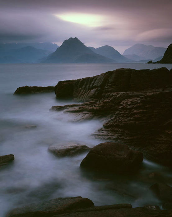
Alistair Lee is primarily a climber but has been carrying a camera since his early outings and with this his fourth book (Eyes Up was his first followed by Forgotten Landsacpe and then Pendle Hill) he has concentrated wholly on the mountains of the Lake District and it works treat. I suppose this makes him the Lake District Colin Prior but Alistair’s pictures seem less planned, more open to possibility. The pictures show a flavour of an area to good effect, from full 360 pictures taken on roundshot cameras to panoramas on 6x17 and I presume some digital cameras and HDR.
I particularly like his shots from half way down the mountains, an idea I’ve been wanting to play with for some time and I would be happy to get some of the results Alistair has. Yes a lot of these pictures are fairly straight, but this isn’t just a photographic book, it’s about the Lakes and about climbing. Some of the best pictures are those taken under dramatic conditions, temperature inversions, snow, skimming light, etc.
Think of this as a classic Lake District/Climbing book with some great photography and it will make a wonderful stocking filler.
Jan Tove is a bit of an enigma in the UK; A photographer of no small talent who has inspired a great many more people than his British profile would suggest. Born in 1958 (approx 52 yrs old as of writing I believe) and now living in Hökerum, in Western Sweden, he originally trained as a portrait photographer and educated as a film photographer but ended up working as a reporter for Borås Tidning, Sweden's main daily newspaper where he worked from the age of 28 to 34 (sort of, freelance reporting and various projects from what I can make out from various sources).
It was when he was 36 that he became a full time professional photographer, following trips with his 35mm camera to South Greenland and the Everglades in the US. The next two years of work in Finland created the main body of work for his 'Speglingar' book, which I think was published by his old newspaper house.
He started using a large format camera just after this and many of the pictures in his second book 'Beyond Order' (published in 2000 when he was 42 years old) are taken on these unwieldy, but magnificent beasts. This work includes content from many sources and as I don't have the English copy, I can say much more about it apart from the fact it is gob-smackingly, jaw-droppingly beautiful.
Since producing Beyond Order, he has been working on a variety of projects, some landscape but a lot of which are fine art documentary where he has started to use a Phase One digital system, starting with a P25 but should now have a P65. In the meantime, here is a sample of his pictures and don’t forget you can buy his book at Beyond Words(http://www.beyondwords.co.uk/) or check out his website (http://www.jantove.com/)
p.s. Jan has called us back and is happy to take part in an interview so keep 'em peeled :-)
Beauty pains and when it pained most, I shot. Ernst Haas
A debate almost as old as photography is whether we take or make photographs. I've always felt strongly that we make images, that it is a creative act. `Take' has always seemed too passive, too casual, as if the images were lying around waiting to be picked up by any passing photographer. Knowing how hard it is to produce good photographs, `take' has thus seemed to be an almost derogatory term. But I've recently realised that in one sense photography is all about taking, that it has an acquisitive side. It seems to me that when I'm looking for subjects for my photography I'm actually looking to capture their beauty; one might say that I'm seeking to drag an image of that elusive quality back to my lair so that I may feast my eyes upon it at leisure. William Somerset Maugham put it much more eloquently: ‘Beauty is an ecstasy; it is as simple as hunger.’
Nanven boulder
Only a tiny minority of photographers start solely with an attraction to the process of photography. Fascination with a subject, finding beauty in the world around us, is the motivation for image-making/taking for most photographers. The great American photographer Edward Weston wrote that he started to photograph because of ’amazement at subject matter’. I think that this childlike sense of wonder is, whether the subject is wildlife, people or landscape, the one factor that links all expressive photography. My sense of wonder as I walked amongst the hills and mountains of Britain led me to want to record their beauty, and photography seemed to me the most appropriate tool.
From wonder grows a desire to do the subject justice, maybe to reveal to others how you feel about the subject or perhaps just to make those feelings clearer and deeper to yourself. Photographs, when they are successful, can surprise even the author of the image because they reveal some hidden truth, either about the subject or about the author. Most of us will have had that `Eureka!' moment when we see an image on screen or on a lightbox for the first time and it wildly exceeds our expectations. It doesn't happen very often. Ansel Adams was probably right about his ‘twelve epiphanies in one year’, twelve times when an image seems to sing, when it appears to be so much more than the sum of its parts. But, there can be a kind of alchemy at work in the mundane chemistry and that magic seems to me to be linked to beauty.
For us as photographers, a search for mysterious beauty is also a search for the wellspring of our passion for image- making. I believe that this quality is both the motivator and an essential part of any truly great photograph. But beauty is a complicated subject – it isn't a single indivisible property but raises diverse questions, from aesthetics to psychology. Thinking about these might help us find it more readily and better understand its significance in our photography.
Badwater fin
John Cleese once played a Renaissance Pope who had summoned Michelangelo to explain his rendition of the Last Supper. He was unhappy with the aesthetics of Michelangelo's composition and wanted to know in particular why the painting contained a juggler, a kangaroo and three Christs. Michelangelo's answer that ’the fat one balances the two thin ones’ failed to mollify him. Cleese finished the sketch by screaming in his inimitable style at a hapless Michelangelo, ’I may only be the bleeding Pope but I know what I like!’ This is a telling and amusing confirmation of Margaret Wolfe Hungerford's famous assertion that ’Beauty is in the eye of the beholder’.
The phrase highlights the most obvious quality of beauty – its particularity, the way that beauty binds one person and one object. There is a strongly weighted feeling in Western cultures that beauty is predominantly a matter of individual taste. In the English-speaking world Hungerford's oft-quoted line seems to have been at least partly responsibly for this skewed viewpoint. It has become so well known that we cannot think of beauty without it popping unbidden into our minds. The concept of beauty that she's describing is a very narrow one. It best explains beauty in relation to sexual attraction and the often unfathomable relationship between one person and the object of their desire. It's another way of saying, ‘Love is blind’.
Iceberg
Whilst aesthetic beauty may not be truly universal, beauty is thought of as having universal qualities. At a basic biological level, humans find bilateral symmetry beautiful. Evolutionary psychologists argue that this is because a member of the opposite sex who exhibits symmetry is more likely to be, in the evolutionary sense, fit. Certain genetic disorders and injuries or illnesses in later life result in asymmetry and research has shown that individuals exhibiting these traits are less likely to produce viable offspring. We find symmetry beautiful and the search for symmetry/beauty in potential mates is a facet of natural selection. Another aspect of beauty that is held to be universal is apparent in John Keats' famous line from Ode on a Grecian Urn:
Beauty is truth, truth beauty, – that is all
Ye know on earth and all ye need to know.
The intuitive linking of the notions of beauty and truth has a long history stretching back at least as far as Plato and the Ancient Greeks. The association between beauty and deeper meaning is not solely a Western one but seems to be cross-cultural. The Navajo, for instance, have the word `hozho’, which is normally translated into English as 'Beauty' but actually, as one anthropologist explains:
`Hozho' expresses the intellectual concept of order, the emotional state of happiness, the moral notion of good, the biological condition of health and well-being, and the aesthetic dimensions of balance, harmony, and beauty.
Despite this long-standing philosophical connection there can logically be no proof that something beautiful is inherently truthful or untruthful. Yet many scientists and mathematicians express the view that mathematical proofs or solutions to scientific problems are beautiful. The visionary, writer, architect and designer Buckminster Fuller wrote, ‘when I have finished [working on a problem], if the solution is not beautiful, I know it is wrong’.
So, beauty on the one hand is seen as being intensely personal and therefore of little account; yet on the other hand humans intuitively feel that beauty has deep and universal importance. A striking feature of the aspects of beauty that I've touched upon so far is that they seem to arise when something is fit, or rather fittest, for purpose. There is something here that seems to link the particular and universal aspects of beauty and I will return to this later in the chapter.
Etive ice and boulder
Given its uncertain nature why might beauty be important to photography? When Alfred Stieglitz, the man many consider to be the father of modern photography, wrote, ’Beauty is the universal seen’, he meant that humans all recognise beauty when they encounter it. A brush with beauty, however personal or universal, has a powerful effect upon viewers. They are able to relate more intimately to images that contain it. Of course, recognising beauty does not mean that we can describe it in words. The fact that you can't quantify beauty makes it richer rather than poorer.
American photographer Robert Adams (no relative of Ansel) suggested that we judge art
. . .by whether it reveals to us important Form that we ourselves have experienced but to which we have not paid adequate attention. Successful art rediscovers Beauty for us.
He also wrote:
. . . the Beauty that concerns me is that of Form. Beauty is, in my view, a synonym for the coherence and structure underlying life. . . Why is Form beautiful? Because, I think, it helps us meet our worst fear, the suspicion that life may be chaos and that therefore our suffering is without meaning.
Beauty for Adams is a universal concept that lies at the heart of what photographers are seeking to do when they create.
bonnet
The beauty that Adams and Stieglitz envisage isn't the shallow veneer of appearances, it's not at all the anodyne decorative quality celebrated in beauty contests. It isn't absolute: there isn't a quantifiable highest, widest or deepest point in beauty. So how can anybody even think of having a contest? Beauty is relative, it's a quality not a quantity, and some will find it in a particular image while others will not. But the beauty that Adams refers to isn't simply a question of aesthetics. Rather it is a deeper expression of beauty that not only contains the superficial visual appeal but, critically, also reveals truths about our world. A photograph with this quality makes you see something fresh again or more importantly reveals something that you had never noticed before.
Images with this quality might be sumptuous or terrifying, they might make you happy or move you to tears. Whatever emotion they instil, the images will be compelling; beauty will force you to look at them. It is perhaps this attribute of beauty that best helps us to confirm whether it is present in an image. And isn't this what we all want from our images? We want people to take notice of our photographs because we are passionate about our subject and we have something to say.
It seems ironic to me that beauty, which humans crave in so many aspects of their lives, has been considered with disdain for almost a century within much of the realm of high art. From the early twentieth century onwards, the view put forward by over-eager Modernist artists was almost precisely opposite to that expounded by Adams and Stieglitz. In the Modernist view beauty really is only skin deep – a matter of shallow (in all senses of the word) appearances, a matter of taste and, as they sneeringly point out, inferior bourgeois taste at that! Of course there have always been exceptions but here I am discussing the entrenched orthodoxy that has formed so much of the art establishment.
The Modernists sought to apply scientific principles to art. Rather than seeing art as an aesthetic pursuit they sought to make it purely intellectual to make it an–aesthetic. Of course an-aesthetic just makes you numb and I don’t want art to numb my senses. You might say that they were merely following the social trend. In our increasingly secular Western world, we more often place faith in scientific rigour than in what we dismiss as touchy-feely notions such as beauty. However, it is only poor scientists and their imitators who hate ideas that they can't quantify, preferring absolute values to relative ones.
As modern art became increasingly inward-looking over the last century and almost completely turned its back on the natural world, so it increasingly became separated from common experience and its popularity plummeted. What more common experience do we have than the planet we live on? The problem seems to be that the most vociferous, and therefore in the eyes of the media the most influential, modern artists live along with their critics on planet Art. I use `critics' with some unease as they seem more like apologists. This is an urban world that has a very rarefied atmosphere divorced from nature. Over half a century ago Edward Weston wrote in his daybooks:
It seems so utterly naive that landscape, not that of the pictorial school, is not considered of `social significance' when it has a far more important bearing on the human race of a given locale than excrescences called cities.
So true.
Icelandic moss
To dismiss natural beauty as a source for art merely on the grounds that it isn't new is ridiculous. It is clear to me that many modern artists, especially conceptual ones, are now scraping the bottom of the barrel. The continuous search for novelty has led them into an artistic dead end. It is perhaps worth repeating the words of architect Antoni Gaudi, ’Originality is to return to the origin.’ Nothing is closer to the origin than the natural world. The natural world is held in common and offers a much wider realm than the actions of mankind. It surely can't be true that art has exhausted the possibilities for exploration and expression encompassed by the planet around us. I believe that there must be room for a middle path between the self-obsession of Modernism and the Marxist directive for art to concentrate on the social world. Surely these are just different forms of anthropocentrism, both equally and mistakenly self-centred. What's wrong with art looking at the natural world? Not the capitalised, mystical Nature celebrated by Ansel Adams et al. but simply the environments that gave birth to humanity.
For many Modernist and Postmodernist artists the manner of representation is more important than the subject – the intellectual has taken precedence over the visceral, the emotional and the decorative aspects of the image. An ugly image is seen as intellectually more successful than a beautiful one, almost irrespective of its message. This is a clear case of the triumph of style over content. In other words just what the over-eager intellectuals were seeking to avoid in the first place.
Beauty is a rare quality in our everyday lives and we hunger for it but does this mean that it will necessarily deceive us? Are we all so callow as to be overpowered by its simple presence and not to seek other levels of meaning in an image? Clearly for some this will be the case. But surely those who rail against beauty are those least likely to be swayed by appearances, those best equipped to find deeper meanings?
For me, one of the most important criteria for a good work in painting, sculpture, music or photography is that it should evoke an emotional as well as an intellectual response. Interacting with works of art should make our heart beat faster, make us feel sad or happy or wistful or depressed or whatever. . . Just make us feel!
Goldfield Barn
The response might be pleasant or unpleasant but it should arise directly from the piece. The problem for all visual artists, and this applies to musicians too, is that there is no guarantee that others will feel as the artist does about their work. The emotions or concepts that the photographer is trying to convey might pass the audience by because there is no fixed meaning for a single image. Much modern art has got around this philosophical impasse by grafting on an external support structure, by explaining the imagery with words. This approach directs the viewer's interpretation more surely but also makes it more firmly an intellectual rather than an emotional experience. For my money I want art without the need for art-speak. I want my initial response to be visceral not cerebral. Intellectual enquiry can follow on but it shouldn't be to the fore.
It might seem like the pot calling the kettle black for me to accuse intellectuals of diminishing the power of art. I sincerely believe that art can blend the intellectual and the expressive but that the image should appeal to our visual and emotional senses first and foremost. The image should stand or fall on these criteria alone. Not everyone will get what the artist means but that's life! Artists will almost inevitably acquire a philosophical viewpoint on the process of making art and the messages they are trying to convey but the general audience should not need to know this in any detail in order to be able to be excited by the images. The necessity for words just shows how badly some artists have failed. I find myself in agreement with Charlie Chaplin, who opined:
I do not have much patience with a thing of beauty that must be explained to be understood. If it does need additional interpretation by someone other than the creator, then I question whether it has fulfilled its purpose.
Successful photographs, and I mean by this ones that have received both popular and critical acclaim, seem to contain some secret ingredient that is universally, if imperfectly, understood. Might this ingredient be beauty? Fred Hutchinson wrote in a critique on Postmodernism:
The postmodern arts establishment has not been able to entirely snuff out beauty. Oddly, beauty has a toughness and durability which the more fragile realm of ideas seems to lack. People still listen to Beethoven, admire Michelangelo, go to Shakespeare plays, and read Keats.
All well and good, but how does this relate to photography? Beauty is at the heart of expressive photography because it binds so many aspects of image-making together. When we manage to distil our passion into a harmonious arrangement, beauty links the emotional response of the photographer to solving the problem of composition. It also links the individual beholder (the particular) with the audience (the universal); when individual fascination achieves a wider significance it may also reveal truths hitherto untold. And all in an aesthetically appealing package, what more could one ask for?
The title of this essay was a response to Modernism's an-aesthesia and a plea to turn our back on its coldly intellectual take on art. It isn't smart to spurn beauty, it doesn't help us see more clearly; it just makes art uninspiring. I now realise that beauty never really went away. It lies at the core of our humanity and cannot simply be ignored.
Beauty itself doth of itself persuade
The eyes of men without an orator. William Shakespeare
David Ward is one of the foremost landscape photographers in the UK. He has written extensivley about philosophy and perception in landscape photography. This is an extract from his second book, Landscape Beyond which you can purchase from Amazon. You can see more pictures at Into the Light
David Clapp, Tim Parkin and Dav Thomas met up in the Peak District just as On Landscape was being formulated. That first interview had a couple of problems (the Canon 5Dmk2 only recorded 12minutes at a time and the Panasonic GH1 only recorded 30 minutes but with bad sound, the main audio ended up corrupted - a litany of learning), however, there was enough content to make a reasonably interesting interview so apologies to David for cutting the odd stream of conversation short, we will repeat again in the near future! (There is a bit of a repeat at the start so apologies for the slightly unprofessional edit - hopefully, even though it's a little raw, it's still interesting for some of you. Better some slightly unprofessional content that none at all?).
I’m not one to engage in the film vs digital debate from a ‘religious’ point of view. I happily use both (which makes me multi-faith I suppose) and own more digital cameras than film cameras. However, I do spend some time trying to work out the advantages and disadvantages of each and in doing so, some interesting things crop up.
I have two pictures to show you, not the most scientific of comparisons, but it’s enough to show an aspect of digital photography that it’s useful to be wary of (or at least to be a-ware of).
Most of you will no doubt have heard of the Bayer array or mosaic. This is a way of getting colour out of a sensor that only really records brightness per pixel. It does this by clustering four pixels together, two green, one red and one blue, and then interpolating between them to reconstruct the missing colours.
The main problem with this is the lack of red and blue pixels - it means that fine detail in red or blue can have issues. Anything with a red texture (or blue, but we’ll stick with red to reduce repetition) will end up with only a quarter of the supposed megapixels of the camera. However, there is also a more insidious problem in that if you have pixel level red colour detail and those pixels fall on the green or blue pixels (highly likely) then that colour just dissapears, completely.
Slightly less annoying but equally an issue is that if the red pixel level colour falls inbetween two pixels, then the saturation of that red colour is only half of the actual saturation of the pixel detail. This results in muted colour of anything with mixed colour texture.
So in the first example you can see that the red pixel berries have mostly dissapeared and that the a lot of the other pixel berries are particularly muted in colour.
Just for the record, the film has been reduced down to the same native resolution of the digital files but because of the anti-alias filter and various other degradations (24-105 lens and a little bit of diffraction at f/8 I think) the digital file looks less sharp than the film - which probably adds to the detail/texture issues - I said this wasn’t too scientific. However, also for the record, if you reduce the digital file and the film files by 50% you still see the same issues so.....
The last picture just shows the effect on other colours, in this case even the green specks of lichen on the tree are showing some diminution. As they say … “Just sayin’..”
One photograph was taken with a 150mm Rodenstock Sironar S on an Ebony 45SU (Velvia 50) and the other was taken on a Canon 5Dmk2 with a 24-105 lens at about f/8 and post processed in Capture One (the Adobe conversion was even worse - Capture One's demosaic'ing is a lot better)
p.s. Somebody asked whether the effect could be the anti-alias filter.. I tried blurring the film version to see what the effect would be ..
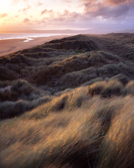
Autumn has finally come to an end here in Argyll. As I write this article sleet and rain lashes against the window and strong winds strip away the remaining colour from the trees, the leaves giving up their tenuous grip having been weakened by hard frosts earlier in the week and Snow has made a dramatic return to the mountains hereabout.
Looking back it really has been a fantastic season, by far the best I have experienced since moving here in 2004. This year the change started early too, I noticed the first hint of gold in Beech trees back in mid August and was initially concerned that the whole show could have been over by the middle of October. Fortunately, early September proved to be mild and settled slowing down the transformation, ensuring that Birch, Beech, Oak and Larch ( my Autumn favourites) all reached their peak together. The twelve weeks of colour this year has enabled me to get out and develop further a number of projects that I had started in previous years and to visit and reconnoitre a number of new locations further afield.
Larches beside Loch Avich
The season has been a wet one too with frequent spells of stormy weather often lasting for days on end. My first Autumn in Scotland was very similar but I failed to capitalise on the opportunities available here in Argyll, its ancient Oak forests are world renowned, the 'Great Northern Rainforest' the last remnants of forests that rapidly covered the whole of Britain after the last Ice Age that were decimated during the industrial revolution. Back in 2004 I waited for weeks to get out on the few blue sky days that we had and in the end made very few satisfactory images. Indeed I wrote an article for Outdoor Photography magazine based around the story of the long wait as a viewpoints feature in 2005. Having spent six years now on this wet and stormy coastline my photography has completely changed, the less frequent blue sky days being my opportunity to catch up at the gallery or with my admin work. Cloud and rain diffusing the light and revealing all the subtlety and beauty in this rich landscape.
Wet day, Ardlui
Due to the wet weather this year has been vastly different and very productive. From Mid Argyll to Sutherland via Loch Ness and Glen Affric and inland to the woodlands and lochs of the Trossachs I have been out trying to capture the colour and mood of the season as it has presented itself.
On a corrugated shed, Loch Lomond.
At no other time of the year do I feel such a strong connection with nature, effecting all of the senses. The rich tapestry of golds, reds and ochres filling the valleys and glens. The earthy smell of of wet woodland with its carpet of decaying foliage. The first frosts of the year tugging at the back of my nose and sitting heavy in my lungs as I head out onto the hill. The patter of fat dew drops falling from branches in a fog filled forest. It's a time of year that never fails to awaken a primaevil urge in me to head back to my cave, store up plenty of comfort food and hunker down for the coming season. An urge that has to be supressed as a landscape photographer since another great thing about Autumn is that it is followed immediately by Winter, my Favourite season!!
Beech trees, Glen Falloch
The Letter from Scotland is brought to you by Richard Childs, a landscape photographer who works with a large format camera and is based around the West coast of Scotland. If you want to see more of Richard's work or take a look at his excellent workshops, visit Richard Childs Photography
It’s an obsession, I admit it, even the giants of Torridon and the beautiful mountains of the far North West can’t drag me away from the Isle of Skye. This beautiful island keeps calling me back to visit and I am happy to say it has hardly ever let me down with it’s notorious weather.
I have recently returned from another enjoyable trip (my kids always say holiday!) to the Western Highlands. I always stay at Dornie on the mainland which is the village next to the much photographed (and rightly so) Eilean Donan Castle. From the lovely guest house there are lovely views down Loch Alsh and on a clear day Beinn na Caillich and Bla Bheinns distinctive shapes dominate the horizon as if to beckon me away from the mainland once again. In an eight day stay I visited Skye seven times so it’s hold on me is quite apparent.
I seem to spend the first day and a half recovering from the drive and the results from locations shot on the first couple of days are poor and in all honesty a little hurried. This dissatisfaction with the early images shot also possibly stems from the fact that if you start in the highlands with decent light it can make you wonder if it will be the only window of opportunity you will get. My mistake was to try and fit in too many locations and drive too much, after the 570 mile journey the last thing I wanted was long driving days, big mistake.
Perhaps the fact that I drive so far north adds an added ‘hidden’ pressure to come back home with something. It’s the getting that first shot in the bag syndrome, once you are up and running, you relax and take your time and that is exactly what I did. A few years ago I’d of wanted to walk every conceivable path and shoot hundreds of images, I like to think that I am far more considered in my approach to making an image nowadays.
In writing this article I thought I would highlight five pictures of mine from the trip that have immediate appeal to me. Having only recently returned perhaps that can be viewed as a little premature to pick favourites and it possibly is. It may be better to say that these images stick out immediately for me as being images that I am happy with whether this be in terms of light,composition or the satisfaction of coming away with an image from a brand new location. There will be others images sitting on my hard drive that one day will show themselves when I re-edit and frequently you end up asking yourself ‘how did I miss this’, these images are often the ones you come to enjoy much more. Whilst I’m sure many of us crave dramatic light it is the ability to make an image from more subtle conditions that can provide the biggest challenge and therefore provide the most satisfaction.
The first image I have chosen is from a little know location on Skye called Elgol!!! On my last visit to Skye I did not visit Elgol, possibly worried about the ensuing tripod rage or the fear of wasting an evening’s good light repeating what I have already shot in this beautiful location. In all honesty I’m am sure every conceivable angle has been shot but there seems to be so many images shot from the beach immediately in front of the car park that I made the intention to walk along the clifftops and down to the beach on the other side of the jetty and explore the wonderful geology. From here the beautiful Bla Bheinn becomes part of the wider view and I wondered why so many don’t bother to walk a couple of hundred metres just to at least get to a different viewpoint.
In truth the image chosen could be mistakenly seen to be from the usual area used in shots across Loch Scavaig but I am happy to say it is not. I was drawn to the rocks leading in from either side thereby framing and pointing towards the pyramidial Gars Bheinn and chose to use just a small section of rocks at my feet to finish off this frame effect. This did leave an expanse of seawater which looked pretty plain and left a lot of dead space, the incoming tide did mean that waves were starting to break in this miniature harbour and I waited for waves to break near the rocks at my feet and tried a few shots here and checked on the lcd for the shots with the best effect of wispy patterns in the incoming waves. In no way is this an original image or stunning new view of Elgol, far from it in fact, but it was just the satisfaction of using legwork to view this stunning scene from a slightly different angle that made this the first image I was happy with.
Being hampered by a very dodgy knee I was limited with how far I could travel without being in some pain but the very short walk around the Fairy Pools area of Glen Brittle was well worth it. Similarly to Elgol, Glen Brittle has one of those great car parks of the world views with stunning vistas into the heart of the Cuillins.
I started off walking beside the Allt coir a’ Mhadaidh and before long the foreground interest just got better and better as the small waterfalls became more beautiful and the ominous presence of the Cuillins loomed large. Even in my poor shape it is one of those places were you wanted to keep going and see if these waterfalls can get any better. Near the brow of the incline I found some particularly impressive falls with some lovely jagged rocks, almost like mini mountains. I set up and ensured that the ‘peak’ of the jagged foreground rocks was placed over the falling water so it stood out clearly, I noticed how it very nearly matches the slope of its’ much bigger compratiot.
From hereon it was a case of finding a shutter speed that will ensure a nice feeling of movement in the water without stopping it dead. The composition basically presented itself with just a small amount of tweaking with the aforementioned jagged rocks. I chose to shoot this when there was not a break in the clouds above the Cuillins as contrast levels became too much, I much prefer this moodier light which suits this wonderful landscape.
The coastal landscape around Loch Bracadle in the west of Skye is host to wonderful small islands and dramatic sea cliffs. I had been taking images on the shoreline at Eabost looking both southwards and northwards with the distinctive shapes of Mac Leod’s ‘Tables dominating the northerly view.
After leaving the coast to head northwards along the main road I passed this lovely old house set back in a field beside the road at Eabost, it’s so rewarding to encounter surprises like this.Skye and the Highlands are littered with these wonderful subjects, of course so many of them are sad subjects as they are the products of the highland clearances. Some of the ruined cottages I saw and photographed on this trip still had a sizeable amount of household furnishings still in them, fascinating subjects but tinged with sadness.
I thought the colouring of the house was set off nicely by the intense blue in the sky and set up a simple composition using the fence as foreground. It wasn’t my intention on this trip to photograph this type of subject but I found so many places like this that I couldn’t resist stopping at one or two to explore their possibilities, it also keeps me from shooting too many wide vistas which is my favoured choice.
The Braes are a collection of small villages that can be found on the eastern coast of Skye south of Portree.From here there are wonderful coastal views across the Sound of Raasay to the island of Raasay itself and southwards towards the Cuillins and northwards towards one of my favourite looking mountains, Ben Tianavaig, which sits at the entrance to Portree Harbour with the same sentinel like presence that Buachaille Etive Mor has at the head of Glencoe.
Near the villages of Balmeanach and Gedintailor there is a distinctive headland which I can wholeheartedly recommend. On a visit in November last year I had some wonderful light and concentrated on views toward Ben Tianavaig from just a short distance along the headland, the memory of that last visit has made this one of my favourite destinations on the island.
On this visit I had the intention to walk to the end of the headland and see what possible compositions I could find. Back at the guest house I had read a book that described sea caves and a curious little sea stack , the high tide put paid to me trying to visit the caves though they are clearly visible as black holes in basalt columned small cliffs.
The sea stack was easy to find, it was small but I though it would make a very useful foreground subject in a view looking northwards. It would be especially useful because the sea was relatively calm and would therefore help to fill a little dead space where the water wasn’t particularly rough, ideally it would have been a little rougher but then would I have placed myself in a slightly precarious position to take the shot, possibly not considering I don’t swim well and have known to suffer from mild vertigo.
Whilst I like this image I can’t help wanting to see more white water in the expanse of sea (though the seas’ intense turquoise tones are of great appeal) but it goes down as one of my favourites as the location is special to me and it wouldn’t be a chore to go back and try and better this image someday soon.
My final image was again taken from an area of the island I wanted to re-visit. It is situated a short distance along the Broadford road from the Skye Bridge and can be reached by crossing the main road and then the old Broadford Road and heading through bracken towards the coast.
There is plenty of varied geology here of all shapes, surfaces and colour and I really enjoyed exploring possible compositions here on this frosty morning which made traversing over the rocks a hazardous exercise. Some compositions I had made were too busy, others I had included too much rock in the foreground and these images lacked a good balance or layered composition involving the rocks, sea and mountains in the distance.
It wasn’t difficult to get interest throughout the frame but it was difficult trying to make it work successfully and on looking at these images I could probably say I had gone into hurrying mode unintentionally, perhaps I was geologically overwhelmed!
Funnily enough my favourite picture from this session was a lucky find. I was heading back to the car for a coffee when I chose a different route back over a higher area of rocks covered in heather, on looking towards Broadford and the bulk of Beinn na Caillich I noticed the intense rusty hues of this small clump of grass that stood out amidst the frosted heather and bracken.
I knew that was it straightaway, a real contrast in colour in my foreground with beautiful light on the distant mountains. I set up placing the clump of grass centrally as I felt this worked well and was pleased that the composition looked to very nicely layered, there wasn’t too much of anything to dominate the picture, just a nice simple set up of grasses, rocks, sea and then mountains, simple but quite effective.I returned to the car a happy man pleased with the mornings efforts and that coffee tasted damn good too.
The next day I left the Highlands and I always feel a sense of guilt as I pass through Glen Shiel in the initial stages of the homeward journey, it is a beautiful place and I would imagine a fairly difficult place to photograph in terms of my preferred wide vistas especially in the area beneath the Five Sisters of Kintail.If the Misty Isle doesn’t call to me so often on my next visit then perhaps I can explore the possibilities here.
All images were taken on a Canon 5d Mark 2 using a Carl Zeiss Distagon 21mm.
Lee Filters were used in all images and the raw files were processed in Capture One.
In all things we describe we merely describe ourselves ~Voltaire
We all ask profound questions about life from time to time from “why is there suffering in the world?” to "why do I have to die?” They are deep and meaningful questions, imponderables that unify us in life. So why does most landscape photography aspire to little more that “the rocks are hard” or even “the water is soft”?
I imagine the answer lies in escapism, the pleasure to be found in a seemingly ideal world, something which requires little effort to appreciate, but frees us from our mundane lives and promises us a sunlit upland.
There’s a power there that captures imaginations, inspires us to travel, explore and maybe even to take up landscape photography itself. It happened to me! But as I developed as a landscape photographer, learning many of the tricks of the trade until I could produce a passable image, I found myself wanting more profundity. Initially this resulted in more dramatic images and processing, it was a sort of inner resentment at the more superficial work I’d produced before, but on the positive side, I found myself genuinely responding to a place for what felt like, the first time.
Conundrum
Indeed it was a turning point that sent me on a journey, an unpredictable and often surprising journey through art, poetry and the psychology of creativity that has potently influenced my working methodology and provided a mass of inspiration to pursue fresh avenues.
The importance of a project based approach.
Ever since I reignited my passion for photography in my late 20s I’ve worked on a project basis. Initially this was simply a way of getting the “best” out of a location, visiting in different lights, different times of day and year for example. Latterly the project has come to mean something more fundamental about my work and the way I produce images.
It takes time to find insights about a place, time to explore it, but more so time to find out what it means to you. The good news is that for many of us the places that have the greatest depth of meaning for us are near home, or at least where we spent our formative years. These are the places laden with memory, probably some of your first experiences of landscape were closer to home than you might imagine. Perhaps I’m lucky living in Wales where there is a plethora of beauty at every bend, but didn’t we all play in the woods or a park, explore the wider landscape and develop ideas about what the landscape means to us?
The Joy of Solitude
For me at least “home is where the heart is” applies equally to the landscape. Many of us have moved, sometimes long distances, but it is the feeling of those first experiences that are as important as the location. If we look back at our earliest childhood experiences we also come to realise how much of landscape appreciation is a social construct, a way we have learned to signify beauty. Who was never afraid of the dark woods, or intimidated by bleak, empty moorland?
For photographers of a certain (ahem) age, the aspect ratio of 35mm film, 24mm x 36mm (ie 2x3), was fed to us like mother’s milk. While there were alternatives, we tended to develop the assumption that 2x3 was the best all-rounder. Since I had my first eastern block slr back in 1976, I have gone on to use 6x4.5, 6x6, 6x7, 6x9, 6x12, 6x17, 5x4 and more recently 4x3 aspect ratio cameras. (To complicate the issue, the so-called ‘6’ in the aforementioned aspects refers to cm, but in reality is around 56mm, muddying the waters slightly.) I hope this qualifies me to explore the topic.
In theory, creative endeavours such as photography involve thinking ‘outside the box’. However, in one sense we are nearly all guilty of remaining firmly inside it, and this is when it comes to the aspect ratio of the camera system(s) we use.
Perhaps the first concern of any lateral thinker should be, ‘why does our working format always have to be four-sided?’ Throughout art history, the square or rectangle has predominated, although at various times artists have made two-dimensional art on different shaped grounds. Gable and arch-topped format shapes in church buildings are common, and circles and ovals are by no means unheard of. Indeed, photography has its example of work made in these more organically-shaped forms. But where are the triangles, pentagons, hexagons and other polygonal figures? Or artworks with random edges, or edges that have been defined by the content of the work?
It is a fact that, culturally, the rectangle holds us in a ‘framework of assumptions’. Just look at the computer screen in front of you, or the magazine or book you are currently reading. Of course, it is undeniable that the four-sided figure has compelling reasons to predominate. It is far easier to make and manufacture this shape than any other. But I do think that it is worth questioning a paradigm which we all take for granted.
One assumption I have long held (although with increasing uncertainty in recent years) is that photography seeks to replicate the experience of human vision. If that is true, then the indefinable edge of our peripheral vision would seem to suggest a non-geometric edge for our working space. Indeed, since we have two eyes working side by side, the nearest we could approximate to this (with a hard-edged space) might be an oval. Some might argue that the 2x3 rectangle (35mm and 6x9cm) is the closest four-sided figure to this hypothetical oval.
Another line of thinking is exemplified by Viktor Hasselblad, whose legendary camera system is based on making the maximum possible use of the image circle generated by the lens. That a square shape cut from out of a circle gives the largest surface area for a four-sided figure can be confirmed by GCSE level mathematics. Of course, the true maximum possible use would be to have a circular-shaped space. But the great man probably made the wise judgment that this might not catch on. Square format cameras remain popular with connoisseurs, and this aspect ratio is the choice of many fine art photographers.
My assumption that photography seeks to replicate human vision is just that, an assumption. It is one based on the fact that I am most impressed by photography when I am transported by it, when it gives me an authentic sense of connection to a time and place and (perhaps) unique confluence of events. But you don’t have to agree that it has to be about ‘eye-like’ seeing. The extraordinary capabilities of digital capture and printing have introduced a new range of possibilities to photography, some of which can be confusing to old-timers such as myself. Yet one of the new potentialities that I particularly respond to is the availability of switchable aspect ratios in some digital compacts, a feature now starting to appear on many dslrs as well.
Looking at aspect ratios and the way we tend to use them reveals another set of assumptions. The most obvious of these is ‘landscape’ format and ‘portrait’ format. The words themselves tell us what we expect to do with them. But there is no regulatory body that obliges us to use them in this way, and defying this assumption is often a more effective way of interpreting the subject. Even if we look at the most extreme commonly-used format, 6x17, we will see some remarkable landscape photography that exploits the thin vertical strip interpretation of a landscape, often to great effect. The 6x17 format undoubtedly encourages a horizontal approach to landscape, but I use the example to emphasise the importance of defying assumptions.
Before digital capture (BDC?), the choice of camera format, and with it, aspect ratio was at least in part determined by our need or ambitions for reproduction quality. On the one hand, story tellers, journalists, mountaineers and many photographic artists insisted that using a mobile hand-holdable camera was much more important than repro quality. Even the ‘ropey-ness’ of 35mm, its grain and limited definition, was seen as a virtue by some. At the other end of the scale, commercial food photographers, and many in fashion and beauty, and car photographers, would never have dreamt of using anything smaller than 10x8inch. And their clients would have rejected anything smaller. So considerations of reproduction also influenced the shapes that photographers worked with. That is not to say that no-one cropped. Nevertheless, the eye and brain becomes attuned to working with a particular format, and most photographers seek to ‘fill the frame’.
Digital has had a confusing effect on reproduction issues. No longer is bigger always seen as being better. If it was, then all commercial photographers would use scanning backs on view cameras allied to top-notch designed-for-purpose digital lenses. In reality, the majority now use Canon 1Ds Mk3(?) or Nikon D3x digital slrs. A few have adopted medium format digital. In practice the high end dslr has enough reproduction quality, when allied to smart interpolation, for most commercial end-uses. Medium format digital covers any really demanding applications. (This willingness to switch formats as well as aspect ratios suggests that commercial photographers have a highly non-sentimental, pragmatic view of the tools of the trade.)
One anecdote I can’t help sharing refers to a photograph I made some years ago with a Ricoh R4 (6mp, jpeg-only digi compact). I had a request to make a print from this camera 24inches in height. At first I didn’t think it could be done. But after I had enlarged it with Genuine Fractals, and done a little noise reduction in the shadows it proved surprisingly acceptable, even though I could do nothing about the in-camera sharpening that had been applied.
I digress. While size still matters, it matters less in digital, and the appearance of ‘multi-aspect ratio capability’ on numerous digital cameras encourages us to think more creatively about the way we frame our images.
On a personal note I admit it, I remain personally fond of 5x4inch as my default working aspect ratio. The proportions created by 5x4 are clearly rectangular, but not forced. They allow landscape photographers to use the horizontal or vertical orientations with freedom, and there are rarely issues of needing to crop heavily to fit a magazine or book format.
I now use medium format digital, so-called 4/3rds, and high-end digital compacts as well. These cameras all produce images with a native aspect ratio of 4x3. I may be wrong, but I think the nearest equivalent in film is 6x4.5cm. I find 4x3 a sensible compromise. With a ratio close to many book and magazine formats, and with minimal cropping to mimic 5x4 on the one hand, or 2x3 on the other.
2x3 is the default aspect ratio of ‘standard’ format dslrs, which I would characterise as ‘half frame’. Confusingly there are many slight variations of sensor size, but they approximate to 16mm x 24mm. Full frame dslrs are the same aspect ratio, and so follow directly their 35mm antecedents at 24mm x 36mm. Strange to relate, this is now my least favourite format. I find it neither satisfyingly full, like 5x4, or sufficiently panoramic to offer the dynamic of a wide aspect ratio. However, that does not stop me using it. The Nikon D-700 is my ‘go to’ camera for assignment work because the camera itself is a brilliant allround tool of the trade. If it had an aspect ratio of 4x3 or 5x4 I would prefer it.
16x9 is one of the options on Panasonic’s digital compacts. It echoes the cinema screen feature film shape. It’s a wonderful format for panoramas of course. Close in shape is 6x12cm (an aspect ratio of 2x1), which is used by Linhof and Horseman system film cameras and is available as a special rollfilm back for 5x4 view cameras. I have great affection for 6x12cm, partly because of its affordability compared to the much greater cost of using sheet film, and because it does lend itself so well to panoramas. The cameras are also a great deal more compact than their 6x17cm cousins.
Many readers will have used the Hasselblad XPan, a 24mmx 65mm film camera, with an aspect ratio of 2.6-ish x 1. It isn’t as extreme an aspect ratio as 6x17cm, which is fully 3x1, but can be seen as the 35mm equivalent of. Both the XPan and the Linhof and Fujifilm 617 cameras are gateways into the world of panoramic photography. (Beyond here lies the extraordinary world of the photographic panorama, which I suspect is another article.) 3x1 could be seen as the limit of the one shot aspect ratio for ‘normal’ photography. For me this is a little more extreme than I used to work with, but having learned to stitch digitally I no longer feel constrained by any specific panoramic ratio, other than by the demands of the subject and the practicality of displaying the work.
Finally, what of 6x6cm, or the ultimate aspect ratio of 1x1? The photographers who have adopted this format and made it their own are legends (Irving Penn, Michael Kenna, Charlie Waite immediately spring to mind), and there is something compelling in its ‘neutrality’. I have found myself treating the square format as a ‘vertical’ when I have used it in landscape photography. I am drawn to frame in depth rather than in width, so to speak. Its symmetry can be seen as a limitation, but of course that is part of its appeal in landscape. Images made in this format often appear to have a stillness and power, and will use objects and space as a form of iconography. As a portrait format, that is to say, for people photography, its convenience and suitability is universally acknowledged, and Penn’s square-framed portraits in particular define my idea of how a photographic portrait should look.
So where does this exploration of aspect ratio leave me? Firstly I want to point out again that the four-sided figure is in itself potentially arbitrary and limiting. Yet at the same time, the wide variety of aspect ratios of four sides provide much opportunity for experimentation and debate. Like me, you may have your own preferences and prejudice, but that shouldn’t prevent you from experimenting with alternatives. ‘Other aspect ratios are available’ is always worth remembering, especially if you are from the 2x3 school. The provocation they can provide in our photography is a powerful catalyst.
This article will be followed up next issue by a discussion of the implication of aspect ratio on composition.
p.s. The image on the index page for this article is the 'Modena Triptych' by El Greco (http://en.wikipedia.org/wiki/Modena_Triptych)
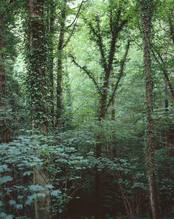
Padley Gorge is well know in photography circles, mostly for Burbage Brook, the small stream that flows through the length of this wooded, miniature valley. The brook can be intensely peaty, giving the water a deep browny-red colour which contrasts wonderfully with the mossy environment and in autumn gives it a remarkable beauty.
However, there is a side to Padley Gorge that many people don't know of; further away from the gorge itself towards the Surprise View car park. This side of this location blends from open moorland and gritstone tors, through some of the 'cleanest' birches and gradually morphing into the oak woodland you probably know from the areas next to the river.
Accessing Padley Gorge is fairly easy, you can approach from car parks on three different sides, the usual two places are outside Grindleford station, where there are many places on the approach road and some places next to the cafe (although some of these are for cafe users only) and on the B6521 between the Hathersage Road and Grindleford itself, where there is a layby which will take six or seven cars.
We'll be approaching our part of Padley from Surprise view car park on the A6187 and heading straight toward Bolehill. There is a path from the car park over the moorland on the way to the Gorge (the gate is pretty small, if you have a big backpack you'll be breathing in.. ).
Don't just skip straight across the moorland though, the textures of the heather and grasses here are exquisite. Dav Thomas and I were scouting the area and it took us just about an hour to cross the 400 yards from the car park to the start of the trees!
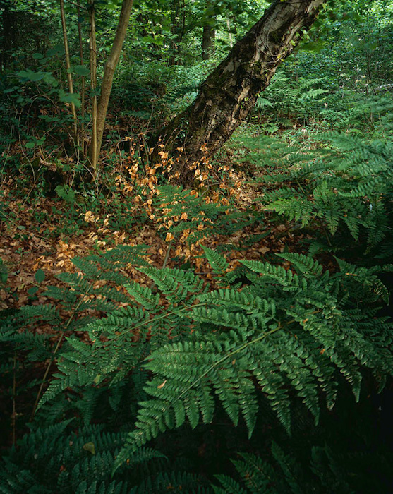
Once you get to the trees though, the variety is wonderul. The birches here are large and beautiful, and combined with the brackens, it creates lots of scope for intimate details - see Eliot Porter and Neil Bryce in this issue for examples of this genre of photography.
On the Western side of this moorland, there is a drop off to Bolehill quarry (which deserves a guide to itself!) and there are even more of the luscious birches.
Things start to get wonderful as we cross the wall at the South Western corner of the moorland though, this area is approached via a zig-zag of old roadways that were used in the quarry industry. Along this road are wonderful old trees, from oaks, birch and beechs and also the occasional scots pine. The trees in the gorge itself and surprisingly small for being hundreds of years old, the growth being limited by the thin topsoil over the scree (blocks of stone). I also suspect that viruses have had their way with many of the trees, with some trees heartwood and sapwood becoming separated and others being twisted around into spirals.
All of the dark peaks were once like this, the combination of birch and oak covering the edges throughout, only being stripped by the charcoal industry (supporting Sheffield's industrial growth) and with deer making sure the regrowth is limited.
I've included a few 360 panoramas from our route down from the Surprise view car park and also a range of pictures from both Dav Thomas and myself. Dav is a local to the area and his website is well worth a visit to get a taste of a different side of the Peaks.
The following gallery is wholly composed of pictures that Dav took on the day of our outing and the couple of days after. Dav has kindly included a map that shows where the photographs were taken (please take these as a guide as he didn't use a GPS). I was going to include some of my snaps in a gallery but I'm a little ashamed by Dav's output, very impressive work considering nearly all of them were captured on large format - if you want to see some geocoded snaps, visit the link here. You can check out more of Dav Thomas' wonderful large format imagery at Peak Landscapes. Read Dav Thomas and Joe Wright article on this location.
As I had mentioned in the news from the previous issue, Joe and I gave a interactive session at the National Media Museum on the 16th of October as part of the Photocamp project. The talk was ostensibly about film and digital but we quickly meandered around a few different topics as questions were asked from the audience.
I'll come back to the points we were talking about and try to flesh them out for those in the audience who were interested in hearing the whole lots. However, that really deserves something a little longer so perhaps next issue. In the meantime, I want to try to expand on the question asked from the audience about using HDR or Graduated Filters.
The short answer, as usual is 'it depends' but closely followed by 'graduated filters'. Now this is possibly a bit of a cop out but I think we both have a feeling that fully automated HDR is mostly a bad approach. Now there are situations where it works fine and obviously, when it works fine, it works fine. However, there are many more situations where the results are not particularly satisfying and to understand why, we need to know a little about what HDR is actually doing.
HDR photography is actually two steps, the HDR step - where multiple photos are combined to give a High Dynamic Range picture - and then a compression step which reduces this high dynamic range into a smaller range that can be shown in a print or on a monitor.
Tricky - Flickr
The HDR step is fairly consistent, with the main variable being the number of pictures and width of exposure bracketing. I don't want to go into detail here as I'm interested in a separate article on this at some point (and I'm not confident enough in my hunches yet).
The compressions step is a lot more interesting and is where there are a whole swathe of techniques to combine results. The typical HDR is 'adaptive' and tries to ensure that within a certain radius, there is a highlight and a dark area (ok there are a lot more versions than this but this was the original version). The problem with this is that very often, within a radius you just have highlights, or in other parts of the picture, you actually want dark shadow. Allowing an automated procedure to handle this means losing control over your exposure. Wider radiuses can help but the problems can still occur. In addition, some of the highlights in the image can end up over saturated as they are dynamically reduced in brightness. These two contribute to a sense of cognitive dissonance (brain stress) where areas in the foreground or in shadow end up brighter than areas in direct sunlight or even the sun itself!
The Photo Boy - Flickr
The key to believable contrast reduction is to keep as much of the general contrast differences in the picture as possible, placing your compensations either gradually over a larger area or if this is impossible, place them along areas that are believable. e.g. the classic hard grad over the horizon because people don't have a strong mental image of what brightness levels next to the horizon do, hence we can move these levels around without confusing people.
All of these techniques come down to 'contrast management' and the best form of contrast management is choosing when and where to take the picture. An example I used in the presentation is shown below where I avoided direct sunlight (where the result was reduced saturation and little 'modelling light') and also avoided taking pictures in full shade (where the picture looked drab and shapeless) and took the picture in between the two, just as a cloud drifted over the sun. This gave a reduced contrast range but kept a little diffuse light from the sun which provided wonderful colour saturation but still kept some directional light which 'modelled' the subject nicely.
A good result is where you use this contrast management in combination with either a subtle graduated filter (2 stop hard or 3 stop soft for instance) or a couple of brackets. The nice thing about using graduated filters is that you can quickly see the effect, you know that you are going to get a believable result.
Tricky - Flickr
I often use a combination of the three, choosing good light to reduce contrast, adding a medium level graduated filter (avoiding 3 stop hard unless against a straight horizon, choosing a 2 stop hard and 2 stop soft in preference if really pushed). I then take a shot that holds the brightness range and maybe take a shot a couple of stops over to allow me to 'fill the shadows' if necessary later. This way I get a working shot straight out of the camera and a supporting shot I can use if the shadows are blocked up or noisy.
If you have a very complicated shape (such as the classic V shaped valley at sunset) taking multiple exposures is inevitable. However, when processing them you need to remember that people know what the gradients of light in a sky should look like and hence blending your shots in the sky will not look as believable.
So I think our recommendation is probably to use graduated filters to get close and then bracket to allow you to blend these if necessary (i.e. use all the tools at your disposal).
We also had a question about 'available light' photography - as in 'do you always use it'. To which Joe quoted XX by saying "flourescent, flash, candles .. if it's available, I'll use it". To be a little more serious, Joe said he was happy to use artificial light and has done in quite a few photographs in print (in the Northumberland Coast for instance). I haven't done so, but I have spent a while thinking about using some form of artificial lighting; a plan to find some pools in the wilderness and create a diorama with a few different diffuse lights - although I can't imagine getting this done without help. I think the conclusion is that the light had to be 'natural looking', if not natural.
Paul Mason - Flickr
A final question came from Jason Theaker and was one that I have an interest in digging a bit deeper into at some point. The question was 'do you take pictures inspired by or homeages of other photographers and how do you feel when people do it to you'. Joe, after a moments hesitation, said that despite his family feeling quite strongly about it, taking a reasonable amount of umbrage when inspiration infringes on plagiarism, he doesn't get too stressed about it. He admits that he has taken pictures, homages of photographers from Ansel Adams through Peter Dombrovskis to Paul Wakefield. And talking to Joe after the event, he said he would love to talk about this more so it will definitely make it into another episode. Perhaps we can go and pay homage to some of the UK's early landscape photographers sometimes (the George Washington Wilson, )
Colin Prior is one of the the original British landscape photographers. If you had wandered into a Borders or Waterstones at any point in the last decade, his Scotland, the WildPlaces and Highland Wilderness books would probably have kept First Light, The Landscape Within and Seeing Photographs company.
Originally an underwater photographer, Colin's hard work in finding the right commissions gave him the chance to travel the world. But he was always returning to Scotland where his fathers influence had him climbing mountains and recording their majesty with his omnipresent landscape film camera.
Colin famously (in geeky landscape circles at least) gave up film for a while only to return with his Fuji GX617 in order to capture that quality of light and feeling of colour in the mountains. He's still using a digital camera (a Canon 1Ds Mk2?) but only uses it for his less elongated shots.
Creachan Moor, Ross of Mull
His new book starts with a charming/heartfelt? missive on the loss of the wilderness in people's lives due to a lack of engagement with the ecosystem that he worries will leave the next generation dislocated from the land, and so unable to have an opinion on ecological matters. I can relate to what he has to say, but I do think that exposure to photography of these wild places, the affordability of travel and the huge increase in the numbers of people using the land for recreational purposes should hopefully balance this dislocation.
Cul Mor and Knockan Crag, Assynt
Anyway - onto the photography. Well firstly, Colin hasn't lost it; he has a strong personal style to his panoramas (I'll talk about the non-pano's afterward) which suits the mountains and you shouldn't expect an experimental "fourth album syndrome" book. This is a real continuation of the previous volumes, covering new territory and showing familiar ground in different light. There are some real standout pictures, particularly Liathach and Beinn Eighe with earth's shadow which continues on from the wonderful photograph of Rannoch Moor from Black Mount in Scotland, the WildPlaces (I'm not including this one as I suggest you buy the book to see it, look on page 120).
Fraoch Bheinn and Sgurr Mhurlagain, Loch Arkaig
In fact if you reduced the massive 50 panoramas in this book down to about 35, every single one would be excellent - not a single filler. The remaining fifteen are fine location shots but don't show what Colin is capable of. The weak side for me are the non panoramas (mostly of more intimate subjects) in the book. Although fine as documentary photographs, as the work of a talented photographer, they leave a little to be desired.
Lichens and rowan, Assynt
Wild Camping, Hallival (to Eigg)
Colin's landscape panoramas are the best of their genre by far. No-one has come close to capturing the range of Scotland's mountains moods. This is a must buy for anyone with a passion for the British mountains or landscape photography.
First of all - a caveat. This research was done on a Canon 5D Mk II (Read Tim Parkin's review of Canon 5D Mark III). If there is enough interest in the article, I am happy to continue by looking at Nikon cameras or other Canon cameras where possible. I have to admit that the delay in this article hasn’t just been because of a lack of time. I have been banging my head against a wall trying to find out just what is happening inside raw files and histograms. Fortunately I think I have got somewhere (although I might have to follow up with a more rigourous analysis with notes).
Whats up with the histogram?
I think most of us who use digital cameras (and that must include 95% of film users as well, with their little digital playthings) have looked at a histogram or the ‘blinkies’ to check whether they have over exposed their pictures and I’m sure a large fraction of those have heard of ‘expose to the right’. But how accurate can we actually get our exposure using these tools? We’ll take a look at just what this information is showing us and how best to use it. First of all, a quick note on why getting everything close to clipping is so important.
Exposing to the right.
Because digital data stores luminosity values linearly, the last ‘stop’ of light takes up half of the total amount of data that the camera can store. Actually forget that load of gobbledegook.
The more you can overexpose the scene without clipping, the better shadows you will get. Full stop. This means that you want to push the highlights as close to clipping as possible in order to avoid noisy shadows, even if the result looks over exposed on your LCD. Back to the histogram...
What data does the histogram and the preview ‘blinkies’ actually represent?
The first thing to be aware of is that both the histogram and the preview are not actually built using the raw data. They are created from a full size jpg that the camera embeds in each raw file. The problems with the histogram appear because the jpg is created using all of those settings that you ignore because you are shooting RAW (you are shooting RAW aren’t you?).
So, if you have increased the contrast and saturation in order to get a more pleasing LCD view, you’ve also changed the levels in the histogram and changed the point at which the blinkies trigger.
So what settings on your camera affect the histogram and blinkies?
Contrast
Saturation
Sharpening
Colour Temperature (and tint)
Colour Space
Some of these affect your histogram/preview (for now I’ll just refer to the histogram) more than others. For instance, sharpening a smooth file will have very little affect. Sharpening a very fine pattern will create a large boost in highlights (all of the edge contrast will be enhanced and if the file is all edges...).
Contrast will affect the overall clipping levels the most, where an increase will push light values lighter and dark values darker (and vice versa). Saturation reduces the levels of the non-primary colours and it’s effects are hard to predict.
The biggest influence on the histogram is surprising though. The colour balance you set will cause the most significant problems and to understand why, you need to know a little about how raw files work.
What’s in a raw file
Some of you may know that most digital sensors have arrays of colours in them called ‘bayer arrays’. Each pixel only collects light of a particular colour and it takes a group of four pixels to record proper colour information.
These four pixels are made up of two green, one red and one blue value. Because the green pixels dominate in both amount and colour content, when you apply a colour temperature to your picture, the conversion multiplies the red and blue channels in order to ‘balance’ up the picture. Here are some sample values for different colour temperatures.
D65 (red 2.3x blue 1.25x)
Tungsten (red 1.4x blue 2.4x)
Shade (red 2.5x blue 1.2x)
Because the JPG, preview picture and histogram all use these multipliers, you can quickly see that even if only the red channel looks like it is clipping in your picture, it is almost certainly not doing so (especially if you are working in the shade).
If the histogram on your camera is split into 5 sections horizontally, this means that if a red channel looks like it is just clipping, it is probably a whole section less than is shown (in the shade). For the blue channel, it is probably half a section less.
This pretty much means that the only channel whose data you can trust is the green channel.
Here's a visual example so you can see what is going on..
Histograms from a picture on the edge of clipping
The top row of images show a the back of a Canon 5Dmk2 having taken a picture at Hardcastle Crags at about 3pm on a cloudy day - probably about 5,800K colour temperature. As you can see, the preview shows the blinkies for a large part of the sky and the colour histogram shows the blue channel blowing out. The second images show the photo being opened in lightroom and record pretty much the same information.
However, the software I have been using to analyse the images have allowed me to extract the real raw data and create a histogram for it (the extraction software is called 'dcraw' and the histogram generation is done using a program called 'histogrammer'). This histogram shows that the blue channel is a long way from clipping and it is actually the green channel that is clipping very slightly. The red channel, that looked like it was almost clipping as well, is actually half way down the histogram (which probably represents about a whole stop of headroom!).
The final image shows the raw file as the camera sees it - notice the strong green cast from all of these green pixels!!
As an aside, what it does mean is that generally when you are taking a sunset, the red channel isn’t clipping anywhere near as much as you think it is.. The same goes to a lesser extent if you are working in deep shade where everything becomes blue.
So what can I do about it?
Well - there are a few tricks you can do, but you may not like them. There is a technique called ‘UNIWB’ (universal white balance) with which you can trick your camera into using unity multipliers for your jpg (i.e. force it to show a histogram for the raw data!). The problem with this is that in doing so, the pictures that end up getting displayed on your LCD come out looking green (as per the final image in the example above).
The way you do this ‘forcing’ is to drop a pink raw file onto your memory card and use this to set a custom white balance. You can follow the links at the bottom of this article if you want to do this (there are more complicated ways to do it better but you’ll get 90% of the benefits by just using one of the sample raw files you can download).
Alternatively, you can just ‘know’ what is happening to the histogram and use your common sense to cope with the headroom.
What about those Damned 'Blinkies'
Well it turns out that the blinkies use a combination of red green and blue channels and don't adequately show individual channels clipping very well at all. In fact, even with the UNIWB stuff, the blinkies on their own are flawed. The only real way to be sure is to use the UNIWB and keep an eye on the individual colour histograms..
Can I get the best of both worlds, a good histogram and a nice LCD display?
Well yes you can! Sort of..
I’ve started to play with using a custom setting (C1) which uses the UNIWB pink custom white balance and then having C2 as my ‘normal’ LCD display. C1 should allow me to check the proper histogram for my conditions - get an idea for the relationships between the different channels and clipping and then switch to C2 for taking and checking the shot. Not perfect but it should be a useful ‘learning’ aid.
In a perfect world what would happen
Well - in a perfect world the camera manufacturers would do a few things that would help the photographer..
Show real, raw data histograms and blinkies.
Allow you to ‘expose to the right’ but still show a well exposed LCD preview.
In order to do both of these it would be really nice to have a read out which tells you what percentage of pixels in the picture are clipping (possibly for each channel) and maybe also let you specify what percentage of pixels you want to allow to clip as an exposure system. A sort of ‘clipping priority’ to complement ‘aperture priority’ and ‘shutter priority’.
What about the other variables, saturation, contrast, colour space?
Well after a fair bit of testing, I can highly recommend setting your contrast as low as possible, your saturation at 0, your sharpening at minimum and using AdobeRGB as your colour space. If you can combine these with the UNIWB, you will get an almost perfect representation of what is happening in the RAW file..
Can I find out more about this?
You certainly can - the origins of the UNIWB are in the Nikon camp and long threads on Nikonians talk about it (you can actually set the RGB multipliers on Nikon cameras). Also, a very clever fellow named Guillermo Luijk worked out the 'custom white balance' stuff for the Canon.
Hopefully my contribution has been to make things a little more accessible? Who knows - if this has been pitched a little too geeky or too basic, please let me know. I'd be happy to expand or simplify in a future section.
References
Guillermo Lujik - Created 'Histogrammer' software and documented a lot around the process of creating UNIWB for generic cameras
Malcolm Hoar - Documented UNIWB for Nikon cameras (much easier to setup for it)
For every 'famous' photographer that you may hear about through our esteemed photographic press or via 'exploring' the photo sharing websites, there are many more who just go about their photographic business with little attention. It should therefore come as no surprise that for every 'brilliant, famous' photography, there are other 'brilliant, unkown' photographers.
One of Great British Landscape's self imposed goals is to bring some of those photographers to a wider audience and so that, somewhat roundabout, introduction brings me to one of our personal favourite photographers, Neil Bryce.
Neil is a dentist by training but works four days a week to give him more time to work on his photograpy, a hobby he has no ambition to extend into professional areas. When he's not causing intense pain and financial damage, he's not averse to spending time in the Wirral or north Wales and has been known to visit the northern parts of Liverpool - on occasion as far as the Outer Hebrides, where I met him for the first time on a course run by David Ward. The occasion was important for both of us in similar ways, as Neil mentions.
I asked Neil a few questions about his photography and he kindly replied..
Your style of photography is particularly 'quiet', not unlike Eliot Porter or Christopher Burkett. Did you start your photography with this sort of vision? If not how did it develop?
Well, quiet is not one of the adjectives that springs to mind when thinkng about my images but thankyou. When I started out I was drawn to strong graphical shapes, colours and patterns, things that caught the eye, very simplistic and obvious. Being new to photography I was unaware of the subtler nuances of light and composition and living in a city was influenced by my immediate urban surroundings. Since concentrating (almost exclusively) on landscape photography where chaos is often the overiding feature I still find I am drawn to strong compositional elements, sometimes too much so, feeling my images can be too simplistic ordered and graphical. Porter and Burkett especially, have a more freeform, fluid and natural style that I would love to emulate. As for my vision/style developing, I feel I am only just taking my first steps, there is such a lot to explore yet.
In most photographers lives there are 'epiphanic' moments where things become clear, or new directions are formed. What were your two main moments and how did they change your photography?
My two 'epiphanies'... let me think. I suppose the first was when I bought my first camera in 2004 in my thirties. As a child I was always creative, as most children are and was even quite good at art. That slowly slipped away as I hit my teens and early twenties and work and socialising took over. The camera purchase (which initially was to record case studies for work) awakened my creative side again. I haven't looked back since. The second 'epiphany' was shortly after. I had decided to try some landscape 'stuff' after seeing some images in one of the photo magazines.I woke up rediculously early (never got up before 10am on the weekends) and traveled down to Llangollen for the sunrise. That morning was a true epiphaneal moment for me, on a heathery hillside, clear skies, looking down into a misty valley with the river winding between white frosted fields. Watching the colour of the sky change from blues to pinks as the dawn approached and then when the sun finally rose and its beams streamed down the valley higlighting the tree tops, well... I was hooked. There have been a few other defining photographic moments that have changed my approach and perception but non as dramatic as the above.One was watching several large format photographers at work, their approach to photography appealed to me, also viewing a 5x4 on a lightbox is quite a wow moment. Another was seeing some of David Wards transparencies on a tour I was on. I think it was then that the penny dropped that photography could be art.
Landscape photography hardly lucrative and, as a full time medical professional, what are your goals? How do you balance your source of revenue with your creative side?
Luckily I am in the enviable position of being able to have a good career which also allows me time to enjoy my hobby. I went back to college at the age of 26 feeling I was in a dead end job. It was a huge gamble at an age when I should have been thinking of mortgages and settling down. I wanted to do more with my life, have a rewarding and fulfilling career and a more pleasing way of life than I thought I was destined for. Looking back it was the bravest decision I have ever made but I would do it again without hesitation. Currently I have the best of both worlds, a rewarding career, although stressful, and the ideal hobby that helps me escape mentally and emotionally. They go hand in hand at the moment and one complements the other. I have been fortunate to be able to reduce work to a four day week and have a 3 day weekend for the photography (even though that still gets easily disrupted) At the end of the day that was my intention as a 26 year old, the money might not be as good but my quality of life and enjoyment has improved immeasurably. I am quite happy where I am at the moment and cannot see a huge change. Certainly as far as the photography goes I don't see myself becoming more professional (I haven't sold a print yet !) Keeping it as a hobby maintains my enjoyment and fulfillment, the day I became worried about deadlines, commisions and fulfilling a brief is probably the day I would change my hobby....well...maybe.
Which photographers do you think influence you (conciously or unconciously) and which photographer do you admire despite being in a different landscape photography 'genre'.
How long do you want the list to be Tim. I suppose the main ones that I keep returning to and have had the biggest wow moments are everyones favourites. As mentioned Eliot Porter, Christopher Burkett, also Jan Tove, Paul Wakefield, David Ward and Joe Cornish. Recently Charlie Waite, whilst I've known of him for ages I haven't really looked at his images extensively, I'm really enjoying them. Also Charles Cramer, Paul Schilliger... I'll stop now. Someone I admire in a different genre would have to be Michael Kenna, I don't really do black and white photography but I enjoy his style. Others I keep returning to and try to keep an eye on are people like Jon Brock, Richard Childs, Dav Thomas, Julian Barkway, Nigel Halliwell, Anna Booth and of course your good self.
How do you find photographs in the field? What processes and tools do you use (i.e. how long do you spend looking to taking, do you use a finder, etc.)
The main approach for me is to be inquisitive and enjoy the moment. I almost revert to having a childs like curiosty and when I'm fully focused it's like I'm seeing things for the first time. I get those excited feelings in the pit of the stomach and walk round with a spring in my step. I tend to look for shapes, patterns and colours that catch my eye, something that interests me. I don't make images with anyone in mind, or to please an audience, I'm doing it just for my own pleasure. Once I see something then I'll explore the possibilities for an image, composition, framing, angles. Try different distances and heights and include or exclude different components. Usually I'll narrow the choices down to a few ideas and then its a case of picking the most complete, balanced and pleasing composition. Usually to help with this I use a viewfinder but more recently I've been using a canon S90 which I find gives a better indication of what the image will look like 2 dimensionally. More often than not if I can't make it work I'll move on to something else. Very rarely I'll be walking around and and image will just appear. It's difficult to explain but I just know its right, it feels right, I know exactly what will be included and how it will look. I find those images are my most enjoyable ones. My best advice would be go out without expectations. If I go on a photographic holiday my aim is to come back with just one shot that encapsulates my holiday, one shot that would be a keeper and I wouldn't tire of looking at. I find it more relaxing and enjoyable if I say to myself you've got a whole week to get one photo. Then again I'm more than happy to come back home not having taken a single image as it is all about being outdoors in nature and enjoying the journey. The photographs I take in my mind are the most important ones.
Tell me about your 'equipment' (without being rude)? I know you are a film user, do you get on with digital - what do you feel are the advantages and disadvantages of film/digital?
I've never been a huge fan of digital (sorry) although I've got a sony A900 and a canon S90. I cant quite put my finger on it but it doesn't look as natural to me to a well exposed slide, even the saturated (some say garish) velvia. It could be my processing but I feel the colours aren't quite right or it looks too clean or plastiky. Don't get me wrong I couldn't pick someone elses digital shot from a film shot if they smacked me around the head but when I'm working on my images I don't have the same affinity for my digital images as I do my film. Perhaps that has something to do with the craft of making the image and the tactile nature of physically holding a slide in my hands. The S90 is great for instant feedback and exploring with, plus its light, unlike my Linhof Technikardan large format view camera which weighs close to (I'll have to get the scales out) one tonne.
Many thanks Neil! If you want to see more of Neil's picture, we've included a sample here or you can visit his flickr stream here
Our Hindsight series continues on with a series of pictures from Scotland's Coast. As you can imagine, Joe took many more pictures than were included in the book and we're talking about two of them here. We're also featuring what must be one of Joe's most well known and creative pictures and discussing a little bit about how it came about. Suffice it to say the Boy Scount motto "Be prepared" is not just for little boys..
Just click on the link to the right or the icon below and the video should appear
Antony is a deserving winner of Take a View 2010, his capture of Corfe is original and well seen and his other commended images are, in my opinion, even better (especially the lavendar sunrise shot which is mentioned here). We spoke to Antony on the Monday after the winners were announced.
Presumably you entered more than one picture into the competition, how did you go about choosing and why do you think the judges chose the winner?
"To be perfectly honest I wasn't going to enter this year. I had entered the two previous years and made the shortlist both times but never got any further. I was a little disillusioned with many of the choices especially the winning images from the last two years. At the last minute I changed my mind and entered in the last few days. I entered what I felt were my strongest 5 images and just hoped to make the book, never for a minute did I expect this to happen, having Charie Waite turn up at my house was one of those moments I will never forget. The aspects I like most about my winning image would be the unique composition and the subtle sky colours working very nicely with the frozen foreground details. I think although the concept is ultimately fairly cliched (another Corfe Castle mist shot), its been executed in a way that is not and I hope thats what the judges liked most about it."
Which pictures that you submitted did you think would get through and why?
"Out of the images I entered I guess I thought the lavender image would be the one most likely to get through. Its an image I consider my personal favourite, its very naturally vibrant and the light that morning was fantastic. Just based on previous years it seemed to be the photograph most likely to do well. As soon as Charlie said I had won I assumed it was the lavender picture that had done it."
Lavendar - Anthony Spencer
£10,000 is a reasonable sum of money, will you be spending it on photographic equipment or on more 'reasonable' purchases.
"Yes £10,000 is a massive amount of money for me. This year has been one of the hardest of my life, the recession has made things very difficult for me and being a self employed stonemason, work has been very inconsistent for a couple of years now. My wife and I had our third child this summer so a bigger car is high on the list of priorities, I will try to spend half of it on equipment and maybe the odd trip or two as well. One thing I'm almost certain to upgrade to is at least one more zeiss prime, I would however really like a timelapse dolly and a spare 5dmkii also."
What sort of effect has the success and consequent exposure have on your business (e.g. print sales and workshop bookings).
"The effects of all the recent publicity has been massive. The list of emails to reply to the day I got back from Norway was just mind blowing. Print sales have been great, I've never sold so many through my website and there are a lot of workshop bookings. I've just added another trip to Northern Norway in March which is very nearly fully booked and a lot of whole and half day bookings have been made down around the Dorset coast. I don't think I will be returning to "normal" work until well into the new year, I have a couple of trips still planned in the next 6 weeks before spending 5 weeks in Australia for Christmas, its going to be nice shooting the Indian Ocean in December rather than the Dorset Coast again in the cold and wet! :-)"
Where do you think your photography is heading (in terms of style and subject matter)? & Do you think your choice of photographic subject and style is changing as you become more experienced and are exposed to the work of more photographers?
"I think my photography is evolving all the time, I look back at what I considered to be really good a couple of years ago and most of it now looks pretty average. I think as time goes on you develop as a photographer and work out your own style. My first few years were spent running around doing the more cliched shots everywhere I went, I don't really even attempt those images now. There is just no satisfaction anymore in shooting those compositions that have been done to death. I really have slowed down in the last 12 months or so, I really try to achieve different compositions which is much more rewarding but can also be incredibly frustrating when it doesn't come off."
Which photographers are your peers; who influences you and who do you admire?
"The list of photographers I admire right now is pretty large. I called into a Joe Cornish Gallery in Northallerton earlier this year as was absolutely blown away. I knew it was going to be good but I had no idea it would be that good! His work was just outstanding, the compositions are absolutely superb and the execution and use of light is equally as good. Joe is one of those landscape photographers who can satisfy everyone with each single image, its something thats definitely got me thinking about my own work a lot more."
"I'm also a massive fan of David Clapp's work. Browsing his images is something I do often, its all so technically perfect and again beautifully executed. I think David Clapp is probably my favourite 35mm digital photographer. He really captures fantastic emotion and leaves me feeling very inadequate with his technical abilities, something I really have to work on in the future."
"A lovely guy called Christian Fletcher is another big influence on me, a Western Australian panoramic photographer, whose work is just breathtaking. I called into one of his galleries a few years back and have never seen prints like it since. 3-4 meter prints everywhere, at that size and with his processing and vision its an incredible viewing experience."
"David Noton was probably the first photographer who caught my eye, I think his work has given me the most inspiration over the years. There seems to be a whole host of professional photographers making a living on replicating his work, I guess it just goes to show how influential he is on the U.K landscape scene."
"There really are so many landscape photographers whose work has inspired me, Charlie Waite, Jeremy Walker, Ken Duncan, Jason Theaker and many extremely decent photographers on flickr that never get the attention they deserve, the list is almost endless!"
If you were on the judging panel, which photograph would you have chosen?
"I think thats a really difficult question to answer. I have yet to see the book so can only comment on what I have seen so far. Rhys Davies image of Beachy Head was lovely and extremely well executed. That could very easily have won the competition, I love all of Marcin Bera's work and it was great to see him get some recognition is this years competition. I think if I had been judging though I would have chosen an image from a very good friend of mine an image that is one of the very best photographs I have ever seen the guys name is Mike Kempsey and his work is just stunning in print.
Dorset by Mike Kempsey - Commended, Take a View 2010
The picture is here and really should be checked out! I still cant believe my image was chosen, I only ever hoped to make the book! I think a lot of the regular entrants to the competition didn't seem to enter this year, I don't think it would be myself answering these interview questions if people like David Clapp, Ian Cameron and Simon Butterworth had entered this time around."
Thanks to Antony for sparing the time in his suddenly very busy schedule for this interview..
What Digital have a short video interview with Antony here
Eliot Porter, born in 1901; the beginning of a century that would transform photography. From the age of 11 he was discovering his surroundings via a camera but his career started in chemistry at Harvard university. He never lost the love of photography and was taking photographs of the East with his Leica in his off hours. An introduction to Ansel Adams and Alfred Steiglitz when he was 33 (just after his divorce) increased his passion for photography, purchasing a Linhof medium format camera and two years later in 1936, he had the offer of an exhibition from Steiglitz (only bestowed on two other photographers, Paul Strand and Ansel Adams - esteemed company indeed).
This exhibition led Eliot to give up his career and take up photography full time, following in the footsteps of his peers apart from in one respect; Colour photography. He immediately took to the new (and difficult) medium. Taking pictures of birds with a large format camera is probably enough to be famous for, but Eliot’s landscape photography used the new medium of colour to excellent effect and “An American Place” exhibition led to many patrons and was successful enough to support his family.
Being a colour photographer wasn’t particularly straightforward in his time. The medium itself was difficult to work with and the art community didn’t appreciate colour, thinking it a garish medium only useful for advertising. He worked with a large format camera primarily because the colour films of the time were so grainy. He also invested as much time in getting colour film to render the range of tones he needed as Ansel spent with his zone system (even more time if you take into account his extensive work in dye separation printing, a method of splitting the colours into cyan magenta and yellow and creating/manipulating each layer as a black and white negative and then recombining them into a single print - Charles Cramer has an excellent article on this http://www.charlescramer.com/dyetransfer.htm . His response to many critiques of colour that it “left little room for expression” was that Dye Transfer allowed extensive scope for adjustment, and it was even more difficult that colour to ‘get right’.
During the 60’s he had a major boost to his popularity when the Sierra Club published his “In Wildness Is the Preservation of the World.” to popular acclaim. The book can be had second hand from Alibris or Abe Books for just a few pounds and is well recommend as an introduction to Eliot’s work.
In later life, Eliot visited Antarctica, China, Egypt, Greece and photographed classical monuments and landscapes but there was a consistent underpinning of fascination and obsession with his subjects, especially the natural geological or biological.
One of his last works, James Gleick’s book Chaos: Making a New Science (1987), opened his eyes to a pattern that threaded through his whole lifes work.
Eliot Porter developed a vision of the landscape that looked closer, caught the natural chaos of the wild but in a way that showed the hidden structures. He is the forefather of colour landscape photography and anyone who calls themselves a landscape photographer should at least be aware of his work.

 Alistair Lee is primarily a climber but has been carrying a camera since his early outings and with this his fourth book (Eyes Up was his first followed by Forgotten Landsacpe and then Pendle Hill) he has concentrated wholly on the mountains of the Lake District and it works treat. I suppose this makes him the Lake District Colin Prior but Alistair’s pictures seem less planned, more open to possibility. The pictures show a flavour of an area to good effect, from full 360 pictures taken on roundshot cameras to panoramas on 6x17 and I presume some digital cameras and HDR.


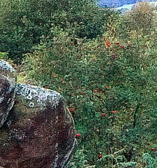
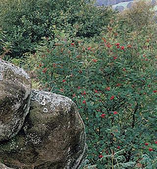
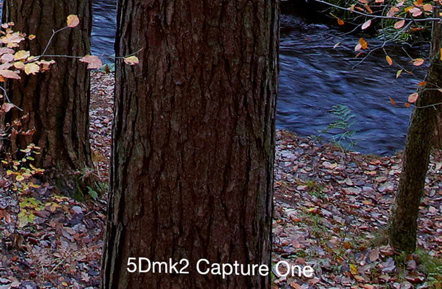
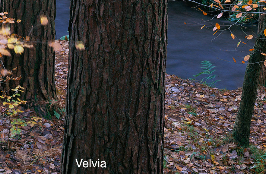


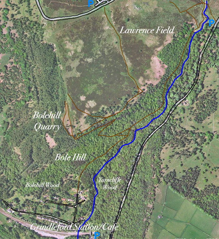

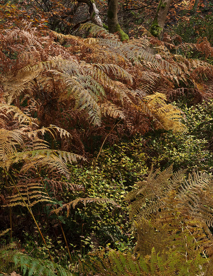
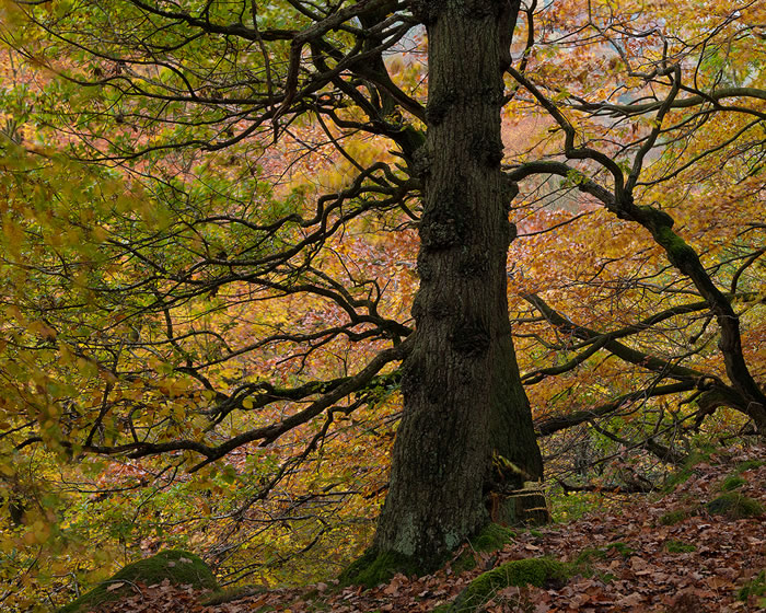
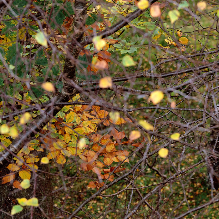
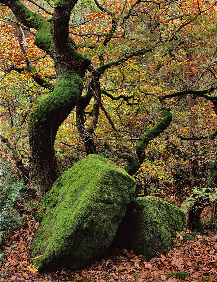
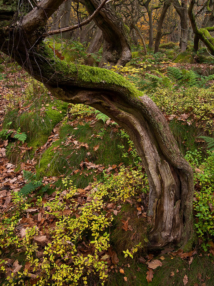
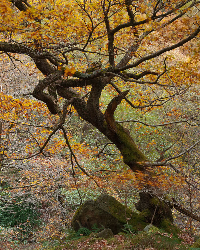
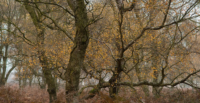
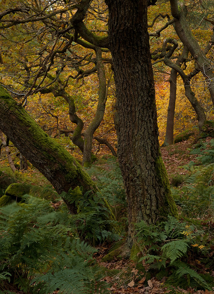
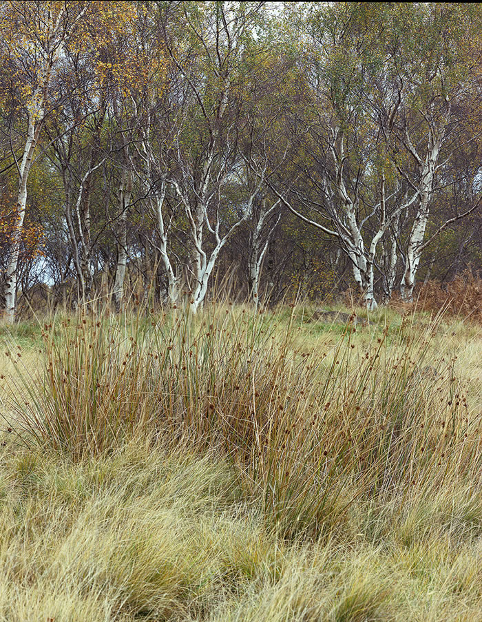
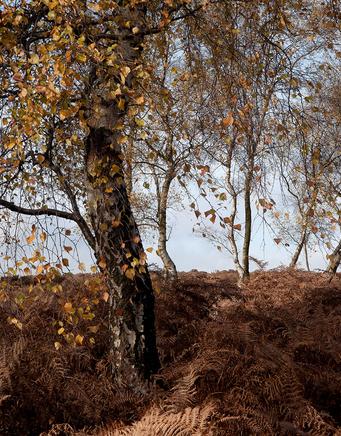
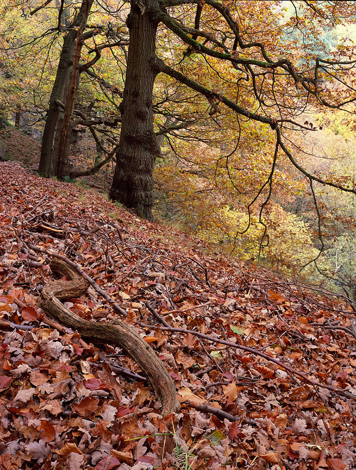
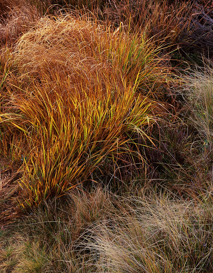
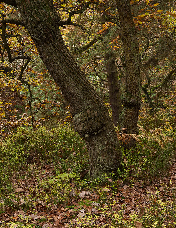
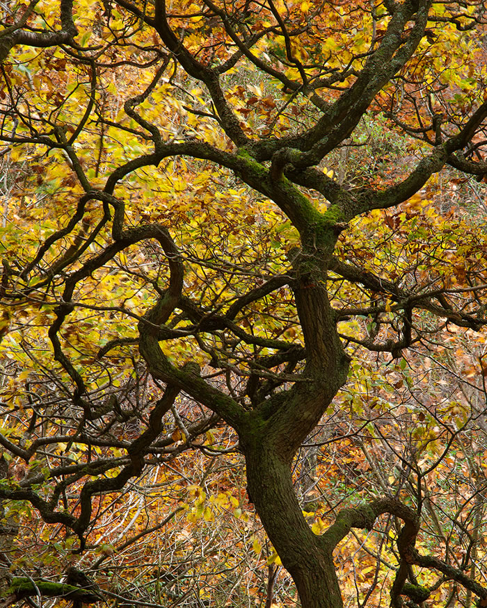
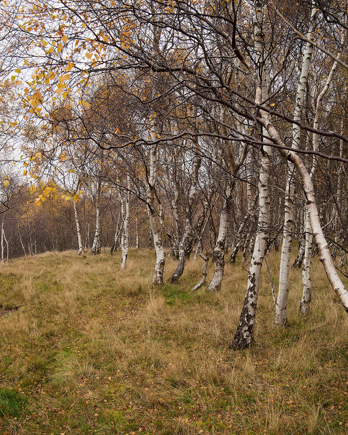
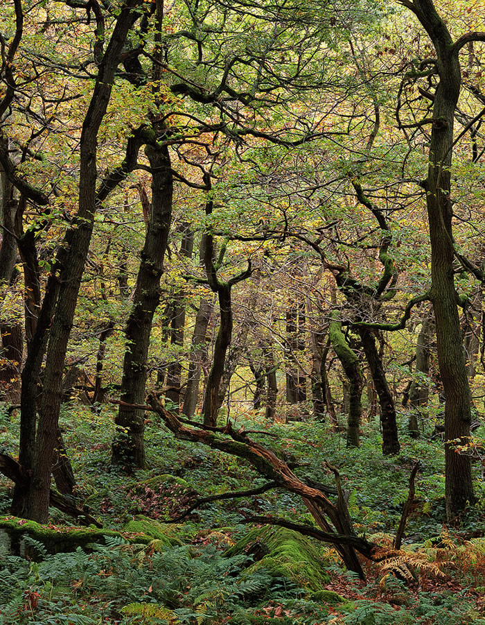
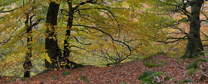

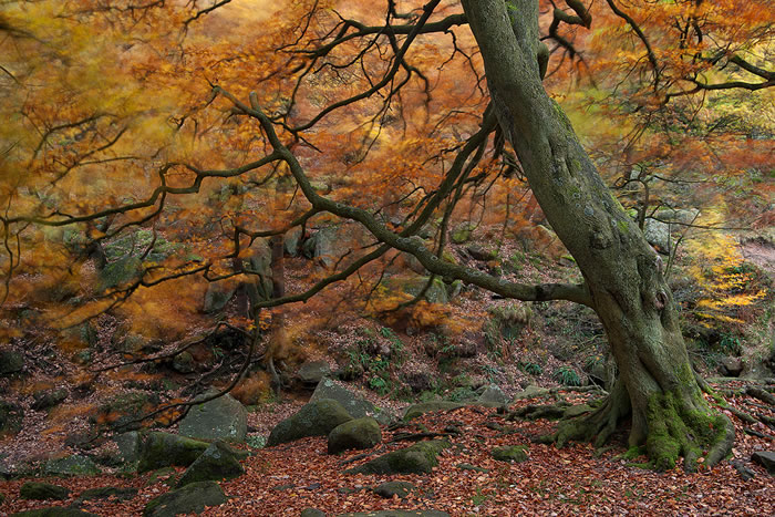
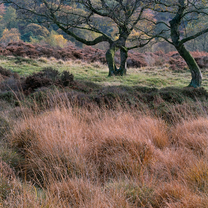
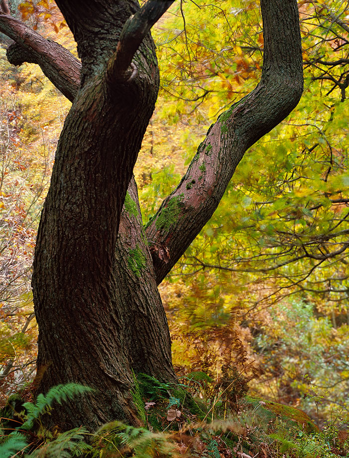
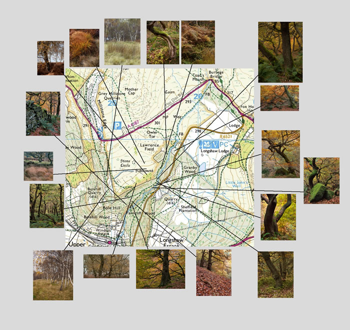


")