Michael Frye may be known as the 'Coloured Cactus' man by those of you who have only seen him in the "World's Top Photographers : Landscape" book but he has more than just a flashgun and some coloured gels to his name! He's worked in the Ansel Adam's gallery for many years and has produced what may be two of the definitive photography books on Yosemite. Although he does have an experimental urge occasionally, much of his output fits into the class 'sublime' American landscape work.
He starts the book with the comparison between photographs and music, giving the advise that, just like a great song, a photograph needs to have tension and release, loud and quiet, low to high notes, etc. Just like in music, a sugary pop photo won't appeal for a long time but will get lots of airplay and the general public will like it on first listen. This idea of using the digital darkroom to produce a photograph in the same way as a song is produced is a good on, bringing out the best in a recording through finding what really makes a song/composition tick.
Michael doesn't use photoshop in this book, probably realising that the majority of people can't afford a (legitimate) copy and instead bases his changes on lightroom, whose features in the most recent versions provide a great deal of control over photographic output.
The first part of the book develops a workflow that you can apply to every photograph, a way of thinking that ensures you address the key aspects of post production. Each step in this workflow is then considered and great use of screenshots and sample photographs underly the advice given. The advice is always based on interpreting the picture, allowing the subject to guide the post processing.
The main part of the book is dedicated to processing five different pictures from various parts of Yosemite and the Sierra Nevada. And this is where the best part of this book starts to appear. Being able to see how a professional 'interprets' pictures using tools available in Lightroom will be incredibly useful to beginners and professionals alike. Clarity, Saturation, Curves, Masking, Colour Temperature, Converting to Black and White, Toning, Cloning, Highlight Recovering - you'll learn a lot of the tools of Lightroom but not in a dry technical way but in a way that informs your future choices. There are also quite a few snippets of information throughout that the more advanced photographer can learn from.
Is this book worth the $5 asked? Oh yes, very much so.. So go out and buy it now - support photographers that are doing a great job of disseminating knowledge.
In the first part of this discussion on aspect ratios, I genuinely attempted to question the assumptions we all hold about aspect ratio, including the fact that four sides to our working ground is an inevitable paradigm. The responses received (Thanks, Dav, Steve and Adam) helped me to accept that such scrutiny is rhetorical at best, and whistling in the wind at worst! In short, therefore, the rest of my investigation will concentrate on the four-sided figure.
What I would like to do with this second part is look at the main camera types that we all use, and how we respond to the proportions of aspect ratio. I will also speculate on the nature of the cameras with which they were made and how this influences the results. Aspect ratio must ultimately be seen hand in hand with the cameras that were designed to produce them. For in such a technologically-driven field as photography, the camera itself plays a large part in determining the current state of the art.
The dominant digital cameras have an aspect ratio of 2x3 (as has 35mm film), although confusingly for beginners, these come in two sensor sizes; full-frame is the same as 35mm (24x36mm); and we also have the so-called APS-c sensor, which is 23x15mm-ish. In fact, Canon sensors are slightly smaller (22.3x14.9mm), Nikon slightly larger, (23.1x15.4mm). I have absolutely no idea why they are different, so if anyone can enlighten me I would be grateful. To me, these are half frame sensors.
Nevertheless, the aspect ratio remains 2x3.
Four thirds and micro four thirds cameras (Panasonic, Olympus) have an aspect ratio, unsurprisingly, of 4x3 (sensor size is 18x13.5mm) This is also the aspect ratio of most (not all) medium format digital backs, with a sensor size of 37x49mm being typical currently. Many readers of these pages use a view camera, usually 5x4inch, whose larger cousin, 10x8inch is the same aspect ratio (and a sort of vague aspiration for most of us to try at some point).
Now, these are all rectangular shapes, and by no means that different. Yet almost everyone I know who has tried them all finds 2x3 the least ‘natural’, and the most difficult with which to compose satisfactorily. I realise that this is not exactly a scientific statement. On the contrary it is anecdotal, and I do accept that it reflects my own personal experience, so I may be listening for comments that support my own opinion.
Nevertheless, landscape photographers looking to shoot vertical format compositions find the proportions 5x4 absolutely ideal. Some photographers appear to only ever shoot vertically in 5x4 with a horizontal composition being strictly a tactic of last resort. While not quite so pleasing as 5x4, 4x3 can be pressed into similar vertical service. But by the time we have narrowed the ratio down to 2x3, the frame seems too skinny somehow. Even the ‘A’ paper series is not that narrow as a portrait, and on most magazine and book formats a 2x3 image will almost always have to be cropped top and/or bottom. Admittedly, that may not be a problem. But personally I cannot help using every last square mm of the frame. I do not like to leave things unresolved, and indeed this was why I could never ‘shoot for stock’. In landscape this typically meant leaving loads of empty sky for the banner title or headline. Most people who pride themselves on good technique and artistic awareness would, I suspect, prefer not to crop.
Can I rationally explain why 2x3 is not a comfortable vertical format? No. Ironically, I prefer the challenge of composing a vertical pan (say 2x1 or narrower) to using 2x3. So could this indicate that the problem with 2x3 is that it is neither one thing nor the other? In landscape I think that is so.
But you might well say, ‘yes, but 2x3 scores when it comes to the landscape format’. But does it? Again, I find that it is neither wide enough to be a real panoramic format, nor boxy enough to be a generous, broadly proportioned ‘canvas’. In short, 4x3 and 5x4 appear to win out in landscape format as well.
I was lucky enough to have use of a Panasonic LX3 for two years, which has a handy switchable aspect ratio lever on the side of the lens, with 4x3, 2x3 and 16x9 as options. The LX-3 is a wonderful sketchbook camera, with enough quality to allow for fair sized prints. I found I typically used 4x3 for all my verticals (except for the occasional 16x9 vertical pan) and 4x3 and 16x9 for all my landscape format images. After two years I had used the 2x3 shape on perhaps one or two occasions. When I asked all my landscape photographer friends who had this camera about their use of the ratio options, their views universally echoed my own. Nobody I have spoken to has expressed a preference for 2x3. And that included photographers who used Canon and Nikon (2x3 cameras), so it was not simply a large formatter’s view.
All of which leads me to believe that the photographers who have made such good use of 2x3 for decades, the war photographers, the photojournalists, the news, sports, fashion, wildlife and travel photographers must have known something that I don’t.
But most probably they simply became accustomed to using what was undoubtedly the best tool for the job back in the day, namely the professional film slr, or possibly the Leica rangefinder. There were no variable aspect ratios back then (The Hasselblad X-Pan being the one short-lived exception), and given the limited repro capabilities of film of that size, cropping was generally avoided for practical reasons. The other reason might have been the insistence that cropping was somehow immoral, unethical, or plain bad photography. Most photographers of a certain age will be aware of Cartier-Bresson’s distaste for cropping, and he was not alone. Such views about the sacrosanct nature of the composition framed in camera were prevalent then and remain so today.
The contemporary successor to these classic 35mm cameras are the dslrs mentioned earlier (and the Leica M-9). While they universally come with a tripod thread, the slr camera is fundamentally designed to be used in the hand. Without doubt this does influence the way they are used, even in landscape photography, as I know all too well from leading workshops. The temptation to rely on auto-iso, or to simply increase the iso to give a hand-holdable speed, then snap and walk away is strong. It takes a special type of discipline to use these cameras tripod-mounted (like a miniature view camera) for landscape photography. This observation by no means rules out 2x3 as ratio for landscape photography, but does imply that the culture surrounding their design and use celebrates the speed and performance of the camera, rather than the contemplative, slow photography ethos that accompanies large format. This culture of speed and modernity is reflected in the majority of 2x3 images we see published and on the web (although not all). How it may be connected to composition in this aspect ratio is harder to define.
At the same time, some dslrs and a number of top flight compacts give us a choice of aspect ratios. With the greater incentive to determine the final outcome offered by computer-based post processing, we probably should use aspect ratio more flexibly and hopefully, more creatively.
The square is for some people the most pure of all aspect ratios, being ‘neutral’, without bias, or emphasis. Supposedly. In fact, the Hassleblad V series, other 6x6cm slrs, various TLRs and even a few rangefinders utilising the square shape were adopted by many because they offered “a big enough negative to allow for cropping”. Indeed, the foregoing proposition was a marketing ploy that the manufacturers of these cameras almost always used. It did no harm that the cameras never had to be placed on their side, that they could always be used in the same orientation, with the thought, ‘I’ll crop later’ to fit the subject or indeed the use. But you could argue that is a recipe for sloppy technique.
In practice the square represents a favoured final presentation format for many, with some of the most memorable and iconic images in the history of photography shot with this ratio. Perhaps the most famous photograph of all time, the earth rising beyond the surface of the moon shot on one of the Apollo missions, was made with a Hasselblad. Of course, shot on any format it would have been no less memorable. But the fact is that the square works beautifully for many applications. If an aspect ratio could be said to have a timeless quality, it would be the square. I have always loved using it for portraits, probably inspired by the work of Irving Penn. His amazing portrait series, compiled in the book, Worlds in a small room, are mostly square and seem stronger for it. They were mainly shot with the Rolleiflex TLR.
Counter-intuitively, the square has also been hugely effective as a landscape format. Fay Godwin employed it, and Michael Kenna has inspired a legion of followers using the simplicity of the square as a suitable foil for the stark beauty of his long exposure monochrome images. Through the 1980s, Charlie Waite produced an unrivalled body of travel and landscape images, all made with the Hasselblad. Indeed the George Phillip series of books that cemented his reputation was also square, reflecting the photographer’s aesthetic. This was perhaps the first series of travel books published by the British book industry that valued the photographer on a par with the writer.
[Following in Charlie’s footsteps I personally used a Hasselblad for many years, and still occasionally use it (now with a Phase One back). Regarding compositional approaches, I can see that my square landscapes helped me set a framework for the images I now shoot as verticals in 5x4 (or 4x3) today. What does that mean? Essentially, that the emphasis in these images leads the eye from front to back; I am usually seeking to move the eye upward and deeper into the picture space, emphasising depth, and the connection of elements front to back. So for me, the Hasselblad was fore-runner to my vertically-composed 5x4 landscapes. My horizontal landscapes, by contrast, have more space, breadth, sideways movement and rhythm in them.]
Just as influential at the time, at least among working photographers, were Paul Wakefield’s Aurum Press book series of Wales, Ireland and Scotland. These books were all photographed on 5x4, and it was Wakefield who advised David Ward to shoot on 5x4 if he wanted to establish his reputation as a landscape photographer. Between them, the influence these two great photographers have had in inspiring the adoption of large format (and 5x4 in particular) among enthusiasts in the UK and beyond has been huge.
Of course, the view camera’s principle appeal is not its aspect ratio but its acreage of film, giving built-in quality, and the miracle of camera movements, which to the technically-accomplished creative photographer gives amazing control of focus and perspective. But as I have observed above, the rather ‘mild’ proportions of 5x4 prove to be a virtue in their own right, offering emphasis without exaggeration, and minimal requirement to crop when being used (full-bleed) in the majority of published page shapes.
With a few exceptions, such as Weegee and other Speed Graphic-toting post-war photojournalists, most 5x4 photographers have used a tripod for their work. The considered and careful approach this dictates has inevitably influenced the sort of compositions made, as has the expense of the process. Nevertheless, I am always struck that when I look back at my favourite landscape photographers of the last three decades the majority have been large format practitioners. Their compositions seem just right somehow. Much of this is to do with their artistry, skill, commitment and philosophy. So does proportion also play a part, the relatively unobtrusive, yet subtly persuasive emphasis of 5x4 in both portrait and landscape orientations? It is debatable of course, but I believe it does.
Looking back through recent photographic history the ‘middling’ aspect ratios 1x1, 5x4, 4x3 and 2x3 offer a remarkable range of different approaches and opportunities. The reader will no doubt have their own view on the influence of these frame proportions. However, it is up to us all to make the most of the ‘real estate’ (as our American cousins would have it) within the frame boundary. Each aspect ratio has its own charm and effect, and so long as we want to get it right in-camera (which we surely do) then aspect ratio is a fundamental characteristic of the camera we choose.
All of which makes me wonder, will Nikon or Canon ever countenance making a 24x30mm sensor? Probably not, but if they ever do you saw it here first. Interestingly, the very first Nikon rangefinders, The Nikon 1, were 32x24mm in format, 4x3 in ratio as it happens. Ironically, the history story in the following link shows how the slide film cutters developed for Leica users were set up for 24x36mm, and that this alone apparently proved the downfall of the new Nikon format.
Nikon 1
To think that on the basis of such apparently trivial matters the proportions with which recent history has been recorded were made… Only 1000 or so Nikon 1 cameras were made. I have a feeling that if they updated it with a good digital sensor they might find quite a market share!
My final instalment will look into the extreme aspect ratios, which we collectively describe as panoramic.
This is the first post in a series of articles comparing all of the colour film available to the large format photographer*.
Background
Some of you may be asking 'Why are you talking about film? Isn't it nearly extinct?' and if you only read the photography magazines, you might well be led to believe so. However, film still has a strong - if niche - market around the world and, surprisingly, one that has started growing again.
I recently spoke to a representative from Fuji who said that film sales of medium and especially large format are experiencing somewhat of a resurgence with large format film sales actually growing. Kodak announced recently announched that "There is a very real resurgence for film" and also released two new films in the last year, Ektar and a new formulation of Portra 400 (which isn't included in the tests yet).
And what of the tests themselves? Well the idea is that over the space of approximately twelve months I will finding suitable subjects that show some of the 'edge behaviour' of film - i.e. Deep blue polarised skies in daylight, bluebell colours (in this example), snow scenes, autumnal colour, sunset/sunrise, overcast woodland, etc. and I will take the same shot with all of the different films. Digitalab of Newcastle have kindly offered to develop all of these films for us and we will be mentioning them in support of their contribution. See footer for more details.
Methodology
The use of a large format camera makes this sort of comparison a lot easier (if a lot more expensive) as it is very easy to switch between film types from shot to shot. I am also using two graphmatic backs for the film to make things even easier. If you don't know what a graphmatic back is the picture below shows them in comparison with dark slides. They hold six films each and allow you to change to the next sheet by simply lifting the whole body of the magazine out of it's container, allowing the next film to pop to the front. Once you get used to this process (which I hadn't on this first test - see the story at the bottom for more details) then you can change from one film to the next in about five seconds. The main stumbling block in the methodology is keeping track of which shots have been taken, where you are in the series and adjusting the exposure for the different film ISO's. These seem trivial but can get quite stressful out in the field when the light is changing.
Light will inevitably change a little bit between pictures but we will be trying to choose scenes where comparisons are still valid. Additionally, we have bought new film of each type and stored them together. The film has been taken at rated speed for all but the Velvia 50 which was taken a third of a stop down (40 iso or a third of a stop over exposed) as otherwise the comparisons are quite difficult. We've tried to match up mid tones for the transprency work.
We have also placed film that may be used as alternatives as close to each other in the series as possible. For instance, all of the velvias are together, the portras are together, all negatives are together, etc.
The negative film presents the biggest challenge because there are so many different ways of converting them to positive images. To this end, although we have made our own conversions using colorneg at close to standard settings, we have also corrected colour casts where a simple colour curves adjustment allows it. We will be working on the negative inversion process over the coming months and will reassess these as we do. We are also providing the scanned negatives for you to try yourselves (scanned using as colour accurate a process as possible so the scans look like the negatives on a lightbox - possibly with different gammas).
The scans were made on a Howtek 4500 using profile generated with the Hutch Fuji colour target which have proven to have very accurate colour.
Here is a full list of the films being compared.
Transparency
Fuji Velvia 50
Fuji Velvia 100
Fuji Velvia 100f
Fuji Provia 100
Fuji Astia 100
Kodak E100G
Kodak E100VS
Negatives
Kodak Ektar 100
Kodak Portra 160NC
Kodak Portra 160VC
Fuji Pro160S
Kodak Portra 400NC
The viewers below allow you to pick which two film types to compare. Click on a film type from the list below the image on the left and then do the same on the right and you can then move the comparison slider backward and forward.
First Results
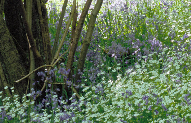
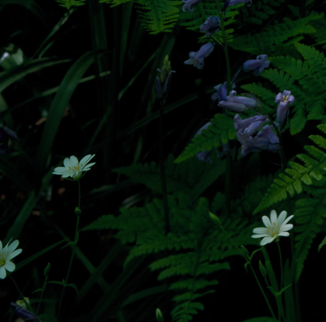
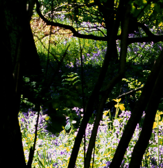
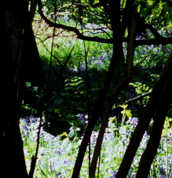
Our first test was taken on an outing to a bluebell wood in the Peak District. Given the issues in getting a good bluebell colour and the challenges of shooting dappled light, we thought this a suitable test. We did have an issue half way through with a jammed graphmatic (I tried to change films too quickly) so there is a time gap between the fuji transparencies and the kodak transparencies and all negatives. The light was still at the same level before and after though (clear skies around midday).
Hopefully this picture will show the differences in how the films handle highlights (top left corner) and shadows (under the ferns near the front).
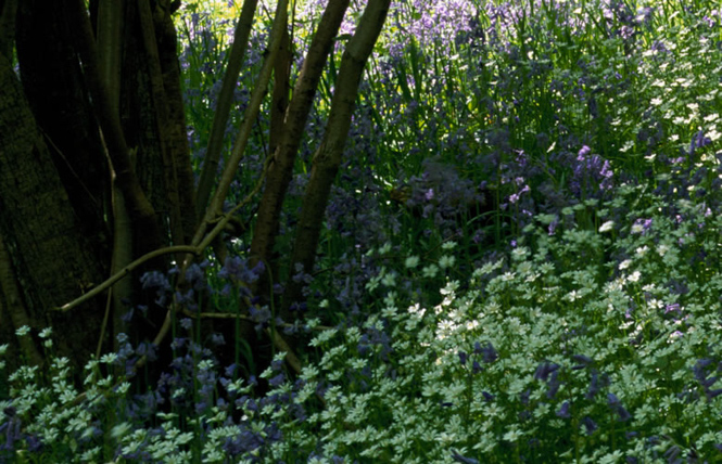
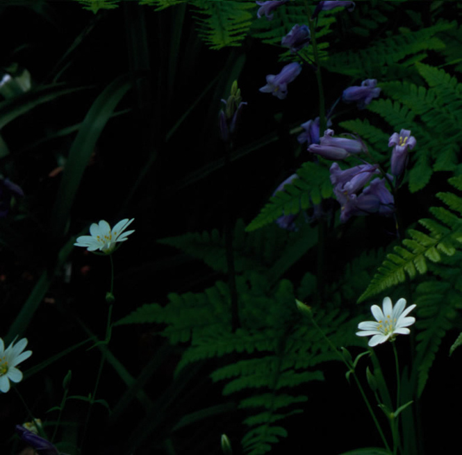
Complete Picture
Comparing Velvia 50 with Velvia 100
Choose Which Films to Compare
Before side
Velvia 50
Velvia 100
Velvia 100F
Provia
Astia
E100G
E100VS
Ektar
Portra 160NC
Portra 160VC
Pro 160S
Portra 400NC
After side
Velvia 50
Velvia 100
Velvia 100F
Provia
Astia
E100G
E100VS
Ektar
Portra 160NC
Portra 160VC
Pro 160S
Portra 400NC
The following sections show details of crops from a couple of different places and also with the shadows boosted by doubling the gamma. They are available if you have a free subscription.
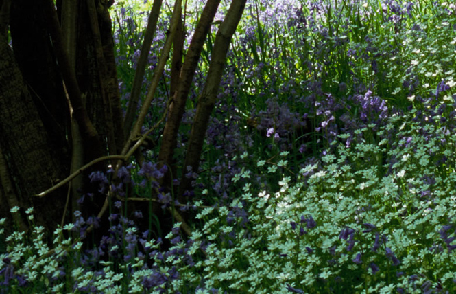
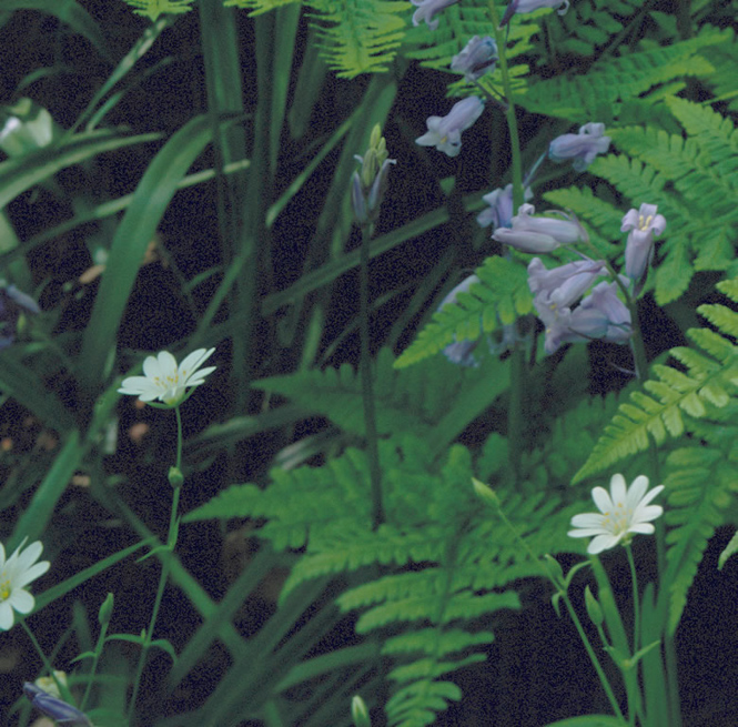
Complete Picture (Crop Near Trees)
This crop shows an area at the top left of the picture. It includes some of the bright highlights but mostly it includes some of the densest shadows. We have also doubled the gamma in the next example of this crop.
Comparing Velvia 50 with Velvia 100
Choose Which Films to Compare
Before side
Velvia 50
Velvia 100
Velvia 100F
Provia
Astia
E100G
E100VS
Ektar
Portra 160NC
Portra 160VC
Pro 160S
Portra 400NC
After side
Velvia 50
Velvia 100
Velvia 100F
Provia
Astia
E100G
E100VS
Ektar
Portra 160NC
Portra 160VC
Pro 160S
Portra 400NC
Complete Picture (Crop Near Trees - Boost)
Comparing Velvia 50 with Velvia 100
Choose Which Films to Compare
Before side
Velvia 50
Velvia 100
Velvia 100F
Provia
Astia
E100G
E100VS
Ektar
Portra 160NC
Portra 160VC
Pro 160S
Portra 400NC
After side
Velvia 50
Velvia 100
Velvia 100F
Provia
Astia
E100G
E100VS
Ektar
Portra 160NC
Portra 160VC
Pro 160S
Portra 400NC
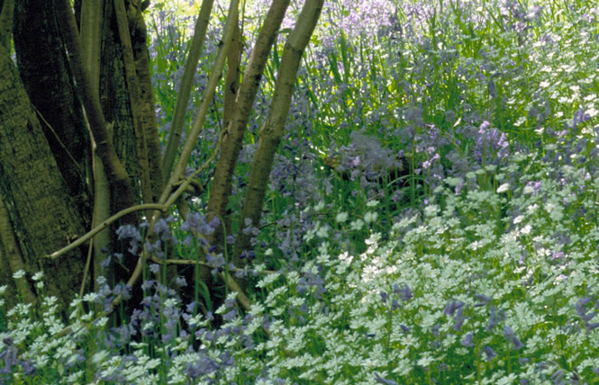
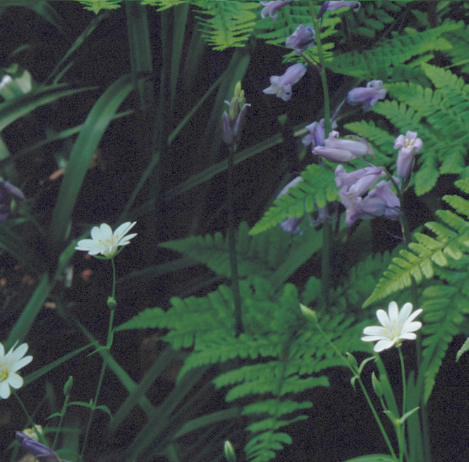
Complete Picture (Crop Near Bottom Corner)
This crop was taken from the bottom left corner and includes some shaded greens and white flowers surrounded by deep shadows. The next example shows a double gamma boost of the same.
Comparing Velvia 50 with Velvia 100
Choose Which Films to Compare
Before side
Velvia 50
Velvia 100
Velvia 100F
Provia
Astia
E100G
E100VS
Ektar
Portra 160NC
Portra 160VC
Pro 160S
Portra 400NC
After side
Velvia 50
Velvia 100
Velvia 100F
Provia
Astia
E100G
E100VS
Ektar
Portra 160NC
Portra 160VC
Pro 160S
Portra 400NC
Complete Picture (Crop Near Bottom Corner) - Boost)
Comparing Velvia 50 with Velvia 100
Choose Which Films to Compare
Before side
Velvia 50
Velvia 100
Velvia 100F
Provia
Astia
E100G
E100VS
Ektar
Portra 160NC
Portra 160VC
Pro 160S
Portra 400NC
After side
Velvia 50
Velvia 100
Velvia 100F
Provia
Astia
E100G
E100VS
Ektar
Portra 160NC
Portra 160VC
Pro 160S
Portra 400NC
Complete Picture (Highlight Area)
This last shows one of the brightest area of the photo and I've reduced the gamma by 0.5 in order to show how these highlights can be recovered. You'll notice that the negative film really holds the highlights well, which is probably why people say you can rate a lot of negative film at 100.
Comparing Velvia 50 with Velvia 100
Choose Which Films to Compare
Before side
Velvia 50
Velvia 100
Velvia 100F
Provia
Astia
E100G
E100VS
Ektar
Portra 160NC
Portra 160VC
Pro 160S
Portra 400NC
After side
Velvia 50
Velvia 100
Velvia 100F
Provia
Astia
E100G
E100VS
Ektar
Portra 160NC
Portra 160VC
Pro 160S
Portra 400NC
Conclusions
Now i'm not going to make any conclusions out of these tests for now - I'll start to bring my conclusions together as the series continues and as my negative processing gets better. My only comments are that the E100G has surprised me as being a fairly neutral film, well worth playing with despite it's expense. E100VS is also very nice but the colour casts can be a little strange. What is quite clear is that Velvia 50 is a great film with a shadow response almost as deep as Provia (when scanned on a drum scanner anyway). I'm also more and more interested in Portra 400NC and especially as the new Portra is supposedly even more fine grained and with a slightly more colourful nature. We'll see what that brings. What was surprising is that Portra 160NC ends up showing more grain than most films - I'm not sure if this is related to scanning yet. 160VC shows nice grain control though. Pro160S is a difficult one, I find it difficult to convert and so am holding out on whether I like it or not until I've learned more. I'll be trying 160VC and 400NC negative films and playing with Pro160S to see if I can learn more in the future.
A big thank you to Digitalab for doing the E6 and C41 developing for this work. They do a lot of work with Joe Cornish and used to develop his film and now make his custom prints. They are developing the film for this whole series, a not insignificant cost, and so deserve a little push. They're also very good at what they do!
* I was going to try and cover medium format but in order to do so would have had to shoot a whole roll of each and change films between each type and this would have made light changes even worse.
** The graphmatic back locked up because I was trying to change films too fast. This meant getting a dark bag out and fixing the problem so as not to ruin the other transprencies. Also, It appears that I double exposed the Ektar because of a counting problem afterwards (it wasn't clear at what point I was in the cycle of pictures when the holder jammed).
Could it be that the very things that make digital capture so appealing also inhibit the creative process of image making? Could those who make images using dSLRs or compact digital cameras benefit from eschewing speed and fine-tuning through capture/instant review, in favour of a slower, more considered approach? (more similar to that of Large Format photographers such as Richard Childs, Joe Cornish and David Ward?)
My aim in this (series of) article(s) is to analyse the differences in the ‘in the field’ workflow between the two formats, and suggest situations where the digital landscape photographer might benefit from adopting an approach more similar to that of large format. Large format film photography may remain out of reach, undesirable to, or simply not meet the needs of many photographers (e.g. attempting sports or street photography with such cameras would not be wise!). However, in the realm of landscape photography there is a compelling argument that the workflows and techniques adopted by those who shoot large format film would be of benefit to a great many aspiring landscape photographers.
In wracking my brains as to how best to structure this series I came up with 4 key themes that I think bring out the major differences between the two workflows.
Bulk, Weight and General ‘Inconvenience’
Low-tech vs. High-tech
Uncertainty of Result (Time until Image Review)
Scarcity & Cost
In this article I’ll cover the first two themes. These address quite specific, literal technological differences and their potential impacts on workflow. The second article in the series will address the impact of uncertainty of result, and delayed review of images, which deals a little more with the psychology (in the loosest possible definition!) of image-making. Finally, I analyse the cross-cutting themes of scarcity and cost in relation to the two mediums.
Bulk, Weight and General ‘Inconvenience’
View cameras are large, heavy, and cumbersome to set up, especially in comparison to dSLRs. Some might say that even the most skilled of PR consultants couldn’t spin those characteristics into a set of advantages, but, taking a closer look at the impact that they might have on a photographer’s workflow reveals a compelling argument to the contrary.
The impact of the difference in format begins before the photographer even gets out into the field. By acknowledging the large bulk and weight of large format gear, yet continuing out into the field anyway, the large format photographer has made a positive decision to go out and make images. In contrast, while it is certainly common practice for many dSLR users to go out specifically to make images, there is always the temptation to simply bring the camera along ‘just in case’ and snap a few shots. Removing this temptation arguably forces the photographer to set aside time to concentrate solely on their photographic endeavours – a good mindset to get into. (… though, of course, could backfire and lead to ‘not finding time’ to get out with a camera!)
Finding the shot:
Once out in the field, the dSLR photographer is free to hand-hold their camera to set up a shot, and to make images hand-held if necessary. For the large format photographer, it is a not insignificant commitment to set up a view camera, both in terms of time and effort. The implication of this? The photographer looks for images without being able to hold the camera up to their eye (Commonly done through a finder, or alternatively, a simple piece of card with a rectangle in the correct proportions cut out of it (e.g. 5x4 or 3x2)). Having been through this process on a recent workshop with Richard Childs and David Ward, I can attest that it really does aid the creative process: Instead of getting ahead of yourself by worrying prematurely about the technical details, the kit bag goes down to the ground and you are free to roam and explore subjects as you will. Most importantly, following this process frees you to concentrate on one single part of the photographic process at a time – in this case, composition. Only once you have identified an emotive and evocative composition, is it time to get out the camera equipment and start setting up the shot.
Setting up your equipment:
Again, at this point, the two workflows diverge. For the large format photographer, equipment that is both large and heavy combines to necessitate a tripod, which is simply not the case if using a dSLR. However, out of this apparent constraint, something magical starts to occur once the camera is secured to the tripod: By removing the need to physically support the camera with your own frame, you allow yourself to truly concentrate on the image that is in the viewfinder (and most importantly, the emotion that it evokes in you). Without having to devote physical and mental effort to maintaining the same composition by keeping the camera balanced in exactly the same position, you can take the time to evaluate whether the nascent image has the same impact that had drawn you to it in the first place. Plus, you can make small and precise changes to simplify and fine-tune the composition to enhance its impact further.
Throughout this careful and deliberate process, you are looking and thinking photographically: concentrating fully on the landscape around you, and removed from the temptation to take a cursive look at your surroundings and skip to the next step without a second thought.
Low-tech vs. High-tech
In addition to their bulk and weight, large format cameras are distinctly manual (with a capital M!). Prime lenses, manual focus with bellows, manual adjustment of the aperture, spot metering with a hand-held meter and manual adjustment of the many possible movements. Electronics - what electronics? Even the shutter release is timed manually.
Compare and contrast this to the wonder of modern engineering that constitutes a dSLR. At your fingertips are autofocus, zoom lenses, multiple metering modes, automatically timed shutters that go down to 1/5000 of a second or less. Single or multi-shot modes, LCDs on which you can immediately review your image and histograms to tell you whether your exposure is over or under… and that is just scratching the surface!
But yet again, having all these options so readily available often leads to the temptation to skip ahead - thereby failing to fully concentrate on each one in turn. By the time you’ve started setting up the composition, you’re already thinking about the exposure… and once you’re doing that (or letting the camera do it for you via matrix metering), you’re on to fiddling with ISO, white balance, shutter speed and… oh you might as well take the shot as a test anyway (just to see what it’s going to look like first). The emphasis is often on speed, ‘efficiency’ and multi-tasking. It makes it easy to ‘take photographs’, but not so easy to make evocative images. All along you are being tempted to cede responsibility for the image to the camera’s automated systems.
So where does this leave us?
Well, simply put, just because all that technology is tempting you to hurry up and take the shot in case you ‘miss the moment’, it doesn’t mean that you have to listen!
Adopting and adapting some of the large format workflow out in the field while continuing to use a dSLR can really benefit your landscape photography. Slow down: Look deeply at what surrounds you and find an inspirational composition. Then use the technology at your fingertips wisely and you’ll find that being deliberate and making careful and well-thought out use of the rich functionality available on dSLRs is definitely a path worth following.
2nd Article to cover:
Uncertainty of Result (Time until Image Review)
The inability to review the image immediately (and the reaction of therefore checking and re-checking every step of the technical and creative process that has gone before, rather than tripping the shutter, reviewing and tweaking).
Scarcity & Cost
Temporal distribution of cost in the workflow. Pay high and early (and relatively often in terms of camera body upgrades) for digital. vs. Pay per image for digital. The psychology of cost per image. Immediacy. Read part 2 article here.
Ben Stephenson is a photographer who draws his inspiration from the natural world. Specialising in landscape and abstract macro work, he sees photography as a way of interpreting and sharing the beauty he experiences day-to-day. His photographs distil the complexity of the world into artful compositions that exhibit clarity, intensity and graphic simplicity. You can see more of his work, along with the work of his co-conspirators at www.incphoto.com
Here is the first in a series of videos started with Joe's 'Post Processing Borders' where photographers look at some of their own pictures and show how they post processed them. This first picture is one taken on the isle of Eigg and although it's a little rough and ready (I'm learning how to present these as we go along) I think there are a couple of valuable lessons built in (or at least a couple of interesting questions raised).
I must confess to having sat down to read this book with little enthusiasm.The book stores are full of ‘guides to digital photography’, promising much but delivering little of real value. My enthusiasm hit rock bottom when I read the sub title of the book - ‘In the Footsteps of Ansel Adams and the Great Masters’. Was this to be yet another photographer trying to make money piggybacking on the name of Ansel Adams?
However, within a few pages I was warming to Mr. Frye and his approach. To begin with, he does live close to Ansel Adam’s beloved Yosemite and has photographed and taught extensively there. Indeed, he has been privileged to have exhibited in the Ansel Adams gallery.
On inspection, you can see why. His images are accomplished and he has captured the spirit of Yosemite, its unpredictable and dramatic weather and light very well.
He uses his images and those of Ansel Adams and Eliot Porter to great effect to illustrate his lessons in improving our digital images. The book is peppered with quotes from these renowned image makers and he draws on many of their techniques.
The Zone System for Digital Photographers
Most interesting is his section on using the ‘Zone System’ which was developed by Adams and his fellow instructor, Fred Archer, at the Los Angeles Art Centre. It was a system used to improve the quality of black and white images by focusing on contrast and having a full tonal range in images. Frye in this book shows how to take the principles of this system to help modern digital color photographers improve the quality of their images as well as to fully understand how to expose our images correctly and to be able to visualise the finished image after post-production.
Frye really covers a great deal in this book, but in sufficient depth for it to be useful. It is divided into three main sections. The first is ‘Technical Foundations’ which covers image quality, controlling sharpness in the field, filters, white balance along with exposures and histograms. The second section is entitled ‘Light, Composition and the Art of Seeing’ with chapters on light, directing the eye, composition, simplifying scenes, and capturing a mood. The final section, ‘The Digital Darkroom; Editing, Processing & Printing’ covers workflow, processing order, expanding the contrast range, expanding the depth of field and finally printing images.
Black and White Toning
In the footsteps of Adams, Frye does not ignore black and white images created digitally and spends some time discussing how to ‘see’ images which will work well in monochrome as well as covering in some depth his techniques for making black and white images from colour digital files. As with all of the chapters and techniques in the book, they are fully illustrated with images to highlight the points he is making.
When I read many of these types of books I find myself getting irritated with the author who so often seems to be parroting misinformation gleaned from unreliable blogs and magazine articles. However, Michael Frye is a man who knows his stuff. His advice is soundly based on a good knowledge of the subject going back many years. His technical approach is almost identical to my own and much of the advice and guidance he dispenses I use when teaching my workshop students.
His use of Adams and other great American photographers of the last century does add weight to his comments and reasoning. Some subjects he covers demand a book (or several volumes) to themselves, such as composition. But in his brief overview he provides sound sensible guidance, not a formulaic reliance on the ‘Rule of Thirds’ and suchlike.
This is an instructive manual. It is ideal for landscape photographers who have grasped the basics and want to move forward. If you are using aperture and shutter priority modes and want to move forward into full manual mode or if you feel you need help developing your understanding of exposure or how to ‘see’ light and its effect on the landscape, this book is ideal. If you know the ‘how’ to do things with the camera but don’t always fully understand the ‘why” you will benefit from the book. I would go so far as to say it is one of the best all round intermediate skills guides I have read and users of digital cameras will find it not only a good read from front to back but a book that gets taken down and used as a reference aid on a regular basis.
I have to say I have learned several very valuable lessons from the book and will be recommending it in future to my workshop participants as a guide to help them develop their skills. It would be nice to be able to buy it in hardback, with the use this book is going to have the soft-back version may become well worn quickly. Some of the sections could be fuller, such as that on composition but all books have finite space and on the whole I think Michael has balanced everything very well. This is a book I will be re-reading and referring too often, I am sure.
Front Cover
Digital Landscape Photography
In the Footsteps of Ansel Adams and the Great Masters
by Michael Frye
www.michaelfrye.com
Published by Ilex
ISBN - 978-1-905814-75-6
Cover price £15.99
First, the man. There can be few landscape photographers in the UK who haven’t heard of David Noton. He has emerged on the crest of the digital SLR revolution as one of the foremost digital landscape photographers in this country.
He has served his time, facing the struggles of all aspiring landscape photographers trying to make a living from a hybrid photography business, doing a bit of this and a bit of that until his profile in landscapes allowed him to become a specialist.
There can be no doubting that David is a hard working, dedicated man. Some may envy his lifestyle now jetting from country to country making images in spectacular locations before coming home and getting in his customized Land Rover Discovery (complete with roof mounted photography platform) to lead premium priced landscape workshops. For many of us, this is the life we aspire to.
But this has come through grit and determination. It has not been an easy ride. A willingness to be up long before dawn, day after day, month after month chasing the right conditions that have become the hallmark of his images. He advocates getting ‘mud on the boots’. Getting out of the car and walking to track down the perfect spots. No driving around looking for locations from the car window for David. He is an evangelist for dedicated location searching.
His rise in the business coincided with digital SLR’s becoming affordable and popular, reigniting a passion for photography for many who had somehow let it slip away while film reigned supreme. His ability to market himself along with his ‘blokey’ down to earth style has appealed to many. He is the kind of guy we can imagine going out on a shoot and enjoying a bacon sandwich with afterwards. A photographers photographer.
That’s the man. Now the book, his second, called Full Frame, has been released to coincide with his new DVD, ‘Photography in the Raw’ (which we will be reviewing shortly in Great British Landscapes). The book is based around 10 chapters in which we get to follow David and his ever present wife, Wendy, as they journey around the World for twelve months in search of new vistas to capture. We get to see Morocco, Bali, South Africa, Laos, Provence, Umbria, Canada, Dorset, Snowdonia and finally Bolivia. Tough being a landscaper, isn’t it?
The chapters are written in Davids well known chatty style and although some readers will be disappointed that a lot of content from his popular blog and newsletters is reproduced or repurposed here, it is usually expanded upon and the majority of the material has been written exclusively for the book (after all this is documenting his trips for the last three years, as were the despatches). As we have come to expect, David shares not only those thrilling adrenaline fueled spectacular moments of fabulous light we live for, but also the lows. Weeks shooting in Laos with skies laden with ash from farmers burning off fields of stubble making landscape images almost impossible. He describes the agony of traveling 16,000 to Bali and back and spending two weeks to get just one ‘killer’ image. As I said, David is a man who puts in the hours.
But despite some trips not living up to expectations his optimistic approach and willingness to adapt and work with what he had led him to dig deep and turn to people and place image making. Throughout the book you will find David has spent more time photographing the people of the lands he has visited, their markets and workshops. It is not what he does best, but he has captured some great personalities working wide open with his 85mm f1.2 L lens. I defy anyone not to be moved by the image of a young girl in stunning morning light beside a river in Laos, that he calls ‘A Lao Mona Lisa’. Enigmatic and intriguing.
His willingness to adapt, not to be defeated, is a lesson for all of us a landscapers to learn from. It is so easy to go home after another fruitless dawn shoot in a glum mood when , in reality, there probably were images to be made if we had only taken our focus off of the wide landscape and taken a positive look at what else there was to be had.
The book is lavishly illustrated and a lot of thought has gone into the page design to give it a ‘travel diary’ feel. He is a master of wide landscapes and his use of the same digital cameras and lenses that the majority of landscape photographers now use gives us hope that we could achieve what he does, if we put in the effort. he makes these images seem within our grasp.
It is not an instructional book, but you will find nuggets of helpful information and tips nestled in the text. You will see how David uses a infrared converted body to make some beautiful images in summer sun and his early forays into using extreme ND filters to lengthen his exposures.
You will also find his wife, Wendy. She deserves a mention. Many landscape photographers would wish to have a wife like Wendy who is prepared to rise in the dark with them to trudge into remote locations for the dawn shoot. Regular followers of David will recognize her as she appears in yet another of his images as a lone figure (complete with one of her trademark wide brimmed hats) walking through the landscape, giving a sense of scale and perspective. On the downside, he does seem to worry quite a lot when she is let loose in yet another local market as she has a penchant for fabrics and other artifacts that just ‘have’ to be bought and taken home. Small price to pay, David, for a wife who is prepared to indulge you in your photography!
So what we have is a beautiful coffee table book (or in Davids case, malt whiskey table book might be a better description - you will read of his beloved collection of Scottish single malts). It makes a good read for all landscapers who revel, not only in the images, but also in the trials and tribulations, as well as the occasional victories, that we all experience when out with our cameras.
Could the book be better? Yes. I would love to read more tips and techniques, perhaps going beyond the basics and maybe a bit less of how it feels to be experiencing disappointing light again, although David is able to derive the positives even from these shoots with his upbeat and positive approach. On my bookshelf it sits happily beside Davids first book and will be taken down and enjoyed from time to time as I sip a glass single malt and dream of wild places and the great people who live there.
Published by David & Charles ISBN - 10; 0-7153-3614-2 Paperback ISBN - 13; 978-0-7153-3614-4 Hardback
£25 for SIGNED copies from David’s website, plus free gift of greetings cards with every order (worth £10)
Editors Note: We should add that as well as getting more bang per buck, David also makes a better margin if you buy direct, as do any photographers. So, support all photographers by buying direct where possible. .
We're taking a little detour in our Hindsight series with a video covering two complementary images from Joe's Scotland's Mountains book - one you've seen before and one not. The first is a photo from Glen Orchy taken under very difficult conditions, bright blue skies in the mid-summer with 'cooked' green trees. The second is one from the book and a photograph that made Joe realise the possibilities of shooting vistas in inclement conditions. We hope you enjoy.
We suggest downloading the high resolution version overnight as it's about 1Gb - just right click on the link (or ctrl click) and 'save as'. The medium resolution version is probably the best option to play on most computers and can be downloaded also.
Chris Friel is a photographer with a wonderful, natural eye - a modern day Faye Godwin perhaps. His photography is instinctive and all the more refreshing for it. A high bandwidth flickr stream has some stunning gems and whilst he is an extremely very accomplished black and white photographer, his colour experimentation is showing some very promising results and stand out from the 'shake and bake' crowd.
I would like to preface my answers by saying that I am very much a part time amateur with a day job who picked up a camera 4 years ago, so feel rather self-conscious following in the footsteps of people like david tolcher. With this caveat here goes:
In most photographers lives there are 'epiphanic' moments where things become clear, or new directions are formed. What were your two main moments and how did they change your photography?
It probably sounds rather basic, but it was when I started showing images to strangers. Before joining flickr 3 years ago I had just been shooting for myself and printing out odd things at home. Suddenly my pictures were seen by complete strangers who had no need to be polite, unlike my long-suffering family and friends. Not only did I get lots of feedback but I was also exposed to a barrage of new images from all over the world. It really was a revelation.
I was a painter for many years before starting photography and with a painting it would be months before I got any idea whether anyone else liked a particular work or not.
Now I can shoot an image in the afternoon, post it that evening, and 1000 people will have seen it by the following morning. It’s a wonderful feedback loop and a great way to learn.
When I realized that I could shoot colour. Being red/green colour blind I only ever shot black and white images up until a year ago. I was too nervous about my colour temperatures to ever go for a natural looking landscape. When I decided that it didn’t matter if the colours were all wrong, I started shooting a lot more colour and now it accounts for a large part of my output.
I can see aspects of Faye Godwin, Bill Brandt & Harry Callahan in some of your black and white work and possibly Frank Grisdale and some painterly references in your 'movement' works. I realise that these are probably not your influences but I wonder what are? How have your influences changed over time?
Flattery will get you everywhere. I like all four but you are particularly astute about two of them:
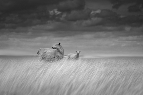
Faye Godwin was an early influence, 10 years ago when were living in London with young children we used to borrow a friends country cottage a few doors from where she lived. There was one of her photos above the fireplace. Despite the fact that it was a simple shot of a single sheep and I didn’t even own a camera at the time, I spent many nights studying that image and trying to work out why I liked it. I guess it was the first photo I really consciously admired.
Frank Grisdale was a big influence when I started shooting colour. I actually wrote a note to him last year saying how much I liked his work. He was kind enough to answer and we ended up doing a print swap.
Frank also showed me that it was possible to shoot abstract colour images and people would actually take them seriously.
So ten years on I still greatly admire Fay Godwin and I have a Frank Grisdale print hanging over my own fireplace.
A very short shortlist of favourite photographers would include Susan Burnstine, Michal Giedrojc, Nicolas Hughes, Klavdij Sluban and Alexander Gronsky.
The Russian photographer Alexey Titarenko is probably my current favourite. His series on Saint Petersburg shot over the last 20 years is just wonderful.
The colour work is influenced by various painters including Kurt Jackson, Keith Carter, David Greenall and Howard Hodgkin
I have just noticed that most of these influences are not even landscape photographers and certainly not British. Sorry
My influences are forever changing in that I am always coming across new work from people I had never even heard of before. However my favourites have remained remarkably static. A decade ago I was studying David Greenall’s landscapes and trying to emulate them with paint. Now I suppose I am attempting to do the same thing with photography.
You have developed a wonderful technique for infusing your photography with movement or emotion which harks back to a pictorial era - do you think that photography is too 'representational' at times, trying to reproduce exactly what was there rather than the feelings associated with it?
Thanks for the kind words but who am I to say. I certainly lean towards interpretation rather than representation.
I think my technique may also be a result of where I live and time constraints.
I am lucky enough to live on a beach in a relatively rural area in southern England, where the surrounding countryside is beautiful, but in a rather tame southern England sort of way. Maybe if I lived in northwest Scotland I would be obsessed by representing my surroundings more accurately.
I know some of our audience would love to know a little bit about how you take your pictures. Can you give us an idea without 'giving away' your secrets (perhaps we could do a video of you working in the field sometime?)
Certainly no secrets. I think the only consistent theme in the process is walking long distances, usually in the rain, and shooting far too many pictures. My shooting ratio is appalling. On an average afternoon I take about 600 images, of which I keep 50 and have one that I like if I am lucky. In my defence I would say that I know when I have a picture I will keep as soon as I have taken it. I just have to hone the process a little!
In terms of the black and white pictures most are just shot straight with canon 24 and 45m tilt shift lenses on a canon 5dmk11. The lenses are at maximum shift to give a big sky and then tilted in various directions to give a shallow depth of field. I did dabble with bw long exposure for a while but soon moved over to colour.
In terms of colour pieces, these are generally shot with the same lenses using long exposure times and camera movement. I just use an nd 6 filter and a polarizer, set the camera to maximum contrast and wrong colour temperature, exposure for 2 to 5 seconds depending on the subject matter, wave the camera around, and hope for the best. Practice gives you an idea about the balance between keeping the camera still and movement.
Many of your pictures have a sense of 'gaze' about them, a feeling of quiet and almost loneliness and they have a way of putting the viewer inside the picture. Is this something you consciously look for or is it something that seems to have emerged over time.
It’s not something I consciously look for. I just try to take photos that appeal to me and then am grateful if they strike a chord with anyone else.
You work in colour and black and white - most people say it is difficult to think both of these at the same time. Do you go out with a particular style in mind or do you switch as the subjects take your fancy (or possibly all chosen in post processing?)
I switch around depending on subject matter and mood, I am forever taking the nd filter on and off the camera.
I am ashamed to say that until recently all my pictures were taken as in-camera jpegs, so the black and white images were all processed as in-camera bw jpegs. Therefore there wasn’t much choice in post!
This was partly a function of using, until earlier this year, an old pc which could not handle large numbers of raw files, and partly due to an aversion to editing.
I have literally just started shooting everything in raw so I’ll see if this changes how I work.
What sorts of things do you think might challenge you in the future or do you have any photographs or styles that you want to investigate?
I think Frank Grisdale has quoted the 10000 hour rule in the past – the idea that if you spend 10000 hours practicing anything you will eventually achieve some sort of success in that field. I think I need to put in a few more hours.
The images I have taken so far are rather random and have no cohesive structure. My next step is to start applying what I have learned to some longer-term projects.
Who do you think we should feature as our next photographer
Peter scammell
A big thanks to Chris Friel for his time and if you want to see more, take a look at his website or his flickr stream.
I recently spent an amazing four days in Perthshire at the tail end of autumn. In truth the weather was far more wintry than autumnal. I encountered reedy frozen lochans, birch trees in deep glens covered in hoar frost, and snow capped mountains. However, the highlight of the trip actually started off with typical Scottish weather – drab, dull and cloudy!
I came down off the hills about an hour before sunset to thick clouds with no definition. I had still to check in to the B&B and the tug of a hot shower was pretty strong. However my time on this trip was relatively short and so I decided to spend the last hour of daylight finding a number of locations for the next few days.
I headed up the South road of Loch Rannoch until I came across a part of the shore where the trees thinned out next to an outflow of a stream. I parked at the conveniently placed lay-by and headed down onto the shore.
Due to the fact that the current water level of Loch Rannoch has been controlled by the Hydro Board there were plenty of dead trees sticking out of the water up to ten feet from the shore. I found the trees aesthetically pleasing, almost sculptural - they looked very unusual poking out of the loch. I instantly saw photographic potential realising that if I isolated the trees it would make for a very interesting composition.
I had started to play about with several ideas using the nearest tree which seemed to mimic the tree further into the loch and there was some lovely low lying cloud but the light was far from interesting.
I liked the replication of shape of both trees.
I was not completely sold on the composition so I gently waded further into the loch until the water was perilously close to the top of my wellies. I was now much closer to the more interesting tree and started to frame my next shot, isolating the unique and framing out the ordinary. I did not spend too much time on the shot as it was more of a reminder so I could come back to the same location at a later date. I was thinking about heading back now but being the eternal optimist (and hating that feeling I have experienced all too often for not waiting long enough for the best!); I decided to stay put until the bitter end.
A more simple and pleasing composition, I loved the sculptural quality of the tree.
By this time the clouds had started to break apart at the West end of the loch. The sun was making an appearance for minutes at a time but due to the dynamic range of the scene and the fact I could not really get a better angle on the tree due to the depth of the water I could not make any meaningful shots. I watched with envy as the low cloud further up the loch was being illuminated in warm sunlight.
Intense light was piercing through the cloud but I did not like shooting straight into it
The ribbon of low cloud stretched all the way down the loch to my location and swirled around Meall Druidhe. My flight of fancy at that moment was for a sufficient break in the sky so that the cloud at my location would be illuminated with the same warm light. I watched, spellbound, as clouds parted further and that wonderful golden light slowly crept up the loch, punctuating the sombre tones of the scene with rich vibrant colour. It took a few minutes for the light to reach my location. The saying “the more I practice the luckier I get” applies very much to landscape photography in so much as if you are out often enough (and are prepared to wait) you will come across fantastic light regularly. It was most certainly true on this occasion.
I watched with childlike anticipation as the lovely light slowly illuminated the low cloud.
When light as good as this occurs you are very wary that it can disappear as quickly as it came. Without changing my composition I made the shot when the light eventually illuminated the cloud at the Eastern end of Meall Druidhe. I need not have been so hasty. The light seemed to linger here for quite some time. I was struggling to control the highlights at the right-hand side of the frame and did not like how the mountain was sitting in the frame so I fine-tuned my composition.
The finished photograph.
The photograph I finally settled for gave proper prominence to the mountain beyond. The orange-tinged ribbon of cloud swirling around a peak with a subtle dusting of snow seemed to dictate the composition. It felt right to place them there. The tree’s position was a by-product of this and, as oftentimes can happen in landscape photography, sat perfectly in the frame. Often, as mentioned by Tim and Joe in the first screen cast of ‘First Light, Still’, it is easy to over-intellectualise photographs when we view the finished result. Actually, most of what we do compositionally happens through primal instinct of what feels right and also our pre-conditioned way of seeing the landscape.
I find comparing the first and last photograph very interesting. In what is essentially the same photograph, the difference is startling. The wonderful light has transformed an essentially dull photograph to something beautiful. Checking the EXIF data there is an almost exact ten minute difference from when they where taken. To me, it illustrates perfectly that, even though you never can tell what the weather will do, we should always wait until the very end before deciding to pack up and go home.
Bill Brandt is a photographer that is probably well known to a generation of photographers who worked in the sixties and seventies (and maybe the eighties) but unless you are the investigative sort, you may have only heard the name in passing and not realised that he had a passion for landscape photography (he is famous mostly for his portraits and reportage style work).
I only came to know of his landscape work whilst on a workshop in Cornwall with David Ward and Joe Cornish. Joe had a book by Bill that contained some wonderful, creative black and white landscape work printed in a very bold style that seemed to stand out from it's time (especially in British photography). I immediately had a look around on the internet and found a couple of small books for less than a fiver each and although I could not find the original book that Joe had showed me, these were enough to lead me on a bit of research. I hope the following article helps you to discover more about one of our greatest landscape photographers.
Bill Brandt was born in Hamburg, Germany growing up in World War I with a British father and a German mother. This must have been a disturbing time for him and he later disowned his German heritage by claiming South London birth.
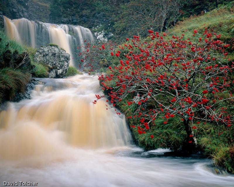
Lord Macdonald's Forest, Isle of Sky
He was endlessly bullied in his youth at boarding schools in Germany, suffered from a strict father who himself was in a 'camp' in Germany for six months, ensconced in a sanitorium under 'Iron Key' treatment for tuberculosis and finally living with a charlatan Freudian psycho analyst. This exposure to extreme environments must have influenced his photography greatly, especially the time spent in Switzerland whilst being treated for tuberculosis when he first started to use a camera. The high contrast environment where his colleagues were dying on a daily basis but living in a town renowned for it's carefree, aphrodisiac nature set him up well for his first 'apprenticeship' to Man Ray, a position gained after taking a famous portrait of Ezra Pound. Although he was never 'trained' with Man Ray - the exposure to the artistic environment was to have an immense influence on his future work.
Train leaving Newcatle 1937
He finally came to Britain in 1931 where he became a staff photographer for the home office and where he documented the suffering of the Londoners during the bombing raids. Some of his most famous work was his documentary photography of the coal mining communities of Northern England, a stark representation of a hard place; a work produced at his own expense. He returned to the North regularly and worked on a book 'Literary Britain' which was to produce a large part of his Landscape oeuvre. He also combined the landscape with nude photography, using wide angle lenses to create virtual landscapes out of female curves and abstracting the whole through a very heavy printing style. His photography owed as much to Hitchcock and Orson Welles and the Expressionist cinema he would have seen in his youth to the experiences in Man Rays studio. The heavily emotional, almost abstract work standing out from much of the mainstream photographic work at the time.
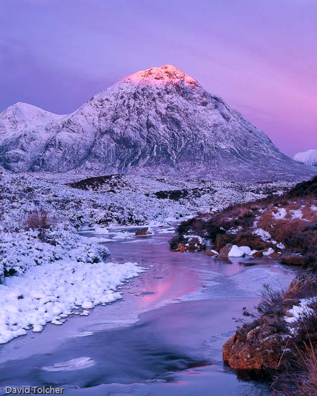
Loch Slapin, Isle of Sky
I personally love his landscape work for its rawness and lack of contemporary reference. The pictures are almost brutal but stop just short of being too difficult to appreciate. I'm only just starting my journey into Bill's repertoire and am looking forward to finding more in the future - perhaps another article when I make a pitstop at some point. As a last comment on Bill, it was his exhibition entitled "Twentieth-century landscape photographs selected by Bill Brandt" that inspired Michael Kenna to become a landscape photographer and for that, we should be extremely grateful to him.
We thought christmas was a good opportunity to thank everyone of you who has supported the new venture by taking out a paid subscription, a free subscription or just by visiting and maybe talking about the magazine. We've had a wonderful start and have exceeded the 'ad-hoc' projections we had made. We've also had a bucketload of supportive feedback so thanks to all of you who raised your voices.
We have had a couple of set backs to what we must admit was an ambitious goal of one issue every two weeks, the main one being a pile of existing work from the Tim's 'old career' that needed addressing and also the failure of his beloved campervan which has meant the lack of location guides (doubly frustrating as the campervan was bought to ensure landscape access during cold weather conditions, being imported from Hokkaido in Japan - it obviously didn't like the tropical November Cornish air as it blew a cylinder head gasket on the way back. Actually it was a bust radiator so we can't blame the van completely).
The good news is that nearly all of the existing work has been cleared up and the New Year offers a schedule dedicated to the magazine (although a 2 day per week visit to the real employment world limits things a little). This means more locations guides, better marketing and more articles - the goal of which is to have the magazine to support a full time work load by the summer.
For those who are thinking of contributing, we really hope you do and we are trying to make it as easy and accessible as possible. We would really like to be able to use your work in our 'subscriber' section, this ensure your work will only be seen by dedicated landscape photographers. However, if you wish to ensure your writing gets as wide a publication as possible (or don't wish to contribute your work to line our pockets.. although you should see our pockets before you think that) then we can put work up as only accessible to free subscribers OR only available to free subscribers for a couple of months and then made freely accessible OR just freely accessible from day one! The magazine obviously needs to "wash it's face" financially at some point but it is also fully intended to be a platform for landscape photographers to have a voice in their own community.
So - thank your support and for bearing with us in the early issues, we hope the magazine can grow in both circulation and quality in the new year.
In most photographers lives there are 'epiphanic' moments where things become clear, or new directions are formed. What were your two main moments and how did they change your photography?
There were really 2 moments that changed my photography. I have always aspired to take good landscape pictures but largely failed to reach my own goals, for the first 20 years of taking pictures I chased butterflies & insects and landscape photography was a second interest. I was always trying to squeeze the best quality out of 35mm film whether it be Kodachrome 25 or Tech Pan and still didn't get the subliminal quality that I desired. Whilst living in Australia in 1989 I came across a book by John Sexton - 'Quiet Light' and that really made me stop and stare. It was a few years later that I realised the significance of that moment and made a move from 35mm to MF and then on to LF and the start of the process of getting what I wanted in my landscape photography.
The second was more of a short period around 1999/2000 when Robert White held a few seminars by Charlie Waite & Joe Cornish among others and this gave me hands on view of the wonderful work from Joe and what you can do with an Ebony. It also prompted me to book on a Light & Land course with David Ward in Glencoe in January. My wife bought me a surprise xmas present of an Ebony RSW that year and off to Scotland I went with it leading to a long association with 5X4 and Ebony in particular. A course with someone like David or Joe really lifts your ambition and ability - the number of 'aha' moments when things start to make sense is worth years of solitary learning. It was really basic stuff like take pictures at dawn and dusk that had previously somehow passed me by.
Your landscape photography has been taken on quite a range of cameras from GF1, Olympus EP1, Arca and Ebony large formats, Nikon DSLR's, etc. What do think are the advantages of disadvantages of each format and when do you use them?
This is a hard question to answer today as the quality available from all the formats is so far in advance of 10 years ago. 5x4 is still very special, a well exposed & composed Velvia 50 transparency on the light box beats anything else hands down but it is only arrived at by good planning, sound technique and a sprinkling of luck. You have to anticipate the light and conditions and really understand your medium to get the best from it. Arca or Ebony... well head and heart and that is all I want to say about that. I am back with Ebony now and both cameras are not limiting the photographer under the dark cloth ! Of the other stuff, when you need to anticipate the light, none are a replacement for 5x4. I use Nikon because I always have, I need it for my insect and flower work as I am not brave enough to chase butterflies around a field with 5X4 or an m 4/3rds camera. The wide angle options on 35mm digital remain compromised in quality and distortion when you are used to 5x4 and don't provide an equivalent solution for landscape work IMHO. The genre of micro 4/3rds cameras at last get some way to a portable solution with wide angle lenses not compromised by the design constraints of a mirror but come with a crop ! Today, these cameras provide my walkaround solution and I am very happy with the quality from them.
You have started using colour negative film as well - how do you think this compares with digital/transparency and what methods do you use to invert the picture after scanning?
I have shot colour negative only in the last 2-3 years as I really got to quite dislike the results from Provia. It was my answer when I couldn't squash the range of tones that I wanted into Velvia 50 so I needed to seek an alternative. Colour negative film has the reputation of being forgiving in exposure and having great latitude so is the perfect answer until you try to turn those orange tones into something looking like the scene you started with ! Right now I don't have enough experience to have a fixed repeatable workflow. I use exclusively Pro 160S from Fuji and find that sometimes Vuescan gives the best scan sometimes Silverfast and sometimes something else with no apparent rhyme or reason. After scanning as a negative ( I let the scanning software invert prior to output) I always import the file into Lightroom and auto balance and tone as a starting point, for hard negatives I might auto colour in CS4. From there it's the same as any other picture with tweaking colour & saturation to get what I envisaged when I took the shot.
Which photographers do you think influence you (conciously or unconciously) and which photographer(s) do you admire despite being in a different landscape photography 'genre'.
I have a very busy bookshelf trying to look at as many quality photographer's work as I can. Modern inspiration comes from the likes of
Charlie Waite, David Ward, Joe Cornish and David Noton but a significant part comes from more personal interactions with friends who I photograph with especially Jon Brock with whom I have shared many steps of my own journey during the last 10 years. Light & Land Advanced Large Format courses have given a window into some great photographers whose work I would never have seen or been inspired by, Nigel Halliwell, Anna Booth, Roger Longdin, Sami Nabeel, Julian Barkway to name but a few of many.
How do you find photographs in the field? What processes and tools do you use (i.e. how long do you spend looking to taking, do you use a finder, etc.)
Seeing how other photographers approach a subject and get the best out of a medium provides the knowledge base for heading out into the field. Things like how velvia 50 responds to blue sky light when photographing a subject in the shade is one example of a piece of 'inspiration' that I carry out into the field that I wouldn't have known without looking at work of Anna Booth or David Ward. There are many others that you just absorb and then build on when you go out. The rest for me is down to what looks and feels right through my eyes. I typically set up quite quickly when on location and then make decisions about lenses, film and timing and tweak the final composition. I will often potter about with the digicam for a while if inspiration doesn't hit me on arrival. I did use a finder but found it interfered with my wide vision. From then on its fairly simple waiting for the light, working out the metering in advance with my Pentax spotmeter, gradding if required and then patience.
You work a lot in Robin Hood's bay and the surrounds, what particular features make this area a unique place in your opinion?
For me its unique because I have bonded with it in a way that only comes with being there over a long period of time. For the most part I think that the best landscape photographs come from a place the photographer has emotionally bonded with, understands and can relate those feeling to the viewer via the picture. RHB is not unique in terms of features and light but emotionally I feel close to the landscape. Similarly I have been visiting Glen Coe and Glen Etive every Winter since 2000 and my pictures have improved year on year as a result of getting to understand how and when the light plays with the landscape in different weather conditions. Its not that you cant take good pictures as a tour bus photographer on a first visit but pictures of depth and emotion only come with repeated visits.
I know you go out taking pictures with Jon Brock quite often, do you take different pictures when are out with other people? How does your photography change when you are out on your own?
A good question. Yes I think I do take different pictures when out with others, especially those whose work I know and respect. Probably the main reason for this is that I will visit locations that I otherwise wouldn't photograph in and then I look for pictures in the genre that suit the location even if they don't naturally appeal to me. I love taking more traditional landscapes but can have a happy few hours in a details / abstract location even though I don't want to put any of them on my wall. On my own I will look specifically for what interests me and take that uninfluenced by others.
A big thanks to David for his frank and very interesting answers - you can see more of his photography at his own website and his flickr stream.
It's been an exceptionally cold start to the year which I find deeply annoying because my supposed 'snowmobile' is out of action and being repaired after a blown headgasket that I suffered on the return trip from Cornwall a couple of weeks ago. Being as the main reason for buying the 4x4 version was to get out in these sorts of conditions, watching everybody else have fun while I'm stuck in has been particularly difficult. Anyway - I won't whinge (OK, just a little bit) and I've been putting the time I would have had in the field creating a location guide into researching how some of Britains top landscape photographers deal with the cold weather. The following are a compilation of notes made during phone calls, emails and general conversation made over the last week. We start with the man who has arguably been out photographing in Britains coldest ever weather - a minus 29 degrees in Moray last year.
Ian Cameron
Dava Moor, Moray, Scotland (-29 degrees celsius) - Ian Cameron
Ian has been out in some of the coldest conditions that the UK has to offer (suffering from frostbite at one point when the temperatures hit -29 degrees). He has a pragamatic approach to cold weather gear and I had the chance to make a few notes whilst talking to him recently.
If it’s dry cold, then down jackets work very well, very light and assuming I’m not going up into the mountains. I try to use multiple layers, synthetic materials where possible (polartec for instance). The jackets I use have zips and so regulating temperature is as simple as unzipping the front. I keep the hood down typically as I get too hot quite quickly. A standard wooly hat pulled down over my ears if it gets really cold is fine and two pairs of gloves, a thin fingerless pair and a thick pair of mitts over the top.
I don’t typically use hiking boots as I don’t get on with gaiters and without them, you quickly end up with feet full of snow. I use a good pair of wellingtons (Hunter) with very thick neoprene inners (3-5mm) and these work really well with a single pair of good socks. My trousers are just standard walking trousers with a waterproof overtrouser when needed.
As for dealing with camera gear, film cameras are a lot better at dealing with the cold but even they have the odd problem when it gets really cold. Film can get brittle and can also suffer from electrostic discharge if the really cold air is very dry also, so I take care to wind the film on very slowly (otherwise you get pinprick spark lines on your photos). The electronics can get a little wierd if you breathe on the camera too much.
My tripod works very well in the cold (A Gitzo 3530LS) but I keep the bottom sections extended to stop snow getting packed into the locking mechanism.
See more of Ian's winter work here or have a good look around his whole website here.
Dav Thomas
A dusting at Over Owler Tor
Dav Thomas spends a lot of his time walking in the Peak District which sees more snow than most parts of the UK bar the Yorkshire Moors
Firstly I must say I'm not a 'climb up a mountain and bivy out on a precipice in -30 conditions' type photographer. Despite the fact that my girlfriend thinks I'm in mortal danger every time I leave the house with a tripod in my hand, I rarely travel more than a few miles away from the car, and generally return within 3 or 4 hours. Still, it can get to be pretty hardcore out there on those Peak District edges in the middle of winter so keeping warm is an important issue. It's not just a matter of comfort and safety either - the colder and wetter you get the more likely you are to skip that last, potentially brilliant shot in favour of a full English at the nearest café - keep warm and you're likely to stay out longer.
I admit that I am seduced by outdoor gear - I might even be accused of being a gear snob. I'm a big fan of buying decent stuff and hopefully not having to replace it every five minutes. I've got a fair amount of kit but I generally come back to a handful of items that I know are going to be comfortable that keep me warm. There are a few areas where I know I haven't found the perfect set up so in those areas, the search goes on.
Trousers
I have 3 main pairs of trousers and they get swapped about depending on the conditions. If I know rain is unlikely, or I know it's going to be light rain my first choice every time are my Craghopper Kiwi Winter Lined trousers. They have a fleece lining which keeps you pretty toasty are are reasonably hardy against rain showers. Being on the baggy side there's room underneath if it's really cold for thermals. Being cargo pantish they have a good few pockets to loose things in!
If I need something a bit more windproof and waterproof I have an excellent pair of Rohan Warm Goa trousers, these are a polyamide fabric and they are warmer than they look like they should be. Not entirely sure about the draw string around the waist but I guess it comes in handy after that full English Breakfast! It doesn't look like Rohan do them anymore but to be honest I've never had an issue with any Rohan gear so I'm sure their replacement will be just as good.
My 3rd pair of often used trousers are Rohan Superstriders - seriously good pants! They benefit of a built it gaiter which is great because I can never be bothered taking old school gaiters out with me. They have a brushed cotton liner to keep things warm and are wind resistant.
Top half
My approach up top is a thin base layer, some sort of fleece and a decent jacket - OK, so I'm not re-inventing the wheel but it works. Favourite base layer is my Rohan Core Zip long sleeve. It's not super tight which is a good feature in my book (although logic would suggest it doesn't wick as well), you don't really notice it's there which is good. Of course there are so many makes and styles of fast wicking base layer tops it's just a matter of finding a couple that suit you. I have got a merino wool top which is good but I don't find it as warm as a polyester top, that might just be the one I've got though. It is very comply against the skin though and they just don't get smelly!
Mid section - if I know it's going to be really cold out there I go for my trusty Lowe Alpine Aleutian stretch fleece top - a great top, very snug - I just wish it were a bit longer, it does tend to ride up over time. I have other mid level fleeces from North Face and Rohan which often get an outing.
Coat
Having tried a number of coats I always come back to my one favourite - a North Face Redpoint PrimaLoft . For me it's pretty ideal - not too bulky, warm but not silly warm like a full on insulated puffer jacket so it works well with layering and it has 3 good zip up pockets - I know some people like lots of pockets for their stuff but for me more pockets just mean more places to loose stuff. IT's water resistant and not too bulky. The only thing I'd change if I could is I'd give it a hood.
Feet
My tootsies are one where I haven't found the perfect set up. I do suffer from cold feet - they tend to itch like crazy when they get cold; not good. I have a good pair of Scarpa walking boots but warm they're not. I actually think my regular Caterpillar leather boots are warmer. I did invest in some heated socks last year but I managed to get the wrong size - the ones I ended up with would be ideal for sasquatch! I may have a go this year. I'd really love to give Columbia Bugathermo books a go with built in heaters - being a large format photographer I tend to spend a lot of time standing about in the same spot so some centrally heated footwear would be great!
Other bits
As someone whose hair days are pretty much over I have a large collection of beanie hats. I do find them to be a bit of a pain - they tend to get too hot so I normally find myself taking them off for a bit until my ears start to turn blue and then have another go. I guess there must be a good breathable beanie out there but I'm yet to find it.
Hand warmers - these are great things to carry, you can get them all over the place - they are smalls bags of liquid which, when activated start giving out a fair amount of heat - lovely for warming the hands when you've been fiddling about with the camera. they go hard after a few minutes, you re-activate them when back home by boiling in water for a few minutes.
Gloves - I've tried using a number of pairs of gloves - the fingerless style ones with a mitten like cover are OK but not super warm, I tend to go for a normal pair of walking gloves and take them off when using the camera - I can cope with the code for a few minutes. I do have a pair of North Face Etip Gloves on my Christmas list - hopefully allowing me to use the large format camera whilst still wearing gloves.
One other piece of clothing I like to wear is a North Face neck gaiter, an inexpensive bit of kit which really helps keep the warmth in and much less faff than a scarf.
You can see more of Dav Thomas' work here. Read Dav's other articles here.
David Ward
Conway Summit
David leads photography tours and workshops all around the world including Iceland and Norway. I spoke to David on the phone and made a few notes - here are some summarised highlights.
Goretex has some serious problems and delaminates in heavy use (especially on the shoulders when using rucksacks). I’ve had two go .. just before the warranty run out annoyingly
I use a lot of Paramo gear because a lot of technologies stop working once you stop perspiring or when it gets wet (It needs heat and moisture vapour to work. Once wet and cold, it doesn’t work very well)
I don't wear a lot of gear - it has to be pretty cold in order for me to wear long johns... Lowe or Patagonia Capilene base layer (when freezing and below).
I use fingerless gloves (Thinsulate) and Jack Wolfskin mittens. The problem with Full on snow gloves is that they are a pain to take off and put on easily (they need to seal into your jacket sleeve). I have heard of people using silk gloves or even surgical gloves to allow fine control but stopping skin evaporation from chilling your fingers.
For trousers I wear Paramo Pajaro (which aren’t fully waterproof but wick well and dry quickly) over north face cargo pants. Boots are North Face Chilkats which have kept me warm in -19 degree conditions
Mid layers are Paramo Summit hoodie, top layer is an Aspira Smock and/or a Torres smock.The nice thing about the Aspira smock instead of the Pajaro/Halcon is that you can slip the waist belt of your ruck sack through the side waist slits so when you get hot you can open your jacket without taking your rucksack off.
Bruce spends a lot of time outdoor in the cold weather in Scotland but also in extreme cold in Patagonia and Iceland - He kindly sent me an email about his advice for staying warm as a landscape photographer
1. Don't go out!
2. Spade and sleeping bag in the car for safety. Preferably a down sleeping bag and some chocolate and mobile phone are important.
3. Goretex boots don't work. So many shops push them on folk, but you need leather boots, with sno-seal applied to keep the water out (slighly heat your leather boot in the oven and apply sno-seal which is absorbed by the leather).
4. Gaiters keep you really warm. They stop the wind rustling up your trouser legs, and stop any water coming over your boots too when you step into a boggy patch as is often the case
5. Gloves designed to help you operate your camera don't keep you warm, and they don't help you operate your camera either. So I now have the biggest, thickest cloves I can get. I take my hands out to operate the camera and put my hands back into the gloves once the camera is set up. My hands get warm very quickly in big thick gloves.
6. A hooded jacket to cover your head with a beanie hat on works for me, but I also use an Alpine-Lowe hat with sides that cover my ears. A hat must be capable of staying on your head and not flying off with the wind and rain.
7. Thermal layers and my trousers are fully waterproof. I don't like to have to wear trousers that need me to put an additional layer on, so I use trousers that are all in one items.
8. I like a jacket with one big pocket. I use the Paramo smocks because they allow me to put things in one place. I also have a whistle attached to the jacket in case I get into trouble
Joe was down in London on business but I managed to get a few minutes to chat about his approach to the cold. These are taken from my notes so are not direct quotes.
I tend to get quite cold (probably my age) so as soon as it get down to freezing I use leggings of various brands, Lowe Alpine, North Face, etc. I never use cotton though.
Really Good socks are important and I sometimes wear two pairs, definitely so with wellingtons.
Long sleeve thermals with crew necks are reall useful with Patagonia being a good brand and Paramo being brilliant - Some people still use Helle Hanson but they didn’t get the nickname “smelly hellys” for nothing.
My personal most important item is a pair of really good boots. I use La Sportiva mountaineering boots (possibly Nepal ones? - tim) which work really well in thick snow. They are expensive but are really worth the money. Generally I use wellingtons which are OK but don’t keep you warm when temperatures plummet.. if you’re doing serious time/distance in the snow you need decent boots. I would hesitate to recommend some of the high street brands, stick to good European specialist brands such as La Sportiva, Scarpa, etc. If you do a lot of time in the mountains, make sure they take crampons/snow shoes. Duck type insulated boots are a good alternative but maybe not good for long walking/climbing.
Paramo mountain shirt or pull-on are excellent for wicking and thermal properties - you really need to keep a technical continuity through your layers. I also use fleece or mountain shirt fleece layers, mostly Paramo again.
For dry snow, Paramo Cascada are great but I use Aspira Salopettes otherwise which are fully waterproof (but heavy and can get warm). If you think skiing gear you won’t go too far wrong. Torres insulated overtrousers amazing - single most important piece of extra insulation I have, will keep you going for a long time in cold conditions.
Finally, I use Paramo Shells; in the high mountain it is Aspira shell but for general photography, the Halcon/Pajaro are very good. But for really cold conditions, the Torres smock is almost essential. (for less bulky option, torres sleeves work very well).
The best solution is probably fingerless base gloves with a good insulated overglove (or mitten). Finally, a good buff is a great idea to keep out the cold winds. Hyperthermia is the biggest danger and it is very difficult to tell the symptoms, it’s probably a good idea to read up how to recognise if you, or others, are succombing to it.
Mike has some great experience of winter working and has also worked in a mountaineering garment shop
I come from a Scottish winter climbing background where the standard clothing is pile/pertex garments made by Buffalo or Montane. The windproof outer shell keeps the wind out and the pile fleece inside keeps me well insulated. Most of these garments feature lots of ventilation zips so I can control my body temperature very well to prevent sweating too much, and then zip everything up to keep cosy when I stop to photograph. I've found nothing that even comes close to the performance in our cold damp winters, especially given the low price compared to many newer solutions. They also last for years, my first one did about 15 years of hard winter climbing and mountain biking.
Ideally pile/pertex should be worn next to skin, with the fit as close as possible. They tend to be quite ill fitting, so it is worth trying a few sizes and styles from different brands. I wear a cheap waterproof over the top for wet sleet days. For really cold conditions, below about -10degC, the pile/pertex salopettes are amazing, but can be too warm. I’ve been on the north face of Ben Nevis in the jacket and salopettes with temperatures of about -20degC and been too warm when walking! Cosy, comforting and amazing value for money.
Mike is writing a full length article on cold weather clothing and as someone who has worked in a mountain clothing shop and spent a lot of time outdoors, it should make a very good read! I've been told it should be online in the next week or so here. In the meantime, check out more of Mike's work here.
Richard Childs
Beinn Lora at -19c - Richard Childs
Richard is a full time professional photographer living in Oban who spends a lot of time on the hills - he regularly works in 'difficult' conditions and doesn't let the weather stop him from getting the picture
As Winter arrives I usually spend some time, and a little money fine tuning my outdoor wear based on a previous years experience. There's no doubt that being comfortable will lead to a more enjoyable and probably successful time on the hill. Roald Amundsen was credited with saying 'there's no such thing as bad weather, only inappropriate clothing' and every miserable day I can remember on the hill was down to this. While we can arm ourselves against much of what Britain's maritime climate throws at us spending increasing time in the mountains as I do means paying a little more attention to detail to avoid disappointment, misery and even disaster. Simply loosing a glove has in the past lead to the demise of more than one climber here in Scotland. We all carry spare bits and pieces for our cameras but often neglect ourselves in doing so.
Because I carry a heavy load I try to keep my clothing light, layering to provide the warmth, and regularly changing the number of layers as I go to keep me comfortable. Unfortunately, I sweat alot with sustained exertion so I now take spare base layers and change into these on arrival at my destination to ensure that the clothes next to my skin are dry and do not wick away my body heat. This does mean stripping off on a mountain top in sub-zero temperatures but this is far more desirable than standing around in wet clothes for hours. Those of you who know me well enough also know of my reputation for this anyway!
I'm not one of those people who kits myself out in one particular brand. I try to find what really works for me and then stick with it through the years until the 'new and improved' version comes out and proves to be the opposite.
I currently use combinations of the following:
Lowe Alpine breathable base layers
Merino Wool Base layers ( top and bottom) but not when ascending.
Mid layer fleeces by The North Face and Patagonia
Reversable tops by Paramo.
Trekking Pants by The North Face and Crag Hoppers.
Fleeces by Sprayway and Vaude
Paramo Torres Smock
Paramo Fuera Fleece/Windproof combination
Rab Down Jacket
The North Face Caber Hybrid Pants ( possible the best bit of outdoor wear I have ever bought)
Scarpa SL and Manta boots
Grivel Crampons.
Gloves and mittens
Finally, a Buff. This simple tube of fabric provides me with a hat, balaclava, midge net, neck warmer and lens cleaning cloth, all for about £12, a genuine bargain.
See more of Richard's work here. Read Richard's other articles here.
Rob Hudson
Skirrid Fawr - birch tree in a blizzard - Rob Hudson
Rob has hiked for most of his life prior to being a photographer and likes to keep things simple. I love the picture has above too - really shows a heavy snowstorm well.
OK, first point to make is you wont find a list of expensive / fashionable outdoors gear in my wardrobe, I came to landscape photography after a lifetime of walking and hiking, since I was a small child. There really isn't any point in wearing half the mountaineering shop, like most people seem to (even in the middle of summer!), for 95% of my experience a few appropriate and well chosen items will do. A little bit of cold and wet rarely does you any harm!
From the bottom up....
The trick is to choose appropriately to the conditions and layer.
Base layers, unless I'm planning extreme winter mountaineering, I just don't bother with the "wickable" polyester based base layers. I find they get so hot under physical exertion, that it makes it very difficult to control body temperature - and that is as important as anything. An ordinary cotton tee shirt is just fine for me, so what if it gets a little damp, that's how your body naturally regulates temperature.
I much prefer to layer appropriately, wear things with zips that are easy to undo or remove / add as required.
Next up in winter I usually wear a microfleece top, my fave is from Rohan which is tight fighting, warm and extremely light.
If it's getting colder I wear a 300gm fleece or in extreme cold I actually prefer an ordinary high street cardigan, it's 80% acrylic and 20% wool, wicks beautifully and is about the warmest thing I own. Plus the zip means I can regulate body temperature as required.
Trousers wide I have a wide variety to choose from. In late spring and early autumn it's a light weight pair of Rohan hiking trousers. Later in the seasons (or for milder days) I have a pair of heavier weight Craghoppers and in extreme winter a pair of lined Craghoppers. Both the later are a couple of sizes too big, so I can wear fleece long-johns if it's really mean out, but honestly unless I'm doing star trails up a mountain in the middle of winter I wouldn't bother.
Boots are a fairly expensive pair of Swiss made Raichle "Motion Control" which are leather outer and Goretex lined. Long experience has taught me that cheap boots just don't last. They're pretty much all year boots (unless it's hiking sandals weather), waterproof, comfortable, warm enough for winter use and with a sharp enough edge on the Vibram soles
to get some traction in snow. I also have a range of socks, for winter a pair with merino wool for added warm. I very rarely get cold feet in that combo.
Coats are a choice between a pretty basic Berghaus waterproof, nothing special, has their own proprietary breathable waterproof membrane, lots of pockets. Again it's a couple of sizes too large so I can get all the layers needed underneath. Or an ancient 1980s Line7 winter mountaineering jacket (Goretex outer, Thinsulate lined) which only comes out about 3 times a year and will therefore never wear out. It's claimed to be suitable for up to minus twenty, but I doubt that's true, having warn it in far less for star trailing last year and been pretty cold.
Lastly Goretex Berghaus waterproof over trousers and Berghaus Gortex knee high gaters, neither of which get warn as a rule. Hats are a Thinsulate woolly number and a couple of pairs or Thinsulate gloves, but I normally only use them for carrying a cold tripod,I'm not really a hat or gloves person. I was quite surprised to find my hair frozen last week after taking my hat off during a steep climb, but still I wasn't cold, the exertion kept me warm.
So general advice is you don't need to spend a fortune on the most expensive gear in the shop (that's for mountaineers or people who are scared of the outdoors) layer and remember to pack a spare fleece for when you're standing still with the camera or when required.
Winter woollies? Hmm, a tricky one this, lots ifs and buts...
Seriously, there are many factors at play: what your activity will be, how
cold/wet it is, how well you as a person withstand weather etc.
In summary, here is what I wear for really cold winter photography i.e. lots of standing around but probably not very much heat-generating trekking to get to the location.
Upper body (layering): Long sleeve Paramo base T-shirt, North Face standard thin fleece, Paramo "Explorer" pull-on, Paramo Taiga fleece, North Face Gore-tex windproof.
Total 5 layers with increasing warmth and a final windproof (and rainproof) outer jacket. This combination kept me warm when we were on a dawn shoot at the Grand Tetons at -9.2C. If it's maybe between 0 and -5 C and not very windy (as in Yellowstone), then I would dispense with the Explorer layer and might even swap the GoreTex for my much lighter Paramo Fuera jacket.
Legs: Craighoppers Kiwi lined trousers.
Feet: Just normal mountain boots with walking/trekking socks. I would appreciate proper lined winter boots when it is really cold, but don't go out in such conditions often enough to justify the cost.
Head: Thinsulate soft hat that I pull down over the ears. If it is also windy and/or raining then I use the hood attached to my jacket. And a tube-scarf for the neck - these are thin so not cumbersome but really great.
Now for the anecdote: I used to be a traditionalist and had a heavy double cotton windcheater with a woolly jumper underneath. Then I moved to GoreTex and that's very good,
but a bit sticky in milder weather. More recently I was persuaded to try Paramo (those blasted L&L endorsements...) and tried their base layer (reversible T-shirts). These are superb and just last summer in the Pyrenees I was wearing one such T-shirt while running downhill at around 2000-1500 metres through a cloud away from a thunderstorm. Not only did I stay warm but despite the cloud vapour itself (I got a super photo of dew laden grass!!) I felt amazingly dry. Daft I know, but really I did.
I have a Paramo Taiga fleece and Fuera windproof and like them both for cold but not bitterly cold low temperatures. Used them in the Californian Sierra on an L&L tour a couple of years ago and basically they were fine. I am not convinced that these would keep me as warm as my old cotton windcheater and woolly jumper would have done when standing around. But, they keep the wind and rain off, so can't be bad. But Paramo is great for activity wear for example for the approach to a remote location and of course when
climbing/descending. I suppose that this is where layers come in so you can add a layer when you get to your spot and reduce your activity level. If I had oodles of cash and was sure to use the jacket on many many days in a year, then perhaps Paramo's top of the range £300 Halcon jacket is the thing to buy.
David gets about a bit, as they say, and for such a warm guy, he certainly knows how to deal with the cold (OK - I'm trying too hard). Anyway - he sent me an email discussing his 'tactics'
I have the ultimate staying warm coat, in fact you could probably just lie on the floor wearing it and not even bother with a sleeping bag, well here in the UK anyway!
Before you think I am made of money, I did a clothing review and got it for nothing before last years Canada trip.
For the UK I have to say it (sponsorship aside) but the Stealth Gear Extreme suit. (trousers and jacket not a geeky all in one thankfully)
It's the best thing I have ever found for softness, quietness and it has masses of pockets. Totally waterproof, crap hood, but so nice to wear. Its just wonderful and its ridiculously hard wearing with Teflon all over it. It's perfect for the UK winter as are the trousers, which get a good thashing over the moors in particular.
I also recommend the Berghaus Spectrum hat and scarf. The reason being the hat doesn't itch my head like wool or other fabrics. Its super soft and I can wear it for hours. I suffer from bad hat-hair (remember my greasy interview?)
Finally gloves wise, I would recommend these These are bloody brilliant as they are super warm and have sticky all over the palm and (AT LAST) up over the finger tips unlike other gloves I have had before. Not waterproof mind you, so if you need something similar for the coast then its these
Boots wise, I have a newish pair of North Face winter boots, rated at -30, that I bought in Canada. They were absolutely excellent on the ice and in the snow.
See more of David's work here. Read other articles by David Clapp here.
One of the issues that sometimes comes up when doing landscape photography in the UK (and I’m sure abroad sometimes too, but I never go there) is that we have clouds; lots of them; All over the bloody place. This can sometimes mean that the only glimpse of the sun you get all day is when it slips above the horizon and just before it slips behind this layer of clouds for the rest of the day (and then again in the evening).
This leads to a bit of a problem because that strip of light at the horizon is often about 2 or 3 stops brighter than the sky above it and about 4 or 5 stops brighter than the ground below. Singh Ray, an American manufacturer of filters, sell a filter called a ‘reverse grad’ which aims to solve this issue (well, in the US it tends to be aimed at the gradually darkening clear sky with ultra wide lenses). I should add that even with a clear sky, the brightness difference between the horizon and looking up about 90 degrees can be a couple of stops or more so it's equally valid then.
Quite a few people have contacted Lee Filters to ask if they can create them only to be told ‘no’. I’m presuming the answer may have been slightly more detailed but ‘no’ is sufficient for this article*.
However, “I have a cunning plan!” - we can take two hard graduated filters and turn them around so they are sitting opposite each other. Where the two graduated filters overlap, we have a dense area. Depending on the graduated filters used, we can ‘emulate’ the fabled ‘reverse grad’ as follows..
Obviously we end up with an extra two stops of ND above what a reverse grad would give us but as a bonus, we get to choose the width of the extra one stop of filter.
With a few different combinations, we can create hard strip filters and reverse grads of various powers (the light stopping sort of powers, not flying powers and stuff - that would be silly - although quite handy should you be shooting off the edge of a cliff and you over adjust your 3H filter, dropping it down towards the rocks, despairing at the fact the production capabilities of Lee a running so short of demand and realising that you might be waiting for another three months before you can capture *that* shot, hence scuppering your professional landscape photographer plans for good...).
This isn't a perfect solution as you end up with an ND grad as well as a reverse grad but if you can get the shot quickly using this then all the better. Let us know what you think of the technique and if you have used it either before or since the article.
Some examples shown visually
*no = the dipping method used by Lee filters makes creating a colour balanced reverse graduated filter very difficult.
I was an early adopter of the m4/3rds ‘compact’ system buying a Panasonic GF-1 with 20mm lens pretty much as soon as they became available. It promised so much. It was to replace the Canon G10 that I owned and carried everywhere as a recorder whilst on location with the LF gear and as a better quality snapshot camera. I briefly owned an EP-1 when they first became available but the AF was so horrible I returned it within 48hrs (see later for a revisit with better results). Early experience with the GF-1 and 20mm lens was very frustrating. Sharp pictures were at a premium, the lens was excellent and the camera intuitive and easy to use but…. No IS meant that I was only getting 20-30% of pictures without shake even at 1/60th of a second, the pixel density really shows up the slightest movement. Compare that to the G10 where it was nigh on impossible not to get a sharp picture even down to 1/8th second. The occasional sharp picture really showed what the system was capable of, performing as well as the D300 I also owned at the time but with an indefinable quality from that beautiful 20mm lens that surpassed anything I would get from the Nikon. A brief dalliance with the Leica 14-50mm F3.8 improved the hit rate enormously with IS and gave me the confidence to push on and hone my technique. I now own the GF-1 and the classic landscape kit of 14mm, 20mm and 45mm lenses with a Lee RF75 filter outfit which I think best fits the ethos and quality capabilities of the system. A recap on what I see as the advantages of the GF-1 (or EP-1) for the 5x4 photographer.
Sensor size and dimensions
The 4/3rds sensor is very close to 5x4 dimensions and loses very little when cropped to this format. Portrait landscapes are perfectly possible with 4/3rds but nearly always too long with 3x2 from the DX/FX sensor. Largest crop from the GF-1 to 5X4 gives 3750x3000 pixels vs 3560x2848 from the 12mp D300, so about 10% more pixels.
Quality vs Size
A full outfit for the GF-1 comprising camera, L bracket, Lee RF75 filter system, 14 (80-90mm), 20 (120-150mm) and 45mm(240-300mm) lenses & hood weighs in at 950gms which is on par with a d300 body only and is capable of delivering the same quality results (or arguably better). It packs down into a small bum bag and with the addition of a small tripod and arca style head (like the Acratech) gives great portability on the hills without compromise. It can easily be packed in around the LF gear to give a versatile & high quality back-up or digi record on location. Dynamic Range is good and when combined with grads largely provides all the DR practically needed (certainly compared to Velvia or Provia).
The 5x4 Experience from a compact
Subliminally using the GF-1 on a tripod is very like shooting 5x4 using ‘live view’ as the ground glass. Using very hard RF75 grads is just like using grads on 5x4, easy to see positioning real time on the ‘live view’ screen. DOF from the 14mm & 20mm lenses mean that movements aren’t required to get pretty much everything sharp, note that diffraction really kicks in at F8. Using MF to tune the focussing around the hyperfocal point is very easy with the magnification view and with stop down although this is rarely required. In use I either balance the camera on the front standard to take a picture or snap it on the tripod after I have packed the LF down to record the image taken so it seamlessly integrates into the workflow. Use of 2sec self timer negates the requirement for a cable release. I wholly recommend the RRS ‘L’ bracket for the GF-1 (and also available for the EP-1). I was prompted to revisit the EP-1 mainly due to its low cost (I picked up a new one for £225.00) to test out how the Panasonic lenses work on the body because it has IS built in. This could get over one of the biggest remaining issues for me with the GF-1. I wont repeat what others say about the cameras on the web, look at Thom Hogan’s page (www.bythom.com) for a comprehensive and excellent review of both EP-1 and GF-1 and will add my perspective having used the GF-1 for just over 12 months. I only shoot RAW so cant coment on the differences in JPEG output.
Discussion on aspects of the GF-1 vs the EP-1 :
1. Image Stabilisation
This remains a problem for the GF-1 with the prime lenses and lack of in-body or in-lens IS. I can still get camera shake at 1/125th second with 20mm lens. Fortunately you get decent DOF at F2.8-F5.6 range when combined with ISO200 mostly gives a good working shutter speed. Supporting the camera on the tripod or the front standard improves the situation hugely. The 14-42mm zoom lens has a reputation for pretty decent quality and has IS but is already getting into diffraction at the long end of the range when wide open. My hit rate is now up in the 90+% through improved technique and a focus on holding the camera steady, use of a 2sec timer even for handheld etc to the point that I am pretty happy with this but you cant be lazy or complacent in use. Interestingly when my wife uses the camera she has nearly 100% sharp pictures, go figure ! The EP-1 provides in-body IS with the Panasonic lenses and does enable a more P&S attitude to be adopted but it still isn’t anywhere near what I could achieve with the G10.
2. Lens Correction
The GF-1 does a lot of lens correction in camera. All Chromatic Abherration is removed even in RAW and other corrections are applied to give a fairly well corrected clean file delivered to the PC. The EP-1 does no CA correction for any lenses in camera and no perspective correction for the Panasonic lenses. The following example shows how bad the CA is when using the 20mm lens on the EP-1. It cleans up in Lightroom but leaves an ugly trace which is hard to eliminate. I haven’t tested the Olympus kit lens but a bit of reading on the Web suggests that this remains a problem. This is almost a deal breaker for the EP-1 as the basis for a kit vs the GF-1. Ok for web work but when the sensor has the capability to print to a decent size then this becomes an issue.
Fig 1: EP-1 with & without correction of CA in lightroom
EP1 on left GF1 on right
3. Colour Rendering
There is a surprisingly large difference in the colour output from the 2 cameras. Neither is unpleasant or ugly, just different ! Post processing of the files in Lightroom cant fully harmonise the differences so this will boil down to personal preference. For the majority of comparison shots I find the Olympus slightly warmer and of marginally better integrity out of the camera (sky particularly is better). My preference here is for the Olympus.
EP1 on left GF1 on right
Fig 4: GF- 1 / EP-1 Colour comparison (EP-1 is on the right)
4. Exposure & Clipping
Contrary to other observations made on the web I find that the Olympus does not clip highlights so regularly. Standard landscapes with 1/3rd sky tend to be not clipped with the EP-1 whereas I am always dialling in some form of –ve compensation with the GF-1. The GF-1 is permanently set on -1/3rd compensation and often needs dialling down further. Both offer ‘blinkies’ on playback and histograms for establishing the correct exposure and come with the health warning that this based on the JPG engine rather than RAW so is a little conservative. In keeping with all digital capture when the highlights go it is ugly and best avoided. In this respect I prefer the EP-1 as a P & S
Summary
The best thing to say is that aside from learning the idiosyncrasies in the UI there is very little else to distinguish the 2 cameras. The important thing – quality of files is excellent from both cameras. Much has been written about the dpi of the screen and, yes the GF-1 is better but the EP-1 isnt unusable by any stretch. Likewise the AF capability, for landscape work Single AF is the mode of choice and they both work well enough to not cause issues but the GF-1 is more transparent in use (note: upgrades in firmware seem to have really improved this area on the EP-1 since my early experiences). If either of these things are important to you then the case for the GF-1 becomes quite compelling. Body style and ergonomics comes down to personal choice, they are worlds apart. If I was given the choice of which one to keep I would come down in favour of the GF-1. The differentiator for me is the in-body correction of lens defects that Panasonic have incorporated. Its designed in at source and works well – so much so that I didn’t know that the 20mm lens suffered from CA until I put it on the EP-1 ! Fig 5: Borrowdale Woods GF-1, 20mm lens [/s2If]
OK, I'm coming clean, and I think it's only right that I do it publicly and nationally in this magazine.
I have been having a secret affair. It's been going on for about four years now but has been far more serious in the last two. Initially she modelled for me and I would visit perhaps once a month spending an hour or two in her company, sometimes making successful images sometimes not. She's no supermodel, nowhere near as glamorous as some of the others hereabout and although I regularly photograph them, she is the one I go to the most. Just over two years ago, following a health scare in the family I found that she was the one most able to help me come to terms with the stress and strain. I started to visit her more regularly, often just to sit, to spend time clearing my head of the jumbled thoughts and problems trapped within. She would quietly listen, never offering any advice but never the less allowing the tensions to fall away.
Beinn Lora, from Dunstaffnage
Every time I visit she reveals a little more of herself to me. Her many colours and moods. Together we have experienced sunrises, sunsets, days of ice and snow, warm summer breezes and howling gales. Her name is Lora, Beinn Lora and she resides just one hundred metres from my home.
At just over 1000ft high and with no particularly defined peak visible from a distance Beinn Lora is a fairly unremarkable hill to look at. But sat with my back to the summit trig point I never fail to be blown away by the views. just the other day I climbed (without camera) and sat as blizzards swept around each side of the hill, miraculously missing me, painting the landscape white before racing out to sea.
Ben Cruachan and loch Etive at Dusk
The climb to the top is brutally steep in places, rising in great steps from sea level through thick forestry plantation and moorland bog. As a consequence the summit offers a commanding view through 360 degrees. The sea lies on three sides, Benderloch, the nearest village, is written Meadarloch in Gaelic meaning the land between the waters. Thrusting north is Loch Linnhe and beyond this the mountains of Ardgour and as far as Glenfinnan. To the East Loch Etive reaches towards Ben Cruachan, beyond which the horizon includes the hills of Arrochar on Loch Lomond. North East lie the mountains of Glencoe and to the South West the breath-taking Firth of Lorn and the inner Hebridean islands including Mull, Colonsay, Scarba and even Islay some 50 miles distant.
Larches, Beinn lora
Fighting for space.
While the top offers a plethora of views and a true mountain/moorland experience the first six hundreds feet are blanketed in in a rich tapestry of deciduous woodland and managed forestry. More often than not my photographic forays go no further than this as it offers a never ending supply of possibilities throughout the year, right on my doorstep.
While Beinn Lora hasn't yielded an enormous number of images to date (unlike Joe Cornish's bit on the side, Rose Berry) my evergrowing familiarity and the constant discovery of new possibilities keep me going back for more. A small hill among giants, Beinn Lora offers all I need as a photographer of landscape, the chance to get out and stay out a while.
In this Hindsight Joe Cornish talks about three pictures taken in the Cairngorms for Scotland's Mountains. Like before, we talk about one of the featured pictures, a picture that didn't quite work out and finally - a picture that ended up as a personal favourite, despite not seeming so at the time.


")