But does wilderness really exist or is it just in the mind of the photographer, who goes all starry eyed at the mention of the word?
This article is written in response to that by Julian Barkway on Beauty, which had a wilderness connection, and as a result of Joe Cornish’s report from the great wilderness trek in NW Scotland. His book Scotland’s Mountains could be regarded as a homage to what remains of Scotland’s wilderness areas. Torridon, Cairngorm, Glencoe, Rannoch Moor, Assynt, and the black Cuillin are all there, in their vastness and enticing wildness.
But does wilderness really exist or is it just in the mind of the photographer, who goes all starry eyed at the mention of the word? Is it an illusion that plays tricks on outdoors people who need such places for their own sanity? Julian asked the question ‘is there something profound in the human psyche that makes the experience of wilderness so alluring?’ This article attempts to answer these questions with reference to wilderness and where the landscape photographer might fit in.
By way of background it is worth considering aspects of wilderness and how it has affected some of our predecessors. For that we need to go to America because that is where wilderness has had the greatest effect on photographers and artists. Ansel Adams, Edward and Brett Weston, Eliot Porter are some examples. This article will mainly use the Ansel Adams experience, as he was such a prolific writer.
The US Congressional Wilderness Act of 1964 defined wilderness as follows: “ A wilderness, in contrast with those areas where man and his works dominate the landscape, is hereby recognized as an area where the earth and its community of life are untrammeled by man, where man himself is a visitor who does not remain.”
I don’t know of any other government in the world that has tried to define wilderness, but the US Congress in 1964 did a pretty good job. Wilderness is an essential part of the history of the American west and the psyche of its people as noted by the environmentalist, Wallace Stegner, writing “Something will have gone out of us as a people if we ever let the remaining wilderness be destroyed.” He believed that there was something deep in the human psyche that needed wilderness, even if it was just to look at from a distance. Americans would have admired the grand vistas in the paintings of Frederick Edwin Church and Thomas Moran, because such art was representative of a new and evolving country.
Yosemite was a world that was as pristine as you could get it. Working alone in such an environment does things to you. You become more alert to the surroundings. The slightest noise will disturb your sleep. The slightest change in light and cloud cover might be a warning signal. This, I believe is part of our human psyche – we are going back to our evolutionary roots.
If it was not for John Muir and latterly Ansel Adams with his well documented photographs of the American west, the Wilderness Act may never have been passed. It was Ansel Adams’ admiration for John Muir and his love of the great outdoors that inspired him to go to Yosemite and other parts of the Sierra Nevada. Paintings by Albert Bierstadt and the photography of Carleton Watkins would have encouraged him. But it was John Muir’s writings about his lengthy travels that motivated him to plan and execute major expeditions into Yosemite with large format gear;10 x 8 kit no less, plus plates and heavy tripods. These trips often lasted up to a month with the equipment, food and camping gear being carried by mules. The preparation and planning would have been a task in itself.
So why did he do it? Because it was there? Or was there something else? Based on my own photographic experience the answer may lie in the mystical attractions of being in the wilderness. Yosemite was a world that was as pristine as you could get it. Working alone in such an environment does things to you. You become more alert to the surroundings. The slightest noise will disturb your sleep. The slightest change in light and cloud cover might be a warning signal. This, I believe is part of our human psyche – we are going back to our evolutionary roots.
The whole business of planning for a trip into the wilderness is mentally stimulating: maps, compasses, GPS, books and all the paraphernalia of camping before you even start on the camera equipment. We plan for difficulties and problems along the way, mindful of Ansel’s other comment that ‘the real wilderness is a hell of a place’. Christopher McCandless, an itinerant traveller and subject of Jon Krakauer’s book Into the Wild, was found dead some four months after entering Denali National Park. Even Edward Weston came across a dead body in the Colorado Desert - which he photographed. The thought of being out in the wilds sits inside us as part of our psyche, taking us back to our forebears.
There are other mental aspects of wilderness that affect us. The feeling of space and solitude that are worth the pain of a long trek. We become tuned into the landscape; touching rocks, drinking pure water, scanning the skyline and hearing mysterious sounds. For Adams to photograph in Yosemite was ‘to enquire of my own soul just what the primeval scene really signifies”.
He went on to write to the director of the National Park Service in 1952 that “ Half dome is just a piece of rock…There is some deep personal distillation of spirit and concept which moulds these earthly facts into some transcendental emotional spiritual experience”. The one time occupants of Yosemite, the Ahwahneechee Indians would have had the same feelings, with one essential difference – they actually lived there. They too had a deep reverence and respect for the land that they occupied and may well have worshipped half dome for all we know. But their voices were lost in the growing nation that largely excluded them.
The fact that Ansel was not simply passing through these mountains and forests must have made a difference. He was a photographer with large format kit. To get those descriptive feelings means spending time in an area. You have to live, eat, and breath it to get the photograph you are after. Or it means returning again and again until you do. Large Format photography demands a certain kind of photographic discipline. Rather than making many pictures knowing a couple will pass muster – it is a few done to perfection. Frame, reframe, focus, refocus, adjust tripod, check edges, check composition, and re-check. Does it feel good? Yes – trip the shutter or no… and wait.. and wait..and wait…..
Ansel made thousands of photographs in the Sierra Nevada but is remembered for a small percentage of them which sell year in year out. To achieve that, something in his personality must be apparent in those photographs. He must have reacted to that transcendental feeling which drove him on in his search. That, I think is where beauty comes in. A natural beauty or even a terrible beauty evokes ideas of wilderness from a different world to that which we are used to. Such impressions sit inside the photographer for a long time.
In winter 2010 I made yet another foray into the depths of Torridon in Northern Scotland. An extract from my notes read as follows: “Majesty of Rhuadh-stac Mor, Sail Mor. Pinnacle peaks that stand out. Triple Buttress a bit far away. The wild slopes descending into the glen – the light. An amazing evening – one of the best ever - light and sunset. All mountains illuminated, particularly the tops – even isolated rocks on their faces stand out as little illuminations, not balls of fire but illuminated patches of gravel and rock. Glistening snow – the light getting warmer and warmer until glowing over the mountains. The moment of excitement – the moment when watching the landscape you gasp at the sheer unbelievability of what you are witnessing – the display of light. I try to think about the photograph but it is hard, so many distractions. The real wilderness feeling is here, isolation, apprehension. The feeling of being totally alone, an insignificant part of the grandeur.”
These notes reveal an intense encounter with nature – winter sunset over the Torridon mountains in line with what Ansel experienced time and again in Yosemite. I have had similar experiences in the desert of the Empty Quarter and on the deserted island of Mingulay in the Outer Hebrides, which like Yosemite, was once occupied. Those experiences and photographs remain in the photographer’s mind. The successes and the failures. Perhaps not so much the photograph itself but the experience, and that is why photographers are alive to their art and craft, always speaking animatedly of places they have visited.
I believe beauty is seen and captured by the photographer. In my view nature is intrinsically beautiful but it has to be sought out. They then have to make decisions quickly about what to do when they find it. Immediate impulses can over ride a calm assessment of the photographic possibilities. Can nature be moody and emotional? Possibly. Mixed with other emotions (apprehension, aloneness, elation, tiredness, vulnerability) found in a wilderness location the photographer is almost high on a cocktail of internal feelings before even setting up the camera. Too many artists and writers have written that ‘nature speaks to them’ for me to believe that nature is not moody and emotional or just ‘is’. But one thing is for sure, the photographer has to come alive when nature is performing. Wilderness creates a real sense of awareness – it is not an illusion. Photographers see things that others do not. They have trained their minds and eyes to do that. Climbers climb, and will find a handhold where there isn’t one. The photographer is almost programmed to respond to what is seen and felt, but must be mentally agile in line with the Zen swordsman’s maxim “ expect nothing, prepare for everything”.
Dav Thomas sent me an email recently saying to take a look at Joe Wright's photographs as he saw something interesting going on. After looking myself I had to agree and so called Joe for a chat. He's only been taking photography seriously for about four years but there has been a major change in his outlook over the last year which caught both of our eyes. A systems architect living in Swindon, Joe has a particular love to the Lake District harking back to holidaying in Grisdale as a child. I asked Joe a few of the usual questions and some more about his photography.
Arch
In most photographers lives there are 'epiphanic’ moments where things become clear, or new directions are formed. What were your two main moments and how did they change your photography?
For me this is quite easy to answer, two moments which will always be with me and were born out of a number of experiences coming together for that 'epiphanic' moment. That said, every day I spend in the landscape is a blessing and I am never failed to be inspired with everything nature has to show us. So, the first moment came on an extended holiday touring New Zealand in 2006, a lifelong ambition for me and my lovely wife Deborah, for which I had invested in buying my first DSLR. In my research for the holiday I had seen a number of fantastic images from some of the areas we would be visiting, one of them, a mirror reflection of Lake Mathieson stood out for me. I decided to set myself the challenge to come back with an image that I wouldn't be unhappy about hanging on our wall.
You may be thinking what is so special about simply copying an image that has been made literally thousands of times before? Well, what made taking this particular photograph epiphanic was at this point I reconnected spiritually to the landscape. It was less about the process of taking the photo, the ‘cliché’, but more about the whole experience of being there alone, immersed in the landscape, the awakening dawn, and the primeval sounds of the forest and for the first time in a long
Cobwebs in the mist
while, time to reflect and contemplate. From that point on I knew I wanted to somehow share moments like those through landscape photography.
But why was this a reconnection? Well, I have to go back a few years for this, in fact right back to my childhood. I spent my growing up years living on a farm, pretty much running free in the woods and the most amazing established orchard. Even when we moved in to town in my teens I soon found all the wild places to explore. Most of the time was spent on my own, not that it mattered, I was happy, in fact so happy, frequently I wouldn’t come home until hunger reminded me I lived in a house not the woods! Also, many family holidays were spent in the Lake District, a fantastic lodge set in a clearing in Grizedale Forest, the home of a family friend John Cubby, formerly head wildlife ranger at the Forestry Commission’s Grizedale Forest Park. What better place for a young lad to explore and connect with nature. So it was only natural that photography would ultimately lead me back to
Autumn lights
my spiritual home, the landscape, and those wild wooded places. I hope one day to be able to return to Grizedale and photograph the tarns and forests of my youth.
The second moment was much more recent, in fact just two months back. It was the morning we were due to fly back to the UK from another holiday, this time the SW USA. The trip finished with a few nights in Denver and having done my research I knew there was a landmark photography gallery based there; Camera Obscura, that had prints by Christopher Burkett available to view and buy (I wish!). My timing couldn't have been any better really, the gallery has now closed due to the owner retiring, and sadly I sense a big loss for all involved and photography in general. However, the gallery staff was only too happy to pull out 20 or so of CB's prints, many of which were the large 30"x40" prints. You will know how inspiring his images can be from
Yosemite Falls
viewing them on his website and as featured in an earlier issue of GBL, the quality in his books are a level well beyond that online, however, nothing really prepares you for the impact of the print. The work is spectacular, a luminosity and richness of colour, depth and detail of which I have never seen in colour print before. To see the actual prints was for me quite frankly, emotionally moving, it bought home everything that I aspired to myself when I first made that connection to the landscape in NZ. I now how much further I have to go in my work to express intense feelings through something as simple as a picture.
In the last few months your photography has changed considerably (in my eyes anyway) and you have been a lot more creative in your compositions - what happened?
I think this comes down to the photographers 'rites of passage'! I guess it all started from being the self appointed family photographer responsible for making sure we had some decent memories of the places we visited. Then having made that connection to photography and the landscape, not really knowing any better, I then set about following a well trodden path of 'chasing the sun' and ' looking for other tripod holes' and simply recreating my versions of cliché’s. Not that there's anything wrong with that, isn't every photograph just a 'cliché' but we all seek to add our own mark to it? Maybe the subject of a future article which I'm sure would result in a good debate!
Glowing Beech canopy with Bluebells
However, this wasn't working for me, it wasn't fulfilling in what I was looking to achieve. It was all about me as a photographer, that I could follow a well trodden path and not what I wanted to convey about the subject. My way out of that was to become a little more contemplative, make it personal, and think about that spiritual connection again. The result I think is work that tries to convey the intimate aspects of the landscape that ordinarily go unnoticed playing a supporting role in the bigger picture, then for that briefest moment of time takes centre stage. That said, there is so much more I do want to explore with my photography, both from a technical standpoint but also in an artistic sense, furthering the way I express myself through my photography.
Not being a full time photographer, how do you find time to get out and take pictures?
Not easily, it's all about balance, which I am sure my wife will tell you I don't always get right! One thing that works for me is to focus on having a local project, an area you can get familiar with and dip in and out of whenever the opportunity or conditions are right. This can be a double edged sword though, things you see everyday become unnoticeable and in a way you have to work harder to 'see' and feel an image but ultimately I do believe this allows you to develop some intimacy
Sunset shimmer
with an area that leads to more rewarding photographs. This approach has led to two of my most recent favourite pictures. It is great to travel though, if only sometimes to realise where you live has just as much to offer.
Could you tell us a little about the cameras and lenses you typically take on a trip and how they affect your photography?
I use a Nikon digital setup; a D700 body, 17-35, 24-70, 80-400 and 105 lenses, combined with a Lumix LX5. I rarely go wider than the 24, so the 24-70 is pretty much on the camera most of the time. One way the system has affected me though is I have had to learn to see like my camera, how I need to work with it to get the image I'm looking for without then spending hours in front of a screen. Something I have also done is to start using a right angle view finder, I find this really helps me slow down and examine every part of the composition before the shot is made. With the LX5, given a bit of care and attention I am finding it is turning out great results comparable at times with the D700, so what at times are just sketching shots end up as the final result. As a consequence it is pretty much with me wherever I go, if only to use to record a scene with the intention of a return visit.
You told me about a recent trip to America that was planned around photographing some of the ‘icons’ and yet your photographic tastes have changed since then - tell me a little bit about this.
Three trees
There's a link here to the 'rites of passage'. At the time we booked and planned the trip I was still in a frame of mind to drive round SW America ticking 'icons' of a list, which to some extent I did still do and really enjoyed. But during the period before we left for the trip my philosophy on photography became more personal, less inclined to simply recreate popular views. So whilst there was no doubt the trip was a fantastic experience I never felt I made quite the same connection I have with the landscapes I know and love so well in the UK. In hindsight I should have reduced the number of locations and spent more time in each, still giving the chance to get the 'icons' but also to explore opportunities closer to my tastes. I did realise an ambition to visit Antelope Canyon though which I'll write about a bit on my blog and to spend time in and around Glen Canyon, an area a big inspiration of mine Eliot Porter documented.
You write quite a lot on your blog , do you think writing helps you as a photographer as well as your readers?
In a way the act of writing about my photography makes me think and reflect about what it was that made me take an image in the first place, so in a sense that probably is helping me develop. But in the end there's nothing better than practice, even in photography, so I'll always choose to be out with the camera over sitting in front of the PC writing about it, which is probably why I’m not writing as much as I would like. I was never a big one for writing though but I think my interest in photography has sparked something in my right brain, I suddenly find myself wanting to share experiences and knowledge with others! A good example being my NZ tour blog which I know has been put to good use by others researching trips there http://newzealandblog.jarw.co.uk/.
Tell me what your favourite two or three photographs are and a little bit about them?
R1 – For all the reasons I talk about earlier, the first will be an image of Lake Mathieson reflecting the Mt Cook range, this will always have a place in my soul.
Mount Cook Range
R2 – Next up is a picture showing the bridge over the Isis River on the fringes of the Cotswold Water Park. Why this is a current favourite boils down to the fact I had visualised an image with the bridge for a number of years, waiting for the right conditions, but when the time came to it what I decided to portray was something altogether different. For me it portrays a shift in direction of compositional complexity and subtleness of light.
Bridge Over the Isis
R3 – Finally something from very recent, a 'Beech tree in spring leaf'. Taken in a very popular beauty spot, ironically it sits in a car park (hope that doesn't spoil the beauty of it!) I knew the tree was there, parked under it countless times, on this occasion I had parked in a different spot which afforded me a different viewpoint, the light and time was right, I happened to glance back in to the woods and bingo there it was shouting out at me... sometimes you just get lucky! A few days later this opportunity was gone, the trees came in to full leaf and the composition was gone. It took a while to frame up but I love the contrast of the ordered stands of Beech in the background setting a canvas for the ancient Beech to spread its arms across.
Beech Tree in Spring
What sort of post processing do you undertake on your pictures? Give me an idea of your workflow.
Ultimately as little as possible. I use Lightroom as my cataloguing, workflow and processing engine. I very rarely go anywhere near the 'auto' processing options and will typically just touch WB, exposure, ‘levels’, correct colour casts, etc. Occasionally I will dodge and/or burn sections and target specific colours in an attempt to reflect my memory of a particular tone or draw out a texture that wasn’t handled to my liking by the camera. I have no qualms about shooting with a crop in mind, favouring 5x4 format for Portrait and 16x9 or wider for Panoramic.
Golden reeds
Do you print much of your work? If so how have you approached it and if not, why not?
Not as much as I would have liked to by now. Printing is still bit of a black art to me at the moment, having dabbled with my own printing, local printers and online companies, but as yet I haven’t been entirely satisfied. That said, of course I am going to be my own harshest critic. It is one area I am going to invest more time in though, having seen the work by Christopher Burkett there is nothing better than seeing the final picture ‘in the flesh’ hanging on a wall. To date the prints have primarily been for display in local exhibitions, my way of testing the waters before I consider anything more ambitious. An ambition being to be exhibited either solely or part of a UK landscape orientated exhibition.
Tell me about the photographers that inspire you most?
Those that have made a profound difference; as mentioned earlier, Christopher Burkett, his expression of spirituality has certainly made its mark on me. Eliot Porter for his ability to show nature in its quietest forms. Philip Hyde demonstrates how to look past the beauty of a scene, into its essence, and his work supporting conservation. Phil Malpas gave me encouragement, advice and early inspiration when I first began my photographic journey. Joe Cornish and Charlie Waite for inspiring a whole generation of UK landscape photography. I also continue to be amazed by the collective of the UK based photographers using flickr and featured in GBL. Most of all I really get a sense that something special is happening in UK landscape photography at the moment.
Clearing storm
What sorts of things do you think might challenge you in the future or do you have any photographs or styles that you want to investigate? Where do you see your photography going in terms of subject and style?
I am going to explore film, specifically large format this year. I do feel that the digital technology sometimes lacks the subtlety I am looking for in the rendering of certain colour tones and textures, particularly as I start to explore the more intimate aspects of the landscape where tone is critical when trying to portray delicacy of texture.
Who do you think we should feature as our next photographer?
Well a big thanks to Joe Wright for a great set of answers and he'll be pleased to know that we've been planning a Phil Malpas and Philip Hyde article for a while now. Keep tuned in! (stupid phrase for the internet really - keep your IP packets routed through your firewall would be more correct I suppose - doesn't quite slip of the tongue as easily... ho hum..)
There has been some interesting discussion on the history of saturation boosting in photography in recent days, notably David Hyde on the excellent Landscape Photography Blogger website talks about "Did Velvia Film Change Landscape Photography". His topic was about how the use of hyperreal film such as Fuji Velvia and whether it fundamentally changed the look of landscape photography.
Well the first question I'd ask is 'could you get saturated colour before Velvia came out?' and I think the answer is a reserved 'yes'. For instance, Eliot Porter was a very advanced printer and used dye transfer technology to 'post process' his images. This allowed him to increase colour saturation as much as he wished (within the maximum colour available for each colour). For instance, if he wanted a fully saturated yellow, he would reduce dodge the cyan and magenta separations so that there were no 'polluting' colours. And some of Eliot Porters prints showed a quite 'robust' colour. For instance, here is a sample of photographs from his portfolios - He chose to manipulate the colour palette rather than be restricted by film stock or technology.
Eliot worked with Kodakchrome and later Ektachrome
Dye transfer has been used to create some of the most famous colour photographs, take a look at Ctein's summary of the technique or some comments from Charles Cramer and Philip Hyde on the Landscape Photography Blogger website if you want to learn more about the technique. But just looking at the neon sign at the top of Ctein's shows the capabilities.
Ernst Haas also a pioneer in colour and produced quite intense work. These works from the 60's show that with the right will, saturated works could still be produced.
David Muench also produced what could be called 'saturated' work too. So what was it about Velvia that was so different? Well my suggestion is that rather than producing just more saturation, it was the palette of Velvia that revolutionised things. Velvia moved colours around, shifting yellows to reds, separating yellow greens from blue greens to produce a vivid colour range in foliage. It did boost saturation but other films had done so previously. It's that it purified low level saturation that produced the revelation. It could take a 'mucky' uniform green and purify the colours and separate out the yellow greens from the blue greens, creating strong contrast and interest. As an example, if it was just satuation then a film such as E100VS would have as much impact but it turns out that photographers regularly choose velvia in preference.
But saturation has undoubtedly played a major part in Velvia's success. What is this? Well I put some research into the effects of saturation and how our perceptions work. It turns out that if you show someone a color and then as them to pick that colour out after some time has passed, they almost always pick out a more saturated colour. This is called saturation and has been tested many times.
In another psychological test, people were shown an object such as a brick, apple, tree, etc. and were asked to pick the colour out again. Interestingly, as well as picking out something typically more saturated, they also chose a colour that was closer to what they thought of as a 'typical' colour for the object. Bricks were a particular bricky red, apples an appley green, etc. etc. This is termed 'typicality'.
So it appears that we consistently remember things as more saturated or closer to a 'representative' colour. Is this why we like saturation? It's certainly a potential explanation.
When digital photography and digital post processing became popular there were many calls for 'velvia plugins' that could simulate the colour changes that velvia introduced. In order to create some of the increased saturation in subdued colours, the overal colour saturation very often ended up being oversaturated. My personal opinion is that the easy accessibility of saturation boosting was the big change in colour over the last 15 years. Photographers with a critical eye have always been able to tell when enough is enough, desaturating colour sometimes if necessary (quite a few photographers I know will desaturated velvia in certain conditions). Also, quite a few photographers I know also won't use velvia during moments of 'peak colour' because the results are not only too 'over the top' - mostly because intense colours all tend towards a single orange-red primary wheras a similar shot on astia would separate the colours nicely, see the sunset photo below.
Top Velvia - Bottom Astia
Level of saturation is an artistic choice and more does not equal better and applying saturation globally is far from what the 'bold' films do. Managing saturation on a picture by picture and colour by colour basis, even area by area basis, is important. And don't forget, you can always desaturate as well as saturate ;-)
Looking in Amateur Photographer this week shows healthy signs that film is nowhere near dead yet. They have featured a whole host of vintage great recently and the current issue has a 'Bigger Pictures on a Budget' which includes medium format cameras available second hand - although some aren't quite so budget as the recent purchase of a Mamiya 7 kit demonstrate. More about that in a future article. The back of the magazine also features page after page of film cameras for sale at far from 'disposable' prices - people spending this sort of money are taking the cameras fairly seriously.
One of the messages we hear repeatedly on forum after forum whenever film is mentioned is that 'Film is Dead' and no amount of 'no it just smells funny' can get people to shut up about it. Far from being dead though, film is undergoing a little bit of a renaissance. Talking to Fuji representatives recently had them admitting increased film sales over the last year or so and Kodak have reported 'a very real resurgence in film'.
This resurgence in film nowhere as well demonstrated as in Kodak's decision to release three new film types in the last couple of years. First came Ektar 100, a very fine grained and bold coloured negative film stock. Then, last year, we got Kodak Portra 400 - a replacement for the old Portra 400 NC and VC stocks. Finally this year we have Kodak Portra 160 - a replacement for 160 NC and VC. It's supposedly based on Kodak's 'Vision 3' movie film which has had millions of pounds of investment over the last decade (and is still used for most motion pictures).
So why? Why are people using film in this most digital of ages? Well for various reasons but not just sentimentality or because of some luddite tendencies. Film still has some advantages including resolution (a drum scanned 6x7 fine grained colour transparency is arguably equivalent to about 40-50 megapixels and there are some tests showing 200 megapixels of detail from a leica) and colour rendering (the popularity of velvia demonstrates this).
One of the biggest advantages that isn't talked about that often is dynamic range. People have talked about digital cameras having 12 stops of dynamic range and negative film is quite often talked about as having the same. However, it was the experience of a colleague recently that made me realise just how different the two platforms are. Andrew Nadolski, a photographer well known for working a little beach in Cornwall, is a well known proponent of negative film. A move to digital recently for commercial purposes left him having to work with graduated filters for the first time. How can that be if they have the same dynamic range? It's more likely the difference between dynamic range and 'usable' dynamic range.
Well the picture at the top of this article is taken with Portra 400 (the new film from Kodak that replaces the old 400NC and 400VC) from a workshop we held in the Peak District and is taken without graduated filters and I know for a fact that if I had taken this with my 5D I would have had to choose between the foregound or sky. The camera used was an Olympus OM1 with a 28mm f/3.5 Zuiko lens.
I tested the new Portra 400 recently by using my new (old) Olympus OM1 and taking shots of a sunset, without a graduated filter, with exposures ranging from -4 stops to +6 stops. I was expecting to see the film go pretty black at one end of this range and fairly blown out at the other end of the range. Well - here are the results.
And if we broadly correct these for luminosity and colour
I could have corrected the colour a little better, the bottom line is that there is still colour and detail (if noisy detail) everywhere!
Here's three of those shots - the first is the -4 stops show, second is my base exposure and the last is a plus 6 stops shot.
-4 stops
Base Exposure
+6 stops
Now bearing in mind that those shadows in the trees in the foreground are 5 stops below a mid tone and the 'glow' next to the sun is 6 stops above a mid tone, that gives a total 18 or 19 stops!! That is ridiculous!! (I should probably point out the stripes on the last picture - I think this is caused by the developing system - the flow appears to be going vertically across the picture and the stripes line up with the sprocket holes. I'm guessing that it's something to do with developer exhaustion as I see a similar effect ghosting above Alisdair's head in the top picture. Am going to ask the lab about it).
Having used 400NC before I know it's a good film but the new Portra 400 has a better grain structure and seems to hold it together a bit better. I don't know if it has more dynamic range than old Portra, I'll be doing some proper tests soon, but it's good - bloody good!
As a last note, here's a shot I took at Loch Tulla of a sunrise in the mist. The trees were silhouettes as far as I could see but Portra thought different!
New Portra 400 - Ebony 45SU Nikkor T-ED 500mm
I've added a few external links here for you to see what other people are saying about Portra 400 (there are some great tests in here also).
Blair Loch – Sony A900, Sigma DG 28-70 - Dav Thomas
Well we’ve introduced the two most important aspects of composition, balance and flow, what next. Well, we could talk about these two alone for quite a while - the idiosyncracies of each of these will be part of our discussions in future episodes.
In this issue I’d like to talk a little about taking photographs in woodland, of trees and shrubs and other complex subjects. A lot is talked about the difficulties in composing in woodland and distilling the natural chaos and I hope I can pass on a few techniques for simplifying things.
I’ll start with an obvious one for many of you but it bears repeating. When you are wandering around the woods, you are seeing in three dimensions. When you take a photograph, you are seeing in two dimensions. Very often you will see a view that works really well with leading lines and background/foreground but you need to be really wary that this view doesn’t rely on depth perception in order to work.
I’ve been asked by a couple of people to write some notes about black and white conversions and although I may not be the expert in this area, I thought it would be a good one to tackle and hopefully get some feedback from some people with more experience than me.
1) What to photograph
2) Preparing the file for conversion
3) Converting the colour file to black and white
4) Post processing
Most articles and books I have read have spent the most amount of time on step two but I feel that one of the most important steps is step three. A simple straight conversion of a colour file to black and white, even with the use of colour filters and grain simulation, etc. will rarely lead to a fully satisfying result. Anyway - back to that in a moment, let’s take a look at step one.
What to photograph
I’m not an expert black and white photographer and don’t publish many of my black and white photographs so anything I say in here will be observations and opinions only.
From what I have seen of successful black and white pictures, the following aspects are important.
1) Broad tonal structure - A picture that has areas of broad and consistent tonal structure offer a good opporunity. This typically means avoiding complex contrasty textures and looking for pictures that have low local contrast but broad global contrast. e.g. mist works well because it smooths out local contrast. The sea, sky and snow are also great elements for providing areas of low local contrast (as is architecture)
2) Overall high or low key - working within a small tonal scale allows you to play with texture and gradation of tone. Look at some of John Blakemore’s work for great examples of this type of work.
3) Bold shapes or structures - Think Michael Kenna and his ability to ‘extract’ the simple from the landscape.
As a colour photographer nearly all of my good colour photographs make pretty bad black and white photographs. I rely on subtle tonal and colour differences to create my compositions and these things tend not to work in a monochrome photograph. In the process of writing this article I’ve tried converting many images from my portfolio and only a few work at all. The only shot that I have published, and taken, as black and white have been a photograph of Holy Island which works because of it’s very broad polarity of shading
There are a few photographs that may work as conversions and I’ll be looking at these in the next section. One of these is a photograph of a hawthorn (I think) in the mist, which works, well, because of the mist - the great gift to photographers of all sorts. It has enough tonal structure with the bright flowers and mist and with darker rocks and the darker rocks and green leaves form an overall darker structure.
The left hand shot is my final processed image, the middle image is my initial colour conversion and the far right is my original velvia transparency scan.
The other is a detail some geology in Glencoe which has enough shape and shading to work besides it’s colour.
More complex pictures can work but they work best when the colour texture isn’t playing a major part. For instance, this photograph of ferns in the Taynish oakwoods in Kintyre has a consistent colour and it is the shading within this colour that makes the subject work. This shading comes across in a black and white conversion just as well (here using a green filter to enhance green contrast).
The final step here was some simple rebalancing of tones around the edge and the centre.
Preparing the file for conversion to black and white
Here I’m going to suggest that we create a file that is quite flat and natural looking, we don’t need dramatic amounts of saturation.. What we need is a fairly straight looking file with tones from black to white. Now this isn’t a ‘law’, you can start with any looking file you like and I’ll come to low key and high key pictures later but I think this allows you a good flat starting point. This will allow use to derive an initial black and white file which is the equivalent of a good negative - which as we know is only a starting point in itself.
I would also suggest that any noise reduction is applied at this point, as should be any pre-sharpening. This isn’t a tutorial on either of these subjects but I know I have had great success with Imagenomic’s Noiseware and Topaz Denoise for noise reduction and Photokit Sharpener for sharpening. The latter transformed my sharpening approach and will probably be a good topic of discussion in itself.
Anyway - hopefully we’ll have a file not unlike the one below.. (I’m using the Hawthorn tree photograph for this example).
My first task is to create a lower contrast version (after all the original here was velvia, one of the highest contrast films going). I do this by applying a reverse S curve as shown to the left.
This reduces contrast - ensuring we don't have any really dark blacks or really light whites. This also gives us a little headroom to play with when boosting and reducing the brightness of different colours.
I've used the photoshop black and white converter on this image but the approach is the same for most tools - we're lightening or darkening colours in order to create the effect we desire. In this images case, I've lightened the greens to provide some nice separation and we've darkened the blues to create contrast in the background (The background tending towards blue because of the rain. Rain again!! Wonderful stuff!).
This isn't a particularly exciting file but it gives us some nice material to work with. One thing I noticed with this file is that I didn't like the dark path in the background and so I added a little 'trick' adjustment layer that shifts the hue of that particular area. I could have played with the brightness of just the path but instead I used the hue/saturation tool and selected the blues and shifted the hue towards greens. Since greens are being lightened by my conversion, the path becomes more defined.
Obviously you need to put this adjustment layer below the black and white conversion layer. There is nothing stopping you making two different black and white conversions and blending between them if you like. In fact Joe
Cornish has a graduated yellow to red filter to allow him to place the red filter over a sky and the yellow over the ground - great for emphasising the bold skies without over filtering foregrounds. With photoshop we can blend all sorts of different conversions, red filters for the sky, green for foreground etc..
The geology example was even simpler - I increased the brightness in the reds and yellows a little and decreased the brightness in the cyans and blues - this choice informed by looking at the tones in the initial picture, namely the fact that the blue/cyan fomed the 'canvas' for the colours of the rocks.
The fern example at the end was prepared in Lightroom and you can see the initial conversion process in the left hand side here. The main influencing parameters are the increase in green brightness and the decrease in aqua/blue brightness. This will typically help with most foliage based pictures as the variation in greens are from a yellowy green to an aqua/cyan green. By brightening one end and darkening the other, we increase the contrast in the foliage areas. I could have increase the yellow a little more but didn't want to create too much contrast and there was quite a bit of yellow in the background which I didn't want to lighten up too much - I could have addressed this with a 'blended conversion', i.e. create two layers in photoshop, one with a green/yellow boost and another with just a green boost and used the 'just green boost' as the background. However, I wanted to convert this in lightroom so...
Post Processing
In my mind, this is where the real magic of black and white comes and and it's something that none of the 'plugins' can help you with (although they may help with burning the edges in a little).
The level of processing that has historically been applied to black and white photographs will probably surprise most people. The most well known example of this process is probably 'Moonlight over Hernandez' by Ansel Adams. Ansel took this as a quick snapshot (as quick as you can with a 10x8 camera) and guessed the exposure. Anyway - here is the original negative.
and here is the final product overlayed onto this negative (interesting that he didn't get the crop right although I imagine that would have meant running forward from the car another few hundred yards and he was in a rush so we'll let him off).
As you can see, quite dramatic changes including the bold move of dodging out the top clouds completely. He also used some intensifier on the actual negative in later years to boost the 'town' area and make it easier to print. Here are his notes..
You can see a translation of these notes (and the original copy of this image) at the excellent Notes on Photographs website.
The notes show where he darkened and lightened areas, where negative numbers are lightening and positive numbers are darkening. Ansel has transformed the image from something that looks pretty good into something quite dramatic.
Your changes don't have to be this dramatic, quite often smaller changes will get you where you want to be (or even no changes at all on occasion!).
Let's take a look at the Hawthorn tree example from above.
The first step was to darken the sky and burning in the edges slightly, this gives a bit more texture in the sky and holds a little interest in the picture. I also dodged in the bottom left to create a bit of a gradient in the corner grases. Note that I'm not affecting the shadows with my curves here, just bringing the highlights and mid-tones down.
I'm now dodging the ground areas which were quite bright in the original. This creates some texture and balances the tones between the sky and the tree areas.
Here I wanted to create a consistent tone in the whole of the tree trunk to make it stand out from the wall better. I've graduated a selection down the trunk and then reduced the exposure using a curve. My aim here is to simplify the picture and to create more consistent areas of tone. This is a subtle change but the sum of a few subtle changes can make a big effect.
I'm lightening up the areas of the wall that were a little too dark. The goal here is to create a more consistent tone for the whole wall because originally the shadowy areas were very dark. Lightening these provides a continuity of tone across the wall area.
Now that the wall is balanced overall, I'm going to lighten the whole of the wall area to give it a tone slightly lighter than the grasses. This helps the tree trunk to stand out (especially as we have made the trunk an overall darker shade earlier).
My last step was to dodge some areas to create a little more broad tonal textre in the grasses and the bushes in the background and also to create a little more shape in the erratic. This creates a little more tonal interest to keep your eye in the picture.
And here is the final image.. I did make one more change and that was to use a fine brush dodging tool to dodge the highlights in the blossoms just to help them stand out a little. I paid attention to a consistent direction of light so I applied most of the dodging to the top and left edges of each cluster of blossom. I hope the final photograph was worth the effort.
The Geology example from earlier was easier in some ways but I was paying more attention to enhancing the consistent tonal graduations in the print. Here were my steps.
My first step was to work on the area at the top of the image, lightening the dark area here and then ...
.. darkening this corner and finally ...
.. lifting the very dark shadow on the right hand side of the picture (including lifting the 0,0,0 black up) but if you note on the curve, I've left the midtones and highlights alone. This creates a more consistent tone around the top edge of the picture, not drawing attention and allowing the pointy bit in the top right to sit on a consistent background. to that end ....
The next two steps are aimed at smoothing out a couple of the areas that 'stand out'. This first is just a darker band of rock that made a little bit too much of an obvious 'edge' which I wanted to smooth out.
Ant this was to lift the brightness of a dimple in the rock.
A bit burning the corner in helps to keep the attention in (note that I don't burn in all of the edges with a simple vignette. Most pictures benefit from working the edges on a custom basis like this - it makes the burned edges less obvious also),
An finally, there were a few quite bright stones in the bottom left of the picture that I wanted to subdue. Again, working in black and white allows me to make quite drastic curve changes without making things look too 'wrong'.
The final result...
If you want to take a look at a few more real world examples from someone I consider to be one of the best black and white photographers, have a look at the technique page of Rolfe Horn's website. Also, take a look around some of his photographs in general as there is a lot of inspiration to be had.
Here are a few other black and white photographers that float my particular boat - Michael Levin, Beth Dow, Rolfe Horn, Michael Kenna, Bill Schwab - not an exhaustive list, please add links to any that you think are exceptional..
I'll hopefully continue talking about Black and White in future posts, addressing some of the conversion plugins such as Exposure or Silver EFX..
We recently took a look at a fantastic photograph by Joe Rainbow of Gunwalloe Scales and asked Joe Cornish to critique it and also asked him how he would approach the post processing of it. The results, whilst not far from Joe Rainbow's version, show some interesting aspects of technique and style. The original picture is shown below.
During the making of Scotland's Mountains, Joe never had the chance to take a long hike with a few friends - he recently had the opportunity to get back up to Scotland with a bit more time and those same friends. I chatted with Joe about the experience and also how he coped with camera equipment (he only took small sensor cameras - three of them however, talk about belt and braces!).
Most people are familiar with the way that a shift lens can ‘fix’ the perspective (verticals) in buildings or trees, even if they haven’t tried these lenses themselves. How these lenses work is often not completely clear and even those with experience typically don’t know how to make the most of them. Hopefully this article can make things a bit clearer.
The first thing that most people learn about creating pictures with ‘correct’ verticals is that the camera shouldn’t be pointed up or down but straight ahead. Let’s imagine we are working with a 24mm lens and that we’re taking a picture of a tower block. The only way we can get the tower block in is to point the camera upwards but that gives us a distorted view as shown below..
In order to get the verticals correct, we need to point the camera horizontally, but then the angle of view of the 45mm lens won’t get the top of the tower block in.
So without shift lenses, the only way we could get this shot (without photoshop) would be to use a wider lens, shoot straight ahead and then crop to the required format.
The disadvantage of this is that the crop we make loses over half of our resolution and so in order to get 35mm quality, we would have to use a bigger sensor. A medium format sensor would do, 6x7 is two times larger than 35mm and so a digital 6x7 camera would do the job! However, not only do they not make 6x7 digital cameras yet, you'd be throwing away so much information that it would be uneconomical. How about if we just use a 6x7 camera lens and then just put a 35mm sensor behind it in just the right position to crop the bit we want? Well yes, that is exactly what tilt shift lenses are - they are effectively medium format lenses adapted for use on 35mm and able to be moved around relative to the sensor.
One thing to remember is that a 24mm lens on medium format is equivalent to 12mm on a full frame DSLR. That's pretty damn wide! Just to show you how wide this is, here’s a view from a 12mm rectilinear lens.. (rectilinear just means not a fisheye lens, i.e. it has no unnatural distortions). We'll use a real example this time - a shot from my back garden.
This is very wide (it's actually a 15mm fisheye lens that has been defished which works out about 12mm). So a tilt shift lens would show a cropped view as shown in the image above (shifted up = red lines, shifted down = blue lines).
Here are the shifted up and shifted down views..
Well what does this allow us to do? Beyond the simple ‘fix the verticals’ as discussed above, it also allows us to play with the distorted persepective that the lens gives us.
Our next example shows how this can be used. I've taken a few pictures with the 12mm lens, the first with the subject at the very top edge of the frame, the second with the subject on the very bottom edge of the frame.
A 24mm tilt shift lens shifted fully up would show the red square image and a 24mm tilt shift lens shifted fully down would show the blue square image. And in fact that is what we get (I checked with a Canon 24mm T-SE mk2).
The thing that is really weird here is that the bottom picture looks like it was taken on a very wide angle lens and the top picture looks like it was taken on a standard lens.
In another example, let’s say we want to shoot a wide angle photograph of a person but the composition we have chosen happens to have them on the very edge of the picture.
With a standard 24mm wide angle lens, the persons head will be ‘stretched’ giving an unflattering appearance. However, if we think in terms of the 12mm lens from which we can crop, we can place the persons head in the centre of the frame (where it won’t be distorted much) and then crop from there to the edge of the frame. This will make the 24mm lens look more like a standard lens (as long as the other side of the frame didn’t contain anything recognisably shaped - for instance rocks or grass don’t “give away” distortion as much as a persons head).
Conversely, we can use very edge of the image circle* in order to get as much ‘distortion as possible. This can make the 24mm lens look more like a 12mm lens. Have a look at the example below..
So, using the two extremes we can make a single lens have two very different look.
*Image Circle means the circular area that the lens covers - usually given as a diameter at a certain focussing distance
** Of course I should have used some fall on the lens as well to get rid of those converging verticals in the fence - interesting how the converge differently in each frame though!
*** apologies for having to look at your editor for too long..
One thing to be wary of is that the lens quality will inevitably get worse as you get close to the edge of the ‘image circle’. Canon’s old 24 tilt shift was pretty bad in this respect but the new one work very well up until right over to one edge (although you can see it starting to distort in the bottom picture of the camera and lenses). I would back off a little from the point where you can see the photo vignetting.
So - thanks for reading this far and if you have any questions about this article, please add them to the comments below. Finally, the camera you saw in the middle of this article is our new Olympus OM1 which we'll be testing against our Canon 5Dmk2 in the next couple of issues.
When I bought my first digital camera seven years ago, I hadn’t remotely considered that it might one day provide a career for me to follow. Over time, it occurred to me that I could perhaps one day make a living from it, and eventually, I decided it would be the career for me. In this article, I shall explain what I actually do as a professional photographer, and you’ll see what great opportunities I get for exploring my first (and still my greatest) love in photography – the landscape.
At the time I bought that camera, I was working as a financial advisor and struggling through day after day at a desk, travelling to meetings with clients, attending networking events and above all, attempting to persuade people to spend their money with me instead of with all the other advisors who were doing exactly the same thing.
This hectic business lifestyle and the 50 hours a week spent living it meant that I didn’t really have any time to devote to my landscape photography. In the end, the only time I had to make landscape images was when I was away on holiday, or the occasional free weekend when I was able to leave early on Friday night and work my way over to Wales, or down to Cornwall. This isn’t news to anyone. As landscape photographers, we all have trouble finding the time to get out in to the landscape, struggle against the conditions and, especially if you live in the Midlands, the long journeys you have to endure to get there.
Once I made the change to professional photography, however, I was motivated, I was determined, I was sure. I confidently told my wife how fantastic it all was that now I was going to be able to spend lots of time in different parts of the UK, in all seasons, really working on my landscape portfolio, and would be able to make a name for myself as a landscape photographer too. “Joe Cornish, here I come!”
Errr…. No.
Any business owner knows that cash flow is the absolute most important aspect in the survival (or not) of a business, especially one that is a new venture. So in order to survive, my first few years as a professional photographer were spent struggling through day after day at a desk, travelling to meetings with clients, attending networking events and above all, attempting to persuade people to spend their money with me instead of with all the other photographers around doing exactly the same thing. Sound familiar?
Now that I’m more established, I admit that it is much easier to generate an income, and I do get to shoot commissioned work several times a week, but the flip side is that I always have editing to do, meetings to attend, and photoshoots to plan and execute. I still have to market myself and have to do a lot of client management on top.
This week is a good example. Today is Monday and I spent the morning meeting a company that specialise in Search Engine Optimisation, as I want to improve my company’s presence on the internet. This afternoon, I’ve been editing the images from a jewellery photoshoot that I completed on Friday, as well as printing some images for a networking meeting tomorrow, looking back at my archive for another client and scanning some old images for someone else. Tomorrow I will be up at half past five for a breakfast meeting, then on to a planning meeting for a commercial shoot; Wednesday is a portrait photoshoot and a lunch meeting. Thursday and Friday are set aside for editing, marketing, and finishing off the tax return.
These days, as well as being a photographer, I’m an administrator, marketing manager, business development person, book keeper, accountant, photoshop guy and tea lady.
So, I bet you’re wondering how I’m getting on with all that landscape photography? Well, I’m afraid that instead of the 50 hours of work every week is now more like 60, which means that I don’t have that many spare weekends any more, and I can’t afford the holidays to the nice, photogenic locations. Frankly, it’s a wonder I make any landscape images at all.
In fact, I do make a small part of my living from landscape photography, which is really lovely, but unfortunately the landscape photography market is so saturated with exceptional talent both in amateur and professional circles, that it is next to impossible for all but the real shining lights of the genre to make any kind of living from it alone. So there go my world domination plans and my dreams of untold riches earned out in the countryside with my camera.
The solution then, is that if you love landscape photography and want to be a professional landscape photographer, you’re likely to make a much better living for yourself if you make sure that you’re also really good at another area of photography, because that’s where you’ll make the majority of your money.
You may also find, like me, that your other photography greatly influences how you see the natural world and therefore how you photograph it. My day-to-day business is in architectural and portrait photography, and I’m certain that it has changed what I look for in the landscape and the way that I use it to communicate with the viewer. There are technical similarities of course in terms of the equipment I use and the way I use it, but it goes deeper than that. I try to distil what I see down to something that will make the viewer stop and think about the image, and this doesn’t happen if the image is simply descriptive.
I feel that what really makes you stand out in these fields is a commitment to great composition and having an understanding of both strong, graphic lines and negative space. Photography that relies entirely on a subject is limited too much by it, and you won’t ever make an image that is greater than its content unless you use it to convey more to the viewer. Much like landscape photography, architectural photography is about making images of beautiful buildings in beautiful light, and much like landscape photography, a truly special image is one that combines those things with a composition that is more than a sum of its parts.
Robert Capa once said “If your pictures aren’t good enough, you’re not close enough” and although I’m sure he was talking about changing physical viewpoint, I think it actually applies just as well to our emotional relationship with what we photograph. If your images grab the viewer and shake them in to looking at the world differently, then you’re on to a winner.
Landscape photography is such a popular hobby for a reason, it’s incredibly rewarding to bring your vision of our beautiful landscape back in to your home, and also it’s perhaps the easiest genre to get started in. Unfortunately for us, pretty much everyone who photographs the landscape themselves is unlikely to buy one of your pictures, or mine.
There is however, a bright side. I’m now spending my life doing work that I love. The cliché that you should work to live, not live to work goes out of the window when you have a job that captivates you and drives you. I do still manage to make landscape images every now and then, and my experience in other genres undoubtedly influences the way I work in the landscape for the better.
And best of all? I still have that expensive hobby to which I can’t devote as much time as I would like, but now, it’s tax deductible!
Paul Arthur is a full time commercial photographer living and working in Birmingham. You can see more of his work at www.paularthur.net
If you’ve read around the outskirts of photography for while, you can’t help but have come across the occasional use of music as a metaphor for some part or other of the photographic process. Whether you have or not, I’m hoping this article will give you a bit more to think about.
The most famous analogy between these two is Ansel Adams’ metaphor “The negative is comparable to the composer's score and the print to its performance”. Ansel’s use of music as a metaphor is all the more apposite as he was a concert pianist, nearly choosing music over photography at one point.
Straw polling quite a few colleagues and other photographers shows many have a musical bent too, David Clapp (guitar), Melanie Foster (saxaphone), Richard Childs (drums), Charles Cramer (piano), me (guitar - somewhat badly), Dav Thomas (guitar), etc. and I have a theory why.. bear with me whilst I go on a trip through pyschology.
WARNING - emotive subject being discussed. I'm not getting into analysing clinical autism here. Just want to discuss some observations around the subject!
There is a sliding scale on which we all appear called ‘autistic spectrum disorders’. I have a little personal beef with this because if it’s a scale and we all live on it, how can it be a disorder? Anyway, my point is that as we exhibit some aspects of this ‘disorder’ we pass through an area that is referred to as ‘aspergers’. People who work with computers, scientists and musicians quite often exhibit far greater than average incidence of Aspergers syndrome. The psychological profile extends to artists also, there is great book on this subject “The Genesis of Artistic Creativity: Asperger's Syndrome and the Arts, by Michael Fitzgerald, Paperback, ISBN: 9781843103349”. It has been suggested by many that Michaelangleo, Newton, Einstein, Darwin and Wittgenstein were all ‘sufferers’ of Aspergers (obviously these are retrospective diagnoses based on biographical analysis). My suggestion is that landscape photography has a correlation with this 'syndrome'.
So why would this condition have such a strong link with photography (art) and music? Well one of the key aspects of both of these is to do with the recognition and creation of patterns. A major aspect of the creation of music is the structuring of ‘data’ into ordered patterns. Photographic composition is also founded on the creation of order out of ‘chaos’; on the identification of patterns and structure and the organisation of components into a coherent whole (or incoherent depending on your propensity for Schonberg).
Part of our evolution has been to find these patterns in order to survive. The issue is that it seems that being better at seeing patterns means that you are potentially worse at social interaction (note this doesn't mean *bad*, just that it doesn't come naturally - you won't tend to be or enjoy being a professional salesman if you fit into the 'Aspergers' symptoms). So landscape photography is ideal - none of that making small talk - just a person and his camera looking for order in the chaos of the wilderness.
Beyond Ansel’s analogy, music can be a useful metaphor for many other aspects of photography. Let’s take a look at musical tastes. Everybody has incredibly different musical tastes and an open minded jazz fan can enjoy a great indie track as much as an indie fan can get into Canon in D (if they can get past ‘Altogether Now’).
Why is it we can accept the range of different music tastes that we all have but we find it difficult to realise that the same is true of photography? We don’t have to have universal acclaim to have merit; In fact in terms of indie music, bands become less cool as they become more popular.
Perhaps there is also a parallel between the success of local cover version pub bands over original music - I’ll leave the conclusions to our readers.
In terms of music structure, the classic progression of dissonance to resolution has it’s potential in photography too. The ii V I progression is typically a more interesting turnaround than a simple continuous maj7 - and in photographic terms, the question would be “Can I create a more pleasing final result through the inclusion of dissonance than in the straightforward application of beauty?”. To me, I would say yes - it’s the dissonances in a picture that keep your eye moving around, the inclusion of ‘tensions’ that keep a viewer looking. (This could be taken to another step when putting together a series of photographs such as in an exhibition or book).
I have a few other ideas mulling around in my mind and I may add to this later... in the meantime, please let me know what you think and if you can come up with any other connections.
The only book readily available from Peter Dombrovskis is ‘Simply’ which although reaching the end of it’s print run, can still be bought from a couple of places in Tasmania (see Peter’s website for details) - I bought mine from Book City in Australia.
The book is a gem and many of the pictures look like they could have been taken yesterday. A few pictures in the book stand out for me though, in particular the Myrtle Tree and the long shot of Bathurst Harbour, both seen below.
Myrtle Tree
Bathurst Harbour
The short entries by various botanists (at least I presume they are botanists - there are no descriptions of who these people are) seem shoehorned into the book in order to demonstrate Peter’s environmental credentials. Not that they aren’t interesting but seem decoupled from the book as if an afterthought. The preface and essays (by Patricia Sabine, director the Wilderness Gallery, Tasmania and Gael Newton senior curator of photography at the National Gallery of Australia) provide a quick background on Australian photography of the era and of Peter’s work in particular.
The Quiet Land, Peter Dombrovskis
The Quiet Land is Peter’s first publication and this shows in some of the photographs, however many of the pictures demonstrate the unique view that he was developing, particular personal favourites are Four Peaks from Thwaites Plateua, Forest Floor and Weindorfer’s Bath Hut (shown below).
Four Peaks from Thwaites Plateau
Forest Floor
Weisendorfer's Bath Hut
The book combines poetry with the images, a very 70’s / 80’s thing to do and something I can’t really assess as I’m not really the poetry sort. I do like a particular quote from Peter’s introductory text ..
“I took photographs for the simple pleasure of recording objects and places that were important to me, and because the discipline of photography increased my awareness of Tasmania’s beauty and made me appreciate more clearly the value of the wilderness.”
Well put..
"The Quiet Land" can be bought through second hand book brokers, Abebooks or Alibris for about £50 for a fairly good copy (although you will probably have to buy internationally - postage is cheap though). I shall hopefully be getting hold of a couple more of Peter’s books at some point in the future and will add reviews of them as and when..
Also you can view the video below which features Joe talking about Peter's work and some of his books..
I found out about Peter Dombrovskis when I was on a large format photography course with Joe Cornish and David Ward. Joe had a couple of books by Peter and both of them became very popular ‘hand arounds’ whilst whilst we enjoyed the few rare moments of downtime on a very intense course. Following the course I purchased my own copy of ‘Simply’ and was entranced by the photographs. Here was a photographer with a strong compositional sensibility that could create beautiful work even in the dullest conditions; in fact many of his skies are completely blown out - beautifully so. And if you have read my blog before now, you may have seen Joe talking about Peter Dombrovskis in one of my first videos which I’ve included at the end of this article.
Olegas Truchanas
Peter was born of Latvian parents in 1945 in a ‘displaced persons’ camp in Germany, migrated to Australia in 1950 and finally settled in Tasmania when he was five years old. He got his first camera in the 1960’s and combined with his love of the wilderness developed whilst living on the slopes of Mount Wellington. When he was 17 he met Olegas Truchanas, a leader of adventure camps, conservationist and also of Eastern european descent. Olegas took Peter under his wing and became a mentor and ‘father figure’ to him. It was only at this point that Peter really took an interest in photography. Olegas's campaigning to save rivers from destruction through damming was also a big influence on Peter. Because Olegas worked for the hydroelectric company that was doing the damming, he was banned from protesting about the proposed dam that would have flooded the river so he used his photography and wilderness talks to show people the beauty of the area, hoping that would be enough to motivate people. The campaign was eventually successful. As well as Olegas, Peter’s influences were varied with photographers such as Edward Weston and Ansel Adams playing an important part but the work of Eliot Porter in particular struck a particular chord, with books such as ‘In Wildness is the Preservation of the World’. The connection with Eliot was also through his chosen career as a botanist/zooligist.
Morning Light on Little Horn
Photographically, Peter’s early days working under the tutelage of Olegas lasted for five years until 1972 when Olegas slipped whilst trying to recover a canoe on the Gordon River, ironically the river he was trying to save at the time. Many people took part in the attempts to recover Olegas’ body but it was Peter that finally found it. Whatever happened in Peter’s thoughts we cannot know but from this point forward he took it upon himself to continue Olegas’ work and whilst he knew he would never be the raconteur that his mentor was - he was determined to make the images speak for him. The critical component of Peter’s style was put in place when he took up the large format camera in 1976 - a Linhof Master Technika with three lenses, a Nikkor 90mm f/4.5, Schneider 150mm Symmar-S and a Nikkor M 300mm f/9 (approx. equivalent to 24mm 40mm and 80mm lenses). This camera encouraged Peter to capture the full detail and splendour of all that he experienced. His first publication was a calendar which found a ready audience and then a book followed a few years later “The Quiet Land”, which whilst not displaying Peter’s trademark style (probably due to his use of 35mm cameras and early developing style) is still a strong introductory work. His piece de resistance was ‘Wild Rivers’. Over the period of 1979 to 1981, Peter rafted the length of the Franklin and later expored the Gordon and Denison rivers and put togther Wild Rivers to document the whole.
West Coast, Tasmania
He was often asked if he took long hikes to escape to which he answered “When you go out there you don’t get away from it all, you get back to it all. You come home to what is important. You come home to yourself” and “‘I seldom take pictures from the roadside. Inspiration comes more readily after walking for a couple of days away from civilisation” Later in life, Peter travelled to photograph away from Tasmania in Fiji & Borneo amongst others but Tasmania was always his primary passion and it was in the wilderness that Peter died of a heart attack near his 50th birthday. He was posthumously inducted into the International Photography Hall of Fame in 2003, the first austrlian to receive this honour.
Joe Cornish on Peter Dombrovskis
Lake Oberon, Western Arthur Range
"In some ways, no photographer has influenced me more than Peter Dombrovskis. In retrospect it seems odd that this should be so, given that he worked on the other side of the world. The first Dombrovskis images I saw were greetings cards, sent by friends travelling in the Antipodes. I remember being pleasantly surprised, rather than overwhelmed at first. Such simple compositions, such rich colours, yet such flat light! A good friend sent me a Dombrovskis calendar for Christmas, and that was when I became a fan, for the size and quality of the calendar images gave a depth and detail to the photographs that truly brought them to life. Shortly after, an extraordinary coincidence arose. Following Peter's untimely death, a memorial competition was instituted in Tasmania in his honour, with bursaries for young photographers as a prize. One of the winners of the inaugural Peter Dombrovskis Award was Cameron Crawford who through a mutual Tasmanian friend got in touch,
Rock Lichen, Lake Rodway
and during a number of months travelling in the UK spent a two week spell assisting me. As a gesture of thanks, Cam's mum sent me the original 'Dombrovskis' memorial book. This was an overwhelming gift, and remains one of my most cherished possessions. The connections has continued as I subsequently went to Tasmania and stayed with the Crawfords, and met Peter's widow Liz, and have acquired various Dombrovskis books since. But why the reverence for this flat light Tasmanian photography? For me, Peter's work has a totally deceptive simplicity and grace that seems to say, 'This is the natural world in all its varied wonder. It is real. It is what really matters.' There is no apparent reference to him, the photographer. There is no intrusion of photographic technique, or self-conscious artiness, just a penetrating gaze that reveals the surface textures and colours and space and form of the wild landscape, as if he had just happened upon the scene, and was the first human to do so. For me it was also about 'sublimating the ego', which I suppose is a fancy way of saying, 'it's not about me, it's about the subject'. Philosophically I do still regard that idea as a guiding light, and try to hold to it in principle.
Dunes and Granite near Interview River"
It is worth saying that Peter is a also a hero to me because his images, or one in particular, helped protect areas of the Tasmanian wilderness from deforestation and hydro-electric development, especially the Franklin river. To put landscape photography to such effective use is, I think, part of our role, and an inspiration for future photographers. Peter collaborated effectively with politicians such as Green state senator for Tasmania, Bob Brown, and in his general publications with noted designer Rod Poole, and environmental scientist Jamie Kirkpatrick (the latter an excellent writer on matters ecological). The books and calendars in particular owe a great deal to Rod and to Jamie, whose expertise and insight adds greatly to the weight and power of the images. And Liz Dombrovskis, Peter's second wife was a tireless supporter of Peter and continued to manage his photographic archive and business following his death. Her influence and dedication helped make Peter's work available to inspire thousands of others, just as Peter clearly inspired others to support and collaborate with him. Prior to seeing Peter's work my own photography was heavily dependent on strong colour, sunlight, and I even used polarisers regularly. Since I became familiar with Dombrovskis I have developed a love for soft light, for fog, for mist, for overcast weather, for drizzle, for rain. (Boy, we could do with a bit of that in the UK right now!) His photography quite literally changed the way I saw the world" -- Joe Cornish
This issue we've been chatting with photographer Doug Chinnery, a very talented photographer who works across a variety of styles. Hope you like..
In most photographers lives there are 'epiphanic’ moments where things become clear, or new directions are formed. What were your two main moments and how did they change your photography?
Yes, I have had those moments where my mind has cleared and a new focus has emerged. The first occurred several years ago soon after I acquired my first DSLR. I took a portrait of a friends young son, he was crying I and I was trying to cheer him up by messing about with the camera. One shot had a massive impact on me, and his parents. Everything had come together, and the picture was by far the best I had ever taken. It made me realise that by working the camera and experimenting I could create strong images rather than 'snaps'.
The second I would pick as a major epiphany for me involved a website rather than a camera. I came across the website of Michael Kenna and was quite simply dumbfounded. I had never seen images like those he creates. So much had an effect on me. His use of black and white to simplify his images and focus attention on shapes and forms, his use of the square aspect ratio his camera gave to constrain his compositions and again simplify the scene. I was also very taken with his images made at night to give very long exposures and the way this revealed the world and the effects of time on the landscape. I think it is from him I have developed my love of the square image and the use of symmetry in my compositions.
How did you get into photography?
Like just about everyone it seems, I was given a plastic Kodak Brownie as a kid and remember making images with it on school trips and holidays when I was probably eight or nine years old. I then progressed to what has become a bit of a cult camera these days, a Russian Lubitel 6 x 6 cm 120 Film Camera and used that for years. Focusing was nigh on impossible and I rarely shot at anything other than f8 and 1/125th second, purely because I had no idea what I was doing! When I got married Elizabeth bought me my first SLR a Canon film camera which I enjoyed using but like many men in the early years of marriage photography faded into the background. Then years later I saw the emergence of digital technology. When Canon released the 350D I decided it was time to jump in and it was this camera that helped me make the first images I was able to sell.
You experiment more with different styles and techniques than most photographers (and master many of them almost immediately too) is this part of a search for your own style or is this experimentation actually your style?
I have a big problem with this, a battle rages inside me. I am quite an organised person, I like things to be in place and everything to be orderly. So I look at photographers I admire and read their writings and they all seem to have developed or are developing a style. Their websites have a flow, a 'look' and an orderliness and this appeals to my nature. The issue is I find myself drawn to many different styles of photography and can't help myself from experimenting with them. This is why I hesitate to describe myself as a 'Landscape Photographer'. Certainly, my first love is the landscape and most of my images are made in classic wild locations using the tools and techniques that most landscapers use. I also as a professional photographer have to have a commercial head and my customers mostly want classic landscapes in fine light, so this has to remain part of my output otherwise the mortgage doesn't get paid.
However, I also love more creative images. I love blur and ICM (Intentional Camera Movement). I find myself fascinated with the effects achieved with toy cameras, lensless cameras, Holga's, Lensbabies and textures. I find this genre of photography far more creative and satisfying than classic landscape photography. Don't get me wrong, if I am out on the hills or by the sea and see a stunning composition or wonderful light I am as excited as anyone making classic images. But there is something more creative and artistic in making an image that can't be replicated, that is more abstract - it gives me an outlet for my desire to make 'art'.
So, going back to your question, is this part of my search for a style or is it my style? A year ago I would have said I was searching for a style. I really wanted to have a 'look' to my work which would perhaps make people think "that's got to be one of Chinnerys images". I had a dream of a coherent, balanced website portfolio which showed a specialism in one style of work and a nice orderly look to it. But now I have come to the conclusion its not going to happen. I can't leave classic landscapes behind. I can't stop experimenting so somehow I have to reconcile the two.
So now, when I am out photographing I adapt my approach and style to the conditions. If the light, clouds and scenery are wonderful I go for classic landscapes. If the light and weather are not so good, or I am in a location that lends itself to my more creative imagery then thats what I do. On my website I have galleries of my more classic landscapes and tucked away there is also a gallery called 'Marmite', the 'love it or hate it' gallery for all my images which don't fit with rest. If making a living was not a consideration I think I would devote most of my time to my creative imagery.<<
Could you tell us a little about the cameras and lenses you typically take on a trip and how they affect your photography
Digitally I am a Canon user. I have two 5D mk2's,a 5D Mk1 and a 1ds mk2. I carry a range of lenses, 16-35mm f2.8 L, 24-70mm f2.8L, 70-200mm f2.8 IS L, 24mm mk2 L TSE, 45mm TSE, 50mm f1.4, 100mm f2.8 L Macro and the 1.4x Extender.
In just the last couple of weeks I have finally ventured into film photography. 4 x 5 format film has been eating away at me for the last couple of years but I have resisted. However, two events ( more epiphanies?) occurred in a single week. I had a professional photographer on one of my seascapes workshops and he introduced me to a lenscap pinhole adaptor for his Nikon DSLR. I was mesmerised and had to exercise great self control to continue teaching the group and not to get utterly engrossed in playing with it. When I got home that night I ordered one for my Canon. The same week I also came across the website of Steve Gosling and was awestruck by his lensless landscapes. This was the final push I needed to get into film.
So I have ordered an old Russian Zenit 35mm camera which has been converted to pinhole as well as a Noon wooden pinhole camera from Poland which I am waiting to be delivered. Not satisfied with that I have also bought on EBay a Soviet Kiev 6 x 6 format camera (I can't afford a Hassleblad to follow in the footsteps of Kenna just yet but the Kiev is a copy, affectionately known as a Hasslebladski, so it might satisfy my craving for those square film images for a while) and I have ordered a plastic toy camera from the 1960's to experiment with - along with a load of expired film.
I have little idea what I am doing and this is so new I haven't had any film developed yet but it is very exciting.
But as for using my DSLR and lenses for classic landscape work. I have found myself of late veering away from using wide lenses. Looking particularly at the work of Charlie Waite, I was drawn to the way he seldom works 'wide' but still manages to capture the simple beauty of the landscape without the distortion of wider focal lengths. I have recently started working with tilt and shift lenses using a 24mm and 45mm as almost exclusively my landscape lenses. Their sharpness and wider apertures whilst still giving superb depth of field makes them so good for landscapes. I can see me making a move to using prime lenses exclusively in the near future - once you experience their sharpness and clarity it is hard to use zooms again.
From the early days of your work you have used textures in your photographs (combining textural photographs with straight photographs). Can you tell me a little about what the inspiration for this was and give our audience a few tips?
To be honest, I can't remember the first time I became aware of Photoshops ability to meld images together using a base image and then overlaying textures on top and blending them in such a way that the original image remains visible but it becomes affected in texture, tone and colour by the textures applied.
I have built up an very extensive library of several hundred textures. Many I have made myself photographing walls, sheet metal, stone, lichen, wood and so on and others I have purchased from people specialising in producing quality textures.
It only works with some images and you have to be prepared to experiment extensively. You can't view it as a way of rescuing poor images, composition and light are still very important. You also have to know when to stop working on an image, it is very easy to go too far. I love the creative aspect of texturing, you are making something truly original and coming up with a design satisfies that inner creative urge I have.
As for tips, there are four blending modes in the layers panel you should will use mostly, Soft Light, Overlay, Screen and Multiply. Experiment with each on each texture you apply and then vary the opacity of the layer to tone down the effects of some layers. Also be prepared to desaturate some layers to use the texture but not the colour.
I think it would be fair to say that it’s obvious that Chris Friel is a big influence - who else has been a major influence on your photography?
Agreed. Chris has been a big influence on me. I love the way he breaks all the rules and is also not too interested in if people like what he does. He just enjoys experimenting. He sees the world differently to most of us and reveals his view through his images. Thats not to say I like everything he does but I think he is one of the most creative photographers working in the UK today and he deserves much more recognition and exposure.
I have also been influenced by American black and white photographer, Cole Thompson, which is ironic because he has a philosophy of not looking at the work of others in an effort to preserve his view of the world. He feels that isolating himself from the work of others will lead to him being creatively original. I don't agree but respect his position and you have to say looking at his work that it is highly original. His images of Auschwitz are haunting and his work on tall buildings is very creative. I love his 'Harbinger' series of lone cloud images, which inspired me to take the shot which won me a Judges Choice in last years LPOTY.
I am in awe of the work of Susan Burnstein and her images made from home-made cameras - so evocative and ethereal - something I am striving for in my creative work. I have also recently discovered the work of Alexey Titarenko whose images of people in Russia are spellbinding.
Finally, I have to mention Charlie Waite. Everyone I speak to about him who have met him agree he is a thoroughly nice guy. No airs and graces, just a passion for the landscape and for encouraging the photography of others - a real gentleman. His images, especially when seen printed, are stunning. His attention to detail, his control of the camera and the graphic compositional tools he uses really move me. No super saturated colour for him or gimmicks, just really well composed, gentle landscapes. if I could be half as good as Charlie I could die a happy man.
Tell me what your favourite two or three photographs are and a little bit about them.
I guess many photographers have a hard time isolating one favourite image but just now, and since the day I made it, I have one image which for me is the best I have made.
I called it 'Three Birds' and took it in the winter of 2009/10. It is square, which is my favourite aspect ratio, the composition is simple and symmetrical (except the birds) and I by chance got the shutter speed just right to blur the birds enough and caught them in just the right place in the frame - a 'decisive moment' image for me. I also love the muted colour palette and the fact I made it just a couple of miles from home. As things stand for me now I find it hard to imagine taking an image which will give me more pleasure. I keep trying but haven't got close yet. I also quite like it that when I show people the image and describe it as the best image I feel I have ever made almost without exception they don't get it. It appeals to me that I seem to be the only one who admires it.
Picking one or two more favourite images becomes much harder. Like many photographers, I find they are often images made recently. Images made some time ago which I loved at the time I have looked at so much they now lose something. If you pressed me it would be my image made at Saltwick bay of three rocks taken before sunrise using a long exposure - symmetry again, simplicity again and I do like the blue/grey end of the colour palette.
My third choice would, interestingly, be one you have chosen for this article (incidentally, I am fascinated by the images you have selected, some I cringe to have used to be honest, others I really like but have not had much recognition elsewhere). It is an image of yellow grass amidst pine tree trunks made up in Scotland near Poolewe. I had been taking an image of Inverewe gardens for the National Trust for Scotland and then we went for a walk in local woods with our dog Stan. I came around a corner and the grasses and trees just made me stop and stare. I spend half an hour composing and making images and have loved them from the first - but you are the first person to home in on them as interesting.
You are just putting on a gallery show - tell me a little bit about it and what is involved in putting one together.
Yes, I have my first solo exhibition. It begins next Saturday (and I will be there all day so I would love to say 'hi' to GB Landscape readers who can pop in). I am the first guest photographer exhibiting at a new gallery devoted to photography. The gallery, called the Image Gallery, has been opened by photographers Pete Bridgwood (who writes a monthly column for Outdoor Photography magazine) and his friend and photographer Chris Upton. They will have a permanent and changing exhibition of their own work which takes up two of the three rooms in the gallery space and the third room is devoted to invited photographers who will be able to hold their own exhibitions.
My exhibition is entitled 'Time Passing' and this reflects the fact that most of the images have been made with exposures of one second or longer, showing the effect of time on the landscape in way the eye cannot perceive. One or two images have been taken with shorter exposures but reflect time passing in other ways.
I have been astounded at how much work is involved in selecting images, printing them, framing, mounting, packing, pricing, and all the other myriad tasks that need to be done. the cost has also come as a bit of a shock. I hope I sell some images to help recoup the expense. I have learned a great deal from the process, especially about the need to be very self-critical when selecting the final images. I have also hit the wall of indecision I spoke about earlier - should I exhibit purely commercial 'nice' landscapes or should it be an exhibition of more creative work which would likely not sell as well? In the end I have let my head and heart come to a truce and have devoted some space to commercial images which I hope will pay the bills while still finding room for some of my 'marmite' images which people will love or hate. I am excited and apprehensive to see what response I get, particularly to these creative works.
Also, knowing that many fine photographers who make better images than me and are better at printing and presenting their work than I am will be coming along is quite an ordeal. I am expecting to be able to identify photographers browsing as they will no doubt be pressing their noses 3cm from the glass to check for sharpness and focus!!
I plan to write an extensive article on staging an exhibition in the hopes it will help others with theirs if they get the chance to put on a display.
Do you print much of your work? If so how have you approached it and if not, why not?
Until last summer I didn't print any of my images. All printing was done for me by Loxley in Glasgow (and I still use them for large prints beyond A3+) However, I attended one of Scott Kelbys seminars on Photoshop and was so impressed with his results from his Epson printers that I took the plunge and ordered a Colormunki calibrations system (superb) and an Epson R2880.
Once set up I have never been less than delighted with the results I am getting. The images come out so close to what I have on screen and being able to use fine art papers with ICC profiles is great. I also use Nik softwares output Sharpener and the results are superb. So all of the printing for my exhibition is mine. I must say Pete Bridgwood prints all of his own images and he gets exceptional quality from his Epson system (and his printer is much larger than mine so he can show some really big images) and I am sure when mine are hung they may not be quite as good as his, but I am very happy with them.
I can't believe I shied away from printing my own work. There is nothing like seeing an image printed, it is so much better than a screen display. I am now addicted to printing and the walls of my house are very quickly filling with my work. I now also print for other photographers and am starting the design of my 2012 calendar as I have bought a pro binding machine so I can make my own and calendars for other photographers. I just wish the Epson K3 inks, although superb, were cheaper.
I believe you are experimenting with film and pinhole photography - what sort of plans do you have and how are they going?
I have touched on this, but yes, I am just venturing in to film. Already I am equally enjoying and being frustrated by the lack of immediate feedback from film. I can't wait to see the results. If I can produce pinhole landscapes of the quality Steve Gosling is achieving I will be very happy.
I also want to get to grips with the Kiev 6x6 camera and try some night photography along with my minimal landscapes. I realise there is a huge amount to learn about film and how it behaves, but I am keen to immerse myself in it. Photographer Paul Morton was telling me how he has got rid of his DSLR system and gone into medium format film photography as he feels his education in photography is lacking as he never worked in film and I can now appreciate that view. I can't ditch the DSLR (and don't want to) but I think trying to master film will make me a better photographer.
I want to experience what all you medium and large format lads go on about - that slowing down and becoming more considered in my compositions. I also hope it will deepen my understanding of light. Having listened to and watched Joe here on GB Landscapes, I have come to realise I just don't take enough time in the field over my compositions. I need to slow right down and think it all through. Joes intense attention to detail has really come across in his tutorials and I can see now his images are so good because of this.
I can see me delving further into film by getting a 5 x 4 camera (I know that would please you, Tim!) I am still frightened by them and feel I need to understand film as a medium first, but am excited by the prospect. I have been thinking of booking one of your workshops with Dav where you introduce people to LF photography - I think they are a great idea and I know I could learn a lot from you both about film use and composition too.
Who do you think we should feature as our next photographer?
Good question. I can think of several (forgive me if you have interviewed some recently - I am on catch up with GB Landscapes)
I would have - Paul Morton & Joe Rainbow from Flickr. I think Pete Bridgwood would have some interesting things to say. I think you have featured Tim Smalley recently? and you plan to talk to Steve Gosling I think?
Away from Flickr, I would love to see an interview with Andrew Sanderson http://www.andrewsanderson.com/index.php
Graham Lowe would be interesting too - http://www.grahamlowephotography.com/
Ian MacDonald - http://www.ianmacdonald.co.uk/
Mark Voce - http://markvoce.com/
Nicolas Hughes - http://www.nicholas-hughes.net
These are some of the UK landscapers who I admire
Thank you for interviewing me, Tim.
Thanks to you Doug - if you want to see more of Doug's work, take a look at his website at http://www.dougchinnery.com/ or at his flickr feed at http://www.flickr.com/photos/dougchinnery/
How does one review a hefty tome such as this? With over 500 pages of 250x250mm, this is a collection of some of the most memorable photographs taken by National Geographic photographers. The text is written by one such photographer, Annie Griffiths. Maura Mulvihill (Vice President at the NGS) in her Foreword, explains how they were trying to “find beauty” in photographs but without full agreement on what this means. As Confucius said: “Everything has beauty but not everyone sees it”
The result is an interesting mix of new and old images and perhaps these old ones have a muted appearance, with plenty of grain. But this gives the book a certain nostalgic appeal which re-awakened my childhood enjoyment of books from the 50s and 60s. This tome seems to be written by a photographer for those interested in photography and the division into chapters covering vital photographic factors works well: Light, Composition, Moment, Time, Palette, and Wonder. The book is peppered with quotations relating to Beauty and/or to photography. One that I particularly like is from Susan Sontag: To photograph is to confer importance.
So let’s look at the chapters, starting with Light. We read that “More than any other aspect in a photograph, it is light that makes us gasp. It says to us pay attention”. Well this is true in many cases, but for example some intimate landscapes work only because of flat non-directional light which takes an invisible role, letting the subject speak for itself. But a good wide ranging discussion about light follows and Annie Griffiths considers some of the excellent images with particular reference to light, which so often is strongly directional as in this Turkish bath scene.
I particularly like one of a group of children taken indoors in Mongolia. This breaks all the rules with bright patches at the edge of the frame, burnt out highlights, some faces being barely visible and dodgy focus (or lack of sharpness). But boy the atmosphere is so 3-dimensional!
There is a fabulous winter scene of the Grand Canyon, with a large area of nothing (fog/cloud) but a very balanced composition and wonderful contrast in colours. This works for me on several planes including Light, Moment, Composition and Palette.
A photo of Central park New York in the snow with low sunlight just catching the tops of the trees. Wonderful colour again, but the image is “made” by two tiny figures in the extreme bottom left corner. What mystery – who are they, why are they there on this obviously very cold day? And another image this time of some trellis fence leading to a burial mound. Here again the photographer chose to include figures and my eye went straight to them. The strong leading curve of the fence is almost irrelevant – the tiny figures still dominate. I’ll end this section with a quote from Aaron Rose: “In the right light, at the right time, everything is extraordinary”.
Composition: As Annie writes, “Composition is nothing more than an arrangement of elements within a chosen frame”. This simple truth hides that the photographers have to choose the elements and the frame – a very complex task indeed! A discussion about composition follows, with consideration given to the golden mean and how it can be found across the world in many different cultures; some thoughts about Cartier-Bresson, and an introduction to the role that geometric patterns play in creating well-composed photographs.
Ms Griffiths repeats the mantra that a photographer’s goal is to include only the elements which matter and exclude any distractions. The text ends with the statement that “we are moved by the geometry of perfection” though I am not quite sure how this sits with an earlier statement that “…each [compositional] element is most effective not when it captures perfection but rather when it reveals the imperfect”. The bulk of photos which illustrate Composition seem to be in the Travel genre featuring people or their influence, e.g. buildings and other structures.
Having said that, among the ones I like is Jim Brandbur’s shot of avocets sleeping, beautifully arranged in strong diagonals. Except one bird on the left, which is looking straight into the lens. Perhaps that is the one “imperfect” element among the geometric alignment?
Moment:
Griffiths asks us to quickly recall three photos we will never forget. I inadvertently read on (she gives some examples) but then went back to the exercise. I remembered one image on my own, and one other which was prompted by her examples. But there was no third, instead a flow of many both old and new. Try it and see what you come up with! Most of the images to illustrate Moment involve people but there are also some delightful shots of animals with almost human expressions (e.g. Joel Sartore’s drill monkey).
But not one landscape photo – why? Is it because the landscape photographer’s moment tends to last at least a few seconds, sometimes several minutes or far longer in stable light, whereas human and animal moments can exist for just a fraction of a second? Earlier in the book Griffiths does acknowledge that photographers go to extraordinary lengths to capture the right light, but that is not in relation to Moment.
Time: This section is all about how photography extends our vision capturing motion with either very short or rather long shutter speeds. She discusses how most photographers leave the camera set to auto and so miss the creativity of varying the shutter. She also discusses how freezing motion was made possible with higher ISO film and now with very sensitive digital sensors the possibilities of shooting almost in the dark. One of the astonishing photos in this section is by Joe Petersburger of a kingfisher meeting its reflection just as it enters very still water. The beak has already broken the surface but no ripples have yet formed. Just wonderful. There is also John Burcham’s superb photo of wind-blown tumbleweed in mid-air against the backdrop of the Bonneville Salt Flats. But.. well, read on to the last section on Wonder.
Palette: Colour, whether highly varied and garish or subdued and monochromatic: “Together with light” Griffiths writes, “palette is the most important element in setting the mood of a photograph”. She uses the analogy of music in discussing discordant and harmonious hues; she mentions Ernst Haas finding beauty in the mundane (the colour of peeling paint) and alludes to us all discovering colour on film or sensor which we wouldn’t normally see with our own eyes – such as the saturation of purple in shadows or the “bruising colour in a stormy sky”. Dramatic stuff and true. There is a good number of landscape images in this section alongside some Travel and Wildlife shots. There is even one fine b&w image of a vaquero cowboy by Rob Kendrick , alongside this quote from Murasaki Shikibu: “Beauty without colour seems somehow to belong to another world”. Two images, very different to each other, stand out for me: one shows the stark brutal beauty of nature’s forces (Micahel Melford’s image of the Kronotsky Volcano, Kamchatka),
the other is Jan Vermeer’s delightful study of Icelandic Poppies, showing a much softer and vulnerable side of the beauty around us.
Wonder: This last section considers how “the craziest and most curious photographers on Earth are those who seek wonder”. Griffiths goes on to describe how such photographers suffer to capture the wondrous, the dangers they are exposed to (volcanoes, swimming with sharks….) or how scientific curiosity has only been heightened with the development of high tech imaging equipment. Photographs of the wondrous “.. lift us out of a jaded world and make us gasp.” Wow! Isn’t this what we all strive to achieve in our images? We want to show the beauty and wonder that we have discovered in our own photographic journey! Yet the author also raises the slightly disturbing point that viewers have become so accustomed to digital manipulation that they now question the truly wondrous. This made me go back to the tumbleweed photo in mid-air. Was it photoshopped in? Did an assistant throw it into the air? Is it lit by flash? Perhaps it does look a bit too good to be true…. Thankfully, according to Annie Griffiths, most genuinely curious photographers disdain manipulation and falsification and really do record the truly wondrous. The images in this section are a celebration of Nature in the grandest sense, from natural phenomena to beautiful landscapes to the wonders of wildlife at macro and micro levels.
It isn’t possible to do justice to such a large collection of photos in this review. The text is generally a good read even if we have come across many of the thoughts in other books. The images mostly speak for themselves – inspiring photography from masters in their genres. Let me end this review with this powerful quote:
"When we look at a photo, we are looking at something that no longer exists"
What is 'beauty' in landscape photography? On the face of it, it's almost a question that doesn't even need to be asked. We all know intuitively what a beautiful landscape looks like, don't we? But is it so intuitive? And what makes the landscape 'beautiful'? Why do we respond better to certain types of terrain and not others? Is the landscape intrinsically beautiful or are we looking at it through the prism of our own experiences and cultural associations? And why is this even important? Well, beauty is undeniably fundamental to good composition - we try to arrange the elements of our photograph in an aesthetically pleasing way, do we not? - so understanding our perception of beauty is a key part in transferring our vision of the landscape to a meaningful photograph. To do this we first need to analyse how 'beauty', or more generally, 'aesthetics', relate to photography.
I often travel to relatively remote mountain areas to make photographs and it was during one such trip that I found myself musing on why wilderness is such a powerful draw in landscape photography. I didn't need to search much further than my own feelings of elation and well-being whilst enjoying the mountains to find the answer. But this came far too easily to be truly satisfying and I was left with the feeling that there must be more to it than that. Let's try framing the question in a different way: is there something profound in the human psyche that makes the experience of wilderness so alluring? Or is this a comparatively recent phenomenon? If we look back to the pre-industrialised world, to a time when mankind was much more a part of nature, wild nature was something to be feared. Crossing a mountain pass was so fraught with all kinds of dangers - some natural, some arising from unfriendly or downright malignant locals - that it was only ever done out of absolute necessity. In addition to these perils, the harshness of daily life gave people little time for travel or reflection. When you have to struggle with nature on a daily basis you have an entirely different relationship with it.
Then came 19th century industrialisation and the urbanised lifestyle that went with it. People began to find themselves increasingly cut off from the natural world so, partly in response to this, poets and novelists, belonging to what became known as the Romantic movement, were busily imbuing the landscape with distinctly human qualities - we need look no further than the novels of Thomas Hardy for evidence of this. Artists as diverse as Constable and Turner were depicting the landscape as a sort of bucolic fantasy or as a dramatic turmoil of the elements. At the same time, the quickly improving transportation infrastructure was allowing greater access to areas which were previously considered to be far too dangerous. And shortly before the turn of the last century, our relationship with landscape had changed so much that Sir Arthur Conan Doyle was thrilling readers of 'The Strand' magazine with tales of his exploits as an early Alpine skiing enthusiast in Switzerland. Wilderness had started to become exciting, interesting and alluring. People had more free time and were increasingly taking advantage of better transport links to travel.
These days we can visit wilderness in comparative comfort and safety so, more than ever before, wilderness is symbolic of freedom and reconnecting with a lifestyle we have largely lost. Above all, being in a wild place gives us pause for thought. We think about our place in nature, the fragility of life, how small we are in comparison to the vast landscape. We might even see ourselves as akin to explorers, happening on a wilderness for the first time. It's these attitudes and associations which drive our fascination with nature in the raw.
Is nature intrinsically beautiful?
So when we talk of 'capturing the beauty of nature' or 'capturing mood and emotion', what do we really mean? Are we simply responding to cultural associations? Is beauty there just waiting to be captured by our cameras or is it created by the act of making an image? Can nature be intrinsically beautiful? To this last I would answer, no it can't. And neither is it intrinsically ugly. Nature just 'is'. For example, a flower looks the way it does to serve a purpose - that of attracting insects for pollination - it's just coincidence that we humans also find most flowers sensually attractive. Similarly, a pristine landscape is fundamentally the product of the quantifiable and deterministic forces acting on its underlying rock and, as with the flower, humans are simply an irrelevance. In the same vein, can nature really be moody and emotional? Of course not. A stormy sea, for example, is caused, as we know, by high winds which are in turn a product of the rotation of the Earth and the effects of the Moon and our local star, the Sun. Even at a smaller scale, nature has evolved forms which, after millennia of natural selection, are the most efficient and energy-saving for the jobs they have to do. Even if, like a mathematical equation reduced to its simplest and most concise expression, we humans perceive such things as 'beautiful'.
Human vision systems contain, by a long way, the best pattern-recognition 'algorithms' of which we know. We are pre-programmed to seek order in the essential chaos of nature; to look for patterns and symmetry since this is what makes the world around us so much easier for our brains to assimilate. When these symmetries are not readily apparent, the task of our visual cortices becomes much harder and this extra effort required is reflected in feelings of uncertainty, disorientation or a vague sense of unease - feelings that are not present when what we see can be understood more effortlessly. After all, a scene which we do not readily understand may contain hidden dangers so such feelings of unease would, in more primitive times, be a necessary survival strategy. But it isn't just pattern and symmetry that we find attractive. There is also shape and form. Down through the ages, artists have associated a preference within all of us for curving, bulbous shapes with the female body and, in particular, that part of it which is bound up with our earliest tactile sensations.
By making images of the landscape, we are doing two things: we are placing a frame around a part of nature which contains, at the most basic level, an arrangement of forms which the human mind finds easy to process - Modernist reductivism, if you like. But, at the same time, we are also essentially photographing a metaphor. A stormy sea is not inherently emotional but seeing such a scene does trigger a slew of associations - vulnerability, emotional turbulence, awe, excitement, which, if the photographer is doing their job properly, is perceived by the viewer as emotion - the Romantic approach. There is no hard and fast dividing line between these two strands of landscape photography and they are not mutually exclusive. Thus, on one level, beauty in landscape photography is about how we arrange nature and what shapes or forms we choose to photograph and on another, about the meaning, or semantics, of those forms and patterns.
Blues and greens are associated with a sense of calm, stillness and contemplation.
It isn't just a matter of choosing a subject which is rich with associations, though. Colour has a very large part to play as well. Colour theory tells us, amongst other things, about the emotional associations of individual colours and intensities. We all know there are 'warm' and 'cool' colours (reds, yellows and oranges vs. blues and greens) which are clearly associated with such 'elements' as fire, water or ice. Strongly saturated 'warm' colours are associated with heightened emotional states while the 'cooler' end of the spectrum puts us in mind of calmness and contemplation. The same can be said of highly saturated colours as opposed to pastels. Strongly contrasting colours lead to visual confusion whereas toning colours have an inclusive effect; bringing disparate elements together in an unforced way.
When we photograph, say, a sunset over the ocean we are essentially playing with layers of metaphor and association, allbeit in a very obvious way. Think about it. The ocean represents our own smallness in relation to nature. A gently lapping sea evokes tranquility; a rough one, excitement and drama. In the sky, warm colours reflected from clouds are associated with feelings of contentment and security while the cool blues of the sky and the ocean underline these feelings with a sense of calm. In such a scene, our experience of 'beauty' is essentially a product of the pleasant sensations which the scene evokes.
Of course, I'm not saying that you should go around consciously trying to play with metaphor or associations in every image you make. Some subjects are obviously more amenable to this approach than others. However, it can be a useful tool if your aim is to add layers of meaning to your work. Similarly, reducing every scene to its simplest expression can work well but that doesn't mean that showing the raw complexity of nature isn't also valid. Understanding the 'tools of the trade' is what it's all about. Not just the physical tools with which we capture, store and process our images but also the mental toolkit of ideas and aesthetics which we all take with us into the field and employ before we have even triggered the camera's shutter.
If we are to make images which go beyond merely providing the sensation of 'beauty' in an obvious way, we need to be aware of how we perceive it. Formal composition distills the chaos of nature to the barest essentials revealing form and structure; associations of form and colour evoke emotions and, on top of all of this, our cultural associations help to finely tune those emotions. Not that we are aware of any of this when we view an image - it all happens at too deep a level - but if we take control of these aspects when we place a frame around a segment of the wider landscape then we might just end up making subtler, more evocative and more finely-nuanced images, and perhaps even go 'beyond beauty'.


 By way of background it is worth considering aspects of wilderness and how it has affected some of our predecessors. For that we need to go to America because that is where wilderness has had the greatest effect on photographers and artists. Ansel Adams, Edward and Brett Weston, Eliot Porter are some examples. This article will mainly use the Ansel Adams experience, as he was such a prolific writer.
 I don’t know of any other government in the world that has tried to define wilderness, but the US Congress in 1964 did a pretty good job. Wilderness is an essential part of the history of the American west and the psyche of its people as noted by the environmentalist, Wallace Stegner, writing “Something will have gone out of us as a people if we ever let the remaining wilderness be destroyed.” He believed that there was something deep in the human psyche that needed wilderness, even if it was just to look at from a distance. Americans would have admired the grand vistas in the paintings of Frederick Edwin Church and Thomas Moran, because such art was representative of a new and evolving country.
 There are other mental aspects of wilderness that affect us. The feeling of space and solitude that are worth the pain of a long trek. We become tuned into the landscape; touching rocks, drinking pure water, scanning the skyline and hearing mysterious sounds. For Adams to photograph in Yosemite was ‘to enquire of my own soul just what the primeval scene really signifies”.
 In winter 2010 I made yet another foray into the depths of Torridon in Northern Scotland. An extract from my notes read as follows: “Majesty of Rhuadh-stac Mor, Sail Mor. Pinnacle peaks that stand out. Triple Buttress a bit far away. The wild slopes descending into the glen – the light. An amazing evening – one of the best ever - light and sunset. All mountains illuminated, particularly the tops – even isolated rocks on their faces stand out as little illuminations, not balls of fire but illuminated patches of gravel and rock. Glistening snow – the light getting warmer and warmer until glowing over the mountains. The moment of excitement – the moment when watching the landscape you gasp at the sheer unbelievability of what you are witnessing – the display of light. I try to think about the photograph but it is hard, so many distractions. The real wilderness feeling is here, isolation, apprehension. The feeling of being totally alone, an insignificant part of the grandeur.”
 These notes reveal an intense encounter with nature – winter sunset over the Torridon mountains in line with what Ansel experienced time and again in Yosemite. I have had similar experiences in the desert of the Empty Quarter and on the deserted island of Mingulay in the Outer Hebrides, which like Yosemite, was once occupied. Those experiences and photographs remain in the photographer’s mind. The successes and the failures. Perhaps not so much the photograph itself but the experience, and that is why photographers are alive to their art and craft, always speaking animatedly of places they have visited.


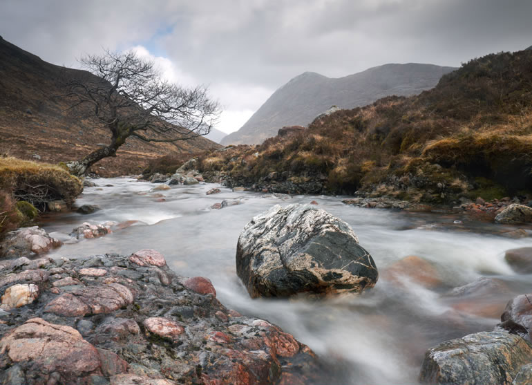
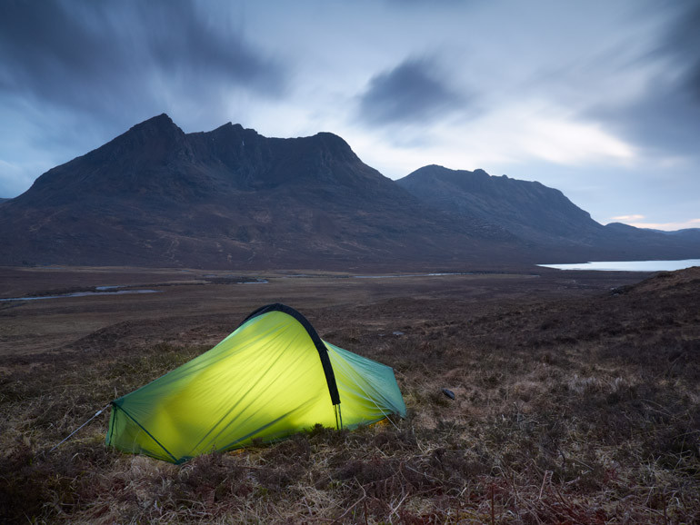
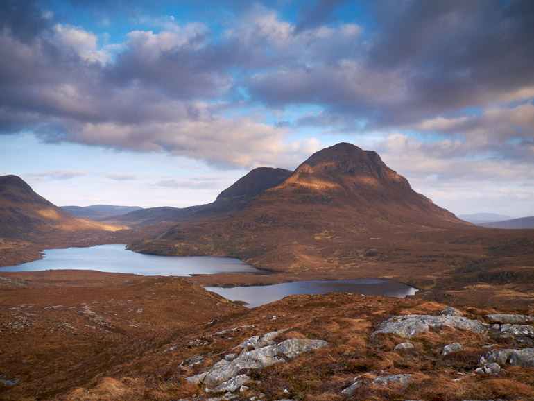
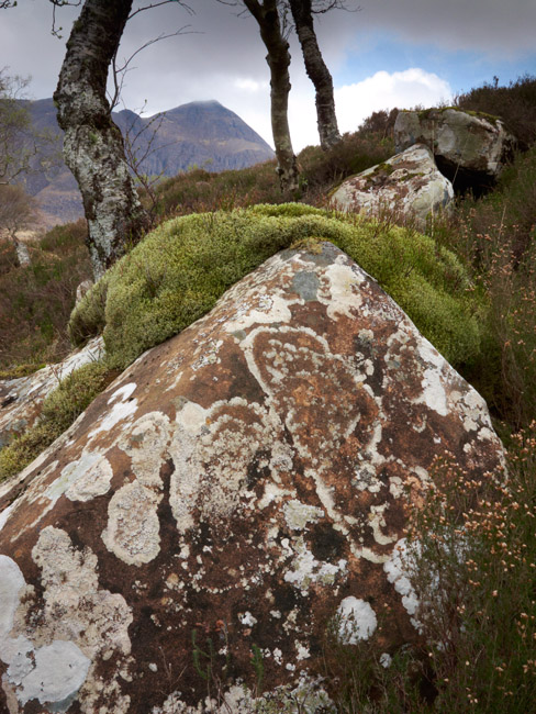
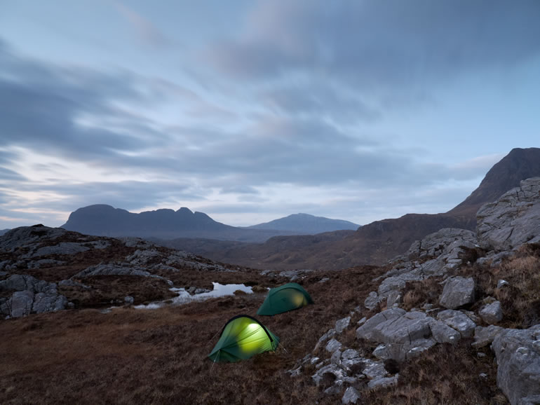
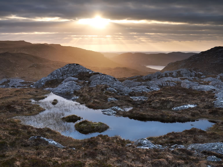
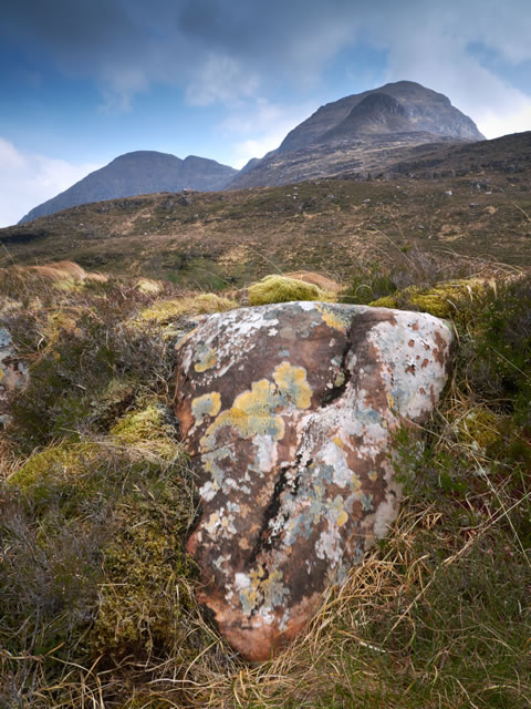
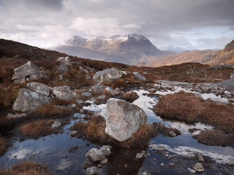
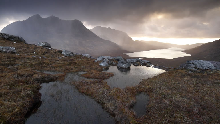
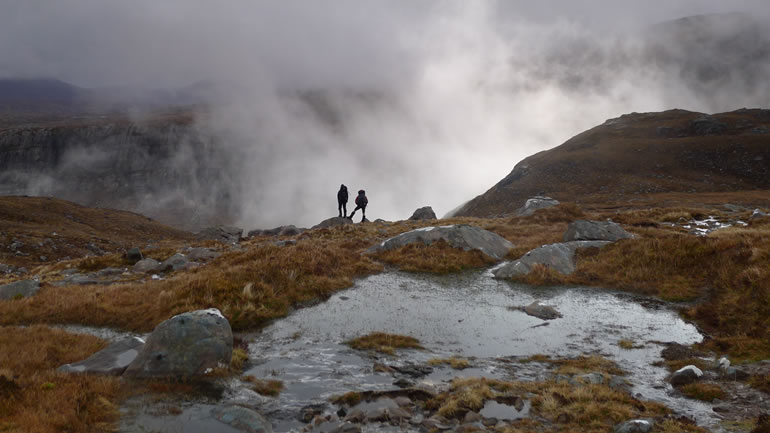
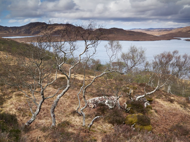
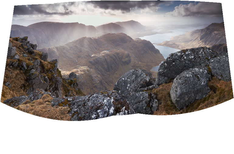


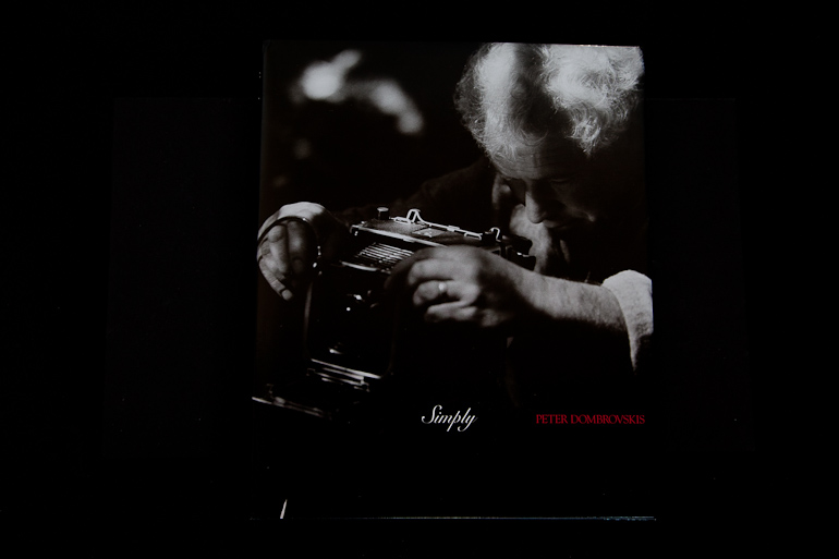
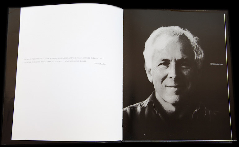
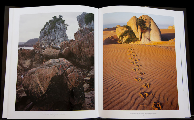
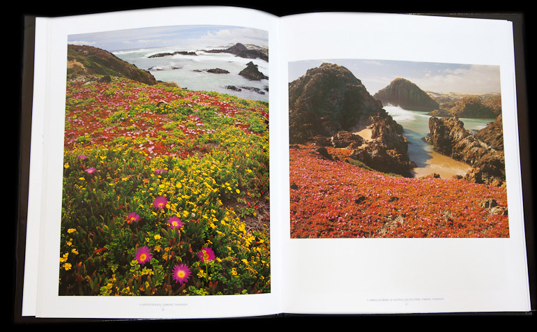
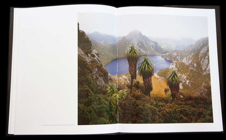
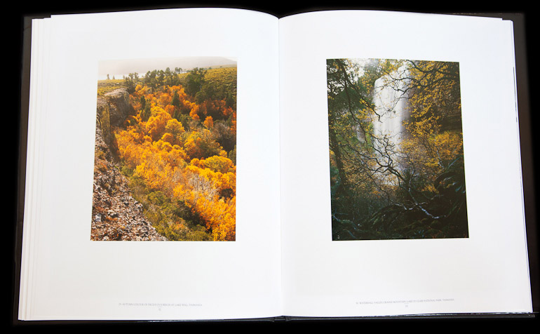
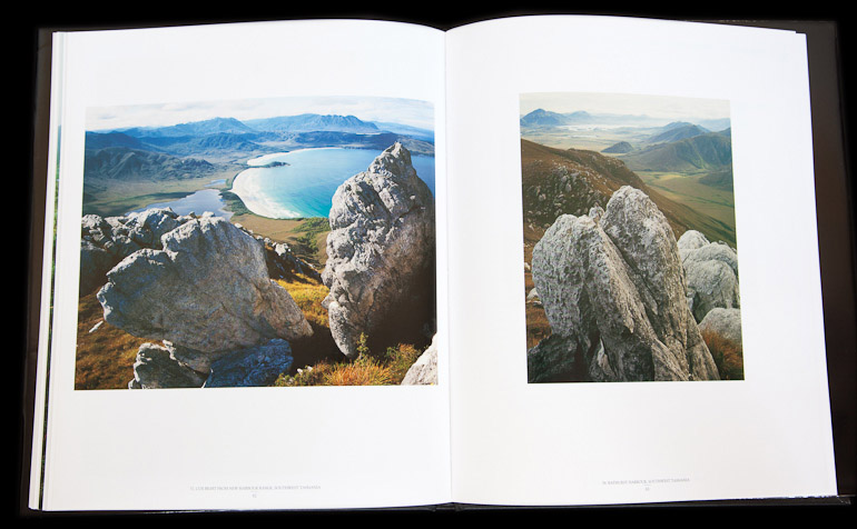


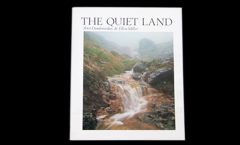
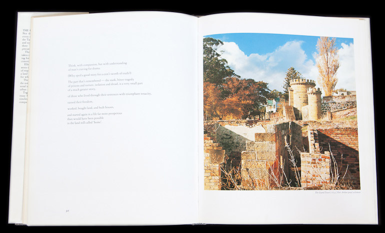
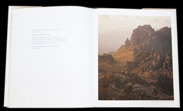
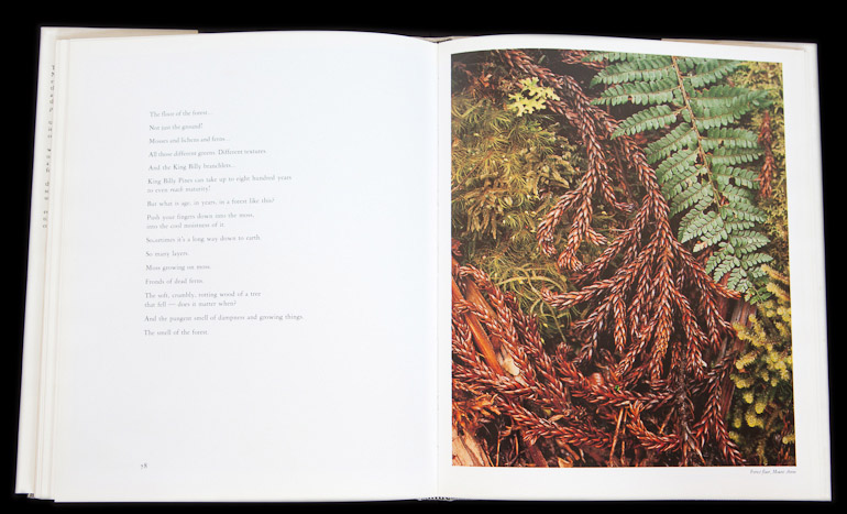
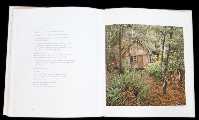
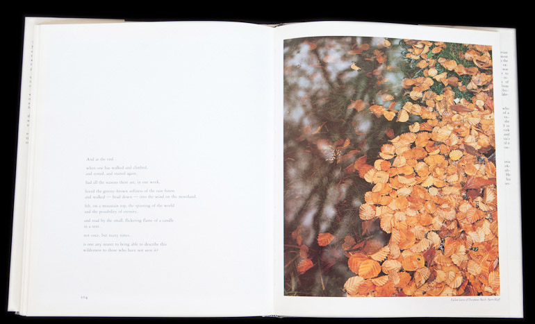
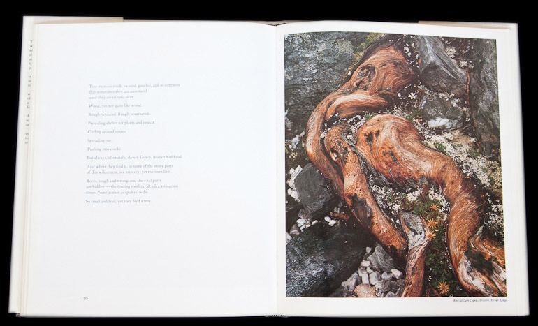


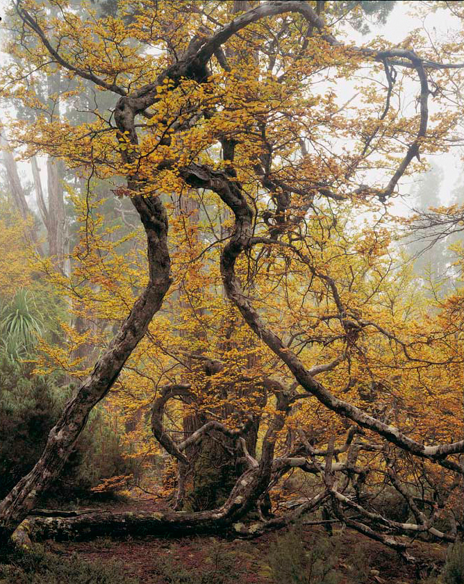
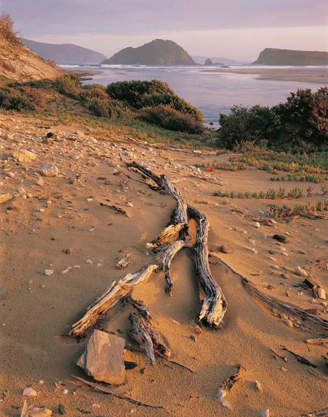
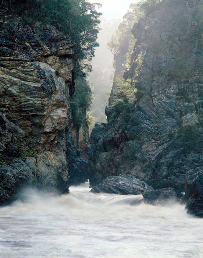
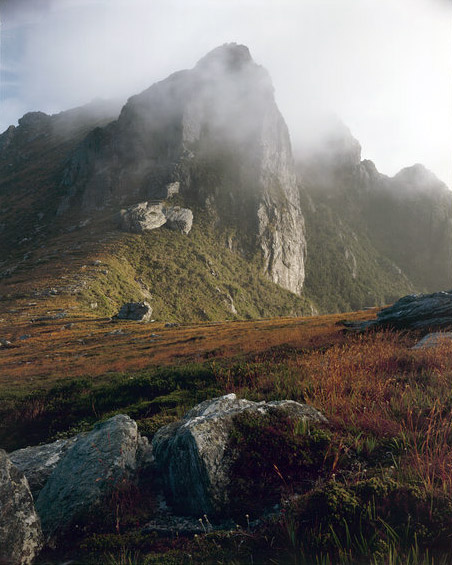


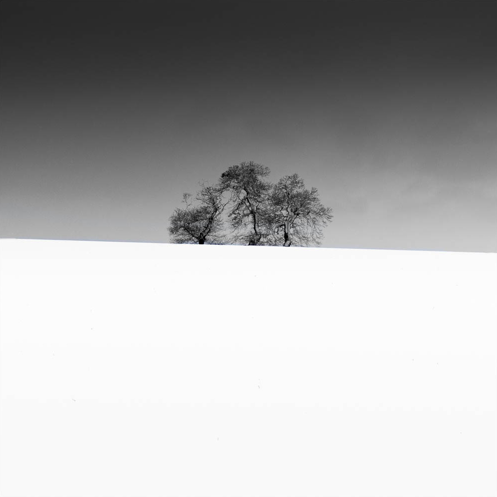


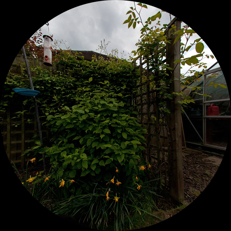