Paul Moon

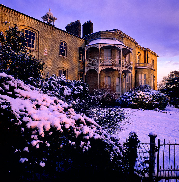
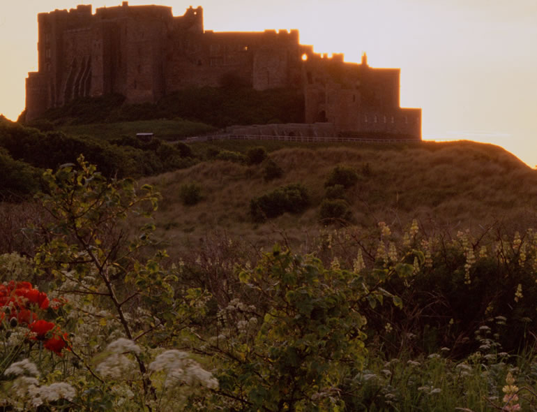
This week we're featuring a great photographer who has spent a lot of time championing a beautiful part of the country that gets a too little attention.


1


In most photographers lives there are 'epiphanic’ moments where things become clear, or new directions are formed. What were your two main moments and how did they change your photography?

I suppose my first epiphany would have to be the day my father returned from working abroad with a second-hand Zenit T SLR. It was clunky and awkward looking but I was smitten with it. I was only in my early teens but it really ignited something inside me. My parents encouraged my passion by buying me a Zenit TTL when I was 14. It was the black version so it was reasonably cool looking for a young teenager. Over the years I’ve attended night classes, taken an o-level in photography, learnt to process and print black and white photographs but never once did it occur to me that I could pursue a career in photography, especially landscape work. After years of using the camera to record my children growing up I started to become interested in patterns and textures in the landscape and a few local viewpoints. After being made redundant from a 15 year career in newspapers I bought a Canon 10D in 1994 and embraced the digital era. I had absolutely no idea that Joe Cornish, Charlie Waite, David Ward or Paul Wakefield even existed let alone Ansel Adams! Horrible to admit, I’m afraid!

The second epiphany was the realisation that I lived in a location that offered everything I ever needed in terms of wonderful subject matter. Like most budding landscape photographers I had an urge to travel to all the

2

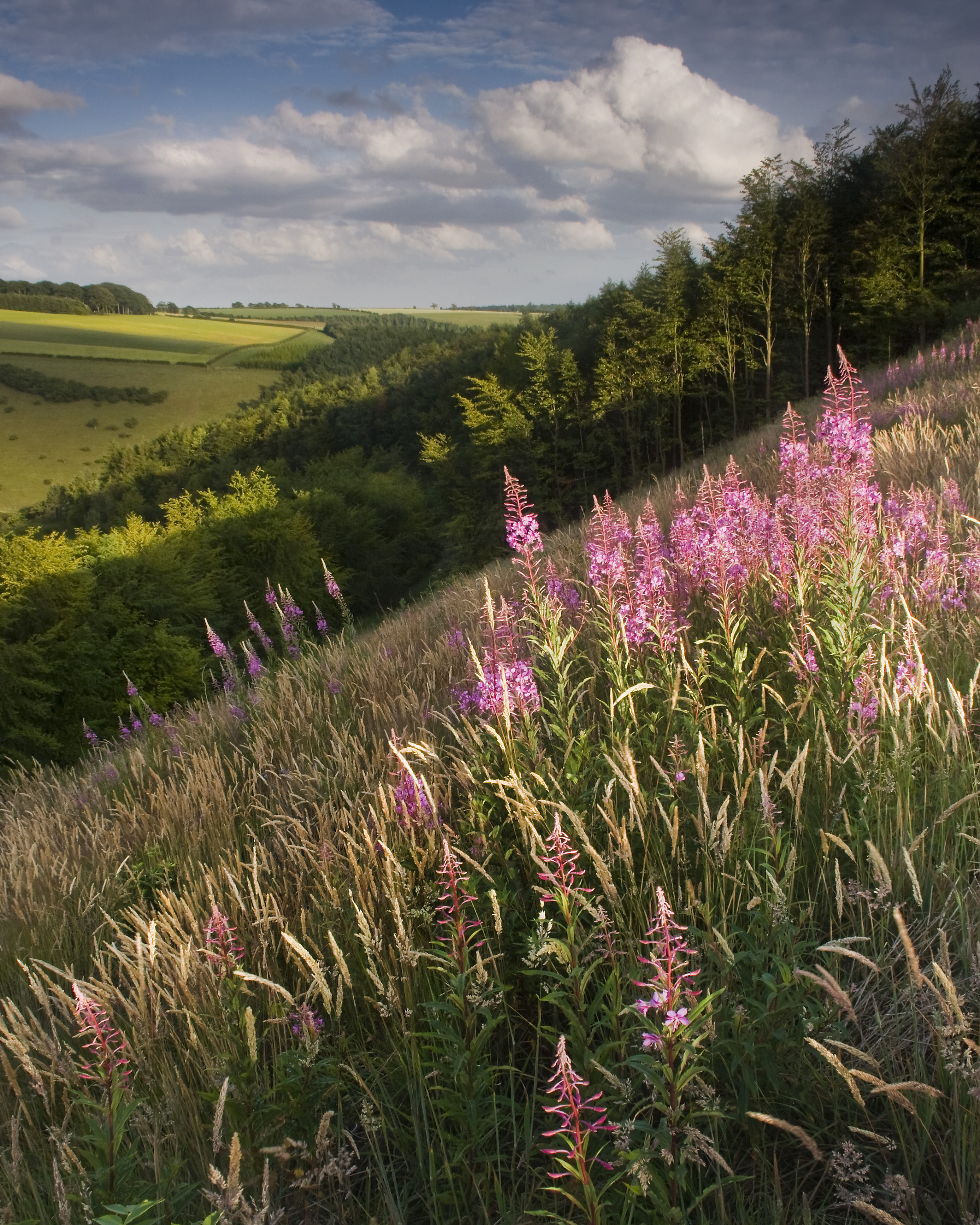
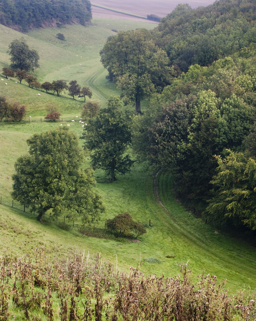
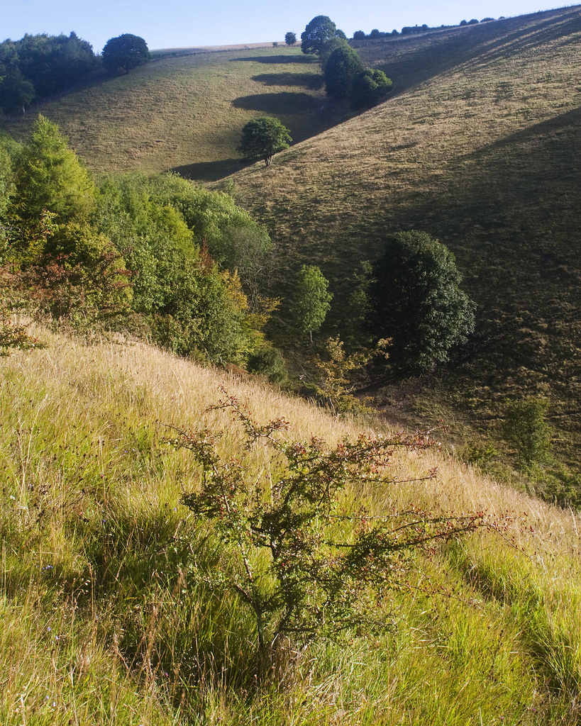
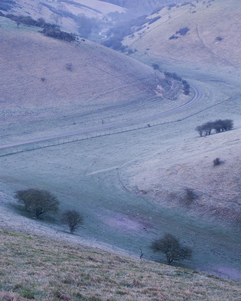
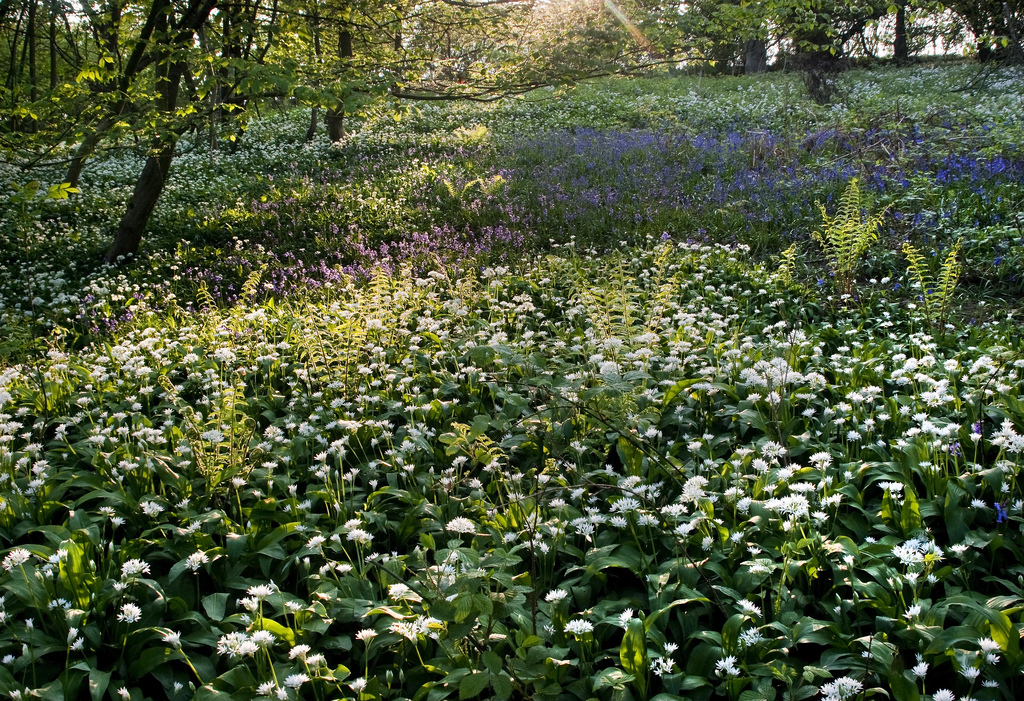
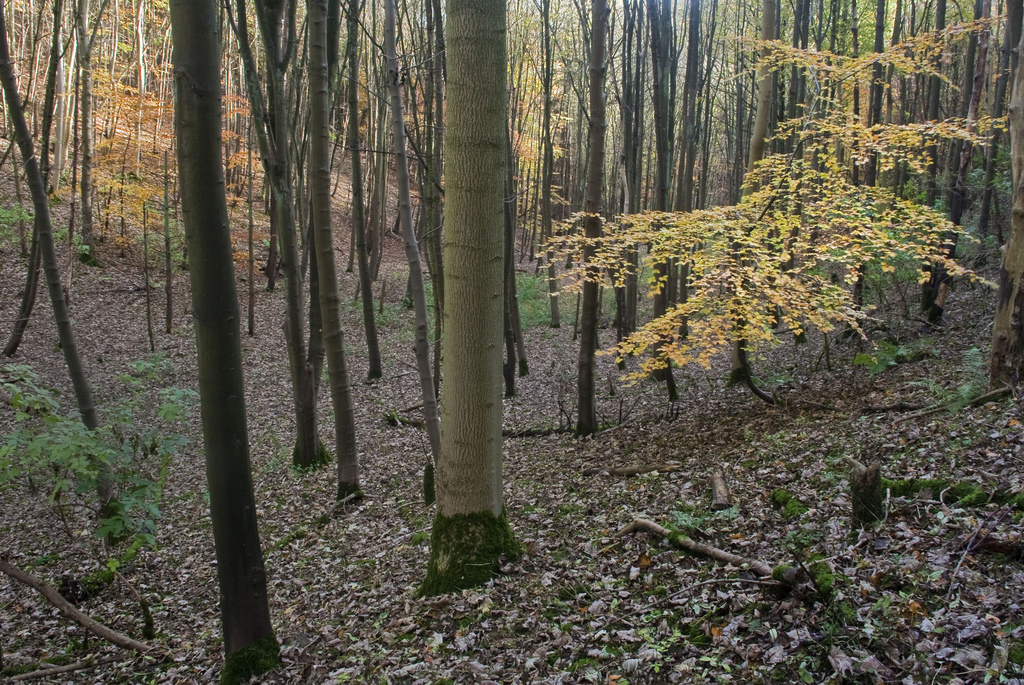
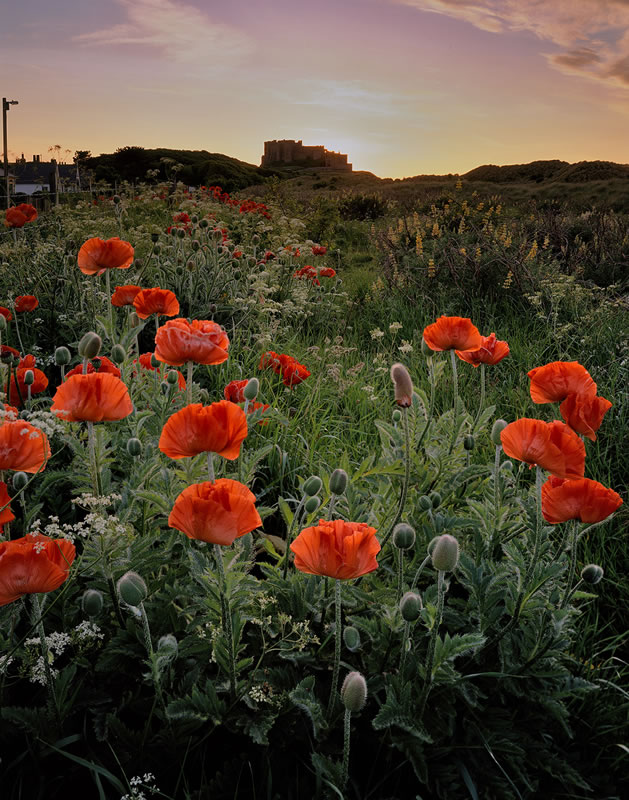
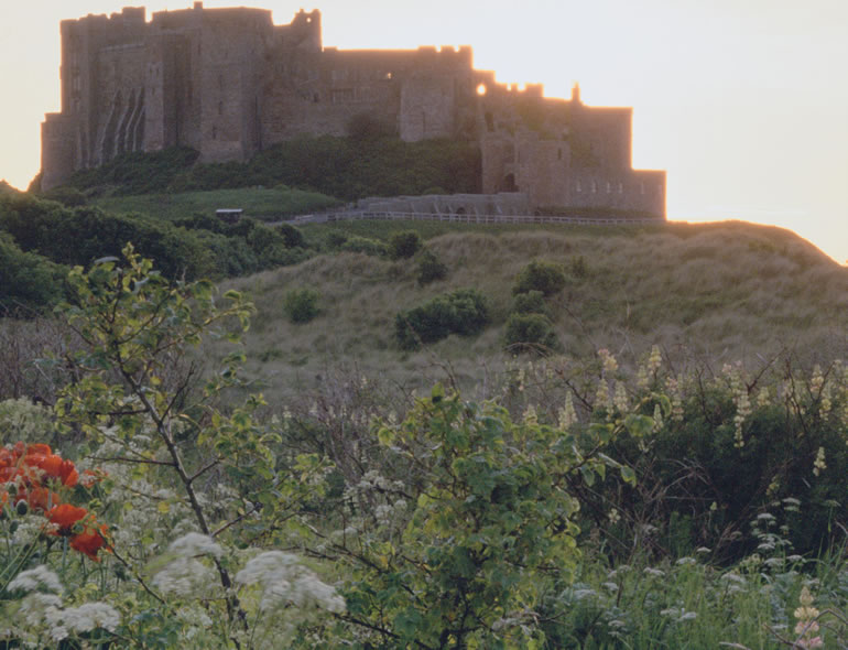
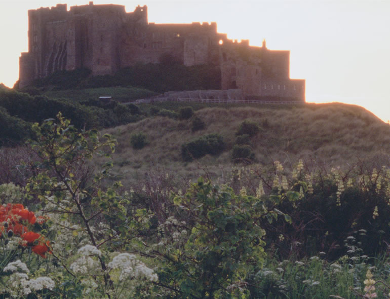
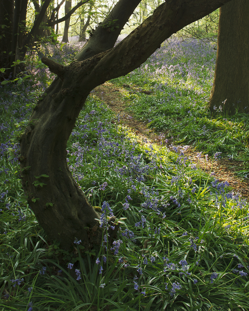
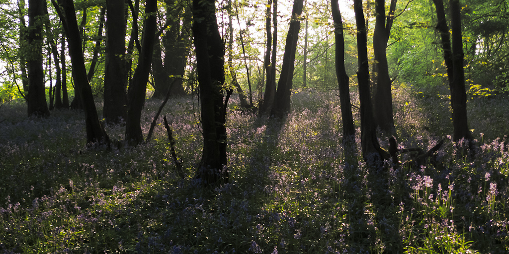
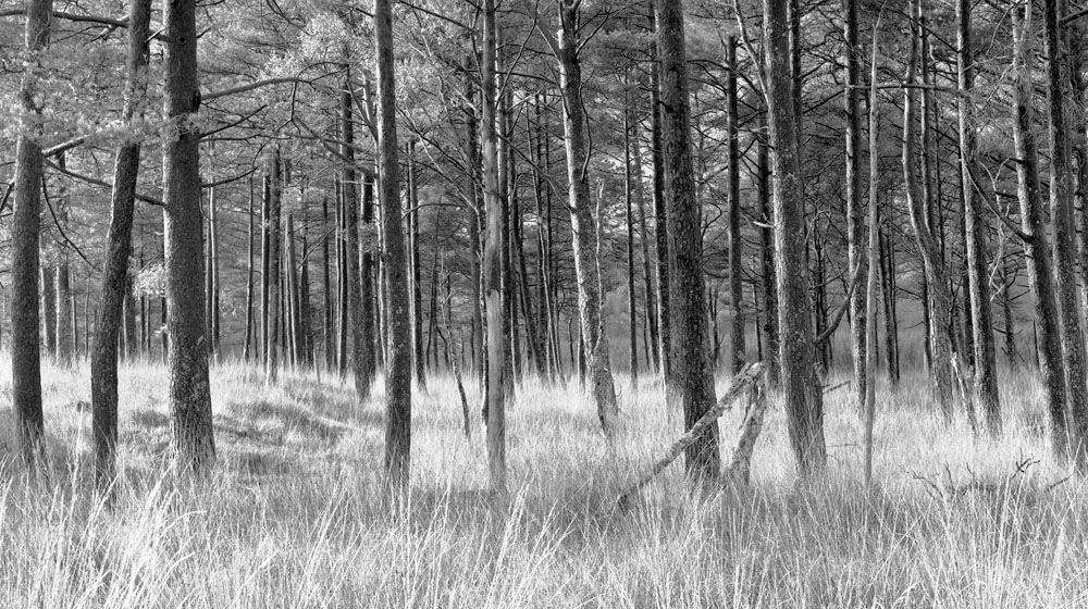
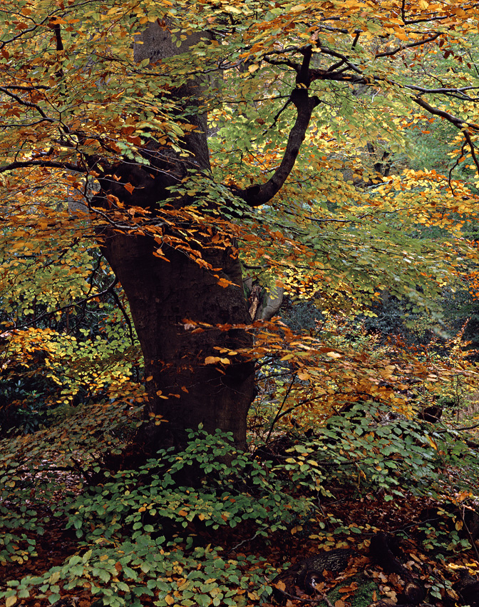
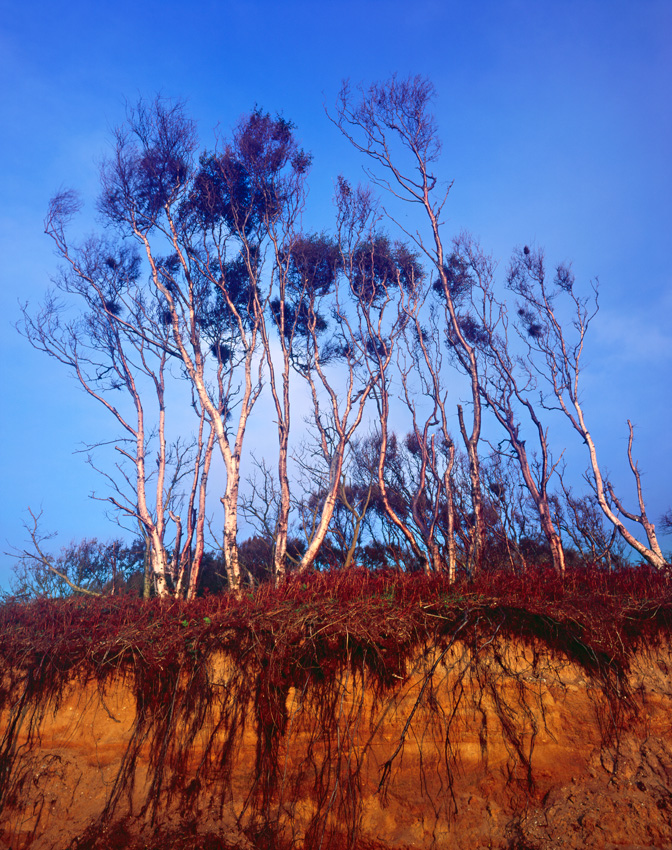
honey-pot locations I’d seen in magazines, and did so when I took the family on holidays to places like Cornwall, The Lake District and Scotland but during local family walks I began to see the potential of the Yorkshire Wolds for landscape photography. I’ve lived here most of my life without being aware of how little it had been photographed seriously. There are chalk cliffs at Flamborough and Thornwick Bay that are popular locations for photographers but the inland region had been largely ignored. Mark Denton had photographed a few local views for his Yorkshire Moors and Wolds book but he hadn’t, in my opinion, captured the essence of the chalk landscapes I knew. I decided I had to start exploring and photographing the Wolds but it took me a couple of years to really get to grips with the style of photography needed to make successful images here. I tend to concentrate on the chalk valleys that were formed as melt-water produced huge rivers that cut deep into the frozen chalk at

3

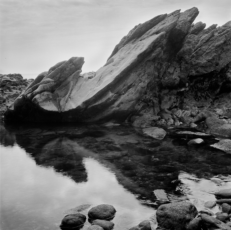
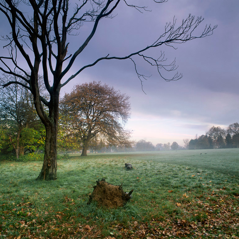
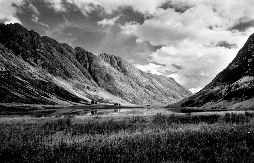
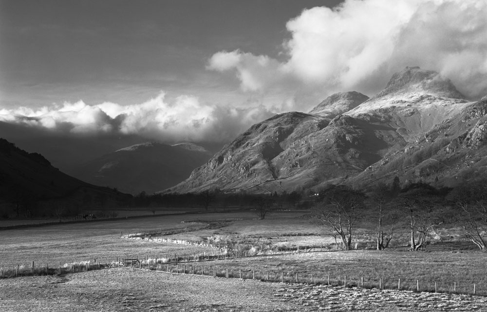
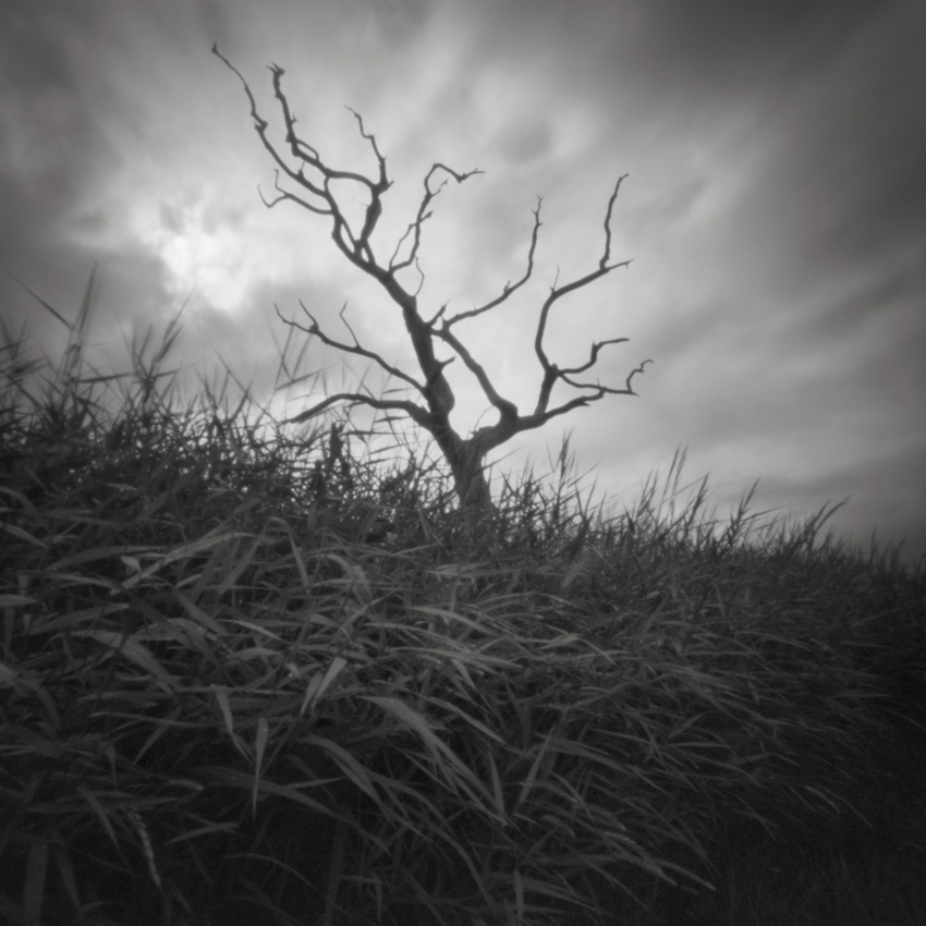
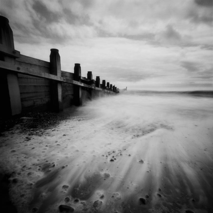
the end of the ice-age. These valleys twist and snake through the chalk upland and are mostly used for grazing livestock. Most have stretches of open access land and are very popular with walkers. If anyone looks on Google satellite maps at the village of Thixendale, North Yorkshire, they will no doubt see the extent of some of the valleys and tributaries, There are no mountains, very few rock formations (other than at the coast), no waterfalls or ancient monuments and it doesn’t have the dramatic locations that would really attract photographers, such as Malham Cove in the Dales or The Hole of Horcum in the North Yorkshire Moors. However, there are stunning views and wonderful subject matter available throughout the year, it just needs time to get to know where.

Not being a full time photographer, how do you find time to get out and take pictures?

I’ve had a very supportive wife and children who have put up with my Wolds obsession over the past few years and hopefully their faith in my passion will not have been in vain. Being able to drive just a few miles to many of the locations I have discovered helps enormously as I can be at some of my favourite spots in 5-10 minutes.

I do venture out at least once a week because I feel that the area needs far more exposure (no pun intended!), and the only way I can achieve that is by being productive and it’s also improving my photographic ability.

4

It’s quite unusual to have all these wonderful locations to myself the vast majority of the time and I’ve discovered some real treasures which would have probably remained hidden, photographically speaking, without my determination and love for this region. There are places further a-field that I need to explore more but for the time being I have enough locally - within a 10 mile radius - to keep me occupied.

Could you tell us a little about the cameras and lenses you typically take on a trip and how they affect your photography.

My equipment is very basic compared to most serious landscape photographers. I only have one camera body, a Canon 30D and three lenses that have seen better days, an 18-50mm, a 28-105mm and a 75-300mm. Wide angle photography on the Wolds is difficult so I tend to use the mid-range zoom more often. I occasionally use a 2-stop grad (when I get round to replacing the scratched one!) and a polariser (rarely). My Manfroto tripod is due for renewal but I’ll get a little more use out of it yet. I’ve enjoyed using digital because it gives me flexibility to experiment and not worry too much about the cost of failure. I’d love to use a 5x4 view camera sometime in the future but I’m unable to justify the expense at present and I like travelling light!

Your photographs exhibit a wonderful stream of


5


experimentation and each photograph is well considered in terms of composition and light. Do you compose instinctively or do you spend a lot of time on each photograph?

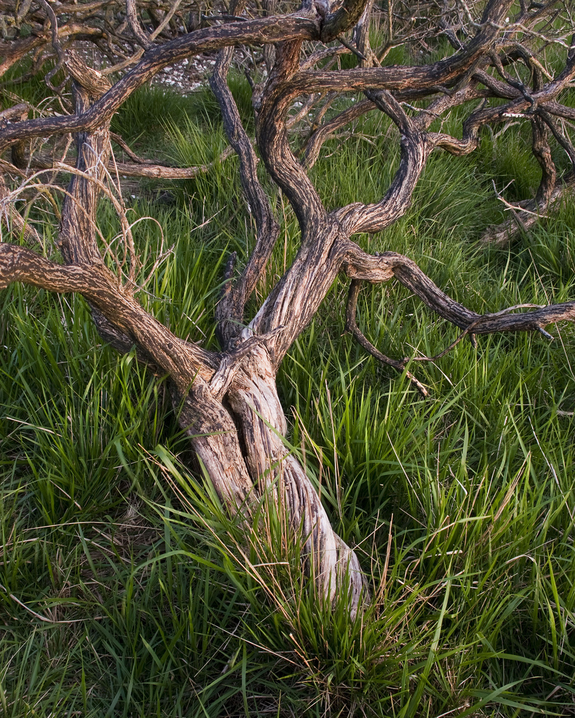
Thanks for the compliment Tim. I guess I’d have to call it instinctual, as I’ve never had any training or attended workshops. Some people may call my compositions simplistic or naive but that’s how I like to shoot. I’m trained in graphic design so I’m instinctively drawn to simple structural forms in the landscape, be they twisting S-shapes or zig-zags which occur often in my Wolds work. I’ve had the pleasant company of expert large format photographer Jon Brock on many outings around the Wolds, and to see him patiently working the subject matter has also had an affect on my photography. I return to many locations regularly but I also try and set aside periods when I will just scout new locations looking for subjects that will be worth returning to at a certain time of day or time of the year. These may well be beds of wild flowers or certain species of trees (alive or dead!). The weather conditions such as snow, ice, mist or low sun also play a big part in my choice of location and composition. Eventually all the conditions and my experience pays off, but on the odd occasion I just happen to find the perfect image slap-bang in front of me.

Tell me what your favourite two or three photographs are and a little bit about them.

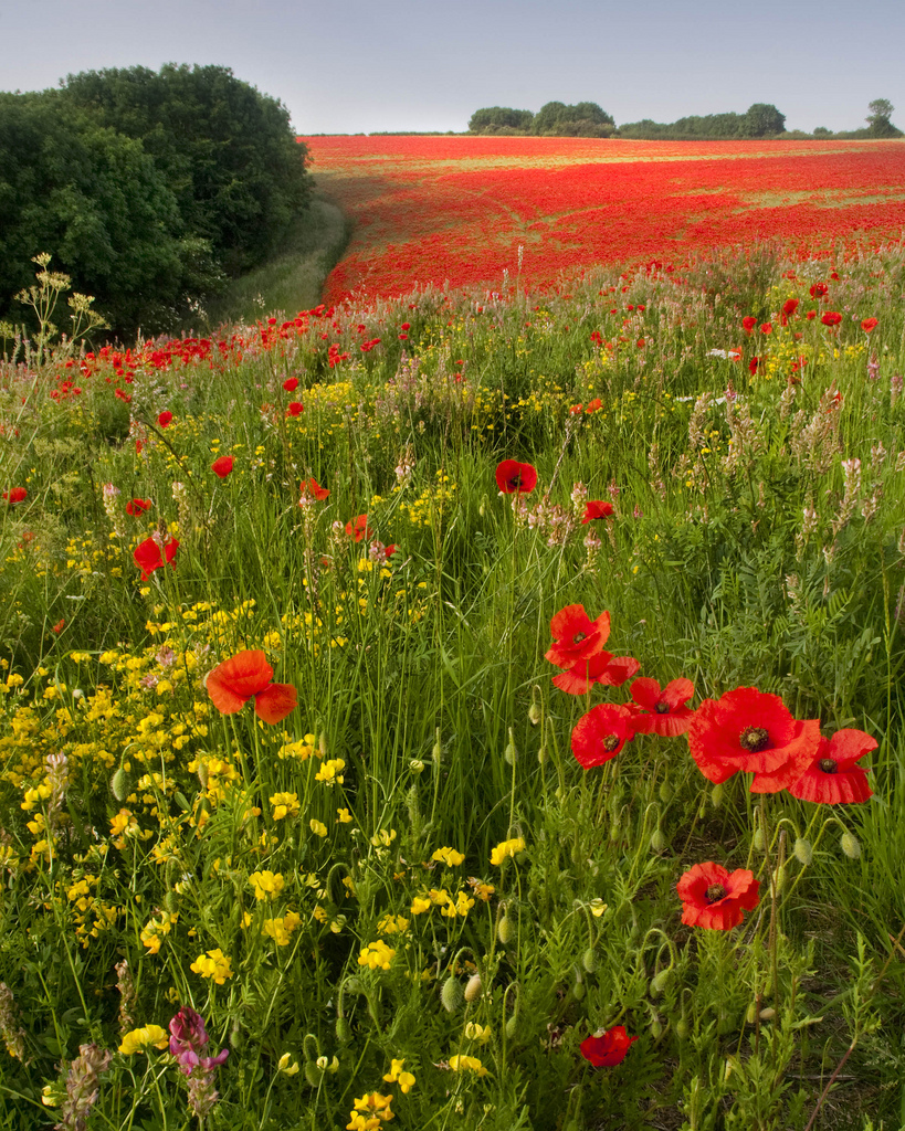
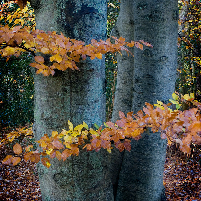
Autumn View – this is quite a pivotal image for me and my vision of the Wolds. It was taken in the middle of a bright sunny day in November in a small valley I’d only visited once before. Not the best way to approach a location admittedly and I tried hard to produce an image using my wide angle zoom, which seemed to be what all the magazines had been telling me to use. I gave up and reached into my rucksack for my telephoto lens as I’d been interested in this section of the view when composing the wide angle shot. Suddenly I realised that what I was seeing had all the makings of a strong graphic image using the receding curves and colours in blocks together with the hard shadows. To me it is archetypal Wolds landscape and I’d been trying hard to create this vision until that moment. I’m not sure it will go down well with many landscape photographers due to its hard lighting but I still enjoy looking at it.

Burnt Gorse – I had come across this patch of recently burnt gorse on the side of a valley at dusk. The landowners often destroy gorse and hawthorn scrub to encourage the grasses for grazing livestock and to conserve the native wild flowers. I quickly made a few images with the smell of smouldering wood filling my lungs but it was only after cropping my original effort to my preferred 5x4 portrait ratio recently that I realised how fortunate I’d been with my instinctive (jammy!) composition.


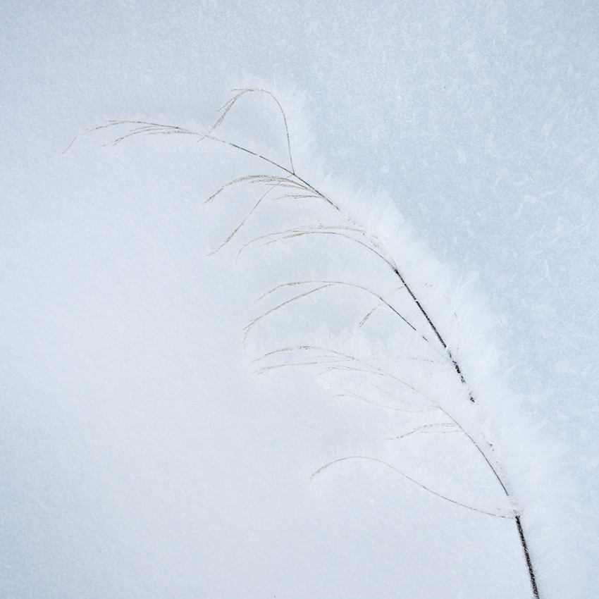
Footprints and Berries – not all my landscape shots have to be serious as this goes to prove. I nearly walked past this snow covered puddle with the path of hawthorn berries and the trail of pheasant tracks. It has a wonderful narrative quality running through it, holes where berries have been plucked up by the pheasant, the arrow footprints pointing back along its chosen path and the sudden disappearance of the footprints. It also indicates two of the Wolds most widespread occupants, the hawthorn and the pheasant in an abstract study. Perhaps I should just stick to vistas!


6


What sort of post processing do you undertake on your pictures? Give me an idea of your workflow..

I shoot raw, using self-timer and mirror lock-up, and process using the Photoshop Raw converter. I usually add contrast using the slider, tweak the white balance to a favourable setting, recover blown highlights, which I try hard to avoid in-camera and then increase the blacks setting until they become clipped on the histogram. I avoid saturation and vibrance as increasing contrast usually boosts colour intensity anyway. I often process two versions of the same shot, one for sky and one for foreground and then blend them after pasting one on top of the other and using a layer mask. Occasionally I shoot two images out in the field if I feel the contrast range is too excessive, one for shadows and one for highlights (if I can’t use a grad for some reason), then blend each together after processing. I’m a bit of a fan of deep shadows and often underexpose my raw files to increase the blacks but only occasionally when the subject suits the treatment. I suppose it’s a nod to the lack of dynamic range of Velvia but as you’ve discovered recently it does hold shadows better than previously presumed. Perhaps I should strive to show some detail in shadows but still keep them deep. I then use the dodge and burn tools (sparingly) until I’m happy with the results. I then use Lab sharpening with discretion. One other thing I do is crop all my uprights to 5x4 ratio. I don’t use this ratio for my landscape shots however, I just trim to a width I feel works best. I don’t crop to panoramic formats but I do take a few panoramas using multiple shots for stitching as it gives better results.


7


Do you print much of your work? If so how have you approached it and if not, why not?

I do sell prints of my work occasionally and use either a Roland Versacamm for canvases or an Epson Stylus Pro 4400 that we use at work for press proofs. I work in pre-press so know how to turn out fairly decent ink-jet prints. I’ve had some of my photographs litho printed for my own range of greetings cards and that has been an experience. I had no profiles for the press for the CMYK conversions, I just relied on instinct and knowledge of our workflow and having a monitor correctly calibrated helps enormously. I’m more than happy with the results although I’d prefer to spend more time experimenting. I had two books published a couple of years ago by Halsgrove on the city of York and I had no proofs to check the results of my CMYK conversions. In hindsight I could have lightened them a little more but they were reasonably accurate to my monitor. I am slowly getting the hang of CMYK conversion but having said that, and in spite of my occupation, I still have a great deal to learn on the art of printing.

Tell me about the photographers that inspire you most.

I’m inspired by many photographers but the four who have fuelled my passion have to be Joe, David Ward, Paul Wakefield and Charlie Waite. Each has their own unique direction in recording the landscape but all show a real love of their subject matter and I hope I show the passion I

8

have for the Wolds in the images I make. I recently invited Joe for an afternoon trip out on the Wolds and he duly obliged. It was a real pleasure watching him tackle some of the subject matter I showed him and I’m sure he’ll return soon! Other photographers who inspire me include Christopher Burkett, Charles Cramer, Peter Dombrovskis, Elliot Porter, Nigel Haliwell, Dav Thomas, Dave Tolcher, Paul Mitchell, Kyriakos Kalorkoti to name but a few and my good friend Jon Brock, and of course your good self Tim! As you may have noticed they mostly use film and/or large format view cameras. I try hard with my style to emulate the compositional approaches of these photographers but still have a great deal to learn from these experts.

What sorts of things do you think might challenge you in the future or do you have any photographs or styles that you want to investigate? Where do you see your photography going in terms of subject and style?

I’m hoping that the next challenge for me will be to see my work published in a book. I’m not in a position to self-publish although I could produce a Blurb book (other on-line self publishing companies are available!). I’d rather not have to make a guide book but just let my work tell the story of the Wolds landscape and it would have to be a quality product in order for me to be happy. Probably far too much to ask, but still worth pursuing.  I’d also love to be able to have eminent photographers running workshops with myself as a guide in the future (for a small fee! ).

9

I’m not really a creative photographer but I really enjoy the work of photographers like Doug Chinnery, Chris Friel and Rob Hudson. It’s just not something I have a passion for at present. I’m more of a documentary photographer (as Joe likes to call it), and I take great pleasure in the creativity of nature and occasionally man-made objects. Perhaps I’ll have another epiphany and discover something that does take me in a new direction but until then I’ll just continue producing the work I feel comfortable with at the moment. Over the years I have often attempted to shoot vistas in dull or wet conditions with soft light and I’ve been reasonably happy with the results so I’ll continue to work on that side of my landscape work.

One last thing that I’d love to see happen in my lifetime is for the Wolds to be given a national designation for its landscape quality. A national park would probably be too much to ask, but an AONB designation would be ideal to help protect the landscape from large scale development. There are already plans afoot to install ten 126 metre tall wind turbines on the Wolds and in my opinion they will seriously disrupt some stunning views. I’d love anyone who feels passionate about this subject to visit www.heslertonwindfarm.com and sign the petition for AONB designation. Hope I’m not rubbing anyone up the wrong way with this request. I’d be even more pleased if my landscape photography could in some way contribute to an AONB designation happening.

Who do you think we should feature as our next photographer?

I’d love you to feature Paul Wakefield as his four books published by Aurum Press in the eighties have been a benchmark for many landscape photographers including myself. Oh, and that nice Jon Brock chap!!

By the way, did I mention the Wolds…..!


Thank you Paul for a another great interview and for your passion for the Wolds - please take up his call to support it too.. You can see more of Paul's images either at his website or by visiting his flickr stream.

The Arca-Swiss D4 Geared Head

There has been little choice and many compromises for those wanting to benefit from a geared head. The Manfrotto 405 / 410 have been the only game in town and although very good for the job have suffered from a reputation for poor engineering and are not long lived before needing repair or replacement. They are also beasts weighing in at 2.4kg for the pro spec 405 which is the head most commonly used by large format enthusiasts. Ball heads are lighter but present challenges with control as once released a tiny change is often only arrived at with a waft in all dimensions so making precise compositional control more awkward than it needs to be. Arca’s cube although solving these problems was expensive and more designed for the studio than the landscape. It was with this backdrop that the announcement by Arca at Photokina 2010 that they had developed a new geared head was met with much interest by LFers and those who desired the ultimate control in a lighter weight package.

I took delivery of a new Arca Swiss D4 Geared Head from Robert White in May 2011 and was immediately impressed by its small dimensions and its quality engineering. A version without gears (the D4 Manual) is also available. This head is a very compact pan and tilt head. Weight is a meagre 800gms and size (110x90xH100) is basically the same as an Olympus EP1. Price was a hefty £690.00 plus VAT compared to a Manfrotto 405 for £300incl or Kirk BH-1 for £350incl.

Here is the press release for the head from Arca:
“With the invention of the d4 pan tilt head ARCA SWISS has put an end to setting levers of 3d heads that extend in all directions and always get in the way. No more uneven swivelling out of the camera. No more oversized dimensions, heavy loads and other all too well-known drawbacks to get in your way. We get straight to the point!
The d4 and d4m are especially suitable for efficient and precise work in digital studio photography and outdoors for architectural photography. The d4 is the world’s smallest, most functional and lightest gearhead.


Technical specifications

The innovative design of the Arca Swiss D4 Geared Head and d4m gear heads unites the pivot points of the X and Y movements at the same point.

The result of this new concept: identical and the smallest possible rotational radii. That ensures small camera movements and, as a consequence, almost no deviations in scale, which, until now, led to reduced depth of field in digital photography and all too often made tedious corrections necessary.

The self-locking, micrometric movements in X and Y result from separate gear mechanisms, manufactured with a high-strength special alloy. Every tilt movement has its own fine tuning knob and a lockable free wheel button. When both knobs are unlocked, the tilts can optionally be carried out in freewheeling modus. The possibility of free movement in both axes using the freewheeling modus then ensures free movements similar to those of a spherical head!

The ARCA SWISS d4 and d4m have, like the cube C1 from ARCA-SWISS, a turning device on its base to align the camera as well as a panning device under the camera mount for panorama pans which maintains the swivel axis. Underneath the panorama feature are 2 bubble levels at a 90° angle to align the camera. In additionto the tilts in X and Y and the panorama rotation, the ARCA-SWISS camera mount enables the camera back and forth movement in the exposure axis, the 4th dimension, so to speak, as the model number d4 symbolizes.

The outstanding specifications include the record-breaking weight of just 800gr for the d4 and only 640 gr for the d4m. There is no smaller gearhead on the market.”

I have used the head with 3 styles of camera that I own with the m4/3rds compact and D3X both with ‘L’ brackets and with the Ebony 45S. All the plates that I own work perfectly with the flip lock head that is provided.
In general it is a joy to use with precise smooth movements whether locked or unlocked. It has all the spirit levels you could need to get the platform level even if the head isn’t level itself. Panning is possible on the base of the head and on the QR plate which is an excellent touch for when the tripod isn’t level. Once locked the gearing is precise and micrometric in feel – ie very fine movement is possible. Once locked the camera is held solidly and with no creep. Basically it does what is says on the tin with the quality you expect from Arca. The one thing I will re-iterate is that this head is tiny by comparison to any other head that competes in quality. I have owned variously a Kirk BH-1 (& BH-3), Acratech GV2 and Manfrotto 405 (& 410) and only the GV2 was smaller and lighter.

Some buts…..

If you are familiar with the current version Arca Swiss cameras then the locking knobs are the same as on the cameras. This is both good and bad, the knobs are quite small (50pence piece size) and have a fine rubber grip which I don’t find very grippy. As with the cameras the gears are tight due to the tolerances. They should loosen up a bit with use (the cameras do) but right now the knobs are just a little small to comfortably drive the gears with the heavier combinations. I haven’t found a maximum weight specification but I might consider carefully whether I would put a 10x8 or larger camera on this head or indeed anything bigger that a d3x/70-200mm combination. A slight unknown at this point is how it will perform in extreme cold with tolerances this tight. I never had a problem with Arca cameras down to -20c but the jury is out until we have been through the Winter.

Lock nut placement on the base of the head isn’t good when the tripod base is larger than the head base. Its fiddly even with my small fingers. The head fits perfectly on a Manfrotto 055 but looks tiny on my Gitzo systematic 5 series. The base is about 5.5cm in diameter. I don’t have a Gitzo 35XX to hand but suspect the head would be about perfect on these legs.

A personal preference may determine whether you like the placement of lock nut and geared knob. The Manfrotto is quite convenient with both together and just a small movement of the hand needed to unlock the movement or gear. The Arca has them separated on opposite sides of the head. It has taken some getting used to especially with your head under a dark cloth.

Conclusion

Takeaway for me is that this head does solve the compromises between the classic Mn405 vs large ballhead and is a viable replacement. It wont suit wildlife photographers who need to convert it to a gimbal head or use big glass. Price is an obvious problem but it does replace both types of head and at that point looks more affordable. I expect it to last a lifetime.

Brockwell Park

Autumn in the walled garden

I first wandered into Brockwell Park with a camera about five years ago, the park entrance being only a few metres from my front door. Before this it had been nothing more than a pleasant green space to cross on the way to the station at Herne Hill, or the venue for occasional summer picnics. When I could, I traveled to my landscape “home” in mid Wales, photographing the Elan Valley. Although dominated by man-made reservoirs, the Elan Valley is rich in the plant and animal life of wild Britain; every stone there is covered with lichens and painted with watercolour-like mineral stains such that the observant visitor struggles to fully appreciate both the world at their feet and the dramatic scenery of hills, valleys and Victorian dams.

London had nothing of this richness to offer, being built out of tarmac and concrete, cracks in the one revealing deeper layers of the other dating from earlier attempts to cover the entire landscape in one of the two.

However, having borrowed a friend’s digital camera I wandered out on a December morning, for once liberated from the economic constraints of film. A few shop owners had suggested that recognizable local landscapes might sell well as cards and prints, so I attempted to depict some of the park’s old and distinctive oak trees. I was aided by

Evening shower in the walled garden

a spectacular sunrise through fog, and my success in producing decent photographs devoid of visible concrete and bins motivated me to explore this sideline further, portraying other trees and architectural landmarks.

At some point my friend with the digital camera went on holiday, and faced with early spring snow that I couldn’t waste, I went out with my real medium format camera. This marked the beginning of a project I have been pursuing ever since, and the basis for a personal approach to landscape photography in London.
A central idea in my Brockwell Park project is to convey the landscape’s distinctive character, giving prominence to both its historical and modern features. Despite the concrete and bins, this landscape is rich in form and this form a direct link to the area’s well-documented history. It was once a wealthy glass merchant’s country estate, but the original mansion is now the park café, and the kitchen garden split into a decorative walled garden and a community-run greenhouse project. Some of the architecture clearly shows its venerable age, but is also potentially juxtaposed with the still-evolving skyline of central London.

Sunrise in fog, near Brockwell Hall

In my first year working on the park, I focused on small details, hoping that if I looked closely enough I would find miniature landscapes as complete as those in Wales. In a few cases this worked: the meadow in late summer, flattened into swirling patterns by the preceding months’ wind and rain, or the knotted branches of closely growing plane trees in falling snow, a graphic texture of grey and white lines. However with increasing confidence grew the desire to tackle the wider landscape and to make the accessible appeal of the dramatic, even epic vista work in my favour. The feeling that this was a more difficult challenge further increased my resolve, and towards the end of the project many of the earlier miniature landscapes in my portfolio had been usurped by more accomplished, carefully considered and planned wide-angle views made in dramatic light and with whatever other exciting weather phenomena I could work with. The luxury of living within seconds of my location enabled me to capture fleeting meteorological drama and beauty that has eluded me elsewhere, and in glancing though the work I hope one of its overall characteristics is an abundance of vibrant colours. I have tried to use the weather as an atmospheric connoisseur, prizing the best examples of fog, frost, snow and summer showers in the same very familiar settings. For once I can show a location on some of the very best days of the year, and not have to make do with what’s available during a short window. Over the years I’ve found the

Delicate dawn at the lake

climate in London to produce a lot of photogenic weather, but of a slightly different kind from that typical of mid Wales or Scotland. I particularly enjoy using dramatic cumulus cloud-filled skies to convey a feeling of grandeur, like the Dutch, German and Italian landscape painters whose work I often study. Contrails aside, the London sky is the great expanse of wilderness that we have permanent access to, an ever-changing spectacle of natural forces that contrast with or compliment the immobility of the land. Occasionally it even descends to envelop the ground in fog, falling snow or drifting rain, forming the link between landscape and cloudscape that is so often felt in the countryside. One of the qualities I have particularly sought in this project is the sense of almost consciously designed drama that recalls the work of painters – it reinforces the images of nature as we’ve seen it depicted (with apparent artistic license), but also demonstrates that many of these observations are quite truthful, and as true in the urban environment as in the rural.

I hope my journey through the seasons and the park landscape can help change preconceptions of what London can look like, and also the idea that travel is a prerequisite for landscape photography. Of course not all Londoners live quite as close to green spaces as I do, but few of us are so

Morning walker in drifting fog bank

far removed from nature that we can’t at least practice the craft in familiar surroundings.

I am now widening the scope of my work, spending more time exploring other parts of south London and also having been commissioned to photograph Islington’s parks through the seasons. Some of my new elevated locations in Lambeth and Southwark literally put Brockwell Park in context, with the park’s central hill rising out of the conurbation’s vast expanse of trees and buildings. However this year I had the opportunity to exhibit the original photographs of the park in the park itself, as one of three shows in Brockwell Hall, the estate’s mansion.

With the support of the park management, “friends of” group and two commercial sponsors, Veolia and Land Use Consultants, I was able to print and display almost forty of the photographs, for once having the resources to present them in the sizes and frames I think best suit them.

The show was a huge success, with over 600 visitors during the short 3-day run. Many of the prints sold to enthusiastic locals and in the subsequent weeks I have barely had time to deal with all the orders. I’ve also found a new larger local venue, available for a whole month, and I hope some of those that didn’t make it to the first show will be

Brockwell clock in snowstorm

able to see the second.

I frequently think of the long hours I spent alone in the park, slowly working out what to do with the work and how to make the most of London’s particular qualities not just as a location but as a marketplace for art. Seeing so many people go out of their way to help with my show and to buy prints reminds me how powerful and accessible the art of landscape photography is. It can be a difficult profession, but it’s easy to forget how much can be gained by making decent prints and finding ways of showing them to people. It brings the pictures out of the confused world of the internet and the forgotten world of disks and transparency sleeves and gives them a substance comparable to that of paintings.

For those readers planning on being in London in September, the new incarnation of Brockwell Park, a Year in Landscape Photographs will be at Carnegie Library, Lambeth. It’s open on Mondays, Wednesdays, Fridays and Saturdays, with full details available on my website soon – www.maxarush.com

Technical details (in case of interest):

Pendulous sage and pond

All the park photographs were made using a Bronica SQ 6x6 cm camera and three lenses, 50, 80 and 150mm. The film was Velvia and very little filtration was used, apart from ND grads. Some of the architectural subjects were challenging to photograph without a view camera, but with the particular emphasis on the weather and light, the speed and convenience of roll film made this choice worthwhile. Many exposures were spoiled by dog and dog-walker movement, so the ability to make a few at a time without excessive expense was also valuable.

The prints were made from scans, colour-corrected and prepared myself and printed on Hahnemule Photo Rag paper at Photofusion, my local photographic centre in Brixton.

Brockwell Park:
A Year in Landscape Photographs by Max A Rush

At Carnegie Library
188 Herne Hill Road
SE24 0AG

Throughout September 2011

Colour Film Comparison Pt. 3


We're back with our film tests so sorry for those of you who are purely digital. The tests are really useful for the large number of people who are coming back to film or starting to use it for the first time. I only plan to do another two or three full comparisons such as this (an autumn scene, an overcast lush green scene and a winter scene for example) and then I'm also looking at a full test of all the colour films available (about 26 different films at this point in time - although only about 18 are in current production) which will give dynamic ranges and colour handling.

So, if you are still reading then you've got a passing interest in film (hurrah!) and I'll see what I can do to help you choose which films you may wish to play with. The extra in this run was that we have included the new Portra 400 and Portra 160 films which have proven to give excellent results. Portra 400 has about 19 stops of dynamic range (about the same as Portra 400NC in the highlights but it has an extra couple of stops in the shadows) and Portra 160 is a very similar film to Portra 160VC but with a smoother grain and a small amount of extra dynamic range.

The scene I was testing was a view from the small poppy drifts on the 'other' side of Bamburgh castle in Northumberland. The sun had just popped below the castle and so the dynamic range was full on, probably 8 or 9 stops between the shaded greenery and the area around the castle and the deep shadows going down to about 13 stops below. The sun was moving as I was taking the shots but I've tried to group related films together. There shouldn't be too much difference in colour - the latter neg shots will probably be a little cooler in the sky and at one point the sun 'popped' out for a few seconds in the right hand corner of the castle (coinciding with the early neg shots).

I don't want to do too much analysis here - I'd like a fresh set of eyes to look at this and give comments so, please, if you have some conclusions about different films, please add comments to the bottom of this post and I'll come back at the end of the week, compile the best and add my own conclusions.

I should also add a huge thanks for Digitalab in Newcastle upon Tyne who developed all of the film for these tests and who have proven consistently great results. Although I could have developed the film myself, in order to make the tests consistent a professional lab minimised a potential failure point

Whole Photograph

The full picture with the photographs as they came out of the scanner (which means calibrated chromes and for neg film I set the shadow highlight points in my Howtek drum scanner software. However, similar results were had by making a raw scan and setting the RGB points in photoshop.)

before
after
Comparing Velvia 50 with Velvia 100

Choose Which Films to Compare

Before side
  • Velvia 50
  • Velvia 100
  • Velvia 100F
  • Provia
  • Astia
  • E100G
  • E100VS
  • Ektar
  • Pro160S
  • Portra 160NC
  • Portra 160VC
  • Portra 160
  • Portra 400NC
  • Portra 400
After side
  • Velvia 50
  • Velvia 100
  • Velvia 100F
  • Provia
  • Astia
  • E100G
  • E100VS
  • Ektar
  • Pro160S
  • Portra 160NC
  • Portra 160VC
  • Portra 160
  • Portra 400NC
  • Portra 400

Whole Photograph (added contrast to neg and shadow/highlight to slides)

Because the negs come out with a very low contrast, I've applied a strong contrast curve, pulling the shadows and mid tones down and pushing the highlights up to creating a strong shoulder

before
after
Comparing Velvia 50 with Velvia 100

Choose Which Films to Compare

Before side
  • Velvia 50
  • Velvia 100
  • Velvia 100F
  • Provia
  • Astia
  • E100G
  • E100VS
  • Ektar
  • Pro160S
  • Portra 160NC
  • Portra 160VC
  • Portra 160
  • Portra 400NC
  • Portra 400
After side
  • Velvia 50
  • Velvia 100
  • Velvia 100F
  • Provia
  • Astia
  • E100G
  • E100VS
  • Ektar
  • Pro160S
  • Portra 160NC
  • Portra 160VC
  • Portra 160
  • Portra 400NC
  • Portra 400

Whole Photograph (added grad to neg and shadow/highlight to slides)

In order to compare the slides and negs, many people will add a 'virtual' grad over the neg skies and so I've done some post processing on the negs that I would if I wanted to make them look more 'chrome' like

before
after
Comparing Velvia 50 with Velvia 100

Choose Which Films to Compare

Before side
  • Velvia 50
  • Velvia 100
  • Velvia 100F
  • Provia
  • Astia
  • E100G
  • E100VS
  • Ektar
  • Pro160S
  • Portra 160NC
  • Portra 160VC
  • Portra 160
  • Portra 400NC
  • Portra 400
After side
  • Velvia 50
  • Velvia 100
  • Velvia 100F
  • Provia
  • Astia
  • E100G
  • E100VS
  • Ektar
  • Pro160S
  • Portra 160NC
  • Portra 160VC
  • Portra 160
  • Portra 400NC
  • Portra 400

Houses (default settings)

Here are the houses on the left hand side of the picture with the chromes boosted to show the shadow detail (not much needed doing the the negs) I've tried to balance the negs by setting a grey point on one of the posts

before
after
Comparing Velvia 50 with Velvia 100

Choose Which Films to Compare

Before side
  • Velvia 50
  • Velvia 100
  • Velvia 100F
  • Provia
  • Astia
  • E100G
  • E100VS
  • Ektar
  • Pro160S
  • Portra 160NC
  • Portra 160VC
  • Portra 160
  • Portra 400NC
  • Portra 400
After side
  • Velvia 50
  • Velvia 100
  • Velvia 100F
  • Provia
  • Astia
  • E100G
  • E100VS
  • Ektar
  • Pro160S
  • Portra 160NC
  • Portra 160VC
  • Portra 160
  • Portra 400NC
  • Portra 400

Houses (Boost curve)

Applying a general boost to show the shadows (which has blown the highlights in the chromes)

before
after
Comparing Velvia 50 with Velvia 100

Choose Which Films to Compare

Before side
  • Velvia 50
  • Velvia 100
  • Velvia 100F
  • Provia
  • Astia
  • E100G
  • E100VS
  • Ektar
  • Pro160S
  • Portra 160NC
  • Portra 160VC
  • Portra 160
  • Portra 400NC
  • Portra 400
After side
  • Velvia 50
  • Velvia 100
  • Velvia 100F
  • Provia
  • Astia
  • E100G
  • E100VS
  • Ektar
  • Pro160S
  • Portra 160NC
  • Portra 160VC
  • Portra 160
  • Portra 400NC
  • Portra 400

Houses (200% grain)

To give you an idea of the grain in the different film types, we've boosted the shadows on our 4000dpi scan and shown the results at 200%

before
after
Comparing Velvia 50 with Velvia 100

Choose Which Films to Compare

Before side
  • Velvia 50
  • Velvia 100
  • Velvia 100F
  • Provia
  • Astia
  • E100G
  • E100VS
  • Ektar
  • Pro160S
  • Portra 160NC
  • Portra 160VC
  • Portra 160
  • Portra 400NC
  • Portra 400
After side
  • Velvia 50
  • Velvia 100
  • Velvia 100F
  • Provia
  • Astia
  • E100G
  • E100VS
  • Ektar
  • Pro160S
  • Portra 160NC
  • Portra 160VC
  • Portra 160
  • Portra 400NC
  • Portra 400

Sky (default)

Sky colour is something that changes quite a lot between different film types and so we've shown the raw sky results first

before
after
Comparing Velvia 50 with Velvia 100

Choose Which Films to Compare

Before side
  • Velvia 50
  • Velvia 100
  • Velvia 100F
  • Provia
  • Astia
  • E100G
  • E100VS
  • Ektar
  • Ektar grad
  • Pro160S
  • Portra 160NC
  • Portra 160VC
  • Portra 160
  • Portra 400NC
  • Portra 400
After side
  • Velvia 50
  • Velvia 100
  • Velvia 100F
  • Provia
  • Astia
  • E100G
  • E100VS
  • Ektar
  • Ektar grad
  • Pro160S
  • Portra 160NC
  • Portra 160VC
  • Portra 160
  • Portra 400NC
  • Portra 400

Sky (curves on negs)

We've applied a virtual grad to the negs to show how they would look with a photoshop grad applied. You can see that we have an Ektar shot where we've applied an actual grad; The difference in colour is remarkable with Ektar where it changes colour depending on exposure level.

before
after
Comparing Velvia 50 with Velvia 100

Choose Which Films to Compare

Before side
  • Velvia 50
  • Velvia 100
  • Velvia 100F
  • Provia
  • Astia
  • E100G
  • E100VS
  • Ektar
  • Ektar grad
  • Pro160S
  • Portra 160NC
  • Portra 160VC
  • Portra 160
  • Portra 400NC
  • Portra 400
After side
  • Velvia 50
  • Velvia 100
  • Velvia 100F
  • Provia
  • Astia
  • E100G
  • E100VS
  • Ektar
  • Ektar grad
  • Pro160S
  • Portra 160NC
  • Portra 160VC
  • Portra 160
  • Portra 400NC
  • Portra 400

Sky (curves on negs and noise reduction)

Neg film is particularly noisy in the highlights (especially when you make a scan using a 6 micron aperture like I have - if you use a drum scanner it is better to use a larger aperture. However I've found better results applying noise reduction to a finer scan. Here I've used Imagenomic's Noiseware

before
after
Comparing Velvia 50 with Velvia 100

Choose Which Films to Compare

Before side
  • Velvia 50
  • Velvia 100
  • Velvia 100F
  • Provia
  • Astia
  • E100G
  • E100VS
  • Ektar
  • Ektar grad
  • Pro160S
  • Portra 160NC
  • Portra 160VC
  • Portra 160
  • Portra 400NC
  • Portra 400
After side
  • Velvia 50
  • Velvia 100
  • Velvia 100F
  • Provia
  • Astia
  • E100G
  • E100VS
  • Ektar
  • Ektar grad
  • Pro160S
  • Portra 160NC
  • Portra 160VC
  • Portra 160
  • Portra 400NC
  • Portra 400

Castle (default)

We take a look at the castle with the chromes boosted a bit to bring up the shadows

before
after
Comparing Velvia 50 with Velvia 100

Choose Which Films to Compare

Before side
  • Velvia 50
  • Velvia 100
  • Velvia 100F
  • Provia
  • Astia
  • E100G
  • E100VS
  • Ektar
  • Pro160S
  • Portra 160NC
  • Portra 160VC
  • Portra 160
  • Portra 400NC
  • Portra 400
After side
  • Velvia 50
  • Velvia 100
  • Velvia 100F
  • Provia
  • Astia
  • E100G
  • E100VS
  • Ektar
  • Pro160S
  • Portra 160NC
  • Portra 160VC
  • Portra 160
  • Portra 400NC
  • Portra 400

Castle (boost)

And an even bigger boost to show what is going on in the shadows

before
after
Comparing Velvia 50 with Velvia 100

Choose Which Films to Compare

Before side
  • Velvia 50
  • Velvia 100
  • Velvia 100F
  • Provia
  • Astia
  • E100G
  • E100VS
  • Ektar
  • Pro160S
  • Portra 160NC
  • Portra 160VC
  • Portra 160
  • Portra 400NC
  • Portra 400
After side
  • Velvia 50
  • Velvia 100
  • Velvia 100F
  • Provia
  • Astia
  • E100G
  • E100VS
  • Ektar
  • Pro160S
  • Portra 160NC
  • Portra 160VC
  • Portra 160
  • Portra 400NC
  • Portra 400

Castle (colour match)

And finally I wanted to see what the castle would look like if we normlised the colour balance between the different films by taking a grey point off the white flowers in the foreground.

before
after
Comparing Velvia 50 with Velvia 100

Choose Which Films to Compare

Before side
  • Velvia 50
  • Velvia 100
  • Velvia 100F
  • Provia
  • Astia
  • E100G
  • E100VS
  • Ektar
  • Pro160S
  • Portra 160NC
  • Portra 160VC
  • Portra 160
  • Portra 400NC
  • Portra 400
After side
  • Velvia 50
  • Velvia 100
  • Velvia 100F
  • Provia
  • Astia
  • E100G
  • E100VS
  • Ektar
  • Pro160S
  • Portra 160NC
  • Portra 160VC
  • Portra 160
  • Portra 400NC
  • Portra 400

Shadows (default boost scan)

We're trying to see what is happening in the deep shadows at the bottom left of the picture

before
after
Comparing Velvia 50 with Velvia 100

Choose Which Films to Compare

Before side
  • Velvia 50
  • Velvia 100
  • Velvia 100F
  • Provia
  • Astia
  • E100G
  • E100VS
  • Ektar
  • Pro160S
  • Portra 160NC
  • Portra 160VC
  • Portra 160
  • Portra 400NC
  • Portra 400
After side
  • Velvia 50
  • Velvia 100
  • Velvia 100F
  • Provia
  • Astia
  • E100G
  • E100VS
  • Ektar
  • Pro160S
  • Portra 160NC
  • Portra 160VC
  • Portra 160
  • Portra 400NC
  • Portra 400

Shadows (more boost)

Lifting the shadows even further to show where things fall into complete black (or complete blurgh in some films cases)

before
after
Comparing Velvia 50 with Velvia 100

Choose Which Films to Compare

Before side
  • Velvia 50
  • Velvia 100
  • Velvia 100F
  • Provia
  • Astia
  • E100G
  • E100VS
  • Ektar
  • Pro160S
  • Portra 160NC
  • Portra 160VC
  • Portra 160
  • Portra 400NC
  • Portra 400
After side
  • Velvia 50
  • Velvia 100
  • Velvia 100F
  • Provia
  • Astia
  • E100G
  • E100VS
  • Ektar
  • Pro160S
  • Portra 160NC
  • Portra 160VC
  • Portra 160
  • Portra 400NC
  • Portra 400

Shadows (default boost scan)

And finally we fix the black points as there were some horrible colours in the deep shadows of some films (e.g. Velvia 100, Velvia 100F). This is probably the best comparison of 'capability'

before
after
Comparing Velvia 50 with Velvia 100

Choose Which Films to Compare

Before side
  • Velvia 50
  • Velvia 100
  • Velvia 100F
  • Provia
  • Astia
  • E100G
  • E100VS
  • Ektar
  • Pro160S
  • Portra 160NC
  • Portra 160VC
  • Portra 160
  • Portra 400NC
  • Portra 400
After side
  • Velvia 50
  • Velvia 100
  • Velvia 100F
  • Provia
  • Astia
  • E100G
  • E100VS
  • Ektar
  • Pro160S
  • Portra 160NC
  • Portra 160VC
  • Portra 160
  • Portra 400NC
  • Portra 400

The Other Tests

A Colour Film Comparison

Colour Film Comparison – Pt Two

E(igg)volution of an idea

2005, October

Having recently returned from a week long visit to the Isle of Eigg, processed the sheets the sheets of film and completed the digital work flow I have taken a little time to look back over images made on previous visits going back to my first in October 2005.

Anthropomorphism in Landscape Photography

Seeing Ghosts?

I keep seeing human behaviours and emotional states in photographic subjects which I know full well are not human and don't have such characteristics; trees, rocks, clouds, that sort of thing. In other words, I've recently been anthropomorphising images wildly. Obviously, I know I'm merely projecting these human characteristics, and I'll assert my confidence up-front that it's not just me sliding into early dementia here: Flickr and the like are awash, judging by the comments, with 'malevolent' weather systems, 'brooding' mountains, 'dancing' streams, and generically 'moody' examples of just about everything. Beyond that, people have historically named features and built folklore around them: the countryside is littered with named rocks and trees, and Scottish mountains often translate as body parts. It's apparent that people like to see their landscapes in terms of human characters, and the starting point of this article is that I've come to think that anthropomorphism helps in appreciating images; but does it help in creating them too, or could it?

I'm not talking about animals and birds....

To define the scope of what I'm musing about here: it's obvious that shots of animals behaving, or appearing to behave, like humans are engaging, eye-catching and have an emotional impact ñ after all, we can readily project our own emotions onto the subject and thereby feel that we identify and empathise with it, making the image more appealing. As simple examples, think 'happy dog' or 'playful kitten'. Apart from anything else, those projections may well, on some level, be entirely reasonable; the dog may well be happy and the kitten may indeed be feeling playful. But what about landscapes? I'm not taking much risk of argument (I hope!) in asserting that a large rock doesn't actually feel like a 'guardian of the cove', or whatever! Nonetheless, even for non-sentient objects, does anthropomorphising make landscape images more accessible to the viewer; more alluring? Does an image with which we can create an emotional connection, or whose subject's motivation we can imagine that we understand, whether consciously or unconsciously, help the image itself, in the sense of making it a better photograph?

Before leaping into whether, and how, this habit we have of seeing things as exhibiting our own characteristics is useful or good, I'd better briefly define the primary rationales for anthropomorphising 'stuff'. It seems generally held in psychology circles that there are three principle reasons for our doing this:

  1. Projecting our own behaviour onto things is an attempt to understand them. Essentially, this is a typically child-like habit which we largely grow out of when we realise that the World really doesn't quite work that way. This is mostly applied to things which actually look human to some degree, often featuring eyes, ears, arms, etc. Think dog and kitten again.
  2. Seeing things as human in order to provide a connection with them, to develop empathy. Consider people 'sharing' a quiet, contemplative moment with their favourite tree. This is more the realm of literature than visual images, though I've certainly seen images in which people are supposedly 'enjoying sitting with the tree / flowers / rock / stream'; the very words 'sharing' and 'with' imply a connection both ways.
  3. Attributing motive, intent or emotion to objects as if they were human. This is, I believe, the most interesting in the context of photography, or any other visual art; at least, it's the one we're using most obviously when describing images in human terms. Again, think of those 'angry' storms, 'marching across the landscape'.

So, whilst anthropomorphism is simply attributing human-like characteristics to any non-human objects, I'm writing about landscapes only here. I'm not talking about animal and bird behaviours: I'm considering assigning emotion, intent, motivation, thought and other distinctly human features to various aspects of a landscape image. This does include trees which look like people and mountains with faces, but it applies to weather systems as well: think 'threatening clouds', 'menacing darkness', 'joyous light' and all those other fundamentally human emotions which we project onto landscapes.

What's the value in seeing trees, rocks and weather as human?

Tim Parkin

Here's an image by Tim Parkin where the two trees look very much like legs and feet, standing in the water. I see this mainly as an example of the second type of anthropomorphism, but it has elements of all three if you start imagining the body attached to the legs, and perhaps the purpose it has in being there, even where it might be going, in that I see the legs as being braced, ready to move. I'm convinced that this vision of the subject as having near-human purpose makes me engage more with the image.

Conveying emotion is key...

...an oft-quoted, and paraphrased, piece of advice for making effective landscape photographs, and not necessarily one which requires any anthropomorphism whatsoever. It's perfectly possible to have an emotional response to a scene due to association and memory, but eliciting that sort of reaction in the viewer is, from the perspective of the photographer making the image, pure luck. Whilst I may have an emotional response to a particular view of a particular hill, based on my past association with it, or even to a completely unknown hill which is reminiscent of something, you, as the viewer, may not, so the photographer has no real control over your response.

More interesting, at least in my view and from the standpoint of aiding composition, is the idea that we can use archetypes to deliberately induce an anthropomorphic view of the subject. Those archetypes can be very wide-ranging and depend not only on the subject itself but the way it's used compositionally. Imagine a large rock on a beach:

  • photographed close up on a sunny day, with its bulk dominating the frame and the breaking waves in the background, it might be imagined as an impassive sentinel, casting its gaze out over the sea; keeping watch and confident in its role;
  • photographed from above and behind, on a stormy, dark day with waves forming the majority of the scene and the rock shown as small compared to the enormity of the ocean, it could be seen as a beleaguered guardian, apprehensive and about to be overcome by the power of the ocean.

Both those examples, whilst arguably fanciful and exaggerated to make the point, are typical of how we collectively describe features of landscape images. Sometimes it's subtle and non-specific: 'moody' is rather imprecise, for example. Sometimes it's very pointed: the image to the right, by Duncan George,


Duncan George

is of an abandoned hide on the Blackwater estuary. Duncan says that it ìlooks out over lonely salt marsh.î Whether or not I'd have seen this image that way without the caption, I don't know, though I suspect I would, but, having read the caption, I'm unavoidably thrown into imagining myself standing there, not beside the hide but as the hide, surveying the bleakness of the scene ñ and yes, feeling lonely! On one level, and ignoring the technical aspects of colour, texture and detail, this is just an old wooden shed on stilts on a rather banal, flat landscape; adding the emotional overlay and identification with the hide's situation (or predicament!) gives the image a great deal more impact, engendering a sense of isolation and abandonment. To my eyes, that emotional and situational identification with the hut helps the image a great deal.


Bruce Percy

Another example is the following image, which Bruce Percy has kindly allowed me to use, of Olstind, a mountain on the Lofoten Islands of northern Norway. Bruce describes this mountain, in his ebook on Lofoten, as looking like an old man with a beard, perhaps wrapped in a nice, warm cloak, and talks about how he began to see the mountain as a presence whilst there, one to be engaged with. This anthropomorphic interpretation of the scene illustrates Bruce's emotional engagement with the composition and with the surrounding landscape, and also conveys more interest in the image to me, as the viewer. It makes my whole experience of studying the photograph more involved and empathetic, both to its creation and to the end result.


Back to naming and labelling then?

In each of the above two examples I drew their anthropomorphic quality from their names or captions initially, though of course I don't know whether I'd have felt similar emotions had I seen just the images and no accompanying text. It's obvious that words are not essential, that we as viewers can project human thoughts and emotions onto landscape elements without either being told to do so or told what those projections should be; but perhaps the use of words links the creating artist to the viewer and assists the process of appreciating their art?

Compose with anthropomorphism in mind?

I think visualising and creating compositions with anthropomorphism in mind may be a useful technique in creating the 'emotional engagement' so often cited with reference to images of all sorts. And whilst engendering anthropomorphic feelings for the subject in the mind of the viewer is clearly easier with some subjects, and landscape photographs are certainly not amongst that group, it's undoubtedly possible and potentially a very powerful tool in helping the viewer to engage with the finished image.

Perhaps, however, rather than seeking to deliberately construct an image with the intention of inducing the viewer to attribute emotion to weather, rocks, trees, bodies of water or mountains, it's most effective to simply allow oneself to see things that way during composition and hope that the resulting image will produce a similar response in people looking at the finished item, as I know Bruce did with his Olstind photograph? Whichever of those two approaches you take, I have written before about the potential benefits of naming and captioning images and I still think it's useful. If anything, this idea of using a caption or name is reinforced by the idea that we can pass on the anthropomorphic view we had when capturing the image.

At this point in my development as a photographer, all of this is very much just speculation. I'm not remotely suggesting that every image should, or indeed can, use anthropomorphism, either in itself or via associated titles and captions. What I am putting forward is the idea that doing so may well be, surprisingly often, a means of creating that much sought-after 'emotional engagement' between the viewers and the resulting image, and that it can therefore be a useful tool in composing images. Anthropomorphising something can


Mike Green

make it seem more understandable and predictable: we ascribe intent or intelligence, even purpose, to the objects in the frame and this helps us in our basic wish to make sense of, and connect emotionally with, an uncertain environment. People's need to use anthropomorphism to interpret and accept their surroundings is a long-established one, and using that seemingly inherent trait must surely be a useful tool to landscape photographers.

My notes for this piece included whether or not actively treating subjects anthropomorphically is a good or a bad thing, and I've failed to think of any way in which it's bad. So, I'd welcome comments on any of the above, including whether you think this is generally either positive or negative, both from the perspective of the photographer and from that of the viewer.

Oh, and I just remembered that I called by most recent image 'Talon', as described in my previous article on being aware of the 'right kit' and at the time I wasn't even thinking consciously about this subject!

Note from the editor: You can see more of Mike Green's photography at http://www.mikegreenimages.co.uk/


Escaping the Rut

It’s inevitable that we all reach a point in our photographic journey when we begin to draw nothing but blanks. After downloading the contents of your memory card or getting your freshly processed images back from the lab, you realise that there isn’t even a single image amongst them of any worth. Weeks, or even months, without an image of note can begin to chip away at your creative confidence and can lead to you asking yourself questions about your value as a photographer.  If you’ve ever felt this way, you’re certainly not alone – it happens in every creative medium and definitely isn’t just limited to photography. And, for some, it can happen with a degree of regularity.Late in February this year, I entered a dry spell that went on for almost two months – every image I made during this period meant little or nothing to me, or my fiancée (who’s incredibly brutal about some of my work). She keeps me sane and knocks me down to size when I’m kidding myself.The rut seemed to go on forever and I felt there was no end in sight. I’d just moved house too – from thedepths of rural Surrey onto the Middlesex/Hertfordshire border. This clearly hadn’t helped – many of the places that I visited previously were now almost two hours away, as opposed to just a few minutes, making repeated visits more difficult – but I knew it wasn’t the only reason.However, rather than get down about temporarily losing my photographic eye and blame it on moving away from some favoured locations, I saw it as an opportunity to move forwards creatively. It’s important in these circumstances not to try too hard, blame your equipment or admit defeat – the last point is particularly important to avoid, as there’s no point dwelling on or trying to justify why you’re going through a photographic rut. It just happens sometimes.I see it as an opportunity to reflect on what you’ve achieved and how you’ve changed as an artist and photographer. It’s a license to experiment, reconnect with the landscape and, above all, to enjoy just being out in the great outdoors – no matter how good or bad the weather is, and whether or not you come back having made a meaningful image.I cast a cynical eye over my portfolio and realised I wasn’t where I wanted to be – I was throwing images out that I was previously very fond of because they just didn’t satisfy me anymore. It’s sometimes good to do this but, if you do, don’t be too critical of yourself and your work because it’s important to remember that our tastes change as time passes by. Rather than spend time dwelling on why I wasn’t where I wanted to be, I instead started to think how I could get there without setting my expectations too high – I knew that I wouldn’t get where I wanted to be overnight.

I decided that it was as good a time as ever to start a couple of new projects with subjects that inspired me, but forced me to step outside of my comfort zone. Both projects would force me to experiment and were not particularly weather dependant so I couldn’t blame my situation on being unlucky with the light.

The first of these projects was based in a part of the Heartwood Forest that’s just north of St. Albans on the edge of a small village called Sandridge, which isn’t far from my new home. This meant it was easy to get to and also cost-effective to visit repeatedly, giving me no excuse to stay at home. It’s an ancient bluebell woodland with lots of character and, with spring just around the corner, I felt it’d be an ideal place to get some fresh inspiration.

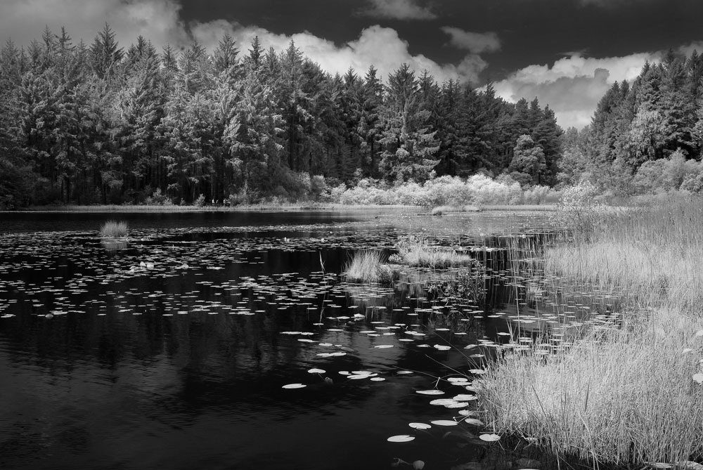
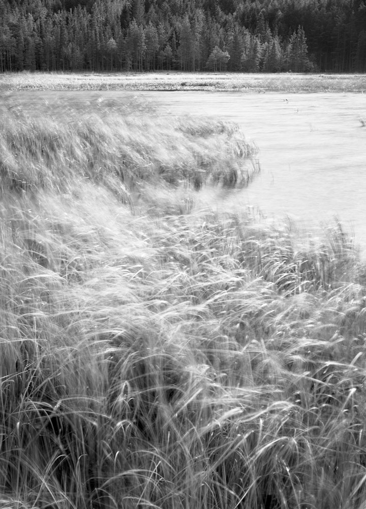
The second project was also based in woodland, but instead focused on bracken. It was a much wider project that would enable me to visit familiar locations – both close to home and further afield – and hopefully see them through a different set of eyes. I also intended to seek out some new locations with potential that could be visited later in the project when I felt my rut was coming to an end.

Despite its potential vastness, it bore a close relation to the Heartwood Forest project because it was primarily based on form and composition, but could also be worked on in almost all weather conditions with the help of a big white umbrella.What’s more, because both projects relied on the arrival of the spring bloom, it meant I had to spend the first few weeks of both projects planning, pre-visualising and establishing an emotional connection with any potential new locations I came across (or re-establishing that connection with familiar locations).

It’s all too easy to arrive at a new location with your heart in your mouth and think that a

significant image is literally just around the corner. However, more often than not that image will allude you and, because of your current situation, you’ll go home casting even more doubt over your prowess when it’s down to the fact you don’t understand what makes the location tick and don’t have any emotional basis for inspiration.

My decision to start two projects that would require serious thought before any image making could commence as it forced me to meticulously plan and also connect with my subject. It was important that I didn’t try too hard to force an image – as is often the case when you lose your artistic mojo – because I’d more than likely see it as a failure; instead, I gave myself time to let the images come to me when I was ready.

At this point, all of my work on these projects had been done alone. I felt I needed time to reflect and reignite my creativity without any outside pressure tomove onto a new area or head home. I spent days exploring locations –

mainly with my Panasonic Lumix DMC-LX3 – and, as the bloom started appearing, I called up one of my shooting partners to see if they fancied visiting some of the locations I’d been exploring for so long.

I was keen to see how they saw the locations differently to me and to hopefully gain inspiration from the images they made. The spring flowers were still not at their peak on the first few trips, but I felt it was right to give my shooting partner some time to acclimatise himself with the locations I’d spent so long connecting with.

Reviewing the images that came from these pre-bloom sessions left me with hope, but the revelation came when I sat down with my shooting partner. The images he’d come back with were completely different to mine, but very revealing as we were quite often shooting just a few feet away from each other.

This enabled me to think beyond the images I made at the same time and see images that I would never have visualised before. I was now just a week or so away from some areas of the Sandridge woodland coming into bloom and I was starting to see more clearly again.

Five days later, I made one of the most significant images of the year to date and it was of an unexpected subject. The trees had just started blossoming and I noticed an area with some delicate, but very shapely branches that I would have normally walked right past on the way back to the car. However, this time, I was determined to stop and make it work – even though the light was fading. It wasn’t an image I had planned but the idea jumped out at me immediately.  It required a lot of work to juxtapose the elements within the frame and also adjust the plane of focus to match my visualisation. At last, I felt like a massive weight had been taken off my shoulders and I was free to proceed in the direction my eyes took me.

Like most things, different people deal with situations differently so while I can’t offer a Delia Smith style recipe for getting out of a photographic rut, I do hope that my decision to focus on a longer-term goal inspires you to work your way out of a rut without feeling short-term pressure.  Your mind is a complicated thing that’s unique to you, and it needs time to rest and recharge itself before the next challenge. Even if you only have limited time to dedicate to landscape photography, there’s little point being too hard on yourself and applying unneeded pressure to make meaningful images. Creativity isn’t available on tap so don’t force it – let that moment of inspiration come to you because, believe me, it will when the time is right.

You can see more of Tim Smalley's photography at http://tsmalley.com/
and
http://www.flickr.com/photos/timsmalley/.


Paul Gallagher

We'd like to thank Paul Gallagher for taking part in this enlightening video. We talked about everything from composition to use of film developers optimised for scanning. We hope you enjoy and would love to know your feedback.


Part One

Part Two

Part Three

Chelsea Flower Show – An Outdoor Gallery

David Anthony Hall is an Irish landscape photographer specialising in very large prints, mostly panoramas, of groups of trees (although this is not all he does). He has recently worked with a garden designer to produce an outdoor garden exhibition for the Chelsea Flower show...

You've recently had your photographs used as part of an exhibit at the Chelsea Flower show. Can you let us know a little about how this came about and the challenges of working in support of another creative project?

The urban garden was created by Thompsons Gallery to show the harmonious link between art and the creative outdoor space. The idea was the brainchild of gallery owner, Sue Thompson.

As a Landscape Artist I constantly strive to find locations of significant interest in order to capture my work in the manner I wish it best enjoyed. The garden environment, as my gallery, has opened up the way in which my work can co-exist with its surroundings. However, with this exciting new approach the technical challenges must be closely addressed. Art in the garden, in this way, has not yet been explored fully. There are many ways in which my images can be finished, each with a varying degree of permanency. As yet, technology does not offer a perfect solution to provide the high quality images I wish to portray in a totally outdoor proof application.

The pictures will obviously be subject to some 'environmental stress' (i.e. rain and kids fingers) how did/are they coping and did you do any testing/research?

Over the past two years I have been conducting my own test in my garden with a number of Dibond face mounted on Perspex prints. I have been delighted to witness no colour shift, but as expected there has been degradation to the print. The Dibond aluminium backing and the Perspex has split which has allowed some moisture to seep into the print, causing some staining.

Furthermore I have carried out lengthy research and spoken to a number of industry experts about the permanency of my work outdoors. The response on this subject is indicative of the avant-garde nature of this project. At best the estimations I have been given range from three years to a maximum of nine, determined by a number of factors including the type of finish.

Prolonging the life of outdoor prints

Sunlight – As much as we love to see it, sunlight does in this case cause the biggest effect to prints outdoors. The best possible place for the work would be on a north facing wall or in a position with little or no sunlight.

Temperatures – Gradual changes in temperature are not a major factor, however large swings of temperature or extremely high temperatures may damage the quality of the prints.

Humidity – Luckily in the UK we don’t suffer the same type of humidity as our Mediterranean neighbours, but we do get our fair share of rain which should be avoided especially with face mounted work.

Finishing Solutions

Liquid Laminate on Vinyl

This solution provides a weather resistant finish as well as keeping production costs to a minimum. Suggested life – up to nine years.

Conventional Diabond Face Mounting on to Perspex (as displayed in the Chelsea Garden)

Whilst this does provide my favoured finish and most of my indoor images are finished in this way, it will not stand the test of time outdoors. It will also prove an expensive way of exhibiting work for what would ultimately become a short lifespan.

Modified Face Mounting on to Perspex

By modifying the process detailed above we hope to achieve up to nine years in the outdoor space and possibly more with the right conditions. The process would require printing onto vinyl and then face mounting onto Perspex with Perspex backing and finally sealing the edges with an Aluminium frame.

Choosing pictures and sizes must have been difficult? How did you go about this and did you have any constraints to work under?

At 250 cm wide the scale of my panoramics aim to capture ones peripheral vision when viewed from a distance of up to two meters compelling the viewer to take a closer look and on even closer to pick out the finer details. With this three-stage approach it has been suggested I’m creating a window for the viewer and inviting them to climb through.

For me there is a lot of satisfaction in producing larger work simply put - there is nowhere to hide when you print your pictures this big. Technically you have to be spot on and when you set out to capture a scene that’s going to be finished at sizes up to 150 cm x 300 cm you have to take your time and plan the shoot from end to beginning.

I’ve printed my work up to eleven meters wide but in the UK the largest piece of Perspex I can finish is 150 x 300 cm by finishing in Germany I can get up to 180 x 330 cm. However I have plans for some really huge public art pieces and I have a personal ambition to cover a London Underground platform with some of my woodland images.

You've contributed a few pictures to charity and most recently a Bluebell picture. Did you supply a finished print and how did the sales of these pictures go?

All charity work is supplied finished, I raised £12,820 for the London charity, Children’s Acute Transport Service (CATS). The image ‘Bluebell Woodland’ 150 cm x 300 cm was part of a body of work that formed the inspiration behind a concept garden at this year’s RHS Chelsea Flower Show. Thompson’s Gallery, who devised the garden, waived their fees, as did the other suppliers, which includes finishers Genesis and Canon UK & printer distributors Velmex. The new owner has also gift-aided her donation enabling the charity to benefit from the extra £2,820.

Thanks very much for your time and if people wish to see more of your work, where should they go?

Solo show runs until 24th June Private View Wednesday 8th June 6pm-8pm

You can see more of David's photography at his website or by following his Twitter or Facebook accounts

Paul Mitchell

Paul Mitchell has been on my personal radar for quite a while since seeing his quadriptych(?) of pictures from Covehithe in Suffolk. Since then I've come to appreciate the range of styles and subject that he works with. Yes, he's a film photographer but it's his eye for composition that works here, not the medium he works in. I hope you appreciate his works and words.

In most photographers lives there are 'epiphanic' moments where things become clear, or new directions are formed. What were your two main moments and how did they change your photography?

I am consciously aware that my first epiphanic moment came some 7 years ago when I attended a landscape workshop with Jeff Teasdale (coincidentally in Teesdale!). Jeff is an excellent photographer and some of his B&W images would stand there against the greats. Before we had even had a chance to remove our lens caps I always remember Jeff saying 'there are images to be found anywhere in any conditions'. As luck would have it, it then rained for the next 3 days! But with Jeff's creative insight and guidance, I came back with a set of images that I was genuinely proud of!

The second 'moment' came some 6 years later when I attended a Large Format workshop with Joe Cornish and David Ward. Prior to the workshop, I had envisaged Joe and David on a pedestal, with glowing aura's, looking down on us mere mortals. Nothing could have been further from this vision, it turned out they were two ordinary blokes who, just like myself and my group, had a passion for photography. More importantly, though was their desire to inspire and pass on their experience to other photographers. Oh and I also met a couple of blokes called Tim Parkin and Dav Thomas...

You make your living as a graphic designer but I believe you started out on an Illustration degree?

Throughout my school years, I always remember having a passion, and a certain amount a talent, for drawing and painting. This eventually led me to start a degree course in illustration at the Hull College of Art. Unfortunately, the course disbanded just after I had completed the first year! I was then offered a transfer to the graphic design department where I spent the next three years and is really where my interest in photography began in earnest. Given the choice, I would like to have started a career in photography but living in the provinces the opportunities were few and I only thought it fair on my parents that I started to earn a living.

Do you think your graphic design background affects your photography and if so how? Do you think learning the principles of graphic design might help other photographers?

It is true that graphic designers quite often make good photographers. I also like to think that being creative is sometimes not about being able to draw or play a musical instrument, but more a way of thinking, a way of viewing the world. With design, I often pre-visualise what it is I want to achieve before even putting pen to paper (or these days cursor to screen!). Transfer this way of thinking to photography and try pre-visualising what it is you want to achieve before committing to film or sensor. On a more practical level, it's true to say that designers are more aware of space and the way elements interact with each other, a bit like type and images on a page. A perfect example of this in reverse is Eddie Ephraums, a wonderful photographer who has also become a great book designer.

Could you tell us a little about the cameras and lenses you typically take on a trip and how they affect your photography

I have too many cameras and lenses! and the biggest mistake I have made in the past is thinking I can take them all. Apart from giving yourself a hernia, you become so indecisive about which camera to use and which focal length will work best that the moment of inspiration has gone. For days of exploration and reconnaissance, I just pop my Lumix GF1, my trusty 55 year old Agfa Isolette medium format folding camera, a couple of rolls of HP5 in my Billingham Hadley and away I go! Once I get to know a location I start to bring the big guns out... depending on what I have pre-visualised I will either take my Bronica SQAi plus 50, 80 & 150mm lenses or my Chamonix 45N-1 plus 90, 150 & 240mm lenses. All the aforementioned kit enables me to vary the format, film type and hopefully come back with something half decent. However on those occasions when I feel a real need to spread my creative wings and not care about being a third of a stop out or what percentage of grad to use I take my Zero 2000 pinhole camera.

Some of the first images I saw of yours were a series of shots under different conditions at Covehithe - is this a local area to you and have you worked on any similar series?

I have been a regular visitor to the Suffolk coast for the past 25 years. My wife's grandparents bought a holiday home near Southwold just after the 2nd World War where the family often spend the whole of the summer holidays. Covehithe and Benacre Broad is an area that we often walk to and know well. It is really only in the past 10 years that I have become acutely aware that this part of our coastline is rapidly disappearing due to coastal erosion. Apart from the wonderful photographic opportunities it has given me it has also been my way of recording an area in constant flux, no two years are ever the same, ultimately some of the images that I have taken over the years can never be repeated. Such was my fascination of this area that I used a panel of my Covehithe images to successfully gain Associateship of the RPS a few years ago. More poignantly the coastal erosion has been so rapid these past few years that we sadly had to demolish our holiday home in March this year. As regards to future projects I am currently building up a portfolio of images in and around Burnham Beeches which, apart from being an area of outstanding natural beauty, is only 5 minutes away from where I live!

You do quite a bit of pinhole photography, what was the learning curve like for this until you could get satisfactory results?

Ha! I could probably write a whole article on this one question. Suffice to say there is a learning curve but not as steep as one would imagine as the mechanics are very simple. You point your wooden box in the general direction of your subject, there's nothing to focus as there's no lens, take a light reading, expand that to f138 and on a fairly bright day you end up with an exposure of roughly a couple of seconds. It obviously becomes more complicated the lower the light levels and having to factor in reciprocity etc. My post capture and scanning workflow has been something that I have refined over the years and probably is a subject left for another day... or (shameless plug) buy my book off Blurb as it's all there!

You are putting together a book of your pinhole images - can you tell us a bit about this process

I presume that quite a few photographers are aware of 'on demand' publishing these days, Blurb, LuLu, PhotoBox to name a few. I chose Blurb mainly because of their choice of sizes, book types and finishing etc. Blurb also has some excellent online software for creating your book, however, being a designer I chose to create my own artwork using InDesign. Once you have downloaded the InDesign templates and Acrobat distiller settings it's pretty straight forward. Ultimately I look at the Blurb edition as just a proofing exercise as I hope to self publish in the not to distant future.


Tell me what your favourite two or three photographs are and a little bit about them.

Gosh, this is a difficult one! I think it's not about picking a favourite but looking back at images that, for me, are emotive and take me back to a particular place and time.

My first image has to be

It was taken about 7 years ago when I had only just started my return journey into film, in fact, it was only my second roll of Velvia in a new Bronica SQAi that I had just bought. These Wild Lupins dot the Suffolk coast in the late Spring and was lucky to have a perfect mound of them in the foreground, the line of beach huts through the middle adds structure and colour while the dramatic cloudscape adds drama. You also would not believe how lucky I was not to have a single car in the car park!!

My second is taken from my Covehithe set

I had actually walked to this location in the dark hoping for something interesting to happen as dawn neared. Something interesting did happen, a sea fret rolled in giving this wonderful peach coloured light. This is also one of those images that cannot be replicated as this particular tree is now halfway down the beach with the North Sea lapping at its trunk!

My third image takes me closer to home

It is often said that making a decent composition in woodlands is quite difficult and have to admit that I frequently wander around aimlessly not being able to see anything. On this occasion, I was initially drawn to the short canopy of beech leaves spreading out from a sapling, the inclusion of the mature trunk with its nearby sibling completed the three ages.

You are primarily a film photographer, using everything from 35mm to large format. What are your reasons for eschewing digital?

The film vs digital debate has been discussed on many occasions and I don't want to add any more linage to what has already been said. I still use a digital camera and all my post capture is digital so you could call me a hybrid, suffice to say I still choose to use film because it's still the only medium that creates something close what I had pre-visualised.

You have put on an exhibition with a bunch of other photographers (Exposure, Aylesury) Would you recommend this as a way of pooling resources?

To be able to fill a gallery on your own is a daunting task, it's time consuming and hard work! By pooling resources with like minded individuals makes life so much easier. We have a core group who have been exhibiting since its conception 4 years ago and every year we invite other guest photographers to enhance and complement our own individual styles. I can say hand on heart that no one has ever made a profit, sadly photography is not perceived as an art form here in the UK unlike in America. Saying that we have always sold work up to the break even point and have enjoyed the recognition and plaudits one often receives at these events. If anyone does have the opportunity go for it!

Do you print much of your work? If so how have you approached it and if not, why not?

Having your own design studio means that having a decent printer is a necessity not a luxury so yes I have always printed my own work. Added to the fact that I retain total control over all aspects of my work. I've owned many printers over the years, I even had an A3 Dye Sublimation printer which could knock spots off many of todays printers, but am currently very happy with my Epson 3800.

Tell me about the photographers that inspire you most.

I can't say that I have ever consciously sought out other photographers work for inspiration. I certainly pick up on recommendations from other people, you yourself Tim have introduced me to the works of Christopher Burkett and Peter Dombrovskis whose work I greatly admire. If I do get inspiration from other photographers it would be the one's that I know personally and can readily communicate with either physically or through Flickr etc. You yourself Tim would be on that list together with Dav Thomas, Jon Brock, Roger Longdin, Julian Barkway... all the usual suspects!

What sorts of things do you think might challenge you in the future or do you have any photographs or styles that you want to investigate? Where do you see your photography going in terms of subject and style?

I am a Gemini what more can I say!... I can't stand still otherwise I get bored. I love my pinhole camera and will continue with that, I have a fridge full of Polaroid film for a project that I have yet to realise, I would like to start creating my own digital negatives and print using some of the alternative processes, the list goes on. Ultimately I want my photography to keep giving me those butterflies in my lower abdomen for as long as possible!


Who do you think we should feature as our next photographer?

Roger Longdin if you can manage to persuade him or Jon Brock if he's not dashing around the country on business.

Many thanks Paul!

If you want to see more of Paul's pictures, take a look at http://www.flickr.com/photos/tobchasinglight/

Also, see our subsequent revisited interview with Paul Mitchell in 2019.

Camera Competition

We get a few people saying that Great British Landscapes is a little 'Film biased' and so to try to balance things up a bit, we're holding a competition to ask people to suggest their favourite digital photographers. Everyone who provides a suggestion and accompanies it with a reason why, will be entered into a draw to win ... a film camera!!

We've been playing with some cheap cameras from e-bay to find out just what the results could be like. The Portra 400 review in the last issue showed just how good they can be (12+ megapixels at 400 iso with 19 stops of dynamic range!).

The camera is an Olympus OM1 and although it isn't automatic, it has a simple light meter and to use it with the Portra 400 we tested, you only need to be within a couple of stops and things will be good. It comes with a 28mm and 50mm lens, both of which are really sharp - in fact, take a look below for a comparison between the canon 50 f/1.8 and the Olympus 50 f/1.8.

And also, here's a comparison between the Olympus 28 f/3.5 and the Canon 24-105 f/4 (both shown at approx 200%)

Centre of image at f/5.6

Corner of Image at f/5.6

So - you suggest a photographer and if you win a prize we've got a proposal. We'll supply two rolls of film and offer to develop and drum scan the best 10 shots as long as you write an article about how you got on!

And obviously we'll get in touch with some of those wonderful digital photographers to feature on the website in future issues!

To repeat .. what you'll receive is an Olympus OM1n full frame camera with a Zuiko 28mm f/2.8 and 50mm f/1.8 lens plus a camera strap plus a roll of Portra 400 and a roll of Fuji Velvia 50 plus developing at a commercial lab and finally a drum scan of 10 of the best photos and a feature story on Great British Landscapes!! Total commercial value nearly <cough> £1,000!! **

So - send us your suggestions to info@landscapegb.com and don't forget to give us a short reason why and a link to their website!

** Well - OK, the Olympus stuff would have cost about £500 when bought new but you can get them now for £100 for camera and 50mm lens and £50 for the 28mm lens although I've been watching for a while and got a functional copy of camera and two lenses for £40. The film is £8, the developing £8 and the drum scanning would be another £500 if you went to professional lab however I do drum scanning of 35mm frames for £8 each.

Then again a feature on GBL is priceless!! ;-)


With Landscape in Mind

Last week my wife and I accompanied Joe Cornish to a small cinema in Hyde Park, Leeds. Despite the strong temptation, we weren't going to see 'Kung Fu Panda 3D' and definitely not 'Hangover 2'. This was 'Joe Cornish 1' in a leading role in 'With Landscape in Mind', a production by Environment Films.

Joe is only credited as 'presenter' but this is 'about' Joe Cornish and covers a few days early this year when Joe was accompanied by a cameraman and sound engineer on a photographic road tripd from East to West. I was unsure what to expect having been told by Joe that it tried to strike a balance between geeky photography stuff and a general documentary on the land and photography for the general viewer.

It all starts with Joe on the East coast, working on the edge of the land and the edge of the human population; the edge of industry and the edge of his home turf. The Corus steel plant in redcar is a strange place for a landscape photographer known for his sublime and bucolic vistas. However, Joe's working practices take him to all sorts of locations, it's just that his gallery and the popular press have him type cast in many ways.

The journey moves on, eloquently shot by Ben Todd, a cinematographer that knows his composition and light. This isn't a photographic tutorial video helping you to get your exposure right, it's a subtle engagement with a photographer relaxed in the familiarity of his craft. Joe is a natural orator and even despite his cold (although the ladies might like the husky voice), he communicates a relationship with the land that most other landscape photographers will recognise.

The whole works very well, the only part that I was unsure initially about was a section where we are invited into Joe's train of conciousness whilst he is composing a shot. To be honest it was a little unnatural to begin with although by the time it finished it was working fine (and someone commented that they would have liked more of it!). The remainder of the film was with Joe talking on location or narration.

I talked to Joe about the film and he answered a few questions for us..

The film comes across as a very natural portrayal of a photographer at work - did you worry that the film would be true to your approach?

Yes. Worry in the sense that right from the start in discussions with Ben (the film's director and cameraman) we agreed that it should be as real and authentic as possible. Some 'artifice' is unavoidable in film-making; clearly, working with a cameraman who will sometimes need you to do something again or follow a particular walking line, is not the same as being out there on your own. Nevertheless, we pursued a normal working pattern to each day, essentially 'business as usual'. Certainly the photographs I made were, as far as I know, exactly what I would have done if the film camera had not been there.

The concept was an absolutely authentic documentary, in which I could articulate some of my ideas and wider working philosophy both on location and via the device of the voice over.

You weren't treated to the best of weather in the production of the film, would this be a typical week of your photography or were you commited regardless and just worked with it?

Well, that is an interesting point. In some ways the film echoed how I work when I am on assignment in Scotland, where I am usually committed to be out and about with my camera, come what may. Most of the time on the film we were never more than a couple of hours from home so arguably without the obligation to the film crew I might have been tempted to 'bag it' and wait for better weather. interestingly, this was one of the pleasing outcomes of the film as one or two of the most interesting sequences are made in persistent rain, and they do show the benefits of persevering and working against the odds. Perseverance has often paid off in Scotland, especially in recent years with some of my most satisfying pictures being made in rain, or heavily overcast light.

In our original plans I was to climb Scafell Pike, with an overnight camp near the summit so I could shoot up there at dawn. However, the weather turned out so wet and so windy that we had to abandon this due to health and safety considerations (for the film crew of course!)

Anyway, aside from the proximity to home, yes it probably was a fairly typical working week.

Your cameraman had a great eye for a picture himself. Do you think he'd have much of a future as a landscape photographer?

I am already a fan of Ben Todd's still photography. Ben is a real artist and would undoubtedly be a brilliant landscape photographer. However, in the months before he shot the film with me he was director of photography in a TV series with Billie Piper, so I think it's unlikely he will short of rather more attractive work opportunities. He also has a young family and will need to make a reasonable living in the years ahead, not the easiest thing to do in landscape photography

Were you happy with the result and are there any things you would have liked to have had happen or done differently?

I am very happy with the result, and I have no regrets whatsoever. It would be interesting to know how or whether it would have been more successful if the weather had been more benign, but in some ways I think the weather makes it and gives it a special atmosphere, and quality of light. I do believe we succeeded in creating a true and honest picture of a week in the life of a landscape photographer.

Thanks Joe!


The DVD will be available in the next few weeks (hopefully in the next week) and will be accompanied by a bunch of extras including some from Great British Landscapes where we discuss some of the pictures taken during the DVD.

You can buy the DVD directly from the website at http://www.withlandscapeinmind.com/WLIM/DVD.html.

Would I buy it? Yes, unreservedly. It's firstly rare to see landscape photography given such exquisite attention. It might not teach you lots of photography tricks but it will give you a window into a rare profession being practised by an accomplished craftsmen.


With Landscape in Mind (TRAILER) from ENVIRONMENT FILMS on Vimeo.

Ektar 100 versus Velvia 100F

I spent a few days on the north Cornish coast in March and chanced upon a really good week. In fact perhaps too good as the weather was mainly of very hazy sunshine and even foggy evenings. This led me to concentrate more on details than the grand vista, but I did have some fun with moody foggy sunsets. Because of the stable light in the shade I thought that I would make a mini comparison of Velvia 100F (my usual MF transparency film) and Ektar 100. I wondered whether the latter would be useful for high contrast scenes and could double up for b&w, even using it with yellow-green and orange filters. Note that I was not trying to reproduce Velvia colours on Ektar. Could Ektar be a universal film for what I like to photograph?

How I did the comparison

I used a Mamiya 645 with two backs, one loaded with the Velvia and the other with Ektar. Switching between the two takes just a few seconds and as the films’ ISO rating is the same I didn’t have to adjust exposures. Given the subject matter, the colour was a little limited; for example I wasn’t able to compare greens, or pure reds and yellows. I do however have a good comparison for blues, oranges, magenta and purple.

I scanned the films on an Epson 750v at 1800 dpi using the standard film holder and processed in SilverFast 6.2.4a. For Ektar there is a standard setting under Kodak/Other/Ektar.

The results

The results are quite surprising. On loading the film in the holder and running the initial pre-scan, the Ektar colours look awful. Totally wrong (so far out that I cannot even describe them) and out of balance. However, as soon as I selected a frame to view zoomed in, the auto-adjust kicked in and the colours looked quite decent. So my “basic” result is the scan straight out of the Epson with just the SilverFast one-click auto-settings applied. I then processed the scan in Lightroom to try and arrive at a satisfying image either close to the jpeg on the back of my Panasonic or close to my memory of the scene. Very subjective I know, but I don’t think that this is so important. After all, I was trying to see if I would be satisfied with Ektar and not trying to conduct a rigorous colorimetric study.

Conclusions

Neither film is exactly faithful to my memory – but how accurate is my memory in any case? Also, given the processing between my eyes and brain who knows what is “reality”. I can certainly live with Ektar though I will probably try to play a little more with the scans to work around that warm cyan-green tinge. The black & white conversions, with conventional b&w filters, work out fine which means that I can probably do away with real b&w film. Incidentally, because of the inability to use Digital ICE with silver b&w film, I have been using chromogenic C41 (Ilford XP2) till now.

So I am definitely going to experiment more with Ektar and see how I get on, perhaps trying some of the other Epson 750v settings for Kodak negative rather than that officially for Ektar. Having said that, where the contrast range is manageable I probably will still use transparency film though I might shift to Provia, an emulsion I used when I first started in MF a few years ago.

For each pair in the table below, Ektar is on the left and Velvia is on the right

Subject Basic Scan Processed in Lightroom
Rock detail at Sandymouth. Open Shade (hazy blue sky above). Light grey and orange-brown strata & grey pebbles The colours in open shade on both films are reasonably close to each other with the Ektar blues being a tad more cyan-green After processing in Lightroom I was able to get the results very close, not identical but perfectly satisfying.
Rock detail on Crooklets beach. Veiled sunlight. Rock pale yellowish with pinkish streaks and grey patches which I hoped would pick up the overall blue light Huge difference between the films - difficult to believe that this is the same subject and lighting. Ektar has brought out the pale yellow and rendered blues very cyan-green, whereas Velvia has emphasised the blues and brought out magenta and purple. Results much closer but still a notable difference. Neither really satisfactory for me, though both probably acceptable. Velvia still much bluer and apparently darker. Had the sun been more veiled with the Velvia? I was not aware of that. But the image seems darker.

(Ektar is on the left and Velvia is on the right)

Basic Scan Processed in Lightroom
Very foggy-grey view to sea at Sandymouth. Almost monochrome so I shot thinking of converting to b&w. On Ektar there is still that slight greenish tinge and an overall warm (creamy?) cast, but quite believable. Perhaps closest to my visual memory of the scene. The original Velvia slide was more blue and slightly pale magenta compared to my memory of the scene, but still totally believable. The basic scan is reasonably faithful to the slide Adding some blue and taking out the greenish tinge on Ektar, I achieved a satisfying result – perhaps I went a bit too far with the magenta. The wave in the sea took on a pleasing green-cyan tone though I didn’t see this in real life.
Bedruthan Steps Very foggy early evening just before the sun sank into the fog. The colour faded about 30 mins before sunset. Familiar pattern: Velvia slightly more blue/magenta but both perfectly acceptable. Ektar perhaps closer to what I remember seeing, i.e. more “natural” After processing, a similar difference can be seen: Velvia is cooler and the warmer Ektar looks a bit more natural.

Light, Composition or Subject?

I’ve read a few times in the past months that ‘light’ is always the most important thing in photography. Every time I read this I’ve felt a little more uncomfortable. This week a colleague pointed out another occurence in the popular press and as I was in the process of writing a couple more articles I thought I had to respond.

The only way to really address this is to look at potential permutations of these three aspects of photography that are repeatedly mentioned and I’ll try to come up with examples.

Good Light, Good Composition & Good Subject

Obviously this is the goal, we don't really need to dwell on this - get everything working together and you’ve made it. Here's a Joe Cornish picture that ticks all of the boxes for me...

Good Light, Good Subject & Poor Composition

Many beginner photographers work in this area as they’ve made the effort to go somewhere special or have found a beautiful subject be it a tree, dry stone wall etc.

What they haven’t worked out is how to compose a picture yet and so the result, whilst being something that could satisfy the undiscerning viewer, is ultimately unsatisfactory beyond the observation of a moment.

Here’s one of my early efforts to demonstrate what I mean


Good Light, Poor Subject & Good Composition

Well we have to ask ourselves here “What is a poor subject” - in fact in landscape photography, I’m not sure I can completely define subject. Subject makes sense in portrait photography, it’s the person isn’t it? And architecture you could say it’s the building. However, in landscape photography, the subject is whatever we point the camera at. Again, I suppose that you could say that there are certain pictures where there is a focal point or icon that is itself intrinsically beautiful. This would make ‘The Storr’ a subject and also a beautiful tree or wall.

Could a definition be ...  ‘that which a member of the public would point at and say ‘that is beautiful’? If so then here are a few photographs that show 'poor subjects'.

Clachaig, Scotland - Tim Parkin

Joe Cornish

David Ward

Poor Light, Good Subject & Good Composition

So, according to the established truth, these photographs shouldn’t work. The lack of great light should produce sub-standard pictures.

However, in my eyes there is no such thing as poor light - only an inflexible photographer. Even bright sunshine on a blue sky day can be used (supposedly the worst sort of light) and as for those ‘flat light days’, well, just take a look below at a couple.

Joe Cornish

Joe Cornish

Tim Parkin

Now we'll take a look at each of the variables on their own to see if they can be used 'individually' to create good photographs.

Good Light, Poor Subject & Poor Composition

Can good light on it’s own provide a good photograph? Well, I’ll cut to the chase here - can it hell... I’ve yet to see a picture that would be considered ‘great’ with just light. Even pictures that are all about the light have to have some form of balanced composition of clouds or shape to support them. Any suggestions for this section??

Poor Light, Good Subject & Poor Composition

An a good subject on it’s own? Well - it would have to be an inherently beautiful subject and then a bad composition would detract from the subject which means the photographer has reduced the intrinsic beauty of the subject through poor composition.

I had quite a problem finding these - I have bad pictures but when I started I was mostly going out in good light. However here's a photo of the Rumps in Cornwall that was pretty bad and I've cropped it badly too.

Tim Parkin (ahem! a long time ago, really!)

Poor Light, Poor Subject & Good Composition

Given poor light and poor subject we should have real problems. And yet the amount of great pictures here is remarkable. A great photographer can go out at any time and come back with a satisfying image and quite often a great one - regardless of intrinsic, iconic beauty or ‘great’ light.

David Ward

Tim Parkin

Alistair Haimes

Poor Light, Poor Subject & Poor Composition

Hmm.... I think we can agree that this wouldn’t be good :-)

Conclusion

Well, my conclusion is that it’s all about the composition. Without composition, photographs can only be representation of what was before the camera - a documentation of a scene with the photographer’s skill reduced to camera craft and the finding of subject and the luck or calculation of the right time for the 'right' light (and maybe some photoshop talents at the end).

I won't say that light is unimportant, complementary light is essential - however ‘warm sunset/sunrise’ light can be bad if it doesn’t match the subject. Take the following examples.

Joe Cornish

David Ward

Tim Parkin

So, it doesn’t matter what light you have as long as it complements the subject. Doesn’t matter what subject you have as long as you compose it well.

It’s composition that is the photographers skill, the core attribute that lifts a photographer from craftsman to artist.

Let me suggest a scenario that I hope highlights my thoughts. I sign on to a Joe Cornish course and he takes us all to a great location and, knowing the weather well, he has brought us at just the right moment.

Each photographer takes a picture - who’s photographs are they?

Well, if it’s all about the light or the subject then they are Joe’s pictures. If they are about the composition then they are the workshop participants.

And....

A colleague Rob Hudson took a look at this article and pointed out that the whole Light/Subject/Composition triumvirate was missing a while dimension. That dimension can be called concept or narrative - it's a function of the way the photographer communicates through the picture. This needn't be conscious, a photograph can communicate emotions as a concept and these may be a subconscious reaction by the photographer. It may be better if the photographer is aware of what they are trying to communicate though.

A photograph may also work as part of a sequence, in which case we could have a photograph with poor subject, poor (or no apparent) composition and poor light and yet as part of a sequence of pictures it has inherent meaning.

He also pointed out the redundancy of good/bad and the fact that there is really no such dichotomy - however the article is responding to a received vocabulary and grammar of the photographic community as represented by the popular press. I would agree with Rob that it doesn't really matter about light, subject or composition as long as the photograph is creating a reaction that the photographer wanted. However that would make a boring article :-)

Mirrors Messages Manifestations – Minor White

Minor White only really had one major publication of his own in his lifetime. Mirrors Messages Manfiestations was published in 1968 and is a strange work. A combination of spiritual guide book, artist catalog, diary extracts and poetry it is a wonderful distillation of his approach to his work and life. Although some of the text is a little 'arty' it still warrants attention. The photographs show a keen mind at work trying to use the landscape (and cityscape) to evoke the inner spiritual. One of my favourite quotations..

"To a student asking: To photograph what else things are? When you try to photograph something for what it is you have to go out of yourself, out of your way, to understand the object its facts and essence. When you photograph things for what 'Else' they are, the object goes out of its way to understand you." - Minor White, 19th Jan. 1957

The book is difficult to get hold of online though - my copy was £50 but I had to keep my eye out for quite a while to get hold of that. You can probably pick up a copy for £60-£70 but mint copies sell for upwards of £400.

For somebody who wants to know 'about' Minor White, I would highly recommend getting a copy of 'The Eye that Shapes'. It was published to coincide with a major retrospective of his life and work at the Museum of Modern Art in New York and has a comprehensive biography and extracts from many of his journals and letters. It also puts together many of his most important works. A lot of the work from 'Mirrors' is also included but many are only quarter page size and included in a appendix of 'sequences'. His sequence work came from the influence of Stieglitz and his working with Nancy Newhall where he helped with exhibitions at the Museum of Modern Art in New York. A copy of this on your bookshelf should give you all you need to know about Minor White in the context of the time he worked.

You should be able to get a cheap copy of this for £15 to £20 (and well worth it at that price) and good copies start at about £40-£50.

Minor White

Some photographers have an extended influence far beyond their public notoriety. Minor White epitomises these individuals. His work in analysing and teaching photography created a whole host of ‘followers’ and in some cases ‘acolytes’ and his writing still inspires today, but a lot of people don’t know his photography (or may be put off by his proclivities) which is a real shame. Hopefully this short biography will help as an introducton. For extensive information about Minor White, I strongly recommend “The Eye That Shapes” which studies his work and teachings in some detail and includes a great sampling from his portfolios (see the book review in this issue).

Minor Was born in 1908 to a book keeper and a dressmaker and received his first camera from his grandfather at the age of 8. Over the next few years his parents had various separations until they separated when he was 21. At 16, Minor inheritied a carbon arc projector and a whole load of historical travel slides.

He had a mixed art and science education, taking part in stage productions, writing poetry and gaining distinctions in science and literature. At eighteen he realizes his sexuality with ‘a brief crisis’ - charming understatement.

He goes on to study at Minnesota university majoring in Botany with a sideline in literature and poetry. The botany course includes education in processing photographs of algae, the start of his abstract work perhaps. He leaves university when he realises he won’t be able to pass although he works part time and finishes his degree through taking night and day courses, graduating in 1934.

He continues to write poetry whilst living in with a group of lifestyle tolerant colleagues. His first real photographs are taken on walking trips with this group of friends whilst he earned enough to live on working as a night clerk at a hotel.

In 1938 at the age of 30, he starts a photographic club at Reed College. Over the next few years he photographs mostly architectural work. He also shoots players in the theatrical productions that he and his colleague associate with.

It is only in 1935 that Minor really starts work in a style we would recognise, photographing in the landscape and shooting details using a speed graphic camera.

He writes more during his thirties (nearly all of his diaries and writings are archived) and also takes a brief stint in the army intelligence where he also writes poetry quite prolifically.

At the end of his 30’s he leaves the army and begins to work at the Museum of Modern Arts. Over the next couple of decades he jumps around jobs teaching at various colleges and universites under the auspices of Beaumont and Nancy Newhall, the museums librarian and curator respectively.

His association with the Newhalls enables an introduction to Alfred Stieglitz whose theory of equivalents - that a photograph can act as the equivalent of something else - inpires his work onto new channels. It also brings him into the social circle of other seminal photographers such as Harry Callahan, Bernice Abbott, Edward Steichen, Paul Strand and Edward Weston.

It is the influence of Edward Weston, Ansel Adams and Steiglitz pushing in different directions under which Minor creates his own credo of 'straight' photography with an interpretive twist. (if he lived now he would have been amused by the label 'straight'!)

In 1952 at the age of 44 Minor White, Ansel Adams, Dorothea Lange, Ernest Louie, Barbara Morgan, Beaumont and Nancy Newhall and Dody Warren start the Aperture imprint with Minor as editor - a highly influential magazine that still runs today.

Minor also worked in colour for a time in his late forties, some of these pictures are available in “The Eye That Shapes” (one included below). It was during this time that he worked with Ansel Adams and becomes a proponent of his ‘Zone System’, subsequently writing an in depth technical book on it’s use and creative application.

In his fifties, Minor investigated different religions and philosophies, beginning with the I-Ching and ‘Zen and the Art of Archery’ and moving on to Gestalt approaches and eastern mysticism. He also created a home that was heavily Japanese influenced and included areas dedicated to Zen meditation.

In the latter part of his life, he developed a cult like following inspiring an annoying in equal degrees. He was dictatorial in style and it has been suggested that he used hypnosis techniques in his workshops and teaching (he took courses in hypnotism). Paul Caponigro, Nathan Lyons, Pete Turner and Jerry Uelsmann were some of his more famous acolytes.

It has been said that you can neatly summarise the difference between Ansel Adams and Minor White as saying that one invented the Zone system and one the Zen system - a surprisingly accurate description, however terse. Minor was as influential at the time as Ansel and spent more time teaching the ‘art’ of photography rather than the rather straight technical expression of Ansel’s legacy. Minor was undoubtedly a complex individual, his sexual orientation informed many of his photographs (which, although unsubtle to our informed eyes, were well received in art circles of the time) as did his constant attempts to discover a underlying meaning in terms of his spiritual religion and spiritual values. His photography worked well beyond the literal, looking not for what a photograph is but for what else it is.

One of my main learnings from Minor White is his approach to sequences of images. He wrote repeatedly on the power of related images and how they can say more about a subject or the photographers relation with it than the a single image, however moving or beautiful. Check out the books we've reviewed in this issue for more info.


Landscape Photography and Book Publishing

The purpose of this article is to consider some aspects of working with a book publisher as it pertains to landscape photography. The themes of the article will be based around a recent publication of my own called ‘Mull, Iona, and Staffa’, which is my third book of landscape photography. I will also comment on books produced by other well known photographers.

Publishing a book of photographs, on a specific theme is a very satisfying enterprise and an essential part of any photographer’s livelihood. Making money is not the objective, but it gives the photographer a certain profile and photographic purpose. This article concentrates on the business of working with a publisher. The main advantage that publishers have over self-publishing is that they get books into bookshops.

Joe Cornish in Black and White

After our article on black and white last in the last issue we thought it would be topical to take a look at some of Joe Cornish's black and white photography. This brought up a few nice surprises along the way. We're looking at quite a few photographs and here are a small sample of them (there are more in the gallery at the bottom of this article).

09 Howick rock geometry mono print
11 CF006105_Snowdon
13 CF007341_mono

Part One

Part Two

Part Three

Read the other Hindsight articles in this series.