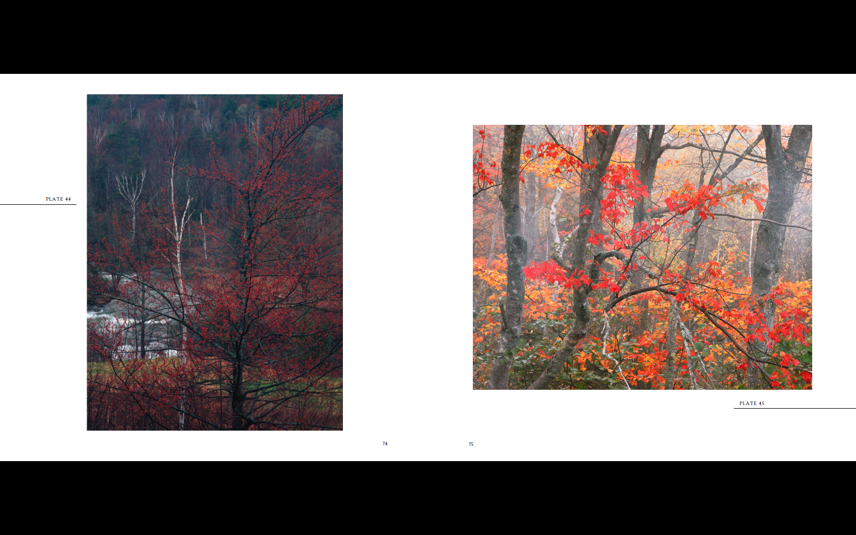
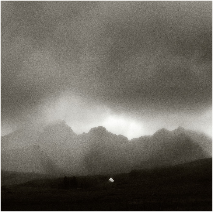
William Neill assisted at Ansel Adams' studio in Yosemite and has worked with many of the top photographers in the world and in the process has himself become part of the group he studied with. His work has been published around the world and, living in Yosemite, he has formed an intimate relationship with the land and the seasons.
We took a look at four of William's books that he was gracious enough to contribute to us.
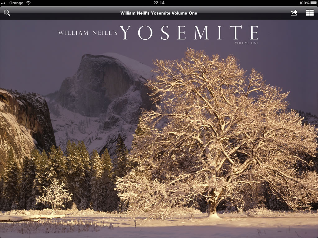
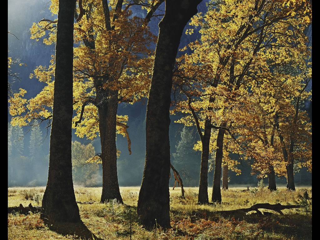
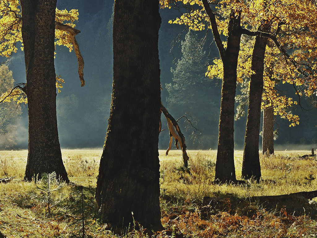
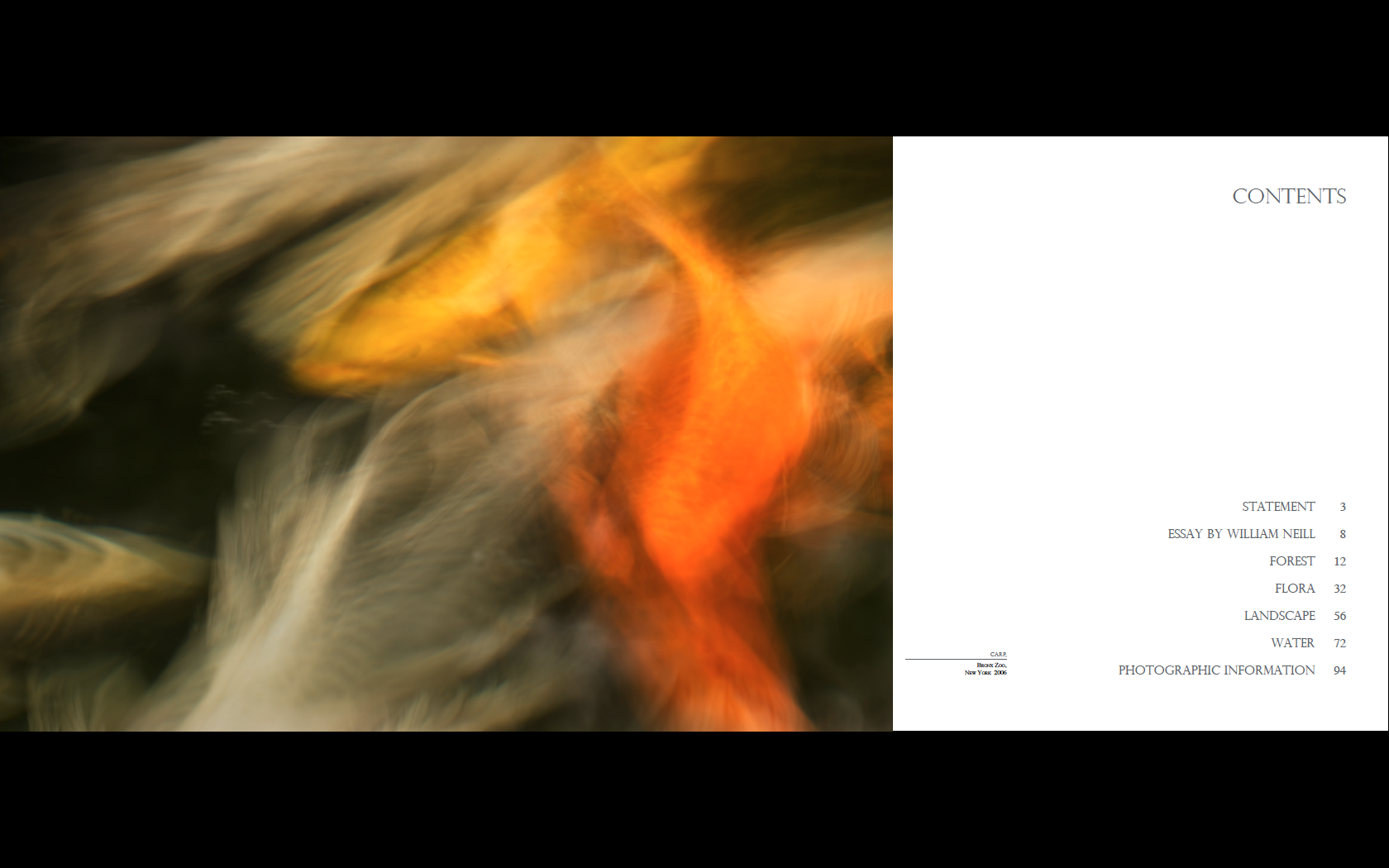
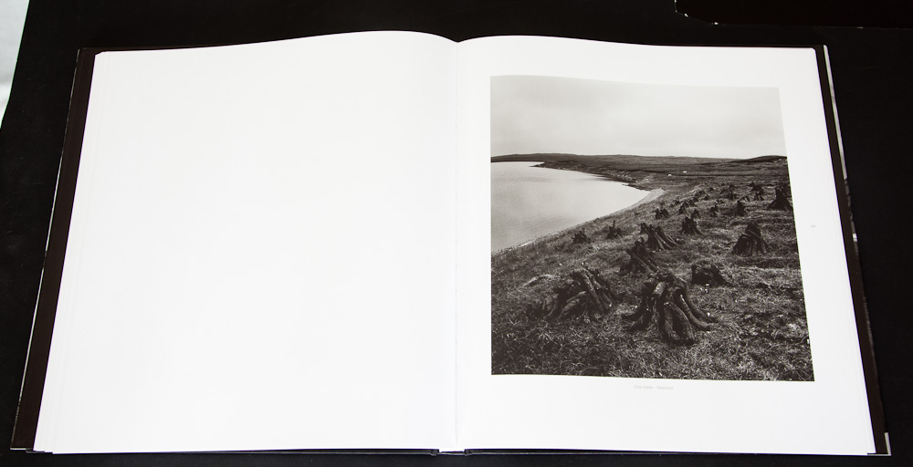
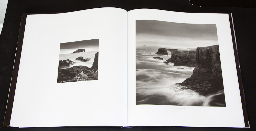
William Neill's Yosemite - Volume One
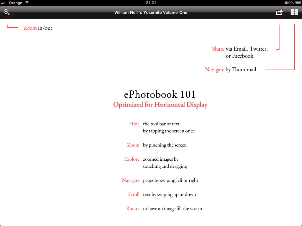
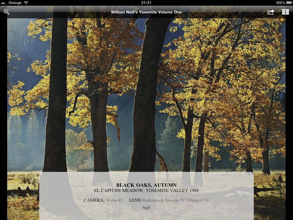
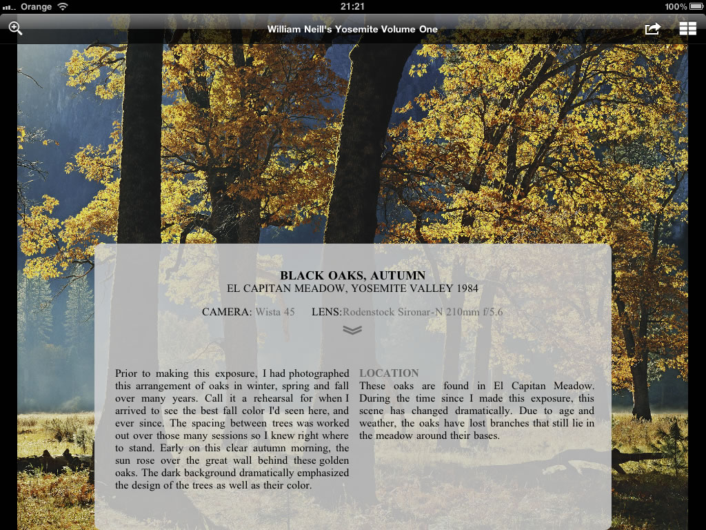
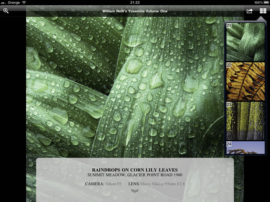
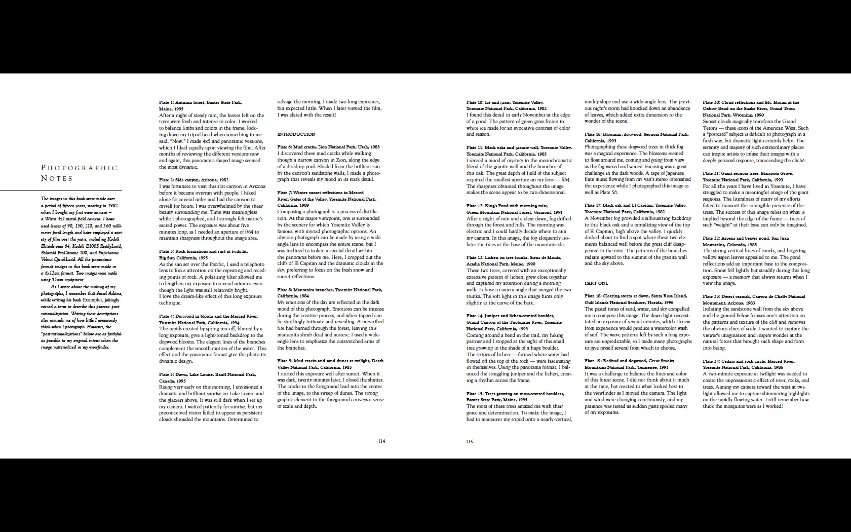
I have downloaded a few e-books to my iPad and in the most, I have to say I've been a little disappointed. Most of them seem like they have been bodged together quickly in order to 'get stuff out'. William Neill's book, based on an ebook technology developed by another photographer Jim Goldstein is something a little different though. The content is eloquently written, the pictures beautiful and the interface is simple and yet allows you to browse the pictures in detail whilst having easy access to supporting information. The panels below show a few pages so you can see how you can see either snippet of the description, the full description or just the image on its own. You can also zoom in to expand the image to double size, effectively viewing images approx. 2000px by 1500px - a very generous size that allows you to see some of the fine detail recorded by William's 5x4 camera and also appreciate some of the great images shot on his 35mm Nikon FE.
Each image has a small story associated with it which gives you some insight into his working practise and life. I would buy this even if it were just for the images but the associated text lifts this above your usual e-book fayre.
The book is also available as a PDF and QT Luong also reviewed the book and noted some colour issues between the iPad app and the PDF (and the online images). Personally, I think the iPad has got the colour right and there is an issue with the PDF and website. Looking at images such as the water lilies where the website and PDF show green cloud reflections which I'm not totally sure about whereas the app shows neutral clouds and tints of blue sky (whichever is right, I much prefer the iPad versions). All of the images on the iPad app look better than their online counterparts. My only issue is that the full size version because it is reduced from the larger version, shows sharpening artefacts that I find a little over the top - just a taste thing though.
In all though, I think the current iPads are great devices for browsing images. The transmissive nature of the device makes images look like transparencies on a lightbox. Hopefully, the next iPad will have the same resolution as the iPhone which would allow browsing images at 300dpi or a full screen image would be 2400x1800 pixels. This would take the devices from a nice to have to an almost essential image browsing device. Let's keep our fingers crossed. (I think we'll probably end up with a HD Ipad 3 at 1920px but you never know).
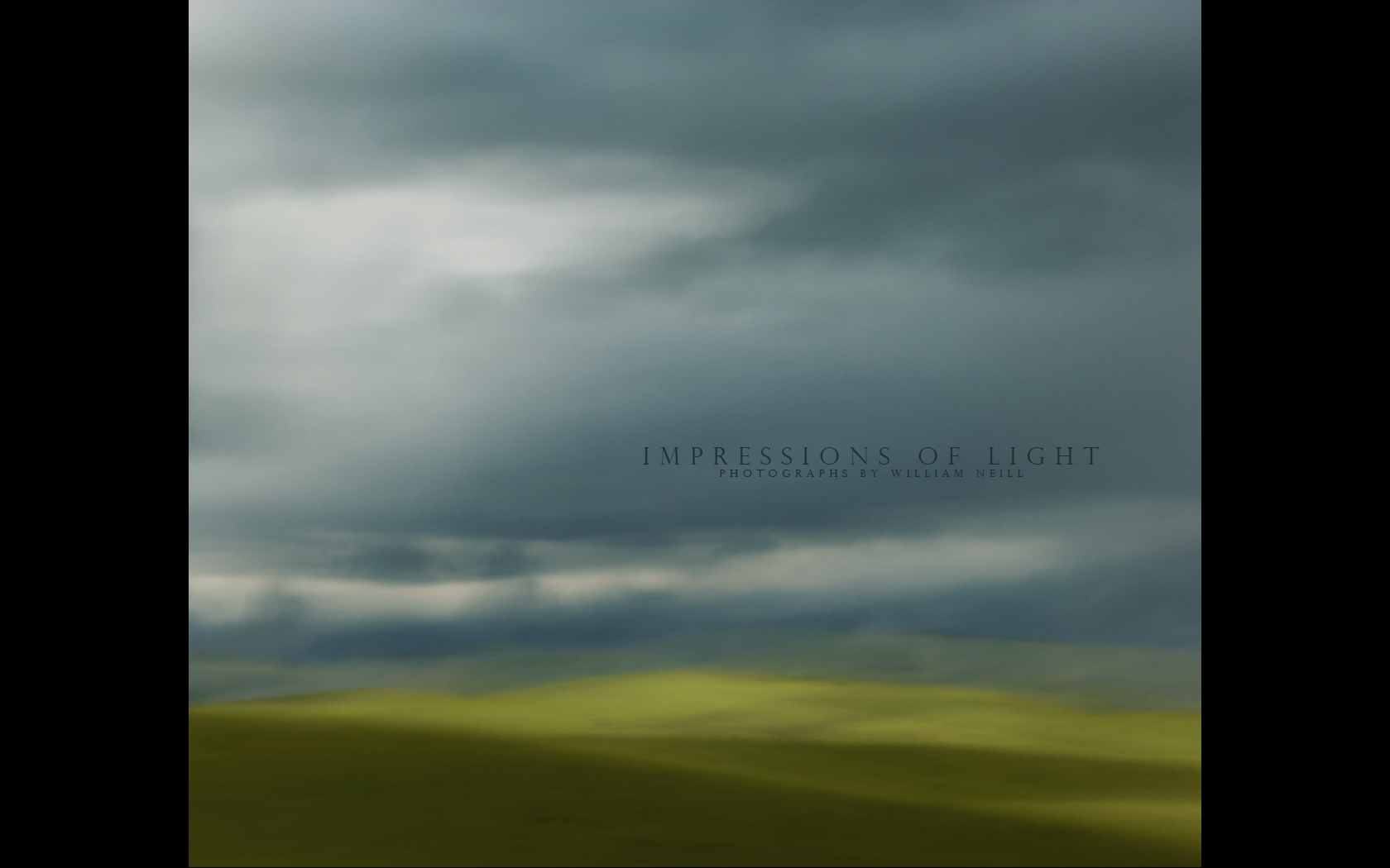
Impressions of Light
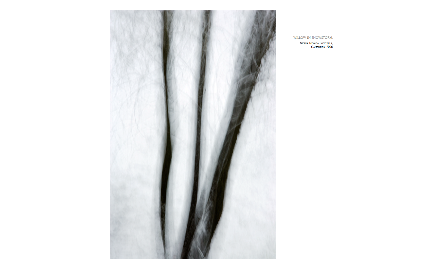
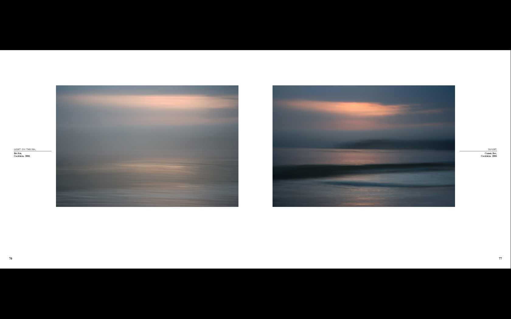
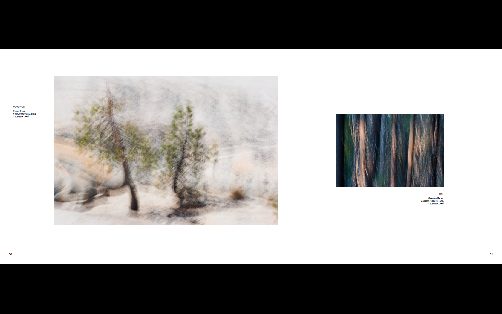
William Neill was one of the first people to play with the 'Intentional Camera Movement' (yuk! I hate that phrase) and even he admits that he was inspired by Freeman Paterson and Ernst Haas. I'm generally not a great fan of the technique, although exponents such as Chris Friel and Ted Leeming hit some high notes on occasion. William's work has an organic nature that still holds a connection with the subject, a painterly aspect that doesn't lose a photographic connection. It doesn't always work but there are a few pictures that really draw me in, particularly the snowstorm trees (which I've included in my extracts).
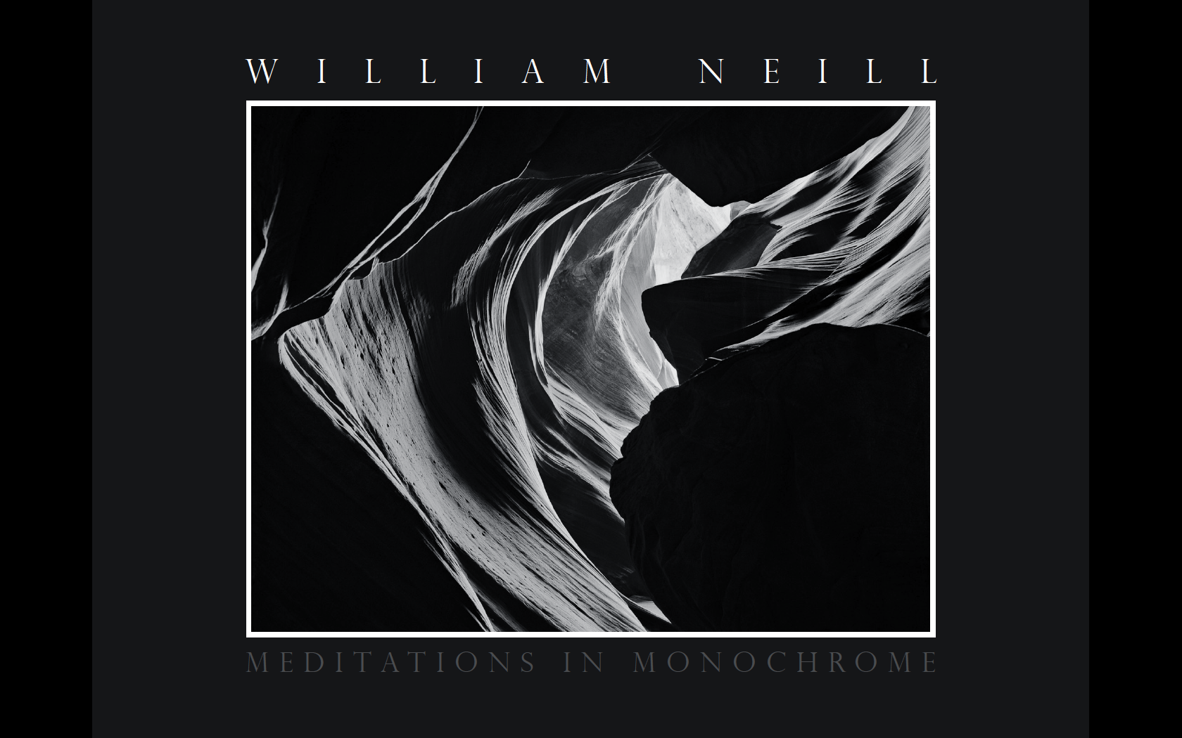
Meditations in Monochrome
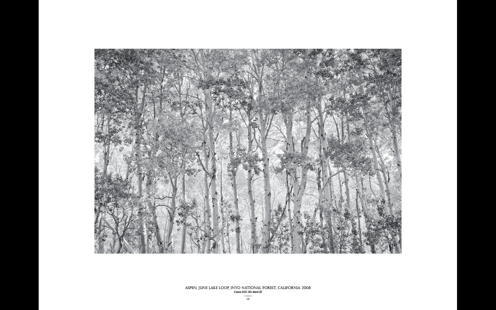
I don't think you could work as an assistant to Ansel Adams without having some interest in black and white photography; although expressing a preference for colour, William appreciates the work of photographs such as Ansel Adams, Edward Weston, Wynn Bullock, Minor White, Brett Weston, Paul Caponigro, Michael Kenna, John Sexton, Jerry Uelsmann, Bruce Barnbaum, Chris Rainier, Huntington Witherill. Working in black and white is another world but, for a tourist, he seems to know his way around :-) It's only recently that he has had a chance and the motivation to work in black and white in a combination of scanned film and digital capture and the results are perfectly acceptable and there are a few very good pictures. However, there is something missing and I think it may be that so many of these pictures are (published) colour pictures that have been converted to black and white. The best picture for me is a wonderful high-key shot of Aspens at June Lake Loop.
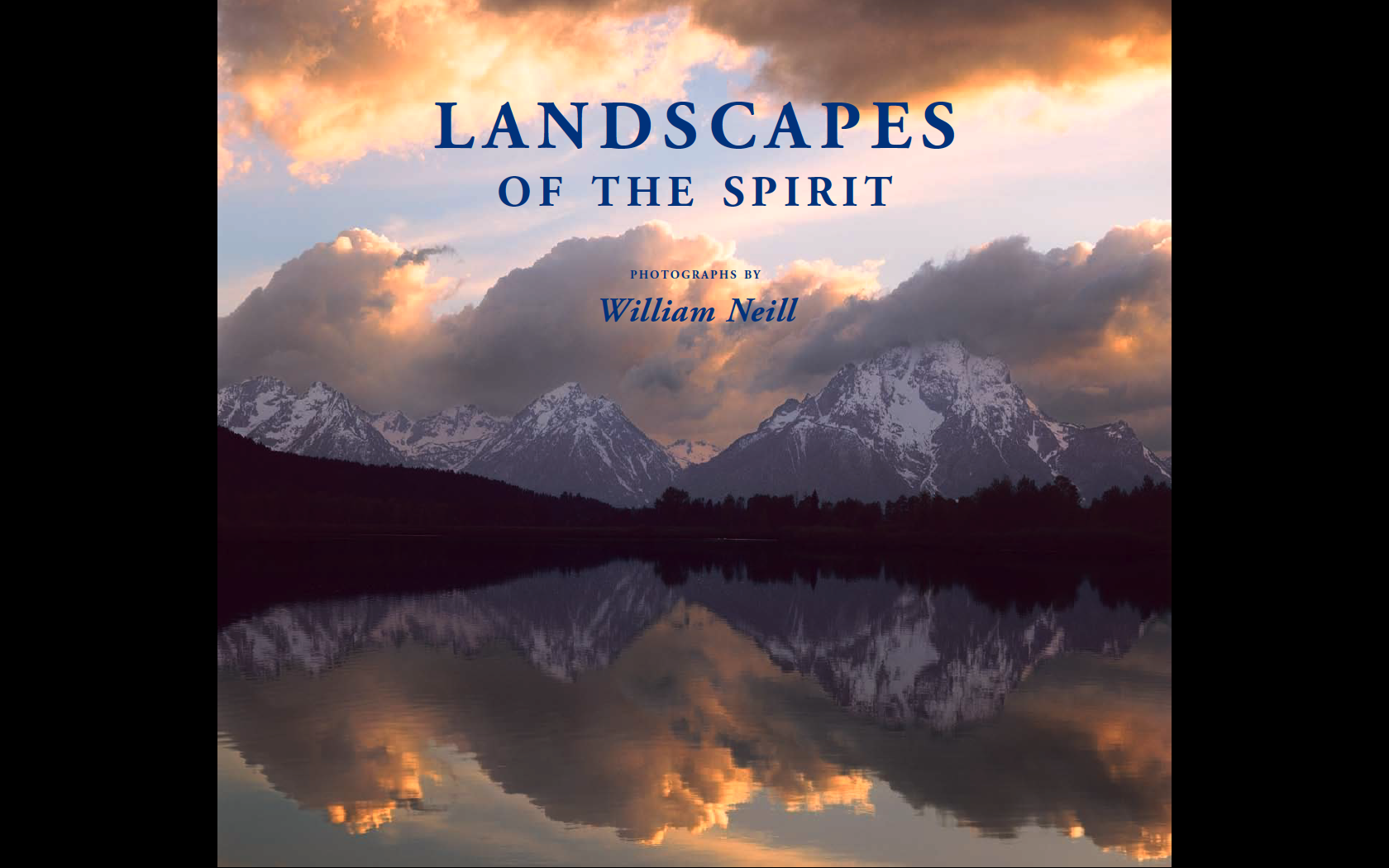
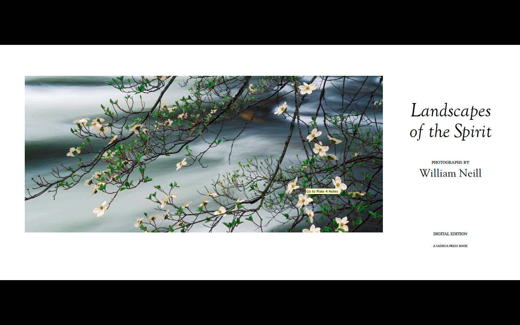
Landscapes of the Spirit
This is an older e-book and contains some of the images in the Yosemite book. However, there are many images that don't appear in that book and the good news is that all for of the books I've written about here are available for $30 (approx £22) and I think any landscape lover will get a lot out of spending some time with these books.
The highlight of this set of e-books is undoubtedly William Neill's Yosemite and I shall be looking out for Volume Two with anticipation. Anyone interested in the 'Intentional Camera Movement' or more experimental side of photo capture, 'Impressions' is well worth buying also. And if you find yourself impressed by what you see, the additional images in 'Spirit' (each with a short text associated with it) will be a worthwhile addition.
Furthermore, the iPad app is a great example of how the device can be used to present a well balanced portfolio.
You can buy William's books from his website on the e-book page.
Thanks to William for letting me review these books.
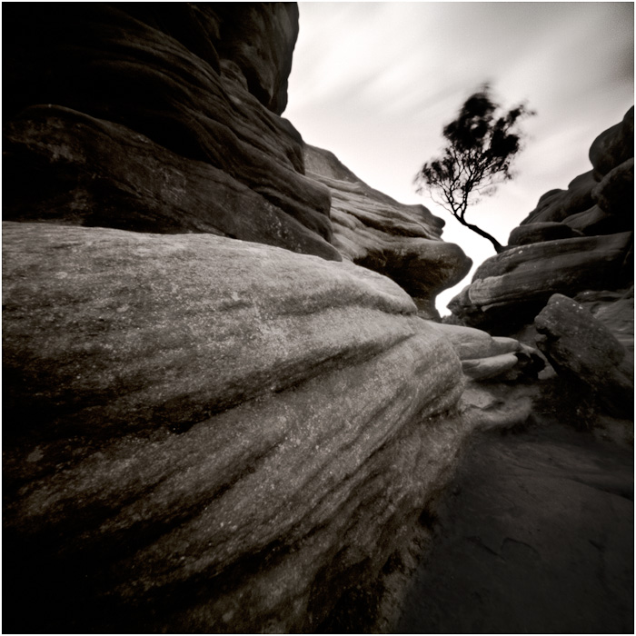
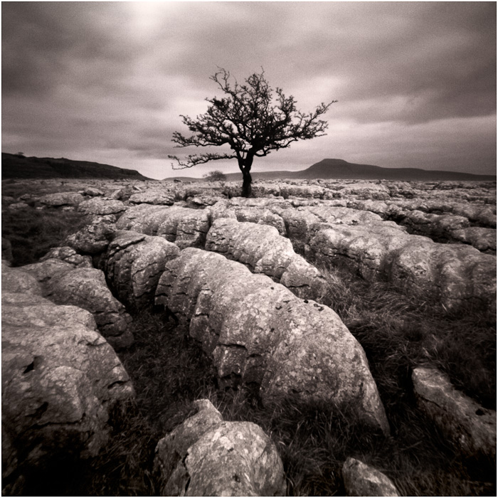
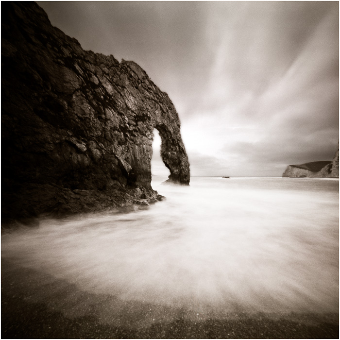
Pinhole photography is photography taken to it's most simple form. Just a small hole and some photosensitive material. There are a few people in the UK who have really mastered using this technique (see Paul Mitchell's work in one of our featured photographer issues).
Steve Gosling has mastered this process over the years and has produced a wonderful book of 'Lensless Landscapes' which we have featured in a review elsewhere this issue. We caught up with Steve at his home in Harrogate and asked him a few questions about his work.
Back in the late 1980’s my darkroom (and bedroom, though that is incidental to this tale) was a windowless coal bunker in Catford you had to crawl on all fours underneath the floorboards of the sitting room above to reach. It smelt of its past and I remember the odour of stale coal to this day. But hour upon hour would pass down there without a care in the world as I went in search of that eureka moment when all the burning and dodging would come together as that elusive final print.
Slowly I began to unravel a few of the necessary skills of the black and white darkroom. But just as my tan slowly faded and the smell of chemicals became my deodorant I began to suspect that to be a true “wet” darkroom specialist, particularly if delving into colour processing, was a calling in its own right and I had to decide if I wanted to take this route or concentrate on my journey as photographer.
As a result, I placed my faith for my colour work in the hands a character I called “Gollum”, a reclusive genius who inhabited a windowless basement off the Tottenham Court Road in London. He was the only darkroom technician I ever found that ever truly seemed to “see” as I did and know exactly what it was I was trying to create in my images. With minimal discussion, he could review a transparency and add the finishing element to my images that I could never achieve. The image would come alive after he had practised his art.
A film imparts its character and personality to the final print as soon as it is chosen but once applied there is no going back. Having made the choice of filmstock I would have already predetermined the look of my final images. I would then filter and expose appropriately with an understanding of the impact this would have on the celluloid before handing over to Gollum who, with a set of development instructions, would then add the appropriate under and over exposure to the original film, burn, dodge, apply his magic dust and print on an agreed paper before arriving at the final image. What the magic dust was I never truly knew, but when Gollum decided to give up his underworld kingdom I was left in a very difficult situation as I simply could not find a replacement.
With the arrival of digital (at an acceptable quality and price point) and the ability to manipulate the captured frame myself, I realised I had potentially resolved this ongoing problem. Everything had suddenly changed. I began to realise I now had the ability to choose the final “look” for my image on a print by print basis once I had returned home. I could manipulate my digital negative in post production to create the inherent feel of a particular filmstock and finish, depending on the chemical, exposure and paper cauldron that the film and paper had been dipped into. Whilst the nuances of a specific filmstock can never truly be recreated in the digital darkroom (not by me anyway) I could reflect a traditional style or even create my own - and in addition have far more flexibility throughout the process than ever before.
I also became aware that not only could I affect the overall look of the image but I was finally in control of the entire workflow for my work without having to live underground for half my life. Every localised burn and dodge, contrast adjustment, crop or colour correction was mine. It was now entirely up to me to make adjustments to my negative, right up until the final print was made. Indeed I could even correct errors post printing without having to remember and apply a series of approximations again to a second print to arrive at my final vision. I was suddenly free of the fixed paramenter of filmstock or the vagueness of the wet darkroom.
With this growing understanding of what is an entirely different post production technique (I fear I am woefully inadequate in this department compared to others who will read this) I have found, conversely, the way I “see” and operate in the field is also changing. This is an interesting and relatively recent phenomenon that is having a growing impact on my work. As a result I am now working on an increasing number of different portfolios that, as conditions in the field allow, enable me to shoot to the requirements of a specific body of work. If the light or mood in the field changes (not exactly an unusual dynamic here in Scotland!) so can I adapt and even change my shooting method to suit an alternative portfolio. This freedom and approach may not be to everyone’s taste but I find it can be very useful and at a personal level satisfies my eclectic creative bent.
Having become a proponent of digital post production I still, however, try to create the image as far as possible in the field. For me, it is still about the art of photography rather than being a mouse master. I still use ND grads and a polariser (occasionally) for example, and my camera is set up as if a clockwork Nikon FM2 rather than a sophisticated digital tool. I have even been told by more than one large format photographer that I am “rather slow” in the field, which I think was a compliment! At the end of the day though, this is where I want to be and is currently the way I want to be shooting.
As such I do not consider myself a “Photoshopaholic” and it is digital enhancement that I seek when I sit at the keyboard, rather than manipulation, to achieve the desired affect. I see this as little different from choosing what film/filter/exposure/paper combination I would have chosen had I been shooting with film. I normally follow a recognised workflow and make similar adjustments to an image when I first return from the field, then look at the detail of each image to enhance or subdue areas as I feel appropriate. I then leave the image on the computer screen for up to a month, returning to it frequently to make subtle changes to compensate for any over-adjustments which I find can easily happen in a single sitting. Time allows me to retrace my steps and to compensate for over-exuberance until the image finally feels complete.
I feel very lucky to have had the “film” experience as this entire way of working still impacts how I work and as time goes by I fear this art will eventually be lost. I still find myself thinking back to the days when I had to decide what film to take out and to thoughts of my darkroom, cupping and gently moving my hands like shadow puppets, introducing a filter and re-exposing to increase the contrast over a small portion of the image. You just can’t recreate that magic with a mouse.
But do I really miss it? Well, put it this way, whilst I reflect nostalgically over Gollum and coal filled nostrils and still have creative avenues the idealist in me would (and may one day) dearly like to explore, I haven’t actually got round to setting up all that dusty kit for many, many years.
Pete Bridgewood has organised another 'Masters of Vision' exhibition at Southwell Minster and we went down to the preview night to see what's changed since the last exhibition.
Well, the name is the same and although I'm not sure it's right for the exhibition, there is certainly some masterful work on show. I suppose we can split the show into a couple of sections, firstly there is Pete and colleagues who remain represented this year, Dav Thomas, Mark Gould, Chris Upton and Jonathan Horrocks (Chris Upton has a gallery with Pete at the Patchings Art Centre), then there are the celebrities - David Noton, who is the master 'Master' and also two magazine editors, Steve Watkins (who is editor of Outdoor Photography magazine and a travel photographer) and Damien Demolder (who is editor of Amateur Photographer and a self confessed photographic generalist).
The photography was on the whole very good quality but I must mention particularly notable work overall by Dav Thomas and Chris Friel whose work you should be familiar with through our articles on them. Chris Friel's are more impressive in print form than on screen and are well worth seeing. Dav's pictures I know very well but seeing them in print is a pleasure. The two pictures that was really transformed through printing are his Rannoch Moor pond (which I scanned for him - do I get brownie points?) and his 'Constable' where the tones of the negative film really shine .
David Noton's qualifications as a professional landscape photographer are without question and the eight panels of photography shown here provide a great slice of his work from earlier 6x17 work to more recent digital panoramas. I was particularly drawn to his vertical 6x17 rain forest photograph and his sunrise at Te Pare Point. I was pleased to see that over 2/3 of his pictures were his classic 6x17 film shots which were printed and displayed beautifully - Out of the film work, I really loved the rainforest, trotternish and cloudburst shots and out of his digital work, the stand out shots were his Te Pare point and the poppies shots (and some of the other Tuscany photographs too).
Steve Watkins and Damien Demolder are clever choices by Pete - whilst not who I would choose for my 'masters', they do have some great pictures (especially Steve Watkins Bamboo photograph which I was repeatedly drawn too) and they certainly add to the promotional aspect and reputation of the exhibition.
Chris Upton's work is greatly improved over the previous exhibition and I particularly liked his Santorini and New York bridge shots (at least I think it's New York). Mark and Jonathan have also raised there game, Mark produced a set of photographs from Scotland (via one shot from Porth Nanven), including a wonderful symmetric shot down toward Rannoch Moor. Jonathan also has his Porth Nanven shot plus a range of coastal work from rock pools to sea views (great pebbles). His best work was the black and white panel which showed an original, aesthetic view and the two beach photographs showing flowing water - very nice.
Pete's work shouldn't be underestimated either - a lot of it definitely from the dreamscape end of photography with mist and long exposures abstracting the landscape supported by a couple of very nice looking piers. It was Pete's two Castlerigg photographs that I liked the most though - wonderful, particularly the black and white.
In all, this is one of the better landscape photography exhibitions I've been too - a stunning location and some great work.
In the past few weeks I’ve been chatting with Beyond Words about reviewing books on a ‘return’ basis (i.e. if I don’t want to keep them I return them, otherwise I pay for them). This looks like it may be turning into an expensive agreement as out of the first three books I’ve ‘borrowed’, I’ve bought two of them.
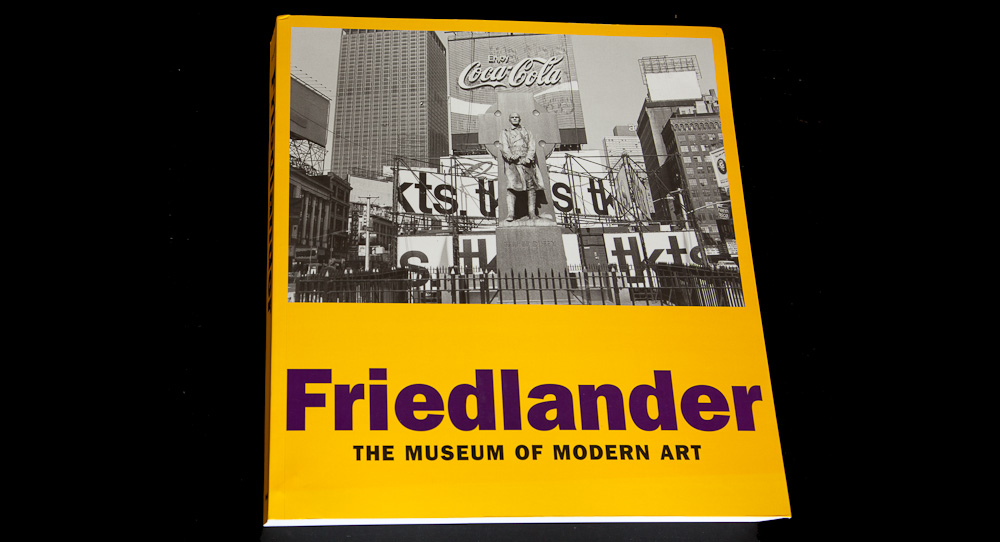
So briefly which did I borrow and which did I buy. Well the three books borrowed were Lee Friedlander’s “Friedlander”, Marco Paoluzzo’s “Terra Borealis” and Thomas Joshua Cooper’s “Shoshone Falls” (read our interview with Thomas Joshua Cooper) and the only one I returned was Friedlander’s.
Lee Friedlander’s “Friedlander”
Why did I return this book? Well, two reasons - one for me is that his photography is primarly street photography, which doesn’t hold too much interest for me; The second is that although the main reason for borrowing his book is to study and form an opinion on his landscape work, it didn’t move me.
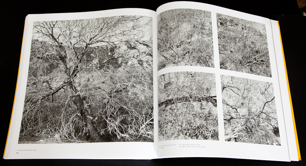
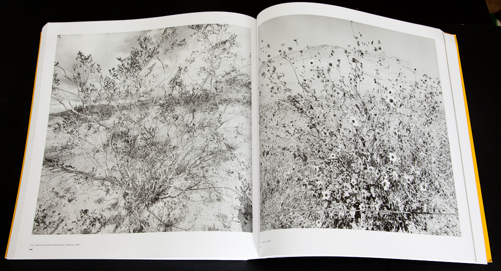
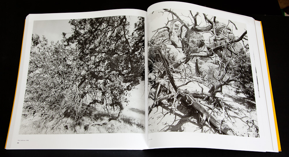
I’ll give you a brief overview or formula for his work. Turn up at a location in the American West; Find a nearby tree, bush or cluttered foreground; Step into the middle of the tree or bush, ensuring that the view you had seen is mostly obscured by it (or compose with the cluttered foreground as a dominant feature); overexpose to demonstrate the intensity of the western light.
To me this seems like the germ of an idea that could prove interesting if developed, but - like many a ‘contemporary’ artist - the throwaway idea seems enough to justify a whole show.
Further, the commentary associated with this set of pictures, although not Friedlander’s, gives you an idea of the mood of the curators at many contemporary institutions (in this case the Museum of Modern Art
“The western landscape was an old [topic] for photography. By the 90’s, indeed, the natural beauty of the West was a distinctly old-fashioned, even questionable theme.”
“The inspiration that the young Ansel Adams had drawn from pristine nature in the ‘20s and ‘30s would henceforth be available only as fraud or self delusion.”
and from the exhibition associated with his landscape work
“The heterogeneous organic mesh so often experienced in the foreground of these landscapes imbue forests and mountains with a kind of intimacy and immediacy ordinarily reserved for those actually trekking through the photographed terrain. The foregrounds do not diminish the power of the hills and mountains but rather draw them into the whole of the rectangular plane, at once veiling and celebrating their volume and shape.”
ho hum...
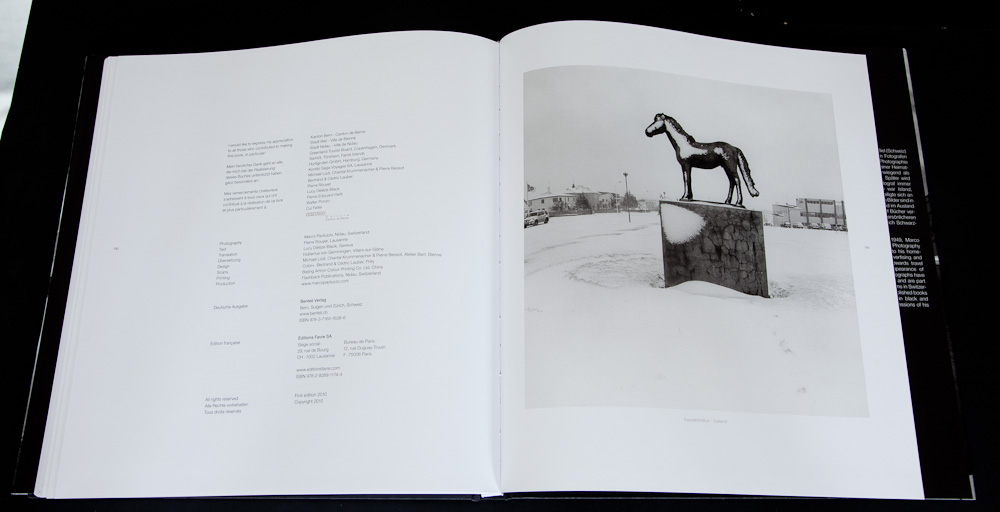
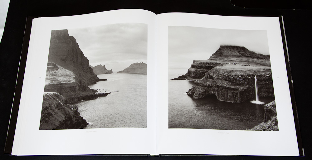
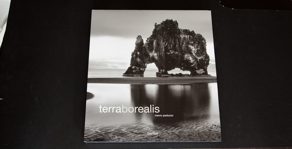
Marco Paoluzzo’s “Terra Borealis”
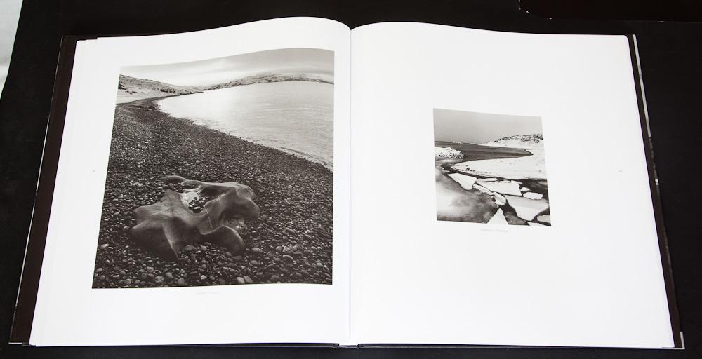
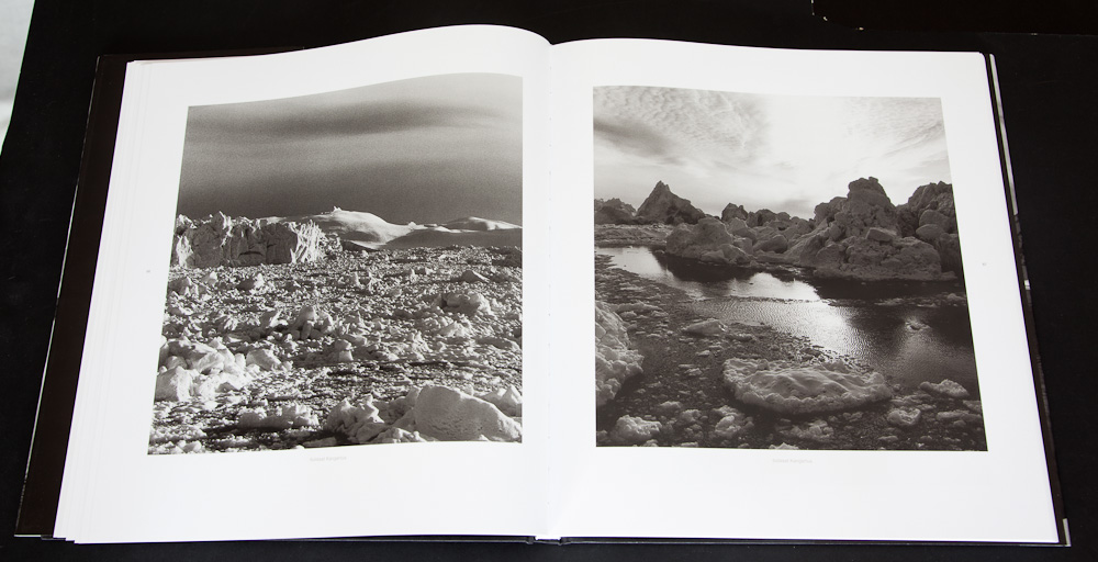
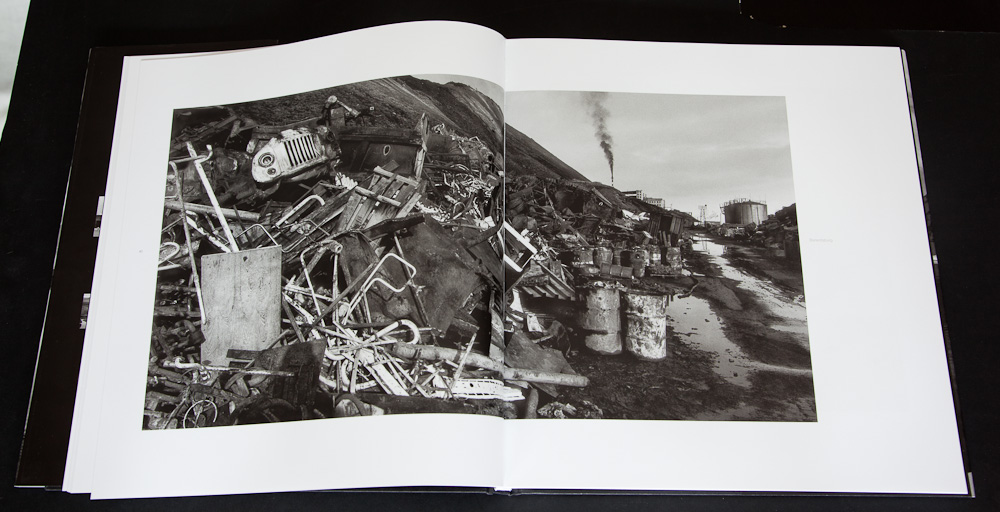
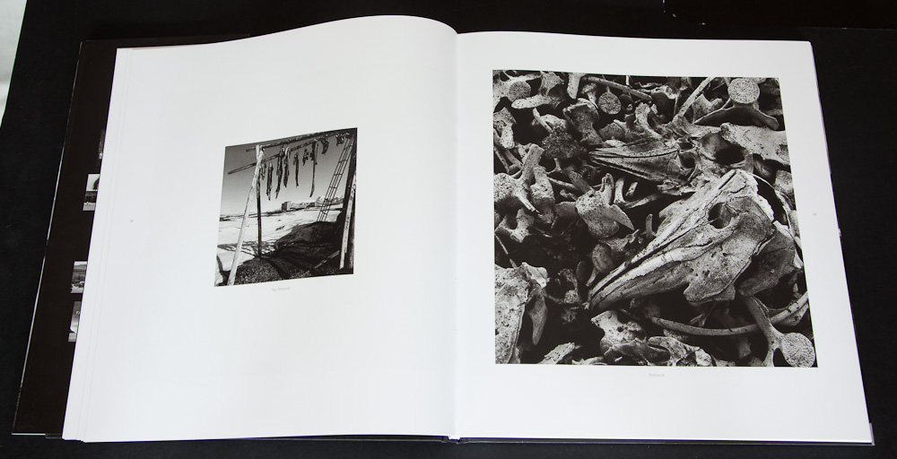
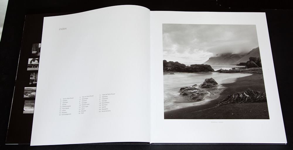
Marco Paoluzzo’s “Terra Borealis” is another story. Here is a photographer who is entranced by “the vastness of the place and of the ice”. This is the story of the 60th parallel; a twenty-year project that captured the land, from the prosaic to the sublime. The result is a captivating set of photographs that don’t wander too far into the celebratory or wallow in the despair of the industry defiling the land. These are just a story - images captured to represent a journey. Don’t expect every image to blow you away or to be moved to political activism. And don’t expect magnificent compositions. Do expect to walk away with a feeling that you’ve shared something of the land. That can’t be such a bad thing. One of our readers, David Mantripp, has also reviewed this book which you can read here.
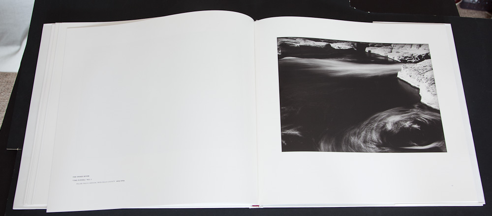
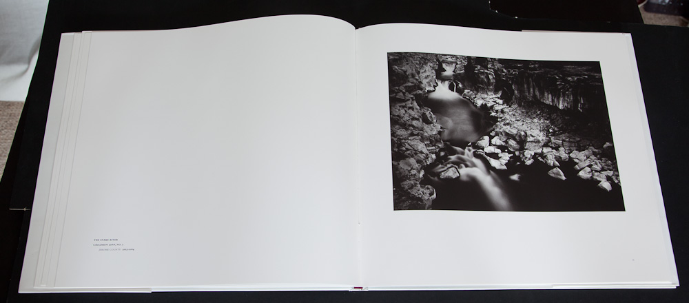
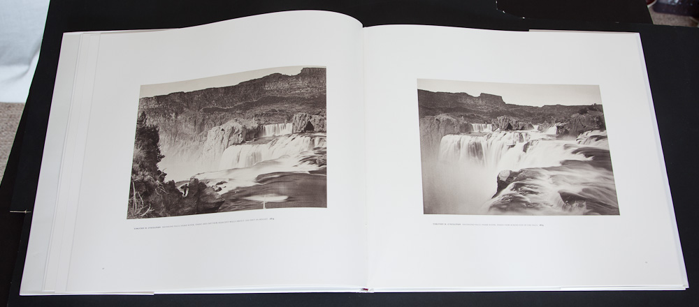
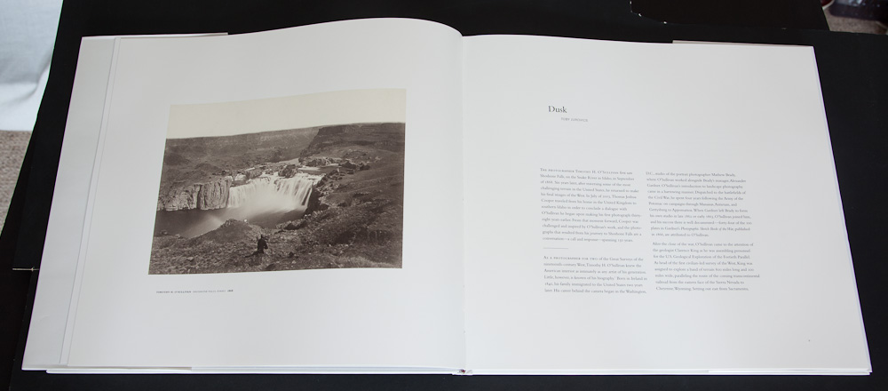
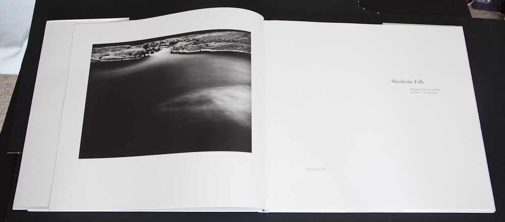
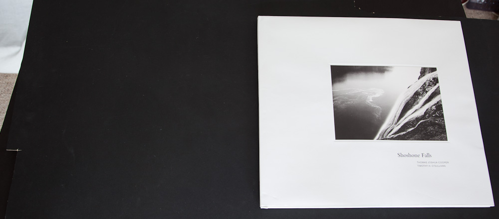
Thomas Joshua Cooper “Shoshone Falls”
Finally, there is Thomas Joshua Cooper’s “Shoshone Falls”. I’ll admit to being perplexed by Mr Cooper. On the one hand, I love some of his work from the ‘Point of No Return’ project - especially the picture “Moonlight” shown to the right.
I’m having difficulty getting into Shoshone Falls though. I’m not sure if it’s just because it is printed so extraordinarily contrasty (enough to give Adams nightmares - “Nooo!! The zones canna take it!!”) or if it’s that it’s over so suddenly (there are only a handful of plates in the book, 18 of Cooper’s and 8 of Sullivan’s).
So why did I buy it? Well - the combination of commentary on Timothy O’Sullivan’s original trip to Shoshone (which inspired the re-photography project) and the contrary nature of Cooper’s prints and his comments in the essay section make for a book I’m sure I will come back to. Will I end up loving it? I don’t know - only time will tell. Will I gain from owning it? Yes I think I probably will - it made me think, which can only be a good thing.
You can buy any of these books from Beyond Words and the links and ISBNs are below.
I’m currently developing a couple of websites for colleagues and I thought it would be a good idea to discuss the aspects that need thinking about when doing so.
I’ll cover a few different points here but please let me know if you have any questions and I’ll expand on things here.
Image Size
First of all what size are we going to present our images? The constraints are far as size is concerned are
the possibility of image theft if your picture are too big
not presenting your images in the best light if your images are too small
your images not fitting on the screen if they are too big
So what about image theft? Well, what types of theft are there?
People using your images and saying that they are their own
People pinching your images for commercial use
Unauthorised use of your images where you don’t wish to see them
Whatever size images you use, it will always be possible for people to copy images and use them on their own website and say that they are there own. It’s very difficult to stop this happening (see copyright marks below).
Well, there is definitely a risk but you need to balance what your losses may be. Whatever size your images, they may be used for web purposes (i.e. to illustrate articles or to feature as images on a commercial website) so let's presume a minimum size of 500px and a maximum size of 1000px. The only use the small size may prevent is as a ‘header’ image on a website (the bar across the top of some websites).
For print purposes, the 500px image could only really be printed up to 2.5” so for a typical picture you may get a 2.5 x 1.5 inch photo. The 1000px image may produce a 5” x 3” photograph - perhaps enough for a postcard, not enough for a book cover.
For editorial use, even 500px will allow people to use an image to support an article or in a book or brochure.
And if anybody wanted to use your pictures at full resolution, they would just order a print and scan it? It’s probably cheaper than licensing at the prices many people sell small prints for (you could scan a 10x8 and use it for most editorial purposes).
For most people, it’s probably easier to think about what possible losses may result in sharing larger images against the impression that your online gallery would give if you showed larger images.
So the only way you can ‘lose’ money is either through someone pinching a photograph when they could have paid for it or if the use of a picture affects your reputation. Well, it’s difficult to stop the latter - some of the least reputable stuff is on the internet and it’s difficult to stop anyone using your small pictures.
However - the first example is where it gets interesting. For you to actively lose money, the use of a larger image must have made someone say “Hmm - you know what, I was going to pay for this but it just happens to be the right size for my purpose. I think I’ll pinch it instead”.
.. and here is a possible way of making money. Prosecute the people who pinch your image, even though you’ve marked them as ‘copyright’ and attached metadata. I have a small though that there is more money made from illegal uses being prosecuted than lost because images just happen to be big enough for people to forego paying for them.
Anyway - I’d love to have anybody demonstrate evidence of directly losing money from pictures being pinched off websites ‘because they are too big’.
In addition to this, I can definitely imagine someone *not* buying an image because they can’t see it big enough on the website.
Image Compression
Always a difficult one to judge - I have my rules of thumb and I tend to stay at about 75-80% compression. Any more than this and file sizes tend to increase without significant improvement in quality and anything less and I can see a difference.
Sharpening
I used to struggle with sharpening until I discovered Photokit Sharpener. The technology is perfect and you don’t have to worry about settings. Just dial in ‘screen’ in the ‘output sharpening’ section and choose the right size.
This has also now been built into Lightroom (another reason to buy this great product!).
The only thing to try to avoid is ‘halos’. I’ll hopefully write an article about sharpening at some point detailing the use of Photokit/Lightroom
Navigation
You have to make your website easy to use. A visitor needs to be able to browse your pictures at their leisure, either quickly or in detail.
Critical to this is navigating into your categories and then navigating from picture to picture. Something as simple as making sure the next and previous buttons are in a consistent location from picture to picture.
Nothing is worse than having to click on each picture to go back to a category page to then have to find and pick the next picture.
Ideally, in my opinion, it is best to have multiple top level categories and then in each category to have a ‘manageable’ number of images with the simple ability to navigate from image to image by either just repeatedly clicking the mouse and/or by using the keyboard with a simple way to get back to the category list page and then the list of categories page.
Grouping/Categories
Oh, this is a big kettle of fish. How should we categorise our images? How can we sub-divide our photographs up? Well, I can’t tell you that but it depends on whether you are selling for decorative, art or stock purposes. If decorative, perhaps you should group by subject matter or location (or both?); if art then by ‘project’ or year; if the stock then by keyword search.
Basically, subdivide it however you like but think carefully about how your customers or visitors are going to ‘sub-browse’ your website. i.e. If they aren’t going to browse all of your images, what are they searching for.
Required Information
Well, every website needs
A contact form, preferably with a real email address (yes I know about spam but these days there are no excuses for not using something that is almost spam free such as a gmail account).
An about page which gives people some information about you and what it is you are trying to do with your photography
News of some sort (if you have any) to indicate that this isn’t just a one off ‘stick a website up and hope they will come’ affair. A news page can give a sign of life and personality. Even better, include a blog for your news with all of the nice stuff that this comes with like an RSS feed
Selling
Most people aren’t going to sell more than the occasional print online. Do yourself a favour and just include a button that takes the customer to a pre-filled in contact form showing the picture they are interested in.
If you are selling cards, this is a little different, even then your basket really only has to fire an email order off which will give you a chance to talk to your customer and you can find out who, why and how they found you etc..
Yes, if you want to include a proper checkout and integration, however, make sure you know how much this is costing you if you are having your website custom built.
Home Page
What to have on the homepage? Well, I would recommend including a couple of your best images at least - two images that show two different aspects of your photographic output.
You’ll also want a reasonable amount of textual content - if possible, something that regularly changes. Blog post summaries are excellent examples of this.
I’ll leave it there for now. This won’t be the last article on website design and I’ll probably go into some of these issues in greater detail.
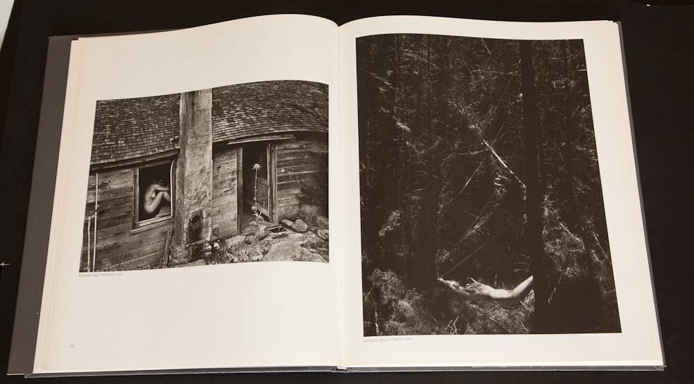
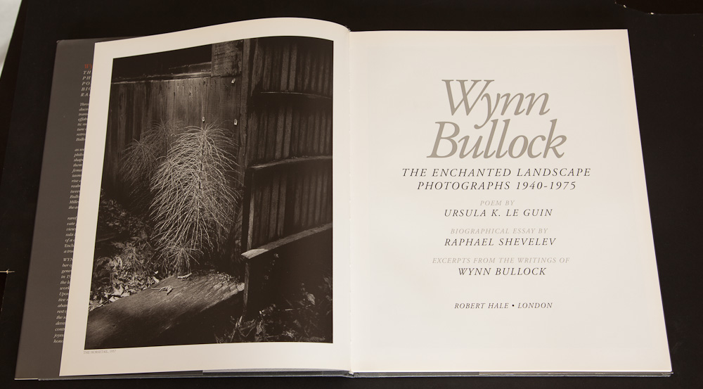
Wynn Bullock was a Chicago born photographer who grew up in California. His youth was all sports and singing and it was his singing that took him to New York to study music and languages. Whilst in New York, he sang in the chorus in front of President Warren Harding and Irving Berlin. He married a colleague from the chorus and ended up moving to Paris, France where he became enchanted with the impressionists and more importantly to the photography of Laszlo Moholy Nagy and Man Ray. A tour of europe, ending in Milan also became a introduction to photography where he started with a Zeiss and finally, at the end of the tour, he bought a Leica in Berlin.
He returned to the US to manage his families business in Virginia. He finally moved his family back to california and started to study Law at USC. This didn't last long and within a few weeks, he enrolled in a photography course. The influence of Ray and Nagy pushed him into experimentation with solarisation and bas releif.
Under Monterey Wharf, 1969
During the war, Bullock was employed as a photographer and at its end, he remarried, started selling postcard pictures and became co-owner of a commercial photography business.
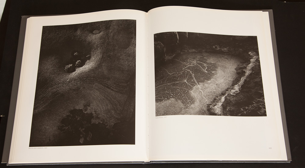
The big turning point in his personal photographic journey was meeting Edward Weston in 1948. Stunned by the beauty of his prints, he devoted himself to 'straight' photography, spending a long time working around Point Lobos trying to work in an area that Weston knew well - he wasn't completely taken by all of Weston's words though, saying "Some of his best known sayings don't make any sense at all".
He moved away from his study of Weston (who was already dying and unable to photograph when he first met him) and is probably best known (apart from the Family of Man photographs) for his much emulated photographs of Nudes in the landscape. Bullock primarily used his children as models (sometimes without there cooperation, to the point of fainting or suffering from nettles and rashes) and some have interpreted there use to symbolise negative meanings but Bullock was primarily trying to symbolise purity and the link between the human and nature.
Colour Light Abstraction 1071, 1960
His professional photographic journey took a major boost when Steichen chose two of his photographs to be included in his "Family of Man" exhibition (one of the most widely seen photographic exhibitions of its time). His two pictures were the most popular of the show (see included).
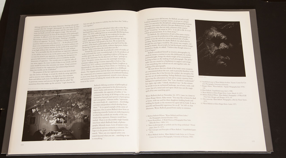
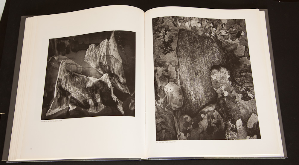
In the 60's he worked with 'Color Light Abstractions', which was before it's time and could only really be seen as intended in his families reproductions. (see his website for more images).
He returned to black and white soon after this, frustrated with the quality of colour reproductions. His last works were a search for the light within, even continuing to take photographs of inanimate objects searching for the energy and animism within.
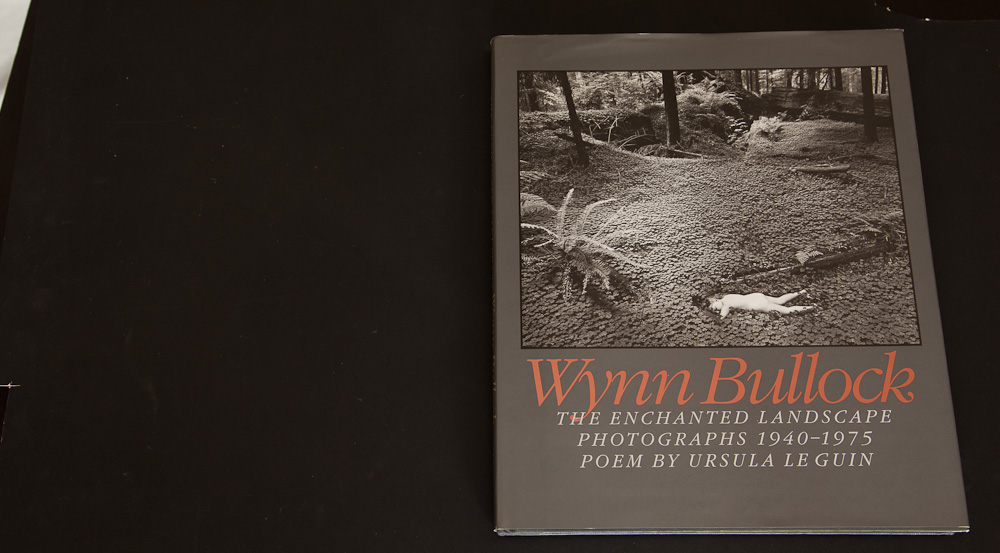
There is a lot more to be read about Bullock's work and life in the book "The Enchanted Landscape" which collects together most of his well known landscape images and quite a few interesting abstracts. The website (http://www.wynnbullockphotography.com/) curated by his daughter is also well worth a long study and she talks about some of her fathers work in detail.
The "Enchanted Landscape" can be bought from Alibris or Abebooks second hand for around £30 pound typically (although there are a couple at £17 at the moment). You may also buy the book direct from the Bullock estate at $100.
We're featuring a photographer that I met on a trip to the lake district in January. I didn't realise quite what a large amount of great work he had generated in such a short amount of time and I had great fun going through his photoblog whilst putting this together. David Baker!
In most photographers lives there are 'epiphanic’ moments where things become clear, or new directions are formed. What were your two main moments and how did they change your photography?
Just after I started using an SLR, I saw a photograph by Guy Edwardes of Keyhaven/Milford beach at sunset and the sea looked fantastic drawn over the shingle beach. The wave trails looked ethereal. I tried it myself a week or so later and that was that I was caught and I’ve been a coast hugger ever since. It’s a fair comment that the majority of my work is a variation on this theme and hopefully will continue to be so.
The second is really linked to the first and that was a visit to the Coast Exposed exhibition in Greenwich in 2005
For example, I recall a panoramic print of David Noton’s St.Michael’s Mount about six feet across, and one of Joe Cornish’s (I think of Horden beach) on a light box that was mesmerising. To quote from the blurb: …[the exhibition is]… drawn from the work of superb photographers working for the National Trust and Magnum Photos, [and] it evokes Britain’s manifold seascapes with such exuberant veracity that you can practically taste the salt in the breeze. But as the exhibition’s title suggests, this is also a show with an agenda. Britain’s coastline is “exposed” in more than the shipping-forecast sense. Those mighty cliffs and ancient harbours may seem indomitable. But the reality is that many of our finest seascapes are all too fragile, all too easily scarred or destroyed.
From our brief chat on the phone, I believe you first bought a guitar before changing your mind and settling on a camera. There is obviously an urge to be creative going on, what do you think triggered it and why photography?
At 15 I wanted to be an architect. My dad had introduced me to an architect client and despite the then (1978) 33% unemployment in the industry, I was keen on pursuing architecture as a career. Despite good grades, events didn’t entirely pan out as planned, and after dithering about a course at Salisbury Art College and flirting with a technical drawing apprenticeship, I joined the civil service. It’s fair to say that there’s been little creativity work-wise since. I’ve always had a great love of art (especially sculpture) so I guess the creative ‘urge’ has always been there albeit mostly dormant.
I started using a Canon A70 in about 2003/04 when my wife, Stef, and I began visiting stone circles, dolmens and standing stones. Despite my advanced years, I used to be a keen online gamer and during a lull in competitions and tournaments, a fellow player talked about his new camera, a Canon 300D, and suggested that I also buy one as I had become disillusioned about online gaming. This occurred at the same time when it was confirmed that I had no musical ability at all. A friend in Cornwall is a marvellous guitar player and after a visit, I thought I’d be Paul Weller within a month or two. Sadly not. So, in January 2005, trying to engage a creative aspect of myself, I also bought a 300D.
Almost immediately I wondered what I had let myself in for as I had always used the A70 on auto mode. I started reading magazines, books (fortunately Southampton has an excellent library) and looking at other images in various exhibitions and photoblogs. In the spring of 2005, I started posting images on a web forum and as a consequence, in November 2005, Jamey (of http://www.jameyhoward.com/photoblog/) started a photoblog and convinced me that it was a good idea to start one too.
Why photography? It was accessible and there was an immense amount of support and inspiration from the photoblog community.
You have a fascination with the coast (and water in general?) why do you think that is? Are there are other subjects that intrigue you in the same way.
I found this a very difficult question to answer and to articulate a considered response. By rights, I should be a videographer as I find the sound of the sea equally as important as the visual representation. The existence and the movement of water in a landscape are what principally engages me. ... (more to come - ed)
Could you tell us a little about the cameras and lenses you typically take on a trip and how they affect your photography
I think my set-up is very similar to a large number of seascapers and landscapers, namely a 5D MkII, a 17-40, a 50mm and a 70-200 f/4. This year I bought a 24mm TS-E II. Before the tilt-shift, the 17-40 was mostly welded to the camera, and I don’t think I ever took if off the 300D. During the past couple of years, I have used the 50mm and increasingly so the 70-200 for seascape work as I’ve moved away from the 17mm ultra wide angle.
Incidentally, as I do a lot of square cropping so I’d love to be able to do that in-camera by having a button that changed the format from 3:2.
Every now and then I think about exploring medium or large format.
Your post processing covers a quite broad range of styles, all resolved with equally high standards (black and white, pastel colour negative looks, textures, etc). Which do you think is most ‘you’?
Thanks for your kind words! I’m not sure if I have a distinctive look even though much of my subject matter is consistent. I do like to experiment principally via black and white and cross processing.
I hate to put it like this, but you do have a fascination with Groynes as well, a Michael Kenna influence?
Groynes and sea defences feature as they are so prevalent along the shingle strewn south coast. The first real open sea to me is at Keyhaven/Milford and without the groynes, it’ll be a shingle beach only with the sea and the sky. Admittedly that in itself is an attractive combination but the continuous variation of the sea’s movement around a groyne provides a huge amount of focus for me.
Incidentally, I only discovered Michael Kenna’s work, a year or two after I started the photoblog. I saw David Burdeny’s work first in Silvershotz magazine and thought it fab. I bought his book (my first photobook I think) immediately. After a trip to Edinburgh a few months afterwards, I went to Beyond Words and saw and bought the two Michael Kenna retrospective books.
Tell me what your favourite two or three photographs are and a little bit about them.
The Tide Pool
The Tide Pool
This is one of my favourite shots taken from a trip to the Outer Hebrides in February 2008 and was taken next to one of the immense rock stacks on the Traigh Ghearadha beach about 13 miles north of Stornoway just below the ‘Bridge to Nowhere’.
It’s a 90 second exposure with the tripod set just above the sand. The sea in the tide pool was making its way back to the shoreline. Behind me, a fabulous sunset albeit happening 25 miles away across the other side of Lewis but I wanted to capture this journey back to the sea.
This image encapsulates the contrast between light and shade I found across Lewis and Harris. The top right is a tad too dark (less sun and some shadow) and whilst not a lot is going on in the bottom left, I love it.
Wesdale Bay
Wesdale Bay
What a place. I had a weekend away in Pembrokeshire principally to see an exhibition by Rupert Heath at St. David’s and to see Westdale bay which featured in his portfolio. This image is coast hugging – the bay is strewn with rocks of all sizes and seem to be graduated in their redness. The sand is red as is the earth leading down to the bay. It’s one of the two places where I thought I was going to be caught out by the tide and seriously considered abandoning my gear.
Hengsitbury II
Hengsitbury II
My tribute to one of my favourite Charlie Waite images. I saw his printed at an exhibition at the Oxo Gallery, South Bank, London, and it was quite amazing.
You’ve had a few book covers too, how did you make these sales and how does it feel having your pictures used in this way?
Most of the sales have been through the Trevillion agency which is a managed library. I read a feature about Michael Trevillion in Black & White Photography so I submitted 20 or so images and five were taken on. I’m constantly surprised and flattered that there are sales, and it’s instructive to see how designers use images with others to get the right illustration for the book. Despite working in a corporate governance policy environment, I have no entrepreneurial ability at all so I’m happy for an agent to handle all the necessary details!
What sort of post processing do you undertake on your pictures? Give me an idea of your workflow.
I use a ‘converted’ version of RawShooters Essential (converted to recognise the 5D Mk II) as a RAW converter. I know it’s been discontinued since about 1485 due to the Adobe takeover and the development into Lightroom but I like the interface and it works for me. The majority of my mono conversions are via RSE (I prefer it to say, Photoshop or Silver Efex). I use Photoshop to crop, to balance colour, curves to draw out or to reduce detail, the inevitable clean up and sometimes to dodge/burn via the 50% grey method. It really depends on what I’m trying to achieve at the time. I’m a fairly ruthless editor. I’m always chopping away at saved images in periods of self doubt, deleting material left, right and centre.
Do you print much of your work? If so how have you approached it and if not, why not?
I’ve taken part in one solo and two joint exhibitions so there’s been a fair amount of printing over the last couple of years or so. I used a variety of firms and if I sell a print outside an exhibition, I usually use the Printspace. The most recent exhibition (with Andy Bell of Deceptivemedia.co.uk) tried to replicate a printed version of an online photo slide-show so it was, amongst other factors, frame free. We printed about 50 or so images each so cost was a pretty major contributory consideration.
Tell me about the photographers that inspire you most.
Perhaps one of my favourite photos is Chesil Beach by Charlie Waite – coast hugging encapsulated –his black and white images are enormously inspiring.
I’m also inspired by Marco Paoluzzo’s North/Nord collection. Rupert Heath’s large format image of Westdale Bay introduced me to my favourite part of Pembrokeshire coast. Through his then photoblog, Absolutely Nothing, Tristan Campbell motivated me, not that he knew it (!), to taking a trip to the Outer Hebrides in 2008.
I have always followed a whole host of photobloggers who had provided and still provide, a tremendous amount of inspiration and motivation. I’d like to say a word of thanks to my pal Gary Shrimpling (who now concentrates solely on his brilliant street work) who via his photoblog introduced me to long exposure monochrome seascapes.
What sorts of things do you think might challenge you in the future or do you have any photographs or styles that you want to investigate? Where do you see your photography going in terms of subject and style?
I’m trying to articulate a photo project which at present I’m finding a challenging process. I have a lot of admiration for example for Rod Hudson’s Skirrid Hill series and Chris Tancock’s stone series. I’m aware that it has to be personal to me, the subject should allow access to create the images I want, and that there should be a story. The New Forest is about 20 minutes away and I only have a few tree images. I suspect the project will be about identifying the equivalent of the sea’s energy howsoever defined within the forest and heathland environment or maybe illustrating the four elements within a forest setting.
Who do you think we should feature as our next photographer?