If you’ve done much Photoshop work, you must have come across curves. Even Lightroom has a basic version of them, but we’ve wondered what it is they actually do and how can we understand them and hence use them more effectively.
First of all, let's take a look at how the basic curve works in RGB mode. The diagram below shows a 'neutral' curve i.e. one that has no adjustments applied so far. What this curve represents is a transform from the input values to output values.
A straight line like this shows that every input value is going to be mapped to exactly the same as the value in the output. You can confirm this by picking a value in the bottom greyscale and making a line from this going vertically until you hit the curve. Then draw a line horizontally until you get to the output grayscale. This shows you that for any value, the result is the same.
Now let's take a look at a curve that adjusts some values. This is a typical curve that people might use to make an image brighter. As you can see, the bottom left and top right points have stayed in the same place and hence the blacks and whites in the image will not be affected. Every value in between black and white will be affected, however, with the dark areas and light areas being lightened a bit and the middle values being lightened a lot.
This is a curve that doesn't "throw away" any data. What we mean by this is that the values could be recovered by making the opposite of the curve (a darkening curve). The following shows what we mean (for pedants, these curves are not the exact opposite of each other so wouldn't perfectly cancel each other out - it's close enough for you get the idea though.) This is almost the same as changing the middle point on the input values of the Levels dialog in Photoshop.
Here is a curve where data is "thrown away", if you look at the very dark areas of the image, a whole range of them is being transformed to solid black.
These values would not be recoverable later. This curve darkens the whole image and is the equivalent to bringing the black point up in levels or the blacks slider in Lightroom.
Here is a transform where data is not destroyed but the whole is reduced in contrast; blacks become dark grey and whites become light greys.
This is the same as output levels values in the levels dialog.
Very often you may wish to make more complicated adjustments in the curves dialog. Here is a curve that darkens most of the picture but lightens some of the very brightest areas, creating an overall contrast increase and slight darkening of the picture.
In practice, you will probably use some of these curves as global changes to get the overall tonality of a picture how you want it.
Here are some example curves and the effects they have had on some real world pictures.
This curve is being used to brighten the dark shadows in the image. If we try to use just a single point (A), we would end up brightening the whole image. I added a second point (B) which has pulled the curve back down. The goal was to get the curve back on the diagonal, hence not affecting any other values. I have used some extreme curves to brighten shadows and you may end up in a situation where you need a third point to control the smooth gradation of the curve.
There are a couple of guidelines for making changes like this. The first is that the curve should always be 'ascending'. A flat section or a section that goes down to a small section will create distortions that nearly always be detrimental. the e.g.The curve here brightens the shadows dramatically but then levels out for a moment. The result may look OK but take a closer look at the area under the log on the left hand side.
You should be able to see that some of the tones around this area have all been merged into one. Any tones from just to the left of the middle point to just to the right of the middle point will result in the same output tone. This results in strangely reduced colour contrasts and a lack of three dimensionality (3D effect is created by smooth gradients around shapes).
The question you might be asking is 'How do you find out what shape the curve needs to be?' (well, ok, you probably aren't but for narrative flow it sounds better if I say that).
Well, there are a couple of things you can play with, the first is to use the 'hand' icon on the photoshop curve dialog. As follows
You can see that I had the cursor held over the icon here (the hand with the up/down arrow). This does what it says on the pop-up dialog, you can now move over to your image and as you move your cursor around, you will see a circle appear on the curve at a point that matches the brightness level under your cursor. You can also click in the image to add a new curve point and drag up and down to change the position of the point on the curve.
This makes a really easy way to visually grab points and make them brighter and darker. However, be careful to make sure you still have a smooth gradient on your curve (or at least make sure it doesn't slope downward at any point).
Another great way of targeting curves is to selectively increase contrast across a range of tones. Here's an image where I would like to increase the contrast in the trees on the island.
I can do this by just playing with the curves until I get what I want or I can target the actual values I want to change using the hand picker. I first select the hand picker from the curves dialog and roll over the area until I find the darkest tone I want to affect and then click and drag it down a little, then find the lightest tone I want to affect and drag it up a little. This should have increased the contrast as follows (I've shown the curve dialog that resulted).
Now obviously this has affected the areas outside this range and so we can mask these changes off (a topic I will come to next issue) but we can also help prevent unwanted changes by adding points either side of this range to bring the curve back to our diagonal line. e.g.
In future parts we will talk about using masks (general and luminosity) to apply local changes, using curves to colour correct parts of the images and how curves affect saturation.
I’ll admit to being heavily influenced by my workshop with John Blakemore and this has probably biased my review of this book a bit. However, given that declaration of bias, I will also say that this is one of the most beautifully printed books I own, necessarily so if it is to reflect the prints that I saw in person.
The good news is it gets close - as close as a book can get I would say. Let’s start with the book itself though. Clothbound in a cool grey and including a print on the front cover (the limited edition includes an 8x10 hand print although is £150).
The first pictures we see are a surprising set of colour photographs from 1963-1968, shoot through pictures of trees and grasses with the setting sun a blurry fireball as the backdrop, quite contemporary in feel.
The book is a chronicle of sorts, with comments giving brief context. It begins in Tripoli, his national service posting, and an inspiration came in the Picture Post (The Family of Man) and it continues at his home in Hillfields, all street photography and theatre.
Then the start of his real journey, the dislocation of living in the big city triggering memories of landscape and the start of exploration of photography as a metaphor.
The Lila and Wind series is the heart of his landscape work and seen as a product of their time, they are quite revolutionary. American photography had visited these more abstract ideas but it is rare to see it in British art of the time and bears comparison with Edward Weston and is contemporaneous with Minor White.
It is probably Minor White that is the easiest, if not necessarily the best comparison as they both had a great influence on the photographers they taught and were looking deeper into the ideas of photography than those around them. Blakemore's is quintessentially English against White’s liberal and zen underpinnings though.
The prints within this section are exquisite; many of them printed in just the lowest of tones (see Blakemore’s ‘Black and White Photography Workshop’ for a great overview of the techniques behind many of these photographs) and some, especially the Wind series, printed as light as air; suggesting the ephemeral.
In the 80s, his studio work began in earnest, a retreat from the landscape and it’s complexity, only to have this complexity reappear as projects continued. Leaves, branches, garden detritus; pampus grasses in the paper against windows and then, Thistles - the start of a series. Again, the prints are exquisite and as far from Ansel ‘must have every zone’ Adams as you can image (damn - and I was almost sounding erudite for a while then).
We also see commissioned work that looks as if it could appear in one of Faye Godwin’s later books but which play with the previous Wind projects yet contrast the proximity of potential nuclear dumping grounds with the beauty of the area - his only overtly political work.
And then to Tulips… I have to say that it was John talking about Wind/Lila and then Tulips that made me realise that there was so much more to photography than the individual photograph. His continuous interpretation and discovery and reformulation of the project is amazing. It becomes so much more than tulips.
In the latter part of the book, we have his work with handmade books. I’m not completely convinced by the end product but I do admire the philosophy behind it, a process of distilling photography down to the immediate taking and production of a set of pictures for consumption; the process of ordering, creation and binding as much part of the creative process as printing was in previous works.
Saying that - his book of Schmaltz the cat is fantastic. I think all photographers who cohabit with cats will have taken the occasional picture but John takes it, as always, to another level.
The only book project that really hooked me is ‘seeing light, chasing rainbows’, a selection of photographs of cast light around his house. This revealed an exploration and moments of discovery.
There is also, at the end, an excellent essay by Jane Fletcher, lacking in typical artistic hyperbole and philosophic ephemera. It approaches John’s work directly and is all the better for it. And finally a chronology, list of exhibitions and shows and a few sunsets (there - sunsets! Even John Blakemore does sunsets! They must be cool again!)
I would say that for the photographer interested in metaphor & project or just exquisite black and white work, this book and ‘Workshop’ are very highly recommended.
There is also a book signing and talk at two events in Scotland in October.
On Sunday 23 October at 2 p.m. at Street Level Photoworks, Trongate 103, Glasgow G1 5HD, he will be giving a talk and signing copies of the book.
On Monday 24 October there will be a further talk and signing (organized by Beyond Words photographic books) at McDonald Road, 2 McDonald Road, Edinburgh EH7 4LU at 6.15 p.m.
A limited number of signed books will be available from Beyond Words for those not able to make the event.
For further information, or to reserve a place, contact Malcolm Dickson for the Glasgow event or Neil McIlwraith for the Edinburgh event.
There is also an exhibition on at Hoopers Gallery in London which will be running until the 14th October. If you can make it I promise you won't be disappointed.
This article is meant as a brief introduction to a photographer who gets very little attention this side of the Atlantic. We will hopefully be interviewing Carr in the next month or so and will write a longer article then.
Carr Clifton is a hard working photographer who has done as much for the environment as any other photographer but has probably done as little shouting about it as well. Hence we don't get to hear about his work as much as Galen Rowell, Philip Hyde, et al. However, despite my first impressions seeing a couple of poorly reproduced mini-books, I have grown to really admire him as a photographer and quite recently to realise he is one of the real greats who should be a lot better known that he is (apologies to Carr if he is well known in the US, I'm writing this from a British/European perspective).
I've included a few photographs in this article and also a short book review of my favourite of his works, California.
Carr Clifton has been photographing the landscape for over thirty years and in that time has produced five exhibit format books, including my personal favourite, ‘California’. He has also been a continuous advocate for the conservation movement. Although he was reliant on the stock photography industry for many years, this didn’t stop him creating some highly original and beautiful work (probably overlooked by most editors, sadly).
He has mentioned on a few occasions that he is more at home with the mid range or close up landscape but it seems that the years of producing grand vistas for stock and editorial use has typecast him somewhat. In reality, I can see a huge influence of Eliot Porter in his work and it bears a resemblance to Peter Dombrovskis’ considered landscape work in his ability to create superb shots in ‘uncomplimentary’ lighting conditions.
Clifton was influenced by his Californian neighbour Philip Hyde (another under-rated landscape photographer) who helped convince him that landscape photography was a potential career move.
His first book "California, The Magnificent Wilderness" is one of my favourites and includes consistently powerful photography in all conditions and light. Yes, it is an old book and the reproduction is at times lacking but in the majority the Ektachrome and Fujichrome transparencies have reproduced well. It also has one of my all time favourite pictures of Mono Lake, seen very differently with grasses blowing in the foreground, glinted by early evening light.
In the book's preface, he says "Too often we ignore or overlook information that doesn't fit in with out practised thought. So, too, in photography, the temptation is to frame again and again what we've already grown accustomed to see, rather than make ourselves available to expose on film whatever is revealed by wild nature". What a wonderful quote. Definitely worth buying if possible.
Take a look at Carr Clifton's own website and a couple of other biographies and articles I found whilst researching this.
I wrote an introduction to developing your website a couple of issues back and although I wasn’t going to cover the copyright/image size debate again so quickly, a blog post from a fellow photographer (Chris France) made me think more about my reasons for publishing images at such a large size. (for those of you who haven’t seen, I have quite a few photographs on flickr posted at the maximum size Flickr allows - quite often 50 megapixels worth).
Chris wanted to raise the issue of Internet image fraud by finding some large online photographs and making prints of them. This was supposed to demonstrate how easy it is for people to pinch your photographs and potentially sell them for financial gain.
He chose a 1200px image from Ian Cameron which was printed up to postcard size and also a photograph of Seil near Oban that I had uploaded at about 7000px longest edge.
Firstly the Ian Cameron image. This was printed at 6” and the logic following on from the article considers the danger from someone downloading many of these images and then offering them for sale either at art fairs or online.
Let’s consider that danger for a moment. It supposes a non-photographer in his spare time (or potentially full time) will make a living from selling postcards printed at £1.50. Well I’d love to know the photographer that is managing this because most of them I know can’t. The only people I know making money from postcards need to have contacts for bulk printing to bring per-unit costs down massively and even then they have to spend a lot of time getting those pictures into a huge numbers of shops. Only then can a reasonable income be made. And we suppose that someone is going to make this effort at the risk of being prosecuted for multiple cases of infringing copyright - and they are fairly certain to be found out if they get enough distribution to make any money.
The question is, does this impact the income of the photographer? I find it difficult to imagine it would unless they were trying to sell postcards from the same location, which would lead to a quick discovery and potentially a financial settlement to the photographers benefit.
Moving on to my own pictures, the main photograph was blown up to 16” x 20” and printed for a total cost of £40. The suggestion here is that the photographer could easily sell this for more than a hundred pounds and make a tidy profit.
Well I know a lot of photographers again and I don’t know many that can make a significant sum from print sales without reducing the print costs down below that mentioned and without spending a lot of time promoting their business, building up a reputation and working hard at art fairs, etc. Yes the photographer could possibly sell a handful and even make a few hundred quid. However, the chances of someone finding out in a relatively small scene such as landscape photography in the UK is? Quite high I would say. Would the original photographer lose money through this process. Well I could imagine a handful of people may have the inclination to find a picture they really want from my website and print out their own version to hang on the wall, but if they could afford the £40 to print it, I imagine most would try and raise a little extra to get it from the photographer (and those that wouldn’t - well they wouldn’t have bought the image in the first place).
Now we get to my response as to why I upload images so large (it’s a shame the original website doesn’t allow comments, it could have made for an interesting discussion).
I come from an engineering background and have travelled in my career through the music industry and have also ran and sold a software consultancy that specialised in open source.
The music industry is probably a great metaphor for the topic at hand. Music companies have been in sheer terror at the thought of losing their business if they allowed consumers to pass on the actual copies of the music they were selling. Downloads were going to kill the industry and god forbid the company that sold music without Digital Rights Management (DRM) or let it become available on the internet at the highest quality.
Well, I think most people know what happened here. It is now easier to illegally download a 192kHz FLAC file (higher quality than most CDs and definitely a lot higher quality than mp3 music downloads) than it is to buy one. So why do people buy the obviously inferior version? This question has many answers but the obvious one is that most people are basically honest and if they see a value to something they want to pay something in exchange. The music industry found it incredible that people would download a version of a song or album, listen to it and then buy the official version? Huh!!?
In addition to this, the record labels that released their songs without DRM made more money?! Double Huh?!
What is being revealed is that we are not machines trying to find everything at the cheapest price. We want to reward the creators of things we love. We want to support an industry we care about (interestingly, the bands that release versions of their music for free see great returns on merchandise and also donations - people want to ‘give’ money to the bands!)
Yes there are unscrupulous people that will try to create a complete copy of a CD at a huge discount and sell them down pubs but this is going to happen regardless, you can’t stop human nature. The financial impact of these activities? Less than the financial advantage of a user-friendly approach.
The case of open source software is another influence on my approach. The idea behind open source software is that people give away their hard work for the benefit of the community and for personal ‘kudos’. Linux and FreeBSD (the operating system behind Mac OSX) were both created and given away, the former under a license that forced sharing, the latter under a license that allowed any use at all. The creators of the main parts of these systems made no direct financial gain from the hard work that went into them. They did however become well known experts in certain fields and most have made a reasonable amount of indirect gain through employment, contract, etc. The bigger gain comes because lots of people have shared. The individual sharing extrapolated to a global basis has been the foundation for one of the greatest innovations of the millennia, the Internet.
So, given these influences why do I share my photographs? Well, I use a large format camera because it produces such intenesly detailed work and I want to share that with people. If I only showed the high resolution files to people that bought 30” x 40” prints then instead of thousands of people seeing the work, it would only be a small handful (if any to be perfectly honest).
I’m also an advocate for film and medium/large format photography and I show the results of my work to give people the opportunity to see what it is capable of (a resource that is unavailable or very rare anywhere else to my knowledge). This is also the reason I run workshops with Dav Thomas for very little financial gain. The experience of teaching is a learning process in and of itself and if it gets me into the landscape, provides good company and pays for a little bit of film that is fine by me.
Should everybody share images at the size I do? Probably not, but the risks are a lot less than would be imagined. The most pervasive form of image theft is for use on other peoples websites and unless you use stupidly small images, people can clone or crop watermarks out of the picture. Yes, having large picture does allow the use as wide website banners but people can just stitch together a few images or use ‘context aware scale’ to expand them.
I think Chris' article was very interesting and helped me focus my reasoning beyond simple business decision and gut feeling. Image theft will happen, regardless of what you do. Think carefully about the potential financial impact on your business and ask yourself whether your worries are business related or just an emotional knee jerk reaction that is stopping you showing off your creations to their best.
I should also add that the copyright on many fine works of art has expired and images such as Ansel Adams and Dorothea Lange are free to copy and print for money, legally. And yet very few people do this. Why? Because it's hard to make money from Art, even when you are the artist.
I came across Daniel Bergmann’s book quite by chance; it was lying on a coffee table in a remote hotel in the Icelandic Highlands. I was there on a photo tour run by Nature Explorer, an excellent local family-run company. But more of that in another article…
Daniel Bergmann was a new name to me and although it is a landscape book that I review here he is apparently known for superb bird photography. Certainly, his website showcases a number of fine images of different genres. On leafing through the book I was immediately drawn into his uncomplicated yet powerful and inspiring landscape photographs. Nearly all work is on two levels – descriptive and interpretative going beyond the obvious subject depicted on the page. In fact, I was so impressed with this work that I thought he shoots large format and I was strangely disappointed to discover that he uses a Canon DSLR. This probably says more about my prejudice that LF photographers produce better work than users of other media – despite me not being a LF user myself!
But back to Bergman’s book: apart from the excellent photography, the juxtaposition of images on adjacent pages has been very carefully thought through and it is noteworthy that Bergman did the book design himself. There is a thoughtful foreword by Pall Asgeir Asgeirsson, an Icelandic writer, and a very complimentary introduction by none other than David Ward. To see his name in a book laid out for hotel guests, in the middle of nowhere, was a total surprise – and an additional factor in my buying the book. A rich portfolio of photos follows the introduction and in my limited experience of Iceland, it seems to be a first-class distillation of the country’s tremendously varied landscape and light. The author then presents his own Reflections on Photography in Iceland and the book ends with interesting and helpful notes on each image. Daniel Bergman has the ability to make even the most photographed locations look like new discoveries and is a master at intriguing near-far compositions. With 143 pages the book is a truly inspiring work.
It has been customary in these book reviews to home in on selected photographs and page spreads but I find it really difficult to select just a few that give a sense of the rich beauty in this book – they are all so good. However, let me try and pick a few pairs of well matched photographs:
On page 28 on the left we have a beautifully lit iceberg with soft yellows from the setting sun contrasting with the cool colours of distant hills, yet also complementing them with the similarity of shape. Even the clouds in the sky are echoes of smaller icebergs stranded on the black sand beach. On the right page (page 29), a perfectly reflected blue iceberg creates a symmetrical photo which makes me think of an axe head. Two beautiful photos, essentially of ice, yet with inspiring colour contrast and very different moods.
In complete contrast, the spread on pages 34–35 shows geothermal activity in the form of fumaroles so utterly alien that the pictures seem to be from another planet in its earliest primordial stages of being formed. Similar subject matter though from two different areas, similar colours yet in very different light create a pair of very fine intriguing landscapes. Both combine detail in the foreground fumaroles with a grand vista stretching to mountains on the horizon.
I was impressed with the two images on pages 48–49 which are abstracts of brown rock and snow on the left page and of beige sand on the right. The similarity in the shapes and in the restricted colour palette makes this pair work very well together even though I find neither photograph especially appealing on its own.
One other pair which I find works well is this: on the left on page 54 an image of dense yellowish fog streaming in over Latrabjarg cliffs. The bright fog seems to hug the clefts in the dark cliffs creating a strong vertically layered effect and a good sense of depth. On the right, page 55, and contrasting in colour is an image of clouds reflected in shallow sea water on the beach at Leirur. There is a small area of raised black sand which works perfectly as a foil to the bright reflection of a hole in the cloud making the whole scene quite surreal. Not only do both photos have their own contrasting tonal range, but the cool blue evening tones of the second photo work well with the yellow of the fog in the first. Quite masterly. But only a few days after I first looked at this pair I suddenly noticed that there are birds (puffins???) flying around the cliff, tiny specks which somehow soften the stark scene.
Another wonderful pair is on pages 60–61, showing in abstraction: the warm toned rock detail at Hellnar in comparison with cold blue ice seracs on Falljokull. A very strong colour contrast, yet the two images are united by the macro-detail of rock and ice formations. Here again, the individual images are not my favourites, but as a pair, they work very well indeed.
An astonishing pairing on pages 72–73 is that of a Kittiwake colony, with the birds scattered on small shelves on a cliff, with a photo of the ends of basalt columns which seem to mimic the pattern of the birds on the left page. It takes a very creative mind to pair two such utterly different subjects!
There are many images which are wonderful as stand-alone pictures: a beautiful sunset over the black beach at Dyrholaey (p71), pink clouds reflected in a pond at Skaftafell (page 80), and a perfectly caught arctic tern on page 107, whose wings seem to mimic the shape of the iceberg on which it is perched. And there are so many more!
But the one that will most likely stay in my mind is of Melrakkasletta taken after midnight in June. As Bergmann himself says it seems to be a photo of nothing – some jagged rocks scattered around on a vast sandy plain. The muted orange-red light shining on those rocks is repeated in a sky laden with soft clouds almost like veils draped horizontally from the ceiling. It’s an image of wonderful simplicity yet draws me in and I feel that I too would like to be there with my camera. The day after I saw this photo, in the late afternoon, we drove through a similar desolate field of jagged rocks strewn over black sandy/stony ground. Back at the hotel, as the sun was setting I was desperate to go back, to create my own homage to Bermann. But dinner was being served and the photo I would have made remains in my mind’s eye. It is probably far better than anything that I have committed to film – clearly the one that got away!
This is a superbly produced book of beautiful images of a beautiful country. It’s that simple.
[We have contacted Beyond Words and Neil is checking to see if he can source copies so try emailing directly for now and I'll put a link up here once we have a confirmation of this - ed]
Our featured photographer this issue hails from Northumberland and has developed his landscape photography into a career after leaving the videogame industry in 2004.
In most photographers lives there are 'epiphanic’ moments where things become clear, or new directions are formed. What were your two main moments and how did they change your photography?
Oddly enough my first ‘epiphany’ came long before I owned a camera. It was on a ferry trip from the Kyle of Lochalsh to Mallaig when I was a teenager. The weather didn’t look promising when we set off, there was low cloud and the sea was choppy and grey. However, I was transfixed on the journey south by the quality of the light. There was a ‘silveriness’ to the landscape that I thought was just magical. It’s surprising that I didn’t immediately take up black and white photography right there and then. It’s taken about twenty-five years but I’m finally coming round to the idea.
The second epiphany came on a family trip to the Lake District. I had my first camera at this point - a Cosina CT-1 if I remember rightly. After I had the film developed there was one shot that I thought had some merit. Enough merit to encourage me to keep trying so that every shot I took had merit. I’m still trying!
You nearly studied art in further education but this didn’t pan out. Tell us a little bit about what attracted you to art and what happened to stop you going to college/uni?
As long as I can remember I’ve been interested in drawing and painting. My dream job when I was a teenager was to be a cartoonist. There’s something thrilling about making marks on a piece of paper and creating something recognizable. That thrill has transferred to photography now, but it’s still there and is central to who I am.
I stopped formal education after A-Levels. I had intended on continuing on to university but got distracted by a career in computer game development. This distraction lasted about twenty years, starting with the creating graphics for the Sinclair Spectrum and ending with PlayStation 2. At some point, I really need to write down all that happened during that period… During that time photography bubbled under as a hobby, ironically because it was very much non-computer related and so different to the day job.
You now make your money through landscape photography, when did this start and did it meet expectations?
My first paying photographic job was for the Northumberland National Park. That was in 2003/4. However, I didn’t become a full-time photographer until 2006. With impeccable timing that was just before the biggest financial crisis for a generation!
The business of making a living as a photographer is different to how I imagined it. Not better or worse, just different. It’s a far more varied existence than I expected. And I’ve met some inspiring and wonderful people along the way, which has been a very pleasant bonus.
Any painful learning you are willing to share?
For some reason, I thought it would be possible to make a living just selling stock! When I first joined Alamy there were about four million images available on their website. There are now more than twenty million (with fifteen thousand added every day apparently). Unless you have the mind of a crossword addict and are privy to the secrets of how Alamy works it’s getting harder and harder to be found by picture buyers. That said my sales have increased over time, just not to the point where I can put my feet up and think that I’ve finally made it.
Could you tell us a little about the cameras and lenses you typically take on a trip and how they affect your photography.
There’s a very fine balance between the number of lenses you can carry and the number of sandwiches. I now tend to err on the side of sandwiches and so keep my lens selection simple. I shoot with a Canon 7D and a 17-40mm lens. If I’m cutting back on the sandwiches I’ll also take a 50mm and 70-200mm lens.
The 7D is a crop sensor camera, something I’m not quite used to yet! The 17-40mm lens often doesn’t seem ‘wide’ enough. At some point, I may have to invest in either a wider lens or a full-frame camera. For the moment though I do seem to be shying away from the ‘bigger’ landscape in favour of the more intimate. Whether that will change if I get my hands on a ‘wider’ lens is an interesting thought.
The 50mm lens I think is wonderful. On the 7D it’s ‘longer’ than if it were on a full-frame camera. However, I can live with that because it’s an optically excellent lens and it’s fast. I've become more and more interested in using wide-apertures. For me, the idea that everything in an image has to be sharp is being slowly eroded – though old habits die hard! This change partly comes from a fascination with photos from the 19th and early 20th century – particularly those shot with ‘cheap’ cameras such as Box Brownies. They have such a distinctive and evocative visual quality.
I have seen your work on St Cuthbert's way. Could you tell us a little about this and are you working on any current projects?
The Cheviot Hills in Northumberland I find particularly inspiring. On visits to the hills around Wooler I started noticing signs for the St. Cuthbert’s Way. That sparked an interest in documenting the route photographically.
For those who don’t know, the St. Cuthbert’s Way is a 62-mile long-distance path across the country that would have been familiar to the saint. It starts near St. Cuthbert’s birthplace in the town of Melrose in the Scottish Borders, cuts east into Northumberland, ending on Holy Island where he died. The landscape along the route is a mix of moorland, farmland and coast. It’s very inspiring – and photographically – far easier to document than the Pennine Way! I spent a year visiting and re-visiting locations along the route to try and capture it across the seasons. After the project was complete it was turned into a touring exhibition at venues as close to the route as I could find.
My current project involves a return to the Cheviots to document the various valleys in the range. There are four main valleys in the Northumberland Cheviots and each has a different look and character. Hopefully, all this work will be turned into a book in the next year or so.
Tell me what your favourite two or three photographs are and a little bit about them.
My favourite photographs invariably change over time. However, the ones that are still special to me are those that, at the time, involved special effort or the overcoming of an obstacle.
This shot from the beach near Bamburgh wasn’t the one I’d pre-visualised. I was in the process of setting up when another photographer walked down from the nearby car park, right across the pristine sand of my intended composition. I followed his progress across the beach, giving him my best Paddington Bear stare, until I realised that I had a new, and better, shot to create! Since then I’ve been a bit more open to the idea of the happy accident in the creation of a photograph…
Getting wet seems to be in the job description of the landscape photographer. I’d spent a fruitless afternoon up on the slopes of Henhole in the College Valley, getting more and more wet from the rain that didn’t seem to want to stop falling. I had finally given up and was on my way back down to the car when the clouds finally parted and a theatrical light illuminated the valley below. Oddly enough I didn’t mind the fact that I was soaked through after I’d exposed this image.
Keeping a tripod steady when the wind is howling in across open moors is always an interesting challenge. Cawfields Crag in Northumberland is a favourite spot of mine. It’s the northeast’s Half Dome! Though admittedly a fraction of the size…I was inspired to make this image because strong winds were whipping the trees around quite violently, but of course Cawfields was as steady as a…er rock. I was taken with this contrast and wanted to capture the essence of it, even if it meant leaning against the tripod to keep it from toppling over.
What sort of post processing do you undertake on your pictures? Give me an idea of your workflow.
I work purely digitally now so the first task after a day’s shooting is importing the files. I use Lightroom for importing, converting the camera’s RAW files to DNG. Once the files have been imported I back them up to DVD and begin to whittle the selection down to those images that I want to keep. I then use Lightroom to make any necessary tonal adjustments such as contrast or white balance as well as adding keywords and descriptions. I do try to expose an image correctly in-camera, using ND Graduate filters if necessary. If I’ve done my job right I don’t have to spend too long in Lightroom adjusting images, but invariably there are adjustments to be made. Once I’m happy with an image it’s exported as a 16-bit TIFF for a final spit and polish in Photoshop.
What are your thoughts on exhibitions? Are they profitable or is the benefit non-financial?
Putting on an exhibition is an enjoyable process and one that even occasionally pays for itself! Beyond the purely financial there are intangible benefits to hosting an exhibition. The most obvious one is that an exhibition is great opportunity to meet people and receive feedback on your photography. A less obvious benefit is that creating an exhibition forces you to think about whether a series of images works as a collection and if they do, how they should be ordered within the exhibition space.
Do you print much of your work? If so how have you approached it and if not, why not?
I don’t print my own work, that’s done for me by Peak Imaging in Yorkshire and Digitalab in Newcastle. I like the idea of printing my own images but I’m very happy with the quality of the Fuji Crystal Archive paper that Peak and Digitalab use. That said I am becoming more interested in black and white photography and the range of textured paper that is available for inkjet printing is a tempting prospect to explore further.
Tell us a little bit about the workshops you run and what your ‘unique selling point’ is.
My workshops are one-day small-group affairs, mainly based in my home county of Northumberland. My unique selling point? I work on the basis that people are there to enjoy their day – and learn something in the process. For me the two are interlinked. So, I try to make sure that participants are put at their ease and to start the day by discussing what they’d like to achieve during the workshop. From then on, the day is tailored (or is it taylored?) to those initial responses. Because I prefer to stick to small groups (no more than six) that gives me an opportunity to see everybody in the group individually during the day.
Tell me about the photographers that inspire you most.
In terms of landscape photography - if it’s not too embarrassing! - I’d have to say Joe Cornish. I’ve been lucky enough to attend several of Joe’s workshops and come away suitably inspired with concepts and ideas to mull over and put into practice.
For non-landscape photography, I’d have to nominate Elliott Erwitt. If I were only allowed to keep one photography book it would have to be Erwitt’s ‘Snaps’. It’s an astonishing body of work that I keep returning to.
If you were told you couldn’t do anything art/photography related for a week, what would you end up doing (i.e. Do you have a hobby other than photography..)
I never seem to be able to find the time to curl up and have a really good read. That’s what I’d do with my week! I’m very interested in history, particularly British 20th century history. I’d spend my week working my way back through Dominic Sandbrook’s three books that cover the 1960s and 70s. If that could be done with some good music playing in the background I’d be more than happy.
What sorts of things do you think might challenge you in the future or do you have any photographs or styles that you want to investigate?
I’m becoming more and more interested in black and white photography (a photographer friend told me that I was finally taking up proper photography…). Black and white photography is a huge subject; one that I don’t think could be exhausted in one lifetime. At least not a life that involved sleep and other inconvenient activities! I like the idea of embarking on something that has no real end, where there is always something new to learn. It would be terrible to feel as though you knew everything there was to know about a subject.
Where do you see your photography going in terms of subject and style?
This is probably heresy, but I’d like to learn more about architectural photography! It’s as challenging as landscape and, even just within Britain, would be a subject that could never be exhausted.
Who do you think we should feature as our next photographer?
Mike McFarlane and Stewart Smith are both producing interesting work in northern England.
Myself and Joe Cornish filmed a few short videos for With Landscape in Mind and some of those got used on the DVD as extras. A couple didn't however, so in order to entice you to buy the DVD (if you haven't already) we're including all of the videos for members only here.
Andrew Nadolski was one of my inspirations when I was learning my photographic craft. On a trip to Cornwall, I had read about his 'End of the Land' book and purchased a copy from Tristan's Gallery in Wadebridge (which seems to be shut now). The pictures within blew me away. The range of shapes and composition must have inspired me in some way and I continued to be intrigued by the colour until I finally found out what was going on (yes, sorry, film again).
I was privileged to meet up with Andrew Nadolski on a course I attended in Cornwall and he has kindly agreed to answer a few questions for us about his photography.
How did you ‘get into’ photography in the first place?
I will have to go back quite a few years to answer that. I got my first ‘proper camera’ at 18, a Pentax ME Super. I was doing A-level art at school and started to take pictures but nothing really serious. I had decided I was going to be a graphic designer, so the path was Foundation Course at home in Derby then a 3 year degree course somewhere else. At that stage, I only ever saw photography as a hobby. Also, my views on art were quite blinkered while I was at school; I was really into American Marvel comics and had no interest in fine art at all.
I chose to do a degree in graphic design at Exeter College of Art it because it was the college nearest to Cornwall that offered a degree course. I didn’t know anything about the course structure and didn’t even visit it before I applied, I just picked it on its location. It turned out that the course was based on three main areas of study: typography, illustration and photography, all under a ‘graphic design’ umbrella. In the first year, we rotated disciplines weekly and I found I really started to enjoy the photography projects and working in the darkroom. At the end of the first year, we had to elect to go into one of those three areas. Logically I should have specialised in typography but the photographers seemed to be having a lot more fun with parties in the studios and field trips. There was a girl I fancied who had chosen photography so it was tempting. I talked to the Head of Photography, David Meredith and he told me I could still keep as much typography within my studies as I wanted. My parents were rather surprised when I said I was going to do photography. They were sacrificing a lot financially so I could go to College but to reassure them, I told them having two disciplines would double my job prospects!
So you changed direction and you studied photography where one of your tutors was Jem Southam who has worked on the coast and next to water a great deal. Did you find him an inspiration and was he a factor when you started your Porth Nanven work? It was in the final term of the second year (my first year doing photography) that Jem arrived as a part-time lecturer. He then became a full-time lecturer for my final year. Another part-time lecturer was Paul Graham who had just published his first book: A1 - the great North Road. Both of them would later be seen as pivotal figures in the New British Colour Photography movement. Paul Graham has just recently had a major mid-career exhibition in London.
I was really lucky to study at college when I did. I think those were the ‘golden years’ of photography education. The course was full-time, we were expected to be working five days a week, 9am until 6.00pm. Sometimes the darkrooms would be open into the evening or we would decamp to the nearest pub, often with the lecturers, to carry on photography discussions. We lived and breathed photography. I think you need a hands-on approach; you can’t teach people about photography purely in a classroom.
I can see why you ask the question about Jem’s work but when I was being taught by him he wasn’t doing the work you are probably familiar with. He had produced an interesting series ‘Painters of the West of Cornwall’ but I didn’t see him then as a landscape photographer.
The best thing I learnt from Jem, Paul and the other lecturers was to think and conceptualise. Also, they were instrumental in introducing C-type printing in my final year. Prior to Paul and Jem’s involvement (read Jem Southam's articles), we had to shoot on transparency and make Cibachromes, which I hated.
After I had started The End of the Land, Jem who was then the Head of Photography let me use the colour darkrooms at the College to make my first prints. It was at this stage that I saw his stunning work on rockfalls.
We’ll be talking about photography in a future video interview but can you tell us briefly how the Porth Nanven project came about?
I had been introduced to Porth Nanven by a friend years before, he wanted to show me the stunning raised beach. The reason I started taking photographs there was because of a girl. I had loved and lost someone, who at the time I thought I wanted to spend my life with. I was in a situation that was way over my head. I decided to make her a handmade book of photographs of Porth Nanven to try and win her back. If I go into more details this is going to be more ‘Mills and Boon’ than a discussion about photography. Let’s just say, luckily, it didn’t work as intended.
You have a particular look to your images in The End of the Land. What combination of approach, technique, equipment and post processing do you think is the biggest influence on this?
To adapt a well known phrase of photojournalists; it was a case of ‘f22 and be there’.
My first pictures at Porth Nanven were taken in 1996 so everything about the picture making process was pre-digital. I was shooting on colour negative, selecting from contact prints and then making C-type hand prints when I could beg access to a colour darkroom. I think it was around 2001 that I acquired a Nikon 8000 film scanner; that completely changed my work process. When I started to scan my negatives I was looking for files that matched my darkrooms handprints. Of course, as I learnt more about scanning negatives I realised that I could have some control over contrast which can make beautiful cotton rag prints.
The ‘look’ you are referring to comes from the fact that I like working with flat light for colour. Also with negative film, it is very hard to blow the highlights, so I don’t work with graduated filters. That was the biggest problem I had when I tried to shoot on medium format digital; I hated having to use grads. The sky would be over dramatic and heavy and I found I couldn’t correct this later in Photoshop in a way that would match a good negative. I know there are techniques of exposure blending and HDR but I find it easier to trust my exposure meter and the film’s tonal range. I think as well trusting your ‘eye’ is important; with digital, there is a tendency to keep wanting to check the screen and ‘see if things have worked’. I found I can’t make those judgements in the field.
For me, my best pictures come when I am working in the simplest fashion. I really don’t want to be thinking too much about technique when I am shooting. It is more important for me to concentrate on what I am photographing and how it might fit into a narrative than worrying about too much about technical matters. I think that is why I have settled with medium format. It has some of the benefits of large format; a ground glass screen to compose on and good enough image quality to make large prints but it allows me to work quickly and try things out and important work in conditions that are sometimes quite extreme.
For anyone interested, the majority of pictures in the book were taken on an 80mm standard lens. I used a Bronica SQA for a few years before switching to a mechanical Hasselblad.
Do you think that having an art degree has opened doors for you or do you think you could have managed what you have achieved without it?
I think if I hadn’t gone to art college I would have been technically capable of taking pictures like those in The End of the Land; but conceptually, no. You can teach someone how to take pictures quite easily, especially with today’s technology but learning to think is a different matter.
I think that keen photographers who want to develop their photography further need to think of it this way. They would be better off spending their money on a good workshop than on buying a nice new lens. But when I say a good workshop I mean one run by a photographer who is going to make them think and stretch themselves, not merely a class on how to use your digital camera and the rule of thirds.
I am getting to that stage in my life when I feel I am ready to pass on some of what I have learnt. It is something I need to explore.
Now that you are known (by many landscape photographers at least) as ‘Mr Porth Nanven’, has the book backfired a little and attracted too much interest to ‘your’ beach?
Not really, how could I begrudge anyone wanting to take pictures there. I think it is a big plus if it people visit that area and spent some money locally. I took Joe on a ‘quick tour’ some years ago. I enjoy showing people where I made the pictures in the book as it illustrates just how much the beach changes over time.
Was there any previous significant work at Porth Nanven that you have found in your research?
I hadn’t seen anyone else’s pictures of Porth Nanven; either before I started or certainly during the first ten years of my photographing there, so I was able to develop my own vision. It was important for me that from the outset there was a theme holding the pictures together. The book is meant to work as a poem; it’s just that it is made of pictures not words. Seeing other photographers’ work might have affected this.
Now if I flick though the various photography magazines in WH Smith there always seems to be a Porth Nanven pic in at least one of them.
You have just updated your website (and very nice it is too). Did you design this yourself (I would presume as you are a graphic designer that you did) and did you get someone else to build it or take the task on yourself?
I did it myself. I am primarily a graphic designer for print, though I am getting interested in designing for electronic distribution. Building the website would have been easier if I used templates or got someone else to code it but I wanted to try and build it from the ground up. It helps that I wanted it looking clean and simple. What took the longest was pulling all the images together and finishing all the scanning.
Your ‘I, tourist’ project couldn’t be much further away from Porth Nanven thematically. What connections are there between to the two bodies of work and how did you come to be working in two very different genres?
I started photographing in Newquay in 1985 when I was in my second year at Exeter, my first majoring in photography. At this stage in my education I was probably the most ill-informed student there was when it came to other photographers work. I hadn’t done any history of art studies at school and I certainly had no knowledge of photographic movements. What I was beginning to learn though was that it was ‘okay’ to photograph ‘ordinary things’ and that the immediate, everyday landscape around me could be a source of inspiration. One photographer I can remember looking at was Fay Godwin. I think I was interested in her work initially because she shot quite a lot of square images and I had just got a cheap, second-hand twin lens reflex camera.
I was spending the Whitsun holiday with friends who lived in Newquay. I needed to shoot some pictures over the break and had initially thought I would do some ‘rocks and water’ pictures like some shots of ice and waterfalls I had done a few months before in the Brecon Beacons. My friends were working during the day and as the weather was really nice I wandered around the beaches of Newquay with my Minolta Autocord TLR. I started taking pictures of the beaches and tourists but the pictures weren’t completely detached and analytical as years before it would have been me and my family on the Tolcarne Beach; my memories were shaping what I photographed.
I didn’t use a tripod. I realised I could hand hold my TLR, compose on the ground glass screen, take a picture quickly and instinctively and then move on.
When I got back to College I showed my contact sheets to Jem and the other lecturers and they were really positive about the images. I can remember them talking about the New Topographers and Joe Deal’s work. I said ’who are the New Topographers’ and ‘who is Joe Deal?’.
The next year Fay Godwin came and did a lecture at the College. After I had cornered her to sign my copy of Land, I showed her my Newquay pictures and she told me I should carry on with them and that they should be exhibited. However, as it was my final year I started to panic about earning a living and so personal work went out of the window for a while, which I really regret now.
A year or so after leaving College my freelance work increased and I showed the pictures to other people. This led to a portfolio of them being reproduced in a regional arts magazine and then a joint exhibition at Plymouth Arts Centre. When I could, I carried on with the series until about 1991. It was later when I started scanning my negatives and making bigger prints that I found my interest in the series renewed and I started photographing in Newquay again in 2009.
I really like the fact that the series is so different to The End of the Land. I know that the pictures won’t be as popular with a lot of people but that doesn’t really affect how I feel about them. At the moment I am pulling all the strands of a story together which will put the photographs in a wider context. I would like to make it into a book but I don’t know if it would be commercially viable.
Your work shows an exquisite eye for composition, something that I find sadly lacking in much ‘fine art’ photography - do you think this is strongly influenced by your graphic design background?
I think it must be on a subconscious level but I don’t actively think about things like the rule of thirds; which I never bothered learning about. I compose instinctively. I think working on a ground glass screen and left to right juxtaposition sometimes ensures the image balances really well. I know large format photographers say having the image upside down on the screen benefits them even further.
I have learned in over 25 years of taking photographs that who I am and how I see things is what makes an image work ,not a technique. The more I can simplify how I work ‘in the field’ the more successful the photograph.
The new website that Andrew has built is live now so go take a look at http://www.nadolski.com and Andrew has also kindly supplied us with larger versions of his images for your pleasure.
Andrew Nadolski was born in Derby in 1964. He lives in Exeter and works as a photographer and graphic designer. Signed copies of the End of the Land are available from Andrew directly at £25 including p&p (Normal book price £29.99).
Please contact Andrew on 01392 496200 or email andrew@nadolski.com.
Payment via credit card, paypal or cheque
I found Tim’s article (in Issue 15) on the link between the practice of photography and learning to play music thought-provoking in lots of ways, but one point it didn’t address was the similarities in the evolution of our artistic preferences as we learn the different arts. This is going to be emotive and probably controversial, so get ready.
Having learned to play the piano as an adult, and also become interested/obsessed with landscape photography in my thirties, I’ve been amazed at the similar trajectories. Indulge me: I decided to learn piano because I was bowled over by the beauty of some (relatively) simple pieces: some of Bach’s preludes and so on. I couldn’t understand why pianist friends were obsessed with the “widdly widdly widdly” exercises of Liszt et al, nor could I see any merit – in fact I could only see pretentious perversion – in the off-beat rhythms of Bartok or the exotic harmonies and disharmonies of Scriabin, Medtner and so on. And trust me you can go way further off the beaten track than that, and I did.
Inevitably, as the kinetic pleasure of playing became more an end in itself, the “technique-lust” did take over for a while: hours of études, total obsession. But then, having made some progress (sadly that is not false modesty), I realised that my tastes had changed behind my back just as my technique had improved; the flamboyant pyrotechnic pieces had lost their allure as soon as they were mastered (hacked through, if I’m honest), and I found myself drawn back to the pieces I had originally loved, but heard them afresh and realised just how good they were in ways I hadn’t originally recognised, and craved to the more complex rhythms, tones and harmonies of exactly the composers I had originally dismissed. The Greats were still unapproachably great, I knew, but there was a different kind of satisfaction when tension was built up and released in more complex ways; although I had been passionate about music for years before learning an instrument, it was only after regular effort at learning to play that I really learned not only to hear but also to refine my understanding of what I liked to listen to and why. The music I grew to love was not better than the pieces that drew me in, just great in different ways.
Side-track over; why do I tell you this? Because the same thing happened when I became hooked on landscape photography, and talking to many others (and, through the miracle of Flickr, actually watching their photographic voices evolve) it seems that an awful lot of people share the same trajectory. At first, probably for pretty much everyone, the love of “you know, just beautiful” images: Ansel Adams on an Athena poster, National Trust images (I don’t mean that in any way condescendingly but rather to emphasize their broad appeal), photos of beautiful coastal dawns, and so on, all leading to an initial desire to practice and to become better oneself.
Ansel Adams, “Aspens, Northern New Mexico, 1958” Just obviously great in every way.
The next stage in this archetypal progress, God help us, is often an obsession with the kit, dramatic light, technique, and (frankly) overdoing processing in the Spinal Tap manner:“Hey wow! This saturation goes to 11: and just look how much contrast and sharpening I can put in!”. If you’re into film, an almost religious addiction to nothing but Velvia. (For some people, HDR: but for them, it is a long, long road back…) Perhaps an obsession with “golden hour light”, and intense colour, even where there is effectively no composition or personal stamp on an image apart from being the only person mad enough to get up sufficiently early and insufficiently awful weather to make the photo, and often photos of the usual suspects; I have definitely indulged.
Durdle Door. Light, colour and “actually being there” in spades; but not much opportunity for composition or anything else.
Then eventually, for many, a refinement of these various influences and factors overlaid with a growing awareness of one’s own particular “voice”, to produce great, classical-style landscape photography, unarguably good; still the light and the colour and the boldness, but a greater and more effortless mastery of composition, arrangement and tonality to produce a more satisfactory total work of art. More of the same, in other words, just much much better. For others, a movement to complexity or to simplicity, perhaps an obsession with arrangement and understatement; and perhaps painted with a tonally softer palette. Perhaps a more graphic or abstract impulse; there are many paths to go down. Certainly, a greater focus on developing one’s own style rather than the need for reassuring approval of peers. An off-beat personal style is no guarantee of quality, I should emphasise; pursued just for the sake of being esoteric or off-beat it would be an empty thing and would be seen through as such in an instant. You’d hope.
But the critical point and the main thrust of this article is that, through practice, many people will arrive at a style that they would never have originally guessed at. Nobody, I guess, gets “into” landscape photography imagining that they will rejoice in forecasts of fog and rain and will feel their heart skip a beat more at the chance arrangement of birches than at dramatic light at an iconic viewpoint, but that really is the case, just as many people learning piano would never guess that the schooling of their ear would lead them to a love of the off-beat rhythms and harmonies of many lesser-known names, and also as many people learning to write poetry wouldn’t even guess at the odd beatnik paths their passion would take them down. But I suspect that it is only by a practice that you reach this realisation of your own voice, which then informs your own tastes which in turn feed back into your own practice; and I would argue that it is when you start to recognise your photographic “voice” (or vision, style, whatever you want to call it) developing that marks a far more profound engagement with the art.
Eliot Porter, “Aztec Creek, Glen Canyon Utah” 1962 . Alluring complexity that holds the attention; subtlety, balance, and a close attention to the colours of the “golden hour”, but certainly not a classic “view”.
Whichever way your voice develops it will probably also involve an appreciation, in new ways, of why (and hopefully how) the Greats are truly great, and perhaps also the feeling that the longer a photo can hold your attention is a better gauge of its merit than the violence of its immediate appeal.
Flat, dull light and unremarkable subject matter, and a film with a restrained colour-palette; good fodder for composition and certainly not a photo that everyone would take or like.
I think a similar thing probably happens if one gets into painting: the immediacy and physicality, the Velvia-like impact of oils are probably the initial tug, but many people will later find themselves pulled towards the more neg-like allure of watercolour or a staccato love of charcoals. (I love Velvia, but you know what I mean.) And everyone painting will probably agree on the greatness of the canonical painters (unless they’re trying to be painfully right-on), but as the practice and individual voice develops some will find themselves pulled against their will in more esoteric directions.
Of course the similarities between the arts are not precise, and I don’t want to strain my case: e.g. many branches of the arts seem not to suffer from quite the same kit-lust (at least not at first), you never hear painters obsessing over the latest sable-haired brush (see below - ed), and for the dancing arts it does seem that the focus on technique must be constant to produce great work. For poetry, it seems that to write in the classical style is just hopelessly fuddy-duddy: does anyone actually write iambic pentameters or sonnets any more? But there is enough to make me think that there is something basic and fundamental in the arts and not just in our art, a progress towards finding one’s own artistic voice in the trajectory that I know many of us have traced.
I know some of you are probably already half way through penning irate comments, so let me end by clarifying and hopefully bridge-building. Self-evidently, my taste is just mine, just as yours is yours; neither is better or worse, more or less refined, and neither is anything but involuntary. For some, bold colours and drama are what it is all about, and you only have to look at the subject matter of any landscape photography magazine or the type of prints that people buy to see that frankly drab, low-contrast and quieter scenes (that I personally have grown to love) just aren’t hot ticket items. But the arts, and our art within it, should be a broad church: there is space for everyone and everyone’s taste, there is certainly no hierarchy in preference. The quest for improvement and refinement is the thing.
(note from the editor - see here for artists discussing mongoose hair brushes)
Our featured photographer this month is Alex Nail whose Dartmoor sunrises blew me away last year. His crop of photography has been bountiful over the last year and we had a chat with him about the usual.
In most photographers lives there are 'epiphanic’ moments where things become clear, or new directions are formed. What were your two main moments and how did they change your photography?
I started out with digital compact and took the occasional landscape usually to record a view or sunset. I visited Australia when I was 17 and I was amazed by the work of a photographer called Peter Jarver. By that time I had read enough magazines to understand how to take a photo but seeing these images lit a fire inside me that has never gone out. I realised that if I worked hard enough I could reach the same standard, and that completely changed my outlook on photography. The second came when sat in the car with another photographer on the Isle of Skye. It had been a day of horrendous weather, but as we were going along the road the cloud started to break up and hints of rainbows emerged. Seeing a group of trees at the roadside I asked my friend to pull over as the rainbow formed. I ran through a boggy field as fast as I could, setting up my camera to perfectly frame the trees with the rainbow.
As soon as I was properly set up the rainbow burst into unbelievably intense colour. That shot drives me to always try for the spectacular shot, even if an easier shot is guaranteed. Today I am found more often on mountaintops than down in the valleys.
You work primarily in Dartmoor and Devon, locations that are very popular with ‘tourist’ photographers. How do you differentiate yourself from the photographers who aren’t local to ‘your area’? I have a detailed knowledge of the Dartmoor area within 2 hours walk from home and that certainly helps to create images. I try to work out what times of year and which weather conditions will suit a particular spot and I can then revisit the location until I am happy. With the exception of a few favourite places, I will actively try to avoid any established compositions and find new ones instead. I also push myself harder than many other photographers for whom it is more of a casual hobby.
Could you tell us a little about the cameras and lenses you typically take on a trip and how they affect your photography
I have a 5DmkII, 17-40F4L, 70-200F4L and a 400mm 5.6L. I also carry a 3-stop filter, polariser and tripod. My gear choice is solely based on the ability to capture an image I see, so in a sense, my lens choice doesn’t affect my photography at all! I don’t have any ‘fast’ lenses because of the weight penalty when hiking and for that reason, I sometimes leave the 400mm behind.
You are another photographer who likes to camp out overnight - is this just for photography or is it something you would be doing anyway? and how do you while away the dark hours before sleep? Do you take a computer/ipad/whatever?
I never liked camping before photography and it started as a way to be on location for sunrise, particularly before I could drive. Now I sometimes go camping for fun, although I never leave my camera gear. It is rare when I am camping that I get enough sleep, this is particularly true in the summer when the time between sunrise and sunset is so short. Even in the depths of winter, I find myself setting up well after sunset and I never sleep quite as well in the cold! Certainly, I have no plans to carry any more electronics around with me since my winter pack can weigh up to 20kg.
You take quite a few panoramic images, are these stitched or cropped and how do you visualise your compositions for panoramas (presuming they are planned as panoramas)?
I used to stitch more than I do now. The resolution of the 5DmkII combined with the fact that I rarely sell prints above 30” means I just don’t see a significant benefit. If an image requires an ultra wide view or warrants a higher resolution then I am more than happy to stitch. I frame wide panoramas with my hands first. It seems to give me a feel for the scene. Once I have picked my viewpoint I try to work out how to get the camera there. Occasionally if I am undecided how to frame the image I shoot oversize and crop the panorama later.
Tell me what your favourite two or three photographs are and a little bit about them.
The all time favourite is the previously mentioned rainbow on Skye. I also have a shot of Fur Tor on Dartmoor which I absolutely love.
Fur Tor on Dartmoor
It was one of those times when everything just comes together. I went on a scouting mission to Fur Tor on a grey day and planned a composition with the sun setting down the Tavy valley. A few weeks later the sun was due to set just where I wanted it and the forecast predicted clouds over Dartmoor and a clear horizon. The drama which unfolded that evening was one of my best moments in photography. I now have a shot which sums up how spectacular and expansive the moor can be, taken at one of the most remote locations.
Top of Suilven
Currently, I am very fond of a shot taken at the top of Suilven just before dawn. It’s got a peaceful feel to it which seems to capture the experience of being there after a sleepless night worrying whether it was such a good idea to pitch my tent at the top of a mountain in a gale. In that sense, it’s a trophy as much as anything else!
You mentioned taking a lot of your pictures whilst you were studying at Bristol University (or obviously not studying!). Do you miss the freedom of having the time to do photography and how do you make the time for photography now?
Yes, I miss it hugely. I often hear about all the good weather I am missing from photographers I know, but my life as an engineer leaves me with just weekends and 5 weeks of holiday. I have started planning my photography trips quite carefully and since I have been working I have found this really helpful. I take fewer shots now than I used to but my success rate is far higher.
You also lead photography workshops, and I particularly like the idea of your wild camping workshops. Tell me a little bit more about this particular workshop and what you think people will gain from attending? The wild camping workshop is an overnighter on Dartmoor with all camping equipment provided. It’s not a night at the Ritz but whoever comes will be warm and the bedroom view will be sensational. A large amount of my enjoyment in photography now is a love of the outdoors and that is an important thing to have as a landscape photographer. Camping gives a connection with the natural world that is completely different to anything else.
On a practical side, it allows whoever attends to access areas of the moor which are relatively little photographed and be there for sunset and sunrise the following morning. That leaves loads of time to preplan compositions and wait for the light. Nocturnal photographers can also learn about night-time photography in one of the best clear sky areas south of Scotland
There is a difficult balance between earning money through your photography and being restricted in what you can do and be earning money in a ‘normal’ career and creating the space and budget to allow you to do what you like in your spare time. Which way do you think you are heading and why? In the short term, I certainly feel that my job as an engineer is rewarding and I do worry about the solitude of landscape photography as a long term career. That said I do try to advance my photography in my spare time, in both artistic and business aspects. Time for trips is now much more of an issue than money, a complete change from my student days. Becoming a professional photographer is something I may well do one day, but at the moment I am quite happy. I am also fully aware that it would be a big jump to even earn enough to live off if I did ‘go pro’.
What sort of post processing do you undertake on your pictures? Give me an idea of your workflow.
In general I import my images into Lightroom, change the colour profile, add a bit of saturation, and use simulated gradient masks to control exposure. I then move into Photoshop, clone out any dust or flare and make final adjustments to exposure and contrast using curves. I will often eliminate light fall off or any optical effect that I did not experience myself. I also exposure blend, focus bracket and panorama stitch, often in combination. That’s when things get a little bit trickier. Lightroom does the initial work but I can then spend a long time in Photoshop trying to realistically blend my images using layer masks, which I think I am now quite competent at. Realism is hugely important to me and the balance between impact, emotion and realism is a difficult one to find.
Do you print much of your work? If so how have you approached it and if not, why not?
I have printed every single image in my portfolio at one time or another, usually to 18x12. I get a huge amount of pleasure from seeing a print. The tastes for my own work often change, so they rarely end up on the wall, however. I print through Peak Imaging and recently though The Print Space, who both do a fantastic job as far as I am concerned.
Tell me about the photographers that inspire you most.
David Ward (read David Ward articles) blows my mind! I literally have no idea how he finds his images. For me, he shows creativity on a different level and constantly has me thinking that I need to open my eyes more. I also love reading his books and blogs, his thoughts have helped to clarify my own.
Of the American photographers, my favourites are Nate Zeman and Floris Van Breugal, both young guys, who manage to express a strong connection to nature in their shots which my images sometimes miss.
Another young photographer worth a mention is South African Hougaard Malan, who certainly leans on the side of the spectacular. While I know some photographers criticise the ‘eye candy’ approach, I get an enormous amount of pleasure from spectacular lighting and Hougaard certainly has had his fair share!
What sorts of things do you think might challenge you in the future or do you have any photographs or styles that you want to investigate? Where do you see your photography going in terms of subject and style?
Recently I have come to realise that I am constraining myself too heavily on preconceptions of what makes a good image. While I believe that understanding produces great results I am undoubtedly missing out on other opportunities, particular outside the hours of sunrise and sunset. I am happy with the slow way I feel my style naturally changing and I certainly won’t be actively trying to alter my style. One goal I do have is to push myself further and harder. In particular, I want to camp out and take on Scottish mountaintops in the winter, so if there’s someone reading who has done it before get in touch!
Who do you think we should feature as our next photographer?
Nate Zeman
I’ve been running the picture operation at The Times for about 8 years, the constant pressure of searching through the 12-15,000 images every day seeking the ever elusive front page while balancing budgets and looking after the safety of the photographers – some working in the most dangerous places in the world, is a huge ask on body and mind.
For the last 18 months I have been suffering from depression, insomnia and anxiety – it’s not easy to admit, especially in such a public forum because any kind of mental issues are always attached to a stigma of failure.
For me it was something that crept upon me and then one day I suddenly couldn’t cope with the simplest tasks my job needed, my temper and concentration were both equally short – although I battled on for another 12 months before being signed off.
I felt trapped in dark room filled with heavy curtains, that wrapped around me suffocating me, I completely lost my identity, confidence and creativity.
Apart from the drugs and counselling that I have been given to help me, one cornerstone of my life is photography – but not news photography, no the hustle and bustle of a running news job is the last thing I need.
Following advice from a friend, I turned my photography on its head, put away my digital kit and went back to film, 5x4 film, bought an Ebony RSW and went out into the fields near home in Kent.
Needless to say, my early results were a disaster, underexposed, out of focus bad light – you name it, I suffered from it, I’d go home and lose myself in analysing my very expensive mistakes. However, gradually I started to improve not only in my photographic ability but in my mental health.
The effect of photography on my mental health is amazing, I can sit waiting for the light while concentrating solely on my composition and just switch off to the madness my normal 12 hour day demands. Sometimes I don’t even take a frame if the light isn’t right for my mood. I watch the clouds, waves, and the wind through the grass, the movement of the stars or the aurora dancing over frozen wilderness. I’m not a perfect light photographer; yes I even go out in the pouring rain. I feel that photography reflects the places we are in mentally rather than physically. Importantly though shooting landscapes nurture the part of me that gets lost in my normal job, it allows me to express my moods and feelings without affecting anyone around me.
I know I’m not the only person that feels like this I have recently discovered many of my colleagues suffer in the same way and look to landscape photography as a form of therapy.
At a recent photography workshop, I met Andy Keen of Aurora Hunters; this man’s story is really inspiring.
A few years ago Andy woke up paralysed from the waist down. Literally, overnight he had gone from being an independent, energetic young man to someone who was trapped inside a body that wouldn’t work.
It took a long time for Andy to get the correct diagnosis on his condition, while he was waiting for the doctors to decide what had gone wrong he became depressed and lost all confidence in himself and was deserted by many of his friends.
It took Andy a year to learn to walk again, albeit, with a gait similar to that of a how a tin soldier might walk, this further added to his insecurities as people would stare at him when he did feel brave enough to leave his parents home.
A consultant eventually diagnosed Andy with Neuropathy – which is a sensory disturbance that affects the hands, feet and co-ordinated movement.
During his recovery he began exploring photography and started a “bucket list” one of his desires was to see the northern lights.
Armed with the cheapest camera he could find he went to see the Aurora first hand. He found that photographing the patterns and intensity of this natural wonder a real challenge, and in the same way he taught himself to walk again he learned to photograph the Aurora. Having cracked the technical side Andy set up his own company and he now leads groups of people to photograph the Aurora in temperatures as low as minus 40 degrees!
I recently went to Finland hunting the Aurora with Andy – he offered me the chance to fulfil one of my dreams when he learned how stressed I was – he didn’t even charge me for going but gave me one of the most memorable experiences of my life.
The man who couldn’t walk and lost all hope is now an inspiration and a role model for many – he has even started a charity dedicated to raising awareness of his illness.
Surprisingly when talking to Tim, our esteemed editor, about this article I discovered that he also suffered from depression and following an accident that needed three vertebrae in his spine fusing, Tim used his landscape photography as a means to recovery and no one can argue with the results.
I’ve now gone back to using my Canon 5D mk2, as the cost of the film was too much for me to continue. I sometimes use just my iPhone or a Lomo (very cheap Russian film camera) but I apply my large format workflow to all my work. The same slowing down and consideration, I usually only take one or two shots of a scene then move on, there is little point in burning the motor drive on a landscape, as I would probably miss the best moment anyway!
To me landscape photography is the ultimate anti-depressant; what’s more, it doesn’t matter if no one else likes my pictures, they are for my recovery.
This is an article that almost appeared on another photography website - maybe..
We've been reviewing various examples of the Phase One IQ180 cameras over the last months and although we've been happy with many things, there have been big problems with colour shifts when using wide angle lenses or with large camera movements. We've been approached by a UK photographer with an amazing technology.
We've seen the Ricoh GXR camera but the new technology takes things a step further. The designers have approached the issue of high angle incidence colour shifts by making a sensor with almost 100% coverage and that has no need for microlenses. This means perfect colour from edge to edge even with the widest lenses and greatest shifts.
And they haven't just produced one sensor, there is a range of different sensors which have pre-programmed ISOs. These sensors also have a new advantage in terms of dynamic range. Just like the Fuji EXR sensor, the new design combines pixels of different sensitivity and instead of two different sensitivities, it has three - low, medium and high iso sensor sites. This triple tonal range configuration has doubled the dynamic range of previous CMOS and CCD sensors.The sensor also uses a distribution of imaging sites that is aperiodic in nature which reduces anti-aliasing effects.
The sensor itself
Finally, just like the much acclaimed but overpriced Sigma Foveon design, the sensors for the different colours are distributed on top of each other in order to give full colour at any point on the sensor.
The sensor is already adopted by the motion picture industry and is being used on many Billboard 100 films where absolute visual quality is important.
No new technology is without its disadvantages however and this design is no exception - the sensor material itself is only a temporary 'cache' - the digital information is stored within the sensor and a separate device is used to extract it. This Photosite Extraction Device (PED) can produce files in any format you wish and we have been told that improved quality images can be extracted if a higher quality extraction device is invested in.
The movie industry is using a high end PED which can extract 22Mp of 16 bit colour information from a full frame 35mm sensor (although Sigma would call this 66Mp of course!).
We have been testing the new sensor in a different form, using a highly technical view camera which offers accurate tilts and shifts. The version of the sensor we have been using has an unbelievable 11,500 square millimetres surface area but with the disadvantage of needing a more advanced PED but this allows the production of >100Mp images in full 16 bit colour.
We were most impressed by the screen on the back of our camera though. Being able to compose on a screen that is just under half the size of an A4 page and has a higher resolution that the new iPhone 4 is a joy, especially when using tilts where getting accurate focus can be particularly difficult.
Costs
People are going to be asking about costs but contrary to expectations, the individual sensors in 35mm format can be had for 28p each! Obviously, the cost has been moved to the PED which can cost £10-20,000 pounds but there is at least one consumer version that can be had for just a few hundred pounds.
The final downside is that you can’t get an immediate preview of your film. Photographic extraction takes over an hour and sensor preparation is not straightforward and most professionals will use a specialist company to do this, although most countries now have a dedicated team willing to do this included in the 28p per sensor cost (cost for the 100+Mp sensor work out at approx £4 per shot - this still works out as 8,000 photographs for the price of a Phase One IQ180!)
There is also an in between, medium format sensor size that looks most attractive as it has the capability of >50Mp and can be used on old camera gear that takes the 120 film size.
Unless your need is to take hundreds of photographs per week, this sensor makes complete sense. The cost per exposure is 80p which includes 3rd party photographic extraction.
The Reveal
I think you may have worked out by now that I’m talking about good old film but let me carry on for a minute. I wasn't lying about the new bit, Kodak have released three new films in the last year, all using cutting edge technology that has taken hundreds of millions of dollars to develop. And you can buy a medium format camera for just over £100 with lenses that blow away nearly all DSLR lenses (and are usually less than £100 also).
You’ve already got a digital camera and so having a film camera 'as well' has no downsides - you can still take all the digital pictures you want. So you can leave your film camera in the car and just give it a go when you've got some extra time. Pretty soon you'll have a film full of great shots which will make the 40p a shot cost a small price to pay for 50Mp quality.
The marketing machine deployed by the digital camera manufacturers in an attempt to capture a virgin user base abandoned film just as it was reaching its ultimate quality. Most people who used film never got a chance to experience the best it could offer. It is only now, with digital post production, cheap scanning and inket printing that we can see just how good the stuff was.
Who Really Uses Film?
The movie industry knows a lot about film and digital and if you read interviews with directors and cinematographers you’ll find many of them singing the praises of film and preferring to use it where possible.
For example - you would expect the special effects blockbuster 'Inception' to be shot on the cutting edge of digital when in fact it was shot on Vision 500T, the movie equivalent of Kodak Portra 400. Here is a list of other recent movies shot on film
Harry Potter
True Grit
The Dark Knight
Alice in Wonderland
Iron Man 2
SALT
Unstoppable
127 Hours
The Wolfman
.. and it's not just motion pictures that use film - you would think TV productions would make the most of digital but a lot of big TV shows still use film too.
Desperate Housewives
Glee
Gray's Anatomy
Mad Men
House
The Killing
The Walking Dead
True Blood
Two and a Half Men
What I find amazing is that the 35mm movie stock is actually only half the size of a 35mm camera frame (24mm x 18mm). So that big screen experience that you get at the cinema is just half of 35mm camera that you can pick up off ebay for £10. For an example of what medium format film can produce, take a visit to an IMAX cinema.
Now I thought twice about putting this article on Great British Landscapes because we're getting a bit of a reputation as anti-digital but I'm hoping more than anything that we can change that reputation to from anti-digital (which we try our best not to be) to film-friendly.
All I want is for people not to think of film as some defunct, irrelevant medium that even old fogies have ditched but as the culmination of a century of photographic progress and a valid alternative or addition to anyones photographic arsenal.
"Are you crying?!", asked my girlfriend in an incredulous tone. I'd got to the third spread of photos in Bae, Bien-U's Sacred Wood book, and for the first time in my life, I'd been moved to tears by photography. In my defence, I was somewhat on the tired side having spent days working relentlessly to get images ready for an exhibition - we were sitting at the said exhibition and I found the time to peruse the images in Sacred Wood, properly for the first time.
I'd only recently become aware of Bae, Bien-U, a photographer from South Korea who's been photographing the same area of woodland for over 25 years - my kind of photographer! I've never seen his work mentioned before so assume he is little known in this country, a real shame as he is a phenomenal and original photographer. He is though, the best known photographer there is within his own country where he has been Professor in Photography, Seoul Institute of the Arts since 1981.
Firstly I should talk about the book itself, as a piece of design, it's something wonderful to behold. With a top and bottom cardboard slip (for want of a better word) which provide space for the simplest graphics denoting the name of the book, publisher and Bae, Bien-U's name. Once these are removed they reveal the actual book whose cover is printed with a taster of what's to come; a stunning black and white image covering the whole cover, with no detracting text or titles. The attention to detail carries over to the book's stock, the cover is textured and the full images on back and front look amazing. Inside the smoother stock is also perfect, slightly textured with the slightest sheen. It all adds to the experience of enjoying the book.
It's unlikely that anyone is going to read the forward first – they're something to come back to right? But they are fascinating to read, allowing you to understand why Bae, Bien-U has embarked on a quarter of a century of visual conversation with pine forests. We learn that the pines are an important part of Korean culture and they have the upmost reverence for them.
So, what are all the tears about? Well, the photographs in Sacred Wood are some of the most stunning images I've ever seen. It's no secret I have a fascination with misty woodland but I've never seen them portrayed like this. These are woods the likes of which I've never seen; twisted trunks and sparse woodland floor. The often present mist provides layering which separates the distant trees rendering them as the faintest ghostly forms - creating a great sense of depth – these are images you want to walk around. The photographs are shot mainly in panoramic 2:1 format – it works perfectly giving slices of the forest with foreground often cropped with bold forms. I've no idea what camera equipment is being used here – predictably there's no mention of film or camera in this very "art" book. The geek in me would love to know
It's the sense of separation, created by the mist that makes these images work so well, wonderfully textured trunks fading out to painterly tones. The second spread in (tears imminent!) show a great understanding of composition and technique – introducing the portrait 2:1 format which accentuates the twisted pine trunks.
You could argue that there's a repetition of image style as the book goes on - mist and pines! But for me, this works perfectly each photo offering something new with a fresh slant on the theme. And so, by the fourth spread there's a new slant; sinister renditions – ultimately graphics – amazing images; quiet wows!
4x5 images work equally well and there are some formats that defy regular conventions, a technique I've been using of late - why should images sit within traditional formats?
The book flows so well, just when you think you're getting used to a certain style of image something else is presented on the next turn of the page. So from the misty and sinister, we are next presented with graphic canopies and luminescent uplifting clouds of leaves.
The book isn't only restricted to black and white images, there is also a body of colour work, whilst I feel these aren't as successful as the mono work, they are executed with the same subtlety of composition and presentation. Often low key – there's no over-saturation here, the colour work is often a little more pictorial – less mystical as the mono image. Equally, later in the book, the mono images that are shot in more sunny conditions are less lovable for me.
If you're a lover of monochrome photography and woodland I can't recommend this book enough. I'm sure my work will be influenced in some way by these images and it's a testament to the importance of a project, although a project that lasts more than 25 years might be a bit too much of a commitment for most of us!
You can order the book from Beyond Words, our favourite photography book shop, at a 10% discount £54 - click here. or see more of Bien's work here.
I bought a range of books last year to survey the photographic landscape. One genre of book was the ‘pseudo portfolio’; a vanity publication posing usually as a geographic guidebook.
The photographic section of most bookshops normally has a range of these from various publishers and they typically consist of a short narrative section at the front followed by a cobbled together slew of photographs tied by a geographic location (How many 'guides' to Dorset do we need to be able to find Durdle Door? [66 by my search]).
One book that I thought was going to be just that turned out a little different though. Although it follows the usual formula, in this case ‘The Ribble’ instead of ‘Cornwall’ or ‘West Highlands’, the subject has a little more depth in that it follows the course of the Ribble from the Three Peaks to the salt marshes near Preston and Lytham St Annes.
I scanned through the book at first, noting that the photography hit some highs well above that I had seen in the rest of my clutch. It was only when I returned to the book later that I started to see a consistent look throughout the book.
Although it does have a bunch of ‘filler’ images scattered throughout (who knows if the publisher had a hand in this), a large proportion of the images are very satisfying and accomplish that most important of tasks, showing you the subject through the photographers eyes.
I have to admit that I have come back to this book on more than one occasion and spent an enjoyable half hour, scanning through and resting on some of the best pictures. I can recommend this book to anyone with an interest in the area and I would also say that about 1 in 4 pictures really float my boat. Have a look at the extracts below and take a look at Andy Latham’s website at http://www.andylatham.co.uk/ and if you want to buy a copy – please buy direct from Andy’s website using this link.

 A straight line like this shows that every input value is going to be mapped to exactly the same as the value in the output. You can confirm this by picking a value in the bottom greyscale and making a line from this going vertically until you hit the curve. Then draw a line horizontally until you get to the output grayscale. This shows you that for any value, the result is the same.


 In practice, you will probably use some of these curves as global changes to get the overall tonality of a picture how you want it.
 The curve here brightens the shadows dramatically but then levels out for a moment. The result may look OK but take a closer look at the area under the log on the left hand side.


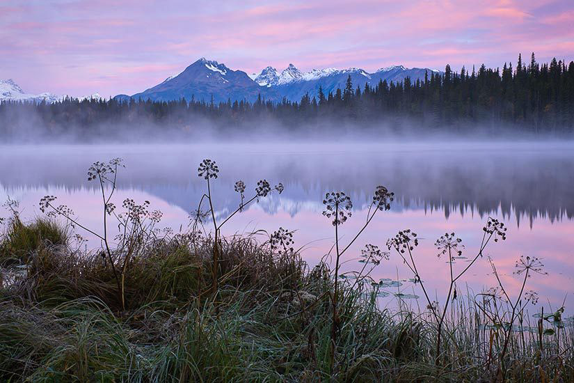
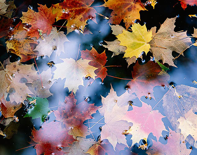
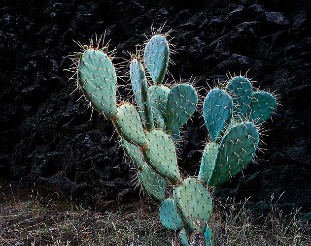
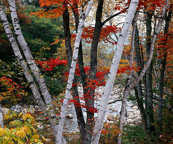
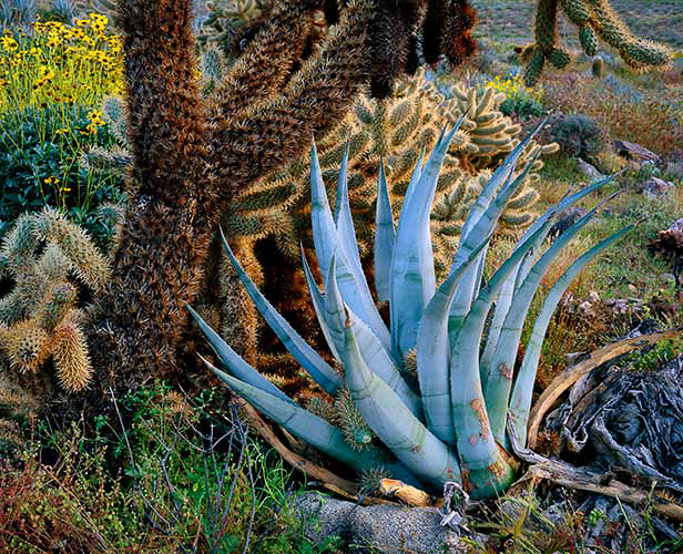


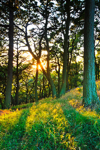
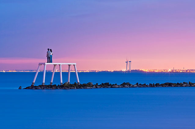
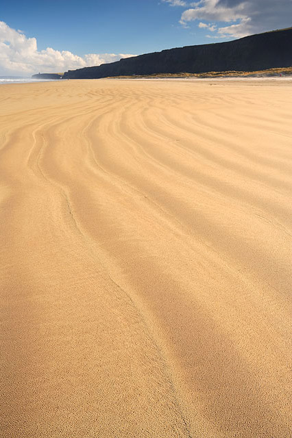
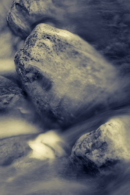
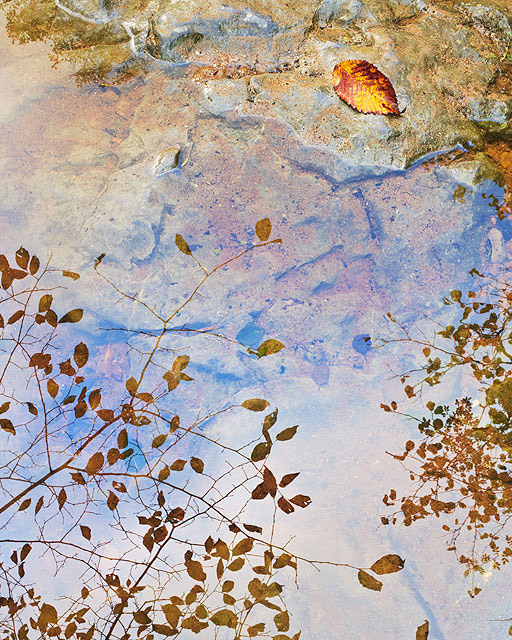
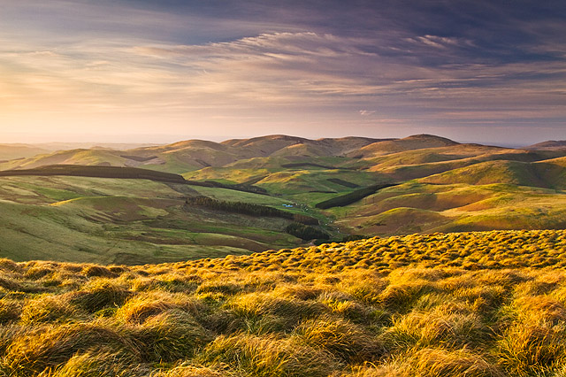
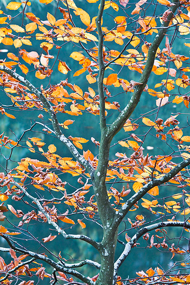
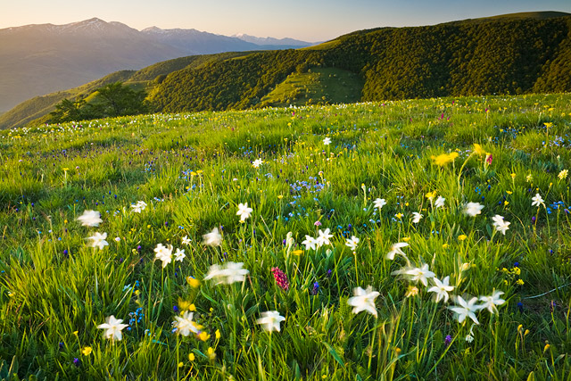
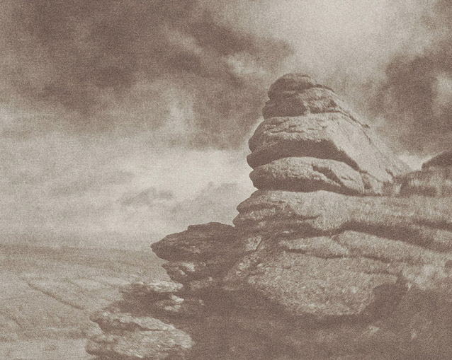


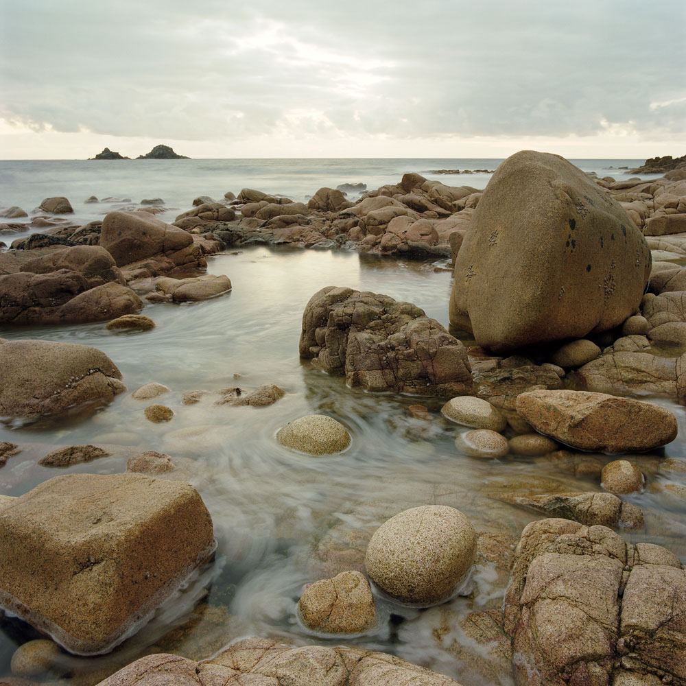
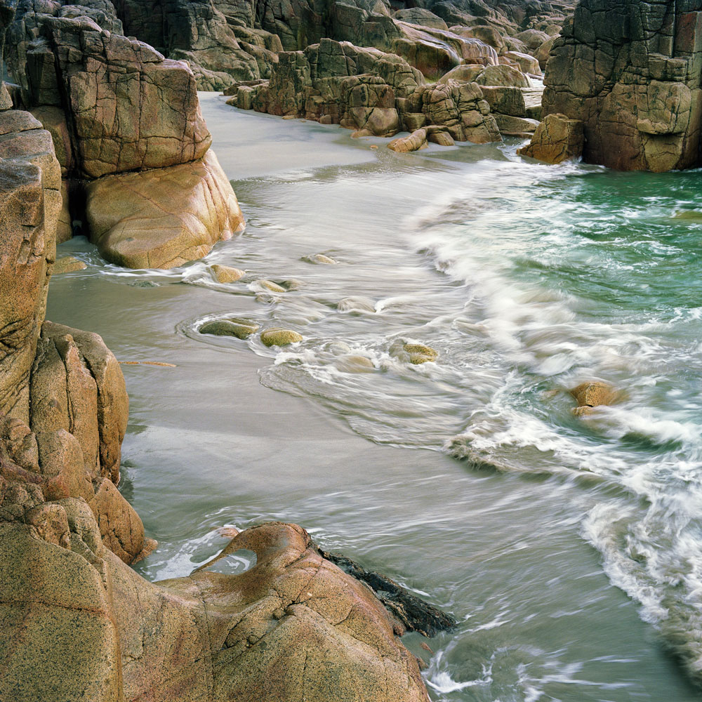
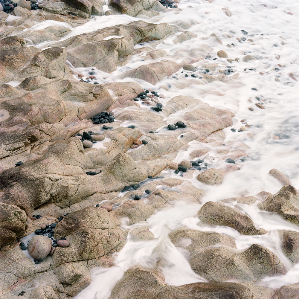
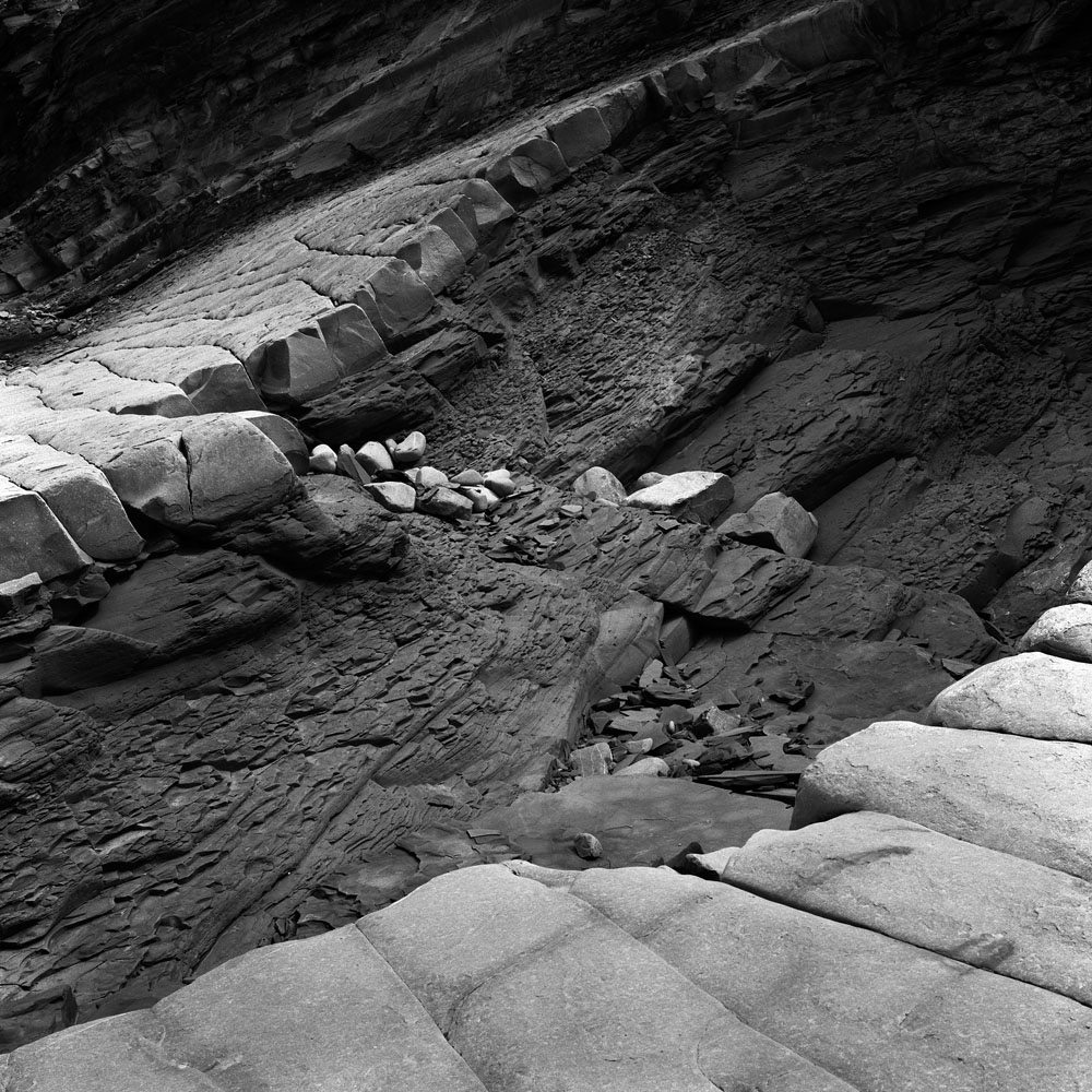
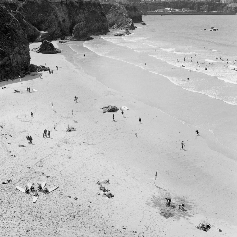


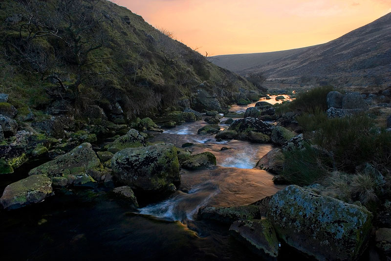
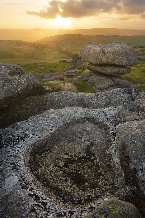
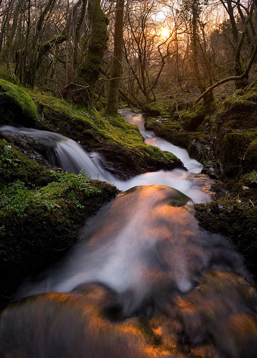
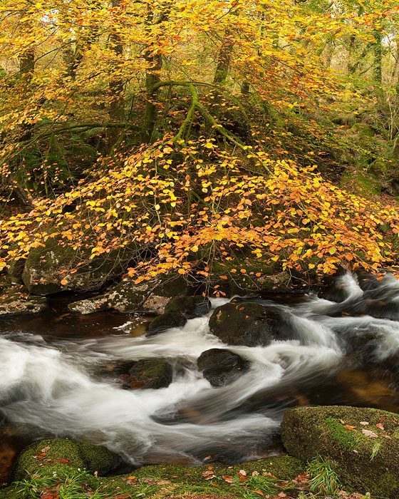
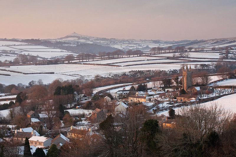
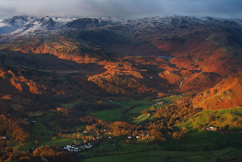
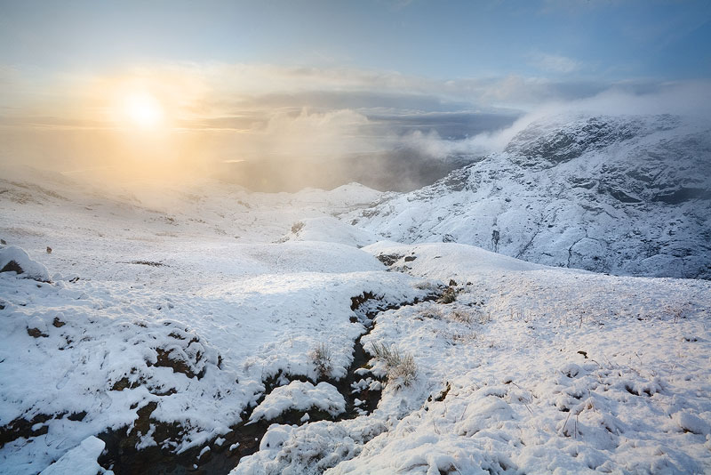
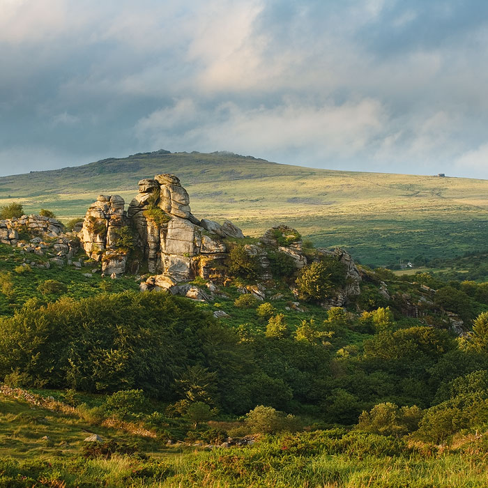
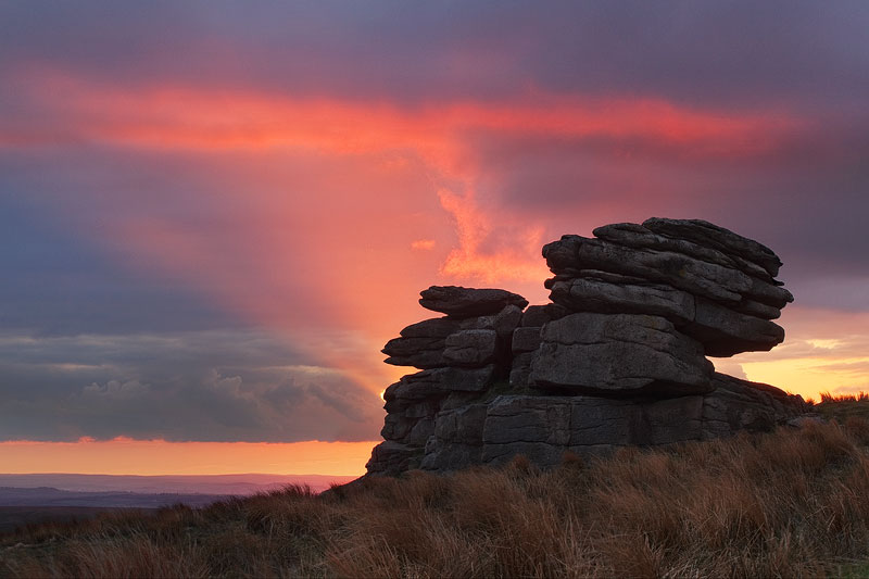
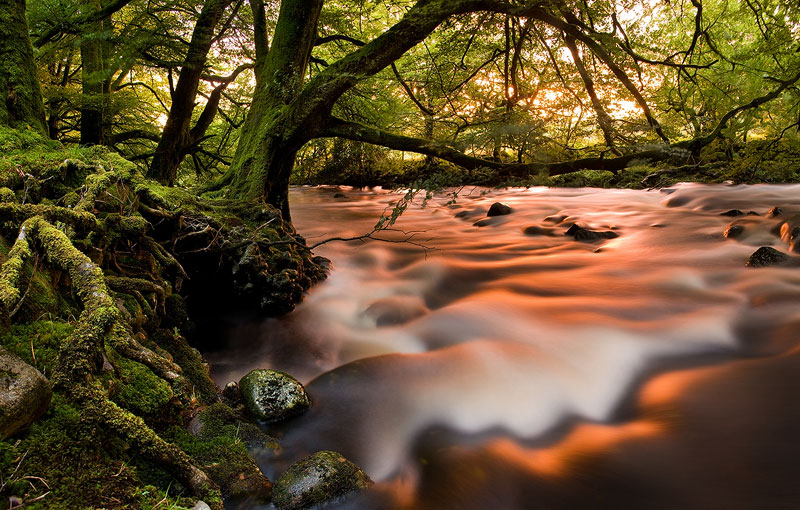
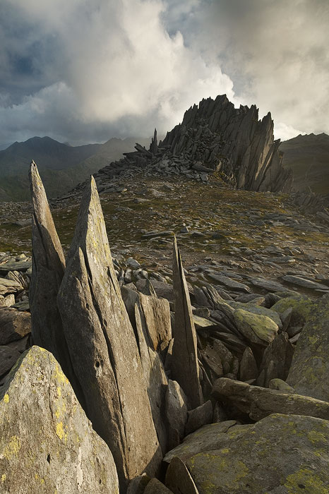
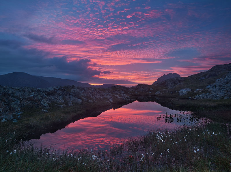
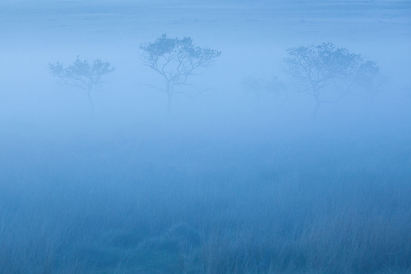
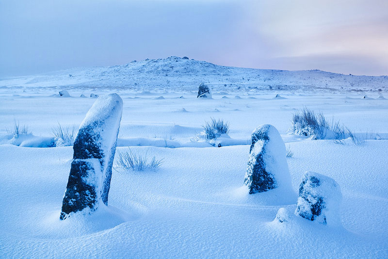


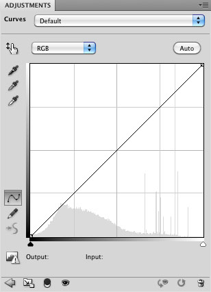