or “Arghh!! For St Ansel’s sake, please tell me why!”
I was on holiday in Glencoe when the news of Gursky’s record breaking picture hit the headlines. I must admit to not paying much attention to it, bandwidth being low and my interest being more in the context than the image itself. Once I returned I realised what a visceral reaction it had stirred up in many photographers and, with the help of Alistair Haimes, I set about looking at the picture and the reason for it’s price.
The first thing that I think most pundits got wrong was to judge the picture in terms of beauty. In my admittedly limited understanding, innate beauty is not an essential part of the fine art genre and I find myself agreeing with this more and more as I progress as a photographer. Great art should portray ideas and/or emotions and pleasure/satisfaction/love/etc are only one part of the gamut of human response.
So what emotion/idea is the picture intending to portray? Well it helps a little if you know a bit about the artist and the artistic context in the same way that it helps to know a bit about Van Gogh and his life to appreciate his work or, probably a better example, Mark Rothko. Without understanding his background and reason for producing his abstract expressionist work it would be a lot harder to understand his multiform paintings (example shown below) and the work probably needs to be seen in it’s original (very large) form in order to get the required effect (Rothko even left instructions on how far away the viewer should stand!).
This particular photograph owes more than a passing debt to Rothko and other abstract impressionists and also plays with the central horizon meme that seems to be overwhelming in much contemporary photography. The theme is quintessentially Gursky though, that of globalisation communicated through the taming of the river, synthetic grass and all. Even Gursky’s digital manipulation of the river is done with the goal of creating a proto-urban river that recalls all harnessed waterways.
The other thing that most people are missing is that purchases of art at this level are either because they form a part of a narrative of photography that museums may wish to purchase or that they are simply investments, in this case potentially the money retreating away from the floundering commodity markets. And $4.3m is hardly a great sum of money when compared with other art purchases. Christies and Sotheby’s regularly trade over a billion dollars per season in fine art sales and typical ‘headline’ prices are around the hundred million dollar mark (for Picasso’s for instance and $140 for Klimt) whereas a second rate Monet (one of the art communities unpopular whipping boys) trades hands for $20 million and an unpopular graffiti artist from New York still sold for just under $10m. Put in this perspective, the pinnacle of photography’s financial returns looks pretty sad indeed.
The other sad fact (depending on your point of view) is that the chances are that the piece won’t get to see the light of day, probably ending up in an air conditioned vault of some investment bank. And investment is the key, as seen in the ‘investments’ link above, there are derivatives based on fine art trading and there are various investment funds with industry advisors (seems like insider trading to me) that will take your money and potentially offer double digit year on year returns. This type of investment is notoriously risk averse and hence purchases are nearly always based on the pedigree of the artist and the perceived future influence the artist may have - hence with Gursky’s bloodline coming from the Becher’s Dussledorf school, his referencing of many fine art memes and his sublime brand management he really is a no brainer. But why the Rhine? Well I imagine it shows photographic pedigree with many previous photographers and artists having worked the location and it also fits in with modern art motifs. It also has the potential for big gains - photography is rapidly making gains on paintings and sculpture (although it isn’t even in the same ballpark yet).
What about the picture though? Well, personally I’m ambivalent. I can see the reasons for its popularity but its message seems a little ‘sixth form’ to me. Perhaps I could appreciate it more if I saw it ‘in person’ but if I’m Gursky’ing I’ll stick to his more complex, aesthetically pleasing or intriguing work such as ‘Niagra Falls’, ‘Bundestag Bonn’, ‘Bahrain’ or my personal favourite ‘Cathedral’.
What does this have to say about landscape photography? Bugger all really...
Alistair Haimes
Alistair sent me this opinion of the piece and if you want a good critique of the picture, visit this Tate page (oh and that Telegraph review was embarrassing!)
Out of interest: even looking at the small image on this page, be aware of how long your eye wanders around it; I suspect, regardless of your visceral reaction, a while. Perhaps the eye hunts for detail when the graphic structure is so stark, the tonal balance so even, the textures so rich? A badge of its quality is the extent to which it holds attention: it mesmerises.
There are classic Gursky hallmarks: technically precise, abstract, graphic; flat-lit, depthless, texturally detailed; unremitting, insistent. Cold, meticulous, odd. Gursky is the superstar of the contemporary photography scene, and this is his favourite image: "It says a lot using the most minimal means … for me it is an allegorical picture about how things are...about the emptiness and the fullness".
Many think it achingly pretentious: wiseguys dismiss it as “rich man’s art”. Oddly enough, the people most stridently against this work seem to be other photographers, landscape photographers in particular. Why should this be?
Perhaps because of what it isn’t? Look in the pages of any photography magazine for what is deemed the proper province of our craft. Coasts, heaths, mountains, colourful dawns; arresting arrangements of natural features and details, archetypes of seasons and weather. Surely, the whole point of all this is documentary? At the very least, for heaven’s sake, representation?
Or perhaps people’s knees are jerked because of what the photo didn’t involve? Travel, an early rise, a one-off conjunction of light and weather: effort. Without being dismissive of the incredible art that a conjunction of these elements can produce, at the same time we must admit that you can find good examples of the individual elements by the thousand every day; appropriately, our eyes flickr over them to the next one, and on, and on.
Is it the degree of digital manipulation that grates? Sadly for Gursky, this image would fail the rules of “LPOTY”; he’ll live. But nothing more than Silvy did 150 years before, and more than this, if Gursky is out to make emotive art (rather than a documentary image), and if he felt that the emotional charge would be diminished without changes, isn’t there an obligation to make them?
In many ways, ‘Rhine II’ isn’t a landscape photograph in the same way as Rothko’s dark panels of the Fifties, which also shocked and fascinated, weren’t paintings. Yet their power to arrest and unsettle remains: you are moved as if by a current. Great art often runs counter to contemporary expectations of a craft, and is dangerous stuff. Within the canon of German landscape art, and in particular its portrayal of the sublime, we can say that the strain that reached an early high pitch with Friedrich has been bookended in our times by this image.
Obviously, I think it’s terrific. Compositionally, extraordinary: contempt for the rule never to divide a canvas into equal halves, and terrific play in viewpoint so that the presentation of the bottom half is equal narrow stripes of green and grey sandwiching equal broad strips in the same palette; the grass footer stitches the lower half back to the narrow grass strip above the sand-bar on the horizon.
Any more information in the sky would distract, any less would unbalance. A longer exposure would prevent the texture in the waves referring to the texture of the grass, and in another light, the tones of the tarmac, sky and grass would be thrown out of their precise equilibrium.
Any less information and it might lose the historical reference and sense-of-place that “landscape” implies, and might be dismissed as a Barnett Newman-style “zip” or a Misrach derivative, but it has too much information to be purely abstract. It is in a balanced zone between; it is, in its way, perfect.
That’s the mechanics of how the photo hangs together, but to see this photo within the cluttered scene that Gursky would have been confronted with, in an unremarkable place: that, to me, is approaching genius. The restraint in the presentation and processing is extraordinary.
Rob Hudson
Gursky’s Rhein II sells for a record-breaking amount of dollars and suddenly everyone is talking about it. Sad really! Perhaps it’s an indication of the true value of an image if it’s talked about widely before it sells for an astronomical sum? Maybe we should leave behind the vagaries of a bloated art market and just concentrate on what values it has intrinsically, why it is good, or bad art, or somewhere in between.
Firstly and the most important factor in its favour is what it is not. It is not yet another over romanticised vision of the Rhine, with mist shrouded fairytale castles, sunsets, ad infinitum! It is a far more personal vision than that, it relates to the loss of the natural landscape through the hand of man and that is certainly a preoccupation for many of my German landscape photography friends. It runs deep, the industrialisation of their land, the monocultural landscapes of mechanised agriculture and factory complexes, spreading urbanisation, create a profound sense of loss.
Gursky’s work is of course compared to abstract impressionism and particularly analogies are drawn to Mark Rothko for the similarities of simply dividing the canvas and using bold colour. There are perhaps better examples of this analogy in 99 Cent II Diptychon, and Chicago Board of Trade II, which far more closely mirror the work of other abstract impressionists in their use of overwhelming complexity and detail. I’ve been lucky enough to see a number of actual Rothko paintings in the flesh and the memory of seeing them will stay with me for a long time. It really isn’t possible to appreciate them from a book or a web image, they are large images and I found myself becoming lost in a world of colour, patina, texture and tone. It was one of the most profound artistic experiences of my life. The one thing a Rothko is not (no matter how it looks from a distance) is simple.
Like most of you, I have only seen small versions of Rhein II and I could, of course, be doing it a disservice here (his prints are enormous), but I see little evidence of that detail that entrances, more of a highly simplified and geometric landscape. It is simplified to the extent of blandness, where is the - often referred - to the wonderful use of colour? It looks pretty straight for a grey day in central Germany to my eyes. I am far from a fan of sunsets and all that clichéd literally and metaphorically over saturated imagery us landscape photographers are supposed to do in the popular imagination. Neither am I particularly a fan of the over composed landscape image that fails to allow the eye’s to walk their own path, but Gursky’s image still fails to excite me. It is neither interesting geometrically, in colour or in message. It falls a bit flat to my mind, simplified to the point of tedium, the message isn’t particularly complex, the metaphors are ordinary and the image equals that mundanely. If I’m to be confronted by “challenging art” then I’d rather have something that I have to get my head around, something which generates a little more to and fro between image maker and viewer. I suppose I’m a bit of a Romantic at heart, but that doesn’t stop me appreciating much modern art if it is good art. This is at best suspect art.
It struck me today that I have a strange relationship with my new photos. I suspect that this has to do, in some way, with working with film and its lack of immediacy but mainly because these images are new to me – only ever previously glimpsed. Of course, we've seen the photo before in some form – through a viewfinder, on a ground glass – but we've never actually seen the photo, and this can be quite a different beast.
This is particularly true of negative film, with digital or transparency we have a quick preview of the image, all the colours are more-or-less in the right place. With negative the true sense of the image can only be realised once it's been scanned and inverted in Photoshop (in my case) and the balance and curves carefully adjusted. Then we can step back and take in exactly what the camera has recorded. This image can only be a rendition of the scene as the mind remembered it – or as the mind thinks colours should be. I'm sure there are workflows that can automate the conversion process so that colours are rendered as the film is supposed to see them but I don't know what that workflow is, and to be honest I'm not that bothered for finding out. I like to interpret the negative to give it the colour space that I think it required to get over my feelings about the image.
There's an even greater sense of detachment with images captured digitally. I’ve asked myself serious questions about the worth of an image before I press the shutter when using a large format view camera – it costs a reasonable amount of money to make images this way and I want my hit rate to be pretty high. On a very good day, I might make ten compositions, on a less giving day, maybe just one or two. I know many (but not all - ed) digital photographers come back with an 8gb card chock-a-block with ‘captures’ (although this applies to some 35mm film photographers - ed) – there then comes the process of narrowing those down to ones with promise, ones without operator error (admittedly not a trait only reserved for digital photographers), and then, which one works best – the landscape or portrait version, the one over there a bit, or the one a bit closer in?! I'm sure in some cases the actual best photo is binned before it had any chance of stating its case – shouted down by a more obvious view.
Once we've sorted out the wheat from the chaff we're left with a new set of photos, they are hopefully all compositionally acceptable, good exposure, reasonable focus and with enough about them to hold our attention. Once I've worked on an image for a while, adjusting colours, touching out sheep poo, and dodging and burning I use my "cup of tea" system to establish what I think of the image and the post processing. I leave the image on screen with a black background – no menus and then wonder off downstairs to make a cup of tea (or coffee/beer, doesn't matter which). My lack of office door means I can look at my photo with fresh eyes from a distance on my return – it can often look so much different after a short period away - colour casts become obvious, composition can be quickly re-evaluated and the need for more or less dodging and burning can stand out a mile.
One of the great things about medium and large format photography is that you are forced to spend time with the image. Unlike digital image post processing which can be much more immediate, these film formats demand time and close scrutiny. Whilst I don't particularly like spotting dust off a 450mb scan it does force us into getting up close and personal with the intricate details of a picture. In the same way that they say the best way to examine the bodywork or a car is to get the sponge and Turtle Wax out, there's no better way than taking in the detail of a hi-res image than ridding it of its dust! Who'd have thought there was a benefit to my dusty office! There's a wealth of interest to be found whilst exploring a large format scan, many of my images contain layers of trees - branches and leaves underlined with a base of subtle grasses, detail resides in there that we could never hope to spot when composing the images, it can be quite a delight spotting the homes of spiders - and I'm sure one day I'll discover someone watching me from the edge of a distant forest!
After initial work is done on our new photos after they've made it through the judging stages to the dizzy heights of ‘portfolio worthy’, we still haven't got to know the photographs, they’re still relative strangers.
It's easy to be wooed with the excitement of a new ‘friend’ ready to be added to our collection of photographic successors. We must all have had that feeling of “Oh yes – this is my best photo ever” only to realise 3 days later that it's not even worthy of inclusion in the portfolio. There has to be an incubation period – to get to know the image, to live with your post processing and take it all in.
In its most basic form, the process of loving to indifference involves coming back to the photo repeatedly over a few weeks, months or even years. One of the really useful things I find about putting some of my images on Flickr is not the whole back patting "wow dude great perspective" comments (to be honest I don't get many of those), but the fact I can use it as a place to put my images to assess them myself – I even have a second account that I’m using for an ongoing project, I post everything that’s half decent up there so I can come back to them with fresh eyes to assess how the project is progressing. It’s also a good way of looking back to see how your photography is (hopefully) progressing. On occasion I've looked back through my Flickr stream and found a photo that I might not have been too bothered for at the time, but now fits in with my current way of looking at the world – if I’d have rejected them at the time, I'd have never have had the chance to enjoy them.
Some of you may well remember the dim and distant past when photographs were just that — photographs, not just a collection of entertaining pixels on the screen. This is way our photographs should be viewed, printed out and ideally, mounted up and framed. I made an image earlier on this year that was very un-me, a summer sunrise – and a view, on screen it was quite nice but it was only when someone requested a print of it that it truly came to life – I was surprised myself, printed on lovely Photo Rag it looked great and my appreciation of the image increased considerably, the blue sky looked fresh, the fields lush and warm – it almost made me want to do more sunrise views! I’d urge everyone to print out their new (and old) photos, it really is the best way to get to know your photos and your photography, they’re not meant to be on screen 600 pixels high! Once you've decided you've got to know your favourite images and their every detail, treat yourself to a few big C-Type prints, they deserve it!
I've included a few of my recent images here, I still don't really know them – they're not part of the family yet, I know a few of them will be welcomed in with open arms whilst others may get left out in the cold.
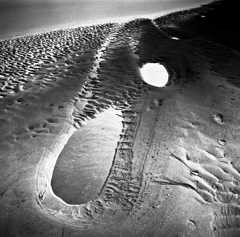
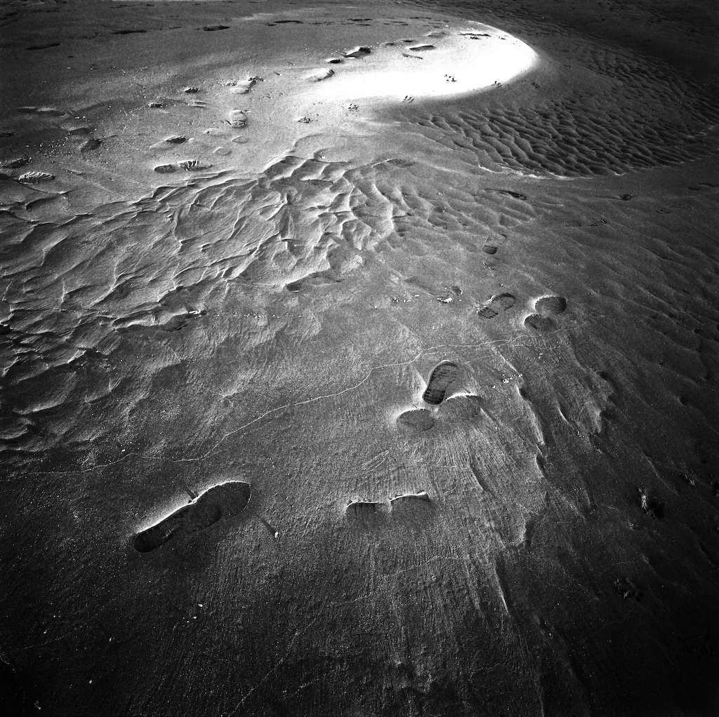
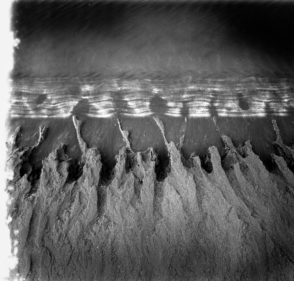
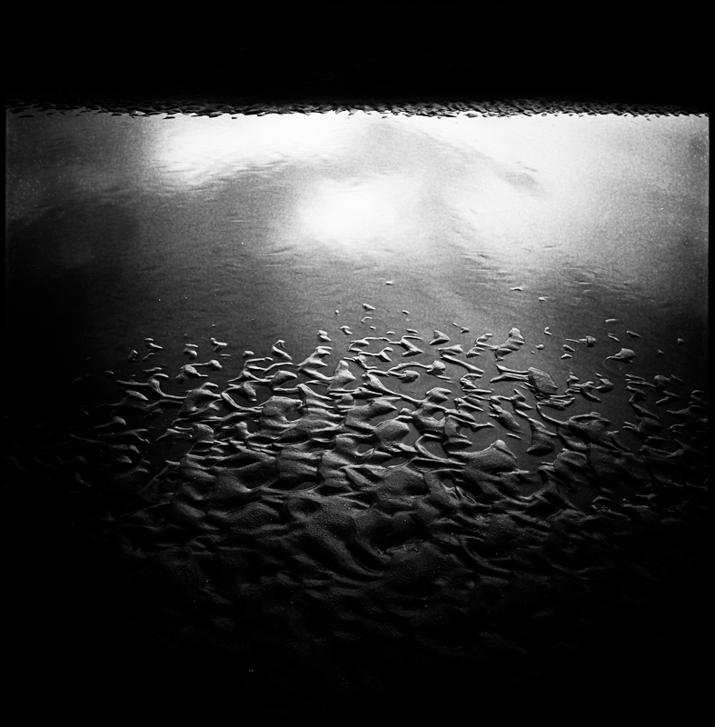
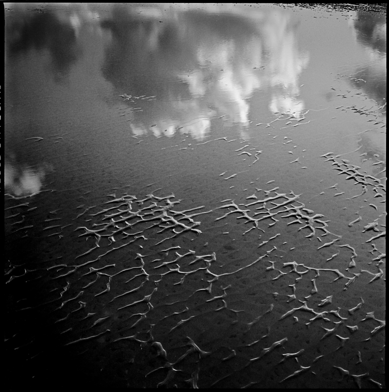
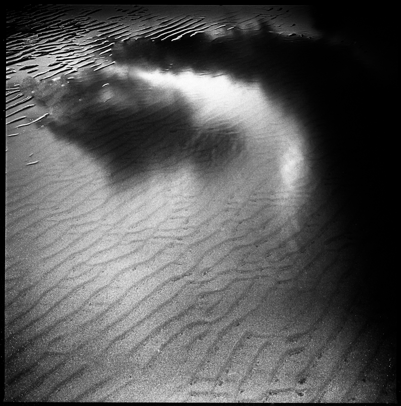
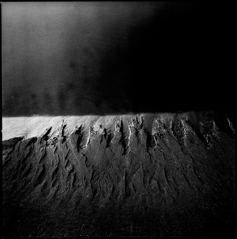
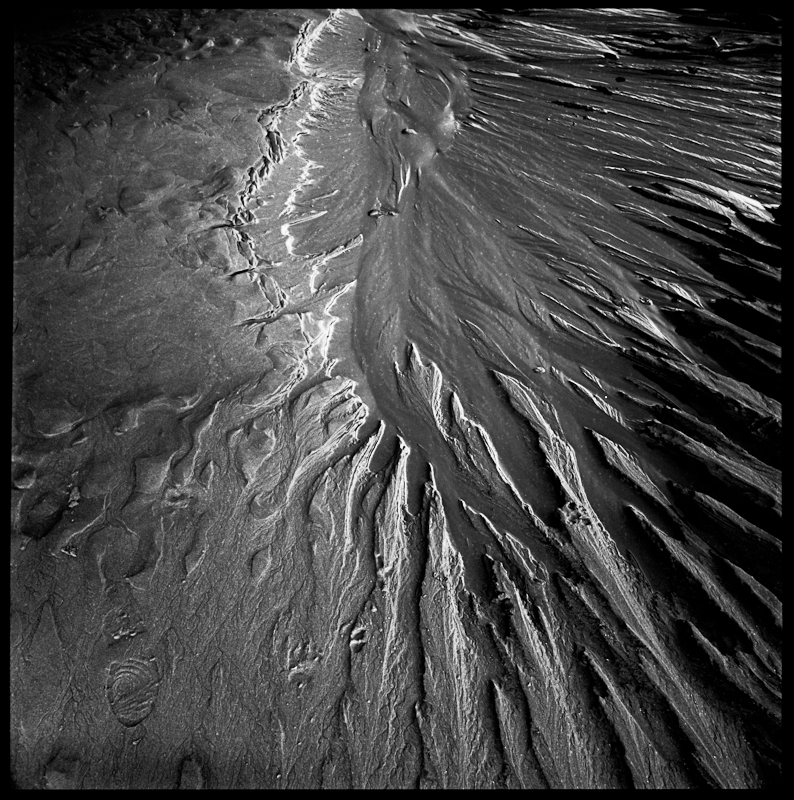
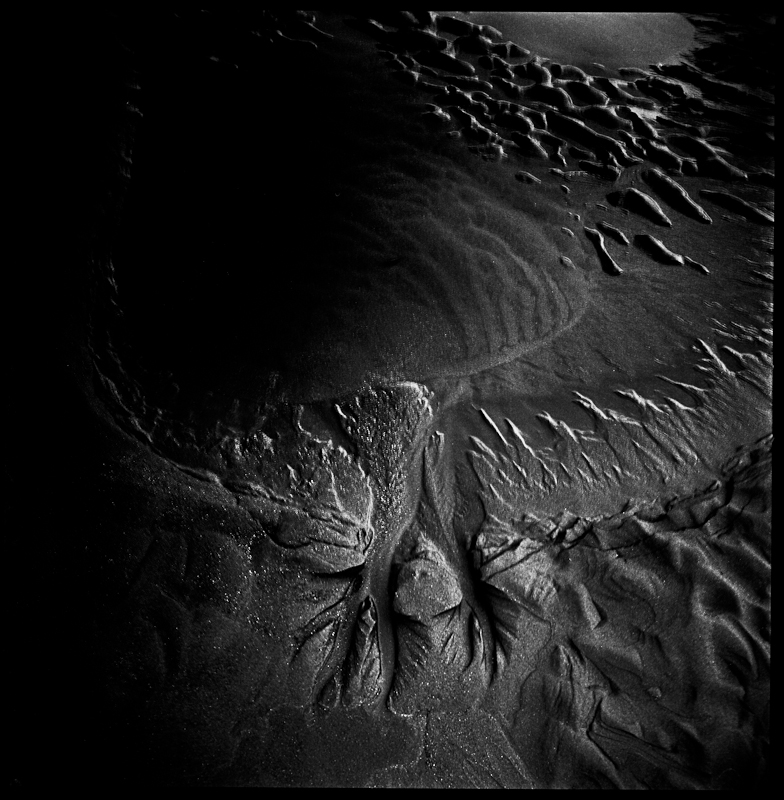
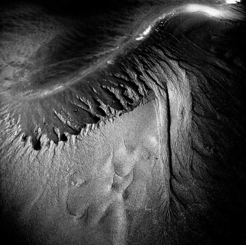
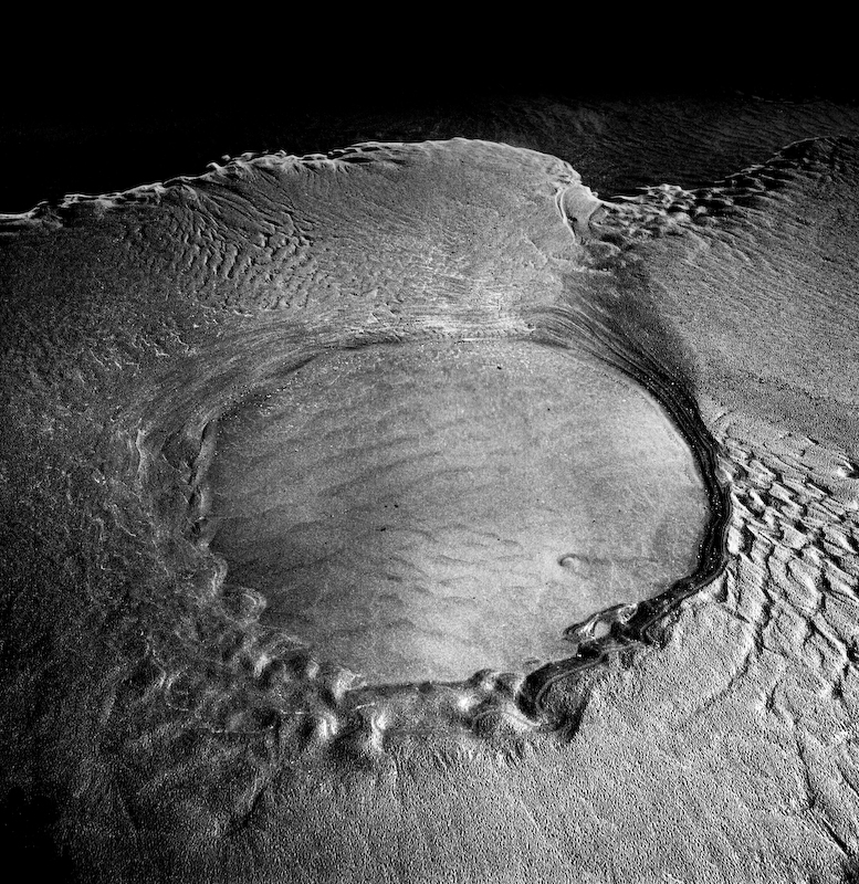
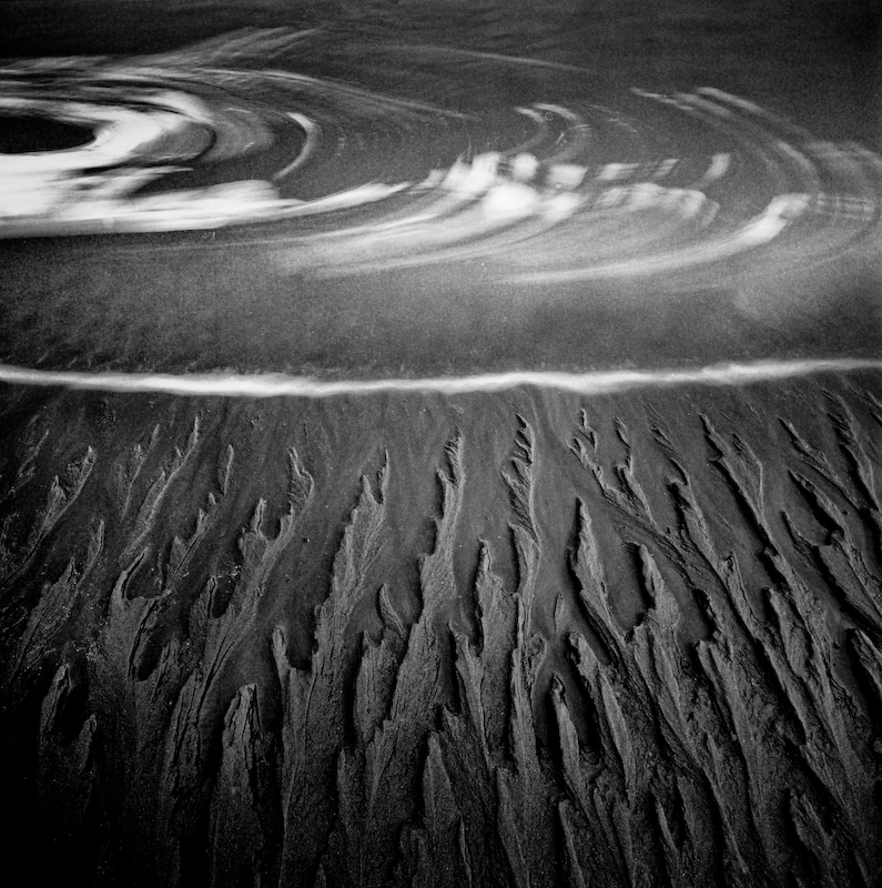
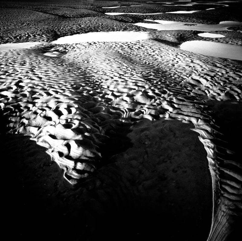
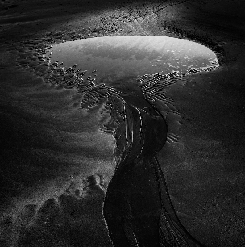
Michael Jackson is best known for his 4-year-old (and continuing) exploration of the beach at Poppit Sands near Cardigan in west Wales. That length of commitment, which startles most photographers, is all the more remarkable because his chosen patch is little more than the size of a football pitch. He always uses the same camera, an ancient Hasselblad 500 CM and a 50mm lens that always stays on the same settings.
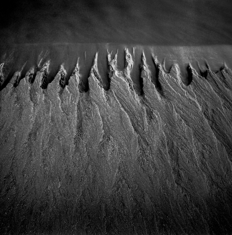
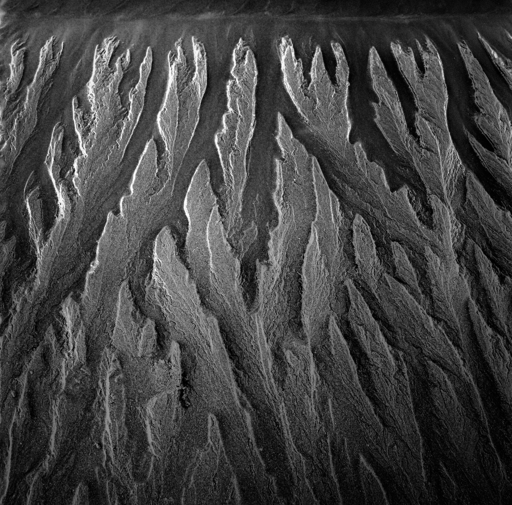
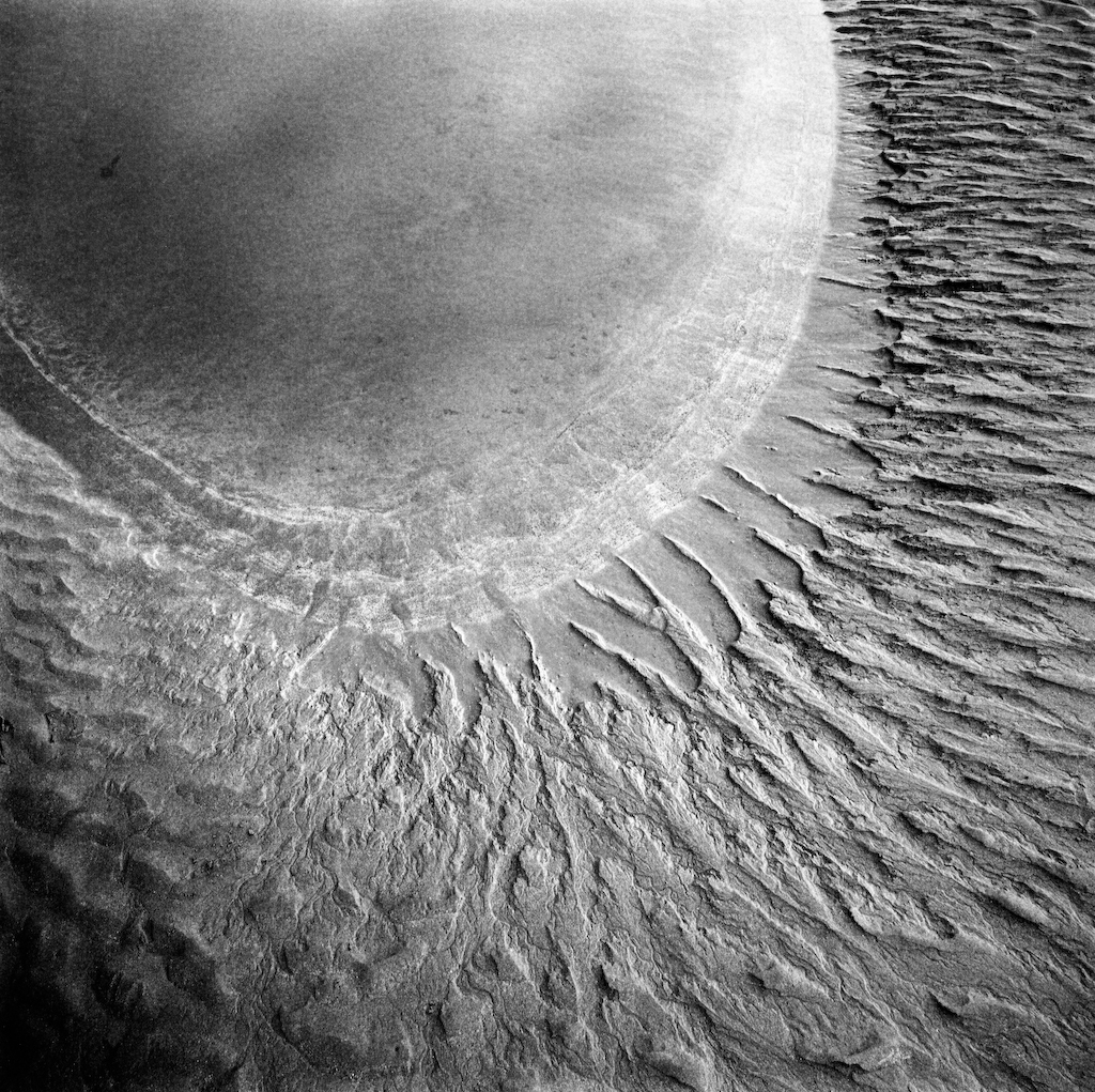
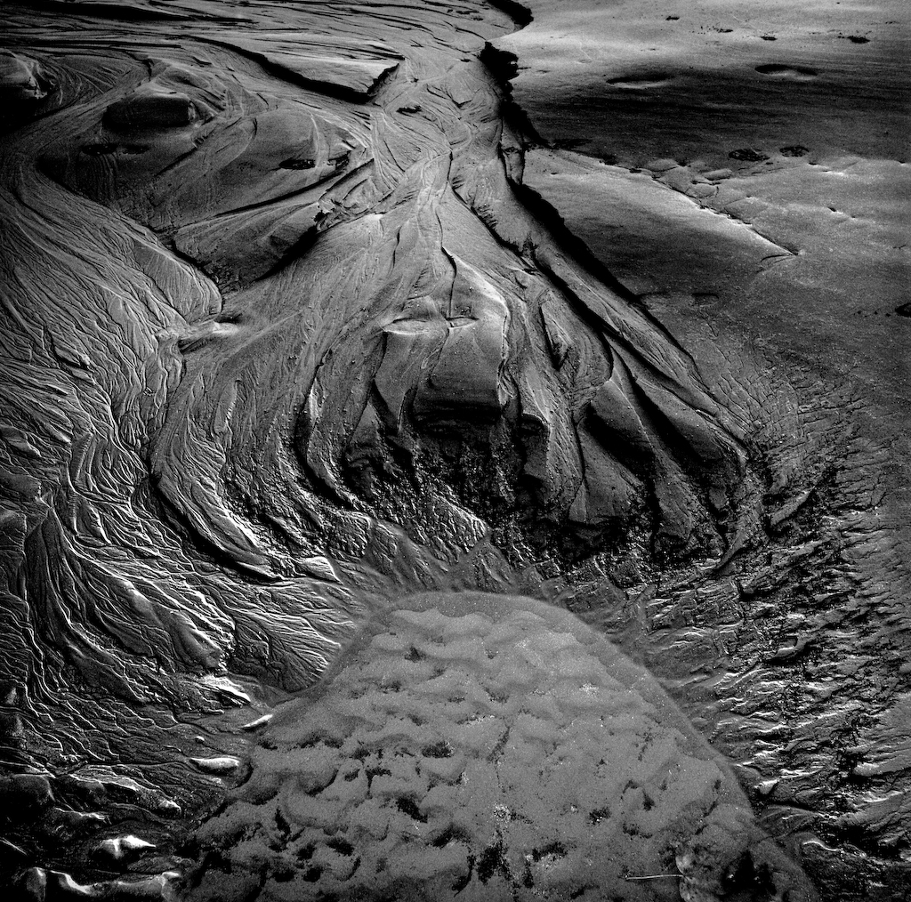
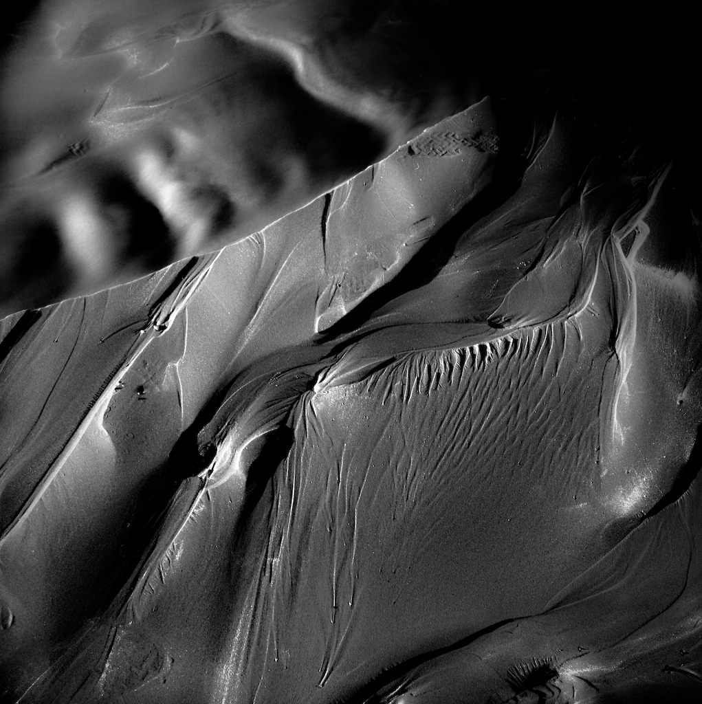
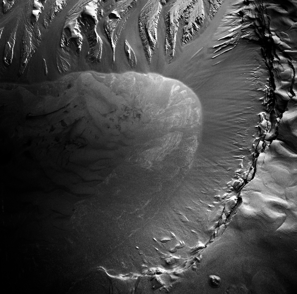
That particular camera has paid dividends in his photographic career. Three years running he has been shortlisted for the Hasselblad Masters Competition for some quite beautiful images; they immediately struck me for their wide range of tones from deep, rich blacks to startling, silvery highlights. There is an otherworldly, almost alien, quality to his work. What you’re looking at is ambiguous, with a tendency to carry you to a different place. Relying primarily on sweeping lines, intriguing shapes and contrasting textures formed by the interaction of sand and water, you could almost think of it like music, a beautiful melody or a song. And that’s not just your author spiralling off into some metaphorical epiphany. Ansel Adams said, “I can look at a fine art photograph and sometimes I can hear music.”
I went to Poppit to meet Michael early in November 2011. I wanted to try to get an understanding of what motivates such a long-term commitment and gain some insight into how he produces such startling and varied images. Pretty soon I was to discover I had found yet another photographer to interview who doesn’t consider himself to be working in the landscape genre in the strictest sense, in that he is producing photographs which almost always exclude the sky. But when asked he also denies (jokingly) being a purely abstract photographer.
“I don’t think of it as abstract. Some of it is, some of it isn’t. There – is that a wide enough answer for you? The Poppit stuff is just pictures of sand and water and the two reacting together. Um, I would say some of it is and some of it isn’t! My deeper answer to the question is ‘yes and no’! (laughs) But I wouldn’t actually think of it as landscape photography.”
He is of course completely right to be hesitant about that particular attempt at pigeonholing. The question has to be asked: whether photography can ever achieve abstraction? Remembering what Ansel Adams said, “In a strict sense photography can never be abstract, for the camera is incapable of synthetic integration.”
He is undeniably passionate about his photography.
“It’s obsessive, I’d say. It’s something that, apart from my family, it’s the main thing that I think about. I’m sure lots of photographers are the same. It’s something that registers really high on the levels of need, that they’ve got to come out and take photographs. It feels like a drug to me, you get a real physical high when you see the images.” Yet despite that fervour, he considers his work as something of a “scientific experiment”, like “looking down a microscope or telescope”, but his technique he describes as non-technical “I don’t think of myself as a technical photographer, I don’t fiddle around with the settings on my camera at all, they are always on the same settings.” Not once did I get the feeling these were in anyway contradictory to Mike – more that he is both unpretentious about his work, and he has that essential mixture of artist and scientist that produces some of the best photographers.
Before coming to Wales Mike had worked in IT, becoming increasing obsessed with the world of art; even studying to be a painter.
“It got to the stage where I would get to work and spend all day thinking about painting. I started studying under a painting teacher called Chris Baker, he was so inspiring, it was fantastic. I’d just listen to every single word he’d say and take it all in. In the end, I asked to be his apprentice. I’d do anything to help, just to see what the day-to-day existence of an artist really is, because that fascinates me.” He migrated to charcoal portrait work, but he soon discovered photography, buying a Holga and a developing tank. “One of my first shots was of my dog and I just couldn’t believe it, it made him look like an angel! It was amazing – it was all blurry, beautiful light. I didn’t really know what I was doing taking photographs, but it kind of sparked something in me and I stopped doing all my charcoal and just kept on with the Holga.”
“Coming to Wales was a big choice for me and my now wife. We wanted to have a lifestyle we could build around my photography. I’d had enough of IT, I wasn’t getting out of life what I wanted, but I was [getting it] out of photography. It’s probably very naïve. I probably didn’t know all the facts, but because I didn’t know the facts it probably didn’t scare me off as much as it would have done had I known how hard it is to make a living as a photographer. I didn’t know anything about Poppit Sands then. I spent a couple of months going around the whole area taking quite standard landscape photos and taking them to galleries and asking, ‘what do you think of this, then?’ Luckily one of them was in Cardigan, he looked through them and really liked them and he suggested taking shots at Poppit Sands. I came down and the first time I took some photos I really fell in love with the place. It was the first time I got a certain type of light and image that I wanted. It was something about the blacks and the silvery tones at that time of day at low tide that made me think, ‘This is it! This is the type of photograph I want to keep on taking.’”
Eventually migrating via a Mamiya to the Hasselblad, he became increasingly fascinated by the darkroom process and ‘flying the flag for film’. “I develop it at home. I scan it into Lightroom, at the moment. I’m working more and more in a darkroom, but it’s such a steep learning curve. I find the darkroom printing exciting, for me it’s strange to go through all this process of working with film and developing it by hand, having it all tactile, touching it and smelling it, scanning it in and pressing a button to print it out, it seems like a funny ending to me, a bit of an anti-climax.”
One of the things about landscape photographers that intrigues me is their connection to a location, be it through a sort of personal history or an abiding affection built over time. I wondered if Poppit was special, important? “We come here with the family, but not really, no, I don’t get shivers down my spine when I walk on it. I’ve been coming here so often, that when I trudge onto the beach it almost feels like going to the office. I get quite possessive about it because you get people walking their dogs and horses. But it definitely feels like a workplace rather than a place to go for pleasure. You go there for a reason because you want to record what’s going on. You want to capture these moments. It’s when you’re walking from – that you see the geese flying over – that’s when I take it in. But once you’re concentrating, that’s when you’re looking all over the place to try and see where you are going to shoot, I think it’s interesting how your mind can channel. You get tunnel vision in a way and you can just ignore everything else.”
Maybe the creative process itself provides his inspiration, while he’s out on the beach? “Um, I find it a bit, um, hard, ha! I don’t find it relaxing, I don’t find it fantastically enjoyable. I do find it exciting when I think that I’ve found a new shape or a new texture, but I’ve nearly always found those times when I am excited about it, when I’m patting myself on the back, when I get it home it nearly always turns out to be a disappointment. It’s the ones that I just thought, ‘yeah, that looks all right,’ those ones are the ones that surprise you when you get home. “
“I like variables, like making mistakes. Quite often when I’ve made a mistake developing, or when I’ve left my footprints in some of my photos I thought that would completely ruin it, but now I’ve come to really like having mine and dogs’ footprints in there. I find it adds extra focal points. I think your eye goes straight to the footprint – well, mine do. It makes you look at it first and then leads you into the rest of the picture. I’ve come up with a theory about focal points and I think if there’s more than one focal point, then it makes it more interesting. For some reason in my mind, when you look at it makes it makes a more interesting picture than if the footprint wasn’t there.”
So does he have influences, people, ideas, inspirations, anything behind it? “Not Poppit Sands, I can’t think of any influences at all. It’s just from me really. I didn’t see someone take a picture of a beach and say that’s how I want to take pictures of the beach. It just seems to have progressed over the years. It surprises me that I don’t see more people doing it, it surprises me I don’t see other people on the beach taking photos. I just don’t understand why some photographers don’t want to try something new, or maybe why can’t they just do photography in a similar style to other peoples work if that’s what makes them happy? Who am I to criticise and say you don’t want to be doing that?”
“I sometimes feel there’s a lot of self-promotion involved with that type of stuff and sometimes people do over self promote themselves. It’s not in my nature to tell anyone how they should do anything, but it’s a shame some people don’t seem to get past a hurdle. They see photographs taken by Joe Cornish and Charlie Waite and they think ‘brilliant, that’s what I’m going to do, but they never seem to be able to produce photography that’s as good as those two, because they have crafted a style that is theirs and comes naturally to them and they’ve got the eye that allows them to carry on producing such a high grade of work. People like Joe Cornish and Charlie Waite have spent a long time building it up and they’ve made lots of mistakes. They know the way to think about producing an image – the thought processes and technical processes are just tuned in. It’s no wonder they take the Joe Cornish image and think how fantastic it looks, try and replicate it up to a certain point, but because they haven’t taken the process to get to that point, they don’t continue the journey. They stick with taking that style of photo for the next 20 or 30 years because they haven’t artistically grown to get to that point. It’s about being honest to yourself. I went through a Charlie Waite thing right at the beginning, which is the reason I got the Hasselblad, I saw him take some fantastic photos and I got some of his books. There was something special about the light in them, there’s something uniquely special about what he does.”
I’m fascinated by why photographers choose to work in projects, committing in this case many years to one subject. I ask Mike why does he work in projects? What does it add to your work?
“I like the idea of repetition. I always have liked the idea of repeating something over and over again – be it Poppit or be it taking photos in Cardiff in a certain way, going to the same place again. “
Is there a developmental aspect, be it only incidental? Poppit has surely changed over time? “It has. It’s easier to package up I suppose, it’s easier to monitor, and it’s easier to think about when you’ve got certain boundaries. Like Skirrid Hill, it’s probably easier for you to work on a book of poems from the same person, rather than work on a different poem from half a dozen different poets. Especially with Poppit – the more you go, the more you see. The landscape of the sands changes all the time, every time you go there you see something different. You can keep on going back there, and back there, and back there, and it builds up and becomes more meaningful to you. You begin to do things in your subconscious rather than having to think about them. You can only get that from repetition, I think. If I was to go from beach to beach to beach to beach, I would start to get a little bit confused, I wouldn’t be able to channel everything and condense my thoughts about the way I want it to look.”
“I find so many ideas lead to dead ends. You can waste an awful lot of time trying this new great idea, when you finally realise that what you are doing is copying someone else. That sparks off an idea in the back of your head. Compartmentalising all these different projects and managing to control them, rather than scattering lots of different things. It probably comes down to your personal nature, the type of person you are, the way your personality shines through your photography by the way you structure going about doing it. Not necessarily the style of the photo, but what’s built around it. I think I might be a bit obsessive about projects, I don’t think you have to be obsessive, but I think you have to have a passion about a single subject enough to keep on wanting to do it. I think you have to be the type of person that can have that kind of a passion without being distracted. Keeping it with strict boundaries, instead of scattering everywhere, means that you are condensing the way you think and making the message that you are sending stronger. If someone can come along and do landscape photography in a way that when you saw their photo that you would know it was them, then I think that would be a wonderful thing. Surely that must be an expression of how much personality that person has put into creating that photo?”
“I was trying to water down into just a few words what photography is. You can say it’s simply a way of communicating an experience or an emotion, you are sharing a memory, something that you’ve seen with other people. You can apply that with landscape photography, because they’ve seen this fantastic sunset or landscape and what they are doing is capturing it either for themselves or to share with other people. Really you’re doing it for yourself. I’m doing Poppit for me, rather than everybody, so maybe it is a personal project. Goodness me! I’m finding myself!” (laughs)
I reflect on how such a creative and distinct photographer fits in with current landscape photography, and what state he finds it in? “That’s a good question! I don’t see very much of it to be honest, I don’t buy magazines or anything like that. It seems to me in this country there’s a certain type of landscape photography, in America, it seems to be a little bit different. Maybe it’s Ansel Adams? I find it very difficult to have a strong opinion about that. I find that if you try and tell someone how they should take a photograph and say, ‘Look, that’s a cliché’ – it’s got a purple sky and there’s some rocks in the foreground – you’re kind of telling them what food they should like. It’s totally down to them and totally their opinion. I try not to look at other photographers too much. I’m a bit like a sponge, and it pushes me off in different directions that I don’t really want to go. I find they were doing it better in the first place, and why on earth copy someone else? The amount of time and effort that I’ve invested in going in that direction, it’s like a dead end.”
Many photographers tell me how they like to “tune in” to a location before undertaking creative work, that’s when they say they produce their best work. Does Mike have a “strategy” for finding creativity? “No, no, nothing at all. I used to when I started, I always used to listen to the same piece of music – Philip Glass's Koyaanisqatsi. I always used to play it driving to Poppit and driving home, and when I was developing the film. I find a lot of people find when they are commuting that they use driving as a relaxation, a way of separating home from work, and Poppit is kind of a workplace for me. Then I used to think, ‘this piece of music is becoming essential to my way of photography, I bet if I don’t listen to this piece of music I won’t be as creative on the beach.’ And then one day I forgot the CD and went down there and got a couple of good ones – and hallelujah! I still love listening to it, but now I find it’s not something that I need to listen to get into that state of mind.
“I usually find that when I get onto the beach I’m in a state of strange panic. I’m looking around, I’m not relaxed in any way at all, because I’m really worried that I’ve missed the light, or I’m really worried that I’m not going to get anything. I’m really worried that that dog is going to knock my tripod over. It takes me about 10 or 15 minutes before I start to relax. I’ve lost count of the number of shots that I’ve cocked up, the number of times that my lens has jammed – I’ve got through three lens services since being in Poppit – because I use the same lens all the time. I’m on my second tripod and second camera bag now, because they just get gunged up. I find that, because I only take three rolls of film with me, that if I get there too early, I’m so keen to start taking photos, I start snapping away at things that aren’t really worthy of taking photos of and I find – hang on a minute – I’ve got no film left. “
Many well-known photographers cite a past as a painter or an art practitioner as an influence on their work. Many photographers made the switch from painting to photography, from Eugene Atget, Cartier-Bresson, Lartigue, Mapplethorpe to today’s Chris Friel and David Unsworth. Ansel Adams also cited his past as a musician on his work. Mike trained as a painter; I ask how does that influence his work, and should photographers study art? “What kind of art it comes out from within you without the need to study. Studying art may have helped me with composition, but if anything it gave me a love for the process that an artist takes. Not specifically painting, but the way he lives his life – in a frugal way, not needing expensive things and being able to devote yourself to your art. I draw most of my inspiration from art like Andrew Wyeth, but it doesn’t inspire me to go out and take pictures like an Andrew Wyeth painting. You can be inspired by them, but you can’t copy their style. You can be inspired by how they lived, and what they had to say, and how they dealt with the day-to-day artistic way of getting around things, how bold and noble they were to go out and do what they did. You can admire them without the baggage of thinking, ‘If I incorporated some of his work into how I do my work, maybe what he got will rub off onto me.’ Maybe it’s because I’m a bit older, when I was younger I wanted money, flash cars, but it’s almost like I’ve found satisfaction in something that I can get. I think you can enjoy technology and enjoy being an artist as well, but I have no desire for money – the strange thing, now it doesn’t really matter. It’s to be able to follow a photographer’s lifestyle and to be able to work on it all day, every day.“
Mike switched from charcoal drawing to black and white photography. I wonder what intrigues him about monochromes and why he disavows colour? “I don’t think there’s anything wrong with colour, but to be completely honest I couldn’t process colour film at home. The colour photography that I’ve tried just doesn’t do it for me at the moment, but I’ve got a feeling that I’m going to experiment and try things out. I’m finding at the moment that I’ve got so many things that I’m trying to wrestle with and learn in the darkroom. That’s just taking up all my time at the moment. I’m hoping split toning will get some colour into the Poppit stuff, but not natural. One of my main influences for Poppit was the Apollo shots and that’s all very monochrome-looking. For me, colour doesn’t fit in, but it might come. I’ve found something that I love and that satisfies a need in me like a drug so I’m sticking with it. I’m working with that in a constrained way.”
I’ve heard and read many times about the influence of lunar photography on Mike’s Poppit Sands work. Is that purely a personal motivation, or is it an attempt to increase the appreciation of the viewer? “Certainly not the second! I think it just puts a pointer in my mind as to what I’m trying to achieve. Ever since I was very young I’ve always loved pictures of the craters, the way the angle of the light hits the moon, and I could look at pictures of the moon forever. That childhood passion is coming out with the way that I make the Poppit shots look. But it really does look like the moon out there. It’s not playing around with Lightroom, there’s a certain slot of time when the light is in a certain way and it just comes out like that.”
So why did he choose abstraction as a method of photographic interpretation and (joking) what the hell is wrong with the sky(!)? “There’s nothing wrong with the sky! (laughs) I do take pictures of the sky, but it’s when it’s reflected in the sand and water. When I first started at Poppit I did those classic ‘landscapey’ shots, but I found there’s a limit to how much you can do. For me what was really going on, what was really changing was… pointing downwards. I found gradually that my camera was gradually pointing further and further downwards until the sky was wiped out altogether, apart from the reflections in the water. And then it gives you a free rein. When you are finally pointing downwards you’re not stuck with the structure of the headland behind you and a certain amount of sky or whatever. You can just go completely crazy and shoot in any direction you want, and not have to worry about it being perfectly level, or the sun hitting the clouds in a certain way. If you are pointing downwards the sand gets wiped clean every day and new formations come. It’s just limitless the amount you can get out of it.”
You’ve split the Poppit Sands work into galleries by period on your website. Why is that? Is it editing? Allowing bite-size morsels? Or has something changed over time? How does time influence the development of a project this long? “I think it’s changing over time, but that’s not the reason why. I put it into different galleries so that anyone who wants to see the newer stuff can go to that gallery. I look at in terms of 10 years, 20 years – it’s not a short-term thing. It’s that fact that makes me take a slow and methodical approach to it. Things change very slowly, they feed off each other, one change feeds off another change, feeds off another. Poppit Sands is changing. It changed from being standard landscapes back in 2007 to abstracts. It seems to be getting darker and footprints are becoming more prominent in them. “
Has the framing become more “active” recently, closer; more likely to hint at what’s outside the frame? Is that a conscious decision? “What I’ve started doing is using full frame cropping, I’ve made a conscious decision not to close crop things. It’s no snobbery saying I don’t have to crop my photos, it’s almost like some kind of discipline. Partly because I like the aesthetic look of the black around and also because I’m now using the enlarger in the darkroom rather than the scanner. You can get those lovely rough edges.”
The more recent work strikes me as both being somehow more defined in its shapes, and hinting at shapes which are more open to interpretation – more alien, more sci–fi, if you like. Have I just been looking too long? “Really? That’s good, that’s a compliment, I like the fact that it’s, err, strange. I like it when people say they are strange images to look at. You could say it’s a pretty image, that’s all right, but if you say it’s an unusual image or I’ve never seen anything like that before, then that’s brilliant!”
A certain well-known photographer (who shall remain nameless) described Mike’s work to me as “beautiful, but meaningless”? Which I suspect is something of a key point in my appreciation of his work. I need to understand how and why my intellectual side can appreciate something which is essentially empty of meaning. How come I find it so satisfying? “He’s probably dead right! I dunno when you say ‘meaningless’ – what does he mean, what does it mean to ‘mean’ something? I don’t understand. Photography is totally subjective and what I’m trying to do is show something that I like the look of. It’s as simple as that, I’m not trying to have any other kind of meaning really. If someone can say it’s beautiful then that’s good enough for me. Photography should be like standing next to the photographer. It should be like them talking to you, it should be like them saying to you, ‘Look at what I’ve seen, isn’t this lovely?’ To me, if I look at a photograph I want to feel like the photographer is there, pointing out these particular aspects with the camera that they fell in love with and it’s wonderful enough to share. For me it’s the mixture of tones, it’s satisfying and is something that I love to look at. Maybe it’s because I purposely don’t try to put any meaning in it at all. Throughout all the photography I do I’ve tried to keep it as simple as possible. I remember going back to the painting and thinking about how I got myself tied in knots, mentally, reading about what artists think of this and artists think this way and it completely sent my head into turmoil. So that’s why I try to keep it pretty simple. I have a theory that you should be able to tell if you like a photo or not from looking at it through a shop or gallery window. You should be able to tell straight away whether you thought it was a nice structure or whatever.”
Maybe the answer is in that ambiguity? It is the vagueness of that “abstract” nature that gives us licence to engage, to open our minds to the simple beauties of shapes, tones and textures. The art lies in the question, not the answer. An “answer” in photographic terms is all too easily digestible. As landscape photographers we all have a natural habit of telling the viewer what they are seeing – sky, rocks, grass, composition, etc. The questions raised by Michael Jackson’s work are too intriguing to be easily discarded. They demand attention, and art requires first of all a personal engagement, an investment on the part of the viewer, an exchange of ideas, a cross- pollination of emotions. It’s what John Blakemore (when discussing a sequence) described as “the construction of a meaning that transcends subject” and that “meaning is formed in the space between the viewer and the image”.
Within that ambiguous world, we can appreciate the art in a work. I can’t say I can actually hear music when I look at Mike’s work, but the emotions they evoke are the same as listening to a treasured classical composition. Patterns from sweeping harmonies, the circularity of melody, the patter of a timpani and the boom of a big base drum, all are to be found there. And it’s the sort of music I don’t want to finish, I ask will the Poppit Sands project ever end? “I fully intend to do it for the rest of my life.
You can see more of Michael Jackson’s work on his website http://www.mgjackson.co.uk/
After producing First Light at the start of his career, possibly Britain’s most loved landscape photography book, Joe Cornish had to overcome the ‘difficult second and third album’ issues. These were put to bed with consummate ease with Scotland’s Coast and Scotland’s Mountains which were more personal in nature, less directed at the photographer but still very popular.
The fourth and fifth books were possibly the bigger challenge with Northumberland having mostly strong photography but disappointing printing and A Photographer at Work proving a challenging meal for many photographers. The latter had not quite enough of Joe’s photography to satisfy the purely visual browser and not quite enough craft oriented narrative to satisfy the photography geeks despite the package working very well when taken as a whole.
Joe’s sixth published book had a bit to prove in some people’s eyes but they shouldn't be too disappointed. The quality of the book is wonderful with exceptionally good paper and printing (done on a 300dpi press - a rarity for all but the top photography books) and a selection of images covering the last ten years of his commercial work.
The choice of photography is predominantly regional, a reflection of the footprint of the gallery’s commercial success, and is most definitely accessible with classic images from the dales and moors interspersed with one or two pictures from beyond such as the sublime Millenium Bridge in Newcastle upon Tyne.
Along with the photography is the occasional commentary from Joe about the images and his work. This isn’t intended to please the photographic community but communicates Joe’s thoughts on the subject matter; changing seasons, climate change, historical crudites and the occasional notes on his experiences taking the pictures.
The whole makes up for a classic coffee table feast that should please any romantic landscape photographer, especially ones with a penchant for the Yorkshire Dales and Moors.
The only negative I can think of is that I still want to see a First Light 2 covering some of Joe’s personal work rather than the more commercial material curated by the Gallery; but this is a request for more material, not a comment on the current. This book would make a fantastic present for a non-photographer, showing them an accessible version of what your passion is about and will be equally at home on most landscape photographer’s bookshelves.
The book is only available via the Joe Cornish Gallery either by visiting or by clicking here priced at £37.50 plus £7.50 p&p.
When I started my photographic journey about five or six years ago, the first photographers to make an impact on me were mostly the usual suspects, Joe Cornish, Charlie Waite, Colin Prior and a couple of others, all because of their book publications. Then there were the websites that I found as I browsed around and one of these had a particularly magnetic attraction. Bruce's Scotland work stood out as having a particularly unique character. The combination of high contrast, peal light on the hills and his wonderful Glen Orchy details led to a series of holidays in the Scotland area and my subsequent love for Scotland convinced my family to buy me a photography course in Harris where I met Richard Childs, Gerry Gavigan and David Ward and succumbed to the Dark Slide.
Bruce has kept that unique visual style but instead of using it as a crutch he has worked the edges of it, creating new work in new locations and subsequently inspiring more followers through his workshops and writing (not many people were writing content about photography at the time and definitely not many writing about the art of photography).
So when I heard that Bruce was creating a portfolio book I was very keen to get my hands on one to see how he was going to distill the last twenty years into a hundred or so page, a task of curation that must have been very difficult - to reject so many great photographs.
The result is quite surprising. Despite the majority of Bruce's work being definitely of the romantic landscape genre, a lot of the images in the book are environmental portraits taken in various third world countries (India, Nepal, Cambodia, Ethiopia and South America). The combination sounds like it shouldn't work, particularly as the locations for portraits and landscapes are mostly unconnected. However, taken as an aesthetic combination rather than a documentary commentary the portraits with their rich and contrasty feel do connect and the result doesn't jar like it sounds it should. The portraits provide a great juxtaposition of warmth in a book that could have ended up just a little too blue if it would have only included landscape photographs which have a predominantly blue/magenta look of the pre-sunrise or post-sunset light that reflects Bruces favourite conditions and use of the incredible Fuji Velvia film.
Although I'm not a big fan of the portrait genre, I can still recognise a great photograph when I see it and some of these are stunning, particularly the Lalibela priest, Baktapur Girl and Praying Buddhist monk. I must admit to having a little discomfort at the poverty tourism that seems to be very popular in travel photography at the moment, the thought of rich westerners capturing the ravaged faces of the poor doesn't seem right somehow. I'm sure Bruce's approach is a lot more empathic than most visitors however and the results are definitely beautiful.
Each of the 40 photographs is accompanied by a short essay and occasionally a supporting picture (with echos of "First Light" in places - in a good way!). The writing is typically eloquent and with enough interest to keep the page flipping to a minimum. Bruce typically writes about his experiences with the locations, his thoughts about how his photography has developed and the occasional technical details. My only real regret is that I would love to have seen more new work but this probably says more about how well I know his current portfolio than anything else.
Bruce should be justifiably proud of this creation and it comes with a preface written by landscape photography luminary Michael Kenna, a photographer with a similar taste in simplicity. You can buy Bruce's book direct from his website.
We live in era of amazing advances in camera technology. High resolution DSLR cameras are available to photographers at very affordable prices. 80 Megapixel camera backs are available for medium and large-format photographers and of course, there is still a dedicated band of 35mm, medium and large format film photographers all creating amazing work.
Yet, over the last few years there has been a resurgence of interest in cameras for whom the highest quality is not the only aesthetic; camera such as Holgas, Dianas, and Lomos, where the arty feel and unpredictable nature of the result is all part of the charm.
In the last 3 years a combination of the low-fi camera aesthetic mixed with digital capture has taken off to such an extent that a new style of capture is seen all over the place; iPhoneography.
The premier Apps in use for iPhoneography are Hipstamatic and Instagram. I will concentrate on Hipstamatic as it is a capture only tool; whereas with Instagram you can also post-process images you've shot to your camera roll and share them with your followers.
Hipstamatic was the most downloaded App from the Apple App Store in 2010 and it has probably done a large amount to drive the iPhone to become the most used camera on Flickr. It has been used in art projects and exhibitions, for rock band promotion and even war photography.
It aims to emulate old/toy and plastic cameras with a combination of 'Lenses', 'Films' and 'Flashes' some of which are free, and others which can be bought through In-App purchase. These are supplied in 'Paks' which are released on a regular basis. A 'HipstaPak' normally contains a lens, a film and either a Flash or a case. Other types of Paks are 'GoodPaks' which are released for a limited period, normally to support an event or cause. 'FreePaks' are as you'd expect free!
Descriptions of these Paks are written in cool, 'hipster' style and often obfuscate the actual effect of the item; sometimes the only way to see what a combination of film and lens can do is to try it. And that is where the fun starts.
And essentially Hipstamatic is a way to have fun with photography. If you are a photographer who tends to shoot in the early morning and late evening and you don't tend to shoot in bad weather then messing around with Hipstamatic can be a great way to extend your shooting time. If you are suffering from a creative block, then walking around the scene and trying something more casual can be very freeing.
On opening the app you are presented with a beautifully rendered interface of a cheap plastic camera, a small square viewfinder, a 'film' window, a Flash switch, some navigational buttons and a yellow shutter button. Tap the bottom right button to flip the camera to the front view and you see the lens you are using, the flash window and the 'rangefinder' window. There is a further set of navigation buttons which allow you to choose 'films', 'flashes', 'cases' and buy further items.
Left: The front view of the camera. The icons on the bottom show let you access, Films, Flashes, Cases, The Hipstamart and the rear of the camera. The lever next to the lens lets you change quality. Right: The rear view of the camera. The film window, the normal viewfinder and shutter button, the Flash selector, the print window and the front of camera selector.
You can select a different lens by swiping on the selected lens. A lever next to the lens allows you to raise or lower the quality. Standard Quality is 600x600px , Medium Quality is 1200x1200px, and High Quality is 1936x1936px, so with the highest resolution you can comfortably make a large print. Indeed, you can order high quality prints up to 30" directly through the software. I have also printed them at home on an Epson Printer as a comparison with the first Hipstaprints I received, and a 300ppi print will print at 16cm and a 10cm print (the size of the ones I ordered) you end up with a 482ppi print. They looked really good too.
With the newly announced iPhone 4S, which now has an 8Mpx camera (3264x2448px), version 226 of the app has a High Quality setting of 2448x2448px.
There is much discussion online about how the iPhone 4S is being considered as a more than useful compact camera alternative for scouting. It is, for many, the camera you have with you most of the time. It probably still has some way to go quality-wise, but what you can get is very impressive (and every shot can be geo-located).
Left: Selecting a film. Edit allows you to choose to have your favourites at the top of the list. Right: showing a lens being swapped by swiping on the current lens
Each 'film' has a look, which can equate to old film styles or processes,. They may be bordered in black, white, buff colour or display rough edges. Some of the films are colour, some black and white or nearly black and white. Some of the films contain information in the 'rebate' area
Lenses also have looks; some are clean and bright, others suffer from light leaks, or operate in small ranges of tones or apply special effects. Flashes too impart further colour casts to images. With the large number of combinations possible there are a myriad of effects you can get and at times the choices are overwhelming. On average it takes 10-20 seconds to select the various combinations you might want, unless you stick to a tried and trusted few. I tend to stick to a couple of films and lenses meaning that I spend less time fiddling to get the right result. With practice, you learn how your chosen combos react to different scenes and if you are creating a project you end up with a more coherent result by limiting the experimentation.
So when you finally come to shoot what can you expect? The answer is a square image that looks as though it could have come from a Holga with expired film, which may have been cross-processed and the film might even have been scratched.
If you have got this far you might well be horrified that this exists and wonder what the future of photography is coming to. Bear in mind that Hipstamatic is one of thousands of photography apps on the Apple App Store, and there are countless others on the Android App Store too, many of which distort and distress an image; some during shooting, some in post-production. This style of photography is very popular. But does it offer anything for a landscape photographer?
As I mentioned, it is a fun tool and one that can be used more casually when you are not shooting on your main camera, but it also imposes some discipline on the photographer. When you shoot a Hipstamatic it will take a minute or so to 'develop" the image. In the digital age of instant viewing this can seem an absolute age. If you shoot too rapidly then you can fill up the available memory (9 images) and you will be forced to wait for the 'film to wind'. The developers Synthetic Corp are working on their next app, which makes you shoot a whole roll of 24 shots before you can see your images. Imagine having to wait that long!
Above: 9 images have been shot, so the film has to be 'wound'
This does mean that you have to slow down a bit and think more about what you are shooting, which can only be a good thing! If you add a tripod mount (I use the Glif) and an adaptor for your tripod head, you have the slightly comical sight of your massive tripod and a small iPhone ready to take pictures, but with added stability. The app lacks a self-timer which would be useful for tripod work; it is a highly requested feature. With iOS 5 there is the option in the built-in camera to use your headphone remote as a shutter release. If this is opened up to all camera apps, then a remote release does exist.
Visualising how an image will look is as important, if not more important, in Hipstamatic than with a normal camera. Not only do you have the constraints of capturing the image you have seen, but you must also work out how that image will be translated by your Film and Lens combo in the app.
Above: From a Train Window. Lens: John S; Film: Kodot XGrizzled. On a train trip back from Edinburgh, I had been experimenting with shooting Hipstamatics out of the window. I had pre-visualised an open field with a solitary tree, and knew that my lens/film combo would work. The timing was essential, any telegraph poles or signs in the view at that speed would end up being distorted (as shown on the right)
Above: Evercreech Church. On the left is a shot taken with the standard iPhone 4 lens, on the right using the Photojojo telephoto lens. There is a lot of blur and vignetting with this image as the case and lens mount didn't fit with other accessories I was using, but it shows the potential reach of the lens.
While a Hipstamatic works well for a conventional landscape view, the possibilities for more intimate landscapes are a strength of the app. Isolating subjects can produce rich and vivid imagery.
Above: Two more intimate landscapes
Left: The (in)famous tree at Loch Nah-Achlaise. At the end of April 2011, there were large numbers of peat fires on the Scottish moors, this one framed the tree, which has, of course, now disappeared.
Right: A fiery sunset. Evercreech.
Above: Whitstable, taken with a Photojojo wide-angle lens.
While on a photographic road trip to Scotland in April, my companions and I took a lot of Hipstamatics, so much so that we coined the phrase "Everything looks better with Hipstamatic". We were all rewarded with some lovely 'arty' images that could be created when moving between locations and in the middle of the day when we were taking a breather.
The photographer Kevin Cummins said in the Guardian, a few weeks ago, "It doesn't matter what camera you use. The connection with your subject is what's important." Practicing and developing your style can only increase your connection with the landscape. In the end shooting Hipstamatic landscapes is still about the same essential things as with any landscape photography 1) seeing the image 2) composition 3) choosing the right tool for the job (in this case your Film and Lens combination) 4) waiting for the light and if it is not quite right, persevere! But the very nature of the effects which get added can add texture to flatter images and give a landscape a unique personality.
Using Hipstamatic since it first appeared, has certainly made me appreciate square format photography again after many years of using a DSLR. When I was younger I had a Lubitel TLR, but never quite got on with it. Exploring the square format with the app; a visit to the National Media Museum for the Fay Godwin exhibition and a healthy injection of 'Mr Parkin's patented film tonic' in LandscapeGB has now led me to try the delights of a Mamiya C330.
Accessories
Lenses. The iPhone 4 lens and quality is pretty good, the iPhone 4S lens is even better, but sometimes you might want to change your field of view. A number of enterprising manufacturers have produced lens adaptors for the iPhone.
Olloclip produce a similar set of Wide, Macro and Fisheye lenses, which clip over the phone (which has proven to be a better solution than the Photojojo lenses).
You can also get Schneider Optics lenses for the iPhone, which should alleviate any concerns about quality!
Finally there is even an adaptor to use your Nikon or Canon DSLR Lenses on the iPhone. Even to me this is slightly mind boggling, so I had to order one!! However, I wouldn't recommend it having used it as there are too many flaws (as perhaps was predictable!)
There are many tripods and tripod adaptors for iPhones, I have mentioned The Glif, which you can place on your normal tripod with an adaptor. There are other variations of that and then there are custom camera phone tripods.
Other Apps.
If you still don't like the idea of looks being added to images with little control then there are a multitude of other camera apps on the App Store. Camera+ has a good reputation, with many extra features over the built-in camera, such as Image Stabilisation, Timer, Burst Mode (it also has Looks which can be added post shoot).
For more of a purist approach there is 6x6 by Michael Hardaker, which presents the user with a 2 1/4 square view with very few bells and whistles - colour or black and white; flash on or off. You can touch for focus and exposure and lock those on screen, you can even reverse the view so you can imagine it is a TLR view. He has more recently released 6x7, which offers another classic image format in an app.
Just over a week ago Joe Cornish and I spent a wonderful couple of hours with Jack Dykinga whilst he was preparing for his keynote speech at Wild Photos, a wildlife and nature conference held at the Royal Geographic Society.
While waiting for Jack to get ready, we had the opportunity to see his presentation, albeit at some speed, and got a great appreciation of how varied his photographic output is. We'll be featuring Jack in a 'Masters of Photography' in the next issue but this issue you can see or hear a range of questions we threw at Jack in our one hour interview.
I prepared this video just before a trip to the Lake District and immediately after, Scotland where I'm currently posting this. Unfortunately, the video appears to have rendered as a small screen inside a large black box. I hope this does not reduce the pleasure of viewing too much and I will rectify when back in the office in a couple of weeks time.
In 2010 I left my job as an accountant in London and embarked on a European photography adventure. My plan was to travel from Provence through the Swiss and French Alps down into the heart of Italy and then make my way up to Slovenia via the Dolomites, part of the Italian Alps in the North-East corner of the country. Throughout the early part of my trip, I kept hearing alluring accounts of the magnificence of the Dolomites. I would outline my itinerary to fellow hikers and travellers, and on the mention of “Dolomiti” (as they are called in Italian) a gleam would come into their eyes, “Ah, you know about the Dolomiti”.
And the reverence this range of mountains inspires is well deserved. They are certainly unlike any mountain range I have ever seen, and for me, by far the most spectacular in the world. The fine early autumn day my fiancée and I arrived we spent that first afternoon driving the mountain roads drinking in the scenery in a state of high excitement. The striking originality of this landscape lies in the contrast between the upper and lower parts of the mountains. Raise your hand to block out anything above 2,000 metres lying in your view you will find yourself gazing upon gentle rolling mountains covered with verdant forests and lush green meadowland scattered with old wooden barns. Enchanting villages complete with picturesque churches either nestle in the nooks and crannies, or perch precariously on the steep hillsides. But take your hand away, and you reveal soaring rocky spires, pinnacles and towers of limestone rising like skeletons of mountains up to 3,000 metres above the fairytale landscape below.
Well, we fell in love, and became determined to make this place home!
There are 18 major peaks in the region, some in isolated splendour, others forming great sweeping panoramas. The area is surprisingly easy to explore by car at any time of year, as many of the mountain roads go up to and beyond 2,000 metres and are kept open all winter (unlike those in the French or Swiss Alps). There is also a large ski lift network, with over 1200 kilometres of piste covered by the Dolomiti Superski pass alone. Also in contrast to much of the Alps, although the ski lift network is a visible modern development in the landscape, it is not so overwhelming as to be ugly and many mountains have been left entirely untouched. Venture down one of the many marked trails on foot and a little effort is quickly rewarded with tranquil solitude in which to enjoy special and magical vistas. A fantastic network of “Rifugi” (mountain huts) populate the upper reaches of the mountains where a hiker or climber can sleep in comfort. Some are simple shelters while others are luxurious; one such establishment even serves Cristal Champagne! It is also possible and permitted to camp overnight in the mountains for dawn and sunset shots, and this is my preferred style of accommodation.
Autumn is an especially beautiful time to be in the Dolomites, the many alpine Larch trees turn a beautiful rich gold before dropping their leaves. For a few magical but all too brief days the first snowfall of winter added a dusting of icing sugar to the golden trees and contours of the rocky peaks. These two images of Croda Di Santa, taken from the Armentara meadows were captured just days apart. I returned one day later and all the needles had fallen to the ground. I look forward to returning in spring when I have heard the pastures are ablaze with wild flowers.
Croda Da Lago is a magnificent jagged ridge not far from the town of Cortina, the winter playground of Italy’s uber rich. In preparation for this shot, I hiked up into the Cinque Torri region and scouted for a suitable location. I knew I wanted a line of golden larch with the ridge in the background. I also knew that for the trees to be out of the mountain shadow I needed to be set up and ready a full hour before sunset.
Lago Di Carezza was one of the first spots we discovered in the Dolomites, a classic alpine lake with the Latemar mountain range as a backdrop.
There is a wonderful detail to be photographed; I waited by these dew covered trees for several hours in anticipation of the early morning light illuminating them.
From a photography perspective, the interaction of man with the landscape has provided many interesting opportunities such as this shot of Val Di Funes was taken moments before sunset with the magnificent Odle range nestled behind the village St. Magdalena.
This image of the Wengen church in Alta Badia was captured in the pre-dawn twilight.
By late November the alpine landscape is in the grips of winter, and suddenly everything becomes much less accessible on foot. Following a failed hike to a location which had to be aborted after three hours trudging through thigh deep powder, I began to use the ski lifts to reach handy vantage points. Usually, I would catch the last lift of the day and wait for sunset. The theory was simple, but in practice, I soon discovered that the ski police (yes, such a thing exists!) do not take kindly to photographers hanging about on the piste once the piste bashers get to work. After one run-in with them, I took to hiding behind trees which added a comic aspect to loitering in the cold. At least my return journeys were quicker than my usual boring trudge down in the dark from mountain top sunset shots, and exhilarating too, as I whizzed over virgin piste dodging the piste bashers!
This image of Pale Di San Martino was taken from the stunning Passo Rolle ski area.
Enjoyable though my lift up/ski down shoots were, I still hankered to reach those less accessible spots in winter. I purchased a set of touring skis to which you can attach synthetic “skins”. The skins stick to the bottom of the ski and have a nap, which allows the ski to slide forward but not back on a gradient – hence enabling uphill travel. It’s certainly good exercise and means you can get to remote locations in heavy snow.
Perhaps my most successful ski touring trip gave rise to this image of Mount Civetta. One late winter afternoon the cloudy stormy skies looked very promising. I threw on my ski touring gear and set off in search of locations in the Cinque Torri area. First up was a mid-afternoon shot of Croda da Lago. Caked in snow, surrounded in a moody cloud and dappled with rays of sunlight I took my first keeper shot of the day.
I began to wait for sunset and dug a snow hole to keep warm, but presently I spied an even better vantage point higher up the mountain. To the alarm of my fiancée who was watching from lower down the mountain getting there necessitated traversing a two metre wide ridge of snow with drops on either side. As I set off I received a phone call on my mobile phone. “Do you know there’s a big cliff just next to you?” my dearly beloved wanted to know. I assured her I did and was being careful and it was true – I was terrified. I set my sights on Rifugio Nuvolo, a summer only hut near the summit. At over 2500m the hut has incredible 360 degree views from the tiny summit with vertical cliffs in all directions. Heaven knows how it was built. Every way I looked there was a composition to be had and the sky filled me with hope and anticipation. As the sun got lower in the sky I photographed the last rays of light on Civetta and also shot towards the sun with incredible rays of sun bursting through the clouds. I gingerly skied back down across the terrifying ridge and lived to see another day.
Another method of getting into the mountains in winter is to make use of snow shoes. Having scoured the map I felt spectacular views of Mount Pelmo could be found if I could get up high enough so we ventured out on our snow shoes into the Mondeval region. After spending an enjoyable afternoon hiking up in glorious sunshine I found a spot looking over Pelmo near a small unmanned emergency hut. We put on every item of clothing we had as the sun disappeared behind a mountain and the temperature plummeted. I waited with my camera for an hour and a half in the now howling wind on a snow-blown slope. The light was beautiful and the view was perfect, just as I had hoped.
It is repeated so often as to be a cliché, but patience really is a virtue in landscape photography. On a flat, overcast day there is so often the temptation to pack up and head home early, especially if the temperature is ten Celsius below freezing. These days I wait, no matter what the conditions, as there is nothing more demoralising than missing the perfect light. On my last winter excursion, I took the last cable car to Lagazuoi from Passo Falzarego. I had close to a four hour wait for sunset and during that time the cloud cover did not fill me with hope. Boredom and cold soon got to me but somehow I fought the urge to head down the mountain. I walked in circles and made frantic “star jumps” to stave off the shivers. Then, the joy of joys, a few minutes of magical light came without warning, lit up the surrounding mountains and made it all worthwhile.
I am still to photograph the most iconic mountain of the Dolomites; Tre Cime. It really requires high summer for dawn or dusk light to illuminate the North facing peaks and I must return in June 2012 to capture it. This is what makes the Dolomites such an exciting prospect for me. In such a small area there are so many beautiful mountains and the four vastly varying seasons ensure endless photographic opportunities. Hopefully, over the coming years, I can share my passion for these mountains through my images and workshops.
For more of my images of the Dolomites, Italy, England, Scotland and more please visit my website: www.jonbakerphotography.co.uk
Great British Landscapes has published a number of articles on tilt-shift lenses so most readers will be familiar with the basics. The tilt facility (see Issue 12) is probably of most interest to landscape photographers. With a little practice and a planar (flat – or flattish) subject, this simple movement borrowed from large format cameras can provide front to back sharpness with almost any focal length. The only real problem is price. Proprietary tilt-shift lenses cost in excess of £1000. You can double that if you fancy one of the new Schneider PC-TS lenses. Not an easy purchasing decision to justify to your wife or significant other. So what to do?
One possible solution is to buy a second hand film-based view camera system. If you shop around you can buy a decent two or three lens kit for the price of a single DSLR tilt-shift lens. This need not be a full-blown large format outfit. For example, earlier this year I acquired a 6x9cm medium format view camera, which combines many of the benefits of large format (including all of the same movements) with the economy and convenience of rollfilm. This works very well. But I confess there are times when I just want to work with a DSLR. And what about all those people who don’t use film at all?
Once again, film photography has the answer, this time in the shape of second hand medium format lenses and adaptors. After a brief search on Ebay, I bought a Zeiss 80mm Planar and Hartblei tilt adaptor for my Canon 5D2 for just £450. I could have paid less, but I wanted a nice clean lens. Even so, that’s less than half the price of proprietary tilt-shift lenses. The new Schneider PC-TS 90mm Makro-Symmar costs a staggering five times as much. Notice that I bought only a tilt adaptor, as I am not really interested in using shift with this focal length. But if you want tilt and shift you can have it for another £100 or so.
So how good is it and what, if any, are the compromises? Let’s deal with the question of quality first. The Zeiss lenses, made for the Hasselblad V series cameras, are top-flight optics of the highest quality. They are designed to cover the 6x6cm format, so have the necessary coverage to offer reasonable movements on full-frame or APS-C format DSLRs. I bought a Planar 80mm F as it is reasonably compact and has no built-in leaf shutter (which you won’t be using anyway). But any of the V series lenses will do the job. And what a job they do. Captures are tack sharp right across the frame with a beguiling combination of warmth, depth and dimensionality, which is the hallmark of Zeiss glass.
The tilt adaptor provides up to eight degrees of tilt by means of a ball and socket arrangement. It is small, light and easy to operate by means of a large and nicely dampened collar. Live View is essential for critical focusing and allows very precise adjustments to be made. The tilt mechanism can be rotated allowing for tilt, swing or compound tilt-swing movements. Although various manufacturers offer tilt and tilt-shift adaptors, it is worth noting that Hartblei has considerable expertise in the manufacture of tilt-shift lenses. In fact, they offer their own range of (very expensive) modified Zeiss lenses. I was therefore confident that the Hartblei adaptor would be up to the task, and so it proved to be.
And what of the compromises? To my mind, these are few and easily outweighed by the outstanding optical quality. The main consideration is the need to manually stop down the aperture, just as you do with real view camera lenses. Stop down metering is possible, but requires a degree of manual compensation, particularly with movements. You can avoid this problem by using a handheld light meter. Incidentally, if all this sounds a bit basic, you might like to know that the Schneider (or Scheißteuer for those who know their German) PC-TS lenses work in exactly the same way.
A further limitation is the lack of suitable wide-angle options. The widest commonly available Hasselblad lens is the 40mm Distagon. This is a highly sophisticated and expensive ultra-wide on its native 6x6cm format but only a moderate wide-standard on a full-frame DSLR. However, tilt – so essential on the large format – is often not necessary with wide-angle DSLR lenses, because of their inherent depth of field. With longer focal lengths, on the other hand, tilt can provide a degree of front to back sharpness that no amount of stopping down would achieve. Therefore, if I were to buy just one tilt-shift lens, I would skip the wide-angle option in favour of a standard or short telephoto lens.
The 80mm Planar is a long-standard focal length on a full-frame DSLR. This is an excellent choice for isolating the subject when making detailed studies of the intimate landscape. Add in the tilt capability and you have the perfect lens for extracting the kind of fine detail that this approach demands. Combine it with a wide-angle zoom and you have an excellent lightweight two-lens kit that won’t break the bank. Want something longer? No problem. How about a 100mm Planar or 120mm Makro-Planar? Longer telephoto designs are not recommended, however, as the nodal point is positioned out in front of the lens, causing the image to shift alarmingly when tilted.
Tilt-shift lenses are not for everyone. Some will no doubt feel that nothing less than a large format view camera is good enough. Others will prefer the speed and spontaneity of normal DSLR lenses. However, if you are interested in exploring the unique possibilities of tilt/shift on a DSLR, the Zeiss/Hartblei offers a great combination of reasonable cost, moderate size/weight (about 600g with adaptor) and superb image quality. Some of you may already have some old Hasselblad lenses just waiting to be pressed into service, in which case the Hartblei adaptor begins to look like quite a bargain. Even your wife will approve (maybe).
Amidst all the talk that film is now dead and Kodak is going away, a few people have reacted to the announcement of the new Kodak negative films and have gone out taking pictures. It's true that for the 4x5 photographers amongst us, the death of quickload meant that we had to use double dark slides and in doing so, they realised that Kodak actually made some decent films. And so a few people really started experimenting with these new films and found them a revelation; high dynamic range, relatively low grain and great colour accuracy. However, anybody who has tried to scan their own negative film will have come across the issues with inverting the scans and getting a good result.
The usual experience is when someone uses the in built profiles on their scanning software and inevitably gets something that looks substantially worse than the transparency film they had used previously. The negative film quickly gets abandoned, even though the dynamic range really impresses. The really persistent photographers will try some external software, like ColorNeg for instance. Sometimes this will give good results but it's hit and miss and sometimes the noise becomes intolerable, among other issues. The really, really persistent end up developing their own procedures for inverting based on workarounds in scanning software, canned Photoshop curves or for the really geeky, ICC profiles. Well I ended up being really, really, really persistent as I was sure there must be a simple way that should work with most negative material.
Now I haven't managed to perfect this so far but I think it’s worth sharing my general process and asking people what they think. First of all, here is my general thinking around why some the 'usual' Photoshop technique doesn't quite work. In order to explain that, we need to know what the usual Photoshop technique is.
Well, the idea is that the black and white points in a scene should be neutral and then as long as we colour balance the midpoint, the result should be a fairly good approximation. The process goes something like this.
1) Open your raw scan
2) Add a curves adjustment layer
3) Open the red channel and either turn on clipping
4) bring up the black point until you start to see clipping; bring down the white point until you start to see clipping
5) repeat for the green and blue channels
6) adjust the contrast curve and grey point
Now, this seems to get pretty close but typically produces a pretty flat looking picture and sometimes has some very difficult to remove colour casts. I should add that it is very important to turn off all colour management in your scanner when doing this - if your scanner converts its results into a working space ICC profile then the inversion process will be a lot more difficult and less consistent.
Anyway, I was wondering why this process didn't quite work properly and after scanning an Ektar negative recently I realised that its colour cast was dominantly in the shadows and, when I was tested Portra 400 recently, I noticed that the very brightest highlights also had a colour cast. This simple realisation led me to think that we shouldn't be setting the black point at the darkest part of the image but at the darkest value that doesn't have a colour cast (and the same for the highlights). Now if we do this we obviously we end up with a lot of clipping in the shadows and highlights. To do this easily and with a nice preview of the effect, we can use a tool available in the curves adjustment dialog. If you 'alt' click on the 'auto' button on the curves adjustment layer you get a prompt that allows you to set the percentage amount to clip the percentage amount to clip both ends of the curve (see Adobe help page).
By using various values (depending on how dark/bright your content is) you can see that the colour changes. I find great success from 1-4% clipping but obviously, this is photographic content dependent and I have used many pictures where 0.03% has been fine and others where I've added 8-9% clipping.
Once you have something you like, you need to fix the highlight and shadow clipping. You can do this by adding some extra points to the red, green and blue curves to roll off the highlights and shadows - checking to make sure you remove the clipping by using the 'View Clipping' options mentioned previously.
This typically gets me pretty close with most of my scans, however there are a few other options I'm playing with that will take this technique a bit further. You will notice that on the curves options dialog, next to the shadows, midtones and highlights you have a colour box (well, OK, black, grey and white box). You can click on this box and set the colour for all three points. This allows you to tell photoshop to set the clipping point to bright yellow/orange instead of white for instance. This could be very useful if you have a picture of a sunset where you want the brightest point is the setting sun which should probably not be white.
These colour pickers can then be used to fix your highlight and shadow colours and your midtone overall colour. If your picture is looking too cyan, click on the midtone colour picker and move it from grey to slightly reddy grey (red being the opposite of cyan - always good to know your colour complements in photoshop tweakery). You can also make your deep shadows a blue colour by making the shadow picker slightly blue.
One other option I've also tried playing with, and haven't quite assessed yet, but it looks promising, is to set the clipping percentage values as you wish, and then set the white point to a grey-white (maybe 10% down from pure white) and set the black point to about 10% above pure black. This shifts the whole curve up by 10% at the bottom and down by 10% at the top and can stop the clipping. This needs some more experimenting with over the next couple of weeks.
I'll post a video of all of the techniques in the next issue with some samples processing some challenging negatives - so if you have anything you think would make a difficult neg inversion, please let me know and we'll try to include it.
UPDATE: It turns out you don't really need to roll off the tops and bottoms of the graphs. And if you set the clipping point