In this issue we talk to Peter Clark - a photographer from Staffordshire who, in my opinion at least, had the best image in this years Take a View competition (The Landscape Photographer of the Year). We asked him the typical questions.
In most photographers lives there are 'epiphanic’ moments where things become clear, or new directions are formed. What were your two main moments and how did they change your photography?
I got into photography almost by accident; my first passions were rock climbing and mountaineering, and it was through these activities that I developed a deep appreciation for nature and the landscape. Climbing immersed me in a world that had previously been unimaginable to me and it captured my imagination in a way that nothing else ever had. When I got home from my climbing trips I desperately wanted to show my friends and family the places that I’d been to, and so I became increasingly interested in photography.
I suppose I’d have to say that my first real epiphany happened five or six years ago when my father bought Colin Prior’s book, ‘Scotland, The Wild Places’ for my mother as a birthday present. I was immediately entranced by Colin’s stunning images of the Highlands and I fell in love with the panoramic format. For a number of years after that I don’t think I took a single image that wasn’t a panorama, and I measured the success of my images based on how similar they were to Colin’s!
So if my first epiphany was discovering the panoramic format, strangely enough my next one was realising that not all photographs had to be panoramic. I came around to the idea that ‘normal’ photographs could be just as visually stunning as their wider counterparts and I enjoyed being able to use my filters without having to worry about how the frames would stitch together in Photoshop. I was also forced to rethink my compositional style which really helped me to develop as a photographer. In other words, my second epiphany was realising that my first epiphany was a load of rubbish! That’s quite depressing.
You studied art in school but went on to study adventure media; kayaking, climbing, writing, etc. What got you interested in art and did you think about studying it at university?
I’ve been interested in art in some way or another for as long as I can remember. I was fascinated by birds and ornithology when I was much younger and I spent countless hours making detailed sketches of various species wherever I could, normally in the back of school exercise books! In my mid-teens the birds turned into cars, and I decided that I wanted to become a car designer when I left college, which would have meant studying art at university. However, climbing eventually took over and I moved away from the idea of studying art.
You mentioned that you got worse results with your first DSLR than the compact that you were already unhappy with - what happened? How did you get to where you were happy?
I think that’s true. I know that certain members of my family were not too keen on the idea of me spending all that money on fancy camera equipment, and so I felt a lot of pressure to try to prove them wrong. I saw using auto mode as cheating, meaning that the results that I was getting were poor in comparison to what I’d been used to with my little Olympus compact. After a while though, and a lot of trial and error, I did start to see an improvement in my pictures. I’m still nowhere near where I want to be though!
Could you tell us a little about the cameras and lenses you typically take on a trip and how they affect your photography
I’m afraid to say that I’ve always been a digital photographer and I wouldn’t know where to begin with a film camera (I realise that this may make me unpopular on here!). My first ‘proper’ camera was a Canon 30D which I used with an EF 24-105 f4L IS USM for a couple of years before taking the plunge and buying a 5D Mk II. At the same time as the camera I bought a 70-200 f2.8L IS USM, which is a fantastic lens but I must admit it doesn’t get all that much use, and more recently I’ve bought a 16-35 f2.8L II USM. I also use a Lee filter system and I’ve just got hold of a Heliopan 105mm circular polariser. My next purchase will hopefully be a 24mm TS-E lens.
Your climbing must be very important to you. Do you still climb and do you combine it with photography much?
It is, but not as much as it was. I find that I’m more interested in photography these days than climbing but I do enjoy it when I get the opportunity to do both at the same time. I’ve always been inspired by mountainous areas and I’d say that the vast majority of my images have been taken in the mountains and have required a certain amount of climbing in order to get the shot. I’ve been involved in a couple of climbing accidents and I’ve known people who have died climbing, and that has really made me reevaluate the risks involved.
Tell me what your favourite two or three photographs are and a little bit about them.
Like a lot of photographers, I find it quite difficult to judge my own work. My favourite images are invariably the ones that I enjoyed capturing the most or the ones that I associate with happy memories or good experiences, and in that respect, my favourite photos are not necessarily the same as my best ones.
I also change my favourites on a regular basis, but here are my current top three:
Derelict Cottage, Lochranza. I took this shot on the final evening of a two-week long holiday in the Scottish Islands. We spent a week working our way down through the Outer Hebrides and then we spent another week on the Isle of Arran. The weather was awful throughout and definitely not conducive to landscape photography. I was feeling really despondent on the final day when, suddenly, the clouds broke up and I was treated to this beautiful evening light. The only problem was the midges which were worse than I’ve ever known them! I think it was worth it in the end though.
Rawhead Woods. I haven’t always loved this shot but it has definitely grown on me recently (probably something to do with it earning me £1,000 in the LPOTY!). It was a fantastic morning when I took this shot and I went home with a number of images that I was pleased with. I took it during the prolonged cold spell that Britain experienced during December 2010.
I couldn’t talk about my favourite photos without mentioning at least one panorama! This shot was taken not long after I bought the 5D Mk II and it shows Loch an Eilean in the Cairngorm National Park. It is a stitch consisting of five photographs and I feel that it’s one of my better compositions. I love the way the mountains in the background get progressively further away and then they almost seem to blend into the clouds. I was also really luck with the direction of the light because it casts shadows over the loch and provides some foreground interest in an area that would be quite blank without.
What sort of post processing do you undertake on your pictures? Give me an idea of your workflow..
My workflow is pretty simple really. I invariably shoot RAW files and then import into Aperture. I have used Adobe Lightroom in the past but I find that Aperture is much more user-friendly and intuitive. If it’s a panorama that I’ve shot I then export the individual files and stitch them in PS CS4. I make all of the normal adjustments in PS including curves, levels, sharpening etc, and I fix any distortion if it needs it – which it normally does if I’ve used my 16-35mm. I then use masks to make any local adjustments. Sorry for being quite vague but each shot is entirely different and I don’t have a set workflow as such.
Your photograph that got into the Take a View competition is very good indeed. I was wondering how many pictures you entered and whether this was your favourite (most people say that the picture that was chosen typically isn’t)
Thank you Tim! I was honoured to be chosen as one of the winners, especially given the quality of the other work in the book. I can’t remember the exact number I entered, I think around seventeen perhaps. I wasn’t all that confident about any of them but I selected the winning image as a bit of a space-filler because I’d paid to enter the maximum number of images. As I mentioned before, I’ve grown to like the shot a lot more now but I think that’s because of the rewards that it’s brought me.
Do you print much of your work? If so how have you approached it and if not, why not?
I do print my own work but I have a very haphazard approach to printing. I bought a Canon Pixma Pro 9500 II about a year ago and I print up to A3+. My monitor is not colour calibrated and so I have to print a series of test-prints before I get anywhere near decent results. I bought a book called Fine Art Printing for Photographers about two years ago but I haven’t got round to reading it yet. I suppose I should really!
Where do you want to take your photography? Have you thought about trying to earn money through it.
That’s a bit of a predicament for me at the moment. On the one hand it’s my hobby and I don’t want to risk losing it and on the other hand, who doesn’t want to earn their living doing the thing they love? At the moment I take photographs because I want to and I don’t want to get to the stage where I take photographs because I have to.
Tell me about the photographers that inspire you most.
First and foremost, I have to mention Colin Prior again. I am a huge fan of his work and I have probably taken more inspiration from him than any other photographer. I also love Joe Cornish’s images and ‘Scotland’s Mountains’ is one of my favourite photography books of all time. I recently bought ‘With Landscape in Mind’ and found it really interesting to be able to see how Joe works in the field and how he approaches landscape photography. Adam Burton is another landscape hero of mine and I recently bought one of his images of the New Forest which is sat just above me as I write this. His work is always technically superb and he has his own unique style that I really like.
Other photographers that inspire me include Don Tiffney, who is always very constructive on Flickr and who posts some top-quality images, Michael Kenna, Doug Chinnery, Chris Friel, Pete Leeming and many more.
If you were told you couldn’t do anything art/photography related for a week, what would you end up doing (i.e. Do you have a hobby other than photography..)
I would probably head to the mountains somewhere and go climbing, cycling, skiing and walking for a week and maybe take a few good books for the evenings.
What sorts of things do you think might challenge you in the future or do you have any photographs or styles that you want to investigate? Where do you see your photography going in terms of subject and style?
The biggest challenge these days is finding enough time to go and take pictures. With working full-time I rarely get the opportunity to head out with the camera.
I would really like to be able to build up a bigger portfolio of Cheshire because I think it’s a beautiful county and it’s rarely explored by photographers. People tend to pass by on their way to North Wales or the Lake District.
I’m also becoming increasingly interested in more abstract landscapes and I want to experiment a bit more with ICM images like Chris Friel’s.
Who do you think we should feature as our next photographer?
Maybe someone like Robert Fulton. It would be interesting to get his perspective on winning LPOTY.
Our first book reviewed here is The International Garden Photographer of the Year, the catalogue to the annual exhibition held at The Royal Botanical Gardens, Kew. The competition which specialises in plant, flower and botanical photography showcases the hugely diverse skills of today's 'garden' photographers and the natural spaces which inspire them. The book, well printed and thoughtfully put together, is a testament to the high standard of this year's entries.
Aside from content, the layout itself is visually very appealing. Adjacent images are nicely juxtaposed and captioned with information about how they were created and the equipment used. I find this a much more reader-friendly solution than similar competition catalogues which seem to list the camera and production details on the final page, as an afterthought.
The double-spread Portfolio pages are also a welcome feature in the book. Interspersed among the individual photographs, they acknowledge extended bodies of work and give context to the photographer's dialogue with his subject. As the competition itself is called 'Garden Photographer' as opposed to 'Garden Photograph of the Year', surely this is how most of the work should be judged. Jason Ingram's Portfolio especially caught my eye, and provides an interesting alternative to the more colour-saturated landscape vistas. The six images, which focus on the hands of vegetable growers clasping their recently picked produce, are rustic in subject and yet delicately captured. Monochrome is used to stunning effect – highlighting the organic textures of both plant and skin.
As a theme, 'Garden' appears to have been widely interpreted. Of course, there is the occasional traditional shot of a well-kept garden 'swathed in evening light', but the majority of photographs are innovative and often unpredictable. The book itself may not be ground-breaking as such, but the talent which the competition showcases make it a worthy purchase. Furthermore it is priced at a reasonable £25 for 150 pages. A welcome addition to any bookshelf.
The second book is from the Czech photographer Josef Sudek. Born in 1896 in Kolin, Bohemia, he initially trained as a book-binder before being drafted into the Hungarian Army. Whilst serving on the Italian Front his right arm was severely wounded and eventually had to be amputated. It was during his convalescence in hospital that he first became acquainted with photography, taking pictures of his fellow inmates. He often had to cradle the camera in one hand, using his teeth to compensate for his right arm. Sudek is probably best-known for his striking black and white still lifes; his compositions of drinking glasses, seashells and eggs have become iconic in the history of twentieth century photography.
This book however, details a body of landscape work, dedicated to the Mionší Forest in his home country of Czech Republic. The project spanned over twenty years of Sudek's life and was his final photographic venture before his death in 1976. The series of images remained unpublished during his life-time, largely because he intended on continuing to re-visit the theme. Sixty four of the set are beautifully printed in this book, which also contains two moving tributes from Antonin Dufex, an historian and expert on Sudek, and Peter Helbich, the photographer's best friend who accompanied him on each of his journeys to the Mionší Forest.
His affiliation with the forest came from a fascination with trees, once they had died and shed their leaves. He rarely photographed them for their picturesque qualities, but instead was interested in their statue-like forms, how they appeared like tombstones or totem-poles rising from a devastated landscape. Sudek's dedication to the subject may have originated from his time at war, his respect for the fallen soldiers. His photography immortalizes it's subjects and the trees in this series are portrayed with a similar stillness and monumentality to his still life compositions. The personifying of inanimate objects has been linked to Surrealism, yet I find more connections with the paintings of Cezanne. Sudek seems to employ what the still-life painter called 'the melancholy of the apple': light picking out wrinkles, dents and flaws in the surface of the object.
The earlier images in this book were taken with a 13x18cm camera and the later with a wooden 18x24cm format and a 10x30cm panoramic. Photographs include the original film rebate and are printed to highlight the exceptional level of detail and soft tones of the original contact prints. Every time I return to this book, I appreciate the photographs more and more. His trees gradually take on different identities; to me they seem as much portraits as they are landscapes. Sudek is a master of light and mood, and this book is testimony to that. A very sombre set of images, yet a fascinating insight into a relatively unknown body of work.
The book costs £42.93 and is available from Beyond Words
When I first considered running this test I figured it would be quite hard work and would take a few days to complete. Little did I know I would end up spending around a hundred man hours completing it. The test started as a reaction to a few articles comparing digital with film over the years, all of which were lacking in some way. Some overestimated the resolution that can be laid onto film by large format lenses, others missed out on critical techniques to make the sharpest pictures on one platform or another. In all though, there was definitely room to make a definitive review of high resolution imaging technologies.
I was in a fortunate position to know the supplier of Phase One cameras in the North of the UK and to have a business partner who had a great deal of experience shooting digital and film cameras and hoped (naively perhaps) that including two ‘experts’ in the digital side of photograph would circumvent some of the criticism from that camp. We also spent some time making sure we had the best gear for the digital cameras, knowing that someone somewhere would say “Ah! You should really have been using a Alfalfa Alpagon on a steel reinforced concrete plinth!”; so we talked to Paula Pell-Johnson from Linhof Studio who loaned us the Alpa SWA with a Digaron 40mm lens which combined with the Phase One 645DF, Cambo Wide and Linhof Techno which we had access to already should be enough to cover a few different bases.
We also talked on various forums about how best to get the sharpest pictures and finally calculated the depth of field based on the pixel size of the IQ180 (turned out to be 10cm either side of the target at the 7m distance for our studio test) to ensure we weren’t asking too much of our focussing abilities!
It was also thought that a good test would be to include some DSLR’s and so we arranged for a colleague, John Robinson, to come with his Nikon D3X and combined with my Canon 5D2 and Dav Thomas’ Sony A900 and a couple of tilt shift lenses from “Lenses for Hire” we covered quite a range (not forgetting the legendary Mamiya 7 in the middle).
The Day of the Test
The day of the test turned into an epic 8am to 5pm marathon with the majority of this taken up in the studio. Each camera was focus checked at least three of the five people present (All four of us, Chris Ireland, Tim Parkin, Dav Thomas, Joe Cornish and John Robinson) and the Alpa was checked by everybody (we all wanted to see how astonishing the Alpa fresnel and ground glass was!).
Focussing wasn’t easy at times either. We were targeting the ‘resolution trumpet’ (we really need a better name for that) and we could only ever manage to see the low resolution version on all cameras apart from the 8x10 (which we hoped had a good ground glass registration - turned out it did). Even the live view on the Alpa was not the easiest thing to use because of the 1s refresh rate. We did spend some time taking multiple pictures with very small shifts of focus whilst checking the maximum resolution we could achieve afterward so became very confident that we were achieving the maximum we could get out of the cameras.
The most difficult focussing was probably the Mamiya 7 though, trying to get critical focus using the Rangefinder wasn’t that easy. However, I did find a ‘cheat’ way of doing it which was using the video camera on 100% zoom and pointing it through the rangefinder window! I shouldn’t have worried in the end because the effective depth of field for the Mamiya was even more than the IQ180.
Around 2pm, after 6 hours of studio shooting, we decamped to the Yorkshire Moors for the ‘landscape’ test. Joe found an excellent spot that he has used a few times in the past and we spent another two and a half hours getting very cold whilst setting up multiple cameras. The IQ180 on the Phase 645DF was as easy to use as the Sony A900 and Mamiya 7, taking very little time to set up beyond working out the best focussing point for hyperfocal operation.
Setting up the 4x5 wasn’t too much of a hassle either, only taking about ten minutes to get set up. The 8x10 was a different matter and even using two of us, it still took a good 15-20 minutes to get set up, stable and focussed (we were using two tripods on the 8x10 - pretty essential for sharp shooting as the camera flex is enough to degrade the image). The windy conditions had us thinking that the 8x10 would probably do worse than the 4x5 in these conditions but the combination of Joe and my skinny frames blocking the wind the results proved better than expected (although one of the Velvia frames was slightly fuzzy).
The Results
Well, I’ve refrained from commenting on the results until everybody else has chipped in so as not to influence people but here goes. What do I think? Well, I have to say I was incredibly impressed that the 8x10 could manage to nearly double the linear resolution of the 4x5. Most sources will tell you that you sacrifice a lot of detail using 8x10 but we definitely proved that if you can avoid stopping down too much then you can get astonishing resolution out of 8x10 photographs. However, at larger taking apertures this can be a different story, more on that later.
Let’s start with the results that started the exercise in the first place, the IQ180 vs 8x10. Well the results put that to bed and pretty authoritatively at that. The studio test shows that the difference in the capabilities of the two systems is enormous. The IQ180 files are 7,660x10,328 pixels whereas the resolving power of the 8x10 system can generate pixel sharp images at 22,400 x 28,000 pixels, nearly three times the linear resolving power and nine times the ‘megabyteage’ at an astonishing (and computer defying) 630 megapixels. Our 4000dpi scans of the 8x10 transparencies generated a 7.6Gb 16bit file, finally pushing me to upgrade my 8 core Mac Pro to 16Gb of RAM and a 64Gb SSD raid 0 scratch drive - and it was still painfully slow.
This isn’t quite the end of the story though, as seen in Hans Strand’s comments where he says he is getting better results from his medium format back than he was getting from 5x4 and 8x10. Digging a little deeper, Hans was using much larger apertures that used in the tests so I did a few calculations. The following table might look really confusing at first but bear with me. What I've done is to provide, for each platform, a list of aperture's used in the test where each row shows an equivalent aperture for each platform. i.e. the first row in each table is the aperture that gives the same depth of field for that platform. What follows this is the theoretical maximum enlargement based on diffraction (based on the table here) - however I've modified these to limit the maximum enlargement based on a couple of different factors. The first limitation is the maximum enlargement of a 35mm digital ~20Mp camera which is 12" x 18" (at 300dpi). The next limitation is placed on the Phase IQ180 system because it has a maximum enlargement of 26" x 32" (based on 300dpi). The next limitation the maximum resolution for lenses for the Mamiya 7 which is about 100 line pairs per mm. The final limitation is the resolution of LF lenses which is about 70 line pairs per mm. Each of these tables now shows the largest enlargement in mm for each platform and each f-stop for equivalent depth of fields. Fortunately you can ignore all of that maths and skip your way down to the very last table which shows the ratio of the different platforms to each other at equivalent focal lengths.
35mm
f/stop
multiplier
height/mm
2⅔
13
312
2.8⅔
13
312
4⅔
13
312
5.6⅔
13
312
8⅔
13
312
IQ180
f/stop
multiplier
height/mm
4
16
646
5.6
16
646
8
16
646
11
16
646
16
13
525
Mamiya 7 - 6x7
f/stop
multiplier
height/mm
5.6
13
728
8
13
728
11
13
728
16
13
728
22
8
448
4x5
f/stop
multiplier
height/mm
8⅔
7.5
720
11⅔
7.5
720
16⅔
7.5
720
22⅔
7.5
720
32⅔
5
480
8x10
f/stop
multiplier
height/mm
11⅔
7.5
1470
22⅔
7
1372
32⅔
5
980
45⅔
3.5
686
64⅔
2.5
490
4x5 vs 8x10
IQ180 vs 8x10
IQ180 vs 4x5
(8⅔/16⅔) 2.0x
(4/16⅔) 2.3x
(4/8⅔) 1.1x
(11⅔/22⅔) 1.9x
(5.6/22⅔) 2.1x
(5.6/11⅔) 1.1x
(16⅔/32⅔) 1.4x
(8/32⅔) 1.5x
(8/16⅔) 1.1x
(22⅔/45⅔) 1.0x
(11/45⅔) 1.1x
(11/22⅔) 1.1x
(32⅔/64⅔) 1.0x
(16/64⅔) 0.9x
(16/32⅔) 0.9x
In summary, this table shows the maximum critical enlargement for each camera type at each aperture taking into account diffraction and 'best lenses'. e.g. 35mm and Mamiya 7 are film limited at 13x but the IQ180 sensor will allow a 19x enlargement before diffraction kicks in. The last table shows the relative enlargement ratios of the camera pairs shown. e.g comparing IQ180 and 8x10 shows that at smaller apertures the advantage to 8x10 is 2.3x but this falls behind at f/90 to 0.9x - diffraction has killed 8x10's advantage
The last section shows the aperture for each platform and the ratio difference in achievable resolution. As you can see, when we are working at the operating apertures we used in the Studio test, the 8x10 is capable of over 200% of the resolution of the IQ180; However, as the need for depth of field increases this advantage starts to disappear. By the time you are using an aperture equivalent to f/5.6 on 35mm cameras, the advantage of the 8x10 over the IQ180 has dropped to 50% and if you should need to stop down to the equivalent of f/11 then the advantage of 8x10 has disappeared. The advantage for 4x5 is is minimal - the theoretical advantage is 10% for smaller apertures but this disappears by the time you get to around f/8 equivalent and for apertures smaller than f/8, the IQ180 has a distinct advantage over 4x5. (don't forget that these are 'equivalent' apertures based on 35mm - the actual aperture is shown in the table above - pick a row from each table to see the equivalents, e.g. the first row in each table is the equivalent in terms of depth of field).
Now this matches up with our studio and field work quite well. The distinct advantage to 10x8 is rapidly degraded by the time you get to the field work where it has maybe 50% advantage in resolution. The same is true of the 5x4 shots where at the taking apertures of f/22⅔ showed a similar resolution to the IQ180.
Just as an aside, the Mamiya 7 did very well in the resolution tests and yet the files looked a lot worse than the absolute resolution would indicate. This is due to the grain of the film starting to obscure tonality and fine detailed textures. Low contrast elements got lost within the grain in most cases. The Mamiya 7 ended up resolving considerably more than the DSLRs but looking only slightly better than them.
Comparing Canon 5Dmk2 with Mamiya 7, Portra 160 Noise Reduction
Choose Which Cameras/Films to Compare
Before side
Nikon D3X
Mamiya 7, Portra 160
Mamiya 7, Portra 160 Noise Reduction
Mamiya 7, T-Max 100
Canon 5Dmk2
After side
Nikon D3X
Mamiya 7, Portra 160
Mamiya 7, Portra 160 Noise Reduction
Mamiya 7, T-Max 100
Canon 5Dmk2
At first it looks like the DSLR's are quite a bit sharper but once you look closer you see that the details are quite mushy. this is something that has been observed in the IQ180/film results also and is symptom of the way digital and film resolve fine detail. With digital, the finer and finer detail in an image are quite contrasty all the way to the resolution of the sensor and then, at that point, there is no more detail. The camera detail hits a resolution brick wall beyond which it cannot go because of the size of the pixel. Film, on the other hand, renders detail quite differently. Finer and finer detail loses more and more contrast so that at the point where digital hits a brick wall, film has lower contrast so the digital looks sharper. However, the film keeps on going finer and finer until either the grain overwhelms it or the scanner runs out of resolution.
What this can mean is that digital can look sharper "at a certain critical resolution". This resolution is dependent on the format but having printed out lots of tests, seems to be at the point of a 300dpi print at native resolution. Once you enlarge beyond this, film carries on looking good but digital starts to look 'plasticky'. Having said that, this critical resolution for the IQ180 is 26" x 32" print - quite good enough for nearly all purposes. In our final print comparison, once you enlarge beyond this to 40" x 50" for example, the 4x5 and definitely the 10x8 start to look better than the IQ180.
Digital Artefacts
One of the inevitable side effects of the digital cameras used is that caused by the Bayer Array. The bayer array means that not every pixel counts for full colour information. In fact, for red and blue, only one in four pixel counts. These effects are not generally seen but as you approach the resolution limit of these cameras, strange things start to happen. The obvious effect is that occasionally colour will appear where there was none in the original picture, or colour will disappear where there was some. For instance, if you look at the close up detail of the nikon lens, the white numbering on the aperture rings have begin to be coloured on the IQ180 files. Also, some of the red berries in the water in one of the transparency tests have almost completely lost there colour. Less obvious is why we appear to have some sort of grid pattern on the resolution chart for the IQ180 and why this grid pattern is overlaid with blue and red colouring (image shown below).
There are a few things going on here - firstly we have the fact that once the resolution of the lines gets higher than the resolution of the sensor, we get lots of aliasing happening. This means that the raw conversion algorithms can't work out what is a line and what is a dot. Why should they be working these things out in the first place? Well the aim of raw conversion is to take the data given and to create something that looks as sharp as possible. In order to do this, the algorithm takes the individual pixel data from each of the colour channels and tries to work out whether there are any contiguous lines or shapes. If there are, then the system can sample the brightness of each of the green, red and blue pixels along this line to work out what colour it should be (adding in the missing data for places where there are no red or blue pixels). When there is no obvious lines, the system hunts around trying to find anything that looks like one and in this case, mistakenly thinks that we have some vertical and horizontal lines and also mistakenly works out the colour as either red or blue depending on exactly which pixels happen to sit over these lines. The means that instead of a blurred effect, we get a mosaic like grid effect; and instead of a lower contrast grey colour we get a textured, coloured effect.
As well as on the nikon 50mm lens, the effect is also very clear on the Nikon logo on the larger lens. Here is an image showing the individual pixels that represent the Nikon text. As the small lines of white text pass over the different coloured bayer filters, the colouring tends to either blue or red. You may wonder why you never see a green effect? Well this is because each row of pixels always contains green, in fact every other pixel. However, each row also contains either red or blue pixels. So one row will be green red green red and another will be green blue green blue. So depending on which row or column the white text hits will result in a different coloured tint. If the white line of the text spans two rows, then the blue and red cancel each other out and we get back to white again.
Scanning Film
All of the film was scanned on a 4000dpi Howtek 4500 drum scanner that can be purchased from between £800 and £1,200. These scans have picked up all of the detail of the 8x10 film but for the f/11⅔ 4x5 file, the microscope results tell us that there is more detail to be scanned. This does suggest that it may be possible to get more detail out but we would have to have access to a 12,000 dpi scanner to do so (the 8,000 dpi scanner we tried did not give a significantly greater amount of data).
The Mamiya 7 results were very surprising though. The scans provided a great deal of detail but when we examined the results through our microscope we were amazed to see a significant amount of extra detail still left. For the Mamiya 7 T-Max image, the resolution detail matched the 4x5 4000dpi scan! This does suggest that it may be possible to get a result from the Mamiya that would compete with the IQ180 in a very, very good darkroom. Achieving this in practise is unlikely though, but that won't stop me trying.
We also had a look at how much detail we could get out of the film if we only had access to an Epson flat bed scanner (V750). It was no great surprise to see that the Mamiya 7 results were degraded to a point where they were only really a match for the Canon 5Dmk2, not quite matching the Nikon D3X. The quality of the 4x5 files was degraded to a point where the detail resolution was a little worse than the IQ180 but the overall result was aesthetically a lot worse for the transparency (you can see this comparison on the Nikon Lens test in the smaller sample of side by side comparisons). However, scanning the Portra 400 on the Epson resulted in a file that was not a huge amount worse than the drum scan in terms of resolution and colour fringing. This would suggest that if you don't have access to a drum scanner, you may be better off shooting negative film? The 8x10 Portra 400 scan was hardly degraded at all however; the results showed a similar level of sharpness of that of the drum scan with very little evidence of the colour fringing and halation that flatbed scanners are renowned for (all Epson V750 scans were made at 4800dpi and down sampled to reduce noise).
Printed Results
The very last task that I undertook was to make prints of all of these images at various sizes from 20"x24" to 64"x80". Obviously I didn't print them at full size but I did make 12"x17" crops. The results of these were quite enlightening. At 64"x80", the 8x10 print was considerably better, it held more detail and the tonality was smooth even though it was slightly grainy. The IQ180 image had that 'plastic wrap' look to it that wasn't particularly pleasing. I did wonder whether adding noise to the IQ180 file would improve that and to a certain extent it did. Although the IQ180 still looked soft in comparison with the 8x10, once noise was added (using Alien Skin's 'Exposure' plugin) the 4x5 and IQ180 prints looked on a par with one another.
At a more realistic gallery hero image of 30x40" print, the images started to look on a par with each other with the edge given to the 8x10 if you really 'nosed' the print (i.e. it has sharp detail in the 20 lines per mm range) and the edge to the IQ180 because of the high acutance at around 5 lines per mm. The 4x5 print holds the same detail as the IQ180 now but looks less sharp because it doesn't have that high level of acutance. However, there is something aesthetically pleasing about the 4x5 and 8x10 images because they don't have this acutance - this is a purely subjective thing though
When you come down to 20x24 prints, the difference between the difference cameras is very difficult to discern a difference between the 4x5, IQ180 and 10x8 images beyond a difference in tonality. The Portra 400 and IQ180 produced very similar images but the Velvia 50 had a definite ability to separate tones, especially in foliage, that both the IQ180 and Portra 400 couldn't manage. This wasn't possibly replicated in Photoshop either. Whether you like that difference or not is a subjective decision - personally I like it in some images and not in others. It's also as impossible to emulate as it is to remove so if you get your Velvia image, you won't be able to wind it back out again - it isn't just saturation by a long shot.
What was a surprise out of all of this was how bad the Phase One P45 managed. The resolution wasn't a great deal better than the Sony A900 - which was evident when we produced prints of both of them side by side - but the colour was terrible. There was no way to compare the files without making quite dramatic selective colour changes (i.e. removing yellow from the greens and yellow/greens, removing magenta/red from everything and also desaturating the greens). I have an idea that this may be something to do with a clash of the frequency spectrum of the bayer filters/sensor and the spiky frequency spectrum of light reflected from chlorophyll. The reason this may be so is that although plants look green, the actual colour spectrum of chloropyll is a combination of almost an almost ultraviolet purple/blue with an almost infra-red red. Because of metamerism, these two colours get detected in our eye and combine together to give us green. However, digital sensors have all sorts of strange behaviour around the ultra-violet and infra-red ends of the spectrum and any slight imbalance between these two ends will end up with chlorophyll looking a weird colour. However a synthetic green patch that looks identical to our eyes may render perfectly correctly. OK - as a colleague of mine would say "back away from the science Tim"...
Back to the Sony A900 for a moment. I was incredibly impressed with the output of this camera on the landscape test - the colour rendering was very natural and looked very similar to the IQ180. During this test the results from both this camera and the Nikon D3X have been very impressive and although I'm a bit tested out, I would love to do a comparison of DSLR colour at some point in the future.
Overall Conclusion
OK - what do I think of all this after spending so long on it. Well, first things first; The IQ180 is the first digital camera that really competes with the best that film can manage. It has the resolution to compete with 4x5 and 8x10 for prints up to 30"x40" and, more importantly for me, it has the colour rendering to compete with negative film. In all respects it is a very highly desirable item. So I would say that if you have the money, either through the volume of work you do or personal reserves, then think about buying one of these. They will produce results that will cope with almost all jobs. I say almost all jobs because there are still three areas where film excels.
Dynamic Range
The IQ180 has one of the highest dynamic ranges of any production digital camera and yet it is still a long way from matching the dynamic range offered by colour negative film, especially the film that has just been released by Kodak, Portra 400 and Portra 160. The truth is that in many situations, especially if you are working at sunrise and sunset, you will still occasionally have to use graduated filters or blend multiple exposures together. It is estimated that the IQ180 has about a theoretical 13.5 stops of dynamic range but in fact has about 10 stops of usable range. Portra 400 has a theoretical 19 stops of dynamic range and a usable 15 stops (see here) and although could arguably benefit from a graduated filter occasionally, most people don't use them and don't need to. I have accidentally left a lens aperture open on a Fuji 6x17 after using the ground glass to focus and only noticed after a minute. That was 10 stops of overexposure on the film that I had just loaded into the camera. I was stunned when there was still an image scannable on the developed film (albeit a little grainy).
Colour
The IQ180 has stunning colour and I would say that this is a more important reason to buy this camera than it's resolution. However, the different colour film stocks available - especially Velvia 50 - give a range of palettes that just are not achievable even through photoshop work. Some artists, such as David Ward, using the idiosyncrasies of these palettes to their advantage in their creative colour work. Until film disappears, this gives a unique rendering of the world.
Composition
Until the IQ180 has a bluetooth tether to an iPad and at least a 15 frames per second live view, a ground glass screen is still one of the most accurate ways of composing images. There is no replacement for working with a reasonably large image in an environment abstracted from the real world. Even the upside down nature of the ground glass is argued by some as an advantage. Obviously many artists can work without this but on the other hand, many artists (just like many art directors in studios) find working on a large scale representation of the image a critical part of their compositional workflow.
Price
Well - I had to say this one didn't I? Myself and Dav Thomas hold large format workshops and we have some recommended kit for clients that would allow them to build a two lens large format system for under £1000. Quite recently I bought an 8x10 camera with reducing back and dark slides for £1000 also. I develop my own film so each frame of 5x4 only costs me about £4 a sheet (or £2.50 if I shop around for short dated stock). I shoot about 300 sheets a year which ends up costing about £1000-1500. In other words the outright purchase of a 5x4 system and two years shooting could cost less than a two lens DSLR system. My 10x8 shooting is a bit more expensive at about £8 a sheet (which would be £15 a sheet if I bought new film and sent it off for developing). I operate an Epson V750 scanner and a drum scanner (got to get a plug in! http://cheapdrumscanning.com/) and hence my scanning outlay was an initial £1200 on top of which consumables cost about £50 per scan.
Disadvantages
Do I need to go into these? Loading dark slides, carrying the equipment (although a minimal 4x5 kit can weight less than an IQ180 set up), developing, scanning, spotting film, inverting negatives, missing transitory light, processing huge files, etc, etc. All of these are true.
My conclusion? Well, If the IQ180 were £10k and lenses for it were about £1k each then I'd be saving up. Would I get rid of my film equipment as well? No.. The process of shooting large format and some of films unique characteristics (i.e. Velvia colour, Portra 160/400 dynamic range) still give me something I want.
Having been involved in the testing process I was a little nervous whether our 'work' in the field and studio would stand up to close scrutiny. Previous internet-published tests often seem to have a hidden agenda, (possibly to prove that the tester is right having invested in a particular digital workflow!). As a reader it would be helpful to understand what that agenda is, if any. Tim, no regular reader of this magazine will doubt that you are a fan of film, and I know you were always intending to 'redress the balance' in this mammoth effort but I am confident that you have been as objective as possible. I think this examination has been incredibly thorough and is something of a revelation.
What it proves unequivocally is that technology and marketing cannot conceal the laws of physics. Film 'engineering' is a great deal more mature than digital, and modern films are simply superb (digital is also superb, but we can all agree that a great deal of additional development lies ahead). Relatively low-tech, inexpensive lenses render huge amounts of detail on film. The vast size of the film capture area means that the images are subject to far less enlargement stress (let us not forget that 8x10inch film is nearly 25 times the image area of the IQ180's CCD sensor). The fantastic detail and colour rendering of the negative films was striking. The remarkably usable detail of the IQ180 was, in its own way, equally impressive.
Overall, the pervasive degrading effect of diffraction is an issue on all devices, but because of the greater degree of enlargement required, far more significant on the MF sensors than on the large format film. Subsequently I have tested most of my film lenses with the IQ180, and that proves beyond doubt that even film lenses are diffraction-affected from F/11 and smaller. None of this is new, but the relative importance of it can be nicely glimpsed in this test. As a committed 'fence-sitter' who uses both digital and film these were fascinating results. It is important to remember that just because diffraction is noticeable at 100% on a high resolution digital back does not make smaller apertures unusable for real world print application. In theory there is a clear trade off: depth of field vs fine detail. But the fine detail 'sacrifice' is in practice insignificant for most print scales.
Resolution is an important part of photographic quality, but only one part of the photographic experience. The opportunities and the ideas created by a workflow inevitably influence our approach. The scale and wonder of a large format ground-glass encourage very 'deep and resolved' approaches to composition (but possibly a risk-averse attitude due to the 'running costs'). The low cost and instant feedback of a digital system encourages a more experimental attitude, and gives us many more opportunities to explore timing relationships with fleeting and elusive subjects, such as clouds, light beams, waves etc (but it can also lead to an undisciplined 'I can fix it later' mentality). These apply equally, whether the work being done is personal or professional.
As a matter of interest, one of the opportunities created by digital (and not covered here) is stitching; once we start putting a few files together (for example in a panorama) then they obviously become much larger files and relatively speaking higher resolution 'devices'. Additionally, I was so impressed by the quality of the IQ180, and with its ease of use that I ended up part-exchanging my nearly 4-year old P45+ with Chris Ireland's demo unit, the very one we used in these tests.
As far as the whys and wherefores of which medium to adopt, the arguments advanced by David and Andrew above cover all the ground I would wish to visit. In reality, most will have already decided, and may simply use the results to prove that they were right. Especially if they shoot 10x8inch colour neg! However, in the end all of this is beside the point. For 99% of photographic applications, all of the devices tested will provide excellent quality. As has been said so many times before, the best camera is the one you have with you.
David Ward
I think it was Niall Benvie who described me as an ‘evolutionary denier’ (that’s someone who denies things, and nothing to do with hosiery) because I’m still emulsionally attached to film. (Enough puns for now…) But reading Tim’s incredibly in-depth and fastidious examination of the differences in quality between digital capture and film gives me, on the one hand, some reason to believe that I have made the ‘right’ choice but, on the other, shows me that in real world situations some of the quality differences aren’t that great.
So if there’s not that much to choose in terms of quality, why don’t I convert? It seems to me that there are two main reasons, one economic and the other based on quality, but not just a narrow definition of quality relating to resolution.
Let’s get the economic argument out of the way first.
It has to be said that looked at dispassionately on purely economic grounds I would have to be mad to want to convert to digital capture when I only make around three hundred images a year on 5x4. I calculate that at around £5 per sheet processed (and that’s Quickload so things will be a lot cheaper when I run out) my film and processing bill is around £4,500 per year. If I wanted to swap to an IQ180 not only would I have to invest in the back but also change the camera body, a number of my lenses and get some new gear, such as the Linhof sliding back. It’s interesting to note that I failed to find a price for the IQ180 during a quick look around the net. My mother always told me to be wary of shops that don’t put prices on their goods… In search of answers, I rang Paula at Linhof and Studio and asked her what I’d need to put on my shopping list and how much this would come to. The basic price for me to convert to digital camera - including Phase 1 back, Techno body and other gubbins - would be £35,283. On top of this I would need to change some of my lenses (a further £3,600) and perhaps upgrade my computer to handle the large file size (let’s say £2,800 for a suitable Mac Pro). So the total bill is in excess of £41,000 – or more than nine year’s worth of film and processing. Even given that I will have scanning costs on top of the film and processing, it’s easy to see that there’s a strong economic disincentive for me to make the move.
But for someone shooting product (who would have spent a far larger annual sum on film than I do) or in an industry that demands digital output such as advertising (where the day rates are also much higher) converting to digital capture is a no-brainer. And we should not overlook the reassurance, that digital brings, the comfort of knowing that the shot is in the bag. When working in a pressured, professional environment this is a huge psychological benefit and one that simply cannot be overestimated.
And so to the issue of quality, my second reason for preferring 5x4.
One look at the maximum print sizes for critical sharpness will confirm that few of us will ever need to approach the limits of resolution that even the Mamiya 7 is capable of. So why would anyone want to shoot on an IQ180 or, as I do, on 5x4 film? Surely in real world situations we simply don’t need the quality that these cameras can achieve? Perhaps a more pertinent question is how relevant a measure of overall quality is this analysis of acuity?
Whilst it’s fairly easy to define the technical results for this aspect of quality there are other indefinite, even ‘unseen’ qualities which using a view camera brings to photographs. For me there are two main reasons for shooting 5x4. The first is that a view camera allows me to manipulate perspective and plane of focus in ways that are simply not achievable on a rigid camera. Though it may not always be readily apparent in the finished photograph, these manipulations are critical to my image making. It’s wonderful to have a large ‘original’ to make a print from but my overriding reason for shooting 5x4 is very definitely not simply one of quality as expressed by the resolution of the picture. But, I hear you say, you can have the view camera experience with a Techno and an IQ180.
It’s true that many of the manipulations that I use are available on other ‘platforms’ (why aren’t they called cameras when a digital back is attached?) but a medium format view camera offers, in my opinion, a diminished experience - especially when one has used a 5x4 for as long as I have. The 6x4.5 ground glass feels cramped and it’s hard to focus accurately in the corners. As the format size diminishes with a view camera so the accuracy with which one needs to use movements such as tilt increases. Yet it’s harder to see if one has applied these ideally. The IQ180 helps out by showing the ‘in focus’ regions on live view. But this only works really well on subjects with reasonable contrast and granularity. In focus, smooth, evenly lit surfaces won’t be identified so well.
The second reason, and perhaps the more compelling one for me, is that I still feel that film gives a better result than digital – both in terms of sharpness and other rendering qualities. It’s interesting looking at the image resolution target images for the Provia 5x4 and the IQ180. There are some very weird artefacts appearing for the latter, presumably because the algorithms for calculating what happens with a curved line are failing to cope very well. This rendering problem is also apparent in the image of the Nikon lens. On the 5x4 Provia it is possible to read the figures on the barrel but these become meaningless blobs on the IQ. Now it can be argued that this doesn’t matter in real world situations as this is an extreme enlargement and having readable text in an image is not of huge importance to landscape photographers. This is a little like the CD versus LP debate in hi-fi circles. The CD manufacturers claim that the audio information that is lacking in comparison to an analogue recording is of no importance, as most people can’t hear the difference. I’m just not sure that this argument really holds up under close scrutiny.
Of more significance to me is the colour rendering of film, the feel for want of a better term. Each film has a particular feel as each responds in a prescribed way to the differing wavelengths of light. I really like working with the fixed palette of a film and treat what might be considered a limitation as a positive advantage. I am convinced that after a while one begins to see like one’s chosen emulsion and that this helps with the creative process. With digital there are no such fixed points. Whilst this might seem to offer boundless opportunities I feel that it can actually limit people’s creativity as they may become paralysed by the choice. Colour is a very personal matter, with each individual seeing things slightly differently – or even, in the case of some well known artists, drastically differently – but I believe that 5x4 transparency’s colour rendition is both more appealing and natural than digital. I know that a film like Velvia can hardly be described as neutral but the superb way that it handles fine colour detail in my opinion far outstrips the digital equivalent.
So to summarise… Perhaps the economic question is a red herring and a more interesting question to ask is would I convert to digital if there were no effective cost barrier? Like many others I wistfully imagine the day when someone from Camelot phones to say, “It’s you!” but, come the day, I can’t quite envisage me spending a large chunk of dosh on a digital back. Having examined my motives for this view quite carefully I can honestly say that I don’t hold it because of any Luddite tendencies I may have, nor because I’m prone to parsimony. The real motives for my wanting to stay in the photographic Iron Age are to do with those qualities that I have mentioned. They may be hard to quantify but, nevertheless, I feel they are essential to my image making.
Andrew Nadolski
There are going to be some people who will see this extensive test as fuelling the fire of a ‘digital vs film’ debate. This is unfortunate as both have different strengths and for me it simply comes down to using the one best suited for a given situation.
I think the test does debunk some of the misinformation that is peddled about the resolving power of digital compared to film. Over the years I have grown tired of reading that each new generation digital medium format back betters 5x4 sheet film; some people have been claiming that since the days of 22mp backs. I can even remember reading many years ago that a 6mp Canon was supposed to be ‘better’ than medium format film.
If the goal is maximum resolution then at last we have the opportunity of an unbiased comparison of the best possible performers from each camp - drum scanned 10x8 film and an 80mp IQ180 digital back costing around £28,000. We can also see how the smaller formats scale up.
To my eyes, and my own experience, the overall ‘winner’ today is 10x8 Portra, both in resolution and dynamic range.
But looking forward, and being realistic, there is unlikely to any significant further development of film emulsions and we won’t be seeing any ‘new’ drum scanners or new film scanners of any quality. The next ‘phase’ (excuse the pun) of medium format digital backs will probably beat the best that film can realistically achieve in resolution but I think it is going to take a few more generations in sensor development before they can better the dynamic range of negative film. And, they are not exactly going to be cheap when they do!
There is an argument that says the best camera is the one that you have with you and the one that allows you to get the shot you want in the circumstances.
The following applies to me and how I work today:
My personal landscape work
For some of my landscape work I struggle to achieve with digital (regardless of price) what I can with film. That is to produce an exhibition print the size I want to be able to make with my style of working.
My commercial work
I cannot match the versatility of digital compared to film in today’s marketplace. To put it simply, I couldn’t work with the limitations of film in a commercial environment.
An explanation
I have been shooting colour negative film for 25 years, moving from hand printing to scanning my negatives when the Nikon LS8000 scanner became available. I found that by scanning my negs I could make exhibition prints which were far superior to anything I could achieve in the darkroom. I wrote an article for the late Chris Dickie’s AG magazine in 2004 about this.
With my personal work the only deadlines I have are the ones I set myself. There is no client demanding pictures the next day so I can wait for films to be processed and the one hour plus it takes me to scan a frame of 6x6 at 4000ppi. This file equates to a file size of around 430mb and can produce a print size of just around 29 inches square at 300ppi. Although I have produced prints around 36 inches square I generally downsize that file and make 20x20 inch exhibition prints. What is sobering is that I can achieve this with cameras that can be bought for a few hundred pounds today.
For a while I had a Hasselblad H4D 50. This was capable of achieving very impressive resolution and would produce a print 27x20 inches at its native file size, which, if shot under optimal conditions would appear to have more detail than film. I found I could obtain stunning results by focus stacking when I was working with non-moving images. However compared to film there was a greater deterioration in image quality as I stopped the lens down to its smallest apertures.
The biggest problem I had was the necessity to use ND grad filters under the conditions I often choose to shoot under, which I found very frustrating. The other aspect which I found affected my picture making was the value of the equipment! On a couple of occasions I found myself reluctant to get the camera out of the bag due to extreme weather conditions, £20k + doesn’t buy you weather sealing!
There are, it must be said, frustrations with working with film. I have had a film ruined this year by a lab and the Nikon film scanner I use has minimal depth of field even with a dedicated glass carrier. If there is any curvature in the film the sharpness can drop significantly and this can be visible in 20x20 inch prints. This is not an issue with drum scanners but I don’t think I would be prepared to go through wet mounting every piece of film I wanted to scan and print.
If I was shooting on transparency I would have abandoned film years ago. The reason I still shoot film is that at the moment there is no medium format digital back currently available that can match the dynamic range of negative stock.
Where I think digital has leapt ahead is in the smaller formats and this is down to the use of CMOS chips with the associated high ISO performance and other benefits such as Live View.
I shot two jobs the other week that I couldn’t have shot successfully with film. The first was some ‘editorial style’ portraits in a hospital. I wasn’t sure what the lighting was going to be like and the location prohibited lugging studio lights around. I ended up balancing daylight, artificial light and two wireless iTTL flashguns with my Nikon D3. I was able to adjust the ISO up and down as required as the light changed.
The other job was, I thought, going to be a three hour shoot. The client wanted me there all day. They ran me ragged shooting a mix of interiors, exteriors and even some floodlit sport. I couldn’t have packed enough film of differing ISOs to cover all that was required, or even enough film. And, at the end of the day the client asked for the best high res edits by the next afternoon!
Shooting film is like a drive in the countryside in a classic two seater sports car (that may break down on occasion) but has ‘soul’. Digital is like the Audi that you can rely on to get you from A to B.
In a ideal world you would want both but the ‘Audi’ would win if I could only pick one.
Hans Strand (from an email conversation)
Interesting results. However I would have liked to see the test being made on a typical shooting aperture. With 8x10" you rarely use f/22, since the depth of field is too shallow at that aperture. At least for landscape photography. A more relevant f stop would have been f/64. The same with 4x5" a more relevant f stop would have been f/32 and for IQ 180 it would have been f/16. You would never get this high resolution at f64 on an 8x10" as you got at f/22. Still I am surprised that the digital medium format was so mediocre. My own experience is that I am getting better results than from 4x5". Not that I have made tests like this one , but I can compare scanned transparencies with the digital files from my Hasselblad H3DII-50. When I compare large prints there is a significant difference in resolution in favour of the Digital medium format.
F-stop also have to do with shooting style. If you use big foregrounds, you need to stop down your 4x5" to even f/45 and the 8x10" certainly to f64 if you want everything to be inside the depth of field. If you have a large object in the foreground which is sticking up from the ideal tilt plane e.g. a rock a plant etc. Also when I shoot in a forest and have a tree close to me. That happens all the time for me:-) Today I solve the problem with focus stacking at f/11 and two or even three focusings. At f64 you will just have a fraction of the resolution you get at f22. This can be discussed in a special thread :-) However I am surprised, since my own experiences, from using both 4x5" for more than 10 years and 8x10" for 5 years, is that I am getting better files from my medium format and I would never go back to film again. I fully respect your test though.
My experience is that at f/16 the diffraction is still at an acceptable level whereas at f/64 there is no fine details left. Still I would sacrifice resolution for depth of field. A landscape image with patchy sharpness does not look good to me. With 8x10" you are extremely limited to what you are able to shoot. Depth of field is a big issue. Look at the images by 8x10" photographers like Christopher Burkett and you will see mostly flat surfaces like ponds of waterlilies or field of flowers or he shoots across a valley from one side to the other. This because he is avoiding depth of field problems. This problem was limiting me in the way I wanted to shoot my images. Now with focus stacking and better depth of field I can shoot more or less without any limitations. You also have the aspect of shutter speed. With 8x10" I was always getting several seconds and even minutes. Shooting in a forest without getting blurred branches was almost impossible. Then of course also the slowness of the operation of the camera which made it very difficult to catch the moment. That is another topic I know, but still it makes sense.
Baxter Bradford
Baxter used to use Ebony 45SU and a combination of Velvia or Acros and bought a P45+ back and Phase One 645DF a couple of years ago - ed
The test has clearly involved a considerable amount of work and commitment to bring it to the stage whereby results can be shown and compared.
It appears to me that the test was very much driven by the phenomenal capabilities of 8x10 with B&W film coupled with the 4000ppi scan. This is really pushing the envelope and whilst academically interesting, think that the practical needs and applications for such resolution are in the tiny minority, if they exist at all.
Because of the extreme magnification, I was surprised to see how Grainy/Noisy the film files were also how badly the Alpa/IQ180 fared. This latter combination has pixel-peepers world-wide in raptures with the incredible detail obtainable, likewise the IQ180 with lesser camera/lens combinations too. Jack Flesher’s B&W Passing Storm, Yosemite image impressed me greatly.
Post 208 shows 100% crop of trees on a ridgeline with the full image below
Image quality is not all about sharpness and noise though, tonality also comes into the appearance and perceived quality of the look of a print. Deciding how this could be measured leads to another quandary!
At my level of resolution and experience, I think that the P45+ back with the Phase One 645DF and lenses produces images which are the equivalent of my Ebony 45SU with Velvia or Acros using lenses such as the Schneider 110XL. Either system is more than good enough for the vast majority of situations. It was only my very best 5x4 film images destined for big prints that I scanned at the 2040ppi maximum resolution of my Imacon scanner. The vast majority were scanned at half resolution and they make 40x50cm prints at 240ppi which are not criticised for poor image quality. The same cannot be guaranteed regarding the picture’s content!
Comments on swapping from Film to Digital.
I’ve been using a Phase One 645DF with P45+ back for the last 18 months and prior to this had predominantly used an Ebony 45SU with a variety of film emulsions. There were a number of drivers which made me spend a considerable amount of money in order to sell up my film equipment and buy an MF digital camera system.
There is no doubt that my approach to photography has changed in these 18 months, some of which is by necessity for the new system, some by flexibility, trying new things and getting immediate/short term feedback and I have made more images than when using my view camera. I am very aware that quantity isn’t everything! Waves have featured strongly in my subject matter and they are tricky customers necessitating shooting many images which would be very wasteful of sheet film.
For some situations, I do miss not having camera movements to control both perspective and plane of focus. Should I wish to make another appreciable investment, then either a Linhof Techno or an Alpa STC, both with Digeron lenses would enable me to increase sharpness and have movements albeit the two cameras implement them slightly differently.
Loading Darkslides, emptying them, film developing, drying and scanning film and subsequent post-processing account for far more time than I expend when adjusting a very demanding image from my P45+ in Capture One.
In summary, I do not regret making the switch to MF digital from 5x4 film, which is what I expected, having undertaken considerable research before the making the large expenditure in order to effect the change. Equally, I am sure that there are many photographers who would weigh up their own needs and decide that a film camera provides their best solution.
David Tolcher
As someone who spends a lot of time considering how to get the best out of the different mediums I was very interested to see the tests that have been done. Myself, I have concluded that my D3X resolves about the same as a 1200 dpi scan of a 5x4 slide on my V700 but the output is very different. I am not surprised that film continues to impress especially in the larger formats. I believe that all the formats discussed are capable of resolving enough detail for commercial or ‘gallery quality’ work up to 30x20inches so we should concentrate on the look and feel of the image and its intended purpose. We are way past the point where any of the cameras tested cannot be said to produce good enough quality.
For me the key difference is that film is a 3 dimensional medium and I believe that this comes through in the lowest resolution scans in the smallest sizes files, the output has a depth. Digital is a 2 dimensional medium and however good the resolving power of the chip the images always look flat to my eye.
There are too many compromises fighting each other in the digital world for it to be an easy solution to get the quality you get easily from film and these are important in the real world. Diffusion on 35mm digital kicks in at F8/F11 with the D3X and lenses have to be the best in Nikon’s draw to get anything like the output the sensor is capable of. Use of T/S or PCE lenses only gets you so far and you still get issues with DOF. With wideangle lenses or movement on medium format digital sensors then you get colour shifts (magenta mainly) and fall-off issues in the corners so have to add extra steps in the workflow or use reference shots to realise the quality available technically. DOF challenges are even worse than 35mm and movements introduce more problems. For a few of the landscape photographers whose work I particularly admire these would be significant issues where extreme movement is used to great effect.
I am with Andrew on this one, for commercial work where the shot has to be nailed on the occasion then digital is king but for ‘slow time’ work in the landscape arena then if you want the best at most reasonable cost it has to be film and preferably on 5x4 for cost/benefit & portability.
Peter Cox
Good to chat with you just now, and thanks for asking me for my involvement.
As I mentioned on the phone, I'm impressed with the testing you've done, and admit surprise at the amount of difference between the IQ180 and the 8x10 results. Here are my comments.
My own background is landscape photography and mainly digital. I have about a year's worth of experience with 4x5 film (using Velvia 50, mainly). I started as a digital photographer and moved into film when my resolution needs were not achievable with the digital equipment I could afford. I will confess that while I enjoy working with medium and large format film cameras, I do not enjoy working with film as a medium. You could say I was spoiled by always being able to review and confirm images in the field, and scanning is a process that I abhor.
For my work, as I don't shoot large volumes in a year, 8x10 would possibly be more cost-effective for me, but due to the point I outline above I much prefer working with the IQ180 on my Arca-Swiss tech camera. There is also the issue of real world practicalities - 8x10 cameras are big and heavy, difficult to transport and are incredibly vulnerable to windy conditions. The IQ180 based system is much more compact, easier to travel with and can be shielded from wind much more effectively. As a result, in real field conditions, it's easier to achieve technical perfection than it would be with the 8x10.
I'll admit to some disappointment to seeing that 8x10 film still trumps digital for resolution at this point, but in honesty for my purposes (and the purposes of any non-scientific photography) the differences (while obvious) are probably minimal in the real world. As you mentioned in the test, we're looking at tiny, tiny areas of these images and pixel peeping to a huge degree.
Did you look at large format prints of these images when testing? I'd be interested to see what sort of subjective results you may have gotten if that had been done? I know from my own work that the IQ180 prints beautifully up to 30x45" - I don't make larger prints than that in general. I'd be very curious to compare an 8x10 image against the 180 in prints of that size.
Sami Nabeel
Thank you for the invite to comment on your very extensive report, very impressive Tim, I really have very little to add, it is very comprehensive and the reasons I went down to Phase One back rout are not technical or due to an extensive study. I had a hotel project in London that ran for 28 months that needed weekly progress reports documented with photographs and the the maths simply added up, it was much cheaper to by a Contax fit back P25 (we had a film based 645 Contax and lens) the immediacy of the output, quality and money saved was enough to upgrade to date to an IQ180. The fact that it easily fitted a view camera, which as you know is my preferred system for personal work clinched it. I still have my 5x4 system which I still use but a lot less since the P45+ came to be, it started to become apparent that the quality was approaching 5X4 and now with the IQ180 I think the images are a bit better that a 5X4 Imacon scan.
This test originally came about as a response to a previous test on Luminous Landscape. Although the test below stands alone, you may wish to read the previous test and our response to it. If you do, please visit the luminous landscape page IQ180 vs 8x10 and the follow up posted in ‘On Landscape’ here.
We followed up the research on the first article by talking to a few different photographers in person in order to get their input on what a thorough test would look like, these subsequently helped with the actual running of the test (so a massive thanks to them!).
Joe Cornish, who owns a Phase One P45 but has spent much of his career shooting transparencies on 4x5 film
Dav Thomas, who started shooting digital DSLR’s but moved onto film and eventually large format
Chris Ireland, Phase One’s representative in the North East of England
We also talked about the project on a few online forums, including the ‘Large Format Photography’ forum, the ‘Luminous Landscape’ forum. These were very helpful in picking the right approach.
Following the test, we talked to other photographers who use large format film, high-end digital or both, including Hans Strand, Andrew Nadolski & David Ward
We started looking at which cameras to test and distilled the potential candidates to the following
Film Cameras
Toyo 810MII
Ebony 45SU
Mamiya 7
Digital Cameras
IQ180 on an Alpa
IQ180 on a Cambo
IQ180 on a Phase One 645DF
Phase One P45 on a Linhof Techno
Nikon D3X
Canon 5Dmk2
We would have liked to have tested the IQ180 on the Linhof Techno as well but the platform used (any of them) didn’t contribute a great deal of difference to the sharpness of the result under ideal conditions so we don’t think this would have produced vastly different results. The Alpa and lenses were loaned to us by Paula of Linhof Studio the tilt shift lenses were loaned by Lenses for Hire and the D3X was contributed and operated by John Robinson.
Our next job was to select a range of lenses that would give us a close enough focal length match. We made a presumption that most people interested in the results would probably be thinking about moving from 4x5 to digital and so we decided to settle on that as the aspect ratio for our conversions. Given this, the ratio of the short sides of the IQ180 (40.4mm) vs the short side of 10x8 (196mm) gives a ratio of 4.6:1 - these calculations were made for all of the cameras and as we wanted to use the Rodenstock Digaron W lenses, we only had 40mm, 50mm and 70mm lenses to choose from. Here is the conversion table we came up with..
Bear in mind that the table below uses the IQ180 as the baseline. Hence the multiplier is 'how much do I need to multiply aperture or focal length to get the equivalent'. The %ge values next to each lens is a representation of how close it is to a perfect match for the IQ180 lens. This is mainly relevant for the landscape photograph shown later as we recomposed the picture by moving backwards and forwards to compensate for these changes (obviously we didn't want the difference to be too much because of perspective effects).
short side / mm
multiplier
f/stop equiv
IQ180
40.4
1.0
5.6
40mm
50mm
70mm
8x10
196.0
4.9
27.2
210
8%
240
-1%
360
6%
4x5
96.0
2.4
13.3
90
-5%
110
-7%
180
8%
6x7
56.0
1.4
7.8
55
-1%
80
15%
80
-18%
35mm
24.0
0.6
3.3
24
1%
24
-19%
50
20%
The table above also shows the f/stop equivalents. We estimated that the sharpest aperture for the IQ180 would be f/5.6 and so bracketed the photographs around this aperture. Obviously this needed converting to keep the same depth of field for each size of film/sensor and so the equivalent f/stop for 8x10 was f/22⅔ : 4x5 was f/11⅓ : 6x7 was f/8 and 35mm was f/4.. In reality, we realised that imperfect lens design would mean the optimum aperture may be larger than these and hence we bracketed with smaller apertures to make sure we found the sharpest point.
Given the available focal lengths in 8x10 and 4x5 we decided to use the 40mm and 70mm Digaron W lenses which gave the following equivalent lenses.
8x10
For the 40mm equivalent we chose the Fujinon 240A, a very popular 4x5 lens which covers 8x10 with some room to spare. The resolution figures suggested it to be a fairly sharp performer. It was a bit longer that we would have liked but for the studio test we were able to move the camera back to compensate and ensure the same framing.
For the 70mm equivalent we shopped around and finally Mr CAD loaned use a huge 360mm Schneider Symmar-S which we knew would perform exceptionally well and only had a 6% difference in focal length* giving a small advantage to the 8x10 for the landscape view.
4x5
For the 40mm equivalent we chose the Rodenstock 90mm f/4.5 Grandagon N, one of the best 90mm lenses available.
For the 70mm equivalent we chose the Fujinon 180A, another classic large format lens and one that matches the 70mm fairly well although gives an 8% advantage to 4x5 over the IQ180*
* i.e. If the cameras were shot from exactly the same position, the %ge difference would be a magnification ration. This translates directly into a %ge difference in resolving power. However, for the studio tests, we repositioned the cameras to compensate for this effect.
6x7
For the 40mm equivalent we chose the 55mm. The Mamiya 7 does not have a great range of lenses for quantity but for quality they are amongst the sharpest lenses ever made and this matched the focal length well.
For the 70mm equivalent we again didn’t have a close match and the resulting shots have a disadvantage of nearly 20%.
35mm
The 40mm equivalent on 35mm cameras was a handy 24mm and we decided to compare using tilt shift lenses on both the Nikon and Canon systems (the latest versions).
The 70mm equivalent wasn’t really a great match again, giving a 20% advantage to 35mm.
Test Targets
Here is a sample picture of the test target used.
The areas that we will show in our tests are marked in red. The sample that is used in the absolute resolution test is marked in green
We were very keen on having some real world targets for the resolution testing but after some debate we also decided to include proper resolution targets and in retrospect it was a wise decision. The tests used were the slanted edge target supplied by Imatest (printed on matt paper using an Epson 4800). The slanted edge target also includes a ‘resolution trumpet’ (I’m sure there is a proper name for this) which is a set of lines which gradually get finer and closer together. We calculated the resolution of these lines so that even in the very best scenario of 8000dpi 8x10 being pin sharp we would still have resolution to spare. We also included a few slanted edge lines in different colours to take a look at possible bayer array issues.
The test on the right was for a 'readability' test. This is to combat the potential for raw converters or sharpening to add data that wasn't in the original image. Again these were included in the three primary colours. Two colour targets were included as well, one a colorchecker and the other a Wolf Faust IT8 target. The light box used for the main resolution tests is a Just Normlicht Colormatch 5000 which has a colour balanced proofing light and lightbox. The lightbox is used to display four transparencies that include typical landscape scenes.
We have also included a five pound note and a twenty pound note which provide very fine detail to check rendering. Finally, we raided Joe Cornish's camera cupboard and laid out a few lenses and cameras. The results show extracts from the Hassleblad, Nikkor Lens, Transparencies and the twenty pound note.
The exposures were made based on the different films used. For instance for the digital cameras we exposed using the histogram and checked this with the light meter. For transparency film we spot metered the paper white and set this at +1⅔; the negative exposure was made by setting the darkest shadow at -2 (we chose the darkest part of the 8x10 camera bellows) and the black and white was set with the paper whites on the lightbox at +3 stops.
The photographs were taken over the space of a three hours and the ambient light in the room changed by about a stop over this period. Obviously the illumination of the lightbox remained constant throughout.
Ensuring Stability and Sharpness
Making sure that the cameras produce the sharpest results possible is an art in of itself. Instead of going through all of the steps taken, here is a summary
Using a five series Gitzo tripod with a BH55 ball head with spikes
Ensuring no one moving when exposures were taken and give time for system to settle (no main roads nearby etc)
Use two tripods for the 8x10 shot (a Velbon Sharpa/Carmagne CF tripod and a five series Gitzo tripod) the smaller tripod supporting the lens end of the camera.
Use double sided tape for the dark slides for 4x5 and 8x10 (more about that later)
Final focus with an 8x Schneider loupe for 4x5 and 8x10
Use live view for digital focussing
For the main aperture chosen, take multiple shots (this includes film e.g. 3 sheets of Provia for both 8x10 and 4x5)
For outdoor shots, ensure that tripod legs are firmly bedded into subsurface of soil
Protect camera from wind (using bodies for larger cameras)
The studio IQ180 photographs were taken using three different camera systems, an Alpa SWA, a Cambo Wide RS and a Phase One 645DF. Although we used the 40mm Rodenstock Digaron W on the Alpa, the lens used on the Cambo was a Schneider 35mm f/5.6 APO Digitar XL and the lens used on the Phase One 645 was the Phase One 45mm Digital AF f/2.8. Remember that the position of all cameras was changed to ensure the same view on the sensor/film.
The film was developed at Peak Imaging, Sheffield (Xtol was used for the black and white processing) and the 8x10 black and whites were developed by Palm Labs, Birmingham. The film was checked using an 80x stereo microscope and photographs were taken through the microscope to record absolute resolution on film. 4000dpi scans were then made using a Howtek 4500 drum scanner with higher resolution scans made by Matt Kaye of Karmaan. on an ICG and Lanovia. It should be noted that the scans were made at an aperture of 6 micron which gets the sharpest pictures but does mean grainy results, scanning with an aperture of 13 micron reduces the noise considerably at a very slight loss of resolution. The following image shows the resolution target results that have been aligned to keep the resolution axis label consistent. Some of the resolution axes were so long that we had to composite the final microscope images from multiple photographs (e.g. the 8x10 black and white result). Digital images were uprezed using Capture One - we tried alternative methods but the results did not change the underlying resolution results. Some of the details are too fine to see on this version - click here for a 1600px wide version.
It is worth noting that we have based our results on the highest resolution camera in our test, in this case it was the 8x10, and enlarged the other results to compare.
We should also mention the sharpest aperture chosen for each platform. The sharpest aperture on the IQ180 was generally f/4 although more contrasty is a better description (see later). The sharpest aperture on 5x4 was f/16⅔ and on 8x10 was also f/16⅔ - this shouldn't completely surprise us as the most large format lenses perform best at the centre of their image circle at between f/16 and f/22. We also shot images at smaller apertures and the reduction in resolution was quite interesting and is reproduced in a separate table below the results here. The 35mm sharpest aperture was f/5.6 but like the medium format, very little extra information was recorded, the contrast was just higher.
You may ask why we are using a microscope to look at the film (and possibly how did we get pictures?). Well many people say that you can get sharper images by enlarging film and the only way to find out the true capability of the film without enlarging is to check through a microscope, the following image shows our 80x stereo microscope. The images were taken using a Canon 5Dmk2 but even this was not able to show the very finest of lines visible through the microscope. e.g. the Mamiya 7 T-Max result shows 7 as the highest value when photographed through the microscope but we can clearly see a value of 9 by eye (the microscope has a higher magnification when used by eye). This suggests that it may be possible for the Mamiya 7 to resolve as much as 4x5 with a very good enlarger. This remains to be tested.
We have used these images to work out what the optimum scan size is by assuming that you need at least one pixel per line to represent the test chart. For example, the 8x10 delta 100 result shows a maximum figure of 14 (i.e. you can see a separation of lines at the number 14 on the chart). At this position on the chart, we can work out what percentage of the frame height is represented by the group of fifteen lines which is 0.134% hence if we need 30 pixels to represent 15 lines, we should have 30/0.00134 approx 22400 pixels for the frame height. We can work out the frame width by dividing by 8 and multiplying by 10 = 28000 pixels and hence we can work out how many megapixels this represents = 28,000 x 22,400 = 627 megapixels. We can also work out how big a print this is by dividing the 22,400 pixels in height by a 300dpi print resolution which makes a 75" wide, 93" high print.
max resolved
height in pixels
Mp
print size (inch) where dpi=300
8x10 Delta 100 (microscope)
14
22400
627Mp
75"
93"
8x10 Delta 100 (4000dpi)
14
22400
627Mp
75"
93"
4x5 Delta 100 (microscope)
12
19200
461Mp
64"
80"
4x5 Delta 100 (8000dpi)
11
17600
387Mp
59"
73"
4x5 Delta 100 (4000dpi)
10
16000
320Mp
53"
67"
4x5 Provia 100 (microscope)
11
17600
387Mp
59"
73"
4x5 Provia 100 (4000dpi)
8
12800
205Mp
43"
53"
IQ180
5
7760
80Mp
26"
32"
Mamiya 7 Portra (microscope)
6
9600
115Mp
32"
43"
Mamiya 7 T-Max (microscope)
7
11200
157Mp
37"
47"
Mamiya 7 T-Max (8000dpi)
5
8000
80Mp
27"
33"
Mamiya 7 T-Max (4000dpi)
4
6400
51Mp
21"
27"
Nikon D3X
2.4
4000
24Mp
13"
20"
Canon 5D2
2
3700
21Mp
12"
19"
These figures should not be taken as bare facts of perceivable differences as different cameras have more or less grain for instance and even though the target resolution was visible, they may have been at less contrast. This does indicate our evaluation of resolving power of these systems though. Items in grey italics are the theoretical results based on microscope analysis. Also it should be mentioned that these figures work out slightly higher than mathematically calculated resolving powers due to diffraction - however these assume a certain level of contrast and we are looking at the 'extinction' value where the detail actually disappears. This has given us an extra 10-15% of resolution compared with theoretical values of maximum enlargement.
Below are the examples showing reduction in resolution at smaller apertures - italics here are used to show the smaller aperture results. I haven't included the results from the IQ180 at different apertures as the camera was sensor limited and resolved the same amount of lines for f/4 f/5.6 f/8 and f/11 - the only difference was that the f/4 and f/5.6 were contrastier and showed more moire. The f/11 result was lower contrast but showed no moire - I've included a photo of the details here which have been scaled up using 'preserve edges' to show actual pixel detail. There was some concern about whether the IQ180 results were in focus; we used live view to focus check but the 1s refresh didn't allow us to do the normal 'sweep' through the focus range to pick the sharpest point. However, it did let us confirm that moving the focus back and forth did not change focus at all and hence we were fairly sure we were at peak focus. We also checked what the depth of field was using the 5 micron pixel size and calculated a value of 20cm front to back. This gave enough room to focus on the chart and still get the cameras within the focus spread. It also confirmed that the camera is sensor limited. i.e. the lens is outresolving the camera,
max resolved
height in pixels
Mp
print size (inch) where dpi=300
4x5 Provia 100 f/16⅔ (4000dpi)
8
12800
205Mp
43"
53"
4x5 Provia 100 f/22⅔
7
11200
157Mp
37"
47"
4x5 Provia 100 f/32⅔
6
9600
115Mp
32"
43"
4x5 Provia 100 f/45⅔ (extrapolated)
4.3
6912
60Mp
23"
28"
8x10 Delta 100 f/16⅔ (4000dpi)
14
22400
627Mp
75"
93"
8x10 Delta 100 f/22⅔
12
19200
461Mp
64"
80"
8x10 Delta 100 f/32⅔
9
14400
259Mp
48"
60"
8x10 Delta 100 f/45⅔ (extrapolated)
6.5
10400
134Mp
34"
43"
8x10 Delta 100 f/64⅔ (extrapolated)
4.7
7500
70Mp
25"
31"
The results for the Mamiya 7 when observed through the microscope directly gave higher figures than the photos through the microscope. At f/5.6=8, f/8=9, f/11=7, f/16=6 - obviously these results will probably all resolve down to 4 or 5 when drum scanned on a 4000dpi scanner. This does suggest that darkroom prints may be able to made to a scale similar to 4x5 if very high end equipment and techniques are used.
We also have comparison samples from some of the areas of the test target.
The right hand side is the IQ180 on the Alpa - by default the left hand side is the 8x10 Provia but you can change this by clicking on the links below (noise reduction has been applied using Imagenomic Noiseware to the second set)
8x10 Provia
4x5 Provia
8x10 Provia (noiseware)
4x5 Provia (noiseware)
8x10 Provia (noiseware/photokit)
4x5 Provia (noiseware/photokit)
Now the IQ180 result doesn't look particularly great here but this has been enlarged considerably to bring it up to the same size as the 8x10 4000dpi scan. You can see in the image below a 100% view of the area including the Nikon lens and if you click on it you can see the whole of the target area at 100%. You can download a sample of the 8x10 black and white file although be aware that it is a 26Mb zip file.
The studio test is the main result of our work but we can't finish here. We need to take some real pictures in real conditions. It's always been suggested that although you can theoretically get high resolution results out of 4x5 and 10x8, there are lots of compromises in real world use that mean it is unlikely that studio based results can be repeated. Well nearby to our studio work is a handy sandstone edge with a great view to the horizon. The view is from Kildale looking over to Roseberry Topping with the city of Middlesborough in the background. The following picture shows the 4x5 Velvia photograph taken without using a grad (showing more dynamic range than many people would credit Velvia with - the sky was reading about 13EV and the foreground about 5-6EV in the darkest areas).
The one issue with taking images of long distance views is that any difference in focal lengths can't be compensated for by 'just getting a little closer' so we can't use these results as a resolution comparison without taking into account the slight differences in focal length. These differences can be summarised as a 7% advantage for 4x5 and 8x10 over the IQ180, a 20% disadvantage for the Mamiya 7 and a 20% advantage for the Sony A900. In real terms, the 7% advantage for the 4x5 and 8x10 is small enough to be difficult to notice (effectively this is smaller than a 1/10 of a pixel advantage in fine detail) and is equivalent to the difference between 18Mp and 21Mp cameras. The 20% disadvantage for the Mamiya is fairly large and would be noticeable and represents the difference between 10Mp and a 16Mp camera - something people pay a lot of money for!
The idea of this test is more about comparing the way the results are rendered, the tonality and colour. The resolution of the IQ180, 4x5 and 8x10 are close enough in focal lengths that comparing them as 'equivalent' is fine for all but absolute resolution purposes.
The image was taken under quite windy conditions, probably about 20-30 mph with the occasional stronger gust. We used a firmly grounded tripod and a second tripod on the 8x10 supporting the front element. We tried to protect the cameras from the wind with our body (bodies for the 8x10) but it was coming toward the front of the camera so was difficult to stop easily.
We have done basic colour and contrast adjustments to match the images where possible (using the Portra as a baseline) but we made sure that we only use a simple central colour picker for the colour balancing and a simple photoshop curve (two control points) for the contrast. We thought that this would be better than comparing images with vastly different colour balances.
It should be noted in all of these tests that whilst some of the cameras look particularly bad (i.e. the Mamiya 7, P45 and DSLR's) this is only because they are being enlarged a great deal more than you would ever do in a real world situation. These shots on screen represent looking at a 12m by 8m print (assuming screen resolution of 100dpi) or a 6m by 4m print in the cases where the tests are marked by "50%".
All of the extra tests are currently available on the following pages. Please note the following
Sharpening was done with a combination of Smart Sharpen (which uses a deconvolution sharpening depending on size of radius) or Photokit Sharpener. Noise reduction was done with Imagenomic's Noiseware plugin. Additional noise was added to one of the IQ180 scans (noted in the tests) using Photoshop's 'add noise'.
We recorded some video but didn't really do a good enough job to make it into anything exciting but thought it may add some background.
We solicited a few opinions on the results from various photographers who use different platforms discussed which you can read here. I have also written my thoughts on the results combined with a few more calculations and conclusions here.
Addendum
A few questions were raised about the accuracy of our resolution figures for the the 8x10 test. We took our best scan of the frame taken on Provia 100 and put the result through Imatest's SFR (Slanted Edge) resolution tests. This gave a maximum resolution at MTF9 of 3360dpi or 66 line pairs per mm. This correlates well with other tests online i.e. Henning Serger tested the peak resolution of Provia 100 recorded in a 35mm camera as 130-140 line pairs per mm. Chris Perez and Kerry Thalmann tested the 240A lens used on the 8x10 as producing 76 line pairs per mm in the central area onto T-Max 100. Henning Serger's test of T-Max 100 produced 140-150 line pairs per mm.
The resolution of 3360dpi on a 10x8 camera is equivalent to 900 megapixels. The difference between this and the 650mp is only approx 15% difference in linear resolution. Here's the Imatest results page.
This article was featured in our bumper christmas issue which you can access here.
The teachers of my youth were seemingly embalmed in cheap tweed jackets with leather elbow patches, lightly coated in chalk dust, and masters of the withering stare – often closely followed by a well aimed chalk duster. Intimidation and coercion were their preferred methods for motivating their students. They singularly failed as role models, giving me little grounds to think that I would one day follow in their footsteps. But to my unending surprise, I find myself teaching for a living: and, worse than that, enjoying it! To be fair, the circumstances are somewhat different. I’ve swapped the dingy classroom for the great outdoors, and learning from dog-eared textbooks for hands-on experience in some of the most beautiful landscapes in the world. There’s no security of tenure and the wages aren’t that great but the job satisfaction is immense.
For me, that satisfaction comes from two things; the broadening of my artistic horizons that teaching has brought and the pleasure of seeing my students grow in photography. The dialogue that I have with students and the need to analyse how I work has immeasurably altered and improved my photography. To teach a subject well you need to be able to dissect it and pass on your findings to your students. Before I was invited to lead workshops I made images more or less completely instinctively – at least at an aesthetic level, technique is something that has to be more consciously studied. I’m pretty sure that this is how most people work. There is usually a right way or a wrong way when it comes to technique – or at least an optimal and a sub-optimal way. Technique needs to be understood in a logical, straightforward way and this make it relatively easy to teach as you can take a step-by-step approach. But trying to pick apart our aesthetic judgements when making images is a much less straightforward matter. Most of us struggle to vocalise how we arrived at a particular composition or why we feel that it works or doesn’t work. In fact we habitually rely on feelings rather than analysis. In a way we can hardly do anything else because, firstly, there is no single ‘right’ answer when we make an image (more on this later) and secondly because we actively want the image to express our feelings about the subject and not to simply illustrate it.
But I feel that in order to become a good teacher of photography you simply have to find a way of explaining that procedure, either through looking at your own work or by critical analysis of another’s. The whole process of examining how I make images in order to be able to teach others has become a virtuous circle for me, leading to new revelations in how to make my own images which feeds back into new insights to pass on to my students. A good workshop leader doesn’t simply deliver facts to be learnt by rote, rather they have to be open to fresh ideas and eager to engage in meaningful conversations with each participant. These conversations, be they technical or aesthetic, should then be enlightening and enriching for both student and teacher.
When I began teaching photographic workshops I had no idea how involved I would become in the photographic journeys of my students. Seeing how students grow in confidence and find their own voices has been both a revelation and a deeply rewarding experience for me. For most students the journey that they undertake is quite modest; they wish to master the equipment so that they might make a faithful “copy” of a landscape that inspires them. For others it is a much longer and harder journey: one in which they move from making illustrations to making images that do much more than describe. It’s equally rewarding for me to see a student progress along either path.
Whatever their ambitions, two things are absolutely clear to me; the student needs to make a serious commitment – they can’t expect to improve without applying themselves – and they also have to believe in themselves. There’s no magic wand that a tutor can wave over the student that will transform them into a great (or even good) photographer overnight. As I noted above, technique is reasonably easy to pass on and I have seen workshop participants move on in leaps and bounds technically in a matter of a few days. But to me enhancing the student’s experience in this way seems the least that we can do. After all, mastery of technique alone won’t make them a good photographer. (Nor will simply plonking them in front of an inspiring landscape, as some photographic tour companies seem to believe.) To develop as a photographer one needs to pay as much, if not more, attention to aesthetics as to technique. It’s the tutor’s job to help the participant achieve the right balance. With such a guiding hand the student can develop their own voice, their own personal style of photography. Sadly there is sometimes an unreasonable expectation of how quickly one might progress. I’ve written elsewhere about how 10,000 hours practice is the minimum time required to become truly proficient at anything. So a one-week workshop isn’t going to transform anyone from a beginner to competent or from competent to masterful. There’s simply no getting around the fact that it’s a much longer journey than this.
You might find it disheartening that you can’t just read a manual in order to achieve mastery of photography but there is no getting around the fact that it requires regular practice combined with a focused way thinking. The key to this is adopting a different way of solving problems to the one we employ in everyday life. Most of the day-to-day problems we encounter in life present themselves as convergent problems with a single correct solution, e.g. 2 plus 2 irrefutably equals 4! In contrast, art presents us with divergent problems with many different but equally valid “correct” answers. This leads us to a question rather than a definite answer: which composition should we pick from the host of alternative possibilities available? This is where the tutor can really help the student by sharing their hard won expertise at the point at which an image is made. Lessons learnt in these circumstances really stick with the student. But there’s little benefit to be gained from the tutor being either prescriptive or proscriptive, taking this approach only leads to the production of artistic clones of the tutor. One man who travelled with Charlie Waite to Andalucia a number of years ago would always utter the same querulous phrase whenever the group reached a location: “So, Charlie, ver is ze picture?!” Charlie could simply have given the man a “Charlie Waite” but ultimately it’s better for the student if they are helped to find their own solution.
The leader, therefore, needs to allow the student room to make their own choices, including making mistakes! Sadly humans learn far more readily from their failures than from their triumphs. That’s not to say that I would ever leave a student entirely to their own devices. And there are even moments when urgent intervention is called for. On a trip to Provence four years ago the group were photographing the beautiful hilltop town of Gordes from a rocky ledge above a deep ravine. I noticed that one of the tripods was in an unstable position and was worried that the camera might blow over in the stiff evening breeze, something that happens surprisingly frequently. So I turned to the lady whose camera it was and proceeded to give a sermon on the dangers of not spreading her legs – always a delicate subject, especially when the client isn’t a native English speaker. At the end of my speech she stared at me blankly for some time and then said in a slightly puzzled voice, “But it’s not my camera…” The real owner was sitting shame faced a couple of feet away and had, perhaps wisely, chosen to remain quiet throughout my lecture.
My aim is to be available to offer advice and guidance whenever needed but most of the direction I offer is necessarily subtle rather than blatant. Some participants are unfortunately unable to appreciate the need for this – at least initially. I vividly remember a client on one of my workshops in the Scottish Highlands complaining that they couldn’t find any images at a particular location. I advised the man to find a spot and just sit still for a few minutes, “Inspiration will come.” I assured him. From the look I got I’m sure that he felt he was getting the brush off. But thirty minutes later he came over to tell me what a great image he’d found and what a profound lesson he had learnt.
So in some ways a tutor’s task is simply to steer the student in the right general direction for their artistic journey, helping them avoid the worst obstacles. A major part of what the tutor provides for the participant on a workshop is confidence. We each need quiet self-belief in order to manage our voyage of artistic discovery. Unfortunately self-criticism is essential to the process so we need to guard against self-doubt. Any photographer needs to believe that what they have to say is worthwhile. Only then will they have the confidence to move beyond making banal and vacuous pastiches. A poor mentor will prevent you from leaving their shadow but a great one will help you find your own place in the light.
I’m always very aware that clients have chosen to spend their valuable leisure time with me so I work hard to try and ensure that everyone is enjoying themselves. Sometimes I feel more like a Butlins Redcoat than a photographer, though you’ll no doubt be relieved to hear that there’s never a knobbly knee contest on any of my workshops. Perhaps I take the humour too far sometimes and people lose sight of my serious intent. A number of years ago a lady on a large format workshop borrowed a copy of my first book, Landscape Within, one evening. The next day she approached me over breakfast with a slightly shocked expression and told me in a very earnest tone, “There’s more to you than meets the eye!” A backhanded compliment perhaps, but one that I was happy to accept.
So what can a student expect on a tour or workshop? Well, it won’t be (as one recent participant was pleasantly surprised to find out) like attending the most boring camera club evening you can imagine but five days long! There will be plenty of laughs as well as amazing opportunities to make images. Many people worry before they go on their first photo trip that other participants will be snooty about a perceived lack of knowledge or high end gear. In my experience nothing could be further from the truth and everyone is very keen to share their knowledge, which further enhances the learning experience for all.
Another great advantage of going on a workshop or photo tour is the chance to completely immerse oneself in photography for a number of days without worrying about one’s significant other! We’ve all been in the situation at one time or another when we want to make an image but worry that our companions will become bored whilst we mess around or wait an hour and half for a cloud to move. Time should never be a concern on a workshop. I aim to go to between 3 and 4 locations in a full day out which gives plenty of time at each to explore and find images beyond the obvious. Much is made of the magical quality of the light at dawn and dusk, and I would certainly take the group out then if the weather is favourable, but it’s equally important to teach the participants how to work with different light and match it to locations. The leader therefore needs to know the area of the tour intimately and be willing to change their plans at a moments notice to make the best of the conditions. I will always have a number of different locations in mind during the day and keep my options open depending on what the weather throws at me.
You can dismiss from your mind – at least on my tours – the notion that everyone will meekly line up at my command, cameras on tripods, and make the same image. Last November, I was in California with a group and watched in disbelief as an American tour leader (I’ll save his blushes by not naming him) told his group to do exactly that. We were at the Patriarch Grove, 11,500ft up in the White Mountains and home to 5,000-year-old bristlecone pines, some of the oldest living trees. I find this one of the most inspiring places I’ve ever visited and somewhere that offers a huge range of possibilities for photography. Yet this other group stayed barely forty minutes and stood in a row to photograph a single fallen tree. My group stayed nearly three hours and spread across a wide area making a diverse range of images. In my experience (and I’ve now led close to 100 tours and workshops) it’s vital to give each participant the time and the room, both physically and artistically, to explore their own potential.
Anyone who regularly reads printed periodicals on photography (shame on you!) can hardly have failed to notice the proliferation of adverts for photography workshops and courses. Not so many years ago there were barely half a dozen providers in this field in the UK but I now estimate that there are over fifty. On the face of it this seems a very positive development. It would appear to show a healthy demand but I wonder if the clientele’s expectations are being met – or, more importantly, exceeded as they should be. There are two main issues that need looking at here: the provider’s level of experience and their motivation.
The question of experience is a tricky one - as one man’s expert is another’s beginner - but I wonder how large a proportion of the many people offering their services are actually equipped to do so in terms of expertise and teaching ability. Certainly the standard of photography on many of the providers’ websites is quite poor. And even when the images look good there’s no guarantee that the photographic leader in question can teach. People skills are every bit as important as photographic skills. My view on this should rightly be balanced with the realisation that not everyone wants to learn from a high profile photographer. Many find the idea of travelling with Joe or Charlie or another big name intimidating. They’re probably not looking to do more than travel with their camera and learn the nuts and bolts. The problem comes when someone advertises himself or herself as being an expert but can’t back up that claim with deeds.
If a tour or workshop seems fantastically cheap then the reason is probably because it’s not being run as a proper business. Some providers give minimal or no support to their clients because they are only taking a group in order to subsidise their own photography. I have heard many stories about photo tour leaders putting their image making before that of the clients – in one case a leader asked a paying client to move out of the way so that they could get a picture, in another an American wildlife photographer scared away a rare bird once he’d got his image. There are a number of reasons why, in my opinion, it’s important for leaders to make photographs:
• Doing so helps participants to understand how a photographer works – learning by example is one of the best ways.
• It can provide participants with fresh insights and inspiration.
• It helps the clients to feel confident that a subject that they wouldn’t normally shoot is worth attempting.
But tour and workshop leaders are, first and foremost, being paid to provide tuition and support. So making their images should never come first. If they aren’t being paid enough to make this the case, as one workshop leader complained to a client of mine, they shouldn’t be in the game.
Clients have paid for a photography trip but I don’t think that it should all be about photography. I want my clients to go home from one of my tours or workshops feeling not only that they’ve learnt something new and exciting about photography but, just as importantly, that they’ve had a great time, been to some fantastic places and met some interesting people. And for me it’s wonderful to pass on my knowledge to people who are eager to learn. Two of my regulars have travelled with me over twenty times without me ever having to threaten them with detention or lines so I hope this means I have the balance about right but one should never get complacent and the students must always come first. How different that is to how I remember my school days.
You can see more of David's work at his website Into The Light where he has recently posted images to his 'latest' and 'sketches' galleries.
Andrew Nadolski's 'End of the Land' represented a watershed for many photographers in its discovery of a unique beauty in a small beach in Cornwall. For me, it showed me my first glimpse of an alternative style of photography, both in terms of composition and palette. Andrew visited in October and we recorded an interview where we discussed the origins and creation of the book in a conversation that often veered onto other topics (what a surprise!).
It is likely that everyone reading this article derives some joy from photographic images of the natural landscape and from the practice of photography. If my decidedly un-scientific observations are any indication, it’s also likely that most of you have found your way to this genre of photography through the appreciation of natural beauty that is inherent in most humans. It’s no wonder that most of us intuitively and emotionally respond to natural scenes and phenomena. After all, we are the product of four billion years of evolution, throughout most of which our ancestors relied on instinct alone to tell good from bad, pleasure from pain and safe from dangerous. In time, imagination and creativity served to provide us with the solutions to progressively more complex problems, allowing humanity to rise to a degree of intelligence, prosperity and dominion unprecedented in Earth’s history. Visuals once found conducive to survival became the foundation for our sense of aesthetics; scenes once associated with awe, challenge and opportunity were incorporated into our perceptions of beauty, adventure and spirituality; and the ability to effectively and visually communicate our thoughts and inspiration to others set the stage for our arts.
Yet, for all our progress and intelligence, our brains often function in primitive ways. When challenged, we tend to fall back on instinct, repeat patterns already established to be successful, seek safety in numbers, conform to popular trends, avoid conflict, and heed the authority of those we accept as superior or more successful. Indeed, the survival and dynamics of a productive and well-functioning society depend on compliance and repetition being the norm rather than the exception. The same, however, cannot be said about progress, which requires the occasional disruption: something novel – an aberration – to introduce new possibilities and the potential to advance toward something better than the prevailing paradigm, albeit often at some risk.
Like the evolution of life, so is the evolution of art dependent on the introduction of new ideas, new methods, new ways of seeing and interpreting, and the courage of creative individuals to step outside the bounds of the common, the accepted and the fashionable, to challenge established concepts and at times to endure personal hardship as well as the ire and ridicule of peers and critics.
I came to photography, as many do, by chance and with little knowledge of, or aspirations for, the creation of art. To me, photography was an extension of my love for the wild; a means of capturing, documenting and sharing the things I’ve seen and the places I’ve been; at least the ones I found worthy and interesting. This was the impetus behind my photography for the nearly two decades over which I became more proficient with tools and techniques. I began earning some income from my images and believed I was content with my work. As long as my images were technically good, aesthetically pleasing and well received, little else mattered. Or, so I tried to convince myself. In truth, my work had become repetitive and formulaic. I visited beautiful places, waited for the ubiquitous “magic” light, captured a few “pretty” images on large film, and waited to post or publish, knowing the accolades from the usual crowd were to follow. It was easy. It required little forethought, emotional engagement or expertise beyond operating the camera. Worst of all, it was utterly and completely meaningless. Short-lived pride in “getting the shot” soon began to feel hollow.
Give anyone a camera and some time to practice, and they’d have made the exact same images that I did. There was nothing in them that was unique to me, that required creativity, that expressed my own sensibilities, state of mind, personal relationship with the subjects or any ulterior message more complex or meaningful than “ooh, pretty.” My images were the equivalent of fast food: simple, momentarily gratifying, requiring little thought, easy to like, and easier to forget and move on.
Ultimately, I realized it was not enough; I had a choice to make. I could continue to trickle repetitive and unremarkable “pretty pictures” into the ever-surging torrent of similar, if not identical work; continue bickering about minutia of gear and visual gimmicks with other photographers; revel in being like everybody else, or I could make my life and my work about something greater, aim for something higher, and strive to create a new aesthetic and purpose for my work.
From a professional viewpoint, this was a daunting proposition. Photography as art relies on complexity of message and ulterior meanings beyond mere aesthetics. As such, it tends to demand more of the viewer. It is also rarely about recognizable subjects and demands to be considered on its own rather than as an illustration for an article or an advertisement. It is, therefore, of little use for editorial purposes. On the other hand, photographic art is still a long way from earning its rightful place in most galleries and museums. I was entering a world that fascinated and challenged me with little idea of how I could earn an income in it. Still, once the seed was sown, I knew deep down that I could never be satisfied being “ordinary” again.
There is nothing wrong with taking pleasure in repeating the successes of the past and in remaining faithful to already-established methods and styles, just like there is nothing wrong with spending an evening watching a movie with loved ones, earning a steady income in an un-exciting job, or eating a favorite dish for the third time this week.
Some people, however, would rather spend the same evening admiring the view from a port-a-ledge hanging 4,000 feet up a cliff, or sitting alone by a small campfire in the middle of nowhere listening to the mournful howls of coyotes, contemplating the universe, or smashing sub-atomic particles hoping to peer into other dimensions.These include people who may not yet know that they would have such preferences and that they are indeed capable of realizing them; people who may never know unless they allow themselves to try. I will tell you this: you will never experience a more profoundly satisfying moment than the instant you realize that you have it in you to be that person – a hero in your own mind, without excuses or wishful thinking.
I went to live in a tiny town of 200 residents, surrounded by millions of acres of wilderness. I began making a different kind of image: more considered, more personal, more creative. I made it my goal to come to know the land around me intimately so that I could listen to its stories and understand what it had to offer. I washed my mind clean of the formulas of the past and forced myself to see deliberately – just me and the subject, with no filters, preconception or concerns about what others might say or think. I became an avid reader of journals and biographies of artists I admired and was amazed to find the same common thread: the art and the life become one and the same. The purpose of one becomes the purpose of the other: to experience first, to feel in the raw and with no cynicism or judgment, then to translate the experience into a work by whatever tools available. For better or worse, the tool available to me and with which I had the most experience was the camera, and it became my brush, my notebook and my chisel.
Where in the past I tried to push myself in the physical sense (to climb higher mountains, to visit more remote locations, to photograph under more difficult conditions), it no longer mattered. Bragging rights seemed so shallow a goal compared with experiencing a moment of profound awe, so joyous as to move me to tears, and then to convey at least a small part of it through a photograph.
I soon learned that I was not alone. Almost every photographer I met expressed a similar desire to produce more personal and original work. The vast majority of them, though, were still beholden to a fear. Yet they were willing to listen, and I began to teach. I was soon able to earn a modest income from the most satisfying of all jobs: inspiring others.
By daring to venture into the unknown and merely being myself in the face of overwhelming pressure to accept photography as practiced and defined by the masses, I was able to not only produce more satisfying work but to live a life that was previously but a dream: the creative life.
There is undoubtedly the risk of failure, but for those bound to be different, the choice of breaking with the pack should be made in consideration of the greater failure of never knowing if your gift and, indeed, your life may be going to waste. You will be far unhappier going through life perpetually wondering “what if” than any ill fate you may suffer for daring to unleash your true self. And, if all comes crashing down, you will at least have the benefit and peace of mind that comes from knowing you tried and you gave it your best.
How do you know? You just know. It nibbles at you from the inside; it makes you daydream and fantasize; the more you feed it the more restless and frustrated you become until you muster the courage to heed your calling.
There is more to it than personal satisfaction, however. The very concept of photography as art hangs in the balance. Some of the most iconic photographers of the past worked tirelessly and against staggering prejudice to promote their work as worthy as any painting, sculpture, novel or symphony. At some point in recent history, the great photographic artists of their day had passed, and few dared continue their struggle for acceptance.
At the core of opposition to photography as art is the assumption that all photographs have but one purpose: to illustrate something already in existence in a way that most closely resembles how a random person would have seen it. Certainly that is one use for photography but it is not the only use. Photography can be a means for creative expression capable of illustrating much deeper concepts than “this is what I saw.” It can be used for the creation of art and ulterior meaning with the same power and nuance as any other means of making and fixing images onto paper (or screen). The purpose of illustration is to say: “Here’s what you would have seen had you been there.” The purpose of art is to say: “Here’s what you would not have seen had I not shown it to you, even if you were standing next to me.” In the former, the photographer is but a passive bystander, a mere operator of machinery; in the latter, the photographer is an integral part of an image and its reason for being.
I no longer consider myself a nature photographer or a landscape photographer. I do not photograph nature or the landscape; I use their visual elements to create images of my own making.
While the proposition of turning your life around on a hunch may understandably be daunting or unrealistic, there is a simple shift you can apply in your work right now, at no practical risk to your livelihood: stop shooting and start creating.
Many thanks to Guy Tal for contributing this article - you can see more of Guy's work at http://www.guytal.com and I can highly recommend his 'Exposures' ebook for a Christmas treat. (all content copyright Guy Tal, all rights reserved)
It’s easy to get hung up on weather forecasts. I admit, I’ve been guilty of putting too much emphasis on predictions of cloud cover, visibility and precipitation that may or may not come true. Making the most of what you are given is part and parcel of landscape photography and it’s something I am only now coming to recognise.
At the end of November I planned my second visit to Assynt in Sutherland with friend and landscape photographer Steven Sellman. Forecasters had warned of a big Atlantic low pressure system for a while. In fact the forecast for the 4 days we had planned to be there was one of the worst I had ever seen. Heavy rain was forecast every day, along with fierce winds and little prospect of sunshine. I was so pessimistic that on the drive up I convinced myself that Snowdonia would be a better bet. We even came off the M6 and drove a junction down the M56 before we said, “Stuff it, let’s go”. It proved to be the right decision.
10 hours of conversation and bad singing after leaving Bristol and we were finally in Assynt. The wind was strong, the rain persistent and the darkness absolute. We set up camp with the car acting as a wind break. I was glad to have my Terra Nova Ultra Quasar, a 4 season mountain tent; the extra sense of security is great in unpredictable conditions even with the car nearby.
The following morning brought grey skies, showers, plenty more wind and brooding clouds. We headed out to a viewpoint over the mountains of Inverpolly and Assynt and set to work. One of the greatest challenges was stabilising my tripod. I use a Gitzo 2228 Explorer, not the biggest of the Gitzo models. Being able to set the leg angles to a wider than standard base proved useful, as did the soft peaty ground, which the legs were unceremoniously forced into. Using my own body as a windbreak seemed to take care of the last of the vibrations, although I doubled up on all my shots just in case.
I made several images and a couple of them worked for me compositionally. The image from the shoot shows an erratic of Torridonian Sandstone surrounded by a pool of water. It was a great start to the trip and the results pleasantly surprised me. I would never have gone out in bad weather on my native Dartmoor.
The main hope for the day hung on the broken cloud and heavy showers forecast at 15.00 by the MetOffice, it was the only spell of sunshine forecast for the whole trip. Sgorr Tuath looked an exciting walk and from my internet research, I couldn’t find any evidence of landscape photographers having visited (although no doubt one or two have). At the start of the walk, we had a break in the weather long enough to get a nice view of Stac Pollaidh but I didn’t hang around for long, determined as I was to reach the summit in plenty of time.
So began the long and boggy climb. Small by Scottish standards at 589m, Sgorr Tuath is completely unpathed though route finding, fortunately, wasn’t a problem. We did have the joy or driving rain and strong wind on the way up, but we were already getting used to the weather and well dressed to deal with it. Fifty meters from the summit and the sun burst through the cloud, I made a dash for the top leaving Steve behind.
The gusts on the summit were powerful and unbalancing. In my hurry, I still had to be very careful not to do anything stupid. A simplistic composition to frame the view was all that was needed and I switched my camera into a custom mode, exposure bracketing to shoot a 3 frame panorama (9 shots). In my hurry, I failed to get the tripod level and as a result, I lost some of my foregrounds when I did my final crop of the panorama, but I am still pleased with the result. The view encompasses from the left the peaks of Cul Beag, Cul Mor, Suilven and Stac Pollaidh.
Relieved to have captured the image I came for I set about exploring the summit, coming across a rather fascinating rock formation. I set up my camera, tweaked my composition and double checked my exposure just as the sun came out again. The resulting image captures the drama of the Scottish Highlands, something that I could never have hoped to do on a sunny day.
If there is anything to take away from the summit shoot it’s that physical fitness can really help, but concentration and preparation are much more helpful. Inclement weather doesn’t mean bad images and you only need one burst of light to see something spectacular.
Day 2 was a complete washout. We drove along the coast exploring future opportunities and stood in the violent wind and rain enjoying the power of the weather. I took a stormy image of Split Rock at Clachtoll but the 60-70mph gusts made it almost impossible to stabilise the camera and I ended up shooting at ISO 1600. The image I came home with won’t be going into the portfolio, but it was an enjoyable challenge getting it!
The third day began with more cloud wind and rain. We headed out to a popular view of Suilven, the region’s most iconic mountain. Although I didn’t really have much success photographically I did come very close. Whilst waiting for the visibility to improve 3 lightning bolts shot across the view. The first struck the peak, the second just to the side and the last arcing horizontally across the mountain. It was absolutely spectacular, a moment I will never forget, but sadly one I didn’t quite manage to capture on camera.
With the promise of more wind, rain and snow showers in the afternoon, we decided to head up to the friendliest peak of the region, Stac Pollaidh. Shortly after getting to the top we were enveloped by cloud and then hit by two flurries of snow. My hope started to sink of seeing the view again, but we stuck it out for two hours.
Shortly before sunset, the sun made a brief appearance lighting the ‘stacs’ of sandstone with the cloud adding some atmosphere. There is no doubt that had I not been more or less ready to go I would have missed it entirely. Being fast enough, or prepared enough to capture fleeting moments of light can pay dividends. ‘Waiting for the light’ is certainly the best approach of the two, but having a fast setup process gives more time to compose when the time is of the essence.
Minutes after the first capture sun had gone but the cloud had lifted giving me the change to shoot a couple of the surrounding mountains, Cul Mor and Cul Beag, desperate to avoid treading on the old ground of my previous trip to this mountain. The best opportunity for a shot came when a snow cloud drifted across the view but my images of it were ruined by an unnoticed water droplet on the lens. I must remember to check in future.
We headed down in the impending darkness as a blizzard hit. The wind sent the snow falling almost horizontal and it was difficult to see but the car wasn’t far away. It was an exciting end to the trip which surprised me in many ways. The images I got from these three days are amongst my favourites in conditions that I originally thought would produce nothing. Although I won’t be completely ignoring the forecast in future, I’ll be paying much less attention!
A few days ago I received a very kind email from a client who attended my recent photographic tour to Torridon. Having thoroughly enjoyed the five day workshop he made a comment that finally helped me answer a question I have been asking myself for some considerable time. Why photography?
For those of you who don't know I trained as an orchestral Timpanist/Percussionist, graduating from The Royal Academy of Music in 1988. For the next sixteen years I taught and played (but mostly taught) Drumkit and Percussion in and around London escaping to the hills whenever I could to walk. Living on the edge of the Chiltern Hills I was introduced to quality landscape photography by the husband of one of my wife's ante-natal class friends and set off on the path to where I am today. Having always been in love with the outdoors I quickly fell in love with photographing it and formulated a plan to escape my life of claustrophobic soundproofed rooms and the repetitious nature of a very full teaching timetable. A plan that finally came together in 2004 when I bought my first large format camera and shortly after moved to Argyll.
Autumn Squall, Port a'Mhuillin
More recently my relationship with photography has become somewhat strained, not particularly because the economic climate has made business and life in general tough but because I have struggled to fathom exactly what I am doing as a photographer and what I personally get out of it. Perhaps to put it differently, why I still love heading out with my camera with a little financial reward for my efforts, huge amounts of frustration when opportunities to travel are suddenly taken away and with the effect, it has had on my relationship with the outdoors (more on that in a minute).
For the vast majority of landscape photographers, the activity is, in reality, a hobby. There are very few photographers actually succeeding to make their entire living shooting landscape. Most professionals (quite sensibly) undertake all sorts of commissions, shoot weddings, portraits, interiors, whatever pays. There are many more who hold down regular jobs to provide stability but still have impressive websites and produce prints, books and calendars etc. For most of these landscape photography is the escape, the chance to get out, clear the mind and be creative.
Fracture Control Liesegang Rings, Widemouth, Cornwall
I have chosen to immerse myself fully in the world of landscape photography as being outdoors is such an important part of my life. The reality, of course, is that for every hour I spend out with my camera I spend another two or three indoors, processing film, managing the library of images, producing a saleable product and then marketing it and myself to the world but I knew that comes with any business you run yourself. What I wasn't expecting, however, was that when I was out photographing I began to feel disconnected from my surroundings and a full outdoor experience (should the one reader of my blog also subscribe to this magazine then you will have read my post on this). You can find the article here.
So why is it that having sounded fairly downbeat about my career choice so far would I not have it any other way? Why do I still feel driven to go out and photograph every day whether I can or not? The answer came in the words of my clients' letter. He was commenting on the strapline on my website, 'Light. Camera. Passion' but suggested that I add a fourth word, 'Discovery' since that had been a defining feature of his experience in Torridon. I realise now that it is a discovery that drives me and my photography. There are always two words in my head while on location, 'What if?'. What if I go round the next corner? What if I follow this river a little further upstream? What if I walk to the top of the next hill on this ridge? What if I stay out in this storm rather than packing down and leaving? This questioning has lead me to many wonderful discoveries over the years and gets me way off the (photographic) beaten track to make images in original locations. Even in well known places, there are many many more undiscovered viewpoints and angles to work.
Winter Reflection, Hospital Lochan
The thrill of finding something new and unique to me and then hopefully being able to make sense of it in camera keeps me plotting and scheming to get out more. The clients with me when we arrived at Hospital Lochan on one of my Glencoe workshops to find the above conditions will remember just how animated I became. In Torridon two weeks ago the burnt forest presented us all with subject matter we had not previously seen. Walking to the far end of Widemouth beach led me to discover geological features I had never seen. Clambering over repeated jagged basalt dykes and slippery sandstone platforms I eventually arrived at a section of Laig Bay I had not seen in any other photograph before. The great thing is that if you look hard enough you really don't have to travel far to find something new and extraordinary, it's often right on your doorstep. I know what you're all thinking, I've got a pretty damn good doorstep where I live with Glencoe only twenty-two miles away but often things conspire to make even that too far. While returning from Torridon last weekend the cam belt on my car broke causing more damage to my engine than I can afford to repair or replace at the moment. So, I find myself facing an on coming Scottish Winter season with no means of getting out and about. So, a massive change of plan then, I live on a small peninsula North of Oban, it has miles of unexplored and very rugged coastline, two or three secret bays, fabulous ancient woodland, ruined cottages and tremendous views to the islands. There's very little of any commercial value here because it's not on the tourist trail but I am so looking forward to spending all my available time out making a series of images within a few miles of my home that no one will have seen before.
Sgeir Liath, Shenavallie
Afterburn, Glen Torridon
Perched Boulder, Okstinbreen, Nordland, Norway
Perched Boulder, Okstindbreen, Nordland
Winter Reflection, Hospital Lochan
Ice, River Nevis.
Mineral Staining, Red Point, Gairloch.
Fracture Control Leisegang Rings, Widemouth, Cornwall
It has come to my attention over the last few years that many landscape photographers have begun to shun a very good friend of mine - the black pixel. I’d like to take the opportunity to spend a little time discussing the steady decline in the use of deep shadow in digital photography and post-processing.
I suppose I should start at the point where I began to enjoy seeing well-taken and wonderfully printed landscape images in magazines and books. Most were taken using film and, more often than not, on Fuji Velvia. As many landscape photographers know this transparency film was, and still is, famed for its narrow dynamic range and high saturation, although drum scanning has shown there is far more detail in the shadows than most flatbed scanners can extract. As a result, scanned images often lost shadow detail when printed. These deep, dark shadows were, in my mind, part of the process of image making and helped give the light a firm foundation from which to glow.
Most negative films, on the other hand, contains a far wider dynamic range than that of transparency film and I do enjoy seeing the proper use of these film stocks for subjects that suit the softer tonality - Andrew Nadolski’s ‘The End of the Land’ being a prime example of how negative film works for the subject matter and soft lighting. Even then, Andrew uses areas of near black quite often, consciously limiting the dynamic range or exposing to allow the shadows to block.
As we know the human vision is far more capable at seeing a wider dynamic range than film and digital sensors but should our photography mimic that dynamism? Many believe it should and hence the proliferation of HDR software and wide dynamic range sensors, but on a personal level, I’ve headed in a completely different direction. I intimated earlier that for me the dark is the foundation for the light to glow from. I’m not implying that every image we take has to include black pixels and deep shadow, just that when there is a shadow in a scene should we not show its true tonality in our final result. Obviously, silhouettes should contain no detail (I hope! ) but where there is shadow and shade should it not look naturally dark? We shouldn’t have to lighten these darker areas into a near mid-tone to show hidden detail.
There is also a tendency for over-grading the sky that often, especially after sunset on coastal images, means that the tonality of the shore and rocks becomes far too light. Surely when the sun goes down the only light is from the darkening sky, and dark surfaces, unless they are wet, will inevitably be dark. I may be on my own here and losing a few readers. As photographers, we often make images that are governed by how the ‘light’ is behaving. Perhaps we should also pay some attention to how the ‘dark’ is misbehaving.
Of course, this argument gives way to a host of philosophical conundrums about image making and digital processing. Does my opinion of how an image is processed matter? Certainly not! It’s only an opinion and should be largely ignored. We rely far too often on the words of others to guide us in our photography when we should work hard to discover our own style. I believe all magazine and online tutorials should always start with the words “In my opinion…”.
Another argument (of mine) is that of creativity versus documentation. Should we produce images that are only governed by our view of the scene as we take the shot or by the exposure value we chose and the post-processing of our raw files? If one only takes photographs to document a subject then surely one has to make an accurate exposure and avoid over-processing. If however, we want our images to evoke something more than ‘this is what I saw’ then use of exposure value, filters and post-processing becomes inevitable. It therefore becomes a creative choice and the final image a tribute to that process. Ansel Adams completely re-worked his ‘Moonrise, Hernandez, New Mexico’ to give a far punchier and contrasty print so there’s certainly no shame in re-interpreting the final image from a raw file.
So what am I trying to say with all this waffling? Put fairly simply – I’d like to see photographers thinking carefully about the tonality and use of the shadows in their final images.
Does your shade look like shade? Does the use of darker shadows allow the lighter areas to shine? Would underexposure create a far more interesting interpretation of the subject matter? Do the areas of shade and shadow create interesting negative spaces?
I hope I’ve made a reasonably good defence for my friend, the black pixel. It’s been dealt a worrying blow from the photographic press, software programmers and camera manufacturers and needs all the love and support I, for one, can give it.
Perhaps my view will change over time but that is entirely up to me and it will not be down to the trends that many photographers seem compelled to follow.
I’ve included a small selection of photographs that show various attempts at the use of shadow and shade creatively. Some are drastically underexposed images, some use shadow to create mystery and drama, some are taken of subjects in shade, and some of just dark subject matter. All these images do contain some highlight elements but they rely on the darkness to bring them alive. Hopefully, each image works in its use of shade and shadow but if you’re not partial to the final results then I won’t mind. It’s purely personal taste and that is something we should all strive hard to hold on to. I’ve only made this case to counteract the slightly worrying trend I see in landscape photography.
Paul Moon’s article about the inclusion of areas of black in an image got me thinking about another pet peeve of mine and I was hoping to share it with you. Paul touched on this in his article when considering the balance of light in a picture and talked about the over bright foreground found in so many coastal sunset shots. This isn’t just a symptom of the coastline however and a more subtle issue arises where parts of a picture that are not in direct sunlight are unbalanced when one area receives the attention of the dodging brush but not the other. This also happens when the shadow/highlight or the fill shadow tool is used. I can’t really continue this without an example and as I was chatting with Neil Mansfield recently about one of his excellent pictures of the Summit of Moel Siabod towards Snowdon, via the SE ridge and although I could see he’d captured some wonderful light with a great composition, I couldn’t help but ask if I could have a little play to rebalance the light in it. Neil, being very tolerant of my presumptuous approach, let me have a play and I’ll describe what I did and why here. First of all, let's take a look at the original file.
Now, again, this is a wonderful picture and my goal was hopefully to show an alternative interpretation. My goal was to try to compensate for the essential graduated filter that I presume was used so the first step was to darken the foreground and lighten the sky using a curve so we don’t clip any highlights or block any shadows.
The result was as follows :
This hopefully creates a baseline to work on for the foreground - I've used some local adjustments to try to make the light on the foreground look as balanced as possible; reducing highlights and opening up shadows.
The next step was to lighten the clouds which were darkened by the graduated filter. This was done applying the following adjustment layer.
Which gives a picture as follows :
Hopefully, this balances the light through the picture from bottom to top, ensuring the clouds are not darker than the foreground (or at least not too much). By doing this we have a picture that is a little 'flat' in the foreground and so our next step was to apply some lightening around the sunlit ridge and applying selective lightening to some of the rocks in the foreground to create 'shape'. Here is the adjustment layer.
Which gives :
My personal logic when applying this lightening is to work out where a light source 'might' be coming from and light objects consistently according to this light source. In this case, the open area of the clouds on the right hand side suggested that there may be more open sky to the right which could give shaping light to the foreground. Obviously, this is subjective but working with the way that objects area already lit and using this sort of logic to help emphasise it often works. These adjustments don't need to be exacting, as you can see from the adjustment layer we have only applied broad adjustments.
A final couple of steps are pretty general but I like to burn the edges in a little using a curves adjustment. I don't apply an overall 'vignette' adjustment as this can often darken areas too much if they are already dark. Here is the adjustment layer.
and here is the result
As you can see we haven't applied the adjustment to the bottom of the image, leaving a lighter area in the foreground to allow a 'route' into the picture. We've also offset the overall vignette toward the focal point of the picture.
Finally, we thought that the light area of the sky at the top right was drawing the eye a little too much so toned it down using the following adjustment.
Giving a final result of ..
So here is a before/after view..
I should probably warn you, switching between the two views quickly will make both look wierd :-) It's what an image looks like after you've been viewing it for a while that matters, the a/b is meant to show the sorts of things that have changed.
Now we haven't worked this image to the Nth degree - there are further amends that could be done. For instance, we might lighten up the path in the foreground and soften up the darkening in the bottom right of the image. However, I'm hoping this has got across some of the ideas. We might even go a lot further and darken the foreground - I've had a little play but I'll leave it at that.
We've probably taken this a bit further than needed in order to demonstrate the point but hopefully, we haven't gone too far. The idea that the light in an image should (may?) conform to the environment where possible is one that I believe helps an image.
What can we take away from this?
Graduated filters are a tool to darken the very brightest parts of the picture, not necessarily to darken all the parts that it covers.
Here is another example using a photograph that I took in 2007 in Cornwall where I used a two stop hard grad to hold back the sky and the bright reflection in the sea. Unfortunately in doing so it made the cliff extremely dark and also darkened the clouds to the point of ominous foreboding. Now if ominous foreboding was my intention (as well as making people squint at that cliff) then I achieved things quite nicely. However, If I apply a fairly vigourous curve adjustment and mask it using a gradient (applied directly to the mask using the photoshop gradient fill tool) I get the following..
And here is the curve and mask I applied..
My second point is..
Look at the natural light in your picture and think about keeping a consistent balance when applying dodging and burning
The biggest culprit in causing unbalanced pictures is probably the shadow/highlight tool. Using this tools blindly can very often result in unbalanced shadows. For instance, imagine we had a picture where we have scattered shadows from the distance to the foreground. The sizes of these shadow areas would differ but the tools described apply a 'boost' only to shadows that are larger than the radius setting. This can mean a shadow in one part of the picture ends up a lot brighter than a shadow in another part of the picture. People may not pick up on what is strange about a picture consciously but the subconscious is very clever at working things like this out. My biggest bugbear is where the shadow/highlight tool has been used with such aggressiveness and with such a small radius that all of the large scale contrast in a picture has been removed. e.g.
I should add that you can get away with areas that should be the same tone being different if they are far enough away from each other in a picture. This has to be true otherwise graduated filters would not work at all! Typically, however, graduated filters have a soft enough transition that the effect isn't 'in your face'. Or when the graduated transition is strong, it is typically placed across a transition in the picture where the difference in tonality is acceptable (i.e. across a horizon or the edge of a hill/wall).
Again, I want to add that all of this is subjective and is also not a hard and fast rule. You can get away with ignoring these 'suggestions' but I would say that being aware of what I have talked about could help your pictures.
Finally, a great big thank you to Neil Mansfield for letting me use his image! You can see more of his work at Neil Mansfield Photography.

 In most photographers lives there are 'epiphanic’ moments where things become clear, or new directions are formed. What were your two main moments and how did they change your photography?
 You studied art in school but went on to study adventure media; kayaking, climbing, writing, etc. What got you interested in art and did you think about studying it at university?
") Could you tell us a little about the cameras and lenses you typically take on a trip and how they affect your photography
Could you tell us a little about the cameras and lenses you typically take on a trip and how they affect your photography


 What sort of post processing do you undertake on your pictures? Give me an idea of your workflow..
 Do you print much of your work? If so how have you approached it and if not, why not?
 Other photographers that inspire me include Don Tiffney, who is always very constructive on Flickr and who posts some top-quality images, Michael Kenna, Doug Chinnery, Chris Friel, Pete Leeming and many more.
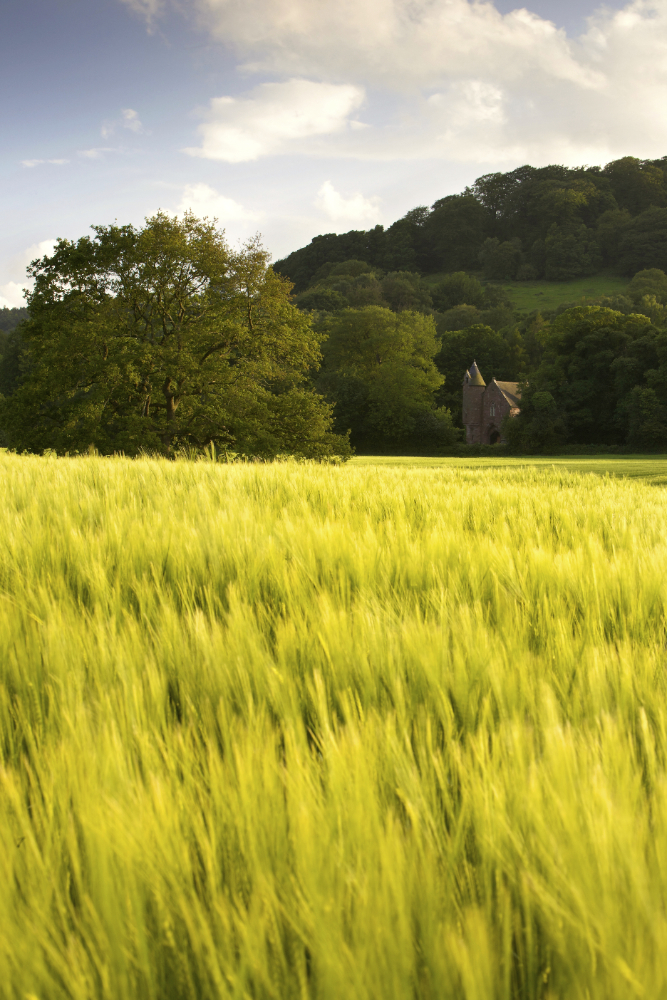
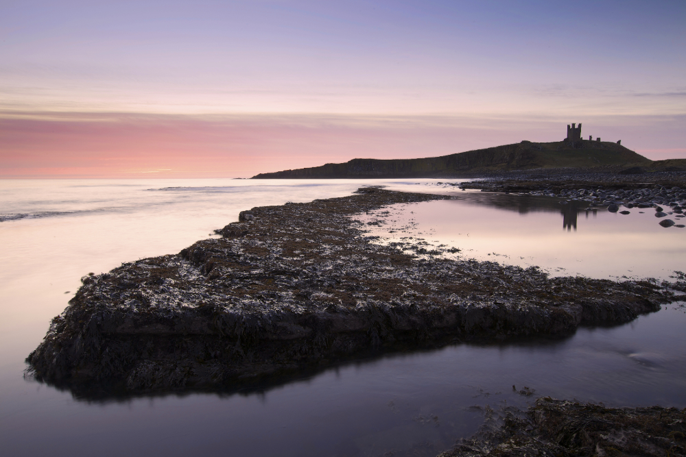
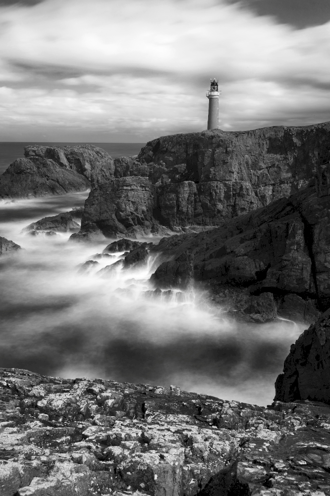
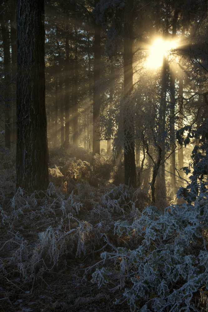
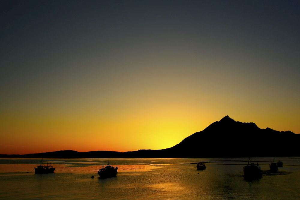
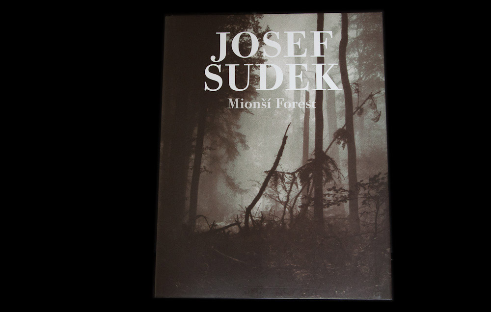
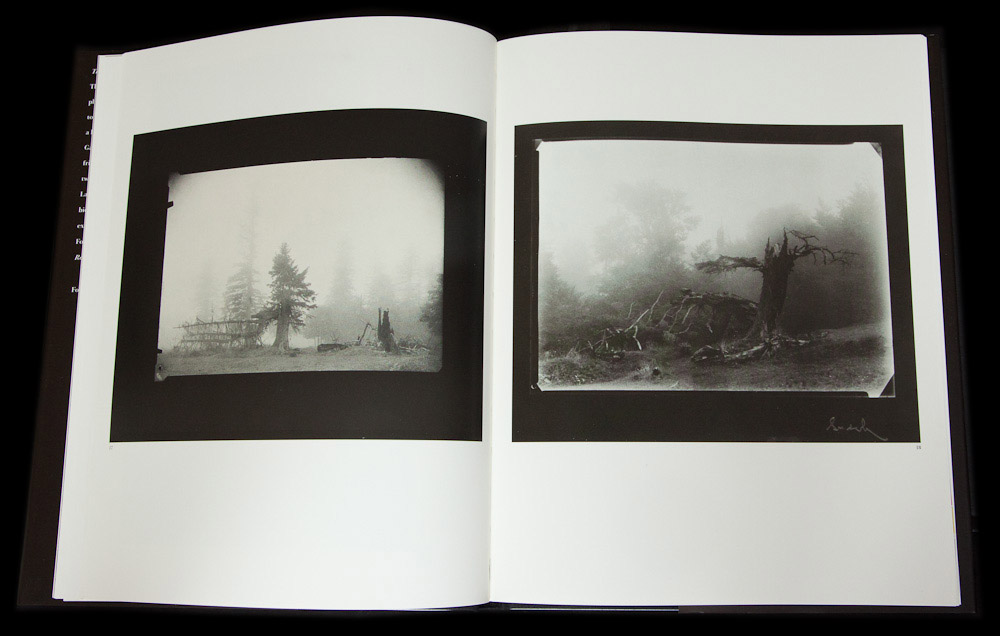
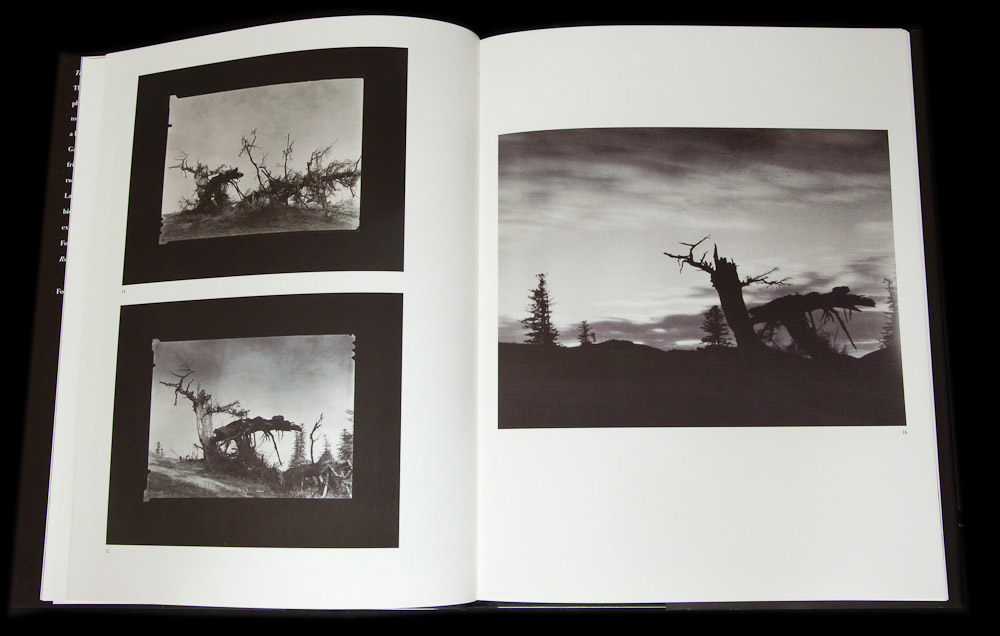
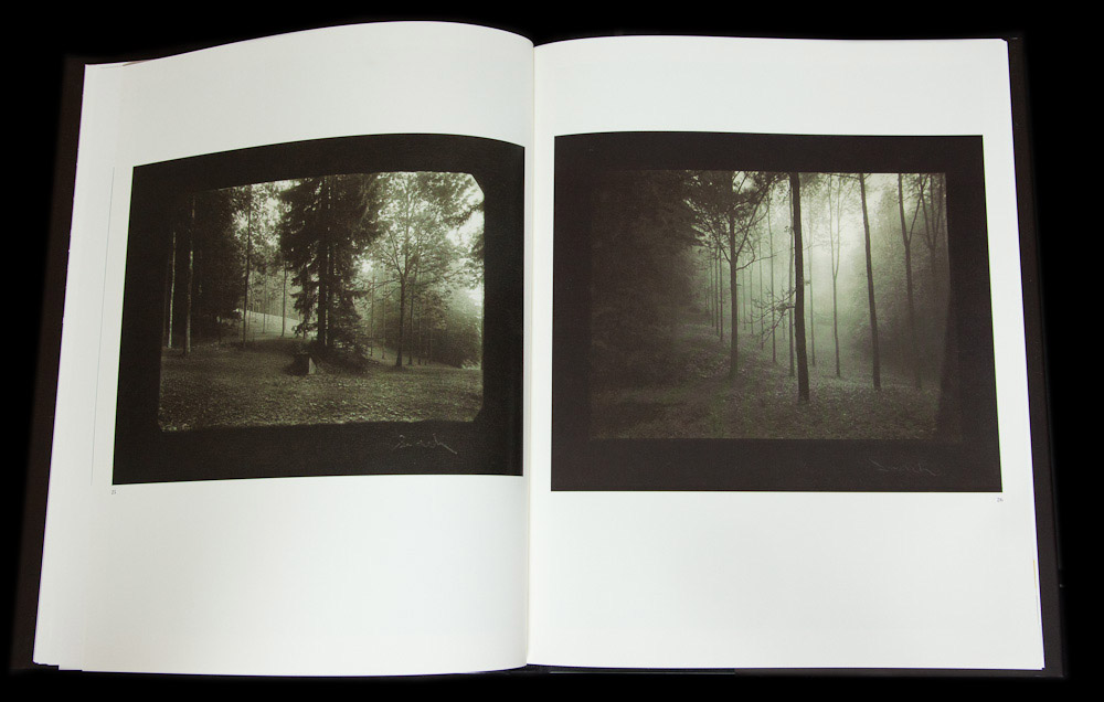
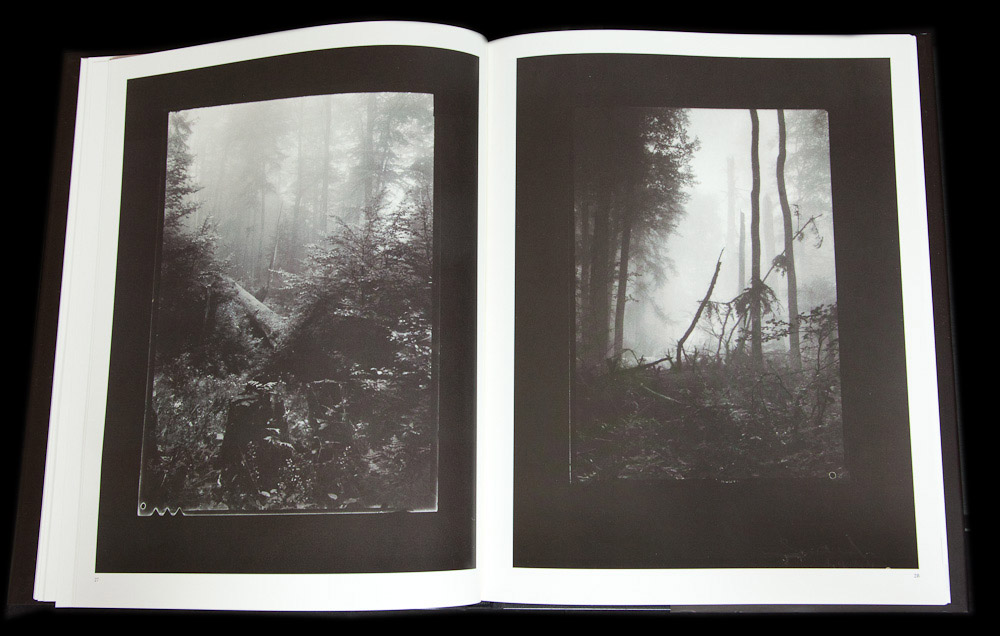
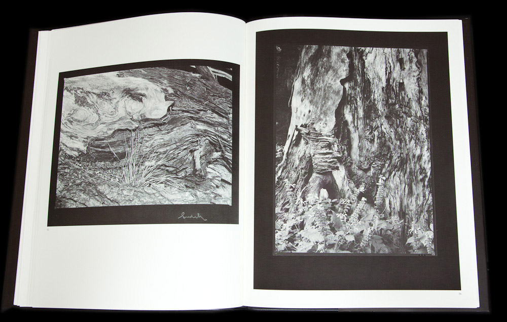
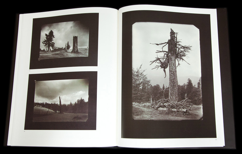
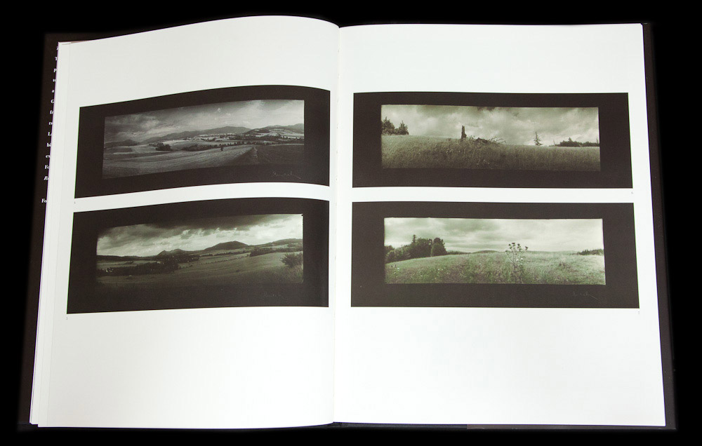
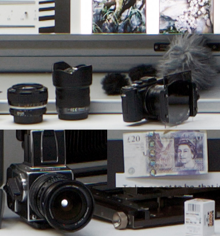
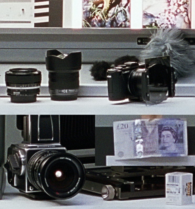


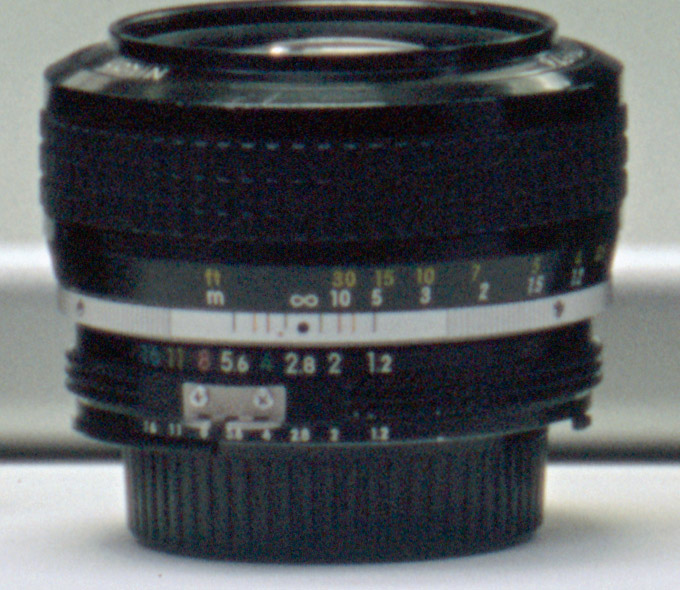
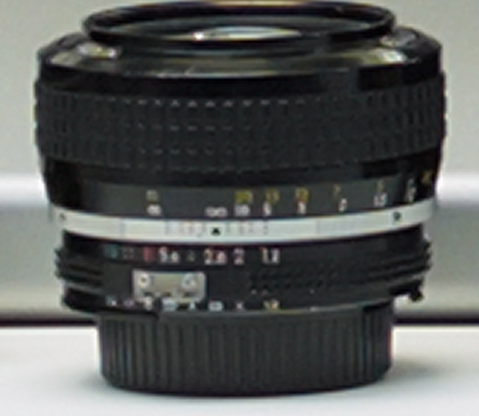


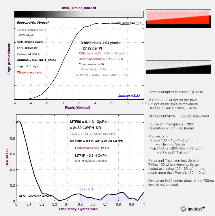


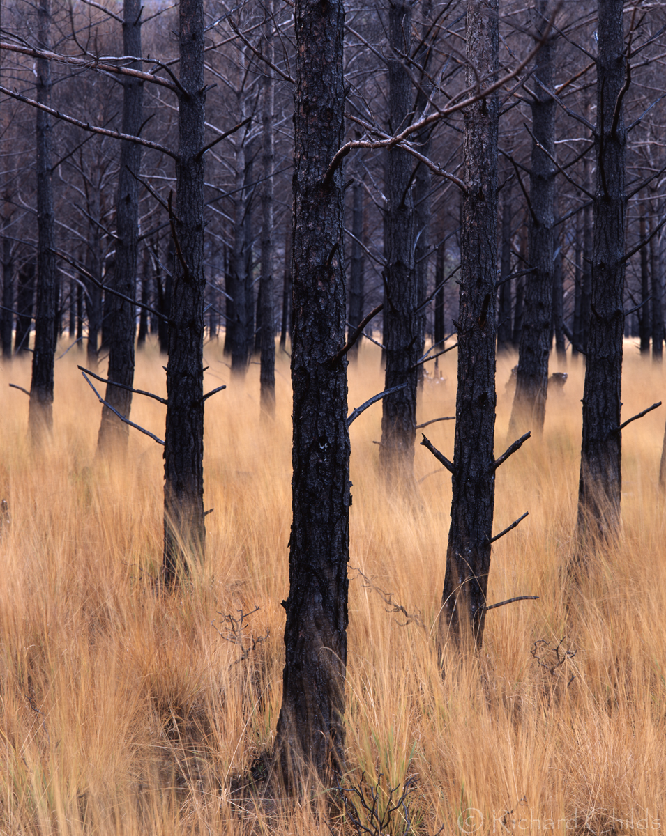
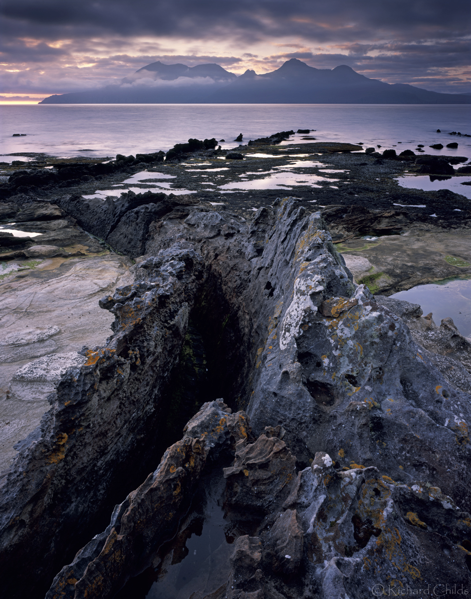
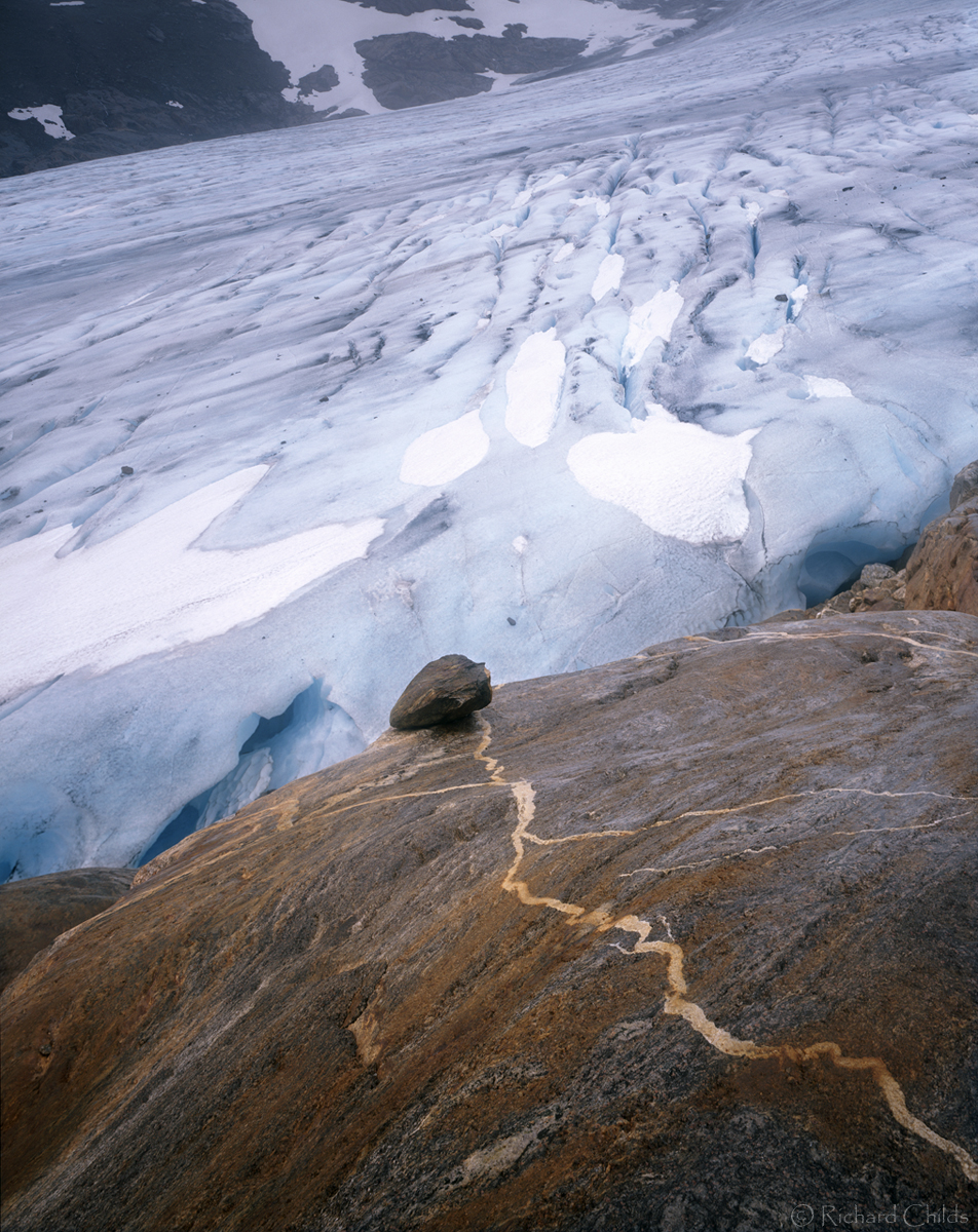

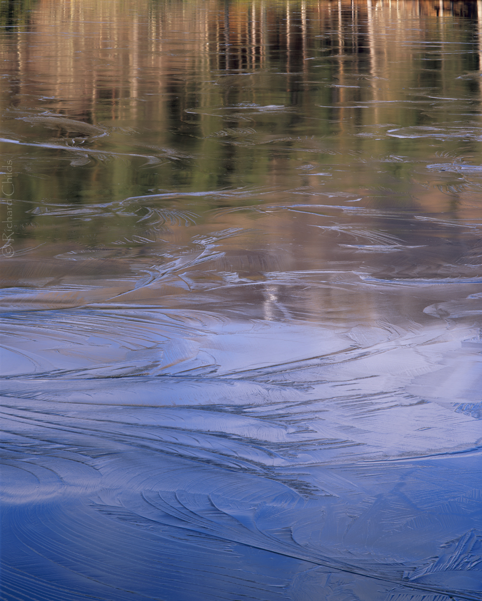
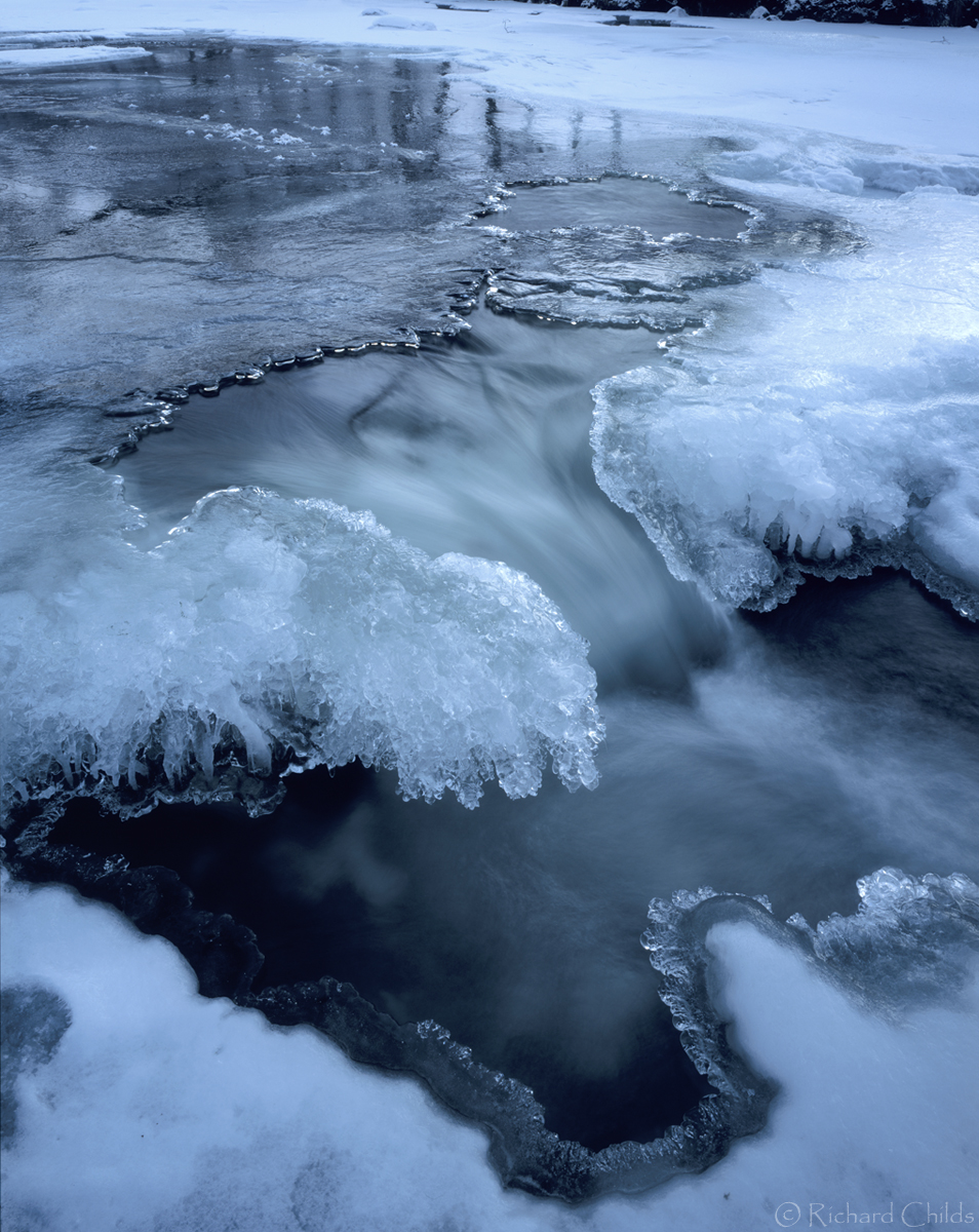
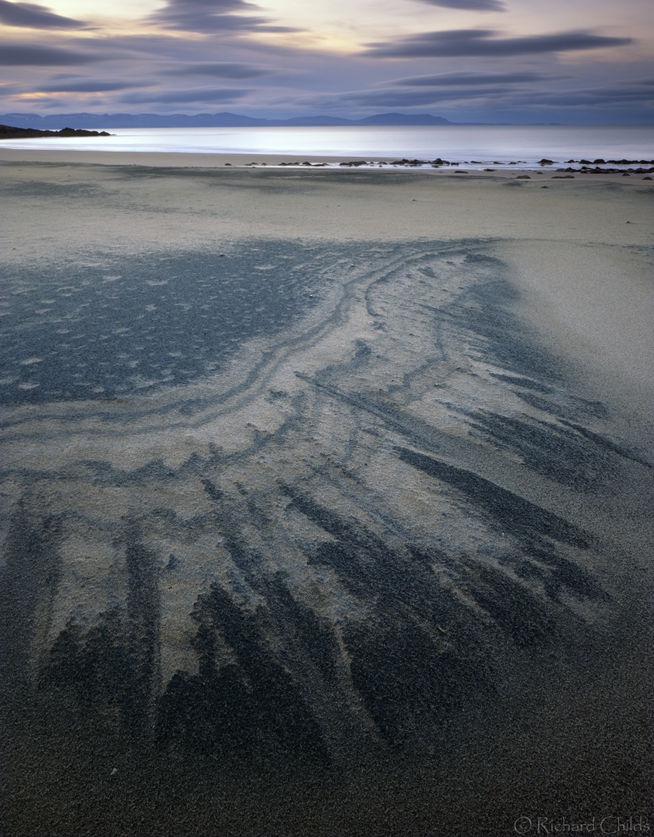
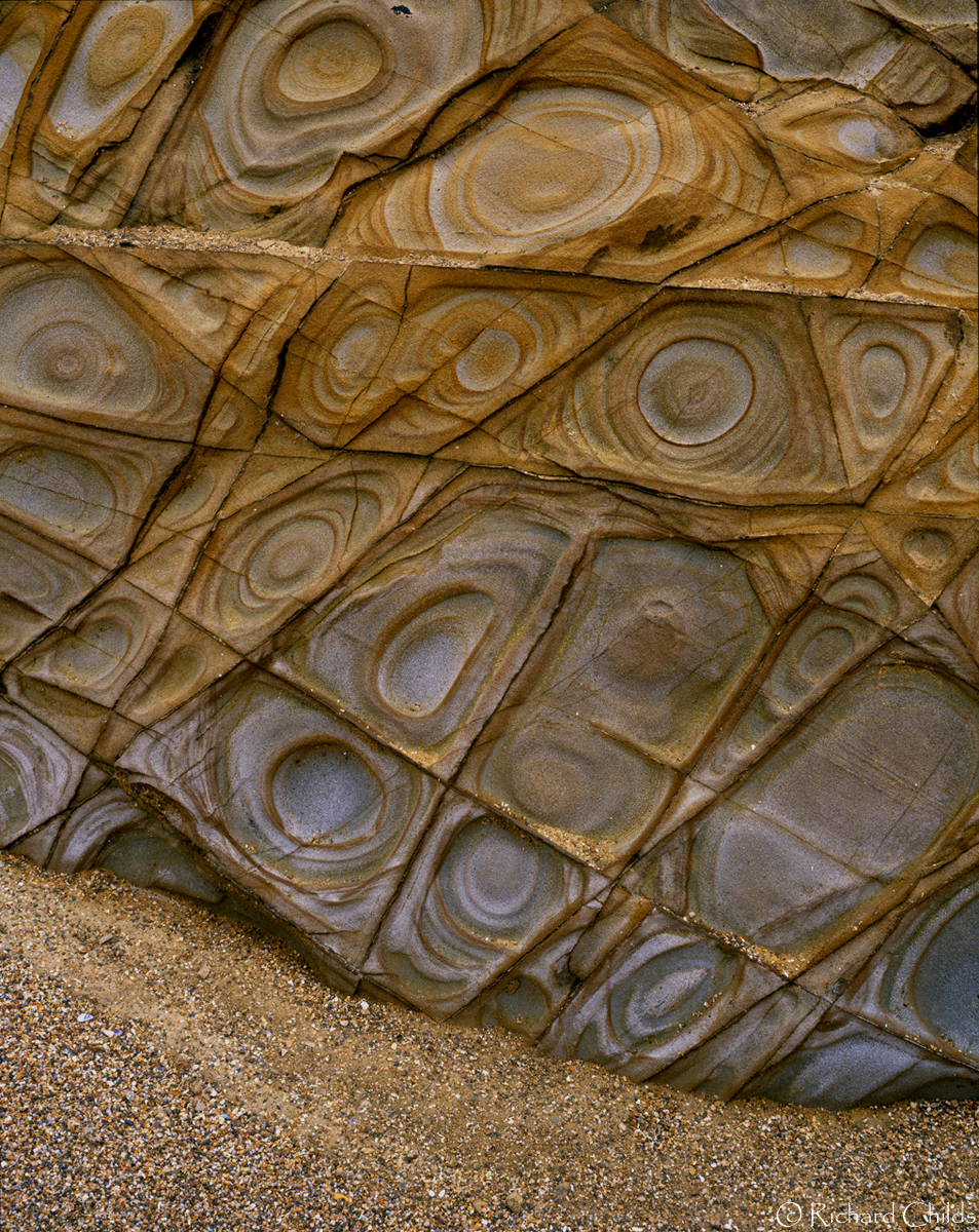
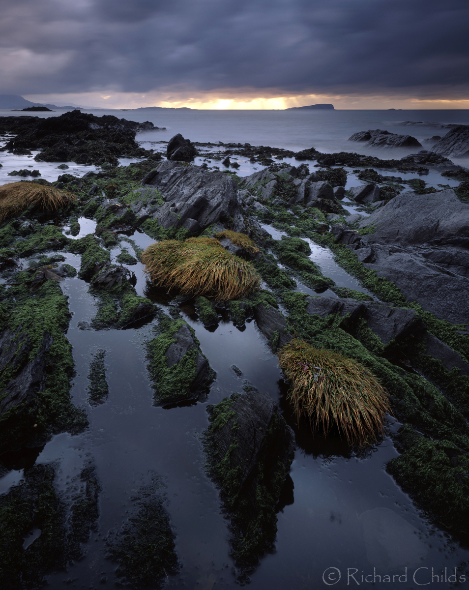
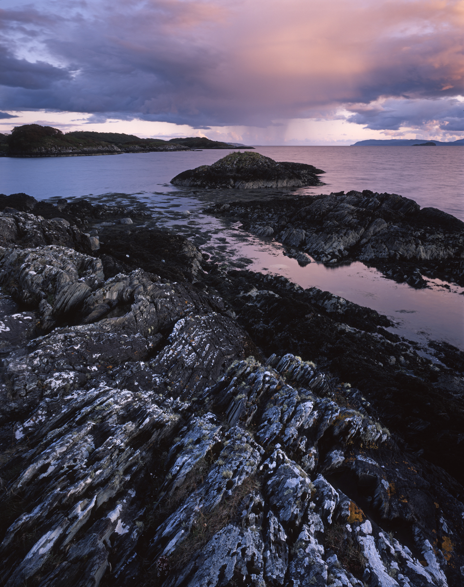


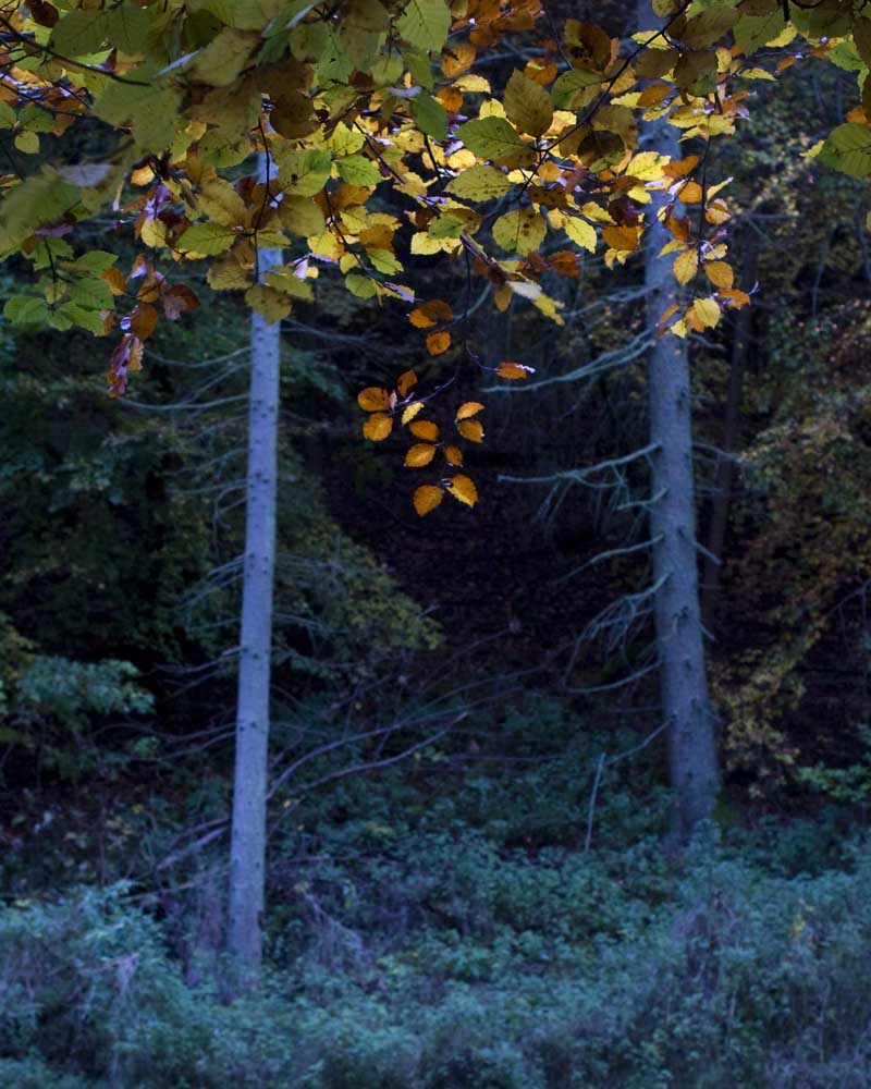
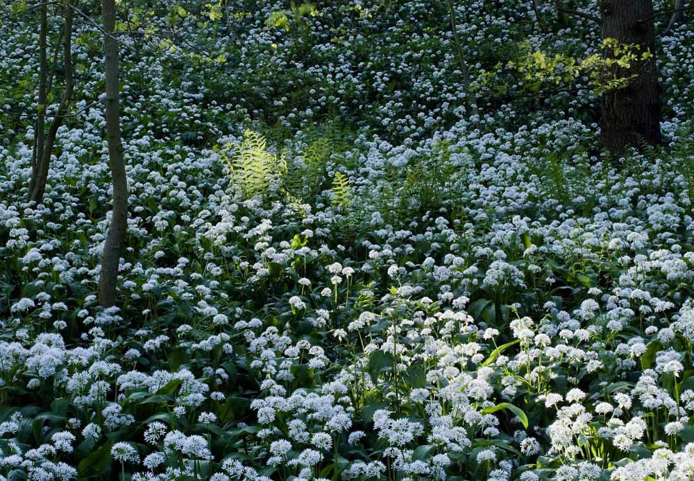
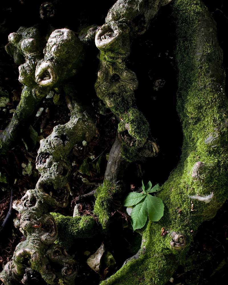
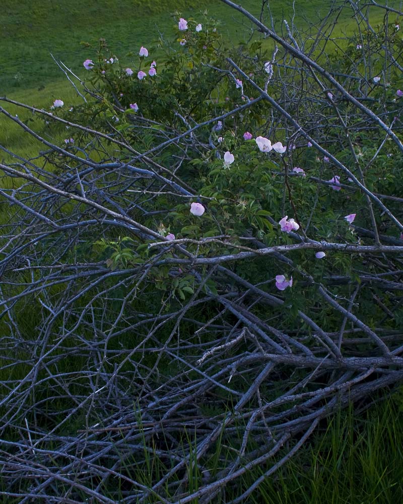
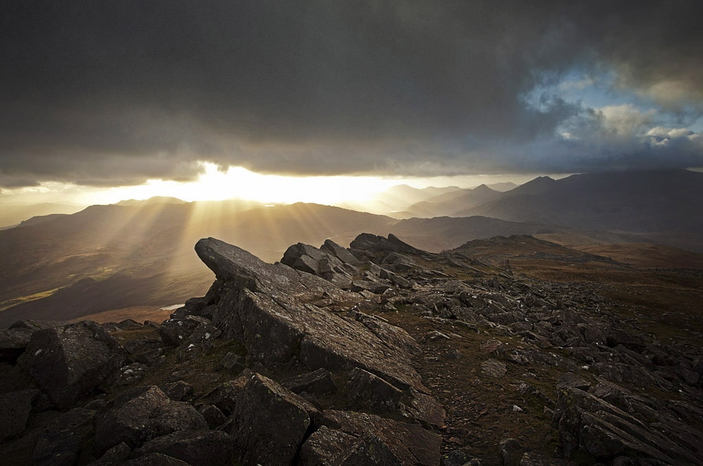


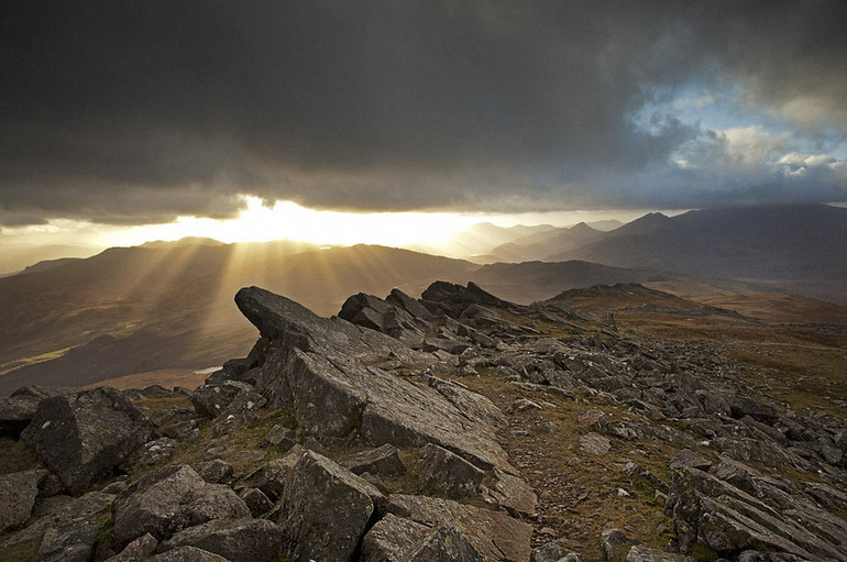
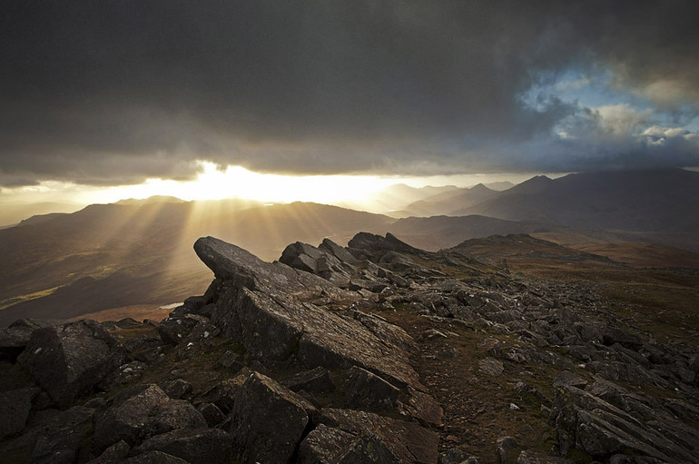
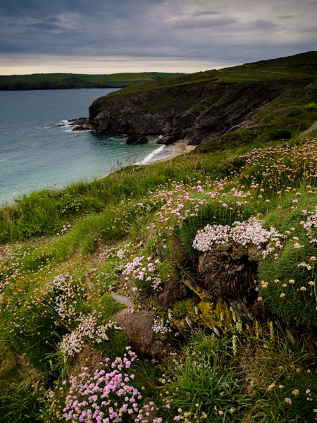
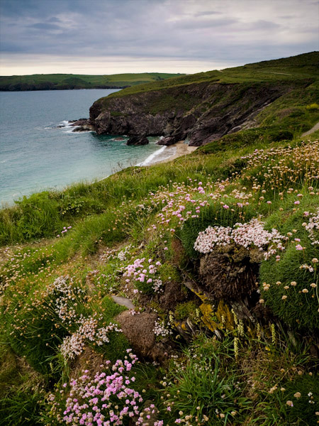

