Alfred Stieglitz

Stieglitz may not be the best photographer that the century has ever seen but you would be hard pushed to find a more influential one or one that pushed the bounds of what photography meant. His obsessive hard work pushed photography forward as an art like no other.  His own photography stretched these boundaries as well, occasionally creating groundbreaking work such as the equivalents. He spent more time promoting others than on his own work, however, famously helping Ansel Adams, Paul Strand, Edward Weston and Eliot Porter. Stieglitz was a workaholic who had to excel at everything he touched, to the point of mental breakdown occasionally. His influence stretches far beyond photography, however, and he was deeply involved in the modernist movement in the first decades oft he 20th century.
Stieglitz was one of five born to a wealthy family of German immigrants and was a precocious youngster who declated his favourite colour as ‘cardinalian black’, his favourite book ‘a pocketbook full of money’ and his the saddest words ‘too late’. In Germany, he received an education and also gained a mentor in Wilhelm Hasemann, a painter, and was influenced by Adolf von Menzel (who interestingly performed his own cloud studies in 1851). He was also influenced by the rural way of life and also painted work horses, another fascination in later life.

When his family returned to America, Alfred started studying under Professor Hermann Wilhelm Vogel. Prof. Vogel taught metallurgy and chemistry and gave the course in photochemistry that Alfred studied. Vogel challenged Steiglitz to make a photograph of a white stone statue outside with a black velvet cloth draped over it and retain detail throughout. Alfred surprised his professor who thought this was not possible.

At this time, Stieglitz was also taking landscape photographs in the Alps, particularly photographs of Lake Thun with a sky that foreshadows the equivalents series. Stieglitz was finding a place for himself in Europe and was exploring some abstract concepts of water and clouds (if approaching them askance) and he also had a romantic involvement with a prostitute who ‘starred’ in one of his most successful images of that time, “Sun Rays, Paula”.

He was called home at the death of his sister and he was so attached to his European life that he refused until his father threatened to stop his ‘stipend’. Stieglitz found New York ‘difficult’ after the liberal life in Europe; a drab city without the cafe culture and without a network of friends, he found it lonely. He started making contacts quickly though and was quickly writing for it with ‘A Plea for Art Photography’ - a call for simplicity and boldness in composition.

It was at this point that Stieglitz borrowed a hand held 4x5 Kodak plate camera* with which he took a picture that for him became ‘The basis of so-called “American Photography”’ - “Winter, Fifth Avenue”. He subsequently bought a Graflex which he loved so much he contributed testimonials to the company. With this camera he very quickly took another pivotal picture, recalling his earlier images of draft horses in Europe, “The Terminal”.

Over the next year he worked taking pictures around the streets of New York and Central Park. The following year he made a marriage of convenience with a friend of the family, Emmilie Obermeyer - a marriage that was not consummated for another year and one that Stiegletz regretted almost immediately.

They honeymooon'd in Europe where, in Paris, Stieglitz took another significant picture of the wet streets, “A Wet Day on the Boulevard, Paris”, the subject being a sense of luminosity rather than the descriptive city scene. Another image that shows a wonderful sense of composition of line and shape was “One the Seine - Near Paris” where a drover rests with his goats but where the image is a combination of perspective, line and recession.

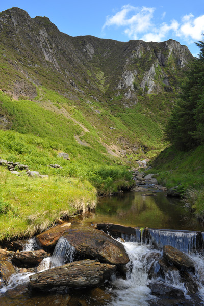
Whilst he took many distant views of the mountains, one of my personal favourite pictures was of a mountain bridge (called “Mountain Bridges”) which depicted two bridges over a gorge but displayed a sense of shape, texture and weight that is quite admirable.

Whilst travelling in Venice, he also took a striking image of the canals, exercising his control over contrast creating luminosity in the sunlit and shaded parts of the picture. A subsequent crop of this image was also very strong and was a little more suggestive than the more classical un-cropped image.

Stieglitz was still working in a pictorial sense though although his work in this genre could still be revelatory. In particular, a photograph ‘The Net Mender’ is particularly evocative and demonstrated Stieglitz’s empathy with the rural and the honest toil involved in village life, an empathy reflected in his work on the streets on New York.

Two other images were taken in Katwyk (the location of the Net Mender) were also significant. “Scurrying Home” is the better known photograph but “The Gossip” with its daring balance of composition is another of my favourites. Interestingly, Stiegletz was travelling around the ‘iconic’ locations of Europe (Venice, Paris and Katwyk particularly being a subject of many painters including Turner).

On his return, Stieglitz became a whirlwind of activity, helping merge the New York camera clibs into a single entity and becoming president thereof, becoming a member of the Linked Ring brotherhood and becoming editor of Camera Notes (the united clubs periodical).

Stieglitz could be as annoying as he was inspiring though and rubbed many people up the wrong way. When the workload became too much and he invited two non-members of the camera club to become assistant editors which ‘annoyed’ some of the other members who made efforts to expel him from the club. Fighting this, whilst running the magazine, exhibitions, etc. mean that this wasn’t his most productive years photographically. He did meet a long time best friend in Edward Steichen, a photographer who began in painting which, in Steiglitz’s mind, gave him an authority that was complementary to his way of thinking. Stieglitz said, “I think I’ve found my man!”.

Stieglitz had a daughter at this point on whom he swung between dotage and disregard. This was the turn of the century though and Stieglitz had other interests. He began the century by putting together an exhibition by the ‘Photo Secession’ a group of photographers chosen by photographs - an uncommon thing at the time. The secession was a move away from the attempts to make photography like painting and an attempt to allow it to be itself.

The same year he officially resigned from Camera Notes and started Camera Work, a journal of photography and art with the goal of placing photography firmly alongside other artistic media. He also opened a small (very small) gallery that complemented the periodical and was used to promote photography and as a place to show the latest movements in art as well (The Little Galleries of the Photo Secession)

In the first three years of the 20th Century, Stieglitz made up for his lack of work in the previous years by producing some of his best work. These include”Spring Showers” recalling his Paris rain pictures, “Snapshot from my Window, New York City”,“The Hand of Man” and “The Flat Iron”, marking a sea change in photography.


These images were a prologue to the photograph around which his work would pivot. On a trip to Europe, he was drawn to an arrangement of mechanical and human shapes and produced “The Steerage”.

Between 1907 and 1915, Alfred Stieglitz became a colour photographer. Yes, you heard that right. He was playing with the autochrome process. Just like Ansel Adams experiments in colour, this was merely a sideline, an experiment of sorts and although some images were strong - they were merely black and white images in colour and did not use colour in any particularly creative way.

Over the next decade, the gallery changed name to 291 (its location on Fifth street) and featured photographers such as Edward Steichen,  Paul Strand, Alvin Langdon Coburn,  Robert Demachy, Constant Puyo, René Le Bégue, Gertrude Kasebier and Clarence H. White and other artists such as  Henri Matisse, Auguste Rodin, Henri Rousseau, Paul Cézanne, Pablo Picasso, Constantin Brâncuşi, Marsden Hartley, Arthur Dove, John Marin, Charles Demuth, Georgia O'Keeffe, Francis Picabia and Marcel Duchamp.

He also produced work that echoed "The Steerage"s new approach, including some from the back window of the gallery! ("From the Back Window of 291" & "Snow Covered Tree, Back Yard"). He also photographed the dawn of the age of flight with photographs of early aeroplanes and dirigibles.

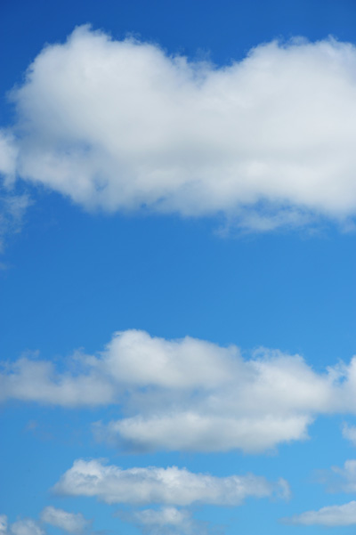
The photographs that many know Stieglitz for are his 'Equivalents'; abstract photographs of clouds. These images were symbolist in nature (symbolism being an extension of romanticism where a shared iconography is replaced by personal metaphor). Stieglitz took cloud photographs over much of his life, starting in Europe in the late 19th century and continuing well into the 1920s. The particular challenge of shooting clouds at the time was that the orthochromatic film was not sensitive to blue light and hence clouds appeared against a white background. The artistic challenge was to answer some of his critics that suggested his photographs were great because of the subject matter, not his particular skill. His answer was to choose the most democratic subject he could think of. The other success of the series was that no one had taken photographs of 'nothing' before, just to present an abstract form from a representational palette. At the time the pictures were revolutionary and received enormous critical praise.

Stieglitz's marriage finally ended shortly after with many people suggesting that he arranged for his wife to find him photographing Georgia O'Keefe naked in their family home upon her return from holiday. This 'provocative' behaviour was not unlike Stieglitz who had a passive-aggressive personality but was also quite prone to just aggressive on occasion. His relationship with his friends was volatile and he gradually pushed most people away from him, including Paul Strand whom he famously insulted after Strand had arranged to invest in a gallery for him.

Stieglitz obsessively photographed O'Keefe over the next decade but still found time to develop further infatuations with young artists. famously Dorothy Norma when she was 42 years younger than him. At the same time

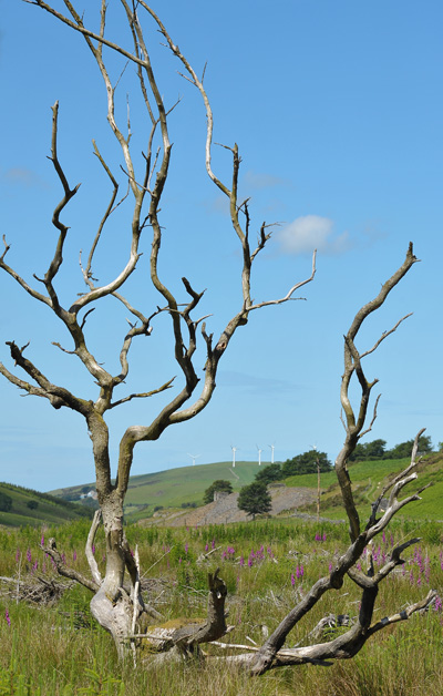
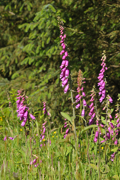
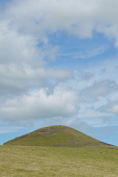
In later life Stieglitz was to shoot landscapes of various sorts, especially around Lake George - a childhood favourite retreat and a Stieglitz family home. The photographs here include beautiful abstract images of grasses.

During his seventies, Stieglitz put on exhibitions of Ansel Adams' work and also, through successfully exhibiting and critiquing his work, nudged Eliot Porter into becoming a full time photographer. Ansel Adams has always talked of Stieglitz as a major influence on his work, being especially moved by the Equivalents series.

Stieglitz died in 1938 after a series of progressively worsening heart attacks.

Timeline

1864 - Born in Hoboken, New Jersey of German parents
1881, aged 17 - Family moved to Europe for education and Alfred’s father to paint
1884, aged 20 - His family returned to America

1887, aged 23 - Writes for photographic magazines and wins prize with A Good Joke
1890, aged 26 - returns to America for his sisters funeral
1892, aged 28 - Buys his first hand-held 4x5 camera, takes “The Terminal”, “Winter Fifth Avenue”
1893, aged 29 - Marries Emmeline Obermeyer
1894, aged 30 - Honeymoon in Europe

1896, aged 32 - Merged NY camera clubs and became president (Camera Club of New York)
1899, aged 35 - Mental breakdown through overwork and resigned/expelled from Camera Club and editor of Camera Notes
1900, aged 36 - Met Steichen
1902, aged 38 - The Photo Secession is formed
1903, aged 39 - Camera Work issue One

1905, aged 41 - Steichen talks Stieglitz into starting a gallery on Fifth street
1906, aged 42 - First exhibition of Little Galleries of the Photo Secession (291)
1907, aged 43 - Exhibits Pamela Coleman Smith’s paintings, widening his artistic eye beyond photography
1907, aged 43 - ‘The Steerage’, taken on a trip to Europe

1915, aged 51 - Exhibits Paul Strand’s work at 291
1916, aged 52 - Includes Paul Strand’s work in Camera Work / Meets Georgia O’Keefe
1917, aged 53 - 50th and Final issue of Camera Work and last exhibition at 291
1918, aged 54 - wife finds Stieglitz photographing O’Keefe in the nude in the family home - not good..
1922, aged 58 - Reviewed Edward Weston’s work
1923, aged 59 - got a bit naughty with Paul Strand’s wife
1924, aged 60 - Started using a room at the Anderson Galleries (The Intimate Gallery or "The Room")

1924, aged 60 - Marries and exhibits with Georgia O’Keefe
1925, aged 61 - puts on the “Alfred Stieglitz Presents Seven Americans: 159 Paintings, Photographs, and Things, Recent and Never Before Publicly Shown by Arthur G. Dove, Marsden Hartley, John Marin, Charles Demuth, Paul Strand, Georgia O'Keeffe and Alfred Stieglitz” show
1927, aged 64 - Starts affair with Dorothy Norma (aged 22)
1929, aged 66 - The Strand’s invest in a new Gallery space for Alfred (The American Place or "The Place")
1929, aged 66 - Georgia O’Keefe gets her own back by being a bit naughty with Paul Strand’s wife too

1936, aged 73 - Put exhibition of Ansel Adam’s work and afterwards, Eliot Porter’s
1938, aged 75 - Heart attack, the first of many which gradually debilitated him

The Truth, the Whole truth and Nothing but the Truth?

'Honesty' and 'truth' are two descriptors which are applied very frequently to the subject of landscape photography. Typically, they will be applied by 'scapers who fall into one (or both) of two categories: the chap who searches tirelessly for the perfect scene and the perfect light (hopefully concurrently!) and the other who is not quite so pernickety but has little in the way of aptitude or skill to get the best out of his images in post production.  In the latter category, I have met no end of folk who eschew the very idea of altering even a single pixel, as so to do would disturb the twins called Honesty and Truth. Often the principle is propounded in a loud and condescending voice, and built upon foundations of clay. I know that there will be few of our readers in this camp!

Hindsight – with David Ward

This issue we had the opportunity to spend some time with David Ward at his home near Hereford and he chose three pictures for us to talk about (well, mostly avoid talking about to be honest). David has inspired a lot of people in the UK through his photography and his workshops and having the opportunity to talk again was a pleasure.

Read the other Hindsight articles in this series.

Shooting for the Moon

If you'd like to take a telephoto landscape image of the full moon then hopefully this technical guide will help you to achieve that. An image of Staple Tor on Dartmoor shot at 560mm is being used as an example.

Software

The Photographer’s Ephemeris is the tool you will need to download in order to follow this article. No doubt many of you will be using it already, but if you aren’t this program is used to give use times and bearings for the sun and moon at any time of day.

You could also use Google Earth to find interesting skylines. It’s another invaluable photography tool.

Subjects

At telephoto focal lengths it is likely that you are going to be looking for strong silhouettes. Make sure that you can stand 'a long way' from your subject so that the moon and subject are within the depth of field of the camera (unless you want to try focus bracketing which would complicate an already technically challenging scenario!)

In this case Staple Tor has many interesting silhouettes, but there was one particular view that had the best potential. Taking a snapshot can help you plan your final image.

Equipment

If you want a telephoto image of the moon where it becomes the focus of the image then 400mm (35mm equivalent) is probably a minimum. The image here was shot with 400mm 5.6L and a 1.4x converter to give a total focal length of 560mm.

Using a camera with a high pixel density can help to increase the size of the moon in pixels if you can actually resolve the detail. The example image was taken with a 5DMKII and it didn’t quite reach the achievable resolution of the camera.

A sturdy tripod is essential. A Gitzo G2228 Explorer was used for this image. It’s a little lightweight, but with good technique and favourable winds you can make any sturdy tripod work. You will also need a shutter release, some weights to hang off your tripod and an umbrella, all of which will be used to reduce wind induced vibrations.

Planning

To simplify things a little this article only refers to photographing the moon when it is full. It is also possible to take these images at the crescent moon.

At the time of the full moon, the moonrise occurs at a similar time to sunset and the moonset occurs at a similar time to sunrise. This is significant because it reduces the contrast range of the image, allowing you to expose to retain detail in the moon whilst still maintaining colour in the sky, or even having the landscape lit by the low sun or twilight. In general, the time when this contrast range is best is from sunset until around 20 minutes after.

In the image above the contrast isn’t quite there to produce a silhouette of the tor. Waiting till a little later helped to deepen the sky to a richer blue whilst the fill light on the rocks was also reduced

You can see in this image that the contrast is already becoming unworkable just 15 minutes after sunset. On this particular evening there were just 10 minutes in which the contrast range was good for making images and of those 10 minutes only 5 were ideal.

The moon rises in the NE through SE and sets in the NW through SW depending on the time of year. The moon will travel through south along the way, just like the sun. This means that from your planned viewpoint your subject shouldn't be to the North, the moon will never appear there! Equally, if your subject is to the south then the moon will be relatively high in the sky which may pose a problem compositionally.

Open up The Photographer's Ephemeris and determine which full moons have the potential of allowing you to capture your shot! Start by finding your location on the map, plant the marker where you think you will be standing to shoot your image then cycle through the full moon dates (it might be better to Google ‘Full moon dates’ to get you there quickly) until you have a full moon rising or setting in roughly the direction of your shot. If this never happens then you might have to go back to the drawing board!

A bit more precision is needed to narrow down exactly when will be suitable. For each of your candidate dates you need to click ‘Details’. Place one end of the marker where you think you will be standing and the other marker where your subject is. You will be given a bearing and an altitude. This is where you probably want the moon to be! You can now move through the day to see how the moon's altitude and position changes relative to your shot direction. Having a little bit of flexibility in your position (in all three dimensions) can be helpful to allow you to match the direction of your subject to the moon. Obviously, you want the altitude of the moon to be above the altitude of your subject!

In the case of the Staple Tor image the moon needed to rise before sunset in order that it could get high enough in the sky to be photographed with the tor, whilst still having twilight to keep some colour in the sky and reveal the silhouette.

You should now have a number of candidate times where the moon is in the right place. Unfortunately many of these times may be unsuitable! You might start with 5 potential days, but by the time you’ve accounted for wind, cloud and life getting in the way you might only have 1 opportunity! In fact the image on show here came after nearly 18 months of waiting and 6 months spent looking forward to that specific Friday.

Recon!

Before 'the big day' try to mock-up a Photoshop image of what you are expecting to shoot. If you use the same camera setup then you can see how big the moon will be relative to your composition and make any adjustments as required. The mock-up might increase your determined to capture the real thing.

Capture technique

Now you've planned exactly where and when you need to be and realised that the opportunities to get your shot are few and far between, the last thing you want to do is mess up the shot!

As far as ISO, aperture and shutter speed go, there is no single correct answer. For the example ISO was compromised first, setting it to ISO800 to allow a short shutter speed to combat motion blur due to the wind. Following similar logic, the aperture was set to f8 (the widest possible with the lens and extended). A practice a few days before showed that a shutter speed of 1/200 should be possible.

You will also need to set mirror lockup on your camera to separate the mirror flip from image capture, reducing vibration. Alternatively, you can set your camera to live view so the mirror remains up. Shoot RAW so that you can adjust exposure and white balance later. Save all your settings in a custom mode if you have one on your camera and hopefully you will only have to tweak things on the day.

The last piece of the puzzle is your tripod. It is quite possible that you will find yourself in a breeze (hopefully it’s not too windy!) and if so, you need to set up your camera and tripod in such a way that they minimise the possibility of the wind causing vibration.

  • Remove your camera strap
  • Remove your lens hood or collapse it
  • Lock the camera firmly to the tripod
  • Set your tripod up without extending the last leg sections and without using the centre column.
  • Force the tripod legs into the ground if possible
  • Hang weights from the tripod. 10kg of dumbbells were used for this example to increase the inertia of my setup and hence reduce the winds affect on it. Make sure that whatever weight you use is in contact with the ground to prevent a pendulum effect.
  • Use an umbrella as a windbreak.

If there is no wind and you are setting up on a hard surface then you probably won't need any of these techniques.

The Big Day

With everything planned it is probably unnecessary to explain in any more detail exactly what to do. It is important however that you don’t let your planning get in the way of any creative opportunities you might have.

The final shot of Staple Tor, was different to the shot that was planned. The below image was captured first but later recomposed to move the moon behind the tor.

Whatever you do, when you get the chance to take your image, make sure you make the most of it.

Good Luck!

You can see more of Alex’s photography at http://www.alexnail.com/ or at his flickr stream.

Outdoor Show versus The Wildlife Photographer of the Year 2012

Myself and Dav Thomas went to report on the Outdoor Show last week and planned on spending a couple of days looking around and chatting with the exhibitors in the Photographic Village. However, the photographic village turned out to be a stall for GMC Publications, Joe Cornish and Andy Rouse, Ocean Capture and .. and .. well that was about it. There was more balsamic vinegar stands than photography stands. We saw Charlie Waite give a talk but instead of a theatre, it was just a bunch of benches in front of a couple of large screen televisions and a small PA system. The music from the slacklining stand provided entertaining background music (not) but Charlie's talk about 'influence', giving examples of classic photographs and possible subliminal links with Charlies ouvre were entertaining and to see some of Charlie's new images from Libya (and to hear about his intriguing experiences for the unknown client) was a refreshing change. However it couldn't make up for the poor show elsewhere.

Even the Outdoor Show itself dissapointed. Very few exhibitors were showing and the majority of the stands were adventure holidays or organic food. The Paramo stand was good and I was happy to see the full range of F-Stop gear (although it might prove expensive).

We eventually gave up, went for a curry and made a change of plans. The following day we visited the 'Wildlife Photographer of the Year' exhibition and the Natural History Museum. Now here was something worth visiting London for. Both myself and Dav are hardly 'wildlife' fans but these images went beyond visual preference. Even though we had to pay £8 each to see the exhibition, the way it was presented and the quality of the peripherals (e.g. computer consoles that allowed you to find out more, vote for you favourites, add comments and get prints) transformed it into an event - I didn't even react that badly to the merchandising (although 'mini chocolates' and 'luggage labels' push the boundaries somewhat). You can see what it looks like by browsing the images below.

The quality of images was very high indeed. What really surprised me was that nearly every single image was powerful and each was presented in a way that maximised its impact. There were some particular favourites, quite a few of which were taken in snowy conditions that created simple, abstract compositions. We spent a good two hours wandering around the exhibition and both agreed that it was one of the best we had visited.

Comparing this to the Landscape Photographer of the Year is not really fair as the Wildlife Photographer of the Year has been running for a lot longer and is truly international but this is definitely an exhibition/competition to aspire to.

For now - take a look at the images below and do yourself a favour and visit the exhibition whilst it is still open until the end of February.

Hugh Webster

This week sees a feature on Hugh Webster - originally born in Northumberland but having spent most of his life in Scotland, Hugh has his own stock photo library which used to be called the Scottish Highland Photo Library but is now Stock Scotland and previously ran the Highlands Development Photo Library.

In most photographers lives there are 'epiphanic’ moments where things become clear, or new directions are formed. What were your two main moments and how did they change your photography?

I am sorry to say that I haven’t had any moments of epiphany as yet but I keep on hoping. I’ve had moments of apparent clarity in which the future, photographically speaking, seemed to open up before me but they have proved to be untrustworthy. I am a pretty stubborn type so I think the answer for me is just to keep on working. Perhaps the closest I’ve come to a moment of revelation was when, just before my university finals, I realised that I could try to make photography my career. Up until that point I’d had no idea what I wanted to do. My father, who was a keen amateur photographer, must have bought me a camera at an early age because I can’t recall a time when I didn’t take photographs. It’s strange, then, that it never occurred to me before that I could make it my living. It seemed such a normal activity that I think I must have just taken it for granted and not noticed how important it was to me.

If I can turn the question around a little, I’ve often had periods of doubt about my choice of photography as a career. There have been sometimes quite long periods of what I call, borrowing from Winston Churchill, photographic ‘black dog’. Periods when I have just found myself going through the motions of producing pretty pictures for my calendars, postcards and stock agency and occasionally wishing I’d chosen another career. These phases have always passed, though, and it may be that they just reflect my temperament rather than anything more profound.

Discovering the slow practice of large format photography was a great help during a particularly extended period of ‘photographic doubt’. Latterly I’ve made some alterations to the way I run my business so that I can spend more time on more personal projects. This practice of setting projects and developing themes through my photography is something I’ve come to quite recently and it has changed the pictures I take and re-invigorated my love for the medium. It’s early days and I don’t have a great deal to show for it yet but I am looking forward to the future. I’ll still be taking the ‘pretty pictures’ though - I have bills to pay and sadly ‘themed projects’, however interesting, don’t tend to pay them.

Why landscape photography?

That’s simultaneously a simple and a complex question to answer. Like many photographers, my initial love for the landscape grew out of a love of place. I was a lucky child: my parents both loved the West Coast of Scotland and most of our family holidays were spent there. Every year from about the ages of four to twelve we would spend the whole summer, six or seven weeks, renting a cottage in the remote village of Arnisdale by Glenelg. For me, it was like being allowed to visit Eden for a few weeks a year and this experience is almost certainly the reason that landscape photography has become so important in my life.

Notwithstanding my earlier remarks about photographic ‘black dog’, the landscape has only grown in importance to me as I’ve got older. However, over time the relationship has become more complex. The initial innocent, joyous and unmediated response to the landscape has been changed by life experience, ideas, history and politics into something more ambivalent, less comfortable or comforting. I can’t regret this as I think it’s absolutely inevitable and I think that this inexorable process will enable me to take more satisfying photographs. I hope this doesn’t make me sound like a gloomy and depressive old landscape photographer because nothing could be further from the truth. Those wonderful moments of sheer unadulterated pleasure in the light and the land occur almost every time I take my camera out for a walk. Also, I am not all that old!

TS Elliot insisted that a poem should be able to communicate before it is understood and this is the way that I approach my landscape photography. The immediate shared aesthetic pleasure of a picture is the vital element and this comes, principally, from relatively immediate experience. The deeper content of the picture comes from elsewhere and, although very important, is more difficult to read. It often requires a little help from the photographer to be understood. I believe that it’s the desire to share experience that draws people to landscape photography - it’s what really counts. I want to share my experience of the landscape with others. Solipsistically taking pictures for myself would be just a waste of time.

Could you tell us a little about the cameras and lenses you typically take on a trip and how they affect your photography

It depends what I am working on. If I am photographing for my retail calendars, postcards etc. I generally use a Canon 5dII and a 24-105mm lens. If I am photographing for personal projects or for my planned gallery and associated prints then I use an Arca F-metric for short carries or a little Ebony 54 for longer carries. I also have a Ebony 5x7 and a Fuji 617 kit but these get less frequent use. I am starting to look seriously at medium format digital.

Do you have any particular workflow post capture?

When I am using film I try to do as much correction as possible at the scanning stage ( I use a Hasselblad Flextight scanner). Once scanned I tend to set dark and light points using a ‘threshold’ layer which often has the added advantage of removing any unwanted casts. I’ll then use a combination of the ‘shadow/highlight’, ‘selective colour’, ‘curves’ and dodging and burning controls. As a general rule, I try to do as little as possible. I’ll draw a veil over my digital workflow as it’s something I am well aware I haven’t really mastered yet.

Who are your inspirations?

I’d like to mention five books that I’ve kept on coming back to over the years for pleasure and inspiration. The first is, in my opinion, the best photo book ever published. Paul Strand’s ‘Tir A’ Mhurain - The Outer Hebrides of Scotland’ combines open landscape, landscape detail and wonderfully sensitive portraiture to get as close to photo-book perfection as I’ve yet seen. My second, third, fourth and fifth selections in no particular order would be: John Davies book ‘The British Landscape’ where he photographs fells, terraced houses, motorways, mountains, railway sidings and bowling greens all in the same majestic light; Fay Godwin and Ted Hughes collaboration Elemet which is the most successful combination of my two favourite art forms that I know of; Gus Wylie’s book ‘The Hebrideans”, another book about the Hebrides and surely inspired by Paul Strand; finally Joel Meyerowitz ‘Cape Light’ for its calm refreshing beauty.

Also, is it just me or are people unwilling to mention names like Ansel Adams and Edward Weston any more? They seem to have slipped out of fashion.

Tell me what your favourite two or three photographs are and a little bit about them.

a. ‘This is not a sunset. A bomb hits An Garbh-eilean’.

I was photographing at Balnakeil Bay in North West Sutherland when I took this photograph. The jets had been around for most of this rather sombre winter afternoon but hidden from view by a lid of thin grey cloud. There was a sudden huge sound which rolled around the bay and I turned to see a ball of fire rising over An Garbh-eilean, a rocky stack just off the North coast of Sutherland. I hastily collected my kit together and hurried up onto the top of a promontory that juts out into the beach in the hope that if they dropped another bomb I’d be able to record it. The resulting picture is one that I find uncomfortable viewing as it seems to make explicit, in perhaps an extreme way, the hidden ambiguities that are often concealed in landscape photographs. In this case the incongruity of beauty and violence.

My daughter asked me if the picture was a sunset, hence the title. An Garbh-eilean is the only live aerial bombing range in Britain.

b. St. Mirren’s Graveyard and Birches, Strath Brora.

This landscape hasn’t always been so quiet. There used to be a lot more people living here and I suspect that the land was better for it. This is Strath Brora in East Sutherland, an area that suffered significant de-population during the infamous Highland Clearances. The structure at the upper right is St. Mirren’s Graveyard. There are the remains of many cottages and much older habitations visible in the Strath but few people live here now. It’s a subtly beautiful and poignant place.

c. Rock formations by Loch nan Uamh, Morar.

This photograph is of one of the many fascinating rock formations by Loch nan Uamh in Morar on the road to Mallaig. According to my geological map, they are part of the ‘Morar Group’ of Neoproterozoic rocks and are about a billion years old. They weather to form beautiful and sometimes dramatic shapes exhibiting a range of fine and course textured layers almost suggestive of the grain of wood but far older, harder and colder. I particularly like the way the large sea-worn pebbles in the foreground have been washed up to the base of the flattened ‘mushroom’ of projecting rock. For some reason, I get a very particular sense of the dynamic nature of the landscape from this picture. Perhaps it’s because the plane of rock is shaped like an arrested explosion (another explosion!).

Where do you think you are going with your photography?

I will, of course, be continuing to photograph for my retail calendars and cards. But I am happy to say that with regard to personal work I believe my road ahead is reasonably clear (for the first time in a long time). I’ll be sticking with landscape but I want to take more understated pictures that make use of a more subdued colour palette than I’ve been accustomed to using. Pictures which whilst emphasising immediate aesthetic appeal also attend to the importance of deeper content.

I want to work more on themed projects rather than taking so many random individual landscapes. For example, I am starting this year on what I hope will be a large project for me tentatively called ‘The Big Space’. Its subject is the area that I live on the edge of and which is probably the world’s largest blanket bog, the huge ‘empty’ area of central Sutherland and Caithness which includes the famous Flow Country. It’s the least densely populated area in Europe and although it is usually ignored or avoided by tourists it is a remarkable place and a real landscape of the imagination.

I am working on a project called ‘The Fading Landscape’ which is about the dwindling signs of the past peoples of the landscape I live in. This part of the world is crowded with the remains of ancient people, with the crumbling squares of roughly cut stones that once were the cottages of those forced to move to the coast or beyond during the Highland Clearances and with signs of the much more recent departures caused by economic hardship and agricultural change.

I am also planning a smaller and more intimate portrait of rather unusual oak wood in East Sutherland and I have an idea for a more light hearted project which I am keeping under wraps for now.

Which photographer would I like to see interviewed?

How about Gus Wylie. A lot of his work is portraiture but the portraits are always tied to a particular landscape.

Or what about David Robertson for an informed perspective on shooting stock in the ‘download age’ or perhaps I should say the ‘sharing’ (read thieving) age.

The Beautiful Square

What do Michael Kenna, Josef Hoflehner and Hengki Koentjoro have in common? I suspect many of you have guessed the answer already: they all work predominantly in black and white and use the square format.

Its popularity with arty landscapists means that I've come to think of the square format as the 'fine art photographer's format'. Perhaps this is because of the format's roots – before digital, you needed a 6x6cm medium format to work in the square format (print cropping aside). These cameras tended to be owned by keen amateur or professional photographers attracted by the high image quality and large print potential of the medium format negative.

How times have changed. Now, any photographer with a digital camera can crop an image to the square format in post-processing. Some cameras even let you use the square format when you're taking a photo (this tends to be cameras with electronic viewfinders or that can display crop marks on the camera's LCD screen in Live View mode). But just because you can doesn't necessarily mean that you should.

Or does it? I've found myself using the square format more and more over the last 12 months. It has been both fun and instructional to work in a different format other than the 3:2 aspect ratio I'm accustomed to seeing through my camera's viewfinder.

One of the reasons that I like the square format is that the rule of thirds no longer applies. I'm not a big fan of the rule of thirds anyway; I firmly believe that balance, space, energy and flow are far more important elements of composition within the landscape.

There seems to be a strange kind of freedom to composing within the square frame. You can place the subject in the centre, or near the edge of the frame, and it seems to work. The square format lends itself to strong, simple compositions. Shapes become emphasised, negative space more important. Perhaps that's why black and white images work so well – the square helps reduce a scene to shapes, forms, texture and lines; which also happen to be the building blocks of strong black and white images.

My first square images were crops of photos that I never originally intended to be square. It started when I was building a photo gallery for my website that used square thumbnails. I noticed that many of the images seemed to become stronger cropped to a square. But not only that, the dynamic of the image had changed. In a rectangular image, the viewer's eyes scan from side to side (if it's in the landscape orientation) or up and down (in the portrait orientation). But a square is different – all the sides have equal weighting and the eye tends to move around in a circle.

Now, I find myself taking images that I intend to crop to a square in post-processing. I've started to 'see' in the square format, and recognise when a subject has the potential to work as a square. Working in the square has also improved my eye for composition within the 3:2 aspect ratio. It's made me more aware of the need to fill the frame with something that's interesting to look at and to avoid too much empty space at the far ends of the rectangle.

The graphic qualities of the square format means that it suits very simple or minimalistic compositions. Again, these are important elements of good black and white imagery. Converting to black and white is in itself a form of simplification as colour is discarded to reveal the underlying forms, shapes and textures.

That's not to say that the square format doesn't work in colour. I've deliberately selected some colour images to illustrate this article to make that point. You should also take a look at the work of Jessica Hilltout. While only a small amount of her work could be described as landscape, she has a wonderful eye for colour and composition and utilises the square frame beautifully.

I've come across a few slightly 'oddball' uses of the square format. One is Instagram, an iPhone/iPad app which crops images to a square and applies 'creative filters' that imitate vintage film types. I enjoy uploading photos to my iPad, and playing with Instagram to see what happens. It's surprising how pleasing the preset effects can be.

Another is the use of toy cameras such as Holga. These are used to good effect by black and white photographers who use film and make their own prints. Flavia Schaller has some wonderful black and white images created with a Holga camera on her website. Lee Frost also has a beautiful series of photos taken with a Holga.

You can also create an enormous square image by taking two photos with a 35mm camera and blending them together afterwards. These are called 'vertoramas' (a search on Flickr will bring up many examples) and are another way of exploring the square format. They work best if you use a tilt-shift lens, although you can achieve the same effect with regular lenses as long as you are prepared for a little more work in post-processing.

There is something very appealing about looking at a framed square image. They also seem to work well when placed in sets of two or three to make a diptych or triptych. Perhaps these are other reasons that it appeals to fine art photographers; who are creating art that will one day be exhibited in a gallery or hung on someone's wall.

Andrew S Gibson is a freelance writer and photographer. His clients include EOS magazine, Craft & Vision, Peachpit and Focal Press. His eBook Square is available on his website.


Why Size Really Doesn’t Matter

I had the pleasure of coming along to Tim’s Big Camera Comparison which featured in Issue 28. As we know, being the ultimate geek, Tim loves to compare pretty much everything photographic – cameras, resolution, film, colour, you name it. And congratulations to Tim for putting together such a thorough and informative test.

I got the chance last week to look at print outs from the test of the landscape view, some differences were noticeable on the larger prints which featured a tiny section of the overall image and from the blind test of which ones I preferred, I think I picked the 4x5 Portra 400 shot and a 4x5 Velvia as my top two – generally the wasn’t an overwhelming difference between them, apart from the P45 back, which looked terrible. On the smaller prints, you really couldn’t choose much between them, other than some better colour in the film images, sharpness, detail and all that was much the same.

Even during the day of testing I was thinking to myself  ‘so what?’, resolution, megapixies – it doesn’t matter, it’s an endless and wildly expensive path to follow.

So, I thought I’d put my thoughts down about this whole resolution thing and why, ultimately, it doesn’t matter.

Big, Big Big!

In this rather troubling age, it all seems to be about big – more pixels, bigger prints, more followers, more Flickr comments, but why? Of course in the relatively calm days before digital things were pretty stable, 35mm was the norm for most folks  and medium and large format were the the standard formats in the studio. We were happy with what we got out of our chosen mediums and cameras advanced at a sedate pace with ‘improvements’ fast auto focus and better metering. Print sizes were really dictated by darkroom technology, so A1 prints were unusual. Then along came Epson and their bubbles, and as ink jet printers improved, making big prints from home became a normal pastime. Obviously the bigger we choose to print, the bigger the source image needs to be, whether it’s film of digital.

Now I believe this whole ‘print big’ thing is a norm that needs questioning, and can, in some cases, be foolish. The fact is, most people don’t need to print large and in some ways I believe it’s detrimental to the photography and limited selling possibilities.

I went to the Fay Godwin exhibition in Bradford last year, other than a couple of large prints (that didn't really look so good), the prints were small, maybe 12" square or so and mounted with the usual wide gallery mounts and black frames. The beauty of images at that size is that the viewer engages with them – you can’t really look at them too closely from a distance because of their size - so you’re forced to get up to them, you view them from a couple of feet away. At this sort of viewing distance you focus fully on the image, your angle of vision extends little further than the edge of the frame. Now imagine if these images were A1 sized - I have to stand considerably further away to view the image as a whole and as a consequence I have more chance of being distracted by the next image which is only the flick of the eyes away. There’s also a more personal connection with a small print – it’s size dictates that only I am likely to look at it at any one time, we share a moment with the photo and with the photographer, whereas with a large print, you often end up side by side with one or more people, rushed into your enjoyment and pushed into moving on.

Fay Godwin Exhibition

At these smaller framed sizes the camera equipment is taken out the equation, sure it will have effected the photographic process, but not the viewing process. Most camera can produce a fine print at sizes up to 10"x8", at that size it’d be pretty hard to tell between a 12 megapixel camera and a large format scan (from a realistic viewing distance at least), this was evident in the print outs from The Big Camera Comparison. A 35mm film camera is certainly capable of producing a fine 10"x8" print and at a push, could probably manage nearly twice that size – as could a lesser pixeled dSLR.

Something else I've found whilst selling my work at shows and exhibitions is that people just haven't got room for mega sized prints in their houses. There may be room above the fireplace for a large framed print but if these are people who are willing to spend a few hundred pounds on a photograph, they’re the sort of people who will have already filled that space up before your photo came along!

I've heard many times people saying ‘I really like that but I'd have nowhere to put it – have you got a smaller version?’. People are also not so keen on spending lots of money without serious consideration. Small prints which allow for a more modest budget are much more likely to sell. Small prints are also much easier frame and are much easier to store.

And then, of course, there are those photographers who buy the latest pixeled up gear and never actually print anything, they look at their images on screen, magnify in and look at all those lovely pixels. Well, I guess if that’s what you want to do...

The tradition of small

Traditional photographers haven't felt the need to print big, if you were to see a Michael Kenna original print, for example, you’d find that they are actually smaller than you’re used to seeing them in the multitude of calendars that are around – a tiny 8"x8" print mounted to 20"x16". You pay for the art with Kenna, not the print acreage! I also recall that Lord Ansel Adams' prints I saw at the exhibition of his work in Edinburgh were generally around the 10"x8" size and smaller.

If you really must

OK, so maybe you want some big prints to go along with your lovely small ones. At an exhibition, I did this year I chose to show four large framed prints with sixteen smaller images It’s a technique that worked well for me and one I'd certainly do again. Obviously, I couldn’t have produced the large prints without something like a large format camera or an IQ180 – well, actually, I could.

Stitching offers a world of possibilities for large prints. With a (fair) bit of work, I'm sure I could produce a file that would match a large format camera or IQ180 with my old Nikon D200

Even without stitching I could get prints that looked perfectly acceptable out of my 10.2 megapixled D200 up to A2 size – they wouldn’t be as bitingly sharp as those produced with the Sony A900 I have today, but I'd rather you didn't wipe your snotty nose on my picture glass – I'd rather you stood a at a more respectable distance away!

Ultimately it’s about the image, it’s not about the technology.

The Joy of Different Cameras

Whilst I never see myself selling everything I own in order to buy an IQ180, or the newer version that’ll come out next year (probably), I have many cameras - from a small army of 35mm SLRs to a couple of large format 4x5s and a full frame digital. Whilst many photographers are happy to stick to just digital, or just large format or whatever, for me, the process of using different cameras makes for different approaches and helps to keep my photography fresh.

This is the crux of it for me – it’s not about if one camera is sharper than the next, or if one produces a file that’s 100mb bigger than that one – it’s about the cameras and how they make you work.

I’m currently working on a self imposed project photographing in an area of woodland. I decided to use 35mm film cameras for this project because, for one reason or another, it suited the way I wanted to work. As a result of the prints I produce form the project will be limited to a certain size, but so what! For this particular project, the majority of final images will probably be printed no bigger than 10"x8" – these aren’t Wow! pictures, I want the viewer to view them up close, as I did when I viewed the Fay Godwin exhibition.

Made with a Yashica TL Electro X - one of my army of 35mm cameras

As my project has developed I have started using other cameras along side the 35mm – my Pentacon Six medium format has come along with me, as has my 4x5s, and even my dSLR once or twice! For me, using different formats makes me interact with the subject in different ways and that’s why I’m unlikely to stick to one type of camera. It frees me up, makes me work differently and hopefully keeps my work fresh.

The same is true of using Holgas or even iPhones – it’s not about resolution, it’s about art! If you’re limited by the size of the final file embrace it, use it as an advantage not a hindrance.

People won’t pay more for resolution

This really only applies if you want to sell your photos, or even just give them away to friends and family.

A framed print is a framed print – the general public really don’t care less if a photo is taken with a £10 SLR or a 40k digital back – all they care about is the image – do they like it, does it move them, and sadly; does it match their colour scheme and will it fit in their house?

Made with £3.99 worth of Fujica

Made with £3.99 worth of Fujica 35mm

I occasionally do arts fairs, where, amongst my framed prints, I have a large format camera on display, mainly to draw attention to our large format workshops – I inevitably get asked repeatedly ‘were these taken with that?’ (pointing generally at my work) Generally, people are surprised, (the next question normally follows ‘can you still get film for that?’) You then have to explain about quality, size of transparency etc. Not all of my prints are taken with a large format camera, it must be pretty clear from this article that I use many types of cameras. I normally tell our questioning show visitor that most of them were taken with a large format camera. After that, they look at the prints, and normally... don’t buy anything! If I’m lucky and they do get their wallets out I’ve hardly ever had anyone ask me what the particular photo they have chosen was taken with – they don’t care, they just like the picture.

Last year I bought a Fujica ST605N 35mm camera on Ebay with a 55mm lens for the princely sum of £3.99. It’s an unassuming little camera which works fine. I took it out, along with my Pentacon Six 6x6 medium format camera to my local bluebell woods where I got a photo – nothing amazing, but reasonable enough. I’ve since sold 3 framed prints of the image (which was scanned on a Nikon IS-2000 Film scanner which cost me £33) – if only all camera purchases could pay for themselves so quickly!

If I were to have two 10x8 sized prints, mounted and framed the same way but one taken with a top of the range digital back on a diabolically expensive Alpa camera body, and one made with my Chamonix 4x5 large format and one of the second hand lenses I use (maybe £900 worth of equipment), Tim’s tests prove that there would be very little difference between the two prints. The fact is I would not be able to charge any more for the print made on the super expensive camera – I'd have to get to be a mighty popular photographer to sell enough prints to cover the cost of the digital back and Alpa!

Be creative with your prints

Framed print from 35mm film
You may well have the latest Canon DSLR and a super lovely inkjet printer, but without care and consideration, it’ll make no difference if they’re mounted and framed badly. I actually think that a well framed print can add value (both visually and economically) to the final piece. I have an established method of framing my work – I like to make a border out of the actual print and mount with a big margin. I always use thick mountboard as it gives a better perceived quality, and I use plain wood or black or white mouldings.

I have two examples here of two framed prints I made today to go along with this article. The first image I made with a very lovely Pentax Spotmatic 35mm camera, I could have printed this at least twice the size I have but I think it works great at this size (the actual image is about 12cm x 28cm and the frame is 32cm x 39cm) by framing it with wide borders, thick mount and signing the actual photo it gives it a greater perceived quality – no one will ever care that it’s made with an old 35mm camera, hopefully they’ll just enjoy the image and it’s presentation.
Framed print from i Phone
To push things to extremes I thought I'd have a go at printing something from my iPhone (and it’s not even a new iPhone with a good camera), I managed a print that’s about 24cm x 20cm and mounted and framed it nicely. I showed it to my girlfriend who’s used to seeing my prints and asked her what she thought – could she see anything out of the ordinary about it? She couldn’t (she even said it was nice)!

I’m not suggesting we all go and sell our expensive camera equipment but it goes to show that you can produce perfectly good work with cameras that most people wouldn’t give the time of day too.

Forget about megapixies - it’s about colour

What Tim’s Big Camera Test highlighted was the fact that whilst 4x5, 10x8 and IQ180s can all produce images that are sharp that you could print the size of Norwich, in my opinion film has the edge on digital in terms of colour fidelity. You’d only really know this if you compared the two side by side (and I wouldn’t suggesting taking an IQ180 out alongside your 10x8). The P45+ looked positively hopeless. The film cameras still had a life to them that wasn’t present in the digital images, and some colour that the digital cameras couldn’t replicate. This colour rendering isn’t particular to large format film cameras, it’s there still on the lowliest of film formats.

It shouldn’t be about resolution anymore – we’ve got enough. It will be interesting to see how the new Fuji X-Pro works out with its X-Trans CMOS sensor, will it make for better colour rendition?

Stating what’s been stated many times before

Maybe the most ignored statement in photography goes something like ‘expensive equipment doesn’t make you a better photographer’. The general reaction might be ‘yes quite right.... oooh look, a new Canon 5Dmk3 with more...things!’ I think it may be the case that easier to use equipment makes you a better photographer. I've experienced this with large format cameras – a client on a workshop had a Wista 45DX – an obvious beginner’s large format choice due to their modest price – it has to be one of the worst pieces of camera equipment I've ever used! Focusing it is a thoroughly miserable experience and folding it up after you’ve battled with it is like mastering one of those annoying wooden puzzles I always seem to get at Christmas. Compare that with the experience of using my regular Chamonix camera which costs only a couple of hundred pounds more and you'd see that, even though they both aim to do the same thing, using the Chamonix is a much more desirable and enjoyable experience. If I were made to use the Wista for a week and then the Chamonix for a week I suspect the Chamonix would make me a better photographer just because it’s more pleasurable and easy to use – I’d actually want to make photos with it.

I’m sure the same is true of digital cameras – usability is something that’s overlooked, trumped by megapixel power. Fiddly controls, nested menus, dim viewfinders (or viewfinders that look like a scene from Tron). I chose my digital camera not because it had thousands of modes, flashing lights, video, but because it didn’t – I don’t want a camera’s fancy antics to get in the way of me and the subject.

It’s all very fancy but...

I've harped on about this before, but I'll repeat myself if I may... Photography at its best is an art form. Sure, if you’re having to photograph toilet seats (that was a perhaps a low point in my career) art probably doesn’t come into it too much; but generally with landscape, fashion, architecture, street photography... it’s about art. Putting your own creative slant on your photography is what it’s about, it’s how you get to stand out from the crowd. And art isn’t about megapixies, it’s about the final image.

Other forms of art, painting and sculpture for example contain within their brush strokes or chisel marks, slight flaws, that when combined as a whole make the work unique and brilliant – unintentional yet brilliant gestures that give the work character. This is what makes the process of making the art so compelling and engaging. Compare this with current trends in landscape photography – the IQ180, clever as it is, takes the art out of photography. Press a button and it’ll show you what’s in focus – it’s computerised photography – where’s the art in that!? Of course this is a fantastic way of working if you’re a commercial photographer, it’s not going to wash if I produce out of focus product photography for a client, ‘oh yeah – it’s art’ isn't going to appease the client! But how many of us are working as commercial landscape photographers where computerised perfection is required? Not many.

We need to question what we’ve photographing the landscape for, where’s the connection, what does it mean to us? It’s not a technical exercise, or at least it shouldn’t be, it’s about making images that mean something to us and hopefully, those who view our photographs.

You can see more of Dav’s work at www.peaklandscapes.com

From a Pentacon Six, a great camera to use

The Outdoor Show

Enjoying landscape photography often requires that we have the right gear for walking and also, if we want to spend some time in the landscape, the gear for camping too. The Outdoor Show, now in it’s 11th year, obviously realise this as they now have a dedicated ‘Photography Village’ where there are a few exhibitors and some great speakers lined up.

For instance, we’ve talked about cold weather shooting but Phil Coates really takes the biscuit working in temperatures down to -48 degrees (Thu/Sat), Jonathan Critchley will be talking about his ocean photography and his travel company ‘Ocean Capture’ (Fri/Sat), Tom Mackie will be talking about his long career in landscape photography (Sat), Andy Rouse about his career and new ideas for photography training (Thu/Fri), Charlie Waite will be talking about his new pictures of Libya and also about where we get our influences from (Thu), Colin Prior about his stunning mountain photography (Fri/Sat), Ben Osbourne about his recent wildlife projects (possibly about shooting for an opera about evolution - Sun) and Joe Cornish talking with Andy Rouse on Saturday - "Inner Visions", a wander through sets of new images and on Sunday his presentation is called "Viewfinder" and is about how we find our images and what it means to be a landscape photographers today. Andy and Joe have prints up at the exhibition so if you want to see some new work, get yourself down there! Alongside these there will be talks by shipwreck explorers, sherpas, professional adventurers, wildlife trackers, travel writers, climbers, outdoor magazine editors and much more. What a line up!

Paramo are exhibiting at the event too and they will be featuring some new products they are distributing, F-Stop camera bags, and I can personally testify to the quality of the product having ordered one well before I heard about this. I have the Tilopa BC, a bag that weighs a fraction of the competition and has various design features that give it some big advantages. Paramo are giving a 20% discount on their own products at the show but just for paying On Landscape subscribers they’ve given us a special discount of 15% on Torres gear (smock, trousers and sleeves) and 10% off F-Stop gear for the whole of January. Drop us a line at info@onlandscape.co.uk in order to get a discount code.

Finally, we’ve got two one day tickets to the first paid subscriber to comment on this post! We’ll be down at the show this Thursday and Friday reporting on as much interesting stuff as we can. We hope to see you there!

Web Design with WordPress

We started our series on web design recently and it’s about time we continued. We’re going to take a look at something that a lot of people have been asking recently and that is ‘Wordpress for photographers websites’. I've been developing websites since 1994 (my first was a website to coordinate a collaborative research project I worked on whilst working at Manchester University) and over the last decade have incubated, grown and sold an Internet marketing and development consultancy. Over this time I've seen WordPress emerge and go from a flawed blogging platform to quite a comprehensive content management system. I still do some web development and have previously used a web framework that myself and a colleague developed. However, in the last year I've started to use wordpress for nearly all my web development work and have started to migrate my existing websites to it.

Curves for Saturation and Contrast

We’ve talked previously about curves of various sorts and how to manipulate contrast and we touched on the relationship between curves and saturation. In short, increasing the slope of a curve also increases the saturation at that point in the image.

Now this doesn’t seem to be a hard and fast rule and is a side effect of the RGB colour system but it’s good enough to allow us to understand a few things that relate to colour and contrast. For instance, the reason why most ‘raw’ HDR images look very unsaturated is because they are very low contrast. Increase the contrast by applying a simple ‘S’ curve. It’s also why things often look less saturated when we print them out because on screen the difference between the brightest white and darkest black is a lot more pronounced, hence it has more contrast.

How can we use this knowledge to help our image processing? Well, image you’ve taken a picture that uses the whole of your cameras dynamic range. For most digital cameras this will be somewhere around 10 stops of light. The picture straight out of camera will look fairly flat and so our first instinct may be to increase the saturation. However, our first step should probably be to try to increase the perceived contrast.

Let’s try this on an image. Here’s a shot I took at Brimham Rocks some time ago which used almost all of the dynamic range of the sensor on my 5Dmk2 and where I couldn’t really use grads effectively. My first step was to output an image that had as much of a spread from shadow to highlight as possible and in order to do this I opened the raw converter and switched off any contrast increases, used ‘camera neutral’ in the profile and reduced the exposure until I got no clipping. At this point the shadows may have been a bit dark so I used a bit of ‘fill light’ to bring these up a bit. The final result wasn’t pretty but it made a good starting point.

You can tell by looking at the histogram that the image is almost split into two halves, the sky and the ground. The sky has a big lump in the histogram to the right and the ground has one to the left. What I propose to do is to increase the contrast in the ground, ignoring what this does to the sky. So here goes.

I’ve click and dragged the white point slider (the white arrow underneath the curve, A) whilst holding ‘alt’ on windows or ‘option’ on mac. This allows me to see if any area in the land is clipping the highlights. I adjust this until it looks contrasty but not too bright. I then add another couple of points to make sure the shadows don’t get too bright. These were B1 which lifted the lighter parts of the ground a little, B2 which pulled the darker bits down to create more contrast and B3 which stopped the darkest bits ending up nearly black.

The next thing I did was to choose a black brush and to brush into the ‘mask’ on the curves layer, stopping the curve from applying to the sky. Start this by ensuring the mask is selected (click in the ‘D’ area of the layers palette if unsure) and then paint onto the picture using the brush tool with black selected. You should see the area of sky that is currently blown out start to reappear. You can preview the effected area by ‘alt’ or ‘option’ clicking on the mask next to the curves layer. (here is a photoshop video tutorial on masks)

You can use a variety of soft edged brushes and you can change the ‘flow’ in the options bar so that you aren’t painting 100% black straight away - allowing you to brush in the effect by stroking over an area multiple times. I like to use a soft brush of about 500-700 pixels for a typical DSLR file. You can tune this mask later on if you have problems with edges showing too much - just remember that softer is probably better. Preview the image small to check whether the transitions look natural.

After you have done this you should have a nice contrasty foreground that has become fairly naturally saturated.

Next job is you can optionally do the same for the sky. Add a curve layer and add a curve that darkens the darkest part of the sky and lightens the brightest part. Don’t forget you can use the ‘hand’ button on the top left of the curves panel to allow you to place a control point on the curve by clicking in the picture.

And then you just have to use the black paint brush to paste out the curve so that it doesn’t affect the ground.

NB If you like, you could just make a selection in the sky, use refine edge to feather it and then add the curves layer - this automatically creates a mask. However, it’s often quite nice to see the areas being brushed in or out so you can interactively see the effect.

Using Shadow/Highlight

There is a quick trick to getting a half decent result which relies on the Shadow/Highlight tool doing the work for you (well - the Shadow tool anyway as the Highlight tool seems like the work of the devil to me).

Firstly you apply a big darkening curve to your image

This provides contrast to the lighter half of the picture so check that the sky and lighter parts look natural. Next, you use the shadow tool to bring the shadows back up again. The shadow tool just happens to increase contrast whilst it’s doing so. I would recommend not using a radius less than about 10% of the picture size and preferably about 5-7% of the picture size. Here I used a 400px radius. You will have to use a tonal width of 60-80% and quite a large amount.

The results can be tweaked by altering the colour correction slider which actually applies a little saturation adjustment to the areas that are being brightened. Midtone contrast can be tweaked too but I rarely use it.

The Shadow tool example doesn’t bring anywhere near as much punch and colour to the image but it can work if you want a more subtle effect. Play around with the midtone contrast and colour correction and you can probably get close though..

NB - One precaution about using curves is probably worth bringing up. The first is that if you make large contrast adjustments to an 8 bit image, you may end up with 'posterisation' in the sky. e.g. If the sky was nearly all a nearly consistent blue colour that only spanned blue values between 200 and 210, increasing the contrast dramatically might mean that the individual transitions between 200/201, 201/202, etc can become visible in the picture as 'bands' of colour/tone. In order to avoid this, try to keep your images in 16bit mode until you have made most of the dramatic tone adjustments. This posterisation doesn't really happen when making normal tone/colour adjustments.

Why do People Photograph?

“Why do we make photographs?” It seems such a simple question. But when I started to think about it I realised that actually, it’s quite a big question and one that few of us have a fully conscious understanding of. In this article, I will try to cover what seem to me to be the most obvious motives for capturing views of the world with a camera. Many of these are based upon personal insights gained from my thirty odd years as a photographer; some come from my interactions with workshop participants; and some from conversations with fellow full time photographers. A few of the motives that I will describe are necessarily specific to landscape work whilst others are, I feel, more universal. But I hope that as a whole they will give some understanding of an aspect of our craft that I think interests most of us. Hopefully, they will also provide a jumping off point for studying your own motives.

The reasons for making photographs are probably almost as numerous as photographers. But however disparate our objectives, there are - in my opinion - two dominant, conscious motives for photography.

Firstly, we make photographs to preserve a visual record of a period of time. This is the overarching reason for all photography. How can it be otherwise? It’s what photography does. It is also, not surprisingly, the principal motive for making photographs amongst the ‘non-photographer’ population – though in this digital age when almost everyone in the West carries a camera, perhaps we’re all photographers.

Secondly, we use photography as a way of expressing our love of a subject. This is the most prevalent reason for making photos amongst photography enthusiasts.

I’ll look at this in more detail after considering photography’s ability to fix a moment in time.

We live in a state of permanent temporal flux, perpetually balanced at the point where the future tips into the past. For millennia man has tried to hold on to some remnants of significant moments, tried to stop them descending into the dark and dusty canyons of the past from the sunlit - but ephemeral - upland of the present. Through the centuries we have done many different things to try and hold on to the past and to try to mitigate our sense of loss. On a cultural level, we commemorated events with ceremonies and rites, we erected memorials or we celebrated events through stories and myths. On a personal level, we had our portraits painted (if we were wealthy enough!), we wrote diaries or we kept mementoes - from commonplace holiday souvenirs to a locket of a loved one’s hair. But none of this was incontrovertible proof today of what had once been true. Photography changed this by holding on to myriad slender vestiges of moments and forever preventing their fall into the past. And, because our memories of the past make us who we are, in this way it provided a reassuring proof, both personal and cultural, of our identity.

Mrs C as a child, Mrs C's daughter and child, Mrs C's daughter and husband

Try for a moment to imagine a world without the family photo album and the memories it enshrines (it’s more likely stored on a computer today than bound in a book but it’s nonetheless a depository of memories): the twenty-first birthday party, the graduation ceremony, the holiday, the christening and countless other less significant moments are entrusted to the permanent vault of photographic representation for safekeeping. Our memories of events in our personal lives are now very often defined by accompanying photographs. Elliot Erwit once said, ‘weddings are orchestrated about the photographers taking the picture because if it hasn’t been photographed it doesn’t really exist.’ The mental image may fade but there is an air of irrefutability about the photograph that dominates our personal histories. If you can’t remember what great aunt Dorothy looked like, what colour hat she was wearing – just reach for the photo album. Memories of the faces of our social circle and events in which they participated are as much the memory of the photographic evidence as of reality. The time of our lives is made real by photography.

Fixing a point in time is also a prime motive for professionals (along with money!) but the difference is that they are preserving carefully crafted constructed moments. This is most apparent in the fields of advertising and fashion but it can be argued that it applies, perhaps to a lesser degree, to all professional photography. Since we inhabit the literal and metaphorical viewpoint of the photographer when we look at a photo, these constructed moments gain power because of their inherent link to reality. Of course, they might be heavily manipulated, both during the making of the image and afterwards, and in this sense, they might almost be thought of as false memories.

Fixing a period of time may be the overarching reason for picking up a camera in the wider population but I would argue that for enthusiasts it’s combined with an equally powerful one: love. I’m not talking about romantic attraction but rather a deep, abiding fascination. Most frequently this love is of a subject but sometimes it’s simply a love of the process of making photographs. In the case of the most committed photographers, the initial love of the subject becomes a love of photography as an aesthetic tool for gaining insights into our world – we can see this shift in the work of photographers such as Alfred Stieglitz, Edward Weston, Man Ray, Minor White, Henri Cartier Bresson, Jacques Henri Lartigue, Elliot Erwit and many others. As the photographers strive to make their images transcend their subject so subject becomes of secondary importance to the exploration of seeing.

For landscape photographers, walking across the land and a concomitant desire to capture some sense of how it feels to be in the landscape are often their initial inspiration for photography. I know from conversations with Joe that walking with a camera – or even just walking – is a very important part of the joy of photography for him. I wonder too if the physical effort helps to form a positive reinforcement between climbing hills and making photographs. It’s well known that when we exercise at moderate to strenuous levels for prolonged periods the body produces a range of chemicals which give us a sense of euphoria – sometimes called the ‘runner’s high’. The chemicals produced include endorphins, serotonin, dopamine and endocanabanoids (related to cannabis!). Together, in a way that’s not yet properly understood, this cocktail makes exercise a pleasurable pursuit rather than simply a fatiguing or painful one. Of course, we mustn’t forget the opposing view as stated by Edward Weston: “Anything more than 500 yards from the car just isn't photogenic.”

The love of subject can at times shade into obsessive behaviour. It is often jokingly suggested by fellow photographers that our craft is an addiction. Within any compulsive behaviour, there is always a spectrum of response. Whoever wrote, “If you saw a man drowning and you could either save him or photograph the event... would you shoot in colour or black and white?”, was clearly worse off than me but perhaps ideally suited to the life of a paparazzo.

I don’t mean to belittle sufferers of more serious and destructive addictions, but the compulsion to make photographs that takes over my life on a regular basis does seem like an addiction. We should be clear that we’re not talking about substance abuse but a form of addictive behaviour. (Opinions differ as to whether behaviours can truly be called addictive but for the sake of argument I will leave that definition in place.) Photography isn’t a destructive force in my life in the way that a true addiction would be. On the contrary, you could say that the craving I feel produces a positive creative outcome.

My photographer friends and I share some of the symptoms of addicts including compulsively performing deeds without the promise of material gain, getting a physical and mental high when the ‘drug’ is taken, feeling unhappy when we’re denied access to the ‘drug’, and a diminishing level of satisfaction with each ‘hit’ – we always want something bigger and better and our craving is never truly satisfied. (‘Bigger and better’ is hard to quantify when we cannot definitively say that one image is better than another. The unstable foundations of our craft can, therefore, make it hard to know for sure when we’ve had a good ‘hit’. And the longer we make images the quicker an individual image’s appeal is likely to diminish. And so we crave more… in an endless cycle.)

The behaviours that we don’t share with addicts are more significant. The level of compulsion is mild compared to true addiction. Photographers generally don’t, for instance, make images even when part of their brain is telling them that it’s a bad thing to do. Nor do they pursue their habit at the expense of their long-term health. Though photographic expeditions have caused me a deal of physical pain over the last three decades, I have only rarely endangered my life in an attempt to satisfy my yearning. I may be mad, but I’m not stupid. A life in photography hasn’t been an easy journey in other ways but it hasn’t cost me my job (perhaps that’s why I became a photographer!) or lost me my house. I’m certainly poorer than fellow graduates who chose other professions. And don’t get my wife and daughters started on my long absences and the pressure this can create at home. Yet, if I could live my life again I would not choose a different path.

I’m truly blessed that, although I’ve spent a small fortune on equipment, photography has provided me with a net income. This is a rare thing amongst landscape photographers who normally have to supplement their earnings with other jobs. But it’s worth re-emphasising that, whilst photography has earned me a living, money is definitely not the reason that I do it. Along with countless thousand others, I would continue to make images even if there were no possibility of a financial return. This suggests a deep compulsion based on emotional rewards. A chance conversation with a psychiatrist on a workshop revealed that the reason I’m not motivated by money might be because I’m affirmatively bonded to my art. Affiliative bonding is similar to the force that creates a profound emotional link between father and child.

Often the initial motive for photography may be slight. The reason given for picking up a camera might even be a pretext, a way of avoiding doing something else. In a phone conversation a few weeks ago, Tim suggested to me that some people might take up photography to look busy on holiday. They simply can’t leave the Protestant work ethic behind when they take time out from their occupations. Perhaps making photographs as opposed to lying on the beach makes them feel virtuous? "I'm not just lazing around, I'm making art!" Facetiousness aside, I can see that for some people photography is simply a way to while away the hours. For me, the thought of lying on a beach basting in sun cream and sweat is abhorrent, so much better to be making something. (I’ll return to the appeal of creating in point one below.)

In addition to the two principle conscious motives I mentioned above, I’m going to look at a further eight possible contributing factors or reasons for our mildly addictive behaviour. The list is not meant to be exhaustive; there are no doubt other reasons. Some of the ones I propose reflect a basic human urge – such as the need to create – some are intensely personal, others arise from our social nature and some are probably not consciously expressed by the photographer.

Here goes…

1. To satisfy the creative urge...

The drive to create seems to be an almost universal human trait though where it comes from is less clear. I've been told that Sigmund Freud thought creativity was the perfect expression of the id, our inner animalistic being. If this is true then creativity is driven by base biological impulses rather than being a highfalutin quest to make grand gestures of civilisation. What is clear to me is that most of the participants I meet on workshops and tours crave the opportunity to make something because they have limited outlets for creativity in their everyday lives. An interesting question to which I currently don’t have a complete answer is what is the reward for creativity? Why does making something make us feel happy? (I’ll return to this in point seven.) Freud thought that creativity was a sublimated sex drive. On the face of it this seems a plausible explanation. Making babies and making art could easily be seen as opposite sides of the same coin. If it’s true then there might be a plausible evolutionary explanation for our desire to create. But I’m not sure that the theory doesn’t say more about Freud and the age that he lived in than provide a true explanation for the urge.

2. Self expression…

The great American painter Edward Hopper wrote, “If I could say it in words there would be no reason to paint.” This is no doubt reason enough for many. Self-expression is an oft-used phrase but what does it mean?

Single photographs can have no consistent meaning because each viewer’s interpretation will be different – sometimes wildly so. Photographs are not like words with a range of widely accepted definitions. Therefore, the thought of being able to express how we feel or some more cogent narrative or idea in a single photo would seem doomed. We might, at best, be able to achieve some slightly out of focus image of our aims with a body of work. Appending a textual explanation would also help.

But I don’t think that most people are trying to express an idea. They just want to show their love of subject by making the most powerful image that they are able to. They want viewers to be entranced, to be fascinated or intrigued or in awe by what they re-present. As far as I’m concerned, there’s no doubt that great images spring from a deep love or understanding on the part of the photographer. There seems to be some alchemy at work since insights are gained yet no words pass between viewer and photographer. It’s apparent to me that when a photographer has a deep and abiding passion for his subject he is able to make images that reveal aspects and subtle nuances that would be invisible to others. It’s this insightful quality that makes the images great.

3. A chance to escape…

Many hobbies or pastimes spring from a desire to move beyond the bounds and bonds of our workaday lives. Photography can satisfy this with both practical and spiritual means of escape from everyday existence. In the case of outdoor photography, the practical escape comes in the form of a continual incentive for a literal change of scene. The majority of the working population now spends their lives indoors. Landscape photography gives people a reason to be outside, a reason to enjoy the natural environment.

The spiritual escape depends upon a certain amount of effort from the photographer but the rewards are great. If we are to master any kind of art, including photography, we need to think in a different way. In our everyday lives many of the tasks that we’re faced with call for convergent thinking, where there is only one correct answer to the problem in hand. A representative example of this type of thinking is an arithmetic equation: 2+2=4. But in the arts the problems we face are divergent. In other words, every puzzle has numerous possible and equally valid solutions. (That’s not to say that some solutions aren’t better than others!) Trying to solve this kind of problem calls much more for subconscious rather than conscious mental processing. This means that one is apt to fall into an almost meditative state where neither the physical discomfort of standing in the pouring rain nor the passage of time is of any significance This meditation is, from my own experience, both pleasurable and psychologically invigorating. I also can’t think of a more profound way to escape the mental restrictions of everyday life. (See point 7 for more on the attraction of solving puzzles.)

4. To hunt, to gather…

The phrase “take a photograph” has more depth than first impressions would suggest. I have written elsewhere that I think one of my motives for photography might be to capture beauty; one might say that I'm seeking to take an image of that elusive quality back to my lair so that I may feast my eyes upon it at leisure. But I think that there’s also a baser motive that might be typified as being a collector. When one looks at some online galleries, there’s a sense that the photographer is ticking places off a list, like the photographic equivalent of Munro bagging. This might be seen as akin to stamp collecting or train spotting, something now recognized as a mild personality disorder called Obsessive Compulsive Personality Disorder (OCPD). This is distinguished from the more serious Obsessive Compulsive Disorder (OCD) by the fact that the effects of the latter (e.g. compulsive counting, washing hands until they bleed, extreme orderliness) are recognised by the sufferer as disruptive whereas the effects of the former (e.g. habitual practices, attention to detail, encyclopaedic knowledge) are seen as a boon. I feel that artists of all kinds benefit from a little bit of OCPD, but it’s a question of degree. The Wikipedia entry puts it succinctly: “habits tend to bring efficiency to one's life, while compulsions tend to disrupt it.”

A subtle variation on this collecting approach is the taking of trophies. The intention of these photographers is not to provide new insights but to gain bragging rights. Typically landscape photographs in this category were made after the photographer endured extreme conditions or are of well-known locations in spectacular light. Of course, both spectacular light and extreme conditions might be seen as worthy reasons for making an image but the accompanying text or discussion in the forums is on how hard the photo was to make rather than it’s aesthetic or artistic merits. A good photograph should do much more than proclaim how clever or brave the photographer was.

5. To belong…

Humans are social animals, we evolved and feel most comfortable as members of familial groups. But now we have the choice to join tribes who share our common interest and although photographers are often loners most still want to belong – they also, not incidentally, crave the approval of their peers. Joining a photographic society, club or online forum are all ways of making stimulating and satisfying social interactions with like-minded individuals. The huge success of web galleries like Flickr and ePhotozine are proof positive of our desire to belong to a group of like minded people.

6. A voyage of discovery…

It has become fashionable in recent years to describe various human activities as revelatory journeys though few seem to warrant this grand description. However, I think that this metaphor is quite opposite when applied to photography – perhaps even more so when applied to landscape photography! When Richard Child’s cited the urge to discover as the driving force in his photography (in his piece on “Why…” in Issue 27) it resonated with my own ideas about photography. For me, photography is a voyage of exploration. But unlike the famed explorers of the past, I don’t usually set out with the expectation of reaching a particular destination. When I set out to make images I do so purely in a spirit of enquiry, and this is the point of difference with the hunter-gatherers that I mentioned above. I don’t feel the need to achieve a specific target, to tick a box and say that I have taken an image of a particular place. I am striving to broaden the limits of what I understand and that doesn’t mean that I will always make a photograph. Robert Louis Stevenson wrote that, ‘To travel hopefully is a better thing than to arrive’ and for me the voyage of discovery alone is sometimes enough.

7. Puzzle solving…

Making a photographic composition can be compared to solving a four-dimensional puzzle – with the added twist that (as I noted in point three) there is no single correct answer. In fact, if you stand a group of six photographers in one spot for an hour or two they will probably make dozens if not hundreds of differing compositions. Because there will always be some uncertainty as to how valid your ‘answers’ are, the satisfaction you achieve from making a composition isn’t quite the same as correctly answering all the clues in the Times cryptic crossword. There is still enormous satisfaction, however, to be gained from making the effort.

In Landscape Beyond I wrote about how a part of the brain called the limbic system forms the bridge between emotions and objective thought. It is the limbic system that provides us with the capability of reasoning so that we may solve problems and also provides us with the feeling that good solutions are beautiful. This makes perfect sense in evolutionary terms. Finding something that works beautifully is a rewarding experience and one that is likely to lead to positive outcomes for the individual. This also explains why the mathematician Henri Poincaré wrote, ’the longing for the beautiful leads to the same choice as the longing for the useful’. And it is why Subramanyan Chandrasekhar, a winner of the Nobel Prize for Physics, wrote, ‘What is intelligible is also beautiful’.

As photographers, we can increase our pleasure by finding more novel solutions to the problem of composition. Since the compositional puzzle is a divergent problem there is always the possibility of finding an answer that stands out amongst the mass of images made by our fellow photographers. The longer we practice as photographers (and sometimes the longer we delay pressing the shutter) the higher the chances are that we will find such an unusual solution. Experience, through a thorough understanding of technique and a practised eye, allows us to combine the elements of the puzzle in new and interesting ways – yet another reason to abandon ‘rules’ which will only lead to mundane answers.

8. The pleasure of seeing…

One of my most enduring pleasures comes from the beauty that I find in the world around me, whether it be new or familiar. Photography has opened my eyes to this treasury by teaching me how to truly see. I suspect that this joy is one shared by most artists and hence a widespread motive. We take seeing for granted, it appears to be a transparent, simple process but is actually a very complex one.

As an indication of how we take seeing for granted, no one understood why we have two eyes until the scientist Charles Wheatstone discovered human stereoscopic vision in 1838. It had always been assumed that we had two eyes merely for reasons of bilateral symmetry. The mind does such a good job of combining the separate images from each eye that, apart from Leonardo da Vinci, no one had noted before Wheatstone that each eye had a slightly different viewpoint. Even the genius Leonardo had not realised that binocular vision afforded us the ability to determine the relative depth of objects in our field of view.

Vision only starts with our eyes, our brains do the majority of the work. However, we have evolved to take shortcuts in this ‘processor’ intensive procedure. We habitually use assumptions, patterns and routines to enable us to see more quickly. There’s an evolutionary advantage in understanding just enough of our visual environment so that we don’t get ourselves into trouble. So most of the time we glance rather than see. If we spent too long looking we might get into other kinds of trouble, like not gathering enough food. The mental processing is subject to misleading assumptions – this is why we have optical illusions. These illusions, such as the Necker Cube shown below, can reveal where the assumptions take over.

Visual artists have to turn their full attention to the world. I’ve heard it said that drawing is 99% observation and only 1% doing and I think that the same applies to making photographs. In order to make good photographs we must learn to see things for what they are and not what we imagine them to be. We must also learn to truly see proportion, line, colour and tone. I find this a deeply engrossing and satisfying process so exploring how I see and how a photograph can change how something looks has become perhaps my overriding reason for making images.

When Tim first proposed that I write this article I was instantly reminded of the fine collection of essays on this topic by Robert Adams. His exploration covered themes both grand and subtle – from the common desire to make art to the less apparent desire to tell truths about life through photographs. In nineteen essays, he looked at other photographers whose work inspired and informed his own and he also examined how working practice had changed in the last century and a bit. The book touched on the profane, the mundane and the personal – exploring sex, money and a love of dogs as reasons to make images. I would recommend it to all of you. I haven’t even attempted to emulate the range of his fascinating work in a mere four thousand words but I hope that this list has stimulated some questions and would love to read about your reasons in the comments.

A Ramble in Wales

Fascination is a good place to start in my art. It comes from the Latin for a spell and quite appropriately describes the feeling of wonder which beckons me to stop and admire something beautiful or intriguing. It gets around the demand for aesthetics in artwork and legitimises the expression of diverse interests. It also has universality by summarising neatly the feelings of the artist before his subject and the public before the work of art. Of course, it is not art per se but it convinces the artist to transform his subject in to a work of art. Equally, it convinces the public to transform the created object in to a work of art too. I take the stance that art is always created afresh and that it does not exist in the absence of the human mind; some may disagree. Whatever the belief, the need for fascination remains.

Landscape photographers are fascinated by a great diversity of subjects. Some are attracted to the sanctity of wilderness, others to graphic patterns, yet others to the simple pleasures of life such as a beautiful sunset. It is easy to dismiss this latter as a naïve response after having witnessed the depths of thought associated with the former two. But it actually draws me to something profoundly within me, something so basic that it is for many of us one of our first expressions. It may be the beauty of a sunset; it could also be the power of a waterfall, the magic of snow or the excitement of an approaching storm. These chime with our primeval instincts.

For all its edification, education has the disadvantage of silencing this set of reactions. They are ridiculed because they do not talk to the higher mind. As I develop my childish fascination in to an individual art of landscape photography, I build up my critical faculties. After a period, the beautiful sunset becomes yet another sunset, or the wrong kind of sunset. I invent reasons for not capturing the scene. I think it won't captivate my future self, or my peers, or that it won't be worthy of Art.

Intellectual concerns channel my thinking. While my power of thought may remain just as vigorous, it is constricted and guided. This pushes me to explore the ramifications of a narrow concept and build in-depth knowledge. The accretion of information on to such a small area lends gravitas to the work of art, for which the specialist public will commend the artist. The generalist public however will see the greater density of the rendition as a barrier to their understanding. The discussion now encounters a moral question over whether the purpose of the artist is to satisfy specialists, himself included, or make it easy for laymen. The choice of elitism versus demagogy is recurrent but a personal one which we should all answer separately.

Yet there are many good reasons for indulging my simple urges, foremost of which is that the original reasons why I loved the landscape can speak plainly for themselves. Much is made of how true to the scene photographs need to be: lifelike colours, a little gardening but no digital fakery are essential to the traditional, almost purist approach but not to the more progressive artists keen to let their imaginations run. Should we also debate whether the picture represents the artist's feelings rather than his education?

Without the imposition of guidelines, my art's evolution would be chaotic. With a modicum of control, my understanding grows in strength while my art returns regularly to haunting themes in order to re-appraise them. Then I can build in-depth knowledge of concepts and techniques in several areas, which in turn can cross-pollinate. It also allows for the subject of my fascination to alter and feed off the process of exploration.

I recently visited Wales with the camera gear in tow. I stopped off at Marloes Sands which I had never visited before. The tide was in and the wind was howling a gale but on the plus side, the sky was full of fluffy clouds and the evening sun was lighting them up wonderfully. For all my looking around and pondering, I failed to find a composition which could not be ruined by one criticism or another. I came away without a shot. A couple days later, I was now in mid-Wales, at Nant yr Arian. I had swapped seaside for moorland, my large format camera for a hand-held digital SLR, evening for middle of the day, and importantly a critical mind for an open mind, without fear of the results’ interpretations.

The changes brought about the pictures which illustrate this article. On the surface, they're about mother Nature. I am fascinated by Her diversity of forms, by the interplay of species, and generally by the many things which led me to a career in the life sciences. They also play with a concept which has fascinated the child and then the artist in me: colour. In what can seem a throw-back to Delaunay’s use of work on the simultaneous contrast of colours, I like to juxtapose strong colours.

The photographer in me has taken this further to a general love of contrast. As my art grew, I realised that one of the defining features of a successful picture (by my terms) was the ability to distinguish the visual elements within that picture. So I would use a subject’s colour (hue, brightness, saturation), as well as its textures (including sharpness) and forms. I also learnt to contrast meaning while perversely not varying the visual elements. By themselves, the photographs stemming from this investigation are mostly heavy going and not obvious out of the context of my thinking. Some however provided exciting results which have been used again in this series.

This fruitful walk in Wales has spurred me on to look again at what the landscape can deliver and not to get too hung up on the validity of the work within a narrow context. It’s important not to lose sight of what was fascinating initially. As long as I am enjoying myself, I am probably doing just that.

You can see more of Charles Twist's images at his websites www.chtwist.com and www.citiesandparks.com.

More ‘Books from Beyond Words’

This week we're featuring two books from Beyond Words, Sam Abell's 'Seeing Gardens' and Peter Niedermeyer's 'Appearances'.

Seeing Gardens - Sam Abell

Sam Abell (http://samabell-thephotographiclife.com/) is part artist/part journalist. His work for the National Geographic puts him firmly in the documentary camp and yet his photographs always seem to push to the creative interpretation, that momentary vision of something other than it is. The front cover of this book, Seeing Gardens, is a great example - a simple glance through a japanese window reveals a tree in front of a roof covered in old tiles. And yet through a matching tonality, the tiles and tree become one and the three dimensions become two rendering a graphic scene like something from a Mondrian painting. The book travels to gardens throughout the world and does succeed in capturing some of the essences of the places visited. Garden is sometimes a loose description though - I'm not sure I'd call the outback of Australia a garden but he suggests the Aborigine culture does so and repeats the semantic dodge when working in Alaska - however it's the results that matter and I found myself coming back to the book after my first glance, dipping in and appreciating the relaxed composition of various pictures. It was only after doing this for a while that I started to realise how much I liked the book. Although initially only a smaller group of pictures impressed me, time spent with the others was rewarded well. At first I was planning to return the book but now I'm in two minds - I think I'll keep it a bit longer to find out :-)

Abell's other book credits include Contemplative Gardens, The Inward Garden: Creating a Place of Beauty and Meaning, Australia: Journey Through a Timeless Land, and Stay this Moment (The Photographs of Sam Abell). In 1998 he collaborated with author Stephen Ambrose on Lewis & Clark: Voyage of Discovery and again in 2002 on The Mississippi: River of History. That same year, he worked with author Leah Bendavid-Val to produce a retrospective of his life and work titled Sam Abell: The Photographic Life.

You can buy 'Seeing Gardens' at Beyond Words (http://www.beyondwords.co.uk) for a discounted price of £10 using this link.

Appearances - Walter Niedermayer

I'll just quote from the text of the book for a second

“Which Colour is the green we know? When snow falls, the colour has a name. Then it (the colour) is called white and isn't one at all, and isn't the white in the photographs either: achromatic and black and white that at least awakens the memory of the green of the meadows and woods, the blue of the sky. The sequence in the framework - a horizontal and vertical order. Individual points of view contemplating each other. Where does the image face? The movement within the borders is static. The alienness is integrated. The image appropriates the alien place. The alien place is de-lineated, which is to say the image robs it of it's alienness.”

Hmm... if the text is meant to evoke alienness I think it worked. There seems a disease at work in contemporary photography that has supplanted rational discourse and substituted some sort ballistic mash up between beat poetry and Roget's thesaurus. I came away from reading the two essays at the start of the book wanting to take a scalpel to the whole introduction, ensuring no-one else has to suffer. Now onto the pictures (at last). As you can imagine from the type of introductory text, this isn't your average romantic landscape photography book. Walter Niedermayer's images have a little bit more sense to them than I could extract from the text though. He uses a combination of straight, single photos with diptychs, triptychs and many more tychs in order to create a rhythm throughout the book. The initial images are all taken on ski slopes or glaciers, all high key and of a consistently green-cyan palette that continues past the snow pictures and into his architectural and interiors of hospitals and airports and then onto a series of almost burnt out images of Iran. The connections between these images is about as clear as the introductory text though, my interpretation is of a sense of disconnection with the world, the way the world looks when you walk out of a dark room into a sunny day, almost painfully bright and robbed of colour. Interestingly Walter works a lot with architects who share his vision of simplification - rendering the world has a reduction of colour and form; the typical white buildings and rooms that are part of the book looking like modern art galleries themselves. Later pictures are off the heart of a developing Iran and I can't find the connections here. From his PR comes this though - "Like SANAA [the archtects he works with] Niedermayr is concerned with a distinct kind of light and whiteness that leave it to the perceiver to ascribe meaning to the photo" - I do wonder at statements like this though. Isn't it the photographer's job to communicated something? The book is full of interesting ideas in pictures - the use of panels of images that suggest a narrative flow, almost like photo comics, is definitely interesting - but I can't seem to engage with the whole in any way. Call me a cynic but his topographic style, close association with professional architects, visits to 'controversial' locations like Iran and 'art installations' with video and audio all seems like a planned strategy for success in the contemporary art world, especially one obsessed with New Topographics. A sum of parts that meet a certain expectation. Looking at the work as a simple series of photographs does work though, they are undoubtedly of a unique look and many are quite beautiful. However cynical I get, the photographs do work, if you like that sort of thing, especially those of the snowy mountains where his obvious relationship with the location is reflected in his creative interpretations. The combination of these with the architectural photographs and the topographic photographs of Iran just seems a little forced.

You can buy 'Appearances' from Beyond Words