More creative uses of a core Photoshop's feature

Tim Parkin
Amateur Photographer who plays with big cameras and film when in between digital photographs.
We’ve talked previously about curves of various sorts and how to manipulate contrast and we touched on the relationship between curves and saturation. In short, increasing the slope of a curve also increases the saturation at that point in the image.
Now this doesn’t seem to be a hard and fast rule and is a side effect of the RGB colour system but it’s good enough to allow us to understand a few things that relate to colour and contrast. For instance, the reason why most ‘raw’ HDR images look very unsaturated is because they are very low contrast. Increase the contrast by applying a simple ‘S’ curve. It’s also why things often look less saturated when we print them out because on screen the difference between the brightest white and darkest black is a lot more pronounced, hence it has more contrast.
How can we use this knowledge to help our image processing? Well, image you’ve taken a picture that uses the whole of your cameras dynamic range. For most digital cameras this will be somewhere around 10 stops of light. The picture straight out of camera will look fairly flat and so our first instinct may be to increase the saturation. However, our first step should probably be to try to increase the perceived contrast.
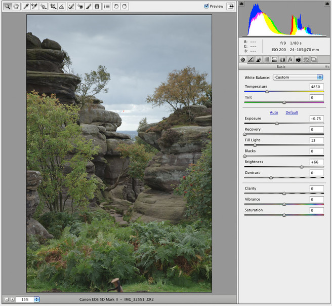
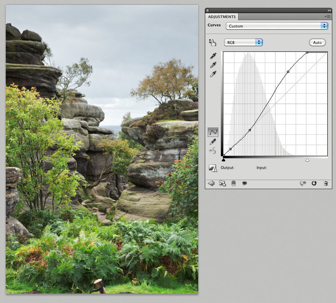
Let’s try this on an image. Here’s a shot I took at Brimham Rocks some time ago which used almost all of the dynamic range of the sensor on my 5Dmk2 and where I couldn’t really use grads effectively. My first step was to output an image that had as much of a spread from shadow to highlight as possible and in order to do this I opened the raw converter and switched off any contrast increases, used ‘camera neutral’ in the profile and reduced the exposure until I got no clipping. At this point the shadows may have been a bit dark so I used a bit of ‘fill light’ to bring these up a bit. The final result wasn’t pretty but it made a good starting point.
You can tell by looking at the histogram that the image is almost split into two halves, the sky and the ground. The sky has a big lump in the histogram to the right and the ground has one to the left. What I propose to do is to increase the contrast in the ground, ignoring what this does to the sky. So here goes.
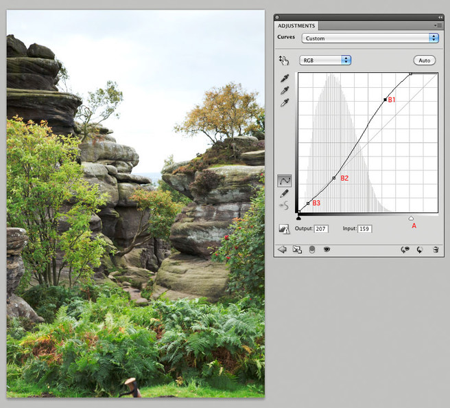
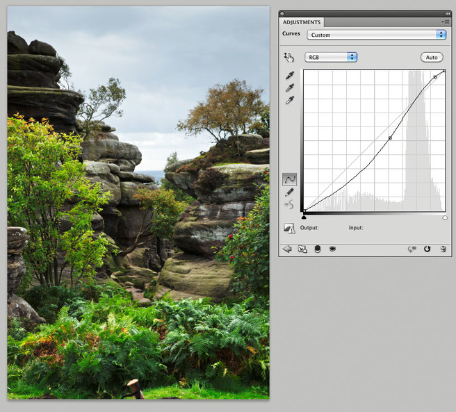
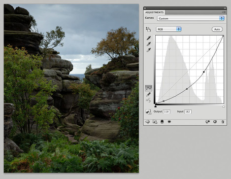
I’ve click and dragged the white point slider (the white arrow underneath the curve, A) whilst holding ‘alt’ on windows or ‘option’ on mac. This allows me to see if any area in the land is clipping the highlights. I adjust this until it looks contrasty but not too bright. I then add another couple of points to make sure the shadows don’t get too bright. These were B1 which lifted the lighter parts of the ground a little, B2 which pulled the darker bits down to create more contrast and B3 which stopped the darkest bits ending up nearly black.
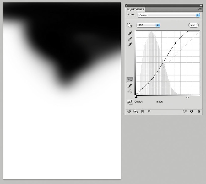
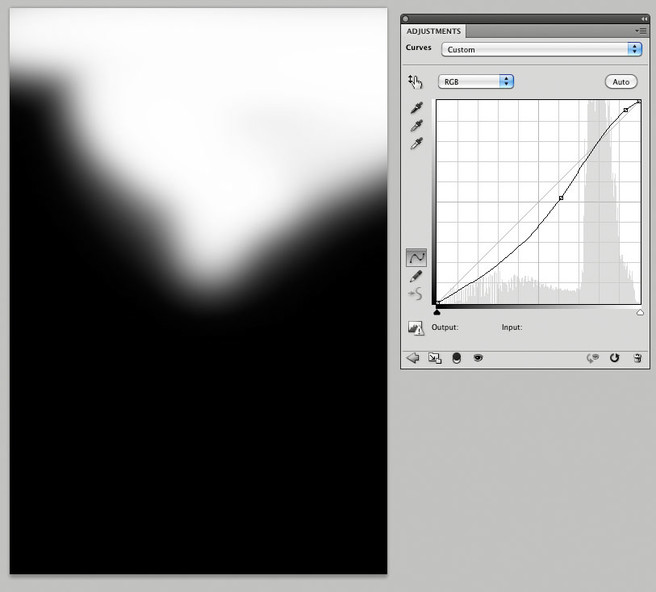
The next thing I did was to choose a black brush and to brush into the ‘mask’ on the curves layer, stopping the curve from applying to the sky. Start this by ensuring the mask is selected (click in the ‘D’ area of the layers palette if unsure) and then paint onto the picture using the brush tool with black selected. You should see the area of sky that is currently blown out start to reappear. You can preview the effected area by ‘alt’ or ‘option’ clicking on the mask next to the curves layer. (here is a photoshop video tutorial on masks)
You can use a variety of soft edged brushes and you can change the ‘flow’ in the options bar so that you aren’t painting 100% black straight away - allowing you to brush in the effect by stroking over an area multiple times. I like to use a soft brush of about 500-700 pixels for a typical DSLR file. You can tune this mask later on if you have problems with edges showing too much - just remember that softer is probably better. Preview the image small to check whether the transitions look natural.
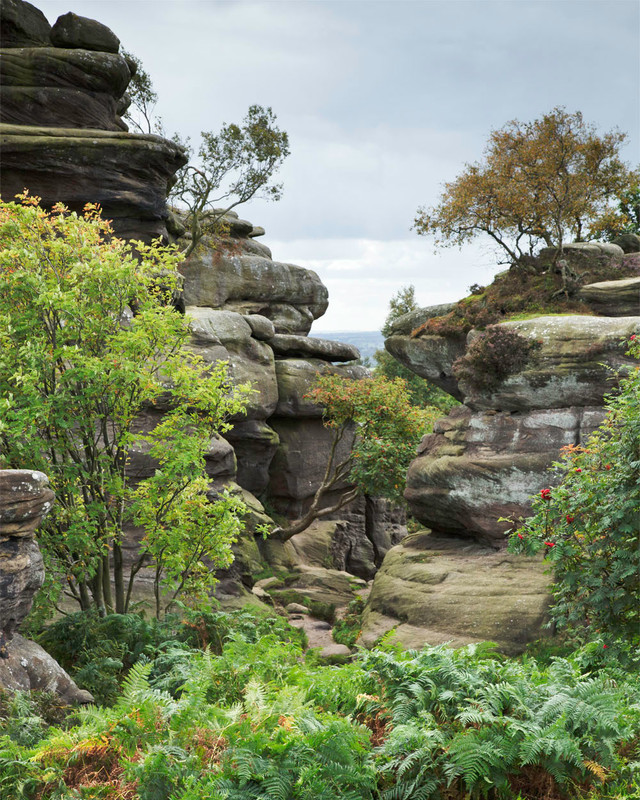
After you have done this you should have a nice contrasty foreground that has become fairly naturally saturated.
Next job is you can optionally do the same for the sky. Add a curve layer and add a curve that darkens the darkest part of the sky and lightens the brightest part. Don’t forget you can use the ‘hand’ button on the top left of the curves panel to allow you to place a control point on the curve by clicking in the picture.
And then you just have to use the black paint brush to paste out the curve so that it doesn’t affect the ground.
NB If you like, you could just make a selection in the sky, use refine edge to feather it and then add the curves layer - this automatically creates a mask. However, it’s often quite nice to see the areas being brushed in or out so you can interactively see the effect.
Using Shadow/Highlight
There is a quick trick to getting a half decent result which relies on the Shadow/Highlight tool doing the work for you (well - the Shadow tool anyway as the Highlight tool seems like the work of the devil to me).
Firstly you apply a big darkening curve to your image
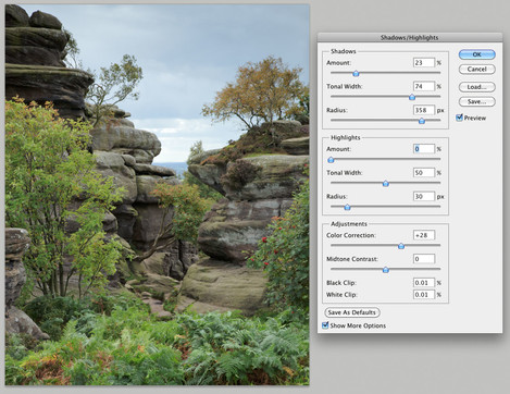
This provides contrast to the lighter half of the picture so check that the sky and lighter parts look natural. Next, you use the shadow tool to bring the shadows back up again. The shadow tool just happens to increase contrast whilst it’s doing so. I would recommend not using a radius less than about 10% of the picture size and preferably about 5-7% of the picture size. Here I used a 400px radius. You will have to use a tonal width of 60-80% and quite a large amount.
The results can be tweaked by altering the colour correction slider which actually applies a little saturation adjustment to the areas that are being brightened. Midtone contrast can be tweaked too but I rarely use it.
The Shadow tool example doesn’t bring anywhere near as much punch and colour to the image but it can work if you want a more subtle effect. Play around with the midtone contrast and colour correction and you can probably get close though..
NB - One precaution about using curves is probably worth bringing up. The first is that if you make large contrast adjustments to an 8 bit image, you may end up with 'posterisation' in the sky. e.g. If the sky was nearly all a nearly consistent blue colour that only spanned blue values between 200 and 210, increasing the contrast dramatically might mean that the individual transitions between 200/201, 201/202, etc can become visible in the picture as 'bands' of colour/tone. In order to avoid this, try to keep your images in 16bit mode until you have made most of the dramatic tone adjustments. This posterisation doesn't really happen when making normal tone/colour adjustments.

