OK - we've been keeping a place open for this one.. Nokia have just out specced nearly all of the camera companies in one fell swoop. The new Nokia 808 will have 41MP!! This looks like a typo when you first see it. FORTY ONE MEGAPIXELS! Well, my first reaction was - must be a fake - but no, lo and behold they've actually created a camera with more megapixies than Nikon's new D800.
The second thought is "Must be a marketing gimmick - there is no way they can make a camera that resolves 41Mp of data" - well, it turns out that they can. The first sample images have been release and I have to say they're pretty damned good.. no scratch that, they're stunning! Here's is a sample with some enlarged details following it.
Having done a bit of analysis of this picture, I'm pretty sure I can see near pixel level detail in those cables or at least 2px level detail. This is amazing for a lens never mind a sensor! The lens, out of interest, is supposedly built to a tolerance surpassing that of DSLR lenses, 10x so according to the PR surrounding this camera. I think this must be to do with the lens system, not the lens itself. I can imagine this to be true because just the construction of larger lenses - plastics involved, machining etc, may be a source of innaccuracies.
However they've managed this, it's damned impressive. Let's take a look at some of the specifications for the camera system.
Xenon flash with operating range up to 3.5 m depending on conditions. Automatic fill-flash
Focal length: 8.02 mm f/2.4 (35 mm equivalent focal length -26 mm, 16:9 / 28 mm, 4:3)
Lens: 5 aspherical elements, 1 group.All lens surfaces are aspherical, one high-index, low-dispersion glass mould lens
Shutter: Mechanical shutter with neutral density filter
Focus: Hyperfocal, Macro, Infinity and Auto; range - 15 cm ~ infinity
Automatic location tagging (Geotagging) of images and videos
16 GB internal user memory and support for up to 48 GB with an external microSD memory card
Weight: 169g
The standout information here are the Carl Zeiss lens... five aspheric elements and one full glass mould coated element. That's a pretty damned complicated lens! On top of this we have a 35mm equivalent focal length of around 28mm (3.5x crop factor) - nicely wide enough for landscape. The only sad news is no RAW but, hey, this is a phone camera!!
The specs also say that it can process 1 billion pixels per second, that means it should turn around a single image in about a 60th of a second (all else being equal).
The logic behind all of these pixels is to oversample the image. This has a logic in audio as well as photography. In audio, the highest frequencies we can hear are about 16kHz with some people managing 18 or maybe 20kHz. In order to get great quality audio though, we need to sample at 44 or 48kHz. Nokia are doing something similar to this and they are 'clustering' groups of pixels together, seven at a time, to create a single, very high quality pixel. Because the 7 sub-pixels should have all colours available then we should get good, moire free colour and because of the averaging effect, the noise should be very low. This means the camera will produce astonishing five megapixel pictures.
Here's a diagram and a a promo video showing the aspect ratio's vs megapixies..
According to Nokia ...
The starting point is a super-high-resolution sensor. This has an active area of 7728 x 5368 pixels, totalling over 41Mpix. Depending on the aspect ratio you choose, it will use 7728 x 4354 pixels for 16:9 images/videos, or 7152 x 5368 pixels for 4:3 images/videos as is shown in Figure 1:"
"Pixel oversampling combines many pixels to create a single (super) pixel. When this happens, you keep virtually all the detail, but filter away visual noise from the image. The speckled, grainy look you tend to get in low-lighting conditions is greatly reduced. And in good light, visual noise is virtually non-existent. Which means the images you can take are more natural and beautiful than ever. They are purer, perhaps a more accurate representation of the original subject than has ever been achieved before."
"With the Nokia 808 PureView, you get effective maximum aperture throughout the zoom range. Whereas with optical zoom, less light tends to reach the sensor as the zoom increases. At maximum zoom, 5.4x more light reaches the Nokia PureView Pro sensor than a broadly equivalent optical-zoom digital camera (f/5.6 as opposed to f/2.4). And this means you get the benefit of faster shutter speeds."
So there seem to be quite a few benefits involved here. What does this say about camera sensors though? Well there are obviously quite a few compromises involved here but, looking at the pictures it certainly seems like Nokia have produced a sensor that could provide the basis for movement beyond the current sensor designs. This 'oversampling' allows different colour sensor distributions and also introduces the possibility of have more than three colours (a hexacolor sensor filter perhaps with a clear pixel - perhaps that's why there are 7 sub-pixels?).
I expect this technology to make it's way into compact cameras quite soon which will make some interesting possibilities. For a start, at this pixel density a micro four-thirds camera could have an image size of 12,500px by 9,300px for a sum total of 116 megapixels.
A lot of people may say "What about diffraction?" - well, at the f/2.4 aperture that the lens has, the diffraction 'spot size' is 3 microns - this just happens to be twice the size of the pixel sensor. Handily, this means that diffraction is acting as a built in anti-aliasing filter, averaging the light over the (probable) different coloured pixels in a sub-pixel set!
What I expect to see is a 40-60 megapixel micro four thirds (or similar size sensor) camera built on this technology using down sampling to produce critically sharp 10-15 megapixel images.
Anyway - enough of the waffle..
Let's take a look at another picture. Take a look at the bottom right and corner - following this picture is a crop showing the car parked on the track.
You can download some more full size images here and here.
Here's one more for luck...
I'm sure we'll see more about this new phone in the up and coming days and I'll try to add links to those resources here.
There has been a lot of talk on the interwebs recently about the new Nikon D800 and the fact that it has been split into two product lines, the D800 and the D800e. For those of you who don’t know, Nikon’s new DSLR is a 36 megapixel blockbuster and for the ‘e’ options, you get to pay an extra £300 and have the anti-alias filter disabled. The fact that you have to pay to have something removed is not the subject of the article, merely a sad reflection of consumer pricing policy somewhat like the extra money you can pay to have the model number removed from your high-end BMW (“if you need the number to recognise the car”, so the logic goes “then you aren’t the person I’m trying to impress”).
Anyway, this article discusses what exactly an anti-alias filter is, why we’ve needed one for so long and why we now want it removed so much that we’re willing to pay enough for a high-end compact to have it.
Firstly, what exactly is an anti-alias filter - well let's backtrack a little - what exactly is aliasing and why are we anti about it? Well in order to understand this, we could do with some signal processing skills but we can get away with talking about fonts instead.
When you used to work on your computer doing some word processing or browsing the web, the letters are formed from an array of pixels. Letters can be quite clear when we have a large number of pixels but as we get smaller and smaller, letters become harder to read - this is especially true on older Windows computers. Here is an example..
What you can see here is a 400% enlargement of some text. On the left is the actual text, in the middle is what a computer would represent the text as if it only had black and white pixels and on the right is the text that has been anti-aliased. In short, this form of anti-aliasing uses shades of grey to represent areas that are part black and part white.
The aliasing problem can become more obvious when you take a look at lines, especially lines in close proximity. A well known test for aliasing problems uses a radial set of ‘spokes’. The diagram below shows what happens when we try to ‘downsize’ a set of these spokes.
The set of lines were 5 pixels wide on my display and I added them at two degree intervals which is shown in the first picture.
My first ‘reduction’ took the image and reduced it to 20% of it’s original size (to give 1px width lines). You can see that where the lines get closer together, we are getting almost concentric circles. These are caused by the areas of grey that are used to make the lines less jaggy occuring next to areas of gray in the next line. These patterns are called moire (pronounced like soiree).
Now this is typical of the sorts of patterns that digital cameras are susceptible to. The last image in the diagram shows an image that has undergone the same amount of reduction but was slightly blurred before being reduced (by 2px using gaussian blur).
This is what the anti-alias filter in a camera is typically doing. It is adding a small degree of blurring to the image coming from the lens in order to prevent the types of moire pattern shown above. These patterns typically occur in clothing but also occur in tiles on rooves, brickwork, fences, etc.
But digital sensors are a little bit more complicated than just black and white pixels. The typical colour sensor also red green and blue pixels but not for every pixel. So for red colours the camera only has a quarter of the resolution or half the number of red pixels in the horizontal and vertical direction. This means the camera is twice as susceptible to colour moire for red colours. The same is true for blue colours and green is about 1.5 times as susceptible.
What this means is that we need to have a bigger blur radius to solve colour moire than to solve black and white moire effects.
The problem with cameras is we can only have one or the other - we either have a big blur that helps with colour moire or a smaller blur that helps with black and white moire only.
Whilst cameras have been used to print at almost their maximum resolution, moire has been a reasonably visible problems. Colour moire is typically in patterns that are 2px wide and hence even small patches are fairly visible. However, as cameras increase in resolution, some of these effects become less and less obvious. This increase in camera resolution is like the increase in monitor resolution we have seen over the last few years. Text on monitors has looked better and better as monitor resolution has increased.
This increase in resolution has led camera developers to think more about removing or minimising the effect of the anti-alias filters - the only problem is that some anti-alias effects are visible no matter what the resolution of the camera. The worst of these are usually clothing materials for fashion photographers where the moire not only adds strange patterns but also adds colour shifts and patterns. For example, the image below (copyright “Nadine Ohara” photo.net).
This probably one of the worst examples of moire I have seen (taken with a Canon 5D) which goes to show that having an anti-alias filter cannot solve the problem completely.
Post processing can help with some of the effects of colour moire, typically by just blurring the colour channel though (with possibly some clever identification of typical moire colours and intensities).
How Does an Anti-Alias Filter Work
I admit to not knowing this completely before reading around the subject. An anti alias filter is typically called a ‘blur’ filter and, whilst some cameras may do this, most cameras use a birefringement (http://en.wikipedia.org/wiki/Birefringent) material that splits light into two separate paths. For example, the image below (from wikipedia) shows some text being split by a ‘birefringent’ material.
If you use two peice of this material with one peice rotated 90 degrees, you can split the image into four separate sections. Tuning the distance between the four images can give you the effect of a ‘blur’ without throwing away lots of extra information.
The following diagram shows that the nikon D800E has two ‘birefringent’ layers but that one of them cancels the other one out. This probably makes manufacturing simpler as Nikon only have to alter one component rather than having to recalibrate the sensor layer for the D800E (the different optical parts affect focus slightly so removing them would mean positioning the sensor differently).
It will yet to be seen but I have my suspicions that there will still be a small anti-alias or blurring effect introduced by the two low pass filters and the optical elements (whatever they are). Without them, there would be luminosity moire introduced which would be a lot harder to correct using software.
One of the interesting things we noted during our Big Camera Comparison was the difference between the 5Dmk2 and the D3X - most notably that the 5Dmk2 had a lot weaker anti alias filter. If you look at the two results, it’s fairly clear that the 5Dmk2 has colour effects around areas of high contrast detail whereas the D3X has very little. It’s also clear that the D3X is showing some luminosity moire - see the area marked ‘L’ on the picture. This shows some of the trade offs the manufacturers have to make.
The other interesting result was that the effects of moire diminished at smaller apertures (see the picture below). This comes as no surprise when you think about diffraction as a blurring effect in itself - hence for photographers having problems with moire, stopping down may well help considerably. (Since writing this I’ve been told that this technique is discussed in the D800 technical manual)
This leads us to presume that other ‘blurring’ techniques can help with moire effects, for example - blurring because of bad technique, defocusing slightly, adding a couple of extra UV filters, breathing on the lens; all of these will diminish moire effects to one degree or another.
In fact, one of the clarion calls of high megapixel critiques is that lenses are not good enough for the sensors anyway may actually be an advantage to these high resolution sensors. Using a poor lens may just introduce enough blurring or abberation to eliminate moire completely (so having that stock zoom lens to hand may be a good thing!).
Conclusions..
In summary - an anti-alias or blurring filter of some sort is a good thing under some conditions. The effects of moire are difficult to remove consistently and hence people shooting a large range of subjects are recommended to go for a camera with an anti-alias filter (or a camera with a high enough resolution to out resolve moire causing patterns, e.g. material patterns in clothing at typical distances).
Moire removal tools are quite blunt instruments and typically remove it by blurring the colour channel. Quite often moire shows itself as colour fringing in areas that already have fine colour detail and hence is impossible to remove without damaging colour texture.
Aliasing issues exist in just the brightess channel and no amount of moire reduction can remove these.
There are ways to minimise moire when you have no anti-alias filter though, stopping down being a prime example and one compatible with most landscape photographers work.
I hope this short guide has helped you understand the issues with the removal of the anti-alias filter and ways to overcome them. Feel free to ask any questions below...
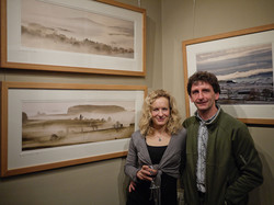
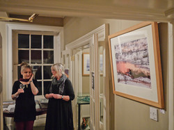
We’ve reviewed Olaf’s ‘Above Zero’ in a previous issue and we were equally enamoured of it’s aesthetic sensibilities with its depth of seeing and the story it carried. We contacted Neil McIlwraith at Beyond Words to ask about other books and he recommended we take a look at ‘Broken Line’. From first opening, we knew we were unlikely to be disappointed. The tipped in picture on the front cover and the embossing of the Greenland coastline on the pale blue cloth cover all pointed to an attention to detail that is carried on throughout.
This book documents a journey (or, possibly more appropriately, a broken journey) that Olaf took between 2003 and 2006. He decided to take his 8x10 camera from one end of the Greenland coastline to the other, a task made slightly more difficult because it has no roads at all and travelling by boat is extremely dangerous. The photographs were mostly taken in the summer months, when it is always light, and shot in the middle of the night when twilight lends the landscape an otherworldly look.
But more than these aesthetic considerations, it is the documentary nature of each photograph that suggests the transient that is particularly interesting. Each image has a GPS location and time associated with it - each picture pinpointed in both time and space. This message is that of impermanence. Even the photographs of the occasional habitation look transitory, houses perched on a bare rock, possessions scattered on surfaces. The overall feel of the book is of a document of change, transient beauty with the occasional human punctuation.
These aren’t all political statements though, Olaf allows the viewer and the essays to make these statements. The pictures can stand on their own as beautiful, formal compositions using exquisite light and each taken with an obvious attachment to the subject matter. From the mist wreathed icebergs of the introduction, through the bare, ice ground rocks and rugged cliffs to the occasional settlement - all the more shocking for the mess surrounding them and the detachment from the beauty of their surroundings (even the the point of hanging pictures of Nordic kitsch on the only interior wall shown).
The whole work is a study in how romantic photography can integrate with a fine art approach to create a work of beauty that can also act as both a documentary and philosophical work. A book that can work on multiple levels and one that I enjoyed immensely.
You can buy ‘Broken Line’ from the Beyond Words website.
Takeshi Shikama - The Silent Respiration of Forests
I had seen Takeshi Shikama’s ‘Silent Respiration..’ series before on a couple of websites and was very impressed with the beauty of his platinum-palladium prints of exquisite forest and flora subject matter. I was hoping that this book would be more of this work but was disappointed to find that it the subject matter was more homogenous and consisted of a set of silver prints, not the platinum prints I had seen. This is not to say the photographs were poor but they did not excite me in the same was as the material I had seen originally. The book is also difficult to browse with a tight binding that doesn’t lay flat without a lot of pressure. Overall a little disappointed. If you want to see the work I would like to see made into a book - take a look here (http://www.klotzgallery.com/?page_id=2576).
Sean Scully - Walls of Aran / Mariana Cook - Stone Walls
I’ve had in the back of my mind for some time the idea of creating a body of work based around stone walls but always had in the back of my head that somebody must have done this before. Whilst browsing around Amazon recently I saw two books about the subject matter that reminded me of these thoughts. The first, “Walls of Arran” by Sean Scully looks more my cup of tea - working with a limited subject matter and location, the opportunity for self expression was there and with a publisher such as Thomas and Hudson. Sadly this book turned out to be more of a poor typology of walls - seemingly poorly reproduced at varying levels of (sometimes inappropriate) enlargement. I tried to spend time with the book to discover something beyond straight reproductions, something that would reveal itself in the patterns and rhythm of the pictures. Alas, no.
However, the book I purchased that I was unsure about, Marianne Cook’s “Stone Walls” turned out to be the book I was looking for. Its cover had what looked like another Aran stone wall (albeit well produced) but I shouldn’t have worried. Mariana has travelled around the world from her home in Massachusets to places as far afield as Ireland, Mediterranean, Peru, Britain and the US.
The book is divided into three main chapters, Personal Boundaries, Containment and Back to Earth plus a series of essays on each location by Wendell Berry. Personal Boundaries shows the walls from a distance, Containment from close up, details and fine structure and Back to Earth shows the decay of stone walls.
The images are uniformly good but many are beautiful. All simple, square black and white images with very little obvious treatment. I later found out that Mariana Cook was one of Ansel Adam’s last protege and this shows in the balance and poise of the compositions. The photographs of the White Peak in the Peak District recall Paul Hill’s work and at times an echo of Goldsworthy appears (a well known natural landscape artist but lesser known photographer).
The book is the antithesis to Sean Scully's, this is about photography in its role as narrative and art. The pictures show the similarities and differences between human constructs, from ramshackle make, do walls as purely functional barriers to the perfection of the South American constructs and the beauty of the British enclosures (interestingly, Mariana chose to photograph a Goldsworthy wall
Gus Wylie - Hebridean Light
Gus Wylie is a photographer I knew very little about. The name rang a few bells from snippets in the popular photography press and I had seen his book on the shelves of a tourist centre in Lewis on my own trip to the Hebrides in 2005 so this book was an introduction for me. The book itself isn’t what you would really call a landscape photography book, it is more in the genre of the photo essay and it is its narrative that attracts. We aren’t looking at a photographer who has spent his time perspiring over the minutiae of formal composition or that works producing perfect prints, Gus seems to use the camera as a tool in the vein of Lartigue's ‘eye-trap’, an extension of his vision, recording moments of his experiences to create a very personal record of the Hebrides. Much of the content is documentary in nature, sheep shearing, tweed production, pictures of families outside their homes, seaweed gathering, etc. but it’s the occasional gem such as the play of the fish scales and wet sand ripples or abandoned church window, thistle and shaft of light opposite a carved gravestone. If you are just after landscape photography, this book probably won’t interest you too much but if you want a slice of what the Hebrides is about and an example of a great photo essay it’s well worth a look.
In this issue we’re talking to Hampshire/Cornwall based photographer Baxter Bradford whose prints from around the granite coastline and Kimmeridge I first saw whilst staying in the Mount Haven Hotel near St Michael’s Mount.
In most photographers lives there are 'epiphanic’ moments where things become clear, or new directions are formed. What were your two main moments and how did they change your photography?
The first ‘moment’ is more of a protracted phase. I learned to slow down, somewhat by necessity as I tried to operate a second hand Bronica SQA on a tripod. This was just as the books and magazines say would happen, despite me thinking I was perfectly capable of hand-holding the camera. With this combination and a book I’d found in Waterstone’s of wonderful square landscape photographs by someone I’d then never heard of, called Charlie Waite the blue touchpaper was lit. I found an amazing internal motivation to do significantly better than I had with my Nikon SLR, this had been sold to help fund the SQA. I soon found that I was taking better family pictures on the Contax T2 too. About six months afterwards, my late father-in-law showed me his Gandolfi traditional 5x4 camera and tripod which the brothers had made in their Peckham workshop. We had a very funny weekend trying to take a few pictures with it near York. One of us read from a procedural checklist, whilst the other fumbled with the camera controls and keeping a darkcloth over their head. He suggested I borrow the camera for a few months. Initially my aim was not to be defeated by a wood and leather contraption. Having managed to get a place on a Joe Cornish L&L workshop at Bedruthan steps, he encouraged me to take it along. Things started to fall into place as I found how to make things work for me. That summer I bought an Ebony RSW off spec as it was the first batch and none had been seen.
The second moment came as I was sitting in the audience of a camera club, with a judge talking about what was to me, the stand-out print of the evening. He said, ‘it’s a lovely image, but it just isn’t competitive photography’. The penny dropped. I didn’t want to be a competitive photographer, I knew what I liked and didn’t need to make images to please a camera club judge. Shortly afterwards I was lucky to arrange a deal whereby I sold my pictures at Habitat in Bournemouth and it seemed their customers were happy buying my non-competitive prints.
Tell me about why you love landscape photography?
It is an opportunity for me to get out to a location in our wonderful countryside, to observe the latent beauty and solve problems working with light, form and the technical issues that using a camera entails producing something original that looks elegant and coherent, yet with hidden, subtle content. I’m constantly seeking to find new ideas, interpretations and ways of seeing; even if I’m not often successful!
Could you tell us a little about the cameras and lenses you typically take on a trip and how they affect your photography
I have a Kata Bumblebee 220 bag which houses my Phase One 645DF, P45+ back and four lenses (28, 45, 80 and 150mm). There is also a set of Lee filters, holders and adaptor rings. These cover all my needs, though I would dearly love Phase One to release a tilt/shift lens or a windfall of cash for a Linhof Techno and 3 prime lenses…. Otherwise, I have a Lumix LX5 and a Nikon D7000 with 16-85 and 35mm f1.4 lenses. The latter I bought when I went to Hawaii last summer with my children. I couldn’t justify the risk and hassle of taking the expensive gear. The Phase One system is so easy to use that the other cameras are only used if I’m out with the children, on my bike or at a gig.
Investing in a high end digital system was quite a step - how has the experience been?
I started looking at the prospect of switching to MF digital 2 years ago taking delivery in the summer of 2010 following the sale of my LF film equipment. There have been many things to learn, but then that’s an integral part of my enjoyment of photography. I still laugh at my early errors with a 5x4 camera. Without camera movements, there are times when I need to focus stitch, usually, this is with the 80 or 150mm lenses. Occasionally, I realise that I’ll need to blend exposures, but find this process tedious, so have only done a few.
In terms of quality, I am extremely happy with the quality of the P45+ back and viewers haven’t been able to distinguish between P45+ prints and my LF film images which were scanned using my Imacon Flextight (soon to be for sale!). As such, I find it hard to believe claims that the P45 was at the bottom of the print pecking order in the recent test conducted for this website.
Tell me what your favourite two or three photographs are and a little bit about them.
One of them has to be this
First light – St Michael’s Mount
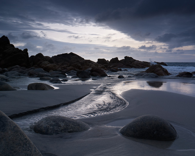
I was starting to love the Far West of Cornwall and a very early start on a tranquil summer morning saw me shoot a lot of film as twilight developed I moved up and down the beach. Soon the Mount was sunlit and I was the only one on the Causeway. It was taken on my Ebony 45SU with RVP50 and a 0.6 hard ND grad with possibly a 0.45 soft down over the water. The halo around the mount is entirely natural and this is a straight scan of the transparency. After taking this, I switched to landscape format and had sunlight on the causeway, but this made it too dominant and overpowered the Mount itself.
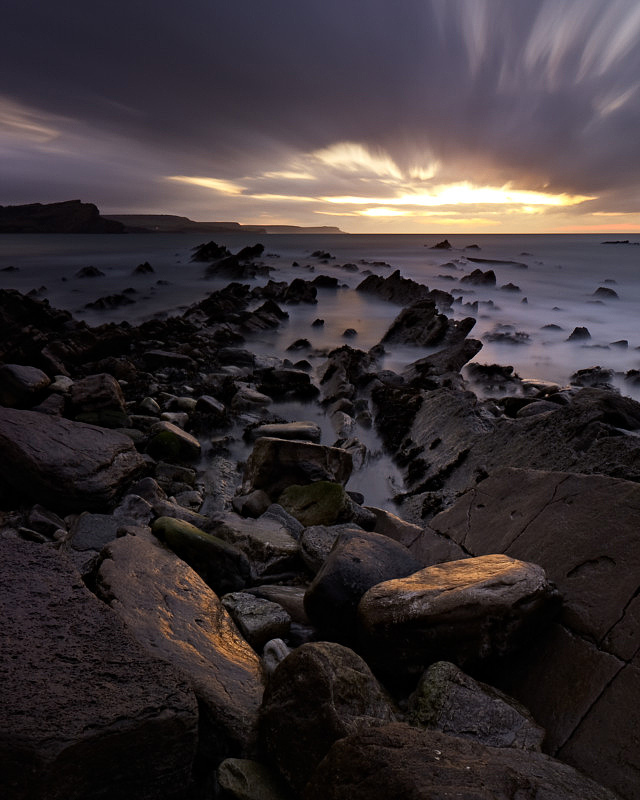
Two minutes at Dancing Ledge
This was my First visit to Dancing Ledge in Dorset. Paul Franklin had been previously and made a great image with light reflecting off the wet cliff. Having walked down in the dark, conditions were rather different. There was a strong F7-8 South-Westerly blowing and really loud crashing waves. Having set up my shot in near dark, the light meter pretty much read Zero. So I guessed I’d need an ND grad and placed it diagonally. The title comes from the exposure on RVP50 allowing for the one stop of reciprocity. This was my first long exposure image. I like the way the clouds have blurred, but most of all how serene it looks, a far cry of the reality of spray reaching 10m up.
Wavelight
This is from last year and marks a new direction for me. Made with the Phase One 645DF and P45+ with 150mm lens. It’s quite a crop from the full frame and I’d like to think of it as more than a happy accident. I could see this lovely light shining through breaking waves and wanted to see if I could photograph it. I’ve made many subsequent visits and not achieved anything quite as pleasing, but I’m getting better! The conditions needed are exacting, right tide, swell direction, with strong sun and little wind. This viewpoint is pretty precarious and I got a wet camera trying somewhere else.
What sort of post processing do you undertake on your pictures? Give me an idea of your workflow..
I like easy, in all walks of life, though sometimes this proves elusive. Where possible I still try to get things right when pressing the shutter, so use Lee Filters etc. I use Capture One for the RAW processing and have some basic adjustments which I make on import such as a slight contrast ‘S’ curve, metadata etc. Horizon gets levelled and I crop to 5x4 the vast majority of the time. Typically all I touch is White balance, default lens corrections and sharpness. Sometimes I alter saturation slightly (up & down) and use the advanced colour editor to tweak colours. Adjustment Layers are used to balance exposure that couldn’t be achieved at time of exposure with ND grads. For B&W I convert using Silver Efex Pro 2 and focus stitching is performed with Helicon Focus.
You have your prints exhibited in a few different locations in Cornwall, can you tell us a little about how you produce your prints and how you went about finding places to distribute them
I print all my pictures myself using the workflow which I explained in Issue 7 on an Epson 7800 printer using predominantly Photo Rag 308gsm paper. I have been fortunate to make some good friends in Cornwall. I’ve gained their trust and so they see what I am doing and try to sell my pictures to help me pursue my quest to show aspects of their County at its best.
Tell me about the photographers that inspire you most. What books stimulated your interest in photography and who drove you forward, directly or indirectly, as you developed?
In the last few years, I’ve spent little time looking at photographic books, but have a reasonable collection. I tend to like quietness in pictures, Werner Bischoff, Josef Sudek, Alfred Eisenstadt, Michael Kenna and Yousef Khanfar. The humour of Elliott Erwitt appeals too. Andrew Nadolski’s End of the Land has been instrumental in developing my way of seeing. I feel privileged to have bought an Eve Arnold print of a Cuban woman in a bar with my LPOTY prize money. In terms of personal photographic development, I have been helped enormously by Joe Cornish and David Ward during their workshops and through their books. They have my utmost respect for their vision, skill level and motivation. I’ve thoroughly enjoyed the time spent in their company.
If you were told you couldn’t do anything art/photography related for a week, what would you end up doing (i.e. Do you have a hobby other than photography..)
This is frequently the norm! As a single parent working full time teaching Maths, there are many weeks where I don’t touch the camera or feel the need to go out and make pictures.
I love doing a myriad of different things and am master of precisely none of them. When at my house at Sennen in Cornwall, I surf and walk on the beaches or cliffs. There’s always something to do. Here in Lymington, I am frequently out on my mountain or road bike, I also paddleboard and windsurf. When I’m feeling brave, the Tenor Sax comes out for a short blast. I’m currently trying to learn Pro Tools 10 software so I can help my children record their music in a spare bedroom. Photoshop was easy in comparison. The poor state of my garden is evidence of the neglect it experiences…
What sorts of things do you think might challenge you in the future or do you have any photographs or styles that you want to investigate? Where do you see your photography going in terms of subject and style?
I am increasingly being motivated to make images with waves. 'Wavelight' has inspired me to try to do a series. Despite the difficulties, or perhaps because of them, I feel that I must see if I can realise the potential that is inherent in this type of picture. It may mean that I need a waterproof housing and to use a tripod and wetsuit.
Who do you think we should feature as our next photographer?
Paul Whiting is always coming up with wonderful new interpretations. If we go shooting together we end up with very different images. Matt Sampson also has a fantastic way of seeing images and creating superb artistic prints.
Thanks to Baxter for a great interview and if you want to see more pictures, take a look at his website, Flickr stream or Facebook page.
I don’t know if you are like me but sometimes our best pictures are those we have in our heads; the shot we would have taken if only we had a camera with us, or if only we could have got the camera out of the bag and on the tripod in time before the light changed. You probably know what I mean.
One of my ‘best’ pictures was ‘taken’ in 2005 standing at the face of Franz Josef Glacier on New Zealand’s South Island. The sheer scale of that monumental wall of ice, the subtle shades of blue in the ice... I could go on. It should exist, I knew where I was going to place the tripod, I knew what light I would need. I knew because I had been there before.
In 1999 I was heading to Australia for a holiday to visit family. As the plane was going via New Zealand, my cousin Tony suggested he fly up from Melbourne and we spend a week driving round the South Island. He was thinking white water rafting, bungy jumping and beer. I was thinking white water rafting, bungy jumping and beer... and photography. That was until he, in that delightfully succinct way of explaining things that Australians have, said “And I am not standing round while you photograph bloody rocks”.
We did have a great time, the weather was exceptional and I must admit I did forget about taking ‘proper’ pictures. It was only by chance then, that I carried my Bronica with me when we set off to walk to Franz Josef Glacier. We followed the easy path along the valley floor to the glacier. Even from miles away it was one of the most amazing sights I have ever seen. It was slightly surreal that the sky was blue and it was baking hot (I was even in shorts and a t-shirt). The sun was reflecting up from the silvery rocks on the ground and it was the only time that I have managed to get sun burned on the underside of my chin. I couldn’t believe that we were able to walk right up to the glacier face. We found some steps carved into the ice for ice climbers so we climbed up - even making our way across a crevice via part of a broken ladder conveniently left there. Realising that training shoes probably didn’t class as ‘appropriate footwear’ we descended. At the base, and by hand holding my Bronica, I managed to get a photograph of the melt water pouring out from underneath the glacier.
On my return to the UK that ‘snap’ began to haunt me. What would it look like taken in subdued light; shot on 5x4; 10x8; a dyptch; no wait, a giant dyptch? I just needed to go back and actually shoot it.
Fast forward to 2005. I was on my way to Australia with my wife-to-be Maria. We had planned on combining a holiday with getting married and I suggested a quick detour via New Zealand (you can probably see where this is going).
Maria was slightly suspicious when she saw me packing my Hasselblad and tripod (my 5x4 would probably have given the game away). I faithfully promised her that it wasn’t going to be a photography trip but “I might want to take a few snaps of the odd glacier if we happen to find one“.
We left Christchurch in beautiful sunshine but as we drove over the Alps in our camper van the weather started to change. Maria was disappointed but I was thinking “perfect for glacier photography”. As we neared the glacier it started to rain. I don’t mean English rain, I mean big wet monsoon type rain. We set off on the walk to the glacier “Its got to ease up at some point” I naively thought, “it has to, my photographic destiny awaits”.
However as we got nearer I realised there was a major problem; the river of melt water, now a raging torrent, had changed direction blocking the path and we couldn’t get to the glacier face. We watched some people on an escorted ice-walking trip wade waist deep through the icy water to get across, only just avoiding being swept away because they were roped together. Meanwhile the rain started to seep into everything. My trousers were so wet that the water was now running down my legs and filling my walking boots.
Evoking the British Bulldog spirit I announced that I was going to wait here until it stopped raining. Maria stood with me for half an hour before eventually deciding to head back to the camper van to try and dry off. I stood in the same spot for over an hour before eventually, it started to dawn on me that it wasn’t going to stop and that it wasn’t a passing shower.
I set the tripod up and got out the camera. I just about managed to focus the lens, looking through a pool of water that was starting to fill the waist level finder. I took a couple of frames before having to tip the camera upside down to empty out the water.
On the long walk back to the camper van I started to wonder whether I could suggest we “wait around awhile” in case the raging river of meltwater subsided a bit. We were getting married in less than a week and I realised that my suggestion, however subtle, might not be met with tremendous enthusiasm.
Maria was then subjected for the next few days with my grumpy moaning “it wasn’t like that last time I was here”.
My masterpiece is still there in my head, I can see it clearly. One day....
_____________________ Andrew Nadolski has realised that sometimes it is best not to combine photography with non-enthusiastic friends and/or, wives to be. He is currently planning his return trip and is looking for a pair of fisherman’s waders.
I’ve written quite a bit about using curves to adjust tonality and brightness but curves can be a lot more flexible tools than this. The fact that curves are split into red, green and blue components allows us to adjust the tone of a picture and to do so at various brightness points. So, for instance, we can change the colour of the shadows in one direction whilst changing the highlights in another direction (e.g. cool shadows, warm highlights but leave midtones alone). This is particularly apt as Lightroom now includes curves adjustments of the red, green and blue channels in a similar way to Photoshop.
General Colour Balance
The first thing that most people will do with the colour components of curves is to play with the white balance of a picture. The ‘noddy’ way is to use the grey color picker as shown below (click on the central ‘grey’ eye dropper icon and then find a neutral subject in the picture).
When you 'pick' using the grey eye dropper, Photoshop adds a middle point to each of the red, green and blue curves and then adjusts each of them until the point you selected has no 'tint'.
"Rolling Back White Balance"
It's worth noting that very often you don't want to eradicate all of a 'tint' or 'cast' in a picture - the subtle natural colour may be positive in small amounts and so it's sometimes useful to use the opacity of a layer to 'roll back' some of the correction; keeping a little bit of a cool cast in a twilight shot for instance.
By default, Photoshop uses an eyedropper which is a single pixel in size. This can cause all sorts of problems if you have a textured surface or a noisy image. Even an area of uniform grey will probably be made up of lots of different pixels that just happen to average out to grey when seen from a distance.
In order to prevent this from happening, you can set the eyedropper to pick up a circle around the area you click of a certain size and it will then average all of the pixels in this circle to calculate an average colour. To get this to happen, you choose the eyedropper tool from the tool menu and then in the options bar there will be a drop down allowing you to pick a 'sample size' from 'point sample' up to a 101px by 101px area. I normally choose 5 by 5 (or 11 by 11 if I'm working on a very high resolution scan). NB Make sure 'sample all layers' is selected too!
The image above shows the 'eyedropper' tool selected and the drop down to select the different sample sizes. It also shows a 'colour sampler' surround that shows a larger representation of the colour being picked (very useful to see just what the colour looks like in a large colour field - very often it's difficult to work out what a colour looks like when sitting in the context of a picture).
However, in most pictures you are unlikely to find anything that is quite neutral so the typical use will be manually adding points. This isn’t as difficult as it sounds but does involve knowing a little bit about colour opposites and the ability to recognise casts.The fundamental things to know are that cyan is the opposite of red, magenta is the opposite of green and yellow is the opposite of blue.
For some other colours, like the classic cool/warm balance, you need to use ‘in between’ colours, for instance to warm a photograph you need to increase the red level and decrease the blue level (because orange is a mix of +red and +yellow and +yellow is -blue) and the opposite for cooling (-red & +blue).
Adjusting colour like this does not require more than a single point adding to the middle of the curve.
Making targeted adjustments
Sometimes colour casts don’t affect the image across its whole range or alternatively we want to apply a colour adjustment just to the shadows or highlights. For instance, quite often in landscape work, adjusting the shadows to make them slightly cooler can improve the look of an image. The following video goes through using the basic ‘eyedropper’ tool to set the white balance of a picture and then discusses using the curves manually and finally looks at setting different colour corrections for highlights and shadows.
When not to use curves
I find that nearly all of the corrections I need to do can be performed using curves either as discussed above or by adding masks (as discussed in a previous ‘curves’ tutorial). However, there are a few different situations where I use different colour corrections
1) Problem colour balances - quite often it’s difficult to see exactly what is happening with a colour cast. This is especially so when you’ve been working on an image for a while and you brain starts to auto correct things for you (how nice of it! google ‘colour constancy’ for more info). In this situation, it’s quite useful to ‘break’ the connection with your eye and the original picture.
The colour balance tool is good for this because you can easily add too much colour correct to a highlight, midtone or shadow and then gradually bring the colour back to normal. In this way, you tend to ‘forget’ what the original image looked like and hence are approaching the correct result as if for the first time. So, open colour balance, pick the midtone selector and then take the red/cyan controller and swing it to either end of it’s range so that you end up with a heavy colour cast. Once you’ve done this a couple of times (to con your brain into giving up trying to balance things) you can then start to bring the controller back toward a more sensible setting. Don’t look at the settings though! You want to use this technique blind if possible. Once you’ve finished with red/cyan, move onto green/magenta and then blue/yellow - you can play with the shadow and highlight if you want after this.
2) For ‘selective’ colour. Sometimes you don’t want to correct a colour cast over the whole picture but the subject matter, your camera or a light source has caused a problem with a particular colour. As discussed in previous issues, green is a particular problem with many cameras or films. I use ‘selective colour’ to target an individual colour (foliage is better addressed as yellow in this case - odd I know).
3) Adjusting the hue of a colour. The only real tool that does this well is the hue saturation tool - this is pretty hairy stuff though and I have rarely used it and only then to fix a problem when printing a particularly out of gamut colour or to tweak colours to make them look more like Fuji Velvia film. It’s probably best to come back to this one in a future article
We'll look at some of these examples in a future issue. In the meantime, please feel free to ask any questions below and we'll add to the article if we can explain things further or add more examples.
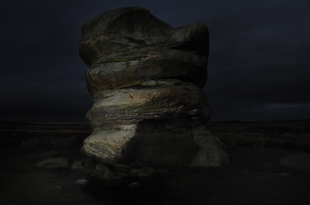
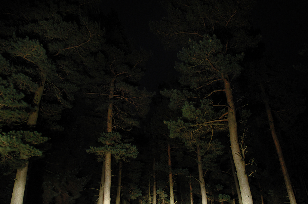
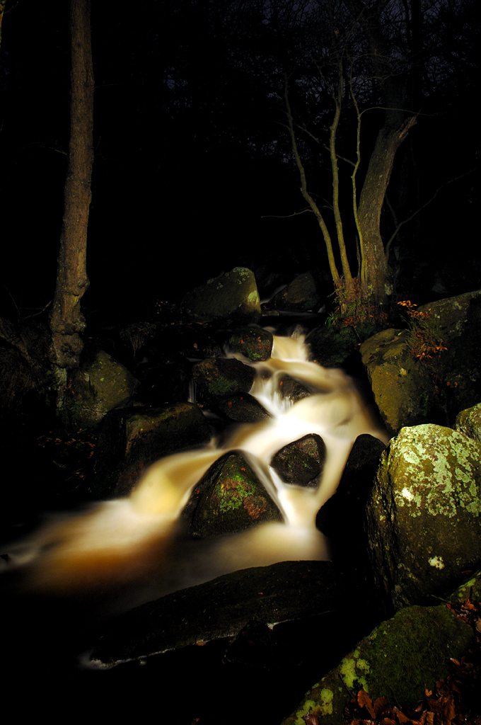
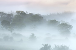
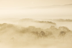
It was only a matter of time before I ended up loitering in the countryside at night.
This series is my attempt at challenging my own relationship with and understanding of the landscape around me. When I was contemplating my next project, night time seemed an obvious choice for a few reasons. It would be technically and physically difficult and would certainly initially be fairly unpredictable in terms of what I would achieve photographically. Starting with no plan was as good a plan as any. I didn't really have any idea what was going to happen and there was a lot of trial and error. In fact there still is. I'm fully aware night photography isn't a new thing and I'm hardly cutting edges or blazing trails but I wanted to explore the heavily photographed landscape of the Peak District in a new way. I wanted to find a balance between the application of fine art photography, satisfying my own creative needs and making something that can be appreciated by a wider audience.
All the images to date were made in the Peak District, which can have a sense of foreboding that I wanted to accentuate by photographing it at night. The initial photographic results were encouraging and I started to formulate the basis of a long term project. I also received very positive feedback from a broad range of people.
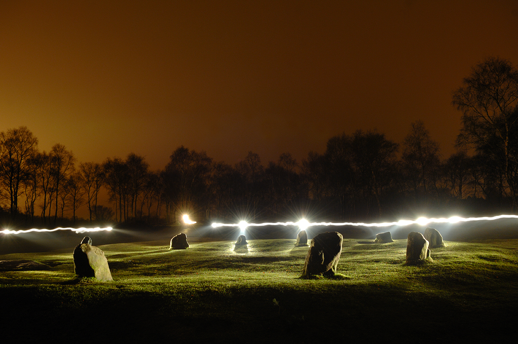
In terms of making the images the whole point of the project was to use artificial light to create a sense of unreality and get viewers to question the photographs, making a series of well known landscapes into something different, possibly an uncomfortable difference. The idea was that I closed off all non essential aspects of light (that I could) as a way of purifying the subject matter. I could then choose to illuminate certain parts of the landscape or allow others to do the hard work for me, as in the Winnats Pass light trails image.
I used various lighting sources. I started with a 1,000,000 candle power torch. This proved effective yet very time consuming due to the long exposures and as usual was never guaranteed to get anything that resonated. I managed maybe four or five shots per shoot. I also used my car headlights to light some of the tree shots but most recently have resorted to using off camera flash. This allows a modicum of control the torch doesn’t offer and I have found planning shots easier and the results I envisaged more achievable.
Other difficulties are getting to and from your location safely and the dreaded composition. Generally I have an idea of what I want to achieve and set out in daylight to compose the photograph. Then it's a case of hanging about till darkness falls.
The biggest problem was overcoming the nervous reaction to sometimes being a long way from anywhere on my own at night. I haven’t always found making the images to be an enjoyable process. It is a strange side effect of the project. When you're working you don't notice but it's always there. All those bad dreams and childhood imaginings reappear. At first I didn't think that this would come across in the photographs but looking back over the series so far I feel they encapsulate some of these emotions. I probably need to man up a bit.
I will keep going with the project for another year or so. It's always running in the background and I intend for it to be the basis for an exhibition and finally a book. In terms of this series of photographs I will be heading further afield to locations around the country to let the project evolve. The next trip is to the Norfolk coast for some late night work by the sea. Should be a mission but the harder the photographs are to make the more I seem to love them.
You can see more work by Al Brydon at his website or Etsy.. Here are a few more photographs from this series
As landscape photographers we are fundamentally solitary predators. Away before the dawn and skulking home long after sundown. Shying the pack culture. Lost in "the zone" of image capture meditation. It is a personal space of peace and calm I love to frequent. A place I feel I am at my best, away from intrusions and thoughts that invade much of the reality of the every day.
And indeed, when seeking to express through the lens ones thoughts and emotions of the scene before us I for one find myself horribly distracted when I feel constrained by the presence of external undesired intrusions. When out with other photographers whose style I know I have in the past found it difficult not to be influenced by their presence and have even found myself creating images that reflect their work more than my own. Time to retreat to the comfort of being alone with my thoughts and ideas. A much safer place to reside.
And there is definitively something to be said for this approach. Some of my favourite personal work has come out of these solitary excursions. To the point where I rarely consider taking my camera out if I am walking with a friend. This lesson I learned many years ago when travelling in Ireland with my brother and a camera. The "third party" on the trip did little for bon accord and at one point I was nearly left at the side of the road having apparently taken more than an hour setting up and wait for the light. My brother is a very patient man but this was the end of the line as it was my umpteenth stop to get a snap.
A decade and a half later I purchased and lived for a year in a campervan as I pursued the solitary dream concept of being alone with my camera in the wilderness. But as the weeks and months passed I realised that solitude, whilst having is place, is a lonely existence. At least it was for me. After about ten days out in the field I would rush to visit a friend or town for a modicum of civilisation. It was a very interesting time and I learnt a great deal about myself. I am sure some would survive and excel in such an environment and part of me wishes that I could but it simply wasn't the case. I love the solitude but not, obviously, over significantly extended periods.
So when I met my wife Morag a new approach to my photography materialised. As a fellow photographer we could go out into the field as individuals and yet at the same time learn from each others experiences, emotions and reactions to the moment. With digital technology we could even learn in the field, reviewing each others ideas and developing concepts as we went along. Sharing the joy of being in "the zone
" whilst out the field.
Our first "project" developing this very new way of working for me, was our Impressions series of portfolios, which we worked pretty much consistently and exclusively on for a period of some two to three years, barely taking any traditional images over that period. This Intentional Camera Movement (I avidly dislike this terminology as I think it reflects only the science of a capture method and not the emotion of the resulting image) at the time was a relatively new concept to single frame, in camera digital capture. The LCD screen allowed us to review and learn as each shoot progressed, enabling us to make step changes in our approach as we went along and examine the styles and techniques of the other which in turn we could use to influence our own images. We could instantly explore new themes and emerge from blind alleys. At some point one or other of us would take the image that reflected our combined vision at the time and that would become the statement shot for the shoot. It didn't really matter which one of us had taken the final photo as we had both played an equal role in arriving at the final shot. As such we adopted the joint signature approach for our collaborative work, which had the additional advantage of reducing marital competitiveness!
As we designed, built and subsequently moved into our new Eco-home in south west Scotland this approach continued with the commencement of the Zero Footprint portfolio. Having spent 5 years of our lives working to minimise our carbon footprint at home we felt it would be interesting to see if this could also be adopted in our work lives. With respect to any commission works we began to charge the client for "carbon dioxide free" petrol and planting native species of trees to offset the fuel use. More recently we have installed a domestic wind turbine to produce our electricity, and the digital darkroom for us is a more pleasant and environmentally friendly place to be (although there will always be a part of me that would love to dive back into that cocktail of pungent chemicals and muted lighting).
We then looked at our fine art work and decided that we could shoot a portfolio of work from the same location, allowing ourselves the luxury of any lens and shooting in any direction. Either one of us could take a photo at any time, as long as it was from the same location, the patio of our house (we are extremely fortunate that despite be a very remote location our house is blessed with a fantastic view). No travel meant no carbon emissions from the shoot.
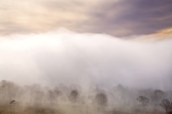
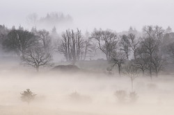
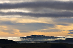
At times we would work together and at others alone, it just depended on who was where at the time when the light shines gold (or grey or dark or bright). The project has remained collaborative and as such maintains the joint signature. With our current exhibition at the Joe Cornish Gallery we present the end of the first phase of this project, which depicts the amazing mists and fogs that permeate our valley throughout the year. These moments are rare and it has taken many hours waiting for the occasional few seconds when the tides of fog roll up and down the valley to reveal the mysteries beneath. In future phases of this ongoing lifetimes work we will explore a variety of techniques and approaches as we attempt to capture our glen in its many guises.
I still absolutely love and crave the solitude of being out there on my own and fully appreciate and admire those who adopt nothing but this approach to their work. But in collaborations with Morag, learning form every person that comes on our workshops and the odd shoot with fellow photographers in the field, I now feel as though I have a new string to my bow as I head to the hills and glens with my sole mates.
While we were working on the Big Camera comparison, one of the things that became quite clear was that the different sensor devices we looked at were producing images whose colour was quite different. More importantly, when we tried to fix the colour from one to look like another, it proved impossible.
This rung a few bells with me from a couple of years ago when I was looking at whether it was possible to simulate Fuji Velvia 50 by creating some form of Photoshop action or icc profile. It quickly became obvious that although we can approach some of the colour changes that Velvia introduces (for instance blue shadows, tendency to move colours toward their primaries), there were certain colour changes that were impossible to fix. Trying to change one part of the colour range would inevitably affect another part. Eventually I gave up with this, concluding there was either something magic going on or my Photoshop skills weren’t up to it.
I’ve also been looking at the colours produced by certain sensors, for instance comparing the colour out of Dav Thomas’ Sony A900 with my Canon 5Dmk2, and saw similar differences in colour that looks ‘uncorrectable’ (I’ve never been completely happy with some of the colour from the 5DMkII - preferring my old 5D by a bit and Dav’s A900 by a lot),
Obviously being a complete geek I had to work out what was happening and so started looking into colour. The very first thing that came to mind was some of my reading around inkjet printers where certain colours appeared different under different light. This effect is called ‘metamerism’ and for the interested amongst you, I’ll try to explain what it means. If you want to skip this section - head down to the ‘comparing sensors’ sections.
Metamerism
The first thing to understand about colour is that our perception of it is a compromise. The physical property of ‘colour’ is the subject of quite a bit of controversy. The actual physics of colour starts with a ‘spectral power distribution’ which tells you the proportions of the light emitted, absorbed or transmitted by an object.
For instance, here is the spectrum of the sun compared with a D65 light bulb. Along the bottom is the frequency of the light and the ‘outline’ is the amplitude of each frequency. You’ll notice that they are completely different. However they are both the same ‘colour’ (a cool white). The spiky output in the saturated colours shows that it has a spike in the blue colour range, another in green and a final one in orangey/red.
How can these be the same colour? Well it turns out that our eyes don’t detect the ‘spectrum’ of light, they have rods and cones that detect an intensity of a section of that light spectrum. The following diagram shows the sections.
This shows the L, M and S cones which combined together give you a colour response (in a similar way to the way R, G and B can create any colour).
Here is how the D65 lamp manages to match the colour of sunlight. The blue spike ‘excites’ one part of the eye, the green spike ‘excites the M and L parts of the eye and the red/orange spike provides a bit of separation between the M and L parts. (in our eye we have blue cones, green cones and red cones)
Hopefully this introduces how the eye works without getting too geeky. Lets take a look at how a digital sensor sees light spectra.
Digital Sensors
Digital sensors work in a similar way to the eye in that they have three colours. However the colour ‘spectra’ are different than the cones/rods in the eye. Here is a sensor sensitivity spectrum for the Nikon D700 (this image is from the Max Max website - a company that customises digital camera by removing anti alias filters or even the whole bayer array in order to create a true black and white digital camera).
The different coloured curves show the colour response of the red green and blue filters in the bayer array.
Different cameras can have very different colour sensitivity though, for instance here is a comparison between the D700 shown above and the Canon 40D (again - sourced from Max Max -
We can see from this comparison that the two cameras are producing different colours. The Canon is producing greens that are more yellowy than the Nikon and reds that are more magentary too.
Now this shows that two sensors can have different colour responses. However the argument put forward by many people is that we can just calibrate our sensors, using ICC profiles perhaps, and correct these colour issues. This *may* be correct but is not necessarily so - the following section tries to explain why.
Metameric Failure
Some of you may have seen the magenta stickers called, RHEM indicators, that look a solid colour under daylight but look striped with different tones under ‘unbalanced’ light.
And here I propose a little experiment; imagine that we take a picture of one of these stickers and it shows two different tones of magenta (I have done this with my Canon 5DMkII in daylight and shown this happens), what colour correction can we make to adjust them both back to the same colour? correct one strip and you affect the other stripe. There is no way to fix because it is impossible to know which magenta stripe was the right colour in the first place.
This form of ‘metameric failure’ is why you may sometimes try come clothes on in a shop and then find out that they look different at home. However, in that case it’s light source that changes but for our digital cameras and film cameras, it’s the sensor that changes. We can imagine that instead of the Canon 5DMkII, we use a different camera and photograph the RHEM sticker in daylight and get a solid magenta colour.
Fortunately for us, the ISO organisation (who create various standards and specification for pretty much everything) have a way of measuring metameric failure in sensors and fortunately for us, it’s used by DxO Mark in their measurements of camera sensors so lets take a look at some of the figures. The number give is an abstract percentage value where 100% is perfect and probably unattainable and where 50% is the metameric error introduced by a difference between daylight and fluorescent lighting. Essentially a score of 90% is very very good and scores close to 50% are getting on for mobile phone quality.We've compiled a small sample of the DxO Mark metamerism results here (I would link to these but they aren't compiled in a single place)
Sony A900
87
Sony NEX7
85
Canon 5D
84
Nikon D5000
83
Nikon D700
83
Samsung GX20
82
Nikon D90
82
Panasonic G3
81
Panasonic GX1
81
Nikon V1
81
Phase IQ180
80
Phase P40
80
Canon 5dMkII
80
Olympus E5
80
Panasonic GH1
79
Nikon D3S
79
Nikon D3X
79
Hassleblad H50
78
Canon 7D
78
Panasonic GH2
77
Fuji X100
77
Phase P65+
76
Fuji X10
76
Leica M9
76
Canon G11
76
Panasonic LX5
75
Hassleblad H39
75
Aptus Leaf
75
Samsung EX1
74
Phase P45
72
The table reflects some of the experiences I have had with colour, starting with the difference between my 5Dmk2 and Dav Thomas’s Sony A900. I’ve noticed that the Canon 5Dmk2 has less accurate colour than the 5D and in the recent tests we noticed that the Nikon D3X had better colour than the 5DMkII. The final item that really showed up the difference was between the Sony A900 and the Phase P45+. To find out that these two cameras were the best and the worst in this list reinforced my belief that it is a metamerism problem that I’ve been seeing.
It also highlights that it isn’t necessarily the sensor that is causing the problem as the Nikon D3X and Sony A900 both have the same sensor and yet score differently. I am presuming this is to do with the dyes used in the bayer colour filters. The Nikon D3X has a lot better low light capability so I’m guessing it uses more transparenct filters (think about how much a dense red filter needs in exposure compensation - making the filter less strong would let in more light but possibly make the colour less accurate?). NB after reading around on the web it turns out that Iliah Borg has checked the filters on the Sony and confirms my suspicions and in many tests, the Sony has outperformed nearly all other cameras (including the Sony A850) for colour accuracy.
I should add here that a low score on this table does not mean that the photographs produced will look bad, the distortion could be pleasing - for example Velvia would probably come out scoring quite low but some would say the distortion looks better than reality. However, it is most likely that the score does reflect a problem rather than an advantage.
Conclusion
I hope that the above discussion has not been too geeky as I think the conclusions drawn from it are very important for landscape photography. These are simply that it may not be possible to take the raw file from a digital camera and, using icc profiles or Photoshop curves, adjust it to look just like reality. There are many materials and conditions where the results from a digital camera (or film camera for that matter) do not match up with real life and unfortunately landscape photography is one of those areas where colour changes are probably more prominent than other genres due to the colours of nature, such as chlorophyll, being quite sensitive to metameric failure i.e. the interaction with chlorophyll spectra and sensor sensitivity might not generate the right green even though all other colours look correct.
This leads into one of our future tests where we take a look at a set of cameras to assess just how good there colour response is, how far you can 'fix' the colour using profiling, and how aesthetically pleasing the results are. We hope to test a range of top end DSLRs, high end compacts and perhaps a couple of low end medium format backs.
We're talking to a fell runner turned photographer this issue (I wish I was as fit!) and someone with a fascinating take on the classic mountain photography genre.
What photographic moments have most transformed your thinking about photography (or have just had you jumping up and down for joy!?)
This is the hardest question Tim and I actually left it last to answer; I do know though that I am not an excitable type to be jumping up and down, far too old for that anyway!
There have been a few transition periods in my relatively short photographic time, for the first year I was in the distinct phase of learning how the camera and lens worked and what I or it needed to do to make reasonable photos. I quickly understood the mechanics and basic physics though and this was made easier I think with me being an Engineer and having a good grasp of technical concepts and devices.
The next phase was concentrating more on the artistic elements needed to make better images such as understanding which exposure to choose for my creative intent, focusing and DOF, motion etc. Although I must qualify by stating that I’m not a creative type by nature.
Then about have way through I became far more concise on the type of images I really wanted to take and became much less random, around about this time I also stopped chasing the light. By this I mean that I became much more subject driven, I stopped taking images of random things that happened to be illuminated in great light and concentrated far more on photogenic subjects that I wanted to capture that were enhanced by complimentary light. A good example of this would be me haring off down to the beach at the sniff of a decent sunset without much consideration for subject but hell bent on light and colours. Actually I don’t think there is anything wrong with this approach and I should do a bit more of it as it can be very relaxing enjoying a spectacular sunset but more on this later why it is on-hold at present.
How long have you been a ‘photographer’ and what connection with the landscape have you had before you started?
I’ve been taking photos seriously for the last five years once I bought my first digital camera, I’m uncomfortable calling myself a ‘photographer’ as I have no formal training and I don’t make a living from photography. I’m a ‘camera user’ though and know how to use it enough to produce results that please me. Prior to buying my first DSLR I only had various automatic pocket cameras that I would very sporadically take a few rolls of film for snapshots only. These would be sent off to Boots for processing then invariably be left in their packets and boxed away in the attic once I had taken an initial look at them, I wasn’t really interested in photography or producing images other than the aforementioned snaps. I’m still not that interested in the ‘art’ of photography preferring just to use it as a tool to create the results I want whether that be a print for home, sharing on my website or progressing my long term project.
I have though been an avid outdoor person for the last 35 odd years of my now maturing 45 years of age. I was born and brought up on the coastal edge of the Lake District underneath Black Combe for anyone who knows the west coast of Cumbria and I still live close by and am fortunate to view ‘The Combe’ from my home. I was introduced to the fells around age 11 when my older brother thought it would be entertaining to take me up Blencathra via Sharp Edge on a windy and icy winter’s day, a life defining moment and I’ve never looked back since. During my teens I walked most things the Lake District could offer soon progressing to donning shorts and vest and quickly took up fell running both for pleasure and competition. Learnt to drive then the hills of Yorkshire, Wales and Scotland beckoned. So, here I am, still walking and running over the hills but perhaps a bit more sedately and a lot less recklessly than my younger days, although I still think I can run races at similar youthful times!!
How did you actually get into photography in the first place?
A relative gave me a £20 birthday gift to go towards buying a picture of Black Combe, I searched and scouted for a decent picture I could buy to frame and hang on my wall but after a few months of unsuccessful looking I came to the conclusion that I could try and photograph it myself. This coincided with my consciousness becoming aware that digital SLR technology was advancing to a point where they were of good quality and obtainable by non-photographers, me basically. I did a wee bit of research and bought a Nikon D40 as a Christmas present for myself then spent the next 6 months working out all these strange and peculiar new concepts of ISO, f-stops, White Balance and apertures etc.
I probably had an unconscious desire as well to start photographing the hills and landscapes that I was walking and running over, perhaps turning forty was another trigger that made me part with cash for a camera. Not that it had anything to do with a mid-life crisis or anything!!
You grew up in the Lake District but much of your photography is of Scotland. Where does your love of or connection with Scotland come from?
One of my first trips to Scotland was shortly after I bought my first car, my friend and I drove to Fort William for a week of walking and climbing the hills of Glen Coe, I distinctly remember my first sight of Buachaille Etive Mor rearing up like a huge pyramidal monolith from the blanket of Rannoch Moor, pretty inspirational stuff and perhaps another life defining moment. Over the years we’d make fairly regular visits to the Highlands for the fix of getting big hills under our boots, the Scottish hills offer a rugged and remoteness that the Lakes or even Wales can’t match. I’m drawn to the harshness and solitary nature these hills are capable of providing, there are many places where you can stand on a summit and not see any signs of civilisation in any direction, a fulfilling and enhancing experience that is quite hard to come by.
More recently, four years ago, I had the chance to work in Aberdeen with a fortnightly commute home; this coincided with me getting more proficient with my then Nikon D200, filters and tripod. I found it convenient on occasion to get a spare day or two on my commute to detour via Skye or Torridon and spend a bit more time walking; this is really where my passion for photographing took off as I could combine the two pastimes together.
Could you tell us a little about the cameras and lenses you typically take on a trip and how you came to choose them?
My current camera is a trusty Nikon D300, a little hard worn but still performing brilliantly. I find it a great compromise between weight, mechanical construction and sealing, performance and operability. I use three Sigma lenses from 10mm to 200mm, the 17-70mm being my default lens and producing probably 80% of my images. I only use the 10-20mm in limited and last resort situations as I find it has a few odd effects but has been essential for a few mountain scenes that dictated its use. I hardly ever use my 70-200mm as it is too heavy to carry in the hills, has a scratch and the focus motor is broken, I should get shot really and repair or replace it. I use a Heliopan polariser, Lee and Hitech filters much preferring to use ND grads rather than HDR which for me doesn’t produce the results I desire for various reasons.
I’m bought into the Nikon system and way of things stemming from the D40 Christmas present. I have to say that Nikon had a better marketing program at the time of my purchase, they were actively advertising in the magazines I was reading at the time so it was them that I plumbed for and I have to say am very content with my present gear with no desire to change or even upgrade.
I believe you are working on a photographic project, can you tell us about this?
It’s a bit of a labour of love I have to say. A couple of years ago whilst my passion for photographing the mountains of Scotland was increasing, I became inquisitive as to what actually are the finest mountains in the Highlands. I started a lot of research gathering many different opinions and information from a fairly wide range of people who either use or admire the hills but mainly from other walkers and drawing on my own experience. I then developed a list, a list in flux I have to say as opinions are so subjective that I keep adding or subtracting depending on who I listen to or how I feel. I then embarked on trying to photograph the mountains on my list, it has taken me a couple of years to photograph 70 odd of them so far and I have around a dozen left to do which as usual are the hardest and most frustrating to accomplish.
This process though has given me great reason to explore parts of Scotland that I probably wouldn’t have thought to go to before and it is a constant source of enthusiasm and has given me plenty of focus and direction in my photography, sometimes detrimental to taking an other type of photograph though occasionally. I’m absolutely committed to finishing it, to the point where I hardly take the camera out of the bag to photograph anything else, I can even drive past Buachaille Etive Mor these days on a frosty winter morning at sunrise and not even have a pang to stop and photograph the waterfall, I already have my image and am solely focused on the ones I require. I may allow myself to go back there and photograph it again though once I’m finished..!!
The ultimate goal though for my collection of photographs is to produce a book describing the most appealing, iconic and photogenic mountains that are in Scotland. I’m in the process of proposing my idea to various publishers and keeping my fingers crossed I may be given the opportunity to see my project to publication.
Actually, I have to say that I have probably had as much enjoyment doing the research and planning of the images that I have wanted to capture for each subject as much as actually climbing the hills and taking the images. The learning process has been exciting, discovering that there are more to the obvious mountains that most of us know. Discovering hidden gems such as Ben Aden in the heart of Knoydart, understanding what its like to walk and photograph a whole range such as the Mamores in a day and the lone overnight camps high on the hills. It’s also given me more reason to pore over maps and guide books with the ability to switch off from the latest soap opera that the family are watching.
Tell me what your favourite three photographs are and a little bit about them.
My current three favourite images are ones that I have taken specifically for my book.
North Glen Shiel Ridge.
This image has some simple aesthetic appeal for me, the Glen Shiel Ridge leading off to the right as the main subject, backed by the opposite mountains in a typical winter scene but this isn’t the main reason why I like this image so much.
This was my third attempt at this image as previous tries hadn’t materialised in favourable weather conditions but this one met my expectations so it does have some appeal purely from a satisfaction point of view that I captured an image that I had pre-visualised.
However, it’s mainly an image that provides me with some distinct memories of a fabulous and quite rare experience. There had been heavy snow overnight and a harsh frost which provided a crust on the fresh snow surface which made a fabulous crunching sound that shot the otherwise eerie silence. The light half an hour before sunrise was soft and subtle which gently accentuated each slight contour. As I stood there in the -10 C temperature I could have stopped time and just savoured this moment for ages. I may not have actually portrayed this atmosphere or how I felt very well with this image and there might not be any particular solid compositional or interesting features in it but it is simply one of them images that transports me back to a wonderful 15 minutes or so where I was literally on a mountain high.
Solace in Silence.
I like this image for two main reasons; firstly it fulfils my desire I had to simply capture the Corrag Bhuidhe ridge of An Teallach in favourable light. I hadn’t seen this image from the summit of Sgurr Fiona before even after all my research but I knew from my study and reading accounts of the scramble over it that it must be worth photographing, again my expectation was satisfactorily met. Perhaps this image demonstrates a bit of my hunter/collector side where I want to show viewers where I have been and what the view is like from this particular location, it was certainly an effort to gain it but more overriding is my desire to show quite a spectacular scene, well for me anyway.
The second reason is perhaps hinted at in the title. I had orchestrated this trip to be at this location for sunset; I had pitched my tent in the afternoon and now had time alone on the summit waiting to take this picture. I had chance of a few minutes to just sit and absorb my circumstance and environment; I was alone close to darkness on the summit of a remote mountain surrounded by inspiring scenery in every direction. This was another life enhancing moment and a wonderful experience all round, it invigorates me when I place myself in these situations and there are many similarities with my personality in this image.
However, once again, I don’t know if viewers will get this message and it’s not really my intention to try and portray these nuances but if you do get more than just the details of the scene then it is a bonus I guess.
Buachaille Etive Beag.
I think this image just simply pleases me greatly for its aesthetics, mountains in winter with a quite fabulous sunrise. It was another location that was planned and pre-visualised for many months before I got the opportunity to attempt it. I’m essentially a recorder of scenes, I like to describe and inform the viewer with straightforward information of a subject. There isn’t much room for abstraction or mystery in my images, I usually cram in as much visual data as possible and there isn’t much left for the imagination in them, Tim will go and choose other images that may contradict me now probably!
It’s a bit of an unusual view of Buachaille Etive Beag and I think makes a reasonable attempt at something alternative of it, the usual view of it is from Glen Etive or from the entrance to Glen Coe but it usually gets overlooked in favour of its big brother. It wasn’t the sole reason why I climbed to this point though as Bidean nam Bain was my first priority which is just out of shot and bagged along with this. These are in essence the type of shots that I’m most proud of and if I could produce just a few of these each winter I’d be very happy as I think they sum up my relationship with the mountains.
When you are ‘in the field’, what is your usual workflow? i.e. How do you find a picture? Do you take sketch shots and then go back to a choice spot and wait for light? etc.
I have two very distinct phases for my planned shots, the research and planning stage which can be up to a year or so from conception of an image to capture. Typically I’ll decide on a mountain to photograph based on obvious reasons such as Ben Nevis having a terrific crag and being the highest or more subtle reasons such as Ben Lomond having an association with the loch and its popularity with many folk from Scotland’s central belt, both worthy of photographing. I will then work out how best to photograph them or concentrate on a particular feature that identifies them, this will be the part where I pore over my maps and ignore the family for hours on end. I will write down the season, angle of Sun and time of day etc to maximise my chances of showing the subject of at its best. I have a methodical spreadsheet for all this information; being the Engineer in me I’m afraid.
I then move to the next phase where I make a trip to attempt the shots and where I am at the mercy of the weather but I have become quite adept at predicting what will happen, the weather is usually the deciding factor whether I meet my expectations or not, if I don’t then I make return visits.
I don’t take sketch shots but I have very strong pre-visualised images in my head of what I want the image to turn out like even if I haven’t seen a previous image or been to the location before, I build this up from contours of the map, I know, I should have done something a bit more funky in my youth!
However, I’m not always robotic and do act spontaneously when chances arise, ‘Schiehallion’ and ‘Leave the light on for me’ are good examples of being somewhere for another reason but taking advantage of an opportunity.
Once on location I don’t think too much about composition and shoot more on what instinctively looks right to my eye through the viewfinder, I’m not trained and don’t read much theory relying more on my years in the hills and what feels right or makes a pretty view.
Light is not a driving factor for making an image either, I prioritise the subject first then hope that the light is complimentary for the composition I have chosen, although it has to be said that if the light isn’t obviously right then I will usually return.
Do you have any desire to put your photography on a professional level (i.e. make some or all of your living from it)
No not really, I’m very lucky to be employed in an interesting and satisfying industry that pays well so it would be quite a hard decision to change to a different career.
I obviously want to get my book published which isn’t from a financial desire but certainly more from a recognition and ability to share places perspective. I have though been fortunate to do well in a few competitions and that is very gratifying. I’m a member of an international curated gallery which displays my images of Scotland and the Lakes to a wider audience other than UK based and I have developed an appreciation and following there.
What sorts of things do you think might challenge you in the future or do you have any photographs or styles that you want to investigate? Where do you see your photography going in terms of subject and style?
At present the only challenges are my levels of enthusiasm and desire to get to the locations that I have set myself, some are physically quite hard, time consuming and at a sacrifice being away from my family, they are getting harder as well, should have taught me not to pluck the champagne images first!
I don’t have any real desires to try different styles or approaches, I am quite limited in what I like in my photography and don’t have any real desires to photograph other than mountains at the minute, I have a macro lens collecting dust that should get used more often in the garden but I’ve found it even harder to get a decent macro shot than trekking all weekend for one.
Even though there is a lifetime of subject matter in Scotland I’d probably like to do the Lake District justice with a similar approach to what I am doing now.
To illustrate how dead set I am though, I spent an all paid three week trip to New Zealand for work but didn’t even bother to wiz down to the Alps and have a ganders there, shocking for a landscaper.
Who do you think we should feature as our next photographer?
Ooh, a difficult question as I don’t really know too many and if I am being totally honest don’t draw too much inspiration from other photographers as much as subjects. I’m also a bit limited to photographers that shoot the things that I’m interested in; I am though a big fan of Colin Prior’s panoramic mountain scenes so I’d suggest Colin Prior.
Alan Gordon provided all the images for ‘The Scottish Mountains’ book. Another source of inspiration with images that were taken through the eyes of someone who obviously spent a lot of time in the hills, I know nothing about him though so that would be interesting for me.
I’m sure many of you are aware that the Bradford-born artist David Hockney has recently filled the walls of the Royal Academy with an exhibition of his landscape paintings, iPad drawings and multi-screen HD films most of which were produced in the East Riding of Yorkshire. Whilst it may not be of great significance to landscape photographers it is certainly a significant event in the history of landscape painting. It is also playing an important role in promoting the landscape of East Yorkshire and especially the Yorkshire Wolds. This quiet but beautiful part of Yorkshire has been largely ignored by tourists but due to the Hockney exhibition is now gearing up for an influx of visitors keen to sample the landscape he has been painting for the last eight years. As some may know I too have spent the last eight years on a different journey into the Wolds landscape, mainly searching and photographing the steep sided dry valleys hidden below the chalk upland. I’ll discuss my reasons for photographing such a quiet and relatively un-dramatic part of the British Isles later in this article but for now I’d like to expand on the landscape work of David Hockney.
Over the past few weeks there have been countless newspaper, television and internet articles about the exhibition which is the first major event in the 2012 Cultural Olympiad. David Hockney had been asked four years ago if he would like to fill the walls of the Royal Academy with new landscape paintings of East Yorkshire. He had previously been successful with the display of ‘Bigger Trees Near Warter’ at the Royal Academy. This huge 50 canvas painting was done on location in stages over a period of a few weeks in winter and spring 2007. It shows towering beech trees at the edge of a junction near to the small Wolds village of Warter. The location is fairly typical of many others around the Wolds but Hockney saw the opportunity to create a huge painting to show the colour and majesty of the trees and tangled branches stripped of foliage. He (and colleagues) used Photoshop to combine photographs of each of the partly painted canvases to re-create the finished jigsaw whilst returning time after time to add new paint strokes and to start on new sections.
After finishing ‘Bigger Trees Near Warter’ he began work on another spinney of beech trees near Warter to show the seasonal changes but the four works were cut short when the trees were felled leaving him aggrieved.
The current fast-selling exhibition has been received favourably by many people and some reviewers but has also been slated by others. His large joined canvas oil paintings range from clever subtle use of colour and keen observation of light to surreal psychedelic studies using an exaggerated palette. His brushwork harks back to the Impressionists, most notably Van Gogh, but he also pays homage to the Fauvist movement’s use of bright colours. Whilst they bare little resemblance to the traditional English landscape work of Constable and Turner there is no denying their presence and impact. As a founding member of the British Pop-Art movement in the early 60s Hockney has now re-invented landscape painting to suit his own radical style and vision. It has certainly sent the art world into a spin and delighted most of the public.
I discovered Hockney’s Wolds paintings shortly after I had begun to explore my local area for photographic subject matter. A friend had shown me a series of Hockney’s early watercolours of views I knew well and they certainly captured the look of the Wolds beautifully. I had no idea that Hockney was continuing his Wolds period only a couple of miles from my home near the village of Warter. I had become far more pre-occupied with my own journeys into the Wolds landscape.
I had become aware of the vast areas of Access Land in the dry valley systems that scatter the Wolds but remain virtually invisible as you drive over the arable chalk upland. The valleys are used for grazing livestock and I’d visit and photograph them with the intention of showing the wonderful geometry and the colour that existed all year round. I would walk miles down quiet and peaceful dales searching for subject matter and the best viewpoints. I’d pour over O/S maps of the Wolds searching for hidden locations then visit and re-visit at all times of the day and throughout the year. I began to know when and where I should visit to catch the best conditions. I learnt all the Tolkein-esque names - Scoar Dale, Frendal Dale, Sylvan Dale, Great Dug Dale, Horse Dale, Thixen Dale (named for its six joining valleys) to name but a few. Each valley has its own individual look and feel - some are barren and beautifully desolate, some are complex and varied where each new twist reveals a completely different eco-system of plants and trees. I began to coincide my visits with the seasonal events I’d witness. Wild garlic, hawthorn blossom, rosebay willow-herb, ox-eye daisies, harebells, ferns and hawthorn berries provided me with scope for variety in my photography. Without mountains, rivers, waterfalls, lakes or rock formations to photograph I had to adapt to what was on offer.
This brings me back to David Hockney and specifically his well-publicised views on photography. According to Hockney photography is all but dead. He has been vocal in criticising the camera’s single viewpoint (hence his series of ‘joiners’ made in the 80s) and the single timeframe of the photograph. Perhaps he should investigate the work of many photographers who take advantage of equipment to drastically lengthen the exposure time, varying it from several seconds to one year in a single image or move their cameras whilst exposing the shot to create blurred effects and impressionistic studies!
This opinion does no justice to Hockney or to the important role photography has had in shaping our lives over the previous and into the current century. It also demeans the already hard work that photography galleries in this country have in convincing the art world of its validity as an art form.
As a landscape photographer I’m fully aware of photography’s limitations. It can never replicate the real sensations of a place but neither can painting nor filmmaking. All three are only capable of creating an impression of being in the landscape. The truth can only come from experiencing the landscape first-hand. All the experiences of being in the landscape can never by gathered from a single image bound by a frame but does that make photography pointless? Whilst it cannot create the feeling of being out in the open air, the one thing it can do is give you the feeling of WANTING to be out in the open air. Wanting to see the subject for ones-self and revel in the experience of being there. This brings me to my own reason for wanting to photograph the places I see on my travels. My photographs do remind me of where I’ve been and the wonderful times I’ve had in the landscape but I also want others to see what the Yorkshire Wolds has to offer.
It’s not about one single image. My photographs around the Wolds were taken over many years in the areas I visit at all times of the year. To show the wonderful variety of subject matter, weather conditions and light you have to produce a large body of work, not a single shot. Only then can people begin to see the dramatic and subtle changes I see on my travels.
A recent article on the Guardian website really caught my eye. Some of the East Yorkshire residents were interviewed after visiting the Hockney exhibition. Whilst they all praised the work they had seen the most telling comment was that it ‘made them wish they were back in East Yorkshire’. That must be the greatest compliment paid to Hockney about his East Yorkshire landscape work. I’d like to hope they, and others, would also feel the same way if they were confronted with wall-filling landscape photographs from their locality (unless it was a Gursky!).
I hope the exhibition will encourage people to begin to experience the landscape and see it with fresh eyes. I know that many landscape photographers already appreciate the wonders of nature, light and the climate as do many non-photographers (ie. artists, naturalists, walkers, climbers) but I hope it convinces others to look a little harder and appreciate and cherish their own immediate landscape.
I’d also like to encourage other photographers to look closer to home. I know of many who do and have been rewarded with some wonderfully creative photography. By putting yourself out of the comfort zone of traditional landscape photography locations you will be forced to look harder and in return begin to see more. That is what Hockney has achieved by putting himself into a landscape that isn’t overtly dramatic.
East Yorkshire residents have always been justifiably proud of this quiet, secret landscape and we are glad that someone of Hockney’s stature has recognised the Wolds undeniable beauty. His motives are purely for pleasure, not for profit, which is an endearing quality. It’s not every day that Britain’s greatest living artist makes his home on your doorstep. It’s also nice to know that the English landscape has found a new spokesman, despite his curmudgeonly views. I’ll forgive him for his views on photography because there’s so much more to admire in him than to dislike. I only hope he continues to produce work around the Wolds as I hope there will be better to come.
I’ve included a selection of some of my favourite views and some of the conditions I’ve had the pleasure to experience on the Wolds. I know one man who’ll hate them!
I’d be interested to hear anyone’s views on Hockney’s work, his views and the exhibition if anyone has been or is planning a visit.
A recent article written by Ian Thompson on his wave photograph at Porth Cawl generated just a little bit more feedback than I or Ian expected. The main gist of the comments were along the lines of ‘this has gone too far’ or ‘this isn’t photography’. I thought it would be a good idea to take a look at the idea of truth and photography in a little more detail.
The Camera Doesn’t Lie
A very famous phrase suggests that what appears in a photograph is a direct reflection of reailty. However, even from the very first photographs we have had varying amounts of metaphorical or literal distortion. For instance, Louis Daguerre’s photograph taken in 1838, supposedly the first photograph of a human being, shows a street scene where a single figure stands on a corner having his shoes shined. Anyone who saw this picture at the time would think that the street was empty, early morning possibly. However it was the extremely long exposure needed that made all the people dissapear (a technique used by many architectural photographers).
And if we are talking about landscape photography, many of the early landscape photographers (Gustav le Gray for instance) used to have a library of sky photographs that they could combine with their landscape images in order to create a convincing whole or would have to take multiple shots with filters to capture the sky and foreground (Frank Meadow Sutcliffe). This could be taken as a necessity to capture skies because of the film used but they regularly picked skies from different locations for instance (skies that probably couldn’t exist in these locations because of atmospheric/geographic conditions). The following image by Camille Silvy is very well blended but for all we know those clouds would never form like that in that location. Although it is thought that they may be taken in the same location, there is no guarantee of this - hence the beginnings of doubt in landscape photography.
Camille Silvy, "River Scene" 1858
Or quite common in the mid 19th century are photo montages, combinations of multiple images into a single scene such as Henry Peach Robinson's "When the day's work is done". A scene as fictitious as the sentiment recorded and the following "Two Ways of Life" by Oscar Rejlander - a blend of many, many pictures.
Most of us probably know about the intentional photographic lies where individuals have been ‘darkroom’d out of photographs such as Trotsky from images where he stood close to Lenin or the Reichstag Flag raising. More recent changes such as OJ Simpson’s ‘darkening’ in Time magazine show a different distortion that is insidious in its subtlety.
However, let us take a look at a photograph taken in 1939.
Dorothea Lange- Mother and baby of family on the road. Tulelake, Siskiyou County, California. 1939.
What we have here is a mother and baby looking like they are enjoying themselves having just gone to pick up the shopping. The more famous version of this picture, taken a few moments earlier is this..
Dorothea Lange- Mother and baby of family on the road. Tulelake, Siskiyou County, California. 1939
So here we have the image chosen by Dorothea Lange for the Farm Security Administration’s representation of the Great Depression. Which one of these photographs is the truth? Obviously the choice of photograph was made influenced by the message the FSA wanted to put forward. (more info here)
Both of these are a lies to some extent - the first is a lie where the subject has decided to show the photographer that they are happy and have a happy, clean baby (the father cleaned the babies face). The second photograph, the one that was taken first, lies in that it only shows a single aspect of the subjects life having just arrived at a food shelter after a long car journey (I look pretty bad after eight hours in the car too).
A more subtle lie that photographers make is through elimination and choice. For instance, a documentary photographer, Supanit Riansrivilai, was criticised recently when they produced a series of photographs depicting the Polish city of Krakow. The criticism was based on the fact that through choosing only to take photographs that depicted her own vision of what communist depression was about. This scenario mirrors the photographs taken by Russian spies of the US where they wanted to depict the human fallout of a capitalist state. By only showing one part of reality they created a new version of it that didn't exist.
Given these particular ‘lies’, lets try to construct a list of ways in which photography can lie without ‘manipulating’ images.
1) Through conscious choice and elimination of parts of a ‘reality’ in a series of images, thereby creating a distorition of the truth. This is particularly true in landscape photography where many people want to create ‘beautiful’ photography in crepuscular light, showing bucolic pastoral scenes. However, the countryside isn’t like this - much of it is agricultural, it spends most of it’s time under high sun with contrasty shadows etc and in many cases it can be quite dull or barren.
2) Through choice of subject or by cropping of the subject to represent a different truth. For example this image from the front pages of most newspapers at the time ...
.. looks very different when you see the whole picture?
. Does this photograph mean the same thing? I would say the story has changed substantually. We do the same when we photograph many of our favourite icons - eliminating the fact that they are next to main roads or popular paths and doing our damndest to make people think we are in the deep wildernerss. Take the tree at Lochan Na h’Achlaise (since blown down)
copyright Christopher Hawkins (cc)
this is literally a few dozen feet from the biggest road on the west coast of Scotland and yet a viewer would think it was in the middle of the wilderness and that the photographer was an intrepid explorer.
3) Through the use of non standard focal length lenses, particularly wide angle lenses. The most recent example of this in my experience was that when I visited the Isle of Eigg, I expected to see Rhum quite small on the distant horizon.
In actual fact Rhum sits quite close to Eigg and encompasses so much of the horizon that it is difficult to take photographs from the north side of the island without including it. Here is a shot showing how close Eigg and Rhum actually are..
In fact when the first very wide angle lenses were used, people struggled to understand what they were seeing in pictures because the distortion of perspective did not make sense - they didn’t recognise the locations in photographs for instance.
4) Through colour balance. Our eyes do a fantastic job of correcting colour casts in the real world, we are so good at doing this that we don’t notice that at midday in blue sky weather, the landscape is quite cold looking. Our eyes adjust for this and keep on adjusting until the sun gets very low in the sky and has become very warm. It is only when the sun gets very low that are eyes cannot compensate for the colour cast any more and everything takes on the hues of the ‘golden hour’ (which is why you can still get great light well before you can see it with your eyes).
With the camera though, we can adjust or fix the colour balance and show images with intense tones that are dramatically different than that which we would have experienced had we been there ourselves.
One of the intriguing things about colour balance is that we can override our subconscious and learn to see it. For instance, most people who have not looked hard at the world will not say that shadows are blue. However, if you get used to this fact, you start to see the blue shadows on clear sky days - so when one person says the shadow is blue and the other one says it isn't, who is correct and who lies?
5) Through saturation. Don’t we all know this one - I think everyone has seen a picture or two that has had their eyes itching and even the subtler levels of saturation boosting depict a strange form of reality. Although this is not necessarily lying, it is certainly deceiving to some extent.
A second aspect of saturation that lies is the total elimination of colour - black and white photography is the original distortion. By removing one of the important cues we have about reality, we are creating a fiction, however aesthetically pleasing that fiction is. Black and white also allows us to us colour filters to change a blue sky to a black one using a red filter or to make foliage 'glow' using a green filter.
6) Through the actions of the photographer whilst taking the photograph. I'll stick to landscape photography here to keep things on topic but there are many examples outside (include Capa's Spanish civil war 're-enactment' and various other staged ware photographs). I suppose the most extreme example of this is Edouard Muybridge's admission of clearing "trees by the score that interfered with the cameras / best point of sight". I suppose you could say he wasn't lying because that is what the landscape looked like, after he had finished with it at least.
Less invasive perhaps, but bringing up the same questions is our fond habit of 'gardening' the scene. Removing or arranging parts of the foreground to better suit our composition. Many photographers talk about this as being more morally correct that using photoshop to remove these items in post processing but I do wonder what the difference is in terms of 'honesty'.
Manipulation
So straight photography isn't purely truthful in the first place, even before you consider manipulation. But once we start to look at manipulation, a whole new set of issues appear. How far can we take digital (or analog) manipulation before we start to lie.
Reading through the hundreds of comments on Ian Thompson's article about the 'wave' picture that was composited from multiple photographs, it really makes it clear that this is an issue that photographers feel very strongly about (whatever their opinion). The points of view range from "the capture is sacrosanct" to "everthing goes" but at first glance there seems to be a few milestones along that path. I'll list a couple here..
1) The first milestone can probably be described thus "Items can be removed but not added and those items removed should be transient with respect to the landscape". So this means that it's OK to remove cars and rubbish but it's not OK to remove stone walls and trees. However, when you look closely at this, things get a little messy. For instance, some rubbish does not degrade at all - many plastics will be around long after we've died. And some things we think of as permanent could be gone, for instance the trees on Rannoch moor that have recently been blown over. Does that means we have to set a time limit on how long things last or do we class 'rubbish' as something that is OK to delete regardless of the amount of time it will be there for (and can we class pylons as rubbish in that case?). And as for transient, clouds are probably the most transient thing in most peoples pictures, is it OK to remove a few of them if they aren't adding to the picture?
2) "It's OK to add and remove things as long as the intrinsic documentary nature of the subject is preserved". This sounds easy to understand, the landscape is the truth and as long as we represent it as truth then we're OK. But what truth? It's probably a little fascetious but if a Llama wandered into your photo of Loch Sunart in Ardnamurchan would you keep it in because there are Llama wandering around the shoreline or remove it because Llama aren't a native species? The problem with a definition like this is that it's subjective - we all have our own interpretation of what the landscape is and this interpretation will dictate what we can or can't do - meaning what is OK for one person won't be for another.
So it seems that even when we have some form of shared vocabulary about our level of tolerance of 'distortion', the finer points mean that we might not be in agreement as much as we think we are. So let's take a look at where this idea of 'pure' photography comes from by looking at some of the 'masters' of photography (hopefully biased towards landscape).
Ansel Adams - One of the supposed bastions of truth in photography but the use of black and white images, strong colour filters and quite extreme darkroom manipulations - for instance in Moonlight over Hernandez was manipulated to remove many of the clouds from the top of the picture (particularly the clouds to the right hand side of the moon)
Bill Brandt - A British master of photography and one know to use the darkroom to quite dramatically change the tonality of his pictures. A good example of which is "The Snicket" which when printed straight shows a lot of detail in the building at the top of the cobbled street. Brandt's darkroom work creates a starker picture where any detail in the building has been completely burned in (darkened to black).
When colour arrived in full swing in the 1950's/1960's, photographers did not manipulate quite as much, mostly because it was too difficult to do so. There were a few colour photographers who did have the skills to manipulate and some of them chose to occasionally 'tweak the truths nose' a little. For example, it seems to me quite obvious that some of Michael Fatali's shots have been manipulated in terms of colour and tone but more importantly for our discussion, he also introduced (or enlarged) celestial and atmospheric conditions. Take the moon in this shot - according to some quick calculations, he would have needed a 1000mm lens to capture the moon at this size in the frame. Even on 8x10 this 1000mm lens is equivalent to a 180mm lens, hardly the wide angle suggested by the perspective of the composition.
Now that we live in a world of digital photography where even film captured images can be piped through the magic of photoshop before creating a final 'darkroom' print, the ability to edit images has been democratised. There is a huge range of free and cheap software out there that you can use to 'photoshop' your images, it should be no surprise that some people do so.
One of the questions that was raised during the discussion in Ian's article was 'Has the bond between photography and the truth been broken'. Having looked at some of the examples above, I would have to say that this bond was fragile to begin with. It may be that in the current era the expectation of truth in photography is weaker than it once was but I would say that it is up to the artist to decide how to answer the question "Did you do anything to that?".
This hasn't stopped people trying to regulate landscape and wildlife photography in some way, even going so far as to propose some form of kite mark to record what level of truth the image includes. Perhaps Ansel Adams' recent exhibition should have contained warnings about 'Moonrise' saying "significant darkroom work applied and elements removed" - would this have helped the viewer enjoy the image? Attempts such as this are always going to be difficult and self regulation seems the only real way to go - especially when the people who are the real villains are those who actively deceive people, suggesting that there pictures are straight out of camera (SOOC) when in fact they have applied all sorts of trickery. Michael Fatali famously set fire to some fire bricks to create some nice smoggy effects whilst leading a course and allegedly added or enlarged moons in many of his desert temple such as Back of Beyond and possibly pasting in mammatus clouds in The Crossing (a meteorologist friends assured me that mammatus such as that don't stretch to the horizon and would be quite small with a wide angle lens). Another photographer alleged to have manipulated his images that insists not is Peter Lik - his latest piece, Bella Luna, is almost certainly a combination of two or more images. The narrative associated with the image "I pressed the shutter, a feeling I'll never forget. The moon, tree, and earth." certainly implied a single moment of capture.
And that is possibly what people want to preserve when they talk about truth in photography - that a single moment of capture created the final image; not multiple captures that have been blended together to create a composite. However, this 'category' of straight photography, however blurred by gardening, subtle cloning etc. is only one aspect. Many photographers wish to evoke the memory or emotion of a place or moment in time and use whatever is in their creative arsenal to achieve this. Ian Thompson's image is perhaps a visualised moment that Ian was unable to capture in a single exposure but he still wants to share what he felt at the time and who is to say that what he did to achieve this is wrong?
Ultimately, photography has been used throughout it's relatively short history as a way of both representing reality and fiction - the viewer is not tied to a single way of understanding the image and it is up to the photographer to suggest ways of viewing just as the cinematographer adds 'based on a true story' to their works of art. No one expects 127 hours to all be the actual recordings of events that happened but they still connect it with reality. Likewise I don't think many people expect fine art to be a pure recording of the truth unless they are specifically told that it is.
As for the limits of what is and isn't photography, like many things in the english language, it is defined by usage and people call images that were primarily recorded by light onto a sensor a photograph. The problem we face if we try to provide definitions is how to cope with edge cases - a colleague runs a roll of 120 through his camera and then sends it to America to get another photographer to expose it again. The constructions don't record the same instant or even the same continent - are they still photographs?
The most sensible course of action is to let each person define their own moral/ethical boundaries and, where possible, help the viewer to understand what they are.
At about the same time that we were testing the cameras for the Big Camera Test, Joe Cornish was pondering the possibility of purchasing the IQ180 and in the last few weeks has been getting to grips with it. Tim Parkin and Andrew Nadolski accompanied him on a walk through Bilsdale which proved too windy to get the photograph we had planned but we stopped on the way back when a group of larches caught our eye in the shadows at the edge of the path. Despite it being almost too dark to see the composition, we decided to record the process and then to print the resultant file to share with our readers. We hope you enjoy the process and would love any feedback.
Photographic description alone will never be inspirational, never make a heart beat faster, never bring a tear to another's face. To achieve these things emotional messages must somehow be woven seamlessly into the photographic representation. But beyond what is baldly described by the light captured in a scene, the exact meaning of photographs is elusive. We read them but it’s not like reading prose, there’s no dictionary that we can refer to for definitions. Every viewer reads them in a subtly different way and their meaning may also alter for different viewings by the same viewer. Photographs’ descriptive power is almost overwhelming, sometimes it’s as if the images shout about the contents of their frame. Yet, almost lost in the cacophony of detail, deeper messages are being whispered. Despite the difficulty of hearing them, we know that the messages are there because we know that photographs can move us.
When a photograph evokes something beyond the mere description of what’s in front of the camera I think of it as transcending its subject matter. A transcendent image is therefore more than just an illustration: the message it imparts is more than the sum of the tones and forms that are amassed in the frame, more than the sum of labels that can be attached to its contents; a transcendent image moves us because of something beyond what is described. The question arises, how are these messages transmitted? Where is the emotional meta data held in a photograph? In this article I will be looking for the sources of this secondary information.
Consider this postcard image of the Austrian Tyrol:
When we ‘read’ a photograph, the first thing we do is to look for things we recognise and mentally attach linguistic or pattern labels to these objects. Our first read of this image might therefore go something like this: ‘tree’, ‘tree’, ‘tree’, ‘tree’, ‘tree’, ‘tree’, ‘tree’, ‘sky’, ‘sky’, ‘sky’, ‘mountain’, ‘mountain’, ‘snow’, ‘mountain’, ‘cow’, ‘cow’, ‘grass’, ‘grass’, ‘grass’, ‘grass’ more ‘grass’ and ‘cloud’. A list of nouns isn’t very exciting is it? (Incidentally, it’s a myth that in the Western world we read a photograph left to right. Our eyes actually move across an image in a complicated pattern, moving up and down, right to left and left to right at seemingly random angles according to what we find interesting in the image. We also frequently return to some points, such as the eyes in a face. It may be a convenient stick for a judge to beat an image with but it makes no difference to how an image is read whether the principle object in a scene is placed on one side of the frame or the other. The ‘preferred’ placement is simply a matter of tradition.)
You’ll notice that all the labels I’ve mentioned are nouns. Yet we rarely get an emotional response simply from a noun – tax-inspector being an obvious exception! To signify emotions we need to look for adjectives or adverbs in the image such as ‘green’, ‘blue’, or, even better, ‘peaceful’, ‘still’ or ‘sunny’. Obviously there is degree of consensus on the definition of some visual adjectives – ‘green’, ‘blue’ etc. – whilst others have more plastic definitions – ‘wild’ for instance. But the central problem with wanting to use photographs to express how we feel about our chosen subject is that whilst every photograph is heavily laden with visual ‘nouns’ (description) there is no single fixed interpretation of their emotional significance. To show how complicated the question of interpretation is let’s consider just the colour adjectives for a moment. Any colour has a wide range of emotional information associated with it, some of it cultural, some personal and, as I shall point out later, some of it hardwired into our brains. Red, for instance, is the colour of blood, said to be the most emotionally intense colour but it is also thought of as optimistic and sexy. In Russian there is a linguistic link between the word for red and the word for beauty. This might be why the Bolsheviks chose red for their flag. But even if it were not it means that red now also has a political connotation. It’s also thought of as aggressive, it stands for danger and stop! It stands out from the background better than any other colour; perhaps this is why some wag once suggested that RPS stands for red patch somewhere? That’s quite a range of possible responses and I’m probably only scratching the surface. There will be other attributes of red that are of personal significance to individuals; perhaps that shade was the colour of your first bike, or the colour of your beloved’s lipstick, or the colour of your favourite football team’s shirts. And it’s not simply a question of any sign being present; how it’s interpreted will depend upon its context. And how the viewer is feeling… Complicated, isn’t it?
So, our reading of the visual nouns would seem straightforward enough but for the fact that we all habitually and unconsciously attach a personal history and significance to objects and places which colours how we interpret them. Our personal experience and the cultural symbols that we have absorbed throughout our lives can lend significance to any part of an image. This level of meaning is classified as residing in signs. Hopefully you can see from my brief look at the colour red that the adjectival labelling is an example a subtle sign system. Signs can exist as text, images, symbols, flags, objects, sounds, colours, smells, facial expressions or physical gestures. Signs can be grouped into languages (body language for instance) in a similar way to words, though the boundaries between these languages are not as distinct as those between spoken languages. Signs are literally anything that communicates a meaning or emotion to us, whether that meaning can be expressed in words or not.
So anything that we see in a photograph might be suggesting something other than just itself. For adherents of the mystical tradition in photography a cloud in a photograph isn’t always just a cloud but, as Tim pointed out in his recent article, in the case of Alfred Stieglitz it was also an expression of how he felt. Beyond this personal perspective, objects or places have often been widely adopted in a culture to stand for things other than just themselves. To grasp this idea one need only think of how living things have been used as symbols to suggest specific attributes; a lion for valour, an oak for strength or an owl for wisdom. Sometimes, as in heraldic symbols, this system of representation is meticulously codified.
A rigorous study of signs began at the beginning of the 20th century when a group of philosophers began looking, as Daniel Chandler noted, “for ‘deep structures’ underlying the ‘surface features’ of phenomena.” These ‘Structuralists’ included the Swiss linguist Ferdinand de Saussure. He proposed a study of signs; anything that signifies something to us and not just the kind that read ‘Keep of the Grass’ or ‘No Waiting’. Perhaps appropriately, philosophers can’t agree a name for the study of signs; it is known variously as semiotics or semiology - it hasn’t even been agreed whether linguistics is part of the study of signs or vice versa! Throughout this article I will refer to the insights Frenchman Roland Barthes who was for many years, until his death in the 1980’s, the leading theoretician using semiotics to analyse photography.
Linguists, like Saussure, realised that words are arbitrary symbols: there can be no innate link between the object and the word attached to it. Such a link would deny the possibility of naming the same thing ‘dog’, ‘hund’ or ‘chien’ - it would preclude the existence of more than one language. This arbitrary nature extends to all other sign systems and therefore any sign may have a multiplicity of meanings. Consider, now, how a photograph of a single crooked tree atop a rocky hill might stand for ‘loneliness’ or ‘deforestation’ or ‘perseverance’ or ‘old age’ or ‘life’ - or maybe even ‘wind’. Semiologists would recognise the tree as a sign and refer to its ‘standing for something else’ as connotation and its ‘standing for itself’ as denotation; so our example tree would, amongst other things, denote crookedness and hawthorn and might connote life and loneliness. As soon as you place two connotations next to each other the complexity of the result is much greater than just double, since it calls to mind yet more signs that evoke the same idea.
The principle difference between words (so called natural language) and other kinds of signs is that words have widely accepted definitions of meaning (otherwise there could not be dictionaries) whereas the latter usually do not – though of course the meaning of some is prescribed, just think how much more chaotic our roads would be if we didn’t all agree on what road signs meant! The lack of definition is because our reading of signs, other than words, is both culturally specific and partly subjective. It is also because, as Emile Benveniste asserted, “We are not able to say ‘the same thing’ in systems based upon different units.” Others, though, have asserted that all other signs can be expressed in written language; Marvin Harris opined that, “human languages are unique among communication systems in possessing semantic universality… [in being able] to convey information about all aspects [of experience] whether actual or possible, real or imaginary.” Lucky chap, he has obviously never been ‘lost for words’! Just think about how inadequate words can be for describing smells or colours and you will see that, whilst it may be true that we can describe anything with them, words are not truly equivalent to the thing described. In a similar vein, the curator, photographer and critic John Szarkowski wrote that, “The meanings of words and those of pictures are at best parallel, describing two lines of thought that do not meet. If our concern is for meanings in pictures, verbal descriptions are finally gratuitous.”
Signs that have a wider cultural meaning are referred to as icons and form a particularly interesting group. Examples from different fields might be Marilyn Monroe, Everest or a Rolex watch. Each of these icons connotes a wide range of subtle but powerful messages. For Monroe for instance we might read movie star/tragedy/beauty/glamour/sex. Icons are potent signs because their range of connotation is widely accepted. The inclusion of any well-known cultural icon in a photograph strongly affects how we read the image. (This has implications for how we caption images since the mere naming of a well-known place will to some degree alter how people think about the image.) Perhaps the best example of a landscape icon in the UK is the Buchaillie Etive Mor, or more correctly the east-facing crag called Stob Dearg. It appears in so many images because its shape mimics the classic pyramidal shape drawn by any child asked to depict a mountain. You might say that it represents mountain-ness in its most concentrated form – especially when covered with a mantle of snow. The problem with including icons in a photograph is that they have a tendency to polarise interpretation because there comes a hard to define point where an icon tips over into a cliché. For some people photographing Stob Dearg is still a dearly held goal whilst for others its mere mention turns them off because they see it as having been done to death.
When Barthes wrote in his last book, ‘Camera Lucida’, that, “A photograph is always invisible, it is not it that we see”, he meant that the meaning we gain from a photograph derives from a whole range of signs and symbols that we understand in a wider context external to the image. The key point is that we read a photograph; viewing one is an active, not a passive process. Some of these signs appear to be universal (e.g. some facial expressions), others are widespread but culturally specific (e.g. religious symbols) and still others are peculiar to the individual viewer arising from their personal experiences (e.g. I hate that shade of green!). The response to some other signs is very deeply seated, perhaps even hardwired. Research has shown that some of the light entering our eyes transmits signals directly to the hypothalamus, one of the oldest parts of the brain and part of the limbic system. Light shifted towards either the red end or the blue end of the spectrum evokes an instinctive emotional response from the limbic system relating to temperature. We even call these colours, respectively, warm light and cold light.
All forms of visual representation, including photography, share one attribute; the image is not only a mirror for the artist's experience but also for those of the viewer. The meanings that we extract from an image are necessarily flavoured by individual responses since every viewer brings his or her own intellectual and emotional baggage to the viewing. The precise source of these personal responses is by rights the domain of psychology and psychoanalysis in the Freudian or Jungian tradition and beyond the scope of this article but we must always be aware that these personal responses are inevitable. This individuality of response means that not only will single signs evoke different connotations for different people but also that any given sign may evoke no response at all in some individuals. There will be common points of contact but also areas where meaning drifts for each individual, in the same way that no two people will get exactly the same meaning from a poem. Just as the conjunction of words produce indefinable and unstable thoughts and feelings which change from one person to another, and sometimes subtly from one reading to the next, so the effect of an image on the viewer changes from one person to another. For some the reflection of the photographer’s viewpoint by the image is smooth and almost perfect, for others it resembles more the grotesque distortions encountered in a fairground Hall of Mirrors.
As I mentioned earlier, the great American photographer Alfred Stieglitz proposed that a series of his photographs of clouds where in a sense equivalent to how he felt about his subject. The problem with the notion of Equivalence is that not only should the object photographed evoke an emotional response in the photographer but that, by dint of his expertise and insight, he is thought able to evoke the exact same response in the viewer. John Szarkowski curated an exhibition entitled ’Mirrors & Windows at the Museum of Modern Art in New York in 1978 that has greatly influenced subsequent ideas about the interpretation of photographs. The premise for the show was that all photographs are either mirrors reflecting the photographer who made them or windows presenting the photographer’s view of the outside world. The former tell us more about the photographer than about reality, and the intent of the latter is to tell us more about reality than about the photographer. In Szarkowski’s terms Stietglitz’s Equivalents are mirroring the photographer’s concerns and presenting them as a perfect reflection to the viewer. This could only possibly be true if there were single fixed meanings for visual signs and, as we have seen, there are none. Another American photographer, Minor White, offered little practical advice on how to achieve ‘equivalence’ beyond his somewhat gnomic comment that, ‘When a photograph is a mirror of the man and the man is a mirror of the world, Spirit might take over.’ However he seemed to realize that something more than a simple intent to express emotional response was needed because he added that, ‘It follows that “self-expression” as the aim of the photographer is not in itself sufficient.’
There can never be a guarantee of Equivalence, only a striving towards it. Individual responses do not mean that interpretations are cut entirely adrift, at the mercy of unstable currents of meaning. The photographer suggests a course by the content of the image but cannot ensure that the viewer will safely reach the intended port. The reading of an image can be directed further by captioning the image, which serves to emphasise certain aspects over others.
Is, then, a common inner meaning really unreachable and if so aren't we then left just with the surface gloss? Photographer and theorist, Victor Burgin insists that a single common meaning beyond a simple description of the contents of the photograph is indeed unreachable because, “There is no language of photography, no single signifying system… upon which all photographs depend.” This contrasts with classical painting. Many works by grand masters from the Renaissance onwards depicted scenes from the Bible or other mythologies. Figures and places depicted in these masterpieces had a range of accepted meanings, so the cognoscenti (i.e. the rich patrons and those involved in the production of such art) could read them. It’s important to note that the paintings were not equivalent to prose but nearer to stanzas of poetry, with all the fuzziness of meaning that suggests. Nevertheless there was an accepted codified system of signs. Such a painting contained a limited range of signs with broadly accepted meanings but in a photograph the signs are not so constrained. To return to my earlier question, we are definitely not left just with the surface gloss in a photograph, but rather with a very complex set of signs to decode.
In any single photograph we will read a lot of different signs, often from totally different sign systems. In a portrait photograph, for instance, we might read signs relating to the style of photography, body language (including facial expression), clothing, age, era, location, social status, race and so on. Some of the processes by which we read these signs are conscious but many are not. The photographer cannot know how the viewer might respond to any one of these signs, let alone the entirety of signs within the image. By careful composition, the photographer might be able to limit the choice but there will always be the possibility that something of personal significance to the viewer subtly changes or even entirely subverts the intended message.
So where does this get us when we’re thinking about making photographs? Landscape photography in the traditional view has essentially been a documentary practice in the sense of recording an image rather than constructing one but, as we have seen in the last issue of On Landscape, this is changing for many practitioners who use montage widely or even exclusively. The possibility exists for these photographers to construct a message from a series of icons. I feel that because the breadth of interpretation is so wide photographers might be tempted to pick icons with the narrowest possible interpretation. The danger arises of the message being clunky. Instead of it being subtle and seamless, like finely crafted prose or (more desirably) poetry, it might look like a group of disparate words. For the traditionalists, the search for symbolic meaning is necessarily constrained by what the landscape has to offer in any particular location. I feel that it is better to react instinctively rather than to try and consciously include signs. Whatever we do at a conscious level there is bound to be a huge amount of signification that we are only subconsciously aware of. Trying to control the signification completely is fruitless task, likely to result in a stilted conversation with our viewers. Where the notion of signs really helps is when we’re trying to understand why an image moves us, whether it be another photographer’s or one of our own. I feel certain that the accumulation of this understanding over a long period will help us to craft our images more skilfully.


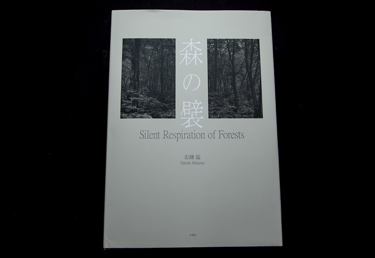
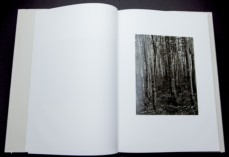
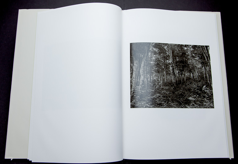
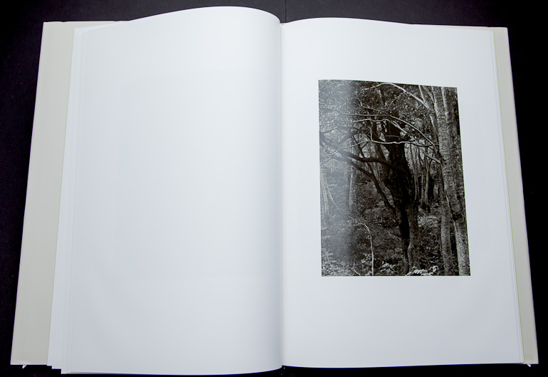
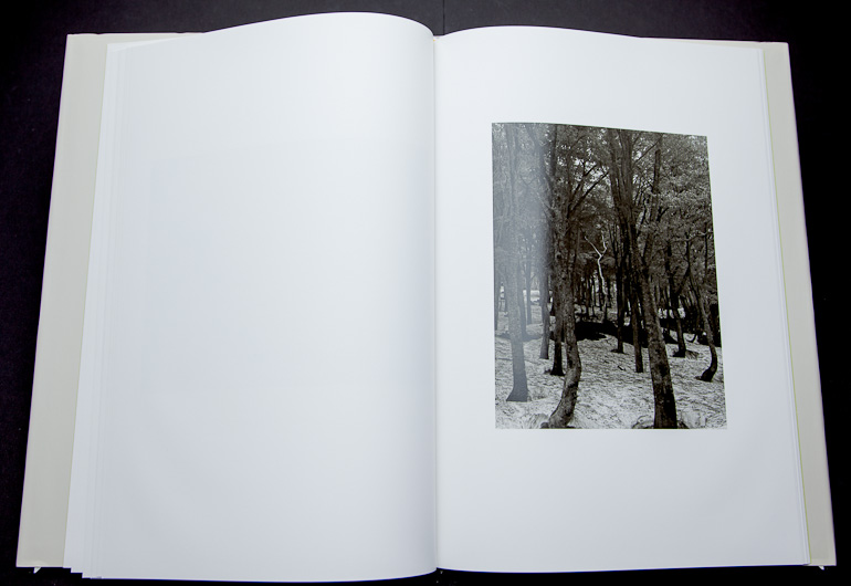
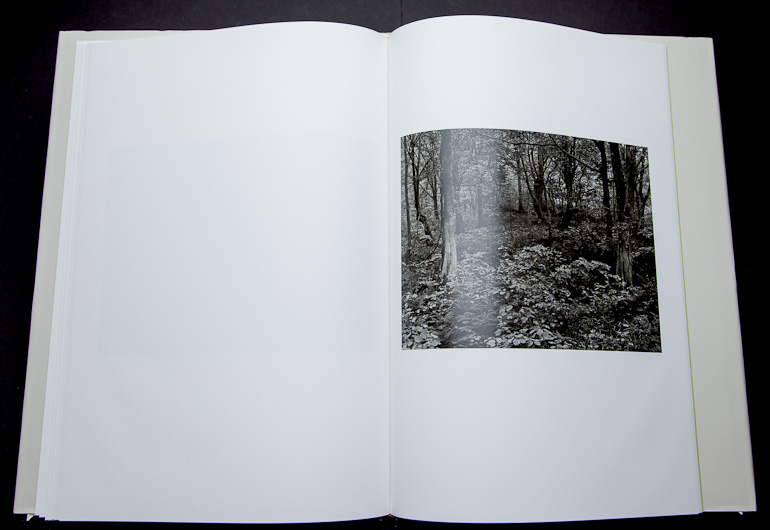
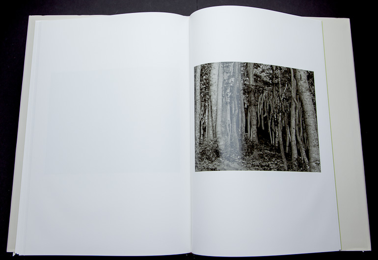


")


")
")
")