RGB or bust! More post-processing with curves

Tim Parkin
Amateur Photographer who plays with big cameras and film when in between digital photographs.
I’ve written quite a bit about using curves to adjust tonality and brightness but curves can be a lot more flexible tools than this. The fact that curves are split into red, green and blue components allows us to adjust the tone of a picture and to do so at various brightness points. So, for instance, we can change the colour of the shadows in one direction whilst changing the highlights in another direction (e.g. cool shadows, warm highlights but leave midtones alone). This is particularly apt as Lightroom now includes curves adjustments of the red, green and blue channels in a similar way to Photoshop.
General Colour Balance
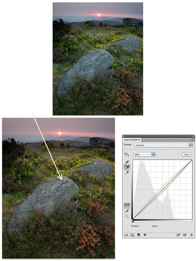
The first thing that most people will do with the colour components of curves is to play with the white balance of a picture. The ‘noddy’ way is to use the grey color picker as shown below (click on the central ‘grey’ eye dropper icon and then find a neutral subject in the picture).
When you 'pick' using the grey eye dropper, Photoshop adds a middle point to each of the red, green and blue curves and then adjusts each of them until the point you selected has no 'tint'.
"Rolling Back White Balance"
It's worth noting that very often you don't want to eradicate all of a 'tint' or 'cast' in a picture - the subtle natural colour may be positive in small amounts and so it's sometimes useful to use the opacity of a layer to 'roll back' some of the correction; keeping a little bit of a cool cast in a twilight shot for instance.
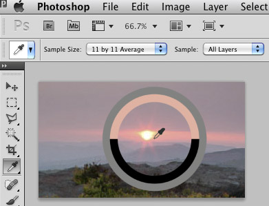
By default, Photoshop uses an eyedropper which is a single pixel in size. This can cause all sorts of problems if you have a textured surface or a noisy image. Even an area of uniform grey will probably be made up of lots of different pixels that just happen to average out to grey when seen from a distance.
In order to prevent this from happening, you can set the eyedropper to pick up a circle around the area you click of a certain size and it will then average all of the pixels in this circle to calculate an average colour. To get this to happen, you choose the eyedropper tool from the tool menu and then in the options bar there will be a drop down allowing you to pick a 'sample size' from 'point sample' up to a 101px by 101px area. I normally choose 5 by 5 (or 11 by 11 if I'm working on a very high resolution scan). NB Make sure 'sample all layers' is selected too!
The image above shows the 'eyedropper' tool selected and the drop down to select the different sample sizes. It also shows a 'colour sampler' surround that shows a larger representation of the colour being picked (very useful to see just what the colour looks like in a large colour field - very often it's difficult to work out what a colour looks like when sitting in the context of a picture).
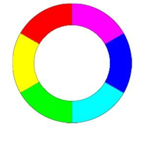
However, in most pictures you are unlikely to find anything that is quite neutral so the typical use will be manually adding points. This isn’t as difficult as it sounds but does involve knowing a little bit about colour opposites and the ability to recognise casts.The fundamental things to know are that cyan is the opposite of red, magenta is the opposite of green and yellow is the opposite of blue.
For some other colours, like the classic cool/warm balance, you need to use ‘in between’ colours, for instance to warm a photograph you need to increase the red level and decrease the blue level (because orange is a mix of +red and +yellow and +yellow is -blue) and the opposite for cooling (-red & +blue).
Adjusting colour like this does not require more than a single point adding to the middle of the curve.
Making targeted adjustments
Sometimes colour casts don’t affect the image across its whole range or alternatively we want to apply a colour adjustment just to the shadows or highlights. For instance, quite often in landscape work, adjusting the shadows to make them slightly cooler can improve the look of an image. The following video goes through using the basic ‘eyedropper’ tool to set the white balance of a picture and then discusses using the curves manually and finally looks at setting different colour corrections for highlights and shadows.
When not to use curves
I find that nearly all of the corrections I need to do can be performed using curves either as discussed above or by adding masks (as discussed in a previous ‘curves’ tutorial). However, there are a few different situations where I use different colour corrections
1) Problem colour balances - quite often it’s difficult to see exactly what is happening with a colour cast. This is especially so when you’ve been working on an image for a while and you brain starts to auto correct things for you (how nice of it! google ‘colour constancy’ for more info). In this situation, it’s quite useful to ‘break’ the connection with your eye and the original picture.
The colour balance tool is good for this because you can easily add too much colour correct to a highlight, midtone or shadow and then gradually bring the colour back to normal. In this way, you tend to ‘forget’ what the original image looked like and hence are approaching the correct result as if for the first time. So, open colour balance, pick the midtone selector and then take the red/cyan controller and swing it to either end of it’s range so that you end up with a heavy colour cast. Once you’ve done this a couple of times (to con your brain into giving up trying to balance things) you can then start to bring the controller back toward a more sensible setting. Don’t look at the settings though! You want to use this technique blind if possible. Once you’ve finished with red/cyan, move onto green/magenta and then blue/yellow - you can play with the shadow and highlight if you want after this.
2) For ‘selective’ colour. Sometimes you don’t want to correct a colour cast over the whole picture but the subject matter, your camera or a light source has caused a problem with a particular colour. As discussed in previous issues, green is a particular problem with many cameras or films. I use ‘selective colour’ to target an individual colour (foliage is better addressed as yellow in this case - odd I know).
3) Adjusting the hue of a colour. The only real tool that does this well is the hue saturation tool - this is pretty hairy stuff though and I have rarely used it and only then to fix a problem when printing a particularly out of gamut colour or to tweak colours to make them look more like Fuji Velvia film. It’s probably best to come back to this one in a future article
We'll look at some of these examples in a future issue. In the meantime, please feel free to ask any questions below and we'll add to the article if we can explain things further or add more examples.


