

Where Does the Viewer Live?

David Ward
T-shirt winning landscape photographer, one time carpenter, full-time workshop leader and occasional author who does all his own decorating.
During a recent one-to-one session, my client - a charming, intelligent and talented photographer called Pam - told me that she often agonised about why she made photographs. What was the point of it all? Was she just engaged in a purely selfish act? Was there some deeper meaning to her practice of photography and the resulting images beyond merely satisfying her whims? (I wrote quite extensively on the possible motives for photography in OL29 and I don’t intend to recap that here.)
Pam’s internal dialogue was related to her father’s love of photography and what she saw as his failure to realise his artistic ambitions. A keen amateur, he had left a legacy of visually acute and personally engaging family portraits, images that captured for Pam the essence of their shared experiences. But not content with using photography to make “snaps”, and perhaps buoyed up by the positive responses of his nearest and dearest, he had attempted to broaden his photographic output and began making landscape images. However, as Pam described it, his “heart wasn’t in it” and his landscapes were not of the same quality as his family portraits. Upon his death he left behind thousands of prints and slides that failed to ignite Pam’s imagination. Sadly, whatever creative spark fed the portraits was absent in these bland landscape photos. What might it be that was missing from her father’s landscapes and what lessons can we learn from this?
Let’s start with one of photography’s most obvious characteristics: every image is weighed down by description; any sharp image re-presents the world in incredibly fine detail. In fact a photograph presents us with a kind of hyper-reality, a view of the world that is more different from our unfiltered vision than we usually acknowledge. Photography’s seemingly fantastically faithful rendering is both a major strength and its Achilles heel.
The level of detail in a photograph is so compelling that the photo seems real, or at least a truthful re-presentation of reality. Photographic description’s strength stems from the perception of inherent truthfulness that it generates.

Boring
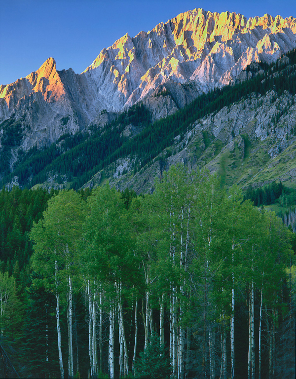
But description alone isn’t enough to make a great image, no matter how spectacular the subject. When photographs are merely descriptive, or at least seem this way, they lack the power to engage our attention. Unless we have a personal connection to the scene described, we will turn away from an image like the one above after a few brief moments. Human evolution has shaped us to reach for early visual closure. We want to understand our visual field as quickly as possible so that we don’t walk off the cliff, bang into a tree or get eaten by that tiger lurking in the tall grass. This means that we’re programmed not to pay too much notice to the contents of our visual field once we understand them. We want to move on until we find something that we don’t fully understand. This applies equally to any photograph we might view.
According to one website, this photograph is a possible contender for the world’s most boring and appears to have very little beyond that to commend it. But context is everything. The picture was posted on Instagram by someone who, after successfully assembling a wardrobe, wished to share their pride in their DIY skills. As a close friend, you might rightly have empathised with their achievement and consequently found the image to be imbued with emotion.
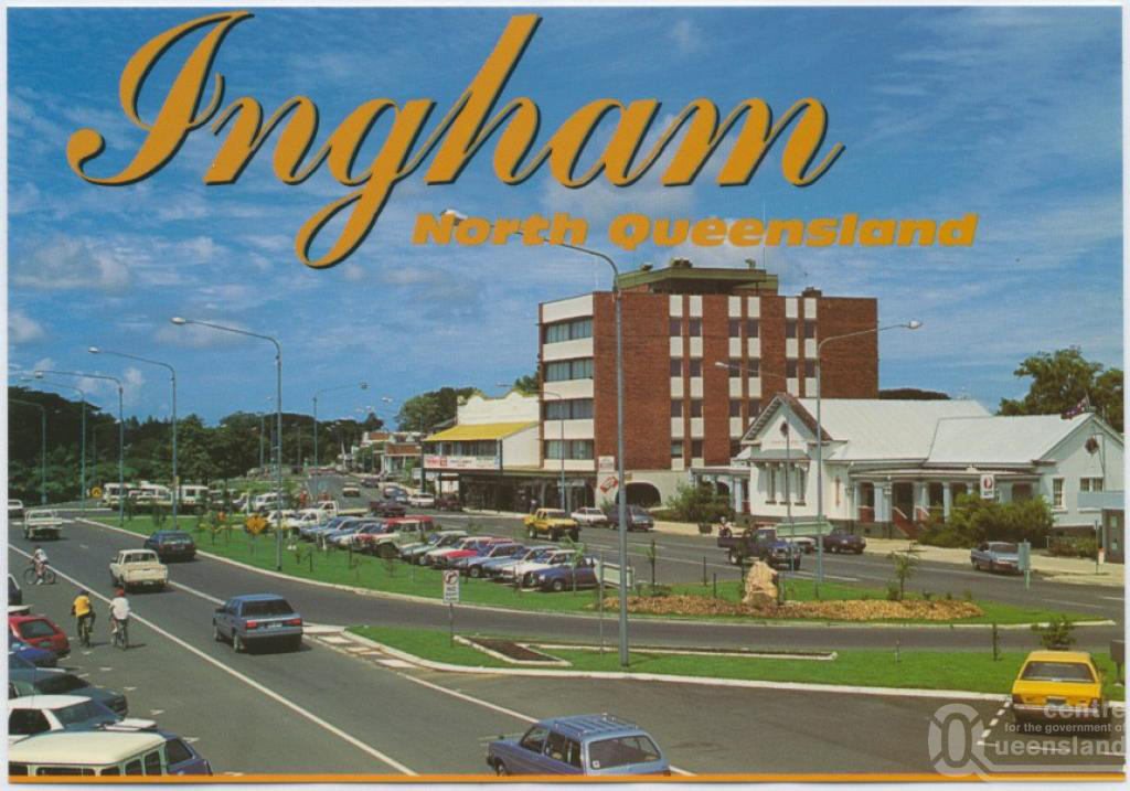
In an image such as the postcard above denotation seems significantly stronger than connotation and the possibilities for an emotional connection with the viewer are consequently greatly reduced or might even be thought lost entirely. It is important to realise however that this doesn’t make a photograph devoid of meaning. Even in a photograph as bland as the view of Ingham there are signifiers. For instance, the vault of blue sky and bright light connote warmth and heat, to someone from the less than balmy British Isles they speak of summer. Of course the accompanying text informs this interpretation. I “know” that Queensland is in Australia and Australia is hot. Other subtler signs are at work too. The image is clearly a celebration of Ingham, a sign of this community’s civic pride. The people who commissioned this were proud of their town’s modernity, its neatness and its cleanliness. However they have expressed this in such a way through this photo that I see them as plodding bureaucrats rather than visual sophisticates. This interpretation springs from what I consider to be the artless way that image is composed and presented. It is dependent upon my intellectual and emotional baggage. We must always remember that there are two people present in the viewing of an image: the photographer with their vision and the viewer with their interpretation of that vision.
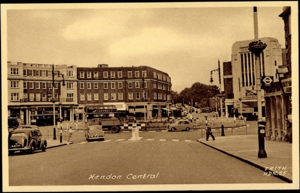
Hendon
We should be aware that a photograph’s meaning and its ability to evoke an emotional response is not fixed. Our interpretation may change over time for at least two reasons: Firstly, because photographs are linked to a moment in time they may acquire historical or cultural significance as they fall forwards into their future. This image of Hendon Central may well have qualified for amongst the least imaginative street shots ever taken when it was made. But it has gained a certain nostalgic charm in the intervening decades. Secondly, we ourselves change either in response to personal experiences or because of wider cultural changes. Our perception of what makes a good photograph will change as we encounter images that move us. It may also change according to fashion or peer pressure. Looking back at photography books from the early years of the 20th Century we would undoubtedly find many images that were lauded at the time but now appear old fashioned or even incomprehensible. Once again context is important.
As an aside, nowadays most photographers don’t take the medium’s magical ability to describe for granted. Dear me, no! For many photographers making sure that you can cut yourself on the sharply defined edges in their photos is of paramount importance. The development of digital imaging and the attendant tools for sharpening have meant that an obsession with sharpness has increased in recent years. You can almost always tell a photographer at an exhibition by their habit of “print sniffing”: they invariably stand incredibly close to any image to check how sharp it is. But they would do well to realise that no one ever stood in front of a photograph and wept just because it was sooooo incredibly sharp. You might weep because your own image isn’t sharp, but that’s an entirely different matter.
You might think that these example images fail to pique our interest much simply because the subjects are boring. Unfortunately, it’s perfectly possible to make boring images of great subjects – I’ll refrain from giving examples here as I know that I am just as guilty of this as any other photographer. The common link between boring photos of boring subjects and boring photos of interesting subjects is that neither evoke an emotional response. This is what Pam felt was missing in her father’s landscapes. Why might that be? I believe that in order to hold our viewers’ attention we need to do more than merely describe. It’s not good enough to stand yourself in front of the most amazing view in the world (suggestions on a postcard please) in breathtakingly beautiful light. That might elicit a wow but it won’t instigate a deep and subtle dialogue with the viewer. For the image to transcend its subject, to become more than an illustration, we need to make images that are intriguing and evocative. Only then might our images be considered art. I consider this ambition to be one of the hardest but most satisfying things to strive for in landscape photography.
The clever thing to do with photography is to use it to try and see more deeply and hence to reveal things to the viewer. This is how any artist aspires to use their medium. In this way we might show something, beyond the obvious spectacle, to be beautiful or compelling. The American photographer Guy Tal described the difference between these too approaches very neatly in an article for OL:
The purpose of illustration is to say: “Here’s what you would have seen had you been there.” The purpose of art is to say: “Here’s what you would not have seen had I not shown it to you, even if you were standing next to me.” In the former, the photographer is but a passive bystander, a mere operator of machinery; in the latter, the photographer is an integral part of an image and its reason for being.
In a sense anyone can photograph the spectacular – okay, I’ll grant that you need to make some effort and be there. But the vast majority of these dramatic landscape images are merely recordings made with a camera. These spectacles are by definition the exception rather than the norm and actually tell us very little about the landscape or the experience of being there. More importantly, perhaps, these images tell us very little about the photographer and their individual vision. Ultimately, it is more important to be noticed for the way we see than for what we see.
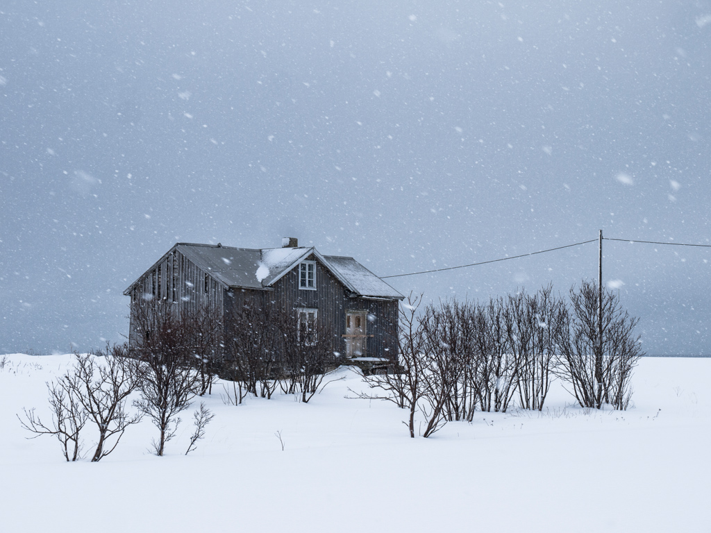
Kvalnes farm in snowstorm
How might we strive for evocation? Quite simply the best images leave something to the imagination, they leave room for the viewer. We might think of the preceding images as bald statements of fact (although I hope that I’ve shown that no matter how boring they’re still more than that). In contrast, an evocative image leaves room for the viewer to construct their own story or to raise their own questions about the subject.
I proposed in Landscape Beyond that we might usefully think of all photographs as always being either questions or answers.
Questions
Images that are questions invite us to explore what we feel about the image’s subject. They evoke questions without necessarily providing answers and they tend to be open to interpretation, to be ambiguous. Questions can be both aesthetically pleasing and revelatory. Questioning images don’t attempt to tell the whole story, they are content to be merely an enquiry.
Any photograph made with serious intent is a form of enquiry; its author is asking a question or questions of the world. A crucial point is that sometimes these are answered within the frame and sometimes the image just leaves a question or questions hanging unanswered. It’s important to point out that this is not the same as the composition being unresolved. An unresolved image is one that lacks compositional balance and is aesthetically unpleasing: it is such an ill-posed question that the viewer is not only unsure what they are being asked but unsatisfied with the form of the image that they’re being presented with.
Answers
Images that are answers impose the viewpoint of the photographer upon the viewer. They appear to be straightforward, to be merely illustrative and they tend to provide a definitive answer without provoking the viewer to raise any questions. Answers can be aesthetically pleasing but are never surprising. Photographers who stay in their comfort zone will make answers. They will typically shoot similar subjects in a formulaic way. They are giving pat answers to the questions posed by the subject matter or they are not even aware that any question exists. A typical seaside postcard would be a good example of an answer image. An answer shows us what was photographed but doesn’t invite us to think, it denotes far more than it connotes.
Many other ways of classifying photographs according to differing polarities have been proposed. The most obvious example is the objective/subjective argument that has running since the invention of photography. Photographer and museum curator John Szarkowski proposed another in 1978. He held an exhibition entitled Mirrors & Windows at the Museum of Modern Art that has greatly influenced subsequent ideas about the interpretation of photographs. The premise for the show was that all photographs are either mirrors reflecting the photographer who made them or windows presenting the photographer’s view of the outside world. The former tell us more about the photographer than about reality and the intent of the latter is to tell us more about reality than about the photographer.
The difference between Szarkowski’s classification and mine becomes more apparent if we look at a diagram.
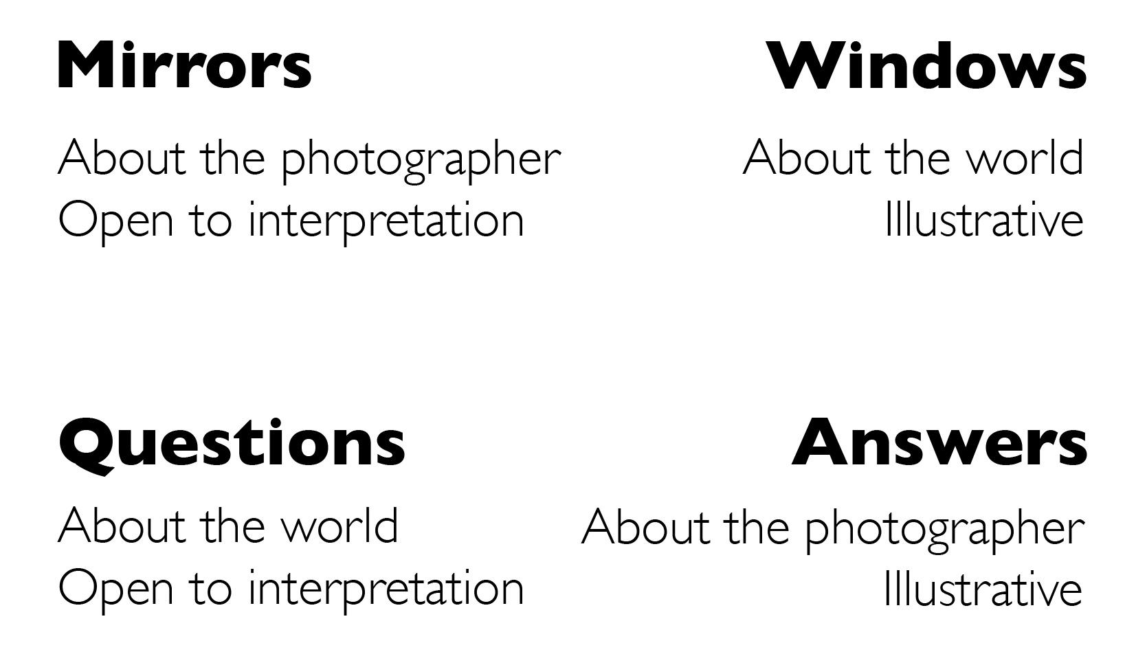
You’ll notice that the new categories mix the attributes of the old; a “question” has one of the attributes of a “mirror” and one of a “window”. I’m not suggesting that Szarkowski’s analysis is incorrect, merely pointing out that we might look at photographs in another way. Of course in reality photographs are never wholly one thing or another. The intention of the photographer and the quality of meanings that arise from his work lie across a matrix.
So, what benefits might we get from thinking of images in this way? The first is to show that photographs have another level of complexity beyond Szarkowski’s duality. Of course we should already know this, and I’ve discussed subjects such as semiology that have a bearing on this at some length in “Landscape Within”. I think that the questions or answers duality lets us think in a new way about photographs, one that is much more weighted toward thinking about intent than the approach offered by semiology. If we think about images in this way we must ask ourselves what might the photographer’s intent have been and have they succeeded. Semiology concentrates on outcomes rather than intent, it looks at what arises from the image rather than why that was included. We can never know the photographer’s intent for sure but asking what it might have been is a useful exercise. It might help us to think about why certain images intrigue us and others don’t. This approach is not intended as a replacement for the other approaches, it certainly offers a shallower analysis than semiology may provide. But one distinct advantage is that it is relatively easy to employ without having to spend years on studying psychology or linguistics.
Mt Ishbel
I feel that many photographs – such as my own of Mt Ishbel – function as ready made visual answers. They leave the viewer with no room for disagreement or inquiry but present a world-view that just is. This often reflects a fixed approach by the photographer.
But when photographers allow themselves to be enquiring they are more likely to produce questioning or intriguing images. These photos don’t seek to impose a visual answer; rather they force the viewer to ask some questions of the photograph and photographer. What am I looking at? Why did the photographer make this image? Why did they choose to compose it like this? How does this make me feel? Unmoved? Curious? Now, these aren’t hard and fast rules. A simple portrayal may, through quiet contemplation, evoke questions rather, than merely illustrate, but this requires subtlety and nuance. A loud image, with super-saturated colours, drowns out any such delicate questions, they become lost in the background noise. The denotative power of the photograph can swamp subtle questions but simplification will help to concentrate the viewers’ attention. Shakespeare wrote that, “Truth hath a quiet breast.” Make your images simple, make them quiet and ask questions and you may at the very least reveal some further mysteries to explore.
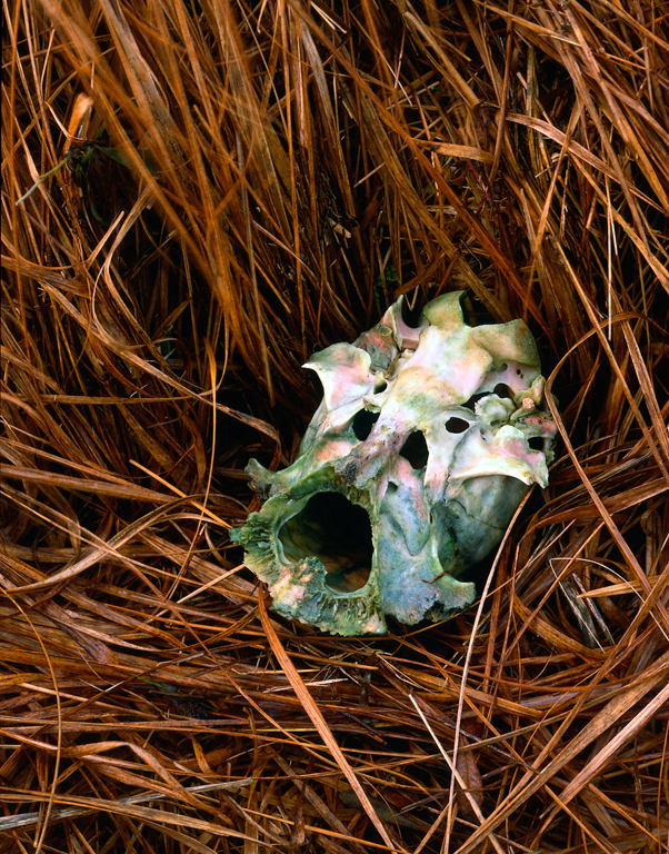
Skull
A questioning image is more 'difficult' to view in the sense that viewing requires the active participation of the viewer. Most photographs are viewed passively; we absorb what they show without much conscious effort. But, in the same way, that junk food is pleasant to eat – because it gives an intense but short-lived high – these passive photographs rarely leave a permanent impression on us. An hour, or at most a day, after we've looked at a passive image it is lost to our memory. What we get out of photographs is directly linked to the effort that we put into the viewing and it seems clear to me that the photographer's duty is to try and engage the viewer; not simply by making 'pretty' images but by asking something of them in return for the gift of the image. The audience should sing for their suppers!
Ian Biggar, an acquaintance of mine and a fine photographer, once described to me a conversation he'd overheard on a photographic workshop. The leader had asked a participant "What are you trying to say in your image?" The participant replied, "I'm not sure I'm trying to say anything yet. I guess I'm still listening." This struck me as a very sound basis for photography. When I'm working I try to be open to the possibilities for image making rather than having a fixed outcome in mind. What's important to me is that I'm making an enquiry about my surroundings in my images rather than imposing a conclusion. I'm not seeking to make definitive statements because I don't know the answers. The questions vary enormously from image to image; I might be asking about the colour of light or what is it that is beautiful about moving water or why I find that arrangement of elements interesting. These questions are born as personal enquiries but only achieve maturity if their final form appeals to a wider audience. The important thing is never to stop questioning. Those who “know” all the answers have stagnated. In the words of a Chinese proverb, “He who asks is a fool for five minutes, but he who does not ask remains a fool forever.”
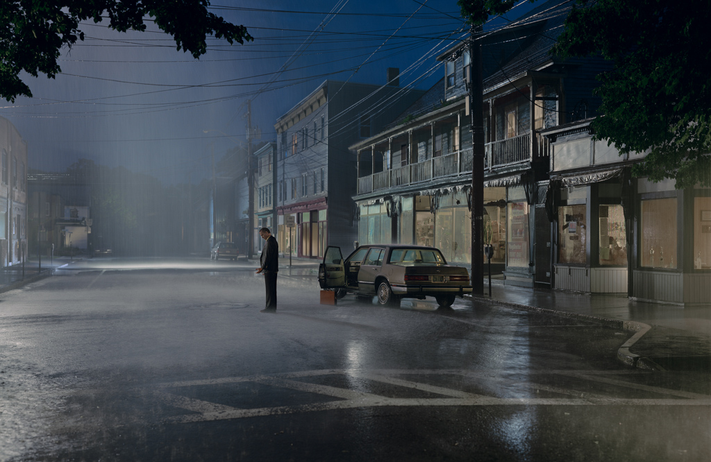
Untitled, summer (from Beneath the roses), 2004 © Gregory Crewdson
Let’s consider for a moment this image by American photographer Gregory Crewdson. A professor at the Yale University School of Art, Crewdson is often credited with being one of America’s greatest living photographers. Yet strangely, at first sight little appears to be going on in many of his images. They often refer to small town America and depict one or two blue-collar characters. The images are beautifully constructed, shot in colour with elaborate cinematic lighting. They combine a powerful richness of texture and colour with subtle and simple compositions. These are all engaging attributes with complicated sets of signification attached to them. But what makes them so incredibly powerful is the feeling that the subjects are caught within some unknown and unknowable psychodrama. The image above provokes countless questions: we wonder what anguish has driven the man to stand in the street in the pouring rain? Has his lover left him? Has he lost his job? Has he lost his mind? What does his gesture mean? Is he impeaching someone just outside the frame? Why has he left the car door open but carefully placed his briefcase upright next to it?
The image invites us to construct a history and future for the protagonist: what happened just before this moment was frozen and what will happen just afterwards? This is what I mean by leaving room for the viewer.

Basking Sharks in Sennen Cove © Pam Harrington
So, what was missing from Pam’s father’s landscapes?
I suspect that for Pam her father’s landscape images failed in a number of ways. Most obviously as a trained designer, they failed to match her aesthetic expectations, although this is perhaps a minor point. As someone with a personal connection, I would guess that Pam was also looking for traces of his personality, particular interests or passions but found this missing. In effect, he was absent from the photos. And finally, I think it likely that they failed because he never moved beyond illustration, never found a way to leave room for the viewer. Unlike his portraits, which were full of life and his obvious interest in the subjects, his landscapes were in effect technical exercises in composition and craft. In short he never managed to transcend his subject and move beyond bald description. This might seem like a harsh analysis but I feel that her father’s failures have taught Pam a very useful lesson. During our critique session, I found her best images – like the Basking Sharks – to be subtle, provocative, surprising and full of room for the viewer.