Joe Cornish in Black and White

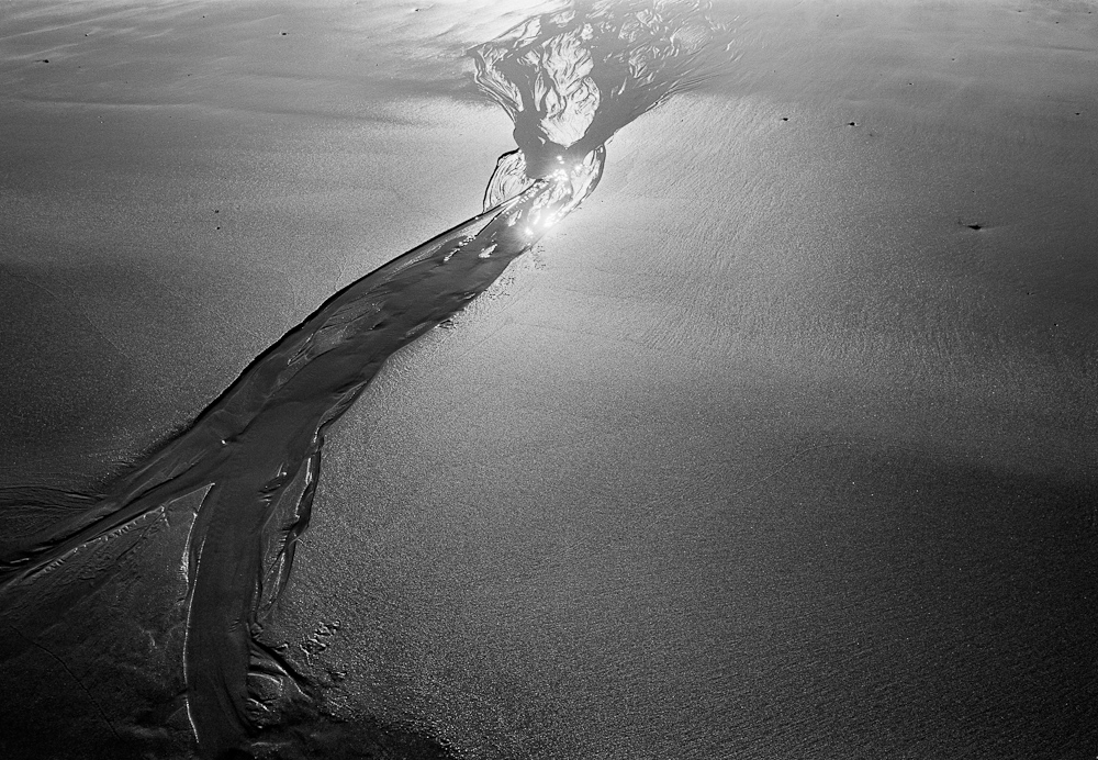
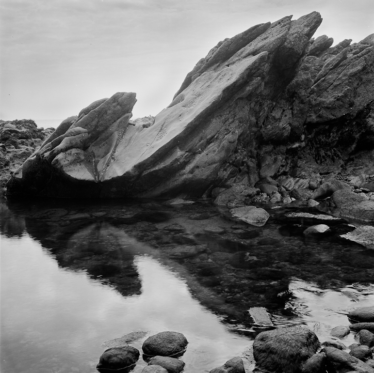
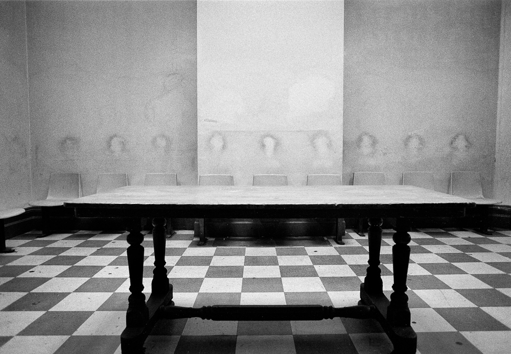
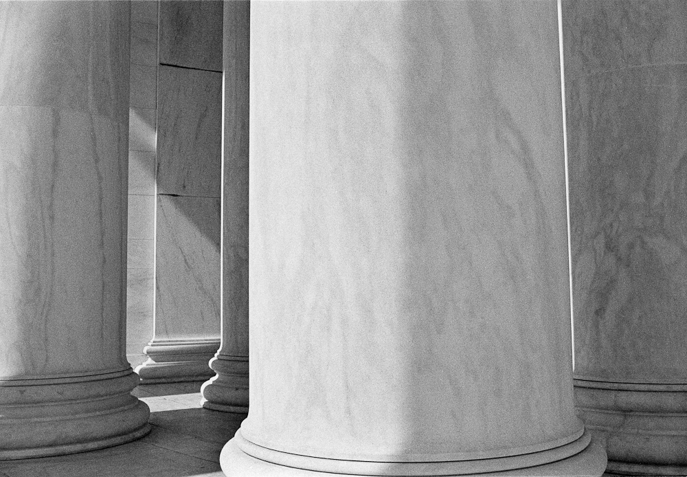
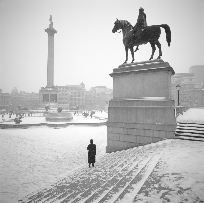
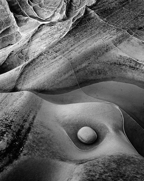
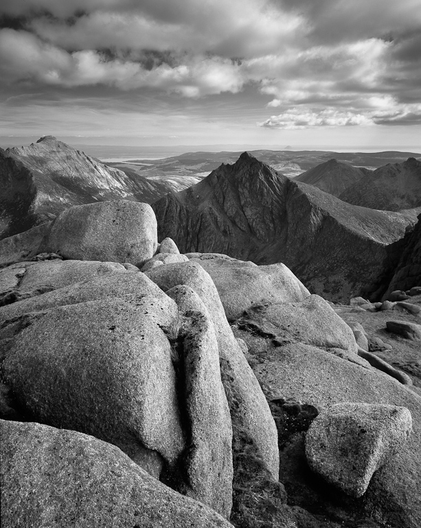
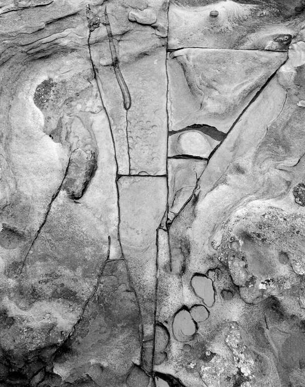
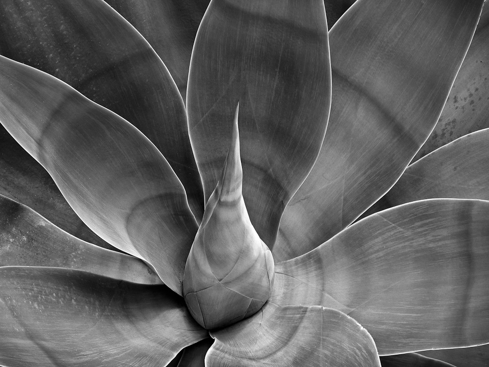
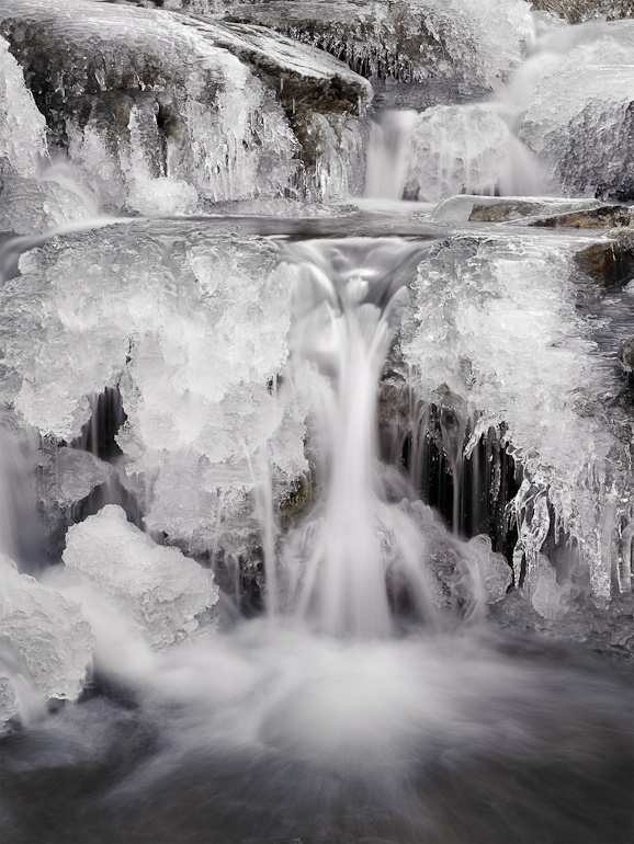
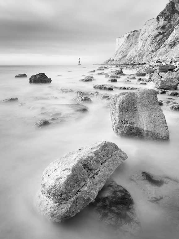
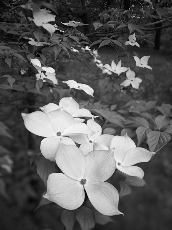
After our article on black and white last issue we thought it would be topical to take a look at some of Joe Cornish’s black and white photography. This brought up a few nice surprises along the way. We’re looking at quite a few photographs and here are a small sample of them (there are more in the gallery at the bottom of this article).

09 Howick rock geometry mono print
11 CF006105_Snowdon
13 CF007341_mono


You need to be logged in to see this part of the post

11 Responses

  1. Thanks Joe and Tim, I have now watched these videos and found it all very interesting. I wholeheartedly agree with Joe’s sentiment about the validity of hybrid workflows. In fact, one of the great things about digital capture is the way it has breathed new life into black and white by opening it up to so many new possibilities and making it accessible to anyone with a scanner or digital camera.

    • Joe Cornish

      Hi Simon,
      Yes, given the amazing wealth of possibilities it is perhaps disappointing there isn’t more radical work being done in this way. But having said that I bet there is an elite hardcore of photographic Picassos out there doodling around with devilish concoctions of silver and platinum even now being poured into the continuous inkflow system of an Epson 40inch wide printer…
      I note that Albert Watson’s recent work for the Macallan distillery was shot with a Phase One P65 on a Hasselblad, but printed beautifully as platinum prints on rag paper via an internegative.

  2. It’s good to hear about Joe’s early b&w days and especially so about the Rolleicord! I inherited one from my father some years ago and have used it quite a bit, but I got frustrated with the fixed lens. The inability to shoot wide made me migrate to the Mamya 645. Nevertheless, I still occasionally use the Rolleicord and was going to do so today, shooting b&w in nearby woods. Unfortunately rain stopped play – but gave me the opportunity to enjoy these videos at leisure :)
    I have not yet been able to reproduce the “glow” that I see in some others’ monochrome images on screen and wonder if Joe (or anybody else) can give me some tips? I used to be able to do that with paper based b&w quite regularly.
    Rgds., Adam

    • Joe Cornish

      Hi Adam,
      Rain stopped play? Shock horror! Surely, rain is perfect for photography in the woods! Nevertheless, glad you took in the videos instead.
      “Glow” is an essential element for me in photography, especially in black and white. My guess is you are being too hard on yourself re your screen images. I must say that I am always working towards the print ultimately, but of course this does not want to be too different from the screen image. There are 101 different techniques for creating that feeling, whether in the darkroom or in the computer, so I wouldn’t attempt to describe them here. However, the phrase that always resonated for me, thinking about darkroom prints certainly, was that the image/print should ‘have its own light’. I have developed both my camera/fieldcraft, and my printing approach and techniques accordingly.

  3. Nigel Clarke

    i thoroughly enjoyed this series and went on a bit of a B&W bender after watching it…. it am writing this only because I saw a rip off (sorry homage) of your station photo recently on the bbc website ‘the art of building’…
    http://www.bbc.co.uk/news/in-pictures-13793606
    I’m afraid modern grit just isn’t as impressive as the stuff you captured Joe.

    • Joe Cornish

      Thanks Nigel,
      Having clicked on your link that was a fascinating browse, and there are some striking images in that collection. Interesting to see the underground station picture too. I must admit it would be nice to think I was a ahead of my time with the Reading station picture (1981). Interestingly (for me) I think it was the first image of mine which (several) other people wanted to buy.

  4. Pete Hyde

    Many thanks Joe and Tim for this interesting and entertaining insight into some of Joe’s black and white images. It is always enlightening to here what inspires a photographer to make a particular image, and in these cases why the preference was for monochrome. I have never seen any of Joe’s ‘non-landscape’ shots before, so that was an unexpected treat and I found the discussion on the work flow of the Agave image particularly interesting.
    (I suspect the Thorpe Perrow shot, which was extraordinarily beautiful, is of a Cornus of some type, possibly C. kousa the Chinese or Japanese Dogwood).
    Regards, Pete

    • Joe Cornish

      Thanks Pete,
      I will aim to verify the tree species on my next trip to Thorp Perrow, and am glad to have an opinion on it to start with. Thanks especially for your kind comments on it.
      I have not visited that many arboretums in the UK, but if TP is anything to go by they offer a wealth of possibilities and inspiration. Since my instinct takes me into the wild, this might seem a surprising comment, but perhaps it is simply a sign of age!

  5. Well, after Mr Cornish chided me oh so harshly for keeping my camera dry the previous weekend, I retired to nurse my slapped wrists but feel I can come out of my dark corner now :) The new “Last Supper at Reading” photo is not a patch on Joe’s if only because the all-important table is no longer there! Also, the modern seating detracts in a big way.
    In any case, it’s good to be stimulated to return to monochrome and I will continue to pursue this line with renewed enthusiasm. Thanks Joe! Rgds., Adam

  6. Fascinating stuff and I’ve only watched the first two parts so far. The “last supper” photo is a revelation – I would never identified this as Joe’s work if it was seen in isolation. It reveals perhaps a greater range of Joe’s work than I had previously appreciated.

    The rock abstract in Northumberland was also very interesting – my first thought was “David Ward does Kandinsky without colour”. Was that at Rumbling Kern ?

    • Joe Cornish

      Thanks Kevin,
      Am a fan of David Ward and Wassily Kandinsky, so that last point is much appreciated. Yes it was Rumbling Kern, and the colour was really ‘inactive’ at the time, hence the decision to shoot mono, 5×4 Neopan 100 Quickload.

Notify me of followup comments via e-mail. You can also subscribe without commenting.