
Bringing natural balance to your images

Tim Parkin
Amateur Photographer who plays with big cameras and film when in between digital photographs.
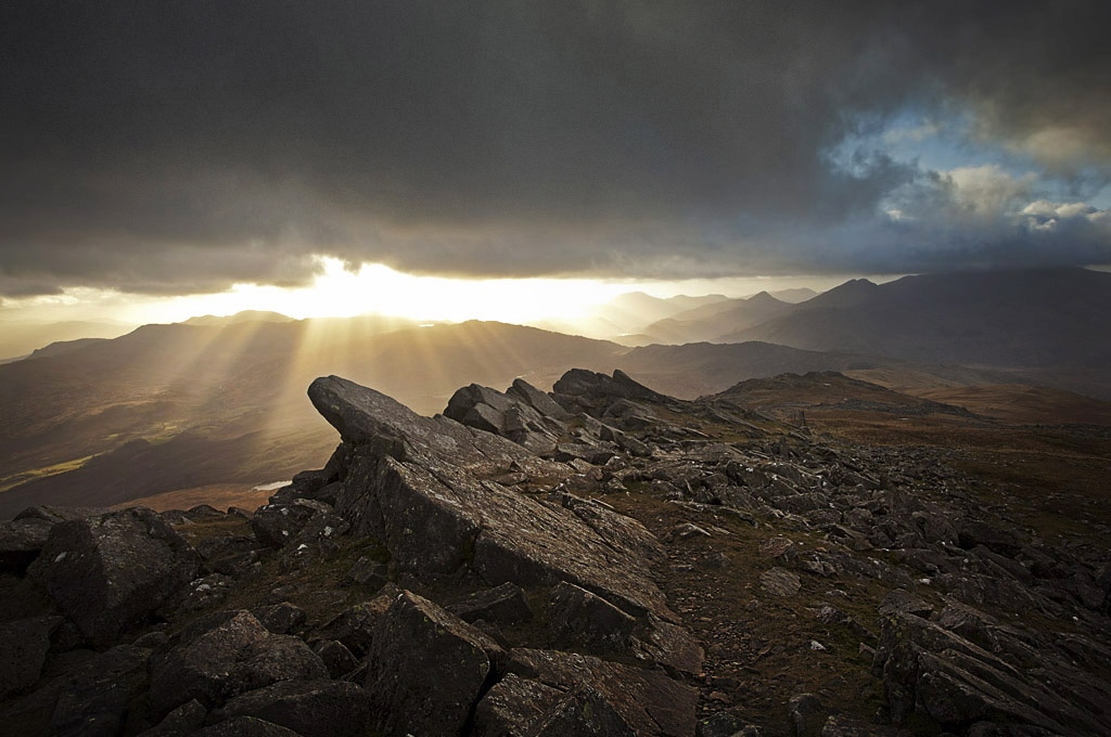
Paul Moon’s article about the inclusion of areas of black in an image got me thinking about another pet peeve of mine and I was hoping to share it with you. Paul touched on this in his article when considering the balance of light in a picture and talked about the over bright foreground found in so many coastal sunset shots. This isn’t just a symptom of the coastline however and a more subtle issue arises where parts of a picture that are not in direct sunlight are unbalanced when one area receives the attention of the dodging brush but not the other. This also happens when the shadow/highlight or the fill shadow tool is used. I can’t really continue this without an example and as I was chatting with Neil Mansfield recently about one of his excellent pictures of the Summit of Moel Siabod towards Snowdon, via the SE ridge and although I could see he’d captured some wonderful light with a great composition, I couldn’t help but ask if I could have a little play to rebalance the light in it. Neil, being very tolerant of my presumptuous approach, let me have a play and I’ll describe what I did and why here. First of all, let's take a look at the original file.
Now, again, this is a wonderful picture and my goal was hopefully to show an alternative interpretation. My goal was to try to compensate for the essential graduated filter that I presume was used so the first step was to darken the foreground and lighten the sky using a curve so we don’t clip any highlights or block any shadows.

The result was as follows :

This hopefully creates a baseline to work on for the foreground - I've used some local adjustments to try to make the light on the foreground look as balanced as possible; reducing highlights and opening up shadows.
The next step was to lighten the clouds which were darkened by the graduated filter. This was done applying the following adjustment layer.

Which gives a picture as follows :

Hopefully, this balances the light through the picture from bottom to top, ensuring the clouds are not darker than the foreground (or at least not too much). By doing this we have a picture that is a little 'flat' in the foreground and so our next step was to apply some lightening around the sunlit ridge and applying selective lightening to some of the rocks in the foreground to create 'shape'. Here is the adjustment layer.

Which gives :

My personal logic when applying this lightening is to work out where a light source 'might' be coming from and light objects consistently according to this light source. In this case, the open area of the clouds on the right hand side suggested that there may be more open sky to the right which could give shaping light to the foreground. Obviously, this is subjective but working with the way that objects area already lit and using this sort of logic to help emphasise it often works. These adjustments don't need to be exacting, as you can see from the adjustment layer we have only applied broad adjustments.
A final couple of steps are pretty general but I like to burn the edges in a little using a curves adjustment. I don't apply an overall 'vignette' adjustment as this can often darken areas too much if they are already dark. Here is the adjustment layer.

and here is the result
As you can see we haven't applied the adjustment to the bottom of the image, leaving a lighter area in the foreground to allow a 'route' into the picture. We've also offset the overall vignette toward the focal point of the picture.
Finally, we thought that the light area of the sky at the top right was drawing the eye a little too much so toned it down using the following adjustment.

Giving a final result of ..

So here is a before/after view..
I should probably warn you, switching between the two views quickly will make both look wierd :-) It's what an image looks like after you've been viewing it for a while that matters, the a/b is meant to show the sorts of things that have changed.
Now we haven't worked this image to the Nth degree - there are further amends that could be done. For instance, we might lighten up the path in the foreground and soften up the darkening in the bottom right of the image. However, I'm hoping this has got across some of the ideas. We might even go a lot further and darken the foreground - I've had a little play but I'll leave it at that.
We've probably taken this a bit further than needed in order to demonstrate the point but hopefully, we haven't gone too far. The idea that the light in an image should (may?) conform to the environment where possible is one that I believe helps an image.
What can we take away from this?
Graduated filters are a tool to darken the very brightest parts of the picture, not necessarily to darken all the parts that it covers.
Here is another example using a photograph that I took in 2007 in Cornwall where I used a two stop hard grad to hold back the sky and the bright reflection in the sea. Unfortunately in doing so it made the cliff extremely dark and also darkened the clouds to the point of ominous foreboding. Now if ominous foreboding was my intention (as well as making people squint at that cliff) then I achieved things quite nicely. However, If I apply a fairly vigourous curve adjustment and mask it using a gradient (applied directly to the mask using the photoshop gradient fill tool) I get the following..
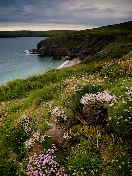
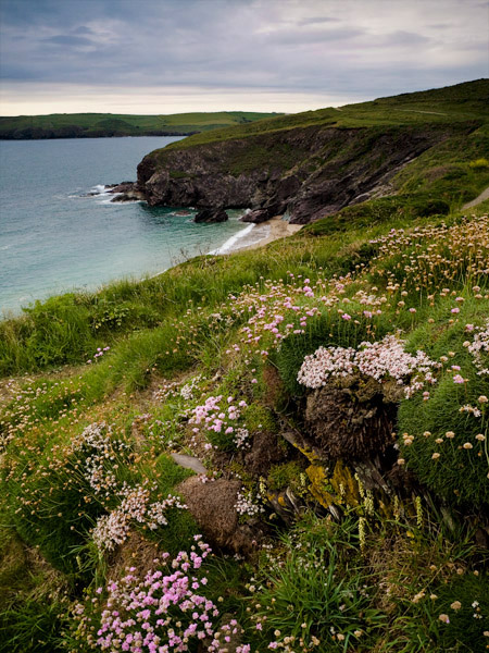
And here is the curve and mask I applied..

My second point is..
Look at the natural light in your picture and think about keeping a consistent balance when applying dodging and burning
The biggest culprit in causing unbalanced pictures is probably the shadow/highlight tool. Using this tools blindly can very often result in unbalanced shadows. For instance, imagine we had a picture where we have scattered shadows from the distance to the foreground. The sizes of these shadow areas would differ but the tools described apply a 'boost' only to shadows that are larger than the radius setting. This can mean a shadow in one part of the picture ends up a lot brighter than a shadow in another part of the picture. People may not pick up on what is strange about a picture consciously but the subconscious is very clever at working things like this out. My biggest bugbear is where the shadow/highlight tool has been used with such aggressiveness and with such a small radius that all of the large scale contrast in a picture has been removed. e.g.

I should add that you can get away with areas that should be the same tone being different if they are far enough away from each other in a picture. This has to be true otherwise graduated filters would not work at all! Typically, however, graduated filters have a soft enough transition that the effect isn't 'in your face'. Or when the graduated transition is strong, it is typically placed across a transition in the picture where the difference in tonality is acceptable (i.e. across a horizon or the edge of a hill/wall).
Again, I want to add that all of this is subjective and is also not a hard and fast rule. You can get away with ignoring these 'suggestions' but I would say that being aware of what I have talked about could help your pictures.
Finally, a great big thank you to Neil Mansfield for letting me use his image! You can see more of his work at Neil Mansfield Photography.
Tim Parkin