
The basics of using 'curves' in post-processing

Tim Parkin
Tim Parkin is a landscape photographer living in Scotland who co-founded On Landscape magazine. Alongside his photography and writing he also co-founded the Natural Landscape Photography Awards, runs a film scanning business and is a judge for other international landscape and nature competitions.
If you’ve done much Photoshop work, you must have come across curves. Even Lightroom has a basic version of them, but we’ve wondered what it is they actually do and how can we understand them and hence use them more effectively.
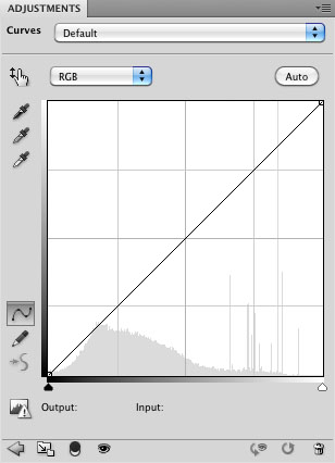
First of all, let's take a look at how the basic curve works in RGB mode. The diagram below shows a 'neutral' curve i.e. one that has no adjustments applied so far. What this curve represents is a transform from the input values to output values.
 A straight line like this shows that every input value is going to be mapped to exactly the same as the value in the output. You can confirm this by picking a value in the bottom greyscale and making a line from this going vertically until you hit the curve. Then draw a line horizontally until you get to the output grayscale. This shows you that for any value, the result is the same.
Now let's take a look at a curve that adjusts some values. This is a typical curve that people might use to make an image brighter. As you can see, the bottom left and top right points have stayed in the same place and hence the blacks and whites in the image will not be affected. Every value in between black and white will be affected, however, with the dark areas and light areas being lightened a bit and the middle values being lightened a lot.
This is a curve that doesn't "throw away" any data. What we mean by this is that the values could be recovered by making the opposite of the curve (a darkening curve). The following shows what we mean (for pedants, these curves are not the exact opposite of each other so wouldn't perfectly cancel each other out - it's close enough for you get the idea though.) This is almost the same as changing the middle point on the input values of the Levels dialog in Photoshop.

Here is a curve where data is "thrown away", if you look at the very dark areas of the image, a whole range of them is being transformed to solid black.

These values would not be recoverable later. This curve darkens the whole image and is the equivalent to bringing the black point up in levels or the blacks slider in Lightroom.
Here is a transform where data is not destroyed but the whole is reduced in contrast; blacks become dark grey and whites become light greys.

This is the same as output levels values in the levels dialog.
Very often you may wish to make more complicated adjustments in the curves dialog. Here is a curve that darkens most of the picture but lightens some of the very brightest areas, creating an overall contrast increase and slight darkening of the picture.
 In practice, you will probably use some of these curves as global changes to get the overall tonality of a picture how you want it.
Here are some example curves and the effects they have had on some real world pictures.

This curve is being used to brighten the dark shadows in the image. If we try to use just a single point (A), we would end up brightening the whole image. I added a second point (B) which has pulled the curve back down. The goal was to get the curve back on the diagonal, hence not affecting any other values. I have used some extreme curves to brighten shadows and you may end up in a situation where you need a third point to control the smooth gradation of the curve.
There are a couple of guidelines for making changes like this. The first is that the curve should always be 'ascending'. A flat section or a section that goes down to a small section will create distortions that nearly always be detrimental. the e.g. The curve here brightens the shadows dramatically but then levels out for a moment. The result may look OK but take a closer look at the area under the log on the left hand side.

You should be able to see that some of the tones around this area have all been merged into one. Any tones from just to the left of the middle point to just to the right of the middle point will result in the same output tone. This results in strangely reduced colour contrasts and a lack of three dimensionality (3D effect is created by smooth gradients around shapes).
The question you might be asking is 'How do you find out what shape the curve needs to be?' (well, ok, you probably aren't but for narrative flow it sounds better if I say that).
Well, there are a couple of things you can play with, the first is to use the 'hand' icon on the photoshop curve dialog. As follows

You can see that I had the cursor held over the icon here (the hand with the up/down arrow). This does what it says on the pop-up dialog, you can now move over to your image and as you move your cursor around, you will see a circle appear on the curve at a point that matches the brightness level under your cursor. You can also click in the image to add a new curve point and drag up and down to change the position of the point on the curve.
This makes a really easy way to visually grab points and make them brighter and darker. However, be careful to make sure you still have a smooth gradient on your curve (or at least make sure it doesn't slope downward at any point).
Another great way of targeting curves is to selectively increase contrast across a range of tones. Here's an image where I would like to increase the contrast in the trees on the island.
I can do this by just playing with the curves until I get what I want or I can target the actual values I want to change using the hand picker. I first select the hand picker from the curves dialog and roll over the area until I find the darkest tone I want to affect and then click and drag it down a little, then find the lightest tone I want to affect and drag it up a little. This should have increased the contrast as follows (I've shown the curve dialog that resulted).

Now obviously this has affected the areas outside this range and so we can mask these changes off (a topic I will come to next issue) but we can also help prevent unwanted changes by adding points either side of this range to bring the curve back to our diagonal line. e.g.
In future parts we will talk about using masks (general and luminosity) to apply local changes, using curves to colour correct parts of the images and how curves affect saturation.