

What you think really does matter!

Tim Parkin
Tim Parkin is a landscape photographer living in Scotland who co-founded On Landscape magazine. Alongside his photography and writing he also co-founded the Natural Landscape Photography Awards, runs a film scanning business and is a judge for other international landscape and nature competitions.
In the first article in our series on colour, we jumped in a bit at the deep end and looked at just what colour is. This second article will take a look at our perceptions of colour and debunk the accepted belief that colour is something that an object has and that we can clearly see just by looking.
Firstly though I’d like to talk about a rather clever experiment that was done in Germany about 10 years ago. They showed the experimental subjects a set of pictures of real world objects and abstract shapes of various colours and all placed on a grey background. They then gave the panel a set of colour controls to adjust the red, green and blue components of the object and told them to play with them until the object was a grey. (i.e. the object had no hue component)
When the subjects were shown abstract shaped objects, e.g. squares & triangles, they successfully adjusted the colours until the objects were neutral grey. However, when presented with real world objects with strong and well known colour e.g. a yellow banana, the final colour wasn’t neutral grey - it actually ended up a slightly blue colour. This makes sense if we remember that the complementary or opposite colour from yellow is blue. In other words they had over adjusted the banana.
The reason postulated for this is that even when the banana was adjusted to a true neutral colour, the subjects of the experiment could still see a hint of yellow because the correlation of banana and yellow is so strong in our memory.
Memory Colour
It turns out that if we know what colour something is, we end up seeing more of that colour. I’ve talked with David Ward about this phenomenon in relation to the colour of shadows on a blue sky day. Most people know that shadows are grey and hence don’t really see the blue colour - David knows the colour is actually blue and this has been reinforced by the fact that every time he photographs them on daylight balanced Fuji Velvia he gets a strong blue. So it is probable that David sees more blue than the average person because he knows the blue exists.
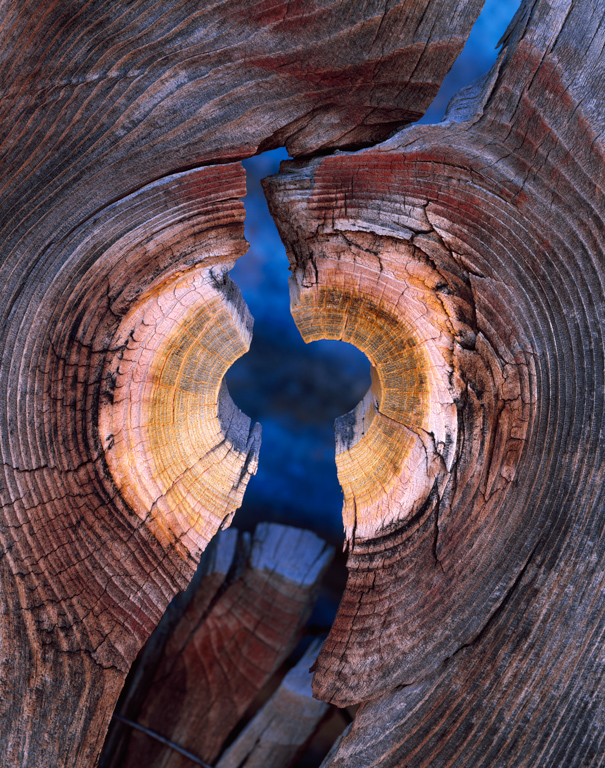
Poverty Flats
You can see the incredible tone of the blue colour in David’s “Poverty Flats” image where the blue sky has filled the area behind the wood with cool light but warm reflected light illuminates the wood itself.
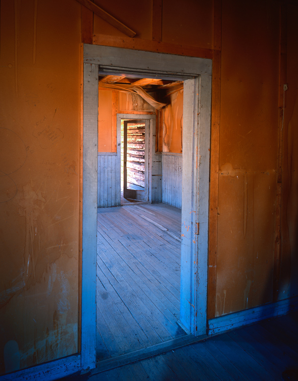
Bannack Doorway
Another image where an acute observation of colour paid off is David’s “Bannack Doorway”. David has mentioned that he wasn’t completely aware of the colour in the door’s frame but thought that the skylight from the window would produce a cooler area at the bottom of the door frame. The actual result was a lot more obvious in print that David originally expected with the upper part of the frame picking up warmer reflected light.
This could just be an experimental fluke but the postulation was recently confirmed using Multi Voxel Pattern Analysis of Functional Magnetic Resonance Imaging data - in other words, they poked virtual electrodes into people’s brains and constructed 3D maps of what was going on. Using this analysis they confirmed what the brain activity was when people looked at a yellow subject and then confirmed that these areas of the brain still fired when people looked at the grey banana. A quite stunning result!
Learn Colour to See Colour
This is a clarion cry to tell us to look more closely at the actual colour of things and to try and drop our preconceived expectations of what they should be (after all we have proven that a preconceived expectation can literally taint the colour we see).
This is even more important when our camera and post processing software are capable of boosting very subtle colours. It definitely pays to get to know these colours in the field so we will know what we can do with them when we get back in the digital darkroom.
More Real World Examples
On two occasions recently I was out with people who were declaring how beautiful the purple hues of wet bracken and fallen oak leaves were whilst walking in the woods (hat tip to David and Angie Unsworth and Doug Chinnery). To most people dead bracken when wet should look like a darker version of the tan/orange colour it looks like when it’s dry; however, if you actually look without expectation you can see that it can take on a distinctly purple/violet hue. Knowing that this is going to happen can give you an opportunity to contrast it with the orangey hues of an autumnal Beech tree for instance.
Conclusion
Artists spend a lot of their time studying the colour and tonality of various subjects and types of light before finally being able to create works that reflect their view of nature. Monet was an obsessive about the study of colour - just take a look at his haystacks series and his poplars (and Rouen and the Houses of Parliament for that matter). It wasn’t just the observation of colour that was important but also the ability to mix that colour using a relatively small colour palette.
We don’t need to be as obsessive as Monet but we would greatly benefit from spending more time studying our subject and our photographs for the actual colours within them. It will not only pay dividends when working in the field but also when we come back to the digital darkroom to post process our pictures. We can take our understanding of colour and apply it when making changes to the balance of our pictures.
For example, if we want to darken an area of a picture, should we look at cooling it down by adding a little blue and removing a little red in order to simulate a correct shadow colour? If we want to add saturation to a picture, what colours will remain within the bounds of what nature can produce and what colours start to look strange?
One of the exercises I did recently was to use a colour picker app on my iPhone (palettes) which allowed me to mix colours directly on the screen of the phone and save them for later. Whilst out in the field I then picked a few things whose colour intrigued me and recorded by mixing it on my phone. The main reason for this was my dissatisfaction with the colour rendition of the greeny yellow lichens that appear on rocks in damp places - especially on slate in the Lake District for example. I had taken pictures with Fuji Velvia and also with my Canon 5D2 and a Sony A900 and none of them matched. The Velvia produced almost pure yellows, the Canon produced murky greens and the Sony was close to the Canon but more yellow.
It turned out that I couldn’t get an accurate match at all - the colours were so far out of gamut of the iPhone 4 screen (the iPhone 5 is better but still only manages sRGB although it’s close to Adobe1998 in the greens). However, because I had a reference I was able to recollect how far out and compare that with the colours recorded by the camera and film. It turns out neither was correct and the actual colour was in between the two. Knowing this I was able to tweak the greens to get a much better match to my memory of the scene.
Obsessive?
Am I being obsessive about colour? I would say that I probably am - but then again I’m wondering if that is actually a good thing. It all depends on your goals I suppose. If you’re happy with the colour from your camera or film then that’s fine. I should add that I’m not looking for completely accurate colour in my pictures, I don’t even know if there is a thing and I’m fairly sure it won’t necessarily be aesthetically pleasing if I could. I’m happy to change colours for my own creative reasons but I want to know more about the colour of things to allow me to do so.