

A Look at Lithographic Screening

Tim Parkin
Amateur Photographer who plays with big cameras and film when in between digital photographs.
We’ve included Dav Thomas’ book in this issue and one of our comments about it was how good we thought the print quality was. What do we actually mean by this? Well there are various aspects that make up the quality of printing in a book but one of the biggest influences is the way that the photographs are converted into plates for the lithographic print process.
We’ve all seen newspaper print, especially black and white newspapers, where you can see the individual dots that make up the picture. These output like this is referred to as ‘halftone’ because it can produce fractions of the ink color. This ‘halftone’ is used because newspaper ink is either black or white and there are no cost effective processes for diluting the colour to create ‘continuous tone’ prints.
The pattern usually used in halftone printing is a grid of dots, usually slanted at some angle. The image below shows an example of mono newsprint halftone.
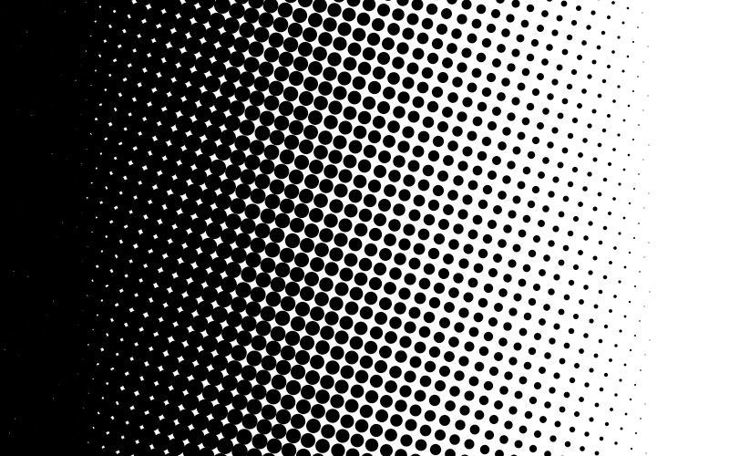
As well as being referred to as halftones, the technique is also known as ‘screening’ because William Fox Talbot’s proposed process was based on photographic ‘screens’ referring back to the Chinese method of printing with silk screens.
A screen is then the pattern that is produced from a continuous tone original. This pattern is then typically etched into a metal plate which is then used to print the final product.
No title
Before this process prints had to be made using forms of direct engraving, we’ll talk about some of those processes in a future issue.The plates used to be generated using photographic processes, originally by mixing multiple masks together and then using computers to write to the photographic film (Computer to Film) but in the last decade the arrival of ‘computer to plate’ processes have revolutionised the industry.
Computer to plate allows very fine screens to be generated which has allowed a lot more control over the types of ‘dots’ that can be used to build up a screen.
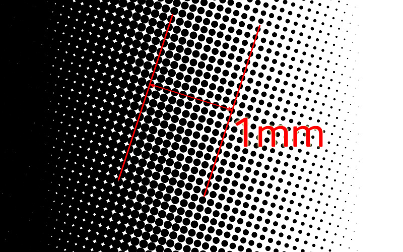
Lines Per Inch
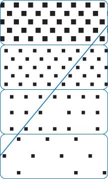
The main variable in lithographic printing is the ‘fineness’ of the screen. The resolution of a screen is typically measured by the ‘pitch’ of the grid of dots. For instance in the following screen you can see that there are 10 lines in 1mm and hence 10*25.4 = 254 lines per inch.
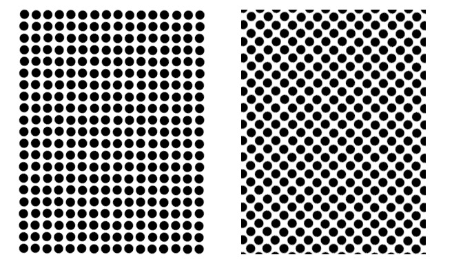
”lpi and dpi”
In order to print a screen of 254 lines per inch, the resolution of the CtP machine has to be anywhere from 5 to 20 times higher. This is because the dots have to be very regular and the lightest area of the picture is defined by the smallest dot the CtP machine can produce.Colour Printing
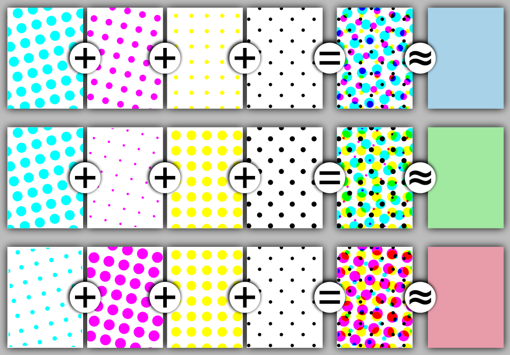
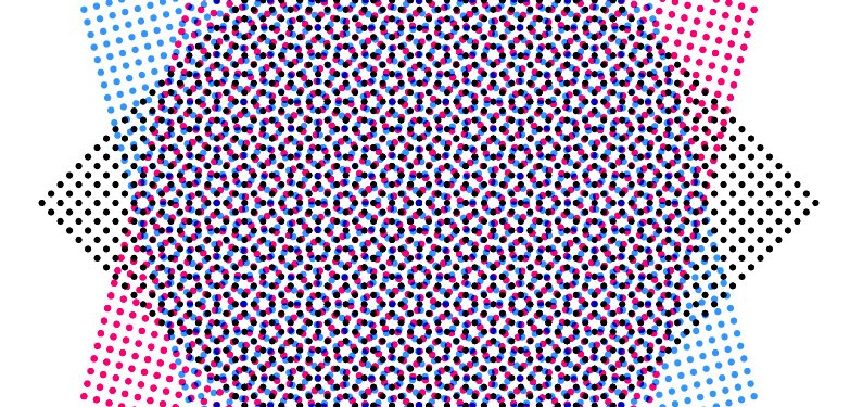
To print in colour we need to be a little clever with our halftones. We can’t have them all at the same angle and if we have them at different angles we need to be wary of moire effects (wider patterns appearing because of the combination of finer patterns - like digital photographs of fine textures like fabrics).
For the darkest colours, the pattern of dots is most visible when it is at right angles because our perception is fine tuned to pick up horizontal and vertical patterns. It is least visible when the pattern is at 45º degrees
So printers typically print the black layer at 45º degrees and the yellow layer (the layer with the least contrast with the base paper) at 0º degrees.
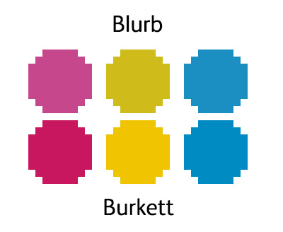
This leaves the magenta and cyan layers. Because layers can cause moire when set less than 30º degrees apart and the lightest colours are yellow and cyan, the resulting angles that have been worked out are usually K (black) 45º, Y 0º, C 15º and M -15º (or 75º)
The resulting screen looks something like the following..
”Tricks”
Printers will also make the yellow screen 5% higher frequency which can help reduce moire furtherRosettes
You can’t eliminate moire completely and the main symptom of moire in the 45, 15, 0, -15 angles we have discussed is the ‘rosette’. This can be seen below
We recommend you take a look at these blog posts by Gordo of The Print Guide if you want to know more about rosettes which has more examples (http://the-print-guide.blogspot.co.uk/2009/04/rosettes-everything-you-didnt-realize.html - http://the-print-guide.blogspot.co.uk/2010/02/why-use-halftone-screen-angles.html )
Why Black?
It is true that you can make any colour and tone by combining three primary (or secondary) colours but in reality the result is not particularly neutral and getting perfect registration between all the plates for fine details such as text is very difficult. Using black ink to replace three coloured inks also saves money as black ink is cheaper.
"Why K?"
The black layer was historically used as an outline layer or key-line layerWorking on press, combining multiple colours together on paper can cause problems as well. Too much ink doesn’t dry quickly and can be damaged whilst drying. The inclusion of black ink helps massively reduce ink usage and also makes producing neutral blacks and dark grey tones a lot easier. When you have dark/medium colours you can do something called gray component replacement. Basically if you have a more neutral tones which is just made of C,M & Y you can typically replace a lot of the ink in these with black (K) which also saves money. This does have downsides in that it can make areas such as this more grainy. Some amount of colour in black areas is sometimes used to increase the density and richness of blacks.
Resolution
We’ve looked at the ‘lines per inch’ definition of resolution that printing uses but when you combine the four colour layers together you can actually resolve quite a bit more detail. The amount of extra detail is arguable but the range of suggested values is between 1.5 to 2x (Agfa suggest 1.6x).
Hence for a press that prints to 240 lines per inch, you should supply images at between 360 and 480 dpi resolution with the AGFA standard being about 400dpi.
This means that for a 20” wide double page spread with full bleed on a high quality press (240lpi) you’d hope for 9600 pixels (480dpi). For a typical press (180lpi) you can get away 5400px (270dpi) but 6000px is recommended (300dpi).
This puts a little perspective on the full page bleeds in Dav’s book which are 22” wide.
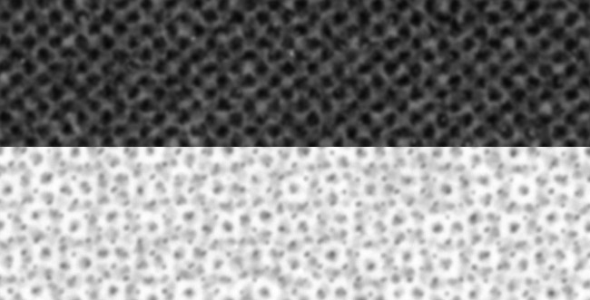
Stochastic or FM Printing
There is another class of printing that we’ve not covered and that is FM or frequency modulation where the number of dots is changed to create tone as opposed to the usual AM or amplitude modulation technique where the amplitude or size of the dots is changed.
There are various FM printing methods but at heart they all use the same small size of dot but put more dots where the image needs more density. It’s easier to see in an example - here’s a sample from Johsel Namkung’s book.
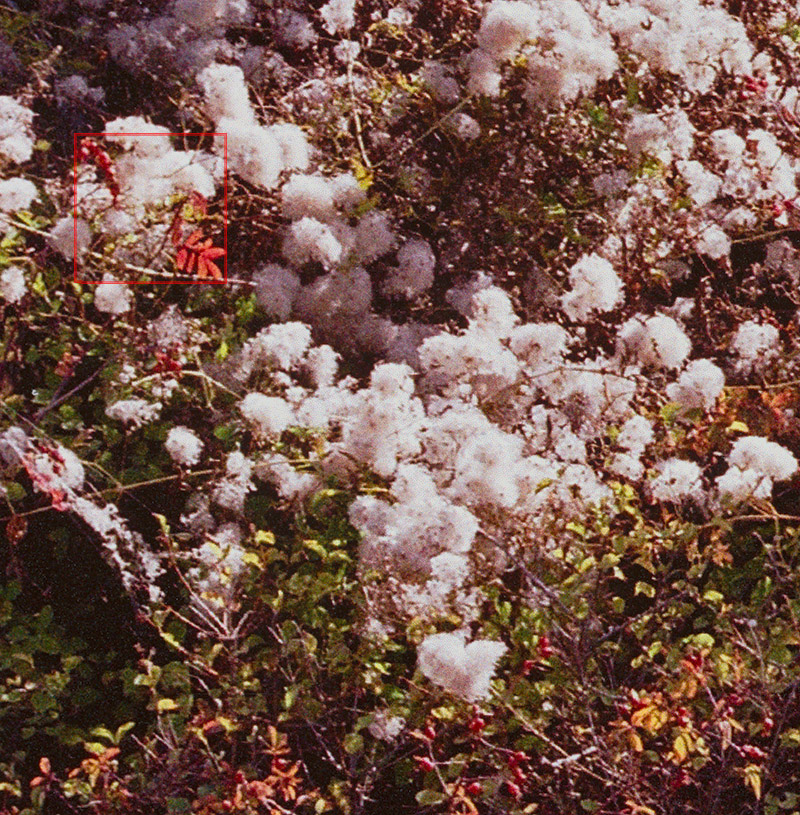
As you can see the dots, cluster, around fine detail. The ‘fineness’ of this method can only be appreciated when you compare it with AM techniques which you’ll see in the examples section.
”Adjusting On Press”
We’ve mentioned you can adjust the colour and tone of an image on press. Sadly this can only be done for a strip and as you have multiple pages on a plate, adjusting a single image can, and probably will, affect multiple images. It’s a trade off but a very useful oneWhy wouldn’t you want to use this technique all of the time? Well, if you’re at the press and you think that the result is looking a little off colour, the press operator can change the density of the inks in certain areas in order to fix things. This can only be done on AM screening as the idea is that you change the volume of ink and this only works if the volume (amplitude) of the ink is being used to control the colour and tone.
In FM or stochastic screening the location of the dots is controlling the colour and tone and so this option is not available - hence a new plate needs creating if there are problems, and that is expensive.
There are hybrid techniques that combine some of the benefits of FM techniques with the flexibility of AM on press adjustment. The most common in use at the moment is Sublima which instead of just stopping once the dots get to the smallest printable, they use an algorithm to remove dots so perhaps every other dot is printed. This can change the lightest tone printable from 5 percent of a colour to 1 or 2 percent, increasing gamut and smoothing colour transitions as well. The same advantage is seen at the dark end of the scale as well. The image to the right shows an example of the 'dot skipping' in a neutral highlight.
Examples
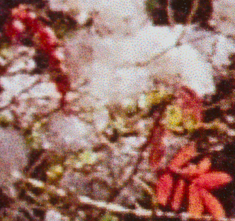
That’s enough of the ‘theory’, lets take a look at some real world examples. First of all we’ll take a look at a comparison between a range of books. These represent resolution of 150lpi to 240lpi. The results represent a 1200dpi scan when viewed at full size (i.e. clicked or in the PDF article). We've blurred the right half of the image to match a typical 20/20 eye at 12 inches. We've also included a 3000dpi scan in the bottom left corner to show finer details.
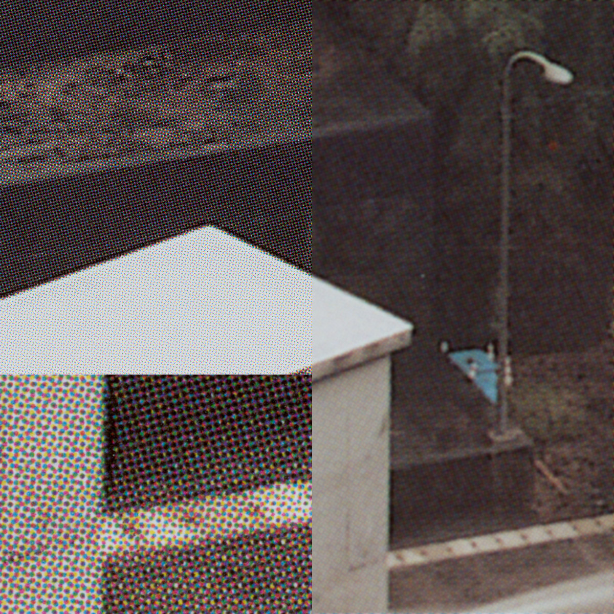
Scotlands Fifty Finest Mountains - John Parminter (150lpi)
At the lower end of print quality of 150lpi it isn’t that the images don’t look good, it’s that you can’t expect to stick your nose up to them in bright light and for them to look good. The print resolution is still effectively around 180dpi, the main effect is a visible screen which can look a bit 'gritty'.
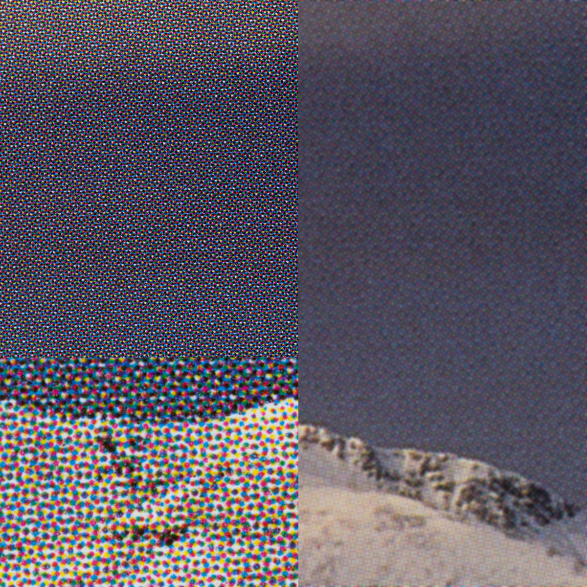
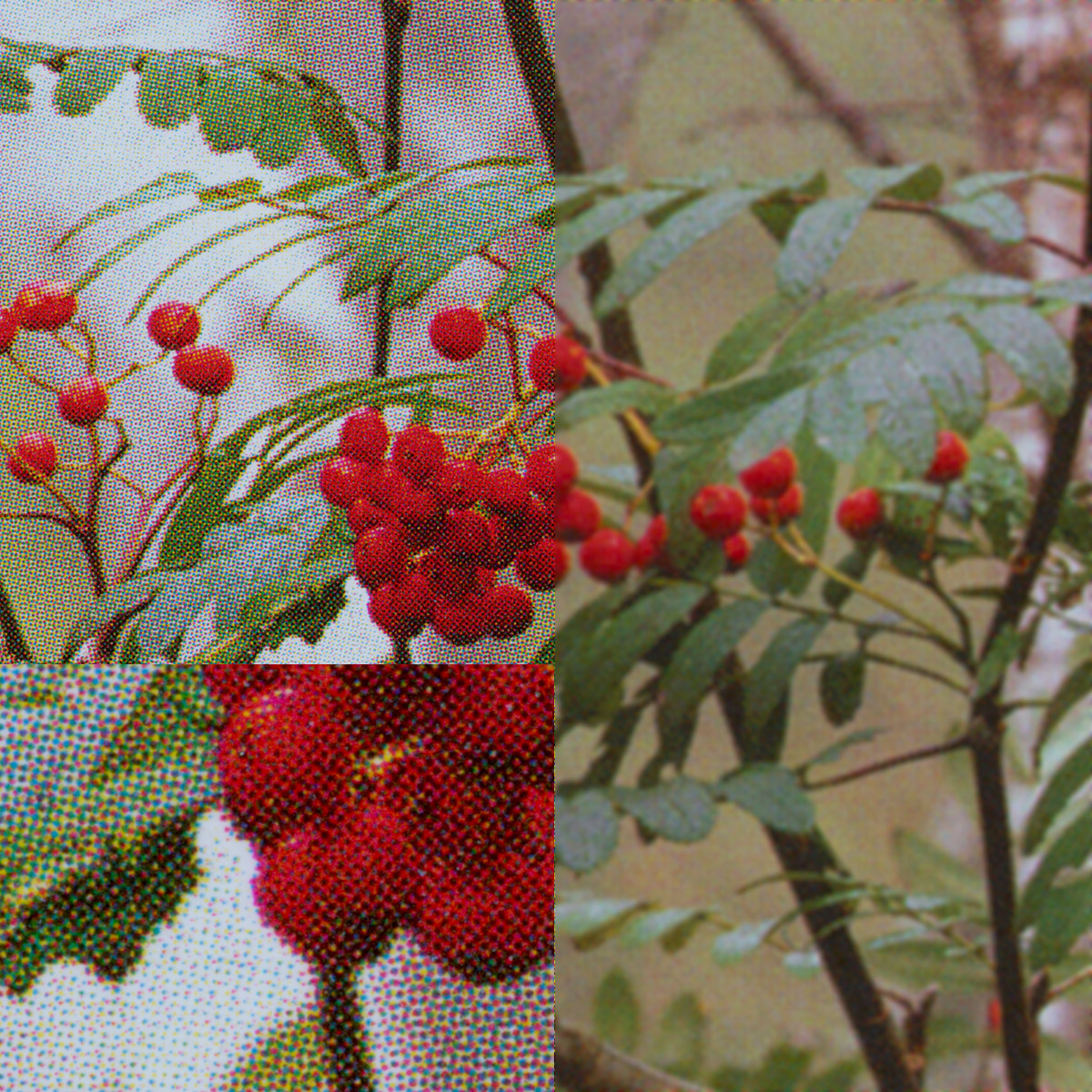
Against Beaty and Other Essays - Kyriakos Kalorkoti : Blurb (180lpi)
Christopher Burkett - Resplendent Light (180lpi)
We have a couple of examples here, one from the print on demand market (blurb) and one from an expert in lithographic printing (Mr Burkett). They're both the same line pitch so what is the difference? Well the accuracy of dot placement is one difference - Mr Burkett's book has a very accurate screen which has each dot perfectly placed so when they overlap or when they are discrete, it is intentional. The Blurb book shows variable dot placement and 'spread'. Also the colour 'gamut' of the two books is different. I've sampled a pure colour from each of the C, M and Y dots which you can see below. This could be caused by density of ink or dilution or because the actual inks were or weren't standard compatible (ISO or Fogra for instance).
As you can see the difference is huge in the yellow and magenta colours and so the vibrancy of Mr Burkett's book is wonderful. The Blurb book looks drab in comparison.
Let's look at a few higher resolution books
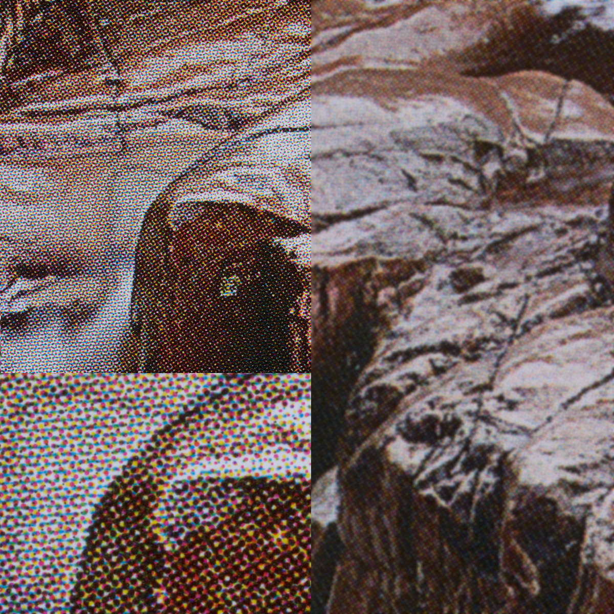
Toshio Shibata - Landscapes II (200lpi)
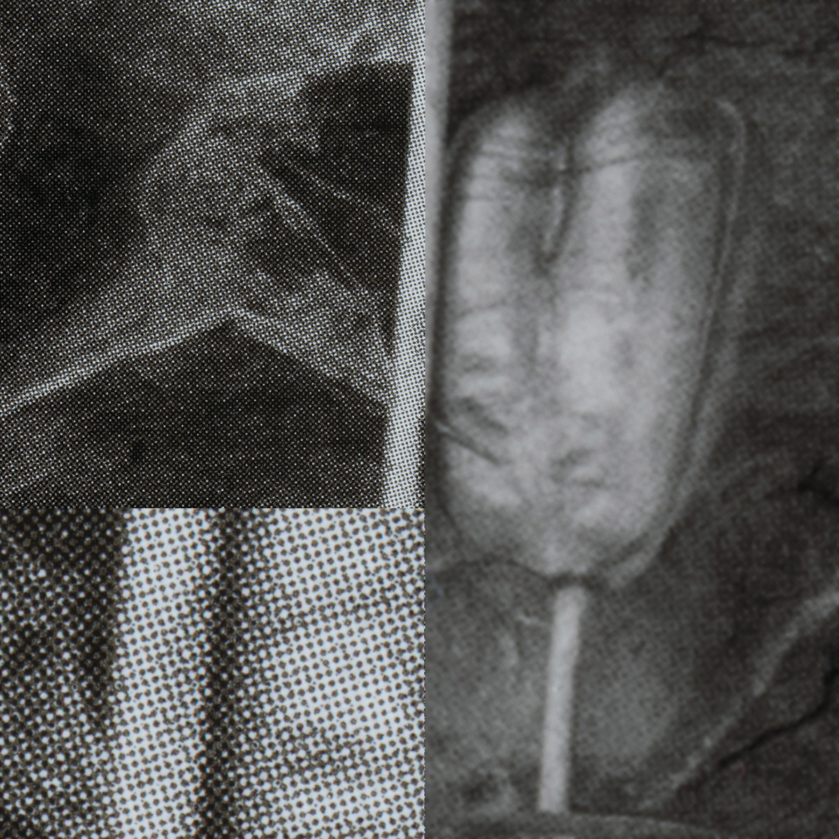
WIth Trees - Dav Thomas (240lpi)
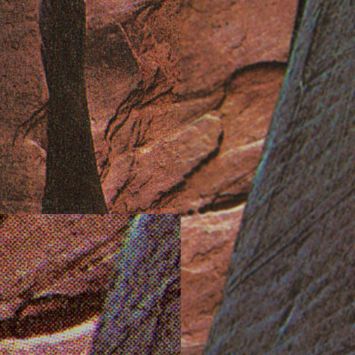
Glen Canyon - Eliot Porter (254lpi)
A few higher res books show some interesting things. Firstly that higher line screens don't necessarily mean better books. The Eliot Porter book is quite old and the saturation of the inks and the quality of separations is obviously of lower quality and the high resolution screen doesn't make up for that.
Dav Thomas' book shows that a combination of good inks, high resolution screens and originals and an accurate press combined with a larger format book really shows photographs off to their best. Interestingly you can see the evidence of slight over sharpening in the Toshio Shibata book which is creating subtle halos that can be visible in the final book.
What about black and white books? Well the typical solution is to print in black and grey inks, commonly known as Duotone. Here's a couple of examples.
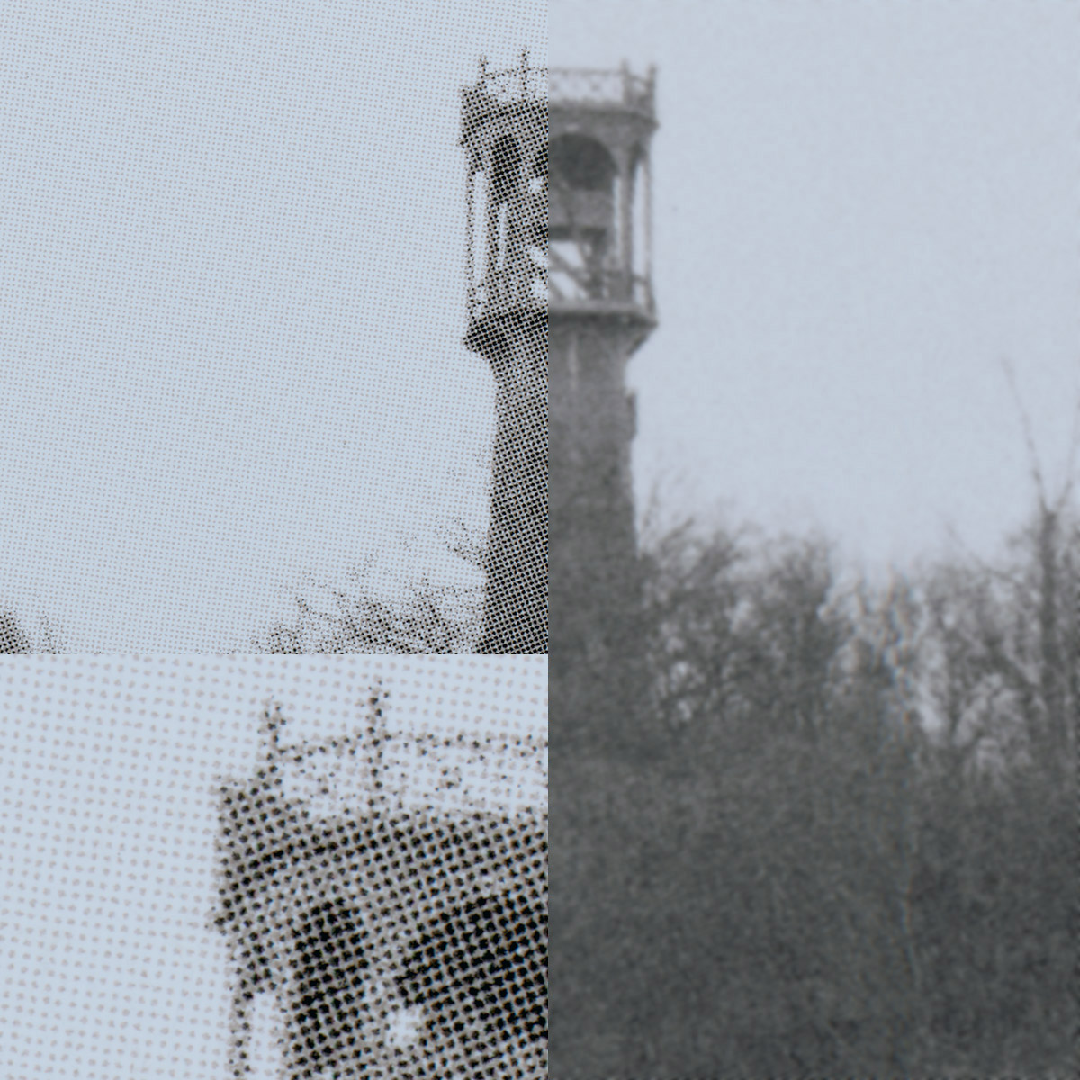
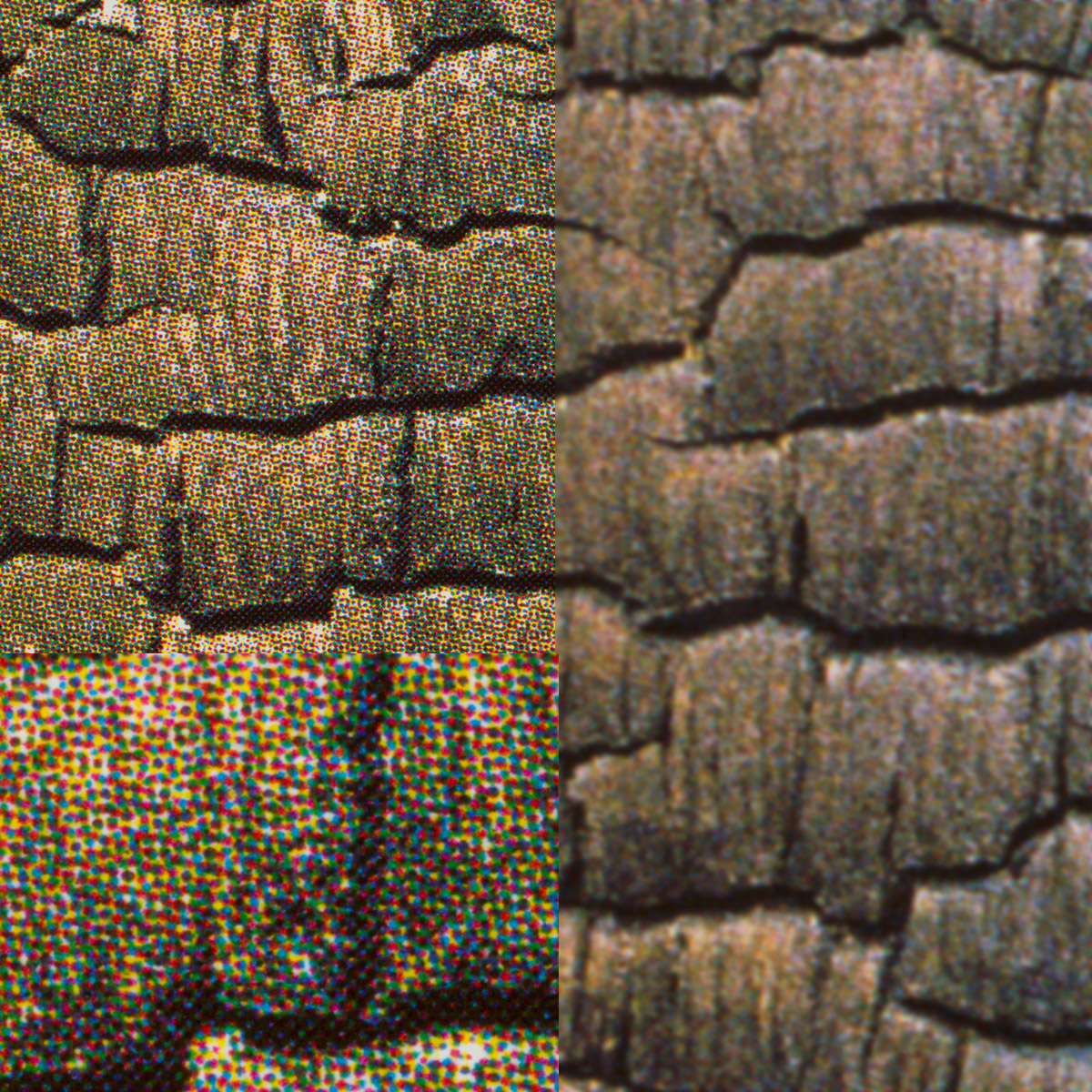
Coal Mines and Steel Mills - Bernd & Hilla Becher (200lpi)
Inscape - John Blakemore (240lpi)
You can also use three tones for what is known as Tritone printing. The Rothko Sugimoto book uses these separations for the Sugimoto images as well as a 300lpi screen. I've included a sample from a light and dark area below but blown up to twice the size of the detail in the previous images. The very lightest grey is almost indiscernible here but on the hi-key images it looks beautiful. This is the very high end of black and white printing.
Rothko/Sugimoto : Tritone (300lpi)
I spent some time with a loupe going through a range of my photography books and nearly all of the mid range books were between 150lpi and 200lpi with the vast majority at 180lpi. At this resolution you can’t really make out the screen even if you have decent vision and reasonably bright light.
With a 240lpi screen you can get your nose right up to the page and you would still be unlikely to see any dots.
Stochastic Printing
Stochastic printing is difficult to analyse in terms of screen resolution but from what I can see the they are very similar using the smallest dot the computer to plate systems can create (somewhere between 1800 and 2400dpi).
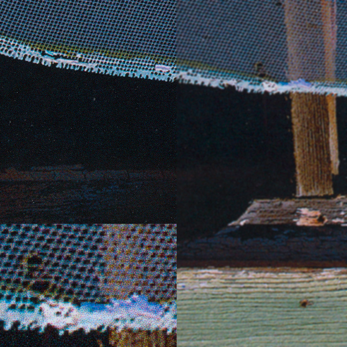
Intimations - Anna Booth
Intimations - David Ward
The result is beautiful continuous tones and highlights and incredible levels of detail. Looking at the mesh screen in Anna Booths image is rendered so fine you can look as close as 6 inches whilst still picking out more detail and no texture.
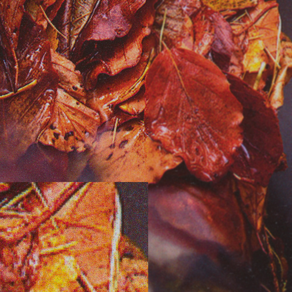
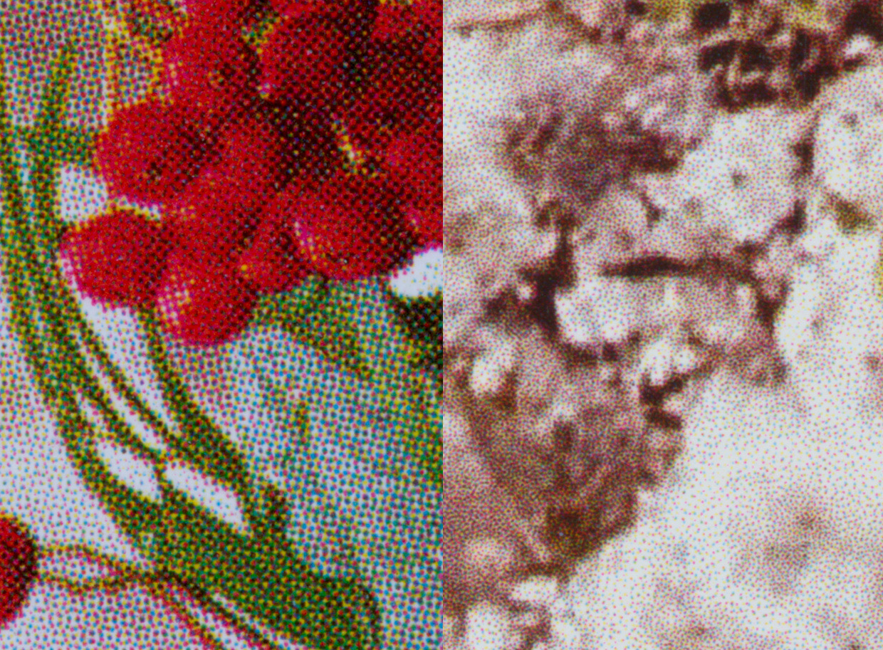
Just to compare AM printing with FM or stochastic printing, here is a side by side comparison of Dav Thomas' 240lpi book and Johsel Namkung's stochastically screened book.
As you can probably see - prepress is a massive subject and one that most photographers will never know everything about but hopefully this article has helped point out some of the variables you can play with when thinking about book publishing.