
The Challenge of Naming a Picture

Kas Stone
Kas Stone is a full-time photographic artist and writer based in Atlantic Canada, where her work is inspired by the wild coastal scenery and moody weather right outside her door. She can’t believe her good fortune in being able to make a (modest) living doing what she loves.
We all know that “a picture is worth a thousand words.” But how did this simple piece of wisdom become, for so many photographers, an excuse to reject words altogether and to insist that our pictures “speak for themselves.” In adopting such a view, I believe we miss a golden opportunity. Words, when used well, can be a powerful ally in our quest to make more meaningful pictures.
In this article, I will explore the pictures-versus-words debate from both sides. However, in light of my introductory paragraph, it will come as no surprise that I favour a pictures-and-words conclusion.
First, for clarity, let’s assume that the “words” used in connection with our pictures might be:
Titles, a few words, usually presented beneath or beside an image;
Captions, a few sentences that provide a longer commentary about an image;
Statements, several paragraphs or pages to introduce a body of work in an exhibition or book;
Text within the image space, either captured in-camera (e.g. road signs) or added to the image afterwards (e.g. a poem or inspirational quote).
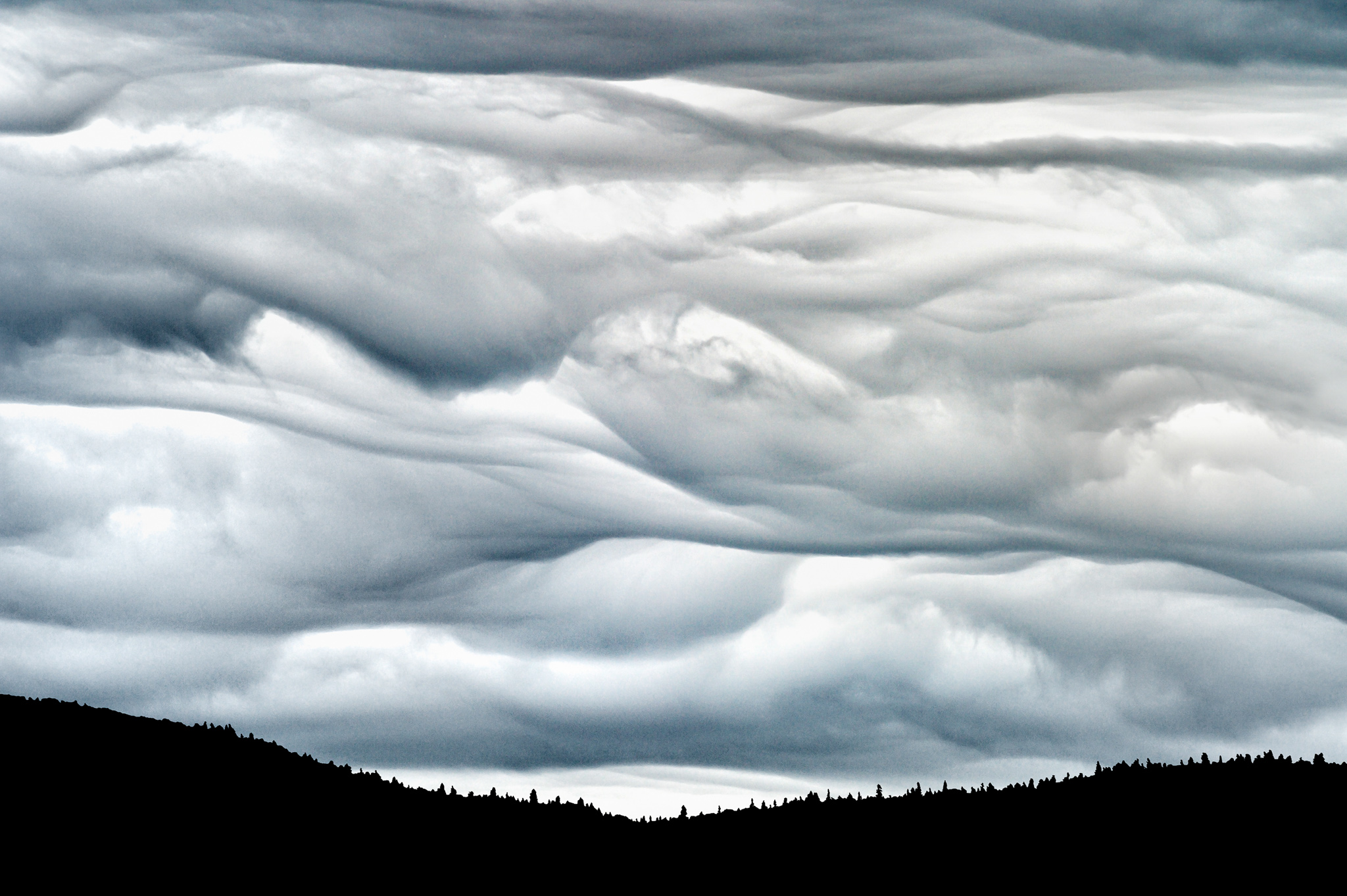
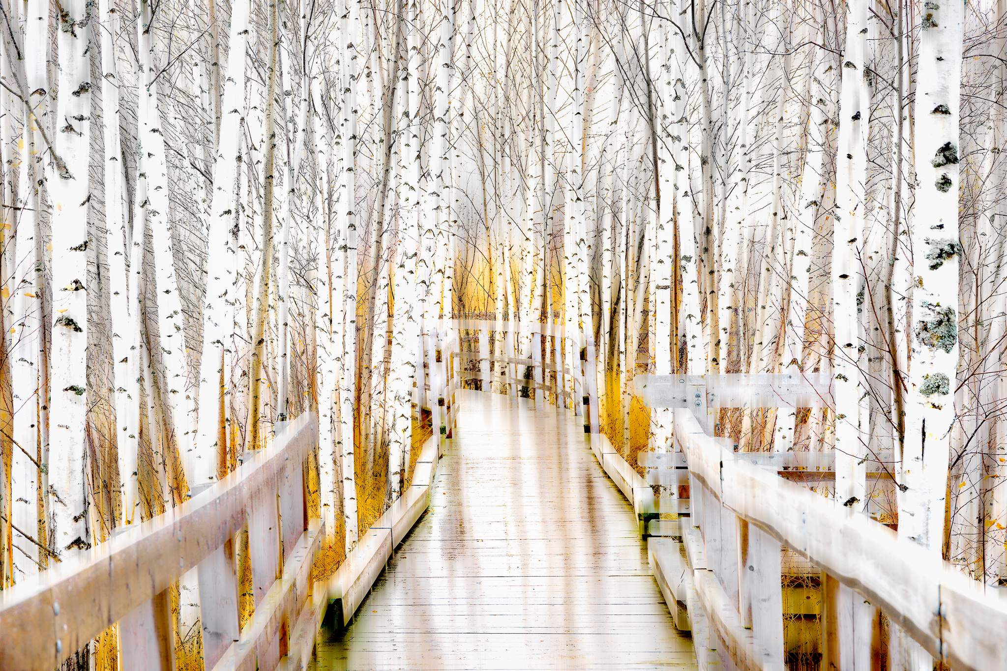
Turbulence uses the classic title composition technique of generalising from the specifics of a scene (dramatic storm clouds rolling across the Cape Breton Highlands in Nova Scotia) to the more universal concept of turbulence. The viewer is left to choose whether to interpret turbulence from the perspective of an aeroplane flying through the clouds, or more personally, as turmoil during a troublesome time in life.
In this article, I will concentrate primarily on titles, and most of my examples will be drawn from landscape imagery, but the reasoning can be extended to other photographic genres and other types of accompanying words.
Some historical background about the evolving relationship between words and pictures may be helpful for our discussion. (For a detailed account I recommend Ruth Bernard Yeazell’s splendid book, Picture Titles: How and Why Western Paintings Acquired Their Names, Princeton University Press, 2015).
Five hundred years ago, when art was the exclusive domain of the ecclesiastical and social elite, and the general populace was illiterate, artworks were rarely titled because there was no need. They were permanently housed either in private collections in manor houses, where the owners were familiar with them or within the precincts of churches, where they served to inspire a congregation who, because they couldn’t read, would have no use for titles anyway.
Then, technological advances during the 18th and 19th centuries, accompanied by shifts in the social and educational climate, led to increasing “democratization” in the art world too. Artworks became more widely accessible and mobile: displayed in public art museums and travelling exhibitions, reproduced in catalogues, and sold at auction houses. So, it became necessary to identify them. In effect, titles were introduced as a practical means of referring to works of art for the purpose of marketing and inventory control. Often this was done, not by the artists themselves, but by the curators, publishers and dealers who handled the art. Gradually these titles, supplemented by longer captions and exhibition statements, came to satisfy the demand of an increasingly literate and diverse public for information about an artwork’s origin, and even for guidance in its interpretation.
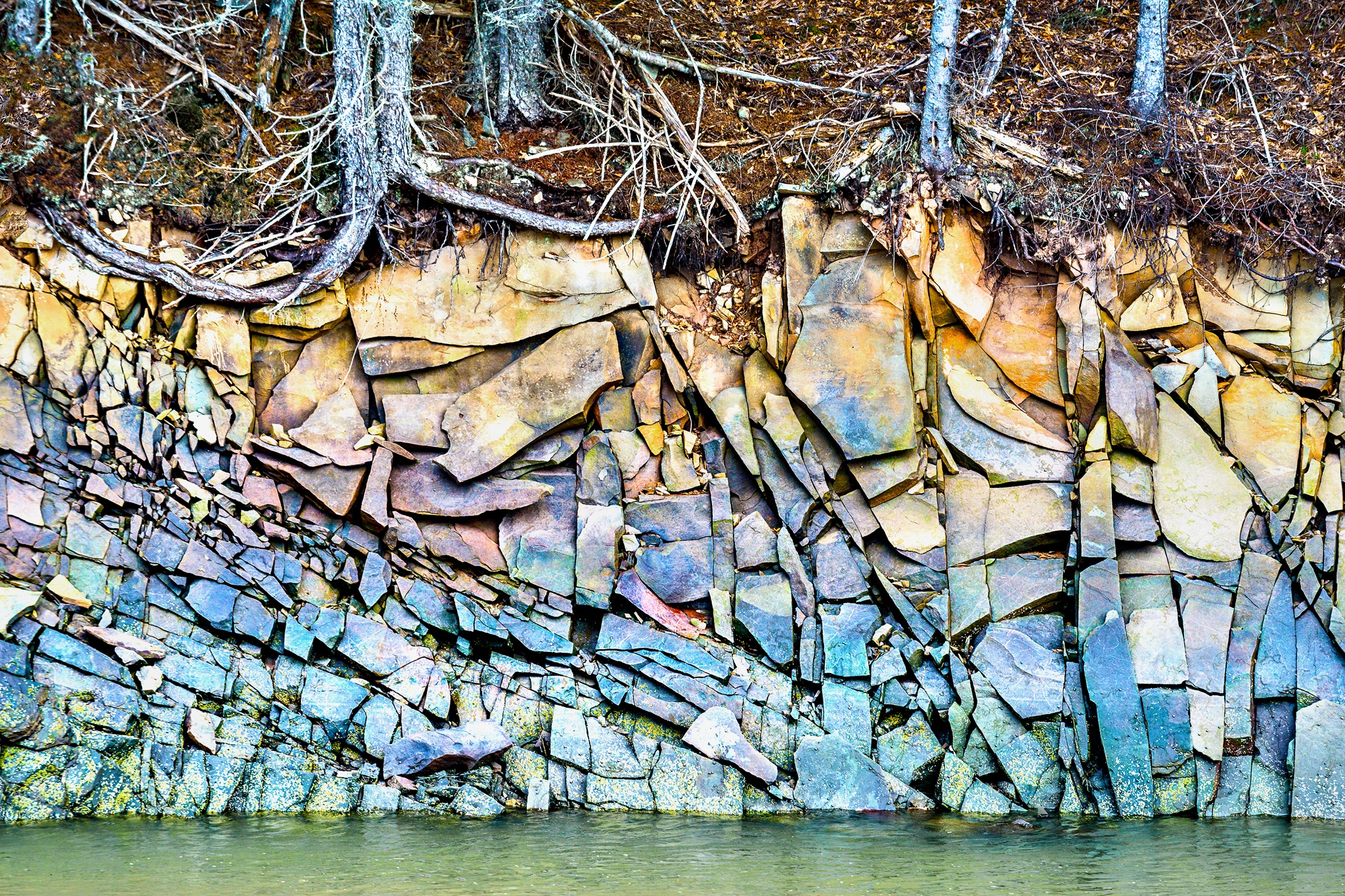
Bedrock Mosaic is a title that guides viewers into the image by providing information about the subject matter (bedrock) but suggesting that it should be interpreted artistically (as a mosaic) rather than geologically. Mosaics are artworks created from an assembly of small pieces of coloured stone, glass or tile, which makes the title an appropriate choice for this colourful, fractured rock face.
By the late 1800s, titles had become commonplace in galleries and most artists had taken on the role of titling their own artwork – although some chose to exercise the option of Untitled, No.# in defiance of this new convention, creating a de facto “negative title” that came to have a meaning of its own.
By then photography had also entered the scene. Indeed, it was in response to photographs that the expression, “a picture is worth a thousand words” became popular. In 1920s America, the recently invented 35mm camera, together with developments in printing press technology, enabled the widespread publication of photographs in newspapers and magazines. Shrewd editors (and advertisers!) quickly realised that a single picture could convey far more information, and with greater clarity and impact, than a wordy description. So, a new style of photojournalism emerged that relied on photographs to tell the stories of the day. It was this image-centric view that ultimately led to the dismissive attitude toward words that so many photographers have today.
Which brings us back to our pictures-versus-words debate.
Master landscape photographer Ansel Adams eloquently voiced one side of this debate: “A true photograph need not be explained, nor can it be contained in words.” There may be some question about precisely what he meant by a “true” photograph, but the general tenor of his message is that if a photograph is any good, it can stand on its own and requires no supplementary text in order to be understood and appreciated. What’s more, his statement suggests that an image’s expressive power surpasses that of words, and runs the risk of being constrained by them. Much food for thought in one short sentence! Let’s dig a little deeper.
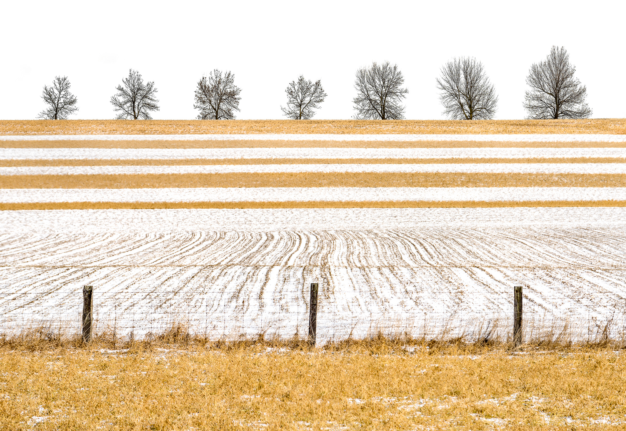
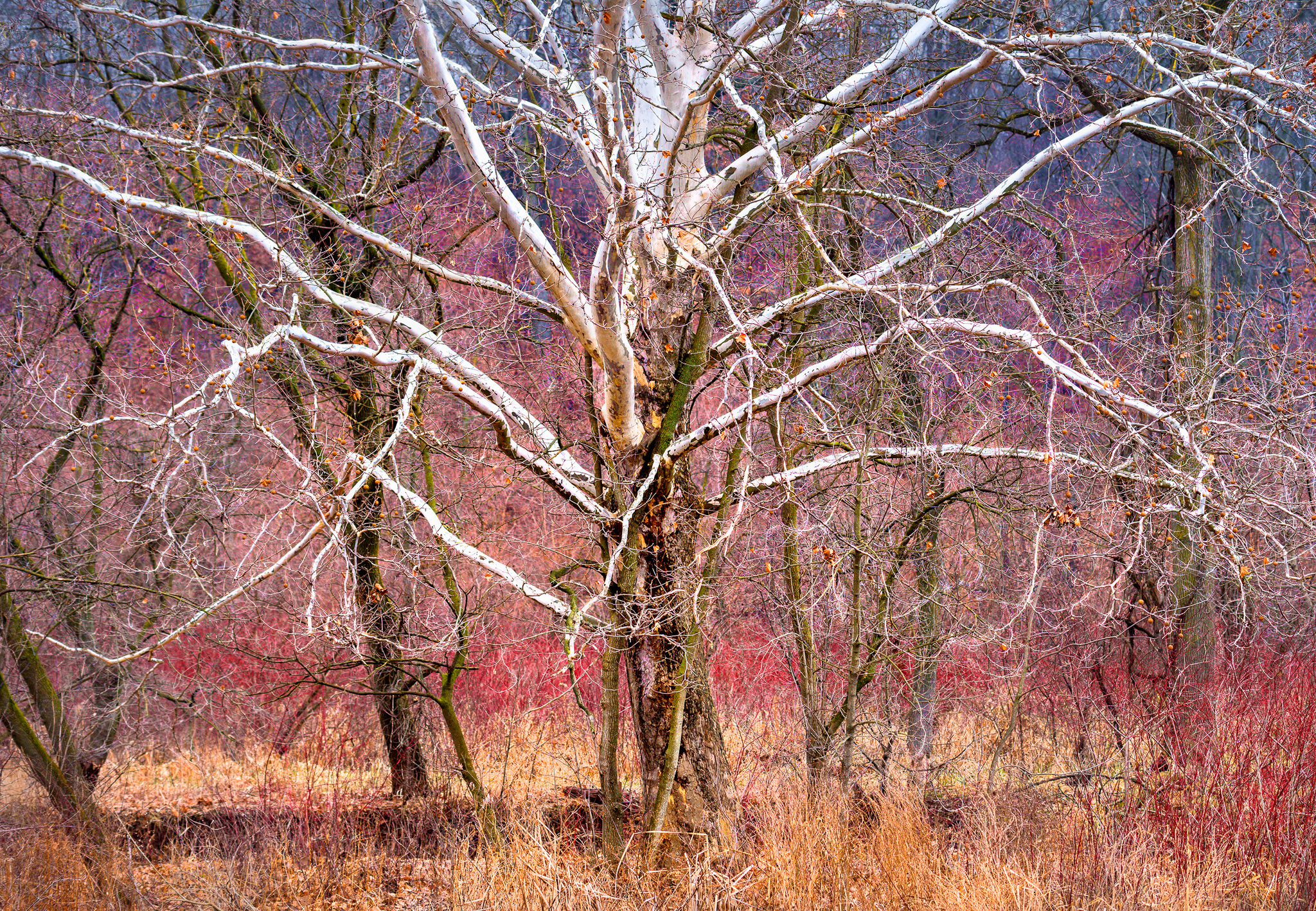
Between the Lines asks the viewer to consider this picture, not as a documentary image of a snowy farm landscape, but in more abstract terms, as a complex graphic scene composed of lines and patterns. The title also implies reading between the lines to discover a deeper meaning, which gives the viewer something to ponder as he explores the picture.
First, I think we can all agree that a “bad” photograph cannot be rescued by words, any more than it can by Photoshop. So, we will assume throughout the following discussion that we are talking about “good” photographs – ones that are technically and compositionally well executed, and (at least for readers of On Landscape magazine) that express a photographer’s emotional, intellectual and/or aesthetic response to the landscape, rather than merely documenting it.
The effectiveness of this communication depends as much on the visual literacy of the viewer as it does on the craftsmanship of the photographer. The viewer must be able to interpret the visual content of a picture and construct meaning from it. To do this he must abstract from the specific physical elements in the picture (what the picture is of) to the more universal concepts they represent (what the picture is about): from a single tree standing in a snowy field for instance, to the concept of solitude, or loneliness, or strength. The picture becomes metaphorical: The World represented by the snowy field, and the Tree personifying whoever or whatever the photographer or viewer wishes it to.
The Road Not Taken pairs my image with Robert Frost’s famous 1916 poem – a wistful narrative about choices and regrets in life. The image was made in New Brunswick’s Sackville Waterfowl Park in December, the drizzly weather entirely suited to the reflective nature of the poem. This park is across the road from Mount Allison University where the latest generation of young people is making similar life choices more than a hundred years later. The title’s poetic allusion resonates strongly with the general public (if sales of the print are any indication), and especially with people who recognise the location.
Of course, it is quite possible that the viewer’s interpretation may not be the one intended by the photographer; their interpretations may differ according to their individual experiences, personalities and cultures. But does this matter? Some would argue that once a picture is out there in the world, the maker’s intent is irrelevant and the viewer should be permitted to interpret the picture and ascribe to it whatever meaning he chooses. If so, a title or explanatory text can be seen as distracting, restrictive, or even misleading. Hence the decision of some visual artists to use Untitled in an attempt to liberate their artwork – and their viewers – from the shackles and potential pitfalls of words.
Words face another significant handicap not shared by pictures; they are dependent on the language in which they are written. A non-English speaker, like the illiterate peasant, cannot grasp the subtleties of irony or grandeur in an English text but will be at no such disadvantage when viewing Elliott Erwitt’s candid street photos or Ansel Adams’ grand landscapes. In short, the language of pictures is universal, at least within a broad cultural context, whereas the language of words is restricted to speakers of that language.
As we have now seen, the case for a pictures-only approach to visual art is compelling indeed. Therefore, photographers who can express in their images everything they wish to say, may not see any point in pairing them with words.
So, why bother? In a word: enrichment. When a photographer takes the trouble to thoughtfully combine an image with words, he enriches both the viewer’s experience of that image and his own in making it.
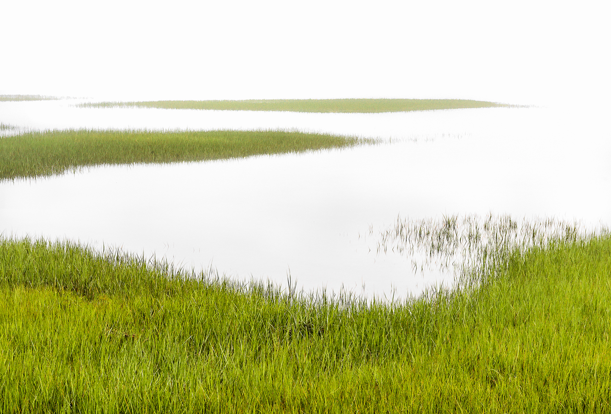
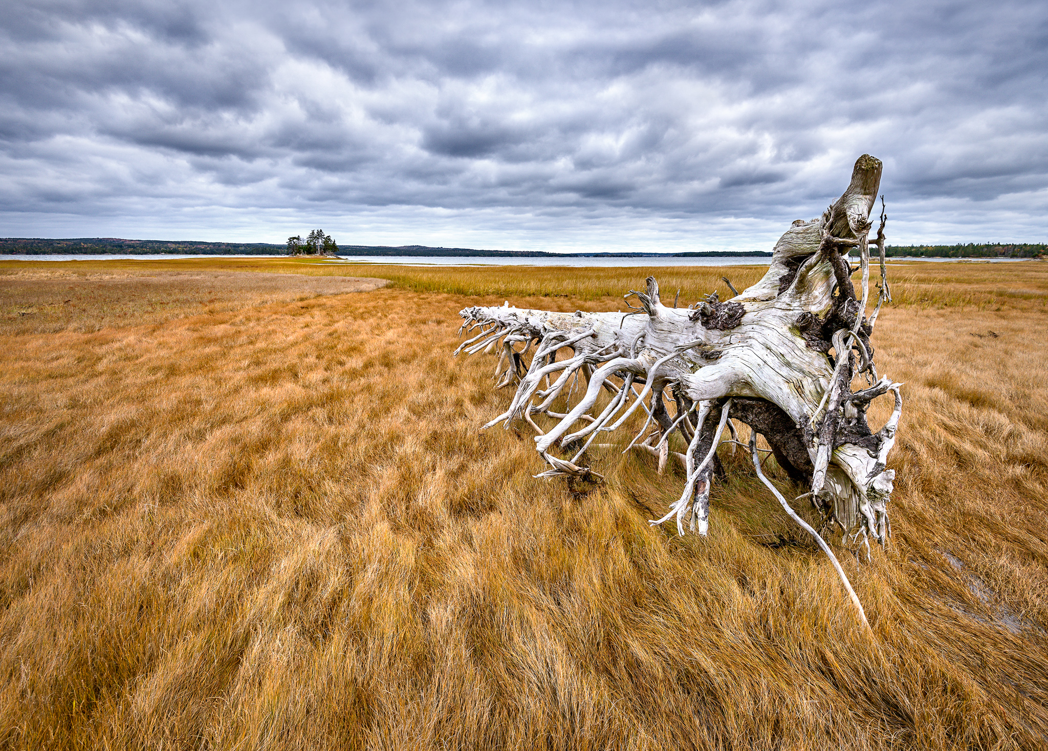
Fiddler’s Green alludes to an Irish legend (and by extension, several popular songs and literary works) about a mythical afterlife for mariners, where, following a lifetime of hardship on the sea, they can come ashore and enjoy limitless sunshine, gaiety, food, drink, and dancing to fiddle music. Although the title seems an obvious match for this moody scene (photographed at high tide in the fog at my local salt marsh), it took six months of thinking, researching, staring at the image and juggling word combinations before I finally hit on the “right” one (which, admittedly, may say more about my sluggish brain than about the title!)
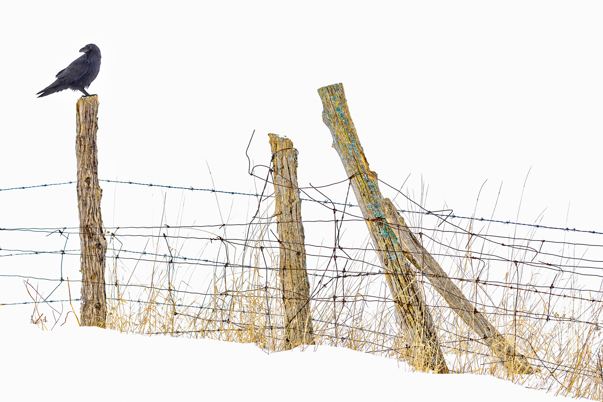
Without a Backward Glance uses a common expression to pair this intimate landscape with an anthropomorphic raven and evoke a very human theme. The picture’s visual design positions the raven close to the edge (creating tension), where he looks toward an unknown object outside the frame (suggesting a mysterious backstory). The bird’s posture ironically contradicts the title, but the high-key treatment and the title make this an optimistic image (“perhaps just a quick glance over my shoulder before l make a fresh start”). It illustrates how the story-telling power of an image can be enhanced with text.
How so?
First, words can be used to clarify visual content and guide the interpretation of images whose subject matter is unknown or ambiguous to the viewer. This happens when the viewer’s geographic, historical or cultural background differs from that of the photographer, so he perceives the subject matter differently or is completely mystified by it. An unusual rock formation, a clear-cut forest, or an abstract textural detail, are examples of potentially confusing landscape subjects that might benefit from clarification.
Even when clarity of content is not an issue, words can offer supplementary information that, whilst perhaps not necessary, can contribute a valuable backstory to the image. It might be details about the broader context or purpose for which the picture was made, or clues about the photographer’s ideological or emotional perspective when making it. Consider, for instance, a disturbing image that promotes environmental protection of a sensitive ecosystem. Or a minimalist snowscape that reflects a photographer’s yearning for solitude and space during a time of grief. In both cases, while the image may convey the story admirably on its own, the background information provided by a title or caption adds another layer of meaning that pulls a viewer deeper into that story and connects him more intimately with its message, even if the “message” is simply an appeal to stop and admire a beautiful curve.
Allusions to other artwork can be especially powerful in creating additional layers of meaning. A title that references a poem, a painting, a work of literature, a philosophy (yes, philosophy is an art), a song lyric, a dance step, a culinary dish or a musical style can draw on the significance already associated with that artwork – assuming, that is, the photographer and viewer share a common culture so that the referenced artwork is known to them both.

Border Lines was created for an exhibition to celebrate Canada’s sesquicentennial anniversary in 2017 on the theme of Canadian identity. The short text I wrote to accompany my image touched on the differences between Canadians and our neighbours to the south, especially relevant following the American presidential election the previous year and the protectionist, wall-building rhetoric that ensued. In response, I offered this rickety snow fence as our “wall”. The image generated a lively exchange with some New York visitors to the gallery one day, when a woman misinterpreted my text as an insult to Americans and stomped off in indignation, prompting other visitors to read it and chat with me about the image. If the purpose of expressive art is to spark communication, I should consider this unnerving incident a triumph!
Words, when paired imaginatively with pictures, can entertain or tease the viewer with a playful or ironic twist on image content. A church scene sparkling with ice after a winter storm might prompt a smile with the title Frosted Sunday or a picture of miserably congested traffic with the title Rush Hour.
Words can also shape a viewer’s perceptual experience of a photograph. Reading a title or explanatory text requires him to spend more time with the picture and offers both a visual and a verbal (right-brain and left-brain) approach to its content. The result is a more immersive experience that is likely to leave a more enduring impression. (In a small way this is comparable to the photographer’s experience when moving slowly in the field, allowing not only the sights but also the sounds, smells and quality of the air to permeate his awareness.) Afterwards, the title gives the viewer a convenient “shorthand” for remembering and sharing his experience of the picture with others.
So far, we have considered the value of words primarily with respect to the viewer’s experience of an image. But the crafting of words can greatly benefit us as photographers too. Composing a title that truly complements an image, or writing an exhibition statement that eloquently summarizes a body of work, challenges us to examine our motivation for making the images and our intent in showing them. It forces us to ask ourselves: What inspired me about this landscape? Why exactly did I make this picture? What do I want to say? Who is my audience and why should they care? Answering these questions is not easy. It’s not supposed to be easy. If it were easy, it likely wouldn’t be worth doing! But it is worth doing because the answers can help us to refine our vision and make better technical and visual design choices as a result. It even elicits the kind of serious introspection that can lead to a more profound understanding of ourselves as artists, and as human beings.
Expressive pictures often suggest several choices of interpretation that can be offered to the viewer in the titles. If we want the viewer to treat this image as a study of colour and texture, we might title it November Tapestry. Or we could focus attention on the straggly old tree, still upright and beautiful amid the tangled undergrowth, in which case an anthropomorphic title like Forest Veteran or simply The Veteran might be suitable.
Of course, it is not always practical or advisable to do this with a camera in hand at the moment of capture. It never hurts to try, but often it’s wiser simply to go with the flow so we don’t become bogged down in self-analysis and miss a splendid photo opportunity. We can postpone the soul-searching until later when we are evaluating and processing our images back in our studio. In either case, the challenge is to think of a single word, or a brief phrase at most, that encapsulates the content and meaning of the scene before us.
Perhaps the best advice comes from another master photographer, Minor White: “One should not only photograph things for what they are but for what else they are.” It’s the “else” that elevates our landscape photographs from mere records of pretty scenery to meaningful and evocative works of art. This, after all, is our goal as expressive photographers. I hope I have convinced you that words can be a valuable tool in achieving it.
Crafting image titles can seem a daunting task. Indeed, it can take as much skill and effort to write an expressive title or exhibition statement as to make the image(s) it accompanies. What follows are some basic guidelines to get you started.
First, imagine an image-style continuum that ranges from strictly documentary at one end, to personally expressive in the middle, to purely abstract at the other end. Consider where your photograph lies on this continuum because its position influences the style of title that is most appropriate.
If the image lies closer to the documentary end, its focus is on the scenic content of the image. In this case, a suitable title might be informative or descriptive, naming the location (either the specific location or a more generic one) or a physical feature or type of terrain, perhaps with a date or time of year. Ben Nevis, October 2018 and Labrador Coastal Barrens are examples of this style – not very exciting, but a safe option until you feel more comfortable with the titling process.
In composing titles, I always consider the image’s intended purpose and choose words that create an appropriate mood and story to go with it. Left Behind or Fallen might suit this classic wide-angle landscape admirably, but the melancholy message may not be wise if my aim is to sell prints (a necessity if I am to make a living). Marketed to tourists or local residents, Fox Island, Lunenburg County would be a better choice but is too dull and documentary for my taste. So, a positive-sounding alternative like Clearing Storm or Reaching Out might work instead.
If your image is close to the continuum’s abstract end, it highlights the aesthetic enjoyment of line, shape, texture, pattern or colour. Since viewers are typically curious about subject matter and scale in an image, you have two choices: either satisfy their curiosity with a clue in the title about what they are looking at (e.g. Ripples in Sand), or indicate that the picture is intended to be viewed purely as an abstract by referring in the title only to formal graphic elements or broad artistic terms (e.g. Tapestry in Gold for autumn leaf reflections rippling in a pond, or Curvaceous for a shapely shadow falling across the snow).
Most of our expressive landscape photographs will lie somewhere in the middle of the continuum. Since expressive images emphasize meaning rather than content, their titles usually enhance, rather than merely identify or clarify, the visual elements in a scene. There is ample scope for titling expressive images, but the best titles point in subtle and imaginative ways to the metaphorical, narrative, poetic or playful nature of the picture. An effective title becomes a gateway for the viewer – a lens through which he perceives the image and infers meaning from its content.
To find appropriate words for an expressive image title, sit quietly in front of your photograph for a while (ideally a print or at least full-screen on your computer). Look closely, examine all the details, notice how they fit into the overall visual design. Remember the excitement you felt when making the picture, the experience of being out there, and all the other things going on in life that made that place and experience so significant. Identify the single most important element in the picture and consider what it represents to you, and why.

The first title that came to mind for this recent (January 2019) image was Infinity Pool because the words are an apt description of the scene and create a suitably reflective mood. However, this is a cautionary tale about titles with unfortunate associations – in this case, the expensive swimming pools with “vanishing edges” featured in luxury mansions, resorts and home improvement shows – that introduce unwelcome commercial, political or religious undercurrents (pun intended), or even cryptic-crossword-style word play into the story. So, I am still thinking about titles for this picture.
Then, sit farther back and try to look at your picture more dispassionately, as if you were a stranger visiting it for the first time at a gallery. Imagine what this stranger might see, think and feel about the picture. Will he understand its content and be drawn to the same important element that you are? Is he likely to appreciate its significance, or might he need some gentle guidance?
Then, squint at the picture until the details blur, leaving just an impression of structure and colour.
While you are looking at your photograph from all these perspectives, jot down, in a free-flowing way, any words that come to mind: names, locations, subjects and counter-subjects; the season, the time of day, weather and quality of light; lines, shapes, spaces, patterns and colours; ideas, emotions, metaphors and allusions; nouns, verbs, adjectives and adverbs. Start simply, naming the specific visual elements, then broaden your frame of reference to include generic words and more universal concepts.
Try spending some time with a thesaurus to check your words for interesting synonyms. Do a web search for expressions, idioms and quotes related to your most important words. Consult glossaries of artistic, musical, scientific, culinary, geographical, philosophical or other terms that might complement your image.
Eventually, if you are diligent and patient – and lucky – there may be an Aha! moment when some of these words come together and the perfect title hits you like a thunderbolt. But if not, at least you will have generated a suitable pool of words to work with. Not every picture requires a brilliant title, but every title should be a thoughtful one.
This is a process that requires time and practice, but also restraint. Too little effort will yield a hackneyed or blindingly obvious title (the world probably doesn’t need another Abandoned or Golden Sunset, or a seascape titled Seascape). On the other hand, too much word-play easily escalates into flowery alliteration (Morning Majesty and Babbling Brook come to mind), or pretentious MFA art speak (there are plenty of silly online title-generators to entertain you with possibilities). Another peril is heavy-handed titling that explains too much or forces a particular interpretation on a viewer. Alas, this may betray a lack of clarity in you, rather than in the viewer, and it suggests you should revisit the image, or even the landscape itself, to examine it – and your response to it – more deeply. As Albert Einstein famously said: “If you can’t explain it simply, you don’t understand it well enough.”
We may be visual artists, but surely, we cannot deny the power of words. Indeed, photographers who treat words carelessly run the risk of doing their images a grave disservice. Words can clarify ambiguity, shape perception, augment experience, spark curiosity, and point to that alluring something “else” that Minor White taught us is the heart and soul of all expressive photographs.
Now, where’s your thesaurus?