Resolutionary, supposedly...

Tim Parkin
Amateur Photographer who plays with big cameras and film when in between digital photographs.
The new iPad. Resolutionary, supposedly. But is it a big improvement for photographers? Well, hopefully this article will go a short way to informing you even if we can't tell you what the next iPad will be called (New new iPad? New iPad mk 2?). Firstly, it doesn't look much different to iPad 2 - it's slightly thicker, about half a mm, but it still fits in cases meant for the older iPad 2. It's slightly heavier - although I can only just tell when holding them in each hand; and the new one gets a bit hotter - but not beyond body heat in mine so far. Overall then, from the outside at least, there isn't much to tell them apart.
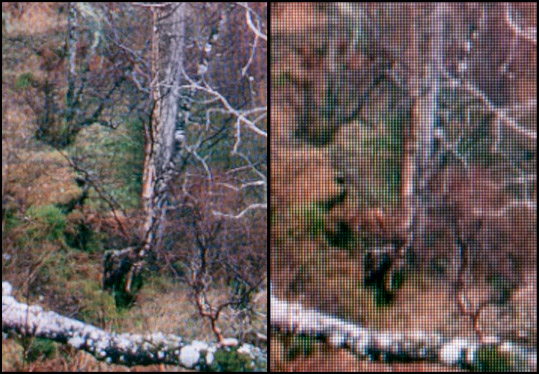
When you start the new iPad up though, it just looks crisp. Looking closer it's what you don't see that makes such a difference. Pixels.. You can't see any of them. In fact you can't really see any evidence of them at all. near horizontal lines that usually have anti-aliasing - jaggy edges - just look like smooth, crisp lines. Text looks sharp, easy one the eye and the icons have a 'depth' to them. But it's what happens when you upload some photographs that makes this a revolutionary device for photographers. The old iPad made photographs a pleasure to view and it was on a trip to Cornwall where I met up with a few other photographers that I saw my first iPad. Images looked vibrant - almost like a lightbox - and it made it a great device to share images with friends. The new iPad is almost indistinguishable from a lightbox though - images now looks amazing. Putting the new iPad along side the old iPad and it becomes clear just how large that difference is. Here's an idea of just how much the detail improves from the old to new. Bear in mind this is probably four times life size (otherwise you wouldn't see the gaos between pixels) and the new iPad image on the left is suffering from a bit of moire (I couldn't focus close enough with my lens to clearly make out individual pixels on the new iPad)
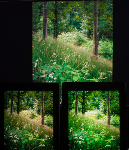
The best way to get an impression of sharpness is to load up an image onto your main computer screen (which I'm presuming is probably 1600px to 2000px wide and is about a 24" diagonal) and then step back until you are about three times arms length away from the screen. That's what the ipad looks like when you are holding it in your hand! Even then, the new iPad screen is 2048 by 1536 pixels - a higher resolution than most large monitors but in a 9.7" diagonal! But there are more things than resolution, how is the colour. Well, it's a mixed bag. If I was comparing it with commercial monitors I would say it's probably good but the big problem with the iPad is that you can't profile it. The good news though is that it's a substantial improvement over the old iPad in most ways. The 'gamut' is a lot better, saturated colours look great and subtle gradations look good. However, there are some colour shifts in the iPad's we own. I tried to photograph these and only a couple could be seen properly. The following are a couple of shots that did match what I could see visually. Old iPad on the bottom left, new iPad on the bottom right and my calibrated monitor at the top.
This first image is typical. The iPad shows an increased contrast due to the high gamma but the colours are fairly accurate and the saturation is in line with that increased contrast. The old iPad in comparison shows a generally warmer result with muted greens. Here's another comparison.
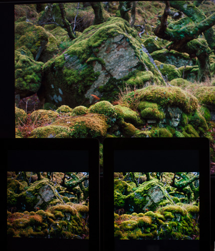 Here is another example showing how the new iPad has increased contrast but generally accurate colour. The old iPad 2 looks muted in comparison. I spent a little time matching a couple of pictures to show the exact hue shift on the new iPad. In general it has a warmer appearance but with a slight magenta tint, especially in the highlights.
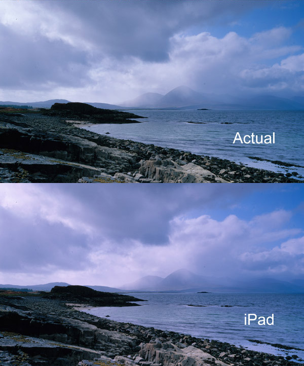
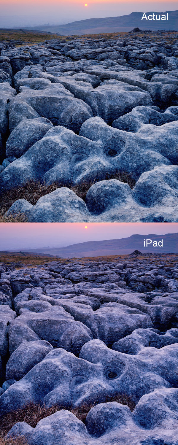 This is quite a strong colour cast but it mostly shows when you have neutral or lightly cyan subject matter (although this is by far the worst example of my library of large format images). If you want to use a portfolio on your iPad, it is fairly easy to create a curve setting in Lightroom or Photoshop to 'pre-fix' this to give true colour. Alternatively you could use the Spyder Gallery which is a Gallery which includes a colour calibration from the Spyder colour tool. It's annoying to have to use a single gallery for all your images however - hopefully Apple may include some form of ICC correction in a future iOS. So - in terms of a gallery tool, I would say that it's absolutely stunning. If only Apple could fix the colour calibration issue it would be just about perfect. I'll be testing out using the iPad as a 'live view' tool in the next iPad installment.
Would I recommend this as a photographic accessory? If you like to share you photographs with other people, I think this will probably end up more useful than a printer for many people. Oh, and it supposedly does more things than just being an amazing picture frame too!

