

It's all subjective 'innit!

Tim Parkin
Tim Parkin is a landscape photographer living in Scotland who co-founded On Landscape magazine. Alongside his photography and writing he also co-founded the Natural Landscape Photography Awards, runs a film scanning business and is a judge for other international landscape and nature competitions.
As photographers, you’d think we had a pretty good handle on what colour is wouldn’t you. I certainly did until I started looking into it and had the proverbial rug pulled from under me. It turns out that if you talk to colour scientists and colour psychologists they’ll tell you that there is no such thing as colour! This article will look a little bit more into that disturbing revelation.
Color is subjective
The reason your colour scientists say there is no thing as colour (apart from being interminable know it alls) is because there are a bunch of different steps that need to be addressed in order to understand what is happening between the subject you're looking at and your brain saying “BLUE!!” (or "Bleu!" or whatever).
Firstly you need to know that in terms of science the only physical, real world phenomenon that we can refer to when discussing colour is the distribution of the amount of energy for each of a continuous range of frequencies of light. i.e. How much of each colour in the spectrum there is. This is often referred to as a 'spectral distribution'. If you look at the diagram below you'll see a spectral distribution for daylight bouncing off a few different substances.
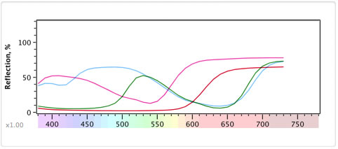
We've tried to keep it interesting so these are four M&Ms we looked at. As physicists, we would say that this is the main information about the M&M that has anything to do with the actual colour of it. And in this case, we're only looking at the frequencies from 400nm to 800nm (actually we can't "see" beyond about 700nm as that is infrared).
However, the term 'visible light' is a human subjective term so a true, full spectral distribution goes from extremely long radio waves all the way up to extremely energetic x-rays. For us, the visible part of this is roughly from 400-700nm wavelength but some people can see more and some less (for instance if you have your cataracts removed you can see ultraviolet from 300-400nm which explains Monet's obsession with Water Lilies in later life and his near complete lack of blue in his "red period" before the operation).
Our eyes aren't spectrum analyzers though and hence the spectral distribution of light hitting our eye is almost meaningless. What we have in our eye instead are a set of different 'cones' which contain a light activated chemical that each responds to a range of frequencies of light. Our brain then processes these three different responses and works out what colour we are seeing (the full story is actually a lot more complex but we'll come back to that later).
In a similar way to the way our digital and film cameras work we have cones that have a reddish colour response, a greenish colour response and a blueish colour response although the green and blue responses on our eye almost overlap each other. The combination of three different sensors colour responses is known as trichromacy - Basically meaning we work out colour from three 'primaries'. So it could be said that we see colour in RGB.
No title
interestingly some birds and insects have an additional set of 'sensors' and hence are "tetrochromats". Typically this extra response is in the UVHowever, the range of frequencies our eye, our film and our digital sensors responds too are quite different. The only way we would ever see colours with a digital camera the same as we did with our eye is if the colour filters in our cameras or film responded to the frequencies of light in the same ranges (the so called "Luther-Ives" criterion).
Because both film and digital cameras have their own, quite different frequency responses they will always see light in a different way to our eye. How this difference manifests itself is quite complicated though and something for a future article. There is a real world phenomenon that explains it quite well though.
Metamerism
Most of you must have experienced or at least heard of the scenario where someone shops for two matching colour items finding a perfect match whilst in store and then when they go out into daylight they find that they're quite different. This is known as a metameric failure.
The colour of the two items are 'metamers' because they match in one lighting condition and then don't match in another. This can only happen because the spectral reflectance of the clothing is different in each item. It just happened that under the store lighting the differences "cancelled each other out".
More specifically this is known as "illuminant Metameric Failure" because the cause of the match/fail was the lighting.
How does lighting contribute to colour?
The spectrum of light that you see coming off a substance isn't just dictated by the substance itself. It's actually the combination of the spectrum of the light that hits the object with the spectral reflectance of the object. This is obvious when you think of the way everything looks when you're out at night under sodium vapour street lamps.
We'll take a look at an example with a pair of substance that look the same colour purple/magenta under daylight.
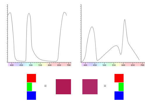
The spectral reflectance curves aren't your typical fayre. Although there are some substances that have peculiar responses like this we're using these to demonstrate a point.
Even though these two substances has such different spectra, our eyes make up an RGB value that matches when viewed under even daylight.
What happens if we look at these substances under some peculiar light source like metal halide lamps? Well here's the emission spectrum of a typical halide lamp like that used to light up sports stadiums at night.
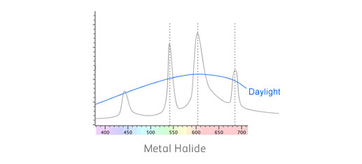
As you can see it doesn't have a nice smooth spectrum like daylight. Instead, it has a set of 'spikes'. These spikes have been designed to stimulate the colour response of our eyes in such a way that it comes close to daylight.
Because our eyes can't discern the very thin spikes, they only take a broad average value. However, our materials above have some quite thin spikes in their reflectance spectra. Let's see how they line up with metal halide..
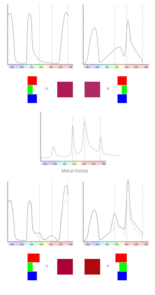
We've put some dotted lines on the image above to show where the main spikes in the metal halide light are.
For the first material, one of the spikes corresponds with the red part of the spectrum. For the second material, two of the spikes correspond with the green and yellow parts of the spectrum.
This means that the first material will have slightly more red in the mix and the second material will have slightly more green and yellow. We've shown the difference in the bottom part of the diagram where the original curve is in a lighter grey colour.
If you take this spectral response and process it using the colour response of the eye you get the colours shown in the bottom part of the diagram. Not a huge difference but significant never the less and it's obvious that the two materials no longer match.
This is just because we've changed the lighting. This is "illuminant metameric failure"
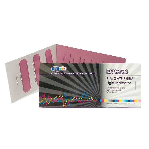
This type of behaviour is something that is used in the RHEM Light Source Indicator. This purple/magenta looking sticker is a continuous colour under true daylight but is striped when viewed under non-daylight sources.
Observer Metameric Failure
Now instead of having a different light source that happens to have a spiky spectrum, what if we have a camera sensor that has a spiky spectrum. The same thing will happen. Two materials that look the same to our eyes will look different when photographed using these this camera.
Interestingly if you take a photograph of the aforementioned RHEM Light Source Indicator with most digital cameras you end up seeing stripes!
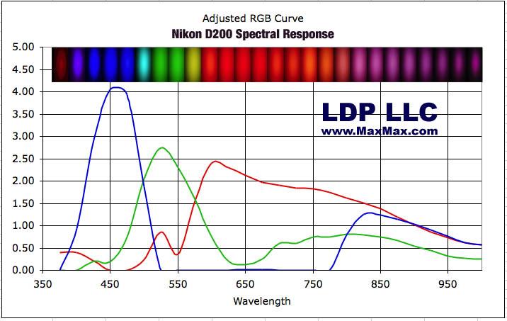
If you want to see the colour response of a typical digital camera, take a look at this page on the MaxMax website that shows the spectra of a few different cameras and here's an example. p.s. it's well worth a look around the Max Max website anyway - they do great IR conversions and some interesting monochromatic ones too!
What does this all mean?
It means that our eyes and our cameras don't see colour in the same way - we actually see a much simplified reduction of what is actually happening in the real world. Because of these simplifications, saying that we know the colour of something without specifying under which light source and by what sort of observer (camera or eye) is pointless.
It also means that your digital of film pictures almost by definition are not seeing the actual colours that we see with our eye. They're close! Close enough to fool most people but they're far from being 100% accurate. This is why some cameras seem to produce seemingly 'nice' colour and some 'not so nice and no amount of photoshop jiggery pokery will make a difference.
We'll be coming back to what this means to our photography in future articles but here are a couple of related subjects that we'll probably cover.
1) Why using selective hue/chroma/lightness shifts in Photoshop are legitimate and arguably essential to producing accurate and/or pleasing colour.
2) How you can make ICC profiles that work with daylight and tungsten light. (Dual Illuminant Profiles)
3) How camera companies measure the amount of metameric error in their cameras and what you might look for when choosing one.