
Chapter 2 : Printing in the Darkroom

Luke Whitaker
Luke Whitaker (born Wimbledon, England 1978) is the owner of the award-winning Bosham Gallery which he set up in 2012, an online photography gallery specialising in the marketing and sale of limited edition prints and their framing.
He also teaches photography, and runs a business course programme for emerging artists. Luke has a lifelong passion for photography and collects photographs himself, particularly prints made between 1880-1920, which is his favourite period in the history of photography.

Michael Kenna
Michael Kenna (born Widnes, England 1953) is one of the most acclaimed landscape photographers of his generation with a truly global audience for his work. During Kenna’s fifty year career, he has held over 530 solo exhibitions in 40 countries, and his photographs have been the subject of over 90 monographs. To date, his prints are held in the permanent collections of over 110 museums worldwide. Kenna is particularly well-known for the intimate scale of his photography and his meticulous personal printing style. He works in the traditional, non-digital, silver photographic medium. His exquisitely handcrafted black and white prints, which he makes in his own darkroom, reflect a sense of refinement, respect for history, and thorough originality. Full Overview.
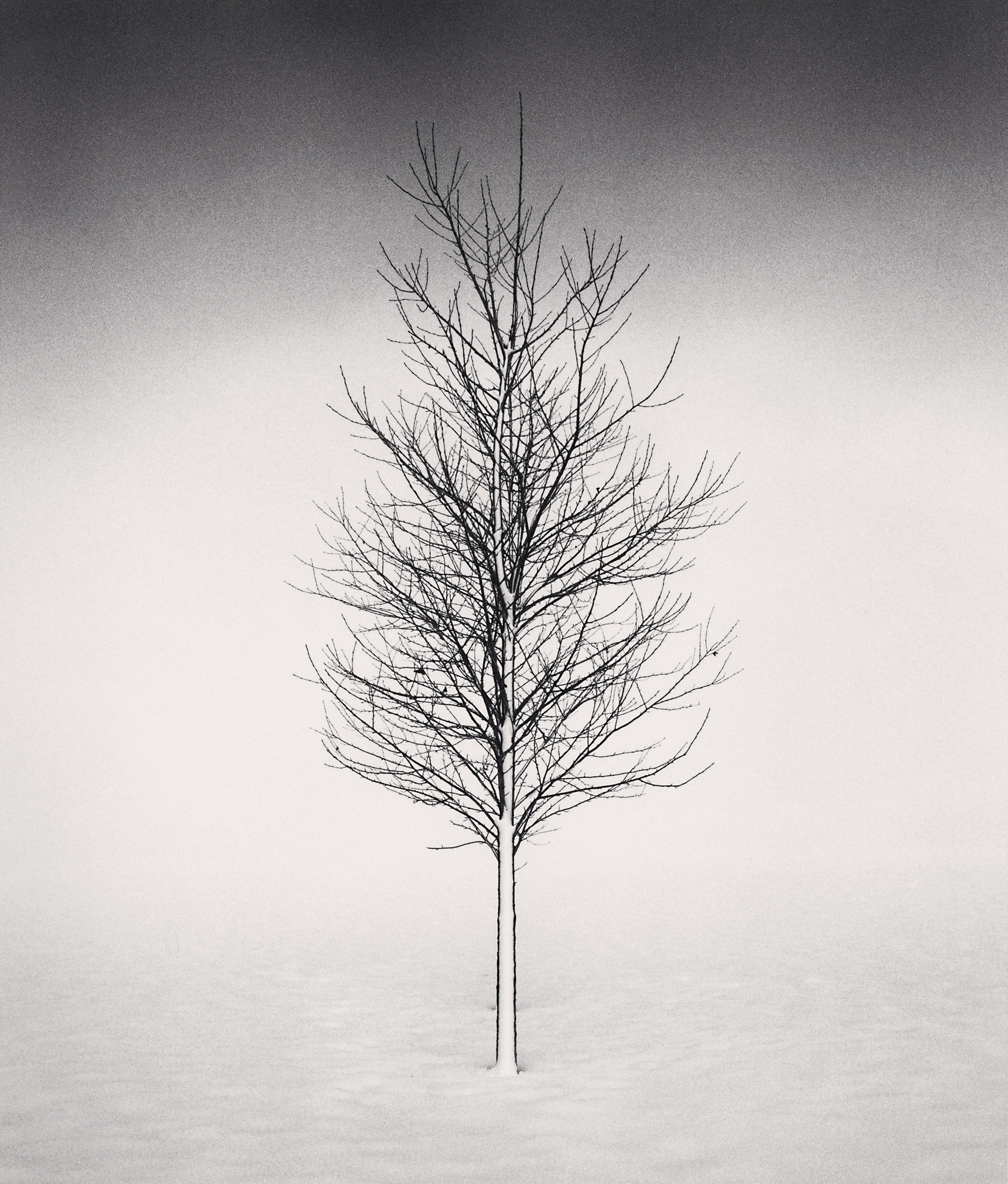
Tree Portrait, Study 1, Wakoto, Hokkaido, Japan. 2002 © Michael Kenna
In the second of five chapters serialising Michael Kenna’s darkroom diaries, we hear Michael discuss the work that he does to interpret each negative, and we see photographs of Michael at work in his darkroom in Seattle, USA. (Chapter 1: Working With Film For Over 50 Years)
Unless you have grown up making wet chemistry prints or have actually been into a darkroom and witnessed the process, it can be very difficult to understand exactly what goes into the making of a silver gelatin print. During my own private discussions with Michael, I have jokingly likened it to the dark art of a scrum in rugby union, because unless you’ve been on the inside, you don’t really know what goes on!
In this article, I share some behind the scenes photographs of Michael making his silver gelatin prints in his darkroom in Seattle, alongside extracts from his diary to help explain the arduous and patient print process, which can take a whole day to make a single print.
As you will read, there are many different stages to the process of making a print after the film has initially been developed to produce a negative. First, the negative is put into an enlarger for Michael to interpret. From this point he will have a lot of creative control and can make fine adjustments. For example, he will dodge and burn (lighten or darken) specific areas of the photograph. The latent image contained in the photographic paper is then developed in a multi-stage wet chemistry process – a series of chemical baths. This is where the magic really happens! In the first tray the image is immersed for two to three minutes and ‘developed’ onto the paper. Next, it is transferred into a ‘stop bath’ solution, which literally does that – it stops the print developing. In the third tray it is ‘fixed’. The print is then placed in a print washer to eliminate any chemical residue before the next process of toning takes place.
After toning, the print will be washed again before it is air-dried flat on a screen. Much later, after it is completely dry, the print will be heat pressed, retouched, dry-mounted, matted, titled, signed and numbered. It is a lengthy process and surprising to learn just how long it can take. Michael will often make many prints before he produces a result he is happy with. He has said that the sign of a good printer is a wastepaper basket full of discarded prints. In the example below, you will see how Michael made 12 working prints of ‘School Yard, Heptonstall, Yorkshire, England 1983’ before he produced a print he was happy to exhibit, a process which took a whole day’s work in the darkroom.
I think what is fascinating about the darkroom printing process is the amount of creative control that Michael has to perform in a series of intricate edits to the photographs. Some negatives are particularly difficult to print, and might take Michael several attempts to get it ‘just right’. For example, ‘Tree Portrait, Study 1, Wakoto, Hokkaido, Japan 2002’, which has both a strong overall contrast and a gradient in the sky. As he states, the very lengthy and unpredictable nature of this traditional process is perhaps what makes it so rewarding when the final print is achieved.
Below are a series of photographs showing Michael working in his darkroom to produce a print titled ‘School Yard, Heptonstall, Yorkshire, England 1983’ for an exhibition of Northern England prints that we hosted in 2022. Once the prints are dried, they are then flattened in a heat press in preparation to be retouched. And it is interesting to note that even after so much work has been completed to get to this stage, Michael is still only a little over halfway through his printing process. In the articles and extracts from Michael’s print diaries that follow, we will explain how the prints are retouched by hand before being mounted, signed and prepared for framing.
The captions and quotes by Michael below each photograph explain each part of the process. They were sent to me by Michael whilst working in his darkroom, and listening to the BBC’s Test Match Special.
Luke Whitaker
“Having chosen a negative to print, I use an enlarger to expose that negative image onto pre-coated photographic paper. The negative must first be placed into a negative carrier and dusted before being inserted into the enlarger. The image is then focused onto the easel with the grain focuser. We are almost ready to start printing. Normally, the first exposure would be a test strip - a series of increasingly longer exposures on one sheet of paper, which gives us important information regarding the appropriate exposure time. At one extreme, we are able to see the exposure it takes for the shadows to go black, and at the other extreme, we can see when the highlights lose detail and become white. A good test strip will be both too dark and too light at either extreme. Having printed for so many years, I must admit that I tend to dispense with this stage, and I usually estimate a starting exposure.
During an exposure, light is emitted for a certain period of time. It travels through the negative and aperture of the lens onto a sheet of photographic paper. Accessories required on the dry side of the darkroom include dodging and burning tools. Dodging is when we hold back light in certain areas of the prints during the basic exposure. This is usually done with various shapes of card attached to the ends of wires. Burning is when we give additional light to certain areas of the print after the basic exposure. This can be done by making shapes with our hands, or with boards (black on the side facing the paper emulsion, white on the top), some with various size holes cut out.
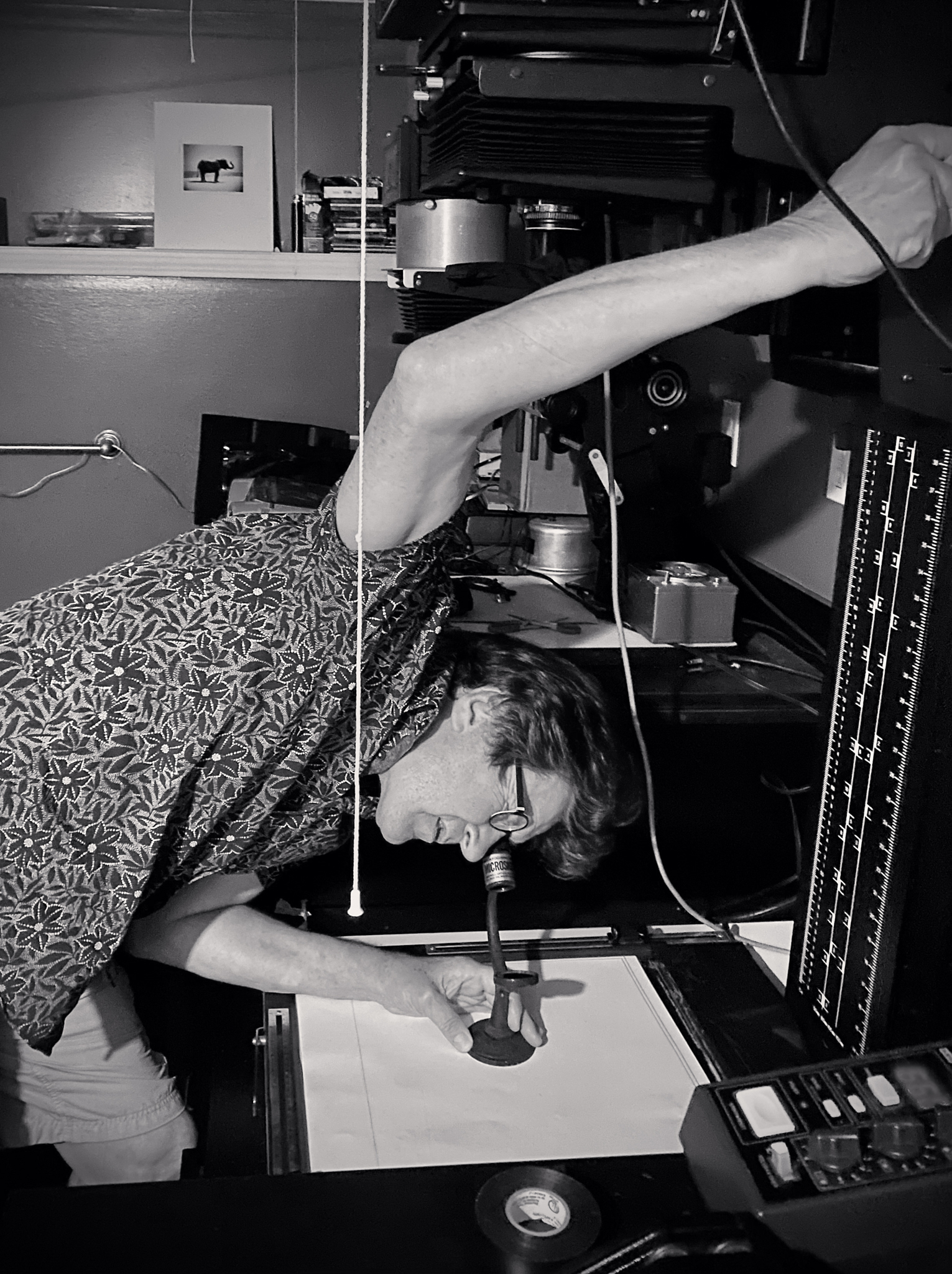
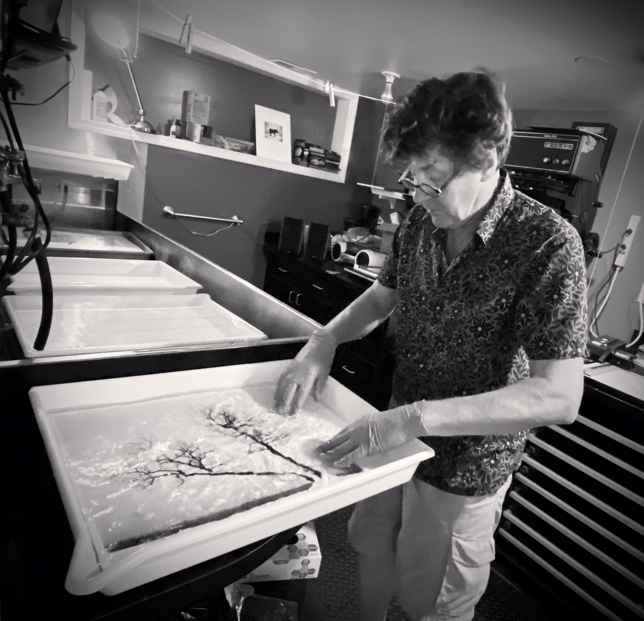
The Dry Side of Michael Kenna’s Darkroom © Mamta Kenna 2021
Each print has extensive interpretive burning and dodging, which is not exactly reproducible from print to print. I cannot press a button to print an edition, and consequently there will always be slight variations. Every print is unique. I fell in love with this traditional darkroom silver gelatin process even before my photography career began. My first prints were made in a makeshift darkroom in my boarding school bathroom when I was only eleven years old.
Pre-coated photographic paper comes in different sizes, surface textures, tonal ranges and silver content. I use Ilford Multigrade fibre-based paper and have done since the paper was first introduced in the 1980s. It is a cold tone paper which I warm up slightly with sepia toner. This photograph below shows a series of chemical baths through which the print will move. The time spent in each chemical is carefully calibrated to achieve desired creative effects. I stock various necessary chemicals: Ilford Multigrade print developer, Acetic acid stop bath, Kodafix hardening fixer, Permawash and Kodak sepia toner are included in the basics. I keep the darkroom well-ventilated so that any fumes from chemicals are directed outside.
The traditional advice when judging the exposure required for a print is to expose for the highlights and develop for the shadows. This is the opposite of when developing negatives, where we expose for the shadows and develop for the highlights.
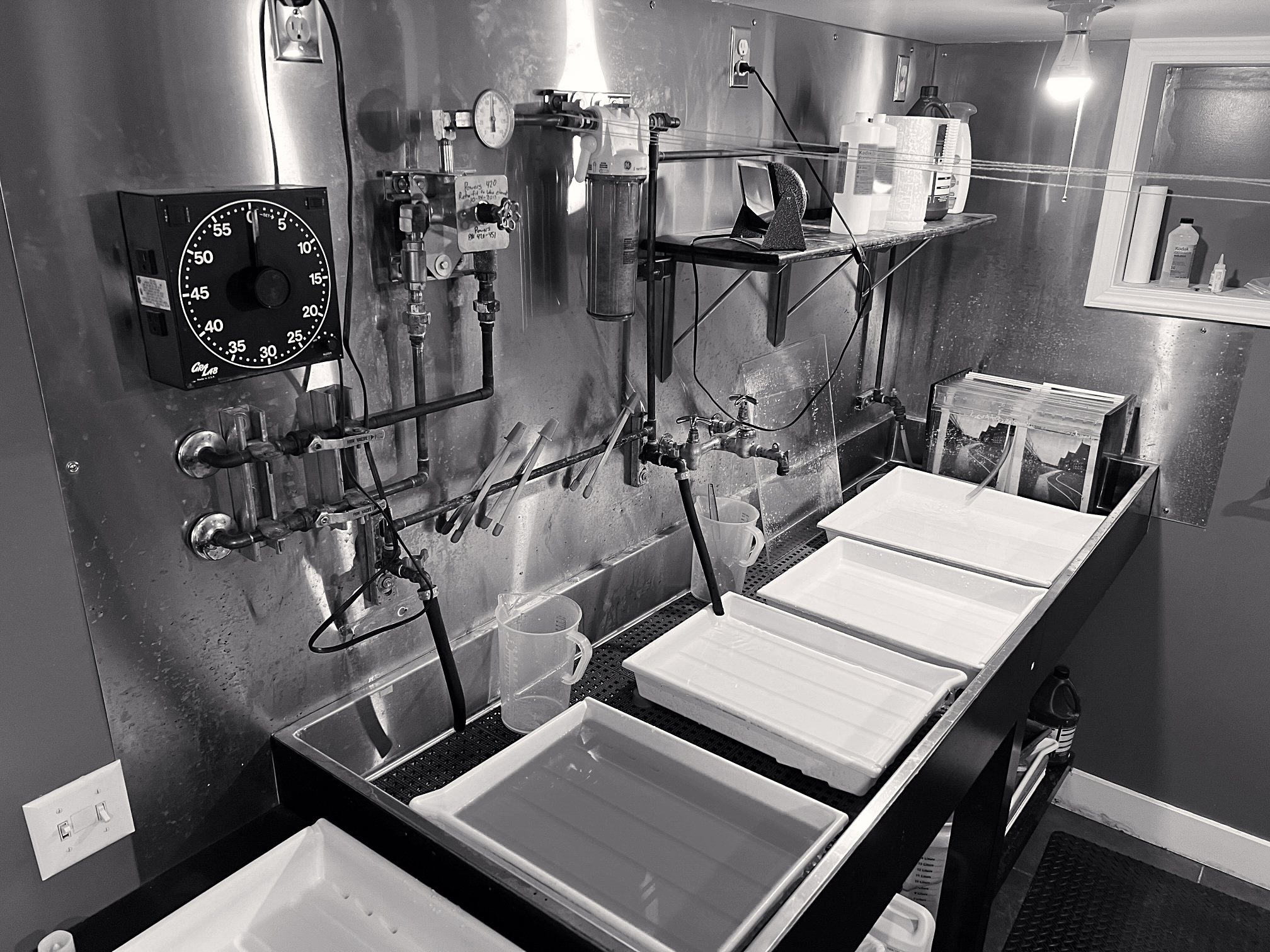
The Wet Side Of Michael Kenna’s Darkroom © Mamta Kenna 2021
Generally, when I print, I try to see the image as an abstract arrangement of lines, surfaces, shapes and tonalities. My aim is to balance and order these elements, thereby focusing attention on and directing viewers to areas that I consider significant. Perhaps it is useful to have a basic understanding of composition, and how light and dark work together in transforming a 2-dimensional print to create the illusion of 3D. Working from an assumption that our eyes are attracted to light - we can use this to our advantage. Our eyes will move through a progression of dark to light, and so we can begin to use light as a sculptural tool. When we darken an area in the print, we pull it forwards in space. When we lighten an area we push it back into the emulsion. This is similar to aerial perspective in Impressionist painting. Warm colours advance, cold colours retreat.
When printing I try to forget the subject matter of the print and instead concentrate on the abstract arrangement of the rectangle. In order to do that, there are some simple methods to help. Often I squint my eyes to take them out of focus. The image becomes more abstract and I can better understand the flow and direction of tonalities. Where does the eye go to, and where does it stop? Often I turn the print upside down, both in the developer bath and later after it is fixed when observing and analysing it. We are used to reading from left to right, top to bottom and it is good to challenge what is taken for granted. I also look at the print both from close up and then at a distance, across the darkroom. Sometimes I purposely go out of the darkroom and creep up on the print to catch it unawares.
My purpose is to see it as if for the first time. I often view the print back to front when wet, by placing a strong light behind it. When dry I sometimes observe it in a mirror. All of these ‘tricks’ or techniques help me to become more objective and analytical. I look at the edges of the prints - if there are distractions on an edge the eye can be drawn away from the centre. Distracting elements can be cropped or balanced and neutralised by an equally distracting element on another edge. They can be lightened or darkened (dodged or burned in). Dark edges move the eye to the centre of the print so corners are often subtly or more obviously darkened.
Michael Kenna Working on A 15x15” Print of Two Leaning Trees, Study 3, Kussharo Lake, Hokkaido, Japan. 2020 © Mamta Kenna 2021
I search for the equilibrium of a print - as in mechanical physics. There is always a centre of gravity in a balanced print - preferably in the areas that I consider to be the most important or significant. Whenever one area is changed, it affects the whole composition and the centre of gravity shifts. The possible interpretations are endless, and it is always an exciting adventure to find personal pathways.
I have printed this image School Yard, Heptonstall, Yorkshire, England, 1983 perhaps three or four times. It takes me several hours and involves many reject prints to reach an acceptable interpretation as there is so much burning and dodging involved. Even when the print is dry – it will take several more hours of retouching by hand to complete. It is survival of the fittest with this negative. Many prints are discarded along the way.
Below are the prints in progress of School Yard, Heptonstall, Yorkshire, England, 1983:
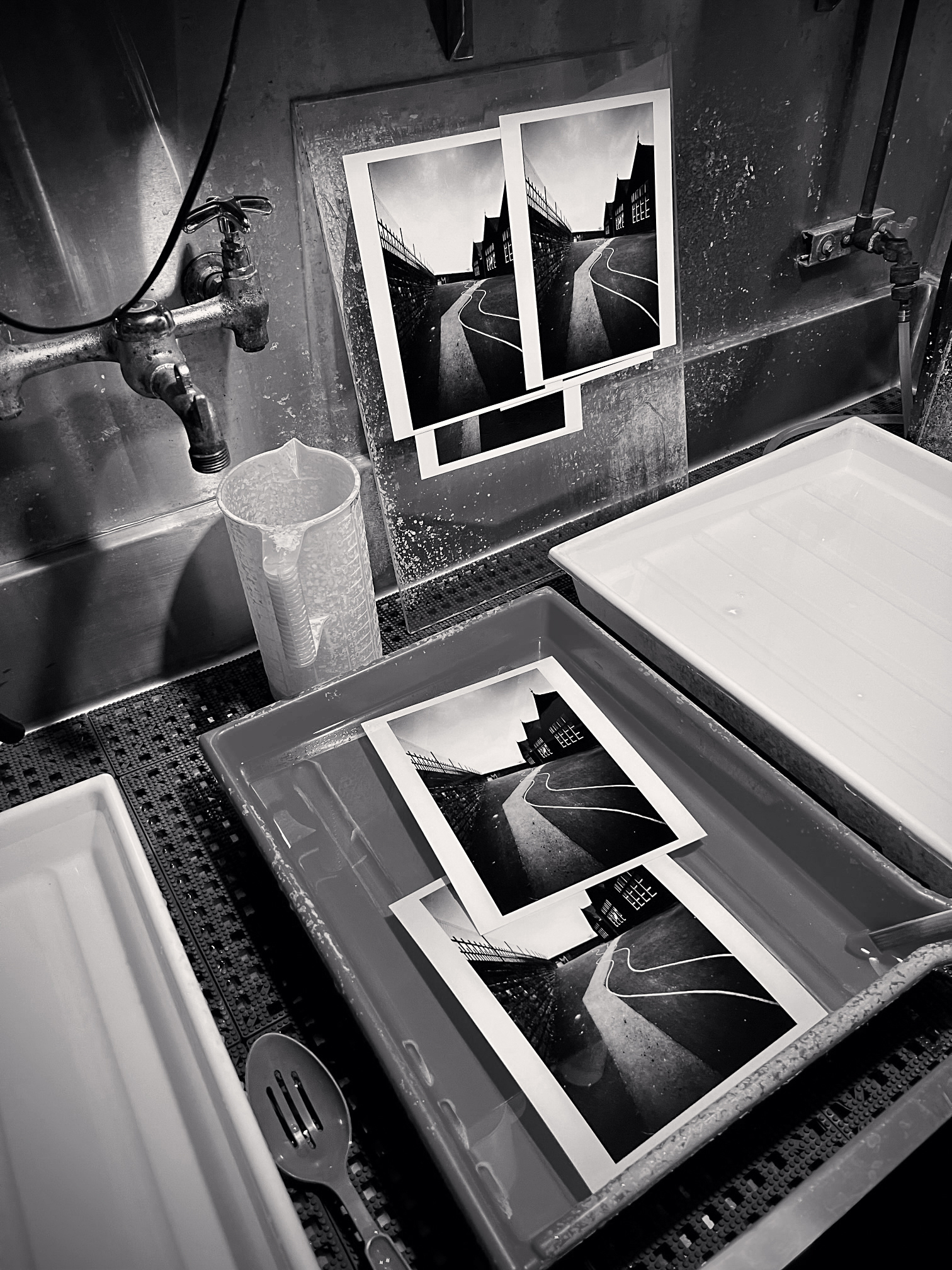
5 Rejected Prints of School Yard, Heptonstall, Yorkshire, England. 1983 © Michael Kenna
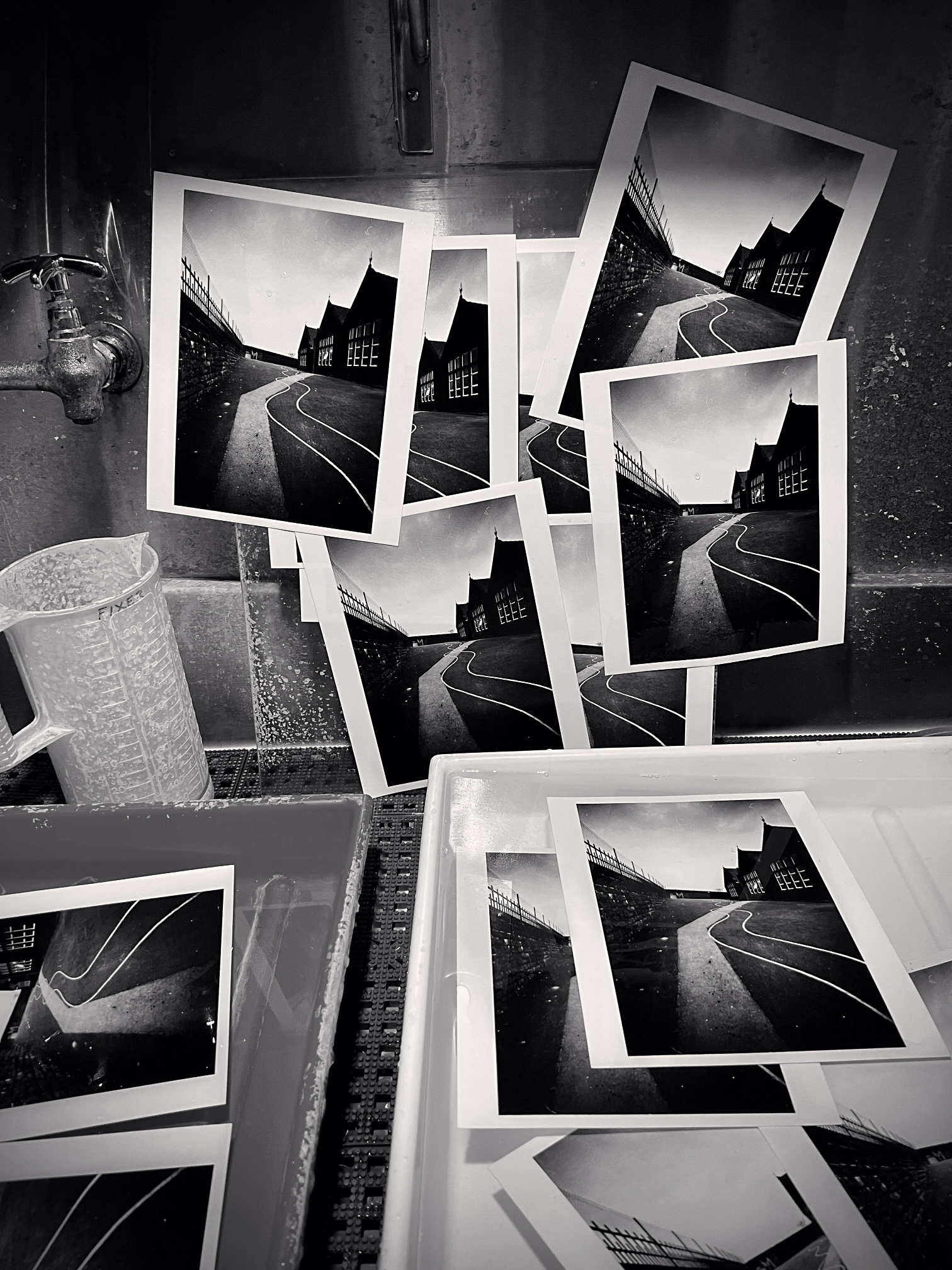
‘Getting There’ 12 Working Prints of School Yard, Heptonstall, Yorkshire, England. 1983 © Michael Kenna
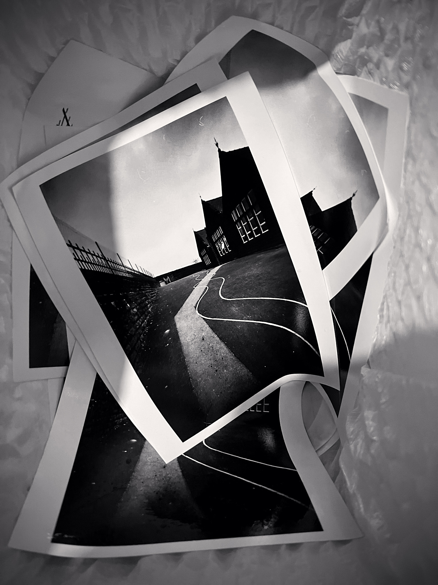
‘Survival of The Fittest’ Rejected Prints of School Yard, Heptonstall, Yorkshire, England. 1983 © Michael Kenna
I have heard it said and seen it written that a fine print should have a full, balanced tonal range from white to black. Of course, it could have this range, but this is only part of the story as we can see by looking at the work of different master photographers. Ultimately, it is the photographer’s personal palette that dictates the characteristics of any individual print. There is no fixed quality standard of a print - just personal preference. A mature artist’s printing style is as individual as a signature. When we view prints made by such masters as, for example, Bill Brandt, Josef Sudek, Mario Giacomelli, Edward Weston, and Ansel Adams, to mention just a few, we can immediately identity the photographer just from their personal printing styles. Give twenty photographers the same negative to print, I would anticipate and hope for twenty different interpretations.
Below are four examples of uninterpreted prints and interpreted prints after burning and dodging:
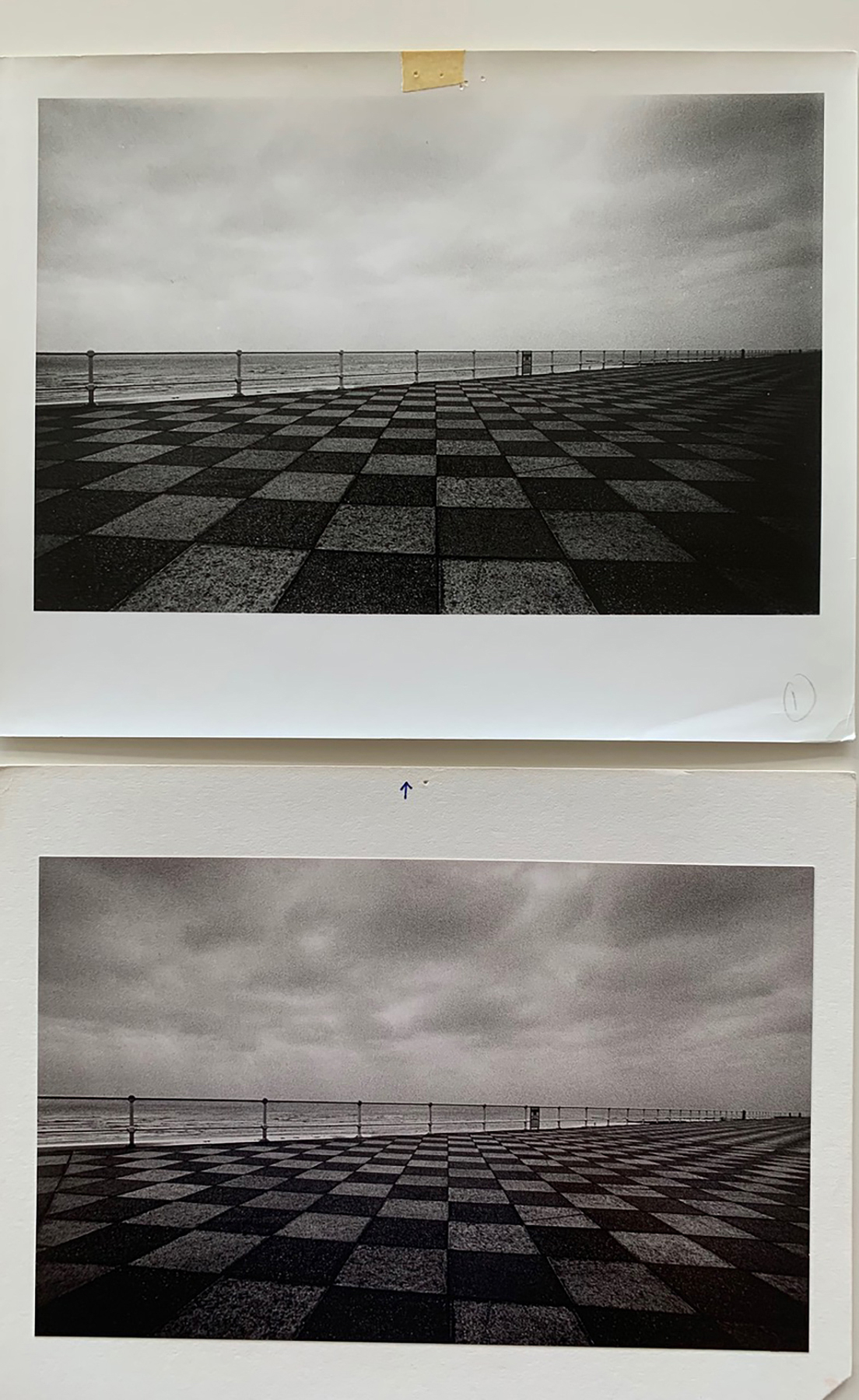
Working Prints of Seafront, Hastings, Sussex, England. 1982 © Michael Kenna
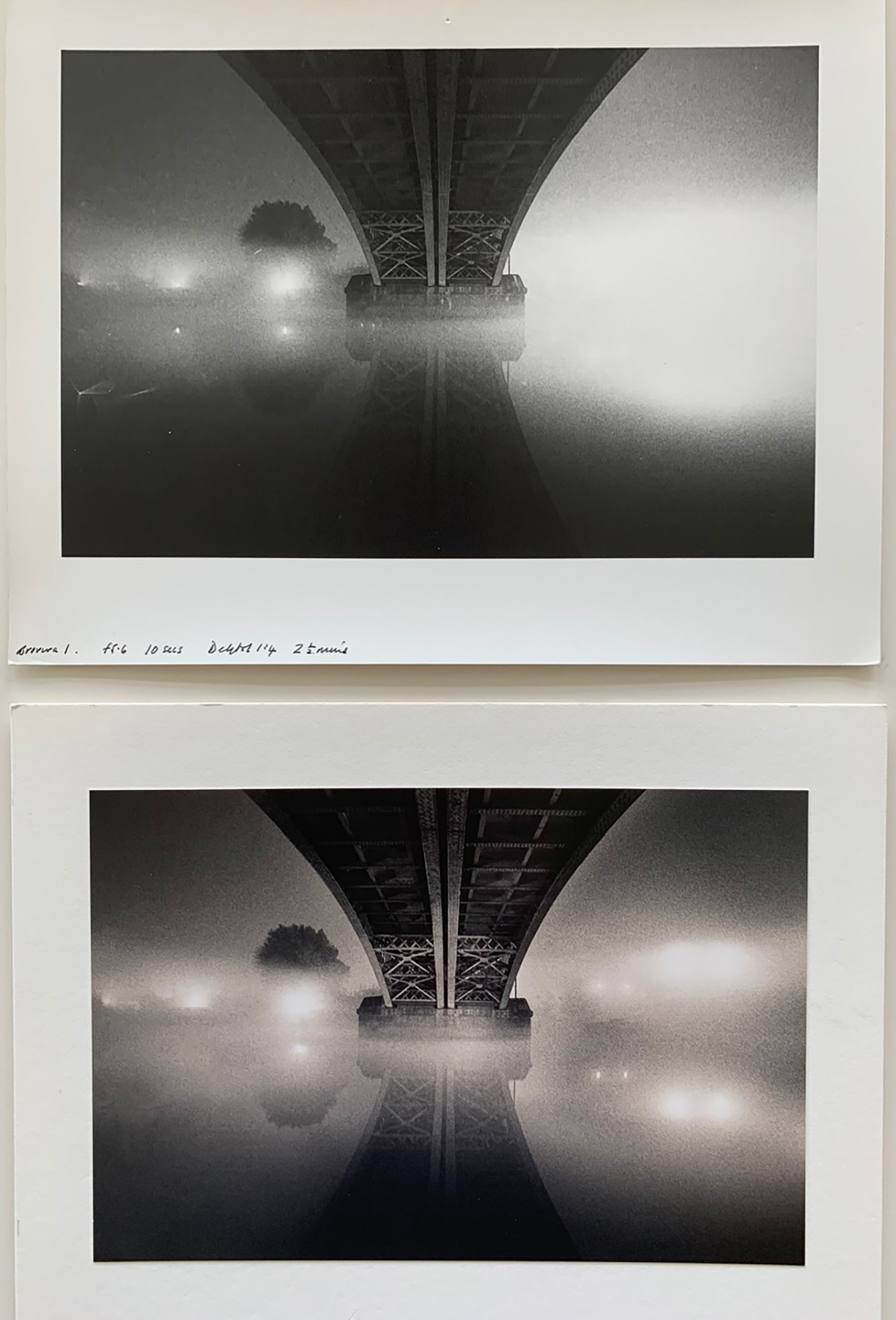
Working Prints of River Thames, Homage to Brassai, London, England. 1983 © Michael Kenna
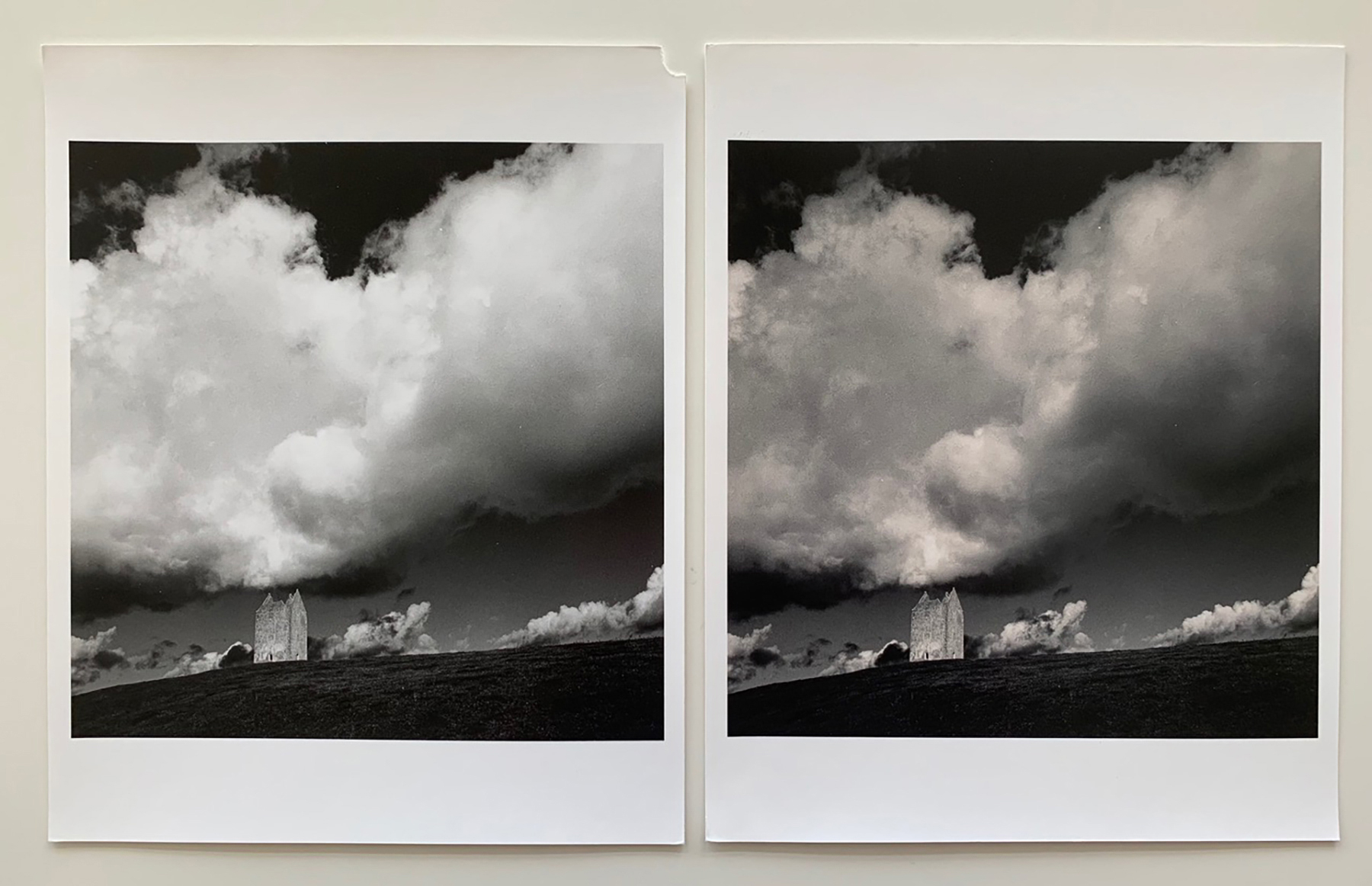
Working Prints of Bruton Dovecote, Somerset, England. 1990 © Michael Kenna
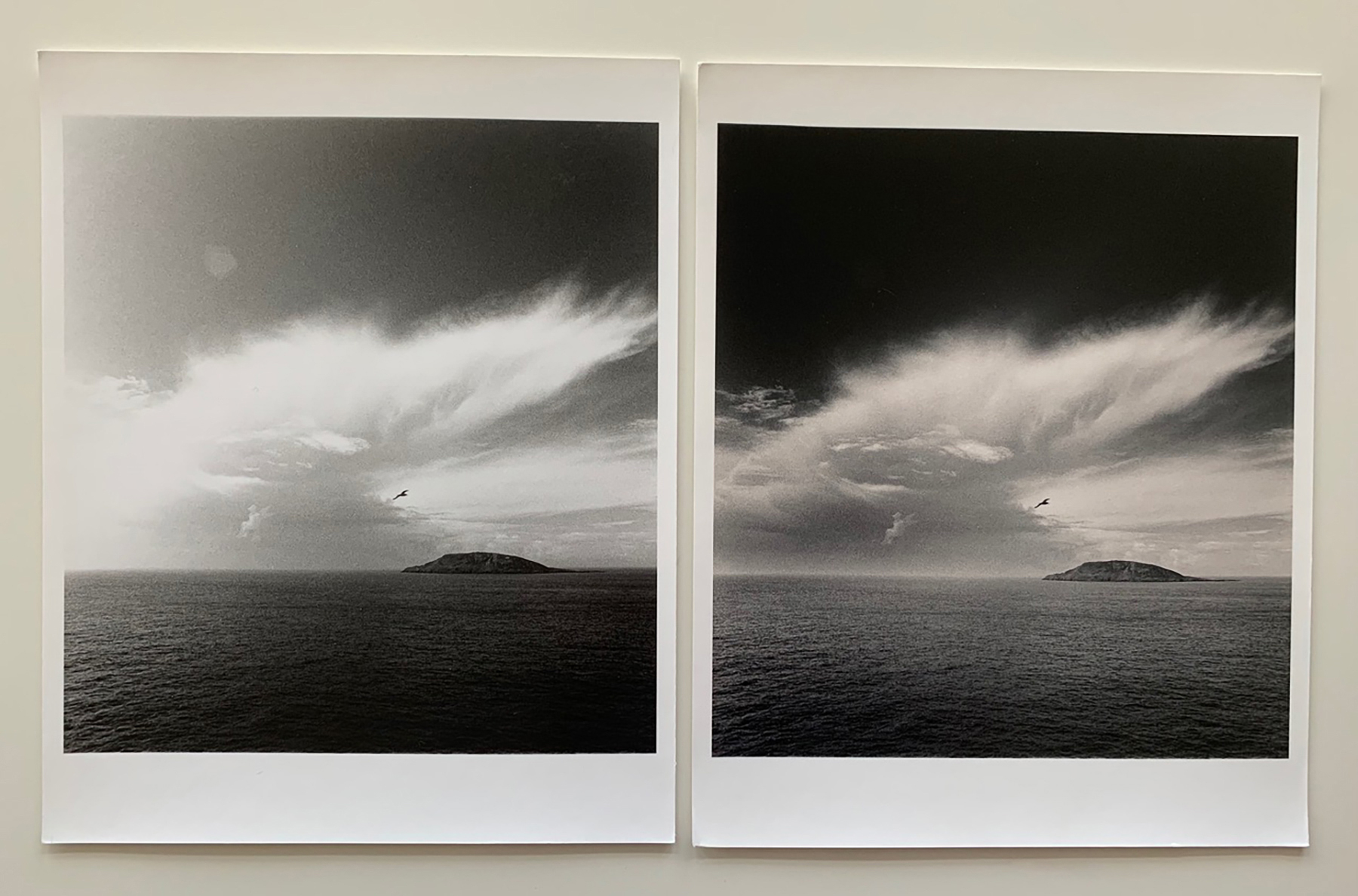
Working Prints of Storm Warning, Bardsey Island, Wales. 1996 © Michael Kenna
Retired Negatives by Michael Kenna
Retired Negatives by Michael Kenna is an online exhibition of his most collected work over the past 50 years, featuring the remaining Artist Proof editions of photographs whose numbered limited editions have now sold out.
The collection is a chance to acquire a print from editions in which the negative has been formally retired within Michael’s archive. All of his silver gelatin prints are still made by him personally in his darkroom at his home in Seattle. The online exhibition is hosted by Bosham Gallery and can be seen at boshamgallery.com until 17th December 2025.
‘Machine-made pigment prints are of excellent quality, but, at least for me, silver prints remain the gold standard in photography,’ says Michael. ‘It is also comforting to know that these prints are made to archival standards, which means they should well outlast myself and collectors. I keep records of every print I have signed and editioned and have prints in my own collection which I made 50 years ago. They are as good today as when I first made them.’
To accompany Retired Negatives, and to celebrate 50 years of darkroom printing, Bosham Gallery’s Luke Whitaker is presenting a five-part series of chapters from Michael Kenna’s Darkroom Diaries.
Please visit boshamgallery.com to see the online exhibition.
Author image: Michael Kenna Photographed in 2011 by Song Xiangyang © All Rights Reserved
-

- Tree Portrait, Study 1, Wakoto, Hokkaido, Japan. 2002 © Michael Kenna
-

- Working Prints of Storm Warning, Bardsey Island, Wales. 1996 © Michael Kenna
-

- Working Prints of Bruton Dovecote, Somerset, England. 1990 © Michael Kenna
-

- Working Prints of Seafront, Hastings, Sussex, England. 1982 © Michael Kenna
-

- Working Prints of River Thames, Homage to Brassai, London, England. 1983 © Michael Kenna
-

- ‘Survival Of The Fittest’ Rejected Prints of School Yard Heptonstall Yorkshire England. 1983 © Michael Kenna
-

- ‘Getting There’ 12 Working Prints of School Yard Heptonstall Yorkshire England. 1983 © Michael Kenna
-

- 5 Rejected Prints of School Yard Heptonstall Yorkshire England. 1983 © Michael Kenna
-

- Michael Kenna Working on A 15×15” Print of Two Leaning Trees, Study 3, Kussharo Lake, Hokkaido, Japan. 2020 © Mamta Kenna 2021
-

- The Wet Side Of Michael Kenna’s Darkroom © Mamta Kenna 2021
-

- The Dry Side of Michael Kenna’s Darkroom © Mamta Kenna 2021