
Advanced use of Hue/Saturation Adjustments

Tim Parkin
Tim Parkin is a landscape photographer living in Scotland who co-founded On Landscape magazine. Alongside his photography and writing he also co-founded the Natural Landscape Photography Awards, runs a film scanning business and is a judge for other international landscape and nature competitions.
If you take a look at the popular photography press you’ll see that the saturation slider is probably one of the most used post production tools and also perhaps one of the most abused. This is not surprising as the desire to create pictures with strong colour is one that has excited artists through the ages. However, the big downfall of the saturation tool is that it is often used as a one size fits all solution; just push the slider as far as you can get it until some internal ‘ouch’ light starts flashing.
Most of the time this ‘ouch’ is restricted to one particular colour and it’s worth thinking about why this happens. Most people have been in the landscape to some extent and know what it looks like. They’ll have seen some glorious sunsets and some beautiful spring greens and autumnal oranges and reds and so they have an internal reference of what looks ‘right’. They’ll allow a bit of leeway with this but if you give them a green that is beyond what they are expectng then the illusion of reality that you’ve worked hard to create will break down - perhaps only a little or perhaps completely.
But some colours are more flexible than others. For example most people have seen some extreme fall colours and so if you’re working in a location with average fall colours you can probably apply quite a bit of saturation before peoples ‘ouch’ warning light flashes. But for something like a grassy field the colours don’t vary that much and if you’ve a sunny day that colour might be quite flat. Push the colours too far and we have an instant flashing ‘ouch’ light.
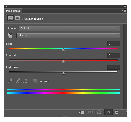
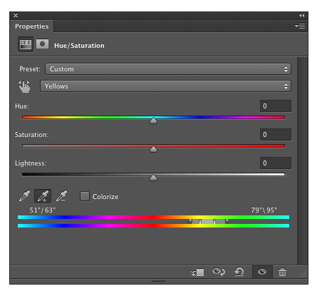
So if you want to make the most of some saturation ‘punch’ then you need to apply it differently to different colours and subjects. Fortunately Photoshop allows you to do this. Take a look at the Hue/Saturation tool below and you can see that the colour range can be selected by a dropdown at the top.
Next to the picker is a hand tool and it looks like this will allow you to pick the exact colour to play with. Sadly this doesn't do that, it just picks the closest colour range from the six mentioned above. The interesting thing happens once you have one of these six ranges selected. If you look at the image below we've selected the yellow range.
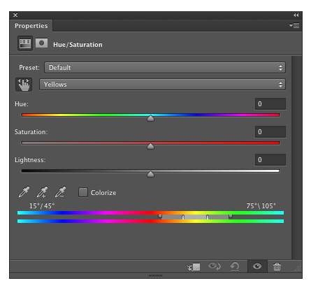
So you can see in the selection bar at the bottom a group of little markers in between the two rainbow bands.
The centre part, the lightest grey area between the two biggest markers, is the area that is 100% selected. The two darker areas either side are a 'transition area' - basically it's a feathering area so that you don't get harsh lines in your image between colours that have been adjusted and those that haven't.
The useful stuff is just above and to the left of those rainbow bands. We have a set of 'eyedropper' tools that we can use to select exact ranges of colour.
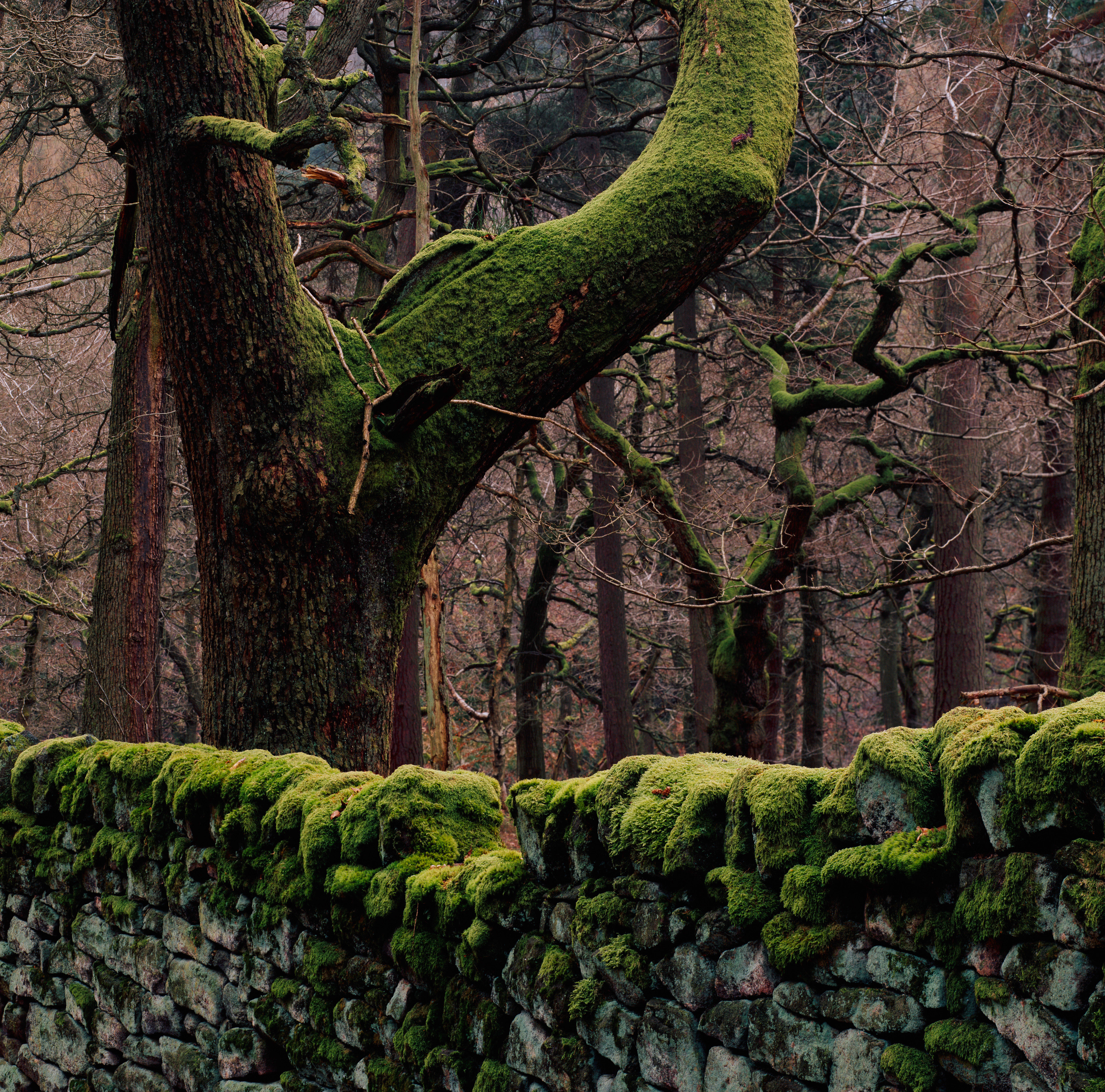
In the picture below we've clicked on exactly the same area that we used with the hand tool above and if you compare the two images you can see that it has selected a range of colours that are more 'green', which is what we'd expect having clicked on a mossy area on some trees.
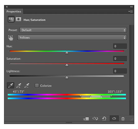
Now this the more accurate selection for the colour we want. We can now expand this selection in one of two ways.
The first way is to use the eyedropper with the plus or minus symbol next to them. This will allow you to add or remove colours from the range selected. I'd try to stick to the 'add' button as removing colours tends to strip whole ranges out.
The alternative to the eyedroppers is to manually expand the range of colours. You can do this by clicking and dragging on the grey areas or markers in between the two rainbow bands. The following describes what happens when you click and drag on each area
1) The main light grey area between the two large markers allows you to drag the whole group of selection to different areas of colour
2) The darker grey areas either side of the light grey allow you to expand the whole selection to include more colours
3) The markers allow you to open or close areas so you can make the transition/feather area smaller or larger for instance.
Making these changes is often very difficult to visualise so I would recommend turning the saturation either down to zero or up to maximum so that it is very obvious what will be selected in your image. here is an example of what the selection might look like if we want to hone it down to a very small hue range.
So now you have a tool that allows you to create an adjustment layer for each colour range you want to tweak in your picture. The settings are saved in the colour range drop down sometimes overwriting existing colour ranges, sometimes adding a new range such as 'green 2'.
You can adjust multiple colours in a single adjustment layer but I like to be able to 'rub out' areas using masks and so an separate layer for each colour being adjusted is sometimes useful.
"Green or Yellow?"
a landscape photographer's definition of green is slightly different to Photoshop's. If you want to change the saturation of foliage or grasses, you should probably choose the yellow channel.The second picture shows what can be achieved if we separate out the saturation increase for the green-yellow mosses and red-orange autumnal colour. I hope you agree the second is much better. 
Finally, the saturation tool also allows you to change the lightness and hue of colours. Don't be afraid to play with subtle changes to these as well. For instance I find that with digital greens, especially Canon ones, it is often beneficial to shift the hue a few points towards blue and to reduce the lightness a bit. Digital skies can often tend toward a turquoise/cyan and it's often useful to select these and shift them slightly away from green.
The Hue/Saturation tool is a key part of the post processing arsenal and one that can really help take control over your images.