Tim talks us through the second stage of preparing for his first exhibition

Tim Parkin
Tim Parkin is a landscape photographer living in Scotland who co-founded On Landscape magazine. Alongside his photography and writing he also co-founded the Natural Landscape Photography Awards, runs a film scanning business and is a judge for other international landscape and nature competitions.
So I left you in the last article (part 1)just as I was starting to print the photographs for the exhibition but hadn’t quite decided which images were going to be printed. I’d made some rough choices but was still not completely convinced I had anything more than a group of favourites.
Final Choices
Before I made my final choices, myself and my wife Charlotte visited David and Angie Unsworth in the Lake District to get kitted out for a winter mountain walking workshop. David and Angie took a look at the images and after a couple of conversations they helped me realise that despite my photographs being ‘just’ pictures taken on my various travels, they did have a theme of sorts. They described many of my images as having a sense of ‘other’ as if they had come from some form of fairy tale. Now I didn’t think this was strong enough or probably appropriate enough to push down people’s throats but I thought I could possibly hint at this through image choice and naming and let people ‘join the dots’.
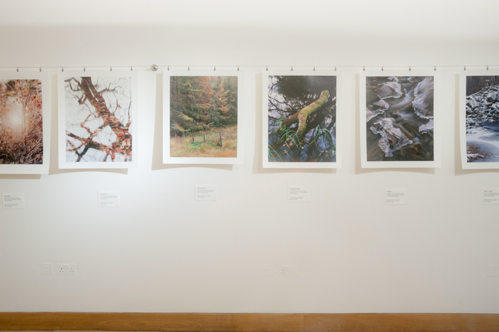
So I went through the images again looking for images that supported the theme. I also have been thinking for a while about the way in which my images show the way nature reclaims landscapes and recovers from mans influence. After a good look through a copy of Brewers Dictionary of Phrase and Fable (borrowed off David and Angie) I decided to call the exhibition “Elemental” which could be interpreted as the components of the landscape - earth, water, wind and fire - but it could also refer to the spirits called elementals.
This helped in at least tying the images together into some form of coherence (however intangible). So it was out with some of the images that just didn’t fit in - this meant no black and white, no big sunny vistas, no obvious locations. Although I quite liked some of the swirly lens images I had taken - only one worked particularly well (the heather and birch).
In all I rejigged the selection and ended up with 26 possible pictures but I knew I would only have space for between 22 and 24. I decided to print all 26 which would give me a little leeway to chop and change once I got to the gallery (and possibly a couple of emergency substitutions for myself or the gallery to use should any prints get damaged
Printing
Oh dear - what a world of potential pitfalls and problems. Printing is one of those areas that cause all sorts of problems for all sorts of reasons. As I don’t have a 17” printer and I was already due to go around to Dav Thomas’ to help calibrate his monitor and 24” printer I asked if it was OK to do the printing at his too.
Now I’m no expert in colour management but I have spent some time looking at the theory and practice (which I’m hoping to write about in a future article) and I hoped we might get Dav’s system set up so that we could at least get close to a match between monitor and printer.
The first step was to calibrate Dav’d NEC Spectraview monitors using my Gretag Macbeth i1 Pro. To cut a long story short, a good hour later and we had converted Dav’s beautiful monitor to some sort of psychedelic lilac monstrosity. Disappointed doesn’t quite cover the emotions.
Fortunately on the second run around where we did a little manual intervention on the brightness, contrast and black levels we managed to get something that looked pretty good.
Now for printer calibration - I know why people use these automated chart readers as manually measuring over 2000 patches of colours quickly becomes quite boring.
However, what happened next wasn’t expected in the slightest. We made a test print of one of my images and put it up on Dav’s daylight print booth (a Just Normlicht print booth off eBay for less than a £100) and the match was just about perfect. Possibly the print was slightly cooler but that could be down to a slight difference between the colour temperatures set.
After a little bit of astonished smugness we got into a printing workflow and over the space of a day managed to print all 26 images. The results on the Crane Museo Silver Rag were quite beautiful, to say the least - rich, deep blacks and a very large colour gamut that was only exceeded by one of the digital photographs that were converted into a ProPhoto colour space (thereby convincing me finally that ProPhoto is a “bad idea”).
Out of the 26 images, we lost two prints to tears in the Crane Museo Silver Rag paper. Other than this, all of the prints came out almost identical to the screen versions. If there was time available I would have liked to have made a few test prints but I am reassured that it is possible to proof on screen if you have the right calibration.
Finally, after having finished printing, I realised just how heavy 26 times 24” wide prints can be!! Fortunately I had two print sleeves that I had borrowed off a good friend which were invaluable to transport the prints. I shudder to think at the problems of moving such a large amount of prints without suitable support!
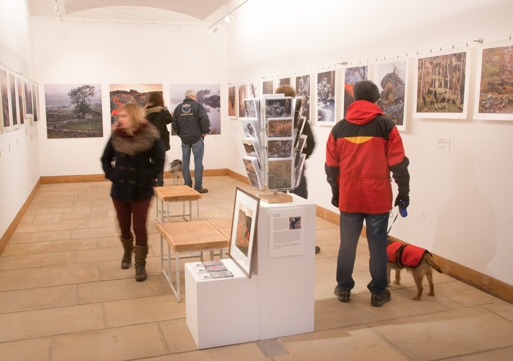
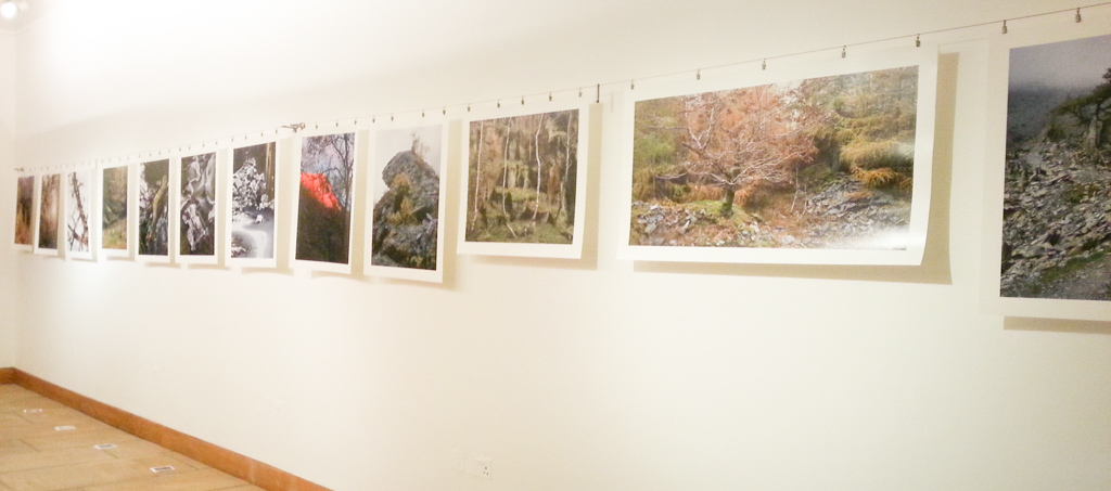
Hanging the Prints
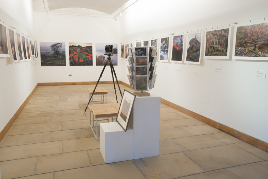
This is where the rubber hits the road. As mentioned previously we had ordered three extra large prints from Digitalab in Newcastle Upon Tyne and I saw these for the first time when I got to the gallery on the day before the exhibition preview. The images looked wonderful as matt C-Type prints mounted on Dibond with a deep crystal laminate coating. The prints were supplied with an aluminium batten hanging system that only took a few minutes to hang (after measuring a two or three times in a fit of paranoia).
For the remaining images I worked out that getting 22 prints framed professionally would have cost £170 per print for a grand total of approx. £3,500. I could probably get this down to a couple of thousand if I did it myself (and a huge amount of time). Because of this, I had decided to use the same hanging system that I had seen David Ward and Anna Booth use in their OXO Gallery exhibitions in London. The cost saving over framing my prints was substantial with individual prints now costing approx. £15 and the whole framing system costing £90.
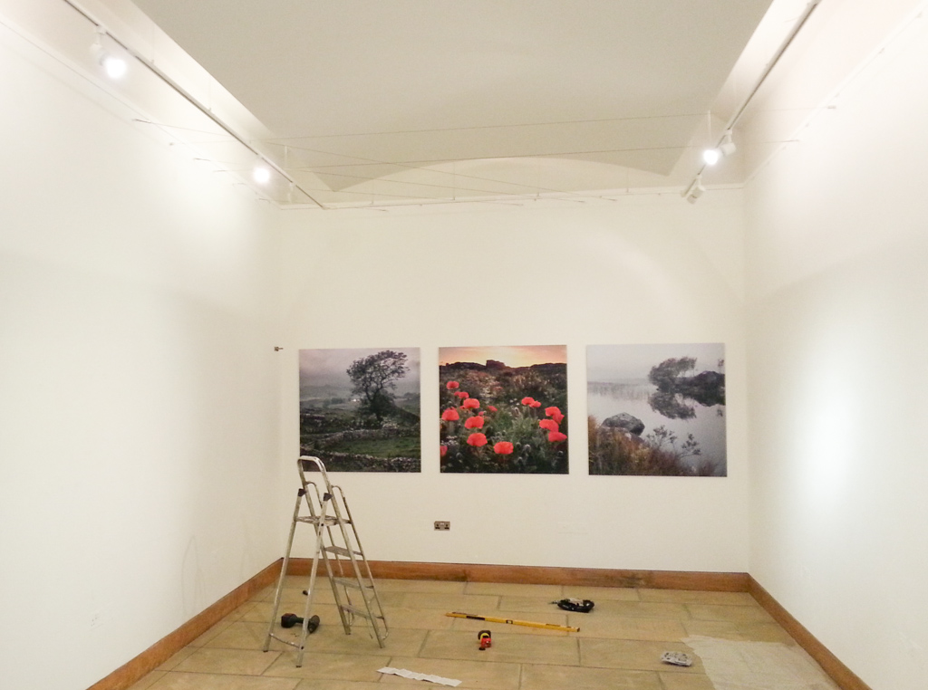
Fortunately the gallery were happy for me to use any mounting system I liked and the walls were thick plasterboard that took drywall screws beautifully. The Ikea Dignitat curtain hanging system was an elegant and simple design to attach to the walls and within about 15-20mins we had the first run finished and a half hour later the remaining were done. This system comes supplied with strong and nicely designed chrome bulldog clips and we used four per print and five or six on the few panoramic prints.
One of the elegant aspects of hanging images on wires such as this is the ease of repositioning images. It was a simple matter to slide images along the wire or transfer images from one side of the room to another. It would have taken more pre-planning if we had to mount individual prints to the walls as we would have had to get the exact sizes, gaps and positioning right from the start. I can only think that the best way to have achieve this would have been to mock everything up in Photoshop with accurate sizes measured from the frames.
Additional Material
We decided to make short captions for each image which would include a title, a sentence (or two) about the image and the pricing. These were printed on Museo Silver Rag as well for consistency. It may have been better to have mounted these to a backing card for extra stiffness but we didn’t have anything suitable and hence we attached these directly to the wall using self adhesive velcro tabs. The use of velcro was justified when I realised I had made the pricing quite confusing with framed/unframed options and had to reprint all of the labels and spray mount the new ones over the old ones (which helped with the card thickness at least!).
As for the content of the captions, I spent a little time with Brewers Dictionary of Phrase and Fable and the odd Google search in order to come up with a little connection from the picture to the mythology around the subject matter. For instance the image of the fallen leaves in the water is titled “Thunderstruck” as the oak tree had been felled by lightning and folklore tells that the tree is sacred to Zeus and Thor and offers protection from lightning (probably because the Oak tree is supposedly more often hit - hence not hitting nearby houses or people). The caption to this picture reads “A shallow lake edge filled with oak leaves under a fallen branch turns to a stroke of arboreal lightning”. Pretentious? A little. Bothered? No :-)
Merchandise
My next door neighbour (well - next village neighbour) Paul Moon said I should get some cards printed and he helped me produce a range of A5 blank greetings cards from 10 of the images on display. These were produced on a digital press and I was pleasantly surprised at both the cost and the quality of the final product. The only downside of digital images is that it can produce some patterning in areas of light, continuous tone. Not something your average greeting card purchaser would notice though.
The images for the greetings care were lightened a bit from the print masters and also given a little more saturation - the equivalent of a “radio edit” in musical terms.
The gallery didn’t have big enough card stands to display all of the selection and so Dav Thomas came to the rescue with the loan of his card spinner.
Pricing
The pricing of the exhibition was extremely difficult to work out. How much should you value your artwork at? Is it worth charging more if people won’t pay for it. If you charge too little you may have a lot of work fulfilling. I decided to charge at middle to higher end for the prints. I got a quote for framing for about £80 per print and I decided I would like to make about £80 per print sold for the smaller prints and about £150 for the larger ones. This ended up as a retail price of £100 for the unframed 12” wide prints and £200 for the unframed 20” wide prints (on 17” wide and 24” wide paper respectively). I added a £40 for the big panoramas which were nearly twice as large as the squares that had been included.
So the final pricing was
£100 for small unframed
£190 for small framed
£200 for large unframed
£320 for large framed
Dav Thomas framed an example of a smaller print that I put on display on a stand at the gallery. As you can tell Dav has been an enormous help in getting this exhibition up and running.
Information
As the exhibition is about me as well as the pictures it seems I have to provide some form of biography. For some reason the accepted way of doing this is to be someone else writing about you. I imagine you can hire a ghost writer to do this sleight of hand but I’ve become used to writing in the third person for other people over time so it came quite naturally.
What to write about though? It’s not a diary or a job CV. I’ve been told a little bit of back story helps people to engage with work though so I included a little bit about what I got into photography (at my doctors behest to me to “go out and do some walking” in order to get my back in shape) and a bit about why I use a large format camera (cuz it makes me speshal!! ermm - no!) and finally a bit about the work itself and a bit about the magazine and scanning business (you never know where you’re going to drum up some work - might not be effective if you are a taxidermist).
Here’s the bio in full as it appears on a podium at the gallery.
“There are few places in the UK that can be thought of as truly wild but it doesn’t take much walking to find places that have a feeling of isolation and stillness. Although Tim Parkin started photography as a pastime to accompany his recovery from an accident, this peace as well as the occasional moment of sublime beauty, is what compels him to continue.
Although he started working with digital cameras, an introduction to the process of working with large format film cameras, and the stunning results that they are capable of, brought a different direction to his work. Instead of a hundred or more photographs in a day, satisfaction could be had from finding one or two compositions. There is also a meditative state that comes from photography; a way of seeing and engaging with the landscape that comes from acute observation and mindfulness. The resulting works show a landscape in flux, often the touch of mans hand can be seen but ultimately there is recovery; the subtle power of elemental nature to re-possess.
Tim Parkin now runs a magazine dedicated to the art of landscape photography, “On Landscape”, and also specialises in scanning film for museums, artists and publishing houses.”
Please forgive me for more pretentiousness - I tried to buck the accepted wisdom but it looked even worse..
David and Angie Unsworth also reminded me that a guest book would be a nice thing to include.
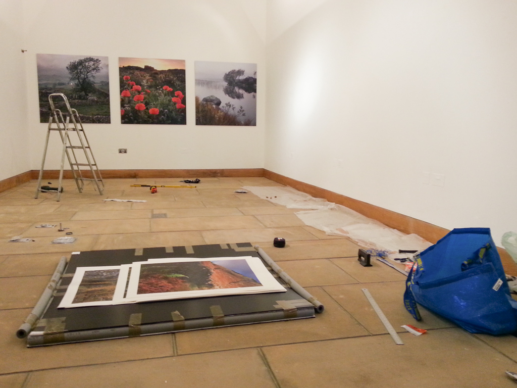
The Problems
It was bound to happen. Things had been going so well that I think we tempted fate. I was slightly concerned about print curl because we had no backing to the images and I had read that Museo Silver Rag did like to bend a bit. I chatted with David and Anna about their exhibition and they said that things did curl a little but settled down quite quickly. Unfortunately I didn’t have every picture printed at the same size, the same aspect ratio and the same orientation and so I couldn’t use a bottom wire as well as a top wire.
I thought I could use a ‘deroller’ to fix the issues and borrowed one from Dav Thomas. Unfortunately my prints decided to curl in the opposite direction to the way that they came off the printer and so the deroller was too small (it’s designed for 24” wide but my prints were up to 48” long).
After a modicum of panic I remember buying a long roll of black studio backing paper. This was also a larger radius than the deroller (and considerably cheaper!). I was able to unroll a section of the paper, insert the print opposite to it’s curl, roll everything up and wait for a while (in my case I started off with 10 seconds and ended up at 2 minutes per print). The results were excellent and the prints looked flat again….. for about 20 minutes.
After that they were back to the same old. I ‘derolled’ again and although it was helping it wasn’t going to cut the mustard.
There was nothing I could do at the gallery so a bit of a brainstorming which involved the possibility of a second wire and elastic bands, some fishing wire, mounting the whole pictures onto foam core, fishing weights on clips and a few stupid ideas as well and I settled on the idea of velcro’ing a few ‘correx’ battens behind the picture opposite to the curl (Correx being laminated thin polypropylene sheets with ribbing between them for rigidity - think light and fairly strong). You can see how they were mounted on the picture below.
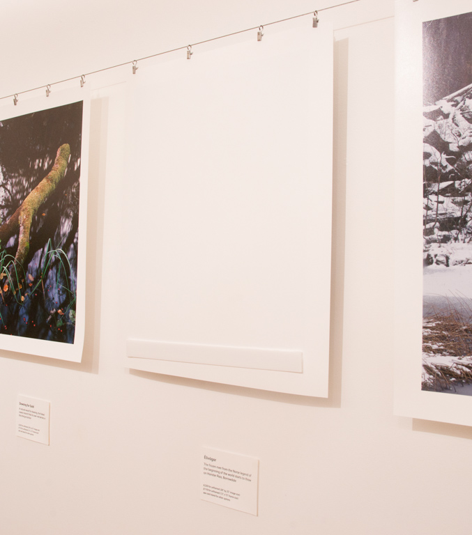
Amazingly this worked a treat and I was finally ready for the preview.