
Image making in Dalt Quarry - decomposed

Tim Parkin
Tim Parkin is a landscape photographer living in Scotland who co-founded On Landscape magazine. Alongside his photography and writing he also co-founded the Natural Landscape Photography Awards, runs a film scanning business and is a judge for other international landscape and nature competitions.
The act of finding and constructing a composition is one that struggles to be pinned down. The way each photographer manages this is often quite different and to generalise about the ‘best’ way is a pointless task. However, a single photographer can describe how they go about approaching a particular area and then possibly document the way that a potential composition reveals itself. There are then all of the framing decisions about edges, corners and flow that can be discussed and finally a discussion of how to emphasise some of these featured in post processing. And then, perhaps if a few different photographers were to do this, we might find a few commonalities - even if not I hope that the experience of reading about such a process might provide a few areas for experimentation.
To this end, whilst I was in Borrowdale in the Lake District last year, I decided to document the area I was hoping to take a picture for just such an article. Those photographs have stayed on my hard drive for 12 months until the final picture was included in my recent exhibition. I hope you’ll find the exercise interesting and please let us know if you’d like to see more of these from myself or other photographers.
The Approach
Borrowdale in the North West Lake District has to be one of the most beautiful square miles of countryside in the United Kingdom. It combines a beautiful lake and meandering river with craggy outcrops and ridges plus some stunning old growth forest. On top of this, it has some added interest from the leftovers of a lead and slate mine, arguably the source of the pencils that Wordsworth may have penned his poems with.
Whilst on a trip to the Lakes with Dav Thomas, Anna Booth, Joe Wright, Alastair Ross, David Unsworth and Paul Arthur we decided that a sleety day would be best spent around and about Dalt Quarry, a small slate(?) quarry on the path from Grange to Castle Crag. The most famous feature of this disused quarry is the mineral staining on the slate around the edges, particularly a bold yellow stripe behind a young birch tree.
As many photographers have already produced great work using this stripe I was keen to produce something that included it but was different enough to hold its own in good company. It’s always interesting when you visit a location that you’ve seen in so many photographs as you’re sure you have an idea what it will look like but you’re inevitably wrong in many ways - usually because of changes in photographic perspective, seasonal variations or the repeated exclusion of parts of the landscape that weren’t “photogenic”.
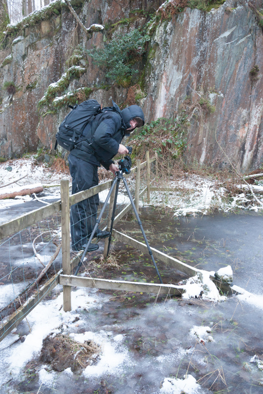
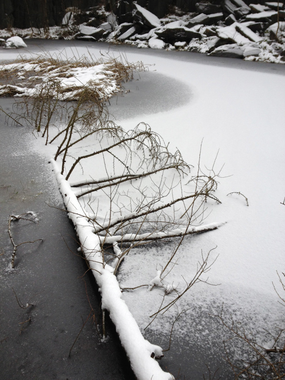
In this particular case, I was surprised to find a sodding great pond filling the whole bottom of the quarry - partially frozen and snowed over in this case. This meant that angles from which to take pictures of the quarry were quite limited. As you can see by this first photograph, Alastair Ross has found the first, slightly precarious, viewpoint and I’m taking his picture from the second, backed up against the start of the rise of the quarry. I took a couple of panoramas of the quarry to give you an idea of first impressions.
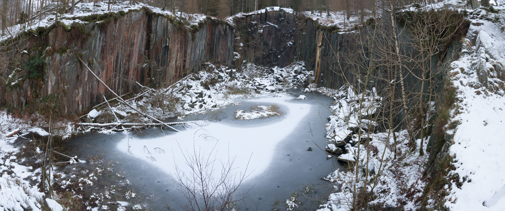
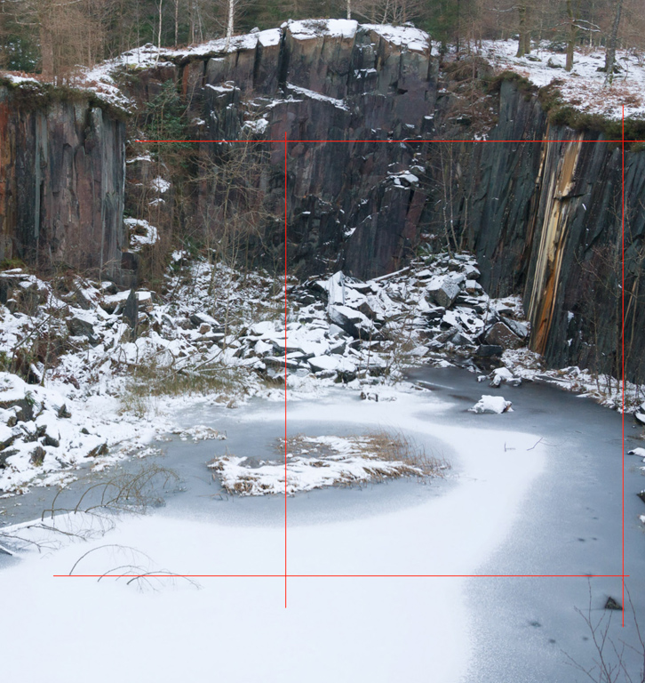
This first panorama shows the general shape of the quarry. If you were to stand in the middle it would encompass 270 degrees of your view. I’m standing on the start of the quarry face to the right of the fence that Alastair was standing on.
Finding the Shot
You can see the ‘famous’ yellow staining just to the right of the middle of the picture. It would appear that many of the ‘usual’ images are using a long lens to pick out details. My first impressions were that things were a little too ‘messy’ to do anything with the edges of the quarry itself and instead I become a little fixated on the arched branches in the snow in the foreground. I moved around from viewpoint to viewpoint to see how I could line up the arched branches - I was trying to include both sets of branches but struggled to create something coherent.
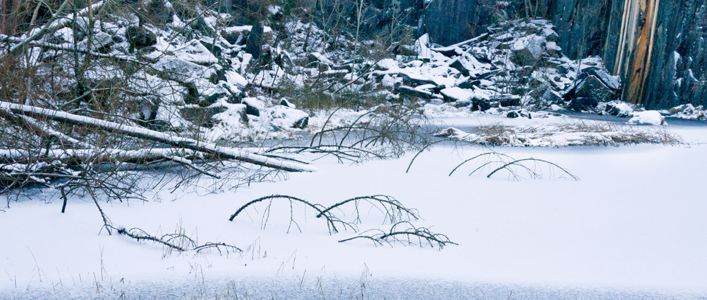
In order to try to make the most of the location, I decided it might be good to walk around the perimeter of the quarry. A few of us made this precarious trip, trying our best not to make obvious footprints as we travelled. Nothing really stood out along the way apart from a possible shot using the fallen tree in the above shot.
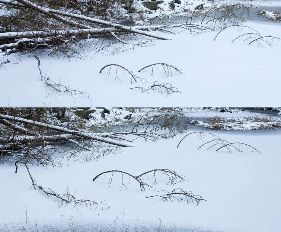
But it wasn’t working. The area to the left of the tree was too featureless and the grasses above the tree were messy. It did start me thinking about using the shape of the snow layer on the pond as a feature though. I returned back to the start again and took a test shot of the arched branches from lower down, trying to include the yellow stripe in the background.
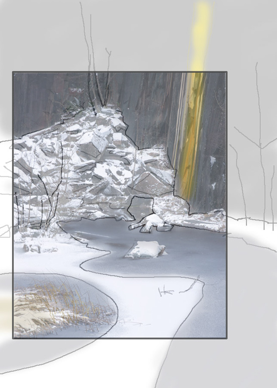
It wasn’t worth trying too hard with though and so I returned back to my two primary viewpoints and started working on potential crops. I was limited by the tree just below my viewpoint at the bottom of the frame and by the edge of the quarry at the right of the frame. I could include some of the trees at the top of the frame but I was thinking about using the snowy pond as the main feature and the trees would probably just detract. On the left hand side of the frame, it was more open but things got a bit messy by the time you reach the fallen trees. Here’s a diagram showing my new area of interest.
Composing the Shot
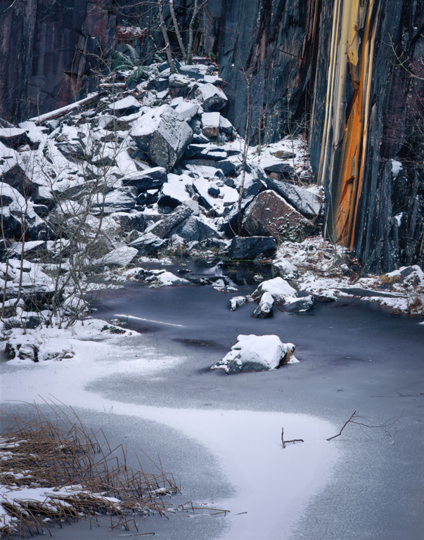
Looking closer at this area, I loved the small branch just stuck in and out of the snow in the pond and I also really like the curves that the snow makes. At the moment there is way too much snow at the bottom of the picture though so I moved the bottom line up a bit. Here’s my new area of interest but converted to a line drawing of dark a light.
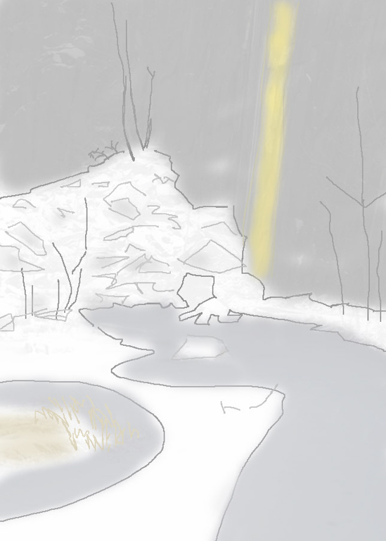
Now it seems fairly obvious to me that there is too much dark area at the top to provide balance - especially if the ‘subject’ is the white curves of of the snow on the pond below. We can darken the snow a bit and lighten the slate but there are limits to these changes in order to keep things believable.
Also, the trees on the right aren’t adding anything and the darker area in the bottom right is unbalancing the picture.
Finally, I’d like the snowing shape in the foreground to act as a leading feature into the picture and hence be a little more central. I can do this by cropping a little off the bottom of the image as well as the previously mentioned cropping from the right.
Given the constraints of the 5x4 crop, this leaves me with…
Taking the picture on my Sony A900 DSLR then gives me this.
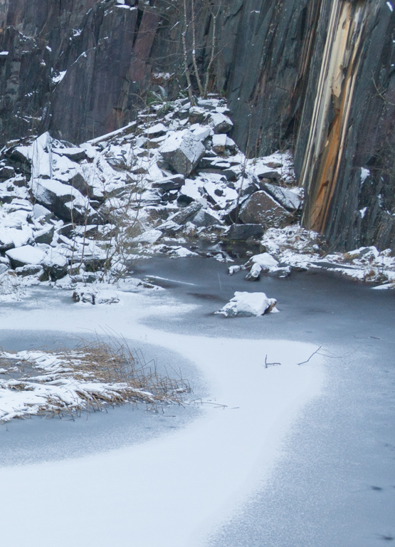
Hopefully, the snowy shape at the bottom of the picture merges into the snow pile on the top left and then back down below the yellow stripe. Obviously, things are still a bit dark around the slate and the yellow stripe could do with a little “enhancement”. However, my next task was to take a picture of this with my 5x4 using Fuji Velvia 50. The focusing wasn’t too hard. Knowing that you need to be more accurate in the foreground because you have less depth of field, I placed the focal plane from just before the branch stuck in the snow and then in the background I made it pass through the yellow strip about a third of the way up. Stopping down to f/32 gave me enough depth of field (it’s the equivalent to f/8 on a full frame camera) and avoided diffraction. I used a one stop hard graduated neutral density filter to hold back the brightness of the snow at the bottom of the picture (not needed on the digital shot).
If I recall correctly, I took this shot with a 200mm f/8 Nikkor M lens which would imply my digital shot was taken at around 50-60mm (there is an approximate 4x factor when converting from LF to Full Frame 35mm).
Post Processing
For my own work, I consider post processing as part of the picture taking process. I will consider whether the image will need some work as I am composing the photograph. This includes adding a little perspective correction to either fix verticals or to nudge undesirable parts of an image out of the shot, cloning out annoying items I couldn’t or didn’t want to remove in the field, balancing, subduing or enhancing tones, etc.
This particular image looked pretty good straight out of the camera but without the yellow stripe to contrast with the cool blues, it just looked a little dull. I’ll show the post processing of the Sony A900 shot first. Here are the before and after shots next to each other
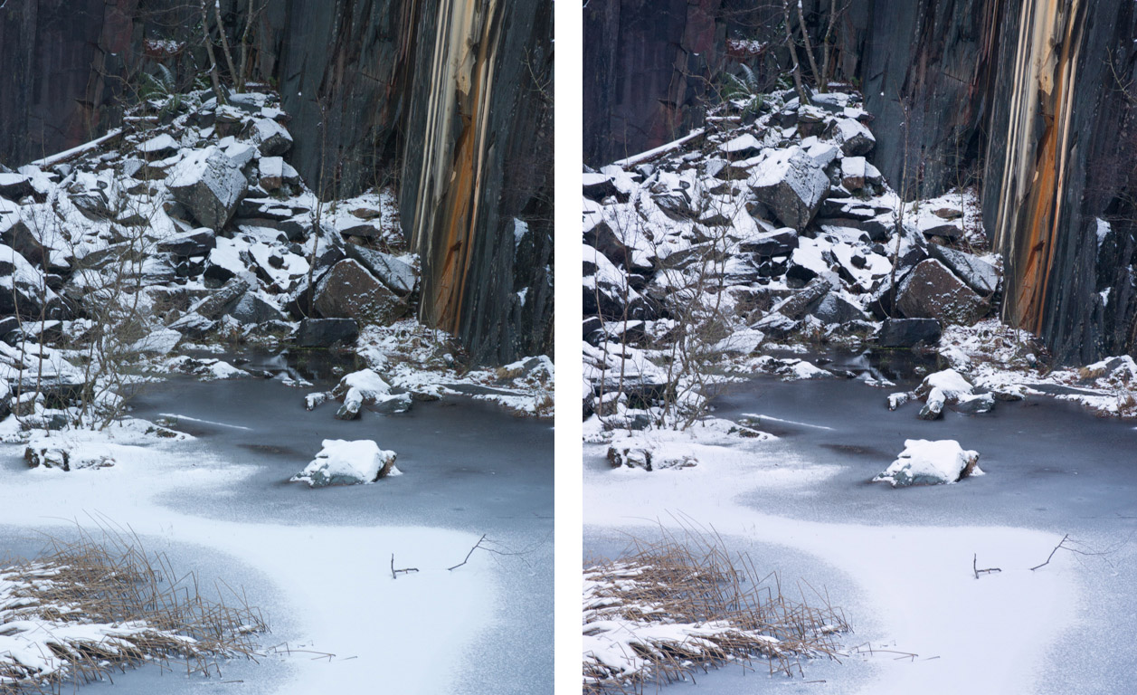
I work with daylight colour balance on my camera which can often end up with images looking a bit cold and occasionally a little cyan/green so the first thing I do is to warm the image up a little and dial in a little magenta as this seems to make the whites stand out.
I’ve also learned over time that most of my favourite films tend to cool off the shadows and warm up the highlights. This is obviously something that Kodak and Fuji’s R&D departments have decided is aesthetically pleasing and I must say that I agree with them, especially for shots like this where I want a feeling of cool to the shadows without the whole picture going blue.
So I use “Colour Balance” to shift the shadows slightly blue and also slightly cyan. I then shift the highlights by adding quite a bit of yellow and a little bit of red. Sometimes the magenta/green balance needs tweaking a little when you do this to get things looking ‘normal’.
I also brightened some of the snow areas that were a bit murky (below the strip, towards the bottom of the rock pile) and lightened the slate wall using a curve adjustment which also pulled out a little extra colour.
Finally, I used the Hue/Saturation tool to select the yellows in the strip and add saturation and also lighten them a little.
The Final Shot
If we look at my Velvia 50 large format shot before and after you’ll see that my starting point is a lot better but it still has a little green tinge and the whites need pulling up.
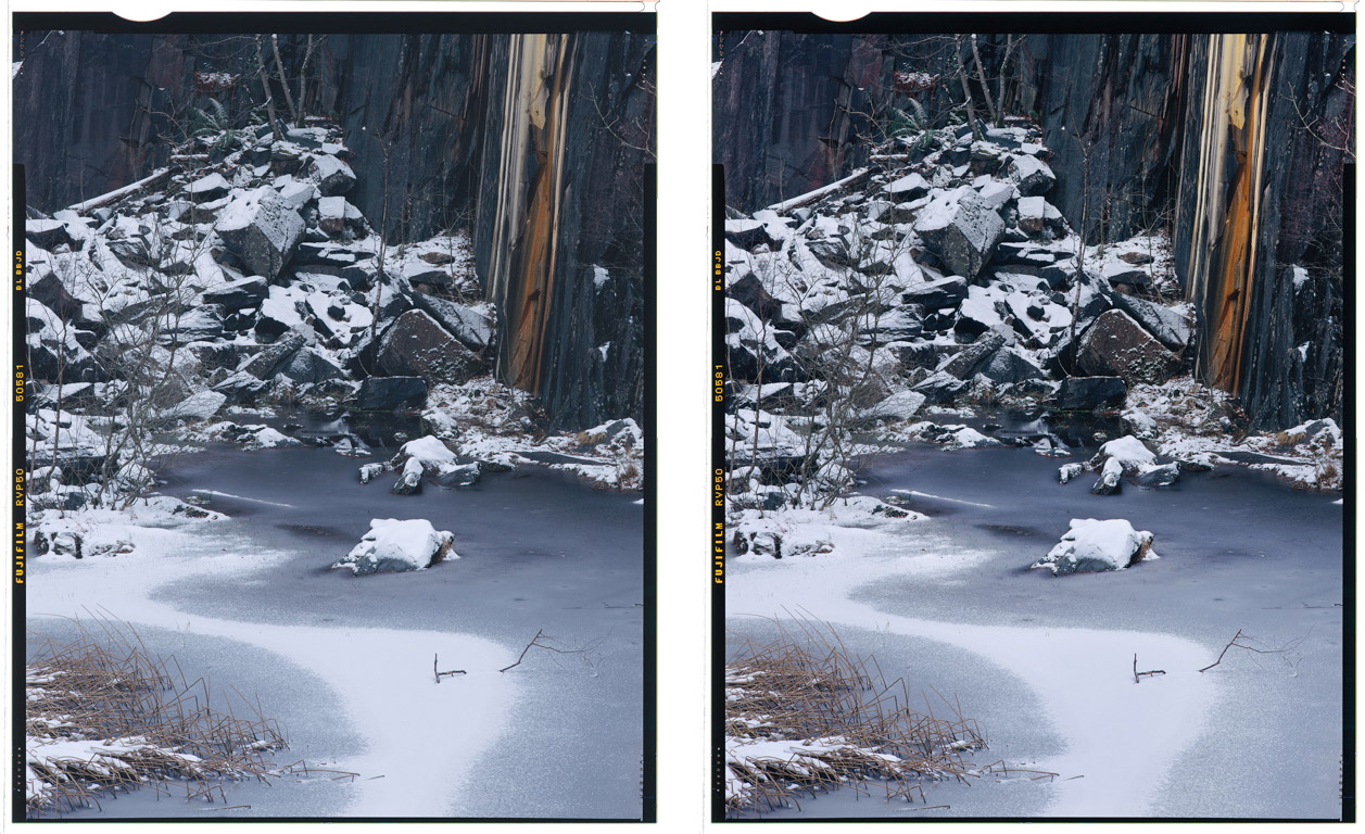
There was one peculiarity of the photograph that I had to deal with when printing this for the exhibition. The trees in front of the rock pile on the left have lots of fine branches and it looks at first like I have a lost contrast in that area because of a light leak or water on the lens. In fact it’s just the fine branches making the dark areas of the slate pile behind not look quite as dark. In the final picture I’ve just a curves layer to selectively add contrast to these areas. I also darkened the bottom of the picture very slightly to move attention into the picture a bit.
Post Rationalisation
You may be asking “Did he really think about all of this whilst standing in the snow with his camera?”. The answer is “Yes and no…”. Some of the things I talked about - particularly the choice of places to crop the image - were done instinctively. Yes I thought About some things such as avoiding the trees on the right and above the quarry, but I was always using a bit of instinct about ‘balance’ in the image. I’d try things using a ‘cropping mask’ (a 4x5 square in an A4 sheet of black plastic) and as I moved the crop around I’d be constantly thinking “Hmmm - works? doesn’t work?” and I would reject crops that weren’t balanced. Now and again a crop would look more natural and I’d hone in on what I thought was making that work.
A Great Walk
http://www.ntlakesoutdoors.org.uk/uploads/download/file/1/w-borger_dalr-walk.pdf