Marianthi Lainas and abstraction

Thomas Peck
The real pleasure of photography is that it forces me to slow down and really look. That’s never easy in our rushed world, so a chance to stop, look and see is truly valuable.
Abstract art can be the most frustrating of art forms, but it can also be the most rewarding. There is a simple reason for this I think: the responsibility for finding ‘meaning’ in an image is thrown entirely on to the viewer. Rather than being presented with a depiction of what the artist saw, we are asked to see completely for ourselves. Most ‘realistic’ photographs make cognition easy: the subject is recognized and the viewer’s reaction to that subject is mediated by the photographer’s treatment of that subject. When we move into the realm of abstraction, however, that link to reality is broken - which of course seems particularly perverse in a medium such as photography which relies so emphatically on the object being photographed. And with truly abstract images meaning is no longer literal, there is no correct interpretation. Humans always seek definition, solidity, coherence, so abstraction runs the risk of frustration…
So how does abstract art become rewarding? The trick, as a viewer, is to relinquish the desire for meaning, or rather, to allow the mind to wander, to see relationships between form, colour, pattern, tone, texture etc, and to take pleasure in these relationships for their own sake. This can imbue an abstract image with an emotional charge which can be hugely pleasurable. Stieglitz is perhaps the earliest exponent of this with his Equivalents series from the 1920s when he photographed clouds but deliberately didn’t include the land so that they were void of reference points. No internal evidence to locate them in time and space. Stieglitz intended for them to function evocatively, like music. Emotion resided purely in their form, and it’s up to the viewer to feel their way to their own emotional interpretation of the images.
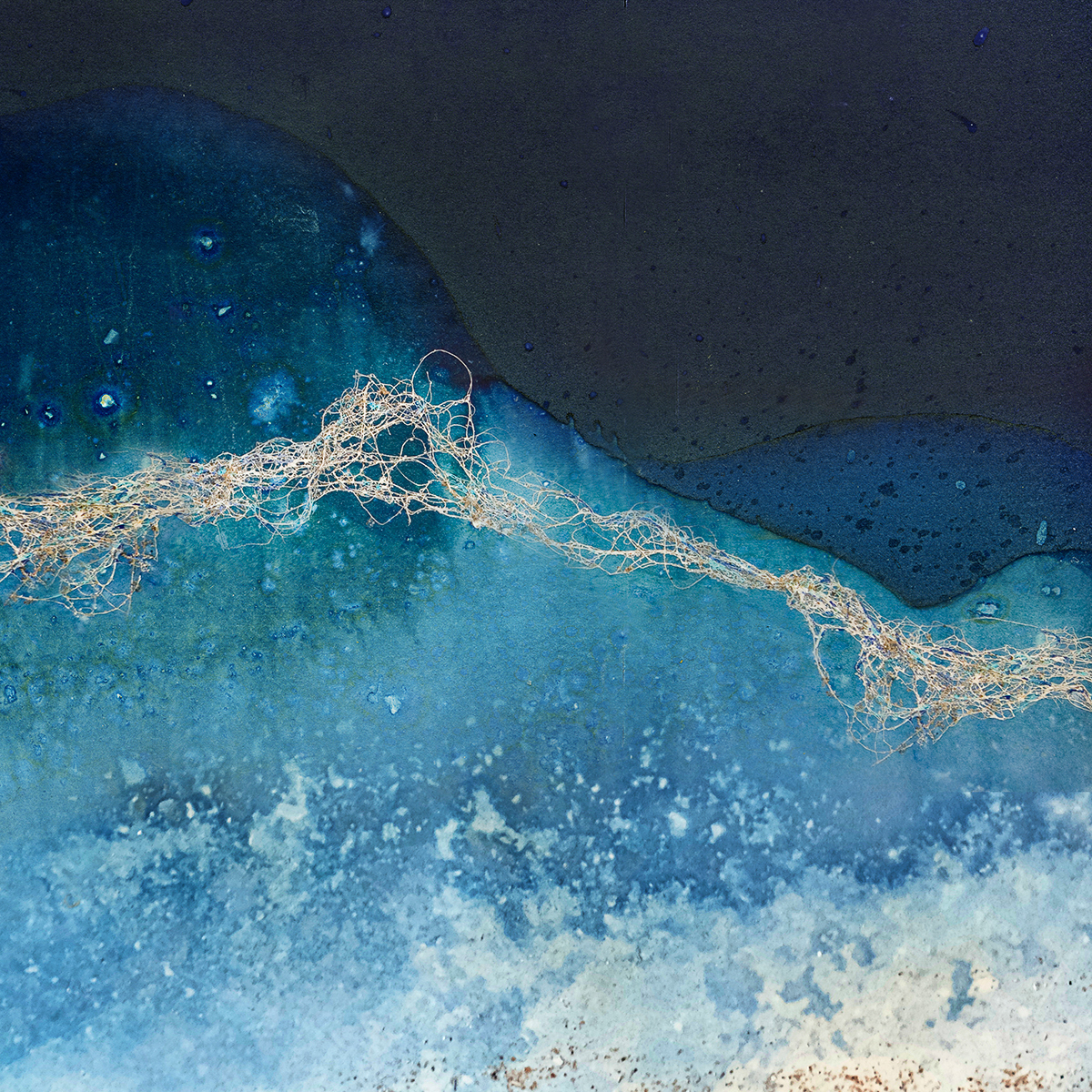
How does this work when we view an image such as Marianthi Lainas’s Tidal Traces #4? It is certainly abstract – there is no grounding in reality, no clear link to an object. Not only is the subject matter unfathomable, but the medium itself is also open to question. Is this actually a photograph? We don’t really know. (On her website Lainas explains that this is a cyanotype using light sensitive papers on the strandline, exposing them to the seawater and sand, and then selectively incorporating other media into the images). But what gives this image its beauty is, I think, the intrigue it evokes in the viewer specifically because it has no link to reality.
My own personal reaction to the image was first to see shapes that did have an echo of the landscape. So I noticed the delineation between blue and orange which suggested a horizon line.
As I look at the image, I am able to hold all these readings of it in my mind at the same time – the desire to impose a literal reading plus the pleasure at just looking at shapes and colours and noticing contrast and similarities. Perhaps this is why Marianthi’s abstraction is so powerful because it allows the viewer not only to see what s/he wants to see but to do that on a multitude of levels, all at the same time…
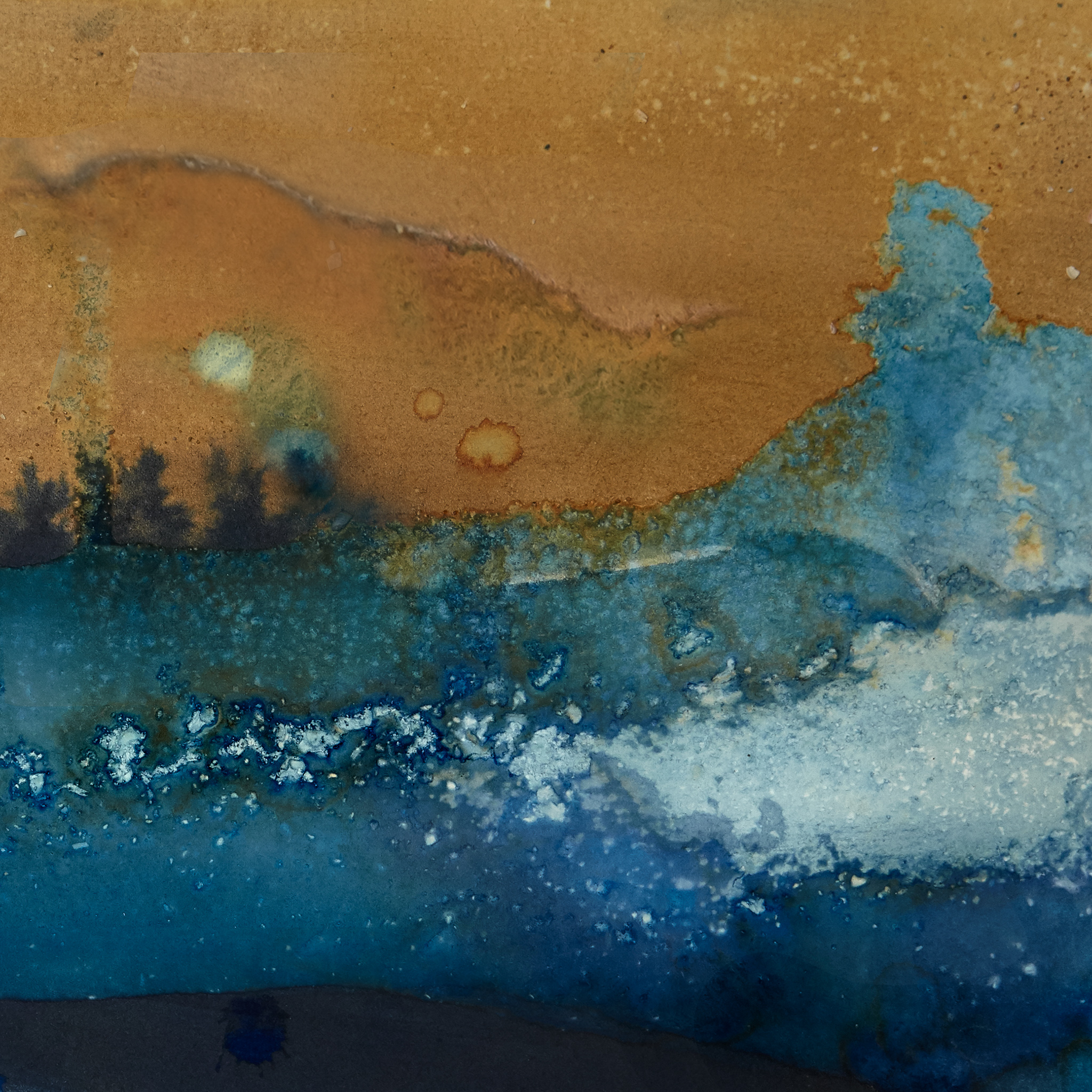
Below is another from the same series. I see the coast, space, sea spume, colour contrasts, lines vs shapes and on, and on. How rewarding is that…! What do you see? For more of Marianthi’s work see http://marianthilainas.com