Book Design Decisions

Tim Parkin
Tim Parkin is a landscape photographer living in Scotland who co-founded On Landscape magazine. Alongside his photography and writing he also co-founded the Natural Landscape Photography Awards, runs a film scanning business and is a judge for other international landscape and nature competitions.
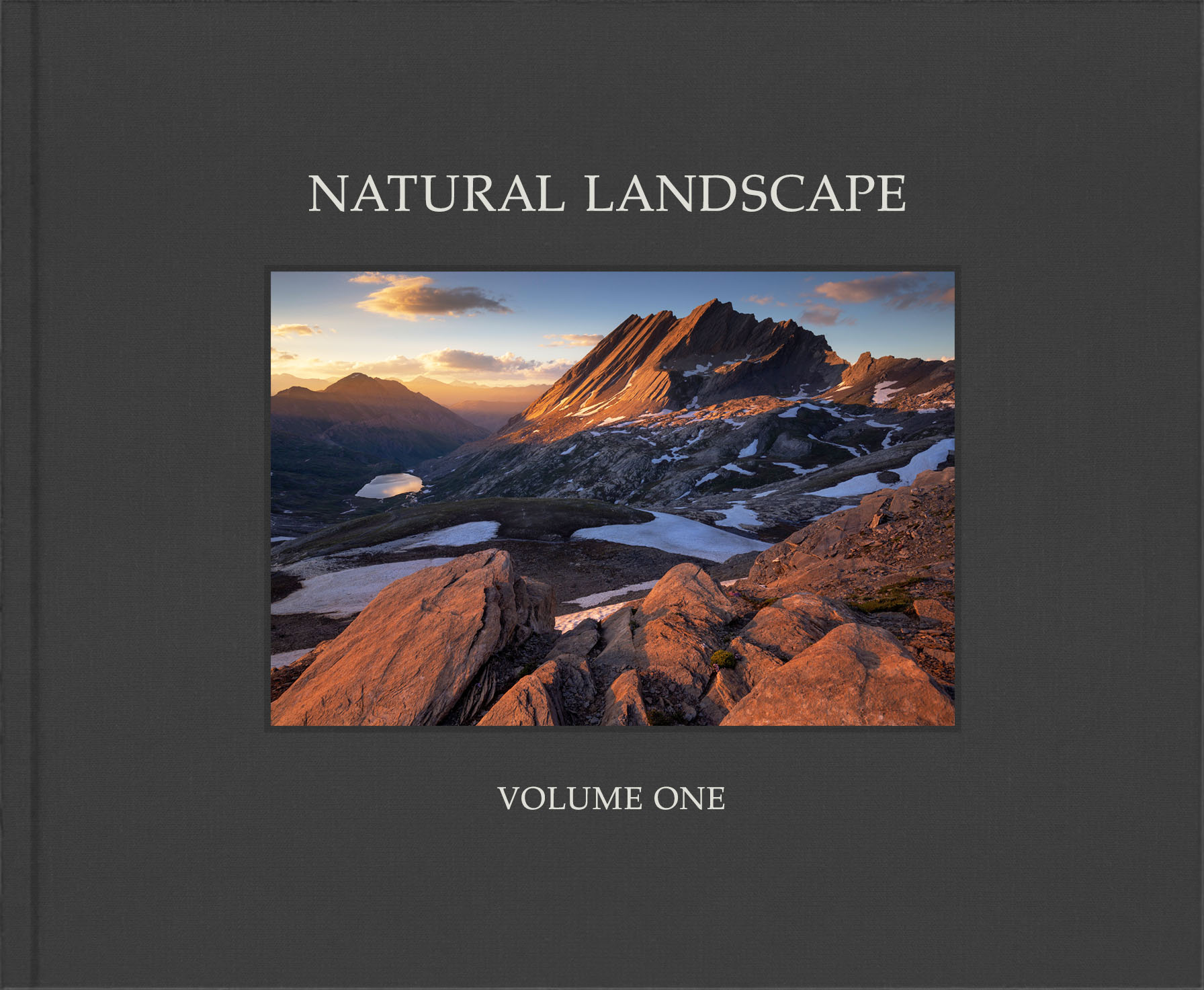
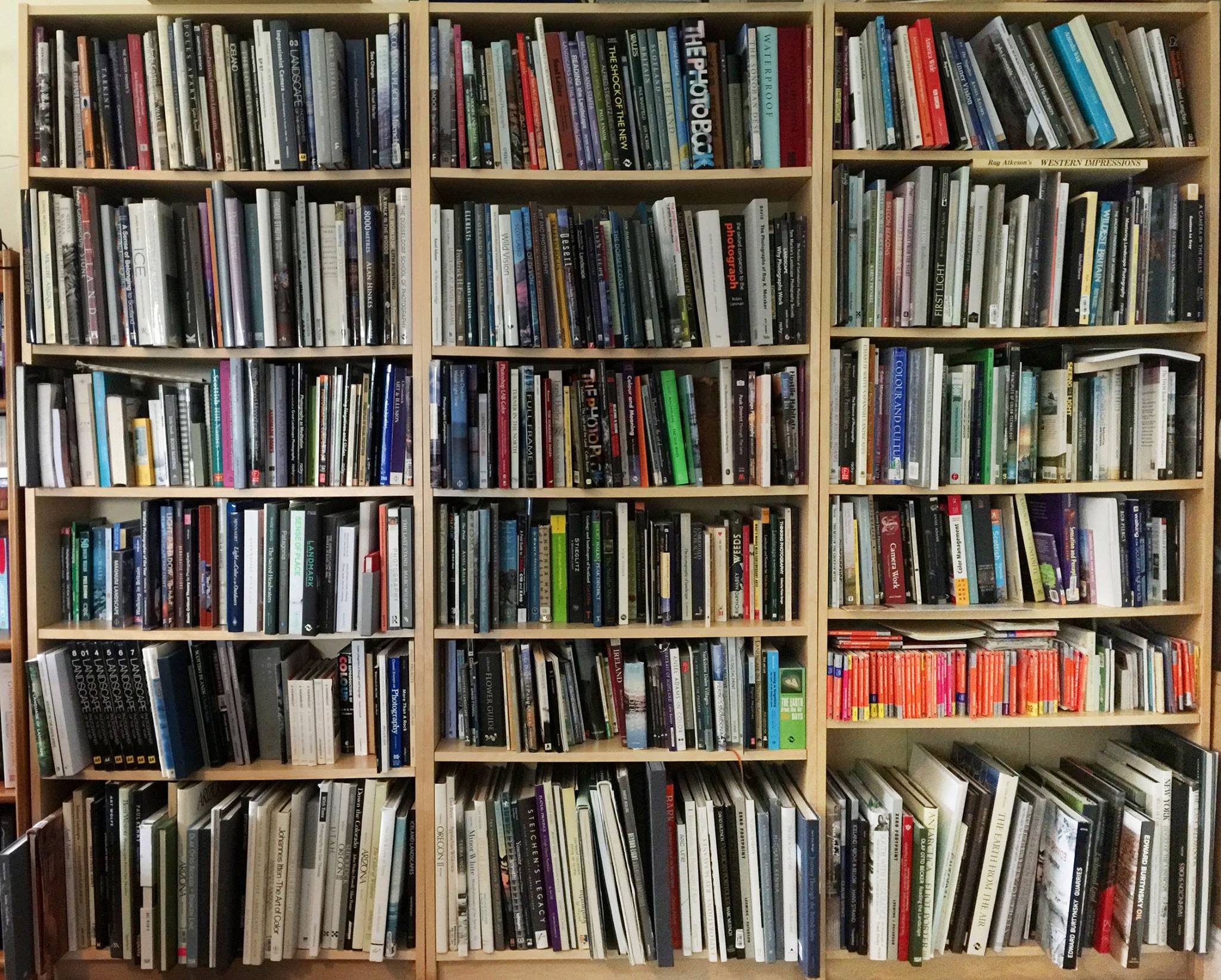
My last few weeks of 2021 were spent immersed in the world of photography books. And, for a change, I wasn’t looking at other people’s books but designing one of my own. Well, our own, because I refer to the Natural Landscape Photography Awards that I run with Matt Payne, Alex Nail and Rajesh Jyothiswaran. After we realised that we could raise enough money to be able to print a high-quality portfolio book to go alongside the competition, we just had the challenge of “what was it going to look like?”. I have a fairly large library of photography books and so I spent a few days trying to find some inspiration. We knew we wanted the book to be more than just a simple ‘catalogue’ of images and we had already approached a few judges and entrants about writing essays to include in the book so the main challenge was one of ‘style’.
You would think that there wasn’t much you could do with a photography book, after all the main thing is that the images appear as large as possible and there are a lot of them. But it turns out that the books that I really enjoyed coming back to had something extra about them. 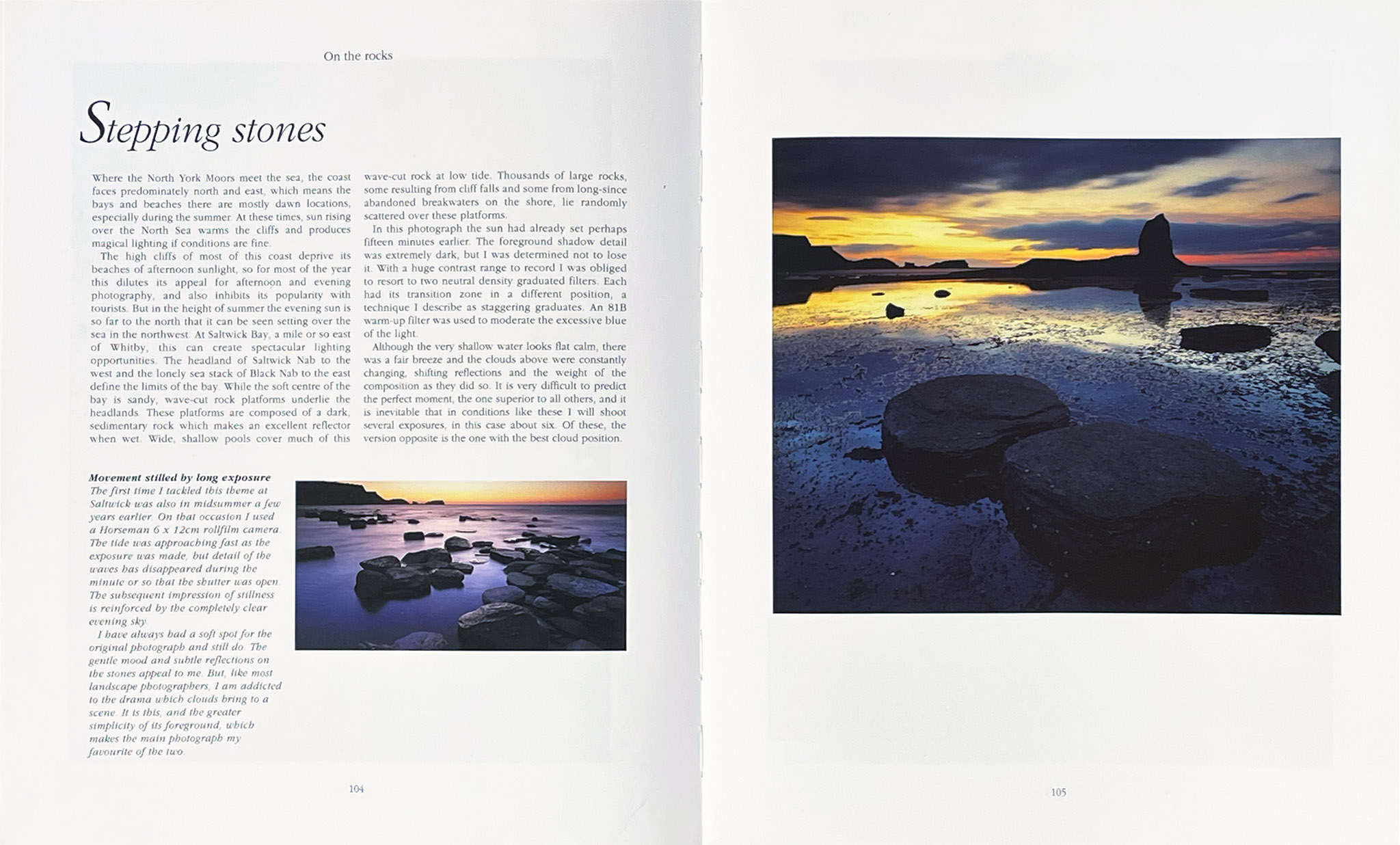 They had a rhythm of presentation, a subdivision of content into logical sections, supplementary content alongside the photographs that didn’t get in the way but gave a little bit of context. For example, Joe Cornish’s first light has a short description next to each image but also a secondary image that “didn’t quite work”. This added a little extra context about why the main picture worked in comparison.
I should thank Eddie Ephraums at this point as whilst researching the types of design I liked and thought worked the best, the books he edited were, in my mind, some of the most interesting and best designed. He uses classic design elements sparingly to create published works that complement but don't overpower photographic portfolios. Have a look at Joe Cornish's "First Light", Light and Land's "Developing Vision and Style" & "Working the Light", Paul Wakefield's "Landscape" and David Ward's "Landscape Beyond" and "Landscape Within".
A designer colleague told me once that the content of a photography book can be considered the words of a story and that without punctuation, paragraphs, grammar and chapters, even the best writing would be almost unreadable. As a designer, we need to think of everything that isn’t the photographs themselves as the grammar and punctuation of the presentation. One of the most significant elements at our disposal is pretty much invisible and yet has the biggest impact. White space is one of the, if not the most important aspect of graphic design. It informs the composition of the page and as such, it is essential to use well. For instance, as much as many photographers want all of their photographs to be as large as possible, varying the size, alignment and distribution of photographs on the page. Let’s have a look at some of the ways we can present photographs.
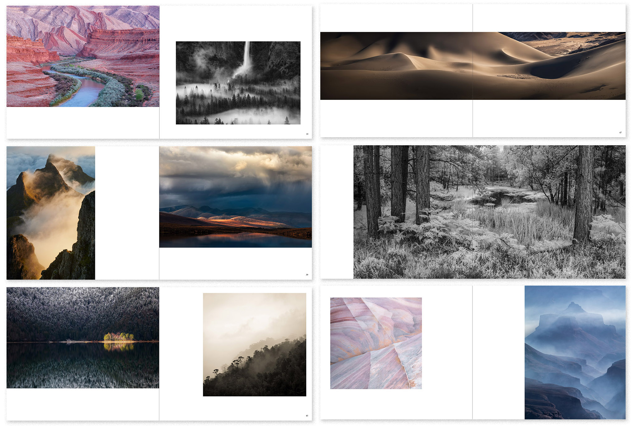
Example Photo Spreads
As you can see - if you mix these up you can get quite a lot of variety. Full bleed images can be a little bit of a pain because you do lose a couple of mm where the picture meets the edge of the page but they can look good and if you choose your alignment well, you don’t clip important features of the images used.
The next aspect of book design is to create the broad rhythm of the book, the categories and sections. With the Founders Awards (Mountains, Trees & Forests, etc), the projects, the portfolios and the essays, we had quite a few different things to create visual and content structure with.
Here’s a list of the sections we’ve included as seen on our table of contents page.
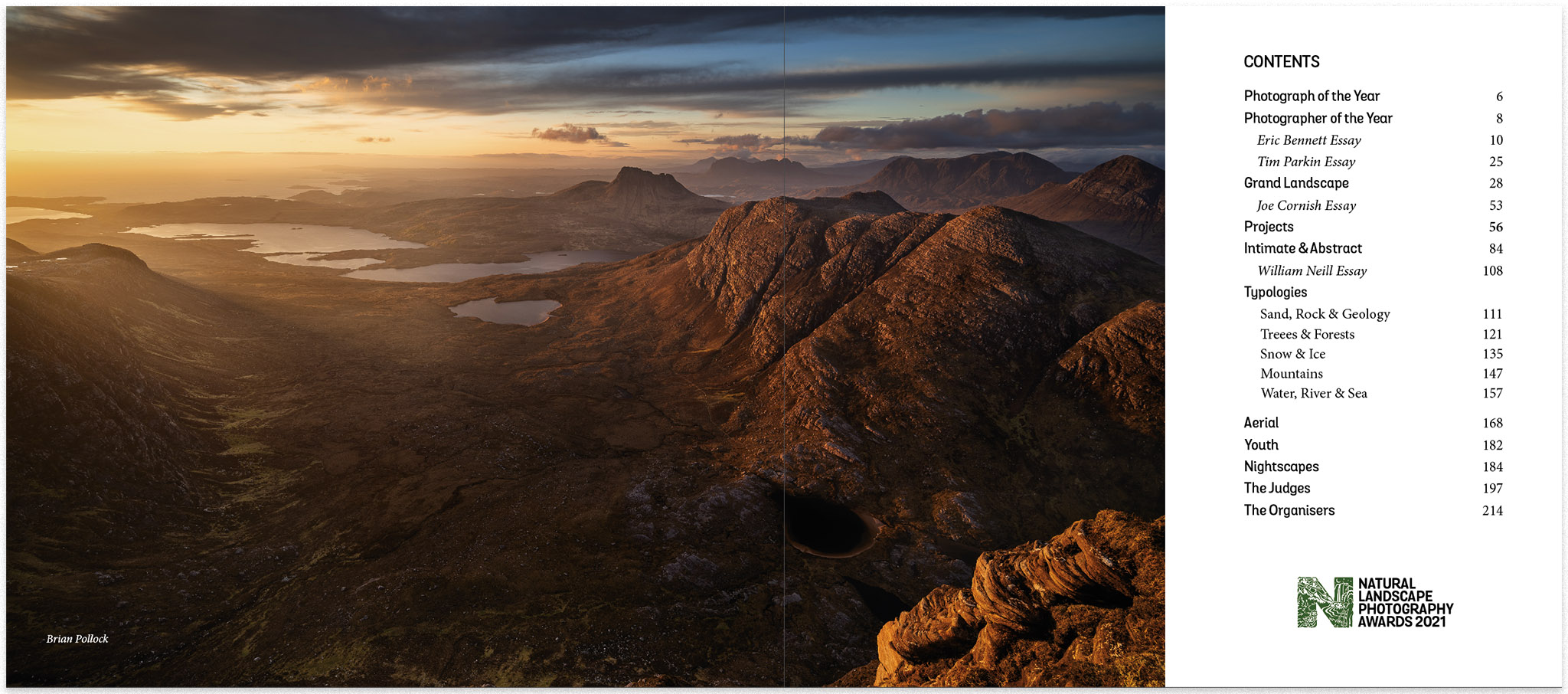
Table Of Contents
Just with these sections, we start to introduce some rhythm and variety. We can treat each main section as a slightly different design template as well. For instance, the main categories can appear in white text on a dark background with a full bleed image. Here’s an example of the Grand Landscape category.
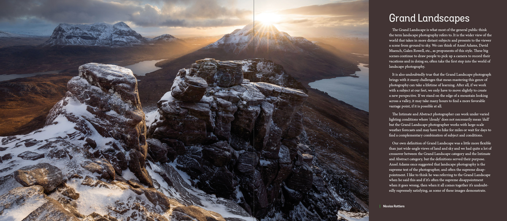
Grand Landscape
And we can use this concept for the big subsections such as the photographer of the year or the winner of categories. Here’s a panel showing a few different examples.
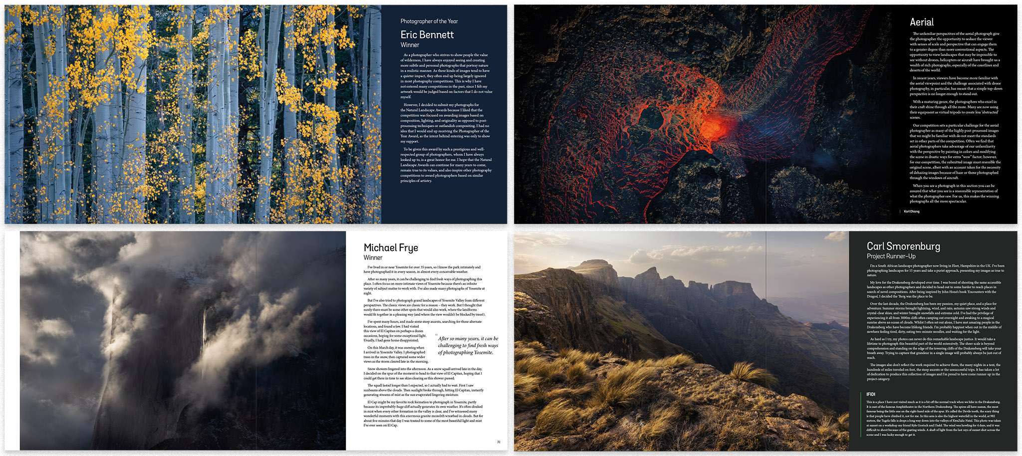
Other Category Spreads
One of the things that I wanted to include in the book is a short caption alongside each image describing why we liked the image. We used a simple vertical line to not only act as a boundary for each caption but also to indicate which side of the page it was referring to (only really useful on a couple of pages where captions appeared opposite the image.
Here are three examples of the captions which include examples of one of the judges captions explaining why the image was one of their favourites in the competition.
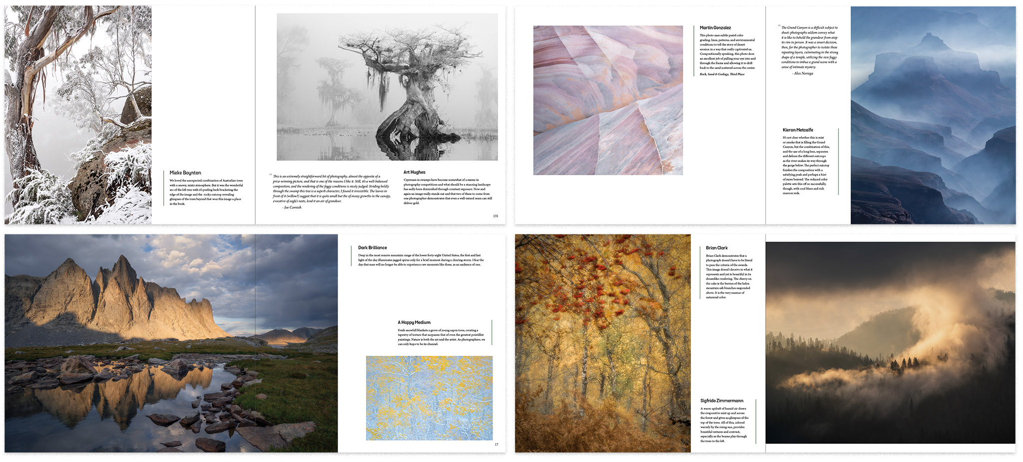
Image Caption Examples
To cope with the various aspect ratios of the images, we have had to lay out the captions quite differently. Also, in order to choose complementary images across each spread that fit in terms of aspect ratio creates a sort of puzzle with multiple solutions. With enough fiddling around, satisfactory solutions eventually appear (albeit they’re a little bit of a fight).
To be honest, this was one of the most fun parts of designing the book. To have such a collection of amazing images to work with and free reign to organise them in a complementary fashion was such fun. The only disappointing thing was not being able to include more images. Unfortunately, we’ve been told that beyond a certain size a book gets difficult to pick up and read. How annoying!
Now we’ve got the bulk of the single image photographic content designed in, we need to add some of the gallery or portfolio pages. We wanted to include a few photographic projects (as you’ll be able to see elsewhere in this issue) but we could only do this by showing a full project on a single spread or even a single page for some of them. Here are the designs I created for these pages.
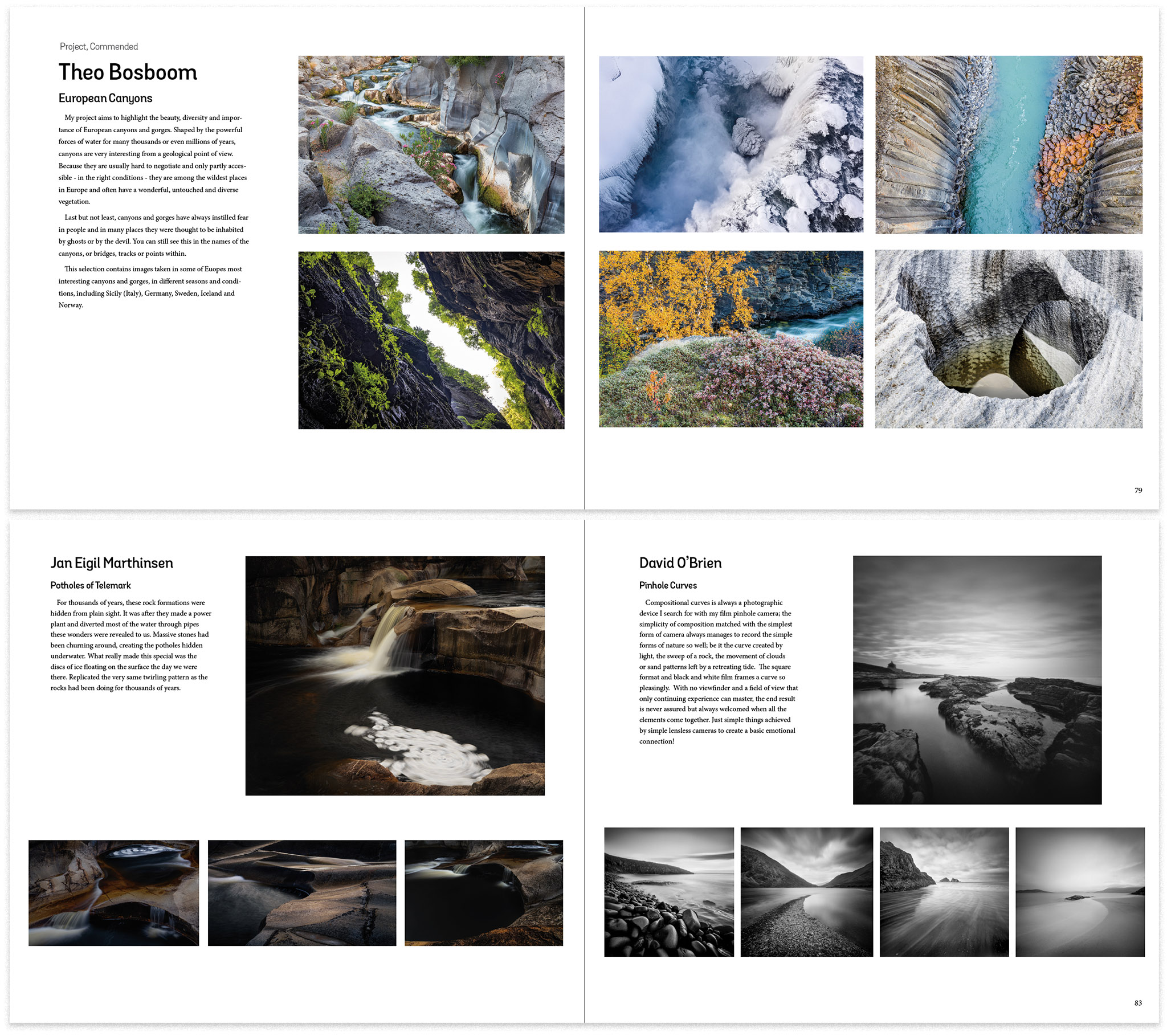
Regular Project Layouts
We were quite lucky with some of the projects in that the photographs included were mostly similar aspect ratios. Working with variable aspect ratios has its own challenges, for instance on Trym Ivar Bergsmo’s spread and also on Andrew Baruffi’s page, we just had to work with a constant height and try to distribute the images to make visual sense. I think the ‘filmstrip’ solution looks OK here. It shows that you don’t need to be a slave to a layout design and your eye can forgive a little bit of variance across pages.
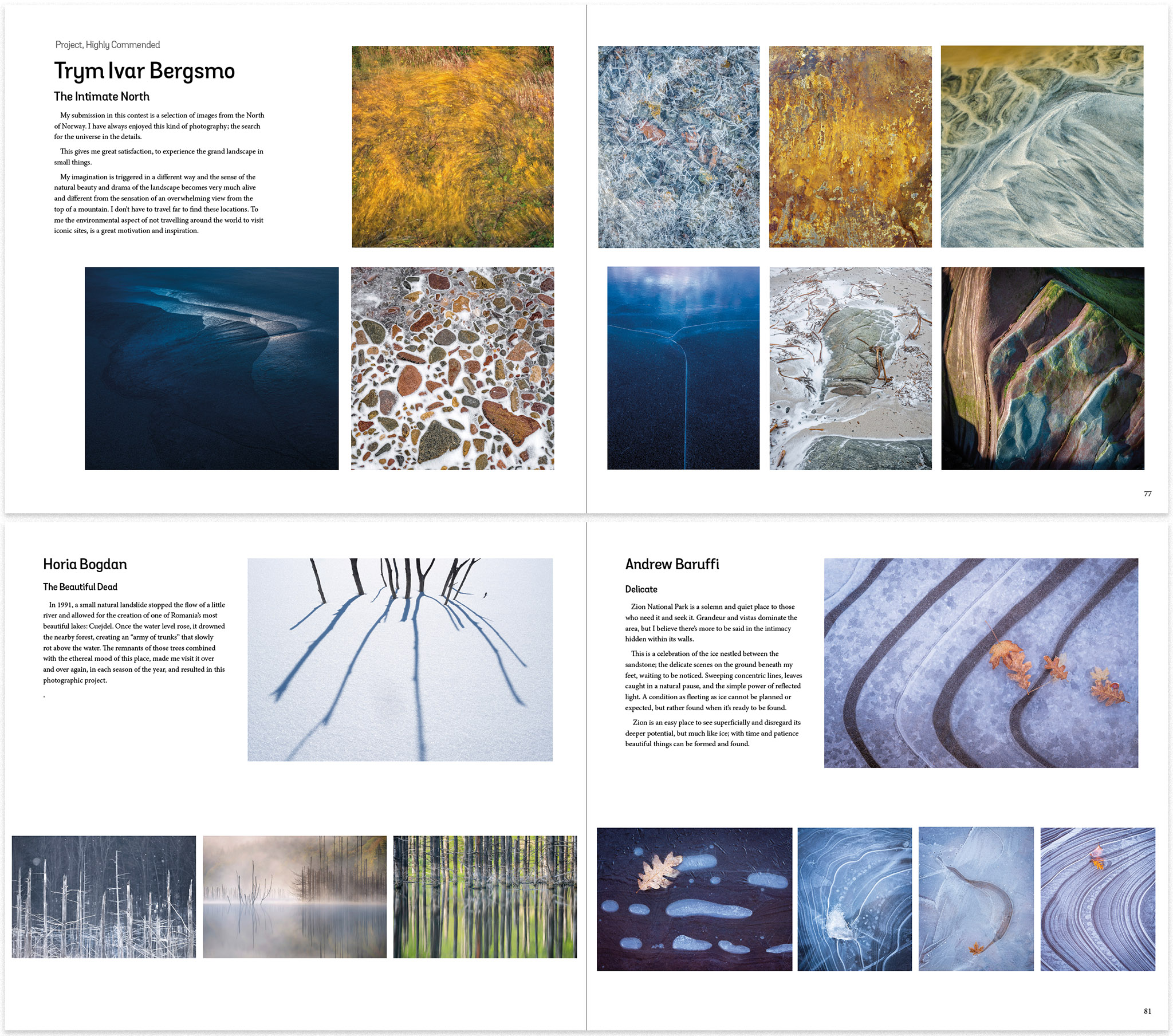
Less Regular Project Layouts
"Free fonts!"
I would highly recommend anybody would designs books to prioritise readability over style for the main body fonts. It’s tempting to find something novel to give your book a new look but your main header fonts and general book design are the places for creativity, not the body copy meant for extended reading at small type sizes. The free fonts that come with your graphic design or operating system are often maligned (with Arial and Georgia only useful for web text) but some are actually way better than most commercial fonts. For example, we chose “Minion” as our body font. It comes free with Adobe software but you know it’s a good font when it’s used to style the body copy for the seminal “The Elements of Typographic Style” by Robert Bringhurst. Read more about Minion here.
The use of multiple columns is, I think, important if you have a landscape orientation book, it makes it a lot easier to scan each line and breaks up the page nicely. It also allows you to embed pull quotes or images without reflowing the page too much.
Here’s Joe Cornish’s essay, which appeared in our previous issue. As you can see, the inclusion of a couple of images and a pull quote, which flow into the text column slightly, breaks up the page layout without making the content any less readable.
Essay Style
Finally, we have a couple of extra page desigs for the Judges and the Organisers. The judge's page was originally going to include a few of the judge's photographs but we thought that it might be better to include the responses to a few short questions about the judging process. We also included the judges top pick from the competition and a short caption on why they selected it.
For the ‘organisers’ section, it made sense to include a few images as people are less likely to know who we are than the judges, plus we have already created a website and a book that discusses what we think about the competition - you don’t really need much more. So we chose a few of our favourite images to show people the sort of thing that we produce when we’re actually taking photos rather than organising competitions!
Judges And Organisers
There was a fair bit of going back to the document repeatedly to fine-tune things. Spacing between captions and vertical lines, headlines and body content, margins on text, etc. Just like going back to a photograph to think about the cropping and space around a subject, you can go back to a book a couple of weeks later and see things that should have been obvious but you were too close to to see properly. Little tweaks were made such as nook numbers were only added to the right-hand pages because that was enough to find things when flipping through the book. The page numbers were also skipped when the caption or photo would have been too close.
There is often a big thing made about the CMYK conversion for photographs but in the vast majority of cases, an automated 'perceptual' conversion to CMYK works very well. There are a few exceptions, mainly in large areas of highly saturated colours where tonality may be lost without manually going in and adjusting things. In our case, there were only two or three images that needed manual interventions. One with very saturated blue/magenta marsh oil and a couple with areas of saturated greens that lost some detail. Yes, quite a few of the rest looked less saturated but seen on their own (never compare conversions side by side!) they looked fine.
To give you an idea of what the final book looks like, I've created a flipbook preview and installed it on the book page which is now live on the Natural Landscape Photography Awards website. The book is currently on pre-sale and comes with a 25% discount which will be available until the 1st of February.