Creating the difficult second album

Tim Parkin
Tim Parkin is a British landscape photographer, writer, and editor best known as the co-founder of On Landscape magazine, where he explores the art and practice of photographing the natural world. His work is thoughtful and carefully crafted, often focusing on subtle details and quiet moments in the landscape rather than dramatic vistas. Alongside his photography and writing, he co-founded the Natural Landscape Photography Awards, serves as a judge for other international competitions. Through all these projects, Parkin has become a respected and influential voice in contemporary landscape photography.
Creating the first Natural Landscape book was a bit of an epic task. All of the decisions about overall design, font choices, typography etc all had to be made in advance of even starting to populate the book with images. As we then proceeded to add content, lots of ‘snags’ came up around how to get the best flow of content, how to cope with variable length text associated with images etc. I wrote a reasonably long article about creating the first book here, so have a look at this if you want to read more about the origins of the design and structure.
Because we had issues in getting the first book ready in time, this year we decided to print it in the UK and arrange our own shipments across to the US. This did mean that the standard paper size is slightly different but it also meant that we could use a small Heidelberg press which would have the benefit of making the printing more accurate (paper stretches and so if you use larger paper, you get more stretch and hence more registration issues across the full sheet). The downside of this is that we lose of a couple of cm in vertical height of the book.
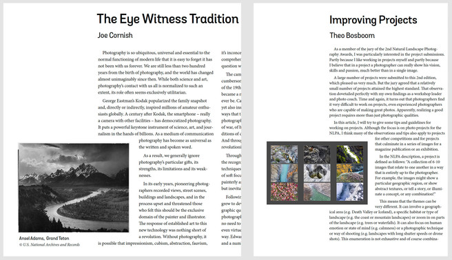
We asked for feedback on the first book once it was printed and received lots of helpful comments. We were pleased that nobody had a problem with reading even the smallest of the fonts in the book so in our new book we decided we could tighten things up a little bit on the essays and main content (10pt typical font size, 13pt line height). This compensated for the loss in vertical height in many places.
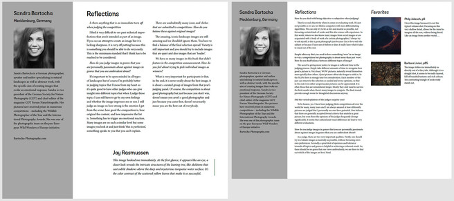
The majority of the book from last year was well received and so we kept the main structure although we decided on three longer essays instead of the four essays in the original book. Was also moved the large photos next to each judges page and replaced them with a compilation of the judges favourites and comments so you can read them all in one location.
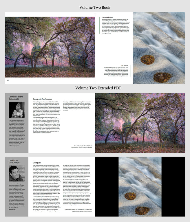
What we were very keen to do this year was to add some extra information about each of the included photographs. Ideally we wanted to include a long caption/short essay on each of the photographs, some information on how it was taken and a profile of each photographers. To include this in the book would almost double the size of it and so we thought we’d create a PDF that would include all of this information which you can open alongside the book either on a laptop or tablet. Although this added a significant amount of extra effort, I think the value it adds to the book is really worth it. I’d love to know your feedback?
Here’s the layout for a typical inclusion which shows the relevant page in the printed book followed by the layouts for the supporting pages in the Extended PDF. I've also created a small PDF with four images included to show the layout of the main book and PDF pages associated with them which you can download here.
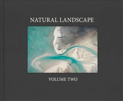
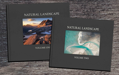
The decision on which photograph to include for the front cover was fairly easy (once we’d restricted it by aspect ratio). Mieke Boynton’s aerial abstract was just so evocative!
Printing the book in the UK meant we were able to spend time on press and we were happy to see that the images coming off the press were very close indeed to the inkjet proofs (Thanks to Johnson's of Nantwich who let me stay with them on press for the whole three days of printing!). We had to play around with a few of the images because of the limits of the CMYK press, but overall I think we’ve got a good handle on how the printing works and it was very reassuring to see the pages coming off just as you would expect. My only caveat for anybody working on press is that images do shift in colour slightly when they’re drying down. I noticed more separation between magentas and blues in the wet prints as they came off press which often exaggerated digital noise/compression in these areas.
Once the final sheets came off press, all we had to do was to wait until they were bound and to mail them out. If anybody is interested in an article about the vagaries of posting out books (and other materials) worldwide - we definitely have enough experience to write something now!! If you're creating a book, don't underestimate this task and try to plan in advance!!
I’m exceptionally proud of the two books we’ve produced so far and if anybody is interested in buying a copy, you can use a coupon code of ONLAND15 for a 15% discount on these, and also on entering the competition if you’re interested. Click here for the purchase page. Also, if you enter the competition this year, you can buy a 50% off coupon for $20/£16 which can be redeemed against Volume One and Volume Two books and also against Volume Three once it is available in January 2024 (potentially saving over $100/£80).
Due to many requests, the books are also now available as PDFs for $20/£16.
I personally always wanted a high-quality compilation book representing the zeitgeist of landscape photography and I think we’ve come pretty close to achieving this. I honestly think that the Natural Landscape book is one of, if not the key features of the Natural Landscape Photography Awards.
If you have a copy of either book, I’d love to know what you think about them.

