Diptychs as a dissonant

Lars Andreas Dybvik
Lars Andreas Dybvik lives in Trondheim in Norway, and has been a nature photographer for many years. He is a member of Norwegian Nature Photographers, the association of professional photographers in Norway. He has exhibited his pictures both in Norway, Europe, USA and China. He is regarded as one of the voices in Norway for connecting nature photography and art.

Wenche Dahle
Wenche Dahle lives in Flatanger, some 200 km north of Trondheim in Norway. She has been taking pictures for about 10 years, when her husband gave her a camera as a present. She is a creative soul and has since then published a prize winning book, and is one of the few female members of Norwegian Nature Photographers, the association of professional photographers in Norway. She has given lectures at several European festivals.
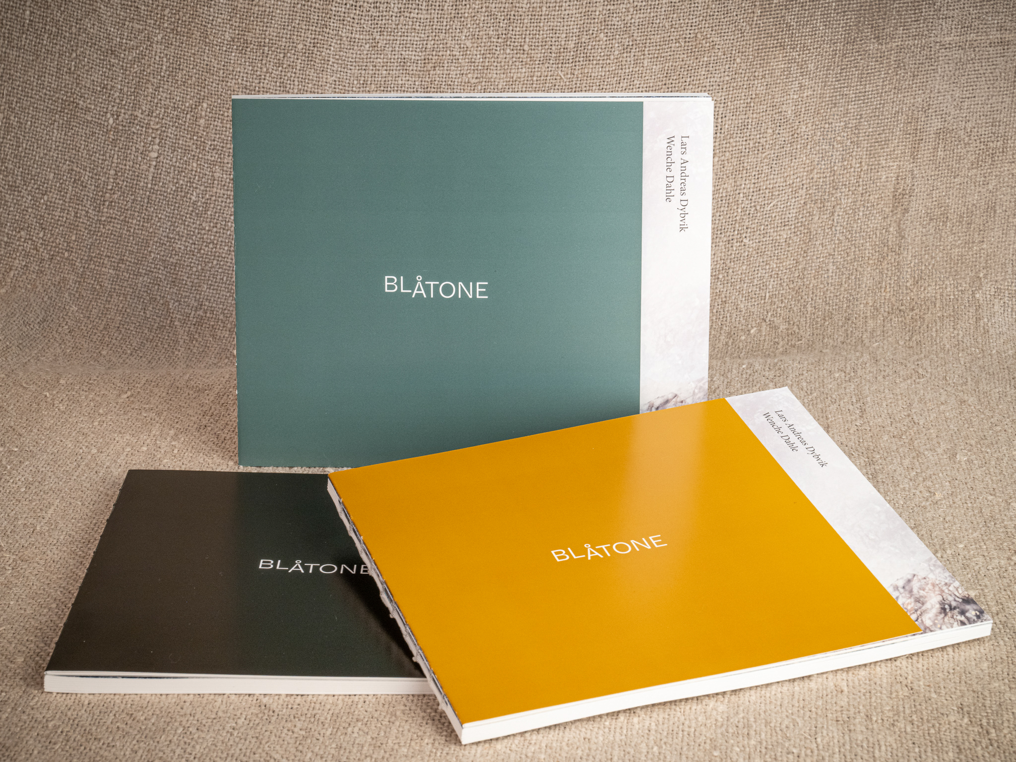
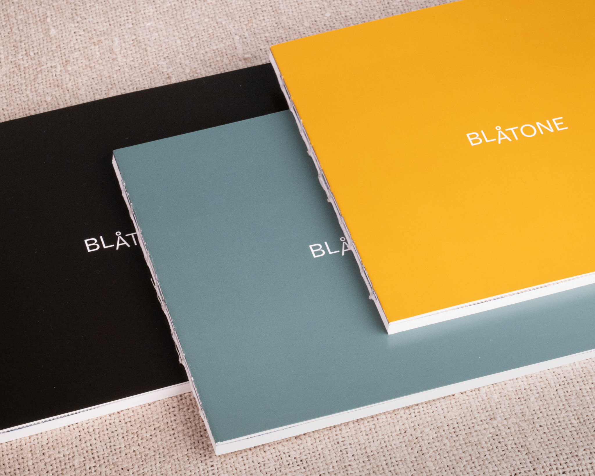
One evening in October, the three of us sit together with a package on the table between us. Photographers Wenche Dahle and Lars Andreas Dybvik, along with book designer Bodil M. Olsen. The book Blåtone has arrived, fresh from the printing press. A complex book design, none of us has seen before, gives room for many errors and misunderstandings. We open it and see three books, each with its own colored cover. As we start flipping through the pages, we find no errors. Everything has fallen into place. The pages of different sizes, the cover reappearing a few pages in, and the thin, almost transparent paper in the latter part of the book. Everything is as it should be. We toast with prosecco, relieved. Outside, the evening has taken on its unmistakable blue tones.
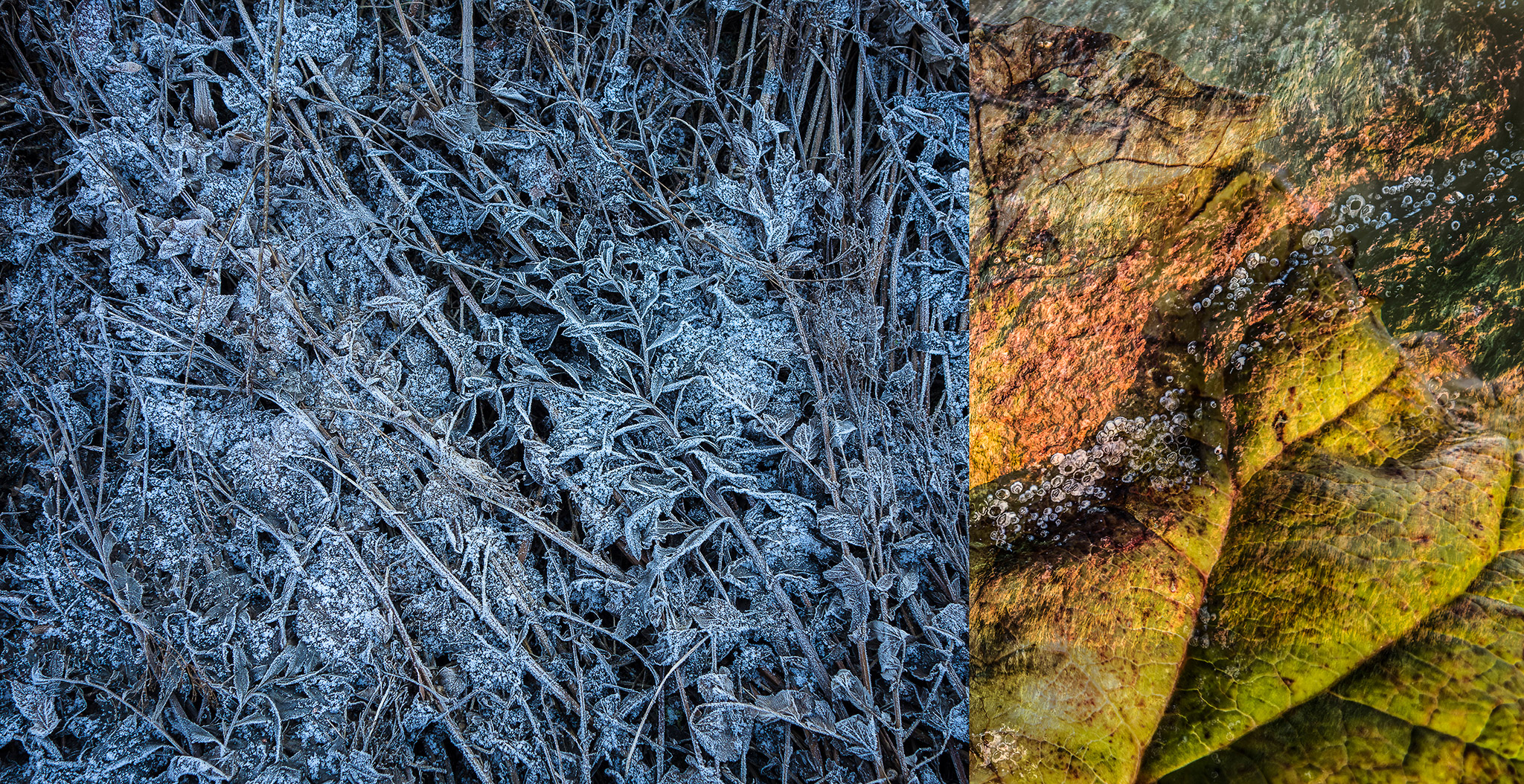
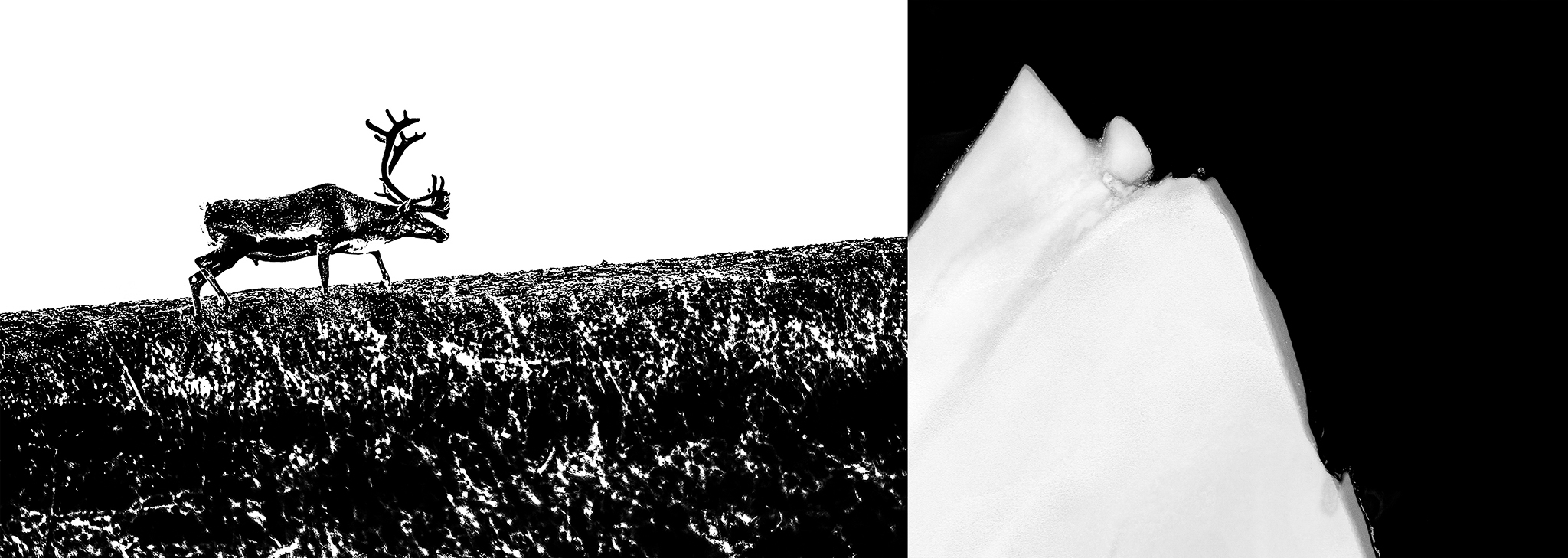
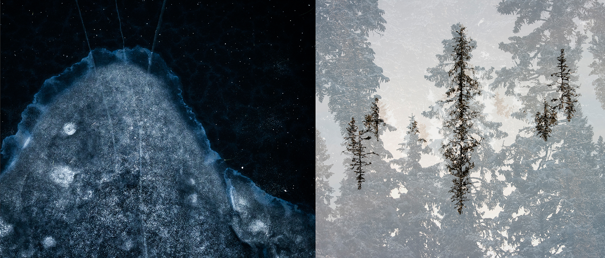
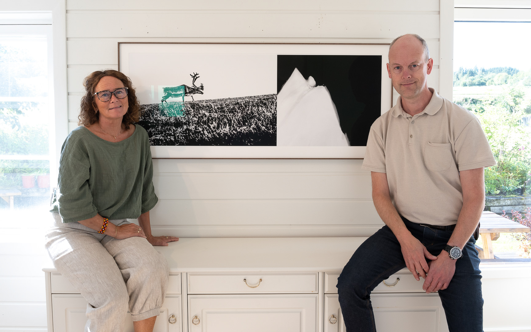
We rewind nearly three years. At that time, we were holding a masterclass together and came up with the idea of creating a diptych as a gift for the participants. One image from each of us, combined into one. Printed, signed, and numbered. This is how the very first artwork in what would become the Blåtone project was created—a stylized reindeer combined with a drone photo of ice on still water.
Diptych as an art form traces back to antiquity. Art a thousand years ago was something different from today and served another function. The church’s need to communicate biblical stories to a largely illiterate population meant that images were the solution. By combining multiple images, they managed to tell a story. Two images—a diptych, or three—a triptych. One of the world's most famous works is The Garden of Earthly Delights by Hieronymus Bosch, completed at the very beginning of the 1500s—a triptych depicting the Garden of Eden, Earth, and Hell.
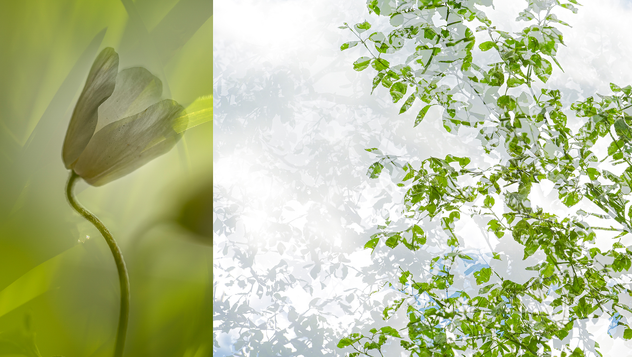
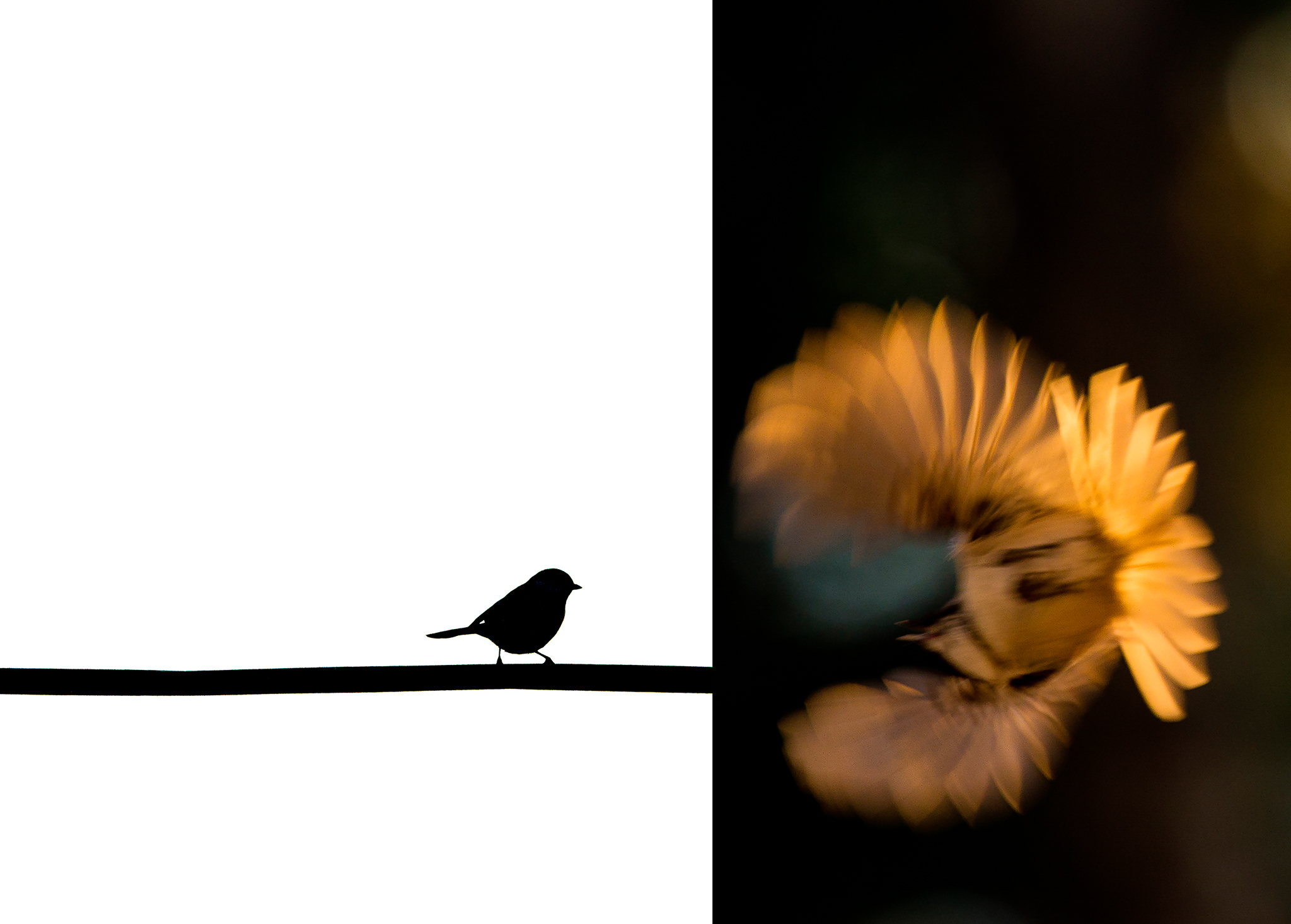
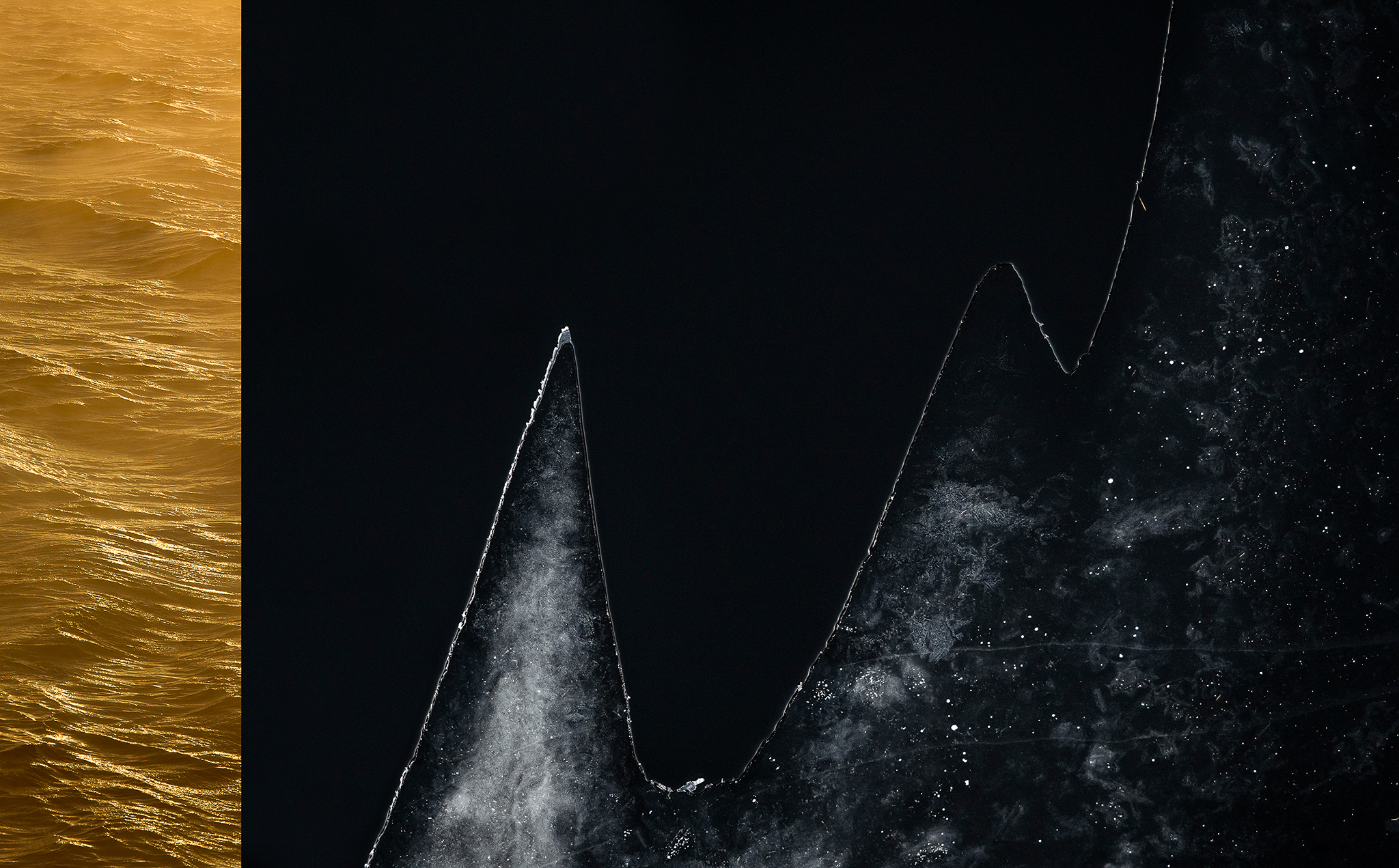
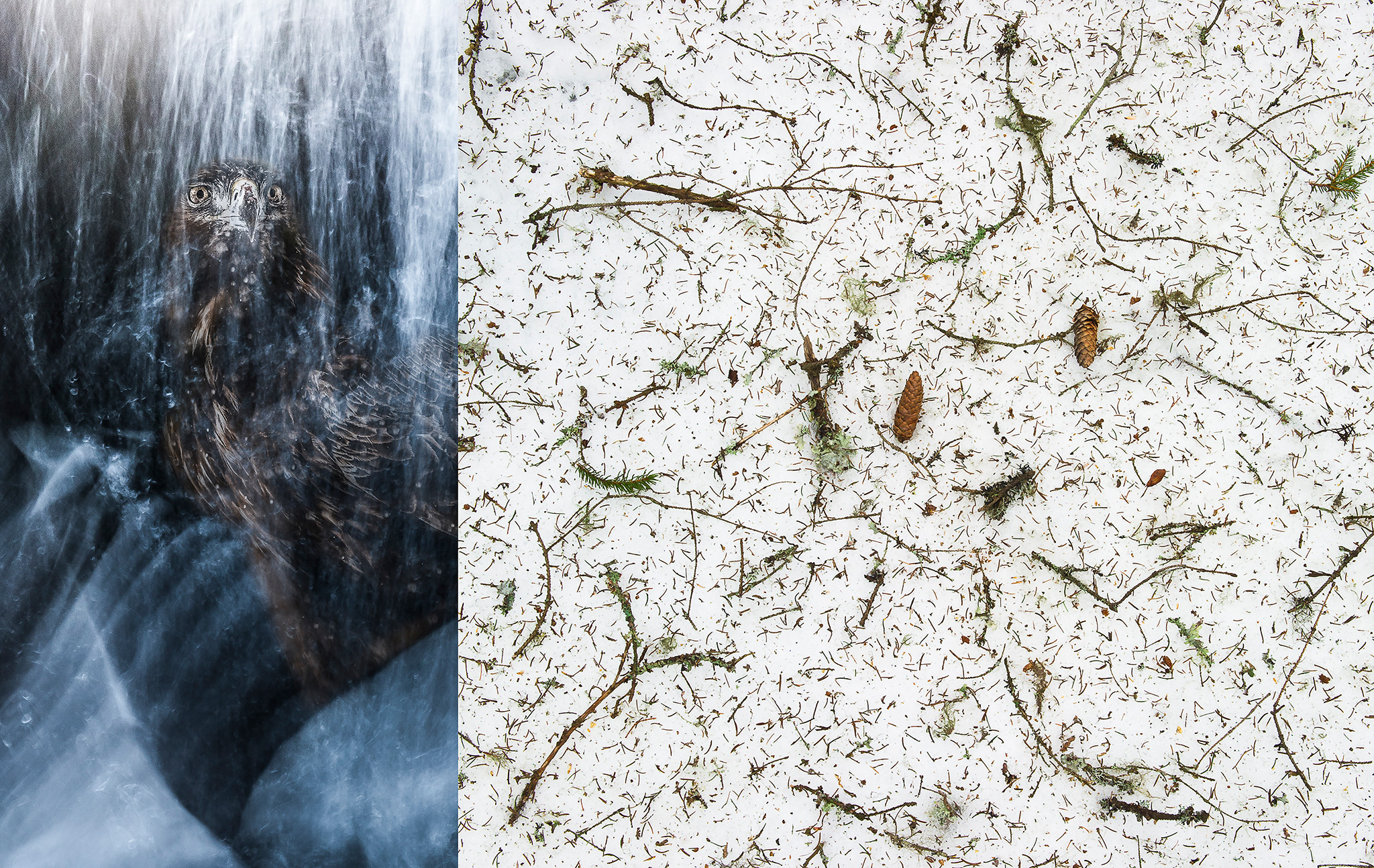
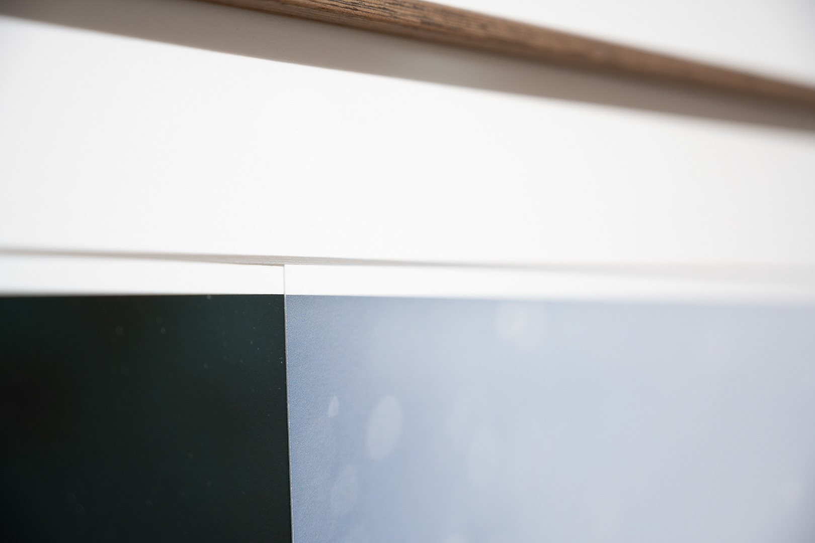
Today, it is not uncommon for photographers to create such compositions. However, when we decided to explore this, we chose to push the norms a bit. We quickly agreed that we did not want a 50/50 division of the surface. We let our instincts decide, and some of the compositions show only a narrow strip of one of the images. We aimed solely to focus on the visual weight one image exerted on the other. Could we create friction, a dissonance, a Blåtone? Could we create pairings that together provided an experience beyond what our individual images conveyed?
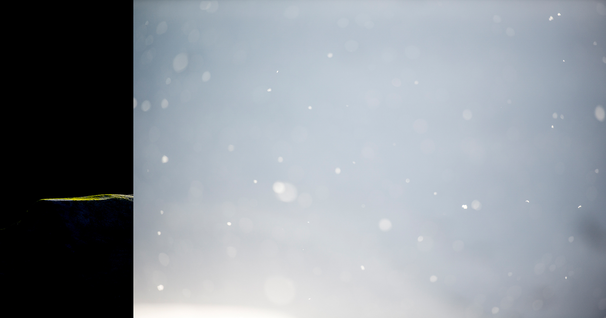
It is perhaps appropriate to elaborate on the term Blåtone. The word is Norwegian and can be translated as blue-tone or blue-note. The immediate understanding for many is the color blue. For us, it is the musical meaning that is guiding. Blue notes in music are perceived as dissonant ("off" or "out of tune"). The term is associated with blues, jazz, and folk music. Blue notes are created by raising or lowering a tone, producing friction in the harmony. And that is exactly what happens in the diptychs.
Both of us are genuinely concerned about biodiversity and share a strong worry about how humans impact nature, both globally and locally. A dissonance has emerged between humans and nature. Has humanity moved that fateful half-step away from the rest of nature, out of harmony? These aspects are important to us both and have played a natural role in shaping the diptychs.
We started with 50 images each, which were printed and spread out so we could see them all at once. We worked this way for several days and eventually narrowed it down to 20 diptychs. Only at this point did we decide to make an exhibition of the material. Up until now, the entire project had been a playful experiment to see if we could create something we found interesting enough to share with others. This was an important aspect for us—not having to perform or meet a set deadline. Keeping it as a passion-project driven by the desire to collaborate was crucial. Experience shows that in creative work, distance from what one creates is healthy. If one can detach and reset the immediate perception, one sees the work with fresh eyes and can be one's own critic. We worked consciously on this.
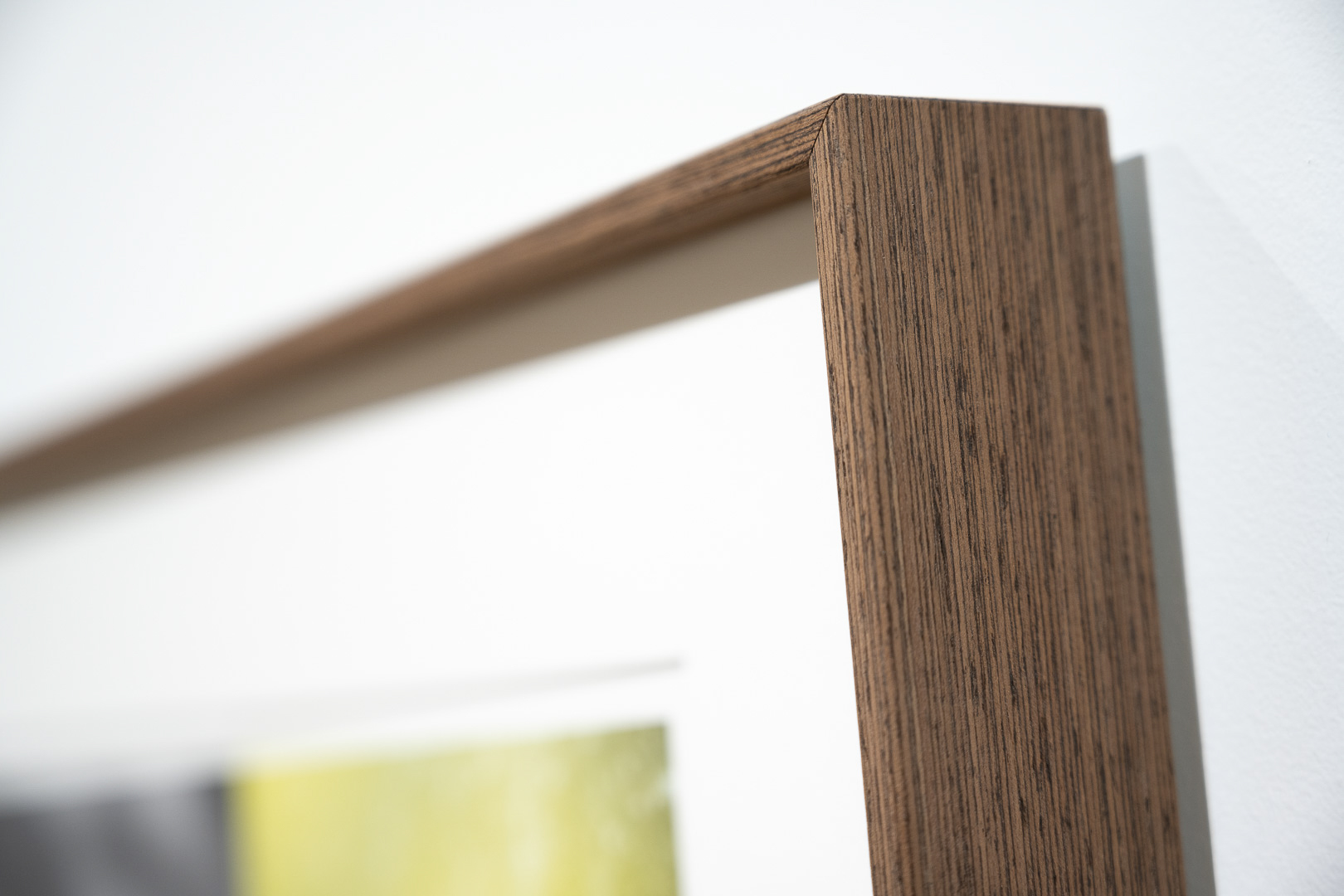
The exhibition premiered in the summer of 2023 at SAGA Center for Photography. The images were printed as two separate photographs and mounted together in frames. This made each framed piece unique. We could have combined them digitally and made life easier, but we wanted to retain elements of craftsmanship in everything we created.
One of the feedback points we received from the exhibition was whether we should also create a book. This was not part of our plan at all. Producing what would essentially be an exhibition catalog seemed uninspiring. However, during the fall of 2023, a new idea took shape. The diptychs were created by concealing parts of one image behind the other. Only a few of them consist of two complete images side by side. What if we could design a book where one could "fold up" the diptychs and reveal what had disappeared in the process of combining the images? A highly ambitious task that would require extensive work and professional design assistance. Just explaining precisely what we envisioned proved challenging. So, we made a physical mock-up by cutting and stapling pages together to test the idea. Just as importantly, it provided us with something to show others to communicate our vision. Another crucial aspect of the potential book project was the financial side. Bringing this to life required professional help, which is expensive.
We reasoned as follows:
Photographers around us spend huge budgets on constantly upgrading their equipment and traveling. Why shouldn’t we spend our money on a book if it gives us the same deep sense of purpose? And so we did.
It was important for us to find a designer unfamiliar with the project. We wanted resistance and a fresh perspective, not a yes-person who respected us and assumed we knew best. Fortunately, we found exactly the right person locally, which made working on the book not only more practical but also more social. We learned a lot about systematic work and about being creative without letting creativity take over. Through a thorough analysis, we defined some key concepts—anchors—related to the book.
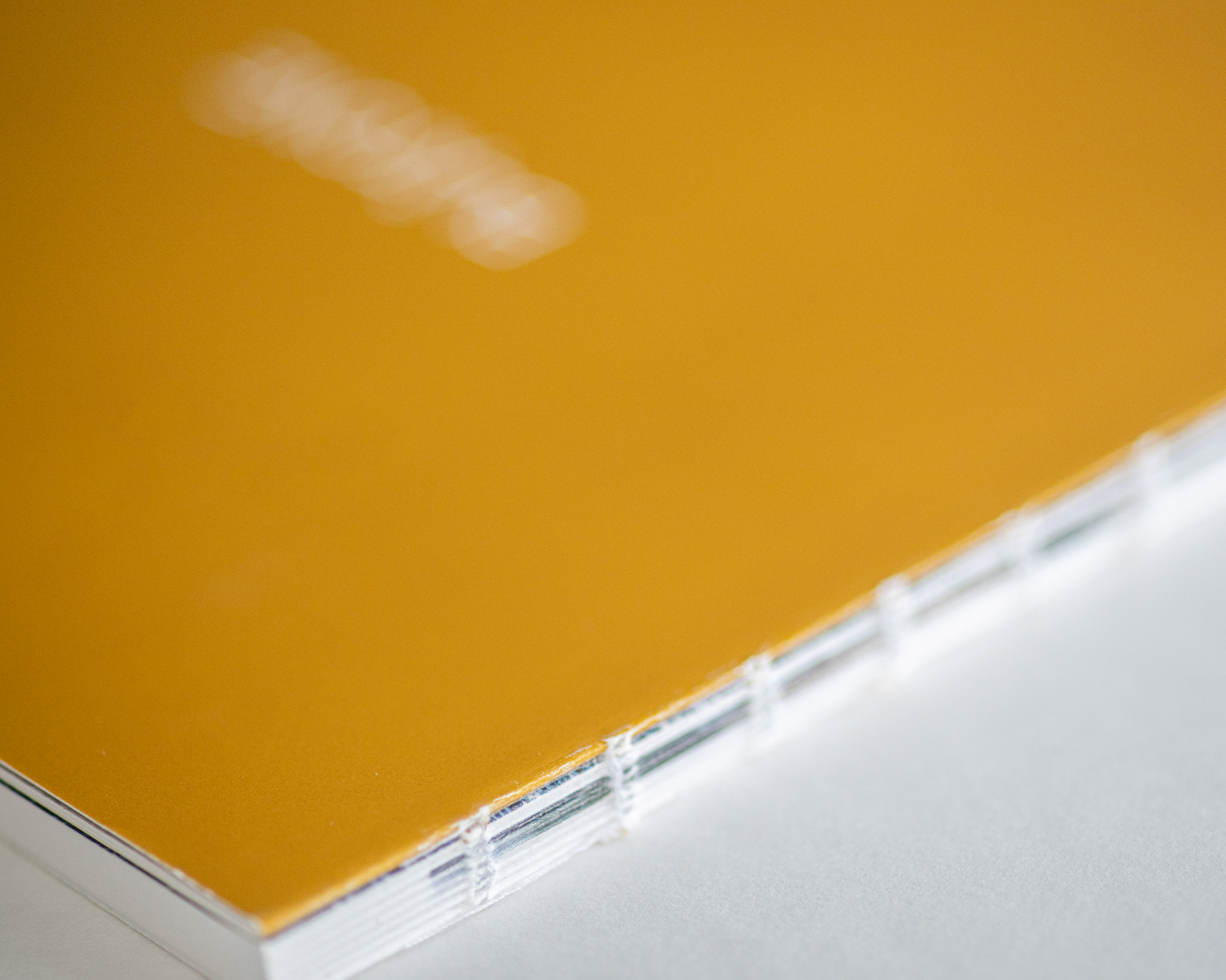
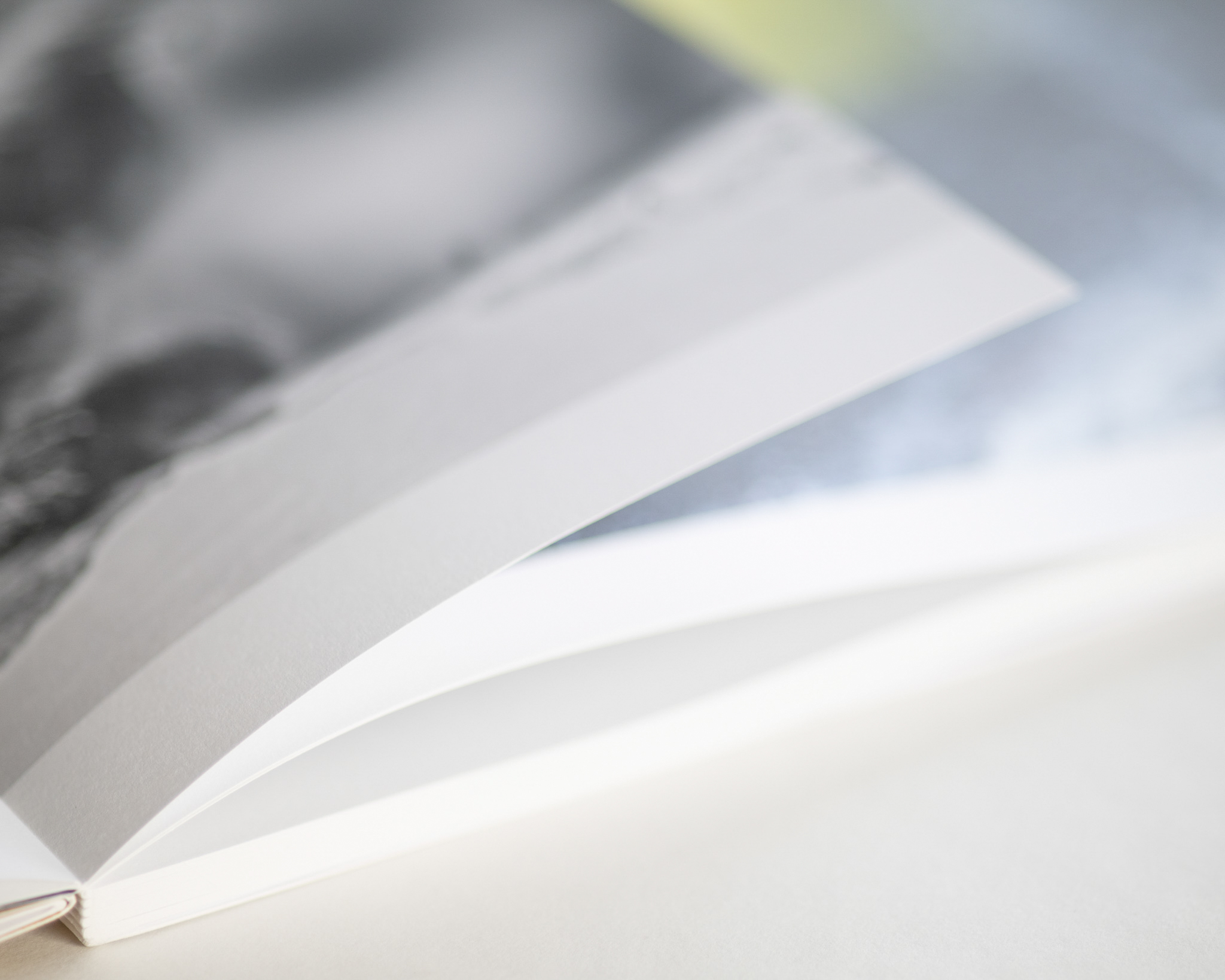
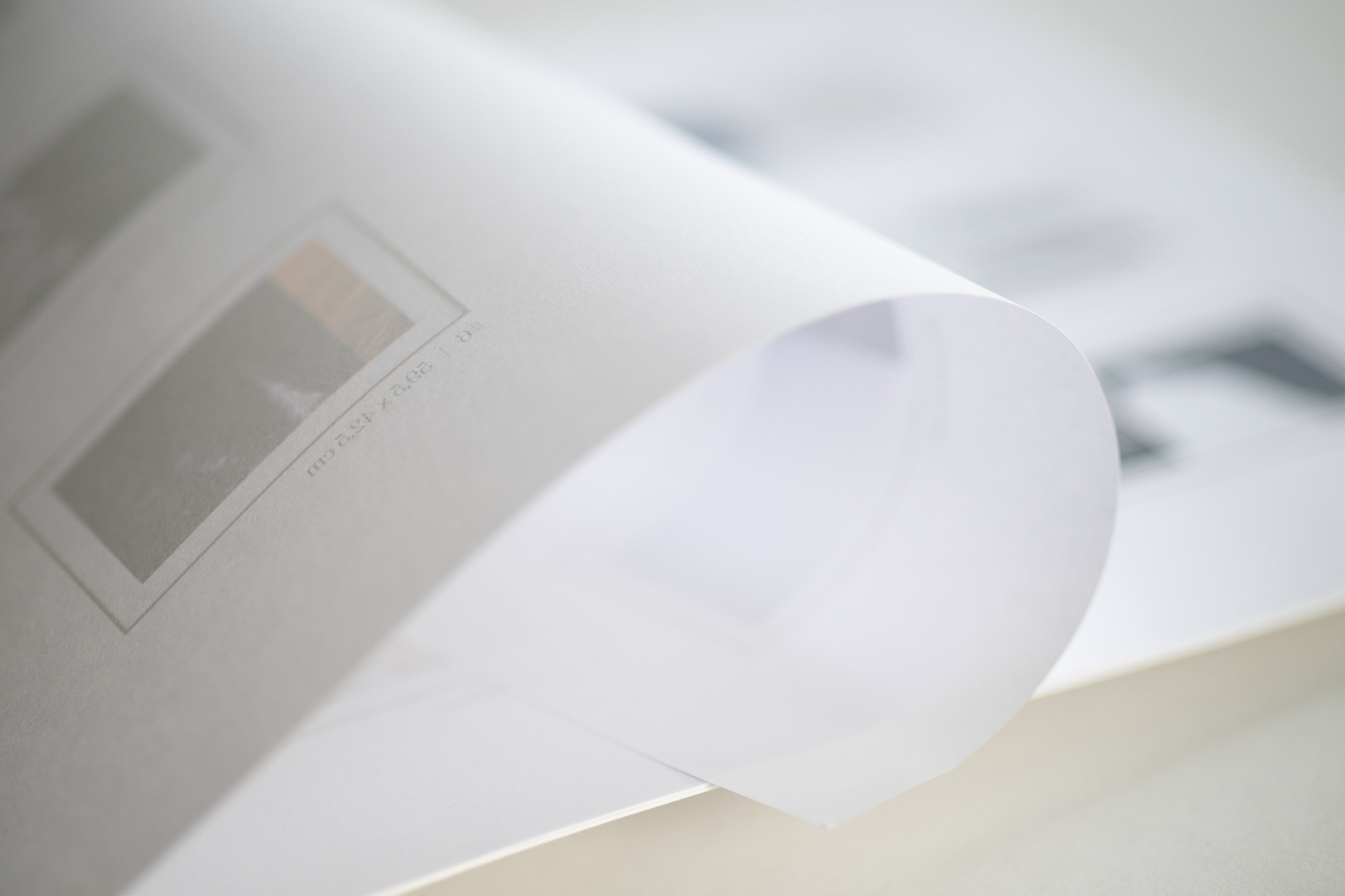
As mentioned, explaining in words how we envisioned the book was difficult, and even designer Bodil remained uncertain for quite some time. To attempt an explanation: The book has a width of 24.5 cm. Some pages are shorter—20 cm, for example. This means that when you see the 20 cm page, you also see 4.5 cm of the page behind it, as it extends further due to the book’s full width. When you turn the page, you get to see the entire page that was previously partially hidden. In this way, we have created an interactive or experiential book. You get a spread where you see a diptych, and then you can lift away one image in the diptych to reveal the hidden part beneath.
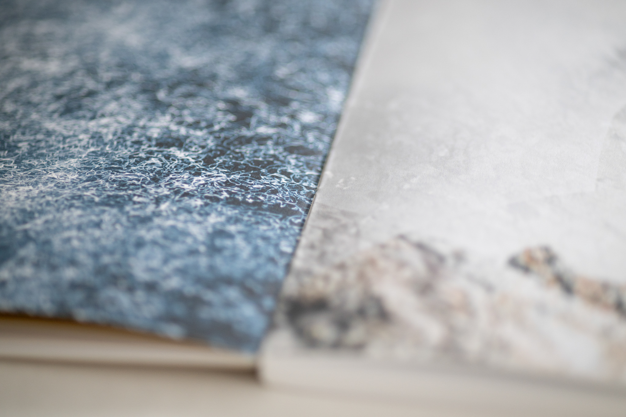
What thrilled us even more was that Bodil introduced several intriguing design elements closely tied to our key anchor—dissonance. The book uses four types of paper, creating a dissonance between glossy and matte textures. The text has a slight displacement in the middle, reinforcing our diptychs both visually and symbolically. The book’s cover reappears inside after a few pages. We love these subtle details that make the book feel like a small treasure chest—full of surprises to discover as you flip through the pages.
We have given several artist talks in connection with the exhibition. A common question is whether we have disagreed or argued. The answer is no—we set ground rules early on, which made the collaboration smooth.
We do not count square centimeters. Who has the most or least image space is irrelevant. The final visual expression is more important than the individuals.
We are not in a hurry. We both have our lives to live and families that should not be neglected.
The one most suited for the task can do it. Suitable does not mean "the best" but the one who has both the time and the competence. We wish each other success without measuring each other's contributions.
Now, we look forward to showcasing both the exhibition and the book in galleries and festivals. Nature does not need us, but we need nature.
Everything is interconnected, balancing on a knife’s edge. Nature always finds the best relationship between dissonance and harmony - the perfect Blåtone.