
An Uneasy Calm

Tim Parkin
Tim Parkin is a landscape photographer living in Scotland who co-founded On Landscape magazine. Alongside his photography and writing he also co-founded the Natural Landscape Photography Awards, runs a film scanning business and is a judge for other international landscape and nature competitions.
Last year I was contacted by Tim Rudman about scanning some darkroom prints for a book project he had in mind. I owned a couple of books by Tim and also had seen some of his work on his website and so was quite intrigued by the project. The production of the prints (which we'll talk about later) produced a broad range of tone and colour which also included a subtle pink transition towards the highlights. Tim was keen to see this reproduced and so began one of the bigger scanning jobs I've handled. We received a large package of over 100 prints some time later and made a few test prints on our Fuji Lanovia C550 scanner.
Trying to reproduce the nuances of colour in such subject matter is more involved than you might think. I have a special light source that can simulate various types of 'daylight' illumination from fluorescent & tungsten to metal halide and natural daylight (solux). Our first job is to examine the print under these different light sources to see how the colour changes. In this case the colour of the pink transitions was emphasised under fluorescent light and nearly disappeared under natural daylight. In our discussions with Tim we realised that it was important to bring out this warm pink transition and so we were happy to use the Lanovia scanner as it's lightsource is fluorescent.
For a big job like this we will calibrate the scanner at the start of the job and use different software to create icc profiles to check which produces the best result. Each software suggests that it has produced a good result (if you look at the delta E figures) but if you apply each profile you get slightly different results. Most annoying in our tests was that one profile (the i1profiler) produced the colour that we wanted and another (the ArgyllCMS) was very good at reproducing the tonal transitions in the scans. We tried to find a single profile that produced both effects but in the end we used the two profiles separately and brought in the colour from one and applied it to the tonality from the other (using 'colour' and 'luminosity' layers in Photoshop).
The only print that we had problems with was a panoramic image where the original negative was a little soft for the enlargement used. This was scanned a couple of times after a reprint was sent and various sharpening techniques were tried. In the end the result was just about acceptable for the double page spread
Tim was very happy with the end results and we didn't hear much from him once the job was complete until finally we were told that the book was nearly ready to print and Tim had an exhibition arranged at Lacock Abbey, the home of Fox Talbot (and many would say the home of photography).
We were very happy to be invited to the opening of the exhibition and Tim agreed to let us interview him about the making of the book and his experiences in Iceland.
The Book
TP: Trying to find people to print your book when you don't have any experience in dealing with printers directly must have been difficult. What sorts of quotations were you receiving and how did you choose your final printer?
TR: The first quotation I had was in China, and then I had a quote from this company in Verona and a quote from Iceland. If you just look at the printing costs and package up the costs for going over for press - it’s all part of the package and so the you need to include travel as part of the quote. The prices didn't vary hugely and most were around the £15k region. I could have had the book printed by the lowest quote printers in China.
TP: Obviously there are substantial risks involved there and also you would have to pay to be on press, etc.
TR: The price for Italy is quite reasonable I think, considering who the publishers are (EBS). I’ve looked at book publishing in Malta and Hong Kong and it’s not a huge amount extra by the time you’ve added the whole package together, going on press and things.
TP: We were discussing how you went from duotone and tritone to finally quadtone on the printing of the book to recreate that effect in some way. Presumably the tritone captured the cool blacks and the yellowy highlights and the midtones.
TR:…but it couldn’t. That elusive pink that looks so beautiful. As you pointed out, depends on the viewing light. I took you to that print to show you and it was very hard to see! But it was there, but if we looked at it by the window here you’d see it of course.
TP: So the printing of the book must have been quite stressful experience for you as someone who’s likes to control the colours?
TR: I hadn’t been on press before and I did find that really interesting. Almost as interesting as printing in a different way.
TP: You think it’s going to be quite a mechanical scientific process but it’s an art in the same fashion.
TR: Completely and some of the practitioners that they have working on those machines, they are so skilled and so accomplished. They know how to make that machine speak, it’s extraordinary.
TP: Did you have to make many changes on press?
TR: Yes, a lot and they were very tolerant. It did take longer than they had allocated which put them under pressure. But the result changes, it’s like a print. If it looks right when it’s wet, it’s not going to look right as it dries. It’s too dark and it’s similar with press. It will look different and it will darken and tone when the pages are all dried off. I’ll say “I don’t want it to look darker, it’s already a shade to dark at the moment, but I want these shades to be more delicate than that.” But if you make them lighter, then the danger he said to me is that they’ll disappear! It’s not a subtle process as my printing process, it’s subtle, but not as subtle as that. If you take it to a certain point you’ll go - and when it’s all finished, these tones that you want aren’t there. So I had to accept that as I had no experience. I see that but I’d still like them to be there.
TP: That’s one of the beauties of the analogue process, is the way it handles highlights and shadows. There’s a lot of subtleties it can bring into prints.
TR: Absolutely, I don’t think that’s achievable digitally from what I’ve seen. I don’t do a lot of digital work myself but have lots of friends who do a lot of it and I see a lot of digital work because most work is these days. So we see it at the salon, the Royal, the distinction panels and exhibitions. So I’m well aware of what can be done but it’s not the same. The depth isn’t the same. In fact I had two sections reprinted as I wasn’t happy with them and that was quite expensive. I had to go back on press again for that.
TP: Was the problem?
TR: I just didn’t like the way they were done, the way they came out or printed. One of them had that double page spread we worked on. In the end I printed it differently, I changed the filtration and printed the sky on a very low filtration which cut a lot of the grain out. It was printed lighter and smaller on the page.
TP: It looks good in the book finally!
TR: It finally looked alright in the book! The other was a signature of twelve pages I had reprinted as I wasn’t happy with the way it came off the press. You look at the large sheet of multiple pages and work out whether it is too light or dark. Then you discuss it and what can be done about it and they make another print run and they have to run off about eighty pages to get it going and finally pull one out which you look at. They are very helpful - and ask is it right?. You think - “if I say no, then they’ll have to do this all again! All these other pages go in the bin!”. So I found some pressure to get it right.
So I wanted to learn a bit more about the process so by the time I had those two signatures done It held it up for another month and I really didn’t like the book when it was put together.
TP: I think that’s part of the process of giving birth to a lot of things, it’s unsatisfying when it’s finished as you are too involved in it. You’ve got no perspective left.
TR: Yes that’s right. Then they gave me F and G’s (folder and gathered signatures) and gathered up the pages. It wasn’t trimmed or folded and I looked at that and thought ‘I think I’ll just ditch this whole process, I’m not happy’. And I very nearly did at that point. I was finally persuaded not to and then when it arrived when it was all trimmed and the cover was on it. It looked quite different.
TP: Presentation makes a big difference.
TR: I stepped back from it for a few weeks by then by the time I saw that. As you do get very immersed and critical.
TP: Book printing itself is not a particularly accurate reproductive process. Particularly if you look at the reproduction and the original side by side.
TR: Yes! It wasn’t normal CYMK though - we started off as duotone and then tritone and they couldn’t get that extra little band of pink, so they put in an extra tone - it’s a type of quad tone that’s not normal CYMK but we did use four tones in the end.

Iceland
TP: When did you start visiting Iceland and what drove you to photograph their originally
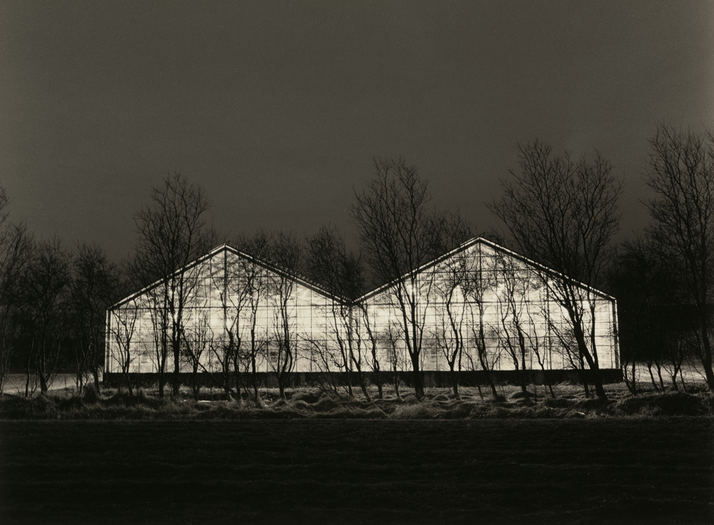
TR: I’ve always wanted to go to Iceland going way back to the Seventies. I’d seen something that really inspired me about Iceland. I was doing a lot of landscape work on Dartmoor and in some areas, in some ways it’s quite a similar landscape to parts of Iceland. Although it’s volcanic, it reminded me of my early Dartmoor work and I felt suddenly at home there.
There wasn’t even a ring road then and it was very little developed. It’s quite sophisticated now. I was looking at a small camping group which was exploring the middle of Iceland in tiny bell tents.
It really excited me and I was working out my rotas to go. Then suddenly Iceland became really hot with photographers, as it is now but not on the same scale. Everyone on this exhibition circuit was producing pictures of Iceland and I didn’t want to go anymore as I didn’t want to jump on this bandwagon.
After two or three years it petered out and then years later I got that feeling back. It was on my list of places I must go and see it. It was a place I identified with but I hadn’t been there in years. Then Bill said he was going to put a small group together with some friends for his first one as he’d been visiting privately for a while. So I emailed him and said can I come along and I’d love to as a paying guest. So he said “It’s full, there’s only a few of us but I’d love to have you, I’ll go an order a bigger van!”
At the start of the trip and for a few days after I couldn’t identify with the landscape. I could see nice pictures to take but they didn’t have a meaning beyond being nice pictures. There were half a dozen of us and they’d all be taking pictures of this and I just turned around in the opposite direction and found something individual to take. I don’t like the idea of us all taking the same picture. It doesn’t mean that much to me.
It was after three or four days, we were going around up the east coast and we stopped by the road somewhere and we had a couple of hours to go off and explore. It was open territory, there were no signs or iconic sights to see there. I found myself eventually inside some terrain which reminded me, as I said, of some parts of Dartmoor. I suddenly started to feel at home there. From that point I suddenly got into Iceland rather than Dartmoor, but that’s how it developed.
TP: So how do you know Bill?
TR: Just through internet and I bought a book of his. We communicated a few times about that but I’d never met him personally. I’d seen his work for some time and which I really liked, so I’d followed him as it were. I wasn’t much into the internet in those days, I was just starting to find it. I’m not the most net savvy person on the planet, I’m quite analogue to be honest.
TP: So you must have seen Iceland change?
TR: Yes, enormously. The first time we went, if we bumped into another photographer, it was unusual. If we saw a group of two or three, that was very unusual. We did meet a school trip that was over there the first time, we bumped into them twice on the way round! Which was a great nuisance where we wanted to take pictures! But now it’s just a swarm of people. People tend to go to the south coast and once you find out more about Iceland you get to know more about the history and the mythology of it. You talk to people and you learn a bit more, and you start to identify with things elsewhere, where you hadn’t seen before. They start to take on a significance which if you were just going to look for an iconic picture you wouldn’t see, as you’re just skimming the surface.
TP: What do you think this popularity?
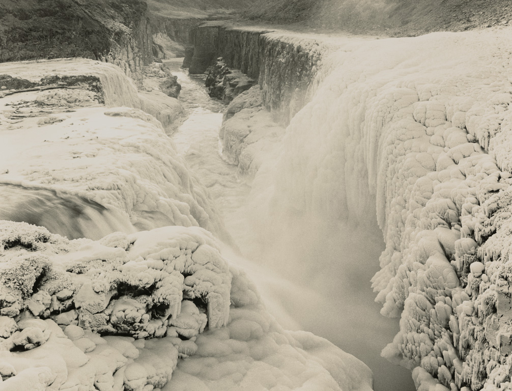
TR: I think it’s a shame, but people want their pictures and that’s perfectly fair. I think it’s a shame what it’s doing to Iceland. One of the things I loved about Iceland was that it was raw. You took your chances and if you went to Dettifoss or somewhere there was nothing to stop you walking up to the edge and falling in if you were stupid enough to do so. If that was in America there would be big concrete walls around it, barriers, and huge sign posts. There it was as nature intended and you could walk into it, without obstruction. You could really identify with the nature of it, rather than the seeing it as a developed site you come and look at. That’s changing now. If you go down to Godafoss - which is the first big fall people most people go to - he only thing to stop you walking off the edge is a little rope which is shin height! Which is exactly the right height to trip over and fall in the falls!
But now they’ve put a cafe down at Reynisfjara and the big sign warning people of the freak waves.
TP: When you see tourists walk off in Jökulsárlón onto the icebergs and get stranded it says everything!
TR: One annoying thing is when you are setting up a camera and suddenly everyone is around you trying to take what you’re taking. Last time I went to Jökulsárlón I was setting up my Mamiya 645 on a tripod and immediately I was surrounded by Japanese tourists and some of them were putting their camera or phone directly in front of my lens. I thought “I can’t work like this”. So I now use a couple of small car parks on the opposite side of the lagoon.
I like to work on my own and I don’t like being with groups. I went over there and I found a nice view point and I was setting up and getting my filters sorted out and blow me within ten minutes there were a whole bunch of Japanese tourists who had driven over and all around my camera and looking saying ‘What are you shooting?”. I didn’t like that either.
TP: Where in Iceland would you go now if and when you go back, as I’d imagine you will be returning?
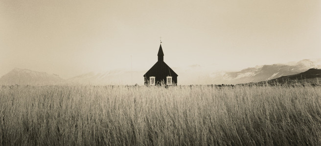
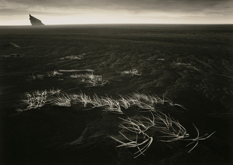
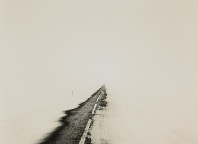
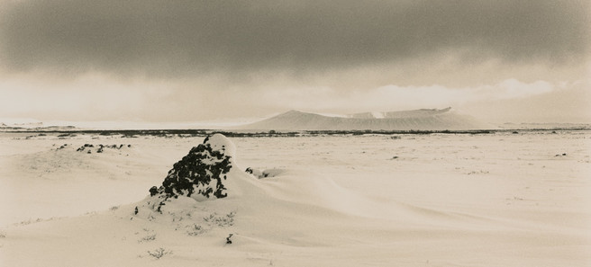
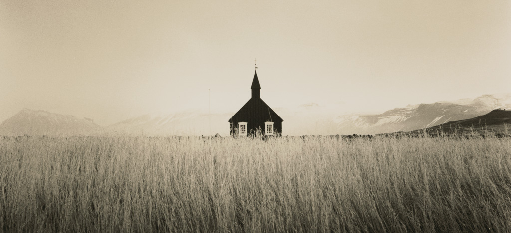
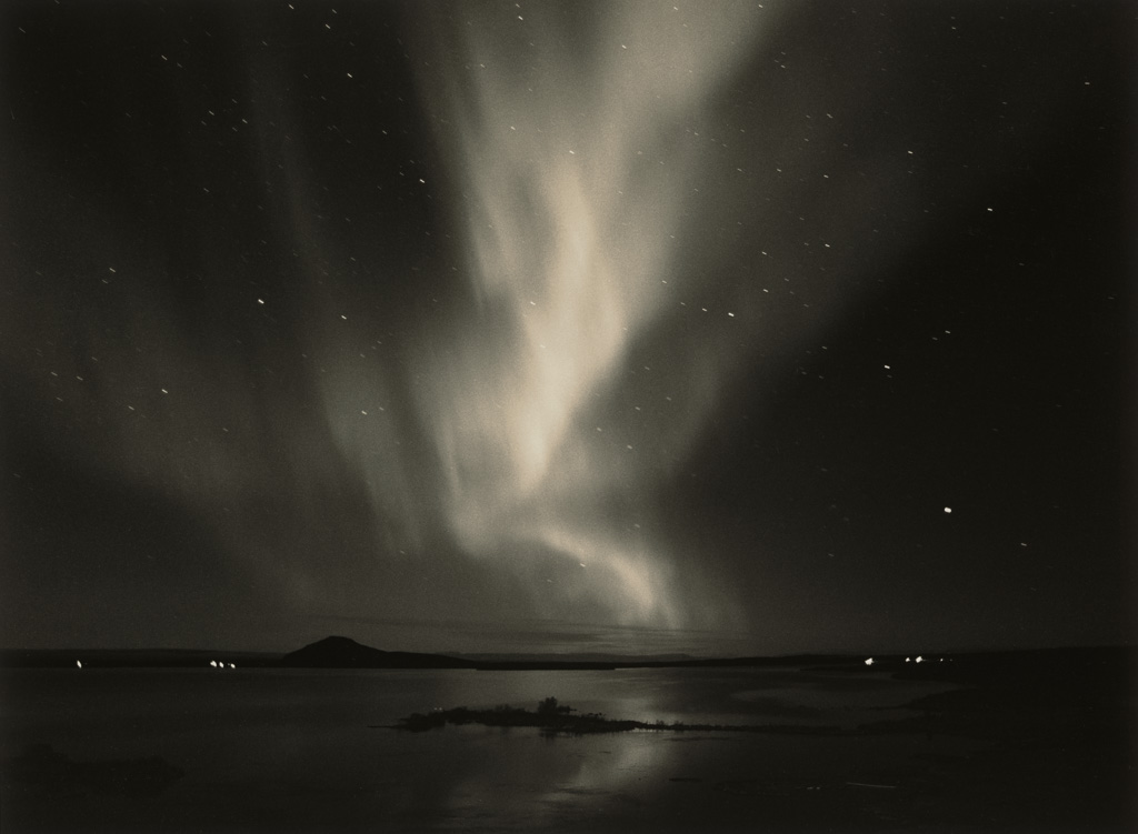
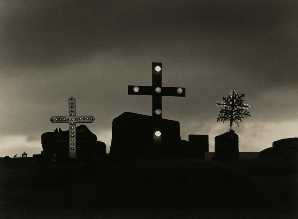
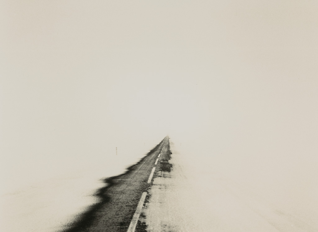
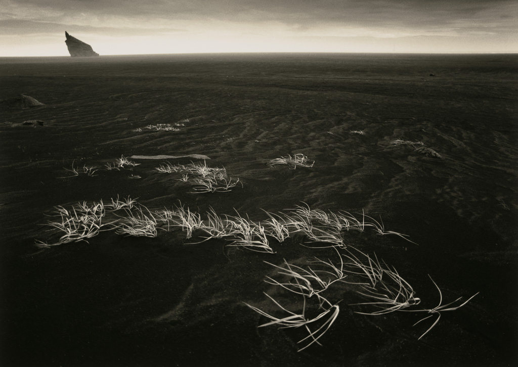
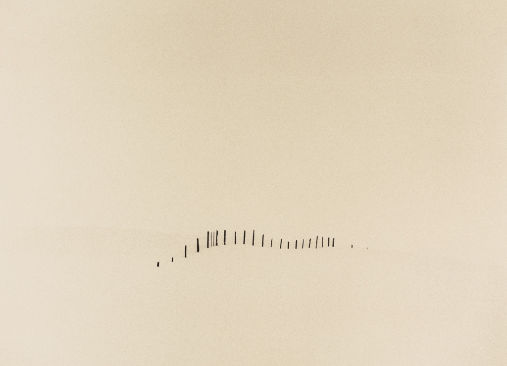
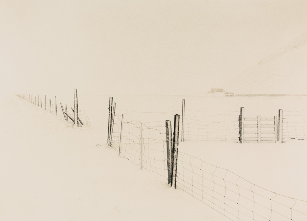
TR: Oh there are lots of places where people don’t go. Some of my favourite images were taken where you wouldn’t go and take a picture. Just at that time in that light, when evening is coming in. Just like the cover of the book - there was nothing there really just at the time it spoke in this way. It was about the eruptive process and the formation of the image, which is why it’s the open process. The crosses at the end are their because the whole narrative of it is the creation and recreation that’s gone on to make Iceland - its constant redevelopment. Man has settled on this plaque of larva in the middle of the ocean and is drawing energy out of it. Whatever man achieves there with his power stations and everything else, he ends up back in the ground and his atoms go back into the universe. As Carl Sagan said “we are all made of stardust” and we all go back and we all have a little bit of previous generations in our atoms and in our bodies, so the cycle is complete.
So it starts off with this eruptive picture of this great process which goes on throughout our universe and it finishes up with the returning to the land at the end to complete the cycle.
The Process
TP: Can you tell me about the prints themselves and the toning process. You said you use a Mamiya 645 on Ilford film?
TR: I don’t use Ilford exclusively but for this process I have. I’ve used it for a long time particularly FP4 which I like a lot but I’ve used Delta 100 on this one and I’ve used Ilford Multigrade Warmtone which gives that particular colour split which I’ve found I liked a lot for this work. When I started this work I printed it in lith and in all sorts of different ways and on different papers searching for what felt right. How the pictures speaks is what it’s about and I found it with this paper. So I used it throughout and it’s fibre based of course, so it's a slowish process and I also split grade. It’s a multigrade paper so you can use different colour contrast filters.
I use a process where you use just the softest filter the 00 filter and the 05. But in different combinations of time and that gives you a step-less range of tones. It enables you to exactly match the contrast with the negative as your starting point. I always take the picture a long way from that straight print though, it never looks much like that. At least everything that I do to it then is interpretive printing rather than rescue printing as the filter I’m using is exactly matched to the negative. I have to hold back shadows as the contrast is not quite right for that negative.
TP: So you’re starting from a flat broad range print?
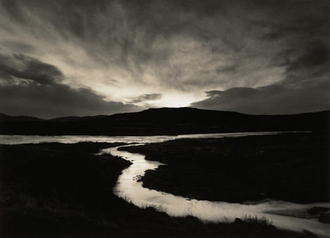
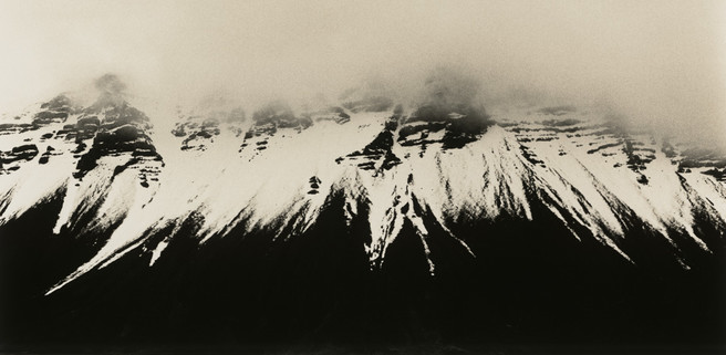
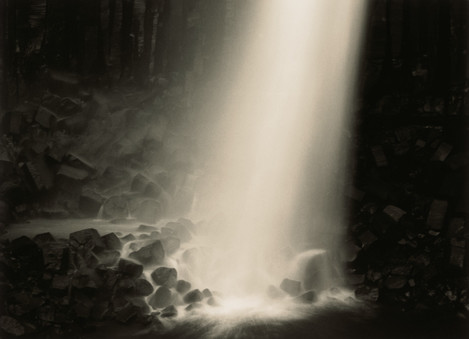
TR: Yes, and then I’m building up to what I want to say, which is usually quite different. Then I tone it in selenium for exactly two minutes at 1:20 ratio at 20C. That gives me enough penetration into those black tones to go just so far. The two minutes give me just enough time to get it hosed off in the sink. I hose it off fast to slow it down in cold water. If you go much longer than that, it just starts to creep into the next band up and that turns a bit brown. Two minutes works perfectly and gives the cooler, deeper blacks as it pushes up the Dmax by about 0.2. It gives you that real subtle depth that the black larva has there, which seems so appropriate. Then you have to wash that for an hour and hypo clear it. Then a bleach which I use very, very dilute, and again I time this with a stop clock.
TP: You’re very accurate then? I’ve seen how you’ve got with multiple prints how repeatable you’ve got them
TR: Very accurate - even five seconds on a 20% dilution can make a huge difference when you’re working. Depends on what full range of tone there is in the print, so I always do test strips and tone it, so I want that cut off to be at a certain point. Even getting it out and hosing it off quickly, five seconds difference can just bring that brown down into the mid tones, depending how steep the tonal range is. It can drop down into the mid tones and turn the whole print brown, instead of having that colder print with those subtly yellowish highlights and cold black shadows. So I time that carefully and I record the time so I can do it again. It’s always a little bit different next time, but it’s close and starting again from the best starting point.
I tone it with the thiourea sodium hydroxide which I use at the low alkali end which gives me that more yellowy colour rather than sepia.
TP: We discussed those when I was scanning the work, the way it reveals a pinkish tone.
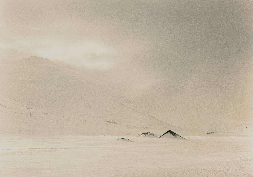
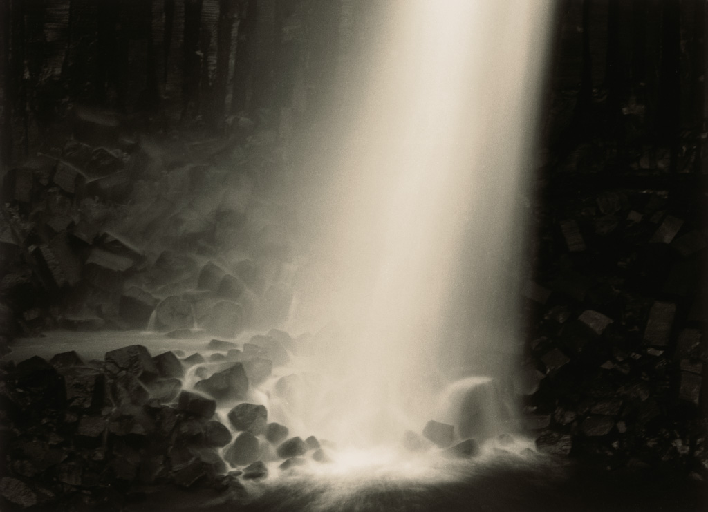
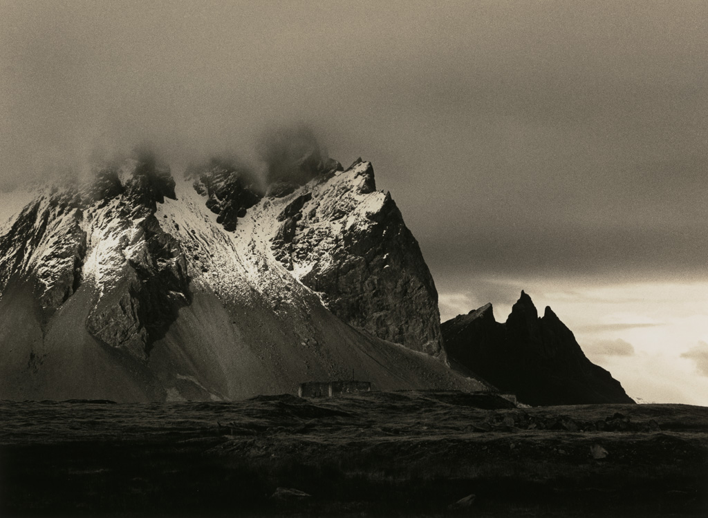
TR: That’s right. Where it crosses over you just get that very delicate band of pink. Doesn’t show on all prints, but on prints that need it and benefit from it are the ones like that. Which are twilight and the sky change on the darker prints or without that range in the sky or on a busy prints like that ‘Storm over Vestrahorn’ taken at Stokksnes there’s so many mid tones in there you don’t see it. But on the more minimal pictures you get the band in the middle.

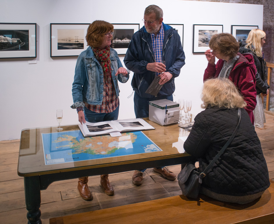
The Exhibition
TP: How did the Fox Talbot Exhibition come about which runs up to July? Can’t think of a better place to have it?
TR: Me neither! It’s wonderful isn’t it? Well I came here to an exhibition here, Shades of grey by Trevor Ashby. I’ve known Trevor for a long time and I admire his work massively. I think he’s a wonderful photographer and I spoke to Roger Watson (Curator, Fox Talbot Museum) briefly but everybody wanted to speak to him that evening. I contacted him later and brought some work to show him - my lith work that I liked and I brought some of the Iceland work that I was doing. This was a few years ago and he liked them a lot. I didn’t hear from him for a while then and I finally touched base with him again at another exhibition that he had curated. He remembered the work and then I got a call from him a couple of years later saying would I like to show my Iceland work here. The book had just come out so it was perfect timing. Of course I said yes I’d like to, can’t imagine anything l’d like more.
It overlapped with an exhibition that’s coming up at The Lightbox by three months, which has meant I’ve had to do repeat prints. Then I became ill which put me behind - I developed bilateral pneumonia which happened quite suddenly. So it’s put me under a lot of pressure to that that one printed up.
TP: Was the this the first time you’ve seen the exhibition on the opening night?
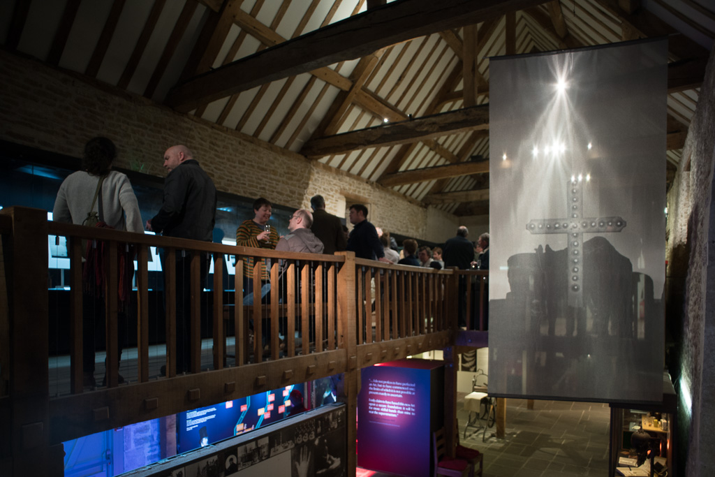
TR: I came and saw it when it was put up. It looks nicer when it’s got people in and it’s buzzing. It brings it to life!

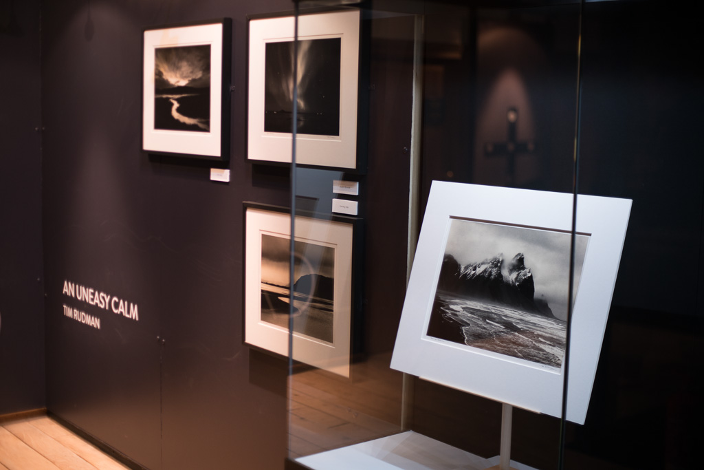
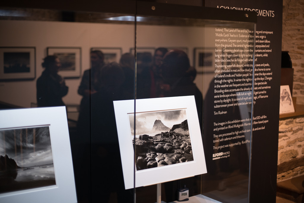
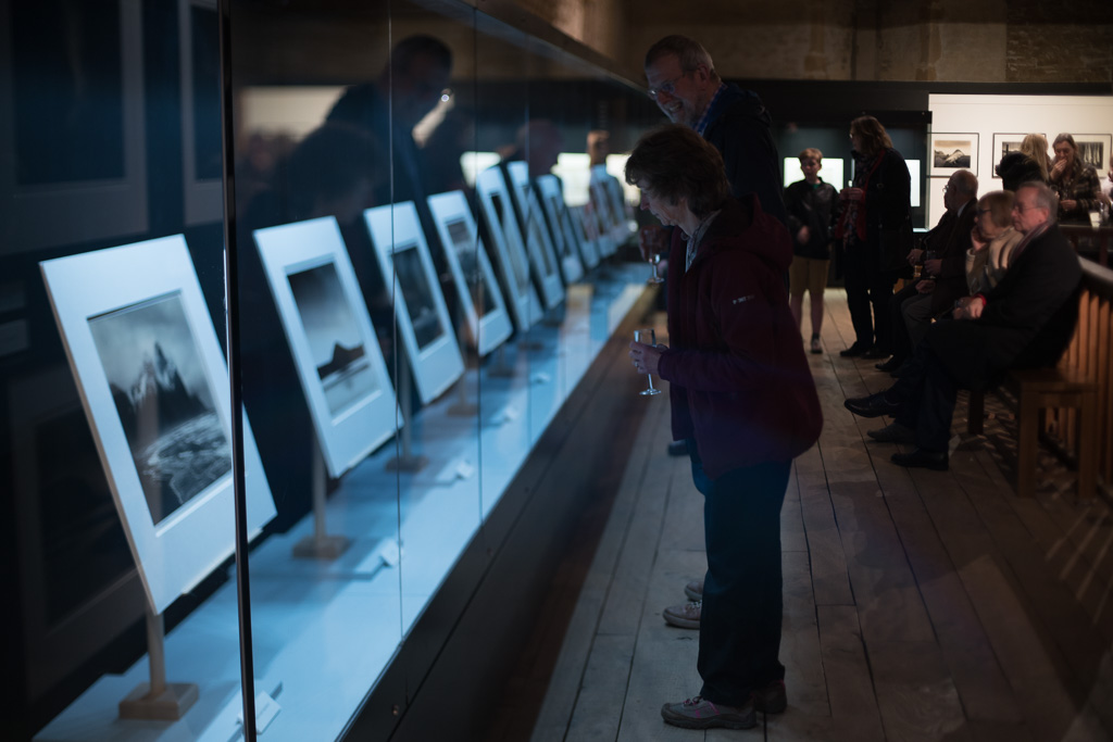
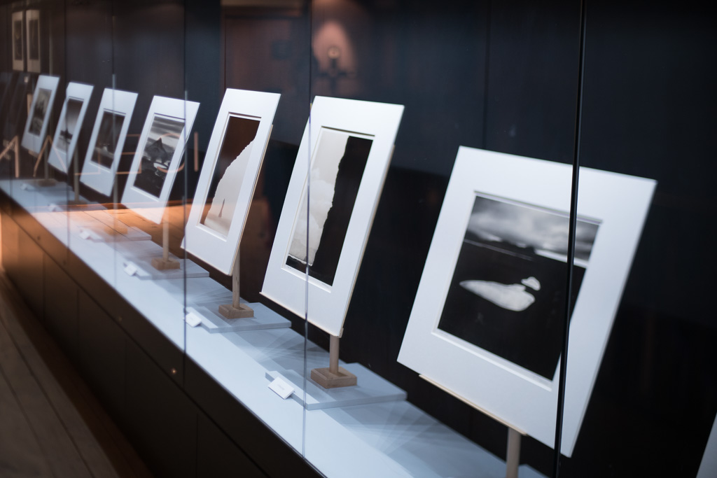
TP: That way of displaying prints as exhibits (shown on stands behind museum glass windows) is interesting. I’ve never seen that before.
TR: It draws you into looking at each piece, as it’s presented to you on a little pedestal, like an exhibit, in this glass case. It invites you to go and look at it closely and inspect it rather than to walk along a wall of prints.
TP: Having the glass away from the print also allows you to see the print better. Glass can often act as a barrier but here it doesn’t seem to.

TR: I think so too, I agree. Also because the back of the case is black, the print is against a black wall. So they stand out and they are beautifully illuminated. Whereas on a gallery wall, I’ve never seen the lights this good.
TP: I’ve not seen many galleries with good lighting at all to be honest. Not away from places such as the National Gallery anyway.
TR: The presentation is beautiful and on for six months too.
TP: Hopefully that will sell the books out!
TR: That would be nice wouldn’t it! I gather it’s going very well.
Tim’s exhibition runs at the Fox Talbot Museum up to 10th July, The Lightbox Museum Gallery April 23rd to July 3rd and Banbury Museum Gallery December 16 - January 17. More details on Tim’s website. Our book review follows in the next issue.


[/p