

Variation in Camera Colour Rendering

Tim Parkin
Tim Parkin is a landscape photographer living in Scotland who co-founded On Landscape magazine. Alongside his photography and writing he also co-founded the Natural Landscape Photography Awards, runs a film scanning business and is a judge for other international landscape and nature competitions.
I’ve written about sensor colour in a previous issue of On Landscape under the title “The Myth of Universal Colour”. In that article I looked at the quite common preconception that if different cameras create pictures with different colours then these can be easily corrected in Photoshop.
To recap the reasoning you need to know that ‘colour’ is a perceptual construct (i.e. it gets made up in our heads) which means that the colour red is not a property of an object but a property of the combination of the light hitting an object, the object itself and the combination of the ‘sensors’ (e.g. rods and cones in the eye).
Light is actually a spectrum of lots of different frequencies or colours of light. (e.g. the suns colour is made up of a full rainbow of colours). You can imagine it’s like a paint mixing set. You can get a green colour by starting with a green pigment or you can mix a green pigment by starting with a blue pigment and a yellow pigment.
Now normally these two colours will both end up looking green to our eye because that is what paints are mixed for. What they look to a camera sensor may be different though.
Imagine the sensor happens to have extra sensitivity to blue. The pure green pigment will look OK but the mixed green pigment will tend towards a bluer colour. This effect is known as ‘metameric failure’.
So why do I think this is a problem? Well I’ve been using a combination of film and digital for some time and when I started with film I was also using a Canon 5Dmk2. Looking at the images side by side when I first started was like night and day. The colour from the 5D2 was very poor in comparison. However, when I went back to write my original article about a year ago I looked at the images again and was presented with the Lightroom dialogue “do you want to update your image to the latest camera raw engine” (or something like that - I forget the actual words). When I selected “yes” the colour improved enormously (Another good reason for shooting in raw - check on some of your old pictures to see if you can see the difference).
However there were still some discrepancies. These were particularly in lush foliage where grasses in particular would look a very yellow green on grass and in the colour of geology where shadows tended to go brown on my Canon.
I thought that this was something intrinsic to film, and to some extent it is however it was when I went out with Dav Thomas a few times and we shot similar scenes on both our digital cameras and his came out looking remarkably film like in comparison to the 5D2 that I realised that different cameras really do see colour fundamentally differently.
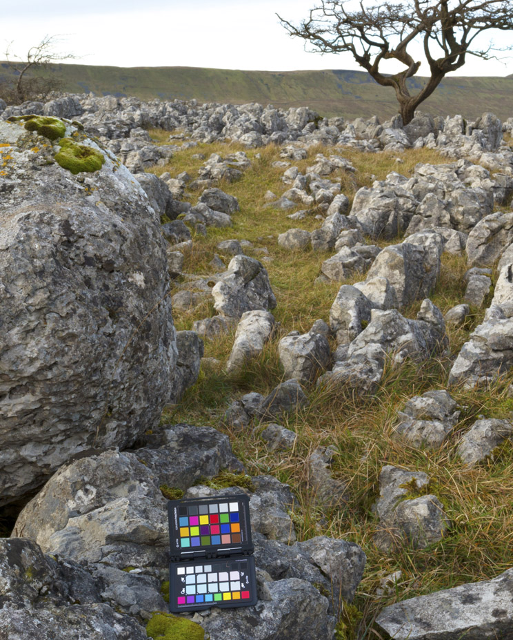
My first opportunity to do so was up at Southerscales near Ingleborough where I dropped in on Joe Cornish and David Ward running their Yorkshire workshop. Fortunately Bruce Cairns and Dave Mead had a Nikon D800 and Canon 5D mark 3 respectively. We also had a Sigma DP2, a Panasonic LX5 and an iPhone 4S to add a bit of extra intrigue.
We included a Colorchecker target in the image so we could colour balance the images. Sadly only the Canon and the Nikon allowed this as the Colorchecker software requires a DNG raw file of the right format. We balanced the other cameras as good as possible by eye however.
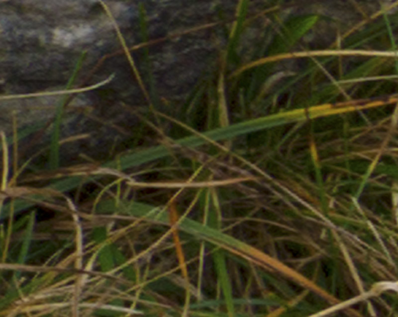
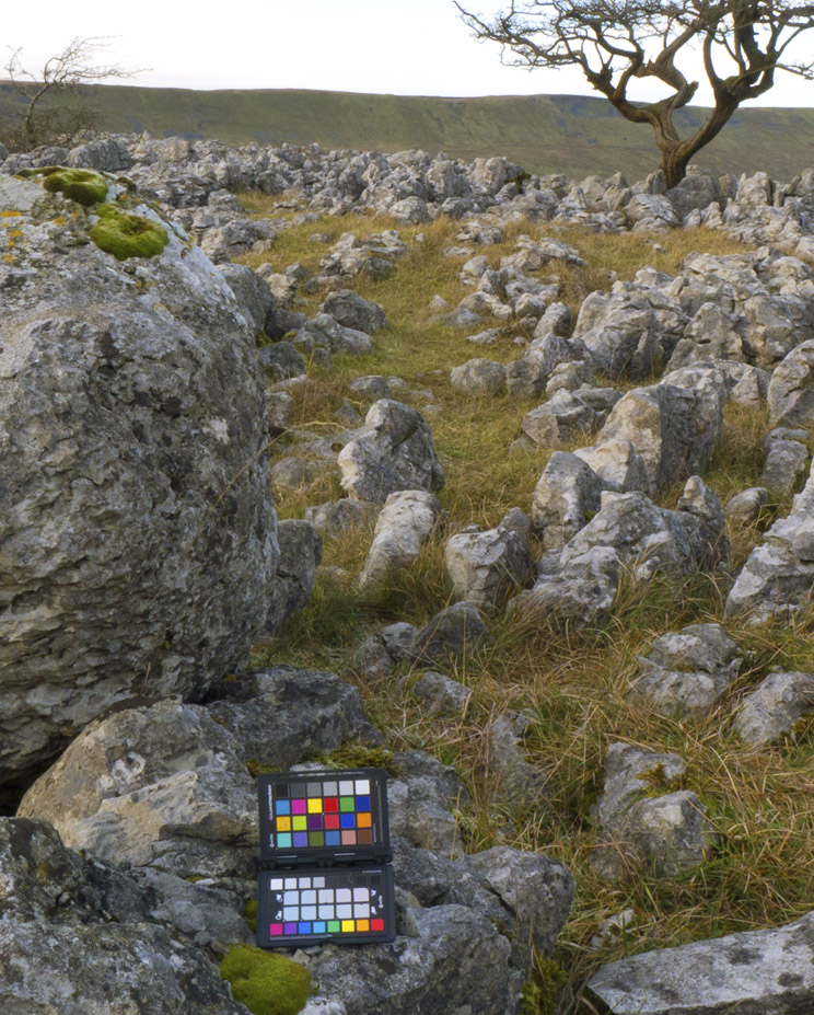
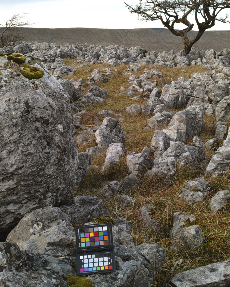
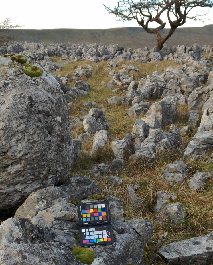
The main point of interest was the difference between the D800 and the 5D3 however. The only downside of the test was that the location didn’t really have much variety or foliage of the sort that I’ve seen problems with but as a proof of concept test it would have to do. We chose an area with some grasses and mosses as well as some yellow lichens.
This first image shows the overall scene difference between the D800 and the 5D3. Not a lot of difference is there. However the comparison afterwards shows a much smaller area and we can start to pick out a few colour differences. I’ve used a color dropper to sample a few different areas and reproduced them as colour squares on the image.
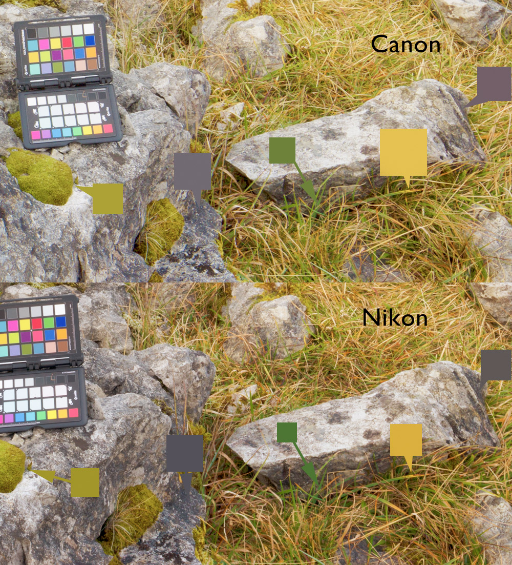
Now depending on your sensitivity to colour this could either be completely the same or quite different. I think I’ve become quite attuned to these changes and the difference in the greens for instance is quite large. The yellows look very similar as does the mustardy green of the mosses. The shadows are closish but I can see the slight red tinge to the shadows on the rocks that I have observed in Canon files before.
It is definitely the greens that show the most difference though. Let’s have a quite good satch at it though - I’ve upped the vibrance by quite a bit in the next shot, not outside the bounds of some photographers I’ve seen on the interwebs though.
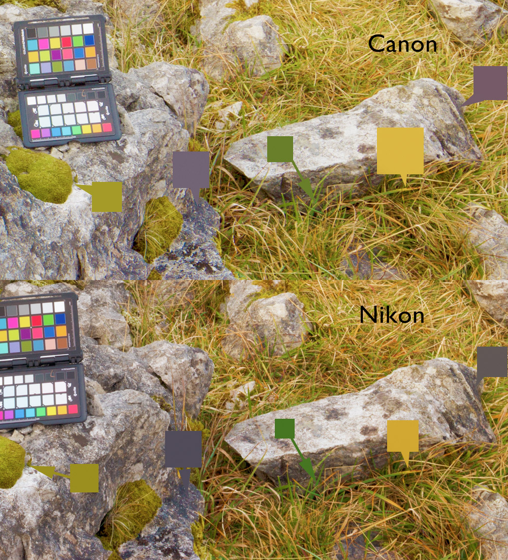
Now the differences become a lot more apparent, especially in the shadows of the Canon shot.
Now this looks quite bad for the Canon but you have to remember I’m pushing things quite hard here and the shadow colours could be fixed in post processing and perhaps the passport colorchecker didn’t do as good a job as it could have. However the casual user won’t be aware of these tweaks and it’s probably fair to say that they shouldn’t need to be aware of them.
You can make fixes to the canon colour to bring it in line with the Nikon but you can’t apply them globally because some of the mosses are also the same colour and fixing that colour globally makes the mosses look wrong. If you wanted to fix like this you’d have to create a mask and only paint over the grasses. The fix is a 10 point hue shift towards blue - a process that both me and Joe Cornish have discovered through general experimentation. Here's the Canon file followed by the Nikon file and finally the corrected Canon file.
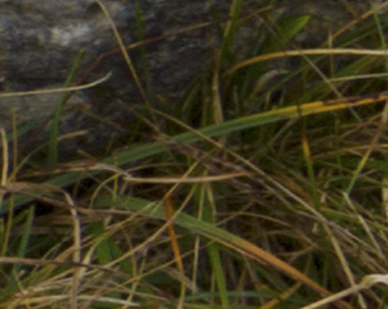
Canon
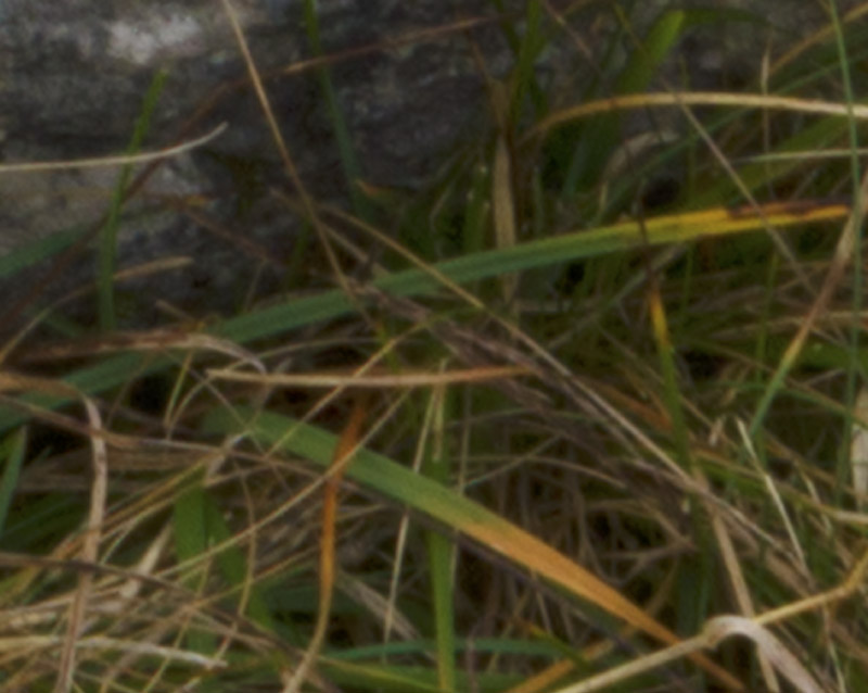
Nikon
Canon with 10 point hue shift in greens (masked for grasses only)
Next step is to get a few more cameras together and to test them in spring when we have a greater variety of greenery around, a subject that we are sure is the most difficult to deal with.
Finally we also tried some other cameras and I reproduce the results here. The Panasonic LX5 did remarkably well, producing results that were very close to the Nikon's. The iPhone put in a respectable showing but with a very small dynamic range and a strange red tint in the shadows.
The camera that produced the strangest result was the Sigma DP2. It's results varied so dramatically from the rest of the cameras that either the rest of the cameras were very, very bad in a remarkably consistent way or the Sigma has a very idiosyncratic colour reaction. The particularly strange result, apart from the fact that the greens look quite brown, is in the grassy straw in the background which shows mostly green in all the other cameras but pinky orange on the DP2.
This test has definitely produced enough of a difference to warrant more research and we'll be taking a range of cameras out on a nice greeny spring day (if we get any). If you have any observations about these sorts of colour differences we'd love to hear about them
Panasonic LX5
Sigma DP2
iPhone 4S
Nikon