one of my favourite photographic secrets

Len Metcalf
Len is a photography educator and art teacher. He is the director of Len's School located in Sydney, Australia, which offers a wide range of online courses from year-long photography masterclasses to shorter composition and drawing courses. Len’s School offers innovative small group workshops and tours for dedicated amateur photographers who wish to grow.
Len publishes Len’s Journal which celebrates creative photography quarterly and is only available via subscription.
Len exhibits his photography regularly and is widely published. His intimate portraits of people and nature show a unique and very personal vision of the beauty of the world though his photographic art.
Technically, luminosity refers to how much light an object emits. In photography we tend to think of luminosity as how much light an object reflects, we measure luminosity with light meters, usually the amount reflected off the subject, though this isn’t really technically correct. A printmaker will think of luminosity in terms of how much of the paper tone will shine through in the final print. An artist will think of how bright the lightest tones they will add to their painting.
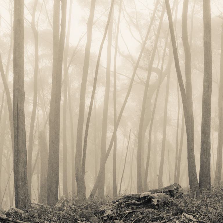
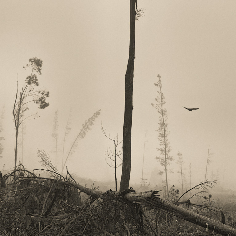
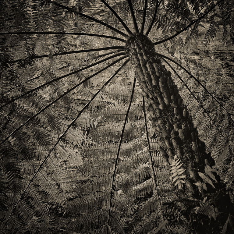
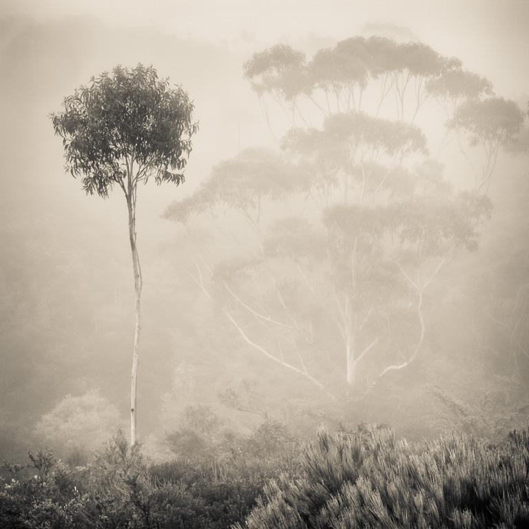
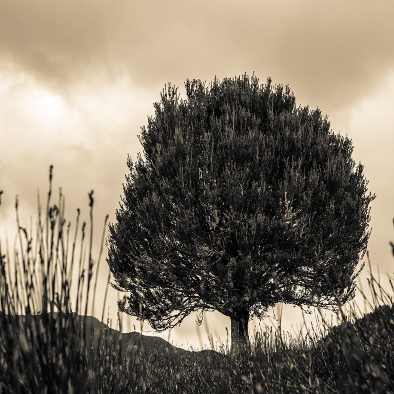
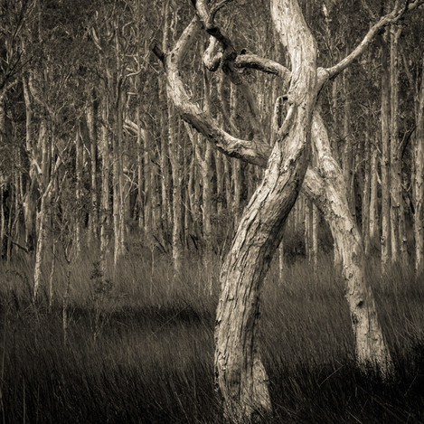
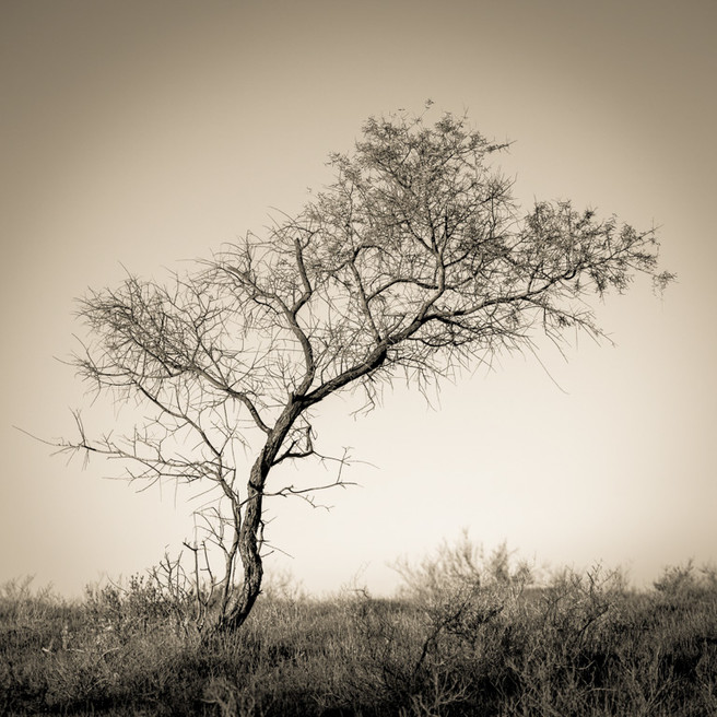
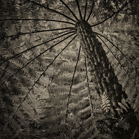
I believe that most great photographs have one consistent compositional element, and that is that they are luminous. They have luminous subjects or luminous lines and tones. When I think of a beautiful photograph that is full of luminosity, I am considering how the highlights glow and are separated from the other tones within the image. How my eyes are lead through the image by the highlights. I like to call this ‘the dance of the highlights’. In a luminous image the subject appears to glow. Simple, yes it really is that simple.
Painters worked this out a long time ago. Masters of this are the greats like Rembrandt and Caravaggio. I used to spend as much time studying the masters of the canvas and paintbrush as I did on the masters of photography. My favourites today are; Olive Cotton, Ruth Bernard, and Imogen Cunningham. My favourites will more than likely be different tomorrow. Painters are taught to flesh out the composition in large dark tones. The first of which goes onto the canvas is the dark tone, in huge swathes and bold big brushstrokes.
When we look at these masterpieces from centuries ago, when camera obscura was the nearest thing to a camera, our eyes flow through the highlights flowing through the painting, then as we explore deeper into the painting we explore the mid tones and finally we may venture into the darker tones, but probably only briefly or with our imagination. When we find interesting things our eyes slow and enjoy the journey. Little details stop us further still. These paintings are so grand and enthralling that they are best seen in real life. Well worth a trip to your state or national gallery to study photographic composition by studying painting. Stand in front of a great work of art that you like and see if you can figure out why it is working for you. To do this exercise properly I would suggest 15 - 30 minutes per artwork. Take a notebook and pen and scribble down your thoughts, make drawings and diagrams. After an afternoon see if you can find patterns in what you are attracted to and how they work.
The same is true of a photographic master piece. The ones that consistently win competitions, the ones that hang on walls, the ones we remember and the ones that we take that we still love many years later. Don’t believe me, go and look for yourself. Most of these images have very carefully considered and composed tonal arrangements.
Once I started really concentrating on the composition of the luminous parts of the image, using the highlights to control the movement of the viewers eyes through the photograph or to the main subject within the photograph, my photography stepped up to another level of mastery. Obviously this can’t be done in isolation. You need an interesting subject, you need the right lighting, you need supporting considered backgrounds, you need to compose the dark or negative spaces. You need something interesting to you. But what your aiming for is creating something that is full of luminosity. Where the main subject just glows and jumps off the page. One where the main subject is luminous.
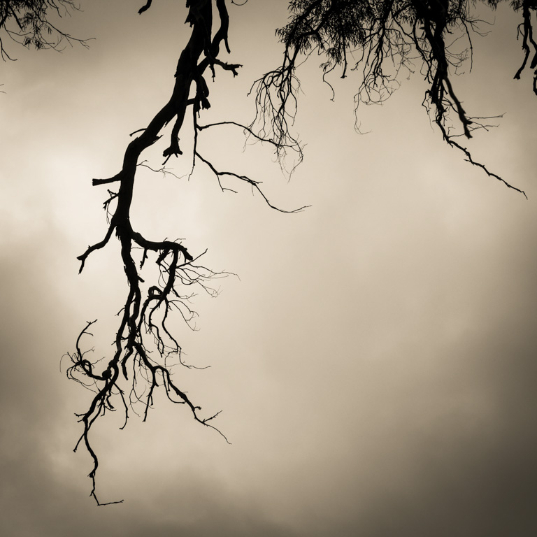
Luminosity is a trick of the eye, much like digital sharpening. Edge sharpness is enhanced by darkening the dark side of the edge and lightening the light side of the edge, just a tiny amount say a pixel widths or two. With that extra little bit of black and white on the edge the edge appears sharper. In a well sharpened image it is so fine that it is indiscernible in the print. Like sharpening, luminosity also is enhanced by the tones around it. Bright areas appear brighter when they are next to darker areas, and brighter still when surrounded by them. Also like sharpening, your technique used to achieve this also needs to be indiscernible to the casual untrained eye. Well it needs to be discreet and in my opinion needs to be so subtle that it only enhances and not detracting. A poorly used graduated neutral density filter does more harm than good for example, but one used well appears natural.
There are a few ways to achieve luminous photographs. One is through careful post processing, something that I really haven’t bothered to learn much beyond my previous darkroom skills.
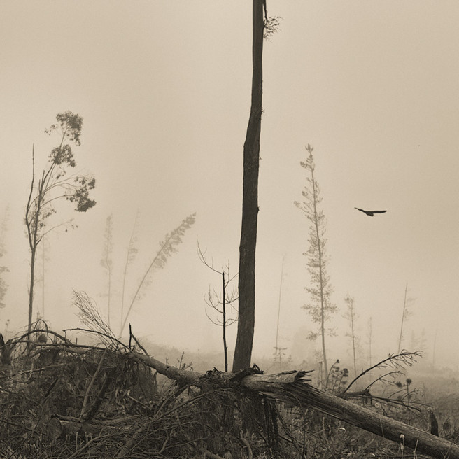
Another way is by looking for this while searching for and taking your photographs. Yes I am a lazy photographer, I prefer to get it right when I take the photograph and spend as little time at the computer as possible. So I actively seek luminous opportunities whilst photographing. Not only am I looking for subjects that have a luminous quality, I am looking for lighter toned subjects on darker toned backgrounds, or looking for leading highlights that take the viewer on a journey through the scene.
The other method I regularly use, is manipulating which colours convert to which tones within the colour to black and white conversion process. No longer am I limited to a colour conversion filter, I can now control each colour individually. Some colours are lightened, while others are darkened. Again I will leave this to another time. But suffice to say at this point, this is one reason I love digital black and white photography, and that is about the control I have at my fingertips.
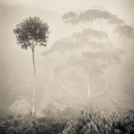
Lighting pays such an important role in photography, and can be crucial in creating luminous photographs. Being out in the landscape straight after the storm, when the light sneaks through the clouds and highlights part of the scene, is a firm favourite with landscape photographers. With street photographers, utilising brighter light on the figures and the deep shadows for backgrounds gives portraits an instant luminous feel. This works even better from within the shadows, having the subject closer to the light source and the background deep in shadow. Usually the light source for me is the sun, and a bright sunny day works just as well as an overcast one. Another favourite is photographing under street lights at night, often harsh and directional but full of deep blacks and sensual dark tones.
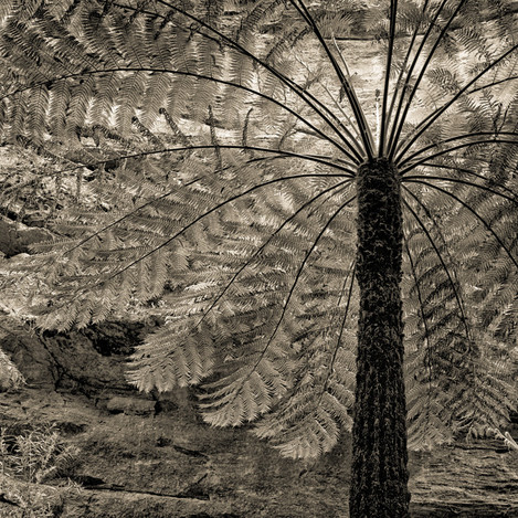
Luminous photographs have a sense of depth about them. In print form the subjects leap out of the depths of the darker backgrounds.
Apparently photographers often take their most famous photographs in their fifties. I have ruminated on this one for years, and eagerly look forward to these years as I am just starting them, wondering what will be interesting me at that time. One of my imaginary pet theories is that they are loosing their eye sight, colours loose their strength, so they are composing with tones. I watched Lloyd Rees get older, his paintings became softer as his eyesight worsened, and some might say they continued to improve. I think his tonal composition continued to grow. Turner’s work matured as he aged, and definitely became softer and more tonally compelling.
I once conducted a survey with friends and students asking them to identify which of my photographs they would buy as postcards, latter I thought I need a black and white set, so I printed my colour photographs again in black and white, and mixed them in with my black and white ones. The most popular colour photographs came back in the same order regardless of which set they were in. The most popular colour photograph was the most popular in black and white. The rest were in the exact same order. What can we learn from this? The tonal arrangement is more important than the colours. “Of course, tone trumps colour” Gordon Undy once said to me as we were discussing my discovery, meaning that your better off composing with tones than with colours, though finding a good balance between colours in an image is important and is not to be disregarded. Now the “Tone trumps colour” theory applies equally well to luminosity. The highlights will trump the shadows, and the high tones and the low tones are more important than the colours.
If you are reading through this and thinking, well Len what about high key images. All the same applies, except that your eyes may dance around the darker lines and tones, reversed if you may.
So these days I am often on the search for subjects that I can use in my photographs that maximise the use of tonal arrangement for brilliant composition, and pay particular attention to the composition in the highlights. Once I find them I pay particular attention to both the highlights and the negative space. Whether shooting in colour or black and white, I am usually in search of that magic ingredient “Luminosity”.
Len’s hints for producing luminous photographs
Correct exposure
Start with a sloppy file, you will short change yourself in your photograph, and in the final print. Some say “garbage in, garbage out”. Check your histograms for correct exposure. Me I tend to expose to the right and check to ensure that my highlights aren’t clipped. I am exposing so that my histogram starts neatly in the right hand corner.
Embrace the light
If you have time stop an analyise the light, figure out its characteristics. How can you incorporate its character into your photographs.
Squint your eyes
Artists have been doing this for years. They also turn their artworks upside down, and stare at them for hours over a coffee working on the composition and tonal arrangements. Years ago we were told to use a viewing filter that removed all of the colours. Now we can look at the image on the lcd or if you are into mirrorless camera the electronic viewfinder by composing in black and white. By looking at the flow of highlights through an image, you can then rework it, and move these highlights around until you create an amazing composition in them. This has become my technique with moving water, I create one image which I use to judge the highlights in the flowing water of a river, then I start re-composing with these higher tones by moving them around within my photographs. In my film days I used to just squint my eyes.
Lead the eye with highlights
Use them to take the viewers eyes on a journey throughout the scene. The greater the journey you can take the viewer on the more they will enjoy the photograph on an intellectual level.
Compose negative space
This is one trick us artists were taught at art school. The arrangement of the negative space can often be an easier way of figuring out where the highlights should go. Interesting and balanced areas of negative space are very important in creating a successful image. Balance the negative spaces with the positive spaces.
Set white point accurately
When processing your images when your trying to create luminous subjects. Setting the black point helps with the shadows and increases the contrast between the lights and the darks. This will give your image more depth. This is the number one step for improving a flat image, and I am always surprised by how many photographers don’t know how to do it. In Lightroom I put on the highlight / shadow warnings and set my points and put a few spots of pure white in most of my images and similarly a few points of black in them.
Containing the viewers gaze in the photograph
The longer I want to keep looking at an image the more successful it is. Students always ask me “what makes a great photograph?”, and my stock answer is “time”. The longer I want to be with a photograph the better it is. If I still want to be with it next week, it is even better, and if I still love looking at it in a years time I have something stunning. If other people want to look at your photograph for equally an as long a time as you do, you have one special photograph. Mind you, when you view your own work this has to be without prejudice. If you love looking at the photograph because it is of your family or favourite spot, then it may be true for you, but not for others. Learning how to distance ones self from your work is hard. The only answer I have seen that is effective is again time. Some leave their work for a year after taking it before judging it aesthetically. When putting together an exhibition I often search my back catalogue for new discoveries.
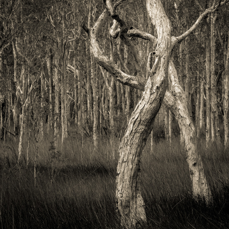
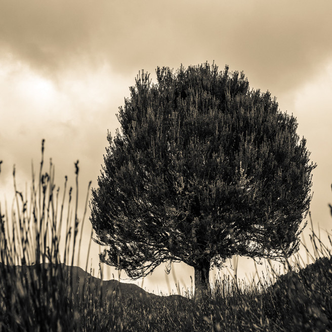
Search for contrast in the subject, in the lighting, and with the background.
Not just contrasty subjects, but a contrast between the tones of the subject that you wish to be luminous and between the darker backgrounds.
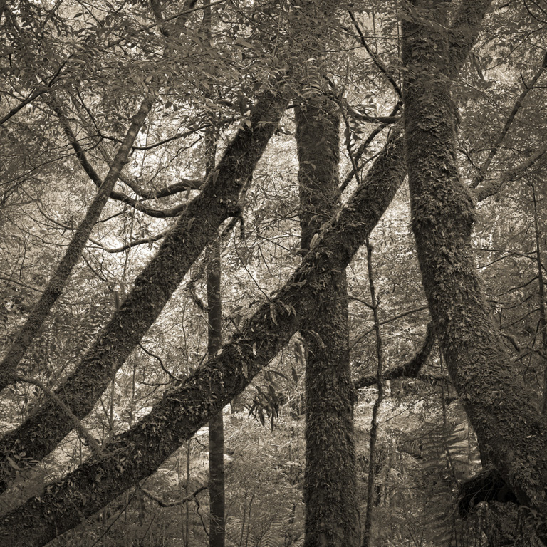
Create depth by using the separation in the tones.
Atmospheric perspective is another tool used by painters to create depth. They do this with luminous tones. Here we use lighter tones in the distance and darker tones in the foreground. Also dark tones recede and light tones advance towards the viewer. Both seem seem to work as it is the contrast between the two that create the depth. Bright warm colours advance as well, while cool dark tones recede. Warm toned papers or highlights and cool tones in the blacks is regularly used by printers to help create that extra sense of depth in their images. Spilling that coffee on that selenium toned print, started a whole genre of split toning that utilises this visual tool to enhance depth.
Master B&W photography, yes seriously
The better you become at black and white photography the better your colour work will get. It is the same as working on one genre or subject in photography, the better you get at it, the better the rest of your photography gets. As tone trumps colour, and your really serious about becoming a better photographer, then start practicing tone. And while your at it, remember one of the secrets of tone is luminosity.
Practice without a camera
Practice noticing what your eyes are doing when they look at a scene. Your eyes are probably wandering around everywhere. Now focus on the highlights and light areas, and force your eyes to wander through the scene following them. Take this exercise further imagining the borders of your photograph. Concentrate on deciding if it would make an interesting photograph. Take a moment to notice how different you view your imaginary photograph as to when your just casually viewing the scene. As accomplished photographers we are trying to create a photograph, rather than capture the scene in front of us. It is not necessarily what we see, but importantly what we create.