Paul Kenny

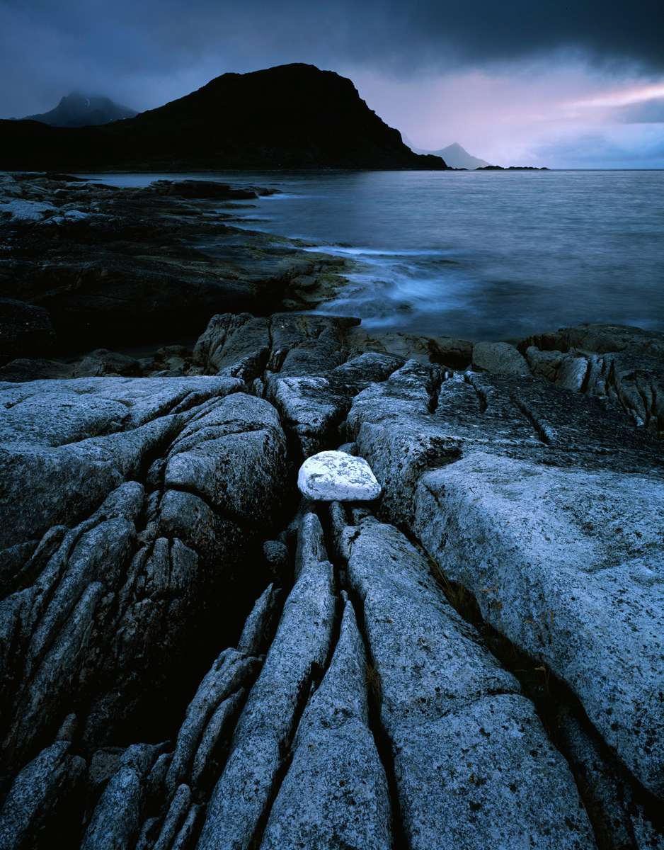
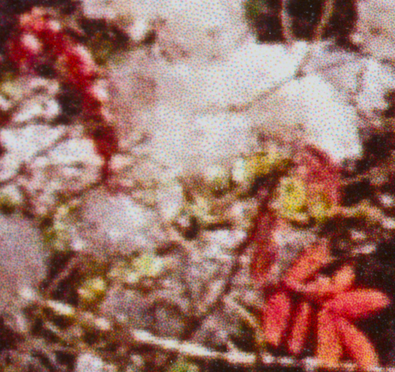
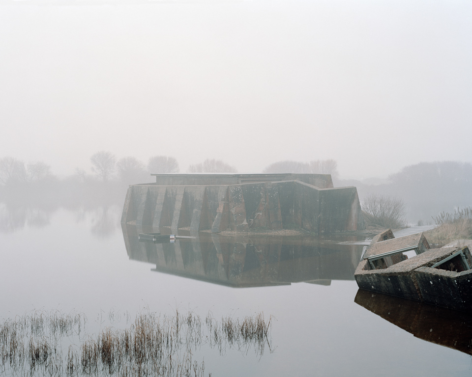
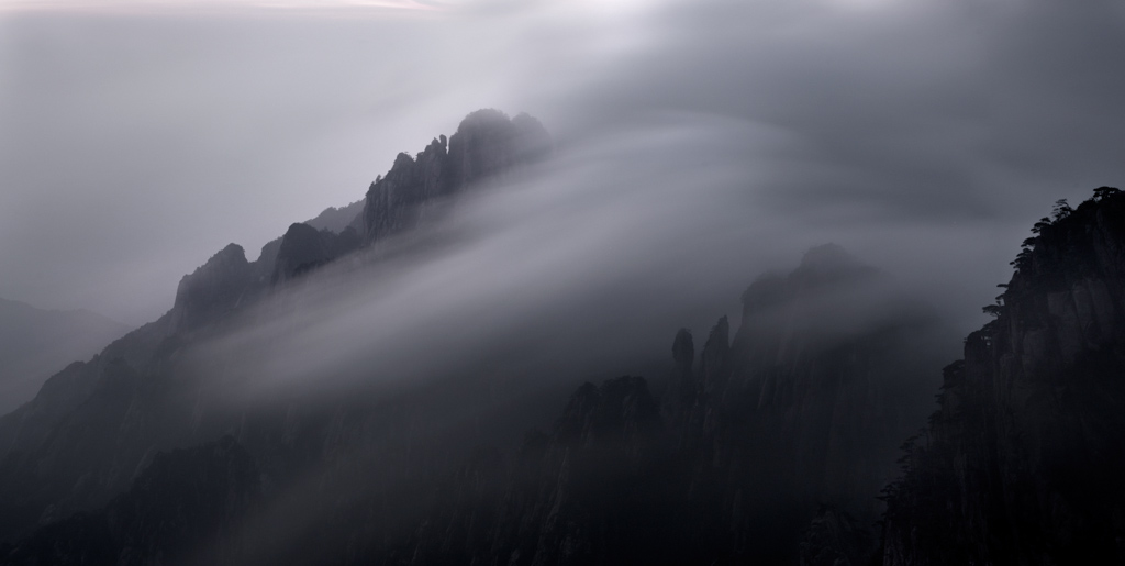
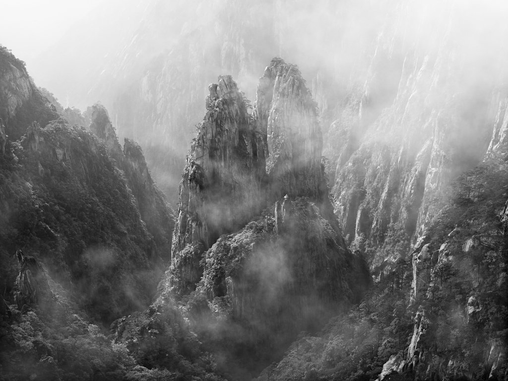
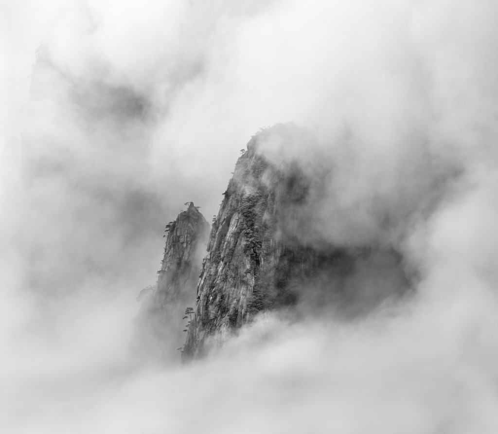
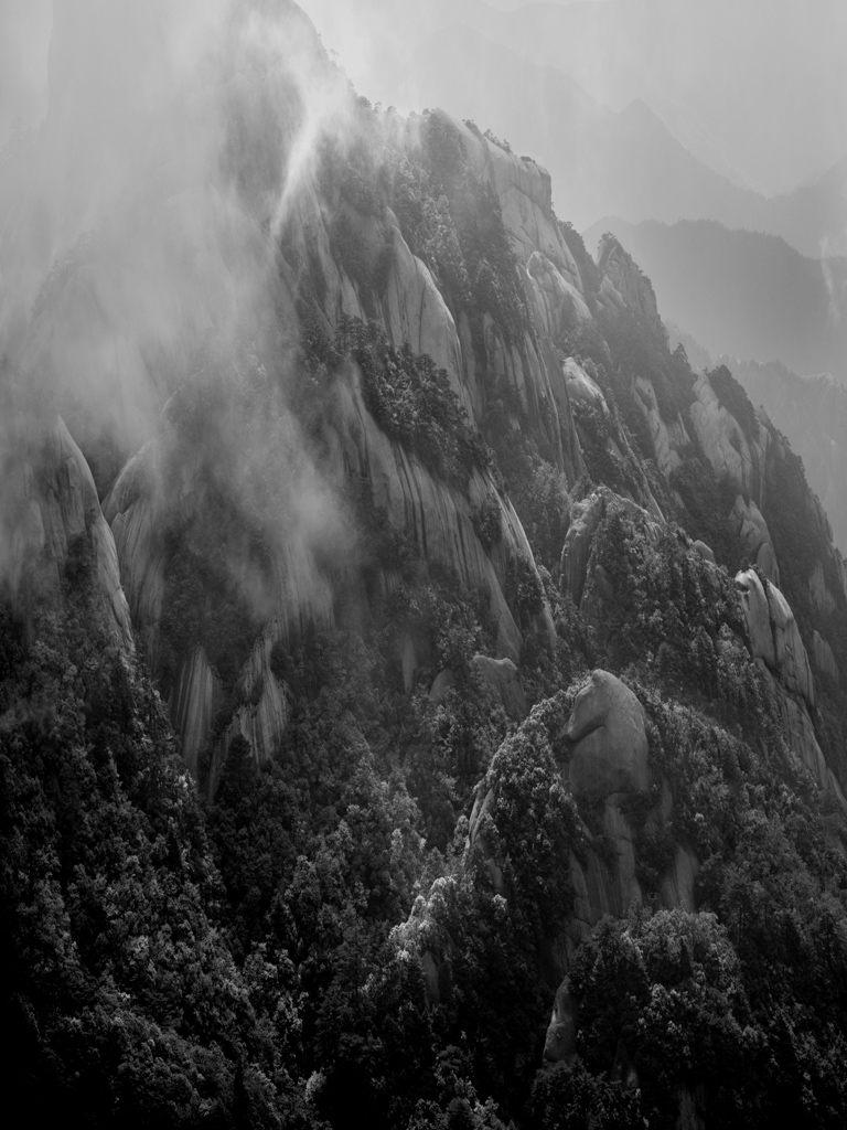
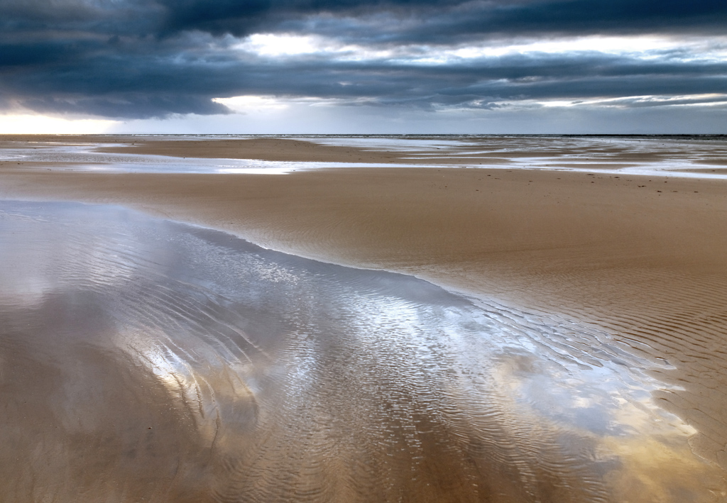
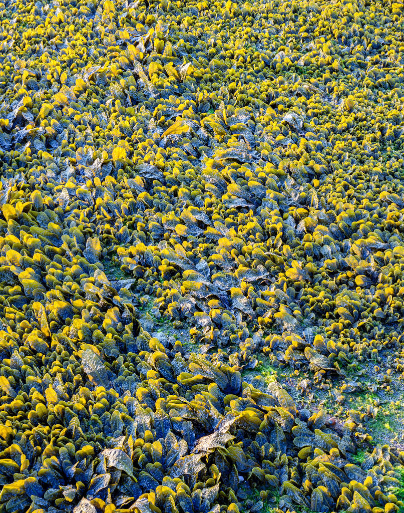
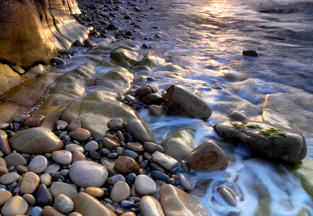
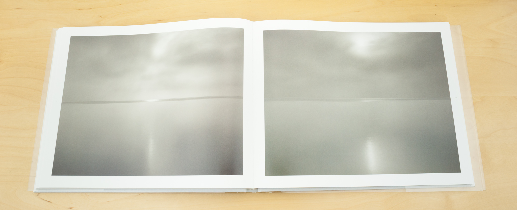
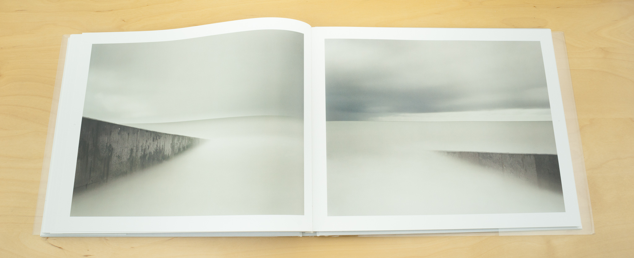
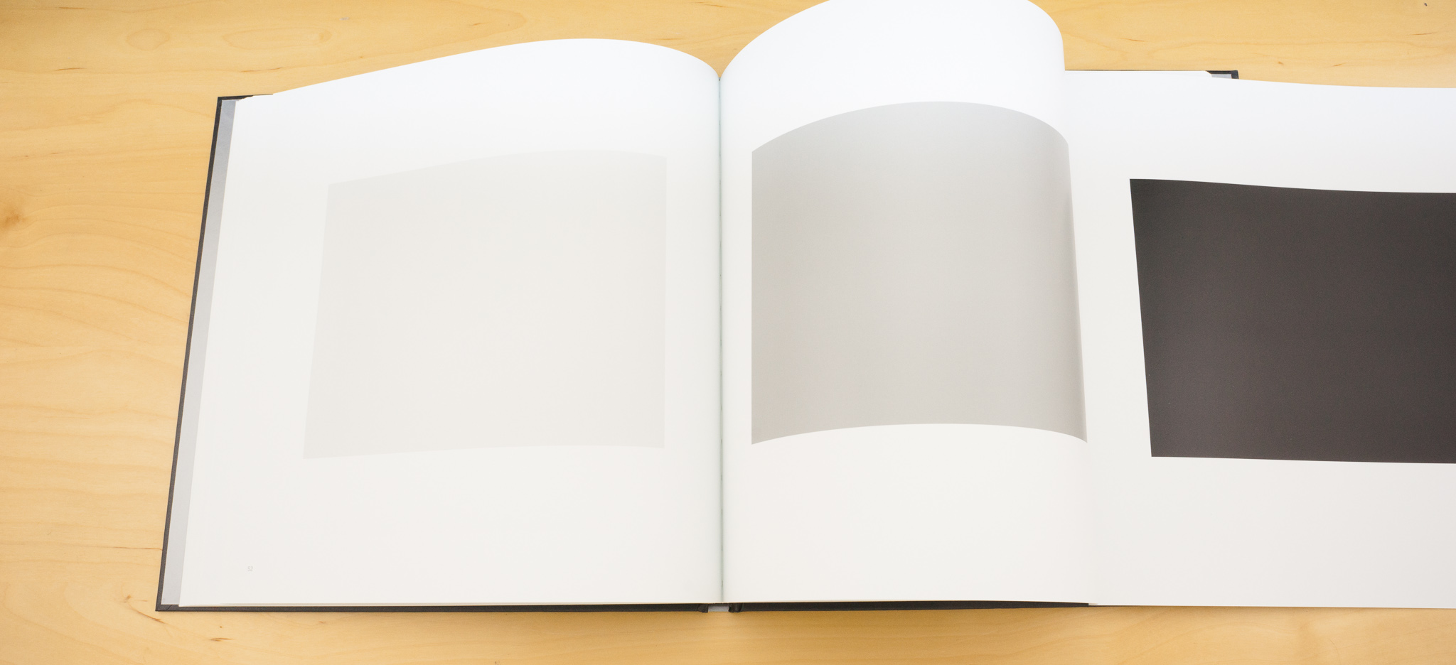
Paul Kenny is an artist who works with the landscape and uses photographic processes to create his work but you'd be hard pushed to know whether to call him a photographer or not. His biggest body of works are constructed still lifes that relate to the sea shore, tidal processes, erosion and time.

Paul has had a joint show, Fragile, at the Chris Beetles gallery over the last month which had a great write up in the London Evening Standard. We didn't get to see the show but we've been wanting to chat with Paul for some time. We started by asking what he's been up to.

Paul Kenny 8

Paul I’ve just come back from that London show, Fragile, and there’s nothing much in the diary until next year. I’ll have a bit of time to do some new work. I’m still vaguely toying with the going to Ireland in October. I’m a fellow of the Ballinglen Arts Foundation in County Mayo, Alex Boyd is a fellow as well. I was made a fellow in 2000 and I’ve been out six times so far. It’s just a fabulous place. It’s mainly painters who go; the people who set it up are from Philadelphia and they ran a gallery in New York in the 80s called Dolan Maxwell and they sold up and set the foundation up. I think they’re both of Irish descent so they have four cottages and two shopfronts on the main street behind which hides four studios, an office, a gallery and a print studio. All in a tiny village in West Mayo, when you go, you get a place to live and a place to work and it’s just incredibly relaxed. Most of the people who are made Fellows are American so you kind of get to mix with these diverse group of artists. I work in a very isolated place in an isolated way – I’m not part of any group, I’m not a part of any academic institutions, I’m not day to day linked with these people in my business so its great for me to have the opportunity to enter into some kind of group discourse…..

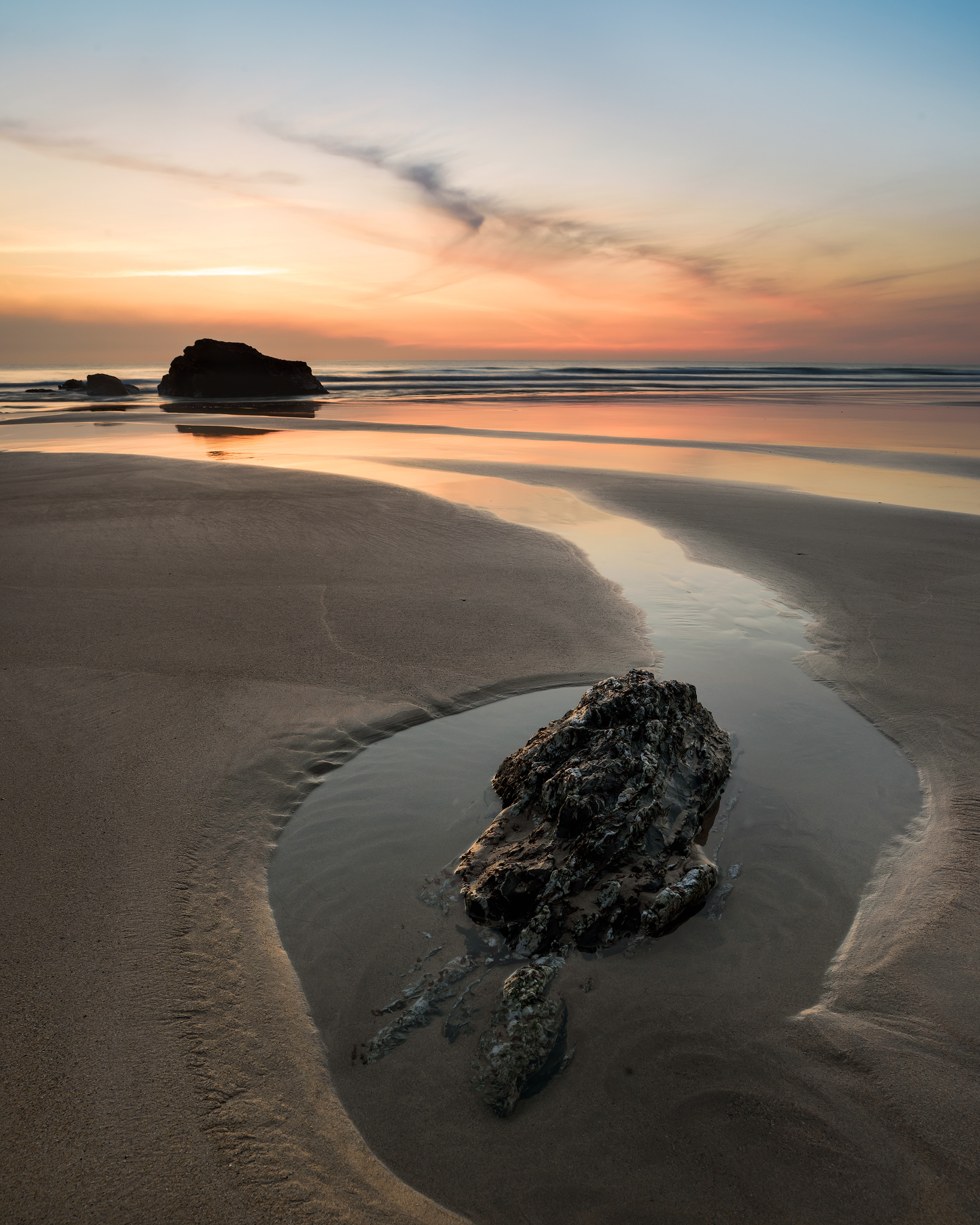
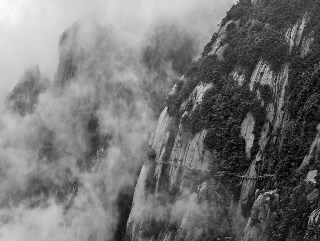
But also the coastline is just fantastic, it’s west facing Atlantic; There’s nothing between you and the states. It’s on the Gulf Stream so a lot of stuff gets drifted across and I use a lot of that flotsam and jetsam in my work. – Plastic bottles, etc. I found a message in a bottle there which was amazing. It had been put in the sea off Fado island in New Foundland and taken seven years to arrive.

Tim: Did you get in touch with the people who ‘delivered’ it?

Paul I did but they weren’t interested, it was part of a school project. They weren’t that interested but it interested me.

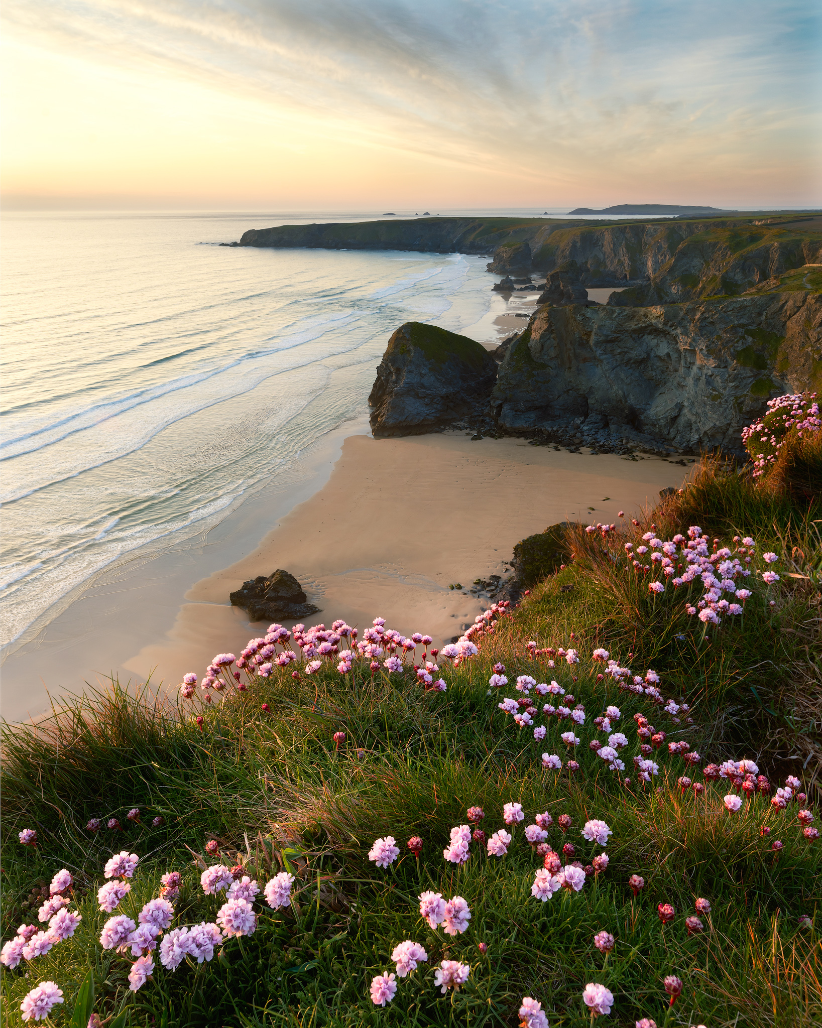
Tim: Do you get the same types of material deposited on your local coastline in Northumberland?

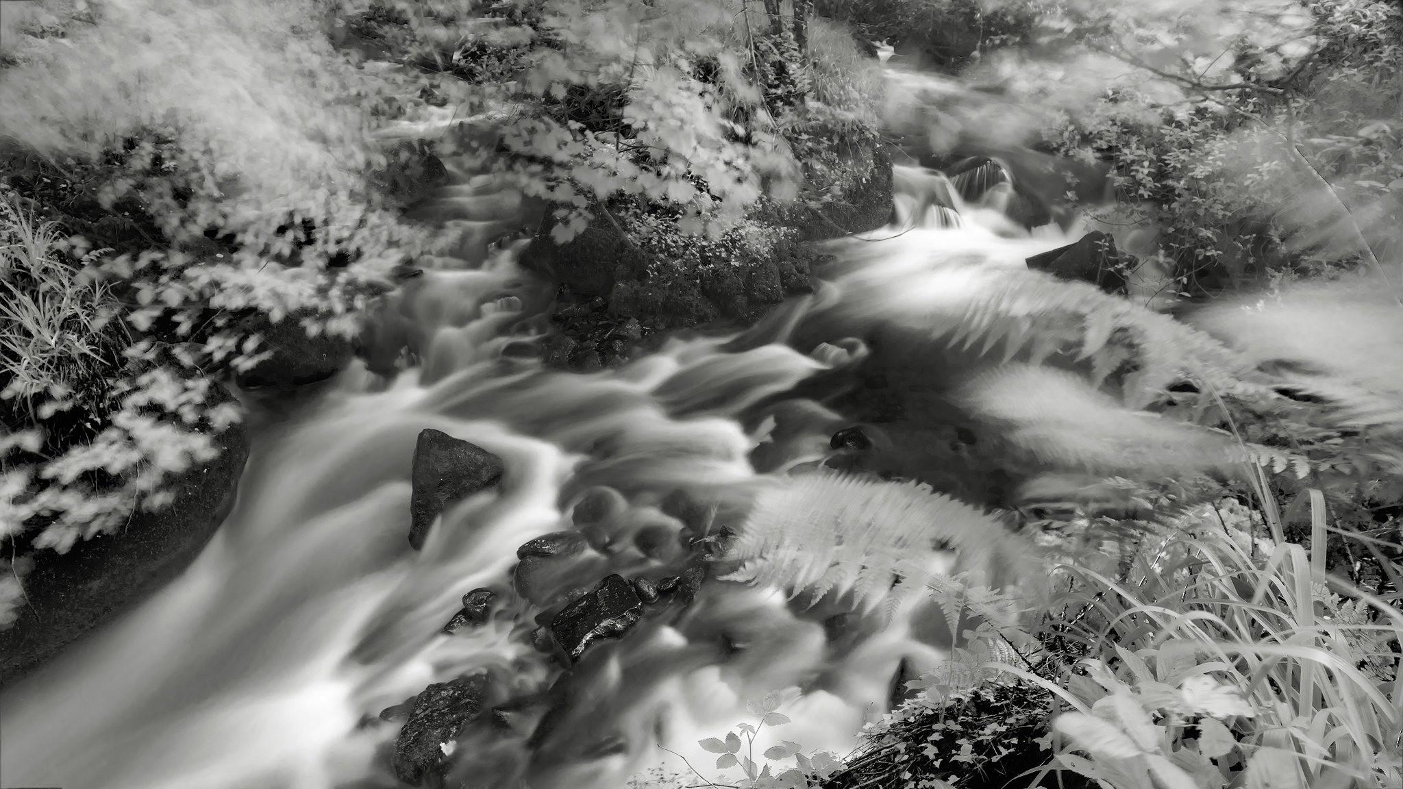
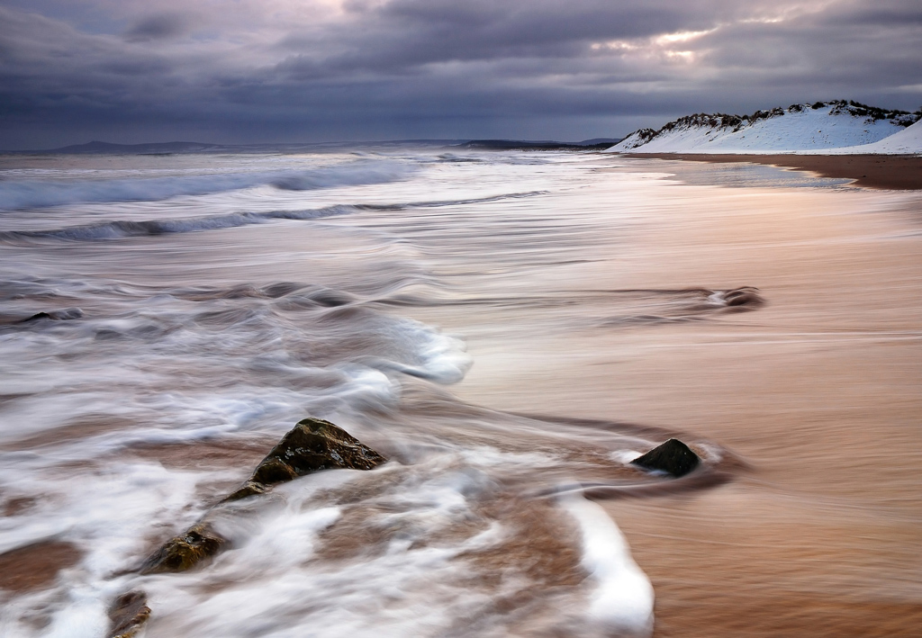
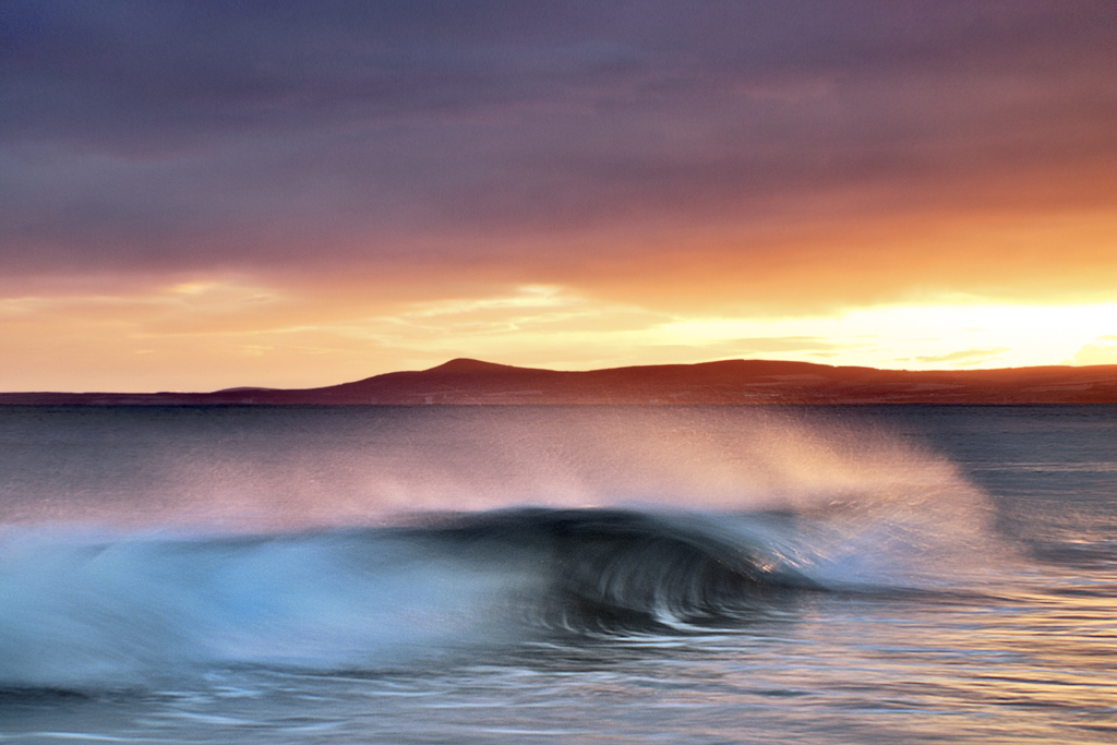
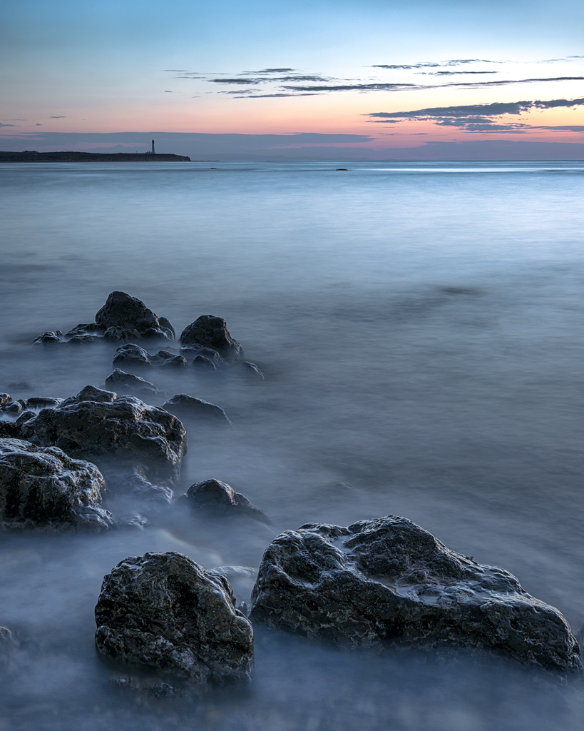
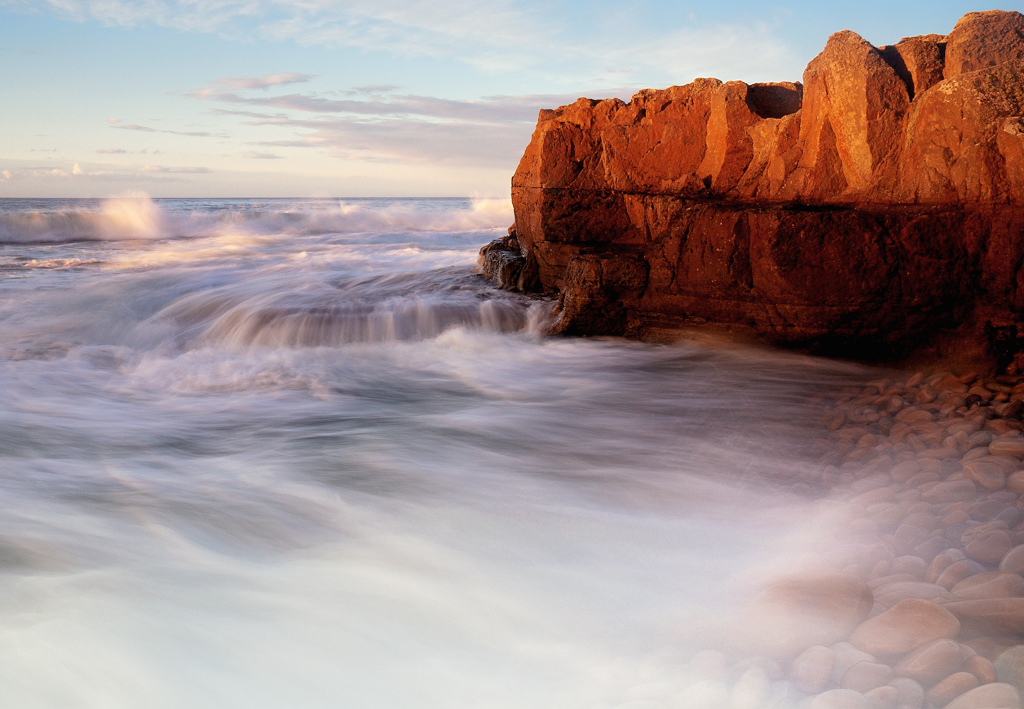
Paul Yeah, yeah. I’m only three miles from the sea so we go two or three times a week. I’ve been going less recently because we’ve got an elderly dog who can’t cope with the pebbles anymore, he just falls over, so we’ve not been going as much. It’s a bit weird going to the beach and leaving the dog at home, it feels very alien. I still go down to gather material, I’ve been using a lot of fisherman’s rope at the moment and bits of net and stuff.

Paul Kenny  6

Tim: So what was the basis of the Fragile exhibition?

Paul It was a group show at the Chris Beetles gallery in London in June. I was really proud of my work and I got a fantastic review in the Evening Standard which did no end of good.

Tim: How do you get publicity like that? Is it something the gallery undertakes?

Paul Yes the gallery promote it. I was really glad that Brian Sewell didn’t review it – he hates photography. He was going on recently about the amount of photography in the Royal Academy Summer Show – but this woman called Sue Steward reviewed it who really liked the work and was interested.

Tim: Brian Swell famously dislikes most photographic works. He has a thing about it not having ‘texture’ or ‘surface’

Paul Yes, the hand of the artist. He can’t just see it as a medium and the art is in the way it’s used. He wouldn’t say “I don’t like Charcoal!”

Tim: So for the pieces in the Fragile exhibition – how do you go about creating them? I note you talked about fisherman’s rope in your current work for instance.

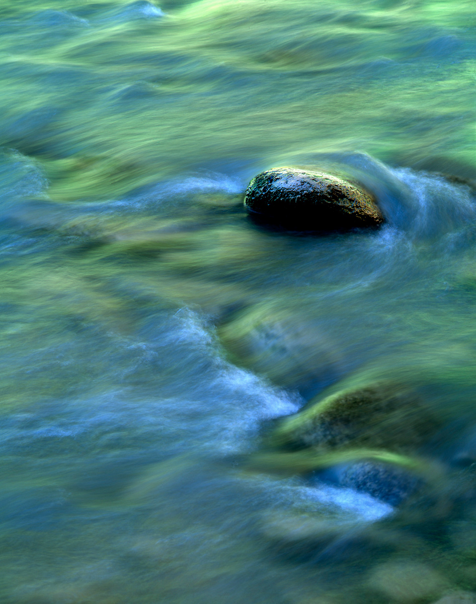
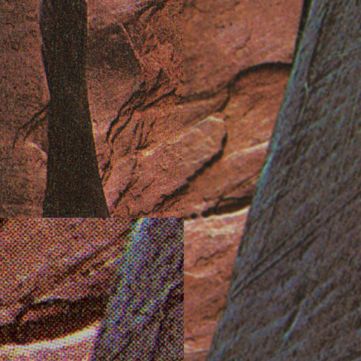
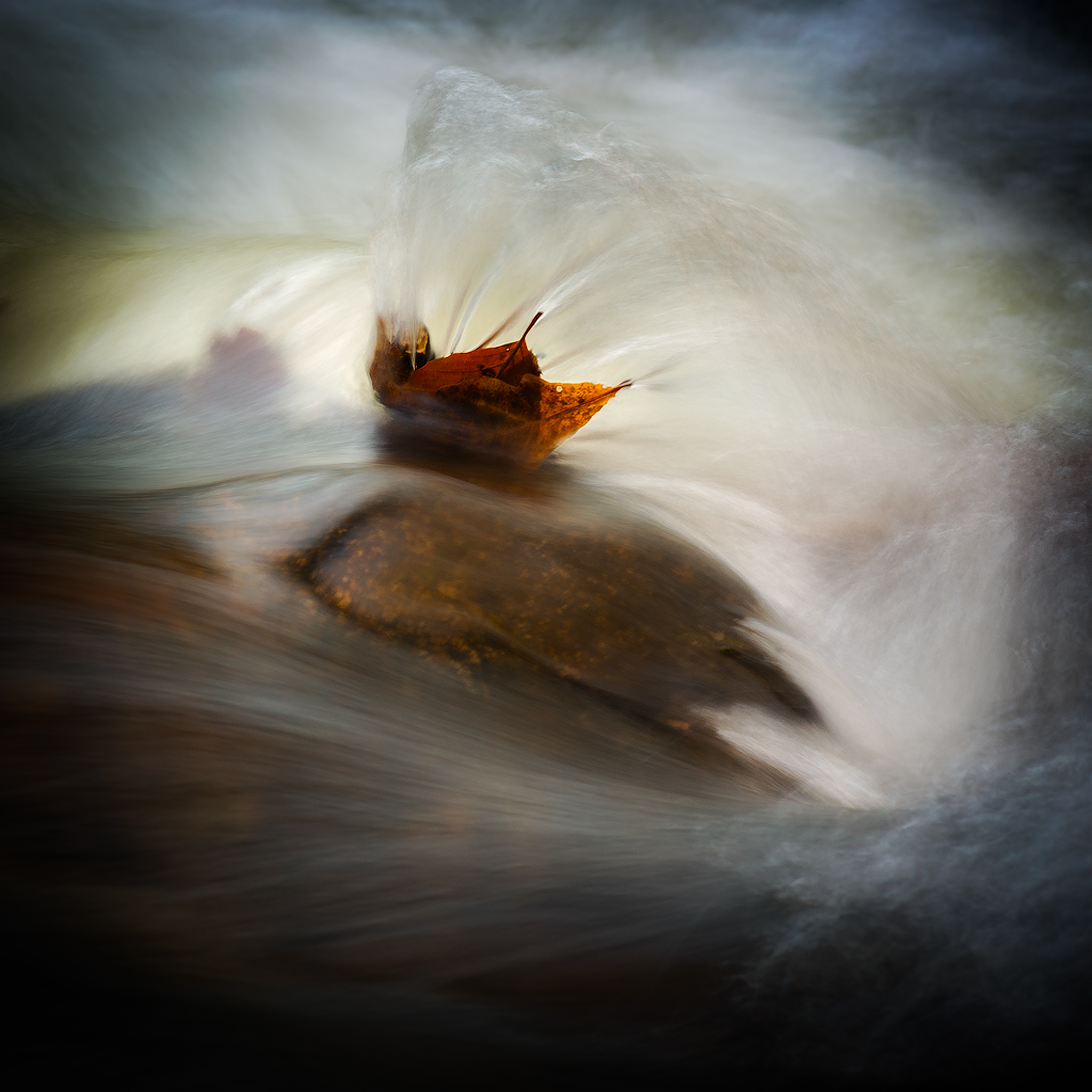
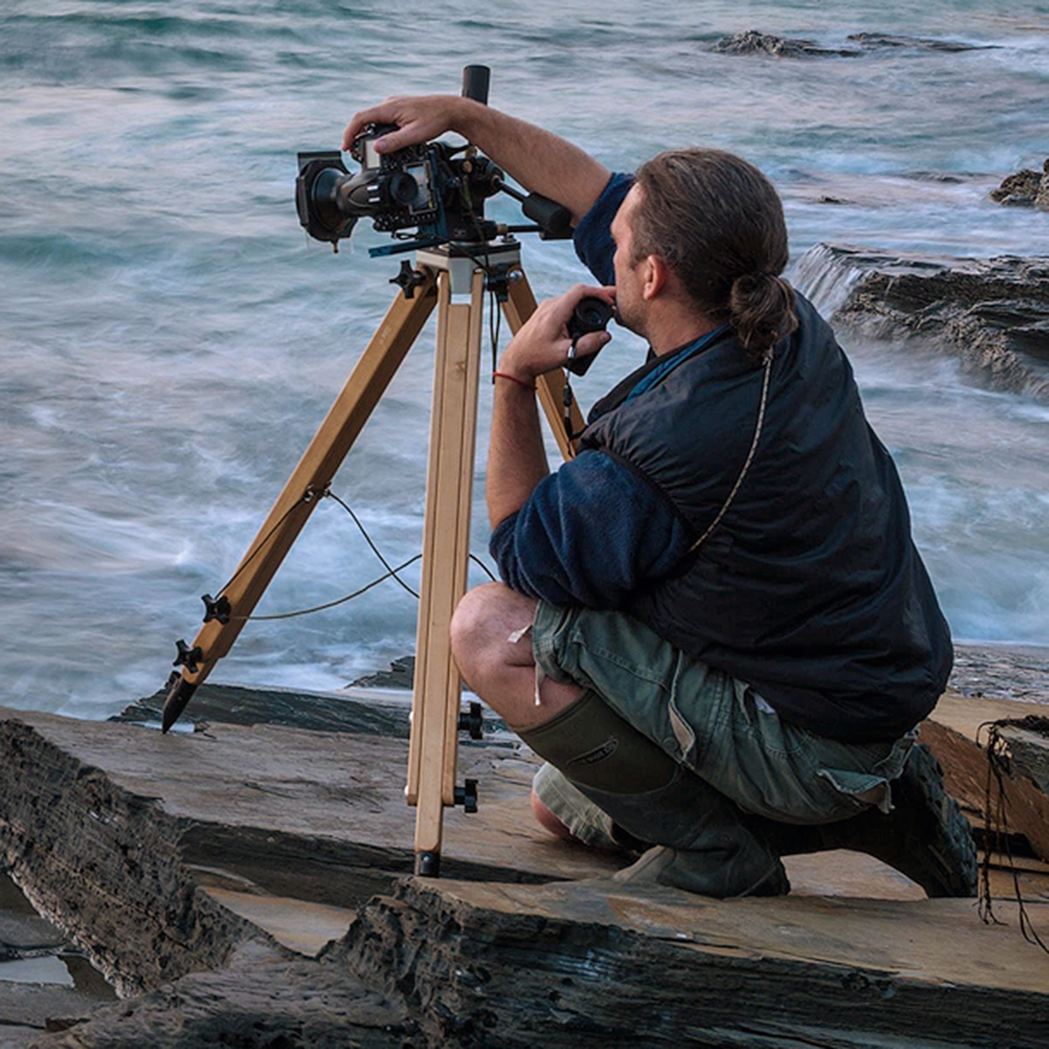
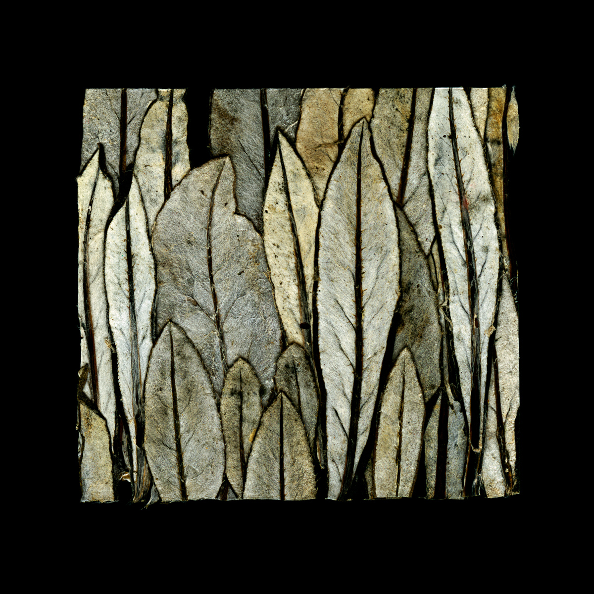
Paul Well it comes out of the fact that I’ve almost stopped using a camera. I’ve been doing this for forty years and I slowly, slowly got disillusioned about photography as a medium. It’s a very limited medium when you boil it down and I think you see this when you see people online. People continue to make the same picture over and over again. That’s OK for them if they want to do that but for me it became really boring and easy. You know what a mean? I was mainly making studio pictures of material the beach that I would bring back to the studio and make a kind of still life studio picture around them – and I started to slightly mess with the negative, scratching the negative. I was interested in the plastic bottles I would find on the beach with all of the scratches in them and I thought these scratches were kind of a diary. Some kind of history of the bottle – every single scratch recorded something. And then I thought about each scratch being created by the tide which is created by the moon and the landscape itself is a record of a journey or history. I made a big series called “A Day at the Beach”. You know sometimes in your work you make a huge leap. You do something that you’ve been scared to do for months but you end up doing it and your work takes a big leap.

Paul Kenny - 2

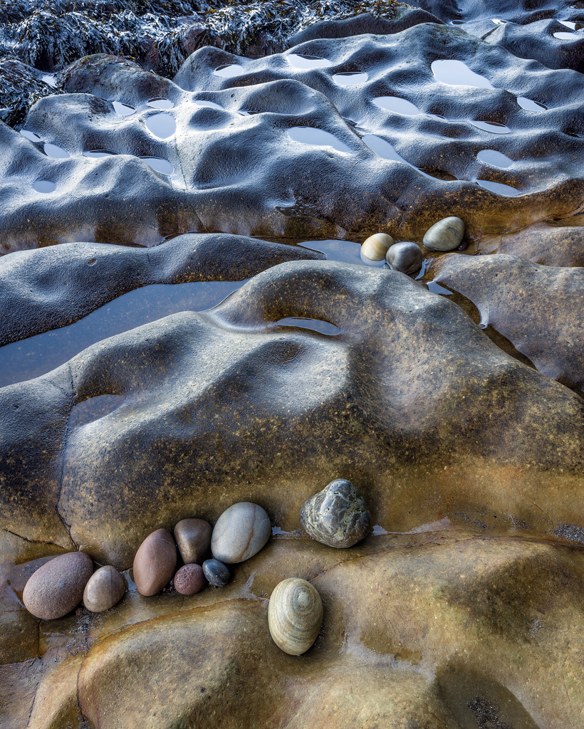
It’s easy to take pictures of beautiful pebbles or shells or material you collect and I started to think if I’m true to myself about finding beauty in little things then I should use less and less pretty material. So I would walk on the beach and at the end of the walk I would take two handfuls of what was around my feet and put them in a bag and take it home and spread it out to try and make a work out of it. Just to try and prove that I could say the things I wanted to say without using obviously beautiful materials. I mean you look at something like Edward Weston’s nautilus shells, you know, they’re just very, very beautiful objects in themselves.

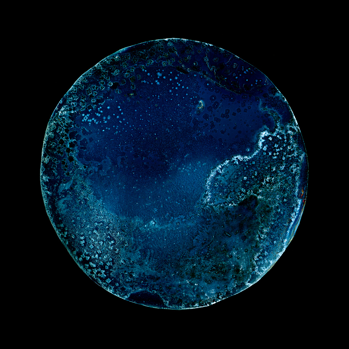
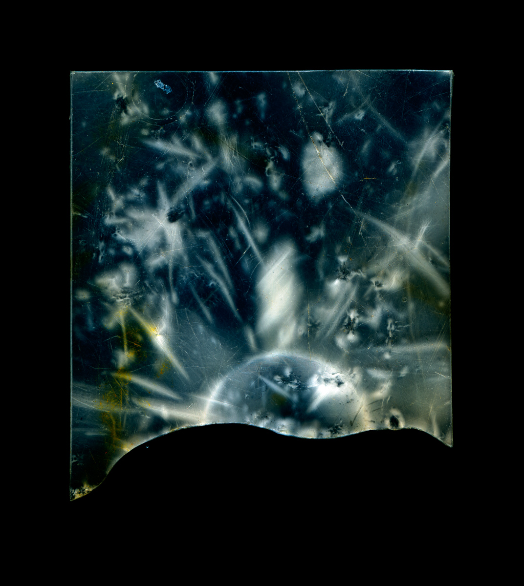
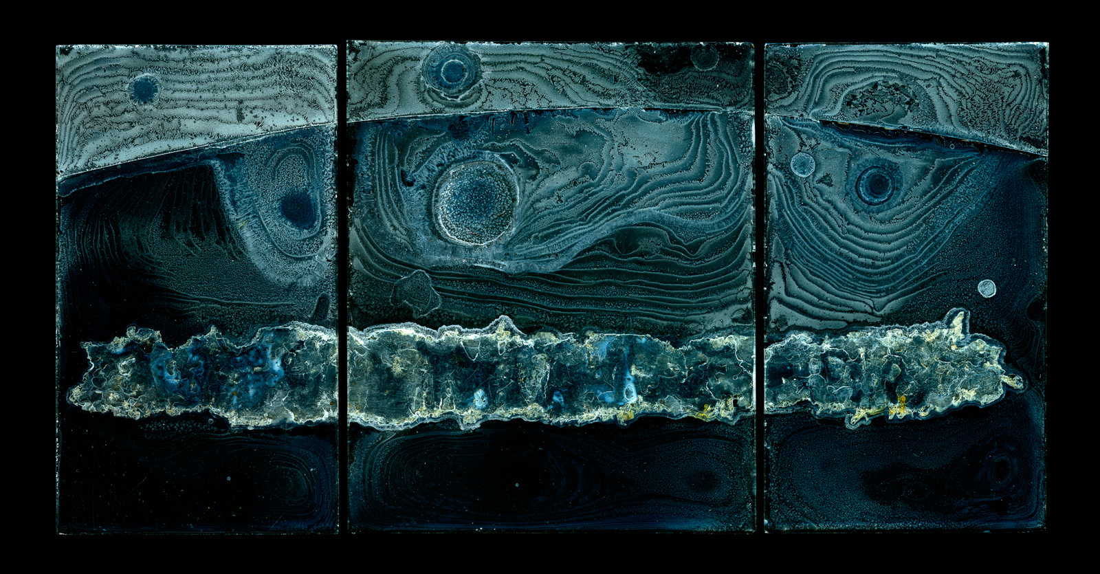
Tim: They have an intrinsic beauty that is just being recorded

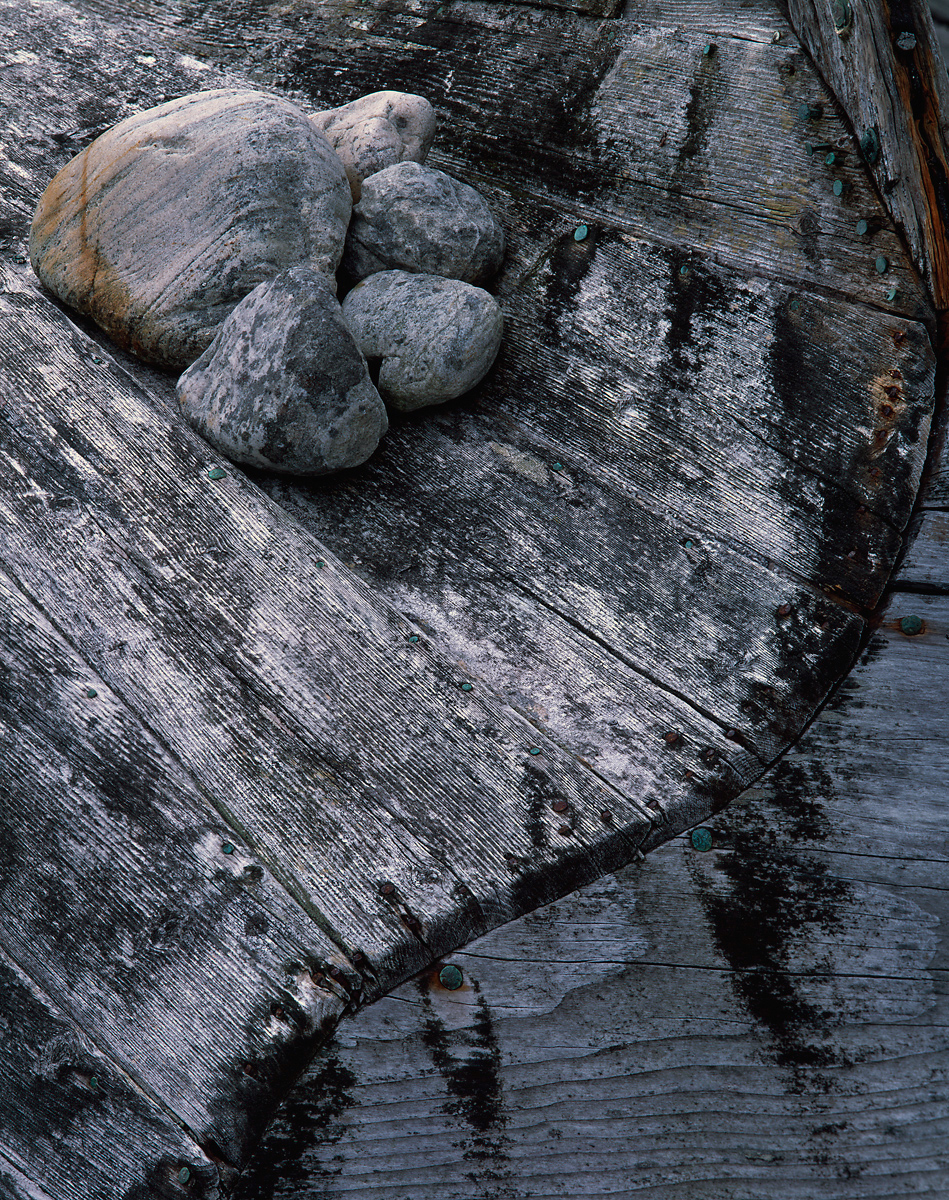
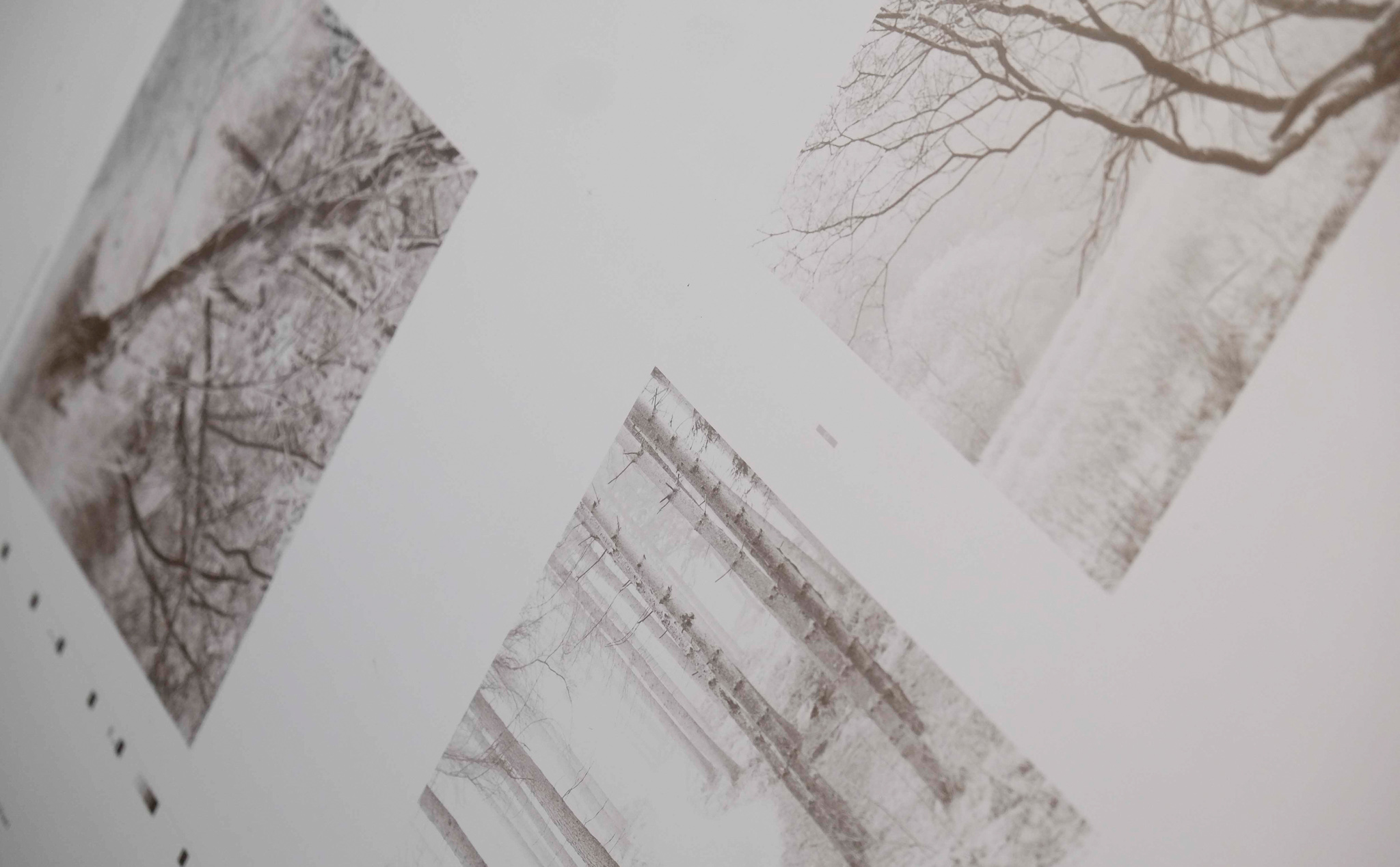
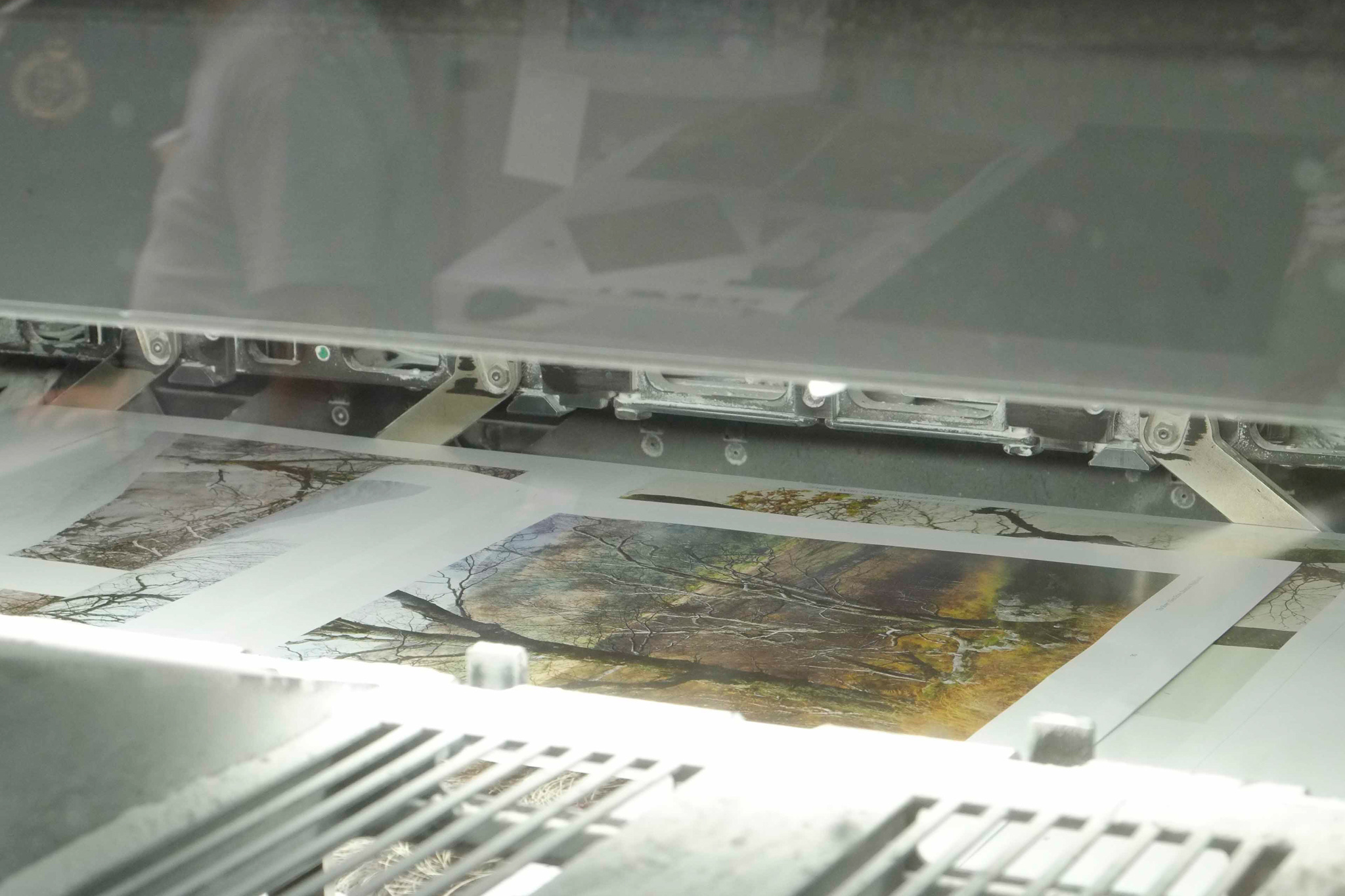
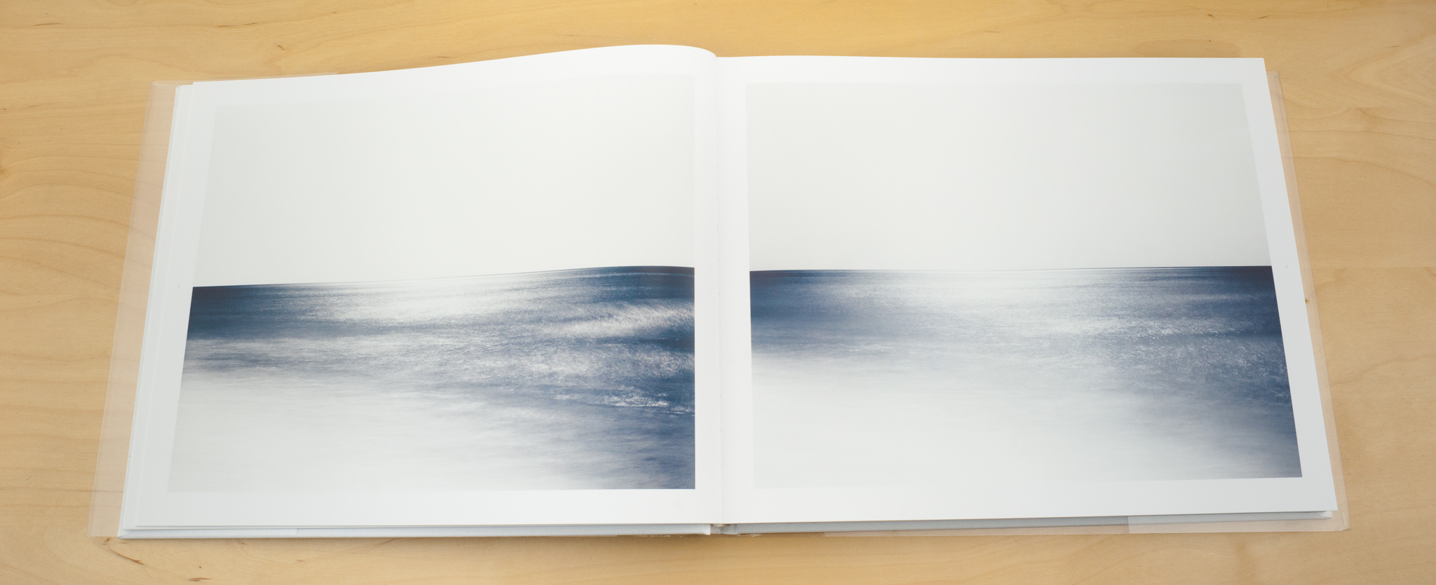
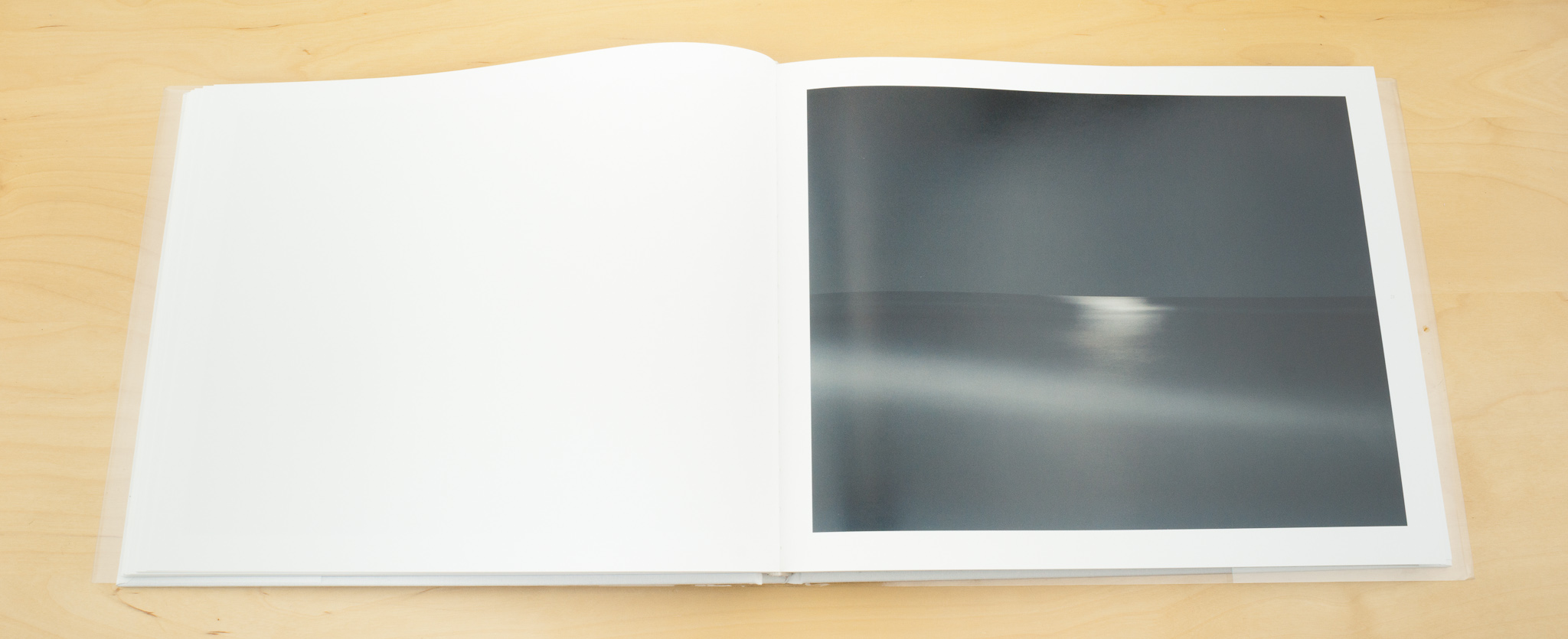
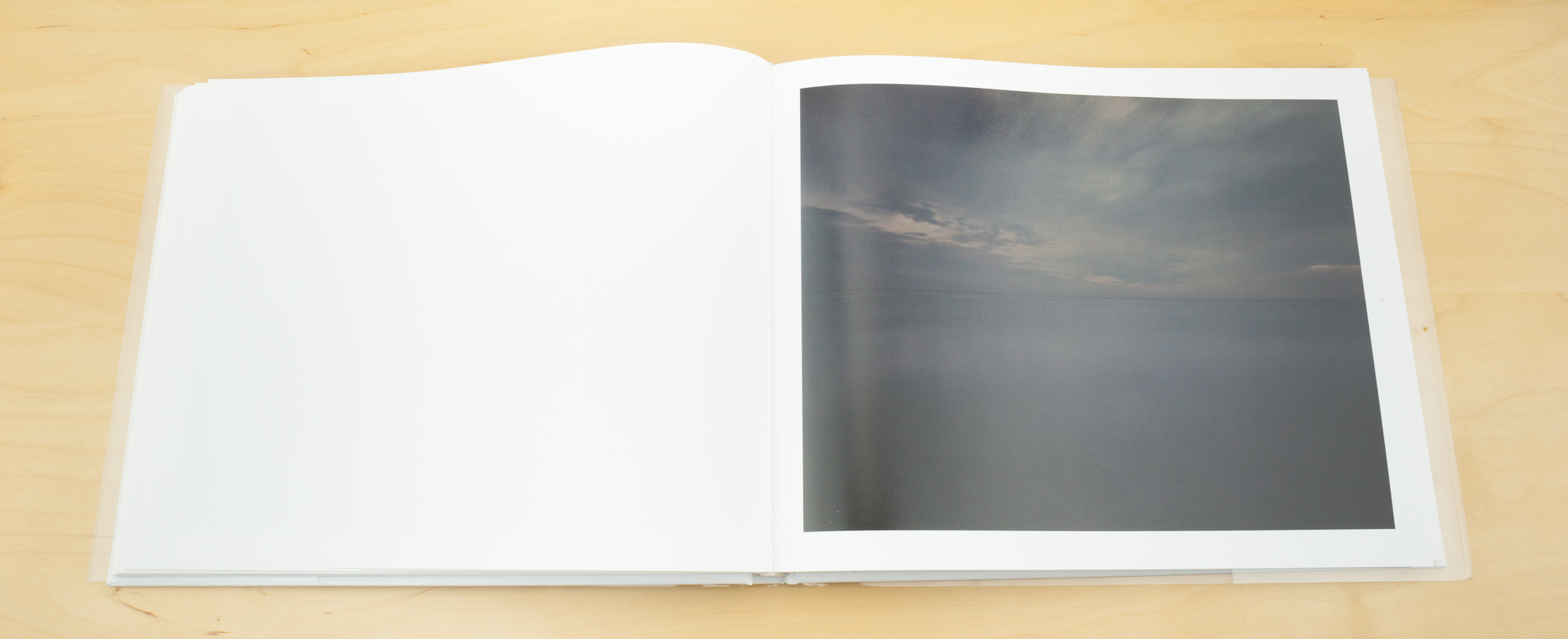
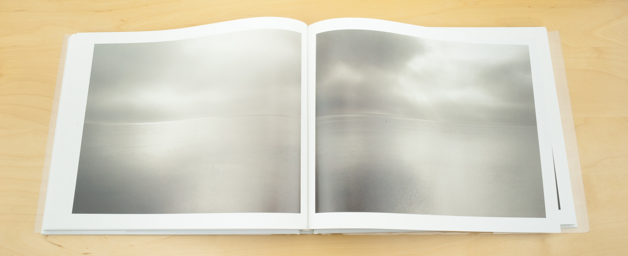
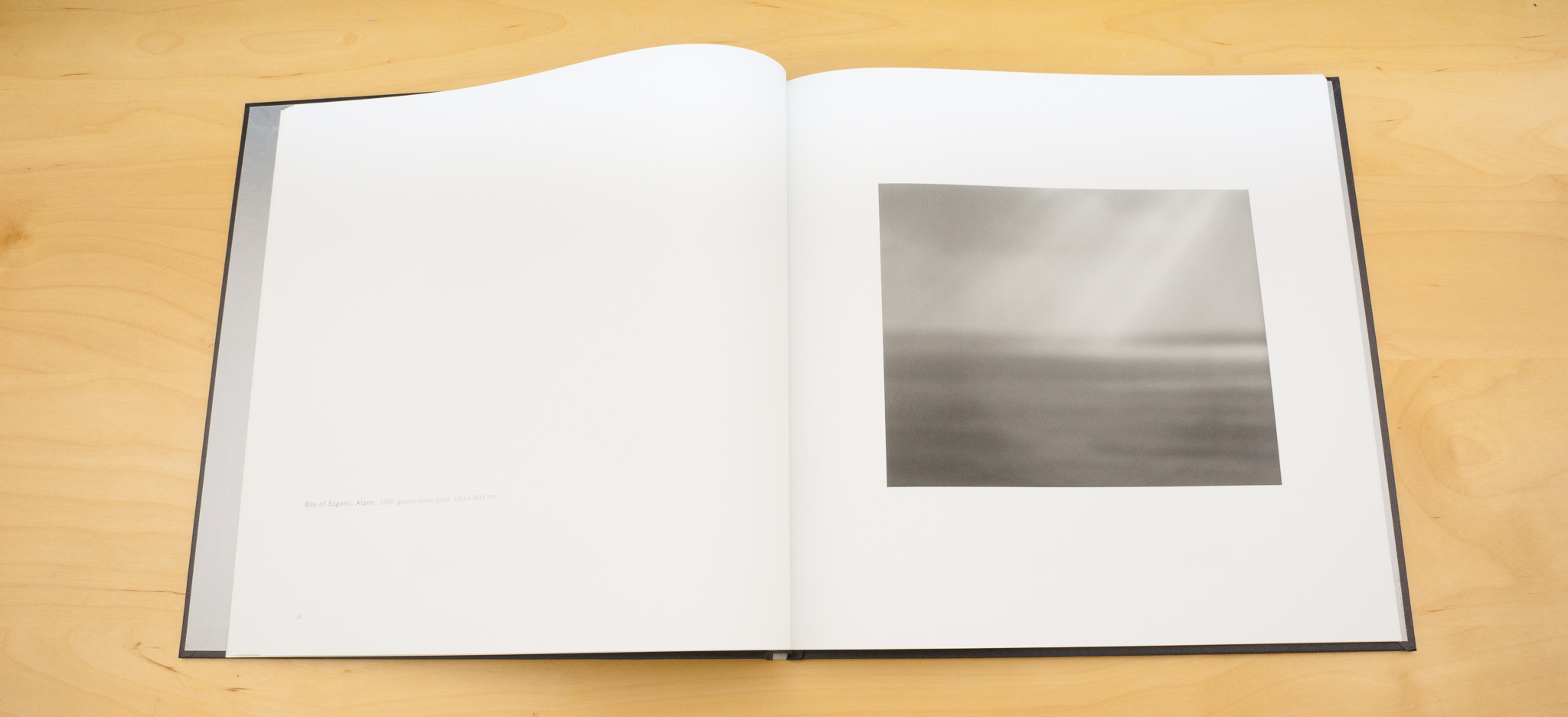
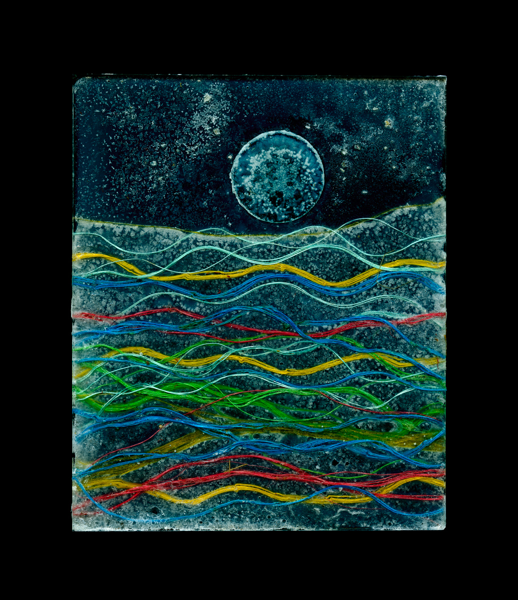
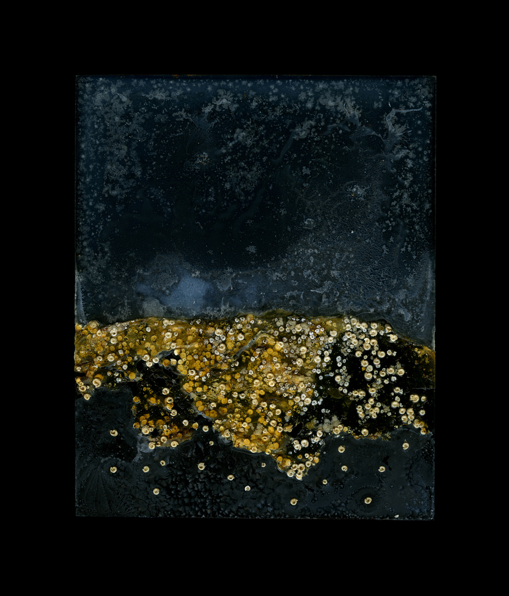
Paul Yeah. And so it came out of that really. And I started to collect seawater and originally I collected the seawater to wet the things I would brought back so that when I would photograph them they would be wet. And then I started to be interested in the seawater itself and thinking, well maybe I can make a picture out of this so I started to dry it on the negatives and I used to put these constructions into an enlarger and print through them to make a black and white print. And slowly, slowly, slowly over a period of ten years now these plates I was making – I used 5x4 inch pieces of glass and I kind of construct these things with seaweed or seawater and then I’d put them in an enlarger and print from them.

But slowly the plates were becoming more beautiful in of themselves and more interesting. So now I decided that I am the camera and I create a negative and now I scan them instead of printing from them.

Paul Kenny 7

Tim: So are these scanned or photographed then?

Paul They’re scanned now. But that is a photograph – I’ve come up with a definition that works for me – “A photograph is a repeatable image made using light”. And that works for me.

Tim: And scanners are cameras at the end of the day as well

Paul So they’re basically 5x4 sheets of glass with stuff from the landscape itself adhered to them .

Tim: So is the piece of artwork the photograph or the object?

Paul yes for me it’s the photograph that is the piece of art. A lot of people have said to me that I should actually exhibit the glass plates but the images are drawn first as part of the design and the finished piece for me is the photograph and then I have to construct something to get me to that point.

Tim: So once these are scanned do you do any post processing work to clean them up or adjust the colours/hues in any way?

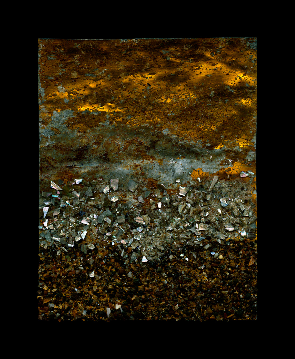
Paul I don’t tend to do much of that. There’s lots of fluff and grit in the seawater but I tend the leave them in. Sometimes I scan with the lid of the scanner open, sometimes as a negative but mostly I scan with the plate on the scanner bed and the scanner open. And I sometimes light the back of the plate as well so there is light going through the plate and reflected from it.In the computer I do saturate the colour slightly but all of the colours in the seawater, when they scanned, come out those turquoisey blue colours.

Paul Kenny 9

Tim: So is this in a way like Andy Goldsworthy’s work being a combination of a real thing and it’s photograph. Where the photograph is often the final work.

Paul I’m a big, big fan of Andy Goldsworthy, in fact he’s a buyer of my work.

Tim: It’s interesting that he plays down his photography as a part of his artwork.

Paul He does indeed. I was invited to spend a day with him once at his studio in Dumfries and we went out and he was working on a piece and he just had his rucksack with a few cameras at the bottom and once he’d done his piece of work he pulled out this camera and he had no lens cap and it was dust on the lens and he makes these photographs. I said to him do you not take more care about them. And he says “no not really – it’s just what I do”

Tim: Is he quite a considered photographer when it comes to creating the picture?

Paul He does but he wasn’t particularly involved with the process. He just pulled out his tripod and – he was using at the time a Fuji 6x17 camera and he just photographed what he made. He obviously knows what he’s after. Just the other day I watched a documentary on You Tube about his work and he was making this piece with ice and he made it so he knew the sun was setting in a certain point and that was part of the picture.

Tim: How do you think your work is developing at the moment?

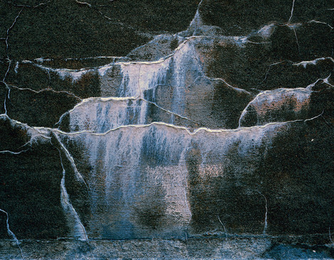
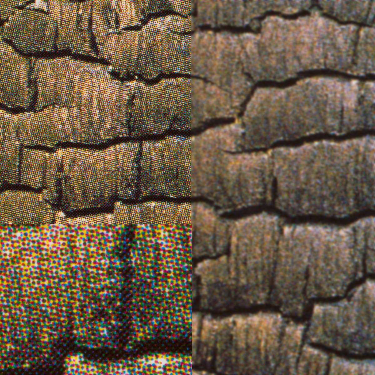
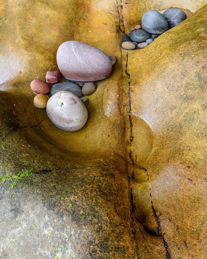
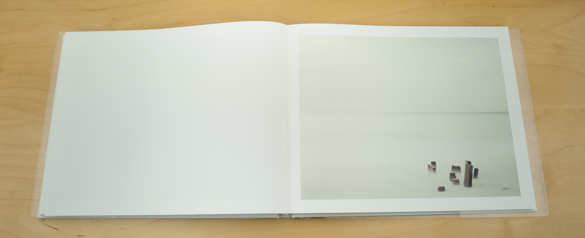
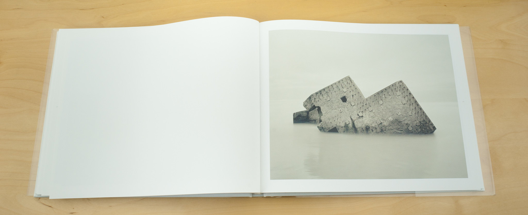
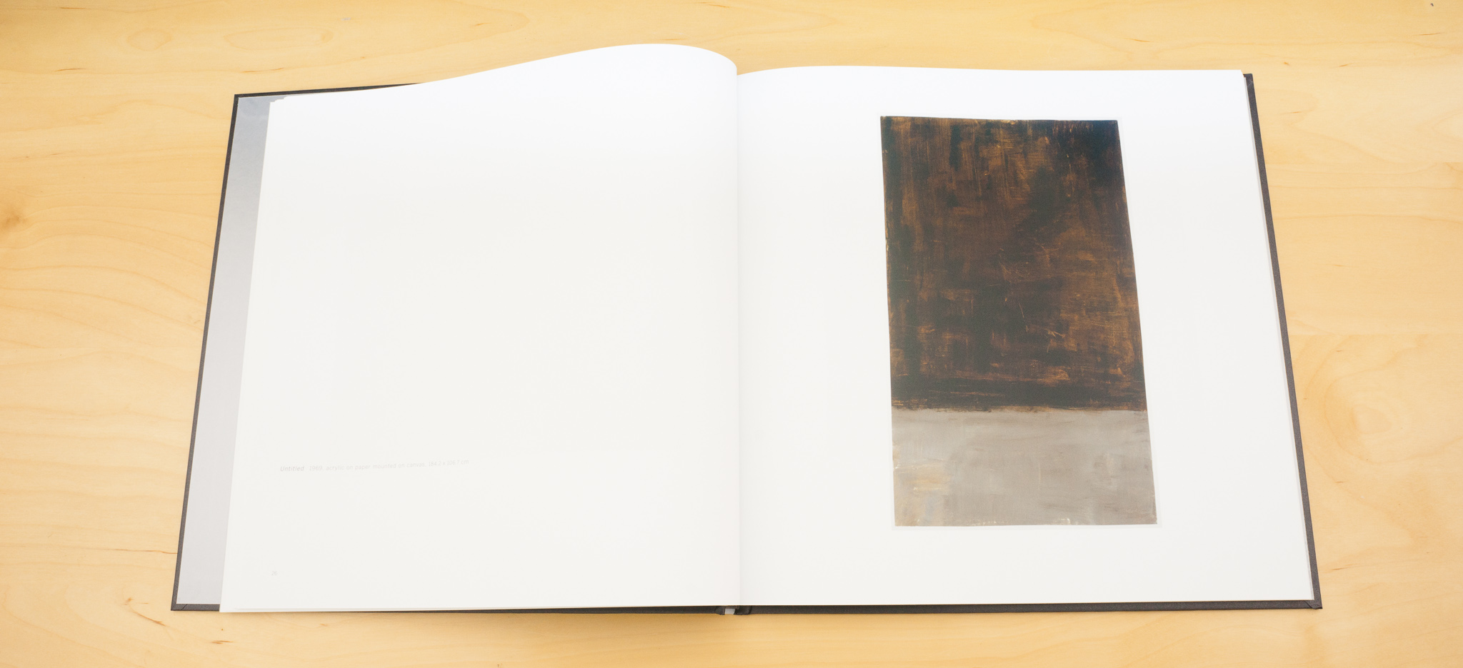
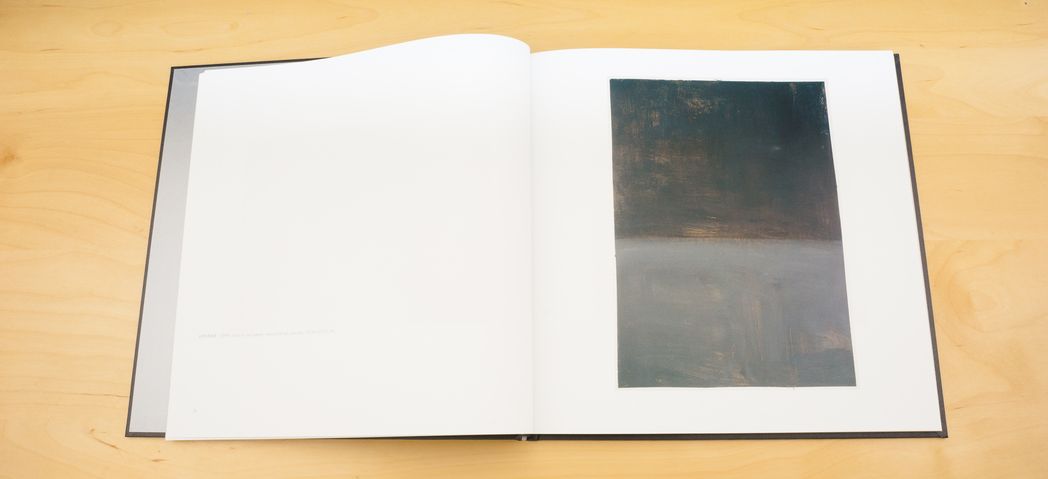
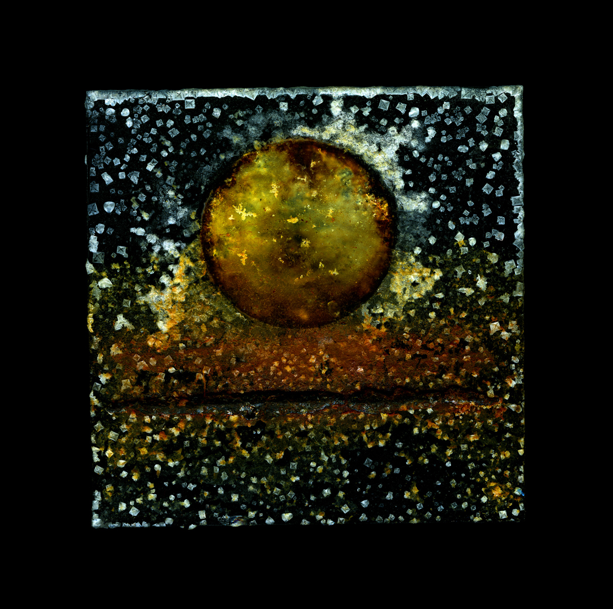
Paul At the moment my work is going very minimal. I’m kind of paring it down. I’m interested in rust at the moment. I find little pieces of metal. One of my favourite things to find on the beach is can bottoms. Because the bottom is a concave, rigid structure the bottom stays more intact so you quite often find them on their own. If I put those on the glass plate you get a lot of rust – particularly if they are made of iron. So some of the pictures in the show had this rust element. And if I keep dripping seawater on over maybe a month the can rusts and rusts and rusts and leaves a rusty stain on the glass which is very beautiful. I’ve become more interested in the emulsion, the idea that I’m creating a type of emulsion on a piece of glass which is very similar to an old glass plate photograph. Just shadows on the glass really. With the nylon rope, I liked the way it unravelled and naturally fell into the shapes of waves.

Tim: You took a bit of diversion when you were producing the O Hanami project…

Paul That was a very specific project. I took a year out two years ago because of this problem, a problem that has spanned my whole career in that I cannot continue to make the same picture. Once I become stale and I’m making the same picture over and over I get very, very disillusioned and it’s caused me huge problems. I’ve been with five different galleries in London and we all get to this point where I’m making these pictures that they love and they can sell and I don’t like changing or restricting the flow of my work and we part company.

Tim: It’s a common problem with artists and galleries I think.

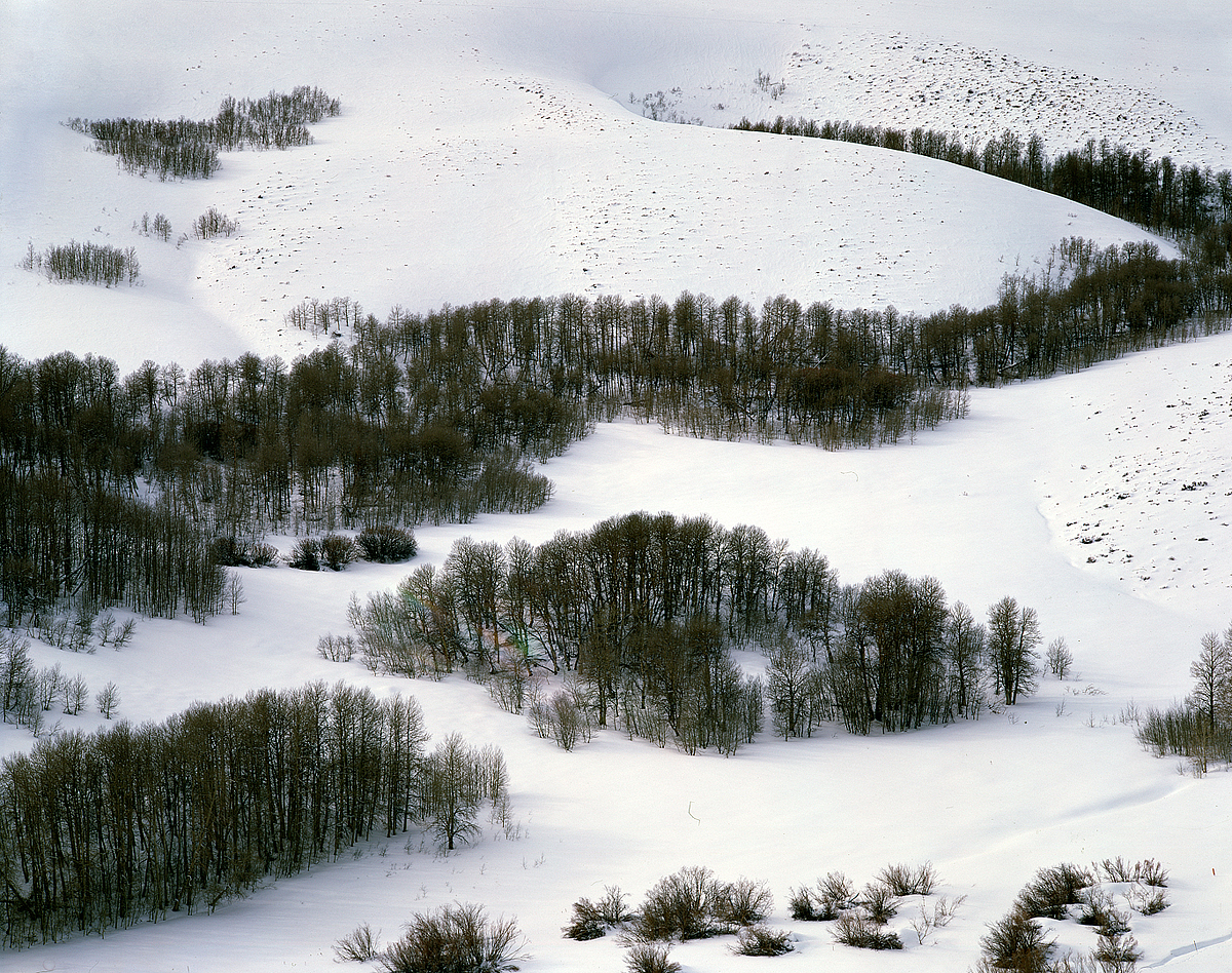
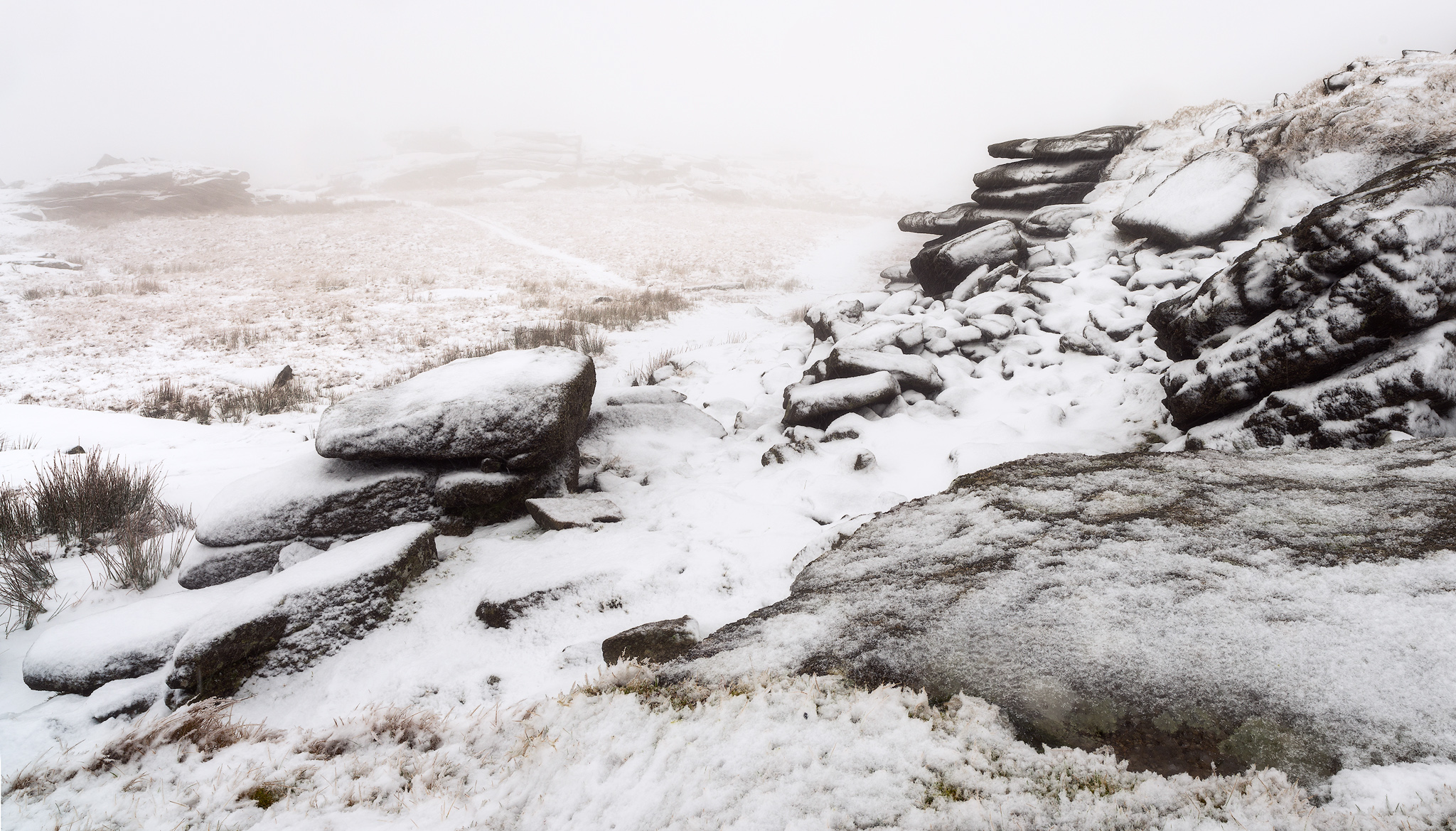
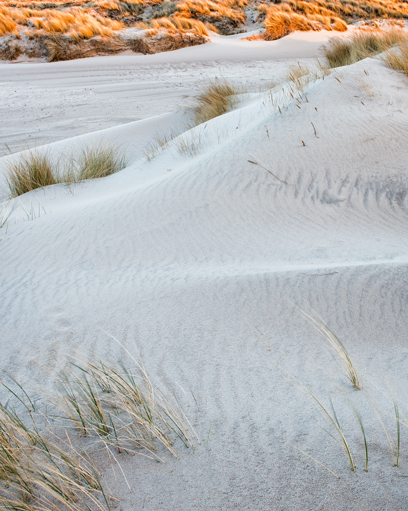
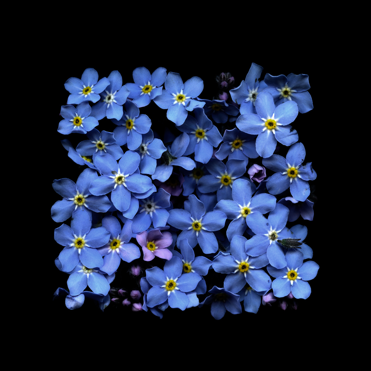
Paul It is! So I was just jaded. I did a big commission on the Isle of Mull and produced a show for the An Tobar gallery called “Mull Works” which was all sea works and at the end of it I was really happy with the work and really content with where I was. But I started working again after the commission and I was rehashing the same picture. Something happened by chance to force me to use my eye and my techniques to make work about a different landscape…. this was the time we got snowed in a couple of years ago. Where I live is very prone to snow and it was the winter of 2010 and we got snowed in for four weeks – we couldn’t get a car out at all – couldn’t get to a shop. My studio is at the side of the house. It’s very small, a little old barn, and I need to go out the back door and round the corner to get to it. And I couldn’t get round – I was digging my way to the studio and I dug up this old little Hosta leaf from under the snow and I took it into the studio and I just started to flatten it out a look at it and I stuck it to a piece of glass the way I would do with seaweed and it looked really beautiful so I started to try to make these pictures out of just scraps of garden material as the snow melted. I thought, this is interesting – I might just stop doing this sea stuff and just do this project for a year. It was linked in with other things as well. I went to Japan quite a few years ago but I did actually witness this ceremony called O Hanami when the cherry blossom is out and they go into the park and sit under the cherry trees and when the wind blows and they get covered in petals they all applaud and drink. The literal translation of the phrase is “A Celebration of Transient Beauty”.

Tim: What a beautiful concept

Paul Yes! I loved it – I just thought the concept of this celebrating this beautiful little pink petal that’s alive and beautiful for about a day was wonderful. So that was a part of it and I thought I could do this for a whole year because we have things that come out and are very beautiful for a short period in this country so why should it be just Japan. A complete show evolved in my head this whole exhibition that started off with these dead Hosta leaves and went right through the summer through brilliant tulips and explosions of colour and through to winter where it went back to dried leaves. The whole show would start in browns and went through to colours and then back to browns.

Paul Kenny 1

Tim: Was it finally hung in the gallery like that?

Paul Yes, yes. The show was just as I imagined it, Chris Beetles did a fantastic job and produced a lovely catalogue, the show was really successful and got me a lot of attention but when it was over it was good to get back to the shoreline.

Tim: Did that journey away refresh your work?

Paul It did indeed. I went back with a fresh eye and different ideas and I thought this work I mde for the Fragile show was really good work and different to what I’d done before and I’ve learned some new things. I don’t know if the gallery liked it because for them it was me jumping about a bit again. They like you to be consistent.

I don’t know how people live with themselves creating the same work all of the time. It’s the same with photographers as well. Some of these people who really promote themselves and are considered quite highly thought of but they revisit the same idea many, many times.

Tim: Going back to photography – how do you think it can be creative?

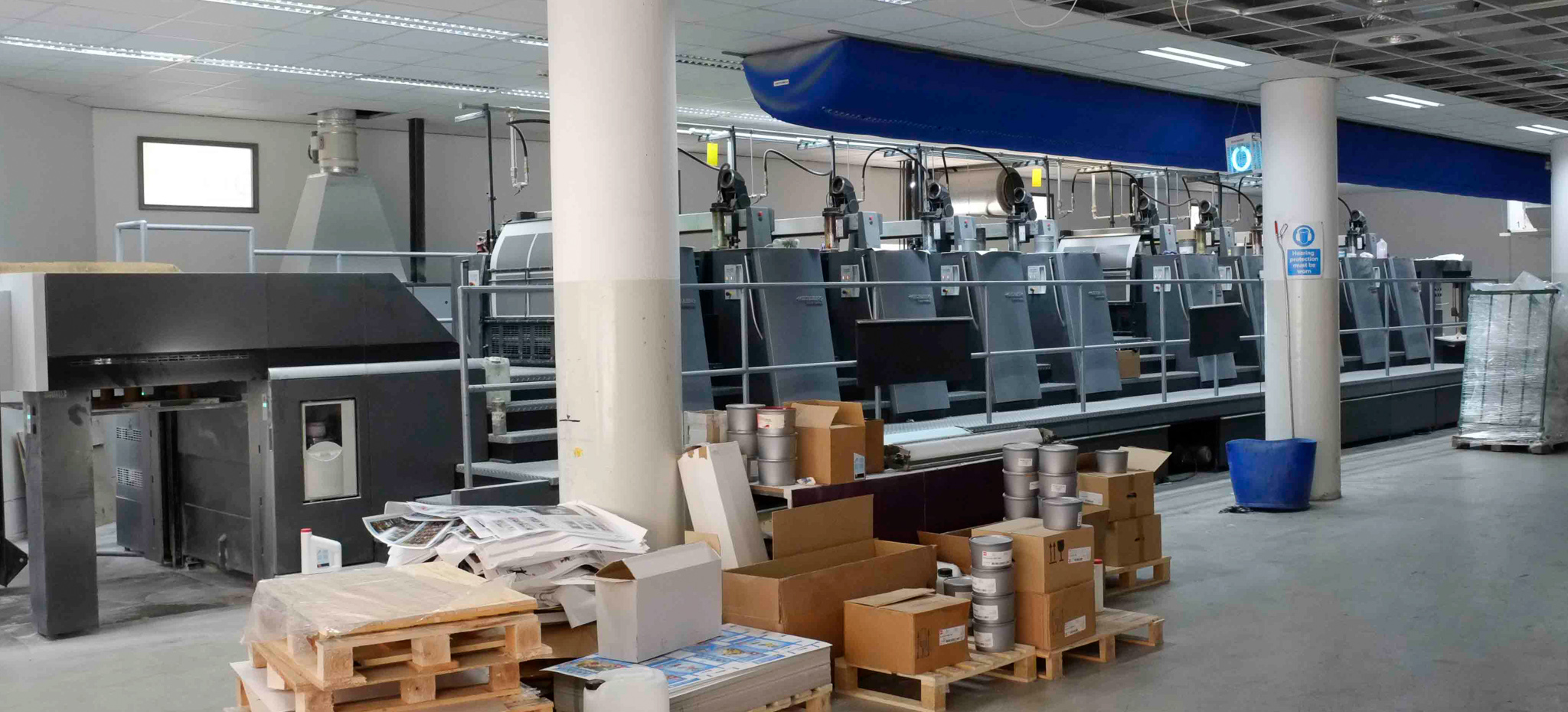
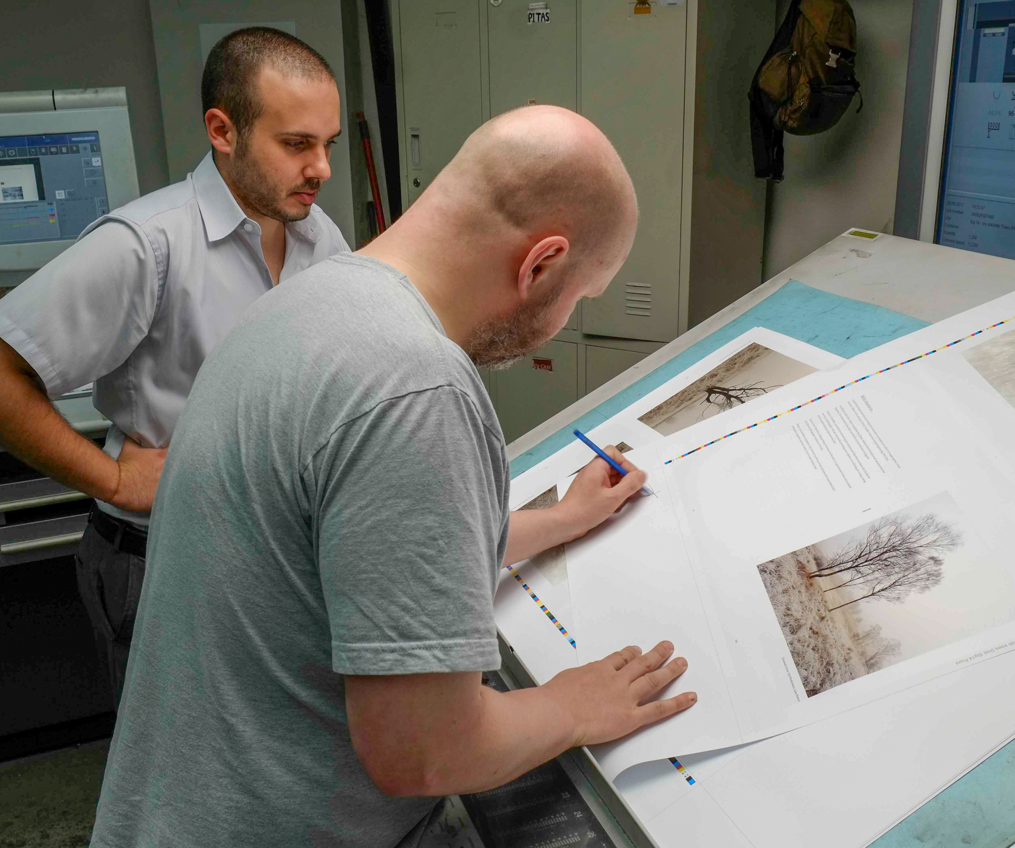
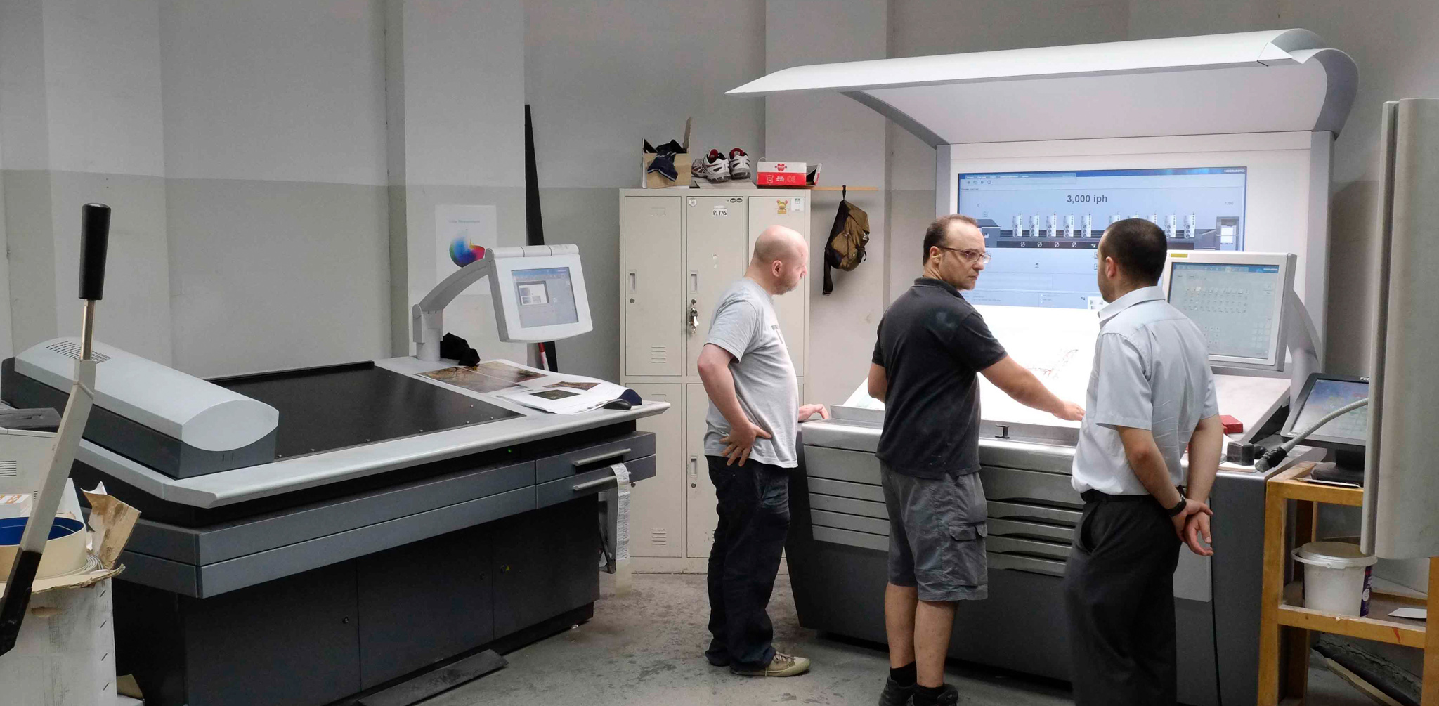
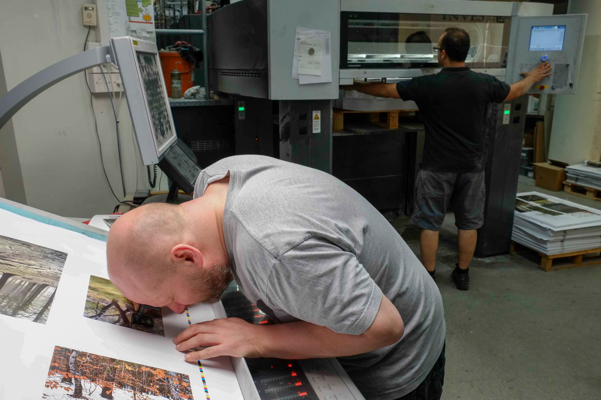
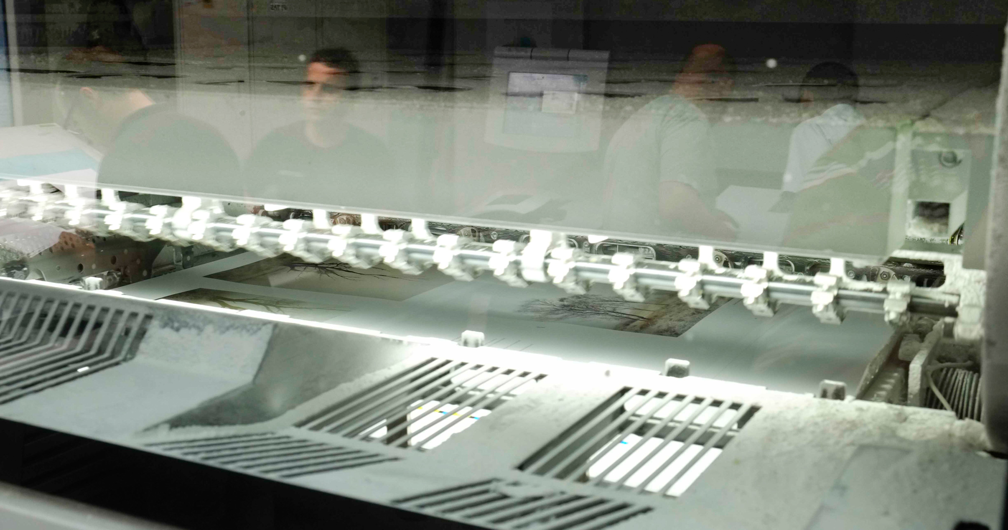
Paul I don’t know really. I think a lot about these kind of issues. It’s interesting that on the whole galleries don’t like inkjet prints at all. Since I discovered Jack Lowe in Newcastle and once I saw his work and what he can do it completely changed my mind about what a digital print was. I used to pride myself on the fact that my silver gelatin prints were beautiful objects. If you saw one and held one you’d think it was a beautiful thing. And I’d never seen a digital print that had that same feeling until I saw what Jack does and I thought “My god! These things are gems!” and I’ve been working with him for five years and we’ve worked really closely and we’re producing something that I think is unique. It’s a new beauty that wasn’t possible before. So there is still room for creativity in the photographic process.

Tim: What types of photography do you enjoy?

Paul Well I went to see that Landmarks exhibition at Somerset House. The two people I like I suppose are Susan Derges who I love and she uses photography in a creative way and Garry Fabian Miller (ed: See the Camera-less Photography exhibition that ran at the V&A) .

I did see a bit at that exhibition that was really interesting but the prints weren’t made for the environment. A lot of them were far too big. The Susan Derges was covering a whole wall in a room that you could hardly move away from. The Nadav Kander and Simon Norfolk were too large as well.

Tim: We’ve got the Becher’s to thank for that I think – If you can’t make something original, make it bigger

Paul That’s right – that’s what I thought. In all the reviews I saw of the show nobody picked that up. I got really interested in David Maisel’s work which is quite similar to mine in it’s ideas but done from as far away from the earth as you can get. Very poor quality printing. I try and make my prints into these beautiful things that make you salivate when you get near them.

Chris McCaw was very good with the sunburn pictures and I did like some of the scientific images from other sources like NASA and Hubble.

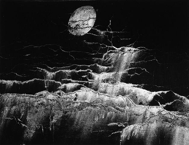
I was massively influenced a while ago by that full moon exhibition at the Haywood by Michael Light. He had access to like 30,000 negatives that were taken on the moon. That was very impressive at the time and a lot my pictures from At the Beach were recreations of pictures like that but using stuff from the earth. I kept on thinking “Why are these pictures so powerful – they’re just pictures of the floor!?”. I should be able to make an equally powerful image with the earth’s floor. I used a lot of raking light across the surface like the moon pictures. There is still an element of that in my work I think.

Paul Kenny 5

Tim: Do you always have an intended scale of your final work?

Paul That’s quite an interesting question. I don’t know. That’s one of the things I’ve found liberating about digital image making. I hadn’t worked in colour ever before I started working digitally and I felt liberated but also by the scale. I like printing big because I can do it but it has to be linked in with where this pictures going to be. I don’t like the idea of doing things huge for the sake of it. I tend to work at about 20x24 – a sort of domestic scale.

Tim: How does a typical day at the beach go for you?

Paul Well it’s just a collecting thing these days and a thinking space for me. I don’t ever take a camera – actually I do, I take a Lumix digital as a notebook and I do like playing around with instagram and snapseed as a sort of playful thing. But mainly it’s in the studio. I always have six or seven things on the go at once. Because the stuff takes so much time to dry things you can’t get onto the next stage quickly. Particularly at the moment with the rust work, I’m having to induce things to rust. It’s a process that you can’t hurry – it just happens. So lots on the go at once. I do some drawings as well. I’ve just found a fantastic bit of fertiliser bag on the beach and it’s so creased and battered by the sea that when I scan it it looks like marble because the creases are white and the bag has a bluey tone to it. So I’m cutting up squares of that and working out how I can match it up with some of the other things I’m doing. It tends to be very hands on in the studio – the landscape itself is the inspiration really.

Tim: What do you do when you aren’t working on art.

Paul Nothing! That’s what I do!

Tim: Do you have any other hobbies or listen to music?

Paul Yeah, we’ve got a big garden so we grow a lot of vegetables. Yes I listen to music too, it’s very important for me. I listen to music all of the time when I’m working.

Tim: What sort of music?

Paul A huge variety. I tend to like things that are quite long winded, I’m listening to Philip Glass at the moment, sort of tinkling away in the background. I try and keep up with it though so I’m always trying to find new music. I listen to a lot of John Hopkins at the moment.

Paul Kenny 4

Tim: Back to your work again – What happens to the ‘originals’, the ‘negatives’ as it were? Do you recycle them?

Paul Yes they tend to get recycled or thrown away. I keep the occasional ones, they’re very good to take to talks. Some people just can’t get there head around what I do and when I get a plate out with the dried rust and water and string on it it suddenly becomes clear.

Do you know Michael Jackson? I’ve been following his blog quite recently and I’ve emailed him saying he’s being too honest. I don’t think he should be telling people how he did those pictures in the fishtank. I think it somehow detracts from them. They were beautiful and mysterious and now they’re not. It’s something I’ve toyed a lot with, whether I should tell people how I do what I do. I like the idea that people should work it out. I have a friend who has one of my pictures and she keeps it by the telephone and she still phones me up after ten years telling me she’s just found another bit you know or “how did you do this?”. I like the idea that people can do that.

One of the issues with photography at the moment is that there is just too much of it. We’re bombarded by photographic images. You wouldn’t listen to a symphony once and say you understand it. You’d listen to it over and over again until it becomes a part of you and I like the idea that people could look at my work in that kind of way over a long period.

Tim: People do seem to like to show too many pictures. They aren’t particularly great self-editors.

Paul The other thing I find with photographers is that they tend to only look at photography. I think like you, you’ve obviously seen Andy Goldsworthy and know his work but that could inform a landscape photographers work far more than looking at Flickr.

These new pictures that were in the Fragile exhibition were heavily influenced by The Boyle Family. They have this thing where they would go around with a wood worker’s set square and throw it in the air and where it would land would be the bottom left hand corner of their piece and they would recreate that square of the world and then hang it on a wall. They’re wonderful – they blew me away. I saw a couple of them at the Tate in Liverpool, the sand ripples and I thought that’s fantastic. So a lot of newer pictures in the Fragile show have got sand in them.

Paul Kenny 3

Tim: Which other artist do you find inspire you

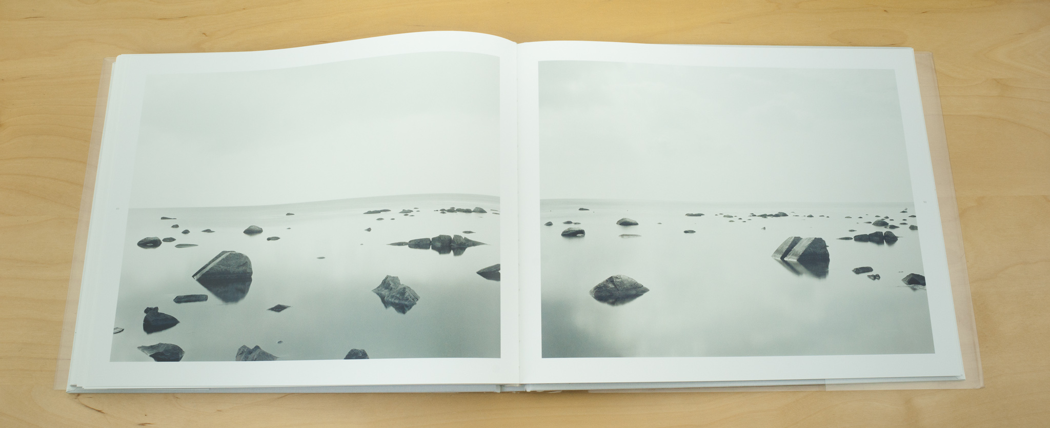
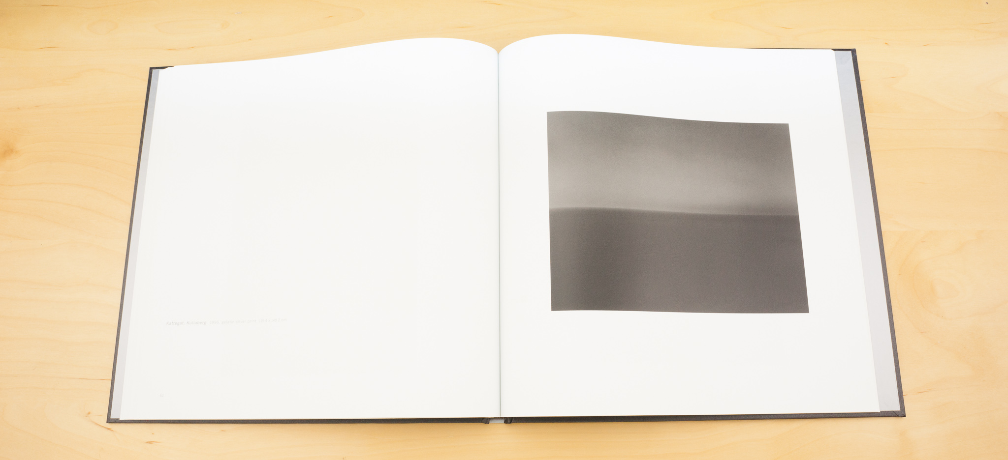
Paul Ooh – Rothko, let’s start with the big ones, erm. One of the artists who influenced me heavily early on was a Yorkshire artist called David Blackburn – he lives in Huddersfield. I was blown away by his work a long, long time ago. About 30 years ago – he does pastel drawings of the moorlands, he calls them visionary landscapes. I was influenced by the fact he was just an ordinary bloke. He owned two terraced houses in Huddersfield – one he lived in and one he worked in – he just toddled between the two, never married, he just worked. He does these panels of about twenty pieces joined together making these huge pieces and when I was at the end of my black and white printing phase I was making these pieces that had 5 or 6 or 8 pictures joined together to try to make a bigger piece out of smaller pieces. In 2007 I had a kind of crisis – I was sponsored by Forte in Hungary, for seven years I didn’t buy a piece of paper, they were fantastic. I got this email one day – we’re closing the factory tomorrow and that’s it. Slowly other bits of changed or stopped being made. They stopped PanF in 5x4 sheets. I came to this point where it was all falling apart and then I was introduced to Jack. I didn’t exhibit for a couple of years while we worked on a digital way of making work.

I’m actually thinking of using film again though, black and white but then had tinting. I’ve been working on some hand tinting of inkjet prints.

Tim: We look forward to seeing that in the future - thank you very much for your time

Paul: It was a pleasure.

You can see more of Paul Kenny's work at his own website www.paul-kenny.co.uk or at the Chris Beetle's gallery website www.chrisbeetlesfinephotographs.com


David Ward – 10 Photographs

We're continuing with the second part of our interview with David Ward

Virgin River

David Ward - virgin river 001

T: This is an older picture.

D: Yeah. Quite an old picture really. Virgin river reflections. Probably the first reflection photograph or water flow photograph, that I was pleased with and I think it would have been 2000, or something like that. Quite a long time ago. First time I’d been to Zion. I was with Joe. We were leading a tour there. It was the last couple of days of the tour. We’d started off in Moab and gone to Arches and Canyonlands and Monument Valley and Page and Antelope and all of those places on route. And then ended up at Zion for the last couple of days. And it was the first time I’d seen these kind of conditions. So the colour is actually sunlight on a cottonwood tree, out of frame.

T: Was this Spring or ..?

D: Autumn. So it’s actually kind of a yellowy green. It’s just turning. So that’s where the reflected colour comes from. And it’s always intensified if the surface is in the shade. So this is in the shade and it’s lit by a blue sky overhead hence the blues in what would normally be neutral, in the white flowing water. I tried to go for a fairly short shutter speed. From memory, I think it’s half a second or a second, something like that because I wanted to retain the structure in the water. And I figured that if I made it too long, then I would lose that. It’s not really stopped down a huge amount. But it was quite easy to lay the plane of focus. The important thing to keep sharp in this, I suppose, would be the boulder. However, as I mentioned to you a little while ago, I’m not sure I’d shoot it now with the boulder. I think I would probably try and pick a portion of water more like the bottom half where you’ve got submerged boulders and flow rather than having the solid object as a punctuation mark.

T:The goal being to avoid having too strong a focal point? The classic meme in photography to say that’s my focal point, that’s the reason for the picture and everything else is just supporting factors?

D: Yeah. I mean I think in this picture that the real subject is the flow and the colour and I actually wonder whether the boulder, in a way, disrupts that - but I think many photographers get obsessed with the notion of a subject, that we are photographing a subject. And usually that subject is a solid object. And, unfortunately, quite often, it is "a boulder in the landscape".

T: Well, there’s a lot of them around.

D: There are a lot of them around. I mean, you go anywhere in the world, there will be a boulder, pretty much.

T: Or a tree.

D: Or a tree. Yeah. But actually, I don’t think the subject has to be something corporeal like that. I mean the subject can be 'flow'. The subject can be 'light'. And I think, increasingly, that I’m turning towards those as things to photograph.

T: Yeah. Like John Blakemore had 'wind'.

D: Did he? Yeah, I’d heard that. Poor chap. Yeah. Too many lentils probably. So, I think that I would look at something like this again, if I ever shot something like this again, in a different way. I mean I would still be fascinated by the colour and the contrast in the colour; the beautiful contrast between the blues and the almost metallic green, so it’s like a bluebottle kind of combination of colours. But I’m not sure that I would now shoot it with the boulder like that. Your eye ends up there. Partly it ends up there because the brightest part of the picture is actually on the boulder.

T: Yeah. Well, it’s got the contrast, hasn’t it? The bright and the dark together.

D: Yeah. And we end up at light. Basically we’ve evolved to look from dark to light, not from right to left, as some people believe... and if anybody tells you that you need to rearrange your photograph in order to read from right to left, they don’t know what the hell they’re talking about.

T: Otherwise, all these Chinese and Korean photographers wouldn’t be able to produce successful pictures.

D: Yeah. Well it’s, you know, we don’t read photographs like that. We don’t read photographs like we read a book. We read photographs in terms of trying to recognise the shapes. Basically, in evolutionary terms, we’re trying to see if there’s any threat. Whenever we look at an image, whether in person or whether we look at a photo, the way we’re programmed to look at a space is to look at the dark areas first, because that’s where the threat might be, and then to look at the light areas because that’s the least important bit, that’s the bit that you don’t worry about - because it would be bloody obvious if the Tyrannosaurus is standing in the light. I didn’t think about any of those things when I made the picture, but they do definitely affect how pictures are read. You know, one of the classic things that lots of printers do when they’re assessing whether an image is balanced or not, is that they take the black and white print out of the fix and they stick it upside down on the splashback and they look at it and go, “Yeah. That’s a bit light.” You can see it when you do that. And I think, because I was obsessed with the subject, at the time, I was probably at that, thinking, “Yeah. It’s brilliant cause your eye ends up on the boulder.” Now, that wouldn’t be where I want it to end up.

T: Yeah. You want your eye to move around more.

D: I think I would. I mean not randomly but for it to circle within the frame. I mean, I still like it, as a picture. I’m not saying it’s a bad picture. I’m just saying, we evolve, I suppose. At least, I hope I have and that I’m not still dragging my knuckles on the ground.

T: Somebody was saying this to me recently about how you should always print your pictures; try and get a final print of a picture quite quickly because, in another year or two’s time, you won’t like that picture in the same way or for the same reasons. So it’s almost like try and get it finished, get it out of the way in the way you intended.

D: otherwise you’ll do something different with it?

T: Yeah.

D: But if we evolve, is it wrong to do something different with it? Or just fall out of love with them. Yeah. I don’t know. Yeah. I certainly do fall out of love with pictures and I’m going to probably have a bit of a cull on my web site soon. Go through and remove some that I don’t like anymore.

T: What does a picture have to do for you to want to keep it for a long time, if you’re looking at your old pictures?

D: I suppose, just fundamentally, it needs to still hold interest in some way so there needs to be something about it that I still enjoy exploring visually. I don’t think there are any that I keep up for just sentimental reasons..

T: It was part of your development, maybe? The green slate picture for instance?

D: ..that’s on there but I do still like it. Other ones that were made round about the same period never made it to the web site. And I have also got a project ongoing to find all of the old copies of the walking books that I did and burn them! I cringe when I look at them. My Minor White period. Obviously it's a brine tank in a herring factory in Iceland. Now this was an interesting thing about a meme, I suppose, because at some point, I must have seen that picture by Minor White which is a quite famous black and white photograph of a similar sort of process, of some sort of thing leaching through concrete and leaving stains behind. In some ways, it's analogous to a Chinese painting. It looks like a set of waterfalls. So something probably triggered my reaction to this where I thought, yeah, that’s a picture I want to make. But I’d forgotten about it.

David Ward - herring

T: Yes. Purely subconsciously.

D: Yeah. It had disappeared into my subconscious. And then, it was sometime after it was published in Landscape Within that I revisited the Minor White book, "Mirrors, Messages, Manifestations" and lo and behold, there is that photograph. And I thought, damn! I gave a talk about a year ago at a camera club and I was recounting this story about how I’d felt quite kind of crestfallen over it cause whilst I still liked the photograph, it doesn’t feel quite as original as it had felt to me at the time. And I described how, in Minor’s picture, you had something that was analogous to the moon.

T: Yes. A little circle in the middle.

D: There was a disc, yeah, towards the top of the frame and slightly off to one side and I thought, I only had the waterfall and I didn’t have the moon as well. David Ward - minor-whiteAnd some guy piped up, “Yeah, but you got a cow in yours. He hasn’t got a cow in his.” And I’d never noticed that this set of shapes over on the right hand side of the frame looks like a cow, staring out of the picture. Look, there’s the horn and there’s the light catching the top of its head, there’s the tail. And the whole works. Yeah. So mine is better. I do have a highland cow in mine and he only had the moon!

T: Yeah. Moon or a cow. You pick which one you prefer.

D: Both would be better, wouldn’t it? "cow jumping over" would be absolutely the ideal, wouldn’t it?

T: Yeah...

D: I do like the symbolism, I suppose, that arises from the picture though. The fact that you photograph one thing but it’s alluding to something else. peanuts_custom-81897f1db91a1e5611221ef8103c1e2ff1560db4-s6-c30And that’s something that I’m interested in photographically. If I can find something that can stand in for something else, that suggests something else. And the classic thing that we all do which is that when you see faces in inanimate objects. It doesn’t matter what it is but you can see the outline of a face. There’s a brilliant cartoon – Schulz’s cartoon – and there’s Charlie Brown and Snoopy and I can’t remember which other one, Linus or something, lying on top of the hill and they’re staring up at the clouds and one turns to the other and says, “Oh look. That cloud over there gives me the impression of the Stoning of Stephen”. “And what do you see Charlie Brown?” And he says, “Well, I was going to say I see a ducky and a horsie but I’ve changed my mind now”. Yeah. We’re programmed to look for patterns is what it is, basically. We’re programmed to look for patterns and this guy was obviously programmed to look for cow patterns.

T: A farmer probably.

D: He probably was, yeah.

Vikspollen

David Ward - ward 8 001

D: Vikspollen in the Lofoten Islands. One of my favourite vistas I suppose because it’s moody, apart from anything else but also because I like the dynamic quality of the foreground with the leading lines, I suppose you would say, naturally eroded into the rock leading to a nexus, a point at which sits a rock covered in white lichen. And then the energy of the photograph seems to flow through and out into the wider landscape beyond. This is made on a workshop trip six years ago maybe now. And we’d had dinner at the hotel and people were saying, “Well, let’s go out for sunset. It looks hopeful.” And we went out and when we got out, the cloud all came in and everybody was kind of miserable because they weren’t going to get the operatic end to the day that they were expecting. And I got really excited about this spot cause I said, “I think this is fantastic. It’s a really good composition and I like the mood in the sky and you should all photograph - you should look at this and see if you can work out something to do.” And they all kind of, “No. It’s not what I want to do” and wandered off. And for me, that taught me a lesson, I suppose, which I probably already to some extent learned which is that lesson about being receptive and not going with just a notion that you’re going to do a particular thing because you become a prisoner to fortune if you do that.

T: It’s a game of roulette.

D: So you go there and you’re going to shoot that and, actually, when you get there, the light’s not what you wanted so people either shoot it because I’m here and they get a picture that doesn’t work very much, or they don’t shoot it and go home feeling miserable cause they’ve failed to achieve their goal.

T: The 'double zero' didn’t come up.

D: Yeah. Some people say that I placed that stone there. I’m going to completely refute that. I just moved 400 others out of the way. No, I didn’t place it there. It was entirely chance that it ended up there, presumably because it narrows so the waves had dragged the stones backwards and forwards and that one had ended up stuck in the kind of wedge at the bottom and it’s not a white stone. It is a lichen that’s growing on the stone that’s coloured it like that.

T: It’s obviously come up from further up the beach.

D: probably a big storm, big waves rolling in, it got pulled down the beach and then ended up stuck.

T: Now, you’ve used this compositional meme in other places. I’m not sure, consciously or subconsciously, of having an X, a vortex of some sort in pictures.

D: Yeah. I think, at first, unconsciously. And then, after I’d done it two or three times, I thought, “Oh God yeah. I’m doing that, aren’t I?” I kind of started to recognise it in my work. I don’t think I’ve done it for a while because I think as soon as I became aware of it, I kind of made a conscious decision not to do it. But I suppose one of the things that I liked about it was that it was breaking the rules in lots of ways. It’s more or less slap, bang in the middle of the frame, that white stone, which is where you should never place anything. Yeah.

T: No. Off to one side, darling.

D: Off to one side. It’s not a third of the way up or a third of the way down. The lines that lead you through go through the centre of the frame and they don’t go diagonally from edge to edge. They don’t do the things that you’re supposed to do.

T: It almost divides the picture into two, doesn’t it? As well, with the tones and the rock.

D: Yeah. It does, almost. It’s also the graduation that I used in order to hold the sky back that meant that that mountain in the background is darker than it would have appeared if you were stood there. But actually, I think that all adds to the mood that darkness is a signifier of mood as much as light is. And the way that the stone is very much the brightest thing in the whole frame, your eye ends up there and then travels out. But because it’s the brightest thing in the frame, your eye ends up there but then also your eye travels out again and turns. It’s interesting. You used the word vortex. It’s like it kind of sucks you back into the centre of the picture and then you swirl around and you get back out and you come back in again. So the leading lines kind of start you on a journey through but you always, it’s like an attractor..

T: Yeah. That’s a good word for it.

D: So I think in some senses it’s challenging as a composition but I also feel that it has a really good sense of mood. It’s quite sombre. There’s only a little hint of warmth in the colour of the sky. But I like that. I like the fact that it’s not full on sunset. The very thing that everybody else was looking for was not what I was looking for; perverse or what?

T: Presumably you’ll take some of those ideas that you’ve learnt from that one into other pictures in the future.

D: Yeah. I think so, yeah. I think for me, it was one of those seminal moments where you make a composition and because it feels right at the time, it’s very much an instinctive process for me. I don’t sit down and think, “Oh I need to do it like this.” It all felt right; positioning the camera kind of centrally on that axis from the grooves through to the block of the mountain in the background, and the white stone there, all felt absolutely right. And ..but actually, then, when you look at it afterwards, you realise there’s lots of other things going on that you haven’t, perhaps, noticed.

T: I was wondering that because when you talk a lot about pictures like this, and when anybody talks about pictures like this, there is the sort of misconception that people have when they are first coming into photography that you were thinking about that when you were taking the picture. I’ve tried to explain things to people by saying a lot of the conscious thinking gets done away from the camera, when you’re looking at pictures at home or you’re looking at other photographers or chatting about things, and then when you go out, that drives an unconscious process; some of those things you’ve thought about previously, get sprung now and again.

D: Yeah. I think, as much as possible, I try to compose using my subconscious mind as much as possible. In other words, it’s about feeling rather than about expressing in language.

T: Yeah. But you think some of that feeling gets fed from thoughts you’ve had when you’ve been away from the camera and looking at pictures and thinking about them?

D: Almost inevitably because I think that all of our problem solving comes from assimilating past experiences. I think one of the things that’s a myth which probably was generated by dear old Ansel, is this notion of visualisation, that the genius auteur, the incredibly talented photographer goes and he stands somewhere and he immediately knows exactly how the photograph is going to look and he works out in his head how it’s going to be printed and all of that stuff. And in my experience, that’s not how it works. My experience, you kind of wander along in a bit of a daze and stumble upon something so it’s about being in the receptive state. And Minor White said, “Being as receptive as an unexposed piece of film, pregnant with possibility upon which any image might be written.”

T: Oh he was an arty bugger, wasn’t he?

D: He was an arty bugger - But it is a good quote. It’s about being in what the psychologists would call, the flow state - a kind of meditation. And so it sounds really airy fairy and kind of difficult and "oh God, I could never do the meditation." But actually, probably every photographer has because it’s that experience when you kind of come to, having knelt in a puddle for half an hour and not noticed that you were doing it because you’ve been lost in the moment making an image.

T: And nothing else has been in your head at all.

D: Nothing else has mattered. So you might have been, at a conscious level, you might have been dealing with technicalities. You might have been dealing with metering or filtration or ‘Oh God, I’m going to put it on aperture mode or whatever else.’ But actually, most of you is lost in the subject cause most of you is lost in a place where time becomes elastic, where it stretches and thins and weird stuff goes on. And that is the ideal place to be in order to make a photograph. Now it doesn’t mean that you’re unaware of your surroundings. It’s a hyper-acuity. There’s a hyper-connection that goes on. And I think that’s one of the things that makes us incredibly tired when we’re really in photographing mode because we’re really looking. We’re trying to look as much as we possibly can and, for most of our lives, we don’t because there’s an overhead, there’s an energy cost to looking. Our brains have to work harder to look. Most of the time, we kind of do visual shorthand; We join the dots. So when you’re navigating somewhere, you join the dots. You don’t actually look at every single piece of pile in the carpet. You don’t look at everything around you. You don’t look at all of the detail of the stuff on either side as you walk between all the boxes, say, here in your office.

T: yes it is kind of untidy.

D: But you don’t study all of that detail when you navigate it.

T: No. My wife does that. She’s got hyper acuity for clutter!

D: Yeah. I’m not going to say anything. Sorry Charlotte! So there are reasons why we don’t normally kind of spend that much energy on seeing but there are huge dividends to be paid as a photographer or an artist. I mean you can’t buy spending that energy on seeing

Conwy

David Ward- fern - scotland 002

T: Now, a landscape landscape but not. Actually one of my favourite of your vistas. As we were mentioning earlier. It’s not really. It’s more about an abstract than it is a vista.

D: Yeah. It’s back in Landscape Within, I defined an intimate landscape as something which excludes the sky. And this does exclude the sky but it still describes a huge space. I’m looking across a valley. I think it was probably shot on the 210mm lens (55mm equivalent) so you’re probably look at a distance of maybe a mile or something to the distant trees. So it’s a big space. But the snow on the ground and the soft light have enabled the space to be kind of abstracted. So it becomes about form and it becomes about flow, rather than about description. Now that’s not to say that you can’t look at it and know that it’s trees and know that it’s a hillside and all the rest of it but the energy and the sense in the picture, I think, comes from a level of abstraction. And one of the things that I think attracted me to making the image like this was that the central band of trees,I always see it as running from left to right, even though I just told people you don’t do that. And then it curls back round on itself and it narrows down and then it kind of peters out. And then I think your eye kind of ends up at the group of trees at the top-left, and then you kind of fall back down into the picture. And there’s this kind of motion of your eye through the picture, which I think is quite satisfying.

T: Yeah. It’s like a dynamic balance of some sort.

D: Yeah.

T: But it’s the shape from the way you diffuse light. The shape of the snow and the shading on it that creates enough sense of three dimensionality in there to stop it being completely abstract.

D: Yeah. Well, and also, you can recognise them as trees although you can’t recognise their scale exactly. You know, are they 20 foot trees or 100 foot trees or those kind of things? There’s not enough information for you to ascertain that. But if you kind of screw your eyes up and look at it as a series of shapes then the structure, the skeleton of the image is all about that abstracted state. When I started out making images and making vistas, most of what I was trying to do was to make illustrative images; images that depicted a space in the clearest possible way. And I think this was an attempt to try and marry what I’d learnt from making the intimate landscapes to making more abstracted images and try and kind of join that with the notion of depicting a larger space. Now that sounds like I thought of all of that before I took the picture but I’m sure I didn’t.

T: How old is this?

D: It was on a Death Valley and Mono Lake tour. About 2004, 2005. So it’s quite old. Yeah. And it’s pretty much drive by shooting. It’s by the main interstate going from Mono north. I had to walk through thigh high snowdrifts to get to the point where I could take the picture but you could see it as you drove down the road. You could see this shape of a really beautiful valley.

T: And there’s a lovely separation between everything in it, as well.

D: Yeah.

T: Which is something easy to do when you’ve got something at your feet cause you can move around very quickly.

D: Yeah. But here I had to move up and down through the thigh deep snow in order to find the right spot to do that. But it’s also because of that soft light that you talked about. So not long after I took it, the sun poked out between the clouds and there were strong shadows coming from the left hand side of the frame. And they joined that band of trees through the centre, through to the kind of island of trees. And then the whole thing ceased to work. Also the top of the picture was in shade and so there was a shadow line at the top left hand side of the picture which also kind of made it not work as well. So it’s about that kind of fortuitous thing of everything coming together but I suppose it’s more about one recognising that those factors had come together.

T: Now, being as it’s a landscape orientation picture.

D: A rare landscape.

T: And all of your pictures are portrait orientation.

D: Sweeping generalisations are always good.

T: Did you typically go out with a 4x5 portrait orientation frame in your head..?

D: Yeah. A good friend, Chris Andrews and I used to joke about this thing that if you wanted to make a landscape image, you got one free on tour and then, after that, you had to fill in a permission sheet. And it had to be sent to the committee to see what you’ve been up to, to do it or not.

T: There are two reasons why I ask. One is, after being at the Landmark Exhibition at Somerset House I can only recall a couple of portrait orientation images out of more than a hundred.

D: So that’s a USP for me, then.

T: A unique selling point perhaps but is there something about the contemporary art market that only wants landscape orientation pictures and is there something different in the way it changes the balance of a picture and was yours a conscious choice?

D: I don’t think you start it off as a conscious choice. It might have become a preference. I think it started off, probably, when you’re making a kind of wider view. You’ve got a 90mm lens equivalent to 28mm or whatever on the 5x4 and because you can get from at your feet to the distance, sharp, with a lens like that, it’s a way of absolutely maximising the description of space.

T: A tendency to play with that foreground and background relationship

D: It tempts you to really kind of really depict the space in its most dynamic way, I suppose. And why I ended up making more of those than landscapes...

T: Because people like Muench worked in portrait orientation quite a lot but there definitely a dominance of landscape orientation images in fine art.

D: The theory that I’ve heard is that most people ascribe something that’s landscape shaped as being more analogous to human vision. It’s not really strictly true in that our field of view is a squashed ellipse and it’s not rectangular in any way at all. But generally speaking, we scan from side to side. There’s the classic thing of if you want to hide from somebody, you go up because nobody bothers to look up. I don’t know how true it is that they teach soldiers to do that but that’s the sort of thing.

T: We also tend to scan horizons so that is backed by evolution I would imagine.

D: And maybe, because I don’t include horizons it ceases to be an issue.

T: The orientation does change the way you read a picture though

D: I think one of the things that happens is that we are trained. We don’t read pictures from left to right but we are trained to hold our eye within a portrait shaped piece of paper by when we learn to read.

T: That’s quite interesting, isn’t it, that most pictures you see on walls are landscape and then everything would be media we look at...

D: ... is all upright. Yeah. And I have heard that, I can’t remember the reference, but I have heard it mentioned that you need to have a stronger composition in a landscape shape in order to hold people’s eye within the frame than you do in a portrait shape. There needs to be something compelling that leads people back in to the picture. So maybe in this instance, this little curl that comes back, is part of the reason why that worked. To be honest, the reason why I shot that landscape was because if I shot it upright, I would have got the bloody sky in there and I didn’t want sky in there. It fitted the subject in this case. Do I make the subject fit the frame, is probably going to be your next question?

T: Yeah. Well, when you’ve got an abstract subject at your feet, you do really have a choice.

D: You have much more ability to change things. Yeah, cause sometimes you can just change the orientation because there isn’t anything to tell anybody what’s up or down. So you can make it, represent it as a portrait when, actually, it wasn’t. Although I don’t think – have I ever done that?

T: Only when it works when you’re doing plainer subjects, doesn’t it? Cause I think even a hint of tilt can give things away

D: It would tell a lie, wouldn’t it? I don’t think I ever actually have done that. In fact, I’ve seen other people try and do it, in workshops, where they take something abstract and they say, “Well, I was thinking if I made this an upright.” And more often than not, you get enough clues about perspective to make it fail.

T: Yeah. It’s got to be flat, really, I think, to get away with it. But the other nice thing about mostly portraits or mostly landscape is it makes galleries on the internet a lot easier. They’ll fit in with each other. There’s a good reason! But then you would be better off shooting square then you never have to think about it at all

D: Do you think that’s why Mr Kenna did that, do you?

T: He didn’t have to make a choice then. In fact, I can put them all on the page

D: Yeah. That’s why we use square thumbnails, isn’t it? You don’t have to worry about arranging them

T: Don’t get on to me about square thumbnails or crops. It frustrates me, that does.

D: Does it?

T: Oh just the idea that somebody would have a picture that they’ve nicely composed and then show a thumbnail of it that’s been cropped without any sense...

D: something that a site like Facebook forces you to, don’t they, because they only have a square template for the picture that you show on your page. But at least they do allow you to reposition it so ...

T: You can get bigger versions too. But that’s just a pet beef.

D: Well the whole notion of thumbnail annoys me. So, I kind of would rather that people didn’t look at something at 100 pixels on a side actually….

T: What are they seeing?

D: it filters out a lot of subtle stuff, I feel. I don’t know, I think you were talking about Jem Southam and talking about how, in order to appreciate his work, you need to see the big prints.

T: I think so. I think there’s a scale element going on there. And pictures do change with scale, dramatically so. Beyond the web site cause I mean, you take a picture – like this, like the colony one here. You put that on a wall at 30 x 40. All of a sudden you’re looking at pictures within pictures. You put it on 100 pixels on a thumbnail, and all you’re seeing is a line with a couple of dots.

D: All it is is the graphic when it’s that small, yeah. I mean this one has a strong graphic but you can imagine a picture that is much more subtle, that has very little in the way of a graphic. In fact, ironically, I would guess that the one that we almost started with, with the boat shed, really small, would you see the grass?

T: No, you wouldn’t would you? You‘d see a red dot. I wonder if this is why we have a tendency to have a lot of simplicity in pictures these days is because people do click on thumbnails or other people are trying to. Some people are guided by their images popularity on places like Facebook of Flicker and if they’re pictures that are simply graphic, get a lot of feedback because people are clicking on them and them, maybe, adding a comment and the ones that aren’t graphic aren’t getting comments. They’re being herded down a certain direction of photography.

D: I think there is probably a filtering process that’s going on there but almost an evolutionary pressure I suppose, isn’t there? I mean, I like graphic images but I like the graphic to be combined with some level of subtlety as well, intrigue and mystery or something else going on rather than it being baldly descriptive. And I think that anything that has any sense of the mysterious has a big possibility of just passing people by because for some of those images you need to work at. Some of them you need to stare at for some time before it becomes apparent why somebody made the picture. And I think there is a huge kind of pressure for rapid consumption for people to consume the photography as fast as they can. And I think that that that’s not good for photography and it’s not good for photographers.

T: Difficult, isn’t it, because people are producing pictures at such a rate. And publishing them at a rate, as well. You try and keep up with a few colleagues or contacts on Flicker and you’re seeing huge amounts of pictures.... Going back to the size thing, has your appreciation for you pictures changed when you've seen them printed very large?

D: Yes it has. There was a picture I took of Mono Lake of some grasses and the back light. I’m not sure that I’m entirely happy, now, with the composition but I like what’s happening with the light. And when I saw that printed for the first time, at the last exhibition I had in London, as a 20 x 24, I was completely blown away with it because even though I’d stood there and made the picture, there was stuff that I hadn’t seen because there’s such enormous depth in it as a subject. You’re looking through the layers of grass and light shining through seed heads and stems and there’s an awful lot going on but when you stand there and look at it, you can’t apprehend that all in one go because, of course, you're having to refocus and scan. But when you make an image and you collapse of of that space and you make it all sit on a flat plane, you can suddenly interact with it in a completely different way than the way you could in reality. I mean, a different variation on that is something that many of those early American photographers were keen on; the notion of hyper-reality, describing things to an incredible degree.

T: It’s still very popular. People still use 10x8 and high end medium format backs, especially in the fine art market. They want engagement.

D: Yeah. And it is beguiling. And sometimes, it’s absolutely fantastic because it does give you access to a part of the visual realm that you would never reach without the camera as the tool.

T: You look at things you would never look at at the time - and perhaps couldn't even see. If it’s in a picture, you’ll look at it. If it wasn’t, if it was just there in front of you ...

D: That's the power of the photography, isn’t it? Because in a way, whenever you present a photograph, what you’re saying to a potential audience is saying, “Look at me. I’ve found this interesting.”

T: Yes. "This is significant"

D: Whatever level of significance it is. And obviously, that level of significance is, in some ways, coloured by the notoriety or fame of the artist. We were looking at that Salgado book last night. Sebastiao Salgado, fantastic photographer, and if he has an exhibition then I would suspect that his photographs of a subject would be more revered than similar quality photographs from somebody that nobody’s ever heard of. And that’s not actually kind of fair, really, because I’m sure there are an awful lot of photographers out there, maybe not in Salgado’s league, but there are an awful lot of photographers out there who are incredibly talented who are not going to get that attention …they’re not going to get people to actually invest the time trying to see significance.

T: No, well, I’ve just come back from helping to judge the wildlife photographer of the year. I was doing some of the technical judging for it and on my coffee breaks I was looking at some of Salgado’s pictures of animals. They wouldn’t stand a chance compared with the level of material I was looking at.

D: Hmm. Cause he’s not a wildlife photographer

T: are those pictures that strong intrinsically or are they just strong because it’s Salgado. Or are they strong because they fit in the project he worked on.

D: I don’t know. I don’t know. It’s a difficult one to call, isn’t it? And I’m going to return briefly to that notion of investment. When everything’s on the web, and it’s 100 pixel thumbnail, how much investment is required of the viewer? As opposed to when you had to go to an exhibition or you had to buy a book or you had to buy a print? Now, all of those things require at least a degree of effort and, in some cases, an outlay as well. And I think that that colours how we look at the pictures. Effectively, once everything is free, in a sense it becomes worthless.

T: I agree. Then it’s up to you to put value on it.

D: Yeah. ..and for some people, they’re going to be sensitive enough to invest emotionally or intelligently in the work and they will make the effort. But, for other people, because the means of dissemination, the web, is so facile, in the old sense of facile. It’s effortless. Then, I think that puts them off making an effort. They don’t need to. Why would you bother? Humans are fundamentally lazy, aren’t we?

T: Yes, and the choice of 'significance' can be influenced by how other people like something - social pressure

D: and the thing you were saying about how do you keep up is interesting, isn’t it? Because the output appears to have expanded enormously and I suppose there has been an expansion because we all carry a camera and a phone or whatever. But there’s also been an expansion in terms of it being available to other people because the images used to sit in a draw, or then once a year, Uncle Reg used to show you his holiday snaps on the slide projector.

T: Yes.

D: But there was never the abundance; there was never the ease with which you can access images as now. It would be interesting, and perhaps a very difficult thing, to work out. But has there actually been an increase in significant photographs or has this whole process, actually, meant that that’s impossible? So, if you look back through the history of photography and you look at the work of somebody like Ansel Adams or Edward Weston or André Kertész. These people stood out as beacons within their lifetime. Is it possible, now, for anybody to be in the same position that they were?

T: No. I don’t think it is, is it? Because they could only stand out because they had the background to be able to do so or they had the people who chose them. They don’t stand out because they’re the best. They stand out because the people who had the power, at the time, the critics or the museum curators or the mentors, patrons, had the money to throw at them; or had the position of influence to throw at them. And it’s not going to happen, now, is it? I imagine it must be very difficult for museums of contemporary photography to choose now. I was asking somebody about this recently, saying in the contemporary art world, how do you choose what’s a good photograph or how do you choose who’s a good photographer? And he was saying, it’s down to your course pedigree - tutors - and critics, mostly; critics and the curators of museums. But they make a decision on what they’ve seen in magazines or little journals or what shows people have put on themselves.

D: Right.

T: So it’s …

D: Yeah. But it’s certainly someone like Ansel relied upon the Newhalls to promote him. They were in a position in the East, based in Rochester, highly regarded as critics, and in a position to really kind of push him. It didn’t harm that he and Nancy were probably having an affair. And whereas Weston, whilst he was well known in his lifetime, was never as well-known as Ansel was because he didn’t have somebody who did that for him. He was much more the lone artist, keen on doing what he wanted to do and not, in a sense, I suppose, buying in to the whole process in the way that Ansel did. Now I wonder if some of that is to do with social background. Ansel was, effectively, upper middle class, as we would describe it. And Weston came from a much humbler background - although married into money. And I wonder if they just had different attitudes about how life was to be lived.

T: More than likely. You see people like Steiglitz who managed to get a huge amount of influence. I mean, whether you like his pictures or not, I know a lot of people who don’t think his photography is brilliant but he just must have positioned himself in the right place, pushing modernist art and becoming influential in photography.

D: Yeah. It was a tipping point where the… Malcolm Gladwell talked about Mavens; people who connect other people and I suppose Steiglitz was one of those. I don’t know that we’ll ever have a figure like any of those again. I don’t think Gursky’s the same.

T: No. I mean Gursky’s almost there, isn’t he? Because of the Bechers. They’re the ones that had the power and the connectivity because they had such a big reputation?

D: They’d already made the connections to the art world and the galleries and they're also running the course, which was highly regarded.

T: So you got all of their disciples would come out and made a big, big splash.

D: Yeah. Interestingly, when I went to the Polytechnic of Central London, as it was, and now University of Westminster, Victor Burgin was one of the tutors there and one of the top theorists of photography at the time. A guy called Simon Watling was there as well and he was also kind of quite high up in all that One of my classmates, a guy called David Bate, is now Head of Photography, I think, at Royal College of Art or one of those esteemed institutions. But I don’t think there was the same patronage that appears to have flowed with the Bechers.

T: Yeah. Well they just happened to be in the topographic exhibition.

D: They were an odd entry in it, all the pictures of the water towers and stuff? Right.

T: Yeah.

D: Oh right. I don’t remember them being there. That’s interesting. Right. Okay. So Szarkowski is the key. Szarkowski is probably the most influential.... We didn’t get off topic at all!

Boat

David Ward - boat 001

T: Interesting picture. I’ll remember you talking about this one so I know the story. But I’ll let you tell it cause you tell it so well.

D: It’s an upturned boat, a place called Achiltibuie, Wester Ross on the north-west coast of Scotland. It’s actually one of a pair of boats, sitting on a pebbly beach and I first photographed both boats. I was drawn to making an image because the palette was all very restrained. There were mostly kind of neutral greys, little bits of warm browns and beiges and just kind of punctuation marks of the copper nail heads. Very kind of restricted and all quite sympathetic. The two boats fitted together quite well within the frame. And in the process of making that first picture, I noticed that there was a tighter crop that I thought was more intriguing, which is the image that we’re now looking at. So, it’s a portion of the nearest boat and it's very abstracted. There’s a kind of sinuous curve of the – is that the transom at the back of a boat? I’m not sure –

T: I don’t know.

D: The stern.

T: The stern – "non pointy end".

D: The "non pointy end" of the boat, yeah. You can tell that both Tim and I are salty sea dogs – "Avast behind!". I thought that that kind of tightening up of the image and placing that curve in relation to the stones that were sitting on the bottom of the hull worked really well. So I made the picture and I was very pleased with it. I thought it worked. It makes it kind of intriguing because the space described is harder to understand. I thought it was a worthwhile picture - in fact it was on the cover of the hardback edition of Landscape Beyond. Sometime later - three years later? Something like that - I got an email from a chap who said, “Oh I see you photographed my stones. I put those stones on that boat.” and I kind of went into a slight panic about that because I thought, “God, so in a way it’s not my composition; somebody had arranged this.”

T: And they’d played such a strong part of the picture.

D: Yeah, I mean they’re an integral part of the composition, yeah. It’s almost like this curve is in orbit around them and the lines all point towards them and yeah. And I was really kind of upset by the whole thing. And then I thought about it for a while and I thought, “Well, actually, do you know, is it any different from erosion having placed something somewhere? Is it any different from weather having moved a cloud in to a particular point in the sky? Because it’s an unseen hand and it’s what I’ve done with the material to present it rather than what was done to the material in order for it to be in that position.

T: Yeah. And there’s a potential, it’s more prosaic if it was a fisherman who’d put them there.

D: Which is what I assumed: I assumed that somebody had piled stones on to stop them blowing away because they weren’t in a good state. In fact, they’ve now completely turned to matchwood. They’re not there at all anymore so…

T: So it wasn’t you taking out your anger?

D: No. it wasn’t no. No. No. No. It wasn’t me destroying the subject afterwards so nobody else could photograph it. No. So… although apparently, that has allegedly been done. But we won’t go there. So, I recovered, I suppose, you’d say, from that. And I’m still pleased with the picture because I do like the kind of incongruity of the space. It looks planar but it’s not planar. And part of that comes from using the movements on the camera in order to make sure that it’s as sharp as it possibly could be.

T: So there are no focus cues.

D: Yes. So it all looks like it’s on a single plane when, in fact, it’s not. It’s on contradictory planes. And that presented me with enormous headaches because the plane of focus is still a plane of focus, no matter what angle you lay it into your field of view.

T: Tilt is not magic.

D: No. You don't have bendy lenses so you can't make it fit that ogive curve. So you have to try and work a best fit for it. And, in fact, the very top left hand corner is slightly out of focus…

T: Yeah. Cause you’ve had to keep the rocks in.

D: Yeah. So that’s the kind of story of that one. Yeah.

T: It does say something about ownership. Cause like you say, if it had been a fisherman, it would still have been a conscious hand that put it there. But not purely for aesthetics. Or even if the fisherman put them there for aesthetic reasons, it would have had a different connotation. But like you say, does it really matter if it’s the image.

D: I’m not sure it does matter. I mean there’s this …the whole debate that keeps resurfacing about truth. Could you say that this is, in some sense, disingenuous because nature didn’t place the stones there; because a wave didn’t place the stones there, and I actually think, as Giles commented recently on a picture of mine, that photographers have as much right to the still life as a painter does.

T: Yeah. They can create things.

D: Yeah. And you could argue that somebody like Andy Goldsworthy, who’s described as a sculptor, is as much a photographer as he is a sculptor.

T: Yes. It’s interesting that he distanced himself from photography, didn’t he? So …consciously.

D: He did. Yeah, he did. I read an interview with him where he said that, “Well, I can’t be too good a photographer because then, actually, if people classed me as a photographer then that would, in some sense, devalue what I do.

T: Sad, isn’t it?

D: I think so, really, yeah. So he’s .. artfully artless, probably, in the way that he makes his images. So he doesn’t want to make them too good.

Book Print Quality

We’ve included Dav Thomas’ book in this issue and one of our comments about it was how good we thought the print quality was. What do we actually mean by this? Well there are various aspects that make up the quality of printing in a book but one of the biggest influences is the way that the photographs are converted into plates for the lithographic print process.

We’ve all seen newspaper print, especially black and white newspapers, where you can see the individual dots that make up the picture. These output like this is referred to as ‘halftone’ because it can produce fractions of the ink color. This ‘halftone’ is used because newspaper ink is either black or white and there are no cost effective processes for diluting the colour to create ‘continuous tone’ prints.

The pattern usually used in halftone printing is a grid of dots, usually slanted at some angle. The image below shows an example of mono newsprint halftone.

monohalftone

As well as being referred to as halftones, the technique is also known as ‘screening’ because William Fox Talbot’s proposed process was based on photographic ‘screens’ referring back to the Chinese method of printing with silk screens.

A screen is then the pattern that is produced from a continuous tone original. This pattern is then typically etched into a metal plate which is then used to print the final product.

No title

Before this process prints had to be made using forms of direct engraving, we’ll talk about some of those processes in a future issue.

The plates used to be generated using photographic processes, originally by mixing multiple masks together and then using computers to write to the photographic film (Computer to Film) but in the last decade the arrival of ‘computer to plate’ processes have revolutionised the industry.

Computer to plate allows very fine screens to be generated which has allowed a lot more control over the types of ‘dots’ that can be used to build up a screen.

Lines Per Inch

The main variable in lithographic printing is the ‘fineness’ of the screen. The resolution of a screen is typically measured by the ‘pitch’ of the grid of dots. For instance in the following screen you can see that there are 10 lines in 1mm and hence 10*25.4 = 254 lines per inch.

Lines Per Inch - monohalftone-pitch

”lpi and dpi”

In order to print a screen of 254 lines per inch, the resolution of the CtP machine has to be anywhere from 5 to 20 times higher. This is because the dots have to be very regular and the lightest area of the picture is defined by the smallest dot the CtP machine can produce.

Colour Printing

To print in colour we need to be a little clever with our halftones. We can’t have them all at the same angle and if we have them at different angles we need to be wary of moire effects (wider patterns appearing because of the combination of finer patterns - like digital photographs of fine textures like fabrics).

For the darkest colours, the pattern of dots is most visible when it is at right angles because our perception is fine tuned to pick up horizontal and vertical patterns. It is least visible when the pattern is at 45º degrees

halftone-angle

So printers typically print the black layer at 45º degrees and the yellow layer (the layer with the least contrast with the base paper) at 0º degrees.

This leaves the magenta and cyan layers. Because layers can cause moire when set less than 30º degrees apart and the lightest colours are yellow and cyan, the resulting angles that have been worked out are usually K (black) 45º, Y 0º, C 15º and M -15º (or 75º)

The resulting screen looks something like the following..

1000px-Halftoningcolor

”Tricks”

Printers will also make the yellow screen 5% higher frequency which can help reduce moire further

Rosettes

You can’t eliminate moire completely and the main symptom of moire in the 45, 15, 0, -15 angles we have discussed is the ‘rosette’. This can be seen below

rosette

We recommend you take a look at these blog posts by Gordo of The Print Guide if you want to know more about rosettes which has more examples (http://the-print-guide.blogspot.co.uk/2009/04/rosettes-everything-you-didnt-realize.html - http://the-print-guide.blogspot.co.uk/2010/02/why-use-halftone-screen-angles.html )

Why Black?

It is true that you can make any colour and tone by combining three primary (or secondary) colours but in reality the result is not particularly neutral and getting perfect registration between all the plates for fine details such as text is very difficult. Using black ink to replace three coloured inks also saves money as black ink is cheaper.

"Why K?"

The black layer was historically used as an outline layer or key-line layer

Working on press, combining multiple colours together on paper can cause problems as well. Too much ink doesn’t dry quickly and can be damaged whilst drying. The inclusion of black ink helps massively reduce ink usage and also makes producing neutral blacks and dark grey tones a lot easier. When you have dark/medium colours you can do something called gray component replacement. Basically if you have a more neutral tones which is just made of C,M & Y you can typically replace a lot of the ink in these with black (K) which also saves money. This does have downsides in that it can make areas such as this more grainy. Some amount of colour in black areas is sometimes used to increase the density and richness of blacks.

Resolution

We’ve looked at the ‘lines per inch’ definition of resolution that printing uses but when you combine the four colour layers together you can actually resolve quite a bit more detail. The amount of extra detail is arguable but the range of suggested values is between 1.5 to 2x (Agfa suggest 1.6x).

Hence for a press that prints to 240 lines per inch, you should supply images at between 360 and 480 dpi resolution with the AGFA standard being about 400dpi.

This means that for a 20” wide double page spread with full bleed on a high quality press (240lpi) you’d hope for 9600 pixels (480dpi). For a typical press (180lpi) you can get away 5400px (270dpi) but 6000px is recommended (300dpi).

This puts a little perspective on the full page bleeds in Dav’s book which are 22” wide.

Stochastic or FM Printing

There is another class of printing that we’ve not covered and that is FM or frequency modulation where the number of dots is changed to create tone as opposed to the usual AM or amplitude modulation technique where the amplitude or size of the dots is changed.

There are various FM printing methods but at heart they all use the same small size of dot but put more dots where the image needs more density. It’s easier to see in an example - here’s a sample from Johsel Namkung’s book.

namkung.tif

namkung.tif

As you can see the dots, cluster, around fine detail. The ‘fineness’ of this method can only be appreciated when you compare it with AM techniques which you’ll see in the examples section.

”Adjusting On Press”

We’ve mentioned you can adjust the colour and tone of an image on press. Sadly this can only be done for a strip and as you have multiple pages on a plate, adjusting a single image can, and probably will, affect multiple images. It’s a trade off but a very useful one

Why wouldn’t you want to use this technique all of the time? Well, if you’re at the press and you think that the result is looking a little off colour, the press operator can change the density of the inks in certain areas in order to fix things. This can only be done on AM screening as the idea is that you change the volume of ink and this only works if the volume (amplitude) of the ink is being used to control the colour and tone.

In FM or stochastic screening the location of the dots is controlling the colour and tone and so this option is not available - hence a new plate needs creating if there are problems, and that is expensive.

Sublima-Image

There are hybrid techniques that combine some of the benefits of FM techniques with the flexibility of AM on press adjustment. The most common in use at the moment is Sublima which instead of just stopping once the dots get to the smallest printable, they use an algorithm to remove dots so perhaps every other dot is printed. This can change the lightest tone printable from 5 percent of a colour to 1 or 2 percent, increasing gamut and smoothing colour transitions as well. The same advantage is seen at the dark end of the scale as well. The image to the right shows an example of the 'dot skipping' in a neutral highlight.

Examples

That’s enough of the ‘theory’, lets take a look at some real world examples. First of all we’ll take a look at a comparison between a range of books. These represent resolution of 150lpi to 240lpi. The results represent a 1200dpi scan when viewed at full size (i.e. clicked or in the PDF article). We've blurred the right half of the image to match a typical 20/20 eye at 12 inches. We've also included a 3000dpi scan in the bottom left corner to show finer details.

Scotlands Fifty Finest Mountains - John Parminter (150lpi)

Scotlands Fifty Finest Mountains - John Parminter (150lpi)

At the lower end of print quality of 150lpi it isn’t that the images don’t look good, it’s that you can’t expect to stick your nose up to them in bright light and for them to look good. The print resolution is still effectively around 180dpi, the main effect is a visible screen which can look a bit 'gritty'.

Against Beaty and Other Essays - Kyriakos Kalorkoti : Blurb (180lpi)

Against Beaty and Other Essays - Kyriakos Kalorkoti : Blurb (180lpi)

Christopher Burkett - Resplendent Light (180lpi)

Christopher Burkett - Resplendent Light (180lpi)

We have a couple of examples here, one from the print on demand market (blurb) and one from an expert in lithographic printing (Mr Burkett). They're both the same line pitch so what is the difference? Well the accuracy of dot placement is one difference - Mr Burkett's book has a very accurate screen which has each dot perfectly placed so when they overlap or when they are discrete, it is intentional. The Blurb book shows variable dot placement and 'spread'. Also the colour 'gamut' of the two books is different. I've sampled a pure colour from each of the C, M and Y dots which you can see below. This could be caused by density of ink or dilution or because the actual inks were or weren't standard compatible (ISO or Fogra for instance).

cmy-chroma

As you can see the difference is huge in the yellow and magenta colours and so the vibrancy of Mr Burkett's book is wonderful. The Blurb book looks drab in comparison.

Let's look at a few higher resolution books

Toshio Shibata - Landscapes II (200lpi)

Toshio Shibata - Landscapes II (200lpi)

WIth Trees - Dav Thomas (240lpi)

WIth Trees - Dav Thomas (240lpi)

Glen Canyon - Eliot Porter (254lpi)

Glen Canyon - Eliot Porter (254lpi)

A few higher res books show some interesting things. Firstly that higher line screens don't necessarily mean better books. The Eliot Porter book is quite old and the saturation of the inks and the quality of separations is obviously of lower quality and the high resolution screen doesn't make up for that.

Dav Thomas' book shows that a combination of good inks, high resolution screens and originals and an accurate press combined with a larger format book really shows photographs off to their best. Interestingly you can see the evidence of slight over sharpening in the Toshio Shibata book which is creating subtle halos that can be visible in the final book.

What about black and white books? Well the typical solution is to print in black and grey inks, commonly known as Duotone. Here's a couple of examples.

Coal Mines and Steel Mills - Bernd & Hilla Becher (200lpi)

Coal Mines and Steel Mills - Bernd & Hilla Becher (200lpi)

Inscape - John Blakemore (240lpi)

Inscape - John Blakemore (240lpi)

You can also use three tones for what is known as Tritone printing. The Rothko Sugimoto book uses these separations for the Sugimoto images as well as a 300lpi screen. I've included a sample from a light and dark area below but blown up to twice the size of the detail in the previous images. The very lightest grey is almost indiscernible here but on the hi-key images it looks beautiful. This is the very high end of black and white printing.

Rothko/Sugimoto : Tritone (300lpi)

Rothko/Sugimoto : Tritone (300lpi)

I spent some time with a loupe going through a range of my photography books and nearly all of the mid range books were between 150lpi and 200lpi with the vast majority at 180lpi. At this resolution you can’t really make out the screen even if you have decent vision and reasonably bright light.

With a 240lpi screen you can get your nose right up to the page and you would still be unlikely to see any dots.

Stochastic Printing

Stochastic printing is difficult to analyse in terms of screen resolution but from what I can see the they are very similar using the smallest dot the computer to plate systems can create (somewhere between 1800 and 2400dpi).

Intimations - Anna Booth

Intimations - Anna Booth

Intimations - David Ward

Intimations - David Ward

The result is beautiful continuous tones and highlights and incredible levels of detail. Looking at the mesh screen in  Anna Booths image is rendered so fine you can look as close as 6 inches whilst still picking out more detail and no texture.

Just to compare AM printing with FM or stochastic printing, here is a side by side comparison of Dav Thomas' 240lpi book and Johsel Namkung's stochastically screened book.

namkung.tif

As you can probably see - prepress is a massive subject and one that most photographers will never know everything about but hopefully this article has helped point out some of the variables you can play with when thinking about book publishing.

David Clapp Webinar

Firstly we’d like to give a big thank you to both our presenters and panelists, David Clapp, Tim Parkin and Neil Barstow and also everyone who signed up for the webinar - we initially advertised it as for 16 people but in the end we have over a hundred registrations and in the end eighty four people turned up.

We recorded the but skipped the introductions - we’ll include them next time - but the one thing that wasn’t recorded was the questions so we’re addressing some of the issues raised in the notes below and will look at writing articles addressing just these issues in a future issue. We refer to David's original presentation in the video and you can find that here.
[youtube]http://www.youtube.com/watch?v=ZRhoA7XIdWA[/youtube]

and here we expand on a couple of the questions raised from the webinar

Prophoto or AdobeRGB

Quite a few people asked about whether they should be using Prophoto or Adobe RGB when they export to photoshop and we won’t lie, there are differing opinions about this. However, we’ve done quite a bit of research since the webinar and our conclusive conclusion is “it depends”.

Not satisfying really is it. So what does it depend on? Well you need to think of a colour space as a big bucket of colour. If you’re picture doesn’t have a lot of colour then having a big bucket doesn’t make much sense.

It doesn’t just make no sense it can also damage your data. If you have a 16 bit colour range a big colour space like Prophoto is wasting more than half that data representing colours that don’t exist outside rainbows & iridescent butterflies. In fact if you look at the picture below you can see that

cie-gamut-digicams


This first diagram shows that your pro DSLR camera is about the equivalent to AdobeRGB whereas you can see that the Sony F55, a very high end digital movie camera, gets pretty close to ProPhoto.

But regardless of what the cameras can record - what colours are actually out there in the real world and what colours can we print?

I spent a while scouring the web and I've found a variety a professionally undertaken analyses of what real world reflective colours and what real world print colours exist. The paper diagram is from the Epson 4880 on Cold Press paper (2880).

cie-gamut-realcolours


The interesting thing here is that the paper can only really record a little more than Adobe 1998. I think it would be questionable whether a trained eye could tell the difference in anything but a lab controlled side by side test.

We looked at a few other papers and although the matt paper didn't have a large gamut, we looked at a couple of gloss papers, a Noritsu and Pro Gloss on an Epson 4880.

cie-gamut-ink

This is one of the main arguments for using AdobeRGB. If you work within the AdobeRGB colour space you are unlikely to exceed a printer's gamut by much and if you have a good monitor you should be able to see most of the colours it can represent accurately. Now this seems to be mostly true for matte papers but as you can see Epson Pro Gloss exceeds AdobeRGB on a couple of colours.

Work within Prophoto though and not only can you not see many of the colours on your monitor but when you come to print them, you will have to make adjustments to saturated colours (not just pure colours either, dark and light tints too) in order for them to print well.

The other reason for avoiding Prophoto is that if you do so and your image does not have many saturated colours, you have a small tub of colour in a big colour bucket. Or rather, more technically, you could end up with banding or quantization errors (duff data) in your image and when you come to make adjustments you may get banding or noise.

However, if you have an image that has colours that are very saturated then it may well be worth using Prophoto but you'd have to be very careful about how you manipulate those colours and you would definitely have to soft proof to check you hadn't exceeded the gamut of your printer.

There is an argument to say that you could use sRGB if you don't have very many saturated colours at all.

Now I haven't seen anybody testing this information and we should really try this out but I have a feeling that in some cases it could cause issues. More later.

If I take photos in raw but with sRGB settings do I lose data

Raw files record ALL the data and the profile is just added as metadata. So you can change to AdobeRGB later.

However, when you import raw images to Lightroom the embedded profile is typically ignored and the camera profile is used or you can customise it in Lightroom.

What is a camera profile you ask? Well the RGB data that comes out of a camera is just a set of abstract numbers and the actual colour red with a full R channel isn't specified.

When you bring your data into Lightroom (or any other software) the camera data isn't used on it's own, if you did then a maximum red out of camera would be a MelissaRGB colour at 255 and that colour doesn't exist - it's outside of real world colours.

The camera manufacturers supply a set of profiles for their cameras that give sample values for what a full red channel actually means. These are the 'Camera Faithful', 'Camera Neutral', 'Camera Landscape' etc. These are basically just different levels of saturation or contrast.

The data from you camera is converted from the camera icc profile to the working space icc profile.

In bucket terms, the camera profile defines how big the colour bucket the camera can supply and the working space defines the bucket you're going to mix your colours in.

You can be clever here and change your camera profile in Lightroom to make your photographs more or less saturated before starting an editing session - something we'll be looking into in a future article.

Please feel free to ask any other questions at the bottom of this article and we'll try to answer them in a future article.

With Trees

with-trees-dav-thomas

Ok, I’ll admit in advance that I’m a bit biased when it comes to Dav Thomas’ first book “With Trees”. Dav has become a good friend since we both started shooting large format at the same time back in 2007 and since then we’ve lead workshops together and gone on a few, usually quite wet, photography trips.

Over that time our ideas about photography have developed and whilst I was germinating the idea of On Landscape, Dav was busy working his local patch developing a quite contrarian idea of what makes a good picture.

32-33-ft-small

Over that time I think more than a few people have been inspired by his take on landscape photography and it was no surprise to me that he has developed quite a following.

When I heard that he was getting a book published and funded by David Breen and his new venture Triplekite Publishing, I knew it ‘should’ be good as I’ve also worked with Dav in his role as a designer and we’ve mocked up a couple of book ideas ourselves (although quite typically we didn’t get off our arses and finish them off).

I purposefully didn’t hassle Dav to see mock ups of the book as I wanted to get an impression of it as a finished project and so my first view of the book was at the same point as everyone else, when the first deliveries went out at the start of July.

tree-view-small

First Impressions

The book is sold in a set of different editions and I plumped for the luxury edition with slip case and prints and the book arrived with a custom screen printed cardboard protector box and inside this a subtly UV printed white slip case protects the book itself.

Pulling the book out of the slipcase was a bit of a tense moment - had Dav and David pulled it off and produced something of great quality? Well in short, yes - the book is oversize hardback and the front cover shows one of Dav’s most popular images, the bullrushes in the mist (and for anyone who thinks Dav is a luddite film junkie, digi-denier - the front cover picture is from a Sony A900 and not the only digital in the book by a long way - try picking out the iPhone 3 picture!).

Cream toned end papers wrap the book and the title page echos the cover with a common theme through the book - that photographers friend, the misty woods.

74-75-ft-small

Foreword

David Ward’s foreword describes the difficulty in photographing in one of the most complex environments in the landscape but also one of the richest. For David to be in awe of Dav's ability to create order out of this environment is fine praise indeed and this introduction to the book is a distillation of what it is to be a photographer.

Why Trees?

Well it’s a good question! Why would a photographer choose to eschew nearly all other subject matter and commit themselves to a single subject matter? Dav’s introduction tells of a connection with the woods but I think we can summarise this by saying it’s where he feels the most connection and the most engagement. This connection and engagement in turn has developed his vision of the environment. For all that Dav might wander to other subjects in the future I can’t see him abandoning his second home for long.

36-37-ft-small

The Plates

The book doesn’t pretend to be a guide to photography or a discourse on the environment - the contents are simply the images that Dav has produced interspersed with six short quotes about a small selection of images giving us a window into his attitudes and approaches to the landscape.

As a friend of Dav’s we’ve often shown each other images as they’re developed or post processed and it’s nice to see a flow of images over a long period such as this but when these images are edited down into a coherent set and then arranged and coupled creatively, the images become a story, a narrative of the landscape.

Dav’s passions become clear throughout the book - the transformative changes of the seasons and the weather bring the environment to life. A copse that is the one hand dull and monotone in a summer sun becomes an intriguing webwork of subtle colour in an autumnal mist or frost.

Although the theme of the book is obviously trees and the cast includes these colours and transformations, the book is what it is because of the shapes and forms that Dav brings to the landscape. In nearly every picture Dav rejects notions of compositional formula and relies on a natural sense of balance and form to create order.

108-109-ft-small

The creation of the picture is a testament to attention to detail - every intersection of branch and frame, each mirroring of gesture and form is considered. The pictures rely on a sense of dynamic balance that is part overt and part instinctual where the trees become characters in a play of form, reaching and bowing for the camera.

For a book that just includes images of trees there is very little repetition (at least in my eyes) as even a small place like Bolehill in the Peak District, a few hundred square yards, provides at least 10 images in the book, all very distinct from one another.

In fact unlike many photo books I can happily open it and be almost certain of finding a spread that will engage my interest; each return visit is rewarded well.

34-35-ft-small

The Printing

Book printing is a world unto itself and the options are endless and quite baffling - as part of this issue I’ve written an article on how photographic images are represented in lithographic printing because I found it difficult to just write “Dav’s book is printed beautifully”.

In short (and without reference to the article this may sound a bit geeky) the book is printed at very high resolution (240 lines per inch against a typical 180 lines per inch) with a technique called ‘Sublima’ which gives better colour and tone transitions in the highlights and shadows. All of this geekery, and the fact that most images were taken on large format, means you can stick your nose right into the book and still see more detail without a distracting dot pattern. This and the fact that the book is 270mm x 345mm and printed on 170gsm matt/satin paper means the images are on a par with decent sized inkjet prints. If you get the standard book that works out at 50 pence per print! (although cost per picture is perhaps not the best way to look at a fine art book purchase...).

76-77-ft-small

So given this slightly gushing review, are there any negatives? Well the slip case is one of the only weak points in my opinion - it doesn’t seem as well finished as the book itself - and possibly the cardboard containers flaps could be a bit stiffer to make it easier to close. As you can see I’m having trouble being critical (or some people might say ‘objective’).

Find out more about the book (and buy it!) at http://withtrees.co.uk/.

I'm probably biased but it's nice to be biased and justified..

p.s. a big thank you for the credit at the back of the book Dav - it wasn't necessary but it made my day!

Interview With David Breen of Triplekite Publishing

We have recently seen the release of an inaugural book from large format photographer Dav Thomas - "With Trees" reviewed elsewhere in this issue. Dav is a friend of On Landscape, having written a few articles in the past, and also a friend of the editor, Tim Parkin. Dav mentions that he was cajoled into the book by the twitter community and credits David Breen, his publisher, as being the enabler of the book and Director of Triplekite Publishing.

We had a chat with David Breen and asked him a few questions about the project and future plans. We've included a few pictures from the first print run of Dav's book at the Gutenberg press in Malta.

Where has Triplekite Publishing come from and why was the business created?

Triplekite is a business I started a few years ago when I left my employment with Virgin. It was set up predominantly to deliver corporate development consultancy, which may seem to be a long way from book publishing. I would probably put down the venturing into book publishing to firstly, my collecting of "photo books" and secondly, as a reaction to the quality of some of the things I was buying. And probably in true Virgin style I had a moment when I thought to myself, I should just publish books then. That way I can diversify my business attentions a little and bring into reality the kinds of books I most enjoy at the quality I want them. Triplekite Publishing is therefore a fledgling business which is planned to sit alongside my core business.

20120720-DSCF1267-small

Was there a catalyst which led you to this business model?

As with all these things it is often rarely one divining moment in time, however ordering 3 titles at the same time from the most famous digital, on demand, book site, certainly had a part in it. I was also having a number of book related conversations which all pointed to the scarcity of funding for landscape biased, photo titles. I can still recall the evening on twitter when I was casually watching Dav being berated, cajoled and brow beaten into a corner, as to whether he would produce a book or not. At some stage during it, I fired him a DM asking if it was something he had researched previously. At the time I thought that it would be an interesting intellectual exercise to do, which may lead to bringing a book into reality. On reflection it now seems an idealistic and beautifully naive thing to think, but we do indeed have a title, and it is currently in the British Library and that feels pretty good.

Along the way Dav & I have been discussing future projects and now have a loose but workable model for future titles.

20120719-DSCF1231-small

What does Triplekite Publishing stand for and what is the goal?

The one word which springs to mind is quality, but its more than that, quality in the print process of course, but also in the design of every aspect. So we strive to create something which has great parts, but also collectively sits well as a total package. Its often too easy to accept the status quo as being the way things are done, to me that seems lazy, and if that was the case I probably wouldn't bother. The box is possibly the best example of my thinking, buy a book from anywhere in the world and 99% of them will arrive in a similar package which you will open, and without thought dispose of, hopefully into the recycling bin. I wanted to create packaging which would ask a question, do i throw this out, is this part of the product, do I keep it… has it worked? To do that does, of course, create some extra work, and we can improve I am sure.

20120719-DSCF1251-smallThe other thing we stand for really strongly is non-compromise in decisions, based on profit reasons. Now I am not suggesting we are an altruistic organisation, we do need to make profit, but we don't bow to short termism. With "With Trees" we could have produced a lovely book with equally good print quality for approx. 20% less cost if we had made it 3cm smaller. We dismissed it within a very short phone call, it would have still been nice, but just not as good. If any real publishers ever read this they will probably think I am some kind of loony, but maybe I am just blessed with ignorance in the status quo of publishing.

At the minute my goal for the future is to produce 2 or 3 titles per year with a leaning towards landscape photography in genre. Each book will be of a quality, or style, which is recognised as a high end "photo book". I am not saying that we won't move into more mainstream book production of instructional photo titles or similar at some stage.

How do you differ from a more traditional and established publishing house?

I am not too sure I can answer that in any level of detail as I don't know that much about the establishment. The biggest difference probably, is that we are not in the same business as them really, they publish titles which need to support multiple departments and that comes with proper plans and financial risk equations, production schedules and all that good stuff.

20120719-DSCF1247-small

We are more of a facilitator of great book production, a collective approach, with a big difference in that we are prepared to put up the financial risk associated, we bet on our instinct. We handle everything from the choosing of artists to support, financing, design, retail and distribution. We have growth plans for sure, but we will never be a Taschen, at least I don't have it in a plan as yet.

Why would a photographer choose Triplekite Publishing over any other publisher?

As above I am not sure that they would. If an artist wanted a traditional, mainstream, mass distribution publisher, then they wouldn't choose Triplekite Publishing. If however they want a high quality, total package, beautifully presented, and made, book, then I think we may just be worth speaking to. They need to want to be involved closely, as our model is as much about the artist as it is about the product.

20120719-DSCF1255-small

How did "With Trees" come about and what was it in Dav, that made you believe it would be a great book.

With Trees started as a twitter chat between many people, which resulted in Dav and I meeting in a hotel bar in Manchester. I had met him once before briefly in Surprise View area near Hathersage, and he had given me some great advice in my own film photography. During that short meeting in the bar we chatted and both pulled out numerous books we respected, debating them we seemed to have a lot of common ground in what we liked and wanted to do. The commercial conversation was very brief and at some point we agreed that we should try and do it, a shake of hands later and “With Trees” was conceived.

I tend to make decisions quickly and hold a lot of faith in the relationships that you hold within business. In Dav I saw many qualities I admired and none that felt like it would cause a problem during the project.

20120719-DSCF1234-small

How long did the project take to bring into reality, what were the major events during the project.

Approximately 9 months form start to book arrival in UK. There were many events which are memorable, but that’s what you expect with doing something for the first time. There are 3 which really stand out for me.

1, the first time Dav uploaded the first draft to the dropbox we had for file sharing. I was expecting some roughed out draft which would have placeholder images, what I saw was nearly a finished book. Months later I realize we since changed it a lot, but I will always recall how happy and relieved that first draft made me feel.

20120719-DSCF1240-small2. Finding a printer in Europe & then going on press and signing off on the final print sheets. We invested so much time and energy up to that point, it was wonderful to see that side of it. More importantly to feel so in control of the process, nothing was too much trouble to those master printers.

3.When the finished book arrived, despite having seen the finished printed sheet. I even had a complete set of sheets in my office, but nothing prepares you for the first time you see the finished article.
As you had never published a book before what made you think you could?

Working for Virgin gives you a level of “challenger brand” thinking, but also teaches you some hard and cold commercial disciplines. Rchard Branson himself is famous for saying “Screw it, Lets do it!” and that saying does resonate with me.

I believe I know when to engage and rely on others, and I am confident in my own judgement of people, to know who to trust, and also when to make a change which is necessary. There were a few times when something didn’t feel right, so I called and asked some people for an opinion. Sometimes I followed that view and sometimes I called someone else.

20120720-DSCF1263-small

My bigger concern was not if I could publish a book or not, it was if I could publish a book which I would be proud of, be commercially successful, would lead to further things and bring joy to its buyers.
What do you think of your first published title?

I am very proud of it, I think we have done a good job at making a book which stands up against other books from vastly more experienced publishers. Ultimately if I was not the publisher I would buy this book and be pleased I did. I cannot say that about every book I have ever bought, and I have many.

What are your future plans?

Our plans are to publish more books going forwards. We are already in very early discussions with 4 photographers, of which there are some very well known names. For me it is about the artist, their involvement and the project itself. We are in no great hurry to get the next title into production, but when the right project presents itself we are equally ready to produce it quickly if need be.

20120719-DSCF1255-small

How do you go about choosing which projects to invest in and produce?

There is no great science behind it as such. Firstly I need to believe its worth doing. I wish to create great “photo books” I am less interested in creating books purely for commercial reasons. Once I have a good feeling that it will stand alone as a beautiful book which can be packaged and have impact, then I have to think if it will sell. So of course commerciality does come into it.

So, how popular is the artist, how well known is the project, body of work & of course the artist. Is this something which will interest the press, does it have an exhibition planned, as I say there is no huge process behind this, it just needs to feel right, all things considered.

20120719-DSCF1251-small

How much involvement in the book promotion are you expecting the photographers to do?

I think it is essential to the success of our model. The return is worth it, but I understand that it doesn’t come naturally to all. However people don’t buy a book because a certain publisher is involved, that’s maybe the starting point, a badge of quality or similar, but ultimately the book is about the artist or the work.

If someone was reading this and thinking of self publishing themselves, what advice would you give?

I would tell them to do it, it’s a fantastic and rewarding experience. Advice I am less likely to give, but if forced, it would be to understand what you are trying to create, price it correctly, and don’t spend your last penny expecting to make your fortune quickly.

Oh and have lots of storage space, and I means LOTS…

Will Clarkson

Will Clarkson "Game" project takes a contrary point of view to many purist landscape artists work who concentrate on the knee-jerk environmental point of view and presents the story of the gamekeeper, the oft maligned arch enemy of wildlife and landscape lover. We had a chance to put a few questions to Will about this alternative approach.

Will Clarkson - _MG_6645-small

Can you give a bit of background about your introduction to photography and what motivated you toward the BA at the University of Arts London?

I started with (I think) a 35mm automatic canon camera when I was 18. Combined with a little travelling it gave me real pleasure, and photography become something I always wanted to explore. On leaving university in 2007, though, I ended up working in the City. It was great fun, but I soon realised it wasn’t for me, so I left after 4 years. By this point photography had become an overgrown hobby and I was spending more and more of my time with it. Being 27 at the time, I felt this was my last chance to take a big risk and try my hand professionally.

The photojournalism and documentary photography MA at LCC was the change in thinking I needed, and I hope it started me on a progression towards something more critical. It taught me to question the motives behind my own photography, making it harder but the results much more satisfying.

Will Clarkson - _MG_0676-smallWe are bombarded by images in ever-increasing amounts, it has become part of our daily intake and can have profound affect on our expectations of the world, so never more than today has a healthy cynicism of photography been necessary.

Your project ‘Game’ verges on social documentary, photojournalism and landscape and has very strong elements of narrative. How did you come to work on the project and what were your thoughts about representing the landscape element of it?

When starting this project, I was always disappointed on arrival in the glen and at first I couldn’t work out why. I came to realise that every time I came north I held in mind a certain set of expectations. In hindsight these were unrealistic notions of wilderness, so I set out to explore these expectations and where I got them from.

I came to realise that every time I came north I held in mind a certain set of expectations. In hindsight these were unrealistic notions of wilderness, so I set out to explore these expectations and where I got them from.

The landscape element, even though I didn’t use many landscapes in Game, is one of the most important in relation to our expectations of the land. In terms of aesthetic standard, landscape photography is a strong medium in the UK, however conceptually I sometimes find it less so, especially in the realm of conservation. We can’t save a wilderness. We can’t save something that doesn’t exist, but we can manage it for the best possible interests of future generations. Arguing occurs when people’s expectations are gulfs apart, and pragmatism melts away.
The landscapes I put into the book always contained fencelines, pylons, all the hallmarks of human interference. My point was that it is still a beautiful glen, and it is not a bad thing that we have influenced it.

Needless to say the debate concerning gamekeepers is a conservational and socio-political one, so this is indeed intended as social documentary in the context of a beautiful setting. I looked to self-styled conservation photographers and to their landscape photography and noticed some incongruent themes. Firstly that fence lines were very rare, domestic animals were rare, in fact human influences of the past 100 or so years were frequently left out. Landscape photography seeking to influence policy carries with it similar responsibility to a photojournalist – misleading public expectations leads the debate into polemical grounds from which few solutions will ever be found.

Will Clarkson - _MG_0266-small

Your coverage of game keeping and land management tries to offer a counterbalance to the knee jerk environmentalist reaction. What were your own personal views and how did these change as you developed the project?

Well I wouldn’t say the environmentalist reaction is knee-jerk, but if you’re expecting a wilderness and you’re met with a deer-fence or a fenced-off woodland, you’re understandably going to be upset. But without these fences, Scotland would be worse off in biodiversity terms.

Gamekeeping carries with it a legacy that is hard to shake off. The modern gamekeepers, at least the majority that are the ones within the law, are not the poisoners, trappers, killers and exploiters of the land from old. They are cleverer than that now, and when even-handed they are excellent to the health of the local ecosystem. Seeing as they are paid for privately, they are an excellent source of preservation if they are directed to act in the benefits of that ecosystem. The conservational movement often distances itself from the gamekeeping community, but there are surprising parallels that I hope I illustrated in the book.

Will Clarkson- _MG_9904-small

My views have had a convoluted journey, not least during this project. When younger I used to shoot, but on further investigation I find the pheasant shooting industry somewhat suspect and I no longer do that. I do not objecting to shooting for food, but I find it hard to believe that the UK consumes or sells 35 million pheasants (not to mention partridges etc) a year. Deer stalking is something different, and it is a necessary control on deer numbers. Whether people should pay for it is a different argument. The question is does it matter who pulls the trigger provided the person is sufficiently skilled to minimize suffering? I can’t decide. As it stands, the deer stalking industry in Scotland does do a lot of good, provides money and protects biodiversity and woodland. Maybe we will see changes down the line but I think this is a good system for now.

Will Clarkson - _MG_7783-smallRepresentations of the Scottish landscape predominantly promote the wild and untouched aspects of the land. Your own views are quite the opposite and see the majority of the landscape as shaped by mans hand. How does this point of view affect your appreciation of landscape photography and shape your own work?

I believe it was Liz Wells who wrote that Scotland is not a wilderness but a “mosaic of cultural landscapes”. There is not anywhere in Scotland that is untouched by human interference, be it directly or indirectly. To say that representations of Scottish landscape promote wild and untouched aspects only exacerbates the misconception being perpetrated by so-called conservation photographers. It is not the photographs that I object to - they are excellent - but it is the context in which they are presented to the viewer.

Will Clarkson - _MG_7804-small

The democratic balance of the UK now lies in cities, never more has the burden of representation lain more with those producing content (film/photography/etc) to be used in public spaces, and it is essential that the message is, if not directly accurate, at least not in the realms of fantasy. That is not to say there is no space for more conceptual or interpretive work or such landscape work concerning other subjects, but in this particular case the point stands.

Will Clarkson- _MG_6425-small

Game was quite an epic challenge and was completed with an exhibition and a book - can you tell us about the highs and lows of the process of producing both of these?

Building a project like this is a great deal of talking, recording, photographing, videoing, then basically deleting it all and starting again. Finally it is honing all this work down into something coherent – it can really wear you down over time. The lows were breaking a camera in the Scottish rain (smoke came out from it…a new for me), the long days of getting the images required to tell the story and shaping the context with the text in the book – in a very tricky debate this is essential. The highs were these labours really bore fruit, and seeing the first copy of the book printed was incredibly exciting. It won’t change the world but it was a labour of love and that is satisfaction enough.

What next for your work and do you forsee any future landscape oriented projects?

I must confess that I am a very weak landscape photographer, although there is one ongoing exploration that I am struggling along with. Through the course of this work I used a 400mm lens to take ‘landscape details’ from one side of the glen to the other. The aim was to flatten the image, to react to the typical wider lens landscapes, to remove the skyline and show that the hillside, fences and all, are beautiful places too. This is early days, though, and I hope to keep working on it for some time to come. A mere reaction isn't a good use of my time or effort, so I want to make it more of a progression. We shall see!

Today I am trying to finish an edit of a Sri Lankan tea estate which is run by women, and is unusual in that Tamils and Sinhalese work alongside one another. Hopefully it will be ready next month.

You can see more of Will Clarkson's work at his website willclarkson.co.uk.

Marc Elliott

Marc Elliott- BEDRUTHAN-STEPS-small

Can you tell me a little about your education, childhood passions, early exposure to photography and vocation?

My education was somewhat random, my attendance was sporadic. At the age of 14 I had this wonderful notion that I was going to be the world’s best rock climber subsequently, I spent most of my school days climbing in the local quarries.

I left school with few qualifications. I returned to education, in my early 30’s as a mature student at Sheffield Hallam University, to do a degree in Ecology and Conservation.

Two years ago, I decided to take an A level course, in Photography using film and Darkroom techniques.

What are you most proud of in your photography?

What gives me the deepest sense of satisfaction and pride, when my visualisation of a scene finally appears as I want it in print. This is a two stage process; Firstly, getting the exposure correct with as much input from myself, and secondly making the correct and ‘only’ needed adjustments to the picture prior to printing.

When this all comes together in a print I quite literally lose myself in the experience (or process). It is this which allows me to marvel at the wonderful detail’s, transitions of tone and colour that is in my work – It is then, that I feel a sense of pride In my work.

Marc Elliott - ROUGH-TOR-SUNSET-small

In most photographers lives there are 'epiphanic’ moments where things become clear, or new directions are formed. What were your two main moments and how did they change your photography?

I wouldn’t say I have had any sudden epiphanical moments, more of a gradual realisation, or clearing of the mist where the path ahead becomes clearer. With being relatively a newcomer to photography, my initial reason to take pictures wasn’t to concentrate on landscapes despite my past mostly being spent in the outdoors. I experimented with various different styles; I completed a year course in documentary photography.
Marc Elliott -GOLITHA-BEECH-LEAVES-copy-small
Documentary photography did, and still does inspire me, but found it a rather stressful genre, and took me completely out of my comfort zone. I think, because of this I slowly drifted back into the environment I feel comfortable in, which is, a rural landscape, places which have been battered by the weather , it is this which I completely enjoy. With time I realised that beautiful, dramatic, wild , lonely Landscapes are in my soul, feeling this, was a moment that I knew my direction within photography.

Tell me about why you love landscape photography? A little background on what your first passions were, what you studied and what job you ended up doing.

Landscapes, natural beauty, an appreciation for the elements, have grown up beside for as long as I can remember. One of my earliest memories is a family holiday in Glen Coe, our family holidays were always at a beautiful scenic part of the UK, we would spend a great deal of time outdoors, come rain or shine.

Marc Elliott - LUXUYLAN-VALLEY-small

This naturally led me to have a driving desire to be in this kind of environment. At 10 years old, took to cycle touring, as a way of exploring my local countryside around Leicestershire. This developed further to one of the pinnacles of my life which occurred at 13 years old. I caught the train to the Peak District from Leicester, Just me, my bike, tent and a small camera. I cycled to Edale, and set up camp for a week.

I recall my first camera, it was a small interchangeable lens Pentax and a stack of film, I spent the week cycling, walking and taking pictures. With no thought to light or composition, just documenting what caught my eye. Looking back now this trip must have deep rooted itself into my subconscious.

Marc Elliott - ROUGH-TOR,-BODMIN-MOOR-small

Since then, I have spent all my life pursuing the outdoors mostly as a rock climber, always documenting my trips and surroundings with a camera of some kind. But life changes, things happen that can turn our life as we know it upside down. For me, this was a breakdown, for want of a better word. I now pursue a daily fight with depression and anxiety. At a particularly low point, something said ‘go and get a camera’. Why? Where that idea came from? I don’t know but in a rather rash manner and without too much thought I did, and came back with a Nikon D90 and a couple of lenses.

From that day on, I have never looked back. I now have a motivation for photography, a thirst for knowledge that I haven’t experienced since I was a child. My love and respect for the landscape has grown deeper than I ever imagined possible. Beneficially, I find myself at peace and solace taking pictures on the days which are difficult for me and in need of time alone.

Marc Elliott - BED-STEPS-ROCKS-smallStrangely, I feels like I have gone full circle, that passion which took me to the peaks district at 13 years old, in the Peak District has returned, I am enjoying the landscape and taking pictures of things I love and catch my eye - and just enjoying that for the pure pleasure of it.

Could you tell us a little about the cameras and lenses you typically take on a trip and how they affect your photography.

My camera is the Nikon D800, it is obedient and does everything I tell it too. The lens’s I use the most are the Zeiss 21mm Distagon, and Zeiss 35mm Distagon. The quality of these lenses are just lovely, not just in the optical quality, but in the pure tactile pleasure - there weight, the feel of metal, and the precision in focusing makes my workflow experience more satisfying.

Along with these I use a Nikon 24-70mm f2.8, I use this more for situations rather than landscape, not that is isn’t a great lens, it’s just, I don’t get the same feel as I do when using the Zeiss. I also have an older Nikon 105mm DC, I brought this second hand from Ebay for photographing the kids, but increasingly find myself using it for more intimate landscape work, as well as some open scenes.

The quality of this lens is wonderful, and produces a very sharp picture. I place the camera on top of a Zone VI wooden tripod (which I was lucky to find second hand), and Manfrotto 3D head, again I just find these a real pleasure to use, and love the stability that the wood gives me.

Marc Elliott - Mikes-Mount-Sunrise--small

What sort of post processing do you undertake on your pictures? Give me an idea of your workflow..

I’m always aiming to the least amount of processing, and very much try to follow Joe’s philosophy of ‘Do as little as possible, but as much as is needed’. This is sound advice, as I find I now look at the picture, more closely for some behind before making any corrections, instead of aimlessly moving sliders and dragging curve lines, as I have in the past.
I do the most of my work in Lightroom 4 with the usual, spot and CA removal, lens corrections ect.. I then can concentrate on achieving the correct white balance, contrast and colour correction. I will usually then take it to Photoshop (CS5) to refine colour and contrast further locally, and perspective correction if needed, before saving that as a Tiff file for future use for the web or print.

Occasionally I do some exposure blending, if a scene is too tricky grad effectively, and focus stacking. If I can’t, get the desired depth of field. For this, I use Photoshop exclusively (after some lightroom preparation) and blend with the use of masks, the paint brush, and luminosity masking to aim to achieve a well-balanced and believable picture.

Marc Elliott - BEDRUTHAN-STEPS-THRIFT-small

Do you get many of your pictures printed and, if at all, where/how do you get them printed?

I do all my own printing on an Epson 3880, and after a shaky start, I appear to be getting results that I’m quite pleased with now. This is an area, I’m continually trying to further develop.. I print mostly on fine art papers, and for me this gives a look I find very pleasing.

Tell me about the photographers that inspire you most. What books stimulated your interest in photography and who drove you forward, directly or indirectly, as you developed?

Joe Cornish and David Ward, alongside many of the large format landscape photographers. What I admire the most about Joe, is his ability to produce naturally beautiful balanced timeless pictures, but also, for his enduring devotion and enthusiasm to landscape photography. Joes, philosophy and knowledge has been a true inspiration for me.

David’s unique style has inspired me, his vision that makes me really look deep into his pictures, I love his writing. It’s deep, and challenging - and has allowed me to think about pictures and photography in a way I hadn’t before. I’m currently reading,‘Landscape within’ once again.

Marc Elliott - _EXP9265-copy-small

Pretty much, anyone who is taking pictures on a large format camera inspires me, I admire their motivation to carry heavy equipment, the slow methodical, considered workflow, and the gorgeous pictures this medium can create - I could be very easily swayed into the world of large format landscape photography! Other than that anybody who is taking pictures that makes me stop for a moment lose myself in the picture and ask questions about it is an inspiration to me.

Tell me what your favourite two or three photographs are and a little bit about them.

This is possibly my favourite picture, for two reasons. Firstly it was one that made me confront my own fears, it challenged me to approach this man in a busy city centre, who I had never met, and ask to take his picture.

Marc Elliott - Ilford-HP5-ISO-400-Sikh-Man-copy-small

Fortunately, his was most obliging and honoured that I would wish to want to take his picture, still a scary experience for me. Secondly, I love the way it has turned out. His pose, his wonderful gaze, and smart dress. And also asks me about his life, who is he, what is his story, what is the meaning of placing the hand on his heart? Taken with a Nikon F2 with a 50mm f1.4 lens, using Ilford HP5 film

Marc Elliott - SPRING-THIRFT-AT-THE-STEPS-small

This picture is of Bedruthan Steps that I took this on a night when I didn’t have the energy to wander very far. I spotted this scene, set up and didn’t move for over an hour and half. In that time I focused on, just refining the comp, studying the light, the shadows, the change in colour and tones as the light intensity began to fade. This was the last picture made that evening. Just as the light was about to leave, the thrift and feel because I took the time to study the scene for a length of time, for me came out exactly as I had visualised it.

Marc Elliott - St-Mawgan-Woods-Mono-small

I took this picture shortly after a day with Joe in which we spent some time exploring these woods near to me. Joe allowed me to view these woods with different eyes and this picture is a result of that. It’s a picture I have printed and one I can lose myself in. I really like the way it almost has this infrared feel to it too. I would like take more pictures like this.

If you were told you couldn’t do anything photography related for a week, what would you end up doing (i.e. Do you have a hobby other than photography..)

Put my feet up with a cuppa, some biscuits and a good book - photography related of course, or is that still photography related? In that case... err , mmm I don’t know what I’d do! I’d get more work done, see my family more and get some desperately needed jobs done around the home.

Marc Elliott- BEDRUTHAN-SUNSET-small

What sorts of things do you think might challenge you in the future or do you have any photographs or styles that you want to investigate? Where do you see your photography going in terms of subject and style?

I consider my main challenge, is finding the unpressured time to devote more to my photography. To be able to have the funds, and time to travel, not so much abroad, as I really enjoy exploring this wonderfully diverse country that we live in. I’d still like to do some documentary work, and possibly undergo some kind of project that would bring to light a local issue within Cornwall.

In the future I would hope to continue developing my craft and vision as a Landscape Photographer, and to bring more meaning and depth to my pictures, and begin to produce a body of work along a theme, I think could be a useful and interesting learning tool.

Who do you think we should feature as our next photographer?

Glyn Davis is a photographer from North Wales who I have admired for some time. Glyn has a wonderful use of light and shadow to create some beautiful and dramatic pictures.

marcelliott

You can see more of Marc's images at his Facebook page or on Flickr - We've been told a new website is coming soon!

The Last Stand

We visited Marc Wilson at the Royal Armouries at Fort Nelson in Portsmouth and he spared us some time for a video interview. We've also transcribed the interview below the video.

Marc Wilson - Studland Bay I, Dorset, England. 2011

Studland Bay I, Dorset, England. 2011

Video

Transcription

Tim: Marc, welcome to On Landscape.

Marc: Thanks.

Tim: We’re here in the Royal Armouries at Fort Nelson in Portsmouth and we have a back drop of your exhibition. So can you tell us a little bit about the project and where it started?

Marc: The project is called "The Last Stand", as you probably know already. The project started about three years or so ago with the kind of research stage and then the photography stage came after that. But the initial idea actually came out of other work I did about eight or nine years ago which was called "Abandoned", which led to places that had some social or political or historical significance and memories, stuff like that. Looking back on some of the images from that work I found myself lingering on the images that had military significance to them as well, so I started looking back into that subject and the more I read into it, and the more I learnt about the subject, the more I realised it was a story that I wanted to tell.

Marc Wilson - Lossiemouth II, Moray, Scotland. 2011

Lossiemouth II, Moray, Scotland. 2011

Tim: Have you got a link with the military in any way?

Marc: No I don’t, I don’t have any. I think like most people I have some family background, I think we’ve all got family background, however many generations you go back will have a military past but I don’t have any big historical background, I don’t have a military background in that way. I've never been particularly interested in military things as such, but i saw this as a wide subject and such an important story to tell, and I've obviously learnt more and more as I've done the project. The more I've learnt, the sadder I have become in a way, the stories I have heard, the tragedies I have read about and so it's become more and more important to do, I think.

Tim: Yeah. So you're a professional photographer. Did you do a degree in art or?

Marc: Yeah, I actually did a sociology degree first.

Tim: Right, okay.

Marc: And then, probably like most people, I finished that and thought what do I do with that?

Tim: Yes.

Marc: I liked taking pictures so I then did a photography degree and afterwards an MA in photography as well. Yeah, so I'm quite well educated that way.

Tim: How did that go? I mean: is that what you expected it was going to be when you started?

Marc: Yeah, I mean the degree was great because I went into it a little bit older than most students, so I knew exactly what I wanted to do. I found that the work I did was kind of quite sociology based, which I guess this is as well. I left college and I never wanted to be a commercial photographer, I only wanted to have a fine art practice and, yeah, I tried doing that by itself and did lots of teaching as well at the time. And then I started shooting commercially about five or six years ago.

Tim: So when did you graduate from your -

Marc: Oh.

Tim: Bit of a rude question!

Marc: No, it's alright actually, I should have planned for that, I want to try to remember. I graduated from LCP, which is LCC now. I think I first graduated in ’96, ’95, ’96 and then my MA was ’98-2000

Tim: So you were just starting the Abandoned project just after you finished your MA, is that right?

Marc: Yeah, that was just – I did one small piece of work after the MA and then the "Abandoned" project after that.

Marc Wilson - Brean Down I, Somerset, England. 2012

Brean Down I, Somerset, England. 2012

Tim: In terms of planning the projects, you obviously had a couple of photographs of places on which to base it. Which were the original photographs? 

Marc: They're not in here at all.

Tim: They're not in the exhibition? 

Marc: No, no, no. That was more kind of inspiration for the project to get me going. So this is all new work. It's basically research really, lots and lots of research. It was general internet, text and image based research, you know, through Google to start with and then finding lots of locations and then starting to look into details of those locations to see which ones would be of interest to the whole project in terms of the stories and the histories and memories behind them. But also as a photographer in terms of the imagery, you know, what I think would make interesting imagery for people to look at.

Tim: So what's the story? I mean how did you envisage the story developing? Did the idea from the project come whole to begin with or?

Marc: Yeah, it was whole. It started off as 20th Century coastal defences, military defences, it was always going to be coastal, it was a way of kind of compacting the project in a way. There's so many defences left all over the country and in Europe that I think unless I put some kind of barrier or board around it it was going to be impossible to kind of choose what to shoot in a way. It would be a bit of a random project. So there's that idea of coastal defences, and also what was interesting with that to me is how the landscape came into it. Coastal erosion over time and the intervening 70, 80 years has had a big effect on the landscape itself but also on the, you know, the subject matter as well.

Tim: Yeah.

Marc: So I was choosing that content in that way. The overall story was there although it did end up going from 20th Century defences to Second World War defences. Mainly because it ended up that all the ones I was shooting ended up being Second World War, apart from a couple of First World War, so it just seemed, you know, the correct thing to do.

Tim: Yeah. Were there many First World War defences?

Marc: There's some but not as many so it seemed like this was a better way to produce a project. It was that bit more coherent really.

Marc Wilson - Abbot’s Cliff I, Kent, England. 2010,

Abbot’s Cliff I, Kent, England. 2010,

Tim: Now I imagine some of them were fairly obvious but did you find any that were quite obscure?

Marc: Yeah. I mean I tried to – There's obviously a lot more defences than I photographed. I'm not cataloguing them as such, it's more of a visual document I think. There's some I found that I didn’t want to go to because they were too well known, like the Old Sound Mirrors down near Dungeness. It's just too - people go there, they’ll know all about them already and to me it's quite interesting to find subject matter and objects that people know less about, and are maybe a bit subtler, a bit less well known and so people need to learn about them and learn about the histories there. But then again, some of the locations I went to are quite well known histories because i just can't ignore them.

Tim: In terms of approaching the subject, once you’ve done your research and you’ve said ‘These are the places I want to go’, how do you work out what the photograph is going to be? Are you reacting to the location mostly or?

Marc: Yeah. I did a kind of minimal amount of research on each location to start with because I knew that to do full in depth research for each one would take a huge amount of time so it was more the case that I'd wait to do the full research until I had edited images for an exhibition such as this. So based on my small research I went to these locations. There's 43 images in the project so far. If I remember correctly I visited about 120, shot about 80 or so. There were some I'd go to and I'd arrive and find that the imagery wasn’t going to work. Or there were some I'd get to and the imagery that I thought was going to work wouldn’t, but I found other things there as well which worked better. Some I went to with visuals in mind and others were more reaction images. It wasn’t so much a reaction to the story behind it because the story is quite fixed. I think what's visually interesting to me is the way things have changed over time, so it's more of a reaction to the object in the landscape. It's very important to me not to simply document the objects themselves with nothing around them, you know, because then it becomes just a record of these things. It was important for me to document them within the landscape.

Tim: It's almost their sociological context.

Marc: Exactly and it is because it's about the histories and memories and the people that were in these locations, so showing the landscape was really important, and that would allow you to show how the landscape changes over time and how these objects sit within the landscape. They're not seen as military objects now necessarily, they're seen as objects in a landscape so it's very important to me to visualise them in that way.

Tim: So talk me through a day because I imagine you’ve been very busy. Would it be one location in a day or quite often doing quite a few?

Marc: It would depend. The first shot I did was in November 2010 in Norfolk and that image isn't here.

Tim: Right.

Marc: It would depend on the location. At first because of the funding it was kind of using bits of money as I had it here and there. I'd find that I'd shoot locations within a day's drive so I'd leave incredibly early and shoot that day or I'd stay overnight so I'd do kind of one or two days maximum. And then the longer trips which would involved European trips and up to the North West of Scotland, that was a case of getting more funding for that.

Marc Wilson - Arromanche-les-Bains I, Normandy, France. 2012

Arromanche-les-Bains I, Normandy, France. 2012

Tim: So the funding, you originally started with your own funding or did you get a grant?

Marc: I started with my own funding and then I ran a crowd funding campaign.

Tim: So that was the first set of funding was it? Was that Kick-Starter?

Marc: It was Indigogo.  I looked at the crowd funding platforms available. Perhaps Kick-Starter would have been better at the time but -

Tim: It was US only wasn’t it.

Marc: It was US only. I think that’s changed now, you can do it in the UK.

Tim: It has, just recently.

Marc: I think in those days you had to have a US bank account. You could run it from the UK but you had to have a US bank account.

Tim: So how did Indigogo work? What happened there?

Marc: It worked really well, you know, I looked around at other profiling campaigns and tried to work out what worked and what didn’t. I actually found another photographer who was running a small campaign himself on a different platform. I wanted to see what the process was so that if you funded something, what will happen.

Marc Wilson - Brean Down II, Somerset, England. 2012

Brean Down II, Somerset, England. 2012

Tim: Yeah.

Marc: So I funded his project and I was very disappointed in what I got back, not as in physically what I got back but I got nothing. I didn’t get an email back, I didn’t get a ‘Thank you’, nothing at all and I was quite surprised.

Tim: Oh, you were paying somebody else for something?

Marc: Yeah. Because I would have really assumed, you know, and this is how I knew I'd want to run my one, I would assume that if you contribute to someone you’d have an email within a day at least, you know. Or something saying, ‘Sorry, I can't back to you, I’ll get back to you tomorrow’. Saying, ‘Thanks very much, this is great. This is what's going to happen with the project’. I didn’t get that and I found that quite strange. So I learnt quite a lot just on that small thing, how important it was that when I did run my campaign it was important to constantly engage with my audience. Because, you know, after all in a way these people are becoming my clients because they were paying towards the project's completion. They were getting rewards for it which is part of crowd funding but I think the main reason people contribute to crowd funding is that they want to see a project completed, so I felt they were my clients so I would constantly engage with them and update them as much as I could. You know, in terms of simply as soon as I knew they’d contributed money, wherever I was, whether it was on my computer off my phone, I'd make sure I'd write them an email, just saying, ‘Thanks so much for your contribution, gratefully received, really helpful. I’ll get back to you later with more details about the project’. That was important.

Tim: And presumably they're your future patrons really aren't they.

Marc: That’s exactly it. You know, when I went into the crowd funding I thought what you’ll get out of this is the money that comes in allows you to complete your project and that’s it but it's not, the bi-product is much larger in that you have this audience for your work. They really appreciate what you're doing and they're your audience for your next project and your next project, your next project. And the audience builds and builds and builds and people then contributed that first campaign maybe with $15 or $20, they’ve since brought prints, you know. So it works really well.

Tim: Because they're engaged with the project.

Marc Wilson - Portland, Dorset, England. 2011

Portland, Dorset, England. 2011

Marc: Yeah, they're engaged with the project.

Tim: You’ve recently had a couple of nightmares in France I believe with placements going missing?

Marc: Yeah, it's an odd one. It was actually the night after the opening of the army show here of an image from the northern coast of France. It's actually the shortest crossing between England and France and apparently where Julius Caesar embarked on his invasion of Britain many, many years ago... but I found out [the gun emplacements] had been removed by the French authorities on health and safety grounds

Tim: Oh right, because they were dangerous -

Marc: Yeah, I think some kids had been injured because, you know, you get lots of rock pools forming underneath. I can see that to a point but for me it's kind of erasing history to a point and I can understand why there's some people that maybe don’t want physical reminders of their past because it's a past they don’t want to be reminded of for whatever reason. My point of view as an individual, not as a photographer but as an individual, is that you have to remember your past. You can't erase your past, however difficult it is for you, because that’s the only way that you can remember it and then learn from these mistakes and protect the future. As a photographer my job isn't to be that subjective in that way, I don’t think, although you can't help but be subjective with the way you point your camera etc.

Tim: Yes.

Marc: My job is to put the imagery out there and then let people come to these conclusions and decisions and conversations themselves. But it also  brought things into sharp focus. I really want to complete the project now as well because, as far as Northern Europe’s concerned, it's only about half way there at the moment.

Tim: Right, so how many have you got to look at in Northern Europe?

Marc: Well I still need to photograph the West Coast of France down to the Spanish border and then Denmark, Norway and then the Orkney and Shetland Islands up in Scotland.

Marc Wilson - Wissant IV, Nord-Pas-De-Calais, France. 2012

Wissant IV, Nord-Pas-De-Calais, France. 2012

Marc: Yes, they're fair distances to travel for that and I mean so far it's taken about three and a half years, it's cost about six and a half thousand pounds and about 60-, 70% of that has come from my own funding and the rest from crowd funding. I've travelled about 11,000 miles so far.

Tim: I can imagine, yeah.

Marc: So still lots of miles to travel.

Tim: You’ve shot it all with a large format camera. Is there a particular reason for that? Is that part of a legacy from your work at art college?

Marc: It's practical really. For the kind of photography I do and the imagery here I need to have the camera movements, it's really important just to shift. I never use tilt, it's just shift. You know, if you're shooting from low down or high up it's imperative.

Tim: For architectural subjects.

Marc: Architectural, yes. And then the reason for using 5x4 as opposed to like a digital camera shift lens is just the quality of the image, you know, because I know that I want to print large and I want to get the tones in the image. I shoot ] with shift lenses for my commercial work and I've looked at the difference in quality and for me at the moment the 5x4 just works better.

Tim: Yeah, yeah. And I suppose in the context of art as well it's still very popular – for the large prints and for the landscapes.

Marc: Yeah, I think it is and I guess it suits the subject matter as well. It's  a very considered subject matter, it's not something you can rush into. Apart from the hours of research once you get to the location, whether it's a two hour or a 24 hour drive and a couple of nights in a motel etc., the subjects have to be treated with real sensitivity so to me the idea that I'm working on one frame at a time and I'm behind the glass screen and I've got the hood over my head. It suits the subject matter.

Tim: Yeah.

Marc: It's a kind of a cost thing as well I guess. given 15, 20 grand I could have a digital back on a 54 camera and I'd happily shoot that way but it's just not cost effective at the moment.

Tim: Yeah. What have your worst and best experiences been in this project so far in terms of running it as an art project.

Marc: It's difficult. I mean people have asked me which is my favourite image for instance and I've never been able to answer that question because I find it almost wrong if I had a favourite image in a large body of work, especially given the subject matter. I think the best experience for me comes when I engage with people. You know, I enjoy the process of photography as a photographer, I enjoy the shooting processes, it's great, I feel very lucky, but I think it's when I have conversations about it, when I speak to war veterans who were there at these locations, or I speak to serving officers in Afghanistan about it, they talk to me about it and I feel very humble when they congratulate me on what I'm doing. And then some people want their grandkids to come along and look at the work so they can tell them stories about what they did during the war in front of my pictures. I think for me that’s the best part of the work really. The worst part of it, I mean it's quite difficult, there's long travelling and lots of early mornings but that’s part of the job really. I think the worst part is if I couldn’t carry on, I couldn’t finish the work because it's a story that’s been told before obviously but I like to believe I'm telling it in a way that will allow people to interact with it slightly differently.

Tim: I suppose knowing some of these things have been destroyed or removed does add a slight amount of stress on top of it

Marc: Yeah. When I left the private viewing here I heard about some certain defences being destroyed. I was driving bath to Bath at the time, but I had this sudden panic that I had to go and shoot them tomorrow or the next day or the next day, although I was sure I'd got some months. In some cases there's years left to shoot this project. I've always wanted to complete it and I always thought I'd have years to complete it but I feel there is a bit more of an urgency now. there's that legacy of well, if one set of defences are removed, it sets a precedent and another one could be removed and another one and I know there's talk of doing the same in Denmark as well.

Marc Wilson - Ragwen, Pembrokeshire, Wales. 2011

Ragwen, Pembrokeshire, Wales. 2011

Tim: Yeah. Are you talking to them to try and find out if there's any about to go on?

Marc: I've got most locations I need to shoot now but until I have the funding to shoot it it's kind of pointless doing stuff because, you know, it takes a lot of money to go and shoot these things. I'm actually running a second crowd funding campaign which is going to start next week on emphasis.

Tim: Yeah, which we’ll make sure we’ve got it on the website.

Marc: Very nice, yeah. So hopefully with the funding from that I’ll be able to then go and shoot all of these next locations. I may shoot them all within the next six months, because they may not be around for much longer so it's important for me as a visual story teller to record these things now.

Tim: In terms of finishing the project – I've spoken to quite a few people who had difficulty finishing a project or knowing when it's finished. What is complete? What does it mean to be complete?

Marc: Because I'm not trying to record everything that’s out there, you know, I have these set of locations I've photographed and the project kind of lends itself to be split into sections quite nicely. For instance if I can shoot the western coast of France and Denmark and Norway etc., I’ll then have, as far as I'm concerned, I will have completed northern Europe for The Last Stand. There's 100s more locations I could shoot and there's all the inland locations I could shoot but for myself and for what I think the project needs, it will be complete. Because, like I say, I'm not shooting everything, I'm just giving you like a glimpse into it. Because each one of these locations can be a symbol for countless other locations and countless stories. That could be the end of the project but then there's talk of shooting other locations around the world as well. So, you know, I can see The Last Stand could, you know, could be here, The Last Stand could be in the Middle East, it could be in like the pacific, in America, stuff like that.

Marc Wilson - St Michaels Mount, Cornwall, England. 2012

St Michaels Mount, Cornwall, England. 2012

Tim: That’s what I mean, it's such a wide concept isn't it.

Marc: Yeah, exactly. I don’t want to become kind of type cast. I don’t want this to be the thing I do for the rest of my life but I think because of the reaction I've got from the European audience with this work, if I get the opportunity to shoot along a similar subject and similar way in other parts of the world where I can get the same reaction and give the same back then I think it's important that I do that.

Tim: Coming back to the crowd funding, you mentioned Emphasis as the next platform. What's the difference in Emphasis from Kick-starter?

Marc: Well Emphasis is purely for photography projects. So the audience is much smaller than Kick-start or Indigogo but the audience that go there are looking specifically for photography and for story telling. Generally for my research what I found is that good photography projects on Emphasis will gather much more funding than good photography projects on other platforms, purely because of the audience that goes there. And, you know, to them it's all about the photography and it's all about visual journeys and story telling and it's a way to get these stories funded. So for me it seems like the natural platform.

Tim: Did you think about this as journalism when you started?

Marc: In terms of my project work I've always thought of myself as a documentary landscape photographer so I've always shot in the landscape but I'm not a pure landscape photographer. I never shoot the landscape by itself, it's always man's interaction or memory of man and history and stories and objects within the landscape.  I still don’t see it as journalism as such but I see it becoming almost more documentary, documentary landscape as I go on and it's just a different kind of documentary. It's documentary of the past as opposed to something that’s happening in present.

Tim: When you did you art degree and MA, was landscape the priority then for you?

Marc: In those days, I think like most students, I was doing lots of self centred work, work about family and memory but all about my own family and my own memory, all made up families and stuff like that. It's funny because I did a talk at my old college last week and I showed them some of my old work. I flicked through it very quickly, put it that way, but it was important for me because they were students now to kind of show them where I'd come from and where I am now. The work I did then, it had some similar ideas in it, but it was much more what I thought was personal at the time and then, you know, as I've kind of grown to photography you kind of get rid of that personal ambition I think.

Tim: Yeah. So how did that link with the Abandoned, the original project because moving from that to landscape –

Marc: How did I get to there? I'm trying to think what I did in-between. After my MA I had an exhibition at the Focal Point Gallery in Southend and they asked me to do anther piece of work for it. And I did another piece that was slightly set in the landscape. It was a terrible piece of work. There was like five pictures and I've never shown them anywhere else again and I've destroyed the prints and I've never spoken about it, I can't even remember what the work was called to be honest, but I think that’s what pushed me towards the landscape, basically trying to talk about personality maybe within the landscape as opposed to just about yourself. And I think that’s where the Abandoned project came through from that really. It's kind of like a progression in a way.

Tim: Last question about how do you promote yourself? It's one thing that photographers and artists are notoriously bad at and you’ve gone through them very well with the Kick-starter projects and you mentioned the Terry O’Neil award.

Marc: Yeah. Self promotion is a very difficult thing because I don’t think I'm fantastic at self promotion, I think there are a lot of artists that are much better than me at that. I think I try and promote myself as my personality is so I try not to over dramatise myself, I try not to over push myself or over-sell myself. I just try and talk about the work. So instead of, you know, instead of trying to promote me I'm just trying to promote the work because I want people to see the work.

Tim: But do you go out, do you talk to any PR companies or do you go out  direct?

Marc: No I don’t, I just do everything myself so, you know, it's a question of, approaching a mailing list that’s generally improving and improving. Yeah, my mailing list was like 55, 60 people a couple of years ago, now it's 4- 500, but it's all contacts that I've gathered myself so I know they're all contacts that are interested in the work and stuff. It's using things like Twitter as well which I think is great. I mean Twitter is like a network of photographers I think but, you know, we all talk about each others work, we talk about our own work and stuff like that and, you know, you get a good audience that way as well. It's trying to find a sensitive approach to marketing yourself.

Tim: How about the Terry O’Neil? Where did that come from?

Marc: That was great. I entered it the night before it closed.  I don’t enter that many photography competitions, I'm not sure my work is right for a lot of them, but the Terry O’Neil one I like because it was about a series of work, it wasn’t about an individual image and I always work in a series of work. And I was umming and ahhing about it, I spent lots of money on nappies and things like that so money was short and I thought I've got to do it. And then I entered and I got, well, ended up getting the 3rd prize which was great. I think it's like most things in the art world, you have one success that leads to something else which leads to something else and something else. So, you know, that’s obviously really, really helpful.

Tim: So has that helped – Can you see any effects from having that award there?

Marc Wilson - Wissant I, Nord-Pas-De-Calais, France. 2012

Wissant I, Nord-Pas-De-Calais, France. 2012

Marc: The effect – I didn’t get any kind of direct exhibitions from that but there were lots of articles from that, i had a piece on BBC Online and there was a Radio 2 interview with Jeremy Vine which when I finished talking I realised I was talking to 6 million people. Luckily I didn’t think about that at the time. And then there was some stuff in the Channel Islands. The Channel Islands BBC News did a piece about me whilst I was shooting down there.

Tim: Where abouts are the exhibitions? I mean you’ve got a few coming up in this series haven't you?

Marc: After this the work goes to the Anise Gallery which is in London for about a month or so and then it goes up to the Royal Armouries in Leeds for Remembrance Day and through to February and then it's at the Peacock Visual Arts Centre in Aberdeen after that.

Tim: Fantastic.

Marc: And we’re in discussions with some other galleries at the moment after that as well. I can only do so many at a time.

Tim: Do you mind if we go around and talk about a couple of pictures?

Marc: Yeah, I mean I think this is the first image where I kind of felt the project was working.

Tim: That’s the feature image for the series?

Marc: Yeah, well this was down in Studland Bay in Dorset and it was quite an early image, I think I shot this in January 2011 if I remember rightly. I spent about three or four trips down there because obviously for this image it was a combination of the light, the weather and the tide as well. You know, getting your feet wet but still being able to get off the beach in time because the tide was rising obviously for this one. So yeah, it was three or four trips down there, mostly for the weather. But then when I got this image, when I had had the neg processed and did a rough scan of it so I could see what it looked like, I think that’s when I knew.  So this was like the first image that I knew the project’s going to work really well. There's a real kind of beauty to them. I mean it's always been an important part to me, that even though the subject matter is anything but beautiful, it's a horrible subject matter, it's depressing and dark and terrible tragedies and stories, to my imagery has to be really beautiful to entice people into it.

Tim: Yeah.

Marc: So you stop and you look at it and you wonder about it and then you want to learn more about it and you sometimes end up with that dichotomy where you're looking at something and thinking it's quite beautiful but knowing what the subject matter is.

Tim: Yeah. Well it's a sense of the sublime isn't it. It's the classic sublime.

Marc: Yeah, which I actually found when I was shooting them a lot that I'd go to locations, I'd photograph them and I'd be in photographer mode: I'd set the camera up, I'd wait etc. etc. and get the photograph done. And then it was when I was putting the dark slides away and putting my camera gear away that I'd start thinking about the research and the history I knew about it and it always felt quite strange. But I almost had to put that out of my mind whilst I was doing the photography so I could get that part of the job done, then after that I'd then, you know, knowing what image I'd taken I'd be able to imagine how people would feel afterwards which worked quite well I think.

Tim: In terms of the weather you shot these in, I mean the classic, romantic landscape photographers want the golden light, the -

Marc: Yeah, obviously not me!

Tim: No, you're not but you’ve go the inverse problem of not wanting the blue skies and not wanting -

Marc: You would have thought, especially with most of these being in Britain that you'd have no problems with the weather. It was actually harder to get this kind of light than it is blue skies, because it meant always shooting very early in the morning in case there was too much light. It meant trying to get mist in some cases or just low, flat cloud. It's more – I didn’t want to glamourise the imagery because it's not a subject matter I wanted glamorised at all. I wanted to produce really soft, subtle images and this kind of light seemed to work really well for it.

Tim: So what's the story behind this particular location?

Marc: This is Studland Bay which is where they did some of the D-Day landing practices and stuff like that. At the fort there was Churchill, Roosevelt and I think the head of the Canadian armed forces and King George as well and they were watching things happening.

Tim: Yeah.

Marc Wilson - Loch Ewe, North West Highlands, Scotland. 2012

Loch Ewe, North West Highlands, Scotland. 2012

Marc: They did some testing of things called Valentine Tanks which were going to be tanks that could basically come off the boats in the water and go on to the beach and they were doing the testing, a big storm came up and I think four or five servicemen died in that. Each location has these stories where there's some history behind it and then a smaller kind of intimate detail. And then it's funny this one because it's a beautiful place and the beach is fantastic and quite a few people recognised it and remembered playing inside it as a kid not knowing what it was, which is quite good.

Tim: You mentioned earlier about some of the pictures standing for other locations.

Marc: Yeah.

Tim: Is that one of the ways you chose some of the pictures, to say that these have a similar concept behind them or the same story?

Marc: Exactly because there's like these anti tank blocks, there's – especially up in Scotland there's countless beaches where there are anti tank blocks so this is about the beaches at Newborough which is actually very close to the many resort where Donald Trump built his golf courses on and there's that added kind of layer to it there. But it's -

Tim: I imagine he wouldn’t have liked them sitting on his -

Marc: Probably not, no. So, you know, it's about the particular location but it's also – it represents all the beaches in Scotland in a way that have these anti tank blocks in them. So it's, you know, for my purpose it didn’t need – I didn’t need to shoot every single beach because this one tells that story.

Tim: Yeah. What are these -

Marc: These are at the same beach as well.

Tim: The same beach?

Marc: Yeah. These were anti tank scaffolding defences as well.

Tim: Oh okay.

Marc: When I shot here actually I'd been to France. I tried to shoot here about a year and a half ago, or two years ago and the light wasn’t right so I had a Scottish trip where I only got a couple shots and then in between going back to Scotland a year later I'd actually been to France in the meantime, and the Channel Islands as well where the German defences are, and I was starting to really realise that the visual and size difference between the German defences and the British defences as well.

Tim: What was the difference? Were the German -

Marc: Size and scale more than anything. Like the German defences, for instance the noes behind you which are huge, hulking masses, and then the British defences that were less, you know, kind of smaller and -

Tim: I suppose in many cases if they're defensive you have to spread across a whole area.

Marc: Yeah, exactly. Yeah, I guess it's the amount of money that was spent on it and perhaps there's a cultural thing as well, you know. It is kind of architecturally so -

Tim: Did you have to get permission to shoot any of these?

Marc: Not for any of these because they're all on open land so, no, that was fine. Obviously normally I would get permission if I had to do stuff that, you know. But not for these. So this one here, this is one of the defences that isn't there any more.

Tim: Oh, so these have been removed?

Marc: Yeah, this one. Not the one next to it, that’s still there, but this one here. So it's quite, not funny but, you know, you look at this now and the sea’s there and the sand’s there but this huge hulking mass of concrete has gone.

Tim: Yeah. It would have taken quite a bit of removing as well.

Marc: It would, yeah. You know, it's 70 odd years of history and memory and it's disappeared and the worry for me now is that people go to this beach and they won't know anything about it, you know. They’ll walk past it and it's just a beautiful beach and that’s it so it's quite sad.

Tim: In many ways if these were on land they would be listed buildings wouldn’t they.

Marc: Yeah, exactly.

Tim: Which is peculiar, yeah. Coastal photographs which is quite -

Marc: Yeah, they're all -

Tim: Floating barges are they?

Marc Wilson - Hayling Island, Hampshire. England. 2013

Hayling Island, Hampshire. England. 2013

Marc: There's a few images where the sky is slightly bluer, you can't help it sometimes but there's, you know, you can shoot in that really early morning before the sun’s up. These are Arromanches-les-Bains which is, you know, where the D-Day landings were so they're all part of the Mulberry Harbours, so these are the cassions that were floated across that helped create the harbours which are, you know, incredible things, incredible feat of engineering, nothing else.

Tim: And you’ve got these all printed on Lightjets?

Marc: Lightjet prints, yeah. So that’s all shot in film and then scanned and printed as Lightjets

Tim: And they way they're displayed, there's no glazing on them?

Marc: No glazing, there's a seal over them so they're protected in that way but it's, again, I just didn’t want to put glass in the way of the viewer. The subject matter is sensitive, the imagery is tonally kind of sensitive in that way and I want the viewer to be able to look at it and not be disturbed by reflection so that they’re just thinking about the subject matter. So it goes, you know, keeping the border of the print and the framing, I don’t want the framing to say anything at all. To me the presentation for me work should never say anything.

Tim: Very neutral.

Marc: It should just let the picture talk for itself really.

Tim: Yeah. And you were mentioning that you had wet prints before now but?

Marc: Yeah.

Tim: But not great experiences.

Marc: I mean colour wise, you know, through college I used to do wet prints etc. and then seven, eight years ago I think a dust tear on a print affected sale and every since then I've been having digital prints done. Never ink jets so I still like to print of photographic paper, it's just a personal thing really.

Tim: Yeah. Well I think that’s great. Thanks Marc.

Here's a final message from Marc about the crowdfunding for the next stage of the project. You can see more of Marc's projects and other work at his website https://marcwilson.co.uk and follow his twitter feed @MarcwilsonPhoto

Over the intervening years some of these ‘markers’ have been lost to the passage of time and shifting sands. Very recently on the Northern coast of France, at Wissant, the vast wartime defences were pulled apart and removed by the authorities. I was lucky to have photographed these defences last year but today there is nothing but the sand and tides in this place. No physical reminder of the past remains.

I have always intended to photograph along the full coastline of Northern Europe and so am looking to now fund the photography along the Western coast of France down to the Spanish border, Denmark, Norway and the Northern Isles in Scotland. Following the events at Wissant, the need to complete the photography in Northern Europe is now more pressing than ever.

Jon Wyatt

A background in business and snowboarding helped Jon Wyatt create a successful business in photography but the move from commercial photographer to fine art photographer isn't the easiest. We catch up with Jon just before he goes off on a holiday/tour/sabbatical around the world and ask him how he got into photography and why the change to a 'fine art' approach.

Jon Wyatt 1

Can you give us some background on how you got into photography in the first place?

After completing a business degree it took the prospect of a year’s hitchhiking round Africa to nudge me into buying my first film slr. 90% of the resulting shots were abstract cloudscapes or landscapes of the remote desert areas that I'd been particularly drawn to. Those shots subsequently formed the core of my first photography website - http://www.skyscapes.co.uk. I put together some portfolios and the several art consultancies liked the work enough to promote it. At the same time I was an extremely keen snowboarder, and as my friends & I sought out some new and relatively unknown snowboarding destinations they convinced me to take my camera up the mountain.Jon Wyatt 4The companies we travelled and stayed with used some of the shots so I contacted some ski and snowboard companies and magazines and made more sales. I met some magazine staff writers and convinced them that i could illustrate more articles and after several years of making part-time photography/snowboard trips I turned full time freelance in 2003. I spent the next eight winters shooting editorial photography for ski and snowboard magazines and became known for working mainly in remote or unusual backcountry locations - editors would refer to them as 'aspirational' destination features. My photographic style tended towards shooting vast landscapes and panoramas with any skiers or riders usually small in the frame. Greenland, Kashmir and Alaska were particular highlights for me.

How did the transition from commercial work to a more project/art oriented approach happen?

It was a combination of several reasons really. I was based in the UK and flew everywhere, rather than some ski photographers who immerse themselves in one mountain area, and this eventually wore me down a little. After 9/11, flying with masses of photography and snowboarding kit had become much more complicated and expensive which didn't help, particularly with editorial budgets constantly tightening. But ultimately it was the rather instantly disposable nature of editorial magazine photography that made me reconsider my options.Jon Wyatt 2

I'd been lucky enough to shoot in so many amazing locations and had become aware that each destination had many other issues beyond what I was shooting for the ski magazines. My visits were often (though not always) brief and I felt that there was so much more to say about those destinations. Whilst still shooting for ski magazines I was part of a studio collective in London with several photographers who were studying photography MA's and that's where I really encountered the critical project-oriented approach first hand. I knew I wanted to work on longer-term projects and felt I had something to say, but it wasn't obvious how to proceed - and I didn't have the money to do an MA!

The transition appeared to have happened overnight but I imagine there were a few struggles along the way. What was that period like?

Whilst I was still shooting commercial ski-related work I'd entered various competitions and had been lucky enough to win an AOP award aswell as regularly showing prints as part of quite a few joint exhibitions. The studio collective (Roof Unit) I was part of had a joint exhibition of work with Brian Griffin and I won the Best Pro Photographer at Kendal Mountain Film Festival which led to a solo exhibition at the festival the following year. At this stage I still had a portfolio full of mostly unrelated landscapes so I immersed myself in the London gallery 'scene' to find out more about how it worked. I quickly realised that I can easily become over-saturated with images if I see too many, the sheer volume of photography simply overwhelming. If I have an idea which I think might work as a project a 'google' will quickly reveal how many times its been done before and it's all too easy to then fall prey to feelings of 'everything's been done before'. The 'usual' advice - shoot what you know or shoot what you love - is still a great starting point but the best advice I've heard came from musician Brian Eno who said 'don’t spend your time shooting at other people’s targets. Shoot your own arrow and paint a target around where it lands…' I like this idea of 'creating' a market for your own work - and I guess I've quite stubbornly made the work I want to make despite hitting quite a few dead ends in its marketing. I've discovered my work can tend to fall between different stools - its been described as 'too beautiful' by some of the more experimental contemporary galleries who believe that this detracts from the message; and some of my 'darker' work is not exactly suited to more 'traditional' landscape galleries. It can be slow and often demoralising process as you come to realise that your photography won't suit everyone, and even the people who it appeals to, might still not know how it should be marketed.

Jon Wyatt 5

You’ve attended a few portfolio reviews, how was your first experience of this and how do you think it helped your photography?

My first portfolio review was at Rhubarb Rhubarb in Birmingham (2010) and I took a portfolio of mysterious, quite abstract mountainscapes and landscapes. It was very much hashed together from previous work and it (mostly) got thrown back at me for the underdeveloped concept. However there were glimpses of hope - some reviewers loved some of the work, some of the themes and styles. Undoubtedly one of the best things about reviews is that they force you to examine your own work critically. And to brutally edit your own work as objectively as possible. You generally have 20 minutes with each reviewer but you need to explain your own work in 5-10 mins max so you want to spend the rest of the time listening to the reviewer. Even if they don't link the work - you need to understand why. And the reviewer will always suggest someone who they think will like the work! The reviews force you to be able to answer questions about the work you're showing - why did you shoot that, why from that angle, what are you trying to say and so on. From my own standpoint and the type of work I now produce I wanted to meet curators, collectors and gallerists. However, most reviews have a cross section of reviewers from the editorial and advertising/commercial fields as well as the contemporary market.

As I have done more reviews you learn that even if your own work is good, often reviewers don't know what to do with it, or where to market it or it is simply 'not their bag'. While choice of reviewer is important as you try to figure out where your work 'fits' in the market, it's often the reviewers you least expect to get something from who surprise you with great leads or advice. And you should build up contacts by seeing the same people again and again each time you bring out new work. Gallerists and collectors are interested in whether you will be around for the long haul, they want to see how your work develops, and if you can repeatedly produce good work. Reviews are very much a long-term investment - generally nothing happens instantaneously, the gallery world in particular generally moving very slowly. They are expensive so you should choose events carefully - use small, cheap local events to polish your presentation skills and portfolio content, and then focus in on the markets you want to get into. And there's a lot of markets out there beyond the UK - I've done larger review events in France (Les Rencontres d'Arles) and in Portland, Oregon (Photolucida) and I've been lucky in that they have both lead to gallery representation.

Jon Wyatt Untitled I, from Huangshan Ltd

You’ve worked on a couple of projects in China, notably Huangshan Ltd and Bamboo (Six Seconds). How did the idea for these projects come about and how did you fund them?

In 2009 I moved to a rural area of Suffolk and spent some time developing a framework for my photography. That framework, or overriding theme if you like, is one within which all my subsequent projects have fitted. The idea behind it came about when I realised that though I’d spent none of my adult life in Devon, I still consider the westcountry, and in particular Dartmoor, my spiritual ‘home’. This made me query how cultures turn to the landscape for collective identification – creating a ‘homeland’ as it were. Memories and cultural virtues are projected onto the landscape, giving it a moral and spiritual significance - originally by storytellers, poets and painters but these days also by photographers. Increasingly I feel that the bond with our homeland, the link between a culture and its physical landscape, is deteriorating. In a nutshell, we now adapt our environment to suit our own ends, rather than allowing our environment to shape who we are - working against ecosystems rather than with them. In trying to illustrate this through photography I’m constantly searching for tools within the landscape that articulate this growing spiritual and cultural detachment. These 'tools' enable me to use landscape photography to express a documentary point of view.

Jon Wyatt V, from Bamboo (Six Seconds)

A Chinese reviewer who had been at Rhubarb Rhubarb liked my work and commissioned me, along with several other UK and US photographers, to visit south-east China. Yangzhou is a small city (by Chinese standards) with a rich history which the city authorities wanted a selection of photographers to record for the production of new publicity material for the city. Once that was complete I extended my stay in China. I'd researched wilderness areas and had discovered an area called Huangshan - of which I knew very little yet whose landscapes seemed strangely familiar. It’s at that point that several strands of the project came together very quickly. Firstly I discovered the well-documented phenomenon of its ‘seas’ of cloud and, as I mentioned, I’m always looking for aspects of the landscape that allow me to articulate, in the imagery, a documentary point of view. I felt these mists could be the perfect tool and the project 'Huangshan Ltd' came about.

Jon Wyatt Untitled III, from Huangshan Ltd

Huangshan, which means ‘Yellow Mountain’, turned out to be one of China's most iconic national monuments. A range of mountains consisting of 72 granite peaks, the ‘Mount Huangshan Scenic Area’ covers an area of nearly 120 square miles and has been declared a UNESCO World Heritage Site for its habitat for rare and threatened species. It’s one of China’s top tourist attractions, and spiritually and culturally its iconic status ranks it with the Yangtze River and the Great Wall. Huangshan’s beauty has inspired centuries of poets, scholars and particularly painters – perhaps the reason its gnarled pines and sheer granite walls seemed so familiar to me. Known to the Chinese as ‘the number one mountain under heaven’, it is a ‘sister’ national park of Yosemite in the US. Jon Wyatt Untitled X, from Huangshan LtdYet the entire Mount Huangshan Scenic Area is owned and managed by one company, the ‘Huangshan Tourism & Development Company Ltd’ and is listed on the Shanghai Stock Exchange. China’s decades of rapid economic reforms and the unwillingness of central government to allocate money and resources to such areas has led to this process of privatization. It’s a model that is being widely replicated for other iconic spiritual and historic sites, from Shaolin temples to sections of the Great Wall.

Whether this situation has ultimately been good or bad for the area involves an extremely complex set of arguments that I won’t go into here, but it was a situation that I wanted to gently draw attention to. And whether right or wrong, I felt the circumstances were indicative of our approach to other iconic environments – and it just didn’t sit right with me. I wanted to express this photographically - not by photographing the building sites and part-finished 5-star hotels high up in the Huangshan mountains but by showing the pristine landscape and using text to contrast and jar the emotions of the viewer. As I mentioned, the area's mists provided the perfect tool to illustrate my point. Witnessing first-hand the mists for which Huangshan is renowned – gossamer threads that drape the mountains and which periodically converge into dramatic ‘seas’ of cloud that surge and billow between the peaks - I knew that I wanted arrange the final images in such an order that would echo the natural process. If the images were seen in a book, or on a gallery wall, the cloud would appear to build up from one image to the next, eventually completely obscuring the landscape, before slowly dispersing again at the end of the series. I also knew from a previous series I’d made in the UK called ‘Avalanche UK’ which featured sites of fatal avalanches – in summer and devoid of snow - that by turning the images to black and white I could emphasise the textural nature of the granite cliffs, and focus the viewers attention on the encroaching clouds.

Jon Wyatt Untitled XI, from Huangshan Ltd

The project 'Bamboo (Six Seconds)' was shot on the same trip. It was an idea I'd had at the back of my mind for a year or two ever since I'd heard the fact that every six seconds fifteen acres of the planet are deforested - that's 60,000 sq metres, or six hectares, or nine football pitches.. In the same way as I had used the mists of Huangshan as a tool, I wanted to use six-second exposures to convey this deforestation fact. I discovered that to the Chinese bamboo holds iconic status, representing the harmony between nature and man – and symbolising civilisation. In myths, literature, calligraphy and painting bamboo’s characteristics embody the finest human virtues – integrity, humility and purity. And comparing a person to bamboo is considered the highest possible praise of their character. Armed with this information I could see that this project would fit ideally with my framework.

Jon Wyatt VI, from Bamboo (Six Seconds)

Bamboo is often touted as a miracle crop to counter deforestation, being one of the fastest growing plants on earth. Growing up to four feet a day, one hectare of bamboo sequesters sixty-two tons of carbon dioxide per year. Generating up to 35% more oxygen than an equivalent stand of trees, it can be used to produce everything from food, fabrics, paper, building material and oil. However, rising demand from the west has, ironically, brought new environmental concerns for bamboo forests. Increased use of unregulated pesticides for production plus the strong chemical solvents required to process the bamboo have poisoned watercourses and threaten precious animal habitat.

Jon Wyatt VIII, from Bamboo (Six Seconds)

Indiscriminate harvesting has resulted in half the world's species of bamboo now being in imminent danger of extinction. Like Huangshan, the bamboo forest is another ecosystem steeped in iconography and cultural values, which finds its existence threatened, at the centre of a complex set of arguments which I hope to use my photography to gently draw attention to. And time (the six second exposure) was the tool that I chose to use.

You specialised in mountain sport photography, a very competitive market. How did you differentiate yourself?

As I hinted at in the answer to your first question I essentially thought of my work as shooting landscapes which just happened to have skiers and snowboarders in them, rather than thinking of myself as an 'action' photographer. Hence the figures tended to be quite distant. Often most of my work would take place in areas outside of regular ski resorts, usually accessed only ski-touring. This was the type of work I was drawn to and I felt that this approach matched the article texts which were often more about the landscape and destination than the skiing. Though I did push the format of the landscape approach to extremes, once presenting an art director of a traditional ski magazine with an assignment shot almost completely in panoramic format. And though I'd said he could crop in, to his credit he devised a layout combining three panoramas to each of several double page spreads.

Jon Wyatt 3

Many of your mountain photographs show people as an almost insignificant part of the environment. Do you plan to include people in your future projects, even if only at a distance?

A lot of my work uses ways of disguising the scale of a landscape to deliberately create mystery and to, hopefully, intrigue the viewer. I'm striving for something innate in the image which creates an unsettling effect for the viewer causing them to question the image - to inquire more closely, and to suggest there might be more to the picture than initially perceived. I've found using figures in the landscape often negates these effects. The eye is usually drawn immediately to the figure, the viewer asking what must that person be seeing/feeling/experiencing. That's not what I want the viewer to be considering when looking at my images. Having said that, if any upcoming projects, that fit within my framework, call for this approach then it's certainly something I won't rule out.

Your taking a ‘sabbatical’ from commercial photography to concentrate on your art/project oriented work. Can you tell us a little about your plans?

Actually to be strictly correct I'm not taking a sabbatical from 'commercial' photography. I find that these days the contemporary market - dealing with galleries, exhibitions, art consultants, collectors etc - takes up more and more of my time, and hence results in a greater proportion of my income. So I've been doing far less 'commercial' work. My personal projects aren't 'personal projects' any more and instead they take up the majority of my time and are becoming more 'commercial' than the 'commercial' photography you're referring to in the question.

However, yes, I am taking a sabbatical with my partner for six months with some travelling in New Zealand, China and some of south east Asia. The timing is mainly to do with her changing jobs. We will, however, be visiting a couple of locations that could feature as part of my next photographic project, so I'll be packing a pared down Phase One kit!

Read Jon's 4x4 portfolio

A Boscage of Birch

Just under a year ago, I started hatching a plan for a photography project which would not only be different from my previous work but would provide a genuine challenge. A project where completion was not guaranteed. For me, my photography had become predictable. If I headed to the beach or ventured into a forest I kind of already knew what I was going to get. That had to change.

David Langan - Spring

Spring

I thought long and hard about how I should construct the boundaries of the project. This is of paramount importance to me as my creativity flourishes when possibilities are constrained. I decided I wanted to stick to a single camera and prime lens. The idea behind this was to enable me to maintain a constant relationship with my subject (which was still to be decided at this point) in a way which a zoom lens would not. The next constraint I felt particularly important was to have a clearly defined start, middle and end as all of my previous projects where open ended. It was my hope that working in this way would provide a concise narrative.

This project also had to adhere to some general rules which have formed over the years and have very much become a conscious part of my photography;

  • One must really get to know a location well before being able to make successful images there.
  • One does not have to travel far or find spectacular locations to find and make good images. Photographs can be found in the most mundane of locations right on your doorstep, particularly locations one has taken for granted due to their proximity.
  • A photograph is often stronger when it has some level of anonymity attached. I have obviously, through this body of text and the video, given the location away. However not one photograph reveals the location. All the images for this project could have in fact been taken in an almost anywhere where birches grow.
David Langan - Summer

Summer

I started searching for a suitable prime lens. I was after a longer lens compared to my normal working range, again to challenge me. Lenses like the Canon 85mm f/1.2 was out of my range. I hunted around and came across the Samyang 85mm. It is an unbelievably cheap manual focus lens with some issues to reflect its price. I thought it was not for me and then thought what if I was to get the lens and try and turn some of its weaknesses (softness around edge etc.) into strengths. At f1/4 it had a large aperture and I resolved myself to get the lens and use it wide open. Again, something I had barely done before in my landscape photography.
Now all I had to do was find a subject matter for this project! I received the lens and married it up to my trusty Canon 5D2 and went out experimenting. I had them down the beach, along rivers, in fields and even used them in urban environments. I was not particularly wowed by the results. In the forest however I started to yield photographs which excited me. But I did not want my project to be another tree/forest project.

I had gained confidence with the 85mm-f/1.4 combo when I decided to take a shortcut one day when heading down to the marshy woods which was the location of my “The Quiet Place” project. The shortcut took me through a small stand of juvenile silver and downy birches which had grown out of a clearing from a small commercial pine forest. All around the stand of trees was junk from fly tipping and the whole place was littered with leftover cut tree stumps, boughs and branches. One could easily describe the collection of trees as inhabiting an ugly place, an uninspiring place.

This was it! This was the subject/location I was after. A place with no obvious beauty or merit. No photogenic viewpoints or specimen trees. It was just a warren of spindly birch trees surrounded by giant fir trees.

David Langan - Autumn

Autumn

After a few experimental shots (autumn 2012) the rest of the project fell into place. I would make photographs of these trees. All the shots would be colour and in square format. The photographs would be of and about the trees themselves and not the environment they inhabit.

Back at home I just had to figure out how to add that structure I craved, the rigid storyline which would have a narrative and definite end. It was then I realised this project had to be presented as a photo-book. And then I thought I would come up with my own story which would force me to go out and have to make a photograph to satisfy the narrative, as opposed to going out and making photos to put them in a book at a later date.

I decided the book would simply be a calendar year of the boscage of birch. The photographs would take you on a journey; from the dormancy and stillness of the trees before spring, into the budding of trees and the explosion of green, then through to late spring as each tree’s leaves grow and mature and the climate warms. Now summer is here, vivid greens provide an impenetrable barrier as if to hide the boscage’s secrets. Amongst the boughs become dark and shadowy places as the sunlight is kept at bay. As summer ends the trees start to wane and we head to autumn. Autumn arrives and there is a spectacular change. Bronzed and golden leaves fall all around like confetti as the stand of trees become see-through again. Cold weather sets in and steals the last few leaves off the trees. Winter is here and the boscage becomes light and airy again, the spindly architectural quality of the trees finally allowed to be seen. Chill and ice grip the trees as days shorten and nights lengthen. Snow blankets the area creating impossibly pristine woodland glistening with crystals of ice. Then the thaw comes. The hues of the trees are drab, greens and browns dominate. Spring is around the corner. . .

This was the rough storyboard which I then elaborated on for each photograph. I ended up with 12 or 13 images I needed to make for each season (chapter).

Summer is now in full swing and I have all the images for the winter and spring chapters and half of the images for the summer and autumn chapters. I would say 75-80% of the photography is now complete.
As anyone who has looked into it knows, self-publishing a photo-book can be an expensive thing to do with little return. For me, making money on the project was not a motivating factor. The driving force was to see this project from conception to completion. Having a physical book in my hand was really important.

Winter

David Langan - Winter

The book was always going to be a short run small scale affair so I opted for a digital print perfect bound book. Even though this proved to be the most cost effective way to get my book printed, the upfront costs were too inhibitive and I sought other ways to fund the project.

A good friend of mine told me about crowdfunding websites a year or two ago and I always thought it a novel and unique way to get projects funded. After doing my research I opted for Kickstarter. I had no idea how time consuming getting a project prepared ready to launch would be, including making a video (turns out I am not a natural in front of the camera, it took 2 hours to get the 2 minute interview right!!!). My project was approved 2 weeks later.

The project was launched on June 23rd and runs for 30 days. As I write this I have secured 40% funding in the first 7 days which has completely bowled me over. The support from people I do know, as well as people I do not, has been overwhelming and has been a humbling experience.

Even though 80% of projects that raised 20% of their goal were successfully funded on Kickstarter I am acutely aware that nearly 1000 projects in the publishing section have failed having garnered around 40% funding. Because of this I am trying not go get carried away at this early stage and remain hopeful that my project is interesting enough to gain full funding.

I also have a series of updates planned. The first update was to volunteer to clean the boscage of birch myself throughout the life of the project, whether successfully funded or not. The second update was to announce that all backers will have their name printed in the book as a thank you for their support. Other updates to follow soon.

If I am successfully funded my aim is to have the book finished and ready for sale by the end of November 2013. If funding is not successful I may opt to release it an ebook, but may just wait until I can get the book published at a later date as my dream is to have it in physical print.

David Langan - kickstarter

Exporting for Accurate Colour

David Clapp follows on from our short article last issue about icc profiles with a look at gamut and how you can ensure that your pictures don't clip colours.

What is Gamut?

An icc profile or colour space has a 'gamut' which is the range of colours that it can represent. For instance, sRGB was designed by HP in 1996 to work with their printers and monitors and because technology wasn't particularly great at the time, the colour space didn't need to address a large range of colours.

Effectively the colour space or icc profile defines the colour of the three primaries - red, green and blue. If these primaries and very intense, pure colours then it is possible to mix a large range of colours just like an artist would. If you don't have very intense RGB colours then the range of colours you can mix tends to be more muted.

You can visualise this using the Colorsync Utilities on the mac or Spyder utilities on the PC (amongst other software). Here's an example showing a comparison between the Adobe 1998 colour space and the sRGB colour space.

srgb-vs-adobe1998

As you can see the Adobe1998 colour space encompasses many more colours, especially greens and turquoises and reds.

You can view the plots in three dimensions because the lightness and darkness of the tones is also important. Understanding such three dimensional plots is quite hard though.

adobe-srgb-3d

We're looking top down onto a comparison of Adobe1998 and sRGB and the very top of the image is the white point and the bottom is the black point.

What is 'Out of Gamut'?

Well most of our cameras shoot in a very large colour space and it is only when we want to convert our photographs into a smaller space that things can go wrong. Take a look at this article for a bit more detail of what happens when we try to convert from one colour space to a smaller one.

Effectively we end up 'clipping' colours because the smaller space can't manage them properly. This is almost as bad as clipping highlights because you can't get that data back and if you only clip one colour channel then the colours can shift depending on how much it's clipped. i.e. imagine a colour gradient. If the green channel clips towards the end of the gradient but the red channel keeps increasing then we get a colour shift - the image below shows a contrived example where you can see in the bottom half the effect of clipping the green channel.

clipgreen

This effect can be responsible for part of the 'fried egg' effect you sometimes see on sunsets (although some of this is also the camera clipping colours).

Lightroom

Lightroom 4 and 5 allow you to preview colour clipping by pressing 'S'. Using this tool you can choose a colour space to check against and then desaturate the colours that are clipping.

softproofing

The 'monitor' icon underneath the cursor in the above image can be clicked to show the area that is out of gamut on the screen. These areas will appear a 'battelship grey'.

You can also look at out of gamut areas in Photoshop using the 'view > proof setup' to pick your colour space and 'view > gamut warning' to show out of gamut colours.

Photoshop has more accurate tools for targetting just the problem colours.

Lightroom's Colour Space

Lightroom histograms can cause people quite a bit of confusion. If you've ever opened an image that doesn't show any clipping in Lightroom but does in Photoshop, join the club.

Lightroom cheats a bit here. Basically, it uses a form of the ProPhoto colour space called 'Melissa' - a space so large that it contains imaginary colours. However, because it's so big it won't clip anything - not until you export stuff anyway.

That's why you should always check your proofing in Lightroom before exporting for archive, web or print.

Screencast

Scotland’s Fifty Finest Mountains

John Parminter - Scotland's Fifty Finest Mountains, A Photographic Exploration

John Parminter has been in On Landscape before as featured photographer and was the first in our PDF issues. We are big fans of his original take on mountain photography and were pleased to hear about his foray into publishing.

The book, "Scotland's Fifty Finest Mountains, A Photographic Exploration" is a great fit for John's ethos and approach. Choosing the top fifty was always going to be a challenge though and it sounds like this wasn't settled until just prior to print.

We heard about John's book as it was just off the press when Dav Thomas was producing his "With Trees" book in Malta and Dav reported that it looked very fine indeed so it was with great pleasure that I received a copy of it within days of it arriving in the UK.

This hardback book is modestly sized but landscape orientation instead of portrait, allowing some great panoramic full spread bleeds in a fashion that has become familiar to most fans of panoramic photography.

John Parminter - The Pinnacles & Am Fasarinen

The Pinnacles & Am Fasarinen

In photograph friendly fashion John keeps the narrative introduction to a minimum, just enough for a few paragraphs from John Beatty, a bit of background from Mr Parminter and we're into the meat of the book.

The body of the book is divided into six sections with the mainland split into compass quadrants plus a central section and finally an islands section.

Each mountain within usually receives anywhere from a couple of paragraphs of the introduction to a full page, depending on the history of the peak, both geological and social, and on the interesting stories accumulated during the capture of the featured photographs.

John Parminter - Stob Dearg and Glen Coe

Stob Dearg and Glen Coe

And it's the photographs we are most interested in. Although John's photography occasionally fits with the received compositional style for the Scottish Highlands (there are only so many ways to get the whole of a mountain into a photograph) in the most part he creates a look of his own.

His more intimate images, and we're talking intimate in mountain terms here, bring new perspectives to the genre with classic images such as his view of the Glencoe hills from Buachaille Etive Beag in wonderful snowy conditions or the buttress of Aonach Eagach from the Three Sisters.

John Parminter - Glen Coe Hills

Glen Coe Hills

It also helps that John is happy to be up the mountain in the less beautiful conditions, just ready for that spark of light or whirl of spindrift. And it's these atmospheric conditions that draw me in more than the usual golden light illuminating the side of a mountain against a blue grey sky. Suilven over Loch Sionasgaig from Stac Pollaidh is a case in point - a common view rendered sumptuous with horizontal beams of evening light picking shapes in the foreground.

I also imagine it helps that John is somewhat of a fell runner and the ability to set off before dawn and be at the top as the sunrise instead of halfway up coughing his lungs up (which would be me) must have been responsible for a few successes herein.

John Parminter - Suilven over Loch Sionasgaig

Suilven over Loch Sionasgaig

If you want to find out more about John's work, take a look at our previous interview with him here.

The hardback binding is nice and the book is reasonably well printed throughout and you can only really see the screen on a few images under good lighting - a far cry from the self published book quality from Blurb et al.

I would love to see more work from John published and wish him every success and if you like what you see you can buy the book from his website for £25 plus postage.

I personally would love to see some sequels dedicated to individual mountains or ranges thereof - perhaps an Argyll special? :-)

Jim Robertson

Jim Robertson featured in our 4x4 portfolio recently and I asked him if he could answer some questions for our featured photographer section. And fortunately for us he did!

In most photographers lives there are ‘epiphanic’ moments where things become clear, or new directions are formed. What were your two main moments and how did they change your photography?

An interest in painting led me to explore photography and I went through the Zenith E introductory route. Later that was followed by a Nikkormat Ft2 and it was that camera which filled me with an enthusiasm for making photographs and for black and white processing and printing. I still have a Durst enlarger etc. in the loft. Anyway, don’t ask me why, I sold the Ft2 and bought an Olympus oM1 which I also still have along with a couple of lenses although I never use it now. Maybe one day. So, for me, the discovery of the SLR was very important.

Jim Robertson - 2048 srgb no11

Another discovery was that the landscape photograph can be compiled of elements and not just be seen as an overall composition straight away. So that if one breaks the photograph down into foreground, middle ground and background it becomes easier to construct a satisfying image by examining the relationship between each and all of these elements. Maybe wide angle lenses play a significant part behind that way of thinking but it’s certainly something which I try to pay attention to although I don’t think I do it well enough.

Tell me about why you love landscape photography? A little background on what your first passions were, what you studied and what job you ended up doing.

Interesting that you say landscape photography. I tend to think of myself as a seascape photographer and I'm never really sure if landscape and seascape are one and the same. Yes that old argument! Some might say that that is restrictive but for me that's why I love photography really. There's something about being in close proximity to the sea which fascinates me. Andrew Nadolski talks about it in his beautiful book 'The Edge of The Land'. The sea is never the same, the foreshore is also always changing and there is that inherent power which the sea has. Calm one day maybe but so violent the next that it can really scare you. Sound does plays a huge part as well. Jim Robertson - 2048 srgb no10The booming sound of giant waves as they crash against rock and the roar at high tide. Then there's the nature which survives on and around the foreshore. The geology also fascinates me. I could go on but enough to say that I feel lucky in that I live beside the sea and near to some great locations for photography. It's the sea which pulls me out there and gets me making photographs so I suppose that's why I love seascape / landscape photography. That and a desire to create.

My first passion was for painting and I should really have gone to art school but I required additional qualifications in order to get there. In other words I didn’t work too hard at school. I did get the qualifications required but by that time I was working for the MOD and I let the opportunity slip. Something I always regret. I’ve painted on and off for years. At the moment it’s off. I quickly left the MOD and joined what is now Scottish and Southern Energy as a cartographic draughtsman, became qualified in CAD, and eventually ended up in the telecommunication side of the business as a mobile telephone base station designer. I worked with the company for almost thirty years before reluctantly accepting redundancy aged 49 in 2002. I had a hand in the design, planning, construction and post-construction phases of most of the T mobile / Orange masts in Scotland but don’t blame me if you find them obtrusive. During those times I made lots of photographs of hills but not a landscape photograph amongst them! Following on from that, and after trying hard to get back into design but I think hitting the age discrimination thing, I worked as a caretaker in Elgin Library and it was there that I first met with Ian Cameron when he exhibited in the gallery there. I worked there for six years then had to leave due to back problems. Now I’m 60 and retired although I still keep my hand in with CAD.

Jim Robertson - 2048 srgb no6

Could you tell us a little about the cameras and lenses you typically take on a trip and how they affect your photography?

I had a Nikon D80 for a good few years but I always had an inkling for full frame and the Nikon D700. I held off from purchasing for a good while expecting an upgrade to the D700 to appear but that never came. Then along came the D800 and I jumped. I use the 5:4 (30.0 x 24.0mm) image area option most of the time with the D800. Wide-angle tends to suit my photography and I have a Nikon 16-35mm f4 G and a Nikon 24-70mm f2.8 G. I’d like to sort out the overlaps and I know that I’ll move to primes eventually.

I use a Gitzo GT3532LS Series 3 6X tripod combined with a Really Right Stuff BH-55 LR ball head and Really Right Stuff L plate on the D800. That combination is a pure joy to use. I also use a Nikon MC-30 remote cord most of the time and I still like to use ND graduated filters.

Jim Robertson- 2048 srgb no9

There’s no doubt in my opinion that to get the best out of the D800 at base ISO and under typical landscape photography lighting conditions that one has to slow down the capture process. Not a bad thing I’d say. I’m not sure how the lens and body combinations affect my photography. Both of the above lenses appear on the Nikon list of recommended lenses for the D800E and I haven’t seen a recommended list for the D800 but suffice to say that I’m very happy with the image quality.

Jim Robertson- 2048 srgb no15What sort of post processing do you undertake on your pictures? Give me an idea of your workflow.

As little as possible RAW processing in Lightroom 4 then exported as 16bit RGB TIF to CS5 for final tweaks. Resizing, output profiling and sharpening in CS5. I would like to process them further in Lightroom maybe.

I process for print as I see the print as the final stage in the creative process. Images for the web are one thing but they can show so little and mask so much. Put another way one is never going to see the detail in a D800 image sized to 800px when viewed on a screen at 72dpi. There’s no hiding with a print. In saying that I don’t do my own printing and to do that should probably be the ultimate goal but I know that it’s not for me at the moment and maybe never will be. Usually I have them printed at 15 x 12 and I ‘T’ mount and double matt and frame them up as required.

Tell me about the photographers that inspire you most. What books stimulated your interest in photography and who drove you forward, directly or indirectly, as you developed?

I briefly touched on it earlier on but the work of Ian Cameron really brought me back into photography and certainly steered me down the landscape road. When I saw the first exhibition of his work it really blew me away and the quality of his work got the photography juices flowing again. His work still blows me away. He’s got such a fantastic eye for a photograph and everything about his work exudes quality and professionalism. Over the years I’d say that we have become fairly friendly and I value that. I know that if I were to ask him for his advice or help that he would get back to me with the answer. He has always been very helpful and supportive towards me. I see him as being a traditional landscape photographer. By that I mean no fads or gimmicks just honest and beautiful landscape photography but with that extra can’t put your finger on it something that makes a photograph into art. Quality photography.

For me Joe Cornish fits that above description as well which leads me onto ‘First Light’. Now there is a book that would stimulate and inspire anyone! I remember meeting and talking to Neil Gove the landscape photographer based in Balmedie, Aberdeen. We were talking about Elgol and Joe’s cover picture with the stone. ‘Aye you’ll find it eventually Jim. It’s not very big and it’s not very round’. Well I did find it a few years back and Neil was correct. It is not very big and not very round. That makes it all the more remarkable that Joe saw the composition in the first place. I think most of us would have scrambled on past to be honest or had our eye taken with the thrift if it was the right time of year.

The intimate landscapes of Hans Strand inspire me and I like his ideas about finding locations close to home as most of my photographs are made no further than 5 miles from my home in Lossiemouth with some just 5 minute’s walk away. Findhorn would be the furthest away and that’s only 15 miles. In saying that I appreciate how fortunate I am to live in close proximity to the sea.

Jim Robertson- 2048 srgb no8

I don’t have any of his books but Peter Dombrovskis photographs are very special and none more so to me than ‘Giant Kelp, Hasselborough Bay’ closely followed by ‘Dunes And Gravel near Interview River’. Again it’s the intimate landscape concept which I find interesting. His photographs often have a look of simplicity about them but then that’s how it is when someone does something exceptionally well.

Tell me what your favourite two or three photographs are and a little bit about them.

Jim Robertson- 2048 srgb catching the tops no1

‘Catching The Tops’ was one of those photographs where one visualises the result beforehand and plans accordingly. I had to wait a few weeks before the tide and light synchronised and was lucky to get fairly large waves on the evening it was made. It just all seemed to come together. It was judged second in the landscape section of the Scottish Nature Photography awards a couple of years back so that was very satisfying. We have a stretched canvas of it on our lounge wall so it’s a photograph I live with daily. It was made close to Hopeman which is a little village located just to the West of Lossiemouth.

Jim Robertson- 2048 srgb seatown frost no2

‘Seatown Frost’ is a photograph which pleases me. There was a freezing fog that morning and I had spent a while on the East beach at Lossiemouth trying to make something of the unusual weather conditions. When making my way back across the footbridge the sun peeped out through the fog for a few minutes and I saw the photograph. You can see the marks left by my hands when I made my way over the ice covered bridge to get to the beach earlier in the morning. It’s a photograph which has become very popular locally so I’m really pleased with that. Benromach Distillery have used it along with ‘Catching the Tops’. It’s a photograph which reminds me that ‘no pain no gain’ can often be the case when adverse weather conditions prevail. It was very cold on that morning and hopefully that feeling comes across.

Jim Robertson- 2048 srgb twelve pebbles no3

‘Twelve Pebbles’ is another favourite. I included it in ‘4×4 Portfolios’ - On Landscape #55. I just like the warm to cool tone progression and the variation in the colour and texture of the pebbles.

If you were told you couldn’t do anything art/photography related for a week, what would you end up doing (i.e. Do you have a hobby other than photography..)

Jim Robertson- 2048 srgb no4I used to play golf but my back problems stopped that. To be honest I only miss the social side of the game. I could get the paints out and I have an old ‘f’ hole Gibson which needs some care and attention. My wife Kath and I have a Golden Retriever so I’d probably walk her more than I do already but even then it would be hard to be on a beach without being able to scout a bit so I’d have to take her somewhere else I think. I’m not sure that photography is just a hobby with me but I can switch off from it. At the right time of year I would do some mushroom foraging. Our children are well and truly grown up now but they still remind me sometimes of the times when they were a lot younger and I used to drag them to the woods to look for mushrooms. My daughter says that she could tell the difference between a false chanterelle and a real chanterelle when she was five! All part of a rounded education I tell her (cough).

What sorts of things do you think might challenge you in the future or do you have any photographs or styles that you want to investigate? Where do you see your photography going in terms of subject and style?

I’ve never been a member of a camera club but I have been asked a few times in the past to talk at camera clubs but I always politely declined the invitations. Last year however I took the plunge and accepted one such invitation. It seemed to go down fairly well and I managed to ramble on for two hours. Mind you it was dark and they may have all been asleep! The funny thing was that I really enjoyed myself so I might take on more of those in the future. I’m a great believer in putting something back into photography in response to the help which I have received down the years so I might do something along those lines. I have another exhibition coming off in September of this year and until it’s hung that will be a challenge. Still I think it’s important to try to get work out there if only for the feedback if nothing else. It will be the third exhibition so I know what to expect and I’m lucky to get the opportunity.

Jim Robertson- 2048 srgb no5

As for subject and style I think both of those are better left to evolve naturally. In saying that I can’t see me staying away from the coast for long. I often see photographers jump into what is the popular subject of the moment but that’s not for me.

Intimate landscape photography fascinates me so I’d like to see what happens along those lines. I also have a couple of ‘projects’ on the go and one could say that, because my photography is confined to such a small location, it is in itself a project. Still developing Tim! Now where have I heard that before?

Jim Robertson - 2048 srgb no7

Who do you think we should feature as our next photographer?

I would say Ian Cameron but that would be better left for one of your interviews I think Tim. I mentioned Neil Gove briefly so let’s go for Neil if he’s around.

You can see more of Jim Robertson's photography at his website http://jimrobertson.co.uk/ and follow his adventures on Twitter @LossiemouthPhoto and on Google+.

Distant Horizons – The Books

Beyond Words kindly added a paragraph to our article about the sea horizon meme and we ordered a few of these. As we've spent a few days getting our book photography perfected we thought we'd include the ones we purchased here.

Thanks to Neil McIlwraith from Beyond Words for the advice. Please purchase from Neil if you can.

Sea Change : The Seascape in Contemporary Art

Sea change is a compilation of images from various photographers who have all approached the sea in their own unique ways. An eclectic selection and worth a punt if you can get one at a reasonably cheap price.

Liquid Light 1983-2003 : Fabien Baron

Fabien Baron's work is almost monotone in it's lack of variety, the first few pages offer images where the subtle changes in wave or tone can be easily missed, but there is a gradual drift of subject throughout the book. Fabien gradually introduces new ideas at his own pace, eventually including a rock or a jetty. Outrageous!!

The book is beautifully printed though and if you like this genre of photo it's worth a punt.

Rothko/Sugimoto

The comparison between Sugimoto and Rothko is a fairly obvious one and Rothko's estate obviously thought it had merit as they approved this joint exhibition. The book is beautifully printed by Meridian in Rhode Island with tritone separations for the black and white (three black inks).

The book includes much of Rothko's later work and a nice cross section of Sugimoto's.

Waterproof : Water in Photography since 1852

This was recommended by Neil McIlwraith and is a brilliant book. Not all typical landscape, there is a good amount of social documentary style photography, but as a historical taster of approaches to the sea it is fascinating. 450 photographs from 250 photographers with names such as Arbus, Atget, Araki, Brandt, Brassai, Bresson and many more.

The book was produced in association with a massive exhibition at the '98 EXPO in Portugal during the International Year of the Ocean, the book is divided up into 17 sections as follows

  • The States of Water
  • The Path of Water
  • The Oceans and the Waves
  • Antarctica
  • On the Beach
  • Swimming
  • Washing
  • Sailing
  • Bonjour Sécurité
  • Fish
  • Aquatic Cities
  • Urban Water
  • Water Works
  • Dangerous Waters
  • Human Waters
  • Abstract Water
  • The Wave

Each section has a narrative section at the start of the book with great information and the choice of images has obviously had great consideration as each is individually strong but fits the exhibition's narrative very well. The book is beautifully printed with what looks like duotones for the black and whites and CMYK for the colours.

Although this is a particularly difficult book to find I can heartily recommend it for the photographer with more catholic tastes and historic interest.

You can pick up a copy from Abebooks/Alibris/Book Repository for between £70 and £150.

[/s2If]