A Review of a Recent Exhibition at the OXO Gallery in London

Adam Pierzchala
Now retired, I have more time to enjoy being out with my camera looking for scenes and subjects that pique my interest, especially coastal, woodland and close-ups. Although I still have several rolls of 35mm and MF film in my freezer, I shoot almost exclusively digital now
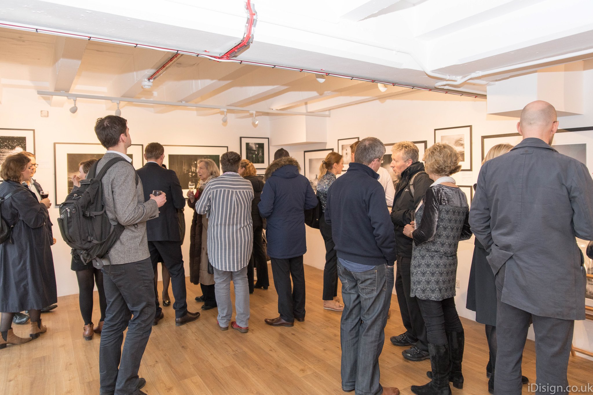
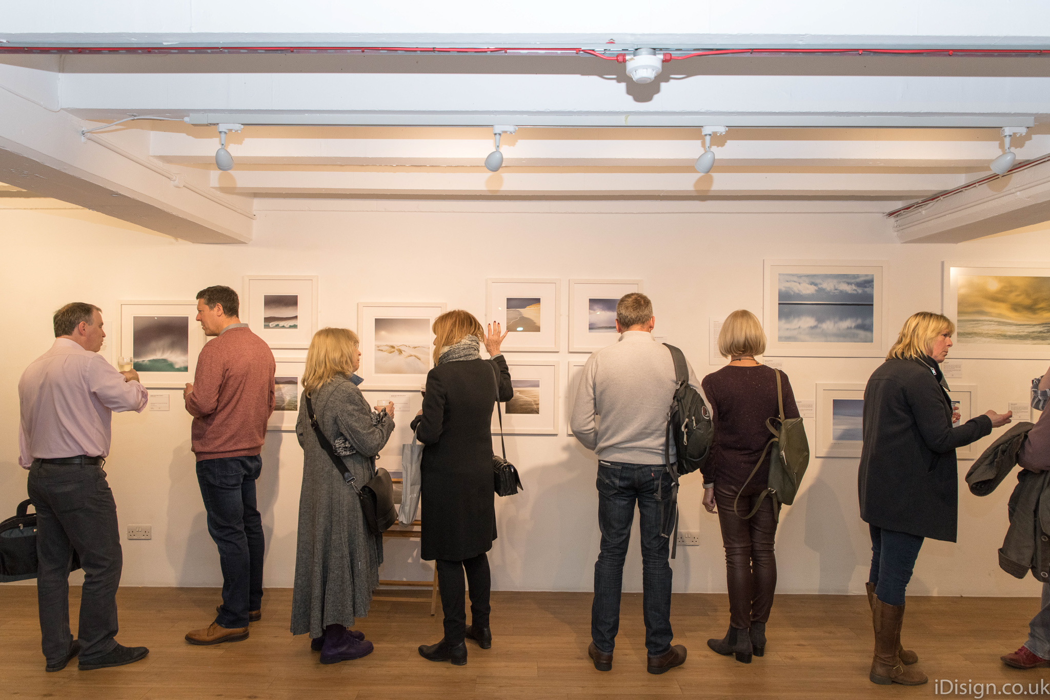
Vision 9, at the J-shaped Oxo gallery in London, showed the work of nine photographers, each having their own unique style, some concentrating on what came out of the camera, others using that original image as the base from which to arrive at a very different end-product. This is not to judge one as being better than the other, they are just different forms of photographic art.
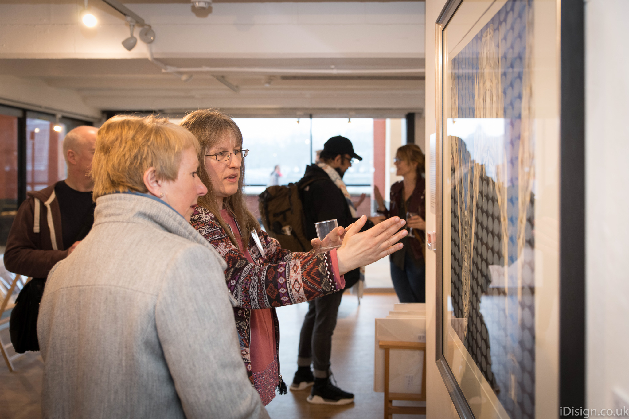
Although I had previously seen several of the exhibits around the Web, there is no doubt in my mind that a well-presented print is far more effective than a virtual image on a screen, bringing the image to life and making it much more tangible. The framed images on the wall were grouped by artist, which allowed the viewers to see variations in each artist's vision while at the same time clearly showing the differences between them.
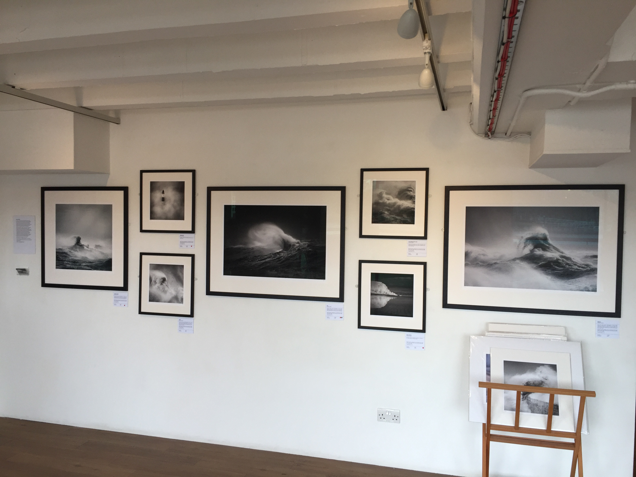
On coming into the gallery the first images I saw were by Beata Moore and Rachael Talibart. Ms. Talibart writes that her inspiration comes from a childhood spent at sea and her well-known Sirens series was well represented here. On display were some wonderful large prints of very dramatic stormy seas, the angry waves taking on the shapes of mythical gods and monsters. Although this type of subject works well in both colour and b&w, the mono processing possibly helps the viewer to more quickly see the shape and form of the waves.
Ms. Moore displayed images presenting the power of the sea and as she writes “the eternal struggle of man trying to subjugate it”. Her prints have a strong sense of the dynamic nature of water, some being carefully composed abstracts bringing colour and form together to create a very pleasing effect. She also showed delightful monoprints from Venice at night, with a full range of tones imparting a wonderful mood to each scene. There is a "classic" feel about these, reminding me of the best of 1960's and 1970's darkroom prints. In her words, they “echo the glorious past of this place and a lingering sense of sadness in front of its slow decline”.
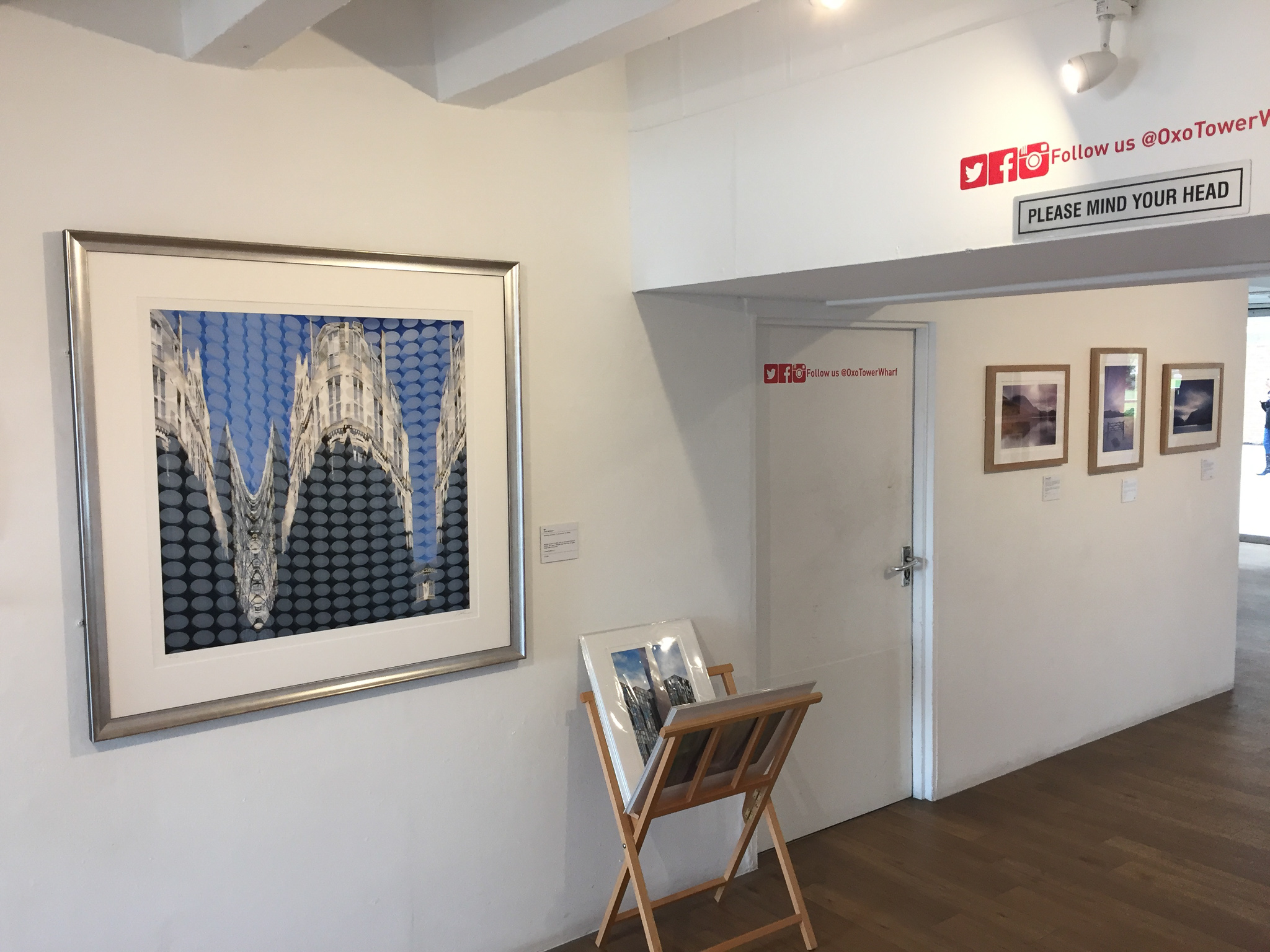
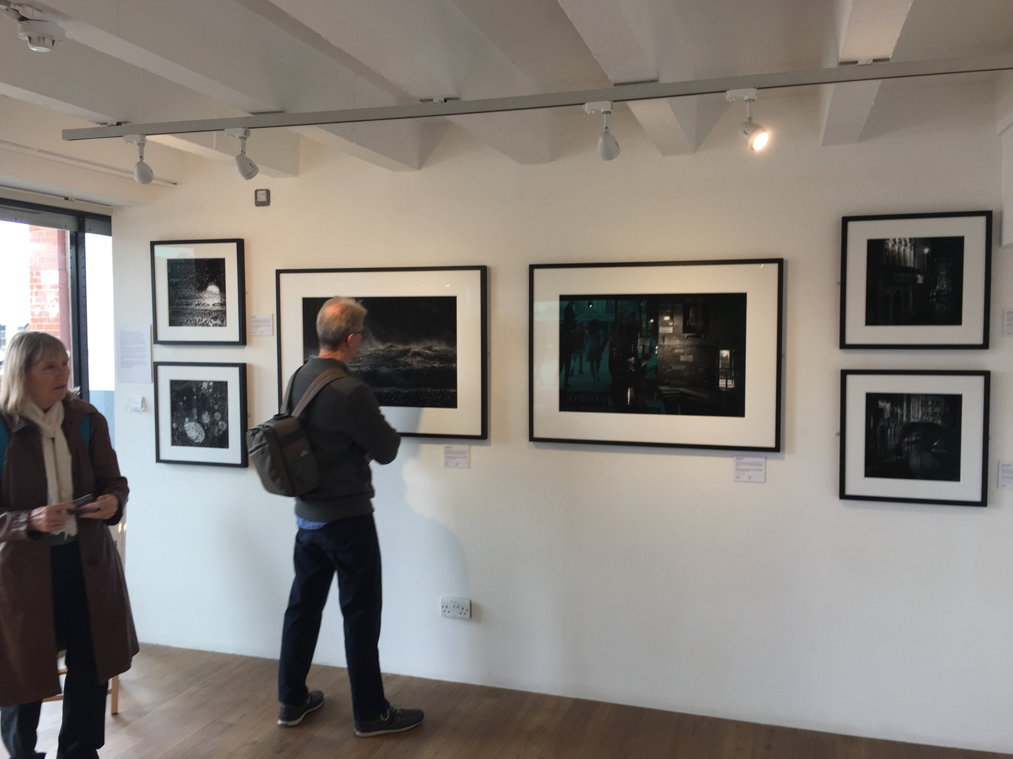
Moving into the next section, the bottom of the J, the exhibits were from three very different photographers: Astrid McGehan showed a few prints from her very pleasing work in the Lake District which she explains considers “the relationships of shapes and colours within classic representations of the landscape”. In complete contrast, she also showed a large print 'W1' of a building in Central London. What struck me about the latter was the mix of straight lines and rectangles with curves. The stark regimented lines of windows work well with the limited colour palette: white wall and blue sky.
On the opposite wall, we had Linda Wevill FRPS. Ms. Wevill's prints here were soft, with predominantly pastel colours, utilising both in-camera creativity as well as carefully considered post-processing. The effect is far from the oft-encountered screaming saturation and wild contrast, instead, the resulting prints are delicate and subtle with a watercolour feel, yet full of detail that invites closer inspection. I particularly liked a print of regimented very straight trees presented in pastel magenta and a soft cream, which she obtained by inverting the colours in post-processing.
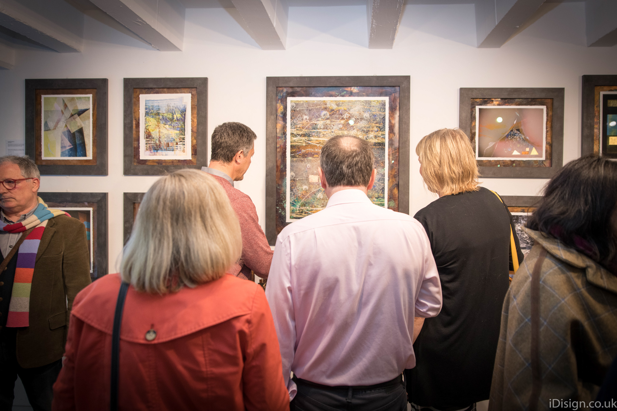
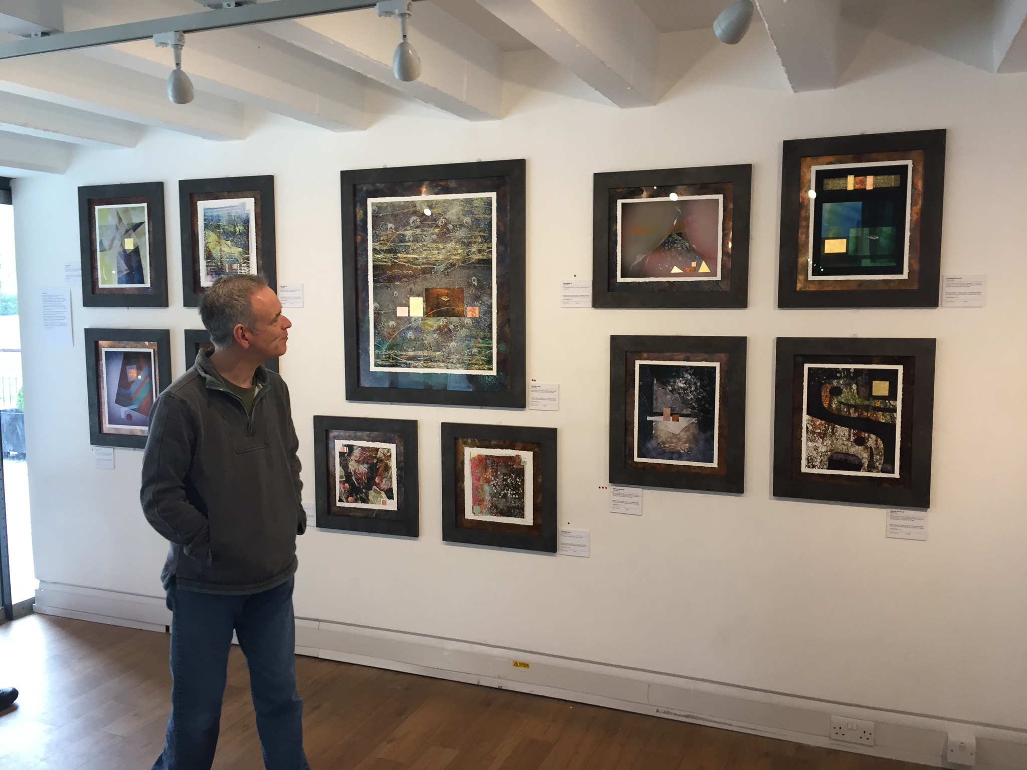
The last exhibit of this section was by Valda Bailey, known for her in-camera movement as well as multiple exposure techniques. This display is totally different from the other artists' work, using photographs as the starting point of a complex process which includes applying gold leaf. The result is a set of images that I thought have an intriguing Asiatic feel; I was rather pleased that on reading Ms. Bailey's statement I learnt that she had taken the initial photographs in Sri Lanka. My impression of the Asiatic look was along the right track! The colours are dark blues, magentas and shades of brown-red providing good contrast with the bright patches of gold. Ms Bailey explains that her photography is greatly informed by her background in painting, with artists influencing her as much as photographers. She aims to use colour and form bringing tension and dynamism to her images.
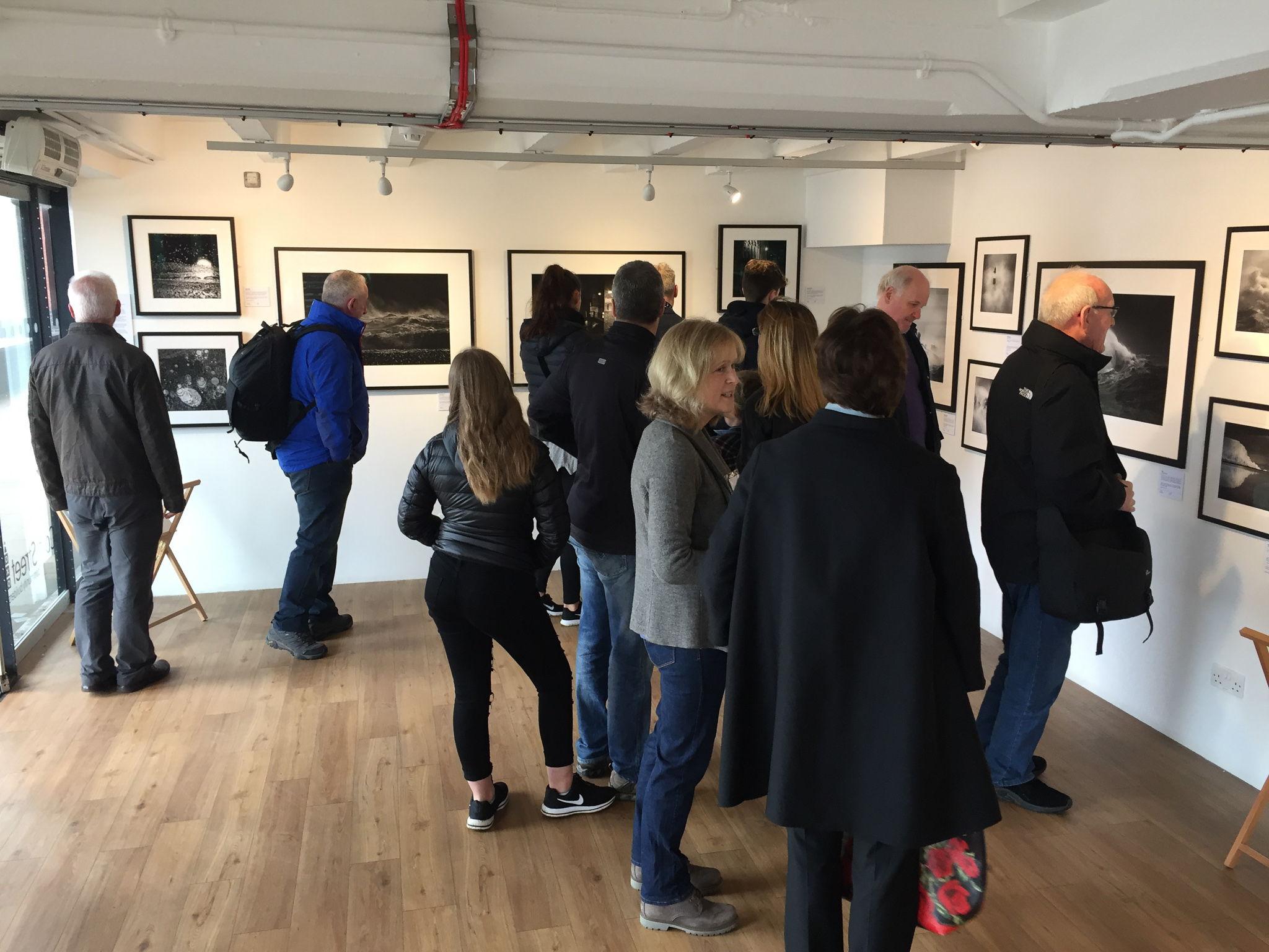
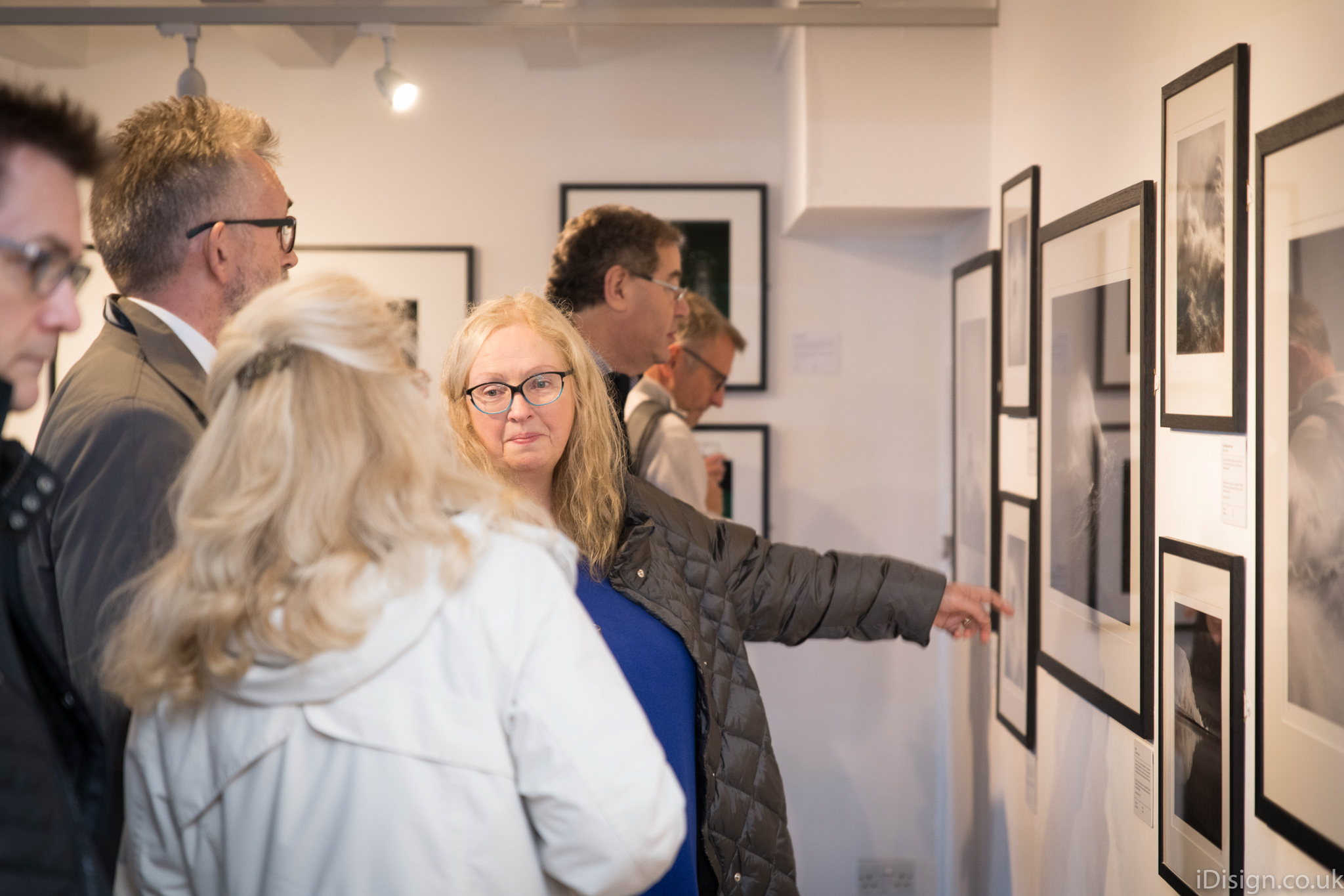
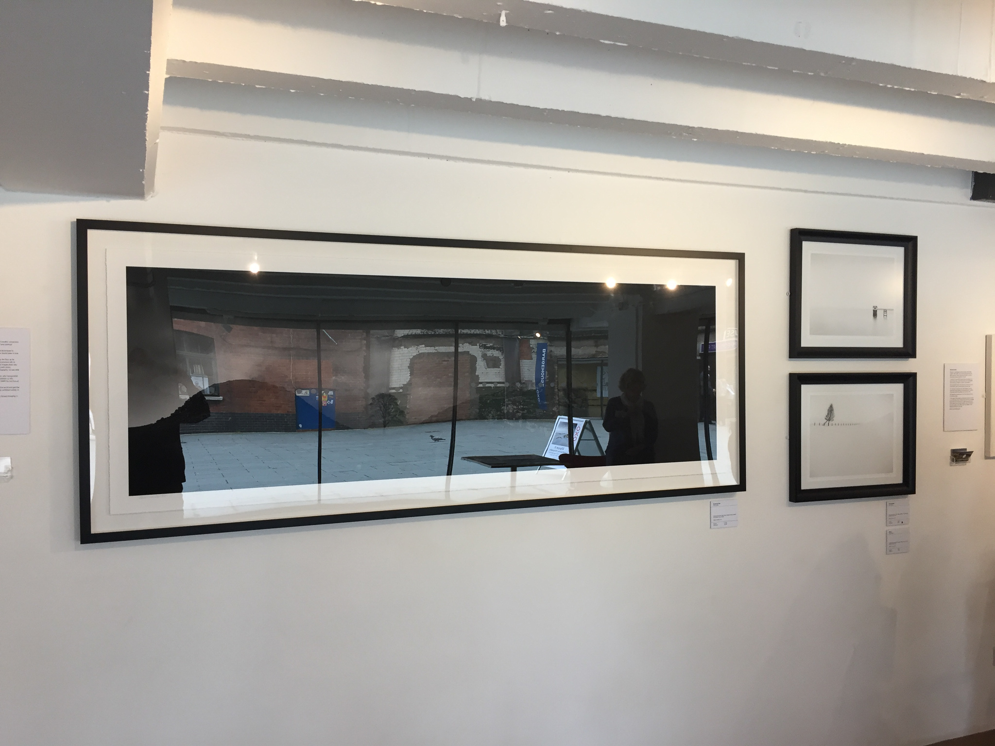
We then come into the long arm of the J-shape and the first print was by Paul Sanders. This is a huge black-and-white panoramic print of a dark, moody hilly landscape. It is a very imposing scene almost forcing the viewer to ask questions (why? what?...), but would have benefited from not being framed behind reflective glass – I understand that would have been Mr. Sanders' preference too but that he was advised to protect the print. Unframed matt paper would have allowed the viewer to better appreciate the darker tones in what is an evocative and mysterious scene. Mr Sanders also showed some of his softer minimalist b&w work, which includes using long exposures to achieve a dreamy look.
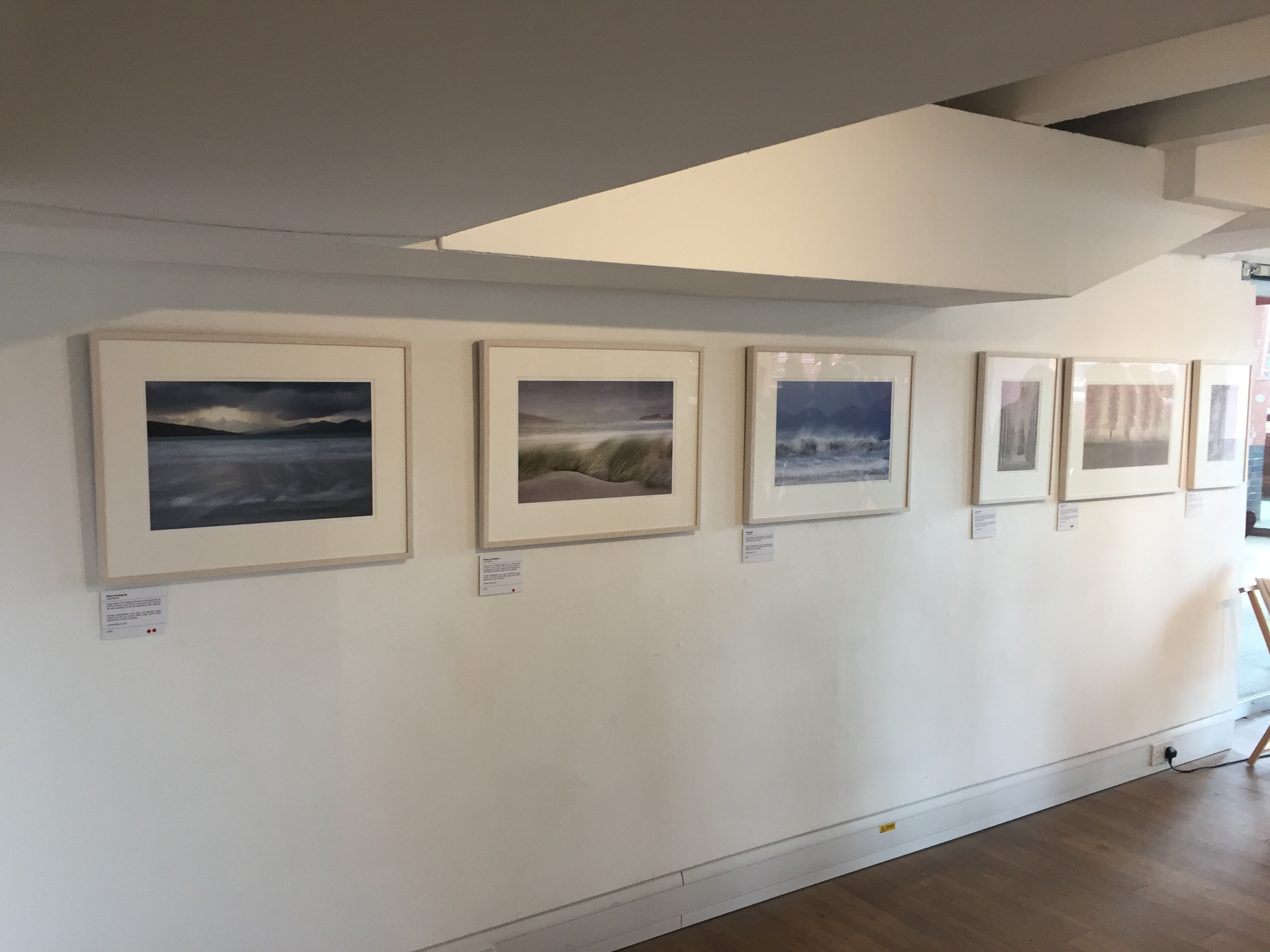
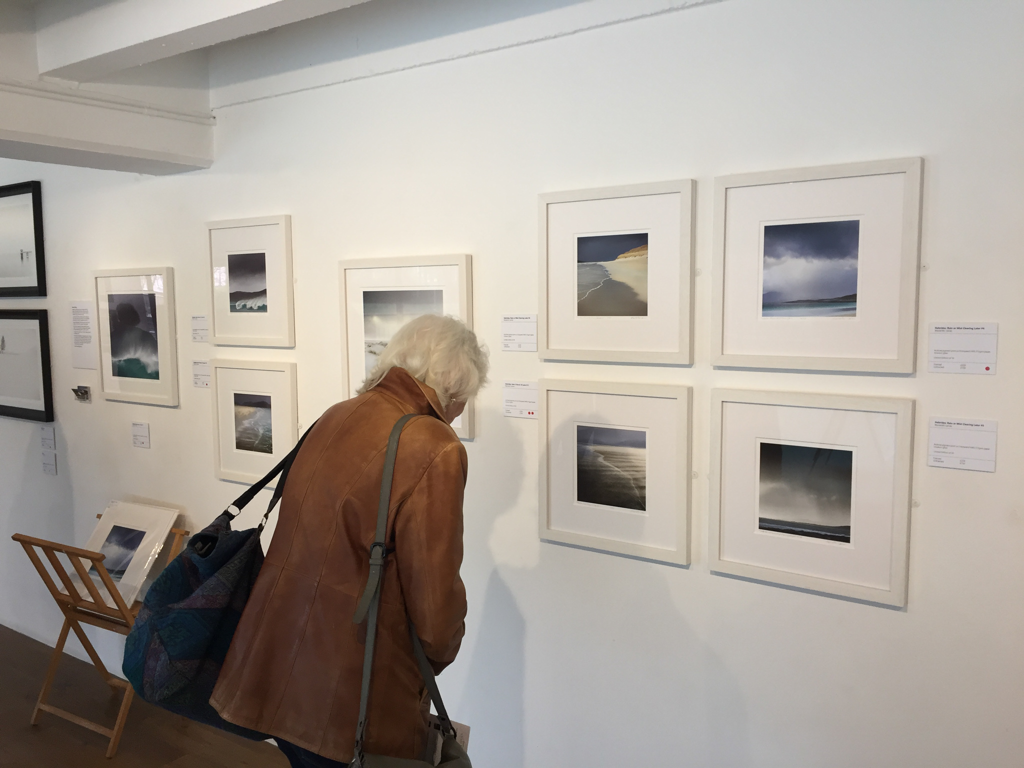
Two female photographers followed on along the wall: Marianthi Lainas showed a very appealing set of prints from the Outer Hebrides; she writes that this is part of a larger body of work inspired by the changing weather conditions on the same Atlantic-facing beach over a two-day period. Ms. Lainas has caught lovely lines and forms in the sand as well as the sky, also the colour contrasts and juxtapositions work well together to bring out the look for which these islands are famed. In an interesting touch, image titles incorporate part of each day's shipping forecast for Hebridean waters.
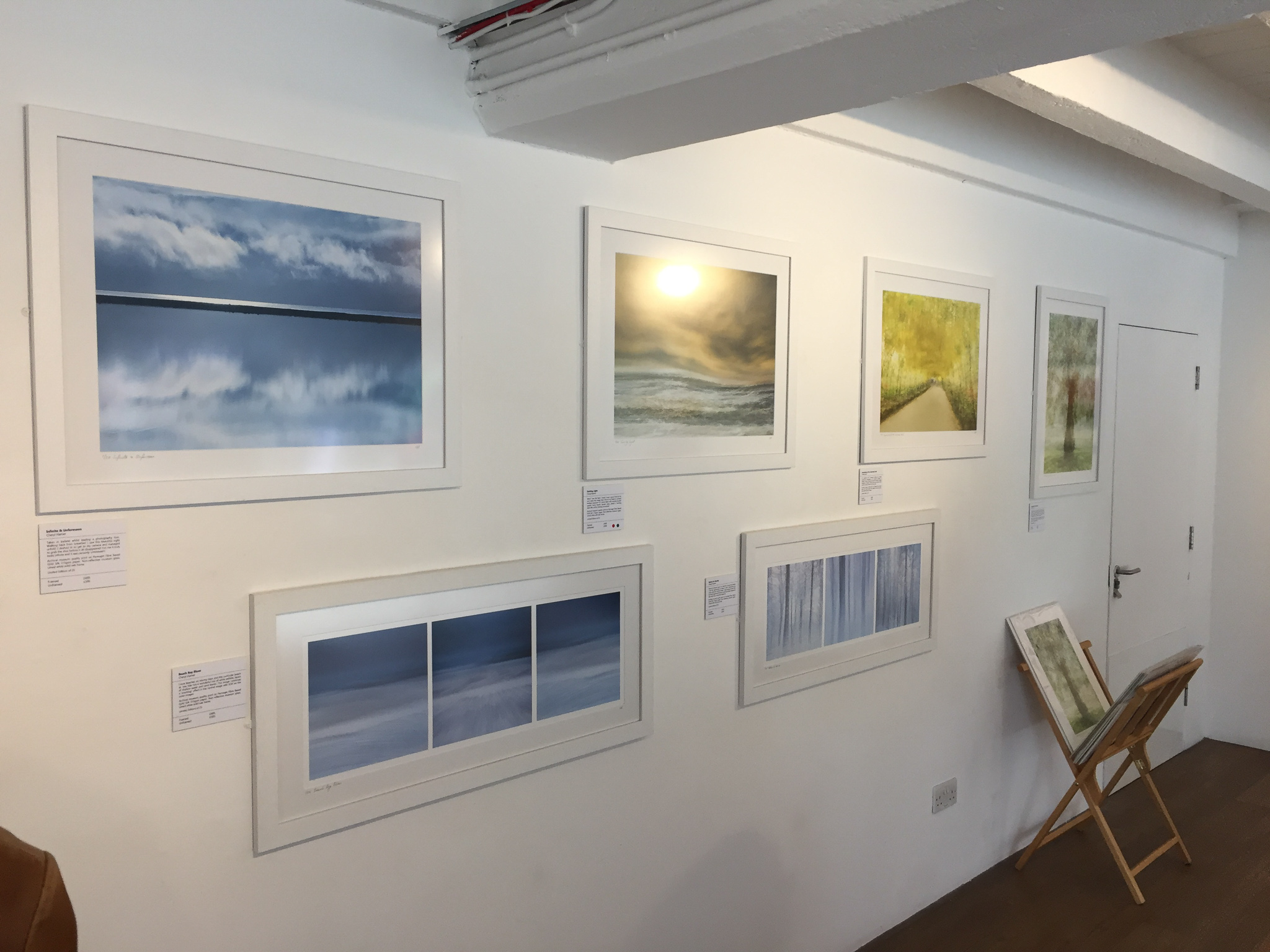
Cheryl Hamer has a somewhat different style yet with similar subject matter. She uses a mix of multiple exposure and ICM techniques, at times in the same final out-of-camera file, to produce very effective images, some with a strong painterly effect yet with a restrained colour palette. I found it very easy to connect with both Ms Lainas’ and Ms Hamer’s sets of prints, they show the sort of subjects that I too like to shoot and seeing these prints inspires me to try and learn some of these techniques.
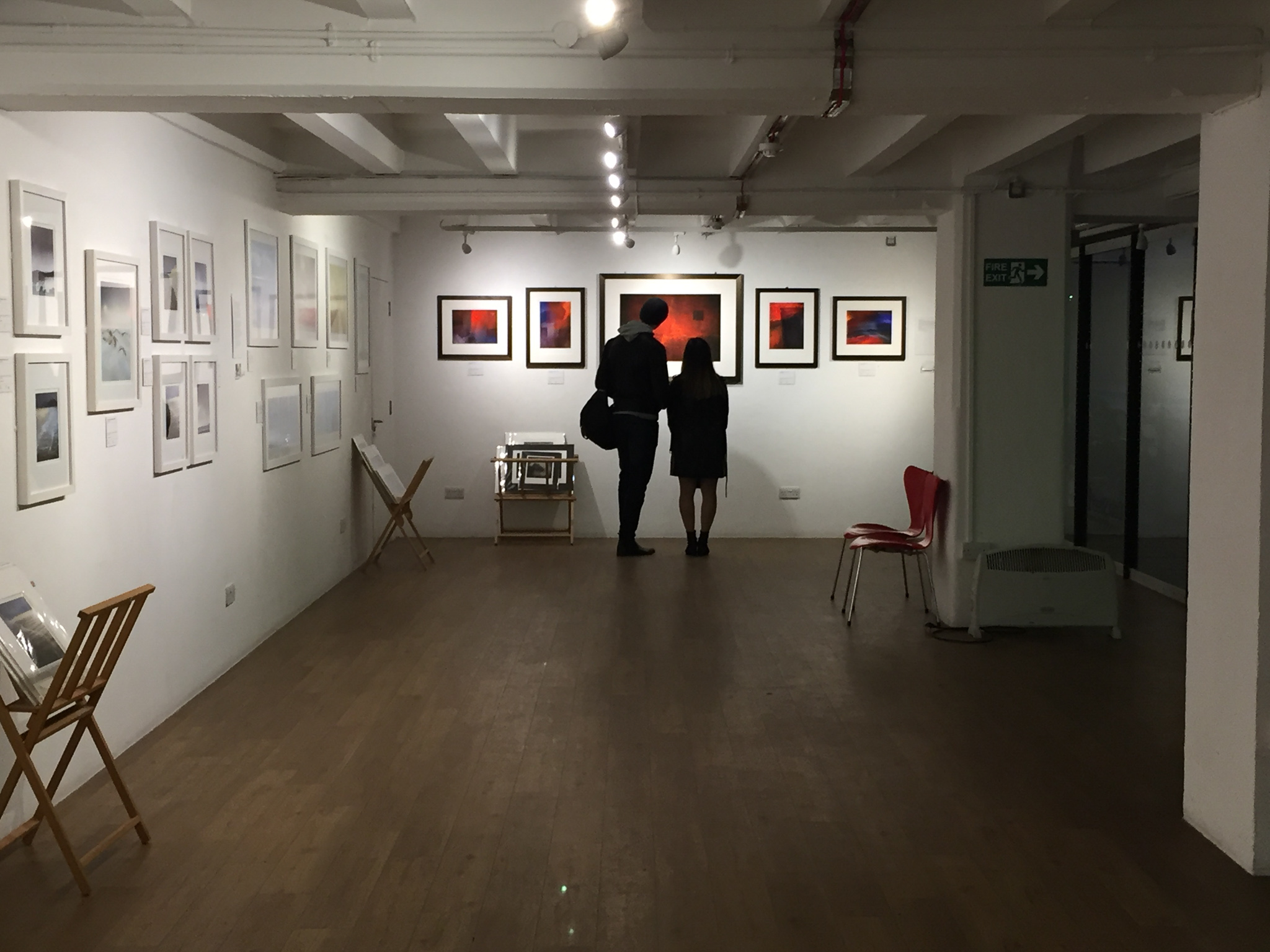
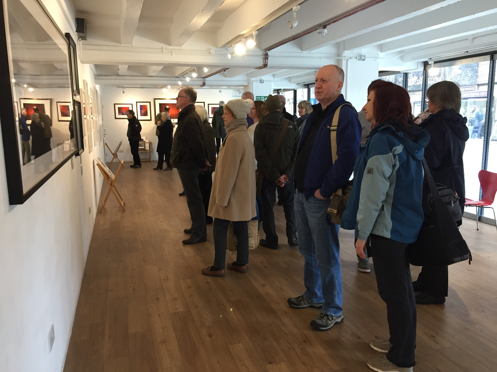
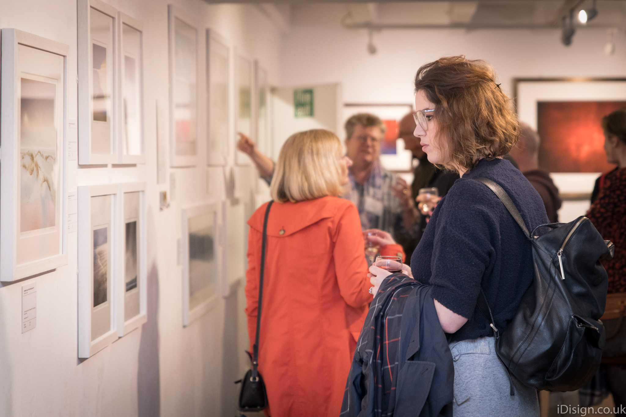
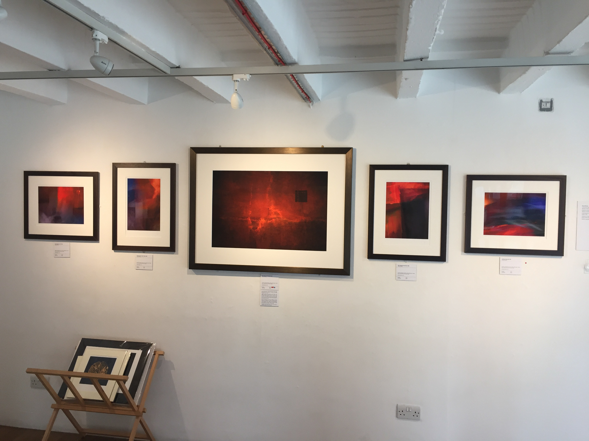
Finally, the far wall of the gallery was given over to a dramatic set of predominantly red prints from Doug Chinnery. He too uses photographs as a starting point, applying in-camera techniques to arrive at abstract images which demand some time of the viewer to appreciate properly. He explains that the images shown were created during a time of sadness and loss, yet the bright colours reflect the positive side of how people can overcome difficult times with resolve, resilience and even a dash of humour. Interesting work.
Overall I thoroughly enjoyed the exhibition and look forward to seeing more from the artists. There was a sufficiently wide range of styles to please most viewers though personally I was most drawn to the softer colours and more painterly prints of recognisably landscape scenes. Photography allows us to work with the widest range of subjects and employ a tremendous variety of techniques to reflect our way of seeing and the feelings we had when releasing the shutter. Visiting an exhibition such as this is very enjoyable and time well spent; it helps me to think about my own work, how I process my photographs and what I am trying to show in the final print.