Part Two - Getting it Right

Tim Parkin
Tim Parkin is a British landscape photographer, writer, and editor best known as the co-founder of On Landscape magazine, where he explores the art and practice of photographing the natural world. His work is thoughtful and carefully crafted, often focusing on subtle details and quiet moments in the landscape rather than dramatic vistas. Alongside his photography and writing, he co-founded the Natural Landscape Photography Awards, serves as a judge for other international competitions. Through all these projects, Parkin has become a respected and influential voice in contemporary landscape photography.
Sometimes you think you've got things so right and yet, when you look at the result, you realise that something has gone significantly wrong. In the last issue I published the results of a series of test on graduated filters, even though I had a few doubts about the results. I didn't think the results were necessarily wrong, but they weren't showing something useful in the context of our landscape photography. If you're interested in the why's and how's of the testing, just have a read past the results and conclusions.
Results
OK, I've spent enough time analysing these graduated filters for colour that I'm happy to come to some general conclusions. I've worked out a colour difference between the clear part and the ND part of each filter (averaged across the ND zone of the filter) and this is given in terms of "Delta E 2000", a term used in printing to denote the difference between two colours in 'human' terms. Values of over 1 are 'visible' if placed next to each other. Most high-end printing companies consider any values less than or equal to 3 to be an acceptable colour match.
Below you can see a list of colour 'errors' for all of the filters tested. There's a lot of data, so I've sorted them from 'best' to 'worst' in terms of colour error. Please bear in mind that the density makes a difference. A denser filter is harder to create so try only comparing similar densities.
Finally, I averaged the two most important filters in my tests (the two stop hard and three stop soft) and came up with this table of brands.
Brand | Delta E | Std Dev |
|---|---|---|
| Lee | 1.1 | 0.7 |
| Kase 1.1 | 1.3 | 1.2 |
| Kase | 1.8 | 0.2 |
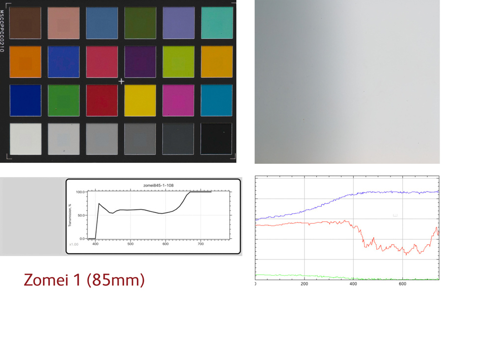
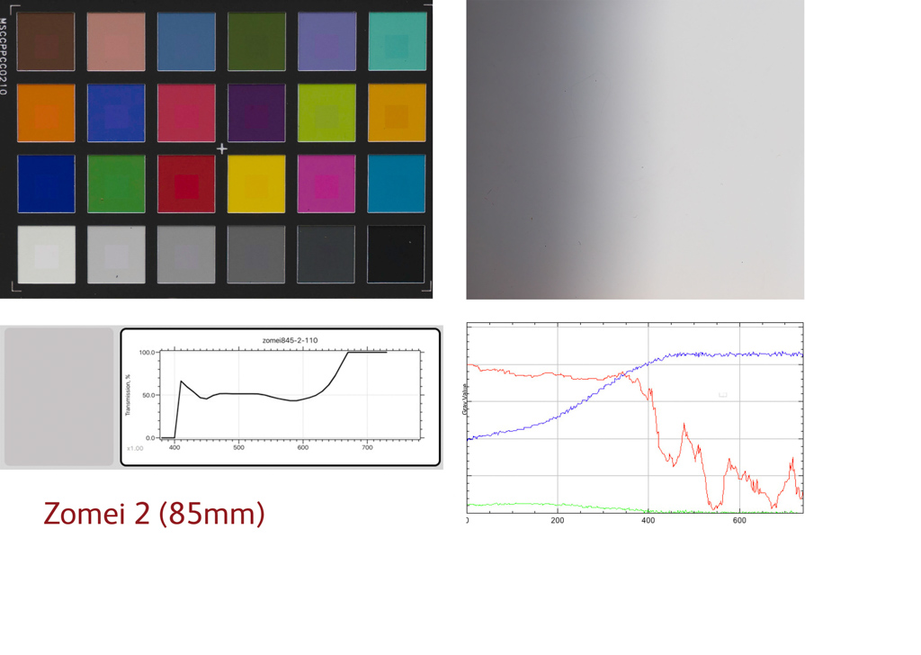
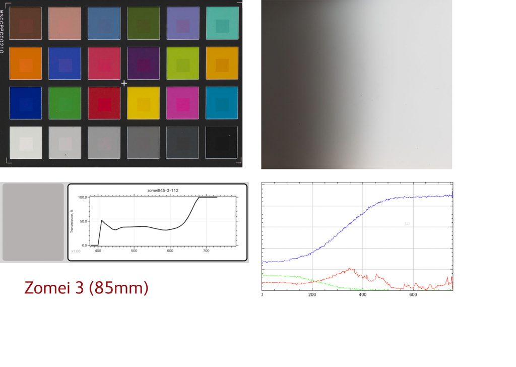
| Zomei 85 | 2.1 | 1.6 |
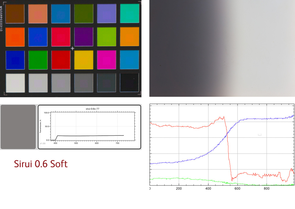
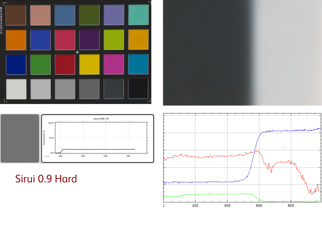
| Sirui | 2.5 | 0.0 |
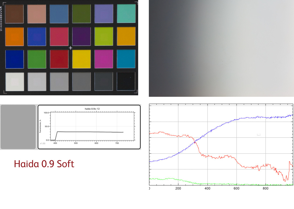
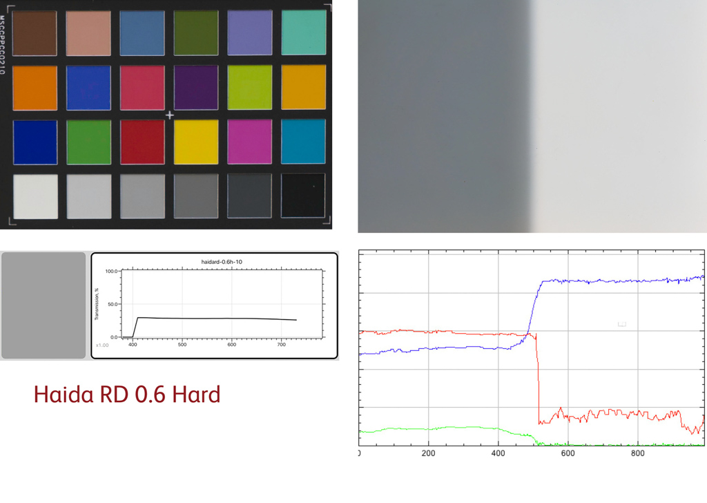
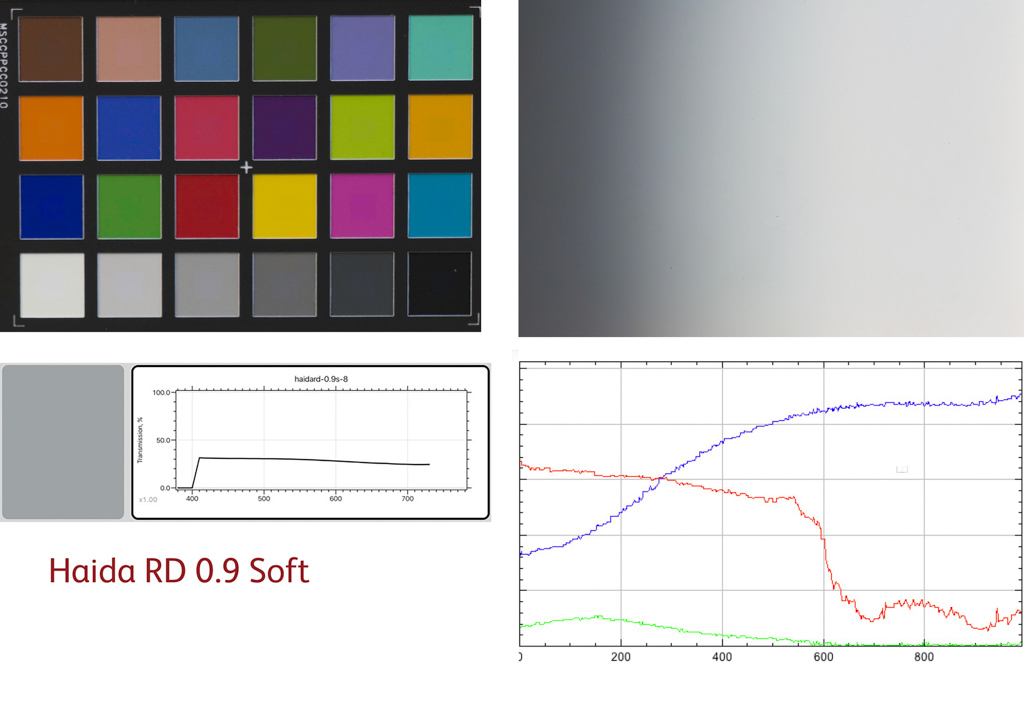
| Haida RD | 2.5 | 0.3 |
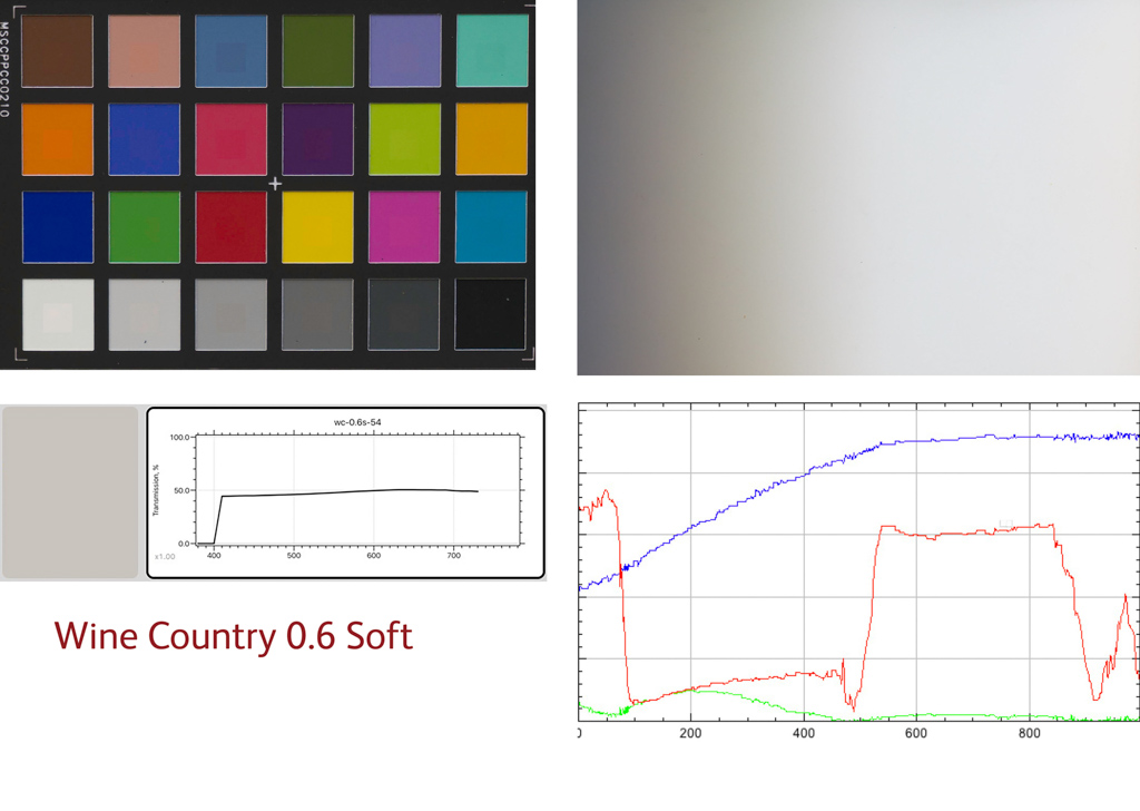
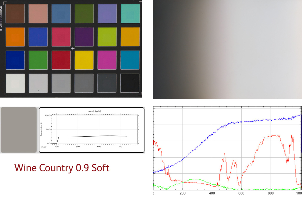
| Wine Country | 2.5 | 0.6 |
| Nisi | 2.6 | 1.0 |
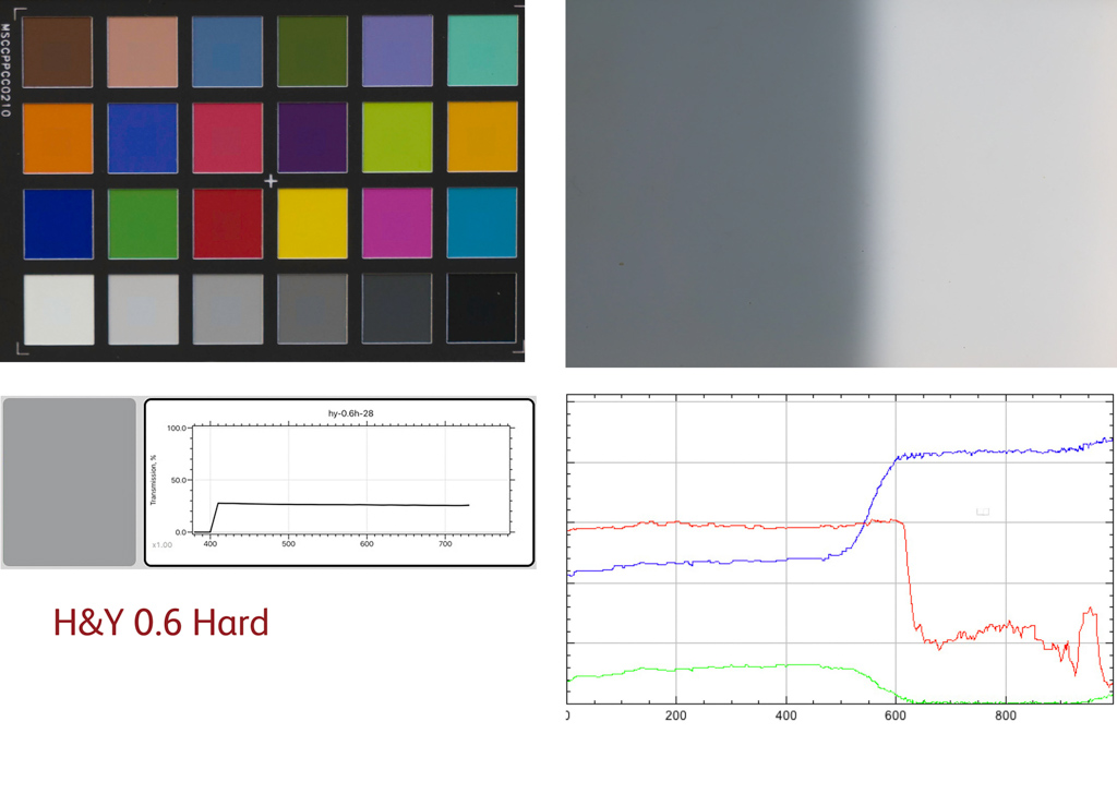
| H&Y | 2.8 | 0.5 |
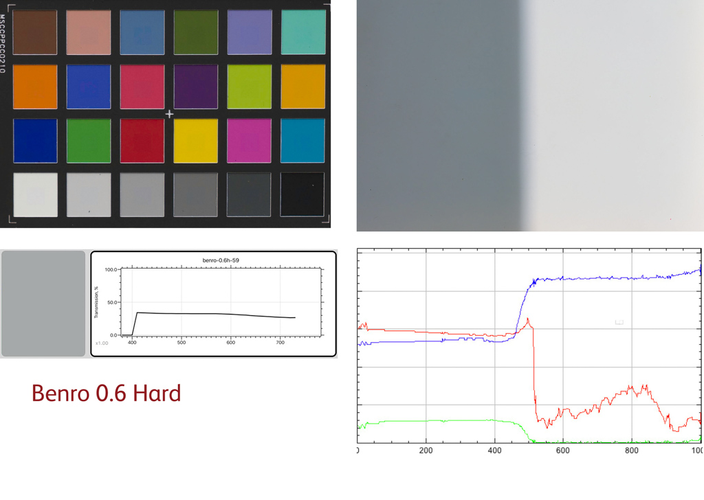
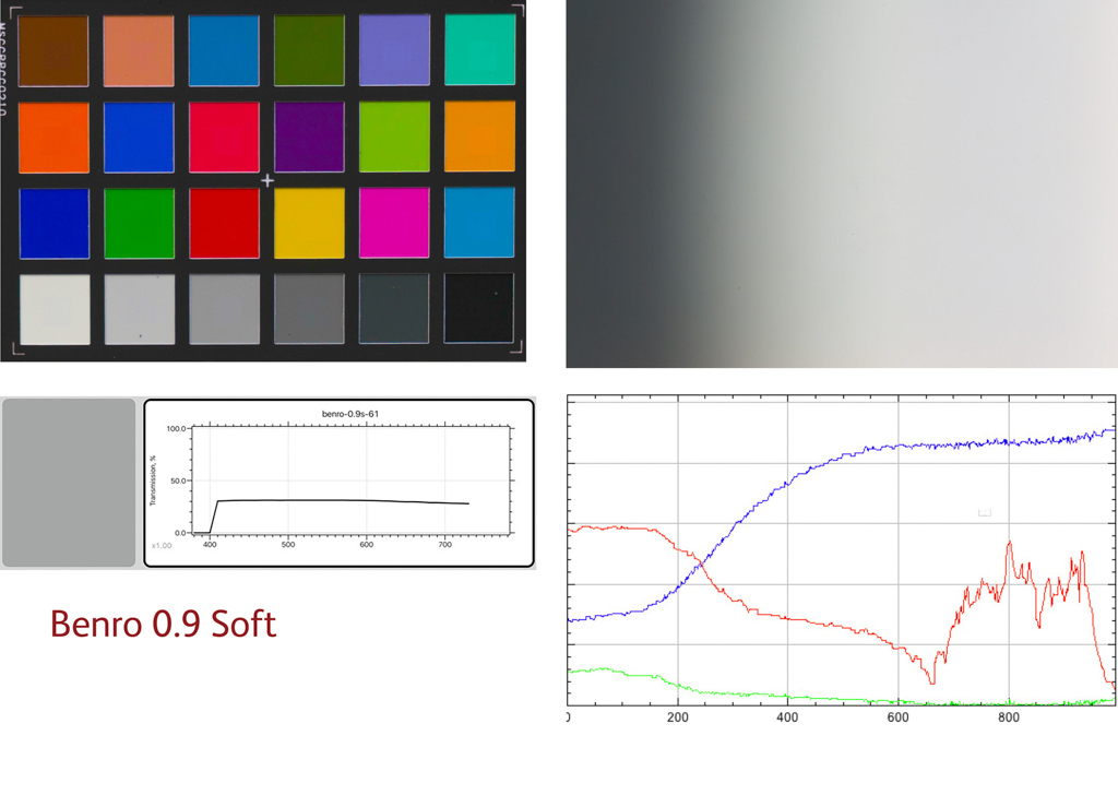
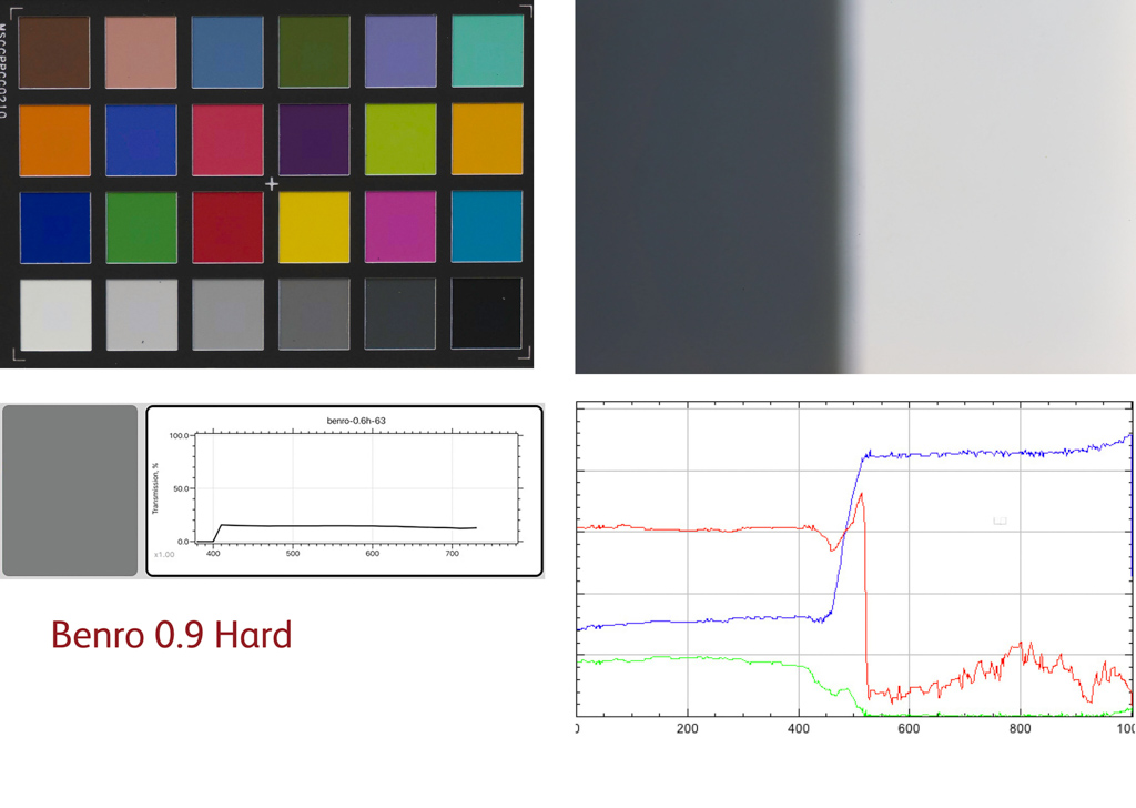
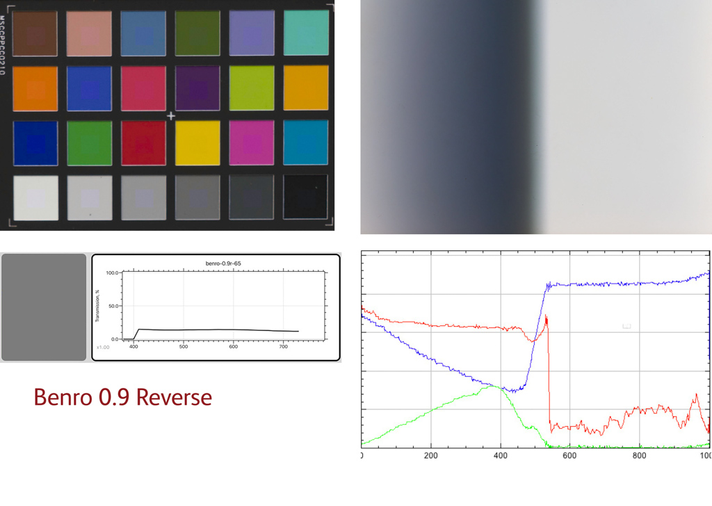
| Benro | 3.0 | 0.7 |
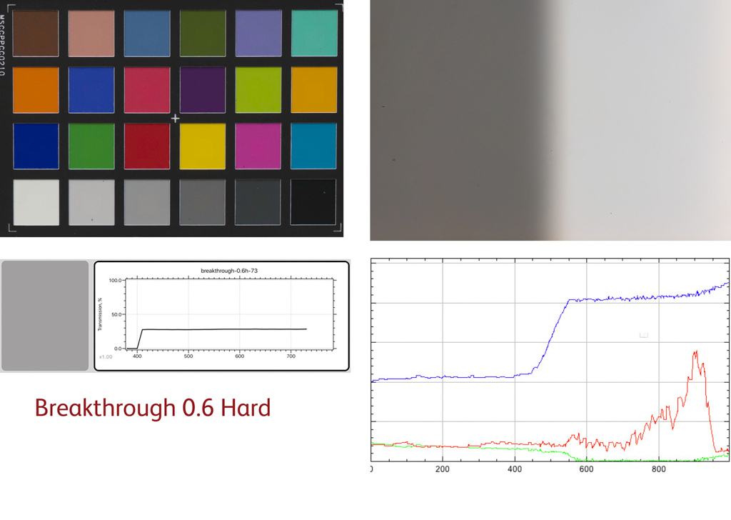
| Breakthrough | 3.5 | 1.7 |
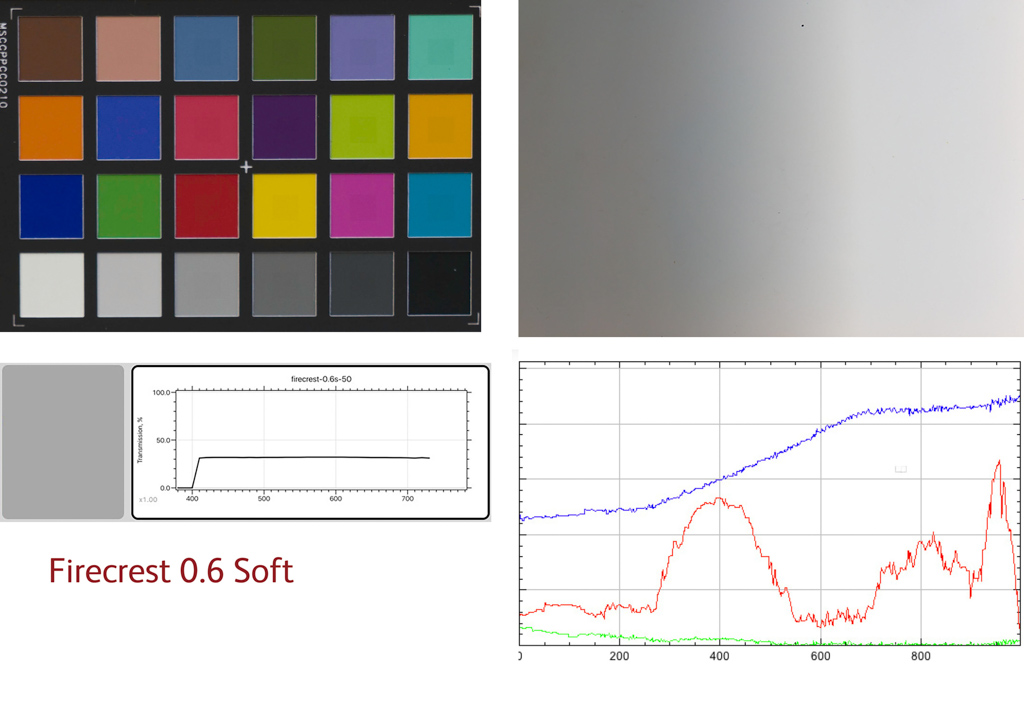
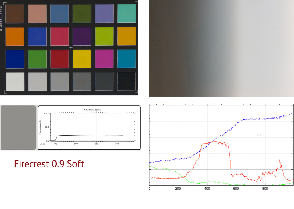
| Firecrest | 3.5 | 3.6 |
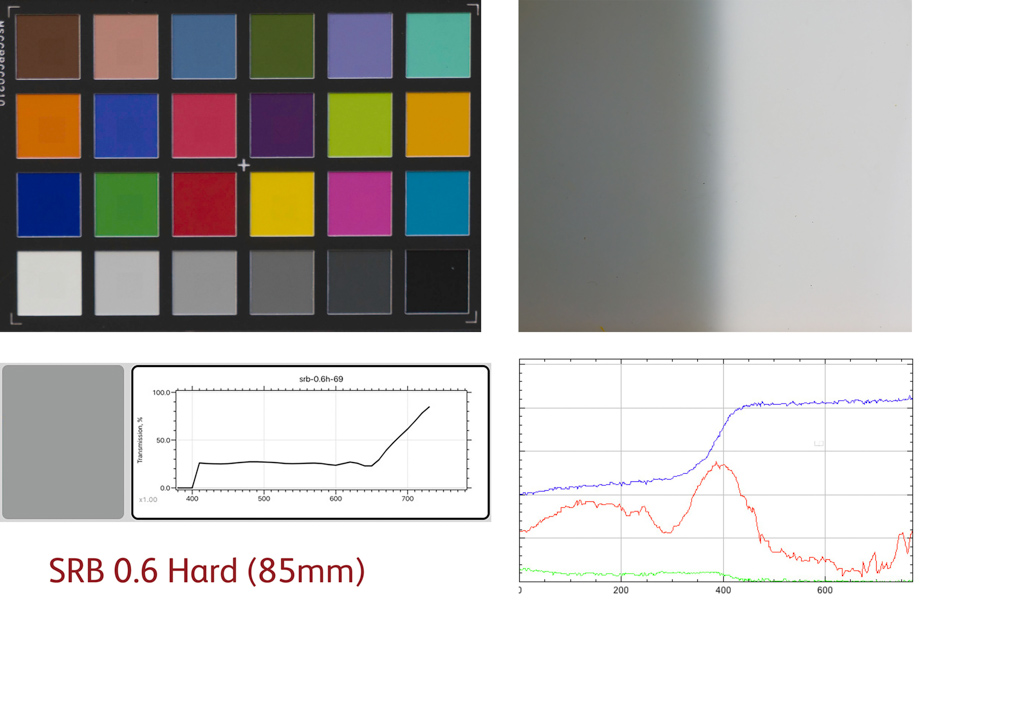
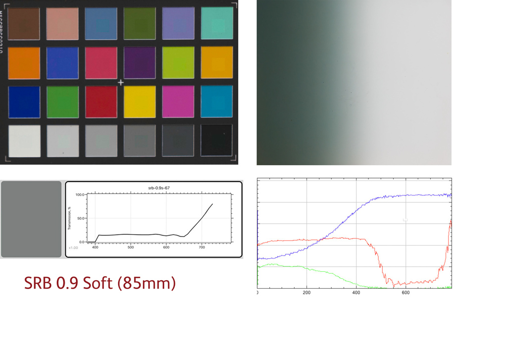
| SRB | 3.5 | 3.6 |
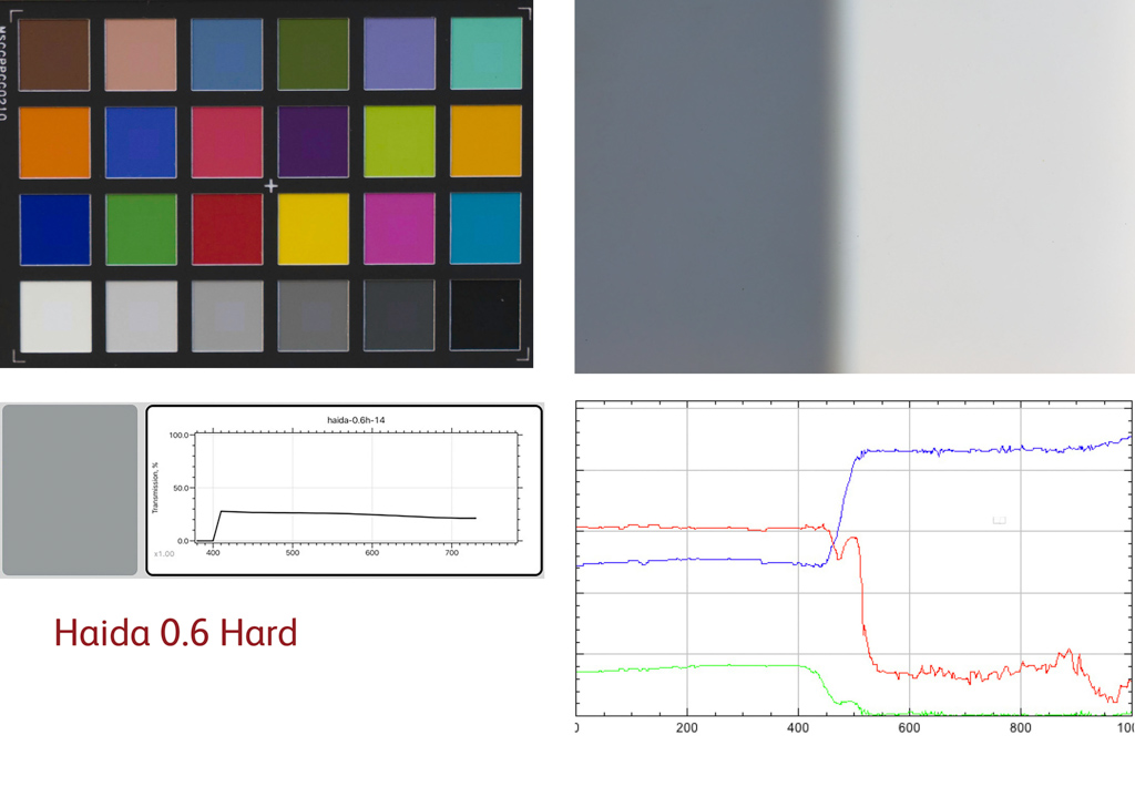
| Haida | 4.0 | 2.4 |
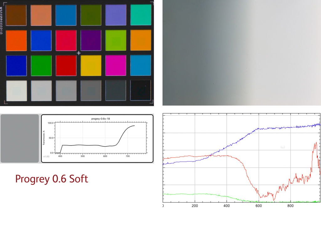
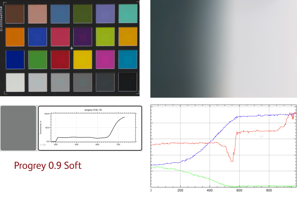
| Progrey | 4.8 | 3.3 |
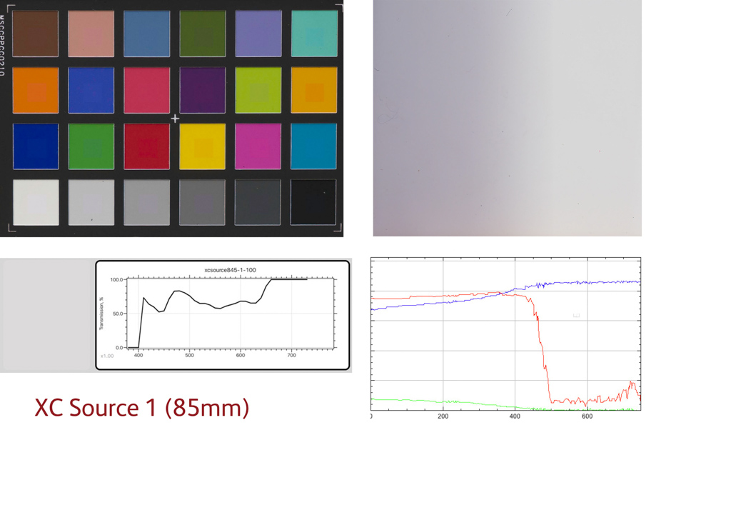
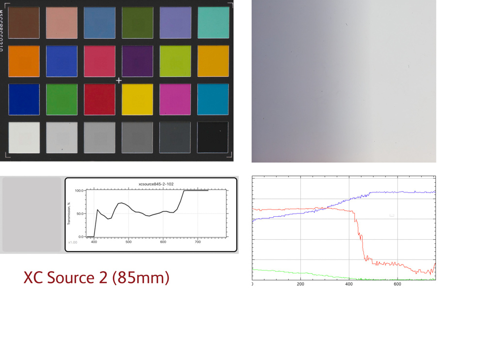
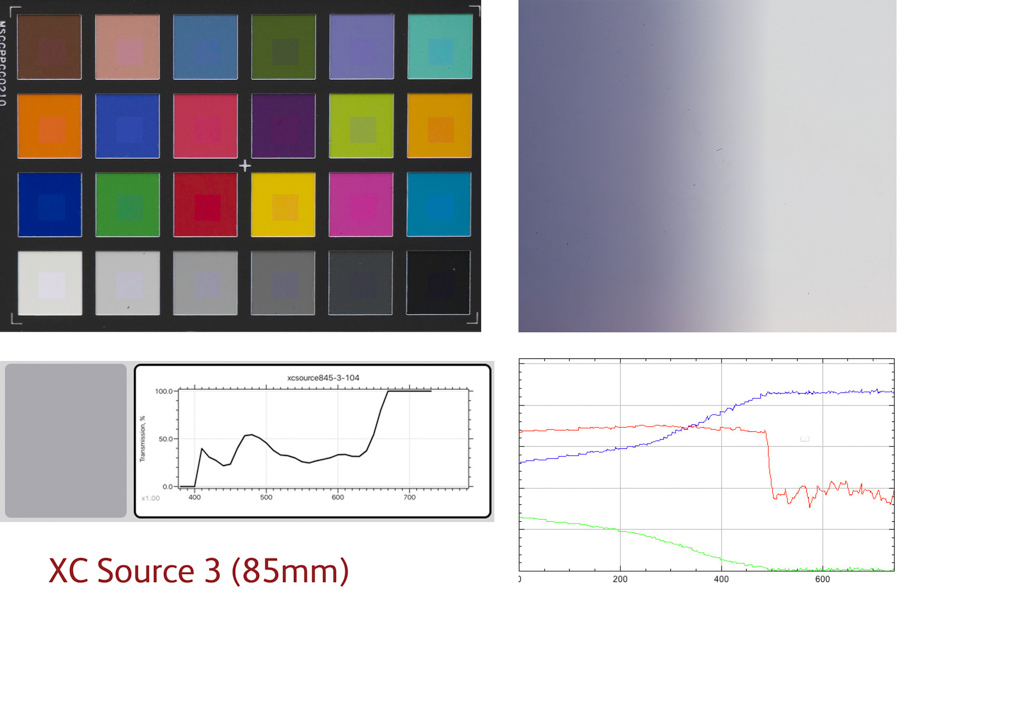
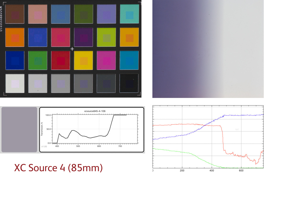
| XC Source | 5.1 | 4.2 |
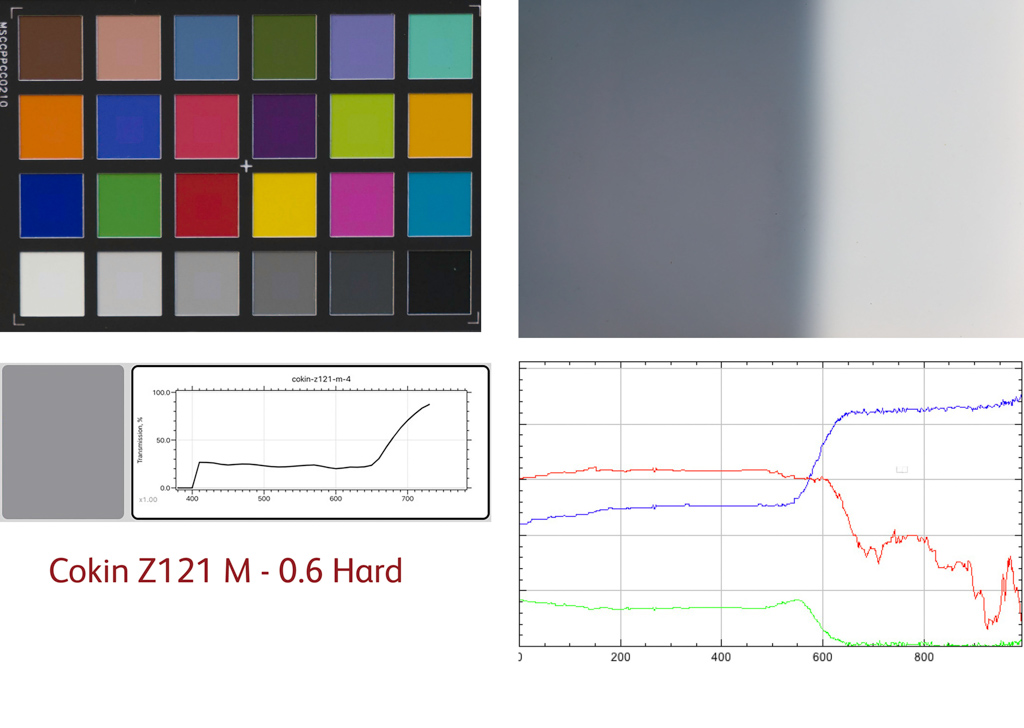
| Cokin | 5.8 | 0.4 |
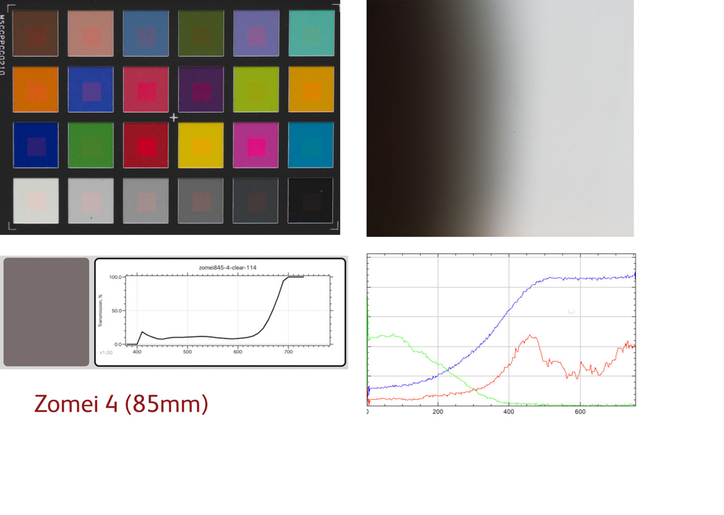
| Zomei | 7.1 | 1.4 |
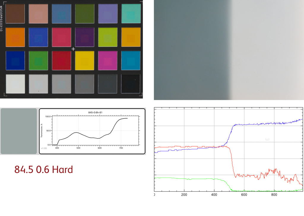
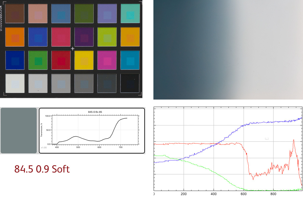
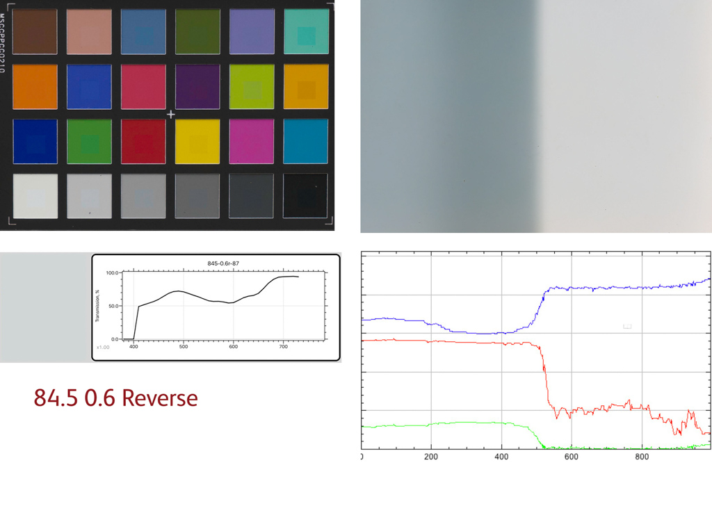
| 84.5 | 9.9 | 5.4 |
You could get very OCD and say that anything more than 1.0 is noticeable but in the field, I would suggest that anything under 3 is going to be accurate enough that nobody would see the difference.
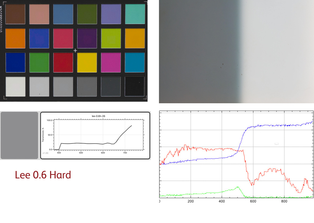
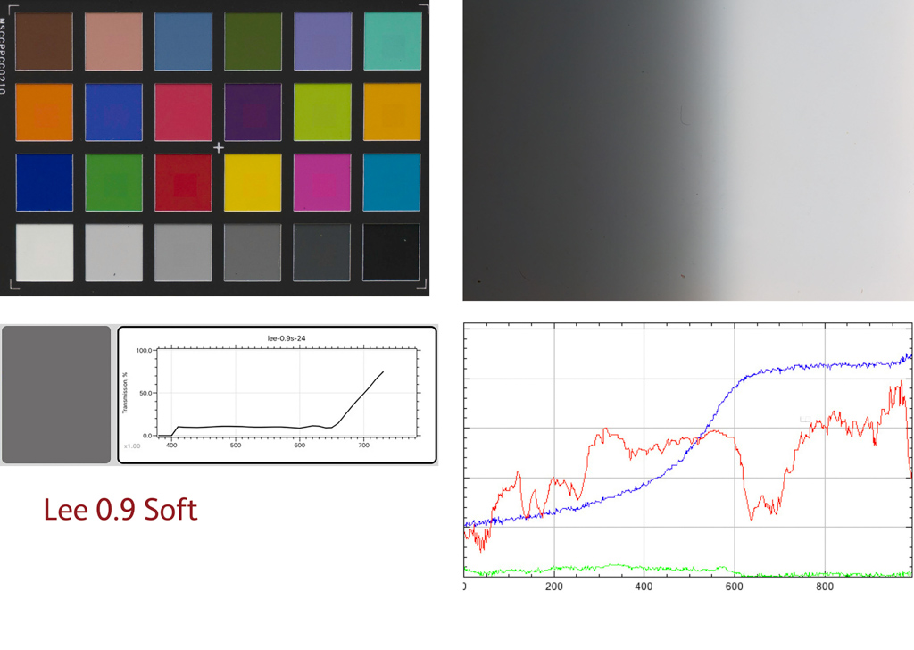
As you can see - for all that the original Lee filters is made out of resin and is an 'old' technology and it leaks infrared, etc. it actually produced some of the best results of the whole test. The three stop filter in particular was amazing in that it showed 0 colour error that we could measure!
One of the real surprises was the "cheap as chips" Zomei 85mm filters. I bought an 8 pack of filters, four grads and four ND filters and a holder for £18, and they turned out to be pretty damned accurate. So much so that they beat many filters 10x the price (in fact, 80x their price if you break down the cost of the package into individual filters).
It's worth taking a look at the results panels below as well as some of the filters may have scored OK but you can see that they have variable colour across the gradation.
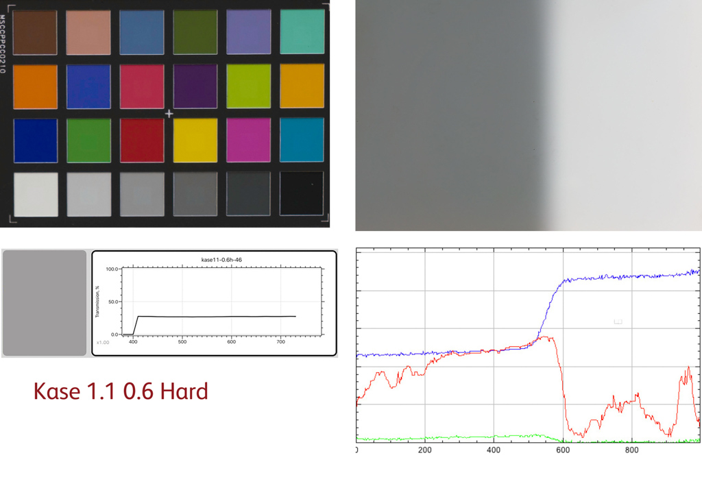
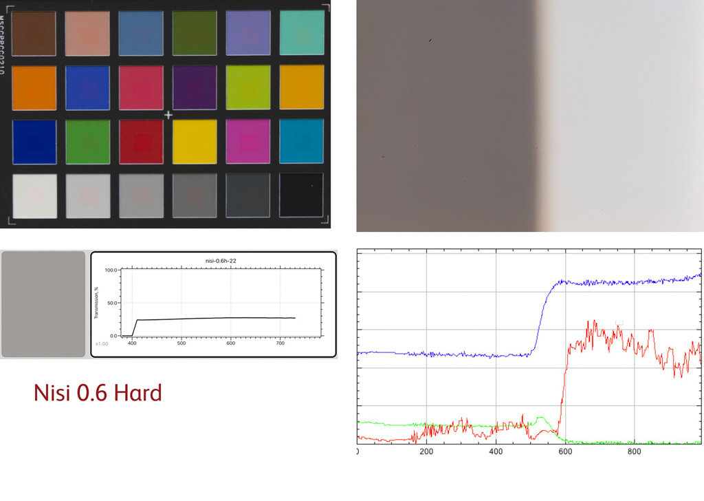
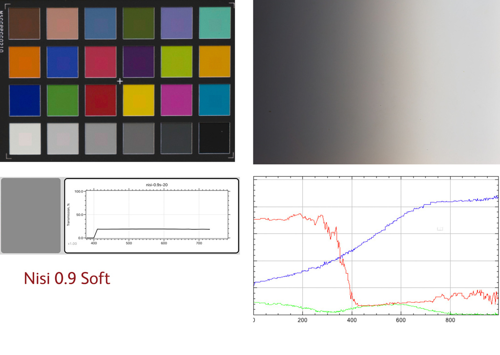
The Nisi filters were an example of this going from Cool to warm across the top part of the filter. The Nisi also had an odd gradation, getting less dense at the top of the 0.6 hard like some peculiar reverse grad.
The Lee 0.6 hard grad also had this slight colour difference around the transition area, with the colour getting less accurate (cooler/cyan) just at the boundary. Each Lee filter is hand dipped so this may well be variable depending on the process.
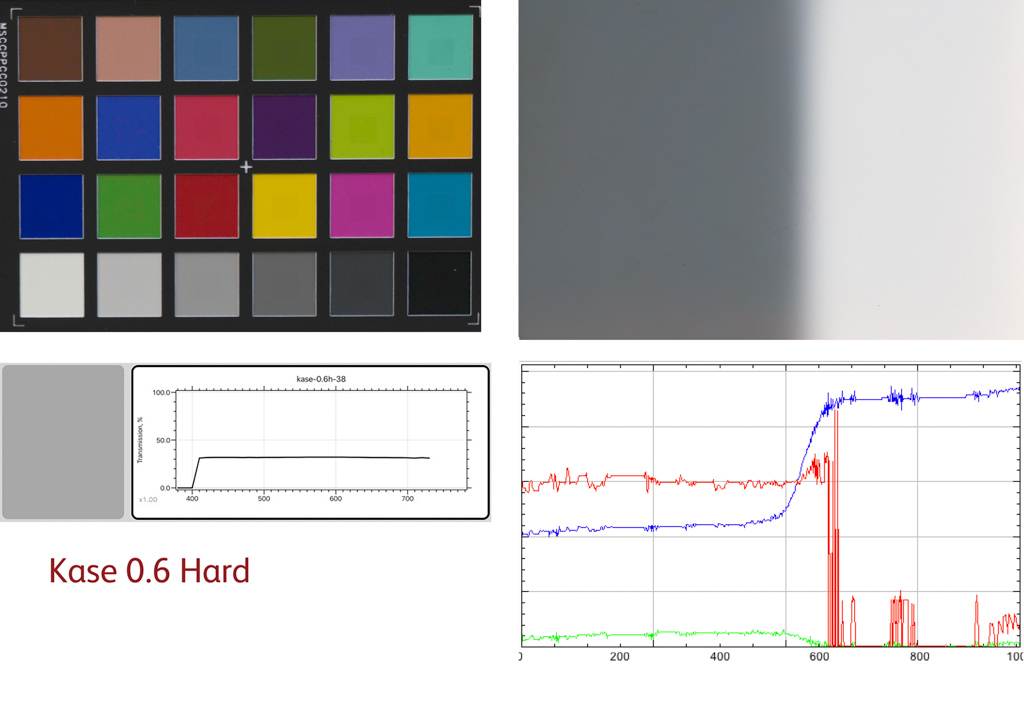
NB: The 0.6 Hard Kase filter was replaced during the test as it was an older version with a very hard edge. If people want to see the data for this I'd be happy to send it to them. Also the order of the results in terms of brands is unchanged. The old filter had a colour accuracy of approximately 2.2 and the new one 1.8.
Caveats!
Now there is a reasonable caveat on most of these results that says I didn't test a large sample of filters apart from Kase. The cost of doing so would be massively prohibitive and getting some of the manufacturers to lend me anything was quite hard. But, I'm confident that the results of the test are generally indicative.
However, my next task will be to take all of these filters outside and shoot a landscape with them. Am I looking forward to that!!! err... (55 test shots! The filters weigh more than camera, lenses and tripod!)
Geeky Stuff
OK! You've shown an interest in the real geeky stuff! I mentioned in the prior article that I was using a high-end flatbed scanner, a Fuji Lanovia, to scan the graduated filters. The scanner has been calibrated during each scan to ensure the results are "accurate'. I also used a spectrophotometer to measure the colour transmission of the grads using a professional Just Normlicht lightbox.
Sadly, both of these devices, the lightbox and the scanner, use fluorescent light sources and despite them being very high-end fluorescent lamps, they still don't accurately model daylight and so I knew I had to do the tests properly.
As it turned out, it's a good job I did as the results were quite substantially changed in some cases.
This time around, I based myself in our conservatory and waited for a stable, fairly clear day with hardly any wind (and in the Highlands, they are few and far between) and made three separate tests.
1) Using a Greta Macbeth i1 through a diffuser (a Capture One, lens cast calibration plate) I measured the spectral transmission of the filters
2) Photographed a i1 Colorchecker illuminated by indirect, diffuse daylight through both the clear part and the ND part of the graduated filter using a Sony A7R3
3) Placing each graduated filters against the diffuser up against a window, I photographed the filter using a Sony A7R3
I had to ensure that the camera results were calibrated correctly and created 'untwisted' colour (many camera profiles have colours that vary with brightness - obviously a bad thing for our tests).
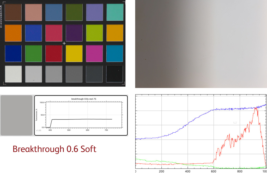
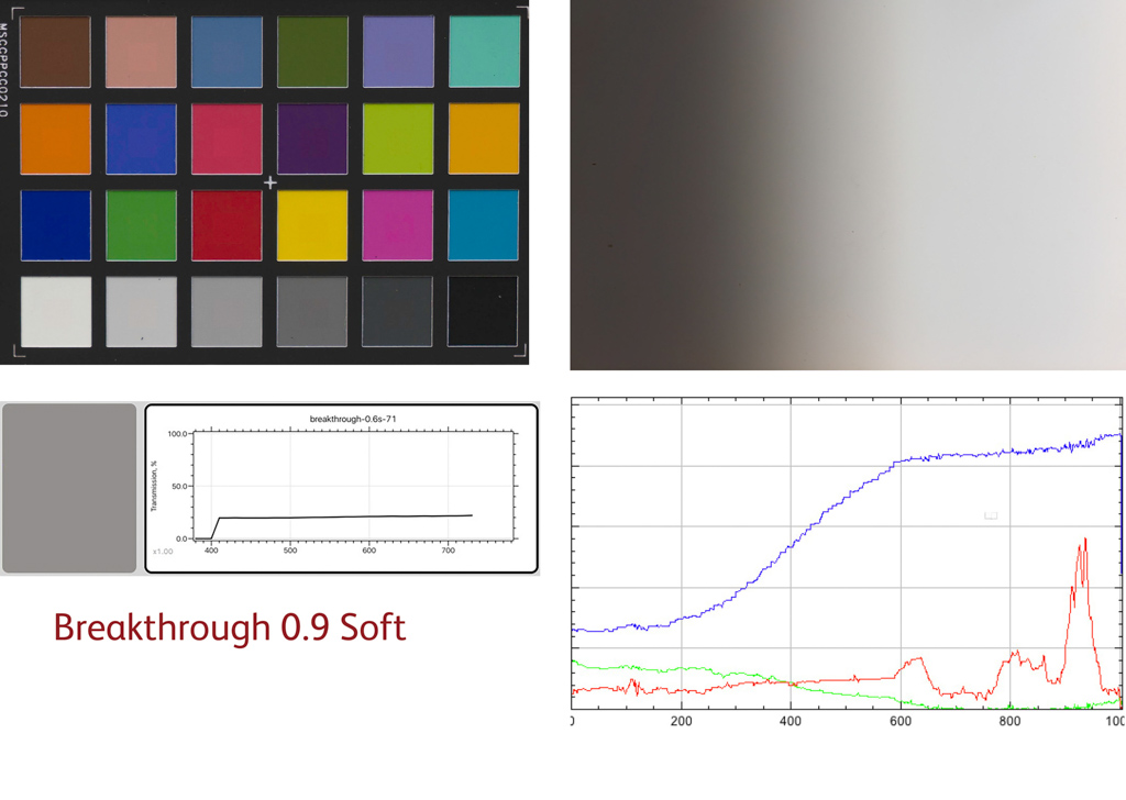
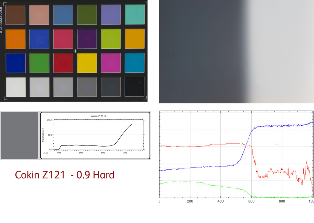
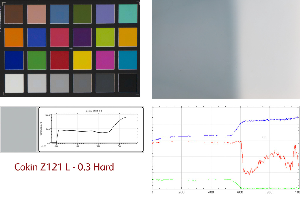
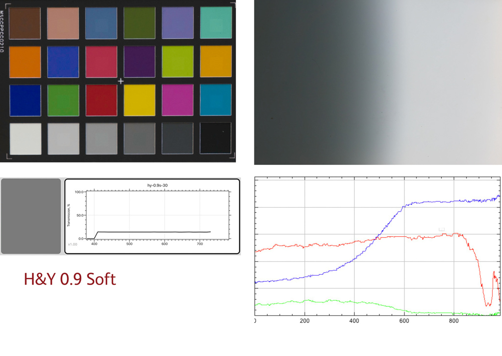
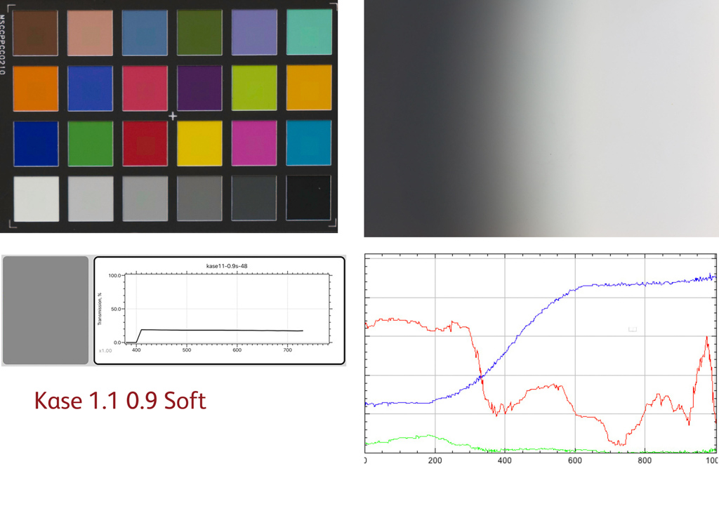
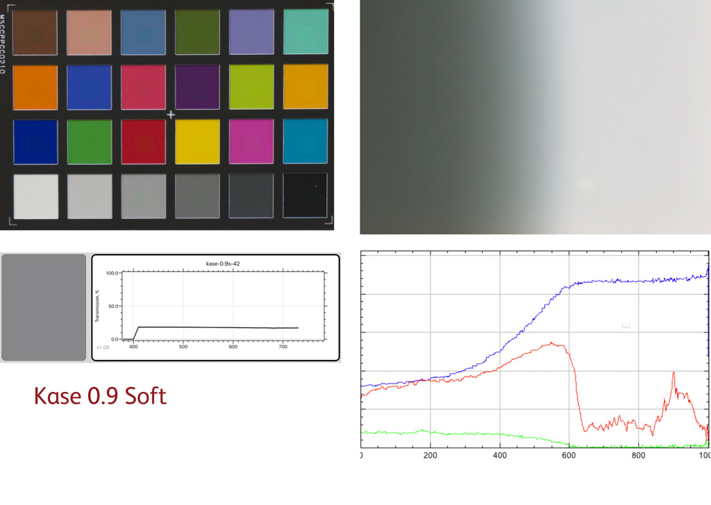
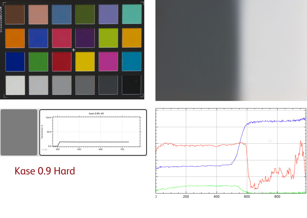
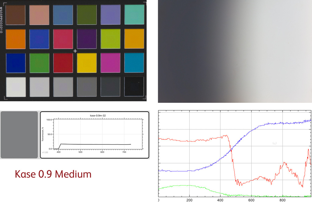
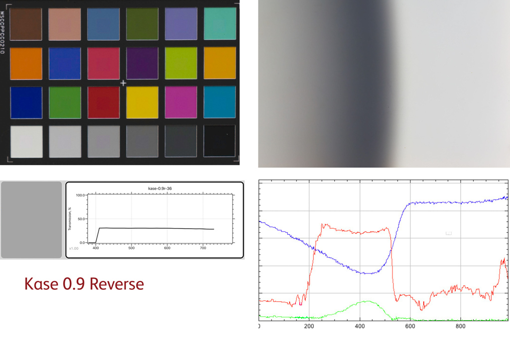
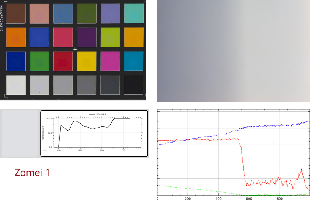
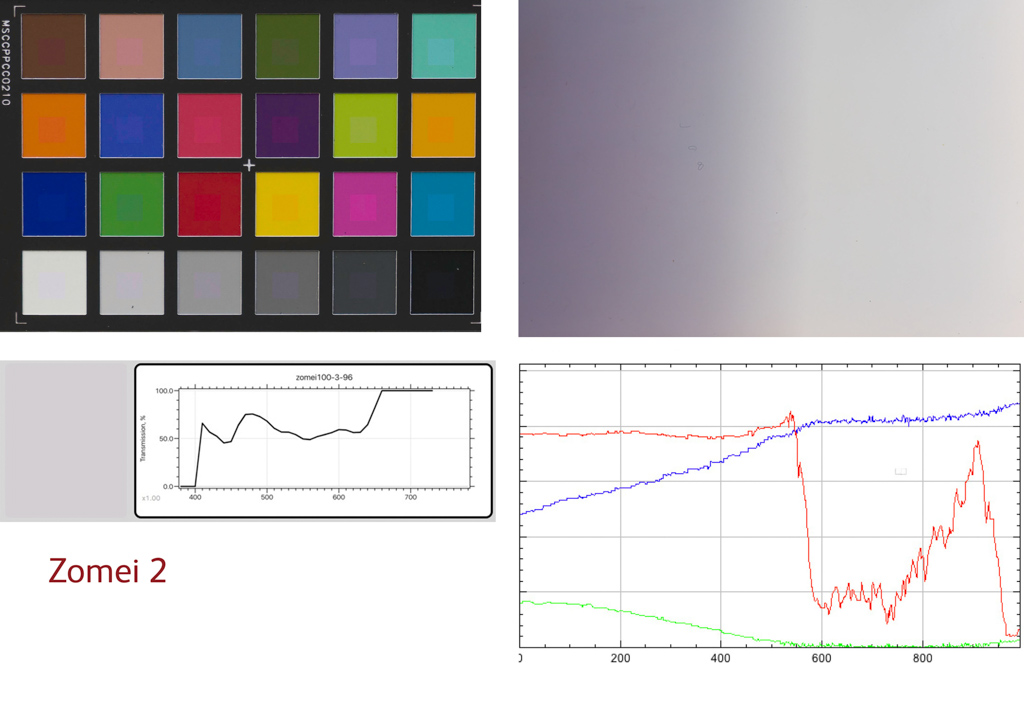
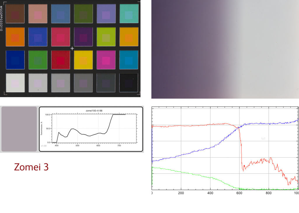
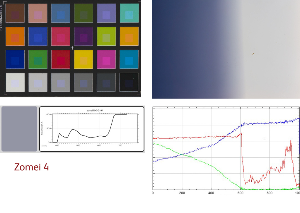
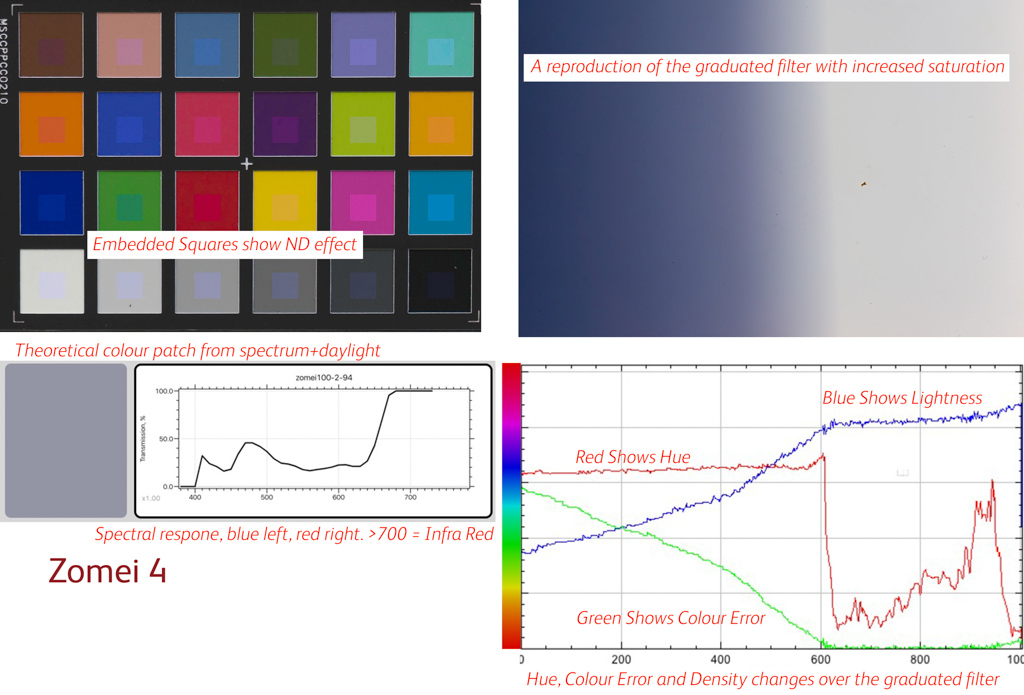
From these tests, I created a panel of results, an annotated example of which is shown below (in this case for the densest Zomei 100mm filter - a particularly bad filter).
I've aligned the reproduction of the graduated filter with the graph of density to make this a lot easier and intuitive to read. I've also added the hue and error graphs to this graph so you can see how the colour changes across the gradation (check the annotated chart for a key). The top left shows the colorchecker with embedded squares to show the tinting effect of the dense part of the graduated filter. Finally we have the spectral analysis of the filter alongside a 'theoretical colour' based on a perfect D65 illuminant (I used the software "Spectrashop 5" which gives you this colour alongside the spectral response).
Other Articles in Series
If you missed the other articles on the Graduated ND Filter Testing:
The Raw Data
So here we go - for those of us with too much time on their hands, here's a compilation of all of the tests done as noted above. First of all here's the key to each panel again.
and then a dump of everything!
Other articles in this Graduated Filter Test series
Part 1: Filter Systems for Neutral Density, Graduated and Polarising Filters
Part 3: Graduated ND Filter Sharpness and Flare
Park 4: Graduated Filter Test Usability, Water Shedding and Final Scores
Part 5: Graduated Filter Test: Scratch Resistance, Vignetting, Methodology and Usability Video