36 Megapixels vs 6×7 Velvia

00 Header Image

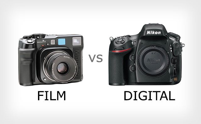
Over a year ago now we carried out various tests of medium format digital camera systems and film camera systems. The results, whilst interesting, didn’t tell us a whole lot about 35mm digital camera systems. Just after the D800 and D800E came out we followed these up with a comparison of these cameras, which are still the gold standard for 35mm sensors, and medium format film. With the surge of interest in film we thought it would be good to share the results with a wider audience.

If you've come here from Petapixel - you can read a longer version of the article that appeared there on this page or you can take a look at the original Big Camera Comparison we ran by clicking here. Thanks for visiting!

How to Compare

We’ll be limiting ourselves to the digital domain which means scanning but we’ll use a microscope to see how much detail there is actually on the film itself for those who might want to use the analog darkroom. Here are the possible ways to compare.

  1. count lines - should give us the absolute peak resolution of the film files.
  2. compare results on screen - good for pixel peepers
  3. compare prints and projected pictures - actually gives useful information for the photographer

Counting Lines

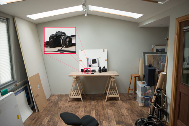
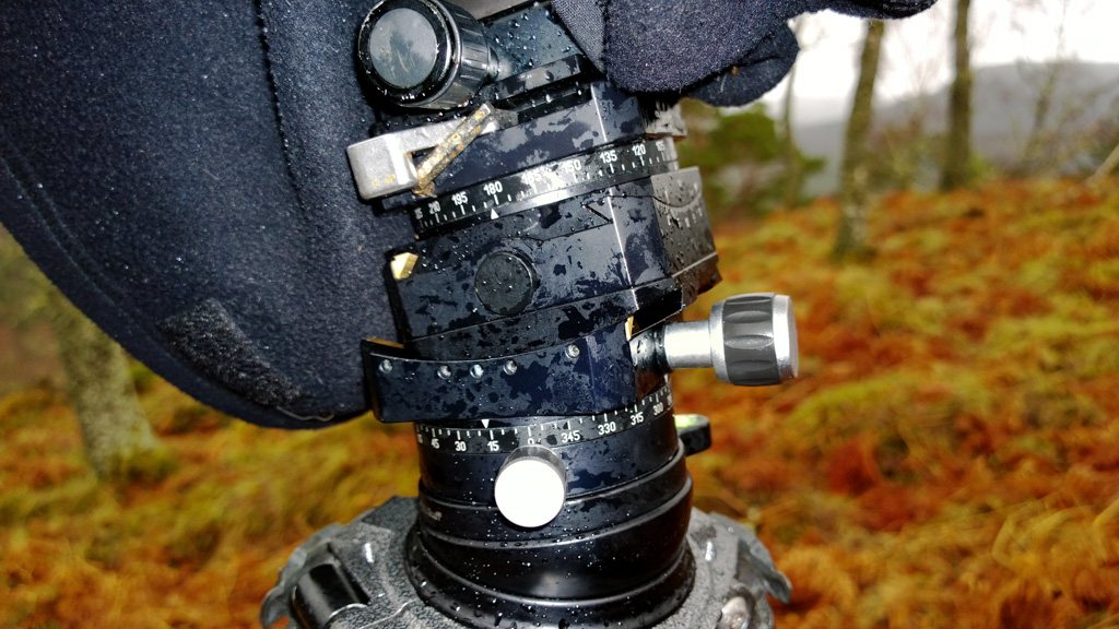
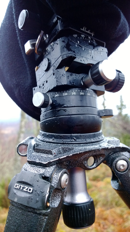
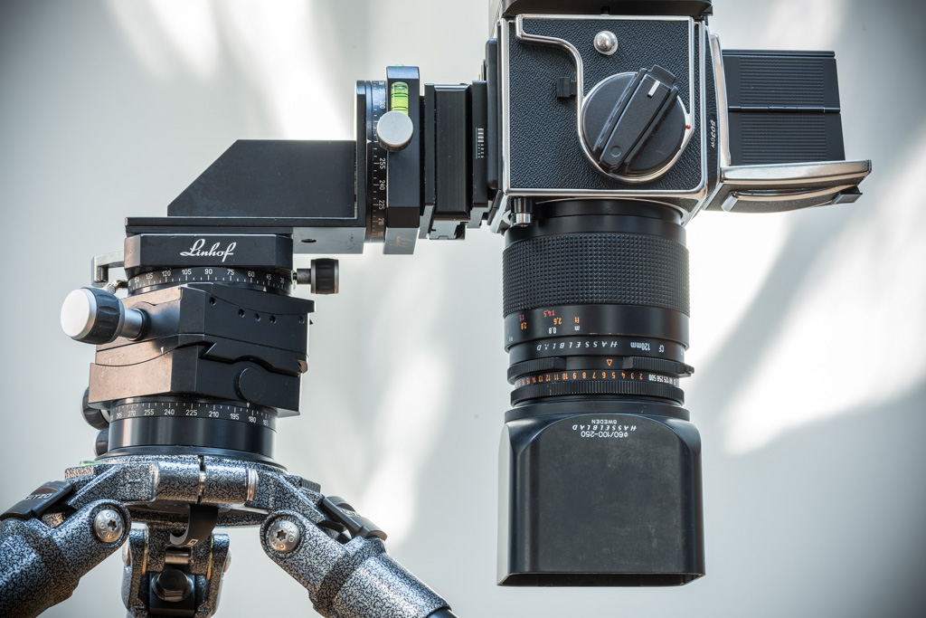
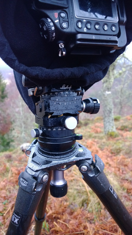
We photographed a test scene with various cameras, ensuring focal lengths were very similar and adjusting distance to target where there was a small discrepancy. Where aspect ratios were different we kept the short edge angle of view consistent. As we have a landscape bias, all of the lenses were chosen to be approx 24mm full frame equivalent. (Zeiss Distagon 25mm f/2 and Mamiya 7 50mm) Here’s a photograph of our test setup.

image14

image08

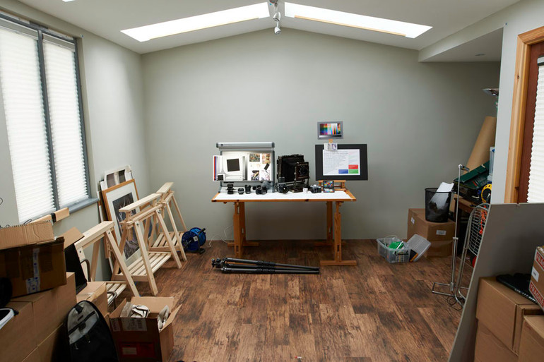
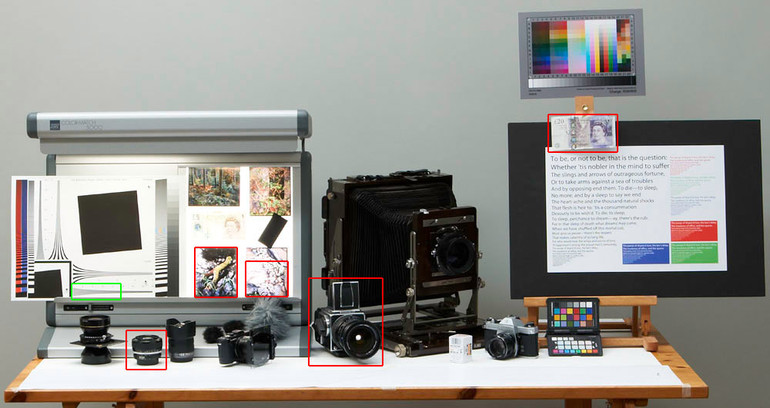
The test sertup as a resolution chart, a couple of very sharp 5x4 transparencies and a few ‘real world’ items (well - real world for photography geeks anyway!)

We used the number of lines we could perceive (regardless of contrast) to calculate number of line pairs per picture height (i.e. half the vertical pixel count). From this we could work out a megapixel equivalent.

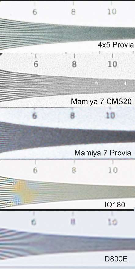
Here’s a sample of resolution scale from a few of the scans we used. These scans were from the Howtek 4500 drum scanner (colour slide) and the Screen Cezanne flatbed (black and white)

image12

And here are some of the calculated stats…

table

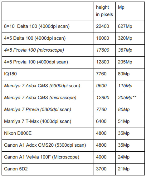
** beyond resolution of chart.

The IQ180 and the D800E produced the full resolution of the sensor at very high contrast and hence they managed to get the theoretical maximum resolution from their sensors.

The surprising thing here is just how big those results are from the medium and large format cameras! (That should get the trolls out in force!).

These figures are supported by our colleague Henning Serger who has been making extensive tests of real world film and sensor resolution for the past few years. His figures show colour film with up to 135 line pairs per mm, B&W film up to 150 lppmm and finally microfiche films such as Adox CMS20 at up to 260 lppmm!! In his scientific tests the object contrast of the test pattern is 1:4 (two stops). For the comparison tests a Nikon Nikkor 1,8/50 AI-S and a Zeiss Makro-Planar 2/50 ZF are used at f5,6. In this test with both lenses the D800 reached 80-85 lppmm, and the D800E 90-95 lppmm. (at a 1:64 contrast Zeiss measured colour film at up to 170lpmm, black and white at up to 180lpmm and CMS20 at 400lpmm!)

Here is a list of equivalent megapixels for each line pair figure.

90lpmm = 28mp
100lpmm = 35mp
120lpmm = 50mp
140lpmm = 68mp
260lpmm = 235mp!!

This is the data actually on the film (Henning uses a projector too - you still have to get this either enlarged or scanned in and that always loses some resolution. The maximum optical scanning resolution of any scanner I’ve tested is just under 6000dpi and my best scanner peaks at 5300dpi. This gives a maximum possible digital camera equivalent of 38mp. If your scanner peaks at 3500 to 4000dpi (as many do) your maximum equivalent is 19mp to 21mp.

Interestingly this seems to be the sorts of figures that you get bandied about in the ‘better’ forums discussions of the resolution of 35mm film.

If you’re interested in medium format cameras, Henning’s results suggest that you can get within 10% of the figures for 35mm cameras using good lenses (i.e. The Mamiya 7 or Hasselblad lenses). This gives up to 125lpmm for colour slide film and for Adox CMS you can get up to 210lpmm. If you were to work out the resolution on 6x7 film you would get the following

90lpmm = 136mp
100lpmm = 168mp
120lpmm = 242mp
140lpmm = 330mp
210lpmm = 741mp!!

Henning also tested the scanned results using an ICG 370HS and an Imacon X5 and found colour film to have up to 100lpmm and Adox CMS20 up to 130lpmm. Using a Nikon Coolscan colour slide film acheived up to 60lpmm and Adox CMS20 up to 65lpmm. Henning has also tested slide projectors and has acheived up to 125lpmm - so where 4K is about 8Mp, 35mm projected slides can achieve 50-150Mp (more information in a future article).

CAN WE TRUST THE NUMBERS?

Well it turns out that numbers don’t tell the whole story (when do they ever!). Despite being verified by myself and others, the fact that the digital camera give their finest detail at very high contrast and the film cameras give their finest detail at about <10% contrast means that comparisons using numbers don’t accurately affect the perceived image quality.

The graph of the contrast of line pairs against resolution for film vs digital will look something like this..

image16

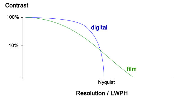
This is just an illustrative graph to show the idea that digital doesn’t lose contrast in the way that film does. In addition digital can cope with a lot more sharpening because the files are so clean whereas film loses contrast with increased resolution and sharpening is quite often limited by grain. However when digital does lose contrast it drops off dramatically while film is still giving some detail, albeit at lower contrast.

So although on paper it looks like 35mm film should keep up with modern 35mm digital and medium format film should blow 35mm digital away, the actual real world results are somewhat less amazing but still pretty impressive.

COMPARING ON SCREEN

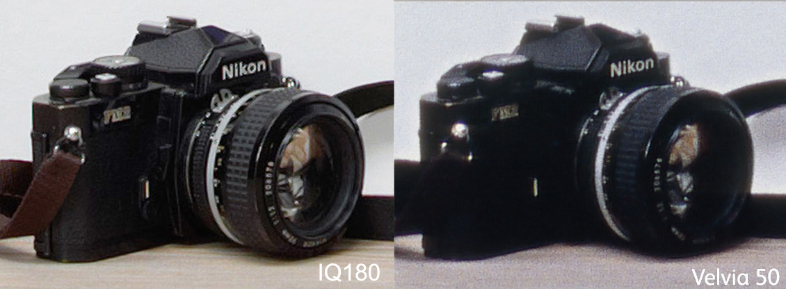
So let’s take a look at the D800E compared with Mamiya 7 using Velvia 50 film and Adox CMS 20 to see just how these figures translate into photographs. First of all here's the test area again (slightly different than above).

00 Overview MFvDIGI

image11

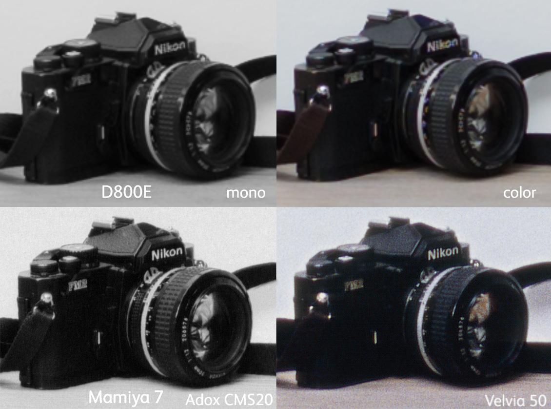
Well I think we can see that the Mamiya 7 in colour is just exceeding the D800E in terms of detail and the CMS20 is substantially better. Normal fine grained black and white film would be somewhere in between (i.e. Delta 100 or T-Max)

Let’s see how well the Mamiya 7 results compare with the IQ180 just to see where they fit in the megapixel race…

image00

This shows that although comparing fine detail shows a fairly close match between the two, in actual fact the IQ180 looks a lot cleaner and sharper. This is a result of the high contrast edges in digital. The Velvia 50 shot is suffering a bit because of underexposure - the dynamic range of the IQ180 blows the transparency film away (the photographs were exposed for the highlights on the lightbox). However the detail on the Velvia shot isn’t doing too badly - small details like the markings on the lens look good but overall the clean, high contrast detail of the IQ180 makes the photograph look clearer.

Here’s another comparison showing the difference between an IQ180 and the Mamiya 7 but this time using Adox CMS 20 film. The Mamiya result blows away the IQ180 in this case and is still a fairly close match even at f/22. This goes to show just how good old lenses actually are (especially the Mamiya rangefinder ones) and on a sideline proves that f/22 isn’t the hellhole that many photographers believe it is (for more about that refer to Roger Cicala’s article about diffraction - http://www.lensrentals.com/blog/2013/03/overcoming-my-fentekaphobia)

iq180-vs-mamiya7-cms20-verticals

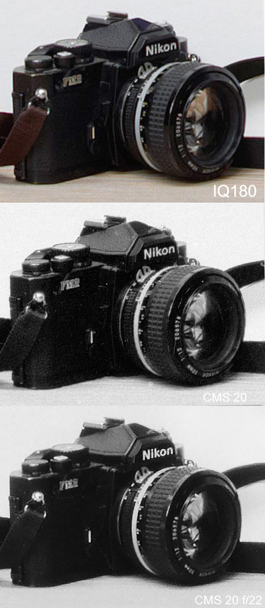
Well I think the thing we learned here is that the type of film makes a substantial difference. Adox CMS 20 has it’s own developer but can be stand developed in Rodinal - not something you can send to your local lab. However - one thing it does prove is that medium format lenses are quite capable and have a lot of leeway left for sensors to increase in resolution substantially.

WHAT ABOUT LARGE FORMAT?

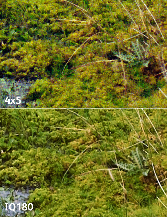
We looked at large format (4x5 & 8x10) shots in our previous tests so here are a final couple of comparisons between 4x5 and the IQ180. This first is a section from a transparency that was placed on a lightbox.

05 studio-close-areas

06 slide-samples

From left to right this is the IQ180, 4x5 Velvia and 8x10 Velvia.

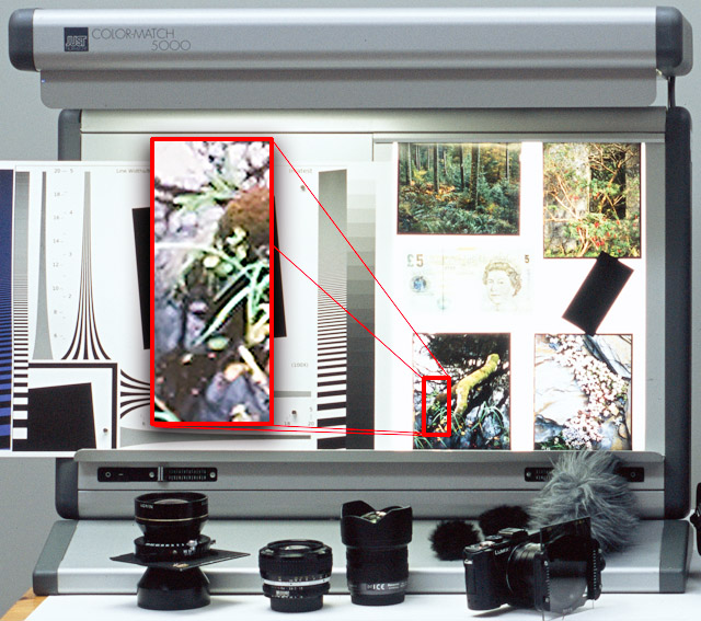
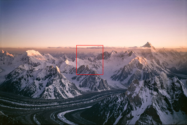
Finally, here’s the real world landscape photograph that we took. We’ll show a final couple of comparisons in the very bottom area marked in red and in the area on the left hand side of the screen.

07 real-world-topping-showing-areas

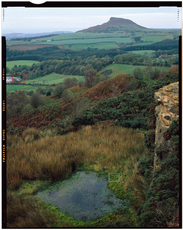
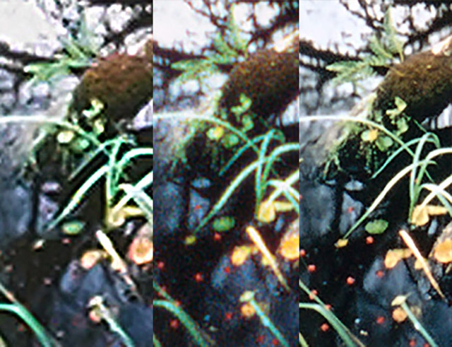
First lets look at a comparison of the small village on the left hand side of the shot in the red square.

08 topping-housesleft-640-iq180-vs-4x5

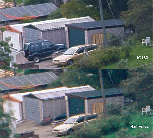
As you can see it’s a close call. Some things look more refined on the 4x5 Velvia (The garden chair, the car grille) and some things look a lot clearer on the IQ180 (the garage roof and walls). In a print of this section things were ranked pretty closely.

big-camera-comparison-prints

Why are the results from 4x5 not performing as well as indicated by the slide comparison? Well in the real world we had to stop down from our optimum aperture of f/11⅔ to about f/22. This reduced the max resolution of the 4x5 shots. The IQ180 needed stopping down too but that just reduced the contrast at the sensors maximum resolution and with a bit of sharpening it didn’t really do much damage.

WHAT ABOUT COLOUR?

One of the interesting things that cropped up was the way that the digital sensors deal with colour in terms of tonality and resolution. Because only one in four pixels are blue or red, quite often colour resolution is reduced in comparison with luminosity resolution. These look fine at small enlargements but when images are shown larger these artefacts can show through.

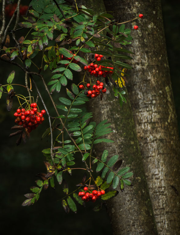
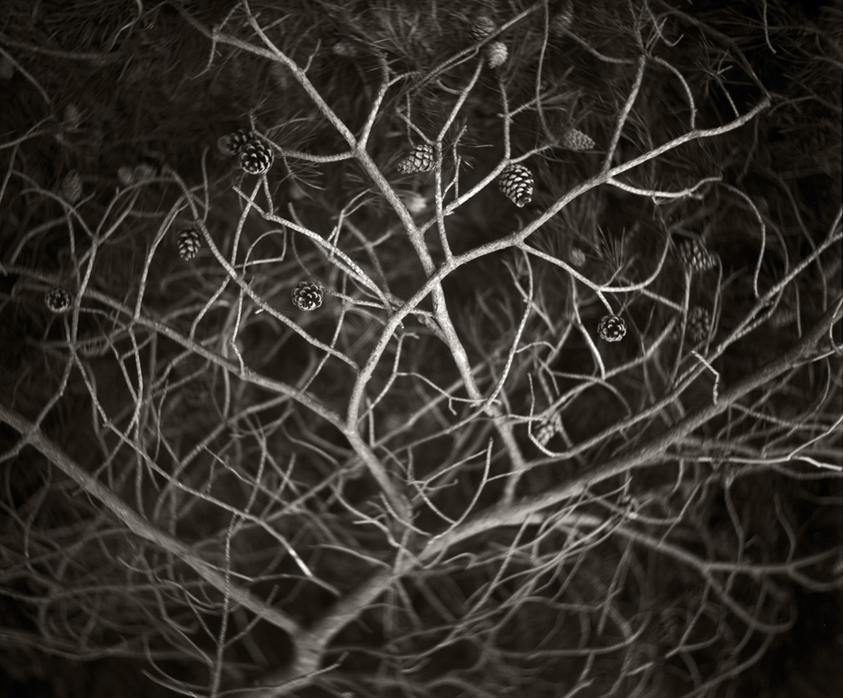
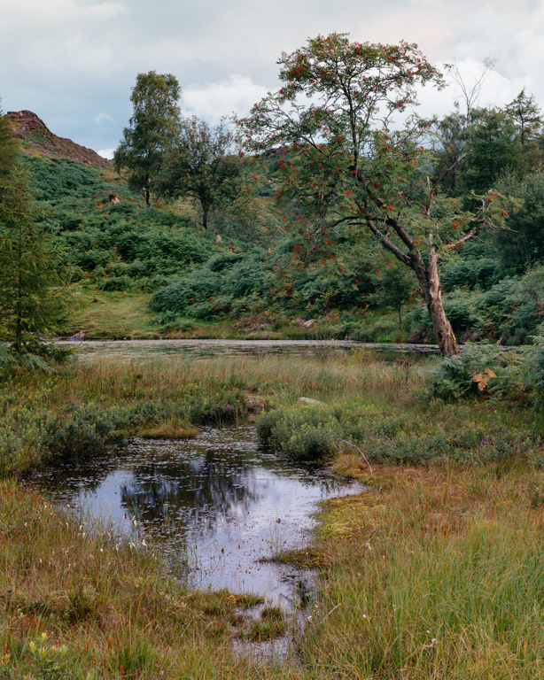
Here’s a great example of the problems with having only a few red pixels from an outing a few years ago, comparing a 5Dmk2 with 4x5 Velvia. Obviously the 4x5 Velvia has more resolution but we downsampled it to match the 5Dmk2 and got the following result (show at 200%)

09 berries

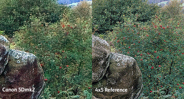
On the left we can see all of the berries on the tree but on the right (the 5Dmk2 image) a lot of the berries have disappeared. The only berries shown are where there were larger groups of them (i.e. a single pixel size berry is unlikely to match up with a single red pixel whereas a group of berries covering 2x2 sensor pixels will definitely hit a red filtered one)

Also colour film still seems to differentiate colour differently to digital (depending on the camera). Here’s a sample of our test image from the cyan square at the bottom of the view next to the pond.

10 topping-moss-iq180-vs-4x5Portra400

On top we have a 4x5 Portra 400 scan and on the bottom the IQ180. I think most people will agree that the 4x5 Portra 400 version has much clearer colour differentiation.

SO WHAT ABOUT 35mm FILM?

Well we didn’t include 35mm film in the test - it was originally aimed at comparing 10x8 film with the IQ180. However I had a recent scanning job for a colleague of mine who has taken 35mm film cameras to some of the highest mountains (Alan Hinkes - the UKs first mountaineer to climb the world’s 8000m peaks) in the world and he has allowed me to show a couple of these here include 100% crops. These photographs were taken using a Ricoh GR1 on Fuji or Kodak transparency film. These images make quite respectable 30” by 15” prints. (the first is Fujichrome and the second Kodachrome 64)

11 hinkes-4

12 hinkes-4-crop100

Here’s another

image07

image15

WHAT ABOUT PRINTS?

We made prints of our test charts at various sizes and also of the photograph taken outside in windy conditions and asked people to say which was better quality in terms of detail and sharpness. We asked a mix of photographers and non-photographers.

Interestingly quite often the digital camera photographs would perform better at smaller image sizes but once they reached about 200dpi then the film photographs were often chosen instead (this is true for some of the comparisons between the IQ180 and 4x5 and D800E vs Mamiya 7). From the comments made this was often to do with the ‘plasticky’ nature of digital images once they are enlarged beyond a certain size.

In general people ranked the 4x5 and IQ180 fairly closely, the 4x5 coming out top just a little more often.

They chose the Mamiya 7 files over the D800E files most of the time (although a small but significant number chose the D800E over the Mamiya 7 files - it seemed there was a large factor of flavour preference).

Effectively we saw the following hierarchy.

  • 10x8 (a significant winner still)
  • 4x5 Black and White
  • 4x5 Slide and Colour Neg
  • Mamiya 7 Adox CMS20
  • IQ180 / Mamiya 7 Delta/T-Max 100
  • Mamiya 7 Slide
  • Mamiya 7 Colour Neg
  • D800E

.. AND PROJECTION?

Well digital projection is definitely getting there with 4K and we’ve just run a conference where we used one of Canon’s high end HD (1080p) projectors on a 70ft high screen. The results were very nice indeed but we’re fascinated by Henning Serger’s results with film projection (both 35mm and medium format) so much so that we will be converting a couple of our presentations in next years conference into medium format slides using LVT film writers.

CONCLUSION

Comparing film and digital is a difficult task as they are not designed to record light in the same ways. However I hope this has shown that with the right scans medium format film can compete quite well with digital and even 35mm film can produce decent size prints (enough for book publishing definitely - see Alan Hinkes “8000m”, nearly all shot on a relatively cheap 35mm film camera (Book currently available from Amazon).

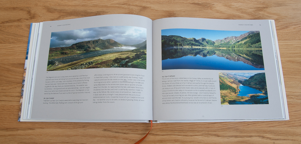
Some comments on the results though

- Medium format lenses can resolve impressive amounts of detail. More than enough to cope with digital sensors to increase in resolution at least four fold more more.

- 35mm lenses, even legacy ones (Henning Serger uses an old manual Nikon 50mm in addition to the modern Zeiss lens) still outresolve all digital sensors.

- 4x5 film competes very well with the best that medium format digital has to offer

- in projection, film delivers an outstanding, unsurpassed quality at extremely low costs (both 35mm and 120)

- optical printing of film is also an excellent quality option at very low costs.

SCANNING COSTS

Fortunately I run a drum scanning business so we had unlimited access to high end flatbeds and drum scanners. We scanned the film using various scanners from a cheap Howtek 4500 drum scanner, a Screen Cezanne Elite Pro flatbed, an Aztek Premiere, an ICG 380 and a Heidelberg Primescan D8200. Microscope measurements were also taken using a 80x stereo microscope.

People will obviously say “well that’s fine if you have a drum scanner! What about your average photographer”. Well the beauty of film is that you can send your film off for very high resolution scans at any point in time. For most purposes though something like a Nikon 8000 or a Minolta Dimage Multi-Pro will produce images that will match the best of 35mm digital (with the right camera and lens). An Epson V750 gets very good results with 4x5 and 8x10 (especially with negatives).

Even drum scanners are now affordable for the dedicated film photographer. I purchased my Heidelberg from Karl Hudson who refurbishes, delivers and gives a warranty for his scanners for less than the price of a top end DSLR.

Great enlargers can also be had at amazing prices and projectors that blow away 4K can be had for peanuts.

ISN’T THIS JUST A PRO FILM RANT?

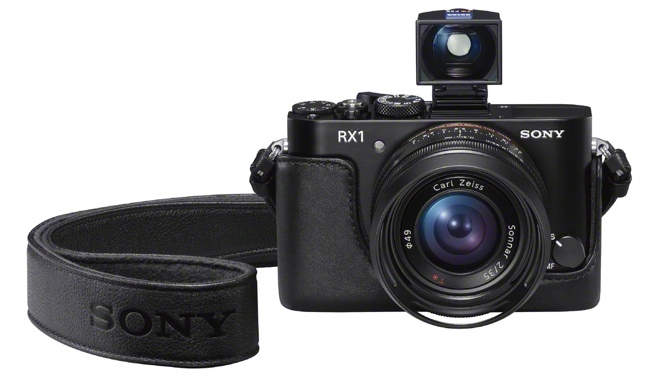
Actually no, well maybe a little. For myself I happily use film and digital and am just about to invest in a Sony mirrorless camera that I will use alongside my 4x5 and 10x8 cameras. The discussion shouldn’t be about film OR digital but film AND digital. They both have so much to offer..

Weald – David Higgs

I have known David and admired his work for a few years now though our mutual connection with the filmwasters.com forum. During that time I have followed the progress of David’s 5 year project to capture the essence of the Sussex Weald and was eagerly awaiting the culmination of this project - an exhibition of 51 superb platinum/palladium prints at the Ashdown Forest Visitors Centre.

David_Higgs_Friends_Clump_Winter

While I was hoping to attend the official private view on the Saturday, a prior engagement delayed my visit until the Sunday. I had arranged to meet David outside the visitors centre at 11am, unfortunately the person with the keys was nowhere to be seen! After a flurry of calls we were informed that it was not to open until 2pm. Fortunately David then suggested we take a brief tour of his favourite areas of woodland. As well as enjoying this beautiful corner of East Sussex it also gave me time to talk with him about his inspiration and working practices.

David’s equipment comprises of a Graflex Crown Graphic 5x4 camera with an assortment of old Ektar and Petzval design lenses. Shooting almost exclusively with black and white film the resulting images are then scanned, adjusted in Photoshop and used to create 10x8 digital negatives. It is the last process that even David himself describes as the most crucial to the final piece. These negatives are then used to create the final platinum/palladium prints on Fabriano Artistico watercolour paper.

IMG_3201

IMG_3250

His inspiration is best summed up in his own words - “Woodland is an escape. A break from modern life. A place to regain perspective. In the life of the wood, my existence is fleeting. The trees are far older, they will still be there when I am dust. They cast no judgement, have no memory and for a moment I can join their peace.”

The exhibition itself is situated in a large rustic barn within the visitors centre and is divided between the ground and a mezzanine floor, a fitting venue for the subject matter. Walking round one immediately is struck by the uniformity of the print colour and tonality, the platinum/palladium process having a beautiful warmth and depth, yet each image is unique. The relatively small size of the prints within simple black frames is perfect.

David_Higgs_ConniesGhyll

I am not going to list all my personal favourites (of which there are many!) but suffice to say that I am in love with the very shallow depth of field and ‘swirliness’ of the fast large format Zeiss and Petzval lenses – ‘Hornbeam’ and ‘Awakening’ being perfect examples.

I am in love with the very shallow depth of field and ‘swirliness’ of the fast large format Zeiss and Petzval lenses
Recently, David has introduced a slight mechanical slant to the predominately organic subject, these take the form of old and forlorn agricultural tractors. Applying the same shallow focus and made under dank, damp conditions they are serene with just a touch of melancholy.

I make no apologies for being totally biased towards David’s collection of WEALD images, I know it’s a tad clichéd but I genuinely would love to have made them and have them hanging on my wall!

I will just end by saying that working on a series of images, rather than just one stand alone photograph, can be very rewarding and in David’s case, leading one to a greater appreciation and understanding of one’s chosen subject matter and printing technique. William Eggleston, when he was once asked about his personal photography, simply said, “I think I’m working on a novel”.

Life after Take a View

When Tim Parkin asked me if I would consider writing an article for OnLandscape I didn’t really have to think hard to come up with a first topic. Thanks to Charlie Waite and Take a View there hasn’t really been much on my mind (or in my diary) for the last month. Competitions aren’t something that I spend a great deal of time with. Apart from the Take a View competition I don’t actually enter any. This year I almost didn’t enter that either. An excellent article by David Ward on the subject of competitions nearly changed my mind. One of the arguments was that if you take the competition seriously, and fail to get recognised, is there a danger that you change your style to try and appease the judges. If you still fail where do you stand? Having given consideration to these factors I still decided to enter but I felt it was important to enter images I liked and even include some that I felt a real connection with. Even if that included images that I felt had no chance of being recognised. In a way I felt that I was trying to keep my integrity as a photographer, whilst at the same time entering a competition that usually numbers more classically appealing landscape images as its winners.

I have started to become far too critical of the scenes around me. Whereas before the competition result was announced I could find beauty, balance and soul in all manner of things I have now begun to judge them as to how good I think the resulting image would be
Like everyone else who enters I didn’t entertain the thought of winning but just wanted to perhaps get in the yearly book and see an image or two in print. Deciding whether or not to enter therefore took up a fair bit of my time and caused me to hold several internal debates. I didn’t really expect that winning the competition would cause me even more internal debate. In the last month and a half or so since I received the call from Charlie I have managed the grand total of one keeper. Has winning created pressure? Undoubtedly. My modus operandi so to speak was always to have what I would term a free wander, both mentally and physically. I could just roam with the camera, looking at whatever took my fancy and taking a shot when the light and the balance of all the elements in the frame caught my eye sufficiently. I realise now that in the last six weeks I have started to become far too critical of the scenes around me. Whereas before the competition result was announced I could find beauty, balance and soul in all manner of things I have now begun to judge them internally as to how good I think the resulting image would be. And the bar is set extremely high. I’m not aware if I had even set a bar before…

0253A

The Problem with Photography Journalism

Landscape photography receives little wholly positive press in the newspapers but most coverage of photography in general is neutral to positive. However, over the last few weeks a certain journalist from The Guardian seems to have taken the reins from Brian Sewell and ridden full blast into the anti-photography hall of fame.

Jonathan Jones started his little escapade with the subtley titled

Flat, soulless and stupid: why photographs don’t work in art galleries

In this essay he has some great quotes on photography starting with:

“photographs on the page or screen are fascinating [but] look stupid when framed or backlit and displayed vertically in an exhibition”.

“[photography] is a flat, soulless, superficial substitute for painting. “

“Putting up massive prints is a waste of space, when the curators could provide iPads and let us scroll through a digital gallery that would easily be as beautiful and compelling as the expensive prints.”

Now the correct response to articles and quotes like this is to tut and ignore but that makes a poor article so.. The biggest issue with the article is that he provides no evidence of thought whatsoever. “They look stupid” “They are a poor substitute for painting” but then says the images would be “Beautiful and compelling” on an iPad - contradictory? Jonathan Jones is essentially saying “I don’t like photography so it’s crap”. This would be laughable if his opinion wasn’t published in a major column in a respected national newspaper.

phantom

Peter Lik's "Phantom" sold for $6.5m

But Mr Jones has gone one step further than this and is now blatantly stating that “Photography is not Art”. Now admittedly he is using one of Peter Lik’s monstrosities (sorry Peter) to try to prove his point, which is rather like pointing at a pit bull and saying all dogs are dangerous, but his whole premise again holds no water. And he adds further insults along the way with

“The fact that it is in black and white should give us pause. Today, this deliberate use of an outmoded style can only be nostalgic and affected, an “arty” special effect.”

So now black and white is just a ‘special effect’ as well <sigh>, and there’s more..

“[the] shaft of sunlight penetrating [the canyon’s] depths becomes the phantom of the title. Yet, in fact, this downward stream of light is simply a natural aspect of Antelope Canyon.”

So we now aren’t allowed to use features of the natural world in our pictures? If we’re recording a natural phenomenon is it in some way just another affectation? Hang on though - isn’t the whole world a natural phenomenon?

“Someone has been very foolish with their money, mistaking the picturesque for high art”

So now the picturesque has been positioned as the antithesis of high art. Tell the galleries to burn their Constable’s, Gilpin’s, Ruskin’s and Gainsborough’s right now!

In all it’s just incredibly disappointing that Mr Jones can’t even spare the brain cells to put some ‘oomph’ behind his argument (for all Brian Sewell’s faults at least he managed this - and he liked bacon .. mmmmm).

At least if Mr Jones were to construct a framework that backs his point up I might feel challenged enough to think about what art is and why photography can fit the bill, and the article might get some constructive discussion going, but instead we come away with a knee jerk feeling of outrage - and this is exactly what Mr Jones wants.

at least with clickbait you know you’ve been had pretty much straight away - Mr Jones is a troll, pure and simple.

If you’ve ever been tempted to click on those links at the bottoms of web articles that say “5 People You Won’t Believe Exist” with a picture of a massive foot with a womans head then you get an idea of what Mr Jones is doing here - it’s called Clickbait and it’s just designed to get people to talk about he article. Actually it’s more insidious than that - at least with clickbait you know you’ve been had pretty much straight away - Mr Jones is a troll, pure and simple.

How do we know this though? How can we be sure he isn’t completely serious in his dismissal of photography. Just take a look at this article..

Photography is the art of our time

Sounds like a different person!

We’ll let Mr Jones off with his one final statement in the Peter Lik article though...

"If this is the most valuable “fine art photograph” in history, God help fine art photography."

 UPDATE 1: I think the Guardian have noticed the extreme backlash and let Sean O'Hagan respond - nicely written.

UPDATE 2: The Independent weighs in..

Cath Waters

Cath Waters is a photographer and artist living in central Scotland. If you are a Flickr user and you don’t recognise her by name, then it’s possible that you may have come across her under her pseudonym, papersnapdragon. I’ve been enjoying her images for a while, which sit somewhere between landscape photography and digital art. Her mood-filled landscapes marry relatively simple views with textures to create what she refers to as ‘digital mixed media collages’. Her textures are derived from a variety of sources - you name it, she has probably tried it. So successful is Cath in creating her own textures that she offers these for sale and runs workshops as well as exhibiting and selling her images at art fairs and through a number of outlets across Scotland.

Until relatively recently your Flickr name was “papersnapdragon” but you now use your own name? Have you found yourself through your art?

I stopped using the ”papersnapdragon” user name because I like to use Flickr to post all sorts of stuff, not necessarily work I want to have under the Paper Snapdragon umbrella (having said that, my Flickr stream has been very neglected recently). I wouldn't really say I've found myself through art and in many ways it's been the cause of a bit of an identity crisis as my background is in science. I love what I do though. I get a huge amount of satisfaction both creatively and in terms of being able to build a business that doesn't feel like a job and allows me to work around my three young kids without having to pay silly amounts of money for full time childcare fees.

Would you describe yourself as a photographer or a digital artist? Do you think it matters – e.g. in the way that your images are perceived?

Recently I've been describing myself as a digital artist. It doesn't really matter to me one way or another but I think that to describe myself as a photographer, especially a Scottish Landscape Photographer, brings certain expectations about how my images should look. Without the digital art element, I don't think my photography would be particularly remarkable so to claim I am a photographer in a professional context would be misleading. I also found that the kinds of shops and galleries that stock my work are much less inclined to show any interest if I introduce myself as a photographer! The technique that I use is often referred to as textured photography but I found that to the uninitiated this term was pretty meaningless so I now describe my work as digital collage in which the landscape photography is one element of the collage.

Stac Pollaidh

Stac Pollaidh

Can you tell me a little about your education, childhood passions, early exposure to photography and vocation?

I have been around photography from a young age. My Dad is an excellent street photographer and had a dark room set up in our spare room. He has a fabulous collection of black and white shots of semi-derelict Byker in Newcastle that he took in the 70's which the rest of the family are trying to pursued him to exhibit.

At secondary school I was always interested in art but I had a brilliant biology teacher who sparked my enthusiasm in science. I did ask a careers advisor how I could combine arts and science but she typed it into her BBC micro and it said I would have to be a landscape gardener! Despite this I continued with art to Higher (Scottish A) level at the expense of physics, and my final modules were landscape painting and photography.
I studied Cell Biology and Immunology at uni, and continued with a PhD at Edinburgh Medical School in Cell Pharmacology. During my student days I still painted (really badly) but after my PhD I spent the next 10 years working in science, mainly in cancer research, and while I enjoyed taking snapshots of various travels I didn't seriously take up photography again until my kids came along and I stopped working full time.

Luskentyre Bay, Harris

Luskentyre Bay, Harris

Tell me why you love landscape photography?

I don't want to see blazing sunsets with every blade of grass and every rock in uber-sharp definition; it's too much for my eyes!
It was painting that drew me to landscapes originally and I think I'm probably trying to use a camera to create what I would paint if I was better at it. There is quite a lot I don't like about landscape photography, I can admire how technically difficult it is but a lot of it seems very formulaic. I don't want to see blazing sunsets with every blade of grass and every rock in uber-sharp definition; it's too much for my eyes! I'd rather get a hint of a place, a glimpse of an atmosphere, and until quite recently when I discovered the work of Chris Friel and others of that impressionist photography genre I had always thought that was outside the remit of photography.

East Lothian Field, Yellow

East Lothian Field, Yellow

Which photographers inspire you most? What books stimulated your interest in photography and who drove you forward, directly or indirectly, as you developed?

I think I'm inspired by painters more than photographers but Chris Friel's work has opened my eyes to a whole new world of what can be achieved with a camera. I find his work mesmerising, it's both dark and uplifting and of course, technically brilliant. I also love the work of Valda Bailey, Doug Chinnery and Peter Scammel. Flickr is a great source of inspiration - there are so many great images popping up that inspire me to try new things.

How long have you been creating textured landscapes and how did this start?

I've been doing this for nearly 4 years now and bizarrely it started in the virtual world, “Second Life” where I played around with making artwork combining textures and photography of virtual landscapes. Some of the virtual landscape installations in Second Llife appealed to me, especially those made by the avatar “AM Radio” as they were beautifully minimal. Pretty quickly though I decided to move my photography back into the real world, which makes much more sense given that living in Scotland I'm surrounded by some of the best landscapes in the world!

Camusdarach Beach, Arisaig

Camusdarach Beach, Arisaig

Taste and Landscape Photography

As you may already know from the interviews we have done with him, Mark Littlejohn was voted as the Take a View Landscape Photographer of the Year. The picture chosen was one that gathered quite a lot of praise online from many people who have previously criticised the competition (including me) but to say it was universally acclaimed is a stretch considering some of the quite vociferous abuse it has received on Facebook.

A Beginning and an End

The criticism ranged from people saying it isn’t to their taste, which is fine as art is subjective after all, to … well here’s a sample (of the ones with no rude words).

“You really have to question what the judges were thinking”

“A champion landscape picture should speak to everyone and create a desire to see that place.”

“A viewer shouldn't have to read the caption to figure out what the image represents”

“If it were one of my shots I think I would have binned it at the point of shooting”

“For me the composition is weak, the waterfall would be much better on the right hand side.”

“If it is meant to be a landscape then why is it that I can not see the mountains, the trees, the weather, the sky?”

“If this were an abstract painting it would hold very high marks in my book of likings and preferences. As a photo, I have no idea what I'm looking at here.”

And this skips some of the more extreme comments. To be fair the amount of feedback that was positive in the comments outweighed the negative but I’m interested in why there has been such a visceral reaction (apart from the fact it won and anything that wins attracts haters). Let’s take a look at some of the ‘classes’ of criticism

  • If it’s abstract it can’t be landscape
  • If it looks like a painting it can’t be photography
  • It breaks the rules of composition/photography
  • A landscape photograph should make people want to be there

If it’s abstract it can’t be landscape

The first is quite interesting and I’ve never seen a reaction like this before. The general public and hence many beginner photographers have been fed a story that a ‘landscape’ is a wide view of the countryside including a horizon and sky. For some reason people are happy to have this definition stretched to include horizonless images as long as the scene is readily identifiable but as soon as we get close up to something or create a picture that isn’t obvious then the picture moves away from this ‘pure’ landscape definition.

As landscape photographers our definition of what is landscape is a lot more flexible - we have people like Eliot Porter and Minor White to demonstrate that abstract images can still be landscape. Edward Burtynsky creates amazing images that defy recognition but that are still classed as landscape. Perhaps the problem here is that our definition of landscape is formed by the history of art and the photographers that are stretching this definition aren’t particularly well known outside of museums, art galleries and practitioners. My hope is that if pictures like Mark’s make more of an impression on the general public, the definition of landscape might become more accepting.

If it looks like a painting it can’t be photography

This almost doesn’t merit a retort but the continuing idea in the eyes of the general public that photography is a ‘documentary’ medium does it such a disservice I can’t help myself. With this definition, the photographer merely has to be in the right place to record what nature hands us on a plate, and we all known how much rubbish that is. If you’ve ever been on a trip with a bunch of photographers and looked at a colleagues amazing photograph and wondered if you were even in the same location - never mind at the same time - you’ll know what I mean.

It breaks the rules of composition/photography

The rules of photography - I loved these comments.. “The river should be on the right hand side” is my favourite although “If you’re photographing in the rain you should clearly show it” comes a very close second. All rules are merely stabilisers for the beginning photographer - they help the photographer stay in the safe zone. However, the safe zone isn’t where all the fun happens!

A landscape photograph should make people want to be there!

This is quite funny being as some of the most amazing photographs ever come from the tops of 8000m peaks (as seen in the recent On Landscape conference during Alan Hinkes’ presentation). As much as the idea of seeing the view with your own eyes is appealing - I think the experience of actually being there wouldn’t live up to expectations.

And so many of the best landscape photographs are transformative in this way. So often the landscape isn’t a pleasant place to be and quite often the photographer is creating a semi-fictional narrative of what a place is like by excluding all of the other senses (and everything outside the frame). Would those images of Lochan na h’Achlaise be so serene with the soundtrack of the A82?

I don’t like it so it shouldn’t have won…

I have a background in music so I often use this as an analogy and this is no exception. There are many music competitions out there (and I’ve judged a few in my time) and one of the things that is very obvious when looking at the competitions is that just because you like a particular kind of music doesn’t mean that music will win. If you’re a folky and a heavy metal band wins you’re almost guaranteed to dislike it. Does this mean it should not have won or that the judges didn’t know what they were doing? Of course not - the judges have to make a choice across multiple genres and will hopefully have the ability to put aside their personal preferences and make an independent judgement of “best”.

I think that this is a very good lesson for photographers to learn as well. Our chosen main genre, landscape, has many, many sub-genres that, like music, you may find to your taste or not. Some people don’t like abstract landscapes, others find classic picturesque landscapes incredibly boring. The fact is that whatever our personal tastes - a well crafted image in any category is worthy of at least a little attention.

So for instance we may prefer our music more in the jazz genre and don’t like pop music. However when a very talented band produces pop music it can surpass it’s genre - just like the Beatles did. However much you may not like the Beatles you can’t doubt their credentials.

I suppose in many ways this is what Mark Littlejohn has done with his Glencoe picture, he’s dropped a “Paperback Writer” on a world where number ones were expected to be Frank and Nancy Sinatra, Dusty Springfield, Georgie Fame and Jim Reeves! And wasn't the world a better place for that?

Do you think taste in music is a reasonable analogy to taste in photography (and if so are you rockers or folkies)? Let us know your thoughts in the comments below.

What is Landscape Photography …

What is Landscape Photography, and where might its boundaries lie?
These are constant questions for me. Not because I need answers as such,
but because exploring these questions is helping to guide my photographic journey.

I thought I knew what landscape photography was and where I was going with it. But that has all changed.

My awareness of a landscape, my interpretation of it and how I might photograph it, is now in a wondrous state of flux.

'Wondrous', because I am enjoying the exploration of definitions, and the anticipation of what lies ahead as I explore where the boundaries of a landscape photograph might be. I am excited by the prospect of where this might lead me, and I am enjoying the space and the freedom which such exploration offers.

In this process, I am discovering new photographers, new visions and the different relationships which each of them have with their landscapes.

My questioning of what I thought I knew, is causing me to grow creatively and technically as a photographer and as a person.

Why is any of this important to you? Well, perhaps it is not. The value of asking questions will of course be different for each of us. However I think an exploration of such core questions can be of help in guiding our own photographic journeys.

For me, photography is first and foremost a creative pursuit. Therefore, everything I think of and do with my photography is influenced by this.

My definition of creativity requires me to visually explore, to experiment, to wander in mind and in vision as I seek out to create landscape visions.

Overexposure

“Let anyone who is accustomed to looking at a great many pictures in an exhibition try just once, if he is still capable of it, spending an hour or more in front of a single master-piece and content himself with that for the day. He will be the gainer by it.” –Hermann Hesse

It is estimated that more than 350 million images are uploaded to Facebook each day. Other popular sites report lower but similarly astounding figures, and of course these numbers still do not account for images published daily in newspapers, magazines, billboards, television shows, advertisements, etc. Certainly only a small percentage of these images is presented as art, but even subscribers to more exclusive photographic forums and media, which do promote art, likely still divide their attention among dozens, perhaps hundreds, of new images on a daily basis and often in short bursts. As cameras become more ubiquitous and more people join online communities, these numbers will continue to grow. What is not likely to grow is the amount of attention available to a viewer to experience, contemplate, research and appreciate individual works. I wish to make the point here that a disciplined approach to managing our limited “viewer time” ultimately yields more satisfying experiences than momentary impressions of large numbers of images.

Image by Guy Tal


While it is obvious to most that the production of good art requires an investment of skill, time and attention, it is not often acknowledged that experiencing art is also enhanced by making such an investment, and especially so with works that do not immediately command attention with extremes of color, perspective or subject matter. Moreover, the subtler or more abstract an image is, the more such investment is needed in order to fully appreciate it. As suggested by photographer Minor White, “The more knowledge (including technical, psychological, historical, and personal) that a viewer brings to a photograph, the richer will be his experience.”

the subtler or more abstract an image is, the more such investment is needed in order to fully appreciate it

I often use the metaphor of a visual language in discussing the way visual artists communicate facts and concepts in images. Not only is it a useful way to analyze how images may serve as equivalents of stories, emotions and sensations, but it also serves to illustrate some truisms about photography as a means of communication. Consider that in verbal communication those who wish to be heard but lack in vocabulary, knowledge or insight, have but one tool left: raise the volume. The same is true of visual communication where extremes may indeed command attention but often are also the equivalent of shouting. When allowing our subconscious brain to passively decide for us what to pay attention to, it will tend to favor those who scream the loudest, those who are most tempting, shocking or vulgar, and not necessarily those who have the most important, most skilled, most clever or most enlightening thing to express.

Image by Guy Tal

The more educated and deliberate viewer often will find more complex and rewarding experiences not in the most colorful or extreme images, but rather in consciously examining images that are nuanced and complex; images that speak quietly; images that do not unravel instantly and that require some investment of conscious thought, acquisition of knowledge or a deeper understanding of such things as the artist’s background, philosophy, motivations and goals. And so, with limited time and attention, we choose – deliberately or unwittingly – between a passive bombardment by superficial visual anecdotes and more focused, immersive, contemplations.

In a broader sense, making the conscious and deliberate choice to dedicate attention to a single image (or to a contained and cohesive body of work), rather than scanning through large numbers of random thumbnails hoping some may call attention to themselves without the need for close examination, also is striking a balance between the depth and breadth of our visual experience. If nothing else, it is an acknowledgement that the two modes result in different experiences. In failing to assert such conscious decision-making, the images you are most likely to notice are those your brain intuitively is drawn to, which may lead you to the most colorful or unusual compositions, but not necessarily to the most creative, original, thoughtful, meaningful, educational or interesting ones, all of which, in my mind, are more satisfying.

Many web sites presenting large numbers of images often sort them using algorithms that equate importance with popularity, leading the unsuspecting viewer to align their impressions with some low common denominator, rather than being led to those images that may most enrich their experience or best fit their personal sensibilities. It is therefore up to each of us to deliberately seek such images, and to challenge ourselves to learn and understand those images that exceed the low bar of popular appeal.

When passively consuming art in large volumes, viewers are not likely to venture into areas they are not familiar with; they are not likely to become motivated to spend additional time studying the history of art and photography, the provenance of a given work or the story of a given artist.
When passively consuming art in large volumes, viewers are not likely to venture into areas they are not familiar with; they are not likely to become motivated to spend additional time studying the history of art and photography, the provenance of a given work or the story of a given artist. Thus, a form of dangerous confirmation bias also is at play, proliferating homogeneity, stifling curiosity, limiting exploration and stunting education. To a casual viewer who may find more meaningful experiences outside photography this may not be a severe sacrifice, but to photographers wishing to elevate their work and their audience’s experience it may be a formidable threat.

One issue that had been particularly troubling to me during my years in photography is the fact that people who report having powerful emotional experiences resulting from encounters with art rarely have them in response to photographs. It is not unusual for someone to be moved to tears by a piece of music or to be profoundly awed by a superbly-crafted painting, but even the most celebrated artistic photographs rarely elicit such transformational sensations. I suspect that it is the nature of abundance and dilution to lessen viewers’ motivation to dig deeper. Where most people may attend an exhibition of paintings or sculptures with at least the expectation of being deeply impressed, perhaps even to have their sensibilities and knowledge challenged, few feel so when visiting an online photo gallery. In the minds of laypeople it may well be that our work is little more than “another picture of a tree,” or “another picture of a rock,” (ARAT - ed) or “another picture of Yosemite.” As creative photographers we should be very concerned about such perceptions. At the same time we also cannot judge others for such failures if we approach the works of our fellow photographers with that same casual mindset. And so, by investing in understanding the works of others, by drilling deeper to separate an image that moves us from so many other “pictures of” the same subject matter, and by becoming more skilled viewers and critics, we also help educate our own audiences.

Image by Guy Tal

And so, my advice is a simple one: manage your viewing time carefully and deliberately. On a given day, find a work or a photographer or a period or a topic that interests you, whether you understand them at first blush or not, and spend the day with them – look at them closely and try to articulate what you feel about them, take some time to research, read and learn about them, share them with others if you find them worthy, become familiar with them before deciding whether they are important to you or not, and only then move on to the next thing. You and the artists you get to know will benefit in multiple ways.

If we, as artists, fail to make such investments in learning the history and traditions of our medium, and in the appreciation of worthy photographic works offering more than the simple feats of dazzling viewers with color or views of exotic locations, how can we hope that others will?

Waterscapes

I recently opened a photo exhibition with my retrospective work here in Sweden. It was randomly put together and there was no overall plan, but when I saw the photographs hanging on the walls I realised that there was water present in every one of them. Everything from crashing waves, rain drops, waterfalls, creeks to flooded forests was in those images. For me, and I am sure for many other landscape photographers, water is a fantastic ingredient in our work. Theoretically it is transparent and should not make so much noise. However it is the other way around. This magical substance has infinite ways of showing itself. It can be flat without motion and work like a mirror, or in smooth motion and give the image a soft impressionistic touch or even in a classic photograph to express the power of nature. Although I have a background as an engineer, I am not so interested in writing about technical aspects of photography, but here I will make an exception. A calm reflecting water surface on a lake does not require any special photo technique, but when it comes to capturing water in motion, a right technical approach is essential. For me motion is best expressed when the water has moved just a little bit and still has kept its structure. I am therefore not a fan of images taken with "Big Stopper" filters. I find these images rely too much on technical expression. I find they are typically too much of: "let´s put a dense neutral density filter on the camera and we will see what comes out of it". The result of course come out way different from the real scene and is mainly appealing to searchers of dreamlike images - I respect that decision if that is your goal but it is not for me. As I pointed out, I prefer a more moderate level of motion blur and the methods to make such photographs is what I will describe in this article.

Rivers and torrents

When shooting rapids of a river you will get the magical combination of motion blur and structure between 1/2 second and 1/15 second, depending on the speed of the water.

The faster the water is moving the more motion blur. With modern DSLR cameras you can check the expression of motion right after your exposure. You just zoom in on your image and check the river waves. Too long a shutter speed and they tend to wash out and look like over exposed white flats without detail. Too short and you get more structure than motion. It is as simple as that. I often find shutter speeds around 1/6 of a second the best. In daylight, with a minimum of ISO100, however it can be difficult to come down to slow enough shutter speeds. Stopping down to f/22 is not a good way to do it, since the diffraction at such small apertures ruins the detail of the image. For the water itself that is not a problem, since it is going to be blurred anyway, but for other elements, like rocks in the water or trees in the background, it will be a bad alternative.

Keith Craven

Many of us are behind the camera through choice, but sometimes events conspire to bring us out into the light. We have one of Keith’s friends to thank for bringing his personal photography to our attention – even booking exhibition space for Keith on the basis of what he had happened to see on the kitchen table one day. This may seem a little strange for someone whose career has been built around photography and the printed image, but Keith is by his own admission a little reserved. This may explain why I couldn’t find out much about him online, so an interview for On Landscape seemed a good way of encouraging Keith to talk a little more about his passion for landscape photography.
Can you give us a little background on what your early interests were, what you studied and where this led?
First of all can I say thank you and how surprised and honoured I am that as a relative newcomer to On Landscape you would be interested in my work.

My early interests were picking out melodies on a guitar that only had one string attached, drawing, and painting. This combination of music and art lead me to study for a degree in Fine Art (and I though a certain career path to rock stardom and excess). The most significant period in all of my art training was, without a doubt, the Foundation Year, which at the time was a mandatory requirement for an art degree course.

Sour Milk_

Having left school with A levels and a naïve notion of how to draw and paint, my world was turned upside down and inside out on a course designed to question and challenge every aspect of visual perception and to encourage lateral thinking. It really was like someone had “flicked the switch” on creating an open minded approach to the next few years of artistic exploration and in point of fact, its influence still remains to this day.

What followed was a period of total immersion in the study of the history and psychology of art, which unquestionably colours the way I work and think about my photography today.
When and where did your relationship with the camera start?
It was during this time that the camera started playing a significant part in my work, not particularly to record images, but as a “mark making” tool, much in the same way as a pencil or a brush is. It was used to create streaks and indistinct blurred areas in images that sought to explore the relationships between chance and order for a series of screen prints. This also was the first foray into exploring darkroom techniques in the production of photo stencils used in the print making process.

Black Nab

Having finished my course, followed by a postgraduate teaching certificate, I joined the “real” world working in the north of England’s leading professional photography laboratory. Excelling in producing the highest quality in commercial photo printing, museum interpretation graphics, galleries and visitor centres, the job provided a wonderful grounding into all things photographic.

My own particular specialisation was to take all of the various printed elements CIBA Chrome, Kentint, DYEchrome and black and white photographs and fine techniques and to splice them together to make a seamless flat image to be mounted and laminated. At this end of the process there was no margin for error due to tight deadlines; attention to detail was paramount and quality control over all the various prints completed the remit. Thank heaven computer technology came along to deskill this labour intensive production method by being able to print all the elements together at the same time.

Manesty

Sitting in the ‘jaws’ of the Borrowdale Valley between the southern tip of Derwentwater and the village of Grange in the Lake District National Park; Cumbria, the little known area of Manesty commands an envious position in one of the most iconic areas in England.

However, its position in the less visited Northern Lakes and in a spot which requires a circuitous driving route from many of the other popular Lake District locations means that Manesty and the Borrowdale Valley as a whole receives less attention than most other areas of the Lake District. As such the somewhat isolated and overlooked location of Manesty affords itself of being a hidden gem; secret now revealed. In fact to a great extent the Borrowdale Valley is quite often just used as a short cut from Keswick out over the Honister Pass to the tourist friendly and iconic locations of Buttermere and Crummock Lake’s, the latter being the location of the 2013 Landscape Photographer of the Year winning photograph.

Black Crag with trees reflected

Nepal trip report – Everest, Gokyo and Cho La trek

These words are going through my head again and again as I continue to slowly make my way up and over the Cho La pass. Having set off at 5.30am we have now been walking for three hours and the top is still another hour away. We will soon be at an altitude of 5,420m, where there is about 50% of the oxygen there is at sea level, and this is having quite an effect on my ability to climb. The camera gear on my back also feels twice as heavy as it normally does, even having thinned it down as much as I could. And little did I know we would be walking for another eight hours that day.

IMG_8902

Having returned from two weeks trekking in the Himalayas in Nepal, including Everest base camp, I emailed Tim and offered to try and write a report of the trip. He accepted and so I set about my task still enthused from the amazing time my wife and I had enjoyed. We had booked the holiday back in February so had spent most of the year looking forward to it, but at the same time having no real idea what to expect. We are both very active people; I play a lot of sport and love nothing more than walking and wild camping in the Lake District or Scotland. But neither of us had ever climbed over about 3,000m before, so had no experience of the kinds of altitude we would be hiking to.

IMG_8723-Edit

Thanks to Tom for this trip report. Combining long, arduous walks with strict timetables is a difficult task. If you want to know more about Tom's experience or would like to give our readers a little feedback about your own experiences, please add comments below.

Blue Fields

This story started several years ago. An email arrived out of the blue: 'My boss has seen your pictures in a magazine and was wondering if you do workshops? He lives in Sydney and is coming over to Europe to see friends and would like to spend a week with you'. I didn't want the responsibility of professionally providing good photography and everything that entails, but I did sense an opportunity which seemed too good to pass up. Inspired by the 'non workshop workshops' of a certain Mr D Clapp, I suggested instead that we do a location swap. I would provide accommodation, local knowledge and tuition as required in return for similar at an unspecified time in Australia.

Blue Fields 3_

Waiting nervously at the arrivals gate in Edinburgh airport I clutched a sign with Rob's name on it. The enormity of what I had set in train had only started to sink in a couple of days earlier. I figured an Australian was a good bet when it came to getting along together - but what if we didn't? I scrutinised each person emerging from the gates and silently implored to some higher deity...'please, please, please don't let that be him!' Eventually a fit looking guy strode purposefully towards me, grabbing my hand in an iron grip he drawled 'Rob, pleased to meet yer mate'.

A big thanks to Simon Butterworth for this beautiful trip report. If you want to see more of Simon Butterworth's photography, please visit his webiste - simonbutterworthphotography.com.

Mark Littlejohn – Landscape Photographer of the Year

Take a View's Landscape Photographer of the Year was announced yesterday and it was great to be able to announce that Mark Littlejohn had won the top place. His image of the side of Beinn Fhada is beautiful and just the sort of high quality photograph we'd hoped would win. And Mark couldn't be any more deserving. Despite only starting photography a few years ago he has produced a stunning array of images, mainly from the Lake District and Scotland (and also a couple of his beautiful Maine Coon cats!). We called Mark and had a chat about what winning the competition was like..

TP: First of all congratulations on winning Take a View's Landscape Photographer of the Year. How do you feel about winning?

ML: Errm interesting one. It still feels slightly surreal. If you talked about this as a journey I still don’t think that I’ve traveled very far. I’ve probably traveled quite along way since I started but I’ve got so much further to go if you know what I mean. I don’t feel comfortable with being called UK Landscape Photographer of the year. If it’s a lovely image, then great but there’s so many people out there who are more qualified than I. Just that title feels awkward.

TP: I feel a lot of people are saying it’s the year of a very deserving winner and I agree with that. How many did you enter?

ML: I think I entered fifteen

TP: Out of the fifteen pictures, did your personal favourites get through?

ML: I don’t really rank them because they are different. I suppose that I’ll take an image and it’ll be straight forward in the dramatic sense, but it’ll be an image that everyone knows. It could be the view up near the Quiraing or it could be Neist Point.

A Beginning and an End

A Beginning and an End

You have got the clichéd shots, the shots that everyone wants to do because people want to say that they’ve done them at least once, the usual suspects, but I suppose that it’s awkward when you decide what goes through and what doesn’t go through. You take those shots more for throwing your hat into the ring to say "I’ve done that".

I had a shot from Neist Point which was from a totally different viewpoint as it was half way down the cliffs, really awkward. I shot the Quaraing in perfect light, which was one of those occasions when you’re at the right place at the right time with the right lens on and everything is going great. These shots are really dramatic and striking but perhaps not individual or unique.

On the other hand I’ve had two or three other shots that were more for me if you understand that. It’s like little snippets of time, ideas which have been in my head that I’m trying to put together. A collection of images that people might walk by.

These (icon) shots are really dramatic and striking but perhaps not individual or unique. On the other hand I’ve had two or three other shots that were more for me. It’s like little snippets of time, ideas which have been in my head that I’m trying to put together. A collection of images that people might walk by.

It’s all about keeping an open mind and collecting these tiny snippets - that’s why I think that’s why a lot of my images are with longer lens. It could be from the 180 or the 85. Some of my favourite landscapes are from the run of the mill 50mm lens. I don’t tend to go hugely wide these days. It’s just these little snippets in time, freezing a moment. That stream is called "A Beginning and an End", it can have two meanings as you can see the start and you can see the end of the stream, it’s purely physical. But it’s a fact that it’s there and it’s not there.

We were talking before and  as you said you come past that spot there's no stream there unless you get the right rainfall and the right conditions. I just love the way it came down and there was a squall coming from the side and you’re just freezing that moment in time. I suppose that’s the challenge and what I love. It’s being keeping an open mind. Don’t go out with preconceptions or with a stated objective in mind. It’s a free wander both mentally and physically.

TP: Do you want to tell us a little about the day of taking the picture as you weren’t set on taking that style of picture. I think you were out for the bigger mountains.

ML: That’s the thing, if I’m out with other people, I don't often get into that "free" state of mind even though I’m very comfortable with Billy Currie and Scott Robertson, the two guys I was with. We were going to a location and Billy wanted to down under the three sisters in Glencoe. There’s one or two pools and different things. We’d stopped two or three times as the weather was dire. I’ve never seen Loch Tulla so high.

You've  got a gorgeous picture of a sunset over Loch Tulla that you took with your Dad haven’t you. Well those trees were completely under water and it was almost up by the road. It was incredibly high so we sat there with a coffee for while.

I think I’d got up at one in the morning and traveled to Billy’s. Then traveled to Bridge of Orchy and met up with Scot who’s got a little campervan so we were sat there by Loch Tulla. It was just horrendous and I wanted to do those trees, that’s why I’d travelled up there.

You know what it’s like when your with your friends, you say "what do you want to do" and I said I really want to do Loch Tulla because every time I got to Loch Tulla it’s been dire. So of course it was dire again. So we decided to explore the Glencoe valley pools which was Billys idea and when we first went up, that stream wasn’t running. There was no sign of it - the next time we went the stream had appeared. Weather was still horrendous but I just loved the temporary nature of it. Just going back to the fleeing moments again, it was just a wee moment of temporary beauty.

TP: This is quite different from the standard landscape photography shot as I believe it was hand held. Is that right?

ML: Yeah hand held. I had three images in the book last year and they were all hand held with a D800. I use the D800 as a point and shoot. I maybe shouldn’t but that’s the way it goes. The photo was taken on the D800, aperture was 5.6, ISO was 800 just so I could get the shutter speed to 1/320 of a second because I was shooting with an 85mm lens.

People go on about you can shoot fine at one over the focal length but I bump it up a bit. Not because I’m old but because I’m out in the wilds and with the D800 I just like to make sure it’s really fast and everything is fine. So it was really a case of bumping up the ISO, which didn’t really matter so much because everything is vague anyway as you’re shooting through a rain storm nothing’s going to be sharp, you’re not going to see the detail through that. I turned away and focused on something behind me because the rain was coming in so fast, knocked off the auto focus and kept the camera down and it was more like gun slinging, raising the camera, shot and away again with the big hood on 85mm. So it really was trying to prepare each shot in advance, make sure you had a decent enough shutter speed and bang go for it.

TP: Were you on your way anywhere else? For people who don’t quite know where it is, it is on the mountain by the Lost Valley isn’t it (Beinn Fhada)?

ML: There’s an old white house that’s sort of derelict and there’s a tiny amount of land in front if it, with a grit box for the winter. So we dumped the car there. It was quite a strange experience actually because when we got out of the car and walked across the road which is roughly where I took the photo, there were three dead deer which had been hit by cars and thrown over the fence. It was a really horrendous sight. The streams down there were gorgeous though, silver birch at the waterfalls and when you go down below and you look back at the three sisters they are just amazing.

Wall Holm

Wall Holm Island - I've always liked the balance of Wall Holm Island. The trees have an almost oriental feeling of calm and I've always wanted a good image of them. On this occasion I happened to be in the right place at the right time on a gorgeous July morning. It was shot with the Pentax DA70 lens on the K-5 at a fairly large aperture. I really wanted to highlight the island against a softer, more subtle background and I think it worked. This has been cropped to 2:1 and is full width but a fair amount of sky removed.

TP: Is this going down opposite the white house? Over the crash barrier

ML: Just going down there yes. Quite a steep slope and there’s a stream alongside going down as well. It’s quite awkward as it gets quite sheer and it wasn’t conditions to be crossing the stream.

TP: In terms of post processing you didn’t really do much to it?

ML: It took five minutes. I split tone quite a bit. I have it in my head that quite often the atmosphere or mood of an image is quite specific in my head and it can be accentuated, or exaggerated if you like, by the use of split tones. I use Lightroom with a variety of presets that I use for different occasions. So I opened it up in Lightroom, looked at it and on this occasion I'd already decided that it was a square that I was after. As I’d taken the photo in portrait mode all I had to do was take a bit off the top and bottom. The D800 files are quite robust in Lightroom. I played a bit with the highlights as well to brighten the stream a little but again I just use general adjustments. I don’t use Photoshop or masks. Coming from computer forensics spending 12-14 hours in front of a computer and then another 3 or 4 at night processing an image when I'm supposed to be relaxing doesn't make sense. So I have a target figure of maybe 5 minutes or so; if it’s a bigger woodland scene or stitches maybe an hour on those.

I had a vision in my minds eye what I wanted to achieve and surprised myself by how quickly I got there. I didn’t tinker after that point, I left it as it was. I did it and really liked it and I thought it was just an image for me if you like. I didn’t really see that it was going to be a big popular image. I didn’t put it on Flickr straight away which what I tend to upload to.

TP: You could almost say that it’s a photographers photograph isn’t it?

ML: Yes I think so, but that’s true of most of my favourites. They have been more photographers favourites. You can tell when you put a picture online. I live a decent distance away from other photographers so I’m not in the pub showing them a picture or having a crack about it. As soon as I put that picture online it was the good photographers who were giving it praise. Which is always a nice sign.

Deepdale

Deepdale - A view from the route up to Boredale Hause. I'd wandered up there the day before to do Angle Tarn for dawn and was struck by the shadows. I have always liked this composition, looking up towards the back of Fairfield. Its a stunning valley. The key was returning two or three times over the next couple of days and checking for the right sidelight and shadows. I was very happy with this one as not only did I get the right light there were also nice clouds and some lovely contrast. I shot this with the big Nikon and the 85mm lens. It has been marginally cropped to improve the composition but only by a very small amount.

TP: I know people are going to say it’s a curious choice for The Landscape Photographer of The Year. I take it as a good sign. Having seen few of the choices on the Sunday Times Magazine it’s looking good for the book to be honest.

ML: I tell you what I think there’s a couple of gorgeous shots in there. I love Nigel Morton’s, I love the tonality and the mood it creates. That’s what I’m talking about with the tones, it’s the greyness of the image just works with those waves. Robert Oliver's image of the tree with the berries on it I really liked. It would have been nice to see better coverage in the Sunday Times, I think it’s been better in previous years and sticking some sort of supplement across it doesn’t help.

Charlie declared it a winner. Interesting choice, very pleasing choice but it’s not perhaps the most obvious choice but I think today the response that I’ve seen online to it has been great.

I was slightly concerned. You know what it’s like, you put an image in and it gets publicised. I was worried it was going to get slated to be honest. Insecurity about whatever image you put up. Charlie declared it a winner. Interesting choice, very pleasing choice but it’s not perhaps the most obvious choice but I think today the response that I’ve seen online to it has been great. Again good photographers making comments, which must be satisfying to Charlie and the team. Comments which have come out are like ‘Great choice’, ‘interesting choice’, ‘photographers choice’

TP: You could say it’s controversial but I don’t think it is? I think anyone who’d knows anything about photography will look at it and go, that’s a good photograph, as would anybody who loves the mountains.

ML: People who don’t like it, won’t say anything. There’s a lot of people who have made comments and I’m very happy with them. I’ve been very pleased with the response as lot of people have made comments about the fact that I’ve got a good portfolio and that I've been consistently taking decent images which is really nice to read actually. It wasn’t something that I’d considered. I still think of myself as, well not as a new comer as I’ve probably spent as much time photographing in the last five years as people have in the last twenty five years. At the end of the day I live and breathe it. It’s a passion.

TP: So what’s the prize money going towards?

ML: Wife hasn’t told me yet! I’ve always liked Russ Barnes' infra red images so I'll be exploring that avenue. Emily is coming up to university age, Matthew is doing his GCSE’s so I’m treating Matthew to a holiday in Iceland at half term because he’s always wanted to go and he’s very much into his geography. Emily will be going on a school trip to Paris at the same time. I’m going to buy a D800e second hand. I don’t see the point in buying new and I don’t think there’s enough of an increase with the 810 to justify buying one of those new. I'll get some advice from Russ Barnes before converting the D800 to IR. I was looking at one from Duncan Fawkes earlier on today, which was gorgeous. Don’t know if you saw that, it was on Facebook. That’s my sort of stuff. I’ll probably treat myself to another lens, very wide maybe a nice Zeiss 18mm and I quite like the look of the Lee landscape polarising filter. I broke my Lee 0.6 soft grad so I’ll need to get another one of those as well. T

TP: You don’t use wide angle often though do you? But when you do you go wide?

ML: I owned a 16-35 for a while and when I reviewed my images in Lightroom the widest I ever used was 19. So I'd like to treat myself to a nice 18mm. I also have the Nikon DF, so that’s my walk around because the image quality at high ISO is tremendous, handles beautifully. A few foibles with it but the image quality is great and fits my hand perfectly. I can use the controls great and is robust. I did have the Fuji Xpro one which I liked but I found the files a bit brittle with Abode. The Df files work beautifully in Lightroom.

The problem was that I was looking to buy a nice 35mm lens but left myself the choice of either the 23 for the Fuji or the Sigma 35 for the Nikon and they were both £800. I couldn't buy both whereas if I sold the Fuji and all the bits and pieces and bought the DF I could get one lens for both. I ended up buying the Sigma 35mm as a consequence which is great. I love wandering around with the Df.

The Formation

The Formation - This is a wee group of trees in a lovely open space down by the River Eden near Temple Sowerby. I've always liked the way they are arranged. On this occasion I'd been elsewhere for dawn trying to get the edge of the mist. I found it here. The next key was getting a nice angle. I chose the Nikon 24mm f1.4 for this and also used a tripod and the Lee 0.6 ND (my favourite filter). I spent a long time getting the arrangement/composition sorted and involved getting all the angles and placement of branches interspersed with trees correctly. I already had it in my head that it was all about the "Formation" so a lot of work on the composition was necessary. The mist worked perfectly for me as it highlighted the depth of the field and the shape of the trees.

TP: Do you use a tripod very often then being as many of your are not taken with one?

ML: I usually just use it to break down the ferns when I’m trying to get somewhere else!

If it’s low light I’ll be using the tripod. One of the images which was commended was taken at dawn, and that was using a tripod. I’ve moved away from long exposure photography. I think it’s that thing where I’ve gone to catching fleeting moments of time. It’s about capturing the moment, not creating one. Using a long exposure I do find it slightly less satisfying somehow. Perhaps because I’m creating things as opposed to capturing them. I not saying I can’t create things but it’s just the way I’m going at the moment. It might be in a year or two I’l be doing something different. But I really do just like wandering around and letting the mind roam. Just taking what comes. If you’re down to slow shutter speed, there’s no option but to use the tripod and I always carry a tripod but it might be that I won’t use it. But if I need to use it, I’ll use it.

I’m always very carful on my shutter speed. The cameras I use are good at high ISO. So I can raise them up a little bit. The DF is an amazing low light camera in that respect. The other thing is that I’m not adversed to using larger apertures than perhaps most. But then again ultimately this isn’t the be and end all. I don’t usually go much past f8, I don’t think I’ve ever shot anything at f/16 in years.

Creating mood and atmosphere I think its imagination which is the key thing in photography for me. You don’t need to see everything perfectly as you’re in danger of losing the mood. Some people will bracket every time. Sometimes it can work but on some occasions I think that can kill an image. It can become too perfect. It might as well be a computer graphic. Some people say I err on the side of being too painterly but at the end of the day that’s my inspiration. I love Turner, the only exhibitions I’ve actually gone to see have been painters, so I suppose it’s the desire to be a painter that comes out.

TP: Do you think that the honour of being the Landscape Photographer of the Year winner will open  opportunities to doing more professional landscape photography?

ML: At the end of the day I’m not doing anything else. I work part time on the old steamers and I do photography. I was lucky enough to gain Hunter Boots as a client this year, I do workshops for the Inn on the Lake and two or three other people so I’m moving slowly in that direction and I have a lot of thoughts about photography in my head and ultimately I would like to get a book sorted, I was going to call you two or three weeks ago about that.

TP: We’ve talked to you about writing for the magazine on a regular basis which we are really looking forward to.

ML: I’d love that. I would like to out my thoughts down onto paper. I would like to move towards doing it as a full time occupation. I emailed a couple of pals earlier on tonight as we’re going to get somewhere in January and see if we’re going to do Harris or go abroad.

I was actually going up to Suilven at the end of the month, myself and another pal were going up in a camper van and walk into Suilven and get there at dawn, but of course some thing is in the way on the 1st December. So I’m going down to London for that instead and do the Suilven trip another time in December.

TP: We’ve also got you as one of our stewards at the Meeting of Minds conference as well.

ML: How posh can you get! The doorman is the landscape photographer of the year!

TP: Many thanks for the chat Mark!

ML: It's a pleasure..

We had an in depth interview with Mark in 2013 which you can read here and you can see more of Mark Littlejohn's work at his website or Flickr stream.

You can watch his video interview with Tim Parkin which was filmed in the run up to the Meeting of Minds Conference.

End Frame – “Stalking Tiger in the Osaka Zoo” by Shosuke Yamaguchi

So how hard can it be to choose a favourite image? Well I guess it depends on how hard you want to make it…..

Having put this off until my summer art shows were out of the way, I now have no good excuse to stall Tim further. The intervening period has at least given me chance to see how others approach the thorny task of picking an image to close “On Landscape” with.

My first reaction was to pull a few obvious contenders off my bookshelf, and I was a little disappointed to draw a blank. I’d find it easier to choose several images to represent the stages in my photographic journey. Ansel Adams (a detail, rather than a vista); Joe Cornish (again most likely a detail or an abstract rather than the views for which he is better known); David Ward – ok a theme is developing here. That for all the attractions of the bigger picture, it is the small things that are so easily overlooked that hold most interest for me.

But much as I might admire these, and others, for their technical excellence, their composition, or their sheer beauty, as my photography has moved on so have my tastes. According to Alan Briot “You know when you are ready to let go” (from emulating the work of others) “when you find your work to be more exciting than the work of the masters”. Well I wouldn’t go that far (much too egotistical a point of view for me to subscribe to) but I do understand the point he was trying to make, and my own journey inevitably has to inform my choice. The images that appeal most to me now leave something to the imagination. They paint an impression. Or convey a mood. Two years of photographing moving water have changed both my technique (from film to digital) and the way I view the landscape. It isn’t static, so why represent it as such? Our eyes jump about – scan the landscape – and our brain connects the visual clues that we pick up on, so why set out to create an image that leaves little to the imagination? Each blade of grass pin sharp. Fore, middle and background in focus. It can be argued that photography allowed painters to become more adventurous and expressive, moving away from photorealism, so perhaps we should aspire to do the same and leave room for the viewer?

Above and Below by Hans Strand

Yann Arthus Bertrand has a lot to answer for. His book "Earth from the Air" has launched thousands of copycat aerial photography books. Anyone with access to a camera and a plane (or kite, or more recently drones) can point the camera at the ground and be almost guaranteed to get something more 'interesting' to your typical punter than your standard landscape. Witness all of the "Britain’s Coast from the Air", "Britain's Towns from the Air", "Britain's Sewage Works from the Air" (rumours about this title only so far) - it's become something of a photographic cliché to find an interesting location and publish a top down view book about it.

Landmannalaugar 2

However, like any 'visual novelty', continued exposure can become quite tiring and I am not alone in comparing much of this genre of images to being a game of “Let’s crop Google satellite view”

Even with a subject as stunning as the Icelandic landscape, successful images need a skilled eye and experienced hand to capture. We shouldn't underestimate the simple skill of guiding the pilot either - and this is confounded in Hans' case in that he gets severely airsick, I imagine exacerbated by looking through the camera viewfinder for long periods in typical windy Icelandic conditions.

Birth-of-a-small-river,-Central-Highlands,-August-2006

Hans has been visiting the Icelandic landscape since 1995 and capturing aerial images has been an important part of this work. The key to the success of Hans' pictures are their beautifully balanced compositions. There are few images in his portfolio that only succeed because of their subject matter - the vast majority show a strong design sensibility marrying the subject matter with the photographic frame. Hans has said that he composes with particular attention to the edges and corners of the frame and rarely crops images in post production and this shows.

Snow-field-on-Mt

If the book were only a series of Hans' aerial images it would be worth the entry fee but the book is further enhanced by juxtaposing these images with select, classic landscape views and more intimate captures, the visual design of which echo and reprise the patterns in the aerial images. Some of my favourite photographs in the book are views of the Landmannalauger area of Iceland, an area that Art Wolfe insightfully calls "Van Gogh inspired".

Hans Strand at Meeting of Mind Conference 2014

Watch the recording from the On Landscape Meeting of Minds Conference in 2014, where Hans talks about the inspiration for the book.

The only thing about the book I didn’t really like is the fact it literally ended with a bang - the final photographs of Eyjafjallajökull are stunning, so much so that turning from them to the back page of the book was a little bit sudden. Then again they do say you should always leave them wanting more and I'm hoping a Hans Strand retrospective is in the works!

You can buy Hans' book directly from Triplekite by clicking on this link.

Tom McLaughlan

Tom McLaughlan:  Finding Rhythm and Soul in the Urban

Our perceptions of landscape are largely romantic, derived from 18th and 19th century fashions for the “picturesque” and for improving upon nature, evidenced through the writings of the traveller, the brush of the painter and the estates of the landed gentry.  Yet the majority live, work and play in an urban environment far removed from this ideal.  Is it possible to find the natural within the architecture of city life?  Look beyond the pattern and colour of Tom McLaughlan’s abstracted buildings and structures and you will find something organic.  Many of his compositions contain echoes of natural shapes or landforms.  He says that he is looking for the extraordinary amongst the ordinary.  Has he found it?

TomMcLaughlan-IMG_6146-1024px

Can you give us a little background on what your early interests were, what you studied and where this led?

Politics has always been a passion of mine.  Back in the 80s, I studied Law and Politics at Oxford Poly, served on the Students Union for a couple of years and then moved into public affairs in the energy industry, leading to four years as a diplomat in Tokyo, a couple of years back in industry (working on EU issues in Brussels) and then to my current job at Accenture. I’ve been there for eight years and it’s the best job I’ve ever had. In effect, I get paid for one passion (politics) that helps fund the other.  I am truly a very fortunate person.

When and where did your relationship with the camera start?  You credit Flickr with having a key role in your development as a photographer?

I started to take pictures seriously about six years ago.  For a while I’d had a Flickr account – we used it to share family snaps with relatives as none of them live close by – through which I was exposed to some great photography.  Eventually I summoned up the courage to post a picture or two of my own and was pleasantly surprised that they got a positive reaction.  Around the same time, I was in need of a hobby to balance the demands of work and so, before I knew it, I was enjoying the camaraderie of Flickr; meeting people who were happy to share their knowledge and help me on my way, several of whom have since become very special friends. For me Flickr and photography are synonymous and without one I’d never have discovered the other.

Tell me about why you love (landscape) photography?

I guess that depends on how the term is defined.  If we’re talking about capturing scenes of nature, then it’s not something I seek out. For me, the most appealing landscapes are the detail of the urban variety – the landscapes we walk through every day and often don’t even notice.

For me, the most appealing landscapes are the detail of the urban variety – the landscapes we walk through every day and often don’t even notice.
They're the ones packed with rhythmic geometries or interplays of light reflected on metal or concrete to create scenes from Ministract Island.  It’s a place where I find challenge and surprise.  Two quotes sum it all up for me: “I’m looking for the unexpected. I’m looking for things I’ve never seen before” by Robert Mapplethorpe and “Ignite the imagination and light the slow fuse of the possible” by Emily Dickinson. Those are the words that guide me.

TomMcLaughlan-IMG_9201-1024px

There’s a sense with your photostream that with time and practice you’ve become…..  more focussed?  That initially lots of things caught your eye, but that now what you leave out is as important as what you leave in?

For sure!  I started off shooting flowers not least because we live quite close to Wisley where there’s an enormous greenhouse so I could always go there whatever the weather.  Shooting flowers introduced me to pursuing patterns and the way that creative use of the camera’s aperture could ‘ignite the imagination’. Looking back they were the elements I held on to – the things I now search out whatever I photograph.  And leaving things out is something I was taught by a great designer friend of mine, John Spencer (founder of Off the top of my head and the guy who designed the Ministract logo).  I can hear him imploring me to leave stuff out.  “Less is more”.  “You don’t need that – get rid”.  “Less, Tom.  Less!”

But this is all a journey… One of my favourite pieces of writing is Arni Minkkinen’s Helsinki Bus Station Theory (mine too – Michéla).  Every now and then I’ll jump off the bus he describes and grab a cab back to the bus station for fear I’d caught the wrong one, but it’s happening less frequently these days as my confidence in the route grows.

Which photographers inspire you most?   What books (if any) stimulated your interest in photography and who drove you forward, directly or indirectly, as you developed?

This is a dangerous question but I’ll offer a few names while noting that I’m inspired by many.

Gianni Galassi is a wonderful photographer – and now friend – from Rome.  He’s an inspiration of fundamental importance and what’s more he’s enormously generous with his time, advice and encouragement.  Two photographers whose images are at the other end of the ministract spectrum to Gianni’s are Chris Friel and Valda Bailey.  Their work transports me to another place, sparking my imagination and leaving me with a general feeling of awe.  Gianni, Chris and Valda take photographs that, one day, I’d like to be able to emulate.  Jim Mortram, however, is an entirely different kettle of fish!  Never in a month of Sundays could I take photographs like his but that’s not the point.  With Jim, the inspiration I get is more about community and about using the camera to try and do some good.  It’s about being honest to yourself as well as to your subject – whether it’s a person, a building or a view out to sea.

TomMcLaughlan-20090816-IMG_4065-1024px

I have collected books in the same way that I’ve collected camera bags. The excess bags have all been sold but the books remain.  To my shame, however, I’m not brilliant at reading them from cover to cover but one I did – several times, in fact – is Michael Freeman’s The Photographer’s Eye. The advice it provided, especially around composition, was great for me. Another I’ve started to read several times is Roland Barthes’ Camera Lucida but it’s a heavy read and so, shamefully, I’m still to complete its 115 or so pages.  Its focus on the effect a photograph has on the viewer – not on the craft of the artist, the quality of their kit or indeed the subject they’re shooting – is why it’s important.  For a while I’ve been fascinated by the concept of punctum, something I poorly describe as the often-unexpected element in a photograph that slaps you across the face. Osvaldo Pieroni, who I met on Flickr soon after I started photography, introduced me to it.  Nobody but nobody has made a greater impression on me or inspired me more on my photography journey than Osvaldo.  He took me under his wing (although he would never have thought of it like that) after I’d been taking pictures for just a few months and guided me along the way, with observations and questions that led to profound learnings.  Osvaldo was stolen from this world last September, a victim of ALS/MND, and even though we’d only known each other for a few years I still feel both him and his wisdom pushing me on. Vola solo chi osa farlo - Only those who dare to, fly.

But ‘fine art photographers’ beware?

I’m afraid it’s just another symptom of ‘artyfartyitis’, a disease that’s increasing in prevalence and which is most often recognised by a severely inflamed ego.
For sure!  Well, not the photographers themselves, of course – just the term.  Maybe it’s more a reflection of my ignorance but the term doesn’t make sense to me.  I mean, what is non fine art photography?  Are we just talking about (self-declared) good photography?  And, like I’ve said before, who determines whether something is fine art photography or not? A little group of the elite, sitting up high somewhere, passing down decrees from time to time? Other terms are descriptive – landscape, abstract, minimal, portrait – and as such are (!) but not fine art as it tells me nothing.  Or is there a definition that I’ve missed? Unless there is, I’m afraid it’s just another symptom of ‘artyfartyitis’, a disease that’s increasing in prevalence and which is most often recognised by a severely inflamed ego.  Oh dear, you’ve got me going now so while we’re at it, the other thing that gets me is when I read people describing themselves as an ‘international award winning photographer’ or their website ‘About’ page is written in the third person but without a reference for the alleged quote.  “Fred Bloggs is an award-winning international photographer whose photographs touch the soul and reveal a new world order”.  Really?  Tell us who said that and it would be ok but please don’t pass it off as a quote, something you wish had been written about your work.  Let us be the judge of the impact the pictures have on us. This sort of trumpet blowing reached its institutionalised heights, I think, when Google+ even included a section on the profile page called ‘bragging rights’.  Mine reads Dime de qué alardeas y te diré de qué careces...

Gosh, you’ve got me going now and so I’d better stop before I annoy too many people.  I hope folk will take this as being (relatively) light-hearted!

In most photographers lives there are 'epiphanic’ moments where things become clear, or new directions are formed. What were your two main moments and how did they change your photography?

The first – a photo of a Japanese bride at Tokyo’s Meiji Shrine, taken in February 2008 (https://www.flickr.com/photos/daruma/2272727405) – was the one that made me think that perhaps I could do something good with a camera and that photography should be my hobby.  I can still remember how I felt when I saw it on the computer screen.  Did I take that?  It’s funny to think of it now but it really was a wonderful moment that’s changed my life.

TomMcLaughlan-Japan-193-1024px

This one (https://www.flickr.com/photos/daruma/3547957281) from the Holocaust Memorial in Berlin provides the second moment – it was one of the first pictures I took on the very first day that I met JiBBR.  From that day I’ve used the camera to make friends, not pictures.  Sure I take shots – I love taking shots! – but the friendship of people lasts long after the buzz of taking a photo has gone.  That meeting had another effect too.  From that short visit to the city of Berlin, I’ve realised that my favourite moments with a camera are out on the street.  I’m a street photographer at heart but with buildings, not people, as my subject.

TomMcLaughlan-20090515-IMG_2531-1024px

You say that you are looking for the extraordinary amongst the ordinary.  Have you found it?

I like to try but the search will go on and on.  It’s too much fun to stop just yet!

You’ve also said that “Ministract is for misfits”?

I mentioned before that for me Flickr and photography are synonymous. Flickr prompts you to tag shots and so I pretty soon got in to the habit but was often uncertain as to whether some of mine were abstract or minimal. They seemed to have elements of both but didn’t truly fit one or the other as far as I understood the definitions.  But I was hooked to tagging and so I came up with ministract as a portmanteau word. If the word has a meaning, for me it goes beyond the misfits point and encourages me to search at the intersection of minimal and abstract. It can be fertile territory.

Do you think that your interest in simplicity / minimalism is a reaction to the complications of (business) life and language?  (Tongue in cheek) Have you any plans to start a Plain (English) Photography campaign?

That’s an interesting question and to be honest it isn’t something I’ve considered.  Perhaps it is.  What I do know is that taking up photography was an attempt to create a degree of work-life balance. As for a Plain (English) Photography campaign…  It certainly sounds interesting and whilst I doubt I’d have the time to start it please do count me in as a member.

Could you tell us a little about the cameras and lenses you typically take on a trip and how they affect your photography?

I’ve recently sold all my DSLR equipment and replaced it with a mirrorless camera.  It’s a dream to be able to carry everything all day and not then have to spend a couple more recovering.

I’m trying not to talk about kit in an obsessive way so all I’ll say is that I’ve recently sold all my DSLR equipment and replaced it with a mirrorless camera.  It’s a dream to be able to carry everything all day and not then have to spend a couple more recovering. The change has had an impact on my photography in that now, at last, I’m able to take my camera with me all the time as it fits comfortably into my workbag.  And if I’m traveling the camera bag fits into my carry-on luggage along with a laptop and a few days’ worth of clothes.

It’s a square world?  Compose in camera or crop?

Both.  Compose in camera with cropping square in mind.  And, yes, nearly always square images.  It started by accident – I’d noticed that square images got more of the real estate on Flickr’s old design so I stuck with it. But pretty soon I found myself shooting with square in mind all the time. From time to time I’ll post non-square pictures but it’s the exception to the rule.

What sort of post processing do you undertake on your pictures? Give me an idea of your workflow.

Pretty basic usually – boost the contrast and colour saturation and crop square.  In summary: take picture; import to Lightroom; use sliders; export as JPEG; and watch hard drive fill up with pictures that are never printed J

Do you get many of your pictures printed and, if at all, where/how do you get them printed?

See last answer!  I’ve seen some printed – at work my boss took a liking to some of the pictures and had six printed for the office walls, and Burson-Marsteller hung a dozen or so at their London HQ as part of a redesign and made a very significant donation to the Helen Bamber Foundation, a human rights charity where I’m a trustee.

Tell me what your favourite two or three photographs are and a little bit about them.

It’s difficult to pick favourites as such so instead I’m going to select three that I like a lot but, more importantly, that are representative of my favourite themes.  The first one is from my Buildings portfolio is of Santiago Calatrava’s railway station at Liége.  It’s a truly fabulous structure with lines and curves to thrill anybody.  Put a wide angle lens on your camera, hold it up above your head and click and I swear you’ll get a wonderful shot. One of the main attractions for me about Calatrava is that he combines two specialisms – architecture and engineering – and so is able to pull off risks that others can’t even contemplate.  His buildings are temples to rhythm.

TomMcLaughlan-TMcL1_Building2-1024px

The next shot from my Italy portfolio combines two of my great loves – Italy and the fun of taking abstract photographs that hopefully surprise. This one is of two painted steel columns in a bar, flipped through 90 degrees, to create (in my mind at least) a ministract red seascape.  I’ve taken several pictures of this style, all of them playing with the reflections you get in metal, but this is my favourite of the bunch.

TomMcLaughlan-TMcL2_Italy1-1024px

The last one from my Schmocus portfolio  reminds me of JiBBR.  JiBBR is Jorg Kaempfer from Berlin, Barbara Kaubisch from Hannover, Barbara Stumm from Zurich, Rita Vita Finzi from Ferrara and me.  We met through Flickr and then met in person for the first time as a group in Berlin, when this shot of colour swatches reflected in the back window of a mini was taken.  The name comes from the first letters of our names but we were short of a vowel and since I was only with them for one day, I became interlude for the sake of the name!  JiBBR has been a wonderful experience for me – we try and meet up a few times a year for long weekends in different cities around Europe.  Starting as a group of people who shared a passion for photography, we very quickly became friends who happened to have cameras.

TomMcLaughlan-TMcL3_Schmocus5-1024px

A few years back you set yourself 3 photographic goals.  Two of these seem well in hand (getting your own website, following in Santiago Calatrava’s footsteps).  How is the third - photograph a stranger with their permission and learn something about them - going?

Errr…  Next question?

What are you most proud of in your photography?

I think that has to be raising money for the Helen Bamber Foundation and a number of ALS/MND charities, including AISLA in Italy. It’s nice to be able to give something back through my work.

What sorts of things do you think might challenge you in the future or do you have any photographs or styles that you want to investigate? Where do you see your photography going in terms of subject and style?

I’ve long wanted to be able to use multi exposure techniques like Chris Friel or Valda Bailey so one day I’d love to learn about it but I’ll never have their eye.  Many times I’ll just sit and enjoy their shots.  Other than that I’m content with what I’m doing now – in terms of style – but I do want to keep on improving.  I often say I’d love to be able to take a sabbatical from work and travel the world for a few months, taking photographs of Santiago Calatrava’s structures but who knows if that will ever happen?

You seem clear that you don’t, for now at least, want to try to monetise your images.  You’ve produced a couple of books via Blurb with sales of these raising funds for good causes.  Is this a direction that you’d like to explore further?

Yes, for sure.  I’ve often wondered whether it would be possible or indeed of any use for a group of photographers to pool their work, making it available for charities to use.  Maybe just as stock pictures for use on their website or in publications or even for something more adventurous. I don’t know.  What I do know, however, is that my images aren’t ever going to change the world or ‘make a difference’ – that’s the bailiwick of wonderful documentary photographers like Jim Mortram.  But if I can use mine in some way that would allow others to make a difference then that would be good.

And one day I’d love to be invited to have an exhibition of my photographs.  Yes, I know it’s a bit of an ego trip (I’d be a fibber to deny it) but the idea of a group of people enjoying my work and perhaps even buying one or two with HBF or AISLA getting a bit of money is one I’d really like to see realised one day.  Apart from announcing my interest though I have no idea how to make it come to fruition!

TomMcLaughlan-20100327-IMG_9189-1024px

If you were told you couldn’t do anything photography related for a week, what would you end up doing (i.e. Do you have a hobby other than photography.)

Photography is the one and only!  But I do have a family and friends and a day job so I’m never short of things to do.  Plus, I’d love to spend more time helping the Helen Bamber Foundation.

Which photographer(s) do you think we should interview for a future feature?

Rita Vita Finzi is a great friend and a wonderful photographer from Ferrara in Italy.  I think you’d enjoy her work and insights.

Thank you Tom – and congratulations for being (I think) the first interviewee to list politics and photography as twin passions.  Tom’s website - including his blog - can be found at http://ministract.com/.  During the last 12 months he’s been posting new images within the blog, but each gallery contains a link back to his Flickr photostream which includes additional or earlier images.


Beautiful Brockwell Park

The height of summer

The height of summer

The old park

Three years ago, I wrote an article for this magazine about my Brockwell Park project, aimed to tie in with an exhibition here in south London. It was the culmination of the previous three years spent photographing the park through the seasons with the aim (there has to be a grand aim) of demonstrating how seasonal changes transform parts of the London landscape as dramatically as they do the countryside.

After the rewarding experience of seeing the fruits of so many years’ worth of standing in soggy fields at dawn ignoring feelings of self-doubt displayed in clean and respectable surroundings, I resolved to move on to other, contrasting locations in London and cease to rely on Brockwell Park’s supreme advantage: proximity to my house. I began working on parks and nature reserves located multiple traffic jams away from Herne Hill – Dulwich and Sydenham Hill Wood, Dulwich Park, Crystal Palace Park, and some local allotments which I thought were particularly interesting. This has been, and continues to be, a rewarding set of subjects, perhaps ripe for a future article if a good enough excuse can be concocted.

Along the river Inn – Autumn in Engadine

One of the joys of living in Switzerland, as I have done for the past fourteen years, is the annual display of colour that marks this time of year. From the vineyards scattered along the northern side of Lake Geneva to the beech forests of the Jura and from the wooded hills of Ticino, replete with sweet chestnut, to the larch-covered mountainsides of Graubünden, Switzerland is a blaze of intense yellows, reds and ochres from mid-October up until winter's icy fingers start to reassert their annual hold over the high Alpine meadows.

Arguably, the one region where this most transitory of seasons reaches its highest expression is Engadine, surrounded by mountains and tucked away in the south-east of the country. Its name is taken from 'Engiadina', meaning 'the Garden of the Inn' in the local Rhaeto-Romansch language and this is an apt description. Bisecting and defining an evocative landscape, the river Inn rises above the Upper Engadine village of Maloja at an altitude of some 2600m, tumbling quickly down into a broad valley where it pauses for a while in the serenely beautiful lakes of Sils and Silvaplana. Passing swanky St. Moritz, it flows into the steeper and narrower valley of the less well-known Lower Engadine then on past charming and evocatively-named villages such as Zuoz, Tarasp and Ramosch, finally taking its leave of Switzerland near the Tyrolean town of Nauders. This is a richly forested and mostly unspoilt area where glaciers, castles, quaint villages, wild rivers and tranquil lakes all jostle for the photographer's attention. Towards the end of October 2013, I spent a few days exploring the length of the valley, along with a couple of side-valleys, and the photographs which accompany this article were all made during this visit.

The view from the Passo dal Fuorn, looking down the Val Mustair

The view from the Passo dal Fuorn, looking down the Val Mustair

I approached Engadine from the west over the dramatic Flüela Pass, resplendent under a light covering of early snow, and immediately headed to the centrally-located town of Zernez to get my bearings. It is here that the river Fuorn joins forces with the Inn and it is near this confluence that Switzerland's first (and so far only) national park is located. Exploring this tract of highly protected Alpine landscape was one of the main aims of the trip so I started by driving the one road that crosses the park. The Pass dal Fuorn also happens to be the only direct link between the remote Val Mustair and the rest of Switzerland and is therefore a vital route for the inhabitants of this isolated valley. In addition to providing some useful vantage points from which to make scenic images, this road forms the start of several of the park's designated hiking paths.

Autumnal Notes

I decided to make a foray into my local woods last weekend (5th October), my first visit for quite some months. The forecast was promising – clearing skies, a drop in temperature and no wind. As predicted there was a light ground frost, low lying mist with a promise of post dawn streams of light. Three hours later I was driving back home with a warm glow and eager to download the fruits of my labour.

1. Morning Glory

It wasn’t until I created a download folder (location & date etc.) that I realised I had created a folder on exactly the same date - last year. I checked back and it was indeed my first ‘autumn’ visit of 2013. Coincidence? or perhaps it was something to do with my body clock? I’m sure we have all at some point woken seconds before your alarm was due to go off!

Autumn is all part of nature’s ‘body clock’, time to re-absorb and store energy, time to shed foliage in preparation for the colder months. There are better qualified people than I to explain the science behind Autumn, therefore I shall impart some of my own personal thoughts and observations based around my own backyard that is Burnham Beeches.

Throughout October I tend to visit the heathland and low lying marshland that makes up part of this estate, the dense deciduous woodland is still quite green at this time of the year. It is also prone to early morning mist which can linger especially around wetlands. Look out for Silver Birch, Larch and web draped Gorse and Broom. Bracken can be such an invasive plant but redeems itself when changing colour. The delicate tracery of the golden brown fronds can make a very good foil against bold tree trunks.

2. Rhapsody in browns

This is also the time for berries (Rowan, Rosehip, Elder etc.) and fungi. Judicial use of telephoto and macro lenses can help to isolate these fruits of the forest.

3. Rowan

4. Ground Level

During the first few weeks of November there begins a subtle transition within the woodland canopy. Trees such as Beech and Oak are still in full leaf but begin to develop a yellowy copper tinge. I tend to visit on dull, ‘quiet light’ days and look for dense areas of trees or on a slope where one can exclude any bright areas of sky.

5. Transition

One can certainly expect heavy frosts in November, which accelerate the colour change. It will certainly differ from which part of the country you are in but in Burnham Beeches usually the 2nd to 3rd week in November is the best time for strong autumnal colour. Look for areas of trees that are on the margins or near paths as they offer the best opportunities for revealing the shape of the tree. Strong sunlight with blue skies also offer the added bonus of chocolate box contre-jour lighting.

6. Make a wish

By the beginning of December the firework display of autumn colour is nearly over but opportunities to make images are still plentiful. We are on the cusp of Winter now with bouts of freezing fog and even the risk of early snow. I often begin where I started, around the heathland areas, where one can be rewarded with one final tableau of subtle colour.

7. Final curtain

Autumn may now be over for another year but my local woods always has something to offer… even when it’s deep and crisp and even!

8. Beech Sapling

The Path of Some Resistance

Ansel Adams observed, “If photography were difficult in the true sense – that the creation of a simple photograph would entail as much time and effort as the production of a good watercolor or etching – there would be a vast improvement in total output. The sheer ease with which we can produce a superficial image often leads to creative disaster.” Indeed, one of the inconvenient truths about photography is that producing exquisitely beautiful photographs is, comparatively, not very difficult. More than ever before, cameras today are capable of automating such things as accurate focus, optimal exposure and visual effects; locations guaranteed to yield beautiful images are widely advertised and easily accessible; and software packages are available that can turn most any exposure into a visual delight with just a few mouse clicks, allowing almost anyone to follow simple directions resulting in images of spectacular quality and popular appeal. Looking ahead, things are likely to get easier still. Manufacturers continue to improve the capabilities of cameras and software; more scenic locations are made known, sometimes with precise directions, GPS coordinates and advice on when to get the “best” light; and paid guides are all too happy to unburden clients of the challenges of travel, exploration, and discovery of worthwhile subjects, delivering them to the “right” places at the “right” times so they can “get the shot” with minimal investment of physical or intellectual effort, imagination, or creativity.

As trees at higher elevations have long shed their leaves, these large cottonwoods growing in the deeper desert canyons begin their transition from green to gold, enhanced by the glow of sunlight reflected off the red sandstone walls. After the summer heat, the air is cool, and crystalline water fills the creeks and pools after the silt of the previous season’s floods was washed into the larger rivers downstream. It is my favorite time of the year to be out in the red rock desert.

As trees at higher elevations have long shed their leaves, these large cottonwoods growing in the deeper desert canyons begin their transition from green to gold, enhanced by the glow of sunlight reflected off the red sandstone walls. After the summer heat, the air is cool, and crystalline water fills the creeks and pools after the silt of the previous season’s floods was washed into the larger rivers downstream. It is my favorite time of the year to be out in the red rock desert.

For too many, landscape photography today is reduced to showing up at a prescribed location and time, selecting from among a handful of proven and vetted compositions, and returning with a predictable prize. Whether this is good or bad for photography may be a matter of debate, but perhaps a better question to ask is whether such an attitude is good or bad for photographers. As observed by Ted Orland and David Bayles in their book Art and Fear, “Art that falls short often does so not because the artist failed to meet the challenge, but because there was never a challenge there in the first place. … There’s little reward in an easy perfection quickly reached by many.”

The Science of Autumn

Every autumn we go through the same cycles of: “Autumn is early!”, “Autumn is late!”, “It looks like a good one coming”, “The leaves will be gone by November”. Our knowledge of the vagaries of autumnal colour is that loose that we grasp hold of any indicator that might support previous experience or not.

I thought that this Autumn I would find out a little bit more about the processes behind our arboreal splendor and try to use this knowledge to let us be a bit more scientific about assessing our chances of ‘peak colour’.

552-blend2-flat-crop

Ardnamurchan, 20/10/13

If you've got any observations about how Autumn is affected by the environment or can tell us which trees go first or last we'd love to expand this article with some more real world information. Head over to our Facebook Page and upload your photos of autumn colour where you are [Click here]

Finally thanks to the Lake District's David and Angie Unsworth for helping with some of the 'on the ground' observations supporting some of the science in this article.

Wood Week – Exhibition and Talk

woodweek

From 6.00pm – 7.15pm on Friday 17 October Joe Cornish will be in conversation with contributing photographers including Tim Parkin, Dav Thomas, Stuart Royse, Lizzie Shepherd, Paul Harris and John Irvine. The exhibition of prints from these photographers will continue until Saturday the 8th of November.

Bolehill - Tim Parkin

Bolehill - Tim Parkin

UK’s Largest Platinum Exhibition

David Higgs' latest exhibition, entitled 'Weald', opens on November 8th. The culmination of a 5 year exploration of the hills, ghylls, heaths and ancient woodland he calls home, David has hand printed over 50 images in platinum. The exhibition runs until the end of March 2015, with the private view between 2-4pm on Saturday November 8th (OL members welcome).

spring

You can see more of David's exhibition images at his website www.milesfromhere.co.uk or find out more about the exhibition location at www.ashdownforest.org.

The Gallery
Ashdown Forest Centre
Wych Cross
Forest Row
East Sussex
RH18 5JP

Composition Challenge

Whilst planning the September board meeting for On Landscape and a planning meeting for the conference we decided that another office based discussion could be avoided by hiring a cottage in the Peak District for a few days and combining the event with a bit of photography, food and drink. On the final day we paid a visit to the top end of Padley Gorge and I challenged Joe Cornish, David Ward and myself to find three or four photographs but with the proviso that they all had to include a particular, famous Padley tree as a significant compositional element. How did we get on? Read about it below.

Joe Padley pano 4000

Joe Cornish at work by David Ward


David Ward

I often set participants on my workshops the task of only making one image in twenty minutes. Of course to a large format photographer this seems unduly hasty; indeed, four or five images in a day seems pretty rapid shooting to me. On this occasion I was using a Fuji XE-1, a camera that positively encourages faster working. Nevertheless I tried my best to avoid a reckless use of pixels. So, when Tim suggested that Joe, he and I spend one hour making four images of just one tree I felt quite at home. Although I did resist the urge to punch the air and cry, “Yes!”

End Frame – “Poverty Flats” by David Ward

Like anyone asked to pick an End Frame, I feel a little intimidated by the prospect. How do you pick your favourite ever image? I don’t know that I could do that. The problem is that if I chose a favourite image now, it may well not be my favourite tomorrow, and almost certainly wouldn’t be my favourite in a year.

What is more interesting is to find the image that has taught me the most over my photographic career. As my day job is as an architectural photographer, I had a list of architectural images that I considered, such as one of the images of the TWA Terminal at Idlewild Airport (now JFK) by Ezra Stoller, something contemporary like this by Iwan Baan, or frankly any number of masterpieces by Julius Schulman. But although these images have taught me crucial things about composition and exposure in architectural photography, the images themselves are essentially all about the subject. The success of an image is almost entirely dependent on the building, and although if you are able to analyse it critically, you can learn specific lessons in problem-solving related to architectural photography, I haven’t come across an architectural image that has actually changed the way I see the world.

Given that you are reading this in a magazine specifically orientated towards landscape photography, you will probably breathe a sigh of relief when I say that the image that I feel has made me really see things differently is a landscape one.

As a regular contributor to On Landscape, it’s possible that David Ward may read this article, and so I hope he forgives me for talking about one of his images, and I want to assure you that I have chosen it for good reasons, and not because I am a sycophant.

Joe Cornish Talks

Ben Cruachan top copy

Joe Cornish has had very little time to give talks in the last couple of years. So you might like to know that he is doing a special one-off evening event in London at the Royal Geographical Society on Friday October 24th. Joe would be delighted to see you there. You can get tickets at the Wildscreen Photography Festival website.

Joe will also be hosting the Natural History Museum's "Understanding Photography" event on Oct 23rd. One of the other guest photographer/presenters will be On Landscape correspondent David Clapp. You can buy tickets at NHM website.

Joe is also one of the speakers at the Wildscreen Festival's main event at the Royal Geographical Society on Saturday Oct 25th

In the Realm of Spirit

When the photograph is a mirror of the man, and the man is a mirror of the world, then Spirit might take over.
Minor White

It is said that the eye has independently evolved between 50 and 100 times. Evolutionary biologists have long recognised that genetically diverse life forms can converge on the same solution to an opportunity presented by their environment. The case for convergent evolution has also been made for flight, fur and sex – sometimes referred to facetiously as the three ‘f’s. A similar convergence might be supposed for many kinds of art, with geographically and even philosophically disconnected artists independently arriving at similar stylistic approaches.

Of course, artists cannot claim to be as unaware of their fellows as the octopus is as ‘unaware’ of the land vertebrates’ convergent evolution of the eye. After all, artists live in a milieu of shared ideas - and in the Internet era these ideas can be rapidly disseminated. Artists with common aims or ideals will often group together into a ‘school’ (such as the Cubists or Impressionists),

But sometimes artists with different aims do independently produce superficially similar images. So it is with the some of the works of Minor White and Paul Kenny. There are, however, even for the most similar images, important differences in technique and approach. Most obviously, Kenny ‘creates’ his images - sculpting them from ‘ingredients’ specific to a location - whereas White worked with the found. Having said that, both are attempting to make the specific stand for the generic, the literal for the metaphorical. They are both striving to make photos that are allegorical and symbolic. It seems to me, that any passing stylistic or formal similarity is less relevant than this coincidentally shared intent. In their own ways, each photographer is attempting to appeal to a sense of spirit. For White, I believe, this is the spirit of Man and for Kenny the spirit of place. More on this anon…

seaworks-cover

The recent publication of Seaworks by Paul Kenny and Manifestations of the Spirit by Paul Martineau has prompted me to try and delineate the two artists points of contact. I’ll try to draw out the similarities between some of their images but also attempt to place their work within a larger historical and artistic context.

Pentax 645z

(This is not a technical review - that has already been done brilliantly elsewhere (herehere and here) This article is I hope the start of a rolling users review of the camera - from a landscape photographers perspective. No walls will be harmed in the making of this review. Or family pets.)

Some background

My love affair with Pentax started just as I was getting into photography, back in 2003, with the venerable Canon D60. As soon as I had bought the camera and a huge 1Gb microdrive CF card (!) I was introduced to a Pentax 67. This large, awkward beast of a camera just had something about it that the small, plastic body of the Canon did not. It looked like a proper camera, it sounded like a thunderclap and the chromes that came out were an eye opener. Using those large, metal and bitingly sharp lenses was a joy. Yet it was a brute. So I moved to wearing the hair shirt of Large Format instead (thanks to Joe C!)

Nevertheless I kept my eye on Pentax, it's demise and subsequent merger with Hoya and then purchase by Ricoh in 2011. I have always had a soft spot for the brand and several years ago purchased a 67ii with an assortment of lenses.

Sadly it didn't quite bite me as it had back in 2003. The quality of digital had moved on and I frankly I had become seduced by the ease of the digital workflow. Rumours circulated that Pentax/Hoya/Ricoh would be introducing a low priced (relatively) entry into the full frame market. This quickly moved to being a medium format sensor, formally the exclusive realm of medium format backs. Intrigued I followed the story for 5 years until 2010 when the the 645D was launched. The online world, particularly landscape, portrait and studio photographers were significantly interested in this development. Did Pentax finally have a good value winner? Not exactly.


Weather watching

Weather watching

Although there is no way of exerting control over the weather (cloud-seeding experiments aside) a bit of knowledge about how changes in atmospheric conditions affect the type and density of cloud cover, and conversely, what clouds can reveal about the coming conditions, will allow for a more successful prediction of what will happen next. As photographers, rather than meteorologists, all we can ever really hope for is an understanding of trends. However, as detailed observers of the environment we can read the sky for clues, buying precious time to pre-visualise possible lighting effects, compose a potential photograph and spend the remaining minutes with fingers crossed in hope.

From historical sayings such as ‘Red sky at night, shepherd’s delight. Red sky in the morning, shepherd’s warning’ to the contemporary practice of analysing airplane vapour trails to reveal conditions in the upper atmosphere, looking to the skies is part and parcel of the everyday anticipation of how the weather will aid or ruin our best laid plans. Although it is commonplace to dismiss the accuracy of weather forecasts - even meteorologists will admit that it is easier to predict climate trends over decades than it is to get the minutiae of daily regional forecasts correct - there is much information to be gleaned that will assist the landscape photographer in making the decisions of where to go and when.

John Finney

John Finney creates atmospheric landscape images – misty mornings, trees and villages lost in the fog, valleys and hillsides draped in cloud and punctuated by piercing light - frequently dynamic views in which weather is a major element. Over time these have become increasingly dynamic and he has now made two trips to the USA to chase tornadoes. The little he has so far shared about himself online is mostly about his love of bicycles and his racing experience, so we thought we’d try to coax him to talk a little more about all things photographic.

Convective Power

Convective Power

Can you give us a little background on what your early interests were, what you studied and where this led?

As a kid I was always outdoors - a sense of adventure and love for being in the countryside started early in my childhood when touring the countryside in my dad’s old VW campervan - and having the Pennines on my doorstep meant it wasn’t long before I started cycling into the Peak District.

As I grew up the cycling kind of took over my life; by 19, I was racing for three different cycling clubs in different disciplines of the sport, but it was the mountain biking that I loved the most. I raced cross country and downhill mountain bikes for 14 years and then concentrated on just racing downhill for another 6 years before I ‘found’ photography. Although when young I didn’t have anything to do with photography, I did do quite well at art at school, hence taking up photography in my late thirties re-kindled my dormant creative side. I have done a wide variety of different jobs since leaving school, from plumbing to coach building, picking up quite a lot of different skills but nothing to do with photography. I am currently working in the Aerospace industry which I now also do commissioned photography work for.

On Landscape Photography Conference

meeting-of-minds

Tim: Hello and welcome to On Landscape. I’m here with David Ward, in On Landscape’s Living Room, and we’re just going to talk a little bit about the upcoming conference in November, because David is not only speaking, but helping to organise it, aren’t you David?

David: I am, which is really exciting. Do I get to wear a dinner jacket on the night itself?

Tim: I think for the evening meal, it might be a good idea.

David: I’m very much a dinner jacket person. It’s a fantastic privilege to be helping with setting it up though. I have done similar things in the past but it’s nice to be doing it again on a much larger scale. What’s really exciting about this, I think, is the real community that On Landscape has built up over the last three and a half years, and the opportunity to meet these people that you interact with via the comments, via email, and via articles that are written and looking at people’s images and articles in the magazine. I think it’s a great opportunity for us all to get together and to have that conversation in a concentrated and intense way. Obviously the other fantastic thing about it is the star line-up that you have arranged for us all, which is really brilliant. To have the likes of Hans Strand and Jem Southam, Paul Wakefield and Rafael Rojas and everybody else coming along to present their work and their ideas is really fantastically exciting for me. I’ve, for instance, never seen Jem’s images except as images on the web and I’d be really interested to see his work projected and to hear what he has to say about it.

Tim: Somebody asked me why we were organising a conference and I think my answer is “Because it’s something that I would want to go to”.

David: I think that’s the best possible reason, really. It is an opportunity for us all to meet and to talk and to take the conversation forward. One of the problems about being a landscape photographer is that most of the time we spend on our own. Most of us probably like being on our own, but in order to exchange ideas and for an art form to grow, you need to actually be in conversation with other artists. The history of art throughout the last millennium or longer has shown that that is the case. If you look at movements, groups started to get together and talk and they took their art forward in a much more cohesive and faster way by meeting. That doesn’t mean that we have to all be some amorphous group or that we have to be some close-knit directive. It’s not about that. On Landscape supports a very wide range of views, but it’s great to exchange ideas with other photographer and practitioners, to let them inspire you to take your vision forward.

Tim: You lead a lot of workshops and some of the things that I have seen in workshops, is that when people start chatting with each other, that they make real progress…

David: I think that’s probably as important as any direction that a workshop leader can give, because the ideas that you pick up from your fellow participants and actually being in a situation where you are immersed in photography, where you don’t have to worry about significant others getting in the way, allow you to make some movements forward. It’s not about learning technical stuff as much as it is about picking up ideas. Photography is all in the mind really. The technique is there to support you so that you can render an image. What’s really important is the ideas, and that’s what a Meeting of Minds is about. The title says it all and that’s the really important thing we are going to get out of this. We will see some amazing images from superb photographers, but we are going to have an opportunity for all of us to exchange ideas and to grow from that.

dw_0003

Tim: And you’ll be talking yourself…

David: I will, yes. I’ll be talking about colour, which is something that has long fascinated me. An awful lot of my best images are about colour relationships and I think that it’s something that is not very often discussed. If it is discussed, it’s discussed in quite simple ways about the colour wheel, contrasting colours, complementary colours. I think there is much more to colour. You introduced me to a book about the links between language and colour, which I find really fascinating. Cultural notions of colour and how they vary from society to society are really fascinating. I will be touching upon that, and I’ll try to introduce what I think is a notion of a language of colour, about the emotional links between colours and imagery. Some of that is very hard-wired, with cool colours like blues, warm colours like yellows, oranges and reds and that goes back to our reptilian forbearers. It’s very deeply embedded in how we perceive colour, but an awful lot of other stuff about colour, we just ignore: the fact that in many senses, colour as we think of it is illusory. When we look at an object, and we think we see a particular shade, if you measured the light emitted from that object, you’d actually see spikes in different points in the spectrum, but our brains think that they see red or green, or whatever it is. We are doing an awful lot of weird stuff to do with colour in our heads. We have very strong memories of what colour is and what it may have been somewhere when it may not actually have been that at all. I’m interested in how colour differs from individual to individual. 40% of the female population are tetra chromic: they have four colour receptors. All males only have three colour receptors, which could explain why we disagree so often with our beloveds about what colour something is and whether they like it or not!

Tim: We are going to write about colour in the magazine a bit more over the next year or so.

David: Yes, you and I have been talking about doing a series on colour and I think it would be a really good thing to do. Colour is such a vital part of composition. Composition is normally described as something to do with form; something to do with how you shoehorn a three-dimensional space in to a two-dimensional space, but colour is such a key part of that and in other art forms like painting, it’s vital. It’s something the other visual realms understand, but for some reason in photography, it’s sort of left out of the notion of composition.

Black-upturned-boat

Tim: I think it’s that painters have to explicitly mix the colour and that’s where a lot of it comes from. They have to know what they are mixing, they have to have a good memory for colour.

David: Yes, perhaps there’s a sort of laziness in photographers because all they have to do is point a camera at it. Most people think that they can stick the camera on auto white balance and then Robert is very much your mother’s brother. That’s not actually how it is. Quite often what we need to do when we actually take a raw file and start processing it is actually to think whether a colour relationship is right, is the way the camera has interpreted it actually how we saw it. I see Joe processing images when he might take a tiny bit of cyan out of things, or put a little bit of warmth back in when he is preparing for a print. It’s very minor adjustments, but it makes a huge difference to the feel of an image, its evocative effect, its emotive effect. Very subtle tweaks and changes are very important and the users of Velvia have been accused through the years of loving things that are too saturated. I don’t think saturation per se is a bad thing, it’s about balance. I’m not a fan of using Velvia in full-blooded light, but if you use it in shaded conditions it has great subtlety and richness. You talk about how Velvia separates colours more than it saturates them…There’s an awful lot to talk about there. The cultural thing I find particularly fascinating, like how if you ask a Russian about where they think the border is between blue and green and then you ask someone from Western Europe where they think it is, you’ll get completely different shades.

Tim: We're going to have a series of little conversations with all the presenters over the next few months until the conference about what they’ll be talking about. We’re also going to have some more featured exhibitors coming on board over the next few months as well. We’ve just had it confirmed that Canon and Park Cameras are going to be coming along with some interesting things, but we’ll bring you more news of that as and when we can. Thank you very much, David.

David: Thank you.

Endframe – Glowing Autumn Forest by Christopher Burkett

I have never considered myself much of a writer so I was immediately quite daunted by the prospect of writing an Endframe for Tim. Even more challenging is the fact that its midnight and I have a sleeping child on either side of me as we fly towards Doha. I have promised my wife I won’t be working whilst we are away and fortunately for me, she is also asleep! Time is of the essence I feel. I have read many of these articles over the last 24 hours and read how many authors of these articles struggled to single out one photograph to write about.

For me there was one obvious image, well, one obvious artist anyway. Christopher Burkett is a landscape photographer who was only introduced to me a few years ago but many of his images have had a huge impact as I keep revisiting them. I was sitting to lunch with David Ward a couple of years ago at David’s home and we had been working all morning. The conversation moved to photography books and David produced a large pile of books from photographers I wasn’t aware of. Some of these books were great and others didn’t do anything for me at all.

In praise of Summer

Let’s be honest, summer gets a raw deal from us photographers. Of the seasons, summer is the one that has for us, on the face of it, fewest qualities and the greatest number of perceived down sides. Up until this last season, and I shouldn’t be quite so rash to talk in the past tense as we are still in August, I would be one more voice proclaiming “everything is just green”, “sunrise is too early”, “there are too many people about”, “the visibility is just too hazy”, “twilight lasts only a few minutes” amongst other oft repeated missives. Basically the problem with summer is that, well, it just isn’t autumn is it? Green isn’t gold! Come to think of it, it is not winter either, with its hoar frost, blankets of minimalistic friendly snow and ice, preferably cracked, in the foreground. And of course we shouldn’t leave out spring with its fresh, zingy enthusiasm, the delicate awakening of the foliage and not forgetting the photographers’ favourite, the bluebells. No, summer is none of those. Summer is just summer. We go on holiday, metaphorically too whilst we wait for the mist and the copper carpets of the fall. Like the first signs of Christmas, garden centres are already stocking cards and crackers in early August, the plaintive cries of “looking forward to autumn” come earlier each year.

Meandering-Above-Thirlmere

So there we have it, summer isn’t any of the other seasons and apart from maybe a splash of colour from poppies or the moorland heather we are mainly looking through green tinted spectacles and as we all know, they are just not as good as the proverbial rose tints or those special misty versions. Don’t get me wrong; I love mist just as much as the next man! So long as the next man goes all giddy at 5AM when a peek through the curtains reveals a thick fog, which later he realizes was just the net curtains or condensation on the windows. Not that I’ve ever done that. Oh no. I love autumn too, the dramatic change, the vibrancy of the colour, the revealing of the vista behind the leaf canopy and of course, the mist too; simplifying.

Summer-Evening-At-Kelly_hall_Tarn

But what of summer? Maybe with a different outlook, spending time getting to know it a little and focusing on what summer offers I could begin to see. Like spending time in a darkened room, eventually the subtleties become more noticeable, greens become hues and change becomes more evident as the sensitivity increases.

This year I’ve been focusing my photography efforts around Thirlmere in the Lake District. Not exclusively so, but enough to enjoy the interludes at other locations with fresh verve. Tapestries of Thirlmere, as it is tentatively named, is my first photography project and focuses on locations around the reservoir created in the 1890s to serve the good people of Manchester. The project will last around a year or so and was started in March 2014. With that as impetus I looked to embrace and use as positives the long days afforded by these months. Not unlike a lot (most, even) of landscape photographers I am generally a morning person. Out before sunrise, back before breakfast type of chap and the day goes downhill from there. Early spring saw me splashing trough the overflowed reservoir as a winter of rain and more rain left it brim full. Either that or the folks of Manchester were eschewing their baths and showers in a bid to leave water for their hosepipes in summer. Either way, the unusual nature of trees submerged, uncharacteristically, in water presented some memorable mornings as the sun rose sedately at an angle with a nip in the air. Contrast that with a sunrise in the current months which, with three lunatic dogs that use the maxim of ‘One up, all up – time for a walk and breakfast’, is just the wrong side of early for a harmonious family life, since they (the family) prefer the maxim ‘get back to bed you big idiot, its too early’. With that in mind I have claimed the evenings as my own. I say ‘claimed’; in retrospect my better half has been a little bit too eager to see me disappear tripod, waterproofs and camera in hand. I now wonder who exactly was claiming the evenings as their own?

Postcards-From-Holme-Fell-4

Be that as it may, the fact remained that I was now enjoying 3-5 hours of walking and photography on each evening expedition. To be fair ‘expedition’ is too grandiose a term but my evenings typically took the form of a 3-4 mile walk, sometimes up one of the surrounding fells of my project location and other times a more leisurely waterside affair. Often I would revisit a route time and again, noticing new aspects, like the eyes getting use to the light in the darkened room. Sunset became the time that I needed to be back at the car, rather than a raison d'être. Rarely did I have any shots in mind before starting out, maybe a rough idea but nothing more than that. I also paid little attention to the weather, save for avoiding two wet evenings in a row simply due to the practicality of my waterproofs and boots drying out. The photographic results may not be anything spectacular, that was never the intention, but they do represent the journey, both literally and metaphorically. They represent time, contemplation and most of all their effect on dilated vision.

Like everyone else, I’m looking forward to autumn, when change manifests itself in the most visible of ways. But for now, I’m enjoying summer, I’m seeing the subtleties of the season and I’m not wishing it away.

You can see more of Colin Bell's Thirlmere work at the dedicated gallery on his website.

Nay More

Can you tell us a little about yourself, how you got into photography and how much of a role it plays in your life now.

I started painting and drawing at a young age and won quite a lot of competitions sketching the scenes around me. I didn’t have access to a camera at the time, and although Mum had a Box Brownie, the film was no longer available. A Vivitar point and shoot appeared in my stocking when I was 10 but disappointment followed... I saw these fantastic vistas, popped the shutter and the result just never looked as I'd envisaged.

When I discovered the documentary work of National Geographic photographers like William Allard in my teens, I was really struck with the human component, the spontaneity and dramatism captured in their work – I’m thinking particularly of an image by Allard of a tearful goatherd in Peru - a van I think - had gone around the corner and hit his goats - a very powerful portrait... and when it was published, it generated such emotion that Nat Geo buyers donated to buy the young lad a new herd and contributed to his local community resources... so the power of the photographic image for the good was really there. I could never have sketched quickly enough to capture such a scene. A proper camera was the way to go!

Far Nook

Far Nook, 14 acres, Amy & Ernest Stansfield, 1960. Previously jointly tenanted by the Collins, Crabtree & Wadsworth families who worked in the local fustian industry

Featured Coments from:

Chris Pattison: This is a great project and reflects my own wanderings amongst abandoned farms of the North Pennines. You are doing something that may well have historical and archaeological importance many years from now.

Ann Holmes: Many thanks Chris. I’m aware the pace of decay is such that when I revisit, the building will have have received further fashioning from either the elements or thieves/”recycling”. A beautiful hearthstone had been removed quite surgically from one place recently- a substantial piece of stone that would have required specialist equipment to remove and translocate. It also makes one question some of the absurdity in planning regs that consign these buildings to becoming crumbling stone piles rather than permitting restoration and reutilisation.

Zero Footprint

The Zero Footprint project, explained in a nutshell, is a series of landscape photographs captured from one single location over a period of five years, and counting. The restriction is purely geographical – roughly one square metre of the patio outside our kitchen, we could use any camera and lens combination and had the entire (not insubstantial) vista as a palette. The one other stipulation was that each image should be aesthetically pleasing in it’s own right, as well as forming part of a coherent portfolio of work.

ZP22OL

Other photographers have explored ideas that constrain opportunities in one form or other, for various reasons. For us it was the experience of building our own low carbon house that inspired us to attempt a project from one fixed location, thereby minimising the footprint of the work, in a very literal as well as in the environmental sense of the phrase.

While the outlook from the house itself is spectacular, we quickly found the view alone doesn’t easily lend itself to traditionally pleasing photographs, - even in what would normally be considered “good” light, partly due to a lack of foreground, the sheer distance to the horizon also resulting in a tendency towards flat images. Initial explorations and experiments with varying degrees of success led us to the conclusion that we would have to allow the weather and atmospheric conditions to inform compositions by shaping and framing the landscape, often using low cloud and - more frequently – the mists and fogs that form along the river valley and loch system.

Launch events

Joe Cornish Gallery, Northallerton 27th September from 2pm with a talk at 3pm
www.joecornishgallery.co.uk
Country Buildings, Wigtown Book Festival, Wigtown 28th September 4pm
www.wigtownbookfestival.com
Beyond Words, Edinburgh date tbc
www.beyondwords.co.uk

Email or phone for more information:
info@leemingpaterson.com or 01644 430 004

Creative Lightroom Pt 4

In this issue’s Lightroom guide we took a second look at the adjustment brush and graduated filter brush.

The video talks through an example image from Joe and another from Tim Parkin shown below

image1-before-after

image2-before-after

Featured Comments from:

Adam Pierzchala: I’ve noticed before when using contrast adjustment in the brush tool, that in order to increase local contrast it is sometimes more effective to push the slider to the left i.e. into negative territory. This in my experience is especially so when working in b&w conversion of digital files (I don’t remember if I had the same experience with scanned colour neg converted to mono). Might this be an optical illusion because of the decrease in brightness when increasing contrast? Another good video by the way.

Paul Harris

Paul Harris was born and grew up in Hackney, east London.  After a variety of jobs he became a professional photographer, then Multiple Sclerosis put him in a wheelchair and now Marian, his wife of nearly 30 years, takes him on photo trips every week and they explore the lovely countryside, villages and coastlines of NE Essex and south Suffolk.

Honeywood Oak

I was taught b&w processing at school. I took my Brownie to school and the art teacher said it was a plastic lens so he lent me his Rolleiflex to use around the school.

Can you tell me a little about your education, childhood passions, early exposure to photography and vocation?

When I was about 7 or 8 my father bought me a Kodak Brownie, which had 620 black and white roll film (everything was b&w in those days!). It had a yellow filter which could be put across the lens by pulling a lever out and focussing was done by pulling a lever in or out. I was taught b&w processing at school. I took my Brownie to school and the art teacher said it was a plastic lens so he lent me his Rolleiflex to use around the school (my introduction to the square format!). Where I came from nobody thought of photography as a potential career.

The River Lee and Mill Fields was our “countryside” and I took pictures of horses on the tow path pulling barges.

a path

What are you most proud of in your photography?

I am proud of reactions I have had from people who have had my pictures hanging on their walls and said they liked the atmosphere they evoked.

I am also proud of being largely self-taught and having made a living from photography. I worked as a freelance from our studio flat in Richmond (Surrey) working mostly for magazines that served industries, such as Computing, Accountancy Age, GP, Broadcast, etc. I also had some interesting assignments from Kent Life and Sussex Life illustrating articles and I did some theatre work and model’s portfolios. Many a time I would be printing through the night in the makeshift darkroom in the bathroom (until my wife came in in the morning wanting a shower!). A motorbike courier would pick up the pictures the next day.

Weir

In most photographers lives there are 'epiphanic’ moments where things become clear, or new directions are formed. What were your two main moments and how did they change your photography?

I visited “PhotoWorld” in about 1980 armed with a Polaroid camera. I couldn’t understand how other people had close-ups and wide-angled shots until I looked down an SLR. I saved up and bought a Pentax K1000 (using Ilford FP4 or Kodak Tri-X film). The other main encouragement came from going to the Camera Club where I learnt about all aspects of photography including developing and printing, lighting, using models etc. from professionals and experienced amateur volunteers. I would also visit the Photographers Gallery, which was downstairs from the Camera Club (then in Leicester Square). I used to carry a camera with me everywhere “in case I caught Mrs Thatcher falling off a building”.

corrugated iron

Tell me about why you love landscape photography? A little background on what your first passions were, what you studied and what job you ended up doing

Landscape photography is a relatively recent passion since I now live in a lovely part of Essex and enjoy the East Anglian countryside and coast.

I used to take portraits and street scenes a lot more when I lived in London and Richmond. As a teenager I wanted to become a film director after reading Frank Capra’s “Name above the Title”. Therefore I got a job in sound recording at the RNIB (following Capra’s advice to learn all aspects of film first-hand). I was offered a job as a tea boy at George Martin’s studios, but turned it down thinking it was beneath me, not realising that was the way in at that time.

I was offered a job as a tea boy at George Martin’s studios, but turned it down thinking it was beneath me, not realising that was the way in at that time.

After working on building sites with my dad, factory work, office work and no work, I saw an advertisement for Operating Department Assistants, so I took on the 2-year training thinking “well at least it’s 2 years work!”. After a year or two my dad became ill with terminal cancer and I found my professional detachment vanished so I had to give up. I was printing pictures at a studio for actors when I met my wife one lunchtime in the park. She encouraged me to start my own freelance photography business (“it’s now or never!”). It was building up quite well, but the recession came along and freelancers were the first to be cut, so I had to close. I got a job as “the” photographer at Brunel University in Uxbridge, which was quite varied but ultimately too much for one person and I got affected by stress with panic attacks and OCD. The OCD meant I couldn’t do developing and printing, so I actually gave up photography for a few years and turned to music. I came back to photography when I finally admitted that digital cameras were excellent quality and I taught myself computer processing. I love the immediacy of digital photography.

marsh

Could you tell us a little about the cameras and lenses you typically take on a trip and how they affect your photography.

I mostly use a Nikon D800 with a f2.8 24-70mm Nikkor lens 90% of the time, with a f4 12-24mm Nikkor DX lens and a f4.5 70-300mm Nikkor lens in my camera bag. Since my wife complains about sloping horizons (due to my weak right side) I now take a tripod with me (Manfrotto). Fortunately for my wife the heavy bag and tripod both fit on the back of my power chair seat! I usually start with the lens set at 35mm and then see if the scene needs it to be wider or longer.

What sort of post processing do you undertake on your pictures? Give me an idea of your workflow..

I use Photoshop CS6 and Nik Software.

trees

Do you get many of your pictures printed and, if at all, where/how do you get them printed?

I don’t print many pictures, but I have exhibited locally and sold a variety of pictures. I print on my Epson R2400. I made an e-book of East Anglia, available on Issuu.com.

Tell me about the photographers that inspire you most. What books stimulated your interest in photography and who drove you forward, directly or indirectly, as you developed?

I was inspired by David Bailey and John Claridge, who showed me that working class people like me could become successful photographers. I still think Bailey is one of the best photographers and I also like John Swannell, Bob Carlos-Clarke, Bert Hardy, and Bill Brandt.

Tell me what your favourite two or three photographs are and a little bit about them.

Puddle

puddle


I like the way the cloud is reflected in the puddle


Rivera river scene

I like to have a human element in a landscape, and this man-made structure now seems to be part of the landscape.

How do you find trying to get to good photographic locations in a wheelchair? Do National Trust locations do anything to help for example?

In the earlier days of my MS I walked with a stick and then crutches. I sometimes fell over and was thankful for the solid metal bodies of the Nikon D300 and Nikon D2X! However, my camera bag was heavy over my right shoulder and the physiotherapist said “no wonder you have balance problems!” (you can tell what my 1st priority is!).

I have a lot more freedom to position myself now that I have got a powered wheelchair – I can even raise the seat to standing eye level for a better angle or to see over walls! (so not just useful for sitting at the bar!). It is quite good on rough terrain as well, but I can’t climb over stiles or get right out into countryside, so I am still somewhat limited. Neither will you find me getting up in the early morning to catch the dawn!

I have visited some NT properties, mostly just going round the grounds – some have maps marking wheelchair-accessible paths, but often they still have steps and don’t lead anywhere. Often the smaller organisations are more accommodating.

Tree In Snow

You obviously have a great deal of experience with black and white in the darkroom - how do you rate some of the software that supposedly simulates black and white film (if you use them)?/strong>

I found processing software quite easy to pick up as most of the principles are the same, for example burning in and dodging can be done in Photoshop. They mimic film quite well, where in Nik software and Alien Skins you can select the actual film, say Ilford Pan-F or Kodak Tri-X. I tend to just choose the effect I’m after directly, such as grainy or contrasty etc.

If you want, you can adjust a lot using software, for example putting the background out of focus, but I prefer to try to keep the discipline of getting what I want at the time of shooting and use relatively few effects – I think the quality is better that way.

If you were told you couldn’t do anything photography related for a week, what would you end up doing (i.e. Do you have a hobby other than photography..)

I’d feel lost without a camera (or depressed as during the period I was without photography). However, I also like watching films (many black and white films from the 1930s). I also like reading, particularly history and fiction from 1930s, 40s and 50s Britain.

rutland

What sorts of things do you think might challenge you in the future or do you have any photographs or styles that you want to investigate? Where do you see your photography going in terms of subject and style?

I like trying out different software for different effects, for example platinotype. I’m playing with Alien Skin software at the moment. As for the future, I take the things as they come, so more of the same but with different techniques learnt by reading or meeting different people.

Who do you think we should feature as our next photographer?

Paul Gallagher and his fantastic pictures of Scotland.

Thanks you for your answers Paul - If you would like to see more of Paul's work you can see his website. 

The Land of the Fire Mountains

Unsure as to whether this was going to be an article about a location guide, photographic inspiration or “what’s in my bag”; I decided to make it about all three! Consequently, it’s quite lengthy but I do split it broadly into those areas if you feel like dipping into one aspect first, although I do think it reads better top to bottom. For information, I did write a little about this location previously on my own website blog after I first visited it last year (2013) but, prompted by a return visit again this year (2014) and a spate of recent articles here on On Landscape featuring a certain volcanic destination. I thought I would throw in an alternative somewhat similar destination just to mix things up a little bit.

So then, to start with let’s play a little guessing game - if I ask you to visualise an island with volcanoes, a sparse landscape, solidified lava flows with beaches of black gritty sand sparkling with lumps of ice and, skylines that glow with vivid green where do your thoughts immediately turn? I am going to hazard a guess and predict you were thinking of the current draw of many landscape orientated photographers; Iceland.

But what if I now throw in a constant all year round temperature of +70c, that there are in fact a number of islands not just one and, those lumps of ice are in actuality small cubes cossetted in tumblers cooling cocktails and the green glow is the luminescent aura of neon tubes of a bar?

Featured Comments from:

Adam Pierzchala: Thanks for this article, it was a very enjoyable post-prandial read on a Saturday afternoon! I have also thought about visiting the Canaries off-season and this article has motivated me to consider the idea more seriously and helps to picture what might be achievable. As to the spotmeter, that brought back horrible memories of my brand new meter doing some surfing in Portugal. Also on the first outing! You have some wonderful photos; Calcium Veins is really beautiful as is Waves on a Beach.

Artistic Promiscuity

Paul Cézanne, one of the most rebellious and original artists of the Modern era admonished, “We must not be content to memorize the beautiful formulas of our illustrious predecessors.” And indeed, he was not and did not, and thus earned the admiration of generations of artists that followed. The great painter Henri Matisse went as far as to refer to Cézanne as “a sort of God of painting;” Pablo Picasso called Cézanne his “one and only master” and “the father of us all.” Cézanne, himself, in his formative years, was influenced heavily by Impressionist Camille Pissarro, as were painters Paul Gauguin and Pierre-Auguste Renoir. Cézanne’s work, along with that of Matisse, Picasso and others, was exhibited and admired by photographer Alfred Stieglitz, himself a mentor to many other photographers, among them Paul Strand, Edward Weston, Ansel Adams and Minor white. With some research, the web of mutual inspiration can be traced to just about every artist you can name. Such connections are responsible not only for the growth of individual artists, but also for the evolution of art itself. And the same is true for almost every area of creative thought, including writing, philosophy and science.


My greatest fascination with art is its ability to serve as metaphor for visceral experiences - emotions and tactile sensations - and to elicit them using visual elements, particularly color and line. Being something of a recluse, I also specifically seek these elements in natural places and not in people or cities. I therefore gravitate toward visual artists whose work and life revolved around a philosophy rooted in emotion, solitude and natural beauty. Van Gogh ranks high among these. His use of particular shades of blues, yellows and reds never fails to pull me into the work, to a point where I intuitively respond to natural scenes in my own area that exhibit similar colors and elements.

Vincent's Palette : My greatest fascination with art is its ability to serve as metaphor for visceral experiences - emotions and tactile sensations - and to elicit them using visual elements, particularly color and line. Being something of a recluse, I also specifically seek these elements in natural places and not in people or cities. I therefore gravitate toward visual artists whose work and life revolved around a philosophy rooted in emotion, solitude and natural beauty. Van Gogh ranks high among these. His use of particular shades of blues, yellows and reds never fails to pull me into the work, to a point where I intuitively respond to natural scenes in my own area that exhibit similar colors and elements.

It is fair to say that every artist, at least in the last several millennia, beyond finding joy in creating their own work, also found inspiration in the art of others. In fact, it is likely that such inspiration is what made them decide to become artists themselves. In my own library I have upward of 150 books by and about artists. Almost every day I find inspiration in these and other books, in exhibits or on various web sites showcasing many kinds of artwork. My life, quite literally, would not be the same without other artists’ art.


Featured Comments from:

David Ward: An interesting, well written piece. Confession time: I was ‘guilty’ at one time of trying to avoid the work of other photographers. I used to think that I didn’t want to be influenced by others, but in retrospect I realise that I avoided most landscape photographers’ work because I found it uninteresting and uninspiring. There were a few notable exceptions; Minor White and Edward Weston being prominent amongst them. Like you, I found my inspiration in other art forms.
Whilst I think that it’s undoubtedly true that we all stand on the shoulders of giants, to borrow Isaac Newton’s famous phrase, it’s also undoubtedly true that we are sometimes subliminally influenced by others work. I was horrified to find that, ten years after first seeing it, I had unconsciously made an image that was strikingly similar to another by Paul Wakefield. The word ‘horrified’ is the key here; I have no desire to directly copy others, although after several millennia of human artistic endeavours we cannot help but copy some aspects of that continuum.
A sentence from your last paragraph:
Borrow but don’t steal; incorporate but don’t imitate; learn the language and use it to tell your own stories.
contrasts interestingly with the famous Picasso quote;
Good artists copy, great artists steal.
But, then again, he also said;
After all, what is a painter? He is a collector who gets what he likes in others by painting them himself. This is how I begin and then it becomes something else.
And, if I’m not mistaken, this is the central tenet of your thesis.
Thank you for sharing your ideas.
Guy Tal: Thank you, David! Picasso was obviously referring to elements of style and technique, rather than making precise copies of someone else’s work. In painting that would be considered forgery and likely will end an artist’s career (perhaps even have legal consequences). In photography I think we implicitly acknowledge that different photographers working with the same subject matter may end up with similar images. Still, I draw a line between accidental similarities and deliberate, intentional copies.
Certainly we are all influenced by everything and everyone we come in contact with. I don’t see that as a bad thing (in fact, I believe the opposite). It’s what I meant by “learn the language.” There is no dictionary for the visual language; we understand it intuitively but also learn new “expressions” as we discover them. The richer one’s visual vocabulary is, the greater the range of things they are be able to express in their work. That’s a very good thing. Still, there is a great chasm between, say, learning to express yourself in iambic pentameter, and outright copying the works of, say, William Shakespeare.
All art, I believe, begins in intuition – a subconscious recognition of something worth expressing. But, it doesn’t end there. You can’t capture, print, frame and hang intuition. The role of the so-called “creative process,” however one defines it, is to transition such amorphous intuitions into tangible expressions through a series of conscious and deliberate decisions for which the artist is, and should be held, responsible.
David Ward: That Picasso was talking about style or subject matter rather than direct copies is obviously true. I fully agree with your differentiation between similarities based on content and direct copying. I also agree that being influenced by others is a good thing. It’s actually completely unavoidable, unless we were to spend our entire lives cut off from humanity in a hermit’s cell. I included the second Picasso quote because I felt it chimed so well with your entreaty to “learn the language”.
Like you, I believe that art should reflect the deep concerns of the artist. Being true to these concerns is the key. But I know, from my experiences leading workshops, that for many landscape photographers – especially at the beginning of their journey – recognising their own unique perspective can be tough. It is easy to become beguiled by surface gloss rather than looking for what lies behind it. Easy to think, for instance, that the place itself is a critical factor in making a great image rather than realising that it’s really how we respond to any place that matters. For this reason, like you and Minor White, I largely prefer anonymous subjects. Art is a translation of reality through the mind of the artist. It’s not, as some photographers believe, simply the recording of amazing light on an amazing place. I blame this paucity of ambition on the general quality of writing about photography in the popular press.
Photography is but one of many visual arts. Yet most magazines treat it as a completely separate entity. I know they have their advertisers to please and that this accounts for much of their emphasis on the technical. We may also claim some special status because of the ineluctable link between reality and photographic image, although this link has been somewhat eroded in recent decades. But neither of these facets of photography grant us the right to turn our back on all that has gone before us, and still goes on around us, in the rest of art. So, your reminding us of that inheritance – with references to Cezanne, van Gogh, Debussy and others – and the debt we owe to the rest of art is much appreciated! Thank you again.

Guy Tal: Hear, hear, David! Very eloquently stated. As educators it is our duty to instill such values in our students, no matter how inconvenient it may seem to some. As Minor White said, “By offering here something of my understanding of photography, I can continue to earn the images that I have been given.”


What sort of camera is the Sony A7r?

From the outset let me explain that this is not a conventional camera review. If that is what you are seeking then returning to the usual suspects (DP Review et al) will give satisfaction. This is unashamedly a partial, personal opinion piece, based on experience gained as a regular user, in which I will come to a rather surprising conclusion. If I have now piqued your interest, read on…

A7r test-0137 copy

FE 35mm f/2.8 ZA


Looking back at my earliest pictures I see that I have now been shooting with the Sony A7r since the beginning of February this year, so over six months. Not surprisingly my first pictures look a bit tentative. When any new camera turns up there is a simple desire to get out and take pictures with it (excitement) tempered by an uncertainty about how to use it (inhibition) eg what do all the flippin' knobs and dials do? And in the case of the A7r, getting used to 24 pages of in-camera menu.

Digital Negative / Digital Print

Since starting On Landscape I've mostly been reviewing either portfolio style books or new releases. I'd like to take a little departure from this to review a book I've had for a while now and which keeps catching the corner of my eye as it sits permanently on my desk. To begin with though, I'd like to introduce the author as it's his pedigree and knowledge that make this such an excellent resource.

Jeff Schewe

Jeff Schewe graduated from Rochester Institute of Technology with two degrees in photography and followed this up with a 25 year professional (award winning) career in photography during which time he was one of the first to use digital services and was an alpha tester of Photoshop 2.0. It was during which time he got to know the core Adobe graphics team of Knoll and Hamburg. Later he developed his own digital photography product company with Bruce Fraser, Pixel Genius. That this company's sharpening product was finally integrated with Lightroom is testament to the respect they have in the industry.

So when Jeff produces a book called "The Digital Negative" and "The Digital Print", named after the all time classic texts "The Camera", "The Negative" and "The Print" by Ansel Adams, you know he means business.

In this review I'm going to talk a little about both of these books but I'll skip to the basic conclusion before I lose you. BUY THESE BOOKS!**

Why would I be so unequivocal? Because unlike many technical books where you get the feeling that the author has had to do their own research in order to make sure everything fits together (and inevitably gets some things wrong and fails to describe the things they got right particularly well) Jeff has this stuff ingrained in his DNA. He could probably have dictated this book ad lib as he juggles four mac pros and a Epson 3800!

Let's go through the two books and give you a few examples why I'm so impressed

The Digital Negative

This book is all about the raw data that comes out of your camera. It starts by explaining what a digital negative is (the output bits that your camera creates - RAW) and explains each aspect, ISO, bit depth, colour space, noise, speed, ETTR (expose to the right). He also explains the camera aspects of the RAW file - lens aberrations, aperture, shutter, resolution, etc. Along the way he also adds in a lot of little side notes in coloured boxes that give you the sort of "Did you know?" extra information that adds texture to your knowledge.

"Did you Know"

Throughout the book Jeff adds in a lot of little side notes in coloured boxes that give you the sort of "Did you know?" extra information that adds texture to your knowledge.

For instance, "Did you know" that AdobeRGB was actually a botched pre-release of a Society of Motion Picture and Television Engineers proposed colour space called "SMPTE-240M"

For instance, "Did you know" that AdobeRGB was actually a botched pre-release of a Society of Motion Picture and Television Engineers proposed colour space called "SMPTE-240M". The original spec had an error in it and SMTPE asked for it to be corrected. However the colour space turned out to be quite useful as it encompassed quite a lot of the natural 'surface' colours and so Adobe created a new, corrected SMPTE-240M (which ended up as rec-709) and kept the botched version but renamed it to Adobe1998. It's little asides like this that give a little 'flavour' to the more technical sections that I particularly liked, whether they were directly useful or not.

The following chapter introduces Lightroom, starting with an interesting background in the history of the software and the reasons behind it's creation. This gives a good basis of understanding why Adobe have the four products, Bridge, Camera Raw, Photoshop and Lightroom. Along the way Jeff also travels past digital image preservation, DNG and lossless/lossy compression.

You might notice that things are quite Adobe-centric here and this is one of my only potential complaints about the book. There are many version of raw software and I think it could have been nice to mention them, if only in passing, and explain why they're different (i.e. dig a little bit into how the software 'de-bayers' the raw information). We'll forgive Jeff for this though as his personal history is closely associated with Adobe and he does it so well.

In a big meaty chapter Jeff then introduces "The Fundamentals of Lightroom and Camera Raw". Now you have to keep in mind that the book isn't a step by step guide to these programs, it's more of a discussion of what these programs can do and why you might use them in a certain way. In some ways it's like a book version of some aspects of our Lightroom guides - it discusses why and how you might use blacks and whites, shadows and highlights; looks at curves and why you might use both curves and the basic section sliders. It continues through the whole of Lightroom and camera raws settings dialogs giving some great background information and context about each.

The following chapter uses some sample images to show how you might use these controls in real world applications - particularly the local adjustments.

And onto "Deploying Photoshop to Perfect your Digital Negatives" - in which Jeff Schewe shows that Photoshop and Lightroom work well together and shows some great tips in the process. Jeff also shows his background in sharpening here as there is quite a chunky section on how to sharpen images in different ways to get the best out of them. The last part of this section takes a brief look at HDR, Panoramas, Focus Stacking.

Finally Jeff looks at how to construct a workflow using the tools described, and a very good way of working it is, especially for a photographer creating larger volumes of photographs.

A final section of performance tweaking and that rounds out the book.

The Digital Print

The second volume of Jeff Schewe's epic mirrors Ansel Adams' in its title and also in it's authority. Jeff uses Canon and Epson printers as examples but the book is useful regardless of the printer you use. It starts with a discussion of the types of printer available, about buying a printer and then dives into the quagmire that is colour management. Thankfully the content is well described when referring to the theory of ICC profiles, illuminants, perception, metamerism, etc and has many practical points about how to load profiles, what to do with missing profiles, etc. It continues onto discussing how to make your own profiles for your camera, monitor and printer.

All of this is a very good theoretical and practical overview of colour. What comes next is a wonderful look at how to put all of the knowledge from the Digital Negative and this book into practise in order to prepare images for print. This covers tone, saturation, colour, noise, sharpening, image sizing, interpolation, printer and image resolution, soft proofing and CMYK conversions.

Once this is done Jeff talks about how to connect your printer to your computer and how to actually make that print in either Lightroom or Photoshop. For someone who struggles to work out or remember how this is done (and it isn't straightforward - there are more than a few gotchas) this section is a godsend.

Finally Jeff talks about what exactly is a perfect print. How to choose paper, how to assess your print, frame, display and even how to sign it!

Conclusions

Jeff isn't covering new ground here - much of this stuff has been talked about again and again in various volumes - but what he has done is distill the 'gist' of the whole process with enough practical guidance to accompany you through the learning curve from practised beginner (who knows a bit of theory and has tried things once or twice) to accomplished master. Don't expect to take all of this in in one sitting - this is a book you can come back to again and again. It ranges over vast amounts of ground but between this, wikipedia and the Lightroom and Photoshop help pages you'll be in good hands.

As I write this, and re-familiarise myself with all aspects of the two books, I realise that they are a great foundation for much of what we discuss here at On Landscape. We try to explain basic concepts and we also go into quite some depth at times but if you'd like a single printed resource to support what you learn about colour management, Lightroom, Photoshop and printing here at On Landscape then this is it.

If you think you learn better visually then we can recommend Jeff's Lightroom videos at Luminous Landscape but if you want a couple of great, in-depth books about the whole image to print process you can't go too far wrong with these.

If you own these books or have any questions about them please leave a comment below. 

** OK there is one caveat - if you're an absolute utter beginner you might want to have wikipedia ready so that you can look up some of the references as he doesn't sit and explain exactly what every acronym and technical term means. And, again, if you are an absolute beginner don't feel like you need to know everything in these books - consider it a resource for dipping into as your knowledge develops and a signpost as to what to research; it will still be very useful but could scare you a little if you're a newbie.

End Frame – Near Stonehenge by Charlie Waite

Many of the previous incumbents of this post have remarked upon the impossibility of the task presented to us by our esteemed editor. It might not quite be comparable with the Labours of Hercules but it’s still pretty daunting. When Tim asked me to suggest my End Frame I briefly toyed with saying “No!”... but quickly dismissed this as an option. A few moments thought during the phone call had already provided a long list of possible candidates: Evening’s Edge by Michael Fatali (probably the only image by him that I truly admire); any one of a number of glorious aspen images by Ansel Adams; too many to choose from by Minor White; ditto for Eliot Porter; and what about Michael Kenna’s extensive body of work? I love his Seven Posts image; Pepper #30 by Edward Weston has to be in my top five; as does Joe Cornish’s image of Tràigh Eais on Barra. There might be too many to choose from but it seemed like an interesting challenge.

Time to be logical; what criteria could I use? There are a number of attributes that I really admire in an image; I’m well known for appreciating beauty, mystery and simplicity. I’m also very impressed by images that surprise me, images that I don’t feel I would have made. However, I think the highest value goes to images that taught me something.

Armed with this new selection tool I started, once again, thumbing through my library of photography books. After some considerable dithering, I chose Charlie Waite’s Near Stonhenge, Wiltshire because I think that this famous image of round straw bales not only fulfills most of my criteria and but is very remarkable in many other ways.

It’s no exaggeration to say that Charlie was a huge inspiration to me when I first started to look at landscape photographs in the late 1970’s. So many books published in the UK prior to that era used landscape as illustrations with little artistic merit. If you wanted to see inspiring landscape images you had to turn to the work of the American greats like Ansel Adams. With the notable exception of Eliot Porter, this work was almost all monochrome. Porter used 10x8 negative film to make his complex and intriguing studies of portions of nature. His images had a quiet, contemplative feel that was very different from contemporary commercial colour work that tended to concentrate, as amateur photography does now, on the spectacular.

Weston’s Point Lobos

Hi Kimberly, can you tell us a little bit about your background, how you got into photography and why landscape in particular?

It seems like I was always taking photos, but it wasn't until 1999, when I transferred to Colorado State University, as a philosophy major, that I happened to fall into photography. Basically, I happened to be in the art building, leaving my required survey art class, when I noticed a sign for a job working as a photo assistant. I applied on a whim and got the job.

After a month of being around the photographers, I knew that I didn't want to just be on the sidelines anymore; I wanted to learn how to do it professionally. However, the only way to get into a photo class at CSU was to become an art major, which wasn't a huge stretch from philosophy, but was more than a little daunting to me, as I had no art background and was not great at drawing.

At the time, I really didn't see myself as an artist, so I asked my art (survey) Professor for advice. She was really supportive, and suggested that I do a photo project with my automatic camera for the final. So I did. I went shooting in the mountains for the first time, and it was exactly the push I needed to make my decision. That was probably the first time I shot b&w film, and I was amazed by the results. I had my answer. Looking back, I see things in those early images that are still visible in my current work.

Undercurrent

Undercurrent

By the time I got into my first in depth photo class (it was always full), I had completely fallen in love with art and was thrilled to finally find something that I actually wanted to spend my life doing. By then, I knew that my work was naturally expressive and tended to leans towards the more abstract, yet I was drawn to more realistic depictions.

However, I was not great at anything overly linear. Things like drawing in a realistic manner were a struggle for me and I did not enjoy the procedure. With photography, I found that I could be both realistic and abstract at the same time, and once I had the techniques down, I loved every step of the process. It was then that I realised that what I had always been looking for had been right in front of me all along, and it was photography.

I actually started out as a street photographer, although that first roll of b&w film was my first real insight into who I was as a photographer; I just didn't see it at the time. Basically, I was doing street photography until my professor suggested I try something new. So I asked my roommate to take me to the mountains. This was my first real trip to the mountains (the first one was nothing like this), and he kind of just left me in this area full of huge jagged rocks while he went fly-fishing. Climbing the rocks with my equipment was pretty scary back then. I enjoyed the images I made there, and I wanted to make more images in the land, but I didn't see myself as a landscape photographer.

Abstract Rock

Abstract Rock

It wasn't until I discovered the work of Minor White that I truly found myself as a photographer. I was taking upper division eastern religion classes at the time (I have a minor in philosophy), and they were starting to make a big impact on my work, so I really related to his images.

It wasn't until I discovered the work of Minor White that I truly found myself as a photographer.

My photographs have always been naturally expressive, but at that point, I wasn't sure how to handle it, they seemed too expressive to me, I couldn't hide anything. When I saw and learned about Minor White's “Equivalent” images, my work finally made sense to me, and I started to embrace “equivalents” of my own.

It was then, that I was inspired to make my first infrared landscapes. I loved the thick, fluffy clouds in Colorado, so I decided to do an infrared cloud study to get a feel for things. I found that infrared translated what my images were trying to say even more effectively than traditional b&w film. Soon after, I did an independent study, shooting infrared film at night, concentrating on what I call tree “entanglements.” By then, I was drawn (almost) exclusively to sky/land/seascapes - and obsessed with infrared film.

To give you the current answer, I am drawn to desolate land and seascapes. For me, making images is a meditation of sorts, a search for truth. While I am intrigued by the formal qualities of the areas I photograph, there’s something about shooting in the land and by the sea that releases my innermost thoughts and somehow transfers them to my photographs.

Your current Point Lobos work is touching the same ground that Edward Weston touched many years ago (literally!) was he an influence from the beginning and how did your knowledge of him develop and reflect in your work after staying at his home in Carmel and working on the beach?

Yes, I was inspired by Weston's work from the moment I first laid eyes on it, but it made a much larger impact on me once I became focused on landscapes myself. Since my early days of photography, I dreamed of making images in Point Lobos, where the Master(s) who inspired me did. When it happened, it came about by accident, a very happy one.

I was visiting Sacramento to attend the opening reception(s) for a show I was in. After the openings, I did a little traveling and then went to San Francisco. I was hanging out at Scott Nichols Gallery (Scott is a friend), and trying to figure out where to go shooting, when he asked if I'd liked to stay at the Weston’s cabin. I nearly passed out. I believe my exact words were "Wait, I can do that??!!!" YES!!!!! So Scott set it up.

Wonderland #3

Wonderland #3

I stayed at Bodie House for 2 1/2 days, and immersed myself in everything Weston. I even got to go into Edward/Kim's darkroom. My first evening there, I got trail suggestions from Gina Weston (Kim's wife; Kim is Edward's grandson) and watched videos about Edward until I fell asleep, surrounded by his images and memorabilia.

I was hanging out at Scott Nichols Gallery and trying to figure out where to go shooting, when he asked if I'd liked to stay at the Weston’s cabin. I nearly passed out.

As I was shooting in Point Lobos, particularly at Weston Beach and China Cove, I could almost feel the spirit of Edward Weston guiding me, until I suddenly realised that I had found the place I truly connected with. Being there felt like I was literally watching my dreams being brought to life.

My images are not about Edward or his work at all. However, the experience of walking in his footsteps and staying at his home, made a huge impact on me, as well as this body of work. No words can come close to conveying the experience. I will say that I suddenly felt like my technical skills were sharper than ever before, and I do think his influence played a part in that.

Any way that Weston’s work is reflected in mine was purely subconscious, but I was definitely more inspired by his work at that time than ever before, and still am. One particular image of his, "Surf, Point Lobos, 1938." has been haunting me since early into printing this body of work. I saw that image at AIPAD a couple years ago and couldn’t get it out of my head, so I purchased "The Last Years in Carmel." I spent a lot of time with that book throughout the early part of my printing process.

Weston's images eventually helped me understand where the next phase of this body of work needs to go, purely as an inspirational tool. They also made me realise that a view camera is not just something I've been wanting for a long time, but it's something that my ongoing work really needs. When I look at my images and I look at his, I see that the one thing my work calls for is the amount of detail that only a large format negative can provide. I'm currently working on funding to purchase a view camera...

I returned to Point Lobos in late 2012, but due to traffic and availability of rental cars over the holidays, only had 5 hours to make photographs before the park would close for the night.

I was pulled to crashing waves and still waters, and somehow managed to shoot enough to get me to where I am now. I hope to return there this fall - to start the next phase of this body of work, although I do wish to visit some other locations as well.

While I feel that my work will always be closely aligned with Edward Weston's, it will always be my own. I have no interest in emulating anyone's work.

You have also worked on cloud studies and anybody who does so can't help but walk in the footprints of Stieglitz - are these works equivalents and if so what were you trying to distil?

It's funny; I actually made those images before I learned of Stieglitz's "Equivalents." When I saw those images for the first time, I was pretty blown away that we had the same idea. I also felt a kinship to Stieglitz's work, which began in my early days of photography. I simply wasn’t aware of this particular series at the time. To this day, those are my favourite images of his.

Sea of Confusion

Sea of Confusion

I like to think of my photographs as "natural equivalents." All of my images are essentially self-portraits, as whatever is going on in my life (or my subconscious) will end up revealing itself in my images. I have no choice in the matter, it just happens. I saw that the most clearly upon exhibition of this body of work; it was the first body of work that I shot completely on infrared film. I also displayed some of the cloud images with haiku I wrote, which was something I had never done before.

Honestly, I usually don't know what my work is truly about until I've been printing for a while. Suddenly after days, weeks, sometimes months of printing, I’ll see something in my images, and before long, poetry will just flow out of me. That’s when I genuinely start to understand what the body of work is about. I continue to learn about my images, as well as myself, throughout the remainder of my printing process.

You started out taking street photographs, what attracted you to landscape work. How do you feel after you've worked on a couple of landscape projects?

Well, I was going to school in Colorado where I was surrounded by beauty every day. At that point, I didn’t even know that I would like to hike, much less with photo equipment (which was still 35 mm back then), and wasn’t at all used to the small town feel of Fort Collins.

Yet, I was always the most inspired by landscape photographers; Edward Weston and Michael Kenna were the first two who really made an impact on me.

My attraction to the land was somewhat of a gradual process. Keep in mind that in just over a year (including summers), I went from not knowing if I could draw, much less fathom I’d see myself as an artist, to falling completely, head over heels in love with art.

Whisper

Whisper

It began when I moved into a shared house off campus; it not only had a back yard with views of the foothills, but it was actually a completely open area. There were beautiful paths behind the house, and a creek - just feet from our back door. I started to take long walks out there to relax, and eventually started exploring the area more. There was a willow tree across the water that I became obsessed with (the very same tree in “Willow Dreams”), and before long I was starting to bring my camera with me on those walks.

I moved a little further away the next year. After the back “yard” I just left, I was inspired to walk (instead of drive) to class from my apartment - to explore the area. It was a good 45-minute walk if I’m remembering correctly. After I learned my way around, I started taking the longest, most beautiful routes. I would find myself staring at the thick, fluffy clouds, and becoming mesmerised by the dry, almost decayed trees.

One day I was walking to class, when I was suddenly inspired to stop to write and poetry. That was the moment I saw myself as a landscape photographer. After that, I started walking with my camera every day. That’s actually how the infrared cloud study began

To address the second part of your question, that really depends on the projects and the gap between the two of them. I’m usually either more inspired than ever before to create the next body of work or totally drained, empty. The only way to really describe it is that it’s like having all the effects of acupuncture, but without the needles.

Reflection Study #2

Reflection Study #2

As far as how I feel about the actual bodies of work, let me start by saying that every body of work I make is a natural progression from the last - even the ones that might not seem like it at first glance. How I feel about the conclusion(s) of the projects is a whole different thing.

For example, my last body of work began during a very dark time in my life, but it evolved throughout the process. I actually thought I was finished with it until about a week ago, when I decided to test out an older image in a larger size. I didn’t end up using the image, but looking at that work print made me see all of my photographs from that time period in a very different way.

Basically, my life has changed so much since I began that body of work in 2007, and I feel like it’s ready to take on a new life of its own. I’m also starting to see how much it’s related to my current/ongoing body of work, so for the first time in my life, I’ll be working on 2 bodies of work at the same time. It should be interesting.

Your Lobos images have intentionally listing horizons - can you tell us more about that

Yes, I’m glad you realised that they are intentional. A lot of people think that they were accidental. The thing to keep in mind is that my images aren’t traditional landscapes; they are self-portraits. My work is who I am, and I don’t leave that out of my images.

The way I see it, my life isn’t perfectly straight, so why should my horizons be?

I actually did take some images with perfectly straight horizon lines, but they didn’t feel right to me, they didn’t feel like me. That said, the body of work could change, and I might be inspired to do perfectly straight horizon lines down the road. I don’t really see that happening any time soon, but you never know.

Willow Dreams

Willow Dreams

You work with film, can you tell us more about your reasons for this and some of the challenges involved.

Film is paramount to my process. Making photographs is a spiritual experience for me, and I appreciate the way that translates to my photographs. I find that it gets a little lost in translation when I shoot digitally.

My work is about asking questions and seeking answers - and I don't gain the same insights while editing on a computer. In case it wasn’t obvious, I’m also a huge darkroom geek - and that’s putting it mildly. Let me put it this way. I went about 4 years before I had my own darkroom space (a shared rental). When I did find it, I walked in, smelled the chemicals, and was home again.

Image quality is also a big factor. I have very high standards for prints. It actually drives me crazy when I go to a show and see a gelatin silver print that wasn’t quite burned in enough or is a little flat. I would never be comfortable printing my images digitally.

As far as challenges, I’ll talk about the biggest ones for me right now.

Let’s start with film itself. As you now know, I’m primarily an infrared photographer. At the moment, there is no true infrared film on the market. There was until a year or two ago, when Efke had problems with their machinery and had to stop coating all film and paper. However, I am getting ready to test the Rollei “like infrared,” I just really prefer the real thing.

Emergence

Emergence

Paper is really the biggest challenge for me right now. I’m finding that I keep running out of certain images (I submit to a lot of different things). My paper is really expensive, and I’m meticulous when it comes to printing, so it seems like I’m always almost out of paper – or rushing to reprint images when I do have it. The dream is to have a paper sponsor, and enough consistent time to work on new photographs, rather than stopping and starting all the time.

Another challenge with paper is that the only reliable source for my paper (in the US) is Freestyle Photographics, which is based in California. I print on Fomatone MG, which B&H technically carries (is local for me), but my size is never in stock, and it takes 3-6 weeks to get it in. Let’s just say that I never have that kind of time to wait for supplies.

I’ll leave you with printing/enlarging supplies. A lot of photo equipment and accessories are not only harder to find, but not made as well as they used to be. Even things like graduates and stirrers are made cheaply now and don’t last as long. There are also a lot fewer options to choose from.

Your photography work isn't a full time occupation at the moment - how do you find enough time to keep going and do you hope to pursue photography full time in the future?

Well, photography is a full-time commitment, so I’ll do whatever I have to do to make the time. It does get pretty insane though. I have a lot of other photo (and non-photo) things I’m working on all the time, so it’s rare for me to even start setting up in the darkroom before 8pm. I usually have to pull all-nighters to have enough time to make new work on short notice, but I’m trying very hard to avoid that.

Well, photography is a full-time commitment, so I’ll do whatever I have to do to make the time. It does get pretty insane though.

To clarify, printing by hand takes time and I do several processes, so there aren’t always enough hours in the day to deal with life and all of my photo deadlines, much less mixing chemicals and printing. I don’t count 12 hours in the darkroom as an all-nighter. I’m talking at least 24 hours just for photo.

To be honest, I’m not sure that there will ever be “enough time,” until I get to the point where I can hire someone to take care of the non-photo and maybe some non-creative things, but I do schedule everything in advance, and a lot of what I’m doing right now is everything humanly possible to make my photography a full-time occupation.

So yes, to answer the next part of your question.

The plan/dream is to eventually live off the sale of my prints, with the help of grants. It’s actually starting to seem realistic, but will take time.

In the mean time, I’m trying to find more (gelatin silver) printing clients, freelance work, and would love to do some workshops.

You primarily shoot infrared film, how do you determine which images you shoot on traditional b&w film?

I’ve been making infrared images for so long, that it’s really “by feel.” I kind of (naturally) visualise things in b&w, and that’s especially true for infrared, so I trust my instincts. Of course I’m still technical, and I do like my infrared to really pop, unless there’s a reason to be subtle.

You print by hand, so do how to do you digitise the work for putting it online? 

I tone my prints for colour shift and I don’t have a large scanner, so I bring my final prints to a lab I trust. It does get expensive, so I usually only have a few scanned at a time.

Do you feel that the jpeg versions accurately represent your work?

Absolutely not! Anyone who’s ever seen my work in person is always shocked at the difference. The scans don’t read the darker areas well, so areas that are full of subtle detail end up showing up pure black on certain computers. It’s really frustrating, especially since most submissions are online these days

In fact, since so much detail is lost in the darker areas of my images, I find quite often that some of the subtle details that are not lost tend to look distracting, more like dust than part of a rock or twig for example, so I essentially have to double spot images that barely have any dust.

If you want to find out more about Kimberly's work, you can visit any of the links below. You can contact her directly via her website, or message her on Facebook or Twitter.

Website: http://www.kimberlyjschneider.com

Facebook: 

Twitter: https://twitter.com/KJSPhotography

Fotofilmic: http://fotofilmic.com/?portfolio=kimberly-schneider-new-york-ny-united-states

Saatchi Art: http://www.saatchiart.com/KJSPhotography

LensCulture: https://www.lensculture.com/kimberly-schneider


Charlie Waite Exhibition

For one of the most well known landscape photographers in the UK, Charlie Waite has been awfully quiet about his own work for the last decade. We’ve seen him promoting both his own tour company, Light and Land, and the hugely successful Landscape Photographer of the Year (or Take a View as it’s more formally known) but we only see the occasional new image associated with other events or in his self published book “Arc and Line”. So it was with great interest that on the day I was to visit London for Paul Kenny’s book I had also been invited to the opening of Charlie’s exhibition at the National Theatre.

IMG_2251


Now a few of us know the National Theatre if we’ve ever been to see the Take a View exhibition. It has various spaces that could be used from quite bijou to rather expansive and I was intrigued to see how and where Charlie’s exhibition would be hung. I was rather pleased to see that the exhibition was in the exactly the same balcony area (the Lyttleton Exhibition Space) as the Take a View exhibition - a huge area for a personal exhibition.

If you’ve ever been to an exhibition opening you’ll probably have experienced the strange sensation that the images aren’t the most important items in the room. For one there are usually too many people for the space and secondly most people seen to use it as an opportunity to catch up with friends they haven’t seen for some time; so I was glad I arrived a couple of hours early so I could spend some time with the images undisturbed.

IMG_2239-Edit

In total Charlie is showing 68 images, all of which are printed reasonably large (from 40cm up to 90cm) and framed beautifully in plain black frames for the black and white images and plain wood frames for the colour ones. They are laid out across the whole of the balcony space and, as you can see from the images in this article, leave buckets of room for people to step back and enjoy them.

The exhibition can be understood as almost a perfect split between the well known Charlie from Outdoor Photography and his various guide books and the less well known Charlie - those images that have been secretly building whilst he has been working on workshops, advertising campaigns and commissions.

IMG_2242


If you don’t know much about Charlie Waite you’re in for a treat. Go and buy a copy of these books. A couple are not the best printed books in the world but there are some great insights about landscape photography in them (particularly Seeing and The Making of). The Story of 50 Favourite Photographs is more expensive but worth the money as it’s the most like a monograph.

Charlie has a great talent in being able to see subtleties of composition that evade many other photographers. His pictures have an insouciant perfection that is beguiling and I think it’s fair to say that he has rightly earned his place as one of the masters of the square photograph.

Here's the intro board to the exhibition

IMG_2130

I’ve included a few of Charlies images in this article, four of which from “Charles I” as it were - the images you may recognise well - and four from “Charles II” - those that you may not have seen.

Charles I

Uffington, Oxfordshire

Uffington, Oxfordshire

This is an exquisite example of Charlie’s understanding of the use of light and shade in composition. The ‘bowl’ itself has been used to great effect within the square bounds of the image but it is the large shadow on the left hand side and the distant landscape under a pall of dark cloud that balances the composition. As Charlie says in 50 Favourite Photographs, “Everything is curved and rhythmic in this photograph. Scoops, s-shapes, swells and softness.” I couldn’t agree more.

Autoire, France

Autoire, France

This particular image is one that doesn’t have as much of the obvious hand of the photographer in it but never-the-less it is one that I keep coming back to. I think it’s the caster sugar dusting of frost that evens out the tones in the whole image until the only focal point is the building. Even the path, which looks like it runs out of the image to the left, is linked to the shed via the bright hole in the fence - the end of the path, the hole and the building itself a rhythmic triplet of light all leading to that wonderful orange and green roof; the orange repeated in the leaves of the frosty trees and scattered across the road, the green repeated in the grasses and bushes.

Near Stonehenge, Wiltshire

Near Stonehenge, Wiltshire

I don’t think there is a person around who hasn’t seen this image and had the impulse to find their own hay bales to work with; and probably not a one of those that came away with anything as perfect as this. One of my personal favourite images and, as you’ll find out later, the unexpected favourite of one of our writers. A favourite aspect of this picture is the way the straw in the bottom left leads to the first bale and suggests a movement and energy that works opposite to the flow in the clouds.

Rydal Water, Lake District

Rydal Water, Lake District

How many times has this boathouse been photographed I wonder? Sitting on the edge of the main road from Windermere and Ambleside to Keswick and yards from a car park it has seen many a tripod; and yet I doubt there is more than a small handful as well balanced and with such exquisite light as this. The warmed purple and brown tones of the now extinct Kodachrome 64 accentuate the hazy late summer light and the ripples from the passing ducks adding a catch light below the shed, all taken from Charlie’s signature step ladder giving the image a little added three dimensionality.

Charles II

I’m obviously seeing Charlie’s newer work for the first time in this exhibition (well - most of it) and as usual there is an element of uncertainty about some of it. Just like the music you heard while growing up, the images you saw when you started photography will connect with you in a stronger way than newer images. However, the modern work is edited from a quieter time in Charlie’s photographic career and it would be unfair to compare it with the best of his work taken over a much longer period whilst he was photographing full time.

Given these caveats it sounds like I’m going to be dismissive of Charlie’s new work but I’m not. It’s fair to say there are images included that I wouldn’t have selected but on the whole the work stands very well alongside the earlier work. The unbiased observer would be hard pressed to separate the two I think.

Contrary my usual preferences I particularly liked Charlie’s architectural work, especially that of the adobe or rustic buildings. They allow Charlie’s eye for tone to shine through. The later colour landscape work in general does not work as well for me although there are obviously exceptions - in particular moments such as this version Damme II below where Charlie has constructed a beautiful arrangement of elements and had the patience to wait for the perfect ‘Bresson’esque focal point to arrive.

Damme II, Belgium

Damme II, Belgium

From the same location Charlie produces a softer exposure of reeds and avenues of trees - both favourite subjects.

Damme II, Belgium

Damme II, Belgium

The architectural work is exquisite though as evidenced by the following image taken on his fateful Libyan excursion (getting final payments from friends of deposed dictators is a challenge even Charlie isn’t up to!)

Tripoli, Libya

Tripoli, Libya

Thi is an exquisite exercise in light and form. Like an Escher painting it challenges perception, especially the right hand nested arches - it is no surprise that Charlie’s latest book is entitled “Arc and Line”

Black and White

Charlie’s black and white work hasn’t had as much attention as his colour work. Apart from the occasional ‘star’ image, the work has been secluded in his “In My Mind’s Eye” book. Most of the images here are contained in this essential purchase but there are a few exceptions - particularly Sahara, Libya (below) and this wonderful conical Italian church in storm lighting.

Ostuni, Italy

Ostuni, Italy

Sahara, Libya

Sahara, Libya

The reed huts in this image remind me of one of Charlie’s pet bugbears - don’t break the horizon! His caption comments on the struggles to get the camera high enough to bring the point on the hut on the right tucked just inside and over the small shadow.

Conclusions

The exhibition is a must see. Charlie has more than earned his place in the ‘masters’ of landscape photography and despite his insecurities about his work he continues to add wonderful images to an already stunning portfolio. Even if you can’t make it I would highly recommend the catalog of the exhibition - it is better printed than some of Charlie’s books and contains all of the images at a reasonable size (the smallest at 3 up on an A4 page). If you can make it down put aside some time to let the images sink in - I spent a very pleasurable two hours with the images and would happily return for another look.

IMG_2137

The exhibition continues until at least the end of September (perhaps later) and if you can make it on the 6th or 19th of August you can have a guided tour of the exhibition with the man himself for a small fee. Click here for more information or here for info about the exhibition in general.


I've just been told about a video introduction to the exhibition that is on the Vimeo sharing website - take a look by clicking here.

Vanda Ralevska

Vanda Ralevska is as unstinting in her enthusiasm and encouragement for her fellow photographers as she is in her own passion for creating images. Despite being a talented wedding and portrait photographer, she has chosen to concentrate on landscape photography. If there is a hill or mountain in the UK that she hasn’t climbed or an area of coast yet to be walked, you can rest assured that they are probably on her list.

At times it is easy to forget how much our own experiences of the landscape may have changed over a period of years. I remember being struck by a series of images that Vanda included in a blog about her time in Czechoslovakia – even here, amid the despoliation, she had found interest and colour, so I started by asking Vanda if this early experience had been influential.

You have a great passion and sense of wonder for the UK’s natural beauty. Do you think that growing up in an area of heavy industry is in part responsible for this?

I think it was a part of it. Growing up in an industrial area definitely made us spend weekends away from the city's noise, overpowering smell and imposing silhouette of chimneys, coal mines and blast furnaces. I love the Czech and Slovak countryside. There is a lot to admire in the mountains, forests and lakes, even towns; and I am always happy to go back to visit. However the first time I saw the White Cliffs of Dover from the ferry, I was smitten. They say, “Home is where your heart is”, and I definitely experienced the true meaning of the saying. Since then I have never stopped admiring this country's incredible beauty.

TreeInTheMist

Can you tell me a little about your education, childhood passions, early exposure to photography and vocation?

The first time I saw the White Cliffs of Dover from the ferry, I was smitten. They say, “Home is where your heart is”, and I definitely experienced the true meaning of the saying.
I wish I could say I grew up in a family of artists or photographers. But there was always music at home and in our family. I remember those precious moments, when I listened to Radio Luxembourg under the duvet, hanging on to every note disappearing into the ether, just when one of my favourite songs was on. From the age of 6 I learnt to play the flute, which I never continued beyond my teens. Had I known of Ian Anderson from Jethro Tull, I might have been inspired to carry on. Nevertheless love for music became a part of me, and I cannot imagine my life without it.

My first encounter with a camera was actually quite a disaster. At about the same age as I started my musical experience we had a family camera - my Granddad’s Agfa Billy Record from 1930s. One day, on a family outing, I had a genius idea. I opened the back to make sure there was a film loaded. As you can imagine, after that I was not allowed anywhere near it.

My passion for photography started later on, in my teens when I got my first camera from my Dad. It was just a little red Konica. But it helped me discover a whole new world around me, and see things I walked by before without noticing them. Needless to say, I no longer opened the back until the last frame was exposed.

Both cameras have found a permanent place on my desk. They remind me of those little moments that laid the foundations for my lifetime journey through the world of photographic discoveries.

MuddyWaterBlues

Featured Comments From:

Lizzie Shepherd: It’s great to see you featured here at last Vanda – you have such an exceptional eye and seem to be able to turn in to any subject matter you choose! As I’m sure you know, I’m a huge admirer of your work and it’s lovely to see a few new (to me) pieces here as well as to hear more about your journey so far.
I was interested in your reference to your childhood and the fact that there was always music in your home – I think many would argue music is one of the most powerful arts that exists, and I’m possibly one of them ;) You should definitely have a go at the saxophone if you have time – it is tremendous fun – I did it for a term at school and loved it – only stopped because it became a lesson too many ;) So I’ll look forward to hearing how you get on!


Respect

Prior to venturing out onto a sandy shore or through pristine snow with a group of photographers I often give them a little advice about tripod rage. This is a serious problem that can result in bruised egos or (in the worst cases) physical bruises, abrasions or even concussion. A minor downside of being on location with seven or eight fellow photographers is that they can sometimes crop up in your field of view. This isn’t usually too serious a problem; most are amenable to a kind request to move along. If they’re not you can always resort to the clone tool, Adobe’s humane method of removing people from your photographs. They might feel a little faint (or perhaps feint) whilst you do it, but at least no blood has been shed. If the location is covered in snow, however, cloning becomes something to be avoided – even for content aware Phil. Better by far to try and keep off the snow until you are absolutely certain that others are done and that you need to tread on it in order to reach the point where you want to make your photograph. Otherwise tripod rage might rear its ugly head as one participant treads on another’s pristine foreground.

Featured Comments From:

Michael SA: Thanks David. Something I have wondered about is hillwalking where this causes damage/erosion. Plenty of mountains now have well trodden paths, and every extra set of footsteps adds to the problem, in some cases creating horrible eyesores. Should we avoid these paths? And what if there is only one safe route (e.g. along a ridge)?

Andy Doune: Excellent article, thank you David. But which has the bigger impact? One out of a hundred photographers tread on a rare flower in the Rocky Mountains, or the global impact of the hundred photographers that flew there in the first place? Sadly anywhere that is popular or desirable will suffer in this way. The only real protection for remote and difficult to reach habitats is to keep them that way. The amazing photography and film making of the last 50 years or more, has educated and informed us, but has also created a huge demand in our affluent society to visit and see these places for ourselves before they ‘disappear’. I’ve always felt this attitude (regularly seen in magazines like the BBC) to be a bit of an oxymoron. How do we solve this problem – I’ve absolutely no idea, just that maybe we should think about that flight to California or South America just as much as not stepping on delicate habitats.

Landscape Photography and Evolutionary Psychology

When we view any landscape scene, there is some form of emotional response. This article is about the fundamental origins of these reactions – why elements of a captivating landscape photograph such as compositional features, environmental conditions and lighting situations trigger human emotion.

Evolutionary psychology attempts to explain why our interpretations and reactions are, to a large extent, universal among modern humans.1 Why, for instance, does an expansive view with a clear focal point, areas of high contrast and a strong foreground element look pleasant to us? In the following text, I hope to demonstrate how many of the answers lie in the study of our evolution as Pleistocene hunter-gatherers.

The Landscape and Animal Emotion

Much like any other component of an animal's body, emotions are ultimately tools to ensure the survival and replication of genes. Over time, advantageous traits that arise within a population become universal through the process of natural selection, leading to highly adapted bodies and minds able to operate more efficiently – and therefore with greater reproductive success – within their environment. Fundamentally these adaptations define separate species.

Featured Comments From:

Adam Long: Great piece Jordan, fascinating. You’ve expanded greatly on a phrase that has stuck with me for twenty years since studying A-level biology; that ‘given the choice, man prefers to settle on an open grassy plain, with groups of trees and rock outcrops’. It has informed my photography ever since and I’ve always meant to research it further, but never got round to it. I look forward to getting stuck into that reading list now, many thanks!

Roger Voller: Thanks for putting some light on how a desirable landscape photograph is shaped. Our busy lives are spent knowing what we like but not thinking about why we like. My subconscious mind selects what composition I frame but now I can demonstrate a bit more intelligence why I selected it :)

Tripod Wars: Time for a Ceasefire?

Imagine the scene – I’m sitting at home in my front room next to my wife, who is watching Grey’s Anatomy (I apologise on her behalf). Having recently subscribed to On Landscape I am busy making my way through the substantial number of previous issues and reading with interest so much of the excellent articles that have been submitted. Being fairly new to landscape photography I am hugely enjoying reading the ideas and thoughts of those much more experienced than me as well as viewing their work.

But then I come across one particular article, one that begins to elicit a reaction in me that no other article did. I found myself in the strange position of feeling both in agreement with it as well as in opposition to it, understanding the position it set out but also feeling indignant towards that position at the same time. The piece in question was Tripod Wars by David Ward (May 2013) and having stirred such a reaction within me I decided to have a go at putting down some thoughts.

Tom7

Featured Comments From:

Joe Cornish: Really enjoyed your article Tom, both pictures, and written thoughts. The Professor knows how to stir things up, doesn’t he ;-) ?! And guess what? He is in the extremely iconic location of the Lofoten Islands at the moment, so may have trouble finding time to respond from there. I am glad that his thoughts have elicited your response though. This issue has caused me concern for some time too. // Every generation must discover the landscape and their response to it in their own way and in their own time. Throughout the admittedly relatively short history of landscape art (in Europe, circa 400 years), artists have visited mountains, cliffs, coasts, moors, lakes, glaciers, volcanoes, ancient ruins and places of legend, and found their own way of responding to those scenes. There have also been landscape artists responding to the quiet, the intimate, the abstract and the domestic scale of scene too. The former are instantly recognisable in the era of Google images and Google earth, whereas the latter are, by definition, not. // This is an era too of mass participation in art, especially the art of photography. The therapeutic and educational benefit of that is huge. It is not a competitive sport, but rather something personally challenging and fulfilling for the creator/illustrator/painter/photographer. The biggest ‘problem’, if problem it is, is finding the best way to participate in the wider community, for inspiration, ideas and feedback, while staying true to oneself. For what it is worth, anyone and everyone is entitled to encounter an iconic view, if you believe in freedom. Knowing something of the history of photography (if photography is your bag) then helps to put that encounter in context. In my case that usually means, “Ah yes, Colin got here first (Colin Prior)”. The advantage of knowing that is that I can then strive for something different, a challenge I enjoy.
Kevin Allan: If a photographer enjoys getting to Bamburgh for dawn in the hope of good light, then I don’t agree that the activity is pointless, as Robin suggested. For a hobby, no other justification is required. Also, all those tourists visiting Bamburgh just happen to be the major source of employment in that area. On the other hand I do feel that those photographers who ask in Internet forums questions like “I am going to the Scotish Highlands / the Lake District / Yorkshire Dales for a week – where should I go to get good photos” are worrying too much. Just go anywhere in these great areas, go for a walk, and you will find something to photograph.

Julian Barkway: Just after Christmas last year I was at Kimmeridge Bay in Dorset – a location I try to get to every winter and an icon if ever there was one! At low tide, it’s possible to hike and scramble your way around most of the bay where you can find all manner of interesting rock formations. However, on any given day you will usually see a cluster of photographers at the end of a long tongue of rock, not entirely coincidentally just below the car-park, attempting to capture the same long exposure of the flat rock disappearing into a misty ocean. On this visit, I had hiked around the bay and was returning to the car-park when I spotted three photographers lined up on the aforementioned ‘tongue’ all pointing their cameras in identical directions. As I neared them with my tripod in hand, one of them called out, “Come to join the party?” “Nah,” I said. “It’s been done to death”. “Yes I know,” came the reply. “But I haven’t managed to get it right yet.” We talked a bit about the evident lack of a good sunset, I wished them good shooting and then pottered back to the car. I guess that’s the point for some. They have an idea of how an iconic shot should look and just keep bashing away at it until they achieve pictorial nirvana. Whatever floats your boat, I guess. My view is that, as a learning exercise, this probably helps train technique but once a certain level of mastery is attained then all you are doing is chasing somebody else’s idea of how a scene should look rather than being truly creative and exploring the area looking for something a bit different (and that’s not hard to find at Kimmeridge since few photographers ever seem to stray very far from the car-park) Anyway, my rather meandering point is much the same as David Ward’s. It’s not the fact that you are shooting a well-worn scene that’s a problem per se. These places are popular for a reason, after all! It’s that if you don’t bring something of yourself to the image by looking for a new angle or novel composition, for example, it simply becomes a sterile exercise in copying the work of others.

Catriona Thompson: Thank you for this, and for the pictures you shared. This is an interesting debate to start, and I think sums up some of my personal feelings about this magazine, and the masters that publish in it. I read onLandscape to improve my photography and to learn; I like to try and look for what is original, and yet there are many of the big vistas that I would like to try. Maybe to see if I can find something new in it, maybe to measure myself against what is already out there. So then I ask myself ‘what level am I?’. Can I ever be as good as those who publish while I sometimes wish to stand close to the tripod holes of so many others?
I count myself as a learner, but still very much feel an outsider because of this. I wonder what it takes to join this community.

David Tolcher: One factor with the whole tripod rage debate is that there is genuinely in some beautiful locations only one very small area that you can take a picture from where the various topographical features balance. Previous masters have found that spot – the view of the Buch from the river next to the A82 is a good example or the Saltwick Nab wreck has just a few square feet, if that ! where a tripod can be placed and the image ‘works’. As much as anything this drives the clustering of photographers I think. You can learn a lot if you take the location variables out of your picture taking and so I think its valid to visit the ‘honeypots’. Apart from anything else they are beautiful places that can just be enjoyed and particularly at the dawn/dusk times.

Rachel Slater: I think photography is much like cooking. We have recipe books. . We like the sound of something or the look of something and we replicate it for ourselves. It isn’t a lack of creativity on our part to follow a recipe. . It means we liked it and wanted to enjoy it when it was made by ourselves. When we get more proficient at making those recipes we can start putting our own twists into the mix. I do all the cliché locations with relish because you never know when they will change! The Rannoch moor treestump I missed out on because I didn’t want to do a cliché shot but then the wind blew it down. As with the tree on lochan na h-achlaise or even Bedruthan steps which have now crumbled a lot. Each shot is unique because you have taken it yourself at that moment. My photography is for my enjoyment at that moment and if twenty other photographers are enjoying the same at that point then that’s a great shared joy.

Shadow Colour

Over the last year or so I’ve been looking more and more into the properties of light and how it interacts with surfaces, shadows, etc. Some of my first research, prompted by a workshop with our own David Ward when I was first getting into photography, was around how shadows are ‘coloured’. This came about when discussing David’s ‘Poverty Flats’ - a stunning example of how sunny day, blue sky shadows can be intensely blue cast (especially when mixed with a dose of Velvia 50).

At first I had never noticed this because our eyes and brain work together to say that shadows are just dark and we don’t expect, and hence don’t look for, any colour. If we use a nigrometer, just a long tube - or at a pinch both hands shaped into a roughly telescope or cupped over one eye so you can only see a small area, then we can see these colours more easily. The nigrometer darkens all of our peripheral vision and hence our colour adaption gets ‘turned off’ (to some extent).

With the advance in the dynamic range of digital sensors (now starting to approach colour negative levels) we are able to lift shadows almost without limit. This raises a couple of questions though. If we are raising a shadow to match areas that are receiving direct or diffuse light, what about the colour? The answer is that it depends on what we are trying to achieve. If we just want to open up an area to make it more visible but still want it to remain a shadow, then we may not need to do anything. However if we want to ‘relight’ a scene then we most certainly do need to think about how colour is going to be affected.

As an example I have gone back to one of my own pictures taken on Fuji Velvia 50 (to emphasise the blue shadow effect) and had a play with how to process it differently. At the time I wanted to catch the light touching the highest points of the limestone pavement in the foreground but by the time it approached this, the whole area become occluded at the same time. It would be great if I could recreate my initial vision for the shot.

Here’s the original

pre


As you can see the foreground is quite blue and dark. The picture fails for me because of this lack of focal point in the bottom right. Let’s go in and just lighten the foreground - we'll show you just the main part to save space.

pre-liftshadows

This looks better but now the balance of colour in the picture is wrong - most people wouldn’t know why it’s wrong but will just feel something odd is going on. We know better - what this picture needs is warming up to signify that this is receiving some direct light (or at least diffuse light).

pre-warmshadowsaddingyellow

OK - we're getting there now. This could arguably be receiving some direct light of sorts but what we really want is some of that skimming low light.

pre-lifthighlights

This is definitely getting there - the highlights have created pockets of light and acted to continue the area in the top left throughout the rest of the image.

I do think that we might have gone a little too far warming the area up - we could have done with just warming the tips of the pavement where we're now 'simulating' direct light and then graduating down to the original blue in the shadows.

final-2

Now we're getting somewhere! All of a sudden the foreground integrates with the rest of the picture and we've also got a wonderful warm/cool complement happening.

This now looks quite convincing. Let's take a look at the whole image side by side with the original

side-by-side

Obviously this technique isn’t going to work in every situation but it’s definitely worth bearing in mind when you’re rebalancing/relighting a picture. Regarding the ethics of making these sorts of changes, I'm neither for not against them - I'd be happier if I had captured the image as I'd envisaged but despite being a large format junkie I'm not puritan when it comes to post processing :-)

If you'd like to see more examples of this sort of post processing or would like to see the photoshop files (or processed in Lightroom) let me know in the comments below.

Featured Comments From:

Scott Rae: Not wanting to get into the ethics of it, but between this and other articles, thanks for helping me become less paranoid about post processing my images! Maybe a naive part of me will always feel I should be getting it “just right” in camera, but I guess post processing has always happened, it’s perhaps just not been this accessible!

Creative Lightroom Pt 3

In this issue’s Lightroom guide we took an introductory look at the adjustment brush and graduated filter brush. Whilst we are still concentrating on the use of these tools in practise, it’s good to ensure that we also cover the controls and options that we may not have used in the video.

The video talks through two example images by Joe and shows a few options to adjust them with brush and grad. Here are the before and after images

Saltwick

After a bit of a lean period in terms of my own photography I’ve had the pleasure of going out every week for the last four weeks. Every one of those weeks has been to the same location but in many ways that has made it more interesting. Apologies for the delay in getting the latest issue complete as we have spent some time getting the 360 location guide working again (why do software developers insist on changing things!). It’s not coincidental that we had the recent meeting at our colleague David Tolcher’s house in Robin Hood’s Bay and that we made a ‘trip report’ of sorts out of it. We thought you might be interested in learning a little more about the location and thinking about what you might have made of it had you been there. And so - in a roundabout way - I’m introducing a new location guide.

If you take a look at a map of Whitby, you’ll see just to the right hand side a sandy bay simply called Saltwick. It’s not really promoted as an attraction and to get their you need to drive up a private caravan park entry road and park up right outside their gates. To get down to the beach you need to walk into the caravan site and then follow a path down a fairly steep slope (thankfully it’s been maintained recently and could previously be described as more of a mud chute than a path). I’ve marked this path in green, as well as other rights of way, on the map below (bare in mind that the map is from 1875 and things have changed a little since then - however it’s all I can get without massive fees from Ordnance Survey).

I’ve marked the sandy part of the beach in orange. Car parking is marked with the P. If you click on the image below you'll get a wider view including Saltwick Nab (right click here if you want to see this on a new tab or download).

A Return to Iceland

I think it’s fair to say that Iceland has become a bit of a cliche for photographers. No matter where you look online there seems to be someone returning with pictures of clear ice on black sand, moss covered boulders and, in winter at least, swathes of “green shit in the sky”. Even two years ago when I visited with Joe Cornish to shoot the promotional videos for Phase One (one, two and three) I felt like I already knew the place. However as soon as we got out of Reykjavik and headed North I realised that the huge collection of photographs of Iceland online had only documented a small fraction of the island (although some parts had probably had more than enough coverage).

[youtube]https://www.youtube.com/watch?v=Xs6NjHlFeWg[/youtube]

On that first trip we stayed in Snaefellsnes for a day and then spent two days in Myvatn where we had stunning blanket snow conditions with beautiful arctic clouds. I must admit I was instantly hooked and so the following year when I was offered the opportunity to accompany Joe Cornish, David Ward and Daniel Bergmann on a workshop in Iceland in winter I jumped at the chance.


The Saltwick Challenge

Around midsummer Joe Cornish, David Tolcher, Andrew Nadolski and I decided we'd set ourselves a little challenge to turn up at the same location with a bunch of cameras and see what happened. As David Tolcher has a house in Robin Hood Bay we chose Saltwick Nab as a great location as the sun sets off to sea in the North at this time of year (well - North West obviously but that's up the coast in these parts).

Each of us had about three hours to take a look around and to explore the slate bed just offshore where the wreck of the Admiral von Tromp sits alongside reflecting pools and the graphic outline of Saltwick Nab.

Read about our experiences below..

Joe Cornish

When you have visited somewhere countless times before, the main challenge would appear to be, how do I not repeat myself? In fact, the North Yorkshire coast shorelines are so dynamic that literally repeating oneself is virtually impossible. Even Saltwick's giant sandstone blocks that I know well from the western side of the beach seemed to have been upturned and repositioned in the winter storms. The sea stacks, Saltwick Nab, and Black Nab seemed familiar enough, but all the details on the beach seemed different.

Our predictions for the falling tide proved errant as well which, sort of, scuppered our plans.

A strong northeasterly breeze had the North Sea piling up against the cliffs for perhaps an hour longer than we had expected. By the time the most productive eastern stretch of the beach was accessible, the sun had long since set.

If landscape photography is a half-remembered echo of hunter-gathering, as some wise heads have speculated, then adaptability, and a willingness to seek other opportunities seems a consistent tactic. I imagine that, if hunting woolly mammoth in the lowlands where the North Sea now resides, our ancestors were not deterred if their preferred target had sought pastures new (for example, to the relatively high land of the modern-day Netherlands). They would by necessity have sought some other prey, or else had to face hunger, or worse. We are more fortunate, but the obligation to be resourceful remains.

Saltwick-000568 copy

Anyway, back to June 2014 in North Yorkshire…! With the limited beach available, and the light flat under the predominantly cloudy sky, detail seemed the most productive theme to pursue. Like Tim, I found myself drawn to the cliff itself with its predominantly dark, shaley sediments broken by clean fractures, fissures and seeps of bright orange, where iron has leached from the rock. My first image is almost completely two dimensional, and depends on contrasting colour relationships and subtle damp textures to give it life. Made on a fairly new Phase One IQ 280 with a Hasselblad 503 CW (20 years old) a Zeiss 120mm Makro (30 years old).

Saltwick-002604 copy

The kelp beds that lie just offshore had been recently scoured; a large area of the sandy part of the beach was caked in it. My instinct initially was to avoid the kelp, but one large hank of weed lay isolated from others. On closer scrutiny its shape took on the form of a resting animal, a dog perhaps, with a menacing presence to the shape, especially when approached from a low angle and in such gloomy light. Echoes of Cerberus, the mythical protector of the Underworld (I must wean myself off the aspirin…). Such a low angle and such near-far elements would challenge the depth of field capabilities of a conventional camera. Accordingly I selected a hybrid arrangement of 40mm Hasselblad lens and Nikon D-800 on a Mirex tilting converter. This combination gives amazing depth of field control with a natural perspective and wonderful image quality. A shame the lens is so huge! In such dark conditions with the light-sapping textures of kelp, a Lee ND 0.9 grad was also needed to feather back the sky.

It seemed that the with the sun now long since set that our time was up. But as we chatted for a few minutes the tide finally retreated enough to reveal the amazing rock platform that makes Saltwick such a wonder for photography. We agreed to continue. My final effort is far from an original idea, but with very little experience of painting with light it was, for me, a useful exercise. Much gratitude to Dave Tolcher for the loan of head torch!

Saltwick-000578 copy

David Tolcher

It all started so well – the planning was good, weekend organised, tides favourable and weather forecast optimistic despite the cloudy high that had settled over the UK.

We gathered at Robin Hoods Bay and had a good round of fish & chips washed down with some Timothy Taylors ale in the Grosvenor setting a good foundation for an evening on the beach. Even the sun was peeking out over the sea under the blanket of gloom, maybe Saltwick was going to work some of its magic tonight.

Saltwick is one of the few places on the East coast that the sun sets over the sea for about 6 weeks during late May, June and first part of July. It is a well known location with an interesting wreck, Victorian industrial architecture, good beach geology and a sea stack. The predominant rock formation is Jurassic Lias which is shiny black when wet (and very very slippery) going to dull grey when dry. Ironstone seepage has stained some areas with vibrant flows of red, white and orange. Areas of Middle Jurassic sandstone with banding and black plant debris cap the cliffs and can be found littering the beach from old falls. A lot happening in quite a small area but actually quite hard to work images from.

Sunset is late around mid summer and the afterglow goes on and on so you can be taking photographs well past 11pm if conditions are right. A receding tide is crucial for the best images at Saltwick so that the rocks (and shelves) are wet and very reflective. We had high tide at 18:45 which was a bit later than perfect but the sea should be out over the first reef exposing the stepping stones for about 21:30. Sunset at just before 22:00.
What could possibly go wrong?

We arrived at the car park around 20:00 and were somewhat surprised to only see water from the cliff top. It soon became obvious that the tide wasn’t receding as fast as expected. Spring tides was one factor but a bitingly cold Easterly wind was keeping the water in. Speaking to a local fisherman who was also caught out by the conditions he reckoned that it was as much as ½ an hour behind where it should be based on the onshore breeze. This was to become crucial after sunset in that we couldn’t get on to the areas we needed until after the light had gone.

N_DSC3441-Edit-2
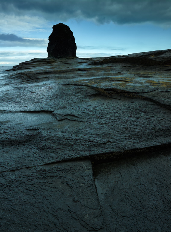
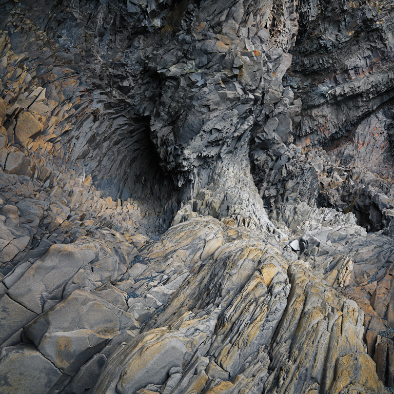
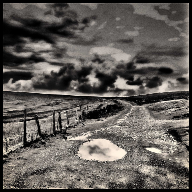
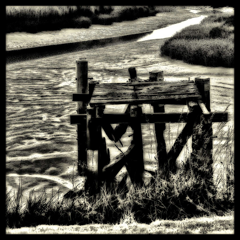
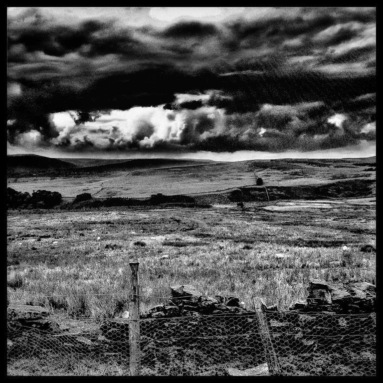
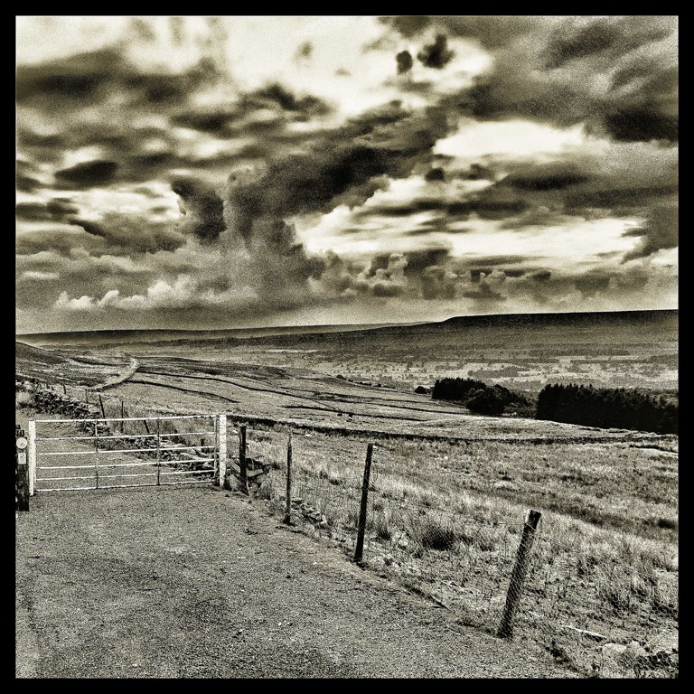
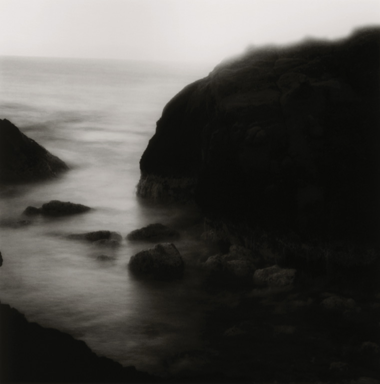
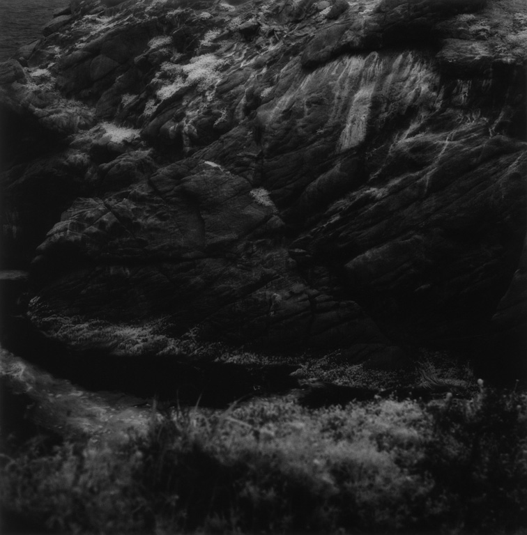
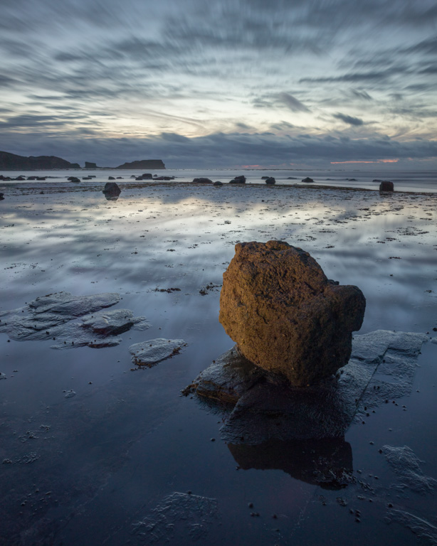
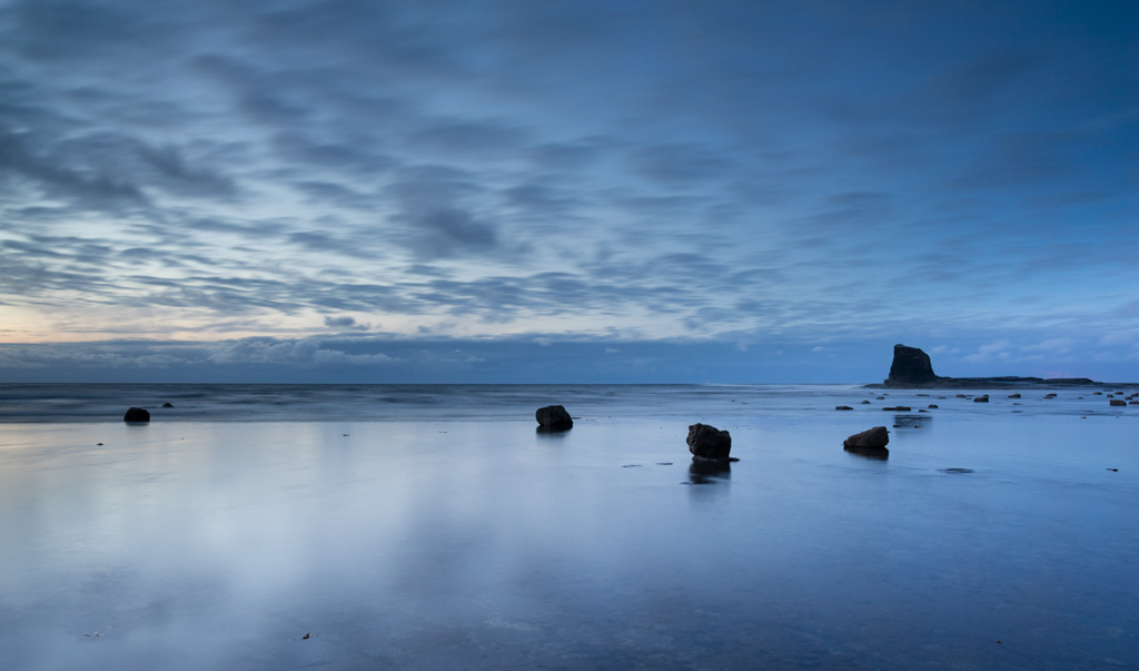
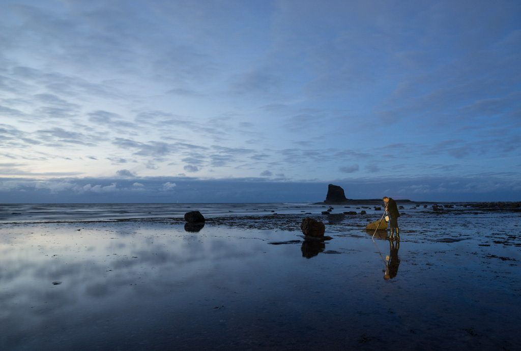
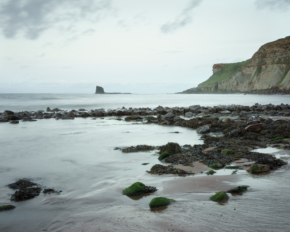
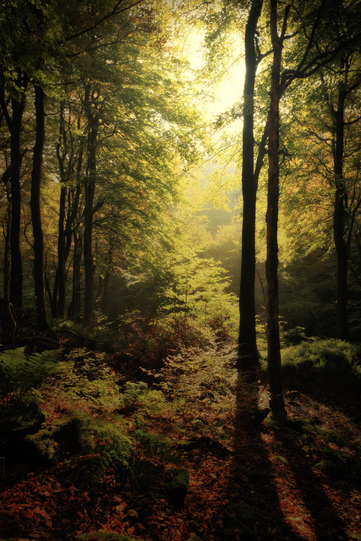
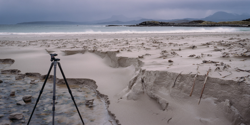
evertheless we pressed on. Although I know Saltwick well having collected fossils there for nearly 40 years and taking pictures since the late 1990s it is somewhere that I always find difficult to get your eye in when the conditions are less than perfect. The temptation is to return to old favourites, search out some well loved bits of sandstone or old jetty or cliff. The high cliffs unbalance any image that includes them, they are dark rock and mostly in shade. Working under them is slightly hazardous (especially recently as cliff ‘showers’ and falls have been more frequent since the 2013/14 Winter) but can be rewarding. I had a new Samyang 24mm F1.4 lens in the bag that I wanted to try on the A7R and found an image that would serve that purpose.
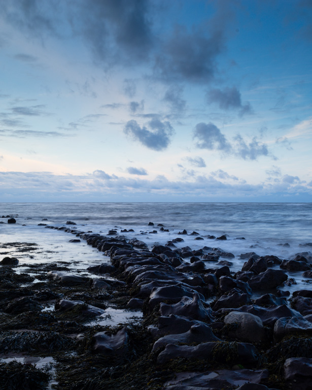
Catastrophe – open the bag and there is the empty space where the camera should be. This is a new problem with mirrorless… too damn light, this would never have happened with Large Format or even my old Nikon DSLRs. I had taken the A7R and pancake lens out with me on a walk and left it at home in the pouch of my jacket. I had turned up on location with a bag full of lenses and no camera and no back up. You visualise that image of a donkey all too well at this time especially with the sniggers from your friends and the ‘been there, done that’ comments. Fortunately Joe had an A7R in the van which he kindly yomped up the cliff to get for me. It was going to be one of those nights !

First image if of some of the sandstone blocks in the predominantly orange sticky sand that is found on the beach. I was attracted to the reflected light on the sand from the blue sky out over the sea in the shade of the cliffs. The scene had a heavy tranquillity to it and good modelling leading to a perceived 3D image. I really needed a bit more height but could just get separation by standing on a rock. Image is a 3 image stitch taken at F16 on a Mirex adapter and 35mm PC Distagon.


As the tide receded we moved down towards the Nab and wreck at the Southerly end of the beach. An opportunity to test the 24mm lens presented itself with the newly exposed wall of the old quay. Interesting cloud and a blue soft light again from the blue sky out over the North Sea. A combination of 2 stop ND grad and 3 stop pro glass ND filter gave me a good shutter speed to soften the sea. It was very important that the sea had just receded as the quay is very dull once dry and sucks away light more effectively than any black hole.

_DSC3447-2

The afternoon high tide had moved a large amount of kelp on to the beach and left it in strands over the sand. The soft light and glowing greens of the waterfall caught my eye as something a bit unusual – the quality of light can be very good at Saltwick and lift an ordinary scene into something a bit more interesting. Again a 3 stitch pano with the PC Distagon stopped down to F16 gave me something I was happy with.

_DSC3450-Edit-2

At last the tide was going out. Unfortunately the cloud had closed the gap in the sky that we had hoped would provide a few moments of magic but the light was soft and tranquil. As the sea moves beyond the first reef it briefly leaves a pool of water through which the stepping stones emerge. These aren’t really stepping stones but a series of flat rocks from a hard layer in the cliffs. I really wanted to capture the tranquillity of the scene with space for the very soft sky. Timing of the exposure was key to avoid the fisherman and his headtorch looking for ‘peeler’ crabs around the Nab. Shot times on the 24mm lens stopped down were over 10seconds now and very very blue ! A switch to ‘cloudy’ white balance and a slight warming of the image and magenta hue adjustment gave the final result.

_DSC3460-2

I was pleased with my four very different images from 3 hours at Saltwick. Note to self – always check the camera is in the bag!

Lastly an image taken partly with my headtorch of Joe at work in the twilight

_DSC3465-2

Andrew Nadolski

Wow - talk about being thrown into the deep end; physically and metaphorically. When I left Exeter for the seven hour drive to Robin Hood’s Bay for an OnLandscape management meeting it was definitely shorts and t-shirt weather and that is exactly what I packed; alongside my Sony A7R with 35 and 55mm lenses and tripod.

The decision was made that on the Saturday evening we should all go off for a joint dusk shoot at Saltwick Bay. Mr Tolcher, with a beady eye on the tide times, told us that we had time for a relaxed meal (accompanied by an excellent pint of Landlord) in the local pub before heading off to the beach.

There was I in my shorts and t-shirt and miniscule camera bag whereas the others were wearing survival clothing last seen in the depths of winter (Joe even sporting an Antarctic expedition fleece), whopping big F-Stop rucksacks and larger than average tripods - talk about being made to feel a little inadequate.
As we gathered around to get into Joe’s minivan I began to feel like we had somehow slipped into a bizarre ‘Top Gear’ world of ‘challenges’ . There was I in my shorts and t-shirt (plus thankfully a thin fleece borrowed from David) and miniscule camera bag whereas the others were wearing survival clothing last seen in the depths of winter (Joe even sporting an Antarctic expedition fleece), whopping big F-Stop rucksacks and larger than average tripods - talk about being made to feel a little inadequate. Mind you as would later be revealed Mr Tolcher was going to try and pioneer a new kind of camera-less photography...

When we got to Saltwick the situation became even more absurd in that the beach was almost completely covered with water and the promised receding tide looked like it wasn’t going to be doing a lot of receding this side of midnight. With an onshore wind the words ‘slightly chilly’ sprang to mind. Oh well I thought if I didn’t come back with any good images I would be able to invent a whole new genre of landscape photography - UCS - Unintentional Camera Shivering - but that would just be a load of bollocks wouldn’t it.

I offered to express my artistic reactions to Saltwick through the medium of dance but the others weren’t having any of that. Mind you I thought it a little unfair as David was obviously intending to use mime as his medium of expression having forgotten his camera!

This is where the metaphorical deep end comes in. It is a little daunting to go to a location that others know well and feel pressured to produce something to display.

I pottered around a little trying to make a few compositions with the wet sand and sea but struggled with a sinking tripod. I knew later on I would be able to produce something ‘acceptable’ at the very least; as water, dusk, long exposure = picture; not exactly original. Would I be able to produce anything meaningful, an artistic reaction to a place? Highly unlikely as there wasn’t time to sit, watch, absorb and simply feel the landscape. I need to walk and look before I can consider getting my camera out.

Is it possible to produce images that ‘say’ something when you haven’t worked out what you might ‘feel’ about a place? The path of compositional cliches is all too easy to go down, making ‘paint by numbers’ images from artistic ‘devices’ - rule of thirds, s-shaped curves etc etc. This trap is readily sprung for all who call themselves ‘landscape photographers’.

We are in an age where it has never been easier to take a photograph but never been harder to take a good photograph. Are we all ‘chasing the light’, tracking down the light’, nay ‘shagging the light’? Has landscape photography become the new big game hunting - tracking down the trophy image at the expense of any intellectual depth or genuine emotional response?

I wonder if there are simply too many landscape photographs ‘out there’ and I am afraid that is the blessing and the curse of the internet - often there is no editing; technicolour images are vomited onto the pages of Flickr and popularity with ‘likes’ and ‘re-tweeting’ seen as success in some kind of eworld of mutual self congratulation. ‘Following’ each other’s blogs or Facebook posts like an ever decreasing circle of dogs sniffing each others delicate parts.

Now I think I had better climb down off my soapbox before I am pushed off.

Anyway my reactions to Saltwick - looks like it might be an interesting place - I have even been told there is the wreck of a boat that makes for good pictures....

DSC02441web DSC02426web DSC02423web

Tim Parkin

It's true that I've been to Saltwick a couple of times in the past and so I should have a small idea what to expect but both times I've been led by our resident expert David Tolcher to just the right spot for reflections, Nab and sunset and hence didn't really get much chance to explore the rest of the bay. Tonight it turned out I'd have even less chance as fortune threw an extra challenge in the guise of a foot of salt water obscuring most of the aforementioned beauty spots.

However, this is part of the idea of the article - in the real world what can you make out of a location given a single evening? Well in my case I fancied taking a look at the opposite end of the beach from the main attraction and was immediately struck by the textures of the mineral stained sandstone and mudstone in the cliff face. The minerals, probably predominantly the famous 'Alum' which was used in antiquity to fix dyes, had dripped across the rocks and dried, sometimes to a rich yellow or orange and sometimes as a white, talcy veil. For my purposes it created all kinds of variety and my task was to make some sense of them as a composition.

The surface of the cliff was three dimensional enough that this wasn't just a case of 'cropping' a nice pattern and so I used a framing card (a 4x5 hole in a piece of black plastic) whilst wandering around to try to find appropriate shapes. A suitable pattern stood out quite quickly and, thankfully, I didn't have to get too close to the cliff (which has a tendency to rockfalls on a regular basis). My camera of choice was my Ebony 45SU large format camera and with a little bit of swing and tilt I got my plane of focus in the right place. A final adjustment for bellows factor and hopefully Fuji Velvia would do the rest.

tp_0003

I continued looking for a few moments wondering if anything else would catch my eye and within about ten foot of the first composition another possibility appeared. I was hoping to move on and try some different subject matter but being as I'd got my eye in on this type of subject and my camera was already out I gave it another shot. This needed a much longer lens - I was using a 360mm lens and area of interest was only about 14 inches across. Lots of bellows and a steady hand and that was two shots in the bag.

tp_0002-small

Having captured a couple of shots I was reasonably happy with it was time to wander around looking for something else. As has been mentioned, our only disadvantage was the onshore wind that kept that seawater blocking our access to the fun stuff. However, instead of trying to hard I took the opportunity to have a chat with a local fisherman who was stocking up on peelers for his bait (crabs that have just shed their shell) and he told me about how the tides work locally, the pertinent bit being up to a fifty minute delay if there is an onshore wind and a low pressure (which we had). It looked like a view of the wreck at sunset wasn't going to happen.

To add insult to injury the dreaded 'Middlesborough Wall of Cloud' made it's regular appearance and blocked any hope of a sunset or afterglow. Having only made a couple of exposures I felt I had to at least try for one more and so I saw a few rocks just offshore and a hint of parallel lines in the slate in the foreground and so I checked the meter to see what exposure I'd need on Portra 400 - well two minutes wasn't so bad. focussing when you can't see s**t wasn't so much fun. I used a headlight to illuminate the foreground whilst applying tilt and crossed my fingers.

TP_2_0010 2

Unlike my digital brethren I didn't get to share the product of my work until the following week when I stocked up with C41 and E6 developer. I then had the wonderful experience of wondering if my exposures were right and if my chemicals were mixed correctly. It all worked out OK though and with a quick run through the drum scanner I got to show my off my own results (a week after everybody else's of course!)

Conclusion

The whole 'challenge' was interesting. I was impressed at how differently we all saw the location and opportunity. I think in many ways having slightly poor conditions was more interesting for the article. We ended up having to work harder to find photographs and to work with the conditions.

I hope you've found the results interesting - we plan to repeat the exercise at some point in the future in another location with different people perhaps.

Featured Comments From:

Ian: It is interesting how different the results of the trip were for each participant. Very brave of Andrew to head out to the NE coast in just a t-shirt, even if it is summer (allegedly). I’ve only been to Saltwick once and the wind was really cutting on that occasion too.
I also enjoyed Andrew’s soap box mini-rant and wonder if there would be any value in an expanded discussion on the assertion that “We are in an age where it has never been easier to take a photograph but never been harder to take a good photograph”.
David O'Brien: This seems a bit like 3 men in a boat! a great read and on any future trips please bring Mr Nadolski and his soap box. I was sitting in the infernal Quiet carriage on the train when I collapsed in laughter at the phrase “shagging the light”. Am not sure my fellow passengers are pleased with me.

Indecisive? Moi?!

I've read a small amount about Ansel Adams over the last few years and he has always come across as the master technician of landscape photography. His teaching of the Zone System and his considered 5x4 and 10x8 work was an aspirational example of the master craftsman personified. So it was with a small amount of relief that I read an article about the making of "Moon and Half Dome, Yosemite" and discovered that he wasn't quite the perfectionist he is made out to be.

MM_4_ 35.tif

Now I have to admit it's an "awesome" shot (ahem), the way that the shadows balance one another and the sunlight creates wonderful textures on the face of half dome are beautiful. However, my inner acolyte tells me that Ansel must have composed this perfectly and his knowledge of exposure would have allowed him to capture this masterpiece in a single frame! Sadly not. If we take a look at the contact sheet for this roll of film (for yes, Ansel did use a medium format camera; a gift from Victor Hasselblad in 1950) we'll see a different side of the master.

Walking, A Way of Photography

“We don't make a photograph just with a camera, we bring to the act of photography all the books we have read, the movies we have seen, the music we have heard, the people we have loved.” - Ansel Adams

In this memorable quote, Ansel Adams distills the idea that photography is truly an act of self expression. He urges us to apply our entire life experience, especially what we have learned from other art forms, and from our relationships, to our photographic seeing. It stands as a luminous signpost to anyone ready to further their photography beyond good craftsmanship/technique.

4_Phuktal_trail_Zanskar

We recognise that the human character is a fusion of nature and nurture. It's no surprise that when we look at our friends and family – those we know well – we find that their behaviour, their habits, patterns, outlook on life is, along with their own natural instincts, abilities and gifts, a reflection on what happened to them as children, and beyond. This recognition becomes much harder though when we look at ourselves, for the mirror we hold to our own experience is also heavily tinted (and perhaps even cracked) by the very experiences on which we need to reflect. Nevertheless, it is from the joy and suffering of a life – our own – that we ultimately find inspiration. 3_Grasses_reflections_YosemiteThe ideas, the shapes, the proportions, the energy, the colour, the light and darkness that invades our images are at their most eloquent when they are connected to, and reflective of, our life as we have lived it.

A Sony Monochrome Sensor?

At the moment if you want to use a dedicated black and white sensor you’ve got the choice of buying an old Kodak DCS camera (in a full 1.2mp or 6mp formats), buying a Leica Monochrom for £5k or a Phase One IQ Achromat for about £36k. Not many realistic options really.

However there are rumours that Sony are looking at producing a monochrome version of one of their sensors as a dedicated lens RX1 which would (hopefully) bring this niche product to market at a reasonable price.

Sony-RX1

But why would anybody want a monochrome sensor in the first place? To know this you have to know how a colour sensor works. I’ll only give you a brief recap of the pertinent details as there is a good explanation of the Bayer array on Wikipedia. The most important fact is that each pixel in the Bayer array is covered by a colour filter. If you’ve ever used colour filters on a black and white camera you know that there is a filter factor involved because they block light. The filter factor for a blue or red filter is about 2 stops. That’s two stops of light blocked!

That means that your native, base ISO is now around 800 instead of 200

Higher Sensitivity

A black and white sensor is the same as a colour sensor but with the colour filters removed. That means that your native, base ISO is now around 800 instead of 200 (presuming a Sony sensor). This would mean an almost noiseless ISO of 6400.

The other good thing (or bad thing depending on your point of view) about having no colour filters is that you can go back to using black and white filters properly again. If you’ve ever tried to use a red filter in front of a colour digital camera you’ll know the loss of resolution you get because you’ve effectively disabled three out of the four pixels available - the green and blue filters receive almost no light with a red filter on. This leads to a more ‘natural’ filter effect (so I’ve been told by people who know better than me).

Now why can’t we just remove the colour filters from a current DSLR to get the same effect? Well you can, but it’s not easy - in fact it’s quite scary by all counts. Have a look at this article.

Some companies will remove the colour filters for you - I know of one that has done in the past and they have a page about monochrome sensors here.

Another advantage of removing the colour filter is sharper pictures.

Sharper Pictures

Another advantage of removing the colour filter is sharper pictures. Depending the subject your resolution on a colour sensor is only a fraction of what it should be. Imaging photographing a girl with red hair. Only the red pixels would pick up the red hair properly and only 25% of the pixels are red. This means less than half the resolution in the hair which leads to blocky, pixelated hairs. On a black and white sensor all the pixels pick up all the information and you get nice consistently drawn lines. In actual fact colour sensors aren’t quite as bad as this but the loss is still significant - estimated at between 15% and 30% depending on who you talk to.

More film like noise

If you do use higher ISOs the noise you get is actually a lot more randomly distributed (because it’s not affected by the different gains the colour channels get). This gives something that looks less digital like if not more film like.

Foveon Sensor?

The Foveon sensor has pixels that collect all the colours of light and hence have some of the resolution advantages of a dedicated black and white sensor but without the sensitivity advantages. Plus there are few high-resolution Foveon sensors. However it does seem like a good compromise for the black and white photographer.

Do I want one?

Well I must say that I like the idea of a black and white sensor and if I were to do a lot more black and white it would definitely be a consideration. If I was a dedicated black and white photographer I think this would be on my shopping list, especially if it has the 36mp sensor! I wouldn't expect to see one until early 2015 though.

I’d be interested in anybody’s opinion who uses either a Leica Monochrom or a Foveon sensor for black and white photography (or even an Achromat or converted sensor).

Featured Comments From:

John Beardsworth: No thanks. And I say that as someone whose first loyalty is to black and white.
Sure, there may be advantages in terms of high ISO (though slow ISO has its value too) and more in terms of sharpness. But as for more film like noise, or rather less digital-looking noise, get a film camera and get your hands wet.

AlexeyD: Just to point out – I would not expect sensor sensitivity to grow a lot with CFA removed. In the old days when camera manufacturers were less concerned about shooting in a dark cupboards at nighttime, the CFA were quite dense and taking them off leaving monochrome sensor did indeed result in 2 stops boost. Looking at Kodak monochrome cameras vs their non monochrome versions it seems around 2 stops gain. Nowadays the CFA are quite weak to accommodate high ISO shooting so taking them off won’t result in drastic sensitivity boost.

Regarding the existing sensor conversion – the link you posted Tim is got to be the most careless one ;). Iliah Borg on DPreview was the pioneer of the conversion (not the one referenced though) – he stripped Nikon D2X sensor CFA off and had monochrome D2X version. From what I recall he used solvent chemicals to dissolve the filters (building an insulation well around sensor chip and using the bath of solvents on the bare sensor surface). His method was repeated by a few brave souls on DPReview with success from what I recall. Considering how many old Kodak SLR/n/c and 14n are left around (they have 14megapixel fullframe sensor) and the sensor construction (where the chip itself sits in a ceramic bath like frame) – solvents method actually looks quite repeatable.

Joe Cornish: I am slightly skeptical whether the theory of the pure black and white camera quite translates in print as we are led to believe; and the control of tone using colour channels remains an attractive aspect of mono conversion from digital colour, to my way of thinking. Nevertheless I do think too that a Sony RX-1 monochrome would be a massively appealing product for traditional street photography, and open up that approach to those of us who still think the price of the Leica Monochrom is too high.

Jürgen Metzler: I Had the chance so see a comparison between b/w prints from the M9 and the Monochrom last year and I couldn’t believe the difference, sharpness and tonality of the MM prints were in a different league. Only for watching on a monitor I wouldn’t buy a monochrome version. However, for me, b/w is strictly connected with film, I don’t like the digital clearness in monochrome.


End Frame – Mist on the North-East Ridge by Peter Dombrovskis

When Tim asked me if I would do an “End Frame” I didn’t realise quite how difficult it would be identifying which particular photograph I wanted to discuss. There are many photographers whose portfolios I admire and there are many more photographs within those collections which I could loosely describe as favourites .... so which one should I choose?

If you'd like to contribute an "Endframe" please get in touch and let us know on via our submissions page. If you have any comments about Pete's choice please let us know below. 

D810 Live View Split Screen

I imagine most of you will have heard that we have a D800 replacement arriving very soon. If you haven’t, the bottom line for landscape photographers is

  • Removed optical low pass filter (the old version still had one but supposedly it cancelled itself out - removing it completely may make things sharper)
  • Included new sensor technology with possibly better noise handling
  • Added a native 64 iso so you can get longer exposures for more blurry water or use wider apertures in daylight
  • Finally a fix for the awful live view screen so finally it might be a match for Canon, Fuji, etc
  • Electronic shutter in live view for quieter and, more importantly, less bouncy exposures

The thing that caught my interest was the “split screen live view mode”. I’ve talked about the possibility of this in previous posts where I proposed that it would be great to have two separate windows on your LCD that you can move around and zoom in and out of independently of one another. Well it looks like Nikon have managed to do this but I think they’re trying to solve the wrong problem (or at least putting unnecessary restrictions in place).

Why do I want a split screen live view?

Nikon’s answer is that you can lock the two windows to the same horizontal level and hence line up parts of the landscape that need to be level with each other. e.g. The horizon on a coastal shot or parts of buildings for architecture. Have a look at the screenshot below from a Nikon presentation.

This could be revolutionary for the use of tilt with T/S lenses

split-screen

Well if you’ve used tilt shift lenses you’ll know one of the live view procedures of moving backward and forward between horizon and foreground trying to get the tilt to line up properly. Imagine if you could put one live view on your foreground and one on the background and then just watch as you tilt and focus your way to a sharp picture! Here’s a mock up of what it might look like..

tilty

The selected window is highilghted in yellow. Of course you’d have to be able to swap it round from top and bottom to left and right (similar to the slide from Nikon).

All is Not Lost (possibly)

Now even if Nikon have locked the two splits to a horizontal line, it might not be the end of the world as long as they aren’t using the orientation sensor to choose which way to display things. If you can tell the camera which way you want the ‘line’ to be then you could just set the line up vertically instead of horizontally. In which case although you’ll be limited to two points directly over each other, this would be fine in most cases (and is what most people do at the moment, just shifting vertically from one point to another).

Also for Depth of Field

Now it’s not just useful for tilt shift lenses, if you want to check that your foreground and background are suitably sharp by stopping down you can place the points in the same way and see how aperture affects depth of field. I can almost envisage an “auto aperture chooser” function that looks at your two windows and chooses the optimum aperture based on two phase detect auto focus points (i.e. it can work out at what point to focus for both and hence work out where the middle is and stop down until they’re at maximum sharpness)

A call for an open API for camera interfaces

Now if Nikon were forward thinking like Apple, they would allow software developers to play with the interface for their cameras and then start up a ‘camera app store’. This sort of functionality would be developed pretty damned quickly even if only for a few geek photographers to ‘scratch their own itch’. I’d like to be able to download tilt shift tables, use my camera with photo ephemeris, focus blend applications, you name it and developers would build it (and probably much more!).

We’ll keep you posted on how this works once we get to play with one!!

FEATURED COMMENTS FROM:

Duncan Fawkes: It would be brilliant if the screen was touch sensitive to allow us to position two windows quickly. Strangely this is a feature found in Canon’s recent entry level cameras that you might expect in more expensive models. Seems like a gimmick at first, but I’m all about speed and ease of use and if I can tap the screen to set my AF/zoom point rather than scroll around with a diddy joystick I’m all for it! (extract)

AlexyD: ETTR applied all the time nowadays can do more harm than good. In my view the reasons why we typically do not see it anywhere in a cameras (only in third party hacks like Magic Lantern) are rather technical. Sensors nowadays come with quite diluted CFA filters and relatively weak primaries separations (to cater for better low light performance). This require more careful profiling and as a result more careful exposing. The profiles will effectively fix the colours in ranges where separation was weak but if exposure was offset (like in ETTR case) wrong colur ranges end up being fixed. This leads to subtle (initially) colour shifts that can be emphasized by postprocessing.

In addition, on some sensors with high dynamic range, nonlinearities start to appear arount saturation point (hence additional colours shifts if that is all to be shifted back to midtones). It all depends of course on amount of posprocessing or it can be acceptable compromise on some subjects like landscapes. With portraiture however it is most likely not – so in my view that’s the reason why we never see this from Nikon or Canon officially.

I agree that public API and camera apps would be superb to extend the functionality but looking at Nikon history for example – it seems that they are quite opposite and want to control more rather then open things up.

Lizzie Shepherd: Some interesting thoughts here Tim. Focus by touch screen would undoubtedly be a great feature – judging by how well it works on the little Olympus cams – split screen, or otherwise… I’d also love to see touch screen functionality allowing one to choose from a sensible range of crop/format options – I know of no camera that offers all the options I’d like. I don’t really see why it has to be limited at all in fact.

D Reisenberger: Good post and question, Tim. The functionality I would like to see (would like to have seen?) on an extended-D800 camera would be a wider range of in-built, or custom programmable, image ratios. 5:4 was a step in the right direction, but why not add square (1:1) and a panoramic format or two, such as 1:2, 1:3, and 9:16-without-movie-mode?


Robert Birkby

This issue we're talking to semi-professional Yorkshire based photographer Robert Birkby.

10

Can you tell me a little about your education, childhood passions, early exposure to photography and vocation?

I was born in Halifax, West Yorkshire and educated in nearby Brighouse. My father is a retired cabinet maker and my mother a housewife. As a child I always had an interest in natural history and geography, so whilst other kids were playing with 'Action Man' or watching American cop shows, I was out rooting in the local canal for creepy crawlies or fishing. My father had Minolta SLR cameras in the 70s and 80s and some of my earlist memories are being with him developing black & white photographs in his dark room in the cellar. It was like magic, watching the image appear, with the pungent smell of 'developer' 'stop' and 'fixer'. I was given a small 35mm film camera for my 10th birthday and used this for many years even up to my late teens.

What are you most proud of in your photography?

I'm proud of what I've achieved in photographing my local area. I live in one of the most heavily populated parts of the country so it's difficult finding unspoiled landscapes here. Photographers in the area often make a beeline for the Dales or Peak District, which is understandable.

Whilst I'm the first to admit that judging and comparing very different photographs is quite subjective, I felt it was quite an achievement to get 5 photos in the 2013 Landscape Photographer of The Year book/exhibition. Even more satisfying was winning two 'judges choice' awards, being runner up in Classic View and winning the people's choice award by all visitors to the exhibition.

Even more satisfying was winning two 'judges choice' awards, being runner up in Classic View and winning the people's choice award by all visitors to the exhibition.

In most photographers lives there are 'epiphanic' moments where things become clear or new directions are formed. What were your two main moments and how did they change your photography?

I think the first would be in my mid teens when I began to take an interest in the gritty urban scenes here in northern England. The journey from Calderdale to Manchester for example seemed atmospheric with the stone terraced housing of home, followed by the misty pennine hills before dropping into the red brick of Manchester. Wet weather and grey skies seemed to enhance the atmosphere and whilst everyone around me found these places depressing, I remember thinking 'One day I will get a SLR and take pictures around here.'

The second would be in 2010 when I took my first trip to the Isles of Scilly. I was taking snaps the best I could, for my own pleasure. To cut a long story short, I became friends with somone there who was a photographer and had contacts in publishing. The next thing I knew, I was being offered good cash for my pictures. Somewhat surprised, I then began to wonder if I could market photographs I'd taken from other parts of the country to the tourist industry and had great success. I couldn't understand it, so many people take photographs, why would they want mine? The upshot of this was that it gave me confidence to try even harder and improve on my photography.

11

Tell me about why you love landscape photography? A little background on what your first passions were, what you studied and what job you ended up doing.

My interest in nature and science somehow ended up with me studying Pharmacy at University and it was around this time I saw my first digital camera. I was instantly fascinated with it, and how it could record scenes without the need for film! I saved up whilst at Uni and eventually purchased a Fuji DX-5, which featured a 0.3 million pixel sensor (and no LCD screen.) Looking back, the images it took were diabolical, but at the time it seemed amazing to me. I started work in retail pharmacy in the late 90s, and got interested in travel once earning some money. I purchased a better digital compact to record scenes from my travels. As technology progressed, so did my obsession with photography, and I began to read books and magazines on how to improve my pictures. I bought my first SLR in 2004, a Canon 300D.

After working in pharmacy for 15 years or so I quit my job (long story) and currently work just part time in pharmacy on a self-employed basis. I have more time to devote to photography now. Since I have a love for nature, scenery and travel, recording landscapes with my camera is just the most rewarding thing I can do.

Could you tell us a little about the cameras and lenses you typically take on a trip and how they affect your photography.

19I'm currently using a Canon 5D Mk III. The lenses I have with me depend on whether I'm home or abroad and weight allowance. Typically I would have my Zeiss 21mm, Canon 50mm 1.4, Canon 100mm macro and a Canon 70-200mm f4. I have a Canon 24mm TSE and a 24-105mm zoom as well. I tend to use primes these days for better resolution in the corners at wide to normal focal lengths, but the 70-200mm is for all intents and purposes as good as a prime. I'm more than happy with the images from my kit, although I do wish Canon would hurry up with a D800 equivalent as I could occasionally use more resolution.

I don't particularly think one brand is better than another, it's just that you invest heavily in compatible glass don't you? I happened to start with Canon 10 years ago and have stuck with them.

What sort of post processing do you undertake on your pictures? Give me an idea of your workflow.. 

I either use Canon DPP or Adobe Camera RAW to produce a 16-bit TIFF file and work on that as necessary. I used to like DPP but since upgrading to a 5d III I find the images a little 'harsh' in appearance, so now favour ACR. I spend a little while getting the colour temperature correct at the RAW stage. There's no set routine after conversion and I'm not all that adept with Photoshop anyway. I tend to level, crop, remove dust spots, correct colour, perhaps a bit of dodging and burning, or curves and the occasional gradient tool.I try and balance out exposures at the time of shooting with grad filters, but very occasionally blend exposures if necessary to retain the range of tones. I've recently enjoyed using Nik Silver FX pro for dramatic B&W conversions, I like the detail it brings out.

I was initially slightly shocked that this photograph got the runner-up prize, but on seeing it printed rather large at the National Theatre I thought ‘crikey it looks really good!’

12

Do you get many of your pictures printed and, if at all, where/how do you get them printed?

I don't print all that many for myself to be honest, my only printer at home is a very old Epson 1290 which I won in a photo contest eons ago. The prints are still fantastic, but I can't sell dye based prints due to the questionable longevity. As a result I use a local printer called Knight Graphics who do a great job on a variety of media, using large format Epsons. A large pigment ink printer will eventually be on my shopping list, but as many prints I have ordered are quite large, Knight Graphics will have my business for a while yet.

I'd never seen my photograph of Ben Nevis (which came runner up in LPOTY Classic View) printed at all until I walked into the exhibition in London. I was initially slightly shocked that this photograph got the runner-up prize, but on seeing it printed rather large at the National Theatre I thought 'crikey it looks really good.' Which just goes to show what difference a quality print makes.

18

Tell me about the photographers that inspire you most. What books stimulated your interest in photography and who drove you forward, directly or indirectly, as you developed?

No photographer from Halifax could fail to mention Bill Brandt's iconic photographs of the town. The scenes of grim cobbled streets and mill chimneys have fascinated me for some time and inspired me to investigate what's on the doorstep. In a similar context I'm a big fan of Simon Butterworth's variety of work, and I enjoyed his 'Searching for Yorkshire' series, taken from around my part of the world. Changing the mood slightly, my first trip to the Antipodes in 1999 was inspired by Andris Apse's New Zealand Landscapes book. Sadly I didn't have the skills or the equipment to take decent pictures from the country back then, but his photos were, and still are, a source of many hours enjoyment. Today, I admire the work from a huge number of photographers, so it's impossible to list them all. However, for all round technical brilliance, I must mention David Clapp and Guy Edwardes. For dramatic, striking landscapes Mark Littlejohn always comes up with the goods. For intricate studies of nature it's got to be David Ward and (am I allowed to say?) Tim Parkin. For my favourite place (Scotland) it's Ian Cameron and Colin Prior.

Tell me what your favourite two or three photographs are and a little bit about them

The first would be 'Winter Solstice.' It's taken really close to home, I was lucky to be off work this particular morning in 2009. I like the texture and cool tones in the snow as well as the lines leading to the rising sun.

Winter Solstice

The second would be 'Milltown II.' I do enjoy photographing Hebden Bridge, it's always had a reputation as being a little, erm, 'different' but quite often the weather actually is different up that end of the Calder Valley. Hebden is a typical pennine town of terraced housing climbing up into the hills and mist tends to form here. It's very atmospheric given the right conditions and I'm not surprised the 'Happy Valley' TV series was based around this area. This is a shot from earlier this year which I felt worked best in mono.

Milltown II

Third - 'January Dawn.' I love winter minimalistic type shots, so I'll pick this image of sheep from a couple of winters ago. As well as the simplicity I like the balance in composition and that delicate warm tinge of the sky which is separated from the white snow by the wall.

January Dawn

If you were told you couldn’t do anything photography related for a week, what would you end up doing (i.e. Do you have a hobby other than photography..)

I enjoy walking in great scenery but that would probably drive me mad without a camera. So I'll go for cycling or the gym. If funds allow I'll fly off to some nice holiday location and loaf on a beach listening to music!

5

What sorts of things do you think might challenge you in the future or do you have any photographs or styles that you want to investigate? Where do you see your photography going in terms of subject and style?

For the time being I plan to carry on doing what I'm doing- i.e. trying to take striking images in very different situations. I enjoy this variety, taking photographs opportunistically as to what the weather and seasons throw at me. If I am to develop a photographic style or subject I'm not sure what it will be as yet!

I shall continue shooting stock images in and amongst too, as I like doing this and it's certainly helping to pay the bills at the moment. My agency 4Corners have been great in this regard, promoting my work to a wider audience. I have a list of locations I'm looking forward to visiting in future, both in the UK and overseas.

6

Who do you think we should feature as our next photographer?

How about Justin Minns ? I've been a fan of his work for a couple of years now, Justin has some super photographs from East Anglia and the surrounding area.

Thanks for Robert for his time. You can see more of Robert Birkby's work at his website ( or follow him on twitter @RobBirkby.

On Vision… Part 1

"Photography is not about the thing photographed. It is about how that thing looks photographed."  Gary Winogrand

Photographing something changes how we view it. Period. That’s a straightforward statement, but the reasons behind why and how it is changed are really quite complex. The camera is the best tool mankind has yet devised for describing the visual realm. It can do so in the most exquisite detail. And, because it captures light using the same laws of physics that govern our eyesight, its images portray a familiar perspective. So, on the face of it, pointing an automatic camera at a portion of the world and pressing the button should infallibly result in an image that is roughly equivalent to how we perceive the same scene. But, as critical consumers of photography, we know that the camera often fails to do this to our satisfaction.


Looking Backward to See Forward – Pentax 645D Re-evaluated

The Pentax 645D is a camera that sort of slid quietly onto the photographic stage, metaphorically speaking. First announced as a concept, there were numerous delays before it appeared in 2010 and then it didn’t really grab any headlines. Had everyone got fed up with Pentax’s indecision about the camera? Would they commit to it long term? It certainly didn’t do a lot to bolster anyone’s faith in how long Pentax would support it as a system.

645 was a misnomer as the sensor wasn’t 6x4.5 as the name would imply, rather a reduced size Kodak CCD (the same as in the Leica S2) measuring 44mm x 33mm (less than 63% of full frame film or the sensor in the PhaseOne IQ180 or Hasselblad H4D60).

645Z_cold_proof_image

Pentax 645Z

Its fixed back design meant the back couldn’t be used on a technical camera therfore making it closer to a large DSLR, only a lot more expensive.

Pentax’s early indecision I think proved costly if they were trying to compete with PhaseOne, Hasselblad, Leaf etc with their established support structures. At its initial price the Pentax 645D could be seen as an expensive gamble especially if Pentax later decided to abandon the camera.

The 645D was dealt what many may have seen as a sucker punch from below when out of the blue the Nikon D800 exploded onto the scene with its class leading 36mp resolution. Suddenly the Pentax looked very overpriced and, on paper, underspecified. A number of reviews and test chart comparisons seemed to show the D800 beating the Pentax on resolution. However there is more to using a camera than photographing test charts. If its overall image quality coupled with excellent ergonomics help the photographer in his or her craft, then arguing over the finer point of exactly how many lpm it can resolve is less important. It’s pictures not pixels that matter.

I was one of those photographers who had initially overlooked the Pentax, going down the Hasselblad H digital road (a decision I now regret). When I was at the Photography Show I managed to briefly escape from the Linhof Studio / Onlandscape stand and got chance to take a closer look at the 645D. Pentax’s announcement of a 50mp CMOS version had piqued my interest and I realised the camera warranted a reappraisal. Paul Waller of Commercial Cameras http://www.commercialcameras.co.uk kindly arranged the loan of a 645D so I could briefly test out the cameras ergonomics in the field in advance of a larger review of the 645Z when it becomes available.

I had the Pentax for a few days, just enough to get the hang of it as a camera and found it very pleasurable to work with. This is a very impressively built camera that shows its heritage. It is not going to win any style awards, boxy is the first impression but in use it means business.

Pentax645D

Pentax 645D

The viewfinder is fantastic and for me is one of the most important things to consider when assessing a camera. If I can’t visualise an image then all manner of clever gadgets and features become irrelevant. As I mentioned before the 645D fell a little short when compared to other digital medium format cameras with their modular design. However reassessing the 645D as a DSLR on steroids is a different proposition - the sensor is 168% larger than that in a D800. When I use my D800 for landscape work I am nearly always shooting in 5x4 crop mode which masks off part of the viewfinder and reduces the resolution to  around 30mp. The format of the Pentax is closer to my ideal format so the non-cropped viewfinder seems huge when compared to the D800.

Pentax-645D-rear

Pentax 645D

In nearly all aspects of use the Pentax is identical to my D800 - okay the AF is a bit basic but as I only ever use the centre AF point anyway it didn’t bother me. It is certainly built a lot better than the Nikon and one of the simplest but hugely appreciated aspects is the inclusion of a tripod socket on the side of the camera - no need for expensive L-brackets here.

The Pentax has two SD card slots. At the time of its launch the non-use of compact flash was sneered at by some people but in hindsight this seems to have been a sensible choice as in all probability SD will become the dominant card format especially with most laptops now including SD card readers. The camera can shoot both jpg and raw (dng) files and I was really impressed with the out of camera colours, there is something about the quality of files that come from CCDs at lower ISO.

645Z_rear3_off_tilt_copie

Pentax 645Z with tilting screen

However with its inherent noise at higher ISOs, compared to CMOS, a CCD is less versatile. With the switch to CMOS  in the new 645Z, the camera will gain live view which will revitalise the Pentax. The ergonomics will be basically the same as the 645D but include weather sealing and an articulated rear lcd. It is the basic ‘down to business’ approach to the feel of the Pentax that I really liked. It may sound silly to say this but I almost felt like I was shooting with a film camera - mind you that may be down to the relatively long wait for a review image to appear on the rear lcd. In fact I stopped waiting and got on shooting as the buffer allows the camera to still shoot.

The camera is nicely balanced in hand and I would be happy working with it hand held when shutter speeds permit. This will be more of an option with the 645Z and better higher ISO performance. Interestingly the shutter is quieter than my Sony A7R.

When shooting in portrait format the rear lcd information changes orientation (though not in the viewfinder sadly). There is a level gauge on the rear lcd which I found very useful with the camera tripod mounted.

In the brief time I had the Pentax I was very impressed with the overall image quality. In fact it performed exactly as I thought it would as at its core is a proven Kodak designed sensor. There seemed to be enough headroom in the raw files (at lower ISOs) to be able to push the exposure in Lightroom or Camera Raw. What was a bit more unexpected was how pleasing the colours were on the camera jpgs an option not offered by my Hasselblad H series cameras while I had them. The cameras AWB certainly handled the scene below better than my Sony A7R.

Conclusion

Apparently when the 645Z appears the original 645D will still be available and Pentax restructured pricing means they are getting quite aggressive now they are part of the Ricoh group. The new price for the 645D with 55mm lens is £5,000 including VAT and the 645Z will retail at £7,699 with lens or £6,799 body only (again including VAT).

With PhaseOne and Hasselblad using the same Sony 50mp sensor as the 645Z but priced at £24,990 and £22,440 respectively the Pentax suddenly looks like a ‘bargain’. This pricing coupled with weather sealing, excellent build quality, bigger pixels compared to 35mm DSLRs, interchangeable focussing screens, articulated rear lcd and live view makes the Pentax an interesting option for landscape shooters and it maybe that this is the market Pentax has in its sights.

Pentax are planning to increase the lens range to 17 lenses (if you include those originally designed for film); 12 primes and 5 zooms. In 35mm terms the zooms cover 26mm - 236mm and the primes 20mm - 315mm.

For those who feel the need to go larger than 35mm but don’t want the pay the much higher costs of digital MFD then maybe Pentax has the answer.

Black and White 

Black and white beach shot

Black and white beach shot


One of the nice things about being able to shoot jpgs alongside raw files is the option to produce in-camera black and white images. All that was needed here was a slight contrast boost in Photoshop.

Comparison to Sony A7R

DSC01208crop

Sony A7R AWB jpg from in-camera jpg

IMGP5330

Pentax 645D AWB jpg from in-camera jpg

Colour Landscape

View with housing estate

View with housing estate

Long Exposure

30secs at f11. Processed raw file +0.35 exposure

30secs at f11. Processed raw file +0.35 exposure


The ‘new ‘Z’ version will feature weather sealing and a tilting rear lcd. In addition to “weather sealing it will retain the excellent build quality, bigger pixels compared to 35mm DSLRs, interchangeable focussing screens, articulated rear lcd and live view makes the Pentax an interesting option for landscape shooters and it maybe that this is the market Pentax has in its sights. We will be taking a look as soon as we can get one to review.


Judging Competitions

The process of judging photographic competitions is something that I have been interested in for some time. Many of you will remember my various rants about photographic competitions in the past and also some of my writing about how to suggest a better competition. Well the fact is that I never started that ‘better competition’ and maybe never will, but I am still interested in seeing how these competitions work and also thinking about ways to possibly improve them.

Judging the Wildlife Photographer of the Year

Judging the Wildlife Photographer of the Year

Recently I was asked to judge two competitions, the Environmental Photographer of the Year and the Wildlife Photographer of the Year. Both competitions had an enormous number of entries and for the Wildlife Photographer of the Year my role was mostly to do with technical judging so I was able to look at the process of judging from the outside to see how group dynamics and the image selection process worked.

Firstly I should give you a bit of detail about how many images a competition like this attracts. The Wildlife Photographer of the Year attracted over 40,000 entries and the Environmental Photographer of the Year attracted just under this number. Each competition had approximately eight judges and the judging process took between one and four days.

Transparency and negatives in the final rounds

Transparency and negatives in the final rounds

The Wildlife Photographer of the Year was split into three rounds. The first round was an ‘elimination round’ where each of the judges was given a few categories to look at and whittle the numbers down by about 95%. The second and third rounds involved all of the judges in a room together looking at each of the categories and reducing the numbers again by about another 80%. The final round then picked out the ‘best’ to be shown in the exhibition or included in the book.

The Environmental Photographer of the Year was judged on a single day where every image was looked at by all of the judges in a room together and the top 100 images were selected (we were effectively only ‘approving’ one in one hundred images throughout the day).

The Pace of Judging

The first thing that hits you when you start judging competitions such as this is that things happen fast. Sometimes you only get about one or two seconds to make a decision about an image - yes you didn’t misread that, one or two seconds.

Mid judging, Wildlife Photographer of the Year

Mid judging, Wildlife Photographer of the Year

This sounds awful doesn’t it? The work that you’ve put into creating all of your images that you’ve then distilled into just a small selection, perhaps the summation of a lifes work, judged and probably dismissed in the time it takes to say “next”.

But the truth of it is that there isn’t enough time to spend more on each picture. Even at 2 seconds each that works out as a solid 24 hours of ‘next, next, next’ to do the whole lot and obviously you can’t spend more than about 6 hours a day doing this if you want to keep your sanity so even that takes four whole days.

What actually happens is that many images can be dismissed in under two seconds - just think about the last time you looked through a Flickr stream. Try it now if you like, go full screen and then swap images every one or two seconds. It’s actually a reasonable amount of time (twice as long as the average shot length for a feature film such as “Quantum of Solace”).

What this forces on the judges is a different mindset than you might have when looking at a single picture. If you’ve got to get rid of all but one in twenty or more then your mindset is one of “why shouldn’t I reject this image?”.

Behind the scenes administration, Wildlife Photographer of the Year

Behind the scenes administration, Wildlife Photographer of the Year

And so images that are badly processed, images that don’t resolve quickly and images that are ‘cliches’ quickly get binned. Images that don’t catch your attention, images that don’t get past a weariness that comes from 8 hours of staring at a screen, images that you’ve seen again and again and again - all gone.

But there is a little hope - when I said “images that don’t resolve quickly get rejected” it’s not quite true. In fact quite often it’s an image that asks “What’s going on here then” that most often stops the judges - as long as the question is answered fairly quickly with “Ooh! Something interesting” then I can almost guarantee that an image will pass that first round.

Later Rounds

In later rounds there is a bit more time to ponder on images and perhaps the priority now is to work out “Why does this image deserve to be in the finals in comparison with these other images?”. In wildlife this more often than not means subject matter becomes more important. Images that show the same old, same old will quite often get rejected. Images that have a strong ‘narrative’ element get kept.
What do I mean by narrative element? It’s often the obvious story that an image has but it’s also the way that an image has room for the viewer to bring their own story and invites them to do so. An image that manages this will undoubtedly be more appealing than mere representation.
Also in the later rounds the group has more time to talk about an image and hence we get into the realm of group dynamics.

Group Dynamics

Whenever you get more than two people in a group you inevitably end up having some form of group dynamic. Some people are more extrovert, others introvert; some are more charismatic and influential, others less so.

These group dynamics dilute the range of opinions of the group. Ways of mitigating these problems range from including a strong chairperson who is briefed to draw out the opinions of quieter members of the audience to using voting button systems (an idea that I’m strongly in favour of but that isn’t used often as far as I can see).

Fatigue

Spending up to eight hours critically studying images is hard work. At some point decisions start to become reflexive rather than conscious. The result of this is typically that images not fitting the individual judges patterns of ‘good’ will get rejected.

The Landscape Photographer of the Year first round judging last year had a good system whereby each of the three judges chose their selection independently and each of their choices got through to the next round. This ensured that when one person was tired, another may have just come back from a break - each image essentially getting three chances to go through to the next round.

Familiarity and Icons

There are cliches throughout any genre of art and our general point of view is to avoid them but there is also a lot of truth in the fact that they are cliches because they work. However, after you’ve seen fifty different versions of the same cliche or icon you start to get a little bored by it. Typically what happens is that the first decent version of the cliche gets selected during the first round. Once this has been done, any future examples of the cliche need to be substantially better to be included.

In a perfect world you’d be able to go back and pick the best example of all those Durdle Door photos but in reality there is no time and so generally the phrase “we’ve already got one of those” flickers through the judges mind and another rejection occurs.

If you want to tweak the judges interest though, make a brand new version of a cliche - the judge may be surprised enough to be jolted out of the half sleep state they’ve entered and at least give your images a few more seconds consideration.

Consistent Judges

When I have analysed the judging process in the past, one of the key conclusions I came to was that judging is an essentially subjective process. You cannot describe the result as “The best…” but only as “The best, selected by …”. Because of this, having different people judging each round of a competition makes little sense. Images that may have been selected in the first round by a ‘final round judge’ will probably get rejected and hence not even have a chance to win. The Wildlife Photographer of the Year awards this year made sure that the same judges took part in the competition from the very first round. I think this can only improve the consistency of the final selection.

In a darkened room for days at a time, Wildlife Photographer of the Year

In a darkened room for days at a time, Wildlife Photographer of the Year

Using This Knowledge

Knowing what I now do about photography competitions I would definitely approach choosing photographs for entry quite differently. I am quite certain that we are probably the least appropriate people to choose the photographs to go into the competition as we have seen most of our images so often and we are so attached to the process of making the images that we are as good as blind to them for these purposes. I would recommend taking a large selection of photograph that you are happy with and allow someone to flick through them in Lightroom or the equivalent or prints and quickly choose the ones that ‘catch their eye’. Don’t let them spend time judging them - only give them a second or so per picture. Once you’ve done this with a few people you should have a good selection that consistently do this. After this you should ditch the cliches and icon shots unless they are exceptionally good and concentrate on the images that look different to those you regularly see on Flickr or elsewhere.

I can almost guarantee that some of your favourite images will be discarded quickly using this process but you have to remember that this isn’t about selecting your best images - it’s about picking images to win a competition - a completely different kettle of fish.

p.s. All pictures taken with Portra 400X pushed to 1600 on a Voigtlander Bessa (very grainy!)

FEATURED COMMENTS FROM:

David Baker: Many thanks for an interesting article Tim. Lensculture has recently published a 'guide' which may assist/add/subtract to the issue: https://www.lensculture.com/../insiders-guide-how-to-get-the-most-out-of-photography-competitions

If you've got any ideas or techniques that you use to help pick 'competition winners' please let us know in the comments below. Or for that matter if you just have any comments about competitions in general.


Voyage of the Eye – Brett Weston

Recently we’ve been reviewing quite a few ‘new’ books for On Landscape but I’m reminded upon looking at my photography book library that the majority of the books I own are second hand and quite often out of print. These are often books which are classics of their time but that you wouldn’t know existed unless you’d come across them on a friend's book shelf or a second hand book store.

SONY DSC

I was asked by a colleague recently for a recommendation of a photography book for someone who enjoys Paul Strand’s work and spent a pleasant half hour browsing through my books (with the usual distraction - “Oooh! I forgot I had that!”) and finally stopped upon a copy of Voyage of the Eye by Brett Weston. An Aperture Monograph, the book may not be the best reproductive quality to show off Brett’s modernist, often brutally contrasty photographs but it has the wonderful attribute for the photographer beginning to build a collection of classics of being available for less than £10 in many places (and that includes shipping from the US to Britain).

The collection of photographs includes many of Brett’s classic works and the afterword by Beaumont Newhall at the back is as much concise biography as essay. The collection leans a little heavily on Brett’s mid-West photographs which I think are a little derivative of his father’s work at time but given that it contains at least eight of my favourite works I’ll forgive it.

As usual I would recommend Abebooks, Alibris or the Book Depository in order to source copies but if you know of any other good second hand book websites please let us know and if you own a copy of this book we’d be interested in your opinion too.

For those with a bigger budget who know they like Brett’s work, you can do a lot worse than pick up any of the series of books published by Lodima which we’ll be reviewing in a future issue hopefully.

Linhof 3D Tripod Head Review

I have now had a Linhof 3D Micro tripod head for over two years. I had used the Manfrotto geared heads 410 and 405 for at least a decade before this, but had become frustrated with their vulnerability to minor knocks and was in search of something more robust and reliable.

http://www.linhofstudio.com/products/Linhof-Heads

In truth the 3D Micro is not really a direct replacement for the Manfrotto heads. Its lateral tilting movements are strictly limited to 12º from zero in each direction. The manufacturer's design philosophy appears clear enough: create a head that can offer the photographer a perfectly level camera with the most microscopically precise adjustments imaginable (and with Quick release). In that sense the full product title (Linhof 3D Micro Levelling Head Q) is Teutonically accurate.

Nokia 1020_20140209_14_45_09_Pro

Conceptually the idea for the 3D Micro comes from the monoblock monorail base of the Linhof M679 CS camera, a feature which Linhof claim means that the M679 CS does not need a tripod head at all, just the tripod, as its own base gives movement enough. Essentially it offers ultra-precise tilts – levelling – in two axes, and two panning actions, below the tilts, and above them. The inclusion of panning below and above the movements not only improves flexibility it also makes a breeze of perfectly-levelled stitched panoramas. The standard camera quick release interface is a Linhof Q plate, although the Arca Swiss-style 'dove tail track' is also available for the same price.

The problem is, while a level camera is often the goal of the view camera photographer doing architectural work, there are enormous numbers of other possible camera positions where use of a tripod is essential/desirable, but where a level camera isn't necessarily. Photography in the field is inherently unpredictable, susceptible to opportunity and creativity. We might imagine that we are heading out with a level(ish) camera image in mind (vistas, architecture etc), yet inspiration may still strike in all sorts of odd angles and perspectives, including straight down or straight up. So the question is, are the 3D Micro's inherent design limitations tolerable for the working landscape photographer?

For anyone new to using this kind of equipment, there is simply no comparison with any consumer model on the market. The precision of the movements and the damping of the panning controls is an engineering experience in itself. No locking knobs are needed for the levelling actions; the fine adjustment knobs are super-smooth but will not budge unless positively twisted. Initially I had the 3D Micro mounted straight onto the flat plate of my Gitzo Systematic tripod. In this arrangement there is no really quick way of positioning it; the damping of the panning plates defies rushing, and the micro drive actions of the tilts are even slower. However, there is a solution… the Really Right Stuff levelling head makes an excellent platform for the 3D Micro; loosening the RRS head lock allows the camera (mounted on the 3D Micro) to be quickly pointed in the right direction and locked again in a single quick turn of the wrist. Precise fine tuning can then follow in a more leisurely fashion. Subsequently Sami Nabeel has shown me his similar set-up, but using the Novoflex Magic Balance levelling base instead. This can be obtained from Speed Graphic (rather than importing the RRS from the USA) and makes a less expensive and at least as capable alternative to the RRS.

Nokia 1020_20140209_14_45_31_Pro

The RRS levelling base adds another 15º of movement either side of zero too, extending positioning capabilities significantly. However, even so, many compositional ideas require more than 12º plus 15º (3D micro + RRS levelling base) of tilt. A few more degrees can be improvised with the tripod, but after that the difficulty of setting up starts to become burdensome and eventually downright impossible. This has to be seen in the light of compositional orientation too. A dslr (or any camera) with an L bracket can work fine, but this really is an essential accessory, for without it only horizontal compositions will be possible, since the camera cannot be put 'on its side'.

Realistically, Linhof designed and engineered this head with the view camera in mind, and all view cameras have 'orientation switching' (ie turn the ground glass screen through 90º) within the camera body itself, as far as I know. There is no doubt that for many view camera photographers, a 'neutral' stance (the level camera) is the 'default' position, perfect for this head. It is for me. But we also like to get creative from time to time.

Having discussed its limitations with Paula Pell-Johnson from Linhof Studio on a few occasions I was delighted to test the solution that Linhof have engineered. This is the simply named, Angled Device. Incredibly, this accessory can take the weight of a full-size view camera, if required, to point straight down (for nature details, document copying etc), or even straight up… although photographing the night sky with a Gandolfi 5x7inch would be a minority activity I imagine. It incorporates an immensely strong welded steel cross section, with a quick release on one axis end, and a panning plate (with Q/R) on the other, perpendicular to the quick release. Essentially the Angled Device pretty well delivers solutions to all the objections I have raised about the 3D Micro as a stand-alone item. (Although a high quality levelling base below the 3D Micro is still essential for speed of set-up.)

_D002591 copy

There is a price to pay for the Angled Device, beyond the £195 + VAT it costs; the additional 300 grams of weight and bulk in your pack. And it takes some getting used to. Just as well most photographers using this kind of equipment enjoy the challenge of quirky design. But it most certainly does work, and in the studio makes an excellent and precise tool for use with a vertically orientated camera eg copying, table top micro photography etc.

It is impossible to be dispassionate about the 3D Micro. It is also hard to rationalise the cost (£799 + VAT) except by comparing it with the Arca Swiss Magic Cube, and Arca Swiss D4, its only obvious rivals. The Magic Cube is much more expensive, but then it is also bulkier (not much heavier though), and more flexible (the Magic Cube can manage vertical compositions by combining a cunning built-in cantilever with more generous tilt capabilities). The D4 is a similar price to the 3D Micro, and is the closest alternative to the aforementioned Manfrotto 410 and 405 heads. But well-made as they are, the Arca products lack the bomb-proof precision of the Linhof.

I love the 3D Micro; perhaps that is partly because it is flawed, because you have to work around it a bit, get to know its strengths and weaknesses (Linhof now offer a push-on crank handle for the micro drive knobs that makes tilting much quicker.) It rewards the user with the most beautifully-damped, smooth, precise actions imaginable. Crazy logic perhaps, or maybe no logic at all, but especially when there is time to work on the crafting of one image, with a high resolution camera/view camera of any description, this is one piece of tripod engineering that feels hewn from solid, inspiring total confidence and quiet satisfaction.

Nokia 1020_20140209_14_44_53_Pro

Pros:

  • Rock solid
  • Precision controls
  • Phenomenal accuracy
  • Perfect damping
  • Panning actions top and bottom
  • Suits any large tripod

Cons:

  • Inflexible
  • Impossible for many cameras to do verticals, without the Angled Device
  • Needs levelling base, to be a practical option.
  • Micro drives almost too accurate for field use (slow to adjust)
  • Potentially vulnerable to sand etc.
  • Expensive

Tim Blogs – Am I still a landscape photographer ?

Whilst wandering around the Patching’s Art Festival last month I was mentioning to my colleague Dav Thomas that I don’t really feel like a landscape photographer at the moment (or any sort of photographer for that matter). It’s true that I’d been on two very rewarding photography trips to Iceland and Scotland in February but apart from that I have been out with my camera only two other times in 2014 so far (and one of those was to test some film at the local church a hundred yards down the road).

Dav said pretty much the same thing - working on his new business ventures (book publishing with Triplekite and campervan interiors with Dubteriors) has stopped him working on his next project completely. It’s frustrating that we both have businesses related to photography and yet the more successful they both are, the less photography gets done. We both made plans to get out together at some point in the future (which will probably get postponed over and over again as another deadline looms).

With a sigh we both walked to the Paul Wakefield talk at the far end of the site and sat down for an informative and entertaining insight into Paul’s background as an advertising photographer. Toward the end of the talk Paul pointed out that after the publication of his books with Jan Morris he didn’t take any landscape photographs for himself for two years!

I asked myself afterward if at this point Paul had stopped being a landscape photographer at this point and the obvious answer was that he hadn’t - it just meant that he was a landscape photographer who hadn’t taken any pictures for a while.

With a small sense of reassurance my wife and I walked around the rest of the exhibition which consisted of many painters either showing off their works or actually demonstrating techniques. It was quite apparent that many if not all of the painters at work their were using landscape photographs as their source material - some of them may be changing the overall structure of the image but they were undoubtedly reproducing material that was sourced through photography. Indeed one of the exhibitors at the Outdoor Photography tent said that quite a few people coming into the tent were trying to find out how to improve their own photography in order to capture better material to paint from.

My last photograph, ironically taking a picture of Mel Foster taking a picture of some sand patterns.

My last photograph, ironically taking a picture of Mel Foster taking a picture of some sand patterns.

Now I didn’t know how to take this - firstly these people were probably taking more landscape photographs than I was (grr!) but they had ruined one of my visions of the landscape painter working ‘En Plein Air’, building paintings directly from nature in a grand Ruskinian tradition.

This was further reinforced upon reading a few ‘guides to painting’ which recommended taking multiple photographs of a scene and “picking the best bits” of each photograph to create a better whole! Scandal!It’s like painters have become the new Photoshoppers of ill repute!

It was reassuring though that there was one painter who was working from sketches done in the field - he was either a traditionalist or had not worked out how to use a camera yet…

I walked away from the experience happier that yes, I think I’m still a landscape photographer after all and that we aren’t that far from many painters after all. I’d still prefer to be a more active landscape photographer - but that’s an ongoing desire for many of us I think.

Do you get as much chance to go out as you’d like? Have you had painters using your photographs as source material or know of painters who are also landscape photographers? Feel free to leave your comments below and get a discussion going.

Valerie Millett

There can be many reasons why we first pick up a camera, but sooner or later it takes us on a journey.  A relatively recent traveller is North American landscape photographer Valerie Millett.  You should not delude yourself over her apparent speed of travel, however effective her use of social media.  Behind the development in her image making lies a firm determination to better herself, and a considerable amount of hard work.  She is now carefully forging a path of her own choosing, travelling at her own pace.  You may have come across her blog which reveals that she is as comfortable with words as with images, however created.  A mix of apt quotations and her own words tell of a developing dialogue with land and light and reveal something of the soul of this particular photographer.

mitten Shadow 066-Edit-Edit-1

End Frame – Early Morning, Merced River by Ansel Adams

When asked if I'd be interested in writing an End Frame article, two favourite landscape images immediately came to mind. Of the two, one I've only become aware of relatively recently (although the image itself is much older), but the other I've known for what must be around twenty years now (although again the image is much older), so I decided it really had to be this image that I write about.

If you'd like to contribute an "Endframe" please get in touch and let us know on via our submissions page. If you have any comments about Ansel's image(s) please let us know below.

Creative Lightroom Pt 2

This is the second part of an ongoing guide to interpreting images using Adobe Lightroom. Our last instalment talked about the environment which you can access here. This current instalment talks about possibly the most important panel to understand for the broad processing of images within Lightroom. For all it's importance, it isn’t particularly clear how it works beyond the obvious. Our video talks about how to use the panel but we wanted to investigate what the controls are actually doing in some more detail.

Joe Cornish & Charlie Waite

Part 2 of our interview of Joe Cornish & Charlie Waite by Steve Watkins (editor of Outdoor Photography).

Steve: What I’d like to discuss is landscape photography in its broadest sense, but also look at some of the practice of landscape photography and what influences Joe and Charlie have had.  I’d also like to touch on the future and where it is all going, because by the time we leave here, landscape photography will have changed, with another 20,000 photographs uploaded to Flickr.  It’s changing before our eyes, and not necessarily all for the good.  We have had some questions emailed in from various people, and we’ll kick off with them and questions we have had from the audience.

Alaska: Breaking Up Is So Hard To Do

There was a loud knock. It was barely light, and after exchanging glances with my wife I put down my half-chewed bagel, smothered in peanut butter, and went over to the campervan door.

Standing there in the gloom was a young man, thin with a pasty white face under a red checkered baseball cap, hands thrust deep into his blue denims. In a sullen southern drawl he said: “Just gonna do some shootin’ here, hope you don’t mind, didn’t want you folks to worry.” Words reassuring on the page, but which were actually delivered with a tone hinting more at begrudging duty towards us tourists, who might panic and call the police at something so innocent and commonplace as bullets at dawn. I thanked him, and closed the door gently. Time to move on...

Polychrome Mountain

The Pool – Iain Sarjeant

There’s another book out by our favourite publisher, Triplekite and it's a rather a beautiful one too. Triplekite are friends on On Landscape and we've helped them on occasion with colour management and hopefully marketing. This most recent book is by one of our favourite photographers, one we've featured a couple of times before in the magazine.

iain-sarjeant-the-pool-book

Imagine walking in your local park and discovering a small pond - only a couple of metres across - which takes your fancy. I think some photographers would take a couple of shots and then move onto something else. This particular photographer saw more than just a photograph or two - they saw an opportunity to experiment, to explore and to create.

This photographer is Iain Sarjeant and the project is called The Pool. A book was always meant to be the culmination of the project and Triplekite have enabled it to be something quite special containing 30 duotone images, each just smaller than 8” square. The book starts with an introduction by Wayne Ford (who runs a blog that’s well worth a read) and runs as a simple sequence of images with the occasional blank page as punctuation.

The result is rather magical. The power of the book comes from the mood the images create - these are rather like entering the dream world of a child, the fascination with the pool and it’s inhabitants, the focus bringing out the occasional detail and the blur suggesting.

pool20_1

There are stand out pictures in the book, the delicate hanging grasses, the blurred rings of a splash of water, the silhouettes of hard ferns, the delicate strands of grass and the occasional spider sitting and waiting. It’s not the individual pictures that have the big effect though - it’s the state of mind they put you in when you sit and absorb the whole book. The work reminds me of Josef Sudek, and not just in the beautiful warm tones but in the creation of an inner world - an escape from reality, a jump back in time.

I can only hope that when people see the book they share my own feeling for the work. If you want to know a little more about the project you can see our earlier interview here.

The book is available for purchase direct from Triplekite (get a copy of Land|Sea while you’re there!). Read Iain's Featured Photographer article & Tim's interview with Iain.

Claudia Muller

They say that travel broadens the mind, and we now live in a world where virtual travel lies at our fingertips, and cheap flights mean that we can go abroad to a wider range of destinations more often.  Even so, it is easy for our own (UK) vision of what is landscape photography to dominate and this is often reinforced by the vivid pixels and photo-workshop destinations that jostle for our online attention.  How much do we know of our European counterparts beyond the occasional headline-grabbing price tag?  Through Flickr I have been enjoying the work of several German photographers who give tempting glimpses of a countryside dominated by forests, lakes, woodlands and meadows and a quieter style of ‘landscape’ photography.  So I was delighted that Claudia Müller agreed to answer my questions for On Landscape.

_CMU8597


Tell us a little about the area in which you live and photograph?

I live in a sparsely inhabited region in the northeast of Germany, in a city halfway between Berlin and the coast of the Baltic Sea. The state is called Mecklenburg-Vorpommern – a stretch of land full of vastness and light, endless beaches, deep mystical forests, silent bogs and a unique flora and fauna. A place of longing for poets and painters for many centuries, created by glacial periods and shaped by human beings since then. A region full of contrasts and contradictions. The landscape is rarely spectacular or dramatic, but above all there is a wide sky.

What themes or styles are popular in German landscape photography?  Is it location-driven as in the UK or more individual?

I‘m deeply rooted in Germany’s nature photographers’ scene and I’m member of the GDT (German Association of Wildlife Photographers), an association which has its origins mainly in wildlife photography. Therefore landscape photography still has a low significance, and such images are often considered as by products. You can find a lot of typical “calendar-photography”, showing the iconic landscapes of the world, but without any attempt at a personal interpretation, or realization of new perceptions. But there are also a few darn good photographers working on long-term projects, creating very personal impressions of the regions they live in.

Can you tell me a little about your education, childhood passions, early exposure to photography and vocation?

I’m still living in the same city in which I was born, and I have never left this town for more than six weeks at a time. It’s a region which was extremely influenced by the German reunification with all the economic and social changes. So, at a time of “working-nomadism”, my biography seems to be rather unusual. I am deeply entrenched here, and I have experienced the changes of this landscape as intensively as those of my own personality.

I was a curious child with too many books and way too much fantasy. My parents taught me a deep love for nature and a great respect for it as well. I explored the world of photography with a little compact camera and a huge number of b&w roll films in my small darkroom. I took pictures of everything that stood still quite long enough to become sharp on film. I wanted to capture the whole world with my images. Photographers like Ansel Adams or Henri Cartier-Bresson have influenced my photography very much – although one might not believe that considering my photographic portfolio. Their distinct imagery, their clear compositions, the consequence and eternalness of their images are absolutely impressive to me even today.

I was also influenced by the paintings of the famous German Romantic Caspar David Friedrich. As a child I admired his paintings in my parent’s books, and later on I often stood at the same locations where he had made sketches for his pictures.

Becoming a nature photographer was a rather fluent process. I was always lucky to meet people who encouraged me to go on. And today I’m fortunate to share this passion with my partner.

How did you become involved in the Wild Wonders of Europe project?  Has it influenced your work since?

At the time when the organizers of the WWoE project were choosing photographers for the several missions there were very few seriously working female photographers. For me this project offered great opportunity. I was allowed to work on certain photographic subjects intensively in regions that I’d never been to before. And moreover it gave me the opportunity to meet other photographers and learn about their way of working. I learned a lot during this time and I also managed to intensify my personal style of photography.

In most photographers' lives there are 'epiphanic’ moments where things become clear, or new directions are formed. What were your two main moments and how did they change your photography?

In my opinion there were no special defining moments. But maybe it is too difficult for me to analyse my work that deeply. Now and then there are images which come quite close to the ideas I intended. I’m rather on my way than close to the aim. Others may look for words, I’m looking for images …

Tell me about why you love landscape photography? A little background on what your first passions were, what you studied and what job you ended up doing.

Landscapes do offer a lot of time for involvement. I’m able to watch intensively, able to change my position or perspective. I’m allowed to wait for a change of light, seasons or vegetation. It’s possible to come back again – and take my picture. Landscape photography matches my mentality, and my approach to photography. And after all, landscape photography offers a perfect argument to be all alone at the most beautiful locations at very unusual times of the day.

I was educated in a skilled trade and I’m also working in this sector. This job gives me financial safety, but photography stays my big passion.

Relatively few of your images feature broad views (and even fewer the horizon or sky). Have you always been drawn to more intimate landscapes and projects?

If you intend to take pictures of a great landscape, you have to know exactly how to compose to capture its certain character. I know of very many images that show that a photographer wanted to put too much information in it, failing in the end. For me reduction is the way. Of course I can photograph a forest panorama. But I can also try to capture a detail of the scene which could be the perfect quintessence. It is only one of many ways in landscape photography – my way.

_CMU7315

Sometimes this kind of photography could also be the result of very simple circumstances: not enough time, bad light and wrong location and the strong will not get back home without an image.

Could you tell us a little about the cameras and lenses you typically take on a trip and how they affect your photography?

I work with a Nikon D700 and a D300. Usually I use a 24-70mm lens or a 70-300mm, sometimes the macro lens, nearly always a polarizer and tripod. The zoom lenses offer the possibility to make the right composition within a very short time. I like the saturated colours of the polarizer, which also removes reflections on the water when you want to work out the colours of the surroundings. The tripod allows long exposure times, which I love to use, and it gives you time to concentrate on a perfect composition.

What sort of post processing do you undertake on your pictures? Give me an idea of your workflow.

I grew up with the frame of a negative film. To come home with a properly exposed and clearly composed image was always the target and it still is. My images arise in the camera, out there in the field. On the computer I do only things like minimal cropping, a little brightening of certain areas, shadows and highlights and adaption of levels. I always try to reduce this part of photography to only the bare necessities.

Do you get many of your pictures printed and, if at all, where/how do you get them printed?

I mainly show my images in small exhibitions. Marc Hesse – photographer, web designer and fine-art printer – is a great partner for me, and is able to produce enchanting prints on Hahnemühle paper from an accumulation of digital data. I love the haptic of these papers, their fine structured surface and the brilliant colours of the pigment inks.

Tell me about the photographers that inspire you most. What books stimulated your interest in photography and who drove you forward, directly or indirectly, as you developed?

Well, there are many photographers whose work I appreciate very much. I love for example the poetical images of the nature photographers from South Tyrol and the genuine pictures of the Italian photographer Bruno D’Amicis. I like the work of many Scandinavians, especially the perfect compositions of Hans Strand …

These are books which I love to look at again and again:

“The House in the Woods“ by Kai Fagerström, Risto Rasa and Heikki Willamo – an enchanting book about abandoned houses in the forest and their new animal dwellers.

Vincent Munier’s “White Nature” – how many colours can winter show? A silent feast. And from the same author “Au fil des Songes“ – poetry from cover to cover.

Jan Töve’s “Beyond Order” – a book for all those who want to know what nature photography could be.

Shinzo Maeda‘s “A Tree, A Blade of Grass” – at a first glance I considered it to be banal, if only because I didn’t understand it …

And I’m especially looking forward to a book about the North that will appear in 2015. It’s called “LYS”, a book by the German photographers Sandra Bartocha and Werner Bollmann, whose development I have been following for a while.

But when I’m outdoors I try to forget all these images to be free for my own cognition, feeling and my own images.

Movement (of wind, or water, or by camera) is often part of your compositions.  In others the emphasis seems to be on quietness, or recollects a dream.  Are these conscious choices or the result of an open mind?

I am consciously deciding which photographic technique I use depending on the situation and the subject. For me as a photographer it is the most exciting experience to be outdoors, at the sea or at a creek, capturing the dynamic of water and the ephemeral play of colours. It is an almost meditative moment to watch the wind blowing over a grain field, seeing the stems bowing and dancing, and catching this movement with my camera. I like moving the camera due to the graphic results and focussing on only a few colours and structures.

I love working with double exposures to accentuate subtle colours or soft light moods. In this context it is very relevant to me to use photographic techniques only for a certain purpose, never for the technique itself. And sometimes pure and sharp is simply the best.

Tell me what your favourite two or three photographs are and a little bit about them.

_CMU3120

This is an image out of my series “Seeland Fragmente I”. While it is four years old, I still like it very much. Because of the movement of the camera a rather simple scene – reed stems at the shore – has been graphically concentrated. The image is characterised by a differentiated and restrained colourfulness.

_CMU2822

This forest landscape is located at the edge of a huge bog in the Müritz National Park. Thick mist was covering the landscape. The humidity was caught in thousands upon thousands of spider webs creating a dreamlike scene. Using a double exposure I tried to accentuate the soft light and the surreal mood.

_CMD9664

This is one of my images from the series “Waldsichten“. Due to the panning of the camera the structures of the tree stems have been condensed and it seems as if you could feel the cold winter wind and the swirling snow. I always try to touch the spectator emotionally and likewise to tie in with my memories.

If you were told you couldn’t do anything photography related for a week, what would you end up doing (i.e. Do you have a hobby other than photography.)

At the moment there are too many days in my life without holding a camera in my hands. But beside photography there is a little, romantic, garden full of apple trees, herbs, flowers and far too many slugs. And a leaning tower of unread books …

Who do you think we should feature as our next photographer?

Orsolya and Erlend Haarberg from Norway; Hugo Wassermann, Georg Kantioler or Sepp Hackhofer from South Tyrol; and, in the next year, Sandra Bartocha and Werner Bollman with the "LYS"-Projekt (they have fantastic pictures from Scandinavia).

Claudia would like to greatly thank Werner Bollmann for his help in translating her answers.  Between them they have expressed most eloquently the passion that Claudia has for the natural world and her relationship with the camera.

Joe Blogs – “One day my Prints will come”

It may be a sign of the times that this year my schedule has included four workshops that were either dedicated to printing, or that have had a significant component of printing in them. (Prior to this year there have been no such workshops). It could be too that only now am I feeling confident enough to lead such an enterprise, or that Light and Land's branding of 2014 as 'the Year of the Print' has something to do with it. But I am also pretty sure there is more to it than that…


End Frame – Dancing Horses by Chris Tancock

Our illustrious editor, Mr. Parkin, has a way of dropping bombshells. A quiet weekend of pottering about was soon transformed into an anguish filled couple of days as he asked if I minded writing an ‘End Frame’ article… with a three day deadline. The reason for the anguish, is the subject of these ‘End Frame’ articles, to discuss our favourite landscape image made by another photographer.

Joe Cornish and Charlie Waite

During the recent "Year of the Print" exhibition organised by Charlie Waite there were a couple of discussion talks with Steve Watkins, Editor of Outdoor Photography, as compere. The topic was open and questions came from audience members and social media. Here is the first of these talks - the second will be published in the next issue.

Audience: What is the secret of a great photograph?

Joe: Well I’m not sure if there is a secret. There is a great quote by Robert Doisneua who said “If I knew how to take a good photograph I’d do it every time” and I think that is probably true for every one of us here. I think one of the great things about photography is that it is an alchemy and so you cannot formulate the success of a picture. Another interesting photographer that many of you know of is Edward Weston and he at one point was on a purple streak and he said “I think I know how to make a masterpiece every day”, but he’s the only person I have ever heard express such a sentiment. I just genuinely think that it is a kind of impossible fusion of the day, the place, the moment, and your own flow, which is really important. Are you in the zone? Whether you are a sportsman or an artist, I think we are all familiar with the idea that there are moments that for whatever reason you become connected and you become like a transmission and somehow what you see as a photographer translates in to something that you cannot define or put your finger on. If we could, we would probably have written that book and would be living on the royalties.

Steve: I think the beauty of photography is that nobody has cracked it, so don’t burden yourself with the thought that you have to crack it in your lifetime. It’s a lifelong pursuit and you can relax and not think that there is an end goal. That is something that can free you up to enjoy photography a lot more, rather than thinking at the end of a trip or a workshop, “I will be a photographer”. First and foremost, you are a photographer before you go. If you have taken any pictures at all, you are a photographer. At the end of a workshop, you might have learned some more about how to improve your work or about shooting or thinking in a different way, but you’re not going to be a changed photographer at the end of a week-long workshop. They are just part of an entire process that goes through your entire life. Charlie, have you got any secrets on how to take great photographs?

Assynt & Quiraing

Introduction

Among hill-walkers and climbers there is a fairly keen appreciation of the correct names of Scotland’s mountain regions and the hills which lie within them. Having come to landscape photography from  such a background, I  have found  that the names used to describe some of our most photographed places are often at odds with long-standing place-name tradition. In this article I have highlighted a couple of examples of very well-photographed places where a lot of confusion seems to have arisen. I hope that this might encourage the practice of looking at the map and/or checking original sources rather than simply repeating place-names quoted by photographers who may not be all that familiar with the local geography.

Book Review – Pierino’s Snowdonia

Pierino Algieri, as the name probably suggests, hails not from Wales but from Southern Italy, only settling in Wales after a tortuous Second World War. I wouldn’t mention this biographical aside but it’s part of the joy of this small photographic book. Pierino has written what is effectively part family history, part diary, part photo guide and part ode to the Welsh countryside. The passion for photography and family reflect each other well and after a foreword by Peter Ogden, director of the campaign for the protection of rural wales we get a short but beautiful potted family history, a short intro by Pierino about his own introduction to photography and then a series of 198 images of Wales, each accompanied by a short description of the location or how the shot was taken.

What this all amounts to is a photographic history of Pierino’s experiences exploring the Welsh countryside over the last decade. I loved leafing through the book and every time I do I think “Why don’t I go to Wales instead of the Lakes sometime?”.

If you’re interested in one mans view of his home country I can highly recommend this charming book. You can buy the book (and see more of Pierino’s photography) at his website (Algieri Images)

http://www.algieri-images.co.uk/


Book Review – From Shore to Summit

Like many photographers I have a love-hate relationship with geology. Love, because it’s endlessly fascinating and you can’t photograph the British Isles without wondering at the different processes that made it. Hate, because what starts out so simple (Granite, Sandstone, Uplift, Glaciers) gets horrendously complicated very quickly (Plagioclase Feldspar, Pyroclastic Breccia, Lithospheric Flexure, Glacial Surge Retreat Drumlin Formation) so most attempts to learn a bit more or to try to identify structures often ends up at a confusing dead end.

Fran Halsall is a photographer with a little more patience than me obviously as she has stuck with her attempts to make sense of it all and turned her experience into wonderful photographic guide to the British and Irish geological landscape. A reasonably compact overview of the different terminology used introduces the book and then we’re quickly into the body of the book with each visual icon accompanied by a short but concise overview of it’s geological make up. And in our country that means a LOT of variety. The British Isles have the most varied geological makeup of any area in the world. This is partly true because our islands consist of a collision of lands from opposite ends of the world - at one end the volcanic Scottish North and at the other the combination of volcanic Lake District and the tropical coastline of the Yorkshire Dales leading to the coral reefs of the Peak District and onwards (now that’s a sentence you won’t hear very often).

All in all this makes for a fascinating read and one that I can recommend to anyone with a passing interest in the geology of some of our favourite landscape locations.

You can buy Shore to Summit from Fran Halsall’s website

http://fran-halsall.co.uk/product-category/books/

Garry Brannigan

Can you tell me a little about your education, childhood passions, early exposure to photography and vocation?

I was born in Sheffield. My Dad was a newspaper editor, my Mum a mother and housewife. Dad worked all hours in his office in the city centre, but I preferred being outdoors and as our back garden opened out into woodland, that’s where I remember spending my childhood when I wasn’t at school. We then moved to the edge of the Peak District and in my early teenage years I explored further afield on the moors and along the rivers. I was in the Scouts and by good luck the leader wasn’t into uniforms and badges, he wanted to be outdoors even more than I did, so we camped, canoed, night hiked and built rope bridges. I enjoyed it all.

7

Joe Blogs

A few years ago I was in Edinburgh when the G8 summit was held there. A widespread good-humoured protest rally marched through the city. One group that caught my eye was the one in skeleton costumes carrying banners that said “Save the planet – join the Mass Suicide Movement!”. I couldn't help smiling and thinking that this was unlikely to be a successful political campaign… even though you could see that from an ecosystem perspective, they had a point. However it seems we're here to stay and so Humankind has to learn, collectively, to become part of the solution.

02fAntarctica_Gentoo Penguins, Whale Vertebrae, Cuverville Island-small


Composing Chaos

Let's face it, nature can be pretty chaotic at times. Not really on the small scale, where natural forms can be elegant and beautiful, or on the large scale, where distance and perspective bring order and a ready visual hierarchy - sky, land, sea, patterns of agriculture: it's all there in front of you. No, it's the bit in the middle where things start getting tricky. The middle-ground can often be a chaotic, confusing place but it can also be very fertile ground for photographers with an eye for order within the chaos.


Tromso

Am I really here in this wonderful, beautiful setting? A classic calm fjord with crystal blue water lit by soft sun and stunning autumn colour all around? Yes I am, at Ersfjorden on the island of Kvaloya near Tromso in Norway, with a small group of old friends and some new faces. We’ve just arrived on a photo tour with Tony Spencer and David Ward and we were settling into our self-catering accommodation, beautifully located on the edge of and just above the fjord.

Still waters

Michael Jackson – Poppit Sands

If you've been reading On Landscape for a while you'll remember in issue 26 that we interviewed Michael Jackson about his black and white project on the patterns at Poppit Sands. Michael has continued to create more work in the series and has had great success in promoting it to various establishments. This month sees a small 'taster' exhibition at the Beetles & Huxley gallery in London.

Ten prints are on show selected from Michael's substantial catalogue of images but you'll have to be quick to catch them as they are only hung until the 10th of May.

Park Light

I’ll admit that my knowledge of the Irish landscape is quite minimal. I’ve seen a couple of books (including Paul Wakefield’s) but I probably know the US landscape in more detail thanks to the joys of the interwebs and the areas I do know are probably just the cliches. That’s why it’s nice to see a book going into detail about one area of this so obviously beautiful country so we can see some of the range of beauty on offer.

PARKLIGHT

Norman McCloskey’s Park Light - Images of Killarney National Park, is part portfolio, part guide book and part diary of it’s own creation. Aesthetically it has the feel of a Colin Prior book (but with fewer panoramas) and runs the gamut from wildlife to mountain, rivers and waterfalls to country homes. Following on from a brief introduction describing the research that was put into it we jump right into some classic landscape views (in both orientation and inclination) and the park shows itself to similar character to the English Lake District crossed with some of the heath and moor land of the Scottish West.

cahernabane

Norman has obviously travelled extensively around the park to capture the images herein and he describes in one section an early morning boat trip with a slightly confused boatman who proceeded to nearly row them blind over the rapids. He has also included some images of mans historic influence on the land and the estate houses and castles that sit within.

The Long Range

These are really short detours though as the main pace of the book sticks to the classic landscape. The book will definitely capture people’s imaginations and if it doesn’t inspire more than a handful of people to visit I would be very surprised.

Print

The main disappointment of the book is that it doesn’t really know whether it is a portfolio or guide book. I would have liked to have seen more about the paths through the park for instance or perhaps suggestions of where to find more information if I wanted to visit. Either way it’s a great introduction to what looks like a stunning location with many opportunities for the landscape photographer. I’ve included a few spreads of some of my favourite images from the book below. You can buy the book directly from Norman’s Facebook page and his own website.

Charles Twist Interview

Can you tell me a little bit about where the exhibition started from because I know that you have been interested in large format photography for a long time, and specifically the use of old lenses, by which I probably mean pre-1920’s, and old techniques, which you have become interested in I think more over the last few years.

It’s the old greasy slope and curiosity killed the cat type problem.  I started off as a 35mm photographer on film – I’ve never really used digital much at all. I was very disappointed in my photographs in 35mm, not because of the composition or the lighting or anything that I was doing, but because the lens was producing pictures that simply weren’t sharp enough.  Then I happened upon a book by Joe Cornish, whom we all know…

SONY DSC