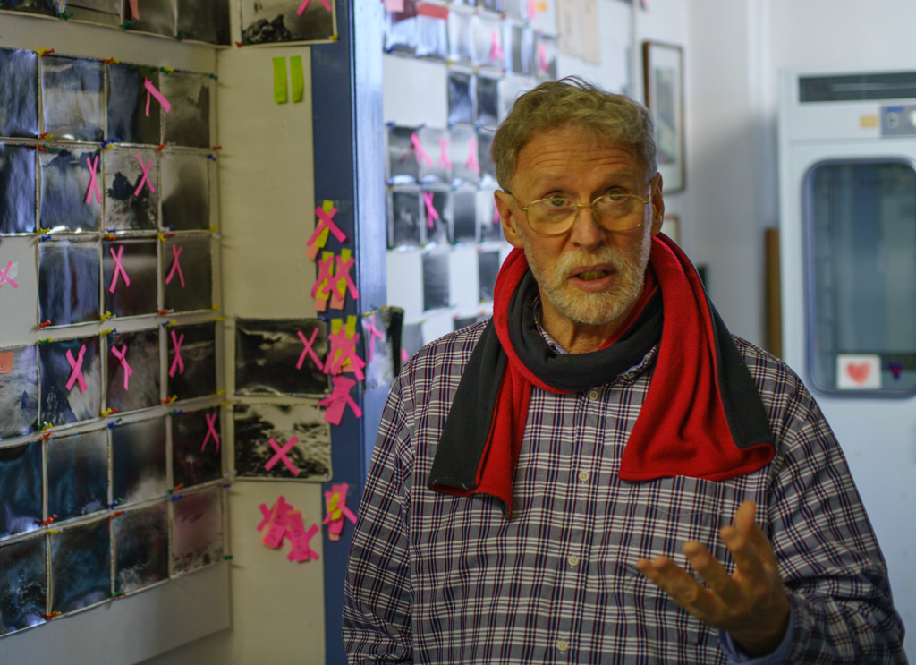
Months go by in a doldrum state where nothing feels right and I am uninspired by what I make, and then, little by little, things turn around and something emerges from the mayhem.
My current project is a very personal one about the death of my father. It happened upon me in a rather roundabout way. My father died when I was a child, and for a long time, I have tried to put this in the past and move on.
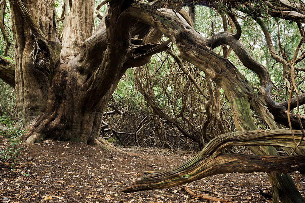
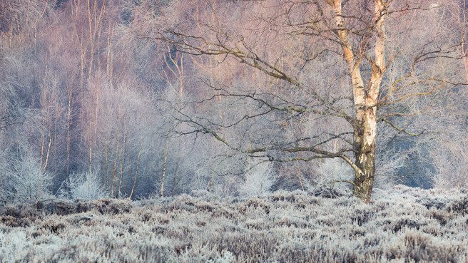
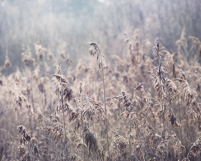
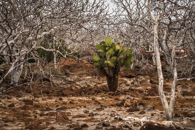
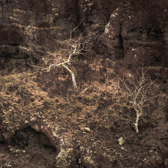
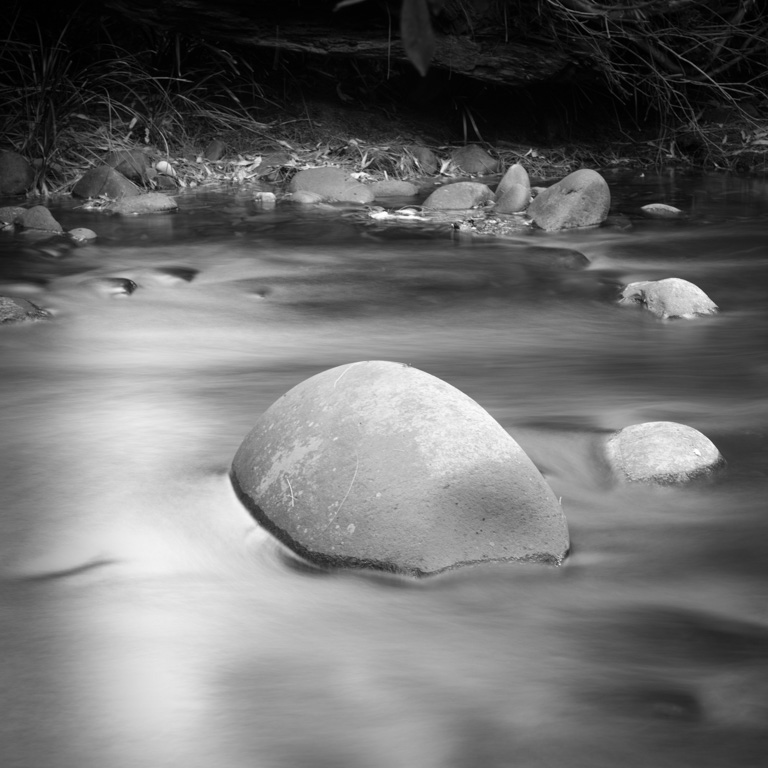
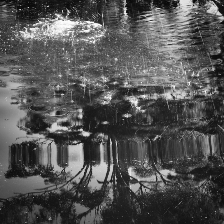
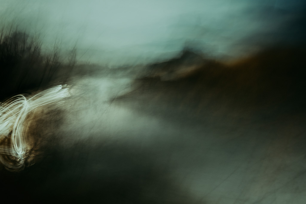
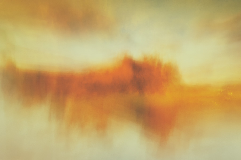
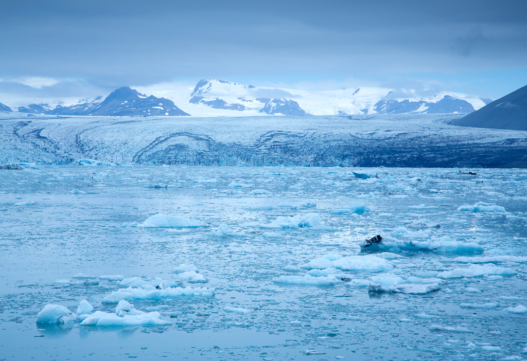
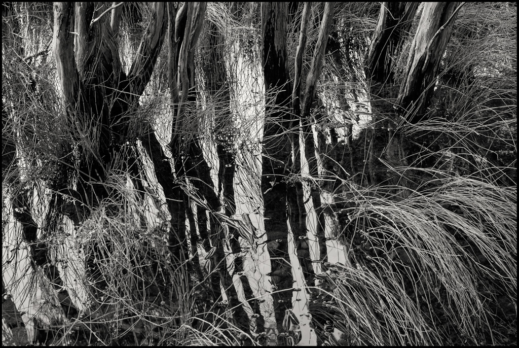
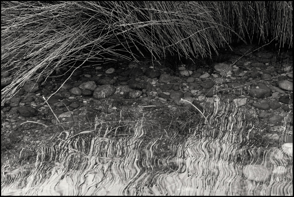
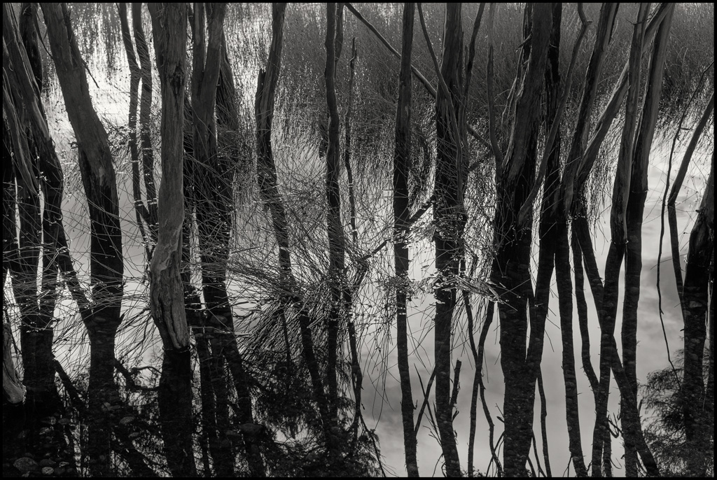
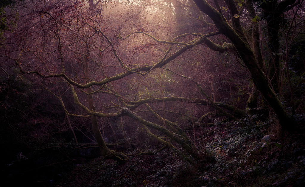
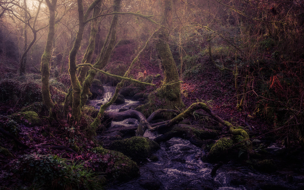
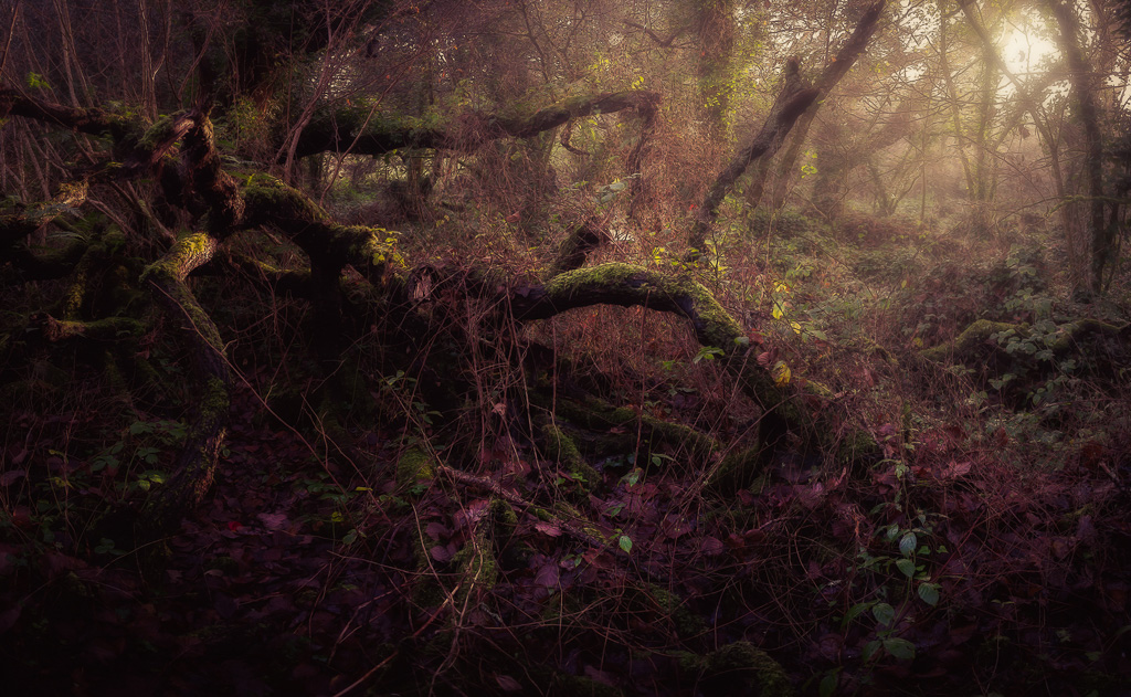
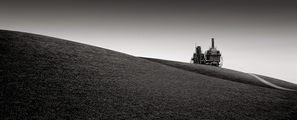
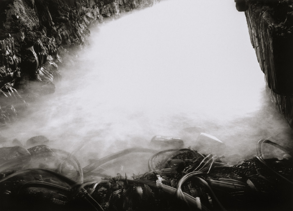
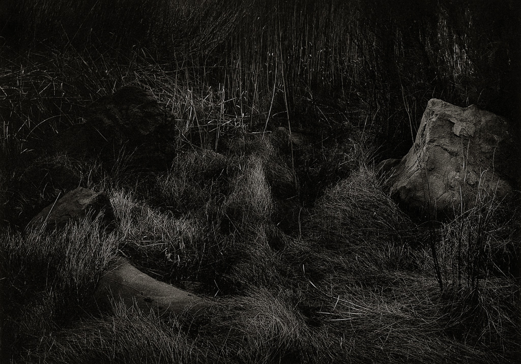
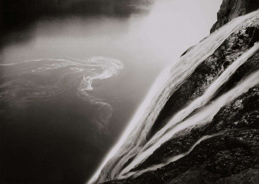
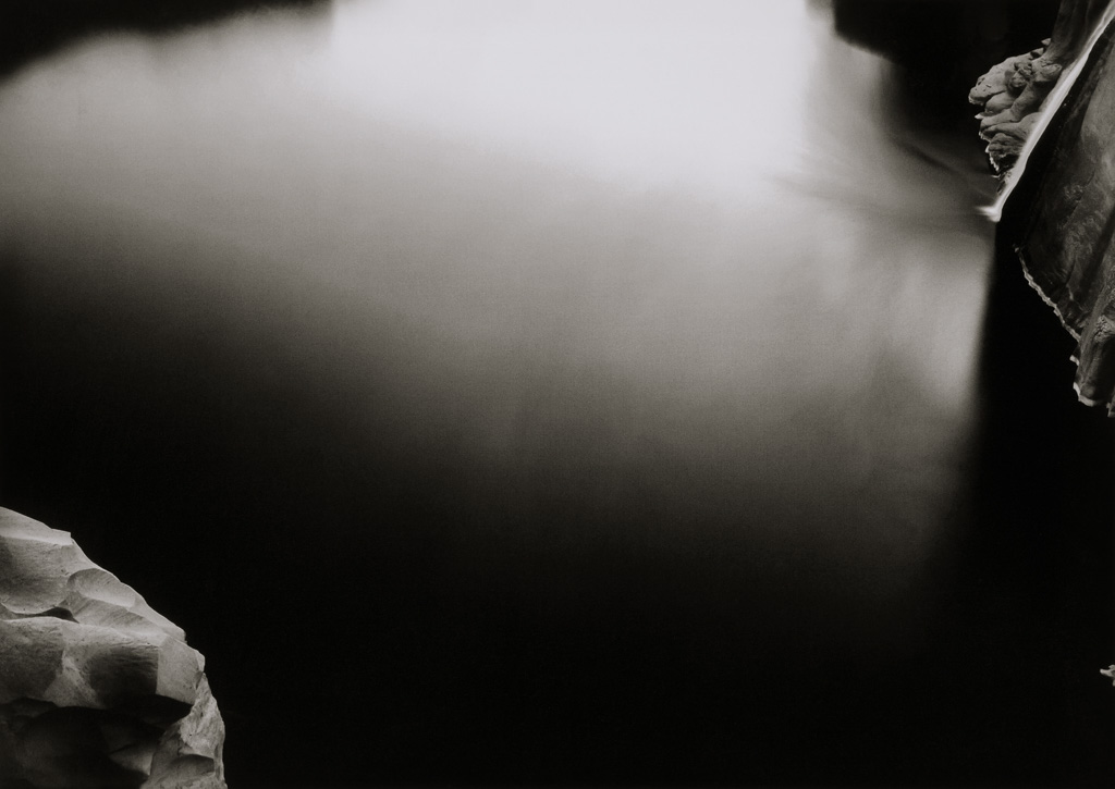
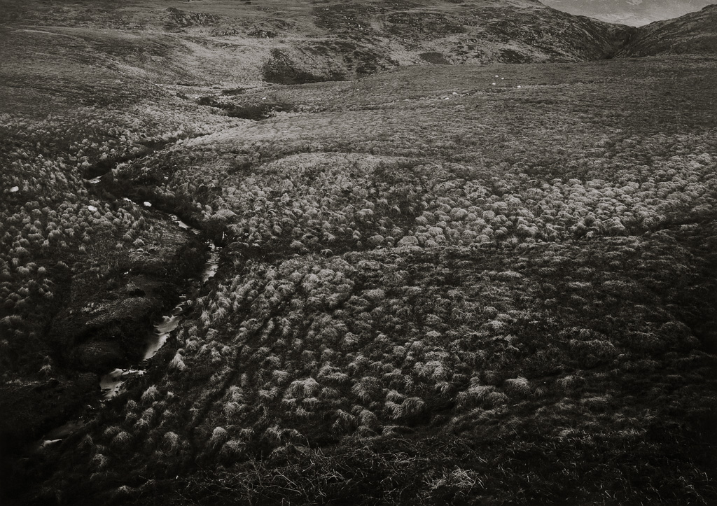
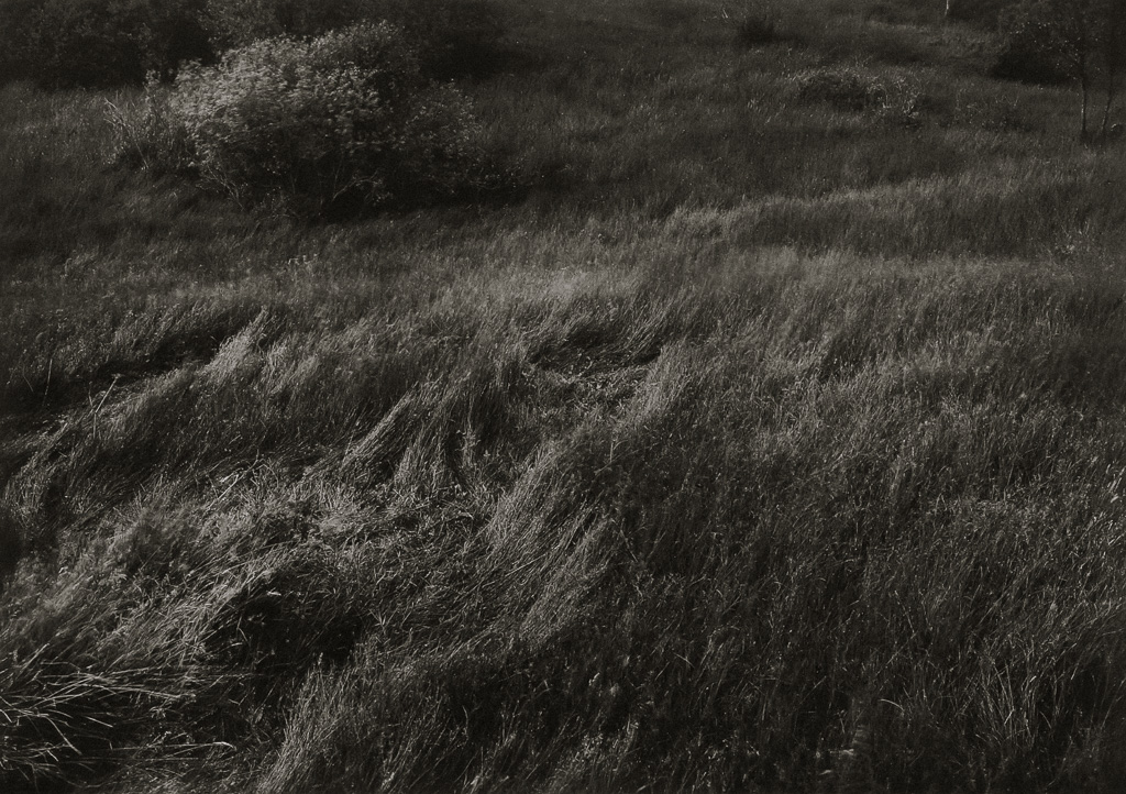
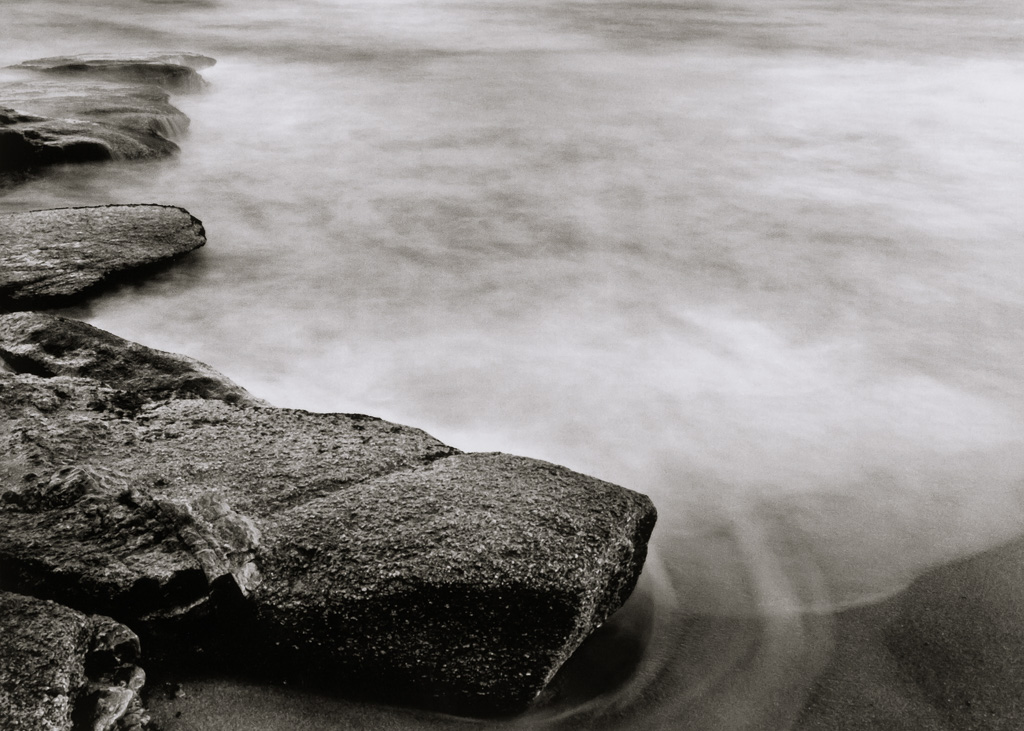
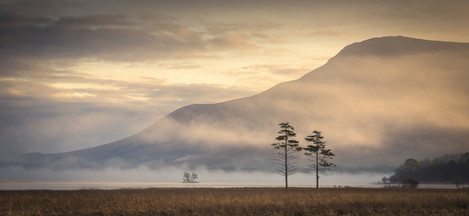
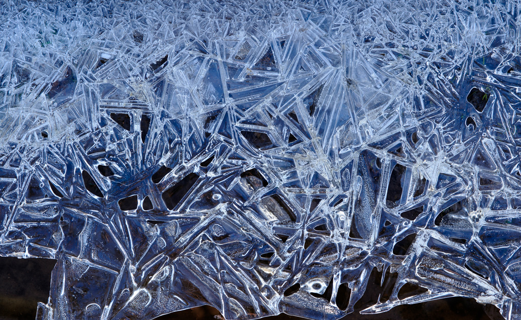
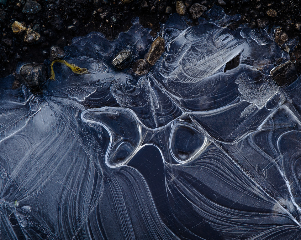
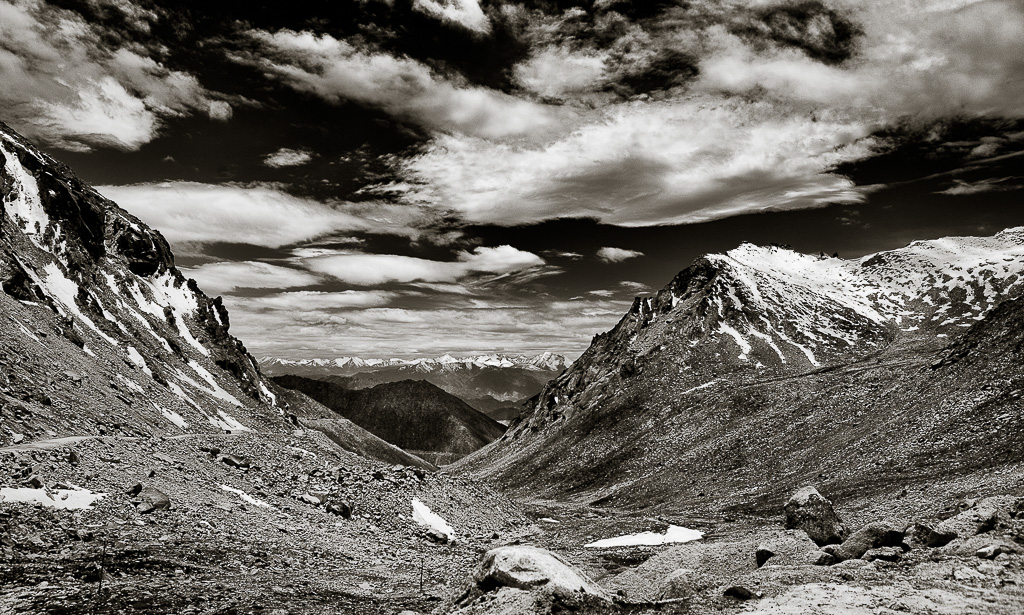
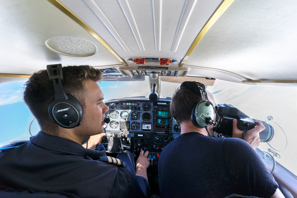
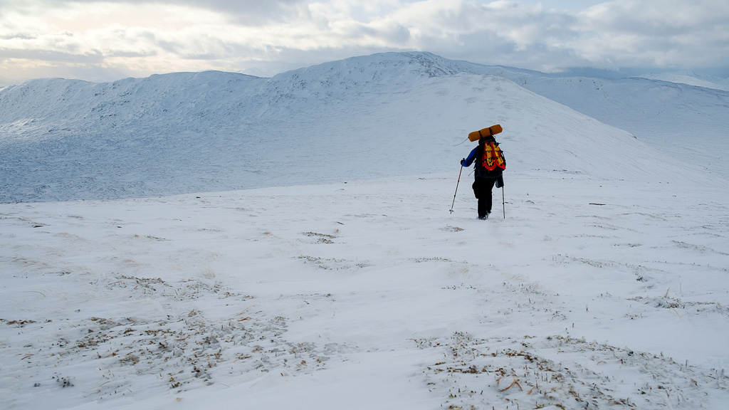
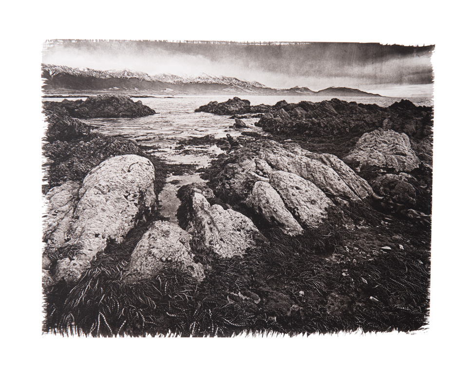
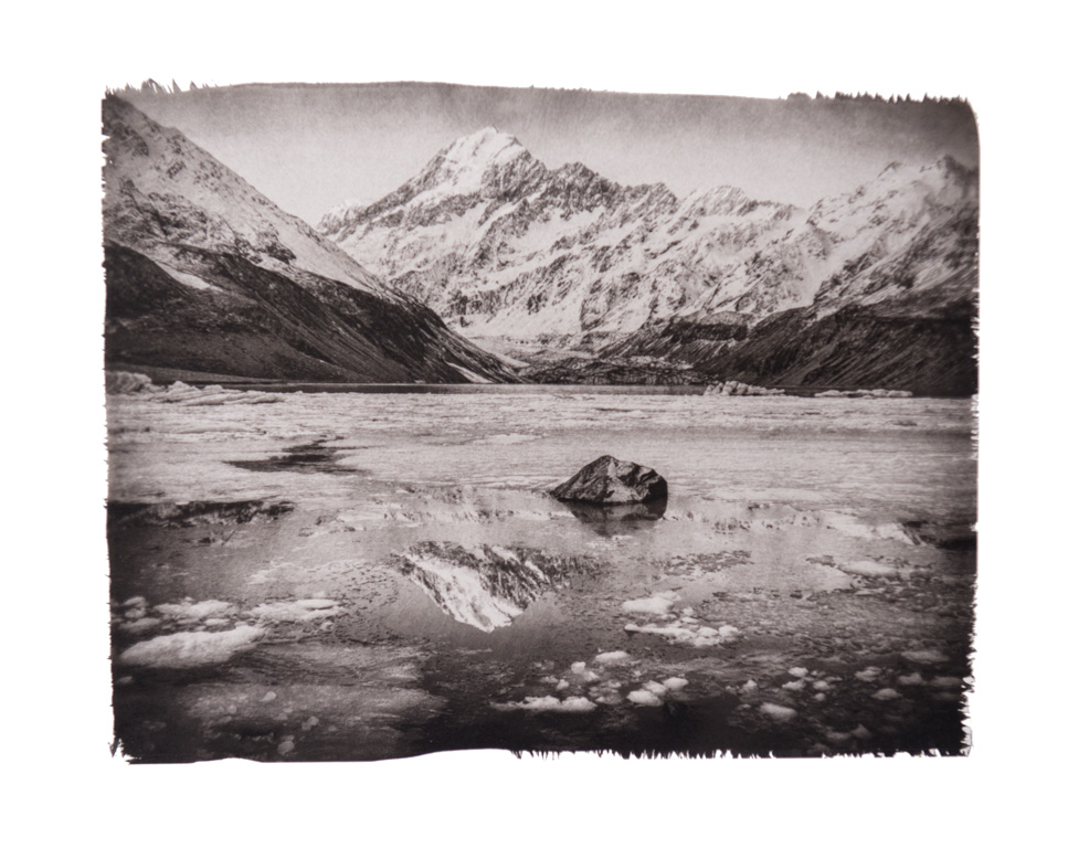
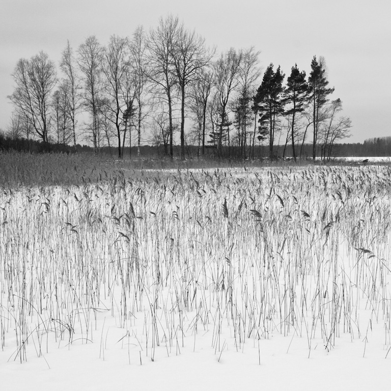
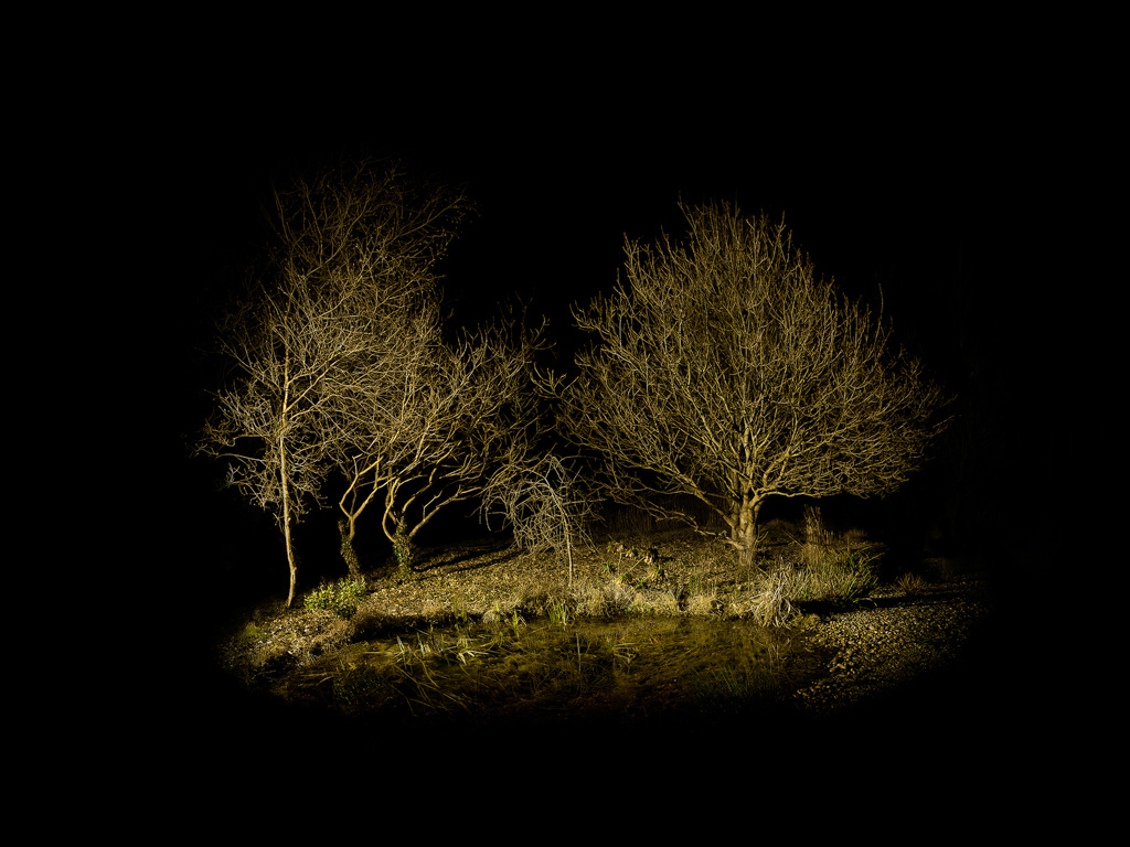
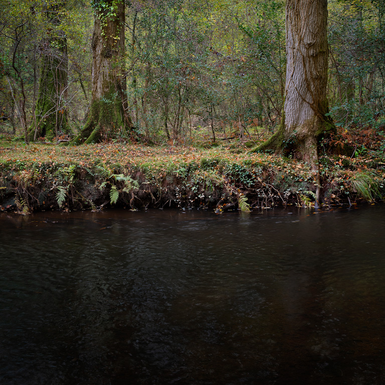
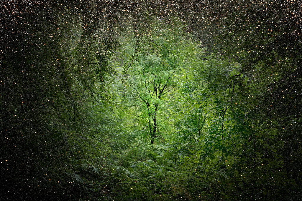
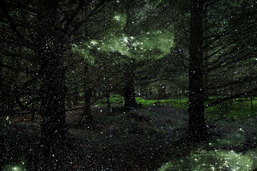
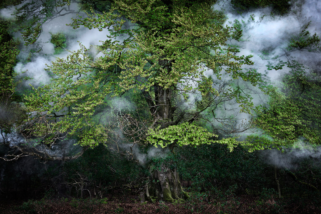
In 2014 I popped up to Scotland for my annual pilgrimage. I like to get there once a year for a dose of mountains, landscape and photography. I spent a week alone in Ardnamurchan and Glencoe.
It rained.
It poured.
Roads were flooded and inaccessible.
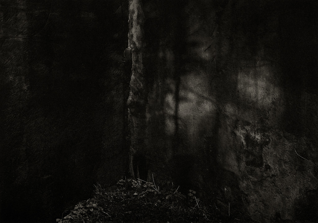
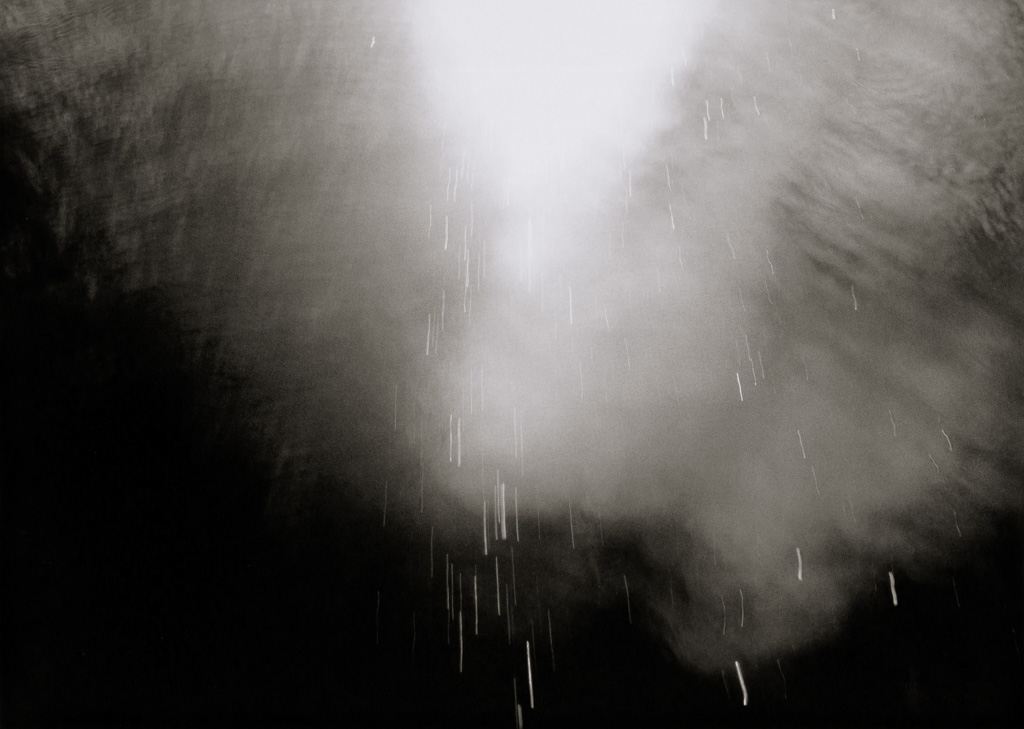
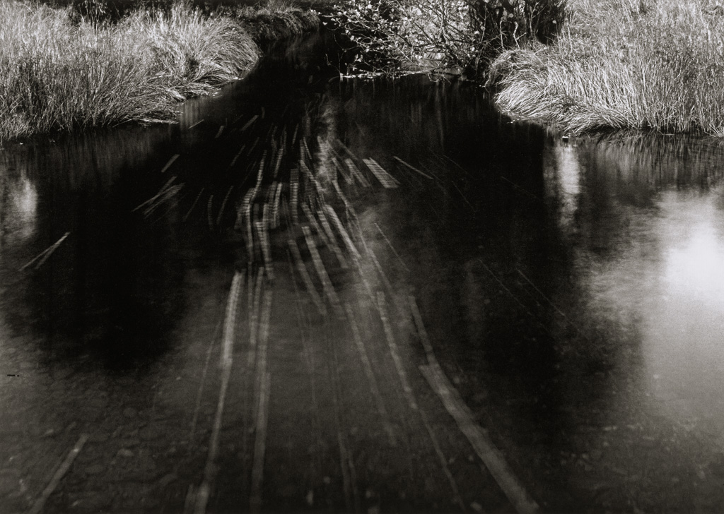
I ended up sheltering in a church taking photographs of rain dripping onto the floor of the interior.
I found my mood darkening and my images along with it.
Monochome was the order of the day.
Images were taken through a wet car window predominated.
Norman Ackroyd my source of inspiration.
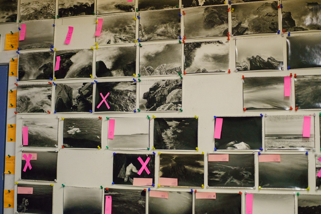
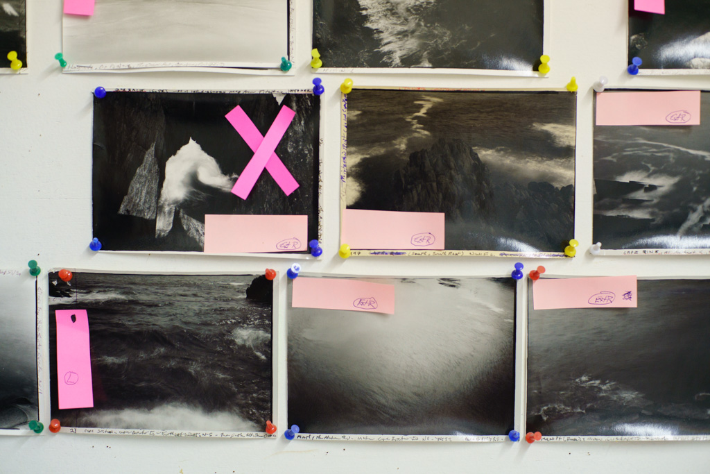
When I came home I felt flat and unhappy with what I had produced. I closed the folder and left it unedited for some time.
And then, from nowhere, came a poem.
I find that a poem ‘comes’ about once every 2 years. I sit, the words emerge, and then it is all over.
This poem was an expression of my experience of my father’s death when I was eight years old.
Intensely personal.
I didn’t know what to do with it, but felt I needed to share it with my brother and sister in a way that was worthy of the subject matter; one that we have all struggled with over the years.
I didn’t know what to do with it, but felt I needed to share it with my brother and sister in a way that was worthy of the subject matter; one that we have all struggled with over the years.
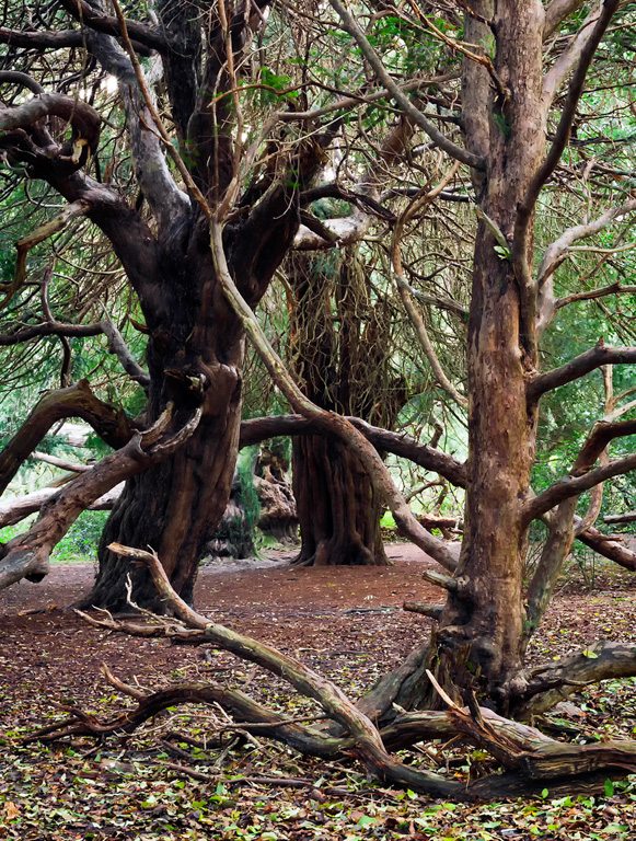
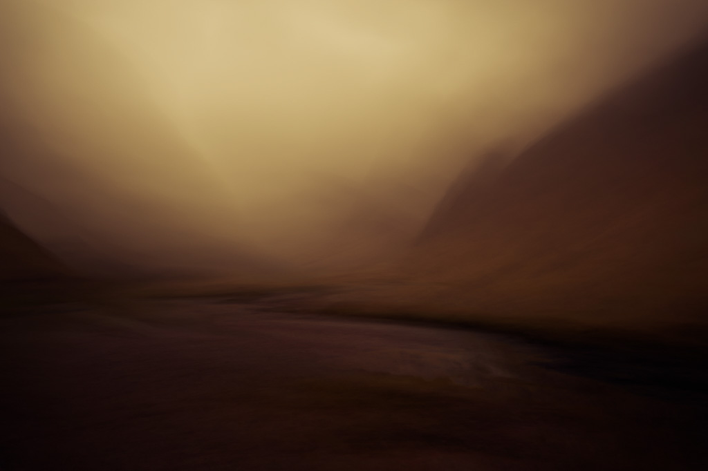
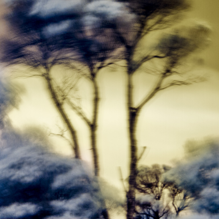
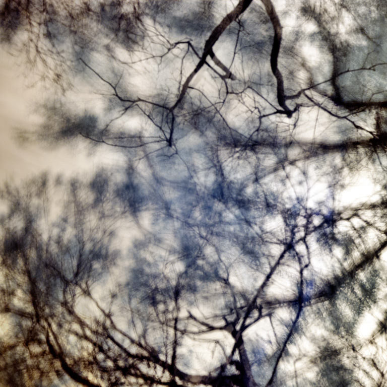
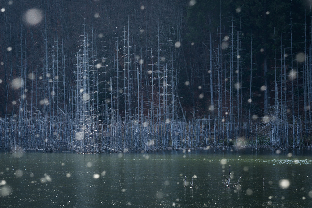
I decided to make a small book. I realised that the images made in Scotland the previous autumn were entirely appropriate to accompany the poem. They represented my need to keep returning to Scotland…… the ‘Land of my Father’. The title was born and I quickly made a small book using Lightroom book module. Within Lightroom, it is easy to edit images and add text and then export directly to Blurb. I then felt able to create a selected body of images for my website under the same title.
Some were created using a tilt-shift lens, and others using multiple exposures. Images that accompany the text may not work as stand alone images, but I felt that they worked together in the context of the poem. I used a creamtone preset in Lightroom to give a unity to the images.
eg; my sister 6, my brother 3
Choosing the format of the book and typeface is always a challenge. I decided on a small square paperback with Adobe Garamond text, for a traditional look.
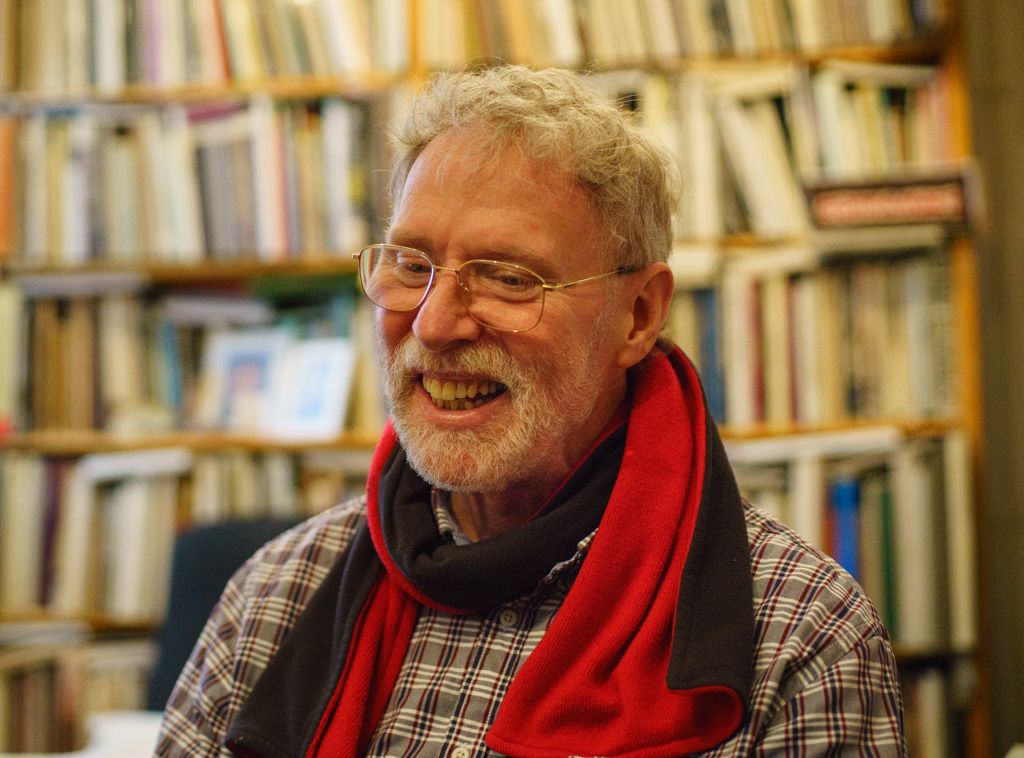
The little paperback volume arrived from Blurb, and while I was reasonably happy with it, I felt that I could do better. I wanted it to be something really special.
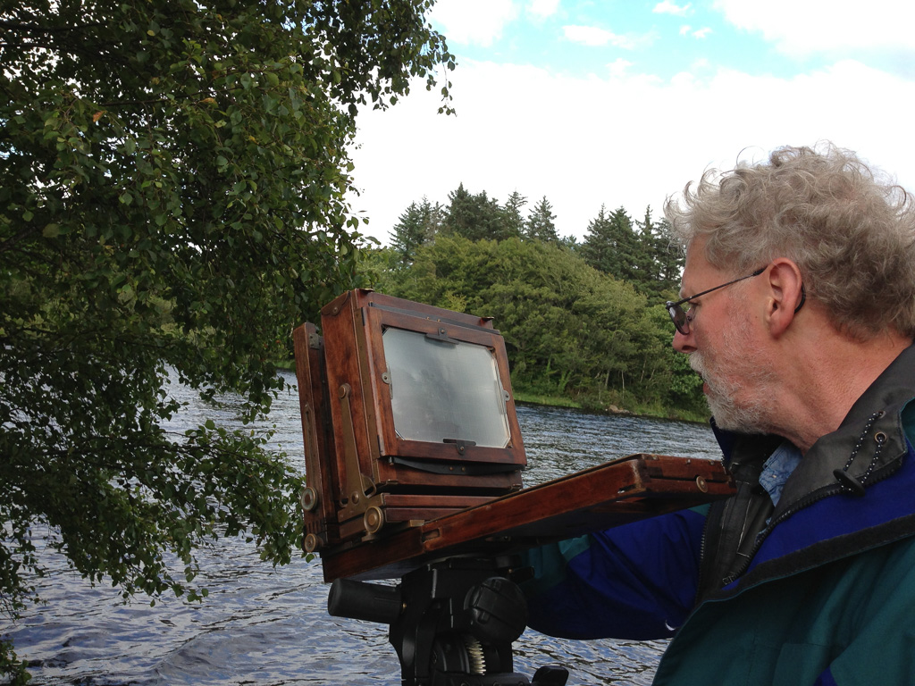
I decided to go for a hand bound edition. Having studied book-making while on my PG cert course in photography at Central St Martins in 2011 I had an idea of how to achieve this, but decided to enlist the help of an expert, in order to make it happen; I have too many projects waiting for a rainy day. The challenges of a handmade book are many, but the most important thing for me was to get the aesthetics right.
The little paperback volume arrived from Blurb, and while I was reasonably happy with it, I felt that I could do better. I wanted it to be something really special.
I enlisted the help of Eddie Ephraums from Envisage Books, and so began a whole new process, involving the selection of paper type, cover materials and format, shape, font, size, and then the difficult decision of how many to print.
What sort of book should it be?
Hardback or soft back?
Square or rectangular?
Large or small?
Perfect bound or saddle stitch? Side stitched or concertina folded?
The only way to answer these questions is to look at lots of books and images on the web until you get an idea of what sort of book you feel is right for you. I collected lots of images on Pinterest as a starting point for my decision making. Eddie showed me some options with regards ways to fold the cover to create a wrap around or sleeve, and ways to fold the cover card back on itself to add strength and substance.
I wanted this book to have a Japanese style binding that shows the thread on the cover and allows for a bit of colour and a feeling of a handcrafted object.
Next, we tested different paper types for the images. Smooth or textured? White or creamy? What weight of paper?
It is only seeing the different options mocked up that it becomes possible to make these choices. Also by testing the prints, it was possible to ensure that they were correctly profiled and true to the originals.
After some test runs, I opted for Munken Lynx as I felt that heavily textured papers were too complex with the already layered images. We decided to opt for a non-standard size of 22x15cm. This allows for maximum efficiency with regards fitting the pages onto the large print sheets and creates a feeling that it is not a ubiquitous A4/A5/A6 format.
Trying out different fonts on the same test sheet was really helpful. I opted for the sans serif font ‘Avenir’ having seen it alongside the serif types such as Adobe Garamond. Avenir was created in 1988, and the word means ‘future’. It was a conscious decision not to use capital letters on the title pages.
We experimented with the possibility of a translucent cover or inset pages for the words. Seeing the translucent paper curl up in the humid air put me off this option. The words looked better on a beautiful creamy paper; one that would withstand changes in humidity.
Choosing cover colours and thread colours were possibly the hardest part. The images are toned monochrome, so the cover had to complement them.
So much rests on first impressions of a book. How many books have you not looked at because you didn’t like the cover? Almost all of the novels that I have read in the last year have turquoise covers. I had to steer myself away from turquoise as it seems to have taken hold as the common choice for getting a book into someone’s hand. I opted for a pale grey.
Looking at threads I was keen for some bright colour. Orange was my choice. The words inside the book reference the bright colours at home disguising the sombre mood.
And so, having made all these difficult decisions we finalised the InDesign document in preparation for print.
As this was to be a hand-sewn book, I limited this first edition to fifty copies, each to be signed and numbered.
The pages and cover were printed and trimmed to size by a commercial printer. Watching the printer in action was a very special moment after weeks and months of planning.
The pages and cover were printed and trimmed to size by a commercial printer. Watching the printer in action was a very special moment after weeks and months of planning.
We used a small hand press to stamp the title onto the book sleeve and presentation box. Foils help to lift the lettering and allow it to catch the light.
Finally, the pages were ready for sewing. A punch device and handmade template allow for uniform sewing holes on the cover and pages.
The thread is hand waxed using beeswax, and the sewing begins. It is a painstaking process, and at least one book is now bloodstained forever. I chose a very simple Japanese binding, with double thread.
The end result leaves me with a feeling of resolution.
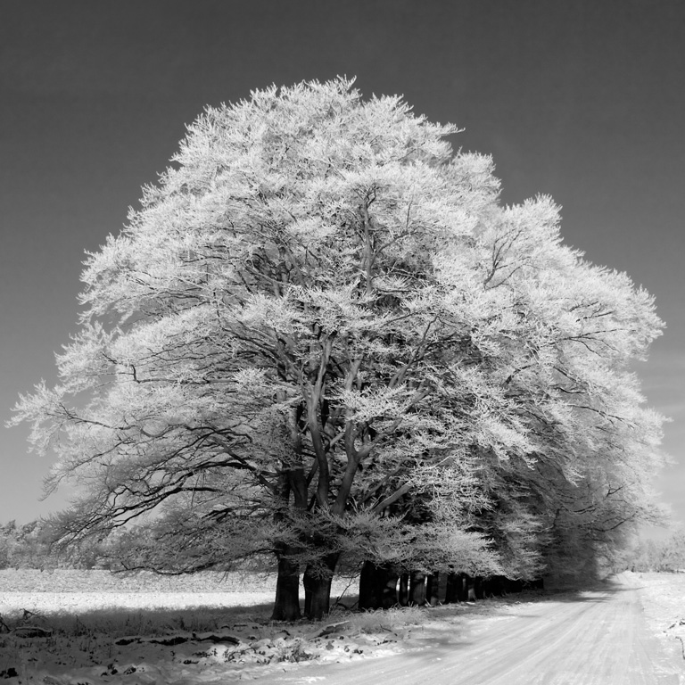
I have been fortunate to photograph many landscapes in a variety of different countries throughout the world but the photographs I had seen of Japan always seemed to have a difference that was difficult to categorise and I have always been drawn to places that may challenge me as a photographer.
My default position is to normally head to locations that could be regarded as remote, or certainly feel that way. As well as feeling a long way from cities and towns, the landscapes I regard as my favourites are ones that appear almost untouched, although, in reality, this is seldom the case as almost all of the landscapes I have experienced have been modelled and influenced by the hands of mankind. One of the main factors that made Japan, and Hokkaido in particular, fascinating was the apparent simplicity of the place, certainly in the deep winter months. One of the approaches I take as a landscape photographer is to distill the elements of the landscape down to understandable parts of a composition so that the photograph is not an overwhelming record of every aspect of the scene.
I often think of images as parts put together in a visually interesting manner. When the parts come together eloquently, they create meaning and message. So when trying to learn more about why some images work they way they do, I often try to deconstruct the image I’m looking at. I take out the background, the foreground, the subject, the counterpoint, the scheme of colours, the main lines, the type of light and so on. A powerful image stays with and has a deep connection with the viewer. That’s probably because the maker of that image took into consideration every aspect of that image, every bit, every layer.
Of course, there are images where the subject is so strong that the background can be irrelevant. Or there’s no apparent subject at all, it’s just a background, a texture. But even these cases can be deconstructed. You take the colour scheme out, you take the lines in the frame out. You have at least two layers that were carefully bound together to form an abstract interpretation of something. Someone looks at it and sees a human face, a hill, an emotion, whatever. Even a portrait of a person looking directly at the viewer has layers. There’s an obvious subject, but then that face is lit a certain way. So you always have light, natural or artificial, which in portrait photography can be decisive in creating the connection between how the face looks into the camera and what the viewer is making of that specific grimace.
When it comes to nature photography, there can be a multitude of layers forming an image. From the classic wide-angle landscape where the spatial separation of the image into fore-, mid- and background can be deconstructed and formulated into a certain type of composition using leading lines and curves that harmoniously take the viewer through the whole frame. They can have a start point on the brightest area of the image, let’s say, or in the foreground. At the other end of the spectrum, using a telephoto lens can decrease the depth appearance to such extent that the spatial separation becomes non-existent. Still, there are lines, there is colour, there is contrast that can suggest depth. It’s basic stuff that happens here, any landscape photographer composes subconsciously using the basic structure of any image. It’s just a question of geometry, perspective, colour, tonality.
So there are basic layers to each image. They’re obvious, the art comes when the photographer finds the right balance of each layer’s qualities. The graphic side of an image might be stronger if there are more triangles in the frame, or if the colour scheme is in accordance to that of the colour wheel, or if there’s no very bright or very dark surface somewhere in the corners of the image. I know, I’m oversimplifying things, but you get the point. Some compositional choices are better than others because a layer’s quality was used to create visual interest in the way the human brain is wired to tell you it’s of effective use.
Cajun crawfisherman Roy Blanchard is accustomed to zipping along at 35 miles per hour in his workaday skiff through the Atchafalaya Basin, threading bald cypress trees and startling the white pelicans. I was not.
This was a new and emotional experience. I’d spent the past several years travelling to the Polar Regions to photograph icebergs, drawn to the grandeur of their light, space, texture and form. The cypress trees of the Atchafalaya in Southwest Louisiana are the major stars in a scene about as different as I could have chosen to photograph next, but every bit as elegant, and as humbling. With an iceberg, 80 percent of its mass is hidden beneath the water; with a bald cypress, even some of the roots are above water.
These majestic giants -- those few left after clear-cutting in the late 1800’s -- seem to float on the tranquil waters, their smooth reflections doubling the visual pleasure. It is nature’s haiku.
These majestic giants -- those few left after clear-cutting in the late 1800’s -- seem to float on the tranquil waters, their smooth reflections doubling the visual pleasure. It is nature’s haiku.This watery landscape is all the more moving because of the simplicity in colour and contrast.
The Forest of Fontainebleau (or Forêt de Bière, the "forest of heather") lies an easy jaunt of sixty kilometres south-east of Paris.
Widely promoted by the leading painter of the Barbizon school in the mid-nineteenth century Parisian Jean-Baptiste-Camille Corot, the forest of Fontainebleau famously attracted and inspired artist and photographers alike. Used both as a retreat and source of inspiration, Fontainebleau appeared as the subject matter in innumerable paintings and photographs that rendered visions of Forest’s elegance and simplicity. Artists sought to emphasise the importance of Nature, rather than subjugating her to background material in an animated scene.
Claude François Denecourt ‘discovered’ the forest in 1832 at the age of 44 and subsequently dedicated the remaining years of his life to its preservation and promotion. Due largely to his entrepreneurial efforts, of the Forest at Fontainebleau, the village of Barbizon (for which the painter’s school was named) and the surrounding areas became a mecca for an estimated 700 painters and photographers throughout the mid-19th century.
Place names were often borrowed from mythology, contemporary and classic history and literature, which provided an opportunity for Denecourt to entertain visitors with stories, myths and legends, most of which he personally invented.
To further attract and interest visiting artists, Denecourt remarkably named over 600 trees, 700 rocks, and numerous landmarks and points of view. Place names were often borrowed from mythology, contemporary and classic history and literature, which provided an opportunity for Denecourt to entertain visitors with stories, myths and legends, most of which he personally invented. Many of the caves, grottoes and ‘ancient’ structures were built under his aegis and locally licensed to food, beverage or souvenir purveyors. His efforts were directed at attracting visitors who would then purchase his traveller’s guide : L'indicateur de Fontainebleau : itinéraire descriptif du palais, de la forêt et des environs, (literally: Fontainebleau : places to visit, a guide and description of the palace, forest and surrounding environs) which was published in eleven editions from 1839 until his death in 1875.
The success of Denecourt’s efforts came in 1849 with the arrival of the railway from Paris, allowing an easy one-day access for anyone with a free afternoon and a couple francs for carriage fare. Called the Sylvain de la Foret de Fontainebleau (literally the Forest Spirit of F…), Denecourt’s efforts resulted in Fontainebleau becoming the world’s first nature reserve in 1861, 11 years preceding the world’s second reserve, California’s fabled Yellowstone National Park.
Widely lauded as one of the early pioneers of modern hiking, Denecourt personally carved 1100 kilometres of forest walking trails and about 300 kilometres of footpaths (called centiers in French) throughout the forest. Ancient photographic practitioners hauled their large and ungainly cameras along these wilderness paths to capture their version of the natural scene.
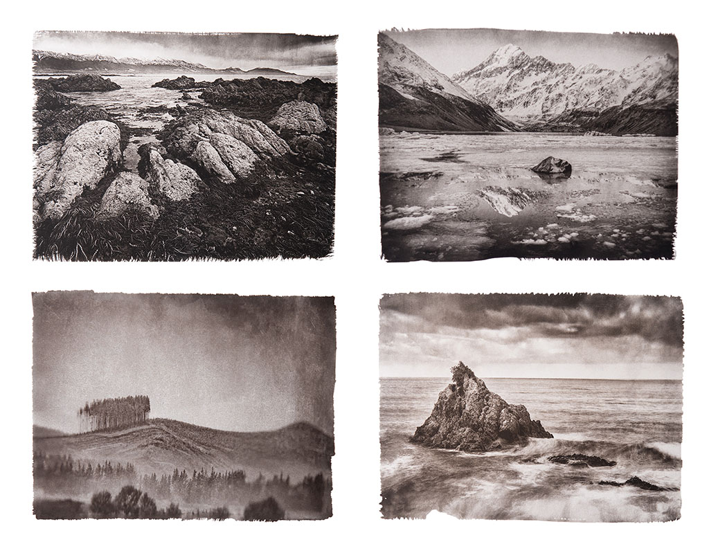
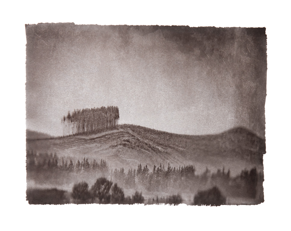
More recently, my images reference the work of the 19th-century photographers Baldus, Le Grey, Couvier, Le Secq, and Mestral among others. Printing in Platinum, a process patented in 1873 by England’s William Willis Jr., I seek to reproduce the vision and methodology of those early photographic pioneers.
The scenes here presented appear exactly as they did to those who first captured these images more than 160 years ago. I know. I found their tripod marks.
Technically, I use a borrowed antique 8 x 10 Deardorff and 150 and 240mm lenses of uncertain lineage and ancient vintage belonging to a Parisian friend. An extra suitcase with a dozen 8 x 10 film holders and a Gitzo carbon fibre tripod is always part of my international luggage. Hand carrying several boxes of Ilford 100 HP4 through customs has thankfully never resulted in X-ray damage. Once home, the film is developed in PMK, proofed on Ilford Multigrade and hand-printed in palladium/platinum.
Josef Sudek may not be known as a landscape photographer, much of his work was still life, urban, occasionally portraits and quite often commercial commissions. However, his passion was very much about the natural world, his first award-winning work was for a landscape after all. During his life, he would travel a creative path through various genres but toward the end, he would return to his love of the landscape with two of his most memorable projects.
Josef Sudek lived in perhaps one of the most unstable times and one of the most unstable countries of the 20th Century. Born in Bohemia (part of today’s Czech Republic), Sudek was originally apprenticed to a bookbinder and it was his sister who was to become the photographer. The first world war put all of this on hold and although at 20 years old he was using a camera alongside his soldier colleagues and producing small portfolios, these were mostly mementoes of his experiences on the Italian front. The following year he became a victim of friendly fire when a grenade left shrapnel in his right arm which was amputated a month later.
After his convalescence where Sudek passed his time taking photographs of his colleagues at the hospital, he received a disability pension and had to consider a future career. He was now unable to go back to his bookbinding, although he latterly admitted he never had a great talent or desire for it, his passion for photography lead him to ignore the usual path into a desk job and instead, he started taking photographs and taking the occasional commission.
The problem with this was that he was not allowed to work as a photographer without having a trade license which required training. Fortunately, the proprietor of the veterans hospital saw something in Sudek’s indomitable attitude and introduced him to the local camera club where he had access to a darkroom and who awarded him a scholarship to the College of Graphic Arts where he studied art and photography.
Sudek’s attitude got him into occasional trouble and you’ll probably be unsurprised to learn that after a few years in the local camera club with his friend Jaromir Funke, where he regularly submitted images to competitions and won a landscape prize, they both ended up being thrown out over strong disagreements with the older members. They subsequently started their own club.
Shortly after graduation, Sudek started submitting his work internationally and began work on what was to be his epiphanic project. The story goes that Sudek entered St Vitus’ Cathedral during the final years of its construction (Despite having begun construction hundreds of years previously, the work had never been completed). Sudek was struck by both the awesome nature of the architecture and the quality of the light beaming through the massive windows and being caught in the dust from the construction works. Many of his projects included elements of this sense of light.
This is the background to the start of Sudek’s photographic trajectory but it doesn’t particularly tell us a huge amount about why he is the photography that he is. After all, much of his work is quite ‘romantic’, using elements of beauty at a time when the majority of the art world had a completely opposite flow.
One of the biggest reasons for Sudek’s position in history is that he spent a lot of his time interacting with painters, musicians and other photographers who had quite different points of view when it came to art. His closest friend, Jaromír Funke, was quite the opposite in artistic outlook to Sudek. He was a big proponent of constructivism (an approach that tried to bring the utility of construction to art - make art useful and connect it with the developing world - see Rodchenko and Moholy-Nagy) and surrealism (an approach that detached the artist from reality and connected with dream or subconscious as a new real - see Man Ray and Duchamp) and would ‘butt heads’ with Sudek on a regular basis. However Sudek’s natural inclination toward beauty and the romantic nearly always put a different spin on his work.
However, just having a friend who espoused these thoughts was one thing but he gained a contract with a publishing house and was commissioned to produce advertising. He then used his understanding of these modern ideas in the production of work that fitted in the genre. In addition to this, he would have been exposed to many other photographers and artists whilst working for the publishing house. He also worked in copying artists paintings and instead of payment would request a painting. In doing so, he became quite an art collector and developed a relationship with many national artists. All of these additional influences could not help but affect his own personal work. However, apart from some of the images in his “Studio Window” series, most of Sudek’s work that we see in books and exhibitions comes from after the second world war.
This doesn’t mean that he wasn’t successful in his work though. He regularly submitted work to national and international competitions and exhibitions and appeared alongside Steichen, Man Ray, Moholy-Nagy, Rodchenko, Brett Weston & Kertesz in an exhibitions in Prague in 1933 and 1936.
During the second world war, Sudek retreated into himself a little. He no longer had the amount of commercial work due to the occupation by Germany, he could no longer work freely in the streets and many friends left in 1939 at the start of the war. He lived at home with his Sister (also his assistant) in a small gloomy studio and started work on his “The Window of my Studio” project. This was a literal and metaphoric boundary between inside and outside spaces, confinement and freedom. He went on to produce many works in this series, from 1940 to 1976, and also changed from enlarging pictures to contact printing (recognising the clarity and rich tonality that was possible in an exhibited contact print), using various sized cameras to produce variety in the final print.
He was also limited in how he could travel, the occupation imposed curfews and blackouts and so Sudek started to take images in the style of Nocturnes, which he would certainly have seen from photographers such as Steichen and were a popular theme in pictorial photography. Sudek’s images were more ‘straight’ than the typical pictorial Nocturne though, more in keeping with the f/64 group and Photo-Secession.
This war period acted as the catalyst for Sudek’s most famous works and after end cessation of hostilities, the opening of the city brought him out of his studio and began the work that made his fame, apart from one final note. During the period from 1945 to 1949, Sudek worked mostly around Prague but also started working on other projects such as “A Walk in the Magic Garden”, “Memories” and “Labyrinths”.
It was in 1948 that a major piece slotted into place for Sudek. Two friends gave him a panoramic camera, more specifically a Kodak No. 4 Panoram. This camera took 3:1 ratio film at 12” by 4” and used a sweep lens that covered almost 120 degrees which works out as a 11mm equivalent. However, because it uses a ‘sweep’ lens, it behaves more like stitching a panorama together from multiple frames, hence you don’t get any edge distortion that you would with a rectilinear lens.
This new way of representing the world struck a chord with Sudek. He immediately started using it in Prague itself. He had already been working on a strong visual record of Prague and this new approach allowed him to create an interpretation, rather than a record of his city. At the same time he was approached by Jan Řesáč with a commission to photograph Prague for a book Jan would act as editor for many more of Sudek’s books in the future.
The coincidence of these two events led Sudek to create the work for which he is most known. Prague Panoramic, which would not be published until 1959, is as much a love letter to the city that Sudek called home as it is a coffee table guide book. Sudek’s use of the panoramic camera and his passion for light and composition produce as close to an intimate view of a large city as it is possible to create. It is also a great book to study how to compose using a panoramic camera. The 3:1 ratio is close to the 6x17 format camera that remained popular into the 21st century and which can be incredibly difficult to use in creating ‘complete’ compositions. That Sudek was able to do so without a viewfinder (the small prism on the Kodak camera only showed the central third of the image) is, even more, testament to how he made this format his own.
At the same time as he started this project, he also began many others. The following section talks about a few of his main projects.
České Středohoří
The painter Emil Filla invites sudek to stay in a manor at České Středohoří in the Central uplands of Bohemia (Northern Czech Republic). Both artists work on panoramic compositions, it’s difficult to tell who inspired who but the work has strong similarities and as they were very good friends since the 1920s (they are sometimes referred to as the Alchemist [Sudek] and the Magician [Filla]) but some research suggests that Sudek’s use of the Kodak Panoramic camera was an inspiration to Filla.
Emil Filla (1951)
Mionší Forest
Sudek wasn't a great traveller and would produce the vast majority of his work in and around the city of Prague. However, he would visit some of his friends and early apprentices in the city of Frenštát (where he was given his panoramic camera) and after a couple of visits he was taken to the Mionší forest in the Beskid mountains. The work created in this forest was to become his longest running project and he never considered it complete in his lifetime.
An early Sudek work taken during his active service in Italy, a premonition of later work.
He found a sense of peace in the forest and it was said that he saw something of his own injuries in the "Vanished Statues", those sentinel like bleached and ancient firs standing in a clearing near the top of the forest.
Still Lives
Sudek would often work with material in his studio, sometimes on commission but in later years as photographic exercise and investigation. His still lives were undoubtedly inspired by his large collection of paintings, books and by his relationships with painters in Prague. The most memorable still lives are those where the quality of light plays a significant role. Many of the photographs include a particular drinking glass with multi-faceted sides which he spent many years representing as a foil for the window light in his studio and for the way that liquids, bubbles and age moderated it.
Labyrinths
Complementary to his reductive and ordered still life work, Sudek also regularly captured the disorder and detritus of his home. Wrapping papers, old film boxes, string, newspapers and letters and much more. The renaming if the clutter in his home to 'labyrinths' bestows intention and discovery onto these works. Starting in the 1960s and continuing through to his death, the works became a way of finding meaning in the everyday surroundings of his life.
Sad Landscapes
These are some of my personal favourites of Sudek's works. In the 1960's to 1970's Sudek returned to the area near České Středohoří but this time to document the effects of the mining activities in the Most region. It was a serious crime to criticise the state at the time and hence many of the works created were never exhibited and Sudek talked little about the reasoning behind the works but it seems clear that he was moved by what had happened to the landscape and intended to represent this in some way (even if he couldn't see a time when he would be able to bring it to the public). The panoramic camera records the landscape perfectly, broad sweeps of a scarred terrain with an implied sense of beauty that once was. A book of these works was published after his death and remain a quite contemporary body of work predating many 'New Topographic' works.
If you wish to find out more about Josef Sudek's work, we can highly recommend the following
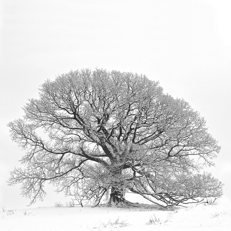
Living where I do in the South Downs, trees dominate the scenery. Perhaps it’s not surprising, then, that I’ve selected a photograph by Charlotte Gibb whose tree shots I’ve recently discovered and enjoyed. A quick search of On Landscape reveals she was included in an Endframe article back in 2015.
This composition has so many aspects that work for me. Where to start ? Strip out the golden leaves and the image could stand as a graphical arrangement of grey/white trunks fronting a mosaic of silvery, grey scrub - starting with warm tones at the front, receding to cooler in the background. The trunks are not too regimented, but naturally varied. I wonder how many versions Charlotte took of this scene ? I can imagine her working to get the alignment just right, maybe moving around to allow ‘breathing spaces between the trunks, while somehow managing to fashion the arrangement of the leaves.
At first glance - the usual millisecond on-line “wow” we are inclined to give photographs these days - I saw a colourful contrast and some interesting shapes. Then, after pausing a few moments more I began to see the leaves in a form of their own. I see three diagonals from left to right. We’re told that compositionally, diagonals have an an energy of their own, and we tend to read from left to right. Maybe this contributes to the image’s success ? Yes, the colours are something that an inhabitant of southern England might envy a little, but this composition is more than just a splash of golden leaf colour and stark trunks.
The image’s graphical appearance is enhanced by the apparent layers. The trunks are in one plane, the leaves in another - the depth of field being allowed to gently blur the background, emphasising the main subjects.
The image’s graphical appearance is enhanced by the apparent layers. The trunks are in one plane, the leaves in another - the depth of field being allowed to gently blur the background, emphasising the main subjects.
I wonder how much analysis actually goes on when we photographers compose our images? When we begin, it’s probably down to getting the camera set-up ‘correctly’. Later, with a little more experience, some might say it becomes a more innate skill: second nature. I’m far from this stage and hopefully will never get there, as the endless joy of seeing things differently each time is very important to me.
All in all, this is a photograph I’ve enjoyed looking at and thinking about. … I’ve just realised this image has a hint of that powerful orange/blue complementary colour combination. More to see with each look, but probably that’s enough from me.
I hope you enjoyed this wonderfully, vibrant, but surprisingly complex, photograph.
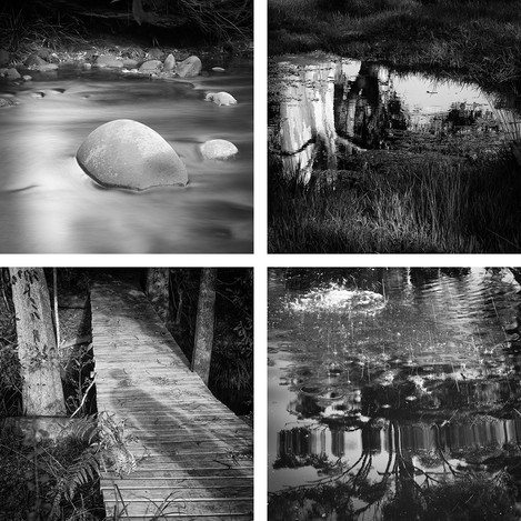
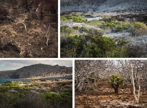
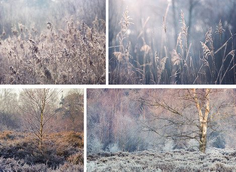
Our 4x4 feature is a set of four mini landscape photography portfolios from our subscribers, each consisting of four images related in some way. You can view previous 4x4 portfolios here.
We're always on the lookout for new portfolios, so please do get in touch! If you would like to submit your 4x4 portfolio, please visit this page for submission information.
*Shout out* as we are looking for contributions for the next few issues, so please do get in touch if you're interested!
Please click the images to see the portfolios in full.
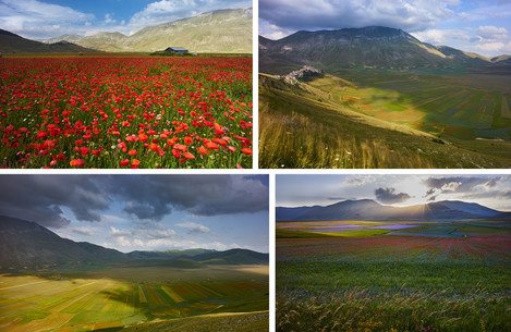
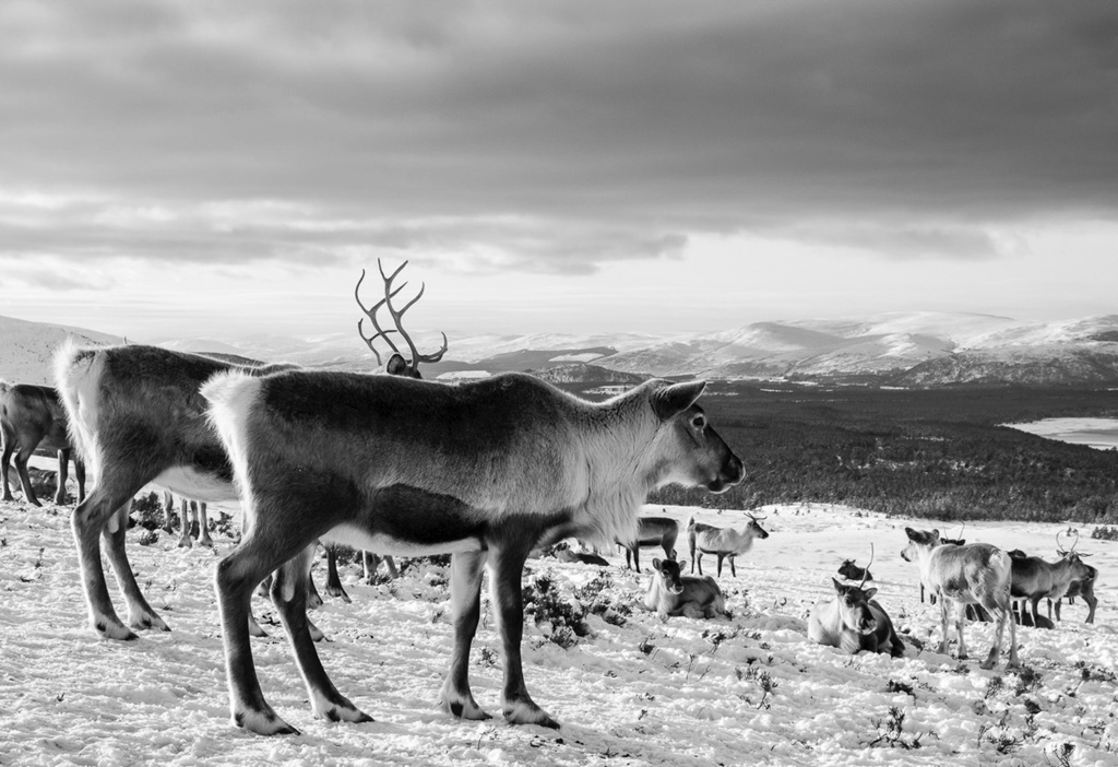
This set of images was taken in Fjallabak, a nature reserve in the interior of Iceland which in winter is only accessible by so-called 4x4 Super-Jeeps. The black deserts, mountains and lava fields of Fjallabak were still covered by meters of snow in March this year, which turned this landscape into a very minimalistic one. At times, when the sky turned white, I felt like being in the middle of a calligraphy painting. Very surreal, but breathtakingly beautiful.
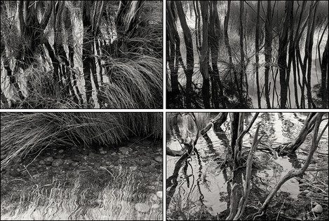
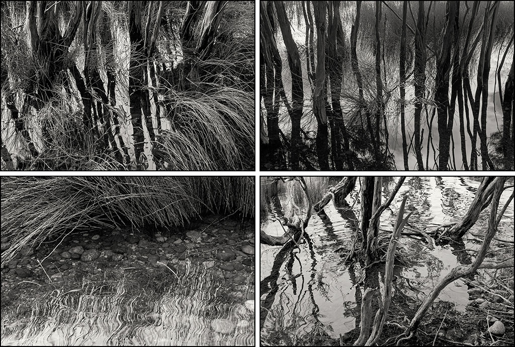
I’m married to a landscape photographer so I often find myself sat in the same place for a while looking closely at my surroundings. Having always taken close up nature images I recently discovered the patterns in water reflection. As I’m also a watercolour artist I’m curious about the levels and depths of colour. My aim in both photography and watercolour painting is to retain the translucence of the layers in nature. My photographs are all taken straight from my Sony Cybershot compact camera.
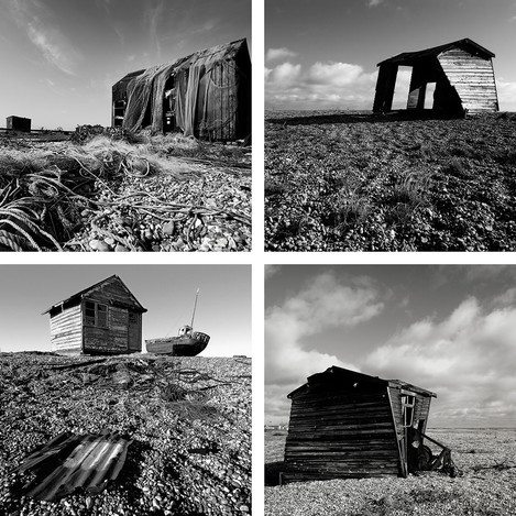
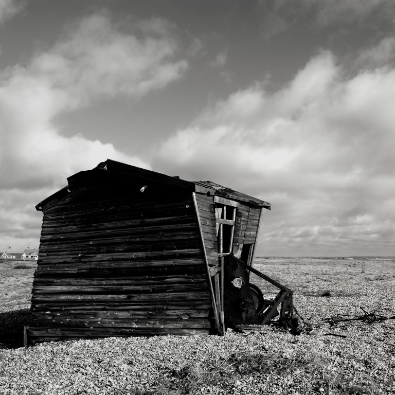
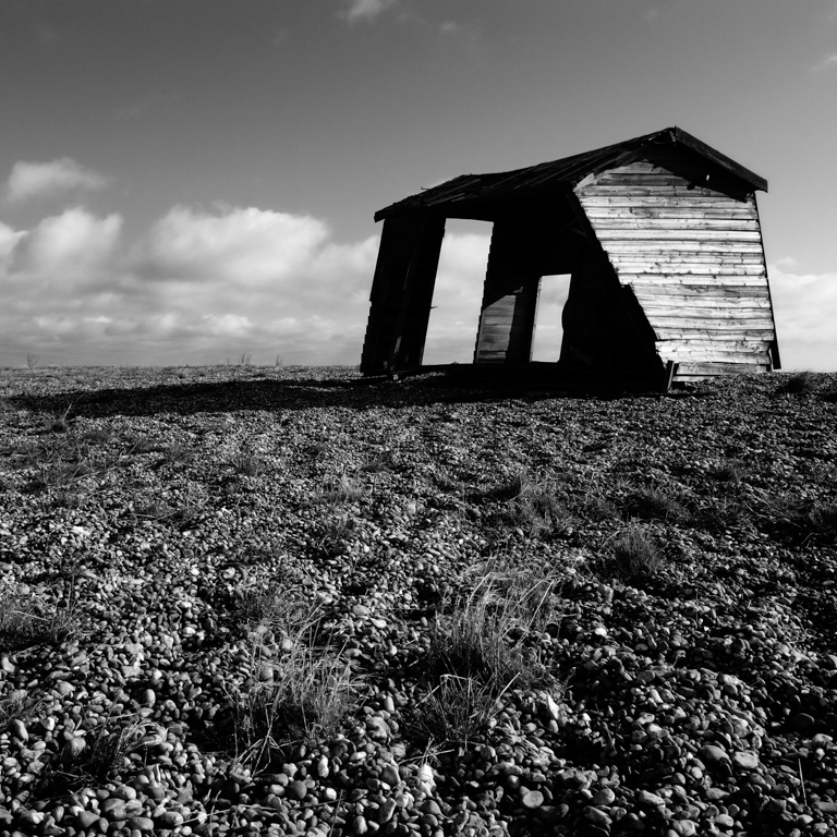
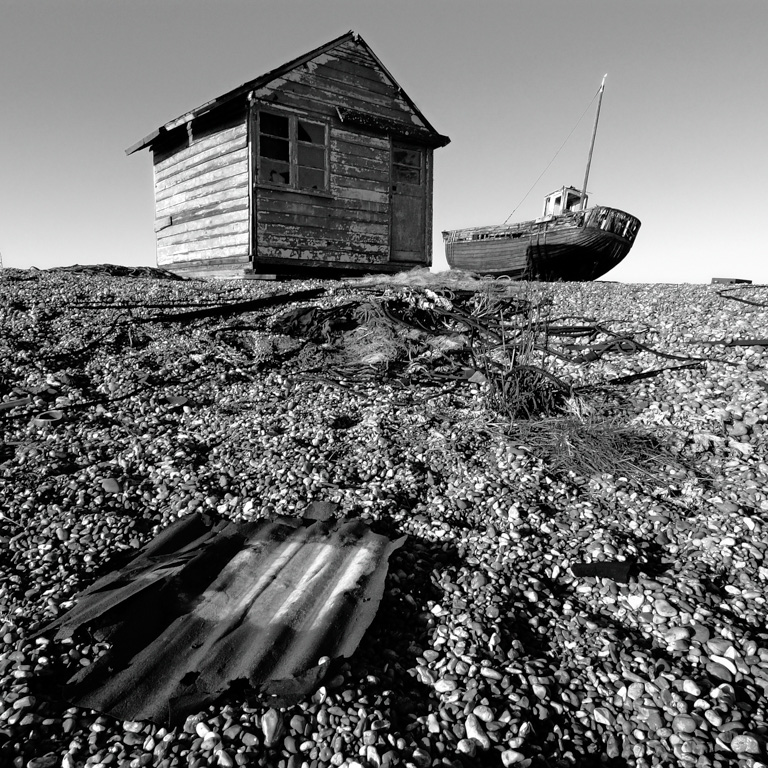
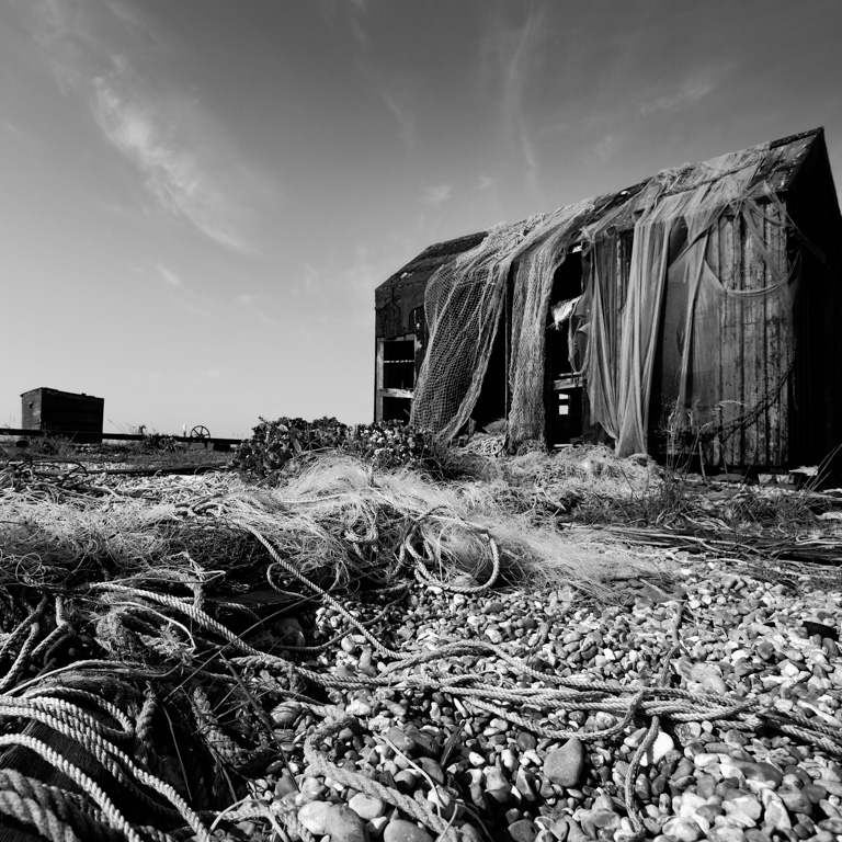
Fish Sheds is the beginnings of a series that considers environments, our interactions with them, and reflects on the nature of human achievement, and its’ contradictions.
Fishing is an essential food source, the sheds speak of an internal world conducted in local communities, a cottage loved and contentious at the same time, declining yet stoic, in East Anglia a once great industry diminished in part due to its’ own success.
Growing up in East Anglian, alongside the boundless skies, exposed coasts and life around the many rivers and estuaries, for me photography has acted as a form of escapism: seeking the presence of wild places, to reflect on and release emotion.
Much of my recent work has evolved from these early experiences but also a conscious effort to draw on the challenges of my work in environmental action and to combine motivations.
Fundamentally I am seeking an authentic consideration, attempting to create images that engage but also offer challenges to viewers, with conjunctions of aesthetic and subject.
I fell in love with both photography and the polar regions on my first expedition to Antarctica from New Zealand in 2010. Before my return trip from Argentina in February 2017, I devoured Joe Cornish's article and video in On Landscape!
South Georgia was probably the most beautiful place we visited. I have chosen a letterbox format to emphasise the vastness of the vistas.
After a mid-career switch from accountancy to farming, I have recently retired to a house that needs doing up in an ancient beech woodland in the Chilterns. Whenever possible I indulge my passion for travel photography.
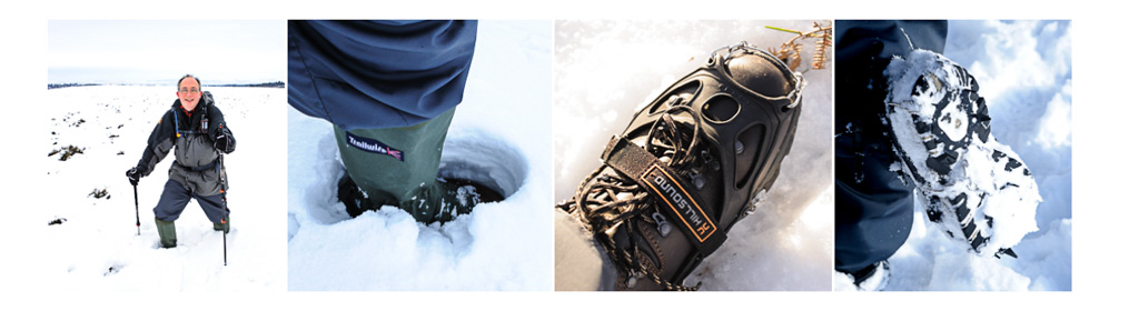
Welcome to the final part of our series giving advice for outdoor photographers looking to cope with the demands of each season. This part is by way of a round-up of some of the key points from previous articles - which focused on sun protection and hydration in summer, water-proofing and flexibility in autumn, insulation and snow preparedness in winter.
Year round essentials
This month’s temperature differences - of more than 10 degrees between one day and the next -have demonstrated the weather’s continued ability to surprise. However, the seasonal variations - at least in the UK - are much less marked than they used to be. Excepting occasional extreme weather incidents, the Country has largely moved into a more even tempered ‘constantly mild’ condition.
So the current mild, dampish conditions of Spring are not a bad guide to what to expect year round - and kit that copes well now will largely cope throughout the other seasons. This base kit can then be augmented with extra layers or accessories to cover occasional more extreme adventures if required. You will find below our suggestions essential year round equipment:
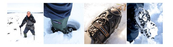
Waterproof jacket (breathable membrane lined or Paramo style - see below for details)
Water repellant walking trousers (quick drying, stretch fabric for preference)
Buff neck gaiter (for sun protection and insulation)
Wide brimmed hat (protects from sun and rain - also be useful for camera protection/sun shading)
Good quality base layers (see below for advice)
Lightweight fleece mid-layer
Walking socks (wool rich for preference, see below for advice)
Sufficient water to maintain good hyrdration
Sufficient food to maintain good energy levels
Torch and spare batteries (we can all get lost at times, and can all find ourselves benighted. Also useful for signalling)
Emergency whistle (for attracting attention)
First aid kit (just the essentials but don’t forget any tablets you might need to take)
Paper map and compass (learn how to use these if you don’t already know)
Mobile phone or tablet (not to be relied on, but becoming universal)
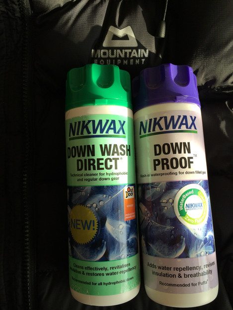
Nikwax Tech Wash and TX Direct (for maintaining waterproofing/repellency)
Let’s take a look at some of these in a bit more detail:
The Base Layer - foundation of an effective system
David Ward asked us at the ‘Meeting of Minds’ conference what Neil and I thought was the one thing anyone should do to improve their outdoor kit. And, other than a regular wash and reproof in Nikwax, we suggested that the simplest change people could make would be to wear a decent technical base layer rather than your favourite old cotton t-shirt.
Being comfortable out of doors - especially when you are carrying some weight on your back - starts with moisture management. A good base layer is designed to wick sweat away from your skin - keeping you dry, and thereby warm. They need not be expensive - although if you have a taste for Merino Wool, you will need deep pockets..!
Personally, we wear a range of base layers - long or short sleeve, zip neck or crew, thicker for winter, thinner for Summer - all made largely from man-made fibres. I like the fit and feel of the latest version of Paramo’s Cambia range, although I am also still wearing some tops from their original iteration that must be over 15 years old by now. At around £50 for a long sleeve zip neck, these will sound pricey to some. But if you treat them well they will last a very long time - so ‘buy once, buy well’ is the motto, just as with photographic equipment.
If you are already kitted out with a full range of technical base layers, think about giving them a little loving care. We know that they often get thrown in with the other washing - perhaps getting a dose of fabric softener for good measure..! This will leave residues behind on the surface of the fabric that will reduce its wicking power, and cause it to hold on to moisture rather than letting it disperse.
So if you think your trusty old tops are beginning to lose their magic powers of moisture management, treat them to a wash in Nikwax’s Basewash. This revitalises the wicking properties of technical fabrics - returning them to their former glory. You can also now buy Basefresh - which you can use on mixed washing loads as a substitute for ordinary fabric softener. It may not provide quite the floral fresh smell that you are used to, but it does perform the same magic re-vitalising job on your technical clothing.
Outer layer options…
As has been discussed before, there are a lot of options for waterproof jackets - and trousers for that matter. Membrane lined jackets provide waterproofing with some level of breathability, and if you are simply going to a location and staying put they can be a reliable option. The shell jacket itself is unlikely to have much warmth though - hence the suggestion of a mid layer to go underneath.
Personally, most of my photography is made whilst out on a walk - which means I will be expending effort carrying the kit in the process. In these situations we have found over the years that membrane lined jackets tend to ‘wet out’ - meaning that you build up more heat and moisture inside than the membrane can cope with, leaving you sweaty and uncomfortable. Our preferred solution is to wear Paramo non-membrane lined waterproof gear instead - which is more breathable, whilst also being inherently insulative - largely removing the need for a mid layer.
With the arrival of warmer spring weather, I also favour Fjallraven trousers and jackets - particularly the lightweight Abisko range. These can be waxed to make them water repellant, or left unwaxed to maximise breathability. Paramo also make a similar range of clothing, with the Halcon Traveller Jacket being a favourite of mine as it features many, many usefully sized pockets for filters and holders, light meters, cable releases, and other bits and bobs
The joy of a good walking sock…
Once you start wearing walking socks they spoil you for alternatives - I hate it when I have to wear ‘smart dress socks’ instead, as they are just so uncomfortable by comparison. Good walking socks tend to use a reasonable level of wool in their construction. The reason for this is that wool fibres have a hollow core - which acts as a store for moisture wicked away from your foot.
The moisture is gradually dispersed to the outside world, leaving your foot warm but relatively dry - which is half the battle in avoiding blisters. Having tried many brands over the years, our favourite at Trailblazer Outdoors are from Bridgedale - whose socks generally feature Merino or Pure New Wool, spiral wound with man-made fibres for added strength and breathability.
At around £16 a pair they may again seem expensive. But again they last a long time if you look after them well - some of mine are just being retired after 10 years of use. Nikwax again makes a dedicated Sock Wash that will keep your walking socks in good condition, but the main message is to wash them on a cool cycle and let them dry naturally. An occasional drop of olive oil in the final rinse can also help to keep the fibres in good condition.
And on the topic of oil, we have over the last few years been using ‘Stride Out’ foot oil. You rub this on to your feet just before you put your socks on, and it seems to help prevent blisters and other sores. The oil probably also helps to keep your socks in good order at the same time..!
Additional kit and other considerations…
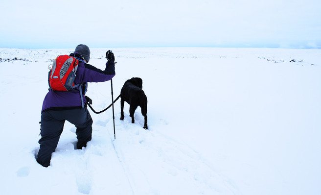
You will find a range of suggestions in the previous articles for specific bits of additional kit we find useful at different times of the year. But I would put out a plea for a set of walking poles to be added to your year-round essentials - particularly for anyone who regularly covers some distance on foot to reach their photographic locations. Quite apart from the health benefits of taking the strain off of joints and giving you an upper body workout, poles can really help with stability if you are carrying heavy equipment on your back. They also help you to go further, increasing your stamina for more extended exploration of the landscape.
And I would finish with a gentle reminder that mobile technology - wonderful though it is - is not the be all and end all of navigation, or communication. Mountain Rescue services have gone on record recently highlighting reliance on mobile phones as a key factor in many of the call outs they have to deal with. Indeed many of the wild places that we love to explore have no mobile coverage - good thing too, many will say..!
So do buy an old fashioned map if you are planning an extended trip out - screens just can’t give you that extended overview that you get from a traditional paper map. Then learn how to use a compass and grid references with it, and plan your route in advance - including escape routes in case something goes awry. Finally, tell someone else where you are going - it makes such a difference if search teams at least have some idea where to start looking for you..!
Using mobiles responsibly...
If you must rely on a mobile phone for navigation, invest in a mapping app like Viewranger - which downloads the map data in advance to your phone. Then you won’t need a mobile signal for the phone to mark your position on the map - just the more universally available GPS signal. Viewranger even has a feature that can access the camera on your phone to help you identify particular hills and other landmarks as you look at them.
Many of the more recent Ordnance Survey Maps - including OL26 and OL27 covering our beloved North York Moors - also include a code for you to download the map data as part of the purchase price of the paper map. Whilst the free Ordnance Survey App is not as fully featured as some, it does work - showing your position on the map and allowing you to plan routes, and track and record your progress.
And all of this goes along with the same sort of advice you take for granted with your camera kit: take spare batteries, make sure everything is fully charged, turn off mobile data or the phone itself if you are not using it - in order to preserve battery life. Unless you have one of the more recent ‘waterproof’ phones, you probably also want to keep it inside a dry bag - some of which have clear viewing windows so that you can use it without removing it.
In summary
Neil and I hope that readers have found some of our suggestions helpful, and would appreciate any feedback on what we have covered, along with suggestions for other topics people would like to learn more about. In the meantime, we are now both deep into the organisation of the Moorsview 2017 photography seminar.
Moorsview 2017 Photography Seminar
Taking place in Pickering, North Yorkshire, on Saturday 9th September - Moorsview 2017 will feature a range of renowned local photographers speaking about their landscape and wildlife photography. Supported by no less than three exhibitions, and a range of activities to encourage photographers to get out with their cameras, Moorsview 2017 is being staged in support of Scarborough & Ryedale Mountain Rescue Team and local wildlife charities.
You can read more about Moorsview in a future issue of On Landscape, but in the meantime head to the Facebook page / moorsview for further details.
Kilian Schönberger is a professional photographer & geographer from Germany. He has previously said that he sees being colour blind as a strength – given the difficulty of distinguishing certain tones, he concentrates on pattern and structure. He’s travelled extensively – most recently 40,000 miles in search of places mentioned in German folklore – and hopes that his images will both provide viewers with scope to make their own stories and somewhere to rest awhile.
Can you tell readers a little about yourself – your education, early interests and career – and where you live now?
Hi everyone, Kilian here. I’m 31 years old, a landscape photographer from Germany. Born in Eastern Bavaria near the German-Czech border, I spent much of my childhood in the environment surrounding my parent’s house. Forests, creeks, ruins and rocks were our adventure playground back then. So I was interested in nature, but also history as a kid. I enjoyed reading old legends and fairy tales and drawing characters from these stories.
Valley of Fog
Experiences that still influence my photographic work today. After grammar school, I lived one year in the foothills of the Bavarian Alps and came to love the mountains. Then I moved to Bonn, the former capital of Germany in the west of the country next to the River Rhine, to study geography. After finishing my studies I started to work as a professional landscape and outdoor photographer and moved to Cologne, Germany’s fourth biggest city. I’m still living there today. In recent years I have published two coffee table books, worked together with Adobe, Mercedes and other brands, and got some features in magazines around the globe. Right now I’m working on my third book.
This project is a collaboration between artist Tom Musgrove and photographer Simon Bray, depicting seven landscape locations from across the British Isles using their respective mediums. The project was supported by Arts Council England, G.F Smith, production company DoodledoMOTION, Pressision Ltd and Fred Aldous. They recently exhibited the project for one night at The Whitworth in Manchester as part of their Thursday Lates series which welcomed over 400 people on the night.We spoke to Tom and Simon to talk about their collaboration. The work from the project has been gathered together in a self-published book, available to purchase from the project website: www.theedgesoftheseisles.com
Charlotte Britton (CB): The idea of the collaboration - how did it come about and how did you make it work?
Simon Bray (SB): Originally, the project was a means for us both to focus on our landscape work, and at the beginning, that was all we shared, we’d each made a decision to be proactive in focusing on using the landscape as our subject matter and we’d decided to explore that together. Working alongside another artist in this way wasn’t something either of us had done before, so we were careful not to place any expectations on the work that would be created, or indeed how working together would affect what was being produced. It took time to build up the relationship. It takes a lot of trust and vulnerability to be expressive in front of someone new, and our way into that was through sharing music on the drives to locations. We’d each bring stacks of CD’s to play to each other, and that really helped strengthen the understanding between us.
Tom Musgrove (TM): The collaboration started when we had a meeting over coffee together at The Anchor Coffee House (which Simon runs). We had completed the Three Peaks Challenge together and I knew Simon was interested in the work I did for that, in particular, an abstract painting about Wastwater. We both enjoyed the experience of those landscapes, being outside with space to breathe, weather to endure and a new path to tread. So in we found in this project a place to get more of that really.
The collaboration has itself become so much more than the work submitted, it has become the conversations between us, the exchange of ideas, grand and minute and also books now, it is becoming political. And all these things go into the work that comes out in the end.
CB: There are so many locations you could have chosen, so how you approach the locations you chose? Did you whittle it down from a list or was there another approach?
SB: As we headed out on trips together, we had time to talk, to discuss our approach, how we process what we are seeing and experiencing and in turn, how that would be portrayed within the work. Some of those journeys were 6 hours at a time, in the car together, really delving deep and asking questions of one another practice.
Photography, by it’s nature, captures a specific place at a specific time, and to that end, I was making Tom get up early and stay out late in order to see the light evolve across the landscape and seek out those sublime moments where everything just seems to fit together and you want to preserve it forever.
This really was the first instance of my appreciation of putting myself into my imagery. Photography, by its nature, captures a specific place at a specific time, and to that end, I was making Tom get up early and stay out late in order to see the light evolve across the landscape and seek out those sublime moments where everything just seems to fit together and you want to preserve it forever.
As an artist that uses paints, waxes and sculpture, Tom’s appreciation of a place is built through a broader sensory understanding, instigated in its various physical forms, but with the opportunity (luxury or burden, I still can’t decide) to ruminate on those experiences over days, weeks and months and to allow himself to distill those into a final piece or often pieces as his understanding of a place evolves over time. That broader sensory understanding is certainly something that I am now looking to put into my imagery, not just a visual appreciation of the combination of place, light and season, but of my experience of that place in that moment and how I could express that with my imagery.
TM: I would approach the locations as open-handed as possible, and as clear-headed. Like Simon mentions, rumination is obligatory and so this dictates that the more I can scribble down inside the landscape then the deeper the reservoir I will have to draw from in order to make work. The scribbles contain as much written notes as they do drawings. So, the most work happens at the start, upon arrival, where I don’t know the place at all and I want to find out exactly what it is that is there to find and I draw figuratively what I see before me. Then as time passes and my experience grows I can include in those drawings my feelings and other senses that come, and begin to see how I relate to that particular landscape.
The scribbles contain as much written notes as they do drawings. So, the most work happens at the start, upon arrival, where I don’t know the place at all and I want to find out exactly what it is that is there to find and I draw figuratively what I see before me. Then as time passes and my experience grows I can include in those drawings my feelings and other senses that come, and begin to see how I relate to that particular landscape.
CB: Obviously you have different styles of workflow and artistic style - did you talk beforehand about the styles or did you just let the landscape work on the day?
SB: As I’ve mentioned, the talking was a significant part of the collaboration, and our approaches would vary according to the place, the landscape or the time, but I don’t feel that at any point we directed ourselves or one another in terms of visual styles.
the talking was a significant part of the collaboration, and our approaches would vary according to the place, the landscape or the time, but I don’t feel that at any point we directed ourselves or one another in terms of visual styles.
At the start of the project, much of Tom’s work didn’t make sense to me, I couldn’t see the place within the work, perhaps because it was quite abstract, or because the work demonstrated more of his experience of a place than the place itself, but as the project developed, and in particular as we prepared for the book and exhibition, things began to click.I would suddenly see something in one of his pieces and it would make sense to me in a way that hadn’t happened before. To that end, there really wasn’t much sense in either of us trying to inform each other’s style of work, the landscape was stimulus enough to be drawing from, but the conversations about how and why we each create in the ways that we do certainly influenced the resulting final imagery.
TM: Yes, as Simon says the landscape was stimulus enough exactly. We would talk a lot about what we were ‘going’ for, with Simon’s filters and my sketches and all our tools, but it was more a fly-by-wire thing really. I think I will say the main influence of style was the weather, the extremes of it in its serenity and chaos.
CB: Once you had been to the locations, how did you choose the images and paintings from the ideas you had?
SB: The editing process was much more long winded for me than it was for Tom. He perhaps had 2 or 3 pieces from each place, whereas I had unto 30 that I had to whittle down to fit in the book and then select one for the final exhibit to be shown alongside Tom’s. Again, I don’t think we wanted to dictate to each other what would be shown, but we certainly took time to show each other pieces and allow each other to pass comment on what was shown.
The aim was never that we would be presenting two pieces side-by-side of the same view by different artists, but we wanted to ensure that the work complimented each other. To that end, it was important for me that we went some way in demonstrating the collaboration, especially within the book, to portray that this work could not have been created if we’d each gone about it individually. The truest collaborations will include a third element, not only the works of the two individuals but elements that the viewer can experience because of the collaboration, that as a result of the collaboration, something greater might be created then the component parts. I don’t think it’s necessarily up to us to say whether we achieved that, like all art, it’s for the viewer to conclude, but I’m hoping the collaboration has provoked questions and thoughts in the viewers mind.
TM: Yep – nothing to add – a great answer!
You can watch the film they made of the project below and you read more on their website. There is also an exhibition starting on the 9th June (closes 17th July) in Clitheroe, Lancashire which you can find out about by clicking here.
I am a landscape photographer and ever since I started in 1981, I have always preferred to use manual focusing. Not that autofocus was an option these days, but still... My first camera was a Contax RTS together with 4 Carl Zeiss lenses. I then gradually stepped up in format from 35mm and finally to shooting with an 8x10” view camera. Quality has always been an important issue for me and therefore I have always aimed to produce images with highest possible technical precision. As the digital era came I bought my first DSLR in 2003, but was not blown away and in 2007 I moved up to medium format using a Hasselblad. There I finally found the quality I wanted. In 2012 Nikon launched their D800E with 36.2 megapixels. I then realised that with this camera and great lenses I could come very close to medium format and with a much lighter equipment. I bought four Zeiss lenses with the Nikon ZF.2 mount. It was a f/2.8 15mm, f/2.8 21mm, f/1.4 35mm and an f/2 50mm Macro. Immediately I found the lenses so much more precise and sharper than any of the Nikon lenses I had tried. I now use this lightweight combination in more than 50% of my work. This year I have upgraded my collection with two of the Zeiss Otus lenses, the 28mm and the 55mm and also a Zeiss Milvus 18mm. They have really become game changers for me. Using these lenses I have moved the technical quality of my DSLR photography to new levels.
Since I am mostly shooting landscapes I prefer using manual focusing. I have never really understood how to use autofocus when shooting a landscape. Even the largest swarm of focus points in the viewfinder will never know exactly where you want to place the focus point. Autofocus is therefore not the optimum method for landscape photography and will in most cases need a manual after correction. When I make a photograph it always follow the procedure of positioning, composition and focusing. I prefer to compose through the viewfinder and not by using live view. When I am happy with the composition I focus the lens.
I have upgraded my collection with two of the Zeiss Otus lenses, the 28mm and the 55mm and also a Zeiss Milvus 18mm. They have really become game changers for me.
This also using the viewfinder. I know that live view is an option many photographers prefer for focusing, but I find it too slow and therefore I prefer to focus in the viewfinder. With fast lenses like f1.4, accurate focusing is rarely a problem.
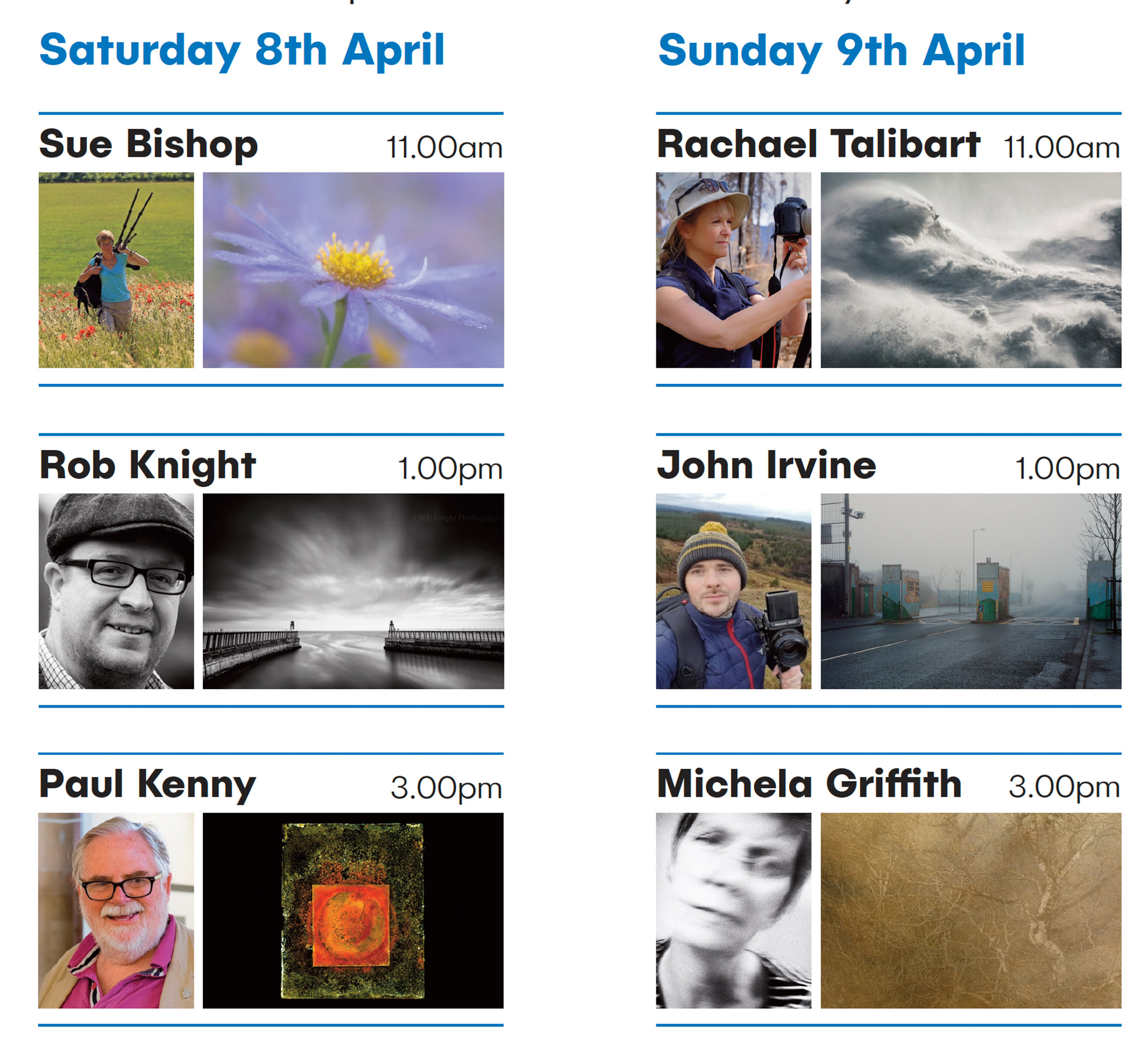
John Blakemore is, without doubt, one of the finest photographers,
darkroom printers and teachers that the UK has ever produced. His
work is currently held in the photographic collection of the
Birmingham Library and currently holds the position of emeritus
professor of photography at Derby University. John’s landscape
photographs, taken between the years of 1970 and 1980 and his
extensive still life work with tulips are reference points for many for
what a personal photography project can look like. John will be
talking about his landscape photography work, his way of working
with projects and his current experience photographing and
producing handmade books.
Meeting of Minds conference 2016
In our third talk of the day, John Blakemore discusses the series of reinventions of his photography from his beginnings after leaving the RAF through his large format black and white projects and up to his current 35mm film work taken around his house in Derby.
I have been fascinated by this image for years. I was quite young when I first saw it, and it has stuck with me ever since. I think it hit my subconscious on first viewing. I can't remember when or where it was, probably some Sunday newspaper magazine that I was flicking through. I encountered it several times over the years, and it always leaves me with a visceral sense of trepidation, concern and curiosity.
Sadly René Burri died in 2014. Born in Zurich, he began his photography career in 1946 at the tender age of 13 when he photographed Winston Churchill who was visiting Switzerland at the time. He went on to work for Walt Disney before joining the revered Magnum agency as an associate in 1955. He graduated to full Magnum membership in 1959.
Burri went on to create iconic photographs of Fidel Castro, Pablo Picasso, and Le Corbusier. His street photography is a lesson in composition, layering and drama. His documentary work in America, China and Vietnam is second to none, simultaneously conveying feeling and fact. Of landscapes, he has some crackers. I could spend hours looking at "Former Summer Palace. Dead lotus flowers on the Kunming Lake" for example.
Refreshing myself for this article by perusing his portfolio on the Magnum website ended up with me getting lost again in his photographs. If ever you want to learn what makes a powerful image, look at Burri's work. He is the epitome of the saying "if you want to be a better photographer, stand in front of more interesting stuff" (Jim Richardson, National Geographic photographer). But of course, it is more than just standing in front of something interesting. You need to compose, you need timing, you need to think and act and maximise your opportunity to create a stand-out photograph.
I could have selected 20 or more of his pictures for this article, but it is his Rooftop image that is constantly arresting. Like most great images, it has many components to it, and it asks questions rather than answering them. Why is he on a rooftop. Who are these suited people on the other rooftop? Why are they there? It's quite sinister. Unusual. What is going on? Did Burri know they were going to be there? He says not - it was purely coincidental. It's just very very strange.
The light reflecting from the road and the haze in the air lend everything a slightly vague and washed-out quality, except for the figures on the building who are suddenly contrasty and deep black, drawing attention immediately.
What is not coincidental is the composition and timing. In low light, I imagine late afternoon, he's gone up on the rooftop to create an image that he's seen in his head at street level. The light reflecting from the road and the haze in the air lend everything a slightly vague and washed-out quality, except for the figures on the building who are suddenly contrasty and deep black, drawing attention immediately. Add in the vertical straight lines and then the only diagonal is the parapet which separates the normal cityscape from the weirdness happening on the rooftop.
I was lucky enough to see him speak at an event in London a few years before he died. There were numerous other speakers, but Burri captured the room like no other. When this image came up on the big screen you could feel the air being sucked out of the auditorium. As a single picture, it is impressive enough. As part of his portfolio of images, it sits amongst a body of work which is simply stunning.
Burri's imagery is a great lesson in simplicity, composition, and creating pictures that ask questions. I fail to get anywhere close, but it's great fun trying. One day…
Do you have a favourite image you would like to write an endframe article on? We are looking for contributions for our forthcoming issues, so please get in touch!
Our 4x4 feature is a set of four mini landscape photography portfolios from our subscribers, each consisting of four images related in some way. You can view previous 4x4 portfolios here.
We're always on the lookout for new portfolios, so please do get in touch! If you would like to submit your 4x4 portfolio, please visit this page for submission information.
*Shout out* as we are looking for contributions for the next few issues, so please do get in touch if you're interested!
Please click the images to see the portfolios in full.
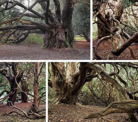
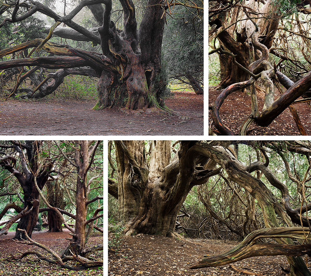
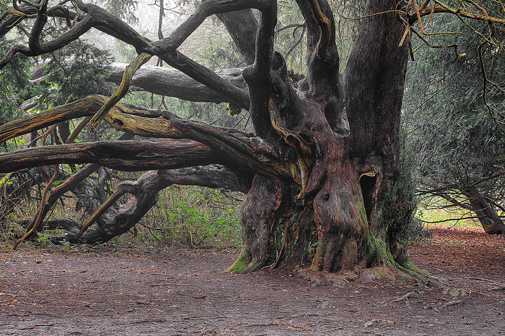
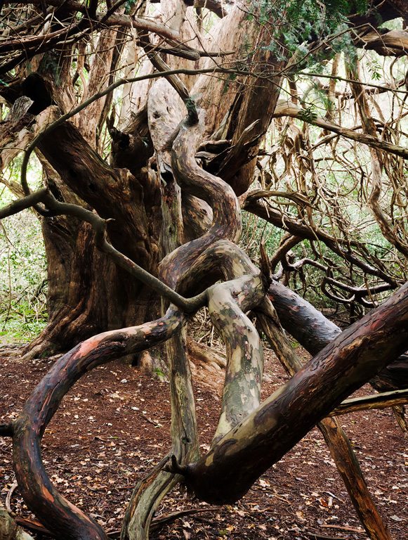
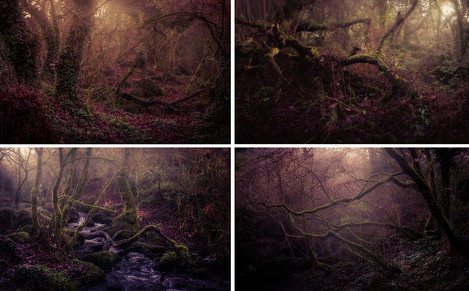
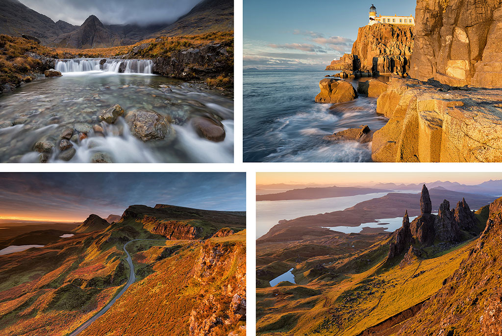
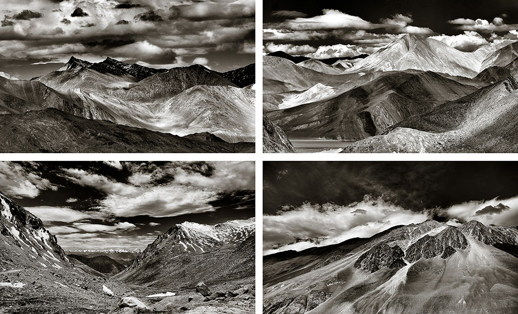
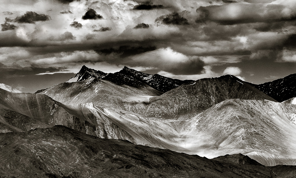
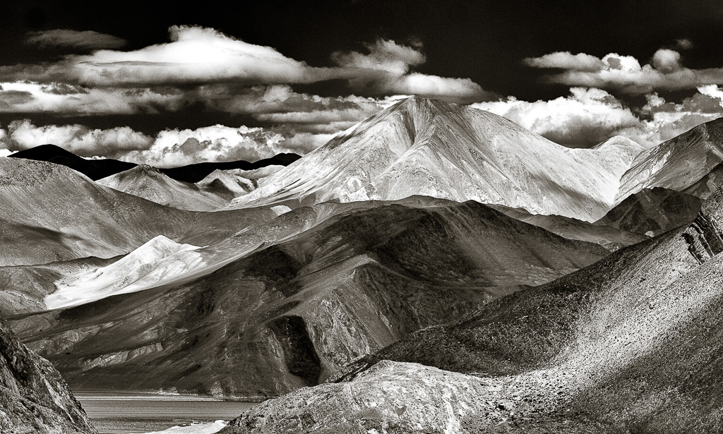
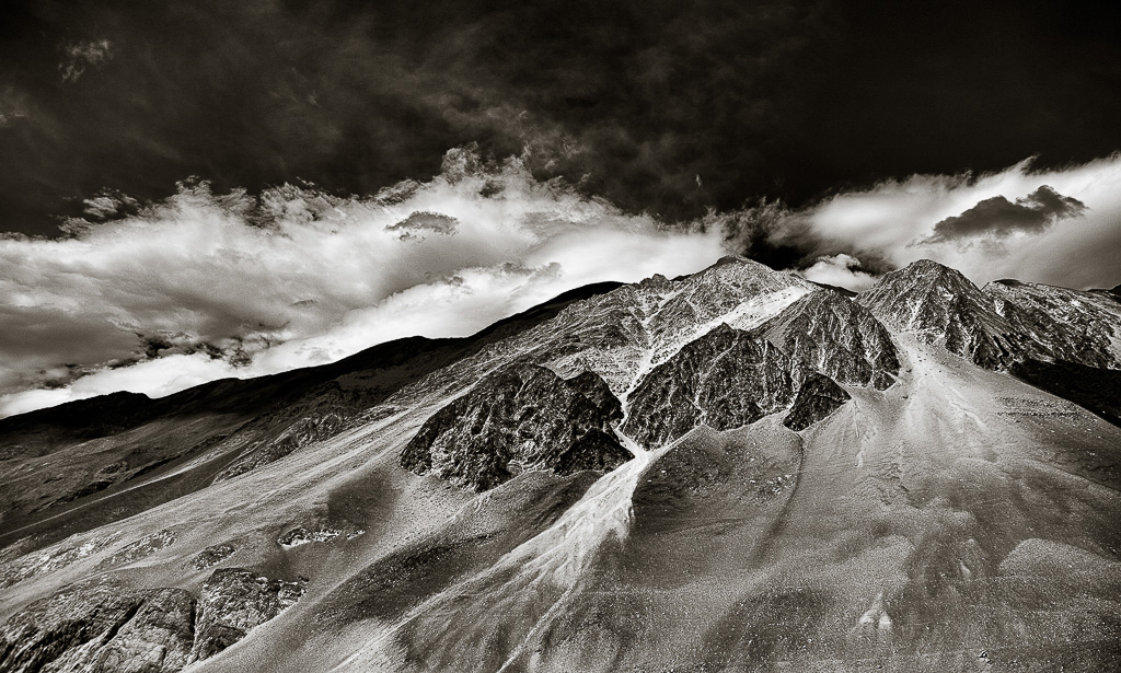
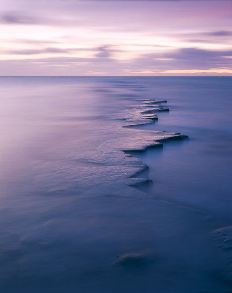
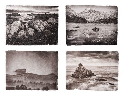
Harris is a capricious muse. Weather conditions are handed out in random fashion at best and seemingly with spite at worst. Rewarding light has to be earned through multiple visits, much suffering and damaged equipment. These four images we all taken on a recent visit when just enough windows of opportunity were presented during a wet and exceptionally windy week. For me, Harris is about Rock, Sea, Sand and Light and each one focuses on these elements.
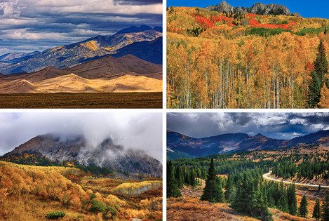
This set of images runs from a morning view of Mt. Jefferson taken north of the town of Madras, OR, moves down to Antelope Canyon in Central Oregon. Image #3 is the view of the Alvord Desert and Steens Mountain when entering from the north and image #4 is of a strong autumn storm draping the southern portion of Steens Mountain near the ghost town of Andrews.
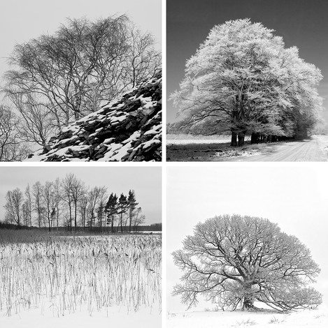
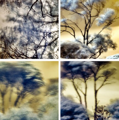
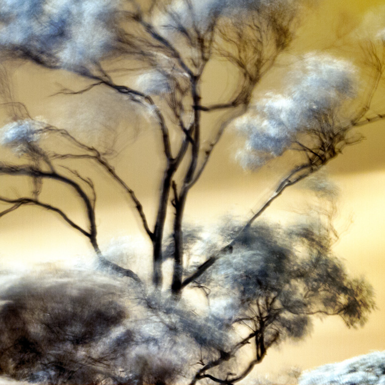
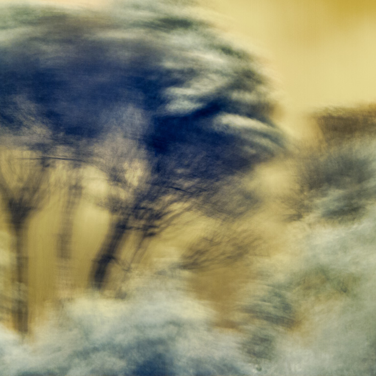
Spring here on Orcas Island (WA, USA) seemed to start a little late this year, but it's finally arriving. I took these photos at various locations in the woods on the island, all using my IR-converted digital camera. I was particularly interested (for two of the images) on the different rendering of the foliage on the branches and in their reflections in the water.
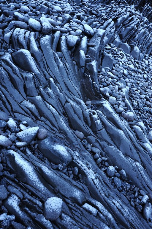
Spittal beach is one of my favourite spots on the Northumbrian coastline. The sandstone rock formations are simply magical and rich in colour, texture and shapes.
I made these, and few more, in the space of a 3hr visit there recently. The difficulty in making the shots was not seeing what I wanted to frame, but setting up the angle/distance and very awkward positioning of myself, the tripod and then ensuring the DoF was as even and controlled as I could get it.
The first shot took around 30mins to perfect - a process that I really enjoyed and a result that I am pretty chuffed with, which is unusual for me!
All 4 frames are uncropped and exactly as framed in camera using a Samyang 24mm TS lens on a Sony A99.
I remember when I was a kid being dragged around the art galleries of Europe by my parents. The national galleries, with room after room of Old Masters through to the Impressionists, were uncontentious. That changed when we got to a Modern Art gallery. Faced with minimalist, abstract, difficult Art, everything suddenly was contentious! One parent loved it, the other hated it. Raging debate ensued and we kids would, of course, join in…
Many still react to minimalist Art with the same confusion or even irritation – it seems so pretentious – but, I suspect, quite the opposite is true of minimalist photography. Whereas the abstraction needed to create a minimalist painting can often lose the viewer (it can be very difficult to tap into the artist’s thought processes), a minimalist photograph is still rooted in reality. The image is of something identifiable. Admittedly it’s pared down, isolated, simplified, but it’s still something real. A hook for the viewer to hang interpretation on. That link to reality is important – it settles the eye and the mind. The viewer can relax – s/he understands what the image is of. Pictorial enjoyment ensues.
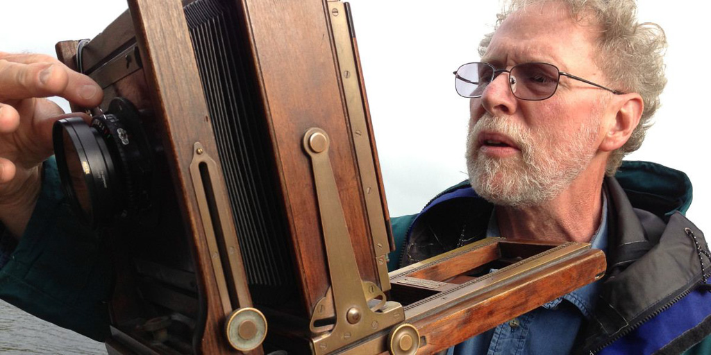
In late 1990, at age 36, we were just months away from the birth of our first child. A few years earlier I'd come to realise that photography was going to play an important part in my life; not as a profession, and yet rather more than a hobby. Perhaps what some call a parergon, the best definition of which I've seen is "side-work which stops your main work driving you insane". I'd been going through that stage where your enthusiasms swing wildly from, say, Ansel Adams one week to Raymond Moore the next. This was fun but confusing, and, before the internet, it was also pretty random. Then in the mid-80s I saw two exhibitions at the John Hansard Gallery in Southampton that changed everything. One was a Josef Koudelka retrospective, and the other Thomas Joshua Cooper's touring show, "Between Dark and Dark".
The highest reward for a person's toil is not what they get for it, but what they become by it. ~John Ruskin
I write these words as I am coming to terms with recent changes in my life. A prolonged illness left me feeling different (truly the only term that seems appropriate), and I am learning to make peace with, and to find meaning in, the change.
I was asked again recently if I have advice for budding photographers. In the past, such questions made me a bit uncomfortable, not because I don’t have worthwhile lessons from three decades of making photographs that I believe are worth sharing, but because I find it hard to address photography in the abstract and without also explaining its role in my life. Photography to me has always been a way of augmenting experiences, rather than to pursue something for its own sake. The most important lesson I learned is that photography, when practised with certain attitudes and priorities, has the power to not just serve as a means of capturing and sharing visual anecdotes but also to help the photographer grow as a person. Knowing that such rewards are possible, what good is any advice for making “better” photographs if it doesn’t also direct the photographer toward loftier life goals?
And so, my advice to photographers—whether budding or accomplished—is this: think not only about improving your photography but also about how, through photography, you may also improve yourself.
The sense of energy at Canary Wharf is palpable; it’s not a place that is often associated with quiet contemplation. Yet pausing for a moment reveals real beauty and softness alongside the corporate architecture; the patterns and colours can be mesmerising like a kaleidoscope as they change with the light and weather. With so much activity all around, capturing these colourful images requires a focus that isn’t immediately obvious to passers by; I can spend hours at a time examining one body of water, waiting for something out of the ordinary – I sometimes think I might be the only person who is still among the crowd.
Attending the first On Landscape conference was a bit of a revelation for me creatively - I had made many trips to locations like the Lakes and Scotland that are usually regarded as highly productive for photographers yet came away with nothing that I felt was remarkable. Jem Southam's talk about his concentrated and detailed studies of his local area helped me realise why my previous approach wasn't working for me.
If anyone asks about what my photography influences are, I think of what fascinated me as a child, playing for hours with a kaleidoscope, spirograph and etch-a-sketch and being captivated by the endless variation of colours and shapes you could create.
If anyone asks about what my photography influences are, I think of what fascinated me as a child, playing for hours with a kaleidoscope, spirograph and etch-a-sketch and being captivated by the endless variation of colours and shapes you could create. Later on, I connected with artists such as Rothko, Klimt and the photography of David Hockney; those themes still inspire me. I realised the sort of photographs I was producing before the On Landscape conference had no roots in what enthused me. So I decided to be more focused and, on being given a creative commission for the Canary Wharf Group plc, and a 24/7 access all areas pass for their site, some ideas began to germinate.
Having to return to the same location time and time again over several months, I began to notice shapes and patterns that motivated me to try to capture in photographic form the images that I was I visualising in my mind. It was precisely because I returned repeatedly that I began to realise the potential for them as a project, a project that would take the next four years to develop into something fruitful. It was probably no coincidence that connecting with something that really interested me meant I was more productive and happier with the results. Winning the 'Your View' section of LPOTY in 2015 with an image from the series made me feel I was on the right track somehow.
Having to return to the same location time and time again over several months, I began to notice shapes and patterns that motivated me to try to capture in photographic form the images that I was I visualising in my mind. It was precisely because I returned repeatedly that I began to realise the potential for them as a project....
It was very much a trial and error process getting the technique right to create what I was imagining I could record but when I did I barely noticed at the time taking them, it was pretty common to take over 600 images over 4 or 5 hours and get only one or two I was happy with. The type of weather I preferred and my availability to coincide with it slowed the process down greatly as only certain conditions seemed to create what I was looking for. But it's no bad thing to have to wait sometimes to make progress; it sort of makes it more exciting.
The whole process became like a form of meditation for me and felt very rewarding, which only fuelled more photography. I doubt that I will find an end to the project as I enjoy it too much but, then again, why would I want to end it if I am still enjoying it?
In the early nineties, Abelardo Morell’s decision to photograph the Camera Obscura effect led to an exploration of the interaction between the outside and the inside, initially in black and white and later in colour. He subsequently devised a portable room – effectively a tent fitted with a periscope – which enabled him to take his work outdoors, first into the desert and then into American National Parks. His images of the landscape have an impressionistic quality, but for me their magic lies in the harmonious juxtaposition of the view with the pattern, colour and texture of the ground below.
Although you’d been inspired by the images you’d seen as a child I believe you came to study photography by chance - you were an engineering student but took a photography course in your second year at college? What was its appeal to you and how did this change the course of your studies and subsequent career?
When I was young I wanted to study engineering so when I went to college that’s what I took courses in; it was a total disaster. I flunked Physics and Math - I went into a spiral of depression. I decided to take a Photography course in the Fall of 1969 and it was instant love and fire. I think that I had a visual intelligence that was much better than the scientific path I was on. Really, I felt that I had found a language and a structural way to look at the world that was intuitive and personal.
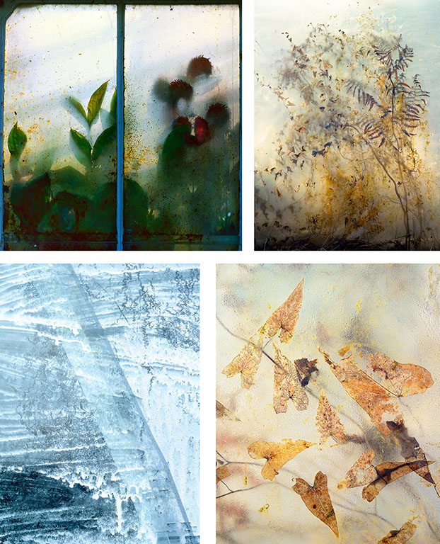
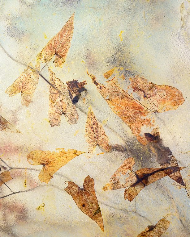
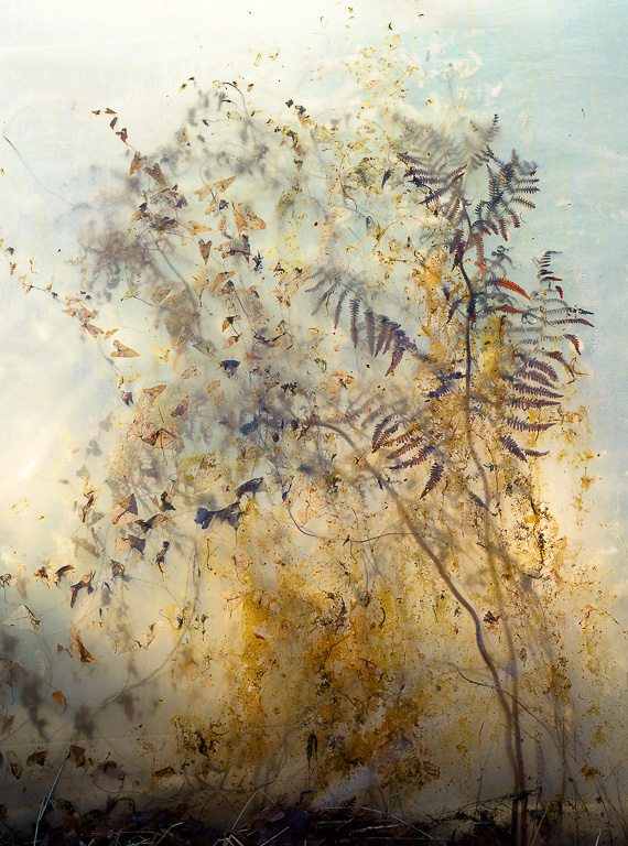
Fern 9, Cliché-Verre, 2009
You’ve commented on the significance of having a good teacher and mentor, and that when successful the relationship broadens and the knowledge imparted is not confined to photography?
John McKee was my photography teacher at Bowdoin College in 1969 and the way he taught it was not so much about f stops but rather about how discovery is tied up with linking music, art and poetry to photographic vision. His approach was perfect for the way I thought and understood things. I owe him a lot.
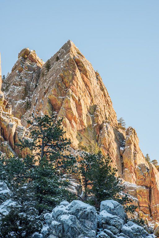
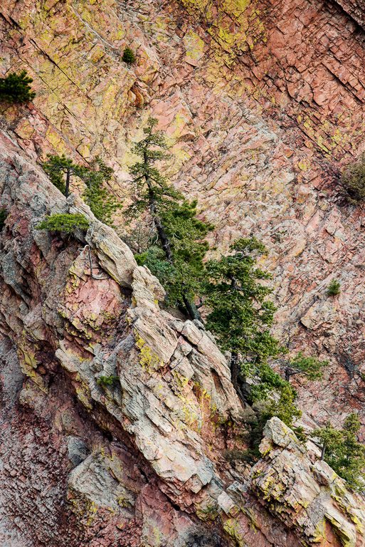
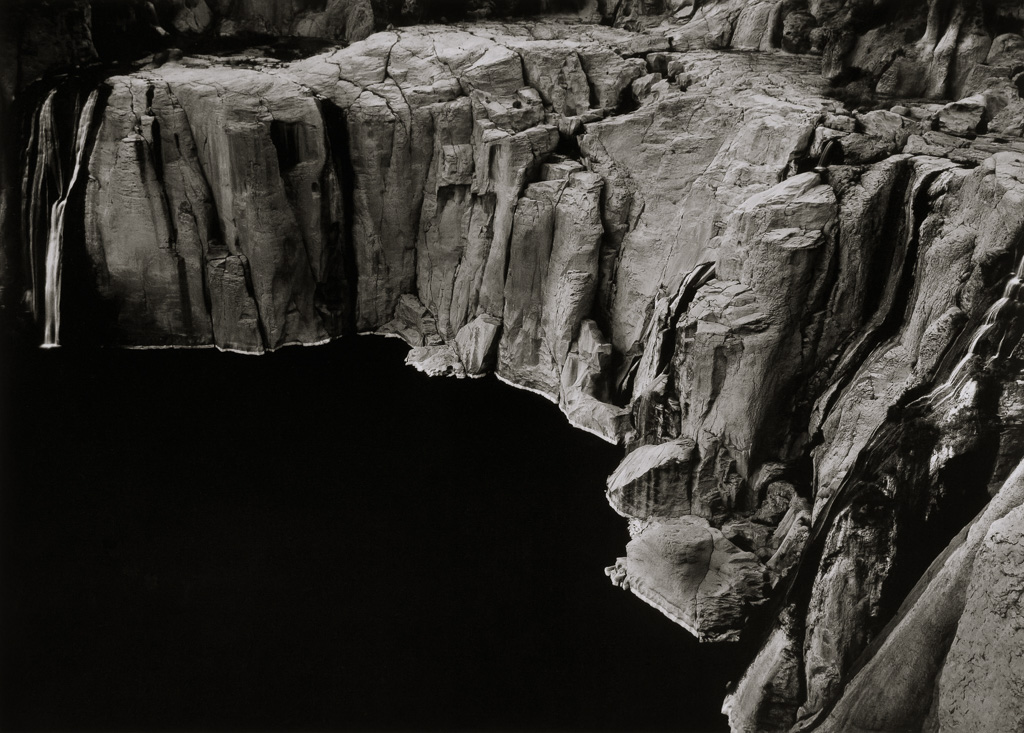
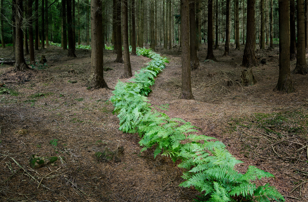
As a regular visitor to the northern Lake District I’ve become interested in photographic opportunities offered by the slate quarries in Borrowdale. Images of these quarries appear from time to time on Facebook and elsewhere, and during my recent visits I followed up on some of these leads. My own photography is mainly of the ‘classic landscape’ genre, but increasingly of late I’ve been interested in more abstract images to be found with closer study of details seen in natural landscapes.
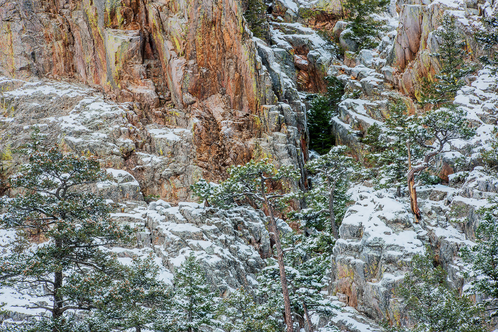
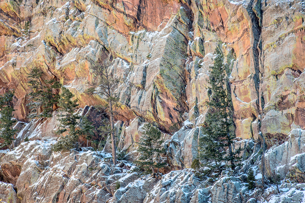
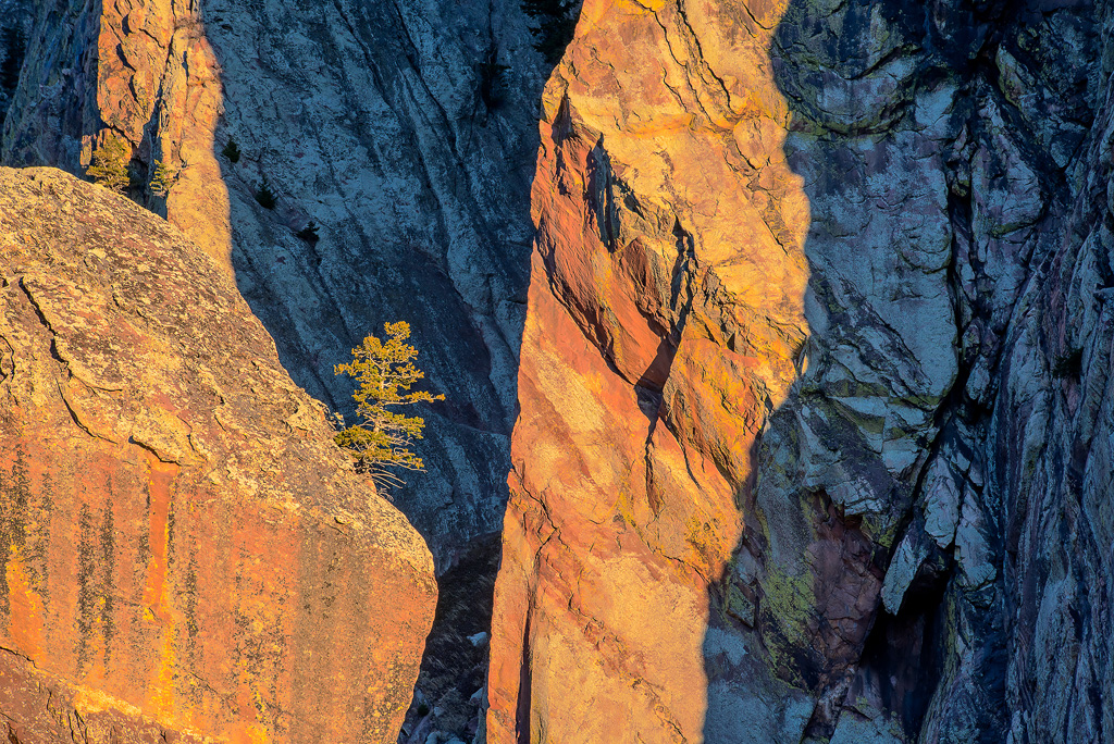
One location that I have visited a number of times is Dalt Quarry, found not far from the footpath leading south from Grange in Borrowdale towards Castle Crag, OS grid 249165. (It is sometimes mentioned on Google as John Dalt Quarry, without references). A recent publication ‘Slate Mining in the Lake District: An Illustrated History By Alastair Cameron, 2016’refers to it by saying “In the woods below Castle Crag can be found the Dalt Quarry which was closed in 1973 by the National Trust on ‘amenity grounds’ causing 18 local men to be put out of work”. Wainwright’s Pictorial Guide to the North Western Fells doesn’t mention Dalt Quarry as such, although the chapter on nearby Castle Crag does include the location of Dalt Quarry as being within “one mile of country containing …. In the author’s humble submission …the loveliest square mile in Lakeland – the Jaws of Borrowdale”. Chris Jesty’s 2008 revision of Wainwright’s Central Fells shows a dotted footpath leading to and from Dalt Quarry, in the chapter ‘Ascent from Grange – Castle Crag 5’.
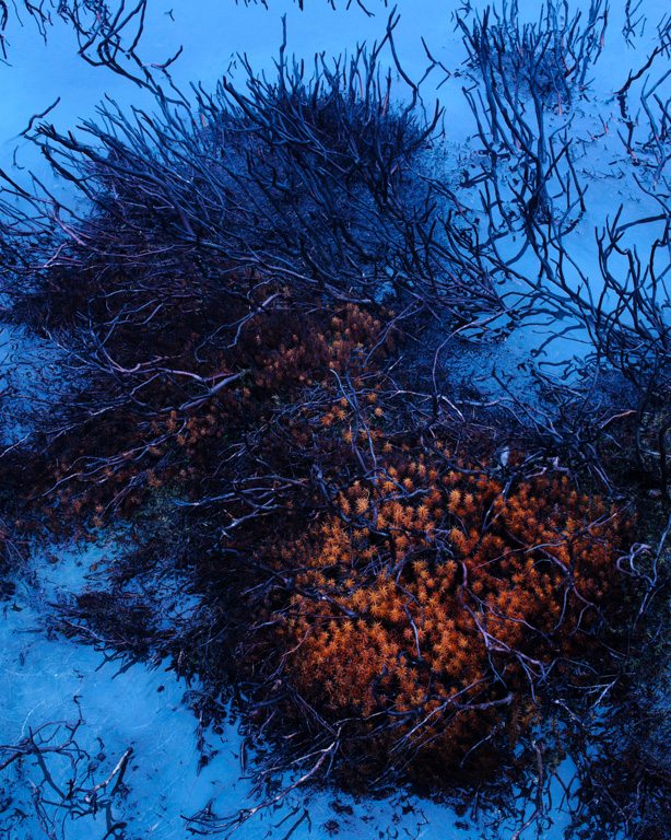
For reasons that must be due to the local geology, this quarry presents a high vertical face with, on one side, diagonal brightly coloured yellow/orange stripes running from top to bottom.
I’d visited Dalt Quarry a while ago but didn’t properly investigate the location. I did what most people seem to do, walking up to the fence at the edge of the quarry (in a very boggy area) and taking some photos from only that spot. By doing so, reflections of the vertical rock strata in the flooded quarry make a good subject.
On a second visit I was determined to explore it more thoroughly, and found there are easily obtained - and much better - views of the coloured rock strata to be had by a short scramble up to the right, where it’s possible to walk around the quarry edge – take care! - and look down from above onto the differently coloured rock faces below. This second visit was in January when there were no leaves on the trees to obstruct the views. For reasons that must be due to the local geology, this quarry presents a high vertical face with, on one side, diagonal brightly coloured yellow/orange stripes running from top to bottom. On the opposite side are rusty/reddish strata. Some images taken in January 2017 are shown here.
Quarries in Borrowdale are a subject for photography I plan to explore more thoroughly in future. I think they offer great potential for ‘landscapes within’.
Polaroid was a remarkable invention. In a world where you had to send film off to a lab before you could see your pictures, here was a technology that was akin to digital photography 30+ years before it existed; better you got a print out of it.
My experience with using Polaroid camera was minimal until a few years ago. I remember using a cream coloured Pack Film camera as a child but have no recollection of whose it was, or what photos were taken with it. But I do recall seeing the little plastic coated paper tab which you had to pull out to reveal the tab of the photo and its backing.
I once shot a book cover using my wife's Polaroid 600 camera, but apart from that, the era passed me by. I knew the name and the cultural significance of a Polaroid. I even knew not to 'shake it like a Polaroid picture' following the release of the song "Hey Ya" by Outkast (their use of the phrase eliciting the stuffy response from the Polaroid Corporation that shaking a Polaroid could damage the development process).
In a way, that was partly the subconscious genesis of this project. Something about that press release made me think a little bit more about Polaroids; that the development process could be damaged.
A bit later and I finally had an old Polaroid SX-70 camera and some Polaroid film. I shot some landscapes with them but due to either a fault in the camera or mucky rollers (a common problem!) what came out was a weird set of blobs and brown and beige colours. They were interesting but not as intended. I moved on but kept the prints. Every so often I'd come across them, puzzle a bit, then put them away in a box.
Leonard Murray Metcalf was born in Australia to parents with mixed heritage. Family folklore tell tales of ancestors such as a Scottish Sea Ferry Captain, an Indian Herbalist, a Reverend from Tatterford, a Chinese music teacher and possible Aboriginal lineage. His paternal grandparents hail from Newcastle on Tyne. It’s no surprise that Len’s work is sophisticated and worldly, attracting attention from an international audience.
Len began his obsession for landscape photography over 40 years ago when his father gifted him his first camera. Growing up in Australia’s spectacular Blue Mountains provided Len with an endless array of incredible scenes to capture. He particularly loves the light and mood of misty wet landscapes, abundant in that region.
Naturally, Len pursued a Bachelor of Visual Arts in Photography and graduated with straight distinctions, also receiving the coveted award for ‘Most Outstanding Advanced Colour Photographer’. However, education had also captured Len’s attention as he had been teaching Outdoor and Environmental Education to pay his way through University. This other passion coupled with a growing sense of disillusionment with the art world saw Len excel in education in the youth, government and corporate worlds for the next 20 years. He undertook a Graduate Diploma in Art Education and a Master’s Degree in Adult Education.
His reunion with photography occurred at the conclusion of a three-year lecturing tenure in the Middle East and he found that the love he had for photographing the natural world had flourished while he was otherwise engaged. Combining his flair for both education and photography made perfect sense and hence, Len’s School was created in 2000.
Len has become renowned as a leading photographic educator through teaching, mentoring and facilitating innovative workshops and tours around Australia. His exquisite photographs capture diverse Australian landscapes, from arid deserts and windswept coasts to his backyard in the Greater Blue Mountains World Heritage Area. He ran his own gallery, has exhibited widely and writes for photography journals around the world.
Meeting of Minds conference 2016
Len's talk looked into his approaches to simplicity and the use of visual punctuation as a tool to create absorbing images. At the end of the video we include a short 'behind the scenes' interview about Len's work.
Our 4x4 feature is a set of four mini landscape photography portfolios from our subscribers, each consisting of four images related in some way. You can view previous 4x4 portfolios here.
We're always on the lookout for new portfolios, so please do get in touch! If you would like to submit your 4x4 portfolio, please visit this page for submission information. We are looking for contributions for the next few issues, so please do get in touch if you're interested!
Please click the images to see the portfolios in full.
Images are from the Norfolk and Lincolnshire coast, around Boston, Cley-next-the-Sea, and Blakeney. Although 2 of them (unusually) show people, they still seem to me to be 'landscapes', as they both show the local natural environment and weather conditions perfectly? This coast is all about open skies, and the wind coming off the North Sea - called an 'idle wind' locally...it goes through you, not around you! The sunrise through the marsh mist was a rare moment of calm however. Falling Sky at Blakeney was in strong gusting winds, and shortly before a drenching in horizontal rain. (image edited 'colder' to emphasise the windchill!)
This mini folio of images entitled “Dark Woods” are from a recent visit to a wood in the Irish midlands. My preference, since my film days, has always been for black and white images. I am drawn more by texture and tone than by colour. In the early 90s I was lucky to do workshops with John Blakemore and Thomas Joshua Cooper. The dark tones of their images, and their subject matter, really resonated with me. I am not really interested in grand vistas. I find the dense woodland more challenging, attempting to capture some aspects amongst the snarling randomness.
I try to express the primaeval essence of the woodland with its ivy and moss covered trees surrounded by tangled undergrowth. This form of landscape, I feel, removes us from our everyday commuter life and transposes us into the ethereal life of trees.
Water and snow make for a great combination to view and enjoy in the winter season. Nature takes on a magical look with snow caps on rocks or ice forms by a water fall. For a photographer every direction the camera is pointed is another photo opportunity to enjoy and capture so that others can also enjoy the magic of winter season
I discovered these woods one spring while walking locally in search of bluebells and have been back many times since in all seasons. They’re a bit of a local secret and during the majority of the year are free of other people so a great place to get headspace. That said, once word gets out the bluebells are in flower they can get a bit overrun with photographers, apparently.
It’s a great wood for me as it’s less than 5 minutes drive from home and if I can’t see the hill it sits on from home due to mist or fog I can grab my kit and pop up. I’ll generally spend a good couple of hours wandering around taking in the atmosphere and trying to be quiet in case I get a glimpse of the herd of roe deer that live here. These shots were taken through the seasons as it’s a beautiful place to be all year. My partner, Philippa Starkey, and I did get a thorough soaking one day when it was pouring with rain which tested our kit somewhat. Even so, we had a great time trying to find compositions and watching out for the deer.
I chose these images as I think they show the diversity of images that can be made in a small space all year round.
Lying 100 miles off the tip of Scotland, the Shetland Isles often seem to get overlooked. Being confined to a small box stuck on the edge of most maps of Britain, you would be forgiven for thinking they were nothing but a minor inconvenience for map makers for refusing to sit a bit closer to the mainland. Mention the Isle of Skye and you can easily conjure up images of The Storr, but mention Shetland and most people would be stumped to think of anything other than ponies. This is why we had to go explore it for ourselves.
Taking the car over on the overnight ferry from Aberdeen, we had decided to wild camp for most of the trip. My wife Kerry (a travel blogger) and I had always found this a good way to really discover new landscapes and allow me to maximise my time shooting rather than travelling back and forth from accommodation (and being able to make up a coffee anytime, anywhere is a serious bonus).
Rolling off the ferry in Lerwick early in the morning, our initial plan was to start from the southernmost tip of the mainland and spend a week working our way up to the top. Then we would revisit the areas we thought were worth spending time in. I’ve often found this to be one of the main challenges of landscape photography, no matter how much research you do beforehand until you’ve been somewhere a few times to build up familiarity much of your time can be spent scouting out locations rather than taking any photographs.
The Shetland isles are much lower, with the highest peak being only 450m tall, the interior land lacks much of the drama seen in Skye or Lewis and Harris.
Our drive to the cliffs of Sumburgh at the south revealed a completely different type of landscape than the other islands of Scotland. The Shetland isles are much lower, with the highest peak being only 450m tall, the interior land lacks much of the drama seen in Skye or Lewis and Harris. Much of the landscape consists of large undulating hills covered in heather or farmland. Given the right weather and light, I’m sure there may have been some good opportunities for photography inland, but I felt my time would be better spent on the rugged coastline, which Shetland has in abundance. The cliffs at Sumburgh were shrouded in low level cloud, providing the type of light that appeals to me; low contrast with none of the hard shadows created by direct light and ideal for longer exposures.
From here we started our exploration of the main island, using 1:25 000 scale maps of the islands to locate beaches, access roads and any areas that looked particularly interesting. The maps we used were OS maps 466-470. It might seem a bit pricey to buy so many maps for each trip (about £40 for the set) but I find them essential, allowing you to plan routes and pick out points of interest; how can rock stacks and places with names such as The Drongs, Papa Stour and Muckle Roe not be worth checking out?
There’s been a noticeable shift in Rachael Talibart’s images over time. Not surprisingly for someone with a self-confessed love of the sea, this has become an increasingly significant part of her work. There’s also been a move towards simpler compositions, with fewer references to location and it is these rather than her earlier landscape views that you will now find most prominent on her website and in her posts on social media.
White Cliffs
Can you tell readers a little about yourself – your education, early interests and career – and how you first became interested in photography?
I’m a full-time photographer, specialising in coastal imagery. I live in Surrey now but I grew up on the South Coast, in a yachting family. For the first twelve years of my life, every weekend and all of the school holidays were spent at sea. Those years left me with a lifelong fascination for the ocean and, although I now live in a landlocked county, I go to the coast as often as I possibly can, at least once a week.
I first became interested in photography in my teens when I was given a little cartridge-film camera for Christmas, one of those where the case folded down to make a handle. The obsession really set in when I took my first 35mm camera on a 9-week, solo, backpacking trip around the world. I’d just qualified as a solicitor in a ‘magic circle’ City firm and was able to take unpaid leave before settling into the rigours of practice. When I got back, I spent my first pay cheque as a qualified solicitor on an SLR and that was it - completely hooked.
Solent Skies
You made a radical change in career and presumably not one driven by financial reward. What prompted this?
I left the legal profession in 2000, when my daughter was born. There were lots of reasons, but looking back I see that I had become bored. It wasn’t just that I wanted to spend more time with the kids; I needed a new challenge. So I went back to university, studying part-time while the children were little. I was still enjoying photography as a hobby but had no plans to make it a career; that just evolved naturally. I want to be clear that it has only been in the last year that my photography has started to pay enough that I need to bother the tax-man. It’s easy to make a few sales sound like a lot in conversation and, as it’s better for your profile to sound successful, photographers are not always upfront about this side of things. In reality, it’s not easy to make money in this game and much patience is needed. If you add up all the expenses (all those miles spent driving to the coast and back!), any income soon gets swallowed up and, if you view it as an hourly rate, well, you’d be better off doing something else. I think most people who choose this life are in it for the love of it, not to get rich. In this respect, I’m lucky that I am a little older and have something to fall back on. I don't have to spend time doing commercial work to pay the bills, which gives me more time for doing what I love.
I am a hydrologist (as well as a photographer for more than 50 years). Hydrology is the study of water. It is a fascinating area of research, in part because of the real importance to human lives of the availability of water for drinking, hygiene, agriculture and manufacturing processes, but also because it is also one of the most dynamic features of the landscape. It has therefore in the past been a subject that has long attracted artists. We have long looked at the water with interest – one of the most famous documented examples being the drawings of the nature of turbulence in the sketchbooks of Leonardo da Vinci. He was one of the first people to study the dynamics of flowing water in detail (he prepared, but never published a Treatise on Water1,2), though it has been suggested that his interest was driven as much by an interest in how to make practical use of the power of water, how to improve canal design, and how to protect people against devastating floods, than in the artistic potential2.
Leonardo da Vinci: sketch of turbulence in a pool below a fall
In fact, the history of art suggests that it has proven really rather difficult to represent the dynamics of flowing water in two-dimensional images. It appears to be one of the greatest challenges for an artist. This is perhaps for good scientific reasons. Water flows are dynamic, changing constantly in response to the changing hydrology and boundaries to the flow, including the effect of the wind. The water will have varying degrees of transparency depending on water quality and sediment loads. Flowing water produces complex and changing patterns of light due to reflection and refraction. The result is that the artistic representation of water often seems to be rather poorly done.
He suggests that one of the first and most influential treatments of water was by J W M Turner, in part because of his skill in using the medium of watercolour to represent effects of light and water in the outdoors, with a view to representing the sublime
Actually, the situation is not that much better for the scientist. We actually have a really beautiful representation of the dynamics of water in the 3 dimensional Navier-Stokes equations. The problem is that we cannot solve those equations in most applications of practical interest because of the uncertainties associated with the knowledge of the relevant boundary conditions (and also, still today, the sheer computer power needed to produce numerical solutions at useful scales). Another problem for the hydrologist is that a lot of the water flows that are of interest take place under the ground surface where it is very difficult to study exactly what is going on, except in small samples. We often resort to inferring what is going on from larger scale flow and tracer observations.
Some of the artistic difficulties of representing water are discussed in an interesting book by David Clarke3. He suggests that one of the first and most influential treatments of water was by J W M Turner, in part because of his skill in using the medium of watercolour to represent effects of light and water in the outdoors, with a view to representing the sublime (as originally defined by Edmund Burke in the 1750s)4. Water was an essential part of the sublime – the sound and fury of mountain torrents and the dramatic presence of glaciers adding to the atmosphere as the Grand Tourists passed through the Alps. Many of Turner’s most famous large-scale watercolours are of waterfalls in Switzerland he had encountered on his travels. David Clarke also suggests that it was the dissolution of the subject matter in his watercolours (which Turner also carried over into his later oil paintings), using water as a medium to represent water as the subject, that started the path towards a more abstract art, particularly in the water-related art of Monet, Mondrian, Kandinsky, Pollock, De Kooning and Frankenthaler. He suggests that these artists (and others of course) had been all influenced by living close to and interacting visually with, water on a daily basis.
J W M Turner: Water colour sketch of sea and sky
With the invention of photography, the representation of water has become somewhat easier. Water has been a subject for images made since the very earliest days of photography, even more so once exposure times became short enough to be able to capture waves (e.g.Gustav Le Gray’s images of the sea in the 1880s). Photography has been used extensively in experimental laboratory studies in hydraulics5. There are whole books devoted to photographic studies and surveys of water images6, and we have now become used to pictures of blurred waterfalls, autumn colours reflected in rivers and lakes and, since the work of Hiroshi Sugimoto and Michael Kenna, of minimalist water stilled by the use of long exposures to emphasise the nature of the light. Water is also involved in other forms of landscape photography, of course, from the refraction that produces rainbows8, to the cloud “equivalents” of Alfred Stieglitz, to backlit geyser eruptions, and, in the form of ice, the recent spate of pictures from inside glacial ice caves and in the lagoon and on the beach at Jökulsárlón. The challenge now, as with so many aspects of photography is trying to avoid cliché (but there are some striking examples of doing so, see, for example, the River Taw work of Susan Derges, the Atlantic and Scottish Rivers work of Thomas Joshua Cooper, the Thames Studies of Roni Horn, and the early Sea Horizon work of Garry Fabian Miller and On Landscape’s own Michéla Griffiths).
In the images that follow I have wanted to show the life and intrinsic beauty of water flows in a realistic way, while recognising the approximate way in which we can represent the dynamics.
As a hydrologist, I can claim to understand something about the nature of the way in which water moves through the landscape. But as already noted, in doing so the scientist has some severe constraints of how well that movement can be observed, measured and modelled. As a result, hydrology is one of the inexact sciences, subject to considerable uncertainties. The precision that scientists like is impossible to achieve (except in certain well-controlled laboratory experiments). Thus, in producing hydrological science we must allow for abstraction and uncertainty. It seems that this has carried over into my image making of water (though it is also interesting to speculate that it might have been the other way round?).
In the images that follow I have wanted to show the life and intrinsic beauty of water flows in a realistic way, while recognising the approximate way in which we can represent the dynamics. How has this been done? By trying to capture images that “feel right” – which is clearly a more artistic concept. Uncertainty also plays a role – I find some of the most satisfying images are those that require the viewer to make some effort to understand. I also find situations where there is no water to be seen, but the history of a place as affected by water is evident – the marks of past water. My hope is that the viewer will respond by valuing what is shown more highly (as hydrologists we often have to deal with the pollution and degradation of water bodies – and it is so difficult to clean up that pollution, especially under the ground, an issue addressed photographically by Edward Burtynski7,9).
Images
Surface Reflections: River Eden at Shoregill
Surface reflections: River Eden at Shoregill
Surface Reflections: River Eden at Shoregill
Surface Reflections: The Sarine at Hauterive, Canton de Fribourg, Switzerland
Internal reflections: Lookout Creek, Oregon
Internal Reflections: River Eden at Stenkrith
Internal Reflections: Val Versasca, Tessin, Switzerland
Frozen Water: River Eden at Hell Gill
Frozen water: glacier D’Aletsch, Canton de Valais, Switzerland
Uncertainty: River Eden at Shoregill
Uncertainty: River Eden at Hell Gill
Uncertainty: The Sarine at Hautrive, Canton de Fribourg, Switzerland
Uncertainty: La Jogne,, Canton de Fribourg, Switzerland
Footnotes
1 Asit K. Biswas, 1971, A History of Hydrology, North-Holland Publishing 2 Laurent Pfister et al., 2009, Leonardo da Vinci’s Theory of Water, Int. Assoc. Sci. Hydrol. Special Publication No. 9 3 David Clarke, 2010, Water and Art, Reaktion Books 4 Thomes Peck, 2015, Face to Face with the Sublime, On Landscape Issue 90. 5 M Van Dyke, 1982, A Gallery of Fluid Motion, Parabolic Press; M. Samimy et al., 2004, A Gallery of Fluid Motion, Cambridge University Press 6 Hans Sylvester, 1992, L’Eau, Editions de La Martinière; David Herrod, 1994; Waters of Cumbria, Creative Monochrome; Bernhard Edmaier, 2015, Water, Prestel; 7 Edward Burtynsky, 2013, Water, Steidl; 8 M G J Minnaert, 1993, Light and Color in the Outdoors, Springer. 9 Edward Burtynsky, 2003, Manufactured Landscapes, Yale University Press and 2013, Salt Pans, Steidl.
‘Black Dots’ is an exploration of mountain bothies and bothy culture throughout the United Kingdom. Far from civilisation and mostly accessible only by foot, these secluded mountain shelters are scattered across the British Isles, tirelessly maintained by volunteers from the Mountain Bothies Association. Unlocked and free to use, they provide a refuge from the vast terrain that surrounds them and have rapidly become an iconic feature of the British Landscape over the past fifty years. Bothies are synonymous with the outdoor experience in the UK, and from day trippers to seasoned mountaineers the growing community of bothy users is hugely diverse.
Born out of curiosity, ‘Black Dots’ is the result of two years spent exploring the British Isles in an attempt to better understand what these buildings are, where they’re located and the culture that surrounds them. In doing so, my hope is that the work will generate a wider dialogue celebrating the relationship between man and the wilderness in the 21st century.
In this piece for OnLandscape, I’ll be selecting a handful of my favourite photographs from the project and delving a little deeper into the stories behind them. [N.B. We caught up with Nick in July 2016 when Tim talked to Nick about his photography and the background to the project]
Warnscale Hut & Haystacks, The Lake District, England
Warnscale was the first bothy I ever stayed in. It ignited a fascination in bothies and was the catalyst that really kick started Black Dots for me. Tucked into the fellside between Fleetwith Pike & Haystacks, this converted miners hut overlooks Buttermere & Crummock water and is only a short hike from the Honister Slate Mine. Once you navigate the tiny doorway, the primitive interior is quickly converted into a truly magical home-away-from-home once the fire is lit, making this one of my favourite bothies in the network. Waking early and scrambling up the banks of slate and heather behind the bothy, I set the 5x4 up and waited for the sun to break over the ridgeline behind me. As it did so, it created a perfect line of light across the summit of Haystacks which timed perfectly with a small plume of smoke that billowed from the chimney.
Corrour & The Devil’s Point, The Cairngorms, Scotland
In the beginning of my photography career, I could not think of shooting landscapes formed by man. I was entirely focusing on the natural and untouched wilderness. I wanted to bring beautiful images from the wild out to the readers of magazines and books. I hiked up and down in the remotest of the Swedish mountains. This to find landscapes which had never had been photographed before. I travelled across the globe to look for the sublime creations of Mother Nature herself. Not until I started to travel to the high Arctic had I any interest in landscapes moderated by man. In and around the the Inuit settlements of Greenland and Nunavut, and the coal mines of Svalbard, I found traces of the presence of mankind and of a kind which changed the course of my photography. I now consider man as the greatest creator and destroyer on top of the crust of the earth.
Working with Adam and Jo, we wanted our second exhibition at the gallery to show what an influence Joe Cornish and the gallery have been on landscape photography in the UK. Going back through our featured photographers and other interviews (and talks at the conference), the common theme with a lot of photographers was who they drew inspiration from when they were defining their voice and style of photography.
On Saturday 4th March 2017 we launched our second exhibition 'First Light Inspiration' and held a panel discussion with Joe Cornish, Tim Parkin and the exhibiting photographers to discuss the influence and inspiration of First Light (click here for our review of First Light) on their photography and the wider conversation around influence and inspiration in their creativity.
The transcription starts just after we get past introductions
Exhibition Launch Discussion
Tim Parkin (Tim): <to Julian> A lot of your work, when you first started personal projects, was based in Scotland and you made almost pilgrimages to various parts. Was that inspired by some of the work in First Light?
Julian Calverley (Julian): It was indeed. Plus I used to go there as a kid, so I wanted to get back and try to capture this amazing place. Which I failed miserably to do! It took a long time for me to come back with something that felt like it was seeing and feeling. Feeling is the important word actually. Some of the locations I hadn’t even really heard of like Skye. The picture on the front of [Joe's] book obviously is a classic and I had never seen this alien landscape. In fact I couldn’t find that boulder, it took me a couple of trips. When I finally found it I was like ‘This is it, I’m here!’. There is something special about being in these particular sorts of places in general though
Tim: You didn’t have much luck with the weather when you went up to look for these pictures?
Julian: That’s right, but it’s when the penny dropped. I was trying to capture big vistas, and failing, and it wasn’t until the bad weather came in and I learnt how to deal with that and capture it that I got excited. It felt like I was doing something, not necessarily unique, but that felt personal. That was the point at which it felt like personal work.
Tim: That’s when the sense of the sublime came in that you talk about Joe?
Joe Cornish (Joe): Exactly, the feeling that you get in your pictures, if that’s the threshold that you cross when you realise that you could work with the weather rather than fighting against it. One more thing I wanted to say in response what Julian said was about crafting pictures. I worked as an assistant with car photographers quite a bit and I subsequently started to think about the landscape a giant still life. When you do that you can’t control the lighting but you can at least conceptualise about the colour relationships and the form and the way modelling works, because of that knowledge from the studio.
Julian: And it was high tide wasn't it? I saw someone commented once on that picture. They said “wow how did he do that because when I was there the water wasn’t there!” That did make me chuckle! Planning and patience. Patience is important.
Joe: Persistence too. I’m not a very patient person and I remember talking to Paul Wakefield about that once. He said “I’m very impatient person” but when you look at his pictures you think, how on earth did he do that! So it’s not so much about hanging around but being prepared to go back and back. Being able to use your time constructively when you are waiting for something to happen. As you need to be able to keep that energy in check and let it flow when you need it to.
Tim: I think it would be safe to say that you lead a bit of a renaissance in large format camera usage in the UK. I know a lot of people who took up large format camera after seeing your's and David Ward’s book. Was this the case for you Baxter? How long had you worked with large format?
Baxter Bradford (Baxter): I had been on a course with Joe in 2001 and I was making my first foray into large format then. I was having a conversation with Paul Saunders last summer and we both made this confession. I feel like a bit of a saddoe as when I went through the book I did a done a tally of the Lee filters Joe had used! The ones with the most ticks against them, I went to Lee Filters and bought! I couldn’t afford all of them but it gave me a pecking order, so when I got a bit more money, I got more. Paul said that was exactly what he’d done. This moment that we had this discussion for the first time. I was getting misses as well as the occasional fluke. The book was seminal in that it shows a nearly right photograph as well as the one that worked. They talk about and self-criticise, and there is the narrative about the background to the image as well. The fact, like you said Julian, the lighting is there, but it’s a case of how can you solve problems so you can identify the answers when you’re out in the landscape. You might have gone with the idea of doing this but the light is doing something different, so I should concentrate on doing that. The variety of landscapes in the book and the picture styles. It helped give me self-confidence to solve the problems such as this isn’t quite right because ……. And this is better because….In hindsight, I would have done this... I thought that was very open and gave me a lot of footholds on my own journey to improve.
Tim: Whose idea was that in the book Joe?
Joe: Very interesting in the way Bax has put that as it reminds me that although the idea for the book was principally Eddie Ephraum’s - the content was inspired largely by my reading of Galen Rowell’s Mountain Light. Anybody got that? Very important work in photography I think. Of all the books that I’d ever read up to that point, that was the first one that revealed the craft process.
Tim: Pulled the curtains back on the process….
Joe: Yes. Galen was extremely good and generous with his explanations for how he’d analyse the way lighting worked. He was very scientific in his approach to problem-solving and that was a revelation to me! That was a good way to go and a generosity of spirit that I liked too. When I was an assistant in London, I don’t know if this will resonate for Julian or not, nobody would tell you anything!
Julian: Absolutely!
Joe: Everything was secretive because every photographer was afraid.
Julian: Paranoid of the next guy?
Joe: Yes, of the next assistant pinching their clients basically! There were no workshops back then either so you had to go out and learn everything by taking pictures and making very expensive mistakes. They were expensive because of the cost of film and processing. It was a different way of learning for sure then. Mountain Light and Galen should have been referenced more strongly in that last chapter. I’m hoping to make up for that here. Thank you for that.
Tim: Matt, you’ve only just recently got into photography is that right?
Matt Lethbridge (Matt): Within the last ten years and pretty much as a direct result of stumbling across Joe’s book in a bookstore. I was the same as a lot of people, I had a little compact camera and took it on holiday and made some nice pictures. You come back from holiday and would be disappointed with the results. I was wandering around a bookshop in our local town, just trying to kill time and came around this remarkable picture on a book cover, the picture of Elgol, and I was just amazed and picked up the book, opened it up and had a flick through. I was even more amazed at the pictures at that time, bearing in mind I had no photographic experience.
We’re all used to National Geographic Magazine images with these wonderful pictures of exotic far off places. But this bloke called Joe Cornish, he photographed all of these photos in the UK more or less. To see Elgol in Scotland and see it lit, and the depth of beauty in the picture, it astounded me. It moved me to purchase the book and got it home. I read through it and again, and it sparked something inside me and made me want to go out and make pictures. I went out and bought a proper camera with interchangeable lens and failed miserably. I devoured magazine after magazine but kept going back and referencing the book.
Joe: You must have a very patient other half, I’m sure!
Matt: I have a very patient wife, she’s wonderful. This inspiration from First Light has just carried on and the book is there at home and is a constant reference to me. Whenever I feel I need some inspiration I pick up the book and look through it. I read a few passages and look at the ‘nearly photos’ and think perhaps one day I’ll make a photo as good as them!
Tim: Do you think that it’s the narrative as well as the pictures that are important for your appreciation?
Matt: Incredibly important because, although the picture speaks volumes itself, it is also the thought processes. I felt I needed to understand why Joe took that particular picture, how he produced it, how was he feeling. It’s been profound actually. Without the book, I wouldn’t be a photographer and I wouldn’t be sat here today.
Tim: Beata, you have a very different style of photography now. Tell me about how you went from discovering Joe’s book and your style.
Beata Moore (Beata): I went for a workshop with Joe a couple of years before the book was published. As a result of the workshop, the very first thing I did was to buy a wide angle lens. I thought that’s it, I’m done, I know what I’m doing! I didn’t and luckily a couple of years later your book came out. I read it a lot and I understood more but I still couldn’t quite grasp, as wonderful as the wide vistas are, I just didn’t feel them. I couldn’t portray what I felt and what I wanted to portray. It took me longer to understand that actually, my heart lies in smaller views, more intimate details. I think some of my images border with abstract and I still love colour on top of everything else.
I think abstracts and a little bit more nature details are more me. As much as I’d like to be Joe Cornish, I’m not! For the last few years, I work more and more towards his more intimate views. I learnt so much from Joe. It’s his approach, that slow approach, less of a galloping photographer like I tend to be sometimes as I get fascinated with what’s in front of me. Joe has a more meticulous approach which I have witnessed and I took that into consideration and I slowed down much more. Although I still get distracted a lot by light, changing moods and reflections and whatever else! I have learnt a lot and think I’m kind of semi-comfortable with what I’m doing with my little nature details.
Tim: Harvey, how did you discover the book?
Harvey Lloyd-Thomas (Harvey): Around the time when I was asked to take part in this exhibition, I was trying to think back to when I became aware of Joe’s work. It was so long ago I can’t remember! I first got into photography at university when I was hill walking in places like Scotland and the Lake District. I was just taking photographers of the walks and the outdoors. My love is being outdoors, that’s what I enjoy and have an interest in the arts and design from when I was a child as I did lots of painting and drawing.
The photography started as a means of recording my hill walking expeditions and around that time I came across Colin Prior books and became aware of Joe’s work. There was a big disconnect between the pictures I was taking and the pictures I saw in these books. That’s when reading Joe’s book and his explanations of how these pictures were taken made me realise that there’s a whole extra new level of craft, patience and attention to detail that I wasn’t taking myself. It started from there and I became more serious about the photography and although I think it’s still being outdoors is the number one thing for me, making the image is number two and I get enjoyment out of both and that’s why I take photographs outdoors rather than other styles of photography.
I still have a conflict in that I have a spontaneous approach to my photography quite often and most of the time I don’t use tripods or filters. I’m aware of deficiencies when I come back with images that I then realise they could have been improved if I’d paid attention to detail that people like Joe do. I’m still trying to slow down and perhaps take that extra care and not always succeeding with images I like as much as when I take the spontaneous approach.
Joe: That’s a very interesting point you identified there I think. That remains a big challenge for everyone that you’re ideas are truly your own voice and you often see those and make phone based snapshots. A few of us here will have that experience and the phone pictures look fantastic and you think I’ll set up my camera and you get your big camera out and you often when you get those pictures back they don’t have quite the same something. So that perhaps some of what was there in the original idea and perhaps it’s how the phone translates it. Perhaps the colour and the light have changed, but sometimes it’s because you’ve laboured over it and it’s hard to get that feeling of something that is crafted and stilled and retains the spontaneity of the idea. That’s no easy job.
Harvey: I think I perhaps just accept that’s my style, that spontaneous approach and it’s not going to be technically perfect as a result. I think also my approach took a while to work out this problem of exposing sky and landscape equally until I discovered graduated filters. Until that point, I was just not achieving results in my pictures that I was seeing in magazines and books. My approach was quite often to come up with compositions that ignored the sky and I think that partly lead me, like Beata. I'm not necessarily attached to representation like the pictures are on the wall in the gallery. A lot of my pictures are more abstracts and details of intimate landscapes. Extracts, I think people describe them as, and that partly started from the technical limitations of how I was taking pictures. I’m still drawn to that but I have this other conflict that I take a lot of my photography when I go away to Iceland, Scandinavia and places like that. I go to these places and come back with pictures of details which could have been taken anywhere. I do want to take vistas and I do occasionally succeed but I’m more successful in the smaller work.
Tim: This is an example of the difference between inspiration and influence isn’t it? Because I can look at many different styles of photography and be inspired by them but not want to produce the same style of work or look. It’s a difference between what you see as well.
Joe: Yes, if only it was possible to fully understand when that changes. We all want to develop our own voice as artists, I think that must be true, and in order to get to that point or place, you do have to go through something that appears to be plagiarism. I’m sure that most people will understand that and after all you go to any art gallery on any day of the week, anywhere in the world and you’ll find art students copying paintings. This is a well-established process, trying to study and understand the work of master painters or photographers in order to build. There’s a famous quote of Picasso’s which I never really understood until David Ward made it clear to me the reasoning. Picasso said that “all artists borrow, great artists steal!” Which I thought was an interesting distinction and I have always been baffled by that. What it means is that when you steal something you now own it. That’s the difference.
Tim: It becomes part of you?
Joe: Yes, in some ways it’s better I suppose to draw the lessons that you learn from the work of others and incorporate it into your own approach as far as you can. Rather than looking at the superficial impression of a picture and go back to try and copy that particular idea. That’s easy to say and not easy to do.
Tim: I remember Charlotte and I went on holiday to Elgol about eight years ago and I sat on the beach there, having a relax and had to guide five people to a particular boulder! I was like a guide or tour operator. It got to the point by the fifth person came and before they even said anything I said: “It’s over there!”.
I do think that there’s a certain problem, there are a lot of people who when they are doing art or photography, can develop a mental model of what a picture looks like. That internal model is related to your exposure to other photographers or artists work. If you have only ever had one influence, that mental model will always look like that influence. I think that this is part of what Picasso was referring to. If you’re going to take influences, take them from lots of different areas and, as you say Joe, don't just take the representation, take the whole work of the artist. Then you become the sum of everything you’ve seen and hopefully that includes your own work too. It’s that which becomes the essence of yourself - a composite of influence and self creation.
Joe: I think that successful artists, what they do is translate themselves very accurately or directly into their work. That has a curious way of becoming the universal. There’s a very famous quote by an artist and which Charles Cramer included in his talk at the On Landscape Meeting of Mind Conference. The summary of which is that "art is not a popularity contest" or a technique contest or any contest. The contest is actually with yourself; to connect with what you really are and feel.
You hear that in music particularly, and I don’t want to go too far off track but if we briefly look at the analogies between photography and the other arts, I think that music is often the most fascinating because it’s a two stage process. The composer or songwriter creates the work but it doesn’t exist until it’s performed. In many ways, that’s how photography is. Until you make that print then you haven’t revealed its life to the world. You can go out and have the experience and make the picture, which matters. Then there’s the performance and Ansel Adams himself said: “The negative is the score and the print is the performance”. Since we have got Charles Cramer's pictures behind us and Charlie was a good friend of Ansel, it’s appropriate. I think we see that it also enables you to think to have the idea on one hand but then have to translate it. At both stages, both at the seeing, thinking, feeling and the craft side making the picture you have to put yourself into it and then you have another opportunity to express more accurately or more decisively what you’ve seen at the print stage. That was certainly true for all those great darkroom printers and it was very difficult in colour up until quite recently. Now it’s opening up amazingly because of new technology.
Tim: I was going to ask you a question which is, a few of the pictures in the exhibition you’ve rescanned, reprocessed and printed for this exhibition. I’m interested in how you felt about that and did you find yourself wanting to process them differently than they were in the book?
Joe: Yes! Very much so. It’s was a pressured test, Tim, thanks for that! Of the ones we ended up choosing, I was fairly happy with them in their own way. They reflected back to me something about myself and how I’ve changed as well. I like to think I’m a better printer, I wasn’t a printer then. I was used to doing some repro but I was not a colour printer. I was shooting to get it right in camera. Because if any of you don't remember that far back or weren't a professional photographer, you took your transparency, in the so-called ‘good old days’ and send it off to your client or repro house and they often murdered it. They then covered it in oil and dust, that’s how it came back anyway.
Some of those repro guys were very good. But what they were trying to do was reproduce the transparency. What you were looking at was both the good and bad aspects of the transparency. So what we were essentially trying to do as colour photographers in the 80s and 90s was to make something that was perfect in camera.
With the best will in the world, that is a very difficult ask. Certainly, Ansel Adams and Edward Weston and the great masters black and white would never have thought that was their obligation to create the perfect negative. Which you could put down on paper and print it. They would have done lots of dodging and burning, multi-stage split toning and contrast control, all of those things.
In some respects what you see in the original book is an honest attempt more or less to reproduce the transparency and in many cases, I can tell you they aren’t very accurate. Not only are they limited by everything I’ve just said, but not that well reproduced. There’s a big difference between a transparency and four colour CMYK, especially with the blues. So the Contours in Blue, that print of the beach in Dunraven Bay is a mile off what the transparency.
Tim: We do have two copies of First Light, one is in Polish version and the other English, if you want to compare what’s in the book, with what’s on the page to see just how accurate it is.
Joe: It is interesting, the scans - Although they’d be even better if I’d got you to scan them Tim, I scanned them at home - I then used Photoshop to rebalance the colour where needed and maybe draw out a bit of shadow detail in one or two places and look at the overall balance. Now, for instance, I always analyse my pictures by inverting them on the screen to understand the flow better, the abstracted flow of the picture, and the life force within it. Then I’ll change areas in terms of light and dark, occasionally I’ll desaturate areas which are too demanding and occasionally bring in little a bit of saturation out to others. It’s usually a multi-stage process, so I very rarely make a scan, clean the dust and print it. I will do those first things, clean the dust, do my first basic curve adjustments and then leave it and come back to it a day later to do some more and come back to it a week later and do a bit more, then I’ll do the print. That way you get a more nuanced interpretation of the original, but the idea, for me is, the light remains at a primary life force of the picture.
Tim: Would it be safe to say that the book is a testament to a moment, that era of photography and to the equipment you used at the time?
Joe: You could say that and I continued to use that large format 5x4 camera up until Scotlands Mountains, so two books down the road as it were. Then I pretty much changed as I realised that at one point I was trying to shot 5x4 large format and medium format digital alongside, which apart from breaking your back, you get distracted. You need to concentrate so I did change but in a way it represents that and certainly First Light is a dedication to that type of workflow. I think in the back I write about how the dedication of film remains as I saw it as the benchmark of what you can do in real terms of quality out in the field. None of that has changed, but what has happened is that digital capture has improved beyond recognition in the meantime.
Tim: Were you using large format Julian presumably?
Julian: Only commercially.
Tim: Harvey, you were using 35mm?
Harvey: Never been anywhere near large format!
Tim: Matt you’ve just started large format?
Matt: Yes, just started!
Tim: Over a decade later you’ve influenced someone else to pick up large format as well Joe! So Matt tell me why you started large format?
Matt: I’m not quite sure Tim, to be quite honest. I like the idea of the whole process, to slow yourself down, to take more time over the finding of your composition. It’s a lot slower process and there is more thought involved. That’s the part I enjoy, going out finding the compositions, finding these pictures, and spending the time making these pictures correct. It really appealed and it doesn’t help when I come to your place and see things on light tables. It was inevitable really, just to learn the craft and it feeds back really towards the book, as it still has relevance personally for me today, because of the details in the back, of what film they were shot on, what filters may have used. I have now come to the conclusion I would like to go back to a lot of the locations I’ve shot digitally and over a period of time, reshoot them on 5x4 film, because I’m a bit daft and it’s hard! That’s the honest explanation!
Tim: You like a challenge Baxter?
Baxter: It was the challenge that got me into it. My father in law had read about the Gandolfi Brothers in the Sunday Times about their cameras and he said to them, I’d quite like one of your cameras and they said if you pay a deposit and wait two years we’ll let you know when it’s ready. So he bought this camera and went to pick it up from Peckham, as that’s where they are in a garage, and it sat upstairs. We were in York and he said I’ve got this 5x4 Bax. So we went down to Jessops and they had some HP5 and had a checklist of things to go through. End of the weekend he said, why don’t you borrow it, as he’d had some abject failures. I read a bit more and (this was preceding going on the course with Joe) and we went to the Lakes for New Year and there was pristine snow in Wastwater and about a three-mile walk in with a Bronica, which I’d only just started using, and this Gandolphi. I set it all up and it was like something I’d never seen before.
For one I discovered that Blutack doesn’t stick filters in place in those conditions! I hadn’t loaded the film into the dark slides properly and there’s a guillotine in the film which popped forward, so all the best light drifted off with me cursing an awful lot and trying to use this thing, it would have made a very funny video.
I took a couple of shots on the Bronica, which came out really quite nicely, and at that point, I thought, I need some tuition and so got on Joe’s course. It was the challenge initially that this bit of wood, leather and brass wasn’t going to beat me. It was a technical challenge, then all of a sudden I found that it was the slowness and contemplation, and occasionally a bit of swearing that got me succeeding.
There was something about the aesthetic of the images that you produce, even the ones which weren’t quite right, you knew you’d done something. That you can control the perspective, the tilt on and get things absolutely right and do things you couldn’t do with a more conventional camera, that’s what got me on that pathway. Something that came in earlier in the conversation, I think some of the best photos that you see them and are dead obvious, those moments are rare, but generally, those are the ones which really just happen for me. There are other ones, where I’ve done all the problem solving and you look at it and it ticks all the boxes but there’s something missing, and you’ve worked too hard to in order to make compromises or whatever it is, solve too many problems that it leaves it a bit sterile. There’s a lot to be said for spontaneity, which sometimes you do get on your phone or whatever else. The bottom line is using the camera like that and the craft that is seen in First Light, it’s amazing.
Tim: Thanks Bax. Any questions from the audience?
Audience Member: Let’s say you were doing a new book called Second Light. What would be different?
Joe: Very interesting question. It would be easier to say what would be the same initially, which would be the craft remains a fundamental of art, but what I mean by that is, that I’m lucky enough to have friends who are painters, musicians, and the odd poet and the thing which is surprising is that when you get chatting to other artists, they are not all head in the sky dreamers. They are actually hard working, analytical, rational thinkers who craft their work and they allow their more personal experience emerge through their work. They won’t necessarily talk about that but they can talk about and share is some of the process. Actually, the mysterious aspects are very difficult to describe, and may by they are beyond description, maybe that’s why we need to use a photograph. So the craft side would probably remain as an important part of it. What I would like to do more of, I think, having reread bits of First Light, is to put landscape photography into a slightly wider context philosophically, so that it ripples out a bit more, more outward looking than the original book. It is concerned with the pictures of all, and I think as time has gone by, I’ve tried to understand why do we do what we do, and I know many people in this room who have jobs that if I compare to what I do are more important than I do, because it’s about saving people’s lives and teaching young people, those really core jobs. What I do is wander about taking pictures, that’s an unimportant job in lots of ways, but I do know that from conversations that I have with many people about how landscape photography and photography and the experience of being in nature influences their life and enriches the quality of it, the kind of reconnecting with the natural world that this process is important and significant. I probably don’t mention that in First Light, probably because it wasn’t something that was on my agenda at the time, whereas it has so now. So I’d like to weave that story in more.
Audience Member: One thing that’s changed from your reprographic use of transparencies being translated to as you print each page which wasn’t available then was local adjustments. I’ve recently reread all the Ansel Adams books on technique and I was actually quite surprised that I knew he managed dynamic range both at the negative and print stage by choice of exposure and choice of developer, that sort of thing. But I hadn't realised quite just how much local adjustment he did. I’m thinking about his large format enlarger with different bulbs he could put in and take out. But that’s something we do routinely.
Joe: Just to check that everyone can hear at the back. The question was, in the dark room, Ansel Adams is a good example and probably the best-known example of how it’s possible to use local adjustments to fundamentally tune the image to a point of perfection. Now we have that process available, whether if that’s through Photoshop or a raw developer like Lightroom, which makes it very easy to do it. Doing it properly is the hard part. You’re right, and I see that very much that local adjustments are really where you identify or re-identify your voice. How you manage local adjustments speaks of how you see light and form and that’s fundamental. You cannot do refined work in global adjustments alone.
Audience Member: Did you use any local adjustments when you rescanned and printed?
Joe: I sure did. I can talk about them if you like? Some of them are very subtle if you look a the Elgol picture as an example. If you look at the foreground, and I think I might have done a little too much there, I’ve drawn out more modelling in the rock to create a more three-dimensional sense of the foreground, and I’ve pushed the background further back by tweaking the light in there. If we take the case of Contours in Blue, the background is actually very slightly softened and the foreground is sharpened and there’s a gradient between them. I’ve basically tried to increase it. It’s very subtle, it’s a small adjustment but these are two local adjustments intersecting. So that there’s an enhanced sense of depth to the image and also the yellows in it, I remember being incredibly vivid on the day. The yellow against the blue light, I’ve tuned them to how I believe they were, whether they were or not nobody can prove, but that’s how I remember it, and certainly, if you look at the original reproduction it’s not how it looks, unfortunately. Hope that makes the point.
Audience Member: You spoke about having to everything in the camera when you were working on film, with very little opportunity to do anything thereafter. Now, what proportion of the final image is the original shot and what proportion is the edit?
Joe: I’ll try to precis that, what proportion is what is captured I camera and what’s the final edit? That’s a how long is a piece of string question, so forgive me for saying that. The fact is the composition is established in camera. To me, that’s, I won’t say that’s sacrosanct like I’d never crop or anything but if you don’t the proportions and overall relationships in the picture are fundamental. If I were to make a print, that’s a straight print and then the print that’s the final version, you most certainly would see the difference. You could say that the original if should be, a good picture. If it’s not a good picture then I shouldn’t be working on it to a final print. Do you see what I mean? What you’ll see is refinements and tweaks of colour, and tonal relationships to essentially create more depth and better balance and usually a more active flow around the image.
Audience Member: One of the things which have changed since the book came out is that we’re bombarded with landscape images. Going back to the inspiration/influence discussion earlier, one of the challenges to me seems to be cliché these days, because we’ve seen everything before more or less. I wondered if you had any comment on that and how to avoid a cliché.
Joe: Avoiding a cliché, I think the most important thing is to try to speak with your own voice. It doesn’t matter if the subject matter is well known but I think that the difficulty is, that if you put “I must avoid a cliché” as a primary objective, then it feels like you’re putting the cart slightly before the horse. Although I totally understand what you’re saying and I think everyone here has a voice and they follow your own path. What’s everyone’s view on that?
Harvey: I find it an interesting challenge as I’ve been to a few of these iconic locations over the years now, Elgol for example, and I take it as a personal fun challenge, other people might not find it so fun to try and avoid all the obvious shots the cliché one. It’s a challenge to myself.
Tim: Like finding a novel take on an existing location that’s well recognised.
Harvey: Yes, the starting point is quite often that’s the view you’ve seen many times in magazines and on the web. Right, I’ll go that way instead…..as a deliberate attempt to avoid it.
Joe: I have a slightly different background in some respects as I still had to make a living as a photographer.
Harvey: Good point, I don’t!
Joe: When I went to do travel photography, to me this is quite interesting because I totally understand the fear of the cliché. When I was going guide books and travel books, my publishing client wanted me to photograph clichés. But I didn’t want to photograph clichés. For example, what happens when you get to somewhere like Mont Saint-Michel which is one of the biggest tourist destinations in Europe, I have been lucky enough to be there on a few occasions and I love it. I explored all the way round on the causeway in the low tide area trying to find different compositions but actually, the best picture I took of Mont Saint-Michel was an absolutely frame filling long lens picture of the mount with a reflection and a storm happening behind it. It was the light which transformed it on that day and it felt like my picture. I didn’t mind, it was what it was. It was quite clearly Mont Saint-Michel, you wouldn’t mistake it for anything else. At least it had been translated in a way that had a very transient lighting, and the lighting for me brought out the magic and the kind of drama of this great historical location.
I also strongly believe that every generation has to rediscover the landscape. So for example, whenever I do talks in Scotland and I show the images of Buachaille Etive Moor, there’s always some wag in the audience who says that old cliché! I was thinking it wasn’t a cliché to me when I first saw it! As when I first saw it I had never seen a picture of it. That’s literally true. I’d say there are two approaches and one is to tackle well-known locations and try to make them your own in whatever way you feel. The other is to keep looking for the new, after all, the truth is there is still millions of places, scenes and angles that have never been photographed.
Tim: It’s worth referring to music as a reference or metaphor for this, as in the world of music, as I’ve chatted with loads of musicians, when I’ve been in bands. They all sit-down at some point and ask themselves "what can do that’s not been done before" and reach the conclusion that it’s impossible. Yet a new genre comes out every year or a new style of music. They are mélanges of everything that’s gone before, with a new person doing it and a new take on lyrics or sounds, but they fundamentally are working on the foundations of every artist that has gone before.
Joe: It’s a performance as well, which is slightly different admittedly. I love this story, my mum many years ago asked her aunt if she liked to accompany her and my father to a concert. She said it’s going to be Beethoven’s 5th and her aunt said I’ve heard it before and declined. We shouldn’t become a victim of cynicism as it were.
Audience Member: How many of the panel might have been influenced or inspired if Joe’s book had been a digital book originally? If they hadn’t actually seen a physical photography of the book would that have affected their thinking? I put it down to my age that the fact that I don’t get the same inspiration or influence by looking at a digital image. If I was Ansel Adams I would call that a negative instead of a print. If I go to a gallery I can be inspired or see a book I can be inspired but I can’t be inspired by digital images.
Harvey: I’ve been inspired by individual images I’ve seen on the web.
Tim: I’ve got William Neill’s books that he’s done digitally which I’ve been inspired by. Do you look at On Landscape possibly?
Joe: It’s more of a kind of how much can you spend with a picture as part of it and I think if this is what you’re saying Rod, that to me pictures on paper do have a presence that a screen image doesn’t have. I know when we all print, I’m sure that everybody here has printed here and had success or had a print come back from a lab that they really loved. It’s often a surprise by how much presence a paper print has compared to a screen image, which is should have, but that goes without saying.
Audience Member: One for all the panel, if you doesn’t matter if you capture the image on film or digitally, when you get to post production. Do the members of the panel see that part as corrective or creative.
Harvey: At the moment I don’t do much post production because Iif I’ve got the free time to dedicate to photography, I prefer to go up a mountain than sit in front of a computer screen. So I guess I would see it as creative on top of instead of correcting. I try and take images out of the camera that I like and I believe most of them could be improved upon creatively post production but I’d consider it as an extra creative step on top of, rather than creatively correcting errors.
Beata: I think it’s a necessity nowadays to put a lot of work in post processing. Probably the creative part for me is cropping the image as a lot of my images are cropped into squares. That is very creative as I choose intentionally which part of the image I am going to get rid of and sometimes what I have in mind when I’m shooting isn’t necessarily the same when I start cropping, which is a bit bizarre but it happens quite often. All the other one is the technical and is basically trying to correct what the camera cannot cope with like dynamic range – sometimes I have to put the layers but I wouldn’t call that creative it’s more like a technical part.
Baxter: When I was shooting film the colour was largely corrective but the black and white film was more creative in that I was doing black and white dark room and darkening areas/sections to bring out different things. I would like to be more creative with my digital processing as sometimes I get blocks and just sit there and don’t do anything with them and leave them and come back to them. The other thing about digital is that your raw files, they improve over time, they do!, as they bring out new generations of software that you get more shadow detail so you can do things with your adjustments you couldn’t do before or in terms of changing your white balance or you can modify if it’s a straight or grad. It’s amazing if you go back with some of them you can actually things you didn’t do. You’ve done nothing, they’ve just sat there and it’s a good job you didn’t throw them away because sometimes you see ones that you wish you’d just done a little bit differently and it’s immediately obvious what you need to do, like the cropping can come in. I see some people who have had fantastic exponents, such as David Baker does some really creative things with seascapes and use of waves which has been successful. We both went to Mupe and shot a fantastic storm in 2014 and I just didn’t have that extra dimension to the way I saw things than David’s done and he’s had tremendous success with those images.
Tim: Julian, you’ve done a bit of post processing now and again!
Julian: Just a little bit! I see it as mostly creative. With commercial work, it can be corrective as you’ve getting rid of things or adding things compositing. But with the landscape work, I’m just playing with a single file, I see it totally as creatively. I see it as no different to darkroom work and I hate it when people go ‘it’s been photoshopped’ because it requires skill and control to do a good job. It’s a creative process apart from spotting dust and for me, it’s an enjoyable part of the process.
Matt: Definitely creative, certainly with digital. When you open up your raw files the picture’s there or not if you know what I mean. It’s either a good picture which means you’re going to try and enhance it and be creative with it or if it’s failed, it’s failed. I tried to get everything right in camera with the use of grads, shot off a tripod and get everything as correct as I possibly can at the point of capture as I’m not a fan of doing a lot of editing as I don’t like being in front of a computer. To open up the raw file as we all know, raw files are flat so they are going to need a bit of a boost or lift and I see that as creative to get the best image from that individual file.
Joe: I echo what Matt says to a large extent but with a twist which is that the camera itself is totally different to the eye and the brain, we all know that. The raw file is the ingredients that you layout when you’ve been shopping they still need to be turned into a dish. The better the ingredients you have the better the final results are going to be. But fundamentally if you want to think about it and corrective and creative. Level one, what did you see, you should restore what you believe you saw, and that should be done as it’s completely different to a pictorial scene where there’s a big dynamic range with a sky for example which is much brighter that land
Secondly, what do you remember seeing often not the same as you saw! Thirdly how do you interpret that memory and then how do you feed in your personal view and lifetime experience of being outdoors and view of colour, texture and form will result from that. Finally, the picture itself will have a life of its own and it will feed back to you the adjustments that need to be made. To me those last stages are creative but the corrective part is to say that the raw file needs to be tuned so it looks three dimensional as the scene that was in front of you because it won’t do when you initial open the file. Whereas a film or transparency image basically has built in curves, so you’re doing much, much less.
Julian: And how you were feeling when you were standing there as well is massively important.
Joe: Did you feel warm about it, or cold is an obvious way of thinking about it. Or is the impression in your memory or mind or emotion is it a dark one or is it a light one? Is it purely balanced or neutral? Have a look at Julian’s prints as you’ll get some dark imagery and some are lighter in mood, so that’s the artistic side.
Tim: I’d like to thank our panel and Joe for coming in and speaking some fantastic words on photography and influence. Big thank you for everybody.
The On Landscape II exhibition celebrates the inspirational elements that stimulate our chosen photographers creativity when making their images.
We hope that you too are inspired!
We would love you to get creative and share your images with us. Include images of your visit to the exhibition and of your own inspired landscape photographs, using the hashtag #firstlightinspired.
There are 3 annual subscriptions to On Landscape to be won for those we like best.
Tweet us on:
@jcornishgallery and @on_landscape using hashtag #firstlightinspired or email us at: charlotte@onlandscape.co.uk
In the fading light of a bleak winter’s evening I stare from the plane window as we begin our decent into Ürümqi. Bogda Peak rises nearly 18000 feet up to meet us in the cold air and layers of lesser hills dusted in snow add captivating textures. This is my first sight of Xinjiang Province in western China and my wife Juanli can see the excitement in my eyes. Our somewhat spontaneous plan to journey through the deserts of China’s Silk Road for three weeks was only 4 days old, having been born on a New Year’s Day walk near our home on the west coast of Scotland.
Juanli deals with all our company’s logistics, and she is meticulous in her role. Subsequently, as we left the city by high-speed train the next morning I had virtually no idea of where we were going. I sat back in the enveloping comfort of a first class seat and smiled as the train pulled away at exactly 10:02, the scheduled departure time. I enjoy surrendering myself to the plans of my partner, I can relax and let my mind drift, dwelling on small thoughts, with occasional grand sparks of inspiration hitting the neurones. I tend to manage my expectations rather well, obsessively avoiding looking at the work of other photographer’s, beyond getting a general feel for what terrain I may expect. However, I’d be lying if I said I wasn’t incredibly excited about the prospect of our journey through the desert. I’ve been fortunate to travel the world extensively, but massive sand dunes had somehow been avoided to date!
The train blasted across a flat, desolate plain; dry, dusty and desiccated by both extremes of heat and cold. With an 80C range of temperatures, the climate can be brutal. Outside it was a modest -17C, and that did cause a moment of anxiety as I knew we planned to camp in the desert. After a couple of hours, we arrived in ShanShan and met our driver for dinner that evening. He was a typical hard core adventurer; a heavy smoker, laconic smiles, yet friendly, quiet and thoughtful. He spoke no English, and after a few minutes of listening to them talking in Chinese, I let myself drift off into my watery beer to clear my head of jet lag and adrenaline. Rarely did Juanli bring me up to speed on their conversation, but she did startle me out of deep thought by telling me that as far as Hui knew, I was the first “foreigner” to make photographs in the area we would be travelling.
That got my attention!
Hui was in his mid 40’s and had spent his entire life in Xinjiang - this was his landscape, and his enthusiasm for it shone from his weathered face. He energetically told Juanli that it was the finest landscape in the world, a fierce pride in his voice. I find that degree of passion infectious and my sense of anticipation grew with each passing moment.
Ben Nevis is the UK's highest mountain, and arguably one of the most intriguing for the landscape photographer. It has everything: towering walls, sweeping ridges, deep corries, and a thousand secret places that would take a lifetime to explore. Ben Nevis offers limitless riches for the photographer willing to seek them out – but those riches are often hard won, for Nevis guards its treasures with hostile weather and inaccessible terrain.
My relationship with this mountain goes back many years. Since I first climbed it, I have sought the perfect Nevis adventure: a long winter's journey on foot to reach the summit, with at least one night spent under the stars on a remote, high ridge. In recent years this dream grew to include photography as well. Perhaps to create images of Ben Nevis that really mean something I'd need to experience that definitive journey, that trail to the stars.
Our 4x4 feature is a set of four mini landscape photography portfolios from our subscribers, each consisting of four images related in some way. You can view previous 4x4 portfolios here.
We're always on the lookout for new portfolios, so please do get in touch! If you would like to submit your 4x4 portfolio, please visit this page for submission information. We are looking for contributions for the next few issues, so please do get in touch if you're interested!
These images are from a late autumn visit to Kingley Vale National Nature Reserve (also known as Kingley Bottom) near Chichester in West Sussex. The reserve was established in 1952 and is renowned as one of the finest yew forests in western Europe. Some of the trees are considered amongst the most ancient living organisms in Britain, in fact the oldest specimens are thought to be over 1000 years old. The reserve covers an area of 160 Ha, and near the foot of the vale are found about twenty of these fascinating contorted trees. It is a landscape of twisted trunks and boughs that provide a very dense, dark cover to the woodland floor beneath them.
Finding pleasing compositions amongst the complex tangle of forms found within these trees is an interesting challenge, and I spent a long time just wandering amongst them. In the deep shade shutter speeds run to several seconds, and controlling the highlights of patches of sky through the trees and reflections off the deep red boughs can be a challenge.
In addition to the ancient yews, the reserve also comprises some important lowland chalk grassland and is an archaeological site, with 14 scheduled ancient monuments within its boundaries. Natural history photographers should therefore find plenty of interest. From the top of the vale the views open out over Chichester, West Sussex, and the Channel beyond.
All 4 images were taken at a local area of woodland that I frequently visit. This particular morning was extremely cold with a thick frost across the heather covered floor. The sun began to rise, bringing with it a warm glow that began to contrast beautifully with the cooler winter tones, creating a beautiful variety of blues, purples, oranges & reds. A stunning morning to be out!
During the second half of the 1960s I saw a few 30 minutes TV programs on Swedish television. As I watched them a dream was born – a dream of someday being able to visit this archipelago myself. The dream became a reality in November 2016 after 18 months of planning – it was time for an adventure to South America with the Galápagos’ Islands as the highlight for me.
When we think about the Galápagos Islands we envision encounters with birds, sea lion, iguanas, etc. Animals that aren’t shy or reserved which gives you the opportunity to get really close to them. But when I finally got there I realised that the scenery was an equally good experience. November means drought season - on the volcanic islands - during which the landscape is characterised by trees and bushes that are withered and therefore appear to be dead. The use of this bare landscape when I created my images was really interesting.
I made these four images on my son-in-law’s farm near the Hunter Valley, NSW, Australia. This land is in a climatically well endowed part of Australia, and as always, water forms and defines the landscape. The various types of waterways and the life they support is endlessly interesting.
Ducklings making their first little “quacks” amongst the grasses around a waterhole; a handmade footbridge over a tributary creek; rocks making interesting splash patterns after being hurled into the water; the river rushing to its eventual destination in the sea. At any time, cattle might arrive and, seeking water, change these scenes so they are never the same again.
I discovered Eldorado Canyon State Park a week after I moved to Boulder, Colorado for a new job. It was a bit scary driving my Prius down the severely potholed dirt road through the town of Eldorado Springs to get to the park, but the moment I drove in, my jaw dropped.
Here I was, looking up at these canyon walls of orange, red and yellow with pine trees dancing right up to the walls.
The park is not large at all. There’s a fire road from the park entrance to the visitor centre that’s just less than a mile long and there are a number of trails off the fire road. Most of the photographs here were taken from the fire road or from Fowler Trail which climbs the canyon on the south side and parallels the fire road.
As the fire road climbs the canyon, the canyon walls continue to amaze.
Fowler Trail, which is cut into the south side of the canyon, gives some higher perspective to the coloured walls and trees.
When I first came to Colorado, I started photographing Eldorado Canyon almost immediately; but it took quite some time before I was really able to see and create meaningful photographs the place.
At that time I was shooting mostly 4x5 film. My longest lens was a 300mm, the equivalent of a 90mm on full frame digital. Like many photographers, I tended to approach landscapes with a wide angle lens, but that didn’t work for “Eldo”. There are no “classic” near/far views here-- just beautiful views that need to be composed more carefully.
Now I just shoot digital and I only bring telephoto lenses with me to the park.
Below is a different view of the trees we saw in the first image, taken from Fowler Trail at 350mm.
In addition to the amazing canyon walls, South Boulder Creek runs through the canyon next to the fire road.
The red reflected in the water is from one of Colorado’s amazing winter sunrises.
In the spring, the creek can be quite full from the snow melt.
I’ve spent many mornings wandering the creek for interesting abstracts.
The reflection of the sun-illuminated canyon walls in the creek makes for some wonderful colours.
Eldorado Canyon is a very popular place. On weekends it’s mobbed with climbers, hikers and picnickers. However, in my hundreds of visits to the place over the seven years I’ve lived in Colorado, I’ve only seen two photographers, and have never seen any photographs of the place other than tourist photos.
When I’m there, early in the morning, there’s usually no one but me and maybe a climber or two.
The park is fabulous in all seasons, but get’s overcrowded in the summer so get there by first light.
On the weekend of Saturday the 8th and Sunday the 9th of April, the 10th Connected exhibition will take place at the Patchings Art Centre near Nottingham. On this 10th anniversary of the exhibition, there will be two days of talks and the gallery spreads across more area. Rob Knight, who organises the event, has booked five guest speakers and will also be talking himself. The itinerary is shown below:-
The talks and exhibition are totally FREE entry and no ticket is required although we do ask people to arrive early each day to ensure they get a seat for the interactive presentations as we know from previous years these have been hugely popular and we expect them to be even more so this year with the calibre of guest speaker who have agreed to help us celebrate the 'Big 10'.
Date: Sat / Sun 8th and 9th April Time: 10-5 both days Location: Patchings Art Centre, Oxton Rd, Calverton, Notts, NG14 6NU Parking: Lots and lots and FREE Entry cost: Completely FREE including all the talks Charity Print Auction: Each day we will be auctioning off prints of images donated by the artists involved to raise as much as we can for the John Van Geest Cancer Research Centre in Nottingham. Last year we raised £1100 and it would be great to smash that total in support of the amazing work they do. Fotospeed: Our paper partners Fotospeed will have a big stand at the opening event with lots of advice about getting into printing yourself, colour management, paper choices and their ink system for various printers. They will also have their superb range of papers on hand and always offer some amazing deals at the opening of #ConnectedTEN. It’s a great way to try their papers or stock up and avoid the postage costs.
When we think about ICM (intentional camera movement) images, we often have in mind something that still references the landscape in a way that we can recognise – we can see the trunks of the trees, or the line and colour of the sea or land. Andy Gray has developed a technique which frequently uses exaggerated camera movements, and for which the recorded image is merely the starting point. Post-production the image may still hint at its origin or it may show something new and open to individual interpretation. If you have a love-hate relationship with post-processing, his answers may just make you rethink this a little.
Would you like to tell readers a little about yourself – your education, early interests and career?
I’m Northumbrian born and was raised on the family farm not far from the town of Alnwick. I now live in a tiny village a couple of fields away from that farm which we left in the mid 90s when my father retired. Both sides of my family have a long lineage in agricultural work in and near the county, however I was never keen on the farming, though I grew up with an appreciation of the land, nature and its peace and quiet. Somewhere along the line I had dreams of ending up as an architect and my subject choices embraced this but alas I wasn’t the hardest worker and I took my foot off the pedal later in my school life and went off to the University at Derby for a diploma in the general subject of Building Studies. Coming from this part of Northumberland, most buildings were built of sandstone and in traditional ways. A major development would be a farm steading conversion, so it was a shock that all we learnt about was modern building styles, steel beams, concrete and logistics. My general interest in history must have discounted the credibility of these abominations and my interest and desire to work in modern construction waned. At this time though I discovered the world of computers and I’ve been looking into those rectangular screens ever since!
After working in a local architectural drawing office for a few years I did finally get to work in the old stone built environment I’d wanted to experience back in the 90s. Even though I loved it, in the end the project management side of things took its toll; I had to leave and over the past 6 years I’ve been self-employed doing various digital things to eke out a living.
How did you first become interested in photography and how much time are you now able to devote to it?
There was always just a camera around, compacts of course, but still always a camera in the house for family events. I remember getting my own film compact one year and of course it was then used by me to photograph random things around the farm and scenery rather than family events and such. However, development costs for your kids “random” photos were a bit steep for an agricultural worker’s meagre pay so there wasn’t much chance to be prolific with the number of pictures taken.
In my youth, I’d always been able to draw reasonably well and thrived in visual mediums so maybe photography was just my older, lazier, self’s tool of working visually. The proliferation of digital photography obviously meant the chance to experiment cheaply and helped too. I got my first digital camera in 1999 bought in return for building a website for a local hotel (and taking the photos for it). Even back then post processing was part of what I classed as important; I remember hours spent playing around learning manipulation in Paintshop Pro even before I had my own digital camera.
For a while (around 2011 to 2014) I concentrated on my photography and developed it as much as I could, almost 100% of my time with little return. Recently though it’s while time allows and how much cash I have in my pocket affects whether there’s petrol in the car to get anywhere away from the village.
Who (photographers, artists or individuals) or what has most inspired you, or driven you forward in your own development as a photographer?
As spring fast approaches and we start to become tired of the damp winter weather we’ve had and in England, some of us start to plan trips out to photograph the new growth in woodlands. Whilst most photographers are keen to bag some lovely bluebells shots around the country I’ve decided to highlight a beautiful spring-flowering plant that I’m very familiar with, the ramson or wild garlic.
A close relative of the chive and onion family, Allium Ursinum (to give it its Latin name) is a widespread sight in many woodlands throughout the UK and Europe, especially ancient broad-leaved woodlands. In spring its carpet of dark green leaves produces bright white flowers in an ‘umbel’ from one tall stem. These generally last two to three weeks and after pollination turn to seed heads.
Throughout the centuries it has been used as a food source and can be used as a salad leaf, crushed to form pesto and as a garnish. It has become a bit of a trendy ingredient with many contemporary chefs. Its flowers and bulbs are also edible but disturbing the bulbs is not recommended. The leaves and flowers are strong flavoured and quite peppery.
I’m very fortunate in that where I live, in East Yorkshire, I have a large woodland five minutes walk across a field to some of the best wild garlic displays I’ve seen. I also have a couple of other woodlands close by with decent amounts too. This has given me ample opportunity to explore and photograph the garlic in all sorts of conditions over many years. Quite often the flowers don’t bloom as well as they do in some years. Dry weather in spring isn’t great for the bulbs to produce the white flower heads but a damp spring can have a dramatic effect with masses of blooms covering every part of the woodland. The blooming of the garlic can also coincide with the flowering of bluebells and although my local woodland only has a few bluebells they can sometimes add a splash of colour. The early growth of beech and oak leaves with their bright yellowy greens can also give a lovely contrast to the dark magenta greens of the garlic leaves.
Mark Littlejohn was born in Edinburgh in 1962 but has lived in North Cumbria for over thirty years. A retired detective and computer forensic analyst, he took up photography relatively late in life and came into it via a love for his local landscape of Ullswater and the Eden Valley.
He specialises in split toning colour images and prefers the smaller view to the grand vista. In 2014 he was named the Take a View UK Landscape Photographer of the Year. He spends his years alternating between working on the Ullswater Steamers and running small photographic workshops in the Eden Valley and the Lake District.
At the Meeting of Minds conference 2017, Mark opened the event with a talk about the aesthetics and reasoning behind his use of split toning in his photography of the Lake District.
For my lightning talk at the On Landscape Meeting of Minds conference, I considered how my images of water were evolving and I talked not just about using the water’s surface as a canvas, but about loosening the knots of representational landscape photography.
Since turning my back on the hills and views, I’ve photographed incident, motion and light; streams and rivers and pools in the abstract; played a little with movement on land and my own progress and that of others through the landscape. I now find myself taking another turn in the path.
Treeplay: Trees have increasingly been recurring in my images over the last 18 months, reflected in whole or part or built up in layers of light and shade
Encouraging female photographers to get ‘out there’ on their own at the more ‘unsociable hours’ of the day or night – and experience the immense photographic and personal satisfaction in doing so!
About a year ago I came back from a solo trip to Iceland doing some reconnaissance for the new photo tours I was planning to run.
This was a BIG THING for me; I had never done this kind of solo trip before, all my previous excursions abroad had been along with other people, and I had never been to Iceland before either. So while I was very excited, I also had quite a lot of trepidation about the trip, particularly as I intended to do some night photography as well as sunrise and sunset shots.
This isn’t an uncommon scenario for women. In the course of running my various workshops and holidays, I get a lot of women coming along and I always try to encourage them to go out at those times – repeating what most of them already know really, that it’s at those more ‘unsociable’ times that they stand the chance of getting their best shots. I also try and encourage them to go out on their own, because again to get our best shots I think we have to really be ‘in the zone’ and totally focused on the landscape; for many of us, other people - even other photographers - can become a distraction and interfere with that experience.
I’m not surprised really that I often get a sharp intake of breath and an exclamation something like “oh I couldn’t possibly go out on my own at those times, I’d be too afraid.”
I’m not surprised really that I often get a sharp intake of breath and an exclamation something like “oh I couldn’t possibly go out on my own at those times, I’d be too afraid.”
Well I have to say, I totally understand those feelings; whilst I’m not normally worried when I’m out at sunset or sunrise on my own, in the middle of the night in Iceland every fibre of me was crying out not to go out in the first place, not to walk up that very dark track in what felt like the middle of nowhere all on my own, and once I got there – to leave as soon as I possibly could! It was a real ‘mind over gut’ moment that had every nerve vibrating away chaotically!
However, the result from that shoot is the aurora shot taken at Kirkjufell shown (above, below, wherever!), and I have to say I’m immensely proud of it, not only because it’s a beautiful picture but also because of what it symbolises.
Similarly, the pictures (above, below, wherever!) taken on Jokulsarlon beach were taken in the blue hour before dawn, and again I was completely on my own with the waves roaring in.
As women, most of us simply aren’t brought up to think that we will do this sort of thing even in the 21st century. There are always rare individuals whose sense of adventure completely overrides the usual constraints, but for most of us – well we are ‘mere mortals’ and have to overcome those inbuilt limitations – often by giving ourselves “a stiff talking to” and doing it anyway! (Thankfully the world is continuing to change, and I do think that for young women these constraints aren’t so strong, so hopefully there will be more and more female photographers ‘doing it’ as the years go on.)
However, for us ‘mere mortals’ quite what’s going on in our heads that’s stopping us I’m not quite sure, but from my experience, those fears are often working at a very visceral level and are so tough to overcome. However, the rewards if we can achieve it are immense at both a photographic and a deeply personal level.
Let’s just step out of this maelstrom of emotion for a minute and look at the facts. I’ve never heard of a photographer being attacked while out on location, have you? As for our fellow male photographers – who are the people most likely to be out in those locations at the same time as us - well
Let’s just step out of this maelstrom of emotion for a minute and look at the facts. I’ve never heard of a photographer being attacked while out on location, have you?
my experience is that they are rarely anything but helpful and considerate. Some of them may well be feeling some trepidation as well. I had the most wonderful experience a few months ago coming down from a mountain in a thunderstorm; a man was sitting on a rock clutching his camera, and as I passed he said he wasn’t sure he dared go any further as it was so scary! Good for him that he had the guts to tell me he was struggling; thunder and lightning are probably more likely to damage us on mountains after all, than fellow photographers or walkers! Similarly, anecdotal evidence tells us that psychopaths, sociopaths, and robbers with violent intent are very unlikely to be out on a hillside or beach at unsociable hours!
I’ve been having a look at a few facts about violent crime in compiling this article. They clearly show that violent crime is falling faster in the UK than in any other European country and that rural areas are far safer than towns. See the map and graph below which clearly show these trends.
The most recent Crime Survey for England and Wales also gives us some interesting data about the balance of violent crime committed against men and women.
Two-thirds of homicide victims in 2011/12 were men. Homicides against men were also more likely to be committed by a friend or acquaintance whereas for women it was most likely to be committed by a partner or ex-partner.
Women were more likely than men to have experienced domestic or sexual violence - 3% of women had experienced some form of sexual assault (including attempts) in the past year, compared with 0.3% of men according to the CSEW 2011/12
So where does all this leave us?
For me, it shows that as women, there’s every reason to embrace President Obama’s slogan and say “YES WE CAN.”
We are far more likely to be attacked by our partners than we are in the middle of the countryside whatever the time of day or night. Although we are more likely to be subject to sexual crime as women that is only by 2.7% - and this is extremely unlikely to happen when out on a photo shoot in the countryside!
We are also far more likely to have an accident while out on a mountain than we are to be attacked in any way – and of course so are men! We only need to take the standard precautions that are freely available on any outdoor adventure website, to ensure our safety – and of course, always make sure that someone knows exactly where we will be going and approximately what time we will be back.
These days there are more and more women getting into photography and experiencing the joy of being able to express our creativity using this unique art form. The rewards of getting out and about in those golden hours – or during the night – are well documented and self-evident. Surely as creative individuals, we want to make the very most of our talents?
These days there are more and more women getting into photography and experiencing the joy of being able to express our creativity using this unique art form.
Perhaps the way to do it is to start small? Go out at sunset on your own first – at a well-known location perhaps where there are likely to be other photographers – but resist the temptation to join the others and just ‘do your own thing’, I’m sure you’ll be pleasantly surprised at just how liberating that can feel.
If you can’t face that, by all means, go out in a small group at unsociable hours to start with and see if you can build up from there.
Then see if step by step you can take if further, so that at some point maybe you can even take yourself off to somewhere exotic on your own and have the photographic time of your life! I did just that in Iceland, whereas only a few short years ago I just couldn’t have countenanced it.
So, I hope I’ve encouraged all you female photographers to ‘get out there’ and just do it; and to all you men, if you see us out there on our own, please come and say a friendly ‘hello’, wish us well and then leave us to get on with it!
Our 4x4 feature is a set of four mini landscape photography portfolios from our subscribers, each consisting of four images related in some way. You can view previous 4x4 portfolios here.
We're always on the lookout for new portfolios, so please do get in touch! If you would like to submit your 4x4 portfolio, please visit this page for submission information. We are looking for contributions for the next few issues, so please do get in touch if you're interested!
These images are from a series made over 18 months, only while the water level of Lake Te Anau floods the Manuka trees on the shore. I am interested in my embodiment of space and the interaction between light, water, life and rock. All are made with a Fuji X100t with tele-converter, a combination which draws beautifully and a pleasing fall off of focus. I hope that the aesthetic influence of Brett Weston and complex spatial arrangements of Lee Friedlander are visible in this work.
This series of images was taken on a cold, misty, winter morning exploring Glasney Woods which lies in the valley where I live in Penryn, Cornwall. I have a real passion for ancient woodlands and the intimate, complex natural forms among the twisted boughs and tangled branches of growth and decay. There was a low lying mist and a soft, almost mystical light when I took this series which lent itself perfectly to the dreamlike quality I was hoping to capture.
The link between these images is that they were all taken in the week following the On Landscape Conference in November last year (2016). I attended the conference (which was excellent and inspiring) and stayed up in the Lakes for the following week. Staying in Pooley Bridge gave excellent access to the Ullswater lake shoreline which not only provided lake views but also wooded areas, grasses, lone trees, boats and distant mountains. But the week was make perfect by the stunning mornings which included heavy frost, mist, soft cloud and glancing rays of morning sun. There was no excuse for poor shots other than my own abilities
Some images pass by while others grab your attention immediately but still allow you to move on. Others both grab your attention immediately and get under your skin. I remember the process here of being struck instantly but then returning time and time again to this image which is filled to the brim with perfection. Those looking at my own photographs might be surprised at my choice of an image of a Gasworks by David Fokos. Although I tend to shy away from the man made, there are occasions where, if only in graphic terms, the hand of mankind has added something to the landscape.
I find immense pleasure in the wide format here, it creates space. I enjoy the fact that the space has, in one interpretation, been left empty. Alternatively it is filled with texture from the grass. There is a bleakness and mood which probably explain my being drawn to it.
I remember the process here of being struck instantly but then returning time and time again to this image which is filled to the brim with perfection.
The strong diagonal would stretch to infinity but for being anchored by the building.The tower, positioned pretty much exactly on the thirds, suits my OCD and then the utter joy of the short stretch of path together with the cut in the slope that joins with it, takes the great to the spectacular.
Immaculate processing make the final image complete. Where David Fokos and I do overlap is with his fundamental statement, ‘. Rather than show what these places look like, I want to show how they feel.’ Personal taste being what it is, this sits with me as an incomparable image, truly fine, perhaps one of the finest.
Last year, Colin McClean suggested that we should interview with Thomas Joshua Cooper, the Professor and founder of the Fine Art Photography Department at Glasgow School of Art, and with Colin's connections with the Department, he offered to help arrange it. A few phone calls (Thomas doesn't do computers, emails via third parties and a quick drive up to Glasgow and we were ushered up to Thomas' offices which consisted of a small room with a desk at one end, wallpapered with bookshelves and a large studio and darkroom at the other, decorated with test prints.
Some would call our 'interview' more of a ramble than a structured set of questions but we got the feeling that trying to herd Thomas down our own agenda might not be productive - and we had the advantage of time on our hands, which was a good job as we were there for nearly four hours.
The following consists of select extractions from our meander through photography and life stories. I present them in chronological order rather than trying to force an imaginary arc of ideas through them that had no basis in reality.
On Shooting, or Taking of Images
TJC: The idea of “taking” is anathema to me, just so I can put that in formally. Taking things, taking pictures, shooting, Jesus, what a vulgar, vulgar idea. When I was young, I was a shooter. In my family, guns were part of the deal: first rifle at six years old, for a shotgun, eight years old, first range rifle, 12 years old. You learn how to shoot things and it has a particular meaning for me. Just like taking things, you take something and all of a sudden whatever you’ve taken is gone. You shoot something and whatever you’ve shot is dead. But if you make something or you build something, what you do isn’t part of a vernacular of incipient violence and carelessness then there is the possibility that maybe something as weird as photography can have a real meaning. I mean it’s a joyful thing, this camera photographing thing.
The Guardian Cycle - A Premonitional Worknr. Sonder Vissing, Braestrup Region. Denmark, 1988 pub: "Dreaming the Gokstadt."
On Academic Art Teaching
TP: When I have talked to graduates of art degrees, one of the big benefits that they say they get is talking to other people who are also trying to be creative, in a group, which doesn’t seem to happen outside of academia. Would you agree?
TJC: Well in my experience it doesn’t, and increasingly it doesn’t happen within the academic world very often. The academic world of art schools has changed fundamentally and bureaucratically for the worse.
CMcC: They’re strangled by performance measurement.
TJC: As almost any commodified kind of institution is, but there was a time where art schools were sanctuaries, they were arks; there was the opportunity for at least two of every known weird species to exist if not compatibly, at least in relation to each other in an art school environment. Increasingly that’s not the case. What’s really exciting is when you get a group of interested people together with a common cause. It is always a great thing; where people aren’t afraid of each other and they’re treated as equals, sometimes with things working well and sometimes with things that don’t work well, but treated as equals. So much is available to learn. I had the privilege of working that out really quickly over the years of doing workshops for the Inversnaid photography workshops. For, I guess, maybe ten years, a group of people who were from very diverse backgrounds, just kept coming. A group of people just stuck with me for a while. One was a priest, one was an organic cattle farmer, one was a mechanic, one lady … I don’t know what the hell she did. Anyway, a group of older people and a couple of younger people who, out of the blue just actually knocked my socks off - completely knocked my socks off. Some of the best, most interesting people I’ve ever met in my life, who came together simply because they were interested in making pictures and advancing the problem solving situations that they found themselves in whilst trying to make things that were important or dear to them. I finally stopped because I realised that this group of people were impacting me so powerfully that I didn’t have anything else to say to them, they were on their own. That I probably ought to meet with them regularly instead of the reverse. Art schools can do that. Carrying on an on-going creative conversation with people, with anybody, is a privilege.
Late Afternoon - remembering lost holidays - The River DevonRumbling Beside Gorge. Kinross-shire, Scotland, 2014 pub: "Scattered Waters."
You ask however if I think it happens, I think once you leave the context and confines of an institutional structure of any kind, club, society, school, you name it, then that conversation dwindles to almost nothing. You then either have to have the presence of mind or, as I put it, need and desire. I have no belief and/or interest in the word ‘talent’, I don’t believe in it. Need and desire is what is important. If you have the need to continue to do things and the desire to figure out how to do them better each time, then you’ll survive the lack of conversation that actually is almost utter when you move away from a community of like-minded people. That’s where it gets rough. That’s also where it gets to the point where it’s easier to do easy things than it is to try and figure out how to continue to do or try and do, new or initially difficult things. Because it’s just hard.
This I’m afraid is the creative person’s dilemma, whether you’re a writer or a dancer, a musician, a painter, a photographer, a philosopher or a mathematician or any other things that I’ve missed in between: It’s how you deal with the almost chilling silences. That is what either does you in intellectually, unless you find a way to resolve it.
Thomas Joshua Cooper by photographer: Laura Indigo Cooper
TP: When you say silences, you mean from the outside world?
TJC: Yeah I talk to myself in the dark. Sad Bastard Syndrome. I talk to myself all the time but in a way just to hear in part a human sound, although my droning orifice is tedious even to me.
Yes it’s really important to have contact and that may sound silly, but you see, we learn the most from being critical and our contacts being critical. There was a very great contemporary modern art historian, an Australian man named Robert Hughes, who did a book and then a series of television programmes called ‘The Shock of the New’. He wrote an autobiographical memoir which is absolutely central to me in terms of its title which is ‘Nothing if not Critical’. Whatever the points of view, whether it’s the kind of philosophical inclination that romanticism might suggest to be a hold on people or other kinds of intellectual pursuits, what is necessary is that desire for critical understanding. This is really what is wonderful about a community of conversants: everybody’s going to know something that you don’t. You might not agree with it, it might make you uncomfortable, in my case it scares me, but that’s when I know that it’s exciting, when my guard is breached and I’m uncomfortable, I think “Okey dokey time to listen up here”.
Ritual GroundNescliffe, Shropshire, England, 1975 pub: "Between Dark and Dark."
On Photographing for an Audience or Yourself
TP: When I started photography I started photographing for an assumed audience, my friends and family possibly, but I realised reasonably quickly that the audience wasn’t really who I wanted to create for. I got to a point where I felt I’m not creating the work just for me but I have an imaginary audience that I’ve created inside my head. Is that something that sounds familiar to you? TJC: That’s a simple question but it’s a really serious one and a slippery one to answer. At a certain point in any kind of practice one moves from the private to the personal to the public, depending on need and desire. The move into the public domain is varietal and many splendored but almost inevitable if you keep practising. You know there are two or three people who are extraordinary picture makers and who have only ever remained almost really on a private level. I’ve never gotten that. They’re exemplars to me, but they’re so eccentric that it’s unbelievable. There are multiple audiences, there is not only one, as you suggest. Then I think the necessity is to make sure that while you work to the audience, you maintain the work that speaks for yourself first. Because once that disappears, when the audience determines the picture, then one is an illustrator. That’s just not very interesting to me. I’m interested in how people conscioulsy or subconsciously find out that they have a voice, that they can enjoy using the materials of photography and the camera and begin to speak their mind. Something that is actually harder to do than it is to say. Then whatever they want to say actually is really of fantastic interest to me. As I would have thought that it would be to anybody trying to struggle with not just a voice but a vocabulary. How do we find a vocabulary to say what we want clearly enough or weirdly enough or unexpectedly enough, to stay entertained long enough to want to do it more. Now that’s interesting to me. Everything else is too much work.
On Projects and Whether a Photograph has to Stand on its Own.
TP: From your point of view, should photographs stand on their own, or can they live only in the context of a project?
TJC: I think it depends. Whatever makes the work, work, should be allowed to make the work, work. I never think a single picture does anything at all. I mean there are no photographic Mona Lisas anymore, not when there’s trillions of photographs in the world. It takes more than one image to make sense out of anything. You can get lucky with one. You can get pretty lucky with five. You have to actually start getting your shit together a bit to have ten or 20 or more in a project.
I cannot approach the problem of trying to make things without a project in mind. Gratuitous image making is kind of wasteful it strikes me, it’s wasteful because it’s not necessarily effective. But having a purpose in mind makes me less embarrassed spending the time.
Freedom Day - Southwest - Table Bay. Looking Toward Cape Town and RememberingRobben Island, Cape Town. South Africa, 2004. pub: "Point of no return."
On Words, Pictures and the British Mentality
TJC: I think words and pictures are naturally in conflict each other. They don’t have to be, but they are natural antagonists. I am absolutely convinced (and it’s sad because I’ve spent most of my adult working life failing in this country to try and insist that photography be seen as an independent visual art) that the British mentality is entirely antagonistic and unaccepting of photography as art. I probably wouldn’t have stayed here so long if I’d had any inclination of what I think is the truth now.
There are three art forms, generic art forms, that have taken hold on the cultural imagination of the British intelligentsia and general public. The first one, figurative painting, absolutely dominated by the greatest figurative painters of the era, like Bacon and Freud amongst others and then going back on some level to figurative sculptures like Moore, Henry Moore. Then weirdly, comes documentary photography, which has an absolute hold on the imaginative condition of the people in this country. Thirdly, and not unexpectedly, conceptual art. It’s those three things that have one thing in common, they deal with literalness and the literalness is in relation to a language base of understanding. A figure is a figure. Documentary photography of a thing is a thing. The word base generally of certainly early conceptual art at least was transferable in terms of understanding, based on language.
The point I am trying to make then is that the English language is so absolutely, deeply, formally embedded in the sort of cultural structure of the imagination that anything that moves towards abstraction or tries to make a contra distinction of what realism is, and therefore what is related to how a word makes sense, has real serious problems. There is for instance, excepting Salman Rushdie who quite clearly is an Indian writer, no magical realist in the English writing tradition. That understanding of how to approach language magically is what the best of art can do and the best of artists. But three things, figuration, documentation and conceptualisation have taken hold in a way that, actually, there is no going back. There are almost no great abstract painters in British history. I could get hammered for that, but it’s a generality that’s not entirely incorrect. Every single maker who is considered a decent artist photographically in this country, an artist at a high level, is a figure or portrait maker. There are people who have moved through the documentary genre into being considered artists and it just irritates me because to me, the best at something for instance, Martin Parr, does actually incline one to believe that there is artistry involved. But I’m not convinced, I’m just not convinced. Forgive me for saying it, but for the most part the landscape tradition, which is really interestingly being rediscovered in the Portsmouth area, has taken no consideration of the British land artists, who actually reinvigorated the landscape and the realism of landscape in relation to language as well.
A Quality of Dancing - Ceremonial Dwelling (small animal nesting ground)San Jose Canyon, New Mexico, 1973 pub: "Between Dark and Dark."
TP: By British land artists do you mean the likes of Goldsworthy, Long and Fulton?
TJC: Yes - they changed the game and yet in some ways poor old Andy, whom I admire greatly as an image maker by the way, is seen too often as an illustrator. A lot of his age group colleagues are in the same situation and there’s been no-one to take on the challenges or tasks of Long or Fulton, no-one, and that includes all the essentially documentary based landscape work coming out of the Portsmouth school if you will. So I mean where does this leave art in relation to photography? It suggests there is a real big problem. Where does that leave the thinking process?
So how for instance, where for instance and when if ever, for instance, is anybody going to ever figure out what made Eggleston’s pictures so tremendously exhilarating in terms of their colour. Photography has opened up so many questions in this country, almost none of which have been dealt with culturally and what we have unfortunately, and including what I believe to be the demise of the particular programme that I once led, is basically an unspoken realisation that, at least in Britain, photography isn’t an art. It is a material process in the use of illustrating things for other purposes.
I can’t believe that I spent a lifetime in a place where the language is so vital, going back to the pictures and words, only to have the recognition that the language is so strong that it stifles the understanding of how to use materials that don’t find themselves easily described within the context of the language. That’s a real problem for me. So you didn’t want to hear this but … so there are two choices, turn and run or stand and fight.
I regret … I only have a few regrets, but I have a genuine regret that I never made a substantial body of colour work. That was stupid, but I had other things to do. I didn’t have the time. I would try to figure out how to use colour to start scaring painters. That’s the very first thing to do, in the same way that some of the best painters are figuring out how to use photographs to start to scare photographers. I spent 20 years trying to figure out how to be a photographer, always hoping I might sometime be an artist, always, only ever, ever wanting … but realising I wasn’t good enough.
TP: What are you now?
TJC: Oh I’m only an artist. I’ve earned it!
On Skills
TJC: I was once told … and I’ve come to believe it very intensely, that it takes as long to figure out how to make a real body of photographic work as it does to become an accomplished concert pianist and I was told that that was an approximate 15 to 20 year period. It’s easy to acquire the skills and then it’s easy to make things look like things that they ought to look like. In other words, to copy pictures that are already out there, illustrations in my opinion. But it takes real time to figure out the voice or the score and, in my kind of interests, more time yet to become familiar enough with the tune to find a way to improvise with them. That’s where the joy is, knowing the tunes and also knowing that if you play enough you’ll find a way of playing the tune anew. That’s brilliant to me. Whatever it’s called, I don’t even care at that point. The musical lesson for me is, of course, the implicit recognition that music is structure. There is a structure to the form that makes the sounds, but within that the great continuing discovery is in this thing tunes and how to find a way to play groups of tunes the same, anew, differently, over and over again without it actually becoming a copy of one or the other. Improvisation.
On Composition
TP: Well that probably brings me onto another question, which I think you might have an opinion on. Formal design, formal patterns, composition, the structures of pictures: I was looking at a video of your work, ‘Carry Me’ at the Lannan Foundation (http://podcast.lannan.org/2015/08/15/thomas-joshua-cooper-carry-me-gallery-tour-video/).
TJC: I’ll be damned, yeah, God. I’m so proud of that. That title, the Curator hit it so hard. He’s one of the people I trust most, outside of my wife, in the world.
TP: Looking at that work, there was obvious passion for the subject matter in there, I can see, but also there’s for me a recognition that you have thought long and hard about how the pictures are structured.
TJC: Absolutely.
TP: In terms of structuring, how did you … how do you develop those skills?
TJC: You know that’s a good question, but Jesus Christ, if I answer it in the way that I could it will sound so glib. In my particular sense I saw groups of people’s pictures that I was drawn to, inspirations, I hate very deeply the idea of influence, influence by its nature is for me fascistic, spheres of influence are only about power bases. Inspirations on the other hand are either sort of the good luck of finding something wonderful and falling in love with it or just being overwhelmed, zonked. The reason I talk about making pictures is that I build them. I have this saying to myself, locate the edges and the sitter will take care of itself. Then when there’s no edges I have a different saying. But those two things are key to how I go out to try and make something outdoors. But then how I learn … because it didn’t come naturally I guess, or maybe everything is natural and it didn’t come easily, I was deeply taken, and probably always will be, by small groups of Alfred Stieglitz’s later work, a large chunk of Edward Weston’s Point Lobos works, his last works in particular. His last works really intrigued me as it turns out. Then of course a couple of things that Minor White made. Then two pictures by Paul Caponigro that everything I did early on were based on; he’d just passed them over, so strange.
"Bridal Falls"" - Shoshone Falls - The Snake River BasinThe West Bank Rim Top, Jerome County, Part 1 of a 2 part work, 2003-2004 pub: "Shoshone Falls."
TP: Can I ask which two they are?
TJC: They’re in his smallest book called “Landscape” which is an old paperback, it’s a turquoise thing, it has two pictures in it, horizon-less things that he just didn’t see. He made the pictures and I talked to him about them, he didn’t see them, so stuff him - they’re mine.
What I learned from these guys, in distinction to the greatest inspiration of my photographic life which was the nineteenth century picture maker Timothy O’Sullivan, was something that was really of intuitive but unspeakable importance. And that was interiority, how something often without a horizon, outdoors, could have the equivalent feeling of being inside in a room, in a place, but still being outside. It’s really seriously important to me.
I think I realised that for what I wanted to do photographically, the first thing that had to happen was to be able to interiorise the outside to make sense out of it, to remove it from being an ‘out there’, a place away, to at least pictorially suggest an ‘in there’ or an ‘around there’ type of place.
There are varieties of ways of doing that. The first was to absolutely demand the removal of the horizon from the outdoor and that removed a figure-ground relationship, the triangulation of where your feet to a place to go to and then the opportunity to go. Generally speaking horizons move you out of the picture faster than you can be in it. I use them very specifically now for very particular things and enjoy them enormously, but for a long time I refused them. Then my original interest, although of course Christ you know, like everybody else, I first fell in love with people like Eugene Smith and Cartier-Bresson, documentary photographers, both of whom … (although Henri lived too long … lots of old people, including myself, talk shit too much you know and you have to be really, deeply careful of that. I may be doing that in this conversation. )
Even in their pictures I saw what it is when you go out to do something and you have a feeling for the doing of it that is different than the expectation of what the thing might initially just look like. And I was like everybody else, just killed by those guys and I studied the work by them and I initially made pictures of people for five years and then I became more and more interested in what was surrounding the people, rather than the people themselves.
By the way I mention pictures and I should add that I distinguish a photograph from a picture, a photograph is anything that comes out of a camera, a picture is something you make. I love lots of things, including lots of photographs, but I only want to make pictures. I’ve tried really hard to be consistent about that for every moment of my work in photography. I just wasn’t very good at it for a while.
In order to graduate from my university I had to take an art class which I put off doing for a very long time because I couldn’t draw and my family had heard of Picasso but we didn’t know who he was. I was a real working kid, a lumberjack, a lumber mill worker. I went to university to read and I read History and English and Philosophy and thought that’s fantastic. Anyway, photography in the school I went to was listed as one of the drawing classes, I thought fantastic, any dumbo can take photographs, even me. I didn’t even have a camera. I borrowed a camera, the first project, go out, isolate and discover visual form. I had no idea what the guy was talking about. I’d spent five years previously studying historical, philosophical and literary forms, I had no idea what visual form was, I had absolutely zero clue. So I made 35, 36 exposure rolls of squares, triangles and circles and they were stupendously, stupendously boring and the guy failed me in the first class and, in front of 20 other students said “ Look man, photography obviously isn’t for you”.
Near Kolgróv. The Isle of Ytra Sula. Norway, 2004-2008. Very near the West-most point of Norway. 61°01.099‘ N pub: "True."
His disgust with what I had done was so immense … I mean I burst into tears because I knew I was screwed. If I couldn’t do a photography class; I was never going to graduate. It had taken me six years by then. I begged him for one more chance, he got embarrassed and he gave me the chance and then other things happened, the project was about form, finding a voice, photographing people, which I didn’t do. I was very unworldly so the camera was an excuse to get close to people that I wouldn’t have normally had an idea for a social conversation with. But at some point I literally bumped into a painter who changed my life, named Maurice Graves who did a group of paintings, of which several now are in the Museum of Modern Art in New York, called Blind Bird. He made paintings of animals in a kind of an inner space but he developed a painting style called white writing with a guy named Mark Toby, more prominent.
I thought god, I really get it… without knowing why, why these white graphic marks in deep interiorised space of say a sense of bird flight or of settling wings or scrambling animals, makes sense and I realised that I could find that same kind of marking in branches, in the movements of water. From then, very quickly I understood this drawing exercise. Actually it’s the drawing that is what’s compelling to me about interiorising these spaces. I just have to find something to interiorise and draw.
My very first photograph that I count as a real photograph I made, I made a decision on, probably appropriately, apocryphal but true, on April Fools’ Day 1969. I did an eight-mile walk to the coast of Central California through a canyon called See Canyon, and I walked through this thing and I thought I’m bound to find something in a place called See Canyon. I walked the eight miles to the sea with all my gear and I didn’t see a god damned thing that I could photograph. I turned around from the crest of this hill down that looked down to the ocean and looked back the way I came and I saw something that I’d walked past. It was the picture that I’d been waiting for and I made a decision right then, one picture, only ever outdoors, generally interiorised and here we go.
But the problem of drawing, finding the edges and letting this improvised centre take care of itself, became instant; why? I have no idea. But it was a real picture, a broken tree on a creek bed that had weathered to silver. Leafless of course, bold, dead, silver, falling inward and pointing towards a dilapidated, disused cabin with five windows. I thought, “I don’t know what this is about but it means something” and that was the beginning.
So formal things are probably a little bit cloying to begin with in terms of metaphors, thank Christ it’s a lot more open now, the product of age and unwillingness to be too embarrassing, but always studying how a thing is built and then trying never to make something simply gratuitous.
You know if something’s wonderful you have to make it and there’s always that joy, but just pumping film through the camera to begin with, hmmm. There’s a Czech image maker called Joseph Koudelka. He and I were friendly and we ended up in the late seventies on the same lecture trail and he would go first because he was the famous one and I was the mutt so I would go last. Everybody would ask him, how many pictures he’d made and he said “I made so many pictures that you can take my negatives and tie them in a bow and loop them around the face of the Moon back to the Earth”. I knew I wouldn’t be able to give as good an answer when they asked me the same question because at that time I had made maybe a football links worth of pictures. But nearly every single one... I don’t miss.
Lingering Twilight - The First View - Shoshone FallsCentre Rim Top, The Snake River Basin. The Twin Falls and Jerome County border line, 2003-2004 pub: "Shoshone Falls."
On Slowing Down
TJC: Slowing down, slowness has become part of my subject matter, one camera, one lens, film, blah, blah, one picture, one place. Part of the pleasure is of course in relation to that slowness, the condition of slowness, which I’m really interested in. It changes the physiology of viewing, dramatically.
It’s about gazing as opposed to glancing. Two primary conditions, not oppositional but not necessarily in the same kind of frame. One condition is about acknowledging the pleasure of the glance, and it is fantastic. I can’t do it though. I was never ever able to do it, in spite of my love for Cartier, my admiration for Koudelka, my devotion to Smith and more particularly Robert Frank. There is a point at which glancing has the same capacity to pierce, as gazing. The pierce is what I’m interested in. I just can’t do it though. I’m clumsy, I’m slow brained and I’m really physically awkward.
I like something as you say on a tripod, it makes it a hell of a lot easier, rocks don’t move so fast I can’t focus them you know. It’s just a hell of a lot easier for me to do what I want to do. The sea becomes a bit difficult as it turns out but I’ve learned how to deal with that a bit over time. Where to place focus on a moveable plane with the passage of time added to the problem of focus is an interesting set of dilemmas for certain types of pictures.
Divided - A Premonitional WorkMalin Head, County Donegal, Ireland, 1986 pub: "Dreaming the Gokstadt."
On The Move Towards Serious Work
When I was younger I was sure that I knew what some of that harder stuff could be and perhaps I could push people towards it. That’s rubbish. People don’t need to be pushed, they find what they need. Need and desire, they articulate themselves given the passing of time. When people can, they do.
TP: I think a little bit of a catalyst and a little bit of a view beyond the wall can help people.
TJC: I’m glad you’ve said the wall because you know, when I talked to Caponigro about the two pictures in his book that I mentioned earlier, I said that people like you and others build walls and those two or three pictures for me funnily enough are not only just stones in the wall but weirdly, from an elevated point of view, the wall seems whole and impenetrable, but from a plan view there are holes in the wall. What those two or three pictures in relation to others, then in relation to my final understandings of O’Sullivan, allowed me to crawl through a hole in the set of walls and think that the walls aren’t there anymore, it’s fantastic. Wherever they are they’re not in front of me and that’s just great.
TP: Would it be better to try and find a job in photography and accept the restrictions this might make on your practise or would they be better trying to find a job anywhere and have the creative freedom that comes from not having to earn a living despite problems with time?
TJC; Well, all I can say is that I did the latter. Then they began to overlap. I realised when I had a choice, which I didn’t know that I had of course, as a younger man, that I really only ever wanted to be a teacher and an artist. I thought well I might well be a teacher but I’m probably never going to be able to be an artist. As it turns out towards the end of my weird little game it’s the artist that I’ve become and I’m moving out of teaching. But I didn’t know that I had a choice because where I came from male children did really three things: they were in ranching, the lumber industry or commercial fishing. Of course there were businessmen and teachers and a few doctors, but my type were rangers, loggers or fishermen. My father was a rancher, I get hayfever so that was out. Fishing was out as I get violently seasick, although I spend a lot of time on boats in the middle of nowhere these days. I couldn’t be a fisherman, although that’s really where the money was in the bad old days. So that left logging and I loved it. I cut down the things that I photograph now. Bad me! It may sound crass but with the peculiar sense of being a parent of children who are rubbing up against the time of their lives then they are growing up and finding things difficult, my only hope is that they do whatever they want to do that makes them happy, nothing else. I don’t come from money, I come from working people, we didn’t have any money, I don’t have any. It’s weird that I realise that, not unlike many of my generation I suspect, I’m making less than my father did. Quite humbling. But you know, if my kids will be happy then it’s a reduced expectation and in a way a melancholy one as well as a joyful one. But that’s all I want for them, happiness.
Mid-Morning - The Source Stream of the River Forth rising from Loch ChonNear Inversnaid, Stirlingshire, Scotland, 1997 / 2014 pub: "Scattered Waters."
Professor of Adventure
TP: So going right back, I looked at a lot of your stuff and I’m a big fan of Timothy O’Sullivan and Carleton Watkins, the approach of the “explorer photographer” and your working process seems very similar in that to what they’re doing but they had an externally imposed task from Washington to go do something. You create your own task and a lot of that seems to be about the adventure
TJC: Absolutely. It’s funny, it took a long time to figure out what made sense out of this weird project that I came up with; that has guided me and haunted me since somewhere between 1988 and ’89, but that came into physical being in 1990. Finally something is happening. I have a date in the autumn of 2019, if I am still alive and even if I’m not, hopefully. The Atlas show is going to be produced by the Los Angeles County Museum of Art, toured and with any luck at all, hopefully it’ll end up at Tate Britain. But you know, they might pull out. Who knows, they might never have pulled in. Anyway, this idea that’s led me to travel around five continents and both poles is maddening to be honest with you. I thought I had the big idea, I knew it and no-one’s ever done it, no-one will ever do it if I don’t. I’ve worked now 26 years on this goddamned thing and I still have three more journeys, a big one, the last big one this summer if it happens, finally the Atlas as a journeying process is complete.
TP: Where are your last three locations?
TJC: I’m doing a small New York show in 2018, a museum show. I’ve put off doing work in Long Island and Manhattan and the bottom of the Hudson for that. And then a medium sized one I’m working on where I’m trying to make pictures along the trail of the zero degree meridians which of course I can do relatively easily in England, France, Spain and the top … in Algeria. The bottom bit in equatorial Africa is a problem for me, just because it’s so unsafe right now. But it’s on the cards so maybe. Then the big one is the final journeys to the north most point of the continent of North America, a place called Zenith Point and then the north most of all North America, a place called Cape Columbia. Cape Columbia is probably one of the five hardest places in the world to get to and I’ve spent years trying to get to it and not being able to. It’s a three-month dog sled, one way, which I just can’t do it, it would kill me, six months on a dog sled, no possibility.
CMcC: Too remote for a helicopter?
TJC: Well actually it would be perfect. It’s what I dream of. My preferred mode of travel. It’s a maximum of a weeks work in a helicopter. But the nearest airbase is 750 miles to the south-east, it’s a placed called Station Alert and it’s one of the Canadian spying stations or early warning stations and they do not allow civilians in there and I have been told that they don’t actually have a Chinook level helicopter, a long distance helicopter there, they have a pissy little thing that can go 150 miles and that doesn’t help me at all. It’s on the top of Ellesmere Island, it’s 1,500 miles long, so what we’re doing now is caching fuel for a bush plane with tundra tyres and skis to leave from the bottom of the island and then a three week trip to try and get to the north most of Cape Columbia, the north-west and the north-east most. But finding pilots who will be willing to go out that long is difficult and we’re legally required to have two. And then, because this place is in the north most Canadian park, the park rangers have only given permits under the condition that one of them, the boss, flies out for free with us to get to this place because no-one’s been there. Well the last people that went there got there by breaking through the ice in a nuclear sub and then rowing ashore. I don’t know what the place looks like, which is great because I don’t do the Google nonsense. If it all goes well, I will make the picture on the continental north most point.
If I can get the picture made at Cape Columbia then I’ve completed the arc of the extreme north, south, east, west of all five continents and both poles surrounding the Atlantic Basin.
It’s more about O’Sullivan as opposed to Watkins. Watkins was a wonderful photographer but he stayed in California and Oregon essentially and they were very easy rides for him you know. He made beautiful pictures, one or two in particular with Seal Rock which I’m very, very fond of, but they’re easy money. O’Sullivan on the other hand, he was what I call in the field. Some of the earlier stuff that Muybridge did in the field, although much different, some of the more problematic things of Jackson and Russell and those guys, they were field based men.
I learned from O’Sullivan that even though he was told, do this, do that, what was great is that for the most part, as you well know, no-one was there telling him what to look at. So his brief was particular but his interpretation wasn’t specific and I love that. So I finally figured out that I could probably, justifiably, in some need for some kind of identification of purpose, term myself an expeditionary artist. I’m probably the last expeditionary artist in the history of the world. That poor bastard that died so close to the completion of his walk recently though, those are the real deal. I do real expeditions, there’s no question about that, but in the sense that there are explorers and explorers and I am an artist.
Moonlight - West, Southwest - The Mid-Atlantic OceanCap Manuel, Dakar. The Cape Verde Peninsula, Senegal, 2004. The South-most point of The Cape Verde Peninsula. pub: "Point of no return."
On Photography as Focus
TP: I’ve got a colleague, Alan Hinkes, who is the first Brit to climb all the world’s 8,000 metre peaks. He’s actually a pretty talented photographer and he has spoken to me about the mental difficulties when you’re working at 8,000 metres. I asked him, did the photography help and, surprised, he replied “bloody hell it probably did”.
TJC: Because of course the concentration. That’s a really smart question. I often am on small boats to get to places and in dinghies in survival suits to get onto cliff faces that are very awkward to get onto and I’m very awkward. I have actually discovered three uncharted sites in Antarctica, which I am exceedingly proud of. I’m afraid of heights as it turns out as well, so I’m on cliff edges with difficulty getting all my stuff in waterproof things and me in freezing water usually, onto cliff edges and then trying to find a way to set the tripod up and make a picture but once the dark cloth is over my head I’m at complete peace and I know what I’m doing and I can make the work and everything else around me as a distraction or as a disturbance or as a difficulty, does not occur.
On the last big trip into the Canadian arctic I was making a picture of a rock face during a six week window of opportunity, and of that six weeks probably only four weeks are useable, but it’s also Polar Bear season. We watched a Polar Bear climb a ridge watching us come into this site that I had to make a picture on and it suddenly disappeared. You always, always have to have a rifleman. Bears are big, they can do ten foot jumps and make it look simple. They run faster than deer and in short distances they can swim faster than a seal so you really can’t get away from them. And they’re bigger than a Grizzly Bear, which I didn’t know.
There are five levels of Polar Bear experience of which I’m now at level three, level five is you’re dead. But I’m making this picture and I had a wonderful crew, three really stupendously well trained young Scandinavian men helping me. I got a tap on the shoulder, get your gear, get into the dinghy immediately, don’t hesitate, there’s a bear on the rock above us. I said I have to finish the picture and the guy said, get in the dinghy now! I managed to finish the picture, pissed about the interruption, I literally got the shit together and almost thrown into the dinghy and I never saw the bear until after the fact. But the rifleman was down on his knee with the rifle ready to shoot the bear, It was 20 metres away, it’s a ten foot jump, so whatever ten feet is and the lead guy from Svalbard who’s been around bears a lot, he’s young but he’s extraordinarily experienced and fearless, started throwing rocks at the foot of this bear to just get its attention away and to hopefully startle it … and it actually worked. But we were at level three, imminent attack. But the point I was simply going to try and make is that I didn’t feel any danger until the picture was done.
CMcC: There’s a moment when you are intently composing a photograph… I don’t think I’ve ever done anything else where I’m so fixed. Moments when I get my tripod out and start to assemble it. I just love that experience
TJC: It’s a very beautiful moment and its cerebral and a genuine experience.
CMcC: A lot of people don’t experience it.
TJC: Well that’s okay too, they’ll experience something else but you can damn well bet that you can tell pictures that are the result of glancing and tell pictures that are the result of gazing and I’m interested in that process. There is something that seems so fixed about a camera on a tripod but actually you realise that that moment is actually the beginning of the process as opposed to the conclusion of it, prematurely. This whole series of improvisational possibilities that are just so wonderful.
Whirl - the Sea-River - early Evening - the Spring High Tide at FloodThe Corryveckan whirlpool. The Gulf of Corryveckan. The Isle of Jura. Looking toward the Isle of Scarba. Argyllshire. Scotland, 1991/2014 (a three part work) pub: "Scattered Waters."
In a Rubber Inflatable
TP: I believe you were an illegal immigrant at one point in your adventures?
TJC: Yeah, in a dinghy. I had an older guide that took me to the top of the north-eastern point of Mexico what I know of as the Rio Grande, but what they call the Rio Bravo, meets the Gulf of Mexico. I’d worked the other side of the Rio Grande, in 2009 and latterly in maybe 2006. Anyway, I kept thinking, “what would it, be like to be a wetback”. I said come on, I know it’s a five mile sand track to the main highway on the American side and there’s not a soul, you can’t see a soul, there is no-one there. Let’s swim across the Rio Grande and be wetbacks together. He said, "I’ll get arrested". I said "there’s nobody to arrest you and I’m going with you and I’ll be the one that gets done, not you." "No, no, no", he said. In the end he finally agreed and we went to a truck stop, got some truck inner tubes. We stripped down to our underwear and left my passport and ID in his truck and got into the river. So much water is drained out through irrigation that this great river doesn’t seem so great. But you get about half way across and the tidal pull occurs. Then we had problems! You know we were two old guys paddling like crazy to try and get across to the other side and we finally made it. It’s so emotional for this old boy, and actually for myself as well; so humbling. We spent enough time to catch our breath and daftly put our names in the sand. So silly. It was just one of the weirdest, sweetest things. Both of us for various reasons when we got back to the truck, started crying. He thought he’d never see the Rio Bravo, let alone get to America and I don’t know what I thought, but I totally bought into the experience… what kind of price you pay to try and realise a dream that may not ever come true. It was pretty interesting.
An Indication - Ritual GroundLedlewan, Old Stirlingshire. Scotland, 1988 pub: "Dreaming the Gokstadt."
On The Moment of Capture
TP: Just going back to this moment of the capture when you’re under the camera. Because you only take one picture, what is that moment like? What is that moment like of shutter release?
TJC: When I see the … when I find the picture, when I see it, when I know I’ve built it properly, depending on the weather because weather is always in the conversation, sometimes it’s a remarkable hassle, like this last trip in November when I was along the Canadian great lakes for 5,000 miles, it just snowed and rained the whole god damn time. High rain and wind is a problem. Snow is sort of okay. Sand is the worst thing. But the high wind and rain really; it’s a wooden camera, everything goes wrong. But when I know it’s right you know, often enough and especially if it’s both right and what I think of as good, I just start laughing.
CMcC: Do you build a picture at times before you set up the camera?
TJC: I see the spot before I build the picture if that makes any … I always know. It requires concentration to see what you’re looking at, to look at what you’re seeing and to see what you’re looking at, because you can’t take anything for granted. Generally speaking I’ll find the site within three to five feet and then mess around with the tripod in that three to five foot area, finding a vantage point. Sea level is awkward because to interiorise something that sometimes has beach in it is very tedious. But you get what you get.
And that’s the other thing I’ve learned, the thing that I make, sometimes they’re really good and sometimes ... there’s a cartoon on my cupboard from the New Yorker that I saw and cut out. It says, “Hotdog Salesman”, and he’s talking to a customer and saying, “This is my studio you know, it’s where I make my hotdogs”. I think of the various types of studio where I make the picture, my hotdogs, and sometimes the hotdogs are good and sometimes they’re crap and sometimes they’re just ordinary, but I make them every day. The first studio is in here [taps head] so I think of a place to go to and I finally try and get there, close to wherever there is. Then getting to the site and placing, looking, finding a site that makes sense, placing the camera, three aspects of the same thing. Then making this picture that process is always clear to me, I don’t know why. Sometimes they’re not very good but they’re always clear. I mean there’s no mistakes anymore that are acceptable. What really kills me is, and it’s such a nuisance, is that I’ve had so many issues caused by x-ray damage to the film that it’s almost prohibited me from working in North America, they’re so difficult to work in. I mean two or three times base level fog exposure, two to three times. I’ve had to learn how to print through that. It’s incredibly awkward.
There’s things that I call field stress, which is damage to the camera that occur from lugging the damn things around and bashing them in their various protective cases, things happen, they’re not pristine. It sounds a little crass, but when I say the view through the ground glass is upside down and backwards, then I know as I often do, that this is the picture that I need, that is pure. If I am ever really happy outside happiness with family, it’s at that time. It’s maybe no other time. Because then making the images physical, making the prints is just always just hard, hard work.
CMcC: Is there another moment though when the image appears in the darkroom?
TJC: It’s a delight. Of course that’s a delight to see the negative, it’s a thrill, especially if they’ve not been too badly damaged by x-rays or not at all sometimes. Then seeing the print, it’s a joy. But that’s the hard work. There is something about the actual making inside the camera that of course it’s work but I want all my pictures, and the best of them I believe have this: to appear effortless.
It sounds stupid, but they really are labour intensive; they’re hard to get to the places, they’re hard to make physically, but that moment where I see something and it looks like it might be effortless, just there, nothing else, just there. I can retrieve those moments in looking at the negative and looking at the print, those moments of retrieval are incredibly labour intensive. That one moment where the unexpected comes, because I never expect anything anymore, I hope a lot but I don’t expect anything, when that happens, by Christ I think well you know, there we are. I’ll show you a couple of things in a minute that’s just proof forms in the studio, the kind of stuff I’m talking about, to see if it makes any sense.
Kangertittivaq / Scorebysund - The Denmark StraitKangikajik / Kap Brewster, 6 a.m. Liverpool Land, Tunu / Ost / East. Kalaalit Nunaat / Grønland / Greenland, 2007-2008. From the longest fjord in the world. 70° 09.097‘ N pub: "True."
Logistics and Safety
CMcC: Who does your logistics, do you do it yourself?
TJC: No, no. I’m a pygmy intellectually. My logistics man is the … he’s a legend actually, he’s the guy that … he lives in Svalbard. His name is Jason Roberts and he is the site producer for all of the Frozen Planet programmes for the Beeb and does all of David Attenborough’s polar work. I don’t even know why he works with me except perhaps he finds my weirdness amusing. He charges me about a quarter of what he charges everybody else but he’s the best.
CMcC: So he works on how to get to places?
TJC: Yeah and then if I’m lucky sometimes he’ll come with me. He’s going to come to the North mostly just because no-one’s ever been there.
Freezing fog - The Arctic Oceansea ice, melt lakes and sestrugi. The North Pole, 2007-2008. 90° N pub: "True."
TP: So this is the most Northerly part of Antarctica?
TJC: Yeah, it’s called Prime Head. I’m number nine and my captain’s number ten who have visited there ever. The previous attempts were three Argentine glaciologists who were killed in a crevasse collapse and what we were told by the station commander at the research base is that more people have stood on the face of the Moon, there are 12, than have been on Prime Head point so far and I don’t think anybody’s followed us. We were the very first sea entry to Prime Head too. We had to chart … which is one of the reasons I found the site, we had to chart a trail into … on sea maps it is marked “uncharted, dangerous”, and if you go into those areas, especially on a pilot chart, and you have problems and you radio for help, no-one has to involuntarily come and help you because there’s no chart. If you haul your ship or boat, Lloyds refuses to insure you, so no-one does this. But we went in at great aggravation to my captain I have to admit, I formally took command as the charterer, I said I own the boat, you can put me off, but there’s no place to put me off, or we can go forward. He said, how do you expect to do this, so I said well I don’t know but I would expect the easiest way for us and the safest is to pull the boat with the dinghy, depth sound a chart as we go. It took three weeks to go 50 miles from the Bransfield Straight where it meets the Antarctic Sound.
TP: You were manually depth sounding?
TJC: Manual. An absolute sod, in real weather. We’d been out so long that the austral summer disappears more or less immediately and there’s no real autumn, it goes almost directly to winter, the first bits of winter. We were just so lucky. But it was so wonderful, God. Maybe God will forgive me some of my foolishness and awfulness for getting to that point and making those pictures. I found a speck of land that was known to exist but that hadn’t been charted and I charted it and the hydrographic board has allowed me to name it for my wife, it’s called Katherine Hyland.
The Mouth of the Stetrin River and Englishman's BaySt. John. The Island of Tobago, 2005 pub: "Eye of the Water."
One Camera, One Lens, One Meter
CMcC: Given all those challenges of getting to places did you only take one camera with you?
TJC: Yeah.
CMcC: What if you drop it?
TJC: Screwed. One lens, one light meter. I’ve broken the light meter on occasions and that’s such a sod. There’s a phrase that appertains to me, I’m as stupid as I look.
CMcC: That’s a massive risk isn’t it, given all the effort and time by you and others, to get to this point.
TJC: When we’re in transit on a dinghy trying to get to this place, they have a process called lurch and clutch where you have to figure out how to get off the boat onto the dinghy and then how to get off the dinghy onto the cliff face and that sounds really simple but the tide is going and the waves are going and we’re in survival suits. The first few times in Antarctica with lurch and clutch I got off the boat at the rise of the wave and of course missed my first step and the dinghy lowers and I fall in, a bad scene, they pull me out, I’m in the dinghy, it’s okay, really scared and lucky I didn’t get too bashed. But I wear glasses and I couldn’t see anything through the glasses and so I had to find something to dry the glasses off which means I had to get back on the goddam boat and I finally get onto the dinghy and get this first cliff face which was actually interestingly one of the three sites that I charted anew which was a proposed new north-west point of Antarctica.
A Premonitional Work - The Giant's Causeway. message for M.S.Emerging. Isle of Staffa, Inner Hebrides. Scotland, 1988 pub: "Dreaming the Gokstadt."
I’m absolutely certain that the current north-west proposal is a misreading. However, on the up swell, grab this rock and I really grabbed it, but I didn’t see it was black ice and the boat or the dinghy dropped and I was dangling and of course, I slipped all the way off against the cliff face and the waves were bashing me and the dinghy was bashing me and I was really disoriented and really frightened. I had no idea where I was, I panicked. Apparently, the captain was telling me what to do and I wasn’t responding and he took an oar and whacked me on the head. It was a real blow and it got my attention and then I figured out how to scramble back into the dinghy and then try the approach again. But you know, the survival suit, you should wear gloves as well but I can’t work the camera with gloves so my hands were screwed, you know. The water is around … somewhere between two and three degrees. You freeze quickly. The survival suit’s kind of fun in a way, for 45 minutes but after you get used to it actually, it’s really pleasant. But learning how to actually get onto the cliff face and then getting the equipment into the dry boxes is such a pain in the arse and then getting them out of the way of the splash zone because salt kills, it corrodes almost instantly, instantaneous corrosion, and that’s the biggest problem. Salt water on the lens is one thing but salt water on the shutter, is really bad. I’ve been seriously lucky because I have had the whole thing, the camera, me, everything, seriously soaked by a giant wave and the only thing I could think to do was put the lens in … intact, in a freshwater plastic bag and leave it there for 24 hours and then everything more or less freeze dries. Before I left I had a Schneider lens that I had them grease it for cold weather and so that helped, but it hit everything, everything. I’m a greenhorn. I mean the real guys, they just look at me and they laugh.
CMcC: You could carry a spare camera
TJC: I could I guess. I have a body with a camera repairman guy who repairs nineteenth century cameras but this is the camera I’ve worked with since I bought it in 1965 from the -
TP: Is it the Gandolfi?
TJC: No I wish. I actually knew Fred and Louis and regret deeply I didn’t interview them for our book. Fred used to fix my dark slides. He just laughed, he said you know, even in the seventies, early seventies, he said to me, what is this thing? I just leave it set up because the more it bends the more it’s going to break, so I carry it and it’s an old five by seven made in Binghamton, New York in 1898 (An Agfa Ansco I think - Tim).
TP: While we’re at that, just because I know people will ask, is a couple of technical things, what lens is it that you use? Is it a Schneider?
TJC: It’s a Schneider Symmar 180mm. Because the 180 is slightly wide on 5x7 (approximately 35mm on full frame), the 210 is normal. But the 180 is … it approximates the view that your eye sees, which is what I want. Then I use … or just recently, as of two weeks ago, I started using … a 210 to print with but now I’m using a 240, simply because there’s so much field damage between x-rays and things that I sometimes have to either print at F/5.6 or … and to print at F/5.6 to get through the x-ray nonsense, that if I don’t have a bigger image circle then things fall off on the edges and it’s just such a pain in the arse at 30 by 40 inches that it’s just unbelievable.
TP: What film do you use?
TJC: I only use Ilford FP4 and I rate it at 80. The developer isn’t made anymore, FG7 with sodium sulphite, and then I use bromophin and then selenium tone everything for intensity and colour. My printing process goes from 5” x 7” contact prints for proofs to 8” x 10” proofs to figure out whether it will scale well, whether it’s a large picture, which means 30” x 40”, or a regular size picture, which is 20” x 24”.
For the paper, which is really important, I have the last remaining supply of Agfa Multi Contrast Classic in the world. It’s going really quickly, the large is anyway. I don’t have many rolls left. I started with 50 and thought that would do it, it was a mistake. I need another 20.
I use only De Vere eight by ten, I swear by them. I don’t know, the Germans may have something better, but I don’t know it. I say this in relation to the again Gandolfi brothers and just a few others, Jesus they were some people with serious knowledge, I was always proud to know, I was just a pisshead. When they talked to me I was amazed you know. I learned a lot from these people.
TP: You seem to use that same camera all the time.
TJC: I bought this camera in 1965 from the 70 year old son of the original owner. He, the original owner obviously bought it in New York and used it as a portrait camera. The son came west to California at some point and became a portrait photographer, sold out at the age of 70 his business, to me, for $300 or $500 which seemed like a bunch but really wasn’t. It included a five by seven diffused light Elwood enlarger, impossible to use and all its bits, but it was the camera that I wanted and I looked at it for two years and then from 1967 till ’69 I worked with it for two years until I figured out how to use it properly and then from then 1969 until today it’s the only camera I have. It’s just perfect for me.
---
And at that point I think hunger overcame the will to continue and after a brief tour of the darkroom (I so want a De Vere 5108!) we parted our ways. I was left with the impression of a man with a devilishly strong sense of direction and forward momentum. Even if Thomas doesn't know the complete path he's taking, he knows which bearing to follow and at most points finds himself somewhere interesting - and considering the amount of miles he's covered in his various projects, that can be very, very interesting!
A big thank you to Colin McClean, Thomas Joshua Cooper and his wife Kate for the patience to get this article published. If you have any questions about the article or about Thomas' work, please let me know and we'll try and answer them.
If you're interested in finding out more about Thomas, you could buy one of these books
Between Dark and Dark, published by Graeme Murray, Edinburgh, 1985
Dreaming the Gokstadt, published by Graeme Murray, Edinburgh, 1988
Point of No Return, published by Haunch of Venison, London, 2004
Eye of the Water, published by Pace Wildenstein, New York, 2007
True, published by Haunch of Venison, London, 2009
Shoshone Falls, published by Radius Books, Santa Fe, 2010
Scattered Waters, published by Ingleby Gallery, Edinburgh, 2014
I'd recommend Between Dark and Dark and Scattered Waters but check out the images in this article which mention which book they are found in.
Thomas Joshua Cooper by photographer: Laura Indigo Cooper
Lingering Twilight – The First View – Shoshone FallsCentre Rim Top, The Snake River Basin. The Twin Falls and Jerome County border line, 2003-2004 pub: “Shoshone Falls.”
“Bridal Falls” – Shoshone Falls – The Snake River BasinThe West Bank Rim Top, Jerome County, Part 1 of a 2 part work, 2003-2004 pub: “Shoshone Falls.”
Shoshone Falls and the Snake River BasinThe East Bank Rim Top, Twin Falls County, 2003-2004 pub: “Shoshone Falls.”
Divided – A Premonitional WorkMalin Head, County Donegal, Ireland, 1986 pub: “Dreaming the Gokstadt.”
A Quality of Dancing – Ceremonial Dwelling (small animal nesting ground)San Jose Canyon, New Mexico, 1973 pub: “Between Dark and Dark.”
Ritual GroundNescliffe, Shropshire, England, 1975 pub: “Between Dark and Dark.”
Further West – The Mid Atlantic OceanOverlooking Tarrfal de Monte Trigo and Ponte Cháo de Mangrade. The Isle of Santo Antáo, Ilhasde Barlavento. The Cape Verde Islands, 2004. The West-most point of The Cape Verde Islands and of all Africa. pub: “Point of no return.”
An Indication – Ritual GroundLedlewan, Old Stirlingshire. Scotland, 1988 pub: “Dreaming the Gokstadt.”
The Guardian Cycle – A Premonitional Worknr. Sonder Vissing, Braestrup Region. Denmark, 1988 pub: “Dreaming the Gokstadt.”
A Premonitional Work – The Giant’s Causeway. message for M.S.Emerging. Isle of Staffa, Inner Hebrides. Scotland, 1988 pub: “Dreaming the Gokstadt.”
The South Atlantic OceanCape Dolphin. East Falkland Island. The Falkland Islands – Islas Malvinas. The United Kingdom, 2006. Very near the North-most point of the Islands pub: “Eye of the Water.”
The South Atlantic OceanPonta Jose Ignacias. Maldonado, Uruguay, 2006. pub: “Eye of the Water.”
The Mouth of the Stetrin River and Englishman’s BaySt. John. The Island of Tobago, 2005 pub: “Eye of the Water.”
Kangertittivaq / Scorebysund – The Denmark StraitKangikajik / Kap Brewster, 6 a.m. Liverpool Land, Tunu / Ost / East. Kalaalit Nunaat / Grønland / Greenland, 2007-2008. From the longest fjord in the world. 70° 09.097‘ N pub: “True.”
the Wild West – The North Sea – The Norwegian SeaNear Kolgróv. The Isle of Ytra Sula. Norway, 2004-2008. Very near the West-most point of Norway. 61°01.099‘ N pub: “True.”
Moonlight – West, Southwest – The Mid Atlantic Ocean
Cap Manuel, Dakar
The Cape Verde Peninsula, Senegal, 2004
The South-most point of The Cape Verde Peninsula
Freedom Day – Southwest – Table Bay. Looking Toward Cape Town and RememberingRobben Island, Cape Town. South Africa, 2004. pub: “Point of no return.”
freezing fog – The Arctic Oceansea ice, melt lakes and sestrugi. The North Pole, 2007-2008. 90° N pub: “True.”
whirl – the Sea-River – early Evening – the Spring High Tide at FloodThe Corryveckan whirlpool. The Gulf of Corryveckan. The Isle of Jura. Looking toward the Isle of Scarba. Argyllshire. Scotland, 1991/2014 (a three part work) pub: “Scattered Waters.”
Mid-Morning – The Source Stream of the River Forth rising from Loch ChonNear Inversnaid, Stirlingshire, Scotland, 1997 / 2014 pub: “Scattered Waters.”
Late Afternoon – remembering lost holidays – The River DevonRumbling Beside Gorge. Kinross-shire, Scotland, 2014 pub: “Scattered Waters.”
It was reading Jim Robertson’s recent Endframe piece on the 1981 Fay Godwin photograph ‘Four trees, Rannoch Moor’ that finally got me reading about and seeking out the books of this master photographer.
Four trees, Rannoch Moor
I was really pleased therefore to see an exhibition of Fay Godwin’s work advertised as ‘The Drovers’ Roads of Wales and Other Photographs’ in the MOMA Gallery, Machynlleth, Wales. If this awakens a desire for a visit (which is the whole point of this little piece) please note the run ends on 1st April 2017, so you better be quick!
If you look at the On Landscape archive you will see there are some substantial pieces on Fay Godwin already, which are referenced below. They all make interesting reading, particularly the comments threads.
To mark the 40th anniversary of the original exhibition and publication of ‘The Drovers’ Roads of Wales’ the first floor gallery includes a selection of original prints on loan from the National Library of Wales. You can also see some of Fay’s original field note books and photographs of her at work. Under subdued lighting I found the images quiet, contemplative and moving. It was also interesting to watch the video tape of the books author, Shirley Toulson talking about her recollections of Fay – who whilst keen to take photographs of the places mentioned in the text, would do what she wanted if she saw something more interesting – very much her own person.
To reflect the status of Fay Godwin in the landscape photography world the 1977 images have been augmented by 19 new prints of her work chosen by people who knew and collaborated with her. The work is exhibited on the ground floor and stairs and includes extended captions which make a very personal appraisal of the work. One of her sons, Nick Godwin, recalls being on the ‘Four trees’ shoot for example, and John Blakemore comments on the ‘Haven Hill, Bradbourne, Peak District’ (Pp 52, ‘Land’) image – one given to Paul Hill at a 1984 Photography Workshop. Highlights for me were ‘Boardale, Cumbria’ and ‘Flooded tree, Derwentwater (Pp 53 and 59, ‘Land’ respectively).
The images have been made by one of Fay’s printers, photographer Peter Cattrell, and the captions include some interesting printing points. All but one of the prints are in black and white and to my mind were quite stunning.
A day conference event, including a preview screening of the film ‘Don’t Fence Me In’ (made by Charles Mapleston and Dr Libby Horner of Malachite Films Ltd), charting what turned out to be the final 5 years of Fay’s work and exhibiting, will take place on Saturday 11th March from 10.30 – 15.30 hours. Tickets are £15 (£10 unwaged) and should be booked at the nearby Pen’rallt Gallery Bookshop (See details below). The bookshop is run by Diane Bailey and Geoff Young who incidentally also curated the whole exhibition.
Pen’rallt Gallery Bookshop is a stones’ throw down the road from MOMA and is a dangerous place for anyone interested in fiction, poetry, the arts and photography. I had a long conversation with Geoff Young and came away with an original copy of Fay’s 1985 ‘Land’ volume which seems to be accepted as her most powerful work. You can buy most of her work at the bookshop. The small but packed shop is a delight. No coffee, no biscuits and no toilets – perfect.
With a long drive in the morning I had been determined to get to Machynlleth early, to grab a coffee and pull myself together before visiting MOMA – and was glad I had done. The gallery itself and the welcome from the staff there were both exemplary. For those interested I had breakfast and lunch in the Quarry Café – an independent vegetarian establishment in the main street, that is excellent.
It is difficult to think of any photographer of landscapes who would not come away wiser from this exhibition – so my advice is to grab it while you can – less than a month to go!
I’d like to share some thoughts on editing, from my own perspective.
You may have your own methods, for your own purpose. For each of us, these might be very different. I hope these thoughts below might add something to your own thinking and workflow.
There is no one way, or right way, to edit your photography.
Editing, for me, is not just an after task. Editing is a constant activity, on a continuum. It starts before I pick up a camera, it is present while I work my camera and it continues at any time I need to review, sort, select or arrange my finished photographs.
I am not talking here about retouching or the functional aspects of editing, which you might do in Photoshop. That is a different type of editing from which I speak of.
When I talk about editing, I am talking about the making of considered choices which drive my whole process of planning, capturing, finishing and presenting a photograph or body of work. It is about the how and the why I make those choices, and it is about the effect such choices have in helping to build and shape the photos I take. That is what I mean by editing.
Fundamental to me having a good editing process is my having a set of values and beliefs about photography. These are the foundations which guide the choices I make throughout my workflow and which influence the photographs I make.
Editing to me is as much about intent, and what drives that intent.
Let me explain...
My editing process could be described as having three stages;
Pre-camera editing; stepping into a location prepared with my own beliefs and values which will guide and tutor me in my choice of subject matter, and the style, tone-of-voice and creativity I might use to create a photograph and in the visual story I might wish to tell.
In-camera editing; the making of decisions about the specific visual elements I can see and will explore through my camera’s viewfinder. The searching for, considering, choosing and combining of these elements so that I can make a photograph which will have meaning in relation to the vision I wish to share.
Post-camera editing; selecting and distilling a wide range of images into a smaller and tighter group of photographs, or reaching a single photograph. The purpose of which is to create a strong and distinct body of work, or photograph, which has purpose, meaning, a unity of spirit and voice, from which the work might best engage viewers and speak.
Of course, these three steps can be broken down further, but it is not my intention to go into too much detail here.
All of this is not to suggest that I step into a location with a rigid plan of what or how I might shoot. Not at all. In fact, I like my shooting style to be open and agile and I am willing to change tack at any moment.
What I am suggesting here, by way of my own beliefs and values below, is that it will help you if you have your own deep foundation as to why and how you photograph, and what you consider to be important in any photograph you take. Such a foundation can drive the editing decisions you make, and will help make you a better photographer.
Again, let me explain further…
Here are some examples of my beliefs and values, and how and why they inform my photography;
1. Will the photo be interesting?: Making a picture interesting is the most fundamental of my beliefs.
So I’d like to spend some time explaining this thought in relation to taking photographs of the landscape.
An interesting picture is, well, interesting. Interesting adds value, and I don’t mean value in the monetary sense. It draws people in, it holds them, it brings them back, and it gets them thinking. Interesting has a voice and gives a photograph a sustainable life force of it’s own, which can live on over time. With “un-interesting" a photograph is soon forgotten and dies. And, if it’s not going to be interesting, then why am I doing it?
Of course “interesting” is subjective. When I talk about “interesting", I’m talking about something cognitive; thinking and ideas interesting. The observation and communication of intelligent minds kind of interesting. Not decorative or pretty picture interesting. A pretty sunset is mostly not going to be cognitive. Of course, you might be able to shoot a sunset in a way that transforms it into something that is cognitive, but that’s difficult to do. Almost impossible without words to support the picture. While I find pretty picture landscapes beautiful and decorative, I don’t find them that interesting.
A clue here. Interesting pictures are often “about something", there is thoughtful intent and meaning, as opposed to pictures that are "of something". The first is deep and requires more of the photographer and the viewer. “About" peels away at the obvious. It often involves a concept that is separate from the subject but informs how the subject is photographed. It takes the viewer on an intellectual and thoughtful journey. A photograph “of something" is far more surface, obvious and skin deep. Here there is little of deeper value, we all too quickly move on, a conveyor belt of photographs where nothing is special.
And don’t assume that the subject in and of itself needs to be interesting. That might be so, but not necessarily so. It’s the thinking captured in the photo that is the hero. It’s up to the photographer to make it so and bring that out.
I will say here that interesting in the context of landscape photography is among the hardest of pictures to take. I think too many photographers are happy to let the landscape do all of the work and they just stop at the beauty or drama they see. A big beautiful vista, lovely light and some photoshop plugins are just all too easy and too tempting. Pretty yes, decorative yes. Interesting? No, not really. I think a lot of photographers confuse being interested in something, with their photo of that something, being interesting. There’s a big difference.
Often landscape photographs get their “interesting" from words. Stories that are associated with the project or photograph, where the photography needs to be explained. But here’s the thing, the danger is that the photographs become ancillary to the words, and the photographs are often not very good. Words are fine, but what I am talking about here is making pictures that are interesting in their own right. Stand alone interesting.
“Interesting" is an important value to me. It is the most fundamental ideal of all my beliefs and it has a huge influence over all editing decisions throughout my workflow. If you can learn to make pictures that are genuinely interesting in a thoughtful way you will become a better photographer, your work will have more value and live on beyond the next flicker stream.
2. The second of my key beliefs and values is “Show me something I have not seen before”:
When I am photographing, I work hard at trying to bring a new look, or a new perspective, to any subject I photograph. I try to capture a scene in such a way that it looks different, or offers something different, from how other photographers have captured the same subject. This mindset energises my whole outlook on photography. It keeps my eyes fresh and creates in me a restless creative mind.
Creating something different in the context of the landscape is easier said than done. Different is perhaps possible. Unique, in terms of the landscape, I think is almost impossible. Yet, such a value is a ‘spark’ to my creativity and vision.
3. I am the photographer, not my camera: I make a conscious decision to work mostly with manual low tech film cameras.
This forces me to do more work at visualising and calculating in my head. This is very empowering to the creative process. It helps train my mind to visualise and evaluate what my photographs might look like with any number of possible changes I might make to settings or shooting adjustments. It ultimately requires me to be so familiar with my camera settings and so experienced in making the camera capture the images I want, that working the camera becomes completely instinctive and transparent. Almost as if the camera ceases to exist as I shoot. Mind and camera become one. I find if I give too much control over to my camera and allow my camera to make too many decisions for me, I start to lose this ‘hardwired’ connection between my mind and the making of the photograph. I think a lot of photographers give lip service to this concept while they actually let their camera’s smarts do a lot of the work.
4. I am not a photocopier: It is part of my beliefs and values that I choose not to photograph just a copy of what I see in front of me.
My vision is that I wish to capture and present an interpretation of, or make a statement about, my subjects and thoughts.
What’s important here is that as I work my camera I am making ‘considered choices’ so that I might cut through the obvious, find and present a photograph beyond a copy. I am in fact editing! I am choosing, condensing, modifying, arranging, removing, highlighting and more. I am making decisions about focus, depth-of-field, speed of exposure, angle of view, cropping, movement, light, shape, texture, sharpness, colour, tone, contrast, temperature of light, visual elements, story, tone of voice, gestures, emphasis and more. But above all, I am thinking about how thought can imbue the picture, and about how I can give the picture it’s own thoughtfulness. At best I am trying to make an interesting picture. At a minimum, I am trying to find and present a unique interpretation of what I see. Where possible I try and do both. Often achieving just one, let alone both, is impossible. That I don’t want to be a photocopier, this is my kind of editing.
A lot of landscape photographers use this concept to justify their heavy use of photoshop and such like to make their pictures on computer. That’s an easy, and I think a somewhat false, use of this concept. I think turning up the saturation, painting in colours, combining and manipulating the image does not mean you are not a photocopier photographer. It’s probably just a different type of photocopy. I prefer the more difficult path of trying to get past even the more enhanced view I see in front of me and find something more, and to do this as a stand alone picture without words. With what is often a big vista this is very hard to do and I mostly fail at this. As landscape photographers, we all say that we try and imbue our photographs with what we feel, or what we believe about what we see. I try and do more than this.
I think that art requires me to put something of myself into what I create and to make decisions about how and what I want to share. But don’t interpret this to mean that I don’t or won’t make a true to life capture of what I see. I will, if that is my purpose.
5. Experimenting and making mistakes: My own photography started conservatively. I am now starting to push my own boundaries and I am increasingly willing to work outside my comfort zone.
An eagerness to experiment and being ok with making mistakes has become a part of my values and is impacting positively on the decisions I make throughout my workflow.
6. Personal passion: I am not a commercial working photographer. Photography for me is personal.
Therefore personal passion is an important part of the values which influence my editing decisions. I don’t enter awards and competitions, I don’t try to shoot what might please the judges. I don’t actively sell my work, so I’m not tempted to predict and capture what I think might sell. And I am not trying to build any kind of reputation or chase gallery representation. And I am not ‘social media’ needy’. So I am free to take pictures that I wish to take for my own reasons. If others like them that is good, but it’s not necessary that they do. That is freedom. I do understand that some photographers will have an economic imperative driving their work which might require them to make different editing decisions.
There are many other things which make up my beliefs, vision and values about photography; a need for my photographs to be poetic, and need to see that light is at work in a photograph, a need for me to capture as much in-camera without the need of software support, and so much more.
My aim here is not to give you my own running list. Your values, and your purpose might be very different from my own. The point of this article is that I wanted to share with you one particular perspective on editing which might add to your own thoughts about your workflow. That is this; that the making of considered choices throughout your whole workflow is all part of the editing process. And, if your choices can be based upon your own set of beliefs and values, then it will help you to build and shape your art, and bring your vision to life in a way that is more uniquely your own and with a depth that has a story to tell.
When I first became interested in landscape photography I found this quote by Elliot Erwitt to be very confronting, and yet I now understand him completely.
Quality doesn't mean deep blacks and whatever tonal range. That's not quality, that's a kind of quality. The pictures of Robert Frank might strike someone as being sloppy, the tone range isn't right and things like that, but they're far superior to the pictures of Ansel Adams with regard to quality, because the quality of Ansel Adams, if I may say so, is essentially the quality of a postcard. But the quality of Robert Frank is a quality that has something to do with what he's doing, what his mind is. It's not balancing out the sky to the sand and so forth. It's got to do with intention.
Elliott Erwitt
I think it's impossible to edit well or with purpose if you don’t have some strong bases from which you can make decisions.
I am convinced that the skill of editing is much more important than our skill and experience in using our cameras as a technical instrument. So much focus on discussions about photography ends up in discussions about technology and equipment and how to use a camera, that the concept of editing is often overlooked or relegated to a place of lesser importance. To become a good photographer you need to get past that point.
I am reminded of Charlie Chaplin’s quote… “Genius is in the editing.” These five simple words are perhaps the best advice any artist might contemplate. But “editing” might be much more than you think.
Often the most successful photographers are not the ones who are the best at taking-the-picture. Rather, the most successful are those who combined a whole host of skills and talents, among which is editing, which I would put at or near the top of the list of any critical skills to have.
Do I think that I and my work meet the benchmarks that my beliefs and values set? No. But I try. It gives me intent and goals to strive for. It pushes and pulls my creativity forward.
You can see examples of my photography on my website here: www.lightinframe.com.
Glencoe is one of the UK’s most iconic locations for landscape photography, and by the time you read this, it will be home to our Editor (just in case you hadn’t noticed). Scott Robertson lives nearby - you may have seen his photos of Stob Dearg and Binnein Beag in the 2016 LPoTY competition and book. As well as sharing his passion for the outdoors and photography, Scott has a cautionary note for those tempted to follow in his footsteps.
Would you like to tell readers a little about yourself – your education, early interests and career?
Growing up in the Highlands I was naturally drawn towards outdoor activities. Summer holidays were spent almost exclusively in Glen Nevis swimming, diving and rafting the river. Didn't matter how hot the summer sun was the river was always ice cold but you didn't feel it at that age. The winter months were spent skiing in Glencoe's White Corries and latterly on Aonach Mor's Nevis Range resort. I could have easily taken up 'ski bum' as a full-time occupation.
There was a short but relatively successful spree of rock climbing with friends along with mountain biking which was becoming an established sport. Myself and a close circle of friends spent many days exploring the numerous routes available to us around the Highlands, often with overnight stays in bothies. It was a great place and time to be a teenager, but inevitably there would be the small matter of employment and a career to get in the way.
Even the relatively benign landscape of the North York Moors can prove a challenge to your stamina in snowfall
With snow still on the tops of the mountains in Scotland and a covering in the Peak District, winter conditions are still with us as we head into March. John and Neil take a look at taking photos in the wintry conditions and how to plan your kit.....
At this time of year you start to hear reminders that you should think about fitting winter tyres to your car, increase the concentration of your screen wash, make sure you put a snack or two in the glovebox and possibly pack a snow shovel in the boot and an old duvet to keep warm in case you get stranded on the roads. But how many of us take heed of this well-intentioned advice?
In the same way, how many photographers do a proper review of their kit before heading out to capture the beauty of the Winter landscape? And how much awareness do we have of some of the risks we may be running when we are lured by the crystalline magic of the season..?
With this in mind, you will find below a few thoughts on some of the things we ought to be aware of over the Winter in terms of comfort and safety, and some of the outdoor kit we find useful.
Consequences of getting cold
Have you ever shivered when out taking landscape photos? Well, believe it or not, you were suffering from the first signs of hypothermia. People often associate hypothermia with extremely cold countries, but in fact, many people in the UK suffer mild and even more extreme cases in winter. Many cases of hypothermia in the UK occur at temperatures closer to zero, and even slightly above it. This is partly because we do not dress appropriately for the conditions, and partly because our damp climate adds to the chilling effect.
Hypothermia is a lowering of the body’s core temperature to below 35º C - which is the normal internal temperature of the body where all your important organs are held. In mild cases, as mentioned above, shivering occurs. This is the body’s response to getting cold, and it’s automatic - there is nothing you can do about it. The shivering is uncontrolled as it is your muscles’ attempt to generate heat through rapid movement.
As they do this, our muscles burn glycogen very quickly. Glycogen is the body’s main store of glucose and, therefore, energy. In this situation, if something is not done to prevent further chilling, the body core temperature can drop even lower. If this happens, and the body’s store of glycogen is used up, you will become disorientated and confused - leading to bad decision making.
This could only result in you taking a bad photo, but in a worst-case scenario, it could result in an accident or trip. Alternatively, you could make a simple navigational error - taking the wrong route off a peak, for example, or getting completely lost in fading Winter light. In extreme cases, particularly at altitude, sufferers hallucinate and often remove clothing believing that they are too hot..!
Mist and fog are often sought after to add mystery and atmosphere to a shot, or simplify and soften busy compositions. But they can pose a serious navigational challenge in winter..!
Avoiding Hypothermia
So how can you avoid getting cold or hypothermic? The most obvious solution is to take plenty of clothing options with you. However, we tend to be guilty of getting overdressed when we first leave our nice warm car to walk off into the hills - only to find that within minutes we are overheated. This can lead to sweating - which can be uncomfortable in summer but can lead to rapid chilling in winter once exercise has stopped.
Try and avoid this by setting off from your car slightly colder than you would like to be - within 10 minutes the exertion of walking will increase your body temperature to a more comfortable level. Measure your pace as well - it’s all too easy, with the excitement of the surroundings, to go off too quickly, and build up too much heat in the process. If you do feel yourself warming up stop and take a layer off - you can always put it back on when you find that great photo opportunity..!
Layering and insulation options
In winter I always take at least one extra layer with me, this will generally be a synthetically insulated jacket or gilet. Whilst not as warm as real down, it will be less affected by moisture - keeping much of its insulating power even in damp conditions. Real down is wonderful to wear, being supremely light and warm. But it is best to keep it for really cold conditions when the moisture is taken out of the atmosphere - that’s when it really comes into its own.
Three places it is particularly useful to keep well insulated are the head, the neck and the wrists. There are many large blood vessels close to the surface in these areas, and keeping them snug goes a long way to making the whole body feel warm and comfortable. I prefer buffs for my neck, and some kind of man made fibre hat - both of which will retain heat whilst still allowing the skin to breathe, and minimising the build up of moisture.
There are any number of glove options to choose from - thick, thin, fleece lined, waterproof, or plain old knitted. Personally, in Winter, I tend to wear a thin liner, made from merino wool, silk or a man-made equivalent. On top of this, I will wear a thicker insulating glove or mit that can be removed easily when I need to do something dextrous with my camera.
I am indebted to Janet Burdon for the next suggestion: return to your childhood by attaching a cord to the gloves - threaded through the arms of your jacket. That way they are always at hand, and you won’t put then down and walk off without them. The finishing touch, especially in windy conditions, are my Extremities wrist gators - great little items that fill that annoying gap where your gloves finish and your cuffs start.
Real down is a great insulator but suffers in the wet. Modern, high-quality garments often feature a Durable Water Repellant coating on the outside, and may be filled with ‘hydro-phobic down’ - which has been treated with Nikwax to repel moisture. Down Wash Direct can be used to clean and re-proof, and re-vitalise both real and artificial down garments.
What if I do get cold?
If you or someone you are with does get cold, and certainly if they start shivering, you must take immediate action. Move them to somewhere warmer as soon as possible - a ‘bothy’ or group shelter is great for this, quickly cutting any wind chill. Make sure you get inside with them - that shared bodily warmth is very important.
If you are wet try and get some spare dry clothes on - something you should always carry with you. Then a hot drink is a good way to rapidly raise the body temperature, along with something with sugar in it as a chocolate bar. The sugar will help to boost the body’s glycogen very quickly and can help enormously if the sufferer is confused.
Once the sufferer is warm and dry, it’ll be best to forget photography for that day and get back inside, where you can get properly warm and dry. Just chalk it up to experience and make sure that next time they go better prepared - with more clothes, a hot drink and something to eat.
When there is significant snowfall, you should plan for even the most familiar walks to take a lot longer, and to use up a lot more energy. This is especially true when you are carrying significant weight on your back - so choose your kit carefully.’
Planning for snow
We don’t get that much snow in this Country, so it’s not something that a lot of us get used to dealing with. And it’s perhaps that very rarity that gives it such an unending appeal for the landscape photographer. Few of us can resist the temptation to get out in it on the rare occasions when we do get a significant snowfall. But you need to be aware of how different venue the simplest walk can be in snow.
Firstly, it can present significant challenges from a navigational point of view - well-worn paths disappear, along with the waymarks that usually help us judge how far we have travelled. But it can also represent a serious challenge to our stamina. At Trailblazer we tend to recommend that people double the amount of time they would normally estimate to walk anywhere and expect to expend twice as much energy doing it. Realistically that normally means halving the distance you would normally plan to walk, and making a point of staying within striking distance of some kind of shelter.
There are things that can help with this, without going in for the full Winter kit that you might need if heading into mountainous areas. Lightweight trail crampons, stout walking boots, and a pair of walking poles are all a must for me if I am out walking on the North York Moors in snowy conditions. The crampons give you traction and help you stay upright on ice or compacted snow, while the poles provide stability and allow you to use your upper body strength in driving you forwards - a technique known as ‘four points walking’.
All that effort again tends to make you sweat - losing moisture at least as quickly as you will on a hot Summer’s day. Added to this you are likely to be breathing harder with the effort, losing more moisture into the dry cold atmosphere. Two potential consequences of this are dehydration and an increased risk of chilling. So do take your water bladder with you - drinking just as much as you would in Summer - and do please wear a decent technical base layer next to your skin, to wick that sweat away. Keeping your skin dry is half the battle in keeping warm.
Gaiters aren’t just for keeping your trousers clean - they also stop deep snow going down into your boots. Walking poles and light weight trail crampons are also useful - helping with traction and stability in the ice and snow
Into more serious wilderness
Although in recent years the UK has not experienced much of a winter there are certain parts of it that always do. One of those is the Highlands of Scotland, where photographers flock every year to take advantage of the great landscape photography opportunities. At every corner, around every turn, you could spend many hours getting those great shots.
In these areas, you will often have to battle through the snow to get to that great viewpoint. But how many of you, I wonder, have ever considered the risk of avalanche..? Most years in Scotland someone will experience at first hand the terror of an avalanche - which can easily prove fatal. Being ‘avalanche aware’ is a key skill that landscape photographers should learn when heading into these environments.
Fortunately, the Scottish Avalanche Information Service and the Mountain Weather Information Service, give daily avalanche reports for key high risk areas. When planning a trip, it's a great idea to keep your eye on these reports on a daily basis. It's not just the day that you're going to be there that will affect conditions but also the days leading up to it - so it's a good to get the history in your head before heading out.
There are three important factors you should always consider when heading out into areas that are likely to have avalanche hazards: the weather and the mountain conditions; your individual skill and experience levels; and the type of landscape you intend to travel in. If you're sticking to the lowland parts, you don't have much to worry about, but if you intend to venture up into the hills then please, please, gain the necessary experience and skills - preferably from an instructor at one of the many outdoor centres around the country.
The Scottish Avalanche Information Service provides a weather report, and also gives indications of the snowpack condition and how that varies with height. They also tell you what direction of slope is most likely to avalanche. This is all summarised by area, in a handy circular diagram or ‘rose’ - broken up into quadrants with compass directions and heights, and coloured lines showing avalanche risk.
It is a great idea to learn how to interpret these roses; there is a handy guide on their website at http://beaware.sais.gov.uk. They also produce a fantastic leaflet which you can download, or pick up in most of the mountainous areas entitled “Be Avalanche Aware”.
The avalanche reports are very localised and generally a good guide, but it's up to you as the person on the ground to make the final decision. Before heading out into the hills, particularly in Scotland, make sure you have a clear plan of where you're going that day and what you are going to do. Make sure you know what the weather forecast is for that day, and what it has been like in the days leading up to your day out. Check the avalanche forecast, download a copy of that rose, know which slopes and aspects that are likely to be the most dangerous.
Make sure someone knows where you are going, when you should be back, and try not to deviate from the route you set yourself - after all, that's the one you have planned for. If you do go off your plan, you may have little or no idea what conditions are like in the new area. If you think there are likely to be avalanche issues, make sure you know where they are and stay well clear of them.
This may all sound a little like overkill. But, nobody intends to be involved in an avalanche, and even the most experienced mountaineer or skier can get caught out. The information is there for you, so please use the services provided - get used to the way the snowpack reports read, and get familiar with those roses..!
Scarborough and Ryedale Mountain Rescue Team on winter skills training in The Cairngorm
In summary
Nobody wants to stop anyone heading out to enjoy the winter landscape or capture its beauty photographically. However, the recent case of a couple who were rescued after becoming benighted in the Cairngorms is instructive. They set out for a walk with their dog on New Year’s Day, but lost their map and became disorientated in the rapidly worsening weather conditions. Fortunately, they were experienced walkers and were equipped with a bivvy bag that gave them shelter from the blizzard conditions and -20º cold.
After searching through the night, the Cairngorm Mountain Rescue Team eventually found them at lunch time the next day and led them safely off the mountain. So when heading out this winter, please do so in a knowledgeable and safe way. After all, Mountain Rescue Teams are composed of unpaid volunteers and, while they do the job without question, they really don’t want to be looking for you buried in an avalanche, or frozen to the side of a hill.
mist and fog are often sought after to add mystery and atmosphere to a shot, or simplify and soften busy compositions. But they can pose a serious navigational challenge in winter..!
Scarborough and Ryedale Mountain Rescue Team on winter skills training in The Cairngorm
when there is significant snowfall you should plan for even the most familiar walks to take a lot longer, and to use up a lot more energy. This is especially true when you are carrying significant weight on your back – so choose your kit carefully.’
Even the relatively benign landscape of the North York Moors can prove a challenge to your stamina in snowfall
Real down is a great insulator but suffers in the wet. Modern high quality garments often feature a Durable Water Repellant coating on the outside, and may be filled with ‘hydro-phobic down’ – which has been treated with Nikwax to repel moisture. Down Wash Direct can be used to clean and re-proof, and re-vitalise both real and artificial down garments’
Gaiters aren’t just for keeping your trousers clean – they also stop deep snow going down into your boots. Walking poles and light weight trail crampons are also useful – helping with traction and stability in the ice and snow
Although usually working behind the scenes for On Landscape, Charlotte has been convinced (and it took a while) that she should write an Endframe for us. Take it away Charlotte...
Although I have always accompanied Tim on his photography days out, I have only started dabbling in photography since I inherited Tim’s old Sony A7R in 2015 used with a 50mm Canon FD f/1.4 lens and tilt adapter. I’ve always been a keen hill walker as far back as I can remember and as a child I was always out in the back garden or down by the stream catching frogs. Being out in nature grounds me, restores my energy and resets my balance - letting go of the hustle and bustle and enjoying the tranquility that nature brings. I’ll have packed in the rucksack (apart from the extra lens’s, film and gadgets), butties, my Trangia and utensils to make a cup of tea and coffee.
Whilst I sit and drink my tea, I soak up the landscape, the light and enjoy the quiet time to reflect. I don’t remember the large landscapes when I’ve been out. In those moments of tranquility, it’s the small elements I remember - the light dancing through the leaves on the trees or the frost glistening on the grass in the sunrise. These capture the essence of the moment and for me evoke memories and emotions better than the larger views.
I have found Sandra Bartocha’s photography an inspiration for sometime and was lucky enough to meet her last year at the Wildlife Photographer of the Year Awards dinner and to see her new book Lys.
This image reminds me of cold snowy days like when I was on holiday in Iceland in Myvatn with Tim and our friends, David and Angie Unsworth.
The heavy snow storm and the light glistening between the trunks of the trees; the quietness and muffled sound of the snow.
The heavy snow storm and the light glistening between the trunks of the trees; the quietness and muffled sound of the snow. Having done such similar walks myself you recognise that commitment and patience of the photographer.
It inspires me to try new compositions and to get out in the landscape. Now, up in the Highlands, I’m looking forward to taking the opportunities to explore both the wilderness and my photography.
Notes from Sandra
Gespensterwald (ghostly forest) is an old beech forest near Nienhagen, Germany. It is buffeted by winds from the Baltic Sea, and these have contributed to the lack of ground cover and the forest's reputation as a spooky place.
For Sandra, however, the forest is 'utterly beautiful'. After a heavy snowfall in January, she spent the day alone in the forest. 'It was so silent,' she says, 'that I could hear my heart pounding.' But it was only when it started to get dark and the snow began to fall again that she had the chance to create the surreal composition she hoped for, with the trees disappearing into snow and a curtain of large, magical flakes falling in the foreground.
Image: The magical forest by #WPYalumni Sandra Bartocha Photography, Germany. Runner-up 2010, Creative Vision.
This year, our partners Linhof Studio are having an alternative event instead of attending the Photography Show. This will be a special one-day event at the main offices on Wednesday 22nd February. Highlights will include:
Two talks by Joe Cornish
Eddie Ruffell, MD of Lee Filters, joins Joe Cornish and Paula from Linhof Studio for a unique debate and Q & A session in this, their 50th Anniversary year. Together they offer over 150 years of Photographic experience.
Pre-bookable individual 30 minute sessions with the Hasselblad X1D and Hasselblad representative.
New 2017 UK Product Launch for Linhof Studio
Many NEW Photokina launched products from represented companies will be seen for the first time in the UK at the open Day.
Unrepeatable offers & fun prize draw with items from Linhof, Lee Filters, Paramo, Hasselblad and more.
Come and join in the fun by the sea (204 Leigh Road, Image House, Leigh on sea. Essex, SS9 1BS) and avoid the Birmingham rush this year.
They anticipate demand to be high for this day, and for this reason a small charge of £40 will be made, refundable against any purchase made on the day. Find out more on the linhof studio website.
Our 4x4 feature is a set of four mini landscape photography portfolios from our subscribers, each consisting of four images related in some way. You can view previous 4x4 portfolios here.
If you would like to submit your 4x4 portfolio, please visit this page for submission information. We are looking for contributions for the next few issues, so please do get in touch if you're interested!
Over many years I have been visiting and photographing Dungeness which has captivated me. The big skies, the desolation, the unpredictability of the weather and the feeling of isolation and abandonment.
The impact of humans seems all rather transient; the rise and demise of the fishermen's huts; the boats left rotting on the shingle; even the houses have a temporary feel about them as though they too are waiting to be replaced. Like the new lighthouse replaced the old and like the power station will be.
The images have been captured over a number of years. I decided to process these in monochrome to emphasise the shapes the buildings have become and used a square format to keep the focus on the shapes, rather than the landscape.
The four images presented here are part of a growing series interpreting and evaluating my emotional connection and reaction to horticultural decay:
Images of the relation between botanicals and the glass (or polyethene) that controls, contains, or restrains them;
Images reflecting my connection with, but also separation from, my ‘roots’.
These images seek out the redemptive beauty in decay and the passage of time – the three shots beyond the Kew image that inspired them are details from my parents’ ageing Derbyshire horticultural business.
These images are also the beginnings of an (initially unintentional) response to my first year of shooting more self-consciously through glass with a 5x4 view camera and film. The Kew image was shot on 5x4 Ektar 100, while the others were with a Nikon D800E and 85mm tilt-shift.
Hopefully shooting large-format film in 2017 will continue to inspire me in unexpected directions.
My Skye journey started off at Neist Point for sunset and being one of Skye’s most photographed places I was weary of it being very busy and everyone being crowded at the same place. Upon arriving I had it in my mind that I wanted to capture the classic viewpoint, but soon realised there was so much more to this location so headed off in search of something original and to be honest I’m so glad I did because I came across this composition and although looks and was very dangerous just had to be taken as the perspective was really cool and imposing.
The Old Man Of Storr
My adventure continued the next morning at another famous landmark on The Isle Of Skye, The Old Man Of Storr! Arriving in the pitch black and with no idea what I was getting myself into having previously been told it was a hard walk I headed off with a fellow photographer Nick Hanson who was local to the area and had good knowledge, so I knew I was in good hands…. after hiking up the mountain which seemed like forever but in fact was just over an hour we finally reached the top where we were greeted with some amazing light… for me reaching the top was a great achievement and a magical moment being my first time up there.
The Quiraing
Before visiting Skye, the Quiraing was always going to be on my list and having seen so many beautiful images from the area I knew I was going to be in for a treat if everything came together. Arriving just before sunrise I noticed there were some nice colours starting to appear so potentially was going to be a good morning and hopefully some nice light. I set off and soon found a composition iIwas happy with and from then on was a waiting game. I wasn’t waiting long before the sun started to rise and produced some stunning light on the mountains. I got what I came for and much more a morning I won't be forgetting in a hurry.
The Fairy Pools, Glen Brittle
So it was my last day in Skye and going off the weather the night before which had given a huge amount of rain fall there was only one place I was heading for… a place I wanted all week but couldn’t due to there being no rain, and it was the Fairy Pools!! Arriving just before sunrise I was greeted with what felt like 50mph winds and fierce heavy rain… But that didn’t put me off, so I headed off with a mission in mind which was to get at least one good solid image. As I started to get closer, the rain and winds eased off leaving some amazing clouds clinging on to the peaks giving me some really nice moody atmosphere so with that in mind I jumped into the freezing cold rushing water set up my composition and took a few images… good job I didn’t hang about though as a few minutes later the rain and winds came back and were even worse telling me that was my cue to head home.
These four images belong to a large series of photographs done during a travel in Ladakh, India in July 2013.
I decided to apply the soft-sepia tone I like so much to all of them.
The scenario is gorgeous at this height, the air is clean, unpolluted and a pleasure to breath.
We interviewed Timo for our Featured Photographer spot back in May 2014. At the time he mentioned experiencing a special moment shooting glacial streams out of a Cessna, and since then interpreting the world from above has become a major part of his portfolio.
He’s currently in the final stages of preparing a new exhibition of images of the melting polar ice cap which opens in London next week. THAW shows the rapidly growing number of blue lakes and rivers that form on the Greenland ice cap in eye-popping detail. Eleven images will be exhibited as large-scale prints at Bonhams’ showroom from Monday 20 February to Thursday 23 February – full details are at the end of this article.
The project was inspired by Timo’s travels to the Arctic and observations of the changes taking place. It was made possible by the assistance of Professor Alun Hubbard, Aberystwyth University, and Professor Julian Dowdeswell and Dr Poul Christoffersen of the Scott Polar Research Institute, University of Cambridge.
The lakes and rivers photographed are in the Greenland ice sheet, which covers 1.7 million square kilometres. The extent of surface melt has grown rapidly over the past decade, but the effects also extend down to the bedrock, exacerbating the problem. The annual loss from the ice sheet is three times greater than that in Antarctica.
The images were taken in summer 2016, when Timo visited the research team on the ice cap in Greenland, photographing melt lakes both from small planes and helicopters. We asked Timo to tell us a little more about his experience of creating this body of work.
MG: Would you like to fill in the gap a little for readers by telling us how your photography has evolved since Tim interviewed you for our FP spot in May 2014?
TL: It has been an exciting journey. These days, I almost solely shoot from the air, and in fact, I haven’t used a tripod in ages. It happened on one of those many trips to Iceland a few years ago that I tried my hand at shooting aerials for the first time. I’d been toying with the idea of doing so for some time, but I’d never got beyond researching the logistics back at base in England. However on that particular occasion, driving past one of the gravel runways dotted around Skaftafell on the south coast of the island, I saw a tiny single-engine plane and immediately turned my 4 x 4 around. I was lucky, as the pilot, who was having a slow day on the tourist front, agreed to fly me up straight away. Before we even touched down again, I had already started plotting my next flight!
I also started shooting with a 100-megapixel Phase One camera. Shooting with that bit of kit has been a revelation. 100 megapixels is a mind-blowing number, and the resolution is just sensational. You really see it when printing big – which is something I very much enjoy.
Most importantly – I now tend to work in series – some of which take a lot of time to put together. My latest body of work, THAW, was two years in the planning. I am particularly drawn to man’s impact on the landscape, which is a subject matter I would like to explore further in the future.
... I now tend to work in series – some of which take a lot of time to put together. My latest body of work, THAW, was two years in the planning.
MG: What prompted you to create the body of work that has become THAW?
TL: Having travelled to the Arctic numerous times and seen the rate of change there, I’ve long wanted to capture the impact of Arctic warming and translate it into beautiful photographs. The Greenland ice sheet has been losing mass rapidly over the past few years and is a major contributor to global sea-level rise – undoubtedly escalated by man’s contribution to global warming. And I really wanted to make the world more aware of what’s going on.
To make the story of THAW more than just a photography series, I teamed up with leading glaciologists, including the Scott Polar Research Institute in Cambridge. While I capture the moment, the scientists provide the background and points of comparison.
MG: You had help from the Scott Polar Research Institute in researching your shoot locations, but what was your reaction when you first saw the extent of the summer thaw for yourself?
TL: The extent of the melt in Greenland is scary. Everywhere you look you see a landscape that is filled with patches of blue. I had studied several satellite maps that the scientists provided in order to find out where the melt lakes were. But the second I arrived in Greenland I could have thrown them all away as there are so many lakes on the ice cap that you can see them all over the place – no maps required at all.
I shot the images in July 2016 and, of course, one expects some melt lakes to form on the ice sheet, but they are increasing in size and number. That’s the problem, and this is where the scientists come in. In the past two decades alone, the Greenland ice sheet has shifted from a steady state in balance with its climate, to one in which it is now losing an estimated 380,000,000,000 tonnes of ice annually. That’s a 12 digit figure, and the rate is accelerating. It’s hard to argue with the facts.
I shot the images in July 2016 and, of course, one expects some melt lakes to form on the ice sheet, but they are increasing in size and number. That’s the problem, and this is where the scientists come in.
MG: What challenges did you face in the process of making the images?
TL: You have the obvious challenges of working in a rather remote and cold part of the world where the weather changes all the time. And it doesn’t help that I hate shooting with gloves on when flying with doors open above the ice cap… Funnily enough, what I found is that my camera gear was incredibly reliable on the ice. When I still used to shoot from the ground at minus 30 Celsius, very often my cable releases would break or my lenses would freeze over from the tiniest bit of moisture in the air. Nothing like this happened with my camera this time round.
MG: You chose to show the seasonal melt in the abstract – were you worried about beautifying something so terrible?
TL: Climate change and its effect on the Greenland ice sheet has been my main focus in creating THAW. To offset the serious message I wanted the photographs to be abstract and beautiful. I envisaged the series not as a photojournalistic project – that is best left to BBC and National Geographic documentaries – but as work that shows a dangerous phenomenon that is nevertheless stunning.
MG: The scale of the exhibition pieces is impressive. What reaction do you hope for from viewers?
TL: Yes, some of the exhibition pieces measure almost two meters by two metres. I really want to invite the viewer to step closer to the images and ask the question: what’s behind all of this beauty? The answer can vary from one person to the next; it is global warming…
We have all heard about climate change, but every so often we choose to ignore what may feel like a rather remote problem. Having spent a lot of time with the scientists over the past few months, it really hit me that the Arctic warming is something we can no longer ignore.
We have all heard about climate change, but every so often we choose to ignore what may feel like a rather remote problem. Having spent a lot of time with the scientists over the past few months, it really hit me that the Arctic warming is something we can no longer ignore. I felt I needed to do something, if not for my own but for my son’s future. And if more of us start thinking the same, including what we can do to prevent a further melting of the Arctic, then maybe this is a good start.
MG: Many of your works feature man’s activities on earth – from mineral extraction to lighting, to leisure. Do you find that you are increasingly interested in drawing attention to man’s interaction with the environment?
TL: Absolutely yes – this is where I am heading with my photography. It is the one area where I hope photography can make a real difference. I also think that combining photography and science is incredibly powerful. As an aerial photographer, I can only ever document the status quo whereas a scientist can provide a longer-term perspective – both in terms of what happened historically and what may happen in the future.
MG: Do you have plans to exhibit the work further?
TL: Yes I do. It is very likely the exhibition will travel to Germany this year, and I am working on further locations.
MG: What’s next for you?
TL: I have several ideas of what to photograph next and the list of places I want to visit only seems to grow. I am still in close touch with the scientists who helped me on THAW, and I’d love to go back to Greenland to continue my work there. I am also researching another environmental topic at the moment that I recently stumbled upon. There is a lot more digging to do, and it’s a logistical nightmare to put the project together, but I am working on it.
Thanks Timo. THAW will be in the main showroom at Bonhams, 101 New Bond Street, London, W1S 1SR from Monday 20 - Thursday 23 February 2017. The exhibition is open daily from 10am - 5.30pm and Timo expects to be there most of the time.
.. Combining photography and science is incredibly powerful. As an aerial photographer, I can only ever document the status quo whereas a scientist can provide a longer-term perspective – both in terms of what happened historically and what may happen in the future.
Timo hopes to raise awareness of the environmental challenges facing the Arctic, and a proportion of proceeds from print sales is to be donated to the Scott Polar Research Institute to support their work monitoring the changes to the Arctic ice cap.
At a time when the beauty of the far north acts as a magnet for photographers, among others, we should perhaps ask ourselves at what cost our appetite for travel to and within these fragile lands. THAW is a reminder of both our responsibility to safeguard our environment and to consider the part that we all play in contributing to change on a daily basis.
By its very nature, landscape photography requires the photographer to be outdoors. But what happens when you extend that time in the wild to days or weeks? How does that change your approach to photography, and what are the unique opportunities and challenges involved with taking your camera on a long-distance trail?
Part of my job is to write features on backpacking, hillwalking and mountaineering. I spend a good chunk of each year hiking through remote, mountainous country with a rucksack on my back, documenting my adventures with camera and notebook, and this has fundamentally shaped my development as a photographer.
Producing quality landscape photography in a wilderness scenario is a significant challenge. Here's what I have learned – and why you should take to the hills for an extended period. I believe it's one of the best ways you can improve your photography.
Winter backpacking above Loch Ossian
Image-first or adventure-first
...photography on the trail requires a different mindset. The image is not necessarily the primary objective.
Many landscape photographers are image-first. Getting the image is the objective, and most of the gear in your pack is photography gear. You probably aren't planning to spend the night on a mountain. The goal is to get to the location, get the shots you want, and get to the pub.
There's absolutely nothing wrong with that approach, but photography on the trail requires a different mindset. The image is not necessarily the primary objective. This might sound counter-intuitive to some, but the main goal is to have an adventure for its own sake – and, if you play your cards right, you'll come away with the images you are looking for too.
Many of us had to put aside our early enthusiasm for art and follow a more sensible career path; often we never really questioned this or considered if there was an alternative - it was just the ‘done’ thing. For a few, photography may be about gear and technique; for many, it is an escape from day to day responsibility and the experience is as important as the resultant images; but increasingly its importance is as an outlet for our frustrated creativity.
Would you like to tell readers a little about yourself – your education, early interests and career?
My favourite subject at school was art as I love being creative for the sake of it, and used to draw and paint after school. Childhood holidays involved being immersed in the great outdoors going to places such as the Lake District, Snowdonia, West Country, as well as my local countryside in the Hampshire Downs; my parents are keen outdoor walkers come rain, wind or shine and this seeded my passion for being outdoors. When I left school I didn't really see art as a working career so took on engineering, as it was still practical but it is technically demanding in the field I am in (of highly precision production work for the aerospace and oil industry). In adulthood I continued to have an interest in art, painting as a hobby, whilst outdoor walking turned into mountain biking to provide my outdoor fix.
How did your relationship with the camera start, and how much time are you now able to devote to photography?
It really started when my neighbour showed off his new toy, an entry level DSLR Nikon D3100 with the kit lens. I was allowed to borrow it for a few hours in program mode of course which led me to buy the same model so I could have a proper play. To justify purchasing what felt like a beast at the time compared to my previous basic compact set in auto mode, I took on a much more considered approach to taking pictures, trying to improve myself every time and utilising its functions. Since I have a background interest in visual art and the natural environment it just fell into place that I could channel those two passions into one through landscape photography, combining both is my core motivation and enjoyment and my appreciation of the art in the landscape really kick-started with the camera. I quickly found having the opportunity to be outdoors and creative as well, and then having the anticipation of going back home to discover what I have taken, greatly appealing.
Working with Adam and Jo from the gallery, we wanted our second exhibition at the gallery to show what an influence Joe Cornish has been on landscape photography in the UK. Going back through our featured photographers and other interviews (and talks at the conference), the common theme with a lot of photographers was who they drew inspiration from when they were defining their voice and style of photography.
Joe Cornish's book 'First Light' was one of the books that was cited many times as an inspiration for those photographers' work, so it felt right to use this as a theme of the next exhibition.
Booking for Event Talk
The exhibition will launch on Saturday 4th March 2017 at 3pm so please join us for a drink and a chance to meet fellow subscribers and photographers.
There will be a panel discussion with the exhibiting photographers, hosted by Joe Cornish and Tim Parkin at 3pm. Space is limited for the talk to 30 people, so you'll need to book a spot fast!
THIS EVENT HAS NOW SOLD OUT. If you'd like to be added to the waiting list, please complete the contact us form
What we need is more sense of the wonder of life and less of this business of making a picture. ~Robert Henri
By asking photographers why they photograph I learned that many are unable to clearly articulate their reasons; and among those who do cite such reasons, I am often intrigued by the diversity of answers. This is to be expected, after all, we are different people with different interests, circumstances and sensibilities. However, on more than one occasion, after a photographer has passionately explained their reasons for practising photography, they also conceded discrepancies between their stated motivations—what they hoped to gain from photography—and their lack of satisfaction with the actual experience of making photographs.
Susan Sontag wrote, “It seems positively unnatural to travel for pleasure without taking a camera along. Photographs will offer indisputable evidence that the trip was made, that the program was carried out, that fun was had.” And, “A way of certifying experience, taking photographs is also a way of refusing it—by limiting experience to a search for the photogenic, by converting experience into an image, a souvenir. Travel becomes a strategy for accumulating photographs.”
Indeed, this seems to be a common mode of work for many photographers today: not to pursue a desired experience for its own sake and to be moved by such experience to create expressive photographs, but rather to produce photographs as a means of socialising (“I’ve been to such-and-such-place, too,” “I have this brand of camera, too,” “I like using my smartphone, too,” etc.), competing with, or impressing others.
This seems to be a common mode of work for many photographers today: not to pursue a desired experience for its own sake and to be moved by such experience to create expressive photographs, but rather to produce photographs as a means of socialising
Years ago, among other factors, the recognition that such discrepancies existed in my work, and conceding that whatever excuses I could come up with to justify them ultimately amounted to denial and rationalisation, changed my life in ways far exceeding my approach to photography.
I think that the French painter and sculptor Jean Dubuffet (1901-1985) would approve of the iPhone in the making of art. Dubuffet eschewed traditional aesthetics in favour of what eventually became known as art brut, or outsider art. He sought out art created outside the traditional art scene, free from the pretentions of academic art and painting. He scoured mental institutions and prisons for art that was ‘not the mere gratification of a handful of specialists, but rather the man in the street when he comes home from work… it is the man in the street whom I feel closest to, with whom I want to make friends and enter into confidence, and he is the one I want to please and enchant by means of my work.’
It’s been a busy few months and I had been struggling to find time for my favourite photography magazine, but over the last week or two I have been catching up with recent On Landscape articles. What a source of inspiration, and perspective! The quality of the writing and the images (especially Guy Tal’s) is excellent. And most recently, Mike Chisholm’s article has given me considerable pause for thought. If you haven’t yet read it (and I suggest you do) it is a provocative critique of contemporary landscape photography and states that this is a ‘movement’ which has run its course. At least at the moment of reading, I even found myself agreeing with some of it; a sign of a persuasive argument.
If we were to follow the logic of the article, we should, as the title suggests, all abandon landscape photography, a genre the article sees as, at the very least, derivative, ‘depressing’ and deceitful. It identifies landscape photography’s popularity as a symptom of its malaise:
‘But... sheer populousness is often a sign that something has peaked, and that it's exciting, pioneering days are over’.
Lichen, Anna Booth
In pursuing any artistic practice with intent, Originality is the mountain top. And whatever falls short is by implication, pretty pointless:
Our 4x4 feature is a set of four mini landscape photography portfolios from our subscribers, each consisting of four images related in some way. You can view previous 4x4 portfolios here.
If you would like to submit your 4x4 portfolio, please visit this page for submission information. We are looking for contributions for the next few issues, so please do get in touch if you're interested!
Landscape photography is my passion and I get a huge buzz and great satisfaction when I overcome the physical challenges and mental gymnastics to successfully express my response to the NZ Landscape in my prints.
This latest work entitled Precious Landscapes uses the latest digital camera technology of the 21st century with the 19th century print making process of platinum, palladium and kallitype to help me render the extraordinary beauty and drama of these iconic and anonymous places in a personal and unique way. These analogue processes are labour intensive and influenced by many variables, some I try to control, others I leave for serendipity to play her part in influencing the end result that are my hand made and unique precious landscape prints of New Zealand.
My limited time for photography dictates that I accept and have learned to work with whatever weather I get. Trees and nature have to adapt similarly, to soil, wind and water, slopes, stone, cliffs - anything really. Failure to them means death!
Trees without leaves show their intricate shapes and fantastic blend of rigidity and flexibility to cope with the wind, water in all its forms, and water's weight. Ice and snow weigh trees down, and only those branches survive which are either small enough not to have collected water or strong enough to carry it.
The question I was asked by an associate when I extolled the rugged beauty of the Rocky Mountains was, “What do you do with it?” implying that some universal utility function needs be applied to any natural landscape or structure, or aesthetic object in order for it to have value. This is the kind of question that might be suitably posed by a farmer, a manufacturer, an architect or, in this context, heaven forbid – a developer. These are the questions that spring from the material world, not from that of the spiritual.
So I undertook a journey to revisit the mountains, that were my home for seven younger years, in pursuit of what my mentor, (More Than A Rock) Guy Tal, has aptly named "aboutness". When I first viewed the wonders of Kebler Pass I thought: I don’t wonder how this came to be; I wonder why – why is this here? Why are mere humans given a gift suitable for the pagan gods and goddesses of Greek lore? What is the purpose, the message, the epiphany that inheres in its creation? Well, there’s a legalist adage that says, “Don’t ask a question unless you already know the answer.”
Upon entering a vast, ornate Cathedral we don’t ask “what you do with it”; – as if it was an empty box in which to place a retail outlet. We know that the intrinsic purpose is “What you do in it.” Its purpose lies entirely within the spiritual realm. The aesthetic features of the Cathedral are there to instil a sense of wonder; a sense of being in the presence of that which is larger than our material selves; something ethereal; the realm of the soul.
The belief/answer I confirmed revisiting the rugged beauty of the Rocky Mountains, in the pursuit of "aboutness" is in a word, Wonderment – to marvel at, to reflect on the mystery of, to refresh the soul.
Living just next to Epping Forest I have always been fascinated by images of trees. They can be wonderfully expressive things. Not easy to photograph though. Too chaotic, seemingly random, difficult to isolate from surroundings. The mainstay of landscape photography, the vista, becomes incredibly hard when you enter amongst the trees. Which is perhaps why focusing on the near and excluding the far is a more advantageous approach. Instead of the magnificent or the dramatic, it is easier to celebrate the intimate. Such images by their very nature reveal themselves more slowly. They reward closer viewing and a patient approach. Making successful images in amongst the trees is the sign of a master photographer.
What does this actually mean? Let’s take this image: Rocks and Old Oak by Jodie Hulden as an example. The photographer has imposed a subtle form on the apparent jumble of the copse/wood/forest where she finds herself. Note the three trees – the dominant first tree in the foreground leans to the left, the next is separated and leans to the right, the third bends almost double as it recedes into the distance. The rocks at the base of the image echo this pattern.
Back in July 2016 On Landscape included a piece that Ellie Davies had written about her then forthcoming exhibition 'Into the Woods' at the Crane Kalman Gallery in London. Ellie has been working predominantly in forests since 2007 exploring both her own and our wider, relationship with them and with the landscape. Her images have reached a wide audience, and we thought it would be interesting to talk to her about her work and about the way in which we perceive nature and the landscape.
MG: Would you like to start by talking a little about yourself and telling readers about your background?
ED: I have always been interested in photography. My dad had a darkroom when we were young. He and his best friend were very interested in black and white photography, and they taught my sister and me to print. Then I did a lot of sculpture at school and thought I was going to be a sculptor. I did an art foundation course, and quite quickly I realised that I wasn’t sure how to be a working artist at that age. I went on to do a psychology degree, which I loved, but I didn’t want to become a psychologist. It was more a way of trying to find out about where I was going to end up. I really missed making things, and I managed to get elements of creativity in my life by doing a bit of sculpture and jewellery making. But I was just desperate to get some creativity back as part of my work.
I moved to London and assisted lots of photographers before taking some commissions and doing some magazine work. Quite quickly I realised that I’m not that good at realising other people’s ideas; I didn’t enjoy it that much and what I really wanted was to explore my own ideas. I did an MA in photography at LCC (London College of Communication), and that was two years part-time. We had to make one body of work through two years which I found excruciating. I like to work quite quickly. I am often thinking about or making several ideas or bodies of work alongside each other. They sometimes merge into each other, and different things arise as I am making them.
During the course I found myself going in different directions within this single series. I guess this arose out of frustration but in a way it was a good discipline to learn.
During the course I found myself going in different directions within this single series. I guess this arose out of frustration but in a way it was a good discipline to learn. It taught me how to build a body of work and make it cohesive. It also forced me to learn how to edit my work, it was hard and quite painful as you have to find a way to remove work that you really love in order to create a body of work that is strong enough; each image standing alone but working together with the other pieces to form a whole.
It was a hard process, and I came out of it realising that I wanted to work in landscape photography. It was a way of thinking about the different balances of power within the image without the need to necessarily use people in the images to explore those themes.
MG: Looking back at your early work, I was interested that you started looking at the relationships between people and the landscape was effectively a set. At some stage, the trees replaced the people, but the landscape is still your set.
ED: Exactly, it was hugely liberating to realise that I could go off on my own and work alone, which I love, without the whole production element of taking people, and all the props and planning that working with other people entails. I love working with people because it brings collaboration and an element of surprise to the process which is often the most interesting part of it, but working by myself was very freeing. Just to go off on my own and explore the woods, walking and imagining without a time scale or anyone to answer to in the process was wonderful.
So the landscape formed a studio space, in which I can introduce different elements to suggest different things in the same way as I would if I was using people. Often in my really early work, I used myself as a model. So to go back to working alone in that way, though not being in the pictures, was fascinating.
MG: I was quite interested to read that you still describe what you do as landscape photography because your work is very different from what most people’s perception of landscape photography is - that it’s about representation. You’re not looking at the elements of the landscape but at our relationship with the natural world.
It’s hard to describe your own work, but for me, it’s landscape because it’s about the natural world and my relationship with it and looking at our relationship with the places that we live and visit in the wider sense.
ED: Absolutely. It’s hard to describe your own work, but for me, it’s landscape because it’s about the natural world and my relationship with it and looking at our relationship with the places that we live and visit in the wider sense. It’s not your typical picturesque view; landscape is so much more than that.
MG: Yes, it is, and that’s something that I think at On Landscape we’re very keen to show people and to talk about. That it is a lot more than a calendar view which can often be a common perception.
ED: Definitely, but because photography is the result of capturing an installation or intervention I have made in the woods, or simply the woods themselves, I feel that my work is definitely photography rather than sculpture, although it has a sculptural element in it. For example Come With Me, seven where I used bracken to make a pathway through the woods, was featured in a sculpture trail at High Heathercombe on Dartmoor where it was installed in the woods amongst lots of other sculptures. There was a temporal element to the work as the bracken died back over a period of six weeks or so. So the people who came to visit viewed it in various stages of decline.
For this piece, I loved going back to a purely sculptural process, but for the rest of my work, the final result is always the photography. I definitely see myself as a photographer rather than a sculptor.
MG: That’s quite an intriguing image that one isn’t it, perhaps more than the others, as it makes you stop and think well did it grow like that or was it placed like that?
The other thing that comes across in your work is that you’re challenging our perception of our landscape as a product of nature and highlighting the fact that it is as much and in some cases more, a product of man.
ED: It’s really hard in the UK to go anywhere and not see elements of interference by man.
It’s really hard in the UK to go anywhere and not see elements of interference by man. Even the woods are managed in various ways, and some of my work is in planted forests.
Even the woods are managed in various ways, and some of my work is in planted forests. Or you go somewhere like the New Forest which is in its own way quite a managed landscape with grazing, tree farming and a variety of different land use. These influence the landscape, for example, the way that in parts of the forest huge areas of pine were planted last century, a lot of which is still standing and is now relatively worthless due to cheaper wood availability from other parts of Europe. I think it’s hard to find any real wilderness landscapes in the UK, but I still find tiny pockets during my wanderings.
MG: That’s very true. The other thing which strikes me is that ‘fantasy’ keeps reoccurring either as something that perhaps you or we are escaping from or are drawn towards.
ED: Definitely. Well for me it’s something I’m drawn towards in the sense that our understanding of landscape comes through all sorts of different mediums. It all starts with childhood fairy tales and that magic of going to the woods as a child and playing, building dens and hiding. I took my son to the woods last weekend, and he was running around in the bracken, and he was much smaller than the height of the bracken, so it was really easy for him to get lost or to hide from me. It made me remember how tiny you can feel in the woods when you’re small and how easy it is to get lost in your own imagination.
MG: I think that’s one of the interesting things about photography, that it’s almost taking you back to see through the eyes of a child the way that everything is new and wonderful and interesting. We get out of that.
ED: We do, particularly now when we’re so saturated and bombarded with imagery. I’m trying to find my way back there to those early sensations of something new, a new experience or at least refreshing that memory of just going off in your own imagination. I remember those feelings of playing as a child, of almost waking up – though I was awake - and realising that I’d been so deeply engrossed in a game or a story in my mind. As adults, we don’t get time to do that anymore. But you can go to the woods and spend time sitting down and listen to the birds and it envelopes you. You can free your mind in a way and let it wander. Modern life can be so distracting and so full of stimulants to the point that it’s very hard to get to the point of being bored or to just drift off into your imagination.
You can free your mind in a way and let it wander. Modern life can be so distracting and so full of stimulants to the point that it’s very hard to get to the point of being bored or to just drift off into your imagination.
MG: Am I right in saying that you grew up in the New Forest? From what you’re saying that was obviously very formative to you and I think you still mostly work there. Presumably, it’s quite important to you that you know your set very well.
ED: It is, but the New Forest is a big place, and I certainly don’t feel like I’ve explored it all yet. It’s an area of great variety and all sorts of different landscapes, at every turn you’re looking at something completely different. There are heathlands, plantations, ancient forests, newer forests and grazed areas, so it’s very varied. The colour palette is quite different from anywhere else I know in the UK. I’ve just moved to Wareham in Dorset and the experience of driving from Dorset which is incredibly green, or from London actually; you arrive on the borders of the New Forest and the palette changes to greys, browns, purples and muted greens. Because of the heathlands you get a totally different range of colours, I just love the muted, earthy colours. And obviously you’ve got the sea; the light is lovely as you get closer to the sea. I feel like I’ve got a great deal more to do there, I don’t feel like I’ve exhausted all the possibilities.
MG: I think even with smaller areas, sometimes you just need to see with new eyes don’t you? There is always something different, but it’s a case of how well we perceive that.
ED: The more you can visit, the more you can see things differently – in a different light, in different weather. It’s often about taking the time to sit still or lie down somewhere for a bit and really look. I feel very fortunate that I’ve finally moved out of London after twenty years and although I love London and I still go back there a lot, I have this wonderful proximity now to the New Forest. I also go to Puddletown Forest in Dorset and to Wareham Forest which is a new area to explore this winter. I’ve been looking at Wareham and at the woodland along the River Frome. The Half Light series is very much about rivers intersecting with the landscape. That was based in the New Forest last winter, and I wanted to carry on with that series and keep on seeing where it went. I don’t feel that it’s finished and I’m making some new work for that at the moment.
MG: Yes, I guessed that’s perhaps where you were the other day. As you’ve touched on Half Light, do you want to talk a little bit more about that? Your two most recent series Stars and Half Light both touch on the alienation that urban populations have increasingly from nature.
ED: When I was living in London the woods were always somewhere I longed for and loved to go to as soon as I got out into the countryside. But these short visits just were not the same as when I was a child and lived there. My sister and I would go out in the woods almost every day, and we felt we had some sort of ownership almost; it’s yours because you are there all the time and you occupy it. I really miss that relationship and that comfort. I was talking earlier about how the woods have this wonderful soothing quality, this liberating effect on me, and on everybody, I think.
MG: It’s a pretty good detox isn’t it?
ED: I would say so! With the Half Light series I was using the rivers visually as a way of demonstrating this wide barrier, it’s very hard to cross these rivers as they are deep and dark and it’s cold. I was often standing in the water making the photographs, but there’s no way to get across to the landscape beyond. I fell in the water a few times actually, getting in too deep for my waders.
MG: Hopefully no expensive accidents with your camera?
ED: Thankfully not! The camera was fine; it was usually just me that got wet! I made that series entirely in the New Forest which is quite rare for recent bodies of work, mostly I’ve worked in several different forests.
It often happens that I have an idea of where the series will go and then something happens, and I make an image that totally changes the course of the series. Sometimes that branches off into an entirely new body of work, or sometimes I find ways of broadening the scope of the series.
Initially, I had thought it was going to be much more homogenous in the sense that the series started with three images that are very similar visually - Half Light 3, 5 and 9 - in terms of colour, structure and composition. I thought I was going to keep it very formal as a series, and I nearly put those three into a separate triptych, but I found myself being drawn to other possibilities. It often happens that I have an idea of where the series will go and then something happens, and I make an image that totally changes the course of the series. Sometimes that branches off into an entirely new body of work, or sometimes I find ways of broadening the scope of the series. I love that element of surprise, and that’s what I was saying when I was talking about working with people, but it’s the same with the landscape. If you keep yourself open, particularly for me where I’m walking with a small kit - I don’t usually light anything, although in a couple of series’ that was a part of the work. Half Light was shot in low light, often in rain or drizzle, which gives it a softer darkness which I really like.
New things crop up, and that’s why I want to keep working on this series. I made Half Light during the first half of last winter but then my father was very ill, and while he recovered miraculously it meant that I had three months when I couldn’t really work on the series at all. I came back to it in March 2016 knowing I had a solo show where I wanted to show this work in June that year, so I had to get the work ready by May in order to get it all framed in time. I really wanted just to have a bit more freedom to explore where the series might go, so I want to keep adding to it again this winter.
I made some more work this week, and I usually put it all on the computer and then don’t look at it again for a few weeks because the experience of making the work is so integrally a part of me that I can’t be objective about an image. So I need a bit of distance to come back and look at it with fresh eyes.
MG: That’s something quite a lot of people say that they find is a benefit.
ED: For sure. I’ll have a look at what I shot in a couple of weeks and see what I’ve got. Maybe carry on with that for the early part of this year and then I’ve got a couple of other ideas..
Then for The Dwellings series, I was using materials gathered from the surrounding area. I was very much responding to elements in the scene, the colours, shapes and composition within the woodland, and referencing them in my choice of materials.
Often with ideas, I tend to make lots of lists, some things come to fruition, and others don’t, so we’ll see. With some, the production of them is rather complicated, and I don’t know if I can do it on my own. I prefer to work alone, it adds to the atmosphere in the images, but then it can be quite limiting in the sense that I have to work in a way that I can cope with. Just having a small kit on my back and walking a lot but I would be interested to see what might happen if I decided to have an assistant for example
MG: One of the things I was going to ask you was about the process of conceiving and making images for a series, and whether the story or the idea comes first or the images? From what you said I get the impression that you like to go out with perhaps some ideas in mind, but you very much respond to what you encounter rather than looking for things that fit your ideas.
ED: I often have a central idea, like for example for the Come with Me, 2011 series I was making pathways in the woods. I have a campervan and took lots of different materials that I thought I might useful, but I ended up using a lot more natural materials. Then for The Dwellings series, I was using materials gathered from the surrounding area. I was very much responding to elements in the scene, the colours, shapes and composition within the woodland, and referencing them in my choice of materials. For one of those large structures, I needed a tree that was at exactly the right angle so I could start working into it. Actually, I got my husband to help me with some of the initial framework as it was often a case of lifting tree trunks and I was pregnant for most of that series. So he’d come and build the initial triangle, and I’d build the rest and then come back later to take the photographs.
So it really depends on the series, and I think that with the Half Light series more than any other, it’s just as you say, it’s very much about walking and responding to the environment I’m in and discovering places that will work with the series. I did a lot of research finding rivers that run through wooded areas - Google Maps is amazing for online planning. It often depends on the time of day and the angle of the sun as I usually like to have the sun behind me even if the weather is awful. So all these factors enter into the decision about where to work, but I like to try to be as flexible as possible. It’s a great way of exploring the forest as well; I take a picnic with me and just go off for the day, and I feel very lucky that I can do that for my work.
MG: Do you tend to work away from the paths and the busier areas? I wonder if sometimes you do on occasion encounter people and what reaction you get from them?
ED: I sometimes do, it varies. I try and keep away from people because I think that what I’m trying to do is create an atmosphere of contemplation in the work, and if I’ve got people crashing about…. I sometimes get people coming up and asking about my camera, and that’s quite intrusive when I’m trying to concentrate. Sometimes I meet people who are working in the woods; I met a rat catcher once, and he was quite an interesting character. I’ve had a couple of people shout at me because they thought I was littering the woodland. For Come With Me, there was one image where I’d cut hundreds of paper leaves, and I’d laid them on the forest floor, and I was photographing them, and a woman came along on her horse. I think really I gave her a fright as she wasn’t expecting to see anyone and she got quite cross.
I’m meticulous about cleaning up after myself as it would be totally against my way of working to leave anything behind or cause any damage of any sort. It’s rare to meet people, and mostly they are very nice and quite interested in what I’m doing. For the Between The Trees series, I made a particular effort to keep away from people because I was using smoke and I didn’t want it to drift across roads. Often if it’s pouring with rain – and I made a lot of that series in the rain - it’s very quiet in the woods. People often stick to the paths as well so if you take a few steps into the dense woodland you are generally on your own. You don’t have to go far to feel quite isolated.
MG: I was interested that you said that you studied psychology and that must be fairly integral to the work that you are creating, both in terms of the ideas you are generating but also in terms of the tension that exists between how much of the work is about yourself and how much is your observation on the state of man.
ED: I’m sure that’s all in there, but it’s hard for me to pick it apart and say one thing came from one element of my experiences. I think that maybe I’ve drawn less from the psychology degree itself than from a women’s studies module which really got me interested in reading about women’s experiences and in the power of different gazes, ‘male gazes’ in particular. That was something that really preoccupied me throughout my degree and stayed with me in terms of thinking about the way we look and experience the world around us. I’m sure that’s had an influence on my work.
MG: The other thing that interested me as I was looking back at Smoke and Mirrors where you were placing a golden tree in amongst a forest or wood was the idea that beauty isn’t always about truth.
For me, beauty is a construct. We can look back at paintings from three or four hundred years ago, perhaps not even that long, and the concept of beauty is very different to how it is now. I think our understanding of what physical beauty is and our ideas of the landscape have changed, and particularly with the advent of photography
ED: No, almost never I would say. For me, beauty is a construct. We can look back at paintings from three or four hundred years ago, perhaps not even that long, and the concept of beauty is very different to how it is now. I think our understanding of what physical beauty is and our ideas of the landscape have changed, and particularly with the advent of photography, we can see that those ideas have evolved and changed dramatically. It is a way, one way, of understanding the world around us and I see it as a culturally constructed idea. In the same way that we understand the landscape, these are concepts that come to us through all sorts of different mediums. History, mythology, storytelling, are all ways in which we develop our understanding and our sense of ourselves and where we live and how we understand the environments around us – that’s what the work was about.
MG: You’ve looked as well at the role of the light and dark in terms of safe space and our perceptions of darkness, but also negative space – I’m thinking about Silent Dark and Deep - about what don’t see and boundaries.
ED: Well those are implied spaces aren’t they? So they are a psychological space, it’s about the other-ness of our imaginations. I like to allow that space for the viewer to go down those pathways on their own. Each person brings something different depending on their experiences, and I really enjoy the fact that people who look at my often work react very differently. Some people find certain bodies of work sinister, almost upsetting. Sometimes, to my surprise actually, they have such a depth of feeling. And for other people, it takes them to somewhere in their imagination where it’s really positive and magical. You don’t know how someone will react, and that to me says a lot more about the viewer than necessarily about my work. I’m just giving them the opportunity to explore those ideas themselves I hope! It’s also about my experience of being in the woods and how it makes me feel, and I hope I can bring that to my work.
MG: When you were saying that I thought that their reaction is perhaps influenced by their own history and their relationship with nature. A lot of it happens at a subliminal level. You were talking about creating work, and all these experiences and influences come in without necessarily being conscious of the thought processes involved.
ED: Absolutely!
MG: One thing I wanted to ask you was if there was anybody who has been particularly inspirational to you - a photographer or an artist or an individual who’s influenced your own development or whose work you particularly admire?
ED: I was really interested in land art when I was young, and you’ve got all the big figures such as Andy Goldsworthy and Richard Long. People do sometimes reference these artists in relation to my work, and I know that’s something that everybody who does photography will have come across. The problem of creating something new in a world where it feels like every image you could ever make has already been made. Trying to find your own view of the world is something that you have to develop. As a student and when you start to make bodies of work you try and find your own voice in amongst all of that. I talked to you earlier about making lists in books and compiling ideas and I can’t even tell you how many times I’ve written something down and then thought, no I’ve seen that before. Or having made work and opened up a photography magazine and seen an image that’s actually the same thing that I had in my mind.
It’s like there’s a collective conscious that creates ideas in different people at the same time who are totally unconnected. It’s just staggering how this can happen. I’m not somebody that goes to lots of exhibitions or reads lots of information online about other artists. I feel like I’m relatively working in a vacuum, but then I can find that I’ve had an idea and then somebody else has already done it. You think “How is this possible?!” That’s hard I think. However, I love the fact that people have referenced Andy Goldsworthy as I love his work and he’s a totally incredible artist, and for me, he has been an influence. My mum had this amazing book of his work when I was young, and I used to go out and smash the ice on our pond and try and build some small replica of his amazing balanced archways of ice. I think he was a big influence.
MG: Maybe it’s a case of it’s about the work, it’s about the images and your relationship with them as much as the person who created them.
MG: A question here from Tim. Andy Goldsworthy plays down the role of photography in his work (referring to it as "routine" and "the leftovers of my work"). Do you see your photography or your sculptures as the dominant in your works of art? A trick question as I'm sure separating them is impossible, but it's something that has played on my mind for some time about ephemeral works.
ED: I definitely see myself as a photographer, and the sculpture is an integral part of that, but not essential. In my recent Half Light series, I didn’t make any sculptural intervention, but the work continued to explore the same themes as older works. It was interesting to see how far I could remove myself from the process while continuing to explore my relationship to the woodlands and forests and my experiences of them.
MG: You’ve had quite a busy and a good year – I’m thinking about the Aesthetica Prize shortlisting for Stars, and lots of magazine features have come from that. Exhibitions as well. What’s particularly excited you from all the good things that have happened over the last year?
ED: I was interviewed by National Geographic last summer and had my work on their website. That was wonderful, a dream. Not something that I’d thought would happen actually! It opened up my work to a huge audience that I wouldn’t otherwise have had access to. Lots of teachers wrote to me, mostly from the US, with lovely letters and emails saying they had discovered my work via the article and the students had found it inspiring, that is the best possible feedback.
Working towards my solo show with Crane Kalman Gallery this summer was a big fixture this year, and it was great to see the new series printed really big. Dimensionally the Half Life series is bigger than anything else I’ve done before because at the beginning of last winter I got a Pentax 645z and that for me was the first affordable medium format camera that I could buy and call my own. That definitely opened up a whole lot of possibilities.
Then the Singapore International Photography Festival – it was wonderful to have my work shown there this autumn. Crane Kalman Brighton Gallery is continuing to take my work to different parts of the world and open up new opportunities for me. This year we started working on a more formal basis. We’ve always had a great working relationship, but previously their representation was quite informal. That’s been great for me as the gallery has taken on a lot of the liaising for book offers, the logistics of negotiating the use of my images for different things, not just for print sales, and exhibitions abroad, things like that. They are handling all that for me now which actually is wonderful.
MG: You mentioned book offers, and I think you made a book through an online platform, called Into the Woods. Do you want to say anything about your experience of creating a book from your work?
ED: Yes, I made the book during 2015. I’d always had in mind that I’d like to see my work in a book format. I’d talked to various publishers, most of them seemed to expect the artist to contribute a large chunk of money and then they do a print run of say 5,000 books. They design it and then distribute their 2500 copies, and the artist gets given the other half of the print run. Well, I don’t have the space to accommodate that many books let alone the outlets to sell them plus it’s a vastly expensive thing to do, and it just seemed completely unfeasible. I talked to friends in the publishing industry, and they said yes, this is the way that a lot of publishing is going with photography books. It seems really sad to me, and most artists don’t have the resources to do that, but these were the sorts of offers I was being made. I knew that wasn’t something I could do.
So I decided to look at self-publishing and I really liked the things that I’d read about Bob Books and their interface that allows you to download an app and then just build the book yourself, and it’s really easy to do. I worked with Miranda Gavin (Hotshoe Magazine) who wrote a piece for the book - I’ve known her for about ten years now. Overall it was a relatively painless and very enjoyable process. It sells through the Bob Books website. It’s a great way for artists to work because you don’t have any costs involved really, just your own time to build the book. Then anyone who wants to order one goes to the book’s website orders the book and it comes straight to them in the post from Bob Books. I take a tiny (like £2) fee for each book that’s sold rather than looking to make a profit. I wanted to make my work accessible to people who don’t want to spend lots of money buying a fine art print. I sometimes buy art books and chop the pages out if I like the image enough! Books are beautiful things, and I know some people feel they are sacrosanct but it’s quite interesting to do different things with them, it’s just another way of experiencing a book. I love the fact that if someone says “I can’t afford your work”, I can offer them another option.
MG: It also works for people who can’t get to the exhibition as well as they can be on in places remote from people, and have a finite period, and it gives the work a life beyond.
ED: Yes. Recently I’ve been involved with Little Toller Books who are based down in Dorset. They have put together a compilation of wonderful writings about woodland called ’Arboreal’ and my image Stars 8 has been used as the cover image, and there are plates inside as well. The writers inside include some incredible authors. I was really honoured to be part of that publication, very exciting.
MG: That sounds like a good one to look out for?
ED: Yes, look out for it! It’s pretty thrilling for me to be involved. We’ve got Andy Goldsworthy in there, Dave Nash, Richard Mabey, William Boyd, Ali Smith, all writing about woodland. That’s out now through Little Toller and Amazon, and it got a great review in the science journal Nature recently.
MG: I was going to ask you if you have any particular plans or projects or ambitions for the future but I get the feeling you probably have quite a lot and it’s just a case of which ones you can take forward and when you can do that.
ED: I’ve just moved to Dorset, so now I can take my son to school, go to the woods and be back in time to pick him up. When we lived in London, I had to take the family down to my mums in the New Forest, and quite a few things would have to be in place in order for me to make some work. The weather would have to be right, I’d have to have my materials organised, and the idea sorted out, the patience and time…. Often I’d get everything in place and get to the woods, and the sun would come out all day! It was extremely frustrating. I’m going to be able to get out in the woods a lot more, so yes, lots of things bubbling up in a way but apart from seeing where Half Light goes in the next few months, there’s nothing concrete. I’ve got a solo show in Ireland this Spring at the Roe Valley Arts and Cultural Centre in County Londonderry and work in a group show at Houston Center of Photography in Texas, US opening in March.
MG: I think I read somewhere that one of your other interests is rock climbing. Is that right? Do you think that as far as you can see that you’ll always work in woodland or do you think there’s any prospect that you might take your work into other places?
ED: Yes. Possibly! I don’t know how. I’m certainly enjoying working in woods at the moment, but I don’t want to rule out working in a different environment. Climbing takes you to amazing places; I’m always looking at the rocks and wondering how I could do something with that landscape. Down here we climb on the sea cliffs at Portland, and I’m often wondering what I can do with the sea and cliffs, the boulder beaches, those edge-spaces.
MG: That’s great Ellie, thank you. I think we have covered most of the things I’d made notes on.
ED: Thank you so much for interviewing me. It’s been lovely to talk to you.
MG: It’s one (interview) Tim and I thought would be interesting. We’re very keen to try to encourage people to think more broadly about landscape and where photography can take them.
Since I started photography, I have had the great privilege of visiting some of the most spectacular areas of our planet. I’ve been to Iceland, Norway, Sweden, the Faroe Islands (yes, I have a thing with the Nordic landscapes, but I’m not the only one, I can assure you), Scotland, the Alps, Patagonia. I now realise that I haven’t seen too many countries. Oh, well, I’m still young I guess. Anyway, these places have inspired and shaped the careers of many photographers whose subjects are usually found in nature. And for good reasons. The landscapes at the edges of our planet are usually built differently by geology and weather alike. They have imposing mountains coming out straight from the sea, glaciers and fjords, a rich birdlife and a harsh, but very attractive climate for us as photographers.
Chance and luck occupy a prominent place in the process of artistic creation.
Thus painting and photography hold many surprises to one who lets accidents, stains or the unexpected to occur. This attitude of letting go is the key to inspiration and creation. This is the best that can happen to an artist.
The project currently occupying me, and for the last three years, is a good illustration of the above lines. It is called LE MUR. In the short version, it consists of 100 pieces of the same size, 50cm by 70cm.
About a third of paintings, a third of photographs and a third of hybrids where the two disciplines interact on the same surface. It was born of the desire to create a work of great size but also technical constraints and chance discoveries. A potential area of 5 meters by 7 meters.
I do not get up on a day with any established protocol in my head. The idea was first blurred and external and unexpected events have shaped its evolution. I'm here to tell you the story.
As far as I can remember, I always had a pencil or paintbrush in my hands. I filled notebooks with small drawings. The pencil becoming safer, and more mature expression, I began to exhibit my work. Nature, animals, mountains were the backbone of my work and painting my environment allowed me to express the energy felt in his contemplation.
At about that time, I got my first digital SLR camera. This new "sport" allowed me to experiment without limitation, even though I was self-taught. It was a new tool in my studio and opened up great potential.
I also explored the world of digital development with some well-known software, my computer darkroom in a way The resonance of multiple images and its potential has become to me as obvious. I did not know what I was doing at first, but I had clearly seen the promise of something to explore.
I was fascinated by the possibilities of image processing software, especially by working with textures and layers. This allowed to modulate the atmosphere and render a shot in a way that reminded me of paint.
But, for the painter I was, staying behind a computer, working on a virtual image, was something frustrating and incomplete. I lacked the material, odour and hands covered in colour!
I spent some time understanding how to move from screen to print, and, after many unsuccessful attempts, I finally understood that the final step in the digital photography was going to be through the printer.
Since it was necessary to print the photo, it meant that photography had to find its support. And, within the limits supported by professional printers, I started to "print" my photos on media that had nothing to do with mere paper.
I found myself in front of a problem. The workspace of my workshop did not allow me to express myself in large formats.
It was in that time that I met Fanny and Audemars Joe Boehler, who offered me an exhibition at the ABPI Foundation of Lausanne (Switzerland).
The conditions were simple: new and large formats!
I found myself in front of a problem. The workspace of my workshop did not allow me to express myself in large formats. A 1.8m workspace gives some constraints ... So I decided to create multi-part works of a certain format consisting of several smaller elements.
As some of my photos were my red line for my paintings, once they were finished, I went back on the comparative method to examine these elements. Doing so, I realised the impact of the artworks, photographs and paintings, resonating together. Thus, the concept of the works that were presented for this exhibition was born.
This exhibition has been very rewarding to develop. Once the works were hung I felt the desire to go further in this.
By exhibiting at ABPI, I added a new component to this future project. I had begun long and patient observations of twilights at the lake where I live, but also there has been a change in altitude when hiking. Initially in a documentation process, it quickly seemed to me boring. So I started trying "tricks". I played with the speeds and focal lengths, I tamed my camera. But mostly, I discovered that one could work as a painter with a camera!
These moments watching Nature do her big show brought a new dimension.
The ground was ripe to launch this great project. LE MUR was in a gestating mode. To go into action mode, I needed money so it was a crowdfunding who gave the decisive initial impetus.
With LE MUR, I decided to create a work of great format. I wanted the viewer to be immersed in the material and colour as I had been during the shooting. And, since the concept was announced, I decided completely arbitrarily set myself a goal of 100 items. Because it's a nice figure and that pleased me.
These moments of contemplation allowed me to immerse myself in the atmosphere of the moment.
100 elements also involved commitment and tenacity. I knew I did not choose the easy way out, but I also knew that this commitment would lead me in unexpected directions.
The original thread was made up of photographs that I brought back from my walks and my observations near the lake. These moments of contemplation allowed me to immerse myself in the atmosphere of the moment. Then, to bridge the gap between the two disciplines, I worked on pieces that I called "hybrid". The idea was to introduce a material dimension to the post processing of the images made with layers and textures, but in "real".
Thus, on textured substrates, acrylic mediums, pigments and other things, I printed the photographs that seemed to be well suited to this kind of exercise. Finally, I came over with colour, ink drawing, resin ... Those to whom I showed my work were confused because they were unable to identify the medium, lost between photography and painting.
So to not lose myself into my work, I carefully scanned and archived every part of the WALL. And this allowed me to begin the most fascinating part of this project: the composition.
I combine the pieces together until I feel this primitive energy, that inner vibration. At this point I know I am in the right and true.
Today my 100 pieces almost finished, I'm looking for this curator or gallery, who will trust me for the last part of the project!
The composition and attachment! I'm excited about the energy of the work as a whole! A fascinating step indeed!
Perhaps the most important. Reaching this point where the artwork begin his proper life.
Modern print technology, advances in papers and inks and computer aided design have lifted the photo book from what were, on the whole, fairly dire offerings if you go back twenty or thirty years, to what are these days often beautifully conceived, designed and printed portfolios of a photographer's work. They may reflect a single project, a retrospective or focus on a region or technique. Whatever the subject or format, every few days there seems to be a new photo book on offer to tempt us to invest in the work of a photographer that we admire.
It is impossible for any but the very select few to get a traditional book publishing deal with a publishing house like Dewi, Argentum or Arum. These houses need us to have a real ‘name’ with a massive following, like Joe Cornish, Charlie Waite or Michael Kenna. They produce large hard bound books and have to print in volume, so a large market has to be there for the investment to be made. The photographer also has to have a very large portfolio of high-quality work to select from. For most photographers, though, this route is not available.
With so much new material flooding our consciousness and social media streams vying for our attention, I thought it might be good to take a step back and look at the whole landscape photo book industry. Many of us, me included, are avid collectors and I am sure probably the majority of us harbour a secret (or not so secret) desire to one day see our work featured in a photo book ourselves. Who wouldn’t like to think their work is preserved for ‘eternity’ in the British Library, complete with its own ISBN number?
So, what is it like to run a landscape photography publishing company? What kind of work are the publishers looking for? If you do manage to get them to publish your work, will it make you rich? What about self-publishing? How can that be approached? What are the pitfalls? I approached several publishers and self-publishers to ask them these kinds of questions and more to get a feel for the whole business of getting our work into print and in front of an audience. I found the answers fascinating. Here is what they had to tell us.
When I received Charlotte's email asking me to consider writing an End Frame article for On Landscape a swirl of photographs immediately began to spin as if in a washing machine in my mind. Many classic landscape photographs to choose, from the work of so many classic landscape photographers.
The spin cycle finished and when everything settled I opened the door. Out came photographs from the famous and the mighty and I mentally hung them up for inspection. Yes, all great in different ways. Perhaps the old ones are slightly faded and the newer ones are definitely more vibrant, but all are very wearable. I let them dry for a while before turning to the washing line again. Something seemed to be missing, so I returned to the machine feeling uneasy that I had left something in there. I had indeed overlooked an item, and on reaching inside, looking like that favourite old shirt that should probably deserve a gentle hand wash but never receives one, I pulled out Fay Godwin's 'Four trees, Rannoch Moor'.
We live in a world today that allows us access to maybe too many images of the Scottish landscape. For example, do we really need to see yet another image of the Buchaille? Be different, show me something exceptional, or I may think that I could have done better and both our time will have been wasted. Having such vision is a difficult thing to achieve and I'm smiling as I write this as I know from personal experience just how difficult that is, and how I feel I fail miserably most if not all of the time.

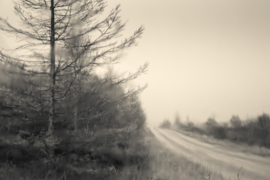
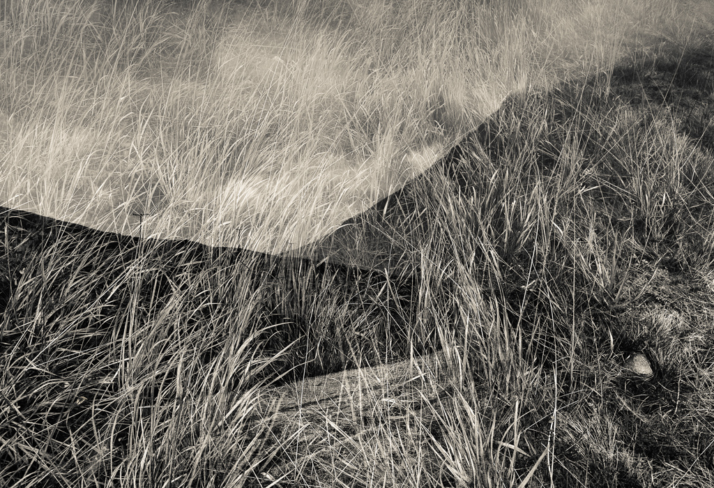
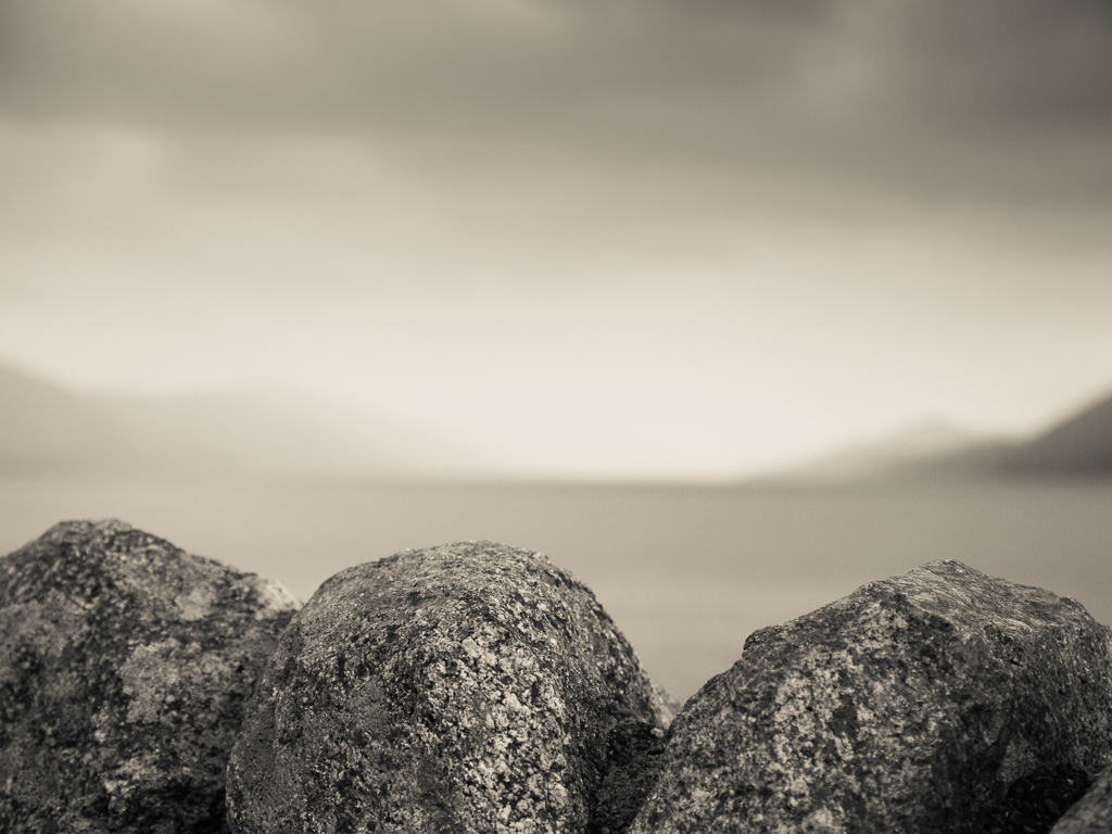
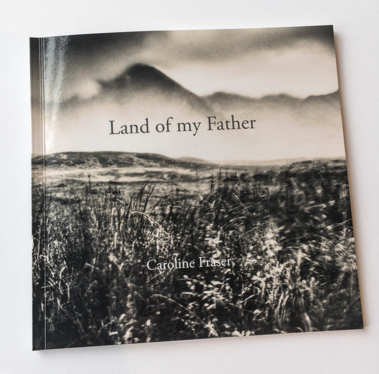
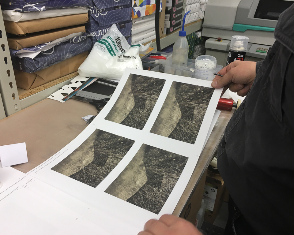
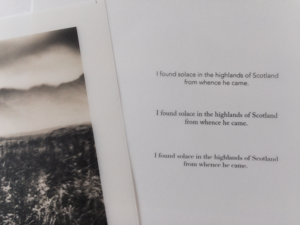
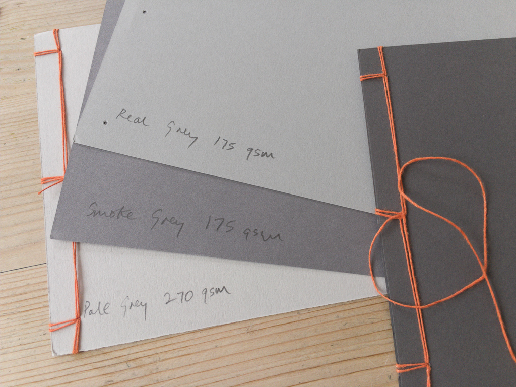
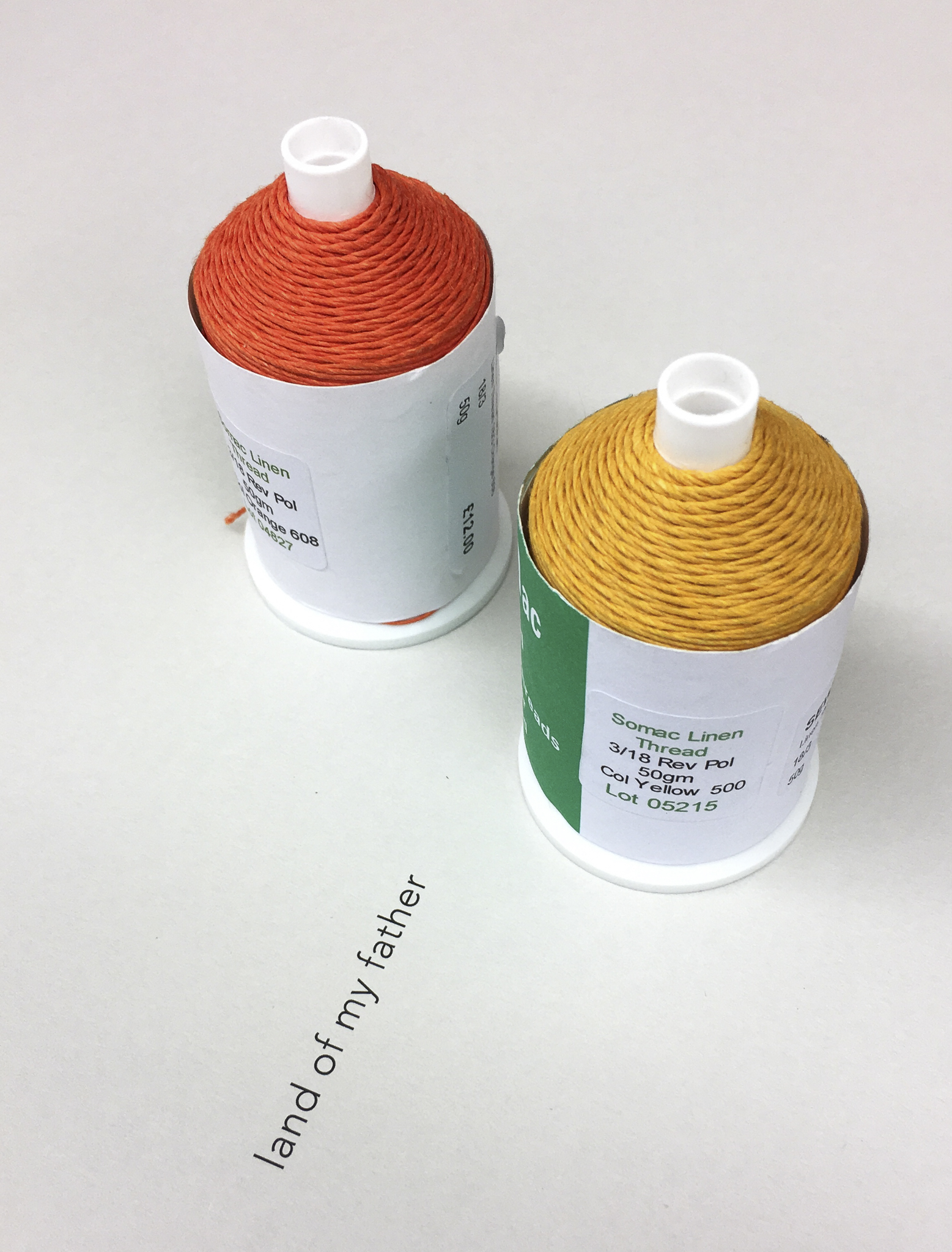
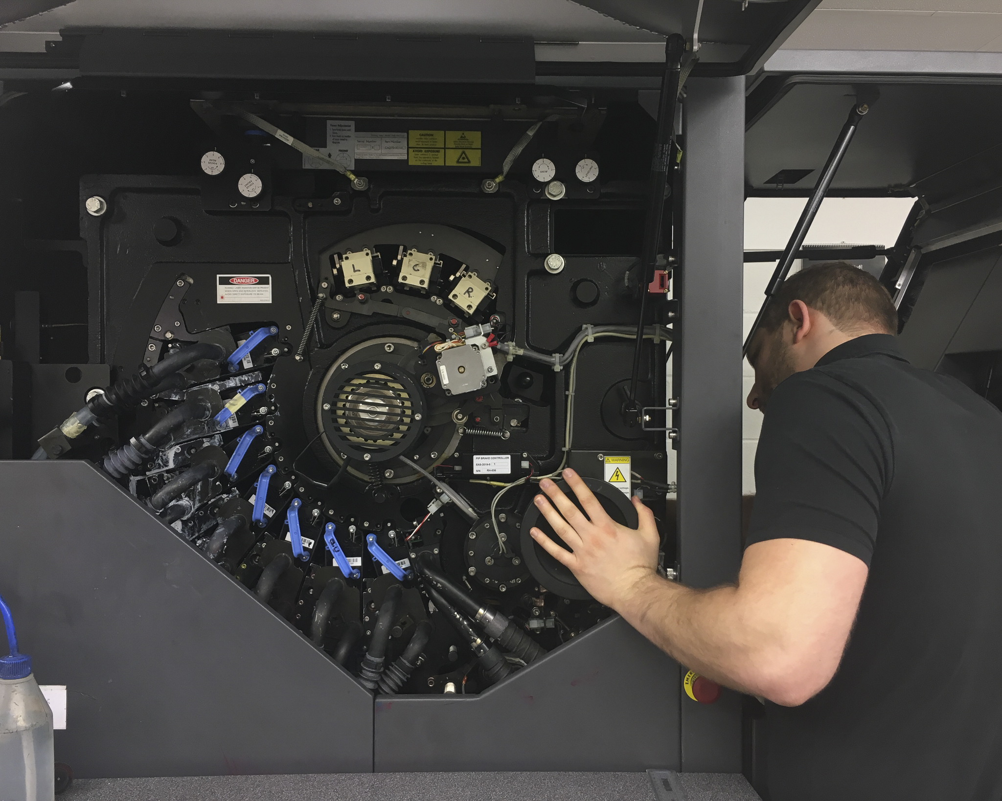
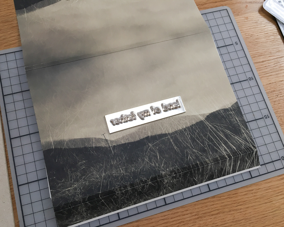
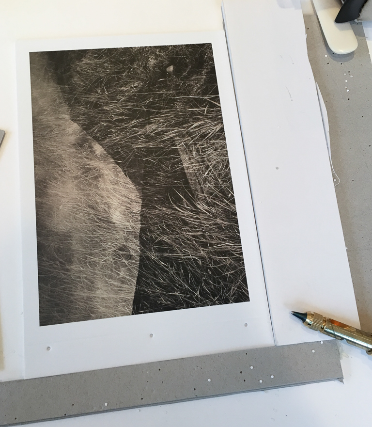
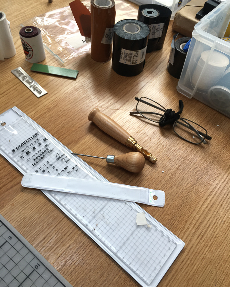
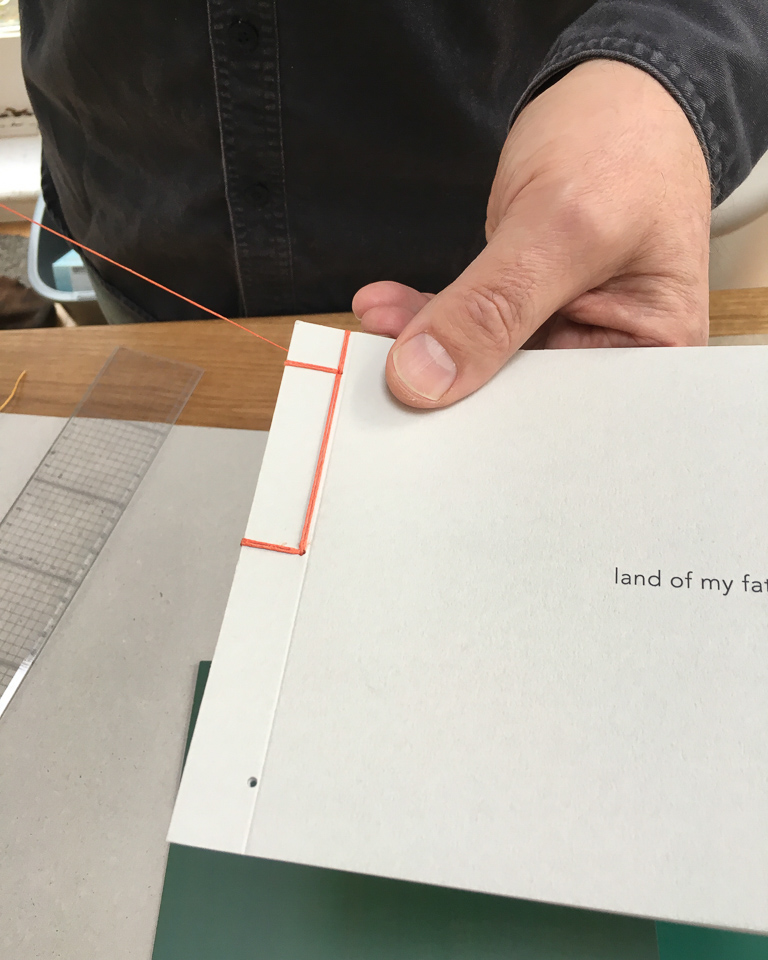
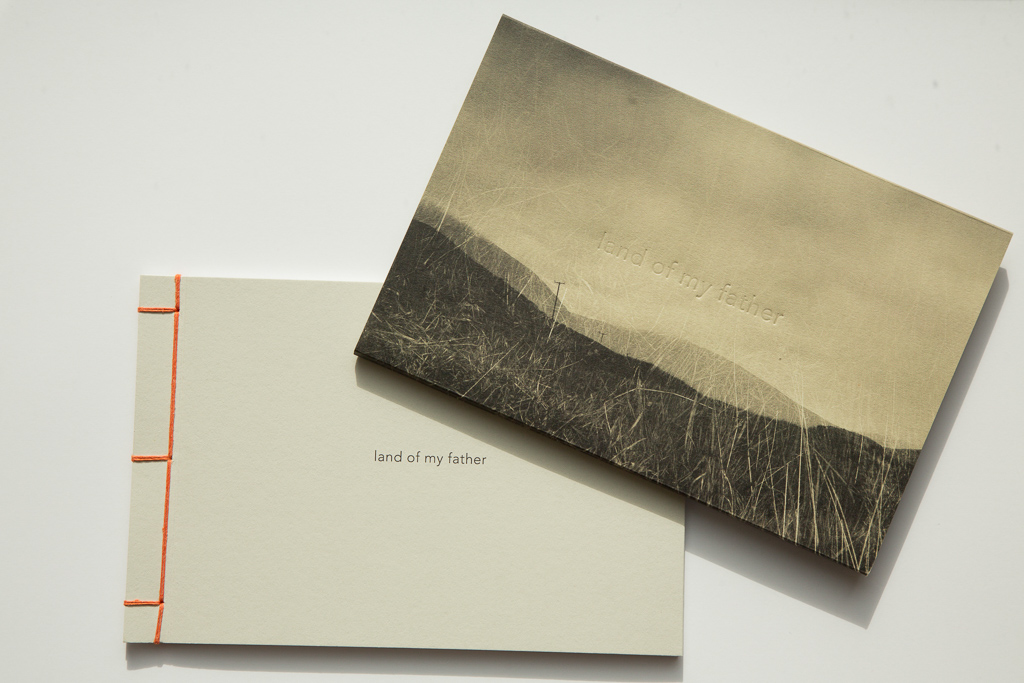
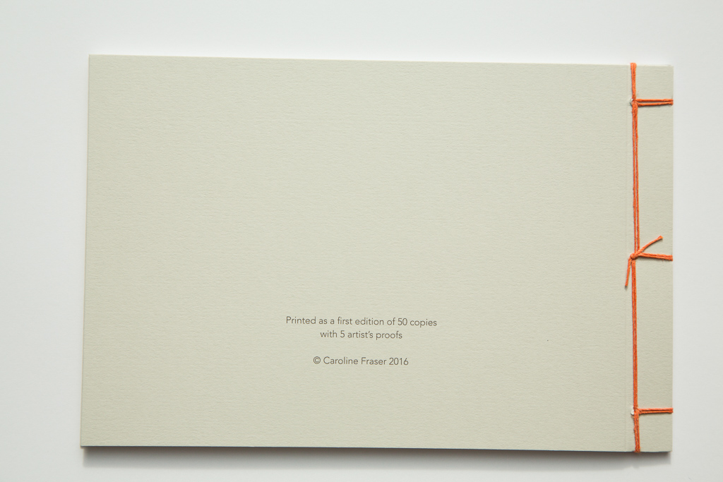
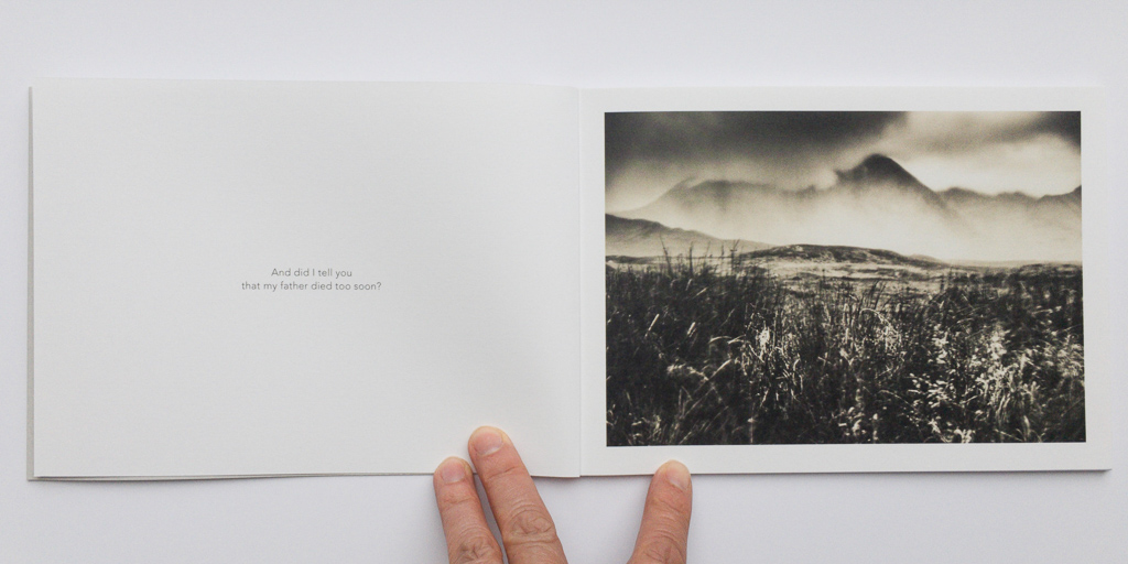
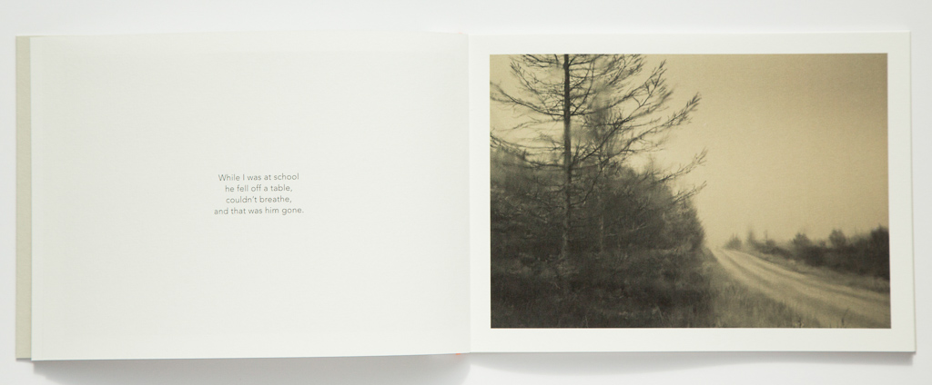
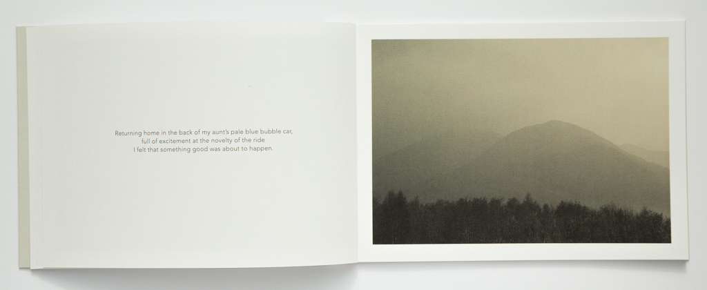
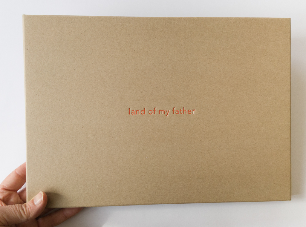
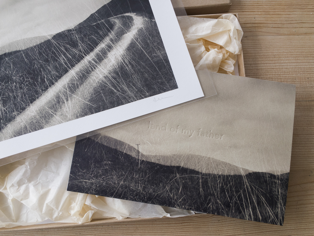

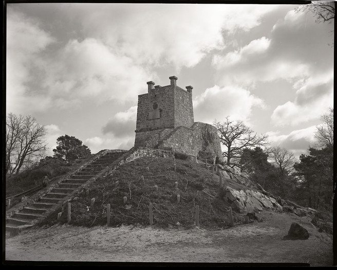
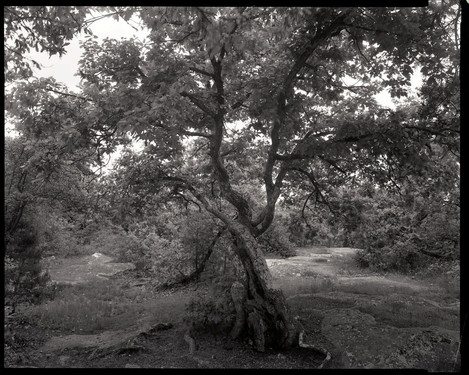
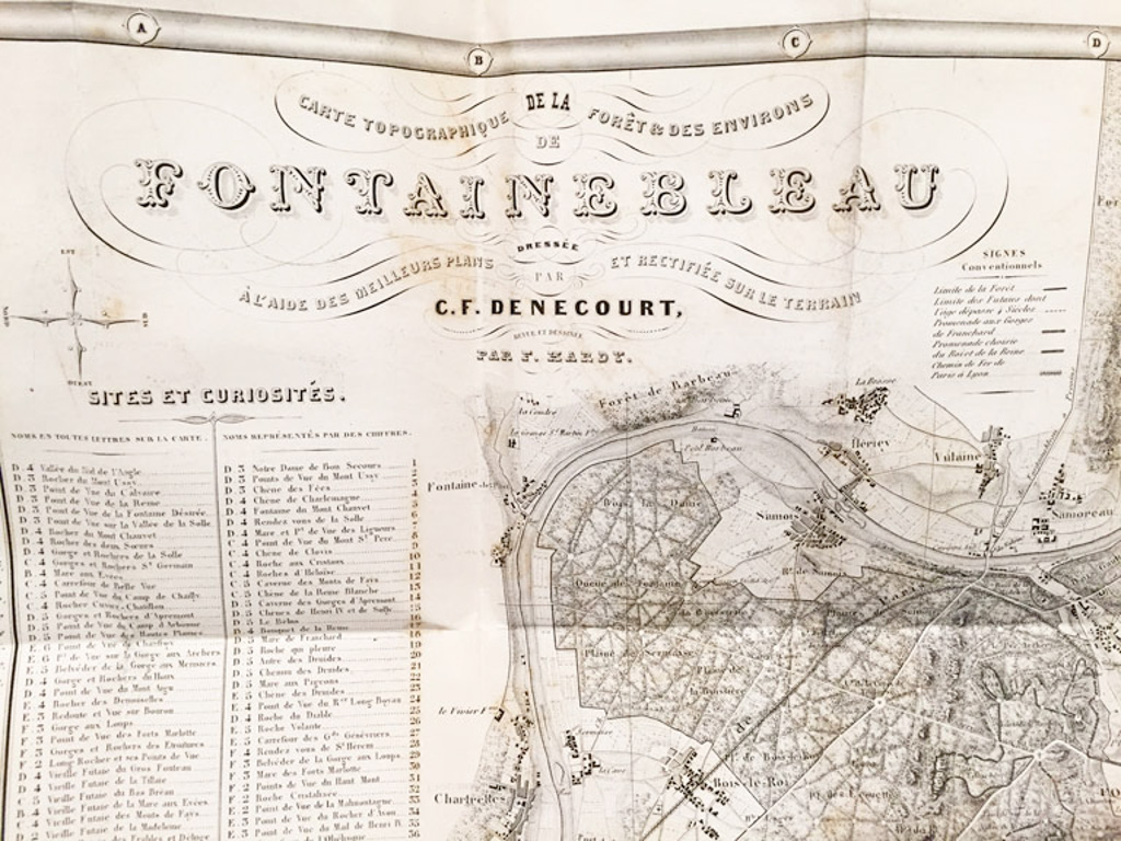
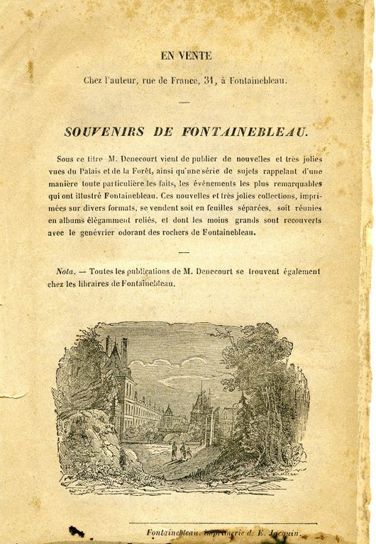
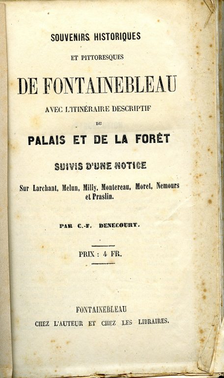
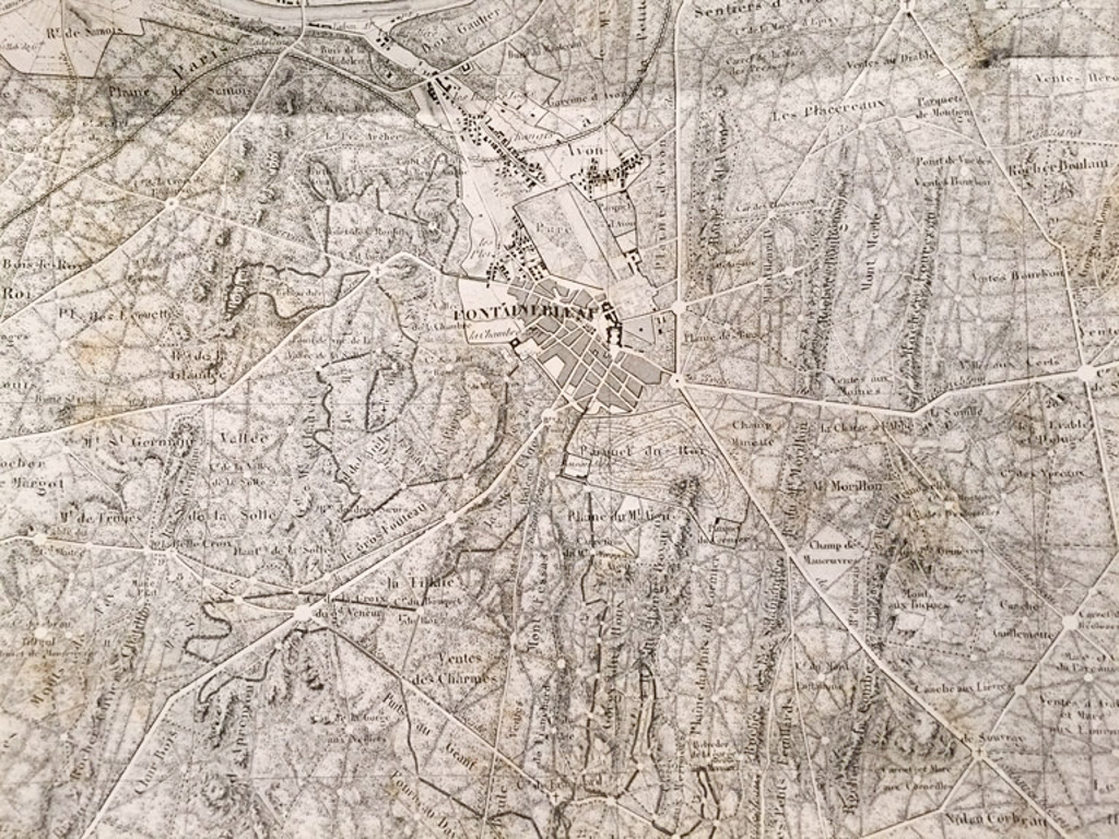
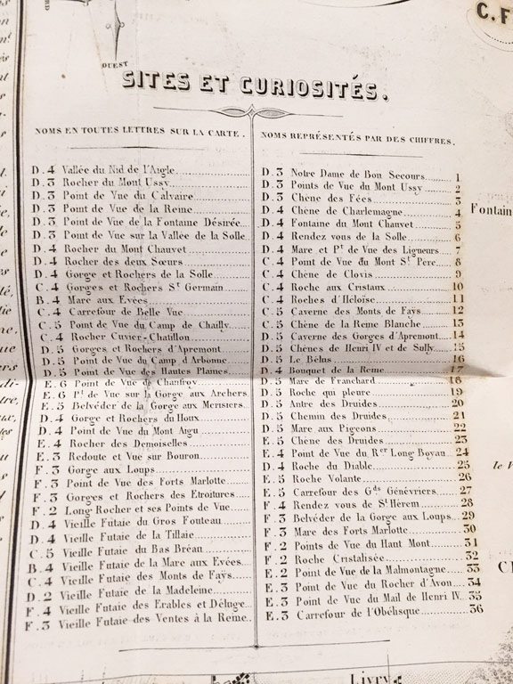
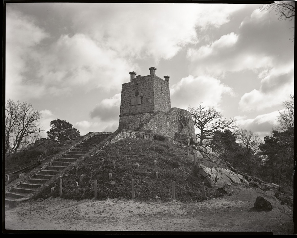
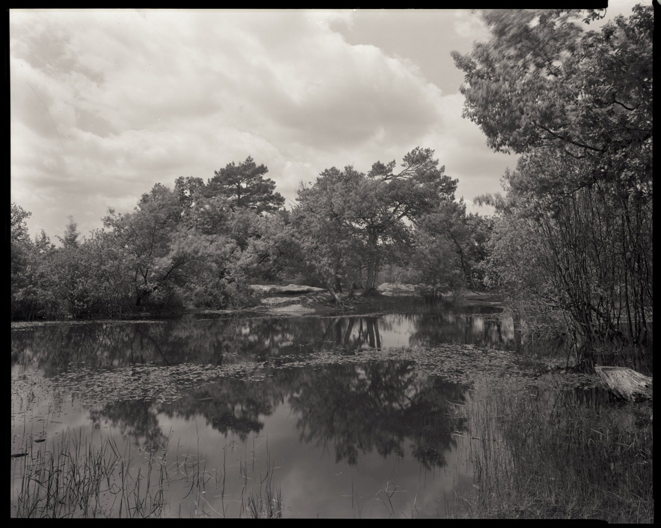
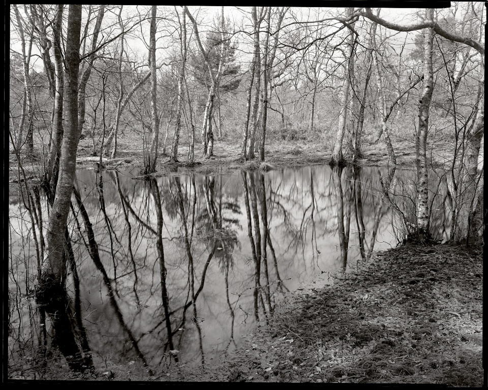
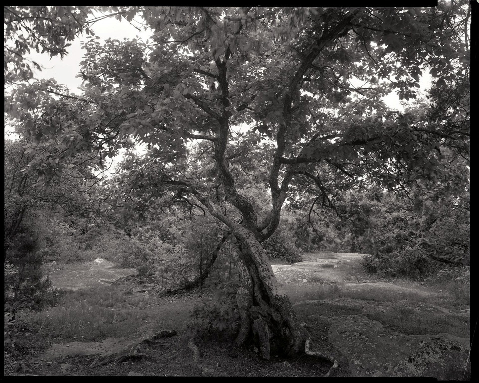
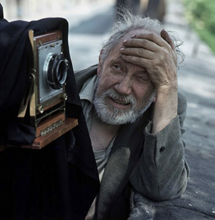
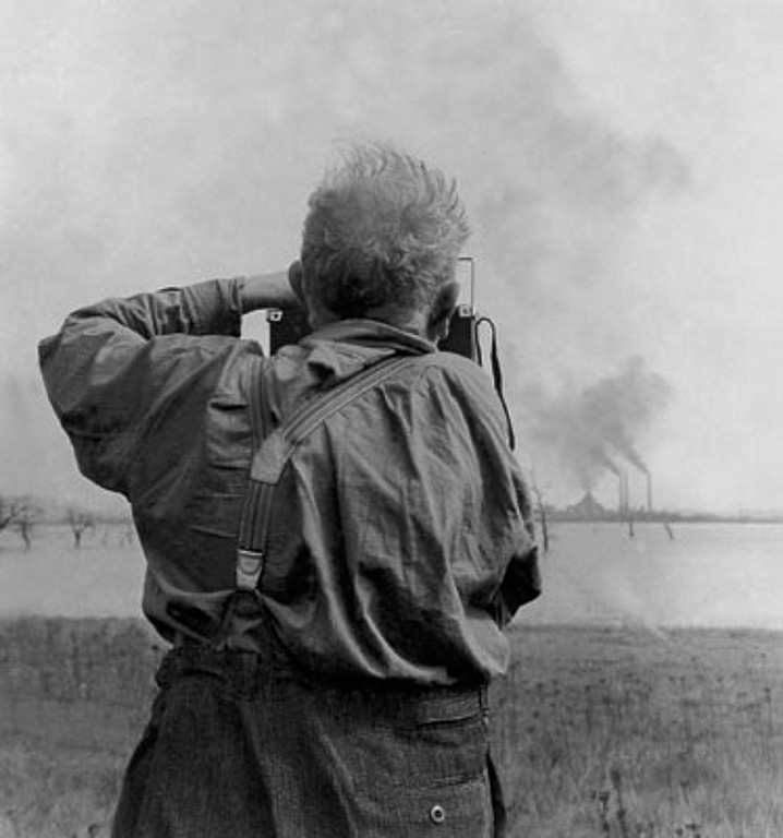
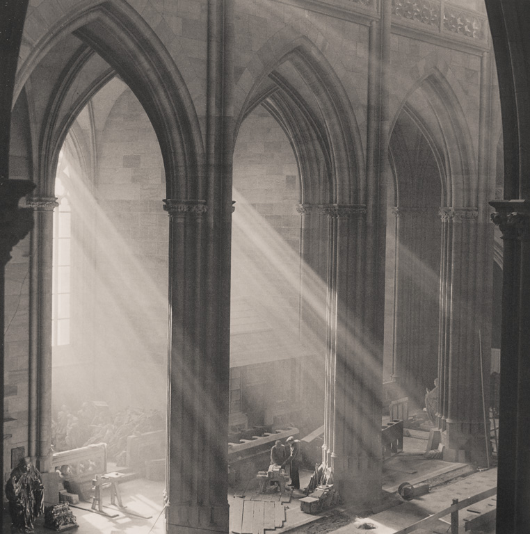
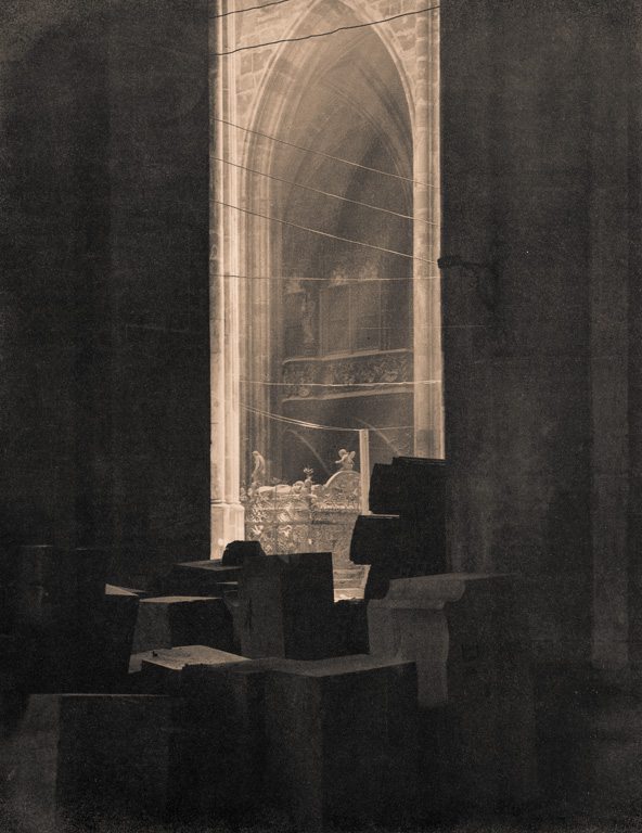
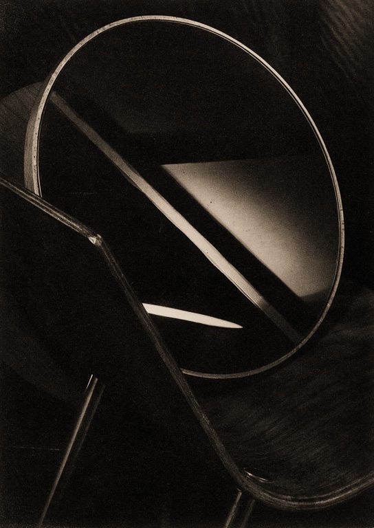
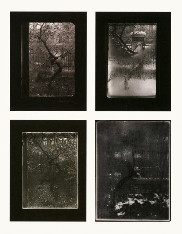
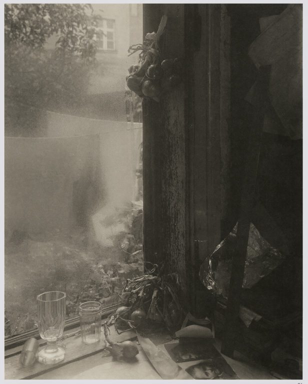
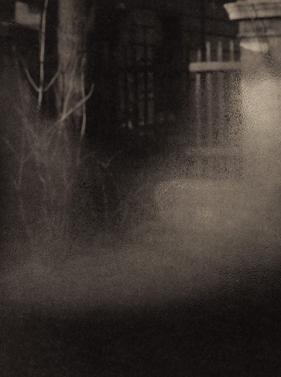
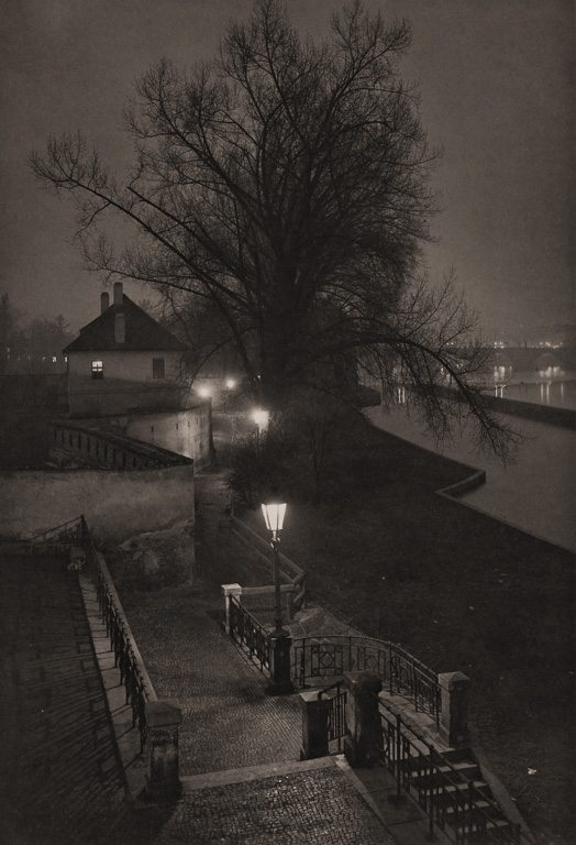
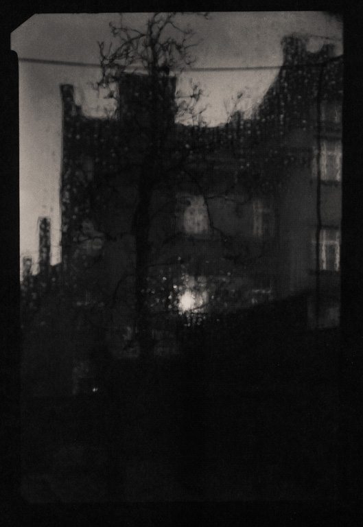
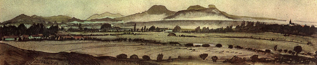
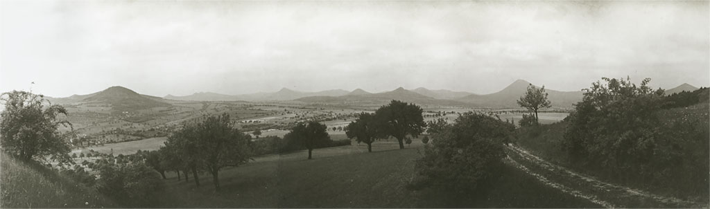
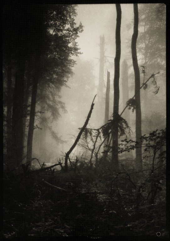
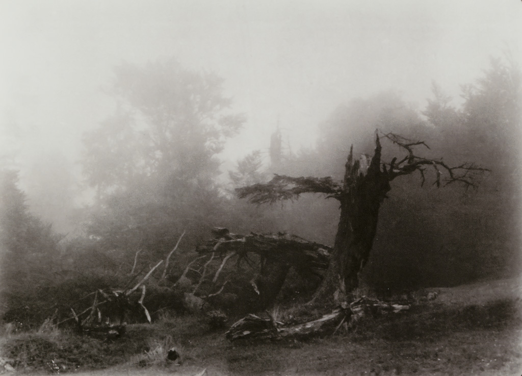
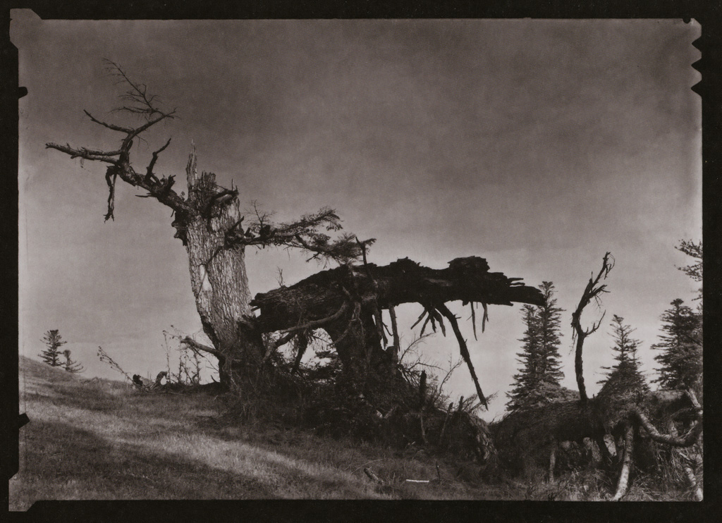
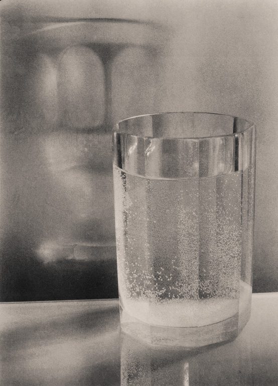
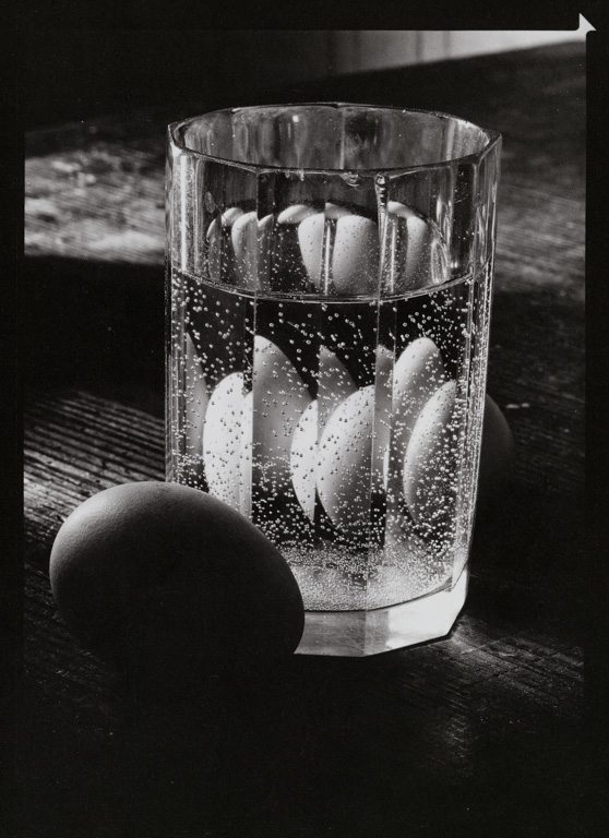
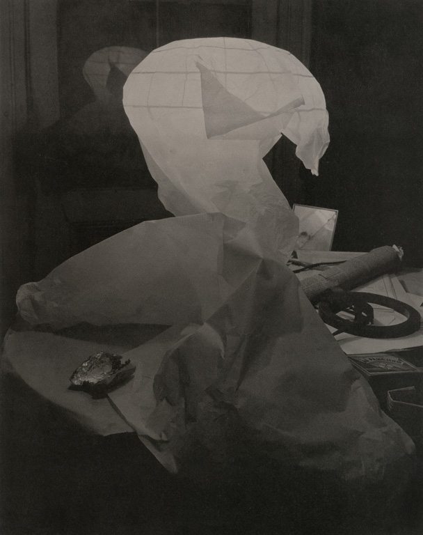
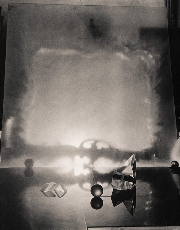
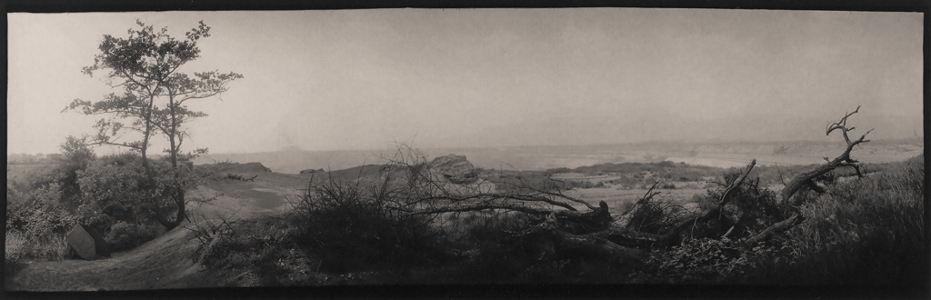
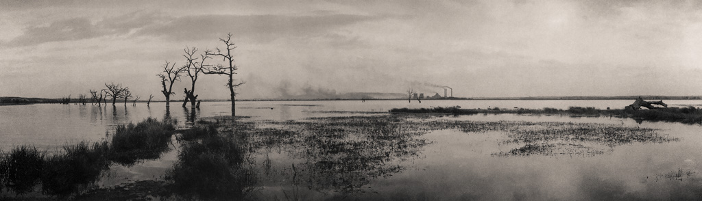
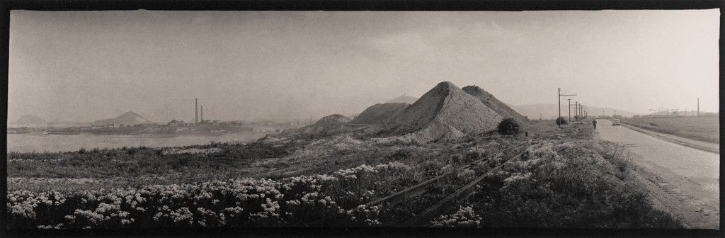
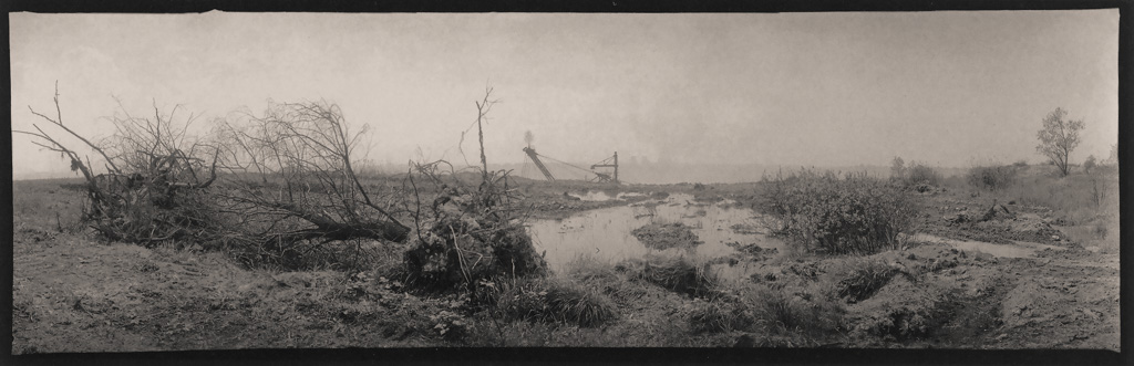
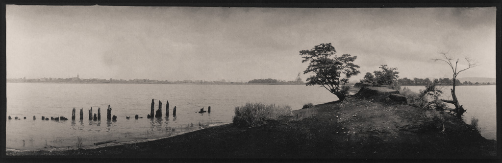
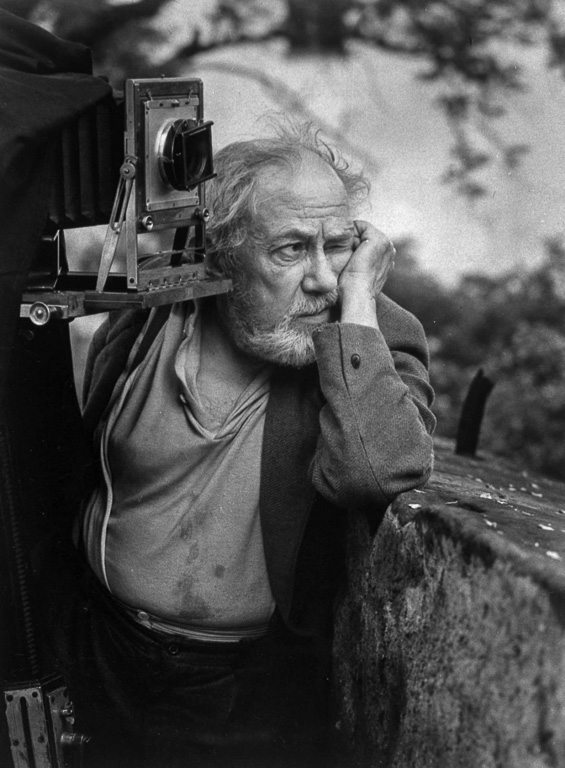
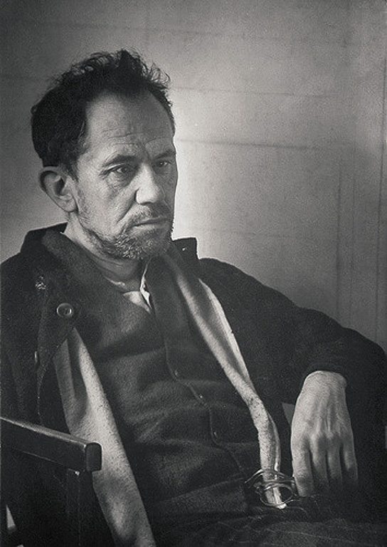
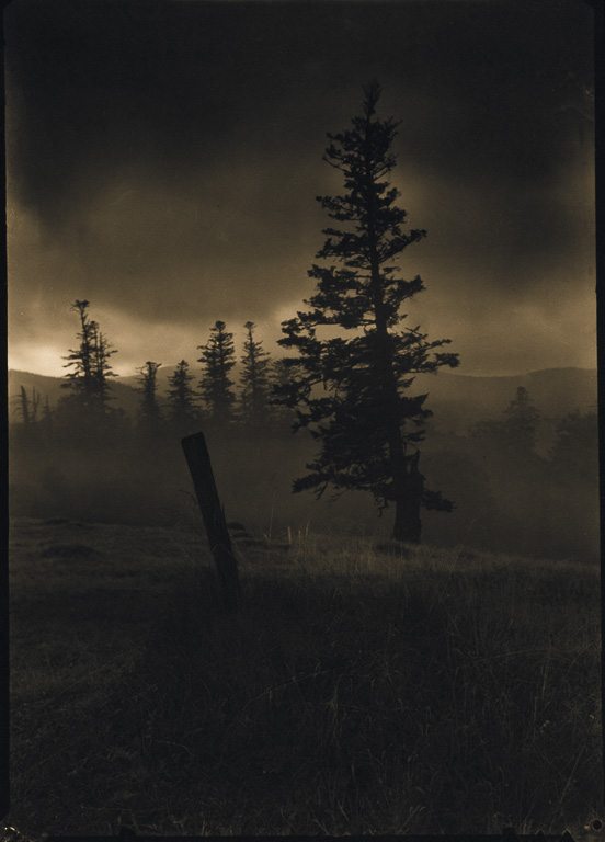
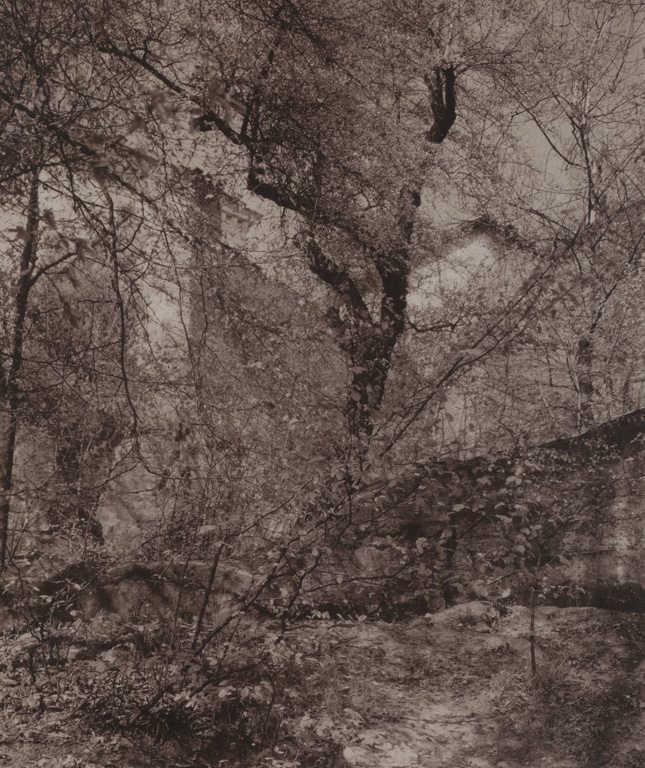
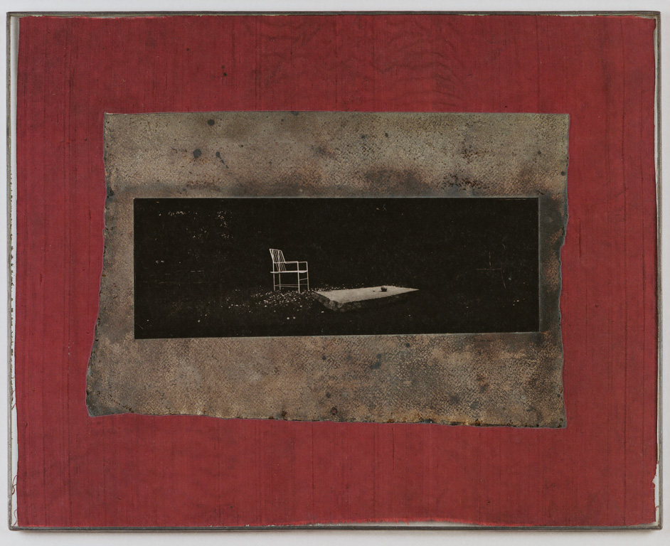
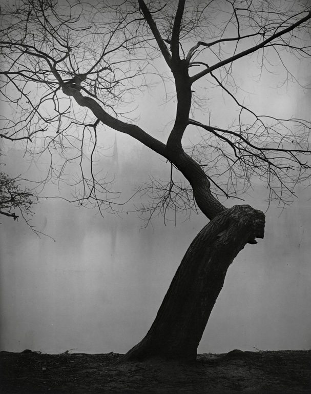
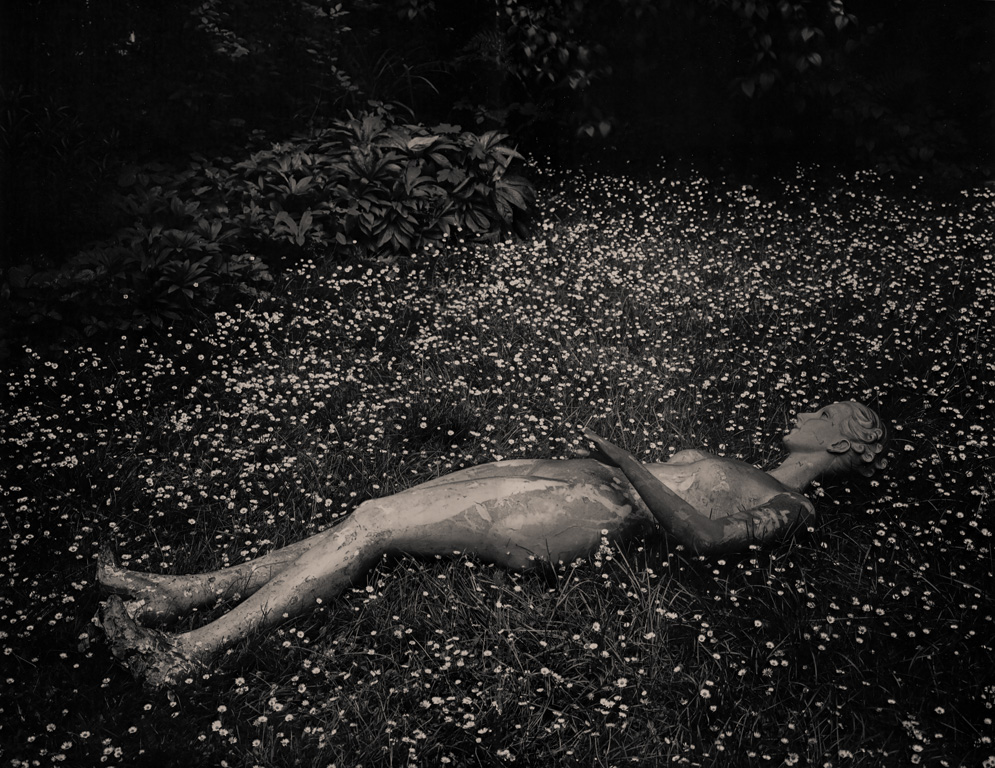
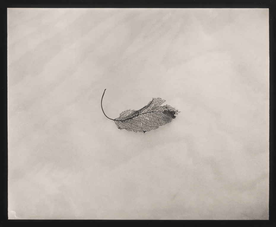
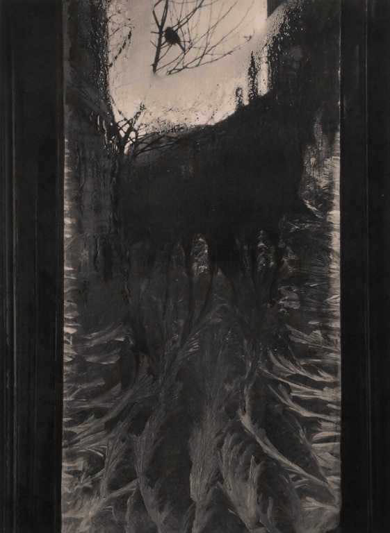
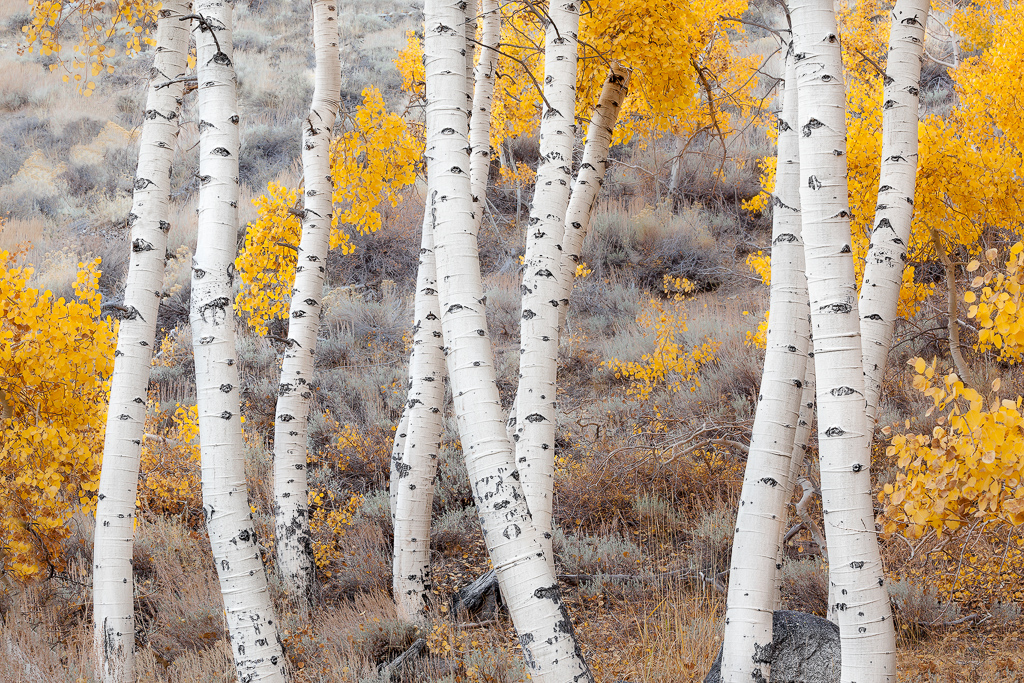
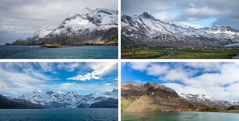
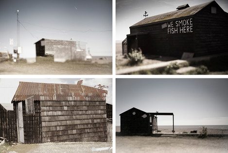
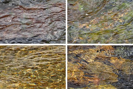
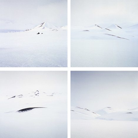
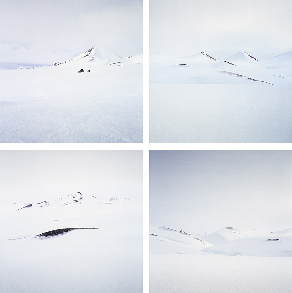
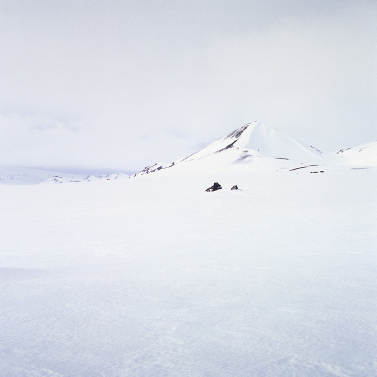
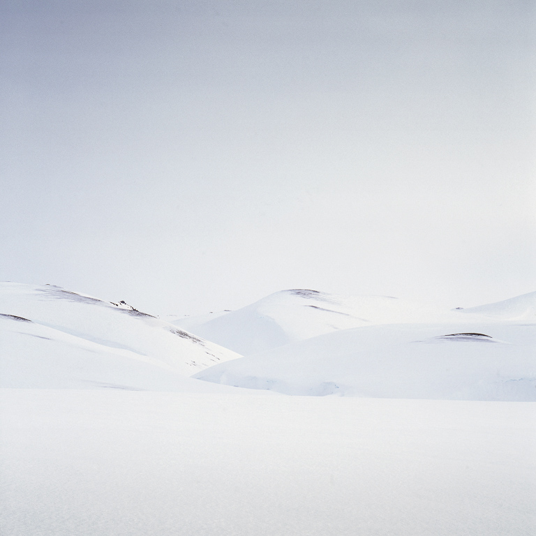
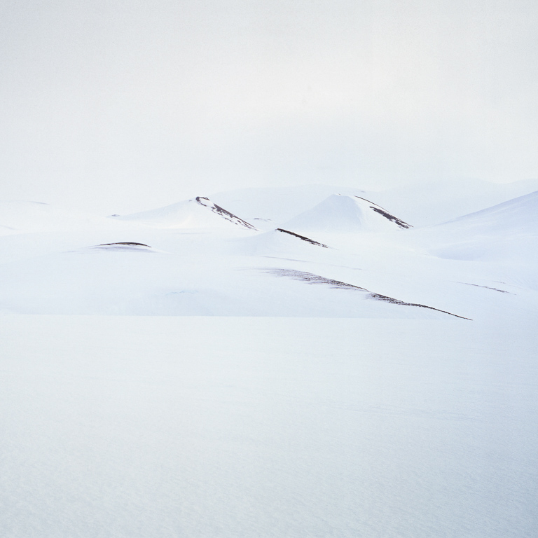
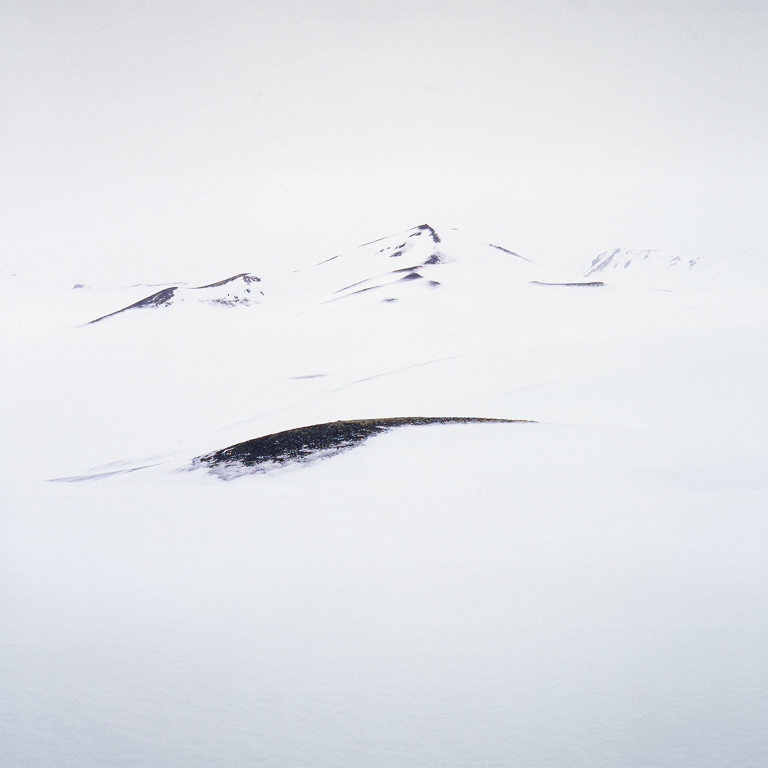

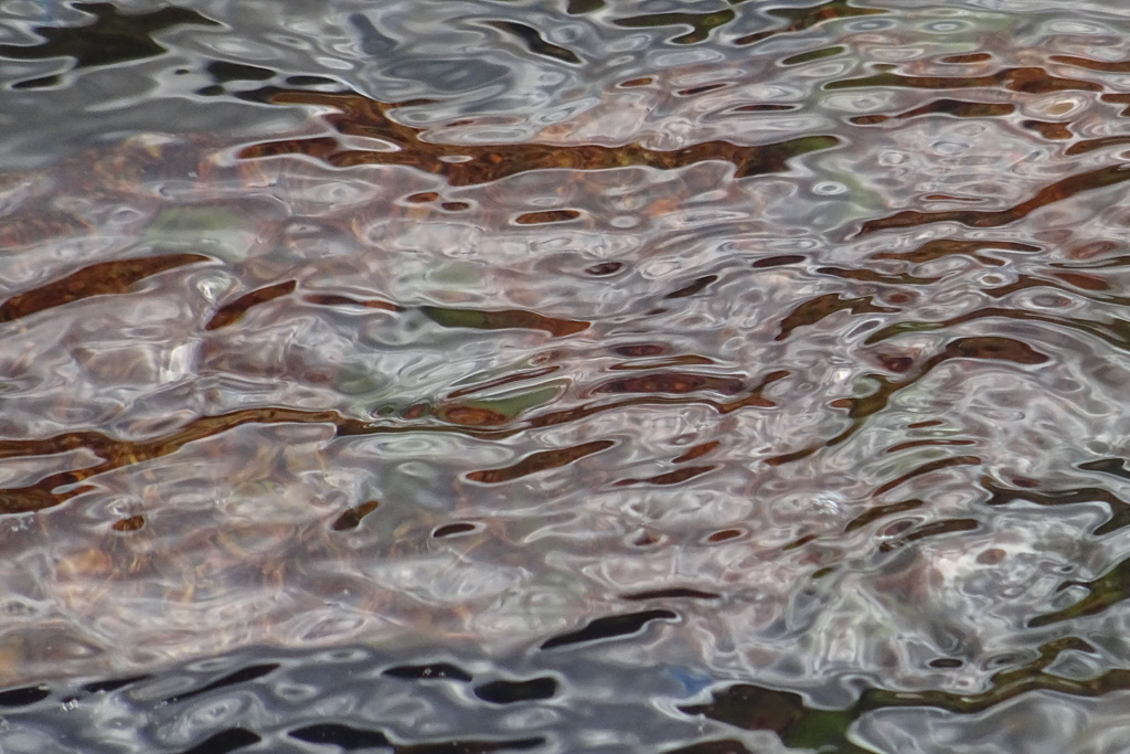
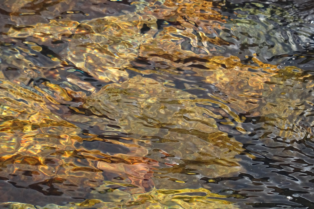
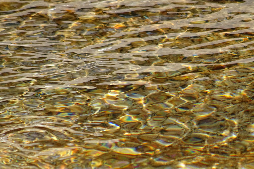
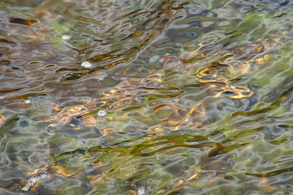

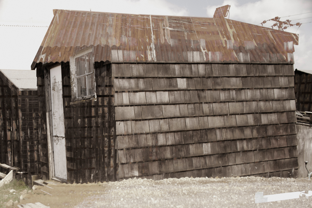
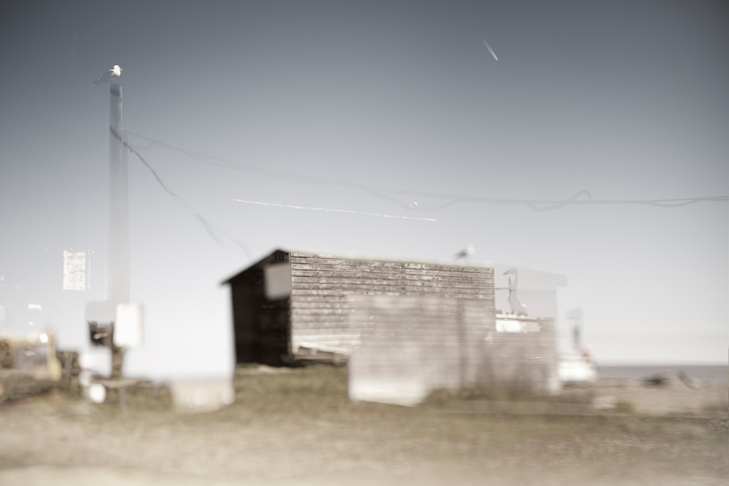
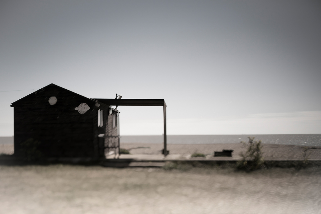
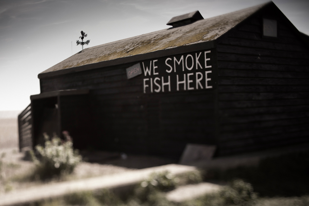

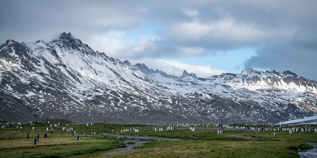
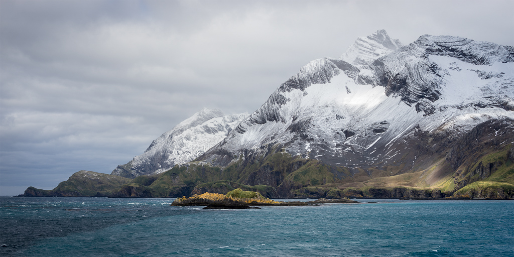
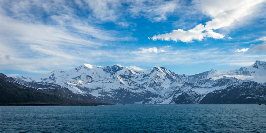
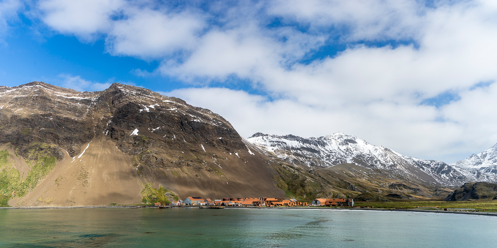
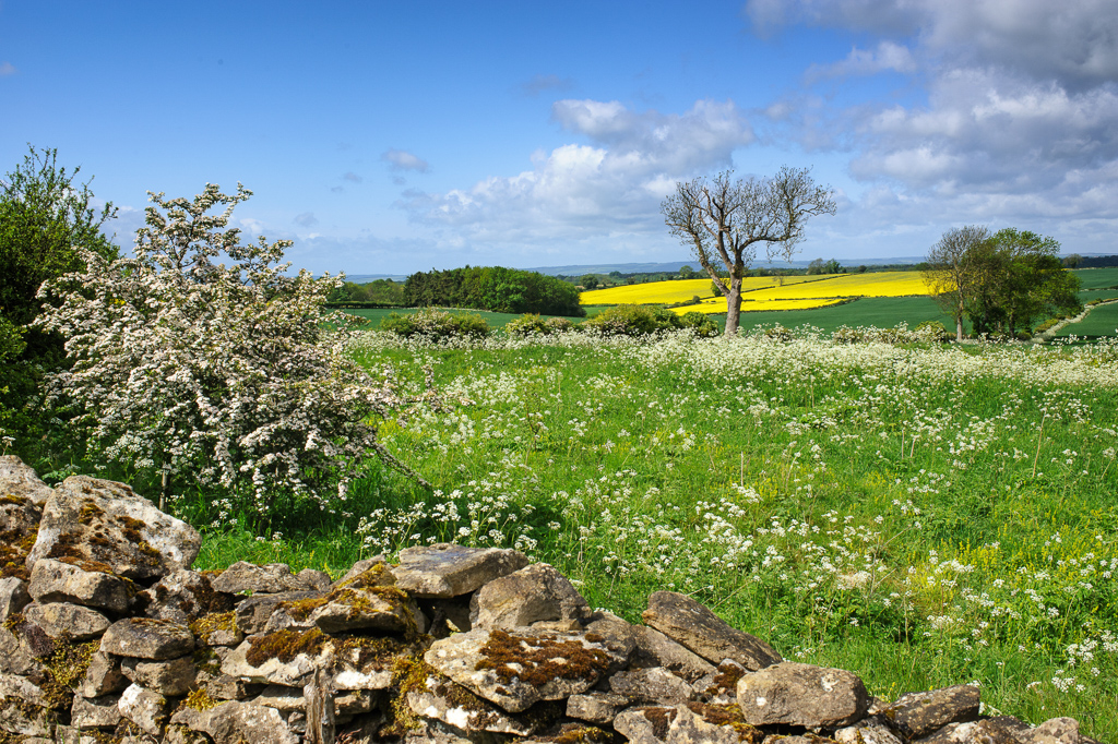
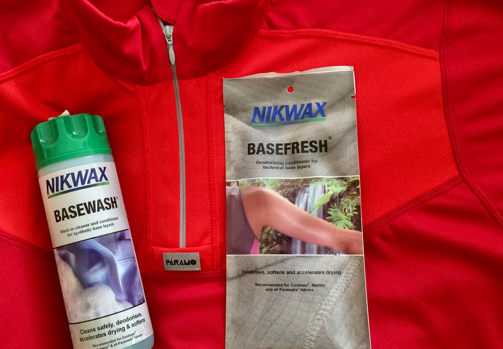
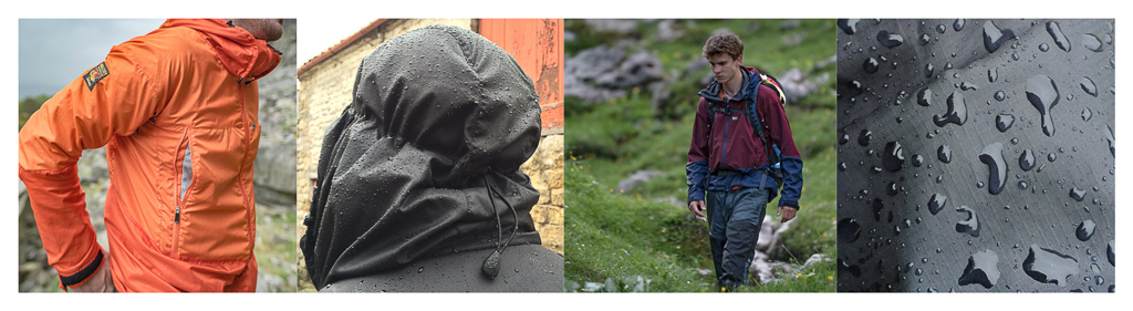
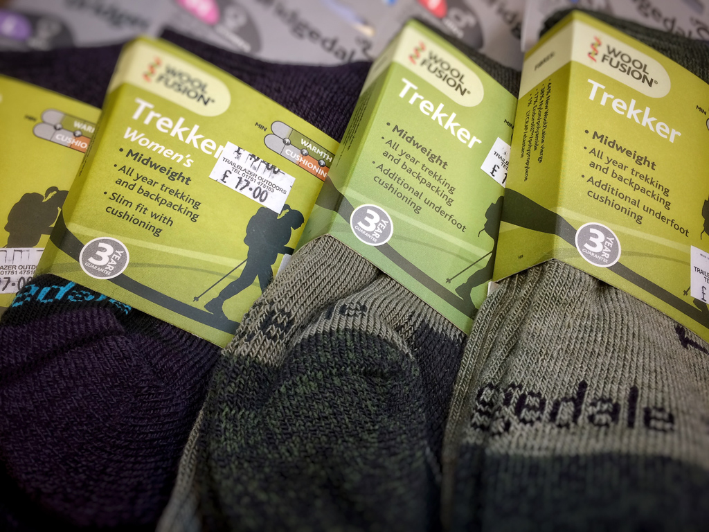
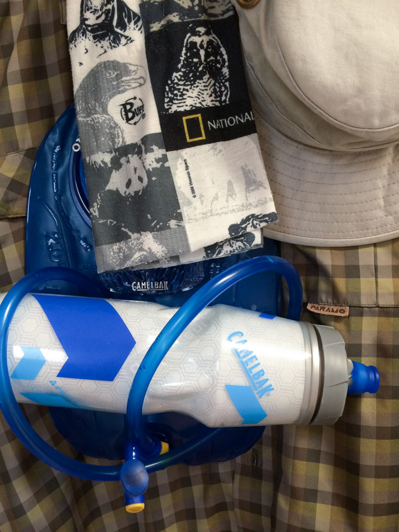
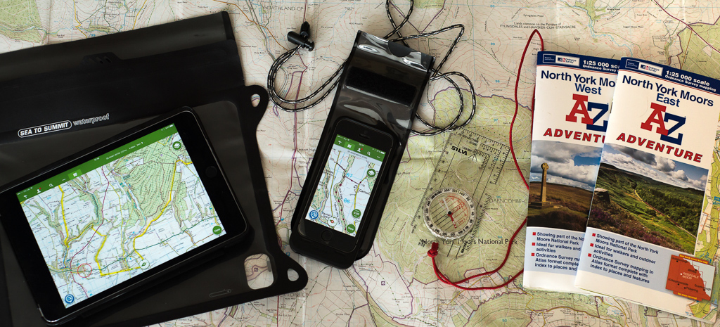
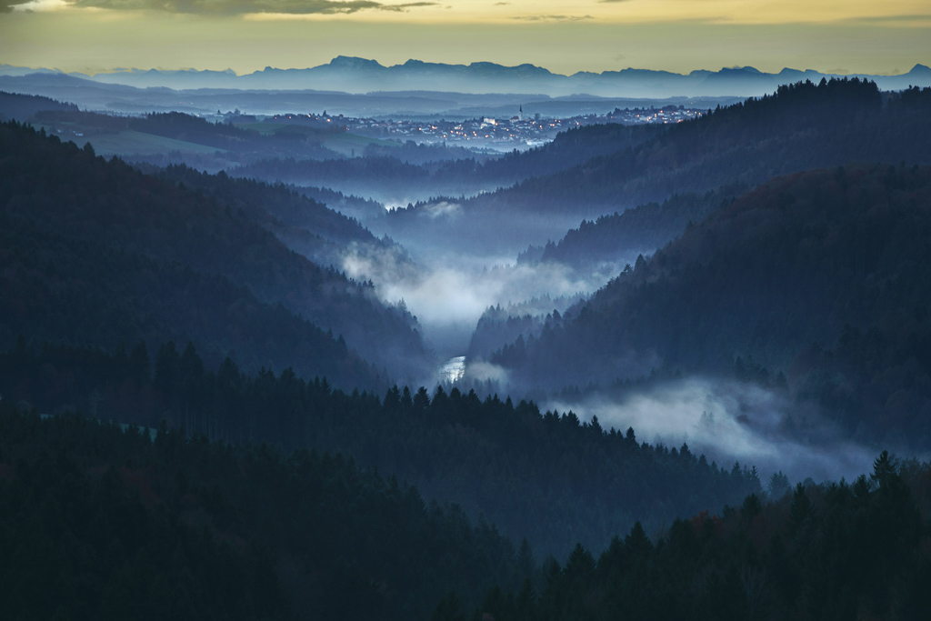
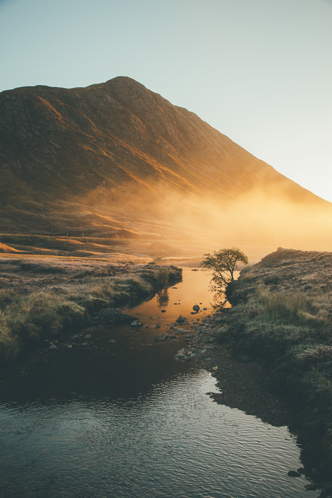
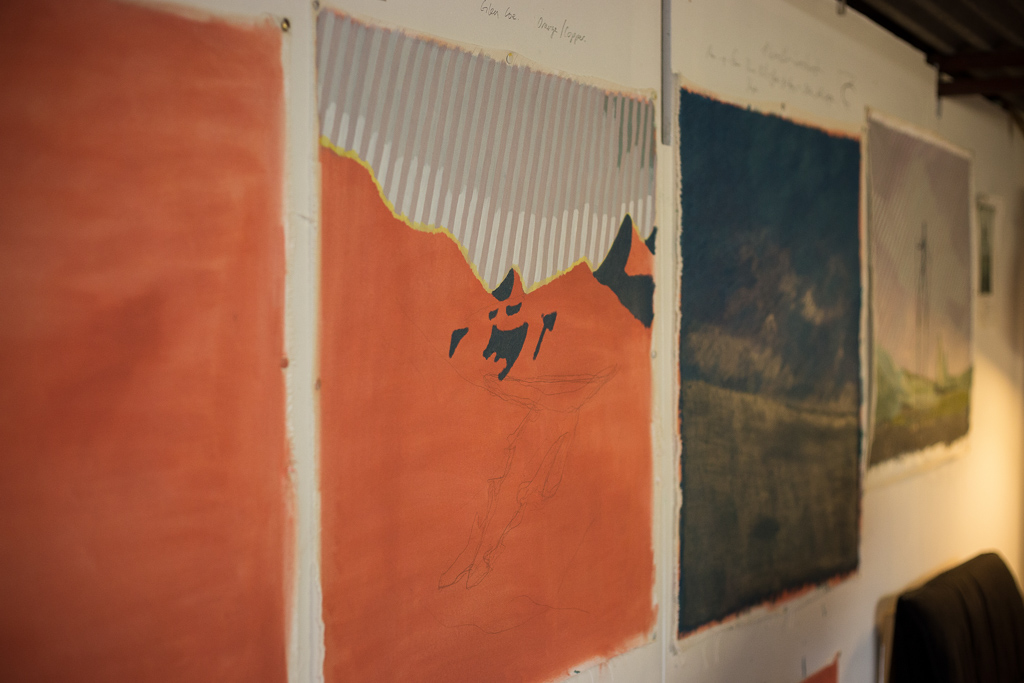
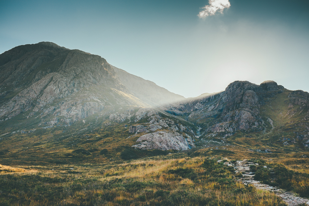
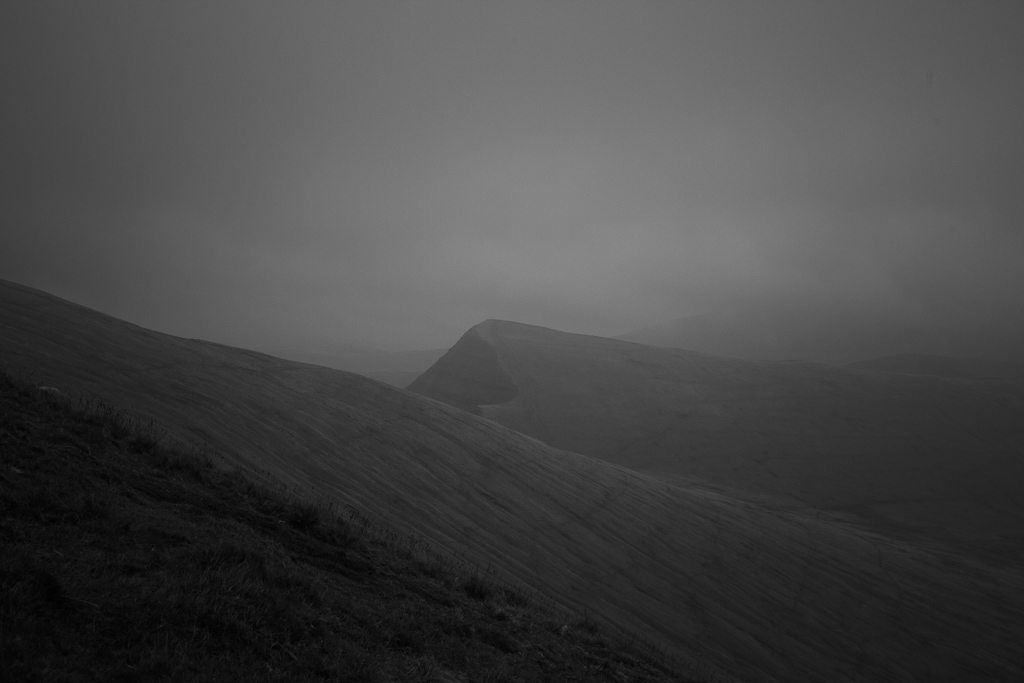
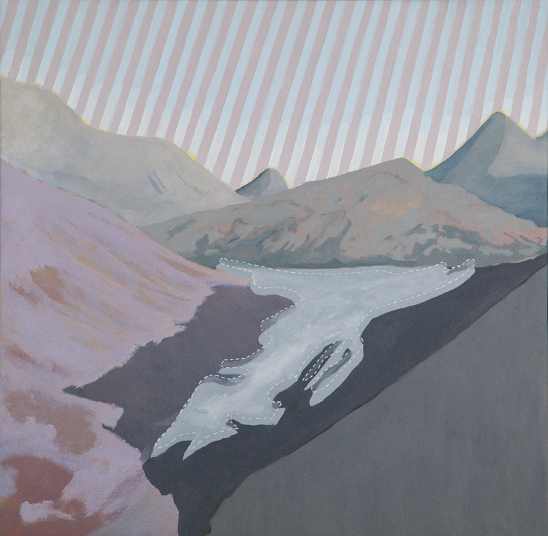
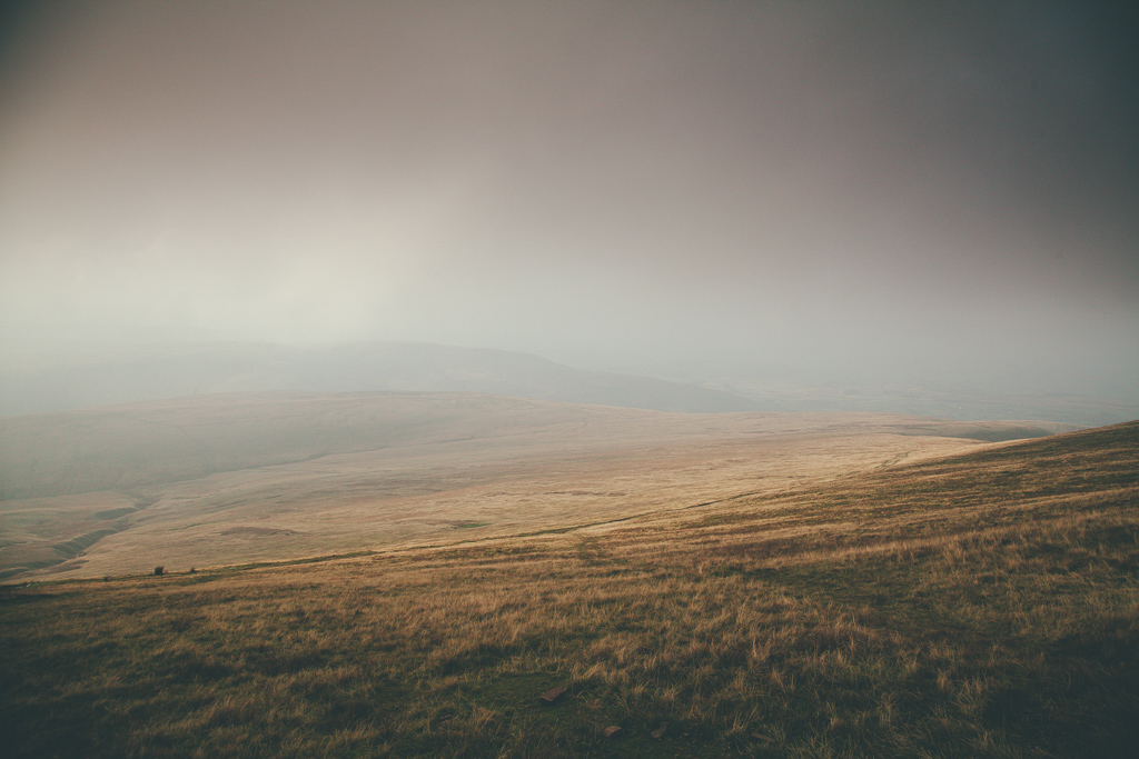
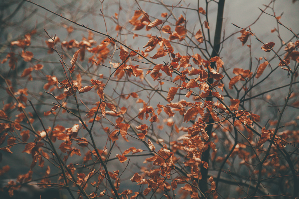
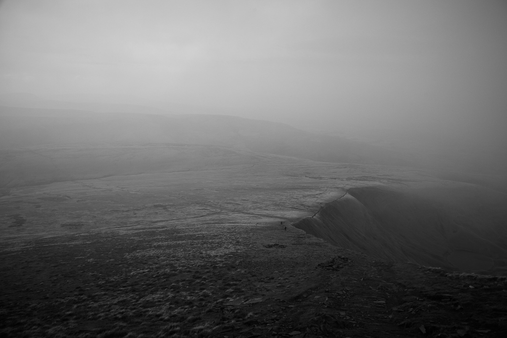
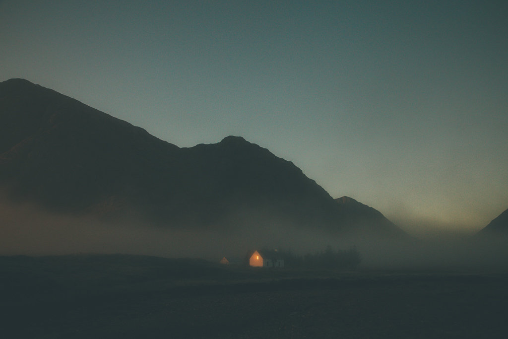

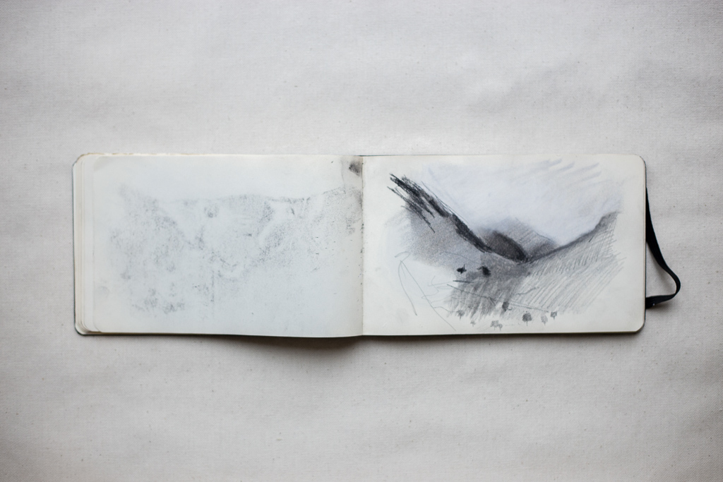
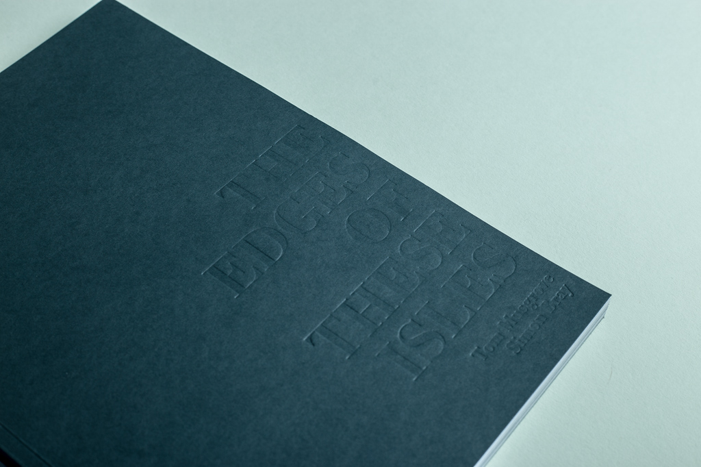
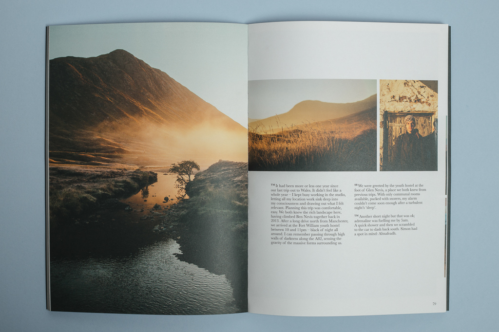
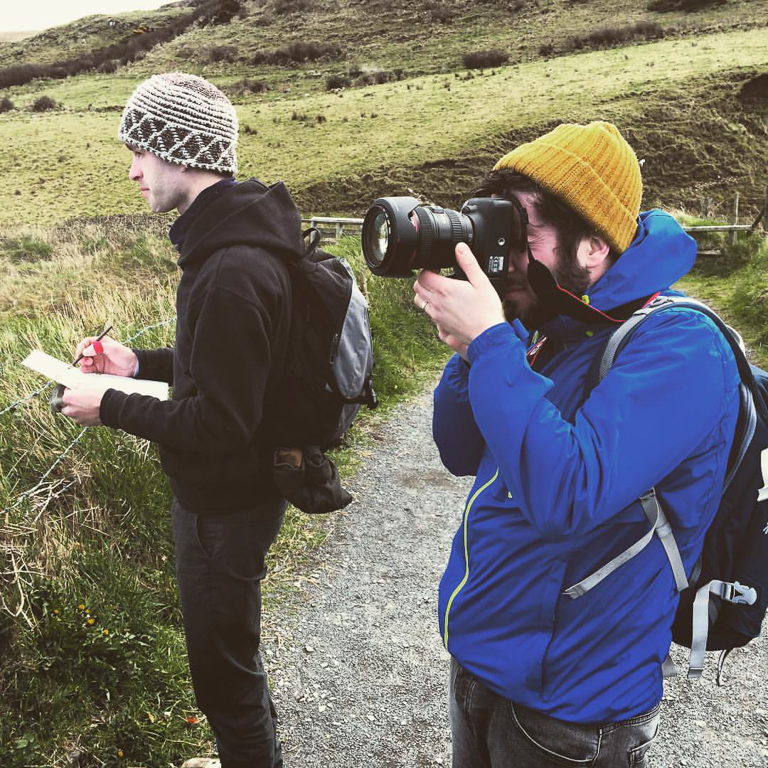
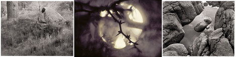
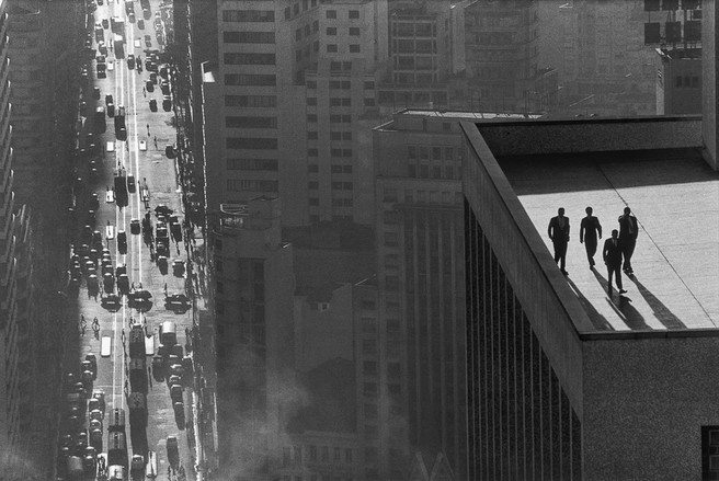

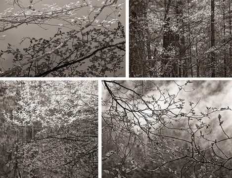
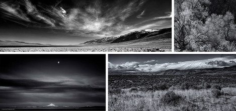
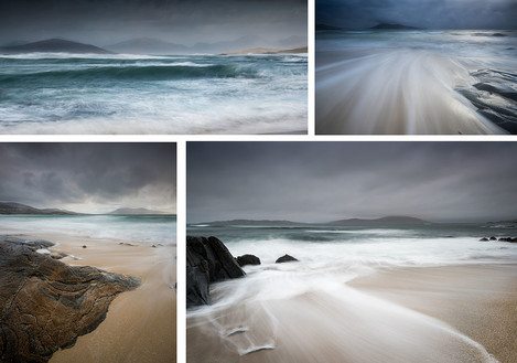

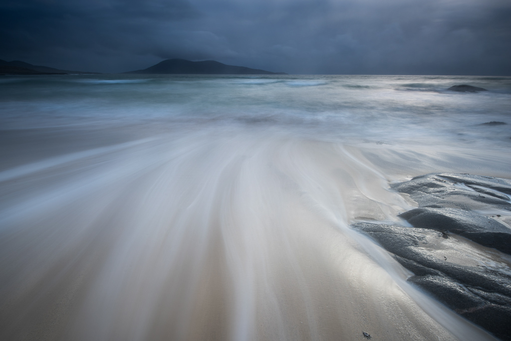
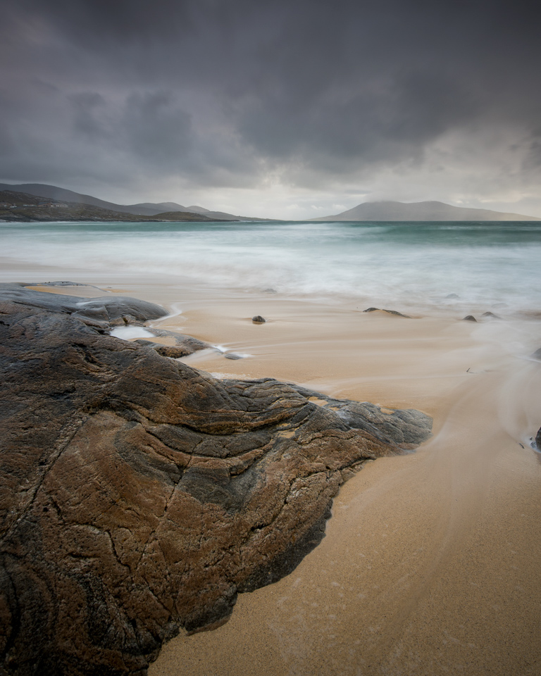
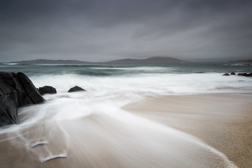
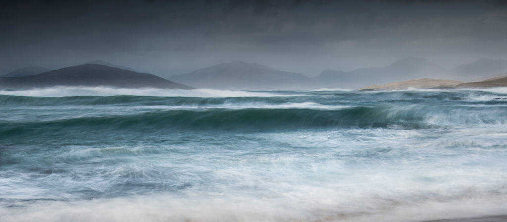
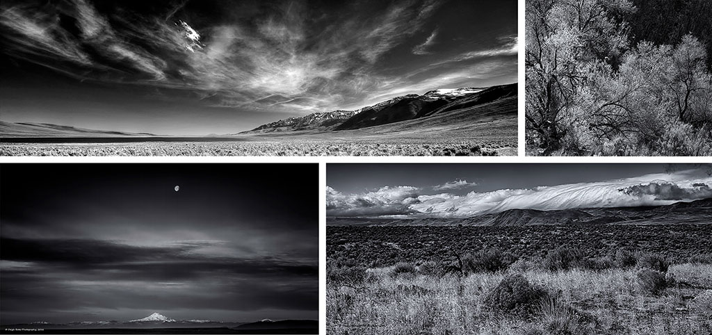
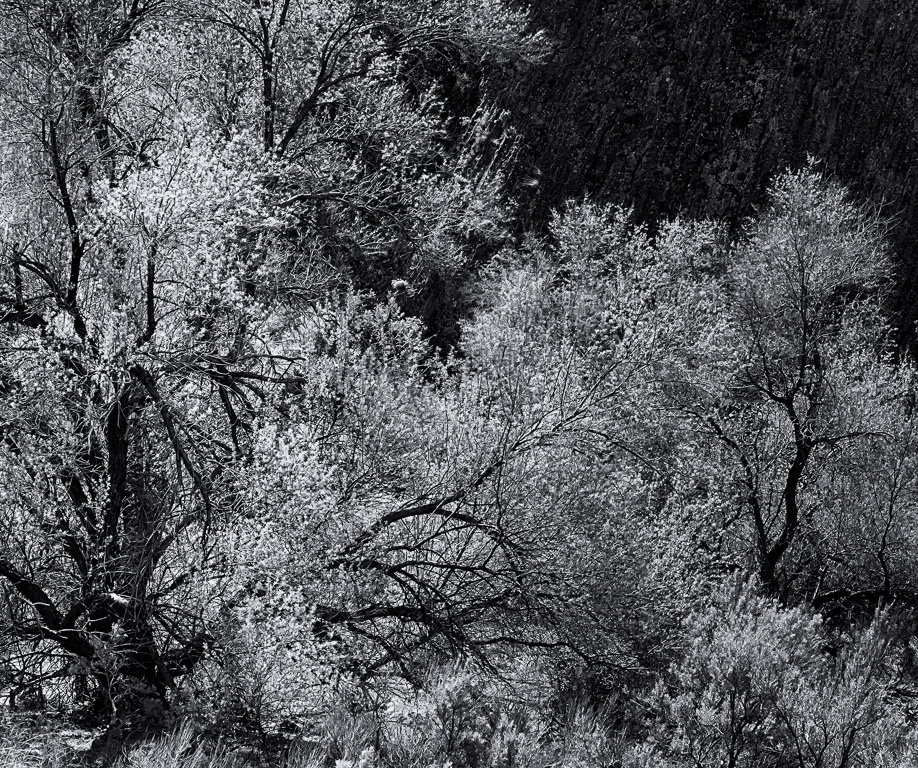
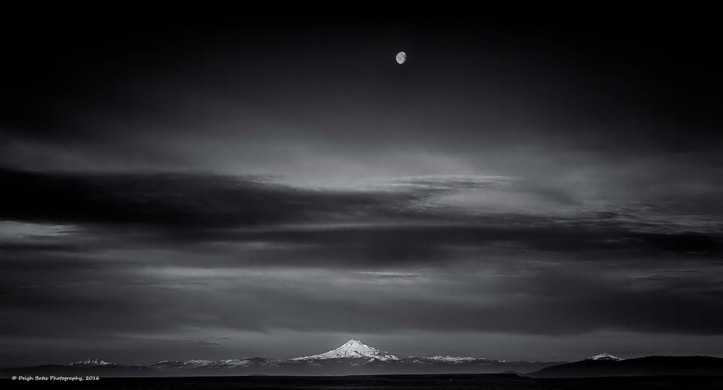
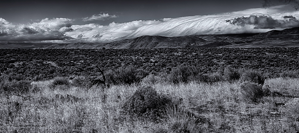
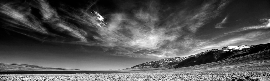
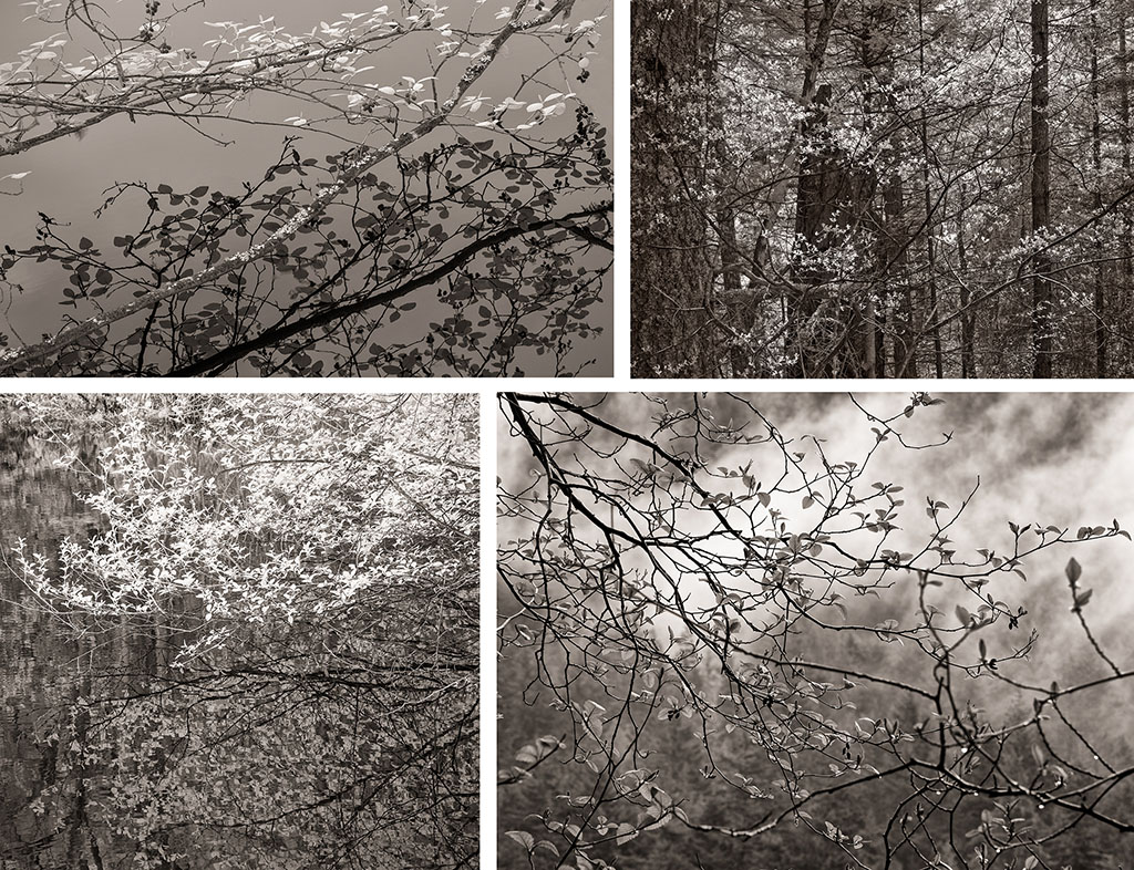
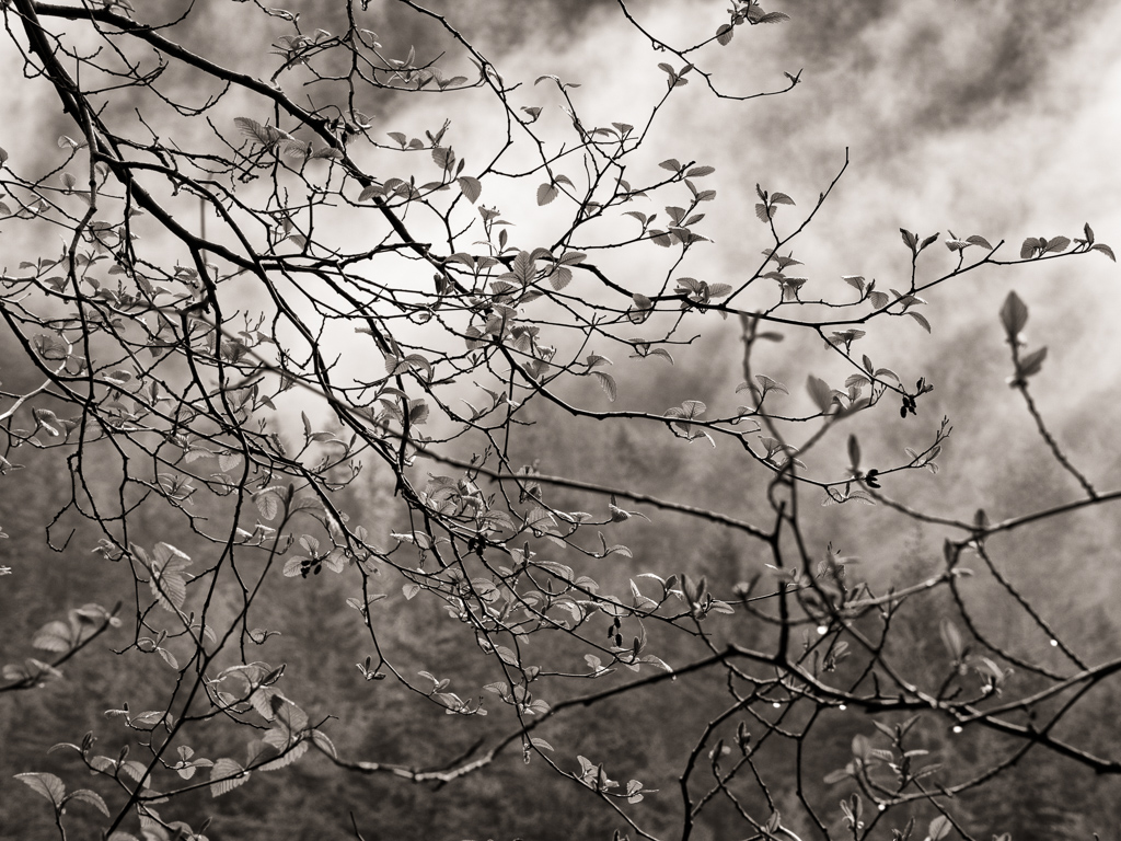
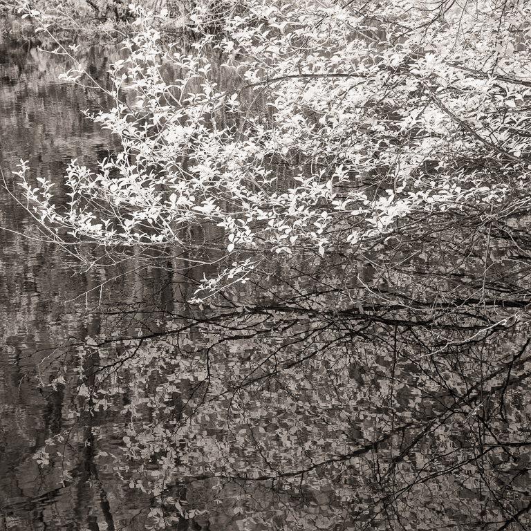
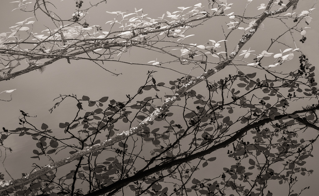
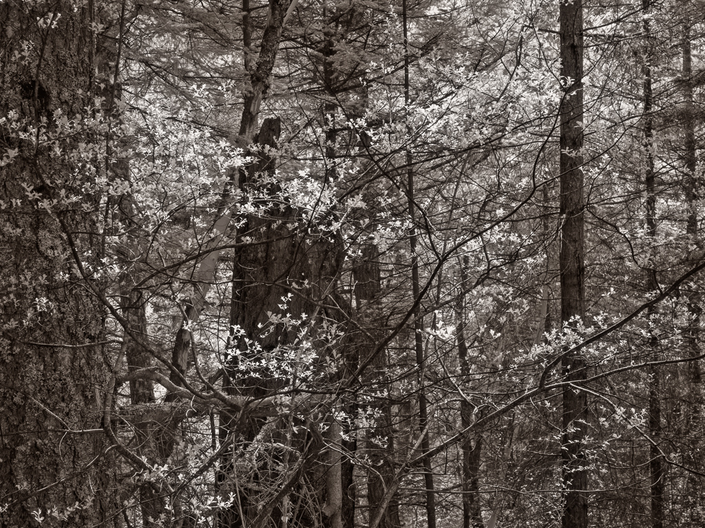
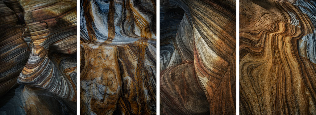
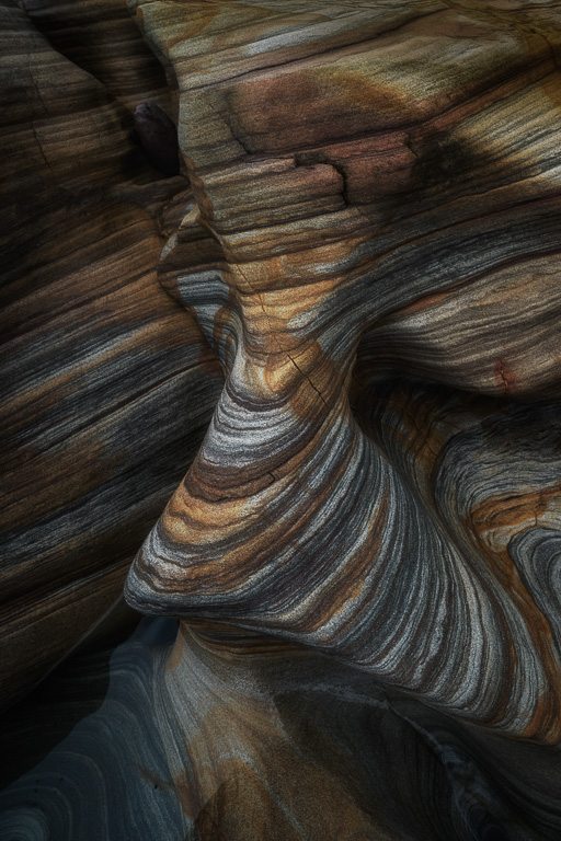
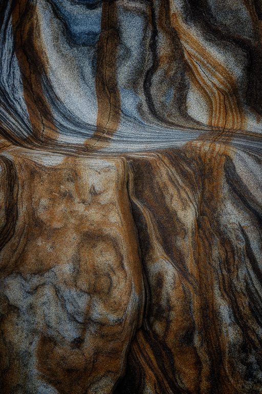
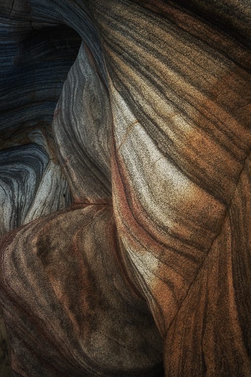
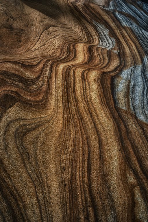
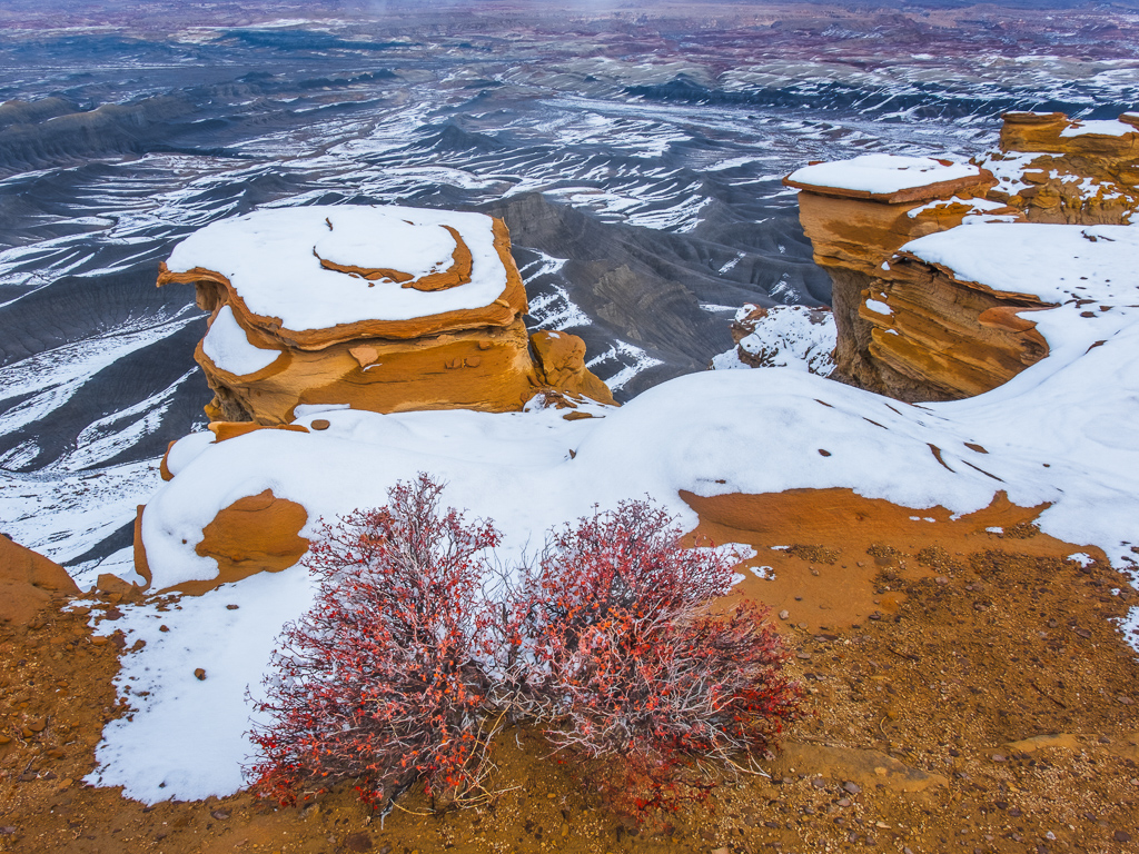
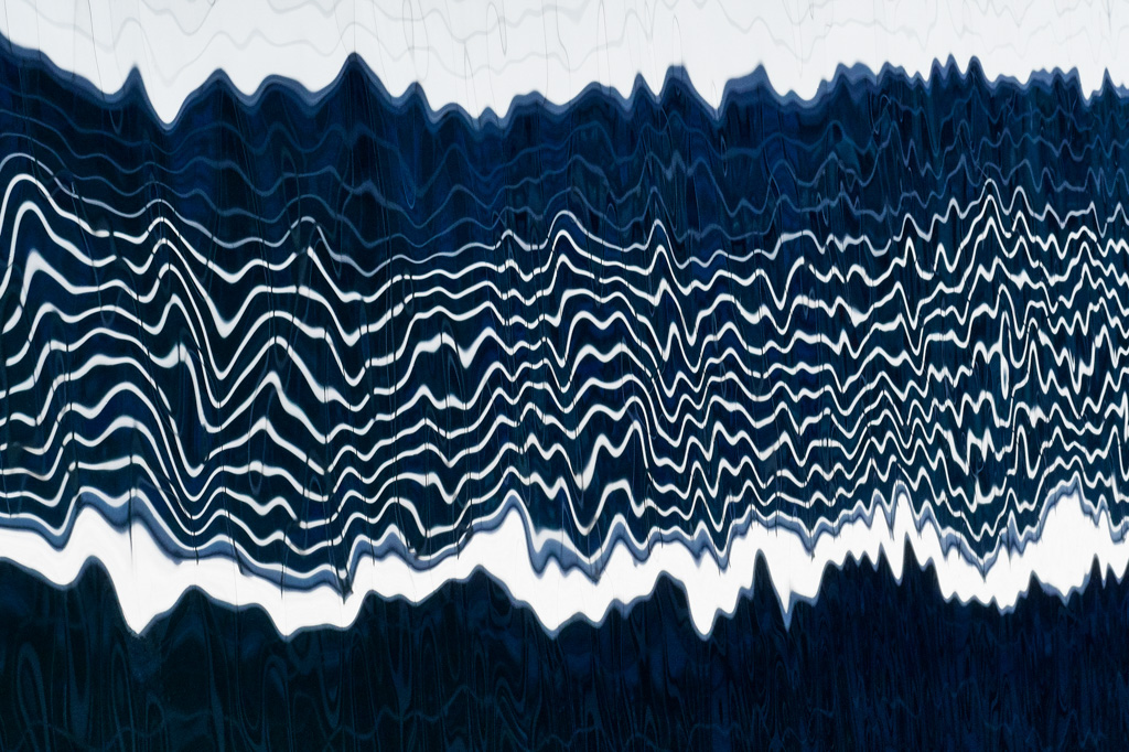
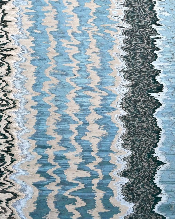
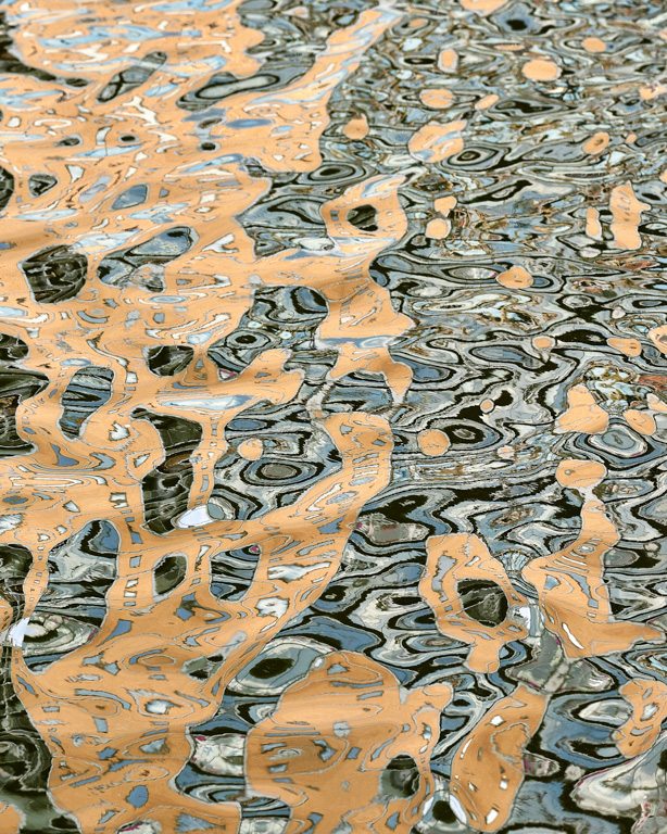
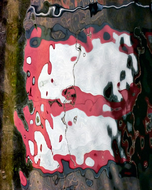
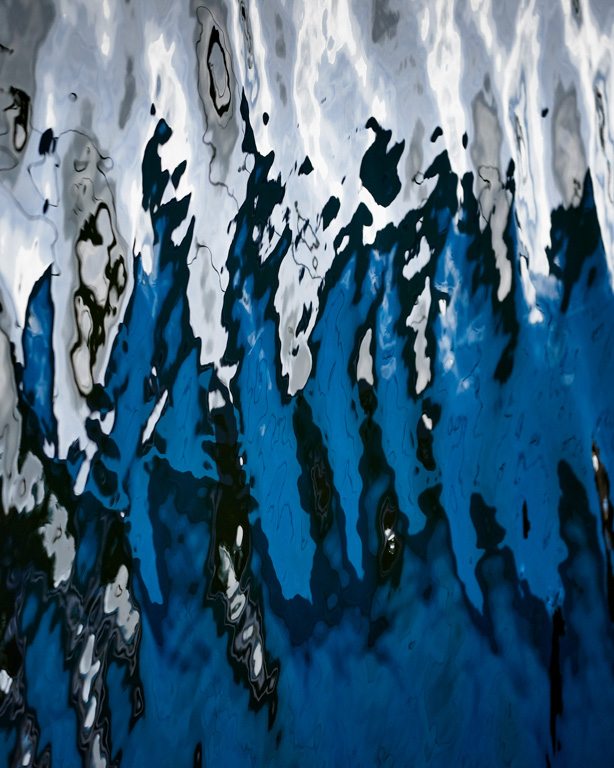
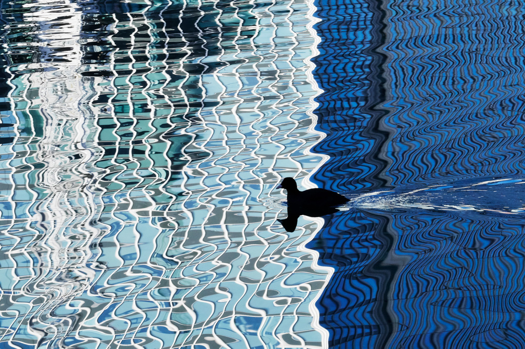
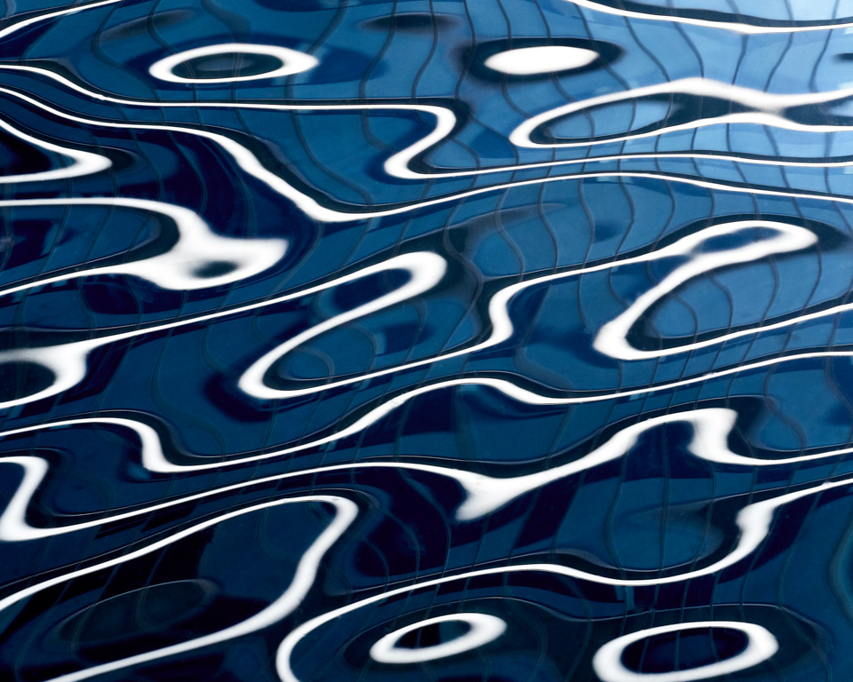
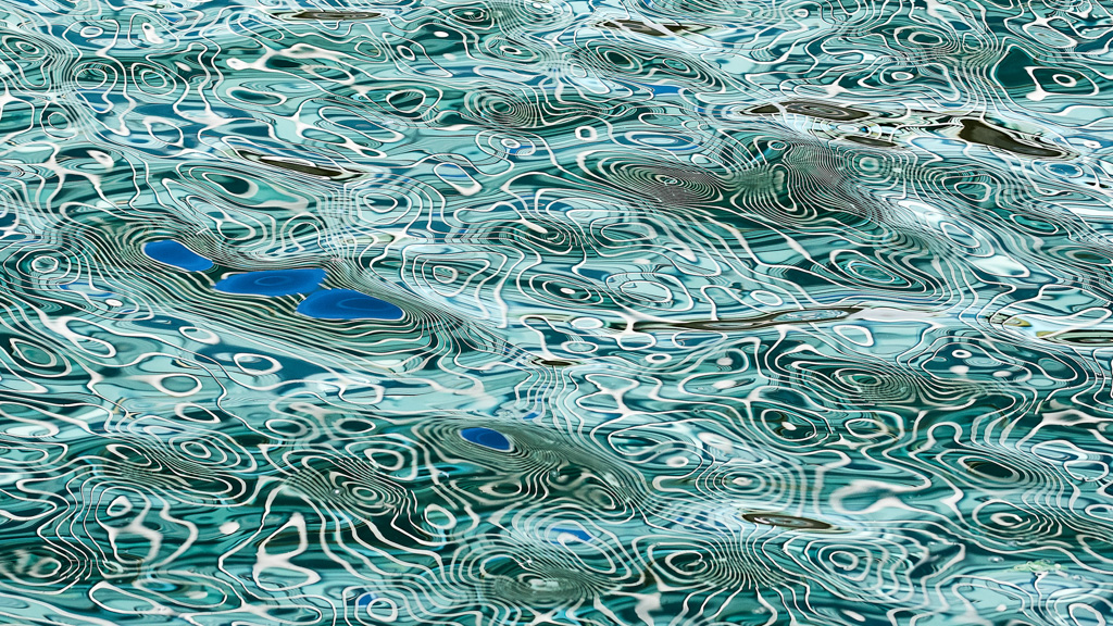
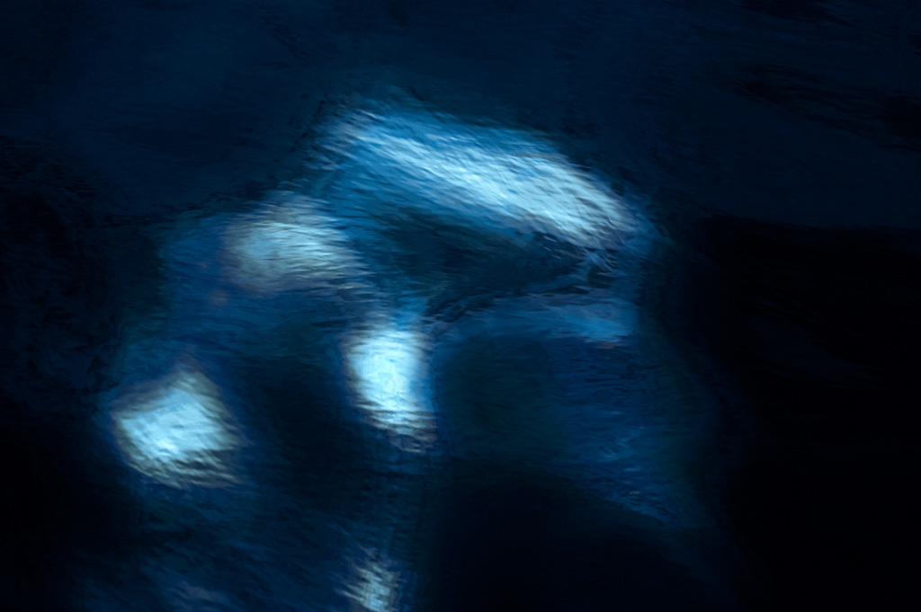
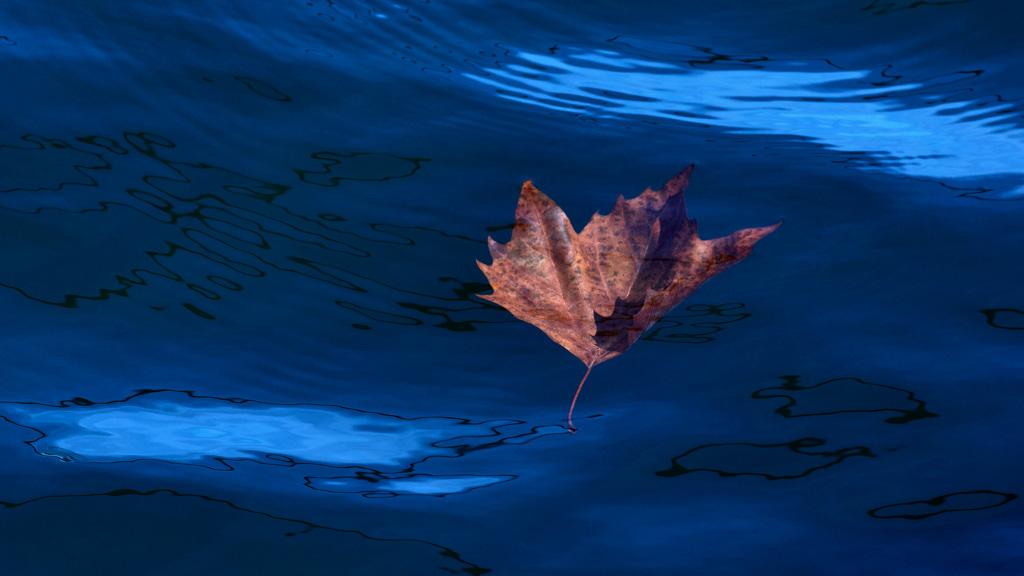
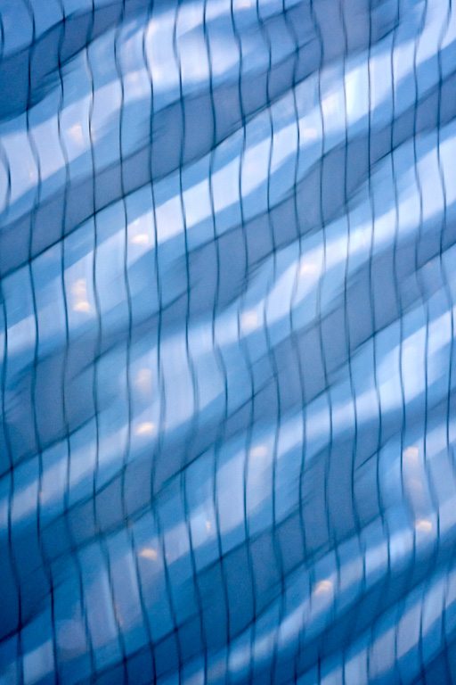

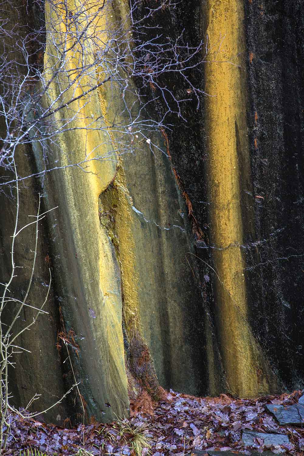
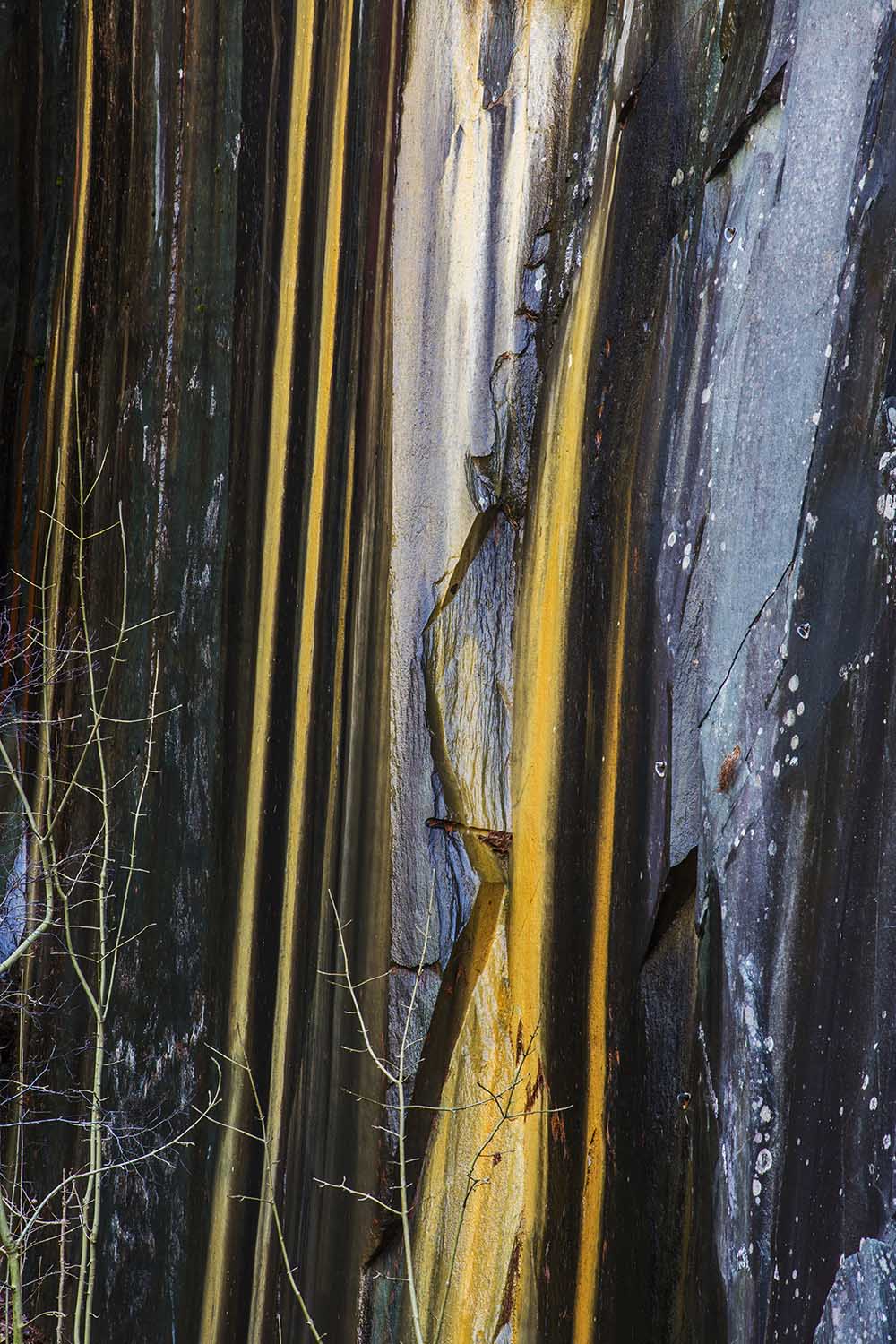
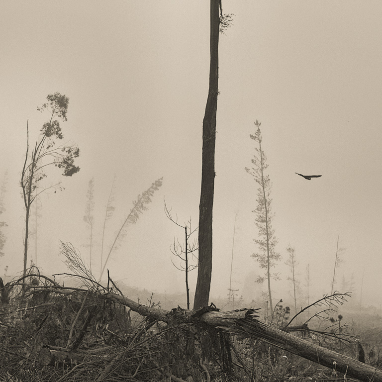
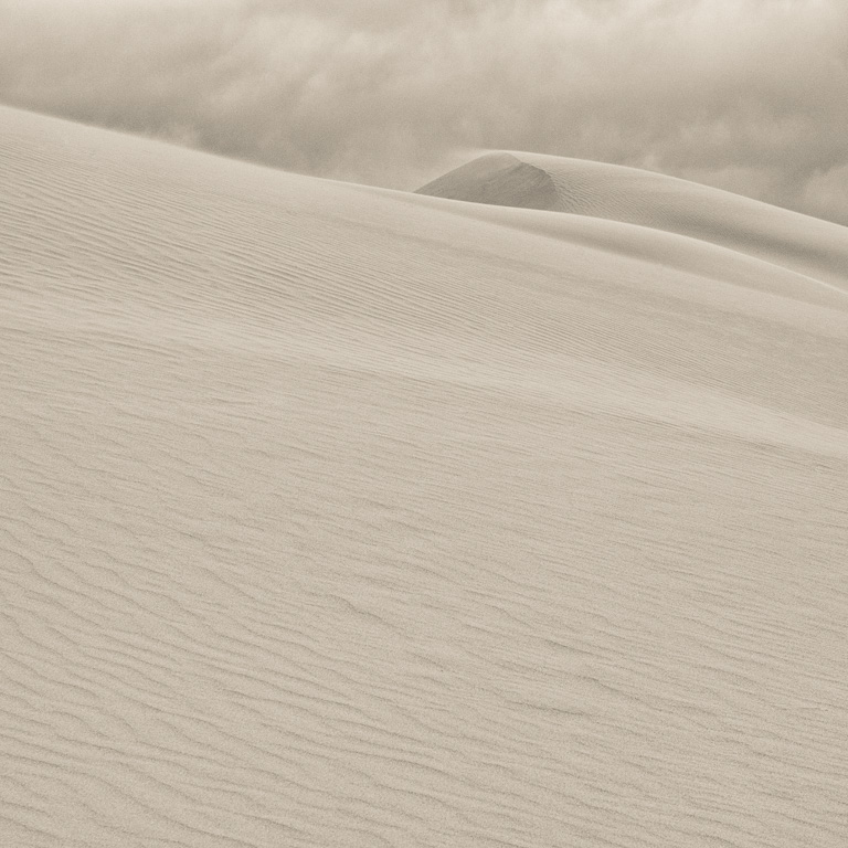
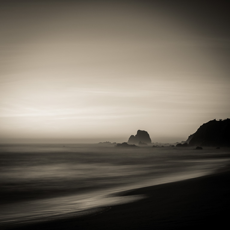

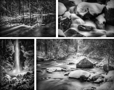
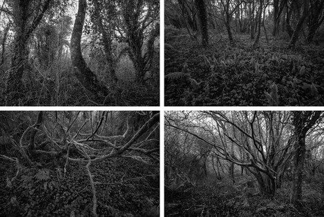
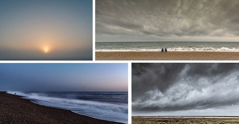
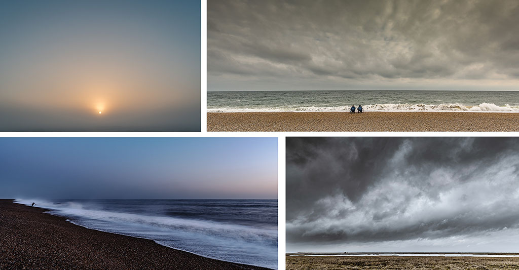
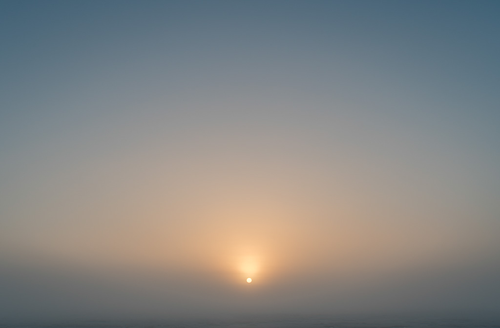
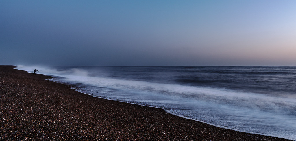
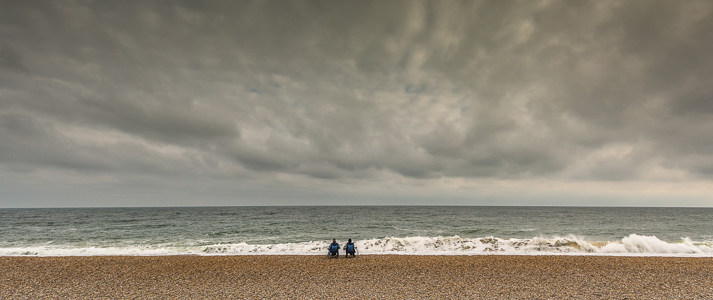
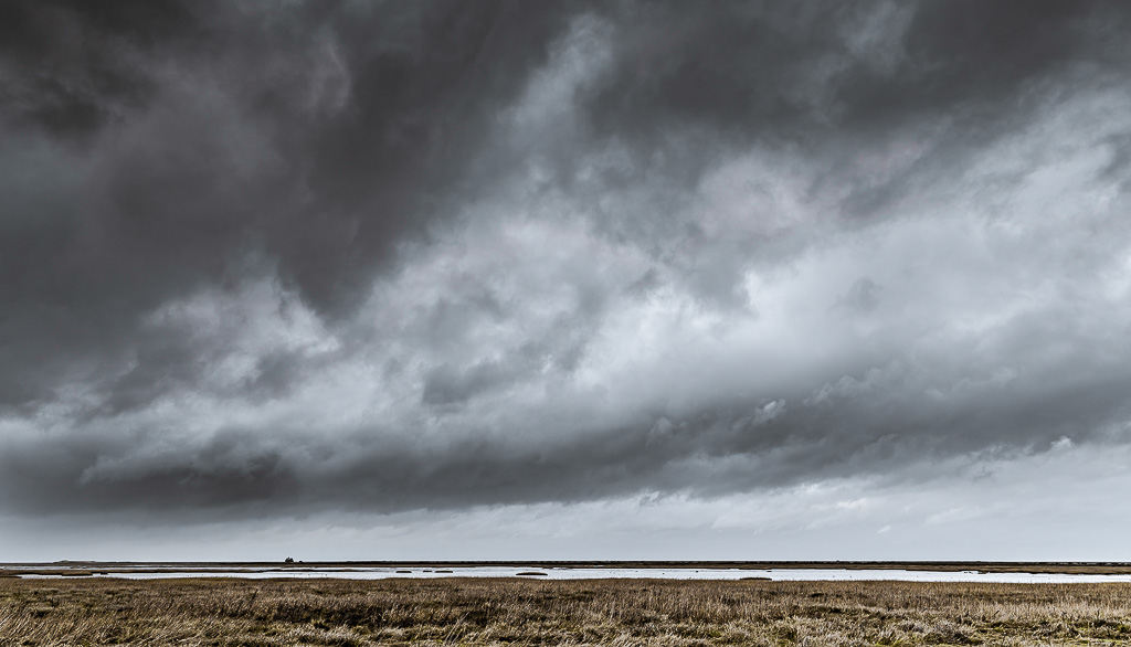

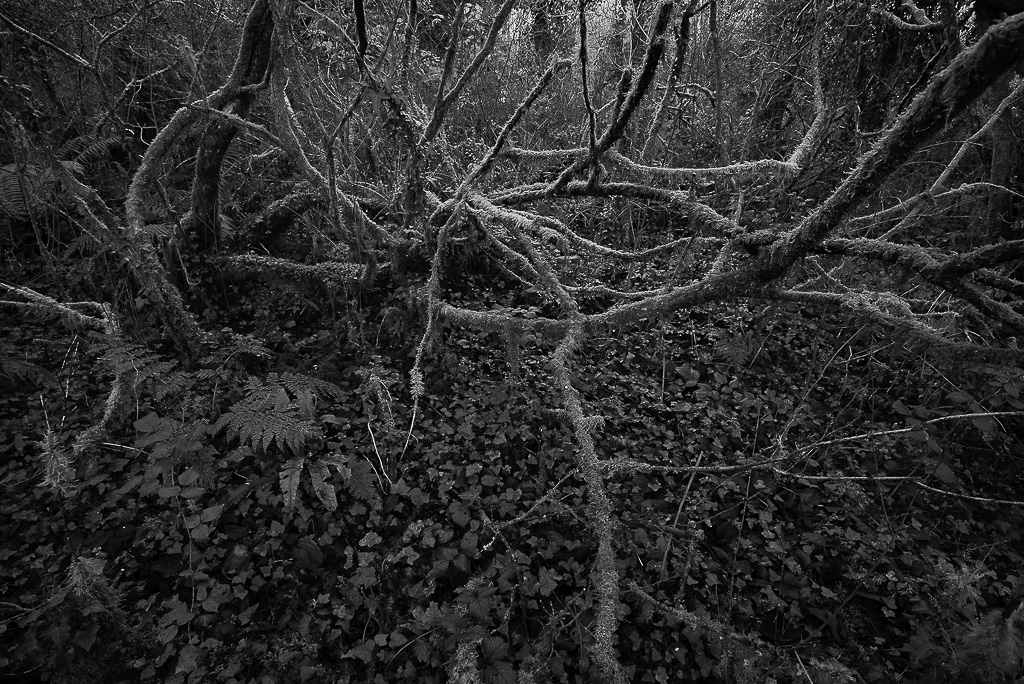
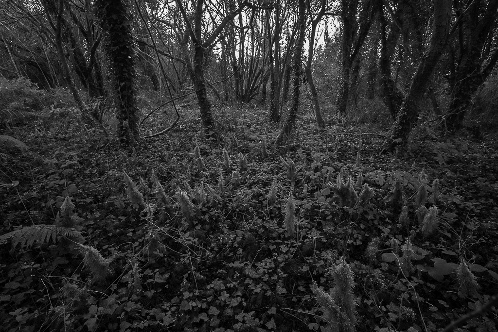
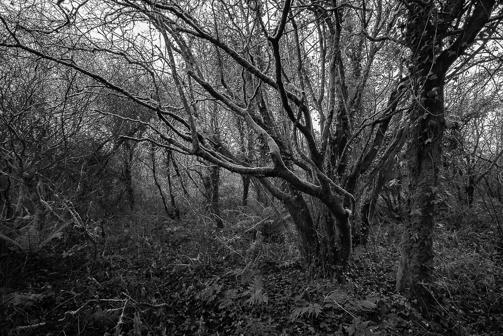
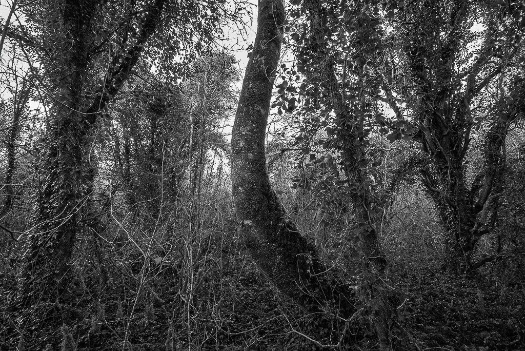
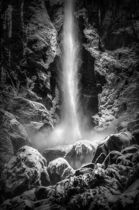
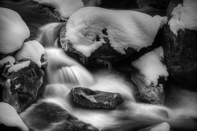
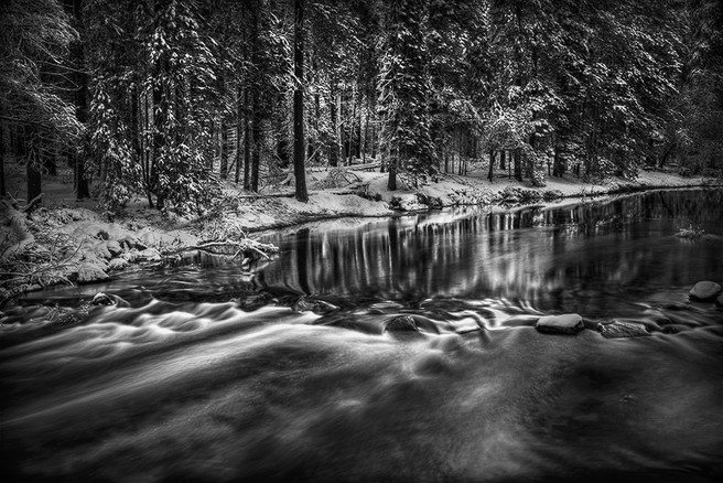
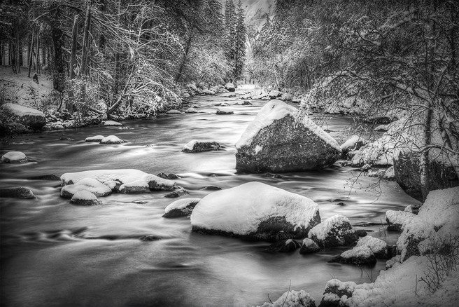
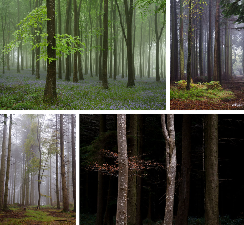
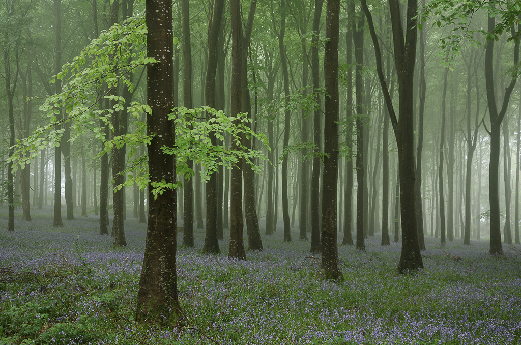
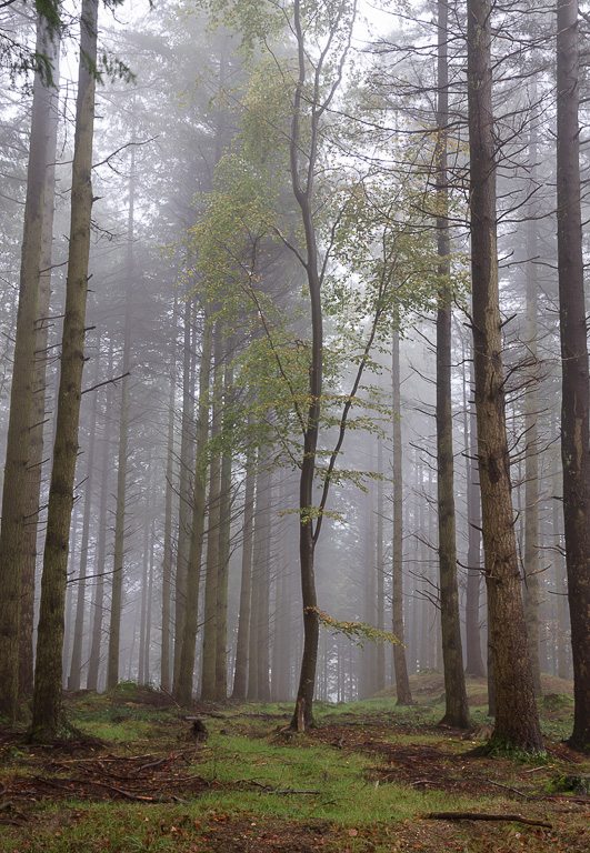
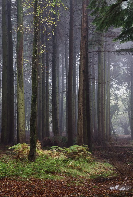
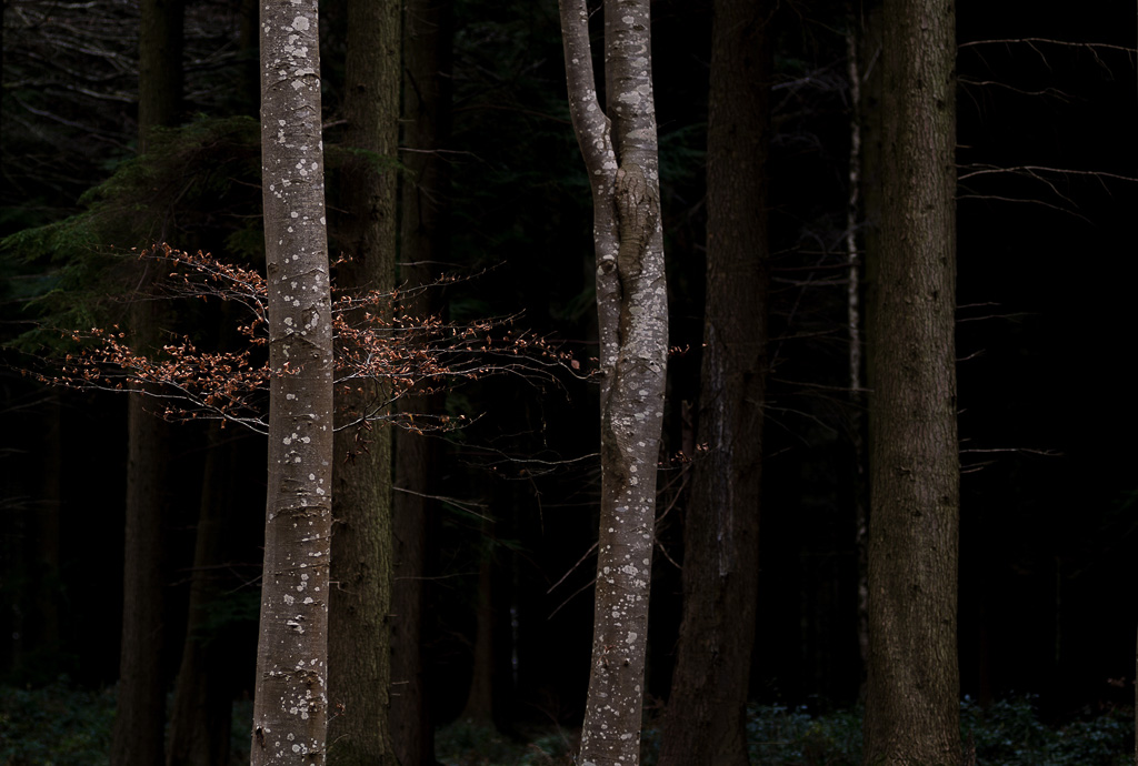
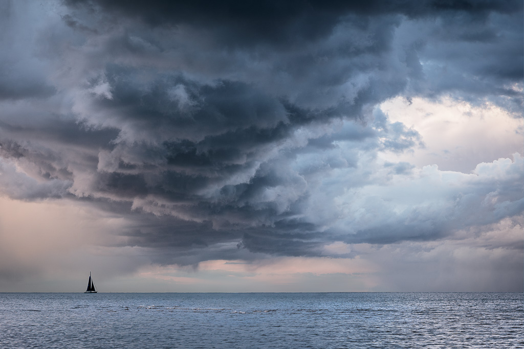
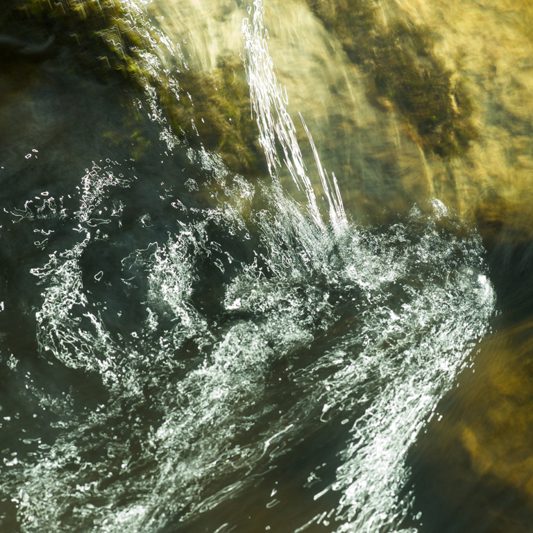
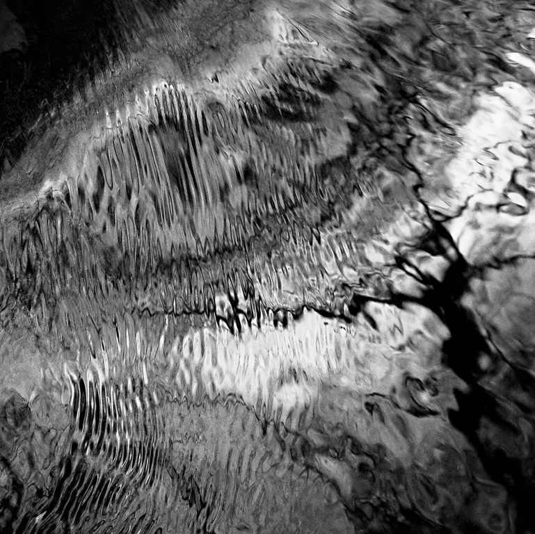
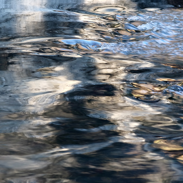
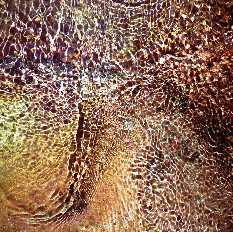
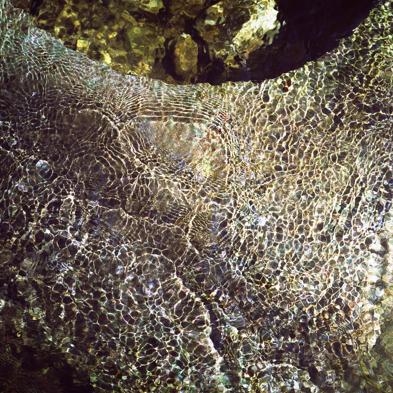
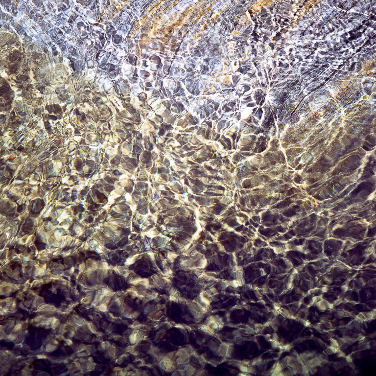
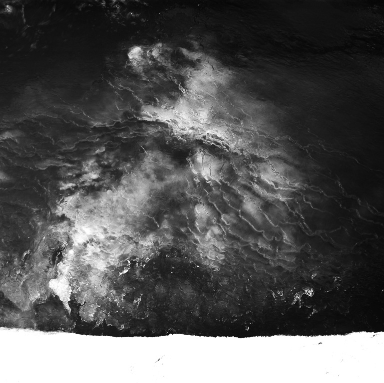
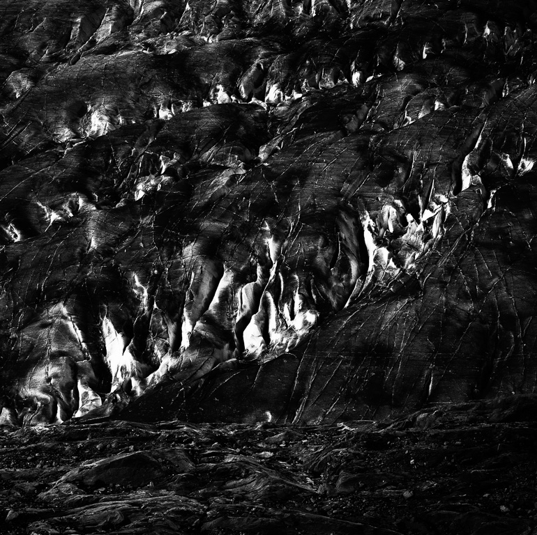
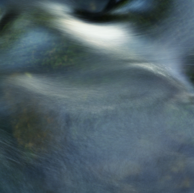
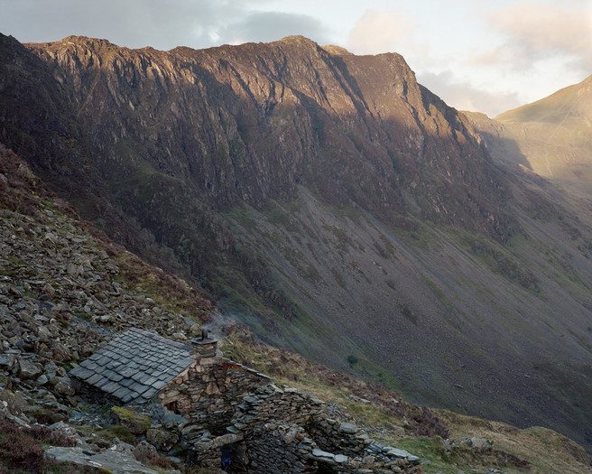
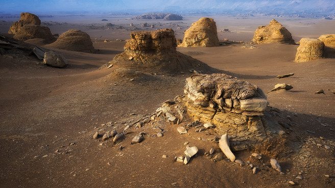 Hui was in his mid 40’s and had spent his entire life in Xinjiang - this was his landscape, and his enthusiasm for it shone from his weathered face. He energetically told Juanli that it was the finest landscape in the world, a fierce pride in his voice. I find that degree of passion infectious and my sense of anticipation grew with each passing moment.