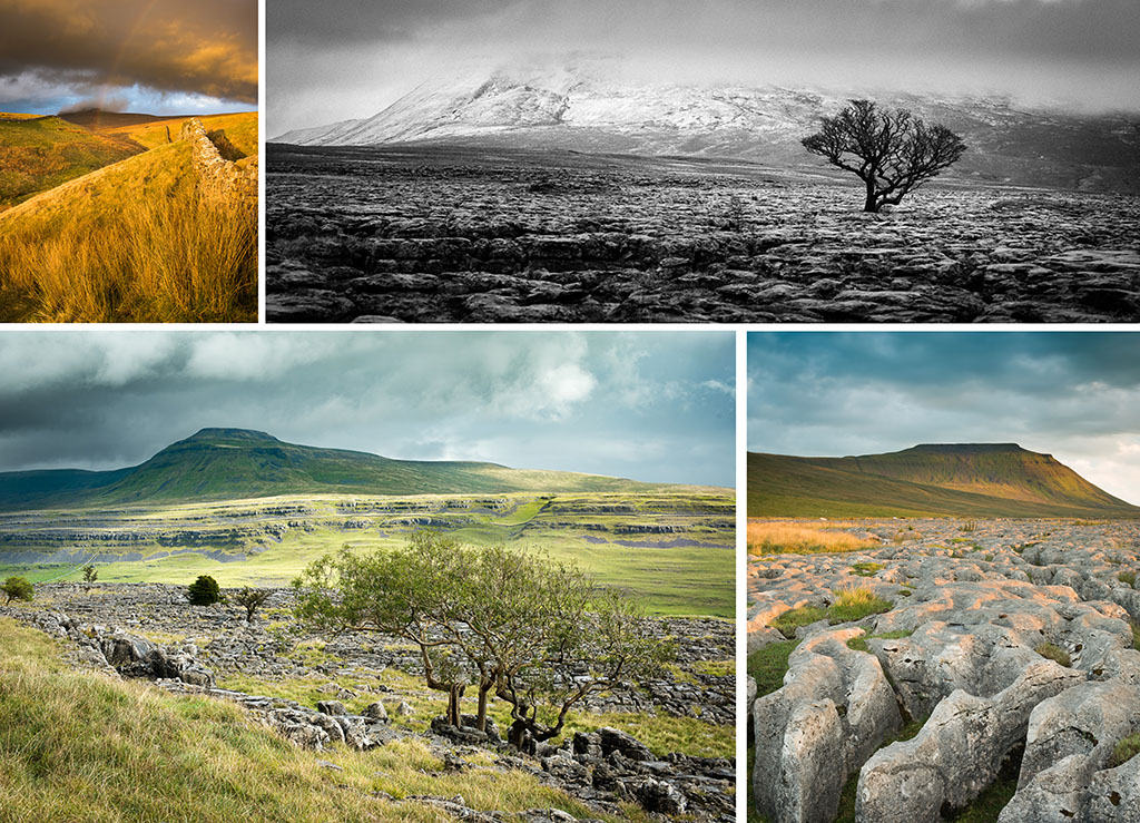
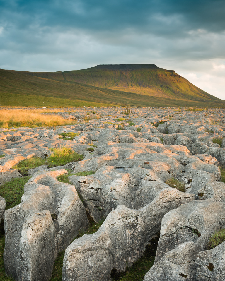
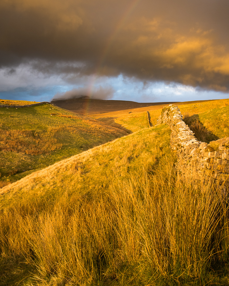
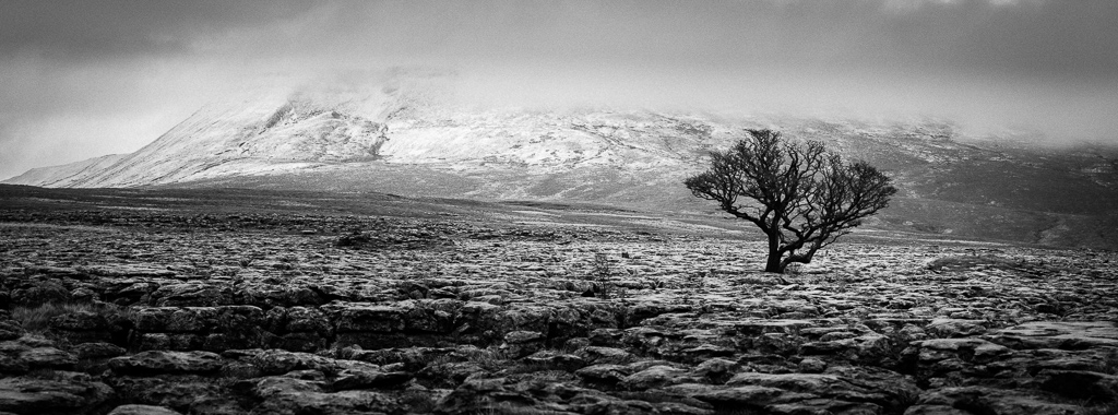
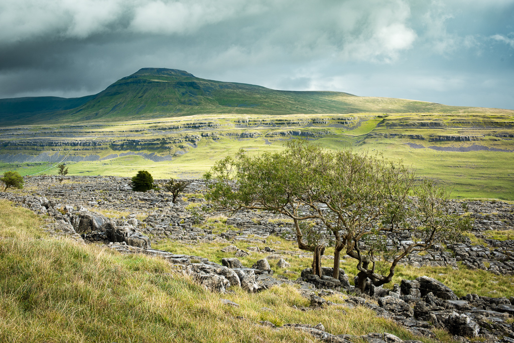
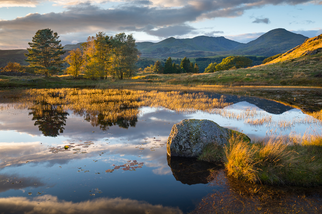
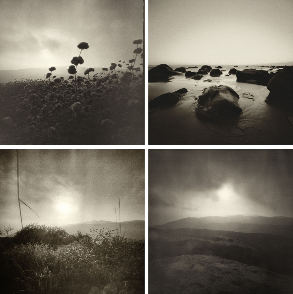
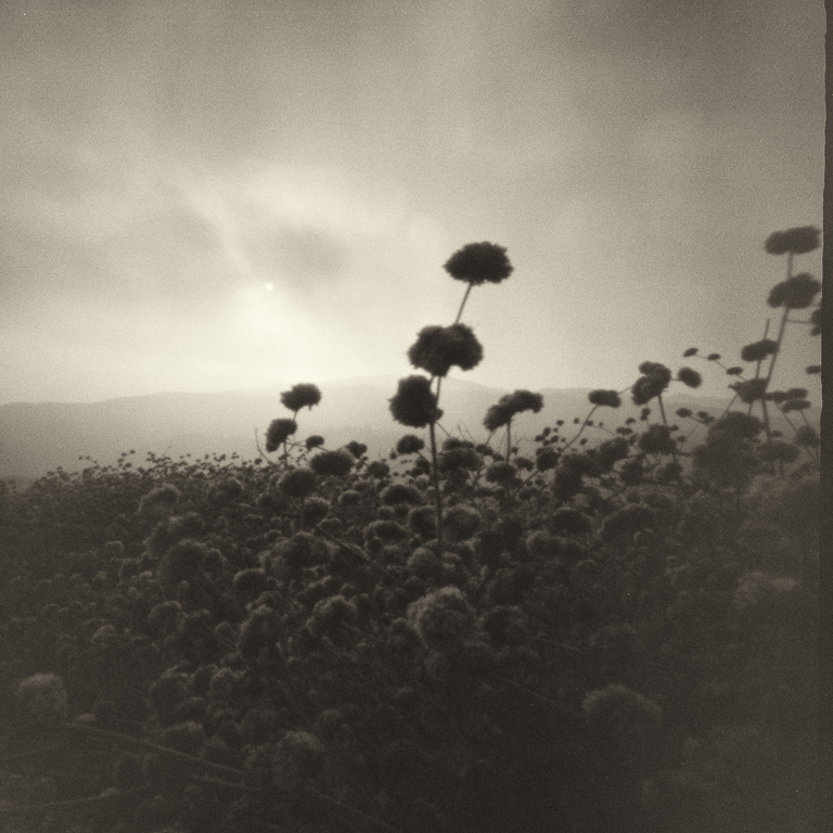
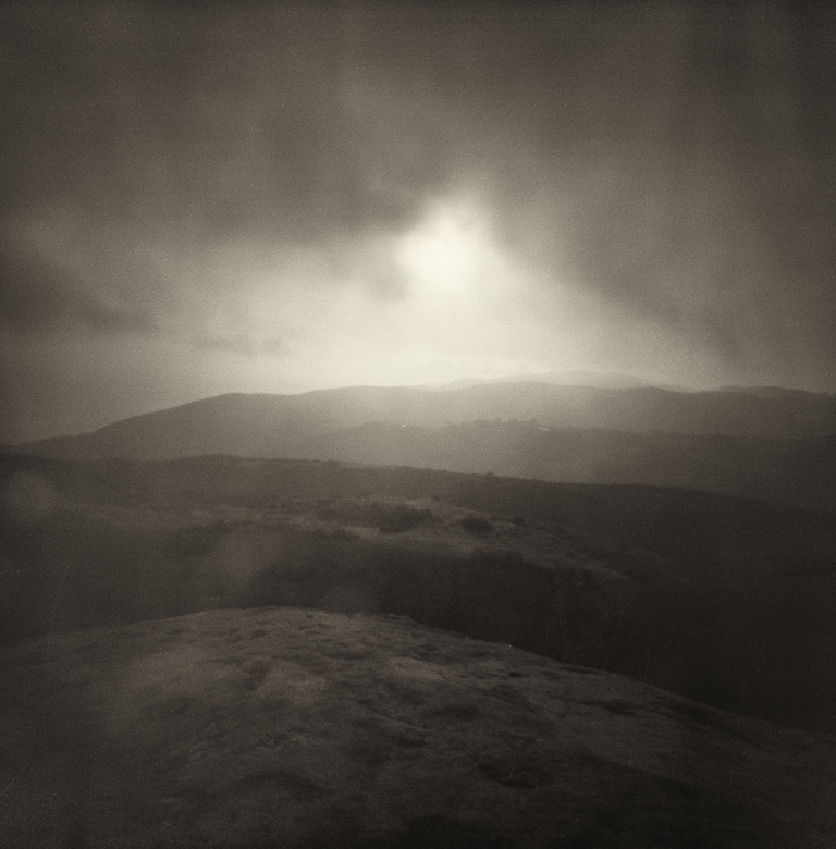
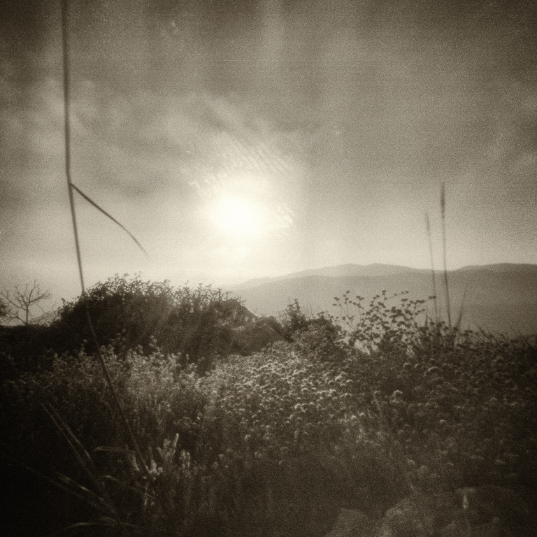
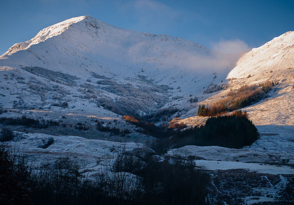
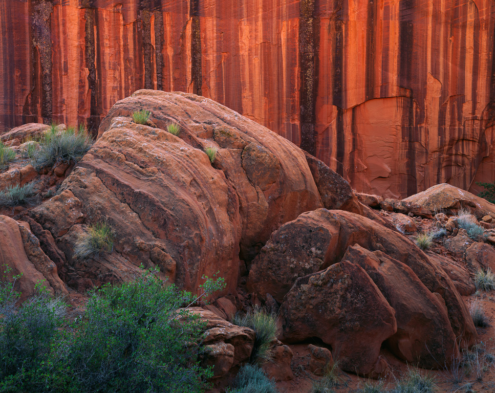
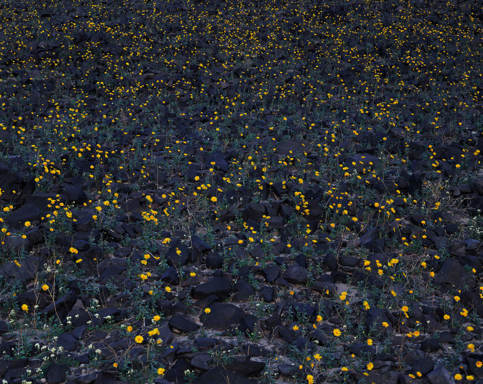
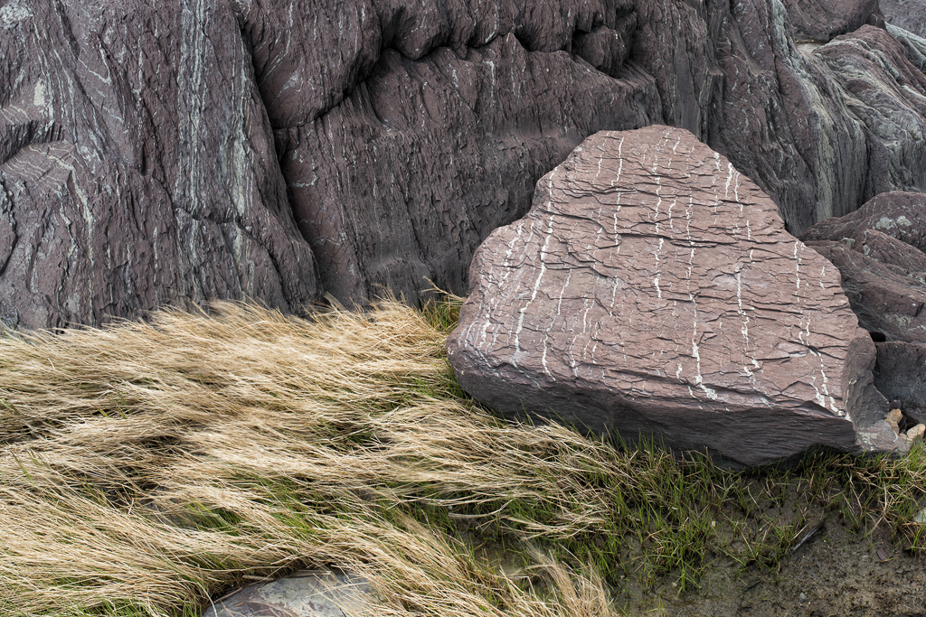
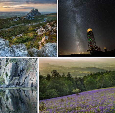
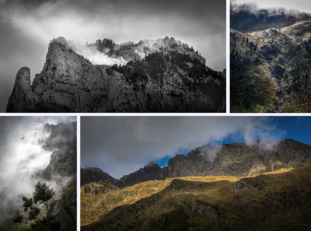
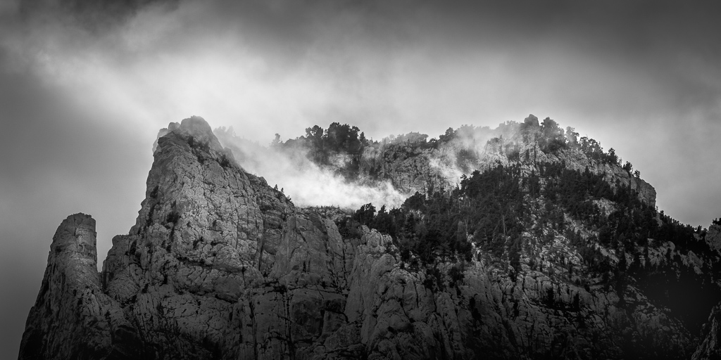
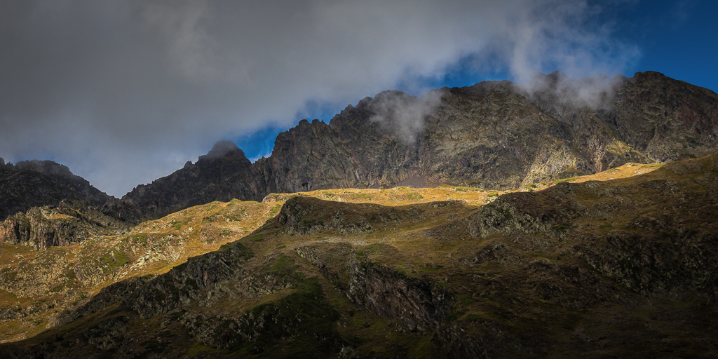
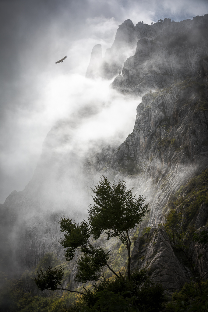
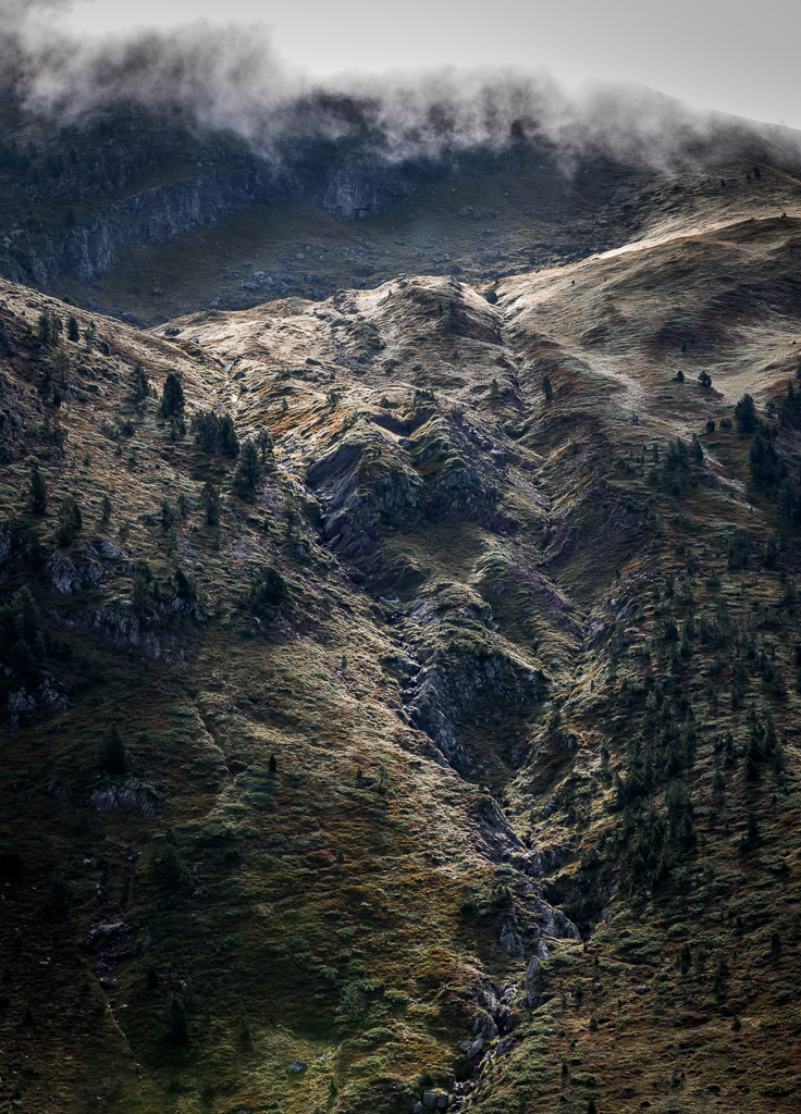
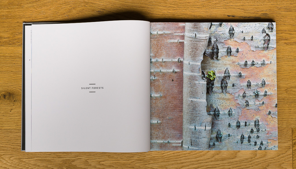
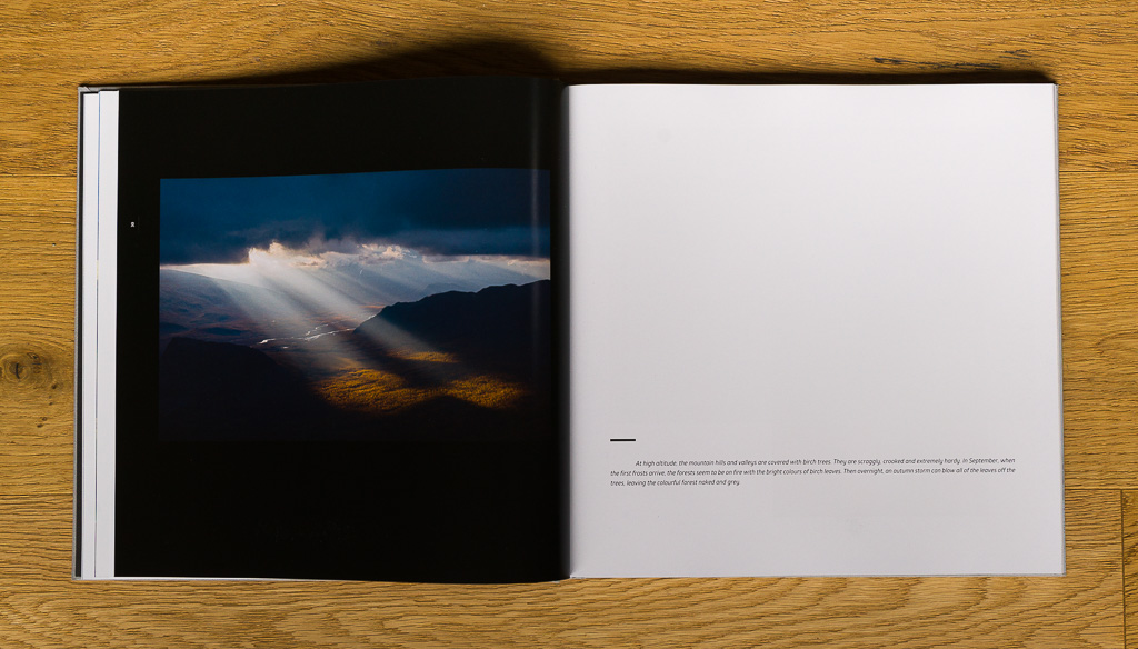
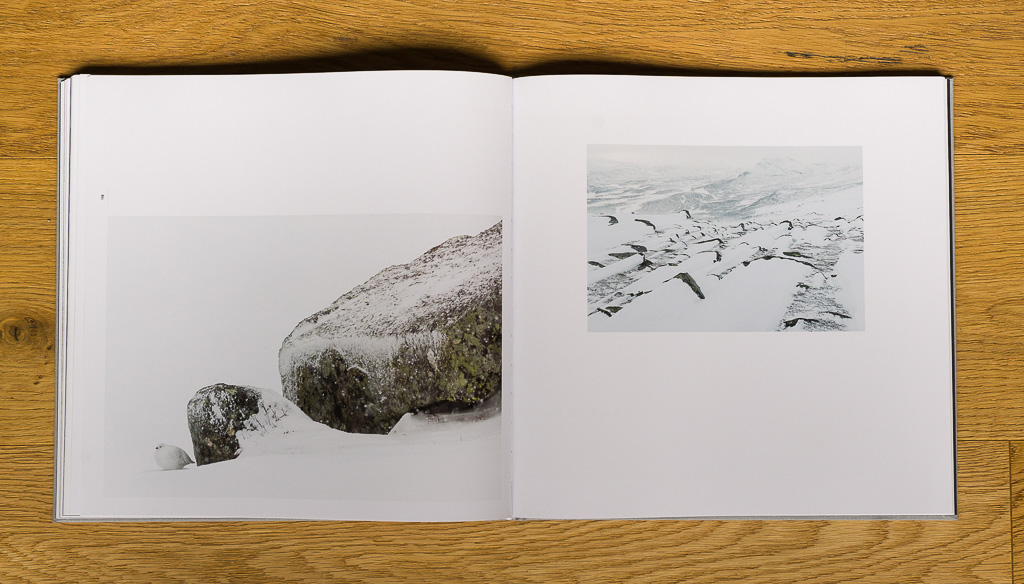
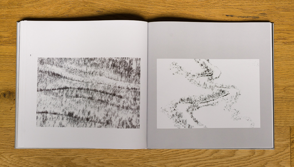
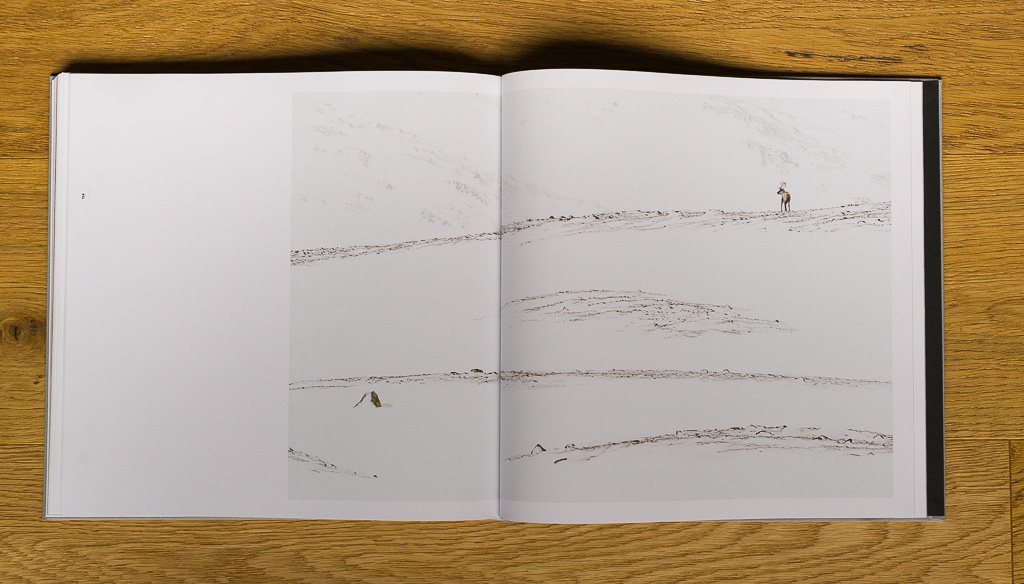
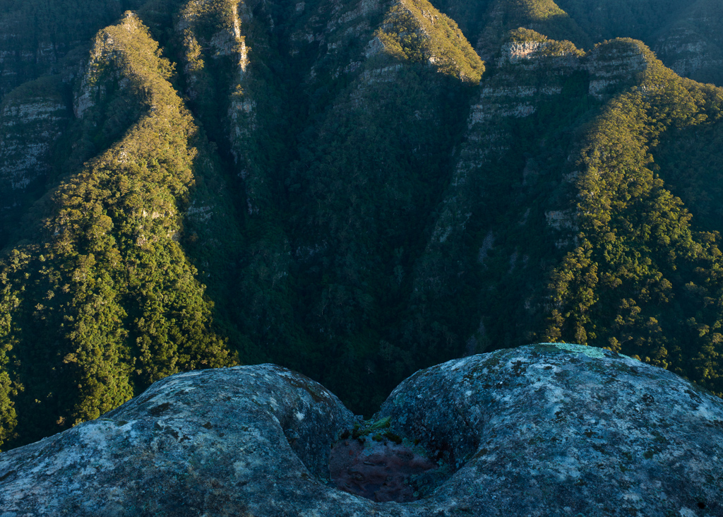
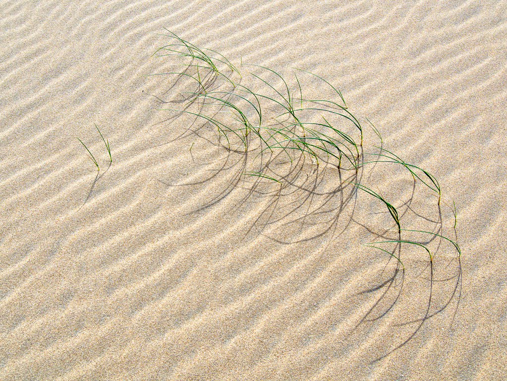
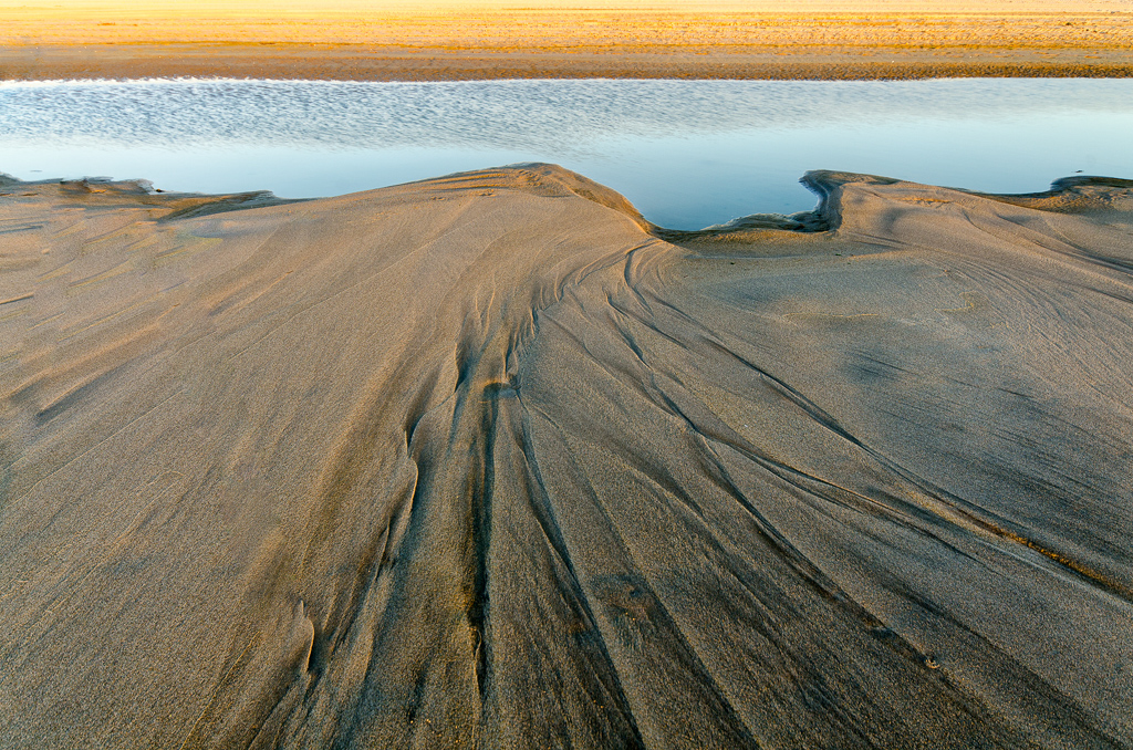
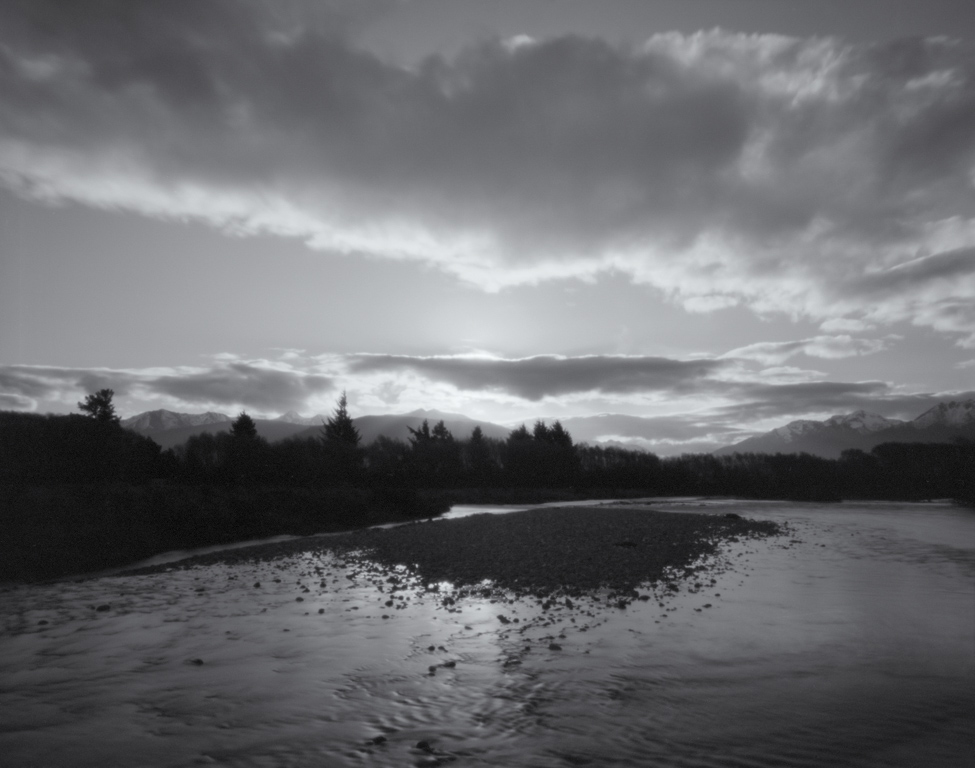
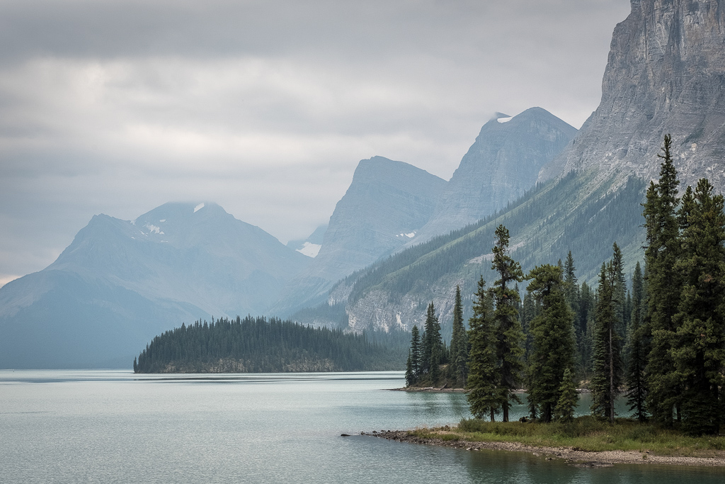
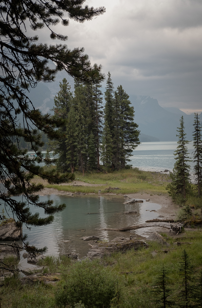
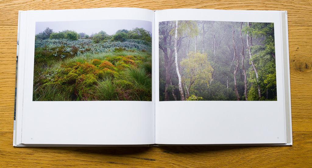
Living at the foot of Ingleborough, the mountain was bound to become the re-occurring theme of my photography. But you know what, no matter how many times I return, the scene is rendered differently each time by the constantly changing seasons, weather, and time of day. In fact, I would say it's impossible to take the same image twice!
These are just a few aspects of Ingleborough depicting all four seasons, and different light conditions, showing the many features of this special mountain.
One could spend a lifetime photographing Ingleborough without ever capturing its full set of moods and features.
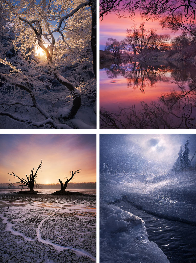
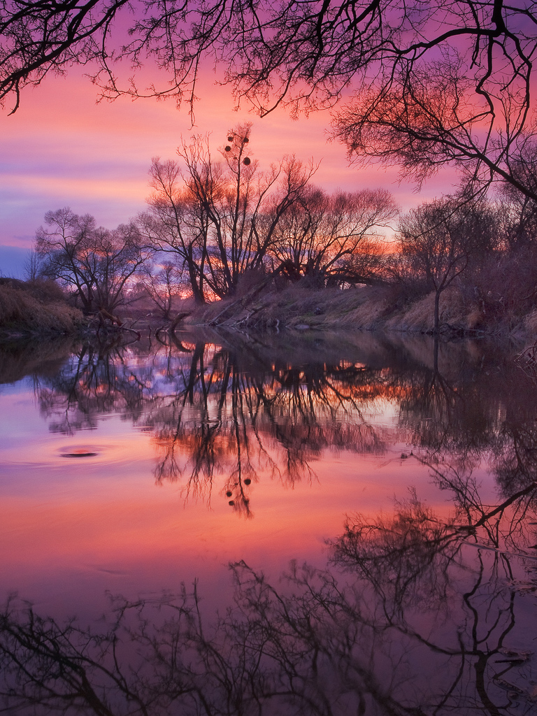
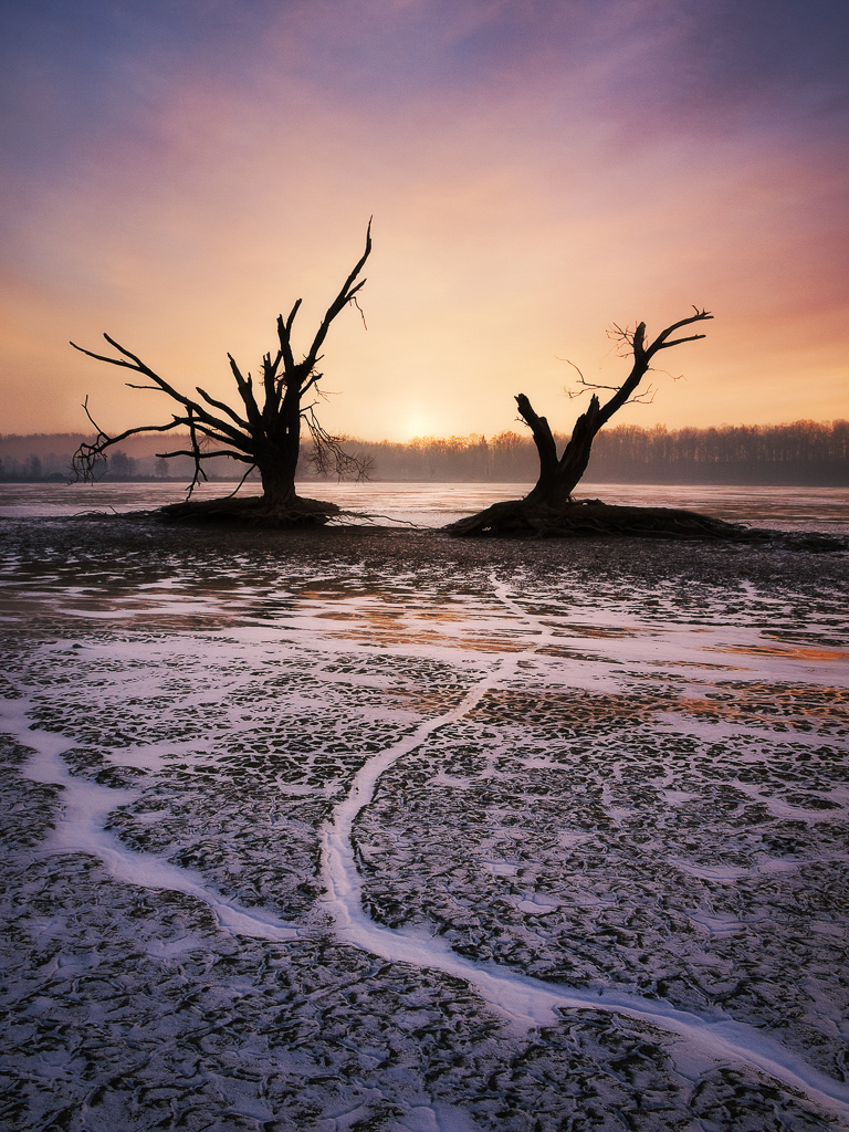
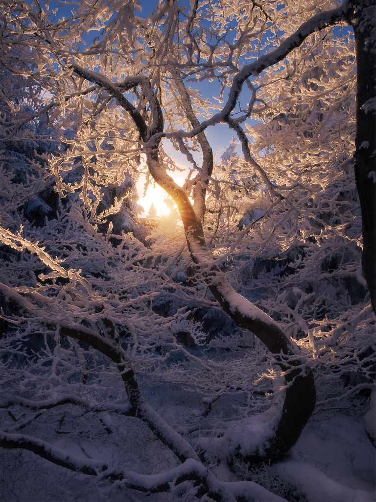
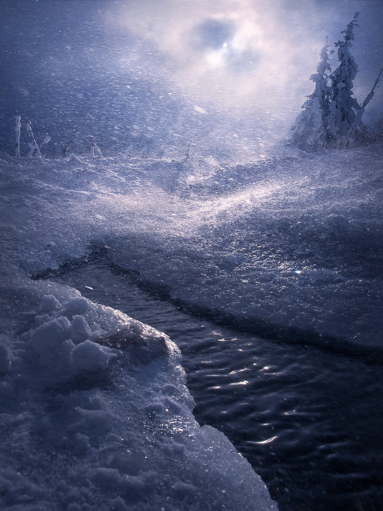
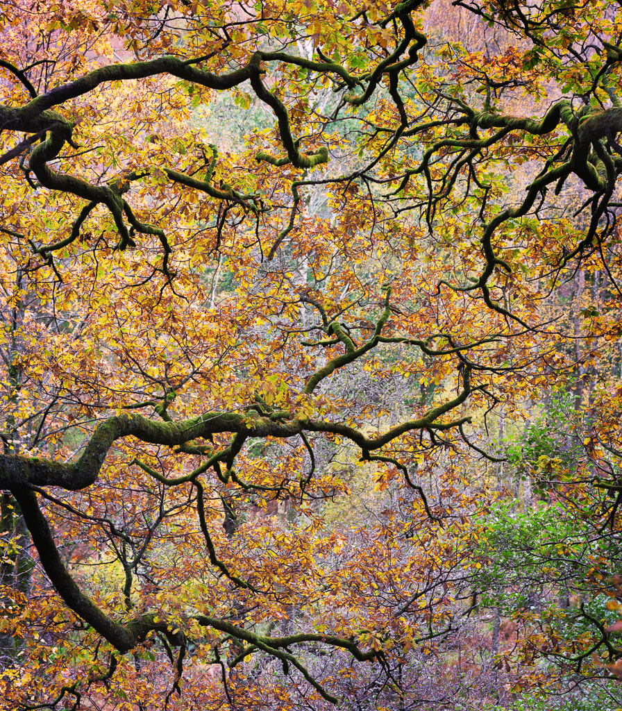
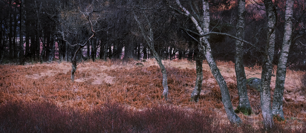
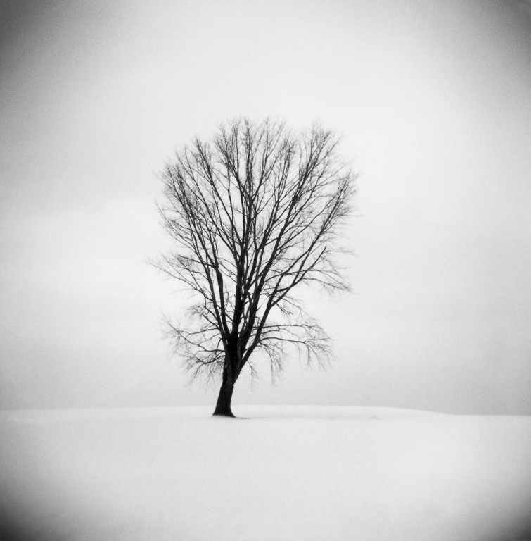
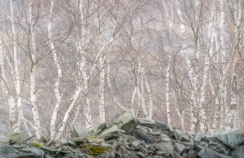
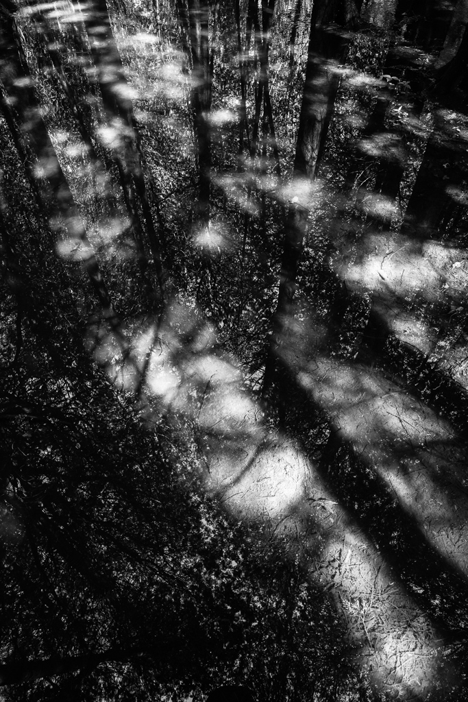
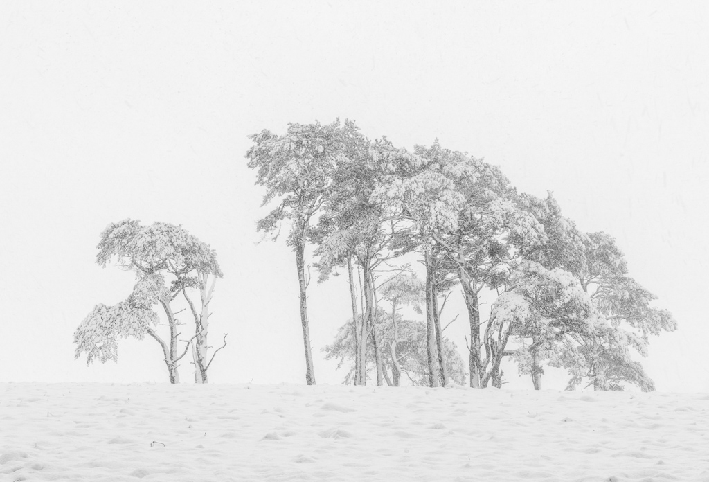
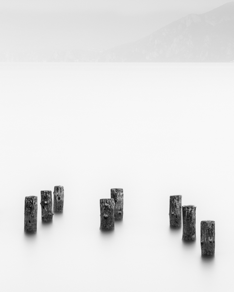
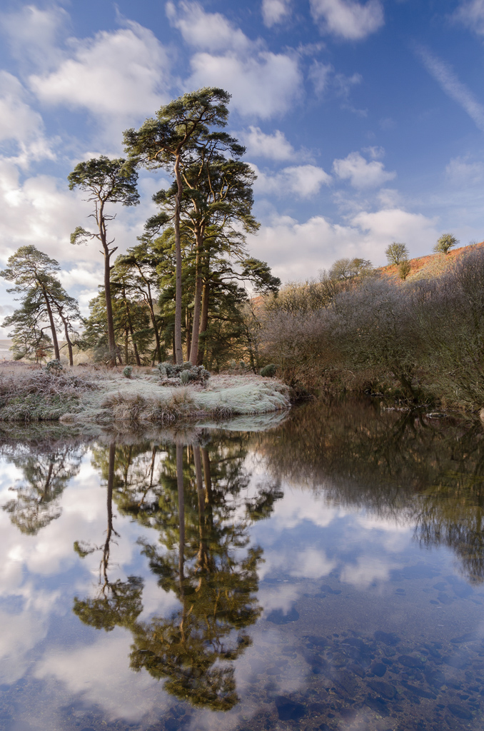
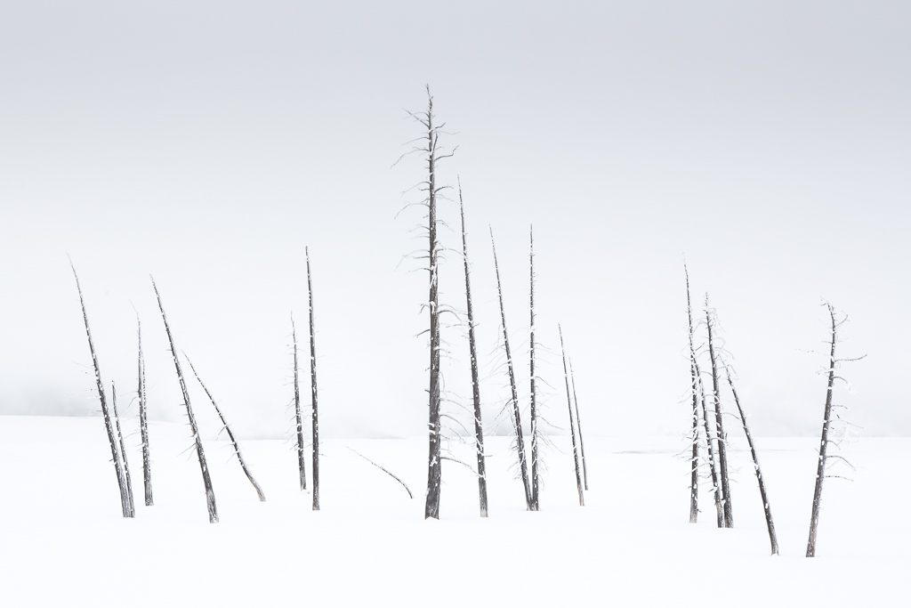
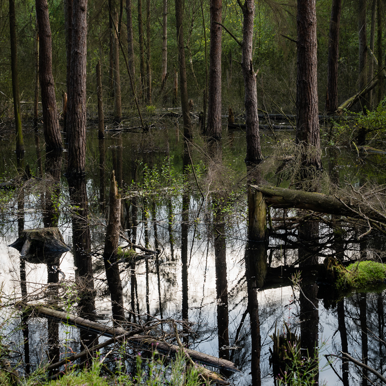
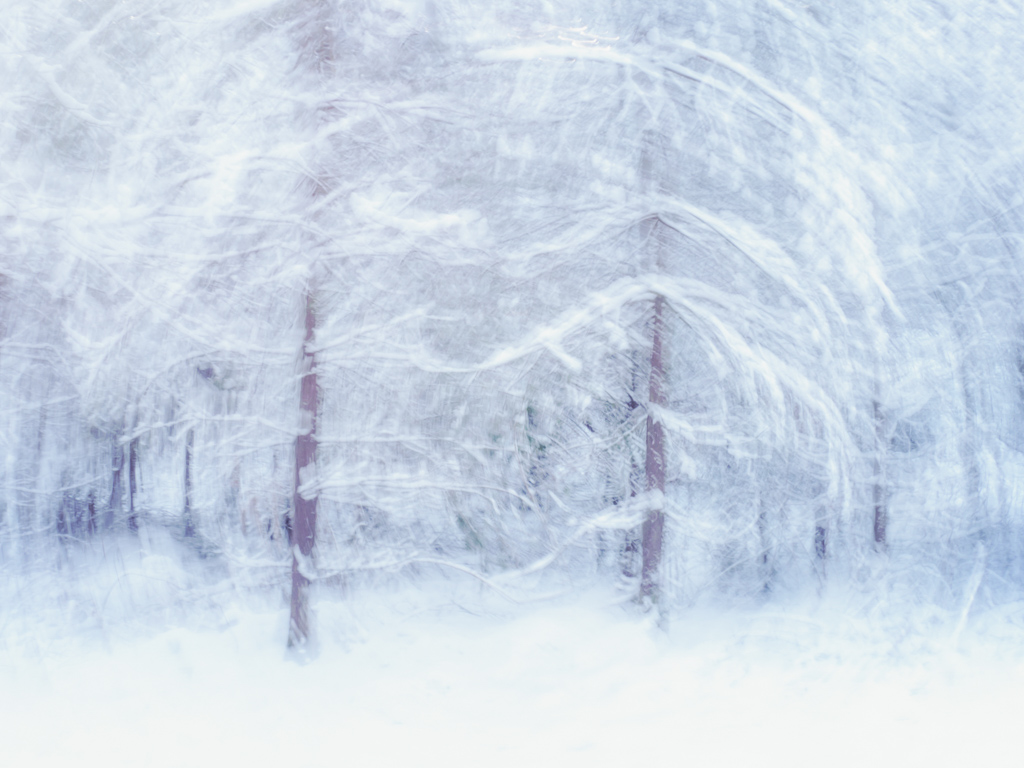
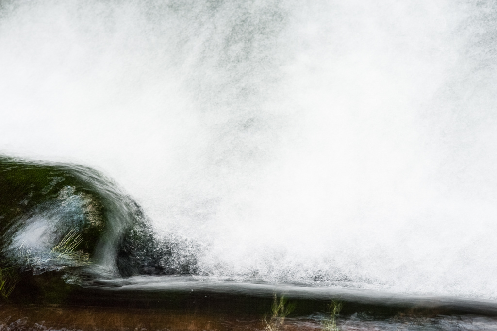
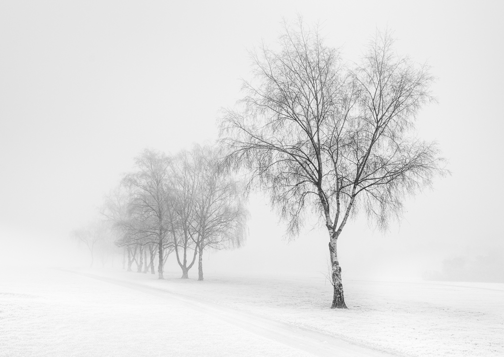
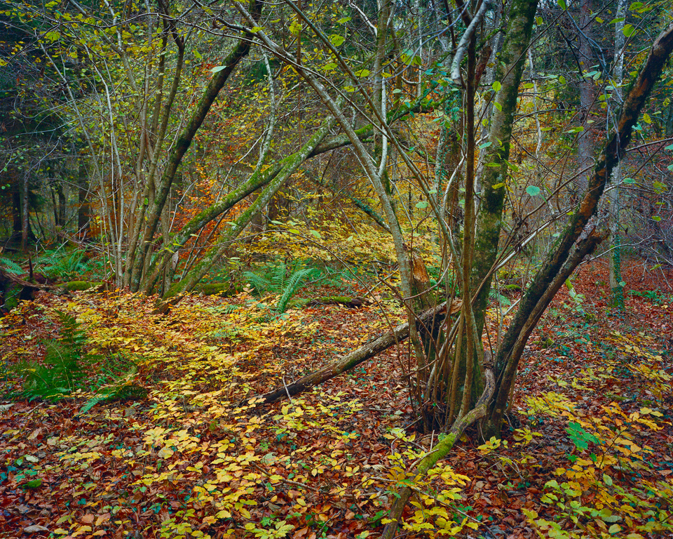
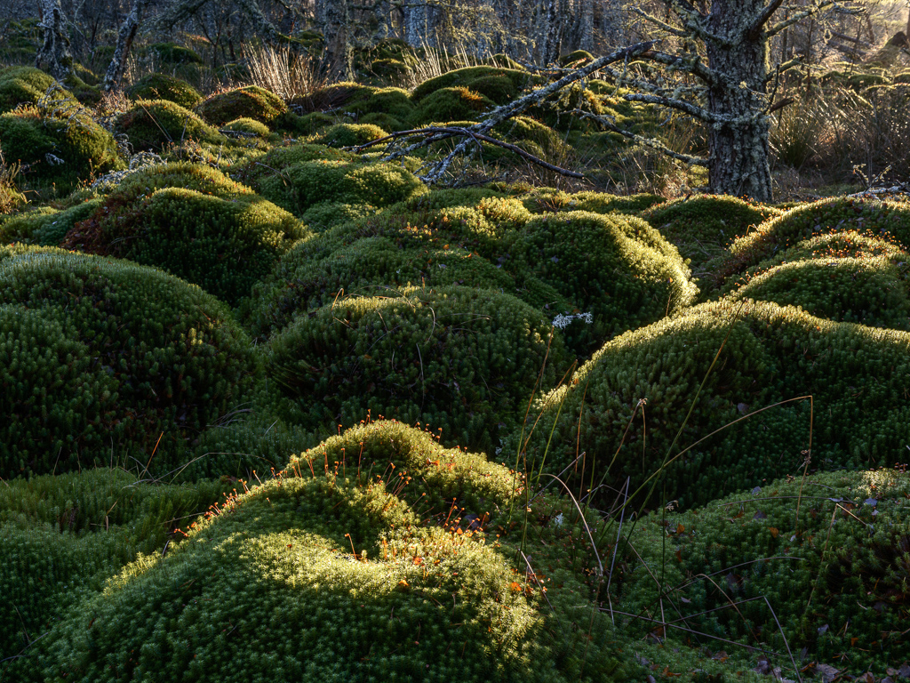
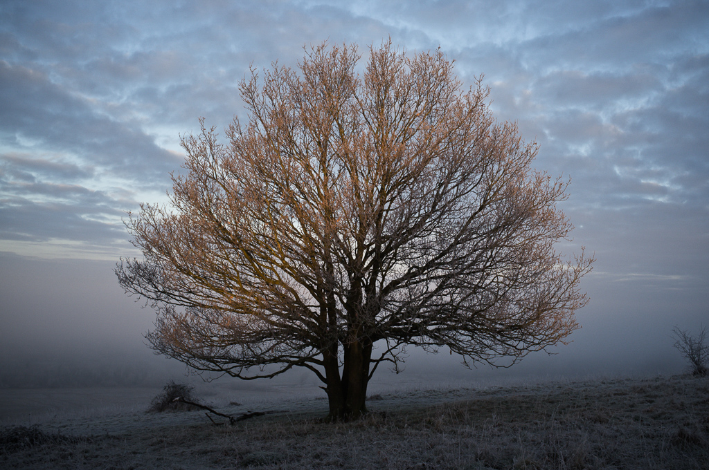
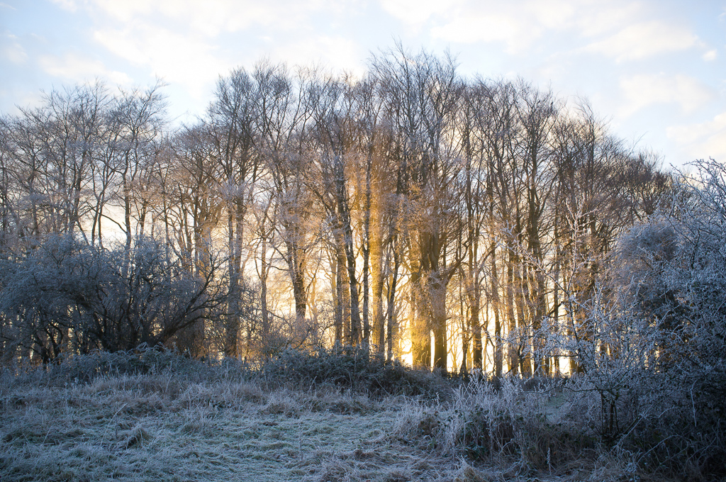
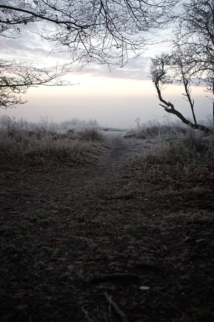
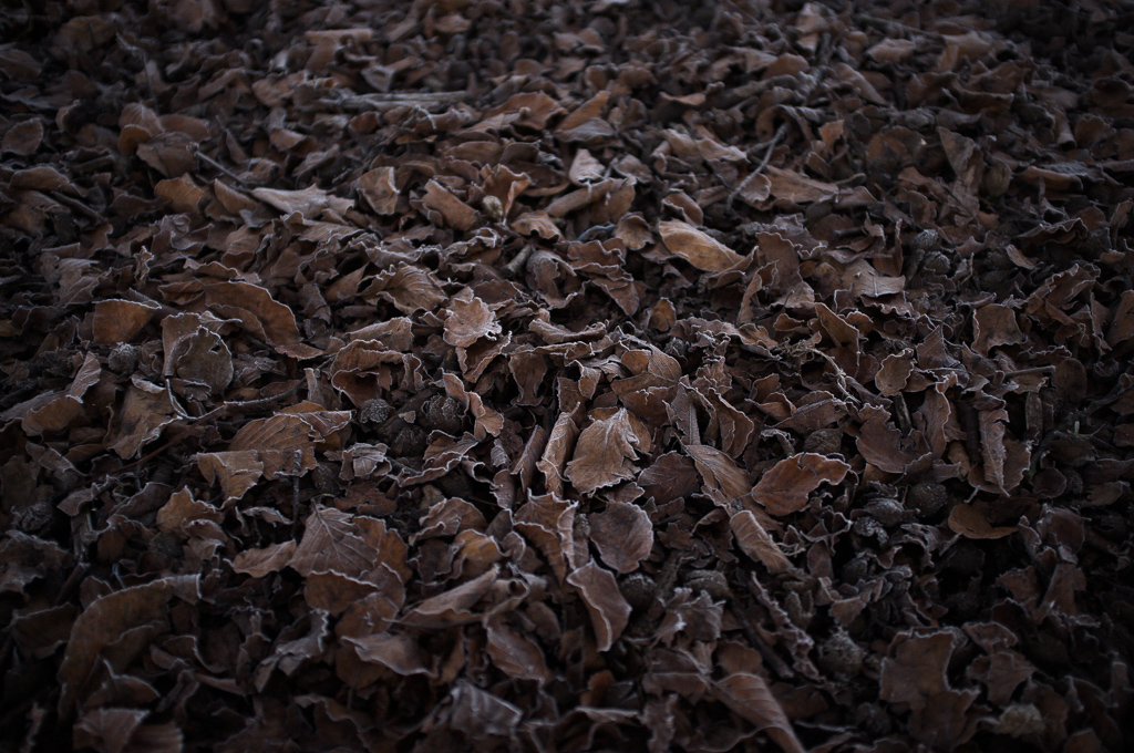
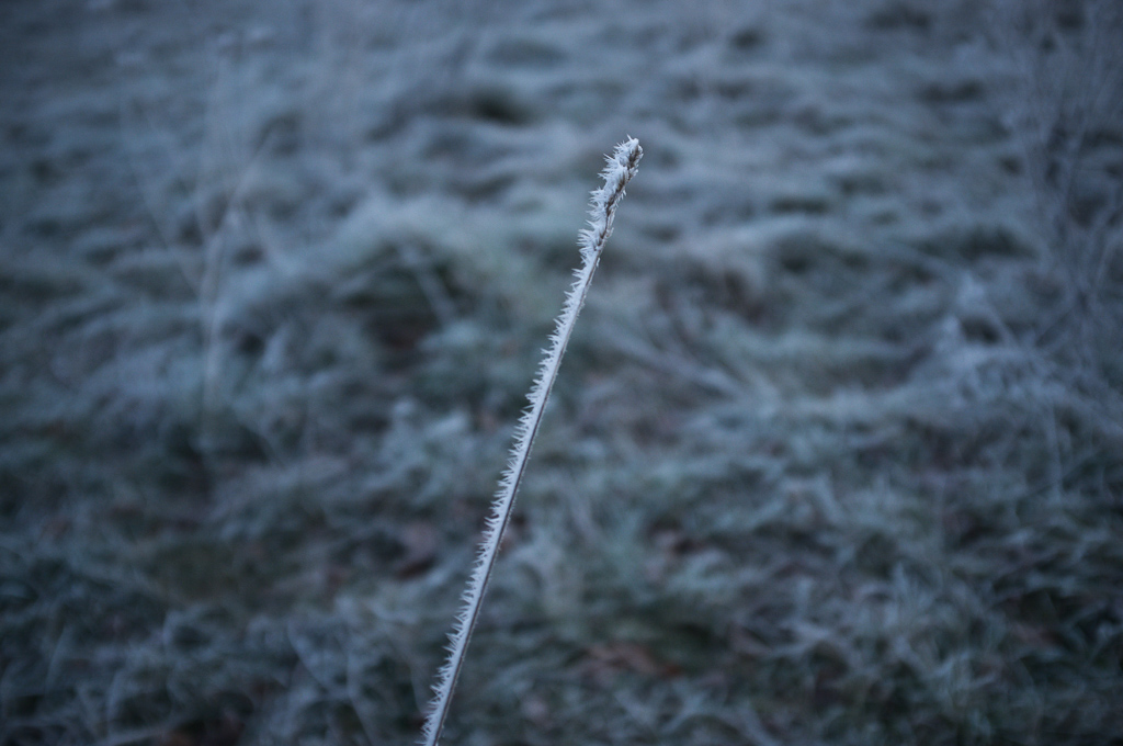
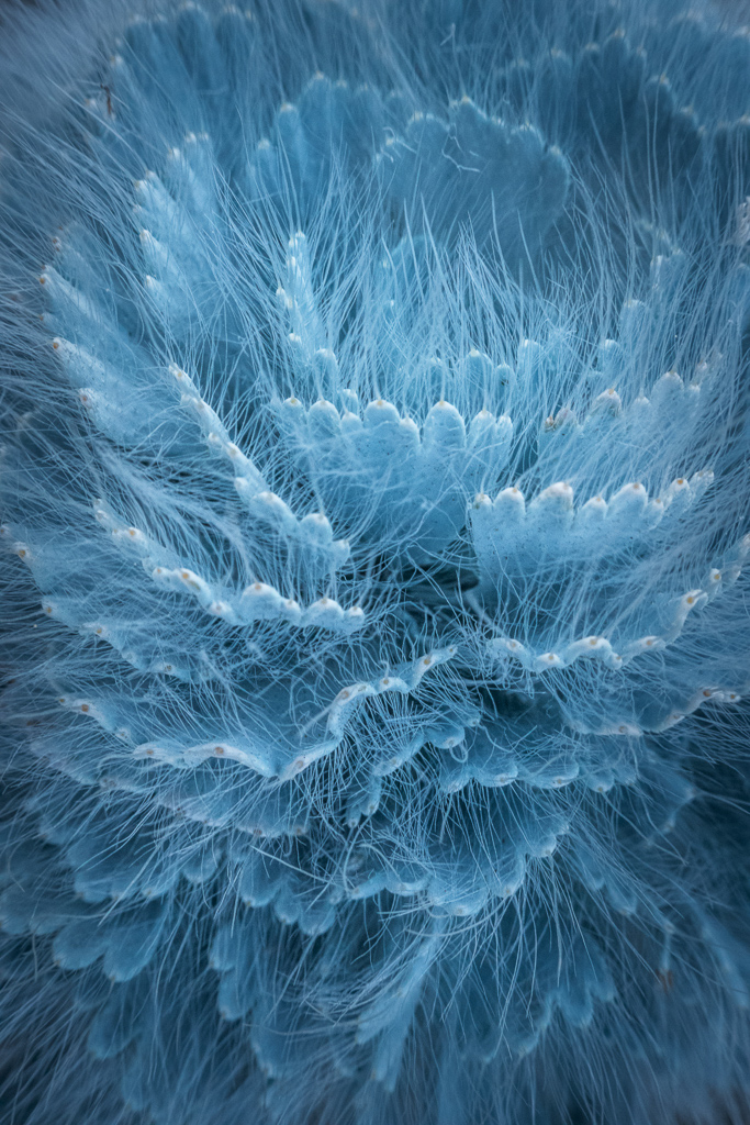
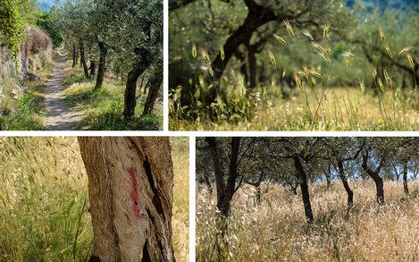
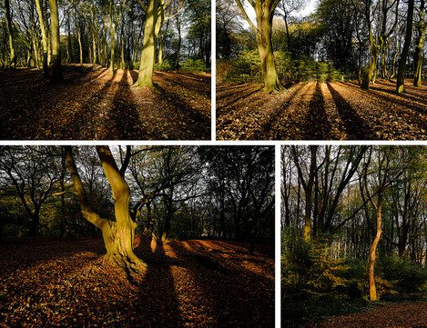
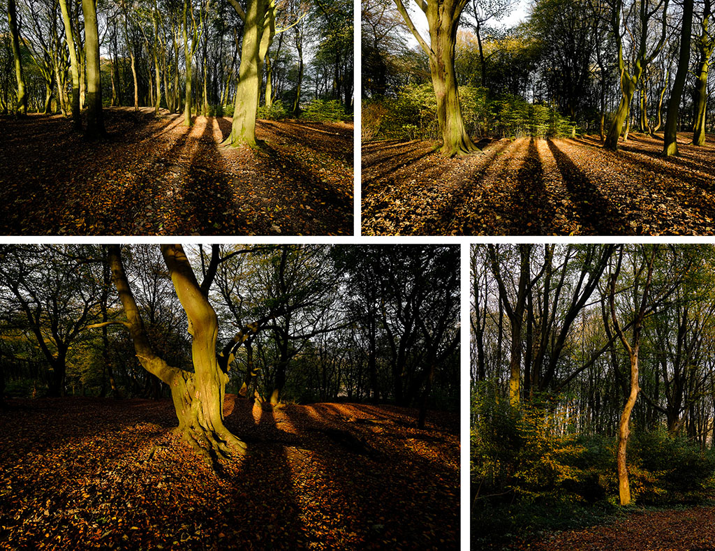
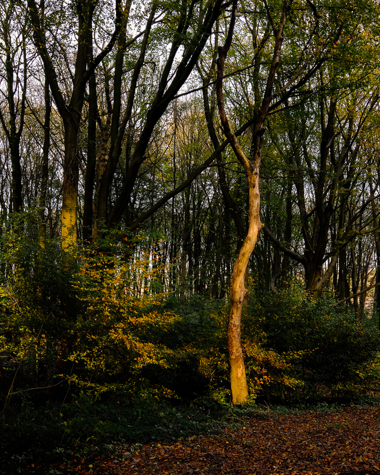
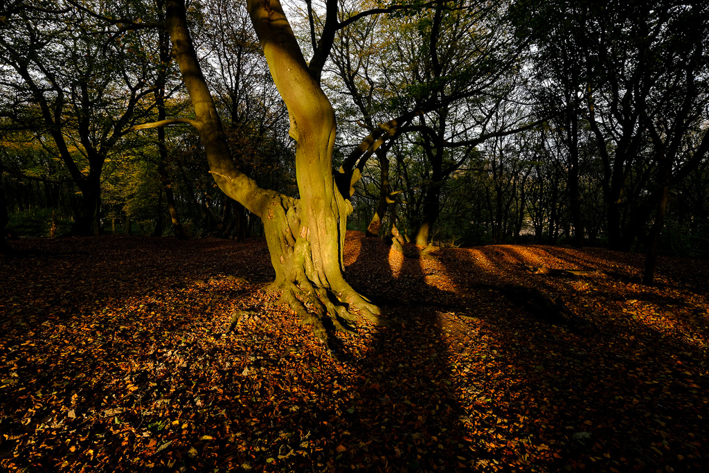
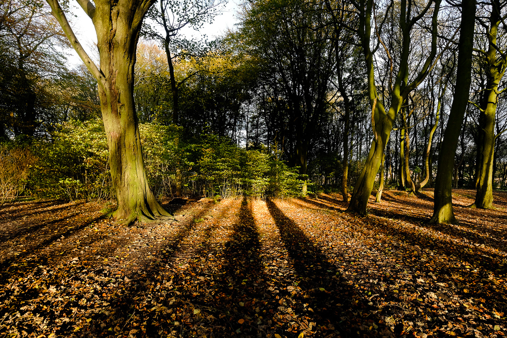
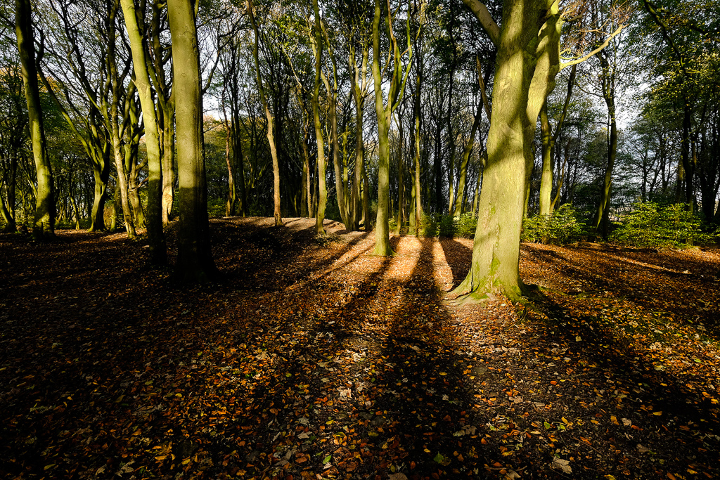
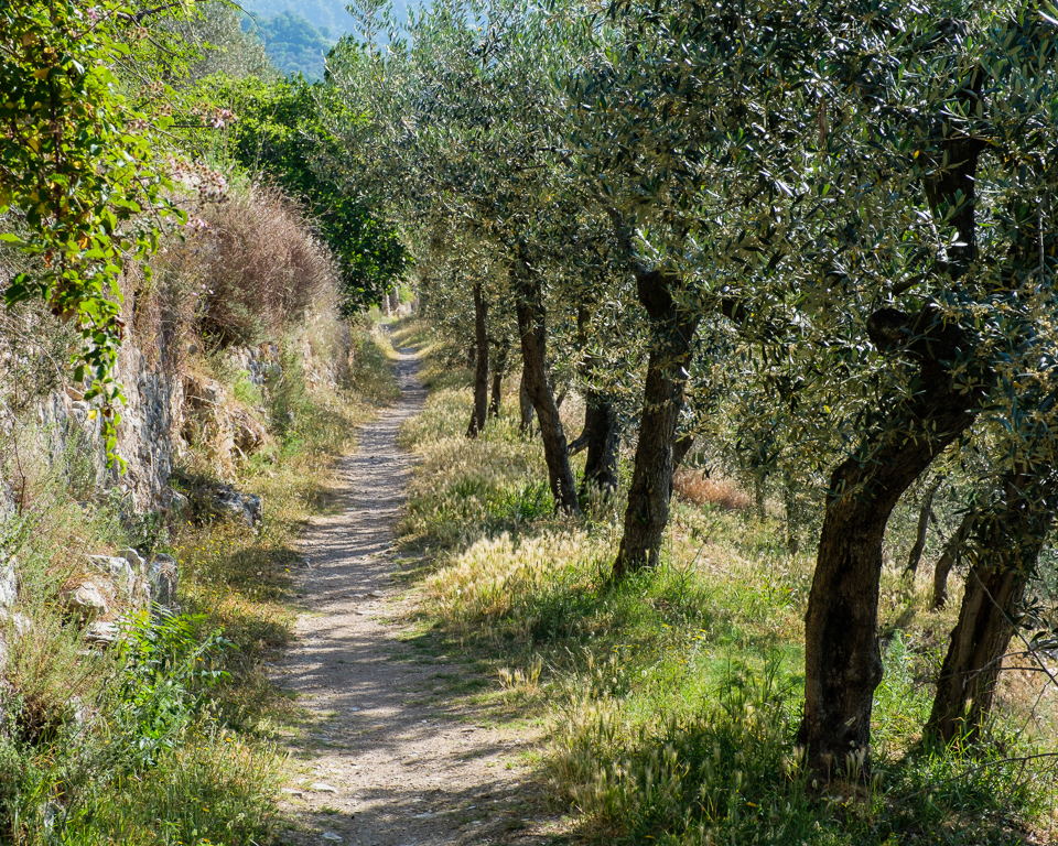
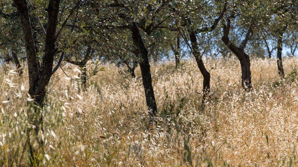
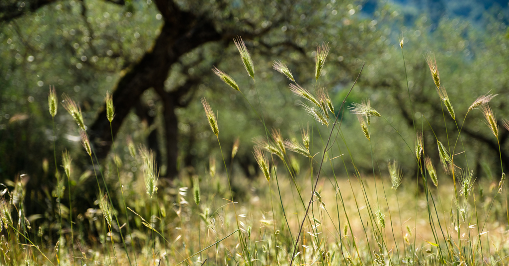
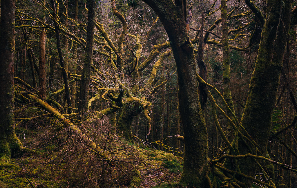
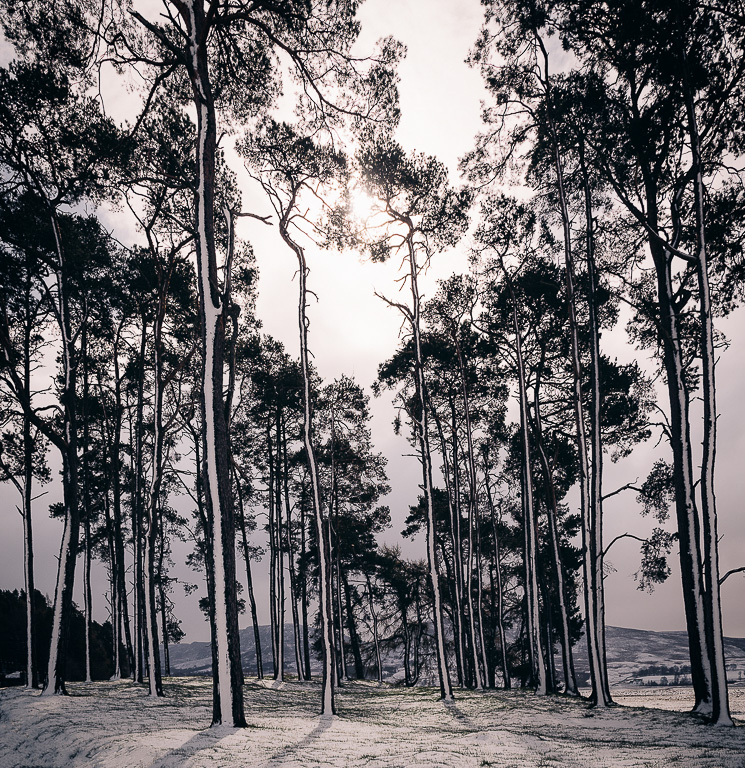
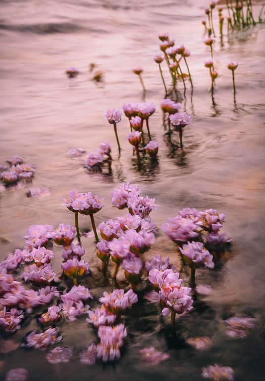
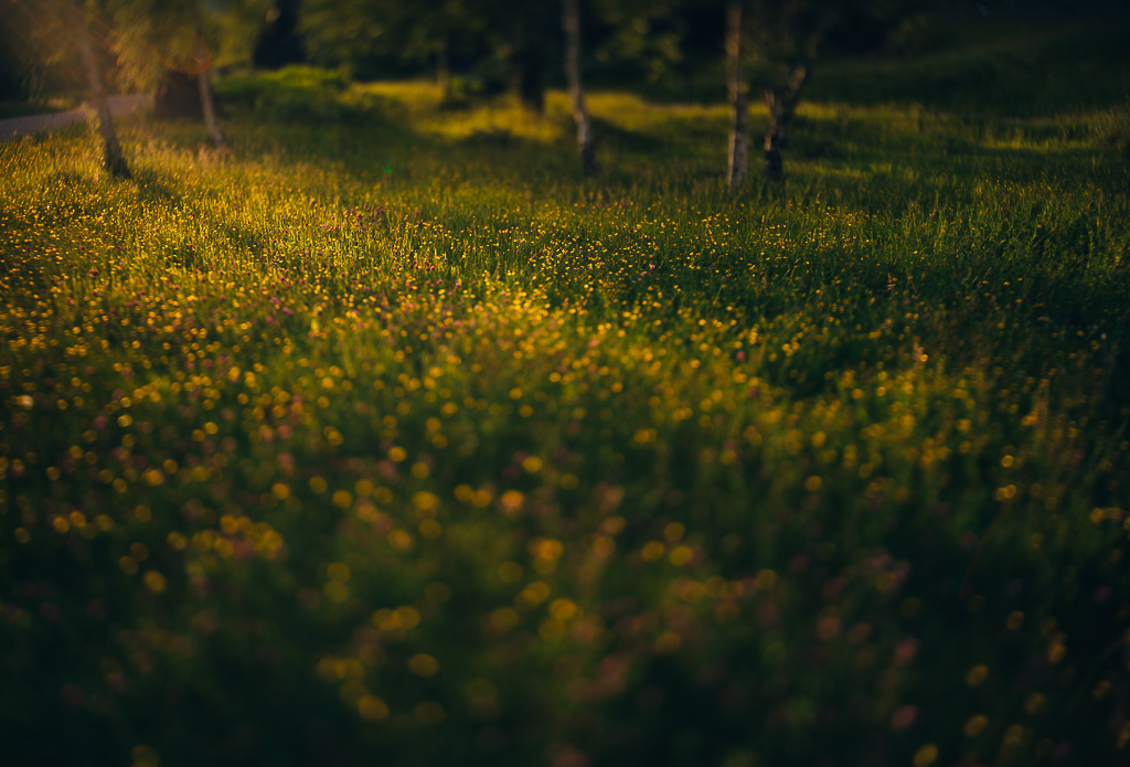
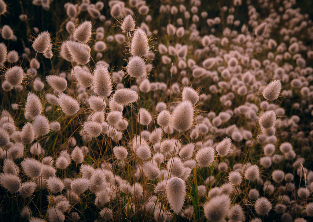
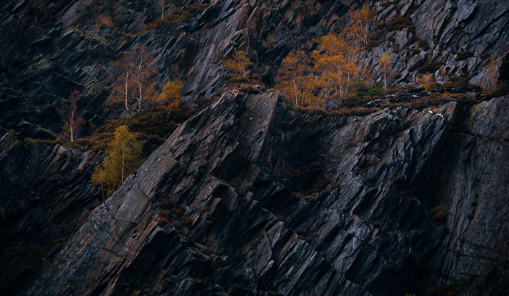
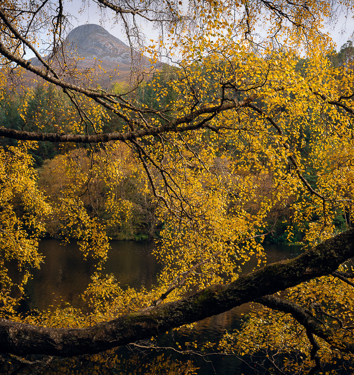
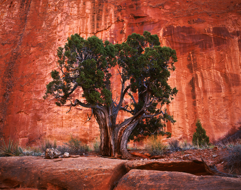
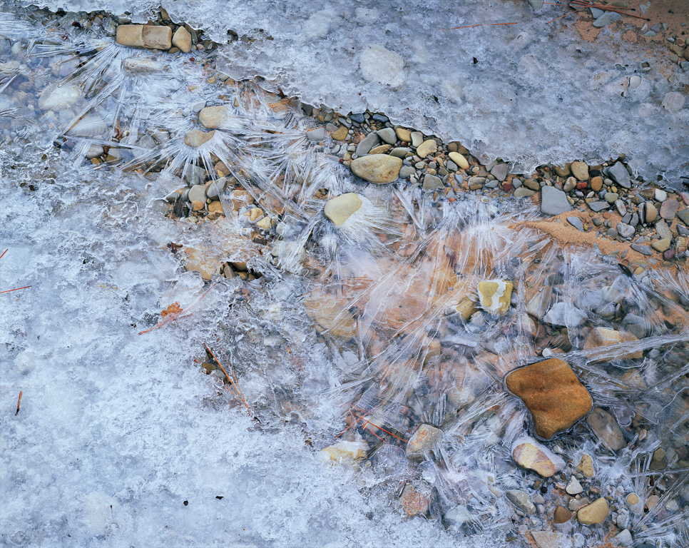
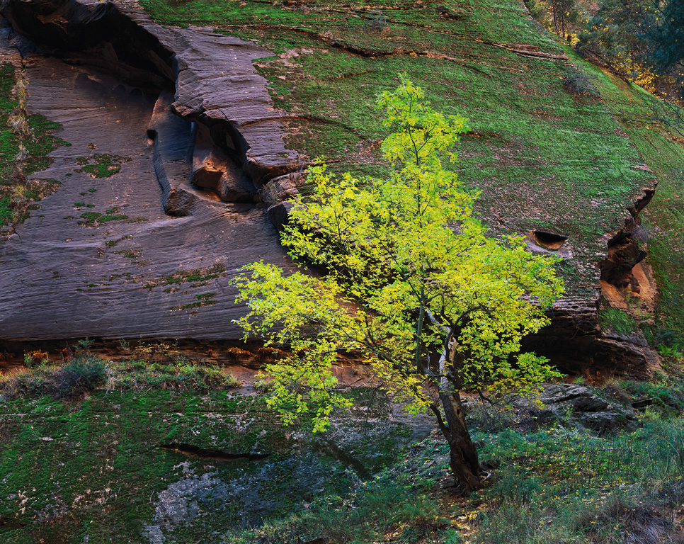
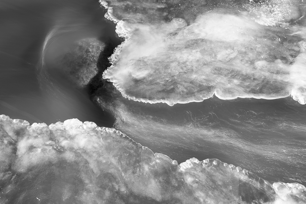
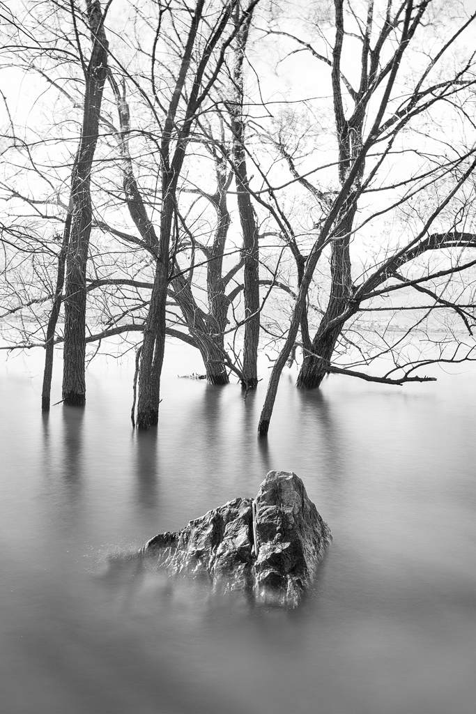
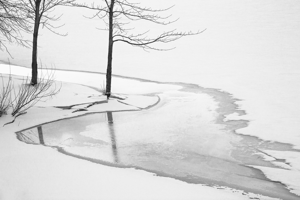
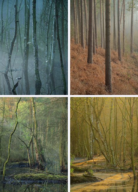
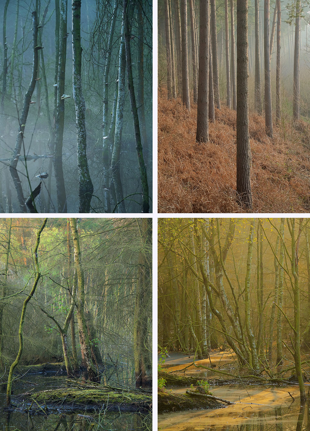
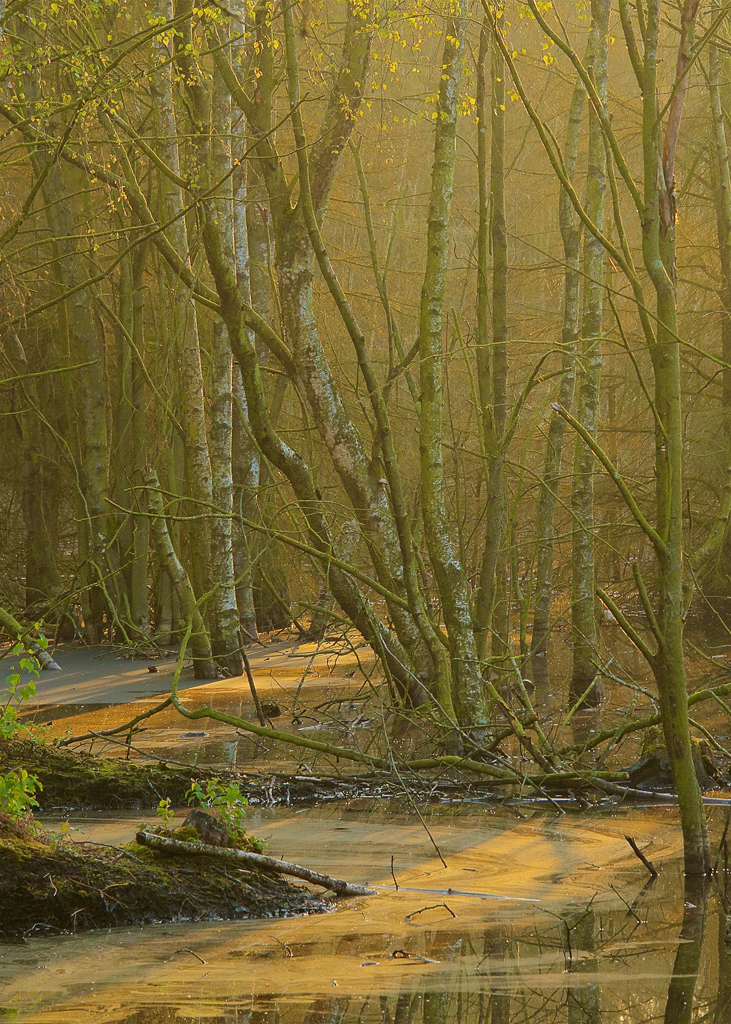
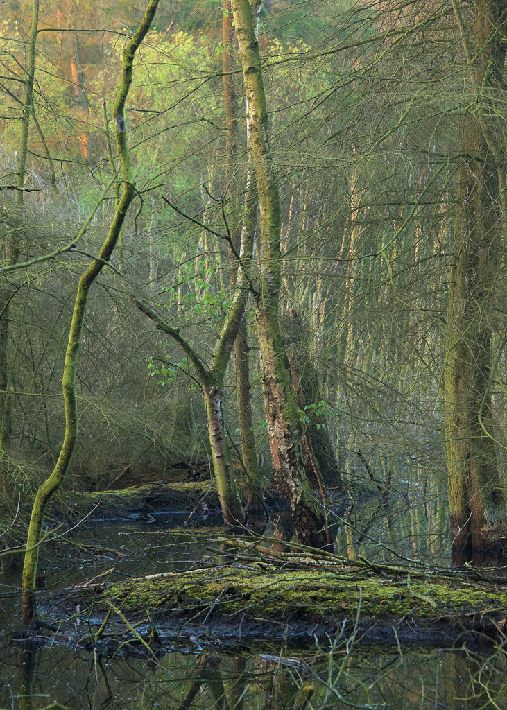
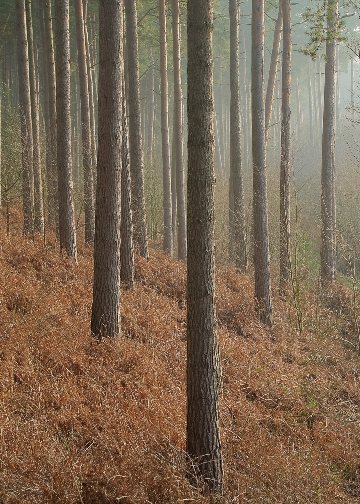
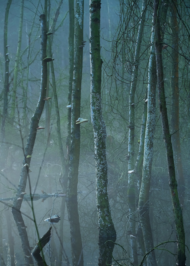
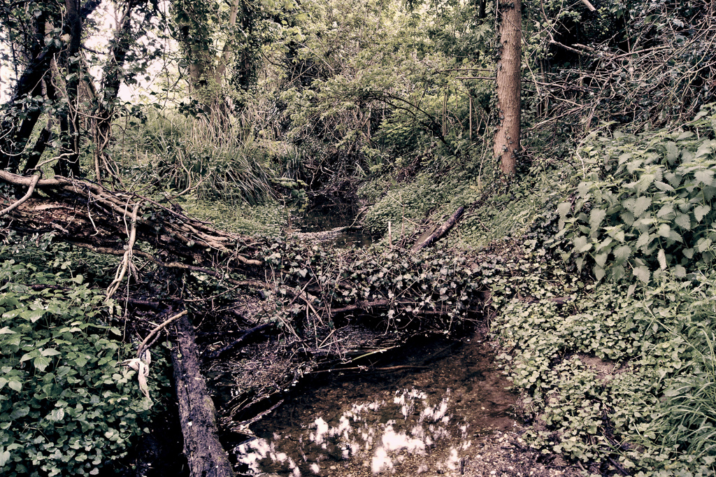
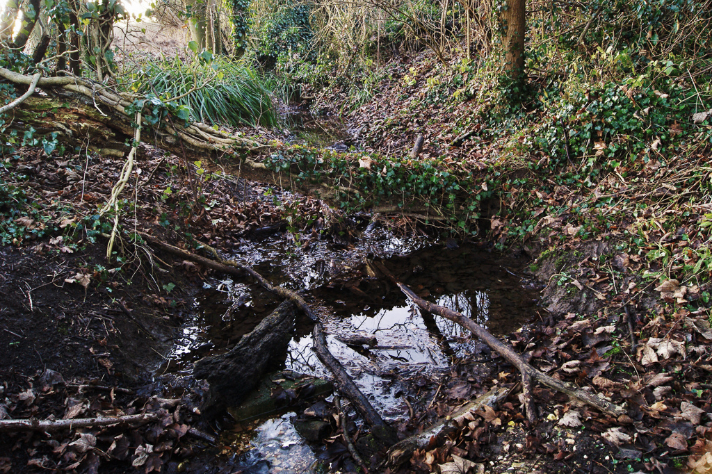
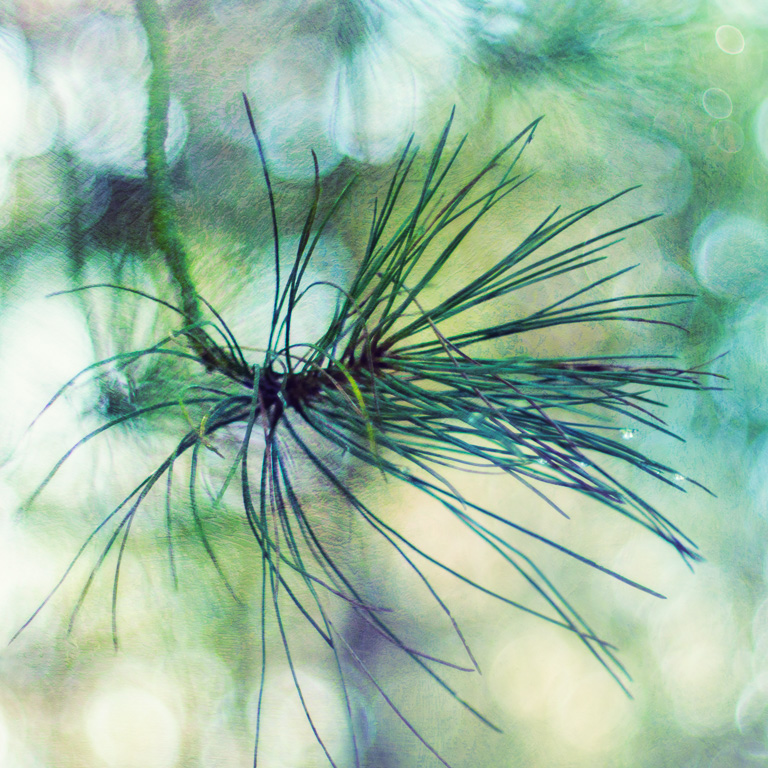
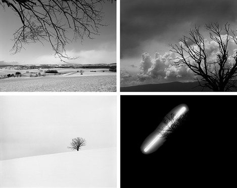
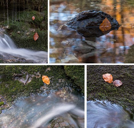
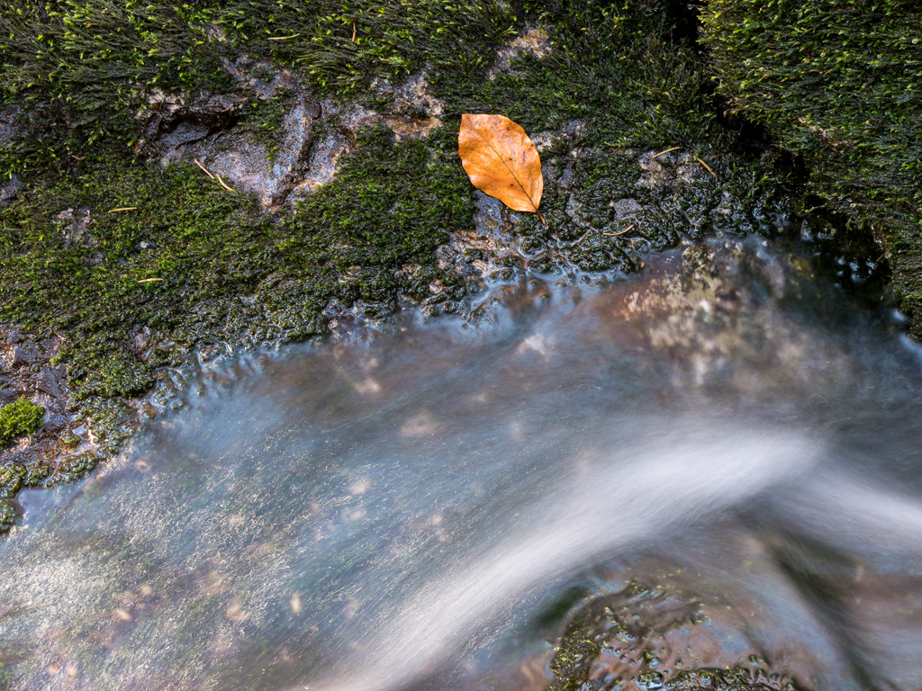
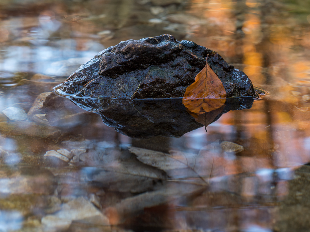
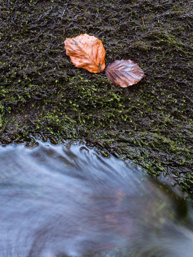
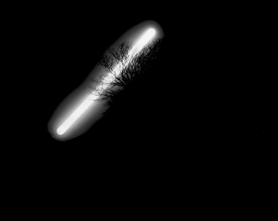
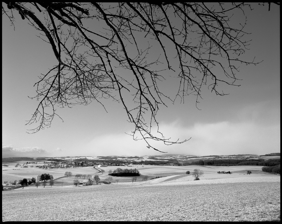
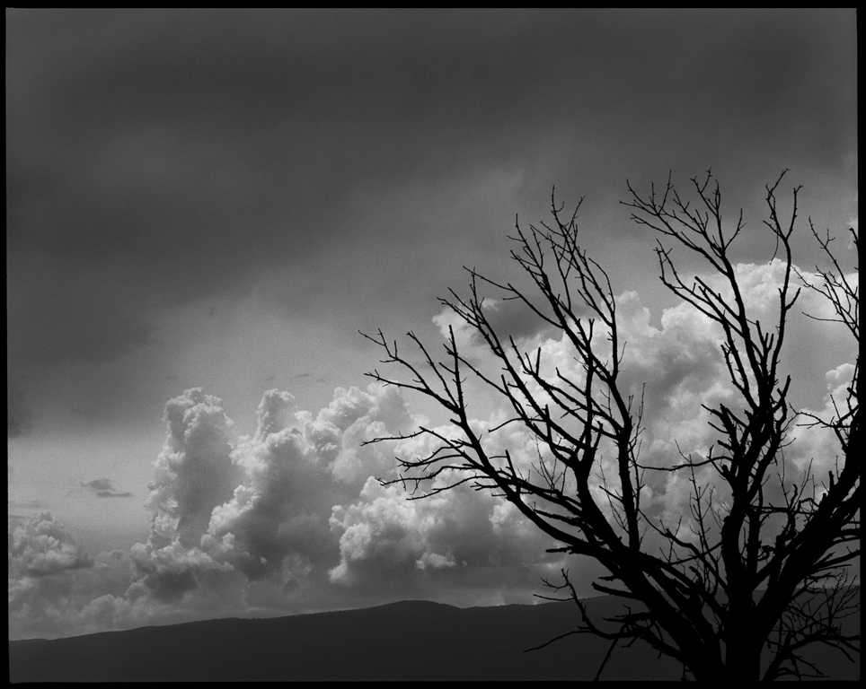
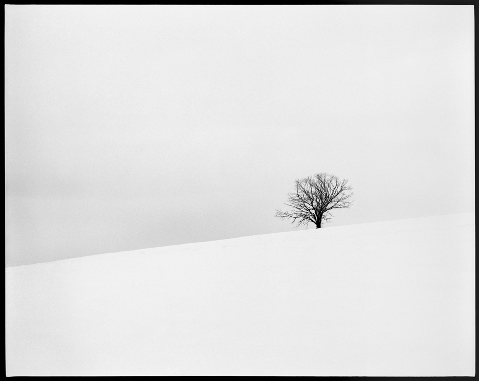
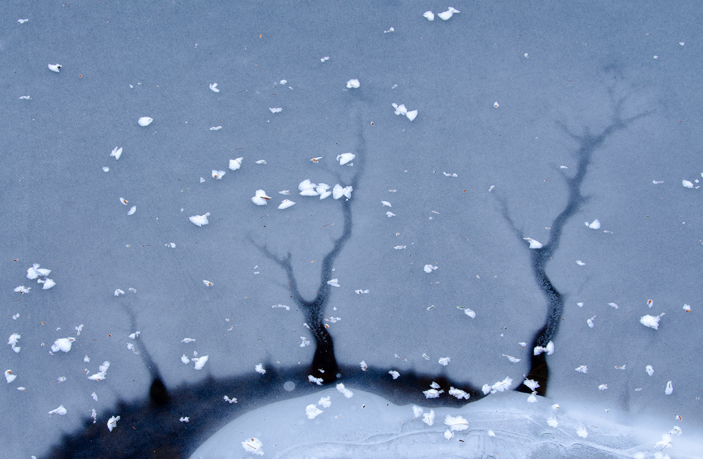
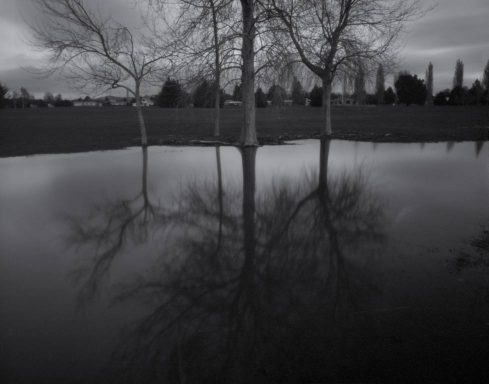
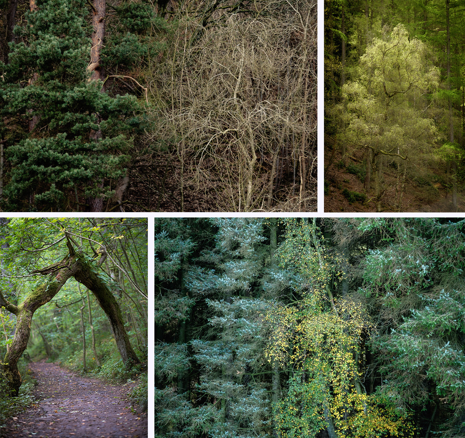
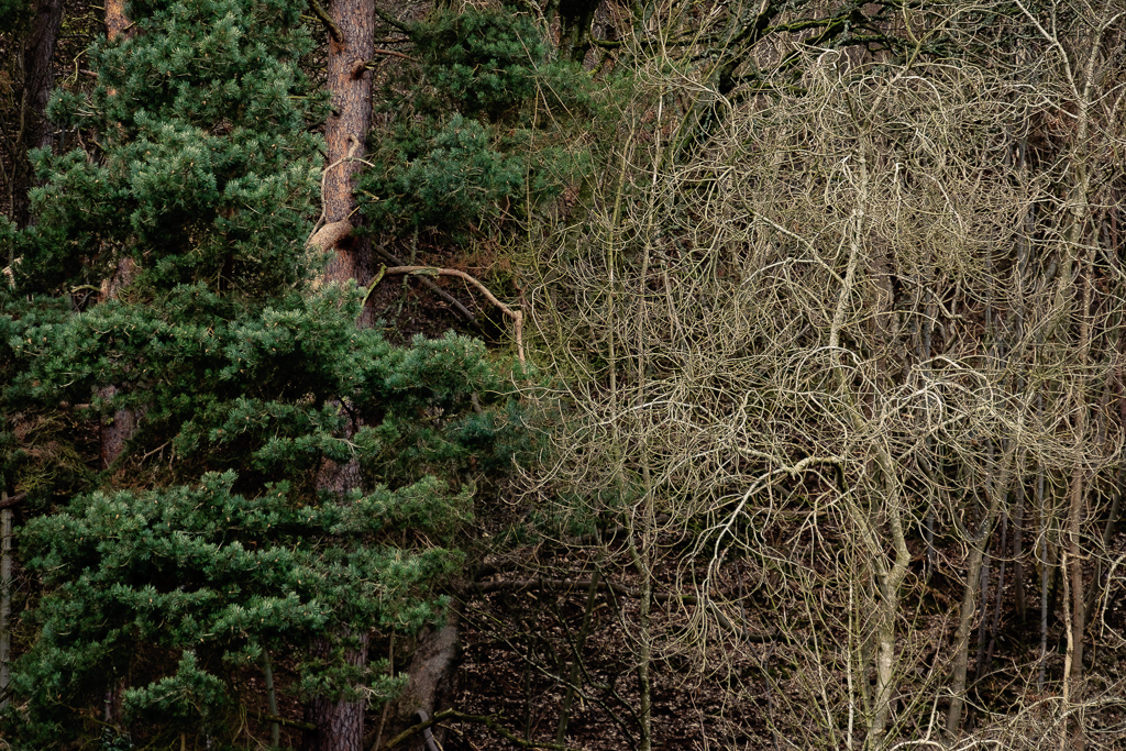
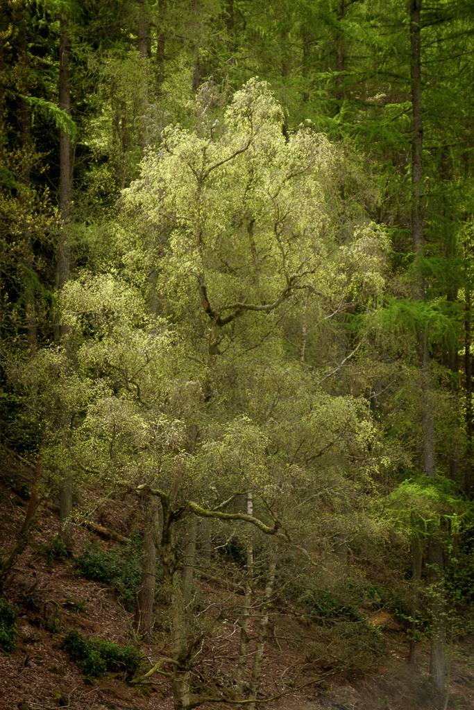
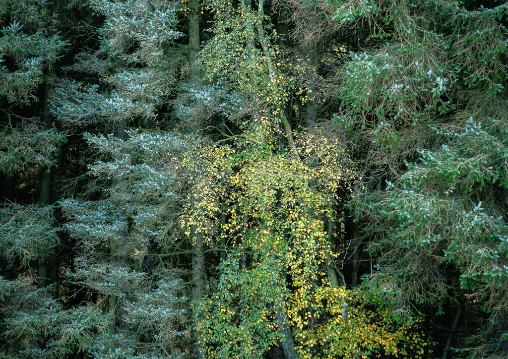
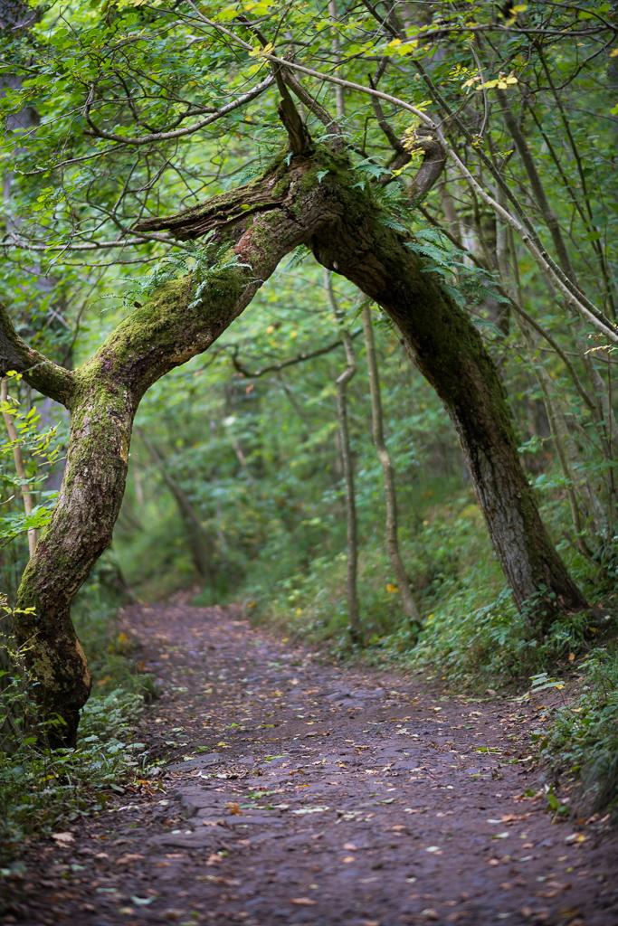
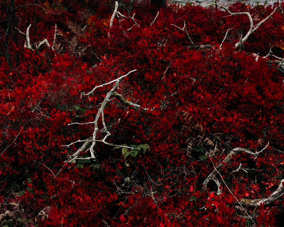
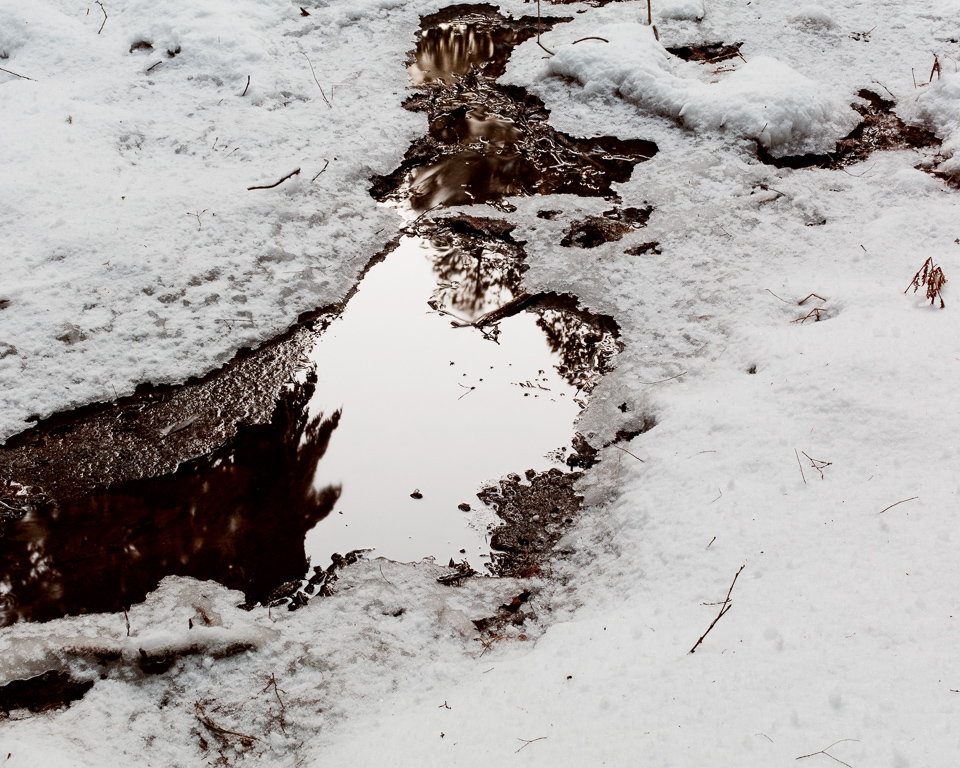
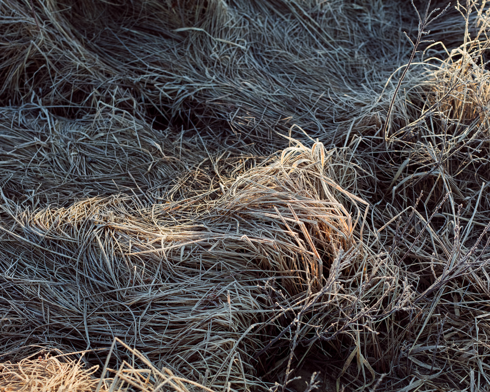
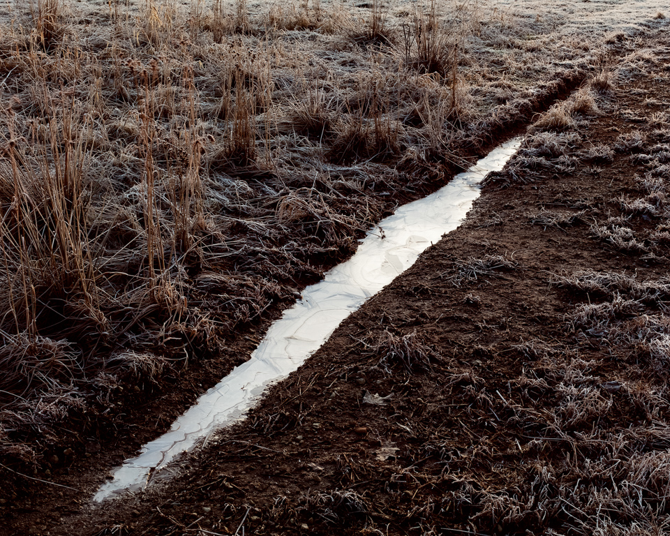
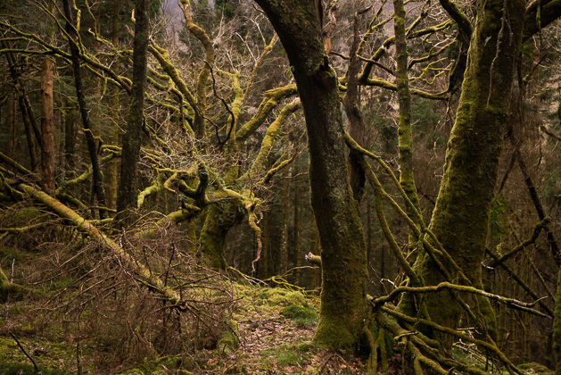
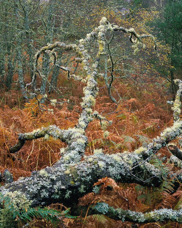
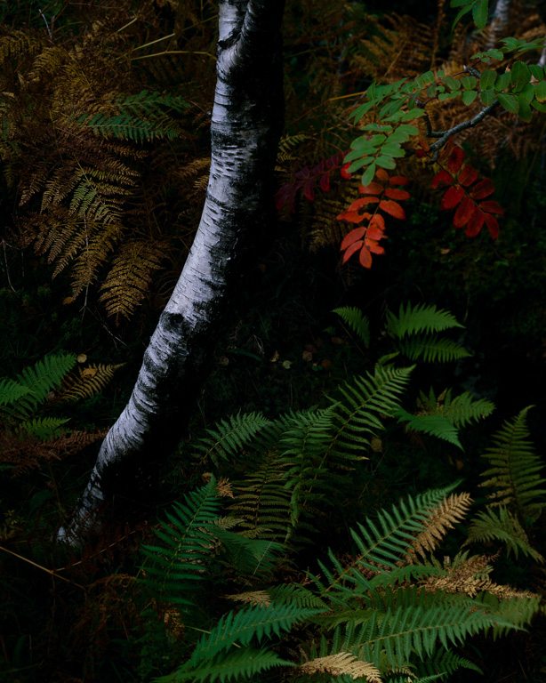
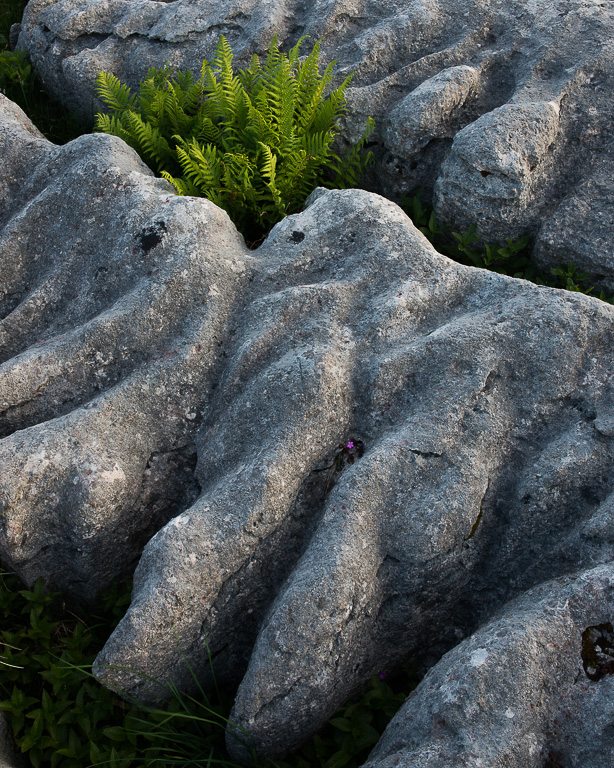
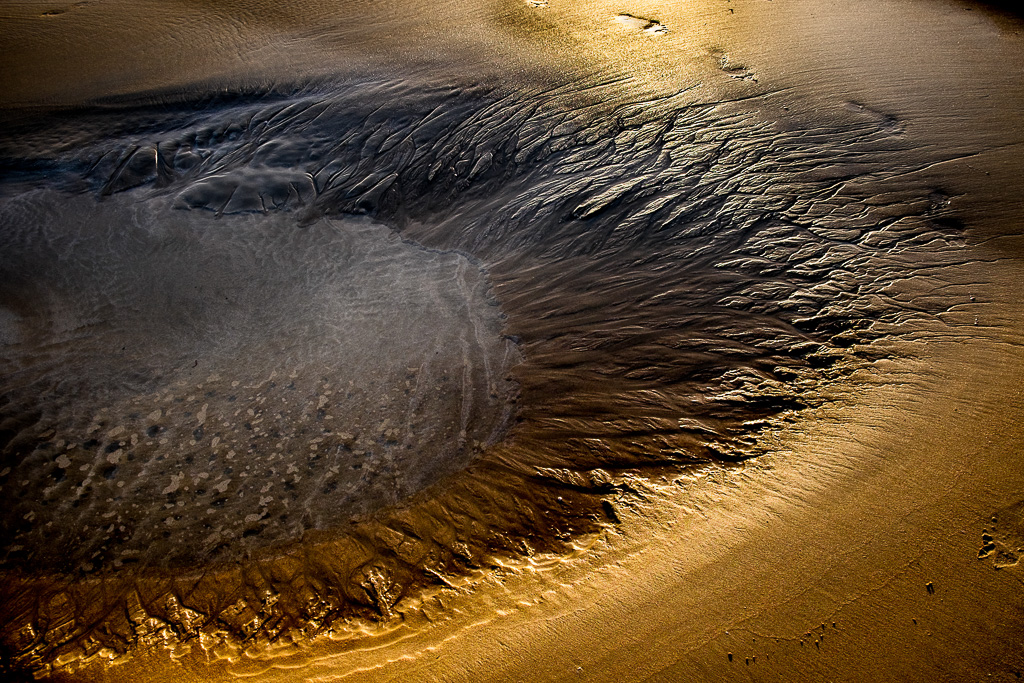
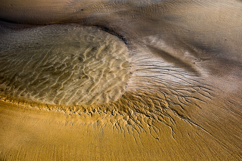
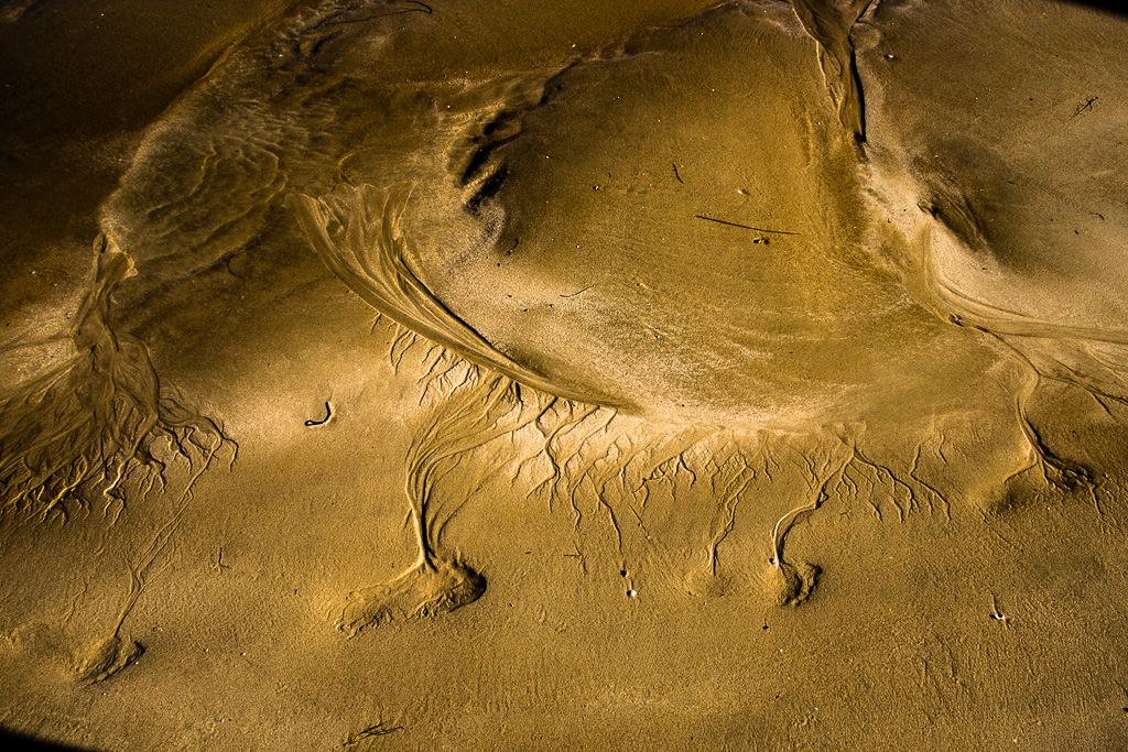
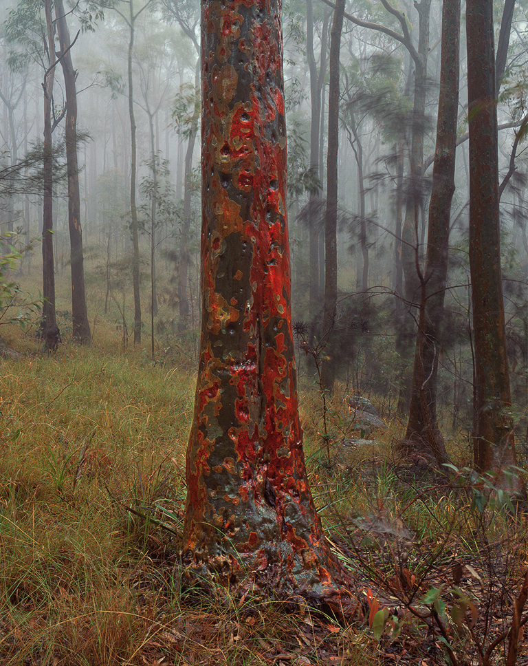
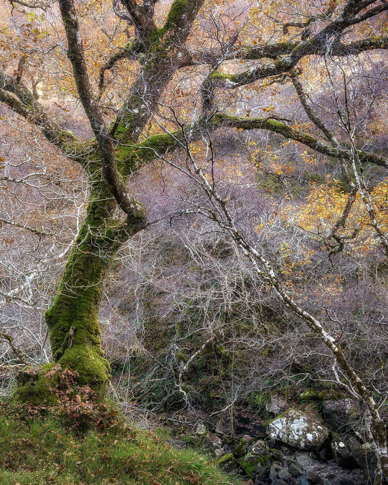
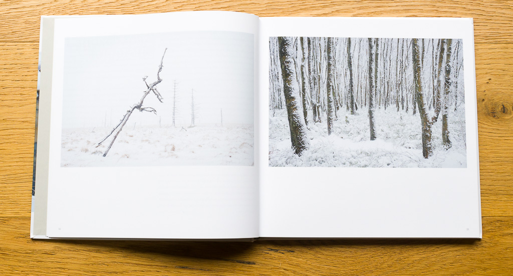
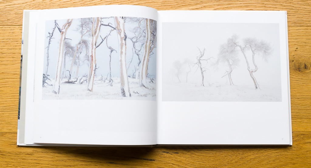
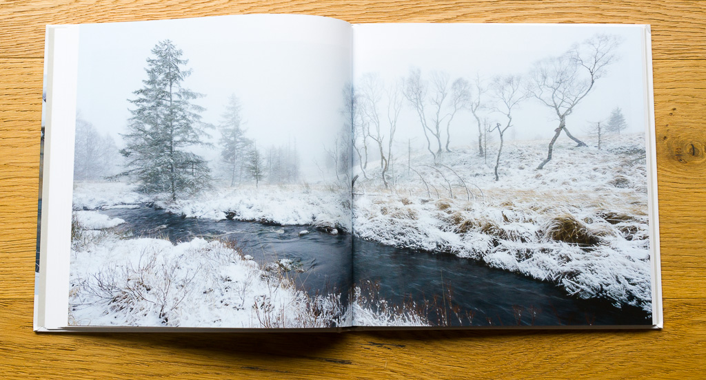
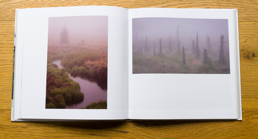
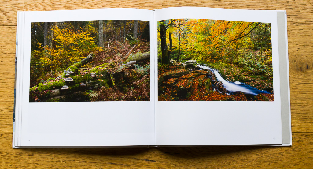
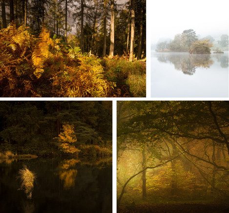
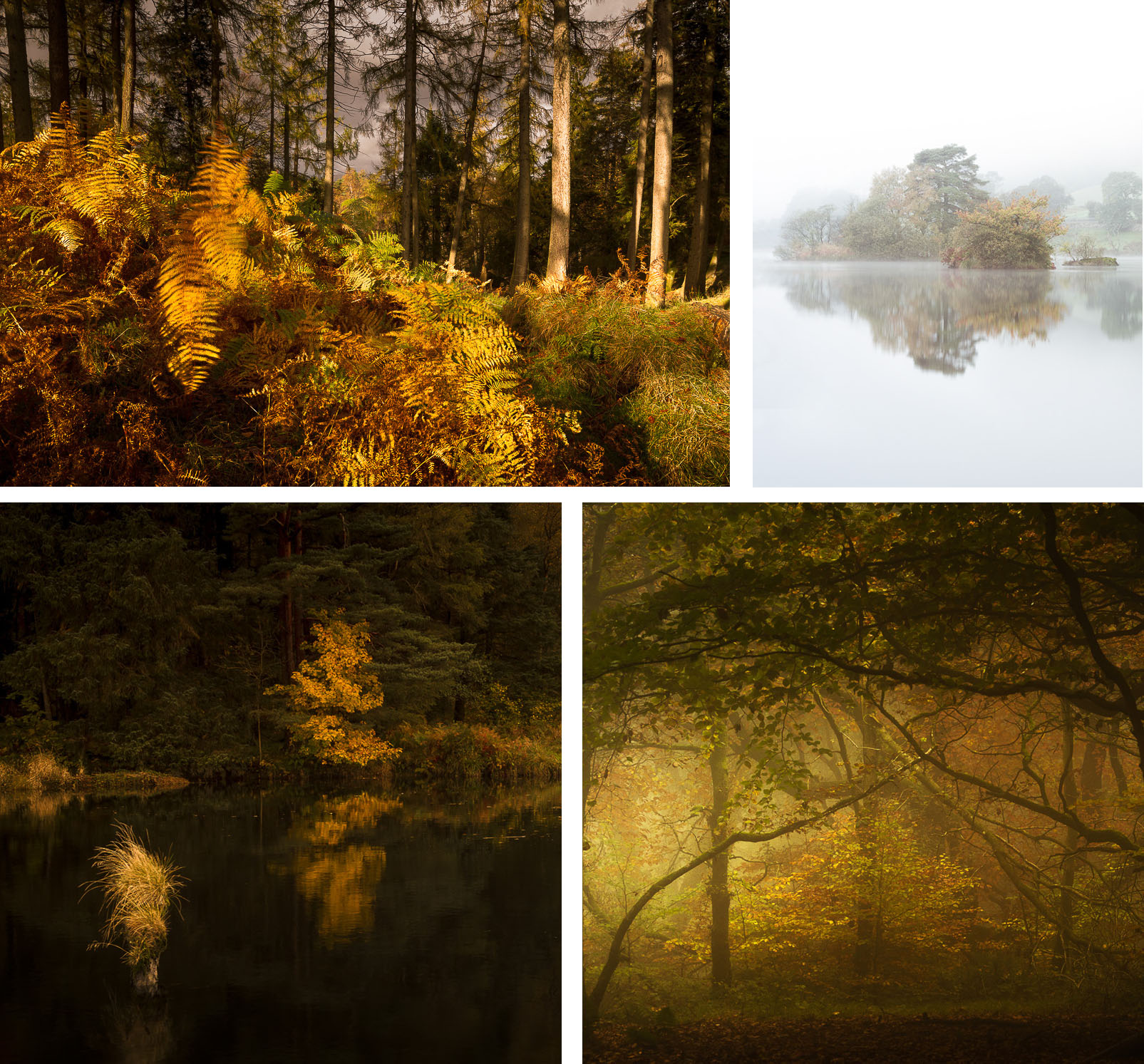
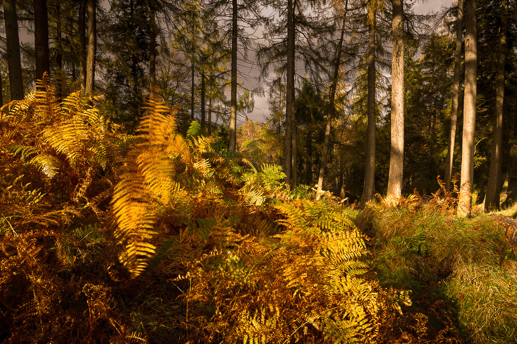
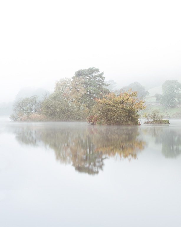
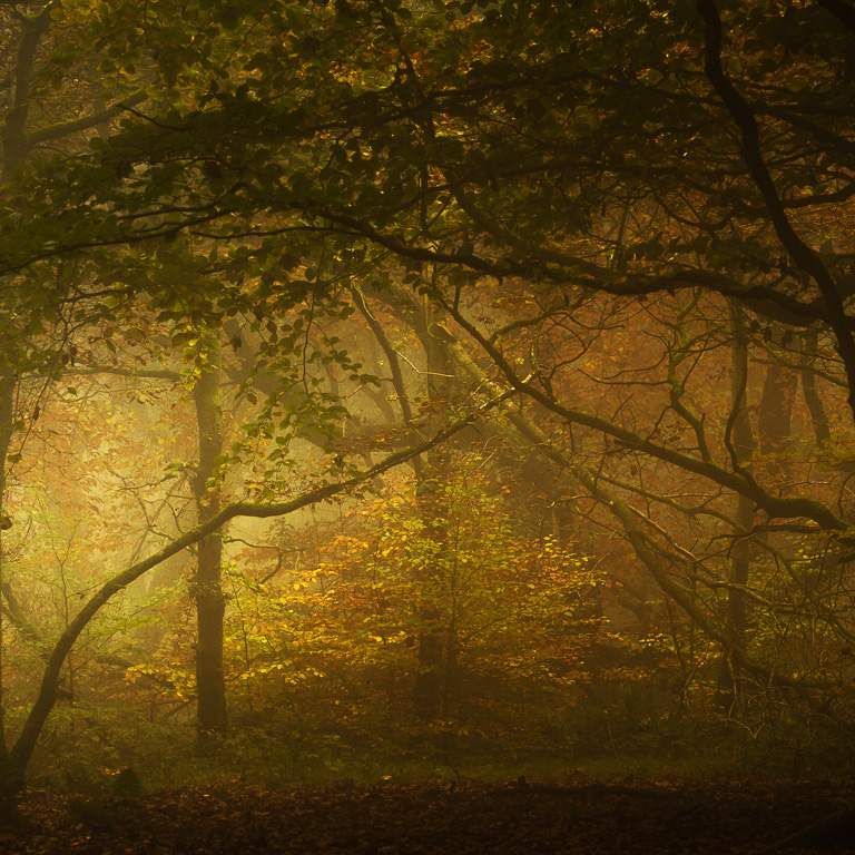
Selecting images for 4x4 has been quite a challenge for me. I could think of many 3x3 portfolios among my pictures but 4x4 is much more difficult. I decided to choose these 4 images which were taken during winter months and share similar subject - trees. It all started with Trees Frozen in Dance - a scene which I went by in January 2014 in Beskydy Mountains. Since then I realised how well vertical format and winter conditions work for my landscape photography. Trees appear very fragile and their strengths and weaknesses are visible.
Joe Cornish talks through some of the images taken during his family holiday in Yosemite last year. Using Capture One he talks through some of the thinking behind the technical and creative decisions made during whilst making these images.
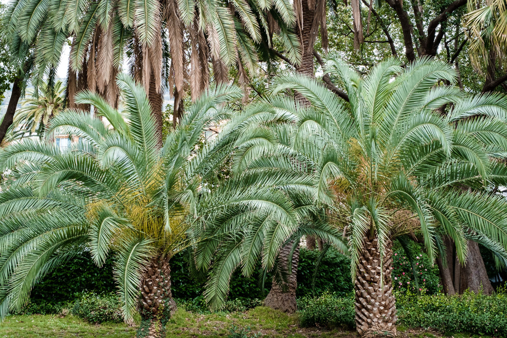
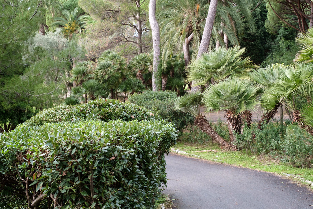
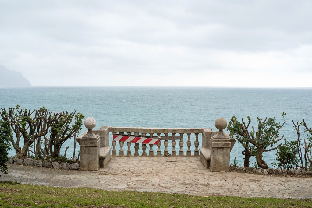
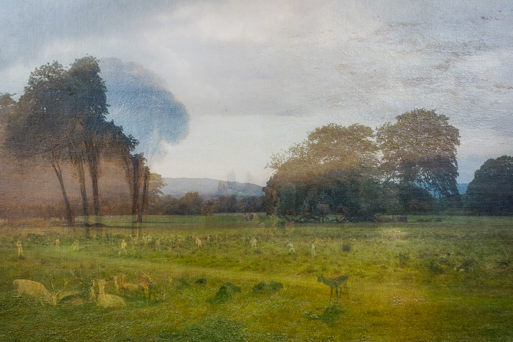
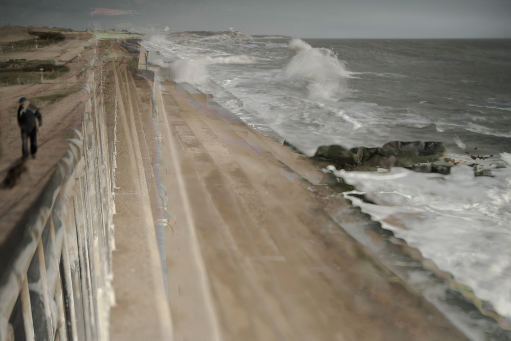
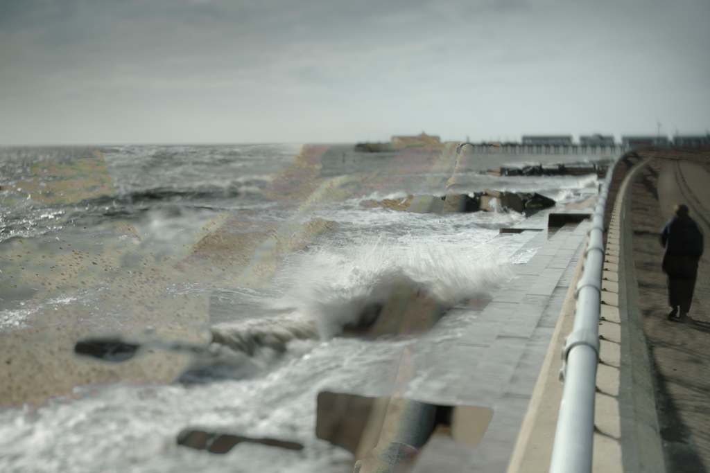
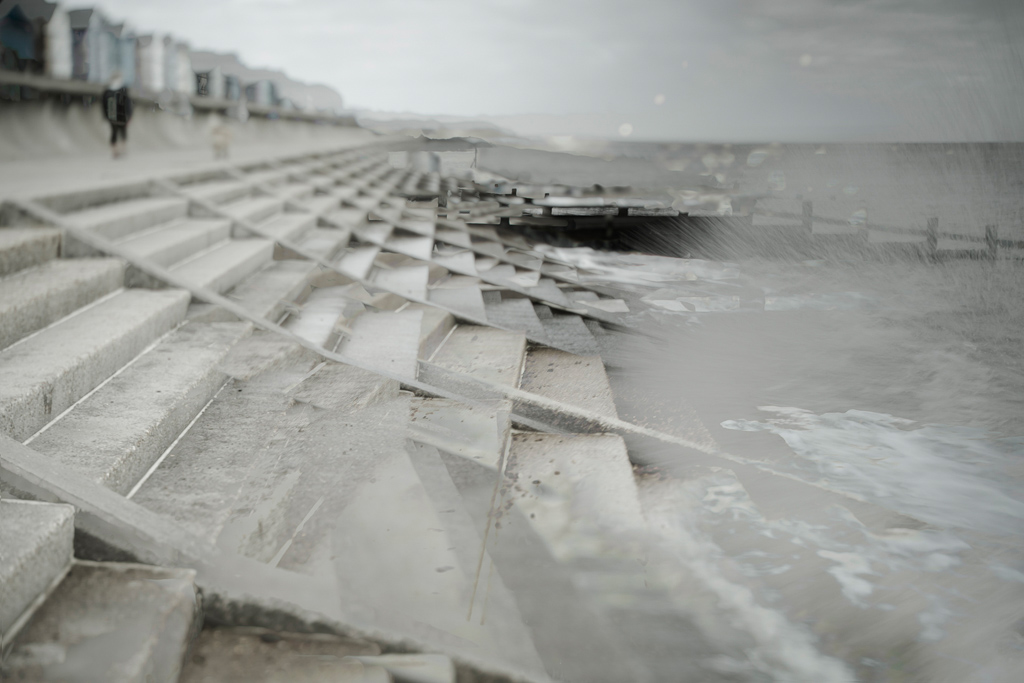
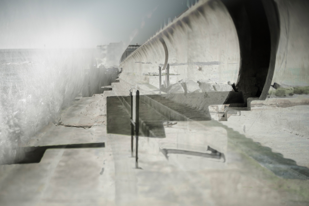
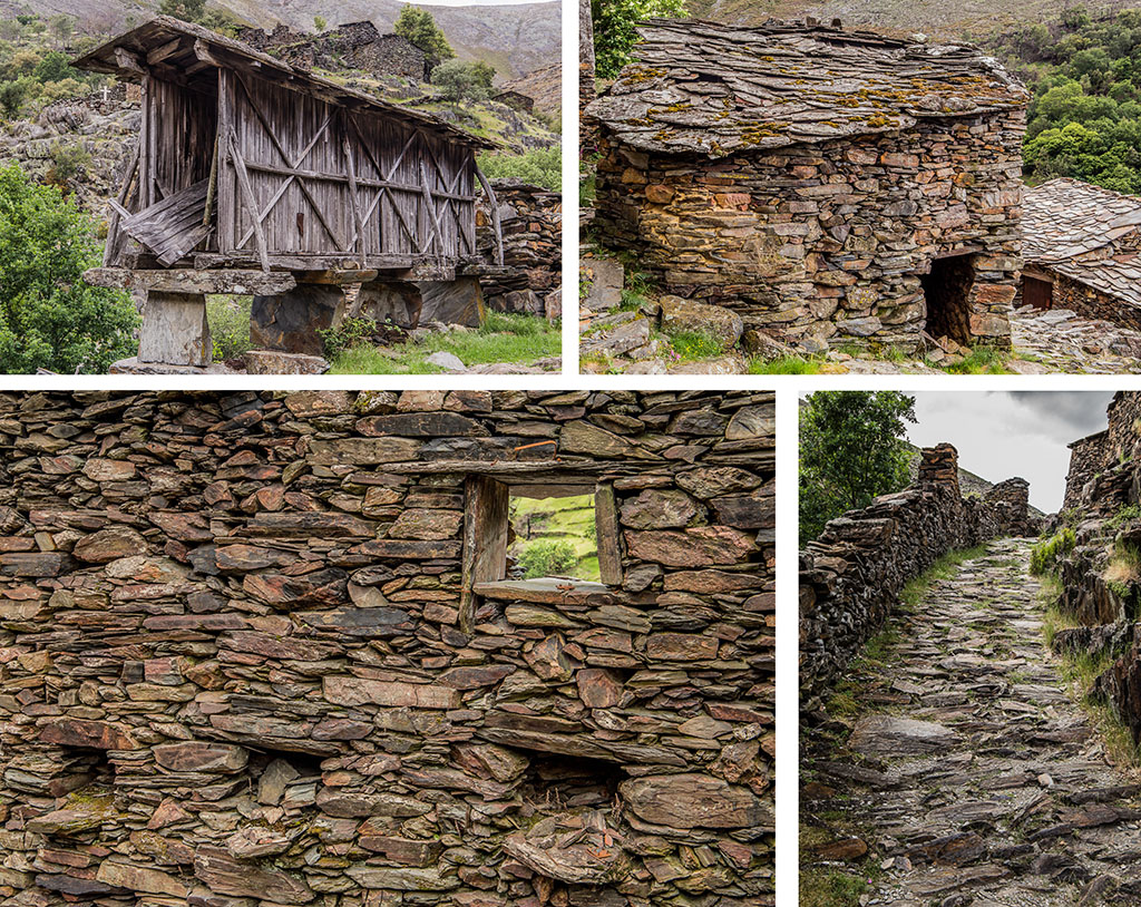
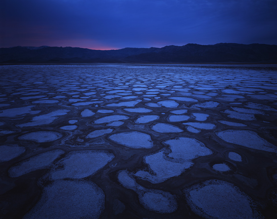
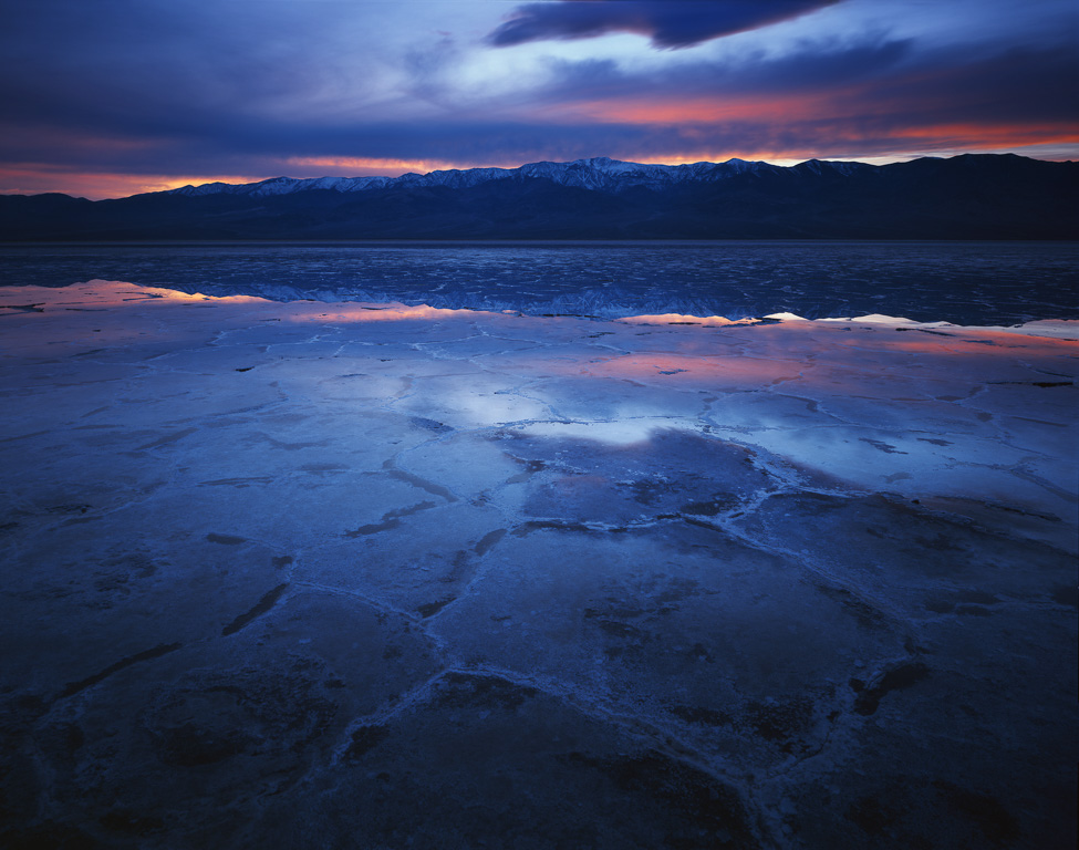
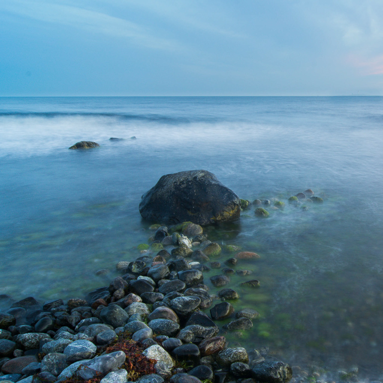
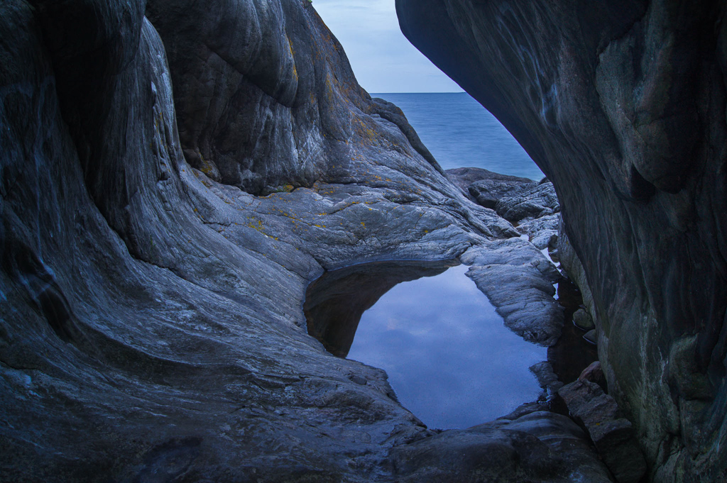
Nervi Parks are located in the easternmost part of Genoa. They comprise of the gardens once belonging to different aristocratic villas and they represent one of the most significant green public areas of the city, extending for about 9.2 hectares.
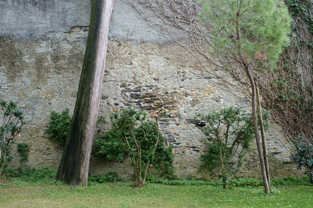
On the 14th of October 2016, just a few months after shooting this project, a violent storm hit the area causing severe damage. Of the 400 trees populating the parks, 196 were either toppled or estimated to be irremediably damaged by the downburst; further 15 trees were felled for safety reasons and, in total, more than 1.000 tonnes of timber were disposed of. As of today, only a few areas still remain inaccessible to the public. However, Nervi Parks are far from being recovered.
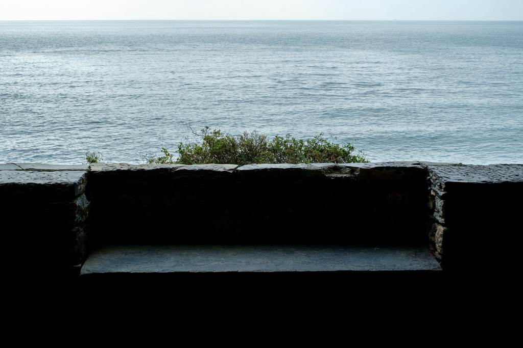
Despite being one of the dearest and most precious places of my childhood memories, the importance that Nervi Parks had - and still have - in my life goes beyond just being a very evocative setting. In fact, this is perhaps the very first place in which I could find vivid visual references to what Andreas Feininger defines as the photographic seeing: to me, it is as if the sense of contemplation generated by these gardens almost had the ability to educate, to aesthetically and mentally develop the way visitors look at the landscape around them. Here, the act of looking becomes the key element through which to perceive, explore and ultimately reveal all the nuances of the beauty of the surrounding landscape.
Bizarrely enough, despite being from Genoa, Parchi di Nervi is the first photographic project I entirely shot in my hometown. For months, I kept revisiting the same areas photographing the artificial landscape architecture of these historic gardens in an attempt to reveal their rigorous compositions and make their scrupulously accurate design more evident.
For months, I kept revisiting the same areas photographing the artificial landscape architecture of these historic gardens in an attempt to reveal their rigorous compositions and make their scrupulously accurate design more evident.
I wanted to present the viewer with those scenes in which the specificity of the photographic medium - i.e. the selection and the exclusion operated while framing and composing each photograph - could contribute to making order and symmetries more evident, thus revealing the design and planning processes shaping visitors' perception of the landscape accommodating their presence.
Given the recent events, this project has become even more significant to me, for the beauty, the sense of contemplation and the quietude, which had generated the need for me to photograph these scenes, have now become even more poignant. Shot just a few months before the catastrophic storm, this series has suddenly turned into the representation of a "non-existent place", for most of the scenes depicted in my photographs have been severely damaged or dramatically altered; many others, though apparently pristine, do present subtle but significant changes.
Over the last year, I have decided not to photograph the aesthetics of the devastation caused by the storm. Instead, I have waited hoping for something even more relevant to emerge and become evident: a new landscape. I have intentionally avoided documenting the violent and sudden modifications as they were happening, waiting for their long-term consequences to become visible. I do consider this to be an ongoing project and ideally, in the coming months, I plan to revisit all the scenes I had photographed before the storm and juxtapose them - perhaps in diptychs - with their new features. Not only this would contribute to documenting and preserving the landscape heritage of Nervi Parks, but the resulting body of work will hopefully be of help in the ongoing debate on whether the damaged areas should be restored as they looked or redesigned altogether.
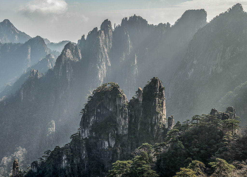
In early 2016 I began liaising with friends I know in China to create a trip to somewhere I had never been before, which actually resulted in me visiting many places I had never even heard of. As much as I love to visit and photograph locations I am familiar with, it is often refreshing and challenging to head to somewhere completely different and see how you approach the subject with your camera and also see how you would interpret the landscape as a result of you experiencing it.
After many suggestions and ideas being shared over many phone calls, it was decided that I should visit Mount Huangshan or Yellow Mountains. Yellow Mountains are a vast and intricate mountain range consisting of thousands of granite spires that extend to nearly 1,900 meters above sea level where there are pine trees that precariously grow in seemingly impossible conditions. The Yellow Mountains situated in the Anhui province of eastern China 5 hours west of Shanghai and the journey alone would prove to be an eye opener for me.
The start of the exploration began in Shanghai itself and standing on the Bund on the west banks of the Huangpu River watching the huge sky-scrapers slowly being lit up as the sun set on the what can only be described as a smoggy evening metropolis. This experience alone was different for me as a landscape photographer used to working in the quiet alone. The Bund is a busy place. When I say busy I mean hugely populated with thousands of people who flock there every evening to witness this spectacular. Now, this may sound like an uncomfortable experience but it was anything but uncomfortable. It was relatively easy to 'carve out' a little working area for my camera and tripod and the people could not have been any friendlier. That said, the lovely Chinese people do not have the same sense of personal space as us westerners and it was not uncommon for them to walk right up to the back of my camera as the thumbnail appeared on the rear screen to have a look. In the end I had created quite an orderly queue, all of which were happy to try out my loupe!
Charlotte Britton: Tell me about why you love landscape photography? A little background on what your first passions were, what you studied and what job you ended up doing
Gary Dawes: I was born in Greenwich South London and grew up on a council estate in North West London, I had a healthy dislike of school apart from Art and Drama.
I had it in my mind from an early age that I wanted to do something creative with my life, the thought of getting a job just to look forward to weekends and holidays just didn't sit well with me. I left school aged 17 years old and never returned.
It was during my earlier years of growing up as a kid that I became heavily influenced by the cinema and I would visit religiously every time a new film was showing. This was made possible by my finding a way to break into the cinemas which I got down to a fine art, I had no money.
CB: Can you tell me a little about your education, childhood passions, early exposure to photography and vocation?
GD: It was in those early years which had a profound effect on me which then became the catalyst for my love of images. Not long after leaving school I landed a Job at Sammy’s, a large film camera rental company in London. I started off in the post room to get my foot in the door and after a few months I was offered a job in the Camera department. I then spent the next three years learning all I could about the film camera equipment from 16mm Arriflex to 35mm Panavision cameras which included a year in Soho working with stills equipment from Hasselbads to 10x8 sinars.
It was when I was working in the branch in Soho that I would be able to take the Cameras home at weekends to shoot with and teach myself how to use them.
I have now gone solo again and do what I love best. I have always had a deep passion for shooting personal work it gives me a creative freedom. Money don't buy that.
This was made possible by having a great boss who also used to put the cost of all my film and processing through the company. The time flew. During my time at Sammy's I was able to meet a lot of camera crews who used to come in to test the camera equipment prior to filming and I would always make myself available to help them . After my 3 years was coming to an end I told them I was leaving and going freelance as a camera assistant, they offered me work, so I gladly took them up on their offer.
I would then go on to spend the next 34 years working in the film business as a freelancer learning the art of film making in various grades and traveling extensively both internationally and in the UK. I worked on a vast and diverse array of films from high end TV commercials, documentaries, music videos, and features. In between work assignments I would always be spending my time shooting and producing my own projects. I have now gone solo again and do what I love best. I have always had a deep passion for shooting personal work it gives me a creative freedom. Money don't buy that.
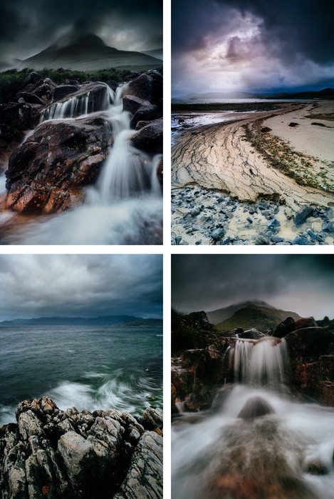
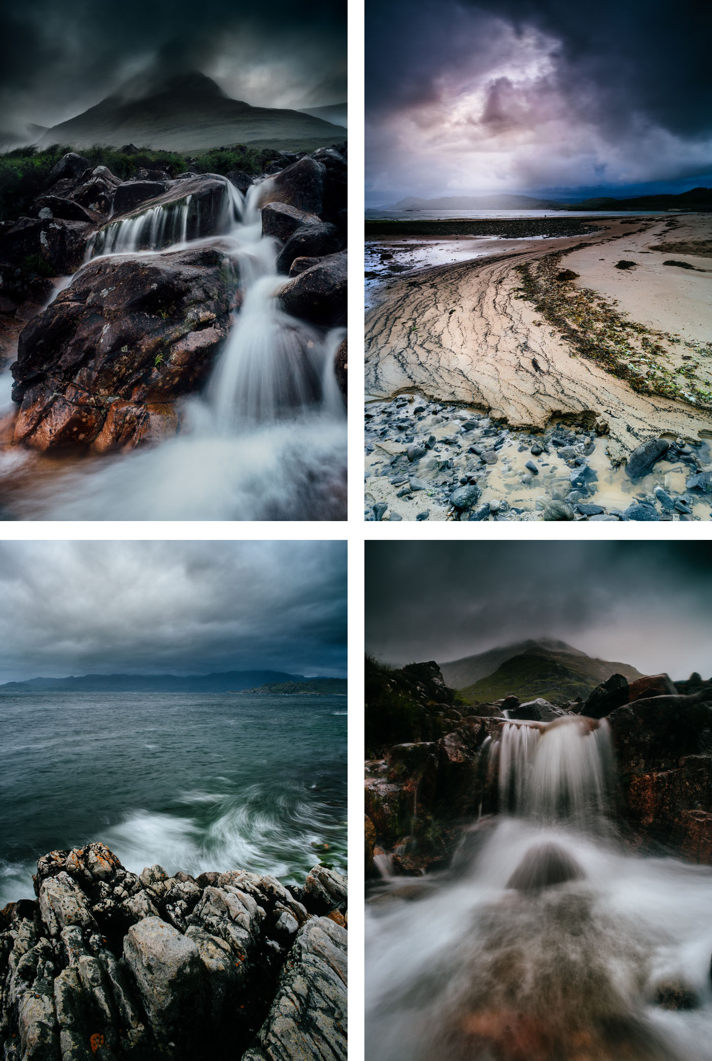
CB: What inspired the Scotch Mist project?
GD: The Scotch Mist series came about due to the fact that I wanted more of a hand in the actual creation of the images I felt I was going stale creatively and becoming dissatisfied with just taking pictures. I wanted to inject more into the work. My goal was to alter the look and feel of the pictures organically in camera, without using computers I always try to give my images a bit of weight as I believe the image is not intended to represent the thing itself, but rather the reality of the force the thing contains.I also believe the truth of a thing is the feel of it. Not the think of it. I really do not see any point in working with photography or any other medium if I am not challenged creatively.
CB: How did you go about planning the project? How did you choose which locations?
GD: When it comes to the photography I am not a great planner, I like the excitement of not knowing what’s around the corner. I will do some research but spend much more time on the road wherever that may be scouting out locations and exploring the landscape to get a feel of the place and to try and get a visual lock on my surroundings. I carry small notebooks everywhere and jot down what takes my eye. These always come in handy for future reference. I am constantly eyeing the world in a sought of cinematic way if that makes sense.
CB: You mentioned on your website that you add the ‘mist effect organically in camera in real time’. Tell us a bit about how you came up with this idea and how you use it in situ
GD:
I was fortunate enough to have worked for a long time with some top class photographers who would try and push boundaries visually and had the balls to try stuff out to achieve a certain look in camera.
In camera effects has been around a long time.I came across this discipline as a camera assistant there was no digital manipulation around. I was fortunate enough to have worked for a long time with some top class photographers who would try and push boundaries visually and had the balls to try stuff out to achieve a certain look in the camera. Which I love, as I found it both interesting and fun, this method has always stuck with me, it also gets me out of the house rather than indoors shackled to a computer screen trying to achieve the same effect. Its the act of photography itself that interests me. Not as subject matter.
CB: You talk about this skill being - a discipline long gone and now done on computers. How did you experiment and develop this idea
GD: It was over a period of a few weeks that I would endeavour to try and find a way to replicate a mist, the test were quite extensive which included creams, liquids, oils, gels, wax, fine strips of Lighting gel, tracing paper which I then sandwiched between 2 4x4 optical flats, sandpapering lines on sheets of plastics, glass etc. It was when I was in a toy shop that the idea first came to me, I saw these tubes of glow sticks, so I bought 6 tubes and began testing, I would line up my frame and just position them in shot, The soft white variety seemed to work the best, I found that if I got my camera angles to the sun right I could light the sticks up also another plus was when in low light situations I would crack them to activate the gel inside to glow. But of far more importance they gave me the control I wanted over the composition which was another main driver in the project.
CB: Could you tell us a little about the cameras and lenses you typically take on a trip and how they affect your photography.
GD: I like using different cameras film or digital.I find it refreshing. I'm no camera snob. I have just recently bought a Polaroid instant film camera a One 600 classic and 10 packs of film to keep me going through the winter months, I am really looking forward to shooting with it. My workhorse is a Nikon D3200 it is small and light with 18mm-300 VR which suits me fine and a Manfrotto tripod. I travel light. I believe that what has a far greater effect on my photography is not the equipment, but what I see and feel at any given time, coupled with a little imagination. Cameras are important, I get that, especially the glass. But for me personally, the image is everything and should stand alone. I have no real interest in what cameras the images are captured on.I have had work on display in the past in a group show at a gallery in Luxembourg that was shot on an old Nikon D70 with a 55mm lens.
CB: What sort of post processing do you undertake on your pictures? Give me an idea of your workflow.
GD: After a shoot, I will walk away from it for 3 or 4 days and get on with the other the things in my life and come back to it with refreshed eyes and start to edit I use photoshop to just grade the images. I carefully manage my time with computers and do only what is necessary if things go on a bit I will break the time up with either a walk to the lakes or the forest. I have to find a balance. For me personally its all about getting out there and getting on with creating the work. I have spent the best part of 5 years putting together a portfolio which I think is half decent. My workflow is now being geared more towards exhibitions/shows and marketing. I am in negotiations at the moment to put on a solo show in 2018 with 2 lots of work the landscape series "Gods country" together with the "Body of light" series.
The business side of things now takes up a 50% of my time, unfortunately, I would rather be shooting any day, but the time has now come to get the work shown in the flesh.
CB: What advice would you give someone else for trying out new ideas and techniques
GD: I’m the last person to be dishing out advice but all I can say is “It's not where you take ideas from. But where you take them too"
Michael has previously written eloquently about "Before the Storm" by Edward S. Curtis for End Frame. A passionate conservationist ready to speak out in support of his beliefs, Michael is especially drawn to the desert. He has observed that "There is no bleak, only beauty" and his images are an excellent reminder that we should all be true to our own definition of beauty, whatever it may be.
Would you like to tell readers a little about yourself and how the places that you have lived in have shaped you?
I was born in Los Angeles nearly a half-century ago and still reside in the metropolis. I'm often reluctant to admit this because it seems at odds with the lifestyle I lead. Although my home resides in a coastal city, my mind and soul live forever in the wild. Traffic congestion and millions of neighbors can be a challenge to anybody's sanity, but this is contrasted by hundreds of miles of incredible coastline; a number of incredibly beautiful National and State Parks; one of the world's most stunning mountain ranges (Sierra Nevada), and the world's most remarkable desert: The Mojave. All of it within a few hours of my home, and all places that have shaped my life, my values, and my art.
Your involvement in conservation pre-dates your interest in photography. How did this start and was there any particular place or issue that first engaged you?
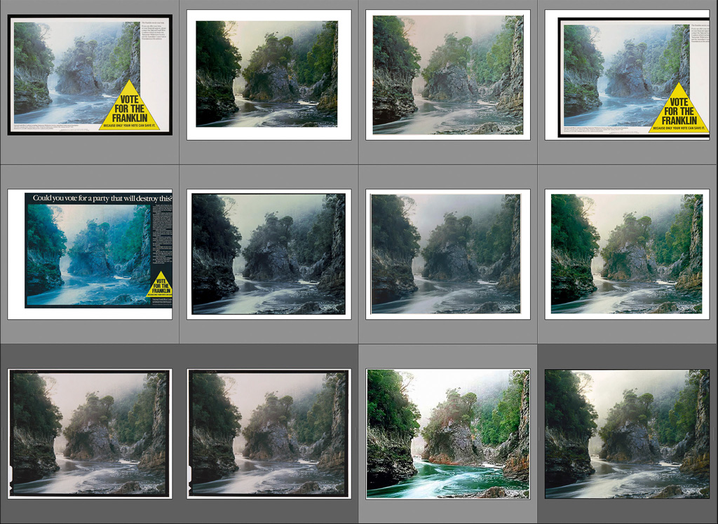
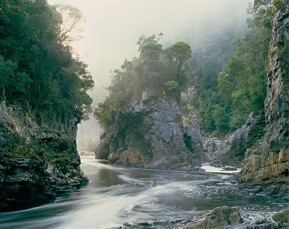
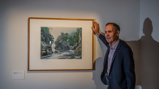
End Frame has long been one of my favourite parts of the On Landscape magazine. Some memorable ones come to mind with just a brief reflection - Rene Burri’s Men on a Roof (a long time favourite image), Galen Rowell’s Rainbow over Potala Palace (great story behind the image); Joe Cornish on an Edward Burtynsky’s Iberian Quarry image (bit of a surprise initially but his commentary opened my eyes); David Ward’s image of Poverty Flats (not a surprise - brilliant photograph).
Many writers have also reflected on how difficult it was to come up with a single image - quite a challenge posed by our editor, as “favourites” come and go - new images displace the older ones as tastes change and new thought processes are inspired. Speaking of Joe Cornish, a number of contributors have picked his images and it would have been easy for me to pick another as he is a long standing photographic hero. However, I have been thinking of another image for some time, by a different author which speaks to me on a number of levels - as a metaphor, as the culmination of a personal project, and as an example of a “cross-over” image, as well as simply being just a wonderful picture. Let me explain.
Jim Brandenburg was a staff photographer for National Geographic for years - decades, travelling the world taking hundreds of rolls of film per assignment. As he says, it wasn’t unusual to take 20, 30 or more rolls of film per day and he didn’t stop until he either exhausted the potential or he was exhausted himself. Away from his family for extended periods he eventually became, in today’s parlance, “burnt out”. He quit National Geographic and returned to his home at North Woods, Minnesota. He thought of a project - a make or break a project - either he would be rejuvenated or he would have to move on and find something different to photography. He decided that for 90 days between the autumn and winter equinoxes he would take a photograph a day - just one frame. This was the mid 1990’s, the days of film - no digital preview, not knowing what he had (or hadn’t) caught until the film was developed. He was to complete his project around his home, close to the Boundary Waters Canoe Area National Park. It certainly brings a new meaning to “working locally”!
There were days when he thought he would have to give up, days when he thought he’d messed up and days of uncertainty. Days when he managed to grab an image at the dying of the light - some of which turned out to be truly memorable.
My idea of a local project might mean the local park or even pond, but Brandenburg had the scope of the Boundary Waters, stretching to over a million acres!! Although in all fairness most of his images were taken in a small section of this. For those unfamiliar with it, the whole project has a fascinating and awe inspiring story and several aspects are worth highlighting. There were days when he thought he would have to give up, days when he thought he’d messed up and days of uncertainty. Days when he managed to grab an image at the dying of the light - some of which turned out to be truly memorable. One which springs to mind was taken after dark after tracking through the woods all day and he had his wife shine a torch on a waterfall outside of his house - a wonderful image resulted but, in his commentary to the project, he wonders whether it matters that this image was “made” rather than “taken” - an interesting play on “made” or “taken” debate that has gone on for a long time. In the end, he decides only the viewer can decide.
On another occasion, he uses some ICM (yes, it’s all been done before) by picking up the tripod during a long exposure and moving the whole thing forward - a spontaneous but brave decision given the uncertainty of film and the fact he only had one go at it! He had wanted to leave an impression rather than an illustration of the woodland he was representing. This also illustrates an interesting point - whether he would have made a “better” image by having multiple attempts or whether that single spontaneous gesture spoke louder, living with it whatever came of it. I could go on; there is something to debate about virtually every image in the project.
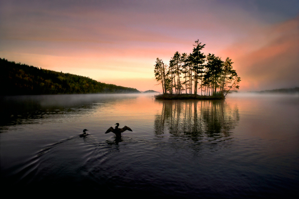
The image I have chosen is, however, also Brandenburg’s favourite from the project I believe - Day 10 Wilderness Loons. He had canoed across the lake at dawn to find two birds on the shore, one tangled with fishing line. He managed to catch it, untie it and release it. Just as it swam away Brandenburg raised his camera towards a magnificent dawn - also just as the bird raised itself up and flapped its wings as if in a thank you. Brandenburg didn’t know whether he had caught the act until the film came back - but he had, and an iconic image was born. There are many metaphors here: the kindness and giving of life; the gratitude of receiving; the wonder and beauty of nature. For me, there is also a sublime element to this image - an awe inspiring dawn and the tiny frailty of life.
This also raises another question: is it a landscape photograph? Is it a wildlife photograph? Is it a nature photograph? Does it matter? I would argue not, it is a stunning image however you look at it. Landscape inevitably includes those things in our environment, be it animal, man-made or natural. It undoubtedly has wildlife in it and it is of a natural history subject, made within the landscape. We can often get hung up on genre specific images but Brandenburg’s image crosses those boundaries. Our European photographer fellows don’t seem to get so hung up on it I feel and I think it makes for a healthy approach to photographing the outdoors, however, we may wish to perceive it.
It is fascinating to think of how this project was achieved. There were probably very few people in the world capable of producing such a project at the time and Brandenburg comments on how the antithesis of having just one image to make compared to his many in a previous life taught him a lot. A lesson, no doubt, many of us could do with learning. It is fascinating to think how all of his experiences, his visualisation, his feelings, were focused so intently on that one image per day. At the conclusion of the project, Brandenburg notes that it sat in a draw for two years - he had done it purely for himself and describes it as the hardest project he had ever done. Another lesson - wise writers in this magazine have previously noted the importance of "flow" and personal expression as opposed to recognition and plaudits. Brandenburg, in the end, achieved both of these with National Geographic persuading him to publish - it becomes the North Woods Journal, followed by his book, Chased by the Light, something he will be remembered for as much (if not more) than his wolf pictures or any of his other international awards.
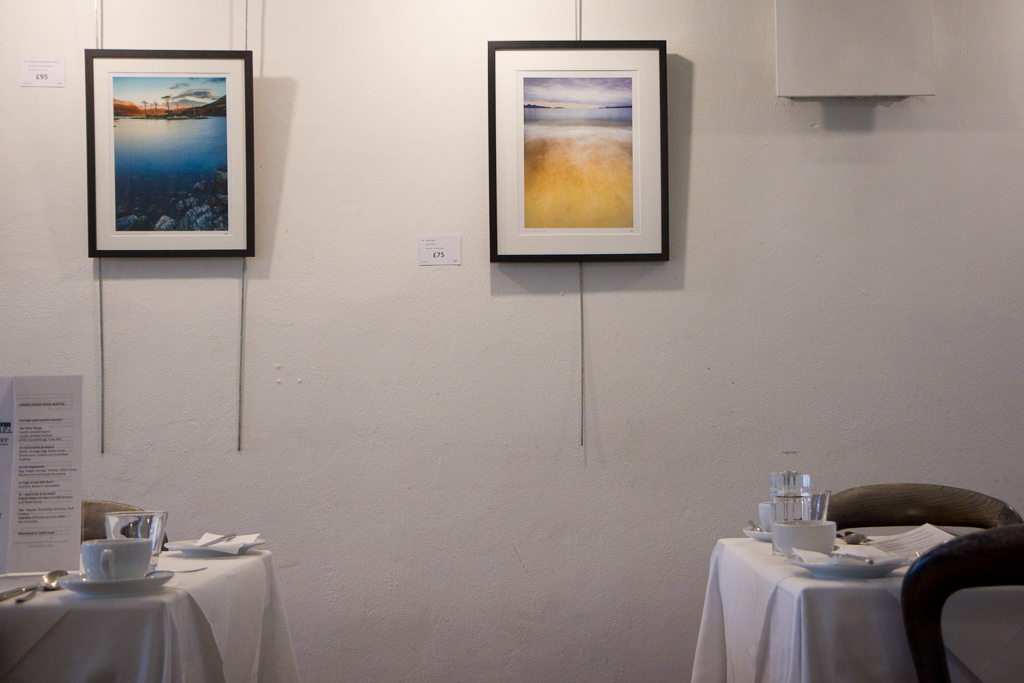
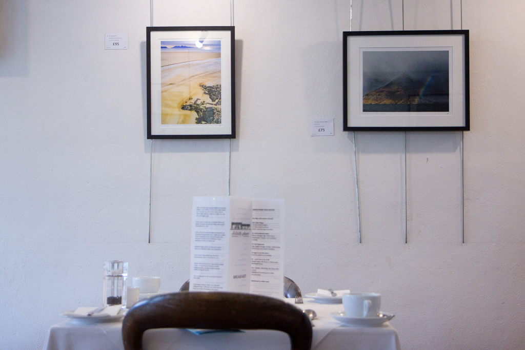
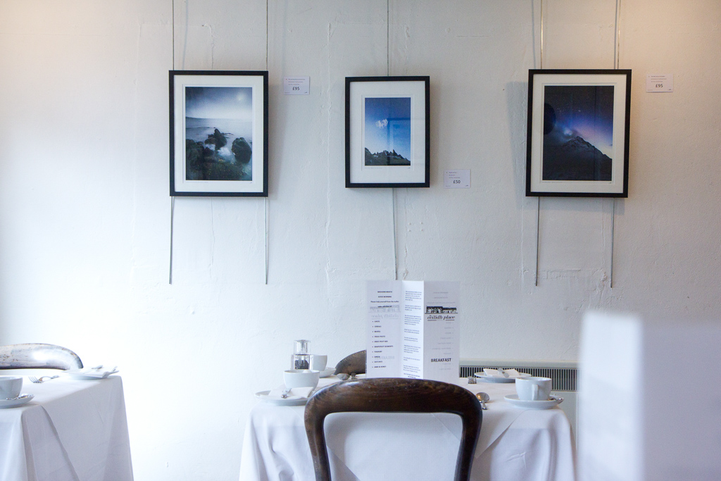
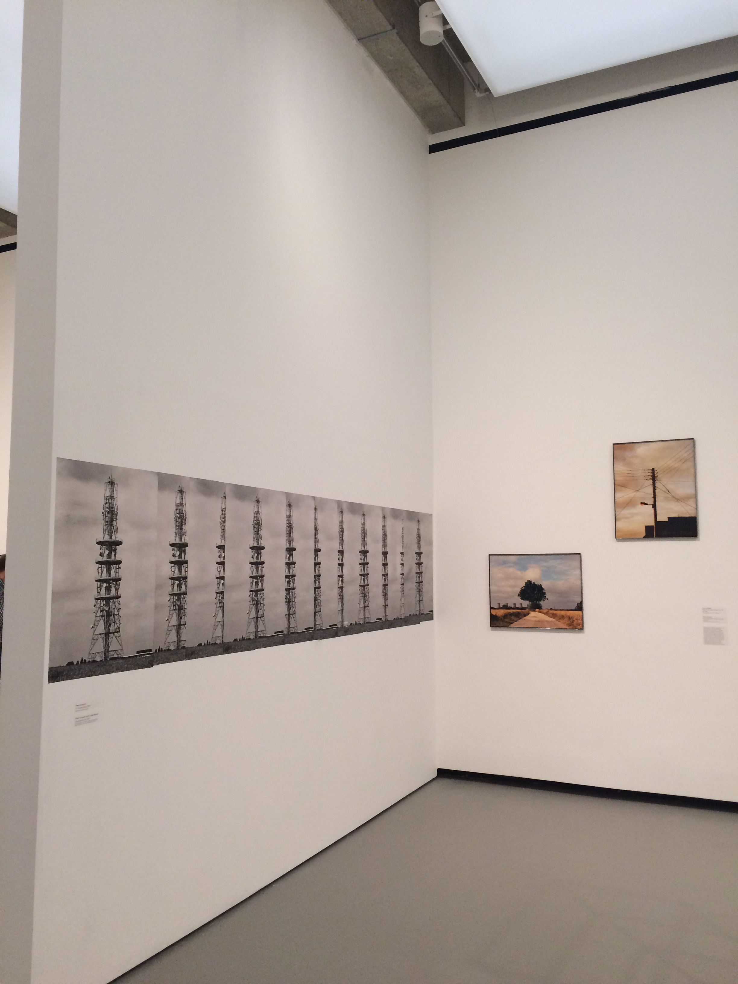
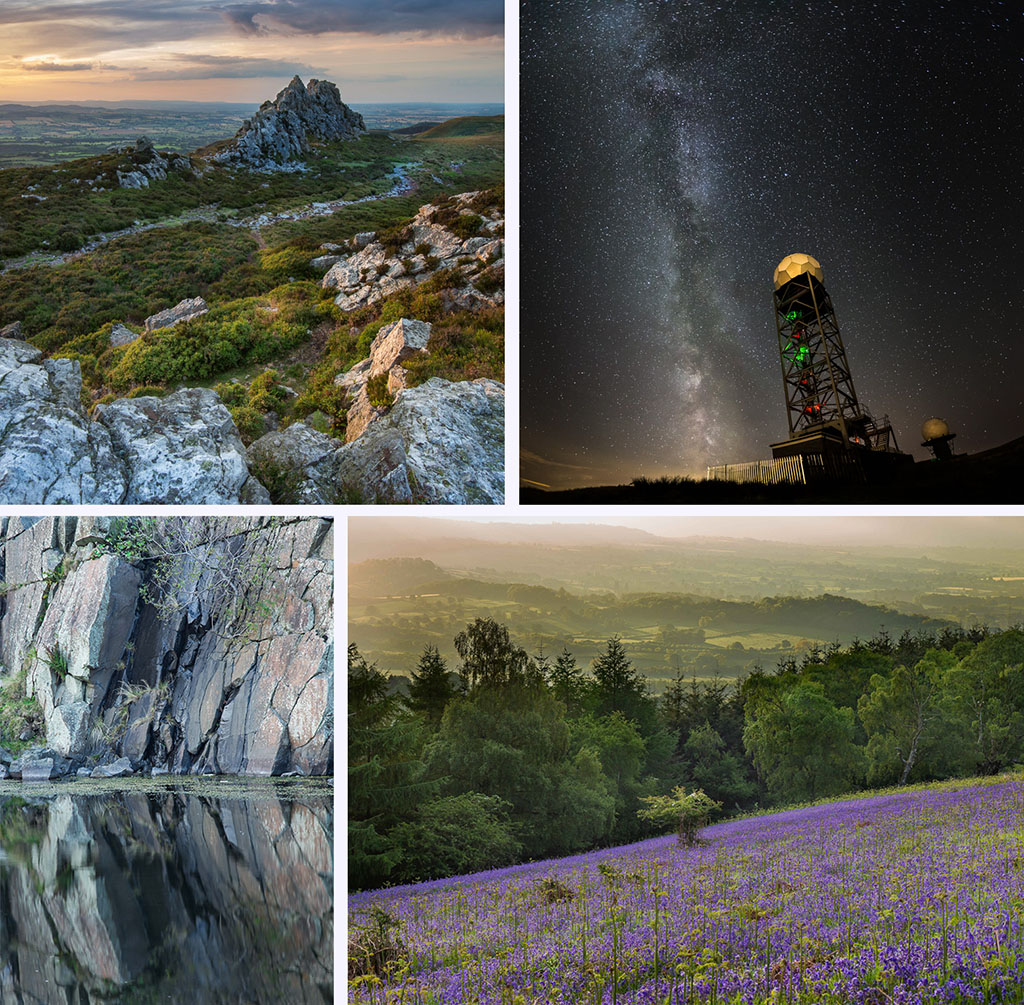
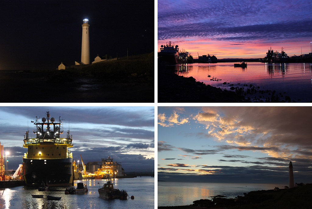
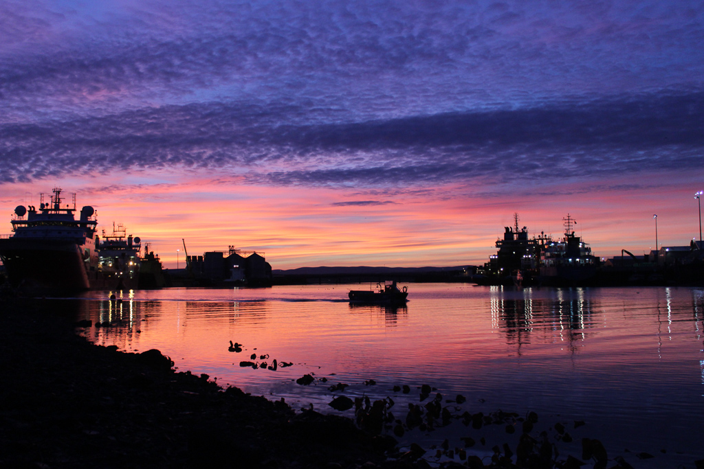
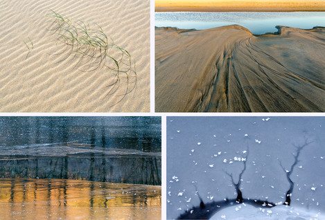
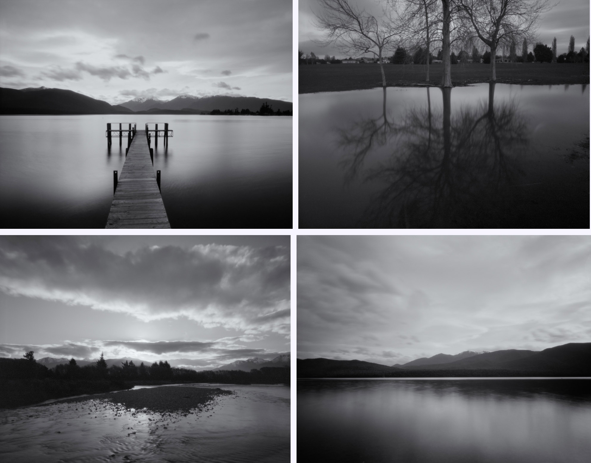
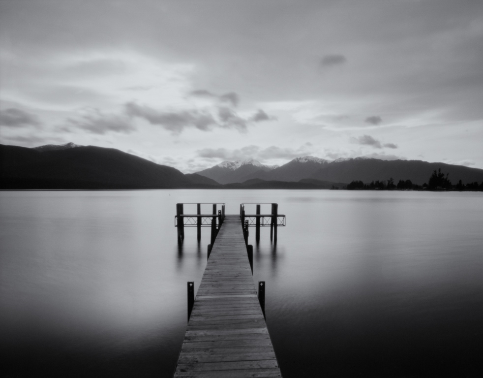
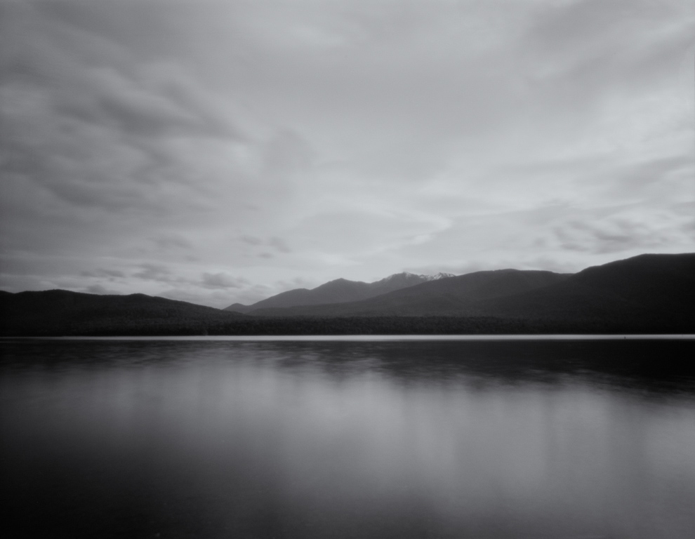
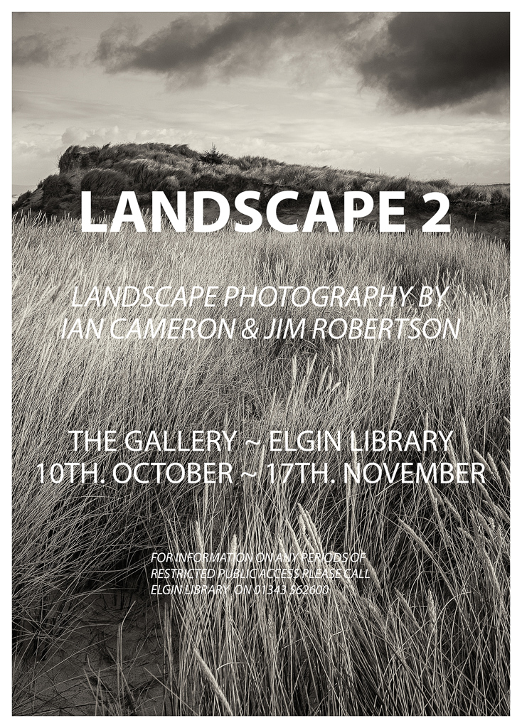
Our 4x4 feature is a set of four mini landscape photography portfolios from our subscribers, each consisting of four images related in some way. You can view previous 4x4 portfolios here.
We're always on the lookout for new portfolios, so please do get in touch! If you would like to submit your 4x4 portfolio, please visit this page for submission information.
*Shout out* as we are looking for contributions for the next few issues, so please do get in touch if you're interested!
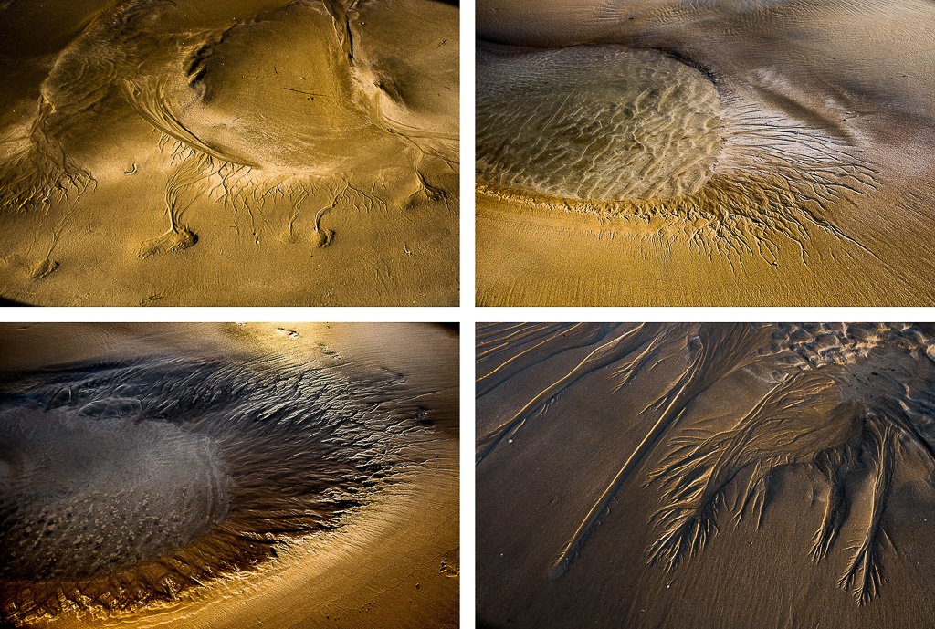
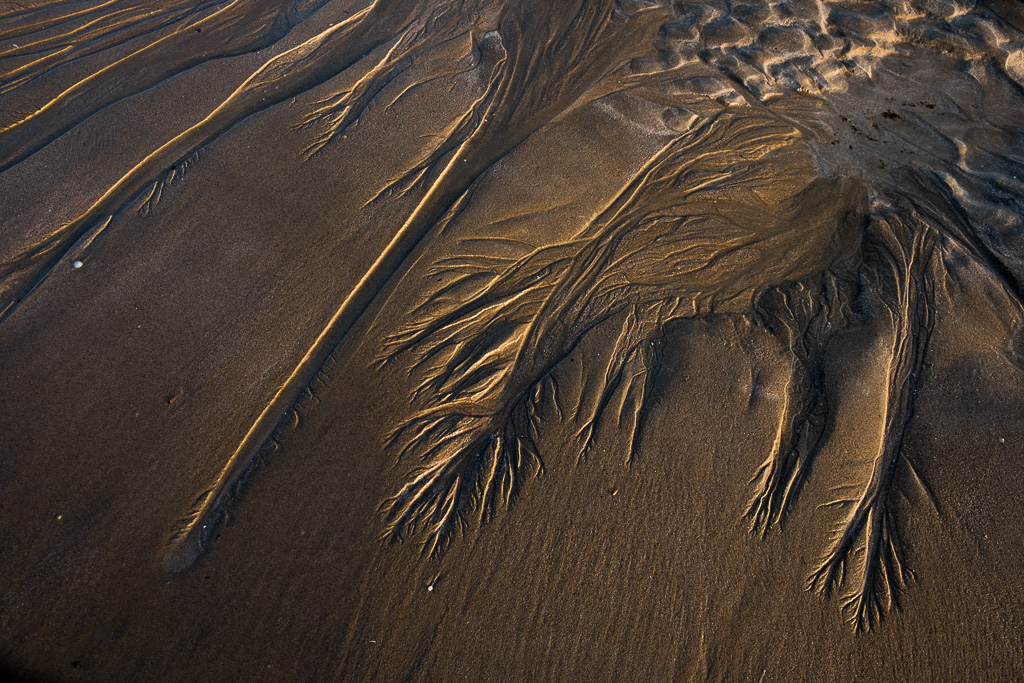
Please click the images to see the portfolios in full.
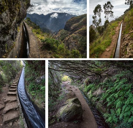
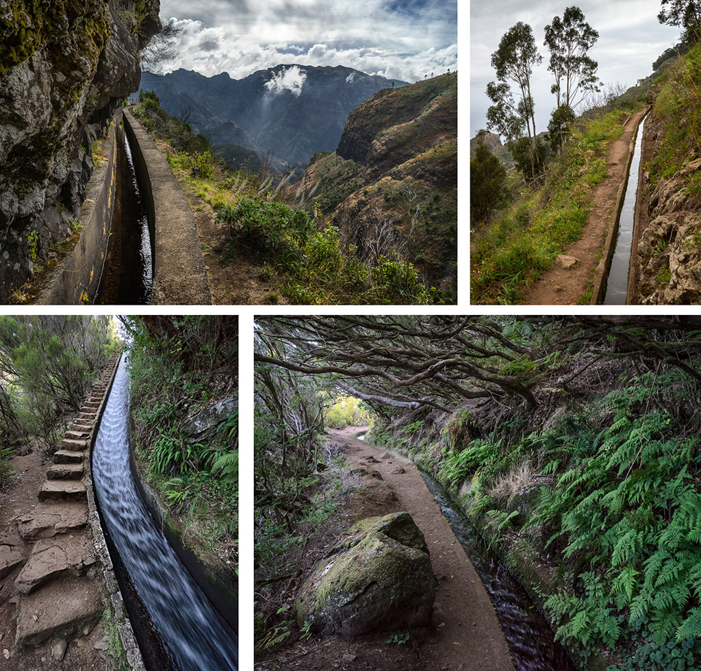
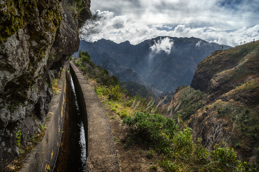
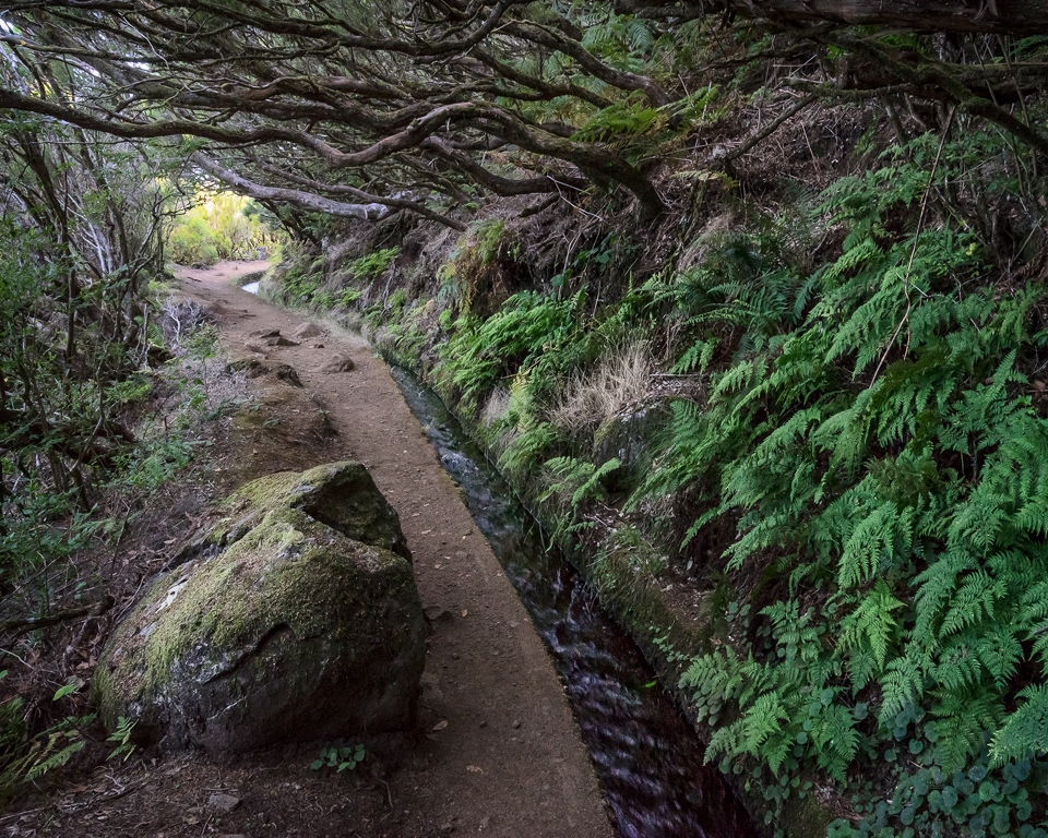
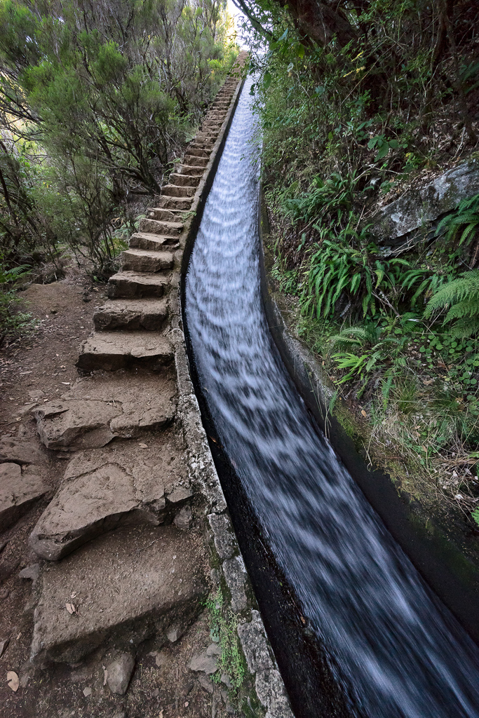
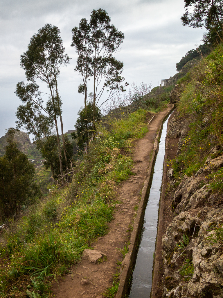
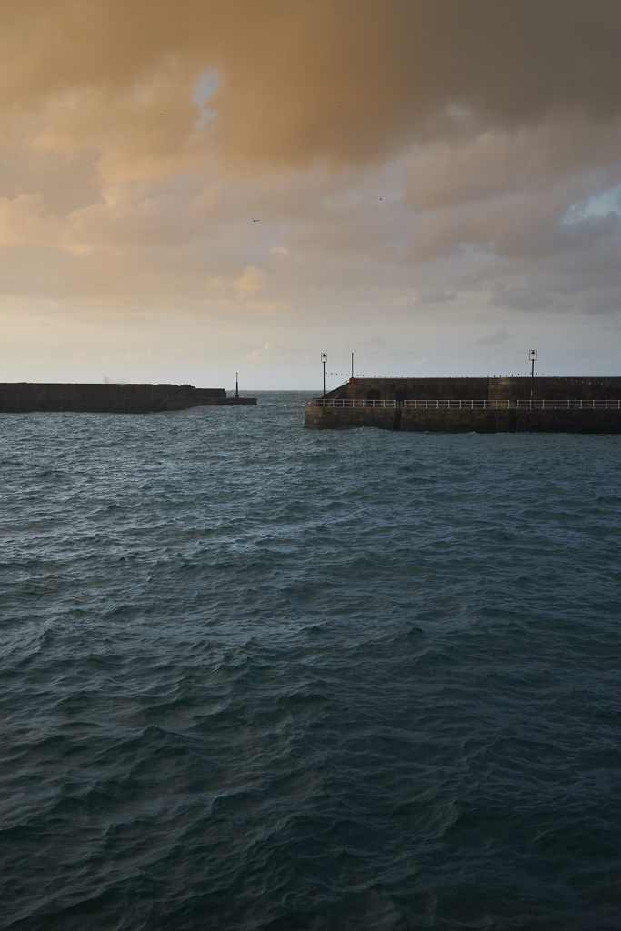
The Portuguese island of Madeira is a steep sided (and hopefully) extinct volcano located about 300 miles from the Atlantic coast of Morocco. The island's agriculture is supported by the capture and distribution of rainwater by well over 1000 miles of levadas or rainwater channels. That's a lot of levadas given that the island is only about 300 square miles. The levadas have been built over the last several hundred years and deliver water from around the island to where it's needed for agriculture. Many of the levadas have paths by their side that can be walked, and, as they're almost on the level they are mostly very easy.
Except that, because they run around the contours of the very steep volcano, in places they have precipitous drops - often without guardrails for protection. And here and there they flow through tunnels, some of which are easily long enough (hundreds of meters) to require a good torch. So, not for those a little unsteady on their feet, or who don't have a good head for heights, or who would feel claustrophobic hiking through unlit restricted height tunnels. But once there it’s difficult not to find things at which to point your camera! Please read more on this project on Steve's website.
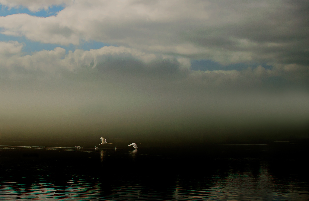
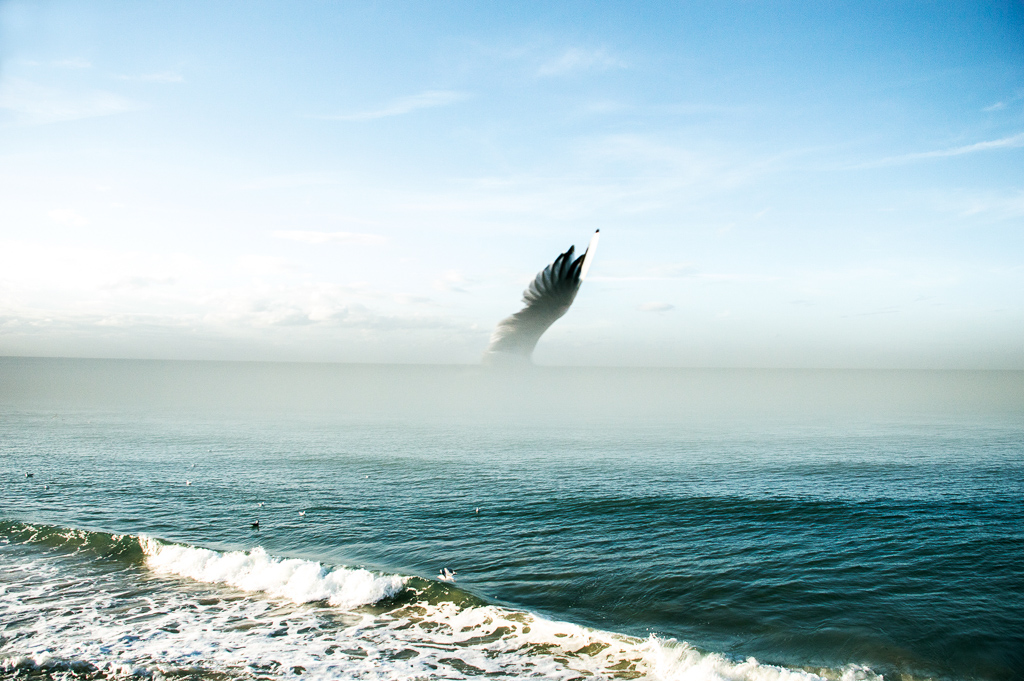
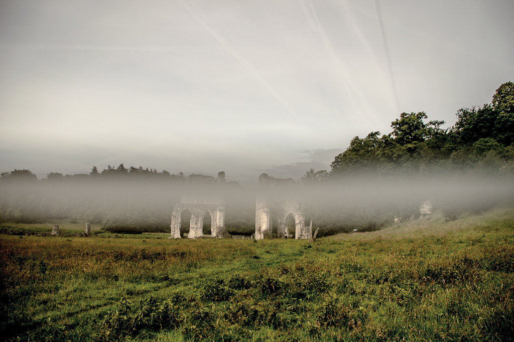
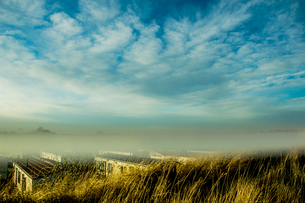
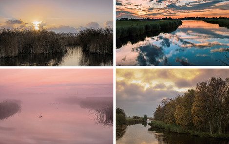
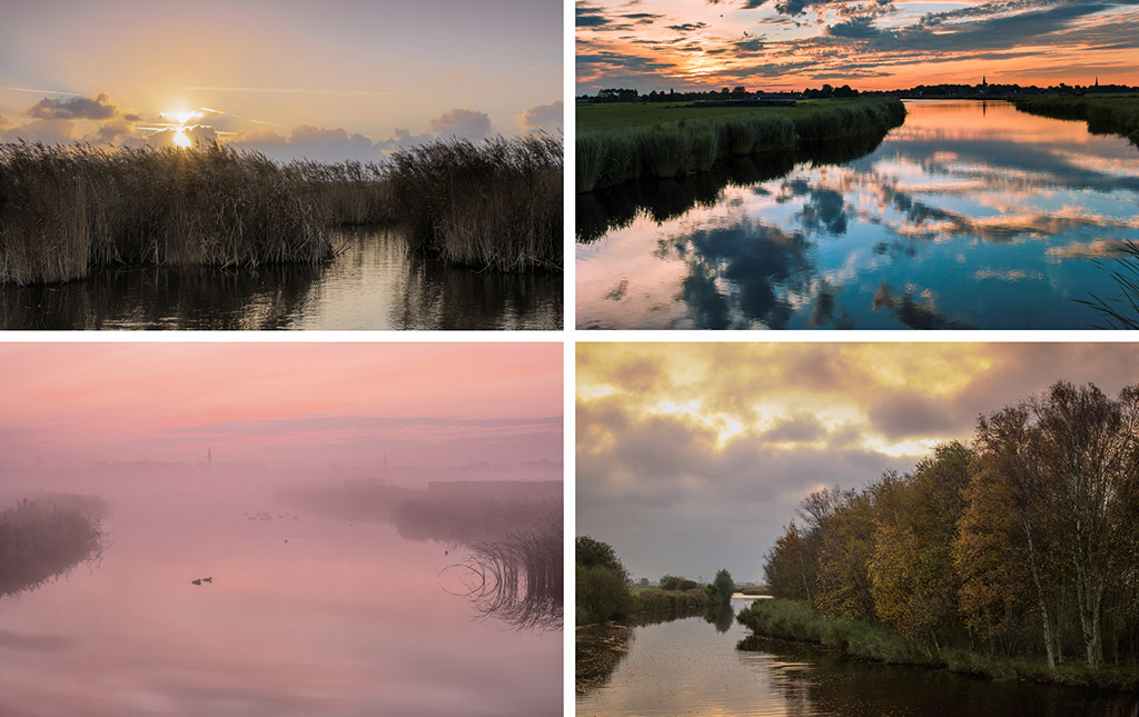
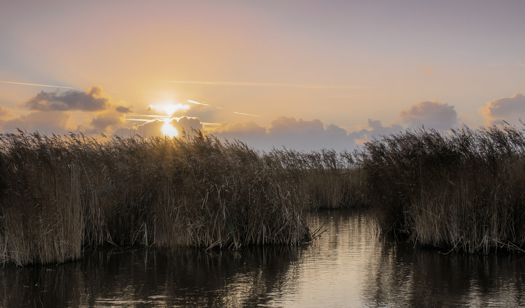
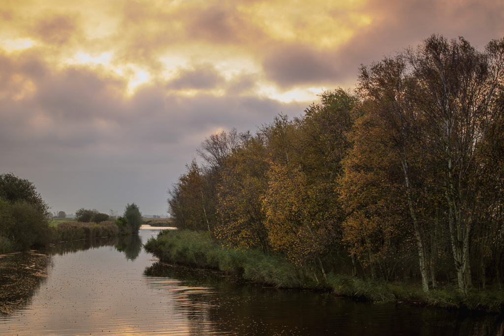
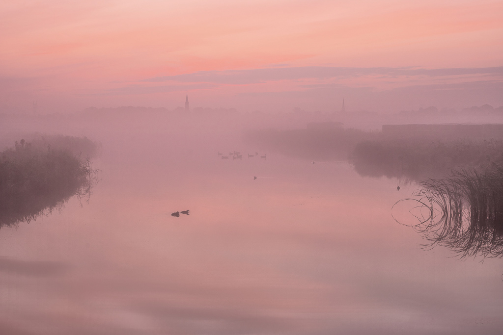
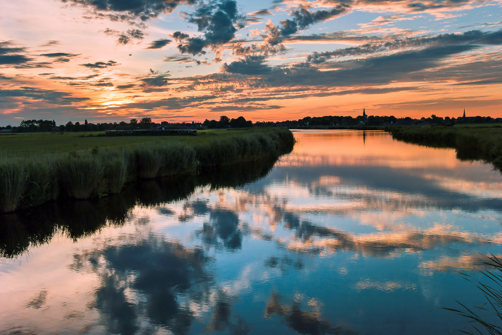
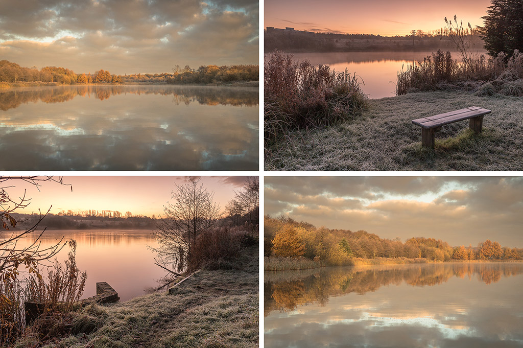
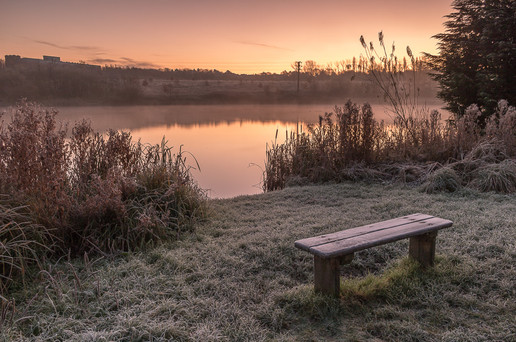
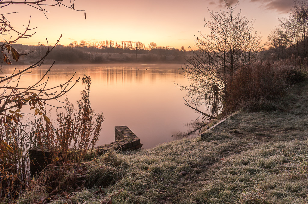
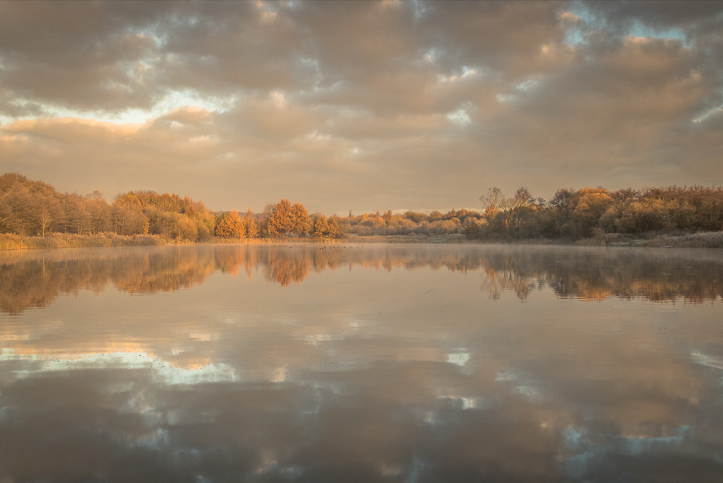
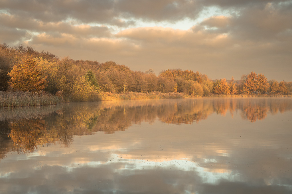
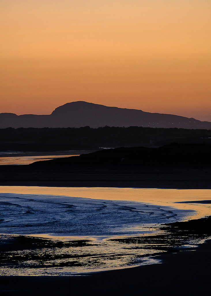
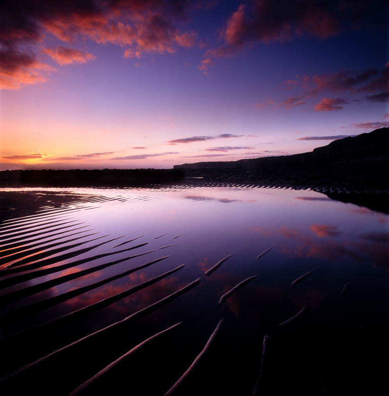
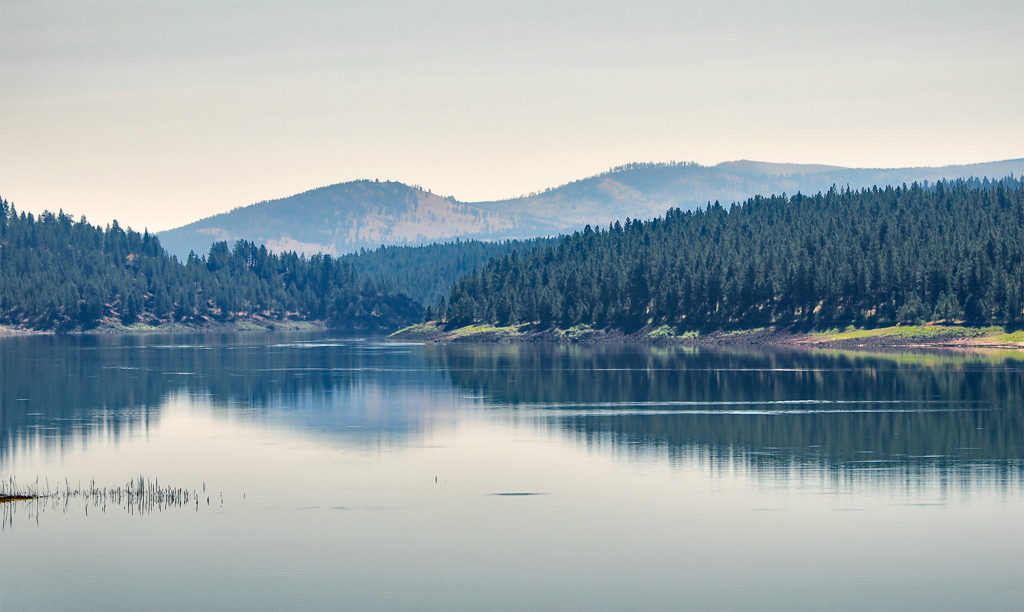
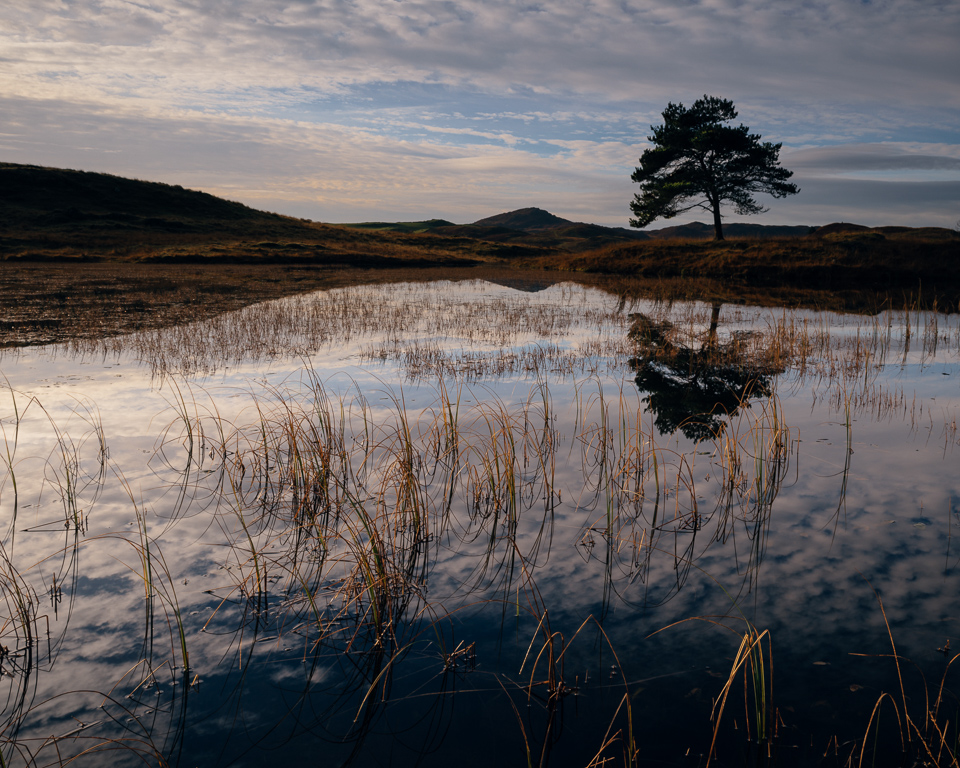
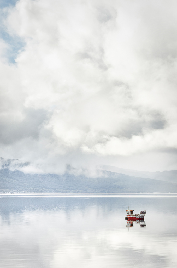
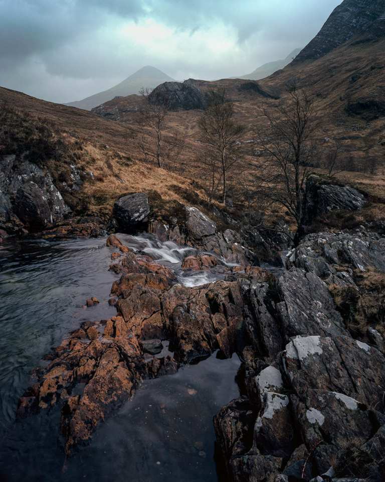
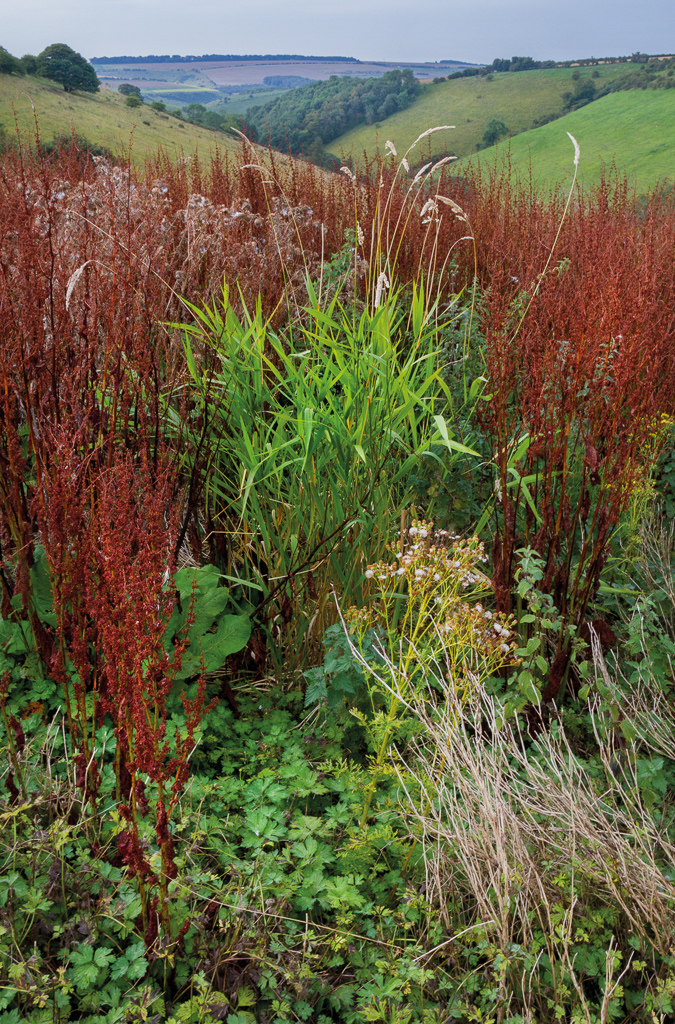
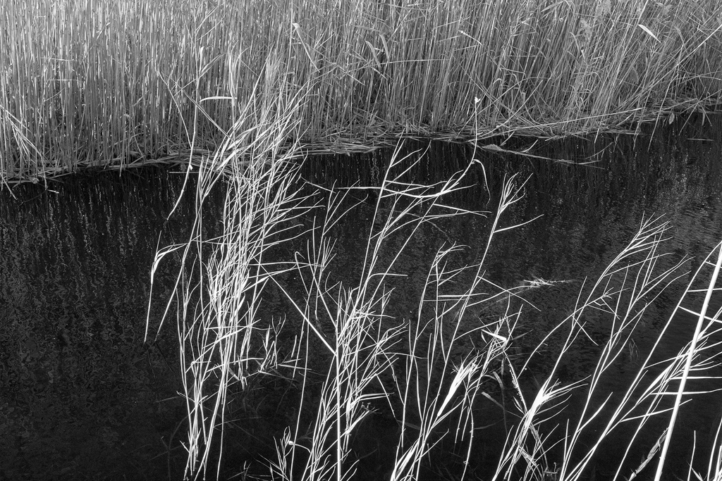
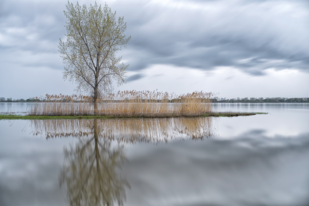
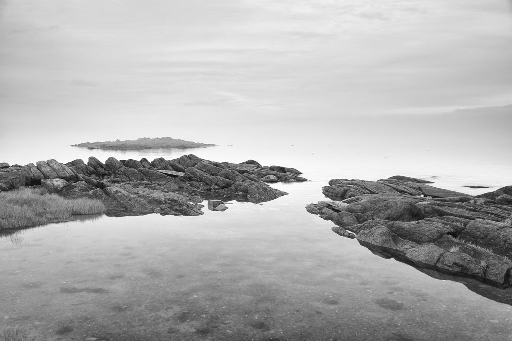
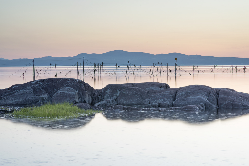
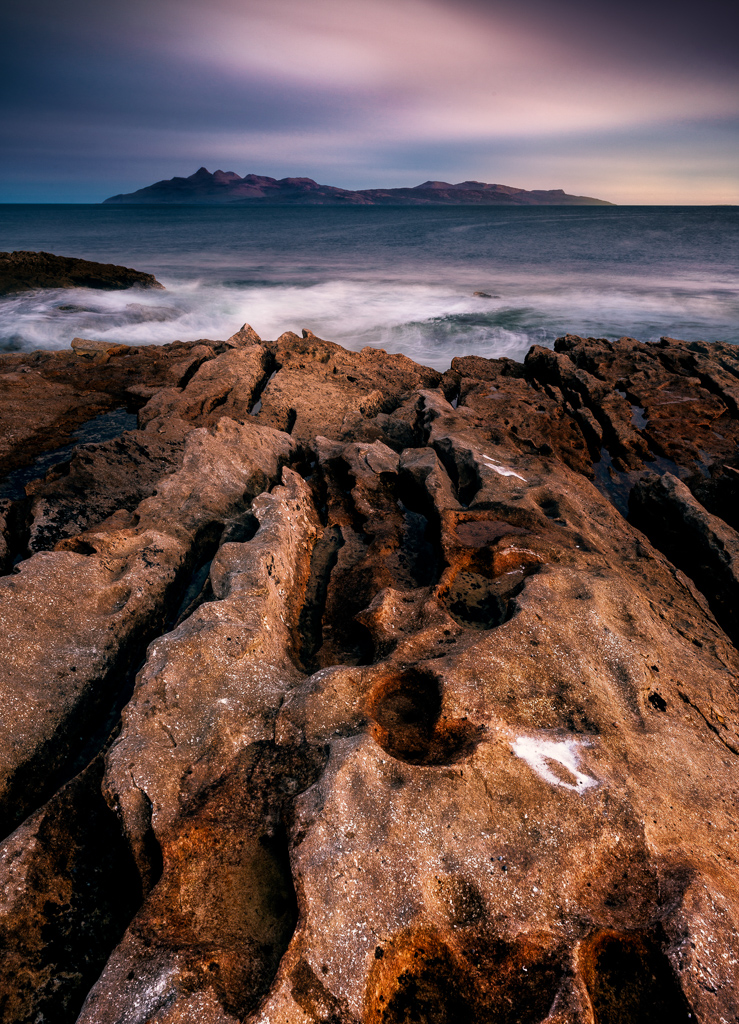
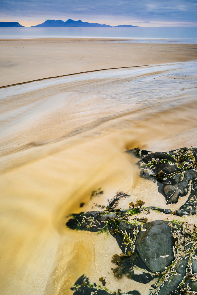
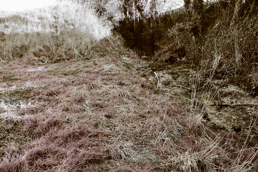
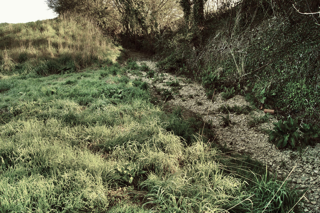
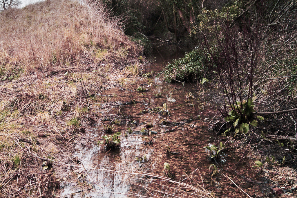
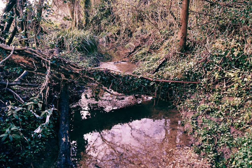
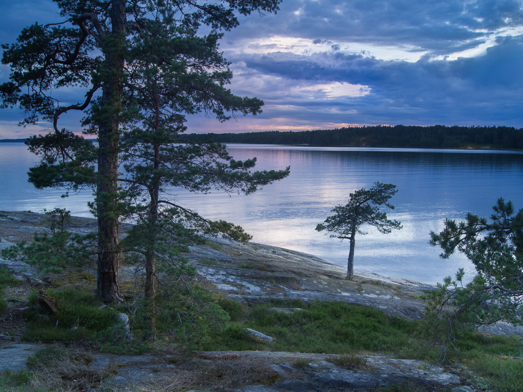
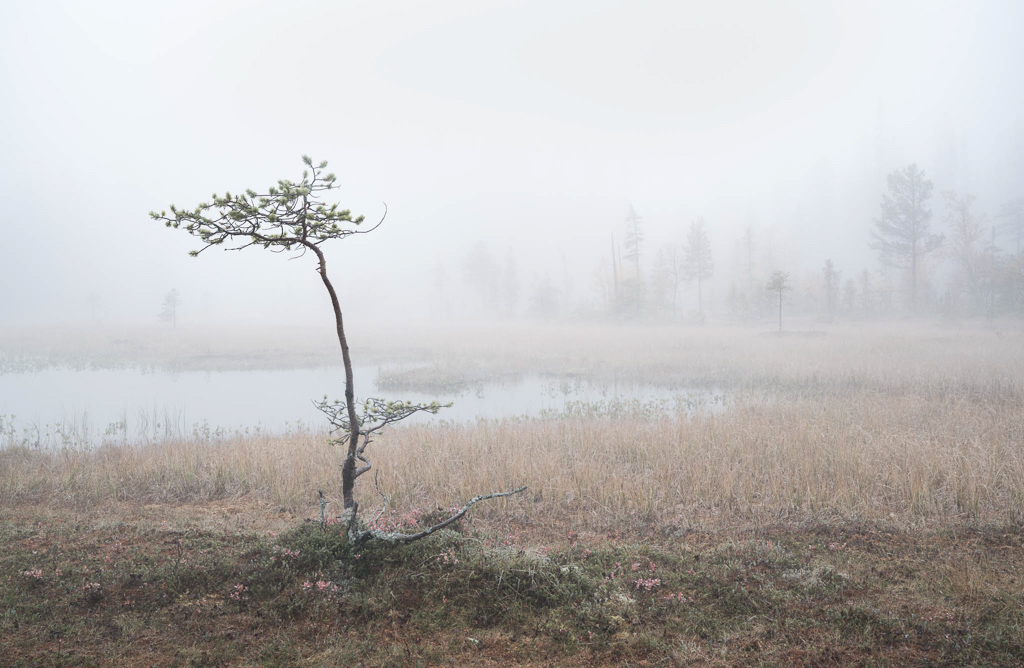
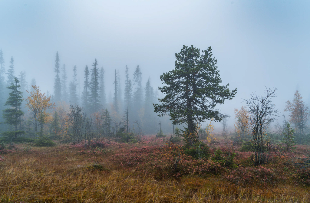
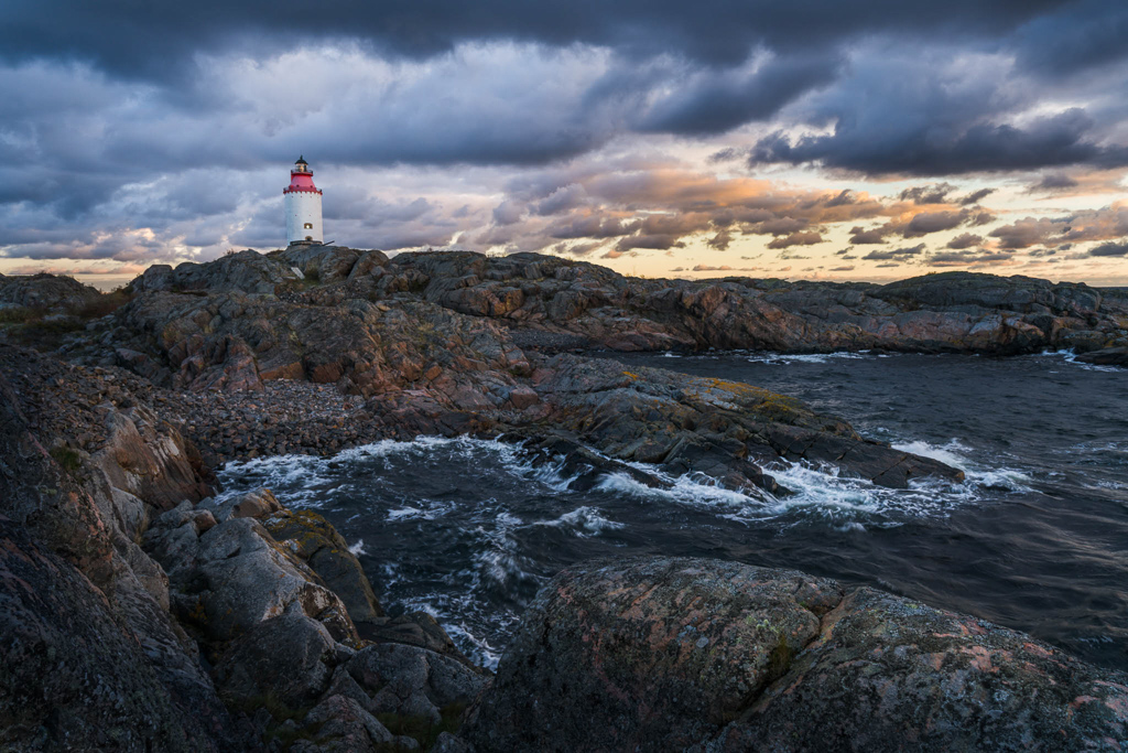
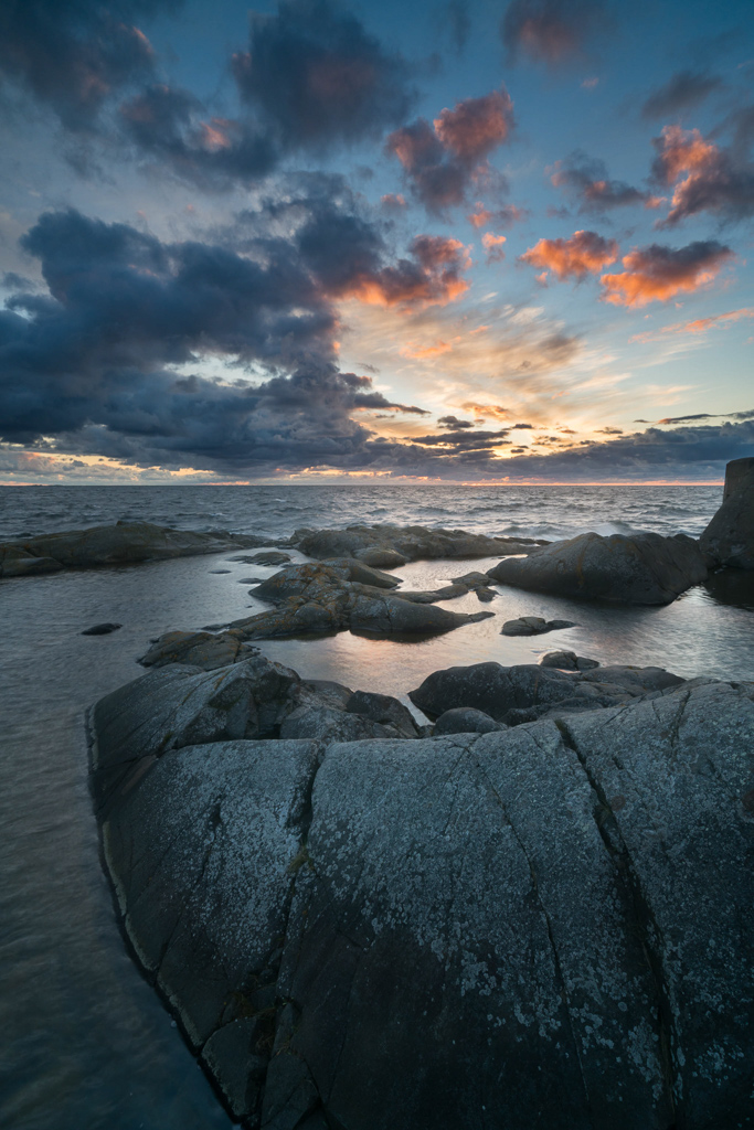
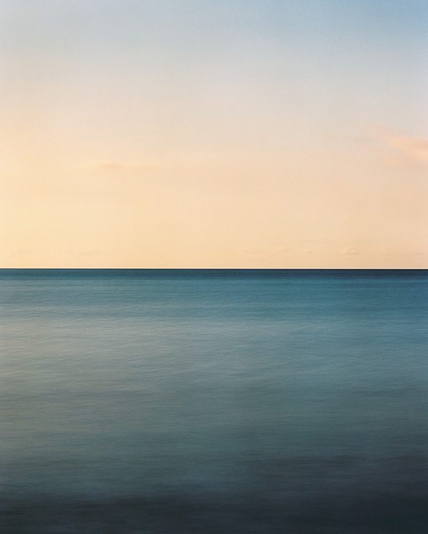
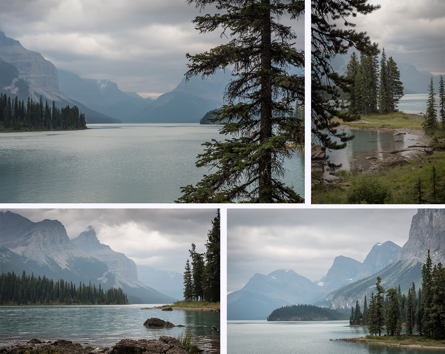
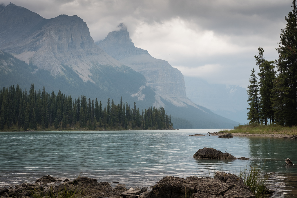
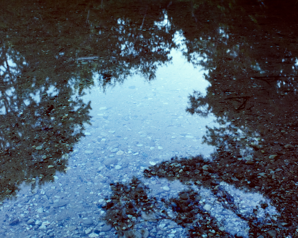
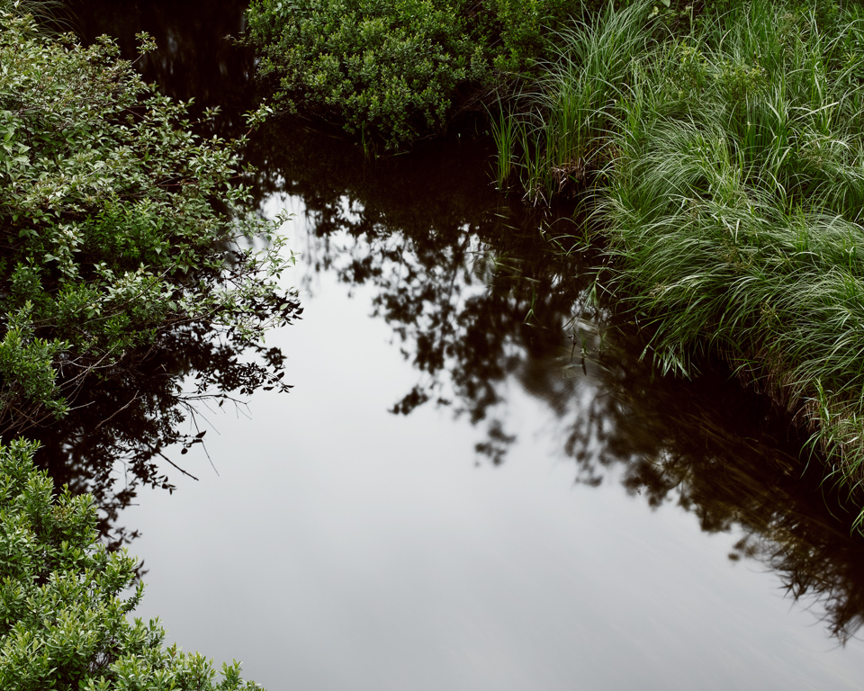
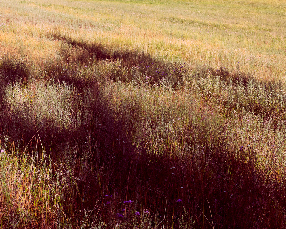
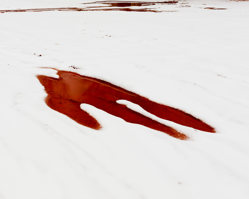
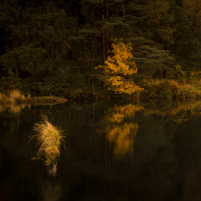
The character of my home region, Waterland, is found in the ever present water. Large parts of the region consist of land literally floating on water. The vegetation is dominated by reed beds, fresh green in Spring and a golden-brown in Autumn. To me, the beauty of this region with its wide landscape lies in the interplay of water and skies. The colour of the reeds underlining its moods. Different skies evoke different atmospheres. These four pictures show just that. I took them at roughly the same spot and yet their look and feel differ a lot.
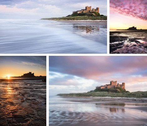
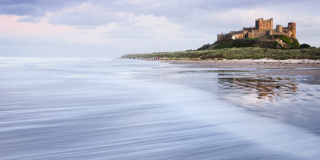
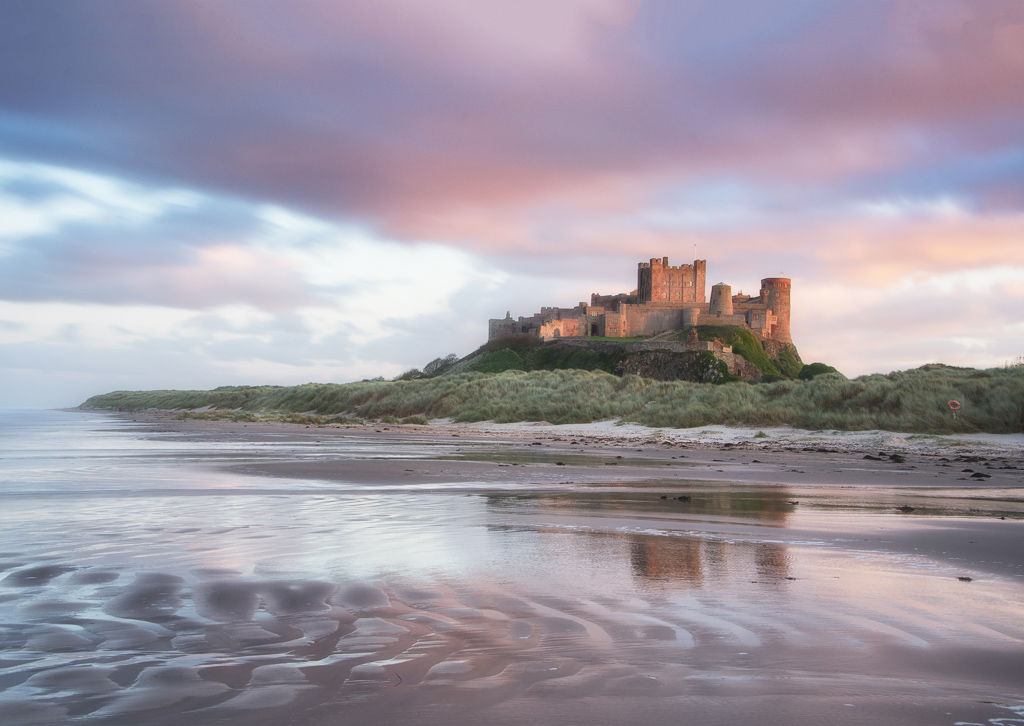
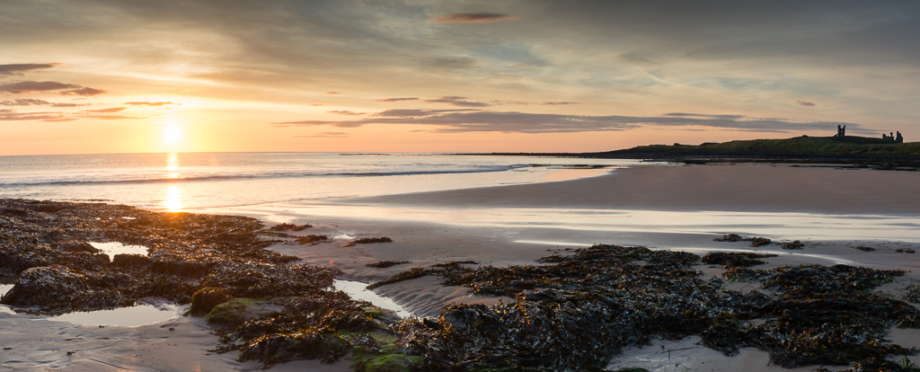
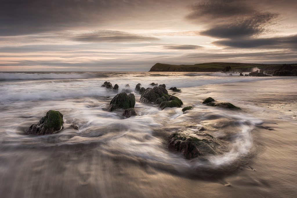
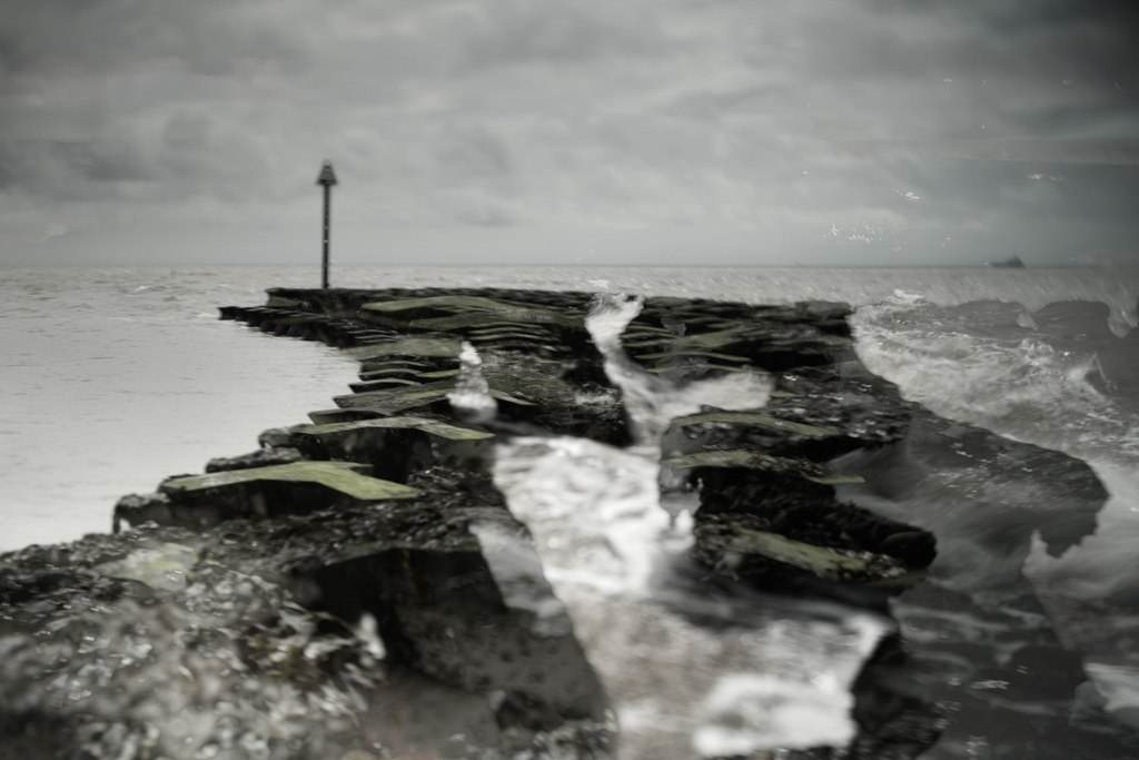
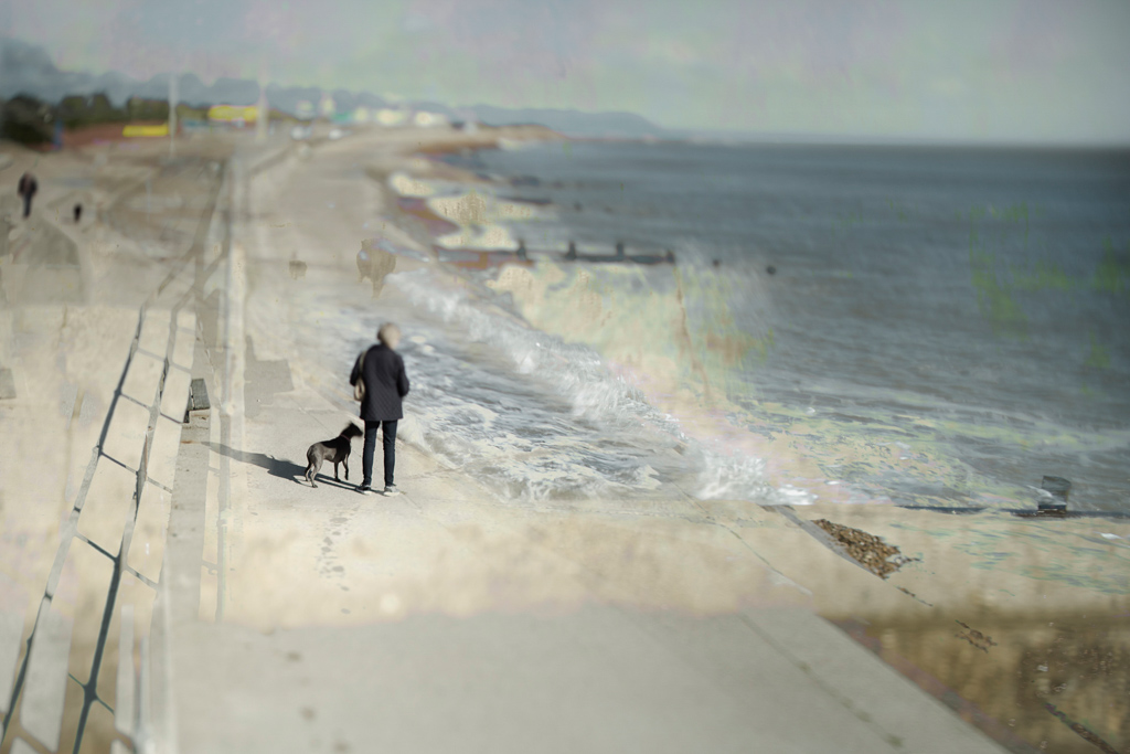
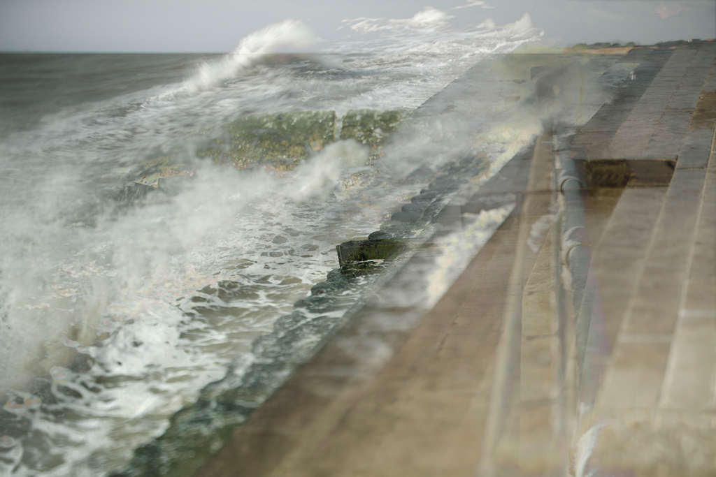
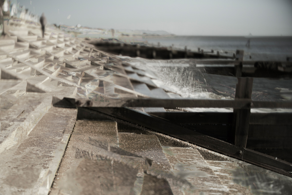
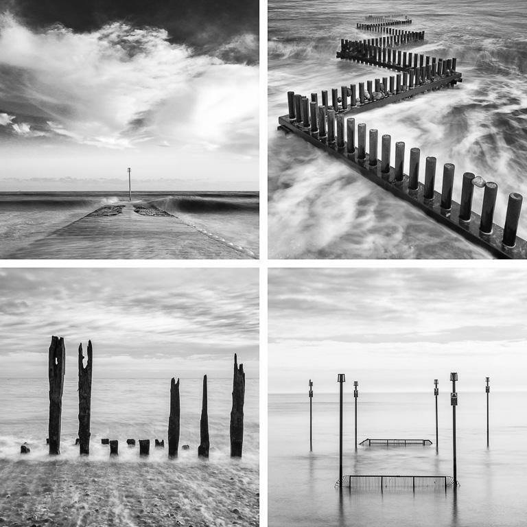
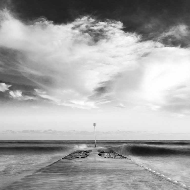
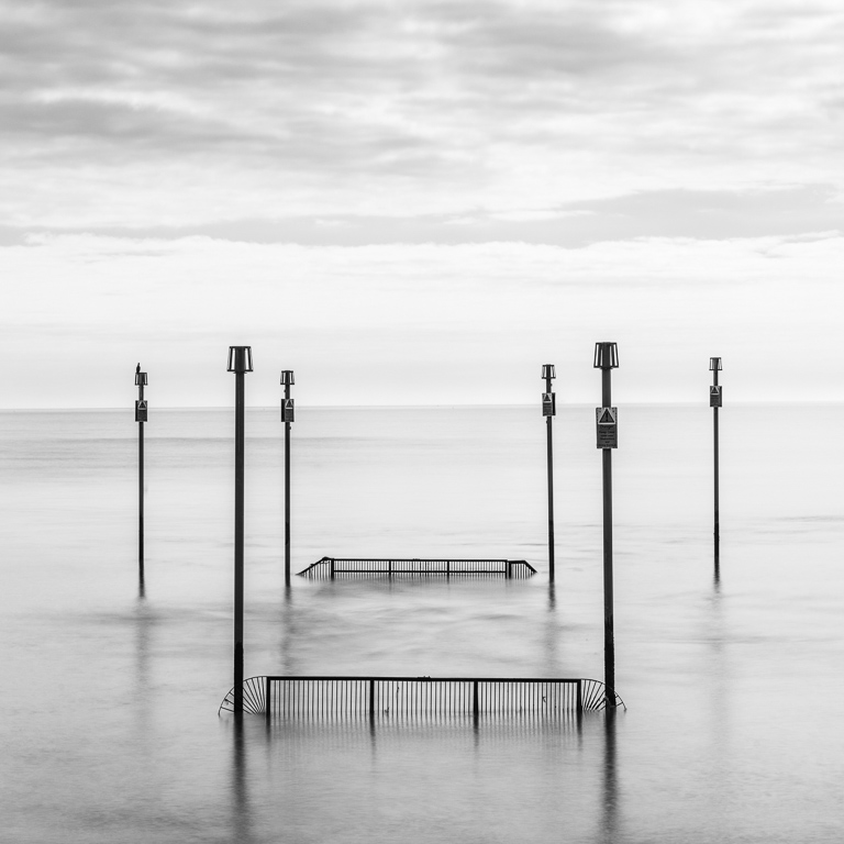
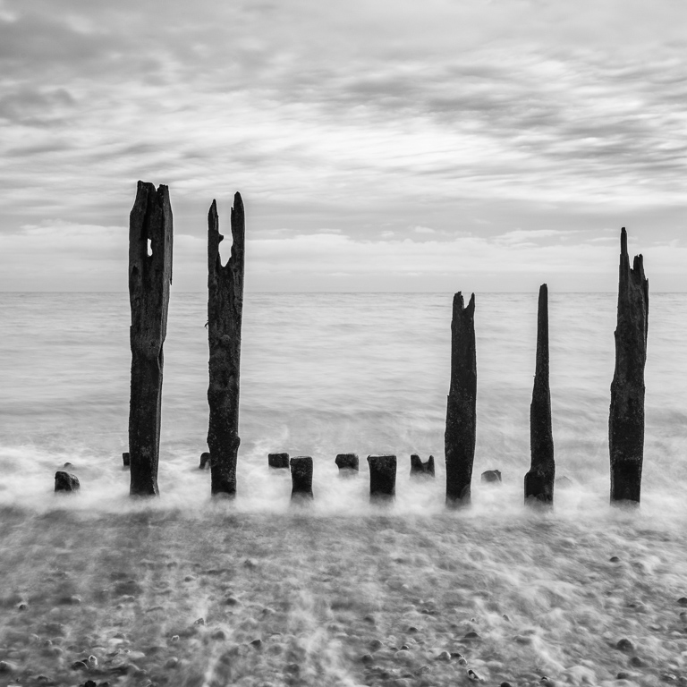
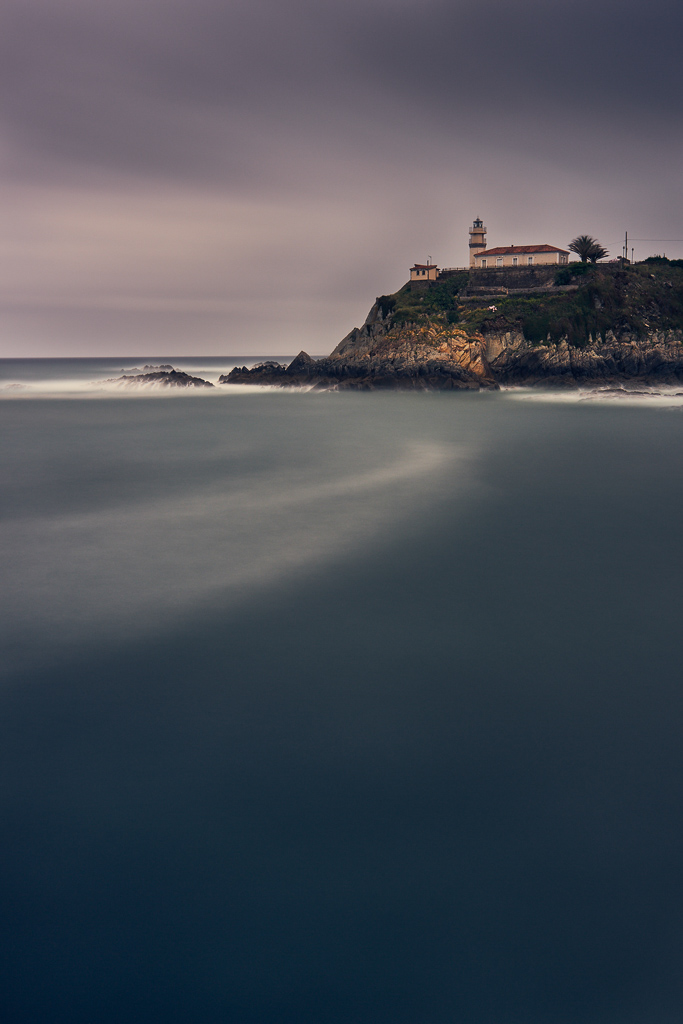
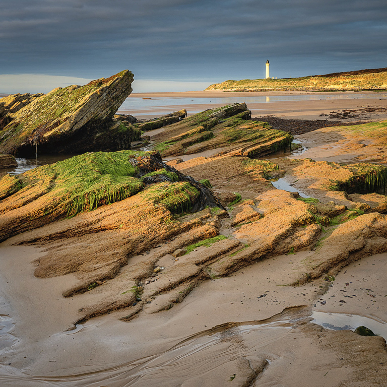
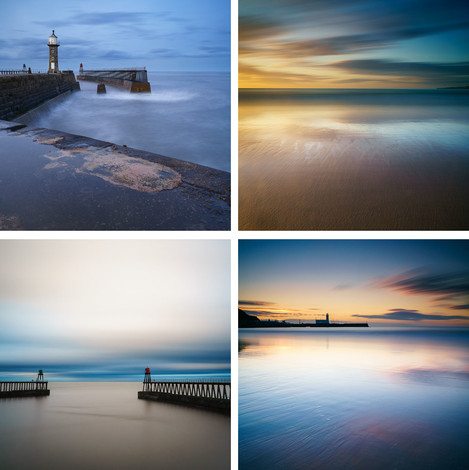
It was a fleeting visit to a famous stretch of British coastline. I had one evening and one morning to photograph Northumberland’s iconic castle Bamburgh. I was going out whatever the weather and wanted to photograph on the sands and rocks from the North. Now, I have to admit this was a trophy bag but it's difficult to shy away from this great wonder on our shores. On the evening, I was the only photographer around with just the most fantastic light. However, I wasn't alone with dog walkers and families enjoying an evening walk on the beach.
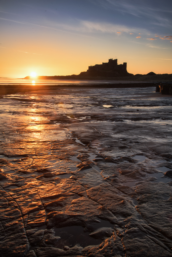
A 10 stop ND filter cleared the beach for me with a long exposure to give the scene a sense of calm and isolation. With the colours and light deteriorating I used the incoming tide to add foreground detail but I've decided to keep human interaction on the beach for this one with a shorter exposure. The following a morning and once again, Bamburgh delivered. This time with a tide heading out, revealing fantastic rocks and pools to incorporate. I picked my composition. Portrait this time and searched around to get more sky and colour in the frame. I wasn't alone again, with two other photographers. To be expected really. We had a chat and they left precisely at sunrise. Onwards to work I presume. I waited for a few minutes and then got my final shot as the sun rose over the sands and rocks.
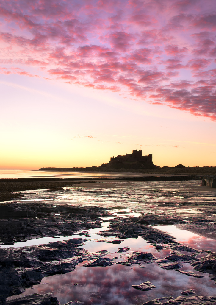
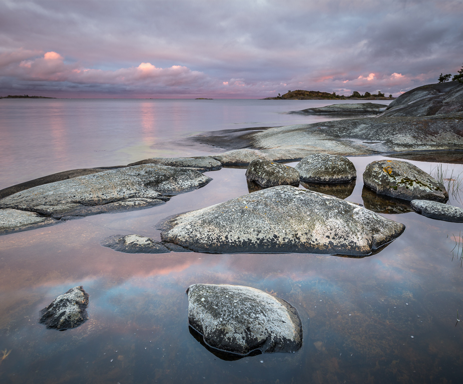
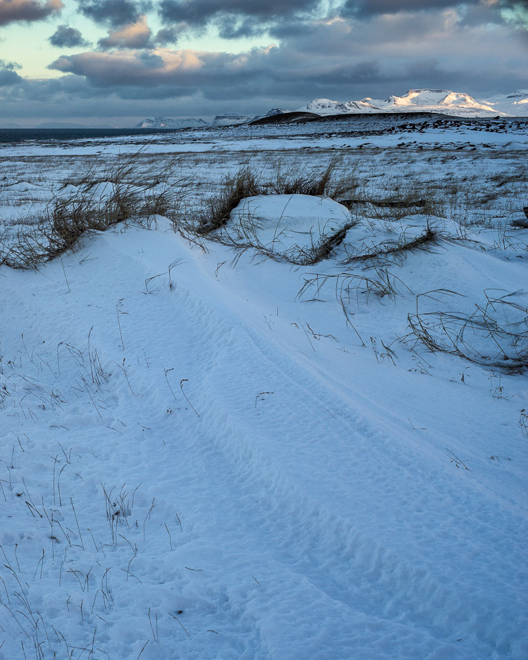
For any landscape photographer who is always wanting to photograph special conditions & make a special image, the weather has to play ball. I checked the weather forecast the evening before to see temperatures overnight were to drop to almost 0 degrees with clear skies for a sunrise.
On this morning, it really did. A combination like this for me always get me really excited. I had mist, gorgeous pink tones, stunning light & a frozen landscape for my playground.
Back in August, in my editorial (see Issue 142) I talked a little about the National Trust (and the National Trust for Scotland) and their sometimes unpleasant attitude toward anything vaguely commercial happening around them.
Following the feedback we got from our readers (many thanks if you submitted a response), we thought it would be a good idea to send a letter out to both organisations to ask them what their policy is for a range of scenarios.
To begin with, here’s the letter we sent.
I hope you don’t mind me contacting you directly. You may not be the person I need to get in touch with but you seem like the person most likely to know.
I run a landscape photography magazine (On Landscape) and we have been receiving quite a few enquiries about the taking and using of photographic images taken on “non-commercial NT locations” (see bottom for my definition of this). I've tried to find the appropriate information on the NT website(s) to no avail. I was hoping you could find someone who can give some clarity to a few particular scenarios we have had suggested to us by readers (we’re not asking about paid access properties, just open landscape).
What would the consequence or requirement be for the following scenarios:
If a photographer who is amateur takes some pictures and then later uses his pictures …
As advertising for a workshop he hopes to run at a later date?
To print out, frame and swap with another photographer for one of their framed prints?
To provide as free stock images?
A photographer takes a group out to show them an area if
The group are just friends?
The group are just friends but have paid expenses to the main photographer?
The group have paid to be on the course?
A photographer takes a photograph of a non-commercial NT location from a public road/path?
A photographer takes a photograph of public land while standing a non-commercial NT location
These scenarios are really asking the following question:
Is the NT going to prosecute people who gain in non-monetary ways from their work?
Can you get retrospective permission to use a photograph commercially?
When does leading a few friends on a day in the landscape become something the NT would prosecute?
Is the NT limiting use to photographs taken ‘on’ an NT locations or ‘of’ an NT location?
Many of our readers want good clarity on these subjects as they see many commercial ventures being undertaken without paying for access (e.g. climbing, walking, kayaking, driving, drone flying) where, officially, it seems like each of these should be paying a commercial use license and from my requests, for each genre there are multiple examples of people and organisations who do not pay.
Obviously, the answer to these questions would mean the difference between commercial viability (or not) for some of our subscriber’s businesses.
A big thank you for taking time to read this and I hope you will be able to help with our enquiries.
Regards
Tim Parkin
For the scope of this document a non-commercial NT location’ refers to one that does not have famous NT buildings or managed gardens. E.g. Wasdale, Borrowdale or the Langdales
The scenarios are obviously to try and elicit whether they are going to differentiate between different levels of payment (i.e. paying in kind vs monetary vs a full course). Neither establishment differentiated between any of these, preferring to treat all commercial endeavours the same. However their approaches were very different indeed.
The National Trust for Scotland were quite quick to respond and what we received was a quite pragmatic approach to the issue.
We are happy for people to access our land. Due to the Right to Roam legislation in Scotland, people are able to take access to our countryside properties on foot in a responsible fashion in line with the Scottish Outdoor Access Code, whether individually or in small groups. The Code references the specifics for photography.
Commercial interior photography is not permitted without our consent. Visitors are able to take photographs inside some of our properties for their own personal use. Details of this can be found at: https://www.nts.org.uk/Site/FAQ/
The National Trust for Scotland is an independent charity, so we encourage donations and memberships to encourage our charitable purpose. If for example, someone is taking a group of people to one of our countryside locations as part of a paid photography workshop, the event organiser may consider giving a donation to the NTS or encouraging the attendees to become members of the Trust.
If people can credit the National Trust for Scotland and the relevant property featured that would be much appreciated.
Drones are subject to separate legislation as they are not subject to access rights. Our drone policy is also available to view in our Visitor FAQs webpage.
Marcin Klimek (via Legal Team) Photographer / Photo Librarian
The National Trust’s response was the polar opposite and suggests that any use that could be seen as commercial (including non-monetary exchanges) and could warrant a legal recourse.
Any commercial activity without a landowner’s permission is illegal.
Public access granted by the landowner is irrelevant to commercial usage. Otherwise, our pathways would be littered with chip vans for instance.
We try to accommodate photo workshops where possible under strict control and normally payment. One of the conditions being no commercial use of the photos or stock usage. Our own image library provides valuable income to the charity and control over where and how photos appear.
We naturally charge for commercial model or product shoots. If someone wants to use a photo already taken for personal use for a commercial purpose we may licence such usage and again would charge. This is a more amicable way than involving legal procedures but we would follow a legal route we felt it was warranted.
Drone flying is not permitted on or over our land except when part of a professional film crew already shooting on our land and sometimes not even then. We also charge.
Some of the other activities you mention can be subjected to licences etc. As much as we want people to enjoy the countryside it does cost money to keep access going. A mile of footpath is approx. £3000 a year to maintain. So it only fair that anyone hoping to commercially gain from our work pays.
Harvey Edgington Head of Filming and Locations National Trust Film Office
So Scotland is the landscape photographers paradise according to this, go and donate some money to them! (Yeah I know they aren’t, having seen the furore over the Glencoe trademark I realise that they also have their problems).
As for the National Trust, I’m not sure how to approach responding to their reply (and if it’s worth doing so at all). The way they are communicating their response reminds me of England’s approach to camping. It’s officially against the law to camp anywhere (unless with the landowner's permission) but in reality, they ignore this if you’re only there for a day (or two). The law sits waiting for the moment they want to use it though. This makes it uncomfortable for people who want to respect the law, understand they can “get away with it” but that in reality they could be prosecuted. The same now goes for photography on NT land in England and Wales.
I’m not sure how to proceed with this, whether I should approach NT again or just let things lie. I’d really like some feedback from our readers on what they think of the issue and what they think we could do. I do plan on submitting a freedom enquiry to ask how many people have been prosecuted by the NT however.
So - your thoughts in the comments section below, please!!
In the meantime - Here I am breaking the law by publishing some pictures from National Trust locations in a commercial magazine... (ooh I'm such a daredevil!)
We posted this on Facebook and have a few comments that people have allowed us to reproduce here:
Stuart Low
I have no experience whatsoever of the English trusts but I'm not surprised at all that the NTS gave a good response. I work very closely with Scotland's trusts (through the competition) and I have nothing but good to say about them when it comes to photographers. The rangers, staff and volunteers are immensely welcoming and helpful to photographers. Look at the prizes the SLPOTY competition offers to encourage photographers for example - 10 memberships to the JMT, special passes from SNH, Historic Scotland, support by the NTS etc.Regrettably, photographers rarely give anything back to the trusts in return. Indeed, the NTS response in your article hints at this specifically when they said it would be nice if workshop leaders would consider making a donation, but the sad reality is that almost none of them do. It's also worth mentioning that I encounter a lot of entitlement amongst landscape photographers at the exhibitions we put on in trust venues. It's always the tourists who drop a fiver into the collection box but photographers are usually the first to complain and last to put their hands in their pockets. Attitudes need to change, and perhaps, when workshop leaders are taking groups of 6-12 clients up the likes of Goatfell and charging £500 a head they should bear in mind that the paths they take for granted were maintained by the trusts, so dropping a £1 in a collection box isn't too much to ask, is it? And photographers making money from prints or selling calendars should also think about crediting the trusts with the images taken on trust properties because giving the trusts credit raises awareness of the work they do, which attracts donations and new members. It's a win-win and a little less selfishness by photograhers would go a long way.
David Tolcher
At the risk of being slightly contrary... Trust operates both ways and where people do run business events (like workshops) on land they don't own then it should be licensed and approved by the landowner. I would have thought that a condition of business insurance for that activity (what a potential mess if someone trips over an unmaintained fence for e.g and sues). Secondly we photographers really jump on anyone that uses our work without permission, I see the position as no different if we take pictures from private land for commercial purposes without a licence. Pots and kettles. Technically I cant see how the NT can take any different position however they have come by the land. You cant differentiate between the little guy and the James Bond movie at this level. How they implement that and commercialise it is quite a different debate. Going to Borrowdale for a week to shoot work as a registered business incurs costs for accommodation, petrol etc and why not the licence to shoot too ? For a private individual wandering round taking pictures for personal use it is a non issue, do what you like - just don't try to flog them. I think Colin Bell approach was absolutely right but how many of us do it ? I have run into this sort of problem in Nidderdale taking pictures not from public highway or right of access so its not just the NT who view it like this. I am a lot more diligent now and ask permission before putting images in Calendars or on cards.
Jason Theaker
This basically comes down to greed. Any commercial use which is in competition with their picture library isn't allowed. Some years ago they contacted me asking for me to stop selling images of their land so I offered to sell them on their picture library but they refused. Rather arrogant I felt, especially from one of the UK's richest charities...
Alan Ranger
Interesting debate and personally I can see it from both sides to some extent. I have a few paid workshops that are run on private grounds for which I seek permission in advance, provide public liability insurance, issue H&S and workshop guidelines to clients on the countryside code and what is permissible or not, make a donation or pay a per client fee to the host/landowner and also seek there support to promote my event.
This relationship works really well for all involved because becomes a partnership of mutual interest, not just financially but also because photos are provided back to the host for their own use too with the photographer being credited if published. In fact, one such arrangement is used to help produce a calendar for the host/location.
I know of "competitors" who run paid workshops at several NT properties in England, but have no idea if, or how they got permission and what the arrangements were. I say this because, whenever I have approached the NT in England, at a local level, no one there seems to know the process, rules or policy.
In fact, I ran a small 4hr workshop at a local NT property in the grounds last year with 4 clients - I asked the receptionist what the appropriate arrangements would be and they replied as long as you pay the entrance fee for your clients, if they are not members, then you are just like anyone else visiting and taking photos on the day.
Maybe it was the incorrect answer from an official NT policy perspective but it does raise the question of how the NT would go about policing, enforcing and prosecuting anyone who used a photo from "its" land.
The fact that they do NOT have a simple and clear procedure to follow for any would be workshop leader or individual leaves everything vague and down to ignorance or willful disobedience/commercial advantage.
Just as a thought to throw in, as one of those workshop leaders who is happy to make formal arrangements in advance if this is easy to do when it comes to those NT property sites/grounds but when it comes to the landscape beyond that then meet with us and agree a charter/process/code of practise or whatever you want to call it to give clear consistent guidelines rather than ambiguity otherwise you will simply fail to ever enforce the alternative.
Rod Ireland
I think we should arrange a day where we all visit a NT location local to us. Then we take a raft of abstracts and 'landscapes within' type images. These should be titled loosely but with reference to the general location and shared via something like a dedicated FB group. Can you imagine the fun as they sought to establish (beyond reasonable doubt) that the piece of Moss, clump of grass, swirl on rock etc was really taken on 'their' land?
Marc Hermans
Apparently, nothing has changed since I wrote to the NT to inquire about these matters a few years ago. Their answer back then let me to decide to discontinue my membership, which is not very valuable to me if I cannot use the photographs I make on NT property. Of course the reverse is true as well: I’d be more than happy to renew membership and occasionally donate, if they would not threaten me with legal action when I offer a photograph as a fine art print or use it in a book.
Jonathan Wilkinson
I've had dealings with the NT, but they've all been positive - for example, I've taken and sold some photos from Studley Royal Deer park and Fountains Abbey. By "sold" I mean, had printed at my own cost and given away (for charity). I guess that counts as commercial use because I did that via my photography page... which no one ever looks at anyway, nor buys any prints, but that's beside the point. I posted them on the NT North Yorkshire page and Fountains Abbey page i think and the people who admin those pages on here liked them and said very nice things.
Clearly all taken from NT land, of NT things.
However I've heard many stories of photography friends taking photos of NT stuff, from off NT land and still being told to "lawyer up" for want of a better phrase if they didn't remove and delete the images. Or something equally draconian.
It might even have come as a letter or email from a proper legal team somewhere.
I do get the fact that the NT need to raise money and whatnot, and sell calendars and books and stuff that they've probably paid a commercial photographer to take and have the rights to... but this is way too heavy handed for my tastes. But I'll still support the NT with my membership, because I get free parking and I like to visit their sites.
I think as Matt says above, 'management' people are somewhat out of touch with reality.
Kersten Howard
My partner did some work for a partnership between the NT & Countryside Council for Wales (CCW). She had permission to take the images, and there were no restrictions applied to the images. After they were used for their intended use, the NT asked to use 1 image for 1 leaflet only. She let them have single use of that image. She has since found out that have used that image, and a couple more, without permission or payment. They give her the run around if she tries to ask for money. The CCW however have always asked before using, and always offer money for any image usage.
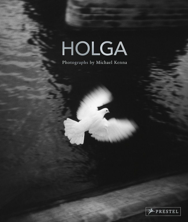
“Photographers are driven creatures” says Michael Kenna. Whatever it is that drives him, landscape photographer Michael Kenna has been travelling the world for more than 40 years, carrying his heavy Hassleblads to countries ranging from France to Japan, often working at night or in the early hours of the morning to produce minimalist black and white landscapes with an uncanny knack of capturing the ‘spirit’ of a place.
His latest book, Holga, though, is a collection of pictures taken around the world using the popular, low-tech, ‘toy camera, the Holga. Graeme Green caught up with him between assignments at his home in the United States to talk solitude, toy cameras, singing karaoke and the lengths he’ll go to for a photo…
You spend a lot of time photographing at night and early in the morning. Why?
There’s something extremely therapeutic about the solitary process of wandering around in beautiful circumstances, early in the morning or at night, alone. You feel alive. It instils an incredible appreciation of our lives and our world.
I’ve always had a proclivity to wander and enjoy being on my own. I find it’s more difficult to connect with nature and the landscape when you’re with somebody else.
I’m a photographer. That’s my profession. But even if I was doing something else, I’d be happy to go off on my own, hiking, and to spend time watching, looking and just being.
Why do you like solitude so much?
You’d probably have to talk to a psychologist. I’ve learned in life not to seek too many answers and just to appreciate the path you’re on. I’m just who I am.
I’ve always had a solitary streak. I come from a large working-class family. Growing up, I slept in the same bed as my brother, with four brothers in the same tiny room. My ambition at 10 years old was to be a priest, which is also a somewhat solitary profession. I’ve always had a proclivity to wander and enjoy being on my own. I find it’s more difficult to connect with nature and the landscape when you’re with somebody else.
How do you go about capturing the ‘spirit’ of a place, rather than just the look of a landscape?
I try not to make specific, conscious decisions ahead of time about what I’m looking for. I find locations, usually by walking. I look for some sort of resonance, connection or spark.
For me, approaching subject matter to photograph is a bit like meeting a person and beginning a conversation. How do I know ahead of time where that will lead? Curiosity is important. So is a willingness to be patient, to allow a subject matter to reveal itself.
Do you imagine or ‘see’ a picture in your mind before you start working on a photograph?
I don’t like to approach a subject with a pre-conceived finished print in my head. It’s the opposite of people like Ansel Adams. I never feel I’m the paparazzi making an exact copy of what’s out there. I always feel it’s a two-way street. You’re giving something to the landscape and it’s giving something to you.
We have infinite options of how to photograph something. That extends into the darkroom afterwards. That’s one of the reasons I haven’t gone over to digital. I prefer the slowness, the unpredictability, the complications. You never know what you have. It’s like the excitement of opening up a Christmas package when you get your negatives back.
Time is a luxury. It’s a luxury not to have to do something, just to stand, to watch, to experience, and not to always have a full agenda and a busy schedule. It allows you to wander off in your mind.
How does working in black and white, rather than colour, change what you look for?
Having less information allows your imagination to work more to create more options. I like this idea. It goes back to writing. With haiku poetry, just a few words suggest an enormous world, rather than a big encyclopaedia that holds lots of information.
I try to eliminate elements that are insignificant, unimportant, distracting, annoying. I concentrate on elements that suggest something. I prefer an element of suggestion in my photography, rather than a detailed and accurate description. I think of my photographs as visual haiku poems, rather than full-length novels.
You sometimes use exposures of 10 hours or more. What do you do with all that time?
Time is a luxury. It’s a luxury not to have to do something, just to stand, to watch, to experience, and not to always have a full agenda and a busy schedule. It allows you to wander off in your mind.
One of my other pastimes is long-distance running. It’s a similar sort of thing. It’s a physical activity, but once you get past the two- or three-hour mark of running, it’s almost like an out-of-body experience. It seems you can solve all the world’s problems. It’s completely illusory, of course.
Most people think of photography as capturing a moment. What is it that you like about long exposures?
Yes, my work is ‘the decisive 12 hours’, not ‘the decisive moment’. Often, it’s not the pictures I’ve taken that I considered to have the perfect light and exposure that are most interesting. I like the ones where there’s something beyond my control. We photographers tend to be a bit controlling, and I’m always trying to liberate myself from that.
Your new book, Holga, contains photos taken with the low-tech, ‘toy camera’. What’s the appeal of a Holga?
I work with Hasselblads most of the time. They’re heavy, cumbersome. You have to spend a lot of time thinking about what you’re doing. The Holga is really very whimsical, instant, unpredictable piece of equipment. You can carry it in your pocket.
I have four or five of them. Each one has a different characteristic. They’re not machine-built to the point they’re consistent, so you really don’t know what you’re getting ahead of time.
Do you find it useful to explore new approaches to photography?
Yes. If you use the analogy of food, you might know exactly what you like, exactly what restaurant you’re going to go to and exactly what you’re going to order. The question is, do you continue with that because, “Yes, I know I like it”, or do you experiment and say “There’s this taste I’ve never tried before and maybe I should try it”, in the understanding that you might not like the taste or it’ll be a failure?
I think most of us look to be constantly creative and constantly curious about what else there is. As you advance, you see yourself repeating patterns and past successes. You have to constantly force yourself away from those patterns.
You’ve been taking photos for 40 years. How has your work changed?
The big element for me was going to Asia in the mid-1980s. Before that, my influences were European photographers. Once I started travelling to Asia, my influences became Asian. My exposure to Japan markedly changed the way I view the world and photograph the world. The equation shifted. In my early work, I used a lot of darkness, a lot of shadows. I found I was using white more in Japan, and things were becoming more abstract, more minimalistic.
What is it you like about Japan’s landscapes?
There’s something mysterious and wonderfully alluring in the Japanese land. It’s visually manifested in the omnipresent interactions between water and earth, and in the constantly changing seasons and skies. There’s reverence and honour towards the land, symbolized by the ubiquitous Torii gates.
Japan is also a volatile place, sometimes unpredictable and potentially dangerous, with typhoons, earthquakes and tsunamis possible. It’s a country where the land is alive and powerful. I believe living in Japan accentuates an awareness of the fragility and beauty of our transient world.
Are there any particular areas you enjoy spending time?
I’ve found Hokkaido in the north to be a particularly intriguing place. Visually, it’s been a paradise on earth for me, a winter wonderland.
My guide in Hokkaido also taught me karaoke songs by Yujiro Ishihara, a well-known Japanese singer. I’d practice in the car on our road trips. Later, in karaoke bars, it was surprising to me how warm and friendly people became once I sang one of these songs. I could have free drinks all night as long as I sang either Yujiro or Beatles duets with everybody, a very useful skill to have in Japan.
I could have free drinks all night as long as I sang either Yujiro or Beatles duets with everybody, a very useful skill to have in Japan.
Which are some of your other favourite countries to work in?
I’m at a point in my life where I love to photograph in many of the places I’ve photographed in the past. I use the analogy of a friendship. It’s nice to deepen and renew and reacquaint with that person, instead of constantly meeting new people. There’s something very good about having deeper relationships with countries too.
I find I’m returning more to China, France, Italy, Japan, places where I’ve been before. I could keep going to places like those for my whole life and still be content. I just did two projects in Italy, a book on Abruzzo and one on confession boxes. I could spend my life in Italy or France.
What keeps drawing you back to France?
France has so much to offer. I’ve photographed there more than in any other country. Brought up in England, I came out of a European tradition. My first photographic masters were Eugene Atget, Bill Brandt, Mario Giacomelli and Josef Sudek, among others. They are all romantics at heart, concerned with photographing a feeling.
Eugene Atget, for example, inspired me to photograph the Le Notre Gardens in and around Paris. His dedication to photographing Paris all his life taught me that nothing is ever the same; the same subject matter can be photographed in many different ways and in different conditions.
With digital cameras and smartphones, most people now travel with a camera. What do you make of the ubiquity of photography?
I choose to opt out. Everyone nowadays is a photographer because everyone has a camera on their phone. That’s just the way it is. It’s not something I’m against.
Most people are content just to take instant photographs and put them out into the world very quickly and easily. There are always going to be some who take the time and delve deeper. It’s a bit like using Garageband on the computer. You can make music very quickly, but to really master an instrument takes years.
Photographers often go to great lengths for a photo. What’s the most you’ve had to endure to get a picture?
A few years ago I was going to my daughter’s graduation in Vermont. There’s a hotel, the Heiden Hotel, where I first worked when I moved to the States in 1976. I’d been photographing it ever since, through rack and ruin. It was decrepit and falling down. It happened that there was a fire and the hotel burned down. I decided to drive to this hotel to photograph the ruins. My stomach was hurting, as I had a problem from spending time in India. I drove for six hours to upstate New York. When I got there, I could barely walk with the pain. I managed to stumble around the hotel and take some photographs and somehow drive back to Vermont. Next morning, I couldn’t get up. I managed to get to a hospital and they told me my appendix had broken two days ago, that I was lucky to be alive, and they had to do emergency surgery. I had been in huge pain.
Photographers are driven creatures. If I scent a photographic possibility, I will go after it. I’ll endure almost anything to get that exposure. I have to get that photo, regardless of common sense.
Holga by Michael Kenna is published by Prestel. See www.prestel.com for details. Confessionali: Reggio Emilia (Corsiero Editore ) and Abruzzo (Nazraeli Press) are also available now. For more on Michael Kenna and his books, see http://www.michaelkenna.net/.
Last issue we asked our subscribers asking you to submit your favourite landscape photograph from 2017. We expected a few entries but in the end we were extremely happy to have had over 80 entries from our subscribers all over the world. We've compiled them into a gallery which is shown below. Thank you for everyone who submitted work! It was a pleasure for me and Tim to go through all of these excellent images. We both hope you all have as much success in 2018!
The images are in order received and click on the images to view them in a larger format.
Uig Bay, Lewis
Idse Herrema
Fantastic curves of the surf in Uig Bay, in beautiful sunshine, when Scotland is hard to beat. It took some nerve to remove the gorgeous colours from the land, water and sky, but the shapes say quite enough!
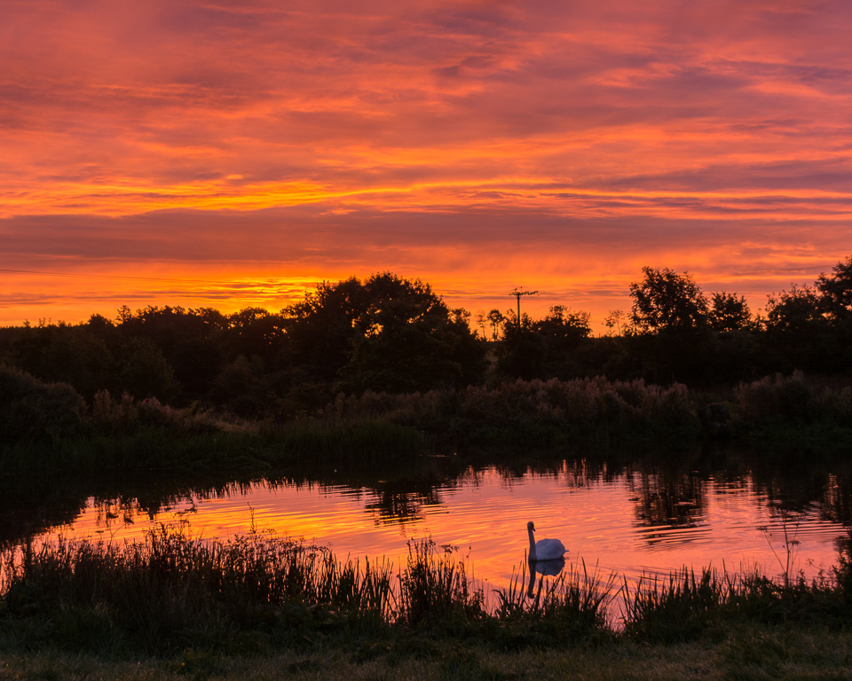
Dawn, Brunton Lake
Bob Holmes
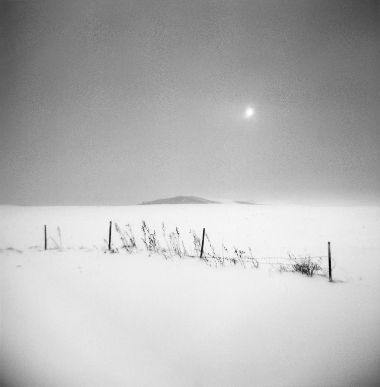
Brunton is a small hamlet about two miles inland from Lower Newton-by-Sea, Northumberland. The “lake” is probably the header pond for a watermill. Not very exciting on a damp September afternoon when I first saw it, but the easterly view suggested it might have potential, so I made my way there before dawn when the conditions looked right and was rewarded with lovely light – and an obliging swan.
Stonethwaite from Castle Crag
John Potter
I was ill most of last winter with a very poorly knee which was very frustrating, as I love working outdoors at this time of year. After a minor keyhole cartilage trim in March I gradually built up my stamina through the summer, and Castle Crag where this image was made from, was the first fell I climbed since March. Then to see light like this and to share it with a local couple for a brief ten minute spell was a truly wonderful experience.
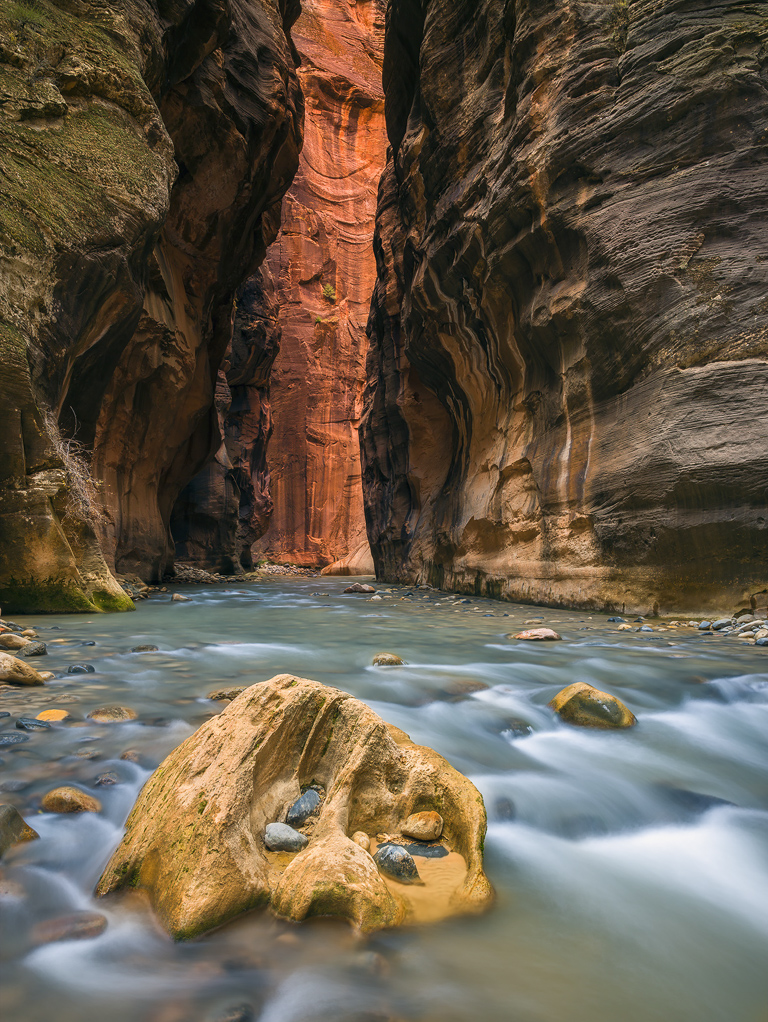
Narrows in Zion National Park
Russ Davis
I have wanted to photograph the Narrows for years but something always seemed to get in the way – water level too high, overcast conditions or simply a lack of time. This fall it all came together! Technical details – Linhof Techno camera, Rodenstock 40mm lens, Phase One IQ280, 6 seconds at F11, 3/4 degree front tilt.
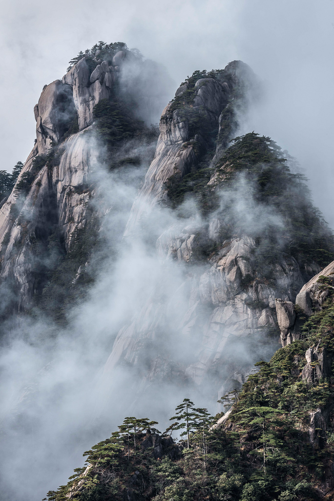
Falling clouds,Yellow Mountains
Fred Cook
On a trip to Yellow Mountains had an amazing day when the cloud base rose and fell, giving us a glimpse of the mountain peaks.
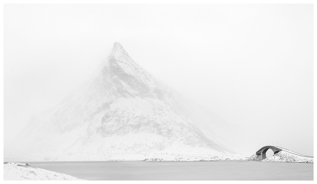
Torvöya Snow storm
Stuart Westmore
Taken in Torvöya, Lofoten Islands
First snow of the season
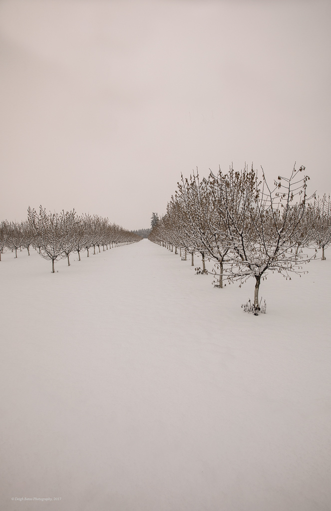
Deigh Bates
Shot in the filbert orchards near the McKenzie River, Eugene.
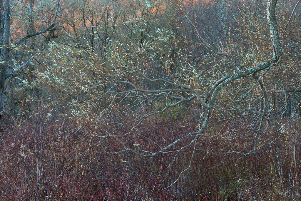
Willow Branch
Chris Murray
The work of Eliot Porter has had a large influence on my work in recent years. I would like to think this image captures the subtle colours, detail, and soft light for which he was so well known.
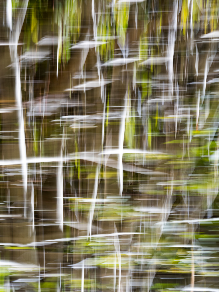
Weaving Aspens, Table Mountain, Inyo National Forest, California
Lori Ryerson
Intentional camera movement with multiple exposure (ICM with ME). For five months, I had been trying to create a shot like this, combining these two techniques. Nothing was working; wrong subject, bad light, bad technique. Nada. And then, on an autumn trip to the Eastern Sierra region in California, in a grove of aspens at the edge of Bishop Creek, this happened. As the early morning sun crested over the top of nearby Table Mountain it released a glorious golden ribbon of light that highlighted the white aspen trunks, reflecting off the surface of the creek. Finally, I was finally able to realise the image that had been living only in my head up until that morning.
Sunset over Berithorn
Alex Roddie
Holyhead Mountain Sunset
John Barton
This is an image of Holyhead Mountain on Anglesey, viewed from land above Rhosneigr Beach in the foreground as the tide ebbed and the Sun had recently set directly behind the Mountain. Fuji XT2, Fuji XC50-230mm lens, F6.4, 1/30″, ISO1600.
Llantwit Major, South Wales, UK
Roger Harrison
Taken with Hasselblad 500EL/M, Zeiss Distagon 40mm CF on Velvia 50
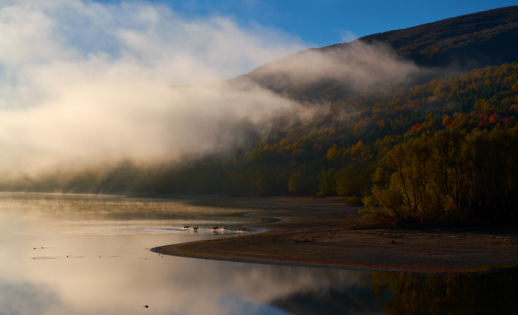
Bath Deers, Italy – Villetta Barrea
Fabrizio Marocchini
Beautiful deers having fun in a cold lake water just after sunrise…
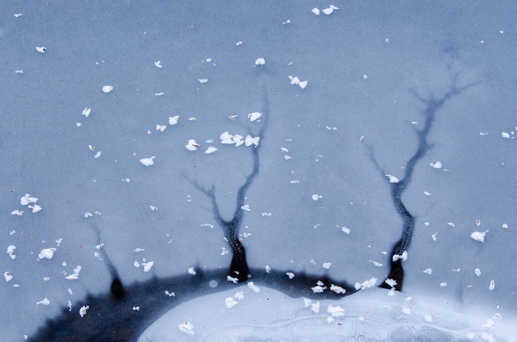
Imaginary Winter, Lake Lases, Italy
Mattia Oliviero
Last January I was having a walk along a frozen lake when I found this scene. It immediately reminded me of a winter landscape with trees, hills and snowflakes. When I realised it was just my imagination I smiled and I kept wander in that imaginary winter.
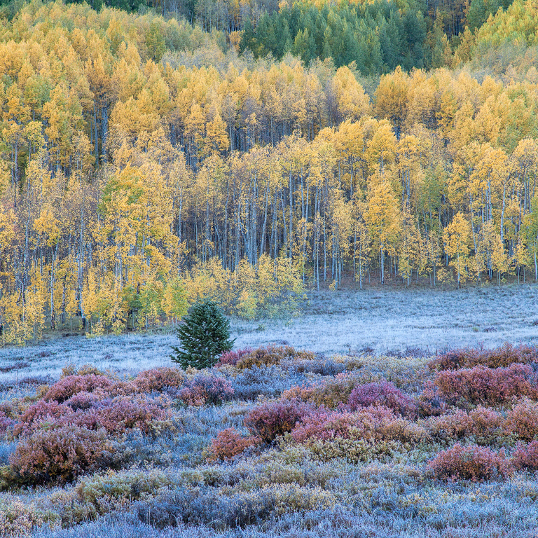
Frosty Morn, Washington Gulch, Gunnison National Forest, CO, USA
Richard T. O’Kell
A high mountain meadow during an autumn morning of soft light and frost.
Peek a boo, The Helvellyn Massif shot from Askham Fell in The Lakes.
Jeff Ashton
I loved the way the cloud was swirling about the massif and caught Catstycam as it appeared for a brief moment along with Striding Edge. This was taken in December after a brief snowfall. Taken with a Nikon D750, Nikon 70-200 2.8 FL ED VR @ 200mm, F5.6, s/s 1/1250, ISO 640.
River Monnow, near Llangua, Monmouthshire
Derrick Golland
The River Monnow forms the boundary between England and Wales, but like many local water courses in the summer of 2017 levels were low. This pool with its over-hanging alders provided an obvious subject. Canon 5D mm lll. EF 70-200 f4L IS USM. f11, 1/40th sec.
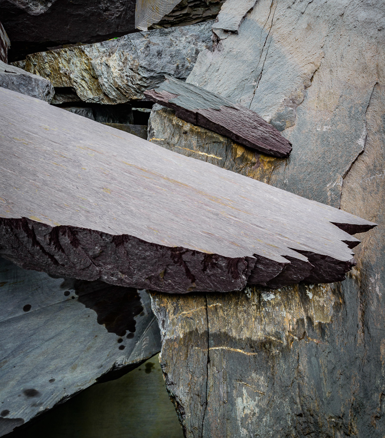
Valentia Slate Mine, off the Co. Kerry Coast
Ed Hannam
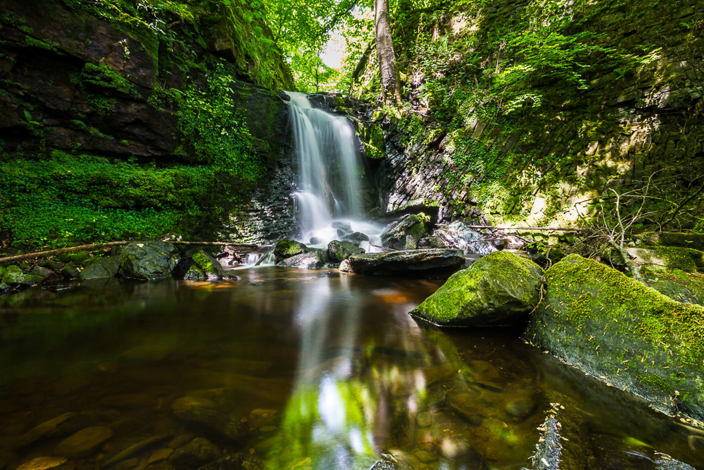
Clough House Wood Waterfall, Slaithwaite, West Yorkshire
Gary Turner
Waterfall from the side of the old Clough House Mill Pond.
Espigoulier Pass, located near Marseille, South of France
Philippe Retoret
One of my favourite location for both hiking and shooting photos and one of the most beautiful around the city. Shot with my Nikon D750 + Nikon 24 PC-E on a half misty day.
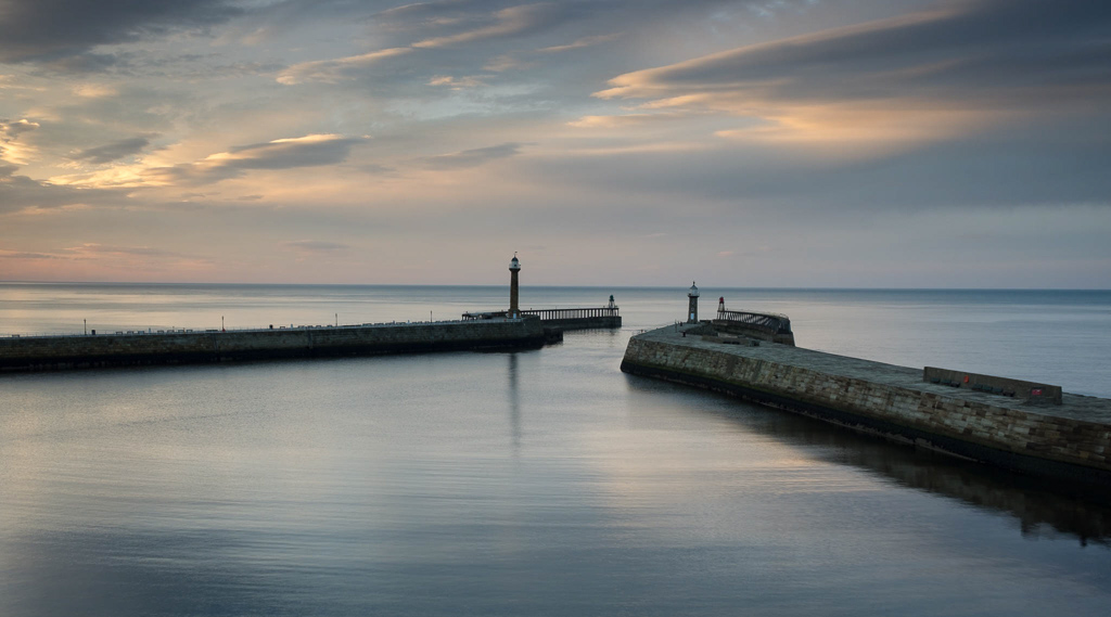
Sunset, Whitby Harbour
Tony Gaskins
Fuji XT1 18-55mm lens 0.5 sec @F14 Lee .75 medium ND Grad.
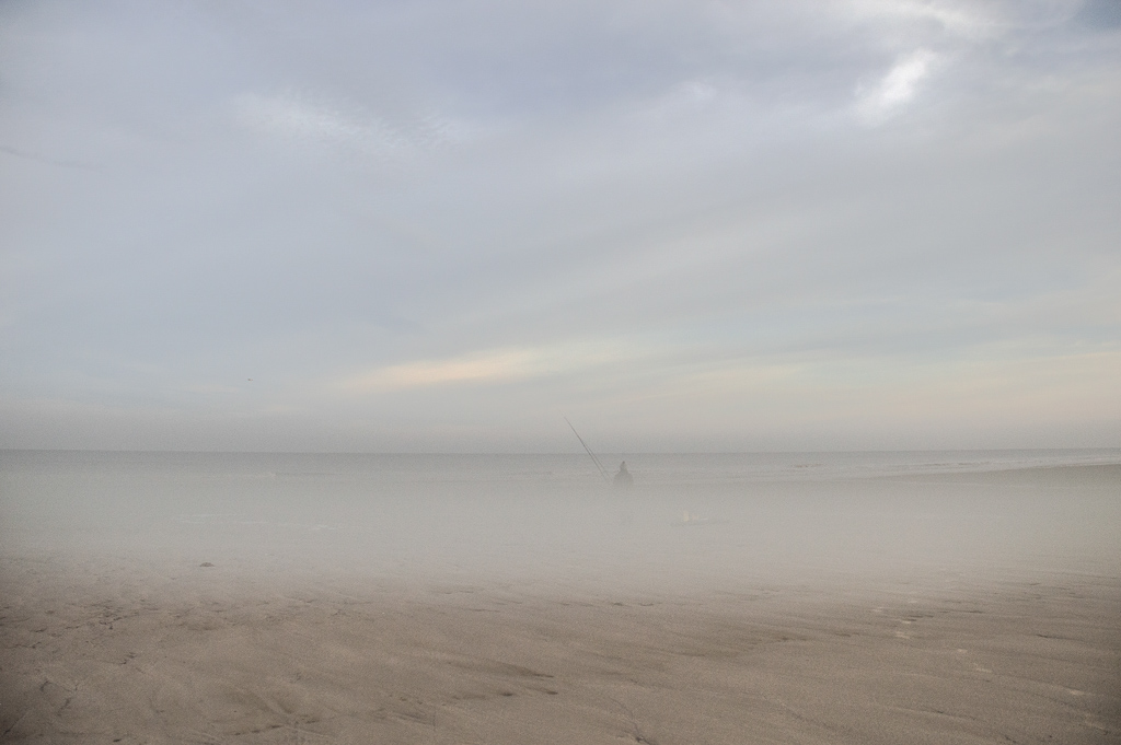
Where sand meets sky
Paula Cooper
Wild Atlantic way, Connemara, Ireland in October.
Sunrise over Phillips Lake, USA
Ian Meades
I was fortunate to be able to experience the total solar eclipse that traversed North America this past August. The area of totality was about 140 miles south of where I live, so I drove down the day before to find a camp site in the Elkhorn Mountains of Eastern Oregon. The media had been reporting that up to one million people were descending on the state to view the eclipse, and so with the local resident viewers I was expecting to be camping with hundreds (if not thousands) of other people. As it turned out, I was the only person camping on a promontory overlooking Phillips Lake – I had the place to myself.
Touched by a Sunrise
Mark Hunneybell
This was taken whilst on holiday in Northumberland. It was taken from Embleton Bay looking back towards Dunstanburgh Castle. It was an early start but worth it. It took a while to find my composition but settled for this classic view. I love the way the clouds seem to lead you towards the Castle.
Krister Berg
Milborne Port, Sherborne, Dorset
David Hansford
It seems to me that there is a lot to be said for visiting the same location repeatedly and this is the case here. Prior to sending off this image to you, I browsed through similar photographs on Lightroom taken in different seasons. Taken as the sun was rising over Crendle Hill Wood in August this year, this is my favourite though – well to date in any event.
Hustle and bustle
Peter Stevens
This is a multiple exposure. The technique is not new but I had to give it a try having seen the inspiring work of Pep Ventosa in the OnLandscape interview earlier this year. I’ve since been exploring different approaches to photo impressionism but find multiple exposures to be my favourite. The technique creates a sense of energy and movement which is both visually attractive and gives an extra level of meaning.
Paul Gotts
An Infra Red shot of Bosham Harbour,
Graham Devenish
I chose it because I like the way that the light pools around the boat and the leading lines of the clouds draw you toward the centre.
Château de Joux, La Cluse-et Mijoux, Doubs, France
Marc Hermans
Just like last year, I went to the Jura with dear friend Bastiaan van Dongen to add a few pictures to my portfolio. On the last morning we drove to Fort Malher, at 1000m a “point de vue” not to miss, and the one from which we wanted to photograph Château de Joux.
Ullswater Gold, towards Sheffield Pike & Birkhouse Moor from Ullswater
Dave Varo
This image was made for the stern of MV Western Belle during a dawn cruise on Ullswater in early November. The promised sunrise never materialised, but the gold colours towards the end of the trip were really stunning and showed Lakeland in all its autumn glory.
Silver Birch, Hodge Close, The Lake District
Martin Addison
One of my favourite locations in the Lake District, the Silver Birches are always beautiful against the slate, whether in sunlight or as here in overcast light.
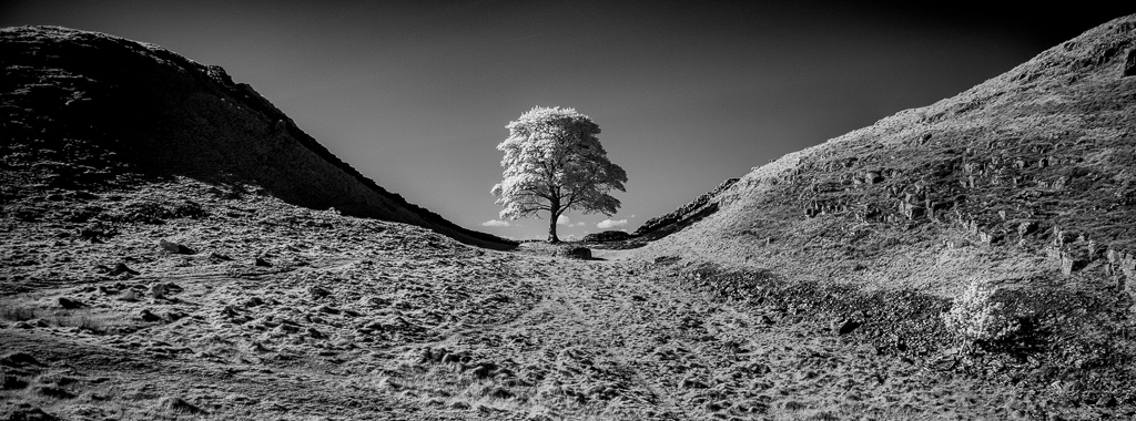
Sycamore Gap in Infrared
Martin Berry
Infra-red image of the famous sycamore tree on Hadrian’s Wall as a panorama. I wanted to capture a different view of this tree and needed clear skies and a sunny day.
Kelly Hall Morning, Lake District
Dave Knight
Mid-morning view of Kelly Hall Tarn in late November, the last of the early morning mist had just dispersed and the sun was trying to break through.
Hohe Tauern National Park in Austria
Daniel Egger
This picture was taken by the end of May this year in the Hohe Tauern National Park in Austria, In the district of Eastern Tyrol (German Osttirol) which is a part of the state of Tyrol. Living quasi in the middle of one of Europes largest National Parks do have some advantages when it comes to spontaneous short trips.
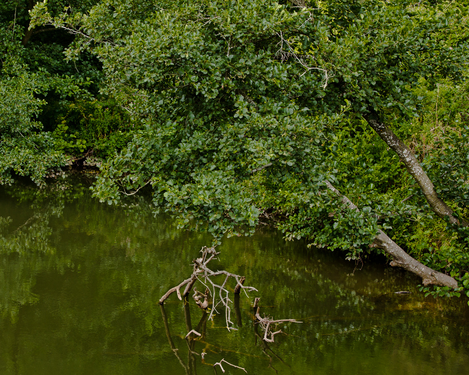
Flood and shadows
Rob de Loë
This part of the forest near the Speed River in Guelph, Ontario, Canada, often goes underwater during the spring flood. This area is mostly cedars, so the tiny spaces between the leaves that are open to the sky during daytime created the impression of stars at night. The larger patches of sunlight that form a pathway through the image, guided by the shadows of some tree trunks, are like spotlights illuminating what lies on the flooded forest floor.
Trees in a snow shower,Cairn Wood, County Down, Northern Ireland
Leslie Ashe
A small stand of Scots Pines which stands separate from the main area of woodland. I like the way that the falling snow gives the whole image a textured look.
Moonlit, Isle of Skye
Prashant Khapane
After missing the sunset I was lucky to see this possibility thanks to the temporary traffic lights in the middle of nowhere for road-works. This is where digital capture excels. It would have been impossible to make this image with my large format or any other film gear. Quick high-iso shots confirmed the composition was how I wanted. And then it was a matter of setting the ISo 100 exposure of the depth of field.
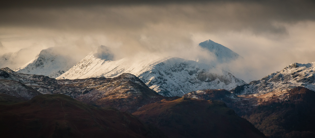
Hunkering Down, Glencoe
Howard Rankin
Taken en route to photograph the Three Sisters in a snow storm, this view was eastwards across the valley. I liked the subtle recession of tones to the far mountainside.
Tranquility, Lake Orhid, Pogradic, Albania
Sarah Bedwell
The tranquil waters of Lake Orhid, and the distant Macedonian hills were a great contrast the rest of Pogradic which had the air of an seaside resort being slightly neglected during the winter months.
Morning with glorious light
Robert Moore
I have been photographing this small slough through the seasons for a number of years. Significant beaver kill and damage has presented an ever-changing view. Present photograph with the X1D and Pentax P67 200 F/4 lens.
Rydal Water from Nab Scar, Lake District
Allan Harris
The showers were coming across from the Scafells and I took a hand held three image quick panorama which I have combined in LR Classic and processed further in Photoshop.
Sunlight falling on the slopes of Glaramara
David Cole
Taken in October 2017, I was walking back down from Styhead Tarn towards Seathwaite in Borrowdale. Sunlight falling on the slopes of Glaramara was catching the stone walls and folds in the land.
Lesvos Island, Greece
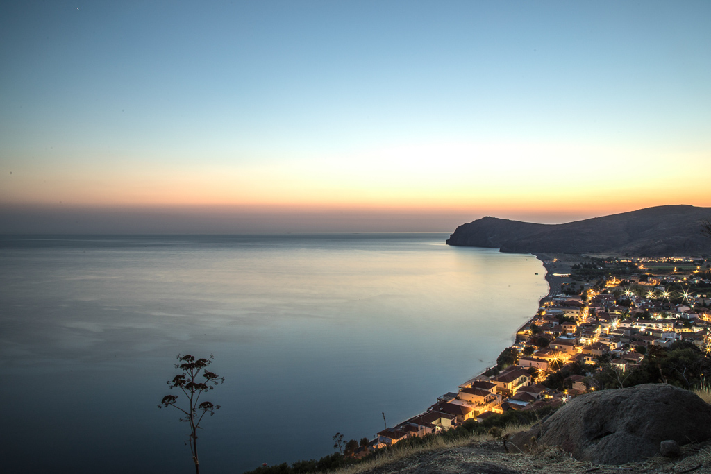
Lucy Littleton
I took this image whilst living on the Greek Island of Lesvos during summer 2017.
Portsoy Harbour at Dusk, Aberdeenshire
Alastair Ross
A departure from the norm for me, hence its inclusion. 2017 taught me that you can process the colour in your digital photography, as you would do when choosing your film for a shot. This is processed using VSCO’s Kodak Portra 160 preset.
Deep in the Gorge, Fiery Gizzard Trail, Tracy City TN
J. Paul Moore
Giant Hemlock Trees contrasted with a solitary Mountain Maple Tree.
Road to Elgol
Alison Taylor
I was on my way to pay my first visit to Elgol when I saw an interesting line of trees on the side of the road with the Cuillins forming a dramatic backdrop. I didn’t stop as I wanted to catch the tide but I decided that I would stop on my return drive. Later in the day I was excited to see some fabulous cloud billowing around the mountains from the melting snow so the photograph I took was far more interesting than it would have been in the morning. There was still some snow but it was melting quickly.
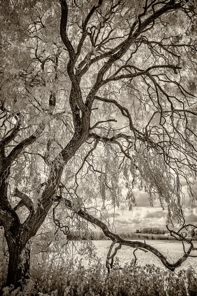
Droopy
David Marshall
This weeping willow is a favourite tree (specially as it’s just a few yards away!) and I’ve taken lots of photos of it, usually with my mobile, as I set off on dog walks. The photo is called ‘Droopy’ for no other reason than it has that one branch drooping down. It could have been called ‘Foxy’, as there appears to be one lurking between the two main trunks.
Sentinel,The Highlands, Scotland
David Driman
Image shot along a river bank somewhere in the county of Sutherland, Scotland (Sony A7RII, Sony EF 70-200 F4 G OSS, Nov 2017).
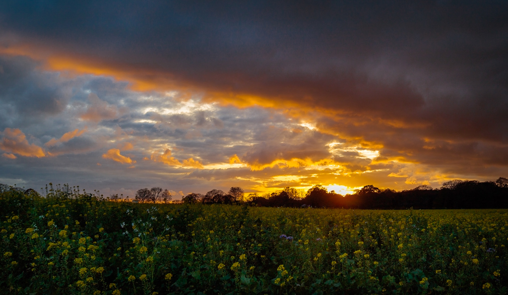
Shiplake Sunset, Shiplake in the Chiltern Hills
David Davidson
Dramatic sunsets are quite rare around Shiplake and this encroaching heavy overcast sky is more the norm. An unusual aspect of this November scene is that the crop is oilseed rape, normally a Spring crop. It was shot on my backup Canon M3 with 11-22mm lens rather than 5D2 as I wasn’t expecting such interesting fleeting light on this particular walk.
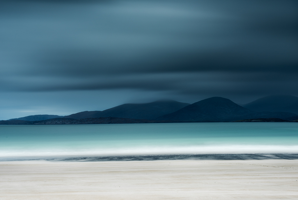
Luskentrye in Aqua, Isle of Harris Scotland
Ruth Grindrod
A moody day in October on Luskentyre beach creating some long exposures of the sea and the Hills.
Fishing boat on a loch in Scotland
Sara Cremer
Having previously being inspired a friends images of Scotland my partner & I decided it was time to have our own road trip! We were traveling up through Inveraray when this little boat grabbed my attention. The weather was moving in too with huge clouds in the sky & I just had to take the shot. I ran about 1/4 of a mile down the road so the boat would have its side to me but this was as close as I could get. I was so happy to photograph that moment in time & to me it was just perfect.
Golden Waters, Cinn Aird, Dingle
David Harris
As the sun sank into the cloud the sky turned a lovely golden brown and I liked the shape of the rocks, the light on the water and the more distant wave action.
Scots Dartmoor, River Dart
Alan Howe
A walk along the river Dart one frosty morning in January turned out to be very productive. I came away with many images I was happy with but this one is my favourite. It was one of those scenes that just had to be captured: frost on the opposite banks and a touch of light catching the trunks of the trees, all reflected beautifully in the perfectly still river. Sometimes a wander into the unknown is all it takes to find something a bit special.
Serenity, Yellowstone National Park
Phil Johnson
One of my first shots on the first day as steam from the nearby hot springs simplified the landscape.
Vadret da Morteratsch
Benjamin Klormann
The Vadret da Morteratsch or the Morteratsch glacier is a significant glacier in the Berninagruppe in Oberengadin, Switzerland. The glacier disappears as a result of global warming. Since the beginning of the measurements in 1878 he went back around 2649 meters. There were only 5 periods in which an increase was observed, most recently in the period 2003-2004 by 10.3 meters. In the last period 2014-2015 a decrease of 163.9 meters was measured. Soon this beautiful place will not be more like I photographed it.
Blakemere Moss, Delamere Forest, Cheshire
John Osman
I was inspired to revisit Delamere Forest by Colin Bell’s photographs of Dead Lake there. I felt that I had more success on this particular day with my images of Blakemere Moss, which is just across the B5152 road from Dead Lake. Blakemere Moss is described at as “…. a reclaimed wetland area. The Moss was originally formed from two kettle holes (water filled hollows formed by a detached mass of glacial ice melted in situ towards the end of the last ice age). Delamere Forest is made up of more than 100 peatland basins and includes several sites of rare ‘quaking’ bogland, a phenomenon in which sphagnum mosses form a carpet above peaty water that appears to tremble when trodden on.” That, and the forest itself, makes for an interesting location for photography.
Binnein Beag, Allt Coire Giubhsachan, Glen Nevis, Scotland
Graham Meek
On a week’s walking holiday with my wife and on a changable April’s day we walked along Glen Nevis to Steall Falls and then beyond. Upon walking up the river leading into Water of Nevis near the ruined Steall, I came across this very orange bedrock which was pointing to distant mountains. Through the murk the distinctive round shape of Binnein Beag came into view in-between showers. I liked how the trees also formed a line towards this peak, but would have loved some foliage on them to contrast with the dark hills. Ah well, can’t have everything. Large format 4×5 (Chamonix 045N-2), Kodak Ektar, Caltar 90mm f6.8 lens, focussed with back tilt and an 81A warming filter was used if that’s important.
Hofdaskard, Snaefellsnes Peninsula
Gari Beet
Shot during a road trip around the Snaefellsnes peninsula, Iceland. Though we visited some of the usual hotspots during the trip, we were both keen to capture something of the island less visited and possibly overlooked, the ‘bits” in between that just get driven past on the way. This was looking across the northern coastline at the end of the peninsula, just outside the Kommune of Hellissandur.
Snow Swirl, Forest of Dean
Jane Simmonds
ICM image taken of fir trees in my local woods during the recent snowy conditions in December.
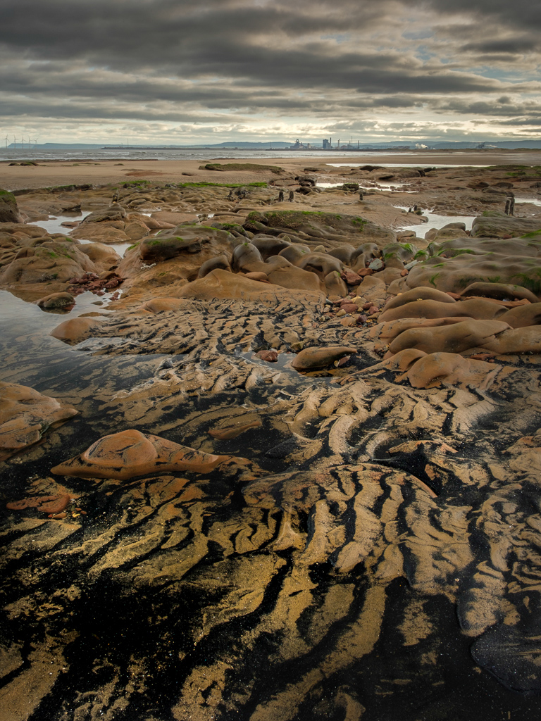
Full Circle, Seaton Carew, Hartlepool, Teesside
Adrian Tilbrook
Tiger stripe effect created with stone, sand and coal deposits (Sea Coal as we locals call it). The sea coal used to be collected by hand with home made ‘Sea-coal rakes’ and sold from barrows (converted prams) and bikes round the streets of Hartlepool and further up and down the coast. This is a reminder of the mighty Durham coal fields that once provided so much employment in the North East, which in turn powered the regions Steel Works including the Redcar Steel works seen here in the distance. Both of these heavy industries are no longer with us and the sea-coal is once again making its mark on the landscape.
The Last Leaves, Fernhill Wood, Plymouth
Phil Starkey
Photographing trees and woodlands is something that I’ve struggled with for a long time, I’ve never felt that I’ve come away with anything that I was happy with at all. This image that I took in November however broke that trend for me. The soft light was beautiful, the proportions felt good within the frame, and the textures and tones really seemed to work too. It’s certainly far from perfect but it signals a personal breakthrough in photographing woodland, and so therefore for that reason it’s my top shot for 2017.
Old Man of Storr
Justas Trimailovas
It was probably the greatest point for me of doing landscape photography up to date. First trip dedicated for taking pictures, which took place in the wonderful highlands of Scotland. I was eager to visit the greatest photographic locations of it and was lucky to capture gorgeous light at the Old Man of Storr.
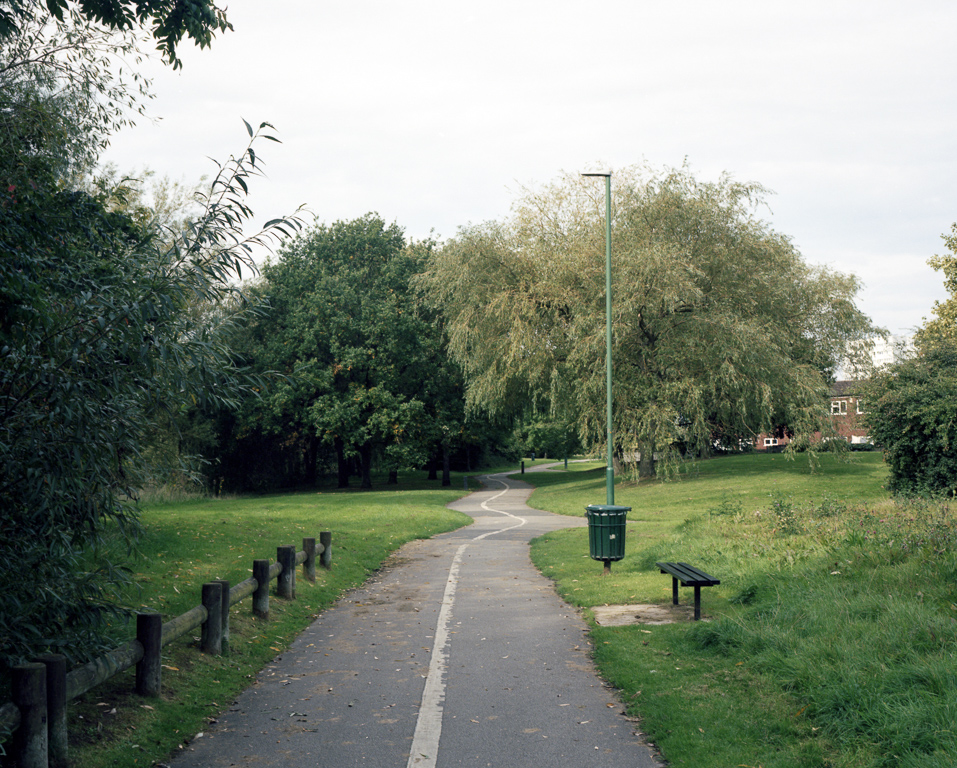
Path 1, Chelmsley Wood, North Solihull
Brendan Gara
Path 1 is part of a series of photographs in and around the B37 postcode locale. I have been using Lynch’s “Elements of the modern city” to map the area (where I currently live) as a long-term project called The Green Estate.
Bostagh Beach, Isle of Lewis
Ursula Lawrence
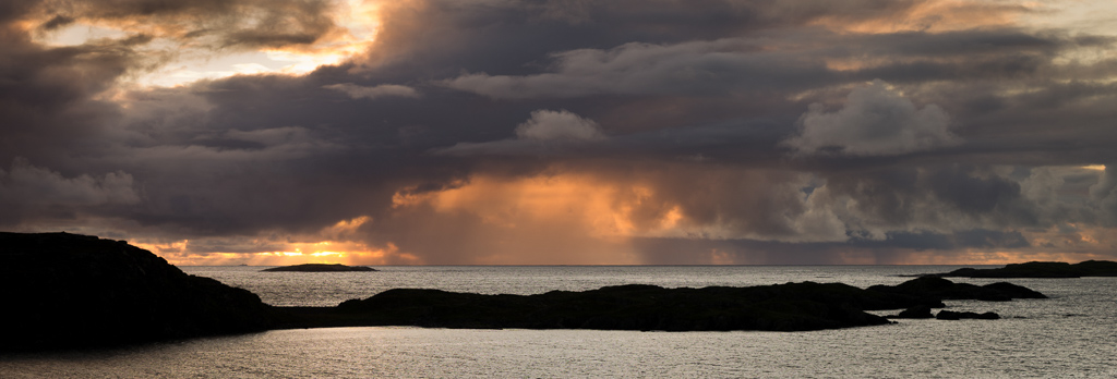
September 2017 I arranged a trip to the Isle of Lewis for myself and two Dutch friends. The forecast for sunset wasn’t good but we thought we’d give it a go as it was dry and Bostagh Beach was close to our cottage. This storm moved in front of the sunset and we split up. I went on to the headland to the east of the beach while my friends went to the headland to the west. I like the way the islands combine with the storm clouds to frame the sunlight sky so that it resembles an eye. Despite being a panoramic format it is a single image taken on a Pentax 645D with 55mm lens. F11 1/13s.
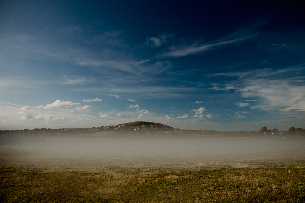
Matchsticks, South Downs, West Sussex
Roger Voller
I arrived just when the mist was clearing and frantically looking for compositions but when the morning sunlight appeared I managed to settle down with this picture.
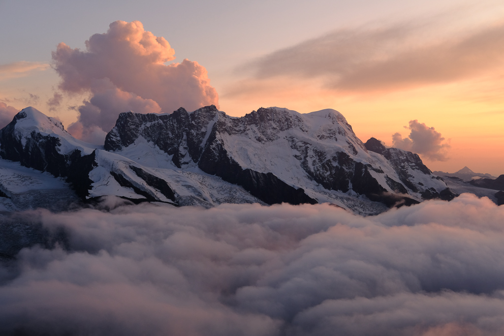
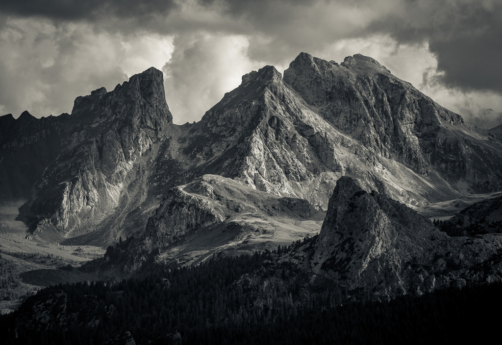
Grandeur, The Dolomites, Italy
Jörg Frauenhoffer
I took this image on the last day of a photography workshop in the Dolomites in August. We were hiking up the side of a valley, taking in the magnificent views towards the opposite mountain ridges. The light kept on changing by the minute and our group just could not believe its luck. Of all the photographs from this evening, this toned black and white conversion ended up being my favourite.
The View At Dinner, Petworth House
Valerie Dalling
One of two images I had selected by the National Trust for their ‘Mixed Emotions’ Open Photography Competition and subsequent Exhibition held at Petworth House before Christmas. I was intrigued by the Carved Room…when dining in Turner’s day guests who were unable to see the view as they had their backs to the window could marvel at one of four of his beautiful paintings on the wall facing them.
Seatown, Dorset
Chris Beesley
A grim summer’s day on the south coast, after sitting in our motorhome for most of the day due to continuous rain we wandered down to the beach for sunset. This is as good as it got.
Flaming June, Knoydart, Scotland
Harvey Lloyd-Thomas
Landing by boat on the western edge of Knoydart, with photographic forays inland repelled by midges, I walked the strand line instead and spotted this pebble cosseted by dried kelp and made this semi-macro image.
Harris Storm, Bagh Steinigidh, West Harris
Mike Prince
An entire day spent on one beach waiting for slight lessening in the showers or rain and hail. There’s no better way to spend a day. My favourite beach on my favourite island in my favourite country.
Private park in Berkshire
Kelvin Richards
Taken in a private park in Berkshire early in 2017 on a ‘one body, one lens’ shoot using an old Nikon 100mm Series E was one of the first experiments yet it remains one of my favourites, I just like the way it caught the essence of the movement.
Walk In The Park, Trent Park Golf Course, Enfield, London
Sandra Roberts
Unusually for London this winters morning had the right mix of fog and frost. Wishing that I didn’t have to go to work I decided I could make a quick detour via Oakwood Tube station into Trent Park. I was pleased i did as to find this scene in the public golf course more than justified me arriving in work late.
Autumn in Alladale, Glen Alladale, Scottish Highlands
Nick McLaren
A view down my favourite local Glen, where great work is being done to regenerate native tree species.
Doolough Valley, Co Mayo, Ireland
Brian Stafford
December sunlight on the Doolough Valley, Co Mayo looking south from near the Famine memorial. The light lasted for only about 10 minutes during an otherwise heavily overcast and very wet winter’s day.
Sunrise over Hon Ba Island, Vung Tau, Vietnam
Brian Graney
I’m currently living in Vung Tau, Vietnam, and enjoy getting up for the sunrise whenever I can. This shot was taken on 26 July 2017, just as the rainy season was getting underway and that can bring dramatic clouds. The island is called Hon Ba and contains a pagoda which pilgrims visit during low tide. The Jesus statue on the mountain is a replica of the one in Rio de Janeiro, and the orange hotel was abandoned some years ago and is a popular spot for wedding photographers.
Dialogue Between Trees, Bois de Chênes, Canton Vaud, Switzerland
Julian Barkway
Two trees appear to share a tender moment as new undergrowth threads a path between them.
Winter Wood – Lichens And Mosses, Near Lossiemouth, Moray, Scotland
Jim Robertson
Favourite images tend to come and go and often my latest becomes my favourite. I took this on January 3rd of this year. A fifteen minute drive followed by a five minute walk takes me to this location which I have visited on many occasions and in all kinds of weather and light. Although it is not my latest it has for the moment become a favourite as it reminds me that locations can be close to home, why I enjoy the intimate landscape, a low winter sun can work wonders compositionally and that ‘green’ is still a bugger to photograph!
Kelly-Hall Tarn, Lake District
Geoff Kell
his was a new location for me, having visited on a workshop with Joe Cornish and Mark Banks. I stayed on after the workshop and revisited this spot in the hope of less rain! I struck lucky with a few minutes of golden light as the sun dipped below the cloud-bank. Camera: Canon EOS 5D Mk III with Canon EF 16-35mm f/4L lens. Lee 0.9ND grad (+ exposure blend and focus stack), tripod.
Dock & Grass, Millington Pastures, Yorkshire Wolds
Paul Moon
A study of colour, shape and texture at the edge of a set-aside field overlooking Millington Pastures.
Chapelle de Ste Cécile, Rivel, France
Peter Reid
This church is above a village about 15 minutes from where I live. I am fascinated by patterns and layers and blocks of colour and shape in landscapes, and buildings often play a role in these patterns. The camera I used was an Olympus OMD-EM1/ii with a Lumix 7-14mm lens, ISO 200, 1/1250 sec at f5.6, image processed in Lightroom.
On 30th December 2009, three days before his 52 birthday, my dad passed away. After over fours years of trying to stop cancer from altering his life, it got the better of him. He left us with the words, ‘faith in action’, to act on that which we believe, not a sentiment that I had heard him mention before, but one that I will never forget.
Taking photographs suddenly became difficult, for months, nothing seemed significant enough to be worthy of capturing in an image, it seemed trivial. What could I photograph that was worthy of my dad, his life, his legacy through me? Those were the subconscious questions holding me back as if I was going to restore something of my dad through the photographs I was taking. In hindsight, that was far too grand an expectation.
Each year, as 30th December comes around, we spend time as a family, return to a place that was significant to dad and just be together. It feels strange to acknowledge it, but losing someone at that time of year is almost a blessing. As a family, we are always together around the Christmas period, and those few days between Christmas and New Year are almost like lost time. Away from the demands of routine, you become responsible to nobody but yourself and those who are very closest to you.
That space, both physically and mentally, has created this annual window for reflection in my life. Amongst all the festive celebrations, it can often feel sombre, but it is has allowed me to venture out, as a means of ritual, recognition, but more importantly my greatest means of expressing that which is within me, to go and make photographs. Sometimes they are bleak, cold or empty, sometimes they are hopeful, amusing or feel more complete. Being a prescribed day, I am not at liberty to select my scenes according to the season or weather, and the limitation of time, and more often, also place (according to who we are with for Christmas), I have found have actually aided my creative process over the years. Those restrictions give me a framework from which I cannot stray and I am able to allow myself to walk and search without the often burdensome weight on landscape shoots of having to make decisions about time, light, locations, angles and probably having to come back tomorrow.
This set of images was taken at dawn in Winchester, Hampshire, the place he had called home for the majority of his life. They are a study on a frost covered morning of a walk up St. Catherine’s Hill, a popular walk just outside the city. As I reached the summit, the sun rose from the opposite side, seeping through the trees and warming the otherwise blue tinted scenes. One of the final photographs in the set features St. Cross church in the valley, somewhere that Dad would regularly sing as part of a choir and always evokes the memory of his voice in me.
The physical act of making something out of a feeling of loss is encouraging and even leaving the house, having time alone and proactively and intentionally searching for that space feels positive.
Regardless of what they look like, it is the practice of making the photographs that are therapeutic for me. The physical act of making something out of a feeling of loss is encouraging and even leaving the house, having time alone and proactively and intentionally searching for that space feels positive. Over the years, the emotions have changed. This year, it will be 9 years since he passed away. 9 years is nearly a third of my lifetime. 9 years is a long time, and it hurts even now to acknowledge the amount of time I’ve missed out on sharing with my dad. I don’t feel as angry anymore, that only lasted a few months really. The confusion and the questions that were never going to be answered have also faded away. The want to maintain his memory will always be there, and the feeling of being able to look back, reflect and be thankful is more prevalent than ever and something I anticipate will grow with time, especially as I bring children into the world and I want them to know about their Grandad. The thing most fervent in me though is my desire to create, to reflect back upon the world my view of it and to be industrious in my endeavours. Perhaps I am still trying to prove something to someone who will never be able to acknowledge it.
My journey with photographs in the resulting years of grief also leads me to create the Loved&Lost project. Like many people who lose someone close to them, I wanted something good to come from something deeply painful. Loved&Lost is a documentary project that gives participants the opportunity to engage with and share their unique experience of loss through the re-staging a family photography and a recorded interview. It’s a simple notion, but over the years, has revealed to me the importance of photographs within loss. Their permanence becomes invaluable, your memory of that person becomes consistent in the emptiness, and it is something people hold on to dearly.
The most powerful notion, however, is returning to a physical place, often for the first time without their lost loved one.
The most powerful notion, however, is returning to a physical place, often for the first time without their lost loved one. The sounds, smells and sights evoke a flood of memories to return and it becomes tangible again, their presence in that place and that person becomes ‘unforgotton’, remembered through more than memory, but a physical experience, albeit, without them. This is what I am practising, this year, and every year as long as I am able, I shall do the same. Wherever I am in the world, on 30th December, I shall go out and make photographs and remember my dad.
Back in October 2016, I decided to retrace steps into my childhood, to revisit the Llŷn Peninsula and the furthest reaches of North Wales, a region so familiar to me from annual family holidays 30 years and more ago, but not visited at all since. I think the long absence was borne out of an anxiety that my fond (both sunlit and of course rain-swept) memories would be shattered or irredeemably altered. Or, that the place would come simply to no longer exist in any meaningful way to me at all. My parents have, though, occasionally visited: a conversation with them about one trip sowed a seed in my mind, and I thought I’d chance my arm on a solo visit out of season.
It’s a pretty long slog from North Oxfordshire to Snowdonia and then the extra 45 minutes or so down to Aberdaron. Altogether, it’s about 4 hours or so each way for me via Telford and the A5, with opportunities for stops around Betwys-y-Coed and the foot of Snowdon, though the roads seem to have dramatically improved since I was young.
The whole area is a pleasant and not-entirely-deserted escape off-season even in the depths of winter.
I’ve done it in a one-er a few times now, but would really recommend, if you can spare the extra time, a stay of a longer duration, at least of a night down there: you have more opportunities with the tides, light, and prevailing weather.
It is a shame to see in the work of an artist the limitations of his critics. ~Robert Brault
One of the transformations I witnessed over the years in how and why people practice photography, is the rise in popularity of participating in competitions and in critique sessions. The trend seems to coincide with the rise of photography practised (to whatever degree) as a social—rather than as a personally expressive—endeavor.
Before sharing my thoughts on competition and critique, I’ll preempt my conclusion, which is this: take any judgment of your work by others with a grain of salt; and on most occasions, as no worthier than a grain of salt. And the reason for mentioning my conclusion at this point is this: I wish to also volunteer a couple of grains of salt for you to keep in mind as you read this essay.
I do not enter my own work into them and have severe reservations about what painter and educator Robert Henri described as, “the pernicious influence of the prize and medal giving in art.”
Although I occasionally judge photography contests, I do not enter my own work into them and have severe reservations about what painter and educator Robert Henri described as, “the pernicious influence of the prize and medal giving in art.” And, while I received very useful advice along my photographic journey in a variety of ways (most prominent among these are the writings of notable photographers, artists, and thinkers of many disciplines, rather than formal critique), I have never—not even once—received critique of my work that I considered particularly useful to the way I practice photography.
A good place to start may be to examine what motivates those who enter their work into such contests, and those who seek critique for their work, especially online. Off the bat, I’ll set aside reasons having to do with vanity and bragging rights. Not only do I find these unimportant and distracting to my own goal of creative self-expression, but the knowledge that another photographer is driven by such things is enough to diminish my interest in their work.
The landscapes I have in mind are not part of the unseen world in a psychic sense, nor are they part
of the Unconscious. They belong to the world that lies, visibly, about us. They are unseen merely because they are not perceived. –Paul Nash, ‘Unseen Landscapes’, Country Life, May 1938.
I have recently been working on a series of images exploring sea defences and the promenades along them. This Promenade series, set along the coastlines of East Anglia, had emerged originally from work exploring industrial elements in the landscape, evolving whilst grappling to find subjects to inform my expression and considerations of our interactions with our environments, and of concerns over environmental degradation.
Given the references in my work to our environment, as well as the landscape, I have increasingly made attempts to find written expression to accompany my works, it is something that I often hear many photographers say they struggle with, and I am no exception to this rule. I recognise that like most people I have emotional responses to nature and landscapes, I have sought out wild and remote areas to live and experience, for me this is necessary for my own wellbeing, if nothing more. But in recent years I have also sought to look beyond the aesthetics and emotion in my work. I want to learn to observe, and through my work to somehow better investigate the truth of my subjects.
In stumbling through some research to begin this process for the images emerging as Promenade, I chanced across some written work on Paul Nash’s exhibition at the Tate. On closer inspection it became apparent that the images I had been working on held significant references. I know some of Paul Nash’s early works well by sight, as opposed to study, and so in my mind’s eye when walking and visioning the series I assume that his influence was there, although largely unperceived. I decided that I would consciously try to allow and understand the influence and pursue further the links within these irregular worlds I was exploring.
For me the Promenade series has grown as an allegory of our struggles to manage and control nature’s fundamental elements.
Sea defence structures are increasingly important to coastal communities, on the front lines of one of the largest challenges posed by climate change, often on the peripheries of urban areas...
Sea defence structures are increasingly important to coastal communities, on the front lines of one of the largest challenges posed by climate change, often on the peripheries of urban areas, they are a necessity purposed to protect, but also serve as recreational spaces for communities, exposing juxtapositions of function and brutalities in form. Landscapes emphasising human design and construction of vistas, sharp, stark, lineal contrasts traced across topography. They highlight the resilience and ingenuity of human nature whilst exposing our fallibilities and frailties.
Alluding to recent histories of Victorian and very British romanticisms of beach huts and sea sides, perched on tiers of concrete architecture. Yet through these fogs of sentiment there is also recognition in these ramparts of an increasing pace of change, of more modern battlements emerging engineered to hold back sweeping tides, multiplying the implication of threat. Yet through perception these intrusions in the landscapes occupy a subsidiary position to our enjoyment of the sliver of oceanic edges. There is a sense of concealment, somehow they sit unobserved in the broad expanse of landscape, often below the eye level of our vantage point, fenced off, a route of safe passage along a breach of cliff, at high tides partly softened through the sea’s interactions with them.
Immediately on consideration of Nash’s work in relation to the series I was aware of large manmade structures and objects in stark landscapes showing references, but perhaps of more interest I felt were the smaller less obvious connections, and it was these that I believe drew me to experiment further.
Perhaps for me the most unusual development was that I had started to include figures in my landscapes, at times almost ghost like, wandering the ramparts. Whereas previously I had sought to exclude human interaction in the landscape it felt right. The series provoked discussion around my emotional responses to imagery, that it is my feelings and longings that give meaning to the spaces in photographs, that my experiences are referenced and I apply a response framed through my eyes. So I found myself seeking out the inclusions and their relationships, not that it is necessarily me or any singular person represented, but my, their, our experiences, longings, and involvement in the issues that are of interest.
Ultimately there is a dialogue around the making of photographs. Why am I motivated to make this image? What do I want to portray? Some might say that emotion is an important part of every human being and so what more is needed than to experience and discover through the practice of photography and the making of images, in particular perhaps those within a landscape genre? But it is these questions that I had begun to consider through my own work.
Increasing allusions to wider human issues were encroaching on the presentation of the landscape aesthetic in my imagery. In Promenade I wanted to continue to explore these themes whilst further emphasising and presenting the implications of threat. In earlier works I had incorporated structures as representation, for example Sizewell B Nuclear Power Station as a related reference, and I wanted expand on this in the series by increasing the prominence of objects that are essentially alien to the natural landscape, juxtaposing concrete, steel, and angular structures with the fluidity of the sea and undulation of landscape. It now seems so obvious however the emergence of this prominence has been a significant echo from Nash’s works.
In their visioning and initial stages these references had emerged without intricacies of knowledge, however my exploration of influence has I feel helped me in expanding the Promenade series and its’ aims. The romantic views and visions of the world we live in as elements from the peopled picture post card remembrance of the seaside;
Ultimately highlighting our disconnections, referencing impacts, acknowledging our complicity, and implying the scale threat that we face as a society.
the threats I grapple with to portray from climate change and human impact on environments, that as Nash described after his experiences of the trenches in the first world war ‘we are creating a new world’. And an increasing fascination with alien objects inhabiting natural spaces. Ultimately highlighting our disconnections, referencing impacts, acknowledging our complicity, and implying the scale threat that we face as a society.
I am unsure whether the Promenade series is still in its infancy, whether the influences discussed will persist, perhaps this is just a first chapter in my exploration of these particular themes. I have enjoyed the process although feel a sense of pause. Whatever the conclusion I am indebted to the creative vision of another, whose exploration for truths has helped mould my own, both unconscious and now conscious. And I hope that I will blossom under these influences, perhaps if I have any learning to depart from the process of working on Promenade, it is to urge all creative minds to seek out the influence, embrace it, learn and grow, whether it be subject, theme, or technique, not as a pure homage but I feel by absorbing and challenging ourselves to portray new expressions, we can progress in ways that perhaps were previously unperceived and unseen.
Like many who have been asked before I was surprised and excited to be asked to submit a favourite image for End Frame, I thought “yep, I can do that “ but then the reality of having to pick a favourite from all those stunning images I see every day on Facebook or Instagram and from those giants of the photography world whose books and websites I am constantly looking though started to dawn on me.
I decided to start with my book collection , I had already taken a small selection off the shelf to read over the August bank holiday while relaxing in the garden with a glass of wine or two Fay Godwin “ Land “, Shinzo Maeda “ Kamikochi“, Jan Tove “ Speglingar “ David Ward’s “ Landscape Beyond “ and “ Yubi “ by Denis and Freda Hocking, so I took these to work with me to have a quick scan through and make a shortlist of possibilities, trouble is I kept remembering other gems at home, the shortlist was going to be anything but short!
I would have to be strict with myself and find an image from the books I had with me, so I chose an image from a book that seems to spend more time on the bookshelf than on it, Fay Godwin’s “ Land “, it constantly inspires and reminds me that the everyday, dare I say ordinary scene can make for stunning images, but only if you have the eye to recognise their potential and the skills to compose all the elements into a photograph that holds the viewers attention and Fay had both in spades.
Our 4x4 feature is a set of four mini landscape photography portfolios from our subscribers, each consisting of four images related in some way. Perhaps a project, a theme, a narrative, a day out photographing, a holiday - it's up to you to choose. You can view previous 4x4 portfolios here.
We're always on the lookout for new portfolios, so please do get in touch! If you would like to submit your 4x4 portfolio, please visit this page for submission information.
*Shout out* as we are looking for contributions for the next few issues, so please do get in touch if you're interested!
Please click the images to see the portfolios in full.
These images were taken in a Woodland Trust managed area called Billinge Plantation.
It sits on the last high land of an eastern facing slope to the South West of Wigan just before the Southern area of the Lancashire Plain stretching towards Liverpool.
The low Autumn/Winter Sun quickly disappears from the lower slopes, so to get long shadows as featured here, I needed to be at the top part of the Plantation with the Sun at my back looking down the slopes.
I loved the deep contrasts of light and shadow, long lead-in shadows and bright foliage high up in the trees."
All images taken with a Fuji XT2 and Fuji 10-24mm lens, Velvia Film simulation in camera, and processed using Photoshop CS6.
One aspect of the landscape that has always fascinated me is the transience of human impacts. The face of the land is always changing, and with it the structures created by people. As more and more Europeans have moved to live in cities over the last 200 years, villages that once flourished have lost their populations and decayed. There is often an overwhelming sense of poignancy in such places – for centuries people struggled to wrest a living from the land, but the results of their efforts are crumbling into nothing.
The village of Drave, hidden in a cleft in the mountains of Northern Portugal never had running tap water or mains electricity and was never accessible by road. It is four kilometres by a rough track to the nearest road – in the next village. Its inhabitants gradually drifted away after World War II to less remote spots, with the last permanent resident leaving around the turn of the century. Today the only buildings that are reasonably well maintained are a small chapel and a few houses used by the Scouts as a base for their outdoor activities. Most of the houses are in varying states of decay, from the almost-habitable to the utterly ruined. They were all made using local stone – schist – that breaks naturally into blocks with flat surfaces; doorways and other larger gaps were reinforced with large blocks of granite. There were few windows and the roofs were covered in loose slates. Streets and paths were simply carved from the bare underlying rock. Looking at the remains of the village today it feels more like an archaeological site – perhaps a Neolithic settlement – than a part of the modern world. It seems unimaginable that people in Western Europe lived in such primitive structures so recently.
Although the village is publicised in tourist literature as part of the Arouca UNESCO Geopark, an innovative and well thought-out way to enable visitors to appreciate the diverse geology, landscapes and history of the area, no one is responsible for curating Drave as a whole, and its buildings are rapidly falling into ruins. Most of the roofs have collapsed, even the precious wooden maize store has been vandalised. None of these images is a great photograph, but together they give a flavour of Drave at one point along its path towards oblivion.
Charmlee state park is one of my favourite locations in southern California. It is a gem with hidden beaches, wonderful vistas, old oaks, deep stones, and silent fields of grass. When sea-storm moves through, the trees and grasses heave and sway, rain and earth rush to a muddy embrace, and the whole landscape breathes. It's marvellous. I have come here often over the years, through life's ups and downs, and spent much time photographing the area with pinhole cameras.
The first three of these photographs are from a recent trip to Charmlee, while the final photograph is from an earlier trip. All photographs are taken with a Zero Image 2000 pinhole camera and the film is developed at home by me.
This summer we walked along the Via Francigena from the city of Spoleto to Assisi with the Oxford based travel company ATG. The freedom of having your luggage taken from place to place means you can enjoy the landscape unfolding with the only weight being the water and food you need as well as much camera gear as you can bear. Because of the need to get from A to B each day, this is not a solely photographic holiday where you can contemplate the vista at leisure but a fairly challenging walk with a developing set of opportunities that have to be quickly summed up and recorded.
I was fascinated by the olive trees. The olive groves we walked through most days had not been strimmed yet of all their grasses, wild alliums and flowers and the morning light through the untidy undergrowth made for a theme I tried to explore. You really feel the history as you walk, this was Etruscan territory, then Roman and the footpath shot shows a 2000 year old path by the Roman aqueduct that supplied the nearby city of Spello.
I’ve been posting my most interesting twelve on and off for the last decade. It’s fair to say that it’s been mostly off for the last few years as our residency in the bleak flatlands of East Yorkshire failed to inspire me (my fault! My colleague Paul Moon proves what potential lies therein if you look properly). Things have all changed in the last year however. Our move to the highlands of Scotland couldn’t fail but give me the inspiration and ingredients to produce some interesting work, but it wasn’t without challenge itself.
Anyone who has moved to a classically beautiful location will probably be familiar with the self-flagellation that goes with not getting out as much as one hoped. Before the move, I was insistent that I would be going out at least every couple of days to graze at the photogenic landscape. However, moving to a new location may bring new opportunity, but it doesn’t suddenly make one’s commitments evaporate - in fact for those familiar with just moving house know, the tasks that accompany that first year seem endless.
However! You don’t need to go out that much to accumulate a few photographs. I also came up with a plan. It’s hardly original, but by the time June came around, I thought it would be a good idea to start my own 365 project. The ultimate goal of any 365 project is to get out every day and take a photo. I’ll admit I didn’t quite achieve that, but I did get out at least very few days and posted a picture every day.
So what was it like moving from the pains of the east to the mountains of the west? Stunning and infuriating in equal measure. After missing a wondrous sprint via DIY, the year went on to become the wettest summer for decades. This didn’t stop us getting out and about though and everywhere pulsed with potential. The best days were getting out on the hill with family and friends (and for some reason we seem to have a lot more of both visiting than we did when we lived in Market Weighton).
One of the best surprises was the woods at the back of our house. What we thought would be your typical forestry commission regimented and tightly packed pine forest was, in reality, a sprawling mix of ageing coniferous with a decent scattering of old deciduous. Here’s a photograph of the area just behind the house.
I'm looking forward to spending time wandering around these woods through the seasons.
Anyway, I’m waffling now though so let’s move onto my ‘most interesting of 2017.’
Last Breath of Winter
At the end of April, Mark Littlejohn gave us a call to say there was a cold snap coming with snow forecast and do we want to go out to play? Of course, we answered yes, and so we were treated to a Chauffeur driven tour of the A86 up to Newtonmore. Quite a few nice photos were taken but this stand of trees next to Balgowan stood out for me, especially as we were lucky with some winter snow diffused sunlight just behind them.
Free Diving Flora
One of the joys of living somewhere instead of visiting is the chance to make ‘risky’ decisions. I don’t mean ‘risky’ as in doing the Aonach Eagach in winter wearing slippers though, I mean you can go out for a meander with no expectation of producing any images. On one of our walks, we came across a bank of thrift on the edge of Loch Leven that was in the process of being covered by salt water as the tide came in. I had never seen this happen to the plant before and the combination of water texture and vibrant pinks kept us both entertained for hours.
Quarry Meadows
Just down the road from us in Ballachulish is one of my favourite photographic assets. The old slate quarry isn’t obviously the most photogenic subject, but there are pockets of detail here and there, especially when the Birch is looking interesting and the atmospheric conditions are picked up by the slate. However, the community has also seeded the floor of the quarry with wild flowers, and it was a great surprise when I visited the area in spring and found this amazing meadow on our doorstep. With slanting light from the sunset skimming the tops of the flowers, I used a bit of tilt to create a curious sense of bokeh that draws your eye to the sun lit sections..
Bunny Tails Grass
Bunny Tails or Hare’s Tail is a plant I’ve never encountered before and finding it on Guernsey during our summer holidays was a bit of a treat. This was just by the side of the road near one of Guernsey’s beachside cafe’s (a great way to break up a walk of the quite arid coastline - Guernsey ice cream milkshakes!). I used my Canon FD 50mm f/1.4 lens with a bit of tilt to create an abstract scene and spent quite some time finding layers with minimal grass and where the foreground section sat on a plane.
The Dark Quarry
Back to the Ballachulish Slate Quarry where the first taste of Autumn preceded the rest of the area (quarries or craggy areas are great for early colour - this was mid-October!). There aren’t many wide views that really work in the quarry and so a longish lens is useful (most of my photographs tend to be from 70-300mm). The colours of the slate vary quite considerably, not only with the colour of the sky, but there also seems to be a change in algae coating that can make the surfaces matt or shiny. This was taken toward sunset on a generally overcast day, so the light was very soft but still directional
Real Men don’t Photograph Ciche
This was from a little wander around the Glencoe Lochan near Invercoe House. The birch were just about perfect in this area and I was treated to a glimpse of sunshine on the Pap of Glencoe (Sgurr na Ciche) in the background. This particular birch is especially beautiful and I have a few photographs of it in various stages of undress.
Meall Cumhann
Up past Steall Falls and beyond the old croft of Steall (now ruined) you can follow a river up toward Meall Cumhann, the peak that overlooks Glen Nevis. Just before you turn away from the river (Coire Giubhsachan) towards the final climb to the peak, there is the detritus of the glacial valley that flows from the Càrn Mòr Dearg watershed and over the flank of Meall na Teanga. We stopped here for a picnic and to take in the first flurries of snow of the season over the Mamores. I had no tripod with me but with a few tries, I managed a fairly sharp exposure at ⅙ of a second (thank goodness for sensor and lens stabilisation!).
Slate and Heather Sunset
In late summer, the sun sets toward the mouth of Loch Leven and you get a good view down the loch to the Ballachulish bridge. If you climb to the higher levels of the Ballachulish quarry, you can get a good vantage of these sunsets and I did just that on this August day. The heather was just about as good as it was going to get and we had been treated to a sprinkling of rain and a final blast of sunlight to illuminate the clouds scudding over Ardgour and add some highlights to the slate on this first level of the quarry near the entrance.
On the Way to the Aviemore
Toward the end of Autumn, we took a drive over to Aviemore for a short walk but got distracted along the way by a waterfall in some woodland near Inverpattack. We were lucky to pass just as the sun cut through some gaps in the trees an illuminate the rocks in the foreground. The combination of lichen-encrusted rocks and trees and moss-covered undergrowth gave the scene a captivating fairy tale feel.
That Cottage
We’ve been coming to Glencoe on our annual holidays for the last 14 years and yet I’ve not once visited this staple attraction. On this first truly wintery day (late November) I took my brother in law for a little tour of Rannoch Moor and thought it was time to have a little look. I have to say that I can understand just why it is so popular as you can literally take the picture from the window of your car and include all the classic components (and oh what a beautiful splash of red!). We spent less than a minute there until the staff at the Glencoe Ski Centre arrived and spoiled the ambience.
St Johns Church
While out with my camera one morning, one of the locals stopped their car beside me and suggested that I should pay a visit to St John’s Church just beyond Ballachulish. Not one to reject local knowledge I promptly moved around the corner and was presented with a beautiful carpet of bluebells in front of the old church building. Although somewhat of a location ‘classic’, I loved the location so much I had to attempt my own version. Within days, photographers had trampled the whole area whilst trying to find their own compositions (despite most of the good vantage points being found from the footpath).
Loch Leven Splendour
Probably one of the finest viewpoints in Lochaber, the path to the Sgùrr Eilde Mòr has only risen about 200m before the view opens out beyond some very photogenic birches. The viewpoint also catches the morning and evening sun in many and varied ways throughout the year. On this occasion, I was accompanied by Joe Cornish, and although I didn’t refer to his version of this composition, I still converged on something very similar.
And that makes up my favourite twelve images of the year. If you'd like to see more images, you can have a look at the 365 website I've been working on at http://www.lochaber365.com. My goal from next year is to do the project properly with each photograph taken on that day. We'll see how that goes!!
Both me and Charlotte would like to thank all of our subscribers for their support over the years, we’re constantly surprised and delighted at the feedback we get from you all, and we’re looking forward to bringing some of our plans into fruition over the next year which will bring you lots more engaging content.
Finally, I’d like to leave you with the view from the On Landscape office which has been inspiring me over the last twelve months. The Highlands have so much to offer the landscape photographer, and if you’re planning on visiting, please don’t hesitate to get in touch. We know a few interesting places now and would love to meet up if we have the time! Have a great holiday and I hope the new year brings all you hope for (and snow - definitely more snow!).
Submit your top landscape photograph from 2017
Shout out to all our subscribers asking you to submit your top landscape photograph from 2017 and we'll pull together the images into an online gallery in the next issue. Deadline for submissions is 5th January 2018.
This issue we have a long awaited interview with Ben Horne, the YouTube'ing large format photographer from the US. We caught up with Ben just after his latest Zion trip.
Tim Parkin (TP): Hi Ben and welcome. We have a bunch of questions in from our subscribers for you. So shall I start going through those? There’s some about large format, some about photography, the photographic world, and general ones about your adventures.
The first one is from Roger Voller “I was wondering how does Ben keep his motivation up. All creatives have dips and I was wondering how Ben keeps his motivation so consistently high"
Ben Horne (BH): I think a lot has to do with the fact that my trips are all planned well in advance, and I have a lot of time to look forward to each trip. I typically go on three trips a year, so that allows several months of anticipation. I don’t do much photography here in San Diego because I really need to have a different mindset. I need to be away from everything for about a week so I can concentrate on what I am doing.
A lot of it has to do with the anticipation and excitement that builds up when I prepare for a trip, but it’s a different story once I get in the field. Every time I go on a trip, I forget how much work it is once I actually get out there. I’ll think I know what I’m in for, and I have very ambitious plans, but once I get there, I forget how far I have to hike and how much weight I have to carry. It gets real very quickly. On the first couple days of a trip, I usually have to force myself to record video, and to find the subjects. Once I get over that hump on day three to six, that’s when I’m on a roll. I’ll find a subject that inspires a shot, which leads to something else, and then something else. That’s why my trips are usually about a week or so at most because after that I’m physically worn out. After about a week, I don’t care how good something is, I’m just ready to go home and look at the photos I’ve already taken.
TP: This was one of the questions from Matt Smith:
“Obviously exhaustion affects problem solving both physically and creatively, how does he work with or combat that?”
BH: For me, each trip is kind of the same in this regard. The trip will be off to a great start and I’ll be productive, but at some point, I get tried — It is as though a switch has been flipped. The moment that switch is flipped, I forget about all those ambitious plans that I wanted to do, and I just want to head home. As an example, I recently returned from my annual fall trip to Zion. There were a few subjects that I wanted to shoot at the end of the trip, but once I got to that point when my legs were worn out and didn’t want to wander around anymore, I completely forgot about those subjects until I got home! I don’t think there is really a great way to combat it, but it definitely gives me a reason for a return trip.
TP: Presumably you are not sleeping particularly well when you’re out?
BH: I actually get some of my best sleep out in the field. Imagine camping in a canyon near a flowing stream with the sound of the wind rustling through cottonwood leaves singing you to sleep. I end up going to bed very early on my trips, though. I don’t have anything else to do once it gets dark. I’ll eat dinner and maybe load some film. I get good sleep but it’s not enough to overcome how much work it is each day and it builds up at a certain point.
TP: You’ve said before that you need that drive in to get you in the mood. However, have you not been tempted to find things locally to be able to adapt to weather conditions or to learn an area? (abbreviated question from Roger Voller)
BH: I have tried that a bit, but I haven’t been successful at it. The short trips, whether it’s just going out taking pictures of a nice sunset along the coast, or perhaps going out to a local desert, make me feel rushed. I never really get into that rhythm of shooting when I only have a day or two to shoot. I don’t have the time to fully scout an area, look for subjects, and come up with a plan. I need about a week in the field to be most productive.
TP: Is that to do with the amount of time or is it to do with the fact that the places you go to are twelve hours away, you got a real attachment to, as they are so beautiful you engage when you go there?
BH: It’s a combination of that. I think a change of scenery is important because it allows me to think a bit differently, but the bigger factor is distance. Death Valley is a five hour drive from my house and Zion is an eight hour drive from my house. If I’m in Zion and things aren’t going too well, I look at my watch and say “if I were to leave right now, I would get home at 2am so that’s not an option. I’m staying here another night”. Sometimes by the next morning, things are much nicer. That usually ends up being a good thing. If it’s an hour to drive home, I’ll just drive home and that’s it.
TP: It sounds like you’re like me, you use tricks to stop yourself from being lazy!
BH: Oh yes! For sure. I’m definitely one to do stuff like that from time to time. It’s like when you’re hiking on a trail and you want to see what’s around that next corner, then the next corner, then the next corner.
My greatest strength is also my greatest weakness. That’s the fact that I’m very stubborn. For example, I have a tendency to go back to the same locations again and again and again. I don’t branch out to new locations as much as I probably should.
TP: The next question is from Olivier Du Tré:
“I would love to hear what Ben thinks his greatest weakness and greatest strength is when it comes to his photographic work.”
BH: I think that it’s actually the same thing, which is interesting. My greatest strength is also my greatest weakness. That’s the fact that I’m very stubborn. For example, I have a tendency to go back to the same locations again and again and again. I don’t branch out to new locations as much as I probably should. In some ways that can be seen as a weakness because I’m sticking with what’s familiar. Likewise, I have a limited scope as far as what I shoot. I might be in an area that has some really beautiful scenery, but I focus on the same type of subjects over and over again. Sometimes that feels like being in a bit of a creative rut, but at the same time, it’s something that has worked well for me over the years.
One of the strengths of being stubborn is that I get to know the locations incredibly well. It allows me to recognize when things are unique and special — that’s one thing I really do enjoy about that stubbornness. Also, by shooting the same locations over and over, and working with the same sort of subjects over and over again, I think it develops a sense of personal style and a level of consistency which is good to have.
In the category of strengths, being stubborn allows me to ignore the pressure of social media. People seem to post stuff just to get the likes and attention. Essentially they are posting things that other people might like. Whereas I’m the stubborn guy sitting back saying, “I just want to post what I like. I want to shoot the things I want to shoot”, so I end up shooting for myself, which is great.
TP: That brings up another question I was going to ask about social media - do you think in balance it’s a good thing or bad thing for photographers?
BH: It’s a classic double edged sword. It’s great to have the sort of connections that you can achieve through social media. Over the years, I’ve met quite a few photographers. If it wasn’t for social media, I wouldn’t know any of them! In that sense, it’s a positive thing. It’s a good thing to put your work out there, but it’s also a trap that people can fall into. A desire to get the likes and attention can change people's motivation. In the case of my YouTube channel, there are techniques people use to gain a much greater audience. It is a bit like following a formula. As I said earlier, I’m stubborn, I don’t want to do those things because it is not true to who I am. If I give in to that and follow the popular path, I wouldn’t enjoy it. I would be producing work for others rather than myself, and I don’t think I’d get much enjoyment out of that.
The backpacking trips are the biggest challenge. I do a lot of research as far as what to expect. You get a good feel for distance and what terrain you’re going to cover. I know that I can generally cover about five to six miles over decently rugged terrain with my backpack.
TP: No top tens or fake controversy then?
BH: No, not a lot of clickbait going on here!
TP: Another question. In the UK we have something called the Naismith’s Rule which gives you an idea of how it’ll take to do a walk. You tell it how long you’re going to go, how many ascents and descent you’re going to take and it gives you a time. I know I generally walk at about half Naismith as I’m unfit and get distracted too easily. When you go out and do one of your longer hikes when you’re camping, how do you work out the logistics of how long it’ll take to get there if you want to be in a place for a certain time.
Which also covers another question from Matt Smith: Which is how you cope with the weight of camera gear and trekking equipment if any techniques to minimise fatigue?
BH: It really depends on the type of trip I am on.The backpacking trips are the biggest challenge. I do a lot of research as far as what to expect. You get a good feel for distance and what terrain you’re going to cover. I know that I can generally cover about five to six miles over decently rugged terrain with my backpack. I really don’t venture extremely far, and I’m not doing any through hikes or anything like that where I’m covering tons of ground. It’s mostly, getting from A to B, set up camp there, stay there for a few days, and then get back out of there. Over the years I think my legs have developed in a good way that I have become a human mule! That’s good when lugging that stuff around but a lot of it is knowing your limits as far as how much water you need, how much food you need and what’s realistic as far as what you can achieve.
TP: That pack of yours with everything in it, what’s the weight? Approximately 60lbs?
BH: Yes that’s about right, On my last backpacking trip, I was carrying about 60lbs. That is with two or three lenses, four film holders and then all the survival stuff I need as well. I would love to get that down and I’m looking forward to when the Intrepid 8x10 camera comes out. The Ebony camera I carry is about 12lbs, and the Intrepid is going to be half the weight. That will be a noticeable drop in weight.
If I’m shooting from my truck and I’m not backpacking in, I’ll carry about 50-55lbs. That’s with more lenses and film holders, and that’s the normal weight that I am accustomed to carrying.
I will say that the first backpacking trip I went on, I carried way too much weight, roughly 80lbs. It was do-able, but it was painful and I’ve trimmed things down a fair amount since then. One of the things I’ve learnt is that the most precarious time is when you put the pack on, and take it off. You don’t want to twist your back in a weird way, so I have to be careful about how I do that.
TP: Sliding it down your body rather than throwing it on on the floor?
BH: Yes, that’s the one
TP: Another question from Matt Smith:
“How do you going about managing risk especially in remote locations?”
BH: The biggest threats to the areas I visit is dehydration and jumping. One of the things I’ve heard the rangers say in the past is that the number one reason people have a mechanical injury is that they are jumping from one thing to another. So if you simply don’t jump, you’re going to be much better off. If you stay hydrated, you’re going to do well.
As far as being away from contact, I do have a satellite messenger, so I can send messages back home to my wife. If something were to happen, I can send a distress signal. That sort of connection is great from a psychological standpoint. It isn’t a two way communication but I know at least I’m sending a message back home. If I were to run into someone else that has an injury of some sort, I can get them help as well. Anyhow, jumping and dehydration are the big things to avoid.
TP: So if you carry enough water you can’t jump, is that the logic?
BH: That’s really good way of saying it!! I didn’t think of that.
I love the process of working with it but I quickly realised that I wanted to go to 8x10. There’s something about seeing that large ground glass which is great, and the camera slows me down even more.
TP: Is that a satellite device a Spot one and what do you think about them if so?
BH: Yes it is. It’s pretty easy to use. A friend of mine recently showed me a Garmin that he used on a very rugged backpacking trip. It has two way communication, which is cool, though it’s best used with a smartphone to make the user interface even better. I don’t typically carry a smartphone with me in the field so that’s out.
TP: In terms of the large format camera - we’ve had a question: 5x4, 10x8 or 16x20?
BH: Of course I have to say this backwards, 4x5! I started with a 4x5 and I love the process of working with it but I quickly realised that I wanted to go to 8x10. There’s something about seeing that large ground glass which is great, and the camera slows me down even more. It has influenced the subject matter that I shoot, and I focus a lot of my attention on intimate landscapes, which the 8x10 does incredibly well. The 4x5 was awesome to work with and I was was very fast with it, but the 8x10 limits me more which I’ve grown to enjoy. I’ve no desire for the 16x20! That’s a huge camera. The 8x10 pushes the limits of where I can take it sometimes, so I don’t think I’ll ever shoot 16x20.
TP: In terms of that, if you’re looking for your pictures, you obviously can’t hand hold a 10x8 camera and look at the ground glass to try and find something. How do you visualise when you’re finding pictures.
BH: I end up using my normal lens a lot. If I see something that looks interesting, chances are I can shoot it with the normal lens. In that sense, shooting 8x10 has shaped the style of my photography. With the normal lens, compositions tend to be very calm, and I think that comes through in the final photo. When I was in Zion recently, one of my favourite photos was taken with a wide angle lens using a vertical composition. It was interesting because even though I was standing right in front of the scene, I’m so used to seeing compositions fit for a normal lens, that I almost walked right past the scene. I was drawn to a rock in the foreground with lichen on it, surrounded by some grasses. Only later did I look up a little higher and see another rock with this beautiful tree in the background and this wonderful visual path that the rocks and tree form. I didn’t even notice it when I was standing there. It was only when I made myself look at all the various elements that I realized its potential as a wide angle shot.
That shows how much working with an 8x10 camera and a normal lens has shaped my own vision. I know some people swear by the viewfinder app that you can get on your phone so you can sit there and look at a scene with your phone. I’ve been reliant mostly on the fact that I see things through a normal lens, but then sometimes I have to force myself to see a wide angle composition. I’ve been really enjoying using my 600mm lens recently to isolate things a little bit. That’s another focal length I can visualise just by looking at the scene.
TP: I did have a side question as well! Do you know anyone who’s got a Fuji 600C going? I’ve been trying to get one for the past ten years. The only time I was successful, someone else wanted it so I let them have it.
BH: Those are really hard to get. I was really lucky to find one. Daniel Duarte, a very talented photographer friend of mine, emailed me a while back and said a friend of his had one for sale. I had already purchased a Nikon T 600mm lens, so I told him I had found a solution. However, after going on a trip with that monster of a lens, and wishing I had the smaller Fuji instead, I messaged him back and asked if that lens was still available. Thankfully it was! I get the feeling that I got the last one on Earth.
A place like Zion has so much beauty in every direction, but using the 8x10 forces me to shoot certain subjects. I find that it’s a useful, and interesting way of making me see things differently.
TP: Do you think shooting large format helps you spend more time engaging and looking at the landscape?
BH: Definitely, I think it shapes the way I look at the landscape. Just as I said earlier, most of the time I use a normal lens, which draws me toward intimate landscape photos and other scenes that I otherwise might not even have noticed. It’s incredibly limiting in a very good way. A place like Zion has so much beauty in every direction, but using the 8x10 forces me to shoot certain subjects. I find that it’s a useful, and interesting way of making me see things differently.
TP: We’ve been writing a series on large format, and one of the things people generally have a problem with is exposing Velvia 50. Exposing neg is not a problem as it has such latitude, but Velvia 50 can be a real challenge. Everybody I speak to has little intricacies that they use when they are exposing it. So what’s your take on how to do it?
BH: It’s definitely a tricky thing to do. It requires a lot of precision but I’ve gotten pretty good at it through the years. Typical I just put the important highlights between 1.5 stops above neutral and at most 2 stops above neutral.
TP: Pentax or Sekonic light meter?
BH: I have a Sekonic 558 and I’m probably transitioning to 758 pretty soon as I lost one of the dials on my meter when I was in Zion. It still works despite that! I put the highlights between +1.5 and 1.8, somewhere in that range. For the shadows, -2 or so is the darkest I would go to hold detail. I rate it at 50 speed and if anything I try and exposure as bright as I can without overexposing the highlights — knowing that I can darken that down afterwards.
TP: Graduated filters?
BH: Yes, for those few times I actually have any sky in the photos! I use Lee grads
TP: Do you use graduated filters when you’re photographing intimate details?
BH: No, never for that. It’s usually a very controlled situation. Just if I’m shooting big skies and stuff like that, more like a Death Valley thing perhaps.
TP: Obviously you shoot colour negative and transparency film, and colour negative is quite a subjective medium in the fact that once you’ve got it you can choose a white balance, contrast, brightness etc. and that means that you are going to do some post-processing of some sort or you allow somebody else to do that. Do you work on your Velvia scans the same way?
BH: When the film is scanned, it’s a case by case basis, but I usually try to make sure that the shadows have plenty of detail and the highlights have plenty of detail. As a result, the scan is usually relatively flat. If I’m having colour negative film drum scanned, I usually provide the scan operator with a rough idea of what it should look like. I usually give them a file that has a bit of lower contrast, lower saturation etc, so they have all the information. The same thing is true for the Velvia as well. I recently sent off a dune photo to get drum scanned and there are some dark shadows in there. I put in the request to get as much detail as they can in those dark areas, as I know it’s there. I know that I can work with it afterwards on the computer.
TP: You do some post processing, do you do that work on both transparencies and negatives?
BH: It’s fairly straightforward. I typically work with a curves adjustment layer since the original scans are often very flat. Sometimes I also need to correct a strange colour cast with the film. Velvia likes to go very really blue in the shadows which sometimes can be nice but sometimes it can be a distraction. I typically use Velvia in low contrast scenes where the colours are actually fairly normal. If you use it in high contrast, it goes kind of cartoonish. That’s something I definitely have to reduce in photoshop. I want to keep things a bit more realistic. The natural colour likely has enough merit, so I don’t want the final photo to go overboard with colour.
TP: Given that transparency film has a punchy colour in contrast and colour neg generally has a flatter look if you look at the old contemporary or new topographic photographers. If you scan them as default they would look obviously from different film stocks. Do you post process to try and bring them towards each other, so you get a slightly flatter look out of your Velvia and punchier look out of your neg?
BH: I think that’s true, I try and meet in the middle with it. When you consider the fact that I usually use Velvia and other slide films in relatively low contrast situations, the saturation and contrast added by the film simply bring it up to a point where it’s a bit more saturated than reality but it’s not overboard. Likewise, if I’m using colour negative film, I’m using it for high contrast scene since it deals really nicely with those bright highlights and deep shadows. When I’m working with that, it’s a matter of trying to give it that look of Velvia in the low contrast situations. I can look at photos and I can tell if they were shot on Velvia or Ektar. There’s definitely a different look to Ektar but I try to keep it somewhat cohesive and either film can go wild at times. I feel I have to try and control either one to get it somewhat back to reality.
TP: Do you use Portra?
BH: I used to. I used it for a while and I probably haven’t since 2011 or so. It did well but at the same time, you can make the film into whatever you want it to be when you scan it. I had a hard time seeing the difference between Ektar and Portra. Unlike slide film, it all ended up being the same. By working with just Ektar, I can simplify my film freezer. I’m sure it would be a much different situation if I was shooting portraits, but for landscapes, I think they are quite similar.
TP: Next question from Matt Lethbridge:
“Did you realise just how inspiring your video journals would turn out to be when he started? His adventures turned my thinking towards LF photography and along with Tim showing me how accessible it was and just how good a large piece of film looked on a lightbox that totally convinced me that this was the way I wanted to go and I'm sure I'm not the only one to start my journey after watching his............ “
BH: It’s still weird to think what’s possible these days with the internet and social media. From my standpoint, I spend a few hours a week producing these videos. To my knowledge no-one really watches them. So it’s kinda cool when you see that they do have an impact. Often times when I’m in the field, I run into people who have followed my work. It’s great to meet people who are like-minded and really enjoy landscape photography.
Often times when I’m in the field, I run into people who have followed my work. It’s great to meet people who are like-minded and really enjoy landscape photography.
It is interesting how that works out, the power of it all. When I originally set out to do this, it really wasn’t for that purpose. The word “vlog” has since become a mainstream thing but I never really use that word. I have always called them video journals. To me, a vlog is a something designed for entertainment value versus a video journal which is more like a hand-written journal in video form. It’s more personal like that. I’m not producing the videos for entertainment, similar to how a handwritten journal isn’t produced for entertainment. In some ways, I make the videos for myself so I can look back at them and relive the decision making process and understand why I did what I did. The same thing applies to my film reveal videos where I record my thoughts and reaction to seeing my film for the first time. I am fascinated by how our own perception changes with time. I might love or hate a photo at first glance, but then give it days, weeks, months, years and that perception will change over time. That is one of the reasons why I started filming the video journals — to remember the experience of being out in the field.
There’s another benefit of that as well. If I’m out in the field on a backpacking trip and I haven’t seen anyone for a few days, talking to the camera is actually kind of a good thing. It helps me talk through the process of why am I'm here, what am I doing, and come up with a plan. There have been some cases where talking to the camera helped me make some important decisions.
It’s an interesting world we live in where all this is even a thing.
TP: I have been saying to some of my nieces that they’ve got to realise the jobs they end up doing may well not exist at this point in time.
BH: For sure. None of this stuff really existed when I started shooting the video journals and going on these trips. It’s weird to think that you can even earn some degree of a living by doing this.
TP: Next question from Olivier Du Tré and I’m not sure what context this is in:
“And what scares you the most about the photo world.”
BH: I’d say it’s two part - the first is the availability of film. I depend heavily on Velvia 50, and Fuji seems to enjoy killing off the film stocks we like the most. If it was discontinued, I could still shoot. There’s Kodak Ektar, there’s Fuji Provia, there are other options out there — but when there’s one particular film that you depend on to make life easier as a photographer, and it gives you the look and feel you’re going for, I’m really tempted to buy a tonne of it to add to my stockpile.
TP: Last time they tried to cancel it, a hell of a lot of people did that. They took out loans to get the film and then when they finally brought it back they wondered why people didn’t buy more of it immediately!
BH: Exactly, there’s got to be better ways of doing that to keep it around. I just want to give Fuji my money for their great film. That’s one of my fears. What’s going to happen in five to ten years down the road?
The second thing that scares me most about the photo world is finding a way to make a living with landscape photography. This has always been at the back of my mind, but it has been progressively getting better with each year. I’m not at the point where I can do this full time but maybe in another year or two that might be a possibility. That’s always in the back of my mind. Things are moving in a good direction, so that’s a good thing.
TP: In terms of your photography creatively or artistically, for want of a better word, what are your goals?
BH: That’s a tough one. I don’t have any specific goals other than trying to find a way to keep doing what I love. That’s what it comes down to. I’m not really interested in leading workshops or doing some of the other things that people have traditionally done to earn an income as a landscape photographer. My goal is to find a way to earn an income by doing what I truly love. To me, that is the definition of a perfect job.
I think it’s a matter of finding balance in life. There are bills to pay and other obligations but I’m not really interested in having a huge income. That doesn’t motivate me. Just so long as I can spend time doing what I enjoy. When the economy wasn’t doing so well back in 2008-09, I voluntarily furloughed myself from work, and said: “don’t pay me, I’m going off on a two week shooting trip”. That’s how I got started doing all of this and I’ve been doing that ever since.
TP: The recession was good for something then, always look at the positives!
BH: Yeah, it forced change. It forced people to look at things differently. In my case, it was a great time to get into large format landscape photography.
TP: That’s fantastic, thank you so much for that and for your time.
BH: really enjoyed chatting
If you haven’t watched any of Ben’s videos you can catch his Youtube channel or his website.
When I was a teenager in the ‘70s, photography magazines were popular and I discovered Ernst Haas, Jeanloup Sieff and the like. With a borrowed 35mm reflex camera, I would shoot haphazardly in black and white. Waiting for the contact sheets from the photo lab was more exciting than the actual photos.
I bought an Olympus OM-1 with a 50mm lens on a visit to Chicago in 1978. By coincidence, it was the 10th anniversary of the riotous Democratic Convention, and I took black and white photos of the small commemorative demonstration. I later acquired a Zuiko 28mm lens and a Vivitar 70–210mm zoom.
Although I had no formal photographic training, my studies provided avenues for inspiration. The three years I was in Paris on a grant, purportedly to finish my PhD in semiology, I actually spent more travelling in Europe with my camera bag than studying. Back in Montreal in the early '80s, I gave up my thesis and went to work first as a copy editor for McGraw-Hill and then as production manager for the Canadian Centre for Architecture. While at the CCA I had the opportunity to meet Lee Friedlander, Geoffrey James and Robert Burley, who were commissioned to photograph the Frederick Law Olmsted parks. The resulting publication increased my interest in landscape photography. I went on to be CSR for a print shop working for art galleries and museums. I studied Web Design and built my photography website in 2014 (phototrope.ca). I now work as a senior editor for an online college and design printed books from time to time.
My photographic epiphany occurred in 2002. Impressed by the convenience of digital cameras, I had purchased a Nikon Coolpix 995 with a whopping 3.1 megapixels and $2,000 price tag. While on vacation, strolling on a beach in Kouchibouguac Park, New Brunswick, I took a vertical photo of a pebble at the end of a wavy sand deposit. Looking at it later, I realised that the composition wasn't bad. It was this photo that truly gave me the impetus to explore landscapes. My photos were often out of focus until I learned about hyperfocal distance.
In 2008 I bought a Canon 40D and a Canon EF-S 17–55mm f/2.8 IS USM, but soon realised the camera's dynamic range wasn’t ideal. By this time landscape photography had become a passion, a necessity. In need of better gear, I read reviews and chose a full frame Nikon D750.
Enter Bruce Percy. I find his work astonishing and his blog very inspiring. Percy is able to rationalise his aesthetic approach, not just discuss equipment. When I had to decide on a lens for my Nikon, he convinced me to start with one prime lens. As he says, let your feet be your zoom. I found this idea of physically moving into the landscape appealing, although many photographers are very adept with their zooms. His advice to buy one lens and master it before buying the next one was useful as well. It enables you to see the way your lens does, instead of juggling with all sorts of lenses and guessing at what you’re trying to achieve.
My primary lens is a Sigma 35mm f/1.4 DG HSM Art. I decided against an extra wide angle, fearing that the distorting effect would be too repetitive. My second lens is an AF-S Nikkor 85mm f/1.8G. This focal length is generally intended for portraits, but when a river or a ravine separates me from a subject, I find this lens does not exaggeratedly compress the scenery.
I realise that most of my photos show water in one form or another. Water captivates me. It moves, it reflects, it’s a time marker that contradicts the static aspect of a photograph.
I always use a tripod and a remote cord. My camera is set mirror up, in manual or aperture mode, and I compose with Live View. An app helps me to calculate the hyperfocal distance, and for this purpose, I carry a measuring tape and a rangefinder. I also very often use Lee neutral density filters and a polarizing filter. All this means taking pictures takes time, but that’s part of my introspection when hiking. Patience is also paramount. Waiting for the proper light or cloud formation when there is so much to discover during a hike makes me feverish. Same thing with the tripod. I’m often tempted to use it right away instead of looking around through the slung camera.
I realise that most of my photos show water in one form or another. Water captivates me. It moves, it reflects, it’s a time marker that contradicts the static aspect of a photograph. Water flowing draws its own patterns, recorded by the camera, and adds a random element to the photographic act.
Nature’s fullness is distracting. So for me, photography is a discipline of the eye. I try to structure my perception of reality rather than finding an immanent order in the visible. I’m quite sure that many of my compositions are influenced by the art I’ve seen in my life.
I would like to go to Iceland, the Faroe Islands or Argentina’s Altiplano. But how many more images of Iceland’s Skógafoss do we need? Still, iconic places deserve their reputation. They epitomize the sublime and stir our emotions. There, most tourists will take clichés and selfies; the good photographer will take original images. Many of my photos are taken within 50 km from home.
I like the physical effort involved in landscape photography as if I have to deserve the beauty of nature. Finding locations with no human intrusion is difficult. George Hampton, a field recording artist, says that today there are fewer than a dozen quiet places left in the United States. This number is probably lower in most countries. Everywhere you go, you will hear at least an aeroplane. The Quebec national parks I've visited so far are nice, but the rumour of civilization always creeps in. I like the fact that photographs are silent.
As much as Percy inspires me, I don’t try to imitate his style. The square format he prefers effectively suppresses the superfluous, but I find the standard 3:2 ratio I use can also generate strong images. Like Percy, though, when assembling elements I want to create a dynamic path for the observer's eye. Sometimes composition is easy, a sort of foreground-background obviousness. Otherwise, I usually obey a principle of exclusion. I link elements that are part of an indivisible whole. I sometimes find the Live View screen deceptive. At this scale, the composition seems to work nicely, but when looking at the bigger image on my Mac, the spatial relations fall apart.
Very often I go hiking without taking a single picture. I don’t like to shoot indiscriminately in the hope of finding a good image back home. On the other hand, digital photography allows strafing, and some photos can reveal themselves in post-production. But the ability to visualise pictures before taking them definitely helps the creative process. Ansel Adams described a mountain hike in 1927 when he could only carry 12 glass plates. He spoiled five unwillingly but was able to turn out a masterpiece with his very last plate.
I always shoot in RAW and make small adjustments in Adobe Camera Raw. Then I fine-tune the tonal curve in Photoshop. I'm not keen on HDR, supersaturated images, or extreme effects in my own work. I use Silver Efex Pro for some of my photos, but with restraint. No camera can render reality faithfully, and every photo is an interpretation. As an object of contemplation, a photo can take some degree of retouching if its author deems it necessary. If the glare of a lens can be removed, I will get rid of it.
For my first exhibition in 2017, I wanted my pictures well printed and framed, using acid-free materials. A 10-colour inkjet printer and pigmented inks were used on Moab Entrada 100% rag. The result is quite stunning and demonstrates again the difference between the screen and a real print. To my relief, it also proved that my camera and lens were doing a good job. My photos are held on a foam core with one piece of tape over the top margin. A mat, glass, and black aluminium moulding complete the framing.
As I write this, I investigate the options to update some of my lenses in order to squeeze all the detail that my new Nikon D850 seems to be able to resolve. And yet, I am not at all convinced I need any more sharpness or perfection in my images... In fact, rather the contrary, as I feel my work has been evolving into a more pictorialist realm these last few years.
That being said, this thought reminded me that these concerns about quality being systematically associated to sharpness are frequent within the community of landscape photographers. Why is it that we are so easily sucked into the need of making always sharper and sharper images?
It cannot be denied that we can always soften sharp images, but more difficultly sharpen fuzzy ones. Seen from this side, obtaining sharp images with good lenses and cameras gives us the luxury of flexibility. Indeed, when starting out with sharp images, we can decide later on how to print and present our images without being limited by a lack of definition. We can also make bigger extrapolations (resampling) and print larger before the artifacts and lack of sharpness start to make our images fall apart.
With this article, I do not intend to embark on technical discussions about the physics behind the concept of sharpness, visual acuity and resolution. Instead, I would like to consider the well established idea that sharper is always better and whether we could adopt an alternative qualitative measurement system instead.
I would like to preface this article by saying that in August of this year my life turned a sharp and precipitous corner. A sea-change in my personal life forced me to re-evaluate both the worth and meaning of my landscape photography; it's emotional power, it's a link between memory and experience: my ancestry and my future.
The adventures that spawned these images put simply were some of the best years of my life. That era of my life is now behind me and this exhibition made me face that reality, to move on, to keep the memories and experiences as they were; happy, beautiful and fulfilling. Through this process, I may have become a poet.
A 'Chreag Ruaidh
There is a weight on the rain. Viscous and oppressive.
There's this one red rock. Abhainn Comhann. I know where it is. She found it.
The illustrious triangle looks down on me. I do not return its glower. I left her in Acharacle. Something was wrong.
But this rock! Not here to be found.
And wet to my soul. The rain in my blood. I stumble, I fall.
The road is too close. I want it to evaporate. The struggle is in this river.
I pace the curve Hidden, that same ditch trips me. Over and Over. Careless, single minded.
How can something so big. Something so important Just disappear?
Now I am no Norman MacCaig or Somhairle Maclean. But they have given me great strength to face my new outlook. Of all the poets these two men describe the landscape of the highlands far better than I or my photographs will ever be able to.
You see landscapes are not something unto themselves. They transcend human notions of time and scale.
You see landscapes are not something unto themselves. They transcend human notions of time and scale. They are connected to the universe in such profound and unfathomable ways that although humans have become very adept at controlling them, understanding them and capturing them. They can never be ours. They ground our homes, our history, our love, our failings, our dead. We project on to them: not the other way round. They don’t care for us.
I named this exhibition 'The rain in my blood' as a nod to my own family history. Both my parents are from Lochaber. My mother from Caol and my father from Achriabhach in Glen Nevis. His father was a shepherd and walked the land between Stob Bàn and Sqùrr a’ Mhàim most of his adult life. He originated from Alligin in Torridon, which in those days was particularly isolated. Angus MacDonald was a man of few words; he died when I was 10. I can’t say I knew him well. I remember his coarse hands, the way his fingers hung round a cigarette, his tweeds, the smell of him. I remember how he breathed the word ‘aye’. Lochaber and Torridon to me are spiritual centres, in these places, my life comes into focus, the reality is often stark, the affinity strong and not always comfortable. I can stake an ancestral claim in these lands but I could never possess them. No one ever could.
Skye to me now - A Memorial - This is the last photo I took on Skye and I’m not sure when or if I will ever go back.
Through my time as a serious landscape photographer – about 3 years. I have built up strong affinities with many other areas of Highland Scotland. Skye in particular. I was in a long-term relationship with a girl from Kingsburgh (north-end). I think it is obvious that she and her family; indeed the island she comes from mean a great deal to me. Many of the images in this exhibition are from Skye. The sharp and precipitous turn I refer to at the beginning of the article was the dissolution of this relationship.
There is one poem by Norman MacCaig called ‘Memorial'. It is particularly hard hitting. In fact when I read it first it took me half an hour or so to come to terms with it all. It gave me butterflies and my emotions boiled over. It is an exquisitely brutal piece of work. Although Norman’s poem is about actual death, the death of a relationship follows a similar process of grief and at that time his words hit me like a sledgehammer.
Although Norman’s poem is about actual death, the death of a relationship follows a similar process of grief and at that time his words hit me like a sledgehammer.
RùmRùm Taken on the same night pointing towards Rum. It’s mad to think I’ve never been to Rum when so many of my photos are of it. I will be visiting Rum and Eigg as soon as I can and maybe on the small isles I can rediscover my muse.
Of all the photos and memories tied up in the last 5 years, this is perhaps my favourite. The image and the caption (although slightly cryptic) captured a weekend, no: an entire era of my life, which I will always remember with great fondness and love. Despite the heartbreak and the grief, having to work these images into high quality prints, to frame them, to hang them, to live with those memories day in day out was difficult. Like rubbing salt in an open wound. But now with a little distance and time, I am happy to be proud of this work, not to treat it with wilful disdain or to ignore it as was my instinct in the beginning. I confronted it all and it was cathartic.
You know life is hard, that’s why no one survives. No one knows what is in the future. You can know your past, where you come from and you should embrace it all, the failures and the success. Embrace it all!
An Camus Darach. A place of great peace, of welcoming shelter and acres of golden sand. I took this one whilst on holiday in Mallaig. We had ventured up for Fèis na Mara, for the craic, for the ' Federation of a disco pimp! We experienced this odd all day sunset whilst walking off a hangover. It was beautiful, peaceful and I felt at home. Deeply in love with my Girlfriend, my friends, with music and my country. You know lots of people go to spain of greece for their holidays but if you ask me... I'd recommend Mallaig.
The last image I want to show is called ‘I spoke to my mother here’. This picture was taken right at the zenith of emotional breakdown. It was a stunning clear summers evening in Sutherland and there was enough wind to keep the midges off you. I wandered the shore of Loch Assynt for hours not even sure what, why or how to do anything remotely approaching photography. I eventually found this big square rock, my back to the sunset. I sat there in the shadow and I spoke to my Mother.
I eventually found this big square rock, my back to the sunset. I sat there in the shadow and I spoke to my Mother.
'Bhruidhinn mi ri mo mhàthair an seo' - Loch Assynt
My Mother; Jean Patricia Scott MacDonald died of a brain tumour in 2012. I wear her chain round my neck and often clasp it in my teeth as a comfort. I was at a low ebb and my Mother was still there for me on the shore of Loch Assynt. She told me what to do and I am still trying to do that. If it had not been for my Mothers enduring encouragement and talent I would never have pursued the arts like I have and I most certainly would not have the strength to feel comfortable in expressing myself as I have in this article. Gràdh Sìorruidh!
Out of the collection of photos, which constitute the exhibition, I have also produced a 2018 calendar. This is my first foray into mass-producing my images and I’m happy to report that thus far it seems to be going well. I sold quite a lot of prints last year and this seemed like the next logical step in getting images on peoples walls. I consider it an honour in this digital age that people buy calendars and prints. That they will live with your work day in day out and hopefully glean some happiness from what you have created. Sure the photos mean so much more to me than they ever could to a ‘customer’ but like all good art they should mean something to everyone. And that is my aim, to convey some meaning of my own so someone else can create a meaning unto themselves.
The Rain in my Blood – will run at The Ceilidh Place in Ullapool till the 1st of January at which point the band, croft no five - in which I play bass - will raise the roof and probably auction off what’s left of the exhibition in a drunken melee. It will be a monumental and pivotal moment in this new chapter of life.
It is difficult to avoid the Impressionist painters. There have been so many blockbuster exhibitions over the last two decades, along with the ubiquitous posters and prints (and all the mugs, bags and umbrellas … ), and another major Monet exhibition is opening in London in 2018. The first group exhibition of the painters we now know as the Impressionists was organised in 1874 by ‘The Anonymous Society of Painters, Sculptors, Engravers, etc’, and was a response to rejections of the various artists’ work by the annual Paris Salon. The show was led by Claude Monet, Edgar Degas, Pierre-Auguste Renoir, Camille Pissarro and Berthe Morisot, and included 165 pieces of work by 30 artists. It was in a satirical review of this show by the critic Louis Leroy that the term ‘Impressionism’ was first used, derived from the title of Monet’s painting, Impression, sol Levant. It was not a name adopted by the artists themselves until their third exhibition in 1877; before that, they were known as the intransigents or independents. They held eight exhibitions in all, the last in 1886.
Claude Monet: Impression – sol levant, 1874, (Musée Marmottan, Paris)
Perhaps less widely known is that this first “Impressionist” exhibition in 1874 was held at 35, boulevard des Capucines, which at that point also housed the studio and exhibition space of the photographers Gustave Le Gray and Nadar (Gaspard-Félix Tournachon). Nadar, who became the most fashionable portrait photographer in the French capital, is known for taking some of the very earliest aerial photographs of Paris (from a balloon)1 and some of the first photographs made with artificial light (in the catacombs of Paris). This close physical proximity suggests the likelihood of links and influences between photography and the Impressionists, and indeed this has been the subject of a number of academic studies2 and exhibitions.3
Many artists, including the Impressionists, also explored the use of photography, and many of the now celebrated photographers of the time had trained and often worked as artists
Impressionism was a movement driven partly by technological innovations, such as the availability of oil pigments in tubes that made it easier to paint outside of the studio.Many artists, including the Impressionists, also explored the use of photography, and many of the now celebrated photographers of the time had trained and often worked as artists.
I have a folder on my computer titled ‘Nicki Gwynn-Jones’ that has been there for 2 years at the time of writing. You could see that as a sign of procrastination (Nicki will get that one!) but the delay in interviewing Nicki comes down to two things. I first came across her images on social media: as well as her delightful high key bird photography she had started to play with the landscape….. At the time I wanted to see how this developed – and the next thing I know she’s upped and offed to Orkney, so I had to see how this developed too. A number of us have been enjoying the images that she’s shared on social media this year of Orkney’s wildflowers and wild waves, and I just happened to message her on the day that she was putting the finishing touches to a new website. Clearly, this interview was in the tea leaves…. [Read Nicki Gwynn-Jones 4x4 portfolio]
Would you like to start by telling readers a little about yourself - your education, early interests and career?
Every Easter holiday during my childhood my parents would load up the camper van and drive the family from Worcestershire to the Scottish Highlands for a fortnight of hill walking, and one of my most abiding memories is of my father, camera in hand, fretting about the light - or lack of it. At the time I showed no inclination whatsoever to follow in his footsteps. Waiting around all day for something that might not happen? Not for me thank you! I was a keen violinist at school but I eventually graduated from the University of London with a degree in Hungarian. I was never brave enough to make use of it and taught swimming until 2014, latterly to adults of all abilities.
When I hear the word landscape, I think of scenes like rolling hills, mountains, seascapes, woodlands. However, the term is broader than that application. If you ask Wikipedia – the font of all knowledge – what landscape photography is, you’ll see that “[it] shows spaces within the world, sometimes vast and unending, but other times microscopic. Landscape photographs typically capture the presence of nature but can also focus on man-made features or disturbances of landscapes.” Even landscape photography competitions like Landscape Photographer of the Year have a category for urban landscapes.
I hadn’t thought about that when I went to see “A Green and Pleasant Land”, so I was a little surprised to see more than images of the landscapes I love. The exhibition at the Towner Gallery in Eastbourne, on until 21st January 2018, is major survey exhibition which focuses on artists who have shaped our understanding of the British landscape and its relationship to identity, place and time. Exploring how artists interpret urban and rural landscape through the lens of their own cultural, political or spiritual ideologies, the exhibition reveals the inherent tensions between landscape represented as a transcendental or spiritual place, and one rooted in social and political histories.
The exhibition comprises almost entirely photographs although there are also a few sculptures and paintings.
The title is a slight misnomer: images range from the bleakness of industrial Britain in John Davies’ Agecroft Power Station to not-so-typical holiday scenes in Melanie Friend’s Avro Lancaster Bomber showing a bomber flying over a crowded beach.
They have been drawn largely from the Arts Council Photography collection, and the images were made between 1970 and 2016. With the appointment of an Arts Council Photography Officer in 1973, photographers were freed from the constraints of commercial commissions and, supported by arts council funding, were able to explore their own ideas. This transformed photography and in particular made an impact on the appearance of landscape photographs. Some works have also been borrowed from the Hyman collection, Impressions Gallery, Purdy Hicks Gallery, Brighton Museum, Kate MacGarry Gallery, The Approach, and from the participating artists.
The title is a slight misnomer: images range from the bleakness of industrial Britain in John Davies’ Agecroft Power Station to not-so-typical holiday scenes in Melanie Friend’s Avro Lancaster Bomber showing a bomber flying over a crowded beach. John Kippin’s Hidden, National Park Northumberland shows the remnants of a fighter plan, taken over gradually by nature in a remote moorland. Jem Southem’s The Pig, the Lamb and the Goat brings us a classic, bucolic scene but on a misty, grey day, while Fay Godwin’s, Maenserth Standing Stone brings us a traditional black and while view of rolling hills and sky.
What is true is that all the artists were united by a desire to explore the landscape as a manifestation of their personal ways of seeing it, rather than showing a representational view of the natural lie of the land or geography. “These different approaches shape our understanding of the land we live on, its relationship to identity, place, time, and to the politics of land and its representation. these artistic intentions are contrasting throughout the exhibition.
Artists who are responding to the landscape as a spiritual space tend to a view of the landscape from the inside. They inhabit the space and their artistic sensibilities result from feeling the presence of the earth. Light, texture and detail are important and viewpoints are often close. On the other hand, artists commenting on the ways in which class, economics and culture shape the landscape tend to look from the outside.” Their work often includes evidence of human activity – people, buildings, ruins, pylons – suggesting the landscape is not picturesque, but instead represents a collision of ideologies. Crisscrossed with transport networks, industrial and housing developments they depict the land as constantly evolving to take account of human need.
Themes of the artworks include impermanence, permanence, human intervention, and how the land recovers from industrial activity. Three photographers explore the social impact of The Troubles in Northern Ireland, each in their own way. Clare Woods and Ben Rivers explore strange worlds hidden within our own.
Themes of the artworks include impermanence, permanence, human intervention, and how the land recovers from industrial activity.
And so much more.
The photographers used various tools from, large format cameras to DSLRs. Simon Roberts, who photographed an election campaign among other things, bought a campervan and photographed standing on its roof. Donovan Wylie went even higher, using only a helicopter to photograph the borderland watchtowers in Northern Ireland. Mishka Henner, whose aim is to really, deeply understand the landscape, used software like Google Earth and Street View to search out what is hidden rather than just photographing what is easily seen.
Some of the scenes shown in the exhibition no longer exist. Donovan Wylie’s watchtowers were demolished by the British government as part of their demilitarisation of Northern Ireland. Trees have been chopped down. Open spaces have been built on. What we’re offered are scenes captured at a moment in time, a few of which have now changed beyond recognition. We’re also offered views of an industrial life that is increasingly in decline. Images of people at the seaside, made in an era of greater innocence, foretell a changing political and military climate, with bombers flying over the heads of the oblivious bathers.
The space holding the artworks is exquisite; tall ceilings with skylights allow natural light to flood in. Each of the rooms is large and airy, and each artwork is given enough space to breathe on the whiter-than-white walls. Image sizes range from small to taking up a whole wall. The framing is eclectic, with an eye to drawing out the best of each image rather than presenting a unified set of mounts and frames.
A Green and Pleasant Land gives us a snapshot of British culture, politics, history, art and yes, landscapes from the 1970s onwards and how they’ve changed, or not, over the last four decades. The artworks capture everything from intimate, micro scenes to large impersonal ones, from green fields to desolate power station chimneys, from ground up to sky down. It is well worth a visit. And while you’re in Eastbourne, take the time to walk along the promenade and enjoy the view of the sea.
A Green and Pleasant Land is at
The Towner Gallery,
Devonshire Park
College Road
Eastbourne
BN21 4JJ
Opening hours Tuesday – Sunday and Bank Holiday Mondays 10am to 5pm until 21st January 2018.
The exhibition is curated by Greg Hobson and Brian cass, Head of exhibitions at Towner. The artists included are: Keith Arnatt, Gerry Badger, Craig Barker, John Blakemore, Henry Bond and Liam Gillick, Paul Caponigro, Thomas Joshua Cooper, John Davies, Susan Derges, Mark Edwards, Anna Fox, Melanie Friend, Hamish Fulton, Fay Godwin, Andy Goldsworthy, Paul Graham, Mishka Henner, Paul Hill, Robert Judges, Angela Kelly, Chris Killip, John Kippin, Karen Knorr, Ian Macdonald, Ron McCormick, Mary McIntyre, Peter Mitchell, Raymond Moore, John Myers, Martin Parr, Mike Perry, Ingrid Pollard, Mark Power, Paul Reas, Emily Richardson, Ben Rivers, Simon Roberts, Paul Seawright, Andy Sewell, Theo Simpson, Graham Smith, Jem Southam, Jo Spence, John Stezaker, Paddy Summerfield, The Caravan Gallery, Chris Wainwright, Patrick Ward, Clare Woods and Donovan Wylie.
Whilst writing the article about the recent Peter Dombrovskis book, it quickly became clear that there were no real, definitive versions available for his pictures that could be used to say "This is what they were supposed to look like!". During his life, Peter created many famous images, but by far the most famous of these is "Rock Island Bend" and it has been printed for many purposes, from newspapers to magazines, diaries to calendars, posters, fine art prints, stock photos. When I came to try to find out what it was "supposed" to look like, I had a bit of a problem.
Firstly, the National Library have Peter's original transparencies so they could be a good reference. However, they also have a few prints and posters which just happen to look quite different. How do we know that Peter wanted the image to look just like the transparency when contemporary prints looked different?
If you look online you can find the original newspaper and magazine versions used in protests at the time. However, the quality of repro means that these can't be considered authoritative either. The image is in various stock libraries and news archives but digital versions suffer from bad colour management on a regular basis.
I collected as many of these as I could and also scanned a few from books and here is a panel showing the range of representations I found.
Wow! OK, that's pretty extreme. We have a saturation range from almost zero to Peter Lik and a colour temperature range from normal to Siberian winter.
In order to try and ascertain which version is closest to Peter's intent, I had to do a bit of digging. In the process, I found four versions that might be recognised as authoritative.
Finding the Authoritative Versions
After Peter's death, his wife, Liz Dombrovskis guided the Wild Island gallery and Simon Olding to produce an exhibition of Peter's work. This presumably was signed off by Liz.
Bob Brown at the opening of the 2014 Wild Island exhibition
The book "Simply" was produced in association with Liz as well and includes a reproduction of a 'copy' transparency of the image
The book "Wild Rivers" was produced during Peter's lifetime so I would imagine it was fairly close to what he wanted.
In 2010, for the 40th Annual Earth day, the International League of Conservation Photographers voted this photograph as one of its top 40 nature photographs of all time. Here's the transparency they used (a dupe of a dupe!)
You might ask why wouldn't we include the version used for the Franklin River campaign? Well in days gone by the transparency used to be sent to 'repro' to be scanned for print every time it was used (well, most times). Hence it was rare that any post processing was done and if it was it probably wouldn't be with Peter's approval.
A Bit of Detective Work
Given these few images, my feeling is that 2014 reproduction is probably closest to Peter's desired rendering. The "Simply" version just appears too warm and I have a feeling it is actually a 'copy' transparency that has had a warming filter placed over it (a warming filter doesn't work like a change in temperature in Photoshop or Lightroom. It affects the lights and darks more).
Given this, I think the version below is probably as close as we can expect to Peter's vision. This is based on the "Simply" version but cooled a little and removed the warmth from the warming filter that affected the shadows and highlights. I also referred to some of Peter's photographs of the Franklin river at dawn and in the mist to see how they look and Simon Olding's reworking from the 2014 exhibition.
A Dupe?
Whilst working on this, I also found an interesting fact. Peter actually took two images when at this location, contrary to many descriptions of his working practice. I can only assume he did this because he expected to have to send a transparency out to repro and wanted a backup just in case.
It turns out that he probably did the right thing as following its use in the Franklin River campaign, the image changed slightly. i.e. The version used in all of the environmental posters and articles isn't the same one used in all of the books and exhibitions!
To show what I mean, here's one of the original Franklin river adverts.
It's not obvious that it's different, but take a look at the comparison below of the bottom section of each picture. The top is the version used in the Franklin River campaign and the bottom was used in every other reproduction since Wild Rivers.
I can only presume that the original transparency got lost or damaged in some way.
Conclusion
So, we have a situation where we not only have no idea what the image should have looked like according to Peter himself but also that the original image has disappeared and the one we now recognise is actually the 'B sheet'. It's probably also the case that many photographers change their idea of what an image should look like through the years and so what Peter would have liked had he been alive now may be very different from what he would have liked on the day he created it. A very similar thing happens when bands play their 'classic' songs at live concerts later on in their careers; the urge to 'tweak' things a bit means that the audience gets a new version that doesn't match up with their memories.
If we want our images to be seen by others in the way we desire, we really need to create our own authoritative, canonical versions and I would highly recommend that these are stored as both an archival print and a digital version saved as an uncompressed TIFF in a common colour space (sRGB, Adobe1998 or ProPhoto for instance) and recent tests show that the most archival digital storage is probably Blu Ray because of it's harder outer coatings.
I think it’s safe to say that the new Dombrovskis retrospective was one of my most anticipated books of recent years and sadly, upon having time to study the book at length, it’s also one of the most disappointing. This doesn’t mean that the book doesn’t have value and it is certainly the case that bringing a level of anticipation to any purchase enhances the sense of disappointment when things aren’t quite as expected.
Let’s backtrack a little though. Peter Dombrovskis, as has been mentioned multiple times in On Landscape over the years, is one of the most important landscape photographers of the 20th Century. He was one of the most passionate outdoorsman, untiring environmentalists and talented artists we have had amongst us. His global popularity doesn’t reflect this, however. Many people have only encountered him mentioned for his environmental work or in passing in interviews with other photographers. This is probably because although he produced a few books in his time, probably because of the state of publishing industry, in terms of investment and quality, in Tasmania was lacking. The few good books published in his time are now changing hands for hundreds of pounds and the best retrospective produced after his death often changes hands for thousands.
So when I heard that the National Library of Australia was putting on an Exhibition and to go with it had commissioned the production of a retrospective book that would have a large print run, you can understand some of my enthusiasm. I managed to get an early pre-order in and about a couple of months ago I received my copy.
I came across Stephan Fürnrohr’s image in the Travel Photographer of the Year 2017 exhibition earlier this year. The venue was on my doorstep in Greenwich so I had the opportunity to visit a few times and to join in some of the workshops and lectures arranged around the show.
There were many great photographs on display but this image stood out for me, and each time I saw it I liked it more.
It’s taken around dawn; the photographer is facing north, the warm light from the east catches the right-hand side of the dunes, the west-facing slopes reflect the cool blue from the sky.
I’m attracted to minimal images with strong shapes and compositions, ideally with a limited colour palette. This image clearly fits these criteria well.
The composition is built around a classic S-curve that leads the eye from top to bottom via a circuitous route around the centre of the image and divides the image into two balanced halves. These also form a stretched Yin and Yang symbol to emphasise the balance and opposition of the elements. The dominant curve is skilfully contained within the frame by bands of sand – pale at the bottom and blue at the top. My first thought was cloud at the top of the image but looking further I think this is probably more distant dunes, so all we can see in the image is desert coloured by the varying tones of the sky.
Our 4x4 feature is a set of four mini landscape photography portfolios from our subscribers, each consisting of four images related in some way. Perhaps a project, a theme, a narrative, a day out photographing, a holiday - it's up to you to choose. You can view previous 4x4 portfolios here.
We're always on the lookout for new portfolios, so please do get in touch! If you would like to submit your 4x4 portfolio, please visit this page for submission information.
*Shout out* as we are looking for contributions for the next few issues, so please do get in touch if you're interested!
Please click the images to see the portfolios in full.
South Shropshire is, at least photographically, an unusual place. It doesn't have the wonder and awe of Snowdonia or The Lakes. However, what it does have is colour. I had to reconcile with myself that I would be capturing jaw dropping vistas and mountainous scenes, rather intimate scenes that are quite literally hidden away out of sight. Some are quintessential and others are sometimes stark, but the county has a strong personality and, certainly in South Shropshire, a landscape that really is quite beautiful.
In September my wife and I took a walking holiday to the central and western Pyrenees. For much of the time we had fabulous weather for hiking but it was only when the weather started to break and the cloud rolled in that it became fabulous for photography.
I am undertaking a year long project of photographing all the seasons and geographical diversity in this old forest . The Forest consists of mosses and meres in addition to many silver birch and oak trees . There is a programme of saving and reinvigorating the mosses in the area .
These images were made while working in Sicily. For a couple of days we had spectacular sunsets and late afternoon storms that produced spectacularly coloured skies with the light reflecting on the mountain top were were working on. The brickwork and the tiles of the local houses seemed to absorb the colour of the evening sky and take on it's glow.
Dr Les Walkling is a renowned artist, educator and imaging consultant. He was the Program Director of Media Arts (1993 – 2005) and a Senior Research Fellow in the School of Art (2006-2010) at RMIT University. In 2012, he was named a Fellow of the Australian Institute of Professional Photography. Les serves on museum boards/committees of management and cultural and technical advisory groups. His own work is widely exhibited and represented in many public collections including the Metropolitan Museum of Art (USA), the National Gallery of Victoria, the Art Gallery of NSW, and the National Gallery of Australia. Les has been teaching specialised workshops since 1977. In recent years his practice has expanded to include major collaborative projects with other artists including Peter Kennedy, Polixeni Papapetrou, Siri Hayes, Tony Hewitt, Peter Eastway, Christian Fletcher, and Bill Henson.
I caught up with Les at his Melbourne studio on a Spring afternoon a week after the opening of “Journeys into the Wild”, an exhibition of Peter Dombrovskis’ photography at the National Library of Australia. Les was about to press check the third print run of the exhibition’s companion book.
Les was kind enough to spend an hour describing his role in preparing images for the exhibition and book. In the following interview, Les explains the lengthy process of preparing images, discusses the challenges of printing the images of a photographer who is no longer with us and reflects on how a refreshed portfolio of Peter Dombrovskis’ photographs might encourage photographers to imagine a purpose beyond the “glory phase” of image making.
Earlier this week I visited the National Library to see the exhibition. It’s fabulous. Would you like to share a bit of the “back story” on how it all came together?
I was approached early in 2014 by Sam Cooper, head of digitisation and photography at the National Library of Australia in Canberra (NLA). The Dombrovskis archive is a personal passion for Sam, who managed the precise and ISO compliant scanning of Peter’s original transparencies.
the whole project would not have been possible if Liz had not so generously bequeathed Peter’s archive of over 3000 transparencies to the National Library
Liz Dombrovskis, Peter’s widow, was also very involved. Indeed the whole project would not have been possible if Liz had not so generously bequeathed Peter’s archive of over 3000 transparencies to the National Library, and on numerous occasions, Liz provided us with detailed guidance and advice.
Peter’s 5x4in and 6x6cm transparencies are now safely housed in the NLA’s cold storage facility, while their digitised ‘archival scans’ are readily accessible on the NLA’s Trove website.
Initially, I was contracted as a consultant working with Susan Hall, Head of NLA Publishing and her team to undertake the file preparation and CMYK separations for their publication, Journeys into the Wild: The Photography of Peter Dombrovskis. I then worked with Matthew Jones, Curator of Exhibitions at the NLA, and his team on the exhibition file preparation and printing.
Matthew Jones and I visited Liz on separate occasions at her Fern Tree home on the slopes of Mt. Wellington in Hobart, and our conversations were always buzzing around my preparation of Peter's images. Liz had also loaned me an incredible collection of books her publishing company, West Wind Press, had produced over the decades.
My first six months were devoted to the restoration and preparation of 183 publication ready files. The next four months were devoted to the file preparation and printing of 80 exhibition prints. Across both projects, I worked on 223 of Peter's images, with 215 of them ending up published and/or exhibited.
Dombrovskis, journeys into the wild is an exhibition at the National Library of Australia in Canberra. The library holds his archive of over 3,000 transparencies. It runs from the 21st September 2017 to 30th January 2018. The exhibition is the most comprehensive of his photography we have ever seen.
I am sitting here in this amazing exhibition of my most important and influential photographic hero. At first I was speechless and felt overwhelmed with emotions. Slowly as I wandered around my thoughts surfaced through the intense feelings for a love of place. Peter photographed the places he loved.
I took photographs for the simple pleasure of recording objects and places that were important to me, and because the discipline of photography increased my awareness of Tasmania's beauty and made me appreciate more clearly the value of its wilderness. ~ Peter Dombrovskis
It is immediately apparent that his deep connection to place shines through these beautiful works of art. I overhear an elderly couple of women say how they look like paintings. Printed on a lustre cotton rag paper, Canson Platine Fibre Rag Paper with an Epson Surecolour P20070 by Dr Les Walking. This gives them a deliciously feel particularly as you can get so close to each print. Many are printed at 24 x 30 Inches. A few take on a decidedly surrealist feel. Particularly, Drying Kelp at Sandy Bay, Macquarie Island in Tasmania 1984 and Swan-plucked and Wind-driven Quillwort Leaves at Lake Elysia in the Du Cane Range 1985. The photographs are very different to the Ilfochrome prints I saw at the Wilderness Gallery in Tasmania. I am reminded yet again about the importance of printing and paper choices. Printed on this paper definitely, softens them and creates a more gentler image than the Ilforchrome prints I had previously seen.
Ever since I started shooting pictures as a kid of the Peak District back in the late 1970’s during a scout camp, I have been interested in the world around me and set about creating landscape pictures. I am now 51 and decided to use the photographic medium of Landscape to create an ongoing project called ‘Echoes’. Now I am getting a little older I am interested in the whole question of legacy and time. Whilst compiling my photo book Vista back in 2015 which highlighted the struggle between man and nature in the context of the English countryside, it dawned on me that by observing these manmade and natural changes over time a record could be made to enhance my understanding of what time is. I started makes images for Echoes early last year a few months before my milestone fiftieth birthday and focused on the questions of legacy and ageing, evolving the Vista narrative and extended it to many selecting sites in the North Essex countryside, some of which were used in the Vista project.
I have based my long term case studies near the market town of Saffron Walden North Essex, mainly concentrating on areas near the hamlet of Little Walden.
The town is within the district of Uttlesford and it is mainly an open field arable setup; with various small fields and wooded sites that shows elements of the former landscape. I focused on areas that have direct human connections which have all but disappeared, but somehow hold on to their past spirit.
The project's images were created over an eighteen month period, when exhibited together the pictures start to show subtle changes that reflect not only the changing seasons and environments but also changes in attitude to the countryside. With this approach, I now started using different colour palettes and a tripod which affects the way my images were taken and planned. It seems to slow the whole photographic process down. I decided to photograph in all available lighting conditions and not stick to the traditional golden hour or days when the light was very flat. This made for an interesting take on the subject being photographed.
As time passes the landscape around us changes this reflects subtle environmental, historical effects and influences. The wind, rain and sun also leave their mark as do passing policies on land use and crop production. Throughout history massive changes such as the nineteenth century Enclosure acts and the ripping out the hedgerows and cutting down coppices and ancient woods, this has left our land poorer environmentally and aesthetically.
Throughout history massive changes such as the nineteenth century Enclosure acts and the ripping out the hedgerows and cutting down coppices and ancient woods, this has left our land poorer environmentally and aesthetically.
The Madgate Slade or Kings Ditch Saffron Walden Essex
One of the first areas I focused on is The Madgate Slade watercourse in Saffron Walden. Though dry in summer, at times the steam can well up and flood the surrounding lands. It starts its life as a network of flood ditches, moving south and fusing together to create a chalk stream meandering its way through the intensively farmed fields, culverted through parts of Saffron Walden, it then ends its days at the Cam after running through the formal Audley End Estate. The stream has two sides to it, in summer the dry chalk bed is home to many items of flotsam and jetsam discarded in the watercourse, shopping trolleys, doors and road signs have all been found in its environs.
But once any large amount of rain falls into the stream it swells up and routinely floods the local area. Hot spots include a bridged former ford and local roads. During a bad flood recently the water rose up and reached the door of a local farm nearly 500 yards away. Even the local pub some distance away from the main body of water has been affected by flooding in extreme cases. This can radically change and mould the Slade’s environs. One of the featured Slade pictures highlights flooding of the area; it also captures the changing dynamic of flora. The surrounding area was once an arable field but after the development of the nearby area the field was re-landscaped and it seems that the mound in the background of the pictures is part of a flood trap.
The idea is when the Slade floods the water will easily flow into a large overflow reservoir that has been cut deep into the original field. The base of the reservoir has been reseeded as a meadow
The idea is when the Slade floods the water will easily flow into a large overflow reservoir that has been cut deep into the original field. The base of the reservoir has been reseeded as a meadow. In the past, there was a working pit very near the spot I have shot my Slade images meaning the footpath to the west would have been used day in and day out by workers digging product by hand at the pit, for use in the local and buildings. All the sites I have photographed have either a historical or modern connection to the area’s local economy.
Down or Water Lane Little Walden Essex
Old footpaths are another massive source of inspiration for me. They would have been used as direct routes to work by many labourers in the past, unaware that all those years later a public footpath network would be established along the same pathways they used and that many people would follow in their footsteps.
But instead of travelling to work the pathways main function now is leisure pursuits such as dog walking or jogging. Researching local maps some dating back to 1758 I have located many footpaths between old farms and villages that in turn split down to service individual properties so creating a complex network of twitchels and tracks. One such path is Down or Water Lane which cuts through the local countryside from Hall Farm in the village, it snaked its way southeast for about a mile following the Slade stream to connect with a few small properties in a field named as Margery Roys in 1758.
The properties are now long gone, but the connecting pathway survives as a public footpath. This was probably used every day by the occupants of the lost properties and would have been massively important as a lifeline to work and the village. The public footpath is now used by many dog walkers and cyclists, utilising the route on a regular basis and keeping its original use intact yet unaware of its past importance. The area is prone to flooding and due to the surrounding intensive agriculture, many nutrients are washed off of the fields encouraging nettle growth. The images shown give a good indication of the flora present and the ebb and flow of the stream that runs through the area.
The Meadows Little Walden Essex
Meadows by their very nature are disappearing places in this era of intensive farming. Many fields around the surviving meadows are intensively farmed, following a pattern that is popular all over the north of Essex. The main crops produced in the area are now wheat or oilseed rape, historically the local grass meadows that were used for haymaking or animal grazing are now not required due to modern farming practices. Some grassland has been reintroduced into Essex via recent government schemes as wildlife buffers, and where a scheme has been adopted locally the results are dramatic.
The meadow that I have focused on is regularly flooded by the adjacent Slade stream; this probably contributes to why this piece of land has been left to grass. This meadow has had many types of wildflowers present and is rich in butterflies and other wildlife. I have documented this area due to its fragile nature, as it is surrounded by either intensive farming or water; not knowing whether it will be ploughed up in the future gives it a vulnerable quality. The featured meadow is close to a field formally named as Water Meadow which is present on the 1758 map of Butlers Farm.
The featured meadow is close to a field formally named as Water Meadow which is present on the 1758 map of Butlers Farm.
I use the name The Meadows to describe the general area. As in many of the areas I have studied I have discovered that there were tenements adjacent, this is also the case with this meadow. A tenement is shown in 1758 by the field and the spirit of this home can be felt. The featured meadow may have been used as a playground or as working the land and would have been part of the view from the tenement. The building’s connection to this piece of land may be historical but it is still there in spirit. In the summer the grasses and wildflowers grow to waist height and impromptu paths are carved out by dog walkers and visitors to the nearby small church and village hall.
I revisit these places throughout the year reflecting the change and at times their former uses... This, in turn, creates a legacy for these areas through photographs; the longer the area is studied the stronger its legacy is reflected. The images are deliberately shot in a quiet and leisurely manner. The plates are all in colour as to reflect the subtle light changes that are on display. The flora adds to the colour palette and makes an important contribution to the feeling of the body of work. I use the fairly basic Lightbox or Picasa programmes for post processing, the software is great for controlling the feel of the light and colour in the images. I build on the original concept or idea and distil what I am trying to say rather than let the software control the work.
As humans have controlled and moulded the landscape over the years, social and historical traits show themselves. My work encapsulates this fine balance between man, nature and time in the thought provoking landscapes captured during this project. In the future will continue with the project and carry on documenting these areas over the next few years.
Do you have a project that you are interested in writing an article about, then get in touch. We're looking for contributions for our forthcoming issues in 2018.
It’s interesting to see the enthusiasm with which techniques such as intentional camera movement and multiple exposures have been taken up, and the variety of images that result. Perhaps that is precisely their appeal – not only do we like what we see and want a little piece of it, but the joy – and indeed frustration – of incorporating any form of movement into your images is that it is nigh on impossible to replicate an image – yours or anyone else’s. I’ve been watching Jane’s images develop over the last year and it is evident that she has been busy.
Can you tell readers a little about yourself – your education, early interests and career?
I was quite arty as a child and loved drawing and painting but went to a grammar school where that sort of thing was not encouraged and I was steered firmly towards academic success – my degree is in Law although I have never practiced Law (I realised pretty quickly I was not cut out for that kind of life).
Some years ago, we (my husband and I) swapped our urban life for an old miner’s cottage and some land in the Forest of Dean. This had lots of space for our numerous spaniels – we had become involved in breeding and competing at shows with our dogs by then. This took up a lot of time so I needed to find something I could do from home. I was quite good with computers and began to build websites for canine clubs and some small businesses. I also did some freelance writing work for canine publications (including a commission for a book on Cocker Spaniels). I’m still running a number of websites but have cut down somewhat – there are only so many hours in the day I want to be sitting in front of a computer screen.
When I write about photography, I do so from my own perspective and based on my own experiences throughout my ongoing development. That journey will end when I do, and I believe strongly that my images will continue to change and develop as I age. If my photographs are a window to my soul, I would hope that in the future that window reveals a better version of myself than today. Surely that is what the journey of life is all about?
For the first 15 years of my personal photographic journey, I understood from studying that development of a personal style was the holy grail achievement. It was to be strived for, thought about, and it became the ultimate focus. The traditional definition of a personal style suggests you have to become recognisably different. This can lead down many potential pathways, one of which is being different for different’s sake, rather than by emotional choice. Furthermore, our personal style can end up defining AND confining us by striving for consistency of style at the expense of diversity of expression.
our personal style can end up defining AND confining us by striving for consistency of style at the expense of diversity of expression.
The Role of Inspiration: In my early years I was a great admirer of the late Galen Rowell, his writing and images not only inspired the spirit of my imagination, sense of adventure and love of the outdoors, but the technical aspect of his capture appealed to me as well, and I set out my strategy to make “Galenesque” images. In my naivety at the time, I didn’t even know what Graduated Neutral Density (GND) Filters were - this was going to be a long journey!
What I learned from studying his work was diverse to say the least and we’ll cover some of these now:
Taste: I liked some images more than others, I didn’t like them all. I had a preference for some colour schemes, subjects, contrasts and conditions.
Technical Development: To overcome some common problems in the field I had to learn new techniques. Using GND’s, understanding what good exposure meant, Depth of Field and Aperture choices. Later on came exposure blending, luminosity masks, dodging and burning, adding atmosphere, three dimensionality etc.
How did this happen? I don’t even like being outdoors. Even as a child I thought of nature as a cold, wet and horrible place, and something to avoid at any cost. I have never owned any Gore-Tex clothes, never slept in a tent.
But in May this year I made my decision – this year will be my landscape year. In the cause of 365 days I will go from having zero experience in this field, to becoming a really good landscape photographer. All free time I can spare will be spent in the field, and when the year is over I will host and exhibition of my work.
It was Iceland that set me up do it. Last fall, a person I knew was organising a week-long photo trip there and in a spur of the moment decision, I booked myself on the trip. And there, walking in the lava fields and by the waterfalls, something happened. Yes, nature was cold and wet, and the wind and hail was whipping my face. But it was also magical. Wild, grand and dramatic. And capture it in a shot was something truly special.
Just before I made my decision, I had read the popular science book ”Peak”, by the psychology professor Anders K Ericsson. It's about what makes some people achieve outstanding excellence in their field of work, be it sports, musical instruments or chess. His findings are, in short:
Extreme amounts of training, and getting personalised coaching. Inspiration or talent is not very important, transpiration is everything.
So I wanted to design my landscape year in the same way, as the training program of an elite sportsman, or a top violin player. But with a camera.
I am 43 years old, living in Stockholm, Sweden, with a wife and two kids and a demanding day-job. Time is short to begin with. So I realised this would only happen if would follow a routine, and I decided to set of time twice a week for shoots in the field. Every week, for a year. Yes, I do have a very understanding wife.
And after some research I found Swedish landscape photographer Patrik Larsson, who accepted my offer to be my tutor and merciless drill instructor. My instruction to him was: put together a program for me that is the landscape photographer’s equivalent of military obstacle course training. Where I have to master all kinds of crawl, jump and runs and be forced to do a hundred push-ups every time I fail.
Now Patrik is the kindest person you can imagine, so the push-ups didn’t happen. But basically my routine has been the same. Patrik gives me an assignment, I get out in the field and shoot, he evaluates my work and points out my mistakes, and I get out again and try better, harder. One more go on the obstacle course, again and again. But instead of walls to climb and trenches to crawl, its mountains and rivers and fields, to shoot and capture.
One more go on the obstacle course, again and again. But instead of walls to climb and trenches to crawl, its mountains and rivers and fields, to shoot and capture.
We have broken down the photography into its individual technical components, working with only one at a time. In the first few weeks I worked only with depth of field. I took really boring shots of trees on at f/11 aperture with different focal lengths and distance to the foreground. Just to learn how to get a super sharp image from foreground to background. Now I can do that.
After that I worked only with lines that run the composition. Horizontal lines (sea views, meadows). Vertical lines (lots of trees). Diagonals (beach edges, mountains and rocks). Then only foregrounds, to get clear starting point in the picture and a sense of depth. More recently, it’s been light. First shooting only with sideways light, then light of particular quality, then another kind of light. Training each individual skill and component on its own, to optimize my improvement.
Often I am out in the evenings or early mornings. Partly because the light is the best then, as all landscape photographers know. But also because it fits into my life, it’s the time slots after putting the kids to bed and before I get to the office for work.
I tick off the nature reserves in Stockholm, one by one. It is not Iceland here at home, there are few waterfalls and steep cliffs. But the greater Stockholm area has a lot of accessible nature. Much more so than I had ever thought of before I started this project – great forests, streams, costal landscapes and an archipelago of many island. Literally, a new world opened up, a part of my surroundings I had never really taken notice of or cared about. And what constantly strikes me is how often I am alone in it. It might have to do with me being out there at 4 am… But anyway, shooting in Sweden is often the luxurious experience of shooting undisturbed.
Recently I photographed the sunrise at Spirudden, a small peninsula part of Tyresta National Park. I stepped into the car at home and drove into the darkness, turning off from the main road from the city after a while and into the agricultural landscapes where few cars passed. There was fog in the fields, and odd deer were looking at me as I passed. When I came to the peninsula at the end of my drive, it was just me, old knotty oak trees and a magical morning light that burned the fog away.On my way home, I saw two moose, just 20 meters from me. It was an ordinary morning, half an hour from Stockholm city centre.
On my way home, I saw two moose, just 20 meters from me. It was an ordinary morning, half an hour from Stockholm city centre.
Taking on photography as a specific set of tasks that I address in deep detail – going full nerd, if you will – has made shooting more fun. When I started shooting six years ago, I had no direction; I took pictures of everything – family and friends, urban environments, travel photos, macro. Now I only shoot landscapes – no people, no animals, no buildings. Only nature. And I do it following according a strict program. You might think that would be monotonous and dull, but it’s the opposite. It’s a real commitment. Going into a project like this is to fully engage, and to let the project truly be a part of me.
Having a clear structure is also what made it practically possible pull off. If I would allow myself to consider in the evening if it’s a good idea to put the alarm clock at 3 am, then the answer would very likely be no. But I don’t allow myself to consider that option. I have ordered myself to shoot twice a week and then it just has to be done, I just do it. Come work weeks, come holidays. Twice a week I get up and out, and shoot. It’s not always great, or even good or fun. But suddenly I find myself standing there with my tripod in a field somewhere at that perfect moment just before the sun rises, capturing something amazing with skills I have honed through all that traing. And it all just pays off.
Many people think of photography as an artistic activity, which it of cause is. But I’ve chosen to focus more on discipline, technical perfection and developing specific skills. It is that discipline that releases my creativity. And I often think of the musician Nick Cave – who goes to an office every morning and composes all day his piano, alone. The creative as a disciplined work. I will not compare myself to him in any other way, but our working methods are the same. Hard training, week after week.
I am now about six months into my landscape year. Six more months of running the obstacle course. Six more months in the cold and wet nature. It will be great.
Follow my year in my Facebook group or Instagram, where I blog about my visits to the field. And, of course, if are in Stockholm in June next year, you are very welcome to the end-of-year exhibition!
Nils Karlson’s photography mines a popular seam of creativity, the liquid horizon. That unearthly split between liquid and gaseous holds a mirror up to light, weather and flow. Many photographers have approached the theme (e.g. Sugimoto, Fabien Baron, etc) and so each instance becomes more of a mirror to the photographer rather than a record of an ephemeral world.
The story of the book is based on the concept of Bardo, as described in The Tibetan Book of the Dead. Bardo can be translated as “intermediate state”, originally describing the state of existence between two earthly lives, a state of transcendence, a concept of existence without beginning or end. Nils’ images progress as time through the liquid light of dawn through the pure blues of the day and, as the tides recede, reveal the setting sun and a fall into the eternal. The sand, rocks, seaweed. The whole forms an allegory for death, transitions, reincarnation - a reflection on life itself.
I first came across the work of Sebastiao Salgado in the summer of 2013, when posters for his exhibition “Genesis” at the Natural History Museum started popping up across London. Relatively new to landscape photography myself, I had started taking pictures towards the back end of 2009, and had very little experience of the landscape world: I'd been to and thoroughly enjoyed a couple of Joe Cornish's exhibitions, one of Ansel Adams, and had started reading the books of another British photographer I'd just come across called David Ward. Freeman Patterson was on my radar, although not on my bookshelf. But Salgado? Who was this Spanish sounding Landscape Photographer of whom I had never heard? I hurried to the Natural History Museum to find out...
What I saw there absolutely, totally and quite categorically blew me away. Salgado's photographs were on a scale and magnitude I'd never experienced before. It wasn't just the scope of the “Genesis” project that astonished me (32 countries, over 8 years - that's 4 two month trips a year – and a total of over 200 photographs) but the daring of it. “Genesis” was conceived as a “celebration of life... a love letter to earth and the resilience of nature”, a remarkable attempt to chronicle and observe the landscape, the animals, the places and the peoples of Planet Earth as they were at the beginning of time (Salgado estimates that approx 46% of the planet remains as it was at the time of creation).
About 100km South of Abisko in Sweden there sits a tract of land of over 9000 square kilometres. Within this area live about 200-250 Sami people plus, on occasion, Orsolya and Erland Haaberg. Following a National Geographic job that brought them to the area, they return again and again, often for month-long treks, creating a body of work that offers a glimpse of this wilderness that only the Sami people may have seen up until now.
The result of these many trips into the heart of the nine parks that make up this world heritage site is “Laponia - Majestic Stillness”, a hardback book that, more than any other book I have, seems to distil the beauty and majesty of the Scandinavian heartland. This isn’t just a landscape photography book, the Europeans don’t seem to split apart Landscape from Wildlife like we do, instead, this is a classic ‘Nature’ book. Glimpses of wildlife throughout seen in the context of the landscape in which they live.
The book is split into four sections “Silent Forests, Water’s Endless Journey, Summer Mountains and Winter Winds” and each section combines intimate details with grand views, samples of the lower birch forests to winter vistas with the setting sun illuminating the land.
I had the pleasure of seeing Orsolya and Erland talking at the Scottish Nature Photography Festival and was instantly transported by the portfolio of images that they had brought back from this area with and buying the book, which had only just come out, was a no-brainer.
Rarely does a book truly transport me to another place; usually, there are occasional flaws, filler images, poor reproduction, a lack of rhythm or bad pacing. Here though, the images seem to have an organic flow - just like pacing slowly through the landscape yourself.
As you can probably tell, I’m a big fan and I would highly recommend not only purchasing the book but also getting to see a talk by them if possible.
You can buy the book directly from the Haaberg’s website (also, if you’re interested in Icelandic images, try and find a copy of “Iceland in all its splendour”). You can find out a little more about Orsolya and Erland’s work on this National Geographic interview.
Our 4x4 feature is a set of four mini landscape photography portfolios from our subscribers, each consisting of four images related in some way. Perhaps a project, a theme, a narrative, a day out photographing, a holiday - it's up to you to choose. You can view previous 4x4 portfolios here.
We're always on the lookout for new portfolios, so please do get in touch! If you would like to submit your 4x4 portfolio, please visit this page for submission information.
*Shout out* as we are looking for contributions for the next few issues, so please do get in touch if you're interested!
Please click the images to see the portfolios in full.
Autumn is my favorite season and each year I search for interesting compositions of autumnal leaves. In particular, I like photographing leaves along rivers or streams. Even though I have been searching for such motives for a couple of years already, I keep continuing every autumn. These four photographs, all showing brownish beech leaves, were captured within a couple of hours of photography along a stretch of 100-200 meters of a small stream. Together with my children we spent a magical afternoon of searching, waiting, looking, and enjoying the fresh autumn air. The four compositions are very similar, but I really enjoy looking at a subject from different angles and showing different points of view of essentially the same motive. And just to make absolutely clear: None of these leaves were touched, arranged, placed or moved by me!
I was very fortunate to be on an expedition cruise recently to Scoresby Sund in Greenland, the very large and complex fjord system. On some days we sailed along sections of the fjord system in rather dark, foggy conditions with periods of rain, sleet and snow, precluding the possibility of zodiac landings. Shooting hand-held from the schooner, there was scant opportunity for composition: getting “my view” was down to thinking in black and white, selecting the subject and getting the timing right as we sailed by. Oh, and trying to keep the horizon level! The higher reaches of the mountains often literally disappeared into the fog, while at sea level there were streaks of low lying mist obscuring some of the shore. The vast scale of the land and waterways often required longer focal lengths which, with the dull foggy conditions, necessitated a higher ISO and faster shutter speeds. All this resulted in a filmic grainy look, which I exploited with monochrome processing. The four shots here, a small fraction of the wealth of material before us, aim to show the feeling of isolation and the stark, raw beauty of the region under 30-40cm of snow.
The project “Somewhere a Tree" (Au Bord du Grand Chemin) presented here was born from the need to take more time to make images, at the turn of the years 2000, with the revolution introduced by the arrival of the first digital cameras. But he also felt the need to make fewer images at a time. The medium format and the film, which gives it the necessary time for reflection and contemplation before each shot, have thus become a framework.
This quest for inspiration recounts the moments of life and the near death of a tree over the years, at the border of the communes of Sullens and Mex in the Canton of Vaud in Switzerland.
GPS co-ordinate of the tree N 46° 35’ 7.243” E 6° 33’ 8.463 “
Tim Parkin: Can you tell us where the idea for the book started.
Rafael Rojas: I love photography books - as I think all photographers do. Now that I’ve walked the paths I have and I look back at my interests in film photography, platinum palladium printing, the dark room, the books, the paper… it’s like a revolt against the all encompassing digital world where everything remains in limbo and no one sees or touches or reads. I feel you lose some of the substance of photography in a way. This interest in the real substance of things has always been there and I think it has been shaping the way I do my own photography. So books, I realise now, are a logical step, and it’s something that had to be done in any case.
This project was not a conventional one for me as it was the first time I’ve photographed the built environment. Nowadays I’m happy to do more things but at that time it wasn’t the case. Now I give myself the freedom to photograph what interests me but at the time I was very much into landscape photography - natural, the wilderness and all that. Which I still like a lot but Venice was something that came out of the blue. I think it’s the only city I like because it embodies this concept of time and it’s very surrealistic. You see the time passing by and this concept of time has been around many of my projects. Like death and going away, ruins and getting derelict. In some ways, time is something that has haunted me and I see that present in many bodies of work that are completely disconnected but you realise there are traces of time which are there.
In answer to your question, I started approaching the project without any idea of doing a book at all. In fact, not even making too many photographs. I went with my Hasselblad and started photographing in black and white. It was at the beginning of when I had started using black and white film, and in a way, it was to discover how it worked and how I worked with it.
I first got the idea to spend an extended time in Alaska six or seven years ago when I was searching the Internet and stumbled upon a help wanted ad looking for summer employees in a remote hotel near the North Pole. I filled in the application, wrote a cover letter and then put it aside. The timing was not right. I had just started a full time position and my photography was at the very beginning. I knew that the gap between the images I was taking and the ones I wanted to take was vast.
Or perhaps my Alaskan project started even earlier when I first moved to Maine in 2005 and discovered a penchant for remote areas, small pockets of civilization tucked away in a landscape, scarcely populated towns in Northern woods or remote islands off the coast accessible only once a day by mail-boat. Coming from the cities of Central Europe, I was fascinated by the ties of the community to nature, weather, seasons and how they permeated daily life. At the same time, I felt oddly at home, won over by the combination of natural beauty, tight-knit community and the faintest presence of nostalgia perhaps coming from the harshness of making a living at the end of the world. And it was the rocky Maine coastline and forested mountains that beckoned me to pick up the camera and become a photographer.
My dream of spending several months in Alaska rose anew last year when I was in between permanent job positions and with a free summer ahead. In my search for the right place I focused on remote areas, small towns off the beaten path, away from cruise ships, souvenir shops and busy hotels, but with a community large enough that they needed a helper they could put up for the summer. I scanned job positions, sent letters and had interviews. From the beginning, one place stood out: McCarthy. Nestled in the mountains of the Wrangell-St. Elias National Park, McCarthy is a small town but rich in history and natural beauty. The town is reachable only by a bush plane or after an eight-hour car ride from Anchorage. The last sixty miles follow an unpaved gravel road that winds its way through the mountains, across a narrow bridge high above the Kuskulana river and past signs that warn drivers to “proceed at their own risk.” The road ends with a footbridge that non-residents cross on feet to walk the couple miles to Main Street, a dirt road pocketed with potholes and puddles.
I was drawn by the combination of remoteness, history and nature committed to spend five months in this small town with no paved roads or power lines, one general store and limited Internet and cell phone signal.
The town sprung into being in the early twentieth century when it provided services and entertainment to the miners who worked in the nearby Kennicott copper mines. When the mines closed in the 1930s, McCarthy went to sleep until its revival in the 1970s. Today you can still see the remnants of the old houses scattered along Main Street, the old Saloon, the Ma Johnson hotel, the last remaining building of the nearby brothel and a little further the railway stations.
But perhaps the great work of art has less importance in itself than in the ordeal it demands of a man and the opportunity it provides him of overcoming his phantoms and approaching a little closer to his naked reality. ~Albert Camus
In one of the most beautiful testaments to the expressive powers of photography, Ernst Haas posed what I consider one of the most meaningful questions a person should contemplate in deciding to pursue photography with any kind of seriousness. “Living in a time of crucial struggle, the mechanization of men,” Haas wrote, “photography for me became nothing but another example of this paradoxical problem: how to overcome, how to humanize the machine on which we are so very dependent—the camera.”
How to overcome and to humanise the machine?
The longer I practice photography, the less inclined I am to keep up with photographic technology. My pocketable “point-and-shoot” camera makes technically better images than my old “professional” 35mm film cameras, and yields fantastic prints. The machine has reached a degree of excellence and quality already exceeding most practical needs for the common function of capturing images. But how much progress have we made in humanising the camera? In assimilating it in ways relevant to the human experience? In overcoming it being, ultimately, just a machine?
But how much progress have we made in humanising the camera? In assimilating it in ways relevant to the human experience? In overcoming it being, ultimately, just a machine?
Cynics may contend that the machine is humanised (if not overly so) by having become a part of contemporary culture, whether by enabling the incessant sharing of “selfies” or pictures of food, by offering a readily available means for exposing police brutality or the horrors of wars, by enabling people to see things and places they otherwise would not, by making possible various forms of entertainment or marketing, etc. Indeed, these are all aspects of humanity, but I wonder if this is what Haas meant by humanising the machine. To humanise may be taken to mean two similar-sounding but quite different things—to make human, or to make humane.
Tim Parkin will be interviewing Ben Horne next week. Ben is a US large format photographer and he has been documenting his solo adventure trips for the past 7 years and publishing these on his YouTube channel.
"Video journals of my solo photography trips for over 7 years now. My goal is to take you along for the ride and tell the story behind the images. I focus less on the technical details, and more on the shooting experience. I am a true one-man operation, which involves hiking with both my large format camera and also a video kit."
Got any questions for Tim for the interview? Then please either send them in via email: submissions@onlandscape.co.uk or leave a comment on this article.
It's February 2015, and I'm perched on a crumbling sandstone cliff trying to organise a somewhat different composition of one of Southern Australia's classic viewpoints. For some reason, I’m failing to be inspired. The light may have been a little ordinary for my liking, but that wasn't the problem, the real issue was my heart wasn't in it, and it certainly wasn't the location that was lacking, maybe it was the constant hubbub of activity behind me?
Like the Southern ocean rolling in before me, every ten minutes busloads of visitors fell upon the boardwalk in a hive of frenzied activity. Arms held aloft like yardarms with mobile phones attached, and three legged bandits jostling for position attached to the combined fiscal figure of a of a small car, all pointing at the same view. All for what? Five minutes worth of photographic and social media orientated bragging rights (my assumption); then the disorganised scurry back to the bus. Not one really paused to absorb the raw power of the scene set before them, nor I thought, did they really care, preoccupied as they were with their technology after image capture, rather than the spectacular scenery before them.
Ok, maybe I’m satirically generalising too much, but all this commotion behind me was certainly making it difficult to get into the frame of mind. But then, does the world really need another image of London Bridge? Am I by being here contributing to the very same thing in which I accused the above? Won't my image end up in the same place, on a .com site for the world to see? Some attitude adjustment may have been beneficial but at the time, deep down, I really thought that I was losing interest in photography big time.
As the sun dips lower the light steadily warms, the last of the hordes disappear, and only an isolated few remain. Finally, there is peace, the only sound the reverberating roar of the Southern Ocean. Salt spray, backlit by the warm tones of a setting sun hangs in the air, its tang tantalising my sense of smell as a cool breeze plays with my jacket. This is why I'm here, but why do I feel I've lost my edge? Is this burn out? I go back to our accommodation imageless, and deep in thought.
Under normal circumstances, we wouldn't have chosen this time of year being Summer and school holidays, but it seemed the natural thing to tag on after travelling so far to see a one of a kind international airshow. It just didn't occur to me that half the world would be doing the same thing. But why not, one spends all that money to be at a particular event, why wouldn't you tag on a holiday to see some spectacular scenery? At that stage in my photography there’d been questions brewing like, what am I doing? Do I really need to get the camera out of the bag to photograph something that I'm not really tuned into? Do I really need to make another mediocre image of a place just to feel photographically satiated? As if clicking the shutter makes it worthwhile, regardless of whether I connect with what I see or not? It's almost as if I have to take home something for the effort and expense expended. There was a time when it wasn't like that, when I used to just enjoy being there, camera or not, but lately, it seems like I’m just going through the motions.
A little over a year ago I shut down my website, closed all my social media accounts, even sold some of my equipment and bought a classic car. The first part might be a bit drastic you think, and what’s the car got to do with a landscape photographer? Well, the first part was a decision I eventually came to as an answer to a symptom I’d like to call photographic burnout. I’d been gradually slipping down this slope unawares for a while, where after years it felt as if photography just wasn’t what it used to be anymore. Maybe it was a little extreme to shut down everything, but at the time my creative capacity and enjoyment just weren't there, and I felt a clean break would allow me to recoup and rethink about photography and me. Well, it certainly did, along with a Pandora's box of stuff that also worked its way to the surface.
But first I wish to point out, that in no way am I advocating that this is what happens to everyone, this is my personal view on events and things that occurred along the way.
As to where the car fits in, aside from landscape photography, I have other interests, don't we all? Old cars being one of them, and this seemed an outlet that could rekindle my enthusiasm, a therapy of sorts. Some friends have called it a midlife crisis, and in some ways it probably is, but it's a crisis I don't mind having. So below is a conjunction of my thoughts and experiences during the period of my photographic demise, no one being the single defining factor, more I think a combination of all over time; and although I seem to point out one main culprit, all featured a contribution of sorts. It’s also disjointed in context as that's what it felt like looking back.
But first I wish to point out, that in no way am I advocating that this is what happens to everyone, this is my personal view on events and things that occurred along the way. Also, photography is not my bread and butter, but something I enjoy and combine with my love of the 'wild' landscape. Back in those heady film days. From small beginnings, I grew into large format (thanks in part to a few articles I read in a magazine by a certain Mr Cornish). LF in time became my choice of camera, in fact, my only camera. It taught me so much about my subjects and I really enjoyed the process. Kind of like being still in the landscape and becoming a part of it, a process that dovetailed very well with my enjoyment of being out there. I switched to a second hand digital medium format system about seven years ago, still using a technical platform, and hadn't looked back. I haven’t a problem with normal digital cameras, I just find them not as interesting to use, that's just me, I guess I like the challenge of a totally manual process, without the temptation of automatic options. So this was the system I was using on that cliff edge in 2015. But for all my allegory in describing the scene, the issue was not the equipment, nor the crowds, the problem was internal.
Since digital media has emerged, photography has changed. I'm not talking about the process or the tools we use, even though they have too, but the perception of and how it's communicated has and is changing at a rapid rate. This is not a bad thing, quite the contrary, it opens up a plethora of new opportunities, but also a Pandora's box of sorts. In our search for the photo, have we lost something in between being out there and an obsession with social media? It can be all consuming to the point of obsession, and maybe to the exclusion of care of the very thing we photograph, the landscape, and all in which it is and means? It certainly gave that impression from my perspective that sunny February day in 2015. Social media, or even technology, if you will, If not checked, can lead to reduced patience and the tension span of a newborn babe, and that is not a good thing in my view if you're a landscape photographer; not to mention the bad manners and discourtesy that I'm sure you’ve all witnessed in the places we subject ourselves to within society. But being old fashioned, that's just my personal view, but nonetheless, one I find disconcerting.
Going back a while, I found as social media took off, my website took fewer hits and the enquiries dropped off, almost quite dramatically. So I joined FB, reluctantly. I'm just not into spending time playing with gadgets, I'd rather be out there, but they appear to be a necessary evil (forgive my sarcasm) if you wish to be noticed or join a 'community'. Over time I noticed that the images I felt had some meaning, usually the ones without the punchy colours that require consideration; to my virtual 'friends' rated hardly any response; while the sunrise/sunset standard garden variety RoT images gained quite a following.
You see, I'm a bit of a traditional landscape guy, trying to work with what nature provides
You see, I'm a bit of a traditional landscape guy, trying to work with what nature provides; But, as has been mentioned before in this magazine, there appears to be a following in some photographic social media circles that favours the over processed image, putting the 'make up' on as it were, or tarting up something to appear as one wanted it to look, rather than reality. There is nothing wrong with that, but if it doesn't represent as it should in the reality, then don't try and pass it off as reality. Nature certainly doesn't look as continually vivid as they seem to in some of these sites (bad grammar intended).
Over quite a few months my work began to change, drifting more towards the mediocre, less engaging of image types, basically overly flashy or run of the mill; a little more post processed than my normal self. I wasn't aware of this till much later, it sort of crept into my workflow, yes, even the workflow of a technical camera. It's the mind that forms the image, the camera’s nothing more than a dumb terminal that follows the mind. It (FB) also began to absorb quite a lot of my time. What was once scanned or processed and then uploaded to the website, also had to be processed for social media, I'm sure I'm not the only one that abhors this mundane of tasks. As you know it takes time, but the real issue that gradually dawned on me was, how much time is soaked up responding to those who have responded to you, who have responded to someone else ad infinitum; or just aimlessly wading through the superfluity of similar visual content.
Once, I realised, I spent three hours of my day, responding and reading comments on various devices. An hour that I had reserved for post processing, four days of the week, suddenly vanished looking in social media, the end result being a backlog of post processing, but a satiated feeling that I had accomplished something, hadn't I? Don't get me wrong I'm not about to start a photographic anti social media rant. It just seems to me there's an awful lot of similar looking images, that receive a whole lot of meaningless similar commentary that suggests they're extraordinary, on the pages, I was involved with anyway. One could spend a whole day trolling through imagery and in reality, not achieve a great deal, or for that matter feel less than enthusiastic. A lot of this, of course, is due to the endless volumes of images that are presented, which needless to say becomes overwhelming, a sign of the digital times we live in. At least it felt that way to me. But, for some reason I persevered, thinking that things will improve, and more will be accomplished.
You might say I'm one of those loner photographers that hate crowds. I tend to prefer photographing alone. I just can't connect when there's a flock of other interested parties darting around in the scene, not to mention scrumming around your tripod position as if there is safety in numbers. and I think the same goes if you get caught up in the daily grind of photo media sites. You can lose your individuality. I'm not meaning we shouldn't post, but the question is why are we posting? Are we trying to blow our own trumpet or get some ego stroked? Or do we really have something to show, something we've discovered about the subject or about ourselves and how we perceive the subject? And for what it's worth is there really a right answer to these questions?
So, after feeling flat and purposeless for some time, I began to yearn for getting out there, get some fresh air away from the backlit screen. So I did, going to iconic views more for me than the camera, but nonetheless, the subsequent images although appealing, lacked presence. Still, I uploaded them, just to say look where I've been. The usual oohs & ahhs came flooding in, no doubt stroking the ego, and more time was spent not post processing. I now have a substantial backlog of work to process, and considering the theme so far, not many will make it to the gold star label!
Ahh yes, and then there is the etiquette factor while at a location. So many times I’ve arrived at such a grand spot and there’s a dumped burnt out car, or piles of rubbish left behind. I mean really?!! They certainly aren’t going to the place to look at the view so what’s the point of being there if they don’t care for it? At times it drives me to the point of why do I bother trying to show the beauty or awesomeness of a place when people do that? Somethings I just don’t understand. Of course, you may have sensed my frustration at the beginning of this article with a certain kind of photographer; which surprising or not, I do believe contributes, maybe in a lessor sense, to my case of burnout. It just seems that the majority of photographers I see around when I'm about are image baggers and not contemplators of the environment they photograph. Although I didn’t have to take that on board, nevertheless as I mentioned before Its disconcerting.
Accessible, and I use that term loosely, for the photographer only at low tide, unless of course, you trend towards adventure photography. One has to scramble over and around jagged volcanic strata before finally appearing on a stretch of beach surrounded by cliffs.
There is a certain place near Bermagui on the South East Coast of Australia, that has a striking unique rock formation. I first saw it in print by a local Australian photographer Brett Thompson, who captured it in B&W in stormy conditions, my kind of place, and to this day it leaves an impression. Five times now I've visited that place, only once have I come close to capturing how I feel about it. It's not an easy place to get to either. Accessible, and I use that term loosely, for the photographer only at low tide, unless of course, you trend towards adventure photography. One has to scramble over and around jagged volcanic strata before finally appearing on a stretch of beach surrounded by cliffs. Much like Skye’s Old Man of Storr, its photographic appeal has become that of legend in Australian circles, at least on social media anyway. Finding oneself alone to contemplate the place there these days though is a rare thing, finding a unique composition even rarer.
The very first time I made it around those sharp volcanics, I set up for the iconic sunrise view and waited. Fifteen minutes later two tripod lugging 'gentlemen' appeared around that same volcanics, and erected their tripods one metre on either side of where I was standing, lens pointing in the same direction. Now, I'm a friendly bloke but that takes the cake, in fact, I was a little miffed, so I clicked the shutter and went in search of something else. Not that I'm perfect mind, but I would never impeach a person's photographic space, even if the light was spectacular I'd personally go find another composition a great way off. There's nothing wrong with wanting to photograph the same subject, but there is a certain photographic etiquette that seems to be missing these days, whether young or, err not so young as I found out the next time. Which leaves me wondering if this is a by-product of social media too?
It was here at this unique rock formation four years ago, that I began to wonder if I was losing my edge. I seemed to be composing by default, rather than, assessing what the landscape had to say and work a composition to suit. It's certainly a spectacular place, but my images of that time seem to look, well... similar to everyone else's on social media. If there was ever a feeling of photographic despair I certainly felt I was heading that way. I began photographing less, (photographing less is one thing but beginning to do so marked a change in my view), depending on holidays or non photographic outings for inspiration, sometimes this worked, mostly it didn't, fading away back to emptiness. Always returning to my social media page for a pep up. Sounds pathetic I know, but as the change was subtle I wasn't realising what really was going on. Even Saturday mornings, those quintessential mornings of getting up early eager to photograph, were spent in bed till after sunup.
I made a concerted effort that February after the airshow, where my wife and I tacked on a driving holiday through Victoria's Great Ocean Road, to really concentrate on achieving something unique. Whether I did or not, it was just great to be out in such 'wild' conditions with my camera. It was certainly inspiring the majority of the time, as some of those images attest to. But as I mentioned at the beginning of this article something wasn't right. What was I doing, why am I here? kept voicing itself, like a broken record. I was pleased with the results of the trip, albeit a less touristy season would have been more fruitful, as the noise and frequent interruptions were off putting, to put it mildly. Nevertheless, when the holiday was over, the excitement of those images waned and that nagging feeling of photographic despair resumed. Why?
Months later, while talking to a photographic friend who shared the same feeling we came to the conclusion that we had a serious case of post traumatic social media image overload, maybe you could call it burnout. Constantly keeping up appearances in the social media world had left its toll on my creativity. Not only creativity but my addiction to it, that's right addiction, had led to all but forsaking the editing work that I really needed to do. My friend closed all his accounts a month after our initial discussion on the topic, and upon talking with him months later on the topic he said he doesn't miss it. In fact, he' s relishing the freedom were his exact words. He sold his gear and now relishes just being in the wilds cameraless.
Months once again pass and I'm still photographically deflated, yet telling myself that it will pick up, I just need another holiday. And then the final straw. It was roughly 11 pm, a weekday, and I was responding to a FB question/comment on my page. Megan, my rather astute and better half came in and demanded, when are you going to sleep, for work beckoned early tomorrow and my health (mental?) had been suffering in recent months. She had noticed my depressed moods and apparent nonchalance. During that week we had a chat, and the subject of my obsession with 'that' computer came up. This obsession with social media was not only curbing my creativity and affecting my personality but unknowingly it was driving a wedge in a relationship in which I cherish. I was spending more time with social media than being social with my wife.
How had this happened? Somehow I had become a slave to my own devices. Was it social medias fault? No, not in essence. The answer to the question lies within, both creatively and socially. Yes, there is also that self glorification, that pat on the back, that seems the root of all social media evil no matter what the subject. But at sometime since starting with social media, I went down the slippery slope of changing reality for virtuality. I had stifled who I was creatively to blend into the photographic mediocrity. I liked the attention you might say. Not once did I ever see constructive critiques of any work, mine included ( even when I asked for it), most of it was much ado about nothing. And yet I got hoodwinked, and instead of trying to remain integral to what makes me photographically who I am, I sold my photographic soul to mediocrity. Don't get me wrong, there are some great images on social media, fantastic actually, but most are in my opinion, overworked or simply too much of the same due to the pure volume that one sees. I'm not sure how it affects anyone else, nor am I suggesting that it affects all the same way, but it had a dampening effect, almost self destructive to the extent the real me wasn't in the picture; I was becoming photographically, and at times humanly, a Mr Hyde. Dr Jekyl had seemingly gone missing in action.
Ever notice that pro photographers in any field mostly choose to go off alone in the landscape, or do something contrary to their work life, to soak it in rather than take? I needed to break the mould. So here's where the classic car came in, and in saying this I'm not suggesting that this is the fix, rather a diversion. As I mentioned photography is not my day job, it's an activity that mostly provides great pleasure, in the above circumstances it had lost its allure, become a chore and to some extent, the fault laying at my feet, created a certain angst in relationships. Something had to give, and this is when after much thought I shut down the website, including the domain name, closed all my social media accounts, and even sold some equipment. This may sound drastic, and in no way am I advocating this is what one should do, as each situation is always going to be unique; but for me, I had to make a clean break.
It's fortunate to have other interests to divert to. The classic car is now part of the family, it's something Megan and I can do together, as while she is photogenic, she's not in anyway inclined towards photography. She enjoys looking at the end result, but a camera in itself to her is as attractive as a house brick. Do we understand how much we put our loved ones through? She's endured endless cold/heat, biting bugs, waiting, carrying tripod for endless miles, waiting, holding an umbrella for hours in sleet, rain, and hail. Been up to her knees in Tasmanian mud, ticks, leaches, woken up at 3 am, did I mention waiting? Truly, It gave me something else to focus on while photography was put in the cupboard. Once I made the decision, I couldn't believe how much freedom I had. .
All through this ‘spare time’ I had time to think and process what happened, and what went wrong. You’ve heard the saying change is like a holiday, well that pretty much sums it up in my case.
I guess it was a therapy of sorts but I did a lot of things that I normally would anyhow, its just they took on a new profound meaning when I shelved photography. I read books that had sat on the shelf awaiting a sunny cloudless day, now I could read them in inclement whether and feel relaxed. I walked, drove, spent a whole day cleaning and polishing the car and enjoyed it; drank coffee and spent more time with family. I was having a ball and didn't miss carrying that tripod one little bit (who wouldn't, even in normal circumstances?)Of course, the car was just one aspect of therapy. Just being alive and doing normal things like getting up early and sitting in the garden, or just walking, going to the beach for a surf, made a world of difference to my mood. Megan even said it’s nice to have me back again. Everything and I mean everything before had a photographic motive. obsessed? Maybe. Sure I saw images when walking thinking if only I had my camera, but I learnt or taught myself to just enjoy the experience like it used to be ohh so long ago, when I first picked up a camera. It was like I had reset, a control alt delete, I had to find and run the old programming.
All through this ‘spare time’ I had time to think and process what happened, and what went wrong. You’ve heard the saying change is like a holiday, well that pretty much sums it up in my case. The clean cut away from what had become the norm, or should that read abnormal, brought the focus back to a wider view, and a more acute understanding of my motives. The question during that time was do I, would I, ever want to pick up a camera and head off on a shoot again? Had this burnout really done the damage to my whole perception of photography?
While confronting Darth Vader and coming out from the dark side I could definitely see a positive in not picking up a camera. I didn’t even read anything photography related during that time. Nope, no magazines, even my grand landscape photography coffee table book collection just gathered dust; although, interestingly, I didn’t cancel my subscription to On Landscape. Having been caught up in it for sometime it was going to take time to level out, so although I had drastically shelved photography, I tried to remain positive about it and keep an open mind, rather than allow the experience to tarnish my view of it in a bad way. Through this journey, the car helped immensely in refocusing that sense of loss. When you give up something you’ve been doing for a long time, there’s an empty hole that needs to be filled. It's not so much about filling in the time, but the sense of purpose lost during that time. So having another interest to divert to while I assessed my thoughts and reasoning on photography was invaluable. And of course that other interest was a bundle of fun, and that helps the process rather than dwelling on the negative that I have lost something I loved doing. It became a form of relaxation like the old days when I used to photograph., and amazingly it also rekindled the interest in photography. Creating images of the car became part of a process that showed me that photography isn’t and doesn’t have to be the centre of attention. We enjoyed getting up early for a drive to a nice location, taking a few photos, and then off for breakfast. I began to enjoy taking those photos and didn’t feel like a slave to a device, it was just fun, how it really should be as after all, I don’t have to strive to a deadline.
So, where am I now?
It's been well over a year since I pulled the plug, the car is almost complete and I'm only now getting the proper urge to look at gear again, not that I need any mind; I still have a camera that will allow me to 'be' in the landscape, albeit it's not a technical camera. I just started a Flickr account to act as my web presence and have decided to limit my social media capacities. Not that I fear going down the same path, but rather the whole experience has shown me I don't need it.
I'm not absconding from this technology, just choosing not to partake of it nor partake in it. Purely because I got by without it before, and as my photography is not my source of income, but rather a form of pleasure, I don't need the extra hassle that it brings.
And I don't mean that in the 'holier than thou' sense. I've grown out of it a different person and learnt something about myself through it. I'm not absconding from this technology, just choosing not to partake of it nor partake in it. Purely because I got by without it before, and as my photography is not my source of income, but rather a form of pleasure, I don't need the extra hassle that it brings. And while I do agree that you can learn/grow from other like minded people, I can choose other sources (like this magazine for instance), where the hype and constraining mentality of social media are wonderfully absent, and in it's place the skies the limit, or limitless if you like.
Has it changed my photography?
Yes and no. The whole scenario has changed my priorities, not depending on photography for a living, it’s easier for me to put the tools away and do something else to pass the time, but the whole scenario has brought something to them for that may have been deep seated for a while. Do I really need to be doing this, do I want to be doing this? My answers to those questions are respectively no and yes, but differently. I’ve changed. My interest in photography is not what it was, but its still there so only in time and in immersing myself back into what I love will I understand where it will lead. As I mentioned I'm using a camera of sorts but it's not technical so the enjoyment/challenge factor isn't what I like for landscape, but it's ideal for my other interests. Being out of the game for such a while I feel a little rusty in my abilities, but I do believe I've changed internally and of course that is where the vision comes from. Where this will lead I'm not sure, but I guess you could say I've widened my outlook to include my other interests, but am concentrating on finding the way, or my way. I still enjoy being out there, but I guess I'm asking myself now I'm not actively promoting me, what am I doing it for? A question yet to be answered let alone understood.
Lots of the stuff which I've been talking about in my view could have been avoided, or filtered to fit in with a creative mindset. Somewhere along the way instead of reigning myself into that mindset, I allowed myself to change, conform if you like, to something less than who I am. Its one thing to try and work to a job spec, but if your trying to change who you are to impress others it comes across less than impressive. If I'd not succumbed to self interest I may have avoided that slippery slope; and If I hadn’t pulled the plug when I did, I could have eventually been one of those mindless photographers that I find disconcerting. It's all about balance, we need to remain true to who we are and not a slave to technology or social fads and fashion. I’m not saying we shouldn’t try different methods and ways, just realise who you are and adapt the method to your creative way. Creativity is a very personal thing and something to be nurtured, not squandered.
Not long ago, Megan and I awoke early and drove to Kanangra-Boyd National Park, to witness a sunrise over the Kanangra Deep. And yes the camera came along. But most inspiring of all, the very thing that generated all those years ago the purchase of my first camera, nature itself! A Lyre birds song of mimicry echoing from the valley mists, of forested mountains unfolding in the fading twilight; the fragrance of the Australian bush, pungent, wafting on a cool gentle breeze, coaxing the sheoak needles to whisper. Yes, this is what it's about for me, something technology can never deliver nor transcend.
It's been quite a journey since I decided to pick up a camera, something now I don't think I will ever be parted from. A friend once asked do I go into the wilds to photograph, or do I photograph to go into the wilds? Now that I'm back on track and not lost in virtual reality I would have to say both. Nature, weather, light and photography for me are mutually inclusive, but all my interests share photography, because it's a part of what each interest represents within me, and photography is a way of learning about and expressing that interest. After all, that's why I picked up a camera in the first place, and its good to be back in that frame of mind.
We’ve previously featured Gary Wagner’s images in a 4x4 portfolio. Gary, who lives in California, works exclusively in black and white and has been making images for over 30 years using film and now digital cameras. An understanding of light links his commercial work and his personal landscape photography which he talks about more for us in this issue.
Can you tell readers a little about yourself – your education, early interests and career? How and when did you first become interested in photography?
I currently work full time as a fine art photographer specialising in black and white landscape photography. I live in Northern California and have easy access to the Sierra Nevada Mountains and the California coast both of which are favourite subjects for my landscape photography. I have been making black and white images of the landscape for over three decades previously using an 8x10 view camera with sheet film and now with a digital camera.
I first became interested in photography while working on my high school newspaper. At that time I was taking photos for the school paper and photos for my own enjoyment of rural backroads of Midwestern, USA. Most of my work was in black and white as I developed and printed the images at home in a makeshift darkroom. My early years in photography were about learning the craft of photography and developing my vision as a photographer and an artist.
In summer 1991 I was in Reading for the day. We'd driven up from Southampton, as my partner was teaching an Open University seminar on the university campus. With us we had our first child, Tom, then less than a year old. While she engaged with eager OU students, I wheeled a pram through the suburban streets until eventually – by some uncanny homing instinct – I found myself in a bookshop. On prominent display were some copies of a photo-book, Red River, by Jem Southam. [you can read the interview with Jem or watch his talk at the Meeting of Minds Conference]
While Tom slept I thumbed through this book, and immediately fell under its spell. I had never seen any work quite like it before. This photographer seemed to look at the landscape in a more intense, but less calculated or mannered way than others and was prepared to allow into the frame the untidiness of the real world. He obviously shared my fascination with the frayed edges of the lived-in rural landscape, places that were neither wilderness nor urban edgeland. This was (to me, at any rate) seriously new work and, what's more, it was in colour.
The book seemed to give permission for a different kind of landscape photography. It seems Jem Southam stumbled across his red Cornish stream not on some carefully-planned expedition but while out walking the dog, and it's the constant return to that level of inconsequential intimacy that sustains the sequence, in the same way, that the red thread of the river – actual or implied – holds it together thematically. There's nothing grandiose going on here, though there are many hints of a banked-down sublimity glimmering through, like embers among ashes or a thinly-crusted lava-flow.
Our 4x4 feature is a set of four mini landscape photography portfolios from our subscribers, each consisting of four images related in some way. Perhaps a project, a theme, a narrative, a day out photographing, a holiday - it's up to you to choose. You can view previous 4x4 portfolios here.
We're always on the lookout for new portfolios, so please do get in touch! If you would like to submit your 4x4 portfolio, please visit this page for submission information.
*Shout out* as we are looking for contributions for the next few issues, so please do get in touch if you're interested!
Please click the images to see the portfolios in full.
At the beginning of my journey into landscape photography, I was fascinated by grand views and dramatic sunrises and sunsets. Too often my approach was to looking for a place, finding a good composition and then waiting for the “best” light to come. It was just a mechanical process without the passion and the love I feel every time I go into nature.
Thanks to many photographers, who have really inspired me, lately I have begun to look at the landscape in a more intimate and personal way. These images are a glimpse on little details which have sparked my imagination in the last year. Something of mine, and something about how I feel when I am out in nature.
Four images from an ongoing series of pinhole pictures. All are made in between bagging dog shit and chasing cats on my frequent walking micro expeditions to the stony shore of Lake Te Anau, New Zealand. Challenging myself to work with a wider perspective and giving up control of focus for an all over blur has, I feel, expanded my effective range. I am working with 5x4 Shanghai GP3 and a broken 90mm Wanderlust Travelwide Plastic Fantastic. I love the tonal subtlety of Shanghai in D23. Make your photography your life!
Our guide said we had fifteen minutes to explore as our tour boat docked at Spirit Island. The island, located in Maligne Lake in Canada's Jasper National Park, is one of the most scenic spots in the Rockies. It did not bode well for capturing a successful image given the short time on the island and the heavy cloud cover. I headed out on the short loop trail and was surprised by a succession of outstanding compositions.
Walking into a woodland, or even a copse of trees has always brought a sense of peace and calm. More often than not, I am also overcome by an overwhelming desire to place a palm on bare bark and just breathe for a few moments. It is primal and sensory. Words do not begin to describe it. Life on earth is complex, species are transient, and for us humans it is difficult to fully comprehend geological and astronomical time-scales when we have only been around for but a proverbial ‘blink of an eye’. But if there are two things that are essential to life on this planet, and most certainly essential to human life, it is water and trees. Take these two things away, and we are left with sheer desolation. No atmosphere as we know it, and definitely no atmosphere - that thing landscape photographers crave!
So when it came to a subject for my first (proper) project, I had little hesitation. Some people may say that images of trees are becoming cliché. I say that shows an unfortunate lack of insight. Would anyone say that portraits of people have become cliché? Undoubtedly you can capture a bad portrait, an unflattering portrait, an uninteresting portrait, a poorly exposed, oversaturated, shoddily cropped, ill-considered portrait. But to call portraits cliché? Absurd. To me, images of trees, like portraits, defy cliché-ism. And like portraits, to capture a good one you must take the time to know your subject. A good tree image carries some essence of the subject and something of yourself too. I find it is often easier to establish this connection with trees than with the wider landscape because trees are the quintessential givers of nature. Open your mind, and your heart, and be assured they will give you something. Or if your mind is in a mess and your heart too unsettled, just stand around them and breathe, for that is their gift too.
These images are the beginnings of a project entitled “In trees I trust”. I look forward to adding to it in the coming months.
In November 2015, I moved to Marquette, Michigan, on the south shore of Lake Superior. I did this with the intention of creating a body of photographs as a response to my sustained presence in the Northern Great Lakes. This work is the result.
Writing about the intention behind this work is difficult for me. The exact meaning behind it has always been elusive. Although, my understanding of this work as lending shape and colour to an emotional state has been consistent. To give a parallel, before I moved, I spent a notable amount of time looking at Helen Frankenthaler’s The Bay, at the Detroit Institute of Arts. Looking at it feels synonymous with dwelling in it. It evokes qualities of place that are vivid, yet intangible. Such an immaterial conception of place is what I set out to describe in these photographs.
It evokes qualities of place that are vivid, yet intangible. Such an immaterial conception of place is what I set out to describe in these photographs.
Being raised in the Detroit suburbs, the homogeneity of my surroundings put me at odds with them. A week spent each year upstate with my family on the shore of Lake Huron felt different than this. The Northern Great Lakes are where I first consciously felt unopposed to my surroundings. Since childhood I have maintained an emotionally vivid relationship with this region. Beyond this, I have never traveled much, adding to the mental stature this region occupies for me.
From the beginning of this work’s development I was fixated upon portraying the psychological timbre of my experience of this place. Describing the quality of this experience of place is difficult with words. I have found photography to be most effective in evoking such qualities. Its ability to make tangible the content of vision, and impose stillness upon it, allows it to recontextualize experience in a way idiosyncratic to the medium.
Photographing in this region throughout my life has had a pronounced effect upon my practice. Much of the landscape here reveals itself gradually. The most dramatic features are the surrounding Great Lakes horizon-lines and the near-constant presence of water. In this work, water’s amorphousness appeals symbolically to the subconscious, to something palpably present, but ungraspable. In water’s visual elasticity I have found a way to address intangibility. .
Much of the landscape here reveals itself gradually. The most dramatic features are the surrounding Great Lakes horizon-lines and the near-constant presence of water.
Trees make open spaces a rarity and dominate the mostly flat topography. With consistently short line of sight, looking near, often at small things has become essential to my way of seeing. From this I have developed a penchant for photographing the minutiae and ephemera of my surroundings. If not for photographically seeking them out, I would likely be only peripherally conscious of such things. This series is built upon taking such content, normally resigned to the corners of experience, and elevating it to the central point of focus. In experience, such content is least likely to be singled out, objectified; it is likely to remain elusive.
Idealism toward the natural environment of this region is very much present in my understanding of it. After moving to the shore of Lake Superior, prolonged exposure to the reality of human encroachment upon this environment more thoroughly settled into my consciousness. The creation of this work has served as catharsis for this tension between idealism and undesirable reality. This understanding has manifested itself in these photographs as dream-like ominousness and an obscuring of the line between the natural and the man-made.
Over the course of creating this work, a dialogue has developed between the landscape and myself. The patterns that run throughout these photographs have become engrained in the way I visually process my surroundings. As a result, the landscape depicted has a through-flowing rhythm all its own. It feels to me like a self-contained place.
Over the course of creating this work, a dialogue has developed between the landscape and myself. The patterns that run throughout these photographs have become engrained in the way I visually process my surroundings.
We often talk about the ability to see in photography. To the general public, that word implies the physiologic act of directional focusing of photons, the conversion to electrical signals on the retina and the subsequent propagation to the visual cortex. In photography though that word implies the ability for artistic vision. The ability to isolate and focus on those visual elements that will be key to self expression. I often struggled with this abstract concept. My training in radiology was structured around visual analysis. As I studied the internal imagery of the human body I gradually developed a visual database and that led to an improved sense of pattern recognition, appreciating nuances in tonality and subtle changes to texture and form. I was taught how to catch anomalies, steer clear of irrelevant visual data and zone in on what looked different from the expected norm. That which should not be there was the clue to pathology. The more I practised this form of visual analysis the easier it became.
The first thing I realised about photography was that unlike learned standard pattern recognition and efficient analysis, photography involved quiet observation. My mind was trained to race through an extensive visual database trying to map out abnormalities with various permutations and combinations as I devoured the visual data laid out before me in radiology. In contrast, the mind quieted down when pursuing photography. There were no extensive lists to cross check through. Only quiet contemplation as the light danced around on the landscape before me. There was no one specific thing that I had to find but instead, appreciate so many things. There was no standard pattern, yet there were patterns galore. It was a confusing process. It was almost as if I was not searching for something but instead waiting for something to move me.
From the moment I started using digital cameras with my Canon 20D I had difficulty in getting ‘pleasing’ colour. I was regularly told that digital cameras were accurate and yet what I saw on the LCD and computer was rarely as I remembered the scene. My disconnect with colour was furthered when I started buying landscape photography books, such as Colin Prior’s Scotland books, Joe Cornish’s “First Light” and Jack Dykinga’s “Large Format Nature Photography”.
About a year later I bought a large format camera and started photographing the same scene with film and digital (I’d upgraded to a Canon 5D mk2 by then). This really brought home to me how much film was creating a more visceral result and that Velvia wasn’t just about saturation but about how the film manipulated colour in a way that was satisfying to the eye (at least my eye!).
Here’s an early comparison between my film result and my digital result where I used Camera Raw to process the raw files.
As you can see the differences are quite obvious and it’s the ‘muddy’ result from the digital files that I wasn’t happy with. Since then I’ve upgraded from the 5D2 to a Sony A7R and then an A7RII. The camera system got better over time and also the Camera Raw processor got better as well. However, the colours were still not quite as I wanted them.
It was shortly after I bought the A7RII that I tried out a few film emulation plugins for Lightroom. I’ve never been a great fan of these plugins when I’ve just considered them as film emulators but what struck me when I was trying them out is that some of the results ‘twisted’ the colours in ways that reminded me of what I was looking for. In particular, most of them made the shadows cooler and the highlights a little warmer. They also changed the lightness of some colours, in particularly the yellows and greens.
I thought it would be good to go back to basics and try to work out a preset that took my Sony files and produced results that didn’t necessarily look like Velvia 50 but gave a better starting point, adopting some of the common techniques in various film emulation plugins.
Because I’ve been using curves for much of my scanning colour adjustments, I first started by playing with the R, G and B curves in Photoshop to create this warm highlight, cool shadow result. On top of this, I played with the hue, saturation and lightness controls to tweak certain colours, for instance, making yellows slightly warmer and greens slightly cooler and darker. The result of my first tests were quite satisfying and so I moved them over to Lightroom to create a preset I could use when importing images.
Now the results I got with my own tweaks were pretty good but it was only when playing around with the VSCO film emulation plugin that I hit on what for me is the ideal preset. The "Classic Film" pack from VSCO includes a range of Fuji films like Velvia 50 and Provia 100 but it was the Provia 400X preset that did the trick for me. I was basically pulling apart these various film presets to see what different aspects do. For instance, looking how the curves panel on its own works or just the camera calibration for instance. When I tried out the curves and camera calibration from VSCO’s Provia 400X pack I immediately got that rich look I’m familiar with, but it took quite a bit of playing with until it stopped looking like an overblown Instagram filter. I made a range of presets which were based on this settings.
These presets made a world of difference to the appreciation of the results from my digital camera. Here’s a couple of samples of before and after images when using my Sony A7RII on some late winter forest at the back of our house.
On the left is the conversion with a standard preset and on the right with my modified VSCO preset
During a recent business trip to Utah I had a free weekend between meetings, so I decided I’d take my camera gear and see what there was to photograph.
Never having been outside the environs of Salt Lake City and Park City, I didn’t know where to go, so I started with Google Maps. Obviously, there are lots of mountains and suchlike, but then I saw these things called National Parks. Two of them specifically seemed within reach – Arches and Canyonlands. A bit more googling and…oh…ah…I see. That’s where THOSE ICONIC IMAGES are taken.
A mission was born – go “Trophy Hunting”. I’m referring to what are called “Trophy Shots” – those images that are taken by millions of people and are so overdone that they are simply everywhere. It’s not my usual modus operandi. I usually target “the other shot”, and look to simplify shapes and textures from otherwise complex landscapes. As a fan of David Ward’s approach of reducing and refining compositions, having a scrum with hordes of others all looking for the same image is too much like my old game of sports photography. But why not for a change? No harm in it and it could well be excellent fun. And anyway, who doesn’t want a shot of Mesa Arch at sunrise, glowing in all its finery? Just because it’s shot to death doesn’t mean it is a bad image. I put together a plan – Mesa Arch, Delicate Arch, and Balanced Rock. Plus anything else I could find, and a few “other shots” if possible.
Photographing Mesa Arch in the “correct” trophy shot manner is a bit of a science. According to the expert trophy hunters, it must be done at dawn, with the sun hitting the rock face below the arch and the reflected light casting a fiery orange/red glow onto the underside of the arch. A small aperture must be used to create a “sun star” which must intersect with the rock to be more obvious. Some cloud cover is useful. Also, it gets VERY BUSY there, so arriving early to set up and “bag” a spot is essential. Plus it was a Saturday. Plus it was a holiday weekend. Thus I set my alarm for 3:30am the following day, and arrived at the arch at 4:15am, the first one there. Hooray! Note that there was nobody at the park entrance that early, so entrance was free. Bonus. Plus the twisty road up there is rather good fun.
It’s not my usual modus operandi. I usually target “the other shot”, and look to simplify shapes and textures from otherwise complex landscapes.
I bagged my spot by placing my tripod in the location I’d recce’d the previous evening, and after checking the position of sunrise with the excellent Sky Guide app. This would ensure I got the “correct” window into the view beyond, and the sun star, and the arch. It was a bit like bagging a pitchside spot at a football match actually.
Think of an image depicting the Swiss Alps. Chances are, you’re visualising a gorgeous scene of the Matterhorn, perhaps rising above a meadow of wildflowers, maybe reflected in the still waters of a pool at dawn. The Matterhorn is a dominant visual motif in popular Alpine imagery. But how accurate is that depiction of an unspoiled natural mountain environment? And as photographers, is it our duty to tell the full, uncensored truth?
I first visited the Swiss Alps in 2007. I wasn’t a photographer then – I came to the mountains as a climber, a passion that slowly morphed into a love of landscape and mountain photography. But I remember feeling puzzled at the disconnect between reality and my expectations. Almost every image I’d seen published of the Swiss Alps portrayed pristine, beautiful desolation – or, at most, a minimal human footprint on the land. A quaint wooden chalet or cobbled street leading the eye over the rooftops and back into the mountains.
But I remember feeling puzzled at the disconnect between reality and my expectations.
The reality I saw was quite different, and yet perhaps no different to any other mountain landscape. Switzerland is a developed country, not a wilderness. Humanity’s presence is everywhere – even if landscape photography rarely embraces that presence to its full extent. The same can be said of the Lake District, the Scottish Highlands, or even Iceland.
But it was only when I returned to the same spot a decade later, in 2017, that I comprehended the true scale of this reality gap in the Alps.
On an intellectual level, I knew that climate change was affecting the Alps, that glaciers were in retreat, but there’s nothing like seeing it for yourself to drive the point home. When I returned to Zermatt in September 2017 and revisited some of the climbs I’d done ten years before, I was shocked at what I found.
Landscape photography tends to be a solitary pursuit for many of us, myself included. We enjoy being out on the hills or down in the woodland valleys, maybe at the coast with just the whistle of the wind, the sound of the tide lapping the shore or maybe the dawn chorus to keep us company, but when we do meet up with like-minded souls, occasionally something in the ensuing conversation sparks an idea, one that makes you examine not only your photography but that of others too.
This happened to me at the beginning of the year when I happened to call in on On Landscape’s proprietors, Tim and Charlotte. Initially, I called in to talk to Tim about Large Format photography, lens choice, film stocks and metering, amongst other things. As we drank coffee in the kitchen I could not take my eyes off of a beautiful large framed print Tim had on the wall. Entitled "Red Leaves" it was to me about as perfect an image as I've seen anywhere. When I stood up and approached the picture Tim pointed out one or two little imperfections caused by the various difficulties with large format, small depth of field requiring a large amount of swing amongst others. Now I had been studying the picture for quite some time and had not noticed these little imperfections, they had to be pointed out to me. I just continued to enjoy the picture and thought no more about it.
It is a commonplace of photographic analysis to point out that the camera does not see like the eyes see. The mono viewpoint (vs human binocular vision), the limitations of the frame, the ability to freeze movement or conversely to capture expanses of time, black and white – these are all structural/formal elements that belong to the machine of the camera rather than the mind’s eye. But in one sense they do come together. That is when the photographic image is made to reflect the emotional feeling and sensibility of the photographer. A ‘neo-Pictorialist’ approach to image making. Steve Gosling’s images do just that. They play with the camera’s technical facilities, not to record ‘reality’ but to convey emotion. John Szarkowski put it thus: “A photographer must define his relationship to the medium: Does he wish his hand to show, or will he try to make the picture look as though it were made by a machine? It is not a technical, but an aesthetic issue […] The question concerns intent and effect, not rule of procedure” (Szarkowski – Looking At Photographs, MoMa, 1973).
When people first try out large format photography and they come to the choice of lens for their first kit, they typically make a few common mistakes. Hopefully, this article will address some of these and also expand on what makes the large format lens such a unique object.
Lens Equivalents
The first problem most people encounter is choosing a focal length. Received wisdom has it that the conversion factor from 35mm to large format (5x4) is 3x. Sadly this received wisdom causes no end of people to buy lenses that are far too wide for day to day use and is a real barrier in certain conditions. The actual answer is a little more complicated because the aspect ratio of the two formats are different. To this end, I’m going to give two sets of tables and which table to use depends on how you plan on photographing with large format camera.
If You Take Panoramic Pictures...
If you typically use your 35mm camera to take horizontally oriented photographs or crop to create panoramic photographs then the difference between the two formats is the ratio of the film/sensor sizes longest edges. 35mm film/sensor is 36mm across the long edge and 5x4 film is 120mm across the long edge. Hence the conversion ratio is 120/36 = 3.333x
Here’s the conversion table for common LF focal lengths
5x4 Focal Length
35mm Focal Length
72mm
22mm
90mm
27mm
110mm
33mm
150mm
45mm
180mm
54mm
210mm
63mm
240mm
72mm
300mm
90mm
360mm
108mm
If You Usually Crop Your 35mm Photos to 5x4 or Square...
If you commonly crop your 35mm images to 5x4 or even square then the difference between the two formats is dictated by the short edges of the film/sensor. 35mm film/sensor is 24mm and 5x4 film is 96mm. This gives a ratio of 96/24 = 4x
Here’s the conversion table
5x4 Focal Length
35mm Focal Length
72mm
18mm
90mm
23mm
110mm
28mm
150mm
38mm
180mm
45mm
210mm
53mm
240mm
60mm
300mm
75mm
360mm
90mm
If we had used the 3x conversion and were typically using a 24-70 zoom lens, our LF equivalent lens range would be from 72mm to 210mm. A 72mm lens is actually a bit of a monster and quite hard to see in the corners in darker conditions and if you typically crop to 5x4 or square then this is actually equivalent to an 18mm lens, not 24mm. Quite a difference!
Given the ‘I crop to 5x4 ratio’ condition, a 24-70 lens is actually from 100mm to 300mm. If you talk to a lot of large format photographers you’ll find that there is a very common lens ‘set’ of 90,150,210 plus sometimes a 300mm and this matches quite closely with the 24-70 zoom lens.
Which Focal Lengths Should I Buy?
Now you’ve got an idea of what the equivalents are between LF and 35mm focal lengths, you can look at choosing a range of lenses. It’s often hard to work out what focal lengths to buy if you’ve mostly used zoom lenses in the past, but people who work primarily with prime lenses tend to stick the the same focal lengths. It’s very common for someone to carry the 24, 35, 50 and 80mm lenses and these are close to the 90, 150, 210 and 300 common focal lengths mentioned above. Some people do prefer to ‘shift’ this range a little by starting off with some a little less wide and so you could have a 135, 180, 240, 300 (the 135 being a very nice 33mm equivalent).
[ My own choice was based around a bit of a classic lens at 110mm (28mm equivalent) and then I worked up from their with a 150, 240, 300 ]
It’s a rare photographer these days that doesn’t have a long lens and an ultra wide in their collection and it’s very tempting to try to get an equivalent lens for their LF collection. Unfortunately, lenses start to become more demanding once you get beyond a certain range and for LF this range is anything wider than 90mm and anything longer than about 300-400mm. Hence if you wanted something to replace your 70-200mm you’d be looking at a 300 to 720mm and you’d need to buy telephoto lenses and also buy a camera that allows you to extend the camera bed a lot further than normal (most cameras that can focus a 720mm at infinity are quite bulky).
At the wide end, people may have a 16-35mm lens and if you want to shoot panoramas at the wide end of this you would need a 54mm lens. The nearest equivalent would either be the 47mm or 58mm Schneider Super Angulon which can be a nightmare to use because in most cases you won’t be able to see all of the image at once (you have to move your head around to see the diverging light rays, even with a good fresnel) and the image can be so dark that it’s difficult to focus, especially in twilight.
For now, this article will restrict itself to the ‘normal’ lens range from 90mm to 300mm and we’ll cover the more extreme focal lengths in the next instalment.
A Look at What Makes a Large Format Lens
If we step back a little and compare our typical 35mm lens with a typical large format lens, we quickly see an obvious difference. Firstly, nearly all modern (post 1950s) large format lenses include a shutter unlike 35mm cameras which have the shutter built into the camera. The most common shutter you will encounter is a Copal which comes in three different sizes, a 0, 1 and 3 (the Copal 2 was never made but there was a very old Compur 2 for which no modern equivalent is available, hence the missing 2!). The size used on a particular lens is usually dependent on focal length and maximum aperture. Long fast lenses tend to use a larger shutter and short, slow lenses tend to use a smaller shutter (if a lens covers a big image circle it might also use a larger shutter). i.e. It all depends on how the light rays pass through the middle of the lens.
One of the benefits of a shutter built into the lens (or a ‘leaf’ shutter) is that they generate almost no vibration in use, unlike the mirror and focal plane shutter on smaller format cameras (if you’ve ever heard and felt a Pentax 67 shutter firing you can image what sort of noise you’d get from a larger format focal plane shutter). The downside of the leaf shutter is that you tend to be limited in shutter speed, for instance the Copal 3 can only manage 1/125 of a second. (although an added bonus is that you can flash sync at 1/500th of a second on a Copal 0 shutter! Not so much use in the landscape though).
The shutter also has the aperture built in and if you want a nice round aperture, most older Copal or Compur shutters have more shutter blades (modern Copal have 5,7 or 7 for 0,1 or 2 shutter size whereas older Compur or Compound shutters can have 9 or more blades but can be unreliable).
Most shutters also have a lever to open the shutter to allow you to view and focus the image on the ground glass (on older shutters you might need a locking cable release to use on the B setting). Remember to close this before you pull your dark slide (you will make this mistake at some point! A good checklist is useful when you’re beginning LF).
The front and rear element set of your lens screw into the front and back of your shutter. The screw threads are brass and can be easily damaged by impact or cross threading (try turning the element in reverse until it ‘clicks’ into the thread position and then thread forward).
Finally, the lens will have a mounting ring at the back which allows you to mount it to a lens board. Some lens boards have a hole that matches a little grub screw in the back of the lens. This is rare and if you buy a new lens, don’t forget to remove the grub screw as you lens won’t mount properly in a lens board that has no hole.
The way the lens is oriented is a personal choice. I try to go for consistency in the position of the shutter open/close lever so that it’s at the top. Other people like to have the shutter cable attachment pointing up or the aperture control lever and shutter speed control easily accessible.
The cable release attaches to the shutter via a small mounted metal block. This is quite strongly attached to the shutter frame but if it does break it’s an expensive fix!
Lens Design from 35mm to Large Format
There are a quite a few quality bonuses of working with large format and one of the biggest for me is that nearly all LF lenses are way better than your average 35mm lens. This is due to a range of things but the key feature is that as the film/sensor surface gets bigger (by 4x when moving from 35mm to 4x5) the same manufacturing standards deliver 4x the quality of lens. In actual fact most landscape photographs are taken at f/22 to f/32 and hence are diffraction limited and not lens limited anyway.
You can add to this advantage the fact that large format lenses also tend to be a lot ‘simpler’. Older large format lenses used a ‘Tessar’ design which just had four lens elements in three groups. The ‘Plasmat’, which took over in the 50’s/60’s, had six lens elements in four groups. The plasmat in particular is a very efficient lens design and is sometimes used for macro lenses in 35mm cameras.
The reason this great lens design wasn’t used for other lenses on 35mm cameras is because the mirror box got in the way for wider lenses and in addtion it could only be designed with an f/5.6 aperture. Of course, for large format work f/5.6 has the same depth of field as an f/1.4 lens for a 35mm camera so is more than enough for creative work but most 35mm photographers demand something a bit faster.
Here’s a diagram showing some high end lens equivalents for 35mm, medium format and large format.
The final difference between large format lens design and 35mm lens design is that large format cameras make a great deal of use of lens movements and hence the lenses need to have a bigger image circle to allow these movements. The image circle is the size of the circle of light that the lens projects. The diagram below from Scheider shows the size of the lens’s image circles in comparison with the 5x4 film area. As you can see, many lenses allow you to shift enough to take two 5x4 photographs side by side (the equivalent to covering 10x8) and some allow you even more movement (probably more than your camera will allow).
In reality, the most image circle you will ever use is half a frame (if you want to keep the horizon in the picture and still correct verticals or you want a full side to side panorama) and typically for landscape photography, you can get away with about a quarter of a frame extra. You need 154mm image circle to cover 5x4, 231mm for a quarter of a frame extra and 308mm for a whole frame extra (i.e. it would cover 10x8). Here's a diagram of typical image circles for Schneider lenses from their PDF catalogue. The 5x4 area is shaded in red and you can see that some lenses have massive image circles but these have been designed for use on giant cameras that take up to 20"x24" film!
Choosing Your Large Format Lenses
The choice of a large format lens can be a difficult one for the beginner. Lens review websites don’t exist for these lenses and wading through old forums to separate truth from fiction is time-consuming and unreliable. The good news is that large format lenses are very rarely bad enough to be able to see even in large prints. If you buy a lens mounted in a Copal shutter, it is almost certainly a modern lens and will give results that far exceed those from any but the most expensive 35mm system. If you limit yourself to certain families of lenses then you will far exceed any 35mm lens and will rarely pay more than £300.
Given that all of these lenses are so good, why do people pay more money for some lenses then? Well, the main reason is to get more ‘image circle’ to allow capacity for more shift. For instance, the Rodenstock Sironar-N often goes for £150-£300 on ebay whereas the Sironar-S can be seen changing hands for £600-£1200. All this extra money for a meagre 15mm extra image circle (from 215 to 230mm) and some very minor improvements in flare control and sharpness in the corners! If you’re making extreme enlargements and using full movements then the S might make sense but that’s a huge amount to pay for this. Read my personal comments section at the bottom of this article to give you some perspective on this.
Just as in most things there are some ‘standard’ manufacturers and product lines. Large format is no different and the big manufacturers (Fuji, Nikon, Schneider and Rodenstock) all created stunning lenses in the latter half of the 20th Century. Here’s the product codes to look out for. You won’t go far wrong with any of these.
65mm to 90mm
Fuji SW & SWD
Nikkor SW
Schneider Super Angulon (and XL)
Rodenstock Grandagon N
100mm to 450mm
Fuji CM-W, A, C
Nikkor W, SW, M
Schneider APO-Symmar
Rodenstock Sironar N and S
I could make a longer list including some more lenses but these are the most common lenses but these are probably the most common lenses in collections I have seen and most likely to still be in good condition (e.g. I’m missing out Ektars, Doctor Optics, APO-Germinars, APO-Ronars etc but I figure as you get more into large format photography and feel a need for different lenses you’ll be talking to more people, browsing forums more often, etc and will have identified a special ‘need’ perhaps).
Kerry Thalmann wrote a fantastic set of articles and tests about large format lenses but the two pages most relevant to the landscape photographer are probably “Future Classics”, part of his “Lightweight Lenses” series.
The problem with Kerry’s fantastic article “Future Classics” is that it probably single-handedly doubled the price of every lens listed (see the aforementioned Sironar S/N comparison). These lenses are all very, very good but do they deserve the price premium they have inevitably gained? I’m not so sure… Would I sell mine? No… :-) The website is worth a look and if you happen to get any of the lenses included at a reasonable price, they’re sure to be a good investment.
Will Your Lens Fit Your Camera?
Now unlike SLR systems where every lens will fit every camera (given a particular lens mount like Nikon or Canon) large format cameras have certain constraints that can limit what lenses you might want to mount.
The first constraint is your bellows and the mechanical structure of your camera. If your bellows will only extend to a certain length then you can only fit a certain focal length of lens (and you might not be able to achieve infinity focus on some lenses). e.g. A 450mm normal lens will need 450mm of bellows extension to focus at infinity. Telephoto lens in large format don’t refer to just a long focal length, they refer to the fact that a lens can be focussed at infinity at a shorter bellows length. E.g. The 500mm Nikkor Telephoto lens can be focussed at infinity with 350mm of bellows. Quite useful!! If you want to know how much bellows extension you need then you should look up the ‘flange focal distance’.
At the other end, if your bellows doesn’t compress enough then you won’t be able to achieve infinity focus (if your bellows length is greater than the flange focal length then you’re focussing closer than infinity). Most cameras manage to focus a 90mm lens but some struggle with wider lenses. It’s worth checking whether your camera can manage before investing.
There are a couple of ‘tricks’ you can use to mitigate this problem. Some lens boards are either recessed or have extensions at the front called ‘top hat lenboards’. These can cause a few issues as the nodal point of the lens moves around when you tilt the camera - nothing that can’t be handled if you need to solve a problem.
If you want to find out more about large format lenses, I spent a while compiling information from various sources online and put them into a Google spreadsheet.
How Many Lenses?
There are no rules! You can work with a closely spaced set of lenses 72, 90, 120, 150, 180,210, 240, 300, 360, 500 & 720 or you can manage with a classic spread of 90, 150 and 210. In fact many photographers work with just a single lens, quite often a 120mm to 135mm gives a very natural field of view and a consistency to your work that can be very effective (look at Jem Southam’s work).
If you have any questions, please add a comment at the bottom of the article and we’ll try to get answer. In the meantime, don’t worry too much! You can’t really go too far wrong and if you buy the wrong thing, as long as you didn’t overpay you should get your money back on resale!
Tim Parkin
When I started large format photography, I was fortunate to exchange a few skills in website development for a few lenses. I remember giving a range of lenses, chosen from the aforementioned “Future Classics” website to my colleague and saying “Get me one or two from this list if you’re happy with the website”. He must have been very happy as he got me everything on the list, all brand new. So here I was with an 80mm and 110mm Schneider Super Symmar XL, a 150mm Rodenstock Sironar S and a 240mm Fujinon A. I couldn’t have been happier with the range of lenses but I quickly found out that the 80mm was difficult to use. Even at f/4.5 wide open it was still darker than I thought it would be. I soon sold it and bought a Nikkor 360/500 instead.
I now owned the main lenses I would use for the next few years. Having not used any ‘cheaper’ lenses (or ones not on the Future Classic list) I had no idea whether what I had was amazing or not. However, a few experiences made me realise that if they were amazing, the differences are subtle.
The first was when I began my scanning business and was looking at many peoples large format photographs. The thing that stood out was that they were all very good. It was rare to see a 5x4 photograph that didn’t wow in terms of sharpness and detail and when I asked about one that was softer, it was usually taken at f/45 or even smaller.
The second was when I started taking photographs of military battalions and thought it would be best to have a duplicate camera and lens setup (belt and braces!). To this end I used my Chamonix camera and bought the cheapest 150mm Schneider APO Symmar I could find, a £45 beaten up sample from ebay. To my surprise, when I came to look at the drum scans of these two photographs, I couldn’t tell the difference! Now I’m sure at the extremes of movement and in certain conditions, there will be differences but in most cases they will be marginal.
Since then I have invested in, and inherited a few extra lenses. A Nikkor 300M (for my 10x8 camera but works really well on 5x4 as well as a Nikkor 200M and I also bought a 75mm Rodenstock Grandagon N which although it has an f/6.8 aperture is beautiful.
Like Richard Childs, I tend to use a different lens setup depending on what I am doing. If I’m doing some mountaineering, I might take a 90mm f/6.8 Angulon (a tiny lens I got for a Travelwide Kickstarter camera with not much coverage but sharp enough to make big prints), the Nikkor and a Nikkor 200 M. if I’m just walking around for a few miles, I might take a 110, 150, 240 and 300 lens (or include the 75mm or 360/500 if I know what I’m going to see). Finally, if I’m working next to the car I’ll take the lot (if it’s not too much hassle).
The main thing to know is that it’s more than possible to take fine pictures if you only go out with two or three lenses (or even one!).
Singing Sands, Eigg – 110mm Schneider Super Symmar XL
Barnluasgan, Knapdale – 150mm Rodenstock Sironar S
Ballachulish – 240mm Fujinon A
White Moss – Nikkor 360mm T-ED
Richard Childs
I didn’t really need to think about lenses when I first took up Large Format Photography. My first camera came bundled with one, a nice, chunky Schneider 90mm Super Angulon Classic. Once I had worked out that I needed a lens panel and had it attached to my RSW45 I was delighted. With hindsight, however, the 90mm was definitely the wrong ‘only’ lens to start out with as it offered very little flexibility and choice with subject matter. A 150mm lens would have been far better proving me the option to shoot both views and details in equal measure.
I still own my original 90mm lens which, even when I’d added to my stable on lenses, was my go-to lens for probably the first five or six years. These days it sees very little action as I opt for a more natural feel/look in my wider shots. I have never owned a 150mm but only because I bought a Rodenstock 135mm and then a Schneider 180mm both of which get me very close to the classic 150 view. There has always been much discussion around what is the best spread of lenses to own. Should you go 90, 150, 210, 300? Or 72, 110, 180, 240 etc. Should you have lots of lenses or maybe just one or two? The answer is, of course, whatever suits you and your photography and this can only be achieved through trial and error and as your photography evolves. I have carried as many as six lenses out on the hill but at the moment tend to go with just one ( and the security of a digital camera covering other options-earning my living from photography I do often have to return with something and Shropshire’s hills have proven to be particularly exposed to Westerly winds).
My typical spread included 72, 90, 135, 180 and 300mm lenses. A 210 or 240mm lens would have perfectly finished the range but never owning one has only had the effect of changing slightly what and how I photographed on a particular day.its absence didn’t mean any missed images because the lenses I did carry would define what I shot. This year I’ve been heading out with only one lens, a Rodenstock 120mm Sironar-N. A Schneider 110 would have been my first choice but at more than five times the price I couldn’t justify the expense. I’ve been enjoying both the discipline, and freedom, that this has brought to my photography not to mention the huge drop in the weight of my bag.
I no longer own the 72mm lens as I immediately found that I didn’t like the overstretched, super wide look. I kept it for about two years before selling it on having only used it a handful of times. It did however enable me to photograph the fissured shoreline in Norway where I simply couldn’t move myself and the camera any further back as we were right up against a four-foot high rock wall. My 90mm lens meant for too tight a foreground and the 72mm solved the problem but was one that I have only experienced a couple of times in nearly fifteen years. Little need then to carry this heavy lens along with special push fit filter holders. I no longer own my Fujinon 300T lens either which I do strongly regret as it would be perfect for some of the woodlands I have visited. However, in open countryside, I’m afraid I do reach for my digital camera with its 70-280mm range as this provides me with a far more stable platform in exposed locations.
I’m sure that Tim will be discussing some of the more technical points ( advantages/disadvantages) of certain types of lenses. Sharpness is not something I’ve ever really been obsessive about. I feel I’ve been quite fortunate in my career in that it hasn’t been a critical consideration in my workflow. That’s not to say that I don’t try my hardest to gain sharp focus when I’m making an image or that I would accept a poor performing lens. However, it has meant that I haven’t had to go looking for the most expensive glass. In my experience it’s only we photographers who press our noses right up to the glass when looking at a print. All of my lenses help me create a wonderful, natural looking sharpness that, combined with film produce prints that make me happy which is what matters.
I was thrilled and honoured to be asked to contribute to the On Landscape ‘End Frame’ feature. I’ve not been active in photography for many months, largely due to work commitments. My full-time job (working for a US software firm) takes me all around the globe. I get to visit many wonderful places, but I rarely have enough downtime to warrant packing my DSLR. I also usually travel hand-baggage only, so that limits what I can take with me. In fact, my last ‘proper’ outing with my DSLR camera was was back in February, up in the Lake District.
I was lucky enough to take part in a workshop with the highly talented Stewart Smith and the very well-known Mark Littlejohn (who's a regular contributor to On Landscape). I’d been a fan of Mark’s for a while, initially inspired by his ‘A Beginning and an End’ shot that won LPOTY in 2014. So, for me to get the chance to spend a few days with him, in his ‘native’ Lake District was a wonderfully rewarding experience (and I learned a hell of a lot, too). I also came away from that trip with a few keepers too, a bonus for sure.
For the magazine feature itself, where I was asked to choose one of my favourite images by another photographer and write an article about said image, there was really only once standout choice for me. Despite having networked with so many excellent photographers through social media, over the last few years, this particular image stands out as a firm favourite.
Confessing to having a favourite type of rock opens oneself to a certain amount of derision and the inevitable quip, “Is it Blackpool?” However, I would guess that a large portion of landscape photographers have at least a passing interest in geology; after all, geology is frequently the essence of what is being photographed. Rock helps to define a place, whether that is the gritstone sculptures of the Peaks, the Torridonian sandstone of Assynt or the exquisite, ancient swirls of Lewisian gneiss in the Outer Hebrides. As wonderful as these rocks are, one rock stands out, to me, as just that little bit different, that little bit special – limestone. Limestone has a story to tell like no other, a story that spans the vastness of geological time and yet one that continues on a scale more comprehensible to humans.
Drifting Light, Newbiggin Crags
For a start, limestone is made out of life. The Carboniferous limestone found in the north-west of England was created 350 million years ago by layer upon layer of dead sea creatures and corals settling on the bottom of a warm, shallow tropical sea. Mind-blowing geological processes turned the calcite of the creatures into rock and transported it to what is currently Yorkshire. So the next time you are standing at the top of Malham Cove or wandering over Twistleton Scar take a moment to reflect on the fact that you are standing on a former sea bed that used to be somewhere akin to the Bahamas! After arriving in its current location the limestone then underwent the rigours of the ice age, the bedrock scoured and gouged before finally being revealed 10,000 years ago as the last of the ice retreated. Exposed to the weather, the rock then succumbed to the slow, subtle effects of rainwater dissolving and eroding to form the karst landscape of caverns, potholes and the clints & grikes of limestone pavement; a process which continues today.
it fascinates me how political boundaries such as county lines or national park boundaries, influence the value placed on particular landscapes – limestone landscapes in the Dales are well known but those in Lancashire and Cumbria are rather forgotten about.
Our 4x4 feature is a set of four mini landscape photography portfolios from our subscribers, each consisting of four images related in some way. You can view previous 4x4 portfolios here.
We're always on the lookout for new portfolios, so please do get in touch! If you would like to submit your 4x4 portfolio, please visit this page for submission information.
*Shout out* as we are looking for contributions for the next few issues, so please do get in touch if you're interested!
Please click the images to see the portfolios in full.
I was brought up by the sea in a village protected from the ravages of the ocean by an extensive groyne structure. Consequently, I have always been fascinated by the interaction of the sea and man-made structure. These images are part of series which aim to explore the interplay of the sea and man-made structure and the ultimate destruction of man’s creations.
This series is titled "Somiglianze" (similarities): I have approached different images, linked by visual analogies. Natural elements are replicated by non-natural elements. Shapes and colours are repeated in nature and in the world of things.
I have always been passionate about photography, I am particularly interested in the world of nature. Details, light, shapes and colours reveal their beauty even in the territory where I live near Milan. Photography is a continuous search for discovering the hidden beauty of things.
These images are of the residual marks left by water receding from the shoreline – an area of the conjunction of a river with the sea. These images have a deep personal resonance. They are influenced by Alfred Stieglitz’s “Equivalents”.
The influential psychologist, Carl Jung, was deeply concerned with our present disconnection from the environment. In his essay “Mind and Earth”, Jung offers a vision of earth that claims that earth must be transcended for consciousness. He implies that earth is in a deep way connected to mind.
In essence, my landscape images have great emotional resonance with me and related to my fairly isolated upbringing in a very small farming town. My images are in general of spaces that should be very ‘visible’ to any viewer, but some-how, in the way I compose the image, gives the viewer the impression that they did not see that context. I feel that my inner psychological terrain results in me unconsciously composing these images in a way that evokes emotions in me, and often within viewers too, and therefore consider these images to be influenced and similar to Alfred Stieglitz’s “Equivalents”.
Asturias, wild land, a thousand faces between the high-carved cliffs that look at the ocean and play with it. A walk in early June, when the spring gives way to summer timidly bursting.
Blue skies changing face leaving the clouds drawn whatever they want.
So the lighthouse lights, the fishermen's work, the scent of grilled fish, the acidic flavour of Sidra poured from above get mixed ... all in a single feeling of cheerfulness and desire to celebrate.
This is Asturias. In these photos, I wanted to trap the deafening noise of the sea, which, with its waves, tide and colours, is for me the absolute protagonist.
It’s always interesting to look at what images others favourite, and it was through this route that I came to Geoff Woods’ images on Flickr. Unusually for these times, I could find out very little about him online, though I remembered him coming into the conversation about a recent End Frame, and having been mentioned by a couple of our previous interviewees. There was clearly only one solution – to ask Geoff to be our Featured Photographer.
Can you tell readers a little about yourself – your education, early interests and career?
I grew up on a wheat and sheep farm for the first 12 years of my life, which my parents then sold and we moved to Sydney where I finished my education. Leaving school I became a Carpenter (and have been doing this for nearly 50 years now). At the same time I took up surfing and was an A Grade surfer by the time I was 25; I kept surfing until I was in my mid 40s.
How and when did you first become interested in photography? What kind of images did you initially set out to make and has this changed over time?
I became interested in photography at the age of 30 years; I thought I needed something of interest besides surfing. So I bought my first camera, which was a Canon T50, and quickly found out that it was a fully automatic camera which restricted what I could do with it so I upgraded to a Canon AE1 Program. In those days I took pictures of anything I laid my eyes on, I had no real direction.
Ian Cameron and I have joined forces for our second shared exhibition, the previous one being held about two years ago. There is no ‘theme’ as such to the exhibition as it is a selection of the work we have produced individually over the last two years. In combination, we will be exhibiting approximately 40 examples of our work.
Content wise my selections lean more towards the ‘inner landscape’ as personally, I find intimate landscape photography a real challenge and therefore for me more satisfying. This also allows me to concentrate on locations close to home in Moray although I have also chosen a few examples made in the North West Highlands of Scotland.
Covesea Beach - Jim Robertson
I’ve included a four print mini project of four trees which I regularly re-visit and photograph as well. One ‘old friend’ located at Badachro near Gairloch I’ve been visiting regularly for the last four years and I plan to go back again in the beginning of December. Apart from the ‘old friends’ mini project most of my framed and matted prints are in a square format and all are shot digitally and composed with cropping in mind.
Ian tells me that a great many of his photographs will centre around Moray but that undoubtedly there will be other familiar and not so familiar locations displayed in all shapes, sizes and finishes. Ian hopes to be around at the gallery on a number of occasions particularly at weekends if he is not running a workshop or master-class and I’ll be in the gallery during some of the exhibition. Both of us will be delighted to meet you, answer any questions we can and of course, offer advice on any photographs. Ian also intends to have cards and his book on sale.
Applecross Strollers - Ian Cameron
The Gallery at Elgin Library offers the most prestigious hanging space in Moray and we are both grateful to Libraries and Information Services - The Moray Council for allowing us the use of the exhibition facilities. A special thank you to Sheila Campbell (Principal Librarian Central Services), Linda Geddes (Lending Services Co-ordinator) and Carol Grant (Business Support Team Leader).
The exhibition runs from 10th October – 13th November 2017 at The Gallery, Elgin Library, Cooper Park, Elgin, Moray, IV30 1HS. Admission free, on site parking and Cafe.
Please contact the library on 01343 562600 to check on opening times and accessibility to the gallery and please do sign and comment in our visitor's book.
A surprise to find the words when photographing the White Horses and Hill figures in Southern England. Leucipotomy, noun, the art of carving white horses on chalk upland areas, from the Greek, Leuci- white, hippo- horse, tomy- the cutting or excising of. And Gigantotomy, noun, the carving of large hill figures. But the craft in Britain is far more ancient than the Greek culture that gave these words.
Alton Priors stone sculpture, Wiltshire
The White Horses and Hill figures are never quite on their own. Whatever the season, someone in our landscape will be aware of one in the corner of their eye, perhaps in the far distance through a cottage window, above or below them when walking uplands or downlands, or looming over them from the other side of their valley.
Climbing up and leaning into their sharp slopes each week, their orientation showed they were clearly chosen for their drama, the focus in the bowl of a hill range, the steepest convex curve of the hillside, or on a crown facing skywards across open Downs.
Like many, they first came into my conscious when young, in Dorset, intermittently glimpsing The Cerne Giant or The Fovant Badges framed through the glass of the family car as we skimmed past flickering hedgerows and trees, or suddenly ahead, after the curve in the road in stark view.
On Landscape are no strangers to the Fotovue series of location guidebooks. We’ve previously looked at the Cornwall and Devon book (plus a brief mention of the Snowdonia and Lake District) and were very impressed with the layout, authority and production values of them. The latest instalment in the series is about the Peak District and weighs in at nearly 500 pages of densely packed information about where, why, when, what with, etc.
My first encounter with Jack Dykinga’s work was with the publication “The World’s Top Landscape Photographers”. Despite the ‘Top Trump’esque moniker, the book is actually a pretty good cross-section of some of the best talent of that era and three double-page spreads were dedicated to Jack’s work.
Shortly thereafter, a colleague of mine bought me Jack’s “Large Format Nature Photography” as a bit of a joke (Ha ha! You’d have to be mad to use those ridiculous cameras!) but regardless of the intended goal of the book in educating the budding large format photographer, it was the images that really stood out for me. Carefully crafted slides of American mid-west with exquisite composition.
We’ve recently featured Michel Lucas in our ‘Featured Photographer’ section and along with his answers, he also sent us a copy of his book “Hoge Venen” or “High Moors”, a self-published portfolio of work from the highest area of the low country in Belgium. The book is a season by season visual narrative of the changing landscape, from deep snowbound forests through misty moors in spring and a quick zip through summer before a wonderful section on forest brooks and fallen leaves. The print quality is good throughout and the design a simple and clean canvas for the images and ideas with just enough layout variety to draw the reader through. The book is the culmination of a project studying a location that Michel obviously has a great personal connection with and it shows in the images.
Michel has a dedicated website for the book at www.hogevenenboek.com and you can see more of Michel's work on our Featured Photographer article and at his own website. Although the book is in Dutch, a PDF of the English translation is available.
After following the "End Frame" article for the last few years I was delighted when Charlotte Britton asked me whether or not I would like to make a contribution. Of course, most of the authors say how much they struggle to make a choice - I had no such struggle. However, all of them then manage to write coherently about their chosen image - this is where I have struggled, but there may be reasons for this.
My chosen image is one from Chris Friel (read our featured photographer interview with Chris)- the 5th photograph in the “Morning” section of his "After" book (JW Editions, 2017). I feel like a bit of a cheat choosing this photograph as a couple a years ago I would not have looked at this sort of thing, never mind bought the book. However we all change and for me, this image brings together the North West Highlands of Scotland, a quality hard copy book and an exquisite, dramatic but unclear view – what could be better?
In summarising some of her key photographic influences, Valda Bailey’s words about the images of Chris Friel seem to hit the nail on the head;-
"I love his lightness of hand and the ease with which his images seem to come together. His work is never laboured and he always appears fresh and innovative." ~ Land | Sea One (Triplekite / On Landscape, 2014)
I couldn’t agree more. The background to the 48 black and white images in the “After” book could scarcely be more poignant – the series was taken in a single day shortly after Chris lost his son, Joe, when he took his own life after a long struggle with mental illness. The photographs are from the Outer Hebrides in memory of happy times Joe had spent there. Chris recounts the images being made while thinking of Joe and “weeping in the rain”. This context makes many of the words one might normally use to describe a photograph very difficult and often trite.
The book is split into three sections dealing with “Morning”, “Afternoon” and “Evening” – my chosen image is the fifth of the “Morning” section, is shot in landscape and covers one and a half pages of the book. It looks like everything has been shot through a blurry lens particularly at the left and top of the frame where it could be a curtain or eyelid coming down and in so doing frames other parts of the image.
The ultimate focus of the picture to me is the sky. There seems to be a juxtaposition of scales going on here with a wide mountain view overlain by a sky made up of close-up raindrops exploding onto the ground.
We see a mountainside falling in from the left hand side of the frame before leading to an undulating curved ridge rising slowly and away into the distance in a sloping line. All this is seen across a short expanse of water – the hillside doesn’t look too far off with the water looking fairly choppy. In the foreground, we see a hint of reeds – and of a slanting rain coming in from right to left. At the bottom right of the image, the water is itself in shadow and blends in with the hillside in the background. The ultimate focus of the picture to me is the sky. There seems to be a juxtaposition of scales going on here with a wide mountain view overlain by a sky made up of close-up raindrops exploding onto the ground. What really attracts me to the image is that it looks like the hills are being so drenched that the soil and stones are being kicked up into the air under the deluge. The overlaid motif, often in a vertical form is repeated several times in other photographs in the series.
I am always asking myself the question of would I like the image so much if the circumstances leading to the book had been different? More fundamentally, is the personal life of an artist in any way related to what their art means to the viewer? In the end, this is only for the viewer to decide and shouldn’t I simply recognise that this image is one of many in the book which resonates really strongly in me and I am forced to return to it time after time – isn’t that enough? Perhaps I should cut down on the analysis and just continue to be moved by the image.
All the images from the book will be on show as part of this exhibition which runs until 4th November at An Lanntair is a hub for creativity and the arts in the Outer Hebrides lanntair.com/events/event/hyperborea/
Do you have a favourite image that you'd like to write about? We're looking out for new end frame submissions for forthcoming issues, so please get in touch.
Our 4x4 feature is a set of four mini landscape photography portfolios from our subscribers, each consisting of four images related in some way. You can view previous 4x4 portfolios here.
We're always on the lookout for new portfolios, so please do get in touch! If you would like to submit your 4x4 portfolio, please visit this page for submission information.
*Shout out* as we are looking for contributions for the next few issues, so please do get in touch if you're interested!
Please click the images to see the portfolios in full.
These 4 images were taken within the space of 3 days in July at Camus An Lighe, somewhere on the road past Glen Uig and in Glen Etive.
Anyone who has spent a good amount of time outdoors in Lochaber will attest that it has the wettest rain in the world. The wettest! Bar none! We had camped on Camus Lighe and the weather was fine for a day but then it came in. It really came in. Waterproofs were no match and ticks made a beeline for the tent to shelter from the deluge, it was like being in a wet nylon prison with blood sucking inmates. The river swelled, from 1 river with a small offshoot. To two rivers, to three, then just one big river. We packed up and marched out. Lochaber had beaten us. Despite all this, I love the weather in Lochaber. It stands against all notions of how wet, we can be. It is defiant and sobering like a slap from your Granny. No matter how hard Lochaber hits me I will always come back. I love the place. My Dad grew up in Glen Nevis and my Mother in Caol. Though I live in Glasgow, Lochaber is home and its rain is in my blood.
These four images to me represent how the autumnal landscape can differ according to the light. From the soft, muted shades of green, yellow and orange of a misty October morning at Rydal Water to the high contrast of an almost spotlit landscape as in "Elterwater Highlights". In between we have "Tarn Hows Gold" & "Illuminated" which is probably how we all think of autumn for the majority of the time, it's all about "in your face" punchy, saturated colour.