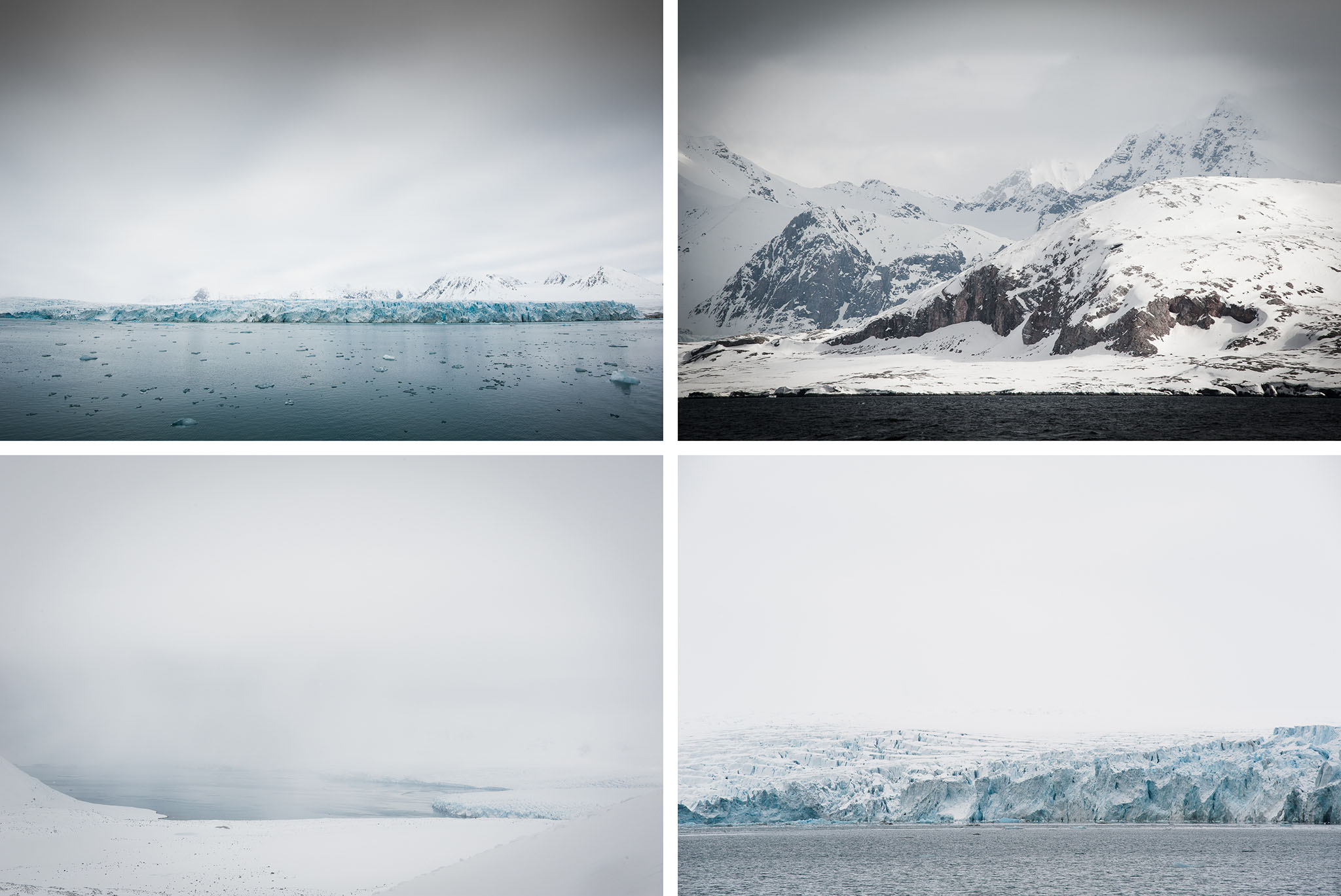
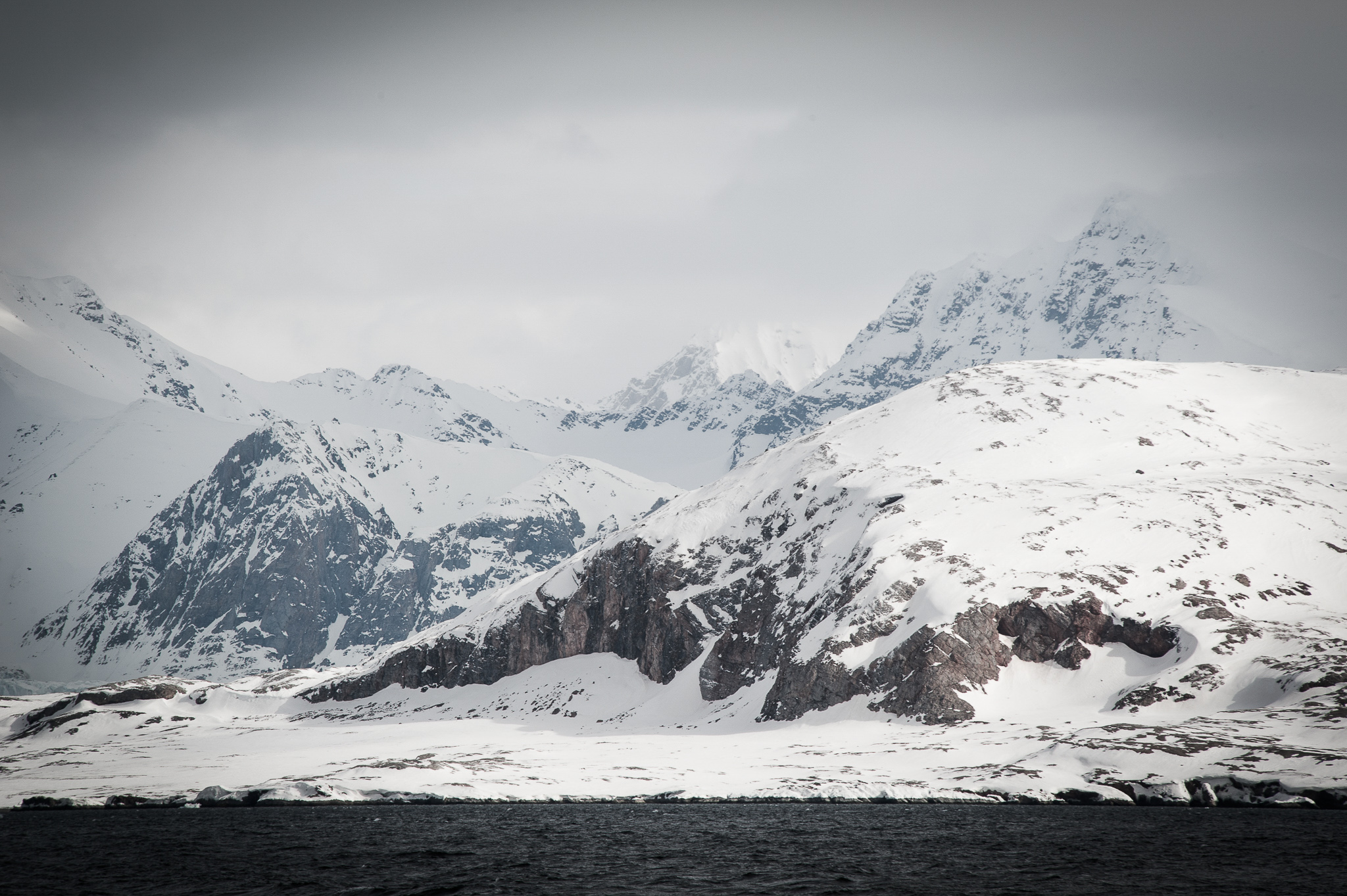
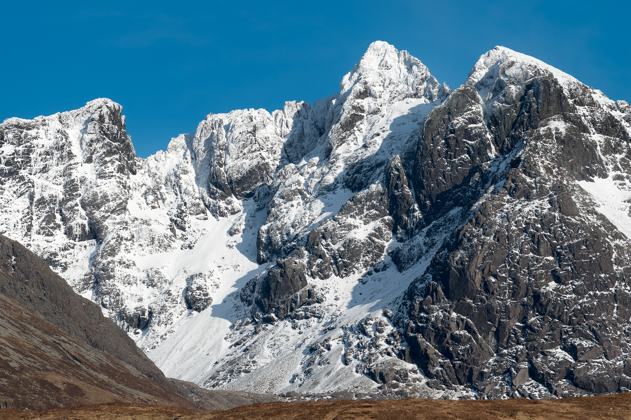
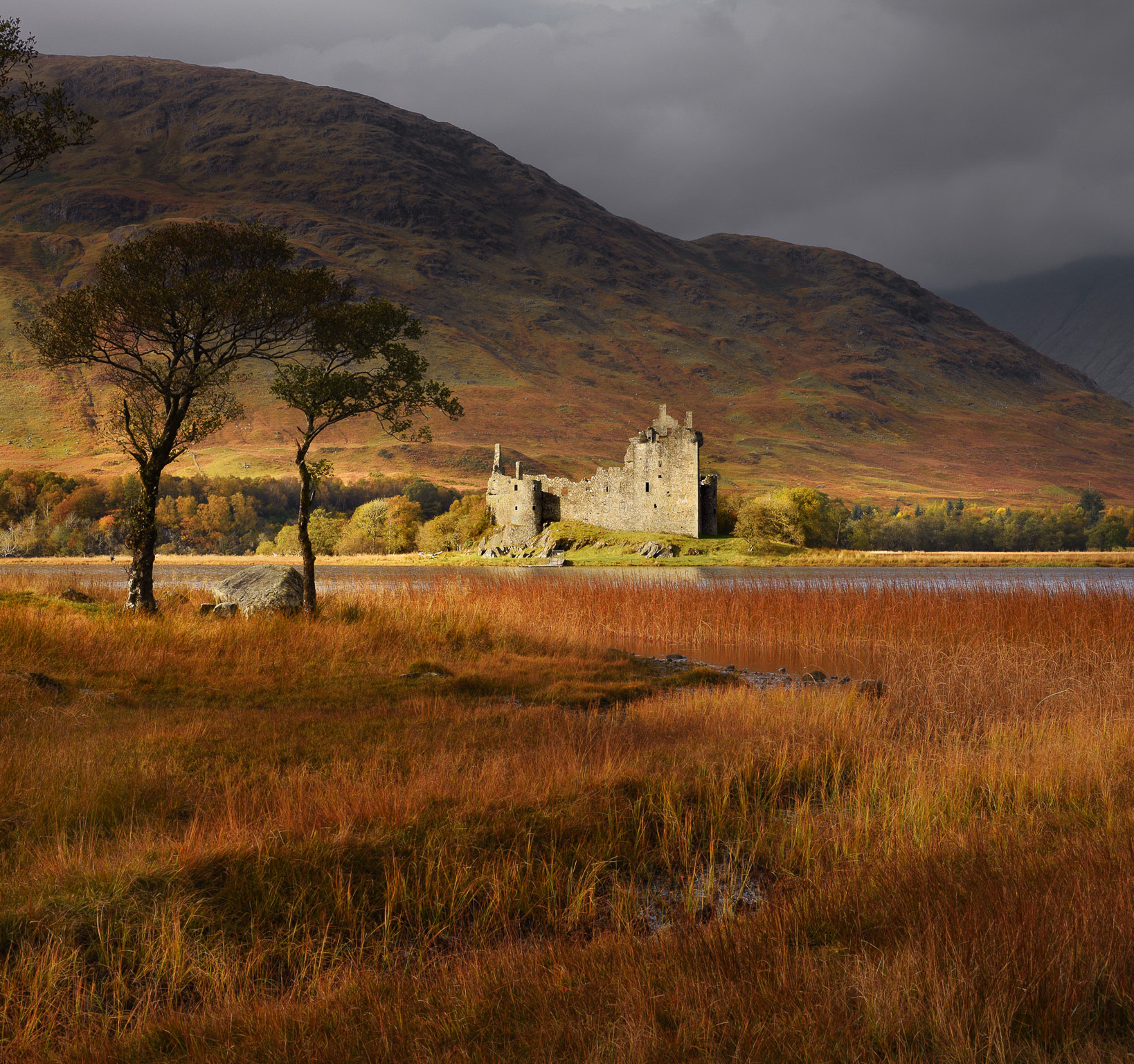
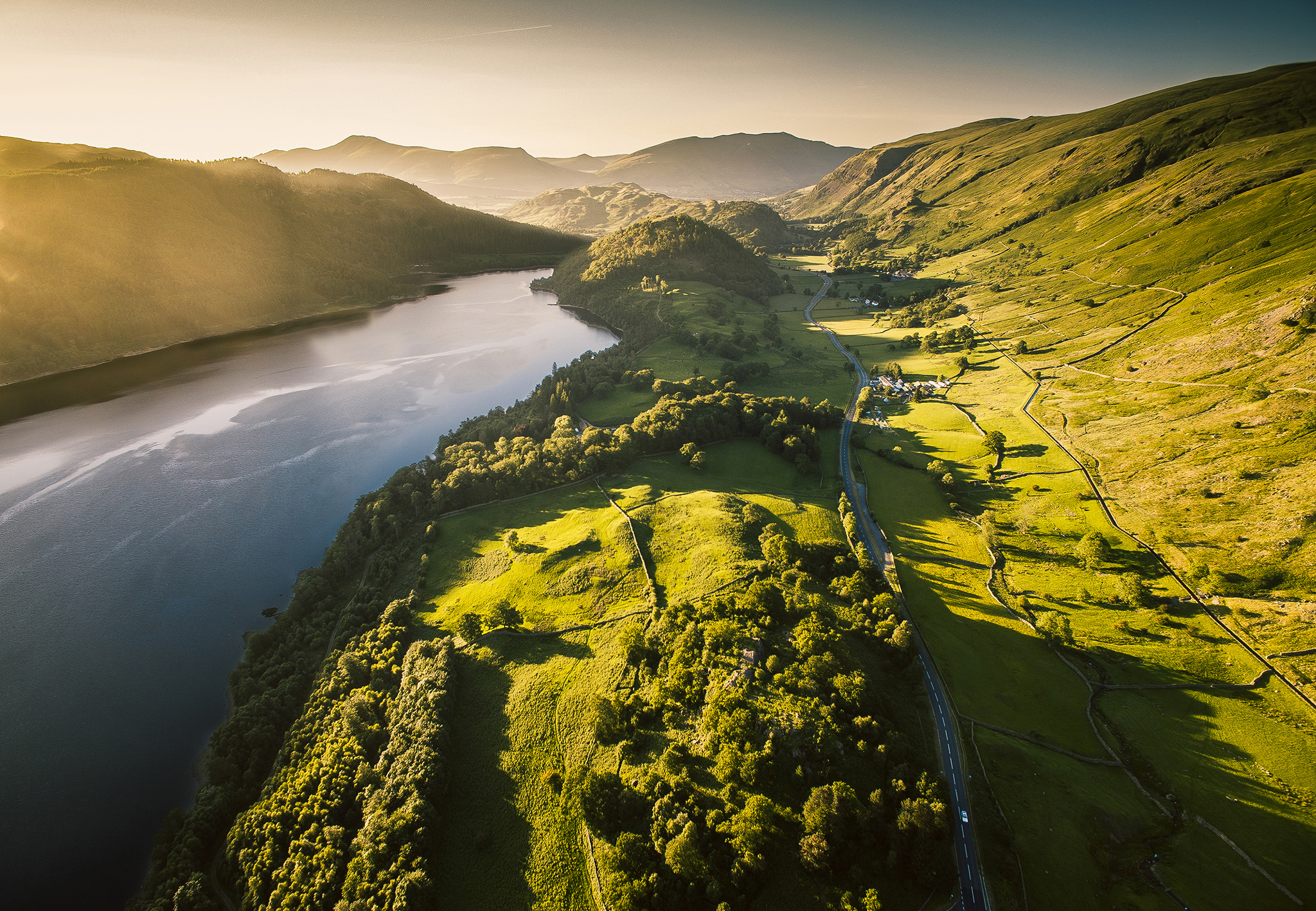
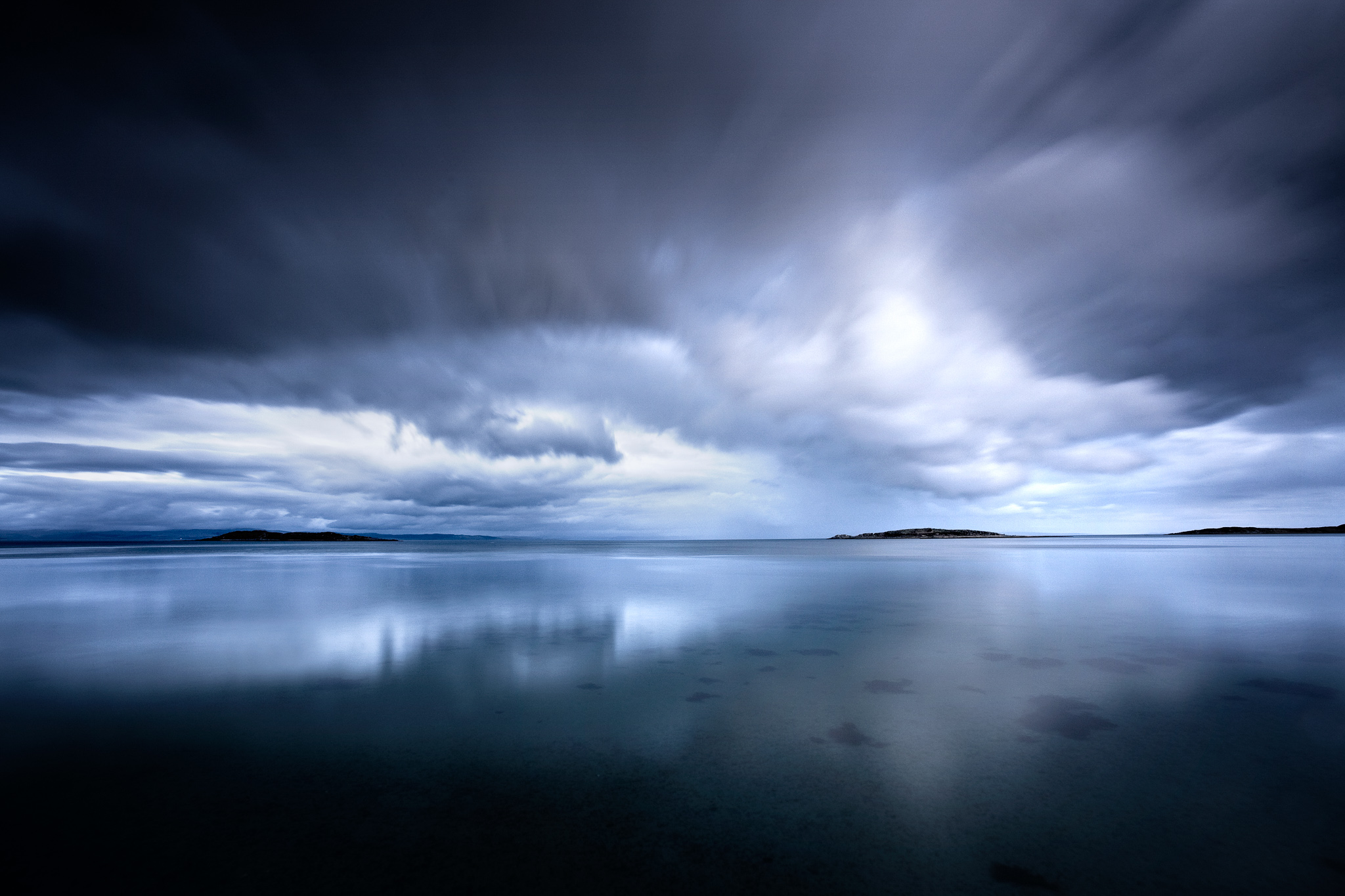
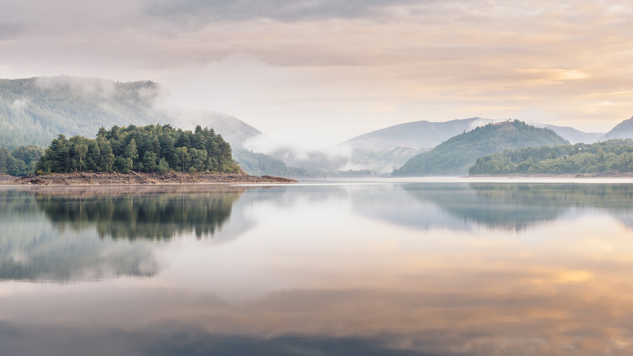
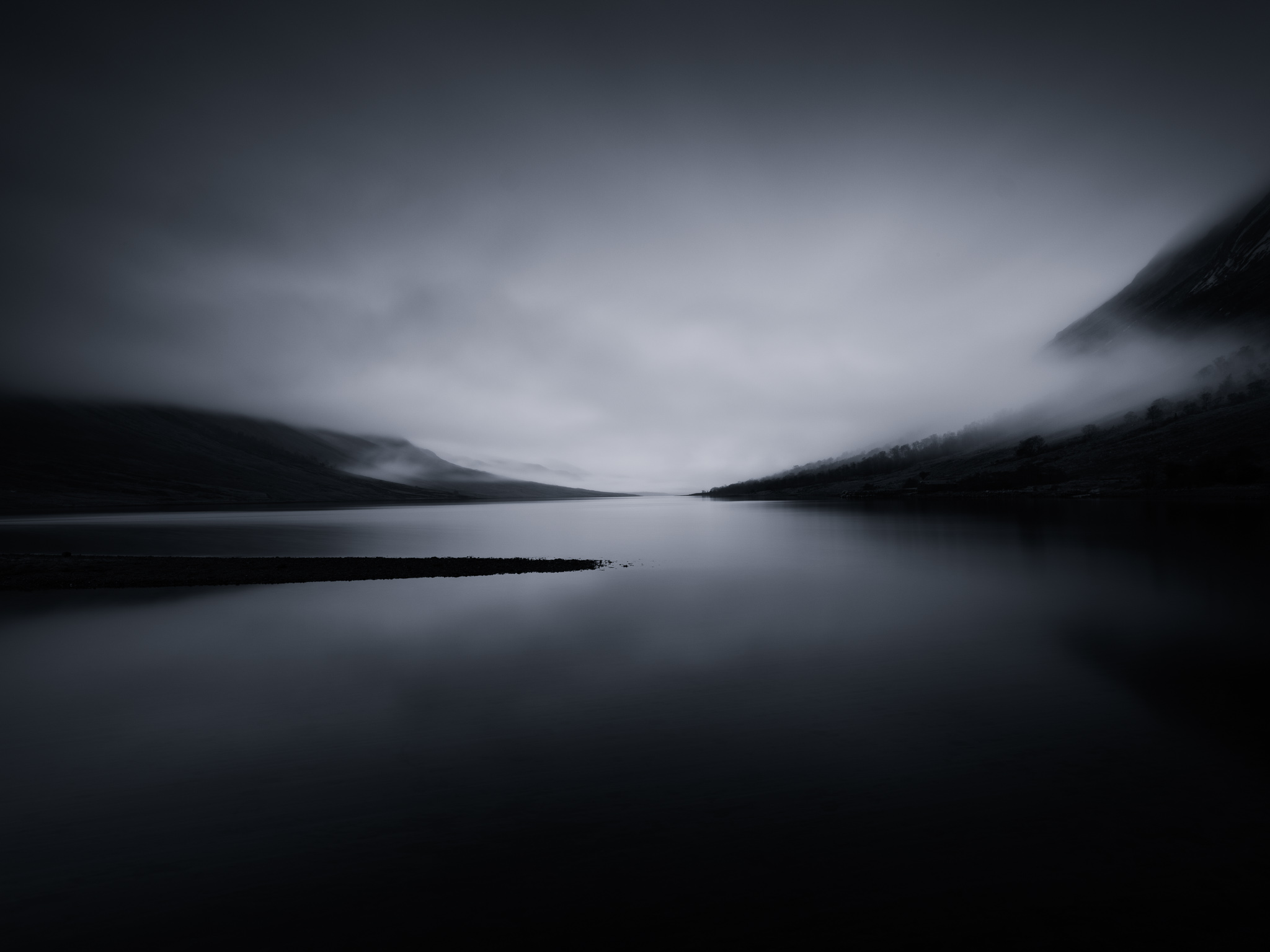
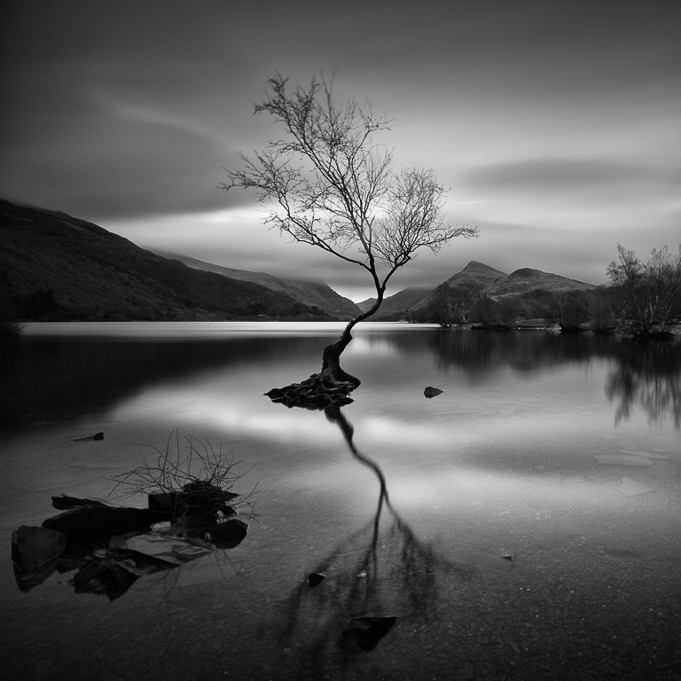
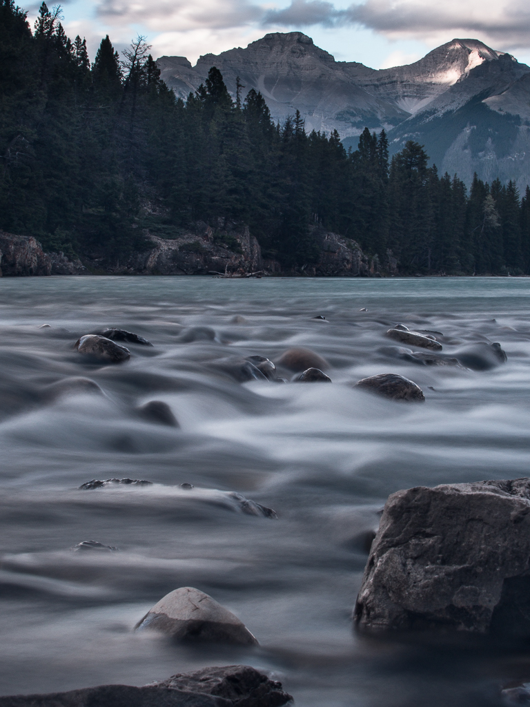
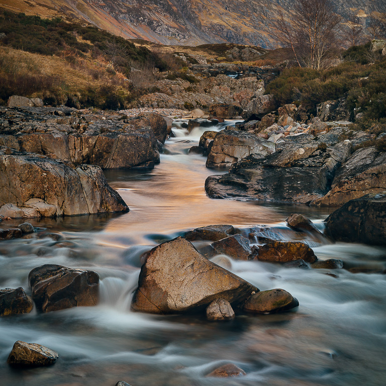
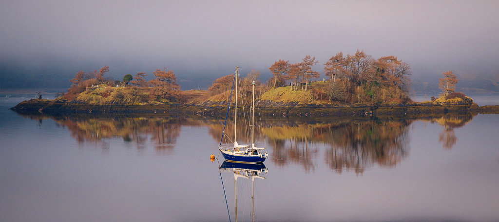
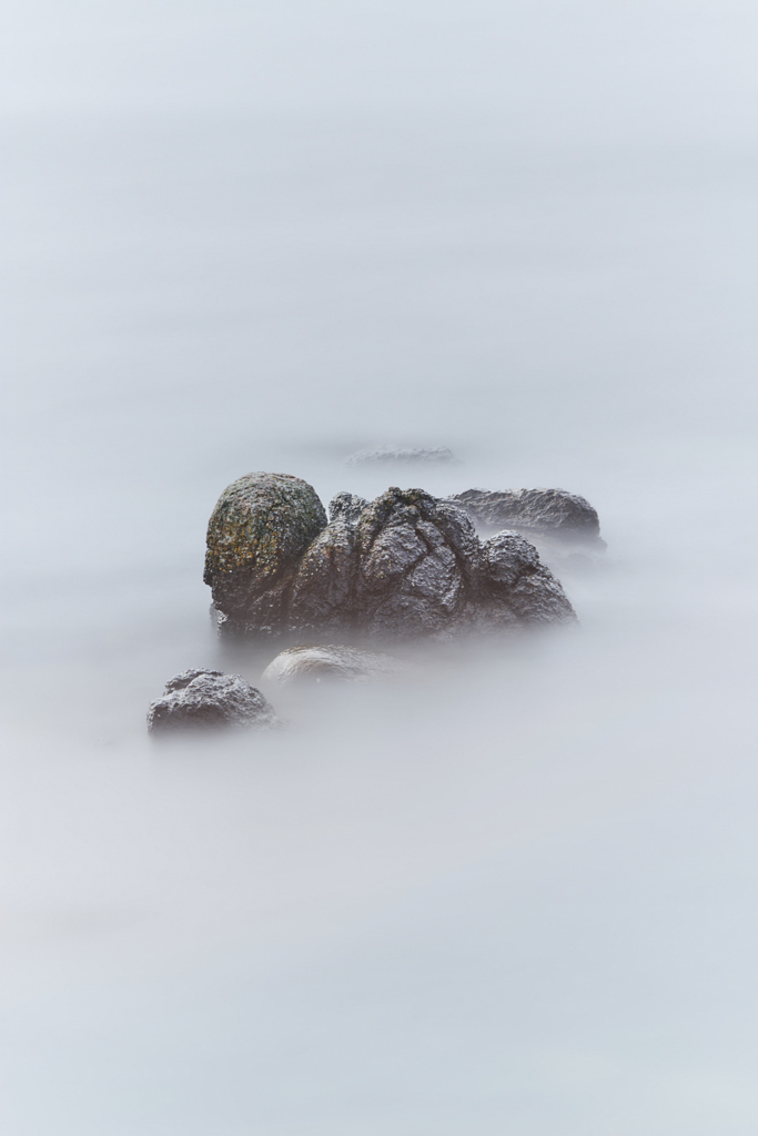
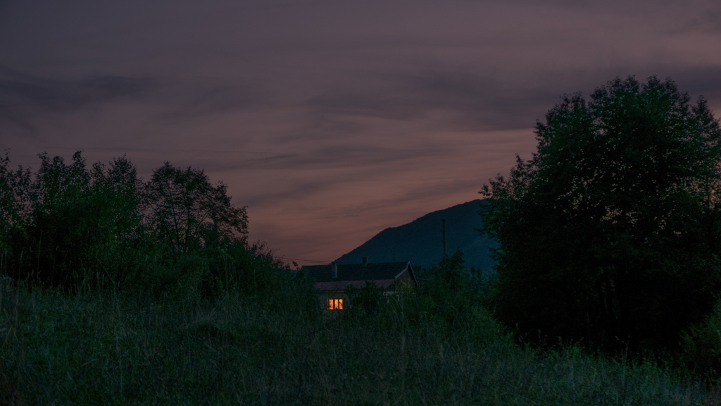
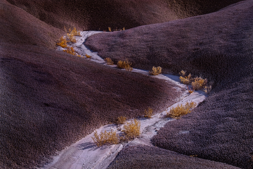
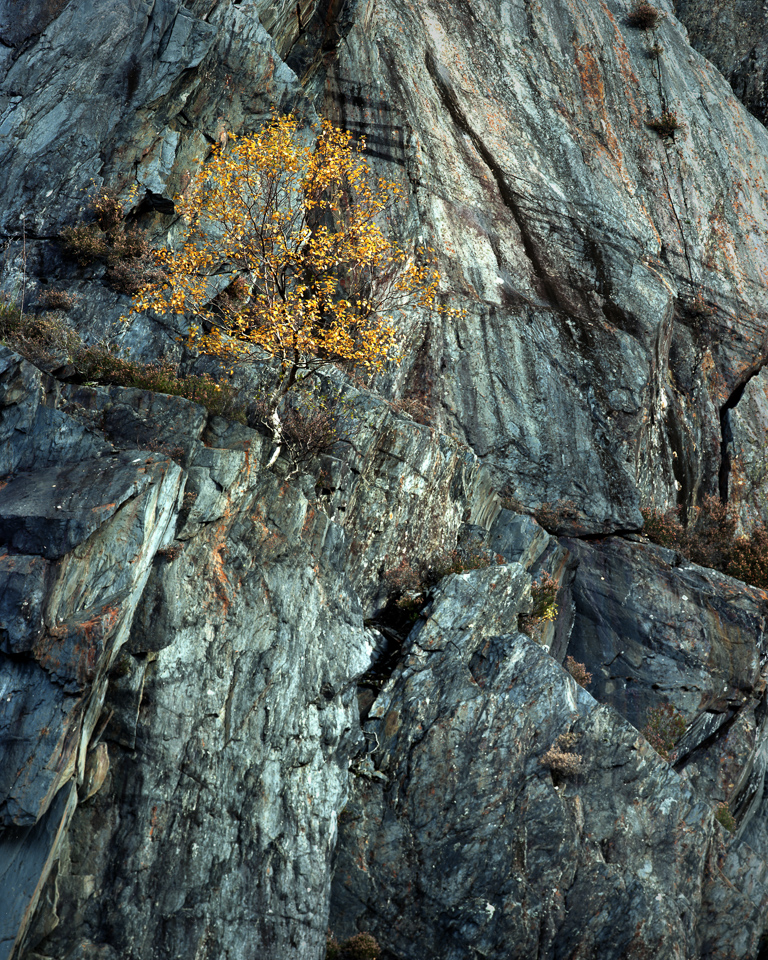
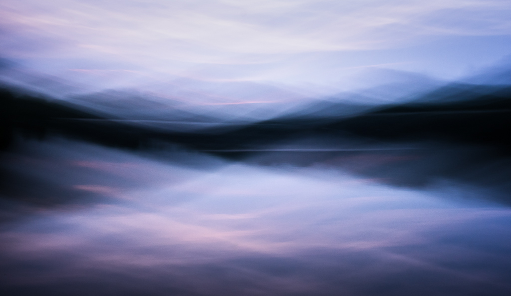
The captain is throwing the anchor for the 10th time at least, I have stopped counting by now. In that part of the fjord, the shores drop really quickly and the chains of our little icebreaker are too short to ensure a safe mooring for the night in that little bay protected from the element. Conrad our captain push the engines back on and we head further north towards Lilliehöökbreen Glacier in hope of a better luck. We are 79 degrees North, the North Pole is 900 kilometres from us…
End of April, it is somewhere around 2.00AM. We have been here for a few days now and with the 24 hours arctic sun, we lost all sense of time in that little life-capsule that is our ship. Ulla Rinman, an 80 feet icebreaker, Conrad her captain and Roger his Second; our little life oasis in the middle of Spitzberg’s beauty and wilderness…
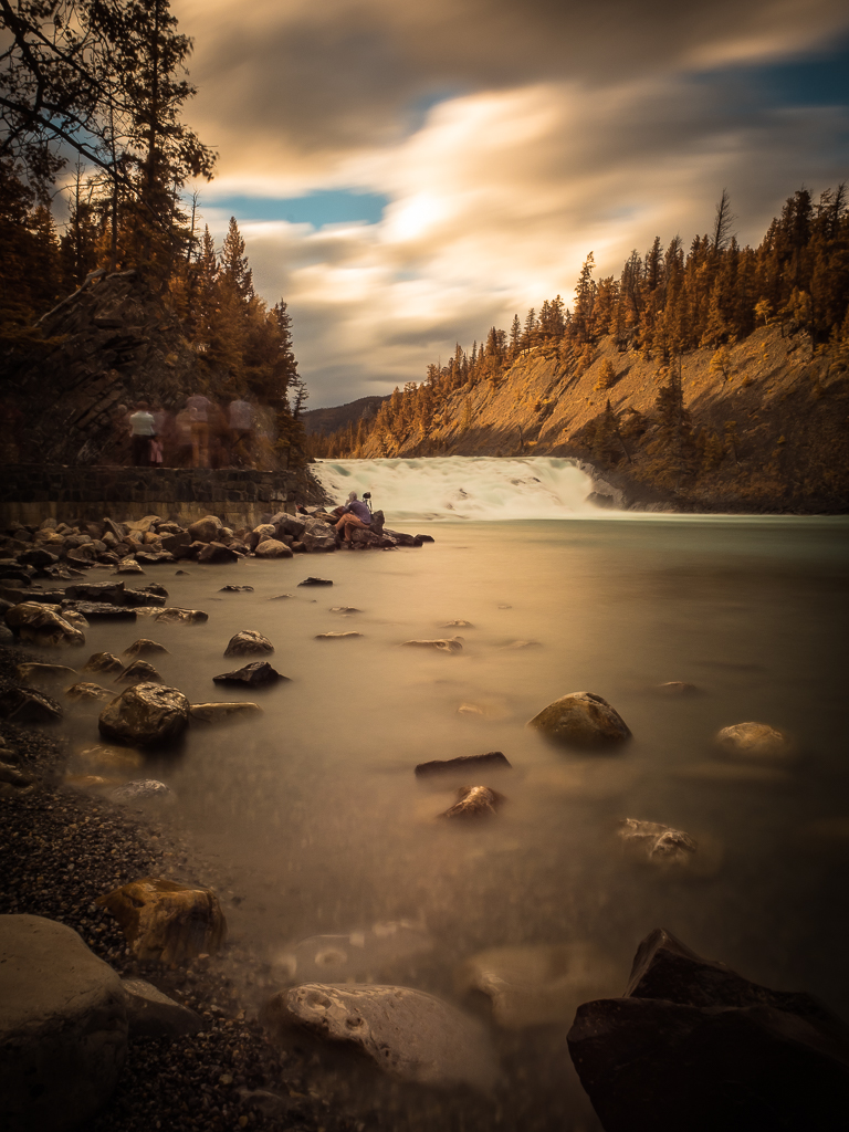
Svalbard is a wind-swept archipelo of islands located just below the north pole where the only predictable thing with the weather is its unpredictability… Crisp blue skies, clouds, snow-storms, the 24 hours sun provides a regular light throughout the day, stronger and warmer at midday; harsher and colder during the « night »… Enough to maintain of photographers
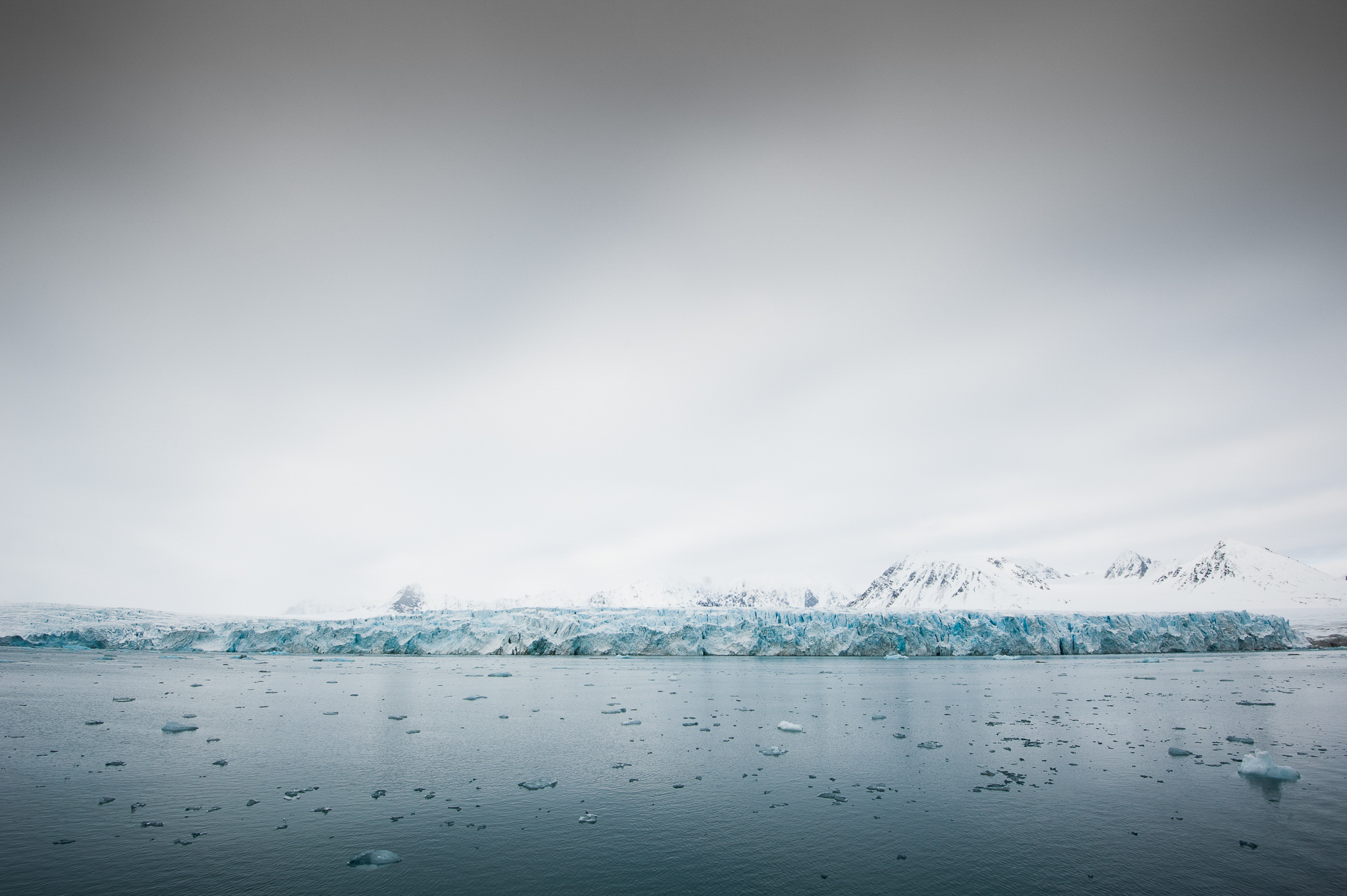
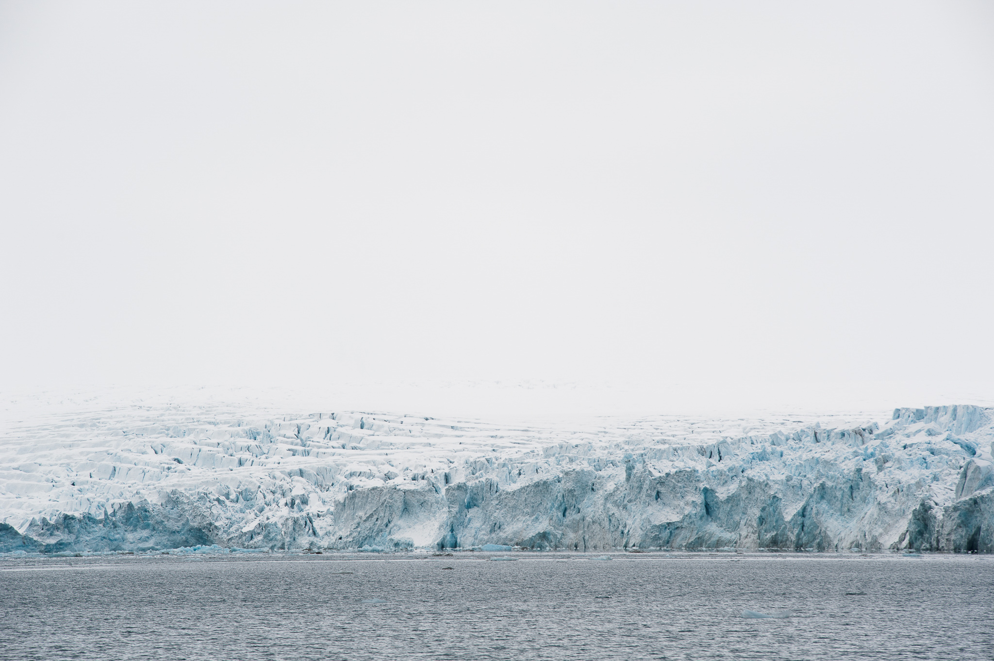
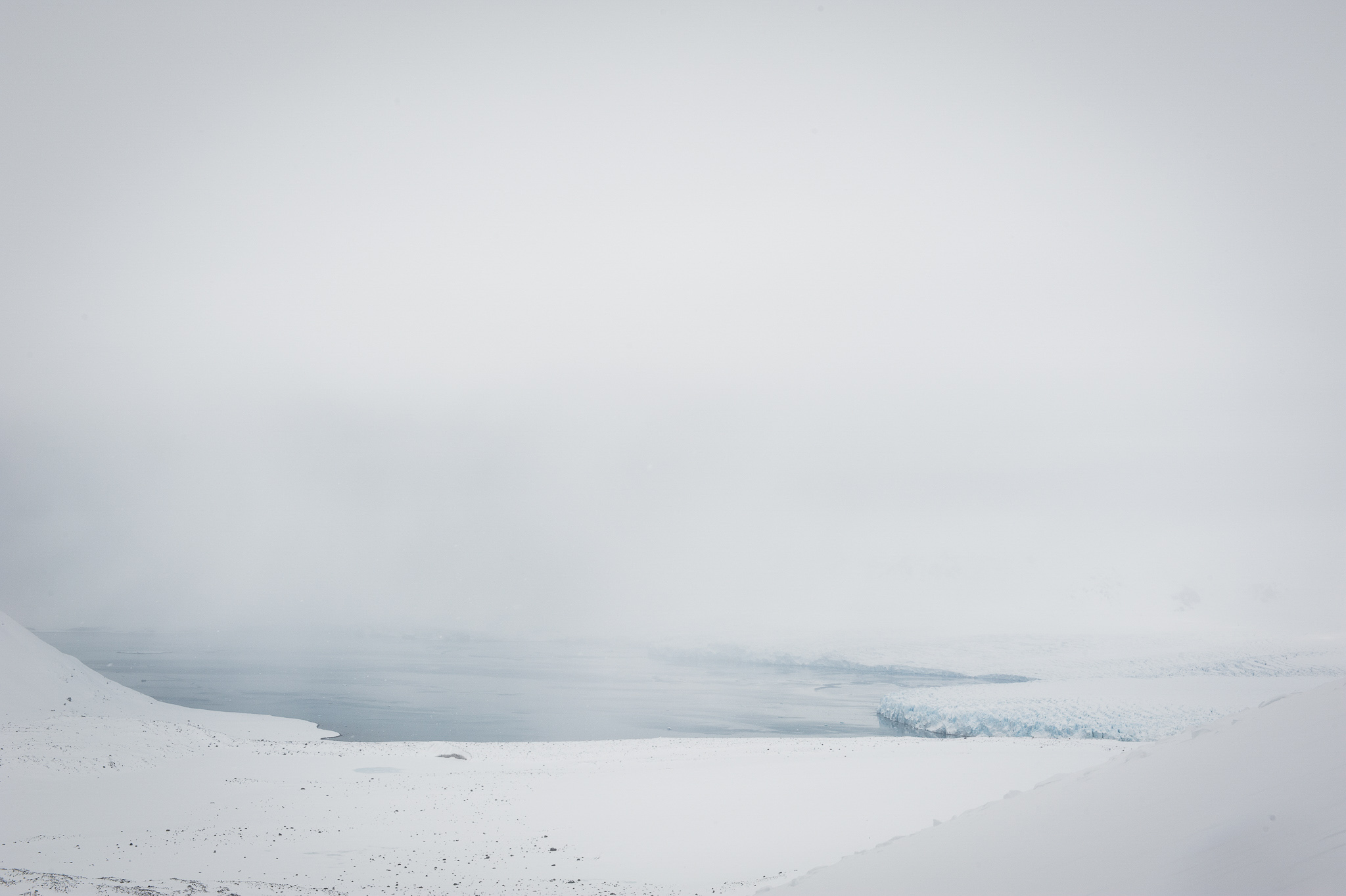
Each weather pattern brings its own light, each more incredible than the other : the deep blue sky of the midday sun, a black sea under a stormy sky, a white-out day during a snowfall, a field of pristine white snow under the midnight sun, the softened light of a cotton-like cloud or the bright blue ice of a glacier under a covered sky. Combine that with the purity of the arctic ocean, the majesty of the mountains and the fragility the glaciers and you will get a sense for the delicate balance and the incredible fragility of that Far North world. The gentleness and sensuality of the lights simply bring to our eyes the fragility of that world and its need for care and protection…
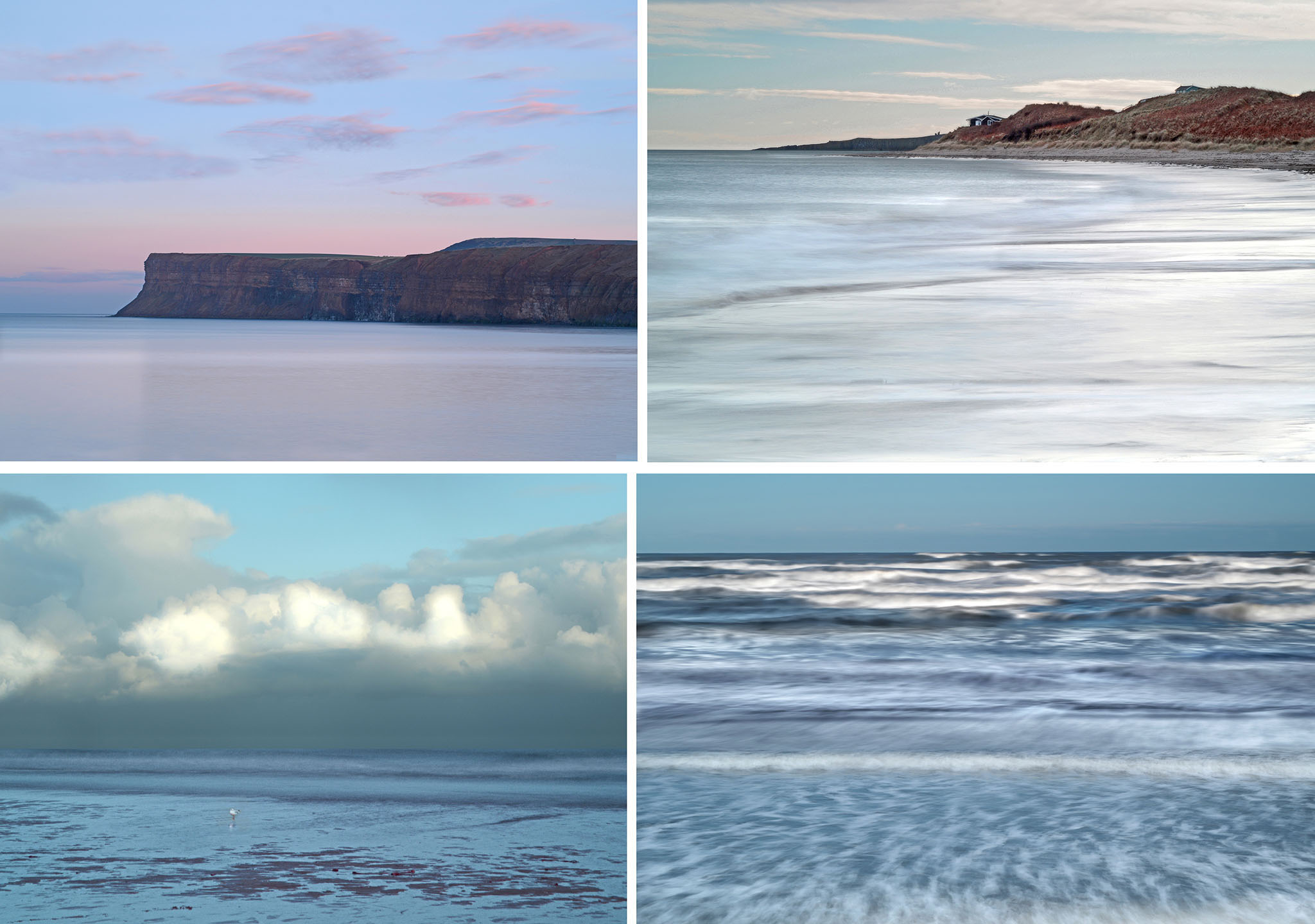
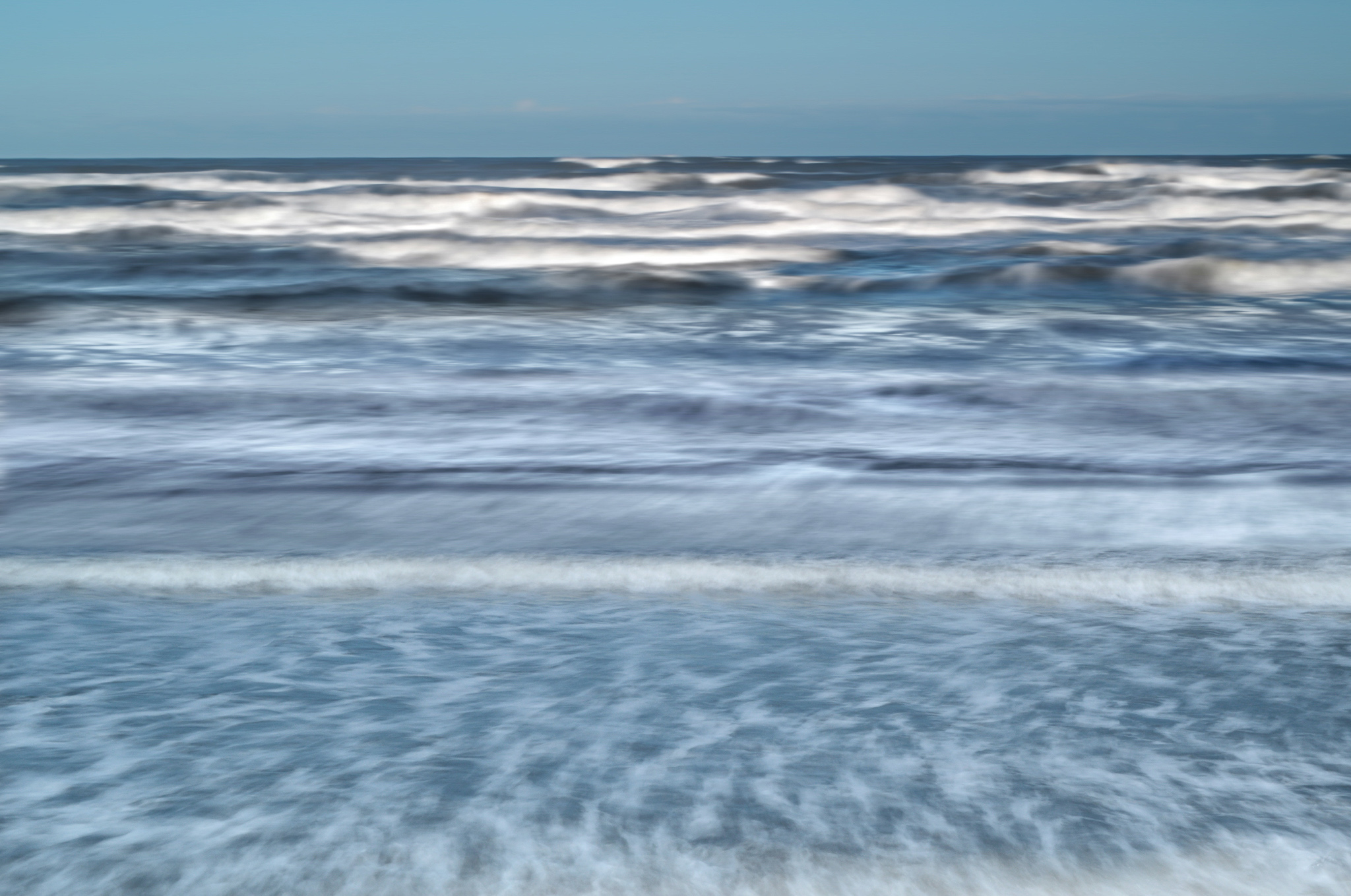
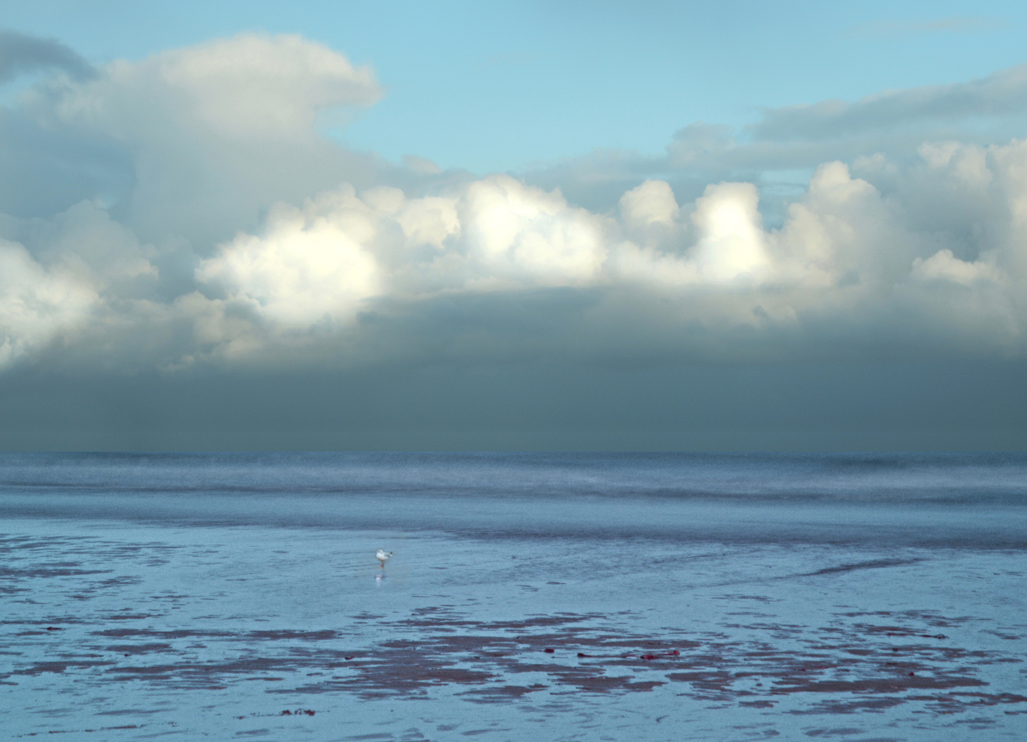
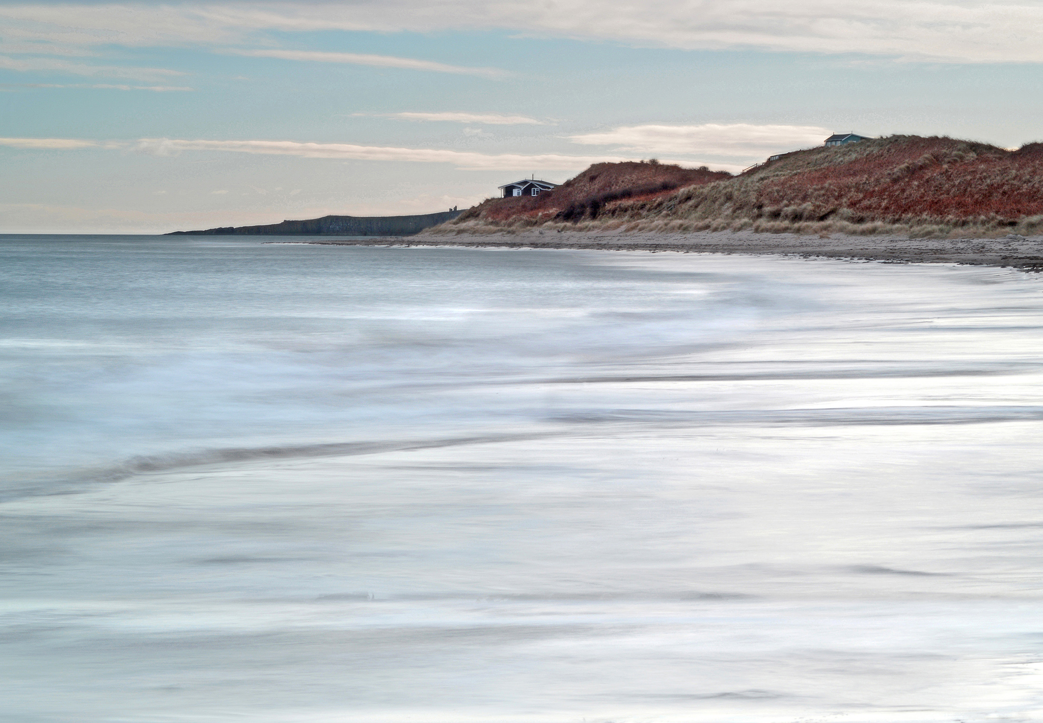
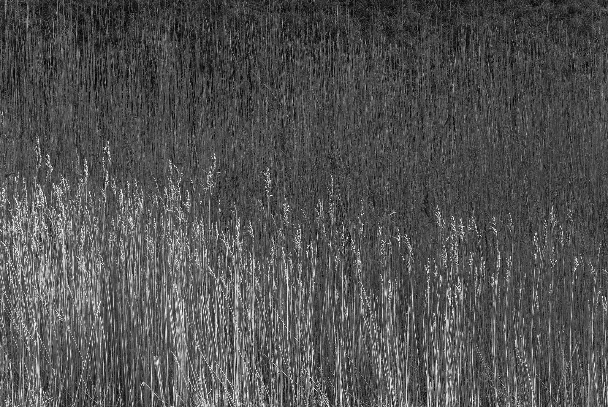
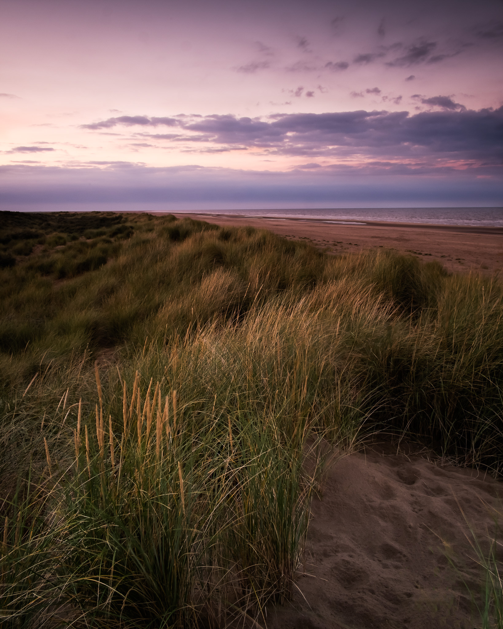
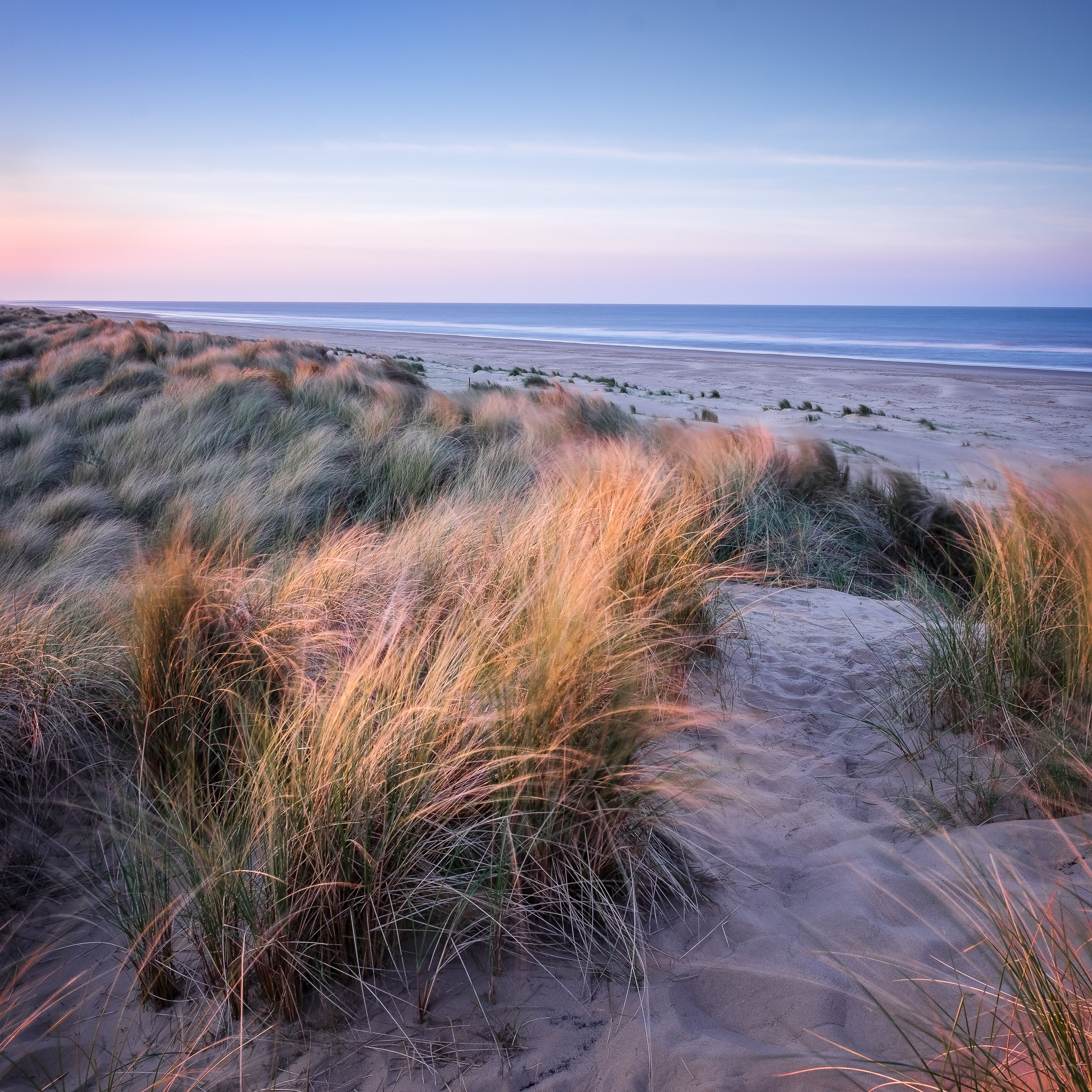
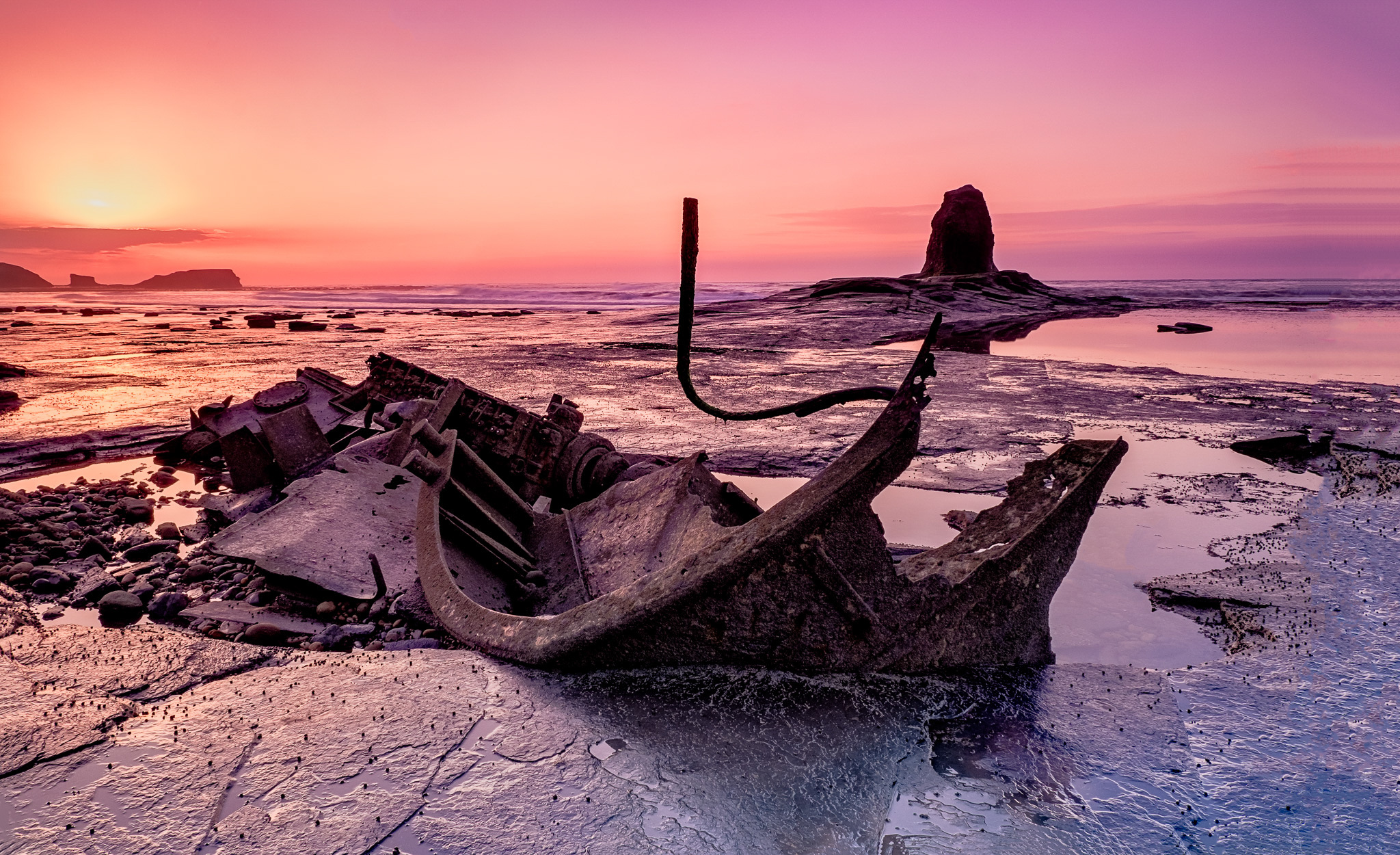
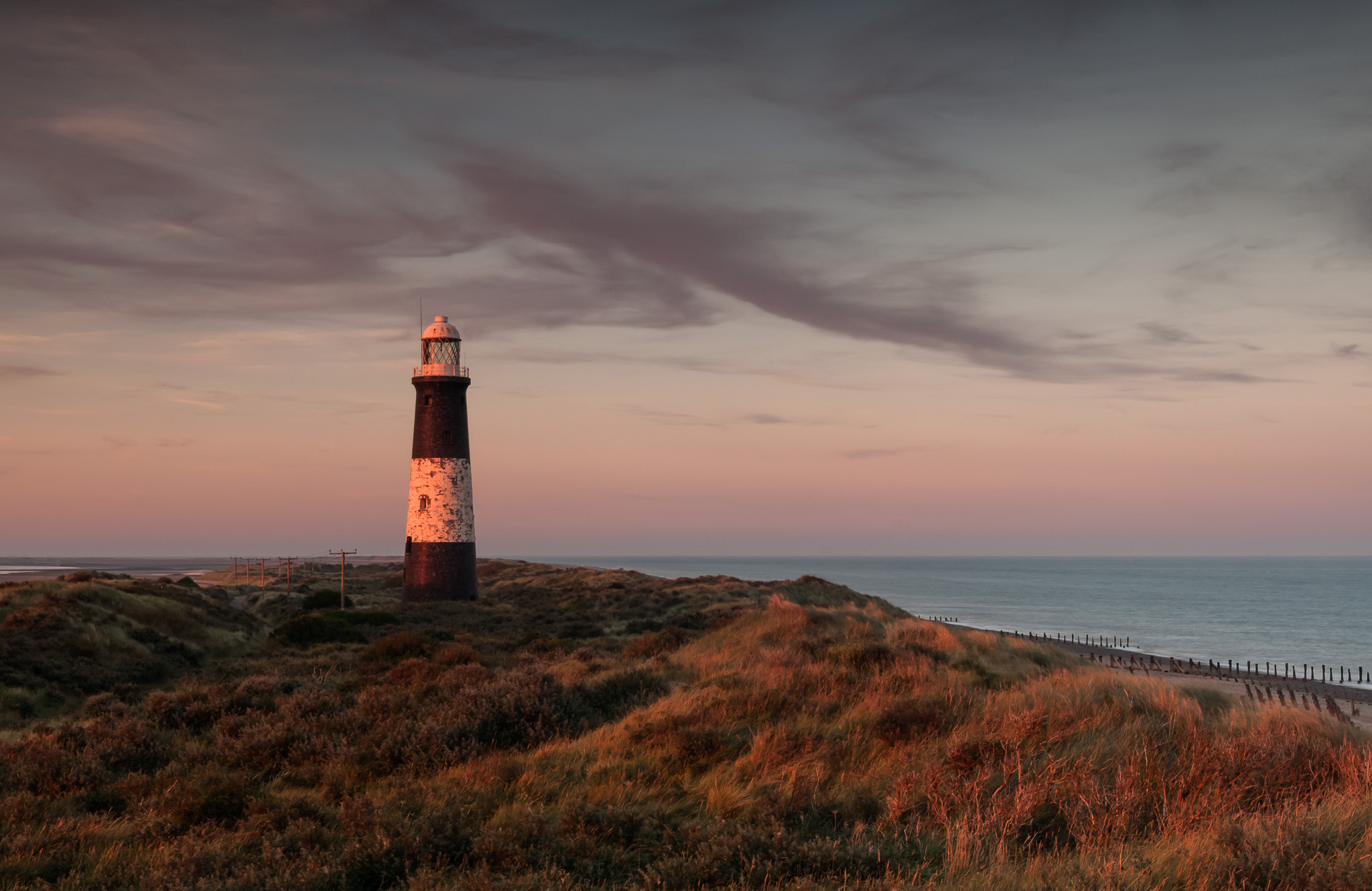
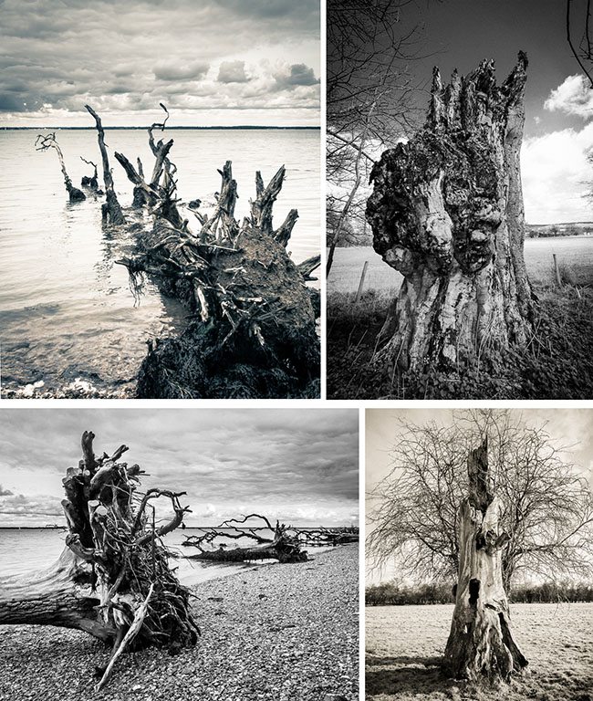
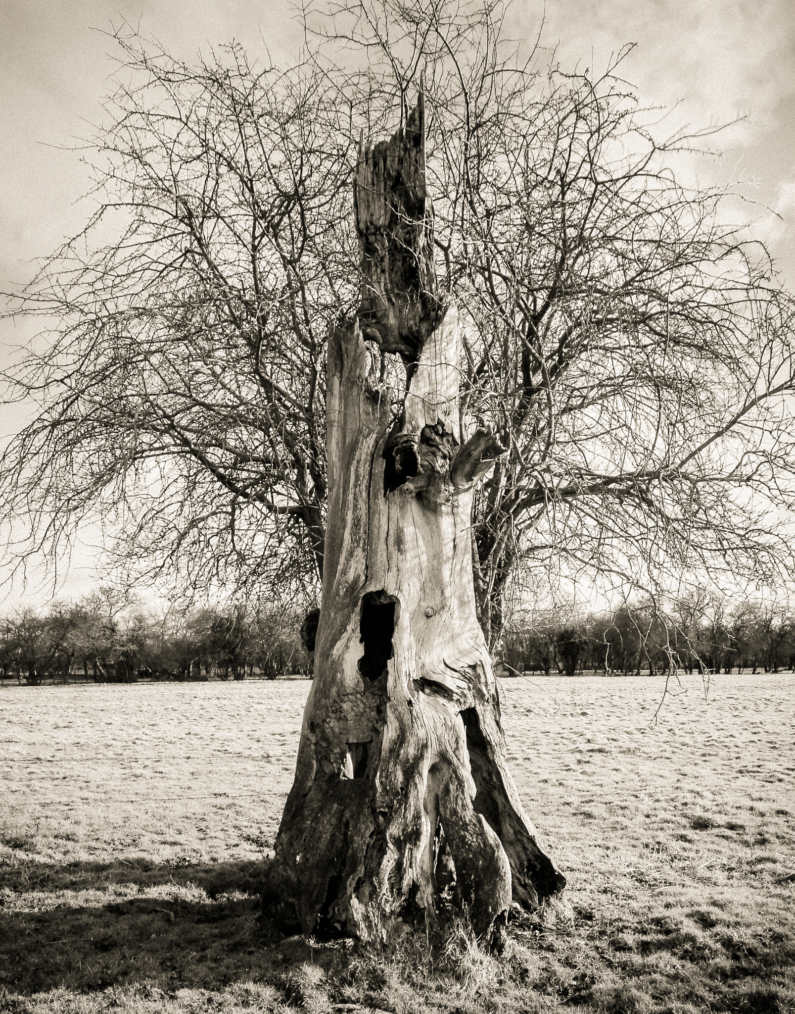
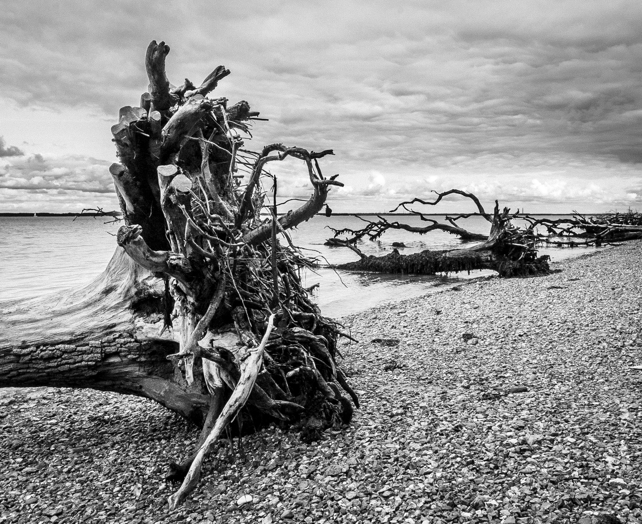
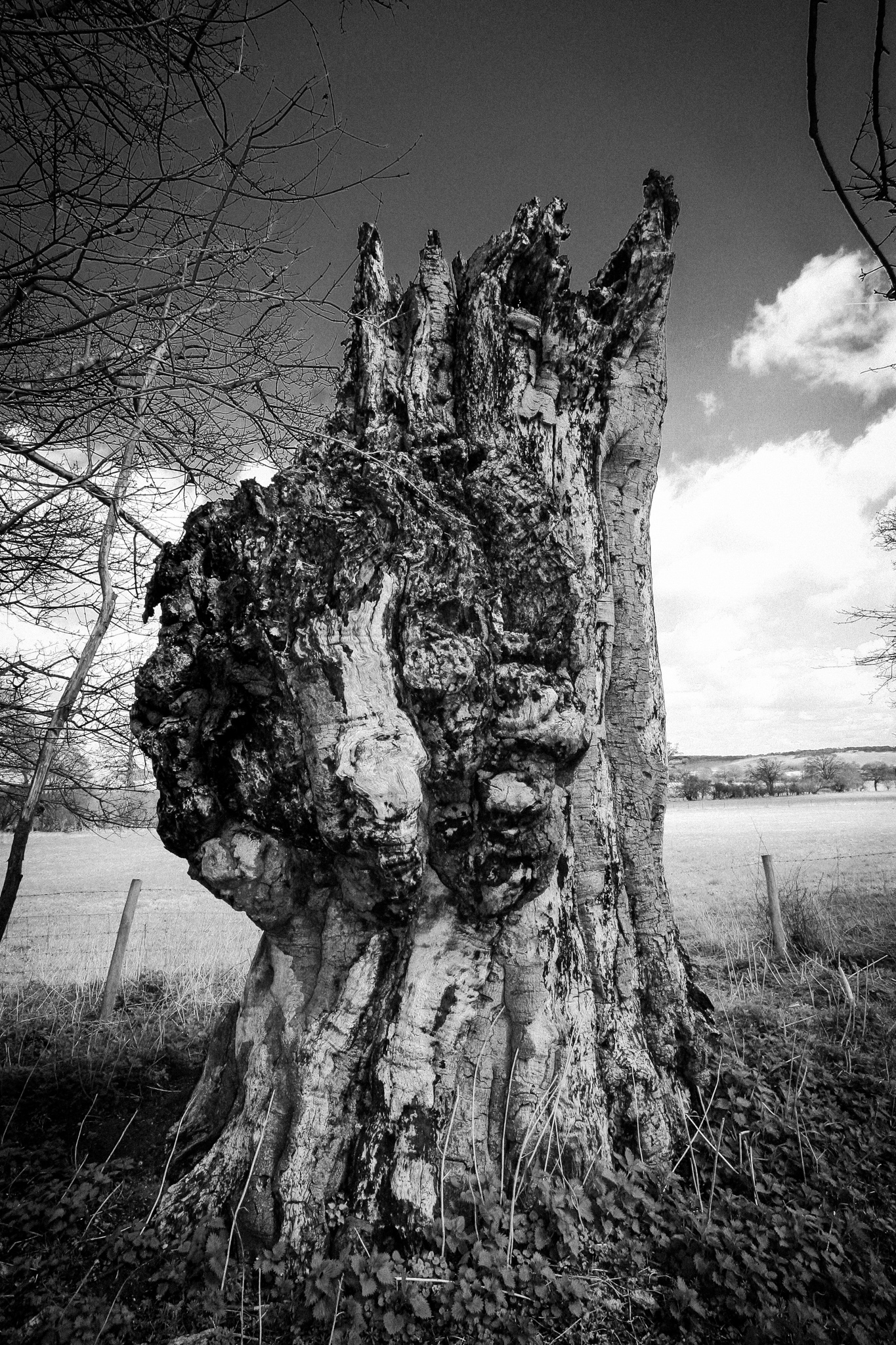
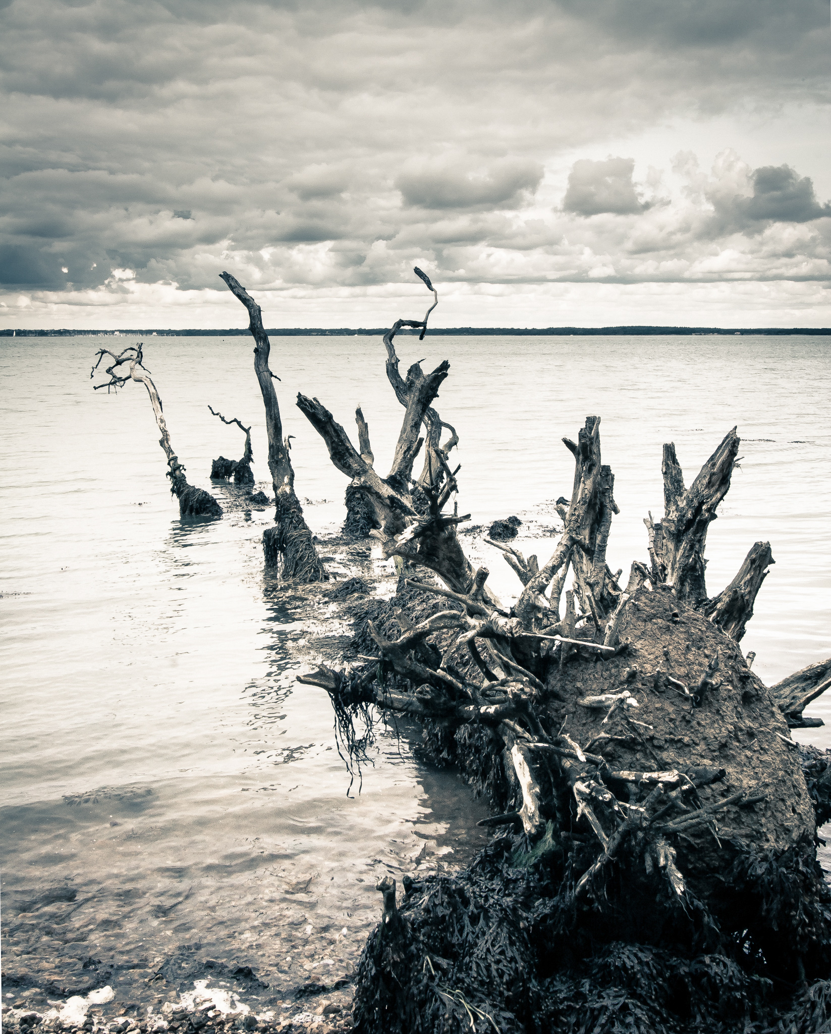
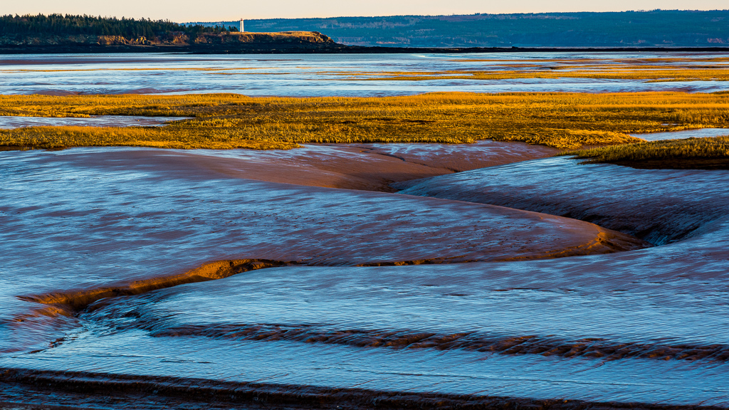
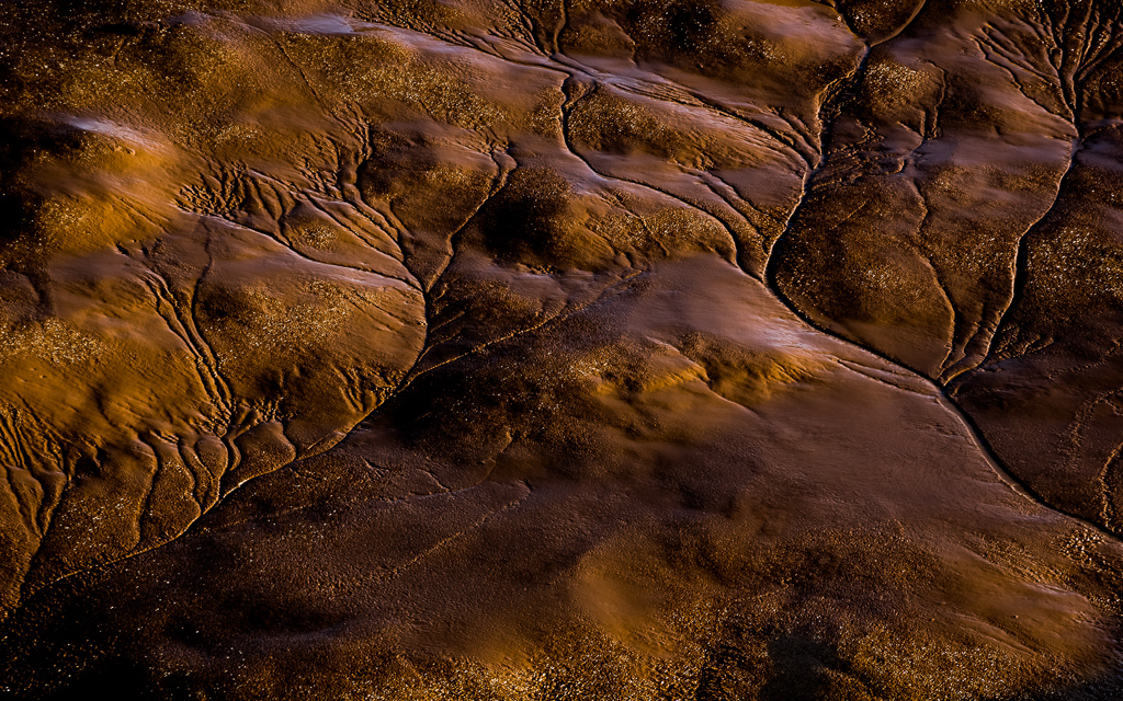
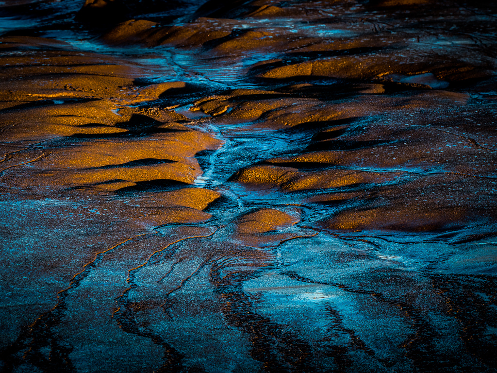
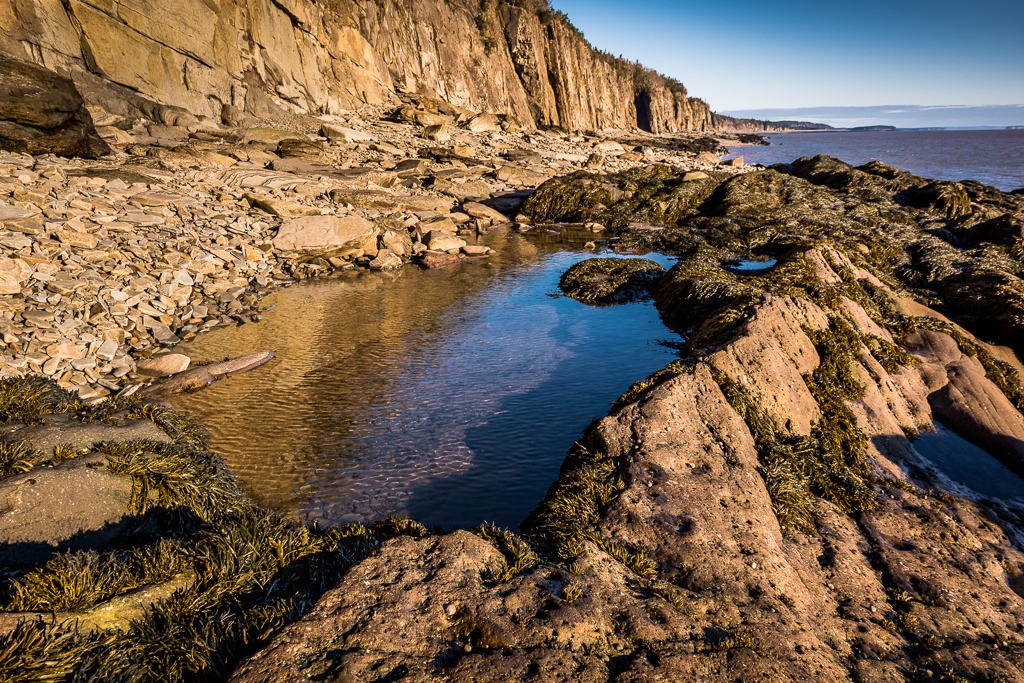
I love going to the coast, particularly as I live close to that of North East England. All these images were taken during the winter when the low angle of the sun gives an opportunity of good light for most of the day. I'm disabled and find access to the coast is often difficult but have a few favourite locations where I can sit in the wheelchair.
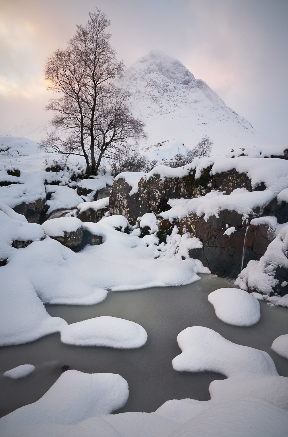
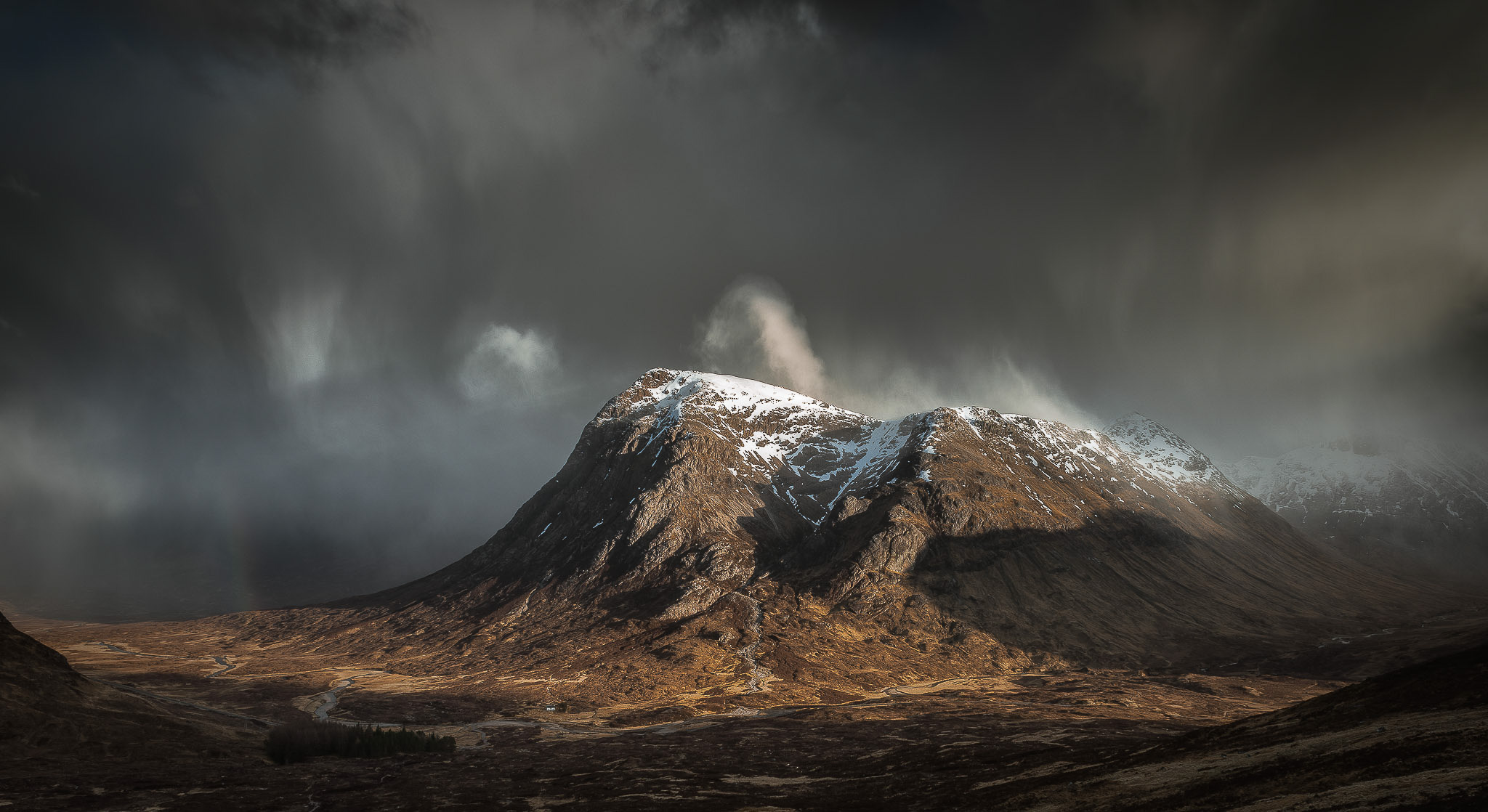
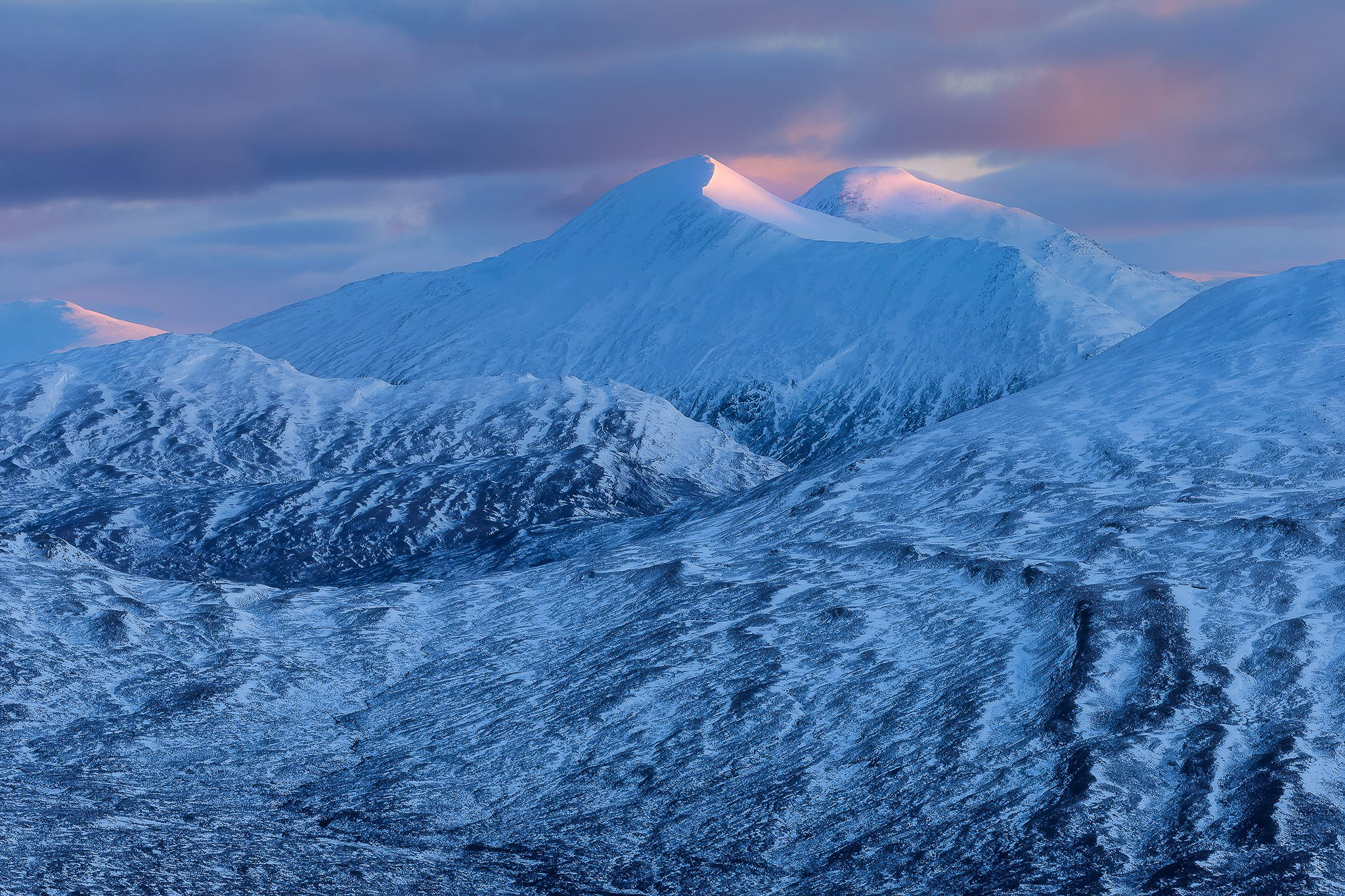
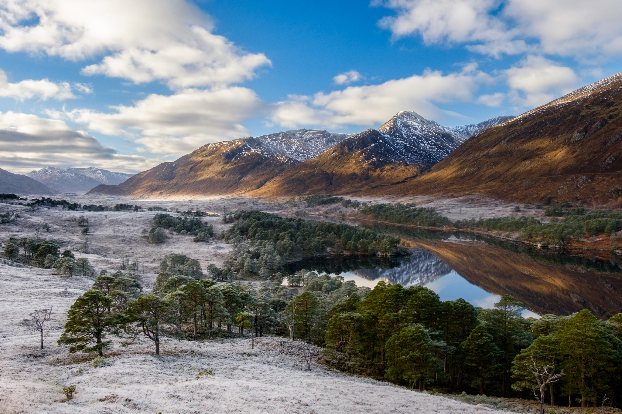
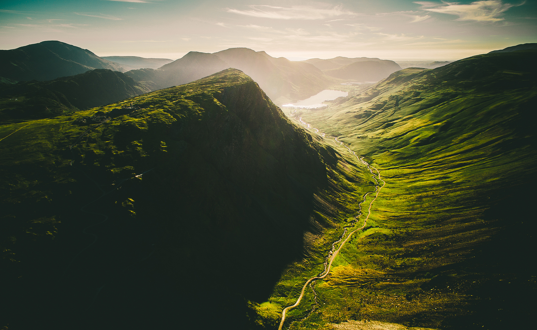
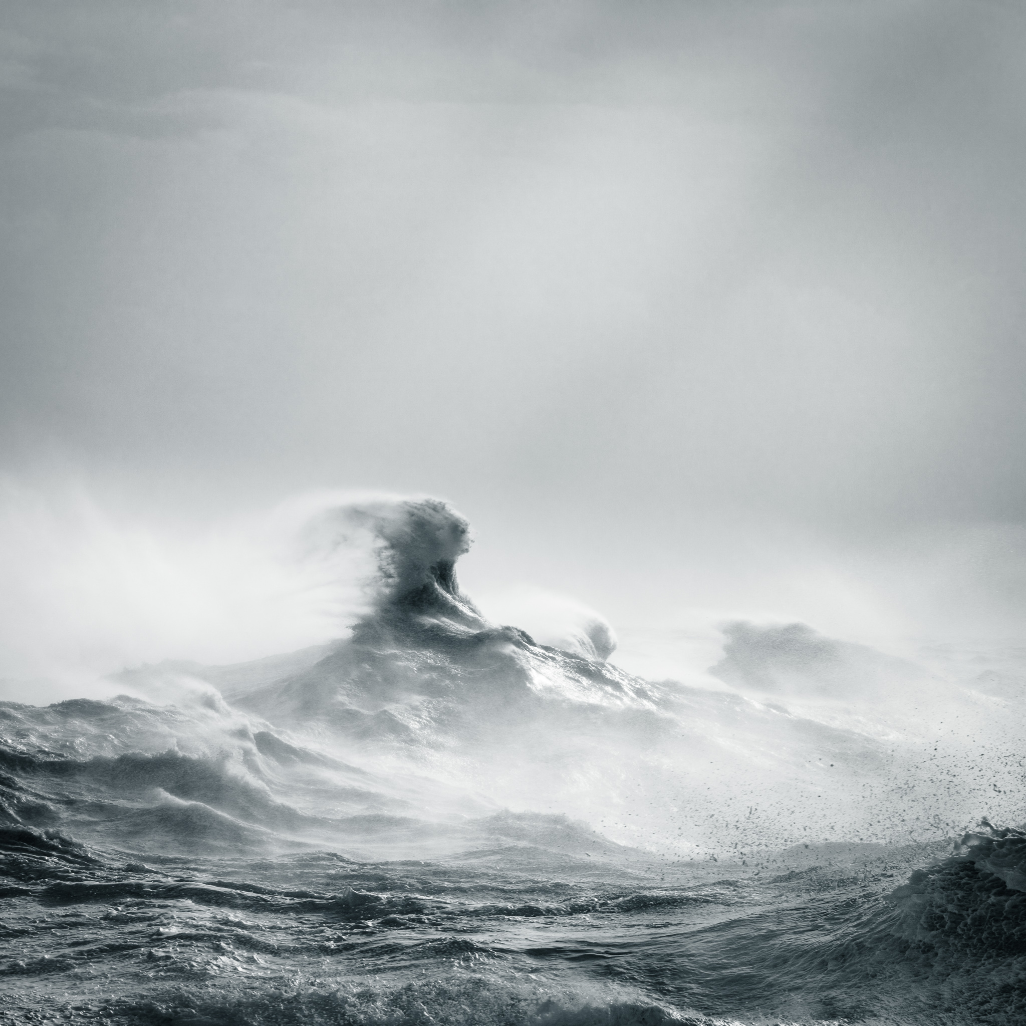
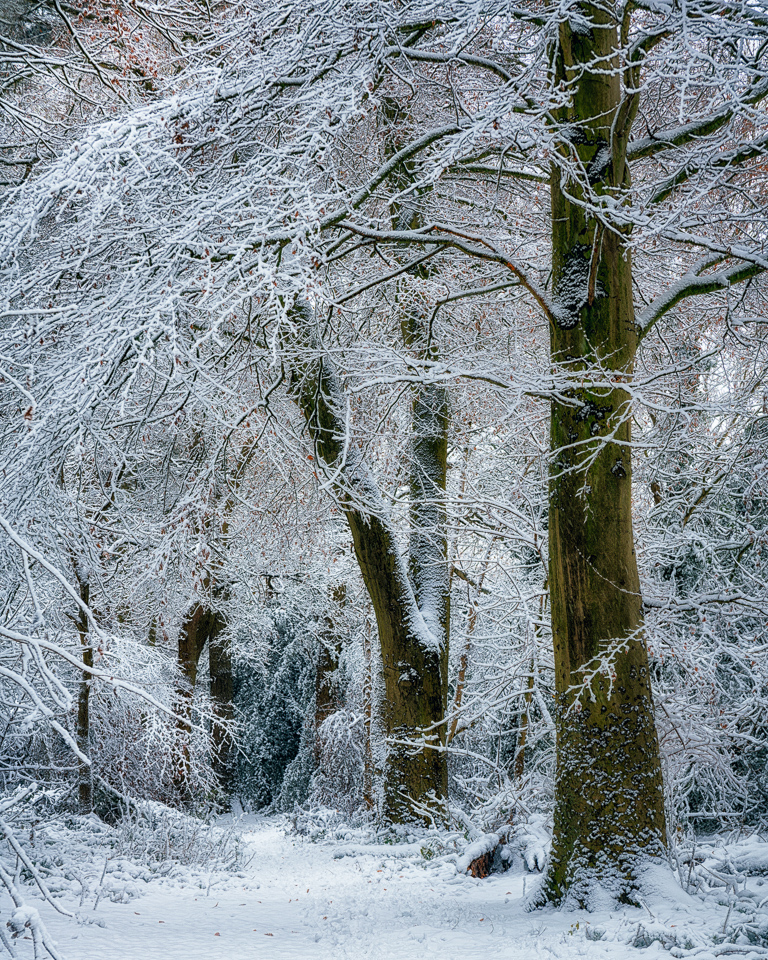
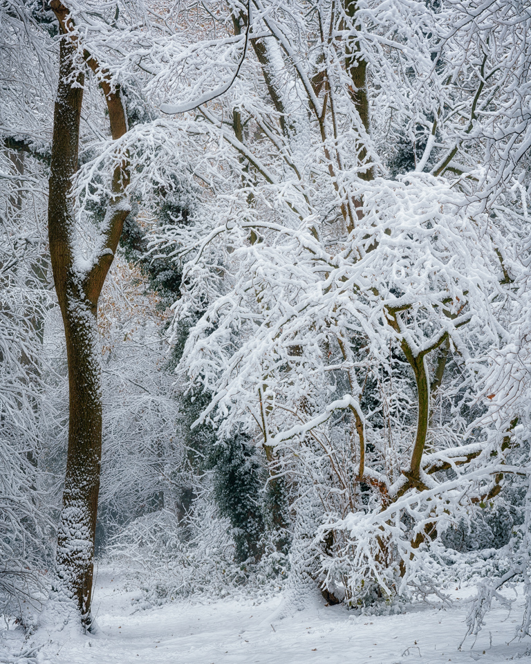
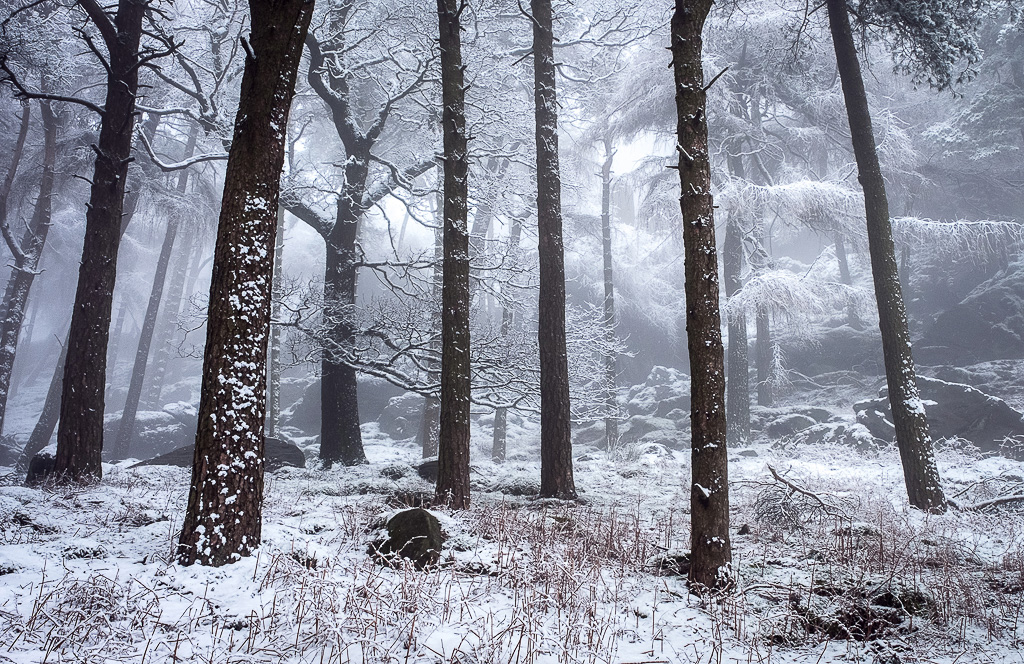
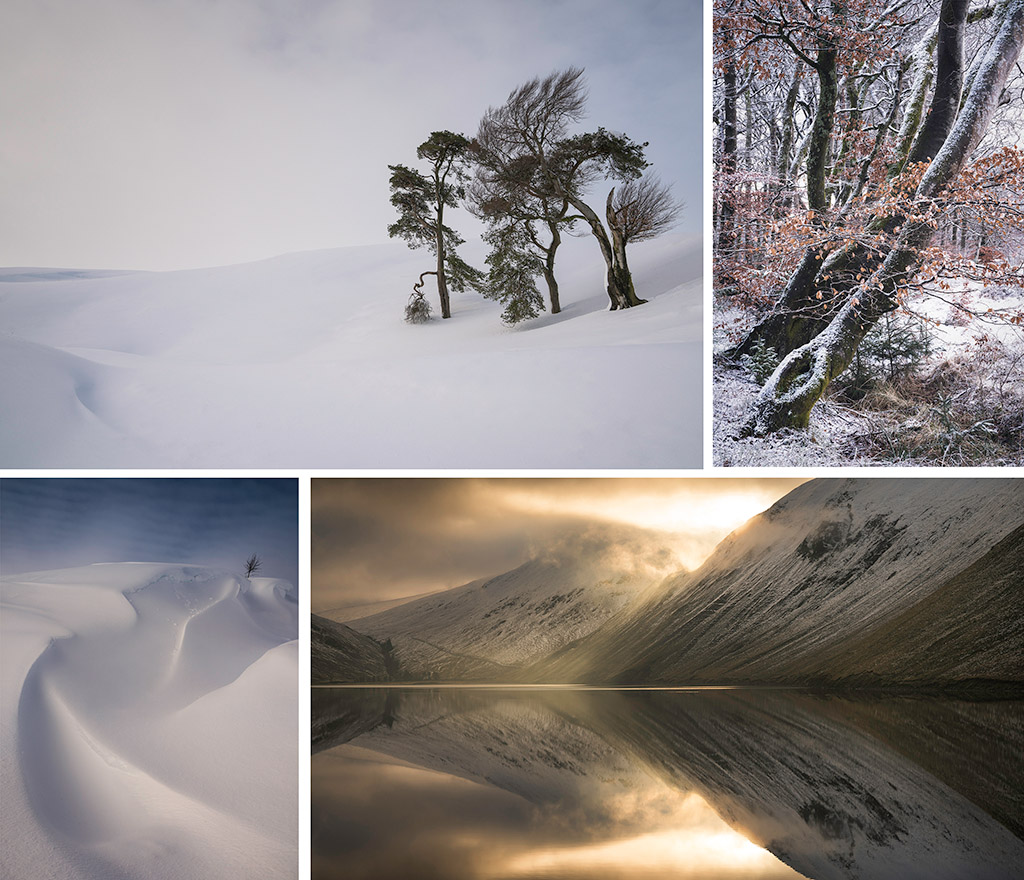
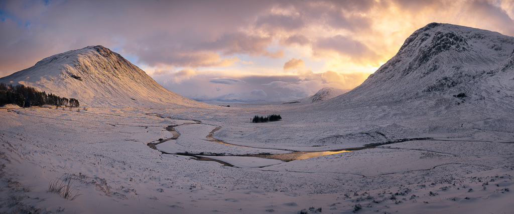
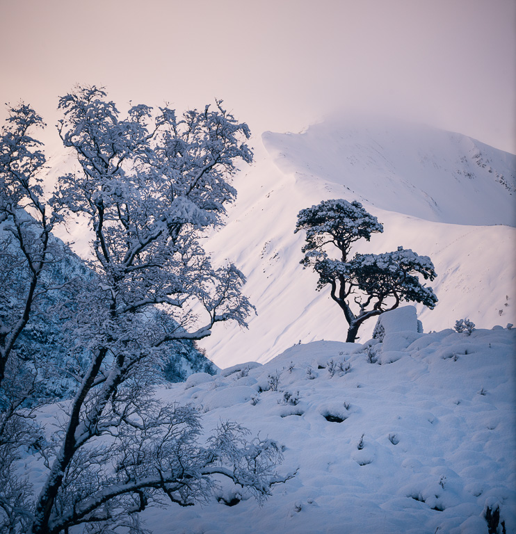
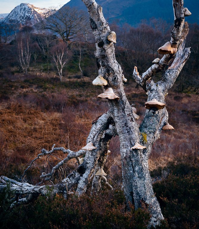
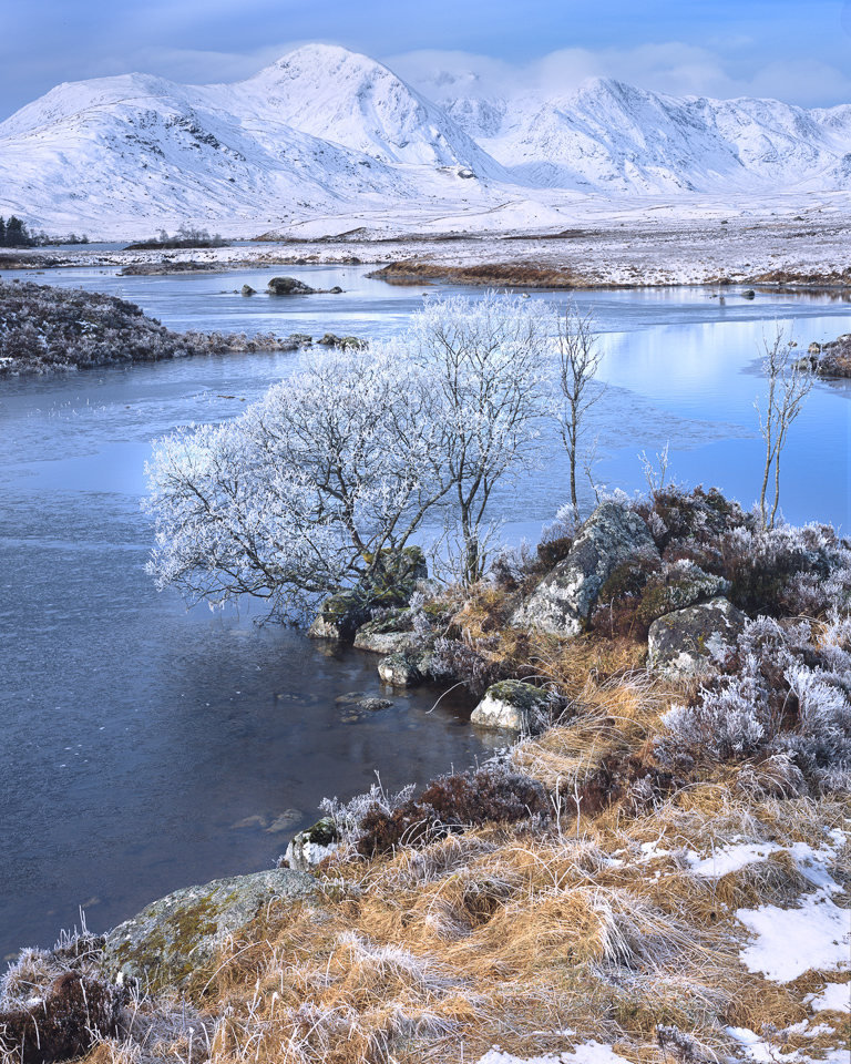
With Spring well and truly Sprung and summer on its way, we've taken the opportunity to reflect on some of the highlights of Winter and in particular a stretch of stunning snowy conditions here in Glencoe that led to six mile tailbacks across Rannoch Moor as the population of the Central Belt of Scotland came to take advantage of the amazing Alpine powder conditions. Adam Pierzchala collected people's images and recollections...
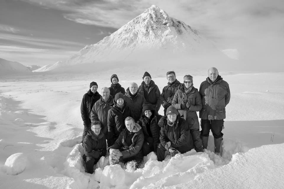
Last year a group of friends hatched the idea to meet-up at Glencoe for a winter shoot and so it was that we met in Ballachulish in mid-January, cameras and tripods at the ready. Joe Cornish was in attendance too, leading the planning and doing much of the driving between locations, as well as running critiques. Two other drivers helped out with ferrying people around. A great big thank you to all for doing such a fantastic job!
The Motley Crew courtesy of Joe Cornish
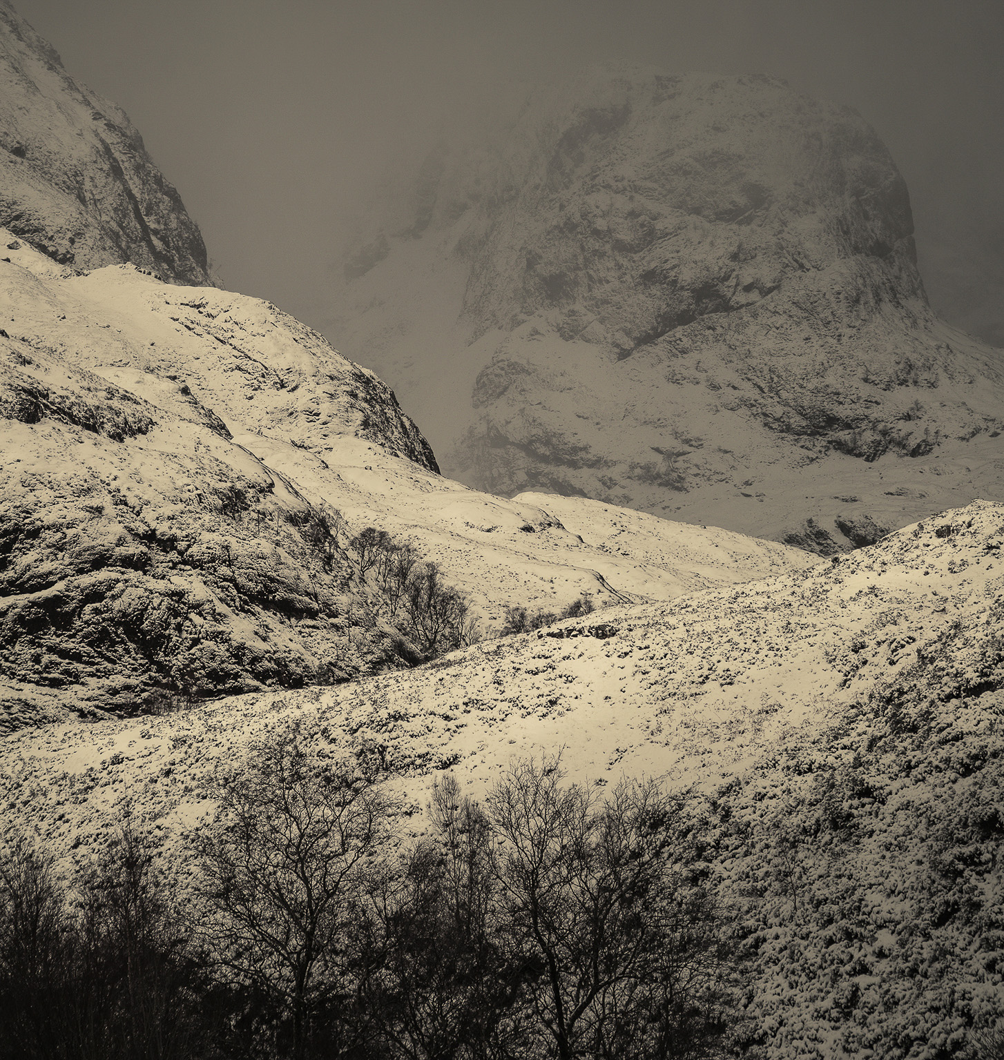
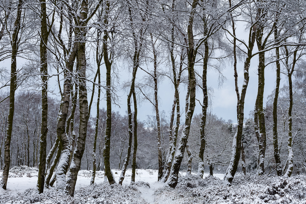
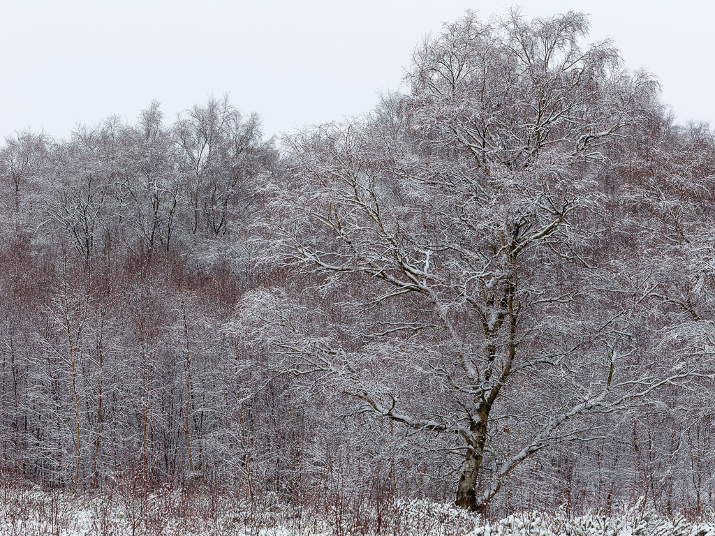
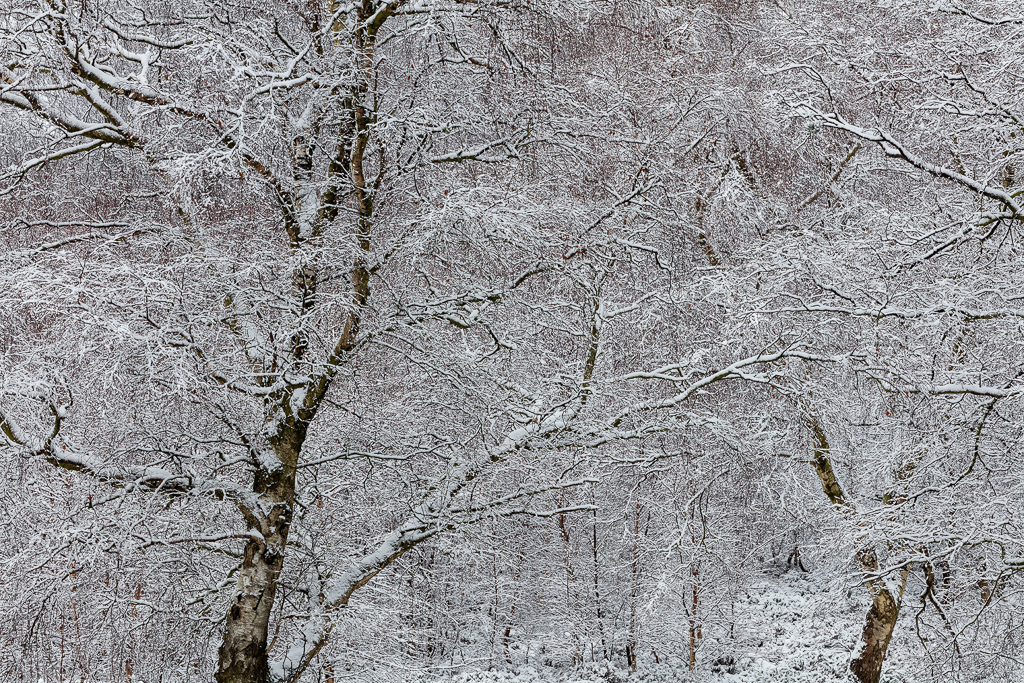
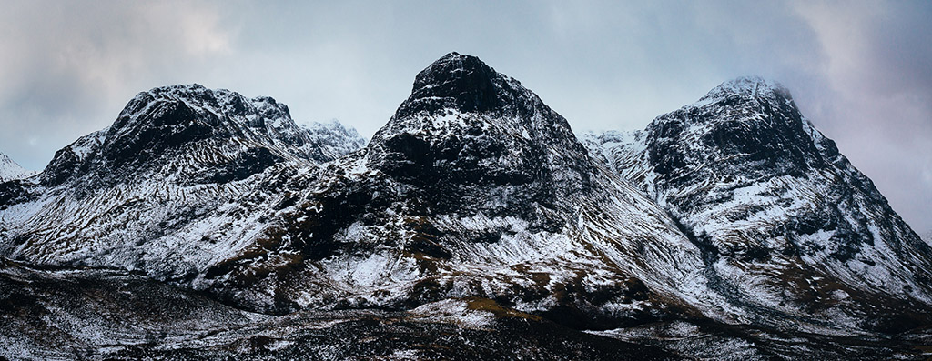
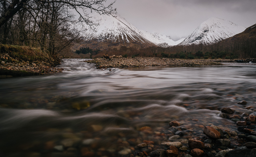
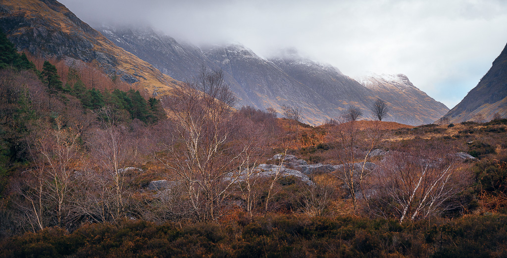
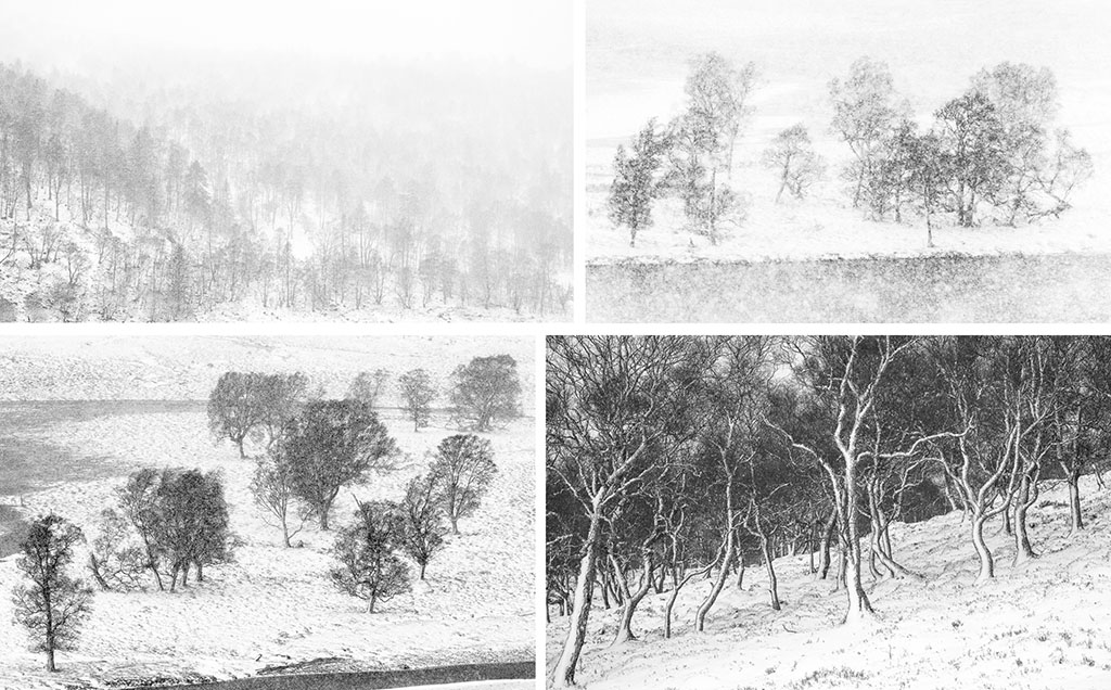
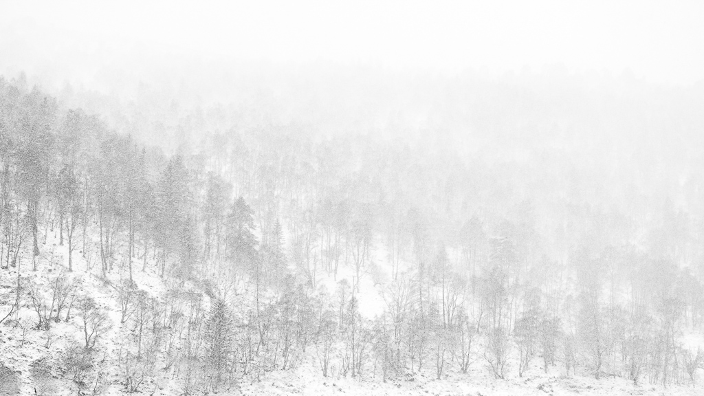
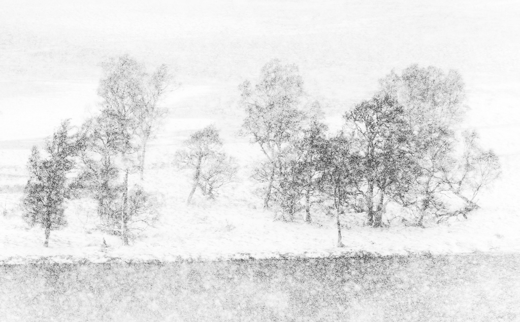
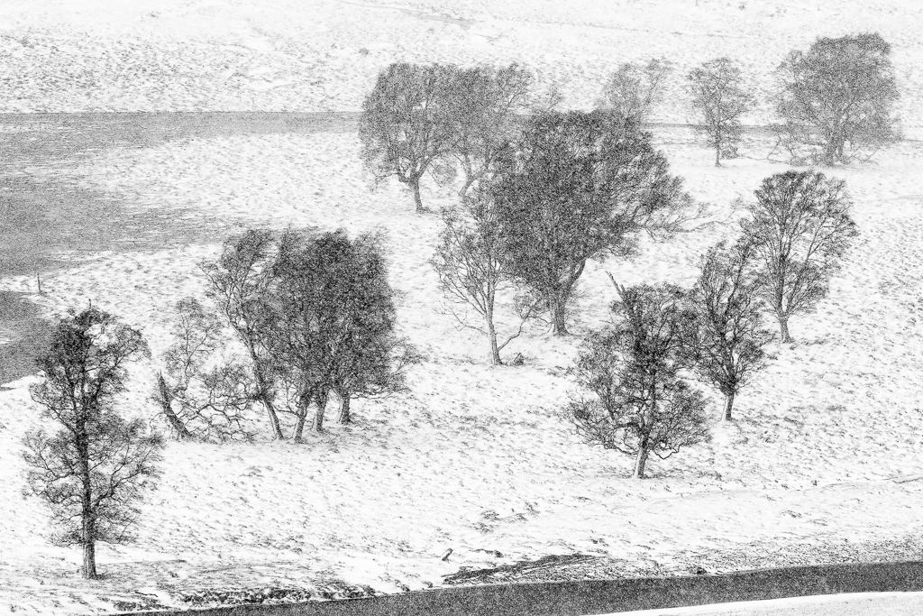
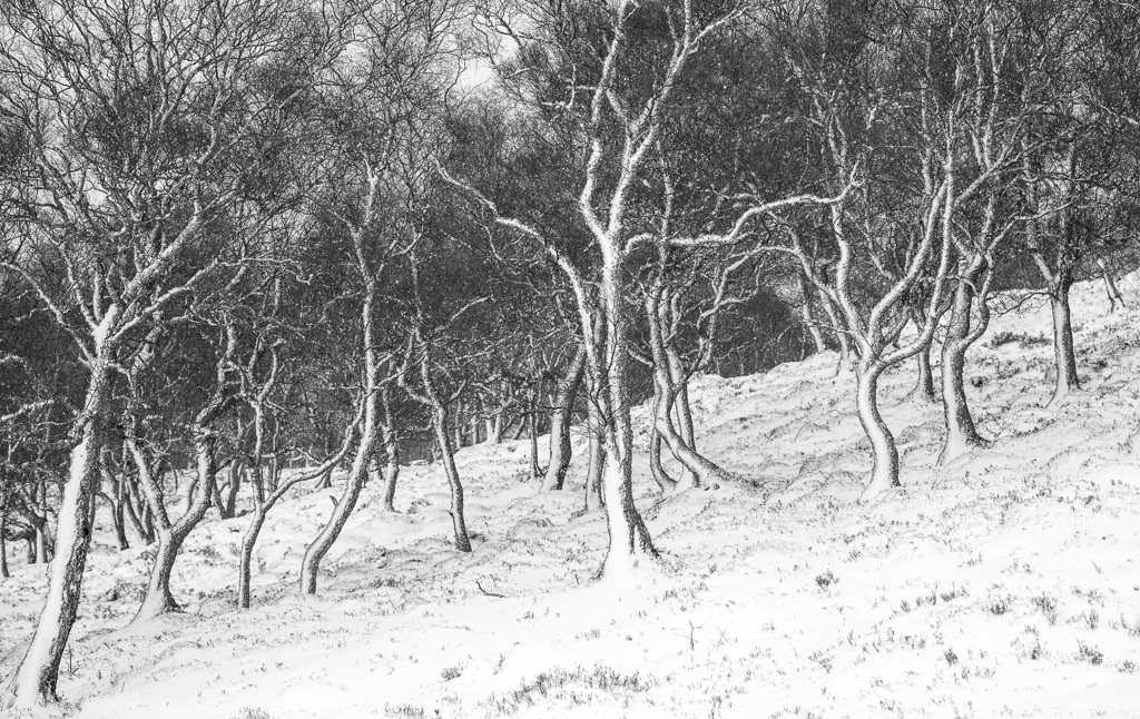
As the day approached to travel to Glencoe, snow looked increasingly likely later in the week and the exchange of emails betrayed a frisson of excitement. The first day provided the usual variety of Scottish weather with brilliant sun, rain and hail showers taking turns to lift or dampen the spirits. However, the snow really set in overnight transforming the area into a veritable winter wonderland. The snowfall increased every day, some locations became inaccessible, trees changed from bare trunks and twigs to beasts of frozen burden laden with more snow, blizzard conditions played havoc with lenses and filters, the light varied from moody greys and blues to joyous bright creamy yellows when the sun filtered through the clouds and mists.
We were blessed with incredible light and landscapes and had to contend with challenging conditions, but what a week it was - truly a time to remember with experiences and emotions that will stay with us for ever. Thanks to everybody for being a great bunch of people to be with, for sharing your results and approaches to the pictures that you made and for making the week such unbridled fun!
Graham Cook
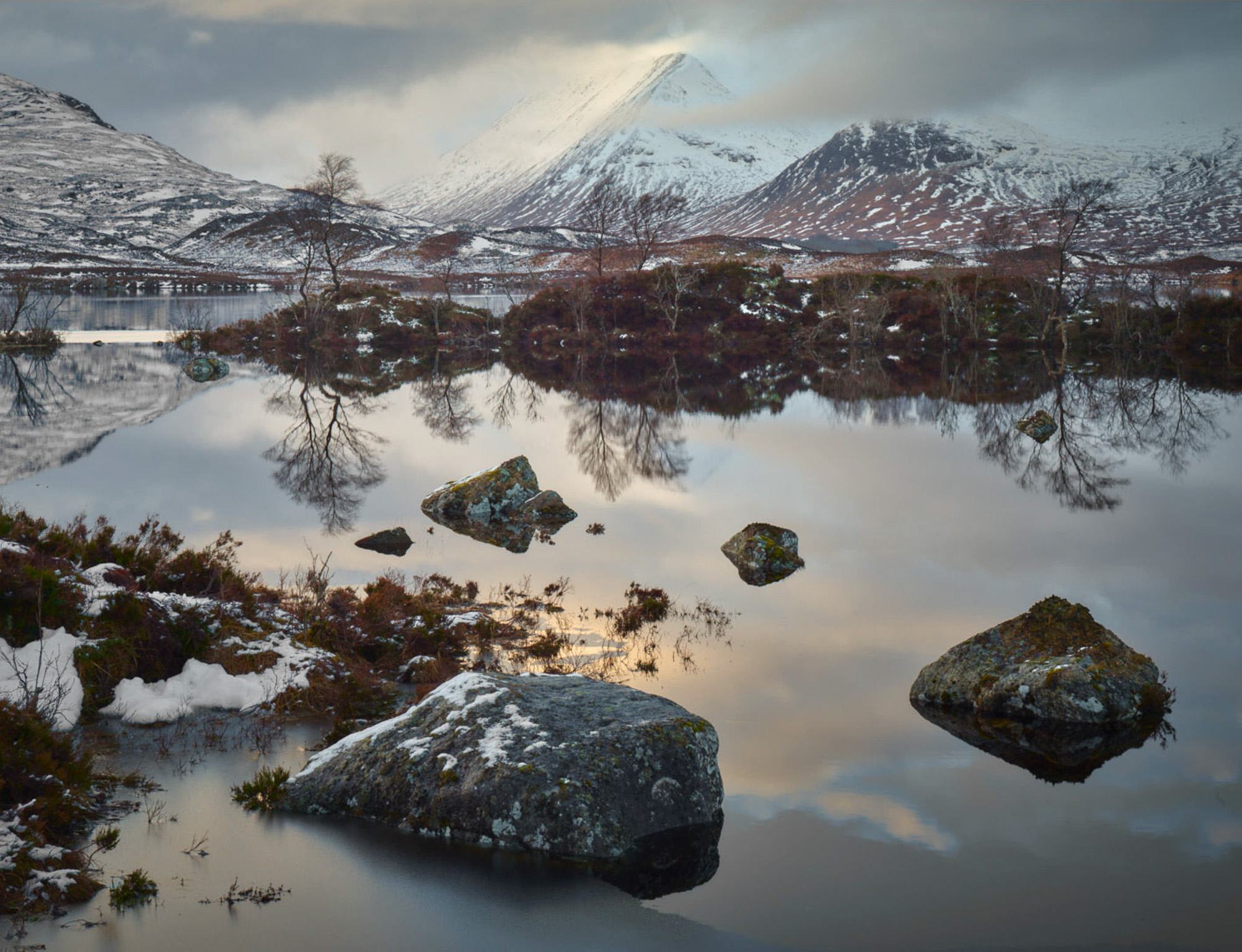
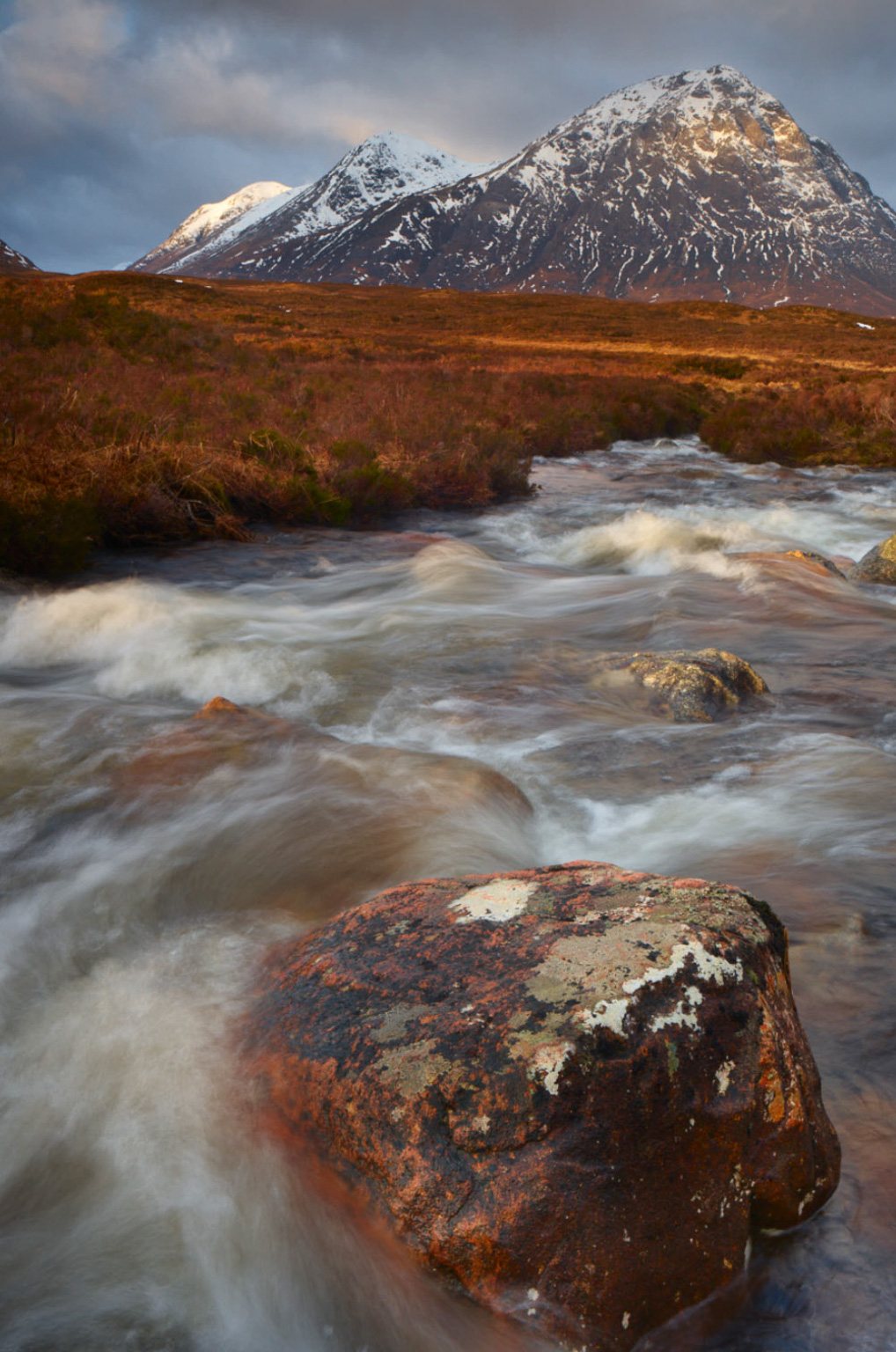
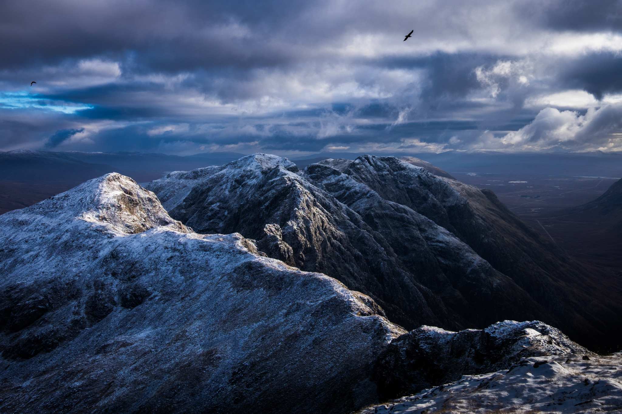
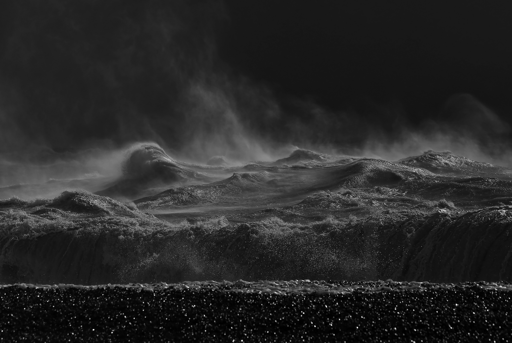
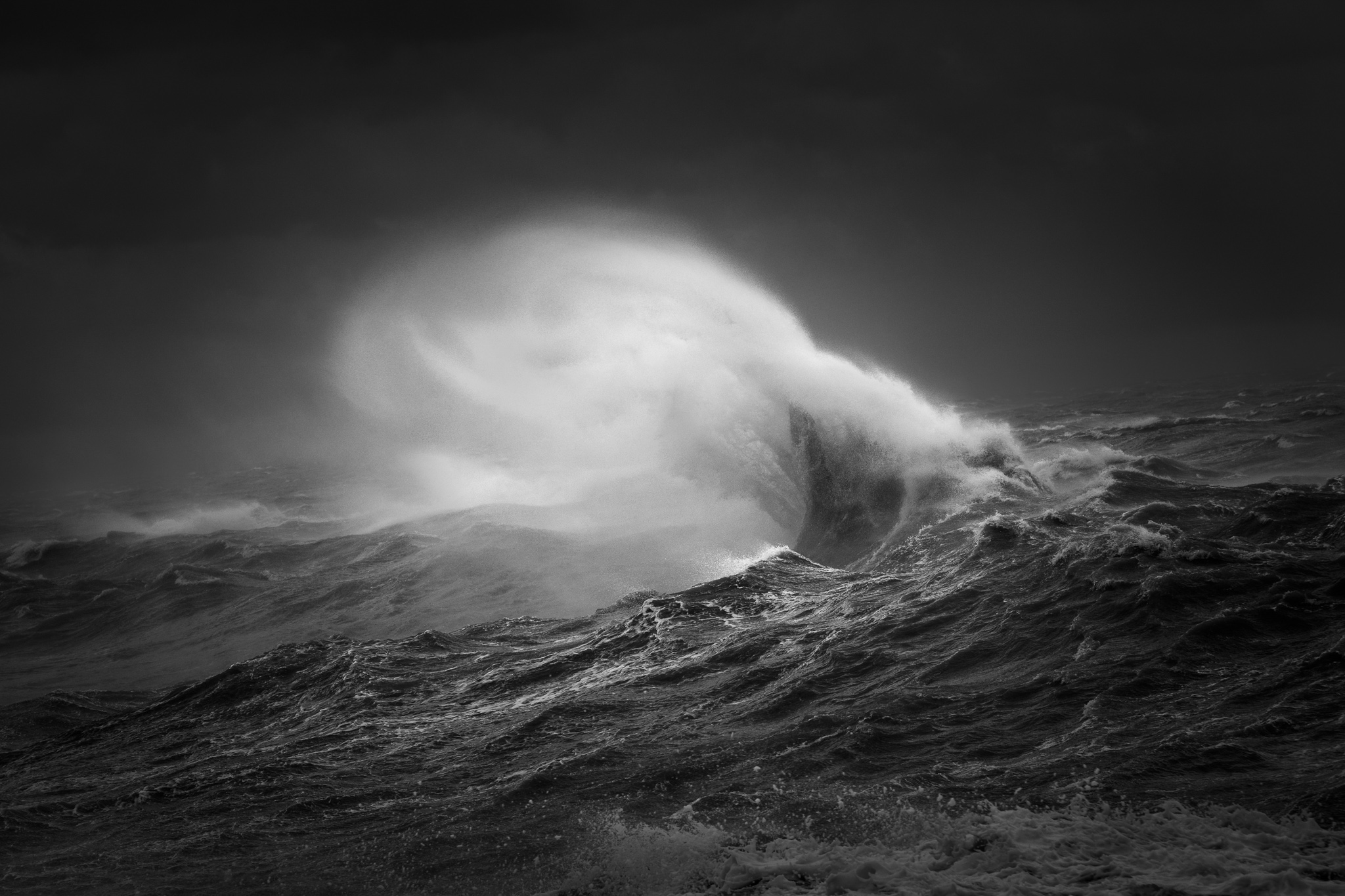
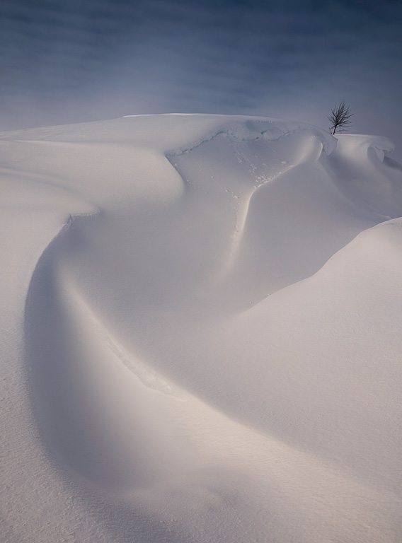
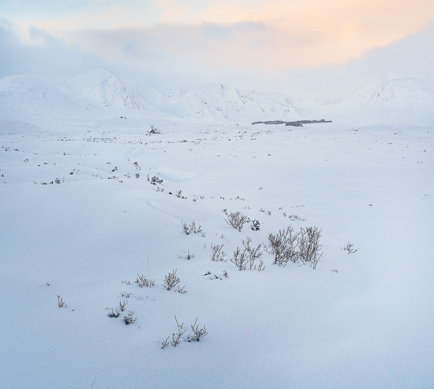
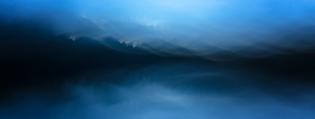
Approaching Snowstorm
The opening scene to a dramatic week ahead perfectly captures my state of childish excitement. This point of the pass, with rock walls and ravines, encourages a feeling of claustrophobia which only serves to heighten the level of anticipation. The mountains, covered in fresh snow, are discoloured by a burnt, menacing light before the approaching blizzard engulfs all and has us rushing to seek shelter.
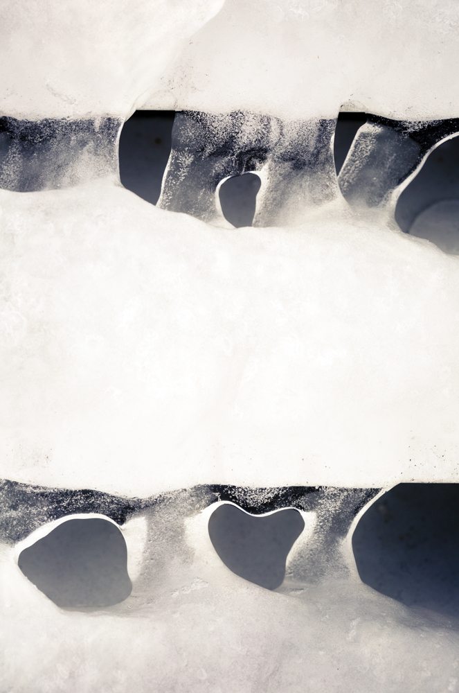
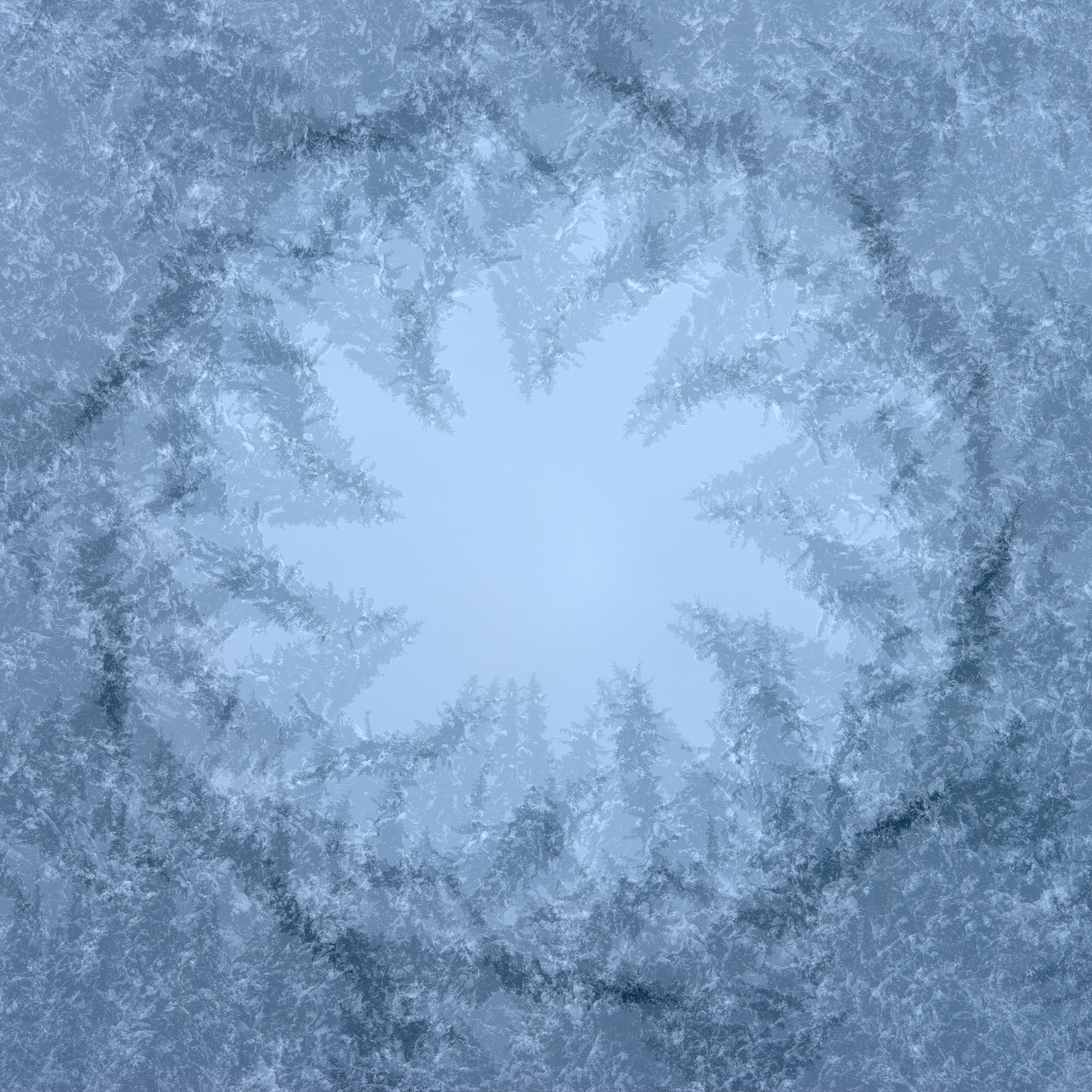
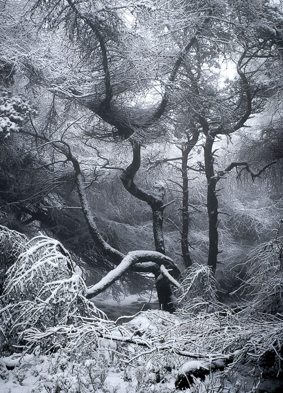
Heart of Cold
Something of a contrast to the wider view, this detail reveals the world in a distilled, simplified form. There’s an ambiguous fluidity to the seemingly monumental ice pillars that's a consequence of intentionally freeing the subject from the obvious association. Symbolically, the heart shape is met with indifference by a harsh and freezing frigidity.
Joe Cornish
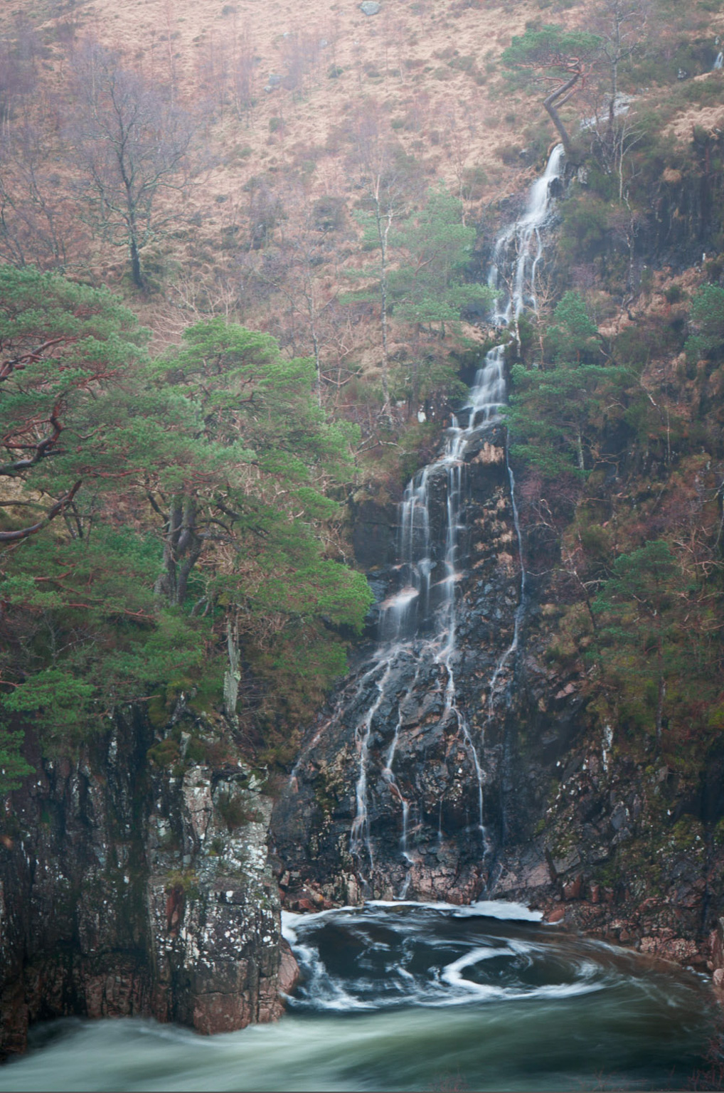
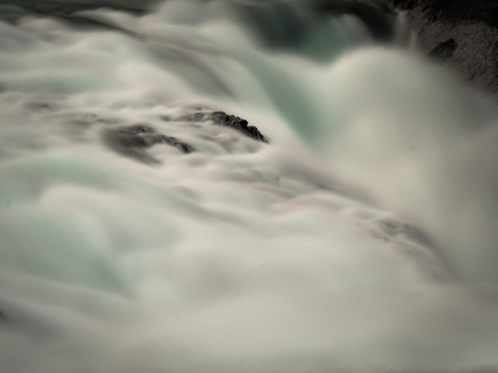
Etive Waterfall
It might seem a foolish conceit, but having photographed so many familiar scenes in the UK over such a long time I still find a thrill from attempting the familiar in an unfamiliar way, or with exceptional conditions. I doubt ever seeing this place in such light and weather again, even if I were to visit every winter for the rest of my life.
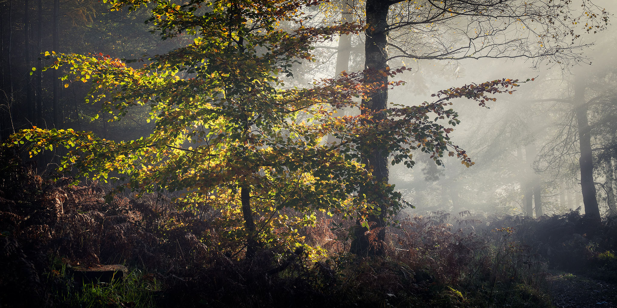
This issue we're talking to Antonio Aleo, an excellent photographer from Italy who specialises in his local area of Calabria. Most of the images included are from his work in the local forests in Calabria.
Can you tell me a little about your education, childhood passions, early exposure to photography etc?
I am an Italian photographer, born and raised in the region of Calabria, southern Italy, a land with many wild features, a very high level of biodiversity. I've always been a fan of art and music. Until the age of 20, I painted and reproduced impressionist and expressionist current paintings. At the same time, I was also an electronic music DJ (made in UK). In 2011 I bought my first camera because I still wanted to create visual art, even if by different means.
What are you most proud of in your photography?
What makes me most proud? My total indifference towards the aesthetic canons. My photographs must tell my inner feelings and not the aesthetic beauty of the landscape. So many times I'm looking for ugly elements, which I use to meet my inner emotions.
In most photographers lives there are 'epiphanic’ moments where things become clear, or new directions are formed. What were your two main moments and how did they change your photography?
A few years ago I was a lover of the grand landscape, of sunrises and sunsets.
I was fascinated by the intimate landscape, when in 2014 I began to observe the photographs of Sarah Marino and Ron Coscorrosa, Guy Tal, Charles Cramer, Christopher Burkett. A new world opened up for me, and I completely turned my back on my old way of conceiving photography. That was my first change, a new way to go. The second change occurred in 2016, with the tragic death of my daughter in the seventh month of pregnancy. From that day my life has totally changed; my way of seeing and conceiving things has changed, and so my images have taken on a more sombre, melancholic and disturbing aspect.
Tell me about why you love landscape photography? A little background on what your first passions were, what you studied and what job you ended up doing
I have always had a weakness for the visual arts and electronic music, because I having lived in a family of artists and musicians. I attended a school of figurative art, and I had a great predisposition for painting. I am a lover of Renaissance and Baroque art, but I also have a weakness for the expressionist, impressionist and post-impressionist movement. When I look at a painting by Van Gogh, Munch, Monet, I am enchanted by the profound inner emanation. My mother was a lover of landscape painting, so it was she who sent me love to the landscape.
After school, I started working for the family business, and the rest of time I dedicated to music, moving away from the world of figurative art for a short time. Photography, in every sense, has reintroduced me into the visual art world. A circle that could not be broken.
Do you think your background in painting brings any advantages to your landscape photography?
Surely my background in painting, has helped to have a visual approach, even from a compositional point of view. But I must say that I was working more in portraiture :-)
Could you tell us a little about the cameras and lenses you typically take on a trip and how they affect your photography.
Exactly 5 years ago I used a Canon 6D, quite discreet camera. For my photography, the lenses have a more important role than my camera body. I use only a 24-70 and a 100-400 (that I use in the majority of photographs). A telephoto lens manages to penetrate the soul of the landscape, creating contact with nature; I love to isolate the elements from their surroundings, eliminating any distraction. I rarely use my 16-35. I'm not a lover of superwide focal lengths, so almost always my wide angle remains at home.
What sort of post processing do you undertake on your pictures? Give me an idea of your workflow..
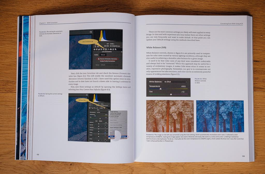
After several years with Lightroom, I've been using Capture One for raw processing in the last few months. I find the engine of C1 very powerful, and already starting the files shine for colour and micro contrasts. Use C1 to eliminate chromatic aberrations, balance white and increase details. I use Photoshop to clean the photograph from any spots or disturbing elements (even if I try to get a clean shot already in the field), selective colour correction, colour balance and tonal values, harmonizing everything in a natural way. Lately, I use Tonality Mask, a very powerful panel able to work selectively and accurately both on the brightness masks and on the tonal masks.
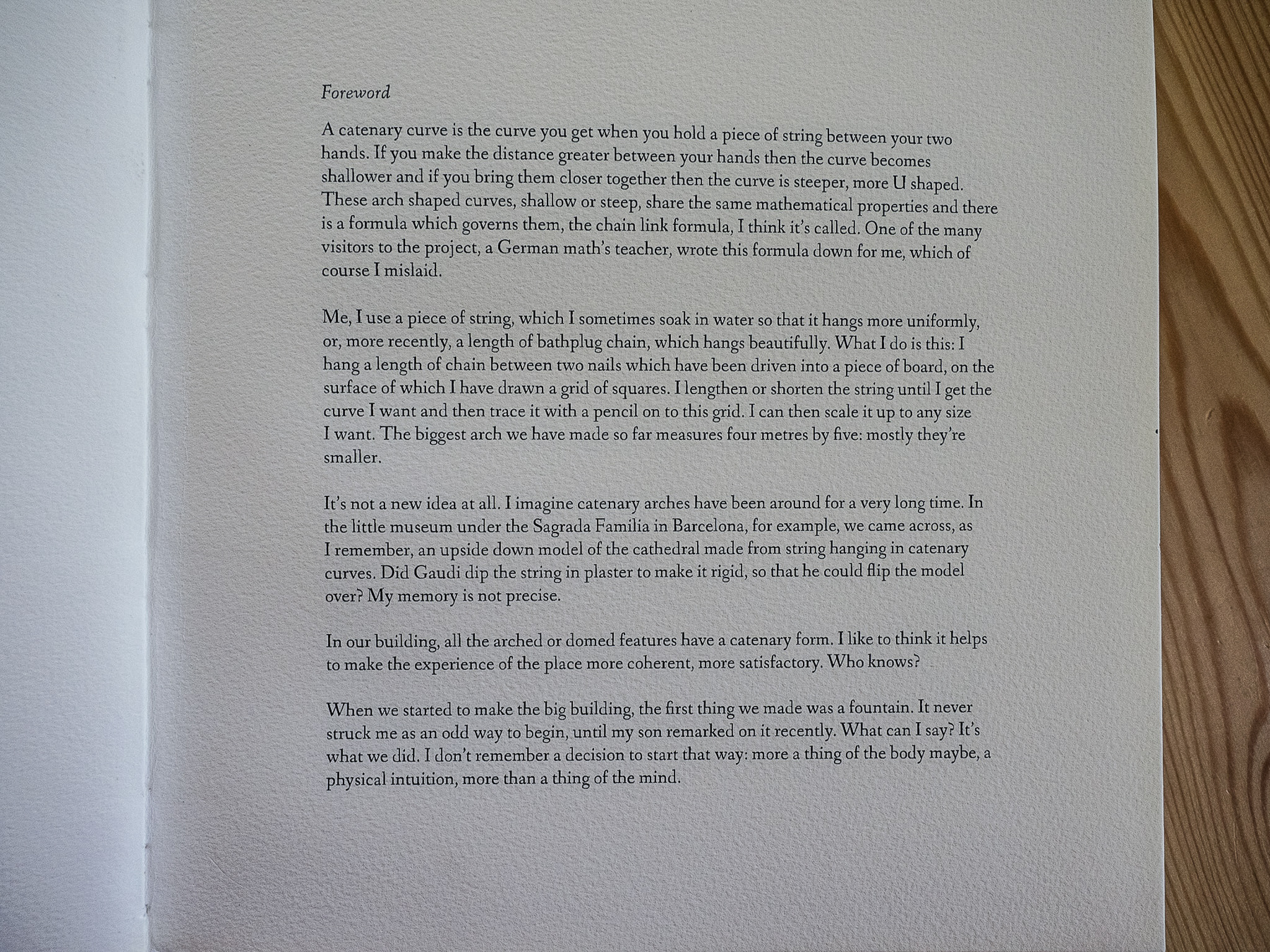
Once you label me you negate me. ~ Søren Kierkegaard
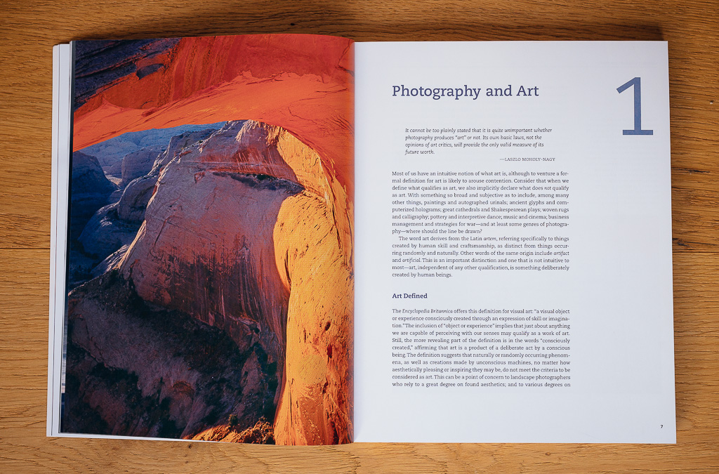
Language is a formal system of signs that provides an abstract counterpart to every single thing existing in the reality we perceive. The use of language, that separates us from other animal species (maybe less than we think!) is one of the reasons our species has been able to evolve, mainly thanks to the possibility of recording, sharing and transmitting knowledge through space and through time. From a more philosophical point of view, the use of language can also be taken as a mean to fight back the natural chaos that surrounds us. Naming something is mastering it. By using names and definitions, we first and foremost make something exist, taking it from the recesses of the subconscious, bringing it under the spotlights of the conscious and rational mind. Once defined, the abstract concepts become mentally tangible and can be controlled and shared amongst other human beings while expecting a certain homogenous understanding by audiences that relate to a specific culture.
When we deal with more or less objective concepts, the use of language becomes ideally suited. Scientists, writers of manuals and (good) journalists might use language in order to clearly put into words objective pieces of the reality that surrounds us.
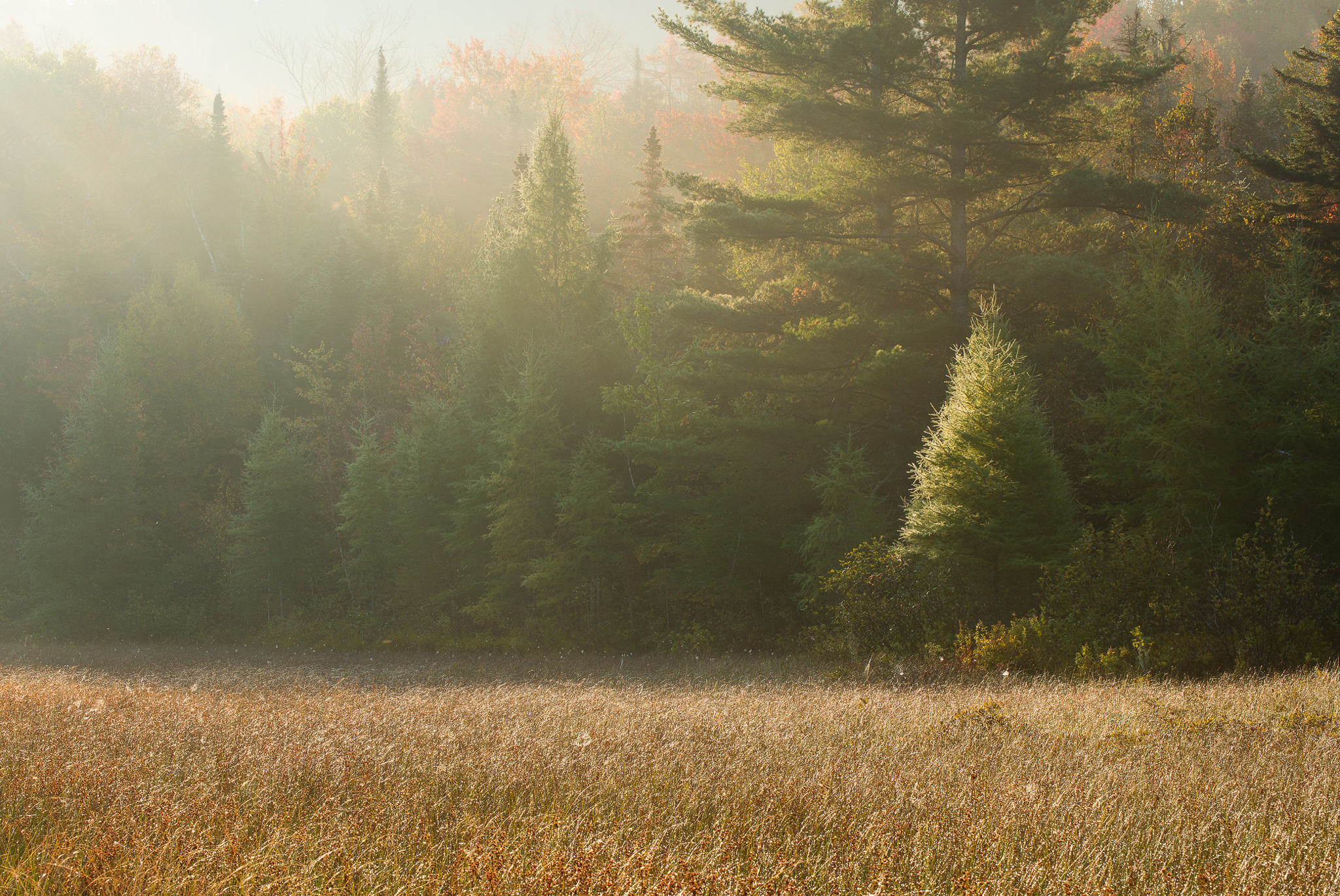
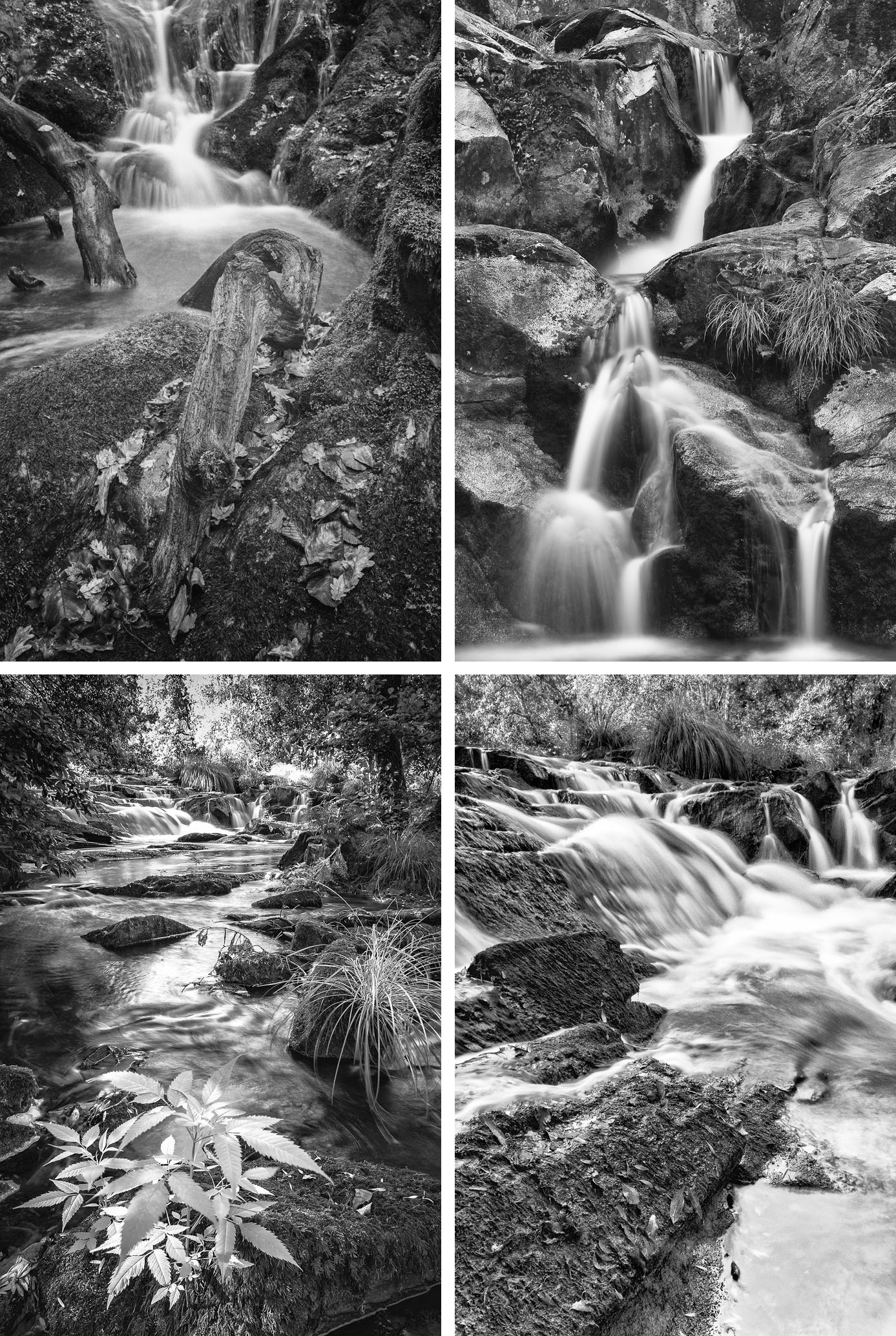
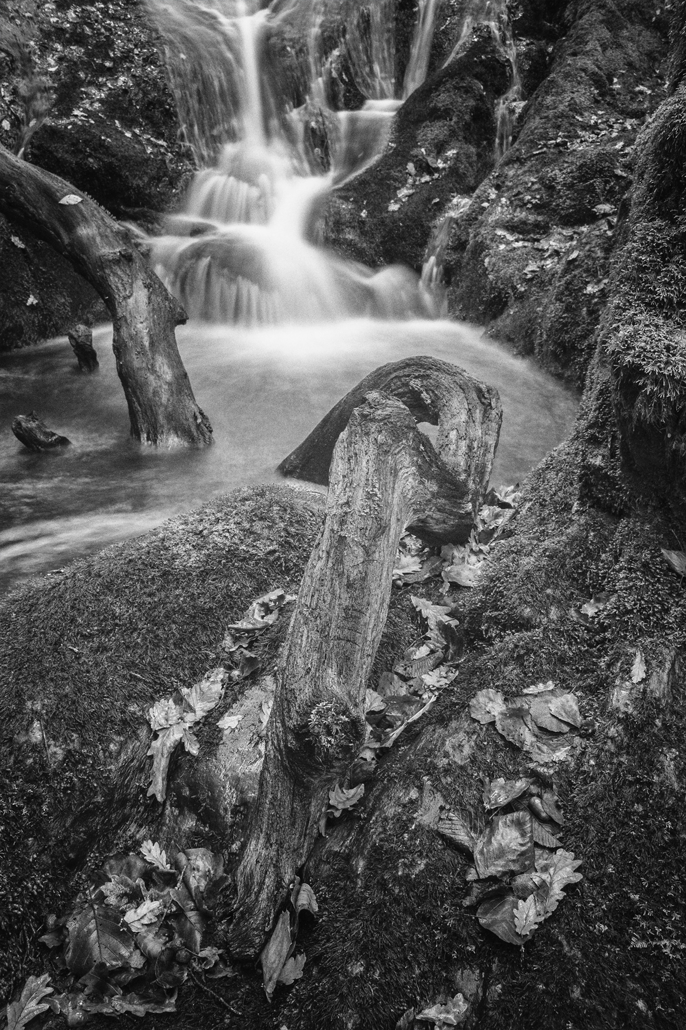
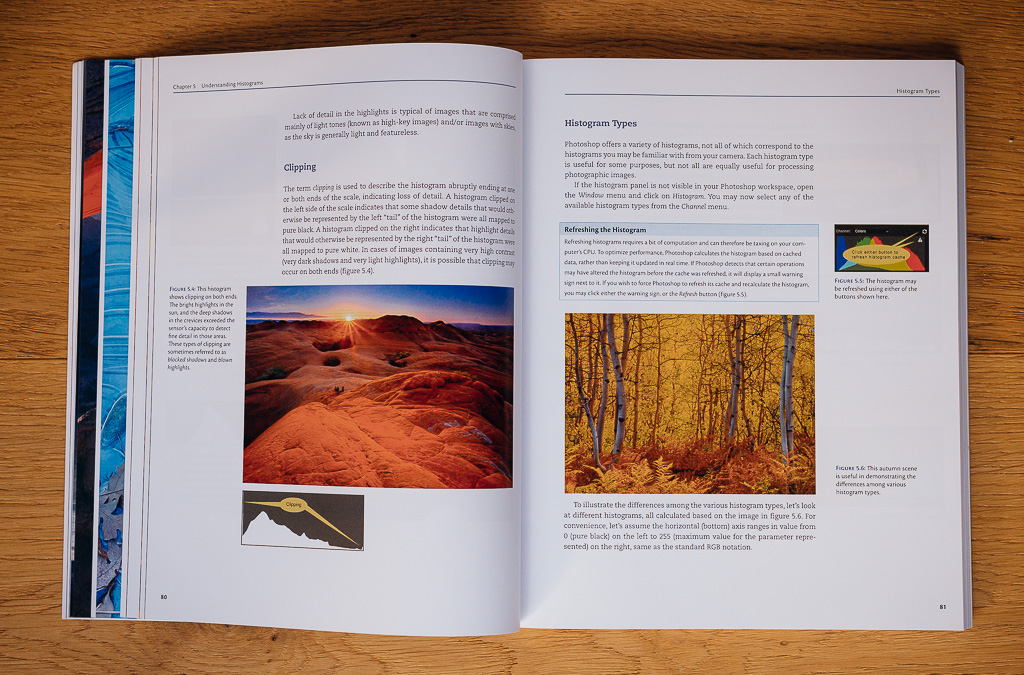
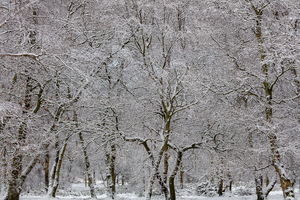
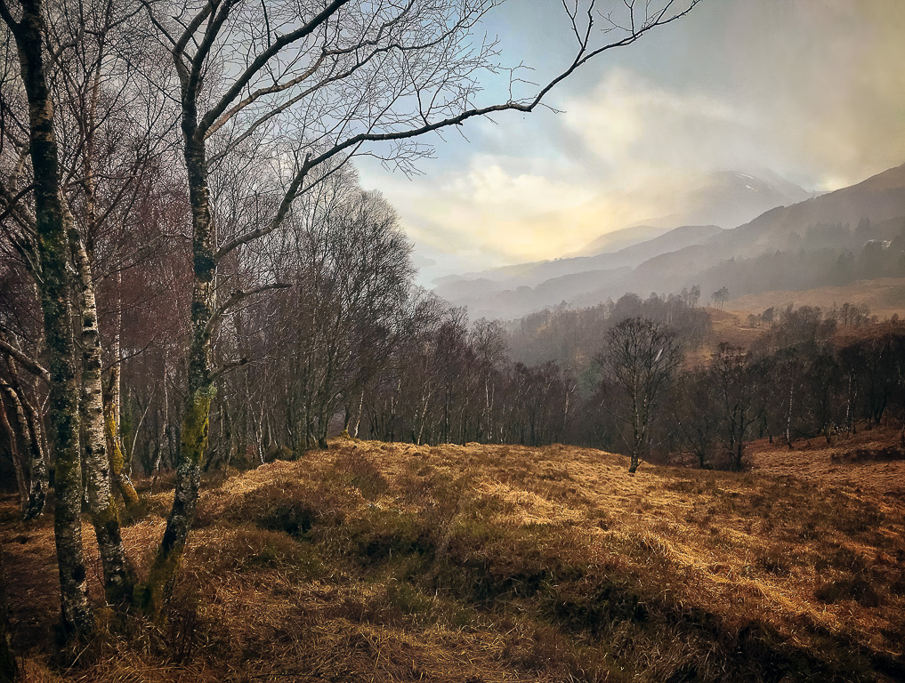
Throughout 2016, over the course of 52 outings, I hiked a total of about 300 miles with my camera on Bredon Hill’s 50 miles of public, permissive and concessionary paths. The hill covers about 15 square miles within its encircling country lanes and is located on the western edge of The Cotswolds in south Worcestershire, just a few miles from my home. I hiked there at all times of the day, often starting well before sunrise and often finishing well after sunset - though only once did both of those
happen on the same day! I was interested to see how familiarity with a location and the things I find to make images from were influenced by differing weather, time of day, season, and not least my own frame of mind. On completion of my project, I concluded that I was completely unable to discern how all of these variables worked. Some days I found many satisfying images whilst on others I almost drew a blank. The how and the why still beats me.
Throughout 2016, over the course of 52 outings, I hiked a total of about 300 miles with my camera on Bredon Hill’s 50 miles of public, permissive and concessionary paths.
Bredon Hill is a gentle dome rising to just shy of 1,000 feet at an iron age hill fort on its northwestern ‘corner’ overlooking the more or less flat River Avon and River Severn valleys. Its northern and western slopes are steeper, more wooded than the southern and eastern slopes. It’s mostly given over to arable and sheep farming with areas of deciduous and coniferous woodland, orchards, a National Nature Reserve, a few small streams, a good scattering of isolated old trees and lines of old Scots pines and at least three iron age hill forts. Some areas are managed for pheasant shooting. There are no public roads onto the hill. It’s encircled at its base by country lanes where there are to be found several very attractive Cotswold
villages, all of which could be photographic subjects in their own right - but not for me on this project. All of this, coupled with the variety brought by visiting throughout daylight hours in all seasons, offered me the chance to get to explore its photographic potential to the full. I had planned a couple of night visits for sky and meteorite photography but was thwarted each time by forecasts of full cloud cover.
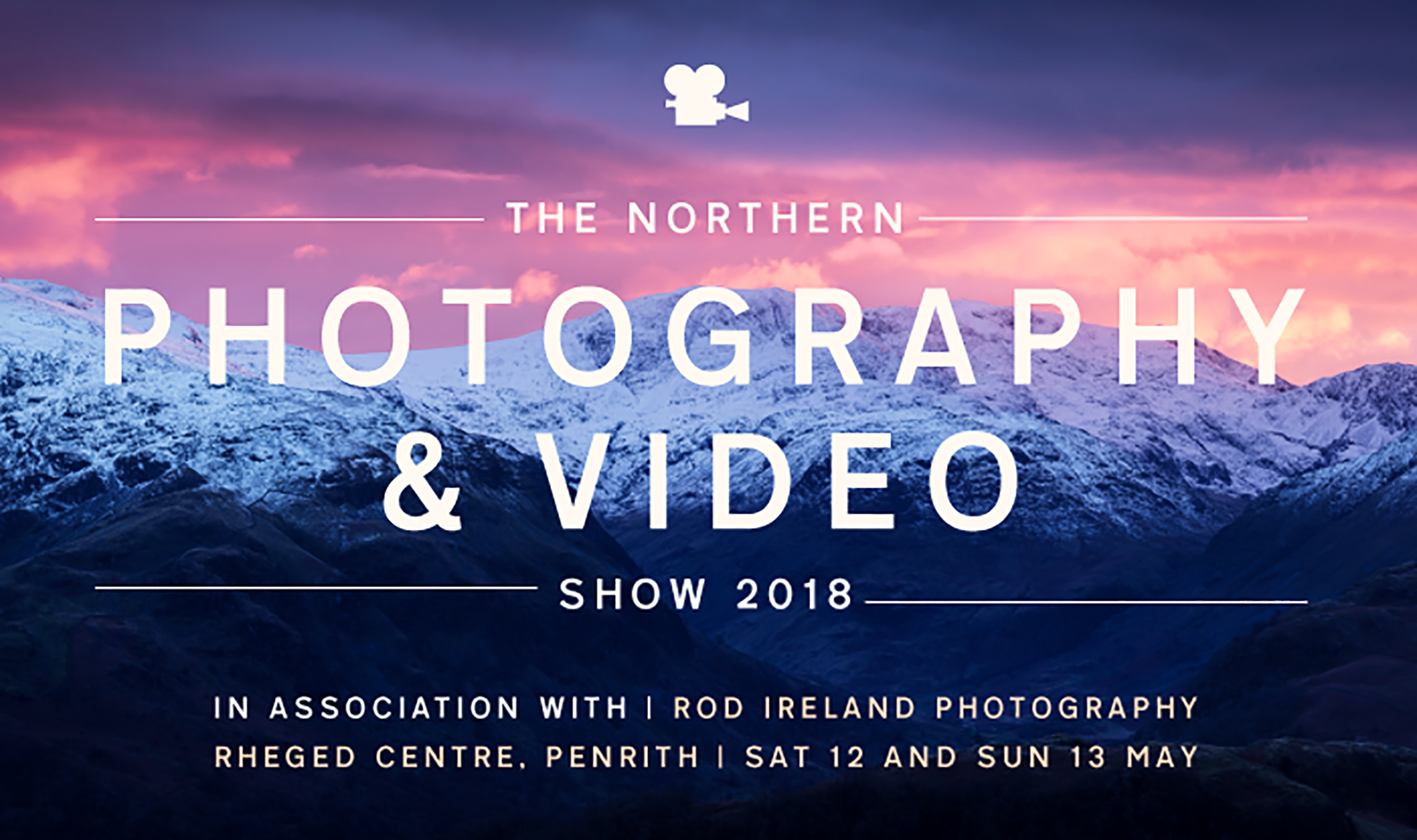
In late 2015, I was chatting with a friend I'd met at our local Camera Club (Penrith & District). Phil Newport, now Chair, was keen to encourage new membership and reach a broader audience of people to join the club. He'd an idea around getting clubs together to put on a joint exhibition to which the public would be invited. Phil asked if I'd like to get involved and after some deliberation, I took the plunge.
The Rheged exhibition centre on the fringe of the Lake District was identified as a good venue to hold the event and in early 2016, Phil and Steve Prior from the club, along with the Rheged team and myself discussed what might be developed. We soon recognised that to appeal to a wider audience, we'd need more than just a social get together for clubs. We'd need talks and other exhibitors to draw people in. It would need to be a photography show.
For better or worse, I undertook the role of curator, tasked with putting together a programme of speakers and identifying who might be interested in exhibiting. The Rheged team would work on the logistics around hosting the event, while Phil and Steve approached various camera clubs to see if they'd take part.
I managed to persuade Mark Littlejohn, another ex-Penrith camera club member, to do a talk for us. Still basking in the success of winning Landscape Photographer of the Year, having him on board would help raise awareness for our fledgeling event. (Mark has been incredibly generous in supporting the show. Appearing for three years now, he always delights the audience so a special thanks are due to him). As well as Mark, I'd do a talk along with other Lake District photographers such as John Gravett. The launch of 'The Cumbria Photography Show' was on for May 2016.
There was the worry the show might slip up and we'd be left with a large empty building and red faces. To our relief, the inaugural show had a strong turnout and really positive feedback. Talks went well; exhibitors were happy and most importantly, we'd provided a platform for over six hundred people with an interest in photography to gather together. Mistakes were made, but we had proof of concept and all involved wanted to take it forward the following year.
Now in year three, we've tweaked the name to 'The Northern Photography & Video Show', reflecting the growing regional audience and acknowledging a widening interest in video as lines between photographers and videographers continues to blur.
We've secured what I think is the strongest line-up of speakers yet, a reflection perhaps on the momentum that's been built over the past couple of years. There's a new programme of practical workshops and we've more exhibitors, with a mix of camera & gear providers as well as photographers selling their services and work. Ten Camera clubs are attending and exhibiting their images. Last year saw nearly 1,000 visitors and we're confident of a great turnout again.
As the show moves forward, we'll look to attract more exhibitors (visitor feedback highlights handling kit and seeing demo's as well valued). We're also committed to maintaining a programme of high quality talks as the cornerstone of the event. Most important though, is keeping the friendly, social aspect that has emerged. Absolute beginners, through to full time professionals able to network, learn and enjoy a relaxed event together. That's how it started and we're determined to keep that going.
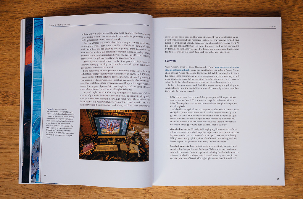
Often the first port of call for me, when I begin teaching photography, is to gain an understanding of what level the photographer I am teaching is at. More often than not they have a good understanding of their camera and lenses and has a solid grasp of exposure and focusing. If a photographer is at this level, then I can reassure myself that the raw files from the camera will make a good foundation for a photograph.
Obviously, in these early stages of interaction I may have not seen him or her working in the field but what I am usually presented with is a series of prints, often some of their favourites as they are keen to show their best. Until recently, my personal journey of photography had been almost entirely dedicated black and white work, so it is not uncommon for photographers of all genres to want to share their black and white prints with me for discussion.
It goes without saying that to see another photographers work is always a pleasure and offers me an understanding of how they ‘see’ the world which is often rewarding and fascinating at the same time. Many bodies of work I have witnessed have been stunning and the print quality has been beautiful.
Photography in the early days for me was always a way of documenting my mountaineering trips. Snatching it from the rucksack at the height of a storm to capture weather blasted summits in violent or moody light, the images on film illustrated my climbing journals, which over the years told the stories of my adventures. They held my thoughts and interpretations of the landscape, the tales of the climbs and chaotic tantrums of the weather, both summer and winter on mountains remote both in place and time.
A few years ago I discovered Chinese mountain poetry, beautiful landscape portraits in sparse words from the 9th century and the travel diaries of Basho with his famous haiku, the compact three line interpretation of a moment. The wonderful eighteenth century English poet John Clare thought that nature herself contained poetry, waiting to be heard and written down and I realised my photographs and journals were doing just that. As I read these poems I started to realise what I had been doing with my early photography, combining image and text to allow me to interpret an experience, to see the poetry inherent in nature.
Around the same time, my photography became more focused, working with light and composition but diverged from my writing. Articles for magazines with images purely as documentation to illustrate the routes or as examples of the views to be had from the summits. The poetry of the landscape was missing. How could I reconnect my internal wiring and get back to how I used to feel when photographing in the mountains? That is what I began to explore when, under an autumn sky I saw a skein of geese coming in from the north, arrowing high above the Sleat moorlands on the Isle of Skye and I knew the haiku would be the route back to that poetry of landscape. Being a Gaelic speaker I decided to write them in that language to accompany my photographs and the ‘Gaiku’ was born.
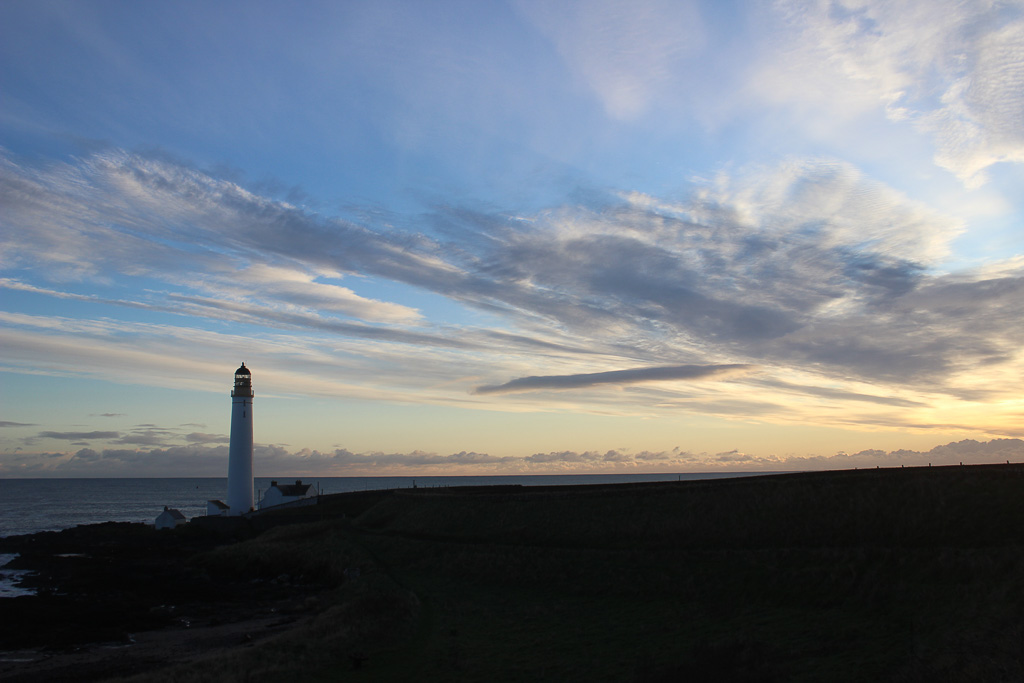
Sgurr Alasdair, highest of the Cuillin mountains on the Isle of Skye.
taigh-solais ‘son anam air chall
feumach air naidheachd ait
rìgh an eilein fo cheò
lighthouse for the lost soul
in need of glad tidings
king of the misty isle
Certainly, there are many theories. Bear in mind that it may not be possible to actually know, but this is my take.
I am alive, the world shows up for me. I am a process, a body that senses, feels and acts. I am unique, as are you. All life appears to conform to an underlying pattern, yet no two living things are identical. I appear to use my senses to construct maps that help me to relate to my surroundings. The maps I make appear to be predictions. I predict the territory I live in. The rectangular Dell monitor I am looking at in this moment is full of letters, symbols, words and ideas. That is a constructed reality, it is really just a grid of tiny lights. Our people have created that meaning and shared it or passed it down to us. You may be looking at an objectively identical Dell monitor, I have no way of knowing if you see exactly the same thing, even if its colour is properly calibrated, you are different to me, but we do have a common language and set of concepts.
In our seeing, we predict and then correct with better prediction as required. Some people have trouble predicting and others have trouble correcting but most of us get it pretty right most of the time, otherwise we would all drive into each other on the motorway or live in a disconnected world. All of this construction appears to be happening outside of conscious awareness. We just see.
There are people that think images and the ideas they contain precede language. There are also image concepts that relate to language. So potentially when I look at a tree, I am constructing an image of a tree concept. It appears that I am able to generate a cascade of detail recursively, the image of the tree becomes more and more detailed and closer to objective reality the closer I look. However, there are some things I don’t know about trees and a botanist could help me to see a tree in much more detail. If I know that I don’t know something, I can see it if I look. You help me to see things that I don’t know that I don’t know. There is a limit to the resolution of what I can experience directly but I can use tools to see more deeply, though indirectly.
Emotional granularity, which is learned, influences the granularity of our seeing. Movement also influences seeing.
Why do I see? In my opinion, we see in order to act or move. Seeing is a spatial awareness. I think we see with our whole being, not just the eyes but also ears, taste, touch, hearing, smell movement, feeling. Emotions influence our seeing. Emotional granularity, which is learned, influences the granularity of our seeing. Movement also influences seeing. Old me sees differently to young me because old me has different movement possibilities. Hip hop dancers see differently to classically trained ballet dancers because they have different movement libraries or maps of space. It is interesting to me that great artists are often students of emotion and movement. I think we could generalise and call enquiry into movement and emotion, the study of relationship.
When we make a photograph we are using a machine to record in 2 dimensions a multi dimensional scene that is directly related to some reality. When I see, the relationship to reality is through my conditioning. There is a feedback loop going on between camera and photographer, our seeing frames the image and the camera informs our seeing. We can change our picture, or we can allow our picture to change us.
In photography, there is always some direct relationship in space. I think we can include time (or possibly the temporal resolution of spatial relationship) in this word ‘space’, perhaps colour too might be thought of in terms of space. All of those describe a quality of movement or my relationship to the world I construct for myself.
Both the photographer and viewer of a photograph are negotiating a constructed space. When I look at a photograph, it’s a construction I see. I am using my concepts to map out a piece of paper with silver or ink on it, or a grid of lights, into something that represents reality. The key point for me is that I am seeing, in the context of ‘photograph’, with all of my assumptions and biases. The concepts I bring to viewing a photograph are cultural, learned. Look at the style of photography submitted to On Landscape and what you see is a cultural norm. Often the same can be said of an art gallery. Perhaps a business person would call that branding. Identification is an important part of being alive.
My photography is an exploration of the relationship. I aspire to create when I feel least sure of myself. I want my photography to come from within me, I try not to rely on artifice. For me, the holy grail is print as gestalt, something that exists as its own concept, independent of the language of our art form. If there were a photographer whose work I admire the most, in this context, it would be Paul Caponigro, who looked at a mundane apple and saw a universe of stars.
I aspire to create when I feel least sure of myself. I want my photography to come from within me, I try not to rely on artifice.
When I received an e-mail from Charlotte at On Landscape inviting me to write an End Frame article I was both surprised and flattered in equal measure, however when the request had finally sunk in I have to say I was more than a little daunted.
Firstly who do I choose?
There are so many incredible photographers who's work is both beautiful and inspirational, many of whom are household names the likes of Joe Cornish,Charlie Waite, David Noton, Ansel Adams to name but a few, all of which have changed the way we look at photography and the way we take or make photographs depending on your opinion.
There are also some names not quite so familiar who's work is equally inspirational. Galen Rowell who's book "Mountain Light" is a must read for all aspiring landscape photographers, David Unsworth, Colin Bell and Peter Watson all of whom have influenced me in some small way as I explore my own creative path.
But the name I keep coming back to is Rafael Rojas. Rafael is an award winning Spanish fine art photographer whose work usually focuses on a concept. Rafael is a Hasselblad master and his book "Timeless" was awarded " Best Fine Art Book" at the International Photography Awards 2016.
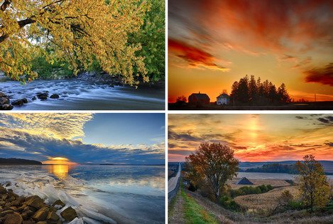
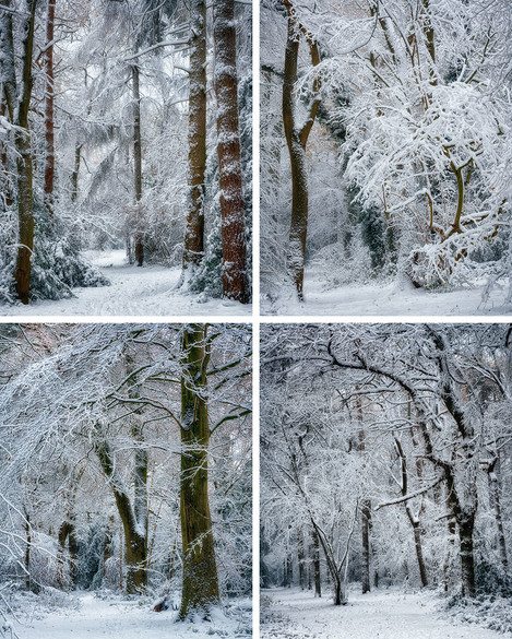
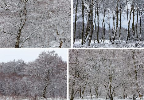
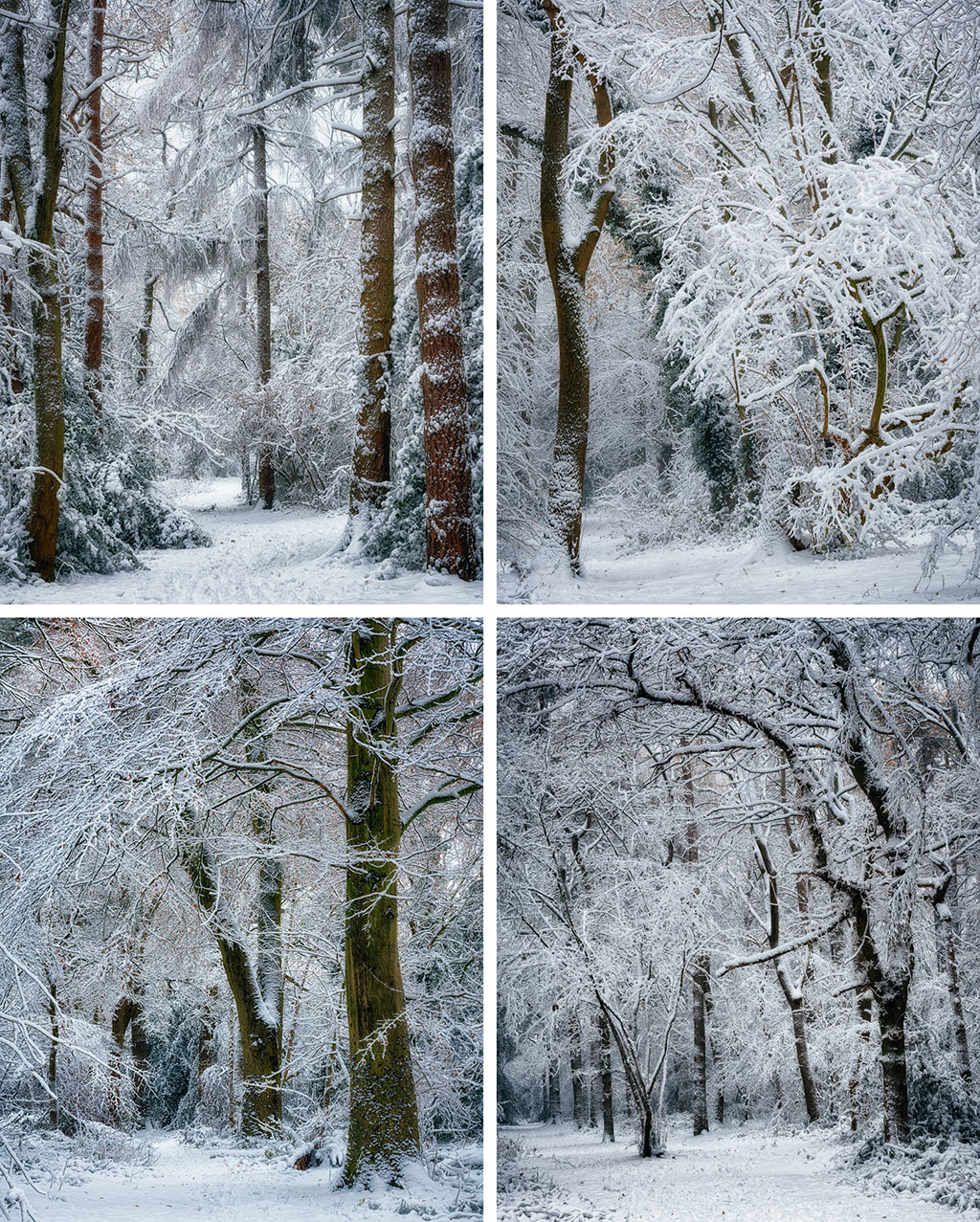
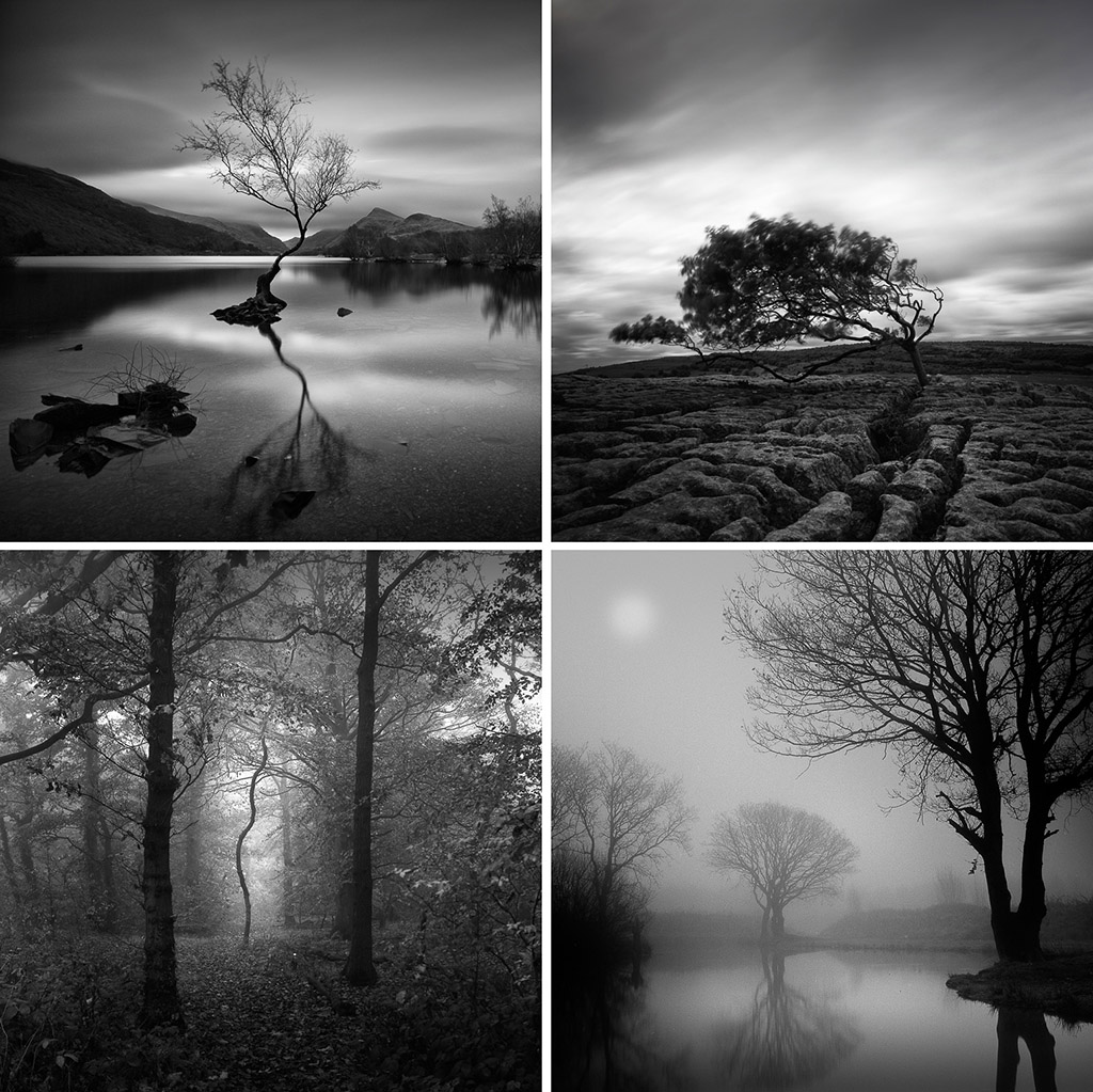
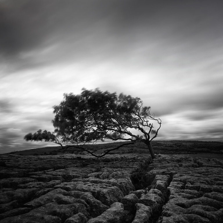
Welcome to our 4x4 feature which is a set of four mini landscape photography portfolios submitted from our subscribers. Each portfolios consisting of four images related in some way. You can view previous 4x4 portfolios here.
Submit Your 4x4 Portfolio
We're on the lookout for new portfolios for the next few issue, so please do get in touch!
If you would like to submit your 4x4 portfolio, please visit this page for submission information.
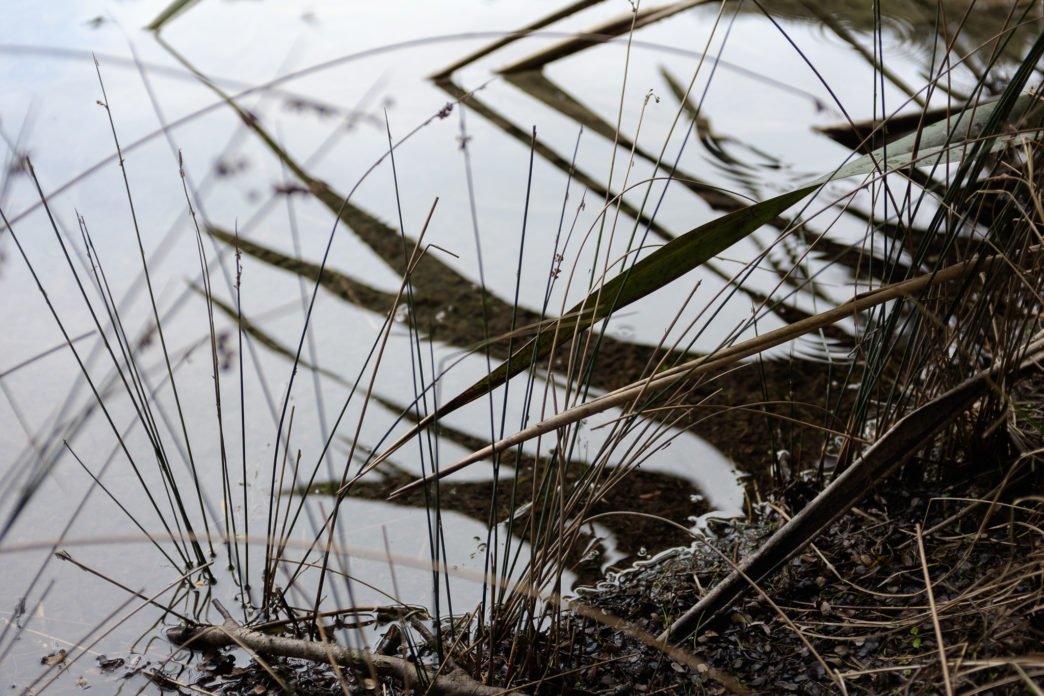
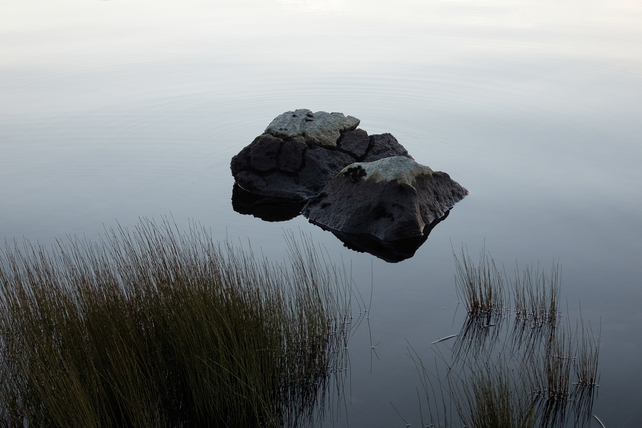
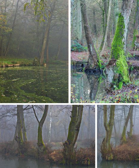
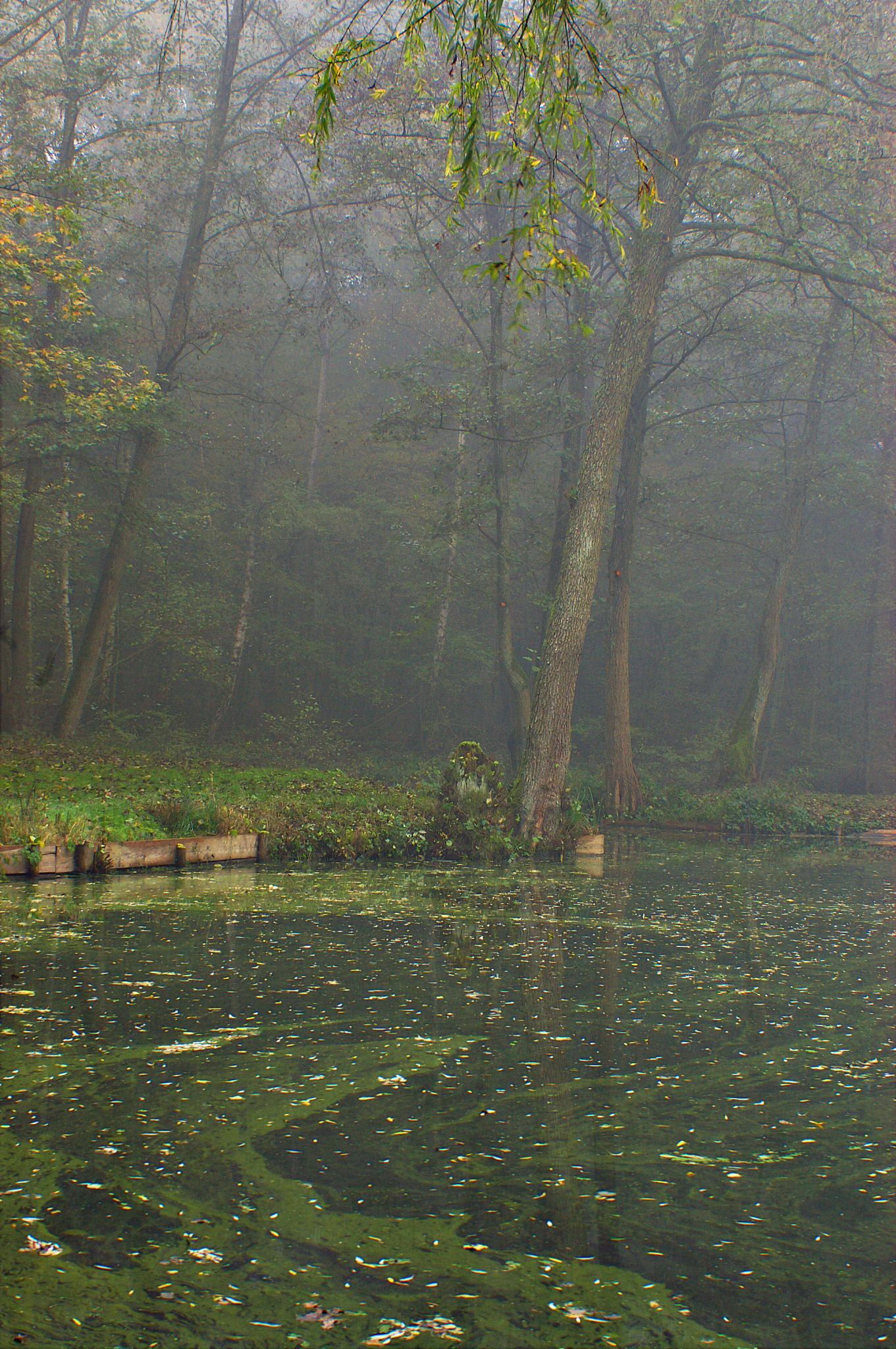
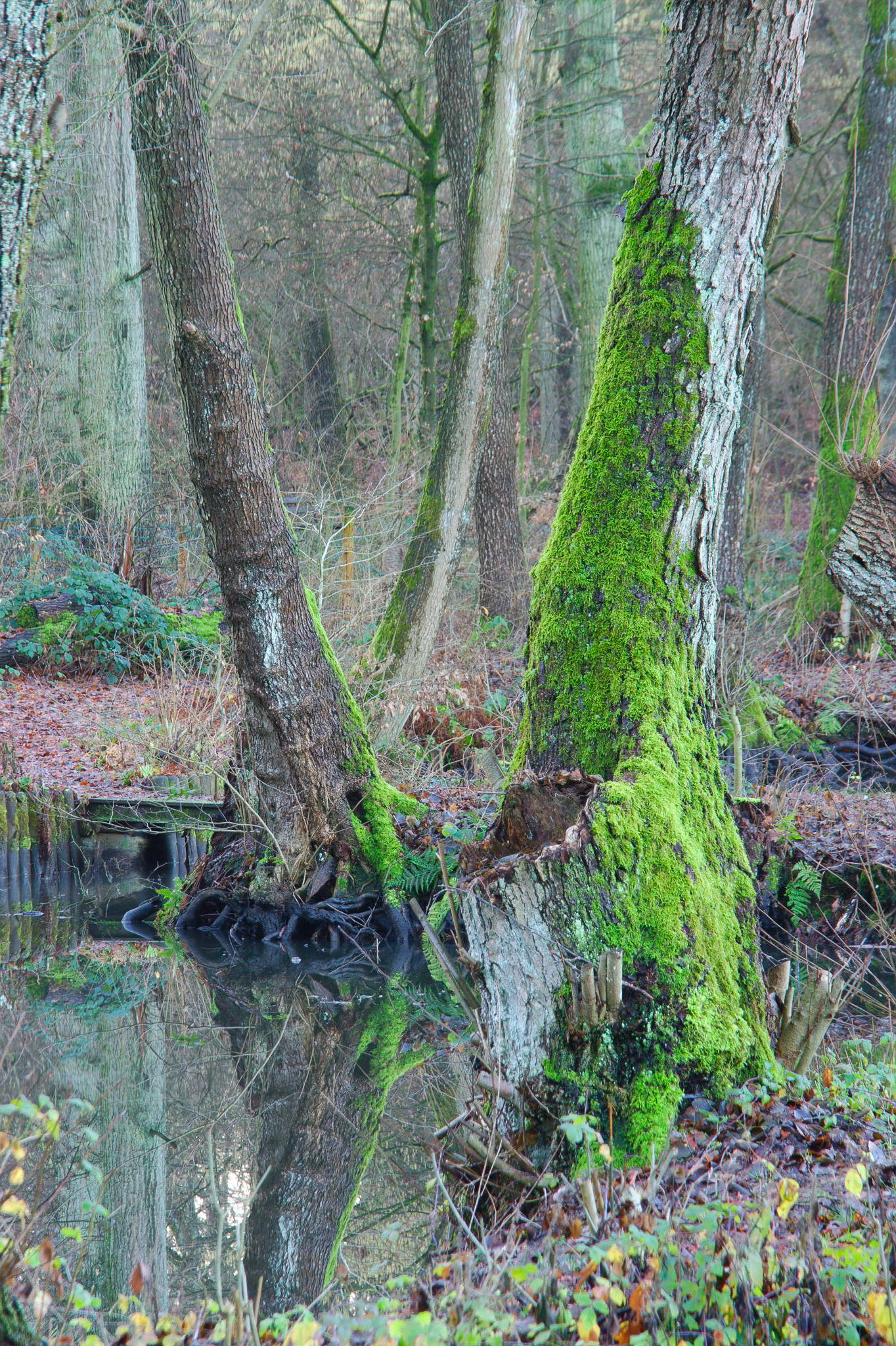
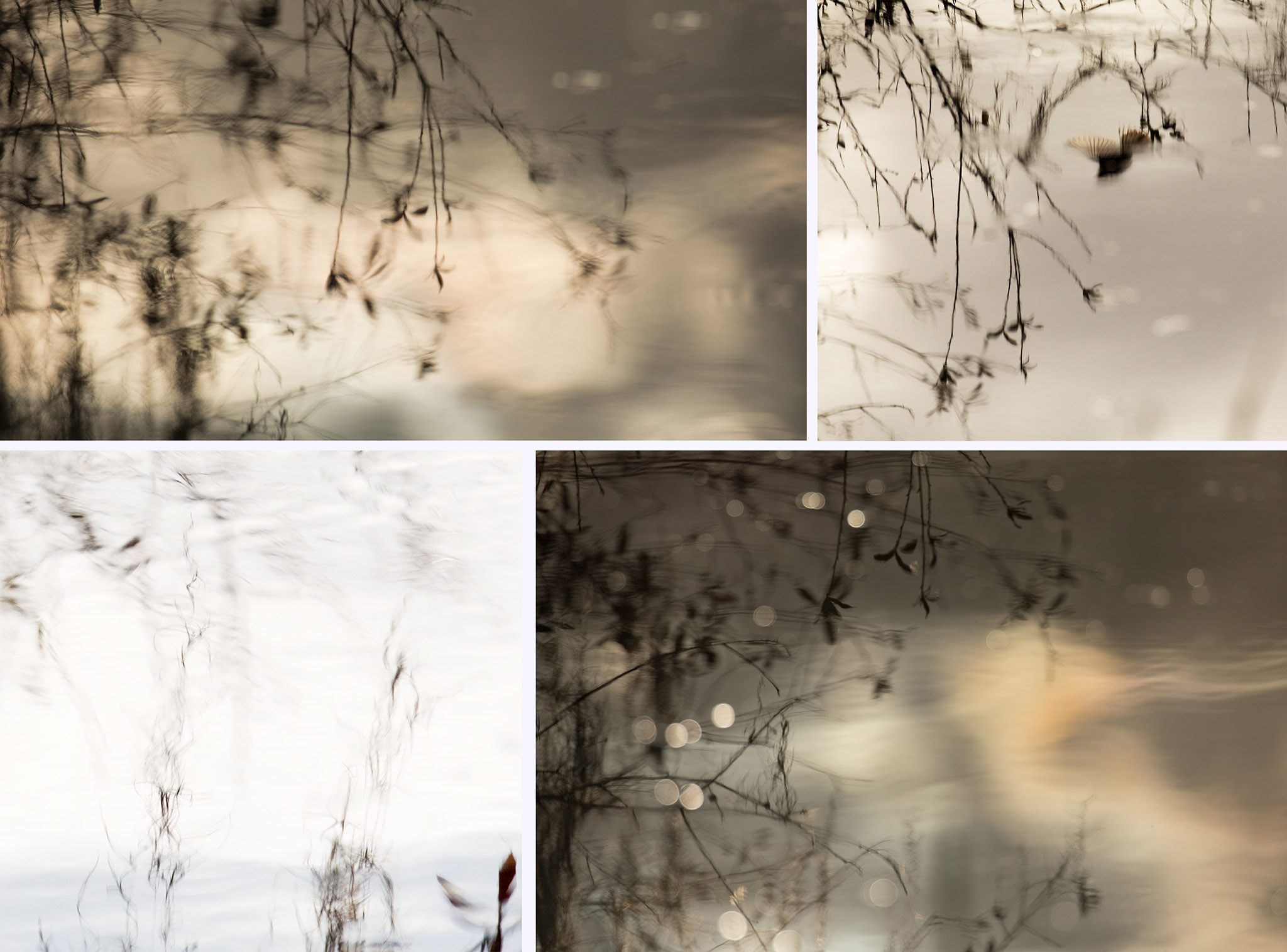
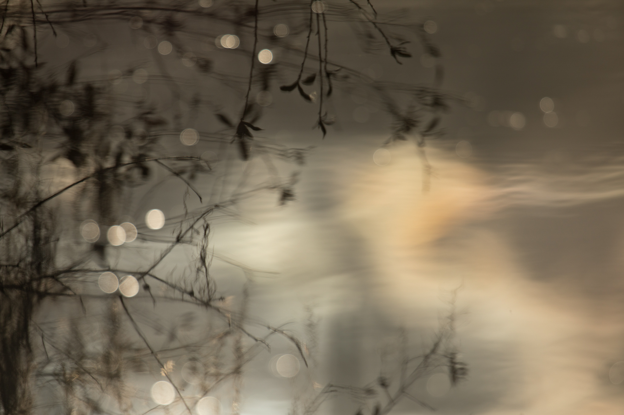
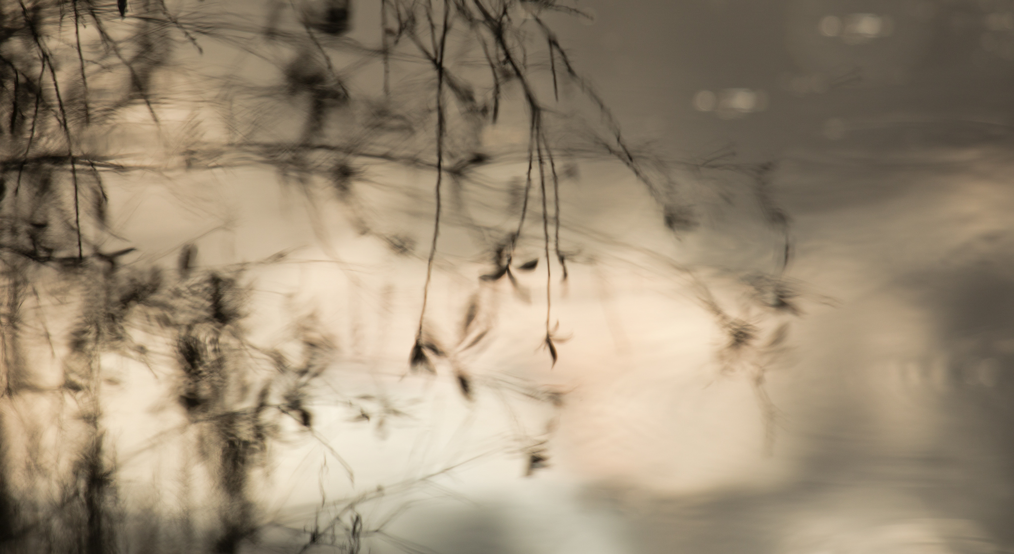
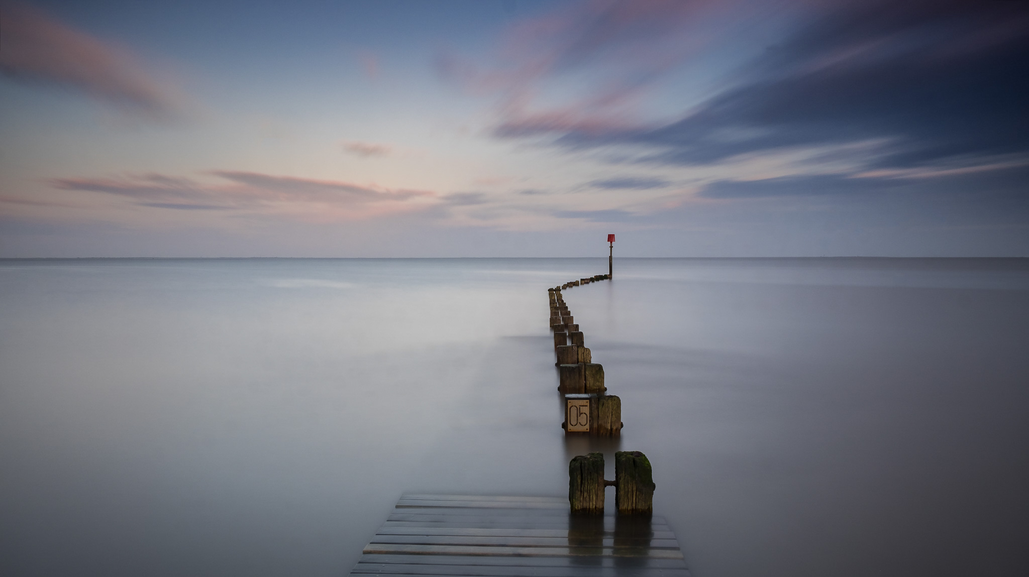
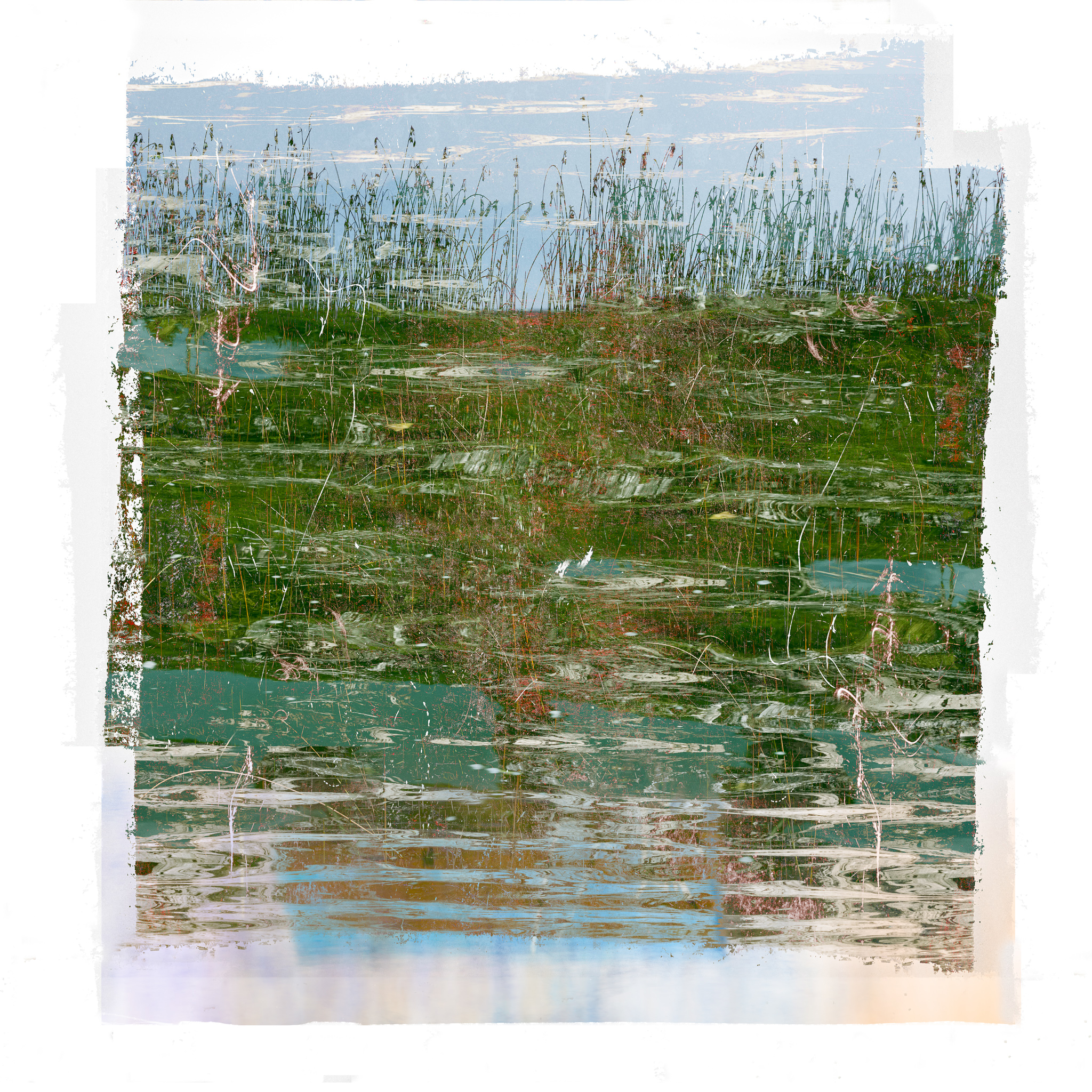
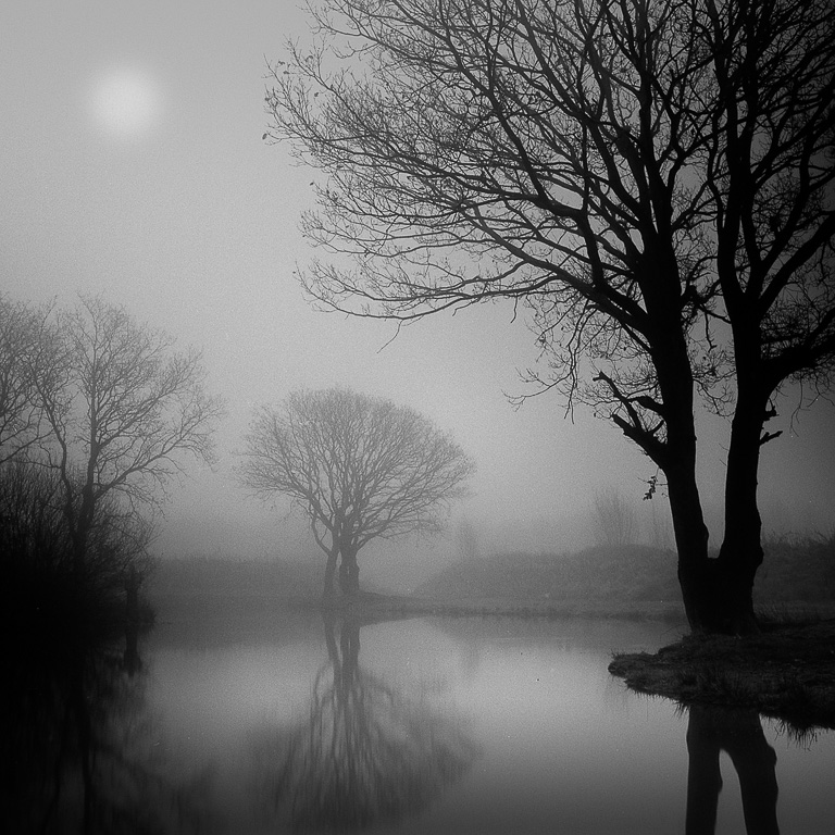
Thirty minutes walking from home, there is a pond used by a Fishing Club. It's an exceptional place to make regular visits. At dusk or down, the location offers very good conditions to try to show the different moods of the place, depending on the time of day, weather conditions or the changing.
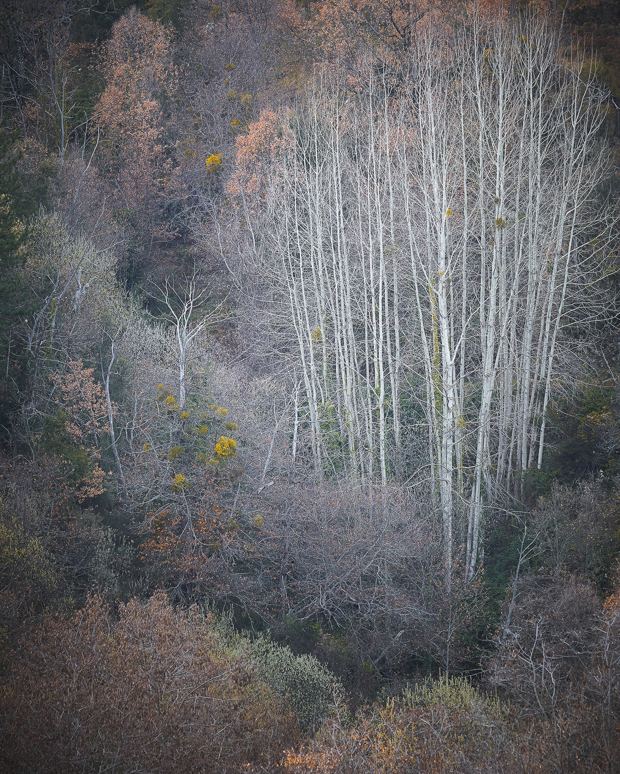
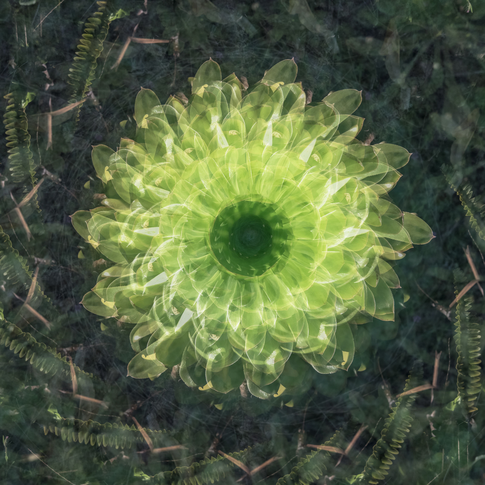
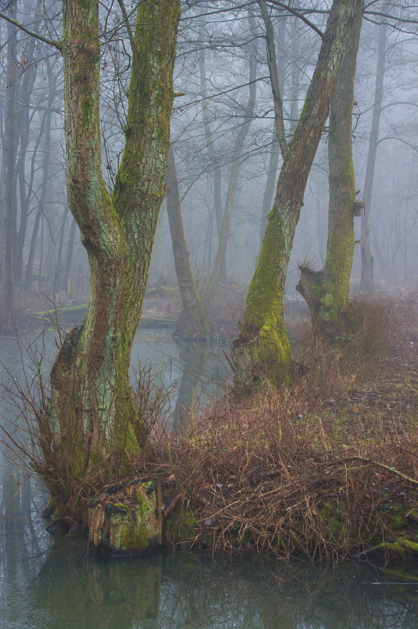
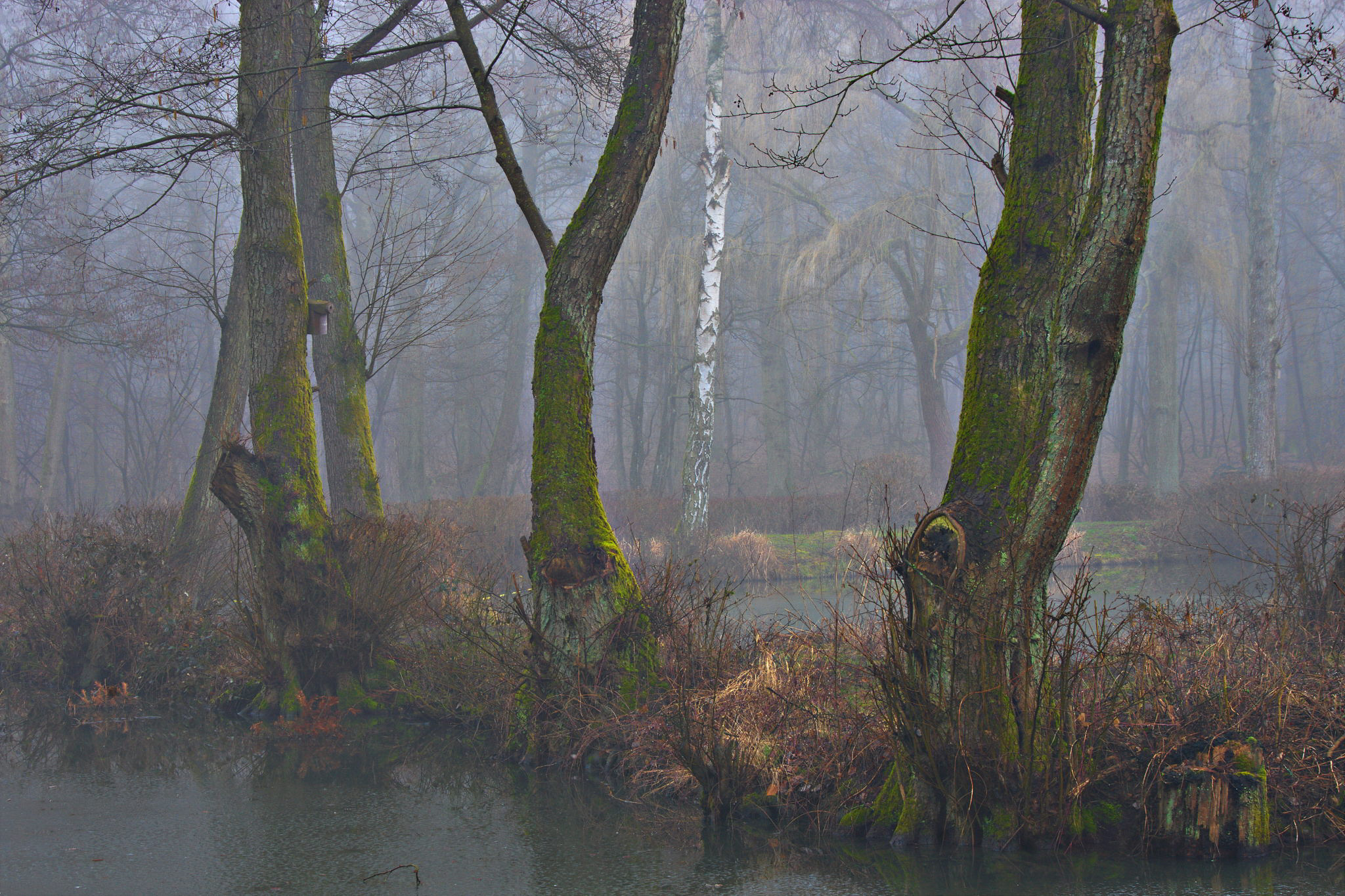
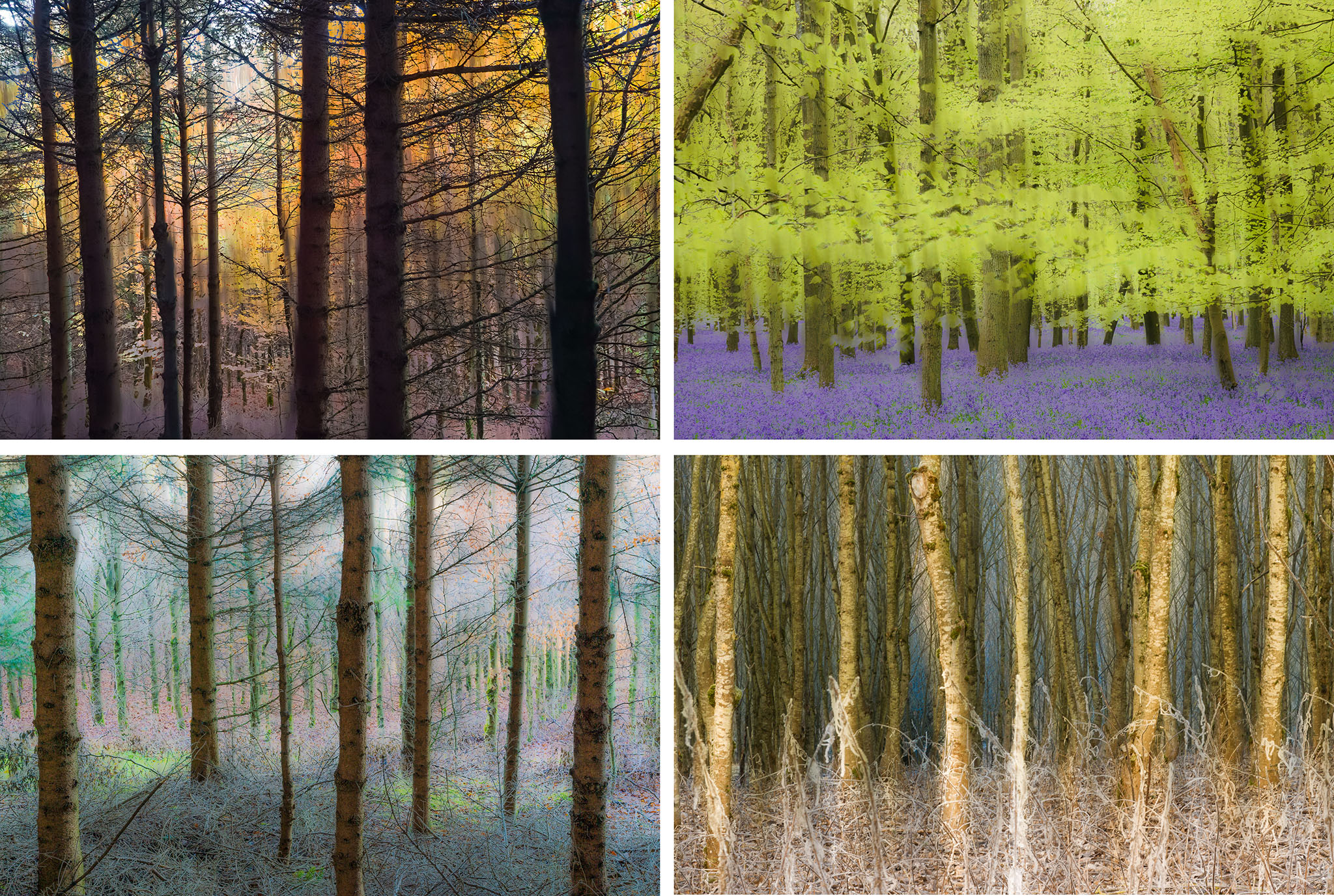
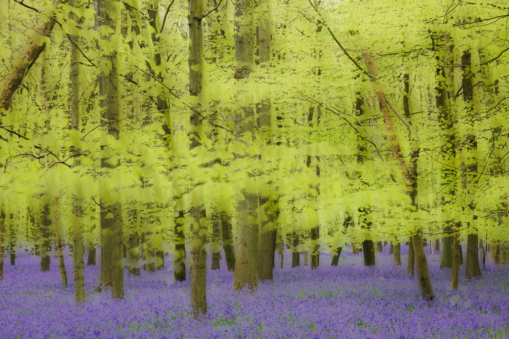
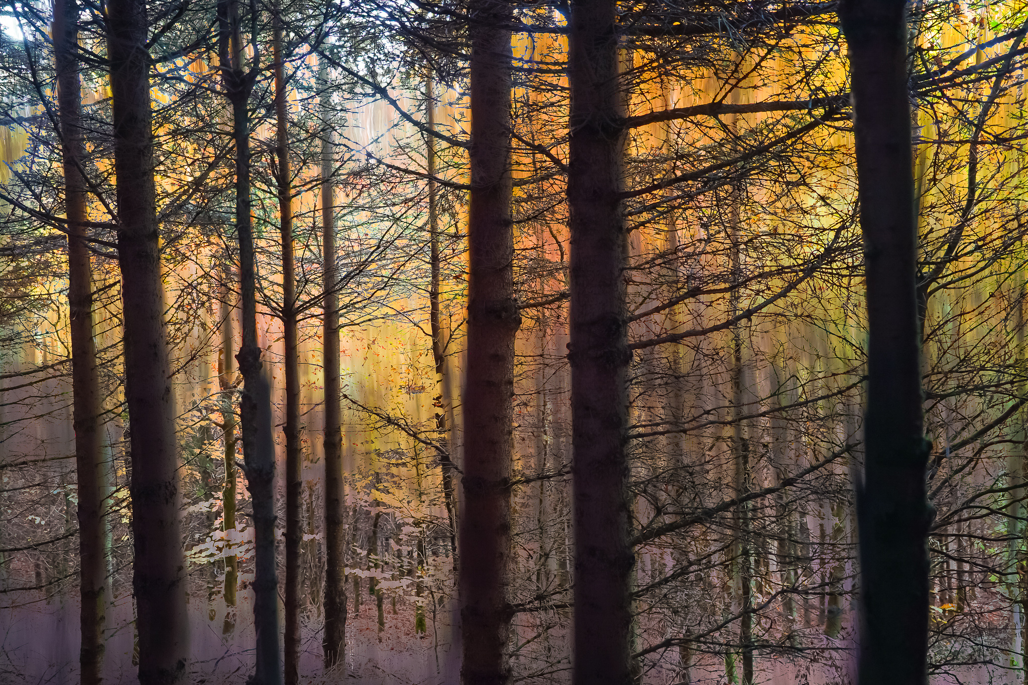
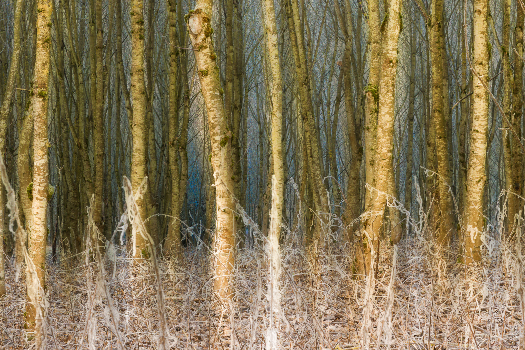
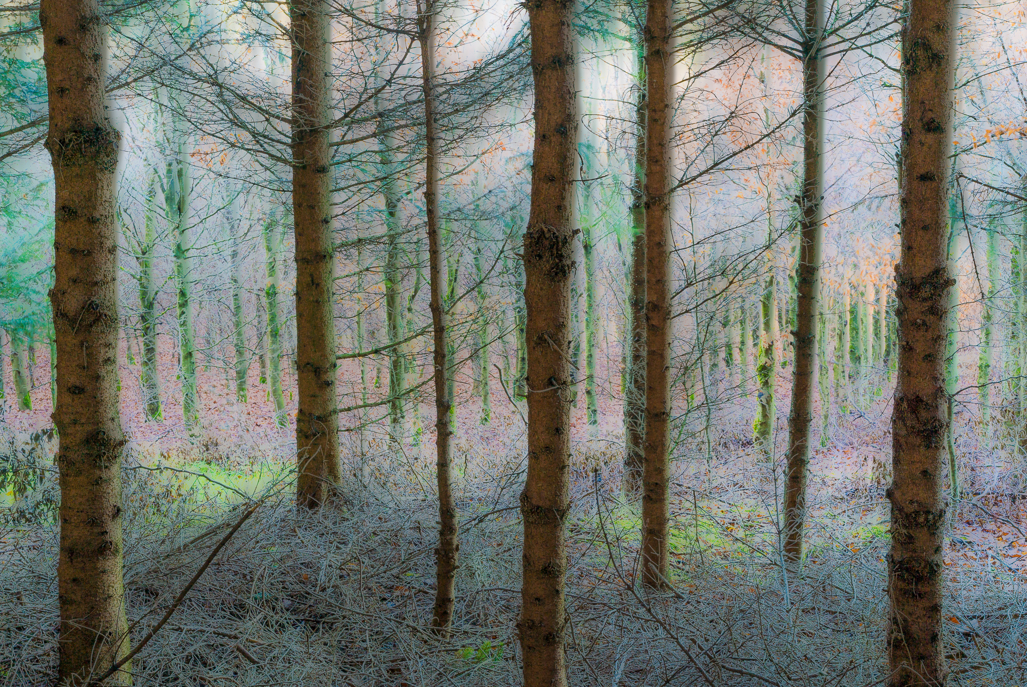
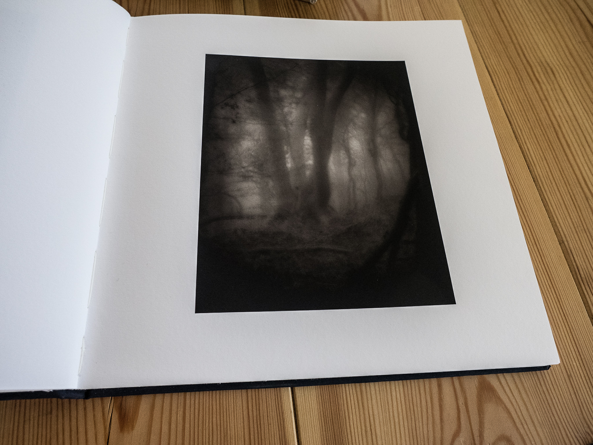
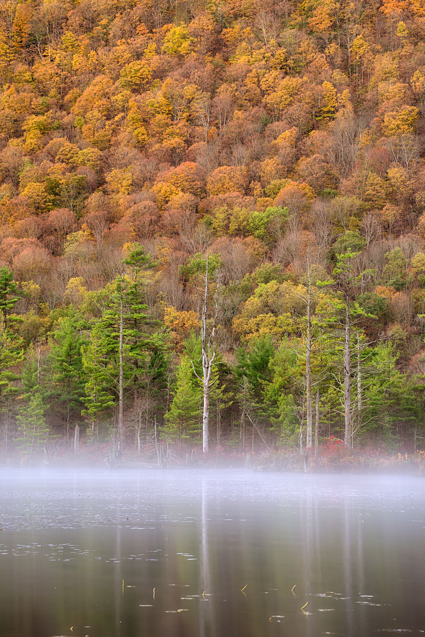
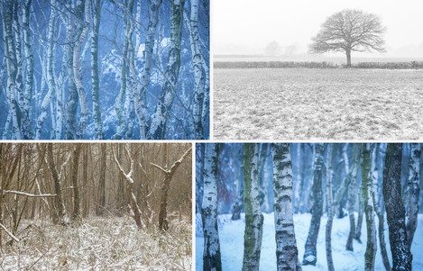
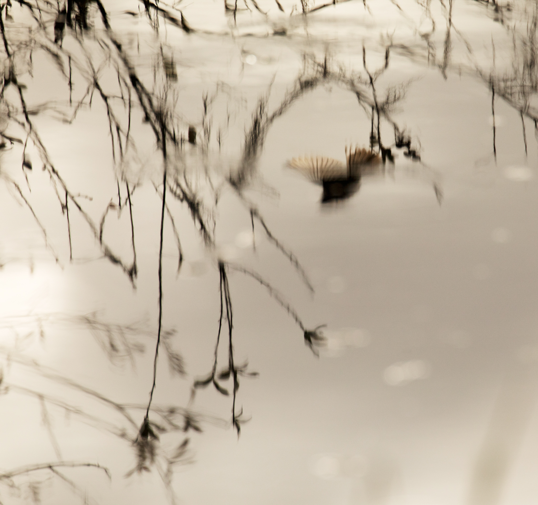
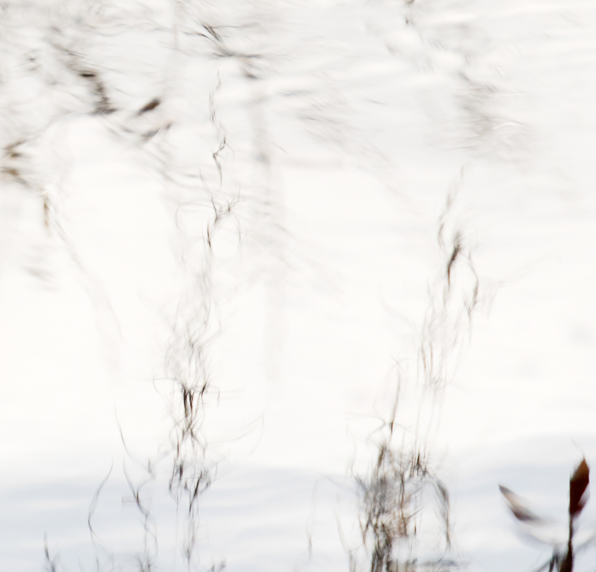
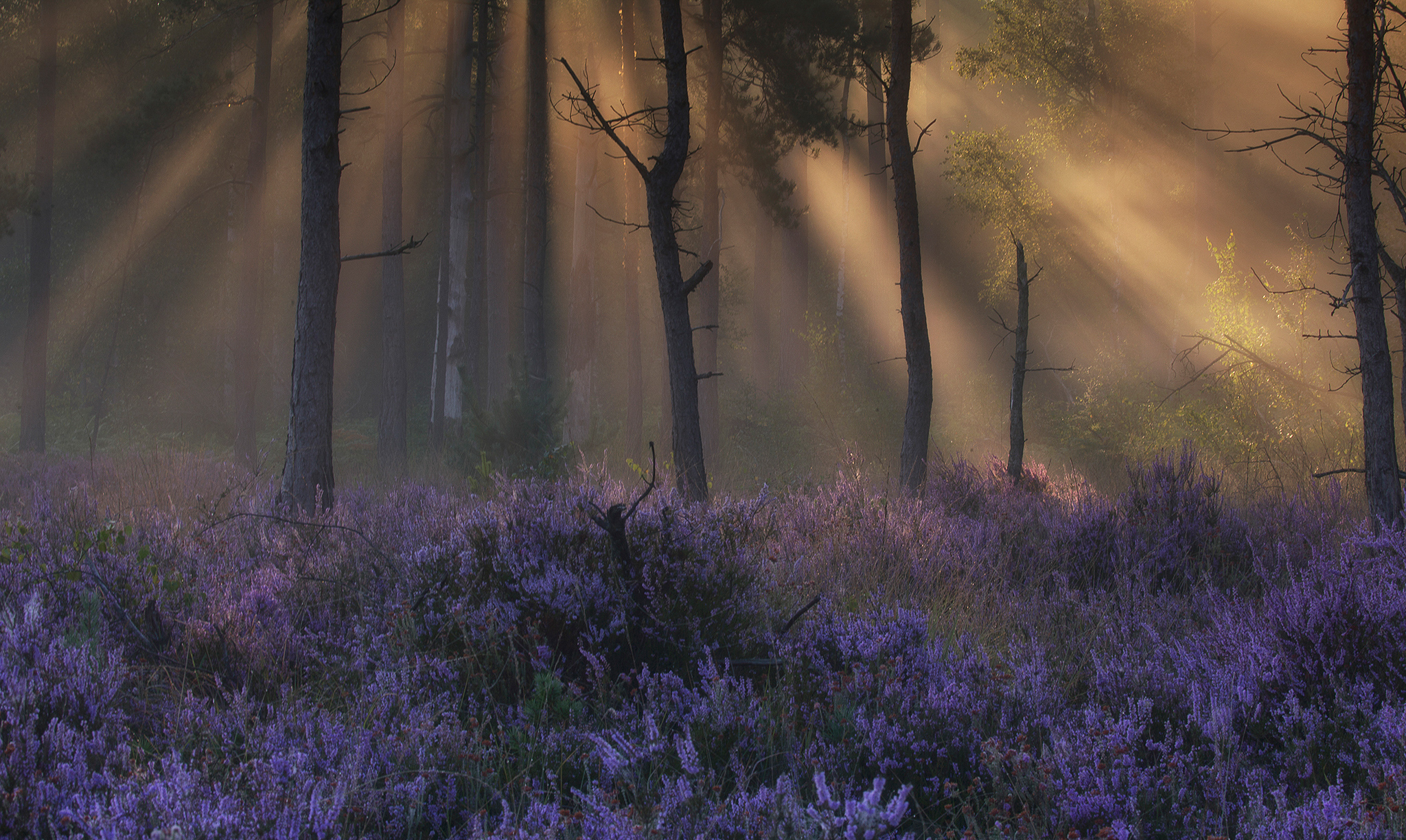
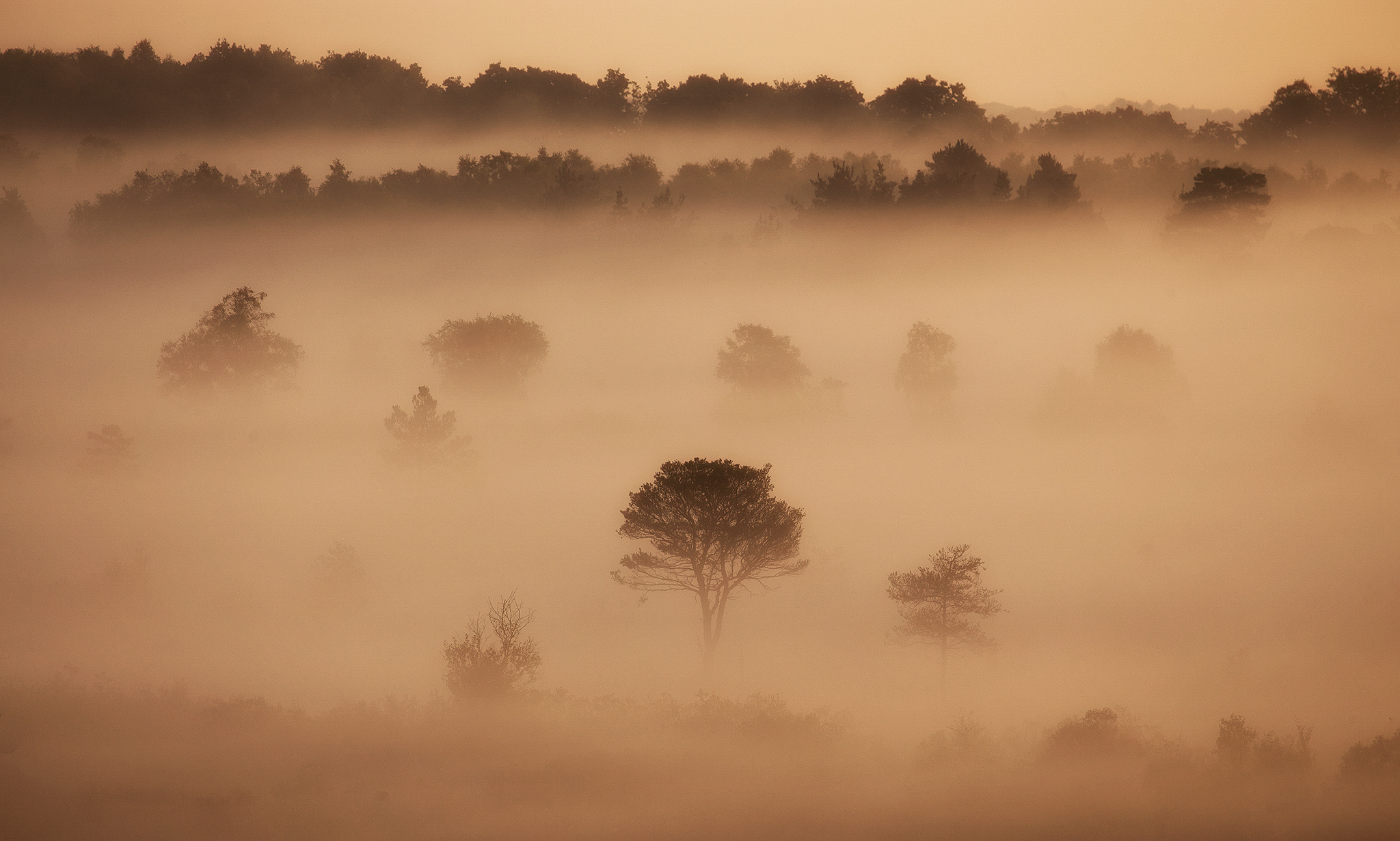
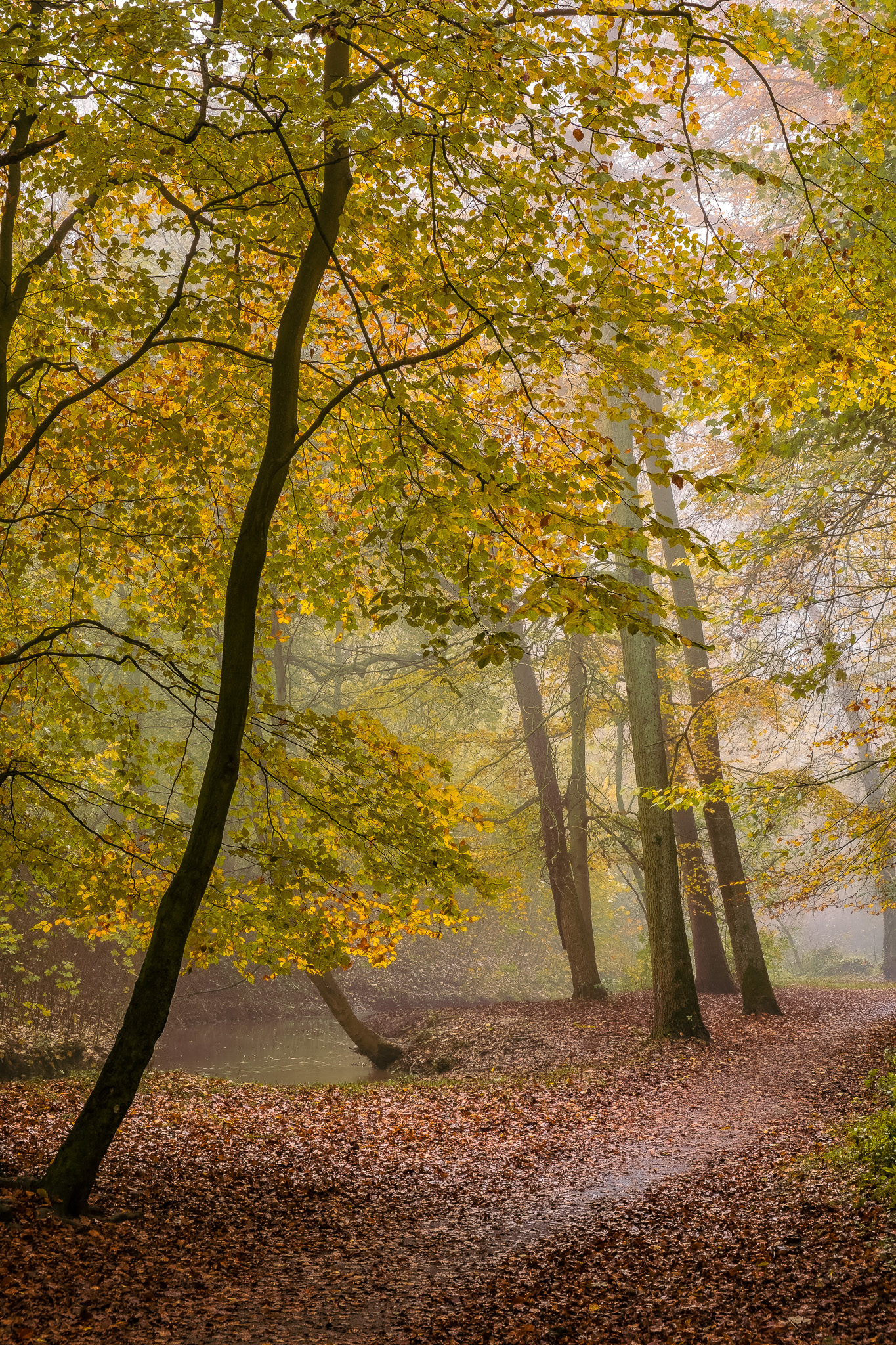
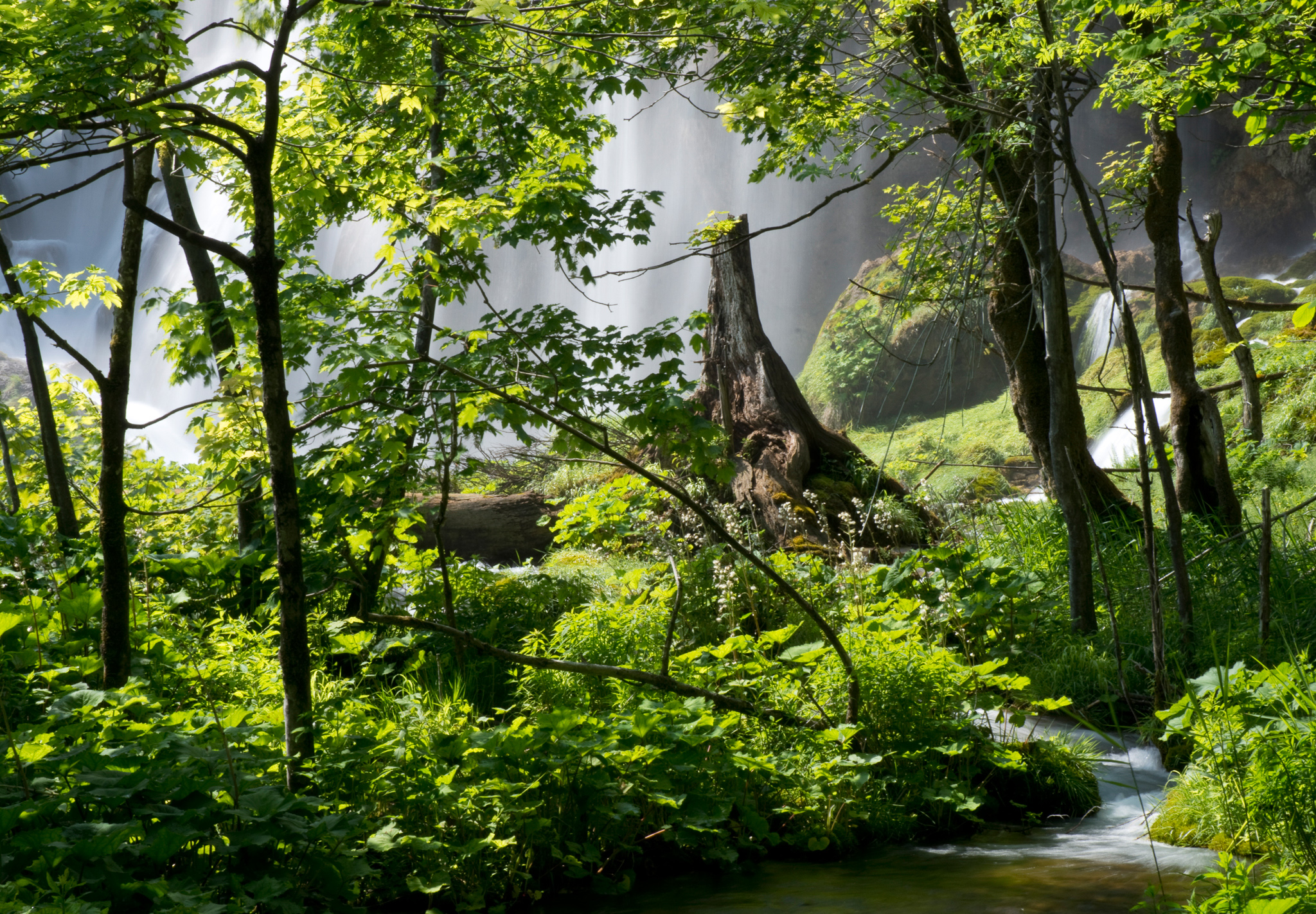
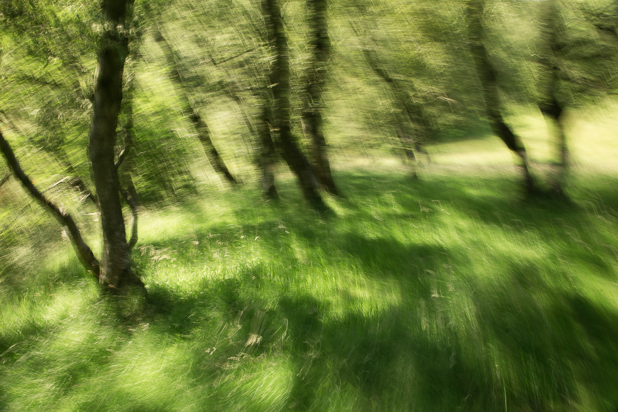
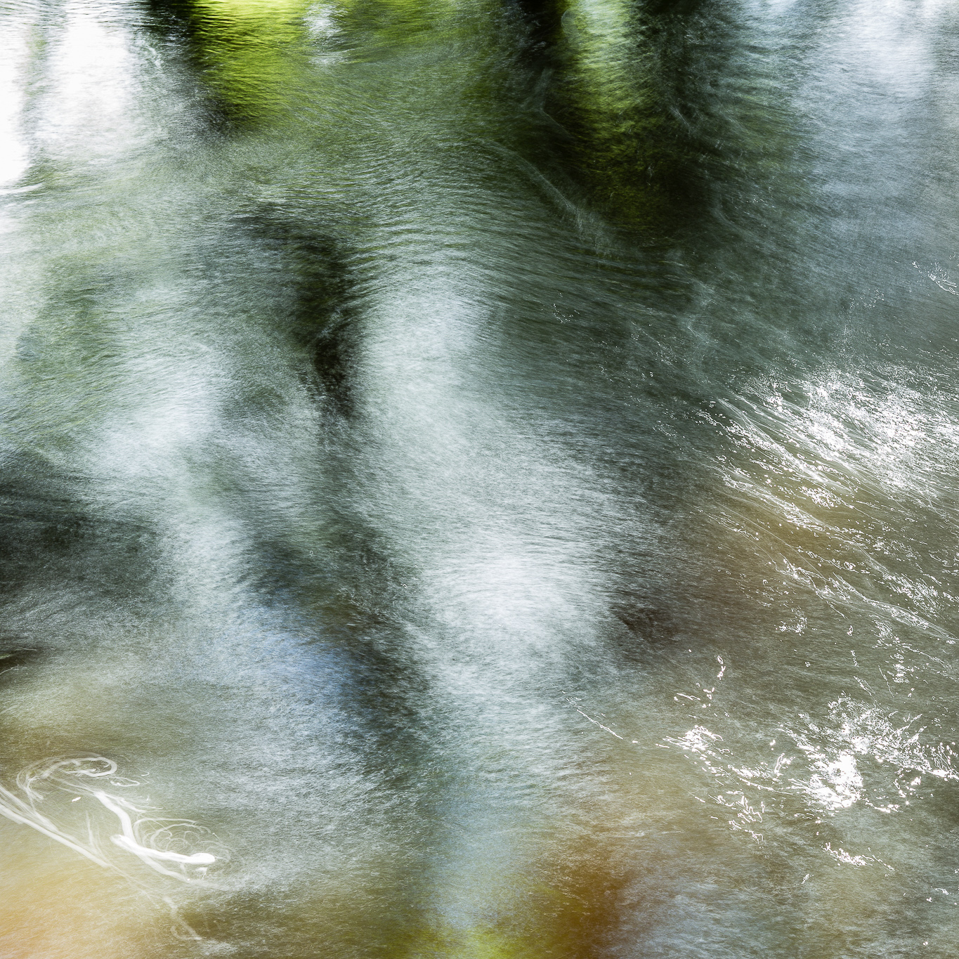
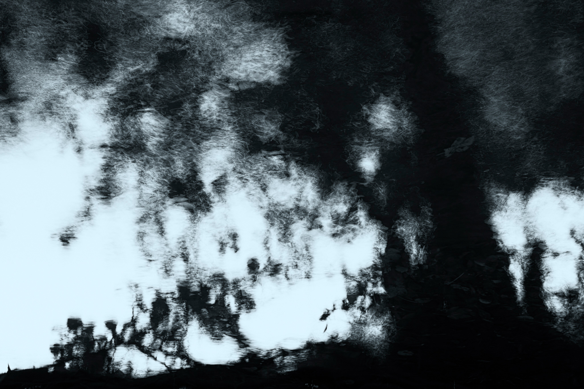
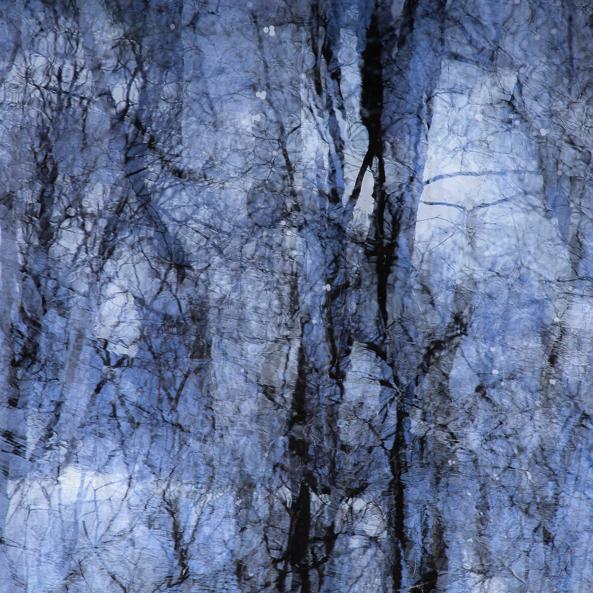
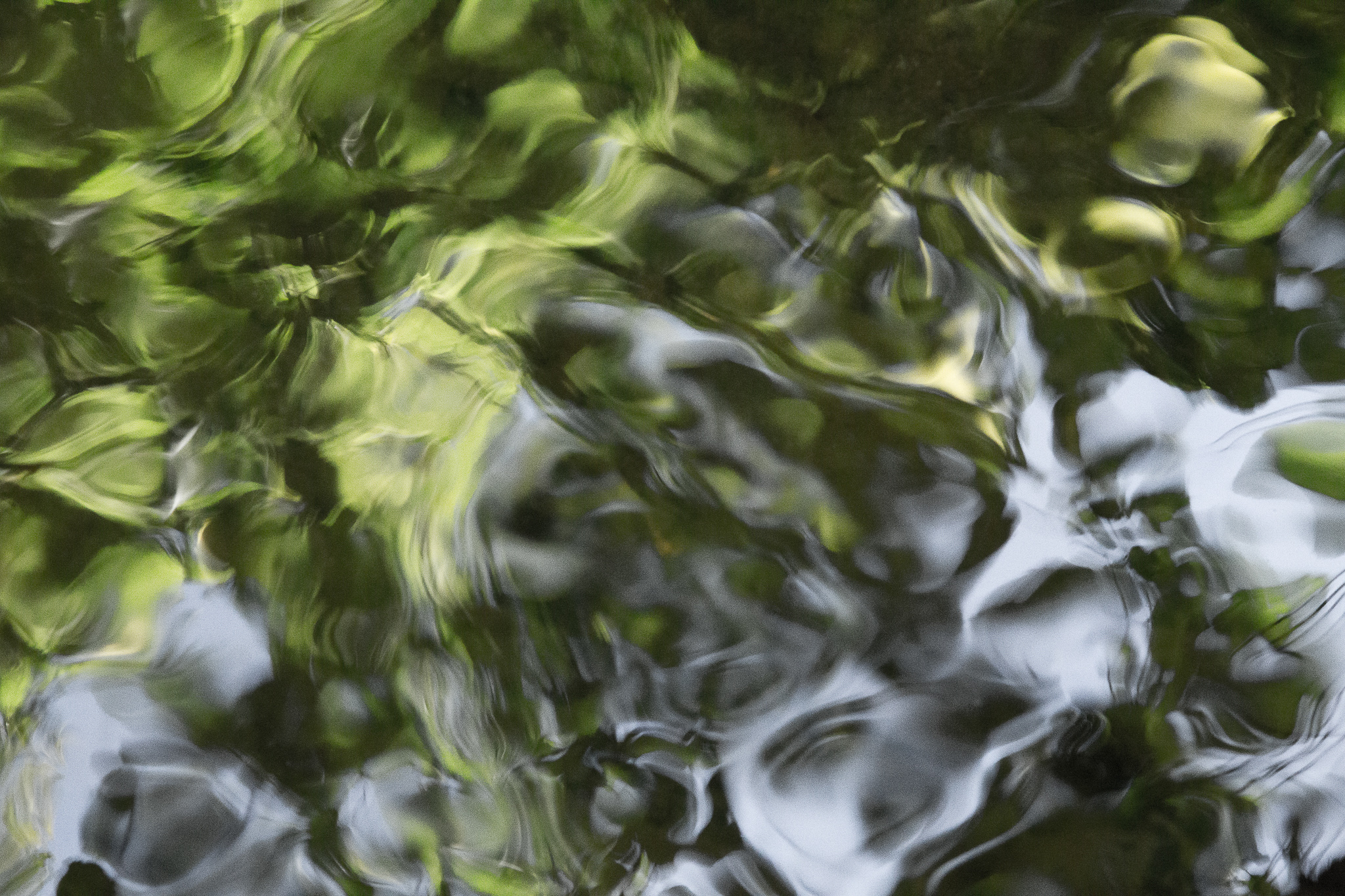
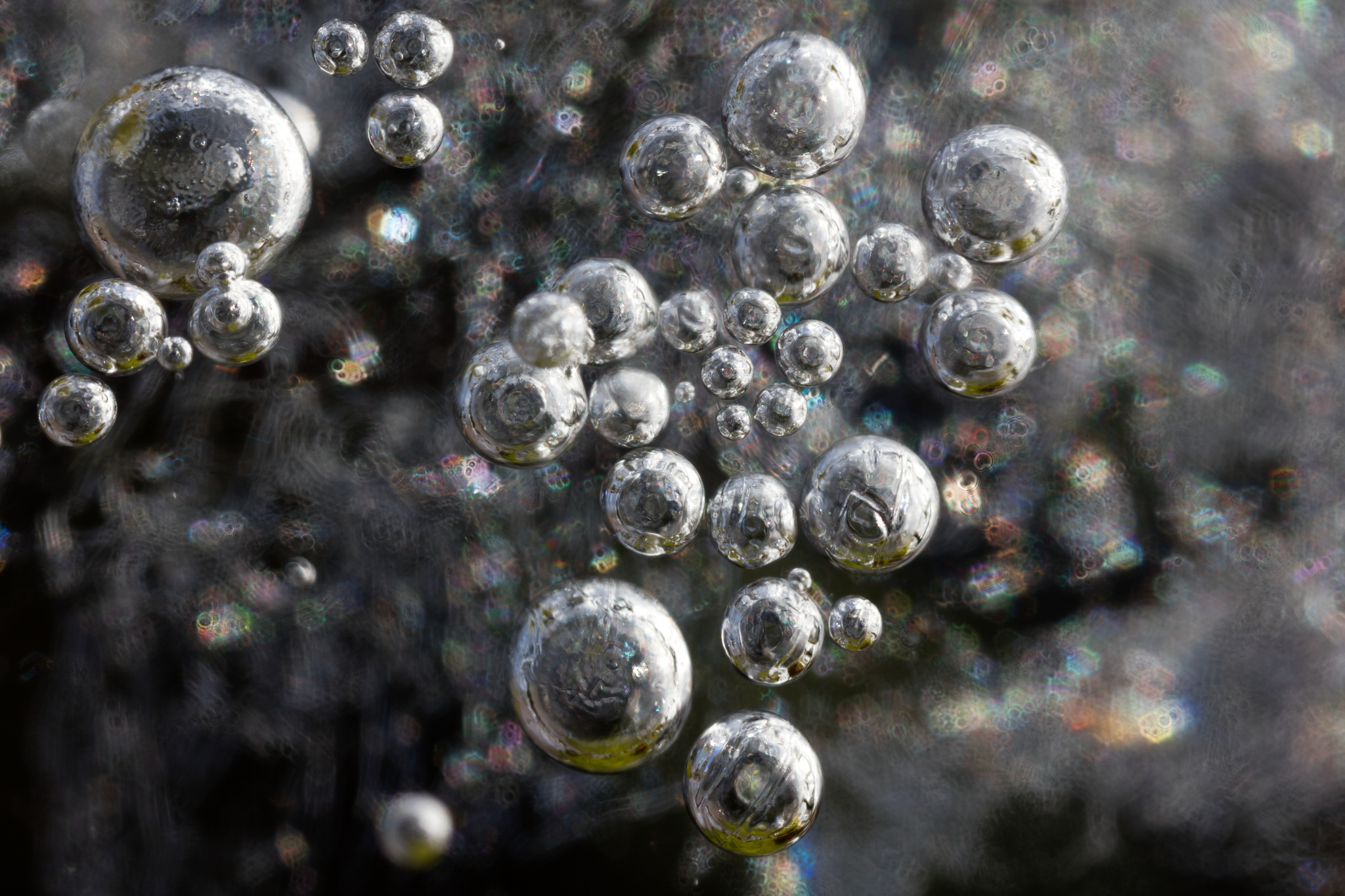
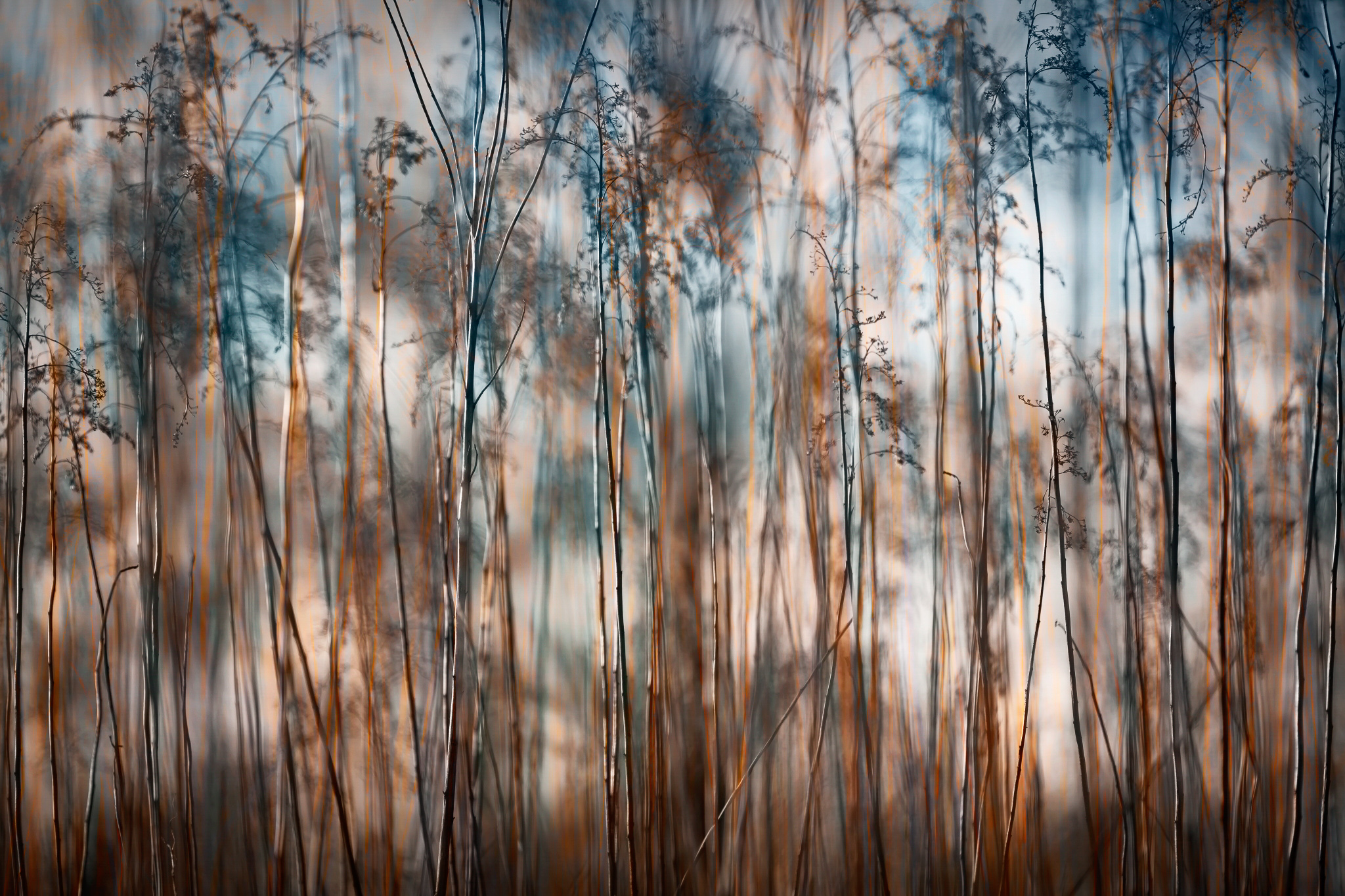
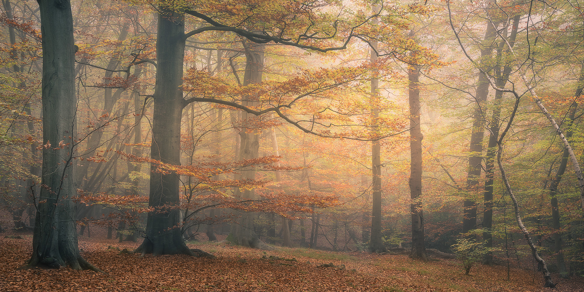
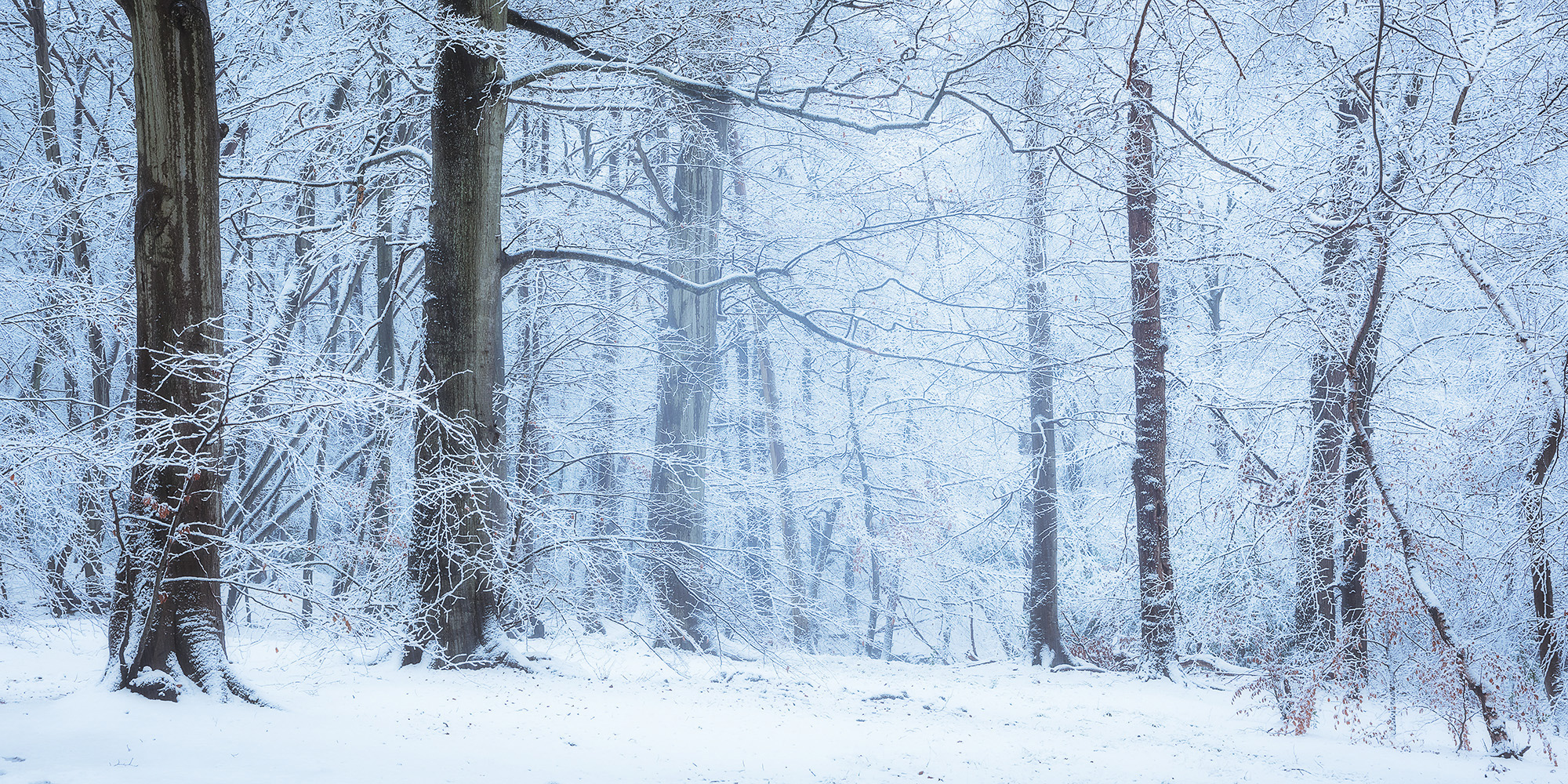
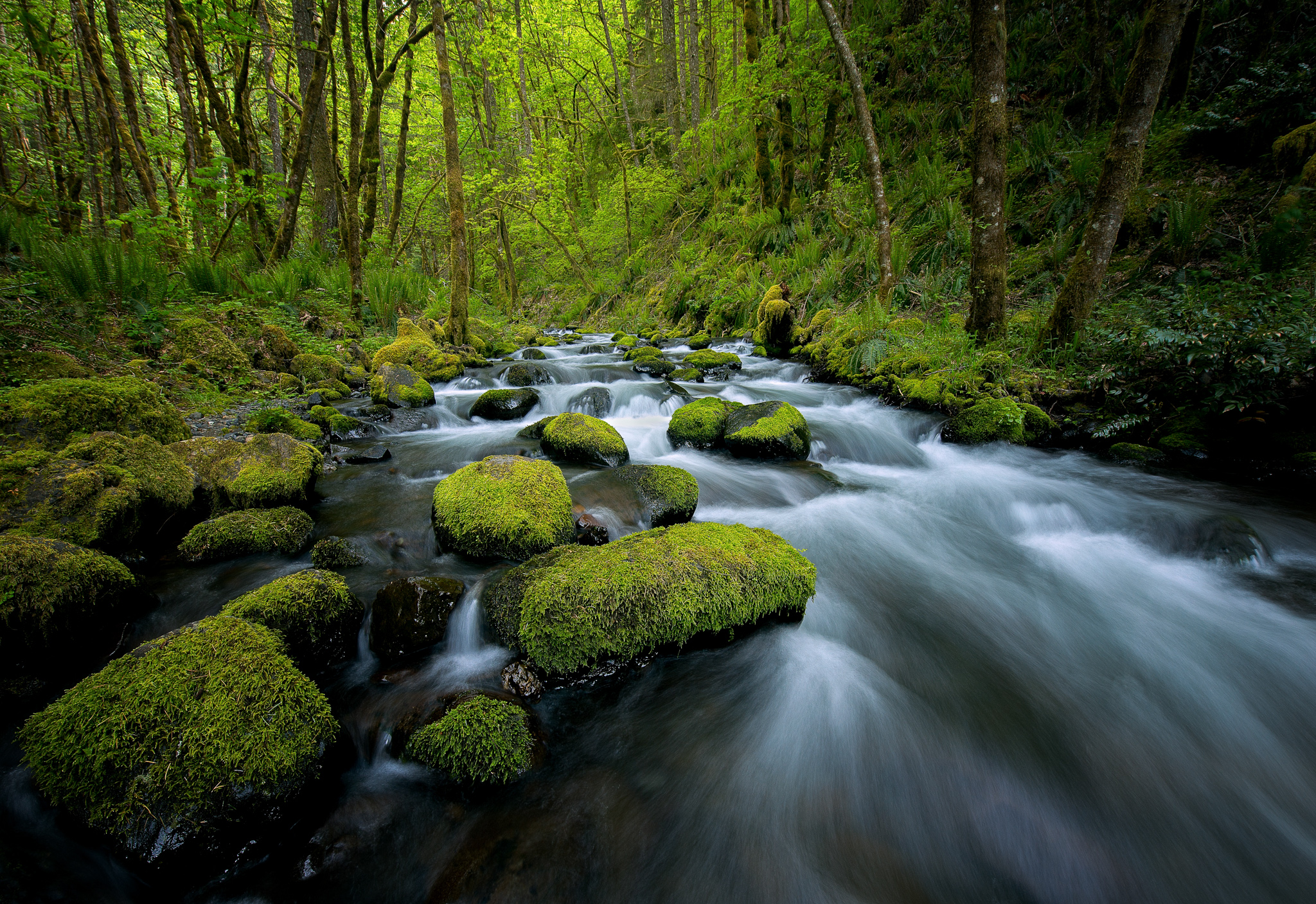
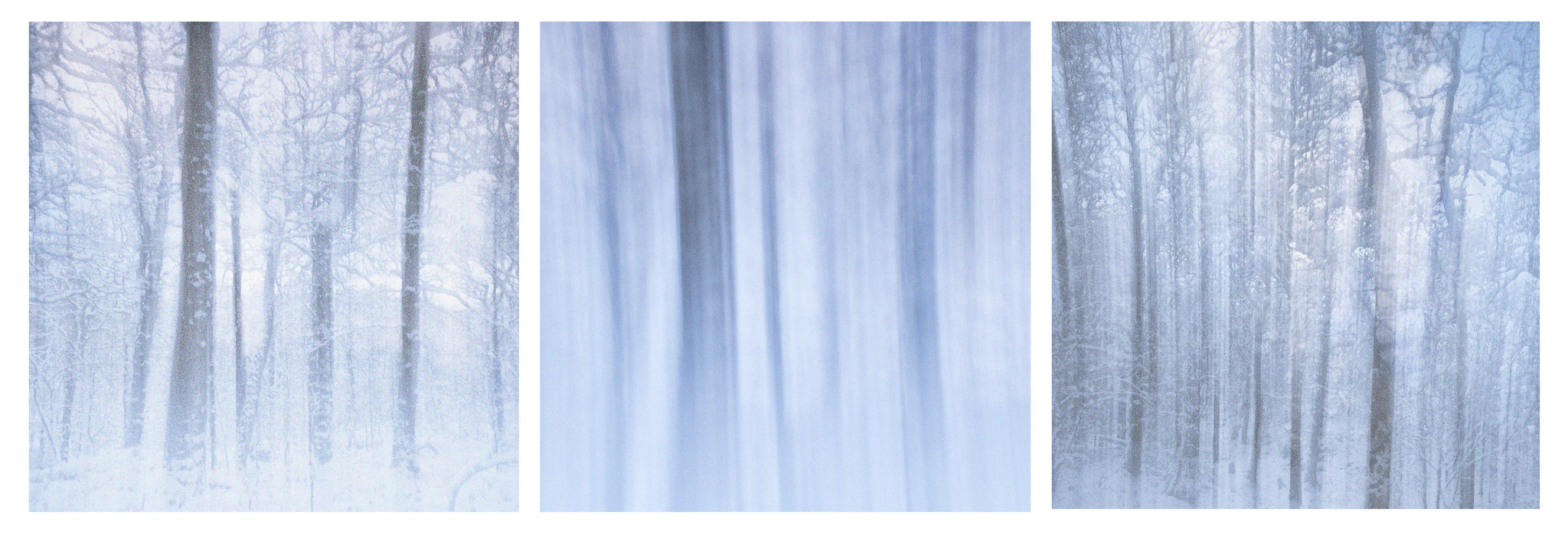
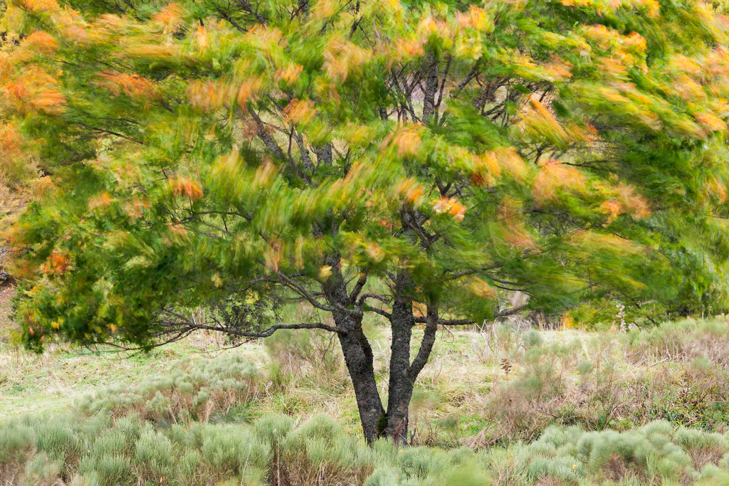
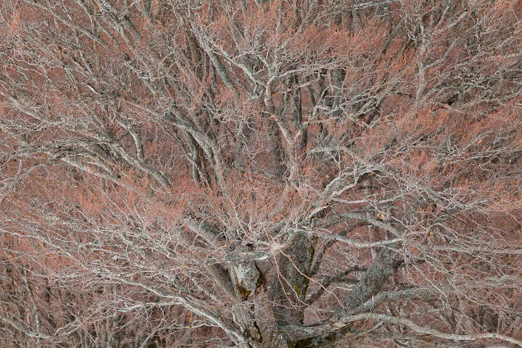
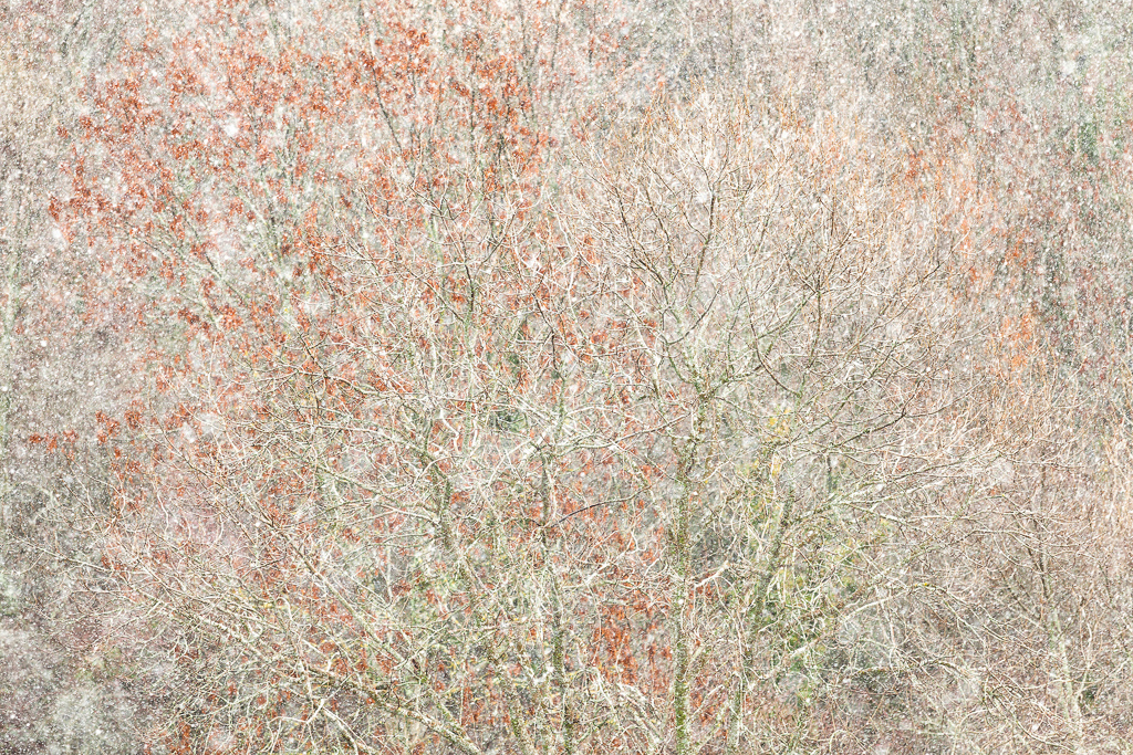
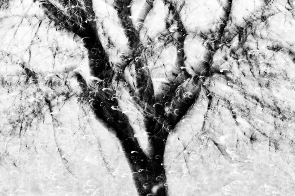
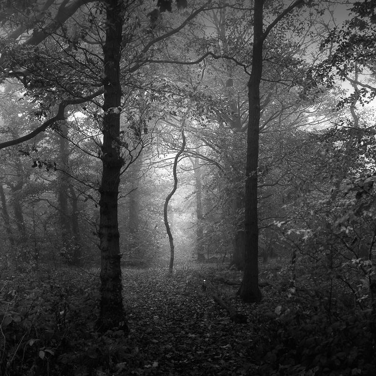
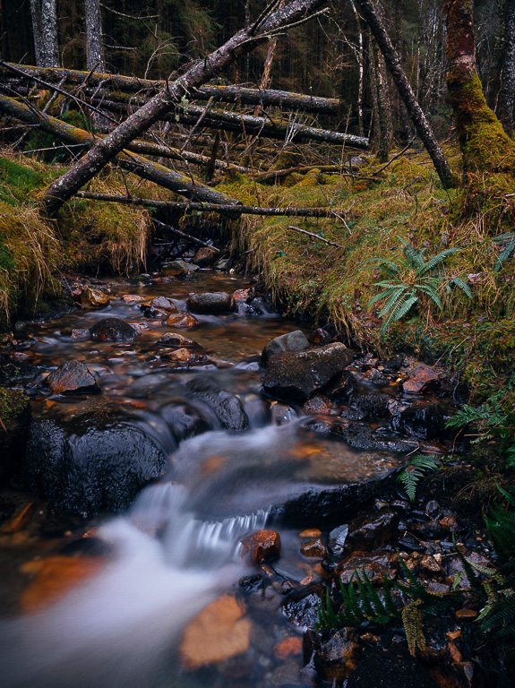
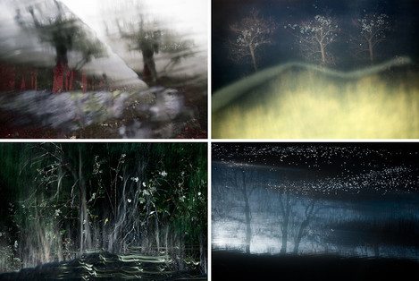
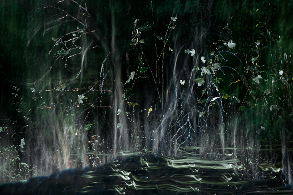
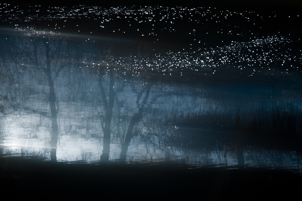
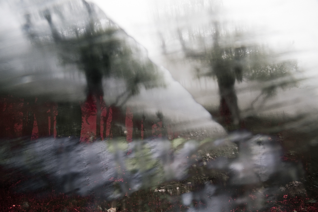
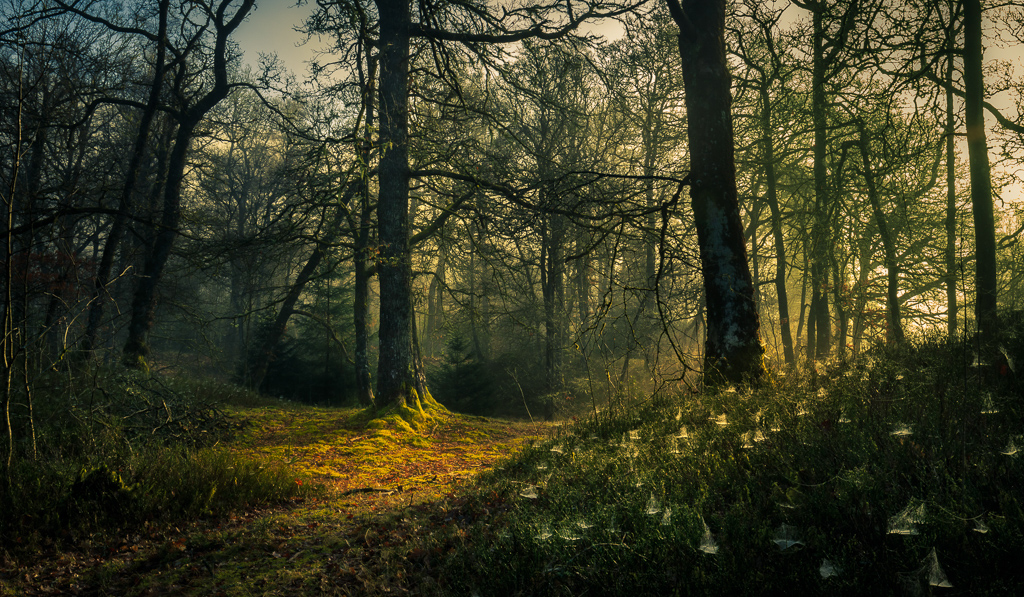
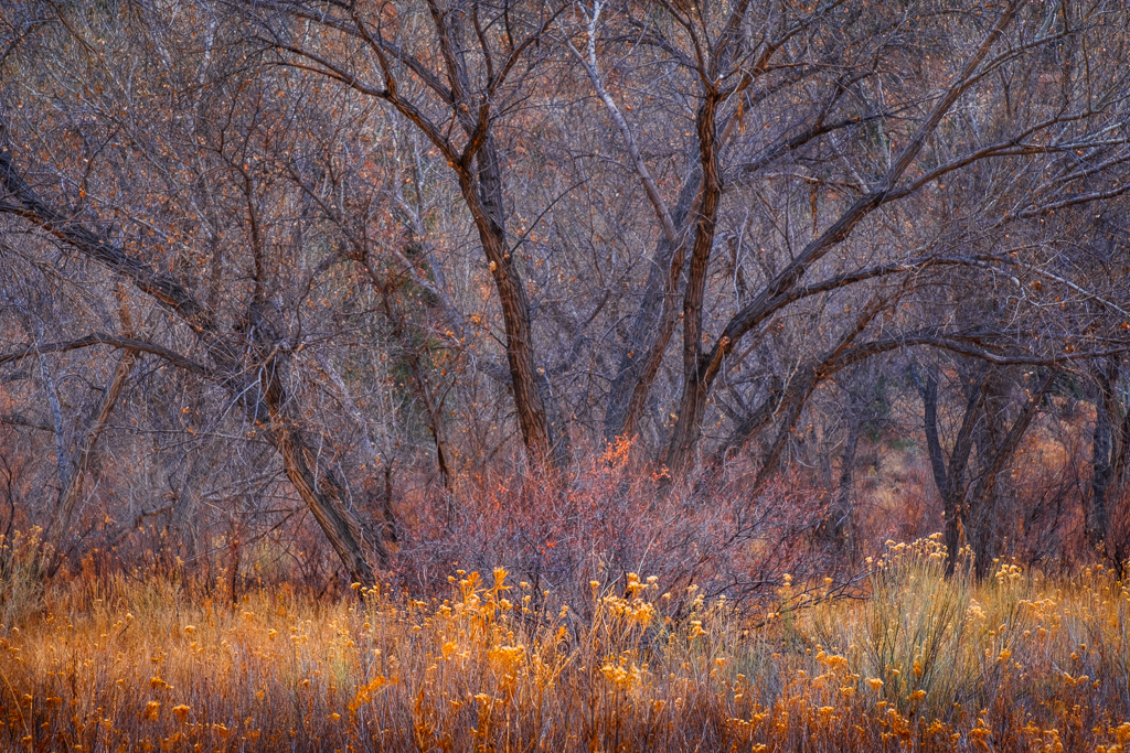
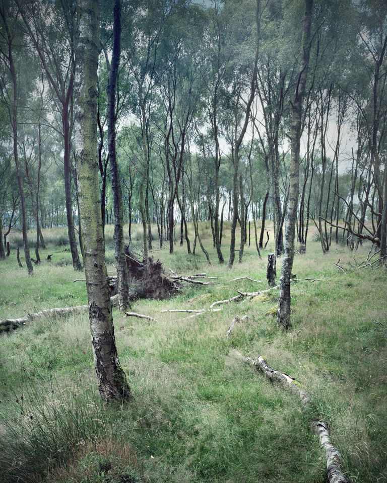
For me, photography is a way to enhance activities I enjoy, and one of them is walking alone in forests. Last year, I started making images of forests to try to capture the qualities that make them so infinitely fascinating, and convey the sense of solitude, depth and discovery that I experience there. In the forest, the viewer is surrounded, and both seeing as well as passing through. Is it possible to capture this experience in a flat rectangular image?
I started by taking single exposures, but quickly abandoned that for in-camera multiple exposures because for a long time, I’ve been fascinated by John Blakemore’s poetic tree landscapes, using multiple exposures of the same scene (between 5 and 50 exposures).
Unlike Blakemore, I am limited by the number of exposures that my camera is willing to take. But I can exponentially enhance the contribution of each exposure by using intentional camera movement and long exposures. I also have many options on how I chose to layer the images to make colours interact and blend in the camera, and am able to explore what happens to colour and depth when the images are overlaid.
The forest, depending on the season and time, is bleak and still, with all the bones of the trees exposed, or it is backlit, vibrant, and rustling with movement. I’ve been trying to find diverse forest settings, but even so, many of the results that emerge in my images surprise me. The in-camera movement and multiple exposures reduce unwanted detail and create a natural ambiguity that seems more akin to the subjective natural gaze than to the ever increasing precision of the modern digital camera.
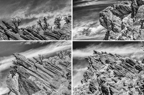
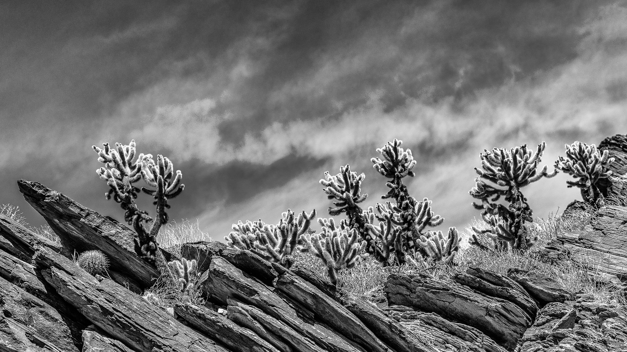
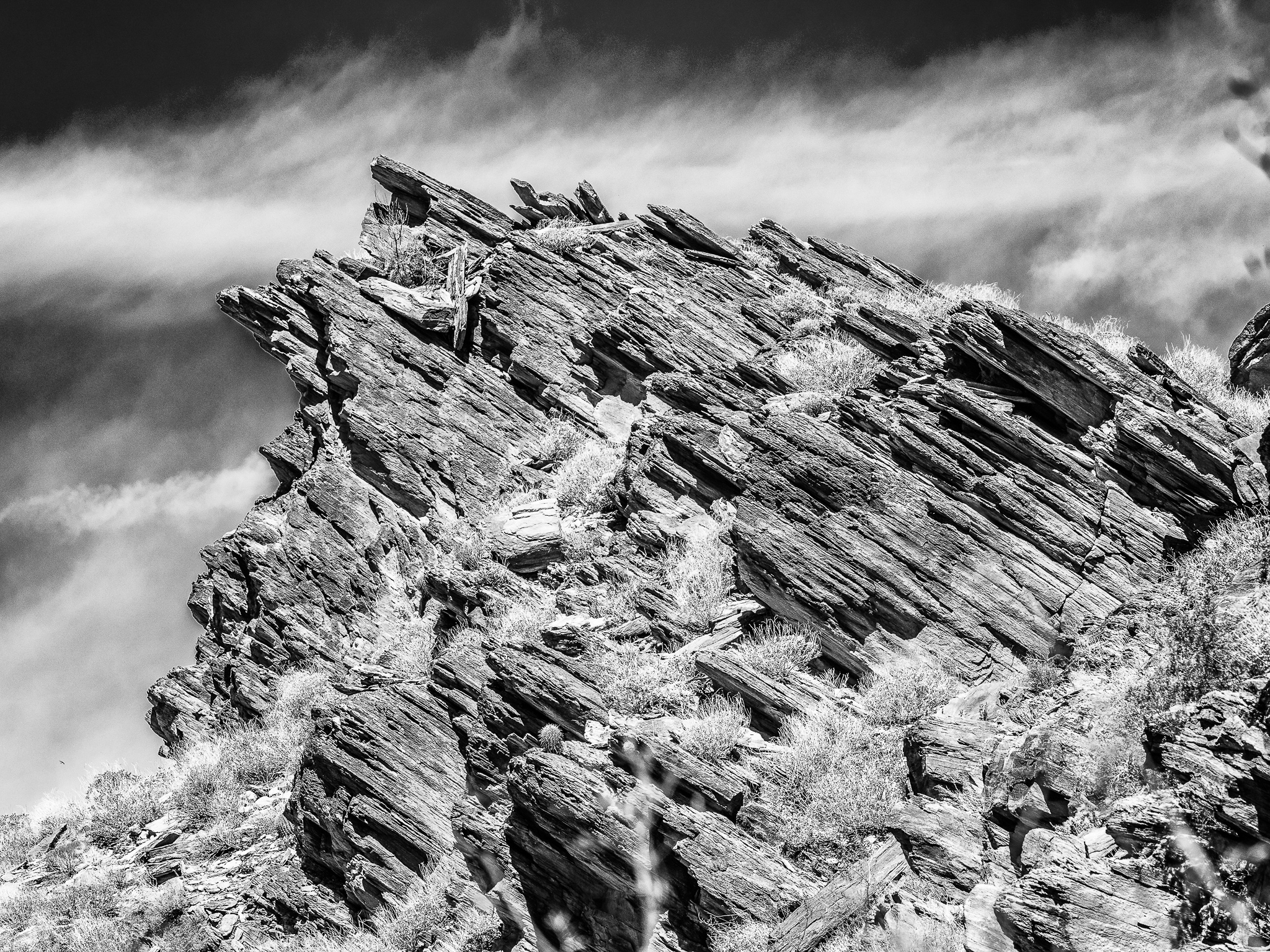
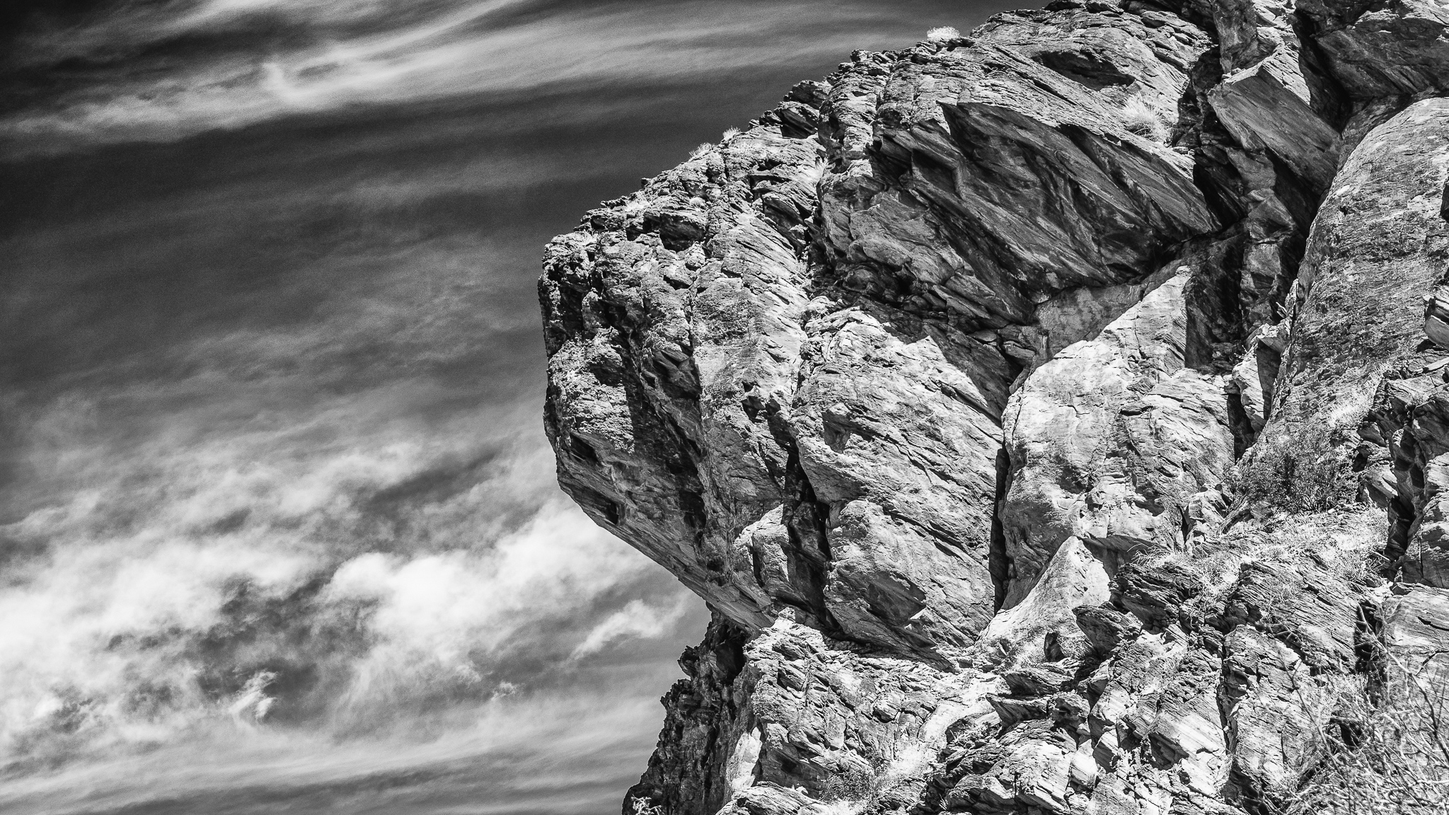
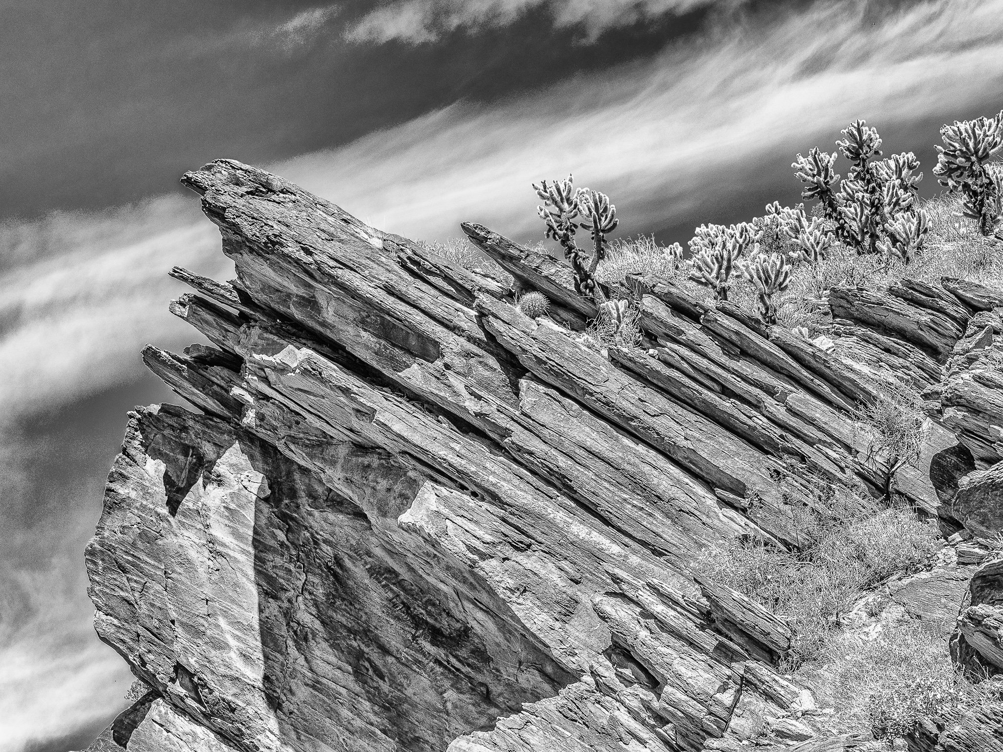
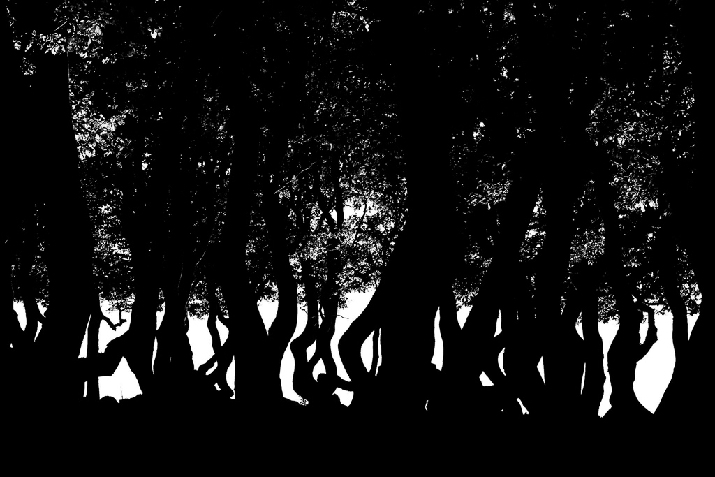
The area around the San Andreas Fault line is a must-see for any photographer passing through Southern California. From jagged canyons and protruding rocks to hidden creeks and secluded oasis’s, this assortment of landscapes inspired me to make this recent collection.
Choosing to stick with black and white photos, these shots show the mystery and drama behind every shadow, crevice, and detail whilst creating an almost otherworldly atmosphere to behold. These photos were shot in the Andreas Canyon near the Palm Springs, California.
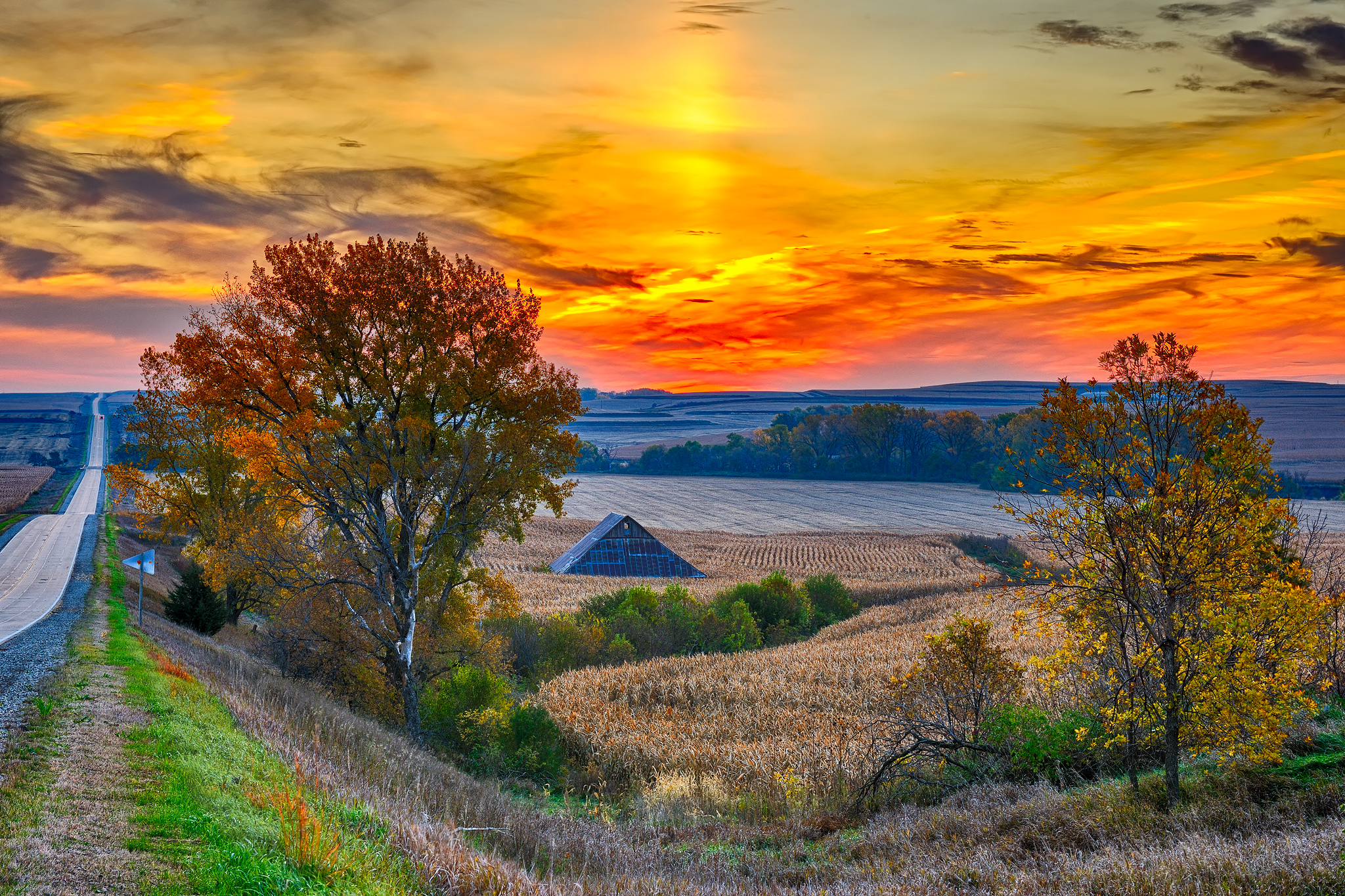
The middle part of the USA is often referred to as Flyover Country by east and west coast air travellers. It is also known as the Midwest and the Plains States. More often than not this vast agricultural area is discounted as having little to offer in an aesthetic sense - a kind of vast wasteland in that regard. These late fall and early winter images from various locations in my home state of Iowa are illustrative of what the Flyover folks are missing.
In the course of my working life, I have been gifted with the opportunities to live in many different parts of the United States. I loved Colorado, Arizona, Texas and the Southwest. However, earning a living that would support me and my photography in the iconic areas that held my affection was a bridge too far. Returning to life in Iowa became the object of my photographic affections. And Iowa has loved me back like no iconic location would. My personal style of photography is not so much a product of or equivalent to the famed photographers that are household names.
However, Ansel Adams was the first photographic icon that influenced my early ventures into the world of black and white film photography with the zone system, and the attendant first magic of the darkroom developer tray. The greatest encouragement for me comes from the world of paint and canvas. Grant Wood, Claude Monet, Paul Cézanne, Norman Rockwell, and Andrew Wyeth celebrated simple landscapes and nature’s gifts with realism and impression, colour and thoughtful composition, but most importantly - lighting. As a professional photographic artist pursuing my passion I have experienced the joy of having hundreds of my photos published in glossy local interest magazines, architectural projects, wall hangings, as well as receiving thousands of daily visitors to my websites. I want to encourage other photographers to express their personal, artful view of the world without needing to travel to exotic or iconic destinations.
I contacted Kevin early in 2017, but as he was in the midst of a hasty departure from the East Midlands (I hasten to add he wasn’t on the run) and searching for a new home in West Dorset we decided to wait. Now that he has a house and a newly plastered and painted office, his computer and files have emerged from storage and we thought we would pick up on the conversation. Last time I moved, photography did not occupy such a major part of my day to day life, so I can only imagine how frustrating it must be to have to put everything on hold. But I wonder too about what might come of an enforced sabbatical and whether less time and less gear for photography can have hidden benefits. If nothing else, it may give us chance to take stock and make new plans.
You don’t say a lot about yourself on your website, and I know that you’ve said you don’t like talking about your work. I’m hoping we can persuade you to share a little more with our readers. Can we start with a little background about you growing up in West Cornwall and how this influenced your early interests, education and career?
Firstly, I am very proud of my Cornish roots and felt very lucky as a child to be living in such a beautiful and dramatic part of the UK. We didn’t have a lot of spare money in our family so holidays tended to be spent close to home. There were certainly no foreign trips (although I did visit Yorkshire a couple of times!). The thing I remember most from those days was the sense of freedom in the landscape and what we could do in it. Big skies, Atlantic swells and huge seas, hidden coves and beaches, moorland and open countryside. Places to explore. Places to get lost in. There is a sense of magic – a special quality of light and air that many visitors to West Penwith often remark on. We were fortunate to be in touch with it all the time. It seemed to seep in somehow and colour the way we saw life. Days seemed endless.
For many years I have collected books of photographic images. I love them. And all those years my photography has been centred around me as a print-maker. But the walls and clamshell boxes fill up and the occasional exhibition, sale or gift of some treasured print did little to stem the burgeoning inventory.
And then about five years ago I read an article by Brooks Jensen the editor and publisher of the wonderful Lenswork magazine. This introduced me to the world of handmade artist’s books with beautiful papers and bindings that were a lovely way of presenting your images. He particularly championed the concept of simply bound ‘Chapbooks’ which are just a few pages long.
And digital printing is ideally suited to the medium of a one-off book. The quality of a well-crafted digital inkjet print will easily surpass almost all commercially printed books. The paper choices, especially if you stray from the usually coated inkjet papers, are myriad and delightful. Any photographer with some persistence and a few tools can turn a collection of their images into a crafted original artefact.
A year or so later I did an awesome digital negative and platinum printing workshop with David Chow at his home. This brilliant and generous teacher, who sadly died far too young, showed me his collection of handmade books by 21st Editions of New England. I particularly remember the exquisite Sally Mann book of beautiful bound original platinum prints that took my breath away. And perhaps it should as these editions sell upwards of $15,000 a time.
But we all know what the feeling is like when we view something we perceive as perfection. We know we never could achieve that standard, but we know it exists and that it can be done and it will forever form the aspiration and benchmark of our own work.
Handbound artist books now represent most of my photographic output. I think I am confident their legacy will be longer for my heirs than any of my stored boxes of prints, whilst taking up a lot less room and being immensely satisfying to produce. I like the idea that the images have to stand as a cohesive whole and not just a collection of ‘greatest hits’. I like the idea that they must be considered and sequenced. In binding a book with its oft considerable cost and labour you are making a statement that you do approve of the images and that they are finished – it helps to subdue the ever-present self-doubt. I like the feeling of working without an undo button where a careless mistake at the bookmaking process can wreck all your expensive work so far – just like it was in the darkroom days.
As well as sharing my experience with making one-off artist books I will also give some suggestions as to how you may have smallish quantities of books commercially printed for exhibitions, publicity or for sale. It is quite possible to economically self-publish a book of your images – you just must find a way to harness your social media and other resources to market and distribute them.
The Design of the Book
The basic structure of the book is dependent on the number of images, your bookbinding skill, the tools available and your personal taste. The number of ways of designing and constructing a book is endless and a short article like this will always be inadequate as instructional material. I can only advise that you buy a couple of books about bookbinding among the hundreds available from your local bookseller or Amazon and start reading and practising. As a start, I can recommend ‘Bookbinding – A step by step guide’ by Kathy Abbot.
And, of course, the internet is your friend as a treasure trove of instructional material and inspiration.
A short workshop at a local bookbinder or art college will be an invaluable help but ultimately the only way to learn is to start making some simple books yourself.
Some styles that I have used are as follows;
Accordion or Concertina Book
One of the simplest forms of book construction consisting of a continuous folded sheet of paper folded back and forth in page widths which is often pasted into a cover.
Stab-Binding
This Japanese method of making books is an excellent place to start. The book is a stack of single unfolded sheets and is simple to make and bind an elegant book.
Single Section Bindings
This would comprise a single set of folded papers sewn together to form a book block. It would often have a cover that would be bound to the section separately.
Multi-section Bindings
As the number of pages gets larger most books will then necessitate the use of two or more sections that must be sewn together. This also would usually have a hardcover bound to the book block.
Book Materials
A huge variety of paper and board using in the construction of a book is available from sources like Shepherds or Ratchfords. When printing photographic images, the obvious choice would be the increasing number of double-sided inkjet papers available. These papers can be expensive so I can recommend the Fotospeed Duo papers, the very economical Bockingford Inkjet Watercolour paper and Ilford Premium Matt Duo as good value reliable starters. Many of the Japanese inkjet Awagami papers are also double-sided.
Non-inkjet coated papers can, of course, be used to beautiful effect but with the inevitable loss of contrast. Some wonderful old and rare book papers which inkjet print well are available from www.vintagepaper.co as well as lots of other bookmaking supplies.
ICC profiles for printing are available for the coated papers but if you have the facilities you may wish to produce your own for the uncoated papers. Especially with these, it is important that you pay attention to soft-proofing, micro-contrast and sharpening to get the best output.
An early introduction to papers from any bookbinding instructional will stress the importance of the correct grain direction of the paper. For the pages of the book block, this should be ‘short’ and in the same direction as the fold. Almost all inkjet double-sided inkjet paper apart from some expensive Hahnemule paper seems to be long grain. I know it is supposed to be critical by I’ve never had any real problems with the use of long grain paper.
Sequencing your images
The photographs you want to include in the book are a personal choice and the reason why you want to make the book. It’s good if they have a strong compelling concept or ‘tell a story’ with or without additional text. In the end, it’s your call.
I fully admit that when I started I was very bad at sequencing my images. I’d read that it was the most important decision about a book but I just couldn’t get it. My early books didn’t really have any sequencing whatsoever and it certainly showed. A workshop with a couple of handmade book greats John Blakemore and Joseph Wright made things a lot clearer.
I usually make some small prints of all the eligible images, lay them out on a table and commence the culling and shuffling. If you feel comfortable without printed copies then Adobe Lightroom in ‘Survey’ mode on a collection will allow you to do the same on the computer screen.
A resource by Nicole Andermatt on her website is a really good read to start understanding sequencing techniques and options.
Her good advice is ‘Pay attention to beginning and end; visual and content related gaps, patterns, irregularities, shifts; paper quality, book and image size (why this size, why not smaller, bigger?), amount of images, text, typeface. Analyse things to death.’
Page Layout and Design
The software that you need for the layout of the pages prior to inkjet printing will ultimately depend on the size and complexity of your book design and the depth of your pocket.
I use Adobe InDesign for all my page layout requirements. It does have a bit of a learning curve but ultimately simplifies the complexities of building a multi-page book considerably. Unfortunately, it is now only available as part of an expensive Adobe Creative Cloud subscription. Older versions which claim to be legal de-activated software are often available on eBay. You certainly do not need to use the latest release of InDesign for a book layout. For simple books then Adobe Photoshop, Adobe Elements, Microsoft Word or Microsoft Publisher would be adequate.
An excellent step-by-step guide to designing and typesetting your book using Adobe InDesign is ‘Book Design made Simple’ by Fiona Raven and Glenna Collett. Although much of its content is about text rather than images it is a valuable resource as it specifically concentrates on book layout.
A pair of sequential facing pages is called a layout spread. For multi-section books, you will have to tackle the complexity of ‘imposition’ which is the process of creating printer spreads from layout spreads. For example, if you are editing an 8-page book the pages will be in sequential order in your layout program. However, when you print the two pages together on the single sheet of unfolded paper or ‘spread’ page 2 will be positioned next to page 7 so that when the paper is folded and collated the pages end up in the appropriate order. Commercial and free software is available to considerably ease this process of producing a printable printer spread in pdf format - Google ‘Indesign imposition’. This pdf can then be directly printed or exported as an image file as you wish.
Printing and Assembly
The equipment needed for the construction of a book will depend on its design and complexity. If you want to make a book that resembles a traditional high quality commercially produced book then it is likely that you will need to make a greater investment than that needed for a more handmade look.
A simple few page concertina design can be printed and folded in a very short while with not much more than a Stanley knife and a bone folder. A hardbound multi-section book may take a week and involve a sewing frame and various presses. I strongly advise that if you want to make professional looking books that have many pages that you invest in a book-makers plough and press to cut the assembled book block pages squarely to size. I ruined quite a few books in trying to do this with a knife and straight edge. I recommend www.bookbinding-supplies.co.uk who make and sell well made and reasonably priced ploughs and presses.
Commercially Printed Books
If you have a need for more than a copy or two there is clearly a problem in printing and making the books completely by hand, especially if it has a large number of pages. I have printed books through various well known on-demand printers such as Blurb but I was usually unimpressed by the quality of the printing and the considerable cost hardly made it financially viable despite their endless 40% sale offers. It is very easy to end up with a book costing £50-£100 which makes it prohibitive to sell or give away.
After some research, I had some small run (10+) books printed by an on-demand print service offered by www.mixam.co.uk and I was impressed. Their choice of styles is much more limited than, say, Blurb and there is no online software to layout the book – you must provide a pdf to a professional standard of the formatted book pages. I find that is no hardship as I can then design the book in Adobe InDesign as I want it rather than to try to adapt to a Blurb packaged style. They are exceptionally helpful in reviewing your pdf and helping you to correct any mistakes that would affect the printing. They do have a wide range of paper types, surface finishes and weights. I think that the ‘natural’ paper is particularly attractive.
Moreover, and I would hasten to mention that I have absolutely no connection with Mixam other than as a very small occasional customer, their customer service is exceptional and very helpful. But I have no doubt that if you wish you will be able to find alternative printers with similar capabilities.
Although inferior to a fine ink-jet print, in my experience the quality and consistency of their printing noticeably surpass that received from Blurb and other similar print services. Additionally, I have purchased many portfolio photography books from the likes of small digital publishers such as the sadly demised Triplekite and have often also been disappointed by the quality of the image print reproduction especially for the lower cost editions.
I suggest you purchase one or two books from Mixam with a few of your images printed on your chosen paper type. You can then experiment with your colour-proofing (you will be expected to supply images in CMYK format), image sharpening and micro-contrast parameters. Having found the image preparation settings that work best my experience is that Mixam will make very consistent and repeatable print runs – which is not always true of all on-demand printers.
The costs are remarkably good. An A4 perfect bound (glued) book in portrait format with a hundred pages and a thick softcover using the highest quality papers would be less than £10 each for a quantity of ten. Larger quantities, fewer pages and smaller sizes reduce in price accordingly. Even one could be purchased for less than £25 which is a very good way of making a proof copy before committing to a longer run.
The economical larger scale production of a well-printed book opens many opportunities. You could self-publish a book and sell it to your friends and followers through your website. You won’t need to commit yourself to a large print run and you can re-order more copies with a few days turn-around. You could become an Amazon seller with a basic account and link that to your website and social media. For inspiration just look at the delightful 55 series of little photography artists portfolio books produced by Phaidon. If you expect to sell many different books and want to look professional you can buy ten ISBN numbers for £150.
Although printing through someone like Mixam does involve some restrictions on book sizes and styles this can with some ingenuity be turned to your advantage. For instance, you could buy say ten or a hundred copies of a soft-bound book in A4 portrait format but with the pages formatted as for landscape mode, accurately cut off the spine using your book-binding plough and rebind the book landscape with an inkjet printed cover on some exotic paper with elegant Japanese stab binding. You could add some additional pages in different papers such as vellum, handmade or Awagami Japanese inkjet papers for an alternative artistic and creative effect. You could keep the book blocks as they are but just bind them into a different cover. You could make a slipcase to hold the book and perhaps include an original inkjet print. There are many possibilities depending on how much you want to differentiate with a little customisation the book from a mass-produced book into a bespoke artefact with added value.
I hope that this little article will inspire you to investigate making artists books of your photographs yourself either as one-off hand-crafted unique artefacts or self-publishing for a wider audience. If I can be of any further help you may contact me through the contact page on my website.
These may seem selfish considerations; but you can't, in sound morals, condemn a man for taking care of his own integrity. It is his clear duty. And least of all can you condemn an artist pursuing, however humbly and imperfectly, a creative aim. In that interior world where his thought and his emotions go seeking for the experience of imagined adventures, there are no policemen, no law, no pressure of circumstance or dread of opinion to keep him within bounds. ~Bertrand Russell
The topic of morality as it pertains to photographic realism (or, as it is often characterised: the ethics of “manipulation”) came up in several discussions I participated in recently. My position is that, as photographers working at this time in history, we should educate our audiences to not consider photographs by default as realistic depictions, whether we happen to aim for such realism in our own work or not.
Realism in photography should only be assumed in some contexts and when sufficient evidence for it is offered (if only a statement from the photographer to that effect).
Realism in photography should only be assumed in some contexts and when sufficient evidence for it is offered (if only a statement from the photographer to that effect). More important, I believe that we should help our audience understand that realism, as a criterion by which to evaluate photographs, is only relevant in those cases where a photograph is intended to serve an evidentiary purpose–a commemoration of the appearance of some object or scene at a point in time; and even in those cases, photographs should not be assumed by default to be truthful, even if ostensibly realistic.
There are many uses for photography in which realism is not only irrelevant but can be an unnecessary imposition and a barrier to greater appreciation of photographs as aesthetic experiences in their own right, rather than as visual records. Possessing such understanding, a knowledgeable viewer may find tremendous joy in non-representational photographs. Quoting Minor White, “The more knowledge (including technical, psychological, historical, and personal) that a viewer brings to a photograph, the richer will be his experience.”
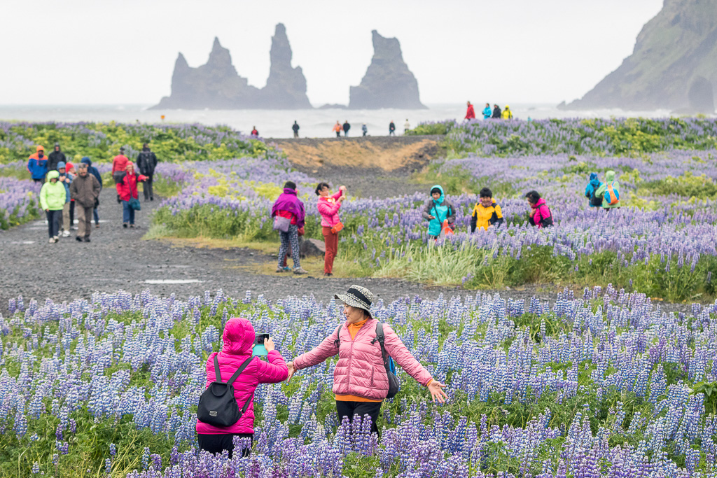
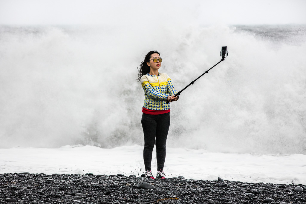
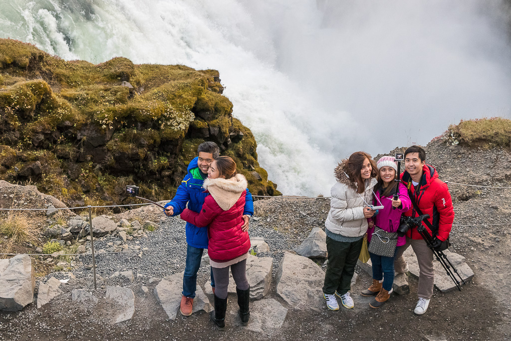
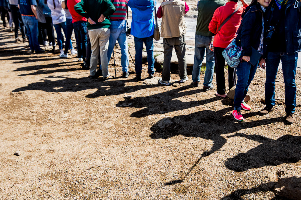
I am currently doing research into why photographers (and other tourists) find human constructions to be attractive focal points in remote and otherwise “natural” environments. In particular derelict structures appear to be favoured. In this article, I will position myself and my approaches to
photography relative to such locations, other photographers and the locals focusing on my experiences in Iceland.
I will start by discussing my own relationship to remote locations and their people then I look at“dereliction” and the issues around its popularity as a photographic subject.I am an urban, Western European, white male, and so I bring my associated, conditioned responses to any location I am photographing. Therefore, what I see and how I interpret it will not be neutral and will be different to that of a local.
Considering my responses, relative to Icelanders and their small communities, the greatest differences will be between my urban life experiences, with expectations of structure and comfort, versus their social and physical self-sufficiencies. I do not believe I could live in a small, remote community for any significant time as I would miss the ease of access to services and to the wider variety of people and social activities available in a large city. I think it would feel quite claustrophobic. As a consequence, I have a respect for those who can and do live in small, remote communities, whether by choice or not. They must have types of self-reliance, tenacity and stoicism to survive and even thrive, that I have never been required to develop. This probably makes me less critical in my approaches to photographing their environments.
My view is likely to be quite different to the way a resident of the area would interpret their own, vernacular landscape as described below by Yi Fu Tuan:
In our mobile society the fleeting impressions of people passing through cannot be neglected.Generally speaking, we may say that only the visitor (and particularly the tourist) has a viewpoint; his perception is often a matter of using his eyes to compose pictures. The native, by contrast, has a complex attitude derived from his immersion in the totality of his environment. The visitor’s viewpoint, being simple, is easily stated.. The complex attitude of the native, on the other hand, can be expressed by him only with difficulty. ~ Cited in Jakle, 1987, p.8
The image below is typical of the “sublime” that many photographers expect to find in Iceland.
However, and characteristic of my personal interests, I have included the functional gravel road and the snow markers to show this is not a wilderness. This is a vernacular landscape.
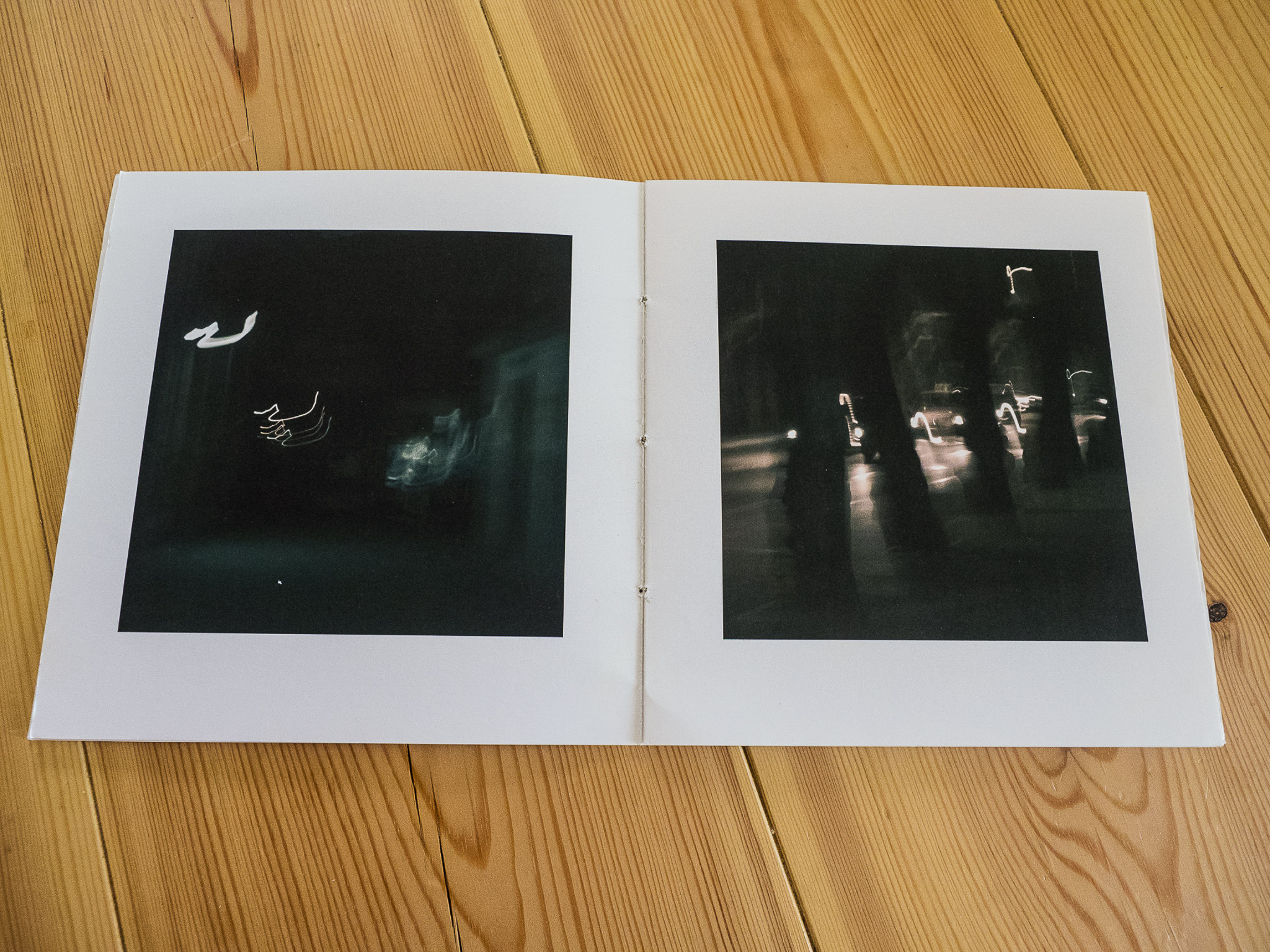
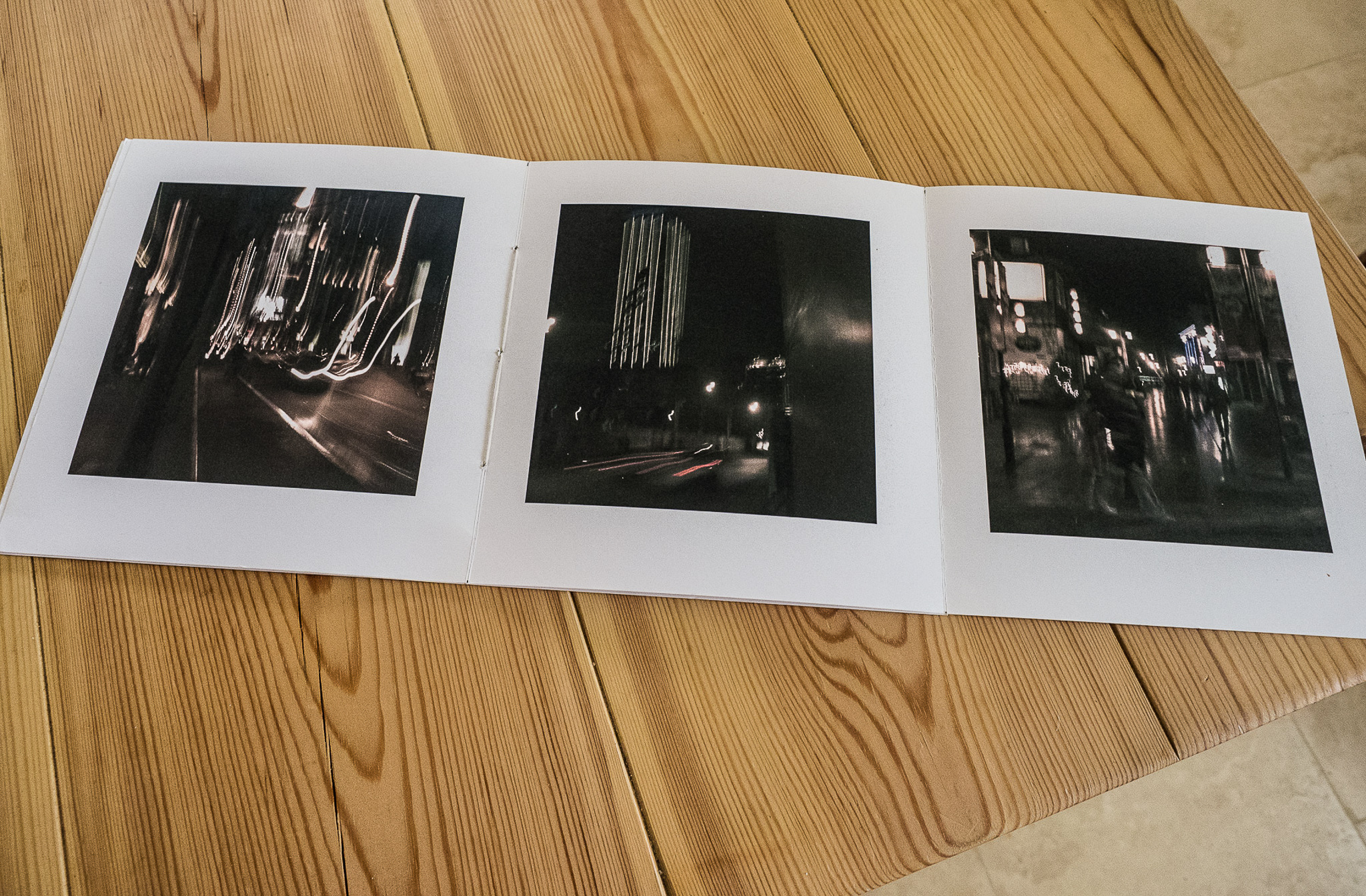
I’ve always been motivated by storytelling. My fascination with photography originated from snapping away on family holidays on Dartmoor so I could relive those experiences when I returned home. As my photographic career developed, I noticed a transition away from the single image and instead, an increasing interest in the ‘series’; bodies of work with a singular theme.
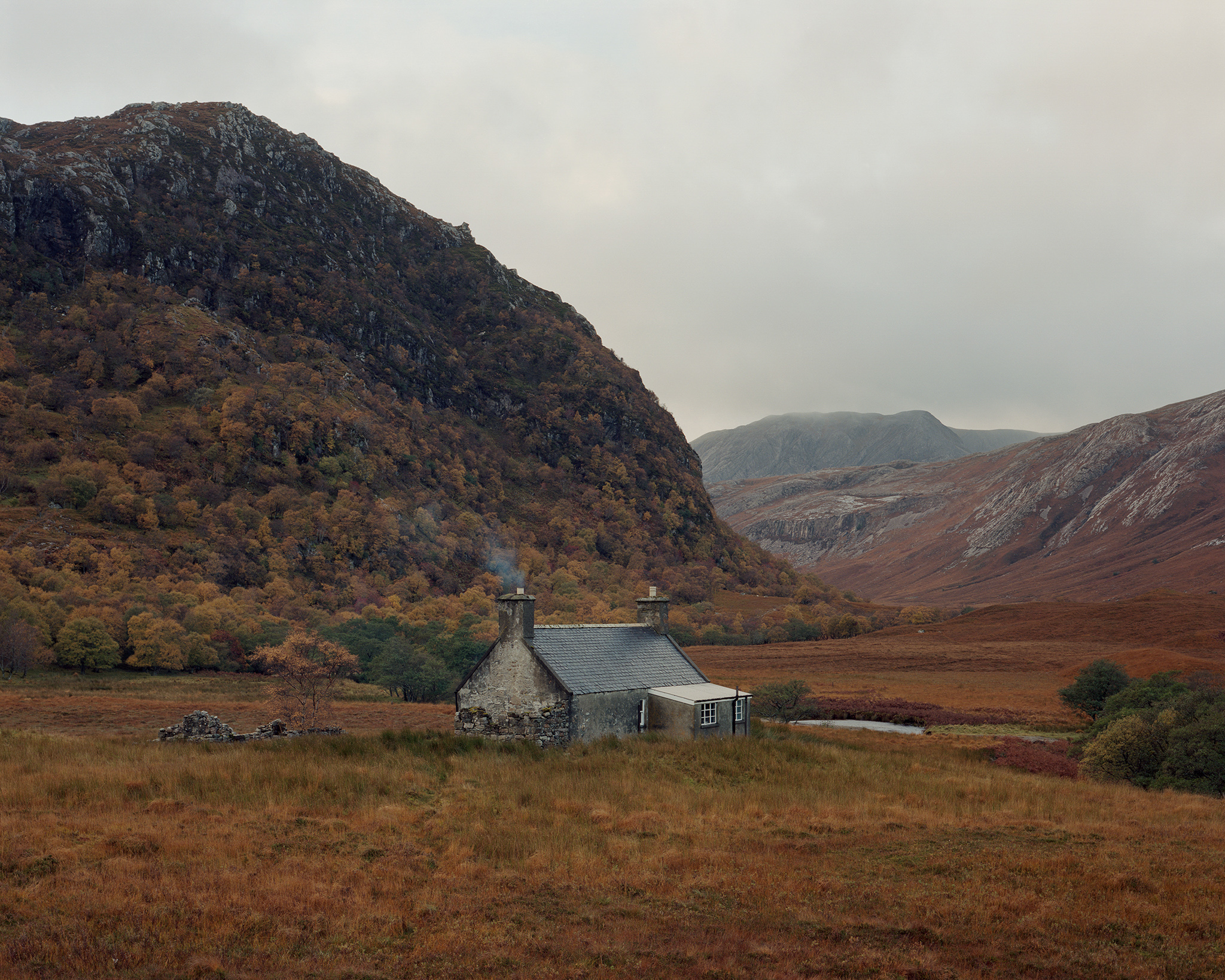
Strabeg, Northern Highlands from 'Black Dots'
Black Dots was my first major body of work since leaving the relative safety of photographic education. I found myself no longer confined to the restrictions of assessment criteria and crucially, I found myself without a deadline. I could pace myself, make photos when I wanted to make photos and when it felt right to do so. Oddly enough, I discovered that I could be more critical of my image making.
Responding to a brief, meeting deadlines, taking criticism are all crucial attributes to the working photographer. However, when it comes to building a personal body of work, this cannot be forced.
I can come home emptyhanded and not have to face the Spanish Inquisition to a room of my peers, and so I was able to apply stricter rules on myself. If the light wasn’t right, I wouldn’t shoot. If the location didn’t quite work, I’d turn around and go back again. Ultimately, I wouldn’t shoot for the sake of shooting. Not to say of course that these characteristics of being enrolled on a photography course are unnecessary. On the contrary, they’re imperative when it comes to developing your skill set and preparing oneself for the industry and working commercially.
Responding to a brief, meeting deadlines, taking criticism are all crucial attributes to the working photographer. However, when it comes to building a personal body of work, this cannot be forced. It has to, in my opinion, present itself naturally and develop organically. I attribute the successes of Black Dots to the freedoms I enjoyed whilst producing it. So in 2017, when I discovered that I’d been awarded the Royal Photographic Society Environmental Bursary to create a new series – a series that I’d been wanting to create for some time - I was concerned that pressure and expectation would impede on the quality of my work. This series of articles for On Landscape will talk through my journey as I embark on this new project in the Southern Carpathian Mountains of Romania. It will feature behind the scenes images and act as a journal of sorts; a scrapbook of ideas chronicling the ebb and flow of the creative process.
Photography is the easiest medium with which to be merely competent. Almost anybody can be competent. It's the hardest medium in which to have some sort of personal vision and to have a signature style. ~ Chuck Close
Critical in the growth of every artist is developing the confidence and courage to follow one’s own creative path. A confidence not only in our abilities but also the manner in which we practice our art. We must find the courage to lead a creative life that is often contradictory to current popular trends and practices. Together, confidence and courage enable an artist to practice their work honestly and without regard for popularity or marketability. Without this confidence and courage, we will not be able to create a unique body of work that is true to our convictions and the ways in which we see the world.
Insecurity in artists is a common affliction, even in those who have “made it”. Bouts of self-doubt are normal and it may not be possible to banish them completely. At its worst insecurity is that feeling of being a phoney, an impostor.
Bouts of self-doubt are normal and it may not be possible to banish them completely. At its worst insecurity is that feeling of being a phoney, an impostor.
Compounding matters, we are in the age of social media where it is easier than ever to compare and rank ourselves among a seemingly infinite number of other photographers. Speaking as someone who has never suffered from an abundance of self-confidence, it has been a years-long journey to believe in myself enough to practice my work with conviction. A recent experience provided a litmus test of how far I have come.
This past autumn I was one of three leaders on a photo tour in the Adirondack Mountains of upstate New York. The final evening found the group on the summit of a mountain to photograph the sunset, a unique opportunity since the toll road leading to the summit closes well before that time (we had been granted special permission). It is an iconic location that has been photographed countless times, including by one of the leaders of the tour, the most accomplished and well-known photographer in the region. Despite the beautiful sunset I declined to make any photos myself, content to watch the beauty unfold and be of service to the participants. I thoroughly enjoyed the evening and relished the opportunity to simply watch the splendour unfold without feeling the need to photograph it.
Later over dinner, the other leader asked if I had captured any good photos. When I told him I hadn’t even take my camera out of the bag he looked at me utterly bewildered. A rare opportunity squandered! I proceeded to list my reasons for such unusual behaviour. I explained that I avoid iconic locations, figuring there is little of myself that I can add to a place that has seen thousands of other photographers. On this particular evening I shared the summit with 20+ other photographers; was I really going to make an image substantially different from the rest? His retort was that we all see something differently, a common belief that I find truer in theory than reality.
I am not inspired by such popular locales. I find the experience of making a meaningful photograph in an ordinary location far more fulfilling. More than that, however, I strongly prefer to photograph alone. I find the presence of even one other person incredibly distracting, let alone twenty people as was the case this evening. I do my best creative work when my attention is completely focused on the subject in front of me. But, it also has to do with the ways in which I prefer to interact with nature. Having other people around spoils the experience, and I am a firm believer that meaningful experiences count more than results. I have not become a landscape photographer to simply accumulate pretty photos, I love the experience of one-on-one communion with nature and the inspiration it provides. Despite my explanation, the look of puzzlement never left his face and it was clear he was unable to understand my reasoning.
I have not become a landscape photographer to simply accumulate pretty photos, I love the experience of one-on-one communion with nature and the inspiration it provides.
As recently as a couple years ago I would have been racked with self doubt had my methods and practices been questioned by a more accomplished and respected photographer. Not anymore. Instead, my question for him, one I did not ask, was how he could find something truly novel in a place with which he was so familiar and had photographed many times before? This is not to imply that his methods are wrong, simply that our approaches are very different. In a way, my confidence was buoyed by his lack of understanding. If everyone “gets” you then most likely you’re not being true to yourself.
So what had changed for me? In my former career, I was a geologist. Growing up I was good in math and science and thought that was my path. I have no formal education in the arts and believed that I had no natural aptitude. As a photographer, I am completely self-taught, which I believe is a big reason why I have struggled with confidence. Who am I to call myself an artist? I realise of course that a formal education is not a prerequisite for becoming an artist and that many iconic photographers were and are self-taught. Nonetheless, for me, it created doubt and the feeling that I was not qualified. With time and practice, I became technically competent enough to routinely produce quality images similar to what I was seeing in the landscape photography magazines of the day. Back then it was having my work accepted by magazine editors, calendar publishers, and stock agencies that began to build my confidence. Still, over time I gradually came to the disturbing realization that while my work was good enough it was not exceptional. Worse, it was not unique. Any photographer of similar skill could have produced the same images. The majority of the photographs weren’t creative or personal. They weren’t me.
I admit to being somewhat old-fashioned in terms of my subject matter and the way I approach it. I have little interest in astrophotography or video. I will never own a drone. I prefer simpler photos that rely on creative expression rather than those that require almost herculean feats of technical wizardry. I favour subtlety and prefer quiet and intimate images to grand landscapes. I avoid iconic locations. I don’t view photography as a social endeavour and I strongly prefer to shoot alone. I am certain I am far from alone in my preferences, but still, I often feel alone in thinking this way.
A turning point in my development as a photographer was becoming a student of the medium. This is what built my confidence. I am ashamed to admit this, but for too long I trudged through photography with little or no sense of its rich history. My work suffered for it. I was technically competent, yet creatively adrift. Once I began to learn about the work and philosophies of the photographers who paved the way it was like an awakening. Much has obviously changed over the years, but the core principles of photography as an art form have not. In particular, the works of contemporary artists such as Guy Tal and Chuck Kimmerle have had a tremendous impact on my confidence. It is as if they have given me permission to pursue my work on my own terms, however different they may be. I believe anyone familiar with Guy and Chuck would agree that they are a breath of fresh air in this environment that seemingly favours technical solutions and stunning landscapes to improving one’s photography over the refinement and development of expressive skills. The answer lies within.
Creating a body of work that is original and consistent with vision or voice (or whatever you call it) is the most difficult challenge facing any photographer.
I’ve quoted Chuck Close at the head of this article because there is no more succinct and accurate description of photography. Creating a body of work that is original and consistent with vision or voice (or whatever you call it) is the most difficult challenge facing any photographer. The only way to do that is to produce honest work, work that truly is a reflection of your own sensibilities and relationship with your subject. That ability to be completely honest is derived solely from inner confidence. Confidence begets honesty because we are free from outside influences and pressures. It used to frustrate me terribly to miss photographing a stunning sunrise, regarding it as a missed opportunity to make an image that would prove popular and marketable. I realise now that such images, as beautiful as they may be, are, for me, a dime a dozen and creatively bereft. I have been there and done that. I now have the confidence and courage to seek something greater, something more personal and infinitely more rewarding. I am seeking myself.
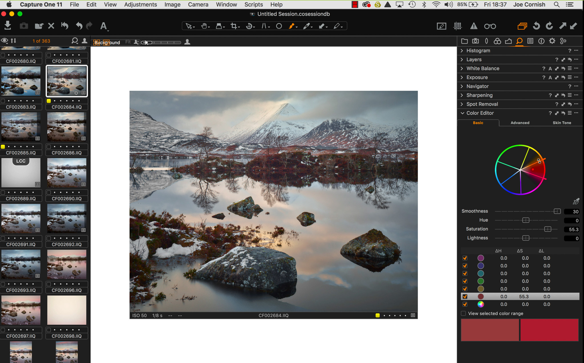
After a great deal of feedback from our readership about the Lightroom for Landscape series that myself and Joe Cornish recorded, we have since received quite a few enquiries about a similar series covering Capture One. That Capture One is a very capable editing tool is something that many people understand but it has historically had a reputation for being a bit obtuse in the way that it handles things. So it's good to hear from Joe that recent iterations of the software have not only improved usability somewhat but it is also a lot faster than it once was and has many more useful features for the creative editing of your landscape photographs.
An Introduction to Capture One
In this first episode, we will take a brief look at the way that the Capture One interface can be customised and a quick overview of the features. In future episodes, we will break down the use of each editing block and show how they are used in the editing of real world photographs.
If you have any questions about the video or general questions about Capture One, please add them in the comments below.
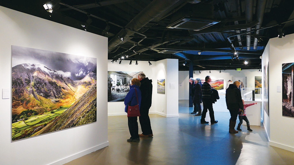
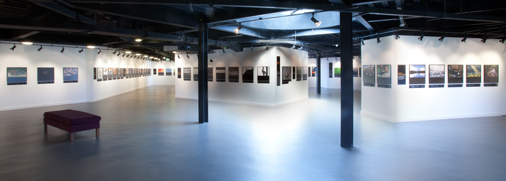
I was recently chatting with a photographer who has experienced the last few decades of the photographic environment in the UK and one of the topics we wandered on to was the change in galleries and approach to exhibitions in the UK. Around the last decade or two of the 20th century, there were quite a few galleries and they were rotating exhibitions on a monthly basis, or more in some cases. Fast forward to the second decade of the 21st century and the number of galleries has fallen and the number of exhibitions they are putting on has also reduced dramatically.
So it's quite possible that there are now only a 1/10th or less of the number of exhibitions than there were 20 years ago. What happens at this point is that the exhibitions that remain tend to be the 'establishment' and quite often foreign artists. There is now very little space for breaking artists or scope for experimentation and bravery by curators.
In this environment, it has now fallen to the photographers themselves to put exhibitions on. In the last few weeks, we've seen the Vision and On Your Doorstep exhibitions and quite a few more. So these days, it's fair to say, if you want to see your work exhibited, it's probably up to you and by the looks of it, many of you are.
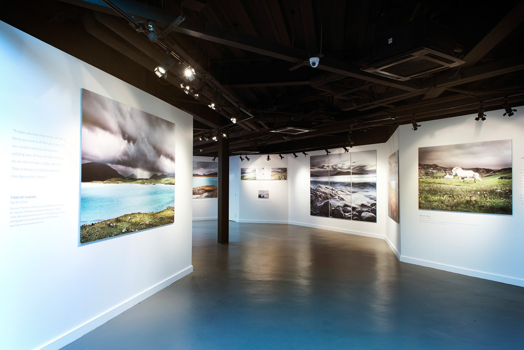
In this vein, the Society of Scottish Landscape Photographers group organised an exhibition through Facebook and found a 'friendly' gallery to host it and some sponsors to fund it (Zeiss and Firecrest). The negative accusations against such group exhibitions are usually about the quality of curation (i.e. usually none - the work is self-selected) and of work (strictly 'amateur'. However, it is a testament to the quality of the photographers showing work (and the fact that there are so many talented 'amateurs') that the exhibition has a coherence beyond that which you might expect. Not only in the quality of imagery but also of printing and presentation. There are always going to be stand out works (just as there are in a single photographer's exhibition) and we've selected a few of these to give you an idea of what you can see if you get to the show.
I should also add that the exhibition space at the Lime Tree Gallery (inside the Lime Tree Hotel) is also very nice indeed with some very high quality and discreet lighting.
I highly recommend a visit and you're in luck in that not only is the exhibition on for another three weeks but it is also going to be exhibited elsewhere in the future. Congratulations to the organisers (especially Davie Hudson, Russell Sherwood, Fiona Mcrae and Sean Kerr) and the exhibitors and I look forward to seeing more exhibitions such as this in the future.
You can go and visit the exhibition Lime Tree Gallery in Fort William until the 5th of May.
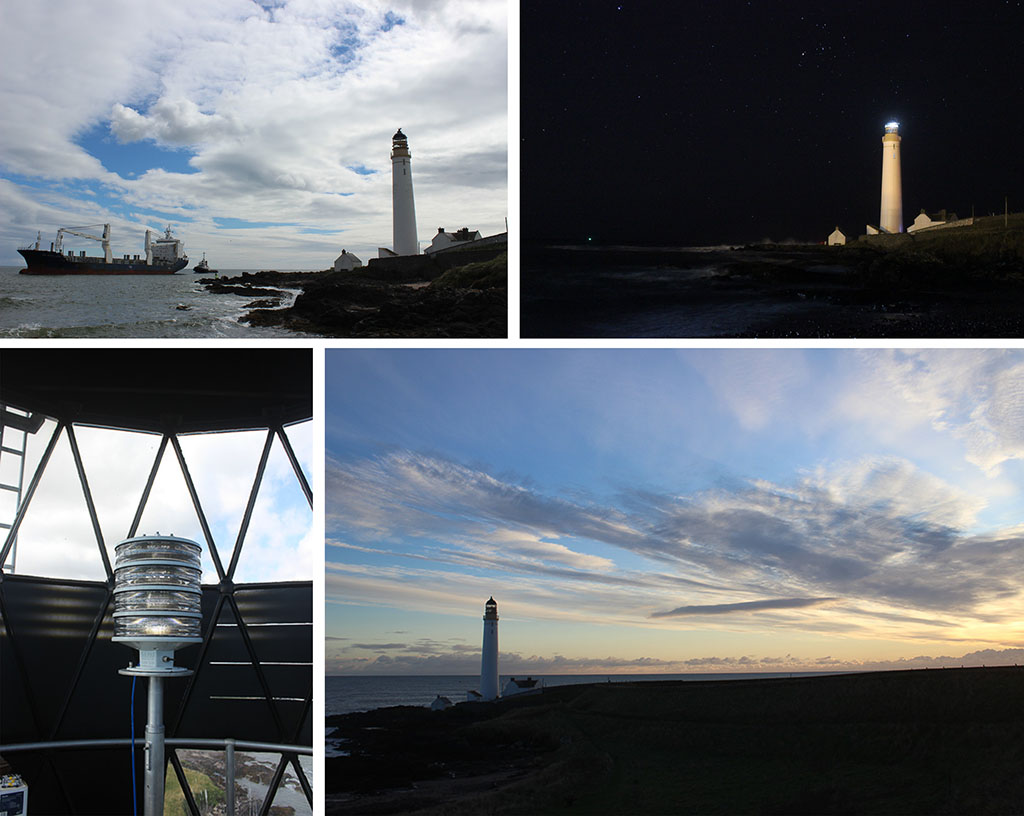
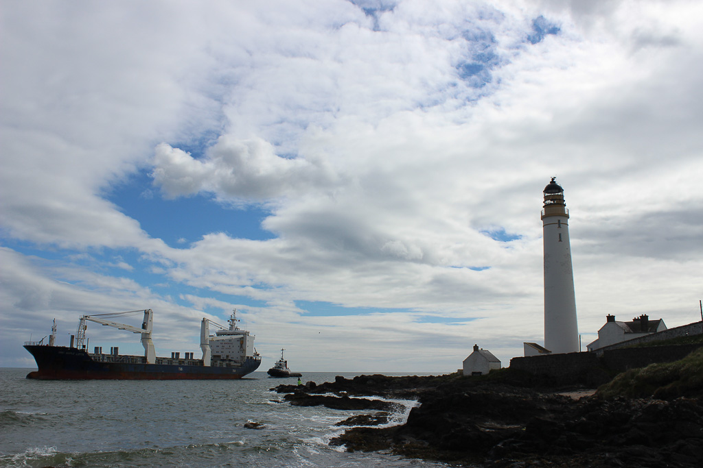
Welcome to our 4x4 feature which is a set of four mini landscape photography portfolios submitted from our subscribers. Each portfolios consisting of four images related in some way. You can view previous 4x4 portfolios here.
Submit Your 4x4 Portfolio
We're on the lookout for new portfolios for April, so please do get in touch!
If you would like to submit your 4x4 portfolio, please visit this page for submission information.
I took these images on a trip to Florida in January. I had injured my back during the journey to the US and was in a desperate state for a few days. Befuddled by large doses of ibuprofen and wondering whether I would ever be pain free again, I went to see The Shape of Water, Guillermo del Toro's Oscar winning film.
The dreamlike, haunting, other-worldly quality of the film suited my mood perfectly and affected me deeply, sweeping me along on a seductive tide of melancholy and making me aware of the shape of my own tears. There was no other possible title for the images. Read Nicki Gwynn-Jones Featured Photographer interview.
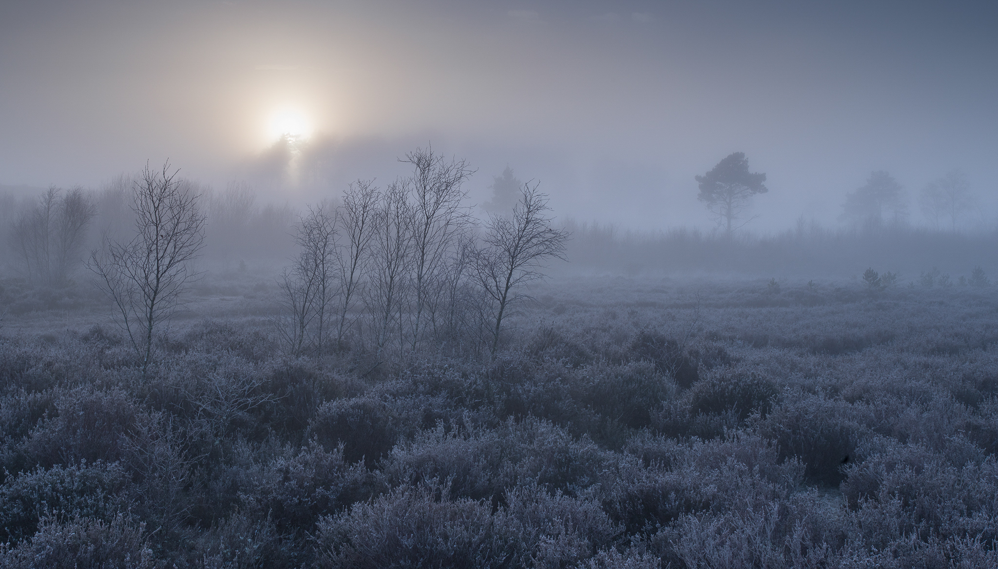
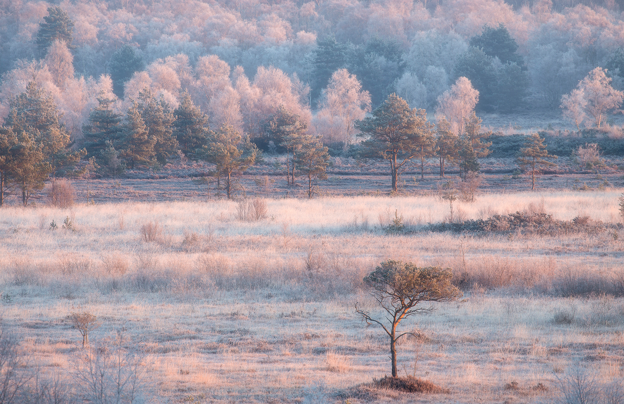
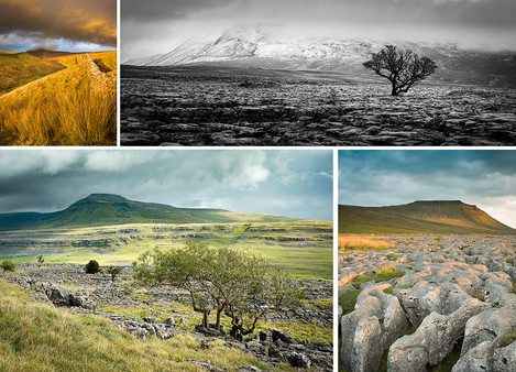
South West Surrey is an area of Britain that is not always appreciated by photographers for its landscape photography opportunities. However, it does offer many rich and diverse natural environments. One such location is Thursley Common. This is one of the last remaining heathlands in Surrey and is famed for its diverse wildlife.
Regular visits to this site have enabled me to become very familiar with this location and so gain an insight as to how the time of day, weather conditions and the changing seasons combine to create the optimal conditions to capture this area at its best.
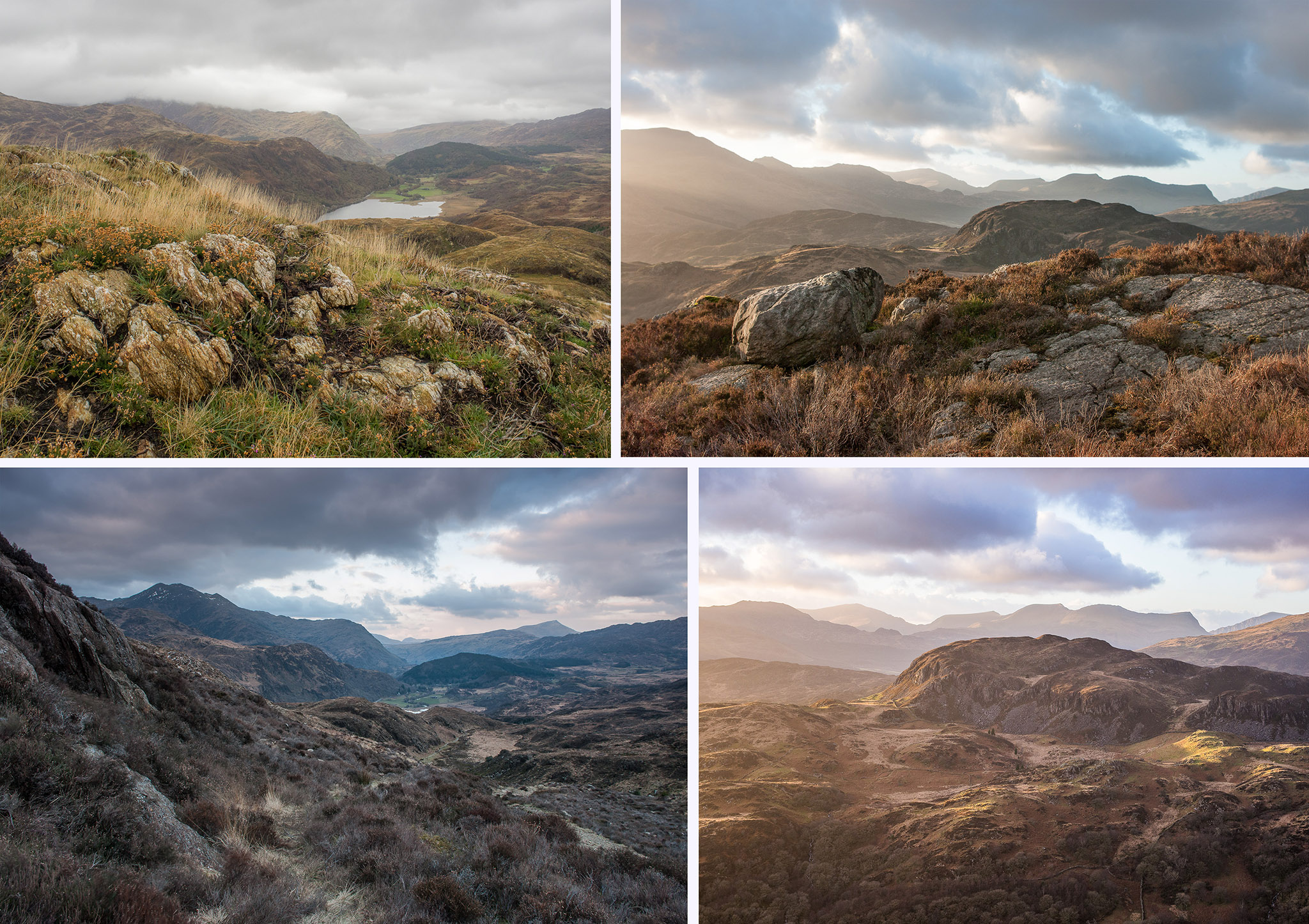
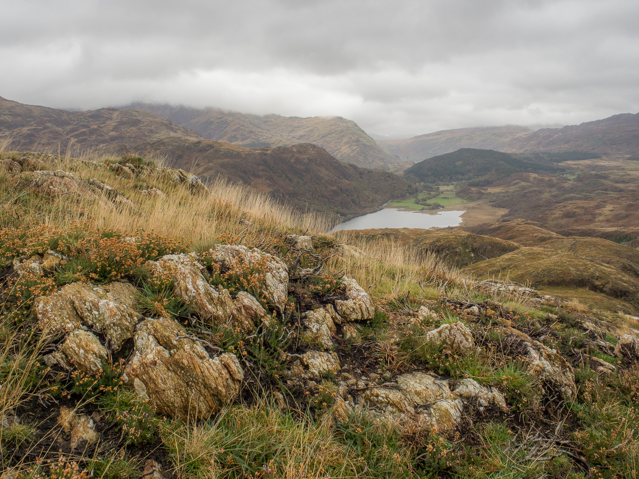
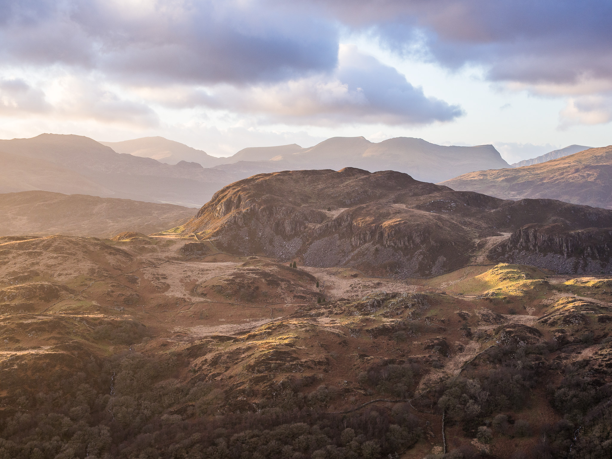
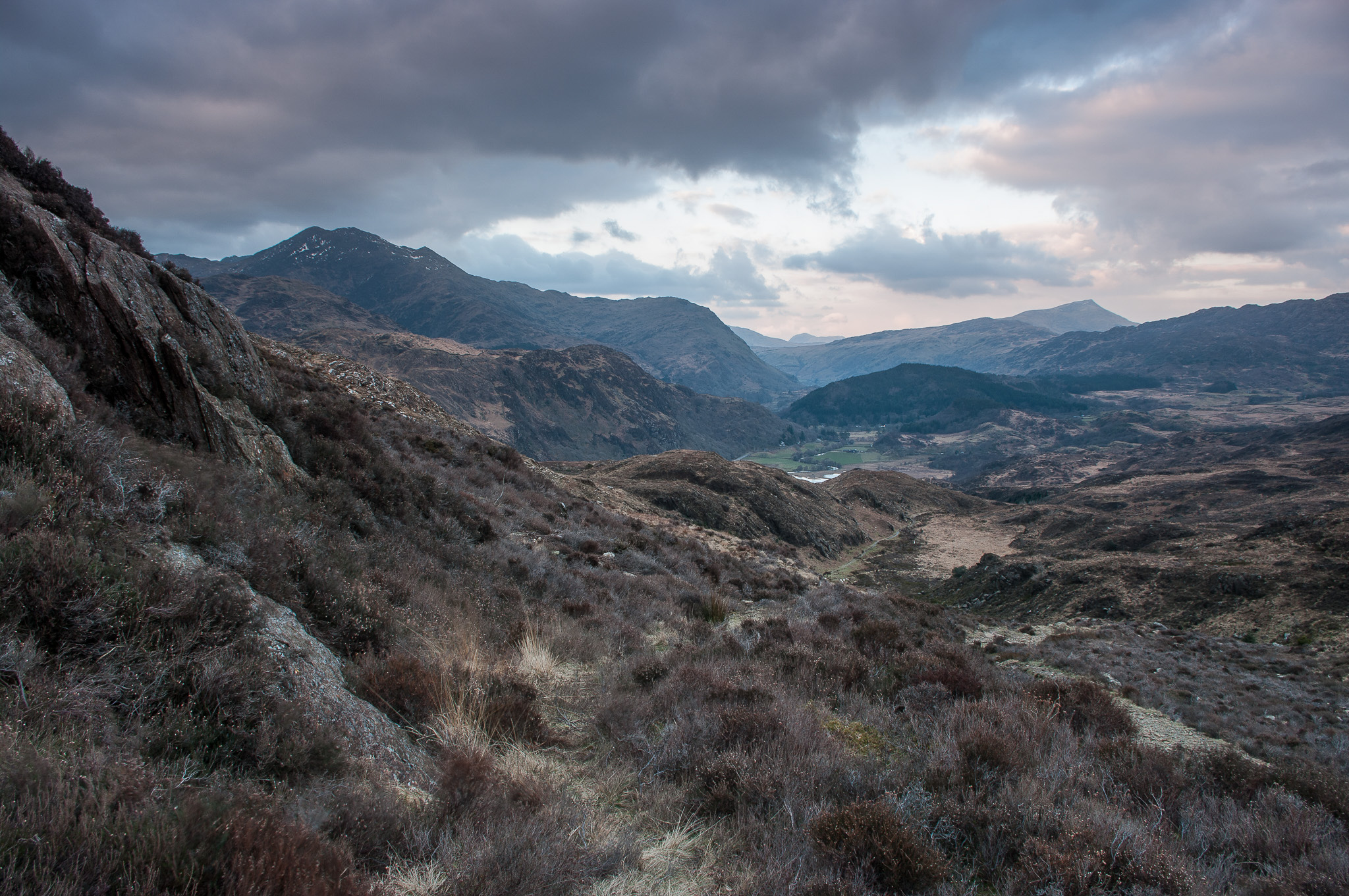
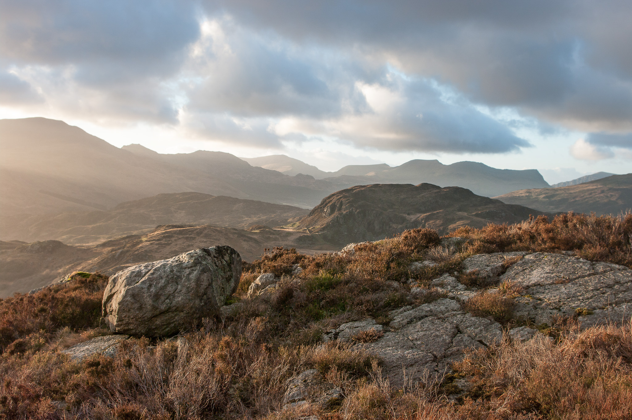
In North Wales, the area east of Beddgelert is wild and rugged and little frequented compared to the honeypots of Snowdon and the Glyders. Paths are sketchy and few and the ground is like a saturated sponge most of the time.
Taking photographs of the mountains one might think the most significant features are the mountains but what's at your feet can be just as important. Many places in the bigger hills consist of uninspiring grass but Cwm Bychan and Yr Arddu ("The Heights") are rich in heather and a wonderful kind of rough red-tinted rock that outcrops all over. These create great foreground interest in a variety of lights and weathers. Although I first went there hoping to get shots of the famous peaks I've been returning several times just because of these textures and colours.
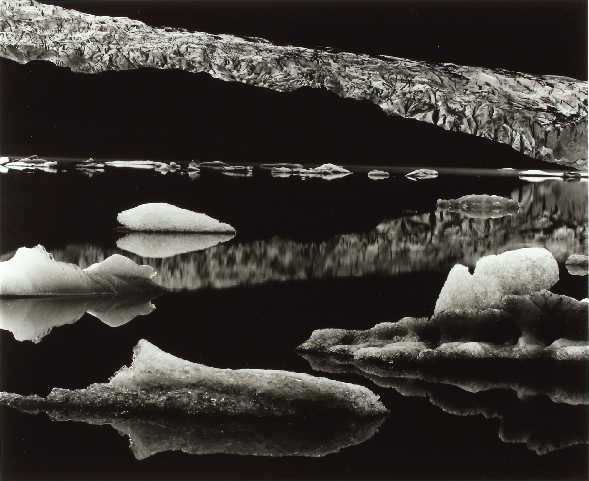
Delighted to be asked to share my favourite image – well one of them anyway!
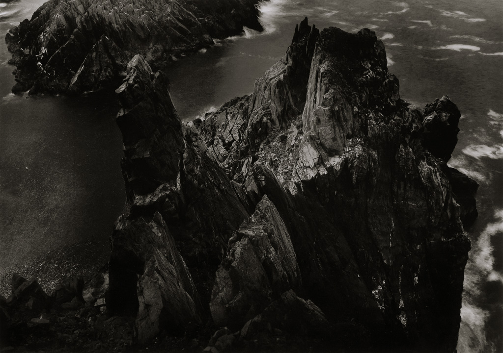
I have chosen Mendenhall Glacier, photographed by Brett Weston – b.1911 – d.1993 (whose Father was the more famous Edward Weston)
This image was photographed in 1973, and the location is in coastal, South East Alaska. The glacier is 13.6 miles long and has retreated 1.75 miles since 1929.
In 1925 Brett was taken out of school at the age of 13 and travelled with his father, from Carmel, California to Mexico, where the young Weston began to learn his trade and Art, and Brett became his father's apprentice. He was surrounded by revolutionary artists of the day including Tina Modotti, Frida Kalo and Diego Rivera.
It has been said that his introduction to Modern Art through the work of painters Rivera and Jose Clemente Orozco, greatly influenced his sense of form and composition. Van Deren Coke described him as the “child genius of American Photography”
At 17 his work was being exhibited internationally, and he exhibited a group of images in the German exhibition “Film and Foto”.
He had his first one-man exhibition in San Francisco at the age of 21. His first camera was a Graflex 3,1/4 x 4,1/4 inch, and he later used 10x8 and 14x11inch view cameras. In his latter years, physical difficulties made him choose medium format Rollei SL6x6 and Mamiya RB6X7. Over many decades he travelled extensively through the Western states of New Mexico, California, Oregon and Alaska; Also Mexico, Europe and Asia, away from his native California.
In 1945 he was awarded Guggenheim Fellowship for creative Arts, USA and Canada.
The Mendenhall Glacier image was printed by the artist onto Silver Gelatin, Glossy paper and is retailing currently, upwards of 20,000 USD for a 20X16 Inch print, and around 10,000 USD for a print size 7,5/8 x 8,7/8 inches. Incidentally, the young Edward Weston persuaded his established father to change printing his work on Platinum papers and use Silver Halide Glossy papers, with richer tones. Edward Weston acknowledged that he was influenced by his son Brett with his own Photography.
This image would have been photographed on a large plate view camera (probably a 10x8 inch format) and most likely would not have been cropped as was the ethos of the f64 group of “Modernist” photographers, who Brett Weston was invited to exhibit alongside with the original core of f64 Photographers.
It would appear that this photograph was exposed on a bright sunny, cloudless day, with no wind, leaving the glacial water like a mirror.
The composition is typically abstract, with strong bold shapes of Black tones from the land mass in front of the glacier, the foreground water, and the sky. I think a Red filter may well have been utilised to enhance these very dark and rich tones.
Contrasting with the strong shapes of dark tone is the light toned glacier to the top of the picture and smaller pieces of broken/thawed glacier blocks in the foreground.
Contrasting with the strong shapes of dark tone is the light toned glacier to the top of the picture and smaller pieces of broken/thawed glacier blocks in the foreground.
The image area has a similar amount of “Positive” and “Negative” shapes (Undetailed Blacks versus Light tones of glistening Ice) The Style of Brett Weston’s compositions often gave the viewer a flat depth two-dimensional appearance as opposed to a three-dimensional appearance, aiding his abstract trademark.
We all perceive other photographer’s images with our own interpretation, and for myself, this image is not easily viewed. I find that I look at the bold Black land mass and the glacier as one point of interest, and then look at the foreground broken ice pieces in a Sea of darkness. It is like looking at two images within one frame. However, I can return to the image and view it as a complete diagonal, zig-zag compositional flow.
I remember the first time I viewed this picture, in 1978, when I bought the book “Voyage of the Eye” for £6.00.(Brett Weston has said there are much better quality books of his work) I remember looking at it and wondering what is it? Only when I viewed the title, did I connect with the composition content! This was long before we all visited Jokulsarlon Glacier Lagoon. Glacial landscape familiarisation for this young Photography student was not the case, especially since I didn’t practice Landscape work until decades later.
I still enjoy this image now, as much as I did in 1978. I like pictures that need scrutinising and searching, pictures that are strong in shape and form, pictures that I can see differently each time I view them. The abstract aesthetics hold my attention, and there is no ambiguity in the content of this picture. My enjoyment and appreciation for Monochrome landscapes and this image belongs to the knowledge that we do not view in Monochrome, and as such, in my opinion, there is greater scope than Colour for artistic interpretation, expression and representation.
monovisions.com is a good source for viewing Brett Weston’s close up abstract imagery of subjects including Plant leaves, knotted roots and tangled kelp.
Grimsby-born photographer Paul Webster, has been announced as this year’s winner of the prestigious Scottish Landscape Photographer of the Year Award.
Cromdale-based Webster beat off strong competition from thousands of entries submitted by photographers from across the globe to win the prestigious title. His winning portfolio comprised of 3 magnificently evocative images shot in the mountain ranges of the Lochaber Geopark and Glen Affric with his Fujifilm digital camera. They included ‘Dreams and Nightmares’, a shot of light breaking through to light up Aonach Eagach whilst two ravens circled overhead; ‘The Mamores’, capturing the mists shifting past Sgor nam Fiannaidh, above Glen Coe; and ‘Wild Affric’, a tranquil shot of the landscape and the magnificent Caledonian pines that surround Loch Affric, dusted by the first snows of the winter.
Paul Webster - Winner
‘Wild Affric’, also received one of 10 Awards, sponsored by the John Muir Trust, which owns and manages many of Scotland’s wild places.
Paul Webster
Paul said: “When I got the telephone call, I was honestly just astonished to be told I'd won. There are so many landscape photographers I really admire that enter this competition, and to have come out on top is just unbelievable - I'm thrilled.”
Webster, 43, is no stranger to the Highlands having moved to Scotland 11 years ago with his wife Helen, where they set up the hugely popular ‘Walkhighlands' website. It was Paul’s love of Scotland's landscapes that came first, later leading to his interest in photography to enable him to share with others, and he has since written 14 guidebooks on walking.
Jeanie Lazenby - Landscape Winner
The competition, now in its fourth year, is the brainchild of Perthshire based landscape photographer, Stuart Low who put it together to promote and inspire photographers of all levels to explore Scotland’s stunning landscapes and to promote Scotland’s natural, cultural and historic heritage to an international audience. Winning entries will be published in a series of public exhibitions across Scotland and in a special edition book that will be launched on 27th March 2018.
Nigel Morton - Scottish Weather Winner
The competition does a lot of good too. The images that the photographers capture of our iconic, and even unseen places, promote tourism and the book that showcases the winning images adds to that. Acting as a brochure for Scotland’s amazing places, it inspires visitors to follow in the footsteps of the photographers so they can experience the views for themselves. Even the exhibitions play their part, boosting numbers to galleries, small cafes and bookshops for example. Find out more at www.slpoty.co.uk
Many of us know Rob as one half of the duo (take a bow, Karen) behind the Connected Exhibitions that are held each Spring at Patchings Art Centre near Nottingham. A lot of his time and energy goes into this but he is passionate about many other aspects of photography, as you will soon learn.
Can you tell readers a little about yourself – your education, early interests and career?
As a child, I’d always had a love of the outdoors, not necessarily photography, and would love to spend time with family and friends exploring the Peak District - close to where we lived - and the coast. The coast was always massively inspirational and important to me, being somewhere I spent a lot of time with my grandparents especially, immersing myself in the atmosphere, sights, sounds, smells and emotion of this special place.
I grew up in the industrial midlands of the 1970s, hailing from the Nottingham / Derby borders; the sights and sounds of urban and industrial areas have helped shape who I am personally and creatively, and were also instrumental in me asking questions about the why’s and wherefores of human interaction with and impact on our landscape/environment.
This led on to my passion through school for Geography and ultimately to me becoming a Geographer by education through University.
In my younger years I always had some degree of interest in photography and have owned numerous small point and shoot film cameras although I can’t say as many do ‘my first introduction to photography was with my father’s / grandfather’s box brownie’ as it wasn’t, although I do remember my Grandad having an old box brownie in the spare room that I used to be fascinated with the textures on and played with as small child.
My Dad gave me my two first ‘serious’ cameras; an Olympus Trip 35 which I still have and use today with black and white film, and the Praktica BX20 kit he bought for holidays to Spain. I think during my college / Uni years I used these much less and the BX20 was sold at a car boot although I have bought pretty much the same kit about 10 years ago.
A life time’s love for photography grew into a passion for making landscape images about 20 years ago. I travelled along pathway familiar to many of us. One of my goals was to hone my vision and style. I loved to be outdoors and especially in the mountains; it was only natural, therefore, that my photography began to express my love of upland environments. All was well until a few years ago when, occasional episodes of immobility, neck, chest and lower back pain became frequent. Medical examinations revealed a problem affecting my spine including discs and nerves.
About 2 years after the diagnosis I was struggling to walk very far and couldn't carry my heavy camera backpack containing either my beloved Ebony 5x4 camera with a variety of Schneider and Rodenstock lenses or my Nikon DSLRs, zoom and prime lenses, flashgun, filters and other ‘essential kit’ weighing in at over 18kg. It was becoming painfully obvious that my time in the mountains of mountains and wilderness was coming. to an end.
Unfortunately the degeneration of my spine continues with eight discs now prolapsed and arthritis affecting several joints including my feet, hands and shoulders. I was diagnosed in my 40s and I'm now in my 50s. All my doctors tell me I'm very young to be affected this badly and although I need a new right shoulder I'm too young to have one. I'm affected everyday by neck, shoulder, arm, lower back, leg and feet pain. I was spending less and less time outdoors and had fleeting trips to upland environments ended in disappointment and frustration.
I had a difficult conversation with my doctor who suggested I should give up photography (and he hadn't even seen my work!)
Around August 2013 I had a difficult conversation with my doctor who advised that my camera bag was far too heavy and its weight was exacerbating my spinal pain each time I carried it. He suggested I should give up photography (and he hadn't even seen my work!). Shooting portraits in a studio or still life etc didn’t really appeal to me.
If I'm being honest I began to feel sorry for myself and became resentful. I was turning my back on photography, but paradoxically continued to enjoy looking at other photographers' images and had vicarious enjoyment of the mountains and wilderness through their work. Although, they'll never realise it, Joe Cornish's, Colin Prior's, Greg Whitton's and other's work continued to inspire me and keep my love of photography alive until I could accept that I had choices. I could have continued to wallow in self-pity or explore my photographic options.
I live in Lincolnshire and, although it seems uninspiring, if you concentrate there are numerous photographic opportunities, the obvious one being the wonderful coastline. It seemed to me that I could redefine myself as a photographer and explore the alien landscape of fens, coast and gentle rolling hills. It was time to form a relationship my own was my back yard,.
The next step was to accept my physical limitations and begin to explore photographic opportunities from flat ground
Thinking about my options, my first decision was to say goodbye to my beloved Ebony 5x4 camera and associated kit, part with my Nikon DSLRs and downsize. I chose the Fuji CSC system and now have a Fuji XT1, 14mm, 18-55 and 55-200 zooms, Lee Seven5 ND grads and stoppers which all fits in a Think Tank Change Up V2 waist bag which can be supported by chest straps. These changes have allowed me to carry my kit for longer periods and because it's not so painful I can concentrate on making images and not being pain when I arrive at my chosen location. The next step was to accept my physical limitations and begin to explore photographic opportunities from flat ground. Over the last 3 years that's what I've done, concentrate on accessible flat ground, often no more than half a mile from a car park. My vision and style have changed; changes that I wouldn't have considered before.
Having come to terms with my limitations I've begun to enjoy the coast far more than upland environments and I've regained my love of photography. OK, my legs give way without warning and I've fallen downstairs at home more times than I care to remember until it finally sunk in that I must hold on with at least one had when using stairs and I have to take precautions when I'm out and about. There's been one incident resulting in a fractured left wrist and 3 ribs a few years ago when my leg gave way exiting a bird watching hide, so I don't go off the beaten track if I'm out on my own, but I continue to go out to make images and from time to time venture near to the edge of sea cliffs if I think the shot's worth doing, I just don't go too close to the edge.
I find that being on the coast and concentrating on making images brings solace and give me the thrill and peace that mountains once did.
My approach is now to hone the composition and reduce it to a few key elements within the frame, juxtaposing colours, light, fore, middle and background elements to create the image. In other words stop, consider and execute the idea that formed in my mind’s eye. I make sure no unwanted elements remain in the frame and that the idea and narrative for the picture are clear (at least to me). This helps me to produce a cohesive image that communicates some of the emotions I feel when in wonderful locations and, I hope, captures something of the spirit of the place.
If, like me, you've got a penchant for photographing waterfalls, Plitvice Lakes National Park in Croatia is pretty much paradise. With 16 crystal clear lakes, lush mixed woodland and more waterfalls than you can count it's got a lot to offer.
It's been on my "I'd really like to go there" list for a long time, so at the end of May, I finally visited on a three day trip. And it didn't disappoint.
The forecast for Day 1 was, unfortunately, torrential rain... not ideal, even though I had packed a brolly and some duct tape to attach it to my tripod, just in case. Thankfully the gods of photography were smiling on me, and it dried up completely by the time I set out to explore the Upper Lakes, giving perfect overcast conditions all day.
The Upper Lakes area really caught my imagination – twisting boardwalks over gurgling rivers, waterfalls cascading out of the surrounding hills and fabulous blue pools edged by rushes and vibrant vegetation. Every time you turned a corner there was another astonishing scene to take in. In fact, there was so much potential is was tricky to decide where to start. I was like a kid in a candy shop and happily whiled away a few hours meandering through the area.
On Day 2 it was time to venture into the Lower Lakes area, which has a very different feel. The series of lakes and cascades are hemmed into a canyon with larger, but somehow less photogenic, waterfalls at the bottom. I spent some time at the obligatory "postcard" viewpoint (when in Rome it's hard to resist), but I got far more satisfaction from a path along the top of the canyon. From here you could look down onto the boardwalks as they wound their way across the lakes. The Sun was shining today, which really brought out the azure blue colour in the water.
For the last day, I couldn't help returning to the Upper Lakes, but with the sun blazing overhead, I had real problems with contrast. It's not often that you're annoyed when it's sunny on holiday, but thankfully I did stumble upon one of my favourite scenes that I hadn't even noticed the first time around.
Although it only gets about 1½ million visitors a year, which is small potatoes compared to many other national parks in the world, it did sometimes feel like at least half of them were in the composition I was trying to shoot! The selfie-stick brigade and coach parties are a common obstacle here, but with a little patience, it wasn't unmanageable. And certainly fairly avoidable if you're willing to get up earlier than I am when on holiday.
The biggest challenge, however, was tripod vibrations. With a lot of the path being boardwalks there's little solid ground to place one on, and every footstep from a passing visitor would wobble the whole section.
The biggest challenge, however, was tripod vibrations. With a lot of the path being boardwalks there's little solid ground to place one on, and every footstep from a passing visitor would wobble the whole section. No amount of careful positioning helped and I certainly did a moderate amount of (silent) cursing at the more flat footed sightseers. The space in which to set up on the boardwalks without blocking the gangway was also pretty tight – they're only about 5 feet wide. If there was a prize for how close together you can have the tripod legs while still standing upright, I feel like I'd have stood a chance of winning.
But even the challenges didn't detract from being in one of the most beautiful national parks I've ever visited. It really is a waterfall wonderland and I'd highly recommend visiting this wonderful part of this delightful country.
For a short guide covering the practicalities of visiting the park and the location of my favourite areas please visit my website.
“The new spin is always the challenge,” says American photographer Art Wolfe. One of the world’s most famous photographers, renowned for his colourful and creative pictures of landscapes, wildlife and disappearing cultures, Wolfe has been finding new spins for 40 years in countries as diverse as China, Ethiopia and the USA. As well as producing dozens of books, including latest Earth Is My Witness, he’s famous for his TV programmes, including Travels From The Edge and Netflix series Tales By Light. Graeme Green caught up with him to hear about revisiting landscapes to find fresh angles, never being satisfied, and how photography can help protect the environment….
Art Wolfe, Jökulsárlón, Iceland
What makes a great landscape photo stand out to you?
I’m always looking for something unique or something new that I’ve not seen before, or maybe a great shot of an old subject in new light.
I’ve been doing this for more than 40 years. I’ve got a great memory for photographs, so I’m always looking for something unique or something new that I’ve not seen before, or maybe a great shot of an old subject in new light.
If I have a perception that somebody’s just putting their tripods in the holes of previous photographers, that is obviously a mark against my interest. If it’s unusual light, if it’s something new, then I’m very intrigued.
You must be bombarded with photographers’ work. Are you hard to impress?
I critique all the time and I’m a product of a major art school at the University of Washington, so even in my late teens and early 20s, I went through the critiquing process and learned how to critique properly.
Seven Color Mountain, Bolivia
There’s always something positive to be said about any photo or any painting. I build on that and then ease into the critique so that the person being reviewed isn’t devastated. If you start off saying something negative, that’s all they hear. I don’t want to say that I’m a pussycat, because I’ll get to the point eventually, but I don’t want to destroy somebody like I’ve seen other critiquers do.
But, yes, I’m kind of tough. I’m tough on myself, and I don’t want to reward people for copying what someone else has done, just with better equipment.
Bungle Bungle Range, Australia
You often return to the same location repeatedly to find new angles. What do you look for when you go back to a place you’ve photographed before?
What’s interesting is that when I return to a place, the likelihood is that I’ve evolved - not the landscape but my intellect.
What’s interesting is that when I return to a place, the likelihood is that I’ve evolved - not the landscape but my intellect. As you keep staying at it, the more you can look with new eyes at an old subject, finding new styles, new perspectives. You’re always bringing something new to a place you’ve been to. I think that’s a great and worthy challenge.
Right above Seattle, we have a beautiful park called Mount Rainier National Park. I’ve been up there hundreds of times and yet every time I go up there, I’m enthusiastic and I find a new perspective, not just of the mountain but the environments around it.
"I am asked with surprising frequency, "How do you know where to make pictures?". To the extent there is a rule, the answer is that it is usually where you stop long enough"
A few days ago I received a really pleasing email from a participant of one of our photo-immersion workshops. The email came with a personal and unsolicited review of the two experiences he recently had with us, exactly when I was to start writing this article about the implications of creation and its opposition to the concept of production. What I read there came to me as a perfect example of what I intended to elaborate on this article, and filled me with joy and gratitude to this fellow photographer.
Snowflake - Finland
For this reason, I decided to start the article with this spontaneous reflection, even at the risk that some of the readers might mistake it for a sneaky act of self-promotion, which is absolutely not. On this message, that I copy literally, I have highlighted some of the words in bold, since they are related to aspects I will cover throughout this article:
"I still miss the days spent in Finland and Norway. The places we went to were absolutely spectacular, but what strikes me most is the style of your photo trips, which deeply changed my philosophy and style of travel and photography. I used to make precise travel plans, go to iconic locations one after another for sunrises and sunsets, and try to maximize the places to visit in limited travel time. But now I find your photo-immersion trips truly a better way to get more personal photos and train one's "photographer's vision". For instance, after reviewing the photos taken during the Finland trip, I surprisingly found that more than half of my favourite photos were taken not in Risiitunturi, but the random places we visited along country roads, the trees, the houses... I would definitely skip and miss them if I did not come with you. And these places, which did not look very photographically promising at first glance, were challenging to get satisfactory photos from, and really forced one to sharpen his photography skills. Of course, the whole process has been quite fun! It was so interesting to see how we came back with very different photos from the same places."
These lines, which indeed reflect my own way of approaching photography (and any creative endeavour, in fact) contrast sharply with something else I recently read in the newsletter of a known landscape photographer, that vented the secret for great landscape photography as the three P's: Planning, Persistence, and Patience. In my opinion, this set of P's leads to a fourth one, the end result such an approach typically leads to Production. I know this because, me too, I used to follow this same approach in the early stages of my photographic career.
I was reading a photographic article the other day that made me laugh - not that it was a funny article, because it wasn’t, but the premise was very much grounded in the current zeitgeist The author of the piece was bemoaning that a certain up-and-coming photographer seemed obsessed with using square format for his images, as if to replicate Instagram and there derive a following amongst his selected audience. It may well be that the photographer in question wished to encompass the square format into his ‘style’ and that he may have wanted to create an association between his vision and that of the users of the aforementioned application. I don’t know, but what I do know is that whilst I might have been laughing at the seeming lack of historical photographic knowledge in the article, I was also acknowledging my age, as I remember clearly my early experiments with an ancient square format camera!
A few days later I was contacted by Charlotte Britton, who enquired if I would be interested in writing a piece for the End Frame section of On Landscape. At first, I thought I would be the last person to write about a favourite photograph, but as a few days went past I recalled my reaction to reading the critic’s view. I realized that here was my chance to write about the origination of the square format, whilst explaining why I believe it still resonates with the British landscape photography community.'
In 1900, Kodak introduced the 117 file type for their first Brownie camera, the No.1 Brownie, designed as a 6×6 cm format. Until then there had been a series of different formats, but Kodak saw this particular format as being ideal for the amateur photographer. The coming years saw many developments and other formats came and went, but still, the equal-sided frame refused to go away; it resisted being consigned to the confines of museum store rooms. However, it does appear, at first glance, not best suited to the landscape photographic genre.
Charlie had got the commission to illustrate this particular guidebook, and I was mesmerized by his photographic accomplishments using a tried and trusted square format Hasselblad.
I remember my mother and father buying me my first ‘real’ camera, a Kodak Brownie 44A, which was a square format camera taking 127 film. I was happy taking photographs with this and eventually hoped I would be able to buy a professional camera such as a Hasselblad or Rolleiflex. In the event with the pocket money I was on, I could only manage to purchase an Adox, that accepted 135 (35mm) film. However many happy hours were spent clicking away with reversal film; I didn’t know such technical limitations as the restricted dynamic range of slide films, nor was I particularly worried about looking at the slides through a projector (the expense of all that equipment, for goodness sake!). I remember well the day I bought a Minolta SRT 101b with my first paycheck, and again enjoyed many excursions with this camera but eventually, life got in the way, and I put the camera in the proverbial attic. [
That is until the day I stumbled across a George Philip guide to Tuscany, one of a series of guides written by various notable travel writers, in this instance Jonathan Keates, accompanied with photographs by two then up-and-coming but now well-known photographers, a certain Joe Cornish and a person with a theatrical background, Charlie Waite. Charlie had got the commission to illustrate this particular guidebook, and I was mesmerized by his photographic accomplishments using a tried and trusted square format Hasselblad. His abilities encompassed far more than just landscape shots, which no doubt his brief demanded, but it was by far those landscape images that struck home with me.
Two years later, Charlie released a seminal book (as far as I am concerned!), ‘The making of Landscape Photographs’ in which, page after page, he demonstrated his utmost skill in making the most exquisite and sublime images with his Hasselblad. And one image, in particular, stood out to me: ‘Calm, San Gimignano, Tuscany’.
Even today, after all these years, the hairs on the back of my neck stand on end when I look at this photograph. At the time I first set eyes on the image, I hadn’t been any further than the odd trip across the channel to France, so the world Charlie had created in this photograph was, whilst not exactly exotic, certainly seemingly out of reach to a relatively young and impoverished snapper. I have since visited San Gimignano on many occasions, both with and without the sprawling mass of tourists, but every time I look at Charlie’s image, it still evokes a sense of being there, on that calm autumn day as the leaves just begin to turn, smelling the wood smoke as it drifts across the valley and with the sun trying to make an appearance.
There is nothing dramatic about the photograph, no heavy clouds, no wind rippling across the vineyards, no raining pelting down. Equally, there is no frantic activity to catch the eye, no mechanical intrusions to one’s inner peace. Yes, we know an aeroplane has flown overhead, but the noise has diminished, leaving only the vapour trail hanging listlessly in the firmament.
Every time I look at Charlie’s image, it still evokes a sense of being there, on that calm autumn day as the leaves just begin to turn, smelling the wood smoke as it drifts across the valley and with the sun trying to make an appearance.
Yet we are also made aware that this is a working landscape; the fields are ploughed by the deep Tuscan mainshares that produce those characteristic furrows, the vines are planted regularly in rows, held up by concrete posts and wire. Indeed the smoke, whilst invoking stillness, suggests land management whilst also alluding to some pagan sacrificial rite.
Charlie is very self-critical of his work. In his notes regarding this photograph he mentions that he had to slightly compromise on his framing in order to exclude a red oil drum from the image; he had hoped for a more symmetrical view. However, I feel this slight asymmetry actually adds to the sense of depth and highlights the slope down to the valley in front of the escarpment that San Gimignano sits on.
There are of course other photographers that have employed the square format to their advantage, not least Fay Godwin, but somehow in this photograph, Charlie has demonstrated that using lines of perspective and tonal graduation, a sense of scale and depth can be achieved. By capturing this image on the day in question he has had no need to use extreme techniques or dramatic weather to engender a sense of being there, of experiencing the moment.
So here we have it, a photograph taken with a standard lens in a square format. It is not dramatic; the colours are not oversaturated. Indeed, it is a world away from the current perceived requirements of a landscape photograph, which tend to use both techniques together with extreme wide-angle lenses. It exudes serenity, at one with the world; in fact, it is the epitome of mindfulness.
I could have chosen a number of Charlie Waite’s square format photographs for an End Frame, but ultimately this image had to be the one, as for me it exemplifies the art of the consummate landscape photographer.
Do you have an image that you'd like to write about in our End Frame feature? We're looking for articles for our forthcoming issues, so please do get in touch!
Welcome to our 4x4 feature which is a set of four mini landscape photography portfolios submitted from our subscribers. Each portfolios consisting of four images related in some way. You can view previous 4x4 portfolios here.
Submit Your 4x4 Portfolio
We're on the lookout for new portfolios for April, so please do get in touch!
If you would like to submit your 4x4 portfolio, please visit this page for submission information.
I've always been a fan of Black & White photography. I feel it requires a completely different mindset to colour. You need to look at not just light & shade but textures also. For me, trees are an ideal subject for this, especially dead ones.
The way light is captured by the distorted shapes and textures of the wood can create images in the mind and stimulates the imagination.
All of these images were taken on walks around where I live and also on the Isle of Wight.
The images were made over the April to September period in 2017 during which these exposures covered between 15 to 140 days. It was not easy leaving the cameras alone for so long a period and I visited them many times when out pushing the buggy to check they were still in situ over the course of the summer. They all ended up weather beaten, occasionally damp inside so not only ended up showing some of the path of the sun but also a distressed look I became quite attached to.
The images cover two local sites which I visit quite often. The first, St Luke's Churchyard in Crosby, Liverpool covers a large plot of land and requires much grounds maintenance. The oldest graves are around 150 years old, with most of their inscriptions well into a weathering process. The final two images were taken a couple of miles further north in Woodham Knoll, a small wood currently used for pheasant breeding. A large part of the wood comprises six or seven stretches of water which I think are former watering holes. The penultimate peaceful photograph faces south over arable land and looks towards Liverpool. The final image taken by the side of one of the pools looking towards the margin of the wood shows the effect of local storm damage and a reflected part of the sun's path.
The final part of this little project was to take advantage of a bookmaking workshop from Joseph Wright that I attended in November. I have really enjoyed printing out more photographs in the last year and the experience of sequencing and binding them up as books have been incredibly rewarding.
Galicia is one of the wettest regions of Spain. Its territory is formed by hundreds of small rivers that flows towards the Atlantic Ocean, forming small waterfalls in its path. It is not only a gift for the eyes of fans of landscape and nature photography, it is also a gift for our ears and our mind that relaxes with the sounds of Galician´s water.
My chosen shots are all from my favourite place in the UK - the Lake District. Although this is nothing new I like to try to use aerial photography to try to give a unique take on locations that have been photographed and documented many times before.
Although drone photography can often be dismissed as a novelty it is certainly now at the point where the quality of shots are working as a direct extension of your regular SLR, and that's why I enjoy it so much I think.
At The Joe Cornish Galleries, Northallerton Saturday 14 April to Tuesday 22 May 2018
Preview Saturday 14 April from 1pm; Artist’s Talk and Q & A hosted by Tim Parkin 2-3pm (book your tickets here).
Little did I imagine on reading (and re-reading) my copy of “First Light” in the ‘noughties’ that the time would come when I was invited to show my own images at the gallery bearing Joe Cornish’s name. I was fortunate to meeting someone in 2013 (thank you Andrea) who suggested I get in touch with curator Jo Rose. I nearly didn’t – I wasn’t sure that my abstracts of water and light from the Peak District would be ‘right’ – but after a phone chat I travelled up to show Jo my prints and returned with an offer of a solo exhibition which became “Moments of Confluence: A River’s Song” in 2015. I’ve now been invited back for a second ‘solo’ to show a new collection of images under the title “Of Wood and Water”.
This prompts me to consider how my photography was both inspired by ‘First Light’, and has changed since. And how the images of water that were exhibited in June 2015 continue to inform what I do and have led to “Of Wood and Water”.
We are often inspired to reproduce the images that we see and this is a natural starting point for us all. However creativity is about the process as much as any product – the ideas sparked, the train of thought, the exploration and, yes, the failures – so while replication may help you learn the craft, it is unlikely to help you develop personally.
When we moved to the Peak District in 2007 rather than have to travel in search of a ‘fix’ on days off or wait for holidays, I could simply walk from the door which gave me the opportunity to get to know an area really well, and to keep going back. For the first 4 years I did the fairly obvious things – climbed the hills, tried to compress wide views into photo format, found the smaller landscapes within and enjoyed the exclusivity of the ends of the day and, when it came, the golden hour. I was very happy doing this.
By early 2011 I had developed some unexpected constraints of my own – fatigue plagued me, and so I went out less often, with less gear, and the hills and dawns were left behind. But in summer 2012 I found something in a mundane corner that intrigued me and I will be forever grateful that this happened. My image making changed dramatically when I paused by my local river, the Dove. The few images that I made that day were unremarkable but were enough to draw me back and I began to experiment with shutter speed. I quickly settled on using a square format and isolating – abstracting – the water from the land. It became addictive. I little knew where it would lead. Once you stop, once you scratch a little and get under the surface, you realise that there are so many more possibilities than you could have imagined. Photography can sometimes seem to give us too many choices, and by removing some of these we have to be more resourceful to find a satisfactory solution. Creative skills require practice. Even small areas are seldom exhausted – only our imagination. Returning to an area helps us get beyond the obvious and find our own personal landscapes.
Since showing this first collection of work at the Joe Cornish Galleries in 2015 I have continued my dialogue with the Dove, exploring its many faces and moods. Inevitably the trees along the river bank, reflected in the water, are a part of the images and of my experimentation. The changes that the river has brought about in my photography have carried over into my exploration of woodland and my interrogation of individual trees on land, and late last year I decided to draw these together for a new portfolio book.
These personal interpretations of wood and water, made over the past 3 years, form the basis for the images selected for display at The Joe Cornish Galleries. They reflect not only the seasons as experienced near my home in the Peak District and during visits to North Yorkshire, but the curiosity that water has inspired in my practice. Water has fundamentally changed my way of seeing and my camera is now simply a tool that lends itself to creative interpretations. I rarely make ‘static’ images these days – if my subject matter is not moving, I will move myself or use other techniques to deconstruct the literal and reimagine the subjective. The changes in my photography – from record to interpretation and impression – now also extend to the way in which I process my image files and I’m looking forward to developing further a new series of abstracts that take me closer still to the water and light that started it all.
Further Information
“Of Wood and Water: Photographs by Michela Griffith” opens on Saturday 14 April with a preview starting at 1pm. There will be an artist’s talk and question and answer session hosted by Tim Parkin between 2pm and 3pm. Tickets for the talk and Q&A are available from the gallery.
The exhibition continues until Tuesday 22 May and is at the Joe Cornish Galleries, Register House, Zetland Street, Northallerton North Yorkshire, DL6 1NA.
The Gallery has a number of events planned for Saturday 14 July: as well as Michela’s exhibition launch, the gallery courtyard will re-open for 2018 with an outdoor exhibition by photographer Tessa Bunney of cut flower images printed on Chromaluxe panels for outdoor display. The images are from “FarmerFlorist”, an ongoing project about the local ‘artisan’ cut flower farms which have recently sprung up in the UK.
You can also see Michela’s images in print on display within the Peak District during Derbyshire Open Arts 25 May to 3 June and at the Great Dome Art Fair in Buxton 13 to 15 July (further details here).
I find it refreshing to look at the way that other photographers approach image making, and the small things that each of us finds fascinating. For those with a less location-based approach to their photography, curiosity is perhaps the most important trait that a person can have. It drives us to experiment, to play, and it also leads us to persevere and see how far down the path we can travel.
Can you tell readers a little about yourself – your education, early interests and career?
I am passionate about nature photography. I try to spend every free minute outside to capture the beauty of nature with my camera. The study of architecture at the University of Aachen, Germany and the resulting three-dimensional mode of thinking has made a lasting effect on my handling of the camera.
When did you first become interested in photography and what subjects or styles attracted you initially?
All my life I have been interested in art and technology. Photography allows me to combine both interests. I am in a permanent learning process. My inner mood, the location, weather conditions and available light all direct the result.
If you’ve been looking closely, the On Landscape photography conference, “Meeting of Minds”, it is still a couple of speakers short. That’s because we’ve been chatting with a few people about the possibility of talking at the conference and we’ve only just completed the process.
If you’ve been to the conference before you’ll know that we have a mix of styles of photographer ranging through the romantic, sublime, documentary, contemporary, creative, etc and even non-photographers sometimes. (Why not watch our videos from our previous conferences) This is to try to expose our audience to the whole world of landscape and to hopefully give everybody something new to think about. When we were planning the current conference there were a couple of photographers that I really wanted to get involved but one of them is a little more ‘interesting’ to engage with than some.
This particular photographer won’t use computers or smartphones at all and hence everything gets printed off; to paraphrase a Guardian interview, he's a half Cherokee Texan-Glaswegian, blind in one eye, can't swim, and likes to wander far-flung, rocky coastal outcrops carrying battered 5x7 camera with which he then produces exquisite tones black and white prints. He also founded the Fine Art Photography department at Glasgow School of Art. Thomas Joshua Cooper is one of the most intriguing photographers working in the landscape genre today. (If you don't know much about him, why not read the interview I did with him last year)
Alongside Thomas, we’ve recruited a climber turned photojournalist who, as well as founding one of the first MA courses in the UK, also set up the first residential photography workshops with the Photographer’s Place in Derbyshire. He also became the first art photographer to receive an MBE for services to photography and the first professor of photographic practice in a British university. Paul Hill has been at the centre of the growth of art photography in the UK and is still working hard not only as a photographer but as a volunteer helping in the refugee crisis in Greece.
As well as working together on the first creative photography course in the UK, Paul and Tom also carried out an inspirational series of interviews with more than twenty photographers including Ansel Adams, Man Ray, Cecil Beaton, Brassai, Henri Cartier-Bresson, Andres Kertesz, Jacques-Henri Lartigue, George Rodger, Robert Doisneau, Herbert Bayer, Henry Holmes Smith, Helmut Gernsheim, Brett Weston, Manuel Alvarez Bravo, Eliot Porter, W. Eugene Smith, Laura Gilpin, Paul Strand, Imogen Cunningham, Wynn Bullock, Minor White, Henri Cartier-Bresson and Beaumont Newhall. The resulting book “Dialogue with Photography” is an essential read for anyone interested in the artistic process.
These two photographers bring our line up to completion and we’re really looking forward to seeing this fantastic range of photographers talk throughout our weekend conference.
The collaborative, community based and fully open #Connected exhibition this year moves into its 11th year of bringing photographers of all levels from enthusiast to professional together to celebrate the creativity and photographic talent of the wider photography community.
The whole ethos of #Connected has always been about a celebration of photography and collaboration through community giving anyone with a passion for making images a chance to exhibit their work at a world renowned arts venue in the centre of England.
Organised by Rob and Karen Knight with the help of many members of the community, some who’ve been with us since the early days when it was born from a passionate group of local photographers in the Nottingham Flickr Group. Since these humble beginnings the #Connected community has grown much wider than a local group to bring photographers from all over the world together and whilst being predominantly landscape inspired the exhibition covers a broader range of themes connected to and drawn from an inspiration of landscape.
Each year the #Connected exhibition features the work of our collaborating artists as well as being centered on a special launch weekend. Here they aim to put on a not only a fantastic exhibition of printed and framed photography but importantly a series of inspirational presentations / talks to offer the guests an insight into the creative thought processes, inspirations and workings of some very well-known photographers and artists.
Over the years #Connected has been proud to bring the likes of Lizzie Shepherd, David Baker, Vanda Ralevska, Paul Kenny, Michela Griffith, Dav Thomas, Sue Bishop, Doug Chinnery, Pete Bridgwood, Mark Littlejohn and many more to Nottingham to share their inspiring photography and stories with us.
This year’s exhibition launch weekend on the 7th and 8th of April at Patchings Art Centre in Nottingham is set to be another amazing event, entry to the exhibition and talks is as always totally FREE (demand is always really high so please arrive early).
The guest speakers for the launch weekend are also joined by a couple of practical demonstrations this year to further expand the weekend’s events.
Our proud sponsors and paper partners Fotospeed will be presenting a practical demonstration on print, colour management and papers with their usual mixture of passion for print and deep knowledge for all things paper and print related.
There will also be a practical demonstration (weather permitting) and talk exploring the opportunities, creative ideas, practicalities and hopefully dispelling some of the misconceptions of drone based photography and videography.
“I am a freelance photographer based on the Wirral peninsula. Having spent most of my life living a stone’s throw from the sea, I draw inspiration from those dynamic places at the edges of our lands; the shifting sands, dunes systems, strand lines and the timelessness of the tides.
Whatever the location, I am fascinated by the changing relationships between light, shape and form.
I exhibit regularly and my work is currently represented by galleries in the North West of England and on the Outer Hebridean Isle of Lewis. My work is held in private collections internationally and I also undertake commissions producing artwork for commercial clients. Limited and open edition prints are available for purchase through this website and I exhibit and sell regularly at art events across the North West.
My images are licensed via an international picture agency as well as directly to a range of commercial and public sector clients via the commercial use section of my website.
As a self taught photographer, I also enjoy helping others to master new techniques and I run regular 1:1 workshops.”
“Ted and Morag have worked both collaboratively and as individuals for over 12 years now and exhibit their work around the world, with their fine art prints featuring in many private collections.
They lead dynamic and friendly photographic trips and workshops in association with Ocean Capture. Currently these are based in the UK as well as Iceland, Italy, the Faroe Islands, Croatia, South America and China. They also offer private tuition and tours, for groups and individuals as well as a dedicated mentoring programs and portfolio reviews. In recognition of the fact that travel photography can have a negative environmental impact, all of their trips include carbon offset. Leeming and Paterson live between Liguria in Italy and rural south-west Scotland on their zero footprint small holding. They built their own eco house powered and heated by its own wind turbine. Their land is now fenced and reverting from agricultural pasture to native woodland with over 3000 trees planted, whilst a poly tunnel provides year round vegetables for the table. This venue and lifestyle form the inspiration for the "Zero Footprint" project.
Capturing the beauty of the natural landscape and man's interaction therein, Ted's work is informed by a lifetime in the outdoors and a profound commitment to the environment. From a traditionalist photographic background his journey increasingly explores a variety of techniques to incite an emotive response, asking the viewer to interpret rather than simply submit a factual representation of place. Ever more concept based projects sit alongside an ongoing passion to capture the inner sense of location whatever the season, weather, light or time of day, with many images having subtle messages that reflect wider issues. Despite many monochromatic and graphic images his work is ultimately focussed towards the positive, engaging the viewer to understand and appreciate the absolute beauty of our planet and why we should seek to protect it.
Morag Paterson
A sense of belonging underpins Morag’s photographic work, which varies from the wildly abstract to more literal representations of the natural world. For her, the art of photography is process based, using the camera as a tool to express her engagement with any given location or subject. Deep immersion is important and she often spends several hours on just a few meters of stream or coast, delving into possibilities, experimenting, observing the ever-shifting interplay of light with matter. Spending many camera-free hours roaming on the hillsides of the southern uplands in Scotland or the wooded slopes of their small hideaway in the Alpes-Maritime helps build her mental scrapbook and incubate ideas.”
“Born in East Yorkshire, Paul's interest for photography began at school. He then studied graphic design at art college and soon after began his design career in London working for many well known FMCG companies and brands. He now lives, and runs his own design consultancy in Buckinghamshire and tries to devote most of his free time to photographing the landscape.
Paul has had numerous exhibitions in London and the South East and has had articles and images published in many photographic magazines. He is a Fellow of the Royal Photographic Society and currently serves on the Fine Art Distinctions Panel, a member of the prestigious Arena group and a founder member of The Landscape Collective UK (LCUK). Paul is also a well respected photographic judge and lecturer.
Paul has also been successful in the prestigious Landscape Photographer of the Year competition, winning the Sunday Times Choice Award in 2013 and being the Urban Category winner in 2015. He has also had recent successes in the Outdoor Photographer of the Year and the International Garden Photographer of the Year.
Apart from his self-published book on pinhole photography “Spirit of Light” he has collaborated with four renowned photographers to publish “The Coast – a personal view of the English coastline”
“Chris Dale, a photographer based in Nottingham, England.
My photography comes from the enjoyment of being out in the woodland and countryside, unwinding from life's stresses and being surrounded by nature.
A lot of my work is focussed on the local area, which isn't known for big vistas. This has led me to look at the landscape differently, trying to capture the essence of the place at that time, rather than a straight representation.
While most of my photos have no obvious landmark I aim to portray the different elements that make up a location, from the wider views to small details and abstract interpretations.”
“I am an artist, a dreamer, a wanderer and explorer.
I look at the world like a child that finds beauty in unexpected places and sees magic everywhere, but I feel things with all the experience and the emotions of a grown-up.
This combination of childlike curiosity and awe with the struggles against anxiety and the acceptance of my inner darkness is what drives me to create, to search for stillness and solitude in a dream-world that lies just beyond reality and time - a place of refuge when reality becomes too overwhelming.
In my pictures I share glimpses of dreams and fragments of imagination from that special realm, telling stories of its mysteries and beauty and of my feelings.
Inspiration
My main inspiration comes from inside myself and from reading a lot of fantasy literature.
Apart from that, I love looking at paintings, my favourites being Japanese and Chinese ink paintings, romantic paintings and abstract (monochromatic) watercolour landscapes.
I also very much enjoy the photographic bodies of work of Harry Callahan, Ernst Haas and Josef Sudek and some pictures by pictorialist photographers.
Creative process
I experiment with various techniques and ideas to convey what I feel and see. I let images find me and follow my intuition. Thus making a photograph has become more a spiritual dance, an emotional experience.
The Japanese concept of Wabi Sabi is another integral part of my creative process. I have learned to embrace the beauty of imperfection and transience (evanescence). The world around us is not perfect and neither are we - light, nature, our lives are all ephemeral and so are my dreams and so is my art.
I often work in “stories”, short episodes in my story-book. These stories are usually finished in one or two days with one roll of film as they very much reflect my dreams and feelings during that time - they are like the stories we create as kids and the next day there is another story.
Since spring 2017 I work exclusively with film, using Large and Medium Format cameras and lenses - this allows me to create most of my vision already in camera.
By developing the negatives in my own darkroom as well as scanning them myself, processing them in Photoshop and printing them either on an Epson large format printer or in my darkroom I am in full control of the whole process from vision to final print or book.”
“I’m a landscape photographer spending time in both Cheshire and the English Lake District. I’ve made video games for 30 years but these days, as a relative latecomer to photography, I’m never happier than when in the landscape and being creative using my camera. In May 2017 I launched my first book, Healing, with foreword by Joe Cornish. Healing is my portrayal of how stories of an invasive past have become interwoven with those of the present. This collection brings together images taken over three years at Thirlmere and Holme Fell in the Lake District and at the enigmatically named Dead Lake, Delamere Forest in Cheshire. There are parallels between the theme of healing in the landscape and photography’s role following the health intervention in my own life.
Outside of photography I love spending time in the Lake District with my family and three lunatic spaniels.”
“#Connected exhibition co-curator / organiser with wife Karen, Rob’s passion is for exploring landscape in all its facets with a key focus in working on long term projects and visual story telling. Rob is a photographic / creative educator, mentor with a passion for helping others explore their personal photography journey.
Rob has solo exhibited at the Joe Cornish Gallery, Patchings and and been published widely, his past projects include the 6 year ‘Dark Visions’ project which he exhibited and self-published as a book, ‘Unknown | Known’ which he’s just finished the photographic stage of and is now collaborating with some song writers and musicians on towards an exhibition in 2019, and many more on his web site.
Rob’s current project is ‘#Washlands’ which he is sharing openly from ideation, through meanders to image making and final output for others to gain an insight into the project workflow and creative processes.
As well as all the paid workshops and residential photography learning holidays Rob and Karen run he also offers two free mentoring slots each year to help photographers explore their own creative ideas and processes through development over a six month period. Rob sees this as a means to give something back to the photography community where he’s drawn inspiration from over the many years.”
Rob will be leading the drone photography demonstration and presentation exploring how this is being used both from his inspiration and education as a Geographer and to inform and make his creative projects, especially the #Washlands project and a recent micro project exploring the unique geological landscape of the Ardnamurchan peninsula.
Fotospeed
Fotospeed will be on hand at the exhibition with a range of the superb papers including some great offers for #Connected guests and lots of advice and inspiration to explore printing your images.
Togcast
At this years #Connected exhibition we are also working with our friends from the Togcast and each day we are hosting a special ‘Photographers Question Time’ with our guests and speakers to get involved and discuss all things landscape and photography. Sam Gregory from the Togcast and Rob Knight will co-host this discussion and it will also be recorded as special TogCast episode to go live on their website.
More Information
For more information on the running order each day over the launch weekend please visit the #Connected web site or follow & chat with @Rkphotographic on Twitter.
The exhibition and talks are open to all to attend and as mentioned are completely FREE. It’s a great opportunity to also come along and find out about getting involved in future exhibition including this year’s special event later in the year #Connected: Landscape Inspired up in North Yorkshire which will have a slight twist in that the second day of the launch weekend will include some special ‘Walkshops’ led by some amazing photographers and raising money for the RNLI.
The #Connected2018 exhibition in April is supporting the charity Young Minds this year and we will be holding an online print auction of donated prints from our guest speakers, collaborating photographers and respected photographers who’ve supported #Connected over the years.
#Connected2018 looks forward to welcoming lots of you to the launch weekend.
When subject matter is forced to fit into preconceived patterns, there can be no freshness of vision. Following rules of composition can only lead to a tedious repetition of pictorial clichés. ~Edward Weston
This is the best time in history to be a photographer. It is a statement I have seen repeated often, in one choice of words or another, in the past decade or so, almost always referring to advances in photographic and social technology, leading to a conclusion that, to some, may be an uncomfortable truth, which is this: this is the best time to be a photographer because it requires less effort than ever before to make a competent photograph; and to have it seen, most often for just a brief moment, by a large number of people.
Certainly, acknowledging the ease of making photographs, even very beautiful and popular photographs, seems less romantic than waxing poetic about such things as photography being a creative outlet, a means of celebrating “nature,” or a medium rooted in the “art of seeing.”
Certainly, acknowledging the ease of making photographs, even very beautiful and popular photographs, seems less romantic than waxing poetic about such things as photography being a creative outlet, a means of celebrating “nature,” or a medium rooted in the “art of seeing.” But, whether romantic or not, I believe that it is important for anyone who wishes to elevate their relationship with the photographic medium to a point where practising photography has the power to profoundly elevate the very living experience, to unburden his or her mind of banalities and misconceptions.
Success is a concept that I struggle with. It’s always been important to me that whatever I do, I do well (or at least to the best of my ability). But that doesn’t make me naturally competitive, and I’ve never thought of myself as ambitious. I’m just not that hungry.
I did, I think, my job (24 years working as a Chartered Landscape Architect) quite well. Well enough for my last line manager to say in his farewell speech that I was possibly the most thorough person he had come across. I’ve never been sure if that was/is a good thing – there’s a fine dividing line between being a perfectionist and a control freak. As my energy ebbed and I moved on to other things, I found my drive diminished. I still had (and have) the self-imposed need to be doing something, but in the absence of hurdles (exams, degree, professional qualification) and deadlines (submissions, project deadlines, end of financial year) I began to find that finishing things were less important to me and ideas and explorations more diverting.
On Sept 2nd 2017 a 15 year old set out on the Eagle Creek trail with his family and friends on a hike that would become an unforgettable experience in his life. The teenager was amusing himself by throwing fireworks into the canyon while his companions were watching and some were filming his actions on a mobile phone. What was intended to be harmless fun in their mind ended up as a catastrophic nightmare. The fire spread through close to 50,000 acres of the Columbia river gorge, lasted for months, impacted thousands of people and cost nearly 50 million dollars. What happens in the aftermath of the fire and how the area is salvaged remains to be seen. There is no doubt in my mind that poor judgement was responsible for this disaster. But on reading various descriptions of the event I was struck by the fact that there was a group of people with the teenager and no one in the group thought it necessary to stop his actions. Instead, he was being encouraged by their giggles/laughter and the video recording of his actions. Perhaps it was felt it would make a good social media post?
Stepping stones. Eagle Creek trail. Columbia river gorge
There is an increasingly disturbing trend developing of challenges on social media. Whether it is dousing oneself with rubbing alcohol and setting yourself ablaze or the more recent challenge of swallowing detergent pods, there is an underlying desire to do something so crazy that it garners attention. What has this got to do with photography you may ask. Please indulge me, keep reading.
As photographers when we share our images on social platforms for all to see we are also hoping to grab attention. Also hoping to create something so dramatic that it stops people from just scrolling past your image in their feed and instead makes them stop and stare in awe.
Take nine diverse landscape photographers, shake them up a bit (metaphorically of course with pre-exhibition nerves), and land them in the inspiring surroundings of the ‘gallery@oxo’ on the South Bank in London, and what do you get?
Well, put simply, a wonderful celebration of the love of our landscape, and so many different interpretations and ways of expressing that love in print!
If you love landscape photography – or indeed simply love the colours, mood, light and contours of our beautiful world – then this exhibition is well worth a visit.
If you venture along to the gallery@oxo, you will find a delightful mixture of landscape photography from intense and detailed abstraction, through to a magical impressionistic world akin to Turner or Monet; from dramatic mono images, wild and emotion-filled seascapes and powerfully minimalist images, through to classic sweeping ‘big vistas’.
Additionally, many of the photographers will be at the gallery all week and would like to actively encourage you to come and chat to them, so if you can’t see the photographer in question please do come to the desk and ask.
There really is something for everyone at this exhibition, and who knows, you may even discover other styles of work that you like, and which bring you inspiration in your own photography.
Vision 9 takes place at gallery@oxo, Oxo Tower Wharf, Bargehouse Street, South Bank, SE1 9PH from April 11th – 15th 2018. Entry is free. Opening times are: 11am – 6pm.
I believe that to be classed as “great”, an image must speak to your heart at the deepest level. Its technical merits are less important than the story it tells. It will touch you emotionally and make you want to learn more about the subject and the photographer. Its message may not be immediately obvious, but it will engage you and draw you into its embrace.
I would like to share one such image with you. It is well-known within its own particular circle but maybe less so in the wider world. It speaks of folly, human arrogance, misplaced hubris and a desperate struggle to survive against overwhelming odds. Around it gathers a tragic human story of love, devotion and lonely death in the high Arctic.
The image was taken by Nils Strindberg, a member of the Swedish 1897 An-drée Arctic expedition. Three men, Andrée, Fraenkel and Strindberg, took off in a hydrogen balloon from North-West Svalbard in an attempt to cross the North Pole. After their departure, which nearly ended in catastrophe, they disappeared into the north and vanished from human ken. Their remains were found 33 years later, entirely by chance, on the island of Vitøya, North-East of Svalbard. They had crashed on the sea ice and struggled for three months across the frozen sea in an effort to reach safety. As winter closed in they managed to reach Vitøya, but within days all three were dead. Rescue parties searched across the Arctic but had no success. One party actually visited Vitøya, but the remains were covered with snow and ice and were not discovered.
The balloon was technically flawed. It leaked hydrogen with alarming speed but had no system to replenish it. The steering system relied on ropes to trail across the ice to slow the balloon and manage its direction, but these were lost immediately after the launch, and would, in any case, have snagged on the rough sea ice. There was neither a clear understanding nor knowledge of Arctic weather conditions, so assumptions as to wind direction were largely false and the balloon would zig-zag across the ice before crashing within three days of its launch. The balloon team was hopelessly ill-equipped to survive in the Arctic. Andrée considered that, since there was no chance of a crash, there was no merit in planning for one. He regarded the survival equipment that they took with them as an emergency lifeboat; enough to survive for a short while until rescue arrived.
If you asked me to guess who would write the next Photoshop book, I think Guy Tal would be right at the bottom of the list. He’s a photographer who rarely discusses technology, equipment or processing and instead concentrates on aspects of aesthetics and of living a life artistic. However, that Guy Tal has written such a book is a great bit of news as he is probably the ideal person to explain why you might be using Photoshop, unlike so many other writers who have created far too many pages about 'how' you use it.
And this is the underlying theme of the book, a framework to think about processing that emphasizes the authority of the picture and of the photographers intent (and is strongly suggesting that you do have intent!).
Unlike many a Photoshop book, the first chapter introduces you to some aspects of art history. Relevant? It might not appear so at first, but it is part of the story of why the final photograph is very rarely complete without an intentional processing step to achieve the result that was visualised at the moment of capture. I.e. rare is the straight photograph that is actually straight out of a camera (apart from Polaroids I suppose).
Guy suggests a break with the production line, or ‘waterfall’, processing of an image (you know the one, set the black and white points, click auto white balance, pull up the shadows and protect the highlights, tweak the saturation to taste, apply three layers of sharpening and save into your archive). This process is the antithesis of the interpretive approach to processing. Instead, Guy recommends a narrative approach to working with images. A visualisation of what the image may look like once complete and a recognition of your own emotions and thoughts about the experience of the scene in front of your camera at the time of capture. Whether you work in with visualisation at the moment of capture or you try to recollect the feelings whilst processing to create your work, you’re asked to look for gaps between your capture and your goal and to keep these gaps in mind whilst processing.
Along the way, Guy talks you through all the technical aspects of using Camera Raw and Photoshop, always trying to keep a connection with the reasons for dealing with these aspects. The chapters on layers, curves, blending images and black and white conversions are worth the price of entry alone.
The book really shouldn’t be called “A guide to Photoshop” as it’s really a guide to processing images that just happens to use Photoshop as an example. You could easily use the majority of the information included if you just happen to use Lightroom or Capture One or any other processing software.
Here’s a list of the topics included:
An overview of the history of art and of photography as art
A deeper understanding of creativity and visualization, and of the technical underpinnings of digital imaging
Techniques to effectively apply visualization in creating and processing your images
How to perform 'gap analysis' to identify the gaps between the image at any point in time and the desired outcome
How to convert your RAW files using Adobe Camera Raw prior to editing in Photoshop
How best to employ many of Photoshop's tools and features
How to leverage Layers and Masks to accomplish your visualized results
How to control and adjust contrast, colour, and tone
Image blending techniques to extend dynamic range and for focus stacking
Processing strategies for black-and-white conversions, including toning your images
Printing and other output techniques including sizing, sharpening, noise reduction, and colour management
Overall, a great addition to a photographer’s bookshelf and better than nearly all of the other Photoshop books I’ve read if you’re not looking for in-depth, technical coverage. You could call it a processing book for artists, not geeks but that might be insulting to geeks like me :-)
If you can do so (i.e. if you’re in the US), I would recommend buying the book directly from Guy’s website. It’s always better to buy direct where possible. If you’re outside of the US, just use your normal bookselling website.
Welcome to our 4x4 feature which is a set of four mini landscape photography portfolios submitted from our subscribers. Each portfolios consisting of four images related in some way. You can view previous 4x4 portfolios here.
Submit Your 4x4 Portfolio
We're on the lookout for new portfolios for April, so please do get in touch!
If you would like to submit your 4x4 portfolio, please visit this page for submission information.
Those four images have been taken along the Petitcodiac River down to Cape Enrage in Southeast New Brunswick, Canada. Every day, the Petitcodiac river and its estuary, the Shepody Bay is transformed by the great tides of the Bay of Fundy. What you see in ''Illusion'' and ''Frozen River Bank'' is the frozen sediments carried in a huge amount by the tides.Because of this, those water bodys are profoundly transformed every day which make them a fasciniting subject to photograph.
Since starting out in photography I’ve never managed to get out in the snowy winter conditions especially to capture some woodland images. Having driven 2 hours and walked 3 miles through blizzards and 40mph gusts I finally reached my location where everything has calmed down and all the conditions had come together.
Good snowfall is hard to come by these days, at least, for those of us who don’t reside in areas of peaks, fells and mountains. So, I was delighted when the forecast for a heavy overnight snowfall materialised in the West Midlands in Dec 2017.
So, when I woke, early, in anticipation that the forecast is right, I was delighted to see a good eight-inch blanket of snow outside my house. I had arranged, the previous night, to meet up with others to share the spectacle together. However, after a 45min failed attempt to move the car 1.5 miles down the road, the idea and meetup were quickly abandoned.
Instead, I ventured out into the woods on foot, Plants Hill Woods, Coventry, that back onto my garden. I walk in these woods most days of the year as part of my daily break away from the computer, phone and being online to run the business. On this day I witnessed and felt something I hadn’t experienced there before.
The transformation in colour, peaceful atmosphere and tranquillity was breath-taking. It was still snowing and in fact was blizzard snow, so I was aware that it could be challenging to make images that required the lens exposed for any length of time without protection.
However, the change in tone, colour and structure from my usual observations along the paths I have walked hundreds of times, was quite inspiring. The normal greens, browns, yellows and abundance of seasonal colour had been completely re-painted into a reduced palette of white and slights hints of colour just revealing itself on a few trunks and branches.
There was a temptation when I initially processed the RAW files, to convert them to mono but somehow those images didn’t convey the same evocative feelings experienced at the moment of being there.
There’s a lot to be said for getting out in your own backyard!
For many of you who print your own photos at home, Fotospeed is a familiar name. In the UK they’ve been successful in courting a range of high profile photographers and have convinced most of them (including me) that their products are of a high quality and that they offer good support. The one thing that has been missing from their range so far though is a matt product that is free from optical brightening agents (OBAs). Until now that is.
With the help of Joe Cornish (read more ofJoe's articles), an early convert to Fotospeed papers, they have produced Platinum Cotton 305. This paper is similar to Fotospeed Smooth Cotton but with a bit more tooth and a less ‘Persil White’ look. It's also 100% cotton and acid free.
Why do we need a paper without optical brightening agents? Well, in order to explain this we need to know a little bit more about optical brightening agents.
What do OBAs do?
The words ‘optical brightening agents’ seem to suggest something quite benign when more descriptive term for these would be ‘UV powered blue tinting agents’. However, it would be more difficult to market them with this name. How do they work? Well, they use fluorescent dyes that absorb UV light and emit it as blue light. Added to paper, which naturally looks slightly creamy, the mitted blue light cancels out the yellow in the cream to make it closer to a pure white.
So what’s the problem?
If we can make paper appear to be not only white but brighter, what is the problem? There are two main problems.
OBAs don’t work forever, which wouldn’t be bad as the paper should just revert to a non-OBA colour. However, then OBAs stop working they turn yellow which will also make the lighter tones in your image look yellow.
The balance of visible light to UV light affects the amount of blue boost so in daylight it might look good but under different types of artificial light the light tones can shift colour.
It is recommended that frames are glazed with UV blocking glass or acrylic. This obviously cuts the UV available to the OBAs and hence negates their effect.
The UV output of the spectrophotometers used for profiling papers has a fixed UV content in its light source. This is unlikely to match the UV output of the light under which a print is viewed. This leads to errors in the colour accuracy of the final print.
Because of this, many fine art printers recommend the use of OBA free papers where longevity is important.
Here’s a couple of very good links about the use of OBAs.
Well, I’ve printed more than a dozen images on this paper so far and am happy to say it handles and looks very nice indeed. It’s not overtly yellow like some OBA free papers I’ve used in the past and personally I like the slight tooth/texture, even in smaller prints (it certainly helps in the dark areas in my opinion).
I spoke briefly with Joe Cornish about the paper as he has a lot more experience of using it than me and he is very happy with the paper and has already printed one of his own exhibitions using it.
The paper (click here for details on Fotospeed website) is being launched at the Photography Show on the Fotospeed stand F31 and will be available online shortly after. If you visit the stand you can ask Joe more about his experiences using it. He'll be around late Monday afternoon and is giving a talk at 15:30.
(NB Fotospeed Studio Enhance & Fotospeed Platinum Baryta are OBA free gloss papers)
At some point last year Isabel Curdes popped into my Twitter consciousness; I’m not sure exactly when as I have no recollection of her not being there. A perfectionist in search of atmosphere and ephemera through ‘imperfect’ images and prose and a lover of film.
Isabel is one of six guest speakers announced for the opening weekend of the #Connected2018 Exhibition at Patchings Art Centre on 7-8 April, so perhaps our interview will whet your appetite and encourage you to come along. (more details here)
Would you like to tell readers a little about yourself – your education, early interests and career?
I am an artist, a dreamer, a wanderer and explorer. I live with my partner and our dogs in the middle of Denmark in the countryside.
My educational background and my career for 25 years had nothing to do with photography but was in finance and management for a major international company. I am also a trained coach.
It was only in 2015 that I quit my old job, turned my whole life upside down and started my own little business focusing on my love for photography, writing, painting, bookmaking and mentoring.
How and when did you first become interested in photography? What kind of images did you initially set out to make and how has this changed in recent years?
For many years my main interest in photography was to document vacations and family events. In 2007, after I had a serious burn-out and as part of the healing process, I used my camera to get me out of the house and to help me see the world with fresh eyes.
On my first winter trip to Southeast Iceland in February 2007, it was hard to find hotels and restaurants that were open. The whole country seemed to be in a state of hibernation and there were hardly any other tourists or photographers around. We were the only guests in Hali Guesthouse close to the famous glacier lagoon and we had the black lava beach with the iceblocks in the surf all to ourselves, day after day.
For my last winter trip to Southeast Iceland two years ago, we had to book accommodation one year in advance otherwise we would have been too late. At some of the famous waterfalls there were hundreds of tourists, brought there in big tour buses. The lava beach was packed with photographers and tourists and during our ice cave tour, guides were shouting to each other, it was almost impossible to get decent shots without other people in them and the experience was quite different than in previous years, to put it mildly.
With this article and the pictures that go along with it, I want to show how Iceland has changed into a destination for mass tourism and how people are experiencing nature in the days of selfie sticks, social media and cheap flights. Besides that I want to take a critical look at my own role as landscape photographer that has promoted Iceland intensively through his images and by leading photo tours.
Photographers paradise
The number of photographers that are visiting Iceland has exploded over the last 5 years. With good reason, because Iceland obviously has a lot to offer. In the foreword of my book Iceland pure I described it as follows:
“It has the biggest ice cap in Europe; the most beautiful and powerful waterfalls; the largest number of active volcanoes. It has puffins and harlequin ducks, wild, rocky coasts and black lava beaches, deserted plateaus and bizarre geothermal phenomena. (…) And yet this impressive roll call is only part of the reason for my continuing passion for Iceland. More important is that when I am there I feel closer to nature than I do anywhere else. It is as if I experience nature more intensely here. Iceland gets under my skin, moves me, and overwhelms me. Time and time again.”
I am sure I am not the only one who feels this way, because I know many photographers that have been to Iceland multiple times.
Inevitably, this resulted in a large flow of Iceland images on the web, in magazines and in books. Often you see similar images of well-known places. But Iceland is big and varied enough and it attracts so many good photographers that even nowadays you can see stunning new work from Iceland every now and then.
The growth of tourism
After the photographers, the ‘normal’ tourists also have discovered Iceland, probably attracted by the constant flow of beautiful images. Iceland has faced an explosive growth in the number of tourists in the last years. According to the Icelandic Tourist Board, the average yearly growth rate since 2010 has been around 25%. In 2017 the island has been visited by more than 2 million people, on a population of only 335.000 people.
When in 2010 the Eyjafjallajokull volcano erupted and severely disrupted the European air traffic for weeks, people on Iceland feared that it would negative effects on tourism. This proved to be wrong. Nowadays it is believed that the eruption has helped to put Iceland on the map. And the growing numbers of tourists surely helped to get Iceland out of the deep financial crisis that hit the country in 2008 when its 3 major banks collapsed. The booming tourist industry creates lots of new jobs and brings in a lot of money.
But the growth brings some major challenges for Iceland with respect to logistics, safety and the environment. Wild camping in vulnerable landscapes, widespread public pooping because of a lack of toilet facilities, illegal off-road driving and throwing coins into hot springs and natural pools are just a few of the problems reported.
Furthermore, many tourists seem to underestimate the power of nature on Iceland. Several people have drowned on the infamous black beaches near Vik in recent years, where the waves can be very treacherous and the current is incredibly strong. I have witnessed many ‘almost accidents’ myself too, often caused by the irresponsible or ignorant behaviour of tourists. The rescue services of Iceland have to execute costly rescue operations regularly saving people in the interior that went for a hike or snowmobile tour and got into trouble.
Headache
The arrival of mass tourism on Iceland has also changed the way the island and its spectacular nature are being photographed. Where previously it was the spectacular nature itself that was photographed by seasoned nature lovers and serious landscape photographers, nowadays the natural wonders of Iceland above all seem to form a nice background for selfies and pictures that tourists take of each other. The people in the pictures often seem to pay more attention to themselves than to the overwhelming beauty of nature around them.
After having witnessed the new developments for several years, I decided to plan a trip to Iceland just to photograph the tourist's behaviour. This project was way out of my comfort zone. Instead of avoiding other photographers and people – what I normally do – I went to the most crowded places on Iceland. And instead of trying to leave the people out of my frames – my normal behaviour – I had to photograph them. This was a real challenge because I wanted to do it without getting noticed, not wanting people to pose for me or to invoke unnatural behaviour. So I usually used my 70-200 mm from a little distance, pretending I was taking pictures of the waterfall, hot spring or whatever was in the background.
The first days of the trip were horrible. I felt very unhappy and every night I returned to my hotel with a bad headache.
The first days of the trip were horrible. I felt very unhappy and every night I returned to my hotel with a bad headache. But after a while I started to get a kind of rhythm and I had the feeling my pictures were getting better. Although the things I witnessed usually made me sad or worried, I also saw many funny things and I noticed that the people I was photographing usually were enjoying themselves thoroughly. So it was sometimes hard not to feel at least a bit of sympathy form my subjects.
What struck me most was the very limited time spent at the sites by many people. People visiting Iceland often have made long flights to get to the island and often drive many hours a day in a rental car or bus to see the highlights. All this stands in stark contrast to the time actually spent at the waterfall, geothermal source or other highlights. This is sometimes only a few minutes and rarely longer than an hour. Moreover, that limited time on the spot is usually largely spent on making selfies, pictures of travelling companions and pictures of the spot itself. Spectacular photos made on an exotic destination are doing well on social media. When the pictures have been made, people quickly lose their interest and move on to the next spot.
Charlotte Parkin (CP): In most photographers' lives there are 'epiphanic' moments where things become clear, or new directions are formed. What were your two main moments and how did they change your photography?
Kristel Schneider (KS): In my younger years I travelled a lot to Asia and was fascinated by the people, their expressions, their colourful clothes, the environment they were living in and I loved the interaction with them.
My photography back then was mainly 'street-photography'. This all changed when I started taking painting classes in, Amsterdam, my hometown. Unfortunately, I soon realised that I could not draw very well and let's say I became an abstract painter very fast. The good thing about it was that it had a big influence on my photography; I started looking at other subjects, more in detail and I became drawn to structures and textures. Call it the seeding moment of my abstract photography.
The moment that changed everything in my life, and as a consequence, my photography too, was when I moved from the Netherlands to France, from the big city to the countryside. This was in my forties. I decided to give up my communication job and focus totally on my passion, photography and two years later I became a professional photographer. Living in an environment with such natural beauty, mountains, forests, volcanoes and meadows all around me changed my direct surrounding and my photography subject changed from street to nature.
CP: Tell me about why you love landscape photography?
KS: Being close to nature made me look to the natural world in a different way. Seeing how beautiful the area is around us and also how fragile and vulnerable it is. This makes you want to treasure it.
Where and whenever you go, no landscape looks the same the second time. The seasonal changes, different light projection on the landscape and the mood you're in yourself make the landscape look different every time you visit. You can always see other elements that will attract you as if you saw it for the first time. That is one of the reasons why photography always makes me happy and I hope, by showing my work to a wider public, people will also pick up a camera and start exploring and looking for these different elements. Once we start 'seeing' and not only just look, you are able to notice how much beauty there is all around us.
CP: Tell us a little background on what your first passions were, what you studied and what job you ended up doing.
KS: I was born in The Netherlands and lived a big part of my adult life in Amsterdam. I studied Human Resource Management and Communication and worked the last 6 years of my other professional career as a Communication Adviser for a Pharmaceutical Company.
Photography is now more than just a passion for me; it's a way of living and the best way to express myself more creatively.
As I said earlier everything changed in 2007 when I decided to move to Auvergne, in France to focus on my passion, photography. In 2009 I became a professional photographer, as well as a workshop instructor and tour guide for Nordic Vision Photo tours.
Photography is now more than just a passion for me; it's a way of living and the best way to express myself more creatively.
CP: How did the book 'Variations in Trees' come about? What was the inspiration behind the book?
KS: It all started in 2014 with my first photo-exhibition tour "Variations in Trees". It was first exhibited in Belgium and later at several festivals in France, then Denmark and finally Italy. The visitors started to ask why I did not have a book. After I was asked to give lectures about my tree photography I realised it was time to start thinking about my first book. It was a big step, financially speaking but above all, emotionally.
CP: What came first the idea for the book or the project?
KS: The project. When I moved to Auvergne in Central France and started looking for a house in the Livradois Forez, I remember that all those trees at first scared me a little, the darkness, the silence...this quickly changed when the dark forest felt more familiar and I saw the beauty of it. Then the trees became a big source of inspiration. After moving there I did not have much time for photography at first as I focused on the garden and the farmland behind our new house. I rapidly got inspired by a single tree and the people who follow me on Facebook know this tree under the name 'window view'. This single tree is the very beginning of my ongoing tree project. The trees stayed the red thread in my photography portfolio.
I remember that all those trees at first scared me a little, the darkness, the silence...this quickly changed when the dark forest felt more familiar and I saw the beauty of it. Then the trees became a big source of inspiration.
CP: Why trees?
KS: My love for trees has grown in my youth, something I have from my father. The 'seeds' were planted during the many walks into the forest during our Sunday family outings but came out much later, when I myself got more interested in nature. I then discovered what my father saw and loved so much in the forest. Trees with all their different shapes, colours and the power they can express. It may sound strange but I owe much to the tree, it has made me look differently at my direct surroundings and playfully developed my photography. It's a challenge to see what you can do with a subject like this, where you often look beyond, try to capture it in different ways.
CP: The photographs in the book are from Auvergne, France - what's your connection to the place and the woods? Why is Auvergne so special?
KS: When I moved to Auvergne I had the feeling I was on holiday every day. This region has such a diversity in nature and landscapes that I am still not bored exploring it. And every season has its own charm too. One result of the decision to move to France is that I now have to live with much less income. In the past, I had a good salary but no time, now it is more the other way around. But as I said before it was a decision that brought me closer to nature and gave me the opportunity to explore my own living area. And living in the middle of one of the regional nature parks, the Livradois Forez I am surrounded by forest, a great source of inspiration!
CP: How did the idea of the structure, the format, size of the book develop? Did you manage the project yourself or did you work with an editor?
KS: I published the book myself, this way I had the design in my own hands. Together with my graphic designer, Duncan Baumbach, I had discussions about the size, thickness and overall layout of the book. We decided not to go for a 4-season type of book but more for the in-between seasons - my personal favourite. As my tree portfolio is still ongoing, it was a challenge to choose a set of images that matched the design and inevitable it meant killing some of my personal 'darlings'. we wanted the book to be slightly different, not the 'standard' photobook design like the white background and one or two images placed in the centre. The designer's opinion was "less is more" - it is not the quantity of images but the quality that matters. Therefore we created a final object that is not a big thick coffee table book displaying a whole portfolio. You usually see that people start to scroll halfway a book, instead of going through and enjoy the images that still remain unwatched.
If you asked Ducan, my designer, that's what he would say, 'When I zoomed in on Kristel's photos they immediately reminded me of the American abstract painter Jackson Pollock. I concluded that I should present Kristel's work as art. I wanted the readers of the book to feel that they were visiting a museum which exhibits organic art made by mother nature
Kristel mentions in her foreword "...Trees, we often pass them by without ever really seeing them". I wanted to emphasize this by letting the viewer see all the tiny details, which they otherwise would have missed. It was also this quote which inspired me for the cover. Lots of negative space, serene and almost transparent. Instead of making a cover that screams for attention we choose to go for emotion. I wanted to book to be modest and grand at the same time, minimalistic but not boring and surprise the beholder with the strength of the photography. We choose to use graphic design only to support the images, let them breathe and just show the captured beauty. "
The combined ideas about the graphic design and my photography had us work together behind the computer, choose the right details and the right colours for the background. As colours do play such an important role in an image mood. I must say, creating a book is a lot of work but I am very happy with the end result 'my first' is a dream come true.
CP: Where was the book printed and how was the experience of working with a printer?
KS: After asking a couple of friend photographers and comparing prices I decided not to print in France but in the Netherlands at Drukkerij Roelofs, in the town of Enschede.
The people at the printing house made me feel at home. They took all the time in the world for me because they understood that this moment was very special indeed.
First of all, I wanted a printer who had a lot of experience with printing books and worked together with a separate bookbinder - for me, these are two different professions. I was very lucky that my graphic designer has worked in the printing world, this made the interaction and preparation of the final documents much easier. I chose the paper by looking at other books, asking around and see what would fit my book better. My dream paper would have been a kind of art paper, like the one I use with my exhibitions prints, Hahnemühle - I find that images come to life on that type of paper - but this is unaffordable for me.
Going to the printing house for the test print session and seeing my images printed on these big sheets, in the final book design was ever so thrilling. The people at the printing house made me feel at home. They took all the time in the world for me because they understood that this moment was very special indeed.
CP: Tell me what your favourite two or three photographs from the book are and a little bit about them.
After the Storm
After the Storm
Inspired by a single tree, is the 'window view' series I talked about earlier on. I took this image just after a huge thunderstorm, the sky was totally orange and I remember I was running to my window when saw the orange sky, the colours and the clouds changed very fast and I was lucky I was just in time to take some shots of the little tree with the curly cloud above it. The beginning of a series that still is going on. What makes me look at this scene is not initially the tree itself but what inspires me is the light and the atmosphere nature is creating and translates into the sky. And every time this same scene looks totally different, that makes this single tree a special window view.
Mosaic
Mosaic
This natural mosaic faithfully expresses the chaos the weather conditions were then. Heavy wind and almost horizontal snow. I remember I had to find something to hold on to, the wind made it almost impossible to stand still. What caught my eyes in this scene were the textures, the different tints and the snow creating an abstract scene. It's not really an 'easy image' to read, as you have to take your time through it to really see all the tiny details that compose it - personally, I can look at it at length. It is one of the images in my new exhibition and I am looking forward to seeing how it is received by the visitors.
Curls
Curls
I took this one image in March. One Dutch expression says Maart roert zijn staart - March stirs his tail.In March, it's true the weather can still be stormy and unpredictable. It was so on that particular day, one moment you looked at the sun and in the other, you were pelted with short but heavy snow showers. The tree is a common cherry tree, in my garden That day it was moving in the wind and by using the intentional camera movement technique I was able to emphasize the fallen snow flocks, like curls falling down from its branches.
CP: What other projects are you currently working on and can we expect another book?
KS: At the moment I am very busy with my new exhibition, 'With Trees'. It will run in France and at a festival in Spain this year. And like other photographers have mentioned, working on a first book makes you think about the next one, so yes I have a budding project but it is still very fresh and I can foresee that it will take a couple of years to be completed. When the time is there I will let the readers from On Landscape know all about it.
More information about Kristel's book Variations in Trees and exhibition updates you can find on her website.
I never intended to become a full-time outdoor photographer-and once I left my uninspiring software engineering job at Intel Corporation behind in 2007 to do just that, I certainly never believed I had the capacity to be a creative one.
I initially took up photography as creative outlet-a much needed distraction from my stressful corporate job in 2001. As I learned what things like aperture, shutter speed, and ISO were, I often visited places familiar to me, like family properties and previous vacations spots, with my camera in hand. In doing so, I could easily describe what I was seeing and attempt to make a photograph of it. Later, I would compare my visualization with the results: did what I see come out of the camera? Lacking experience and technical expertise, more often than not, the answer was "No."
My photography knowledge expanded over time, and eventually, I began selling my work at local art shows and to local publications just for fun, but with surprising success. So much so, I escaped from the grey cubicles walls of Corporate America a mere six years after picking up photography as a hobby.
When I left my job at Intel, I asked a friend-a professional nature photographer for over 20 years-for advice on improving my chances of selling my photographs to national-level magazines. "Go around to all the icons in the Southwest and photograph them differently," she said.
So that's exactly what I did. I analysed photographs in magazines, calendars, and postcards. If the photograph appeared to be from sunrise, I photographed the same location at sunset. If it was made in summer, I photographed it in winter. If the photograph had been made during the day, I photographed it at night. Over time, I consistently made sellable and published images, but I never truly liked the photographs I was making-not a great way to start off a full-time career!
It's always nice when someone else's social media posts introduce you to a photographer that you were not previously familiar with. Of course, had I looked down the list of fellow contributors to the John Muir Trust Wild Nature Diary 2018 I would have found Ross there, as he has images in both the diary and the calendar. Ross enjoys exploring the woodlands and valleys of the United Kingdom and finds the personal space the wilder landscapes north of the Arctic Circle offer to be unmatched. He is especially drawn to the colour and tones of autumn flora, the flow of water and the detailed patterns to be found in mountain and coastal geology
Would you like to tell readers a little about yourself - your education, early interests and career?
My experience of the landscape goes back to being a child when I often went on holiday to different parts of the UK. My parents were keen on walking and we spent holidays exploring the coastal paths of Devon and Cornwall or walking in the dales and hills of the Peak District, Yorkshire Dales or the Lake District. At the age of 18, I went to University in Edinburgh to study Medicine and during my time there I was introduced to the magnificent landscape of the Scottish Highlands. I explored this with friends, wild-camping at Camasunary on the Isle of Skye, walking the Lairig Ghru path, or climbing Munros in the Cairngorms. I have eventually settled in Yorkshire working as a doctor and have lived here for nearly 20 years.
I do enjoy looking at each new "End Frame" as they are uploaded.
A little routine has developed. First, I have a quick look at the picture, trying not to make any judgements until I first see who the author is. If I do not know them or their work, I will look them up through any links.
Then it is back to the picture. One of the parts I enjoy most on workshops, is the review of the day's pictures, sharing your work and seeing what others have produced during the same session. There is a frisson of anticipation as each picture comes up on the screen and then a mixture of inspiration, entertainment and hopefully education from the picture analysis. A tiny bit of anxiety and relief too.
If you know the photographer and or the picture, matching the two and reading the "End Frame" has a not dissimilar feel. But rather than being their own picture it is one that has a significant meaning to them. The choices are sometimes surprising, but the pieces are always fascinating. I like to give myself a few moments to study the picture before reading on. Just as at a workshop, we all have different backgrounds, motivations and aesthetic tastes, so seeing the picture choice and reading the piece gives an insight into what makes them tick. I think the above is called procrastination!
My choice came to mind quite easily. I had to hunt through my bookshelf, from BC at one side to AD at the other to find a copy of it. For those not familiar with this alternative to the Dewey Decimal System, it goes from Before Colour to After Digital, with JC in the middle. I found it in a back copy of AG Magazine.
Welcome to our 4x4 feature which is a set of four mini landscape photography portfolios submitted from our subscribers. Each portfolios consisting of four images related in some way. You can view previous 4x4 portfolios here.
Submit Your 4x4 Portfolio
We're on the lookout for new portfolios for March, so please do get in touch!
If you would like to submit your 4x4 portfolio, please visit this page for submission information.
There is nothing better than photographing my favourite trees that I visit on a regular basis at different times of the year.
Recording their changing shapes like The Dancer which twists and turns as the young tree looks for light among the older trees in a newly created countryside park of a old slag heap in St Helens Merseyside.
First light is probably the most photographed tree in wales at Llyn Pardarn Nth Wales
Shivering tree a Hawthorne twisted and bent by the wind as the tree grows among the limestone pavement at Holme Park Fell Cumbria,
Wood pool trees another countryside park for public use that use to be an old coal slag heap local to where I live in Newton Le Willows Merseyside I waited for the right conditions of fog to enhance the atmosphere of these trees.
My four selected images are based on winter trees in the blue hour. I think most photographers have an affinity with trees, their history and the way they change through the seasons always has interest. My particular favourite time is winter, nothing better than a wander in the fresh cold air with a dusting of snow or covering of ice.
The dull insulated sound and the crunch underfoot with the quiet solitude is perfect to clear the mind of a busy life.
My images, 2 taken in the Lake District and 2 in the Peak district are edited in Lightroom, with adjustments to contrast and colour balance to enhance that blue mood.
Living in Southern Alberta, Canada definitely has its perks for a landscape photographer such as myself. Whether it be winter, summer, spring or fall, the nearby rocky mountain range never fails to invoke feelings of awe over its ruggedness and scale. For me, this scenery hearkens back to an early time where settlers struggled to master their environments and forge a future for themselves.
When picking my 4x4 images, I wanted to encapsulate both the majestic height of these mountains as well as the beauty of the numerous lakes that flow amidst the valleys.
The past month or so have been what I would call the best winter conditions we have had since 2010. I wanted to share with you 4 images from these past few weeks that I feel demonstrate the beauty of the winter.
All the images were taken within the Scottish Borders, an area of the country that perhaps is not so well known to most photographers. In the next year, we are planning on making a permanent move into the area which will allow me to explore and share the wonderful landscapes in the area.
As I mentioned in my 12 favourite photographs article at Christmas, for the latter half of 2017 I was posting photos every day to my #365 project website, Lochaber365.com, but I was really cheating by posting images from previous successful shoots instead of taking one image every day. I knew for 2018 I had to bite the bullet and commit to doing the 365 project properly if I was to get the most out of it, so on the 1st of January 2018 I took my first 365 photograph from a point opposite our house in Ballachulish. A layer of snow on Stob Coire nam Beith and Bidean nam Bian topped with some evening colour and hanging cloud worked as a great background for and old lone tree and the coniferous forest around the Glencoe Lochan.
Don't take it for granted
The main goal of my 365 project was to prevent me taking the area we have moved for granted (something that seems impossible when you first arrive here but, like many people living in beautiful locations will tell you, a few months in and you’re starting to be ‘picky’ about what a good day is and sooner or later you haven’t left the house for a week (especially last summer when it rained nearly every day).
Actually, getting out was a little bit more of a challenge than I thought it would be and for the first few weeks it was nearly always at the end of the day when the thought “I’ve not done my photo yet and it’s nearly sunset!” would pass through my head. Fortunately, our house backs onto Forestry Commission land that is particularly ‘roughly’ planted and is now degrading in a rather photogenic way and so as long as I can see to walk safely I can usually find a late composition.
Here’s one taken from the top corner of our garden of a brook that passes through our neighbours' house. On really stormy days you can hear big rocks rolling down this gully.
Get out and scout
One of my other goals with the 365 project was to push me into exploring places that I wouldn't typically visit and after a couple of roadside views I put a few pins in a map as ‘possibles’ and headed out to my first, a patch of land called ‘Tom Ban’ which is just behind the river Coe. Here I found some beautifully lichen-encrusted trees and tree-clad mounds which could be placed against the snowy hills. There is no obvious entry into this area but under Scottish 'right to roam', as long as I'm not intruding on people's privacy, by walking near their homes or on their gardens, or damaging the land, animals or crops, then I can pretty much go where I please. Common sense applies, such as trying to climb over gates at the hinge end, climb over fences near a post or find alternative access, etc. In this case, I climbed over a locked gate and found a fabulous stretch of woodland.
The first weeks of the 365 project developed a bit of a pattern. I’d either drive up into Glencoe to ‘take a look’ and usually get as far as the Glen Etive turn off before giving up; or I would turn left at Glencoe village onto the Kinlochleven top road and do a full circuit through Kinlochleven and back on the North road via the Ballachulish bridge and then home. Usually, I would find a view or detail to take. Occasionally I would drive a bit farther down Rannoch Moor when the weather looked cold and clear skies looked rewarding. In this case, me and Charlotte wandered up to Rannoch Moor before dawn to make the most of a hard frost.
Live with your failures as well as your successes
Only having a small amount of time to explore locations inevitably means the occasional failure but it’s very rare to come away with nothing, even if you only have a half hour to find a photograph. On some occasions, I have to make do with what I find, which is quite painful when the previous day you’ve had a crop of 3 or 4 images you’re really happy with and have only used one of them. That’s the name of the game though. Here are a couple of my less successful images
Here’s a view from our front drive, how lazy can I get! I figure I should only get away with this a couple of times though.
Here's another from an incident where I was cutting things a bit fine and was told off by a local over where I was parking. It turned out that he had mistaken me for another car that had been blocking his drive for the last week and once I explained what I was doing he became really interested - so interested that I completely missed the sunset and my chance to find a composition! A quick rush to the edge of Loch Linnhe at least got some nice colour and a sense of how windy it was.
And finally, on a day that was torrential rain from start to finish, I hid in the bedroom and took a picture through the window… (I know! It's my project though, so my rules! I won't be doing too many of these unless I can find more creative ways of doing so)
Committing to a project such as this as a New Year's resolution really throws you in at the deep end. The days are short and I had a lot of work to catch up with from before Christmas. However, I do have the advantage of being able to pop out over lunch or clock off early for sunset and then do a bit more work later in the evening.
Also, when the weather really does something special, I get the chance to spend more than an hour exploring. Mid-January the weather did just that and dumped an amazing amount of snow on our doorstep. For four days the skies were constantly changing and there was a thick layer of champagne powder blanketing the landscape.
This not only provided the opportunity for some classic winter photographs but also to test our 4x4 car and camper and some new winter tyres (which I have to say were amazing - compared to all season tyres the grip is phenomenal and I found myself rescuing a couple of cars using our campervan, much to their embarrassment).
Here’s a photograph that was taken from a layby which I was using to test whether could get in and out of patches of thick snow. I had a set of snow chains with me just in case I couldn’t get out normally. Just as I was about to start driving back out again I saw some light appearing behind the Buachaille. Ten minutes later I had this in front of me and another fifteen minutes and it was snowing again! Oh, and I got out without putting the chains on. Bonus!
Here’s another from that spell of great weather, this time from the other end of Rannoch Moor, about 30 minutes away from our house. This was one of those moments when it pays to be familiar with a location’s environmental idiosyncrasies. I parked at the far end of Lochan na h’Achlaise in the official layby on the road up to Black Mount. However, the whole area was completed fogged in. I had encountered these conditions before and had an inkling that the weather would break up from the Glencoe side of the lochan. I parked over at Loch Ba and was treated a wonderful scene as the mist broke up. On driving past my original parking place, the photographer I had said hello to was still waiting for it to clear.
Sometimes it just gets too popular on Rannoch Moor though. On one Saturday during this fantastic snowy period, there were so many people driving up to the Glencoe ski centre that six-mile tailbacks formed all the way back to the Black Mount car park and there were herds of photographers gathered around the Glen Etive road like red deer in rutting season. Me and Scott Robertson decided a better course of action was to retreat to Glen Nevis where we only saw two other people and they didn't even leave the roadside. A winter playground!
All good things come to an end though, and one of the difficult things with the idea of a 365 project is that, even though you have loads of images accumulated over the previous week, it’s the shot of the day that counts, however good or bad it is. There’s no resting on laurels.
And so once the weather broke and we were back to overcast and slush, I continued to comb our local area for opportunities. This sometimes meant more photographs from the garden and also a few more roadside captures of the prevailing weather conditions (usually when it was too late to find a composition to match). And there's always the Three Sisters car park to fall back on!
At the start of February, I was lucky to be included on a workshop combining mountaineering with Photography (Run by Alex Nail and our local mountain guide, Rich Pyne) and a couple of photographs taken during these days were captured with my iPhone.
The first photograph was taken on the iPhone during a quick 'fitness' walk. Why the iPhone? Because I’d forgotten to take a camera battery and the light was absolutely incredible after a rainstorm had broken with sun and blue skies not far behind.
The second was taken on the iPhone again because the slope we were on was too steep to get the big camera out safely. Both images worked very well and I was more than happy to include them in my 365 portfolio.
An unexpected revelation for me during my new 365 routine, was how much the sun moved around on a day to day basis. I have never had the opportunity to observe this effect across multiple locations before and I think it’s enhanced by the three-dimensionality of the landscape where raking light at sunset and cast shadows move visibly across the hills, this is particularly apparent nearer the equinox (20 March).
This next photograph was only really possible with the low light illuminating the top of the Aonach Eagach and allowing me to use the reflected light in the River Coe. I returned on following days and sun had moved around enough to be occluded by the mountains - only when it shone through the gap between Meall Mor and Meall Ligiche did it work this well.
Exploring new locations around Glencoe
Some of the best moments so far have come from exploring areas that don’t at first look particularly productive. I’ve spent a fair amount of time in Glencoe on holiday but there is always the desire to make sure you get good results when you have such limited time and with that, there is a tendency to repeat locations where success has been had in the past (or you've seen other people produce good work. Now I'm living here, I’m not limited by having to produce ‘great’ pictures and only having a small amount of time. Instead, I can just ‘try’ a location out and see what happens. Two of the biggest success I’ve had doing this have been from an area across the water from Ballachulish where there is a strip of what looked like a straggly forest which turned out to actually have some quite beautiful areas.
And the other area has been exploring the river Coe from Glencoe to the Clachaig. Most of this is woodland is quite ‘bitty’ but there are a few stretches that show great potential.
One of my favourite surprise moments so far has been on a day where the dew point and the temperature coincided and there was mist and cloud floating around the valley and loch. I drove down to take some photographs around the Isles of Glencoe and just as I left Ballachulish, the sun came out and illuminated Eilean Munde (The Isle of St Munde) whilst mist hid the far shore.
I know if I had not committed to going out photographing once per day, every day, I would not have chanced upon magical moments like this. These are the rewards for repeatedly practising our art.
Acclaimed British landscape photographer Charlie Waite on getting 'connected' to landscapes, Ansel Adams, and how photography has changed in the last 25 years
Graeme Green (GG): What's the main appeal for you in landscape photography?
Charlie Waite (CW): The faster we're going, as people, the less our feet are actually firmly on the ground. We're becoming very dislocated. We can use the camera to re-engage with ourselves because it can help you notice things that otherwise you might miss. It certainly makes me feel more connected to the landscape and to the world.
GG: Landscape photography seems to keep growing in popularity. Why do you think that is?
CW: There are very many people who at some stage of their lives, perhaps in their middle age, feel a need to explore any creative impulses that may well have been latent. If that desire can't be satisfied through the normal routes, like cooking, gardening, woodwork, painting, music and so on, people are now realising that the camera is a remarkably creative device with which to express their response to their world around them.
GG: How would you describe your own approach?
CW: I see it as contemplative, and, using the word daringly, spiritual. I do have feelings about further dimensions. I'm in a state of permanent wonder and relish. The only time I can express that is through the camera.
GG: What got you into photography?
CW: I'm an Ansel Adams groupie. He was such an amazing technician and interpreter. He had an amazing ability to produce an image that matched human vision, and his approach to dark room work was second-to-none.
GG: You were an actor in TV and theatre before you were a photographer. How did the shift to photography happen?
CW:
I'm an Ansel Adams groupie. He was such an amazing technician and interpreter. He had an amazing ability to produce an image that matched human vision, and his approach to dark room work was second-to-none.
My wife was in a big popular BBC series called The Onedin Line, a bit like the Downton Abbey of it's day, and I got really bored of watching the filming. I had a Beetle in the 1970s, so I'd wander off into the Devonshire countryside while she was filming and found myself half-heartedly responding to a tree or a shed or a cloud. When I looked at the photos, I realised I had had a much more profound feeling in those places and that the image hadn't evoked that experience. That was the first sign for me that you have to invest more of yourself into a photograph.
GG: Your company Light & Land run photography holidays, and you personally guide some workshops and tours. Can you really teach someone how to be a good photographer?
CW: I think you can, especially people who have an understanding of design and good lighting and who can identify all the component parts that go into a landscape photo.
You can often tell if you look at someone's house. If their interior design is all over the place and nothing matches, then the chances are that they don't really understand design and form and balance.
But many people can grasp the work that's needed and all the different elements that go into a photograph. It can be a hugely enjoyable process to get someone to understand the meaning of perception and defining the objective and how to omit the redundant bits that will deflect the eye from the core of the image.
GG: What's the most important element people need to understand?
CW: 'Recognising'. One of Ansel Adam's great lines about photography was "recognition and pre-visualisation blended together in a single moment of awareness." It's essential to be able to recognise a combination of shapes, a configuration of lighting, and an orchestration of colours, and then identify the merit of what you're looking at for having a photograph made of it.
Another thing that is essential, of course, is not tolerating compromise.
GG: Light & Land has been running now for 25 years and the company is celebrating their 'birthday' in 2018. How do you feel about that milestone?
CW:
We've taken great delight over the last 25 years in seeing a network of communities being established and many enduring friendships formed, all with photography at their core. That's extremely satisfying to be a part of.
We've taken great delight over the last 25 years in seeing a network of communities being established and many enduring friendships formed, all with photography at their core. That's extremely satisfying to be a part of.
GG: How has photography changed over the last 25 years?
CW: Digital has offered wonderful opportunities for so many millions of people to explore the magical world of photography. For the world and its people, photography has now become the new common language.
Yet some statistics show that 95 percent of all photographs made are either deleted or confined within an external hard drive, never to be set free. Digital has brought with it a degree of recklessness, which for the photographer's journey could amount to a trial-and-error approach. For the beginner photographer, that's not a crime and it can play an important part in the early stages of their perception and the business of making images. Ultimately, though, less trial and error and more restraint are encouraged as an approach.
Either way, over the last 25 years, photography has given a very large number of people enormous creative joy, and that is what I care about more than anything. Irrespective of film or digital being the method of capture, the composition remains the most elusive and, subsequently, the most rewarding aspect of photography to achieve an understanding of. It was this way 25 years ago and it will remain so, I am sure.
GG: What's your favourite destination for photography?
CW: France. I think it's the most undiscovered country in Europe for landscape photography. I know a lot of people go to the Dordogne, but I prefer a department called The Lot. It's an unusual one. I like that part of France enormously. I never see any tourists there and the roads are quiet, so you have plenty of time to pause, which is important for landscape photography.
The other thing that's lovely is it's full of little cameos. There isn't a lot of the 'big, grand scene', which I'm not really very good at. I find lots of little minor pieces, perhaps not more than a couple of hundred metres wide, that you can just build a little landscape study out of. I love that.
GG: Where else do you like to explore with your camera?
I enjoy spending time in Death Valley and the slot canyons in Utah. Yosemite National Park is jaw-dropping stuff.
Ansel Adams was there 50 years ago doing his thing and it's the most visited national park in the world, but if you get there, it becomes yours.
I've been lucky to travel to many other parts of the world, including India, Namibia, Bhutan. Inle Lake in Myanmar is another favourite.
I spend a lot of time in Europe, though. Tuscany was the first place I went to with my landscape photography hat on, having been dumped by the acting profession after 10 years. I remember my mother always saying: "You've got to go and look at landscape paintings. Look at the Renaissance paintings and look, in particular, at lighting".
In the UK, Glen Coe in Scotland looks good in any weather. It's a classic, dramatic Scottish landscape. Yorkshire also gives me an enormous amount of pleasure.
GG: Do you have a favourite place to take other photographers when you guide tours?
CW: Tuscany. I don't think it always needs to be somewhere complete exotic, the so-called landscape 'Meccas'. The best places have a wonderful variation of landscape, water, low-lying hills or mountains, and at the same time, you can keep photographers stimulated with urban situations and strong architectural challenges, so they keep visually agile. One day, you might go to an urban setting, and then the next day a beautiful pastoral setting where not a single building can be seen. That keeps people on their toes. It's very important to not be repetitive.
GG: Do you always carry a camera when you travel?
CW: I definitely do. In a funny way, it's a curse being a landscape photographer. I find myself estimating everything as to the merit of what I'm looking at may or may not have to be photographed. It's difficult to disengage. But what I love about that is it heightens my sense of awareness by a million times. I bore people crazy by saying "Look at that sky", "Look at the light on that leaf." I'm in a state of amazement. It's weird, really. I can't go from A to B without noticing everything.
Do you have a question you'd like to ask Charlie Waite? Send us your question by Monday 5th March and we will send them to Charlie and will publish the responses in a future issue.
Charlie Waite is one of our speakers at our Meeting of Minds Conference this 2nd - 4th November at Penrith, Cumbria. Early bird tickets are available until 1st May at £195. Find out more.
Charlie Waite's new E-Book 'Beyond The Photograph' is out on Feb 01, 2018. See https://www.charliewaite.com/ for details and more on Charlie Waite's work. Charlie is also celebrating Light and Land's 25th anniversary with an exhibition, ‘25 years of Landscape Photography with Light and Land’ at the OXO Gallery on London’s Southbank from July 18-22, featuring photos by Charlie Waite, Joe Cornish, Doug Chinnery and more.
Bornholm is a small, unique island with a coastline of about one hundred and sixty kilometres and an area of around five hundred and ninety square kilometres.
With beautiful, varied landscapes, craggy and rocky seascapes in the northwest, white sand beaches in the southeast and dense forests in the centre of the island. Bornholm offers a lot for landscape photographers in a small area.
With beautiful, varied landscapes, craggy and rocky seascapes in the northwest, white sand beaches in the southeast and dense forests in the centre of the island. Bornholm offers a lot for landscape photographers in a small area. Situated in the Baltic Sea, forty kilometres south of Sweden, eighty kilometres northeast of Germany, one hundred and twenty kilometres northwest of Poland and one hundred and thirty-five kilometres east of Denmark.
Although the island is closer to Sweden it belongs to the Capital Region of Denmark and is, therefore, Danish territory. However, traces of Swedish can be heard in the dialect spoken on the island. Bornholmsk includes dialects of southern Sweden due to the fact that many Swedes immigrated to Bornholm. The dialect is rarely spoken nowadays though, as the inhabitants have been shifting to standard Danish over the past sixty years.
The capital of the island is Rønne in the southwest with a ferry terminal and an airport to the east of the city near Arnager. You can reach the island by ferry boat or by plane. The ferry boat sails from Køge in Denmark, Ystad in Sweden and Sassnitz in Germany to Rønne whereas the plane flies from København to the capital of Bornholm. Travel time by boat is around one to six hours dependent on your port of departure. The flight only takes thirty-five minutes.
I'm passionate about me! - I believe I have a job to do, and that job is to become the very best version of me; limited as it is by genetics, but otherwise constrained only by my imagination and commitment to apply myself. Over the years, I've made more excuses than I care to recall, but as I stride purposefully into my 50's, I'm getting better at sticking to the job at hand - to become better at being me.
What does this mean? Measurement of this isn't purely subjective, as others can have opinions. For some, my abstaining from alcohol for the past year makes me a more boring version of me, but who's opinion is more pertinent? The same goes for my images, with some viewers preferring one style or subject over another, but I like them all for different reasons, as each represents various aspects of my creative personality.
Whichever way you look at it, “Masters of Landscape Photography”, like “World’s Top Photographers : Landscape”, isn’t the most humble of titles. The key to understanding any list that tries to place a group of photographers on a pedestal is that the end result says more about the person choosing the list than the choices themselves.
In the case of the “World’s Top Photographers: Landscape”, the story goes that in the UK, Charlie Waite was asked to pick a group of photographers that he thought represented the best in the UK and inevitably he chose people he knew and many he worked with (NB: I've gotten to the root of the story and it should have been Terry Hope that is credited with choosing the photographers, sorry Charlie!). The end result absolutely included some of the top photographers of the moment, Charlie Waite (obviously), Joe Cornish, David Ward, Colin Prior and Paul Wakefield but also some photographers that were perhaps not quite as good but happened to be people that Charlie had worked with or knew well. I believe the same happened in America (I’m guessing David Muench might have been asked as his son hadn’t been working long when this was commissioned and yet he was still included) where we had the likes of Galen Rowell, William Neill, Charles Cramer, Jack Dykinga, Tom Till, Jim Brandenburg, Art Wolfe but also a few lesser known photographers.
The fotovue title range continues to grow with seven landscape titles already (and I’m sure more lined up to come). Most of the titles have been covering fairly large areas but none have tried to cover an area the size of their current book, “Photographing Scotland”.
Scotland is massive. Don’t let the old met office maps confuse you, Scotland is three times the size of Wales, and if you’ve ever got lost in Wales you know how big that can seem. So the photographing Scotland book should be six times the size of the North Wales book. Scotland is also sixty times bigger than the Peak District so it should really be about 30,000 pages long and weigh in at about 50kg,
It certainly feels that big when you get it through the post. However, it turns out that at just short of 600 pages, it’s only 100 pages longer than the Peak District book.
This sounds like I’m complaining, but I’m not. It’s just to give you some context on how much Scotland has to offer and how little is actually photographed. The book is actually pretty comprehensive when you’re looking at the classic icons of photography but it will never offer the sort of in-depth coverage that you might get in guides to other areas.
So how in depth is it? Well, as many of you know, we moved to Ballachulish last year and knew the place reasonably well before that. Looking at the book, we have a Glencoe Area section and within that a few pages on Glencoe itself. As my local patch, I have to say that the viewpoints/areas chosen are a pretty good representation of the local area - albeit they are all on the list of ‘classic icons’. Dougie Cunningham should be proud of the work he’s put in to get this sort of coverage for the whole of Scotland.
I loaned the book to a photographer friend who was spending two weeks touring Scotland and was planning a trip up from Glencoe to Skye, up to Assynt & Torridon and across and down to the Cairngorm and then out via Loch Lomond. They said the book was absolutely perfect for what they needed. They didn’t intend to spend a lot of time exploring each location, a couple of nice icons and then a place to wander each morning/evening and then to the pub worked well for them.
If you want a book like the Peak District one then you’ll have to wait for the Lochaber, Torridon, Assynt, Skye, Hebrides, Cairngorm, Far North, Lowlands, etc books. In the meantime, this is about as good as they come and a worthy addition to the pantheon of location guides.
You can buy the book directly from fotovue for £27.95.
James Bell’s path to the production of this book on the Lake District has been quite the tortuous one.
After a spell of Glandular Fever turned into Myalgic Encephalomyelitis/Chronic Fatigue Syndrome which understandably brought on anxiety and depression, James must have thought that the chances of doing anything major with his photography was pretty much over. When he managed to create the beginnings of this book and then had to fight to get a truly quality book it seemed like there was no happy end in sight. Fortunately, with a little help, the final production of the book went through and the James has created a final product he should be very happy with and found ways to cope with his new life.
This is isn’t a perfect book, nor is it a creative tour-de-force, but it is an honest testimonial of a single person's love of the landscape of his birth. On top of this, the hardback binding is very high quality, the paper is thick with no print through and the colours and bold and bright if a little contrasty at times.
Most of the classic locations in the Lakes are represented, and if James likes an area, you’ll get more photographs of it. And rightly so! James has some fantastic images of Buttermere for instance and talks about it with a passion you can feel. Why limit that to just a single image?
If you’re looking for a book as a present for someone with a love of the Lakes, you could do much worse than buy this. It's available directly from James Bell's website for £40 and you can see more of James' images .
Since the Romantism, when landscape painting gained full strength and emancipated itself as a distinct genre in the fine arts, the representation of the landscape has evolved steadily and became a central subject matter of photography since its very birth. Now, immersed in the revolution dictated by the digital era, landscape photography has never found so many practitioners. In the so called social networks, such as Instagram, for instance, one may find him or herself completely absorbed by an abundance of landscape photographs, some strong enough not only to illustrate us the very beauty of the planet we live in but also to stimulate us to reflect upon its need for care and conservation.
Some of the fine landscape photographs we find out there are not merely the result of a good combination of mastered technique and standing in proper place and time at a location. Their achievement may also be strongly to do with the restlessness of the photographer in his or her quest to answer inner questions about the meaning of the landscape for him or herself, and also to assess the significance, relevance or even possibility to extract its quintessential attributes from a medium - photography - that overly simplifies the true human experience before nature.
Recently, I watched an interview with master photographer Joe Cornish as he spoke about the need of self-reliance that sometimes landscape photographers must resort to when in search for such answers. He mentioned one trip to Scotland, when he became completely alone "in bleak Winter conditions, never seeing a soul". He advances by stating that "you learn a self-reliance that's quite significant in the way that it defines you as a person". Reflecting upon the sort of blessing that it is living in a country where health and safety culture is guaranteed, using his own words, and the fundamental need for people to stay safe and have respect for human life, he concludes that "in the creative life, we have to take risks", clear to me that he talks about risks taken under certain controlled parameters.
When I received an email from On Landscape to write for the "End Frame" I was thrilled at first and then panicked. Panicked for two reasons/;
Which photograph or artist to write about? There are so many I appreciate and adore. From Galen Rowel to Guy Tal. From Bruce Percy to Michael Kenna. From Ansel Adams to Jack Dykinga.
Can I write anything at all, words worthy of the image?
Firstly, I used Google to find images made by my favourite artists and I was then even more overwhelmed than before. Then I decided to have sometime away from the screen and I looked at my own little library of photography related books.
And one thing stood out; I own all the books authored or co-authored by a certain Mr. David Ward. His Landscape series, particularly Landscape Beyond has resonated with me and inspired me to title my own website as "travel-hopefully". In contrast to my day job this lack of "getting it done" approach is what I prefer when out in the wilderness. The journey is important than the destination.
It is not the answer that enlightens but the question ~ The book starts with a quote from Eugene Lonesco
And David with his fantastic writing style "enlightens" us by creating more questions in our mind while seeing his images. One image which in my opinion is an epitome of "raising questions" is The Strangles.
It requires an active participation and works better if viewed as a large print. It connotes. Every time I look at this image I interpret it differently.
It is not a typical "pretty" landscape image which will get thousands of likes or thumbs up. Not that I think it is an indication of quality. Far from it. It is also not meant to be viewed passively and forgotten as you move from one to the next thumbing on your mobile device. Or in David's own words - giving us a short lived high. It requires an active participation and works better if viewed as a large print. It connotes. Every time I look at this image I interpret it differently. David has managed to create an illusion.
A spatial ambiguity. An abstract image created from whatever raw material was available to him. It makes me curious every time I look at it. I still have not figured out what it is. If I ever get to meet him I want to ask him what it is and end the agony. On the other hand, I question myself, should I? Will I not lose the "bliss" due to my ignorance?
I leave you with another quote from his book and the image itself to ponder.
The true mystery of the world is the visible, not the invisible ~ Oscar Wilde
Do you have an image that you want to write about in our End Frame series? We are looking for contributions to our forthcoming issues, so please get in touch.
Welcome to our 4x4 feature which is a set of four mini landscape photography portfolios submitted from our subscribers. Each portfolios consisting of four images related in some way. You can view previous 4x4 portfolios here.
Submit Your 4x4 Portfolio
We're on the lookout for new portfolios for March, so please do get in touch!
If you would like to submit your 4x4 portfolio, please visit this page for submission information.
These image's that have been sent you are of Scrudieness Lighthouse Ferryden Montrose Scotland At sunrise and of the new led light of Scrudieness Lighthouse in action.
I begin with an idea and becomes something else’’ ~ Pablo Picasso
That's what this project is all about. Working with multiple exposures in-camera and ICM (intentional camera movement), you can never be sure about the final result.
The following pictures have been created exclusively in the field, pushing my creativity and my camera’s capabilities to the edge. Inspired by artistic movements, I wanted to give a painterly feeling to my photographs. Software is Lightroom or Adobe Raw have only been used to adjust contrast, colour balance and brightness.
Not far from my home I have access to some remarkable limestone pavements where I have made a project of photographing the trees & the glacial erratic boulders scattered along the pavements. The larger ones are of limestone with a scattering of smaller old red sandstone rocks brought down by the ice sheet from North Cumbria.
The trees are stunted & contorted due to their exposure & environment & I believe they are of great age. Below some of the trees there are species of lichens which only seem to grow beneath the tree canopies.
All the areas are Sites of Special Scientific Interest & although in some areas they were plundered for Victorian rockeries they continue to provide some unique habitats for rare flora & fauna.
Any day is a fine day when I allow myself a few moments alone with my camera. It becomes a form of meditation as all the small details of this experience gradually disclose themselves to the camera. These photos were taken last year near a mountainside cottage somewhere in Romania.
To me, they all reveal a natural sense of belonging which is such a fleeting feeling for the times we live in. With each flower on the field and each cloud drifting by, nature teaches us how everything falls in the right place. We must cherish it!
We’ve been working behind the scenes on the On Landscape Conference and are delighted to announce the launch of the On Landscape Conference Exhibition in collaboration with Fotospeed.
The exhibition will run over the weekend of the conference and will include not only images from our speakers but also images from attendees!
Each attendee will have the opportunity to have a 16x12” (or 16” long edge) landscape photo, printed and mounted on foamex (or equivalent) and hung alongside our speakers prints in the exhibition room for the duration of the conference.
This 'community exhibition' is a chance to share your work with a like minded audience and chat about the work of your contemporaries and speakers whilst having a coffee (and even perhaps eating a bit of cake!).
Not only have Fotospeed enabled us to print this exhibition are also attending as one of our exhibitors so if you want to ask any questions about their paper, inks or services, they will be on hand to chat (and hopefully they'll bring along a few prints too!).
Details of submitting an image
In terms of logistics, please indicate on the form below if you are interested in sending in a image for the Conference Exhibition.
For Neil, landscape photography started as an addendum to an escape into the landscapes of Scotland, but it soon became much more than that leading him to step through the door and take up the challenge of making a living as a professional photographer. Behind his images lies quite a story.
Would you like to tell readers a little about yourself - your education, early interests and career?
I studied Fine Art Printmaking at Gray's School of Art in Aberdeen ('88 to '92) plus a brief stint at Louisiana State University. A few years later I set up a web design company and grew that over nearly 20 years from just me in my kitchen to a fairly large company with 25 staff, offices in London and Glasgow and clients such as Channel 4, Scottish Ballet and Holiday Inn Express.
If a roomful of students all arrived at the identical (and demonstrably correct) answer to a math question, it would be exemplary. But if those same students answered an artistic question by producing a roomful of identical paintings, something would be terribly wrong. ~Ted Orland
"Do you like this image better in color or in black-and-white?" — a not uncommon question I sometimes receive from those I have yet to intimidate with my tendency to turn such questions into teaching (or, according to some, preaching) opportunities. My truthful response, albeit a bit snarky, is that by asking such a question the photographer has already made me like the image less than I might if he or she had already made the choice in accordance with their own sensibilities and a clear idea of how they wanted me to be affected by the image. This is because the question implies a greater concern for aesthetic appeal than for expressive intent, which is the quality I am most interested in.
If the photographer had an expressive intent, this intent would have dictated the answer unambiguously, and a more relevant question for the viewer might have to do with the degree to which the expressive goal was accomplished.
What the photographer hoped to express in the image (or, conversely, the effect he or she hoped for the image to have on those who view it) is only knowable to the photographer. Without explicitly stating this intent, there is no way I could have answered the question in any meaningful way (i.e., beyond stating personal taste, which would be of no real value to the photographer) even if I wanted to. If the photographer had an expressive intent, this intent would have dictated the answer unambiguously, and a more relevant question for the viewer might have to do with the degree to which the expressive goal was accomplished
Admittedly, I am reluctant to answer questions about my aesthetic preferences because I wish to prompt photographers to transcend the simplistic thinking of images solely as aesthetic artifacts, lacking an ulterior, subjective, "message." For better or worse, such images — often described as "eye candy" — are so common and prevalent that to one who studies photographs day in and day out they are at best short-lived distractions. I believe wholeheartedly that a photographer wishing to advance beyond following the herd (literally and metaphorically) should aim to make the shift, as early as possible, from considering aesthetic appeal as the primary goal for an image, to treating aesthetics as components of a visual language — words and expressions making up a visual vocabulary: limited in meaning by themselves, but offering a limitless range of expression when combined and composed into more complex narratives.
Those who attended my workshops likely have heard me say, early on, that there is one correct answer to almost every question in photography, which is this: it depends.
Seemingly facetious, "it depends" actually is an answer I offer sincerely and with a clear goal, which is this: to encourage photographers to consider and employ what's known as divergent thinking — a trait so closely associated with creativity that some psychology texts treat them as synonymous. The term was coined in the 1950s by psychologist Joy Paul Guilford, who later evolved his analysis to correlate divergent thinking with creativity. Guilford's model for divergent thinking consists of four elements: fluency (the ability to come up with a large number of possible solutions to a given problem, without advance planning), flexibility (the ability to consider a wide range of possible solutions, rather than focusing on established patterns), originality (the ability to come up with novel and previously unknown solutions), and elaboration (the ability to convert a chosen solution form idea to practical implementation).
Guilford also distinguished divergent thinking from the more common convergent thinking, which is described by psychologist Mihaly Csikszentmihalyi as, "solving well-defined, rational problems that have one correct answer."
A person may be considered exceptionally intelligent but still fail to find creative solutions and expression if he or she does not possess some of the traits identified as conducive to divergent thinking, some of which are: curiosity, nonconformity, persistence (sometimes referred to as "grit"), and willingness to take risks.
An important implication of differentiating convergent from divergent thinking is the now well-accepted assertion that creativity is not correlated with intelligence as measured in IQ tests (which, in fact, measure convergent thinking skills). A person may be considered exceptionally intelligent but still fail to find creative solutions and expression if he or she does not possess some of the traits identified as conducive to divergent thinking, some of which are: curiosity, nonconformity, persistence (sometimes referred to as "grit"), and willingness to take risks.
Of course, simply answering "it depends" is of little use if one does not also articulate what, specifically, the answer depends on. In the case of the color-versus-black-and-white question, my answer may be: it depends on the mood you wish to express; or: it depends on whether these specific colors contribute to or distract from what you wish for the viewer to feel. Certainly, in some cases, the photographer may not have an immediate answer to such questions because he or she did not consider them, allowing their attention to be consumed by the aesthetic appeal of the subject, light, or composition (or, much worse, pressure to conform and to please others). But, it is likely that once presented with such questions the photographer will consider them from that point onward, and hopefully also find a way to answer his or her own question better than anyone else could.
At the core of divergent thinking is entering into a situation whose outcome is not known or determined in advance. At the point of decision, a good divergent thinker will (deliberately or intuitively) consider as many possible outcomes as he or she can come up with and choose the best option from among these in real time. It is easy to see how such an approach is correlated (to the point of almost being synonymous) with creativity, which is commonly defined as the production of novel and useful products. When an outcome is pre-determined, the product indeed may be useful (i.e., serve an intended purpose) but it cannot be considered novel. It follows that photographers who are in the habit of carefully planning their productions, having a clear expectation of what images they will come back with from a trip and how they will go about producing these images, are, by definition, not creative.
When asked what I will photograph on a given outing, my answer is always this: I won't know until I get there, and I don't want to know. I don't want to stand in my own way toward making creative work. As psychologist Erich Fromm put it, "Creativity requires the courage to let go of certainties."
It's fair to ask why one should be concerned about whether their images are creative or not, or why one should risk the possibility of divergent thinking coming up empty when convergent thinking (planning, sticking to well-vetted formulae, etc.) has a better chance of yielding a result that may not be creative but that may still satisfy in some way. Certainly, relying on divergent thinking can be detrimental to productivity, as explained by the late Oliver Sacks:
"Why is it that of every hundred gifted young musicians who study at Juilliard or every hundred brilliant young scientists who go to work in major labs under illustrious mentors, only a handful will write memorable musical compositions or make scientific discoveries of major importance? Are the majority, despite their gifts, lacking in some further creative spark? Are they missing characteristics other than creativity that may be essential for creative achievement — such as boldness, confidence, independence of mind? It takes a special energy, over and above one's creative potential, a special audacity or subversiveness, to strike out in a new direction once one is settled. It is a gamble as all creative projects must be, for the new direction may not turn out to be productive at all."
The short answer is that creative expression (accomplished by way of divergent thinking) is shown to be strongly correlated with a sense of meaning in life. And, all else aside, it is more important to me to feel that my life is meaningful than to please or impress others.
Granted, the answer also may differ based on whether one must rely on making photographs as a means for earning a living (dictating a less risk-tolerant approach) or as a means for creative expression. Then again, there is no reason why the same person may not pursue the safety of convergent thinking in their professional endeavors but also allow himself or herself the freedom and benefits of divergent thinking when pursuing photography for self-edification.
To put a finer point on the benefits of divergent thinking, psychologist Mihaly Csikszentmihalyi offers two reasons why creativity is an important source of meaning in life. The first reason (an objective one) is this: "most of the things that are interesting, important, and human are the results of creativity." I suspect that this reason will not satisfy most. Let's be honest, not many of us would choose to make our photography less productive and more challenging out of a sense of civic duty. The second reason (a subjective one) is this: "when we are involved in it [creativity], we feel that we are living more fully than during the rest of life. The excitement of the artist at the easel or the scientist in the lab comes close to the ideal fulfillment we all hope to get from life, and so rarely do."
If the potential to experience "the ideal fulfilment we all hope to get from life, and so rarely do" is not reason enough to risk the possibility of returning from an otherwise rewarding experience without making a photograph, then what is?
After reading the wonderful series of articles by Tim Parkin and Richard Childs on Large Format photography and learning a great deal from them, I felt inspired to write an article of my own, as although they were very informative and a mine of information, perhaps there are people like myself out there who were tempted to try this form of photography but for whom it still felt rather daunting.
Therefore, I thought I'd write a little more about the journey itself, how it started for me and what I've learned in the last 10 months or so rather than a "how to" article.
As is usually the way with me it had a rather innocent start, last year I started taking a few pictures with a medium format film camera and on the whole, I was quite enjoying the experience. When asked by a few photographer friends if I fancied trying Large Format the answer was always "not a chance, way too difficult, too much hassle" etc. So what actually changed my mind?
I accidentally found a whole series of video journals on You Tube by American photographer Ben Horne. Now for those who don't know of him, Ben travels to wilderness areas in the States such as Zion National Park and photographs them with a 10x8 view camera. His travels are really well filmed and not at all technical and if you are even slightly interested in Large Format I highly recommend looking him up. Following on from watching Ben and still thinking that although I might be a bit more interested, it's still out of reach and too much hassle, I started talking to Tim Parkin rather casually and thought I may just look into it a little. The final nail in the coffin was visiting Tim at home to look at his drum scanning setup and being shown both a couple of his cameras and some 5x4 and 10x8 transparencies on his lightbox, plus the fact that Tim seemed to think using these large cameras was normal and not too much bother at all...............I was sold on the idea.
The next step, what camera?
The first lesson I learnt was there is an extensive choice of lenses, a lot of which are in pretty much pristine condition..........in Japan.
Tim suggested 5x4 and gave me a rough idea of what to look for and luckily the right camera for the right price came up shortly afterwards (thanks, Paul Arthur). A rather tedious journey down to Birmingham and back followed and I became the proud owner of a beautifully crafted Chamonix 045/f1 camera and some film holders. So now I had a whole list of items I needed, not least of which was a lens.......that'll be off to eBay then.
The first lesson I learnt was there is an extensive choice of lenses, a lot of which are in pretty much pristine condition..........in Japan. So after careful vetting of sellers, my first lens was purchased, a "standard" lens which means for 5x4 around the 150-180mm mark. Next, film changing tent, film holders, loupe, dark cloth, film....the list just seemed to go on and on but in reality, it was easy to source all of the above, although I still use a T-shirt as a dark cloth. So, one December day last year I took it upon myself to load some film and to go out and make some pictures. After watching some more Youtube videos on how to load film (which was actually one of the main reasons I had used to avoid large format....thinking I'd not be able to do it) I had a go........if only I'd know earlier that it was so easy......although it has to be said it can be slightly tedious.
Figuring out the workflow
I then compiled the following checklist, set up camera, fit lens, open aperture, open shutter, compose and focus. Take meter readings to determine exposure and then adjust aperture, close shutter, set the shutter speed. lastly, in with the film holder, pull out the darkslide and press cable release, replace darkslide.
For the first day, I used no camera movements, just concentrating on basic focusing. I soon found that although the camera has it's limitations, it was certainly manageable. I also found out that if you breathe out under the dark cloth in cold damp conditions the ground glass steams up and it becomes impossible to focus. Finally, everything kind of went to plan and I exposed a couple of frames.
So now what?
In my haste to get everything sorted and get out with the camera I have overlooked one of the most basic and fundamental issues........what do I do with the exposed film.
In my haste to get everything sorted and get out with the camera I have overlooked one of the most basic and fundamental issues........what do I do with the exposed film? A quick post to Facebook and the ever ready to help Richard Childs posted a couple of empty boxes my way. (Many thanks indeed Richard).
So, unloading was the exact reversal of loading, carried out without a hitch and the sheets of film (safely placed into an empty film box) sent off for processing. Five days later the postman brings a parcel to my door and the anticipation builds........have they come out? Are they any good? The answer was yes and no. The exposure was marginally ok but the pictures were just complete rubbish. It seems that when you look under the dark cloth, pretty much most compositions look good, there being a 3D effect from using both eyes to compose. An online chat with the ever helpful and patient Tim explained where I had gone wrong and I now close one eye for a moment just to check.
Learning from Mistakes
Since that first fateful experience I have been out more and more with the Chamonix and as is the way with these things, the more you practice the better you become. That's not to say I don't still make mistakes, on my second trip I exposed a sheet of Velvia 50 that I had accidentally loaded into the film holder the wrong way around and the resulting picture had me completely perplexed until I realised what I'd done!
It came back completely red! I have also been known to very occasionally full the darkslide out before closing the shutter, resulting in a fried sheet of film......but thankfully these mistakes are getting much fewer and farther between. I shoot a lot of Kodak Ektar 100, which is a colour negative film, has a very high dynamic range and I'm getting quite good at metering for this film stock. I am now comfortable with the use of camera movements and know that, with care, when I expose a sheet of film I'm going to get a decent picture back. My best portfolio pictures have been made with the Chamonix 5x4.
So, what have I learned thus far?
It has been less than 12 months since I first started using a large format camera but I have found that all my initial concerns were totally unfounded.
Large Format photography is.......dare I say.......not as hard as I had believed. I had always thought that it was super complicated, suitable only for highly experienced highly skilled photographers and was as such rather a black art. While it is certainly true that you need a certain amount of dedication to make pictures in this way, it is certainly achievable for those who really wish to give it a go. With colour negative film, for example, anyone with a light meter and a rudimentary knowledge of how to use it can get a decent exposure which will result in a picture. There is quite a lot of resources available if you wish to try large format, not least of which is On Landscape which has plenty of articles about the format. The Large Format community is also very friendly and knowledgeable and also very helpful indeed.
Large Format will not make a bad picture good but what it will do is make a good picture even better, even if just by the sense of achievement gained when it all comes together. It certainly slowed me down, made me think a lot more about all aspects of my photography, not least of which how and why I compose an image the way I do. I believe it has, without doubt, made me personally a better photographer but above and beyond all of this...........it's damn good fun.
For most people, the drive to work in the cold dark mornings during autumn and winter provides an indifferent start to their day. For me, as I pull off the driveway I'm full of hope and optimism. My journey to work travels around the edge of the Peak District, pass farmland and meanders through the countryside. That alone is an enjoyable experience in itself, it's definitely not the worse journey to work.
My Enjoyable Commute to Work
Along this enjoyable commute into work is an area of woodland managed by the Forestry Commission called Bottom Moor, it's full of mature Conifers and a spattering of Silver Birch trees. It's one of a few woodlands that I pass on the way to work, however this woodland due to its location on a ridge overlooking valleys either side is prone to fog, mist, frost and ice. The thing is that when I leave home some ten miles away, I have no idea what the weather will be like in the woods, so full of optimism I ensure the wellies, waterproofs and camera gear are all in the car, just in case today is the day. It can be clear skies at home, but Bottom Moor seems to have its own weather system. I never know what it's like until I get about a mile from it. Then boom, it hits.
We have just arrived from a visit to Paris where we had the great chance of visiting great retrospectives of Irving Penn and Paul Gauguin at the Grand Palais and a great collection of Modern Art from the MoMa at the Louis Vuitton Foundation, which included, amongst other, photographic work from artists like Edward Weston, Alfred Steiglitz and Eugène Atget.
During three intense days, I spent hours in front of masterpieces, carefully observing from far and close, reading accompanying texts, thinking, making connections with other work I had seen, texts I had read and thoughts I had had. I did this for long hours that felt like minutes until my feet ache. Like on many other exhibitions I have attended, these days opened the doors of my mind and soul to a cascade of increasingly complex levels of thoughts and feelings, leading to a profound inspiration that spurred an urge to create on my own.
These visits are not easy, at least for me. One not only needs to put aside the time, money and the energy to visit these grand museums. Taking a few days off, travelling to a major city (places I intend to avoid most of the times) and rubbing shoulders with lots of people is not the idea I have on an inspiring trip. Personally, and particularly when developing my artistic endeavours, I tend to favour the utmost privacy, solitude, quietness, silence and introspection that I can only find when I am totally alone lost in my thoughts and feelings, very often away from civilisation and lost in the natural or rural landscape.
And yet, I have found exhibitions to become a central part to the inspiration I obtain from other artists and a very effective way of growing and maturing as an artist myself, even if I have to put up with many of the not so pleasurable things they bring with them.
As with many people who write articles of this ilk, I don't think I can reduce the world of photography down to a single image. For a start outside the context of photo-journalism, I am not sure of the power of the single image. Most of the work I admire and most of what I do myself comes in the form of a series of images. A series allows for a story arc, a more detailed investigation of subject matter.
As my own photographic interests are in the built environment and the ways we interact with our surrounding landscape I have chosen an image from the project Souvenir d'un Futur by Laurent Kronental. I came across this project at the beginning of last year and it really resonated me.
For four years Laurent Kronental captured the "grand ensemble" housing projects on the outskirts of Paris along with a number of their elderly residents. These estates were mainly built in the period between the 1950s and 1980s to meet France's housing shortage. The building's designs have a certain optimism about them. They were grand buildings, built with ambition, forward looking to the future. Nowadays though they are often criticised and associated with unemployment, delinquency and social exclusion.
Kronental focuses on the lives of the elderly within these buildings. Many of his subjects have lived in these housing projects since they were first built. The utopia they may have been sold at the time they moved in never existed. Even so, they have lived a life within these concrete walls and have adapted themselves to it. The images Kronental made for this project have a rather melancholic look. As many of his elderly subjects are coming to the end of their life, the housing projects have aged with them and are looking more decrepit and unfavoured. These are images of a forgotten generation in a marginalized urban space.
Welcome to our 4x4 feature which is a set of four mini landscape photography portfolios submitted from our subscribers. Each portfolios consisting of four images related in some way. You can view previous 4x4 portfolios here.
Submit Your 4x4 Portfolio
We're on the lookout for new portfolios for March, so please do get in touch!
If you would like to submit your 4x4 portfolio, please visit this page for submission information.
Proper winters are less frequent now, and to make the most of the occasional show I drive out towards the Cairngorms when the forecast looks favourable. These were taken while it was snowing, which I think gives a nice feel to the images.
Sometimes I have to use the car to shield the lens from the driving snow and briefly wind down the passenger window to take the shot. All images converted to black and white from the raw files, but there is hardly any colour to start with. Being out in the Scottish landscape is a great experience, but even better when you come home with a few half decent shots.
All the images were taken at Lynford lake over roughly a 6 month period last year, all from the same viewpoint. All were taken at sunset or in the blue hour with the exception of one which was at sunrise.
I was getting frustrated with the lack of drama in the landscape and tried to come up with a way to make the Norfolk landscape look a bit more dramatic.
I used the mirrorless Panasonic Lumix G7 and G80 along with a variable ND filter to allow longer exposures. All were a single long exposure (most around 2.5 - 6 seconds) with intentional camera movement to create the look I was after.
I tend to end up taking a lot of images to get one or two that work well.The images were then edited in Lightroom to adjust levels etc but with nothing is done in Photoshop.
I wanted to create new worlds within each image and have found that everyone sees them in their own way. Every time I look at the images I see something different which keeps me coming back to them and looking at them in a different light.
I was not aiming for technical perfection but to produce an image that I love and hope others do too.